Articles

Domain Authority (DA) is a ranking metric that predicts how well a site will rank online. It goes by a scale of 1 to 100 — the closer you are to 100, the better your odds of ranking in search engine result pages (SERPs), thus giving you more clicks.

To see how your site currently ranks, visit Moz’s free Link Explorer to test your DA. Just type your website URL in the search bar and click “Analyze”. Just remember: don’t kick yourself if your DA is smaller than 30 to 50. If you follow these 9 tips today, you’ll most definitely see your DA score improve.

1. Domain Name Age

You know that old saying, right? Wisdom comes with age. Well, guess what? The same is true for your domain name. If your domain name doesn’t have an ‘old’ age, then it’ll rank lower, and users online might not see your site as legitimate.

But with an older domain name, not only will users see your site as more legitimate, but it’ll also have a much higher DA score than younger domain names. In other words, every time you change your domain, you might be doing more harm than good to it, since you’re actually knocking down the credibility you’ve built up over the years by starting from scratch.

Therefore, pick an easy-to-remember domain name that’s not only relevant to your niche, but it’s also something that you’re willing to keep for a very long time.

2. On-Page Optimization

Then, it’s time to optimize all the following on your pages:

  • Code;
  • Content;
  • Site structure;
  • Metatags;
  • Other on-page elements (H1, Title tags, Image alt tag, Site architecture, etc.).

Improving your DA with optimization can make your site be more search-engine-friendly.

3. Create Great Content

Want to attract high-quality links from multiple domains in your niche? Good news! More attraction to your site comes from creating high-quality content that appeals to your target audience. Otherwise, poor-quality content will only scare people away.

So, in providing the best content possible, that will definitely help you improve your DA score (and even give you many additional SEO benefits).

4. Internal Link Improvement

Why worry about earning external links when your internal links need the most attention? Yes, focusing too much on external links can make you lose sight of linking internally.

So, why internal links? These links help nudge visitors to what they’re trying to look for on your website. In that way, visitors are getting the best user experience, while you reap the rewards of having an increased DA score.

5. Link Profile Clean-Up

Having a clean link profile is essential, since it helps you obtain and maintain a great DA score. So, to clean up your link profile, you must remove the bad links from it.

In this process, you can use tools like:

These tools help you figure out any inappropriate or unwanted links.

After the link audit is complete, contact the website owners to have them either delete the link or add the “nofollow tag” (devalues the link). If this doesn’t work, use the Google Disavow tool to remove said links from your profile.

6. Know Your Niche

When running a site, it’s important for you to be the expert in what you have to offer online – and your DA is no exception to this. Becoming an authoritative figure in your niche allows you to gain the confidence of readers, while providing expert advice to the community.

If you have amazing content (i.e. guest blogs on industry-related forums) and clever ways to engage your target audience, then people will see you as an authority to your niche. This not only enhances your brand, but also increases your DA score.

7. Be Mobile-Friendly

Nowadays, people are on their phones, tablets, etc. Whatever device that they can use on the go, they’ll use. In other words, mobile isn’t just the way of the future – it’s happening right now, outpacing laptops since 2014. So, if your website isn’t mobile-friendly yet, then now is the time to fix that!

If your website hasn’t been optimized for mobile use yet, not only will it hurt your search rankings (since Google favors mobile-friendly sites), but you’ll also lose out on users visiting your site to begin with.

So, go to Google’s Mobile-Friendly Test, and then run a test for your domain. Afterwards, Google will give you a detailed report of how mobile-friendly your site is, and what you can do to improve it.

8. Improve Page Speed

Let’s face it: No one likes to wait for a webpage to load; they want quick results. So, if your site isn’t loading fast enough, then users will get frustrated and most likely go to another site. So, why not improve your page speed?

First, find the cause of your website running slower than it should. You can do this by running your website through Google’s PageSpeed Insights; it’ll analyze the speed of your site. And then, it will identify some effective ways for you to make your site faster and consequently improve your DA score.

9. Utilize Social Media

Finally, it’s important to increase your social signals, when it comes to gaining more authority with your domain. While search engines like Google won’t insist that sites make social signals a priority to increase their rankings, site runners must still take advantage of social media to do the following:

  • Promote their sites;
  • Promote their products and services;
  • Tell people about any events and contests.

As a result, sites are more likely to get likes, shares, and tweets through social media, versus going solo in search engines.

Conclusion

Domain authority is extremely important for your site. First, DA allows you to analyze how well your website does in the search space. Plus, it allows you to compare the performance of your website with that of your rival sites, thus showing you where you stand in search engine results.

So, why not get your site thriving today by improving and maintaining your DA score today? Your site will thank you for it!


Featured image via Unsplash.

Source


Source de l’article sur Webdesignerdepot

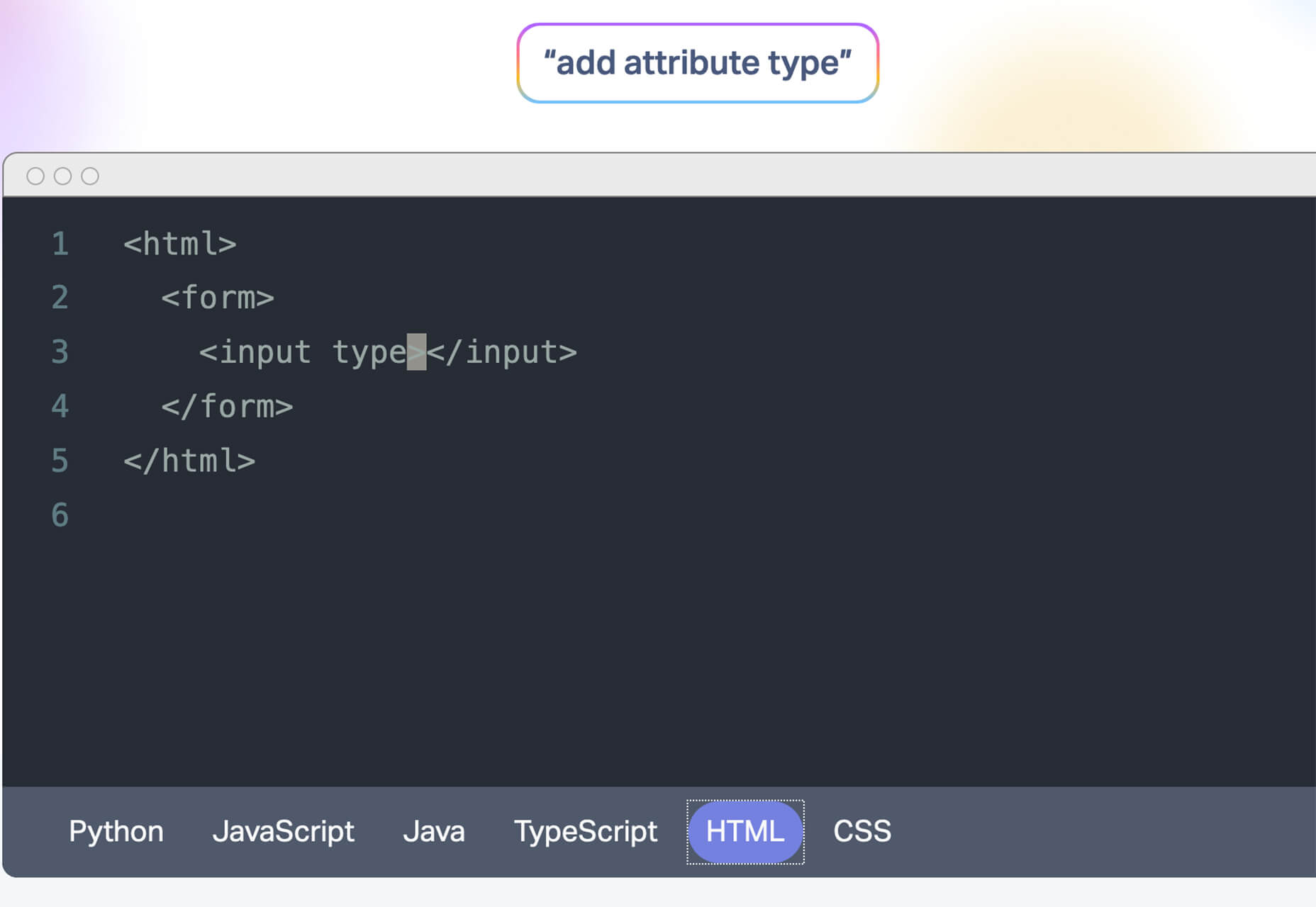
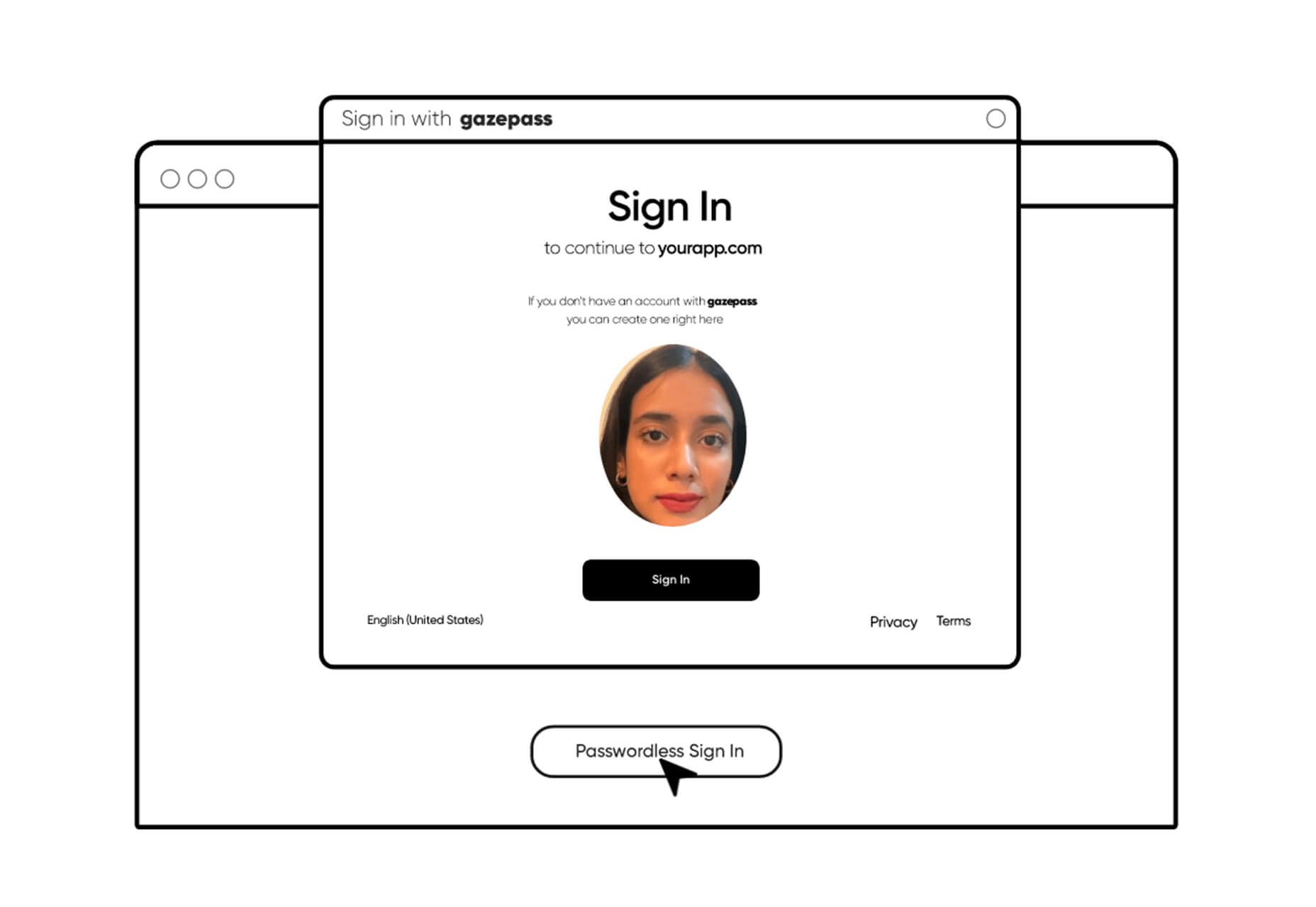
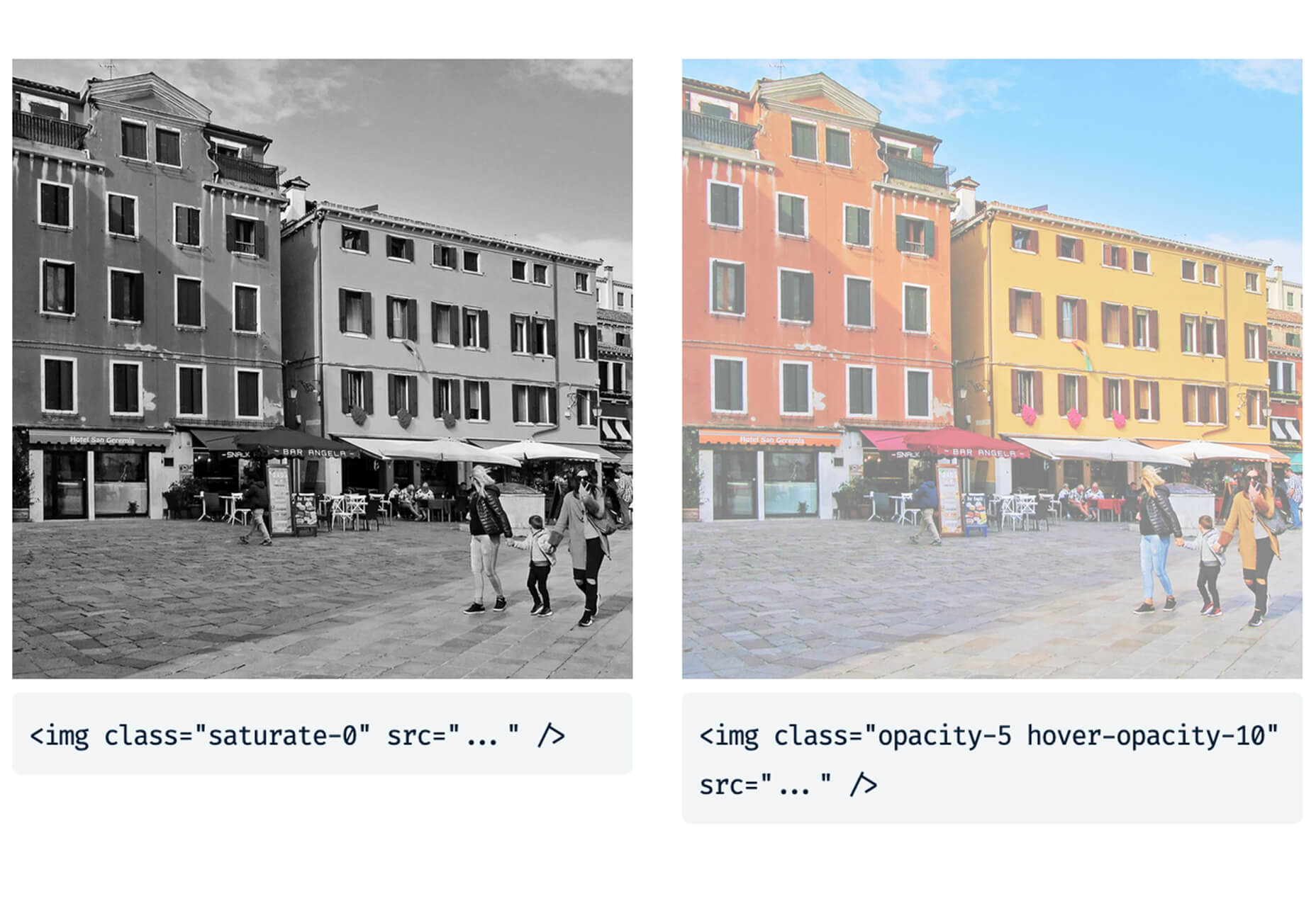
Every week users submit a lot of interesting stuff on our sister site Webdesigner News, highlighting great content from around the web that can be of interest to web designers.

The best way to keep track of all the great stories and news being posted is simply to check out the Webdesigner News site, however, in case you missed some here’s a quick and useful compilation of the most popular designer news that we curated from the past week.

Minimal CSS Frameworks


Responsive Grid Design: Ultimate Guide


The New Facebook Design Sucks


The No-Code Generation is Arriving


15+ Text Typing Effect CSS Animation Examples


AppSheet by Google Workspace – No-code App Building Platform


Ecommerce Development Trends: The 2021 Edition


How Videos Can Boost your Website Ranking Results


5 Small Business Website Essentials You Need for your Site


The Psychology of User Decisions


Overflow for Windows – User Flow Diagramming Tool for Designers


How to Create an AI that Chats like You on WhatsApp


‘50 Shades of Blue’


Here’s Why Developers are in Love with Functional Programming


Apple Building Search Engine to Take on Google, Report Claims


A Faster Way to View Search Results with Less Clicking


Dark Mode in UI Design for Mobile Apps: Beauty Born in the Darkness


EncryptLab – A Collection of Free and Comprehensive Encryption Tools


Part of your World: Why We’re Proud to Build a Truly Native Mac App


Why I will not Call Myself a Junior Designer - and Neither Should You


10 Usability Mistakes Most Designers Make on Checkboxes


People Problems


Practical Guide to Color Theory for UI Designers


Following the 2020 U.S. Election with Google


React Vs Svelte – A Comprehensive Comparison Between Javascript Libraries


Want more? No problem! Keep track of top design news from around the web with Webdesigner News.

Source


Source de l’article sur Webdesignerdepot

With billions of internet users worldwide spending several hours online each day, the online presence of brands is now a necessary avenue for building, boosting, and maintaining positive value and attracting and interacting with customers. 

This has created increasing pressure for web design agencies when creating and managing websites. This pressure is multiplied by all the projects that web design agencies have to handle at one time. This is because different clients demand different things for their websites, whether it’s a signature feature or specialized functionality. 

Hence, it’s vital that the tools the agencies use to work are simple enough and suited to the tasks they have to accomplish in order to build and maintain these projects. Having the right tools can increase efficiency and effectiveness in managing websites.

Challenges in Modern Web Design

Building a website with all the essentials in mind is always easier said than done. Websites have to be both functional and easy on the eyes to invite traffic, disseminate information, or appeal a product or service to a target audience, and all while having an attractive and convenient interface.

The good news is that it’s perfectly possible to design a quality website and without spending a fortune to do so. Below are some of the challenges that web design agencies face when trying to deliver and reconcile efficient user experience and effective user interface in web design.

1. Appealing User Experience

Designing a good website means ensuring that the user experience is appealing to a general audience, but this is one of the most difficult parts of web design. Agencies must be careful not to turn off users with a confusing user experience. For instance, making important information difficult to find on web pages, using technical jargon that ordinary users wouldn’t understand, and focusing too much on the design rather than the overall experience are a few big mistakes that no designer should ever commit.

Instead, web design agencies should focus not only on making the design look good but also on making the experience smooth and fast for the regular site visitor. This includes improving design elements to make navigation easier as well as optimizing webpage load speeds.

2. Working With a Budget

It’s common for the client and the web design agency’s budgets to not line up at all times. Either the client will find the project quote too high, or the designer will find the client’s budget too low. The cost of a web design project can vary greatly, depending on what needs to be done. 

Although having to build a good website on a budget may be difficult, it’s important for both parties to come up with a set amount before the project even starts. The client should always specify what they want to achieve and how much they’re willing to pay to get it, and the agency should let the client know beforehand if this is possible.

3. Integrating Third-Party Functionality

Sometimes, clients may make requests for third-party functions that may not be easily integrated into the site. To prevent this, web design agencies should always consider integration when building a site. Most businesses and companies now have at least one social media account, so it doesn’t make sense for their site to remain disconnected.

When a website visitor shares an excerpt on a social media site like Facebook, Pinterest, or Twitter, other people who can see their posts may become interested in visiting the original post on the website. Properly integrating third-party applications and functions into a website can get it more online presence and popularity.

4. Suitability to Different Devices

There are many devices that people can use to access the web. From smartphones to desktop computers, from cars to game consoles, and even wristwatches and digital cameras, all of these can be web-enabled as long as there’s an available internet connection. 

Websites nowadays should always be compatible with any of the devices people might use to go to the website. They should look pleasing and load fast regardless of what device a visitor is using.

5. Security of Personal Information

Most websites require personal or financial information, whether for account verification, for website subscription, or something else. Websites should be designed with personal security in mind, which is even more important since hacking has been on the rise since the coronavirus hit.

One of the biggest threats that websites face today is phishing, or when an attacker will pretend to be a trusted contact and attempt to compel you to click a malicious link. Another is ransomware, or where cybercriminals hold customer data for ransom and attempt to extort online business owners. Yet one more is SQL injections, or where hackers will attempt to execute malicious SQL commands in your website’s database. 

The best practices in regards to web design to mitigate these risks include third-party plugins and themes, keeping all of your software up to date, setting your web applications so they run the fewest privileges possible, and utilizing SSL certificates and HTTPS protocols. 

Adopting Site-Building Platforms

Gone are the days where you had to be technologically gifted to design a website from scratch, usually through manual HTML codes. Back then, you had to know your way around the web if you wanted to set-up and manage a site of your own.

Now, there are a lot of good website builders that allow you to create websites in a faster period of time. Even web design agencies now make use of such builders in order to make the job easier and more convenient. Not to mention, it allows agencies to focus on the design alone.

Although these platforms offer predesigned templates based on the most common purposes of websites, they normally allow the user to white label the website into the branding specific to the business or agenda of the website owner. The text styles, colors, and sizes coordinated to the website’s theme, and colors can be designed specifically to match the business or organization’s image and identity. 

Simply put, creating websites through a web builder platform can provide web design agencies with easy-to-understand tools that their teams and members can all uniformly use to more effectively and more efficiently handle all their projects.

With services that allow mobile optimization, site management, and even drag-and-drop editing, web design agencies can now better manage their projects and finish with their tasks more quickly.

Not only that, by using white labelling, services can conserve their time and energy into focusing on creating the best website for their client. With all the website builders currently available on the market today, just picking the right one can give web design agencies the best tools to use when creating, designing, and maintaining websites. 


Featured image via Pexels.

Source


Source de l’article sur Webdesignerdepot

Today, great design isn’t just about conveying the right amount of information in a certain number of pages. 

There’s more to creating the perfect website than experimenting with visuals and sound. Designers need to think carefully about how each element of their site impacts the overall user experience. 

After all, with billions of websites available to explore, it takes something truly immersive to convince your client’s audience that they should stay on their pages. The more convenient and attractive your websites are, the more likely it is that visitors will want to stick around. 

Minimalism, one of the more popular styles of web design from the last few years, can sometimes assist designers in making attractive and effective websites more functional.

The less clutter and confusion there is on a page, the easier it is to navigate. 

So, how do you embrace the benefits of functional minimalism?

Understanding Functional Minimalism

Many webs designers are convinced that minimalism is all about aesthetics. 

They see a website like Hugeinc.com and assume that the minimalist appearance is all about making the website as attractive as possible.

However, the underlying ideas of minimalism in web design go much deeper than this.  The history of minimalist design begins with Japanese culture. Japan has long focused on balancing simplicity and beauty with its architecture, interior design, and even graphic design. In the Western world, minimalism got its day in the sun in the web design environment, after customers endured years of cluttered and complicated web pages with difficult navigation, overwhelming information and clashing graphics. 

Designers began to experiment with the idea that less really could be more — particularly when it came to the digital landscape. 

The Functional Rules of Minimalist Web Design

For a while, minimalism was the most popular style for a website. During 2018, in particular, minimalist web design soared to the top of the designer demand list, as companies fell in love with a combination of white space, simple navigation and bold text. 

While now, there are other design trends stepping into the industry, designers can still benefit from exploring some of the essential rules of functional minimalism. After all, visual complexity has been proven to damage a person’s perception of a website

Additionally, a study conducted by the EyeQuant group found that a clean and simple design can lead to a lower bounce rate. Minimalism gives viewers less to contend with on a page, which can allow for a simpler and more straightforward experience. Additionally, a clean website can also drive additional benefits, including faster loading times, better responsivity between screen sizes and more.

Because you’re only using a few images and well-spaced text, you can even experiment with different strategies, like graphics and dynamic fonts. Look at the Manuel Rueda website, for instance, it’s a great example of how a minimalist design can be brimming with activity.

So, how can any designer use the principles of functional minimalism?

1. Focus on the Essentials

First, just like when designing a landing page, designers need to ensure that they’re concentrating only on the elements in the page that really need to be there.

This means removing anything on the website that doesn’t support the end-goals of the specific page that the viewer is using. Any pictures, background noise, buttons, or even navigation features that aren’t going to support the initial experience that the visitor needs, must go. 

Think about what’s going to distract your visitors from the things that are important and concentrate on giving everything a purpose. For instance, the Plus63.org website instantly introduces the visitors to the purpose of the website, then allows users to scroll down to get more information. The data is spread clearly through the home page, pulling the viewer into a story. 

2. Embrace the Positives of Negative Space

Negative space is one of the fundamental components of good minimalist web design. 

Every part of a good website doesn’t need to be filled with noise to make a difference. White, or negative space can help to give your viewer the room they need to fully understand the experience that they’re getting. 

From a functional perspective, it’s the difference between placing someone in an overflowing storage container and asking them to find what they need or placing them in a room where items are carefully spaced out, labelled, and waiting for discovery. 

The Hatchinc.co website uses negative space to ensure that information is easy to consume. You can find the different pages of the site easily, the social media buttons, and the newsletter subscription tool. Plus, you get a chance to see some of the work behind the site.

3. Make it Obvious

One of the biggest problems that consumers have encountered in recent years, is the concept of “choice overload”. 

Whether you’re in a store, or on a website, you’re never sure what to do first. Do you check out the blog posts on the site to learn more about the authority of the company? Do you visit the “About” page, to see where the brand come from? Do you head to their product pages?

As a designer, functional minimalism can help you to make it obvious what your audience should do next. As soon as you arrive on the AYR.com website, you’re not overwhelmed with choice. You can either head to your bag, “shop now”, or check the menu. 

Since the “Shop Now” CTA is the biggest and most compelling, the chances are that most visitors will click that first, increasing the company’s chance of conversions. 

4. Simplify the Navigation (But Don’t Hide It)

The AYR.com example above brings us to another concept of functional minimalism. 

While minimalism and simplicity aren’t always the same thing, they should go hand-in-hand. When you’re designing for functional minimalism, you should be concentrating on helping visitors to accomplish tasks as quickly and easily as possible, without distraction. 

That means that rather than overwhelming your audience with a huge selection of pages that they can visit at the top or side of the screen, it may be worth looking into simpler navigation options. A single menu icon that expands into a full list of items remains a popular design choice – particularly in the era of mobile web design. 

For instance, look at the simple menu on newvision-opticien.com.

With this basic approach, designers can ensure that visitors are more likely to click through to the pages that their clients want their customers to visit. They can still find what they need in the menu, but it’s not taking up space on the page, or distracting them. 

5. Set Great Expectations with the Top of the Screen

Functional minimalism can also help today’s designers to more quickly capture the attention of their visitors from the moment they click into a website. 

The content that’s visible at the top of the page for your visitors is what will encourage them to take the next step in their online experience. Make sure that you’re providing something that keeps your audience interested and gives them the information they need. 

That way, you’ll lower the risk of high bounce rates for your clients, while also taking advantage of minimalism’s ability to deliver quick access to information for your audience. 

At the top of the page, the Kerem.co website instantly introduces the visitor into what the website is all about, and what they should do next. 

You can even deliver more information in one chunk at the top of the page, without cluttering the environment, by using good UI animation. 

Consider implementing a slideshow of pictures that flip from one image to the next, or a font section that dynamically changes as your audience has chance to read each sentence. 

6. Use Functional Minimalism in the Right Spaces

Remember, functional minimalism isn’t just for home pages. 

Depending on what you want to accomplish for your client, you could also embed the components of minimalism into landing pages, portfolios, and squeeze pages too. 

After all, when there’s less clutter and confusion on a page to distract a potential audience, there’s a greater chance that your visitors will scroll to the bottom of the page and complete a conversion. For instance, look at how simple and attractive the Muzzleapp.com landing page is.

The page provides useful information and tells customers exactly what they need to do next. There’s no confusion, no complexity, and nothing to hold visitors back. 

Just be careful. While functional minimalism can be very useful, it won’t be right for every website. A lack of elements can be harmful to websites that rely heavily on content. That’s because low information density will force your user to scroll excessively for the content that they need. Using functional minimalism correctly requires a careful evaluation of where this technique will be the most suitable. 

Minimalism Can be Functional

A minimalist design isn’t just an aesthetic choice. The right aspects of minimalism can simplify interfaces on the web by eliminating unnecessary elements and reducing content that doesn’t support an end goal. 

The key is to ensure that you’re focusing on a combination of aesthetics and usability when creating the right design. An easy-to-navigate and beautiful website can be a powerful tool for any business.  

Source


Source de l’article sur Webdesignerdepot

Plugins offer a ton of benefits to developers and website administrators; from flexibility, to saving time in development, the right plugin is priceless to a project.

In this article, we’ll cover a list of the best new plugins for October 2020. You’ll find useful plugins for WordPress, Craft, Shopify, and Joomla.

Let’s get started.

WordPress

Sticky Post Expire

Sticky Post Expire is a simple plugin for WordPress that allows you to add an expiration date to your sticky posts. When the expiration date you set on a post expires, the post will automatically no longer be sticky. All you need to do is install/enable the plugin and a meta checkbox will appear in your posts admin area. It’s in this checkbox you will set the post’s expiration date.

Product page shipping calculator for WooCommerce

The Product Page Shipping Calculator plugin allows your customers to calculate the cost of shipping before adding the product to their cart. The plugin also allows customers to see the available shipping methods for their area. If the product cannot be shipped to the customer’s location, the plugin will notify the customer. All calculations are done using Ajax, so you don’t have to worry about the plugin slowing down your site.

Payment Page

Payment Page makes it easy to collect payments on your WordPress website. The plugin allows you to connect to any payment gateway platform of choice. You can also receive one-time or recurring payments using Payment Page. The plugin comes with beautifully designed templates that you can customize to fit your brand and style. The form builder helps you increase your sales and conversions. You can collect payment in any currency. After payment, customers will also receive a confirmation message.

WP Roadmap

Wp Roadmap is a product feedback board for WordPress. The plugins allow you to display your company’s product roadmap on your WordPress website or blog. The plugin will display your new products, business developments, upcoming events, achievements, awards, and future projects on your site. WP Roadmap also gives you the option to collect and create feedback boards. The plugin comes with an intuitive interface and works with any WordPress theme.

LiveSession

LiveSession is a session replay plugin for WordPress. The plugin allows you to record everything happening on your site, including clicks, scrolls, and mouse movements. This plugin helps you understand how your visitors interact with your website. You can rewatch the videos as many times as you like. Instead of recording every single visitor on your site, LiveSession will record visitors with a high engagement score.

The plugin also comes with a feature called Rage Clicks. This feature helps you identify when visitors encounter Javascript errors. The plugin also has a beta feature called Clickmap. It helps you identify the specific elements on your site that visitors clicked and how many times. There is also a heatmap feature that identifies which pages on your site get the most interaction. The plugin is very useful in improving your user experience (UX) and conversion rates. It easily integrates with Google Analytics, Segment, Intercom, LiveChat, HelpScout, Olark, Wix, Shopify, and WooCommerce.

Auction Feed

Auction Feed makes it easy to display eBay items on your WordPress website. Visitors to your website will be able to search and buy products directly from your site. The plugin comes with a variety of styles to fit any WordPress theme. You can also add a product description above or below the product image. Customers won’t have to leave your website before making their purchases. The plugin is also free to use.

Floating Related Posts

Floating Related Posts is a WordPress plugin that allows you to display a banner with a list of related posts on your website. The banner can appear at the top or bottom of the web page. You can set the banner to pop up using a time filter or scroll trigger. The plugin is also compatible with Google Analytics. You can customize the banner background color, font size, button style, and text color. The plugin can be translated into any language.

Simple Restrict Content

The Simple Restrict Content plugin allows you to restrict the content that visitors can access on your WordPress site. You can choose who can access content on your website by setting up roles. The simple lightweight plugin restricts different content types, including, posts, web pages, and WooCommerce products. The plugin is available in Spanish and English.

Easy Video Publisher

Easy Video Publisher is a WordPress plugin that allows you to easily publish YouTube videos on your website. You can import YouTube videos from multiple channels. You can also schedule the YouTube videos to automatically upload to your website. Note that a YouTube API key is needed to import multiple videos at a time from a specific channel. The plugin allows you to use multiple API keys.

Preloader Awesome

Preloader Awesome is a preloader plugin for WordPress that allows you to create a page preloader interface while the rest of the webpage is still loading. Preloaders are interface elements that notify visitors that your website hasn’t crashed, just processing before serving content. Some of the features of the plugin include 14 page transition styles, progress bar, GIF support, 10+ default CSS loader, progress status counter, unlimited color, and counter font size options. The plugin is responsive and works on all modern browsers.

Menu Hover Effect

The Menu Hover Effect plugin allows you to add hover effects to the menu bar on your website. With this plugin, you don’t need to learn CSS. This plugin gives you 20 CSS menu hover options to choose from. It is a lightweight plugin and won’t affect your website speed.

Better Comments

The Better Comments plugin allows WordPress users to easily customize the comment section of their website. With the plugin, you can customize the look of your comment form fields, match the submit button with the colors of your site, and hide the comment’s date. The plugin also allows you to create a comment policy section. You can further customize the comment fields to highlight when they are selected and typed in. If you find rounded avatars common, the plugin also offers a hexagonal avatar option.

WP Pocket URLs

WP Pocket URLs is a handy WordPress Plugin that helps you manage your affiliate links. The plugin allows users to automatically shorten and track any affiliate link on their website. You can also manually shorten the links on your website. Each time a visitor clicks on a link you get access to information like click date/time, country, IP address, etc. You can also categorize your links and also create custom permalinks. There is also a dashboard widget that displays your top 10 links. On the “Reports” page, you can generate clicks reports. You can filter the reports by Month/Year, link category, country, and link title.

Craft CMS

Formie

Formie is a Craft CMS plugin that allows you to create user-friendly forms. The plugin comes with a drag and drop builder for creating forms. You can store user form submissions in your control panel in case you want to review them later. When a user submits a form, you will get an email notification. Formie also has an in-built keyword blocking feature to protect you from spam. The plugin has several integrationS: API for Elements, Address Providers, Captchas, CRM tools, Webhooks, and Email Marketing software. You can also create your custom integration. You can add over 25 fields to your forms using Formie.

Craftagram

Craftagram is a Craft CMS plugin for adding any Instagram feed to your website. Since the plugin uses the official Instagram API, you don’t have to worry about your website getting blacklisted. Craftagram also handles pagination for your Instagram feed. 

Shopify

We’re Open

We’re Open is a handy plugin for Shopify users. The plugin lets your customers know when you are open to receive new orders. Once your business hours are close, customers won’t be able to make new orders. A message will be displayed in your store that you are closed. The plugin ensures that you only receive orders when you are open. It works in any time zone and the API easily integrates with mobile apps.

Punch Metrics

Punch Metrics is a Shopify Plugin that helps you track your store’s visitors and also analyze their behavior. The plugin offers real-time data on your site’s visitors, the pages that see the most engagement, and which devices are the most popular. You can also record and replay visitors’ sessions so you can know exactly what they did on your site. Punch Metrics also has a heatmap tracking feature to understand which elements on your site get the most clicks.

Joomla

Simple Sliders

Simple Sliders is a content plugin for Joomla. The plugin allows users to easily create accordion sliders in their articles. You can add the sliders to your Joomla articles by adding this code:

{s​lider title="Slider 1 Title" class="blue"}
Slider 1 content.
{s​lider title="Slider 2 Title" class="red"}
Slider 2 content.
{/s​liders}

Jitsi Conferencing

Jitsi Conferencing is a video conferencing plugin for Joomla. The plugin will allow you to host meetings and easily connect with your clients. The module is simple and effective to use.


Featured image via Unsplash.

Source


Source de l’article sur Webdesignerdepot

Dark themes are everywhere these days. 

As human beings continue to spend more of their time interacting with technology, dark themes provide a more relaxing way to engage with the digital world. More often than not, these themes are easier on the eyes, more attractive, and perfect for the dedicated user

Throughout 2020, countless leading brands have debuted their own version of the dark theme. Google has a solution for your Drive, while Apple and Android have built dark theme performance right into their operating systems. 

If you haven’t learned how to make the most out of dark mode yet, then you could be missing out on an excellent opportunity to differentiate your design skills, and earn more clients going forward. 

Why Dark Mode?

Before we dive too deeply into the possibilities of creating your own dark theme, let’s examine what dark mode is, and why it’s so effective. 

Ultimately, dark themes are created to reduce the amount of luminance emitted by everything from your desktop and laptop, to your smartphone and smartwatch. Dark themes help to improve the visual ergonomics of design, by reducing eye strain, adjusting brightness to suit current lighting conditions, and more. Additionally, many dark mode offerings are also fantastic at conserving battery life. 

Here are some of the main benefits of adding dark themes to your design portfolio

  • Better user experience: A focus on user experience is one of the most important trends of the digital age. You need to be willing to deliver incredible experiences to everyone who visits your website if you want to stand out today. Dark mode reduces everything from eye strain, to battery power consumption. This helps to keep customers on a website for longer.
  • Innovation and cutting edge appeal: Most companies want to prove that they can stay on the cutting edge of their industry. The ability to offer an opt-in dark mode version of a website theme or appearance can help your clients to stand out from the crowd. As the environment becomes more mobile-focused, more companies will be looking for designers that can provide the best mobile experiences. 
  • Support for universal design: Dark mode isn’t just great for people who have light sensitivity at night. This solution could be more comfortable for visually-impaired users who would struggle with eye strain when visiting your websites otherwise. If you want your content to be more inclusive for a wider range of viewers, then learning how to design for dark mode is a good way to start.

Best Practices When Designing for Dark Mode

Designing for dark mode is easier than you’d think. Most of the time, it involves simply thinking about how you can replace some of the brighter, more overwhelming aspects of your site, with something deeper and darker. 

Here are some useful tips that will get you moving in the right direction. 

1. Experiment with Colors

A big issue for a lot of web designers when it comes to developing a dark mode solution is that they get too caught up with things like pure white text against pure black backgrounds. However, this high-contrast option can be a little much after a while. 

It’s often much easier to use a dark grey as your primary surface color, instead of a true black. Additionally, rather than using bright white, think about slightly off-white alternatives that will be warmer to the eye.

Experiment with surfaces and color combinations that are unlikely to cause too much eye strain. Dark grey foundations often offer a wider range of depth, too, because you can demonstrate shadows on grey. 

Additionally, when you are experimenting with colors, remember that saturated colors often vibrate painfully against very dark surfaces, making them harder to read. Desaturating your colors will help to reduce the contrast and make your websites more welcoming. 

Lighter tones in the 200-50 range will have better readability on dark themes. However, you can always experiment with your choices. Google Material Design recommends using a contrast level of around 15:8:1 between your background and text. 

2. Consider the Emotional Impact

Much of the effort involved with dark mode design is figuring out how certain colors work together. It’s easy to get carried away with stark contrasts, particularly when you’re used to working with a white background. However, you need to remember that you’re designing for a user that’s primarily looking for an easier and more subdued browsing experience.

While you’re working, remember to consider the emotional aspect of the design too. The emotion in colors can make or break a buyer’s journey in any environment. However, an often overlooked-aspect of color psychology, is that people perceive shades differently when they’re on a black background

For instance, think of the color green. On a light background, it conveys nature and even financial wealth. However, on a dark background, the same green could come across as something venomous, toxic, or even sickly. It’s important to think about the kind of impressions end users are going to get when they arrive on your site.

3. Give Users the Freedom to Choose

One of the biggest mistakes you can make when you begin designing for dark mode, is thinking that you should focus entirely on your dark themes, and nothing else. This lines you up for a problem if you interact with users who want the best of both worlds. If you’re designing for apps in particular, you’re going to need web pages that can switch naturally between light and dark themes. 

Learning how to implement both a dark mode and a light mode option into the desks you create will help you to reach a wider selection of customers. Remember, you’ll need to test the performance and impact of your designs in both themes, to check that they deliver the same kind of experience, no matter how your user chooses to browse. 

Although dark mode should offer a different experience to end-users, it still needs to feel as though they’re browsing on the same website. That means that you’re going to need to experiment with the most natural combination of light and dark mode options.

4. Remember the Basics

Remember, although the three tips above will help you to get on the right path for dark mode design, you’ll also need to consider the opportunities and limitations of the platforms that you’re designing for. The kind of dark mode experience you can deliver for Google Chrome websites is going to be very different to what you can create for something running on iOS.

Examining the documentation provided by the system that you’re designing for will help you to develop something with a close insight into what’s actually possible. 

Other top tips for dark mode design include:

  • Focus on your content: Make sure that your content stands out on the page, without being too overwhelming. 
  • Test your design: In both light and dark appearances, you need to make sure everything is working as it should be.
  • Adopt vibrancy for your interfaces: Vibrancy helps to improve the contrast between your background and foreground. 
  • Use semantic colors: Semantic colors adapt to the current appearance of a website automatically. Hard-coded color values that don’t adapt can seem more aggressive. 
  • Desktop tinting: Try experiment with things like transparency and filters to give your websites and apps a slightly warmer tint – ideal for late-night browsing
  • Icons: Use individual glyphs and icons for dark and light modes if necessary. 

Ready to Design for Dark Mode?

Preparing your web development and design portfolio for an era addicted to dark mode can be a complex experience. You need to think carefully about how people are going to browse through your websites and apps when they’re searching for something more subtle, and less visually overwhelming than the websites that we’re used to making. 

The most important thing to remember is that everything on your website or application should look just as beautifully tailor-made in dark mode as it does in light mode. Simply adding a dynamic black background when people want to switch settings in an app isn’t enough. You need to go in-depth with your designs and examine how different fonts, colors, and images work together.

Source


Source de l’article sur Webdesignerdepot

This month’s collection of new tools, resources, and freebies for designers is a smorgasbord of sorts. You’ll find everything from useful APIs to icons to tutorials to fonts.

Let’s get right into it, here’s what new for designers this month:

Tooltip Sequence

Now that your app or website is ready, you might need to help users engage with it. Tooltip Sequence is a simple JavaScript package that helps you create a series of small tooltips that will guide users through product features with a small description of what they need to know. It looks great and the best part is this tool saves you from having to create each tooltip description manually on each page and link them together.

Serenade

Serenade allows you to free up your hands with voice coding technology. Use natural speech and stay productive with this tool that allows you to code without typing. It works across multiple coding languages and platforms. It’s as easy as “add function hello” and the tool knows what syntax to use.

Gazepass

Gazepass, which is still in beta, is a nifty API that allows for passwordless multi-factor authentication for any website or mobile app. It uses biometrics on any device or platform to make getting into apps or websites easier for users.

Filters.css

Filters.css is a CSS-only library to apply color filters to website images. Installation only takes three steps and includes a variety of filers, such as blur, grayscale, brightness, contrast, invert, saturate, sepia, and opacity.

Sidebar Webring

Sidebar Webring is a collection of blogs and websites that are focused on web design. The curated list is handpicked for superb content for designers and developers. But, what’s a webring? It’s a collection of linked websites in a circular structure that are organized around a theme. The term is a throwback to the early days of the web in the 1990s and 2000s.

Wicked Templates

Wicked Templates is a set of responsive HTML templates made with Bulma and Tailwind CSS that you can style and use as you wish. Use these templates to jumpstart projects. Free and paid options available.

WP Umbrella

WP Umbrella will help you keep sites running in a healthy and safe manner on WordPress. Monitor uptime and performance, PHP errors, and keep up with hundreds of websites from one dashboard.

Servicebot

Servicebot helps you create customer-facing embeddable billing pages that work with Stripe payments. This premium tool is quite user-friendly and works with websites or SaaS.

Custom, Accessible Checkboxes with Perfect Alignment

Create custom, accessible checkboxes with perfect alignment every time. This walkthrough shows you how to use CSS to align elements and labels.

Sombras.app

Sombras.app is a nifty tool that creates 3D object shadows. Use the easy on-screen controls to get just the right orientation and shape.

urlcat

Urlcat is a tiny JavaScript library that helps you build URLs with dynamic parameters and without mistakes. The friendly API has no dependencies, includes TypeScript types, and is just 0.8KB minified and gzipped.

Reacher

Reacher is a real-time email verification API that lets you check the validity of an address before you send the email. Reduce bounce rates in an instant. (The personal version is free.)

Swell

Swell is a most powerful headless ecommerce platform for modern brands, startups, and agencies. Create fast and flexible shopping experiences with the API and headless storefront themes. This is a premium tool but does have a free trial.

No Code Founders 2.0

No Code Founders 2.0 is a platform for discovering the latest startups built with no-code and the tools used to build them. Browse startups, tools, perks, interviews, jobs, meetups, posts, and more as part of the no-code movement. The community engages on Slack and requires an email to sign up.

How to Pick More Beautiful Colors for Your Data Visualizations

Beautiful color choices will make your data visualizations that much more impactful. This tutorial by Lisa Charlotte Rost will help you make better color choices on the way to better infographics and charts. Plus, it’s well developed, designed, and packed with useful information.

IconPark

IconPark is a collection of more than 1,200 high-quality icons with an interface that allows you to customize them. It uses a single SVG source file that can be transformed into multiple themes. The library includes cross-platform components and is free to use.

Mono Icons

Mono Icons is a simple and consistent open-source icon set that uses mono spacing. The collection includes 136 icons.

BGJar

BGJar is a free SVG background generator for digital projects. Pick a category and customize the result to fit your project or needs.

HitCount

HitCount is almost too simple to be true. This tiny tool lets you add a hit counter to your website that’s as easy as adding an image. Copy the code and make any customizations you want. Then paste it to your design. That’s it!

Blacklight

Blacklight is a real-time website privacy inspector. The tool by Surya Mattu scans any website you enter in the scan bar and shows what user-tracking technologies are used on the website. This allows you to see who might be gathering data about your visit.

Alter

Alter is a customizable – and experimental – three-dimensional typeface that you can experiment with. It’s as fun to play with as use.

Autobus Omnibus

Autobus Omnibus is a simple all capitals font with new wave styling. The character set has 96 glyphs that are perfect for display use.

Deathmatch

Deathmatch is a seasonal blackletter font that’s ideal for the upcoming Halloween holiday. The character set includes plenty of options and there’s a full version (paid) for commercial use.

Futura Now

Futura Now is a premium typeface and update to a font you may already know and love. The new version has 107 styles in a massive family.

Pumpkin Soup

Pumpkin Soup is a fun almost handwriting style typeface with a cartoonish vibe. It includes a regular and italic style and is most appropriate in limited use.

Source


Source de l’article sur Webdesignerdepot

Les clients accordent de plus en plus d’importance à l’expérience qu’ils reçoivent plutôt qu’au prix ou au produit. C’est pourquoi l’expérience client est rapidement devenue une priorité absolue pour toutes les entreprises. En 2020, avec les livraisons à domicile et les mesures de distanciation sociale mises en place en réponse à la COVID-19, les consommateurs sont passés à la commande sur smartphone pour acheter de tout, de la soupe aux noix.

De plus en plus de personnes utilisent des applications mobiles pour faire venir de la nourriture à leur porte. Les consommateurs savent à quel point il est important d’utiliser ces applications, que ce soit dans le confort de leur propre maison ou sur le trajet domicile-travail. Avec des options de personnalisation pour enregistrer leurs préférences, des informations précises sur les prix et des offres à portée de main, les attentes des consommateurs en matière de rapidité et d’absence de friction pour passer leurs commandes n’ont jamais été aussi grandes.

Bien entendu, pour pouvoir offrir une excellente expérience au client à ce niveau, il faut investir dans des technologies et des processus intelligents.

Renforcer les capacités du commerce électronique

Ce n’est pas seulement un dépanneur et un détaillant de carburant typique, mais Casey’s General Stores Inc. (Casey’s) est la cinquième plus grande chaîne de pizzas d’Amérique, avec plus de 19 millions de pizzas servies chaque année. En développant des liens communautaires solides, la marque est intégrée au tissu des petites villes du Midwest, offrant un service de proximité 24 heures sur 24, soutenant des causes importantes et célébrant les héros locaux.

Si la marque a su gagner des adeptes, Casey’s devait faire plus avec ses systèmes de commande et de paiement en ligne. Ils ont été construits sur des logiciels vieillissants qui n’ont pas su suivre le rythme de l’époque, ce qui a eu pour conséquence une expérience client en ligne qui n’était pas à la hauteur de l’essence de la marque, hyper pratique et axée sur la communauté.

Ainsi, dans le cadre de sa transformation numérique, il était non seulement essentiel pour Casey’s de renforcer ses capacités en matière de commerce électronique, mais il lui fallait aussi mettre l’expérience du client au premier plan et répondre plus rapidement aux changements du marché.

Pour ce faire, elle a dû utiliser des technologies intelligentes pour créer une application pratique pour smartphone et un site Web mobile afin de rationaliser les commandes par téléphone portable, ce qui a permis aux habitants de ces villes du Midwest de prendre leurs pizzas préférées très facilement et rapidement. En même temps, dans le but de l’aider à atteindre de nouveaux niveaux de confort, Casey’s a conçu un programme de fidélisation des clients.

citation de Art Sebastian, VP de Casey's

Rationalisation des processus de commande et de paiement

Pour rationaliser le processus de commande et de paiement en permettant aux clients de payer en ligne, Casey’s a déployé les solutions SAP Commerce Cloud et SAP Customer Data Cloud du portefeuille SAP Customer Experience. L’application mobile permet aux clients de passer des commandes de ramassage ou de livraison, de définir une carte de crédit par défaut pour le paiement, de personnaliser les commandes de pizza, de trouver un magasin, de parcourir le menu, de suivre les commandes, de réorganiser les favoris et de vérifier le prix du carburant.

Dans les cinq mois qui ont suivi son lancement, Casey’s a généré environ 65 % de ses revenus numériques grâce à l’application et 30 % supplémentaires grâce au Web mobile.

En lançant son premier programme de fidélité numérique, Casey’s Rewards, sur SAP Customer Data Cloud, Casey’s a organisé les données, le consentement et les préférences des clients et les a reliés directement à ses applications sur SAP Commerce Cloud. D’un seul coup, Casey’s est en mesure de récompenser sa légion de fans avec des offres à valeur ajoutée, tout en l’aidant à mieux connaître leurs besoins – ce qui lui permet en fin de compte de proposer des expériences qui dépassent ces besoins.

Une évolution rapide à l’époque de COVID-19

L’investissement de Casey dans les technologies intelligentes a également permis à ses magasins de rester ouverts pendant la période de COVID-19 et à l’entreprise d’avancer plus rapidement que jamais. Pour répondre aux attentes des clients pendant cette période, Casey’s a donné la priorité aux livraisons sans contact, s’est associé à un service de livraison tiers, a élargi la gamme de produits de marchandises générales disponibles en ligne et a lancé un service de livraison en bordure de trottoir.

Pour en savoir plus sur la transformation numérique de Casey’s, nous avons rencontré Art Sebastian, vice-président de Digital Guest Experience chez Casey’s à SAPPHIRE NOW Converge. Dans cette interview de quatre minutes, il décrit comment le détaillant de la supérette a fait de l’expérience client un avantage concurrentiel. Pour en savoir plus, consultez l’étude sur la transformation de l’entreprise, « Casey’s : Building True Customer Loyalty Over Pizza ».

Article publié en anglais sur blogs.sap.com


The post Faire de l’expérience client un avantage concurrentiel appeared first on SAP France News.

Source de l’article sur sap.com

Two years ago, our  team started developing and training a neural network for recognizing cars in parking lots. During this time, we have collected a dataset of more than 26 thousand images, connected 376 cameras to the car recognition service, 122 parking lots, of which only 5400 parking spaces. We have developed a mobile application displaying free and occupied parking spaces, and also created an SpotVision API that anyone can use to solve business problems.


Source de l’article sur DZONE

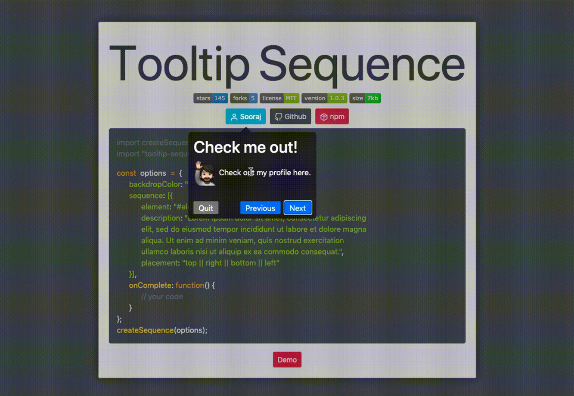
Design can make a statement. It evokes feeling and can encourage thought and conversation. That’s the common theme among the three trends in website design this month.

Each trend is rooted on the time and place where we live and includes elements that provoke thought. Kudos to these designers and design teams for jumpstarting conversations. Here’s what’s trending in design this month.

1. “Taking a Stance” Design

From social to environmental issues, design projects are echoing the sentiments of their audiences and organization in a way that take a stance on an issue.

Once taboo, this is becoming increasingly used as a technique for brands who are no longer worried about turning off a certain segment. The goal is to rally the core audience and people who feel the same way about an issue or cause.

There’s also a secondary thing happening here. Some designs aren’t really position based, but use imagery and language that resonates with a movement to associate with that feeling.

Never Heart uses “Join the Revolution” and a dark image with a heart to tug at your feelings. It can help create an association to a cause that you believe in without stating that cause directly. The design feels strong and inviting while making you feel like part of something.

Skye High uses “powerful” twice in the headline to convey a particular messages to women. The agency is looking to work with “powerful” women. It’s a timely statement and message that could resonate with a lot of business-women at various levels of their careers.

Discovered Wildfoods is a brand that is rooted in sustainability. The corporate model and responsibility of the brand shows through in the website. This type of design helps connect people with mutual feelings to the brand and products.

It’s refreshing to see more websites and brands embracing social causes and issues. It can be tricky for a number of reasons. But for some brands, it pays off.

2. Abstract Art Elements

If you are worried about a lack of images, or not sure how to portray images in an appropriate way due to the worldwide pandemic – groups or not, masked or not – abstract art elements can be the solution.

Widely used for startups and apps, more abstract design elements are everywhere. It’s an easy way to create strong visual interest without photography.

The most common use of abstract art elements is often in the form of geometric shapes with animation. This is something that almost anyone can understand and simple shapes and movement can be quite stunning when done well.

The good news is this aesthetic can work for almost any type of website. Try it for a redesign when you don’t have photography that feels appropriate in the current environment or if you want to create focus for content that drives website visitors to the words or scroll. This works with more abstract concepts when they are simple and help you move quickly from the visual to text.

Here’s how each of the examples handles abstract art elements:

Indicius uses bouncing circles that move toward text and down the screen to drive users to the headline and scroll action.

With Code uses a fun fuzzy circle with different animations to draw you in.

Appimized uses bright color and a monotone scheme with geometric shapes to sell its services.

3. Images That Make You Think

This might be the most visually interesting, and thought-provoking, website design trend we’ve seen in a while. These designs all feature images with a little something different or unusual that make you think.

There are a lot of different ways to do this – marry photographs and illustrations, create imaginary imagery, animations or effects, visual tricks that play on depth perception or create pseudo-3D effects.

The commonality is that the visual is so striking and unusual that website visitors stop and engage with the design. What do the “oddball” visuals mean? What message do they convey? How did they do that?

All of the questions could be associated with this different style of visual representation.

Bling uses a combination of a photo with illustrated animated elements to draw the eye. The yin and yang between reality and fantasy is quickly evident and makes you want to know more. (It doesn’t hurt that the animation uses dollars and lightning.)

Kibun is interesting because the photo choices create an optical illusion of depth. It matches the content of the design well because the website features artistic textile panels with an artistic design. The illusion is in the angles and coloring of photographs and their placements on the screen. The only downside of this design is that it loses the artistic panache on mobile because the images stack.

Oddball images can sell. We Are Mad stands out because it uses a contrived image, but doesn’t go oversized with it. The more subtle placement is ideal and arguably more attention-grabbing.

Conclusion

Website design can be a powerful thing, as these trends and examples show. Don’t discredit the power of choices in color, imagery, animation, and text when creating a digital experience. Design can mean a lot of different things depending on the audience as these examples show.

At the same time, these design trends are powerful and meaningful. They provide context into our world, our time, and our feelings. Don’t be afraid to experiment and make a statement with your design work. Just remember to keep in mind all potential impacts (positive and negative) before taking the project live.

Source


Source de l’article sur Webdesignerdepot