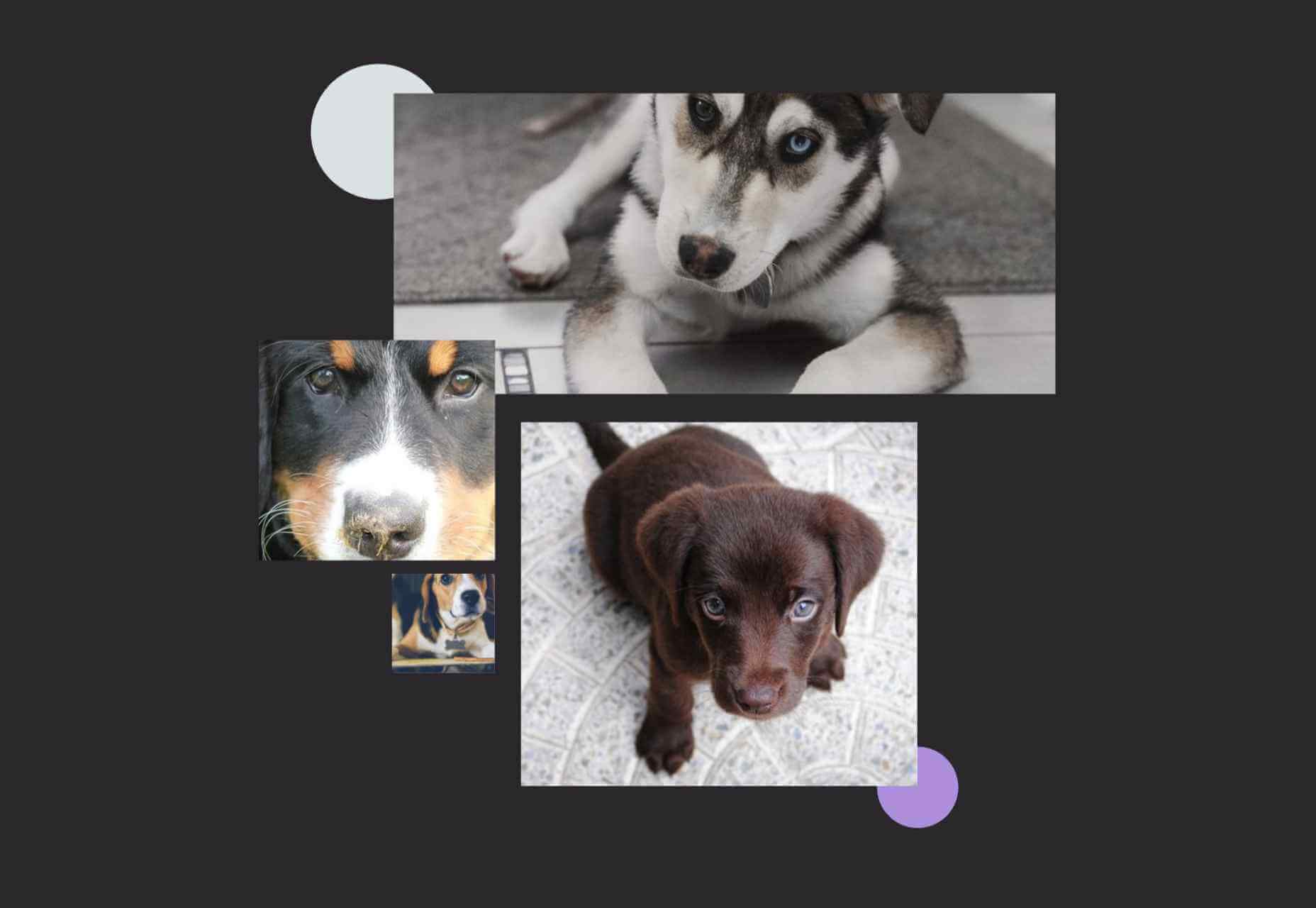
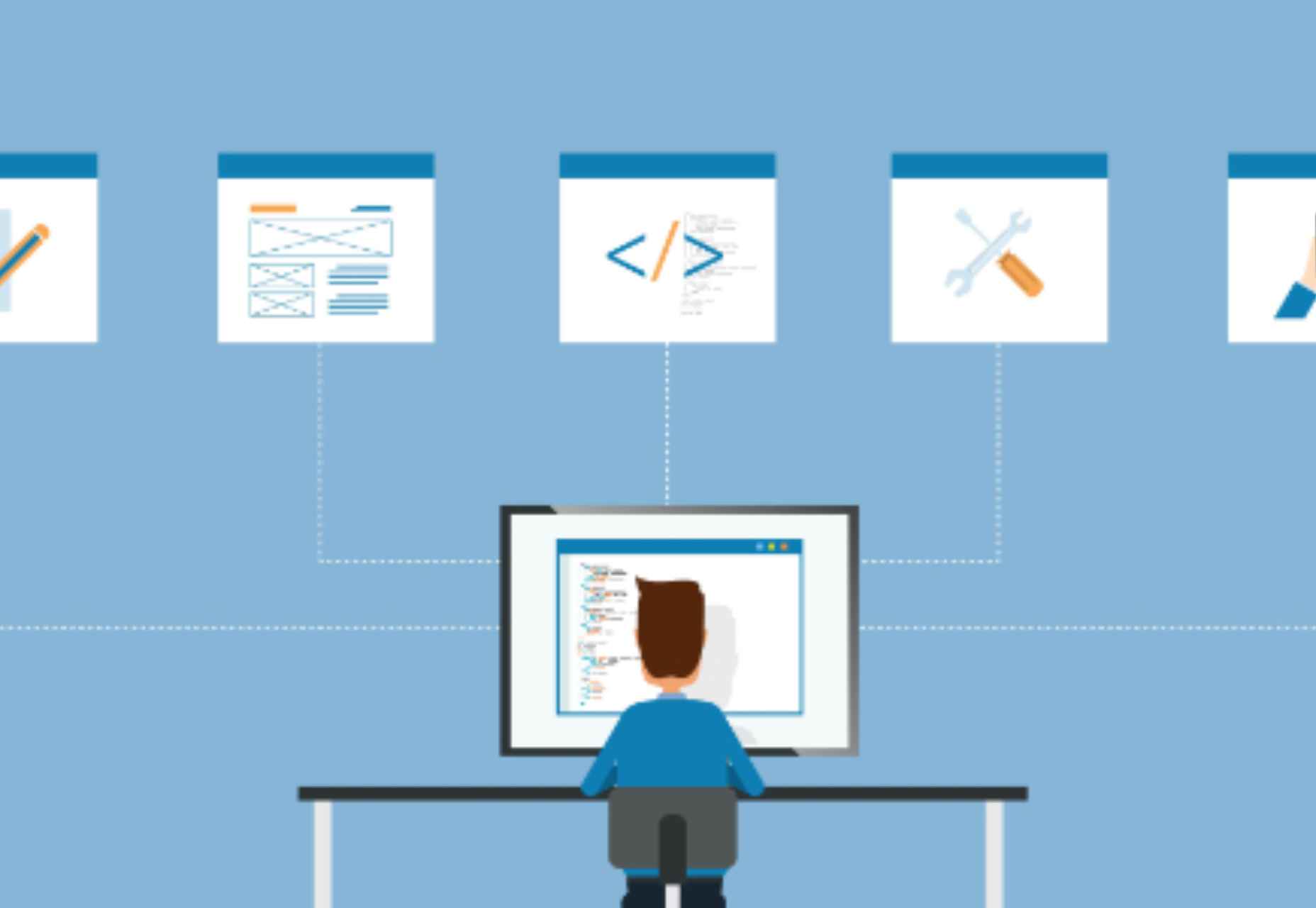
Every day design fans submit incredible industry stories to our sister-site, Webdesigner News. Our colleagues sift through it, selecting the very best stories from the design, UX, tech, and development worlds and posting them live on the site.
The best way to keep up with the most important stories for web professionals is to subscribe to Webdesigner News or check out the site regularly. However, in case you missed a day this week, here’s a handy compilation of the top curated stories from the last seven days. Enjoy!
https://ankaa-pmo.com/wp-content/uploads/2021/04/popular-design-news-of-the-week-april-19-2021-april-25-2021.jpg14082560Service comm.https://ankaa-pmo.com/wp-content/uploads/2017/04/Logo-Ankaa-engineering.pngService comm.2021-04-25 16:45:092021-04-25 16:45:09Popular Design News Of The Week: April 19, 2021 – April 25, 2021
At the dawn of the web-era, there was much focus on how environmentally friendly websites were: we’d chop down fewer trees, ship fewer products, and travel less for business.
And because the web was small, any negative impact it had was relatively small. But the Internet’s no longer small, and neither is the impact it has on the environment. The average website uses 211,000g of CO2 per year, watching a video online outputs an estimated 0.2g of CO2 per second, and a single email can cost 50g of CO2.
In the next four years, the tech industry as a whole may use up to 20% of the world’s electricity and be responsible for 5.5% of global CO2 emissions.
The good news is that because websites are viewed many times, even small improvements can multiply into real change.
1. Reduce Energy Consumption
Through electricity use, the Internet generates around the same CO2 as most major countries. That carbon comes from two sources: the devices we use to access the Internet and the servers that host our data.
Computers heat up, and when they heat up, they slow down. Servers are especially vulnerable and use extraordinary amounts of energy to keep cool and functional, which is why Microsoft keeps throwing servers into the sea.
Make It Faster
The faster your site, the less data is used to serve it, and the less carbon it’s outputting; it’s that simple.
Reduce the Number of Resources Used
Everything you load on your site has an impact. You might think that a tiny PNG is too small to really impact your carbon footprint, but over thousands of page loads, its impact is multiplied. Anything you can do to reduce the number of actual files requested will reduce your carbon output. You can use sites like Ecograder to estimate your own site’s CO2 output.
Optimize Images
If there’s one thing you can do to reduce the size of your site, the amount of data that needs to be sent over the Internet to serve your site, and the resulting speed, it’s optimizing your images.
Nothing reduces a site’s footprint like optimizing images. It’s easy and free to reduce the size of JPGs and PNGs with a service like TinyPNG. Offer WebP to any browser that will accept them; it will boost your Lighthouse score and improve your CO2 usage.
Lazy Load Images
Lazy loading images means images are loaded as they are required; images at the top of a page always load, images further down only load when the user scrolls to them; if the user doesn’t scroll to the bottom of the page, they don’t load, saving you CO2.
Reduce The Amount Of JavaScript You Use
Yes, JavaScript is awesome. Yes, it can be hugely beneficial to UX. And yes, it munches on energy like it’s candy.
When a web page loads, it’s done, the total cost is in. If JavaScript keeps running in the background, redrawing the screen based on user interaction — as is the case with a parallax site — the web page keeps using up energy on the device.
Choose a Sustainable Hosting Company
You can reduce the power needs of a site, but you can’t eliminate them. One simple step is to opt for a hosting company that gets its electricity from sustainable sources such as wind power or solar.
Low←Tech Magazine is powered by a server that runs on solar energy and carries a warning that it may go offline. But it’s possible to host both reliably and sustainably. Many web hosts outsource their actual server management, so they have no control over how those servers are powered, but there are plenty of exceptions that guarantee green web hosting. Google Cloud aims to be the cleanest in the cloud industry. For green web hosting, I always recommend the all-round superb Kualo.
2. Be Inclusive
One of the biggest issues with the EV (Electric Vehicle) movement is that we’re replacing cars earlier than we normally would in a rush to move to “clean” driving.
A new EV certainly outputs less than a gas-powered vehicle when driven the same distance. Combine increased use — because owners think they are driving cleanly — with the fact that a new EV has to be manufactured, the minerals for batteries have to be mined (in horrific conditions), and it then needs to be shipped to you, and EVs are not as friendly as they appear — so go ahead, buy that vintage Porsche it’s probably better for the environment than a Tesla.
Support Legacy Devices
The same issue that applies to cars applies to devices. Every time we rush ahead to support the latest iPhone, we leave older generations behind. A device can and should last longer than two years.
This is not to say that you shouldn’t embrace modern web standards. Technologies like CSS Grid are excellent at reducing markup size and speeding up sites. CSS Grid has been well supported for over four years, and even “legacy” devices can handle it. If you can keep a phone for an extra six months, the environmental cost of that phone is reduced by 20%.
3. Help Users Make Good Choices
More and more people are trying to make good choices. We’re eating a healthier, balanced diet. We’re recycling clothes. We’re traveling by bike, and on foot, instead of by car. People want to do the right thing, and they seek out companies that aid them.
Improve Navigation
Anything that you can do to make your content more findable will mean fewer page loads and therefore consume fewer resources.
By improving your information architecture, improving your search accuracy, and improving on-page signposts like bread crumbs and link text, you help users find content faster.
Feelgood Feedback
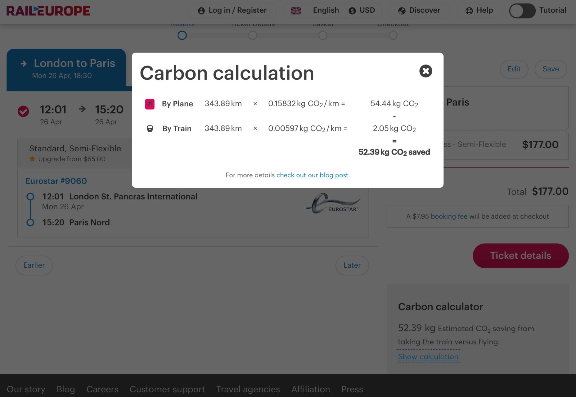
When the environmental impact of a user’s actions are quantifiable, let them know. Users who care will appreciate it, and users who don’t will ignore it.
Raileurope.com adds a note to any quotation letting you know how much carbon you’ve saved by traveling by train instead of flying.
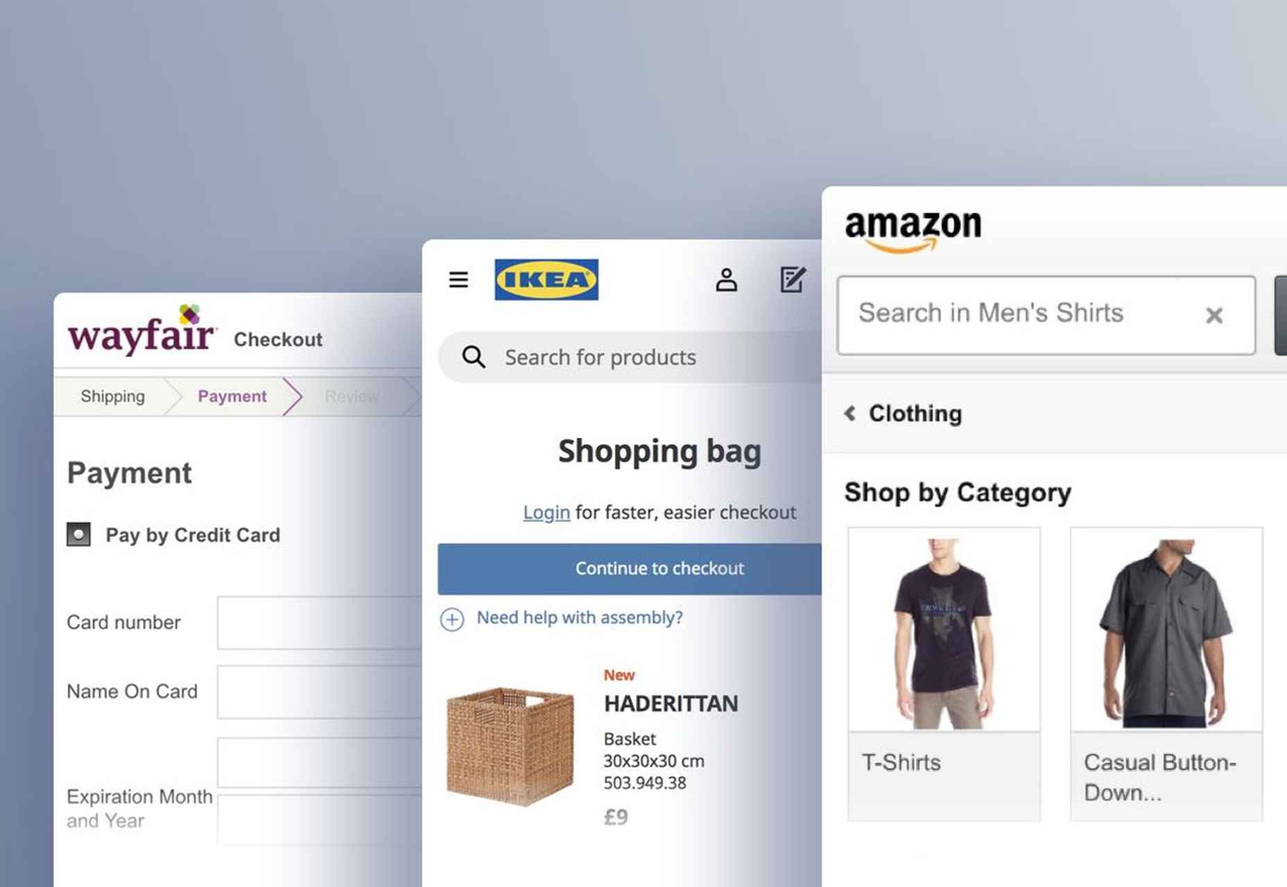
Don’t Remove the Shipping Rate
Many ecommerce sites offer free shipping, especially above a certain order value; it’s a good way to encourage higher sales. But absorbing the shipping cost implies that there is no shipping. By highlighting the shipping costs, even if they’re not passed on to the customer, you remind them that there is an environmental cost and a financial cost.
You can absorb the shipping rate without implying there is no cost by adding the shipping and then explicitly deducting it as a discount.
Make it fast and usable, and you’ll also be making it energy efficient. Make it inclusive, and you’ll help the industry slow the ever-growing tendency to consume. Make it transparent, and you’ll help your users make good choices of their own. All of these things are not only good for the environment, but they also result in improved UX and SEO.
Every day design fans submit incredible industry stories to our sister-site, Webdesigner News. Our colleagues sift through it, selecting the very best stories from the design, UX, tech, and development worlds and posting them live on the site.
The best way to keep up with the most important stories for web professionals is to subscribe to Webdesigner News or check out the site regularly. However, in case you missed a day this week, here’s a handy compilation of the top curated stories from the last seven days. Enjoy!
https://ankaa-pmo.com/wp-content/uploads/2021/04/popular-design-news-of-the-week-april-12-2021-april-18-2021.jpg14082560Service comm.https://ankaa-pmo.com/wp-content/uploads/2017/04/Logo-Ankaa-engineering.pngService comm.2021-04-18 16:45:242021-04-18 16:45:24Popular Design News Of The Week: April 12, 2021 – April 18, 2021
Over the last fortnight one site builder has gone toe-to-toe with another, as Wix launched a marketing campaign aimed at attracting WordPress users, and instead attracted universal ire.
First, Wix sent out expensive headphones as gifts to key WordPress “influencers” in an attempt to lure them to the platform. Second, they produced a series of adverts that instead of promoting their own product, tried to imply that WordPress is so bad you’ll need mental health counselling to cope with it; it’s been widely frowned upon, but am I alone in thinking they’re not a million miles away from Apple’s anti-Windows adverts? No, I’m not.
Then, Wix made an attempt to go viral with an uncomfortable video in which a character portraying “WordPress” releases a “secret” message warning the community of “fake news” supposedly due to be released by Wix. The language and the styling is clear: WordPress is unhip daddio.
Unlike WordPress, Wix is a publicly owned company, it has an obligation to its shareholders to maximize its revenue. Had Wix targeted WordPress’ many failings, that would have been fair game. Had they gone after Shopify, or Webflow, or Squarespace, or one of the many other site builders on the market no one would have blinked an eye. Wix’s error wasn’t going after WordPress, or even the tactics used to do so, Wix’s mistake was in attacking the very community it was attempting to court.
I’m not a big fan of WordPress. I’ve built around a dozen sites in it over the years and we’ve never got along, WordPress and I. But I am a big fan of the ethos of WordPress; who doesn’t love free, open source software, built by volunteers?
The holy grail of marketing is transforming customers into evangelists — individuals who will bare their chests, paint their face with woad, and charge headlong onto social media at the merest hint of a perceived slight. You can’t buy them. It’s a loyalty that has to be cultivated over years, and requires more give than take. WordPress has those evangelists, people who see their careers in web design as intertwined with the CMS. No amount of free headphones is going to convert them to a closed system like Wix.
The irony is that Wix’s approach stemmed from the WordPress community itself. If it is going to celebrate “powering 40% of the Web” then it has to expect to make itself a target. If you’re an antelope, you don’t douse yourself in bbq sauce and strut around the waterhole where the lions like to hang out.
If the row rumbles on, it will eventually end in an apology and a promise from Wix to “do better.” But the truth is, all Wix did was confuse a community of people trying to build websites, with a competing business.
This time next year, Wix will still be recovering from the damage to its reputation, and WordPress will be telling us it powers 110% of the Web.
Have you ever wondered why we’re so amazed by motion? A moving image is more likely to grab your attention than a static one. Motion is exciting and attention-grabbing – plus, it allows us to access more information in a short space of time.
For a while now, companies have been experimenting with all kinds of motion and animation in their design choices. We’ve seen the rise of animated website backgrounds or live-playing videos instead of images on a home page. There are videos and 360-degree pictures on product pages to help people get a better view of certain items and immersive AR experiences on apps.
So why has the power of motion not made its way into the logo design landscape yet?
Sure, there are a few examples of animated logos out there, but they haven’t had the same long-lasting impact as animated websites. Perhaps that’s because people don’t have the right tools to bring their animated logos to life?
Today, we’re going to cover some top tips for live logo design.
1. Understand What “Live Logo” Means
An animated logo or live logo can be a powerful tool in a company’s branding strategy. Although there’s more to a company’s identity than its logo, it’s fair to say that logos make a huge difference to how we feel about brands and their identity.
A powerful logo can make an emotional connection with your target audience and help your brand to thrive in virtually any environment. Live logos, or animated logos, bring more attention to the brand image, by helping a customer to focus on the logo’s action. A live logo might tell a story about what the business does through motion, or just be eye-catching.
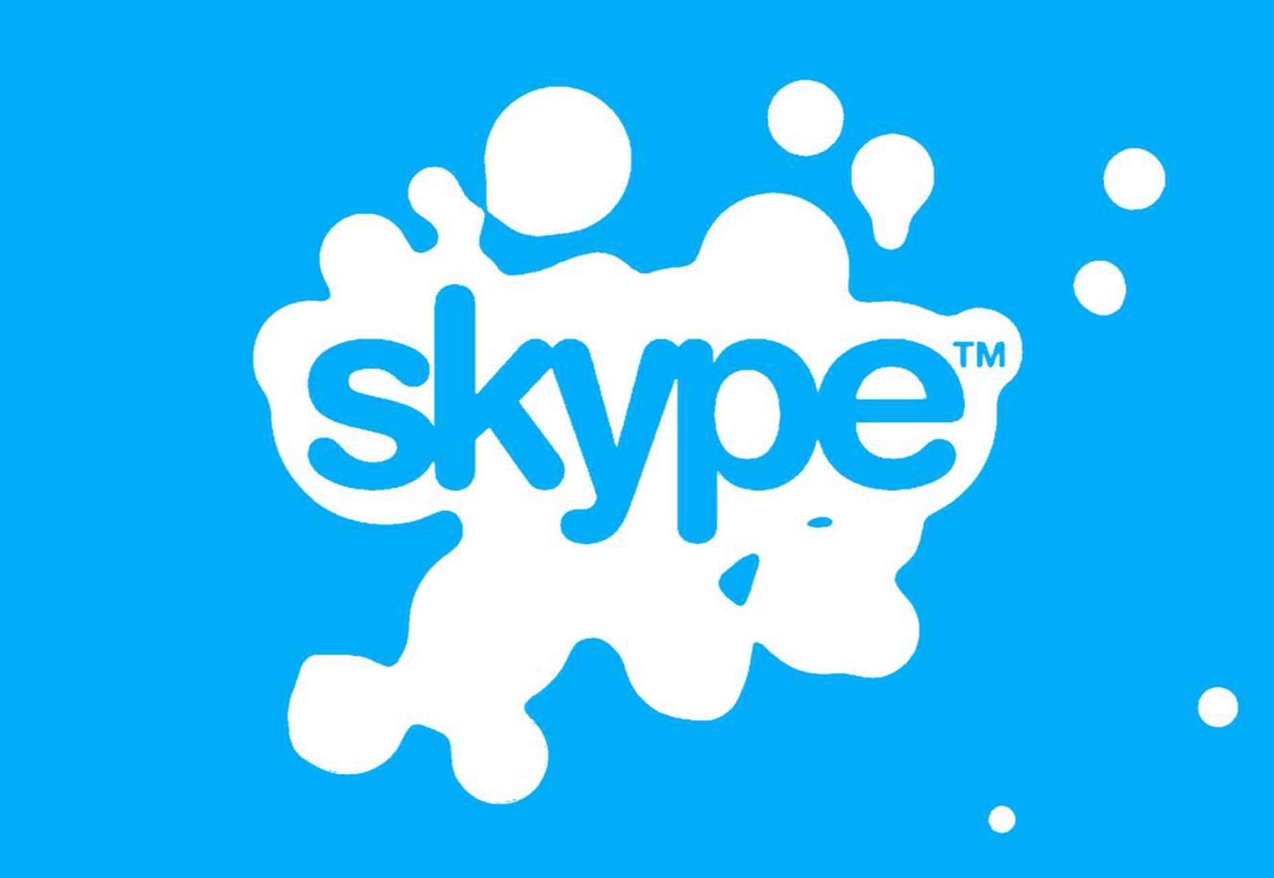
The level of animation varies depending on the designer, but it can go all the way from a short video presentation to a few simple moves. The Skype logo is an excellent example of something simple, that multiple designers have played with to great effect.
Today, there are plenty of open-access tools helping to create more immersive animated graphics in the logo design world. Additionally, the types of animation available are becoming more impressive all the time.
2. Explore the Types of Logo Animation
The next stage of properly leveraged live logos, is knowing what kinds of logo animation are available. There are plenty of different styles of animation to explore today, depending on the kind of impact you want to have.
For instance, sometimes the animation you choose will be connected to your business. A vehicle company might have a logo that seems to “drive” into the central space on the screen. An electricity company might choose a logo that pulses like an electric charge. This animated FedEx logo is an excellent example of how animation can show what a business does.
Options for animation might include:
Rotation: Make an emblem stand out by moving it to the sides or allowing it to move on its axis. Rotation gives a logo a sense of 3D space.
Appearance/Disappearance: You can make a logo grow on the screen by bringing to life one pixel at a time, or have it dissolve and disappear in a similar way.
Transformation: Your logo doesn’t have to start out in the shape it’s going to achieve. You might start with a seed that gradually grows into a tree-shaped logo for a gardening company, for example.
Replacement: Another great way to tell a story is to replace a graphic related to the company in question with the logo through an immersive animated experience.
3. Set Goals for the Live Logo
If you’re not sure what kind of animations to experiment with, then it’s a good idea to start with some solid goals. Your goals will give you a direction to move in with your logo choices. An animated logo can be a dynamic and modern way to present a brand to an audience, but it’s only going to be effective when implemented carefully.
Let’s look at some of the goals you can choose for your live logo:
Differentiation: While it’s true that animation and live content is gaining more attention lately, it’s still relatively new as an overall concept. With an animated logo, you could help a brand to create a more unique image for themselves, which sets them apart from the other organisations in the same space.
Storytelling: As mentioned above, animated logos can tell a story about what the company or product actually does. In this example for Firefox, for instance, the logo mimics a loading wheel to demonstrate a speedy internet browser.
Brand awareness: Dynamic logos and animations are more likely to capture your audience’s attention than static images. They’re also more of a novel experience, which means that customers might want to share them with other people too.
Memorability: Today’s customers are bombarded by hundreds, if not thousands of logos all the time. They need something special to convince them that one image deserves a spot at the front of their mind. Animation can help to make a business more memorable.
4. Do Your Research
Doing your own research is an excellent way to get some inspiration for a live logo or animation. Ideally, you’ll want to focus on the industry you’re already working in, as this will give you some guidance as to the kind of movement that can attract the most attention from the correct audience.
Watch as intros to brand videos and check out as many live logos as you can. Check out the kind of animations that people use in their videos when they’re showcasing products online. You can learn a lot about what works just by evaluating what other people have done before. Just be careful not to simply copy what you’ve found elsewhere.
The aim of your live animation should be to tell a unique story about the company
The aim of your live animation should be to tell a unique story about the company in question. If you’re not sure how to start with differentiating the image, check out the brand guidelines for the company in question. The guidelines that the company used to choose the right brand colors, fonts, and other visual assets can work just as well for your animation strategy.
Remember, the aim here is to tell a specific story, send a message, or evoke a certain emotion. Don’t make the mistake of designing something that looks cool but doesn’t have much of a purchase. Most human beings will naturally look for the meaning behind the content that they see. If there isn’t anything there, it’ll just lead to confusion.
5. Use Live Logos on Brand Websites
The most obvious way to begin experimenting with animated logos in web design, is to implement live logos into a client’s website. Some companies have a “welcome screen” for their site which uses an animation to introduce visitors to the home page and other navigation options. There are also brands out there who love the impact that animation can have but want to use it more subtly.
In these cases, live logos can be an excellent way to draw the eye to a specific spot on a website, perhaps the area just above the “contact” button that encourages a client to reach out. Crucially, to avoid weighing down the website and distracting visitors, companies and designers will need to make some important choices.
Although it might be tempting to keep the animation looping at all times, just in case someone misses the first round, this requires a lot of extra processing power. Too much animation also makes it harder for businesses to push the focus of their visitors to other points on the website, like landing pages for products, or testimonial pages.
Often, as with most innovative decisions in web-design, the best bet is usually to start small and work your way up. Don’t over-do it with animation on day one. See how the visitors to the website respond first.
6. Find the Right Balance
Animations in a live logo are there to grab attention quickly, and effectively. They shouldn’t go on for too long, or you risk overwhelming your audience before they have a chance to browse the rest of the website or check out other content. A live logo should only be active for a few seconds at most, and in that time, it needs to say something valuable.
Often, the best strategy is to start by building up curiosity, and getting your viewer engaged so that they’re keen to see more. Every frame will count to pull the customer in and make them feel connected to the brand in question.
Make sure that the logo animation is dynamic so that it doesn’t just capture the attention of the viewer but maintain their interest for the full time required. During the motion, the viewer’s brain should be working to figure out what’s going to happen next.
Just like most logo design and graphic animation strategies, the key to success is finding the right balance between clever experiences, and simplicity. You want to do something meaningful that earns your viewer’s attention, but you need to compete with the fact that attention spans are plummeting all the time.
7. Explore Logo Animation in Video
One of the best ways to use logo animation, is to draw interest for a company at the beginning of a video. Video is gaining incredible levels of popularity lately, particularly in a world where you can view video content almost anywhere. Companies are adding videos to their product pages, social media accounts, applications, websites, and so much more .
For the majority of companies, a live logo at the start of a video can help their brand to seem more professional. It’s a reminder to viewers of the brand that they’re learning about with that video content. Plus, a logo at the beginning of a piece of video content can also build on the consistency that companies attempt to create by using the same brand assets in various mediums online.
(Starting a video with an animated logo is great for presentation, but it can also be frustrating to customers in certain pieces of content where they’re looking for quick answers to questions. If an animated logo is more than a couple of seconds long, it may be better placed at the back of a video instead.)
With videos for news reports or announcements where you want to get straight to the point and generate excitement about a new product or service, it can be better to jump straight into action. Ending a video with a live logo keeps the brand image front of mind for the customer for longer, even after the message has ended. On the other hand, ending a video with a logo could increase the chances that customers miss the animation, because they click away from the content too quickly.
If you’re new to adding live logos into videos, consider experimenting with different strategies to see which works best. Different companies might get unique results.
8. Bring Logo Animation to the Real World
Another interesting option for live logo design, could be to step outside of the computer screen for a while. In today’s digitally transforming landscape, it’s becoming more common to see the real and digital worlds converging. Most events and trade-shows come with presentations that rely on digital content, like animated presentations and slide shows.
Depending on the signage solutions available at industry events, companies could even use an animated logo above their booth to draw attention in a cluttered environment. Around 48% of exhibitors agree that a more eye-catching stand or booth is often the most effective way to attract visitors and customers at an event.
Animation and live logos may have started life on the computer screen, but they can appear in much more diverse environments today. Offices could use a live logo in the reception room or lobby to make their on-premises environment more appealing. Retail locations could display ads on digital signage, followed by live logos that work to both separate messages, and keep shoppers entertained when they’re enjoying the bricks-and-mortar experience.
9. Include Live Logos in Brand Signatures
Remember, a live logo doesn’t just have to sit on a company’s app or website until someone discovers it. Sometimes, the right logo can also be a powerful way to “sign off” on a message from a brand or its management team. For instance, email remains to be one of the most valuable tools for business marketing and customer relationship building today.
It’s the third most influential source of content and news for a lot of B2B audiences, and yet, most companies aren’t taking full advantage of what their email marketing software solutions are capable of. If you can display gifs and animated videos in an email (which most software solutions can), then you can also add a live logo to the brand signature.
The important thing to remember is that if you’re going to be adding a signature to a lightweight thing, like an email, it needs to be lightweight too. Don’t make the live logo too long and complicated, or it might prevent the email from loading properly.
Outside of email, don’t forget to consider options for live logos in things like social media profile pictures too. According to experts, around 80% of companies use visual assets in their social media marketing. A live logo is a great way to go beyond the basics with a company’s imagery. Motion grabs attention, and video content is quickly gaining steam on a lot of social media platforms.
Embracing a New World of Live Animation
Designers are only just beginning to scratch the surface of what’s possible with animated logos. For many companies, live logos are an excellent way to capture audience attention and encourage engagement with a brand.
A live logo at the beginning of a video, at the start of an app loading screen, or even at the top of a website can differentiate a company and make them stand out. As technology continues to evolve, and customer expectations continue to expand, the options for live animation could continue to grow. You might even be able to infuse live logos with elements of VR and AR, to impart brand essence in a brand-new digital world.
If you haven’t begun experimenting with live logo design yet, now could be the time to start.
https://ankaa-pmo.com/wp-content/uploads/2021/04/9-tips-for-better-live-logo-design.png15292780Service comm.https://ankaa-pmo.com/wp-content/uploads/2017/04/Logo-Ankaa-engineering.pngService comm.2021-04-14 16:45:092021-04-14 16:45:099 Tips for Better Live Logo Design
8 startups françaises et internationales, spécialisées dans l’innovation autour de l’agriculture et de l’agroalimentaire, rejoignent cette sixième édition. Leur but ? Aider ces deux secteurs à se transformer, via des nouvelles technologies, pour avoir un impact positif et durable.
SAP.iO Foundry Paris annonce aujourd’hui le lancement de son nouveau programme d’accélération autour de l’Agribusiness. Suite à son appel à candidature en janvier dernier, le jury de SAP.iO composé de collaborateurs SAP, de partenaires (Deloitte, Accenture), et de fonds d’investissements (CapAgro et Astanor Venture) et de nombreux clients a retenu 8 startups spécialisées en procurement, supply chain, en plateformes de suivi de production et en outils d’aide à la décision. Pendant 10 semaines, SAP.iO va accompagner ces jeunes pousses dans leur croissance autant sur l’aspect business que technologique.
SAP.iO Foundry Paris ouvre ses portes à des startups du monde entier
Cette sixième promotion dépasse les frontières habituelles de SAP.iO Foundry Paris avec 3 startups françaises, 2 américaines 1 israélienne, 1 allemande et 1 canadienne.
Partant du constat que la France est l’une des plus grandes puissances agricoles, SAP.iO Foundry Paris lance le 1er programme d’accélération startups de SAP entièrement dédié à cette industrie. Les 8 jeunes pousses ont été retenues pour leurs technologies et leurs approches innovantes en matière de transition écologique. Grâce à l’expertise de SAP sur le sujet, notamment en Europe et aux Etats-Unis, l’accélérateur de startups offre à ces jeunes pousses l’opportunité de se positionner sur l’ensemble du globe.
Ce nouveau programme d’accélération sera articulé autour de 3 problématiques :
Digital Farming & Data-Driven Agriculture : comment intégrer dans l’Agribusiness de la donnée, de l’intelligence artificielle, de l’analytique, de la plateforme d’aide à la décision ?
Next-gen Agricultural Origination Processes : comment combiner conformité et traçabilité dans l’ensemble du processus de production et de transformation ?
Sustainable AgriBusiness Supply Chains : comment faire de l’agriculture plus responsable et respectueuse de l’environnement tout au long de la chaine de valeur ?
8 startups à forte valeur ajoutée orientées AgTech sélectionnées
Agrora permet aux transformateurs et aux négociants de produits agricoles de gagner du temps sur les processus d’approvisionnement et de distribution en offrant un logiciel d’approvisionnement pour les produits agricoles.
Clarifruit est une startup israélienne spécialisée dans le contrôle qualité des produits frais et notamment des fruits, qui grâce à l’intelligence artificielle et à des caméras, permet d’identifier si les fruits sont de bonne qualité et propres à la consommation.
Connecting Food est la première plateforme collaborative française utilisant la technologie blockchain et des modules intelligents pour apporter de la transparence, une traçabilité de bout en bout et un audit numérique complet des produits alimentaires avant de les mettre dans les mains des consommateurs.
Grain Chain Inc, startup américaine, a développé une plateforme révolutionnaire qui uniformise les règles du jeu pour les producteurs, les acheteurs, les opérateurs de stockage, les prêteurs et tous les autres participants de la chaîne d’approvisionnement agricole mondiale. Sa solution combine la blockchain et la technologie axée sur l’IoT pour vérifier et exécuter automatiquement les contrats intelligents, créant ainsi des flux de travail entièrement automatisés et numérisés à chaque étape.
Heavy Connect est une plateforme mobile américaine spécialisée dans le respect de réglementations, répondant aux difficultés que peuvent rencontrer les agriculteurs, souvent confrontés à de nombreux contrôles sanitaires et réglementaires.
Milk Moovement est une startup canadienne déjà bien établie et qui se développe sur toute la chaîne d’approvisionnement du lait, de la récolte à la livraison. Milk Moovement agit comme un outil de communication entre toutes les entreprises impliquées dans la chaîne d’approvisionnement des produits laitiers.
Procsea France SAS – En dotant l’industrie des produits de la mer des dernières technologies, en structurant et en standardisant les données, et en améliorant la traçabilité et la durabilité de la filière, ProcSea, startup française basée à Rennes, apporte de la valeur à chacun de ces acteurs et transforme également le commerce des produits de la mer dans son ensemble.
Sencrop est une plateforme française d’aide à la décision avec la particularité de pouvoir gérer et animer une communauté autour de sa plateforme pouvant connecter ensemble des capteurs IoT et différentes sources d’informations qui vont permettre d’aider l’agriculteur à prendre la bonne décision.
« L’industrie agroalimentaire est un secteur d’activité majeur pour la France. Au niveau européen, elle se situe au deuxième rang derrière l’Allemagne et on compte aujourd’hui beaucoup de grands groupes français d’envergure internationale. L’innovation est un facteur clé de la compétitivité du secteur, c’est également un moyen de réduire les inégalités et problématiques alimentaires mondiales. C’est dans ce contexte que nous avons décidé d’accompagner des startups dans le domaine Agtech. C’est avec beaucoup d’enthousiasme, que nous lançons notre 1er programme d’accélération startups de SAP entièrement dédié à l’agriculture et à l’agroalimentaire. D’envergure internationale, cette nouvelle promotion vise à apporter au secteur de l’agribusiness différents axes d’améliorations : plus d’efficacité, de transparence et de sécurité. C’est dans ce sens que nous avons sélectionné ces huit jeunes pousses françaises et étrangères dont la mission est de créer des solutions innovantes et complémentaires à celles de SAP pour apporter ensemble plus de valeur à nos clients », explique Sébastien Gibier, directeur de l’accélérateur SAP.iO Foundry Paris.
Avec ce programme et celui de ses autres accélérateurs dans le monde, SAP.iO confirme son ambition d’aller plus loin en 2021 et de vouloir devenir le One Stop Shop de SAP pour les startups à l’échelle mondiale grâce à ses différents programmes complémentaires.
La stratégie de SAP vise à aider chaque organisation à fonctionner en “entreprise intelligente”. En tant que leader du marché des logiciels d’application d’entreprise, nous aidons les entreprises de toutes tailles et de tous secteurs à opérer au mieux : 77 % des transactions commerciales mondiales entrent en contact avec un système SAP®. Nos technologies de Machine Learning, d’Internet des objets (IoT) et d’analytique avancées aident nos clients à transformer leurs activités en “entreprises intelligentes”. SAP permet aux personnes et aux organisations d’avoir une vision approfondie de leur business et favorise la collaboration afin qu’elles puissent garder une longueur d’avance sur leurs concurrents. Nous simplifions la technologie afin que les entreprises puissent utiliser nos logiciels comme elles le souhaitent – sans interruption. Notre suite d’applications et de services de bout en bout permet aux clients privés et publics de 25 secteurs d’activité dans le monde de fonctionner de manière rentable, de s’adapter en permanence et de faire la différence. Avec son réseau mondial de clients, partenaires, employés et leaders d’opinion, SAP aide le monde à mieux fonctionner et à améliorer la vie de chacun. Pour plus d’informations, visitez le site www.sap.com .
https://ankaa-pmo.com/wp-content/uploads/2017/04/Logo-Ankaa-engineering.png00Service comm.https://ankaa-pmo.com/wp-content/uploads/2017/04/Logo-Ankaa-engineering.pngService comm.2021-04-14 06:00:452021-04-14 06:00:45SAP.iO Foundry Paris dévoile les 8 startups AgTech de son sixième programme d’accélération
Google has been talking about the Core Web Vitals tool and the Page Experience Update for about a year now.
With the update scheduled to roll out in May 2021, now is the time to make sure your websites are prepared for it. It’s taking a lot of the best practices Google has recommended over the years and making them an official part of the search algorithm, so not taking this seriously could negatively impact your sites’ rankings.
Today, we’re going to look at everything Google has told us about the update and how to use the Core Web Vitals tool to ensure your site rankings don’t drop once it rolls out.
What We Know About the Google Page Experience Update
Google first told us about the page experience update back in May 2020. Here’s what we know about the upcoming update:
Google’s Search Algorithm Will Change in May 2021
Although there’s no specific day given, we do know that the page experience update will go live sometime in May 2021.
The Goal is to Reduce Friction on the Web
It’s not as though user experience is something that designers and developers overlook when building websites. Heck, there’s an entire disciple of UX design dedicated to it.
That said, Google hasn’t taken too hard line of an approach in enforcing its page experience suggestions, like mobile-first design, removing intrusive pop-ups, or improving page speed. With this update, though, Google is now telling every site owner that performance, accessibility, technical best practices, and SEO must be built into their websites.
Of course, the goal isn’t to create more work on your side of things. Google believes that by encouraging developers to build better web experiences that consumers will experience less friction and businesses will be more profitable as a result.
The Update Will Include Older Signals
According to Google, the page experience update is going to combine a bunch of older signals with the new Core Web Vitals:
The Core Web Vitals tool will now merge all of that data we once had to gather from various Google apps. That’ll make it more convenient for designers and developers to improve the on-page experience across a variety of areas.
The Page Experience Algorithm Will Change Over Time
Per Google:
Because we continue to work on identifying and measuring aspects of page experience, we plan to incorporate more page experience signals on a yearly basis to both further align with evolving user expectations and increase the aspects of user experience that we can measure.
So, don’t expect this to be a one-and-done thing. You’ll have to rely on the Core Web Vitals tool, and pay close attention to updates out of Google, to ensure your sites are keeping up with Google’s page experience standards.
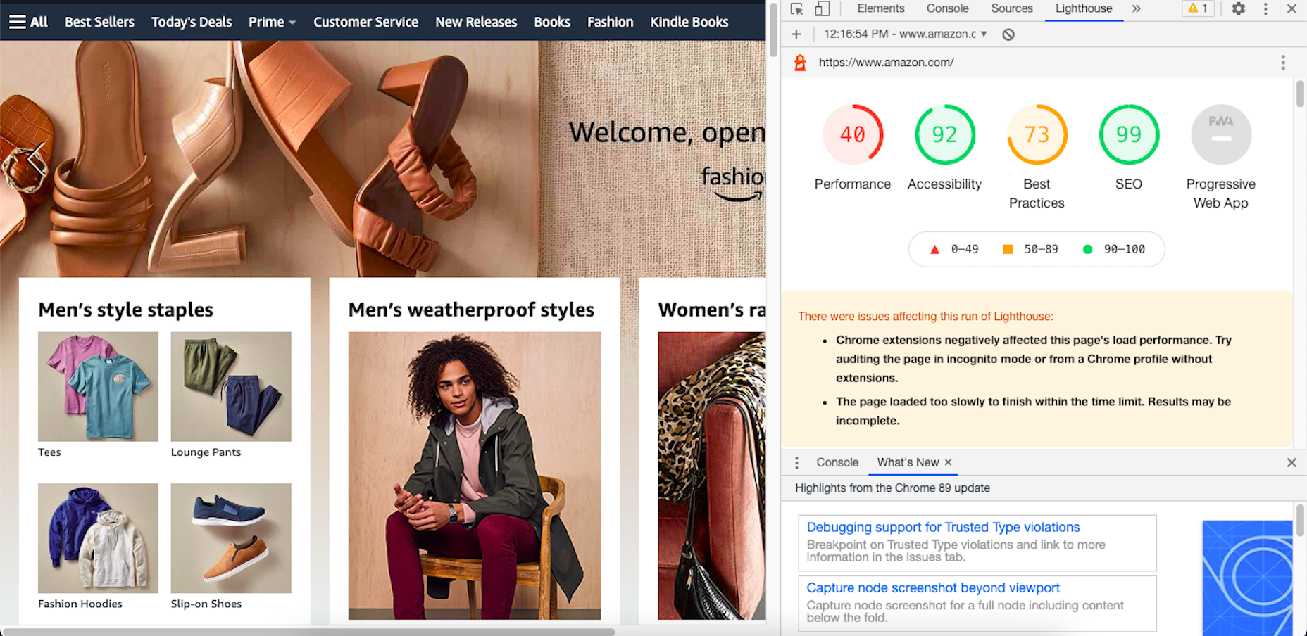
Your Other Google Apps Have Already Been Updated with Core Web Vitals
If you hadn’t noticed, Google has already updated its other apps in anticipation of the page experience update.
Here’s an example of how Lighthouse’s report on the Amazon website now looks:
By including these metrics within the tools you’re already using, you don’t necessarily have to add the Core Web Vitals tool to your growing toolbox. That said, there are some really valuable reports in there, so I’ll show you why you may want to add it anyway.
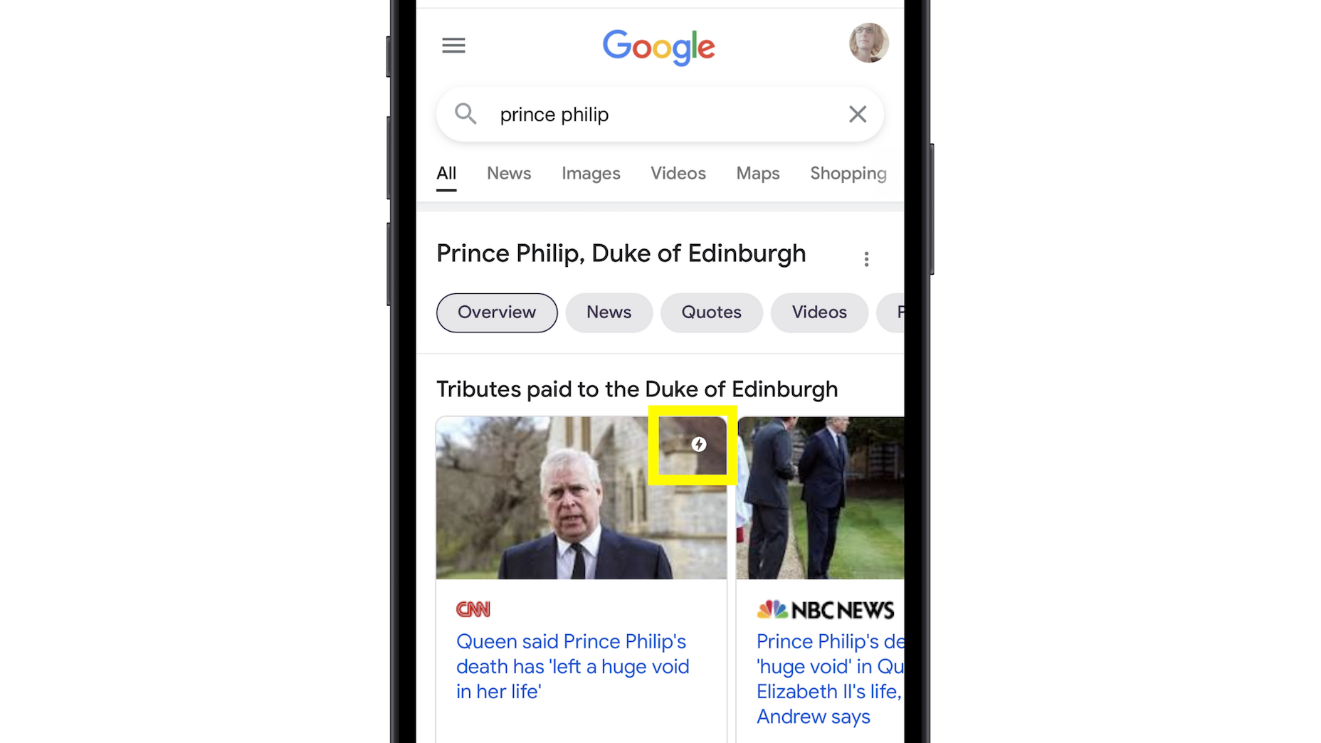
Google’s Top Stories Will Be Affected
In the past when someone did a news-related search on Google, they’d see “Top Stories” results like this one:
Until now, the only pages shown here were AMP-enabled ones.
Once the page experience update goes live, though, the AMP requirement is going away. So long as a page meets the page experience criteria along with Google News content policies, it can now rank in this section.
Google Search Results May Show a Page Experience Indicator
In the Top Stories example above, notice the AMP indicator I highlighted in yellow. Google is thinking about adding something similar to any search result that fulfills its page experience criteria.
While I think a small, eye-catching icon might draw a little more attention from Google users, I’m not sure if it’ll be that big of a deal to them. People working in this industry certainly know what that lightning bolt means, and we’ll also be the ones who recognize the page experience indicator, but I’m not convinced it’ll matter to users.
That said, this is something Google is thinking about rolling about, so it’s something to be aware of. At the very least, you can consider it a badge of honor when showing your websites to clients and prospects who want to see what you can do for them.
Content Is Still More Important Than Page Experience
Even if a website checks off all the page experience boxes, there’s no guarantee that it’ll start to rank better than websites that haven’t. The quality and value of the content on the page still matters greatly.
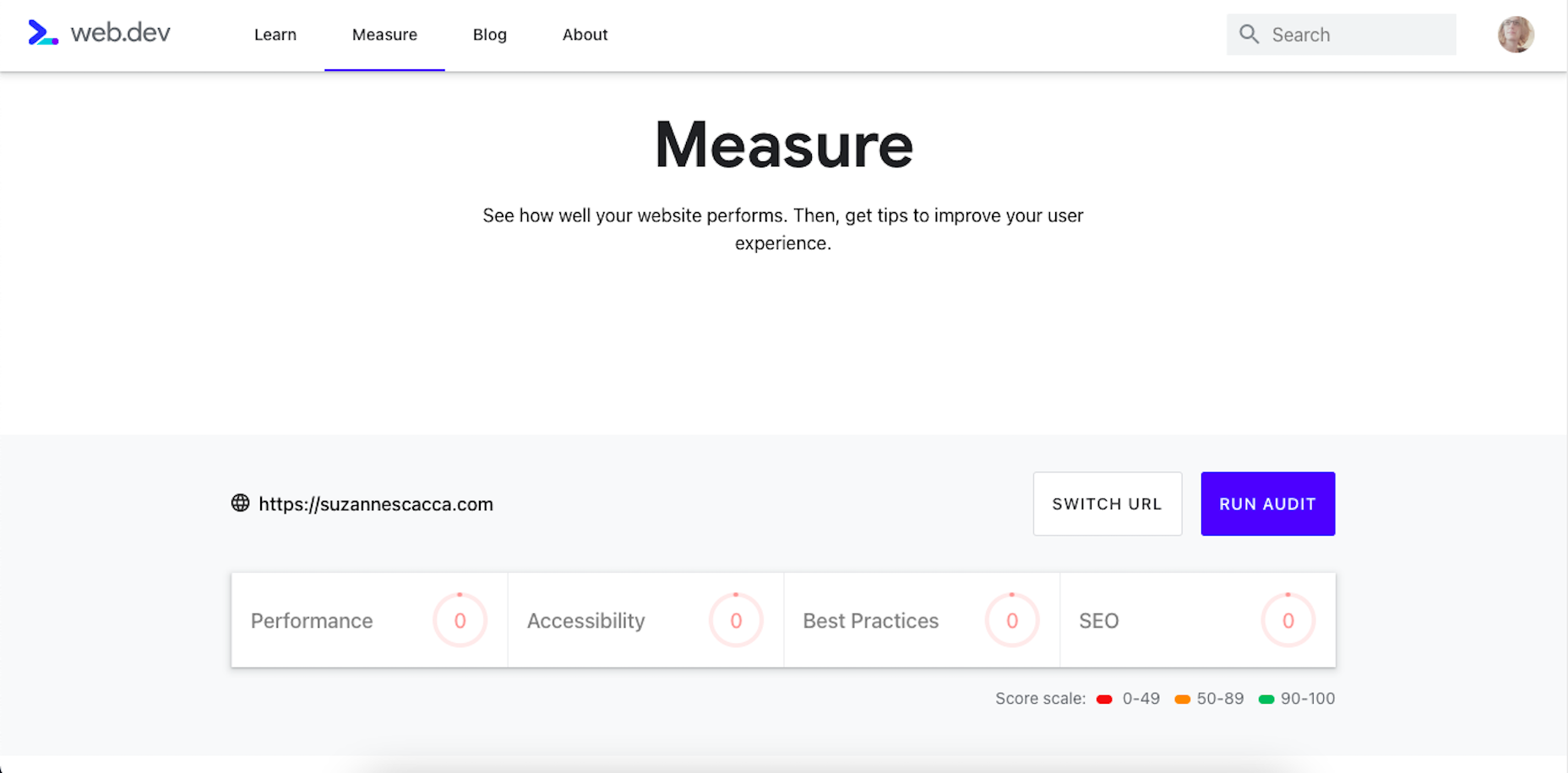
Using Core Web Vitals to Measure Page Experience
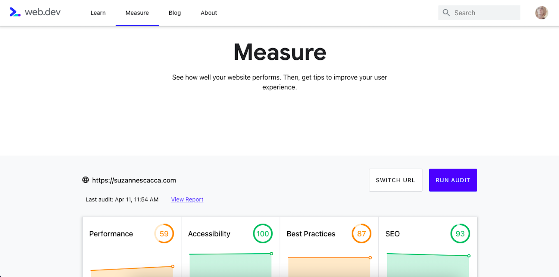
Alright, so let’s take a look at this Core Web Vitals tool. Here’s what the tool looks like when you enter the “Measure” tab:
It’s like most other Google analyzer tools. You enter the URL you want to audit and let the tool run. The results then spit out something that looks like this:
Core Web Vitals are graded on four categories:
Performance measures the loading speed, interactivity, and stability of the page.
Best Practices focus on the technical aspects of the page, including things like having an SSL certificate and making sure images fit within the parameters of the mobile screen.
SEO checks on the typical SEO signals like metadata, structured data, and so on.
Accessibility reports any issues with visitors not being able to see or access parts of the page.
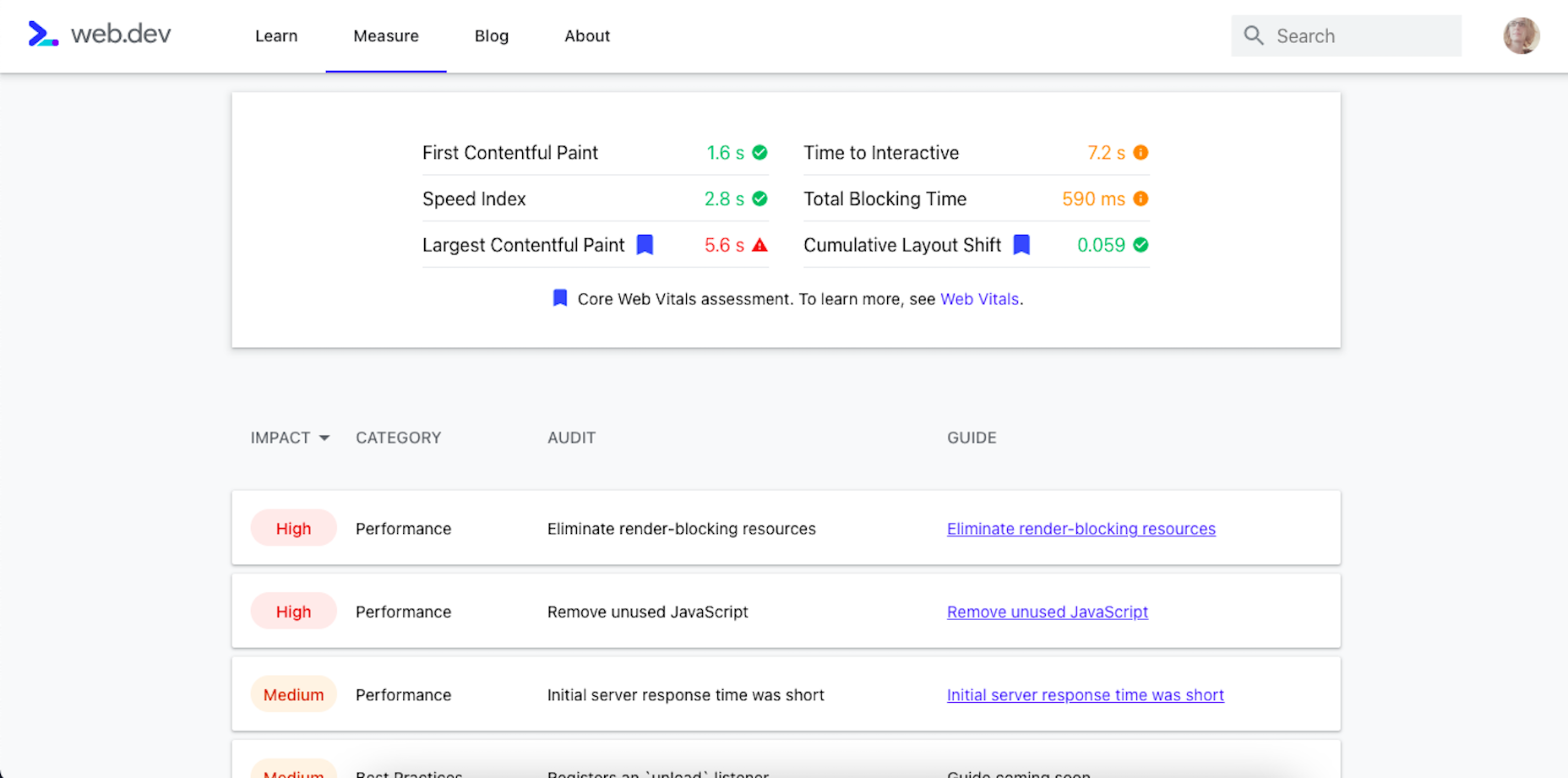
If you scroll down just a little bit on the page, there’s more data available. It mainly has to deal with the technical stuff, like page speeds and unoptimized code:
Now, this isn’t really anything new. We can get this data about load time, interactivity, and content stability from Google’s other apps.
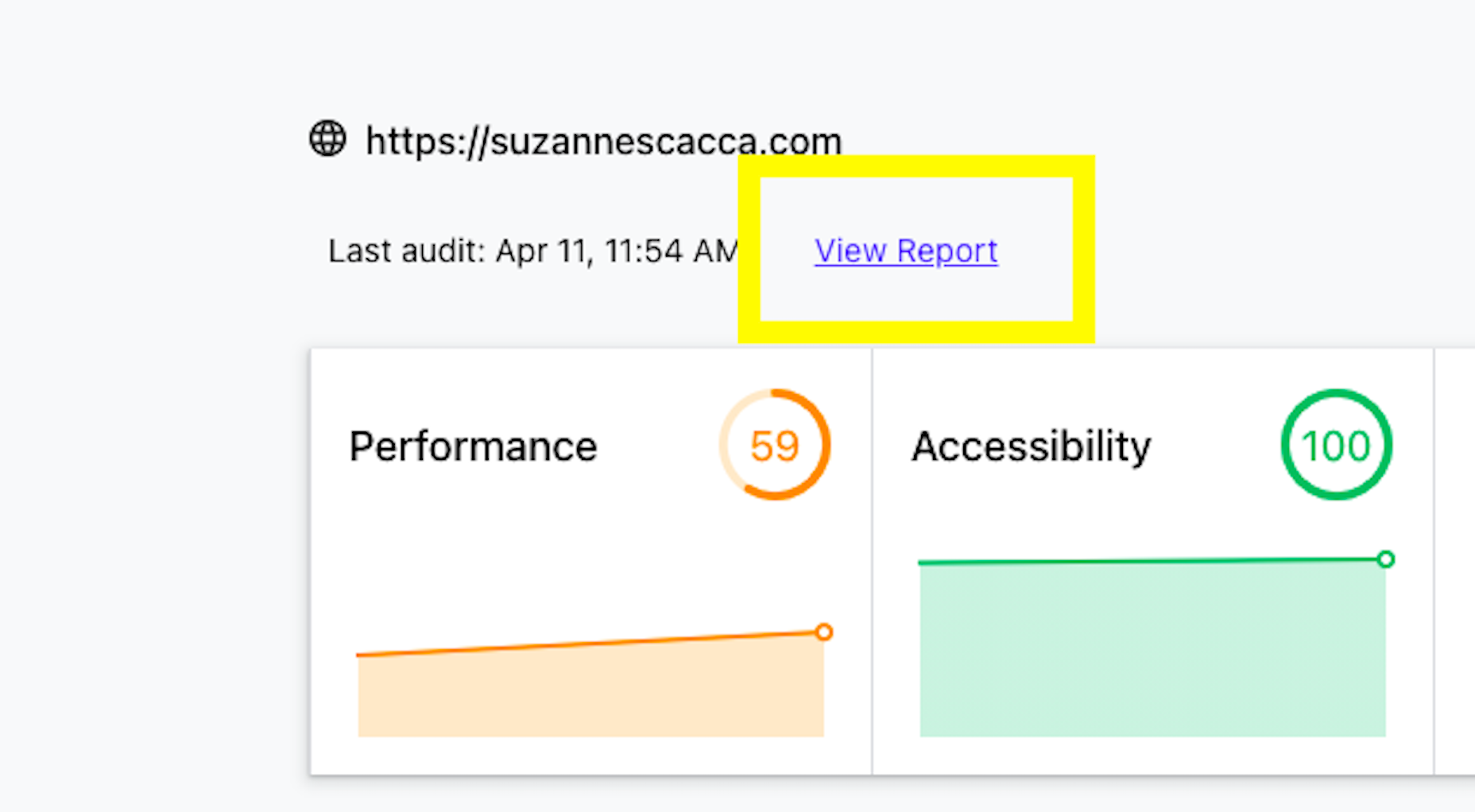
The real value is in the report, which you can access up top next to the date of your audit.
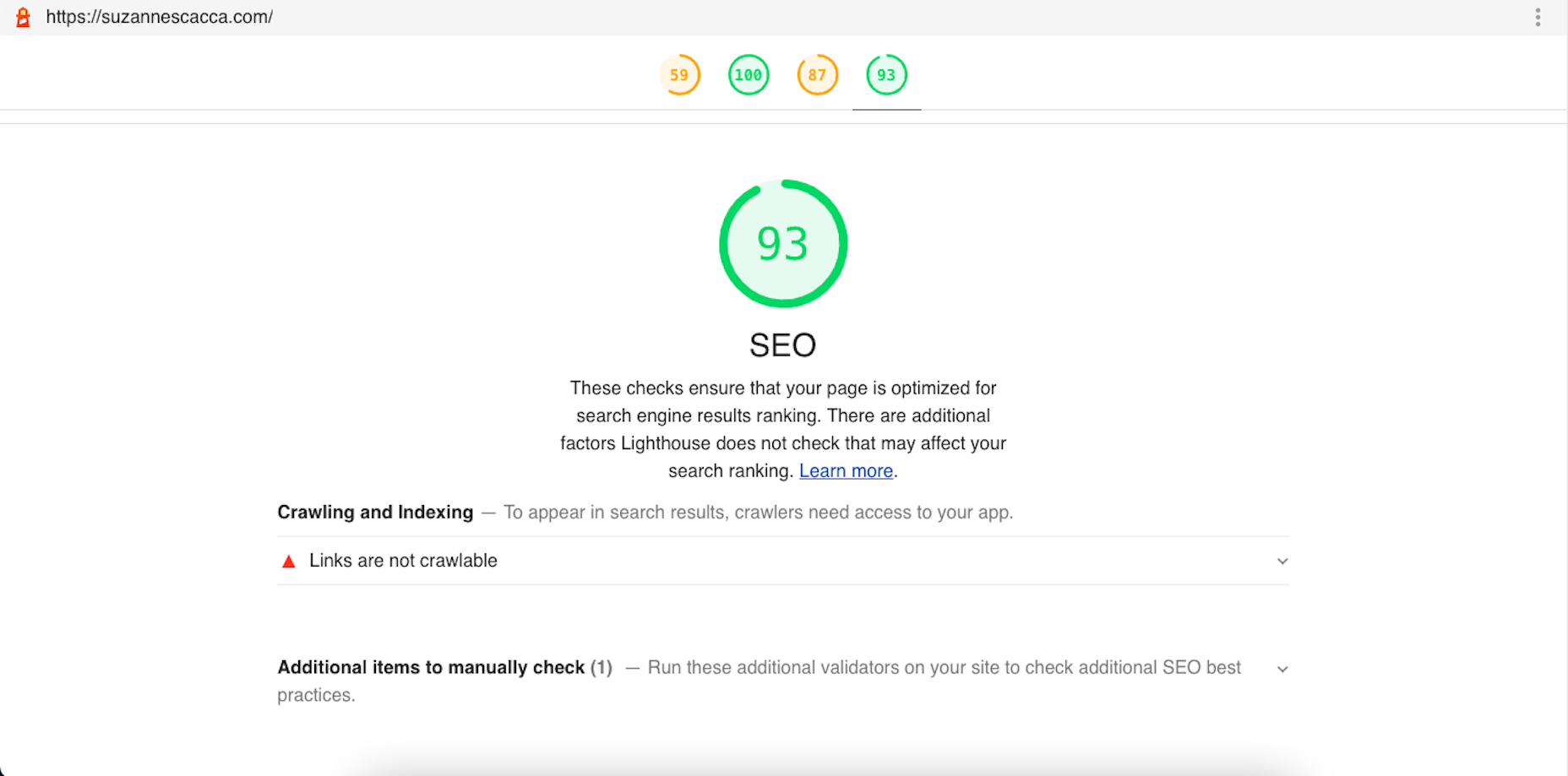
Open the report and you’ll find specific suggestions and pro tips to optimize each part of the page experience, like this SEO report:
Just like other Google tools, this one can teach you a lot about what makes one site more rankable than another. So, make sure you update your web design strategy going forward to integrate all of these ranking signals.
While you’ll have to do annual audits on your sites to see how much Google has changed the page experience signals, you’ll create less work for yourself if this baseline set of criteria are met with every site you build.
https://ankaa-pmo.com/wp-content/uploads/2021/04/get-ready-for-next-months-google-shakeup.png15292780Service comm.https://ankaa-pmo.com/wp-content/uploads/2017/04/Logo-Ankaa-engineering.pngService comm.2021-04-12 12:45:202021-04-12 12:45:20Get Ready For Next Month’s Google Shakeup
SAP annonce ce jour que l’équipementier automobile Faurecia a choisi SAP et SuccessFactors pour l’accompagner dans la digitalisation de ses processus RH afin de valoriser le potentiel de ses employés tout en leur permettant d’évoluer dans leur carrière de manière proactive.
Avec ses 266 sites industriels, 39 centres de R&D et ses 114 000 employés présents dans 35 pays, Faurecia est l’un des dix premiers équipementiers automobiles mondiaux proposant des solutions pour la Mobilité Durable et le Cockpit du Futur.
Simplifier les processus RH et développer les talents
Le SIRH de Faurecia s’est construit sur la base du développement de l’entreprise et des acquisitions externes, comptant jusqu’à 65 systèmes de paie différents.
Pour offrir un nouvelle expérience collaborateur, Faurecia a décidé de centraliser toutes ses données RH et la gestion de la paie en un unique endroit et une seule interface. L’objectif : promouvoir le développement individuel et profiter d’un panorama complet des processus RH qu’il s’agisse de la formation, la définition des objectifs et l’évaluation des performances des collaborateurs, la gestion des salaires et du personnel.
En choisissant SAP SuccessFactors, Faurecia a fait le choix d’un système collaboratif et accessible qui accompagne le développement du potentiel des collaborateurs par la formation, le management direct et les ressources humaines.
Des collaborateurs acteurs de leur carrière
Grâce à l’implémentation de la solution SAP SuccessFactors, Faurecia dispose d’un accès aux évaluations de performance et aux modèles de compétences de ses employés dans le monde entier, afin de leur proposer des formations adaptées à leurs objectifs et parcours professionnel. Cela offre aux managers la possibilité de mieux accompagner les salariés dans leur développement et leurs évolutions de carrière.
La mise en place de SAP SuccessFactors a permis à l’entreprise de profiter d’une source de donnée unique et d’une solution de paie intégrée facilitant de suivi des processus RH et la gestion de l’architecture du SIRH. Les informations RH sont dorénavant centralisées en un même endroit et accessibles en temps réel. Avec SAP SuccessFactors Mobile App, les managers peuvent organiser des entretiens à tout moment, depuis leur téléphone, avec tous les renseignements nécessaires sur le candidat. Grâce à l’intégration de SAP On-Prem Payroll et de Employees Central, le Groupe bénéficie de données de meilleure qualité et de l’enregistrement automatisé des informations RH.
Très bien accueillie par l’ensemble des collaborateurs grâce à une communication régulière, la solution est aujourd’hui pleinement adoptée par l’ensemble des acteurs de l’entreprise.
« SAP SuccessFactors a complètement changé la manière de promouvoir la formation en interne. Aujourd’hui, les employés peuvent d’eux-mêmes avoir accès au catalogue de formations et être pleinement acteur de leur développement professionnel. Nous profitons également de données plus qualitatives grâce à un système unique pour la paie et pour tous les processus RH facilitant ainsi notre visibilité sur le parcours des collaborateurs », explique Laurent Villemagne, Vice President, Group HR Information Systems & Controlling.
À propos de Faurecia
Fondé en 1997, Faurecia est devenu un acteur majeur de l’industrie automobile mondiale. Avec 266 sites industriels, 39 centres de R&D et 114 000 collaborateurs répartis dans 35 pays, Faurecia est un leader mondial dans ses quatre domaines d’activités : Seating, Interiors, Clarion Electronics et Clean Mobility. Son offre technologique forte fournit aux constructeurs automobiles des solutions pour le Cockpit du futur et la Mobilité durable. En 2020, le Groupe a réalisé un chiffre d’affaires de 14,7 milliards d’euros.
À propos de SAP
La stratégie de SAP vise à aider chaque organisation à fonctionner en “entreprise intelligente”. En tant que leader du marché des logiciels d’application d’entreprise, nous aidons les entreprises de toutes tailles et de tous secteurs à opérer au mieux : 77 % des transactions commerciales mondiales entrent en contact avec un système SAP®. Nos technologies de Machine Learning, d’Internet des objets (IoT) et d’analytique avancées aident nos clients à transformer leurs activités en “entreprises intelligentes”. SAP permet aux personnes et aux organisations d’avoir une vision approfondie de leur business et favorise la collaboration afin qu’elles puissent garder une longueur d’avance sur leurs concurrents. Nous simplifions la technologie afin que les entreprises puissent utiliser nos logiciels comme elles le souhaitent – sans interruption. Notre suite d’applications et de services de bout en bout permet aux clients privés et publics de 25 secteurs d’activité dans le monde de fonctionner de manière rentable, de s’adapter en permanence et de faire la différence. Avec son réseau mondial de clients, partenaires, employés et leaders d’opinion, SAP aide le monde à mieux fonctionner et à améliorer la vie de chacun. Pour plus d’informations, visitez le site www.sap.com .
https://ankaa-pmo.com/wp-content/uploads/2017/04/Logo-Ankaa-engineering.png00Service comm.https://ankaa-pmo.com/wp-content/uploads/2017/04/Logo-Ankaa-engineering.pngService comm.2021-04-12 07:00:082021-04-12 07:00:08Faurecia choisit SAP SuccessFactors pour développer une nouvelle expérience collaborateur
Every day design fans submit incredible industry stories to our sister-site, Webdesigner News. Our colleagues sift through it, selecting the very best stories from the design, UX, tech, and development worlds and posting them live on the site.
The best way to keep up with the most important stories for web professionals is to subscribe to Webdesigner News or check out the site regularly. However, in case you missed a day this week, here’s a handy compilation of the top curated stories from the last seven days. Enjoy!
https://ankaa-pmo.com/wp-content/uploads/2021/04/popular-design-news-of-the-week-april-5-2021-april-11-2021.jpg14082560Service comm.https://ankaa-pmo.com/wp-content/uploads/2017/04/Logo-Ankaa-engineering.pngService comm.2021-04-11 16:45:332021-04-11 16:45:33Popular Design News of the Week: April 5, 2021 – April 11, 2021
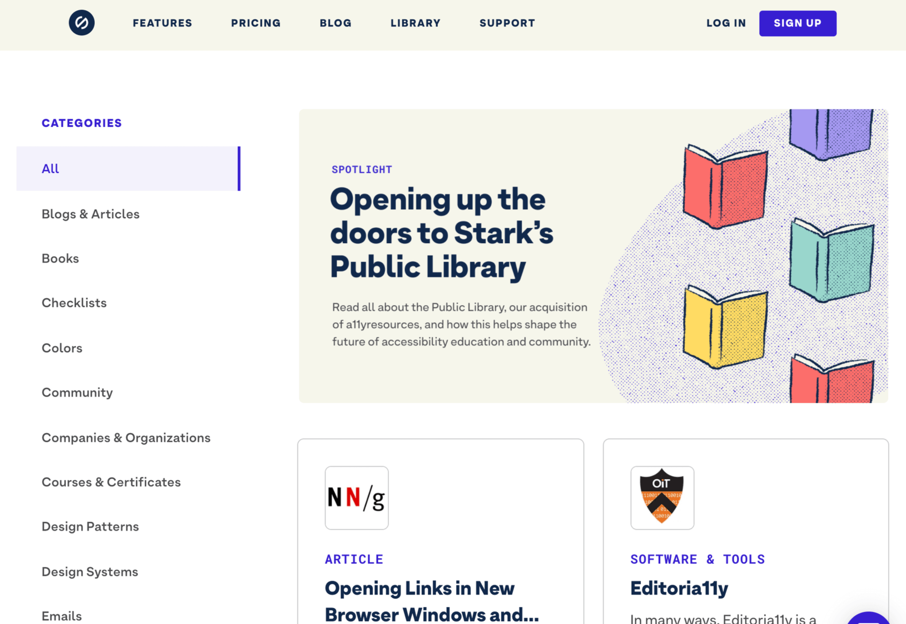
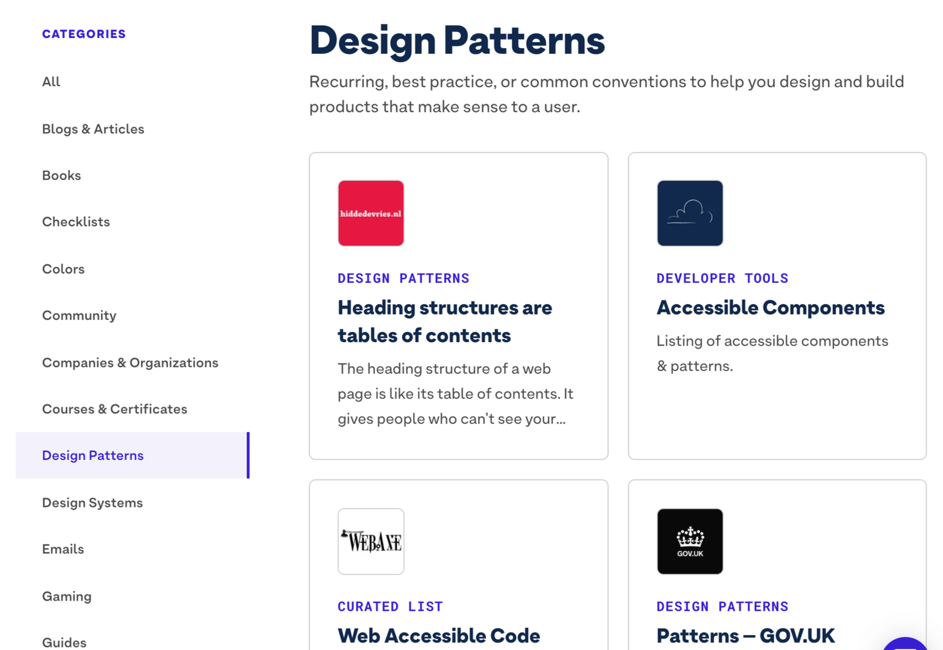
Inclusive design is all about designing sites with everyone in mind instead of designing for your own preferences. It’s an essential component in a professional-grade site and the cornerstone of a successful project.
Accessibility (A11y for short) is the technical branch of inclusive design. Accessibility is a science: it knows what markup is required to make the text available to the visually impaired; it knows the minimum button size for someone with limited motor control; it knows how complex navigation can be for someone with cognitive dysfunction. Accessibility is the engine that powers an inclusive design.
Because accessibility is so complex, it takes a huge wealth of knowledge to do it well. Luckily for you and me, there’s now a free resource you can use to brush up on your skills and improve the ROI of your site.
Stark has just acquired a11yresource and relaunched it as the Stark Public Library — reportedly the largest accessibility resource on the web. The library contains around a thousand different resources. You’ll find blog articles, checklists, formal courses, tools, links to web standards, and a whole lot more. As the library grows, the expectation is that Stark will add new features aimed at fostering a community.
Stark is a suite of accessibility tools for designers that integrates with XD, Sketch, and Figma. It’s free to use the basic package, and the commercial plan is $60 per year. The Public Library is free for everyone to access.
https://ankaa-pmo.com/wp-content/uploads/2021/04/stark-launches-public-library-for-accessibility.jpg14082560Service comm.https://ankaa-pmo.com/wp-content/uploads/2017/04/Logo-Ankaa-engineering.pngService comm.2021-04-09 20:45:232021-04-09 20:45:23Stark Launches Public Library For Accessibility
Paramètres des cookies et politique de confidentialité
Comment nous utilisons les cookies
Nous utilisons les cookies pour nous faire savoir quand vous visitez nos sites Web, comment vous interagissez avec nous, pour enrichir votre expérience utilisateur et pour personnaliser votre relation avec notre site Web.
Cliquez sur les différents titres de catégories pour en savoir plus. Vous pouvez également modifier certaines de vos préférences. Notez que le blocage de certains types de cookies peut avoir un impact sur votre expérience sur nos sites Web et les services que nous sommes en mesure d'offrir.
Cookies essentiels sur ce site
These cookies are strictly necessary to provide you with services available through our website and to use some of its features.
Because these cookies are strictly necessary to deliver the website, you cannot refuse them without impacting how our site functions. You can block or delete them by changing your browser settings and force blocking all cookies on this website.
Cookies Google Analytics
Ces cookies recueillent des renseignements qui sont utilisés sous forme agrégée pour nous aider à comprendre comment notre site Web est utilisé ou l'efficacité de nos campagnes de marketing, ou pour nous aider à personnaliser notre site Web et notre application pour vous afin d'améliorer votre expérience.
Si vous ne voulez pas que nous suivions votre visite sur notre site, vous pouvez désactiver le suivi dans votre navigateur ici :
Autres services
Nous utilisons également différents services externes comme Google Webfonts, Google Maps et les fournisseurs externes de vidéo. Comme ces fournisseurs peuvent collecter des données personnelles comme votre adresse IP, nous vous permettons de les bloquer ici. Veuillez noter que cela pourrait réduire considérablement la fonctionnalité et l'apparence de notre site. Les changements prendront effet une fois que vous aurez rechargé la page.
.
Paramètres de Google Webfont Settings :
Google Map :
Vimeo et Youtube :
Politique de confidentialité
Vous pouvez lire nos cookies et nos paramètres de confidentialité en détail sur la page suivante

 Every day design fans submit incredible industry stories to our sister-site, Webdesigner News. Our colleagues sift through it, selecting the very best stories from the design, UX, tech, and development worlds and posting them live on the site.


 At the dawn of the web-era, there was much focus on how environmentally friendly websites were: we’d chop down fewer trees, ship fewer products, and travel less for business.

 Every day design fans submit incredible industry stories to our sister-site,


 Over the last fortnight one site builder has gone toe-to-toe with another, as Wix launched a marketing campaign aimed at attracting WordPress users, and instead attracted universal ire.

 Google has been talking about the Core Web Vitals tool and the Page Experience Update for about a year now.
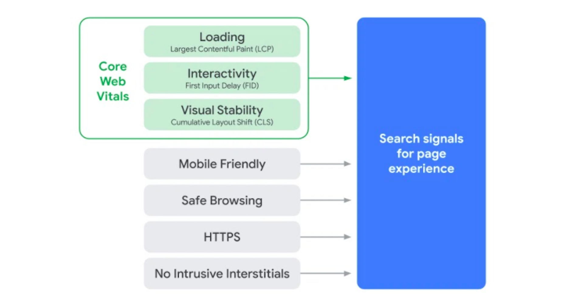

 Every day design fans submit incredible industry stories to our sister-site,


 Inclusive design is all about designing sites with everyone in mind instead of designing for your own preferences. It’s an essential component in a professional-grade site and the cornerstone of a successful project.