Articles

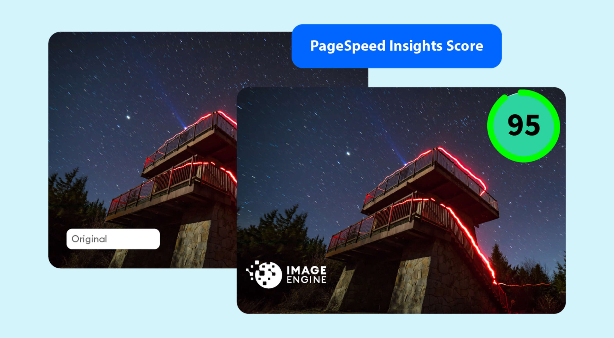
PageSpeed Insights is a free performance measurement tool provided by Google. It analyzes the contents of a web page for desktop and mobile devices. It provides a single number score (from 1 to 100) that summarizes several underlying metrics that measure performance. If you have not run PageSpeed Insights on your website, then you should stop and do it now. It’s an important indicator of how Google scores and ranks your site.

If your PageSpeed Insights score is below 80, don’t panic. You are not alone. Many websites are not optimized for performance. The good news is that you can take steps that should immediately improve your score.

You will notice that PageSpeed Insights highlights issues that cause slow page loading. However, you might need more guidance to resolve these issues. Below, we walk you through how to resolve four common issues related to images. We also show you how ImageEngine, an image CDN, can simplify, automate, and deliver the best image optimization solution possible.

Performance Drives Google SEO Rankings

Why does the PageSpeed Insights score and performance matter? Isn’t SEO ranking all about content relevance, backlinks, and domain authority? Yes, but now performance matters more than it did a year ago. Starting in 2021, Google added performance metrics to the factors that impact search engine rankings. In a market where websites are constantly jockeying to match their competition’s pages (for content relevance, keywords, and other SEO issues), performance is making a difference in keyword search engine rankings.

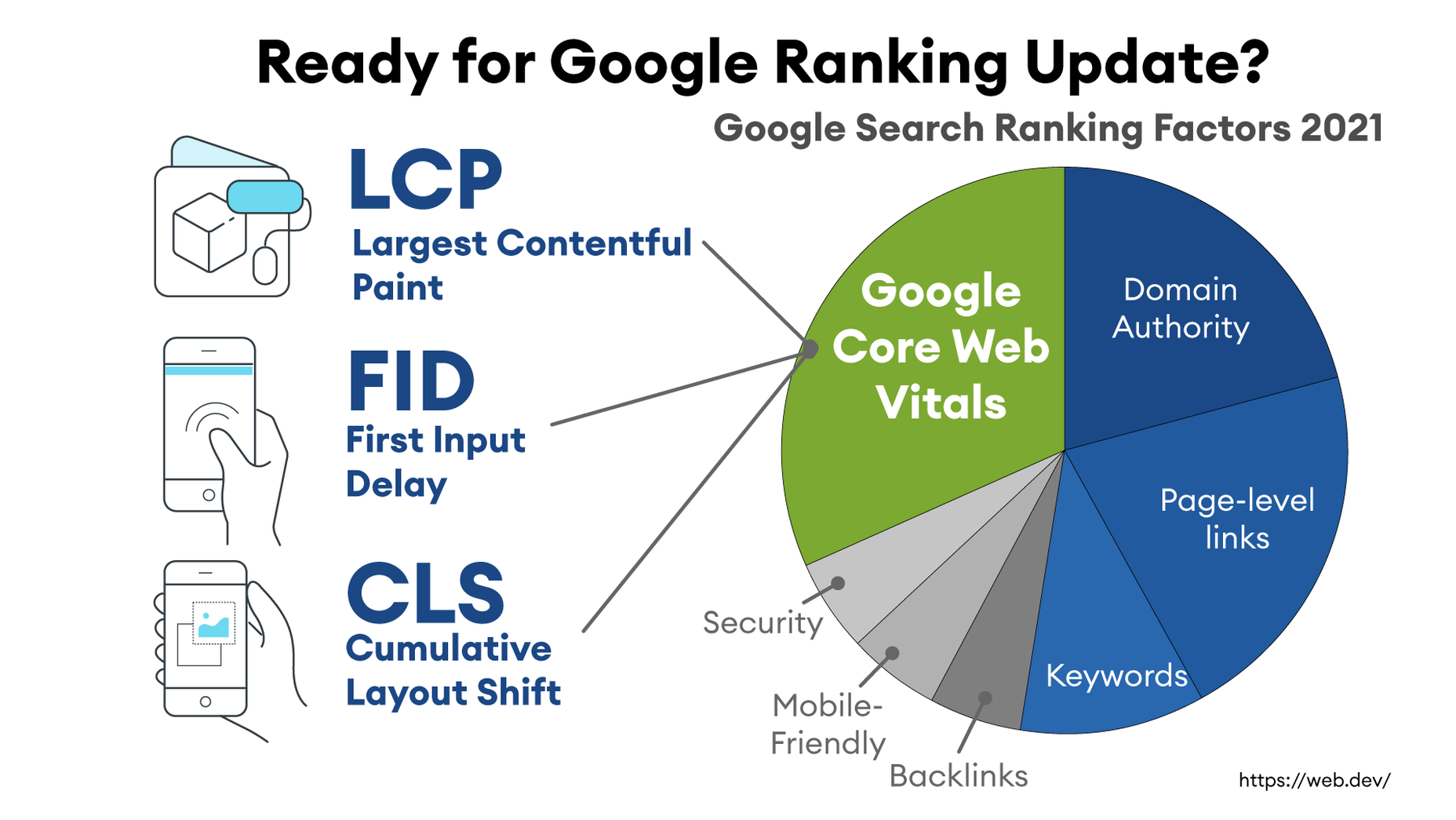
What Are Core Web Vitals Metrics?

PageSpeed Insights relies on a set of performance metrics called Core Web Vitals. These metrics are:

Largest Contentful Paint (LCP): Measures the render time (in seconds) of the largest image or text block visible within the viewport, relative to when the page first started loading. Typically, the largest image is the hero image at the top of pages.

First Input Delay (FID): Measures the time from when a user first interacts with a page (i.e. when they click a link, tap on a button, or use a custom JavaScript-powered control) to the time when the browser is actually able to begin processing event handlers in response to that interaction.

Cumulative Layout Shift (CLS): Measures the layout shift that occurs any time a visible element changes its position from one rendered frame to the next.

Images and JavaScript are the Main Culprits

PageSpeed Insights breaks down problems into categories based upon how they impact these Core Web Vitals metrics. The top two reasons why you might have a low score are driven by JavaScript and images.

JavaScript issues are usually related to code that either blocks or delays page loading. For example, lazy-loading images might involve JavaScript that blocks loading. As a rule of thumb, do not use a third-party JavaScript library to manage image loading. These libraries frequently break the browser’s built-in image loading features. Lazy-loading may make above-the-fold images load slower (longer LCP) because the browser starts the download later and because the browser first has to execute the JavaScript.

Another JavaScript issue involves code that is large or unnecessary for the page. In other words, code bloat. There are good resources for resolving these issues on the web. However, in this blog, we will focus on image problems.

Images are a major contributor to poor performance. The average website payload is 2MB in 2021, and 50% of that is images. Frequently, images are larger than they need to be and can be optimized for size with no impact on quality…if you do it right.

Four Image Issues Highlighted by PageSpeed Insights

Largest Contentful Paint is the primary metric impacted by images. PageSpeed Insights frequently recommends the following four pieces of advice:

  1. Serve images in next-gen formats.
  2. Efficiently encode images.
  3. Properly size images.
  4. Avoid enormous network payloads.

That advice seems straightforward. Google provides some great advice on how to deal with images in its dev community. It can be summarized in the following steps:

  • Select the appropriate file format.
  • Apply the appropriate image compression.
  • Apply the right display size.
  • Render the image.
  • Write responsive image code to select the right variant of the image.

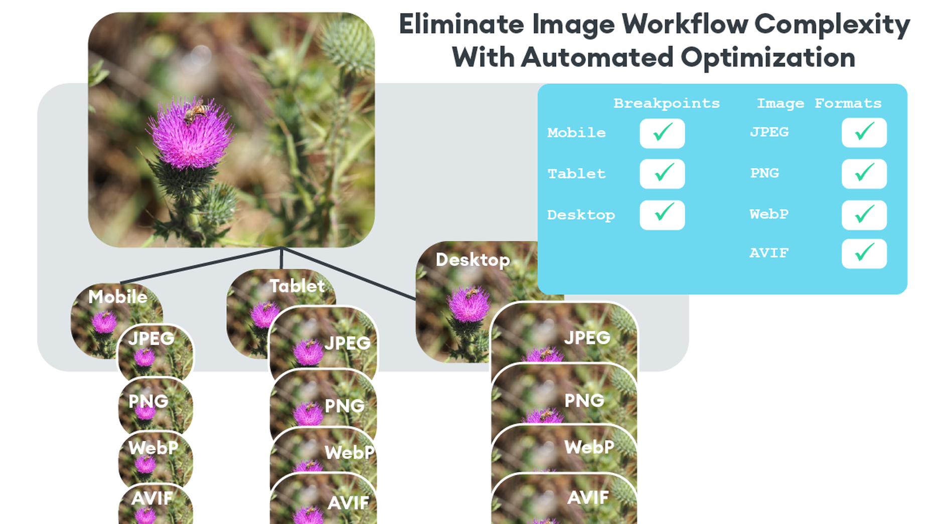
We call Google’s process the “Build-Time Responsive Syntax” approach. If you have a relatively static website where you don’t generate new pages or switch out images frequently, then you can probably live with this approach. However, if you have a large and dynamic site with many images, then you will quickly feel the pain of this approach. Google itself stresses that developers should seek to automate this image process. Why? Because the process has some serious workflow drawbacks:

  • Adds storage requirements due to a large increase in image variants.
  • Increases code bloat and introduces more code complexity.
  • Requires developers’ time and effort to create variants and implement responsiveness.
  • Requires logic to account for different browser’s support for next-gen image formats.
  • Doesn’t adapt to different contexts. It relies on best-guess (breakpoints) of what device visits the web page.
  • Needs a separate CDN to further increase delivery speeds.
  • Requires ongoing maintenance to adapt to new devices, breakpoints, image formats, markets, and practices.

Key Steps to Achieving High-Performance Images

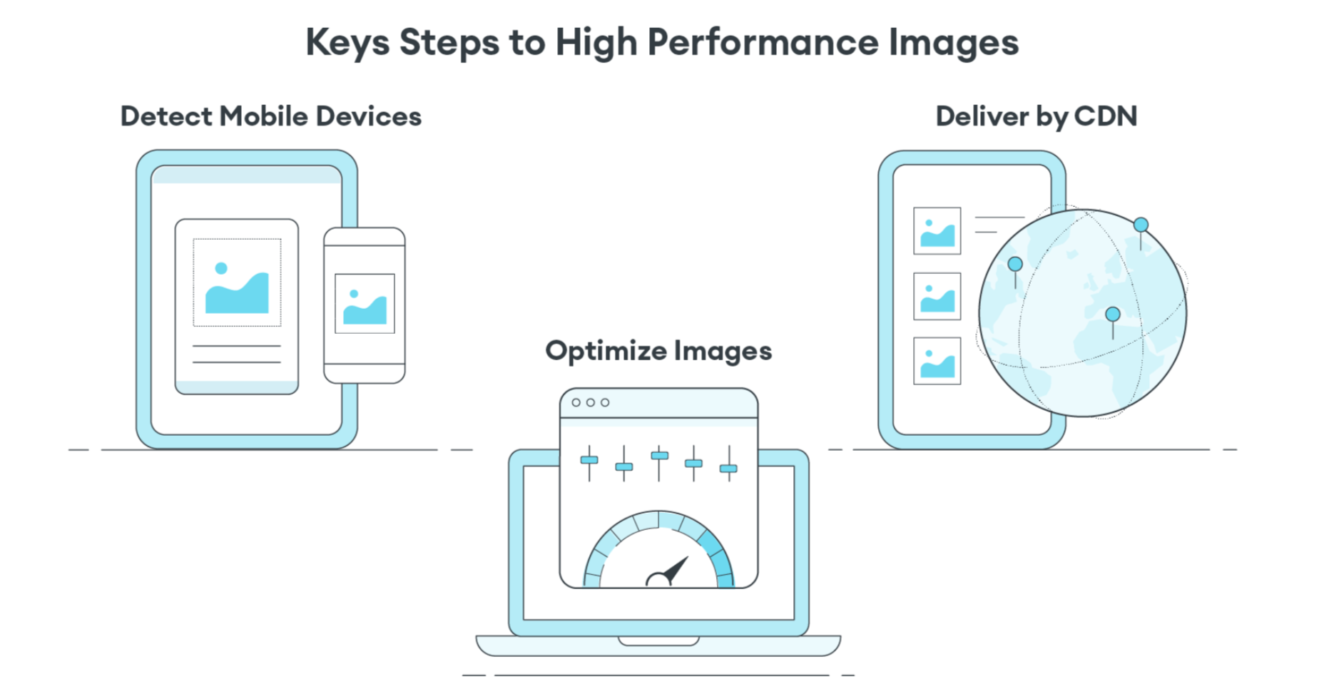
Instead of using the Build-Time Responsive Syntax approach, an automated image CDN solution can address all of the image issues raised by PageSpeed Insights. The key steps of an image CDN that you should look for are:

  1. Detect Mobile Devices: Detection of a website visitor’s device model and its technical capabilities. These include: OS version, browser version, screen pixel density, screen resolution width and height, support for next-gen image and video formats. This is where ImageEngine is unique in the market. ImageEngine uses true mobile device detection to further improve image optimization. It has a huge impact on the effectiveness of the image optimization process.
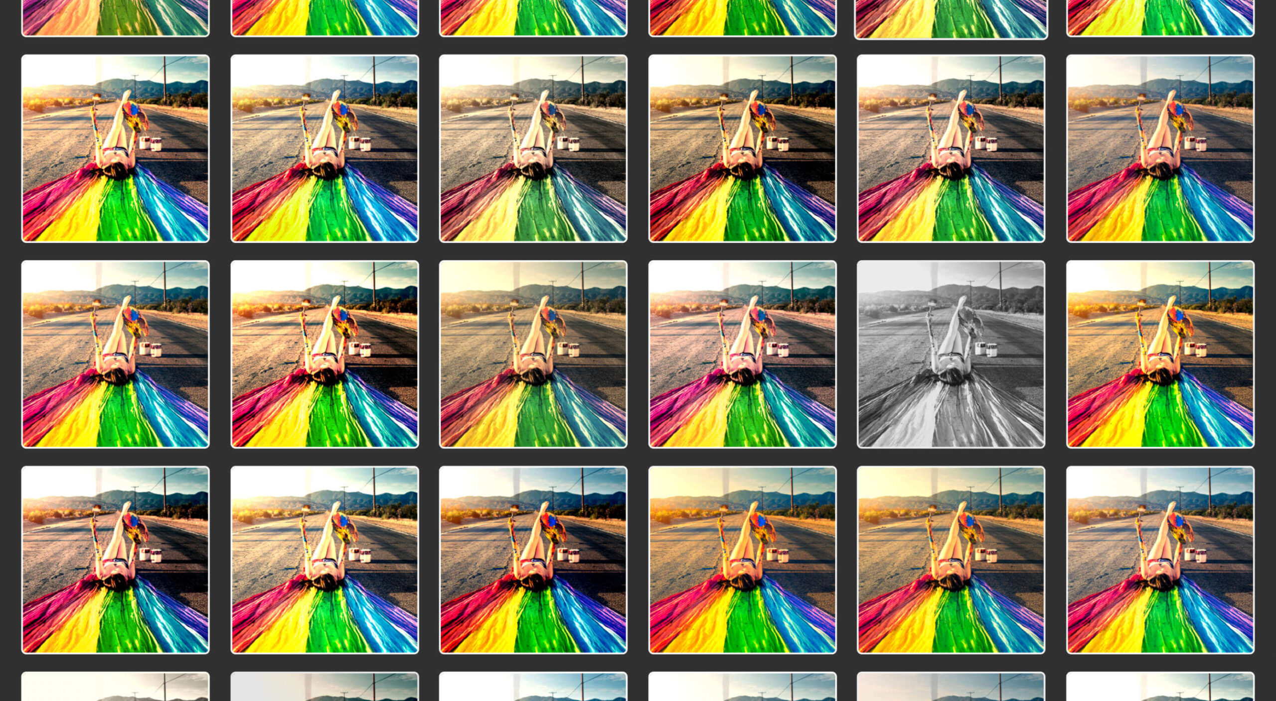
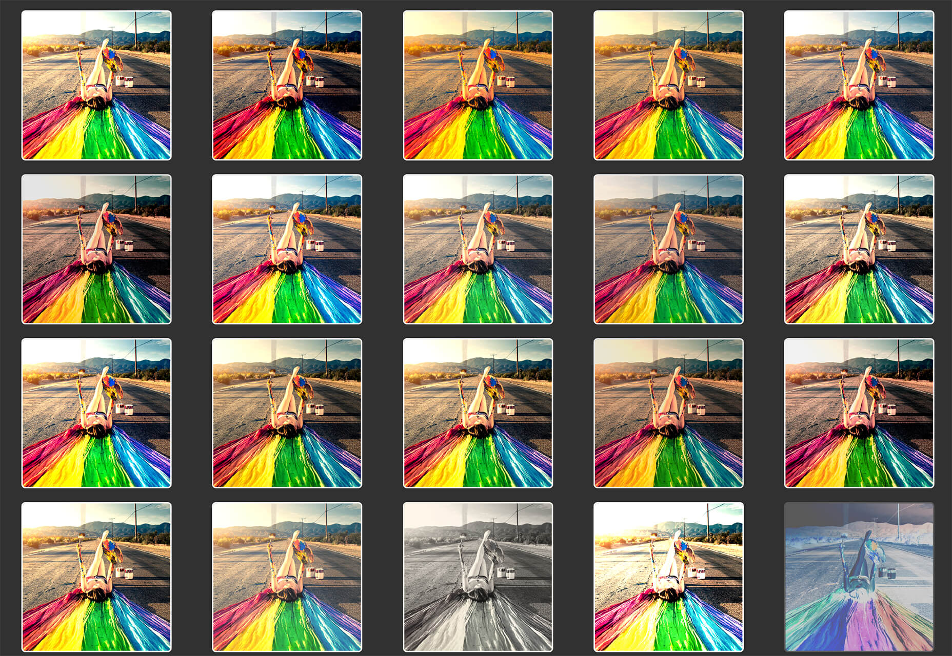
  2. Optimize Images: An image CDN will leverage the device’s parameters to automatically resize, compress and convert large original images into optimized images with next-generation file formats, like WebP and AVIF. Frequently, an image CDN like ImageEngine will reduce the image payload by up to 80%.
  3. Deliver by CDN: Image CDNs like ImageEngine have edge servers strategically positioned around the globe. By pushing optimized images closer to requesting customers and delivering them immediately from the cache, it often provides a 50% faster web page download time than traditional CDNs.

Easy Integration Process for Image CDN

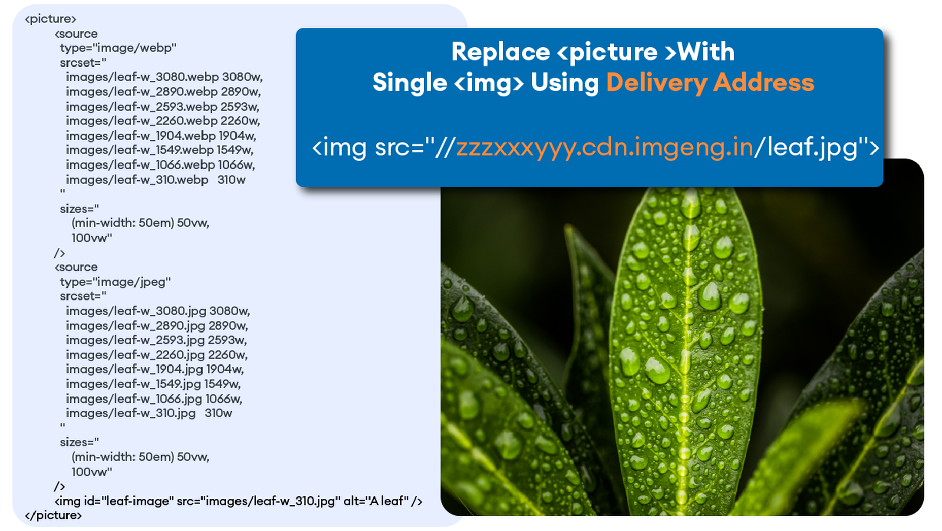
After signing up for an ImageEngine account and free trial, you will receive a Delivery Address. After adjusting your <img /> elements to include the Delivery Address, ImageEngine will start to pull the original images from your website (no need to move or upload them), automatically optimize them, and deliver them.

You can automate the addition of the Delivery Address to the img src tag by using plug-ins for WordPress and Magento. Developers can also use ImageEngine’s React, Vue, or Angular JavaScript frameworks to simplify the process.

Additionally, there are many ways to simplify implementation via adjustments to templates for many CMS and eCommerce platforms.

Results: Improved Performance, Better SEO

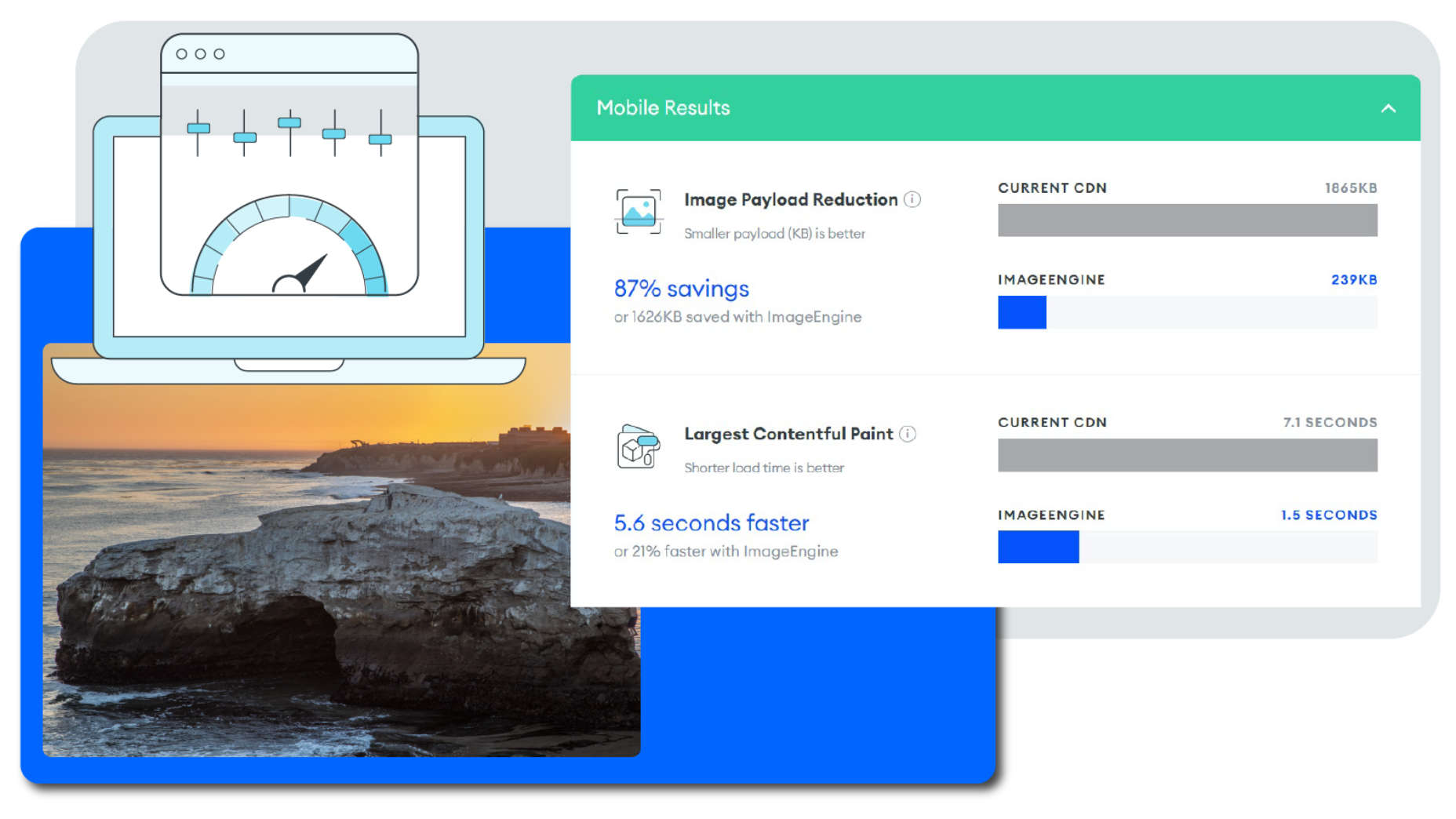
Most ImageEngine users see a huge improvement in LCP metrics, and consequently, a big improvement in the overall PageSpeed Insights score. ImageEngine provides a free demo analysis of your images before and after image optimization. In many cases, developers see improvements of many seconds on their LCP and Speed Index.

In summary, performance drives higher search rankings, and better UX, and increases website conversions for eCommerce. The steps you take to improve your image performance will pay for themselves in more sales and conversions, streamlined workflow, and lower CDN delivery costs.

Source

The post 4 Steps to Improve PageSpeed Insights Score and SEO first appeared on Webdesigner Depot.
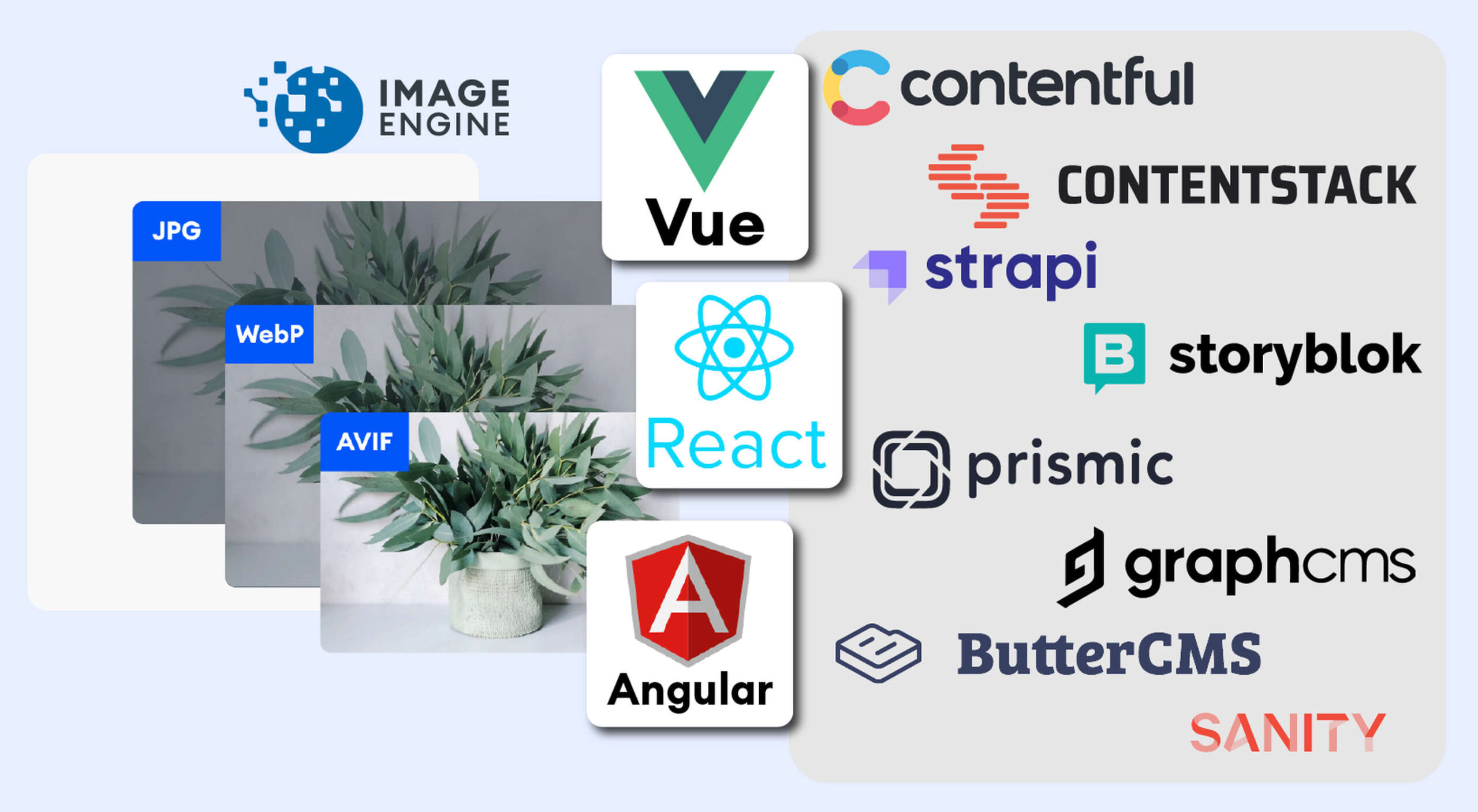

Source de l’article sur Webdesignerdepot

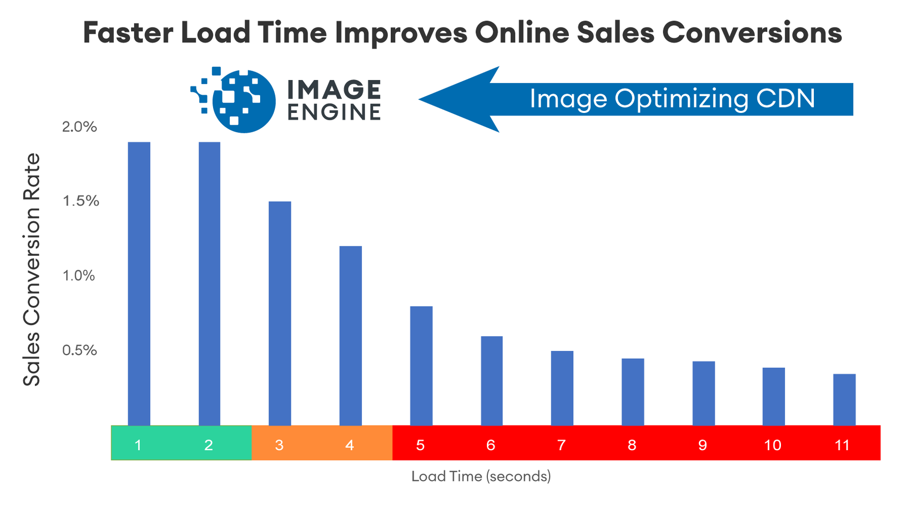
Every day design fans submit incredible industry stories to our sister-site, Webdesigner News. Our colleagues sift through it, selecting the very best stories from the design, UX, tech, and development worlds and posting them live on the site.

The best way to keep up with the most important stories for web professionals is to subscribe to Webdesigner News or check out the site regularly. However, in case you missed a day this week, here’s a handy compilation of the top curated stories from the last seven days. Enjoy!

Kraken – High-Performance Web Rendering Engine

Brands Change Their Logos To Terrible New Designs

10 Web Design Trends and Predictions for 2022 and Beyond

18 Designs That Made a Big Impact in 2021

Awful Web Designs From 18 of MMA’s Top Fighters

Don’t Get Left Behind by the No-Code Wave

The Top 7 Websites to Learn Web Development Online

Xata – Database Service for Serverless Apps

How To Optimize CSS for Peak Site Performance

21 Exceptional Google Fonts You Probably Haven’t Discovered Yet

Source

The post Popular Design News of the Week: September 20, 2021 – September 26, 2021 first appeared on Webdesigner Depot.


Source de l’article sur Webdesignerdepot

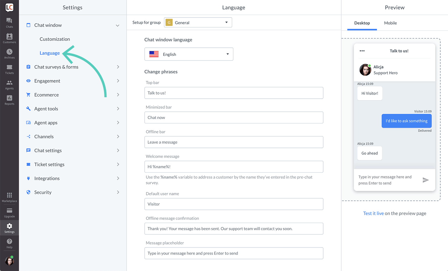
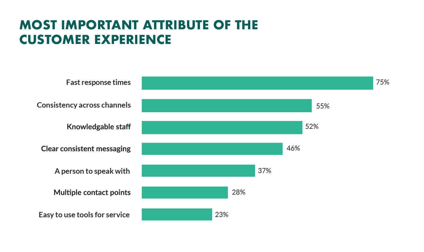
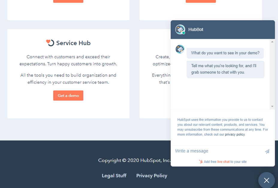
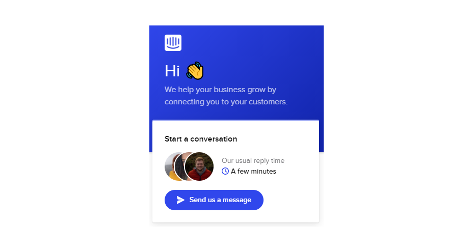
Not so long ago, customers only had a couple of ways to interact with brands. 

If you had an issue with a product or service, you could reach out through the customer service phone number or send an email. Occasionally, sites would introduce dedicated forms on their website that allowed consumers to send support tickets straight to the service desk – but that was it.

The problem with this kind of service was all the waiting. 

Send an email or ticket, and you have no idea when the company is going to get back to you. Customers end up refreshing their inbox all day, waiting for a response. Call the company, and 9 times out of 10, you’ll be placed on hold. You can’t exactly do much when you’re stuck listening to hold music, so customers are gradually getting more frustrated as they wait for a response. 

Fortunately, the evolving digital age has introduced a new solution: live chat.

Transforming Your CX With Live Chat

Live chat is a quick and convenient way for your customers to contact your business and get a response immediately. The result is happier clients, better customer satisfaction scores, and even opportunities for bigger sales. 

More than 41% of customers say they expect to see live chat on a site. 

Even if you don’t have an agent on hand to answer a chat message immediately, you can create an automated system that notifies your customer when someone is available. That means they can go and do other things while they’re waiting for a response. Live chat solutions with bots can even allow your customers to fix problems for themselves. That’s pretty convenient!

Widgets equipped with answers to commonly asked questions can automatically deal with customer queries or help them find solutions to their problems before passing them over to an agent. This means that your customer gets a solution faster, and your agents don’t have as much pressure to deal with. It’s a win-win – as long as you get it right. 

Unfortunately, a lot of companies don’t know how to implement live chat experiences correctly. 

Kayako’s study into 400 customers found that 47% couldn’t remember the last time they’d had a positive experience through a live chat tool.  

How to Upgrade Live Chat CX

The evidence shows that customers love the idea of live chat, but the reality of how businesses implement this technology isn’t always ideal. 

However, since 86% of customers say they’re willing to spend more on a better customer experience, it’s worth figuring out what separates a good live chat interaction from a bad one. 

1. Set Expectations Instantly

Setting the right expectations is crucial if you want to generate better satisfaction for your customers at a later date. When customers know what to expect from your live chat strategy, they can also make more informed decisions about which support channels they’re going to use, and whether they want to hang around for someone to answer their messages. 

The first thing you should do is showcase your agent’s availability. In this example from Help Scout, you can see whether the team is active, online, and ready to talk. The company also sets expectations for how quickly you can get an email response if you don’t want to chat.

Other ways to set expectations include:

  • Showing your opening hours: List when team members are usually available to answer questions if you’re not currently online. 
  • Topics: Offer your customers some topics that they can ask about or use the welcome message on your chat tool to direct your customers to an FAQ page. 
  • Restrictions: If there’s anything you can’t deal with over live chat, like changing a customer’s password, let them know in advance so they don’t waste time.

2. Leverage Pre-Chat Forms

Pre-chat forms are some of the most important parts of the live chat experience. They ask your customer to explain their issue to your chatbot so that they can be directed towards the right agent. Using these forms correctly ensures that your agent has all the information they need to solve a problem fast. 

You can even set up automated systems that direct customers to different agents and teams based on their needs. For instance, the live chat app on Outgrow.co gives customers the option to fill out different forms depending on whether they want answers to a question, a demo, or something else.

The button you click on dictates which professional you’ll get through to. Although filling out a form can seem like an extra friction point for your customer at first, it helps to streamline the customer journey. After all, if you can direct the customer to the right agent the first time, there are fewer chances that they’ll need to explain their issue to various different people. 

Here are a few things you can ask for in the live chat form to make it more effective:

  • The customer’s name: This will help to personalize the conversation. It could also be an opportunity to track down any background information you have about an existing customer and the orders that they may want to speak to you about.
  • An email address: Having an email address will allow you to bring up a customer’s record on your CRM. It also means that you can send any information that the customer needs to their email inbox at the end of the conversation.
  • A brief explanation: Ask your customers to share what they’re reaching out to you about and use keywords in their message to assign the chat to the right agent or professional. You could even add a drop-down menu of topics for them to choose from. 

Remember, don’t ask for too much information straight away, or you’ll risk your clients feeling that the service experience is too complicated. 

3. Make Sure It Works Everywhere

We’ve reached the point now where every customer expects a brand’s website to be responsive on any device. Most web-building templates automatically work on mobile tablets and smartphones. Additionally, it’s becoming increasingly easy for companies to transform their website and online store experiences into dedicated apps too. 

However, while most businesses know that their site needs to be responsive, they often forget about the mobile element when it comes to live chat. If your live chat function is only available on the web browser version of your website, then this is going to end up making your mobile customers pretty unhappy. They don’t want to have to stop browsing on their phone just to connect with you. 

Ideally, you’ll want to create a separate component for your mobile app where your customers can easily access the same live chat functions they’d have on your browser-based site.

If you’re just offering live chat through a mobile version of your website, make sure that it’s easy for your customer to click into the chat section and send messages without accidentally ending up on a different tab or page. It might also be worth setting up functions that allow your chat app to send push notifications to your customer’s phone whenever they get a new message. 

Being able to put their smartphone down or switch to another app while they wait for a response will provide a much more intuitive experience for your audience. 

4. Make Sure You Support All the Right Languages

You’d think that this CX tip for live chat would be obvious, but it’s shocking how many companies fail to offer support for all the languages that their customers might use. If you’re selling your products throughout the world, and you know you have customers in China, then it doesn’t make much sense to only offer live chat in English. 

Some of the available live chat apps on the market today come with features that allow you to automatically translate languages when your agents are talking to foreign customers. For instance, LiveChat currently supports 45 languages

If you’re creating your own chat app from scratch, then you’re going to need to work with your developer or designer to make sure that the right languages are supported. Remember, you don’t have to cover everything, but at least make sure that you can connect with the most common groups of customers in your CRM. 

Ensure that if you are using multiple languages, your customers know how to switch to their preferred option too. Usually, the best way to do this is with a drop-down menu. You could also use little flag icons of the countries that you support. 

5. Find Ways to Reduce First Response Time

Speed is probably one of the biggest advantages of live chat, and the main reason that customers like it so much. According to the CMO council, fast response time is the number one thing that a customer looks at when measuring satisfaction. 

While you might not be able to have someone on-hand to answer your customers 24/7, you can improve the way they perceive your load times in a variety of ways. For instance, start by making it clear when your people are online to talk to your customers. Setting expectations on when you’ll be available to immediately respond should help to avoid frustration.

  • Keep all chats in the same place for agents: Having a combined contact center solution on the back-end makes responding to queries much easier for your agents. If they can see all of your brand’s live chat, social, and email conversations in one place, they don’t have to waste time jumping between different platforms and tabs. 
  • Set routing queues: Use an automated system to send every message you get to the most appropriate agent available. You can intelligently route conversations based on the issues that your customers have or the things they want to discuss. It’s also worth ensuring that your system prioritizes routing conversations to the first agent available. 
  • Send notifications: Make sure that you set your live chat system up to send push notifications to agents when a new message is waiting. It’s also with notifying your customer when they have a response, just in case they’ve switched to another tab. 

The notifications you send to your agents could come with access to a customer’s CRM file, so that your agent can go into a conversation with the context they need. Agents that instantly get context on a conversation don’t have to waste as much time tracking down the right information. Giving your agents context also means that they don’t have to ask repetitive questions, which could annoy your customer. 

6. Make the Chat Experience On-Brand

Every company wants to give their customer a slick experience with live chat. The solution you build needs to be easy to use, and responsive across every device. However, it also needs to be something that your customer associates with your brand. 

Companies generally have a lot of options for how a live chat window can look. You can adjust the appearance to suit your brand by picking specific colors, tweaking button shapes, and even changing the available fonts. 

Working the visual elements of your brand into the design of the live chat experience is the best way to make your customers feel comfortable and confident that they’re dealing with your company. For instance, Hubspot uses matching colors, rounded edges on chat bubbles, and even a fun illustration to make their chat experience more “branded.”

Remember, when you’re creating a Live Chat experience that’s “on brand”, it’s also a good idea to think about things like voice and tone. Infusing live chat with the unique personality of your brand will make the experience more memorable. 

If you usually stick with informal language and use a lot of slang, then it makes sense to continue that in live chat – even when you’re sending automated messages. To make sure your brand identity really shines through:

  • Write scripts for your automated messages in your brand’s tone of voice
  • Write guidance scripts for employees that highlight your tone for agents
  • Provide training on brand tone of voice for your support team
  • Encourage support agents to connect with customers on a personal level
  • Remember to set guidelines on how to use things like gifs, slang, and emojis too!

7. Make a Checklist For Security and Tech Issues

One of the most significant things that will affect the experience your customer has with your live chat service, is technical and security issues. Choose the right developer or designer to help with your app, and the risk of problems dwindle. You can also address the issue of having to constantly maintain, check, and update your live chat experience by using a pre-existing solution, like Intercom.

No matter how you choose to approach live chat, these are the things you’ll need to check for most:

  • Page load times: Page load times are crucial for user experience and SEO, so you should be taking them seriously already. Check your web chat software isn’t dragging down the performance of your page or causing unnecessary problems.
  • Cross-channel conversations: If your website has various subdomains, make sure that moving through these in chat won’t mean you lose the session. Customers don’t want to have to repeat themselves!
  • Functionality with browsers: Your chat app needs to work just as well on every browser and operating system – including mobile devices. 
  • Data management: Under things like GDPR, you need to ensure that you’re controlling user information safely. Ensure you have a DPA in place, and make sure that your web channel doesn’t affect any PCI-DSS compliance systems you have in place. Your chat solution may need to automatically mask credit card information, for instance.

Time to Enhance Your Live Chat Strategy

Ultimately, whether you like it or not, your customers love live chat technology, and they’re not going to stop looking for it on your website. Today’s consumers expect you to serve their interests by delivering customer support on the channels that they choose. Unfortunately, most companies just aren’t living up to expectations.

Following the tips above could help you to transform the way that you interact with your clients and improve your chances of better satisfaction overall.

Source

The post 7 Tips for Transforming CX with Live Chat first appeared on Webdesigner Depot.


Source de l’article sur Webdesignerdepot

Content is the king of the digital world. This is an undisputed fact among marketers and business owners alike.

However, not all content is created equal. Interactive content is a more immersive form of marketing specifically intended for the digital age. Great for companies that need to develop deeper relationships with their audience. 

There are various kinds of interactive content for brands to explore these days. For example, you can create a poll where your customers vote for certain answers to questions. In addition, some companies hire developers to build immersive gaming experiences with prizes and rewards. 

Even standard content like blogs and articles can become more interactive with things like animations, buttons, and elements that ask visitors to do something. 

One of the most valuable forms of interactive content is the quiz. So, how can companies use quizzes to engage their audience effectively? Let’s find out…

The Benefits of Quizzes in Interactive Content

According to studies, 93% of marketers believe interactive content is extremely effective for educating and entertaining customers. Interactive content is meaningful because it’s engaging, and many marketers state that creating engaging content is one of their toughest challenges. 

In an environment where the average attention span is constantly dwindling, interactive content reduces the risk that your customer will end up being distracted by something else before they have a chance to convert on your website. 

Quizzes are an excellent form of interactive content, but many marketers don’t take full advantage of them yet. Quizzes, like some other forms of interactive content, can come in different styles. For example, you could have a personality quiz that tells your customer what kind of vegetable they would be. That might sound odd, but it helps to give your customer a sense of belonging, gives them a feeling of being understood, and offers entertainment. 

Some quizzes can answer questions for your customer. 

For instance, a quiz on “what to buy your dad for father’s day” is an excellent way to solve a customer’s problem while guiding them towards potential products that you sell. 

Z Gallerie, a retail company, launched a quiz called “What is your Z Gallerie Style personality?” The quiz offers a personalized recommendation experience on what to purchase for every current and potential customer. 

The personality quiz became a great way of bringing product recommendations to leads without being pushy. Z Gallerie could, therefore, consistently provide a unique experience to each customer based on their results. 

So, how do you make a quiz that’s really effective for your content marketing plan?

Step 1: Creating the Quiz

Quizzes are a kind of interactive content that can almost feel like a conversation with a brand. They’re an opportunity for you to show your audience how well you understand them. 

According to TryInteract, people take quizzes because they want to know themselves better or want to confirm what they think they already know about themselves. These content solutions solve problems, even if they’re handling a person’s curiosity about what kind of celebrity they’re most like. 

Before you start making your quiz, you need to know your goal and what you’re trying to do for your audience. If your goal is to get more people to feel more attuned to your company, you might need to create something that demonstrates how well you know your visitors.

The goal for the company is to demonstrate a deep knowledge of the industry and target market. If the quiz is helpful and informative, it adds to the brand’s credibility and makes it more likely that customers will want to continue purchasing.

Before you build your quiz, ask yourself:

  • What do you want to get out of your audience taking this quiz? (More conversions, better brand loyalty, improved engagement?)
  • Why would your audience want to take the quiz? (Is it relevant to their interests, will it give them some vital information?)

Knowing exactly what you and your audience should accomplish with the quiz will give you a good platform to begin building on. 

Step 2: Choose the Title and Quiz Type

Titles are important in any content marketing. 80% of readers decide whether to check out an article based on its title. The same process is common for people who want to decide whether they should take a quiz or not. 

There are a lot of great ways to pique your visitor’s attention with a quiz title. For instance, you could challenge your audience to prove their knowledge with the word “actually.” For instance, “How much do you actually know about Kale?” That kind of title immediately appeals to the competitive nature of the human being. 

Another great example of a challenging title is to tell your audience that they can’t do something. Buzzfeed did that with its millennial quiz. The great thing about this quiz title is that it speaks to the competitive nature of the reader but also gives that reader a chance to show that they belong to a specific community. 

Another option could be to ask a question and hope that curiosity will do the rest of the work for you. For instance, “Which celebrity chef are you most like?” The key to success here is understanding your audience and knowing exactly what they most want to know. 

Once you’ve figured out the title, choosing the kind of quiz you want to create is the next step. For instance, you can try:

  • Personality quizzes: People like hearing good things about themselves because of a psychological phenomenon called self-serving bias. A personality quiz that recognizes the features your customers like about themselves will make them feel happier and more connected to your brand.
  • The knowledge test: Commonly found on social media, these quizzes challenge a person’s knowledge on a specific subject. The benefit here is that your audience can learn something and share their knowledge with their friends for social points. This quiz from Unicef is an excellent example of the “knowledge” style quiz.

Step 3: Crafting Quiz Questions

Once you have a good idea of the kind of quiz you want to create and the title you’re going to put alongside it, you’ll need to begin bringing your interactive content to life. That means designing the right questions. 

Writing questions for a quiz is just like creating any excellent content. First, you need to keep your target audience in mind. Next, think about the kind of personality you’re trying to appeal to. Breathing some life into your quiz by injecting your unique sense of personality into it will be an excellent way to strengthen your bond with your customers. 

Other tips for making the most of your quiz questions include:

  • Use visuals in your questions: Having text-only questions is fine in some cases, but it’s worth looking into images too. Using pictures helps to keep things relevant and interesting and makes your quiz feel a lot more immersive. 
  • Don’t make questions too long: In-depth and complicated questions will only scare your audience away. Remember that they’re looking for something fun and lighthearted to do. This means that your questions should be as short as possible. 
  • Make it interesting: Don’t just ask basic questions like “what’s your favorite color” try to go beyond what your customers usually see on quizzes and make it relevant to the quiz topic. Again, this is your chance to show your audience how much you know.

Step 4: Creating Results That People Want to Share

If you want to design a quiz that really blows your audience away, then the results are one of the most important things to focus on. The results you offer your customers dictate whether they enjoy your quiz so much that they want to share it with other people. Creating share-worthy results is how you boost your chances of finding new customers and even going viral. 

So, how do you design results that people want to share? Start by helping your customers to feel positive about themselves. The results should make them feel like a better person or confirm the good things they already believe about themselves. Research tells us that positive emotions are more likely to promote sharing

For instance, this quiz from the PBS company makes people feel good by demonstrating that they know their books. This confirms a customer’s idea that they are well-read.

Using share-worthy images is another way to improve your chances of designing results that people want to share. You’ll need to use interesting pictures here that speak to your audience. Bright and entertaining pictures will make results more eye-catching on a social media feed. 

Don’t forget to include a call-to-action on your results page too. It’s always helpful to give your audience a nudge in the direction you want them to move in. Providing a call-to-action that asks your customers to share their results increases your chances of positive sharing behavior. 

Step 5: Know How to Distribute Your Quiz

Once you’ve put all of the essential components of your quiz together, the next step is ensuring you can distribute that quiz and share it with as many people as possible. For instance, you can promote your quiz on social media to reach more possible customers. Twitter and Facebook are always great places to get started but don’t be afraid to experiment elsewhere. 

Sharing snippets of the quiz experience in an Instagram Story could be a great way to generate engagement or posting a picture on your Instagram feed. 

When promoting your interactive content on social media, use an attractive image to highlight the experience and ensure you make that captivating headline stand out. Share both the caption and image with a shortened link to measure results. Shorter links are more likely to attract audience attention and encourage sharing later. If your links are too long, they can end up looking spammy or unprofessional. That’s not the image you want to build with your quiz content. 

If you need an extra boost for your quiz, promoting through Facebook advertising could be the ideal solution. Paid ads are a great way to get extra attention, but you need to choose your target audience carefully. Select your audience according to demographics, behaviors, connections, and locations. 

Remember that Facebook gives you plenty of opportunities to track down the kind of customers you want to speak to. Creating a custom audience could be a handy step too. This is always useful if you have a lot of information from an email list or a collection of contacts you’ve generated over time.

Step 6: Following Up on Your Quiz

Once you’ve successfully attracted people to your quiz experience, the next step is to follow up on the leads you’ve hopefully collected. When designing a quiz, it’s always a good idea to ask your customer for their email addresses before you give their results. This ensures that you can collect plenty of leads in the long term for nurturing purposes. 

Marketing company, The Foundation, designed a quiz that asked customers whether they had an entrepreneurial mindset. The quiz was based on an existing eBook offered by the company. The quiz, combined with a Facebook ad campaign, helped the business collect new leads to advertise their ebook. The Foundation managed to reduce its cost per lead from $6 to $3.80 using this method. 

When following up on your quiz experience, make sure that you get the tone right. The first thing you need to do is thank your audience for taking the quiz in the first place. After someone opts in and offers their email address, send a quick email that shares their results and says “thanks.” 

After a couple of days, you can follow up on your thank you email by asking your audience to retake the quiz or take a new one. Encourage these repeat customers to share their testimonials and gradually introduce more interesting content you have that’s connected to your quiz. For instance, if you create a quiz to determine whether someone has an entrepreneurial mind, you could advertise articles that cover similar topics. 

Finally, after regular engagement from your audience, you can begin to implement strategies that might convince your audience to purchase your products. This could mean showing off your entrepreneurial eBook, asking someone to sign up for a webinar, or something else entirely.

Don’t forget to track the performance of every quiz too. Examining metrics like click-through rates for your quiz advertisements and conversion rates will help you see which quizzes generate the most attention and action from your intended audience. 

Time to Add Quizzes to Your Interactive Content Strategy?

A content marketing strategy is one of the best ways to engage with your audience and strengthen your position in any industry. The right content demonstrates your knowledge, develops trust, and helps you to attract new customers. With interactive content, you can take the relationship you build with your audience to the next level. It’s your chance to engage with your customers and create an emotional relationship. 

Quizzes are one of the most effective forms of interactive content, and they’re also one of the easiest to implement into your existing strategy. It doesn’t take a lot of time or money to create a good quiz, and you can usually find tools online to help you with things like structure and formatting. You could even hire a professional to design a quiz for you. 

Once you’ve got the kind of quiz that’s really going to interest your target audience, the next step is distributing it in a way that generates as much attention as possible. Remember, you can advertise on social media and various other channels. However, it’s also helpful to pay attention to your options for helping do your promotion for you. For example, many customers will be more than happy to share quiz results that confirm the identity they’re trying to build online.


Featured image via Unsplash.

Source

The post How to Use Quizzes More Effectively in Interactive Content first appeared on Webdesigner Depot.


Source de l’article sur Webdesignerdepot

J’ai récemment eu une conversation avec le responsable produits d’un grand fabricant d’équipements industriels. Chaque machine comporte de  multiples variantes, est vendue à des centaines de clients, ce qui représente des milliers d’installations à travers le monde et peut être utilisée pendant des décennies. Mon interlocuteur m’expliquait qu’il avait reçu un appel d’un de ses clients  pour la mise à niveau d’une de ses machines pour en augmenter la productivité et optimiser. De ce fait, les équipes de ce responsable produits  vont être très occupées pour répondre à cette demande au cours des prochaines semaines, voire des prochains mois. Imaginez maintenant le nombre de ressources et le temps qui seraient nécessaires s’il avait à répondre à plusieurs demandes similaires en parallèle.

Voyons quelles sont les tâches les plus importantes qui sont requises pour élaborer un plan de réponse complet à destination de ce client :

  • évaluer le potentiel de revenus de la demande de mise à niveau ;
  • analyser la réplicabilité de la solution auprès d’autres clients ;
  • vérifier l’état de fonctionnement de l’équipement ;
  • évaluer le mode d’utilisation de la machine ;
  • valider la compatibilité de la dernière configuration proposée par l’ingénierie ;
  • comprendre les nouvelles exigences applicatives ;
  • effectuer une analyse des risques ;
  • analyser les perturbations de la chaîne d’approvisionnement ;
  • collaborer avec les fournisseurs et les partenaires pour élaborer le plan d’exécution ;
  • et probablement bien plus encore…

Il est également important de noter le nombre de systèmes, de processus et de partenaires requis pour construire et appliquer ce plan d’intervention.

Tout est question de stratégie globale

Nous voyons de nombreux clients de tous secteurs, en particulier dans la haute technologie, l’énergie, les équipements industriels, la santé, l’aérospatiale et le pétrole et le gaz, cherchant à tirer une part croissante de leurs revenus de services stratégiques. C’est un objectif commun aux fabricants d’équipements d’origine (OEM) recherchant des marges plus élevées, une proximité accrue avec leurs clients et des revenus récurrents.

Pour y parvenir, les entreprises doivent élaborer une stratégie globale, en intégrant les services d’ingénierie à la gestion des actifs, afin de rapprocher les OEM des opérateurs.

Dans cet article, je vous expose les éléments stratégiques liés à l’intégration du monde de l’ingénierie et de l’opérationnel, qui permettront aux OEM et aux opérateurs de maximiser la valeur de leur collaboration et de mettre en place une base permettant d’explorer de nouveaux business models, tel que le Product as a Service.

Éléments stratégiques d’une intégration des services d’ingénierie à la gestion des actifs

Ne serait-il pas intéressant de disposer d’un package de solutions prêt à l’emploi permettant de gérer tous les actifs installés, prenant en compte leur durée de vie et leur état ?

Comment y parvenir ?

Voyons quelques-uns des éléments stratégiques qui permettront de briser les silos fonctionnels, pour bénéficier d’une vue à 360 degrés du cycle de vie des produits et des actifs.


  • Tout d’abord, un OEM doit savoir déterminer la configuration d’un actif existant à partir des spécifications du produit issues de l’ingénierie. Il s’agit ici de la capacité à suivre et à gérer entièrement l’actif lors son installation, puis tout au long de son cycle de vie et jusqu’à sa mise hors service. L’un des aspects importants est de comparer dynamiquement l’actif en fonctionnement avec les configurations d’ingénierie les plus récentes, afin de prendre les bonnes décisions de maintenance ou de mise à niveau.
  • Le deuxième élément est la façon dont les partenaires collaborent et partagent des données. En créant un écosystème collaboratif de nouvelle génération basé sur le cloud, les équipementiers, les opérateurs, les fournisseurs et les partenaires de service vont disposer d’une plate-forme commune. Elle permettra de rassembler l’ensemble des partenaires, de partager du contenu, des données, et même d’étendre les processus métiers au-delà des murs de l’entreprise. L’objectif est de permettre aux OEM et aux opérateurs de déterminer quelles mesures doivent être prises et à quel moment.
  • Le troisième aspect est l’efficacité avec laquelle nous utilisons les données d’ingénierie en amont pour améliorer la gestion des actifs. Avec une ingénierie de service efficace, nous pouvons établir une nomenclature des services, des conceptions de services, identifier des systèmes critiques, définir des caractéristiques de performance, planifier des stratégies de service, créer des aides visuelles et bien plus encore. Les données de l’ingénierie de service peuvent être utilisées efficacement dans plusieurs flux de gestion des actifs, tels que la planification de la demande, les services sur le terrain, la gestion des garanties, les plans de maintenance et les stratégies d’actifs. En activant une continuité numérique de bout en bout, il est possible de connecter les données tout au long de la chaîne de valeur d’un service, de sa conception à son utilisation.
  • Enfin, l’un des éléments clés est de permettre aux entreprises de capturer et d’analyser les données transactionnelles et de performance des actifs opérationnels. Une fois restituées sous forme exploitable, ces informations permettront de générer des plans de service dynamiques, mais aussi d’identifier les modifications de conception à apporter, ainsi que les mises à niveau possibles afin de maximiser la valeur d’un actif. Cette boucle de rétroaction continue reposant sur l’ensemble de la base installée permettra aux OEM de proposer de meilleurs produits, plus durables.

Afin de répondre à cette évolution des besoins métiers sur le terrain de l’intégration des services d’ingénierie à la gestion des actifs, SAP et Siemens Digital Industries Software ont récemment annoncé  une extension de leur partenariat qui leur permettra de fournir de nouvelles solutions de gestion du cycle de vie intelligent des services et des actifs. Il est essentiel que tous ces éléments stratégiques soient liés aux processus métiers de la chaîne d’approvisionnement et qu’ils soient accessibles sur une plate-forme unique pour que les équipementiers et les opérateurs puissent en tirer une valeur commerciale.


Découvrez la valeur stratégique qu’il y a à gérer le cycle de vie de produits intelligents et connectés avec des technologies numériques à travers l’ensemble de votre entreprise et de l’entreprise étendue.

Demandez le livre blanc PLM 2021 de CIMdata.


The post Que se passe-t-il lorsque l’ingénierie et la gestion des actifs convergent ? Place au rapprochement ! appeared first on SAP France News.

Source de l’article sur sap.com

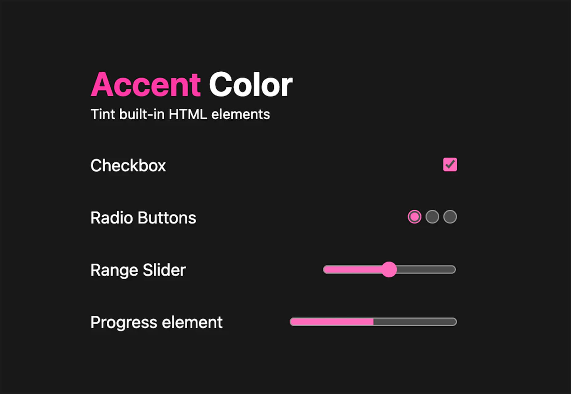
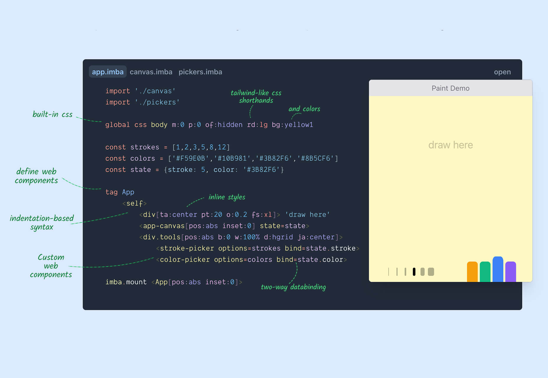
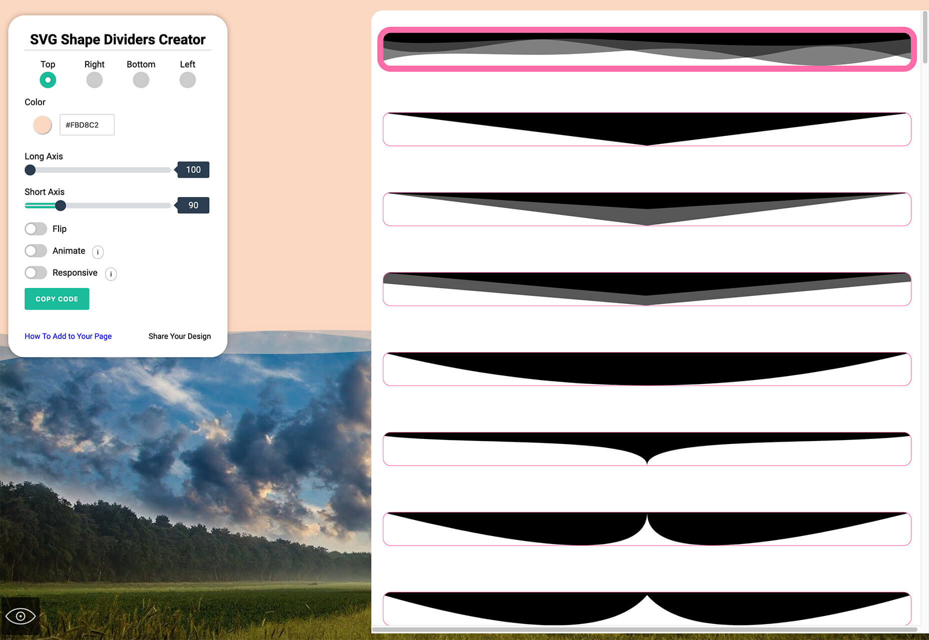
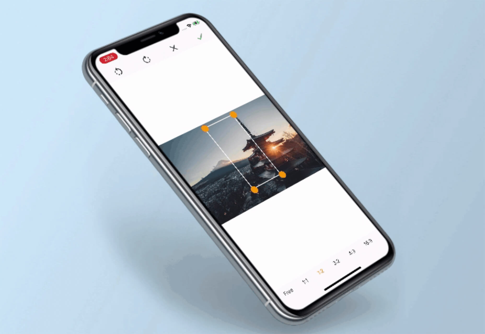
Since school is back in session, this month’s roundup has a learning focus. In addition to tools, many of the resources include guides, tutorials, and cheat sheets to help make design work easier.

Here’s what’s new for designers this month.

ScrollingMockup.io

ScrollingMockup.io generates high-definition, animated scrolling mockups in minutes. All you have to do is paste your website URL, select from the expanding template gallery, add some music and post. You can create three mockups for free, and then this tool comes with a subscription model. The paid model allows for custom branding for mockups and more.

FilterSS

FilterSS is a curated collection of CSS image filters for use in projects. Upload an image, sort through the list, and then copy the code for the filter you want to use. It’s that easy!

Buttons Generator

Buttons Generator is a fun tool with so many button options in one place. Choose from three-dimensional, gradient, shadow borders, neumorphic, retro, animated, ghost, with arrows, and more all in one place. Click the one you like, and the code is copied right to your clipboard and ready to use in projects.

UI Cheat Sheet: Spacing Friendships

UI Cheat Sheet: Spacing Friendships is a fun – and memorable approach to figuring out spacing. This guide shows how close or far away elements should be based on “friend” circles with a couple of relatable instances. It’s one of the most relatable examples of this concept out there while emphasizing the importance of spacing in design.

PrettyMaps

PrettyMaps is a minimal Python library that allows you to draw customized maps from OpenStreetMap data. This tool can help you take online map design to the next level with cool, unique map visuals. It’s based on osmnx, matplotlib, shapely, and vsketch libraries.

Card.UX/UI

Card.UX/UI is a card-style generator with more than 20 templates and elements to create custom cards. Use the on-screen tools to design it the way you want and then copy the code for easy use.

Couleur.io

Couleur.io is a simple color palette builder tool that lets you pick a starting color and build a scheme around it. One of the best elements of the tool might be the quick preview, which shows your choices using the palette in context and in dark mode. Get it looking the way you want, and then snag the CSS to use in your projects.

CSS Accent-Color

CSS Accent-Color can help you tint elements with one line of CSS. It’s a time-saving trick that allows for greater customization for your brand in website design projects. Plus, it works equally well in dark or light color schemes. It supports checkboxes, radio, range, and progress bars.

Vytal

Vytal shows what traces your browser leaves behind while surfing the web. This scan lets you understand how easy it is to identify and track your browser even while using private mode. In addition, it scans for digital fingerprints, connections, and system info.

Imba

Imba is a programming language for the web that’s made to be fast. It’s packed with time-saving syntax tags and a memorized DOM. Everything compiles to JavaScript, works with Node and npm, and has amazing performance. While the language is still in active development, the community around it is pretty active and growing.

SVG Shape Dividers Creator

SVG Shape Dividers Creator is a tool that allows you to create interesting shapes with SVG so that your colors and backgrounds aren’t always rectangles. You can adjust and side, change the color, axis, and flip or animate it. Then snag the CSS, and you are ready to go.

Image Cropper

Image Cropper is a tool that allows you to crop and rotate images using the flutter plugin. It works for Android and IOS.

Noteli

Noteli is a CLI-based notes application that uses TypeScript, MongoDB, and Auth0. The tool is just out of beta.

Yofte

Yofte is a set of components for Tailwind CSS that help you create great e-commerce stores. The UI Kit is packed with components with clean and colorful designs that are customizable. The code is easy to export and clean. This premium kit comes with a lifetime license or a monthly plan.

UI Deck

UI Deck is a collection of free and premium landing page templates, themes, and UI kits for various projects. This is a premium resource with paid access to all of the tools. It includes access to more than 80 templates.

Star Rating: An SVG Solution

Star Rating: An SVG Solution is a tutorial that solves a common design dilemma: How to create great star rating icons for pages. This code takes you through creating an imageless element that’s resizable, accessible, includes partial stars, and is easy to maintain with CSS. It’s a great solution to a common design need.

Designing Accessible WCAG-Compliant Focus Indicators

Designing Accessible WCAG-Compliant Focus Indicators is another convenient guide/tutorial for an everyday application. Here’s why it is important: “By designing and implementing accessible focus indicators, we can make our products accessible to keyboard users, as well as users of assistive technology that works through a keyboard or emulates keyboard functionality, such as voice control, switch controls, mouth sticks, and head wands, to mention a few.”

Blockchain Grants

Blockchain Grants is a tool for anyone developing blockchain applications and in need of funding. It’s a database of grants from a variety of organizations for different applications. Start looking through this free resource to help secure additional funding for your projects.

Basement Grotesque

Basement Grotesque is a beautiful slab with a great heavy weight and plenty of character. There are 413 characters in the set with plenty of accents, numbers, and variable capitals.

Gadimon

Gadimon is a fun, almost comic book-style layered script. The font package includes a regular and extrude style.

Lagom

Lagom is a sleek and functional serif typeface with 16 styles in the robust family from ultralight to extra bold italic. It’s readable and has a lot of personality.

Striped Campus

Striped Campus fits our back-to-school theme with a fun, scholastic look and feel. The block letters have a thick outline stroke and some fun inline texture.

Source

The post Exciting New Tools for Designers, September 2021 first appeared on Webdesigner Depot.


Source de l’article sur Webdesignerdepot

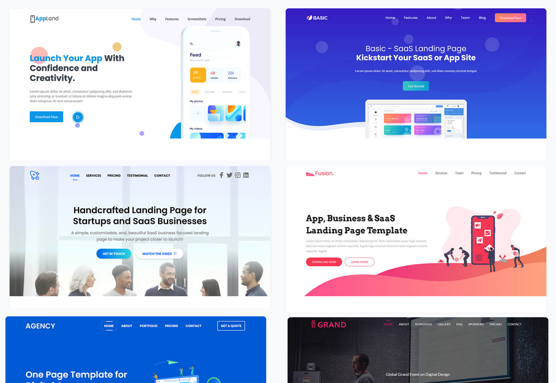
Landing pages are crucial for conversions. User-friendly landing pages rank higher in the search engines and generate the maximum leads.

Interestingly, user behavior changes every year, and new website design trends should be kept in mind to continue acquiring sales from your existing landing pages.

If your high-performing landing pages in 2019 have suddenly started underperforming in 2021, then it is a clear indication that your landing pages need a strategic revamp to record higher conversions.

Landing page revisions are necessary for reduced bounce rate, more visitor time on the page, and better user actions.

This article will discuss some of the top web design trends of 2021 that brands have adopted to revamp their landing page designs. You can learn from the trends and apply your own custom design intelligence to redesign your landing pages for 2022 and convert the maximum number of visitors.

Let’s begin…

Why Landing Page Design Is Crucial For Conversions

Landing pages are the first stop on your consumers’ online buying journey and the first chance to put an impression.

People on the internet are becoming less patient. It takes only about 50 milliseconds for a visitor to form an opinion about a brand and decide whether they want to stay or leave the website.

Convincing modern customers to buy products or fill up query forms on a landing page is not easy with traditional website elements.

In 2021, it is now harder to impress visitors landing on your website than in 2019. Keeping in mind the audience of 2021 and beyond, an ideal landing page should be user-friendly, engaging, innovative and should encourage users to take action.

Here are some of the top reasons why landing page design is so crucial for conversions:

  • You get barely 7 seconds to create a strong impression. It is a time span in which visitors roughly scan the page and make their decisions.
  • Publishing 40+ effective landing pages at regular intervals can generate 12X more leads.
  • The average conversion rate from the landing page across all industries is only 2.35%.
  • Using the right types of targeting and testing can boost landing page conversion rates by up to 300%.

Considering the above stats, it can be easily said that a landing page has to be impressive and quick enough to impact the visitors positively.

7 High Converting Landing Pages & Lessons You Can Learn From Each

Below are some of the best high-converting landing pages, which were just updated recently in 2021. For each page, we list a lesson you can learn to inspire your next design revision in 2021 and ahead:

Example #1 – Replace Boring Customer Info Forms With An Interactive Quiz

Landing Page: Nextiva’s Unified Communications Readiness Quiz Landing Page

Industry: Voice Over IP software

Conversion Measured By: Leads fill out a form if they are interested

Redesign focus: Improve the quantity and quality of leads

Solution: Substitute online form with an interactive quiz

In 2019 and even 2020, many businesses were practicing the trend of including a customer form on their landing pages as a call to action to initiate a quick customer action.

The customer information form was useful for businesses because it helped them generate quick leads. However, at the same time, there was no real reason pushing the customer to fill in the lead forms especially if it consisted of more than 2-3 fields.

Nextiva used its creativity to replace boring lead forms with interactive quizzes. In its 2021 page design, the company added a quiz for visitors to participate in.

The aim is to have interactive pages to keep visitors engaged and persuade them to stay on the page.

Here are the comparisons of both the designs:

2019

2021

Key Takeaways:

  • The 2021 landing page now has a free Unified Communications Readiness Quiz that allows business owners to fill the form interactively. Adding a quiz with the number of pages mentioned at the top tells the user how many steps are left to complete the quiz, making their waiting time easier.
  • The background image is replaced with communication icons to simplify the message of the kind of services they offer.
  • The page looks neater and appears to be easier to scan at a glance.

Example #2 – Emphasize Strong Visuals and Copy that Stresses on Product Details

Landing Page: Western Rise Homepage Variation

Industry: Ecommerce

Conversion Measured By: Apparel purchase

Major redesign focus: Improve the number of leads

Solution: Improve the copy and visuals

Western Rise, a clothing eCommerce company, realized the importance of having impressive images and detailed product information on its landing page.

The 2021 page replaced ordinary product images with strong visuals of the models wearing Western Rise clothing. Also, the product image includes extensive product details, which were missing on the older page.

Here is a clear comparison of the 2019 vs. 2021 landing pages of Western Rise:

2019

2021

Key Takeaways:

  • The new landing page has a powerful headline – Performance Clothing for Travel, Work, and Play. In just a couple of words, the brand tells everything about itself. ‘Performance Clothing’ is their unique selling proposition (USP) that tells the customers that their product is durable. Besides, the caption ‘Travel, Work, and Play’ tells what the product is about. Modern customers like products that fulfill a particular need, and Western Rise made it easier for the users to realize the importance of their products which fulfilled their specific needs.
  • The bold visuals in the new page capture contemporary shots of the models that put a strong impression on the audience. Every image is clicked mindfully to explain the style and quality of the Western Rise clothing line.
  • The products displayed on the new page include every minor detail and feature that often other clothing brands ignore, such as the specialty of the product, occasions to wear, and weight other than colors, fabric, fitting, etc.

Example #3 – Use Strong Social Proof To Increase Conversions

Page: Aura Save 50% Landing Page

Industry: Identity Theft Software

Conversion Measured By: Online registration or an inbound call

Major redesign focus: Improve the number of signups

Solution: Add strong social proof

It is a known fact that social proof on sales pages is essential for increased conversions. But in 2021, the importance of social proof has gone too far.

Aura is an identity theft protection service that aims to build trust with its prospective customers when they first browse their landing page. Take a look at how Aura displays customer reviews above the fold to catch user’s attention.

Unlike others, Aura combined the rating stars and the review to prove customer satisfaction and emphasize their expertise in the field.

BONUS:

Another example of using strong social proof is the Exploding Topics newsletter landing page.

Exploding Topics is a newsletter with a pro subscription for content marketers and anyone interested in trending topics about any topic. It’s an excellent example that uses a lot of social proof on landing pages that give something away for free, like a weekly newsletter or an eBook.

If you could notice, the latest landing page below has multiple forms of social proof on a single page. First, they feature a list of brands that trust Exploding Topics. Secondly, they quote Wired Magazine founder Kevin Kelly’s feedback, followed by the logos and tweets praising the newsletter.

Key Takeaways:

  • Exploding Topics uses several different types of social proof that appeal to different demographics.
  • Their “trusted by” logos of world-renowned companies stand out to potential B2B subscribers.
  • Kevin Kelly’s quote is catching the attention of tech-savvy readers.
  • Despite packing the page with social proof, the opt-in form is still well above the fold. It is the best landing page practice that applies to nearly all pages.
  • The landing page uses actually embedded tweets (not screenshots), which help demonstrate that the tweets are legit.

While Exploding Topics have smartly used social proof on its page, the ideas of leveraging social proof are not limited to this only.

Example #4 – Focus On Visually Appealing Above the Fold Content

Landing Page: Perfect Keto Homepage Variation

Industry: Supplements

Conversion Measured By: Online purchase

Major redesign focus: Improve the number of purchases

Solution: Improve Above The Fold Content

Above the fold content greatly impacts customer’s decision-making. Perfect Keto lacked that appeal on its 2019 landing page design.

Hence, the 2021 design was revamped with better visuals and more professional looks.

The 2021 page received major changes in above-the-fold content, such as the top menu bar with the brand name not losing the user’s attention anymore and an additional menu bar giving a quick overview of what the brand offers.

The older page did have many social proofs, but those were limited to customers only. The 2021 design also highlighted the publications where the brand appeared, which proved exceptional in building customer trust.

Take a look at the two landing pages of Perfect Keto in 2019 and 2021:

2019

2021

Key Takeaways:

  • The 2021 landing page heading is more compelling because it clearly conveys what their product is all about. The older page was missing the actual purpose of the product.
  • An additional section on the new page to educate customers about the Keto diet and how to start it helps visitors understand the product even better.
  • The inclusion of a product image above the fold attracts user attention and makes the product trustworthy. People now know what they will be buying right at first sight of the page.
  • The new page proudly displays the products featured in the publications, such as Women’s Health, Healthline, Reader’s Digest, and Popsugar, which again helped customers trust the brand.
  • The page also features a video of the Perfect Keto founder that is brilliantly working in gaining visitor’s attention and faith.

Example #5 – Make The Call to Action More Compelling

Landing Page: Zendesk HelpDesk Softwage Landing Page

Industry: SaaS

Conversion Measured By: Online registration

Major redesign focus: Improve the number of registrations through the website

Solution: Make The CTA More Compelling

Zendesk did a clever job by replacing the sign-up form with a single button. On the older page, it was unclear to the user if the company has a trial option for free unless they move to linked pages. Such confusions often resulted in traffic bounces.

Adding the start free trial button on the 2021 page makes it easier for the users to understand that the product comes with a free trial. At the time, it helps the user take quick action.

Similarly, the ‘Get started’ button at the top was replaced with ‘Free trial’ with the same intention.

Moreover, chat support was added to guide users at any stage of the buyer journey. Live chats are vital to help visitors better understand the product and move a step ahead in the customer journey.

Take a look at below two images:

2019

2021

Key Takeaways

  • The CTA buttons have more actionable text and look more prominent.
  • The color choice for the button is in contrast with the background but matches the page theme.
  • The older page missed sales support, which is included in the new page for a better customer experience.
  • The tabs in the menu bar were reduced to four to make the page simple to use for users.

Example #6 – Use Contrast To Highlight Specific Copy On The Page

Landing Page: GetResponse Website Building Landing Page

Industry: Online Software

Conversion Measured By: Online signup

Major redesign focus: Improve the number of signups

Solution: Use contrast around important copy on the page

GetResponse focuses on attracting visitors’ attention towards the offerings from their business. Starting from above the fold section, the landing page highlights the texts that are important and need the visitors’ attention.

The infographic on the landing page is the next thing that promises to grab user attention while beautifully describing how this website builder works and is useful to the user.

Key Takeaways:

  • The text highlighted on the landing page draws the user’s attention towards what the business has to offer or unique selling points.
  • The infographics briefly explain the working of the tool in an easy-to-understand manner.
  • The Yellow color is used prominently on the landing page to attract user attention and persuades users to try the tool by listing its advantages.

Summary

Landing pages provide the first opportunity to create an impression in the minds of the consumers. A well-structured and mindfully designed page sets the right tone for your brand message and encourages users to choose your business.

However, the strategy for landing pages needs innovations from time to time for better results. The examples and tips shared above prove how landing pages in 2019 have seen significant improvement in 2021.

In the coming year, use these ideas to create landing pages that influence customer decisions and encourage them to take quick actions.

Source

The post 7 Landing Pages Comparisons To Improve Your Conversions in 2022 first appeared on Webdesigner Depot.


Source de l’article sur Webdesignerdepot

SQL Server Analysis Services (SSAS) is used to create high-level aggregated views of data, allowing users to quickly create dynamic reports and dashboards to centralize business measurable values like Key Performance Indicators (KPIs).

In this article, we’ll cover how a user continued their analytics in SSAS after transferring terabytes of data into a Snowflake data warehouse.

Source de l’article sur DZONE

Ready to take your business online but not sure where to start? It’s a surprisingly simple process, made all the easier by the tagDiv Newspaper theme that can shoulder the burden of code, leaving you to be creative.

Professional web designers normally begin with broad brushstrokes, roughly hewing a site, before finessing on the finer details; that’s exactly what tagDiv’s Newspaper theme lets you do, with innovative tools and a huge selection of pre-built options to choose from.

What is the Newspaper Theme?

Newspaper is the best-selling magazine theme from tagDiv. In constant development over the last twelve years, it’s been used to create world-beating sites for clients as diverse and demanding as United Nations, ShareAmerica, The Rackspace Blog, Bitcoin News, Uber Engineering, and Tech Explorist.

As the name implies, the Newspaper theme is primarily a magazine or blog theme, but you can use it for any kind of site, in any type of industry.

Packed with intuitive features that make personal web development not just possible but enjoyable, it will have your site ready to launch in no time.

It is fully compatible with Gutenberg, WordPress’ drag-n-drop site builder; it also comes with its own WYSIWYG, tagDiv Composer. All the sites built in Newspaper are fully flexible, responsive, mobile-friendly, and retina-ready. Newspaper is even fully integrated with WooCommerce so that you can transform your magazine site into a fully-featured ecommerce store.

Newspaper has been carefully coded to make the most of the upcoming Core Web Vitals update from Google, so your new site will be well-placed to rank highly on search engines.

Now that you know a little about the background of the Newspaper theme let’s look at how we can use it to build a WordPress site.

Pre-Built Websites

Sometimes it’s not just your coding skills but your design skills that are lacking; you know what kind of site that you want, you’re just hazy on the details.

This is where tagDiv’s Newspaper theme comes into its own. With a single click, you can install an entire pre-built website. And the process is so fast and convenient that you can try out as many as you like and pick the one that matches your vision.

You can even import a whole ton of pre-written content for testing the sites out, so you can see how it will look with your content without spending hours typing or copying and pasting text out of a Word doc.

There are 120 different designs covering all kinds of different industries. This means no matter what kind of site you’re building, one click, and you’re ready to go live.

Cloud Library

One step up from a full pre-built website is tagDiv’s Cloud Library. If you’ve installed one of the pre-built websites, this is probably where you want to go next.

The Cloud Library is a collection of 1600 different design elements that can be mixed and matched with live-editing to fast-track your site creation. You’ll find content blocks like headers, footers, testimonials, banners, and featured items. You can mix-n-match them however you please to create the site of your dreams.

Putting the “Cloud” into the Cloud Library are tagDiv’s servers, storing the code for each of these elements, so your installation only needs to load the code you actually use. This provides a huge boost in performance.

Composer

Lastly, the Newspaper theme provides tagDiv Composer, a specialist WordPress builder — like Gutenberg — that allows you to customize your website with absolutely no coding skills whatsoever. It’s a powerful yet simple-to-use tool that allows you to edit the elements of the Cloud Library and adapt them to your own purposes.

With Composer, you can create your own headers, footers, banners, text blocks, and more without any of the limitations of cookie-cutter design.

tagDiv Composer gives you the ultimate control over your site. You’ll find all the essential elements you need, from text and buttons to images and videos. All you have to do is drag and drop them into place.

Building a Site With tagDiv Newspaper Theme

As you can see that the fastest way to an engaging and original website is, to begin with, a pre-built site, then add the different blocks of code you want from the Cloud Library, and finally customize them with the Composer.

To make this possible, tagDiv has brought together experts from multiple disciplines, including brand strategy, project management, and web development.

It’s a slick system for quickly publishing high-quality sites that are unique to you and your business. Trusted by more than 130,000 customers worldwide, the Newspaper has earned tagDiv the status of Power Elite Author on ThemeForest and Top Author on Envato.

The Newspaper theme costs just $59, which includes six months of support from tagDiv, but for just $17.63, you can extend support to 12 months for added peace of mind.

tagDiv Newspaper is the simplest way for you to take your business online using WordPress.


[— This is a sponsored post on behalf of tagDiv —]

Source

The post Build Your Site The Easy Way With TagDiv Newspaper first appeared on Webdesigner Depot.


Source de l’article sur Webdesignerdepot