Articles

Gartner predicts that by 2023, over 50% of medium to large enterprises will have adopted a Low-code/No-code application as part of their platform development.
The proliferation of Low-code/No-code tooling can be partially attributed to the COVID-19 pandemic, which has put pressure on businesses around the world to rapidly implement digital solutions. However, adoption of these tools — while indeed accelerated by the pandemic — would have occurred either way.
Even before the pandemic, the largest, richest companies had already formed an oligopsony around the best tech talent and most advanced development tools. Low-Code/No-code, therefore, is an attractive solution for small and mid-sized organizations to level the playing field, and it does so by giving these smaller players the power to do more with their existing resources.
While these benefits are often realized in the short term, the long-term effect of these tools is often shockingly different. The promise of faster and cheaper delivery is the catch — or lure — inside this organizational mousetrap, whereas backlogs, vendor contracts, technical debts, and constant updates are the hammer.
So, what exactly is the No-Code trap, and how can we avoid it?

What is a No-Code Tool?

First, let’s make sure we clear up any confusion regarding naming. So far I have referred Low-Code and No-Code as if they were one term. It’s certainly easy to confuse them — even large analyst firms seem to have a hard time differentiating between the two — and in the broader context of this article, both can lead to the same set of development pitfalls.
Under the magnifying glass, however, there are lots of small details and capabilities that differentiate Low-code and No-code solutions. Most of them aren’t apparent at the UI level, leading to much of the confusion between where the two come from.
In this section, I will spend a little bit of time exploring the important differences between those two, but only to show that when it comes to the central premise of this article they are virtually equivalent.

Low-Code vs. No-Code Tools

The goal behind Low-Code is to minimize the amount of coding necessary for complex tasks through a visual interface (such as Drag ‘N’ Drop) that integrates existing blocks of code into a workflow.
Skilled professionals have the potential to work smarter and faster with Low-Code tools because repetitive coding or duplicating work is streamlined. Through this, they can spend less time on the 80% of work that builds the foundation and focuses more on optimizing the 20% that makes it different. It, therefore, takes on the role of an entry-level employee doing the grunt work for more senior developers/engineers.
No-Code has a very similar look and feel to Low-Code, but is different in one very important dimension. Where Low-Code is meant to optimize the productivity of developers or engineers that already know how to code (even if just a little), No-Code is built for business and product managers that may not know any actual programming languages. It is meant to equip non-technical workers with the tools they need to create applications without formal development training.
No-Code applications need to be self-contained and everything the No-Code vendor thinks the user may need is already built into the tool.
As a result, No-Code applications create a lot of restrictions for the long-term in exchange for quick results in the short-term. This is a great example of a ‘deliberate-prudent’ scenario in the context of the Technical Debt Quadrant, but more on this later.

Advantages of No-Code Solutions

The appeal of both Low-Code and No-Code is pretty obvious. By removing code organizations can remove those that write it — developers — because they are expensive, in short supply, and fundamentally don’t produce things quickly.
The benefits of these two forms of applications in their best forms can be pretty substantial:
  • Resources: Human Capital is becoming increasingly scarce — and therefore expensive. This can stop a lot of ambitious projects dead in their tracks. Low-Code and No-Code tools minimize the amount of specialized technical skills needed to get an application of the ground, which means things can get done more quickly and at a lower cost.
  • Low Risk/High ROISecurity processes, data integrations, and cross-platform support are all built into Low-Code and No-Code tools, meaning less risk and more time to focus on your business goals.
  • Moving to Production: Similarly, for both types of tools a single click is all it takes to send or deploy a model or application you built to production.
Looking at these advantages, it is no wonder that both Low-Code and No-Code have been taking industries by storm recently. While being distinctly different in terms of users, they serve the same goal — that is to say, faster, safer and cheaper deployment. Given these similarities, both terms will be grouped together under the ‘No-Code’ term for the rest of this article unless otherwise specified.

List of No-Code Data Tools

So far, we have covered the applications of No-Code in a very general way, but for the rest of this article, I would like to focus on data modeling. No-Code tools are prevalent in software development, but have also, in particular, started to take hold in this space, and some applications even claim to be an alternative to SQL and other querying languages (crazy, right?!). My reasons for focusing on this are two-fold: 
Firstly, there is a lot of existing analysis around this problem for software development and very little for data modeling. Secondly, this is also the area in which I have the most expertise.
Now let’s take a look at some of the vendors that provide No-Code solutions in this space. These in no way constitute a complete list and are, for the most part, not exclusively built for data modeling. 

1. No-Code Data Modeling in Power BI

Power BI was created by Microsoft and aims to provide interactive visualizations and business intelligence capabilities to all types of business users. Their simple interface is meant to allow end-users to create their own reports and dashboards through a number of features, including data mapping, transformation, and visualization through dashboards. Power BI does support some R coding capabilities for visualization, but when it comes to data modeling, it is a true No-Code tool.

2. Alteryx as a Low-Code Alternative

Alteryx is meant to make advanced analytics accessible to any data worker. To achieve this, it offers several data analytics solutions. Alteryx specializes in self-service analytics with an intuitive UI. Their offerings can be used as Extract, Transform, Load (ETL) Tools within their own framework. Alteryx allows data workers to organize their data pipelines through their custom features and SQL code blocks. As such, they are easily identified as a Low-Code solution.

3. Is Tableau a No-Code Data Modeling Solution?

Tableau is a visual analytics platform and a direct competitor to Power BI. They were recently acquired by Salesforce which is now hoping to ‘transform the way we use data to solve problems—empowering people and organizations to make the most of their data.’ It is also a pretty obvious No-Code platform that is supposed to appeal to all types of end-users. As of now, it offers fewer tools for data modeling than Power BI, but that is likely to change in the future.

4. Looker is a No-Code Alternative to SQL

Looker is a business intelligence software and big data analytics platform that promises to help you explore, analyze, and share real-time business analytics easily. Very much in line with Tableau and Power BI, it aims to make non-technical end-users proficient in a variety of data tasks such as transformation, modeling, and visualization.

You might be wondering why I am including so many BI/Visualization platforms when talking about potential alternatives to SQL. After all, these tools are only set up to address an organization’s reporting needs, which constitute only one of the use cases for data queries and SQL. This is certainly a valid point, so allow me to clarify my reasoning a bit more.

While it is true that reporting is only one of many potential uses for SQL, it is nevertheless an extremely important one. There is a good reason why there are so many No-Code BI tools in the market—to address heightening demand from enterprises around the world — and therefore, it is worth taking a closer look at their almost inevitable shortcomings.

Source de l’article sur DZONE

Developers who tried to build at least one product for an end-user know how many things are essential in a product: thoughtful UX, friendly UI, good performance and stability, security and data consistency, logging and maintenance, etc.
Multiply this to the number of platforms that you have to support. Add marketings and licensing, client support and bug reports, new feature requests, and competitive product pressure.

It’s hard to track everything in one head, and it is even harder to be perfect at every job. That’s why we work in teams. That’s why we use project management processes.

Source de l’article sur DZONE

For some time, products have been leaning towards NoSQL databases because of the number of advantages that they provide compared to Relational databases (RDBMS), especially in today’s distributed systemsThere is always a pressure of delivering things faster to make it live to end users. But does that mean relational databases won’t be able to compete with NoSQL databases, provided Relational Databases are still best-known for adhering to the ACID property?

Here, I am going to explore the possibilities from Relational Databases perspective and how they come a long way to compete with NoSQL Databases. I am going to compare two managed databases from AWS, DynamoDB and Aurora, to see if it’s really worth giving credit to one type of database over another.

Source de l’article sur DZONE

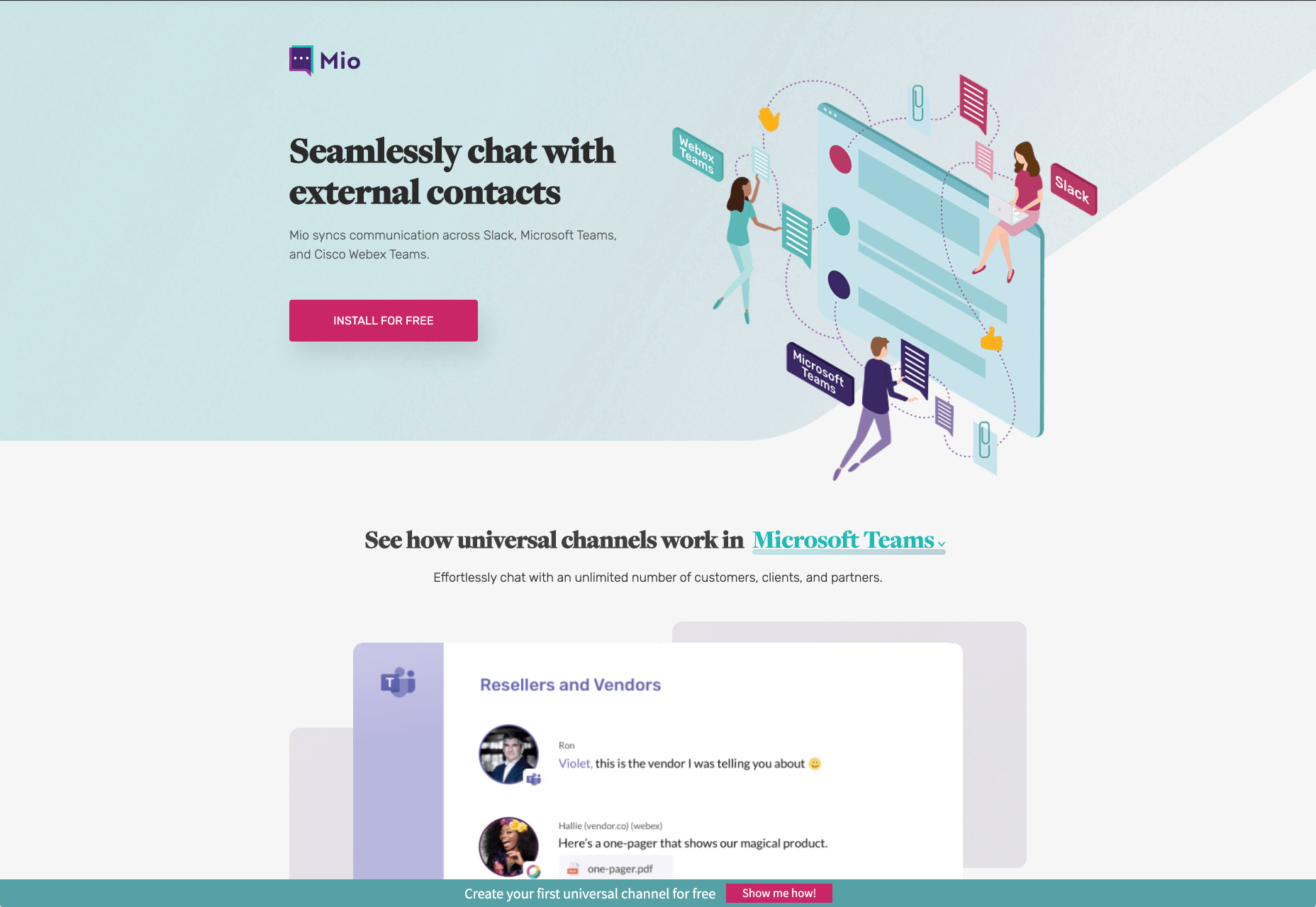
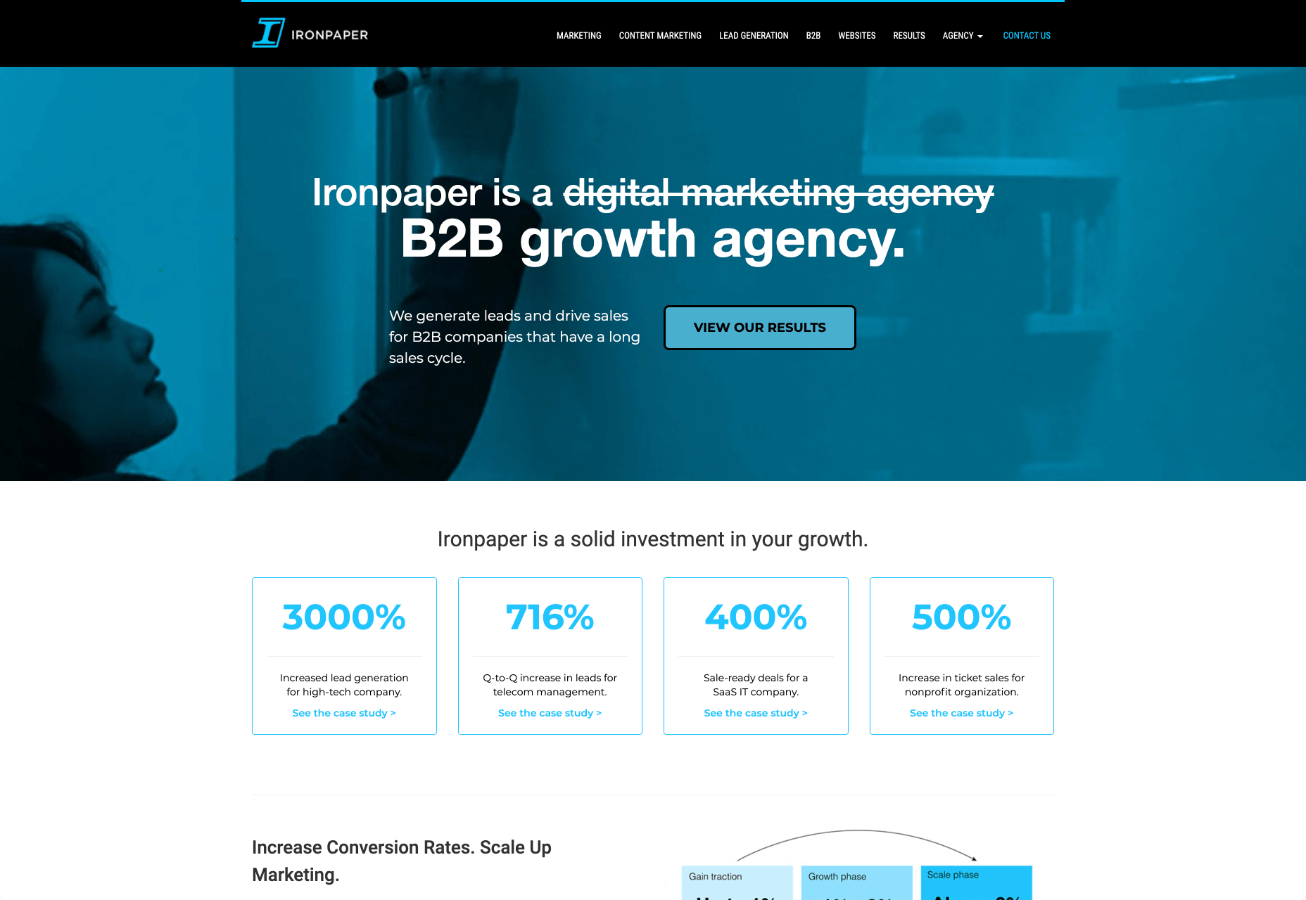
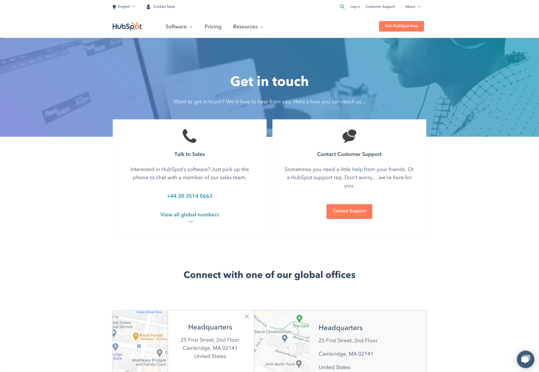
How can your customer reach you? If a client arrives on your website after searching on Google, what can they do to take the next step in a relationship with your brand, without buying anything?

One of the primary aims of any website is to drive conversions. However, it usually takes between 5 and 8 touchpoints to generate a viable sales lead. People don’t want to convert straight away.

Since building a relationship with customers is crucial to success, it makes sense that the contact page would be an essential part of driving results. Unfortunately, a lot of website owners pay virtually no attention to that page. They ask their designer to create a page with their address and phone number on – and that’s it.

What many business owners don’t realize, is that the contact page is the door to deeper, more lucrative relationships with potential prospects. The design of this essential website element needs to be fantastic to drive results.

So, where do you start?

Defining a Well-Designed Contact Page

Let’s start with the basics, what makes a great contact page?

The complete answer to that question depends on the target audience. Some customers will want to see fun and friendly contact pages, complete with social media sharing buttons. Others will want to see a map that shows them exactly how to reach an office or business.

There are a few golden rules to keep in mind, of course. Contact pages should be:

  • Easy to find: Don’t hide the link to the contact page on the website footer. Make it easy for customers to find out how they can get in touch.
  • Simple: Don’t put too much content on this page or it will overwhelm your audience. Just let them know where they can go to get answers to various questions.
  • Professional: Even if you have a friendly brand personality, your contact form still needs to be grammatically correct and well-designed to show a professional edge.
  • Convenient: Make your phone number clickable so customers can use it on Skype. The same can apply for your email address. Provide easy access to social media profiles, and if you have a contact form – keep it short and sweet.
  • Informative: Include all of your contact information in the same place. This may include your address, a map to your location, social media pages, email addresses, and even forums.
  • Accurate: Ensure that the information on your contact page matches the information listed elsewhere. Check directories and Google my Business listings to be sure.
  • Attractive: Yes, a contact page needs to look good too. Plenty of white space will make essential information stand out. A good layout will guide the eye through the page.
  • Consistent: Make sure the contact form on your website matches the brand personality that appears on all of your other pages.

Take a look at the Tune Contact page:

It’s beautifully laid out, with clear information that’s easy to read. The company shows exactly why customers might want to get in touch and how they can reach out. As you scroll through the page, you’ll find additional office locations, email addresses for different teams (sales and support), and links to social media accounts too.

How to Drive Engagement on a Contact Us Page

A good contact page needs to look fantastic, showcase the company’s personality, and capture audience attention. However, there’s a big difference between a contact page that gets the job done, and one that convinces your audience they have to connect with you.

Here are some excellent ways to make your contact us page stand out.

Step 1: Using Color Correctly

Color and color psychology have a massive impact on user experience.

Studies constantly demonstrate the conversion powers of having the right shades on certain pages throughout your website. For instance, changing a CTA button from red to green can increase click-through rates by 27%.

However, every audience is different. The colors that drive engagement on a contact page for your company will depend on your target customer. A/B testing color palettes that match your brand personality is a good way to get started.

One interesting example of colors that make the right impact on a Contact Us page comes from Hubspot. Here, the brand maintains it’s brand color (orange), but it also introduces some new shades that convey trustworthiness and professionalism.

Blue is the most calming and credible color for any brand, The gradient that Hubspot uses here blends perfectly with its brand identity, allowing for a stunning contact page, with CTA buttons that still stand out.

Experiment with colors that can generate the right emotional response from your audience, but don’t ignore the golden rules of color in web design. You still need to showcase your brand identity, and you still need a way of making crucial information stand out.

Step 2: Humanizing the Customer Service Team

Some of the customers that arrive at a contact page are interested in your product or inspired by the potential of your service. Other customers will be looking for assistance because they’re frustrated with something or stressed out.

If you’ve ever had a problem with a product and wanted to reach out to the brand about it, you’ve probably noticed how annoying it is to find a blank contact page with nothing but an email address. The lack of effort and humanity in the contact page is enough to convince you that you probably won’t get a response.

But what if you add some happy smiling faces to the page?

Research indicates that brains are fine-tuned to recognize and appreciate human faces. Having a picture of your customer service team, or just any human being on your contact page makes you instantly more approachable. Your customers start to feel like they’re reaching out to a person – not an empty website.

Look at how engaging and personalized this contact page from Amber McCue looks:

Although you can show any human face on your contact page and potentially get results, showing your actual agents will be more likely to drive positive results. It’s a great way to showcase the authenticity and humanity of your team.

Step 3: Making it Easy to Find

A surprisingly large amount of the time, companies shove their contact information into the footer of their website, forcing customers to spend forever looking for them. However, your audience might not want to spend an age searching for your details if they’re in a hurry to get answers.

Stowing a contact page in a footer is also a problem for those visiting your website via mobile, as they might not be able to see all your footer details and links as well.

A Contact Us page doesn’t have to be a massive part of your website navigation if you don’t want it to be. However, it should be one of the first things your audience can see. Putting the information on the header of your website, or even sticking it to the top of the page as your users scroll is very helpful.

Zendesk makes it easy for customers to get in touch in multiple ways. First, the Contact section of the website is clear at the top of the page. Secondly, if you start scrolling through the Zendesk website, a “Get Help” button pops up, so you don’t have to scroll back to find assistance:

Remember, aside from making sure that your contact page appears in the right part of your website, it’s also worth ensuring that it’s easy to understand. Don’t use unusual terms like “Chat”, or “Chill with us”. Stick to tried-and-true options like Help, Contact, or Support.

Step 4: Making the Experience Relevant

There’s a reason why it’s practically impossible to find a one-size-fits-all contact page.

It’s because different customers need different things from your brand.

Some customers will be looking for the answer to a question; others will want to discuss something with your sales team. That’s why many companies are using adaptive contact pages that can change to suit the situation.

For instance, you may start by asking customers what they need help with. Zapier takes this approach with its Contact page:

By asking the client what they need straight away, Zapier can make sure that the visitor finds the right information, and the right number or email address for the appropriate agent. You can even scroll down the help page and look for something in the available help centre, using the search bar. Or you can click on View our experts to hire a Zapier pro.

Creating a dynamic and customized experience like this does a few things. First, it ensures that the customer will reach the right person to help them first-time around. This reduces the number of inappropriate calls your employees have to deal with, and the number of transfers.

Secondly, you deliver a better experience overall for your client, because they don’t have to repeat their issue to multiple people or start a massive email thread. They get the support they need immediately.

Dynamic contact pages can even save you some money and time. If clients decide to solve an issue themselves, using your resources, that’s great for your busy agents.

Step 5: Direct People to the Right Place

The central focus of your contact us page needs to be the available contact options. Centralizing the contact options on a page is an excellent way to make sure that they get the right amount of attention. Centralizing also means that your customers can spend less time searching for the contact details that they need, which is great for usability.

The Melonfree.com website uses a contact us form that’s centralized to immediately pull attention to the customer’s options for getting help.

Centralization isn’t the only way of using design principles to guide visitors on a contact page. According to Ray Hyman and Edmund Hick, increasing the number of choices on a page often increases the time it takes for people to make a decision.

When it comes to connecting with a brand, the right option for each customer will depend on the person and the situation they’re trying to overcome. For instance, a customer that needs to reset their password will probably be able to get the solution they need from an FAQ page.

On the other hand, someone who needs help using a new feature might need the guidance of a professional. To help guide customers to the right solution, Basecamp gives customers a variety of steps to follow to get the right solution fast.

The main purpose of the contact page is to help customers get the right answer with an informative form. However, there are unobtrusive alternative options available too. If all you’re looking for is a way to help yourself fix a problem, you can click on the help guides link before you ever scroll down to the form.

Step 6: Support the Contact Team Too

The best contact us pages aren’t just a great way to improve customer experience. Well-designed solutions also help the customer service team to save time and stay productive.

One of the primary metrics that companies consider when evaluating the success of a service team, is the number of replies required before an issue is resolved. However, if the initial question from a customer doesn’t contain enough information, this number often increases.

Using the design of the contact form to access the right information helps with:

  • Automatically routing people to the right team member: Companies can set up segmentation rules that automatically send certain emails to different employees based on keywords. You might have questions that go to the sales team, and separate queries that you direct straight to the customer service team.
  • Show appropriate support options and FAQs: Remember to give the audience a chance to help themselves before they reach out for extra support. Links to an FAQ page or self-service options can really reduce the pressure on a team. Some companies even add automated chatbots to the mix to help with self-service.
  • Prompt for extra context: Although not every customer will take advantage of an opportunity to add extra information to a form, some will. Adding a box to your contact form for “anything we need to know?” is a great way to generate more information. Ban.do includes a simple “question” box where customers can add as much detail as they like. An option to add screen shots or documents might be a nice touch too.

Building Your Own Contact Us Page

Every customer has their own specific set of needs. The right contact page for another business might not be the right one for you. That’s why it’s so important to take some time getting to know your customers and speaking to your support team.

When you’re planning your contact page, it helps to ask yourself some basic questions about what you want to achieve. For instance:

  • What kind of channels will our customers want to use to connect with us? Look at things like social media messaging, email, or phone calls. If you’ve got a relatively tech-savvy audience, then they might want to use things like instant messaging with chat bots too.
  • How can we direct clients to the appropriate channels in as little time as possible? Having a system in place to automatically route your customers to the right agent will reduce the time to resolution for your customers. The faster you solve problems, the better your reputation becomes.
  • What can we do to set customer expectations and build confidence before they speak to us? Designing a professional-looking contact page will increase customer confidence, while an FAQ section shows that you’re ready to answer common questions.
  • How can we showcase a unique brand personality without making the page complicated? Everything from using distinct brand colors on a contact page, to adding images and illustrations reminds customers that they’re in the right place.
  • What can we do to reduce the friction points in a customer’s path to contact? Avoid adding too many input options to a contact form and ensure that it’s easy to reach out when your clients have a problem.

Understanding exactly what your audience needs from you, and what they’re looking for when they come to your team for help reduces the effort involved for your client when they reach out for help. Remember, today’s digitally-savvy customers expect their interactions with companies to be as streamlined and simple as possible.

Make the Most of Your Contact Page

Contact pages are frequently an afterthought in the website design process. However, they’re one of the most valuable tools your company has. With a good contact page, you ensure that your customers can always reach you when they have problems. What’s more, you boost your chances of people wanting to reach out to the sales team too!

Good luck creating a contact page that encourages engagement from your target audience. Don’t forget to track your results from each design, and A/B test for optimization.

Source


Source de l’article sur Webdesignerdepot

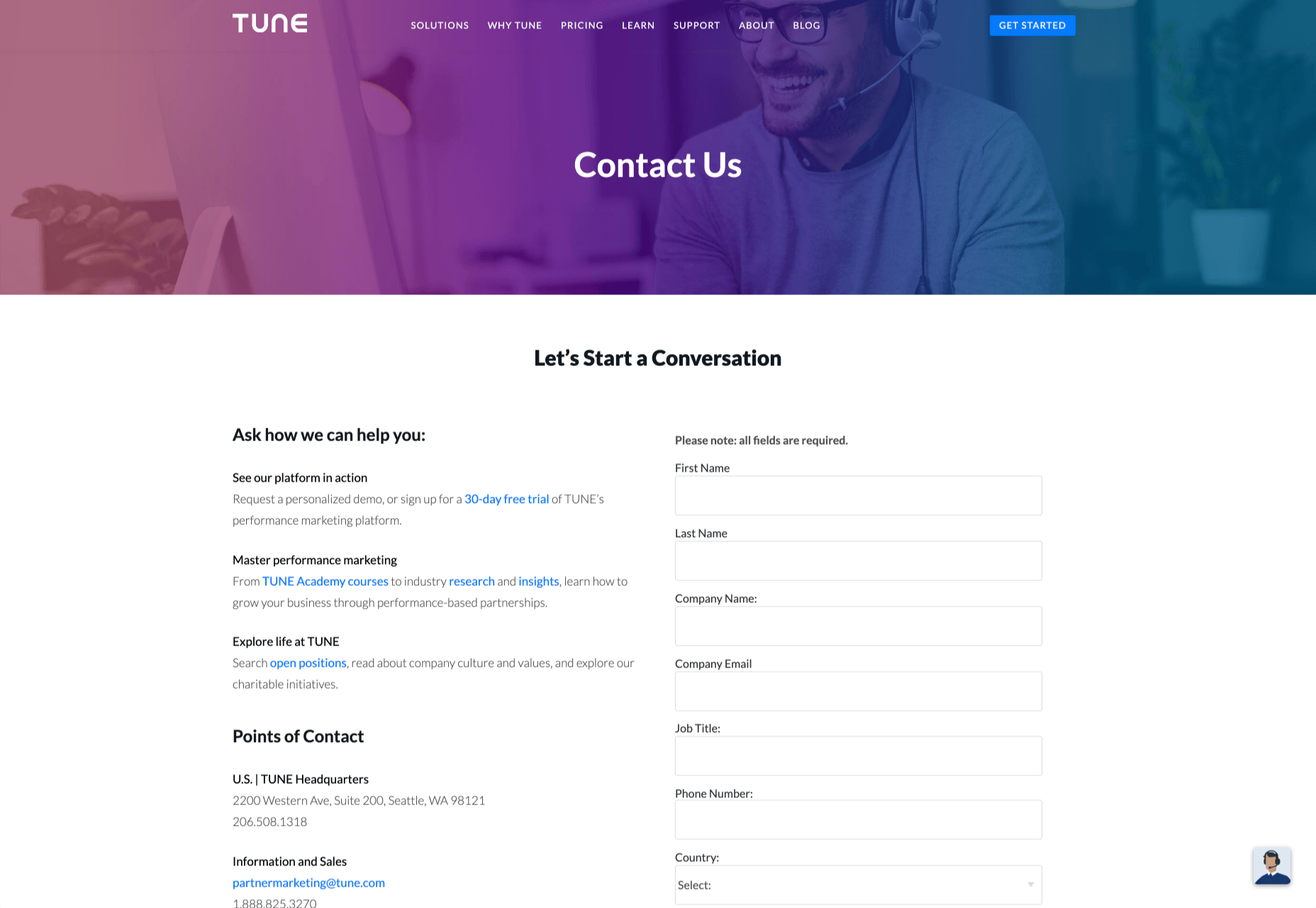
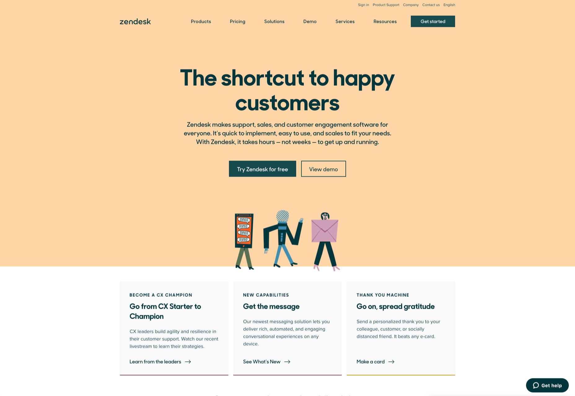
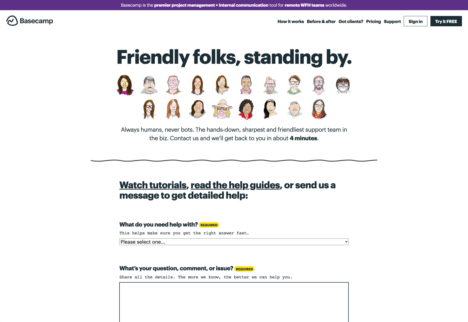
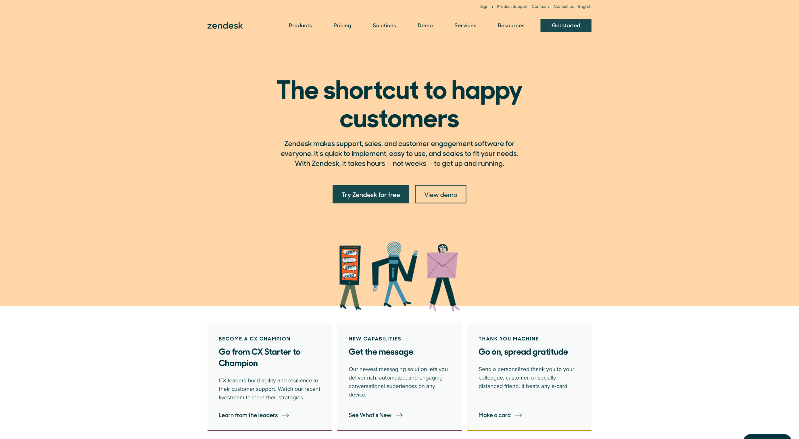
With billions of internet users worldwide spending several hours online each day, the online presence of brands is now a necessary avenue for building, boosting, and maintaining positive value and attracting and interacting with customers. 

This has created increasing pressure for web design agencies when creating and managing websites. This pressure is multiplied by all the projects that web design agencies have to handle at one time. This is because different clients demand different things for their websites, whether it’s a signature feature or specialized functionality. 

Hence, it’s vital that the tools the agencies use to work are simple enough and suited to the tasks they have to accomplish in order to build and maintain these projects. Having the right tools can increase efficiency and effectiveness in managing websites.

Challenges in Modern Web Design

Building a website with all the essentials in mind is always easier said than done. Websites have to be both functional and easy on the eyes to invite traffic, disseminate information, or appeal a product or service to a target audience, and all while having an attractive and convenient interface.

The good news is that it’s perfectly possible to design a quality website and without spending a fortune to do so. Below are some of the challenges that web design agencies face when trying to deliver and reconcile efficient user experience and effective user interface in web design.

1. Appealing User Experience

Designing a good website means ensuring that the user experience is appealing to a general audience, but this is one of the most difficult parts of web design. Agencies must be careful not to turn off users with a confusing user experience. For instance, making important information difficult to find on web pages, using technical jargon that ordinary users wouldn’t understand, and focusing too much on the design rather than the overall experience are a few big mistakes that no designer should ever commit.

Instead, web design agencies should focus not only on making the design look good but also on making the experience smooth and fast for the regular site visitor. This includes improving design elements to make navigation easier as well as optimizing webpage load speeds.

2. Working With a Budget

It’s common for the client and the web design agency’s budgets to not line up at all times. Either the client will find the project quote too high, or the designer will find the client’s budget too low. The cost of a web design project can vary greatly, depending on what needs to be done. 

Although having to build a good website on a budget may be difficult, it’s important for both parties to come up with a set amount before the project even starts. The client should always specify what they want to achieve and how much they’re willing to pay to get it, and the agency should let the client know beforehand if this is possible.

3. Integrating Third-Party Functionality

Sometimes, clients may make requests for third-party functions that may not be easily integrated into the site. To prevent this, web design agencies should always consider integration when building a site. Most businesses and companies now have at least one social media account, so it doesn’t make sense for their site to remain disconnected.

When a website visitor shares an excerpt on a social media site like Facebook, Pinterest, or Twitter, other people who can see their posts may become interested in visiting the original post on the website. Properly integrating third-party applications and functions into a website can get it more online presence and popularity.

4. Suitability to Different Devices

There are many devices that people can use to access the web. From smartphones to desktop computers, from cars to game consoles, and even wristwatches and digital cameras, all of these can be web-enabled as long as there’s an available internet connection. 

Websites nowadays should always be compatible with any of the devices people might use to go to the website. They should look pleasing and load fast regardless of what device a visitor is using.

5. Security of Personal Information

Most websites require personal or financial information, whether for account verification, for website subscription, or something else. Websites should be designed with personal security in mind, which is even more important since hacking has been on the rise since the coronavirus hit.

One of the biggest threats that websites face today is phishing, or when an attacker will pretend to be a trusted contact and attempt to compel you to click a malicious link. Another is ransomware, or where cybercriminals hold customer data for ransom and attempt to extort online business owners. Yet one more is SQL injections, or where hackers will attempt to execute malicious SQL commands in your website’s database. 

The best practices in regards to web design to mitigate these risks include third-party plugins and themes, keeping all of your software up to date, setting your web applications so they run the fewest privileges possible, and utilizing SSL certificates and HTTPS protocols. 

Adopting Site-Building Platforms

Gone are the days where you had to be technologically gifted to design a website from scratch, usually through manual HTML codes. Back then, you had to know your way around the web if you wanted to set-up and manage a site of your own.

Now, there are a lot of good website builders that allow you to create websites in a faster period of time. Even web design agencies now make use of such builders in order to make the job easier and more convenient. Not to mention, it allows agencies to focus on the design alone.

Although these platforms offer predesigned templates based on the most common purposes of websites, they normally allow the user to white label the website into the branding specific to the business or agenda of the website owner. The text styles, colors, and sizes coordinated to the website’s theme, and colors can be designed specifically to match the business or organization’s image and identity. 

Simply put, creating websites through a web builder platform can provide web design agencies with easy-to-understand tools that their teams and members can all uniformly use to more effectively and more efficiently handle all their projects.

With services that allow mobile optimization, site management, and even drag-and-drop editing, web design agencies can now better manage their projects and finish with their tasks more quickly.

Not only that, by using white labelling, services can conserve their time and energy into focusing on creating the best website for their client. With all the website builders currently available on the market today, just picking the right one can give web design agencies the best tools to use when creating, designing, and maintaining websites. 


Featured image via Pexels.

Source


Source de l’article sur Webdesignerdepot

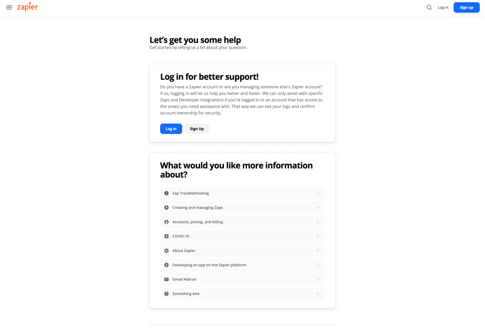
Designing for emotion in and of itself is not a problem. Websites are bound to elicit an emotional reaction from visitors, even if it’s as simple as them feeling at ease because of the soft, pastel color palette you’ve designed the site with.

I don’t want to outright villainize emotional design. Unless there is some form of unethical manipulation at play, designing for your visitors’ emotions can actually provide them with a more positive experience.

So, here’s what I’d like to look at today:

  1. What is emotional design?
  2. When does emotional design cross a line?
  3. What’s the right way to design for emotions?

1. What Is Emotional Design?

When we look at emotional design in the context of a website, we’re focused on three types of emotional reactions:

a. Visceral Reactions

Visceral reactions are instinctive ones. Usually, visitors experience these as their first impressions of a website or web page. For instance, a cluttered or otherwise poorly designed homepage might leave visitors feeling overwhelmed, hesitant, or wanting to flea.

A minimally designed homepage interface, on the other hand, might have visitors not feeling much of a reaction at all. In this case, no feeling is a good feeling.

Like Irene Au said:

b. Behavioral Reactions

Behavioral reactions stem from the usability of a website. There’s a lot that can stir up negative emotions here, like:

  • Extra-long contact forms
  • Confusing menus
  • Error-ridden content
  • Slow-loading pages
  • And more

Again, if a website is easy to get through and attractively designed, visitors aren’t likely going to “ooh” and “aah” with every step they take on the site. And that’s a good thing. If they’re focusing more on how the design looks, they’re not paying attention to the brand’s actual offer.

c. Reflective Reactions

Reflective reactions are the third type of emotions we design for.

This is complicated because there’s a lot wrapped up in how visitors feel about a website after the fact. Sometimes the most well-designed interfaces and experiences can’t save them from a bad experience, whether they realized too late that the products were overpriced or they were treated poorly by a live chat representative.

As a web designer, all you can really do is to make sure you’re working with reputable companies and then aligning the designs of their sites with their values.

When Does Emotional Design Cross a Line?

There’s already enough social pressure online; your website doesn’t need to be one of those places, too

Emotional design shouldn’t be about manipulating consumers’ emotions. In most cases, emotional design is about controlling the environment of the website so that emotions don’t go spinning wildly out of control — in either direction.

It’s when we take what we know about influencing someone’s emotional state to monetarily benefit from it that emotional design becomes problematic.

Here are some ways in which you might negatively impact the emotions of your visitors through design:

FOMO

The fear-of-missing-out isn’t always a bad marketing strategy. However, when FOMO is used for the purposes of rushing consumers to take action now and without time to really think it through, it definitely can be.

Chances are good they’ll feel badly no matter what. Either because they regret the rushed (and probably unnecessary, or expensive) decision or they blame themselves for missing out on an opportunity to be like everyone else.

There’s already enough social pressure online; your website doesn’t need to be one of those places, too. So, be careful with how you present customers with limits (on time, on products, etc.) or how you frame the call-to-action (“If you don’t buy this now, expect to fail/be miserable/suffer even more”).

Analysis Paralysis

It doesn’t matter why people specifically seek out your website. They have a problem or a hole in their life, and they’re looking for something to fix it.

Now, you can’t help it if the website has too much to offer in the way of options or solutions. Companies have to provide every possible solution/option so their users don’t feel like they have to go somewhere else to get what they need. However, the way you design these options can lead to a negative emotional state if you’re not careful.

For instance, your visitors might experience analysis paralysis, where there are so many options that it becomes impossible to take action. Similar to FOMO, this can lead to regret either with the decision they made or the one they were incapable of making.

By simplifying how many choices are presented at once, or designing a clear and supportive pathway to the right option of many, your website will leave visitors feeling much more positively about the whole experience.

Trendy Nostalgia

Nostalgia can be a great way to play upon the positive associations and emotions consumers feel towards an era gone by or a place they once knew. But, again, it depends on how you design with it.

For example, if you design a vintage website for an agency launched in 2019 and run by a group of 20-somethings, it might come off feeling disingenuous once customers start to catch on.

For a restaurant known as the oldest bar in the state, that would be a different story. That nostalgically designed website would be a real part of its story; not just done as a sales gimmick. As a result, customers would likely embrace those warm feelings for the “good ol’ days” they get from the website.

Also, think about how quickly nostalgia fades if it’s done to align with a trend. Unless you’re committed to redesigning a website the second that nostalgic feeling falls out of favor, you could be condemning your client to an outdated website mere months after launch.

What’s the Right Way to Design for Emotions?

Like I said before, there’s nothing wrong with designing for emotions. You just have to make sure your website visitors don’t feel manipulated and that they welcome the pleasant feelings the site gives them.

make sure your website visitors don’t feel manipulated

It might seem harmless at the time. After all, what are they doing on the site if they weren’t interested in the first place? And it’s not like they were bullied into spending their money, right?

But if they sense in any way that their response was driven by an emotion they wouldn’t have otherwise felt, they’re not going to be happy. While it might not be enough for them to cancel their subscription or services, or to return products they bought, it will definitely leave a bad taste in their mouth. And, ultimately, it can cost your website loyal visitors and customers.

So, if you’re going to use emotional design on a website, do it to improve their experience, not to put more money into your clients’ pockets. That means your emotional design choices need to be honest, transparent, and focused on eliciting naturally positive emotions like:

  • Satisfaction
  • Feeling impressed
  • Trust
  • Calm
  • Feeling valued

Go back to the three emotional reactions I brought up earlier. If you can design a website to give off a positive first impression, and to be pain-free and usable, you can spend the rest of your time injecting small bits of happiness and positivity into the website with color choices, friendly micro-interactions, personalized content, and more.


Featured image via Unsplash.

Source


Source de l’article sur Webdesignerdepot

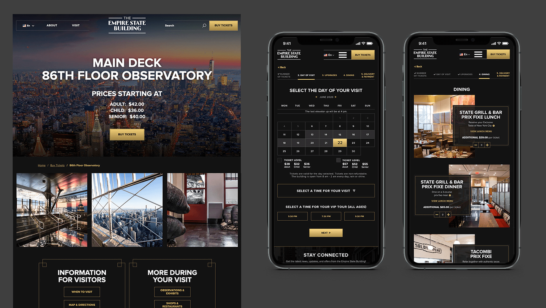
In 2019, to keep pace with an interior redesign of its visitor experience, the Empire State Building decided to redesign its website. Blue Fountain Media were engaged to deliver the project. With the new site launching, we spoke to Head of Design, Tatyana Khamdamova about designing for the world’s most famous building.

Webdesigner Depot: The Empire State Building is probably the most iconic building in America, if not the world. Were there any points at which you thought, “Oh God, this is too much pressure”?

Tatyana Khamdamova: Yes, of course, it was a lot of pressure knowing that people all over the world will be looking at your work. But with the pressure, we also felt excitement and pride that we got to work on such an iconic project. Just thinking that we are doing the site for Empire State Building made us feel proud of all that other work we did during our whole life that gave us the opportunity to be a part of this project.

WD: Blue Fountain Media is a large agency. Did you utilize the whole company, or was there a smaller, dedicated team tasked with creating the site?

TK: On a project like this one, you need the expertise of the team members from all departments in the agency. You want people to work together from the beginning to ensure that their knowledge helps to shape the project and produce the best possible outcome. It’s important for designers and marketers, for example, to be a part of the strategy and UX phase to provide their input which minimizes tunnel vision and generates more ideas. You can only achieve the best results if every single detail from strategy to design to development is done right.

WD: That’s a lot of people to coordinate. Did any roles naturally come to the fore, or is design leadership a quality that varies from person to person?

TK: Some people are natural leaders in their fields. But, sometimes a certain project requires people to take responsibility and show their leadership skills within the team. So I would say that it’s a quality that varies from person to person and doesn’t depend on a role or a title at all.

WD: What were the central aims of the redesign?

TK: ESB’s previous website did not reflect the level of design to match their iconic brand, UX was not user friendly, the content was outdated, and they wanted to grow online individual and group ticket sales. In addition to competing with global and NYC based tourist attractions, ESB was also faced with growing competition in the NYC Observatory market with Top of The Rock, One World Observatory, and Edge at Hudson Yards.

While the building underwent a $165 million renovation, BFM was tasked with creating a best in class website that reclaimed their iconic brand identity while providing an intuitive, and enjoyable user experience for both domestic and international visitors looking to learn about the building, exhibits, and the many ticket experience packages that they offer to visitors.

WD: How do you approach researching a unique project like this?

TK: We went to the source! First, we spoke to visitors of the Empire State Building while they were in line. What was their experience, did they use the website, what made them choose to visit the observatory instead of or in addition to some of the other competing observatories in the city. We then looked at other key tourist towers worldwide to see how they are positioning themselves globally to draw inspiration. We did in-depth stakeholder interviews that included folks working at the building every day and the types of interaction and questions they field from visitors. We conducted surveys of international travelers to understand their motivations and concerns. Finally, we dug into the website itself by testing using various protocols and platforms to understand the visitor paths, what they were able to easily do, and what tasks they may have found challenging. Drawing from all of those insights, we planned and designed the site using an iterative process.

WD: ESB visitors come from all over the world; how did you tackle designing for an international audience?

TK: People across the globe speak different languages, have different cultures and needs. Our goal was to learn about the audience and give them a site that looks and feels like it was created for them. Luckily we were working for the iconic building that is well known internationally and capturing the design aesthetic of the building itself already made the site recognizable across the globe. When working on the project we also were making sure that all users can see the information in their local language when they land on the site and have easy access to the language selector in case they want to change it. When you translate from one language to another the number of words and characters is not always the same. It was important to make sure that the site is designed and developed with an understanding of how the content will be displayed in other languages. With the localization help of our parent company Pactera EDGE we successfully translated the site in several languages and tested it to ensure that it looks right for the local and international audience.

WD: The famous view of the ESB is the external view, but your design feels more in keeping with the experience of the building’s interior. Was that a conscious decision?

TK: It was a conscious decision to create a site that makes you feel like you are visiting the building. Our goal was to make the visitor excited to buy a ticket and see all that beauty with their own eyes. But, if someone doesn’t have an opportunity to come to NY we wanted to make that online experience as close to the real one as possible. We understand that nothing will replace the actual visit to the Empire State Building but we wanted the website to feel real and by using the great photography and amazing Art Deco design elements, we were able to do so.

WD: How did you interpolate such a complex style as Art Deco into a functional site?

TK: Fortunately for us, our office is located a couple blocks away from the building and we had the opportunity to go there and see some of the details. We also had access to the great photos of the renovated hallways, exhibits, and observatory decks, which gave us the idea of how the Art Deco elements were used in the interior design of the building. We all know that interior design and web design have different needs and goals so it was an interesting challenge to design a site that makes you feel like you are inside the building without overwhelming users and that content is easy to read and the ticket purchasing process is simple and clean. We re-created a lot of design elements used on the ceiling, walls, and floor of the building simplified those elements and made them part of the website design. A lot of those elements were used in the background, call to actions, icons, and maps, and combined with the brand colors used in both interior and web designs we were able to give the site the Art Deco look.

WD: There’s been speculation in the design community recently that Art Deco may re-emerge as a trend in the 2020s. Having worked with the style, do you think it could benefit the wider web?

TK: This was a very specific design approach for a very specific project that takes us back to the 1920’s and emphasizes that era through modern twists in web design. I do not see how it can be applied on the web in general unless the client specifically asks for it, for example, architecture website, real estate, or furniture site. Every project is unique and has its own goals and style and there is no one solution that will fit all. As of today, The ESB is Art Deco in a sense and it truly owns that style.

WD: Can you share some details on the technology stack you employed?

TK: The site was built on the Drupal CMS, integrates with Empire’s partner Gateway Ticketing System, and is hosted on Acquia.

WD: Why Drupal? Does it have qualities that suit a project of this scale, or is it simply the case that BFM had the pre-existing expertise of Drupal to facilitate the build?

TK: BFM is a dev-agnostic production team and we always ensure we’re making the best recommendation to our clients. In this case, the previous website was built on Drupal, so in order to decrease the effect of a new platform rollout that would be unfamiliar to the internal ESB teams, we decided to keep the site on the Drupal platform. Luckily, Drupal is an extremely flexible CMS and the needs of the site perfectly align with what Drupal provides.

WD: With visitors from around the world, the range of browsers and devices you had to consider was vastly larger than most projects. Did you draw a line for support? If so, where was it?

TK: BFM constantly updates our list of supported browsers and devices to stay in line with changing technology trends and device usage around the world. We’re extremely lucky that our larger organization, Pactera EDGE, has deep roots in globalization and localization, so we leveraged their team to help us with all aspects of website visitors from the many regions around the world, including translation services and testing. Since this was a complete overhaul, we ensured the baseline standard for all devices was met and will continue to enhance as the future technology needs become apparent.

WD: The Empire State Building gets millions of visits each year, what sort of server resources do you need to throw at it to guarantee uptime?

TK: BFM is a partner of Acquia, and Empire State Building is hosting their new site with them. Acquia is a wonderful ecosystem built specifically for high performing drupal websites and provide many tools for their hosted sites to be able to handle fluctuations in visitors, traffic surges, and with the 24/7 support offered, they can easily manage the changing needs of worldwide visitors.

WD: Now it’s live, how does the new ESB site relate to its real world presence?

TK: The Empire State Building defines the New York City skyline. The world’s most magnificent Art Deco skyscraper, it’s a living piece of New York history and an instantly recognizable symbol of city culture today. The old site did not reflect the amazing interior and exterior design of the building and we had a chance to showcase the redesigned interior and bring more attention to the beautiful Art Deco design elements. We wanted to create the site to make you feel like you are visiting the building. By showcasing the exhibits, renovated halls, and observatories through compelling photography and architectural details, our goal is to make the visitor excited to buy a ticket and see all that beauty with their own eyes.

We’d like to thank Tatyana for taking the time out of her day to talk to us.

Source


Source de l’article sur Webdesignerdepot

Web design clients come from a wide variety of backgrounds. One day, you’ll be designing a portfolio website for a voiceover artist, the next you’ll be creating a comprehensive ecommerce site for a leading retailer. In an ideal world, you’ll get to a point where you eventually specialize in a niche. However, you’ll need to master both avenues first.

The more time you spend in this industry, the more you’ll learn that every client comes with their own unique requirements and challenges to consider. However, there’s a particularly huge divide between the kind of web design projects you do for B2B clients, and the ones you do for B2C customers.

Both B2B (Business to Business) and B2C (Business to Consumer) websites need to be clear, concise, and aesthetically pleasing. They should always have a strong focus on user experience, and they need to work consistently across devices. However, being aware of the difference between B2B and B2C projects will help you to deliver better results to your customers.

Defining the Differences Between B2B and B2C Sites

Some web design trends remain consistent in any environment.

Whether you’re creating a site for a hairdresser, or a leading SaaS company, you’ll need to deliver responsive design, intuitive navigation, and excellent site security.

Your process is unlikely to differ from B2B to B2C much in terms of project milestones, phases, prototyping and wire-framing. The differences that arise between B2B and B2C projects often come in the approach you take to building certain elements.

Let’s take a closer look at the things you might need to consider:

1. The Target Audience

In any design project, it’s always important to keep the end customer in mind. Knowing your client’s target audience will help you to create both an image and a tone of voice that appeals to the right people.

B2B Websites

With B2B websites, you’ll be speaking to a range of highly-educated individuals who already have a general knowledge of your service. The aim here will be to show the end-user how you can help them achieve better results. For instance, m.io highlights “syncing communication” so you can “effortlessly chat” with your team.

The language and content of the website is all about highlighting the key benefits of the products, and the kind of outcomes that they can deliver. The Nielsen Norman Group reports that there’s often a lot of discussion between decision-makers when they’re checking out a B2B website.  

Designers need to work harder at convincing B2B buyers that they’re making the right decision. This is particularly true when you’re selling something like a software subscription that requires a lot of long—term investment.

B2C Websites

On the other hand, while B2B customers make decisions based on logic, information, and well-explained benefits, B2C customers are more influenced by emotion. They want quick solutions to their problems, and the opportunity to purchase from a brand that “understands” them.

Look at the Firebox website, for instance. It instantly highlights an ongoing sale at the top of the homepage, addressing any concerns a customer might have about price. That combined with a quirky layout full of authentic photos and bright colors means that customers are more inclined to take action.

2. The Purpose

Another factor that can vary from B2C to B2B websites, is the motive behind a customer’s purchase. Knowing what’s pushing a target audience to interact with a brand will help you to create a website that appeals to specific goals.

B2B Websites

B2B websites often aim to solve expensive and time-consuming problems for companies. To sell a decision-maker on the validity of a solution, it’s important to thoroughly explain what the solution is, how it works, and how it addressees a specific pain point.

Look at the Zoom website for instance, they don’t just tell people that they offer video conferencing, they address the practical applications of the platform:

B2C Websites

Consumers are a lot easier to appeal to in terms of emotional impact, because many of them come to a website looking to fulfill an urgent need. Because of this, many web designers can take advantage of things like urgency and demand to encourage conversions. For instance, look at this website from TravelZoo. It takes advantage of a customer’s desire to get away:

A B2B website needs to focus on providing information that helps companies to make more confident decisions. What’s more, with B2B sites, decisions are often made by several stakeholders, while B2C sites ask a single person to make a choice. A B2C website needs to address immediate concerns and connect with customers on an emotional level. B2C buyers still want to do their research on products or services, but the turnaround is much quicker, and often requires less information.

3. The Design Elements (Visual Appearance)

Just as the focus of your website design and the audience that you’re creating the experience for can differ from B2B to B2C websites, the visual elements of the design might change too.

B2B Websites

In most cases, B2B websites are all about presenting a highly professional and respectable image. You’ll notice a lot of safe and clear choices when it comes to typography and imagery. It’s unusual to see a B2B website that takes risks with things like illustrations and animations.

Look at the Green Geeks website for instance. Everything is laid out to encourage clarity and understanding. Information is easy to find, and there are no other issues that might distract a customer.

B2C Websites

On the other hand, B2C websites can be a little more daring. With so many different options to choose from, and most customers buying out of a sense of urgency or sudden demand, designers are under pressure to capture attention quick. This means that it’s much more likely to see large pieces of eye-catching imagery on B2C sites, with very little text.

Movement, like slideshows and animations often play more of a role here. Additionally, there’s a good chance that you’ll be able to experiment more aggressively with color. Take a look at the Yotel website, for instance. There’s very little textual information here, but the appeal of the website is conveyed through sliding images:

4. Website Content

The way that information is conveyed on a B2B website is very different to the messages portrayed on a B2C site. Usually, everything from the language, to the amount of content that you use for these projects will differ drastically.

B2B Websites

When designing for a B2B website, you’ll need to be careful with content, as you’ll be speaking to a very mixed audience. If your site caters to different industries, you’ll need to ensure that you show authority, without using too much jargon. Some companies even create different pages on their site for specific customers. The aspin.co.uk website covers the benefits from a company, sale and integration perspective:

Rather than try to talk to all business owners about their differing communication pains, G-Suite anticipates its audience and creates pages for each.

B2C Websites

Alternatively, B2C websites can make things a little simpler. For instance, on glossybox.co.uk, there’s no need to provide a ton of information for different types of shopper, designers can appeal to one audience, i.e. the “beauty addict”:

In both B2B and B2C websites, the aim of the content should always be to answer any questions that the end user might have.

5. CTA Buttons

Call to Action buttons are often a crucial part of the web design journey. However, it’s sometimes difficult to determine where they should be placed, or how many buttons you need.

B2B Websites

Because the decision to buy something won’t always happen immediately with a B2B website, these kinds of sites often use a variety of CTAs. For instance, you might have a “Request a Quote” button at the top of a page, as well as a Sign in button.

On the Klaviyo site, for instance, you can request a demo, sign up or log in:

You can place CTAs lower on the page with B2B websites too, as it’s more likely that your customers will be scrolling through the site to collect more information before they decide to buy.

B2C Websites

On the other hand, with B2C websites, you usually don’t need to give your visitors as many options. A single option to “Add to Cart”, or perhaps an extra choice to “Add to Favorites” is all your user will need. Customers need to instantly see what they need to do next as soon as they arrive on a page:

On the Evil Hair website, you immediately see how to add a product to your cart.

Remember, the sales process is a lot quicker with B2C customers. This means that you need your CTA buttons to be front and center as soon as someone clicks on a page.

6. Contact Forms

In a similar vein, the way that you design your contact forms will also depend on the end-user that the website wants to appeal to. There’s a very different process for getting in touch on a B2B website, compared to a B2C site.

B2B Websites

B2B websites often require longer contact forms, as clients need to collect additional information about a prospect’s position in a company, and what that company does. B2B companies need to share things like what they’re looking for in a service, and how many users they have, so a sales team knows what kind of demonstration to give.

As with any strategy for contact form design, you should always only include the fields that your client needs and no more. If you demand too much from any client, you could send them running in the opposite direction. Check out this straightforward option from Ironpaper, for instance:

The form addresses as many relevant questions as possible without overwhelming the customer. Because the site handles things like design, it makes sense that they would ask for a link to the company’s existing website.

B2C Websites

On a B2C website, there are very different approaches to contact forms. You may have a dedicated contact form on your website where people can get in touch if they have any questions. A FAQ page where customers can serve themselves is another great way to help your client stand out from the competition. Check out this option from River Island, for instance:

On the other hand, you might implement pop-up contact forms into a website if your client wants to collect emails for email marketing. In that case, it’s important to make sure that you’re only asking for the information you need, and nothing more.

The easier it is to sign up for a newsletter, the more likely it is that customers will do it. Being able to enter their name and email address and nothing else will make the signup seem less tasking.

7. Search Bars and Navigation

Whether you’re designing for B2B or B2C companies, navigation will always be a critical concern. End users need to find it easy to track down the information that they need about a company, whether they’re looking for a particular product or a blog.

B2B Websites

On a B2B website, the search bar often takes up a lot less prominence than it does on a B2C site. That’s because all of the information that a client needs, and the buttons they need to take their next steps, are already visible front-and-center.

As a designer, it will be your job to push as many people to convert as possible, by making the purchasing journey the most appealing path for visitors. For instance, on the Copper website, the “Try Free” buttons are much easier to see than “Continue with Google” or “Login”:

With B2B sites, the focus is on a very specific goal. Although navigation still needs to be available, it doesn’t need to be as obvious as it is on a B2C site.

B2C Websites

On the other hand, most B2C websites offer a wide range of products, and they’re perfectly happy for their customers to purchase anything, as long as they eventually convert. Because of this, they make navigation a much more significant part of the customer journey.

The search bar is often presented at the very top of the screen where customers can see it immediately. Additionally, there may be multiple pages within certain product categories, so that customers can browse through the items they’re most interested in. For instance, look at the homepage on the IWoot website:

The navigation elements in B2C websites need to be a lot more obvious, because consumers are more likely to use them when they’re searching through their options.

8. Social Proof and Testimonials

Finally, social proof is one of the things that will work well for improving conversions on any kind of website. When your customers aren’t sure whether or not they should buy from you, a review or testimonial could be just the thing to push them over the edge.

B2B Websites

On a B2B website, the decision-making process takes a lot longer. Because of this, it’s worth including as much social proof as possible in every part of the website. Client testimonials, reviews and ratings, and even high-profile company logos make all the difference. Many B2B websites include a page dedicated to case studies highlighting the success of other brands.

Your client might even go as far as to ask for a page that highlights their awards and recognition or showcases comparison tables that pit their products against the competition.

For instance, Authority Hacker has a “what the pros say about us” section as social proof:

B2C Websites

With a consumer website, you can include consumer ratings and reviews wherever you like. However, it’s most likely that you’ll want to have a place where customers can see the reviews of other clients on the product pages themselves. On the EMP website the company gives users the option to click on the star review section to jump to a different space on the page where testimonials are listed. This ensures that customers don’t have to scroll through a lot of excess information if they just want to add an item straight to their cart.

Designing for B2B vs B2C

In the world of web design, no two customers are ever the same. While you’ll need to adapt your processes to suit each customer you interact with, you can set your expectations in advance by learning the differences between B2B and B2C strategies.


Featured images by Chris Ross Harris and Mike Kononov.

Source

p img {display:inline-block; margin-right:10px;}
.alignleft {float:left;}
p.showcase {clear:both;}
body#browserfriendly p, body#podcast p, div#emailbody p{margin:0;}

Source de l’article sur

We all deal with stressful situations at work.

These are the times teamwork comes to the fore. Will you band together and figure it out? Or freak out and fall apart?

Source de l’article sur DZone (Agile)