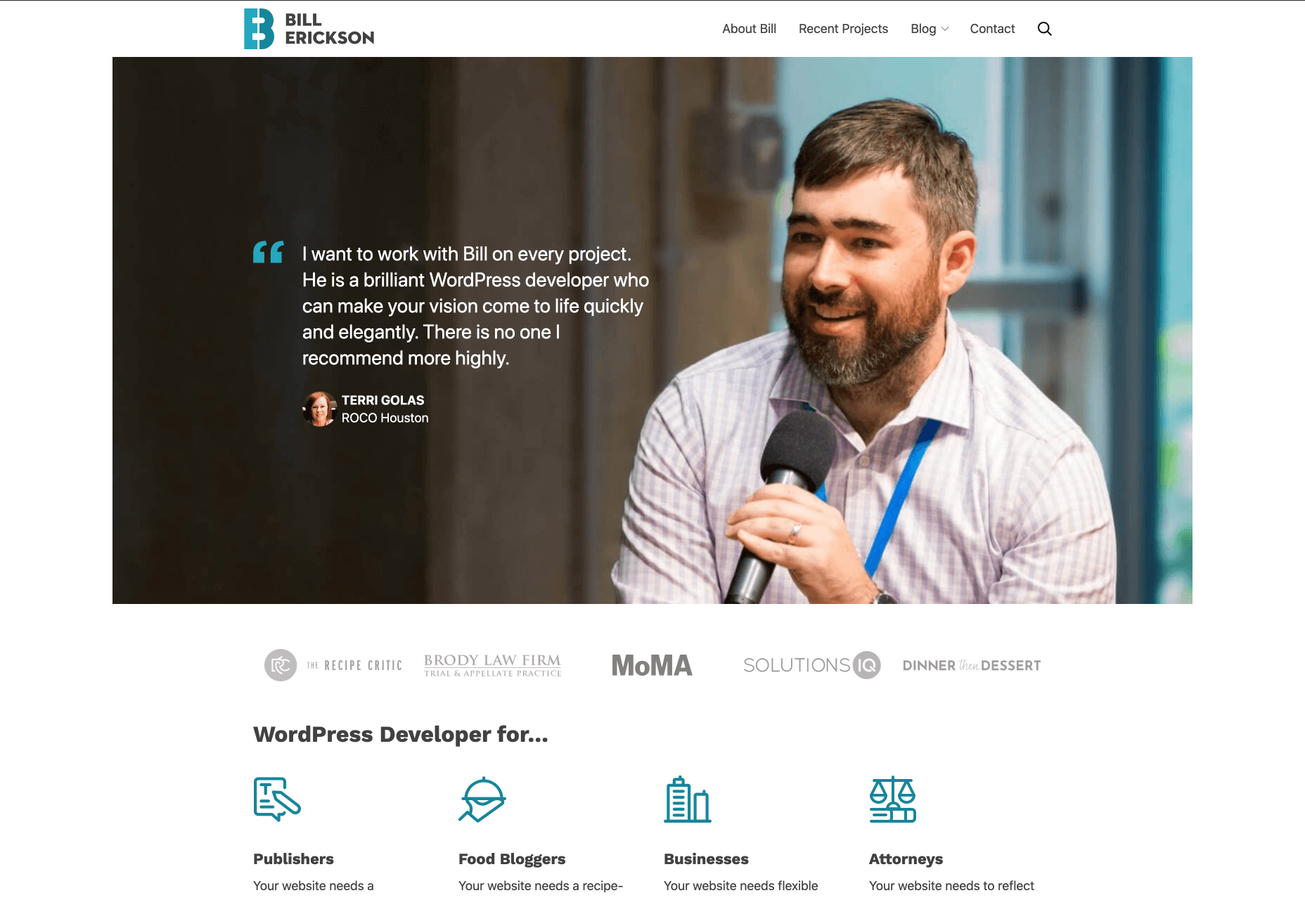
Smart design choices can help reduce the fatigue and frustration people would otherwise feel when using the web.
There are a lot of ways web designers can minimize distractions, information overload, and analysis paralysis. For instance, designing with abundant white space, shorter snippets of text, and calming color palettes all work.
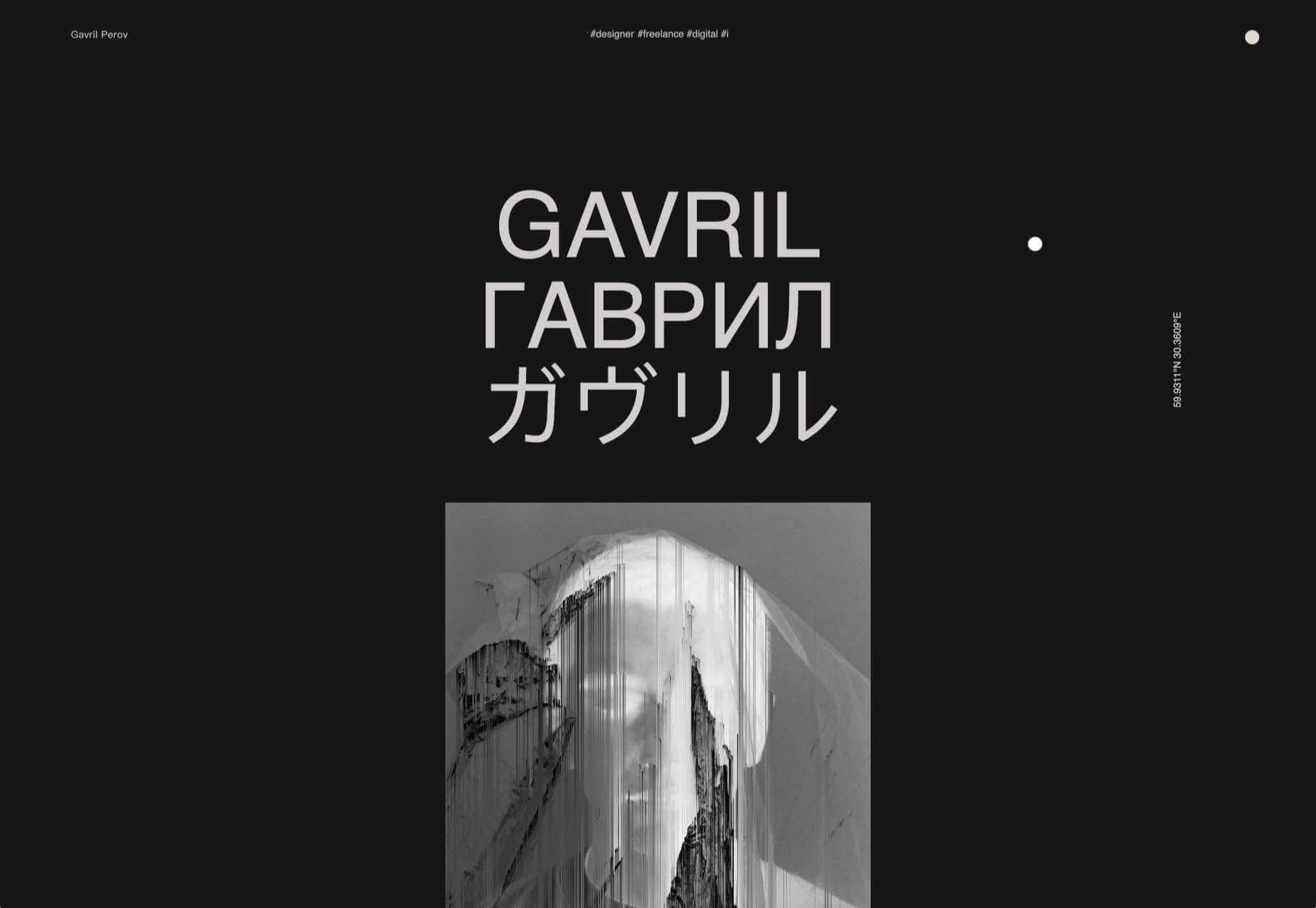
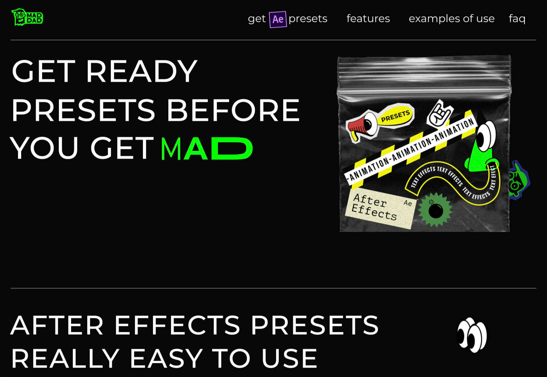
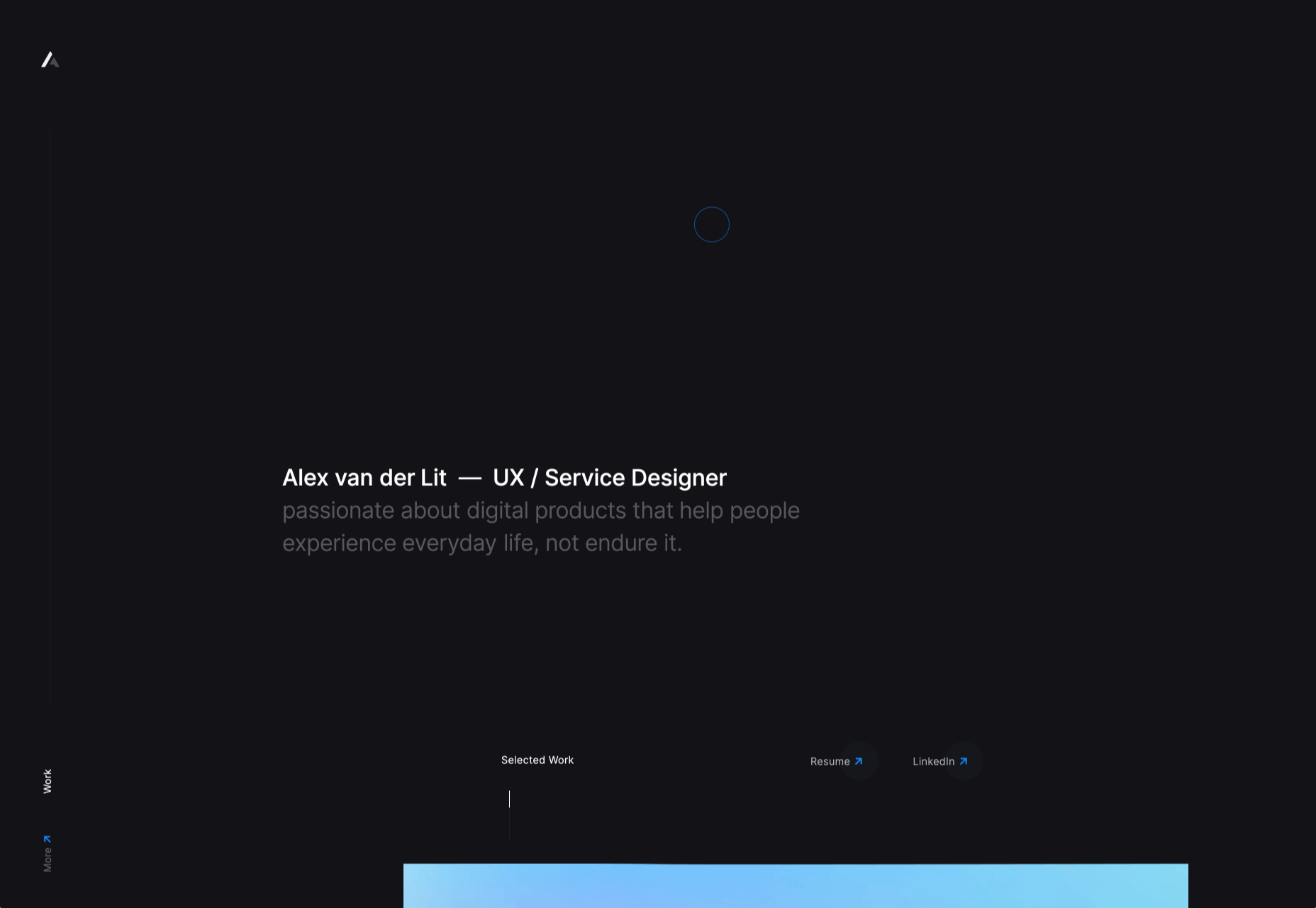
One-page websites might be another design choice worth exploring.
When done right, a single-page website could be very useful in creating a simpler and more welcoming environment for today’s overwhelmed consumers.
With its diminutive structure, it would leave a unique and memorable impression on visitors. What’s more, a well-crafted one-page website would provide visitors with a clean, narrow, and logical pathway to conversion.
For those of you who use BeTheme’s pre-built sites (or are thinking about adopting them for your next site), there’s good news. In addition to the great selection of traditionally structured sites available, Be also has single-page websites for you to work with.
So, the technical aspects you’d need to master to get the one-page formula right are already taken care of.
Let’s have a look at some of the features that make single-page websites shine and how you can design them:
1. Give Visitors a Succinct Journey Through the Website and Brand’s Story
The typical business websites you design include pages like Home, About, and Contact, as well as pages that explain the company’s services or sell their products. Unless you’re building really long sales landing pages, there’s usually about 400 to 600 words on each page.
That’s still a lot of content for your visitors to get through and it can make perusing a single website an overwhelming experience. Imagine how they feel about reading through all that content when they have to do it multiple times when comparing other websites and options.
In some cases, this multi-page website structure is overkill. The information you’d otherwise fill a full page with can easily be edited down to fit a single pane or block on a one-page website and still be as useful.
Like how design and development studio Pixel Lab does it:
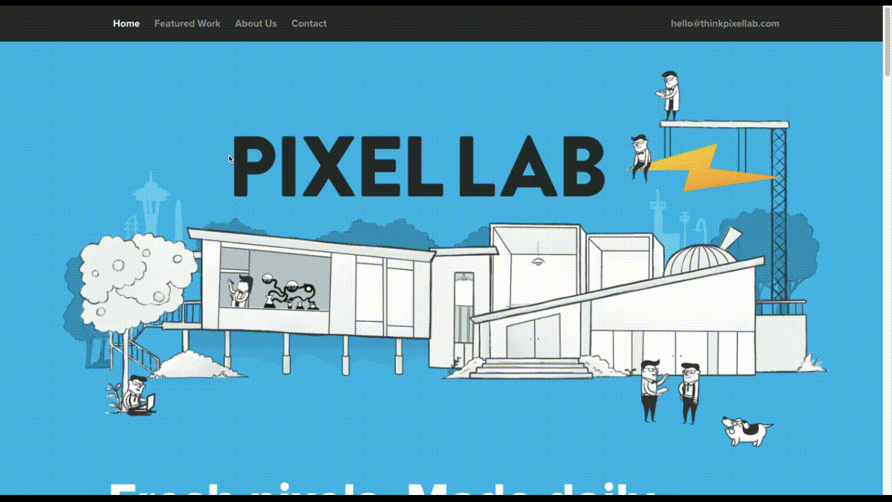
Notice how all the key points are hit in a concise and visually attractive manner:
- The Featured Work portfolio
- The About Us introduction
- The FAQs
- The contact form
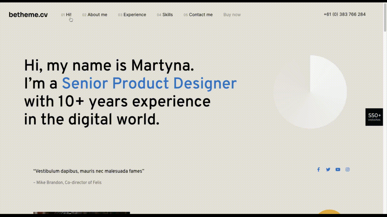
The BeCV pre-built site is built in a similar manner (and for a similar purpose, too):
Just remember to keep a sticky navigation bar present at all times so visitors know exactly how much content there is on the page.
2. Opt For a Non-Traditional Navigation for a Uniquely Memorable Experience
Typically, the rule is that website navigation should follow one of two patterns:
- Logo on the left, navigation links on the right.
- Logo on the left, hamburger menu storing the navigation on the right (for mobile or desktop).
There are a number of reasons why this layout is beneficial. Ultimately, it comes down to the predictability and comfort of having a navigation be right where visitors expect it, no matter where they end up on your website.
However, with a single-page website, this is one of those rules you can bend, so long as you have a way to keep the navigation ever-present and easy to use.
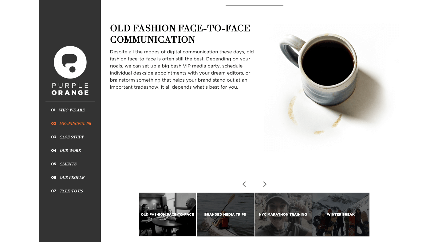
There are some great examples of one-page sites that have done this, usually opting for a stylized left-aligned sidebar that contains links to the various parts of the page. Purple Orange is just one of them:
And you can use a Be pre-built site like BeHairdresser to create a similar navigation for your website:
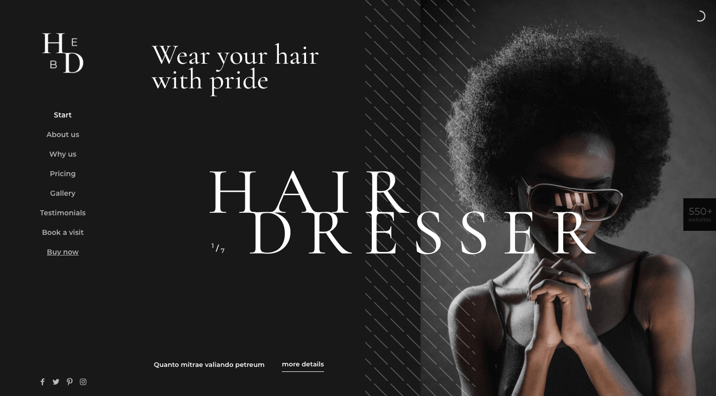
If you’re trying to make a bold brand stand out, this is a neat layout option to experiment with.
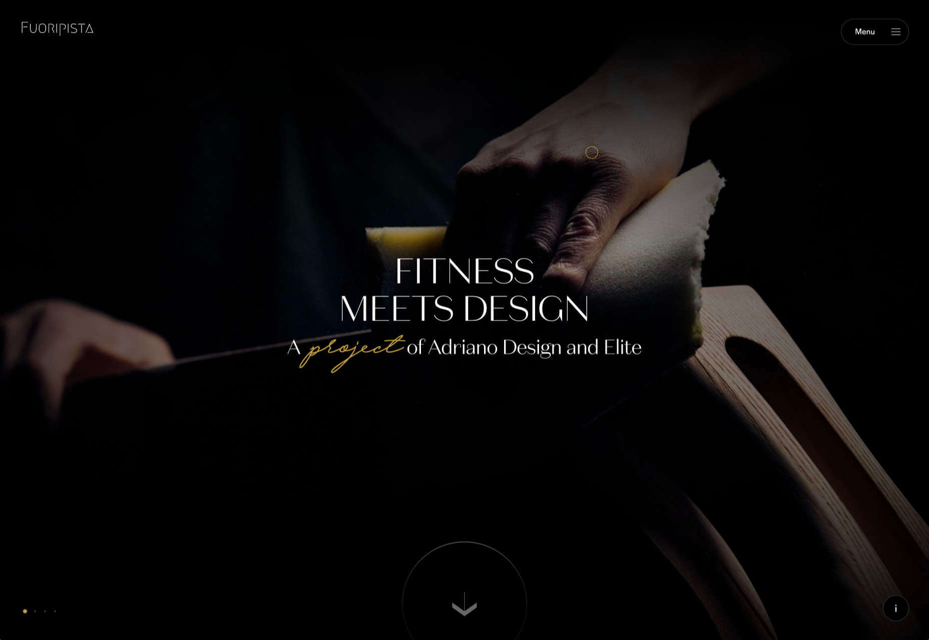
3. Tell a More Visually Striking Story
One of the problems with building a website with WordPress is that you always have to worry about how your design decisions affect speed. Even once the code is optimized, images are usually the low-hanging fruit that have to be dealt with.
But when your website only contains one page, this means images aren’t as much of a problem (so long as you compress and resize them). It’s only when you continue to add pages, products, and galleries that you have to scale back your visual content.
So, if your brand has a strong visual identity and you want the website to show that off through images, a one-page website is a great place to do it.
Just remember to keep a good balance between text and images as Vodka A does:
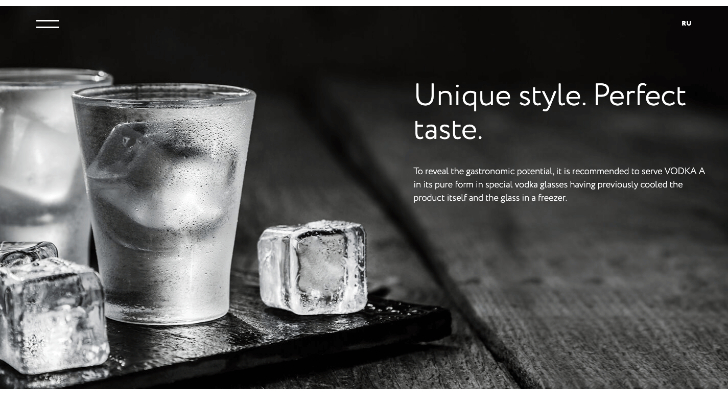
There’s no reason for a liquor distribution company to mince words when the elegant product photos effectively communicate to consumers what it’s all about.
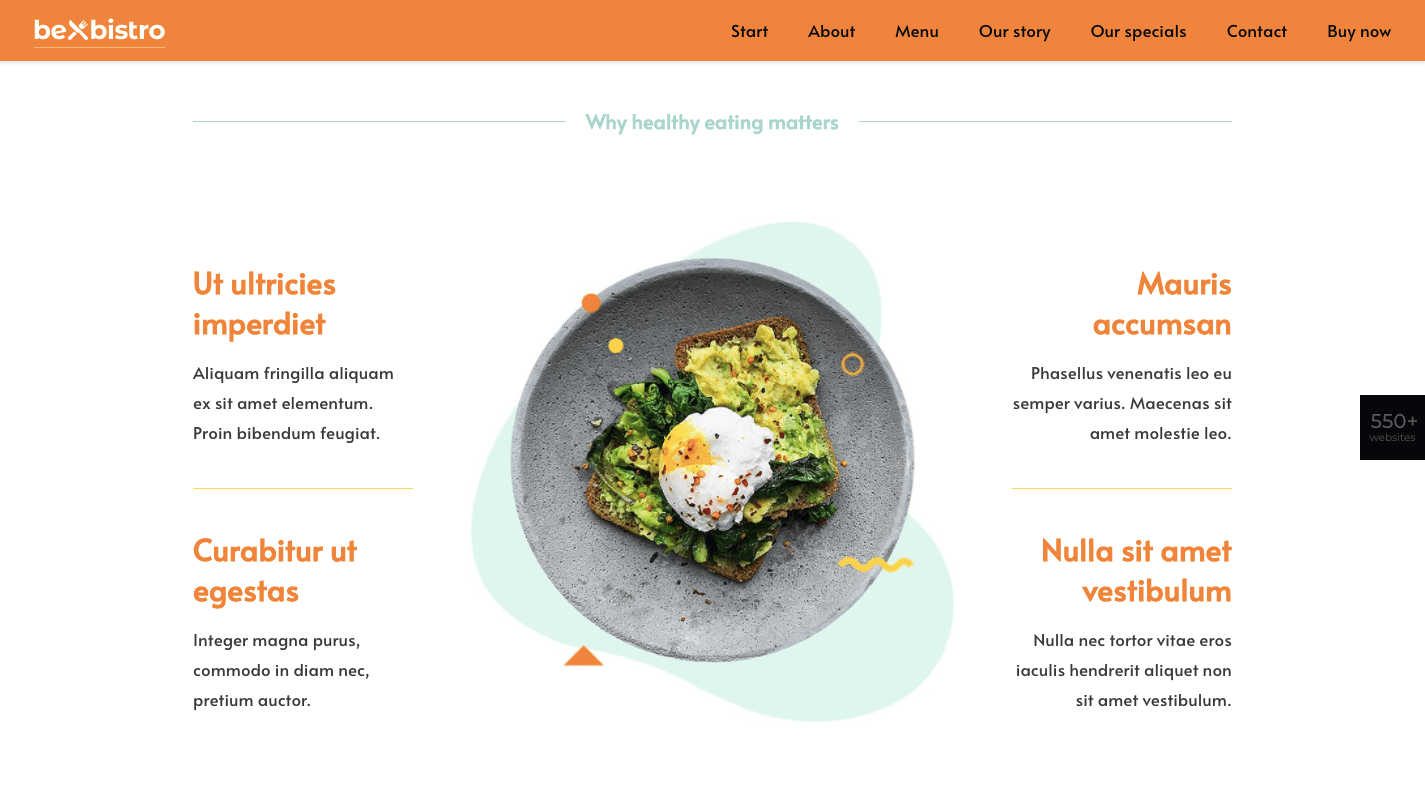
In fact, this image-heavy, single-page style would work well for any vendor selling a small inventory of products: food, beverages, subscription boxes, health and beauty products, etc. And you can use the pre-built BeBistro to carefully craft it:
4. Turn a Complex Business Idea or Offering into Something Simple to Understand
When a company sells a technical or complex solution to consumers, it can be a real struggle to explain what it does and why they should buy it.
But here’s the thing: Consumers don’t really care about all that technical stuff. Even if you were to explain how an app worked or how you use a software like Sketch or WordPress to design a website, their eyes would glaze over.
What matters most to them is that you have an effective and affordable solution that they can trust. So, why bog them down with page after page of technical specs and sales jargon?
A one-page website enables you to simplify even the most complex of solutions.
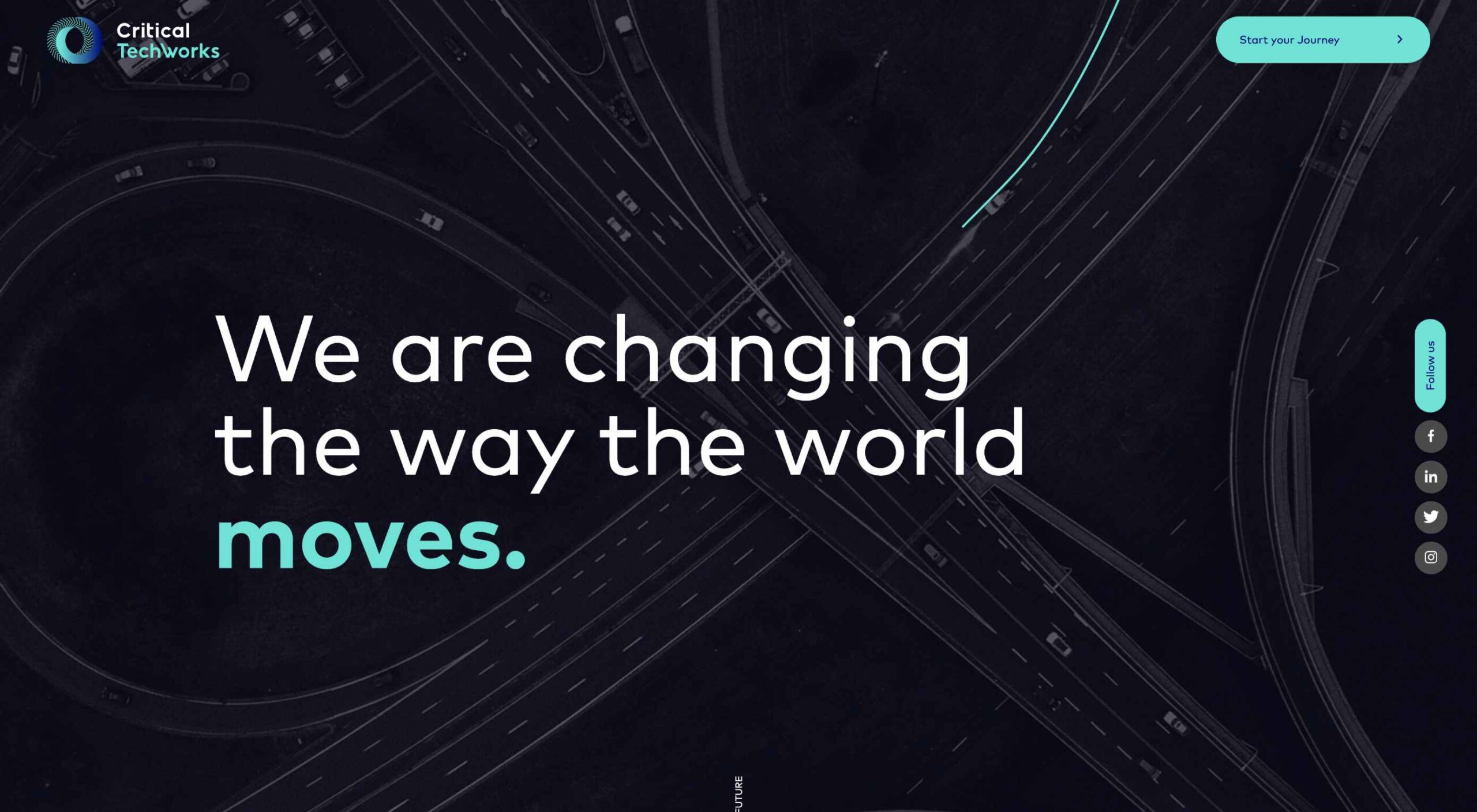
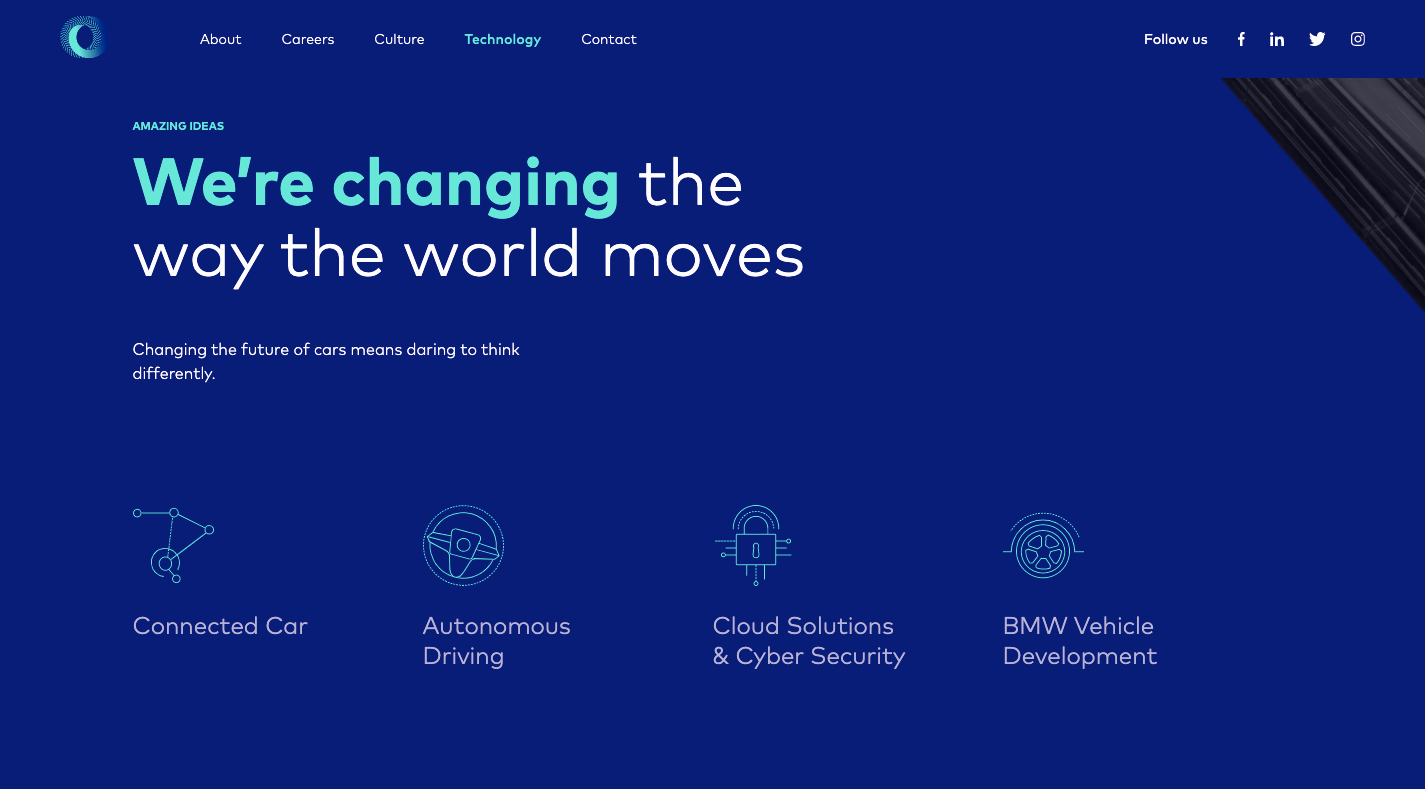
Take Critical TechWorks, for instance. It offers an advanced technological solution for the automobile industry…and, yet, this is all it needs to explain the technology at work:
If your website’s visitors are more concerned with the outcomes rather than the “how”, you’d do well to make the website and content as easy to digest as possible. And you can use a pre-built site like BeCourse to do that:
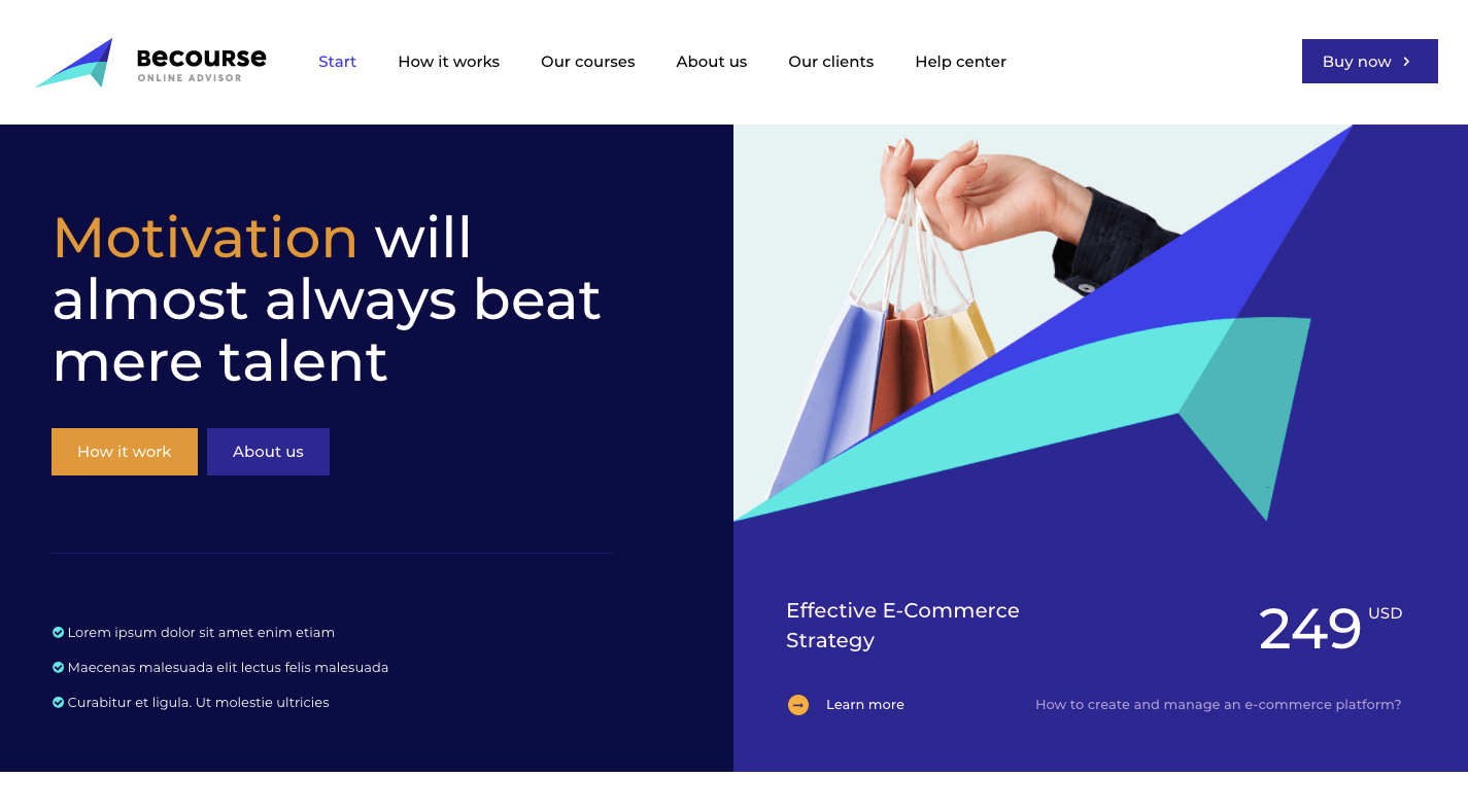
Notice how both of these sites take visitors through a small handful of sections (pages) before delivering them to the main attraction: the contact or sign-up form.
5. Capture Leads and Sales at Different Stages of the Sales Funnel
Some of your visitors will be brand new to the site and need more information before they pull the trigger. Others will already have a good idea of what they’re getting into and just need one small push to get them to take action.
With a single-page website, you can design each section to cater to the different kinds of leads and prospects that arrive there.
The top sections should be introductory in nature, providing new visitors with information they need to decide if this is an option worth pursuing. The sections further below should drill down into the remaining questions or concerns that interested prospects have.
Regardless of which section they’re looking at, your one-page site will have CTA buttons built in along the way that drive them to conversion the second they’re ready.
This will enable your site to always be prepared to convert leads, whether visitors read the first two sections or make their way through all of them until they reach the conversion point (e.g. a contact form, a checkout page, etc.).
You’ll find a nice example of this on the Cycle website, with CTAs strategically placed along the single-page’s design:
BePersonalTrainer is a good pre-built site option if you want to ensure that you include a CTA button at the perfect stopping points throughout your page:
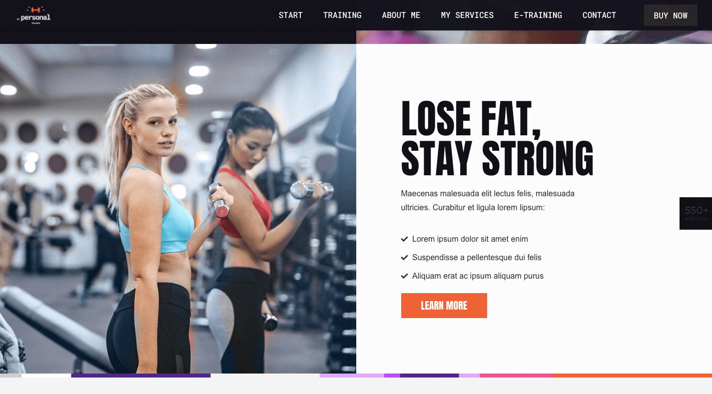
You won’t find them at the bottom of every section, but that’s okay. You just need them whenever your visitors are seriously thinking about taking action.
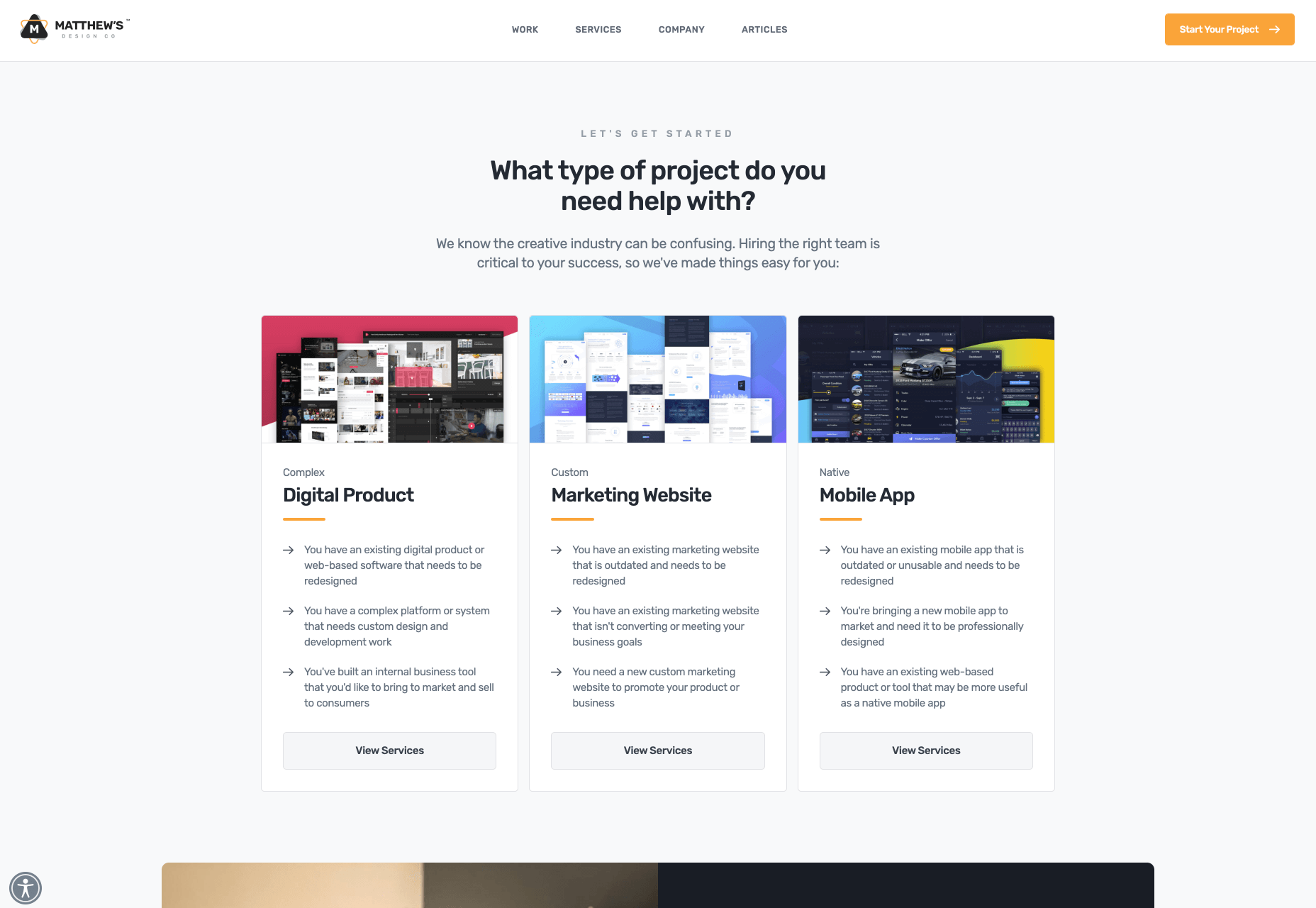
What Should You Build: A Multi-Page or One-Page Website?
Although a single-page website won’t work for larger websites (especially in ecommerce), it could work well for business websites that are on the smaller side to begin with.
By centralizing all of that information into a single page, you’ll create a fresh experience that wows visitors with how succinct yet powerful both the message and offering are.
Just be careful. Many single-page websites are poorly done (which is probably why they fell out of fashion for a while).
Remember: This is not your chance to throw web design rules out the window. In fact, this will be an opportunity to clear out the fluff and the clutter that’s accumulated over the years and to return to a more scaled-back and classic approach to design.
And with the help of Be’s pre-built one-page websites, it won’t require much work on your part to make that happen.
[– This is a sponsored post on behalf of BeTheme –]
Source

Source de l’article sur Webdesignerdepot


 Dark themes are everywhere these days.

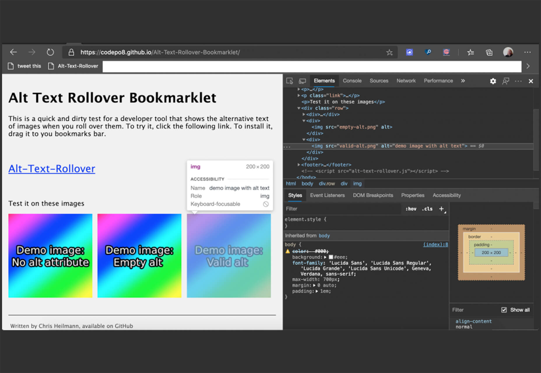
 Every week users submit a lot of interesting stuff on our sister site Webdesigner News, highlighting great content from around the web that can be of interest to web designers.


 Designing for emotion in and of itself is not a problem. Websites are bound to elicit an emotional reaction from visitors, even if it’s as simple as them feeling at ease because of the soft, pastel color palette you’ve designed the site with.
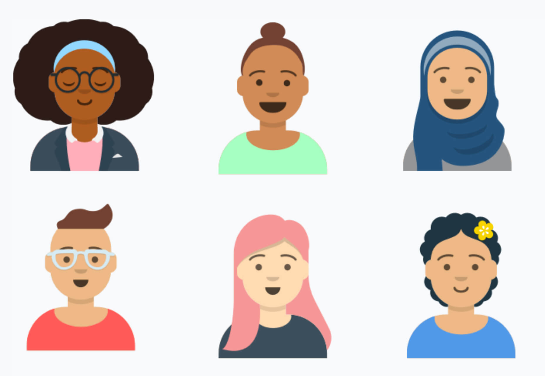
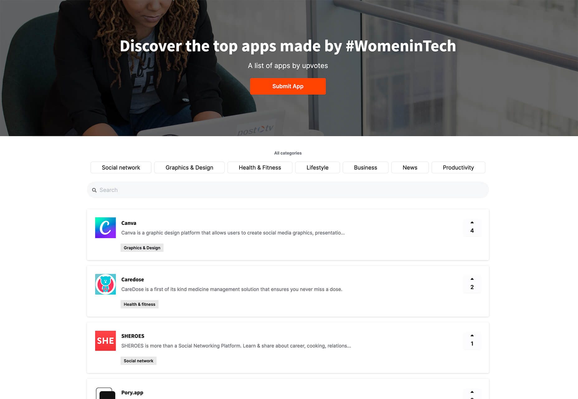
 It’s fun to see new website design tools that reflect current times and the state of the world. That’s very true this month with new databases devoted to diversity and women in technology, as well and resources to make your design life easier.


 As a freelance web developer, how many clients do you get from your website? If you’re like most, you’re probably lucky to get one client every 2-3 months. Unfortunately, that’s very common.
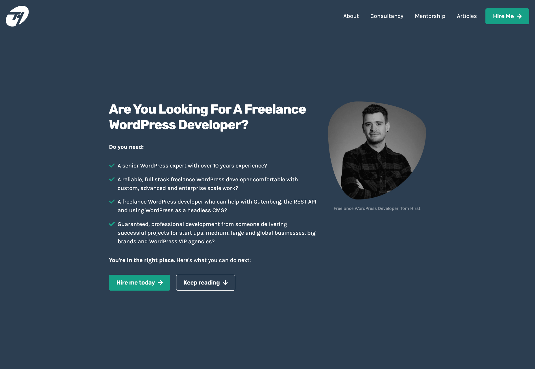