Articles

Domain Authority (DA) is a ranking metric that predicts how well a site will rank online. It goes by a scale of 1 to 100 — the closer you are to 100, the better your odds of ranking in search engine result pages (SERPs), thus giving you more clicks.

To see how your site currently ranks, visit Moz’s free Link Explorer to test your DA. Just type your website URL in the search bar and click “Analyze”. Just remember: don’t kick yourself if your DA is smaller than 30 to 50. If you follow these 9 tips today, you’ll most definitely see your DA score improve.

1. Domain Name Age

You know that old saying, right? Wisdom comes with age. Well, guess what? The same is true for your domain name. If your domain name doesn’t have an ‘old’ age, then it’ll rank lower, and users online might not see your site as legitimate.

But with an older domain name, not only will users see your site as more legitimate, but it’ll also have a much higher DA score than younger domain names. In other words, every time you change your domain, you might be doing more harm than good to it, since you’re actually knocking down the credibility you’ve built up over the years by starting from scratch.

Therefore, pick an easy-to-remember domain name that’s not only relevant to your niche, but it’s also something that you’re willing to keep for a very long time.

2. On-Page Optimization

Then, it’s time to optimize all the following on your pages:

  • Code;
  • Content;
  • Site structure;
  • Metatags;
  • Other on-page elements (H1, Title tags, Image alt tag, Site architecture, etc.).

Improving your DA with optimization can make your site be more search-engine-friendly.

3. Create Great Content

Want to attract high-quality links from multiple domains in your niche? Good news! More attraction to your site comes from creating high-quality content that appeals to your target audience. Otherwise, poor-quality content will only scare people away.

So, in providing the best content possible, that will definitely help you improve your DA score (and even give you many additional SEO benefits).

4. Internal Link Improvement

Why worry about earning external links when your internal links need the most attention? Yes, focusing too much on external links can make you lose sight of linking internally.

So, why internal links? These links help nudge visitors to what they’re trying to look for on your website. In that way, visitors are getting the best user experience, while you reap the rewards of having an increased DA score.

5. Link Profile Clean-Up

Having a clean link profile is essential, since it helps you obtain and maintain a great DA score. So, to clean up your link profile, you must remove the bad links from it.

In this process, you can use tools like:

These tools help you figure out any inappropriate or unwanted links.

After the link audit is complete, contact the website owners to have them either delete the link or add the “nofollow tag” (devalues the link). If this doesn’t work, use the Google Disavow tool to remove said links from your profile.

6. Know Your Niche

When running a site, it’s important for you to be the expert in what you have to offer online – and your DA is no exception to this. Becoming an authoritative figure in your niche allows you to gain the confidence of readers, while providing expert advice to the community.

If you have amazing content (i.e. guest blogs on industry-related forums) and clever ways to engage your target audience, then people will see you as an authority to your niche. This not only enhances your brand, but also increases your DA score.

7. Be Mobile-Friendly

Nowadays, people are on their phones, tablets, etc. Whatever device that they can use on the go, they’ll use. In other words, mobile isn’t just the way of the future – it’s happening right now, outpacing laptops since 2014. So, if your website isn’t mobile-friendly yet, then now is the time to fix that!

If your website hasn’t been optimized for mobile use yet, not only will it hurt your search rankings (since Google favors mobile-friendly sites), but you’ll also lose out on users visiting your site to begin with.

So, go to Google’s Mobile-Friendly Test, and then run a test for your domain. Afterwards, Google will give you a detailed report of how mobile-friendly your site is, and what you can do to improve it.

8. Improve Page Speed

Let’s face it: No one likes to wait for a webpage to load; they want quick results. So, if your site isn’t loading fast enough, then users will get frustrated and most likely go to another site. So, why not improve your page speed?

First, find the cause of your website running slower than it should. You can do this by running your website through Google’s PageSpeed Insights; it’ll analyze the speed of your site. And then, it will identify some effective ways for you to make your site faster and consequently improve your DA score.

9. Utilize Social Media

Finally, it’s important to increase your social signals, when it comes to gaining more authority with your domain. While search engines like Google won’t insist that sites make social signals a priority to increase their rankings, site runners must still take advantage of social media to do the following:

  • Promote their sites;
  • Promote their products and services;
  • Tell people about any events and contests.

As a result, sites are more likely to get likes, shares, and tweets through social media, versus going solo in search engines.

Conclusion

Domain authority is extremely important for your site. First, DA allows you to analyze how well your website does in the search space. Plus, it allows you to compare the performance of your website with that of your rival sites, thus showing you where you stand in search engine results.

So, why not get your site thriving today by improving and maintaining your DA score today? Your site will thank you for it!


Featured image via Unsplash.

Source


Source de l’article sur Webdesignerdepot

When it comes to compliance, website developers need to keep their eyes on more than just ADA regulations and Section 508. Privacy laws are a big consideration and decisions on how to build privacy into a website start with architects. 

And that’s exactly what website developers (and designers!) are. They build up attractive, functional websites and apps for their clients. Yes, they work closely with clients, copywriters, vendors, and other professionals to get the job done, but the developers are the ones who put it all together. 

That’s why it’s critical that website developers are well-versed in marketing privacy laws — these regulations directly impact the end results of their work. But how does a website architect create a digital platform that honors both user privacy and the needs of their clients? 

What Privacy Laws Are Important For Web Developers?

The two biggest privacy laws that web developers need to keep tabs on are the General Data Protection Regulations (GDPR) and the California Consumer Privacy Act (CCPA). Each law has its own unique scope and provisions, but they both shifted the landscape in defining an individual’s rights to their personal data and set mechanisms for how these rights would be protected and enforced.

Each regulation also carries with it fines, fees, and legal measures for non-compliance. These can be substantial. And if that’s not enough, there’s an ever-increasing consumer demand for websites that prioritize privacy and security. Consider these statistics:

  • 82% of Americans surveyed say they are concerned about the security of their online data
  • 79% of adults claim they are very or somewhat worried about how companies use the data they collect about them
  • 63% of Americans believe they understand very little or nothing at all about privacy laws and regulations that are intended to protect their data

How Can Developers Implement These Laws?

Privacy by Design is Critical for Websites

Under GDPR, web developers are required to adopt the Privacy by Design framework, which is a multi-point methodology intended to standardize data protection measures. 

Building privacy into websites shouldn’t happen at the end stages. It should start with how the websites are conceptualized in the first place. Here are points to prioritize:

  • Minimize that data you’re collecting and pseudonymize it to protect data privacy
  • Are you capturing consent? How? Where?
  • Integrating security measures to protect data — anytime you capture data or implement a third party product, a security risk is born.
  • Knowing where you’re introducing privacy and data sharing notices
  • Implement just-in-time notices to provide consumers transparency and build trust 
  • Giving your users the opportunity to manage their personal data

Let’s look at these a little more closely…

Data Minimization is the Goal

Data minimization is an important principle embedded in GDPR. Data minimization itself is a pretty straightforward concept: organizations should limit how much personal data they collect and only process the information necessary to accomplish their business purposes. Once the data is no longer useful, it should be deleted. 

For web developers, this means several things. When it comes to building websites, forms, cookies, and other methods should only ask for essential information. For example, if you are creating a pop-up to collect email addresses, don’t ask for their location unless it’s relevant to the email list and better serving their needs.

How and Where Do You Introduce Privacy Policies and Notices?

Let’s say you take data minimization seriously. That’s great! Now you need to put those data collection practices into words and share them with your customers. 

Privacy policies and notices are a big part of both GDPR and CCPA. Both the CCPA and the GDPR mandate that your privacy policy detail why you’re collecting information and how it will be used, as well as what the individual’s rights are and how they can exercise them. 

CCPA takes a slightly different angle, requiring privacy policies to disclose if the business sells personal data and what third parties have access to the data. CCPA also dictates that privacy policies and notices are current, updated at least annually.  (Nota bene: GDPR also asks for updated privacy documents, but doesn’t specify frequency.) 

How does this translate from policy into web development?

  • If you’re collecting data to improve user experience, allow for targeted ads, or sharing information with third-parties, this information will need to be included in a privacy notice. Remember, CCPA works with a broad definition of selling data, so you may need to account for a “Do Not Sell” link on your home page. 
  • Considering using data beyond these purposes? Plan to obtain explicit user consent for each additional purpose.
  • What’s your plan for the data after the user gives it to you? Where is it stored? Who has access to it? How long are you keeping it? These are all questions that a website developer should consider, and that needs to go into a privacy notice. 

Just-in-Time Notices for Transparency and Trust

Part of Privacy by Design is the use of individual components of your website to create transparency and support compliance. From a development and design perspective, this means you should always be looking for ways to communicate the hows and whys of data collection. 

Yes, your privacy policies and notices aid in this, but going beyond these pieces is important. Customers recognize when businesses go the extra mile for them, after all. 

So consider implementing just-in-time notices at points where users enter their information. These notices are a chance to share your data collection practices with your users. It’s transparent! It’s open! It aids in consumer awareness! 

Keep Users in the Loop

Want to win over your customers? Make it as easy as possible for them to manage their personal data and how it’s being used. This starts with making sure they are aware of why you’re requesting their information and how you’re planning on using it for the website. You should also:

  • Get user consent — clear and unambiguous user consent — prior to gathering any data at all. This includes cookies.  
  • Don’t pre-tick boxes for consent. Just don’t. (It’s bad practice AND it’s against GDPR.)
  • Link to all legal documents on the site. Users should be required to agree to them before using the service. 
  • Want to send marketing communications like email newsletters to your customers? Make sure they agree to this. Expressly. 

One helpful tool for keeping users in the loop is a marketing preference center. A marketing preference center allows users easy access to their information. From there, they can manage, edit, and delete their information at their discretion.  

Bonus? A marketing preference center is an excellent point at which to communicate a business’ commitment to privacy. While users will pick up this through all the discrete elements of privacy on your website, putting it all into one hub that also allows users control over their data really reinforces this message. 

Remember, it’s not just on the consumer to manage their data. Web developers should commit to managing the data in their systems. This means they should:  

  • Maintain accurate and clean records of users’ data consent preferences
  • Send regular reminders to users to update their personal information in your system
  • If a user deletes their account, promptly delete all of their personal information  
  • If your client goes out of business or is sold, they should delete all personal information in their system

Make it User Friendly

A final point: making your websites user friendly is important regardless of privacy compliance. Users expect websites that don’t make them think deeply about, or worry about, their privacy. Make it accessible and easy. Don’t make people figure it out on their own.

Give them value for sharing their data

Your users don’t have to share their data. They’re choosing to. So in exchange for their personal information, make sure you’re using it to provide a user-friendly website. Offer them a secure, enjoyable experience.  

But don’t ask for more than you need

Let’s loop back around to this point again. While consumer data can help you build a better website, don’t plan your websites around it and don’t demand data to create a good experience. 

Usability, web design, and website security; all of these things benefit from consumer data. But privacy laws should always guide how any personal data is collected and used, and respect for consumers’ individual rights, and honoring their privacy should be top-of-mind for web developers. 


Featured image via Pexels.

Source


Source de l’article sur Webdesignerdepot

We have become so used to using web sites just to buy stuff that it is easy to forget that the web has more to offer. So this month we’ve included some because-it’s-interesting sites, some micro-sites and some just-for-the-sake-of-it projects.
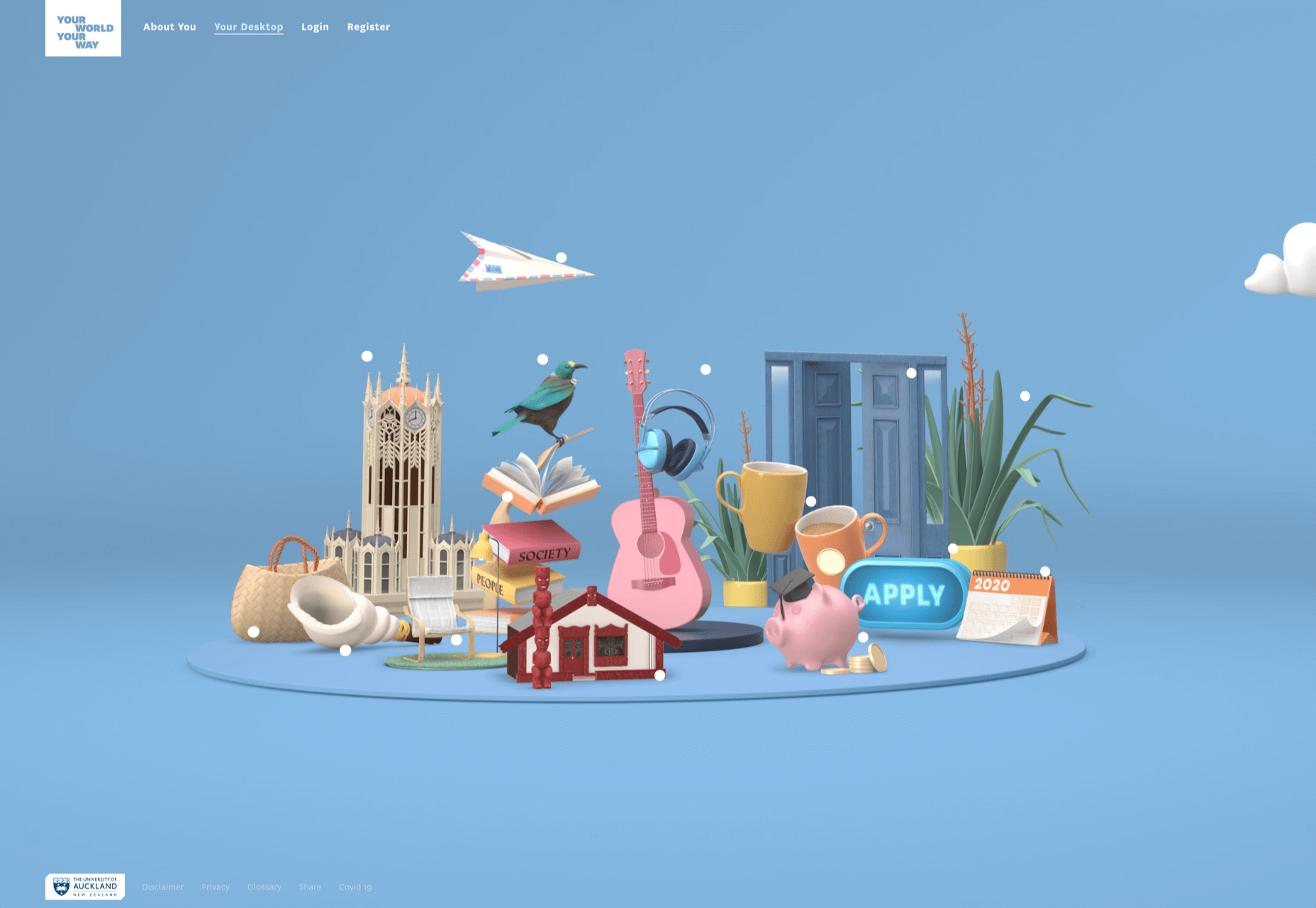
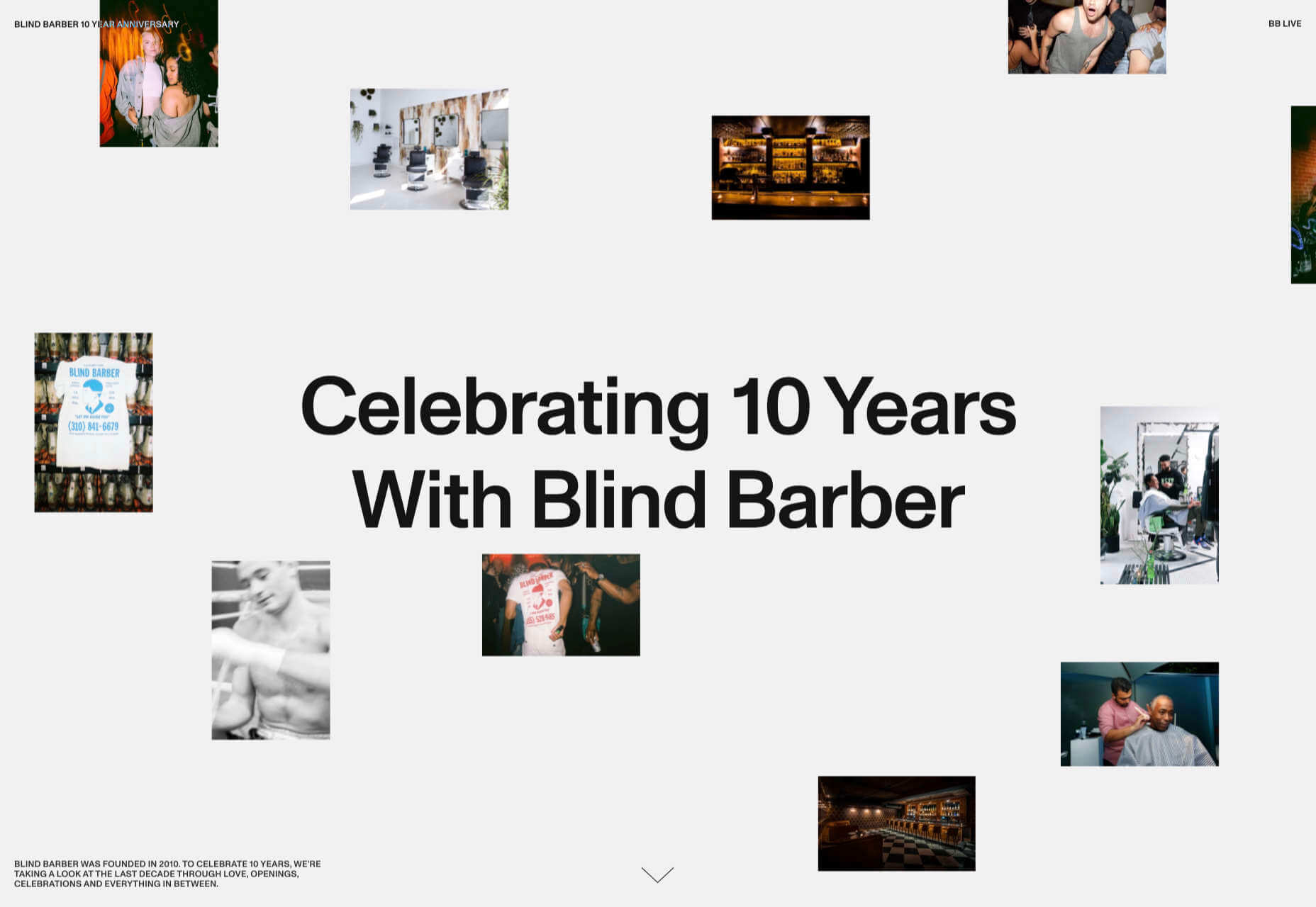
Many of these are about selling or promoting products and services too, but in a more oblique way that is frequently more engaging than a straightforward sales site.

Micro sites can be a great way of including content that doesn’t fit in neatly with the rest of the main site, or is temporary, or to show a lighter, more fun side of a brand. And a well thought out micro site can act as a gateway to pull in even more visitors to its ‘parent’ site.

Your World Your Way

Your World Your Way is an interactive portal for the University of Auckland. An optional questionnaire customizes the experience, and clearly a lot of effort has gone into this in terms of the questions and possible answers, and the presentation. It is engaging and enjoyable to use, and the information provides links to the main University of Auckland website.

Blind Barber

This micro site is to celebrate 10 years of barber shop chain Blind Barber, which started as one shop with a bar in the back room, in New York’s East Village. An entirely black and white design provides a clean backdrop for color photos and videos, and some great scrolling animations give a pleasing flow to the content.

Brews & Grooves

Brews & Grooves pairs records with different beer. Although a ‘fun’ project, it is still a well designed piece of work with some vintage style typography and some pleasing rollover animation effects. It is an effective advert for those involved in creating it, as listed in on its ‘credits’ page.

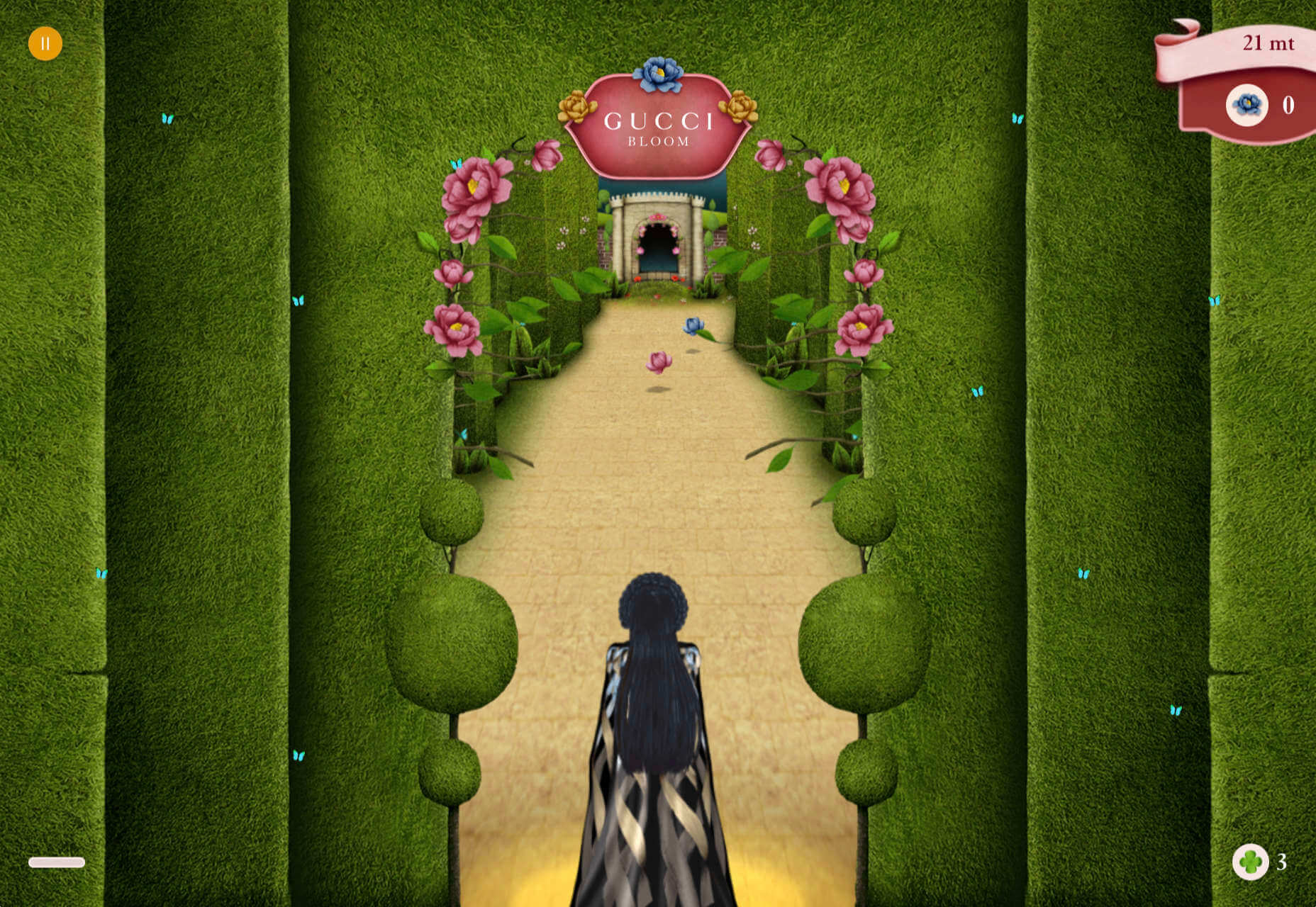
Gucci Bloom

As part of a new campaign to promote it’s ‘Bloom’ perfumes, Gucci have created a Gucci Bloom game. The player has to pick up flowers and perfume bottles, but miss a flower and the vines get in your way.

808303Studio

808303Studio is a digital musical instrument that emulates a Roland TR-808 drum machine and TB-303 bass synthesizer, created in conjunction with the Design Museum (London). It’s fully programmable and there is even short video tutorial with A Guy Called Gerald on how to use it.

Aelfie

Aelfie is a home furnishings brand with a focus on bold patterns and bright color. Their site reflects this with its use of block color, irregular grid, drawings, and type that feels a little off-kilter. It creates a hand-made feel that embodies the brand aesthetic rather well.

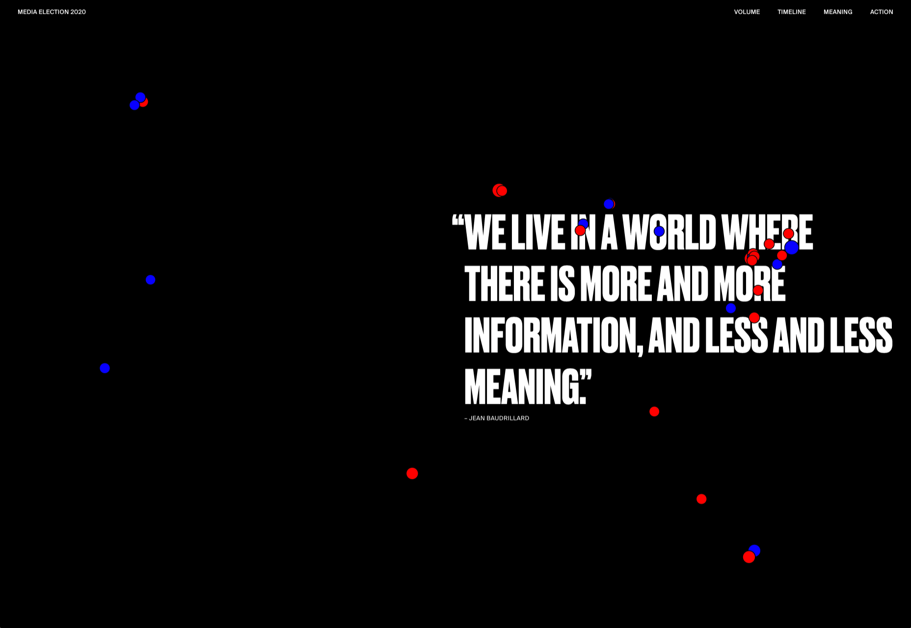
Media Election 2020

As we approach one of the most significant, not to mention acrimonious, elections in US history, Media Election 2020 uses AI to analyze the volume of media attention each candidate receives, in real time.

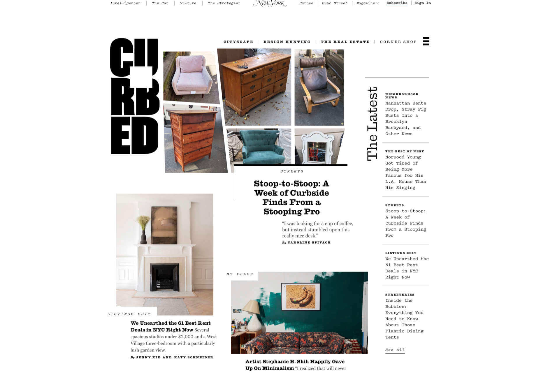
Curbed

Magazine website Curbed has now become a part of New York magazine, and had a redesign in the process. It follows a discernible grid, but distorts it just enough to create an edge. The highlighter color frames, and underlines on rollover, add movement and ‘cool’.

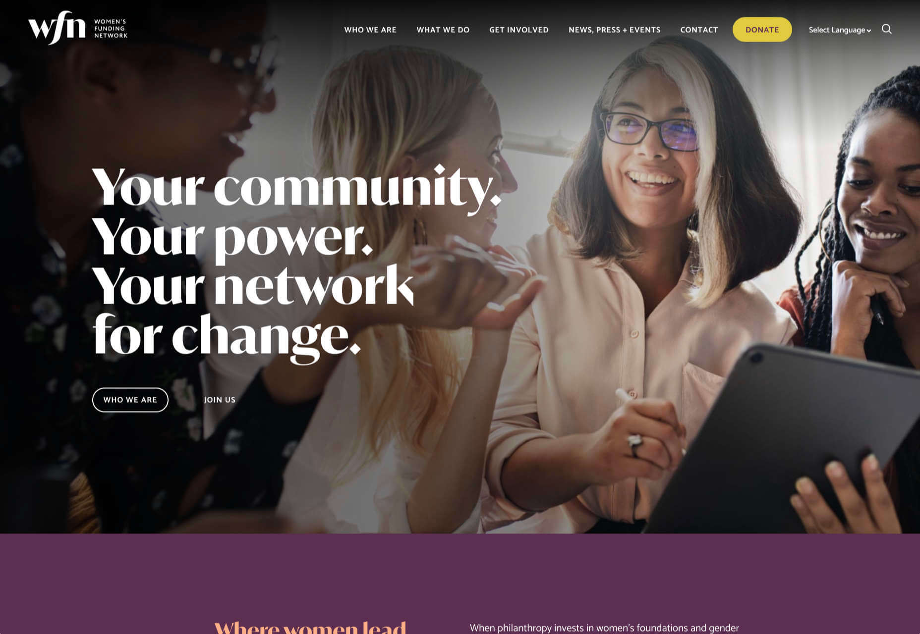
WFN

The WFN (Women’s Funding Network) is an alliance of funds and foundations working to promote gender equity and social change internationally. The site is clean, with strong typography and a sophisticated color palette.

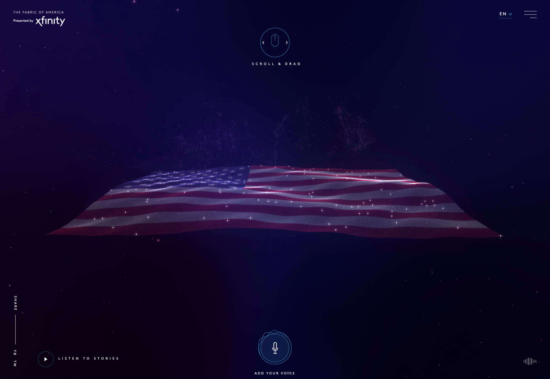
The Fabric of America

Internet, telephone and TV service provider Xfinity is behind the Fabric of America project. It is a collection of voice recordings, the idea being that each voice, and each person’s story, is a thread that makes up the flag that we see on the screen.

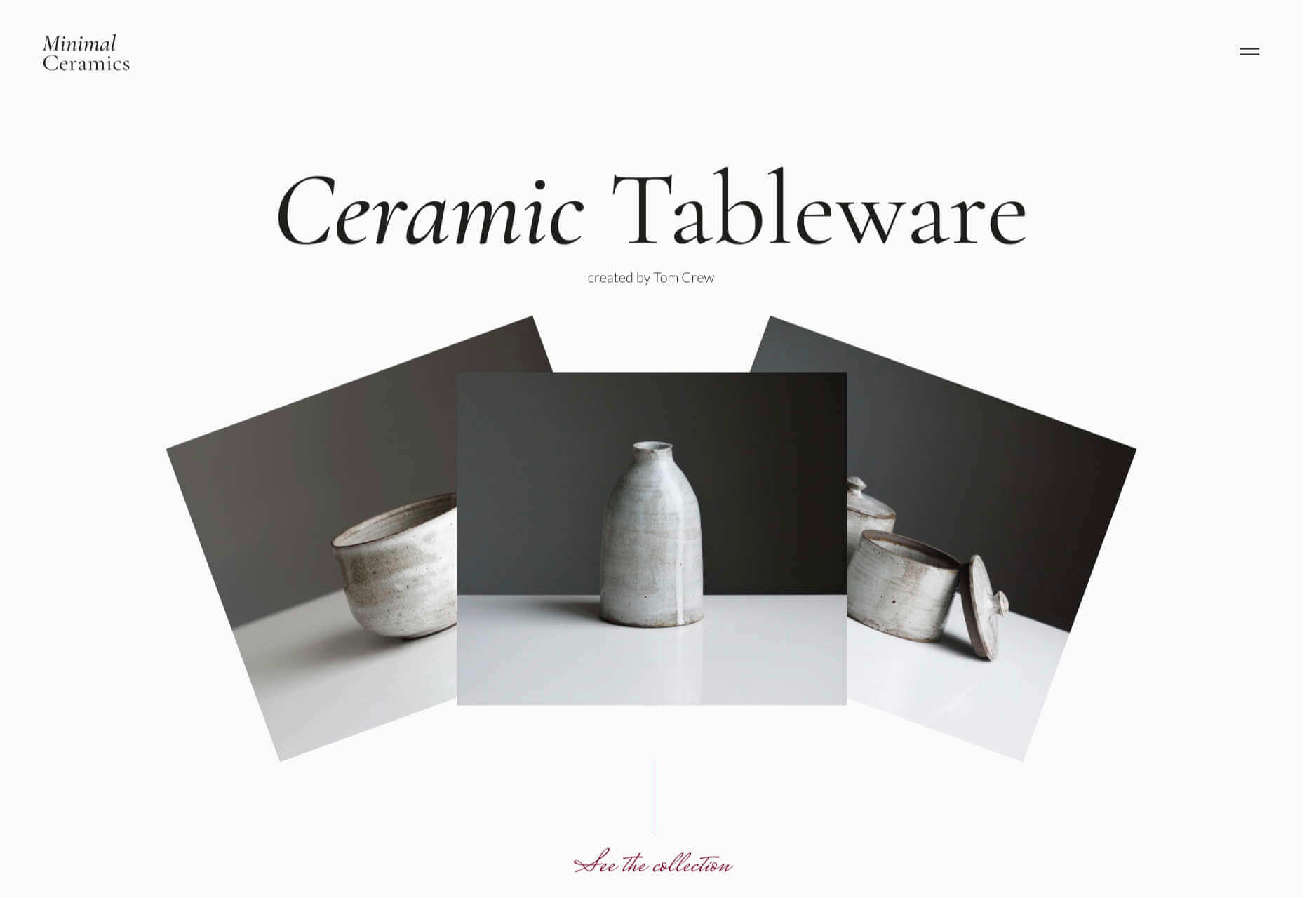
Minimal Ceramics

Minimal Ceramics is a concept site, showcasing the work of London based potter, Tom Crew. The design of the site reflects the simplicity of the showcased work, using great photography and simple typography.

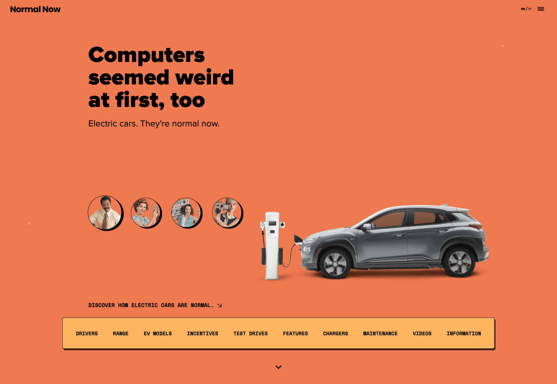
Normal Now

Normal Now is part of an awareness campaign to highlight to consumers the positives of electric cars. Taking a fun approach to engage consumers in a serious subject, it uses a fake retro tech style.

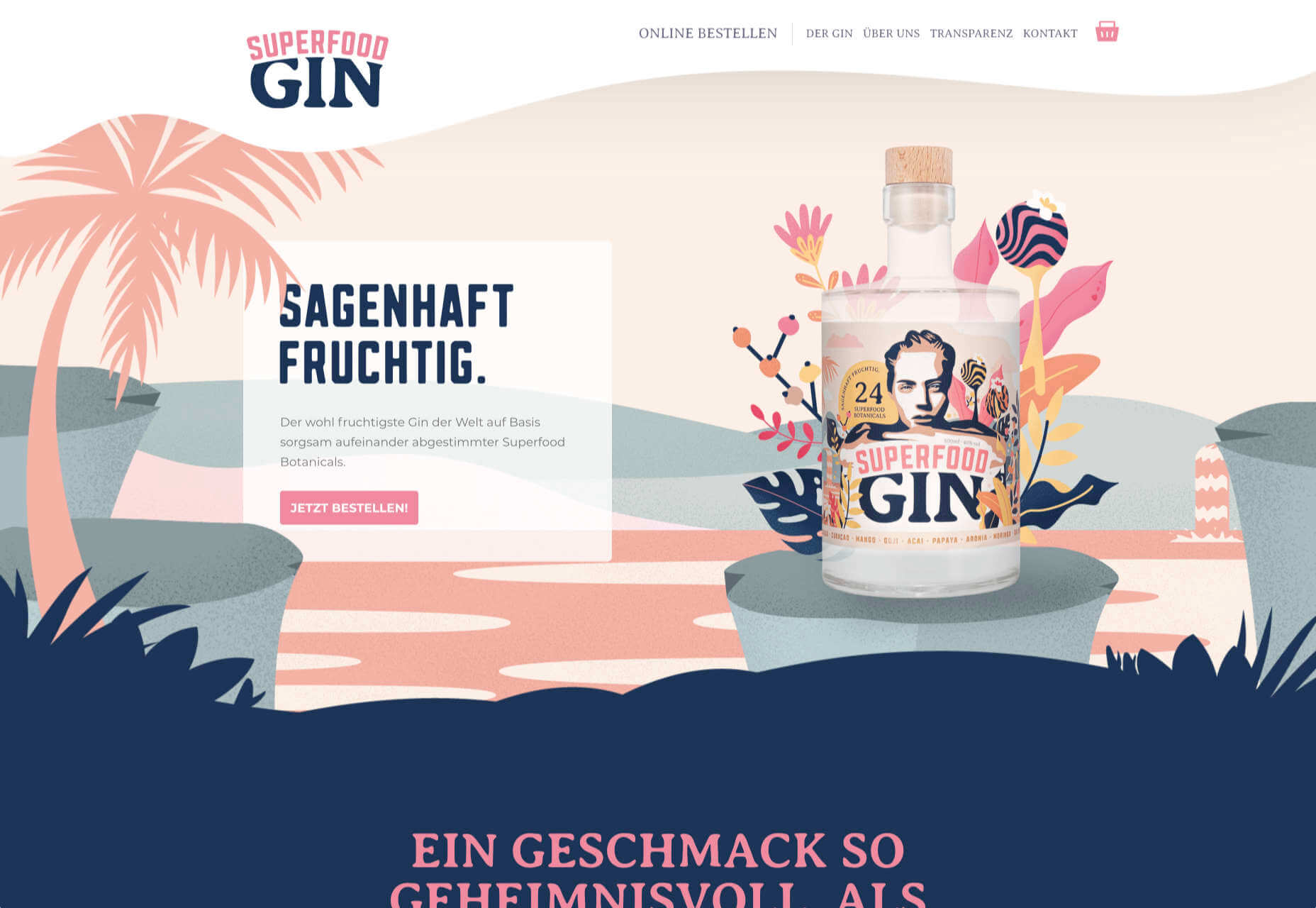
Superfood Gin 

Superfood Gin is a gin made using superfood botanicals, that claims to be fruity and fresh rather than crisp and peppery. The soft color palette, along with the soft lines and curves in the background illustrations, reflect this well.

Maison Louis Marie

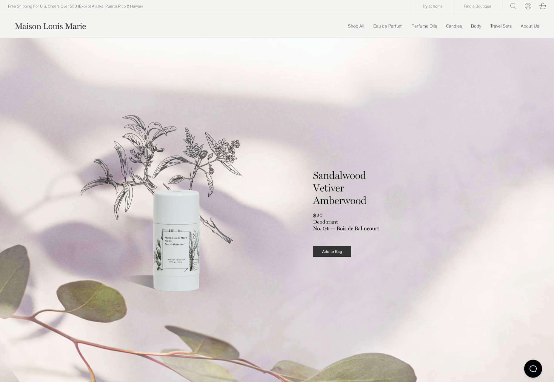
Maison Louis Marie is a natural fragrance company. While this site does nothing really groundbreaking, it does it well. Botanical drawings on a white background, along with clean typography, help create a refined, luxury feel.

Think Economia

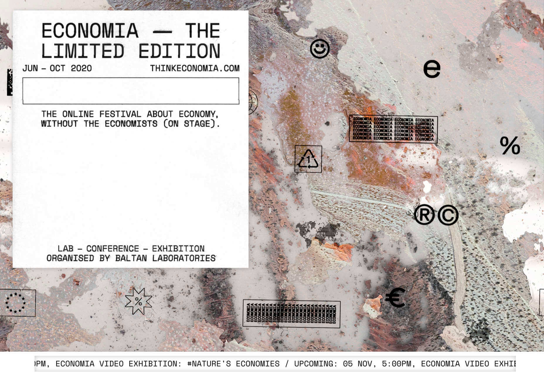
Think Economia is a platform taking a fresh look at economics and the future of economic growth. It doesn’t sound like the most exciting subject, but it is presented here in a playful and intriguing way.

Chernobyl

From Uprock, a Russian design studio that also offers courses in web design, Chernobyl is a thought provoking exposition of the Chernobyl disaster. The design aesthetic is muted, allowing the images their deserved impact, and the brief sections of text to be absorbed.

Declamatuus

Declamatuus is a lingerie company selling gift sets. What stands out here is what you don’t see — live models in underwear. Instead the outline of the body is created with animated particles.

Odisea

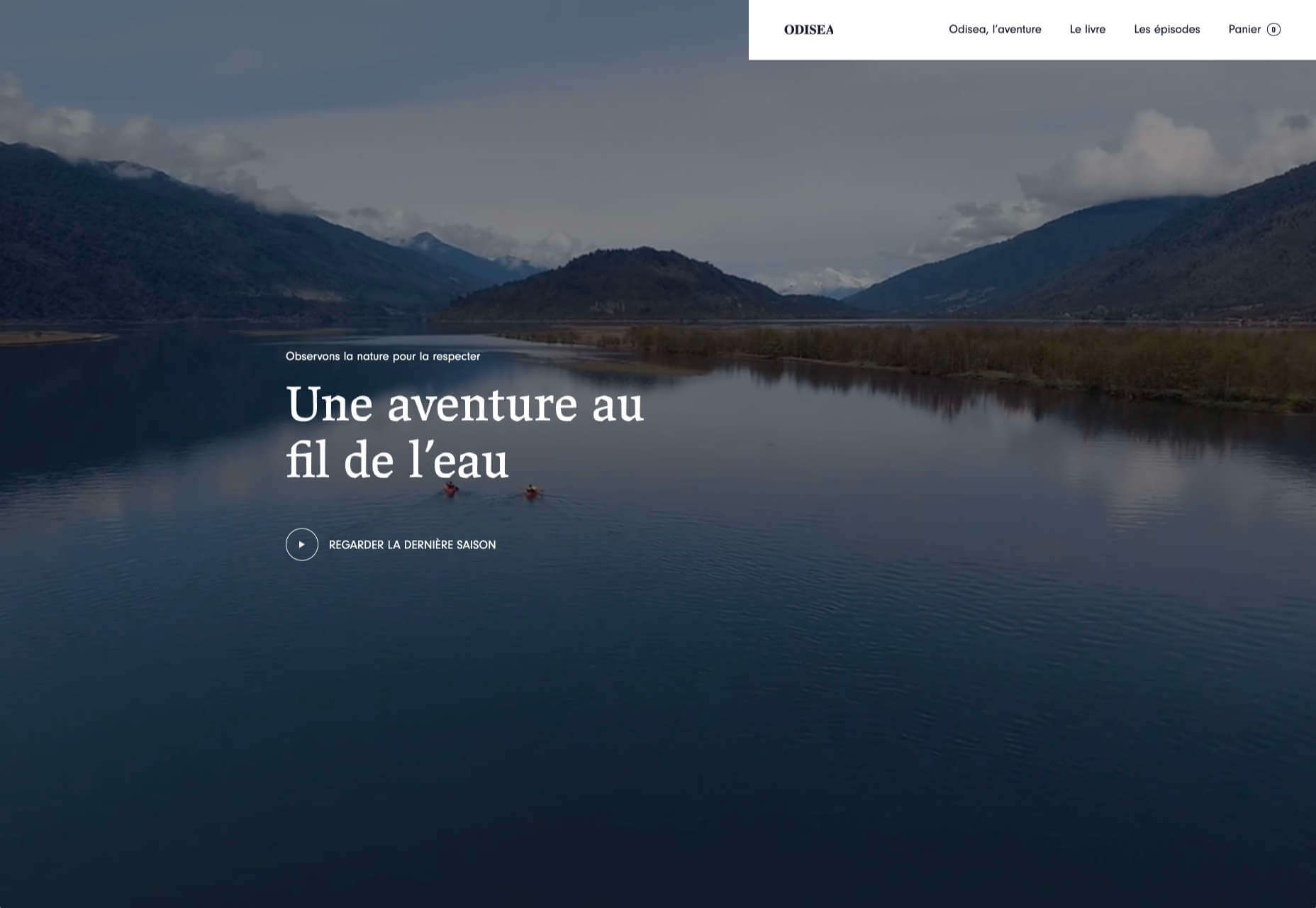
Odisea Expedition is a documentary series following two friends, a surfer and a snowboarder, as they explore remote parts of the world. The photographs and video are everything here, and all other elements are kept minimal to avoid detracting from them.

Riffyn

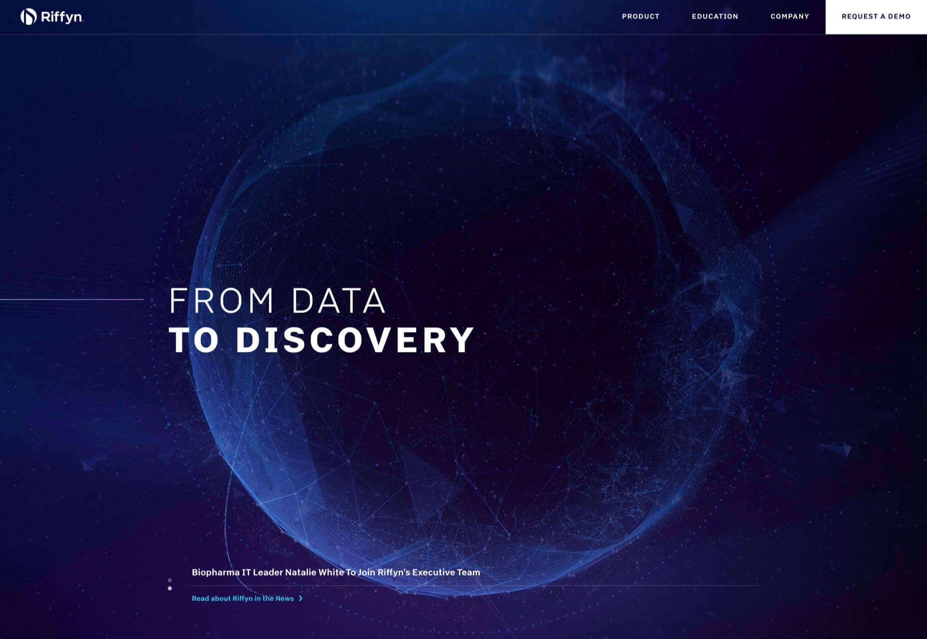
Riffyn Nexus is a ‘Process Data System’ for storing and analyzing scientific data for laboratories. It is a very corporate site and yet it is put together in such a way that doesn’t feel dull.

Maison du Net

This site for digital design agency Maison du Net takes a risk mixing corporate with cutesy, but it works. Offset frames and underlines create interest without overdoing it, and the very bright green is used sparingly enough to liven things up without being overwhelming.

Source


Source de l’article sur Webdesignerdepot

Comment améliorer, contrôler et automatiser ses processus ? L’utilisation de SAP Cloud Platform permet aux entreprises d’atteindre leurs objectifs de Process Excellence.

Une connaissance fine des processus et la capacité à les améliorer en continu sont les clés de l’excellence opérationnelle de l’entreprise. Ceci nécessite agilité, collaboration, automatisation et intelligence dans les processus.

Cet objectif d’excellence des processus peut être atteint au travers d’un cycle comprenant quatre étapes :

  1. compréhension des processus ;
  2. amélioration des processus ;
  3. automatisation des processus ;
  4. surveillance et ajustement des processus.

« Il est essentiel de comprendre les processus existants, avant de pouvoir les améliorer et en tirer plus de valeur », résume Olivier Enault, Presales for Information & Process Excellence, SAP France. La première phase consiste donc à découvrir les processus au travers de la technologie Process Mining de Celonis, qui va les détecter et les analyser.

Redessiner les processus avec SAP Cloud Platform Workflow

SAP Cloud Platform Workflow va permettre de créer ou redéfinir des processus, de façon transparente et simple. « SAP Cloud Platform Workflow propose un moteur complet de design et d’orchestration des workflows, explique Laurent Rieu, Business Development Director EMEA, SAP. Il permet de digitaliser des processus précédemment basés sur des opérations manuelles (par exemple des échanges de mails) et de les orchestrer de manière rigoureuse. »

L’exemple type de processus RH est l’arrivée d’un nouvel employé. En liaison avec le SI, le processus va enchainer des actions, combinant des règles métiers prédéfinies et des tâches effectuées manuellement. Un premier manager va par exemple vérifier que le coach et le matériel assigné à l’employé sont les bons. Un second va se charger d’organiser le déplacement du nouvel employé, lié à sa formation, etc. Et en fin de chaine, il sera possible de collecter l’expérience utilisateur au travers de l’offre Qualtrics, afin d’améliorer encore ce processus.

Automatiser les processus avec SAP Intelligent RPA

Toutes les tâches sans valeur ajoutée sont ensuite automatisées au travers de SAP Intelligent Robotic Process Automation. « Lancés par les utilisateurs ou déclenchés automatiquement suivant un évènement donné, les robots proposent un ROI très rapide, témoigne Laurent Rieu. Les projets de RPA sont courts (quelques semaines) et libèrent immédiatement du temps pour les collaborateurs de l’entreprise. »

L’objectif n’est pas d’éliminer l’humain de l’équation, mais d’automatiser tout ce qui peut l’être. Selon les cas, les processus seront donc entièrement automatisés (sous la supervision d’un responsable) ou partiellement automatisés, les robots servant alors de lien et de support aux différents intervenants.

Déploiement et surveillance assurés par SAP Cloud Platform

Les processus sont déployés par la suite sur SAP Cloud Platform. Le monitoring est alors pris en charge par SAP Cloud Platform Process Visibility. Cet outil offre une vue en temps réel des processus et de leurs instances et fait remonter immédiatement les informations sous la forme d’indicateurs de performance destinés aux utilisateurs métier. Ainsi, des tableaux de bords permettent d’identifier rapidement tout incident ou ralentissement.

Les informations fournies par SAP Cloud Platform Process Visibility serviront de base à un nouveau cycle d’amélioration et d’automatisation des processus. C’est cette boucle d’amélioration continue qui permettra d’atteindre l’objectif d’excellence des processus.

Accélérer la mise en œuvre des projets de digitalisation et d’automatisation des processus

Maintenant que la proposition de valeur des activités de digitalisation et d’automatisation des processus est claire, la question importante reste la suivante : « Comment accélérer la réalisation de tels projets ? ».

SAP Cloud Platform ne se contente pas de fournir les briques technologiques pour implémenter ces scénarios de digitalisation et d’automatisation des processus. Nous allons plus loin et proposons des modèles complets de processus, de robots d’automatisation et de tableaux de bord de pilotage prêts à l’emploi pour permettre de simplifier la mise en œuvre rapide de tels scénarios, tout en fournissant la flexibilité requise pour assurer l’adéquation entre ces modèles et les besoins de nos clients.

Vous trouverez ainsi une collection grandissante de robots d’automatisation prédéfinis sur notre site en ligne Intelligent RPA Store

Vous trouverez également un ensemble de modèles de processus et de tableaux de bord sur notre site API Business Hub

The post Atteignez l’excellence des processus avec la SAP Cloud Platform appeared first on SAP France News.

Source de l’article sur sap.com

When starting a new business (or even venturing into the world of freelancing for the first time), there are some really big, important steps you have to take.

Step #1 is choosing the right business name for your brand identity.

Your business name isn’t something you can casually choose either — especially if you have lofty long-term goals for your company. It’s not as though you can’t change the name down the road, but that comes with a ton of work and will require you to rebuild pretty much everything all over again: your visual brand identity, your reputation, and your SEO…

So, it’s a good idea to spend time choosing a business name that’s going to work for you now and long into the future.

Today, we’re going to go through the process of how to name your brand. These questions will have you thinking beyond just “What name do I like the sound of?” and have you more focused on important questions like “What is my unique value proposition?”.

Let’s get started:

How to Name Your New Business

For those of you considering taking the easy way out and using a business name generator tool, let me show you why that’s a bad idea:

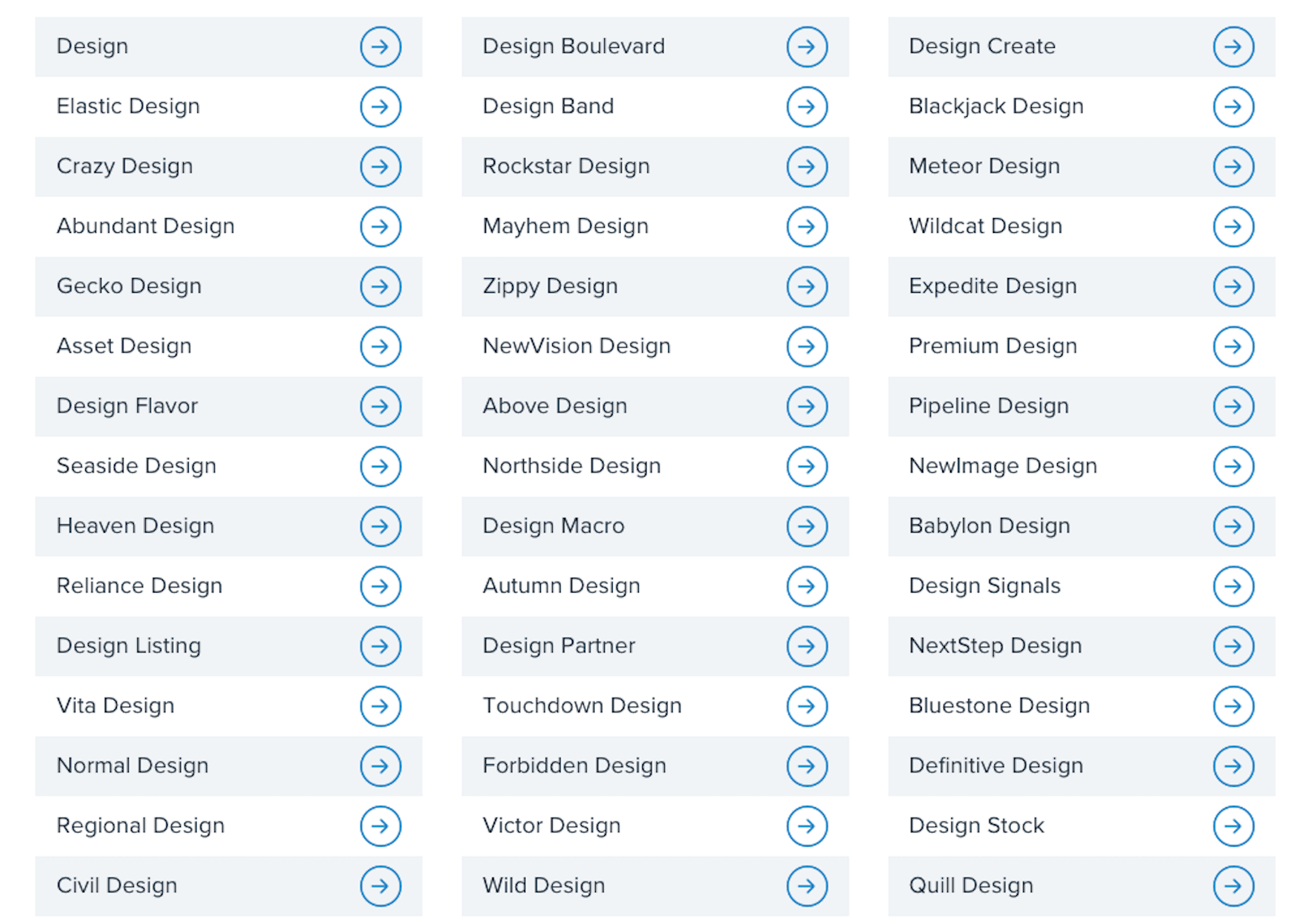
This is a list of business names suggested to me when I told the generator that my business is related to “design”:

  • Design
  • Normal Design
  • Regional Design
  • Design Partner
  • Design Stock

Even the more unique names on the list are unusable; they have no connection to me personally or to the kind of business I plan to start.

This is why it’s so important to sort out your brand identity and make sure you pick a business name that resonates with you, and your target audience. To do this yourself, answer the following seven questions:

1. What Services Will You Provide Or Products Will You Sell?

The one thing that name generators get right is including a descriptive word related to your business. That way, it doesn’t take an actual visit to your website or a look through your portfolio to figure out what you do.

Even if you have a very niche specialty, sum up your offering in one or two words. For instance:

  • Web design
  • Digital design
  • Design & development
  • UX design
  • Graphic design

Unless you run your business through your own name (which I’ll talk about shortly), your business name should include a simplified version of your offering in it.

2. Who Is Your Target User Persona?

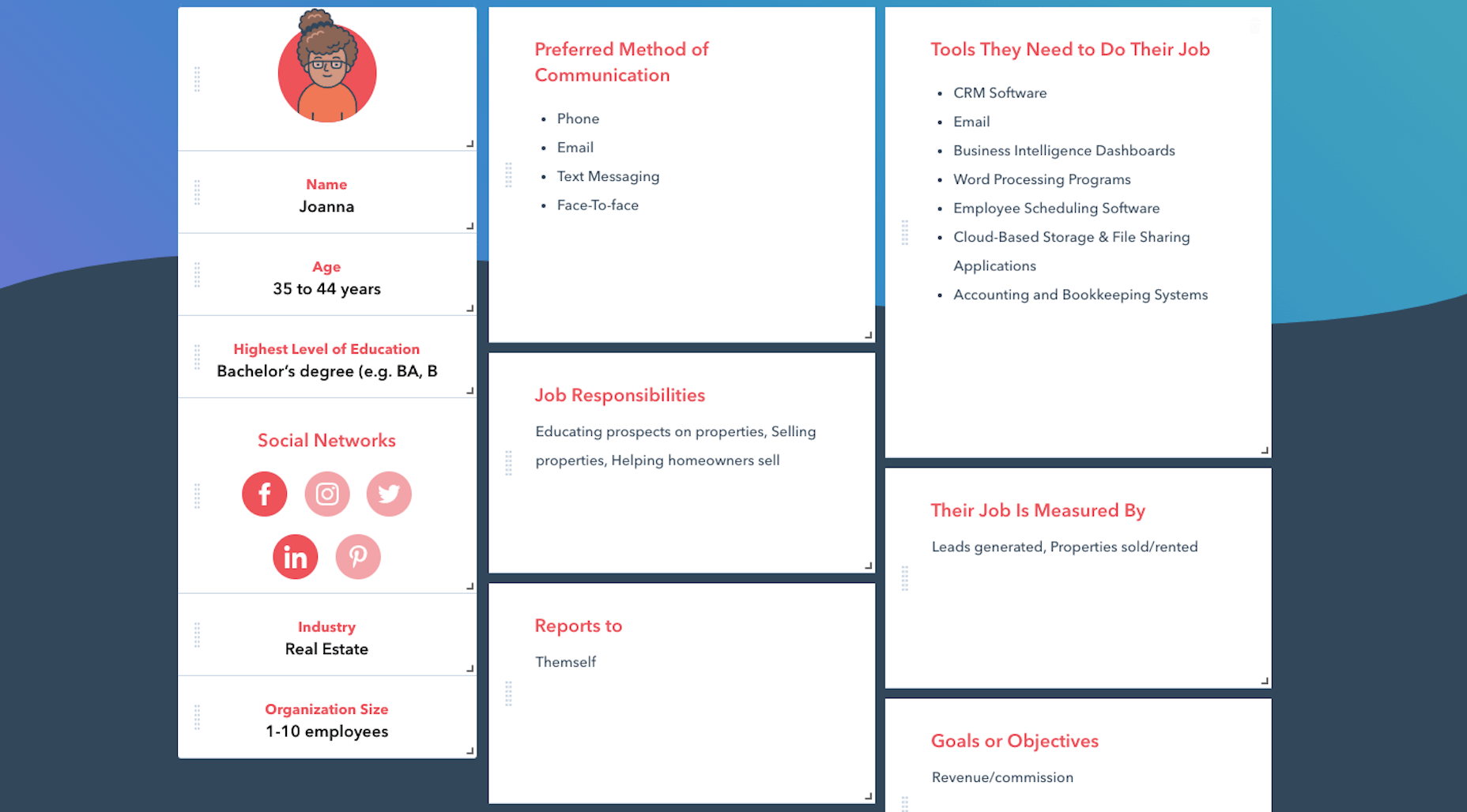
A user persona is a fictional character created using the demographics and psychology of your ideal customer or client. You can use Hubspot’s Make My Persona generator to create a card that documents these details:

Once you sort out who you serve, what makes them tick, and how it fits into the bigger picture of their business, you can better pitch your solution to them.

For instance, Joanna above is a real estate agent and owner whose primary goal is to capture leads and generate sales. You know how effective a real estate website can be for improving an agent’s visibility online and streamlining how they earn money.

So, including words in your business name that speak to that persona as well as their goals might be really useful.

Just keep in mind that web designers don’t always commit to one niche or stick with the same niche over the long run. So, you might not want to make your business name too specific to an industry (e.g. “Real Estate Design Solutions”) and more related to higher level themes and goals.

3. What Are The Names Of Your Top Competitors?

Do you know who your main competitors will be upon entering this space? If not, now’s the time to look them up.

When it comes to business names, you want to see if you can identify common threads among them. Perhaps they use puns or include location-specific descriptors. Or they just stick with the names they were born with.

While you don’t want to come off as a copycat, you can imbue your business name with a similar theme or tone if it’s proven to be successful with your shared audience. 

4. What Makes You Different?

Every business has a unique value proposition (UVP) — something that sets them apart from everyone else in the space. What’s yours?

Do you operate within a large metropolitan area where your prospective clients’ industry is booming?

Did you previously work in the industry for which you now build websites?

Are you an SEO expert who builds enterprise websites that rank?

In business, it’s good to be different — so long as it benefits your clients.

If you have a particular UVP that’s going to make you stand out, you’re going to use it everywhere to market yourself — your website, social media, sales pitches, etc. So, you might want to consider using a unique keyword from it within your business name.

5. Where Do You Envision Yourself In Five Years?

No one’s future is set in stone. However, if you’re seriously thinking about starting a new web design business, you have some ideas about where you want to go with it:

  • Do you like the idea of being a lifelong freelancer or digital nomad?
  • Would you like to operate your own design agency?
  • Do you have aspirations to build and sell website products, like plugins, themes, or UI kits instead?

If you expect to pivot your business at some point, be careful about choosing a business name that paints you into a corner. Keep it broader so that prospects don’t have to wonder what it is you really do.

And if you plan on scaling your business beyond yourself, using your own name might not be the best idea. You’ll want clients to associate the brand name with your agency, not with you specifically.

6. Will Your Business Name Be Easy To Remember?

At this point, you have some business names brewing. So, now we need to look at the more technical aspects of naming your brand.

Here’s what you need to do.

a. Write down no more than three to five business names you like.

For example:

  • Honeymooners Web Design
  • Charles Murphy Design & Development
  • FoREver Websites
  • SOLD Web Design Agency

b. Mash each name into one long lowercase string. Don’t include any punctuation.

For example:

  • honeymoonerswebdesign
  • charlesmurphydesignanddevelopment
  • foreverwebsites
  • soldwebdesignagency

c. Are any of the names difficult to read? Too long? Do any of them cause confusion and look like they mean something else?

If so, get rid of them as a matching domain name won’t work. Or, if you absolutely love them, fix the name so it’s clear, readable, and short. For instance:

charlesmurphydesignanddevelopment becomes charlesmurphydesign or just charlesmurphy.

7. Does The Name You Want Already Exist?

It’s a good idea to have a backup name in case you discover that the name you want already exists. Due to trademarking issues as well as possible confusion for your clients, you’ll want to avoid using a name that overlaps with or is the same as any other company (in or outside of web design).

Do a Google search for the business name you want to use. Check out the top 10 search results to see if there are any other matches.

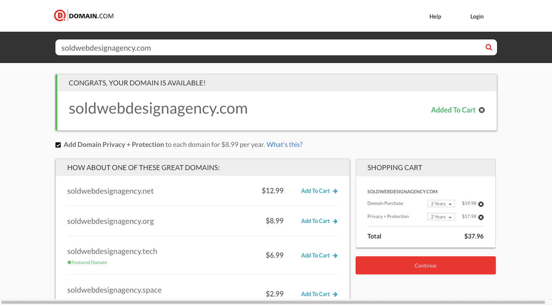
You’ll also want to test out the domain name. Go to Domain.com and run your business name string through it:

You have a few options if this happens:

  1. Choose a different top-level domain (e.g. .tech, .io, .design).
  2. Use an abbreviated version of your business name  (e.g. solddesignagency.com).
  3. Move your backup business name to the front of the line and see if it’s available.

It all depends on how attached you are to the business name you’ve chosen. Just make sure that any changes you make to it (like shortening the domain name or using an alternate TLD) doesn’t cause confusion for prospects who look you up online. You don’t want them confusing someone else’s domain name for yours if business name and domain name don’t line up.

Choosing a Business Name Is Just the First Step…

Once you’ve settled on your business name, share it with a few people you trust. They’ll let you know if you’ve totally missed the mark or if it’s something you should be excited to run with.

As soon as you’re 100% sure it’s the right name, buy the domain name and register your company. Then, it’ll be official!

Of course, this isn’t the end to branding your new business. In our next Branding 101 post, we’re going to look at the next step: How to create the visual identity for your business.

Stay tuned!


Featured image via Pexels.

Source


Source de l’article sur Webdesignerdepot

As a cloud-native developer you’ve installed an OpenShift Container Platform development environment on your local machine, but what’s next?

What can you do with the fully stocked container registry provided to you?

Source de l’article sur DZONE

Every week users submit a lot of interesting stuff on our sister site Webdesigner News, highlighting great content from around the web that can be of interest to web designers.
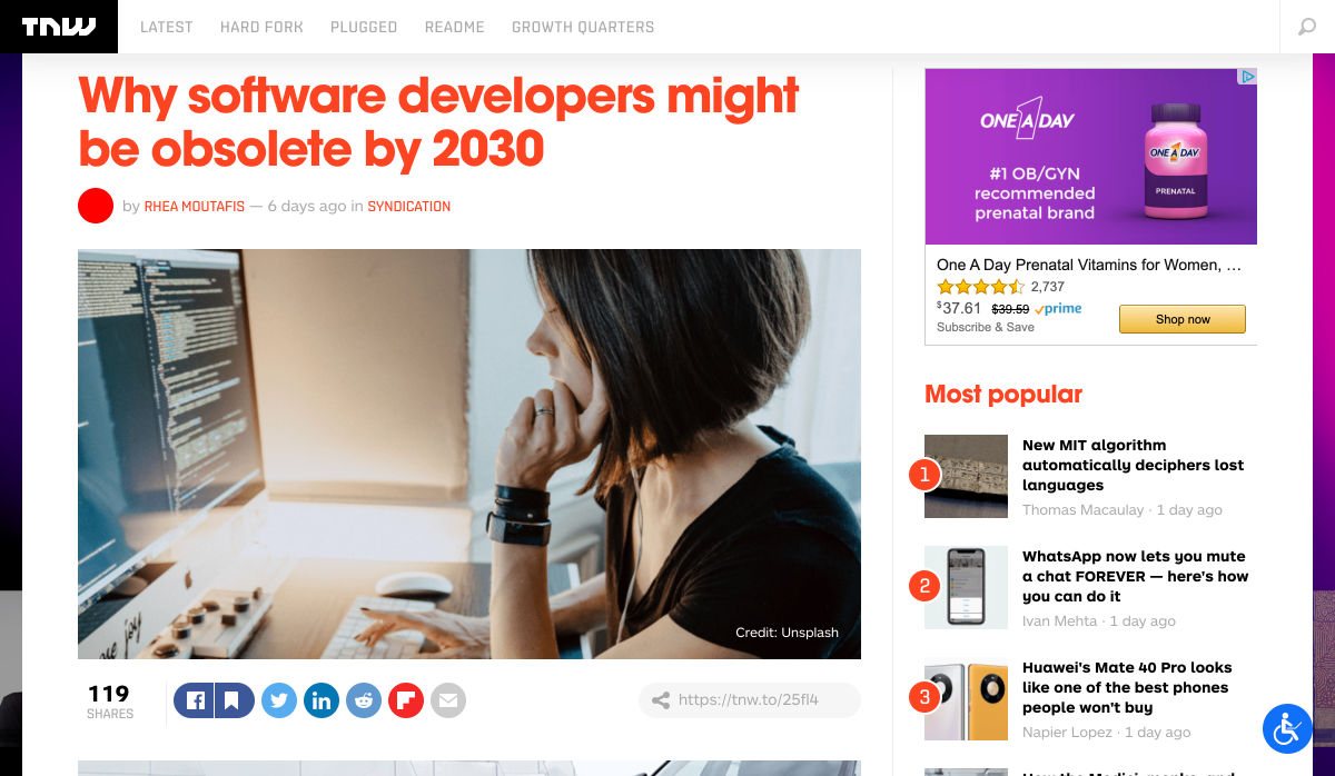
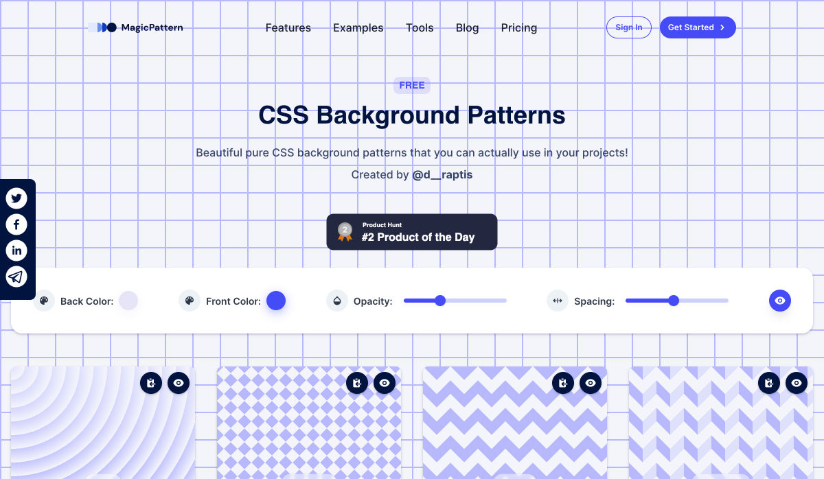
The best way to keep track of all the great stories and news being posted is simply to check out the Webdesigner News site, however, in case you missed some here’s a quick and useful compilation of the most popular designer news that we curated from the past week.

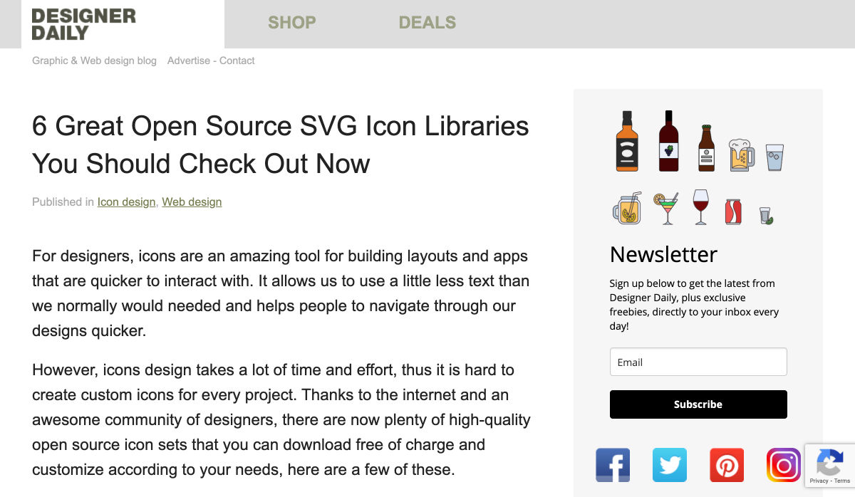
6 Great Open Source SVG Icon Libraries You Should Check Out Now


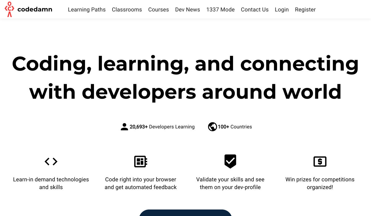
Codedamn – Teach Yourself to Code


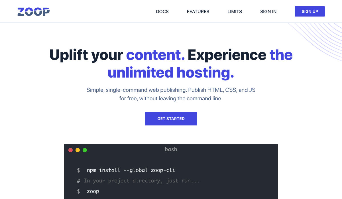
Zoop – Unlimited Serverless Hosting


Sitemaps: A Complete Guide


Shoelace 2.0: A Forward-thinking Library of Web Components


How to Become a UX Designer – No Matter What You Studied at Uni


Buttons that Spark Joy


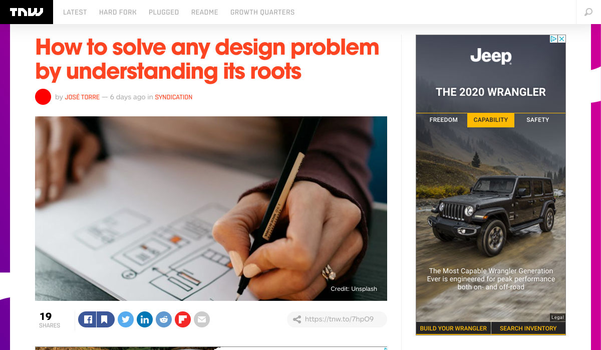
How to Solve any Design Problem by Understanding its Roots


Ooooops I Guess We’re* Full-Stack Developers Now


Blue People Illustrations, or How to Kill a Brand


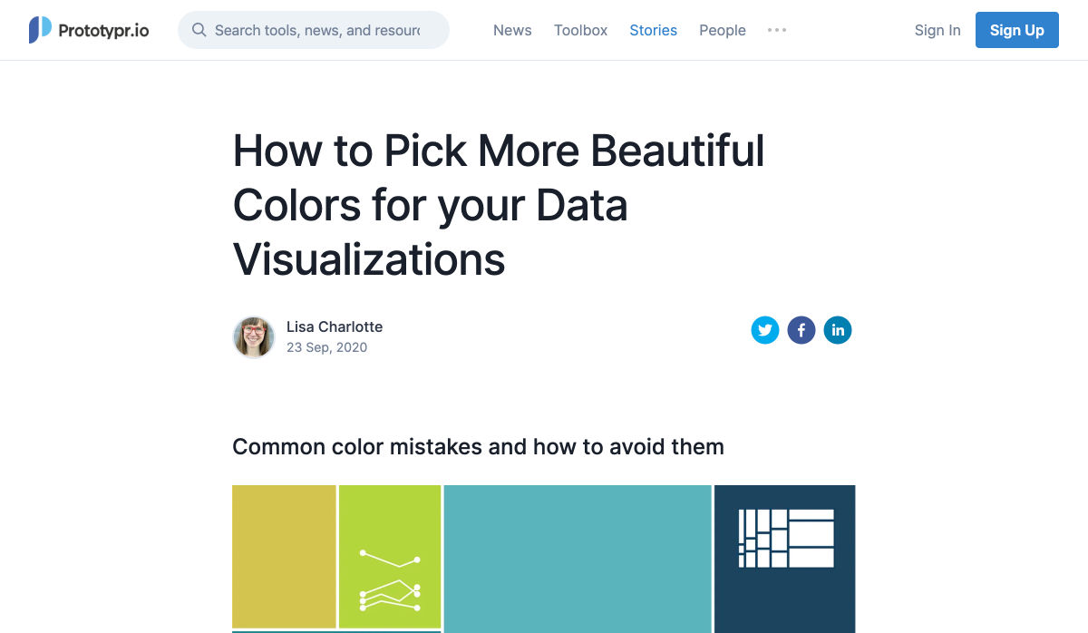
How to Pick More Beautiful Colors for your Data Visualizations


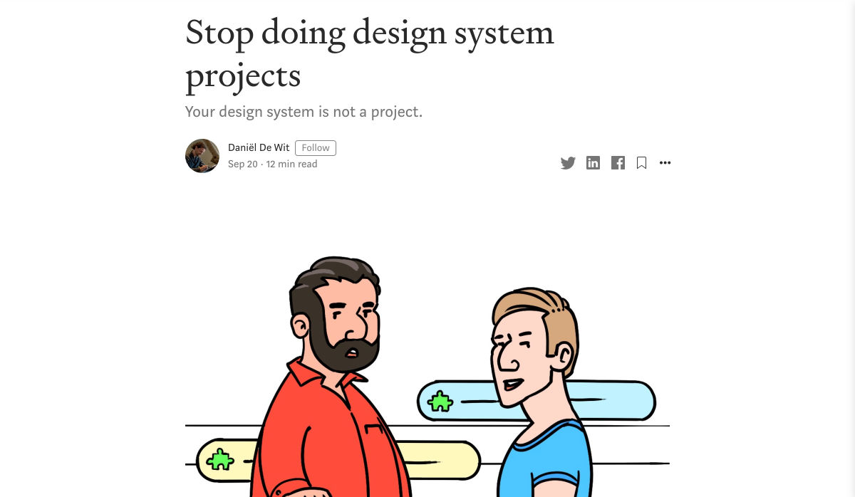
Stop Doing Design System Projects


Please Don’t do That: 4 Things to Ask Clients to Avoid


What’s Driving so Many Car Brands to Redesign their Identity?


How to Prepare Sites for 2020 Holiday Shopping


Nova


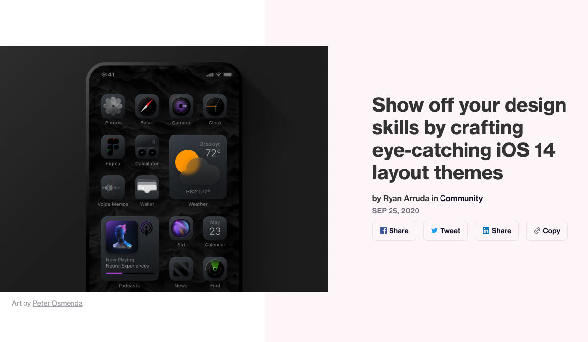
Show Off your Design Skills by Crafting Eye-Catching iOS 14 Layout Themes


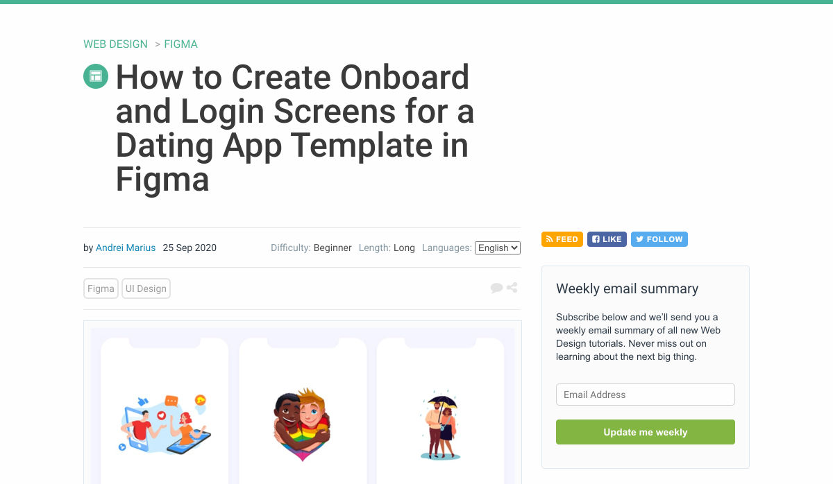
How to Create Onboard and Login Screens for a Dating App Template in Figma


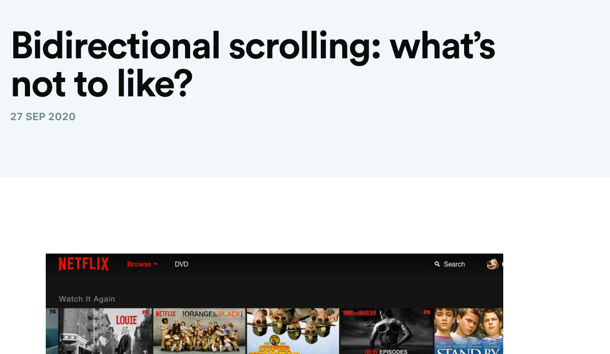
Bidirectional Scrolling: What’s not to Like?


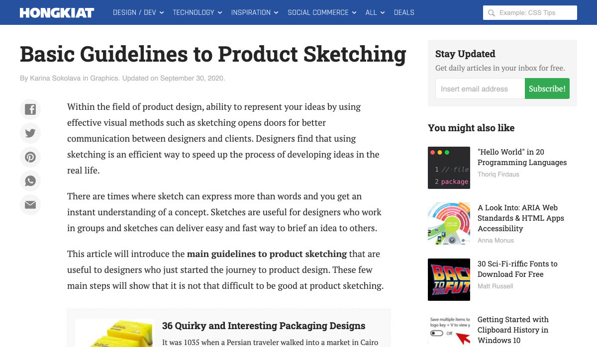
Basic Guidelines to Product Sketching


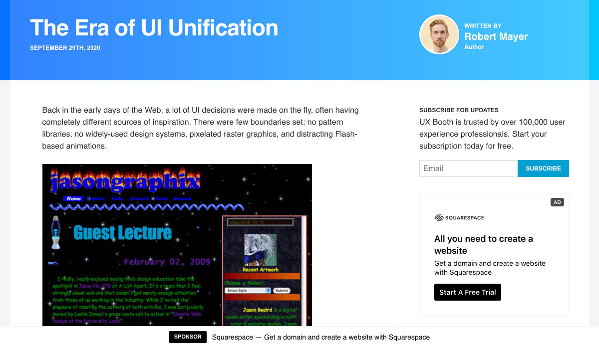
The Era of UI Unification


The Typography of Star Trek: The Motion Picture


The Guide to UX Research


In Search of Illustration: Design Process for Illustration Set


Looking at an Online School Through a Web Designer’s Eyes


Want more? No problem! Keep track of top design news from around the web with Webdesigner News.

Source


Source de l’article sur Webdesignerdepot

And it does this 24 hours a day, 7 days a week, 52 weeks a year without ever asking for a pay raise.

But this is true only if your website landing page is designed well, maintained, and optimized to the gills. The art and science of a flawless landing page is beyond the scope of a single article, but we can start with helping you spot seven of the most common – and damaging – trouble spots.

1. Unclear Value Statement

Typically, new visitors to your page will only stay on it 3 to 15 seconds before they get distracted. In that span of time, you must offer a clear and visible reason to stick around and interact with the page.

That reason is your value statement. What value do your readers get in exchange for the time you ask them to spend? High-quality content is a must (and hopefully a given), but you also need to pull them in so they experience that content.

Does your landing page do that? If yes, great! If no, you should fix that. If you’re not sure, ask yourself:

  • Is there a compelling, visible headline that expresses the end benefits clearly and succinctly?
  • Is there a subheadline explaining your offering in more detail?
  • Are there supporting graphics that pull the eye toward your headline and subheadline?

If there aren’t, add them now.

2. Poor Signposting

Your landing page isn’t just there to be pretty. It’s meant to convince people to take action. If you don’t make it easy to find your call to action, most viewers won’t look for it.

deliver enough value to make it worth the hassle

You must make it clear — in as succinct and efficient terms as possible — why the action you want a reader to take will deliver enough value to make it worth the hassle. Tell them, in words that stand out from the rest of the page, what you want them to do next and what they’ll receive for doing so.

Improving your signposting stats by asking yourself the following questions:

  • Do you have a clear understanding of what the next step in a visitor’s customer journey should be?
  • Is it easy to find and take that step on your website?
  • Does your copy make a clear and compelling argument in favor of taking that step?

If you can answer yes to all three questions, your signposting is likely good (or at least good enough for now). If not, now you know what you have to do to improve it.

3. Slow Loading Time

Remember that 3 to 15-second maximum time limit we mentioned earlier? That span includes time spent waiting for your landing page to load, and every microsecond of that wait increases a reader’s likelihood of bailing on the whole thing. You must get your loading time to be as quick as possible.

Viewers who exit your landing page early – including while still waiting for it to load – increase your site’s bounce rate. Higher bounce rates reduce your rankings on Google and other search engines, meaning a page that loads too slowly not only impresses fewer viewers, but it also gets fewer viewers overall.

Improving your loading time is usually a job for your tech team or whoever in the office is responsible for overseeing your hosting service. That said, here are a few of the most important ways to optimize this important factor:

  • Optimize image size, file format, and compression;
  • Clean up your database by deleting saved drafts, old revisions, unused plugins, and similar virtual detritus;
  • Confirm that your WordPress theme (if applicable) is optimized for quick loading;
  • Use a content distribution network for file storage;
  • Analyze server response time with your hosting service, and work with them to reduce it;
  • Install tools that leverage browser caching;
  • Fix all your broken links;
  • Remove all render-blocking from JavaScript;
  • Reduce the number of redirects necessary to reach your page;
  • Optimize your code, especially in CSS, JavaScript, and HTML;
  • Enable file compression — except for on images;
  • Replace all PHP content with HTML wherever possible.

This is technical, detailed work, but it’s important. If you don’t have team members up to these tasks, it can be worth hiring an outside consulting company to do it for you.

4. Only One Landing Page

You have a good idea of your ideal customer’s hopes, fears, pain points, demographics, likes and dislikes, and other important information. If you have several different types of customers, you can’t use the same landing page for each of your customer groups. Each group has different characteristics that will prompt them to follow your call to action, so you don’t want to offer just one landing page.

Similarly, you also probably have more than one product or set of content and offerings to generate sales. Having only one landing page can lose leads because the page is only optimized for one of those products or content sets.

Ideally, you should have a unique landing page with a tailored offer for each of your customer models that would send those individuals to each of the products and content sets. An ad for professionals in their 30s making over $50,000 a year would lead to a landing page built for them, while an ad for heads of households working from home would lead to a landing page built for them.

Yes, that means a company with three profiles and four content sets would need 12 landing pages. And yes, it’s worth that kind of effort.

5. Insufficient Visuals

“A picture is worth 1,000 words” is ancient wisdom, but it’s far from true in the internet world – it’s actually worth more. A quick look at social media and blog performance will tell you many people will look at, enjoy, and share a photo or video, but not many will read an entire 1,000-word post on the same topic.

How well your landing page performs depends on the images you use and how you present them. Does your page’s layout conform to the best practices of visual web design:

  • Including images that emotionally reinforce the value expressions of your product’s core benefits;
  • Containing sufficient white space to not be intimidating;
  • Providing data images to indicate the worth of what you do;
  • Using visual design cues to lead the eye toward your conversion points;
  • Applying color gradients to highlight offers and your call to action;
  • Using infographics to replace the dreaded “wall of text”.

If you can say yes for half of these things, carry on. If not, this point may be among the better places to start with a landing page redesign.

6. Asking For Too Much, Too Soon

Craft a custom calls to action that meet all levels of interest, need, and desire

Not every landing page visitor is created equal. Some are hardcore fans and experts in what you do, ready for a 10,000-word white paper that dives deeply into the research supporting your use case. Others might have heard about your industry on an Instagram page and want to know the basics of what you do.

There’s nothing worse than going to a website and being asked for all of your personal information right away. If your call to action requires too much knowledge, too deep a commitment, or even too much personal information, consider scaling back. Otherwise, you risk turning away potential customers.

Better yet, go back to No. 5 above and build a new landing page for beginners and early-stage leads. Craft a custom calls to action that meet all levels of interest, need, and desire.

7. No Trust Elements

Offering some type of authentic customer referral or testimonial is important. It all boils down to the same thing: telling those who read your landing page that other people already like what you do and how you do it.

Examples of effective modern trust elements include:

  • Quotes from positive reviews next to a photo of the reviewer;
  • Screenshots of social media posts praising your company or product;
  • Short video interviews of happy clients;
  • Blurbs for industry thought leaders approving of you;
  • Images portraying business credentials and certifications;
  • Links to positive press coverage;
  • Logos of known business customers who buy and trust your brand.

Final Thought: What’s Next?

There isn’t one guaranteed way to turn a landing page from something full of holes into something perfect. But first, run an audit of your landing page using this list as a guide. Note which errors are there. Next, sort them in order of what takes the least time to fix to what takes the most time to fix.

Then, fix them in that order. We find that getting the quick fixes done builds excitement and momentum, whereas starting with a harder fix can mire down the whole process.

If none of these errors exist on your landing page, congratulations. There’s still lots of work to do on your website and content marketing, but it’s not among these rookie mistakes.


Featured image via Pexels.

Source


Source de l’article sur Webdesignerdepot

Artificial intelligence. Just hearing the phrase has been a trigger for many in the technology world since that creepy Haley Joel Osment film circa 2001. But more recently, artificial intelligence and machine learning strike fear into the hearts of skilled workers for an entirely different reason: job security, or lack thereof.

Smart-home devices, streaming services, self-checkouts, even Google searches are ways that artificial intelligence has seeped into everyday life, exemplifying the abilities of computers and machines to master both simple and complex tasks. In some instances, these technological advancements make our lives easier, but for some people, their proliferation has meant job loss and skill replacement. There’s no wonder that when artificial intelligence starts being mentioned along with web design and site creation, the spidey senses of designers all over the world start tingling.

designers think outside the box, something that AI just can’t do

But let’s get real about what AI and automation really mean for designers for a second. Talented designers with busy schedules should view these advancements as virtual assistants. For some small businesses on a limited budget, the websites that artificial intelligence can pump out might be fine…for a while. However, as businesses grow, change, require updating and customization to adapt to their customer base, the expertise of creative and talented designers will always be needed. Even the best AI that we see today is limited by evaluating, replicating, and revising what already exists. It may be able to mix 1,000 different color schemes into 10 million potential combinations, but great designers think outside the box, something that AI just can’t do.

In fact, rather than being scared of automation, designers ought to embrace automation and artificial intelligence as a way to unleash their creative thinking. Delegate repetitive, straightforward tasks to the right software, and suddenly you have time to bring your best ideas to the table and push the boundaries of your own innovation. 

Where AI has Failed in Design

The ultimate goal of artificial intelligence and automation in design work is a grand vision that has yet to be realised.

Consider the case of The Grid, which began as a crowdfunding campaign in 2014. The “revolutionary” product posed itself as an artificial intelligence solution for building thoughtfully, yet automatically, designed websites in five minutes. Research “Reviews of the Grid” in any search engine and you’ll be met with scathing criticism with only some small praise sprinkled in. Most of the initial users cite underwhelming results, the feeling of being duped by the Grid’s marketing tactics, nonsensical placement of text, and ultimately, the Grid being a complete waste of money for the resulting product. Even at the low cost of $100, compared to hiring a talented designer, most users felt their investment was wasted.

For the AI capabilities that exist now, most small business owners, or those looking to put together a simple website, are better off using drag and drop site builders (Wix, Squarespace, Weebly, etc) that have been around for ages. Even so, there are plenty of businesses still willing to hire designers to take this simple task off their plate due to a lack of technical expertise or lack of time. And let’s be honest, are there even enough talented (keyword here!) designers out there to keep up with the millions of websites created every year, without each one working themselves to death? 

Where Automation Shines for Designers

Fortunately for good designers, it appears for now that the days of artificial intelligence completely taking over their jobs is a fantasy. However, what AI and automation do offer designers is a solid starting point for success, eliminating much of the lower-level grunt work that most designers would rather skip anyway.

Even well-received AI website builders like Firedrop still require a basic eye for design and specialised knowledge to produce truly unique, high-converting, and user-friendly websites. Tools and practices that designers should adopt are the artificial intelligence and automation resources that will help them do their jobs better, faster, and leave them with more time to focus on project elements that AI cannot accomplish on its own.

Bridging the Gap Between Designers and Developers

Well-established brands are likely to already have design systems in place that guide the creation of new elements across their digital profiles whether on social media, various mobile apps, or different sections of a website. But even in large corporations — excepting those who have perfected the process — there’s often a breakdown between a designer’s vision and resulting product from the developers. It stems from the basic difference in how they each approach their work and the limitations of the systems they use.

While component libraries — or even full design systems for that matter — won’t reconcile every question, they provide both developers and designers a source of truth to work from that both parties can understand. Design collaboration tools like Invision and Visme, specifically, keep designers and developers on the same page with automated version saving and code-friendly workflows.  

Understanding the Consumer

I don’t suggest using artificial intelligence to produce content for your site

Digging into and understanding the behaviours and habits of site users is a relatively new component of site design, but offers invaluable insights. Tools like HotJar, Mouseflow, or Smartlook make it simple to see holes or leaks in your conversion funnels, detect which page elements users are interacting with, and which they’re not interested in to refine the look and feel of a page for maximum conversions. Even though these tools provide the data, it still takes a keen eye and understanding of design to implement the right changes to improve site performance.

Site content is another way that artificial intelligence has the potential to improve our understanding of customer behaviour and improve site performance for individual users. I don’t suggest using artificial intelligence to produce content for your site, no matter how much the results have improved. However, static landing pages or a single set of further reading recommendations are unlikely to appeal to the majority of site visitors. Artificial intelligence tools like CliClap and Personyze instantly collect and analyse consumer data to provide dynamic, personalised experiences that drive more leads and encourage conversions. Creative designers will also learn from this data to improve customer experience with other pages or elements throughout the site.

Removing Distracting, Time-Sucking Administrative Tasks

Because “artificial intelligence” has become a term with such negative connotations, we often overlook the simple way that AI actually makes our work lives better and easier. Machine learning in email filtering is a great example of this. Consider a simple interface like a Gmail inbox. We have the option to mark certain senders as spam or as important, and our inbox learns that type of communication is and isn’t useful to the user. Pandora, Spotify, Apple Music, and more all take cues from the user behaviour of liking a certain song, artists, or genre of music to build customised playlists. There are a myriad of ways that artificial intelligence and its branches of disciplines merge with our everyday lives. 

Some of the most useful automations for business, and especially for designers, are related to the administrative tasks that frequently take time away or distract from more pressing projects. A perfect example of automation that can relieve stress and cut down on mindless work is an email autoresponder. I’ve always found that having time blocked off in my calendar to tackle complex or important projects helps me to focus on the task at hand and be more efficient. In order to more effectively block out my time, closing my email and setting an autoresponder to reply to all incoming emails serves two purposes: 

  1. Lets those trying to get in touch with me know that I only check my email at certain times of the day and that my response may not be immediate — tempering their expectations of when they might hear from me.
  2. Relieves my personal stress of being tethered to my inbox, splitting my focus, and also saves the time of having to initially respond to each email individually. 

This is just one simple way to use automation in your email, although there are many others to explore.

While Zapier isn’t the only workflow automation service on the market, it’s probably the most well known. Workflow automation reduces time spent on mind-numbing, repetitive tasks and helps designers connect apps that might not natively work together. Do you keep a task list in Todoist? Set up a Zap, then create a task in Todoist anytime someone mentions you on Asana or assigns you a task in Trello.

This is especially helpful for freelance designers who work with multiple clients across various project management platforms. The potential for automation to relieve unnecessary mental overhead for designers is nearly limitless.

Don’t be Afraid of AI, Embrace It

The bottom line of this brief overview of artificial intelligence and automation in design is that this emerging technology isn’t something designers should be scared of. In fact, it’s something to welcome with open arms because ultimately it can make our jobs, and our lives, better. Leave the monotonous tasks of collecting and analysing huge amounts of data or administrative minutiae to the machines; they can handle it.

Save the interesting, creative, abstract work for the talented designers who can turn AI recommendations into unique and intuitive digital experiences. Making the relationship between artificial intelligence and design symbiotic will yield the best results for every entity involved: the business, the AI, and yes, even the designer.


Featured image via Unsplash.

Source


Source de l’article sur Webdesignerdepot