According to Adobe, design-led companies reported 50% more loyal customers and 41% greater market share when the design is implemented in a top-priority and high-quality manner. It plays a multi-level role in helping not only to guide product development but also in establishing a connection with the customer by providing a well-differentiated experience.
Articles
 This month we’re seeing websites that are very conscious of the design trends they’re following. Designers are making conscious choices to adopt styles, and opting out when it doesn’t suit the site. What we end up with is a crop of sophisticated, well-designed websites that use style as a technique to further their aims.
Here are the sites that caught our eye this month, enjoy!
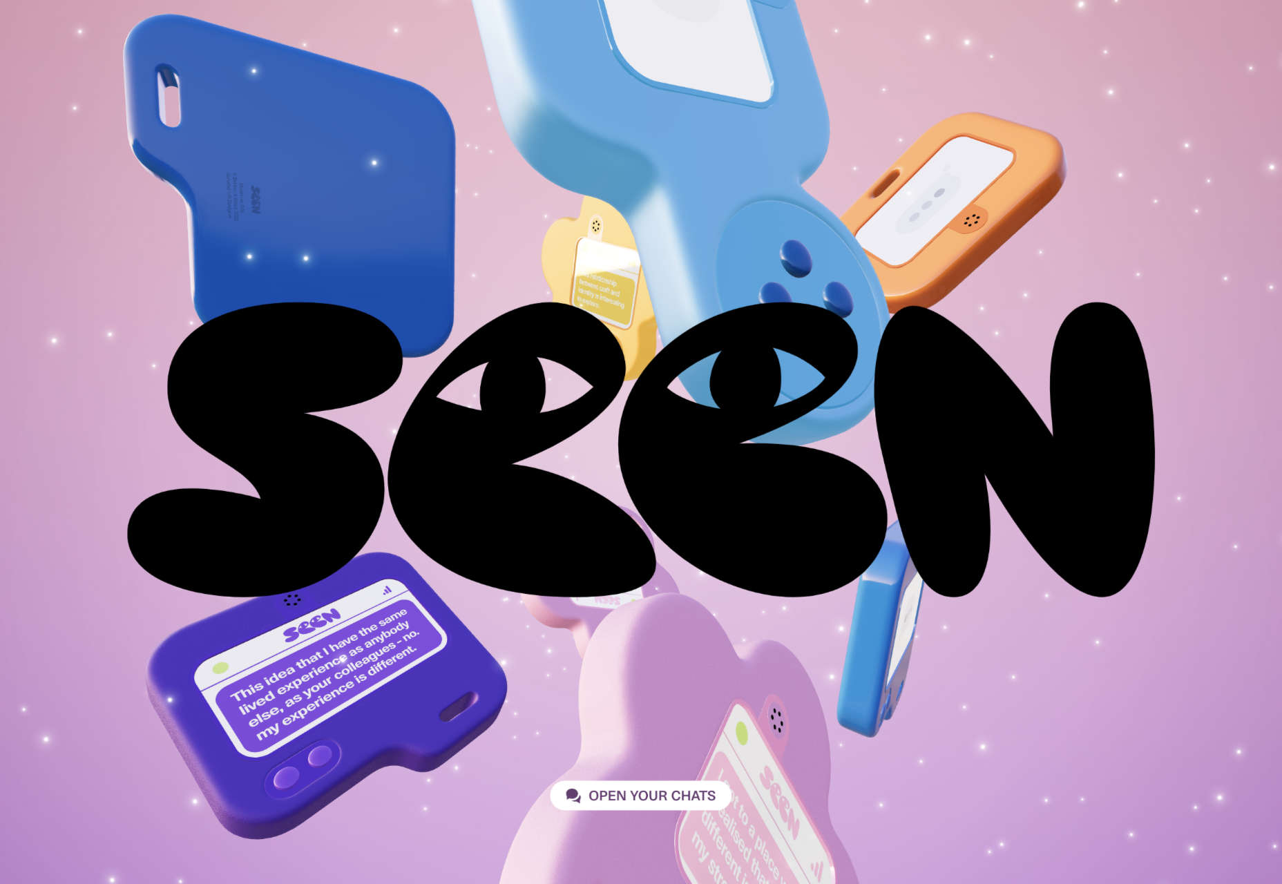
Seen
Seen uses conversations to explore themes surrounding ethnicity and racism in creative fields. Displaying these conversations as online chats creates a sense of intimacy.
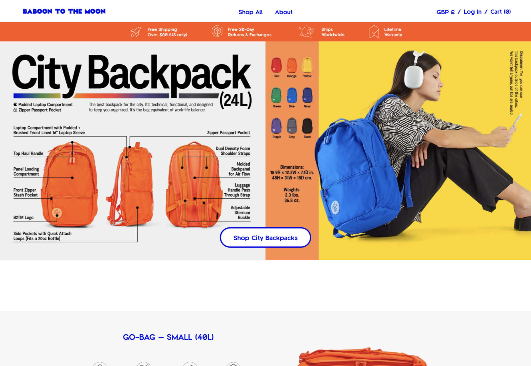
Baboon to the Moon
There is a lot of color in Baboon to the Moon’s product shots, so the rest of the site is kept simple, with good clear navigation too.
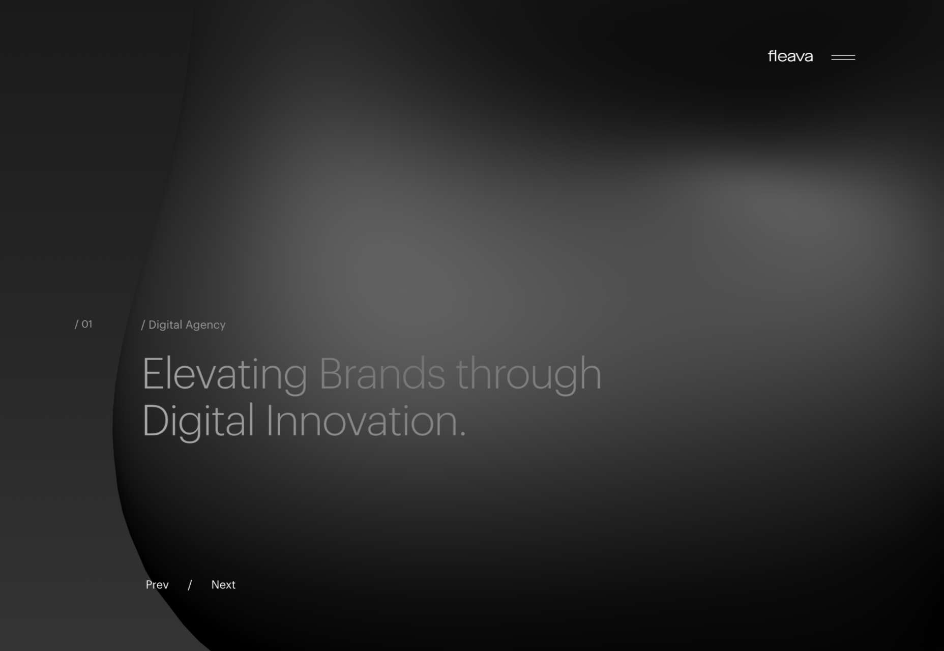
Fleava
There is a strong sense of luxury to digital agency Fleava’s glossy brochure portfolio site.
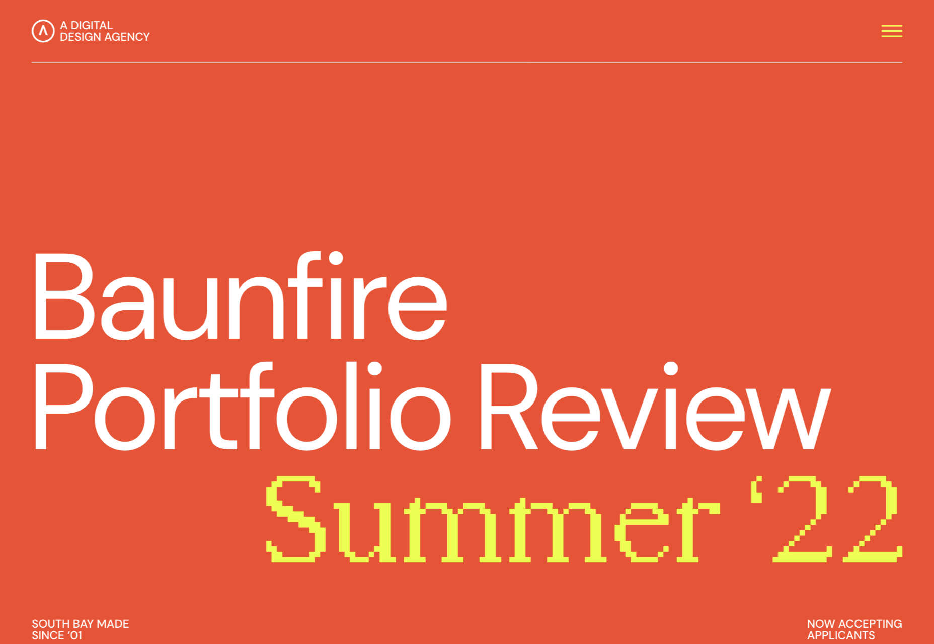
Baunfire Portfolio Review 2022
This site for Baunfire digital agency’s creative networking event is bold, personable, and fun.
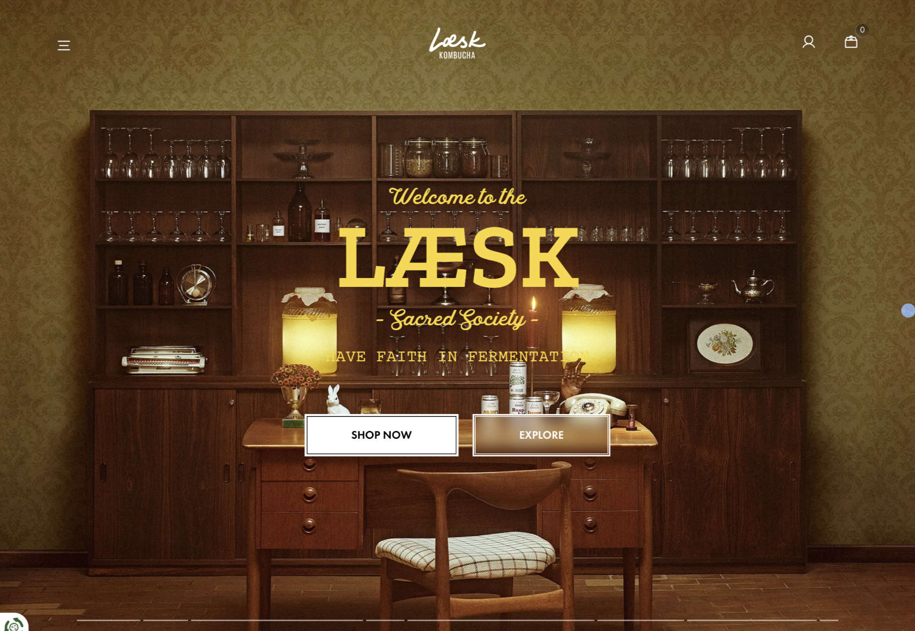
Laesk Kombucha
There is more than a touch of Wes Anderson’s style to this site for Laesk Kombucha; somewhere just out of sight is Bill Murray in a red beanie.
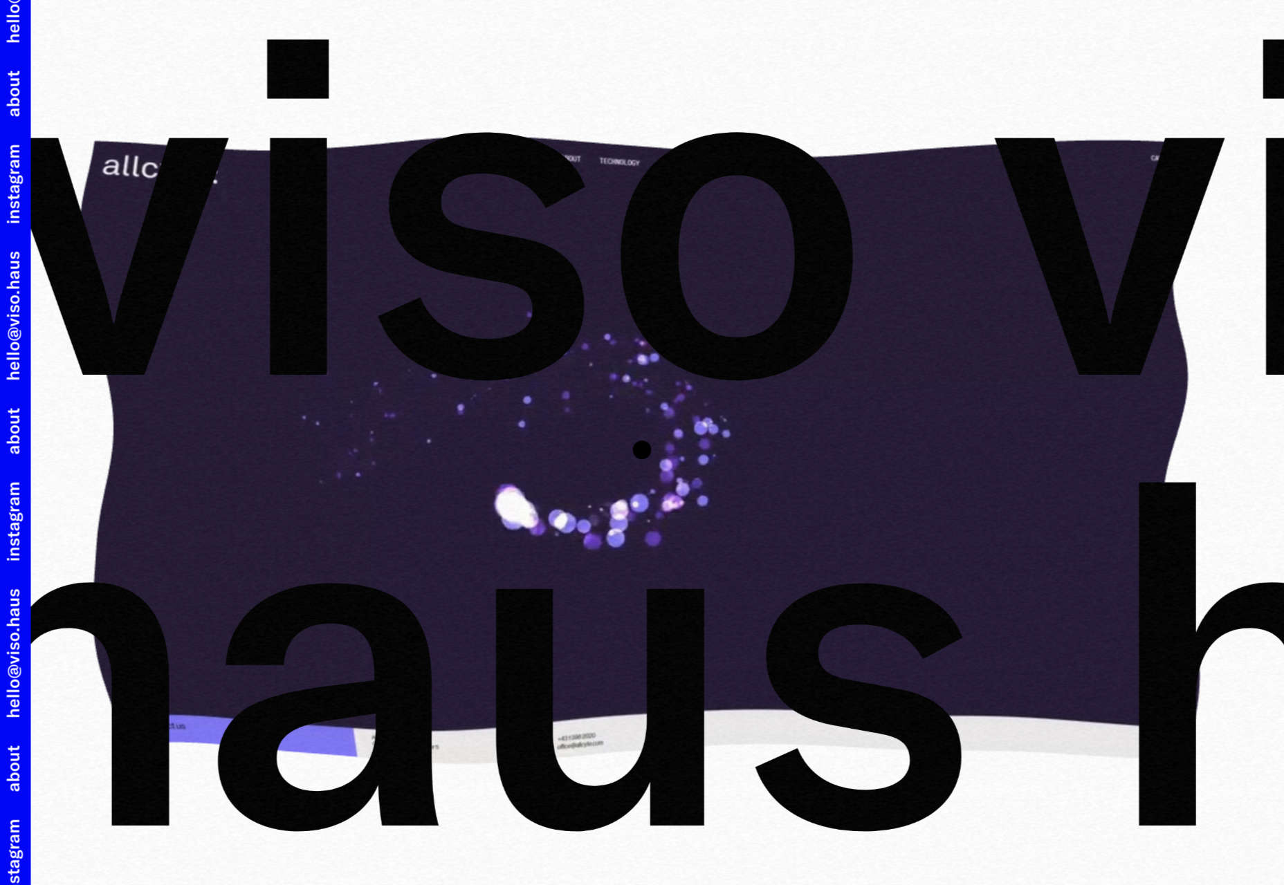
Viso Haus
Viso Haus doesn’t do anything hugely groundbreaking here with their brutalist-style portfolio site, but they do it very well.
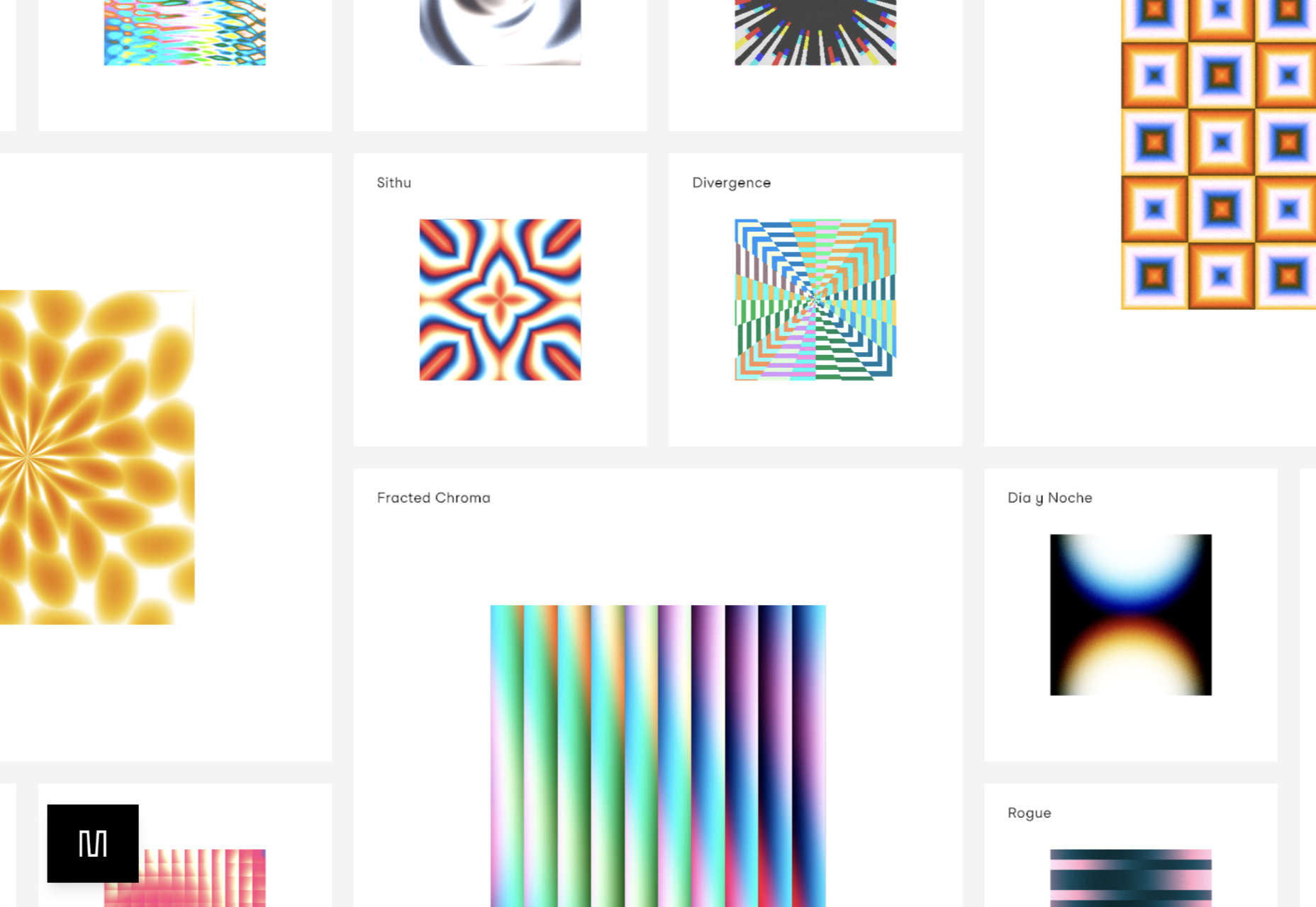
Mario Carillo
Artist/programmer Mario Carillo has opted for a minimal approach, allowing the work to do the talking.
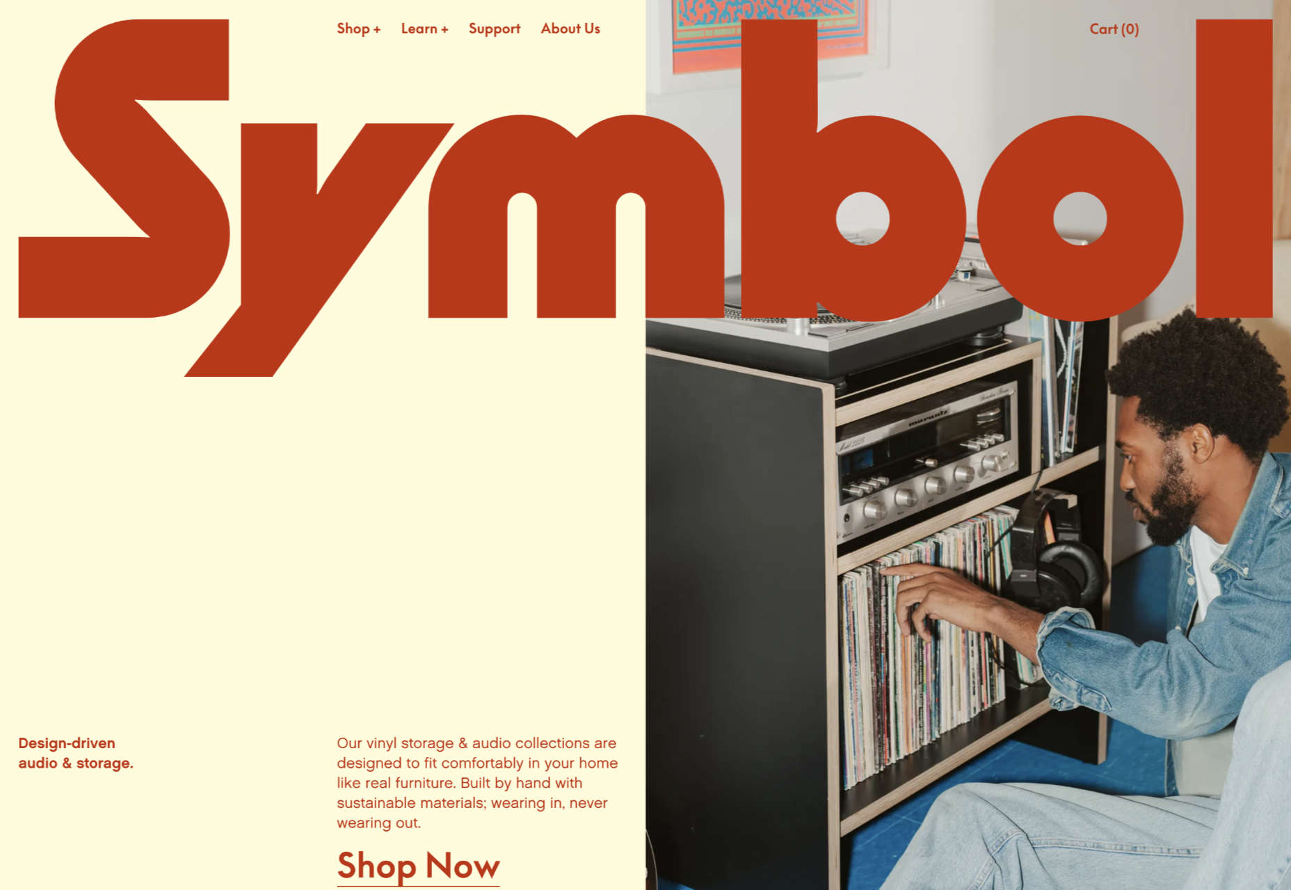
Symbol
There is a warmth to Symbol’s site, created by the color tones and combinations used here.
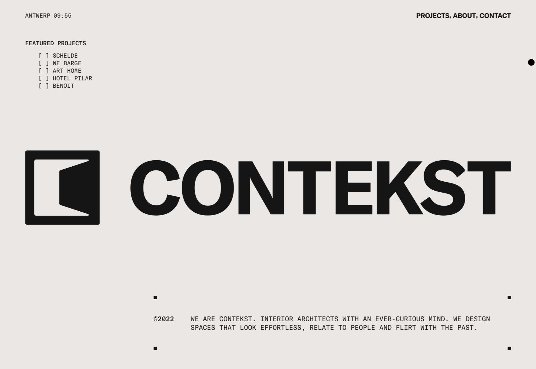
Contekst
Interior architects Contekst favor a brutalist visual style for their site, but with some nice little animated extras.
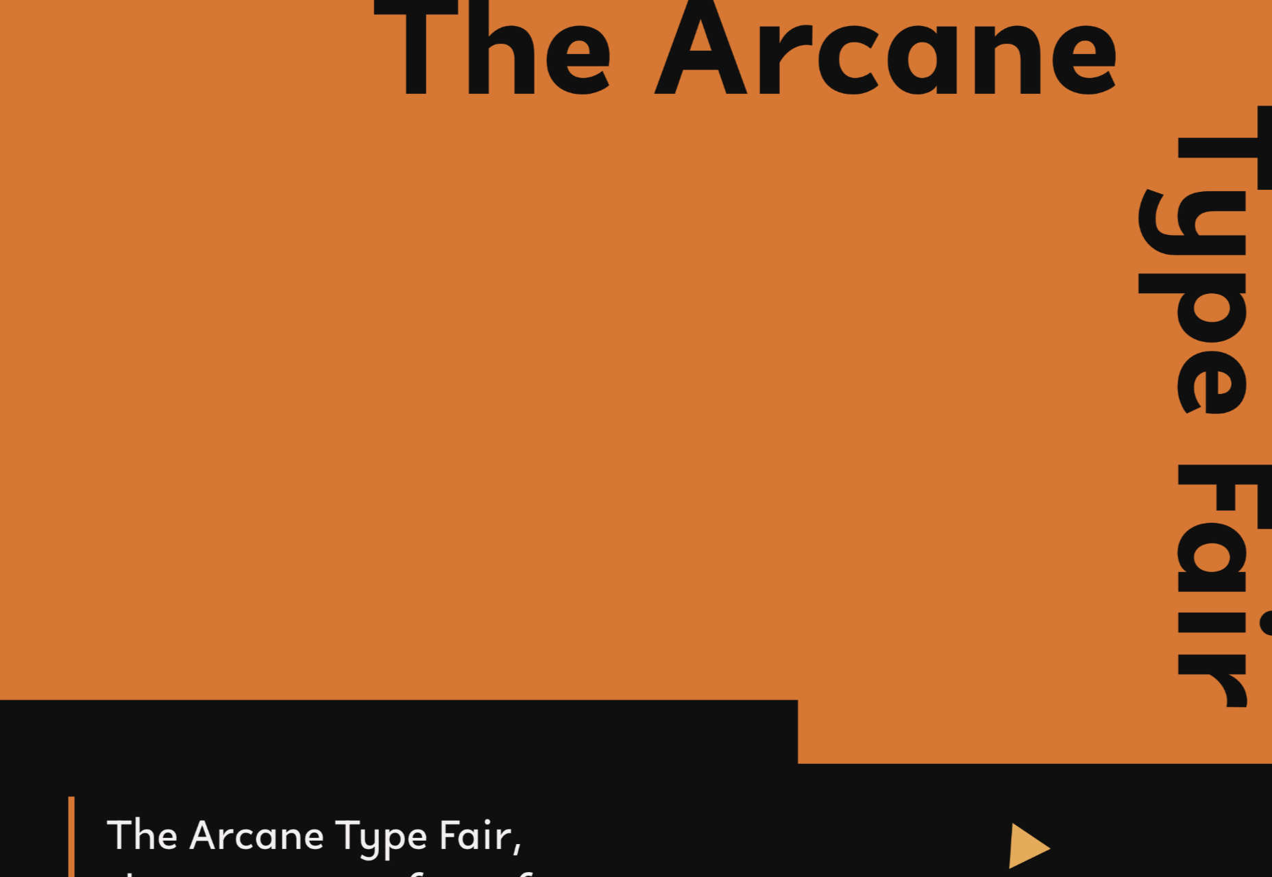
Arcane Type Fair
No, you haven’t missed the font lover’s answer to Comic Con: the Arcane Type Fair is fictitious and a clever showcase for Rain Foundry’s Conacher typeface.
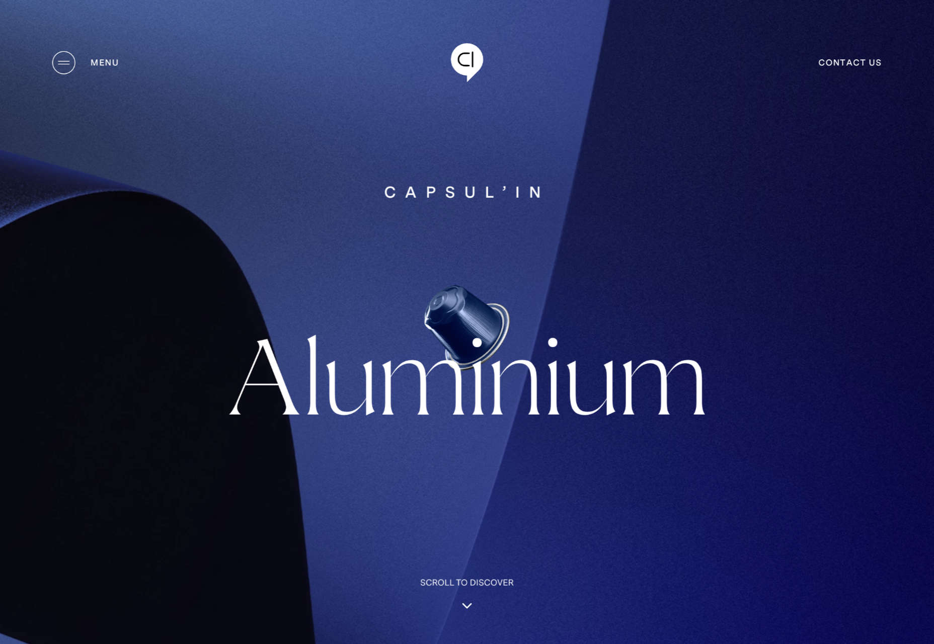
Capsul’in Pro
With lovely scrolling animation and soothing colors, this site for Capsul’in Pro manages to turn coffee pods into objects of desire.
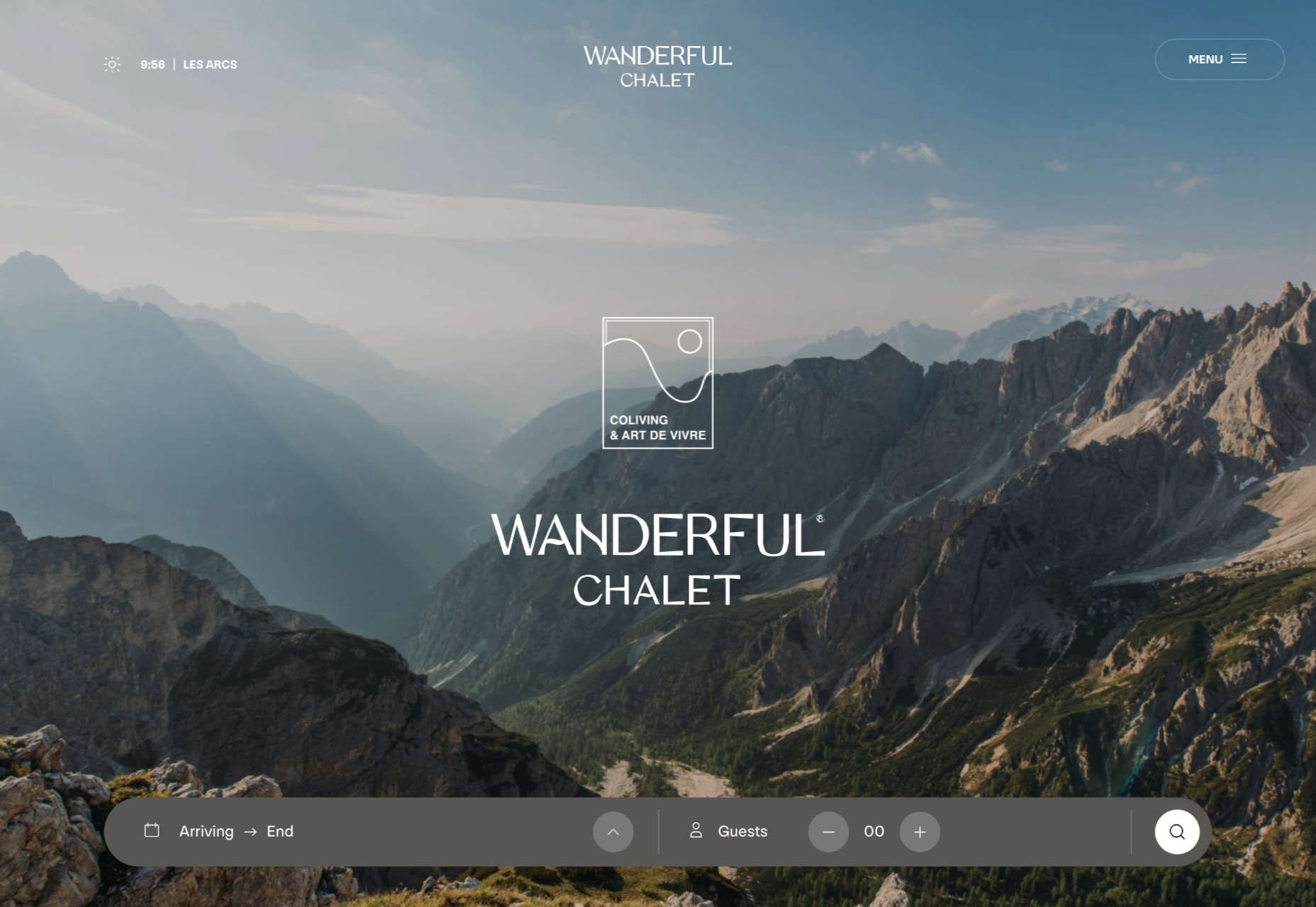
Wanderful Chalet
Random illustrations and a quirky display type add character to Wanderful Chalet’s brochure site.
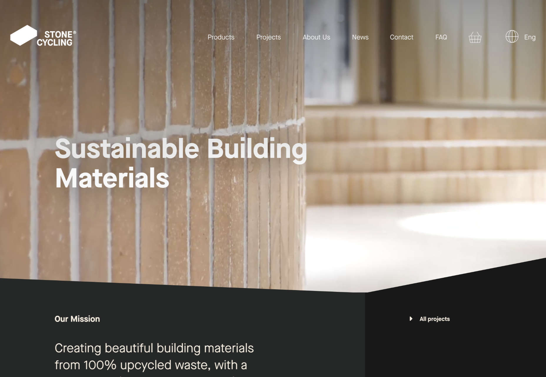
Stone Cycling
Bricks made from rubbish don’t sound like the most exciting thing ever, but this site evokes a lovely clean feel: like an old building gleaming in the sunlight after all the soot has been scraped off it.
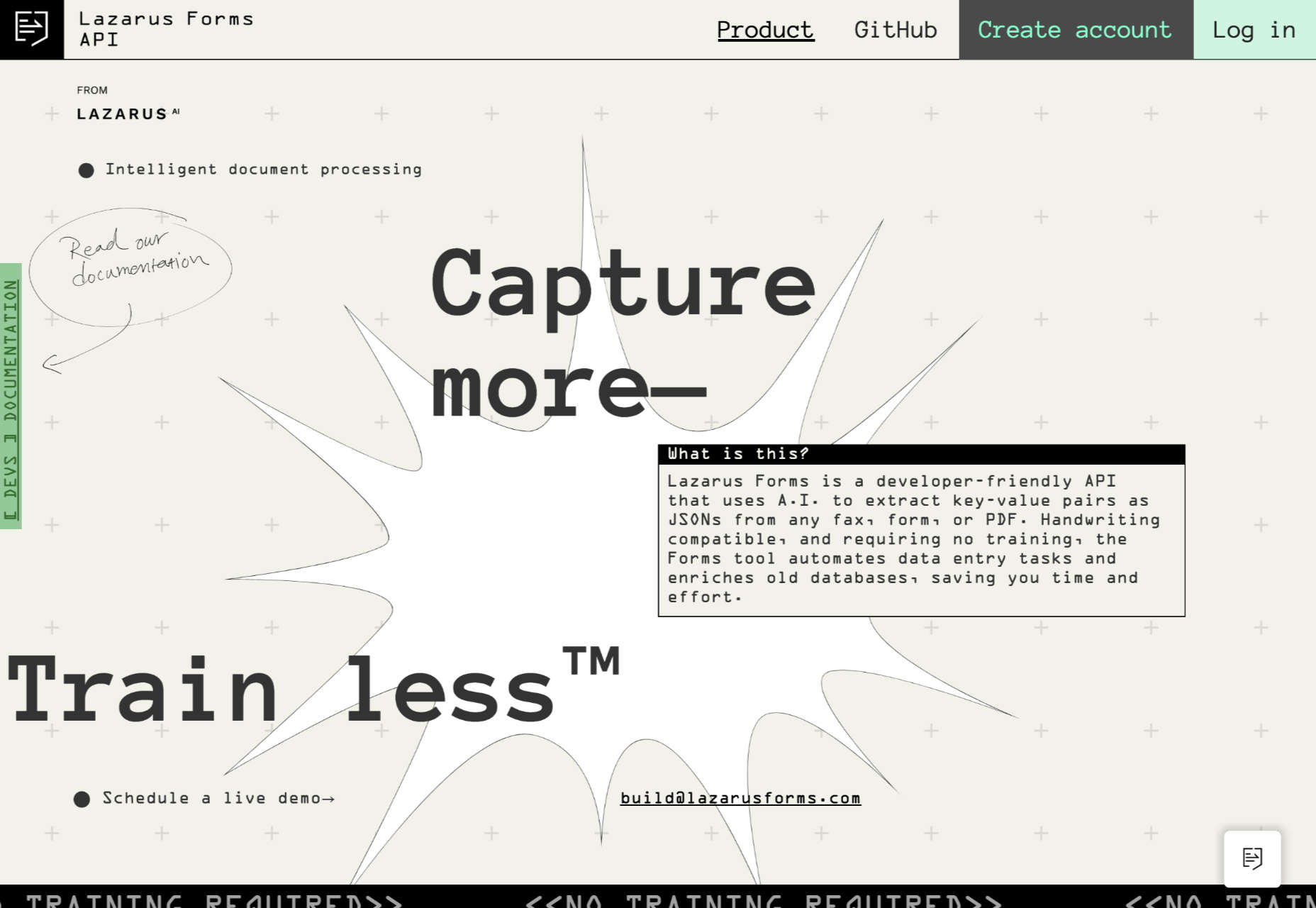
Lazarus Forms
Lazarus Forms is an API for AI document processing. This site succeeds in being transparent in its explanation without being overly technical and pleasing visually.
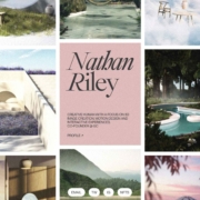
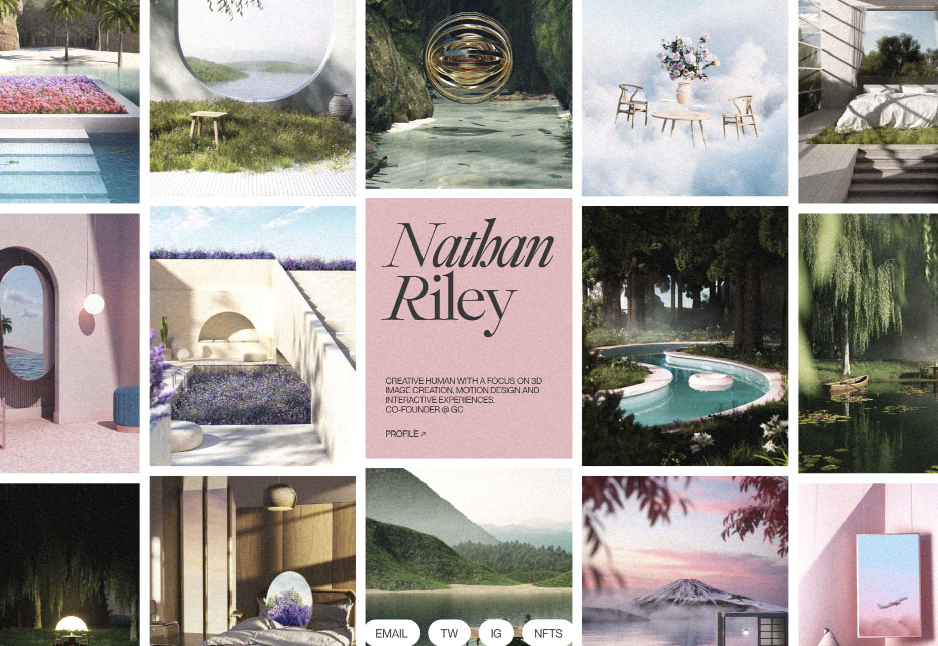
Nathan Riley
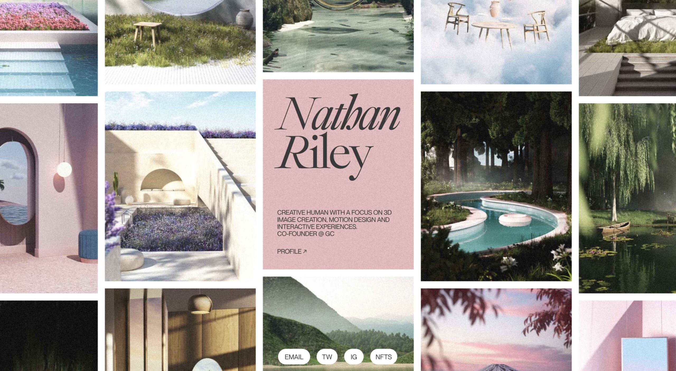
An excellent example of masonry combined with variable scrolling speeds creates tension in digital artist Nathan Riley’s portfolio.
Evi O. Studio
Sometimes the simplest things, like this full-screen image transition for Evi O. Studio’s portfolio, can be so well done it’s an absolute pleasure to scroll through.
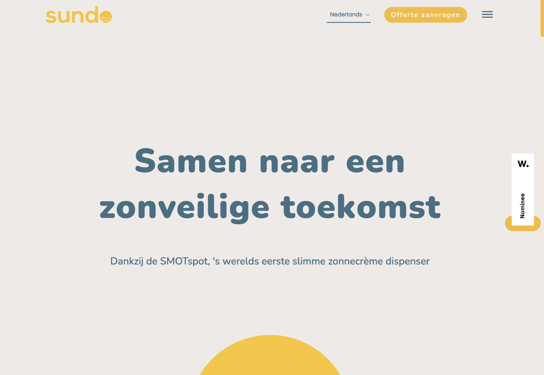
Sundo
Sundo has created SMOTSpots – smart sunscreen dispensers for public areas. The tone of the site is suitably utilitarian with a soft edge.
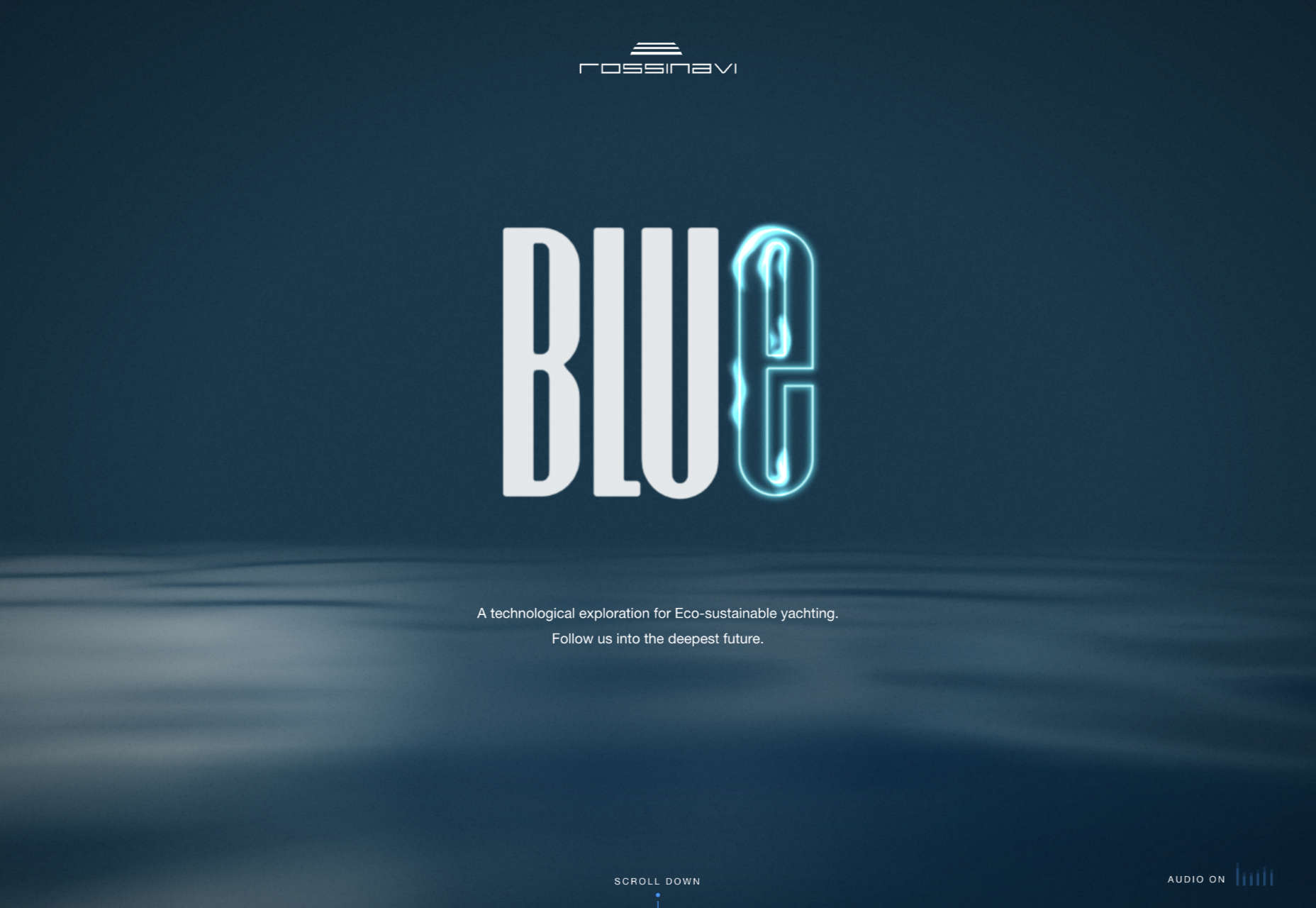
Blue
The Blue experience from Rossinavi luxury boat builders is a pleasing immersive microsite showcasing their new hybrid-electric boats.
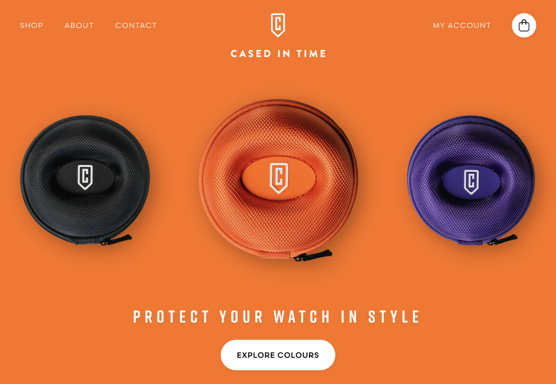
Cased in Time
This site is an excellent example of how to make a single product commerce site that doesn’t feel lacking in content.
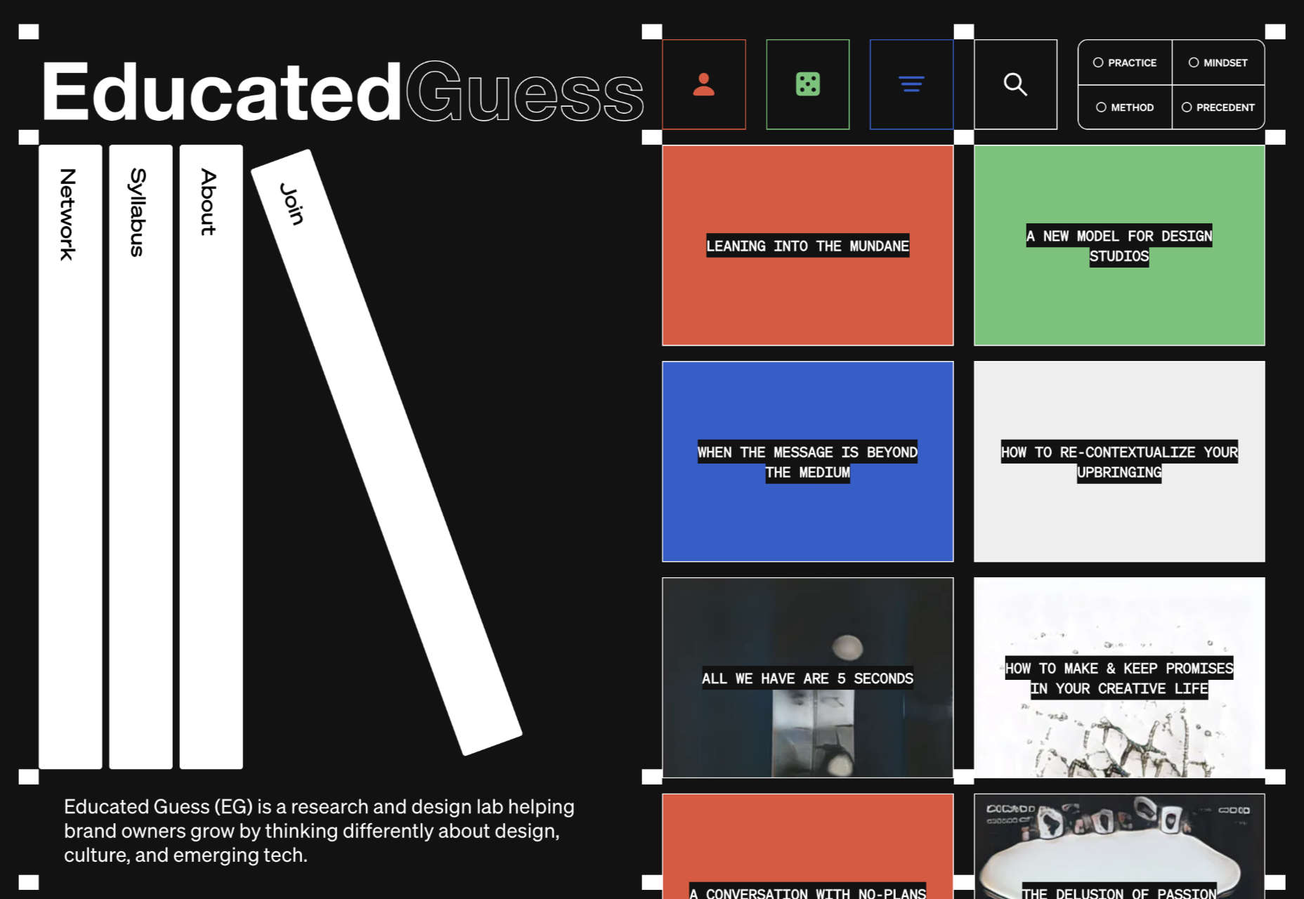
Educated Guess
Educated Guess is a podcast for creatives by creatives. The accompanying website is pleasing to use, easy to navigate, and allows the user to focus on the content.
The post 20 Best New Websites, September 2022 first appeared on Webdesigner Depot.
Whenever we build an awesome product we first build it standalone but sooner or later it attracts more users and then our minds start thinking about how to accommodate more users and there comes the need of scaling the application. Generally scaling means providing more elasticity to the application so that it can sustain the high influx of users and run smoothly without any glitches.
Software scalability is an attribute of a tool or a system to increase its capacity and functionalities based on its users’ demands. Scalable software can remain stable while adapting to changes, upgrades, overhauls, and resource reduction
 Learning how to design an MVP webpage or website could be one of the best things you can do as a site creator in today’s digital world.
In a fast-paced landscape, where customer preferences and technology are constantly changing, most companies don’t have time to dedicate months or years to each web project. The longer you take to complete your website, the more likely your creation will be outdated by the time you hit “publish.” That’s why countless creators are beginning to take a different approach.
To avoid wasting time, money, and effort on something that doesn’t deliver a significant return on investment, designers are now building “Minimum Viable Products,” or “MVPs.”
Here’s what you need to know about creating your MVP webpage.
What is MVP Web Design?
Typically, the “MVP” development process is most common in the app or software creation world. It refers to when a developer builds the simplest version of a technology capable of achieving specific goals. For instance, if a company wanted to create an ecommerce app, they would design a simple tool capable of listing products, enabling payments, and tracking orders.
After launching the MVP product, the company or developer would check to ensure it had the right impact on the target market and generated positive results. Using feedback and analytics, the developer would then begin to add new features one at a time.
MVP design aims to ensure you’re developing the best, most valuable product for your audience while getting your solution to market as quickly as possible.
The same strategy in MVP app and software design can also apply to website creation. Rather than building a highly complicated website with multiple features straightaway, the designer would focus on creating a single page equipped with the essential elements.
For instance, instead of building an entire site for your online course, you may develop a single-page website where customers can learn about the system, sign up, and pay for their membership. The great thing about an MVP web page is it allows companies to start advertising their solution, product, or service quickly, with the minimum initial investment.
How to Create an MVP Web Page
Creating an MVP web page is similar to designing any Minimum Viable Product. Throughout the project, the focus will be on keeping the development process simple while collecting as much feedback as possible.
Here’s how you’d get started with an MVP web page.
Step 1: Planning
Planning is an important stage in any web design project. It’s particularly crucial in the MVP landscape, where you need to define the most critical features of your webpage or website to ensure it’s “viable” for your needs. The initial planning stage can sometimes be the lengthiest part of the process, depending on the amount of research you need to do.
For the most part, web designers and companies will begin by conducting market research. This means examining crucial concepts intended to drive your strategy, such as:
- Your target audience: Who are you trying to target with this web page, and what will they need from your site? A user persona can be helpful if you don’t already have one.
- Competitors: Who are your main competitors in this space, and what do their web pages offer? Which features do you need to replicate or avoid?
- Goal setting: What is the main objective of this web page? What do you need it to do, and what might it need to accomplish in the future?
The key to MVP web page planning is ensuring you look holistically at your project without thinking too far ahead. The site you create should be capable of scaling and expanding in the future, but it shouldn’t have too many features from day one.
Step 2: Creating Your Feature List
Once you’ve done your research and formed the foundations of your plan, it’s time to list all the features your MVP web page needs to have. Unfortunately, this is where the process can get a little complicated. It’s easy to start adding capabilities and components that aren’t necessary to make your site more exciting or competitive.
As worrying as it can feel to release a very basic web page, remember your focus is on rapid growth and development. With this in mind, concentrate on narrowing your feature lists down into:
- Initial must-have capabilities: First, decide what your web page can’t thrive without. If the primary goal of your page is to sell software subscriptions, then you’ll need to implement tools for collecting member information and payments.
- Next stage functionality: Consider the features you might add once you’ve confirmed your webpage is effective. This will allow you to ensure you’re creating a platform that can expand to suit future needs.
- Possible future requirements: You can also list features that might be helpful in the future but don’t necessarily need to be implemented immediately. For instance, if you’re selling an online course, you might create a separate page where people can sign up to learn about future lessons.
Step 3: Finding the Right Software
Next, you’ll need to decide how to build your web page. There are several options available to today’s designers. An open-source solution is usually the best route for designers who need to create something specific from scratch. However, if the factor that makes your solution “viable” is unique, you may need access to code to bring your idea to life.
Alternatively, if you’re building a basic webpage capable of something like collecting customer email addresses or facilitating transactions, you might be able to use an off-the-shelf tool. CMS services for web designers can reduce the work and expense involved in creating a minimum viable product.
For instance, you might use a tool like Wix or Squarespace to edit a pre-existing template and simply drag-and-drop the features you need into the right places. On the other hand, if you’re planning on adding more functionality to your site down the line, it’s worth checking if any builder you will use has the right level of flexibility. Many tools will allow you access to code, advanced features, and essential module-based building functions.
Step 4: Implement Your Analytics
One of the essential parts of an MVP workflow is feedback. When you roll out your MVP, you’ll be looking for insights, guidance, and analytics to help you decide what your next steps are going to be. As a result, MVP workflows are based heavily on experimentation.
This means you’re going to need the right analytical tools in place to track crucial information. You can implement tools for collecting customer feedback directly. It’s also worth having a system in place for tracking metrics like:
- Conversion rate;
- Traffic numbers;
- User behavior;
- Most used/least used features;
- Technical site performance;
- Bounce rate;
- Average time spent on the page.
While Google Analytics is one of the most popular tools for collecting insights in the MVP website design world, various other options are available. You can even find tools with in-built heatmaps to see how people navigate your site more effectively.
It’s also worth having A/B testing components in place. This will allow you to test the different “new” features you add to your web pages over time and examine how they influence your conversions and support your goals. For example, you can use A/B testing to explore the impact of everything from CTA button colors to webpage copy and offers.
Creating Your MVP Web Page
In the fast-paced web development and design world, the old-fashioned and slow approach to designing web pages is growing increasingly less common. Instead, an MVP strategy may be the best bet for companies looking to go to market faster, collect insights from their target audience, and accelerate growth.
Though getting used to this design strategy initially can be challenging, it can save you significant time, resources, and money in the long term.
HTML vector created by vectorjuice – www.freepik.com
The post How to Design an MVP Web Page first appeared on Webdesigner Depot.
What is success for you? When do you feel that you succeeded in your job? Is it when you are promoted? Maybe when you are tasked with more important assignments and greater responsibilities? Or does success mean increased creativity and freedom to work on the job you enjoy? We all envision success differently, and we need some sort of North Star to gauge if what we’re doing is getting us closer or further from it.
Business success is usually measured in monetary value. But, revenue alone is a third-rate guide to building a sustainable product that brings value to both your company and customers. How can a business find its North Star? What might it be?
Machine Learning For Time-series Forecasting
Machine learning is taking the world by storm, performing many tasks with human-like accuracy. In the medical field, there are now smart assistants that can check your health over time. In finance, there are tools that can predict the return on your investment with a reasonable degree of accuracy. In online marketing, there are product recommenders that suggest specific products and brands based on your purchase history.
In each of these fields, a different type of data can be used to train machine learning models. Among them, time-series data is used for training machine learning algorithms where time is the crucial component.
There are several software products on the market that are used for their varied applications. This software makes the different tasks easier and allows for increased efficiency and performance. Development of any software is a tedious and long process, and it undergoes a series of quality and performance tests before its release and use. With the development in technology, the software gets upgraded with the latest updates.
As the technological world evolves, so do user expectations for handling applications; it is essential to test the performance of the applications before deploying them on a large scale.
What Is Text Classification?
Text Classification is the process of categorizing text into one or more different classes to organize, structure, and filter into any parameter. For example, text classification is used in legal documents, medical studies, and files, or as simple as product reviews. Data is more important than ever; companies are spending fortunes trying to extract as many insights as possible.
With text/document data being much more abundant than other data types, new methods of utilizing them are imperative. Since data is inherently unstructured and extremely plentiful, organizing data to understand it in digestible ways can drastically improve its value. Using Text Classification with Machine Learning can automatically structure relevant text in a faster and more cost-effective way.
Alert windows are widely used across websites where an alert message acts as a mode to ‘interrupt’ the current flow of the user journey. A simple example of a JavaScript alert would be someone filling in details on the sign-up page and submitting the details without entering some mandatory information. This user flow also needs to be verified when Selenium automation testing is performed on the web product.
Handling pop-ups and alerts are one of the common test scenarios that should be tested using Selenium WebDriver. In this post of the Selenium Python tutorial series, we look at how to handle JavaScript alerts in Python. It is worth mentioning that the core fundamentals of JavaScript alerts and popups remain unchanged irrespective of the programming language used for Selenium.
 Welcome to our guide to the best new websites this month. If subtle, minimal sites are your thing, either look away now or prepare to have your preconceptions challenged because this month, we are going maximalist.
Lots of elements fill up the screen, lots of color, lots of big fonts, lots of illustration, and plenty of in-your-face personality. This is a tricky style to get right: if elements are not chosen and placed well, the result is simply annoying clutter. If done well, the result can be impactful and memorable.
[And Happy Independence Day to all of our American readers!]
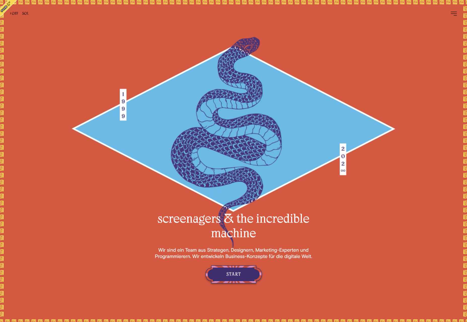
screenagers & the incredible machine
screenagers & the incredible machine’s site puts illustration front and center, creating a look that evokes various mystic ideas. It sounds strange, but it works.
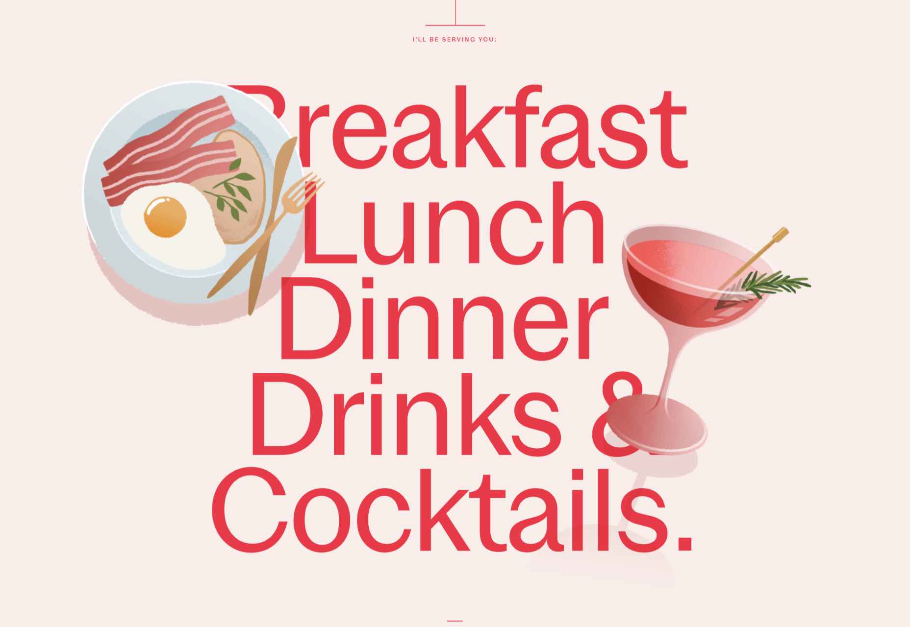
Anna Jóna
This prelaunch teaser site for Anna Jóna café and cinema has an elegant yet modern feel.
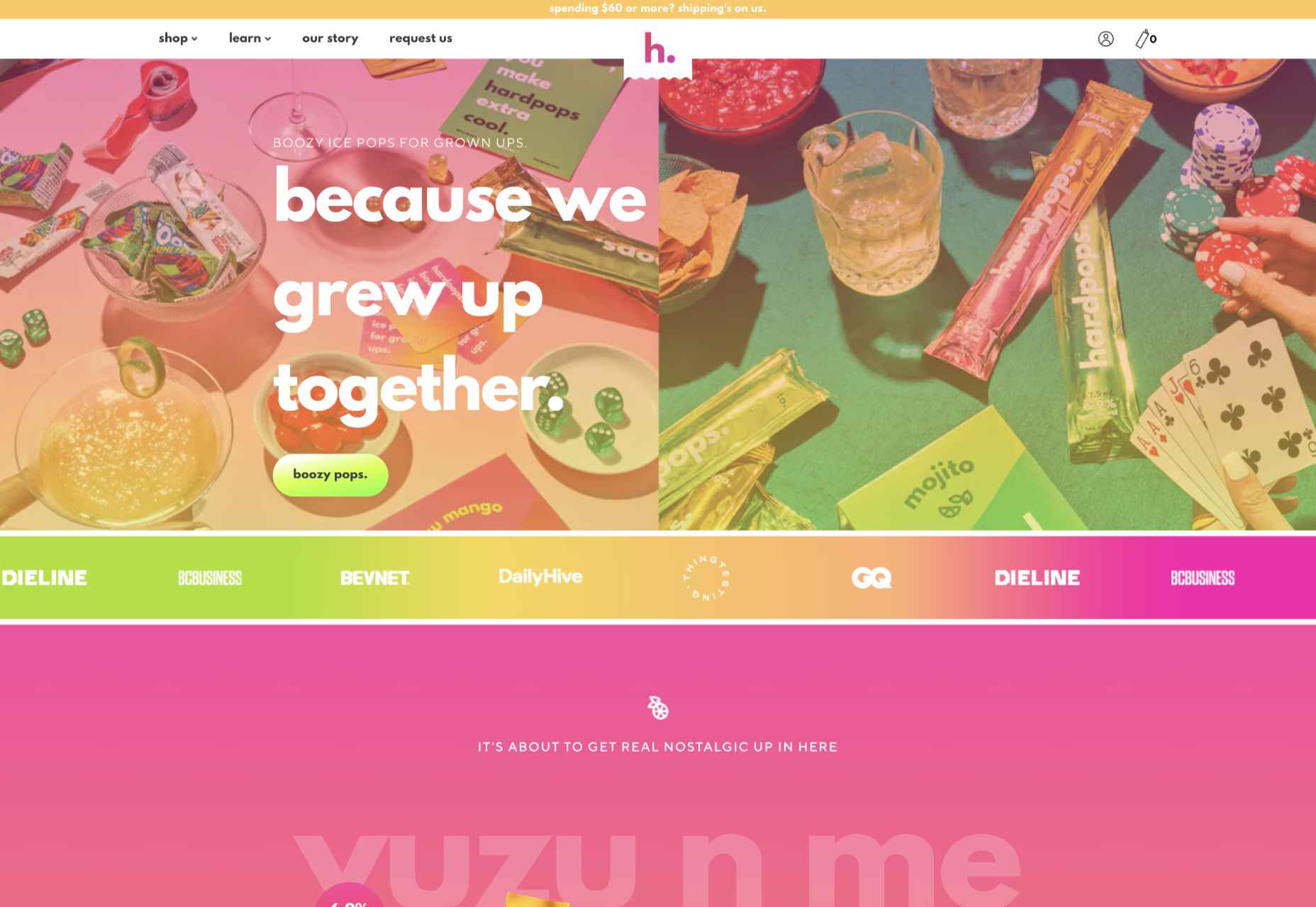
Hardpops
This site for Hardpops (alcoholic) ice pops takes its cue from the product flavors, and the bright, fruity colors give it a real zing.
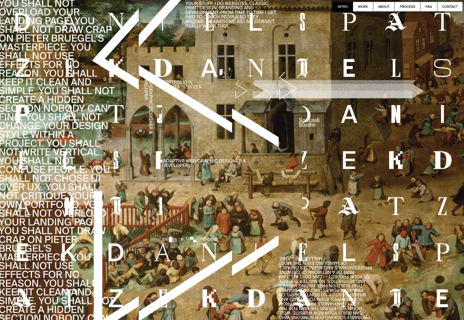
Daniel Spatzek
Daniel Spatzek’s portfolio site takes the rules-are-made-to-be-broken approach. The result has attitude and a nice touch of humor.
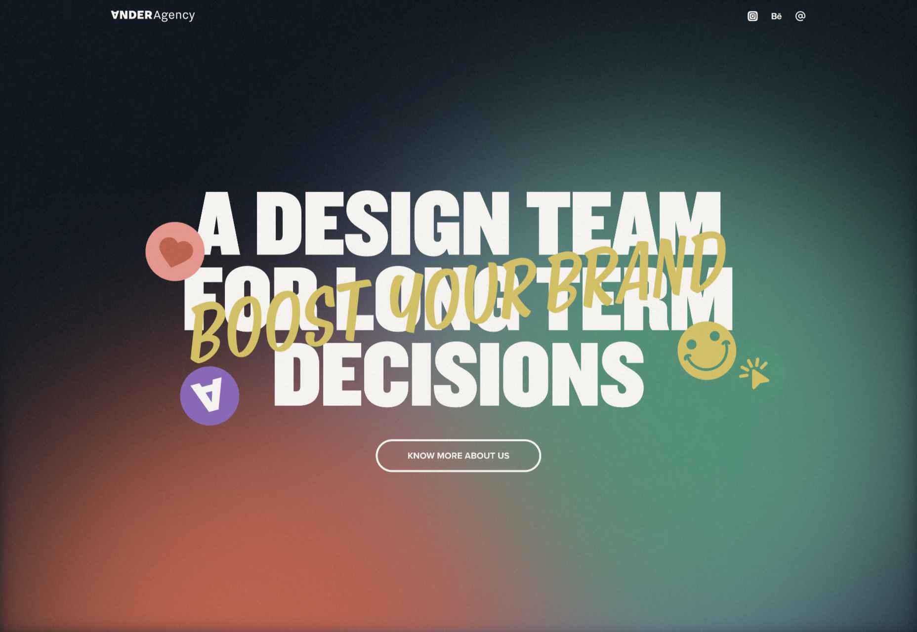
Ander Agency
Plenty of color, large type, and illustration make a bold statement for Ander Agency’s single-page site.
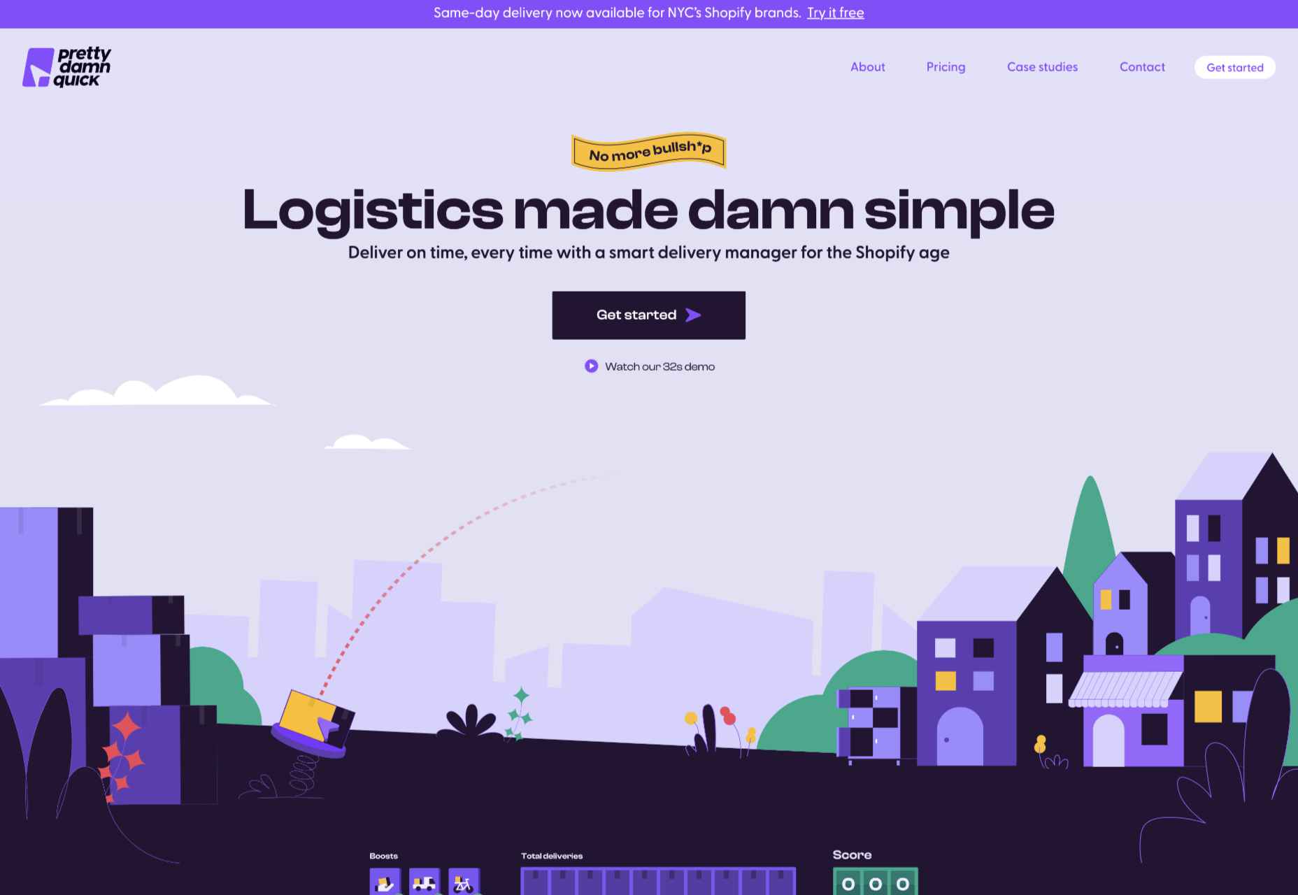
Pretty Damn Quick
Colorful illustration on this site for Pretty Damn Quick’s Shopify app creates an impression of friendliness about the company and ease of use of the product itself.
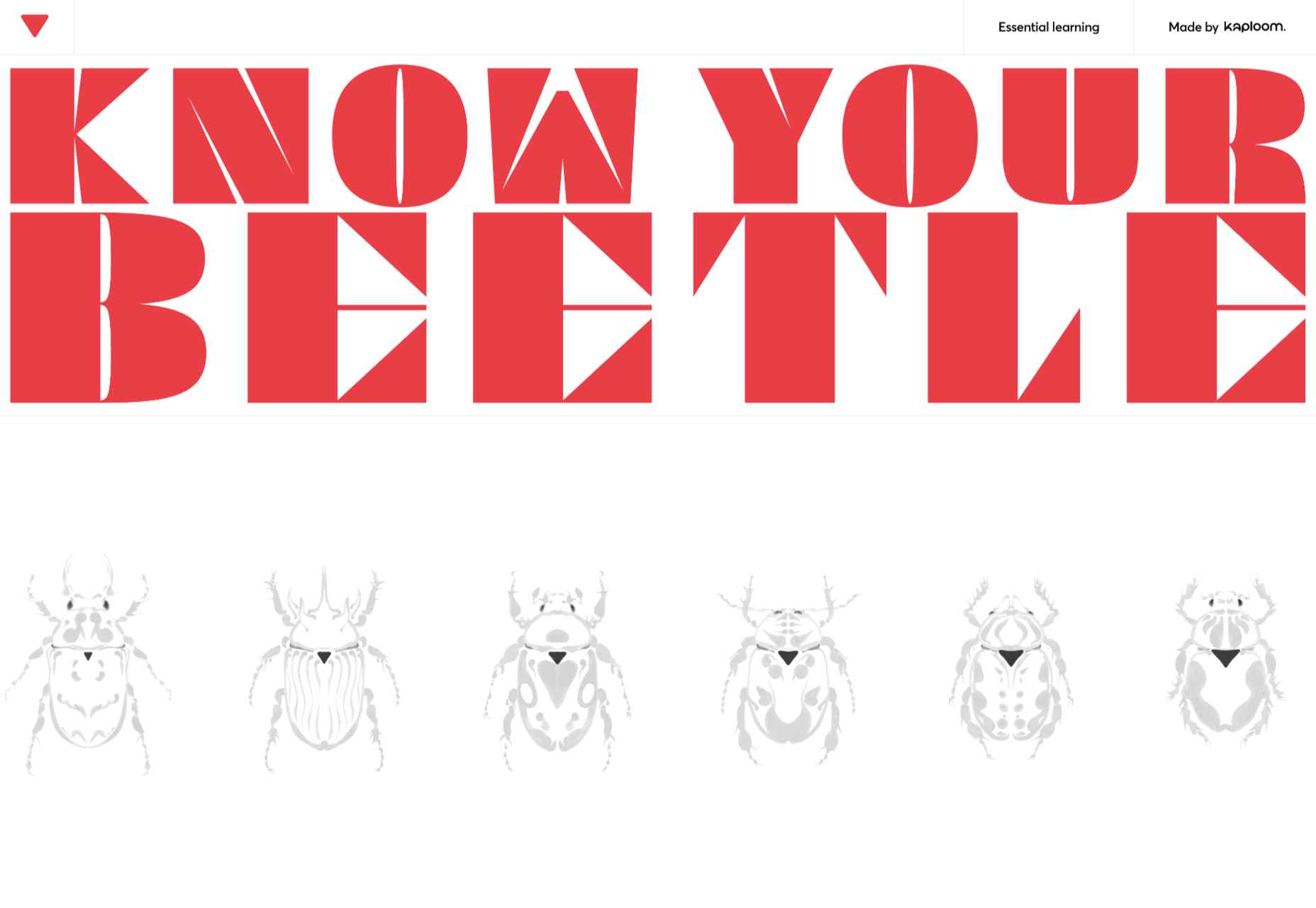
Know Your Beetle
Know Your Beetle is a showcase page for Kaploom creative studio. Color and type combinations make a big impact.
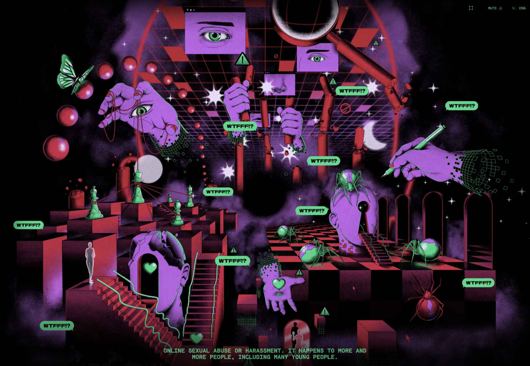
WTFFF
While many of the sites featured here have a sense of fun about them, WTFFF tackles a somber subject: online sexual abuse and harassment. Artwork and audio create an immersive experience in which five young people share their experiences with the aim of helping others.
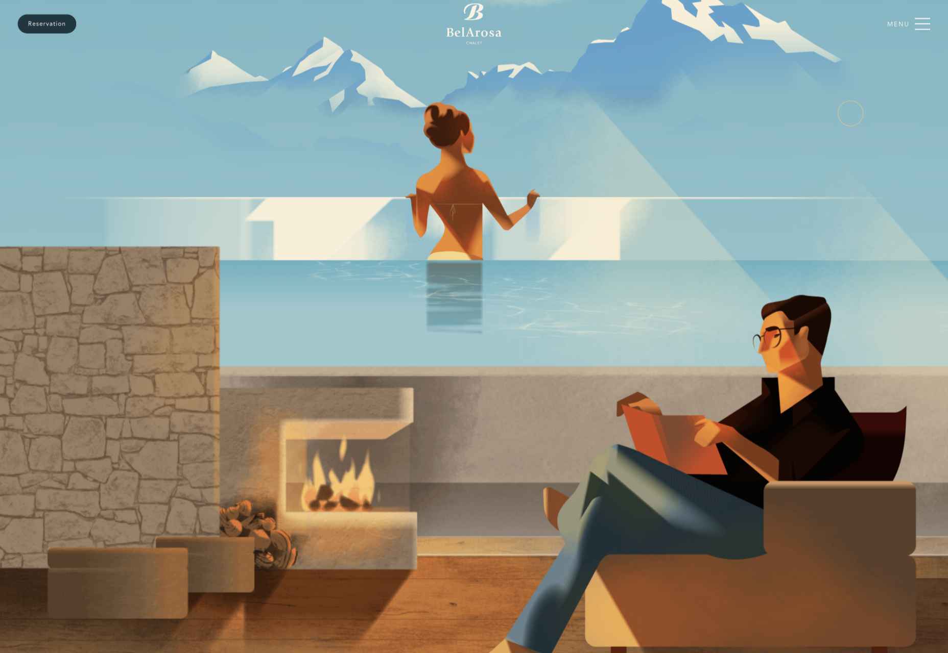
BelArosa Chalet
Full-screen illustrations with a hint of vintage style create an ideal impression of what future guests can expect from the currently under construction BelArosa Chalet.
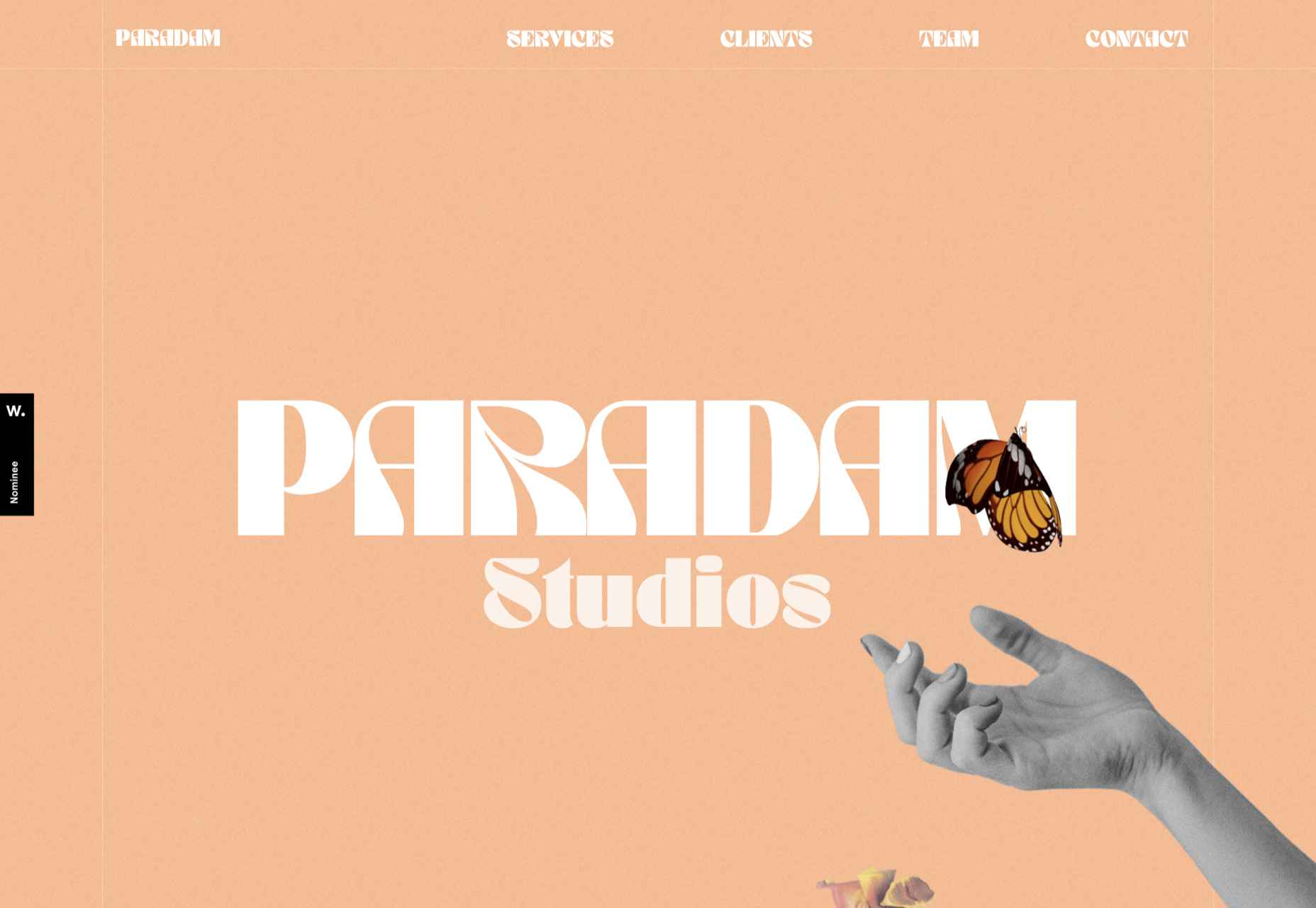
Paradam
The color scheme on the Paradam site is on the pastel end of the scale, but there is still lots going on to entrance the eye.
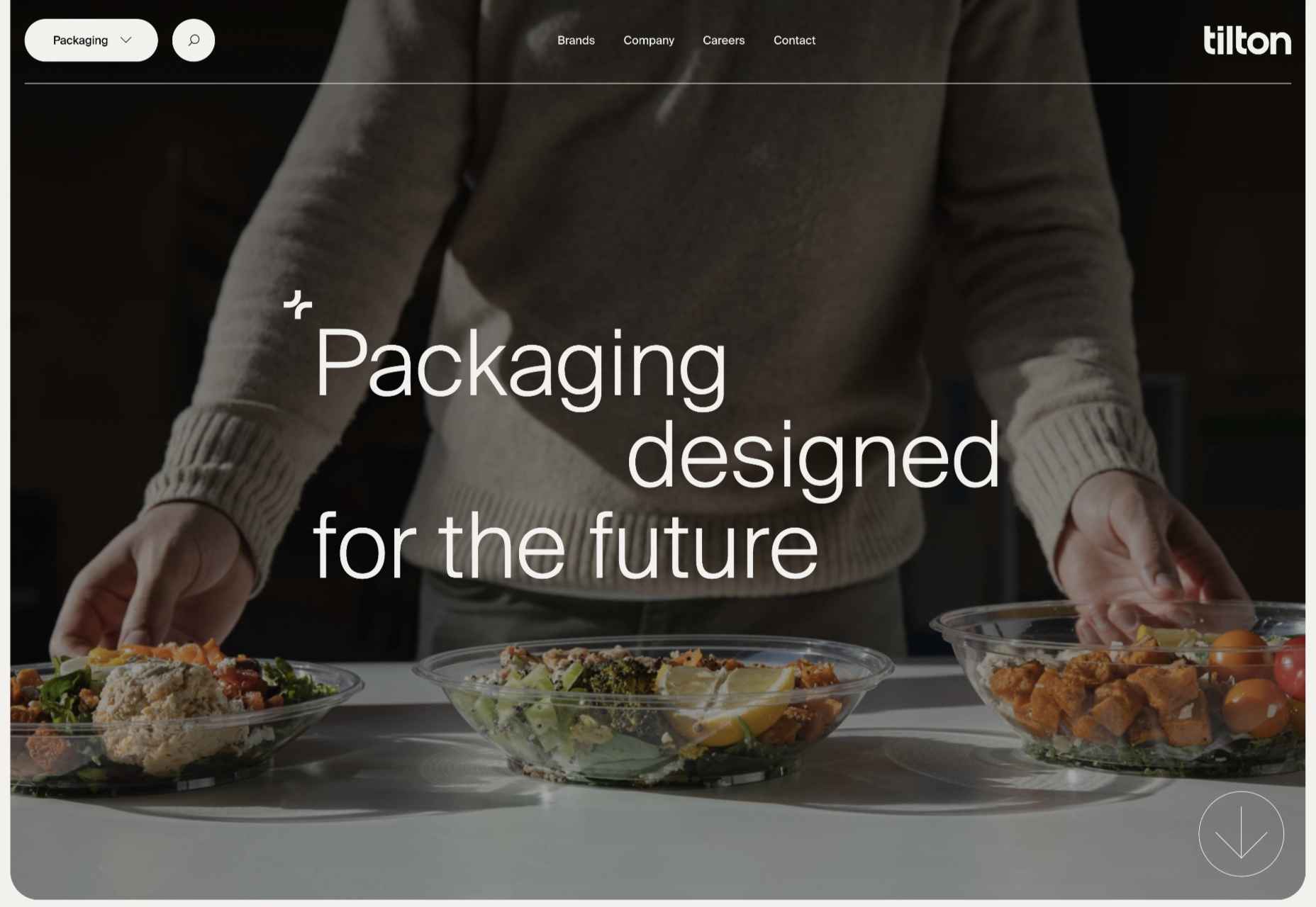
Tilton Group
The scrolling color panels on the Tilton Group site are a thing to behold.
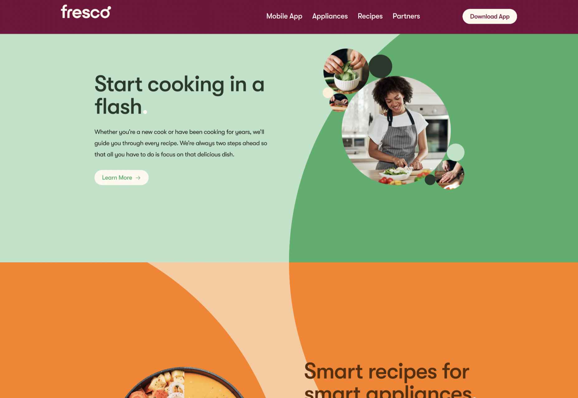
Fresco
Fresco uses a standard layout design, but the colors and quarter-circles instantly lift it.
Museum of Pink Art
Museum of Pink Art is an immersive experience celebrating the color pink. Undoubtedly worth a virtual wander around.
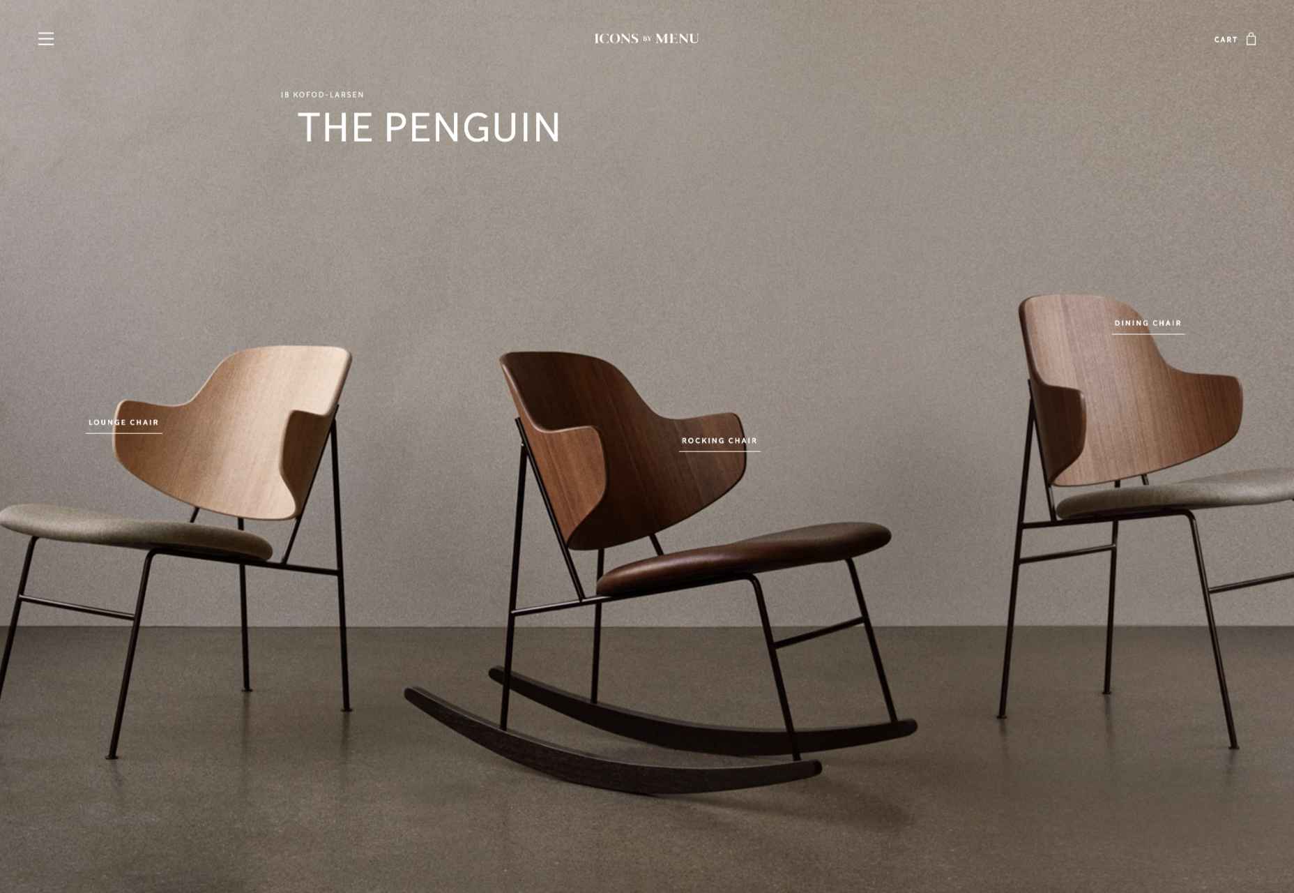
Icons by Menu
OK, this somewhat more minimalist site slipped through the net, but Icons by Menu is so pleasing to look at and use that we had to include it.
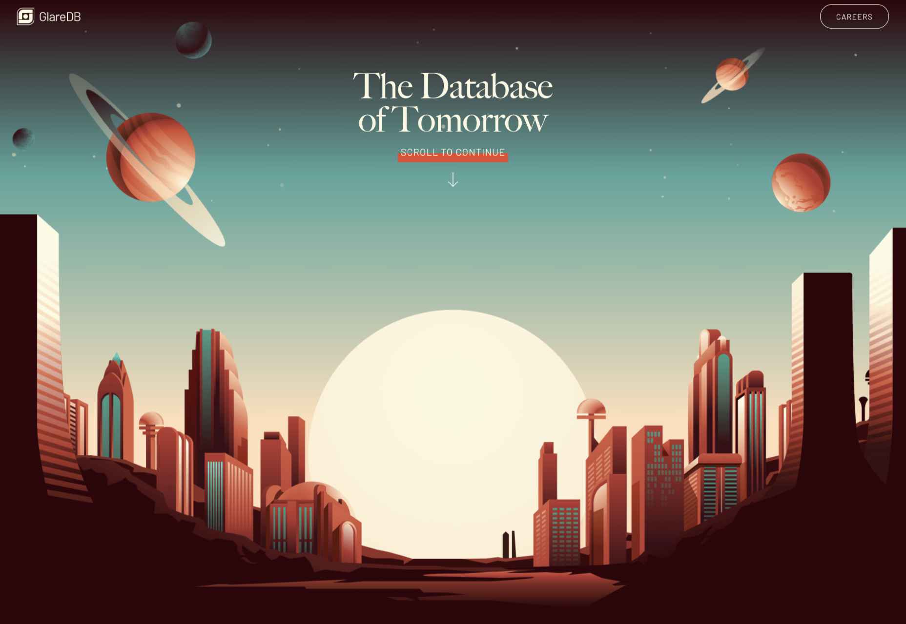
GlareDB
With an illustration that could be ideally at home on an Arthur C. Clarke book jacket and that rich, deep red background, this site for Glare DB is a world away from what might be expected.
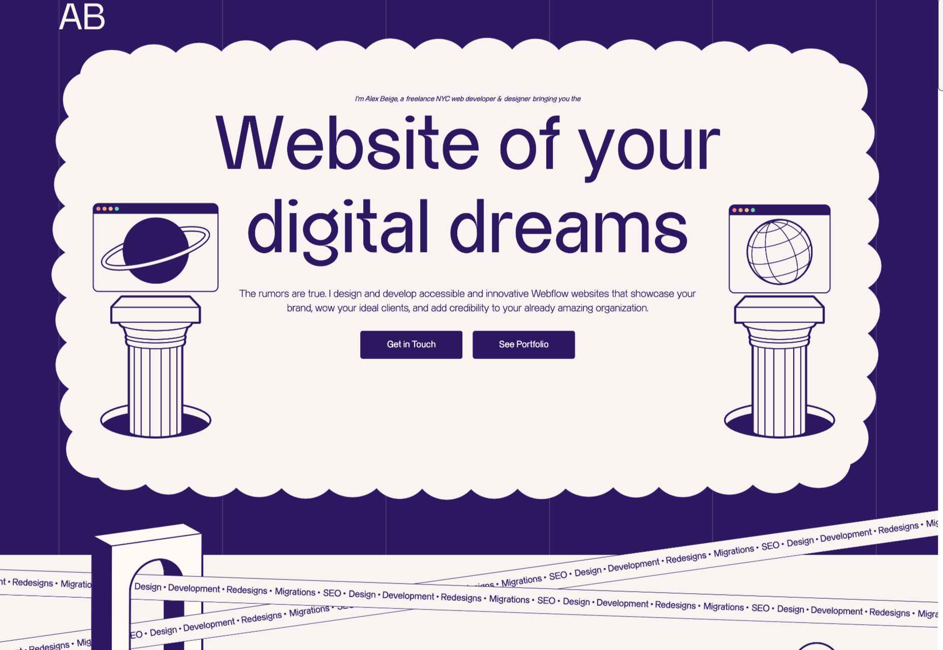
Alex Beige
While the overall style and accent illustrations are pleasing on Alex Beige’s site, the Our Team section is guaranteed to raise a smile and stick in the user’s mind.
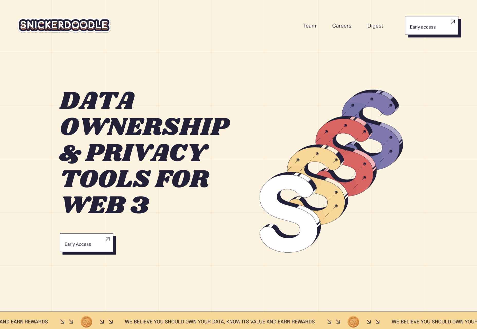
Snickerdoodle
Careful spacing means busy elements (like on scroll animated illustrations) don’t become overwhelming on the Snickerdoodle site.
Grisly’s Cosmic Black
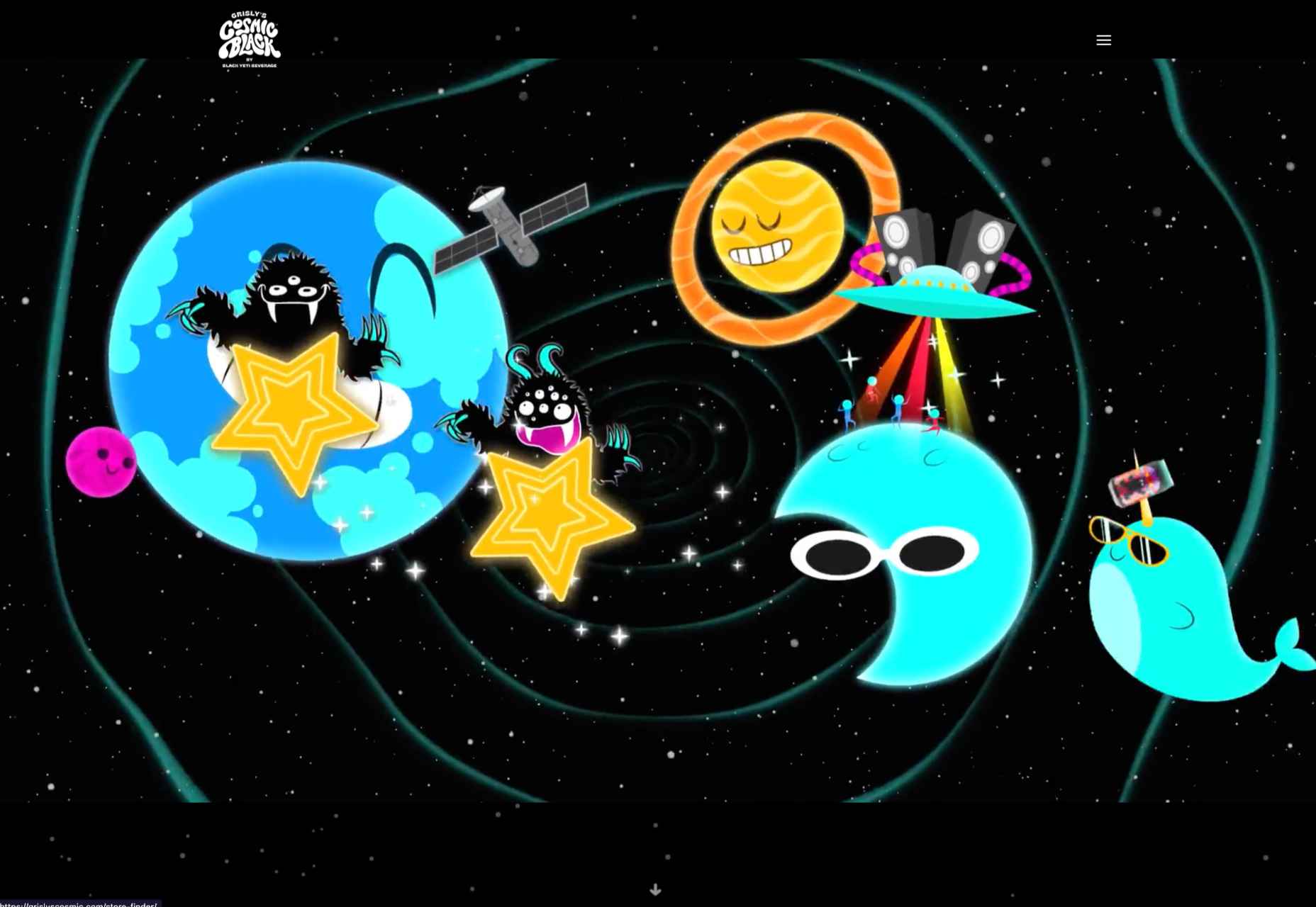
The site for Grisly’s Cosmic Black is fun, bright, and joyful. Plus, it’s nice to see an alcohol site going a bit further than the usual ‘drink responsibly’ and actually providing helpful links.
The Perennial
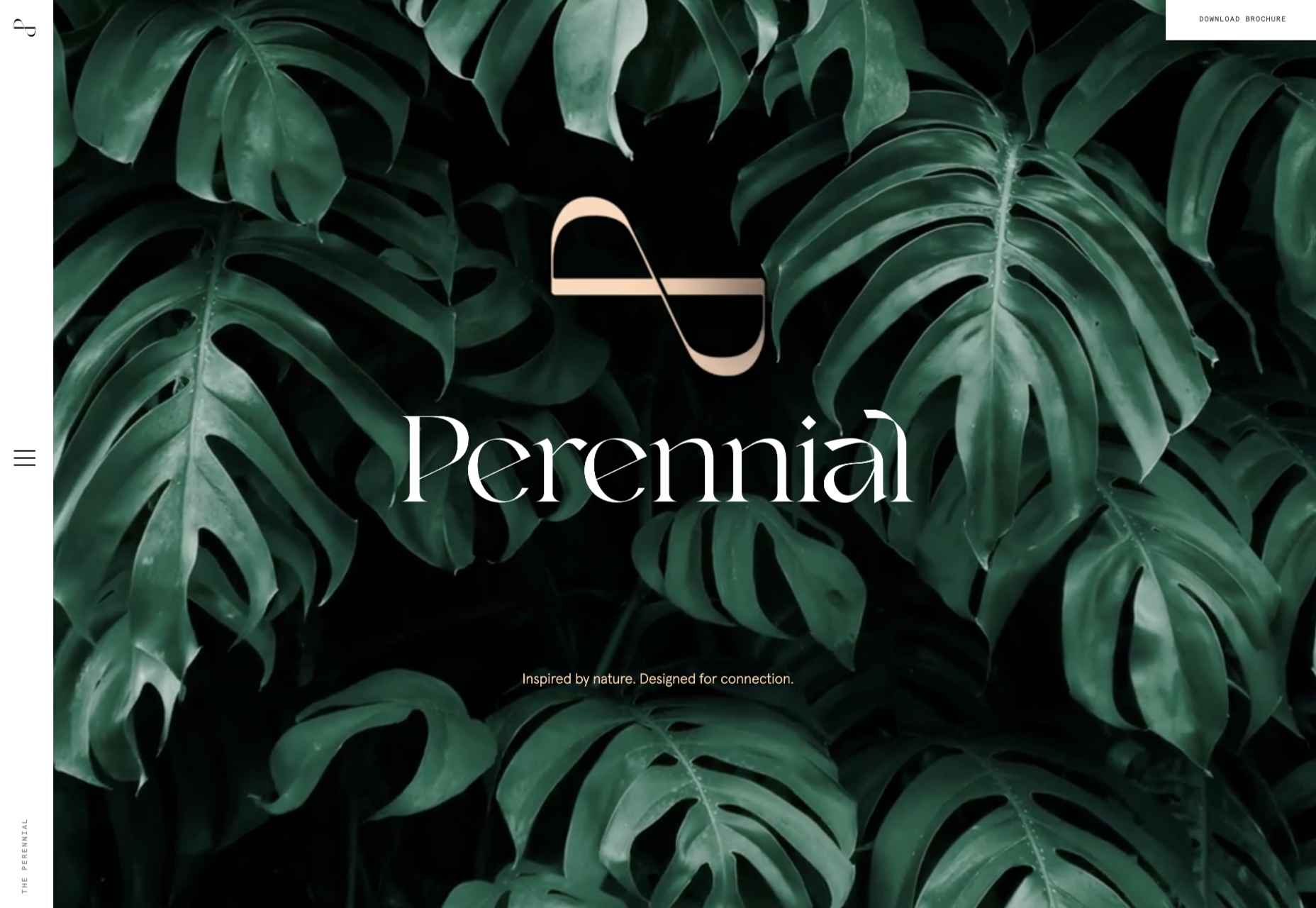
Not just floorplans and (lots of) images, but virtual walkthroughs too. The Perennial doesn’t feel like a standard office building.
The post 20 Best New Websites, July 2022 first appeared on Webdesigner Depot.

