Articles

Dark themes are everywhere these days. 

As human beings continue to spend more of their time interacting with technology, dark themes provide a more relaxing way to engage with the digital world. More often than not, these themes are easier on the eyes, more attractive, and perfect for the dedicated user

Throughout 2020, countless leading brands have debuted their own version of the dark theme. Google has a solution for your Drive, while Apple and Android have built dark theme performance right into their operating systems. 

If you haven’t learned how to make the most out of dark mode yet, then you could be missing out on an excellent opportunity to differentiate your design skills, and earn more clients going forward. 

Why Dark Mode?

Before we dive too deeply into the possibilities of creating your own dark theme, let’s examine what dark mode is, and why it’s so effective. 

Ultimately, dark themes are created to reduce the amount of luminance emitted by everything from your desktop and laptop, to your smartphone and smartwatch. Dark themes help to improve the visual ergonomics of design, by reducing eye strain, adjusting brightness to suit current lighting conditions, and more. Additionally, many dark mode offerings are also fantastic at conserving battery life. 

Here are some of the main benefits of adding dark themes to your design portfolio

  • Better user experience: A focus on user experience is one of the most important trends of the digital age. You need to be willing to deliver incredible experiences to everyone who visits your website if you want to stand out today. Dark mode reduces everything from eye strain, to battery power consumption. This helps to keep customers on a website for longer.
  • Innovation and cutting edge appeal: Most companies want to prove that they can stay on the cutting edge of their industry. The ability to offer an opt-in dark mode version of a website theme or appearance can help your clients to stand out from the crowd. As the environment becomes more mobile-focused, more companies will be looking for designers that can provide the best mobile experiences. 
  • Support for universal design: Dark mode isn’t just great for people who have light sensitivity at night. This solution could be more comfortable for visually-impaired users who would struggle with eye strain when visiting your websites otherwise. If you want your content to be more inclusive for a wider range of viewers, then learning how to design for dark mode is a good way to start.

Best Practices When Designing for Dark Mode

Designing for dark mode is easier than you’d think. Most of the time, it involves simply thinking about how you can replace some of the brighter, more overwhelming aspects of your site, with something deeper and darker. 

Here are some useful tips that will get you moving in the right direction. 

1. Experiment with Colors

A big issue for a lot of web designers when it comes to developing a dark mode solution is that they get too caught up with things like pure white text against pure black backgrounds. However, this high-contrast option can be a little much after a while. 

It’s often much easier to use a dark grey as your primary surface color, instead of a true black. Additionally, rather than using bright white, think about slightly off-white alternatives that will be warmer to the eye.

Experiment with surfaces and color combinations that are unlikely to cause too much eye strain. Dark grey foundations often offer a wider range of depth, too, because you can demonstrate shadows on grey. 

Additionally, when you are experimenting with colors, remember that saturated colors often vibrate painfully against very dark surfaces, making them harder to read. Desaturating your colors will help to reduce the contrast and make your websites more welcoming. 

Lighter tones in the 200-50 range will have better readability on dark themes. However, you can always experiment with your choices. Google Material Design recommends using a contrast level of around 15:8:1 between your background and text. 

2. Consider the Emotional Impact

Much of the effort involved with dark mode design is figuring out how certain colors work together. It’s easy to get carried away with stark contrasts, particularly when you’re used to working with a white background. However, you need to remember that you’re designing for a user that’s primarily looking for an easier and more subdued browsing experience.

While you’re working, remember to consider the emotional aspect of the design too. The emotion in colors can make or break a buyer’s journey in any environment. However, an often overlooked-aspect of color psychology, is that people perceive shades differently when they’re on a black background

For instance, think of the color green. On a light background, it conveys nature and even financial wealth. However, on a dark background, the same green could come across as something venomous, toxic, or even sickly. It’s important to think about the kind of impressions end users are going to get when they arrive on your site.

3. Give Users the Freedom to Choose

One of the biggest mistakes you can make when you begin designing for dark mode, is thinking that you should focus entirely on your dark themes, and nothing else. This lines you up for a problem if you interact with users who want the best of both worlds. If you’re designing for apps in particular, you’re going to need web pages that can switch naturally between light and dark themes. 

Learning how to implement both a dark mode and a light mode option into the desks you create will help you to reach a wider selection of customers. Remember, you’ll need to test the performance and impact of your designs in both themes, to check that they deliver the same kind of experience, no matter how your user chooses to browse. 

Although dark mode should offer a different experience to end-users, it still needs to feel as though they’re browsing on the same website. That means that you’re going to need to experiment with the most natural combination of light and dark mode options.

4. Remember the Basics

Remember, although the three tips above will help you to get on the right path for dark mode design, you’ll also need to consider the opportunities and limitations of the platforms that you’re designing for. The kind of dark mode experience you can deliver for Google Chrome websites is going to be very different to what you can create for something running on iOS.

Examining the documentation provided by the system that you’re designing for will help you to develop something with a close insight into what’s actually possible. 

Other top tips for dark mode design include:

  • Focus on your content: Make sure that your content stands out on the page, without being too overwhelming. 
  • Test your design: In both light and dark appearances, you need to make sure everything is working as it should be.
  • Adopt vibrancy for your interfaces: Vibrancy helps to improve the contrast between your background and foreground. 
  • Use semantic colors: Semantic colors adapt to the current appearance of a website automatically. Hard-coded color values that don’t adapt can seem more aggressive. 
  • Desktop tinting: Try experiment with things like transparency and filters to give your websites and apps a slightly warmer tint – ideal for late-night browsing
  • Icons: Use individual glyphs and icons for dark and light modes if necessary. 

Ready to Design for Dark Mode?

Preparing your web development and design portfolio for an era addicted to dark mode can be a complex experience. You need to think carefully about how people are going to browse through your websites and apps when they’re searching for something more subtle, and less visually overwhelming than the websites that we’re used to making. 

The most important thing to remember is that everything on your website or application should look just as beautifully tailor-made in dark mode as it does in light mode. Simply adding a dynamic black background when people want to switch settings in an app isn’t enough. You need to go in-depth with your designs and examine how different fonts, colors, and images work together.

Source


Source de l’article sur Webdesignerdepot

The digital world is a place of constant change. Just as you get used to a new design trend, another one appears, forcing you to rethink the way that you approach each client project. 

As a web designer, it’s up to you to make sure that you have your finger on the pulse on the latest transformations in the industry. However, it can be challenging to know for sure which trends you should be taking seriously, and which you can simply ignore. 

One option to refine and enhance your design journey is to pay attention to influencers. 

Influencers aren’t just there to guide customers into making purchasing decisions. These people are thought-leaders in their field. They spend all of their time tracking down ideas and concepts that really work. That way, they can maintain a successful reputation online.

Sourcing information and motivation from the following UX influencers could help you to create some truly amazing websites in 2020: 

1. Andrew Kucheriavy 

Andrew Kucheriavy is the phenomenal co-founder and CEO of a company named Intechnic. Andrew was one of the first people in the world to be given the “Master in User Experience” award. This means that he’s an excellent person to pay attention to if you want help understanding the ins and outs of user experience design

As one of the leading visionaries in UX, business strategy, and inbound marketing, Andrew has a lot of useful information to offer professionals and learners alike. Andrew is particularly active on Twitter, where he’s constantly sharing insights on design and marketing. You can also find input from Andrew on the Intechnic blog. 

2. Jeff Veen 

Another must-follow for designers who want to learn more about understanding their audience and their position in the marketplace, Jeff Veen is a leader in UX and product design. Veen got his start with the founding team for Wired, before he created the Adaptive Path company for UX consulting. Jeff Veen is also known for being responsible for various aspects of Google Analytics. 

Over the years, Jeff has expanded his knowledge in the design space, and mentored various companies, from WordPress to Medium. He also has a fantastic podcast that you can listen to for guidance when you’re on the go. 

3. Jared Spool 

Jared Spool has been tackling the most common issues of user experience since before the term “UX” was even a thing. Excelling in the design world since 1978, Jared has become one of the biggest and most recognizable names in the user experience environment. He’s the founder of the User Interface Engineering consulting firm. The company concentrates on helping companies to improve their site and product usability. 

Jared offers plenty of handy information to stock up on in his Twitter feed. Additionally, you can find plenty of helpful links to blogs and articles that he has published around the web on Twitter too. He’s followed by Hubgets, PICUS, and many other leading brands. Make sure that you check out his collection of industry-leading talks on UIE. 

4. Jen Romano Bergstrom

An experimental psychologist, User Experience Research coach, and UX specialist, Jen is one of the most impressive women in the web design world. She helped to create the unique experiences that customers can access on Instagram and Facebook. Additionally, she has a specialist knowledge of eye-tracking on the web. You can even check out Jen’s books on eye-tracking and usability testing

When she’s not writing books or researching user experience, Jen is blogging and tweeting about usability and researching new strategies in the web design space. It’s definitely worth keeping up with Jen on Twitter, particularly if you want to be the first to know about her upcoming seminars and learning sessions. 

5. Katie Dill 

Katie Dill is the former Director of Experience for Airbnb, so you know that she knows her way around some unique experiences. With an expertise in working with companies that harness new technologies and UX design, Katie Dill is at the forefront of the user experience landscape. Dill attends various UX conferences throughout the year, and publishes a range of fantastic videos on YouTube. 

You can find blogs and articles from Katie published on the web; however, you’ll be able to get the most input from her by following Katie on her Twitter account. 

6. Khoi Vinh 

Khoi Vinh is one of the most friendly and unique UX bloggers and influencers on the market today. He knows how to talk to people in a way that’s interesting and engaging – even about more complicated topics in UX design. Vinh is a principle designer at Adobe, and he has his own podcast called Wireframe. However, he still finds time to keep his followers engaged on Twitter. 

Over the years, Khoi has worked as a Design Director for Etsy and the New York Times. Vinh also wrote a book called “Ordering Disorder” which examines grid principles in web design. According to Fast Company, he’s one of the most influential designers in America. Additionally, Khoi has a brilliant blog where you can check out all of his latest insights into UX design. 

7. Cory Lebson

Cory Lebson is a veteran in the world of web design and user experience. With more than 2 decades of experience in the landscape, Cory has his own dedicated UX consulting firm named Lebsontech. Lebson and his company concentrate on offering UX training, mentoring, and user experience strategy support to customers. Cory also regularly speaks on topics regarding UX career development, user experience, information architecture and more. 

Cory is an excellent influencer to follow on Twitter, where you’ll find him sharing various UX tricks and tips. You can also check out Cory’s handbook on UX careers, or find him publishing content on the Lebsontech blog too. 

8. Lizzie Dyson

Another amazing woman in the industry of UX, Lizzie Dyson is changing the experience landscape as we know it. Although she’s a relatively new figure in the web design world, she’s recognized world-wide for her amazing insights into the world of web development. Lizzie also helped to create a new group specifically for women that want to get involved in web design. 

The Ladies that UX monthly meet-up welcomes a community of women into the digital landscape, helping them to learn and expand their skills. Lizzie regularly publishes content online as part of Ladies that UX. Additionally, she appears on the Talk UX feed – an annual design and tech conference held for women around the world. 

9. Chris Messina 

Chris Messina is a product designer and a technical master who understands what it takes to avoid disappointing your users. With more than a decade of experience in the UX design landscape, Messina has worked for a variety of big-name brands, including Google and Uber. He is best known as the inventor of the hashtag!

Chris is a highly skilled individual who understands the unique elements that engage customers and keep people coming back for more on a website. You can see Chris speaking at a selection of leading conferences around the world. Check out some of his talks on YouTube or track down his schedule of upcoming talks here. Chris also has a variety of fantastic articles on Medium to read too. 

10. Elizabeth Churchill

Last, but definitely not least, Elizabeth Churchill is a UX leader with an outstanding background in psychology, research science, psychology, artificial intelligence, cognitive science, human interaction with computers and more. She knows her way around everything from cognitive economics, to everyday web design. Churchill also acts as the director of UX for Google Material Design. 

A powerhouse of innovation and information, Churchill has more than 50 patents to her name. She’s also the vice president of the Association for Computing Machinery too. When she’s not sharing information on Twitter, Elizabeth also has a regular column that you can tune into on the ACM Interactions magazine. 

Who Are You Following in 2020?

Whether you’re looking for inspiration, guidance, or information, the right influencers can deliver some excellent insights into the world of web design. There are plenty of thought leaders out there in the realm of user experience that can transform the way that you approach your client projects. You might even discover a new favourite podcast to listen to, or an amazing series of videos that help you to harness new talents. 

Influencers are more than just tools for digital marketing; they’re an excellent source of guidance for growing UX designers too.


Featured image via Pexels.

Source


Source de l’article sur Webdesignerdepot

I often see freelancers on social media asking what the secret is to working fewer hours, making more money, and helping new clients to find them. While those things tend to happen the longer you’ve been freelancing, it doesn’t happen without some effort.

If you’re wondering how you can change things so that your business becomes more profitable and easier to manage, education is the key.

But it’s not just mastering new design techniques that will take you to the next level. It’s important to invest your time in a well-rounded education so that you can grow not just as a web designer, but also as a freelancer and business owner.

The good news is that you don’t have to spend a ton of cash on courses or resources. In the following round-up, I’m going to share some of the best free courses to help you level up.

5 Best Free Courses and Resources for Web Designers

Rather than sign up for Udemy, Skillshare and other premium course membership sites, I recommend taking a bootstrapping approach to self-education. I mean, the whole point in learning new skills and strengthening existing ones is so you can run a better business and make more money, right?

Once you have extra funds to throw at premium courses, definitely explore those options. For now, let’s focus on the free courses and resources that’ll help get you to that next level:

1. edX

edX was created by Harvard and MIT in order to provide university-level training and education to anyone, anywhere. While you can’t get certified without paying a few hundred dollars, you can go through entire courses for free.

Courses are offered over a wide range of categories. As a freelance web designer, you’d do well to focus on the following areas:

Design
Learn more than just how to design beautiful interfaces. Learn about the technical side of it, too — things like AI, IoT, and cybersecurity.

Computer Science
Learn web development and coding.

Business & Management
Learn essential business skills like:

  • Project management
  • Finance management
  • Leadership
  • Marketing and analysis

Communication
Learn things like branding, negotiation, reputation management, and critical thinking.

2. Envato Tuts+

Envato Tuts+ might be best known for its succinct step-by-step design and development tutorials. However, it has a new section of free video courses to take advantage of.

Although you won’t learn any soft skills here, this is a great resource if you want to master the tools of your trade.

Free courses give you a deeper look at tools like:

  • HTML, CSS, and JavaScript
  • Adobe’s suite of software
  • Sketch
  • WordPress
  • Video conferencing tools

3. YouTube

YouTube is more than just a place to watch entertaining videos. There are some amazing YouTube channels for web designers at all skill levels.

When choosing a design channel and course to follow, look for ones that are well organized. If they’re just posting videos at random without any rhyme or reason, it’ll be difficult to focus on and master one skill set before moving onto the next.

Here are the channels I recommend you follow:

Flux

Learn skills related to:

  • Web design
  • Getting started as a freelancer
  • Strengthening your processes
  • Building your portfolio
  • Design theory and strategy

CharliMarieTV

Learn skills related to:

  • Web design
  • Building sites with Figma or Webflow
  • Career paths for designers
  • Productivity hacks

NNgroup

Learn skills related to UX:

  • Web design
  • User psychology
  • Usability testing
  • Design thinking
  • Research and data analysis
  • Journey mapping
  • Get access to UX Conference seminars, too

4. Moz Whiteboard Fridays

Even if you don’t offer SEO as a standalone service, it’s important for web designers to understand the role they play in SEO and to stay abreast of the latest and greatest strategies.

If you haven’t tuned in for one of Moz’s Whiteboard Fridays yet, I’d recommend you start now.

Some of the topics might not be relevant to you (like creating a content strategy). However, there are others you’ll get some great tips from, like the one above that talks about creating great visuals, preparing web pages with tags and schema markup, and optimizing for featured snippets.

5. Nir Eyal – Indistractible

Nir Eyal has made a name for himself over the years as an author and presenter on the subject of human psychology and behavior. His first book (Hooked) examined consumer behavior and how to design around it. His second (Indistractible) turned the focus on us — the doers and creators who build experiences and products for consumers.

The first of his free resources to explore is this 30-minute presentation on why we’re so easily distracted and how to keep those distractions (and ourselves) from getting in the way.

The second free resource to snag up is the 80-page workbook available on the homepage. Here’s a preview of what it looks like:

You’ll learn about common distractions, identify those that are specific to you, and then work through exercises to defeat them.

If this is something you’re struggling with, these resources will empower you to make a much-needed change.

BONUS: WebDesigner Depot

Although WebDesigner Depot doesn’t offer video courses, I consider each of the articles contained within this site to be mini-courses of their own. And you’ll learn everything you’ve ever wanted to know about becoming a web designer and growing your freelance business.


Featured image via Unsplash.

Source


Source de l’article sur Webdesignerdepot

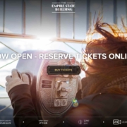
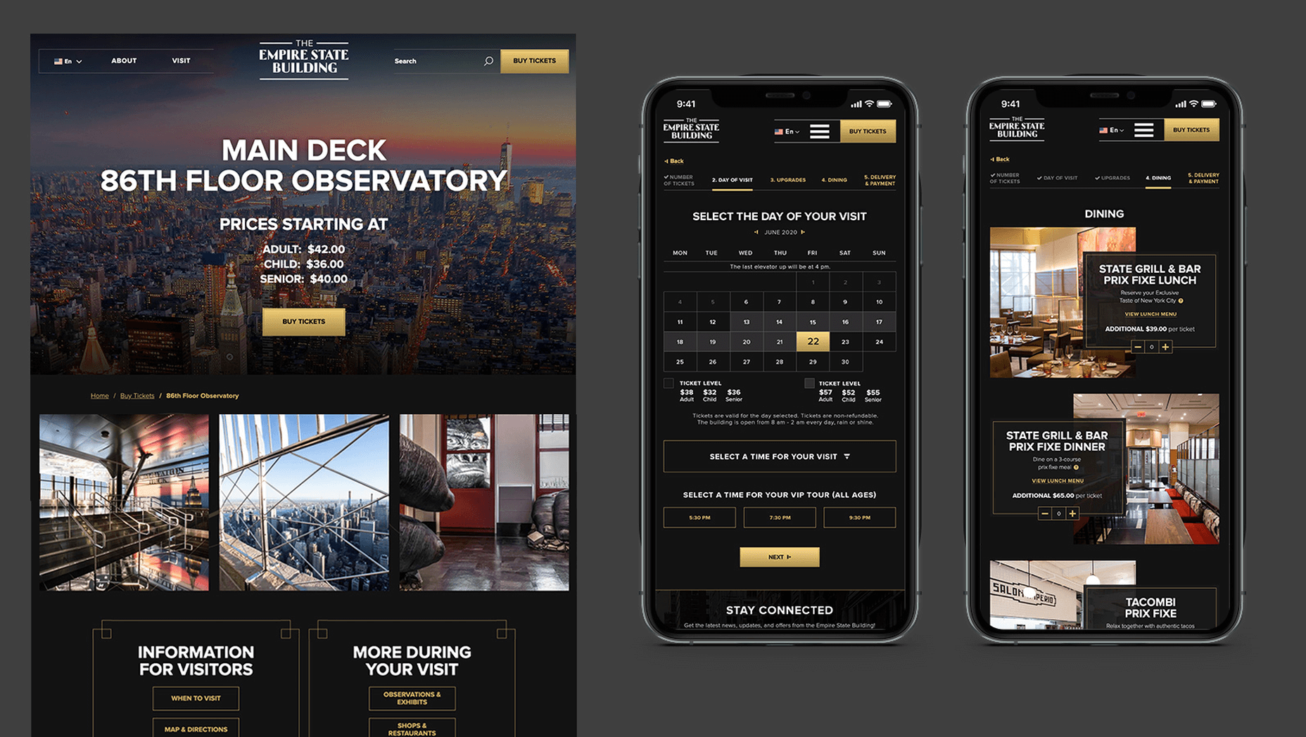
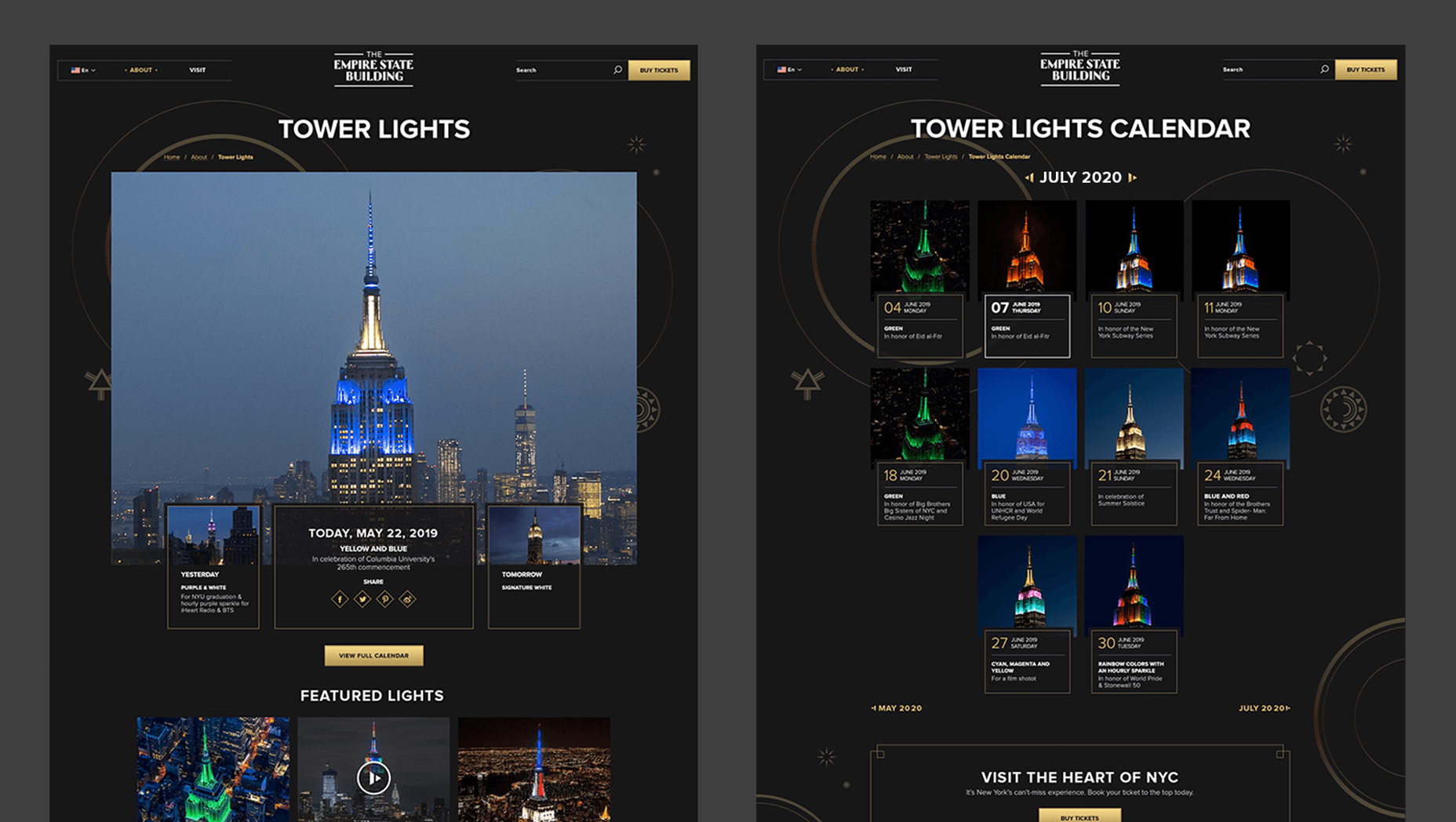
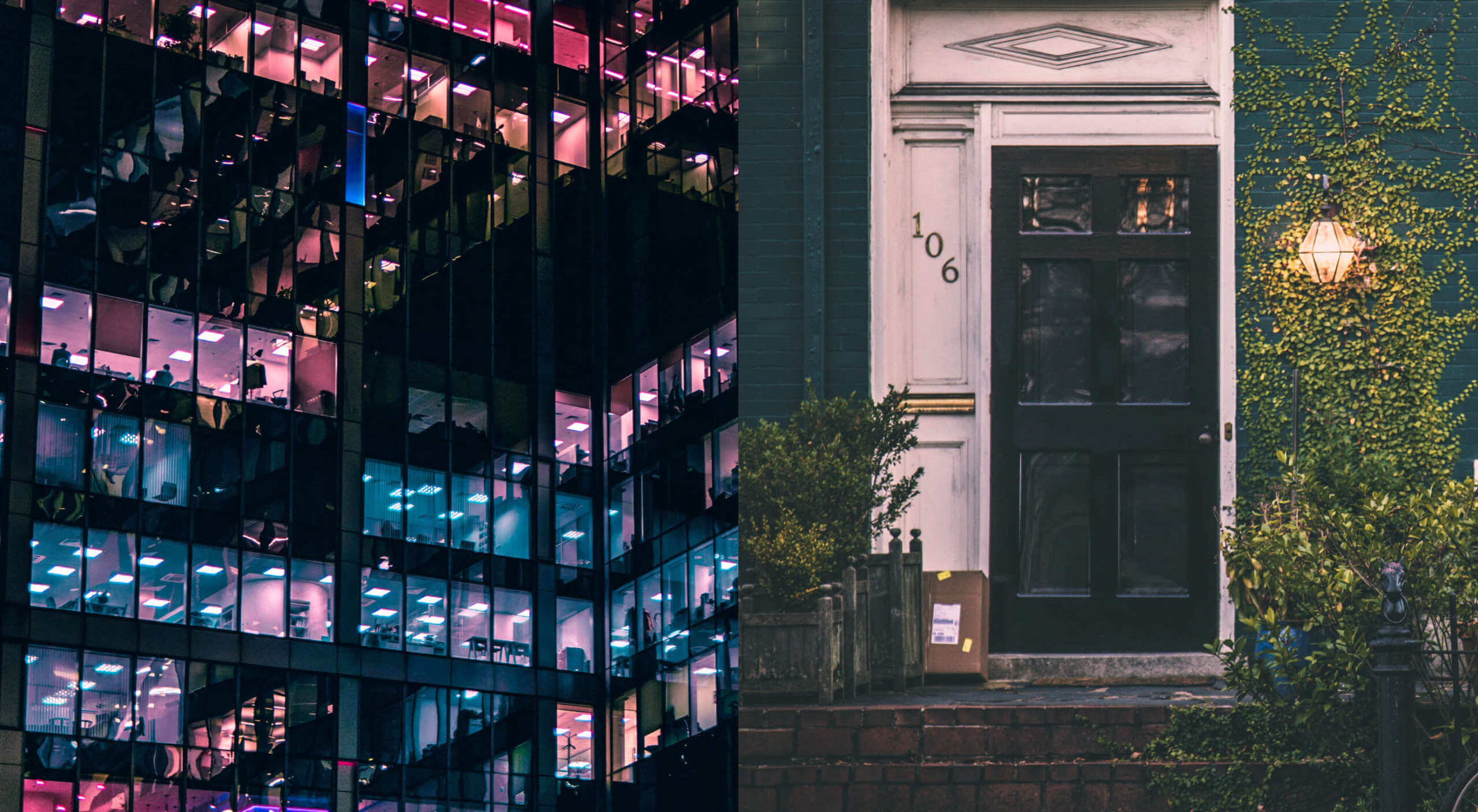
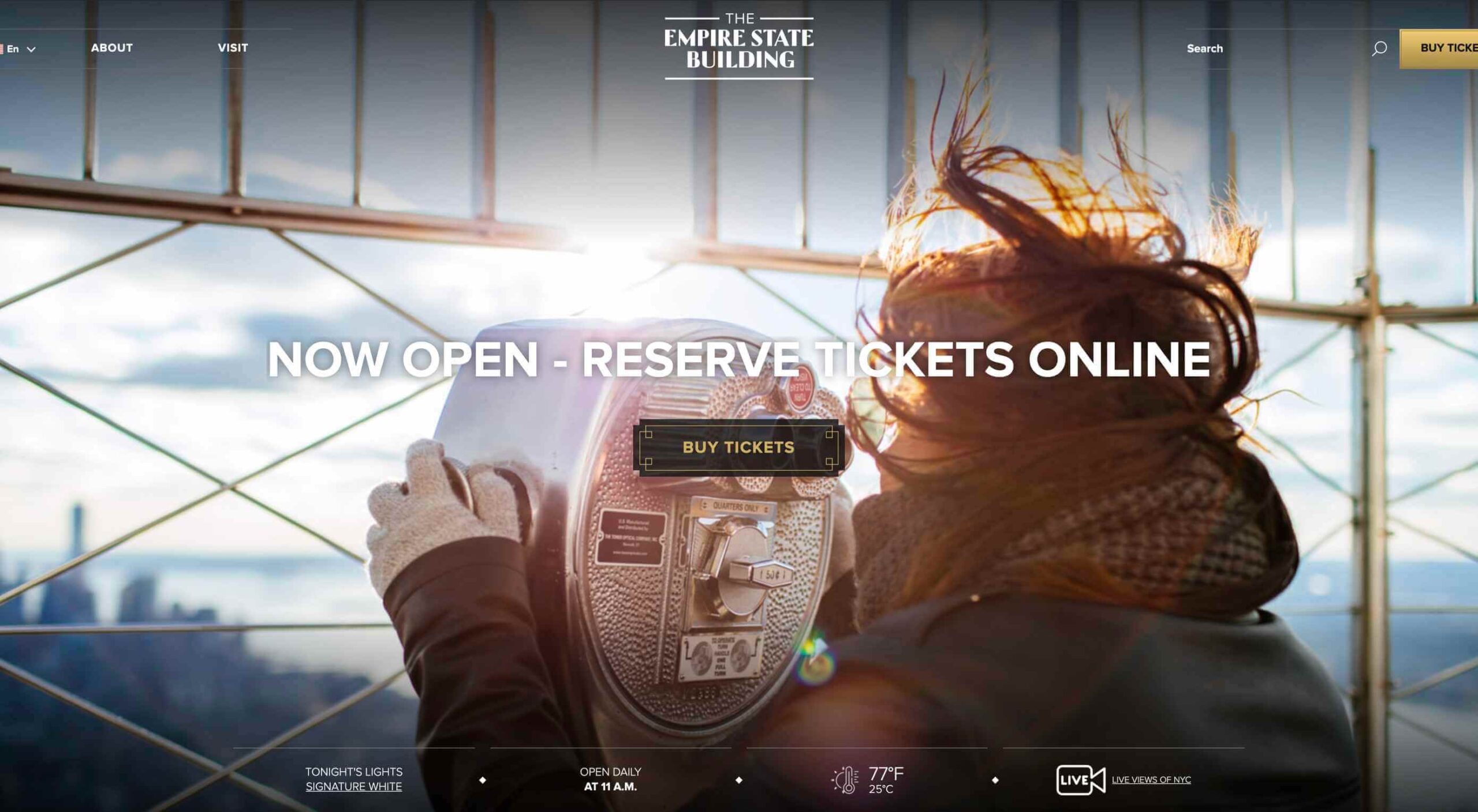
In 2019, to keep pace with an interior redesign of its visitor experience, the Empire State Building decided to redesign its website. Blue Fountain Media were engaged to deliver the project. With the new site launching, we spoke to Head of Design, Tatyana Khamdamova about designing for the world’s most famous building.

Webdesigner Depot: The Empire State Building is probably the most iconic building in America, if not the world. Were there any points at which you thought, “Oh God, this is too much pressure”?

Tatyana Khamdamova: Yes, of course, it was a lot of pressure knowing that people all over the world will be looking at your work. But with the pressure, we also felt excitement and pride that we got to work on such an iconic project. Just thinking that we are doing the site for Empire State Building made us feel proud of all that other work we did during our whole life that gave us the opportunity to be a part of this project.

WD: Blue Fountain Media is a large agency. Did you utilize the whole company, or was there a smaller, dedicated team tasked with creating the site?

TK: On a project like this one, you need the expertise of the team members from all departments in the agency. You want people to work together from the beginning to ensure that their knowledge helps to shape the project and produce the best possible outcome. It’s important for designers and marketers, for example, to be a part of the strategy and UX phase to provide their input which minimizes tunnel vision and generates more ideas. You can only achieve the best results if every single detail from strategy to design to development is done right.

WD: That’s a lot of people to coordinate. Did any roles naturally come to the fore, or is design leadership a quality that varies from person to person?

TK: Some people are natural leaders in their fields. But, sometimes a certain project requires people to take responsibility and show their leadership skills within the team. So I would say that it’s a quality that varies from person to person and doesn’t depend on a role or a title at all.

WD: What were the central aims of the redesign?

TK: ESB’s previous website did not reflect the level of design to match their iconic brand, UX was not user friendly, the content was outdated, and they wanted to grow online individual and group ticket sales. In addition to competing with global and NYC based tourist attractions, ESB was also faced with growing competition in the NYC Observatory market with Top of The Rock, One World Observatory, and Edge at Hudson Yards.

While the building underwent a $165 million renovation, BFM was tasked with creating a best in class website that reclaimed their iconic brand identity while providing an intuitive, and enjoyable user experience for both domestic and international visitors looking to learn about the building, exhibits, and the many ticket experience packages that they offer to visitors.

WD: How do you approach researching a unique project like this?

TK: We went to the source! First, we spoke to visitors of the Empire State Building while they were in line. What was their experience, did they use the website, what made them choose to visit the observatory instead of or in addition to some of the other competing observatories in the city. We then looked at other key tourist towers worldwide to see how they are positioning themselves globally to draw inspiration. We did in-depth stakeholder interviews that included folks working at the building every day and the types of interaction and questions they field from visitors. We conducted surveys of international travelers to understand their motivations and concerns. Finally, we dug into the website itself by testing using various protocols and platforms to understand the visitor paths, what they were able to easily do, and what tasks they may have found challenging. Drawing from all of those insights, we planned and designed the site using an iterative process.

WD: ESB visitors come from all over the world; how did you tackle designing for an international audience?

TK: People across the globe speak different languages, have different cultures and needs. Our goal was to learn about the audience and give them a site that looks and feels like it was created for them. Luckily we were working for the iconic building that is well known internationally and capturing the design aesthetic of the building itself already made the site recognizable across the globe. When working on the project we also were making sure that all users can see the information in their local language when they land on the site and have easy access to the language selector in case they want to change it. When you translate from one language to another the number of words and characters is not always the same. It was important to make sure that the site is designed and developed with an understanding of how the content will be displayed in other languages. With the localization help of our parent company Pactera EDGE we successfully translated the site in several languages and tested it to ensure that it looks right for the local and international audience.

WD: The famous view of the ESB is the external view, but your design feels more in keeping with the experience of the building’s interior. Was that a conscious decision?

TK: It was a conscious decision to create a site that makes you feel like you are visiting the building. Our goal was to make the visitor excited to buy a ticket and see all that beauty with their own eyes. But, if someone doesn’t have an opportunity to come to NY we wanted to make that online experience as close to the real one as possible. We understand that nothing will replace the actual visit to the Empire State Building but we wanted the website to feel real and by using the great photography and amazing Art Deco design elements, we were able to do so.

WD: How did you interpolate such a complex style as Art Deco into a functional site?

TK: Fortunately for us, our office is located a couple blocks away from the building and we had the opportunity to go there and see some of the details. We also had access to the great photos of the renovated hallways, exhibits, and observatory decks, which gave us the idea of how the Art Deco elements were used in the interior design of the building. We all know that interior design and web design have different needs and goals so it was an interesting challenge to design a site that makes you feel like you are inside the building without overwhelming users and that content is easy to read and the ticket purchasing process is simple and clean. We re-created a lot of design elements used on the ceiling, walls, and floor of the building simplified those elements and made them part of the website design. A lot of those elements were used in the background, call to actions, icons, and maps, and combined with the brand colors used in both interior and web designs we were able to give the site the Art Deco look.

WD: There’s been speculation in the design community recently that Art Deco may re-emerge as a trend in the 2020s. Having worked with the style, do you think it could benefit the wider web?

TK: This was a very specific design approach for a very specific project that takes us back to the 1920’s and emphasizes that era through modern twists in web design. I do not see how it can be applied on the web in general unless the client specifically asks for it, for example, architecture website, real estate, or furniture site. Every project is unique and has its own goals and style and there is no one solution that will fit all. As of today, The ESB is Art Deco in a sense and it truly owns that style.

WD: Can you share some details on the technology stack you employed?

TK: The site was built on the Drupal CMS, integrates with Empire’s partner Gateway Ticketing System, and is hosted on Acquia.

WD: Why Drupal? Does it have qualities that suit a project of this scale, or is it simply the case that BFM had the pre-existing expertise of Drupal to facilitate the build?

TK: BFM is a dev-agnostic production team and we always ensure we’re making the best recommendation to our clients. In this case, the previous website was built on Drupal, so in order to decrease the effect of a new platform rollout that would be unfamiliar to the internal ESB teams, we decided to keep the site on the Drupal platform. Luckily, Drupal is an extremely flexible CMS and the needs of the site perfectly align with what Drupal provides.

WD: With visitors from around the world, the range of browsers and devices you had to consider was vastly larger than most projects. Did you draw a line for support? If so, where was it?

TK: BFM constantly updates our list of supported browsers and devices to stay in line with changing technology trends and device usage around the world. We’re extremely lucky that our larger organization, Pactera EDGE, has deep roots in globalization and localization, so we leveraged their team to help us with all aspects of website visitors from the many regions around the world, including translation services and testing. Since this was a complete overhaul, we ensured the baseline standard for all devices was met and will continue to enhance as the future technology needs become apparent.

WD: The Empire State Building gets millions of visits each year, what sort of server resources do you need to throw at it to guarantee uptime?

TK: BFM is a partner of Acquia, and Empire State Building is hosting their new site with them. Acquia is a wonderful ecosystem built specifically for high performing drupal websites and provide many tools for their hosted sites to be able to handle fluctuations in visitors, traffic surges, and with the 24/7 support offered, they can easily manage the changing needs of worldwide visitors.

WD: Now it’s live, how does the new ESB site relate to its real world presence?

TK: The Empire State Building defines the New York City skyline. The world’s most magnificent Art Deco skyscraper, it’s a living piece of New York history and an instantly recognizable symbol of city culture today. The old site did not reflect the amazing interior and exterior design of the building and we had a chance to showcase the redesigned interior and bring more attention to the beautiful Art Deco design elements. We wanted to create the site to make you feel like you are visiting the building. By showcasing the exhibits, renovated halls, and observatories through compelling photography and architectural details, our goal is to make the visitor excited to buy a ticket and see all that beauty with their own eyes.

We’d like to thank Tatyana for taking the time out of her day to talk to us.

Source


Source de l’article sur Webdesignerdepot

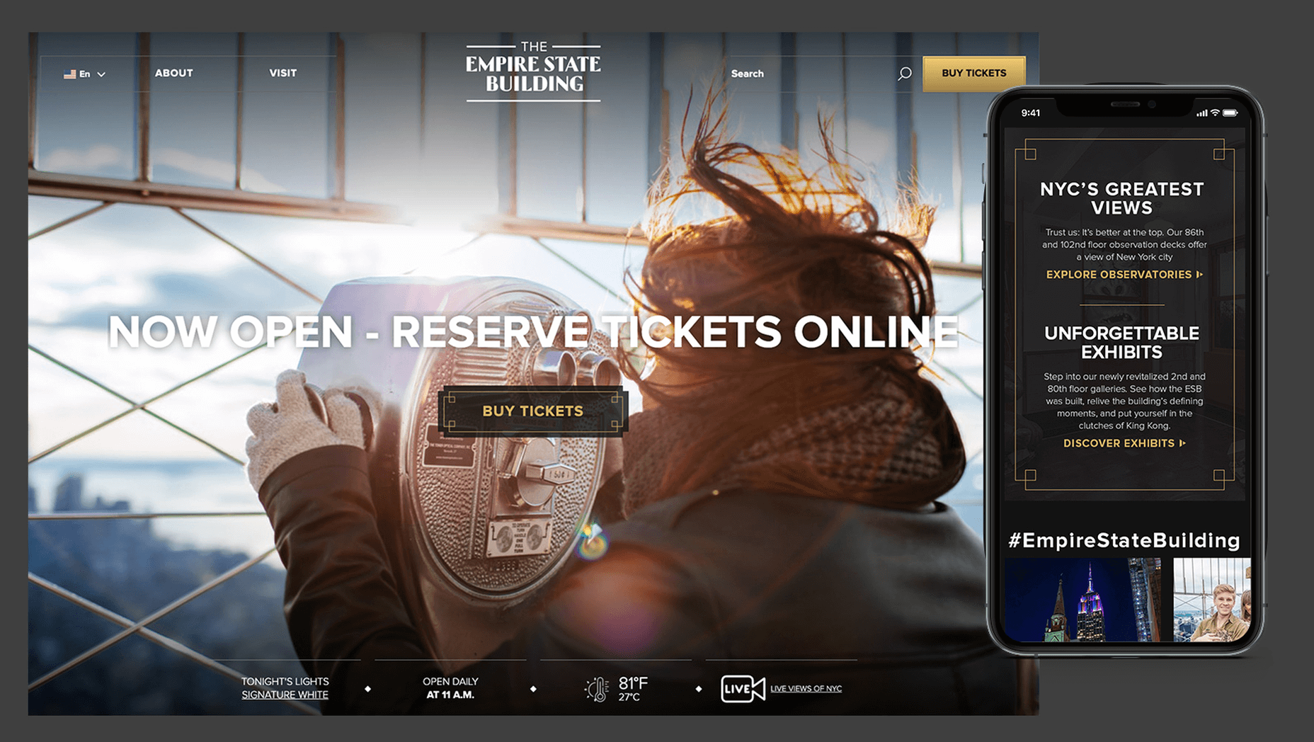
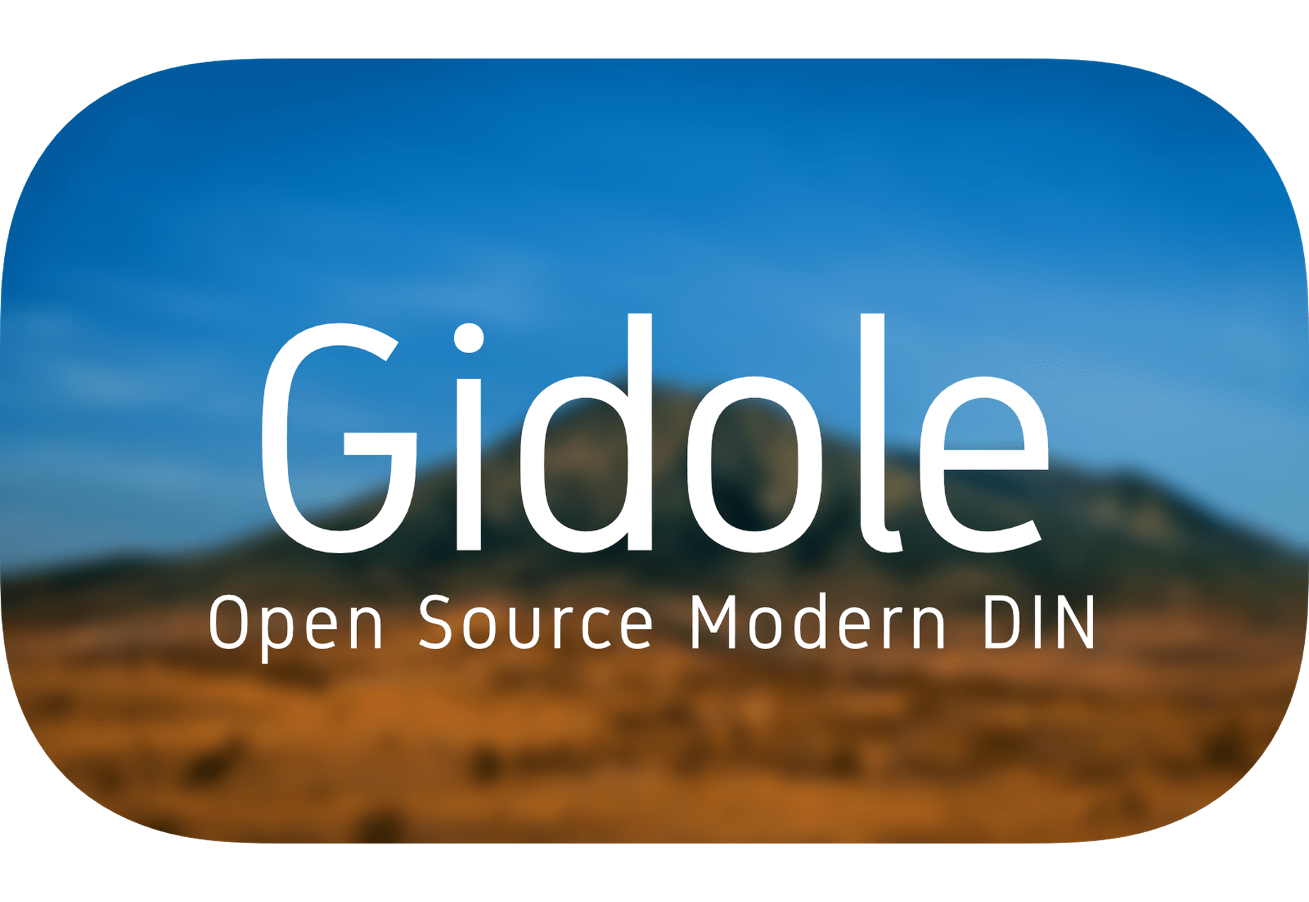
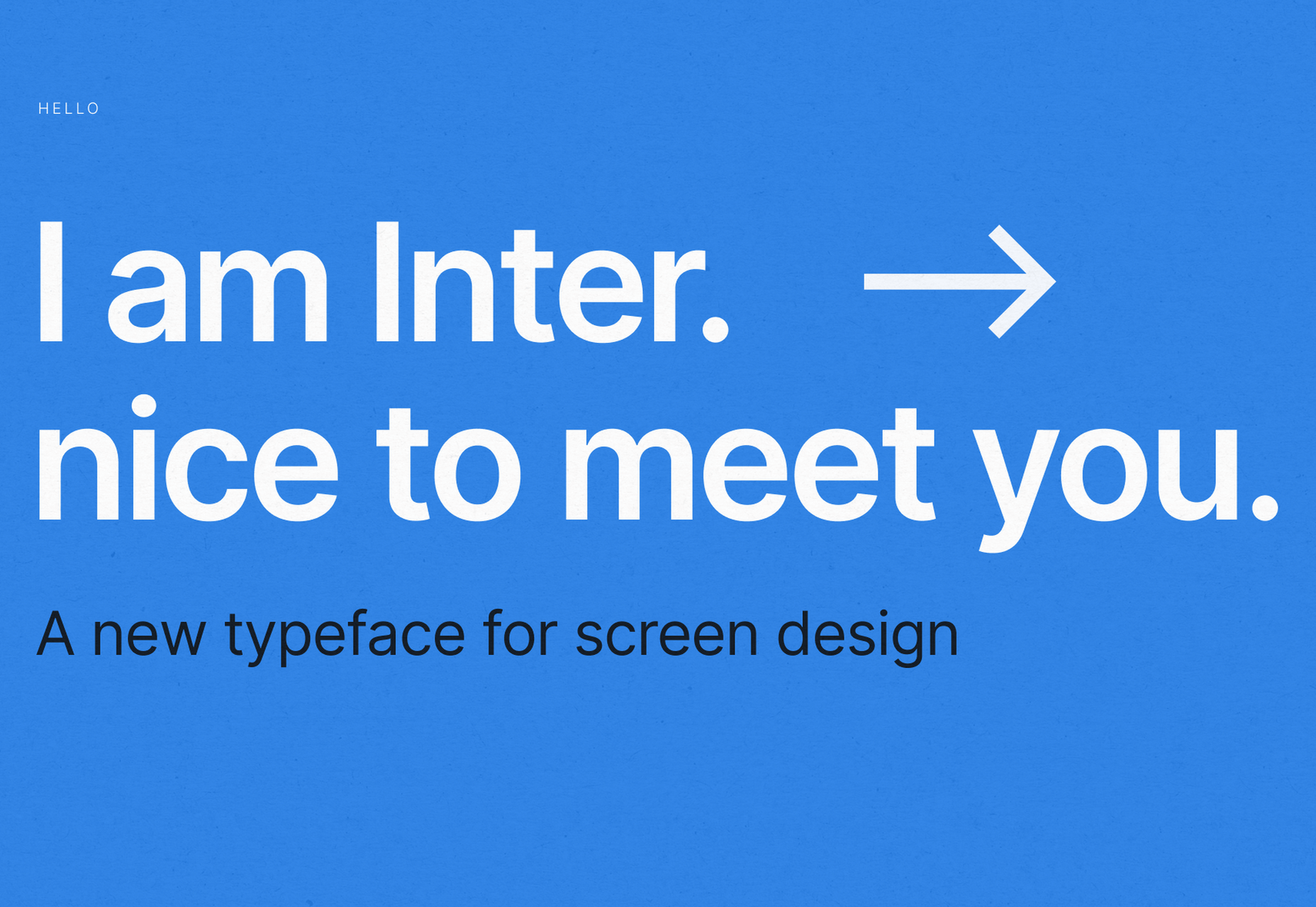
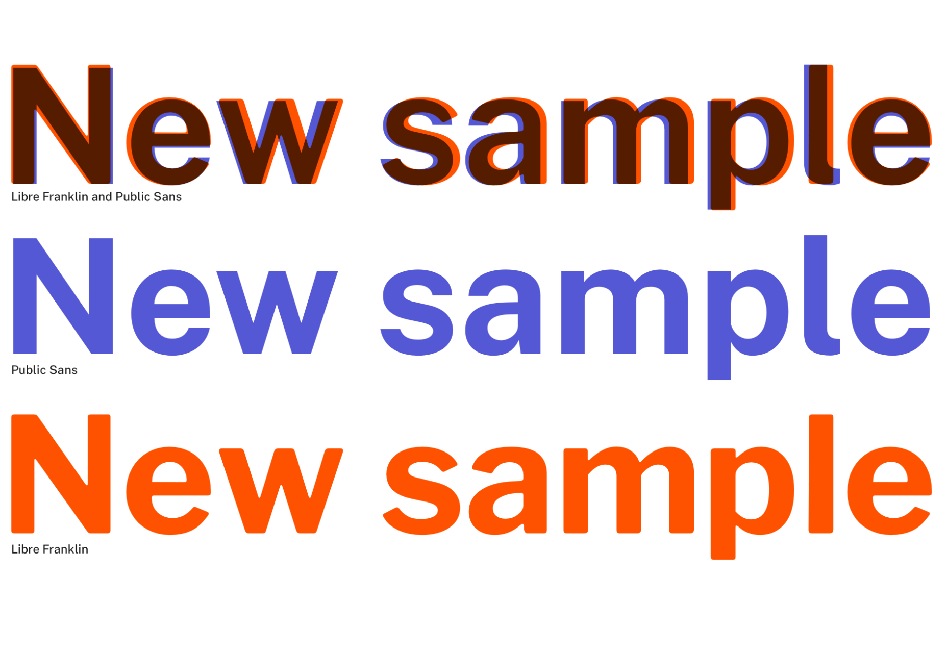
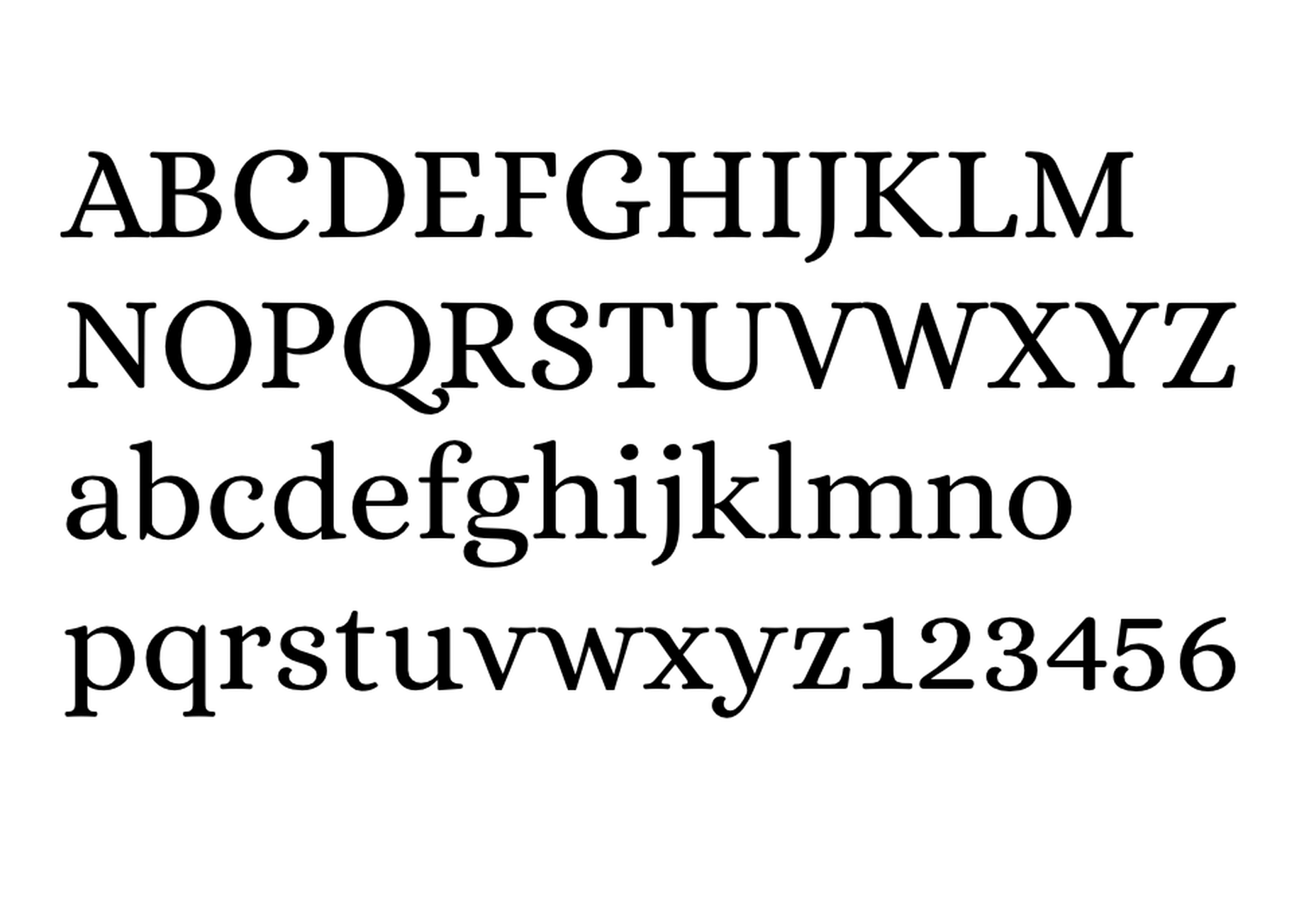
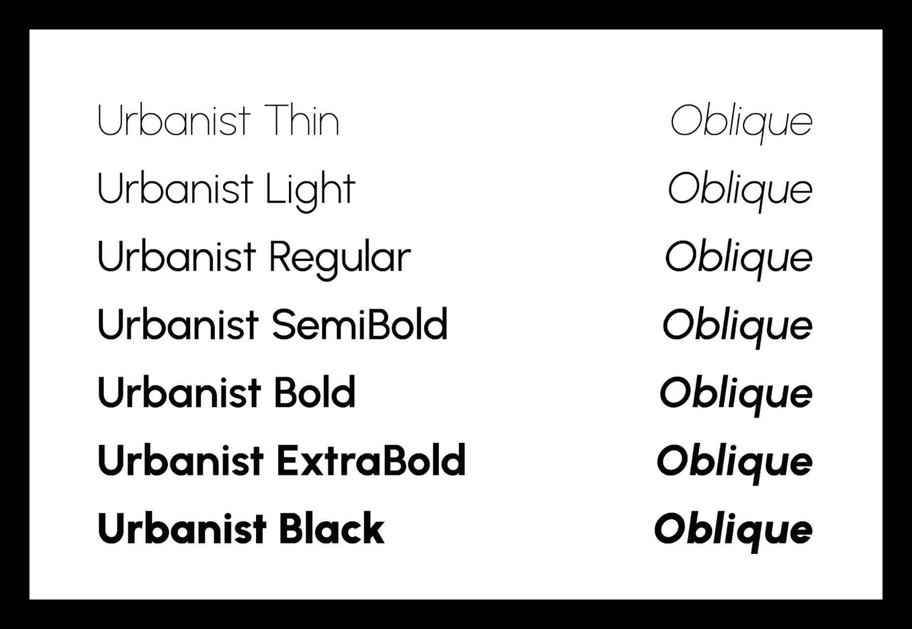
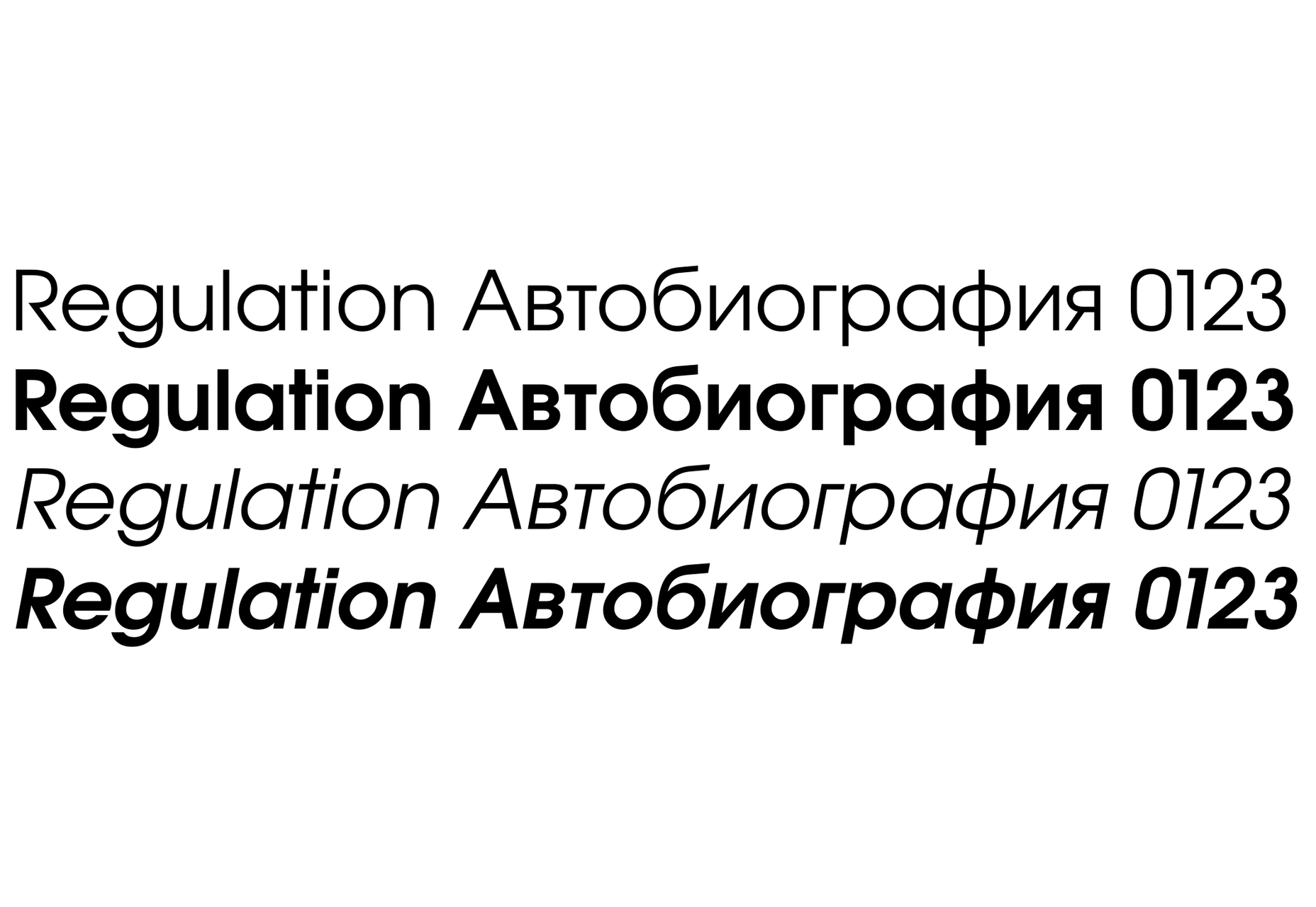
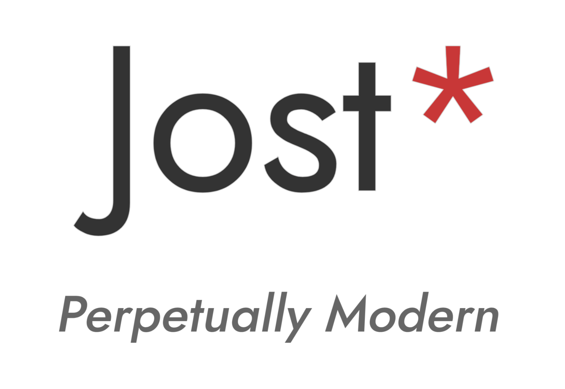
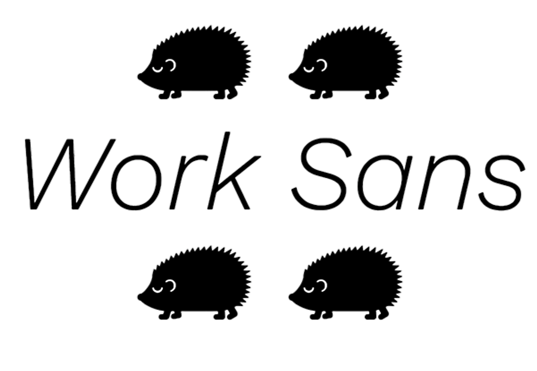
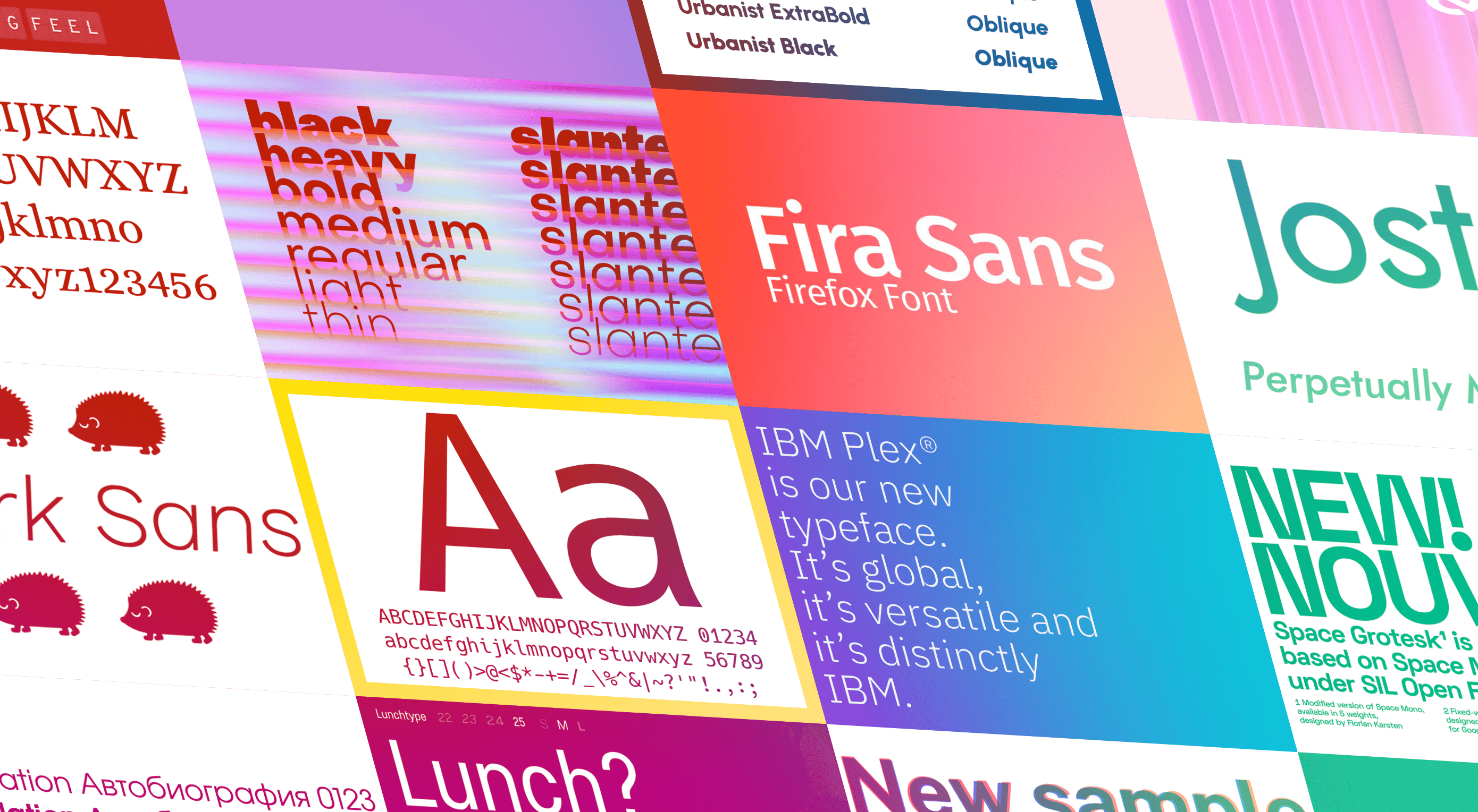
The right typeface can make or break your website. As designers, we will always be naturally drawn towards the premium fonts such as Circular, DIN, or Maison Neue; Before you know it, your website is racking up a font bill larger than your hosting bill.

We’ve put together a list of open-source fonts that will rival your fancy fonts, and might even persuade you to switch them out. All the fonts listed here are completely open-source, which means they’re free to use on both personal and commercial projects.

Manrope

Manrope has sprung onto the font circuit in style, with a website better than most early startups. It’s a variable font, which means you have a flexible range of font weights to choose from in a single font file. Manrope is a personal favorite of mine, it has every ligature you could want, and is fully multi-lingual. It’s a lovely bit of everything as it states on the website: it is semi-condensed, semi-rounded, semi-geometric, semi-din, semi-grotesque.

Gidole

DIN – the font we all love, the font that looks great at every size, and the font that costs quite a bit, especially with a large amount of traffic. Gidole is here to save the day, it’s an open-source version of our favorite – DIN. It’s extremely close to DIN, but designers with a keen eye will spot very few minor differences. Overall, if you’re looking to use DIN, try Gidole out before going live. (There is also a very passionate community around the font on Github)

Inter

Inter is now extremely popular, but we wanted to include it as it’s become a staple in the open-source font world — excellent releases, constant updates, and great communication. If you’re looking for something a bit fancier than Helvetica and something more stable than San Francisco, then Inter is a great choice. The font has now even landed on Google Fonts, making it even easier to install. As of today: 2500+ Glyphs, Multilingual, 18 Styles, and 33 Features… do we need to say more?

Overpass

Overpass was created by Delvefonts and sponsored by Redhat, it was designed to be an alternative to the popular fonts Interstate and Highway Gothic. It’s recently cropped up on large ecommerce sites and is growing in popularity due to its large style set and ligature library. Did we mention it also has a monospace version? Overpass is available via Google Fonts, KeyCDN, and Font Library.

Public Sans

Public Sans is a project of the United States Government, it’s used widely on their own department websites and is part of their design system. The font is based on the popular open-source font Libre Franklin. Public Sans has great qualities such as multilingual support, a wide range of weights, and tabular figures. The font is also available in variable format but this is currently in the experimental phase of development.

Space Grotesk

Space Grotesk isn’t widely known yet, but this quirky font should be at the forefront of your mind if you’re looking for something “less boring” than good old Helvetica. Space Grotesk has all the goodies you can expect from a commercial font such as multiple stylistic sets, tabular figures, accented characters, and multilingual support.

Alice

Alice is a quirky serif font usually described as eclectic and quaint, old-fashioned — perfect if you’re looking to build a website that needs a bit of sophistication. Unfortunately, it only has one weight, but it is available on Google Fonts.

Urbanist

Urbanist is an open-source variable, geometric sans serif inspired by Modernist typography. Designed from elementary shapes, Urbanist carries intentional neutrality that grants its versatility across a variety of print and digital mediums. If you’re looking to replace the premium Sofia font, then Urbanist is your best bet.

Evolventa

Evolventa is a Cyrillic extension of the open-source URW Gothic L font family. It has a familiar geometric sans-serif design and includes four faces. Evolventa is a small font family, generally used across the web for headlines and bold titles.

Fira Sans

Fira Sans is a huge open source project, brought to you, and opened sourced by the same team that makes Firefox. It’s Firefox’s default browser font and the font they use on their website. The font is optimized for legibility on screens. (And it’s on Google Fonts!)

Hack

Building a development website, or need a great code font to style those pesky code-blocks? Then Hack is the font for you. Super lightweight and numerous symbols and ligatures. The whole font was designed for source code and even has a handy Windows installer.

IBM Plex

IBM needs no introduction. Plex is IBM’s default website font and is widely used around the web in its numerous formats Mono, Sans, Serif, Sans-Serif, and Condensed – it has everything you’d need from a full font-family. The whole font family is multi-lingual, perfect for multi-national website designs. (It’s fully open-source!)

Monoid

Another great coding font, Monoid is a favorite of mine for anything code. The clever thing about Monoid is that it has font-awesome built into it, which they call Monoisome. This means when writing code, you can pop a few icons in there easily. Monoid looks just as great when you’re after highly readable website body text.

Object Sans

Object Sans (formally known as Objectivity) is a beautiful geometric font family that can be used in place of quite a few premium fonts out there. The font brings together the top qualities of both Swiss neo-grotesks and geometric fonts. The font works beautifully as large headings but can be used for body content as well.

Lunchtype

Lunchtype has a very interesting back-story, originally designed during the creator’s daily lunchtime during a 100-day project. If you’re looking for something a bit “jazzier” than the typical Helvetica for your project, then Lunchtype is a perfect choice. The family comes with numerous weights as well as a condensed version — enough to fill any lunchbox.

Jost

Inspired by the early 1920’s German sans-serif’s, Jost is a firm favorite in the open-source font world. Jost brings a twist to its closest web designer favorite Futura. When you want a change from the typical Futura, then Jost is a great option with its variable weighting as well as multilingual support.

Work Sans

Work Sans is a beautiful grotesk sans with numerous little eccentricities that may delight or annoy some designers. The font has variable weighting, multilingual support and is optimized for on-screen text use but works perfectly well for print also.

Source


Source de l’article sur Webdesignerdepot

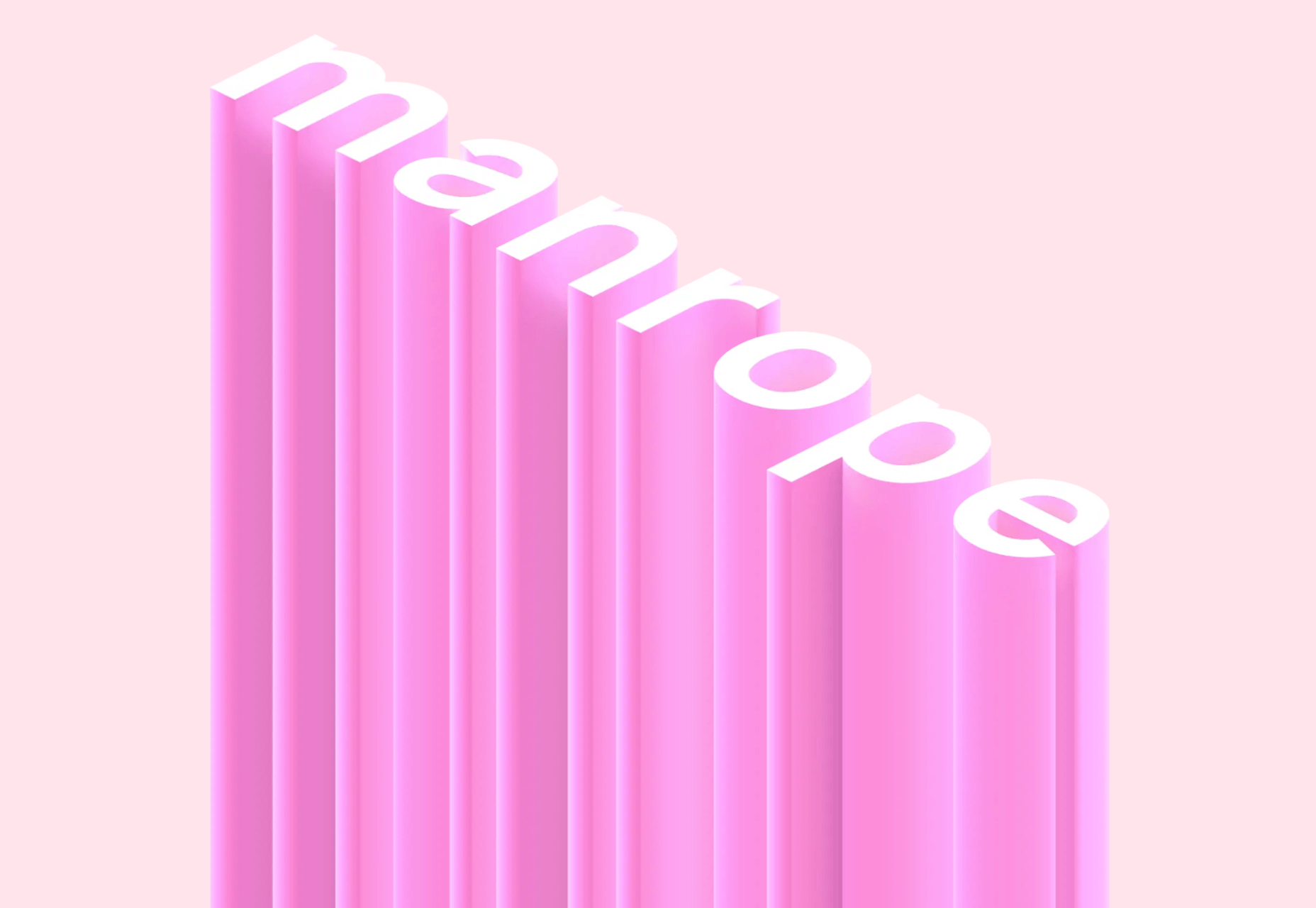
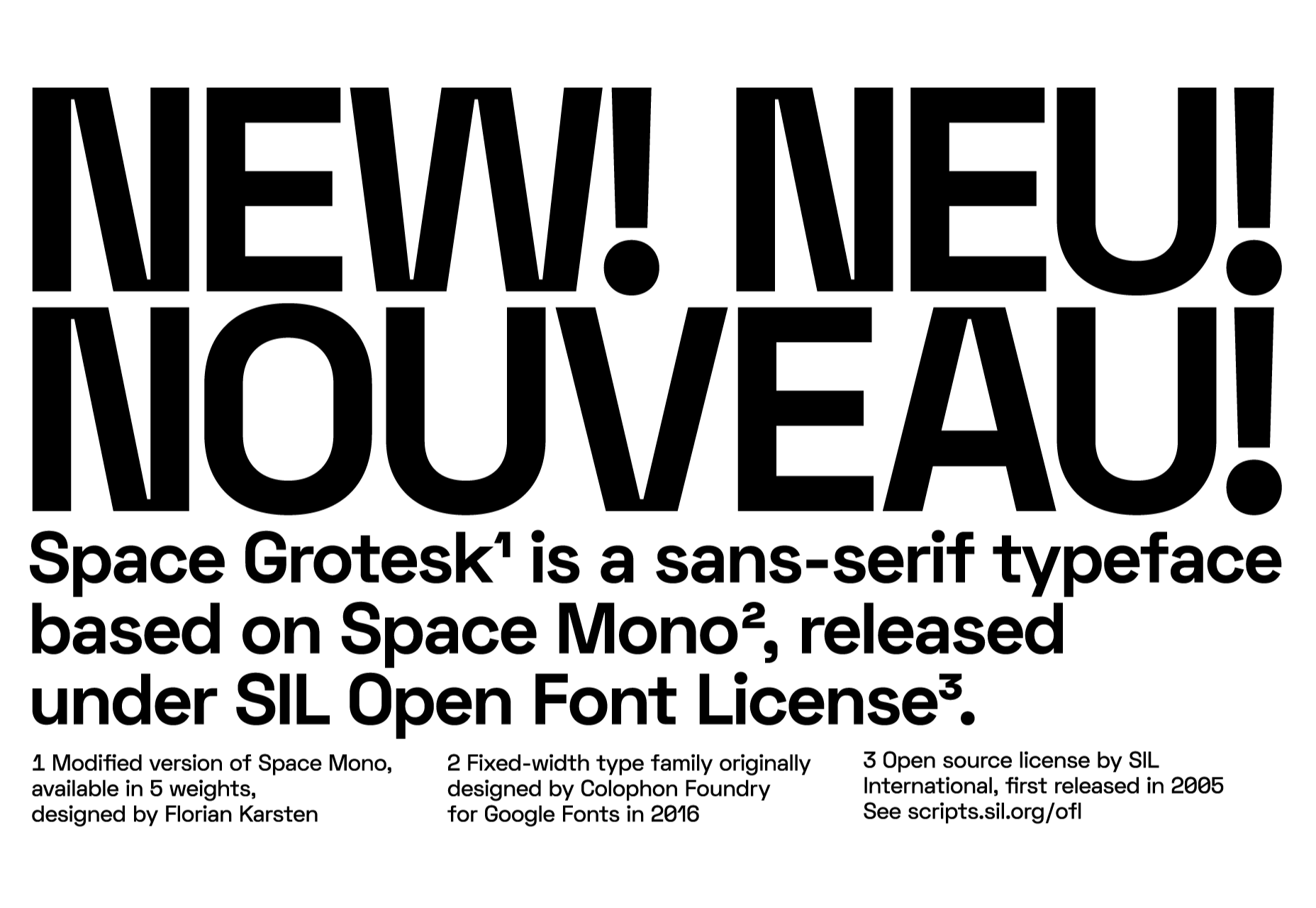
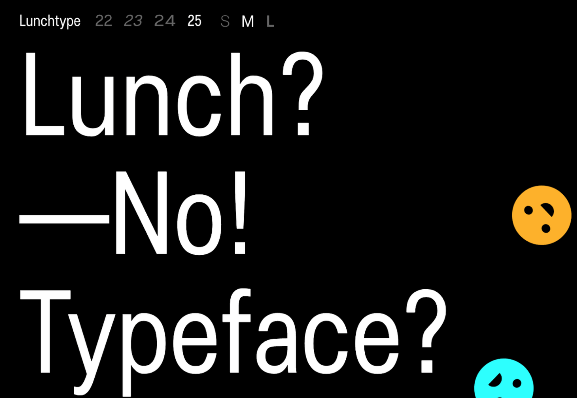
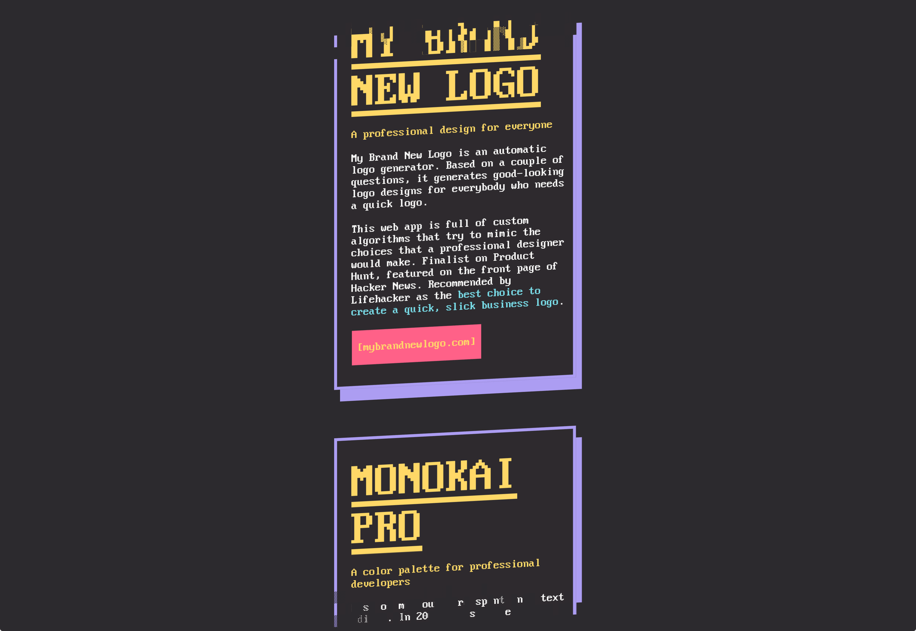
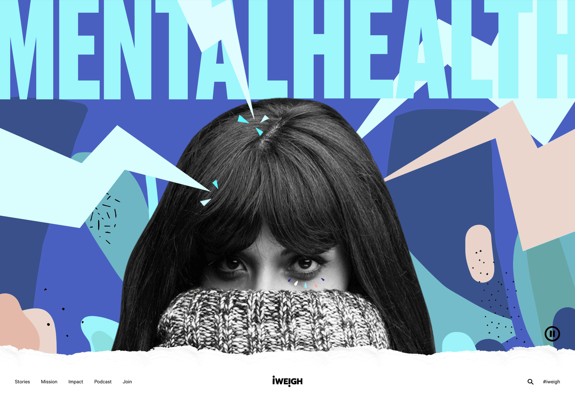
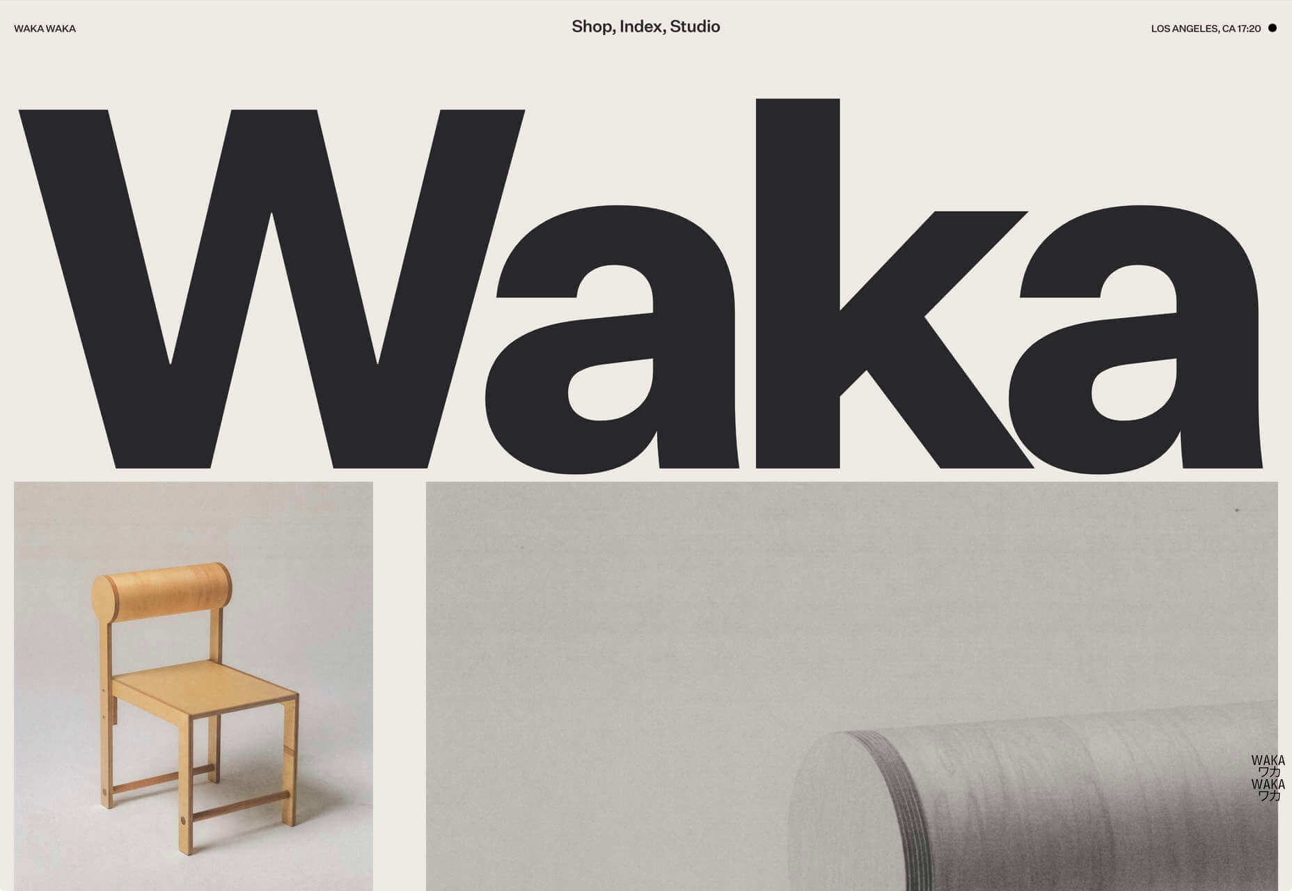
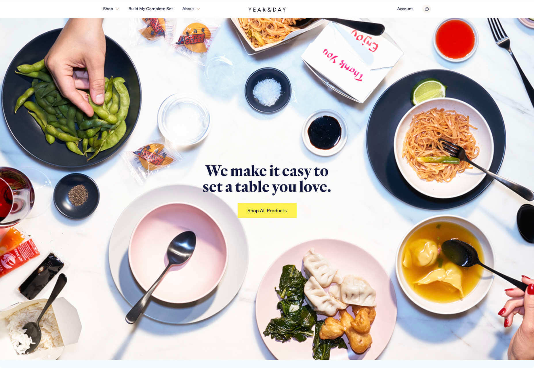
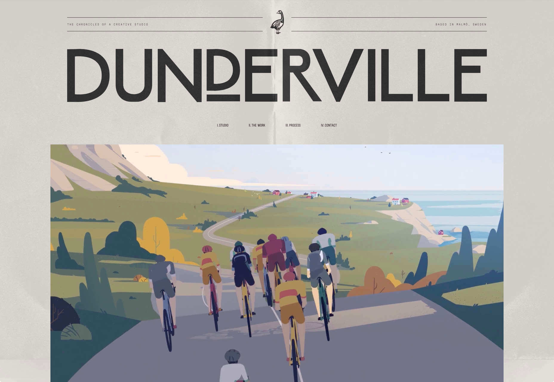
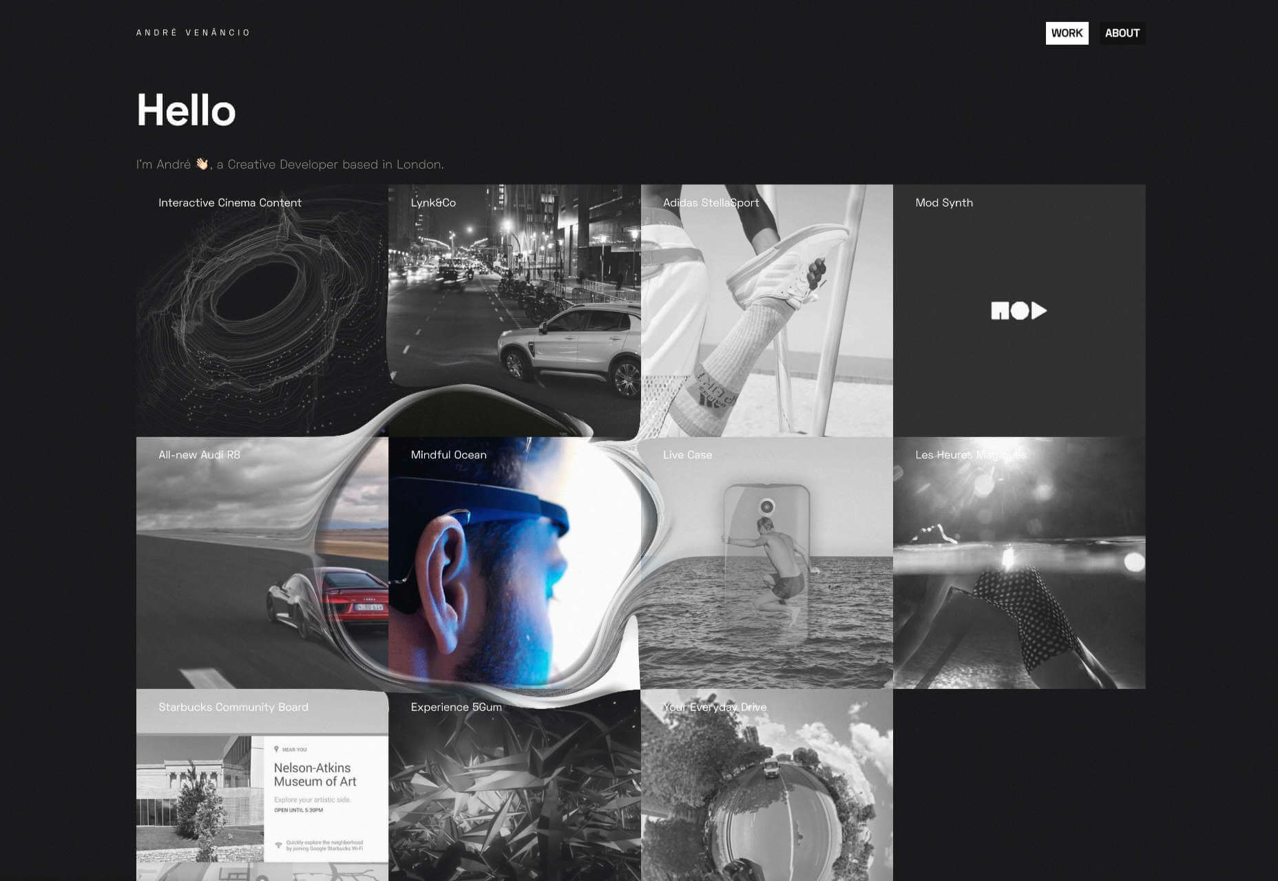
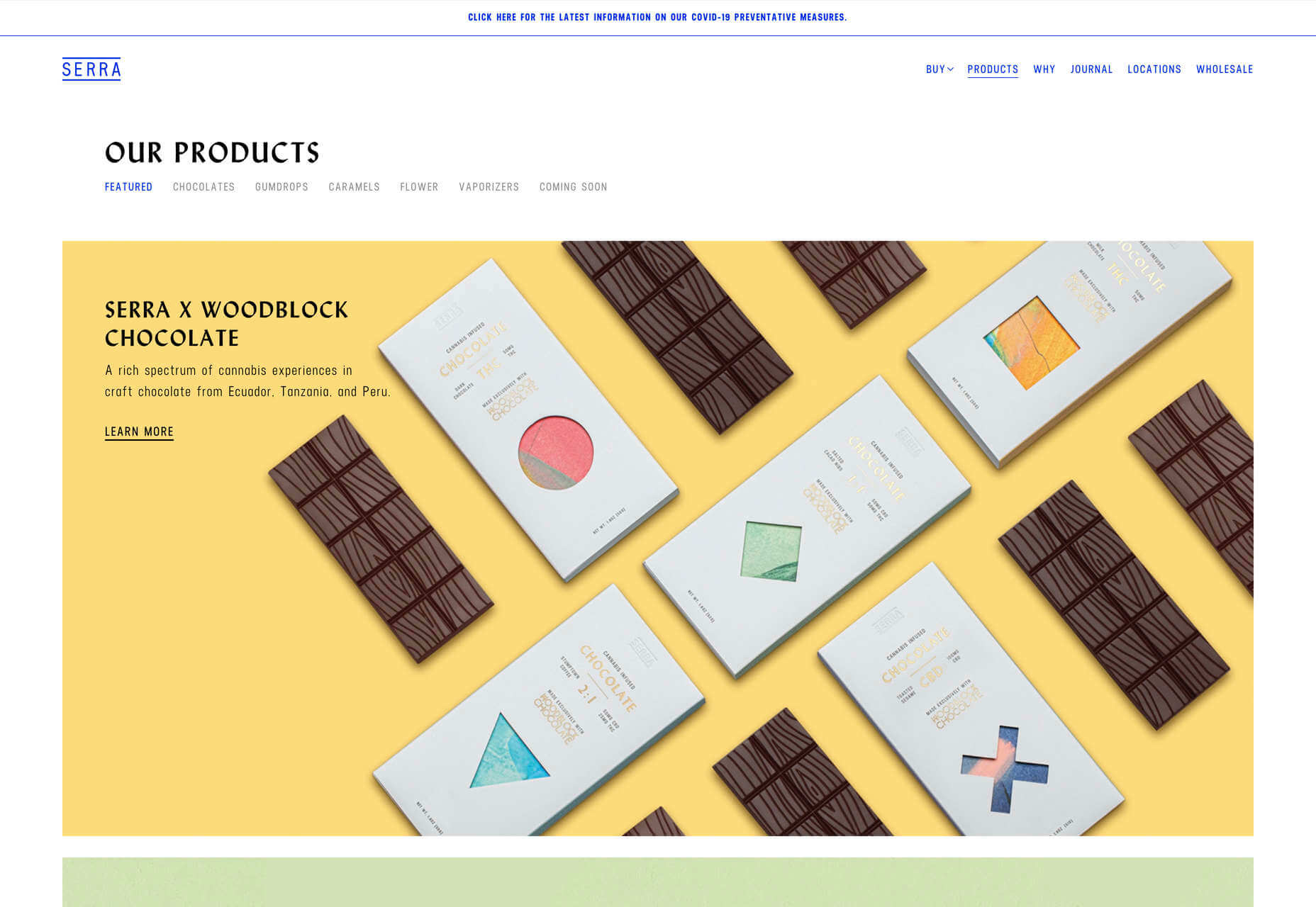
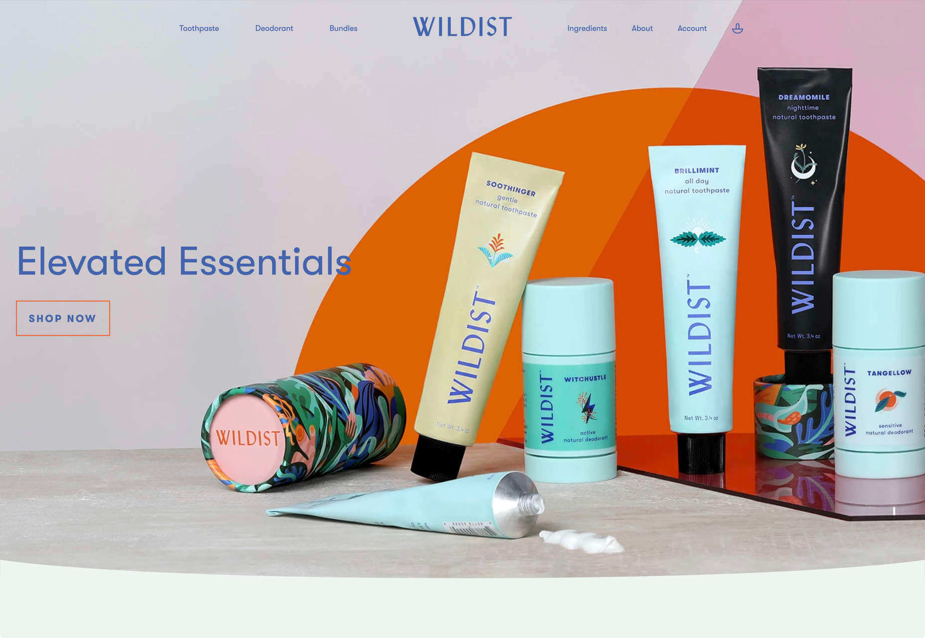
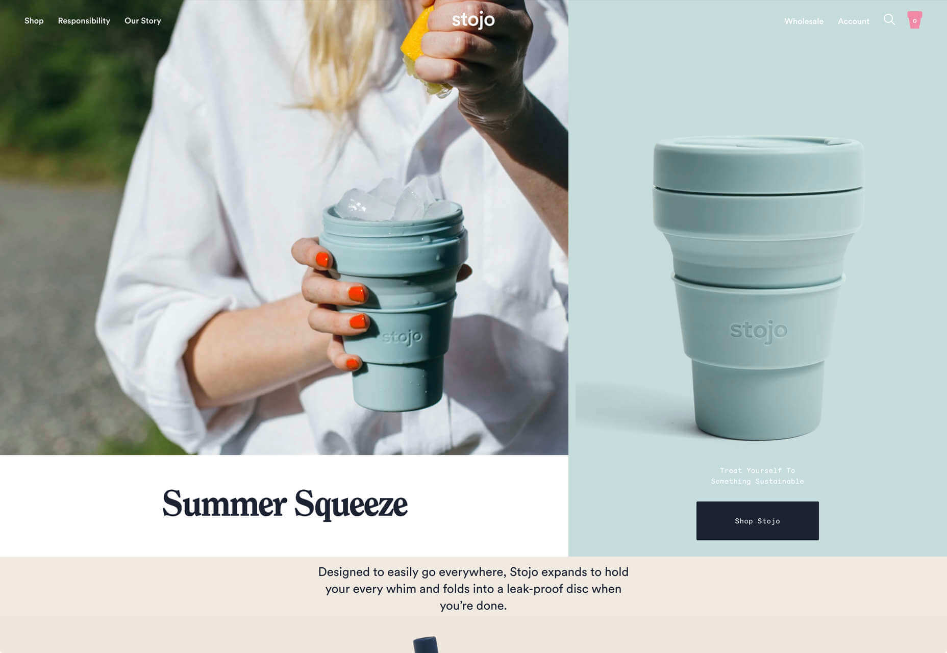
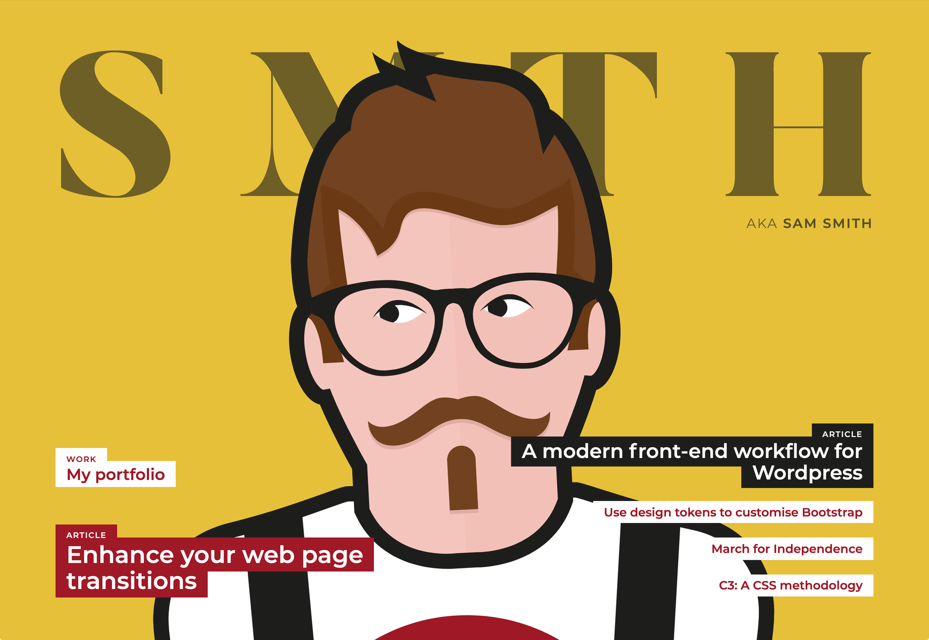
After six months of uncertainty 2020 is finally beginning to find a style of its own. There are nods to Brutalism, a delightful blending of 80s pastels with 90s primaries, and the font style of choice is anything but geometric sans-serif.

In this month’s collection of the freshest sites from the past four weeks you’ll find tons of new portfolios, from big agencies to freelancers, and some amazing primal scream therapy. Enjoy!

Looks Like You Need Iceland

Looks Like You Need Iceland is an incredible site that asks you to record a scream, that they’ll broadcast for you into the wide open spaces of Iceland as therapy. And then perhaps you’ll visit Iceland for real. It’s brilliant marketing for the Iceland tourist board.

Riverlane

The abstract 3D animation on Riverlane’s site is a stunning introduction to a topic that’s hard to visualize. The rest of the site is equally well done, with great typography, slick brand assets, and a professional engaging tone.

Monokai

Wimer Hazenberg’s site features a simple pixelated text column. But scroll down the page and keep an eye on the awesome text dissolve effect, it transforms this simple design.

I Weigh Community

The I Weigh Community is a non-profit community activism initiative helmed by Jameela Jamil. It’s devoted to radical inclusivity, and it promotes its message on its site with striking graphics and bold, expressive typography.

WAKA WAKA

Waka Waka is a design studio specializing in wooden furniture. The noise effect and the mid-century typography evoke the radical design of 60 years ago. The random rotations on the thumbnail hovers are delightfully disruptive.

Dataveyes

Dataveyes is an information design studio that works with large datasets to give meaning to complex information. Its site features beautiful, full-screen animations that illustrate the type of information it specializes in.

Year & Day

Year & Day is an ecommerce site that sells ceramics, glassware, and other choice pieces of tableware. It’s a colorful collection that perfectly complements your food and the stunning site takes its cues from the collection.

Dunderville

Dunderville is a motion design studio with an impressive portfolio of animation and live action films. Its site features a tactile paper fold detail, and as you would expect, some superb text, and vector animations.

André Venâncio

It’s been months since we last saw a creative developer’s site with a liquid effect. André Venâncio revisits the idea with a cool oil bubble effect, hover over the thumbnails to see it.

Thomas Prior

It’s not all 60s revivalism, pastels, and cute animations. There will always be room for minimalism, and nothing suits this style as well as portfolios for photographers; Thomas Prior’s site is a prime example.

Serra

Serra’s site features a really beautiful high-contrast typeface that sits apart from the usual sans-serif. The product page is all colored product photography. It exudes luxury and distinction in a saturated marketplace.

VYBES

VYBES is a CBD drink made in LA. Its site evokes the Californian spirit with baby pink brand colors and sun-bleached photography. It’s a cool, and ever so slightly Brutalist look for what is essentially a health drink.

Karina Sirqueira

We love the simplicity of Karina Sirqueira’s portfolio. The desaturated rainbow leads to a simple slideshow of projects, and it’s refreshing to see a minimal site that uses bold serif-based typography. The content feels fresh and honest too.

Smalls

Smalls produces healthy food for cats. The site, is packed with adorable pictures of kitties, which if you’re a cat person, is guaranteed to draw you in. There’s a definite Brutalist style to the site, and lots of color too.

Wildist

There’s a clear aesthetic beginning to emerge in 2020, with pastels creating a soft background for desaturated primaries, and Wildist gets it exactly right with this youthful, site that features just enough animation to bring it to life.

Kristen Kwong

We’ve seen a lot of OS-style sites recently, but Kristen Kwong’s is one of the slickest. It manages to take a simple metaphor for interaction and transform it with a vintage color scheme.

Stojo

Continuing the Miami-meets-Brutalism trend this month is the site for Stojo, a collapsable cup and bottle. The pastel shades block out a disrupted grid, but for our money it works better on mobile. The vintage typeface is a nice touch.

Hoang Nguyen

Hoang Nguyen’s site features a surreal 3D scene with mountains, a spinning planet, floating islands, a waterfall, and a floating dragon-boy. Click around the site and the scene transforms.

SMTH / Sam Smith

Sam Smith’s portfolio has a cool magazine style to it, with a nice blocky background on the text and a personality packed animated avatar taking centre stage.

Then I Met You

Then I met You is a site promoting a range of skincare products. In this case, the usual pastel colors are replaced with an 80s-style gradient. Watch the products as you scroll, the lighting changes creating an awesome, subtle 3D effect.

Source


Source de l’article sur Webdesignerdepot

Web design clients come from a wide variety of backgrounds. One day, you’ll be designing a portfolio website for a voiceover artist, the next you’ll be creating a comprehensive ecommerce site for a leading retailer. In an ideal world, you’ll get to a point where you eventually specialize in a niche. However, you’ll need to master both avenues first.

The more time you spend in this industry, the more you’ll learn that every client comes with their own unique requirements and challenges to consider. However, there’s a particularly huge divide between the kind of web design projects you do for B2B clients, and the ones you do for B2C customers.

Both B2B (Business to Business) and B2C (Business to Consumer) websites need to be clear, concise, and aesthetically pleasing. They should always have a strong focus on user experience, and they need to work consistently across devices. However, being aware of the difference between B2B and B2C projects will help you to deliver better results to your customers.

Defining the Differences Between B2B and B2C Sites

Some web design trends remain consistent in any environment.

Whether you’re creating a site for a hairdresser, or a leading SaaS company, you’ll need to deliver responsive design, intuitive navigation, and excellent site security.

Your process is unlikely to differ from B2B to B2C much in terms of project milestones, phases, prototyping and wire-framing. The differences that arise between B2B and B2C projects often come in the approach you take to building certain elements.

Let’s take a closer look at the things you might need to consider:

1. The Target Audience

In any design project, it’s always important to keep the end customer in mind. Knowing your client’s target audience will help you to create both an image and a tone of voice that appeals to the right people.

B2B Websites

With B2B websites, you’ll be speaking to a range of highly-educated individuals who already have a general knowledge of your service. The aim here will be to show the end-user how you can help them achieve better results. For instance, m.io highlights “syncing communication” so you can “effortlessly chat” with your team.

The language and content of the website is all about highlighting the key benefits of the products, and the kind of outcomes that they can deliver. The Nielsen Norman Group reports that there’s often a lot of discussion between decision-makers when they’re checking out a B2B website.  

Designers need to work harder at convincing B2B buyers that they’re making the right decision. This is particularly true when you’re selling something like a software subscription that requires a lot of long—term investment.

B2C Websites

On the other hand, while B2B customers make decisions based on logic, information, and well-explained benefits, B2C customers are more influenced by emotion. They want quick solutions to their problems, and the opportunity to purchase from a brand that “understands” them.

Look at the Firebox website, for instance. It instantly highlights an ongoing sale at the top of the homepage, addressing any concerns a customer might have about price. That combined with a quirky layout full of authentic photos and bright colors means that customers are more inclined to take action.

2. The Purpose

Another factor that can vary from B2C to B2B websites, is the motive behind a customer’s purchase. Knowing what’s pushing a target audience to interact with a brand will help you to create a website that appeals to specific goals.

B2B Websites

B2B websites often aim to solve expensive and time-consuming problems for companies. To sell a decision-maker on the validity of a solution, it’s important to thoroughly explain what the solution is, how it works, and how it addressees a specific pain point.

Look at the Zoom website for instance, they don’t just tell people that they offer video conferencing, they address the practical applications of the platform:

B2C Websites

Consumers are a lot easier to appeal to in terms of emotional impact, because many of them come to a website looking to fulfill an urgent need. Because of this, many web designers can take advantage of things like urgency and demand to encourage conversions. For instance, look at this website from TravelZoo. It takes advantage of a customer’s desire to get away:

A B2B website needs to focus on providing information that helps companies to make more confident decisions. What’s more, with B2B sites, decisions are often made by several stakeholders, while B2C sites ask a single person to make a choice. A B2C website needs to address immediate concerns and connect with customers on an emotional level. B2C buyers still want to do their research on products or services, but the turnaround is much quicker, and often requires less information.

3. The Design Elements (Visual Appearance)

Just as the focus of your website design and the audience that you’re creating the experience for can differ from B2B to B2C websites, the visual elements of the design might change too.

B2B Websites

In most cases, B2B websites are all about presenting a highly professional and respectable image. You’ll notice a lot of safe and clear choices when it comes to typography and imagery. It’s unusual to see a B2B website that takes risks with things like illustrations and animations.

Look at the Green Geeks website for instance. Everything is laid out to encourage clarity and understanding. Information is easy to find, and there are no other issues that might distract a customer.

B2C Websites

On the other hand, B2C websites can be a little more daring. With so many different options to choose from, and most customers buying out of a sense of urgency or sudden demand, designers are under pressure to capture attention quick. This means that it’s much more likely to see large pieces of eye-catching imagery on B2C sites, with very little text.

Movement, like slideshows and animations often play more of a role here. Additionally, there’s a good chance that you’ll be able to experiment more aggressively with color. Take a look at the Yotel website, for instance. There’s very little textual information here, but the appeal of the website is conveyed through sliding images:

4. Website Content

The way that information is conveyed on a B2B website is very different to the messages portrayed on a B2C site. Usually, everything from the language, to the amount of content that you use for these projects will differ drastically.

B2B Websites

When designing for a B2B website, you’ll need to be careful with content, as you’ll be speaking to a very mixed audience. If your site caters to different industries, you’ll need to ensure that you show authority, without using too much jargon. Some companies even create different pages on their site for specific customers. The aspin.co.uk website covers the benefits from a company, sale and integration perspective:

Rather than try to talk to all business owners about their differing communication pains, G-Suite anticipates its audience and creates pages for each.

B2C Websites

Alternatively, B2C websites can make things a little simpler. For instance, on glossybox.co.uk, there’s no need to provide a ton of information for different types of shopper, designers can appeal to one audience, i.e. the “beauty addict”:

In both B2B and B2C websites, the aim of the content should always be to answer any questions that the end user might have.

5. CTA Buttons

Call to Action buttons are often a crucial part of the web design journey. However, it’s sometimes difficult to determine where they should be placed, or how many buttons you need.

B2B Websites

Because the decision to buy something won’t always happen immediately with a B2B website, these kinds of sites often use a variety of CTAs. For instance, you might have a “Request a Quote” button at the top of a page, as well as a Sign in button.

On the Klaviyo site, for instance, you can request a demo, sign up or log in:

You can place CTAs lower on the page with B2B websites too, as it’s more likely that your customers will be scrolling through the site to collect more information before they decide to buy.

B2C Websites

On the other hand, with B2C websites, you usually don’t need to give your visitors as many options. A single option to “Add to Cart”, or perhaps an extra choice to “Add to Favorites” is all your user will need. Customers need to instantly see what they need to do next as soon as they arrive on a page:

On the Evil Hair website, you immediately see how to add a product to your cart.

Remember, the sales process is a lot quicker with B2C customers. This means that you need your CTA buttons to be front and center as soon as someone clicks on a page.

6. Contact Forms

In a similar vein, the way that you design your contact forms will also depend on the end-user that the website wants to appeal to. There’s a very different process for getting in touch on a B2B website, compared to a B2C site.

B2B Websites

B2B websites often require longer contact forms, as clients need to collect additional information about a prospect’s position in a company, and what that company does. B2B companies need to share things like what they’re looking for in a service, and how many users they have, so a sales team knows what kind of demonstration to give.

As with any strategy for contact form design, you should always only include the fields that your client needs and no more. If you demand too much from any client, you could send them running in the opposite direction. Check out this straightforward option from Ironpaper, for instance:

The form addresses as many relevant questions as possible without overwhelming the customer. Because the site handles things like design, it makes sense that they would ask for a link to the company’s existing website.

B2C Websites

On a B2C website, there are very different approaches to contact forms. You may have a dedicated contact form on your website where people can get in touch if they have any questions. A FAQ page where customers can serve themselves is another great way to help your client stand out from the competition. Check out this option from River Island, for instance:

On the other hand, you might implement pop-up contact forms into a website if your client wants to collect emails for email marketing. In that case, it’s important to make sure that you’re only asking for the information you need, and nothing more.

The easier it is to sign up for a newsletter, the more likely it is that customers will do it. Being able to enter their name and email address and nothing else will make the signup seem less tasking.

7. Search Bars and Navigation

Whether you’re designing for B2B or B2C companies, navigation will always be a critical concern. End users need to find it easy to track down the information that they need about a company, whether they’re looking for a particular product or a blog.

B2B Websites

On a B2B website, the search bar often takes up a lot less prominence than it does on a B2C site. That’s because all of the information that a client needs, and the buttons they need to take their next steps, are already visible front-and-center.

As a designer, it will be your job to push as many people to convert as possible, by making the purchasing journey the most appealing path for visitors. For instance, on the Copper website, the “Try Free” buttons are much easier to see than “Continue with Google” or “Login”:

With B2B sites, the focus is on a very specific goal. Although navigation still needs to be available, it doesn’t need to be as obvious as it is on a B2C site.

B2C Websites

On the other hand, most B2C websites offer a wide range of products, and they’re perfectly happy for their customers to purchase anything, as long as they eventually convert. Because of this, they make navigation a much more significant part of the customer journey.

The search bar is often presented at the very top of the screen where customers can see it immediately. Additionally, there may be multiple pages within certain product categories, so that customers can browse through the items they’re most interested in. For instance, look at the homepage on the IWoot website:

The navigation elements in B2C websites need to be a lot more obvious, because consumers are more likely to use them when they’re searching through their options.

8. Social Proof and Testimonials

Finally, social proof is one of the things that will work well for improving conversions on any kind of website. When your customers aren’t sure whether or not they should buy from you, a review or testimonial could be just the thing to push them over the edge.

B2B Websites

On a B2B website, the decision-making process takes a lot longer. Because of this, it’s worth including as much social proof as possible in every part of the website. Client testimonials, reviews and ratings, and even high-profile company logos make all the difference. Many B2B websites include a page dedicated to case studies highlighting the success of other brands.

Your client might even go as far as to ask for a page that highlights their awards and recognition or showcases comparison tables that pit their products against the competition.

For instance, Authority Hacker has a “what the pros say about us” section as social proof:

B2C Websites

With a consumer website, you can include consumer ratings and reviews wherever you like. However, it’s most likely that you’ll want to have a place where customers can see the reviews of other clients on the product pages themselves. On the EMP website the company gives users the option to click on the star review section to jump to a different space on the page where testimonials are listed. This ensures that customers don’t have to scroll through a lot of excess information if they just want to add an item straight to their cart.

Designing for B2B vs B2C

In the world of web design, no two customers are ever the same. While you’ll need to adapt your processes to suit each customer you interact with, you can set your expectations in advance by learning the differences between B2B and B2C strategies.


Featured images by Chris Ross Harris and Mike Kononov.

Source

p img {display:inline-block; margin-right:10px;}
.alignleft {float:left;}
p.showcase {clear:both;}
body#browserfriendly p, body#podcast p, div#emailbody p{margin:0;}

Source de l’article sur

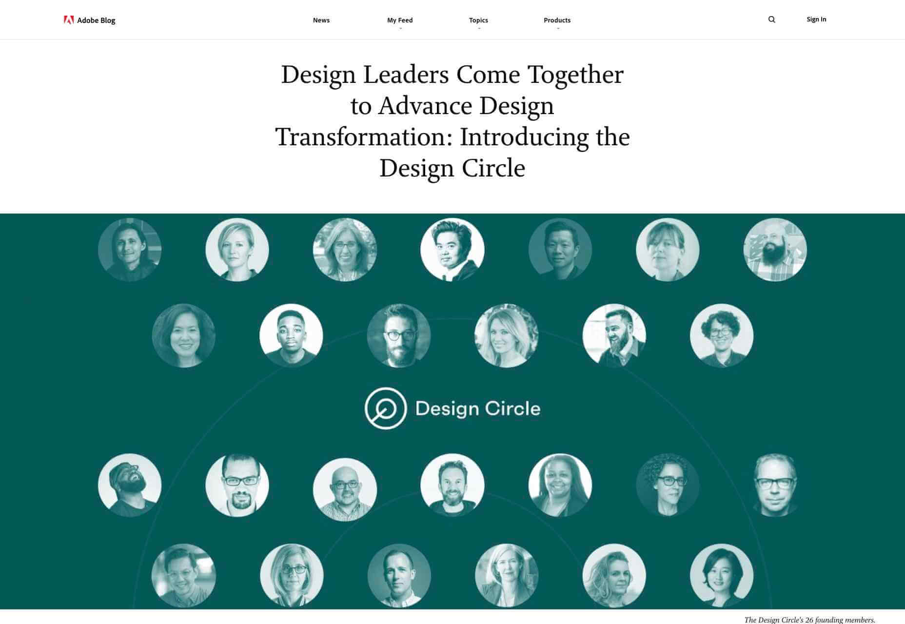
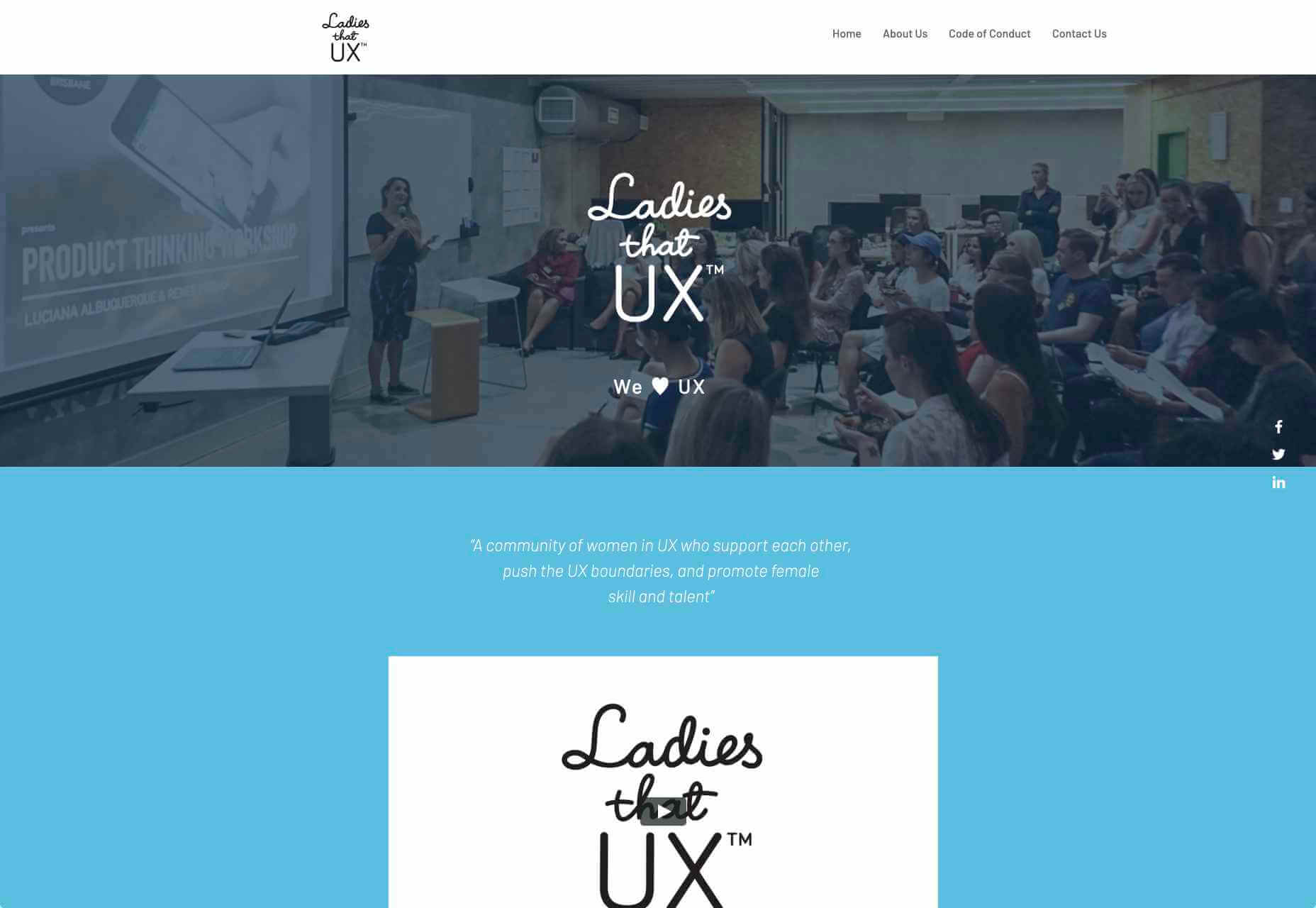
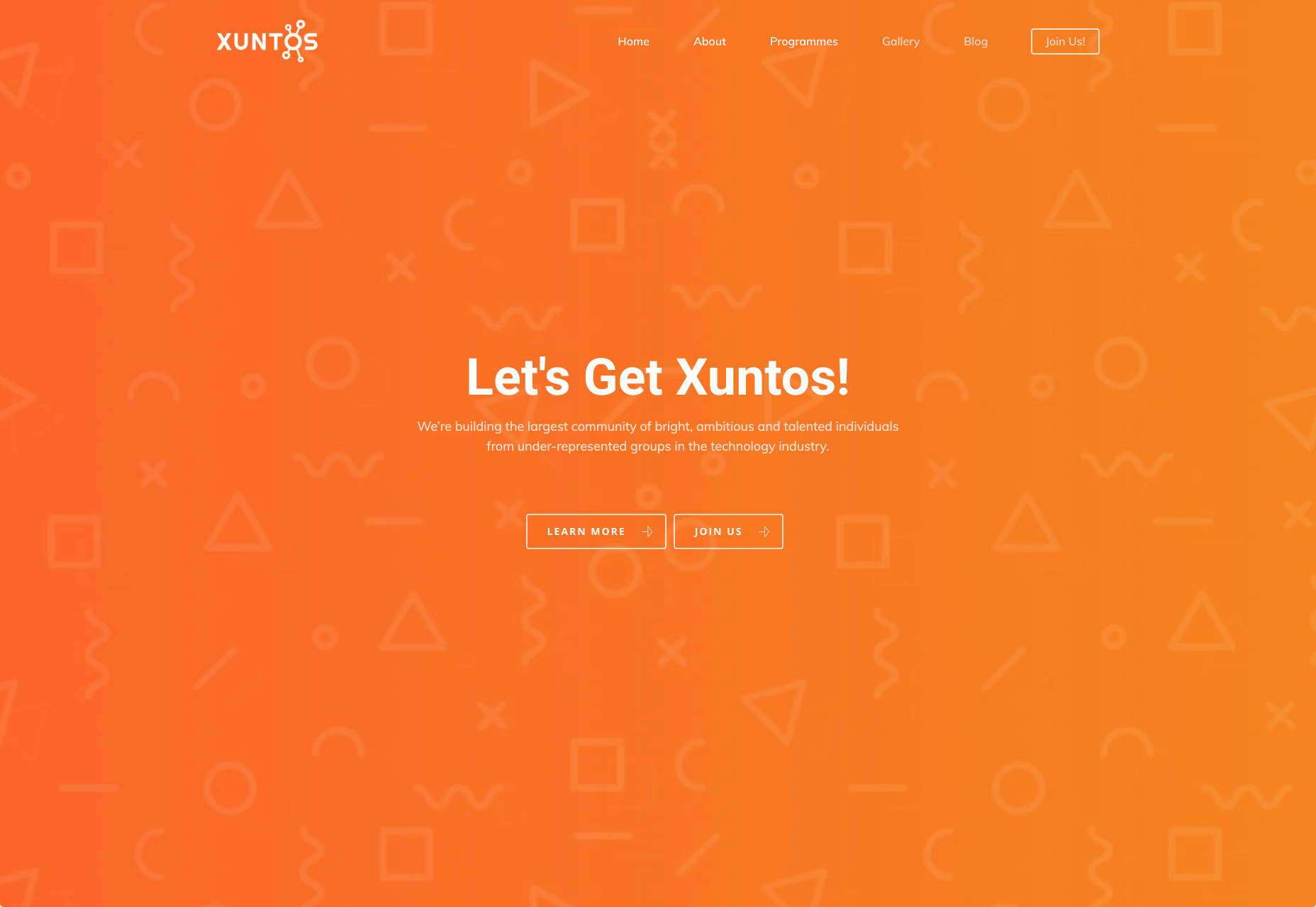
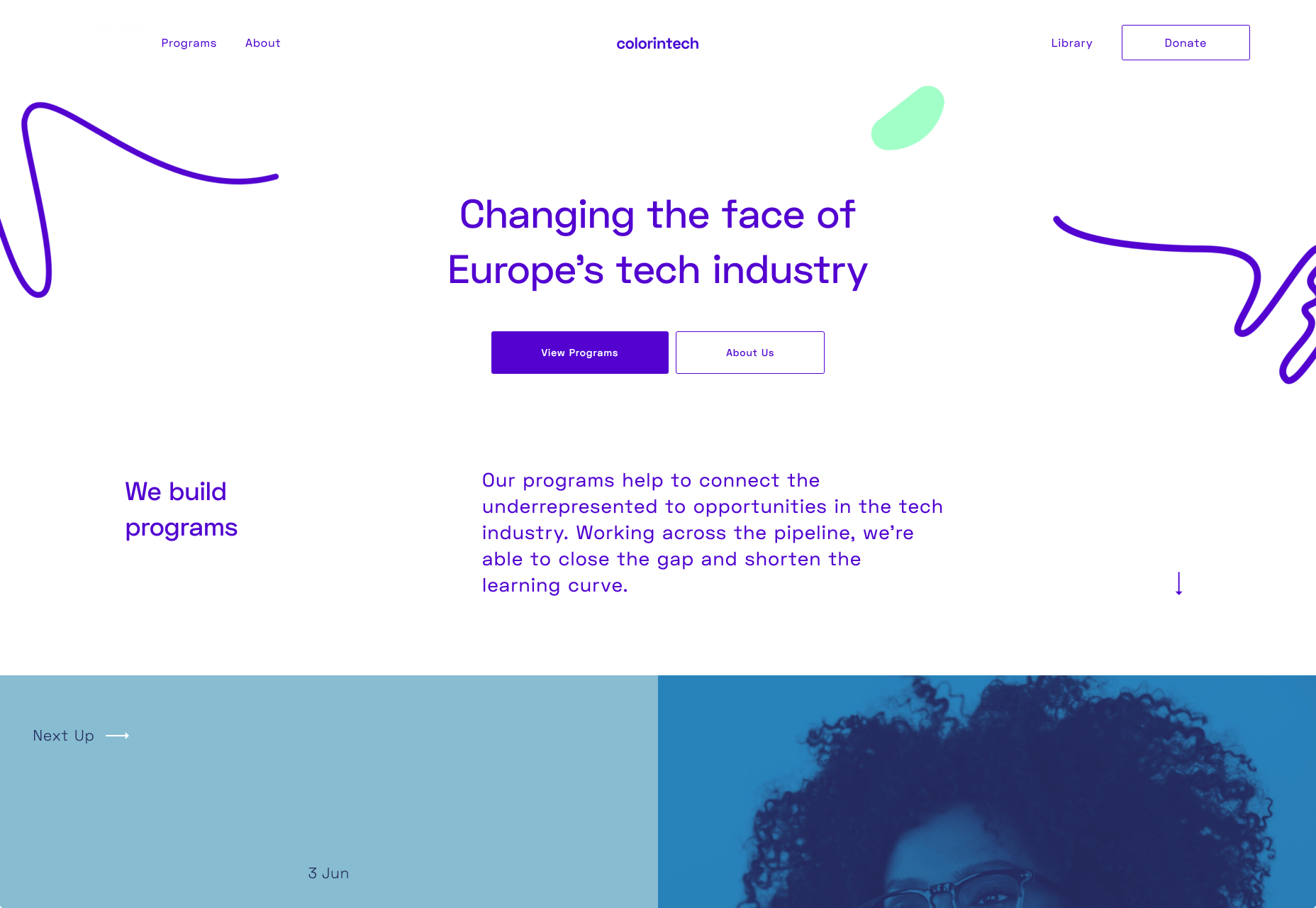
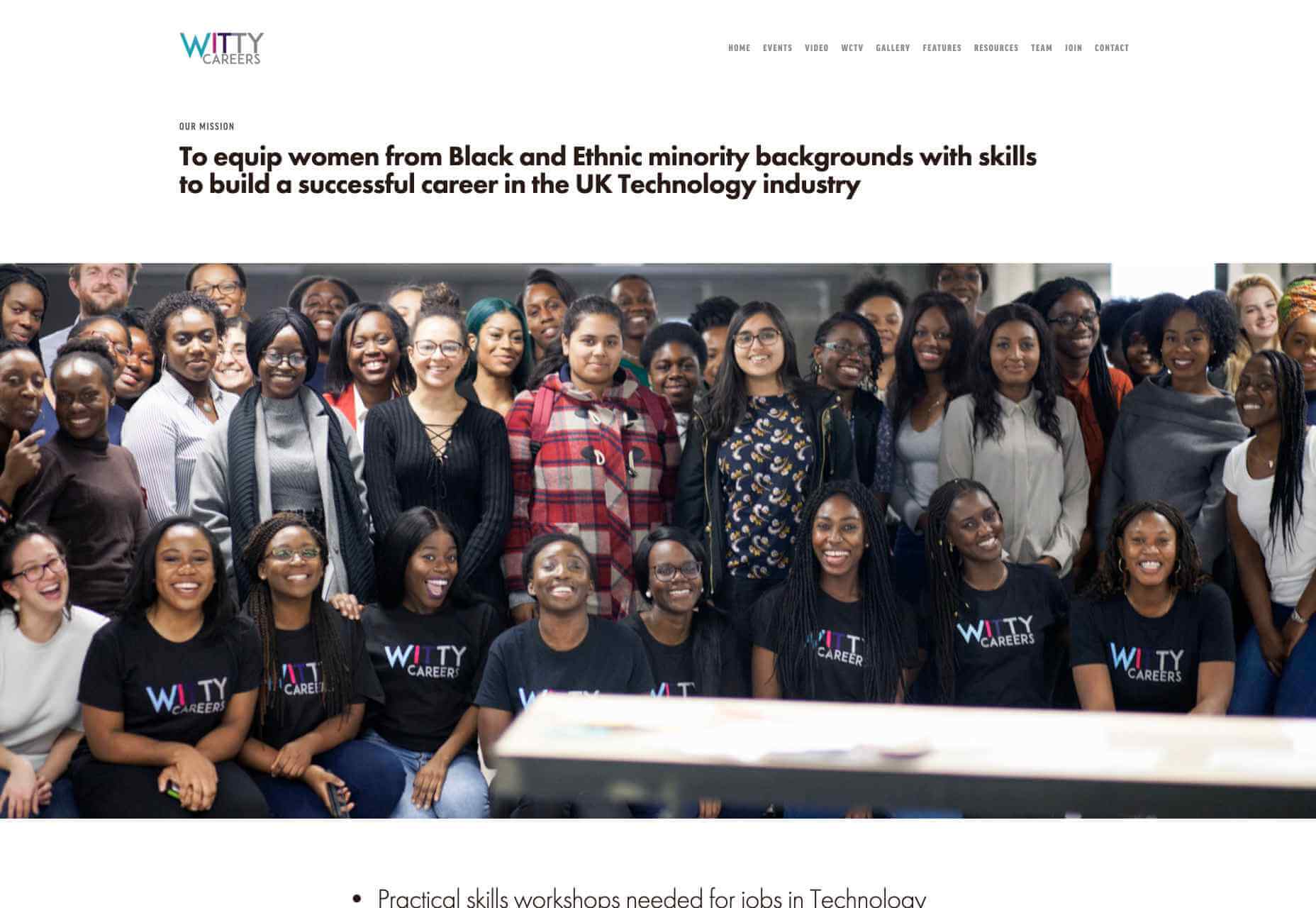
Web developers have been the bedrock of any company’s business strategy for some time, and the industry is continuing to thrive and grow at a rapid pace. This is why it’s surprising that it is so lacklustre when it comes to diversity.

A recent study revealed 80% of those in the design industry are male, and more specifically 79% within the field of web design. According to WISE, just 23% of the people working in STEM roles (Science, Technology, Engineering and Maths) are female and women currently account for just 15.8% of the UK’s current generation of engineering and technology graduates.

Why the Lack of Diversity in Web Design?

The main reason for this, as cited by the Organisation for Economic Co-operation and Development (OECD) found that women still lack the confidence to pursue these careers, despite their school results being as good as (or better) than their male counterparts. Research has found that the professional and technical services sector has the fourth-highest gender pay gap of all UK industries. If more women were to join these higher-paid sectors it could help reduce the gender pay gap as a whole, as well as help female economic empowerment.

This division is seen in ethnic minority groups too. The numbers for BAME (Black, Asian, Minority Ethnic) employees in the British tech industry are unknown but is estimated by the British Computer Society to be at 1-2%, a ridiculously low number in this day and age. This is why groups and organisations are cropping up designed to promote an industry that reflects all of society rather than one part of it. Here are some of the organisations to pay attention to who are bridging the diversity gaps in web design.

Girls Who Code

Girls Who Code are working to create opportunities for women within tech, aiming to deepen their computer science skills and confidence. They run a range of programs designed to equip women with the necessary computing skills to pursue opportunities in the field and to give chances that are often shunned due to society. Founder Saujani states that women are socialized to seek perfection, and this is something that needs to be overcome. One way to break that mentality at an early age, she says, is coding:

[Girls] walk into these classrooms and they feel like they will never be good at it, and when they learn how to create something, whether it’s a website or app, it changes their mindset and they stop giving up

Adobe Design Circle

Adobe Design Circle is another initiative aiming to introduce all members of society to design. They want to create more visibility for design as a viable career path for anyone that might be considering it, and to help with youth entering the field. This is opening the opportunities of working in tech and web to aspiring designers at a young age who aren’t necessarily yet conditioned by the pressures of society and showing them it can be a realistic career path.

They have their own scholarships and mentoring initiative to support these goals too. The faces behind the team of Adobe Design Circle range through multiple ethnicities and have a fairly even male-female divide. This equal representation alone is inspiring. One of Adobe’s core missions is to offer youth the opportunity to learn and express themselves through creativity and technology, regardless of their economic or cultural backgrounds. With this they specifically encourage applicants of all backgrounds to apply and offer many other opportunities from mentoring to internships.

Ladies that UX

Ladies that UX are a collaborative community of women in UX aiming to “support each other, push the UX boundaries and promote female skill and talent.” It is a European-based initiative where each city involved runs slightly different events and groups decide together what they would like to get from their meetups. They assist each other with UX challenges, discuss topics, and brainstorm ideas. Ladies that UX was created in 2013 by Georgie Bottomley and Lizzie Dyson with the aim of bringing together women in the industry, offering support and creating connections around the world.

Xuntos

Xuntos is aiming to create the largest community of ambitious and talented individuals from under-represented groups in the technology industry. It works to nurture university students and recent graduates that are often overlooked in the tech industry by the means of educational workshops, university hubs, events and an active community. The very name “Xuntos” is a Galician word which means “together” and this is their most important factor. They want people to realise they are not alone and just because the representation isn’t there, doesn’t mean their capabilities aren’t.

Colorintech

Colorintech is a non-profit organisation that was founded in 2016. It aims to close the gap and shorten the learning curve, with a strong community designed to help each other. The company was founded by Silicon Valley tech executive Dion McKenzie and ex-Googler Ashleigh Ainsley after they became frustrated at the few black individuals in the field. Since its inception 30,000 students, professionals, volunteers and tech companies have been impacted by their work, and over 450 minorities graduated from their programs in 2019 alone.

UKBlackTech

UKBlackTech are on a mission to create the most diverse tech sector in the world. Their aim is to encourage more ethnic minorities to enter the UK’s technology workforce and make an impact. To help with this, they design and implement different initiatives to help them get employed and retain employment, put on bespoke events that target aspects such as specific job roles or tech topics and promote different opportunities for members to apply to.

Witty Careers

Witty Careers was created with the aim to support women from black and ethnic minority backgrounds in the UK and equip them with the skills to build a career in the tech industry. They run different practical skills workshops and events which in the past have included visits to a Microsoft store, Uber, and Pivotal. They open doors for communications, networking and future career prospects for those in the minority. They also have a handy range of resources designed to help you get into the career you want. From CV writing advice to industry insights, they are all free of charge.

Featured image via Unsplash.

Source

p img {display:inline-block; margin-right:10px;}
.alignleft {float:left;}
p.showcase {clear:both;}
body#browserfriendly p, body#podcast p, div#emailbody p{margin:0;}


Source de l’article sur

Deep Learning has spurred interest in novel floating point formats. Algorithms often don’t need as much precision as standard IEEE-754 doubles or even single precision floats. Lower precision makes it possible to hold more numbers in memory, reducing the time spent swapping numbers in and out of memory. Since this where a lot of time goes, low precision formats can speed things up quite a bit.

Here I want to look at bfloat16, or BF16 for short, and compare it to 16-bit number formats I’ve written about previously, IEEE and posit.


Source de l’article sur DZONE (AI)