Articles

Rather than spring cleaning, do some spring “shopping” for tools that will make your design life easier. Packed with free options this month, this list is crammed full of tools and elements that you can use in your work every day.

Here’s what new for designers this month:

April’s Top Picks

Charts.css

Charts.css makes creating beautiful online charts that much easier. It’s a modern CSS framework that uses CSS utility classes to style HTML elements as charts. It’s accessible, customizable, responsive, and open source. There’s a quick start option and available source code to work with.

Haikei SVG Generator

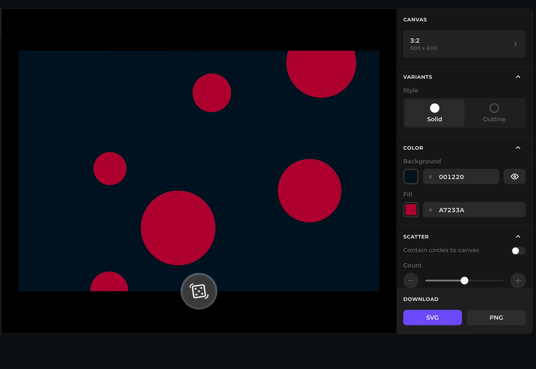
Haikei is a web app that helps you generate SVG shapes, backgrounds, and patterns in all types of shapes to use in projects. Everything can be exported into the tools you are already using for easy integration, and every element is customizable. The tool is free right now – no credit card needed – and you get access to 15 generators and can export in SVG and PNG format. A premium option is on the way, and you can sign up to get notified for access.

Fluid Space Calculator

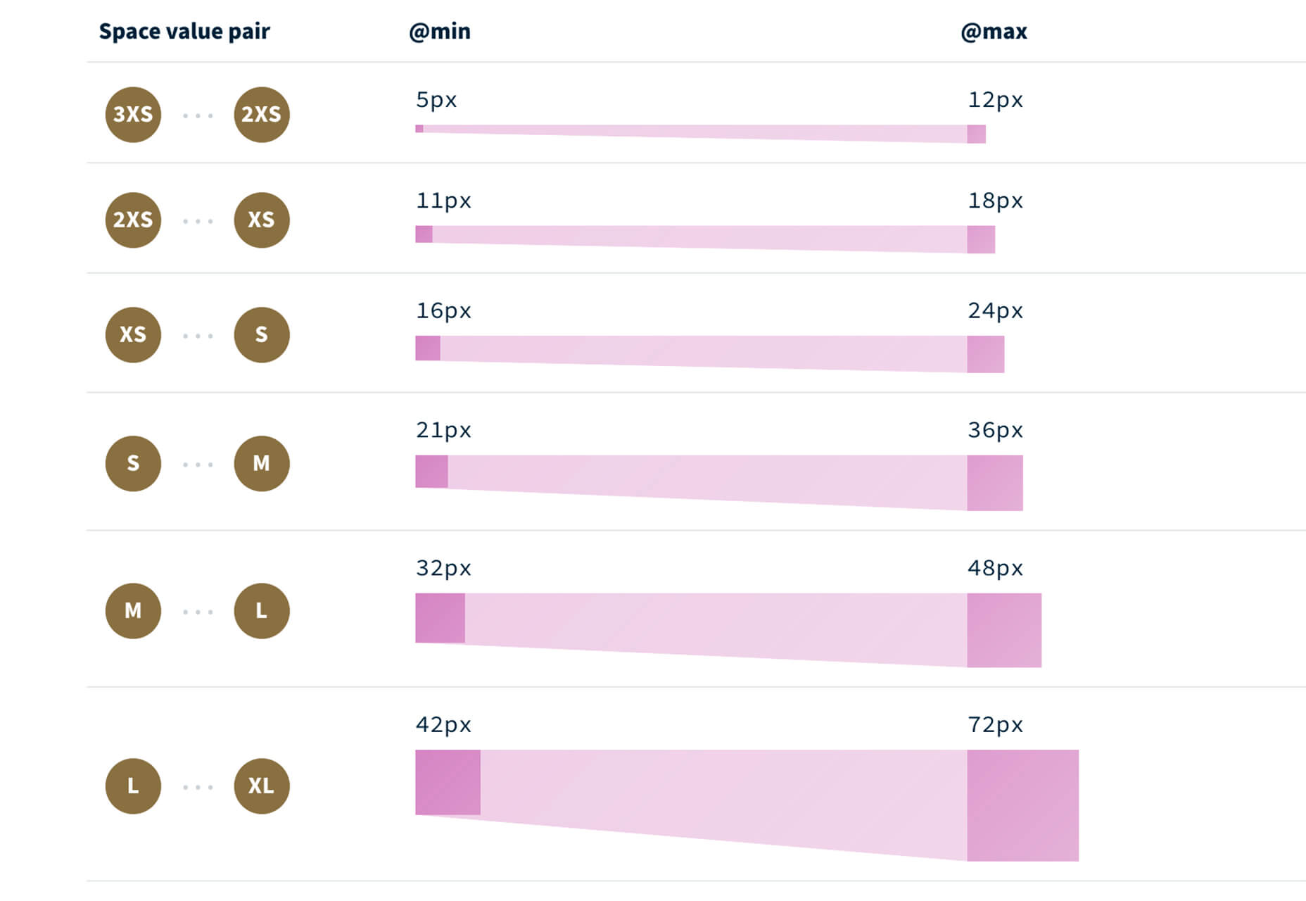
Fluid Space Calculator helps you create a related space system and export the CSS to implement it. The calculator allows you to add space value pairs and multipliers and see the impact on the screen before snagging the related code. It’s great for determining how things will look in different viewports and for creating custom space pairs.

Night Eye WordPress Plugin

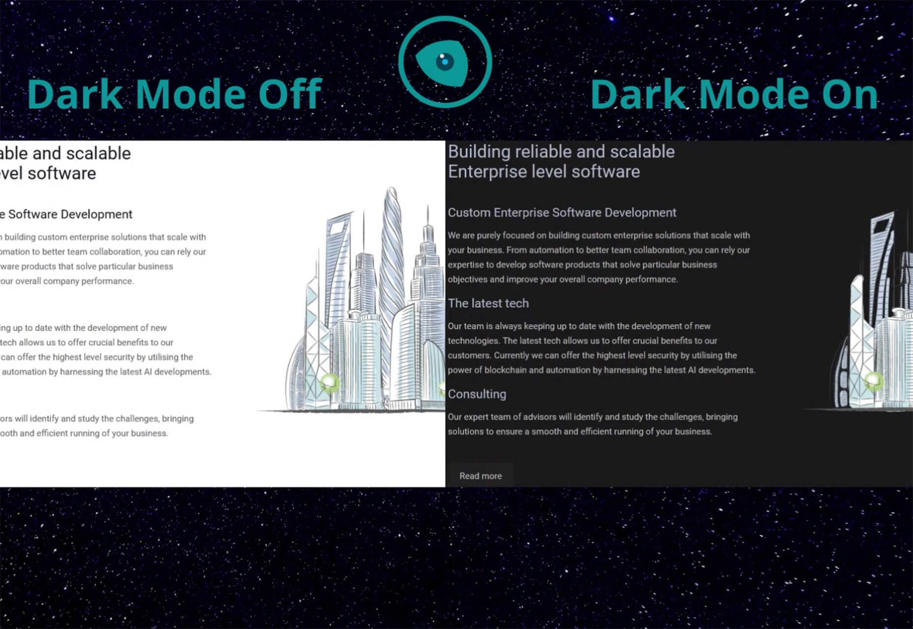
Night Eye WordPress Plugin helps you create a dark mode option for your WordPress website with ease. It’s completely customizable, schedulable, and one of those things that users are starting to expect. The plugin has free and paid versions – the only difference is a link to credit the developer.

3 Productivity Boosters

Macro

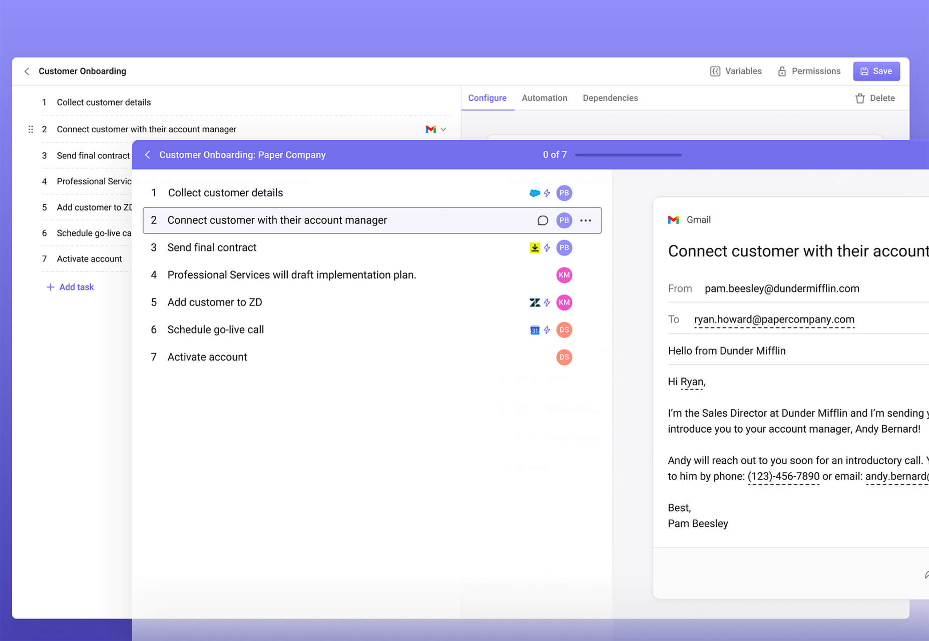
Macro is a supercharged checklist app for recurring processes. It’s designed to help teams document, assign, track, and automate for maximum efficiency. Now is the time to test this tool because it is free in public beta.

Writex.io

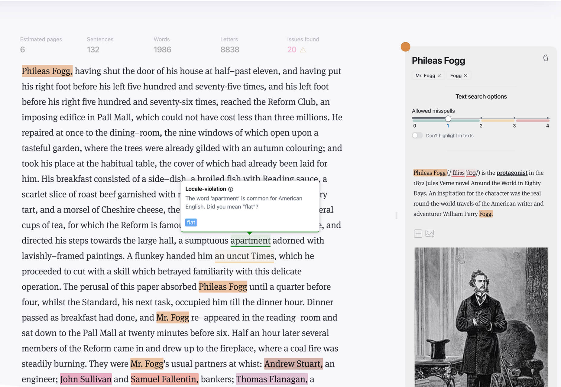
Writex.io is a free writing app that uses AI and smart features to help you write more efficiently. It can check readability as you write, make suggestions, check spelling, and allows you to work with versioning. All the settings are customizable, so you can get help and suggestions when you want them and avoid things you don’t want.

Taloflow

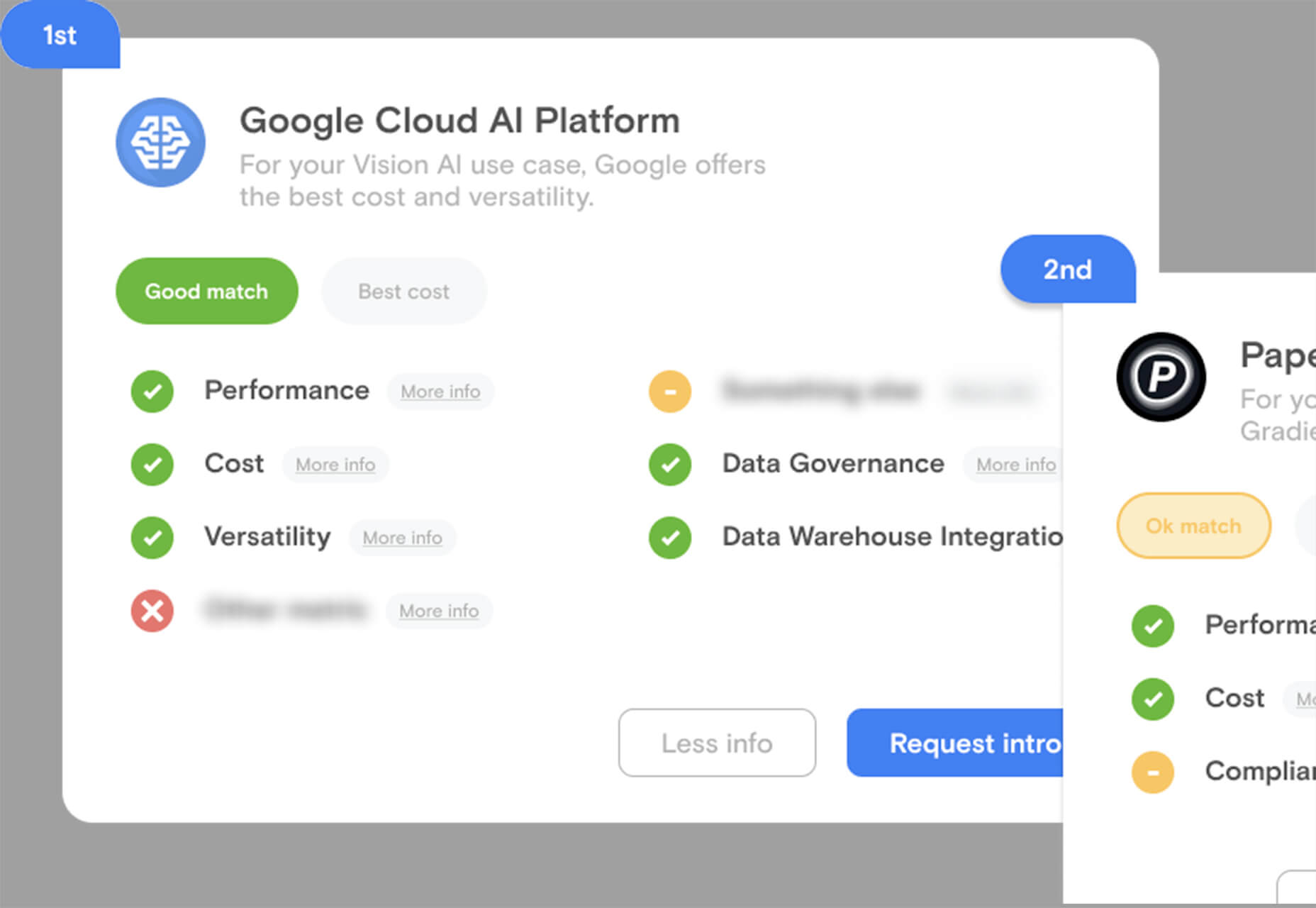
Taloflow, which is in beta, is a tool that helps you find the top cloud and dev tools for your use case. This is designed to be a time-saving solution to finding the right infrastructure and API products for your work.

8 Kits with Illustrations and User Interface Elements

Skribbl

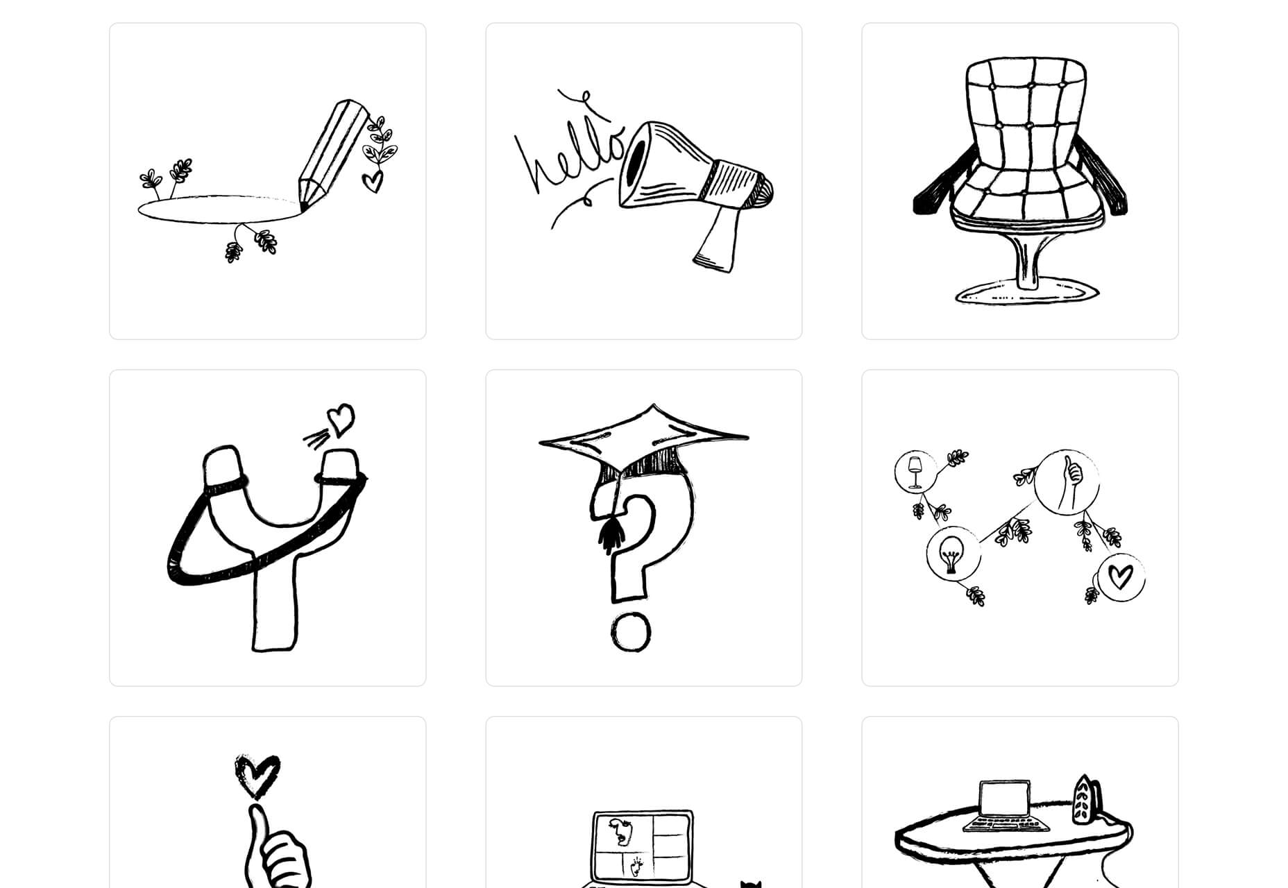
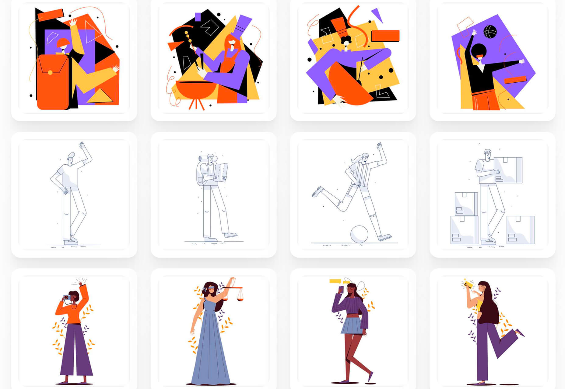
Skribbl is a collection of free, hand-drawn illustrations in a light and fun style. The black and white sketches are friendly, and the collection keeps growing. Plus, the illustrators are allowing them to be used free for any use.

Mobile Chat Kit

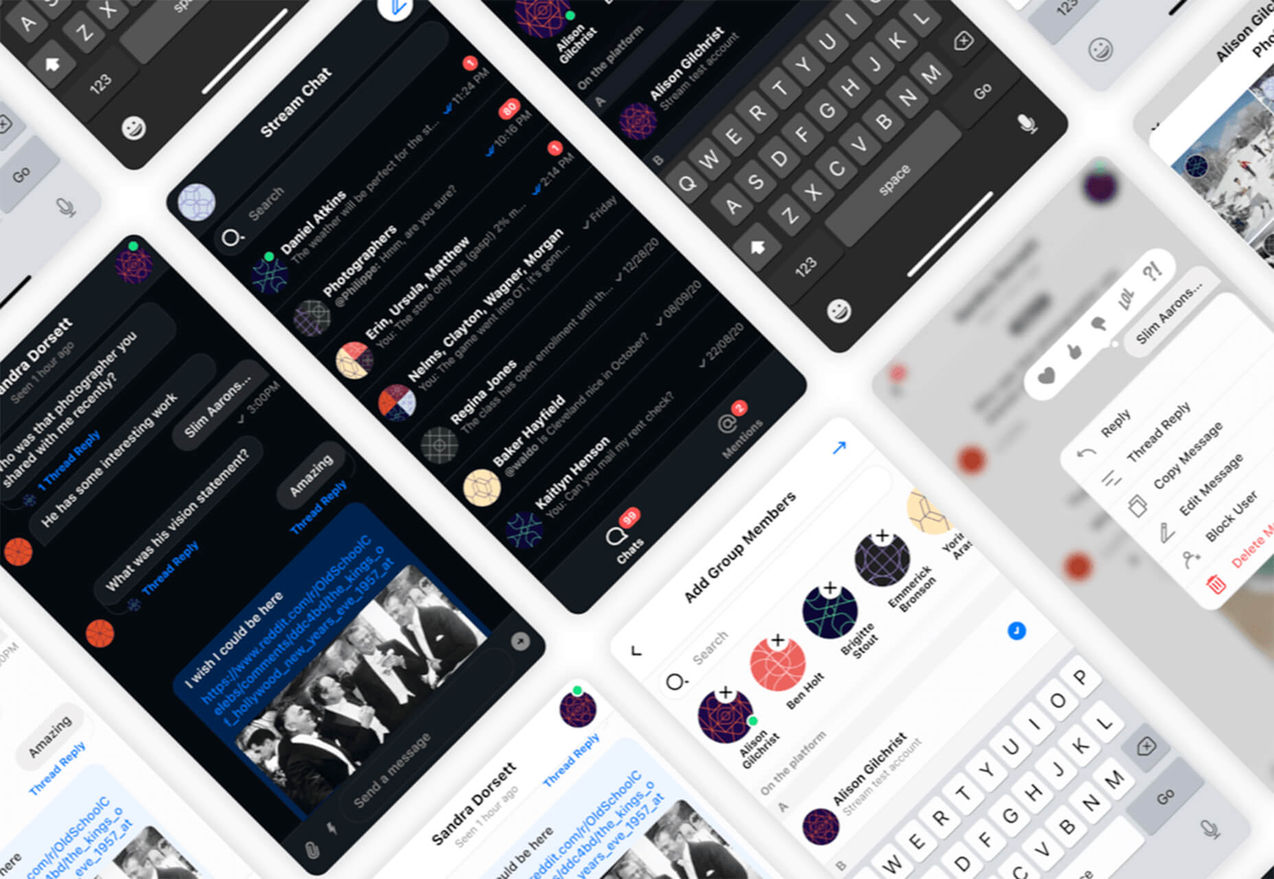
Mobile Chat Kit is a free starter kit for building apps in Figma, Sketch, and Adobe XD. It includes more than 50 screen options with mapped-out flows for a quick-start project.

Flowchart.fun

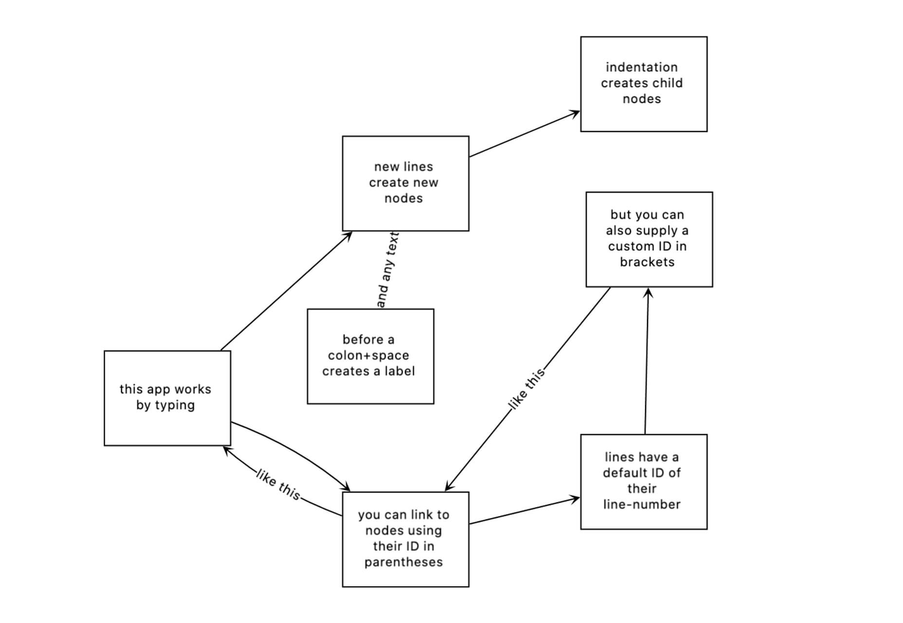
Flowchart.fun is exactly what the name implies. The app allows you to type, create nodes, and link elements to develop simple flow charts quickly. Then you can alter shape and size with drag and drop. Export it for use as an SVG, JPG, or PNG.

Shuffle

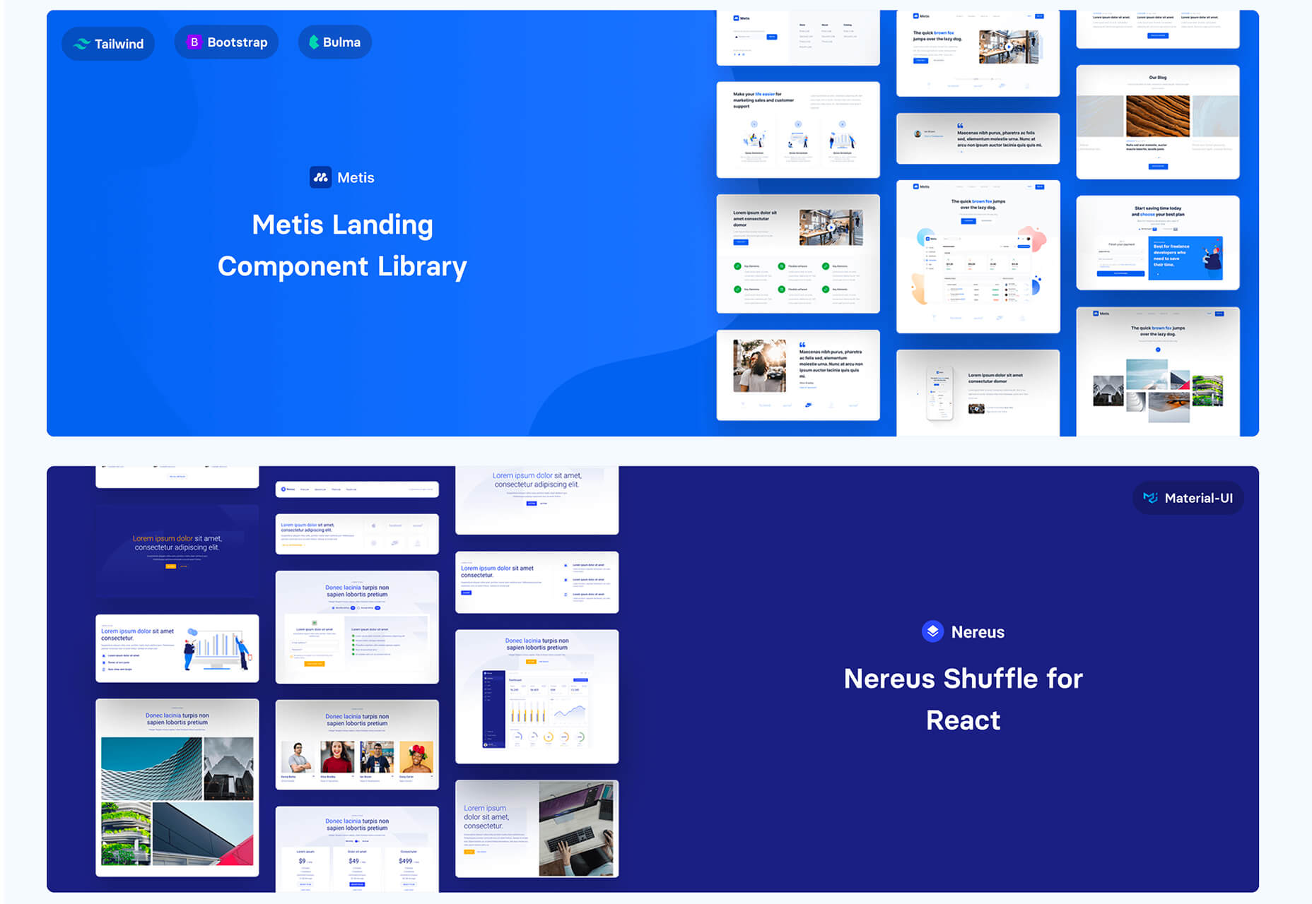
Shuffle is a marketplace packed with UI libraries to help you with a variety of digital projects. There are more than 1,500 pre-built components to choose from with professional designs. This premium tool comes with a monthly subscription or lifetime license.

Cryptocurrency 3D Pack

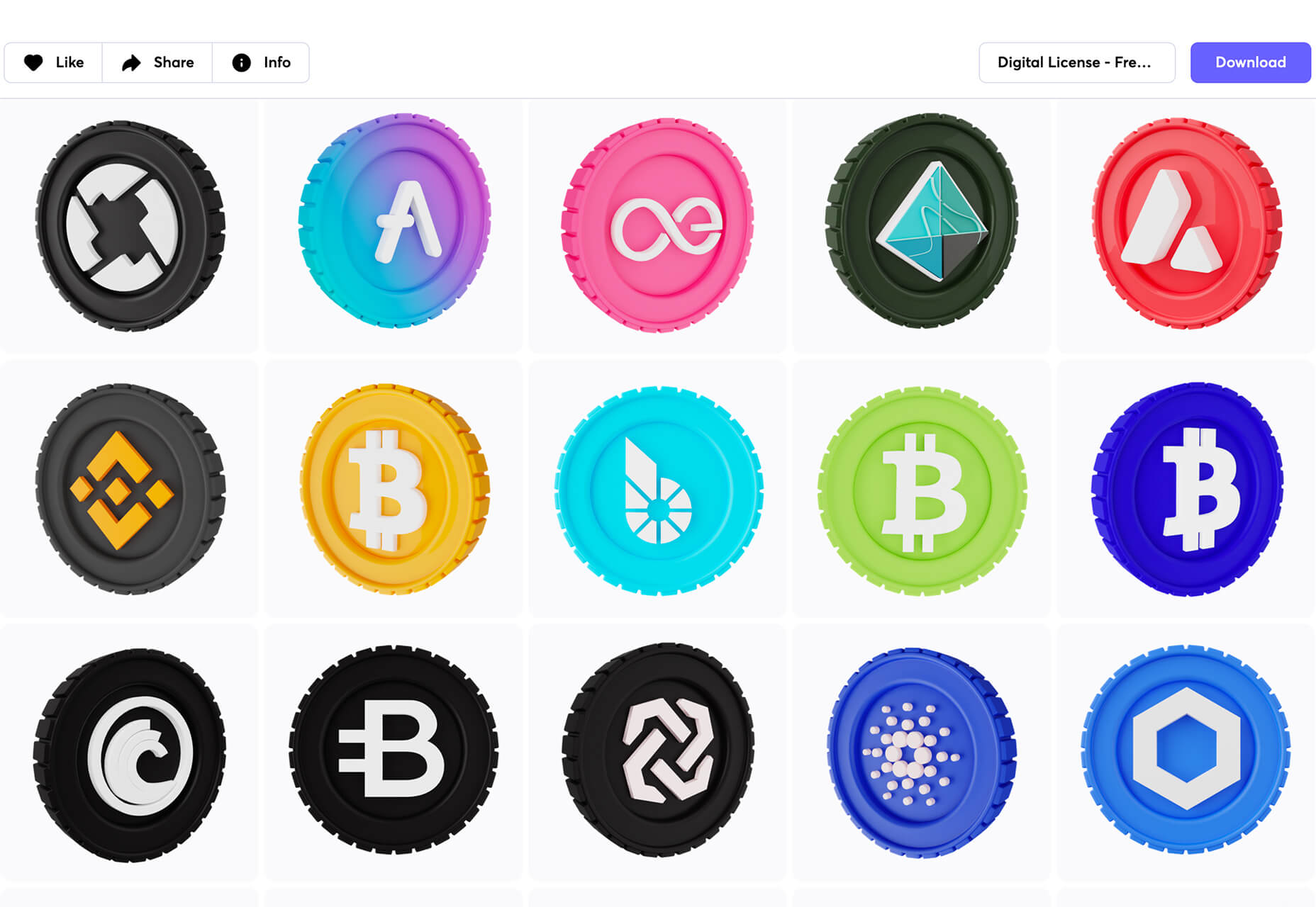
Cryptocurrency 3D Pack is a set of icons with fun colors in three-dimensional shapes that you can use to represent different crypto elements. The pack includes 55 #D icons in PNG and BLEND formats.

Stratum UI Kit for Figma

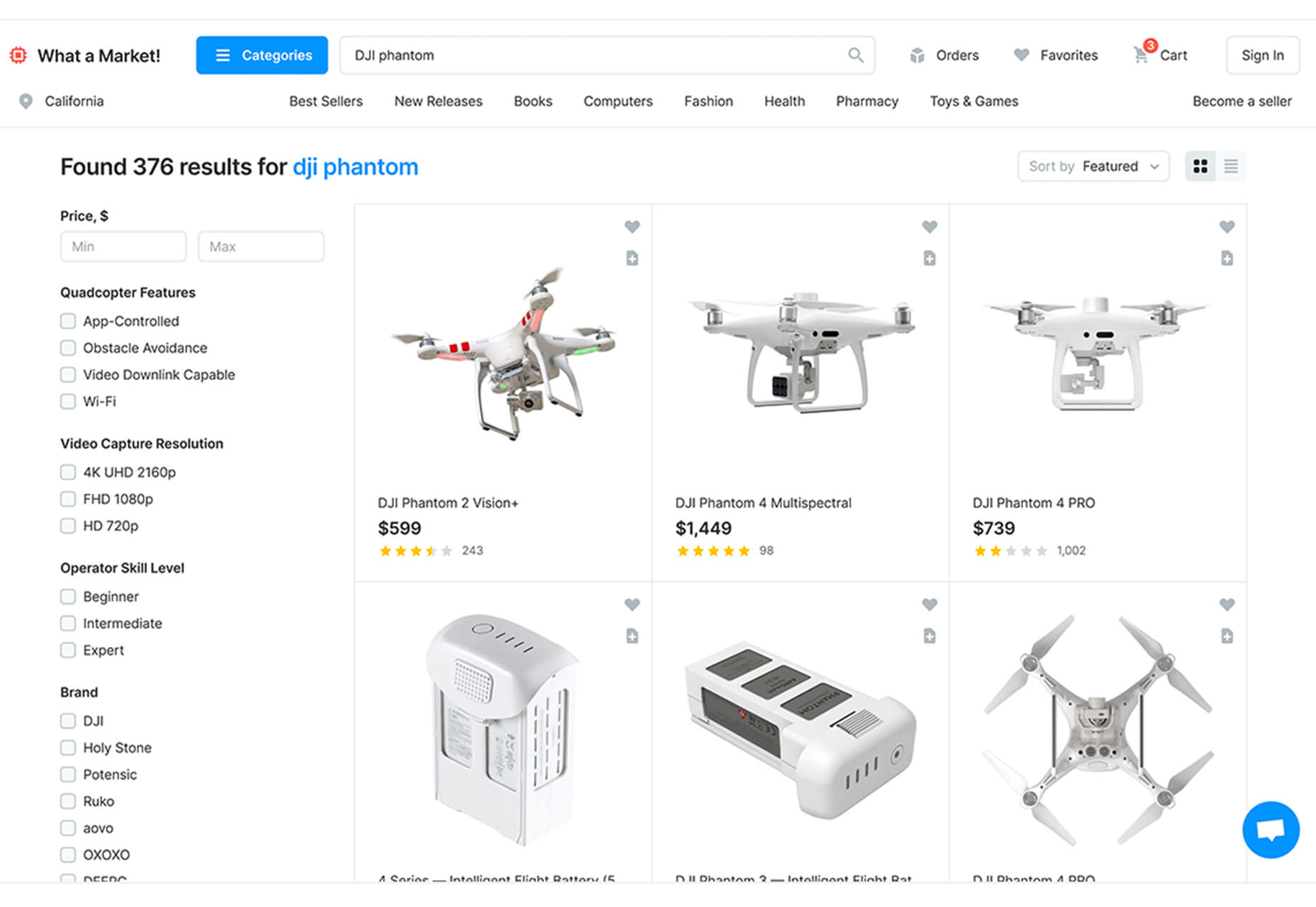
Stratum UI Kit for Figma includes nine free screens that are ready to use. Options include API documentation, Kanban, document, data dashboard, ecommerce product list, ecommerce product options, payments spreadsheet, cloud storage, and newsfeed.

Conic.css

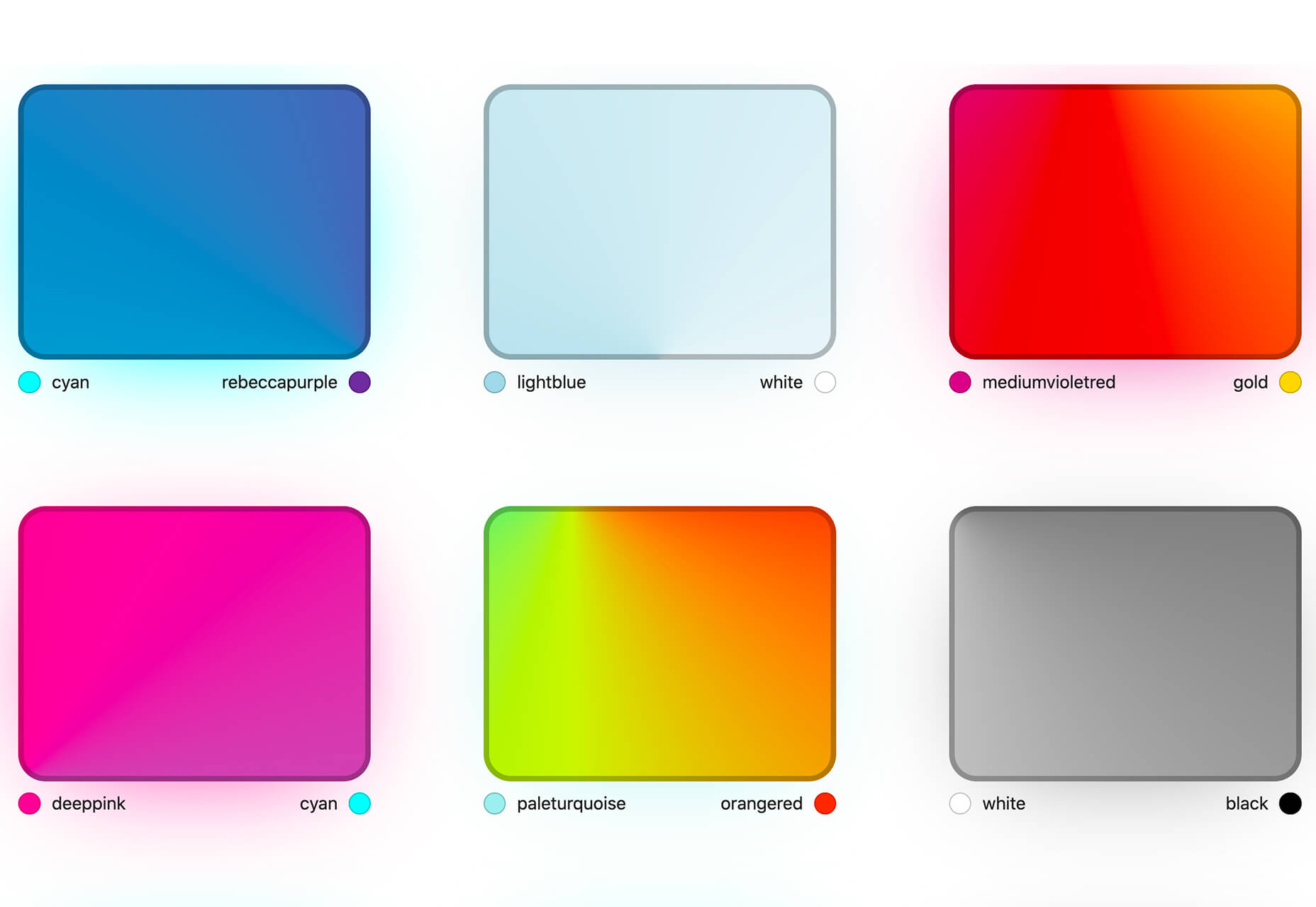
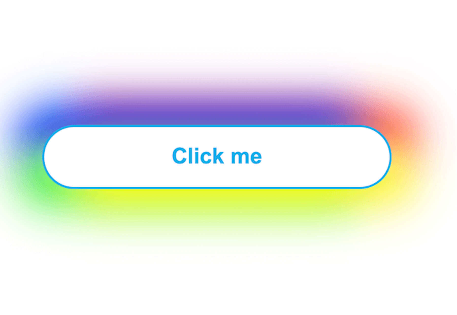
Conic.css is a collection of simple gradients that you can browse and then click to copy the code into your CSS to use them in projects. It’s quick and easy while using trendy color options.

Artify Illustrations

Artify Illustrations is a Figma plugin that allows you to access more than 5,000 SVG and PNG illustrations within the app. It’s got a built-in search feature, everything is high-resolution, and the huge library includes various styles.

2 Tutorials

A Complete Guide to Accessible Front-End Components

A Complete Guide to Accessible Front-End Components is an amazingly comprehensive guide from Smashing Magazine with everything you need to know about accessible components. From tabs to tables to toggles to tooltips, you’ll find it all here and learn how to use it the right way.

Grid CheatSheet in 2021

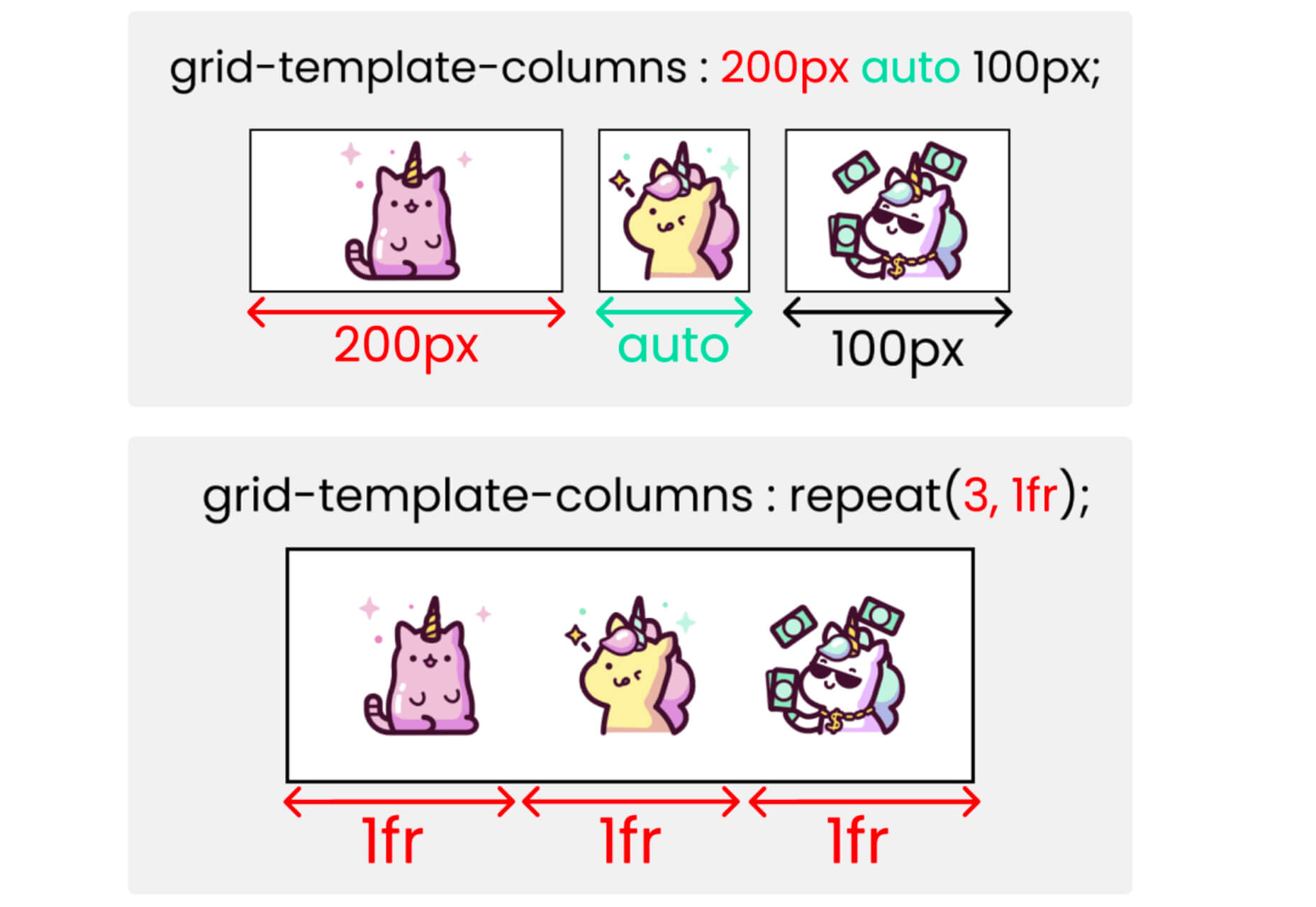
Grid CheatSheet in 2021 is a useful guide of everything you can do with CSS Grid. Plus, it has plenty of fun illustrations and an accompanying video.

8 Fresh and Fun Fonts

Athina

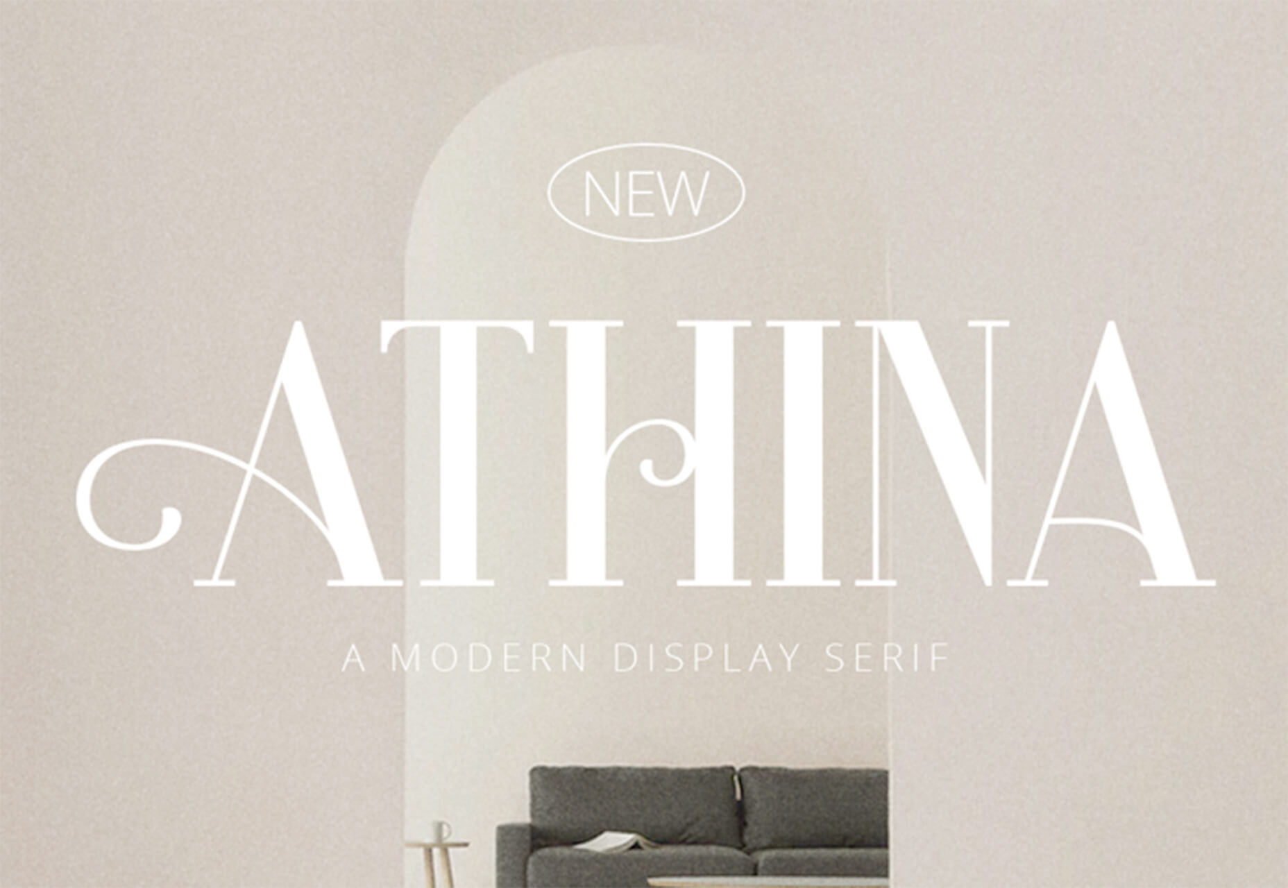
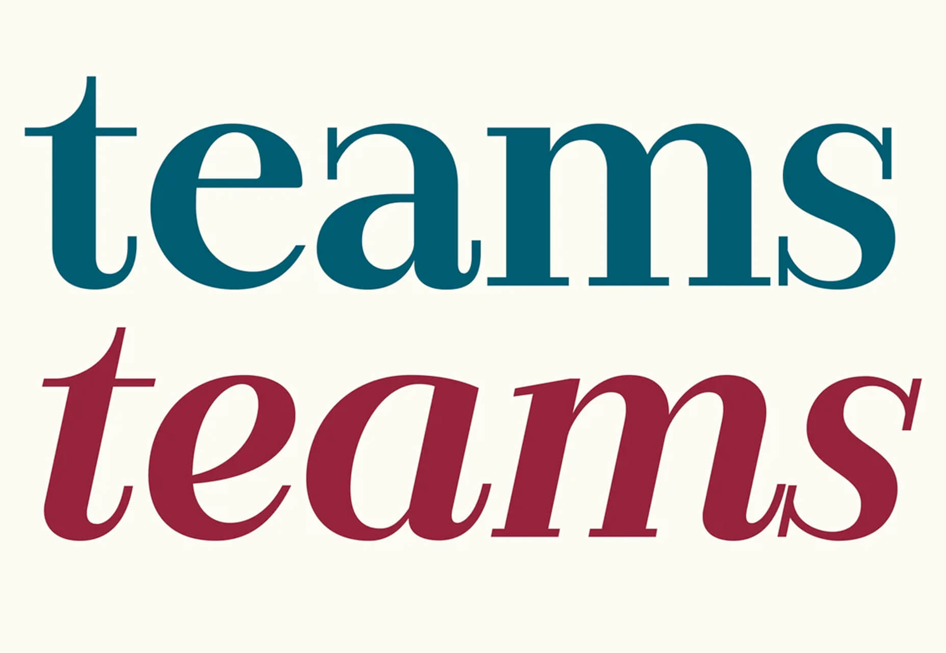
Athina is a modern display serif with beautiful connector strokes. The free version is a demo, and there’s a full family that you can buy.

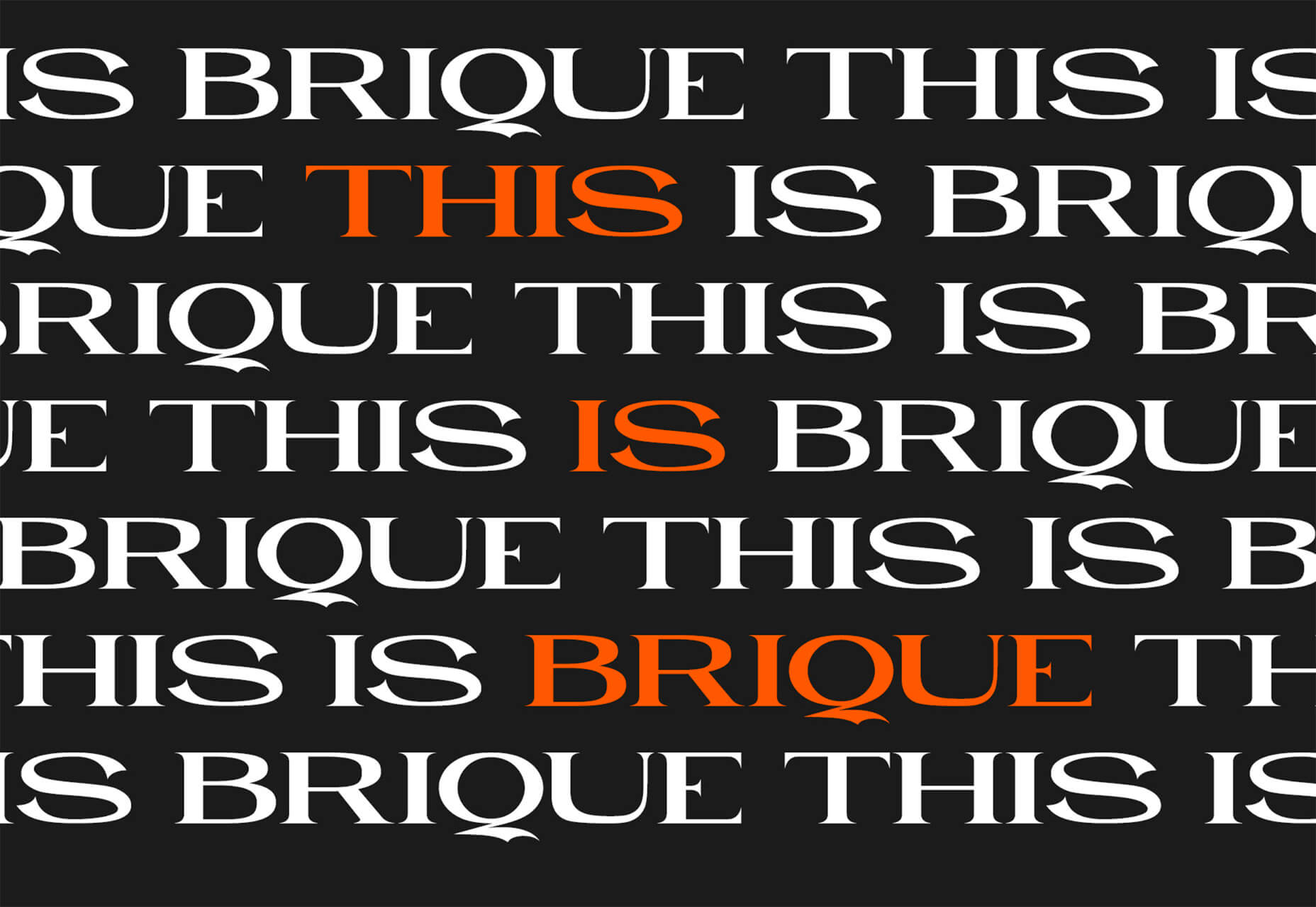
Brique

Brique is a free (personal and commercial) display font with a wide stance and uppercase character set. The letters have a lot of personality and a readable configuration.

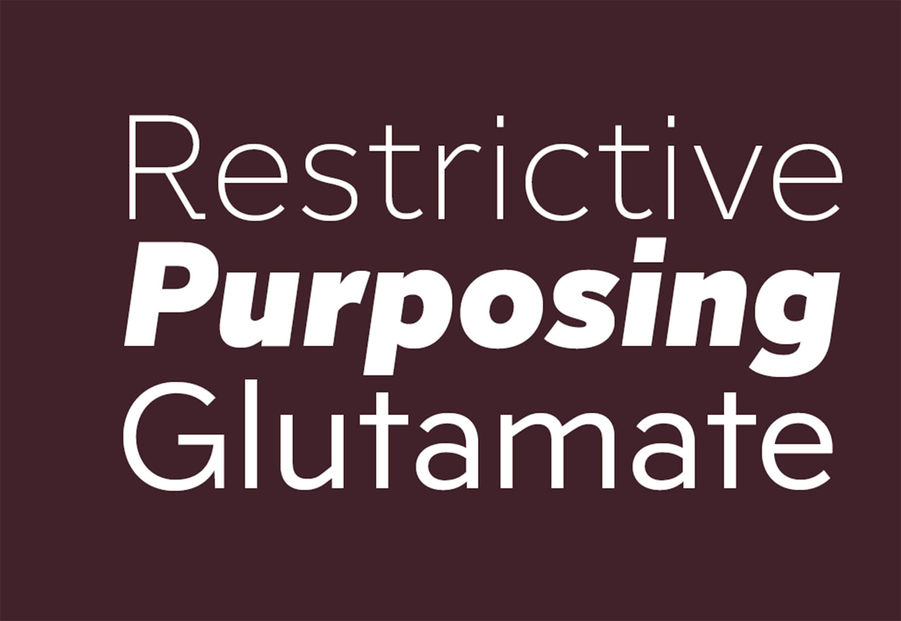
Code Next

Code Next is a great geometric sans serif with a full family of styles. Including two variable fonts. It’s highly readable and would work for almost any application.

Inter

Inter is a simple and functional sense serif family with everything from extra light to heavy weights. The extra character personality makes this a fun and functional font option.

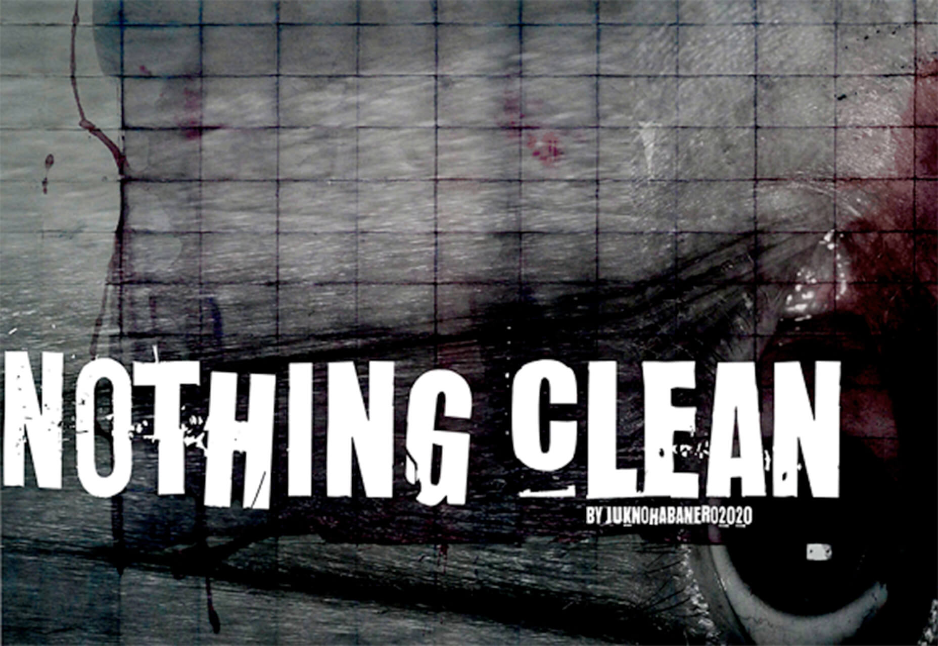
Nothing Clean

Nothing Clean is a fun grunge-type option. It’s an all uppercase character set with alternates.

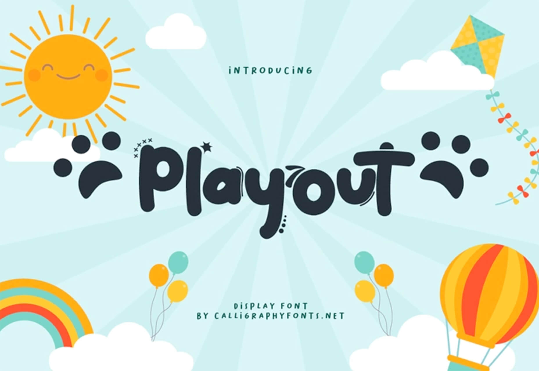
Playout

Playout is a fun, hand-drawn style typeface with interesting glyphs and alternate characters. The most fun feature might be the pawprint characters in the demo set.

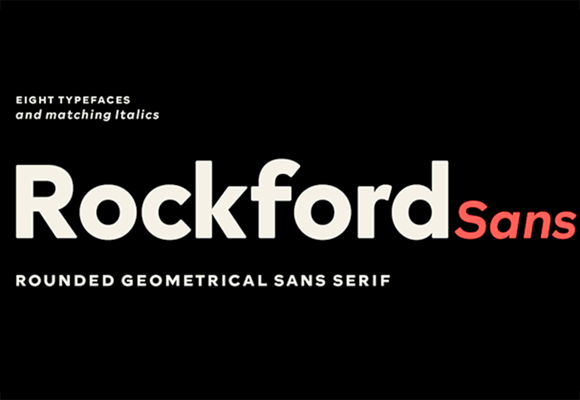
Rockford Sans

Rockford Sans is a geometric typeface with subtly rounded edges. It has eight weights and italics. With its large x-height and round features, it’s legible and friendly. It’s suited to cover a wide variety of tasks from editorial to brand design and advertising.

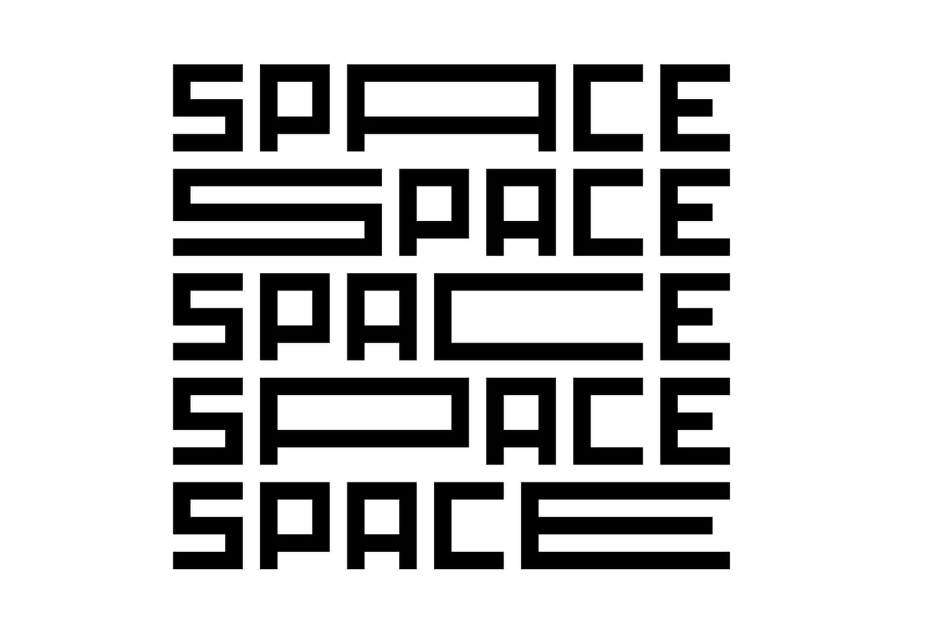
SpaceType

SpaceType is a fun and funky typeface in regular and expanded styles. The stretched letterforms make interesting alternates for display purposes.

Source

The post 25 Exciting New Tools For Designers, April 2021 first appeared on Webdesigner Depot.


Source de l’article sur Webdesignerdepot

The best thing about writing about website design trends each month is looking at all the great sites that are being developed. Designers are stretching creatively and exploring new techniques and ways of doing things all the time.

It’s refreshing and inspiring. This month, some of those trends include a style that nods to brutalism, slide scrolling that’s interesting and fresh, and animated typography.

Here’s what’s trending in design this month…

1. Almost Brutalism

Brutalism can be a lot to handle and only really works for certain types of projects. That being said, some of the elements of brutalism can be the foundation for an interesting aesthetic.

So, it’s not surprising that an “almost brutalism” trend has emerged.

Designers are working with some of the design elements – slab fonts, simple color schemes with a lot of contrast, twitchy animation, mono typefaces, and overall design patterns that are almost over-simplified.

The result is a striking design that isn’t so harsh that it turns users away. It’s the right combination of brutalism and usability to create something with a harder-edge feel that people understand.

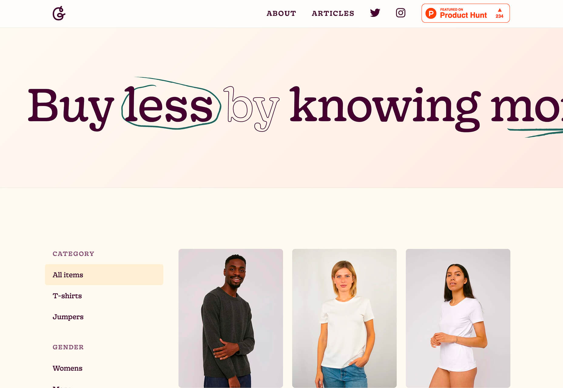
Good Garms uses a typewriter-style typeface, simple patterns, and one of the most streamlined designs you might find for an ecommerce store. It’s effective and makes you look because it is different.

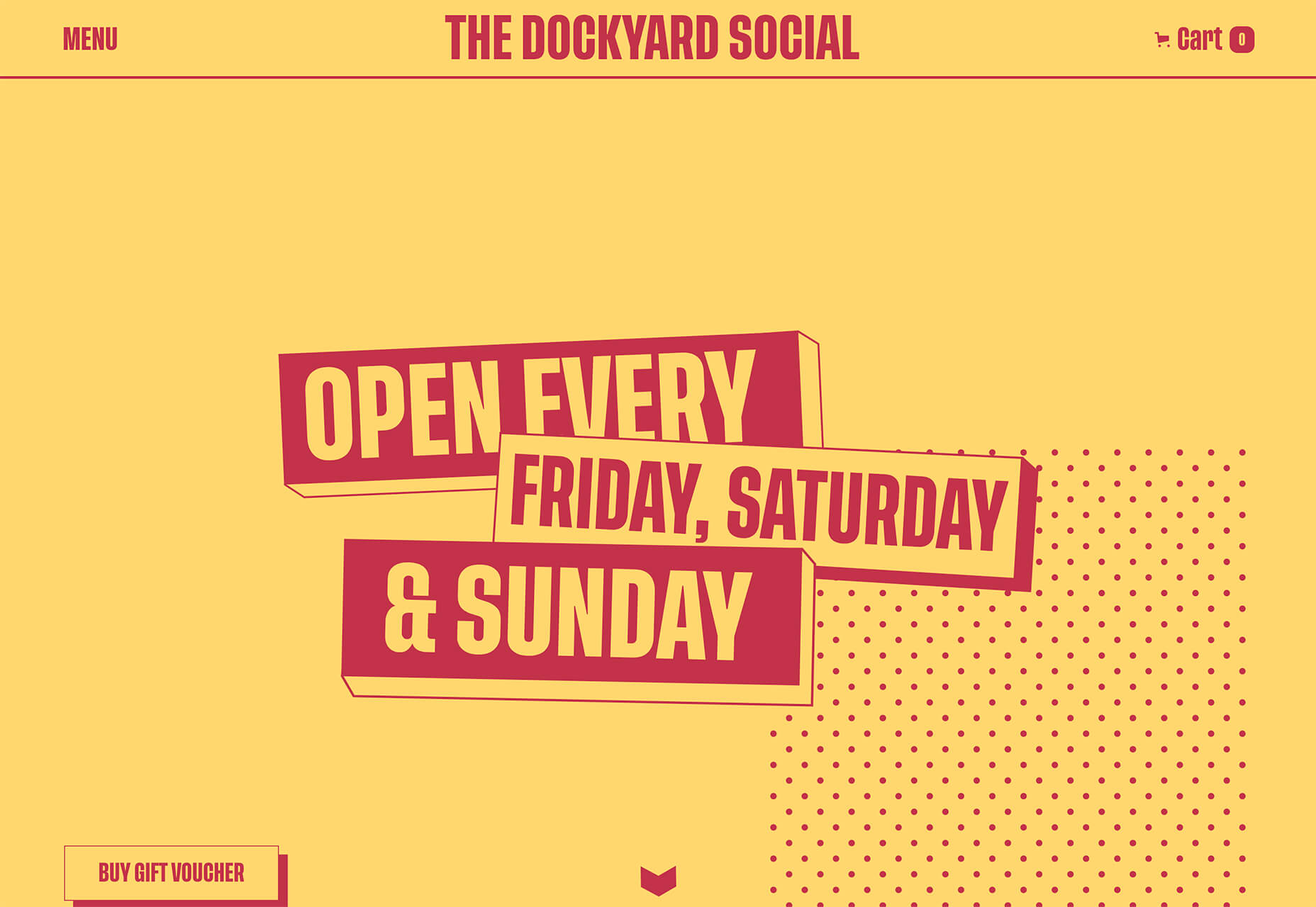
Dockyard Social uses an unexpected color combination with high contrast, sharp shapes, and design elements, and bold slab typography to grab your attention right away. The theme continues on the scroll with new color combinations with equally brutal design elements. It feels a little tight and uncomfortable in places but still highly usable – exactly what almost-brutalism intends to do.

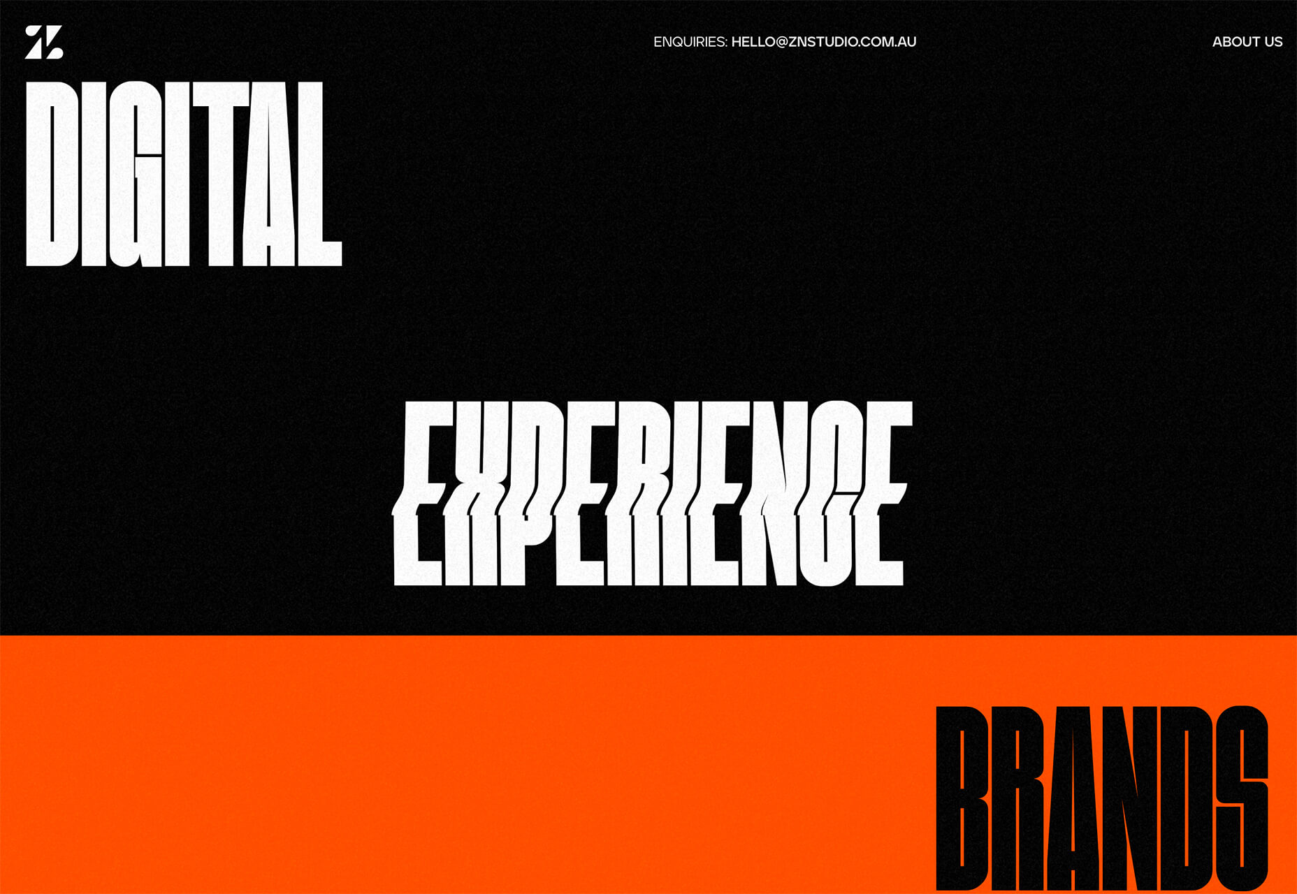
ZN Studio uses the same big, bold type elements as the previous example with a twitchy-style animation to draw you into the design. The entire design uses clever animation effects with a brutal aesthetic to keep you scrolling.


2. Beautiful Slide Scrolling

You can argue the value – or lack thereof – of website sliders as long as you want to. The reality, though, is that, for the most part, they are clunky and get in the way of the content. It’s a lazy option that keeps you from having to make a content choice.

Not with these beautiful slide-scrolling website designs.

Each of these designs uses side-scrolling as a design asset. Here’s the trick that makes it work: Slide scrolling isn’t a “feature” above a bunch of other content. It is how the content is featured.

These examples show you how to use the trend well and should get you excited about slide (or side) scrolling.

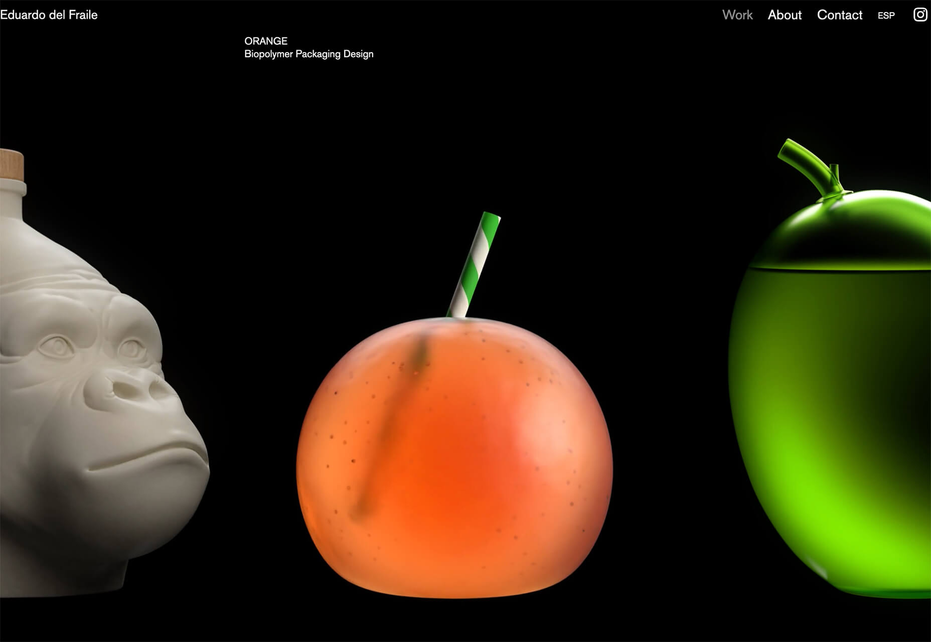
Eduardo del Fraile uses a side scroll to show different projects in his portfolio. In addition to scroll, each element also has a simple and beautiful animation that allows you to see each product he has designed. Everything about the scrolling motion is intuitive, and the site never scrolls vertically, which is where many side scrollers go wrong.

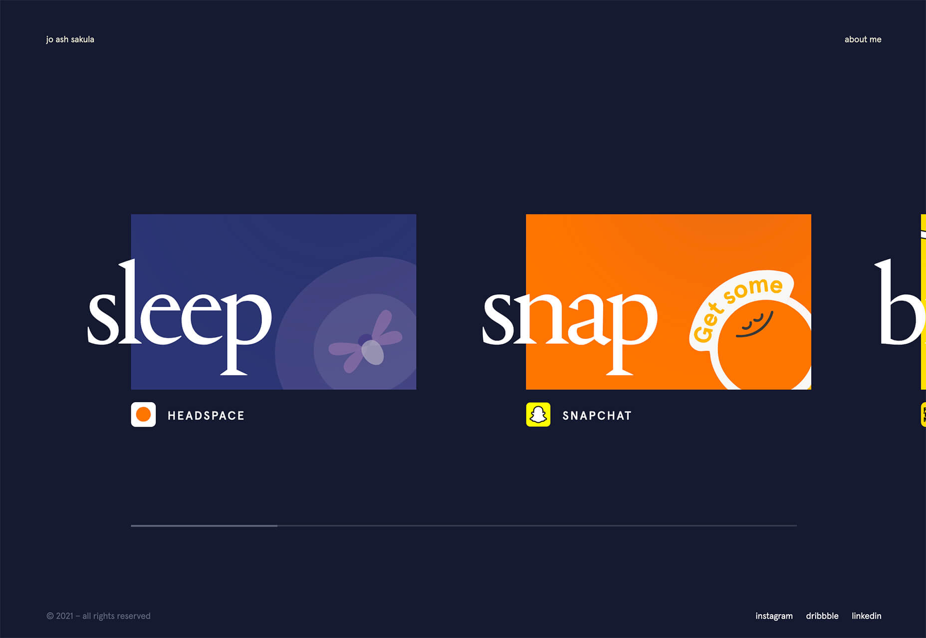
Jo Ash Sakula uses a similar concept for the side scroll here but with different design elements. The bold card elements are striking in terms of color, contrast, and design. You know the scroll will move horizontally because a third element sneaks into your field of vision on the right side. It’s simple, clean, and highly usable.

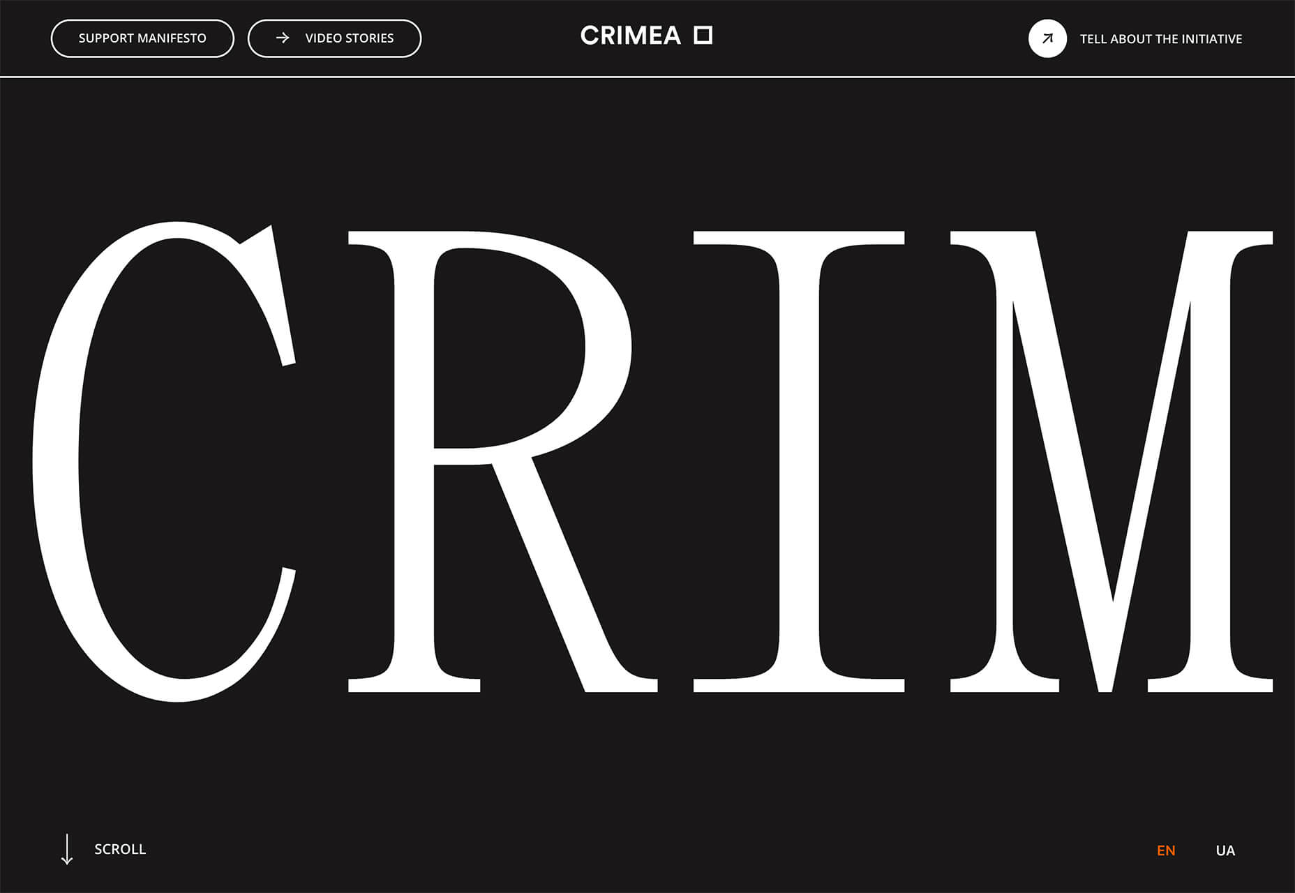
Crimea is interesting because it has an “almost brutalism” style design and uses a side-scrolling pattern. The design is bold and almost overwhelming, but the scroll works to tell a nice story with visuals and content.


3. Typography Animations

Web typography can make or break a design from font choice to size and color to animation, every detail with text elements matters.

This trend explores and pushes the boundaries of animation with text elements in website design. And it is so tricky. The difference between an amazing result and a design fail is a thin line that can be quite subjective.

Each of these examples does something unique with text and animation together to create just the right feel. The flow for each is seamless and text elements – while incorporating movement – maintain readability.

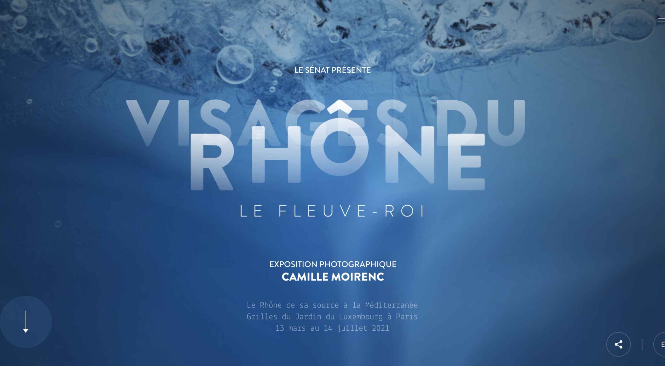
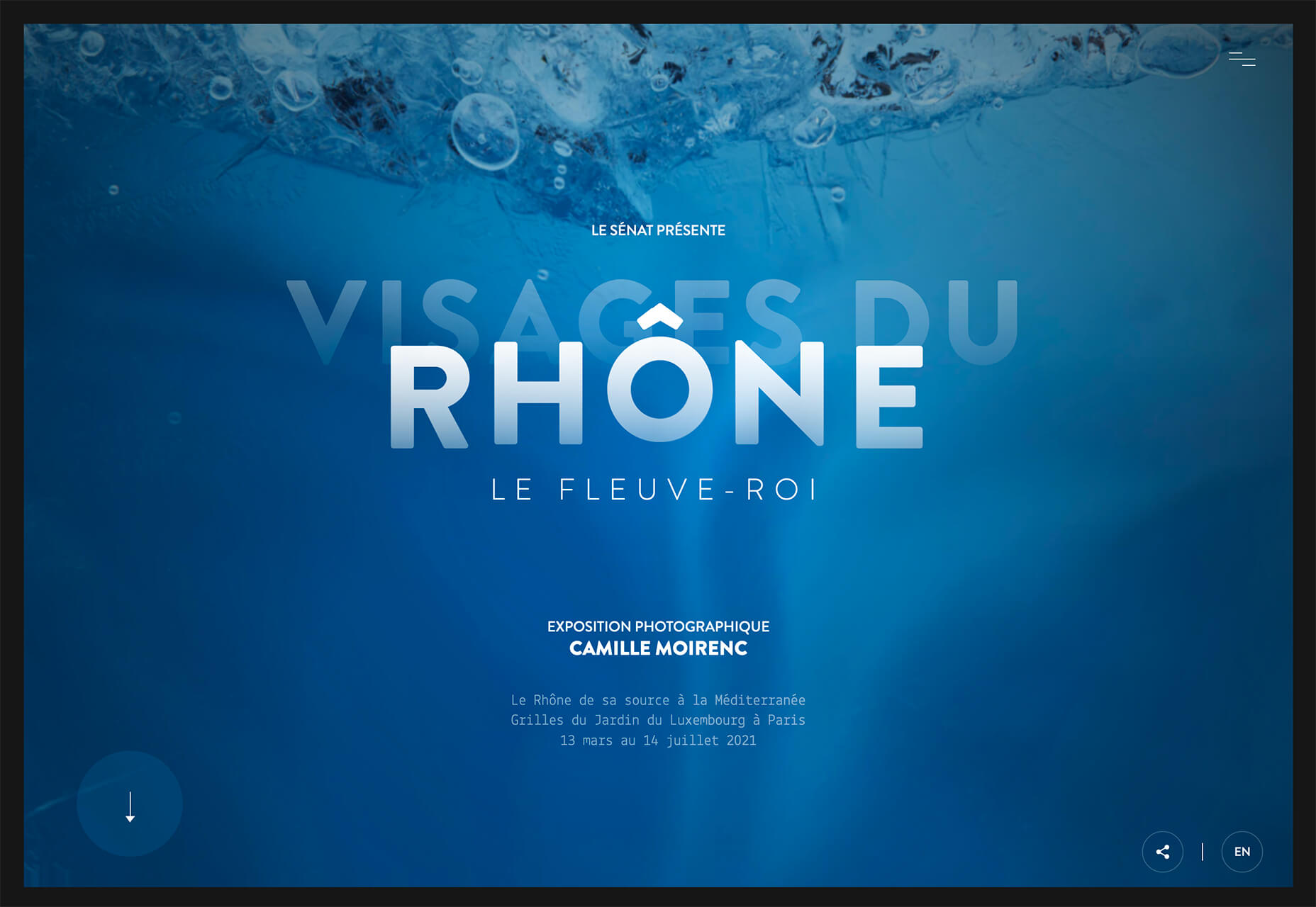
Visages Du Rhone has two layers of animation. The first happens as the words come onto the screen as the color and fade change within the letters. The second is a subtle hover state with a fluid feel for the letters that match the design’s underwater theme. What’s special about the typography animation is that it happens without distorting the letters, something many other liquid text animations do.

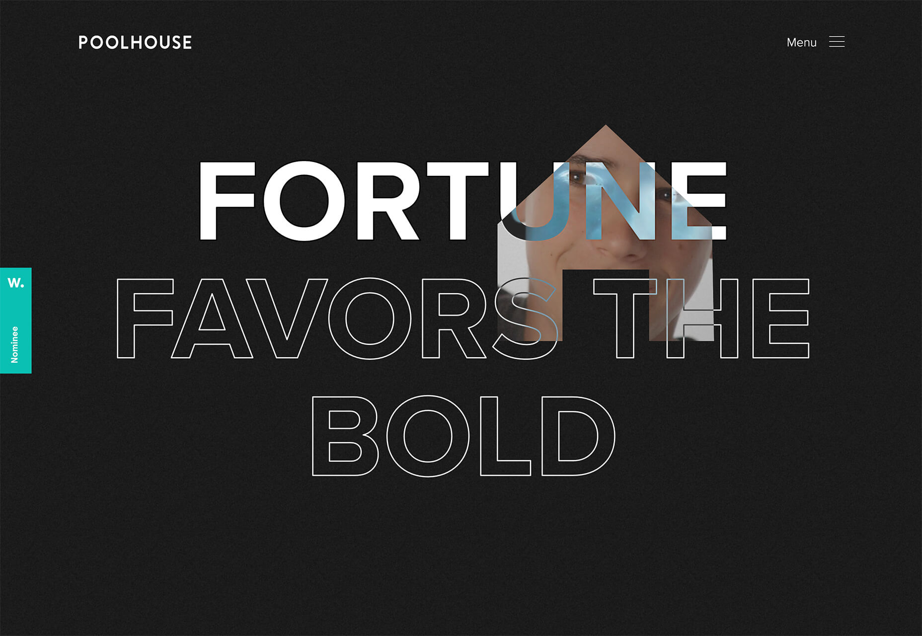
Poolhouse uses transparent letters with movement in a layer behind the words. What’s very neat here is the additional filtering so that the background motion still works while maintaining the integrity of each letterform. Again, the focus on keeping text readable is what sets this design apart and makes it trend-worthy.

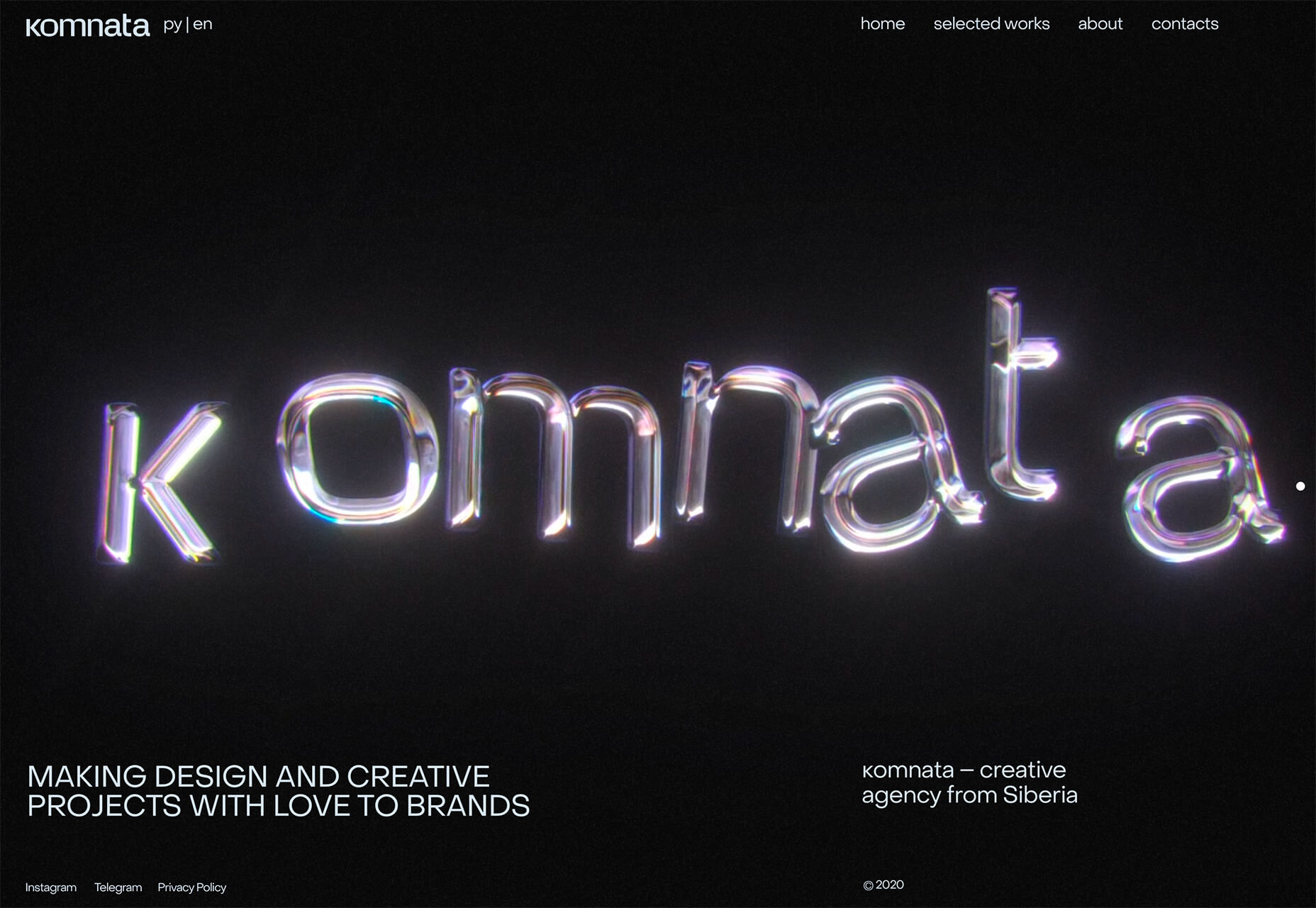
Komnata takes a wholly different approach with letters that float and look like balloons. The motion mimics what you would expect from an element that looks and feels like something in the real world. The user doesn’t have to do anything for this motion to take place. The animation might be even more effective if the scroll and pointer did not have a tail that “draws” on the screen as a distracting element.


Conclusion

The good thing about looking at variations of different trends is that you can see the practical application and apply it to your projects. While you might not move to a full sliding scroll on your website homepage, you could use that concept in another part of the design.

Experiment, have fun and draw inspiration from trending website designs.

Source

The post 3 Essential Design Trends, April 2021 first appeared on Webdesigner Depot.


Source de l’article sur Webdesignerdepot

Looking for something new to get you excited about design work? This list is packed with all kinds of goodies to help you feel inspired and ready to work.

Here’s what new for designers this month.

Top Picks for March

Same Energy

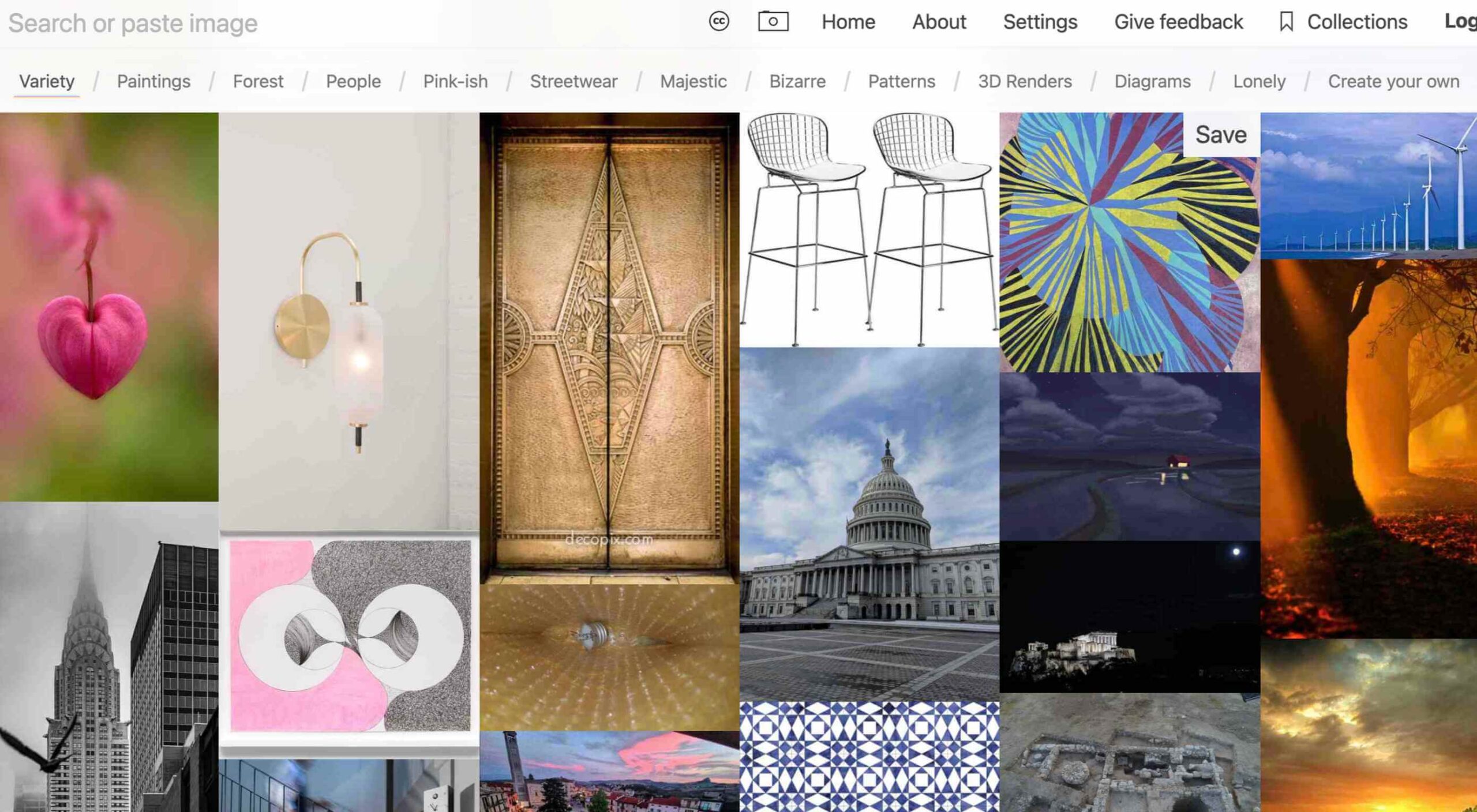
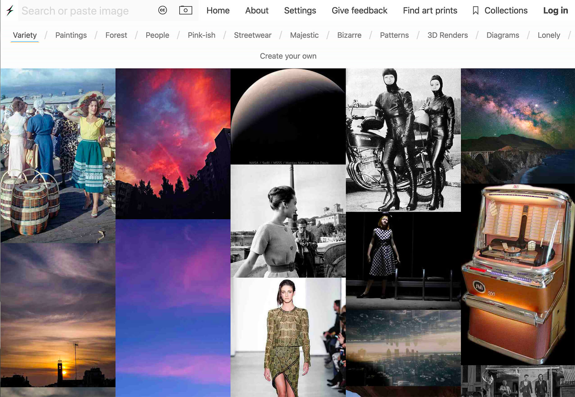
Same Energy, in beta, is a visual search engine. You can search with a minimum number of words or an image. The website is designed to help you find art, photography, decoration ideas, and practically anything. It uses deep learning and algorithms to create images on the home page, and you can create feeds in the same manner. The coolest part of this tool is that it tries to match the visual and artistic style you ask for with image mood and objects.

SVG Repo

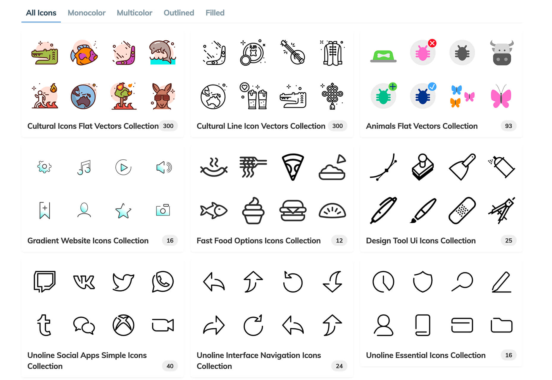
SVG Repo is a collection of more than 300,000 SVG vectors and icons that you can download and use in projects for free (even commercial use). The site has a powerful search tool to help you find the right image, and the platform is designed so that you can contribute.

Penpot

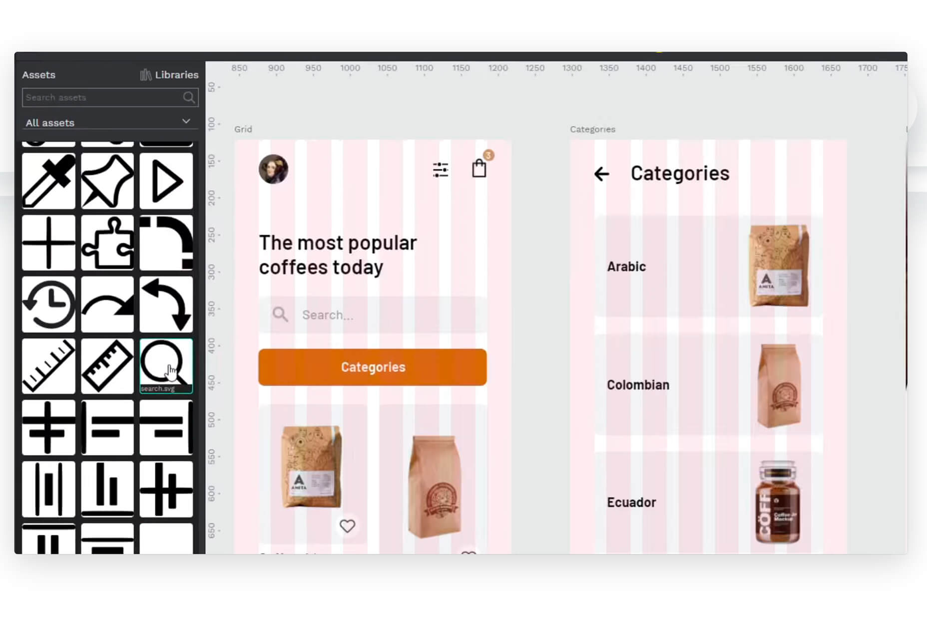
Penpot is an open-source design and prototyping platform for cross-domain teams. It is a web-based tool that isn’t dependent on any operating system and works with open web standards. It’s designed to be zippy and interactive so your team can work fast.

Directual

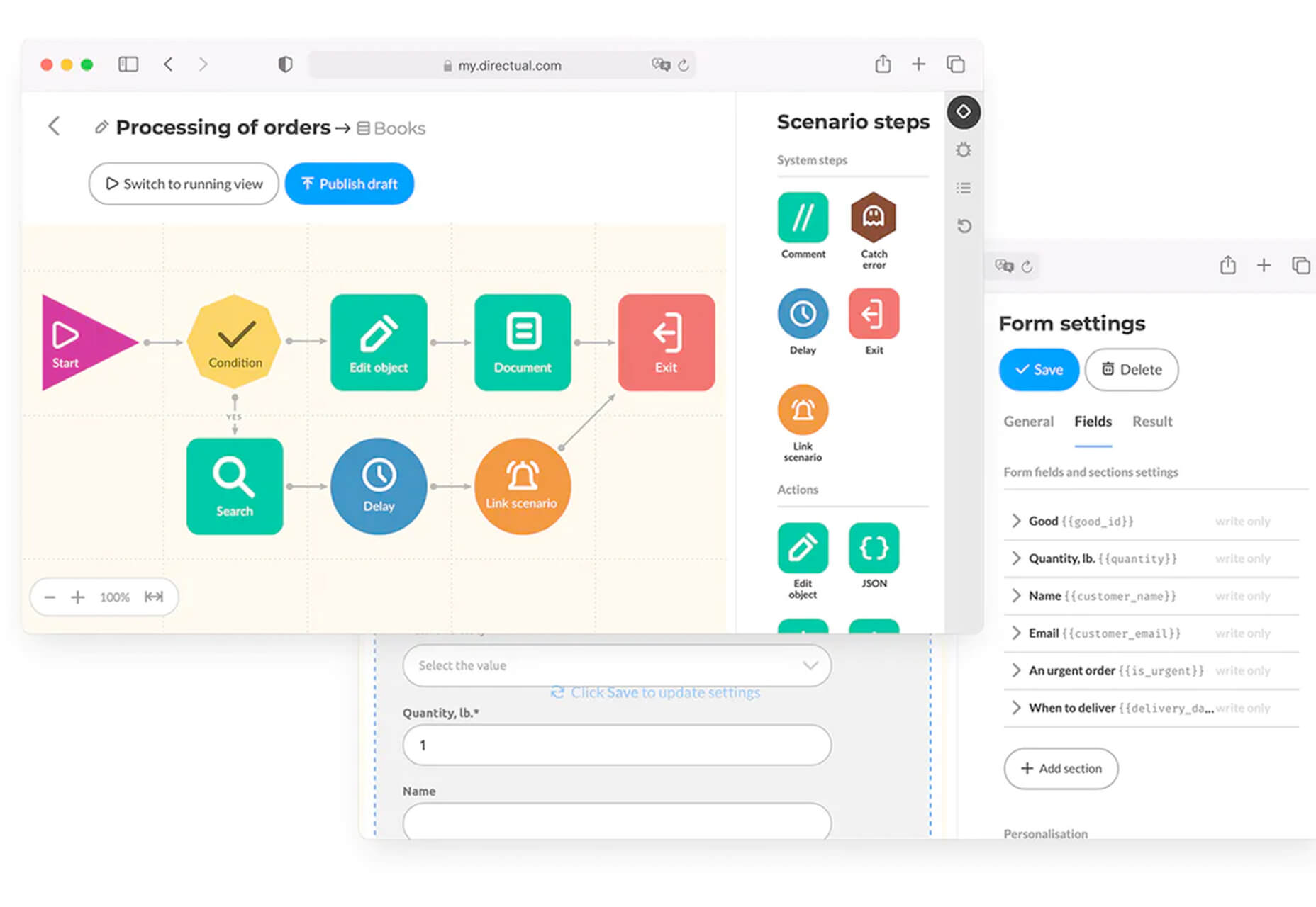
Directual is a no-code platform for building scalable apps using a visual interface. (Perfect for designers with less development experience.) It includes integrations with other popular tools and is free to use while figuring out how the app works and how you can make it fit your business goals.

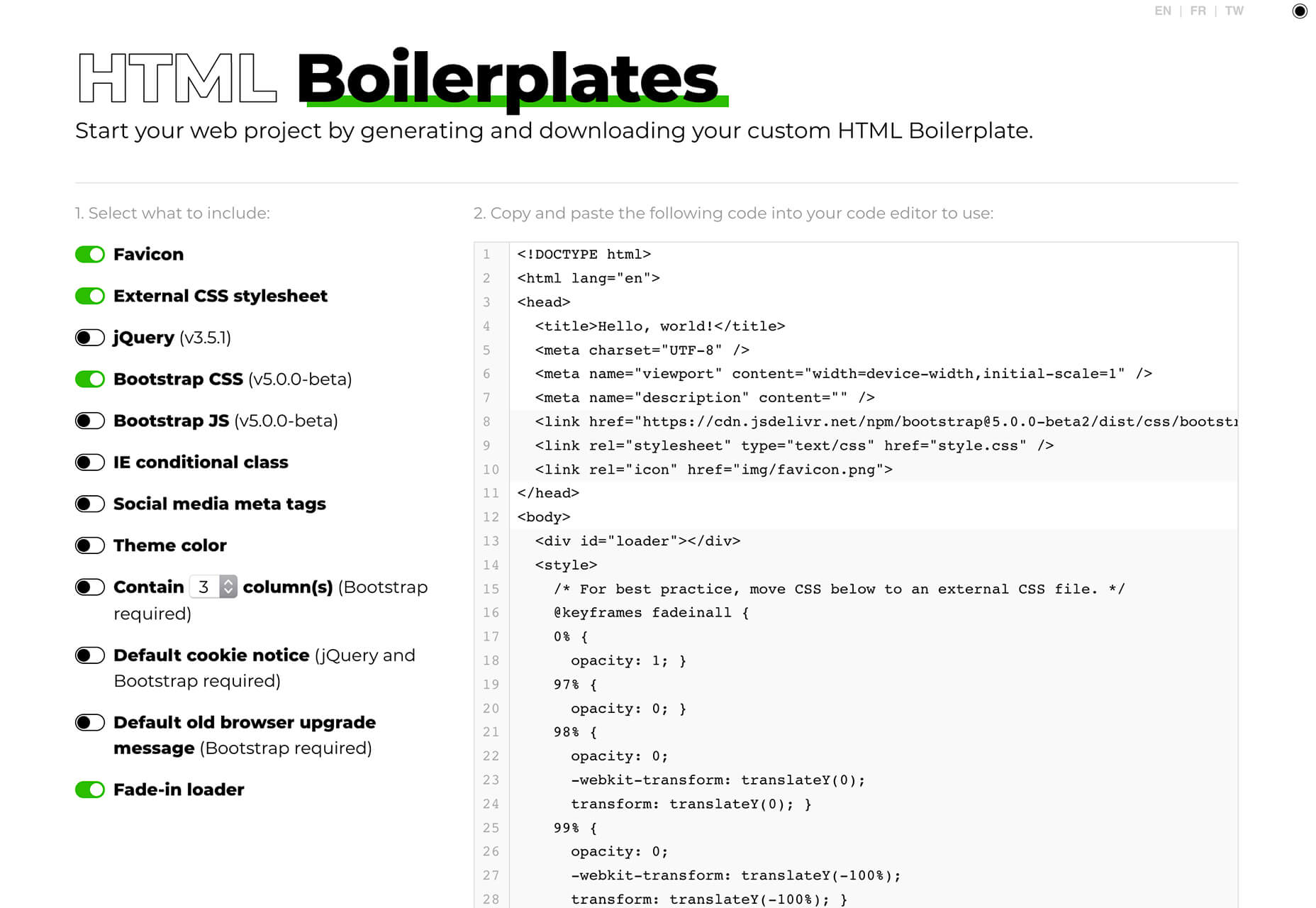
HTML Boilerplates

HTML Boilerplates helps you start web projects by generating a custom HTML boilerplate that you can download. Just choose the elements you want to include and then copy and paste the code into your editor.

6 Productivity Boosters

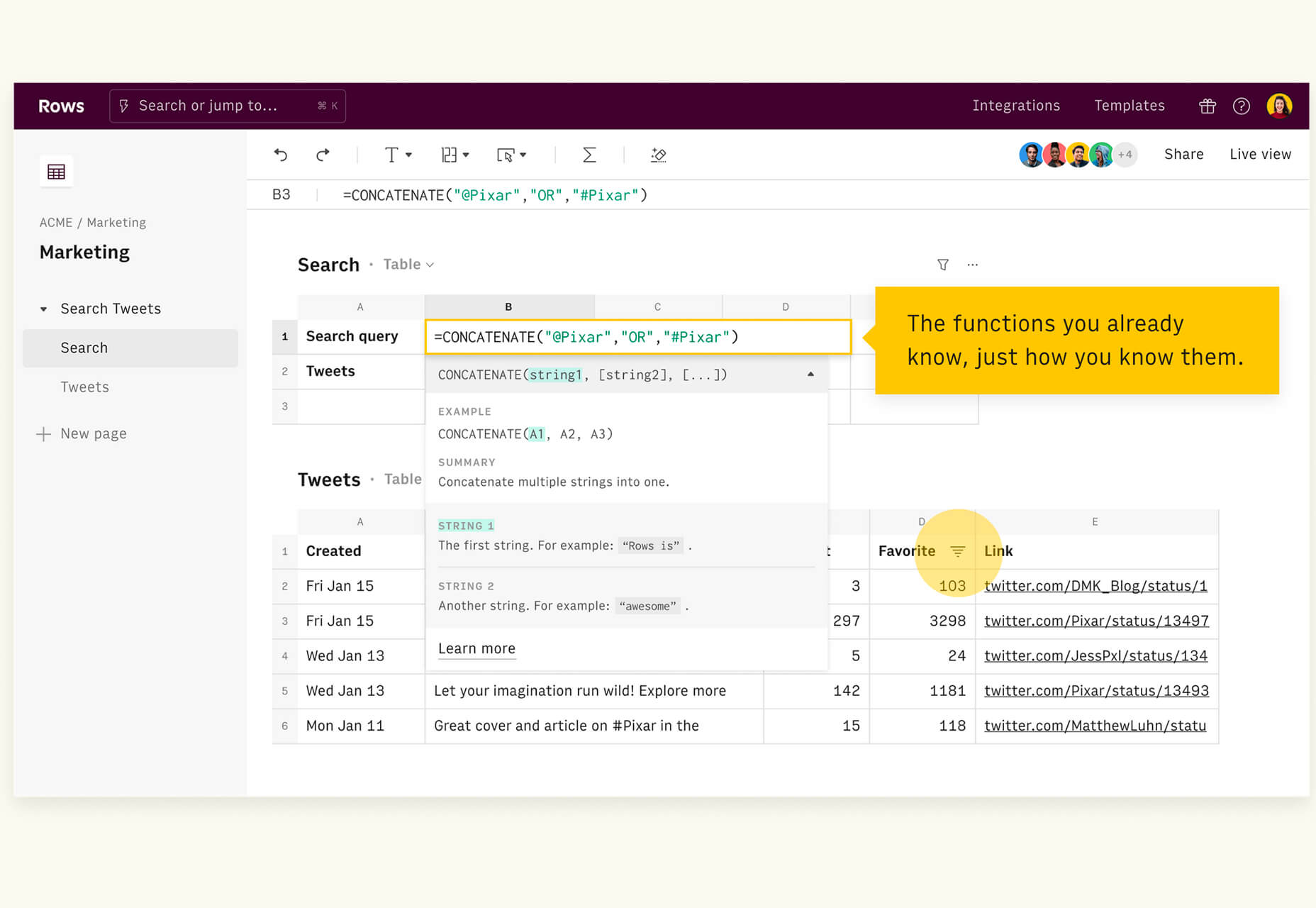
Rows

Rows is a spreadsheet tool with built-in web integrations that’s made for team collaboration. It works with other tools you already use, such as Google Analytics, Twitter, LinkedIn, Mailchimp, and so many others. Without scripts, you can use it to automate workflows, analyze data, share dashboards, and build forms and tools that make work simpler.

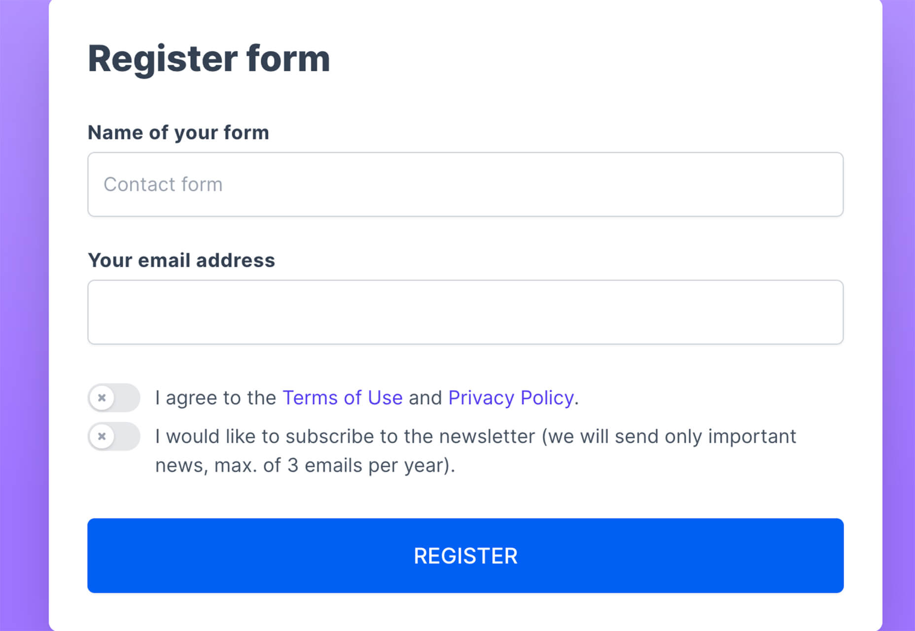
Form.Taxi

Form.taxi is a premium web-based form tool. You can create web forms without code or programming and connect them to your website. The tool then stores information, filters for spam, and notifies you of form submissions.

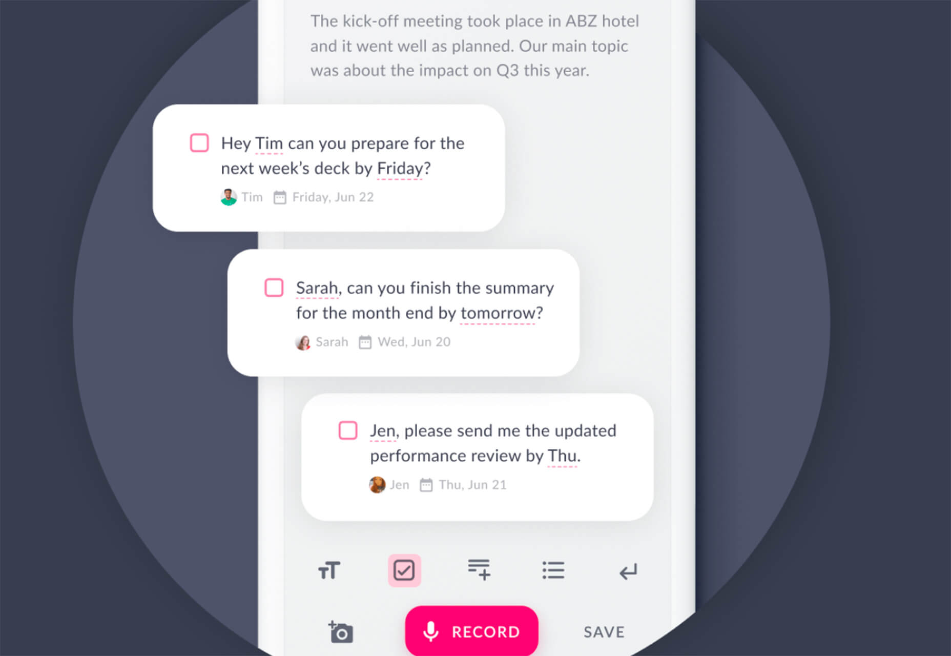
Verbz

Verbz is a voice productivity app that allows you to create notes, assign tasks, make announcements, run standups, or chat. Talk or type, listen or read. It works as your own voice assistant for teams. It’s available in Beta from the App Store, and there’s a waitlist for Android users.

Flameshot

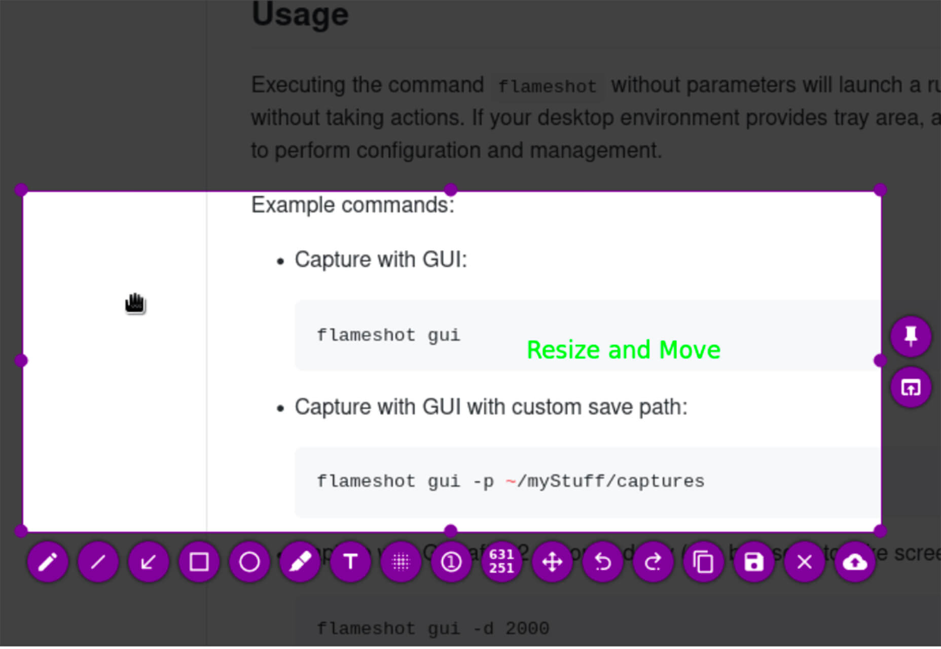
Flameshot is a tool for grabbing screenshots. It has a customizable appearance, is easy to use, and lets you draw and edit screenshots as you work.

Kitemaker

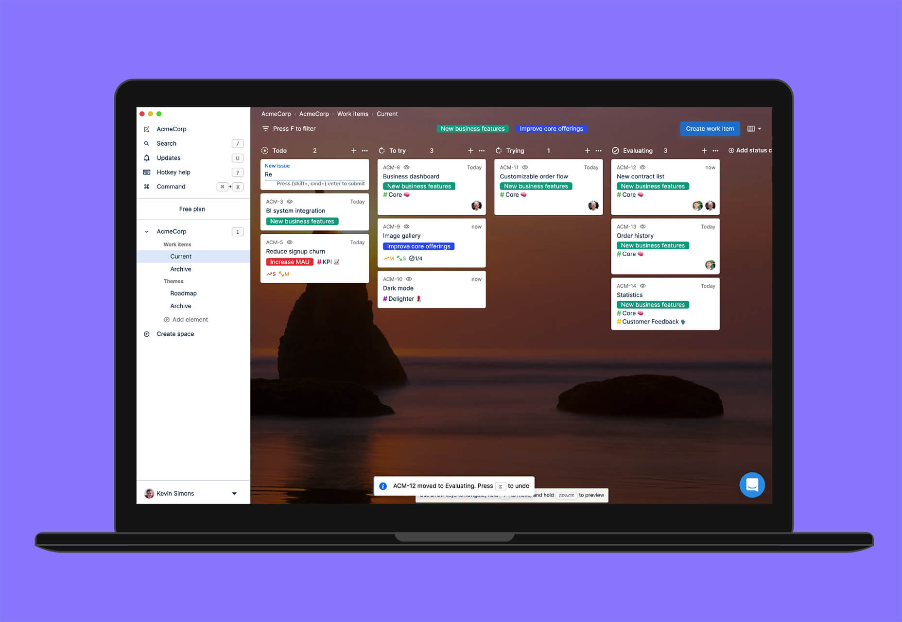
Kitemaker is a collaboration tool for development processes. It can help you keep track of everything from tools such as Slack, Discord, Figma, and Github in one place. It helps you structure projects and keep discussions about work moving forward in one place.

This Code Works

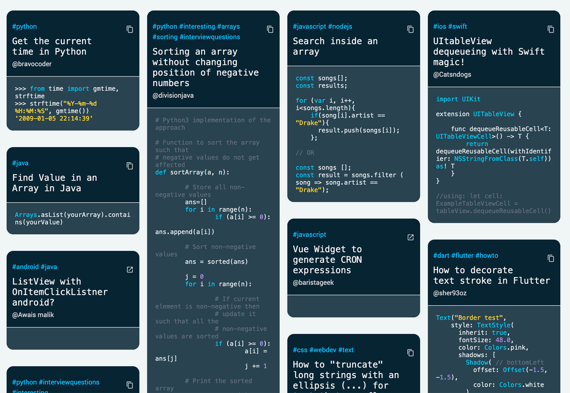
This Code Works is a place to save code snippets that work for when you need them again. You can group and organize snippets and share with others. You might think of it as the “Pinterest of code.”

3 Icons and User Interface Elements

Sensa Emoji

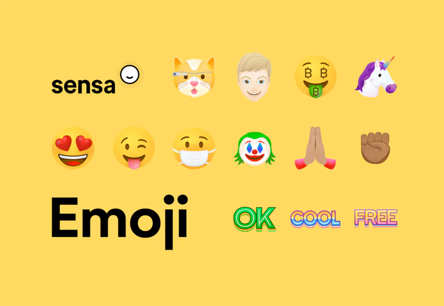
Sensa Emoji is a collection of common emoji icons that you can use in your materials. Every element is fully vector and free to use.

Google Fonts Icons

Google Fonts now supports icons, starting with Material Icons. Choose between outlined, filled, rounded, sharp, or two-tone options in the open-source library.

Toolbox Neumorphism Generator

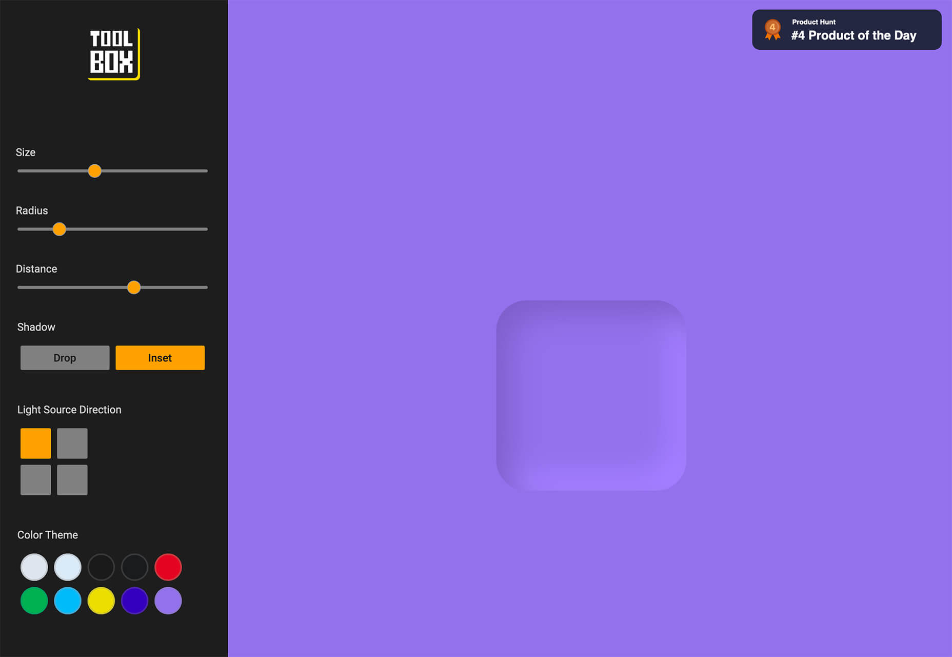
Toolbox Neumorphism Generator is a design tool that helps developers to generate CSS in the soft UI /neomorphism style for the elements with real-time output.

3 Tutorials and Demos

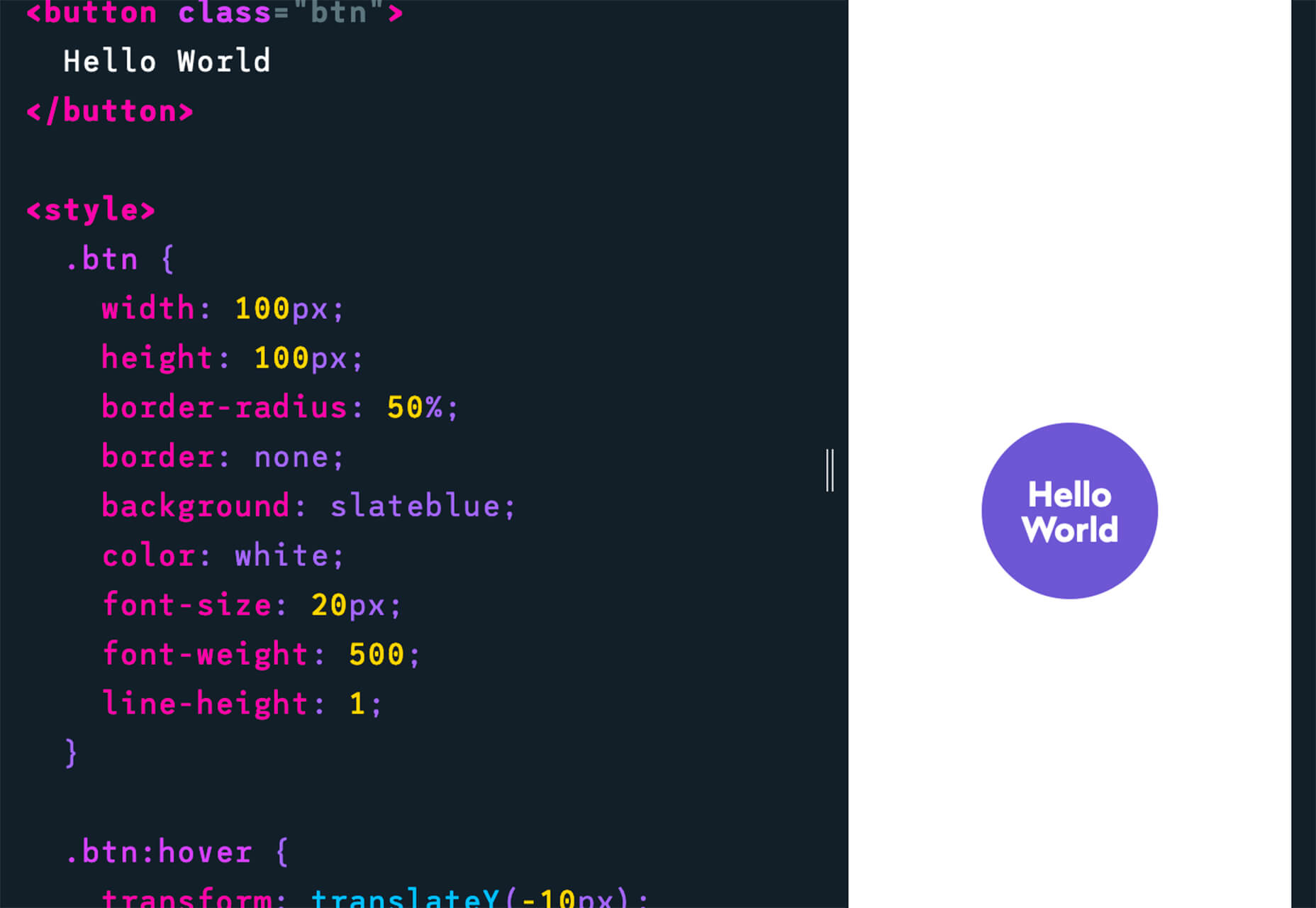
An Interactive Guide to CSS Transitions

An Interactive Guide to CSS Transitions explains everything you need to know about this great animation tool for website designers. This tutorial digs in with code and examples to help you create more polished animations and is designed for anyone from beginners to experienced designers with some pro tips throughout.

About Us Pop-Out Effect

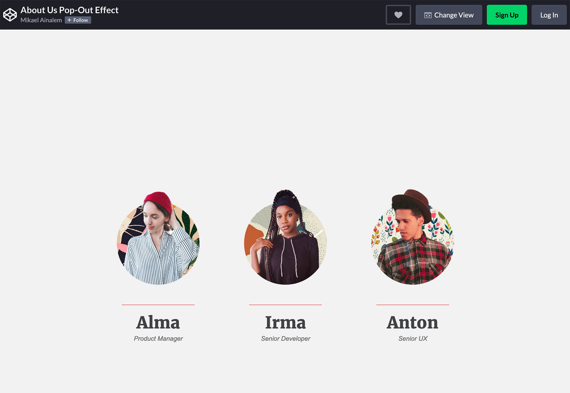
The About Us Pop-Out Effect adds a special element to any team or contact page with a nifty pop animation. Each person seems to lift out of the circle frame in this pen by Mikael Ainalem.

Interactive Particles Text Create with Three.js

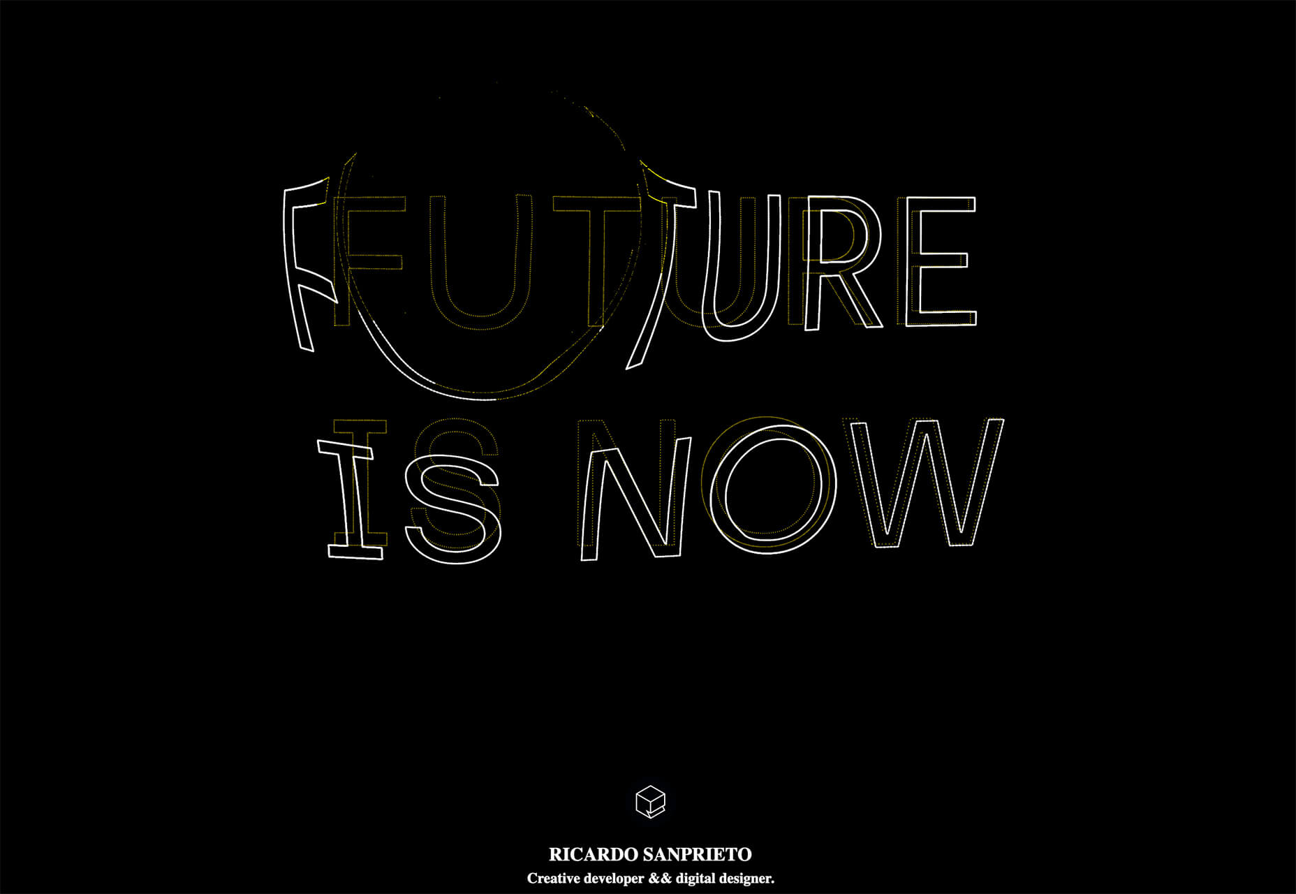
Interactive Particles Text Create with Three.js is a web element you could play with all day. Text shifts into particles and follows mouse movement in a fluid motion in the pen by Ricardo Sanprieto.

10 Fresh Fonts and Text Tools

Bitmap Fonts

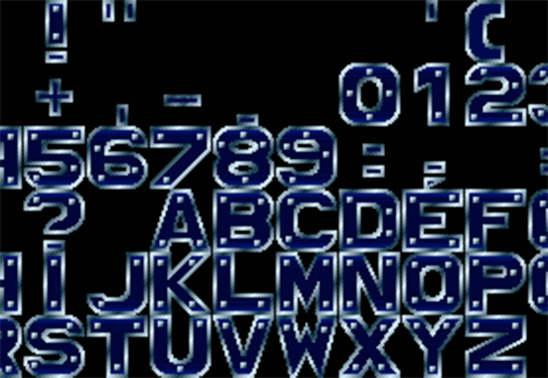
Bitmap Fonts is a collection of various bitmap typefaces all pulled and stored in a single location. This is the perfect solution if you are looking for a bitmap option.

Uniwidth Typefaces

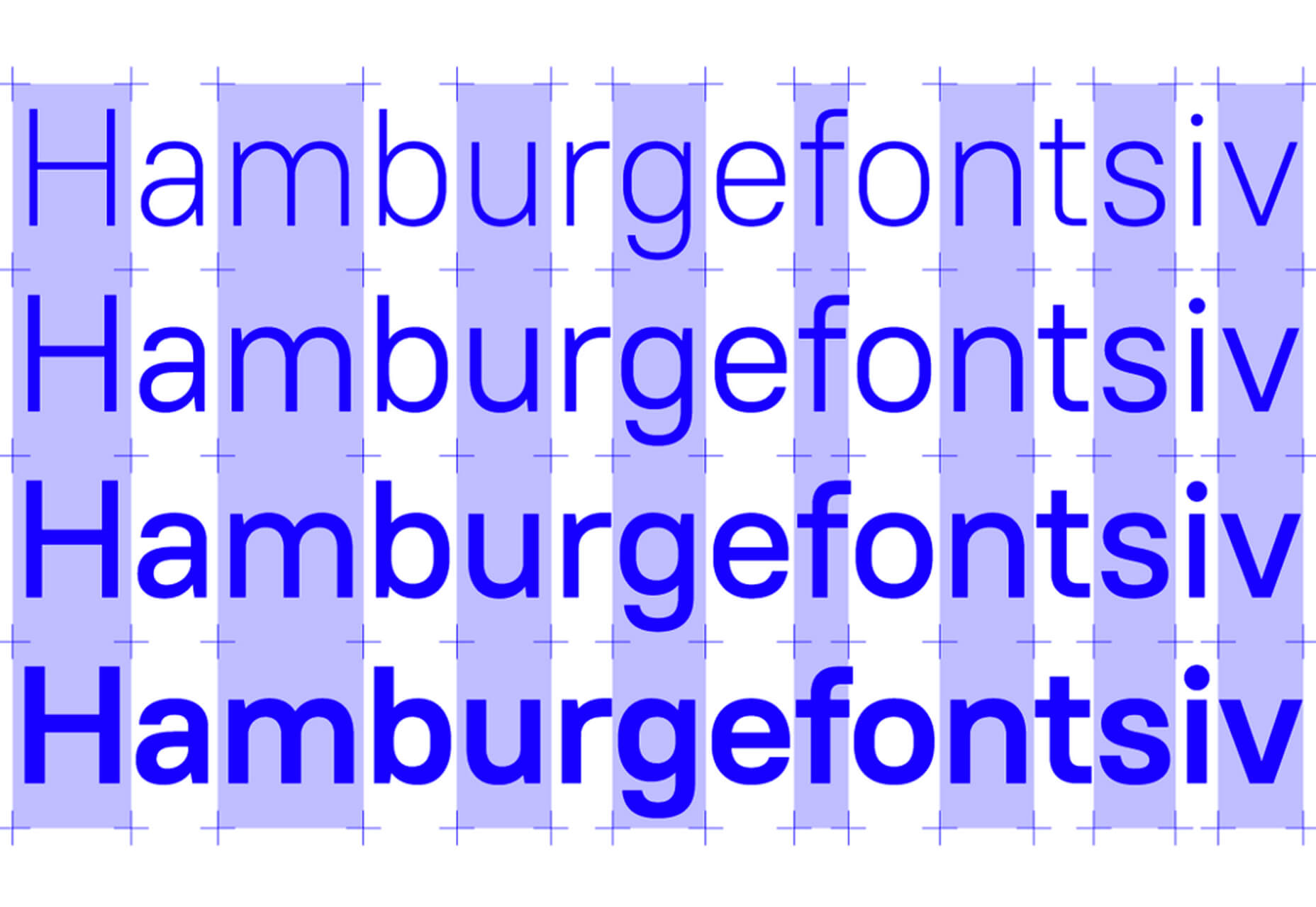
Uniwidth Typefaces for Interface Design is another collection of fonts for a specific purpose – here universal widths for interface design. Uniwidth fonts are proportionally-spaced typefaces where every character occupies the same space across different cuts or weights. This is both a tutorial on the type style as well as font collection.

Bubble Lemon

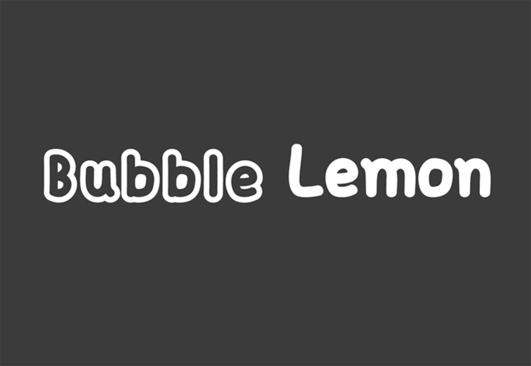
Bubble Lemon is a typeface for projects with a childlike feel. With an outline and regular style, the thick bubble letters look like some of the sketches you may have done in grade school.

Core Font

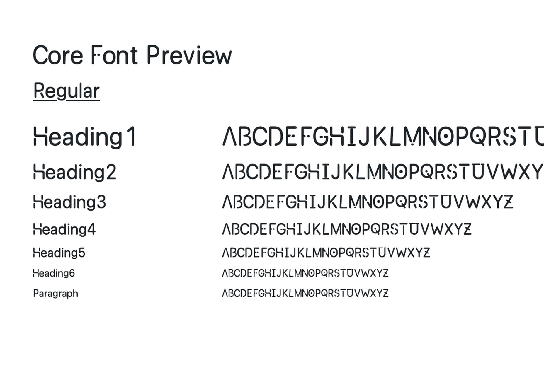
Core Font is an open-source project with a funky and modern style. It has a full upper- and lower-case character set, numerals, and a few punctuation marks.

GHEA Aram

GHEA Aram is a superfamily with a Central European flair, according to the type designer. The premium typeface includes everything from light to black italic and even some Armenian ligatures.

Make Wonderful Moments Duo

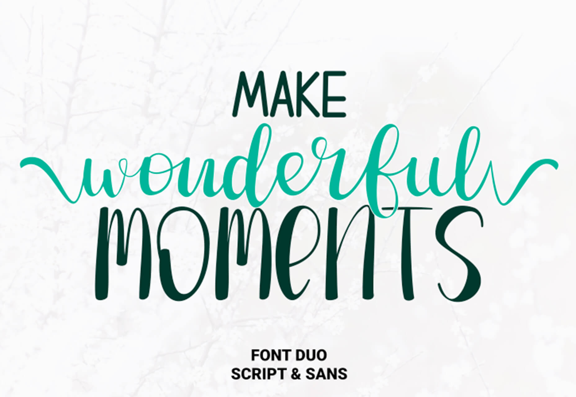
Make Wonderful Moments Duo is a script and sans serif font pair with a lighthearted feel and highly readable character set. The regular (sans serif) only has uppercase characters.

Ribheud

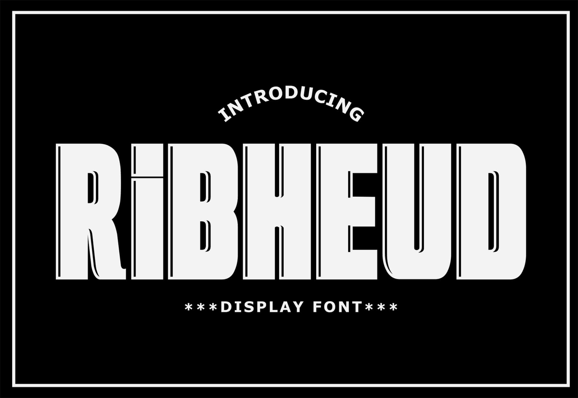
Ribheud is a slab-style display font with a heavy look and strong presence. What makes it interesting is the left-outline/shadow on each character.

Rose Knight

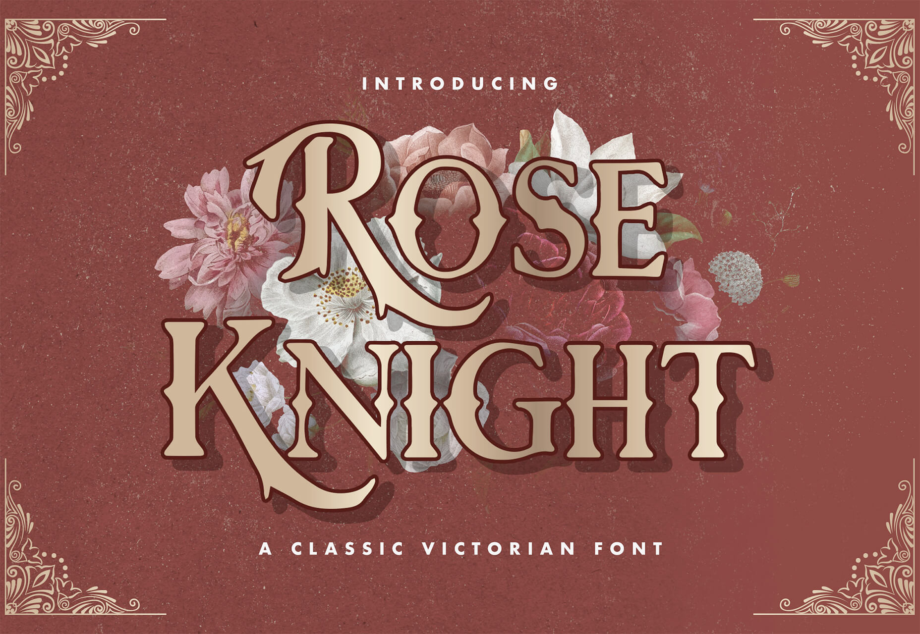
Rose Knight has an old-style feel that can take on multiple moods, depending on supporting design elements. All of the characters are uppercase with alternates. It could make a fun branding option.

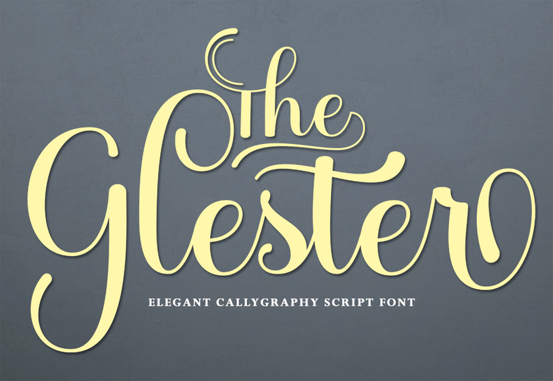
The Glester

The Glester is a beautiful premium typeface in a calligraphic style. The most interesting element of this typeface is all of the extra decorations that allow you to change individual characters (380 glyph alternates).

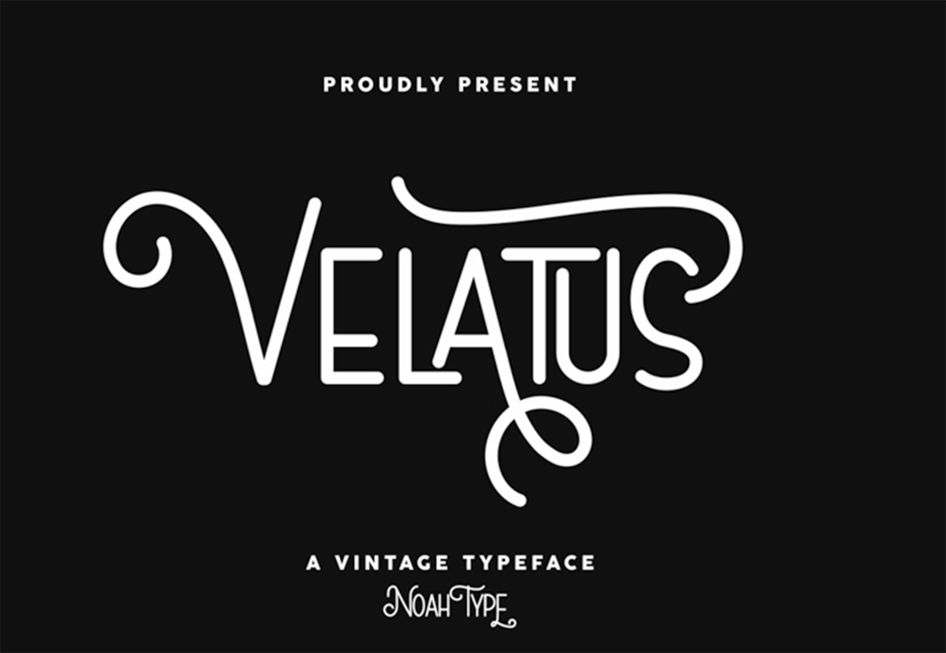
Velatus

Velatus is a vintage-style typeface with plenty of swashes and flourishes that make it unique. It comes with 157 characters and 96 glyphs.

Source

The post 27 Exciting New Tools For Designers, March 2021 first appeared on Webdesigner Depot.


Source de l’article sur Webdesignerdepot

Today, most companies are using Python for AI and Machine Learning. With predictive analytics and pattern recognition becoming more popular than ever, Python development services are a priority for high-scale enterprises and startups. Python developers are in high-demand — mostly because of what can be achieved with the language. AI programming languages need to be powerful, scalable, and readable. Python code delivers on all three.

While there are other technology stacks available for AI-based projects, Python has turned out to be the best programming language for this purpose. It offers great libraries and frameworks for AI and Machine Learning (ML), as well as computational capabilities, statistical calculations, scientific computing, and much more. 

Source de l’article sur DZONE

We’re going to try something a little different this month; with this roundup of tools and resources for designers, we’re going to pick a few of our favorites and group everything else in a manner that makes it even easier to find elements that will work for you, and your projects, right now.

Here’s what’s new for designers this month…

February’s Top Picks

Pika

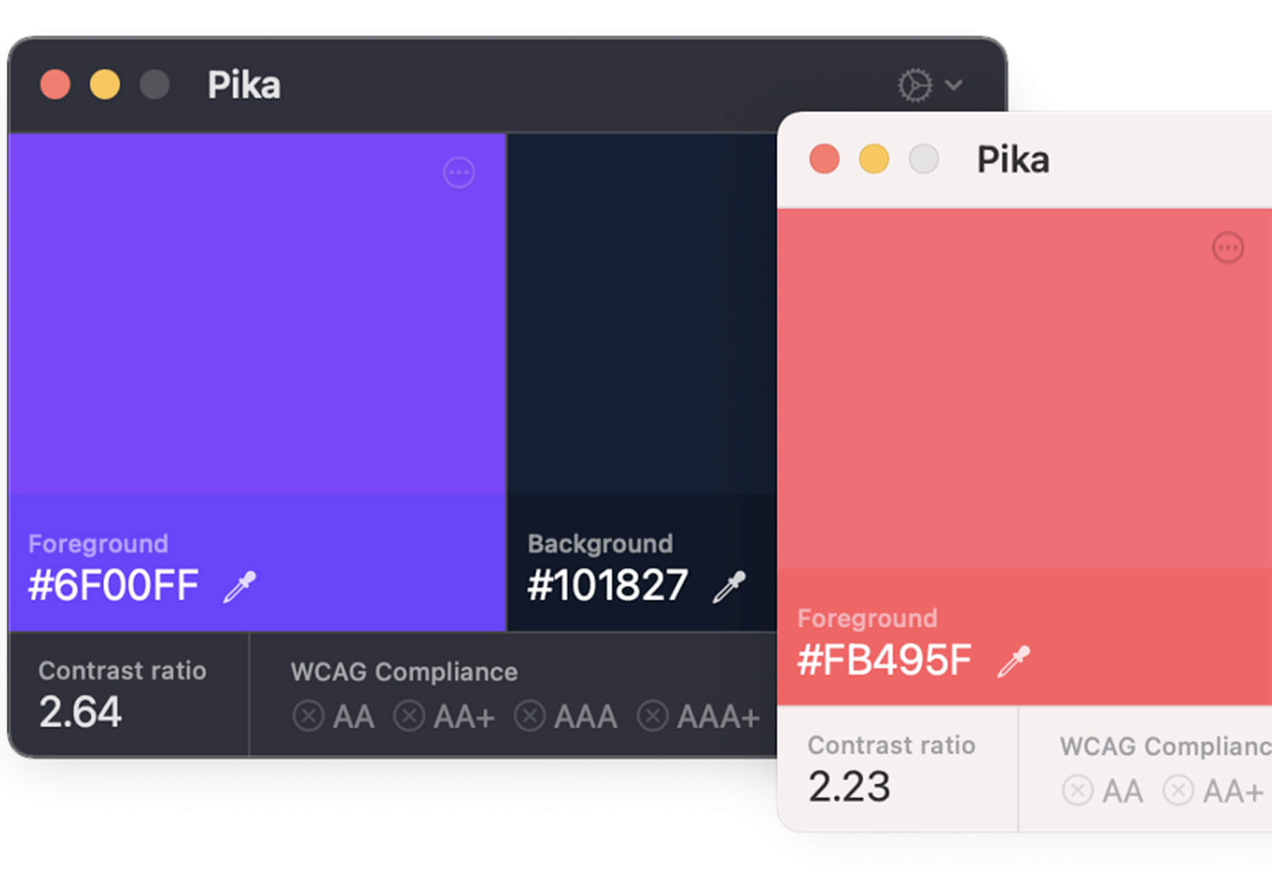
Pika is a new Mac app that is an open-source color picker. It helps you find color swatches on-screen, saving time and design headaches. Plus, it’s packed with bonuses such as the ability to confirm accessibility compliance for colors, compact size and style, easy to access from your desktop, and format-friendly with plenty of color code options.

Iconduck

Iconduck is a searchable database of more than 100,000 icons in one place. (No more searching various marketplaces!) The goal of the project is to make open-source icons and illustrations more accessible. So, everything you find here is free! The site does all the heavy lifting for you by collecting icon sets, tagging them, and making them searchable.

Descript

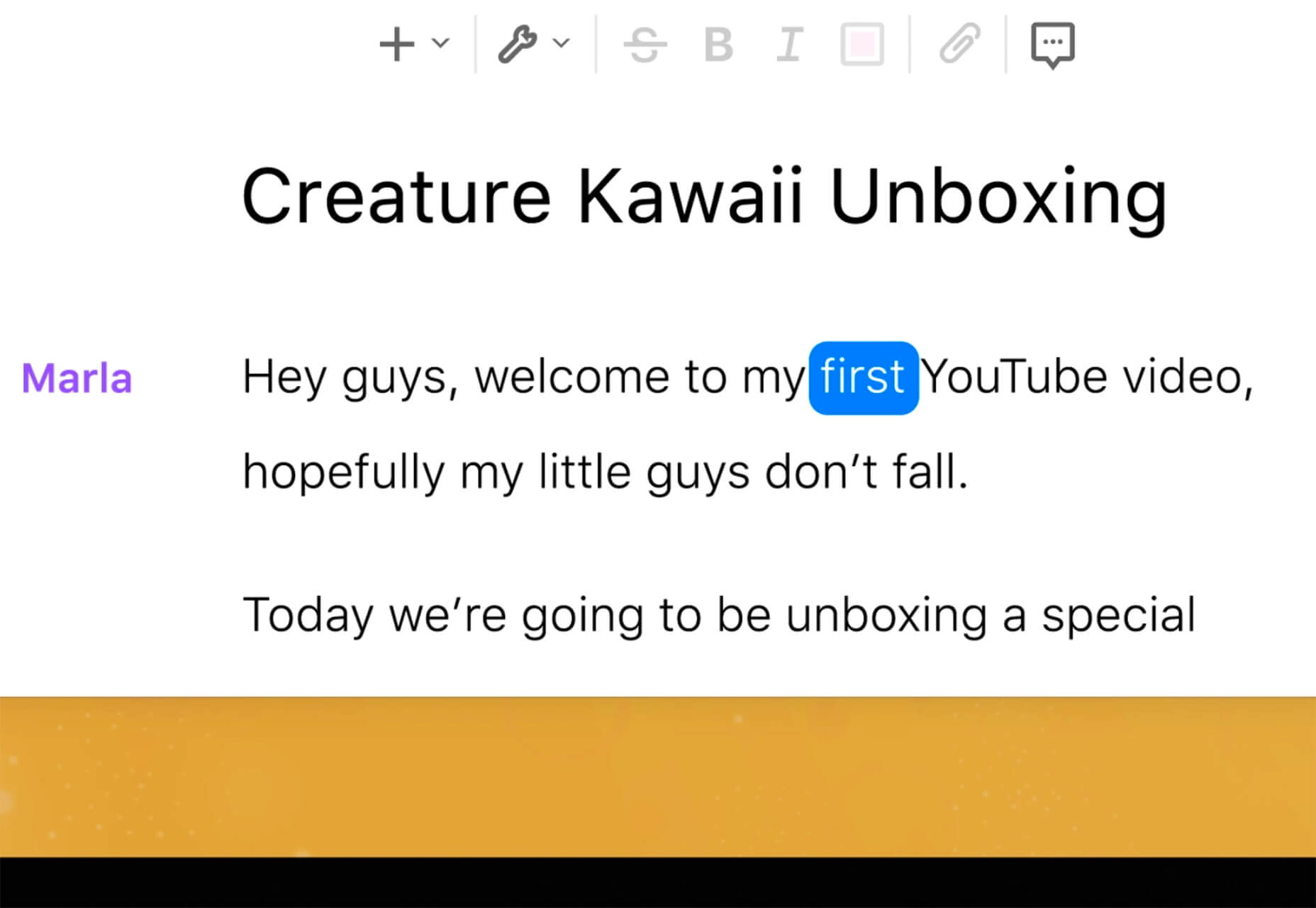
Descript is a premium tool that eliminates some of the intimidation factors with audio and video editing. With a design that functions as a word document and allows you to transcribe, record the screen, publish, and edit, all with some cool AI features.

Persona

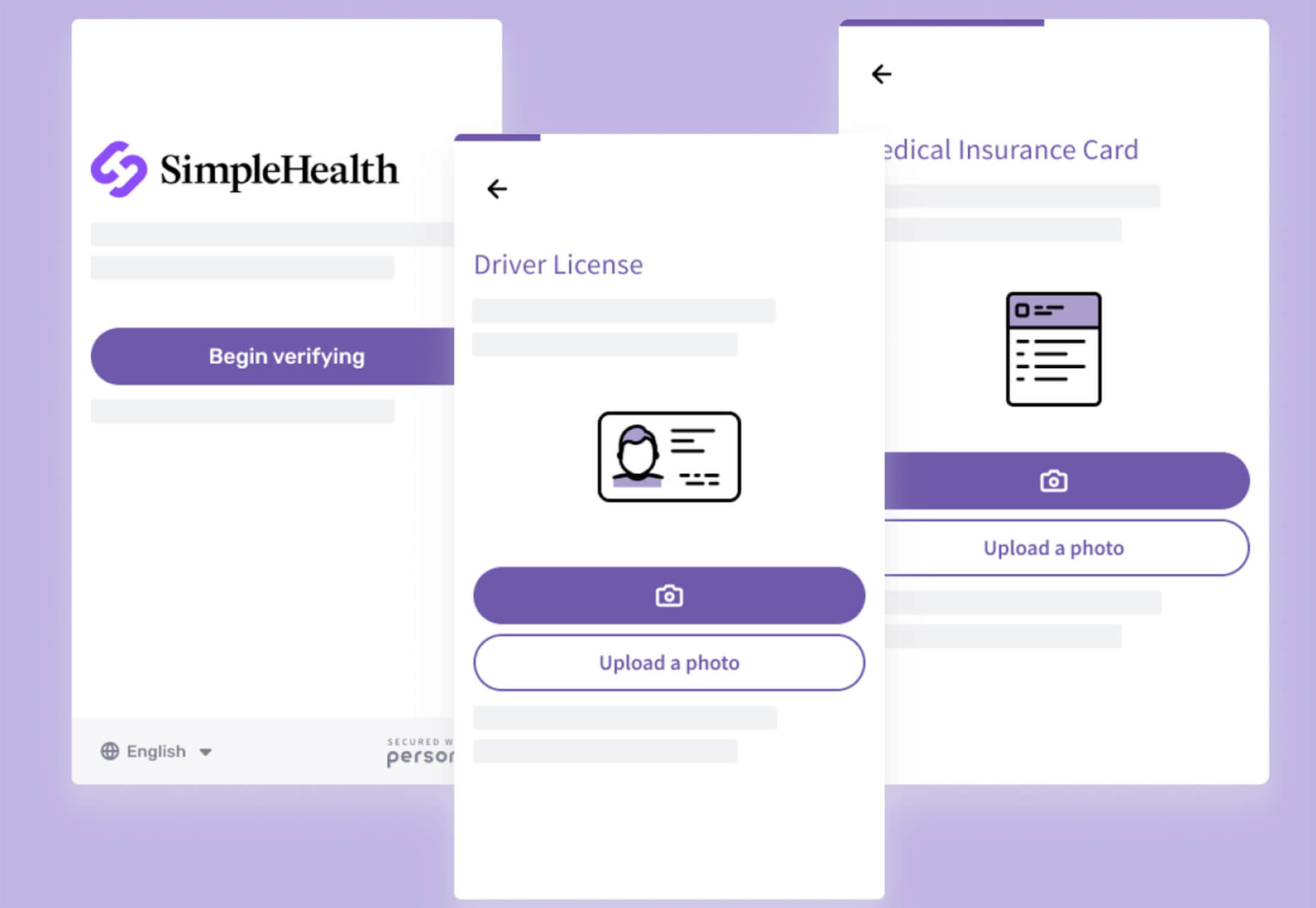
Persona is an all-in-one identity infrastructure that allows you to collect, verify, manage, and decide customer identities from a single dashboard. Everything is fully automated, and most users can be up and running in about 10 minutes. The premium tool does have a free version for small-scale verifications.

6 Productivity Boosters

Peekalink

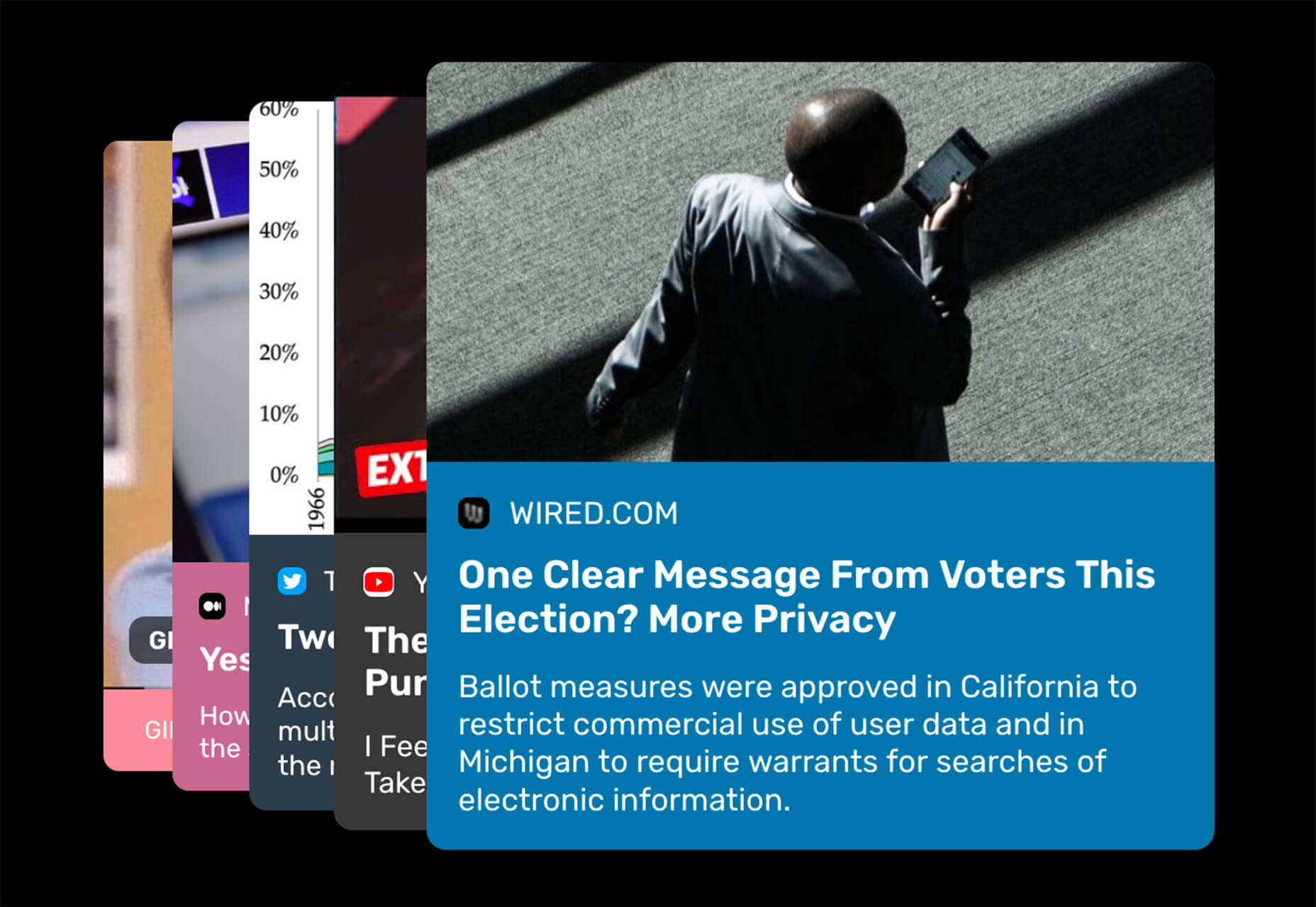
Peekalink turns standard links into rich content that users will be delighted to share and engage in. And it’s easy to use. Just send a request to the API with a link and get a response back to use, including a rich link for your project.

LinkAce

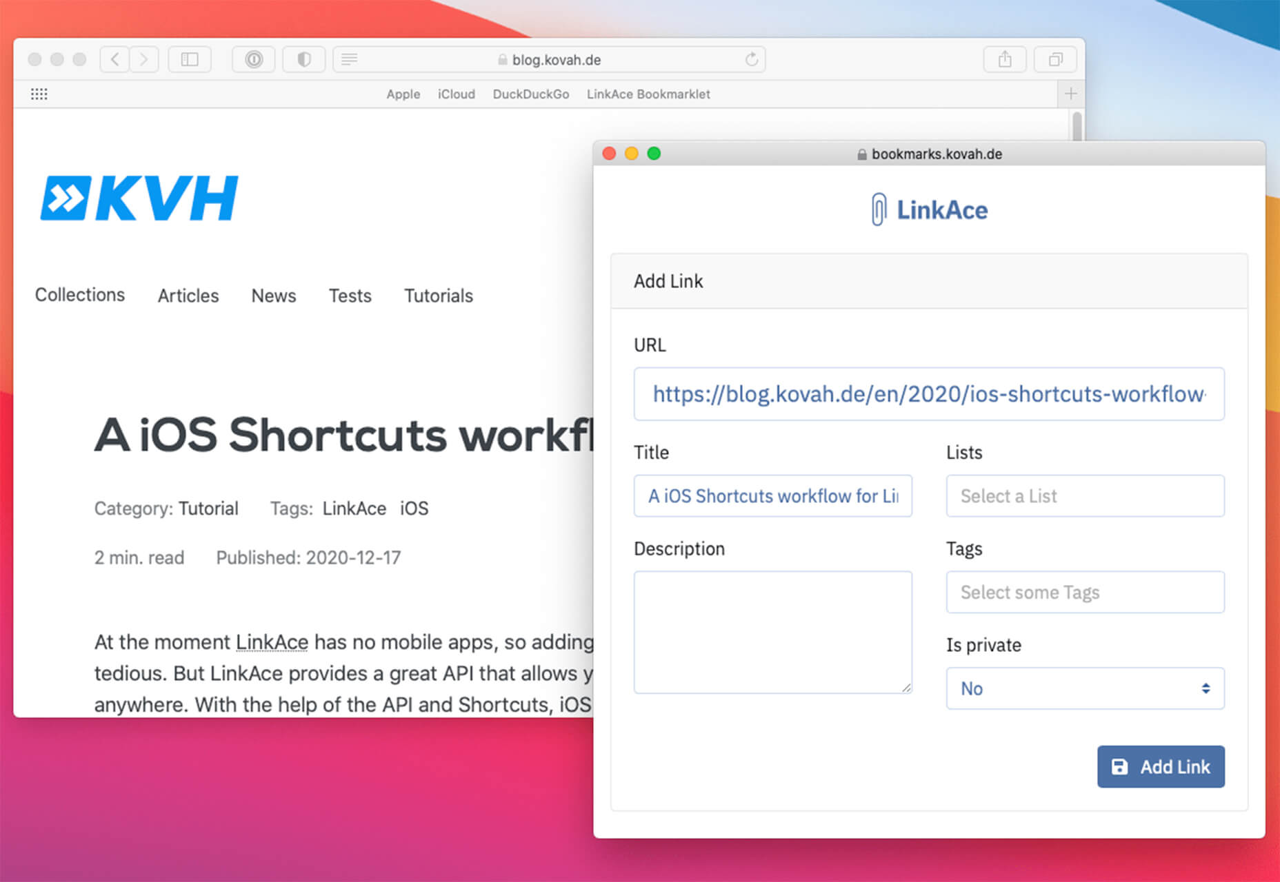
LinkAce is an open-source and self-hosted archive to store and organize links that you want to save. You can search thanks to tags and lists, and all of the content is available thanks to automated backups and monitoring. There’s a demo you can try before installing it yourself.

Formality

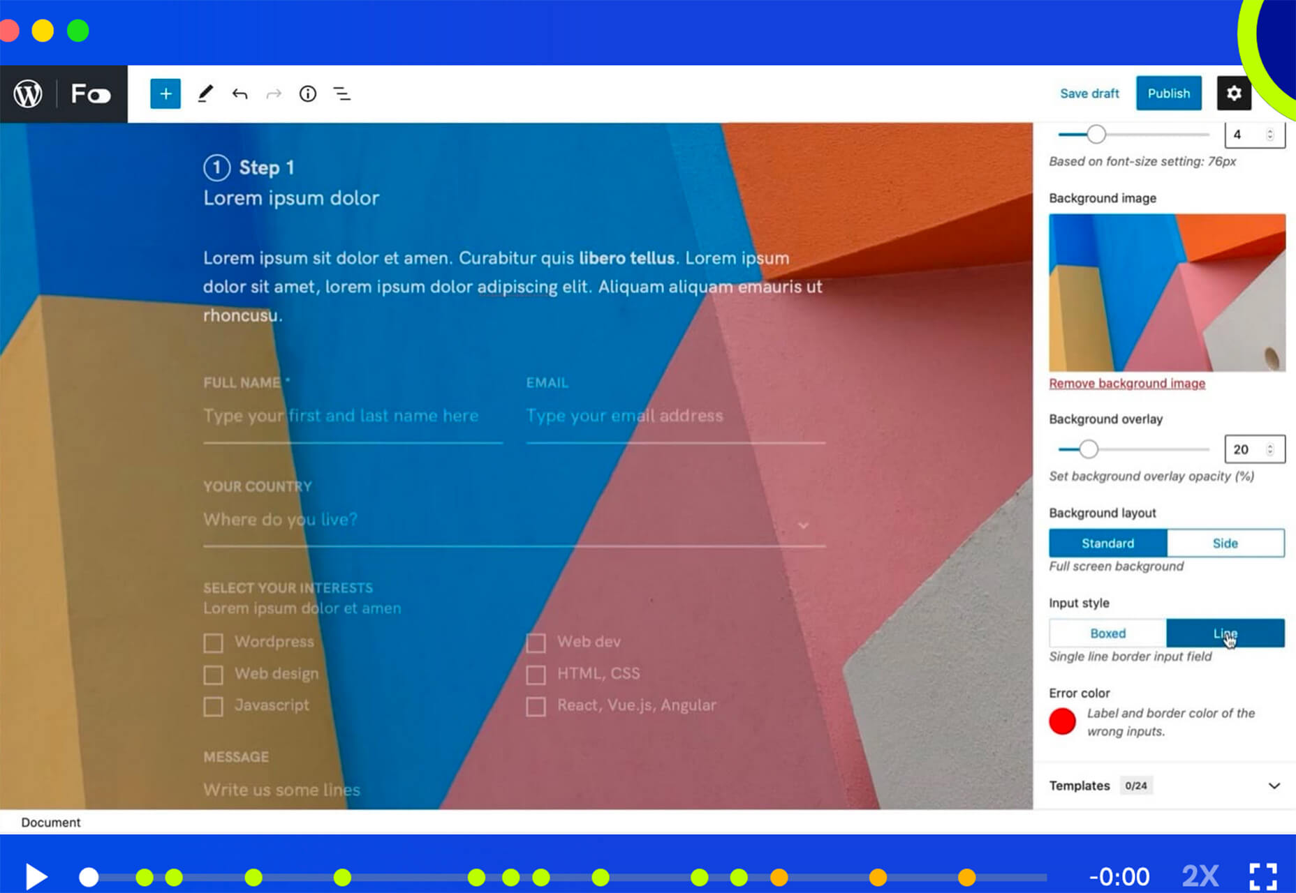
Formality is a WordPress plugin that helps you make forms a little bit easier. It’s made to work with the Gutenberg-based form builder with a single block format to control the form. The plugin has a theme-agnostic design that works with any layout style and includes customizations to make it feel a little more personal.

Wondercall

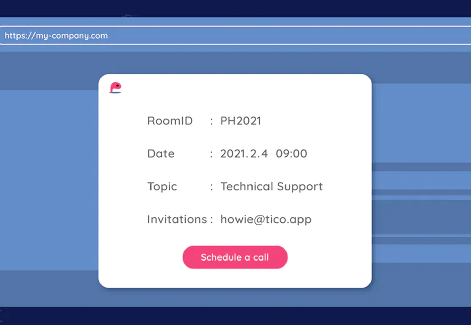
Wondercall is an embeddable video call system for any website or app. You can make calls and schedule them with a widget you can embed right into your design.

Editor X

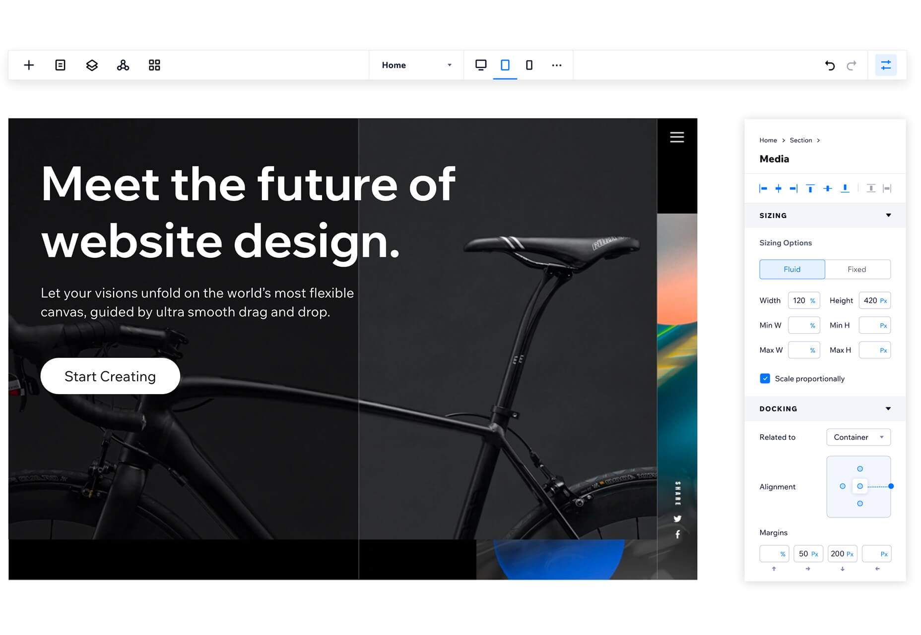
The Editor X website builder is out of beta and ready for mainstream use. The platform is designed for designers and agencies to create websites collaboratively and quicker. Features include live commenting, roles and permissions, and shared design libraries. Plus, the platform offers code-free interactions.

Shareful/h2>

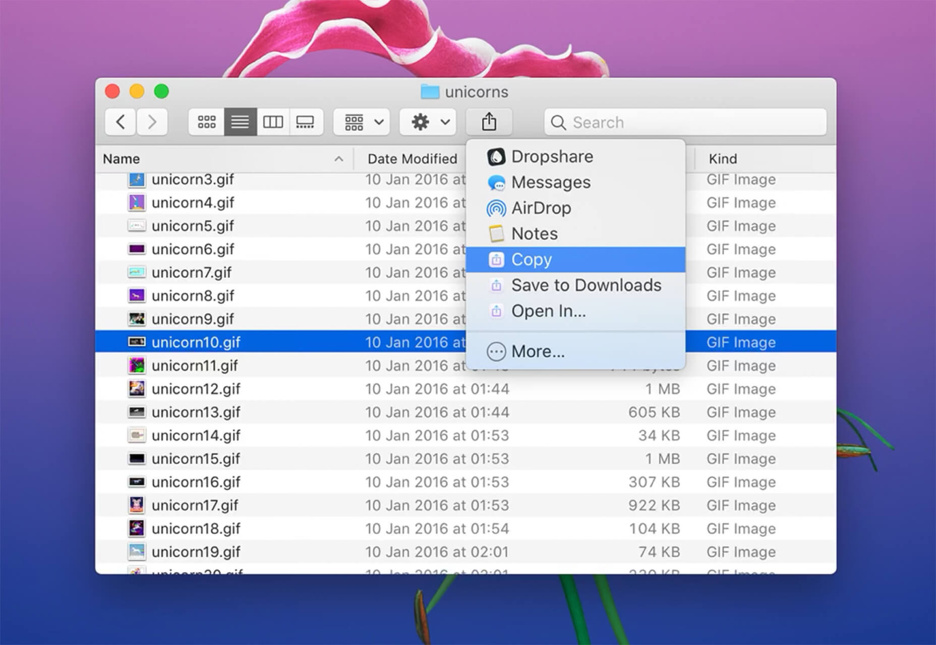
Shareful is a Mac app that makes the system share menu more powerful. You can copy, save as, and open indirectly from the system share menu.

2 Icon Sets

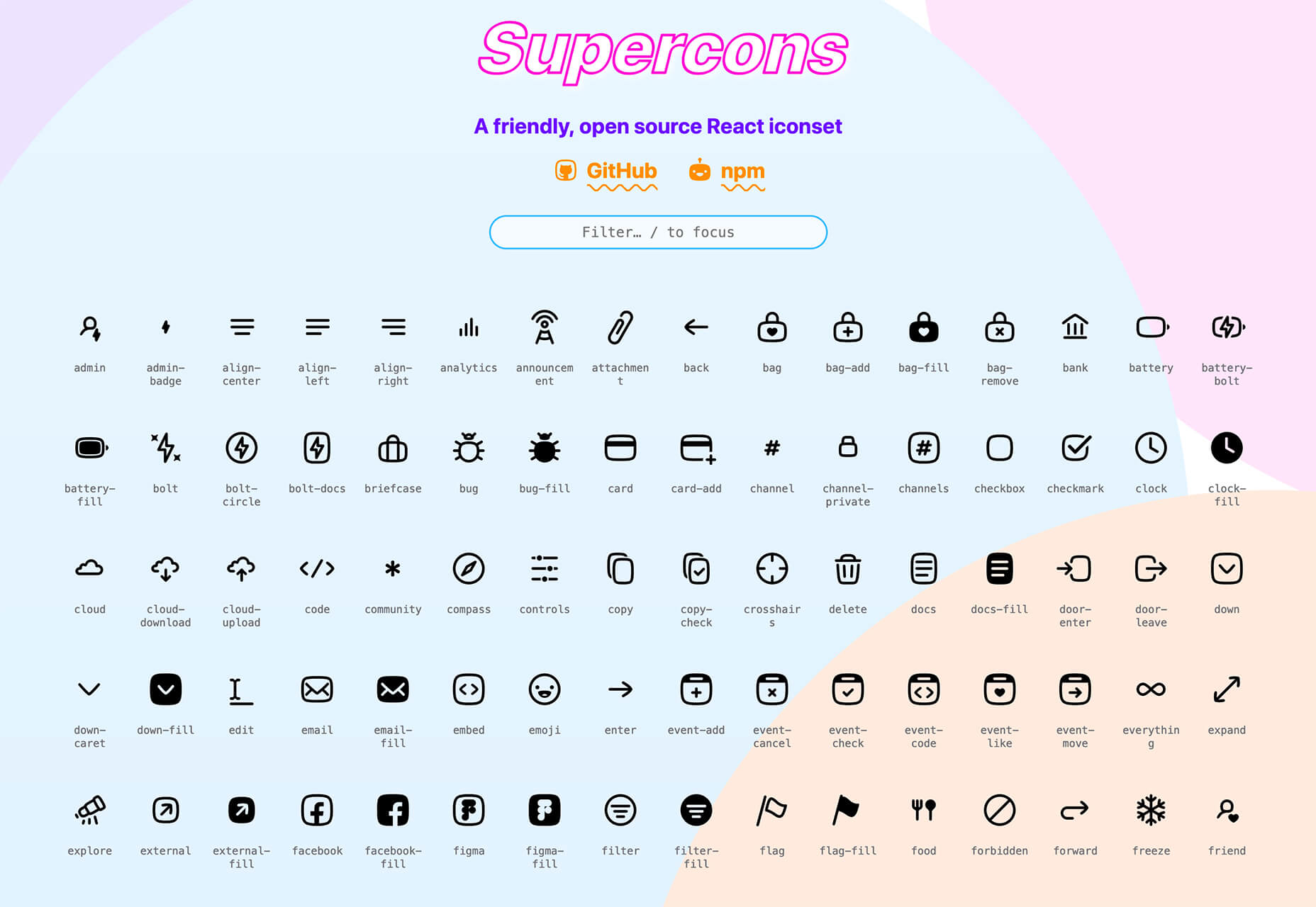
Supercons

Supercons is a giant set of icons in React. They are all open-source, and there are plenty of choices to help you propel projects forward.

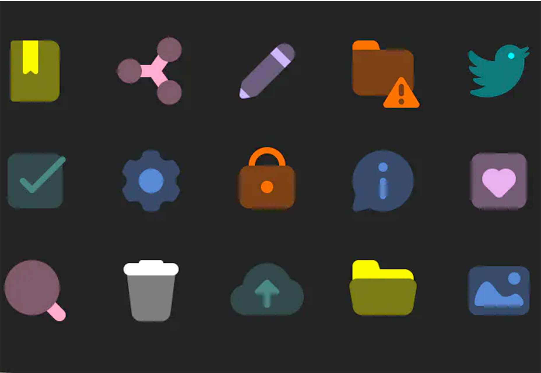
Plumpy Icons

Plumpy Icons are packed with style. The set of icons has a fun design, comes in duotone colors, and scales to any size. Plus, there are more than 4,000 icons in the collection. There are free and paid options depending on the file type and use.

3 Tutorials and Demos

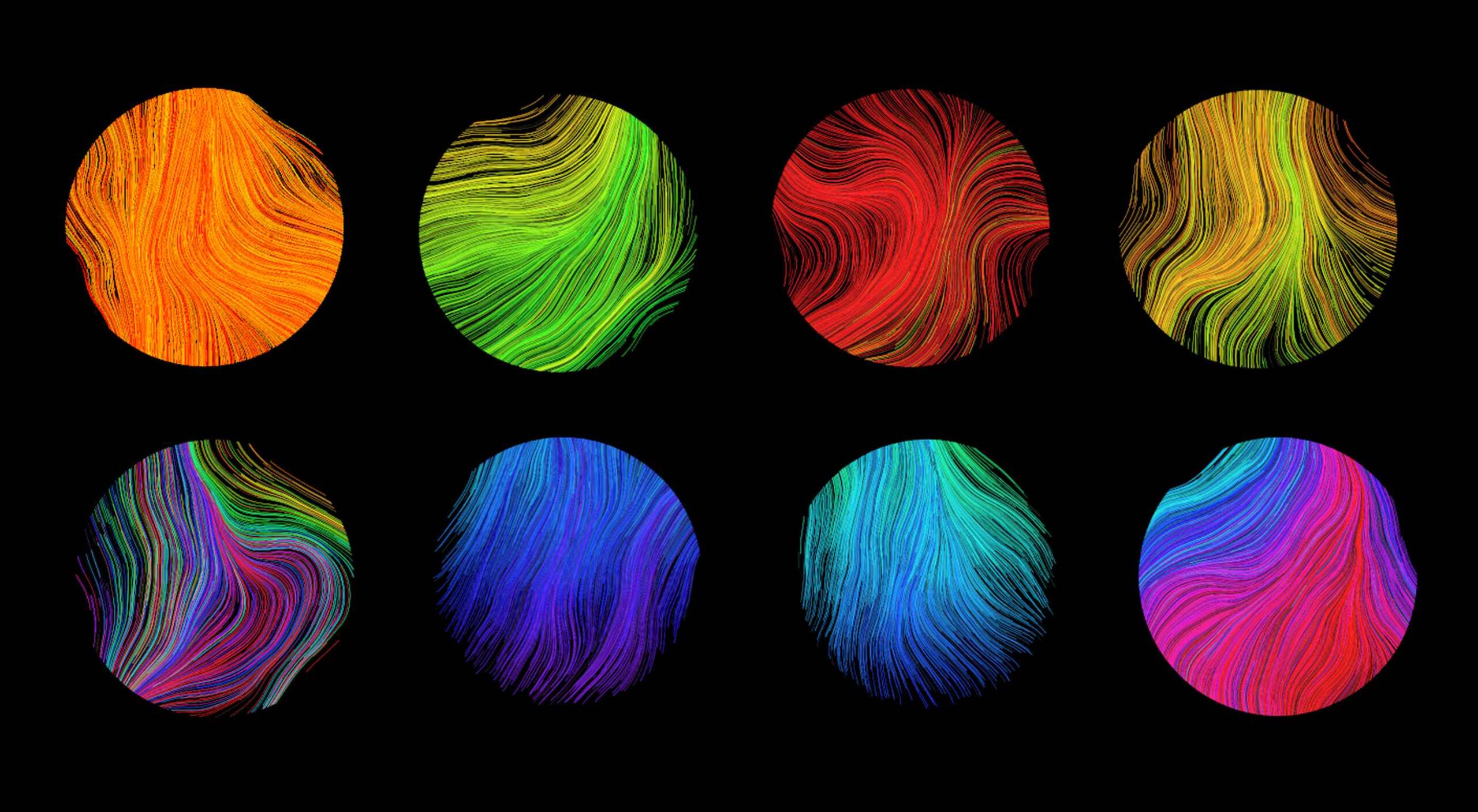
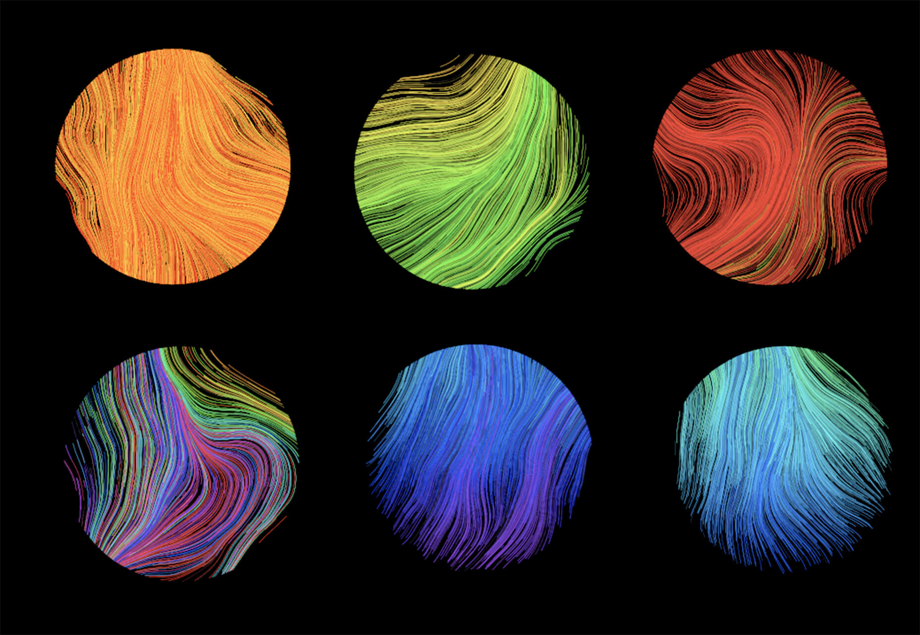
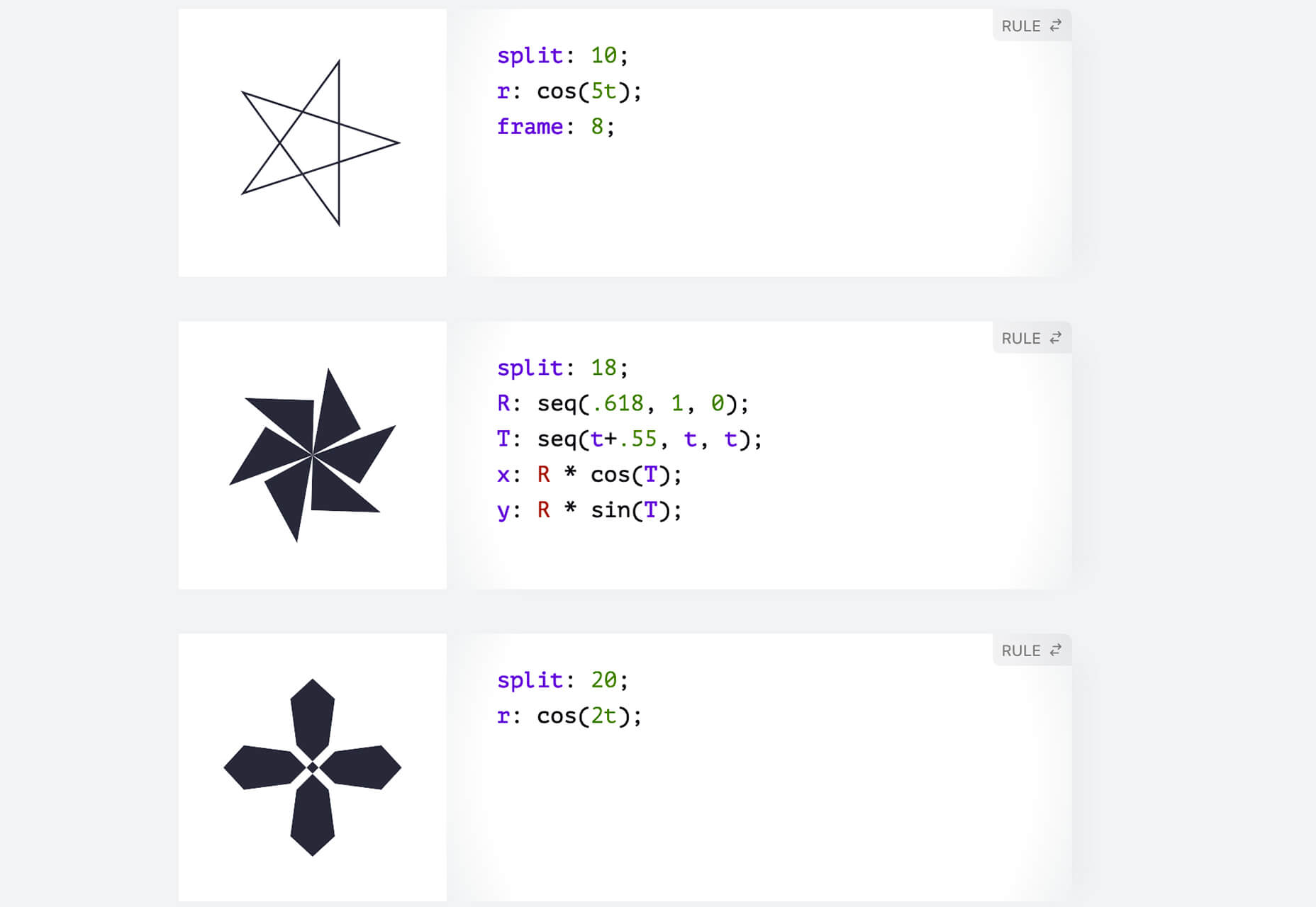
Noise Planets

Noise Planets is a fun look at plotting random points in a circle to create amazing art pieces. You can generate fun shapes and textures and even animate your results with the tutorial and code snippets’ help.

CSS Polygon Shapes

CSS Polygon Shapes are generated using CSS-doodle and clip-path. You can go in and make adjustments to customize shapes further and use them in your website projects.

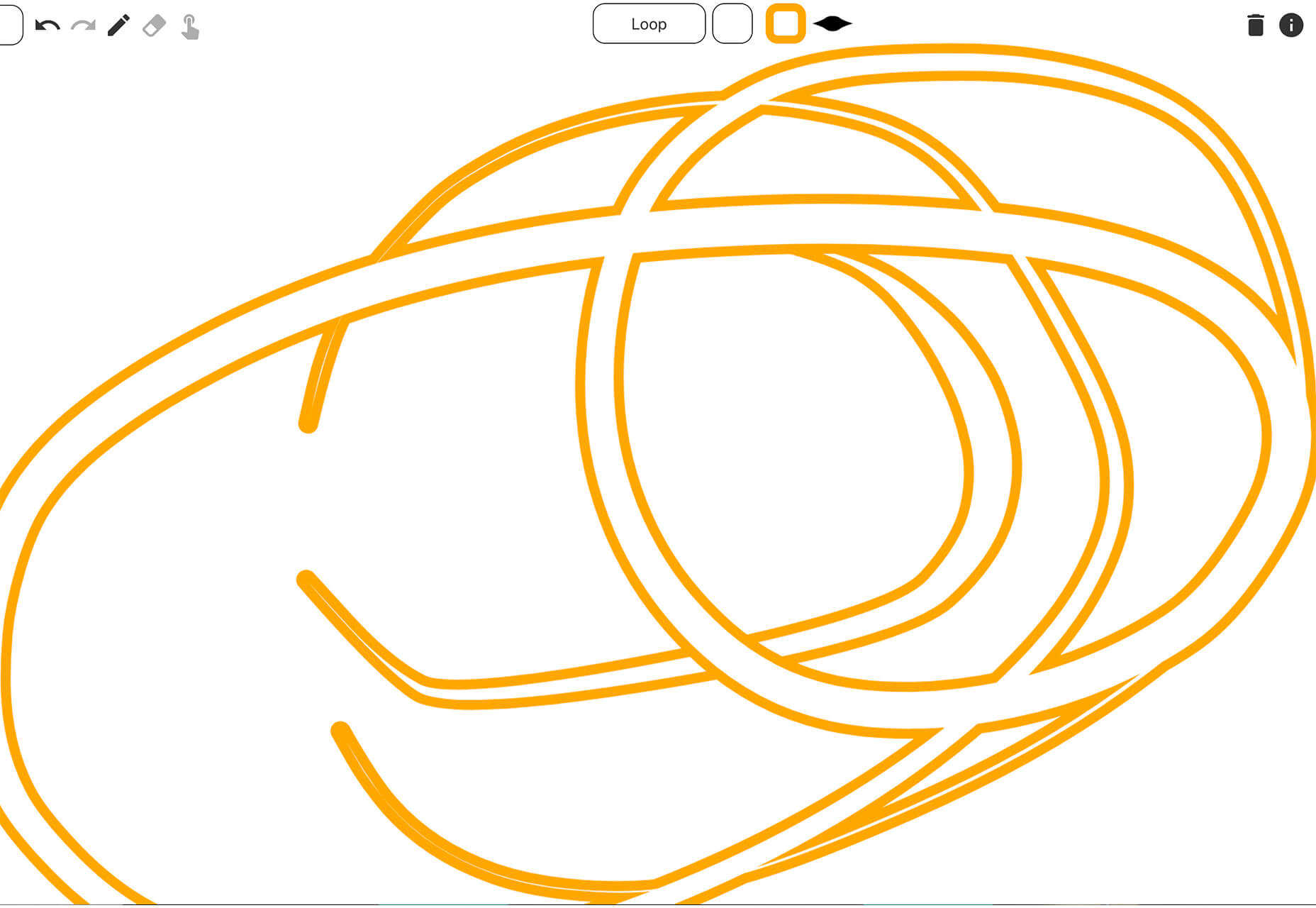
Mutsuacen

Mutsuacen is a little app that lets you create animated and interactive drawings. There’s a lot of potential with this tool if you have some true drawing chops, but it not; it’s just fun to play with. Create a doodle or sketch and export.

5 Fresh Fonts and Text Tools

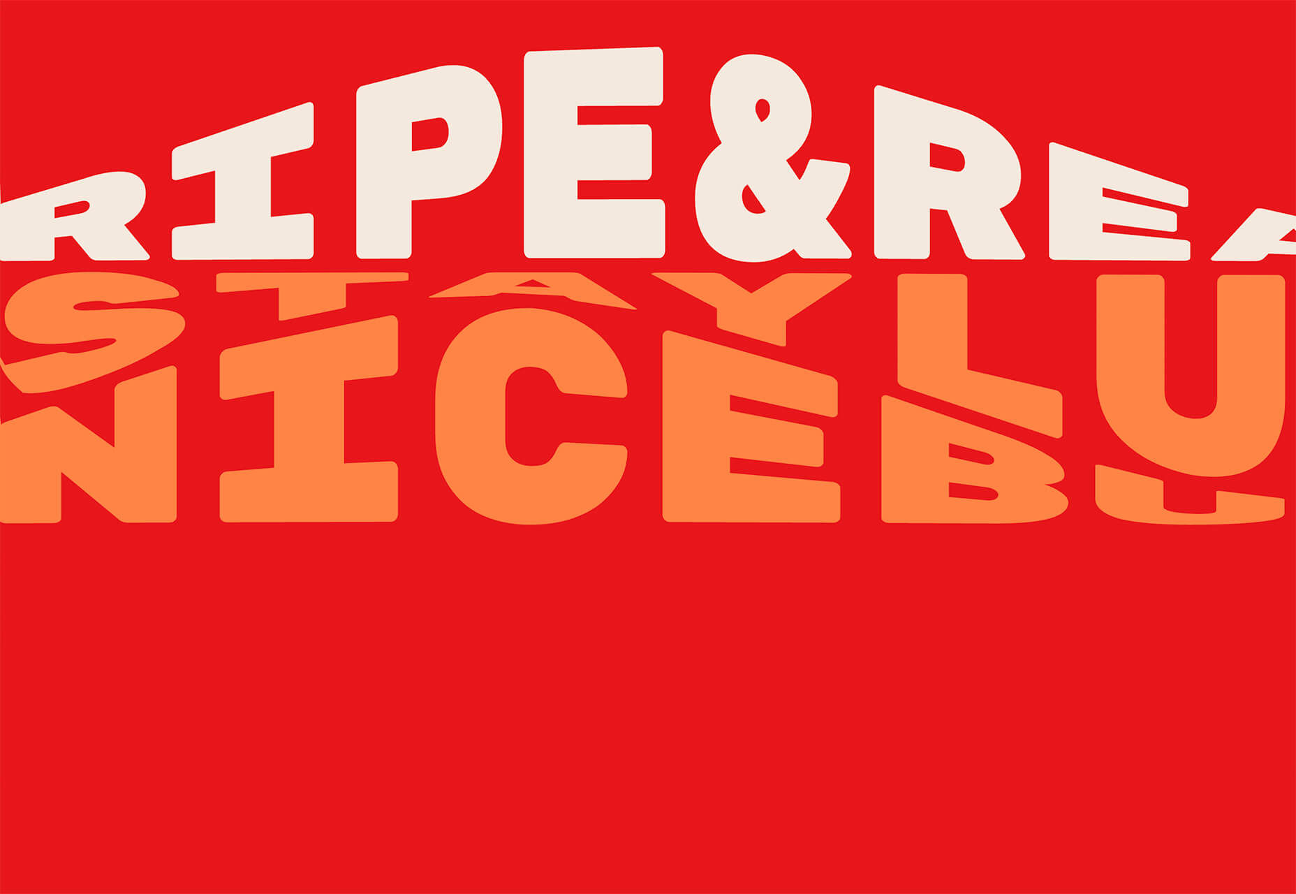
Text Warping – Animated

Text Warping – Animated is a fun effect pen from Lokesh Dhakar. It feels funky while leaving text pretty readable. Play with it for sure.

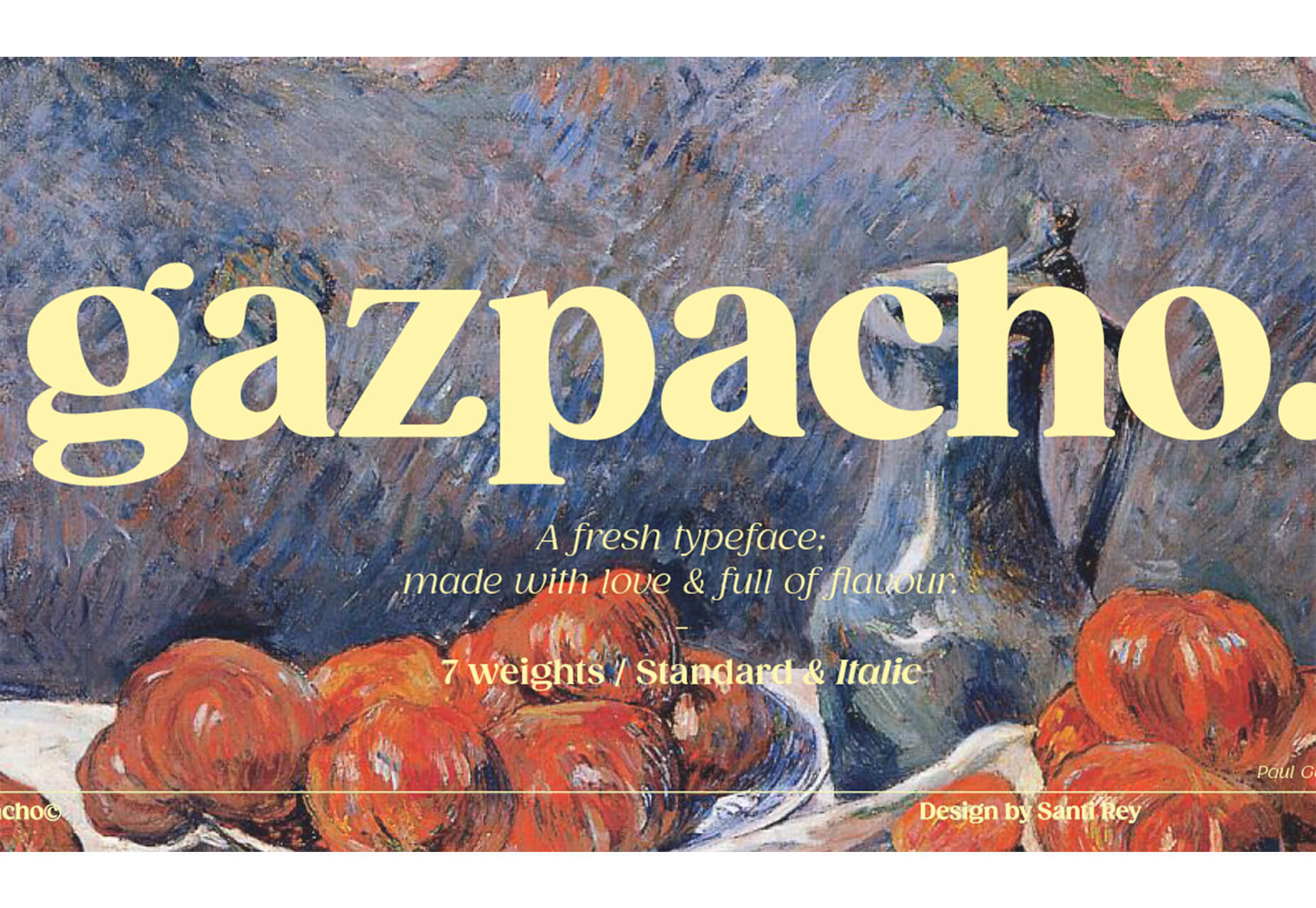
Gazpacho

Gazpacho is a fun and flexible premium font family with 14 styles from thin to heavy italic. It’s a highly readable serif with a wider stance and great curves.

Stay Home

Stay Home is a simple, line-style all caps font. It has a limited character set but could have some fun applications.

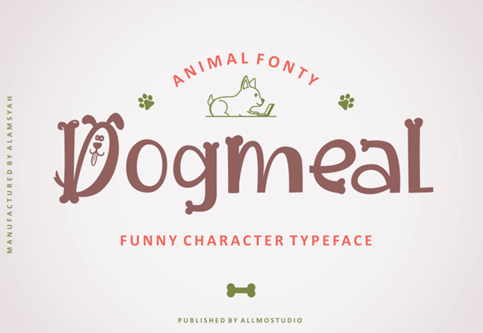
Dogmeal Figure

Dogmeal Figure is an almost silly novelty typeface with dog faces and paw prints in the character set. It might make a fun option for a kids’ project.

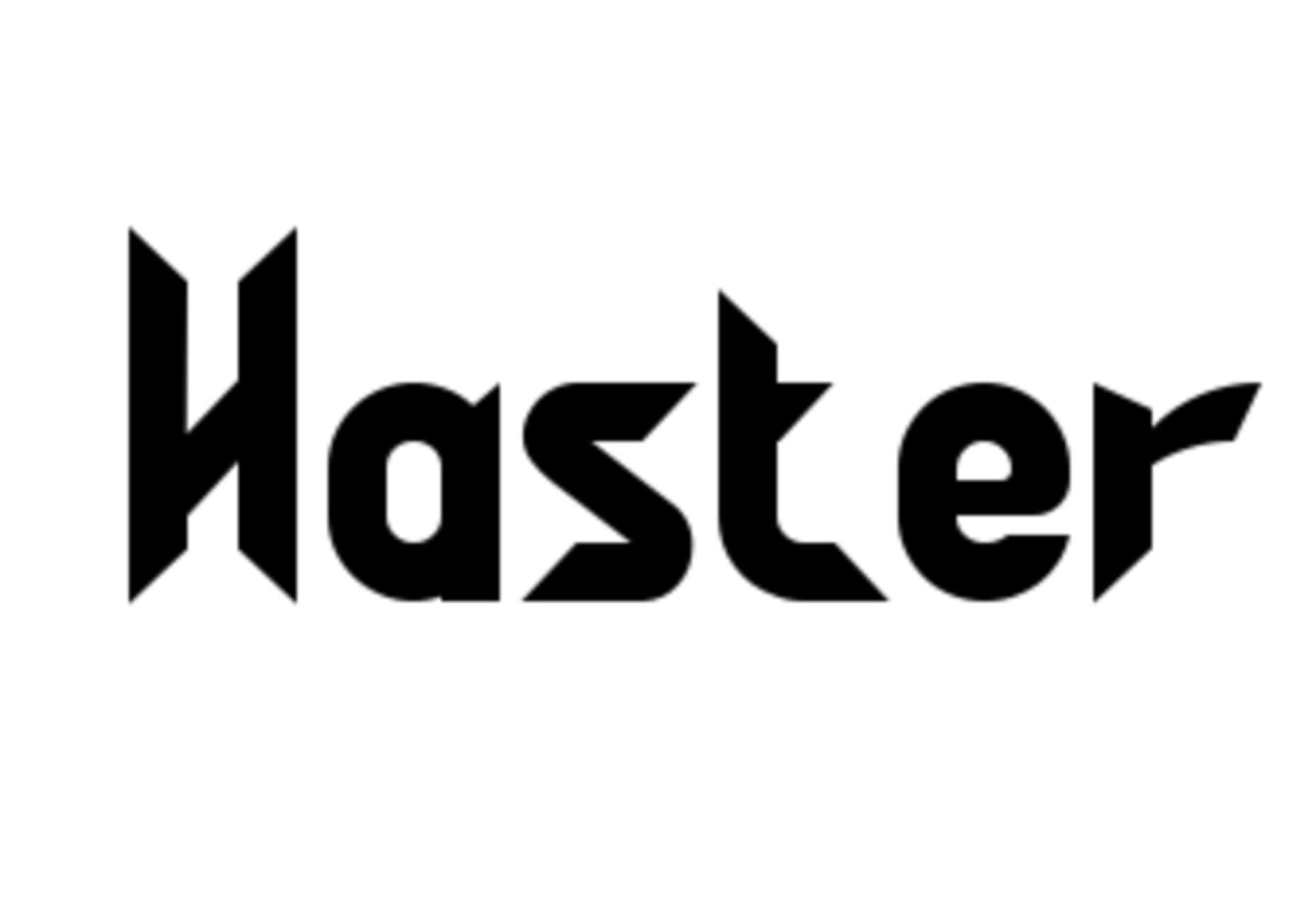
Haster

Haster is a futuristic-style slab with a limited character set. It does have shapes and lines with a lot of impact for display use.

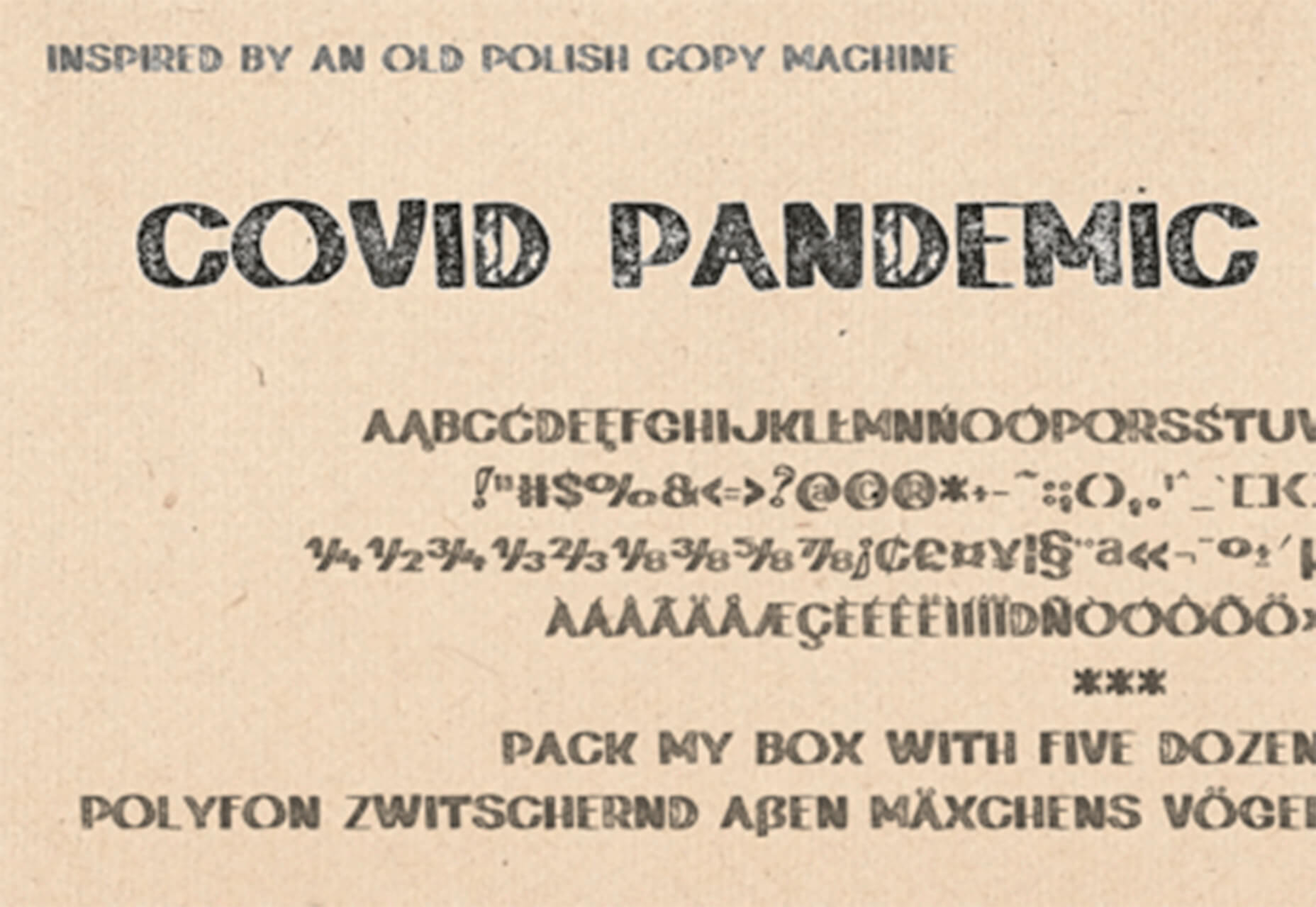
Covid Pandemic Lockdown

Covid Pandemic Lockdown is an interesting novelty font with thick lines and a brush-dot style. While it probably won’t read well small, it could be fun as a display option.

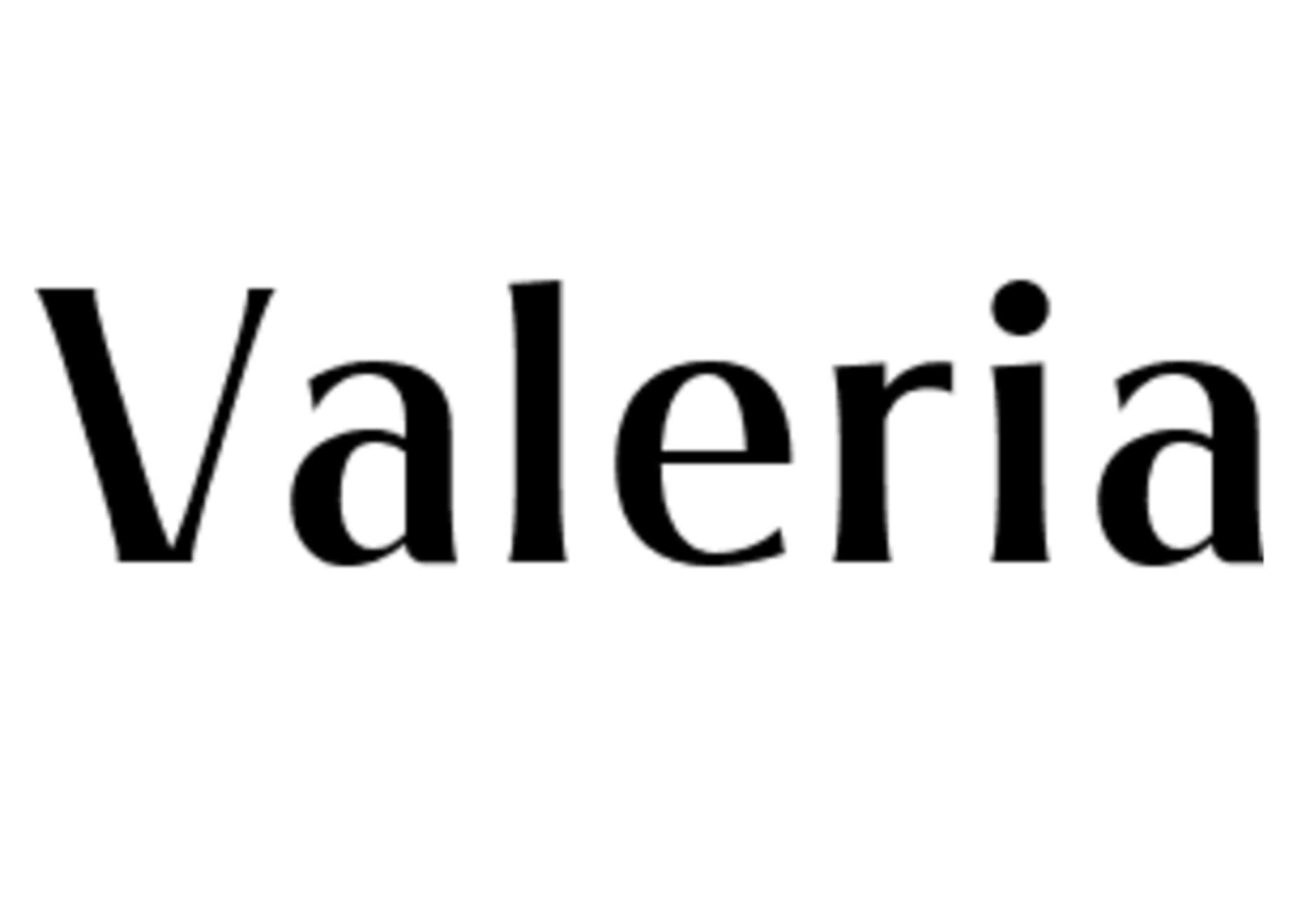
Valeria

Valeria is a simple typeface that’s a little wide but has a nice shape and structure. It includes upper- and lowercase letters.

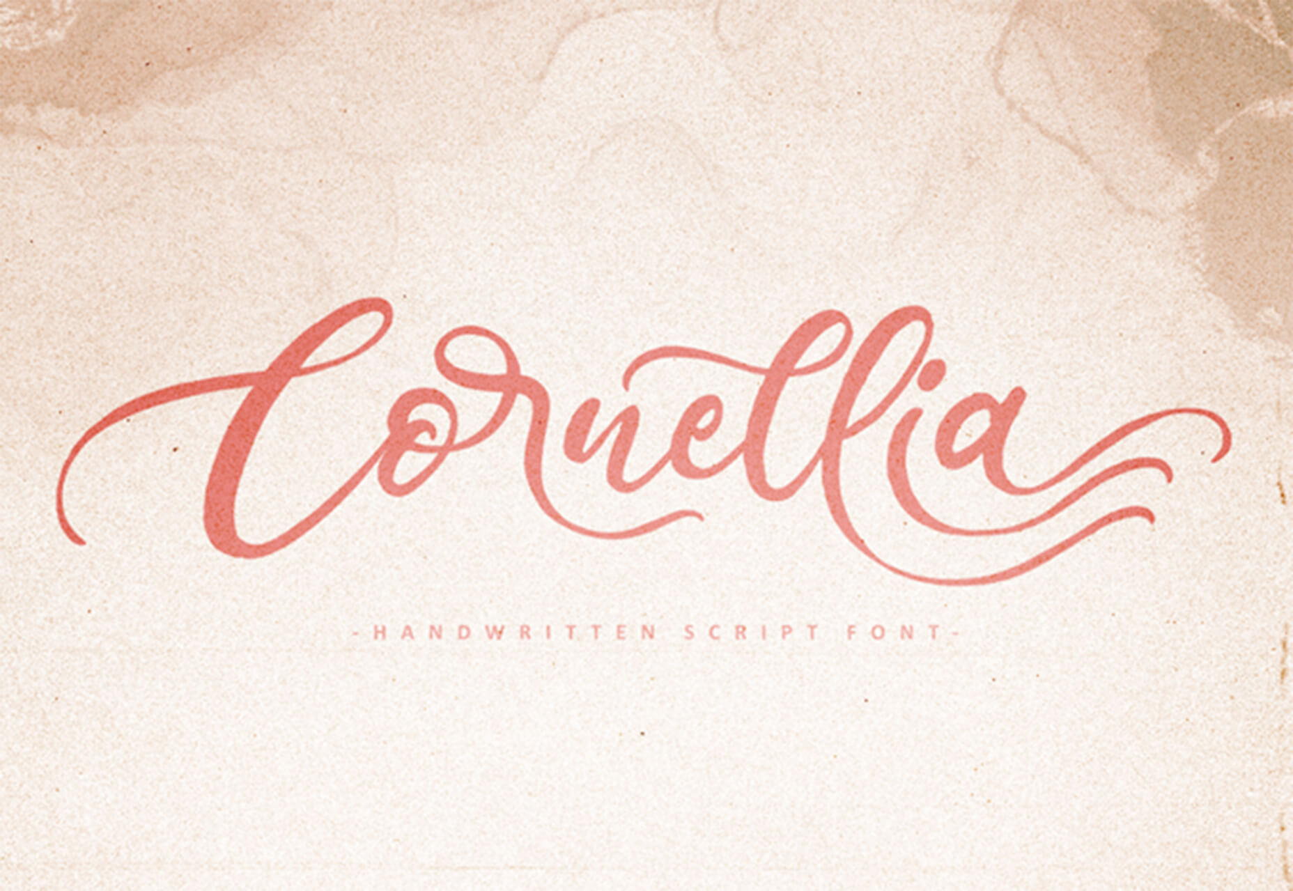
Cornellia

Cornellia is a beautiful script that has amazing letter combinations for use with long swashes and tails. It can add extra elegance to almost any design project instantly.

Source

The post 23 Exciting New Tools for Designers, February 2021 first appeared on Webdesigner Depot.


Source de l’article sur Webdesignerdepot

The new year is often packed with resolutions. Make the most of those goals and resolve to design better, faster, and more efficiently with some of these new tools and resources.

Here’s what new for designers this month.

Radix UI

Radix UI is an open-source UI component library for building high-quality, accessible design systems and web apps. It includes examples and guidelines for all kinds of user interface elements that provide guidance and really make you think about accessible website design. (And everything is usable!)

Froala Charts

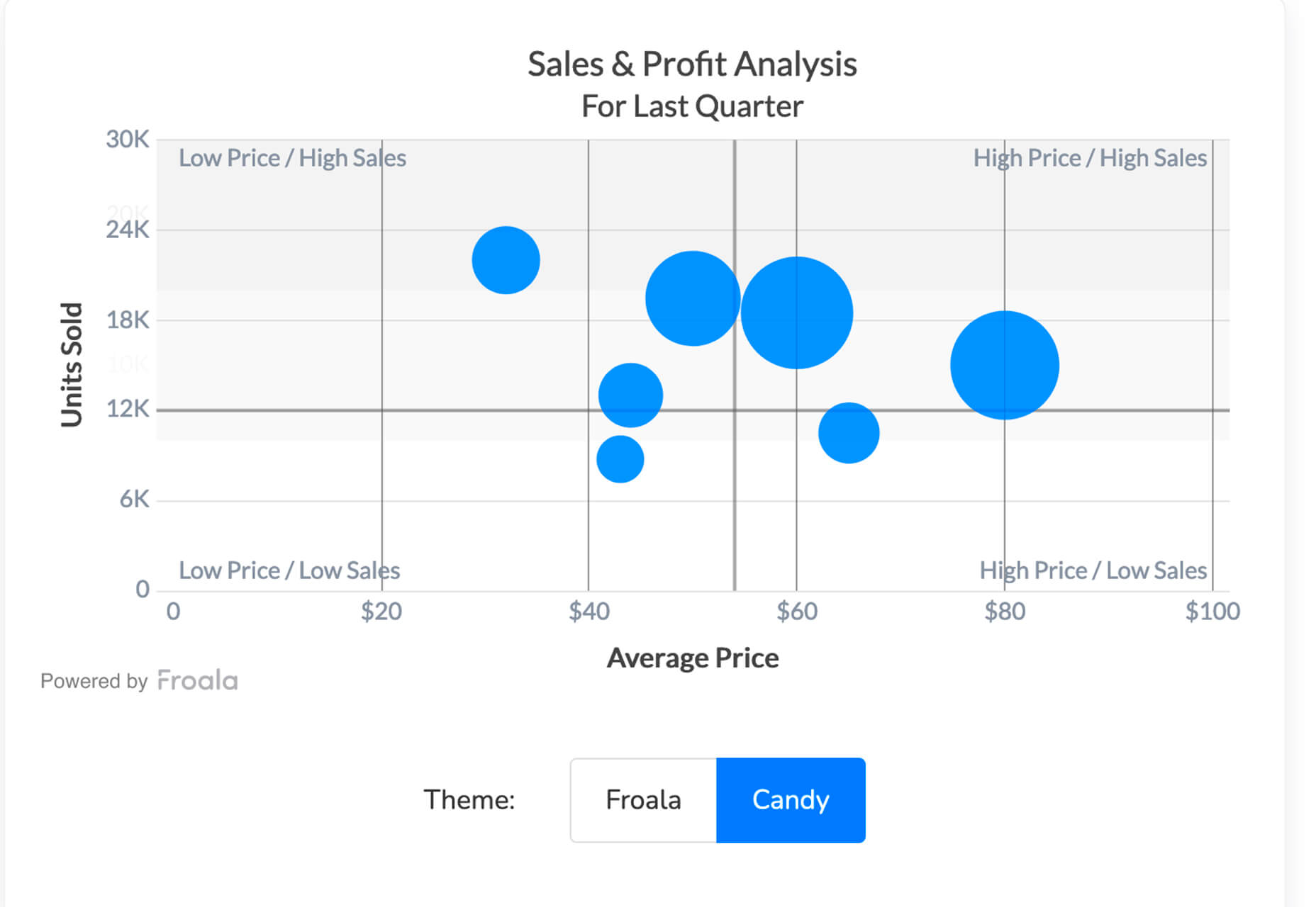
Froala Charts is made to help you create data visualizations for web or mobile apps. Build any chart you can imagine – bar, line, area, heat map, sankey, radar, time series, and more. Plus, you can customize anything and everything, so it all matches your brand. This premium tool is enterprise-level and comes with a one-time license fee.

CSSfox

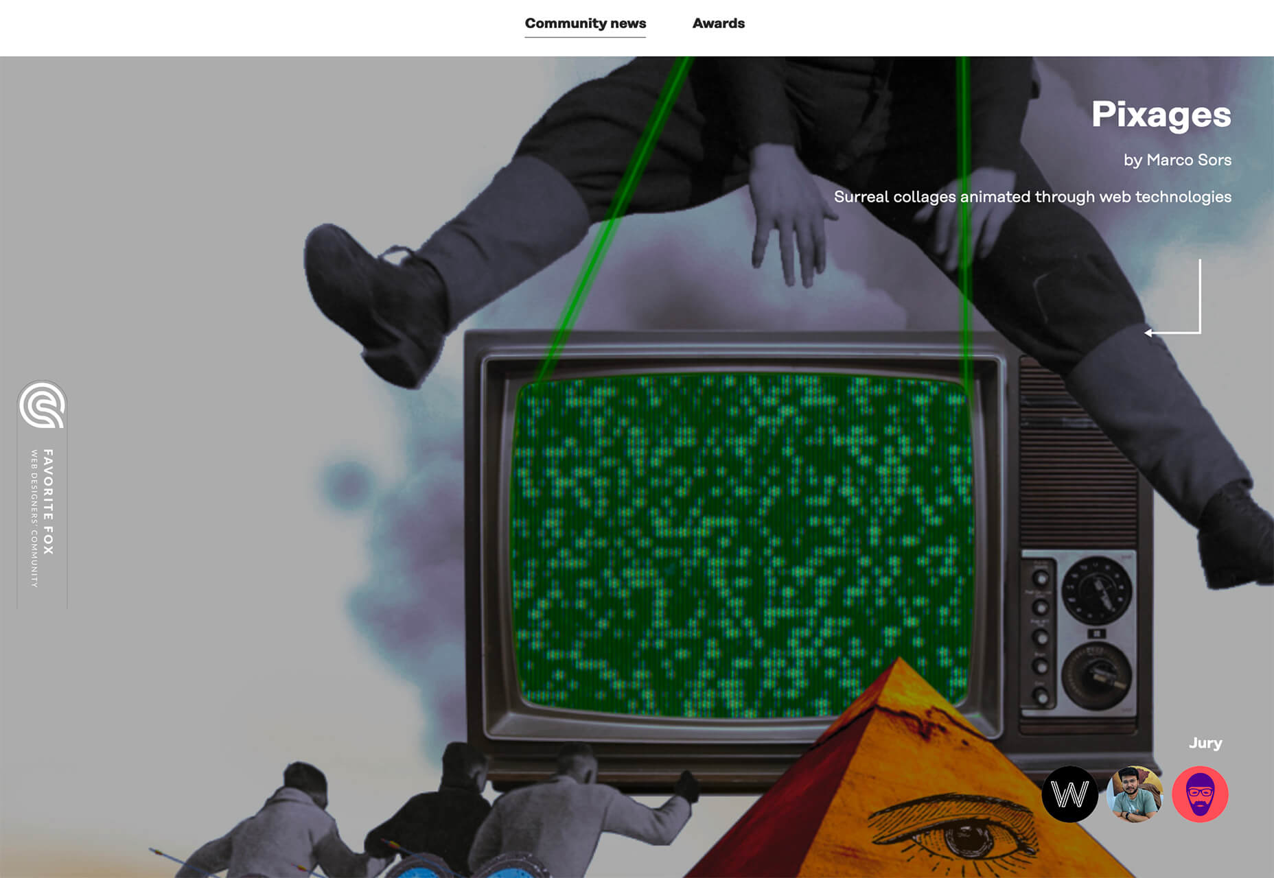
CSSfox is a collection of designs that you can use for inspiration. The curated community project includes posts, reviews, and award nominees and winners.

Pattern Generator

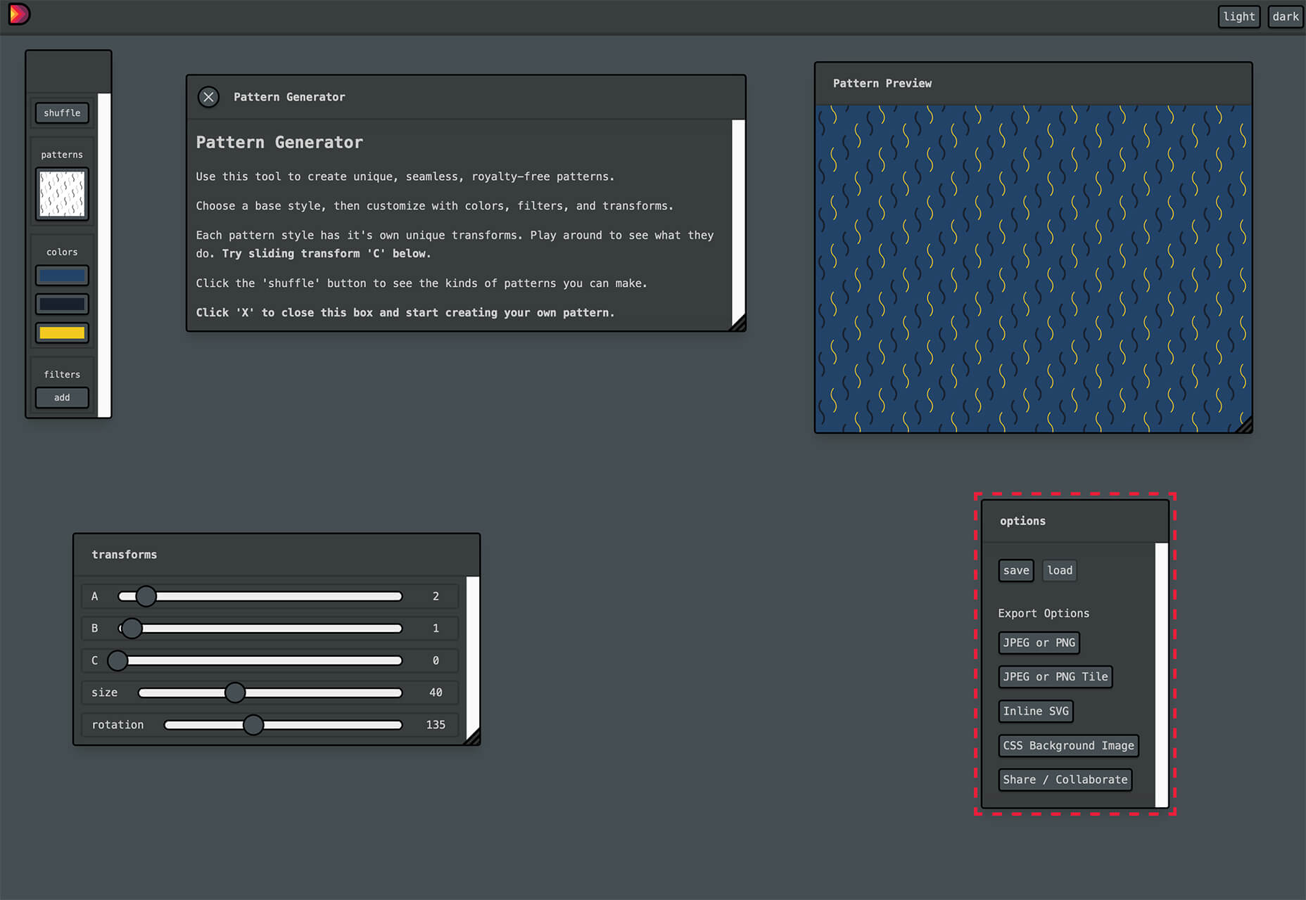
Pattern Generator is a tool to create seamless and royalty-free patterns that you can use in projects. Almost every element of the pattern design is customizable, and you can “shuffle” to get new style inspiration. Design a pattern you like and export it for use as a JPG, PNG, SVG, or CSS.

Type Scale Clamp Generator

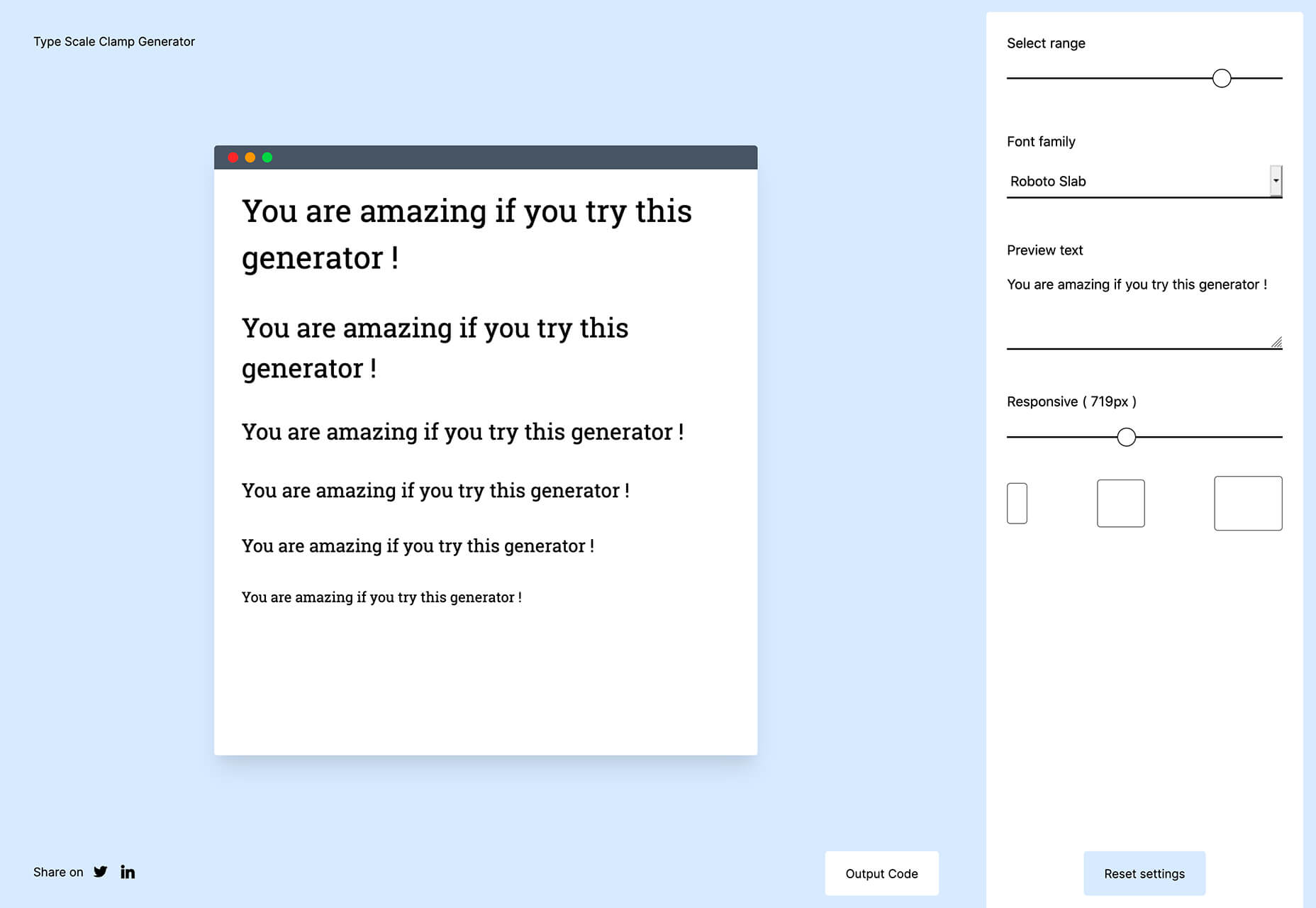
Type Style Clamp Generator helps you create a visualize a typographic scale for web projects. Pick a font and determine a few other settings and see the scale right on the screen. You can even put in your own words to see how they would look. Then, flip to see how sizes appear on different devices. Find a scale you like and snag the code with a click.

Flowdash

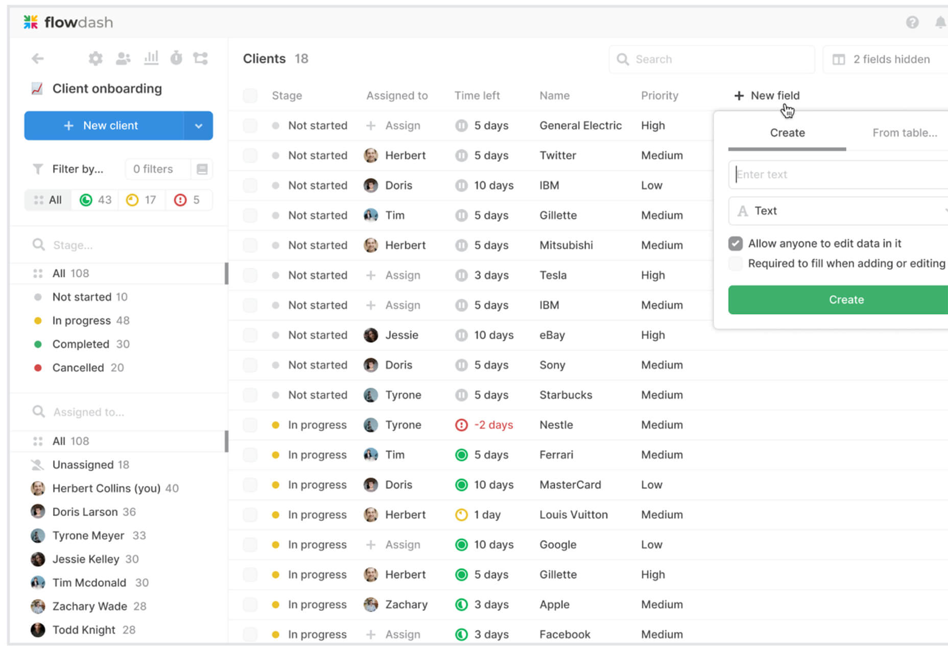
Flowdash is a premium app that helps you build custom tools, data sets and streamline your business operations with one tool. Manage data and processes without code. The tool combines a spreadsheet’s familiarity with a visual workflow builder, plus built-in integrations to automate repetitive tasks so your team can focus on what matters.

Scale

Scale is a website that provides new and open-source illustrations that you can use for projects. Maybe the illustration generator’s neatest part is that you can change the color with just a click to match your brand. Then download the image as an SVG or PNG.

Pe•ple

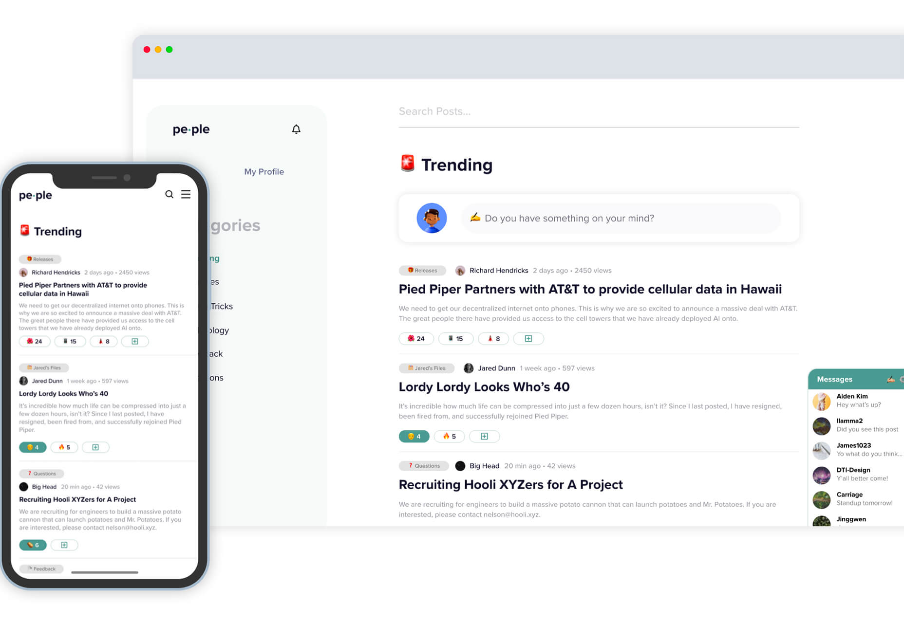
Pe•ple is a tool that adds a “customizable community” to any website to help grow your fanbase and provide a boost to SEO. It allows you to integrate chat, commenting, emojis, and passwordless login, among other things.

K!sbag: Free Minimal Portfolio Template

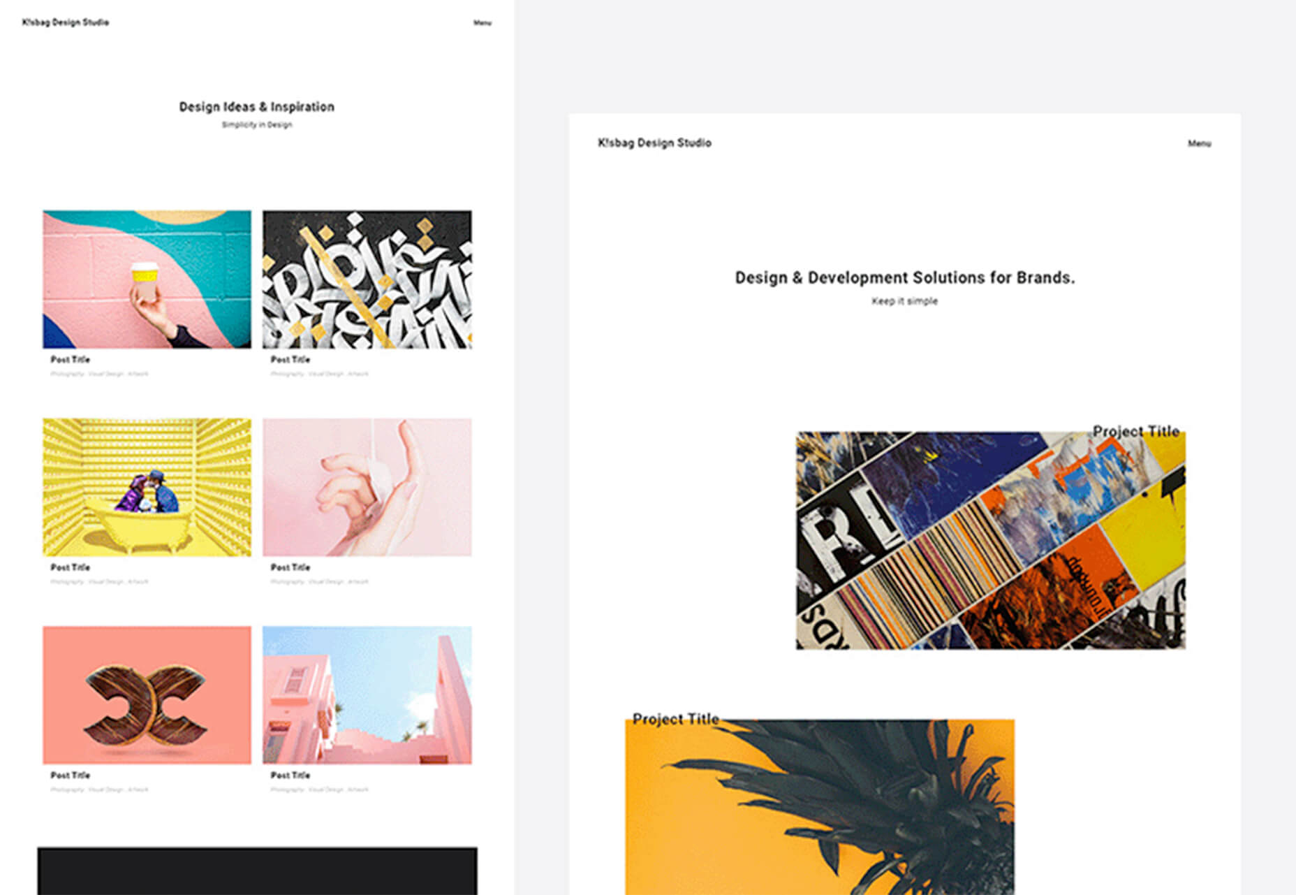
K!sbag is a free minimal website template that’s made for portfolio sites. (Did you resolve to update yours in 2021?) It includes 6 pages in a ready-made HTML format and PSD.

Merico Build

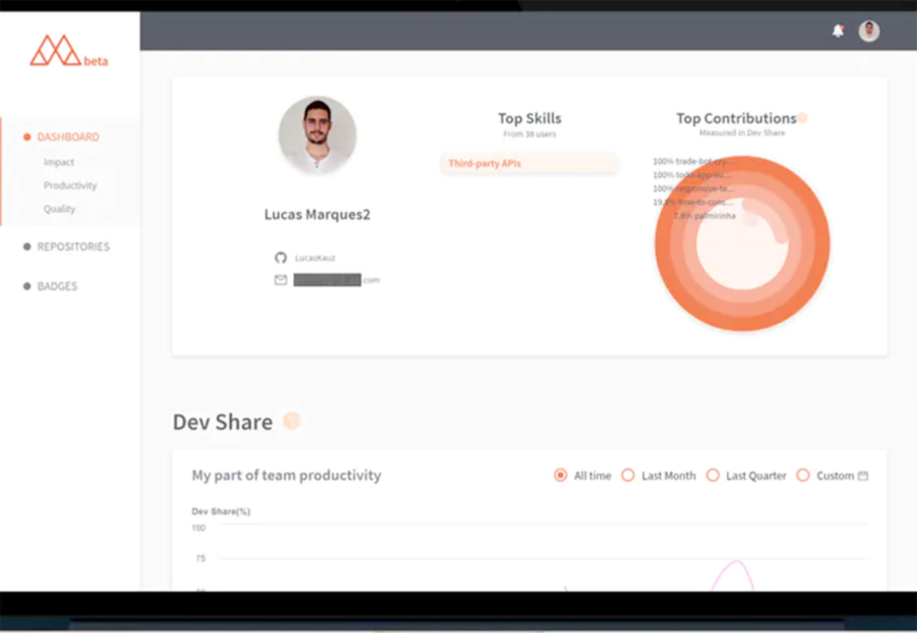
Merico Build is like a fitness tracker for code. It uses contribution analytics to empower developers with insight dashboards and badges focused on self-improvement and career growth. Sign up with tools you already use – Github or Gitlab.

Automatic Social Share Images

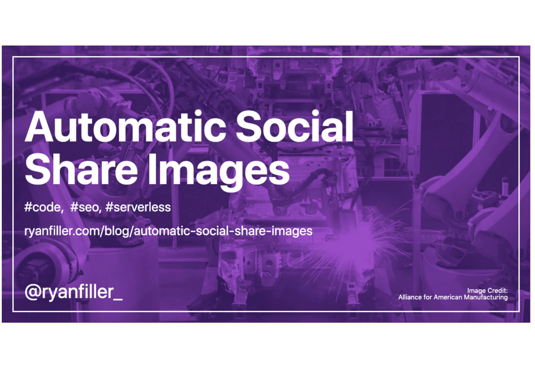
Automatic Social Share Images solves a common website problem: Missing or broken images when posts or pages are shared on social media. This tutorial walks you through the code needed to create the right meta tags so that popular social media channels pick up the image you want for posts. The best part is this code helps you create a dynamic preview image, so you don’t have to make something special every single time.

Animated SVG Links

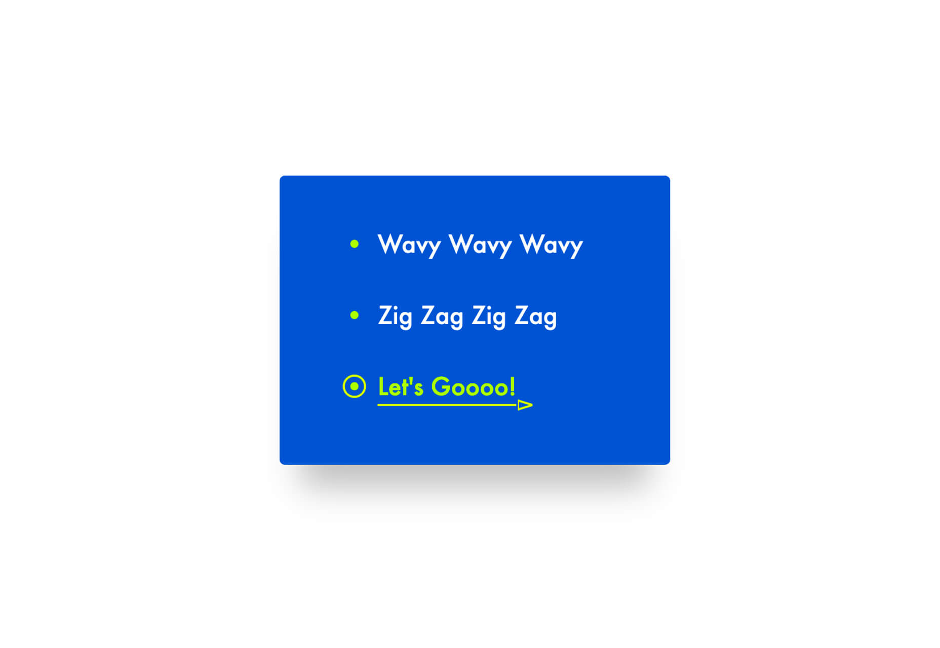
Animated SVG Links can add a little something special to your design. This pen is from Adam Kuhn and includes three different link styles.

Blush

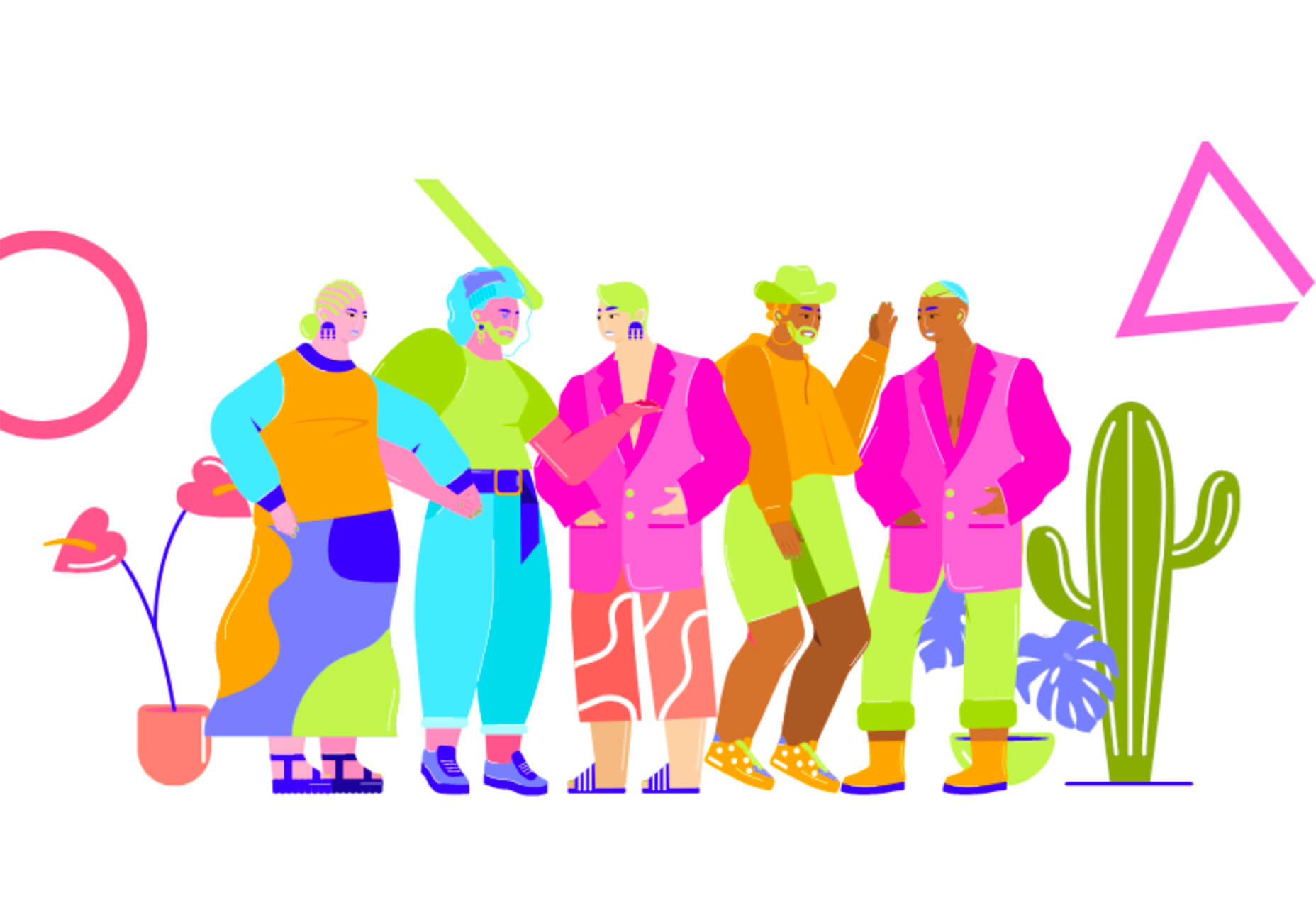
Blush helps you create illustrations. With collections made by artists across the globe, there’s something for everyone and every project. All art is customizable, so you can play with variations to create something unique.

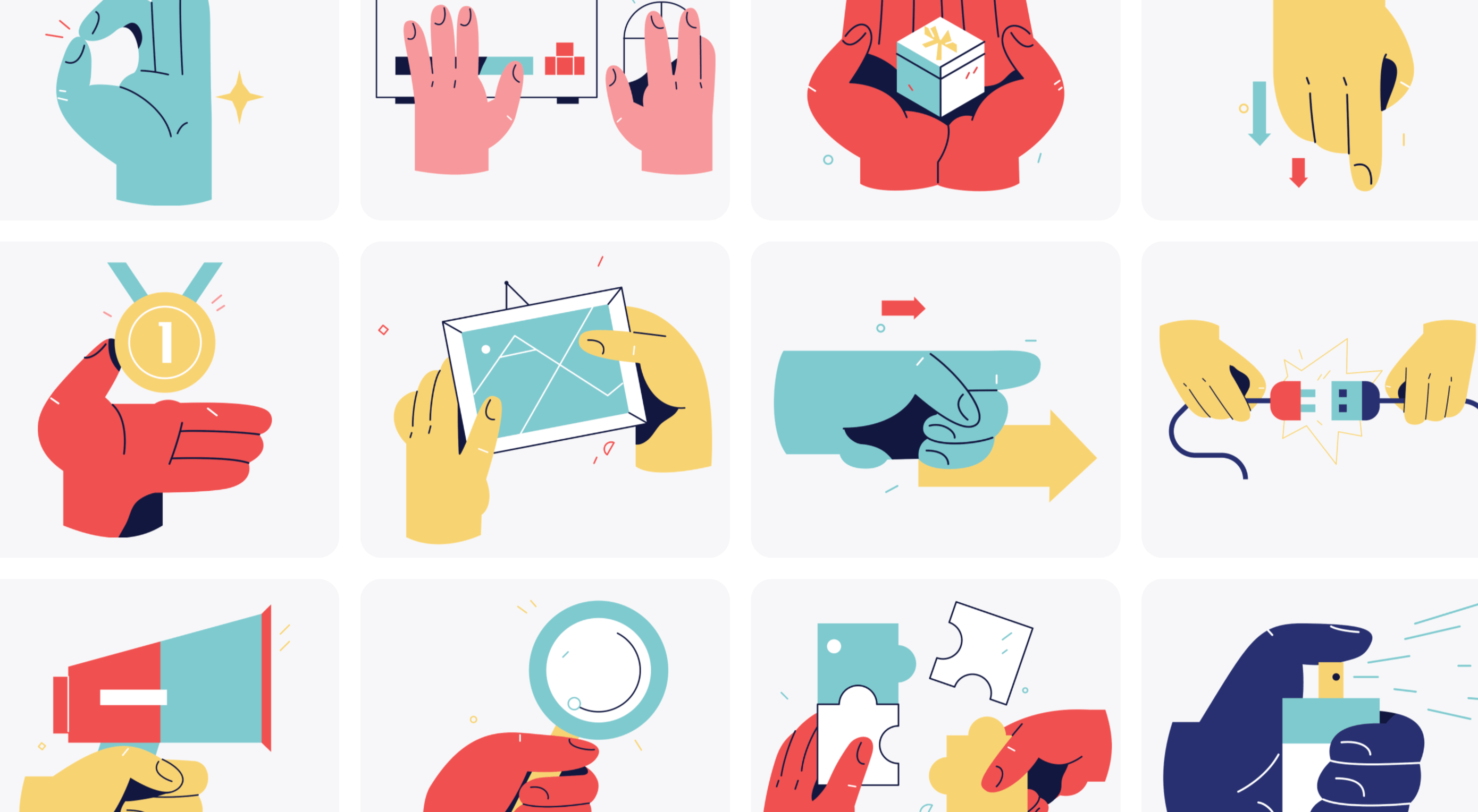
Palms

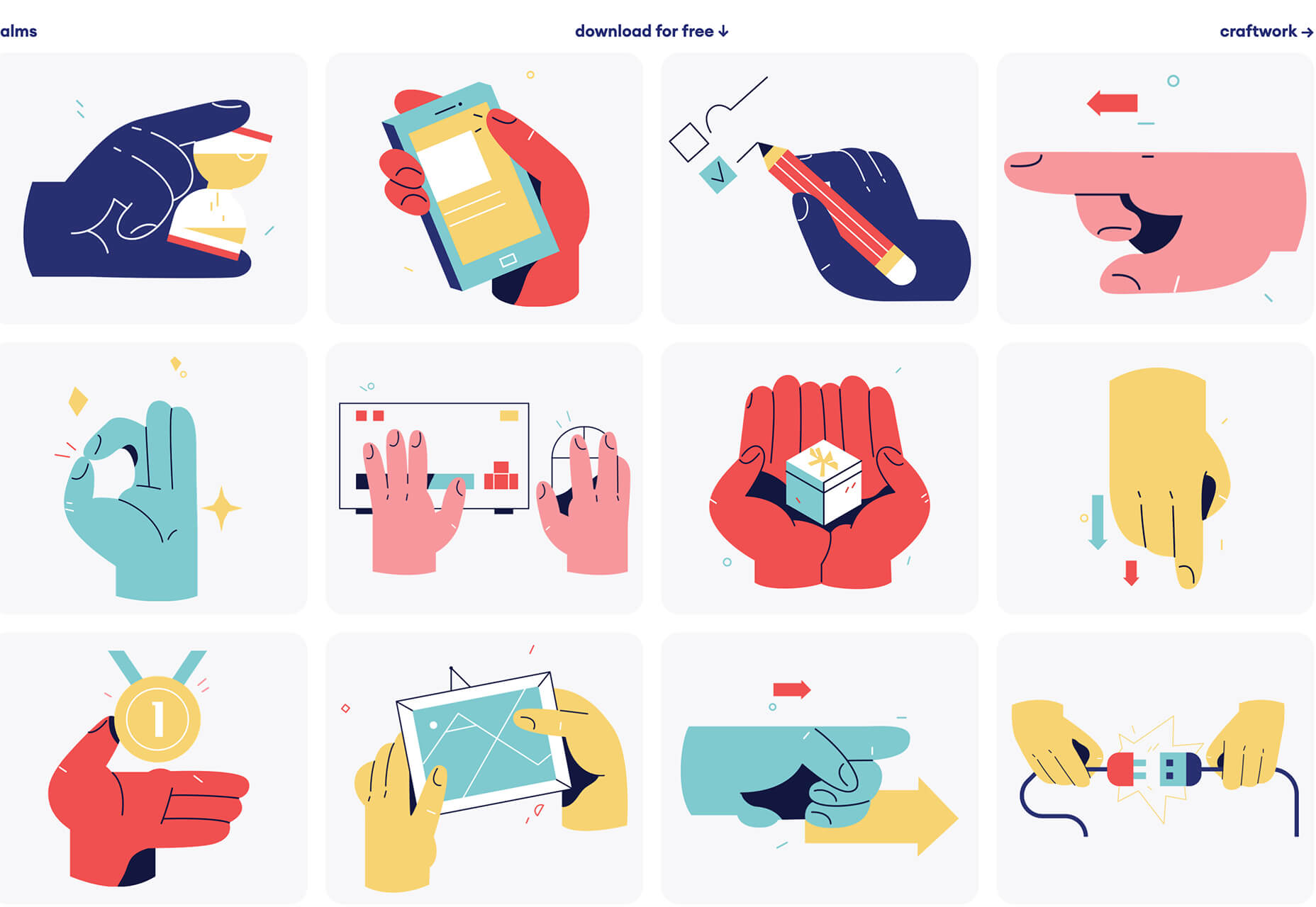
Palms is a set of 43 sets of hands to help illustrate projects. Each illustration is in a vector format and ready to use.

Tabbied

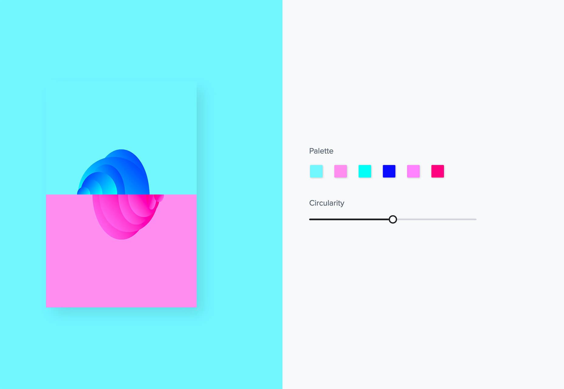
Tabbied allows you to create and customize patterns or artwork in a minimal style for various projects or backgrounds. Tinker with your artwork and patterns and then download a free, high-resolution version.

How to Create Animated Cards

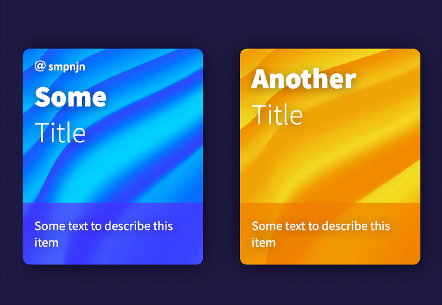
How to Create Animated Cards is a great little tutorial by Johnny Simpson that uses WebGL and Three.js to create a style like those on Apple Music. The result is a stylish modern card style that you can follow along with the CodePen demo.

Bandero

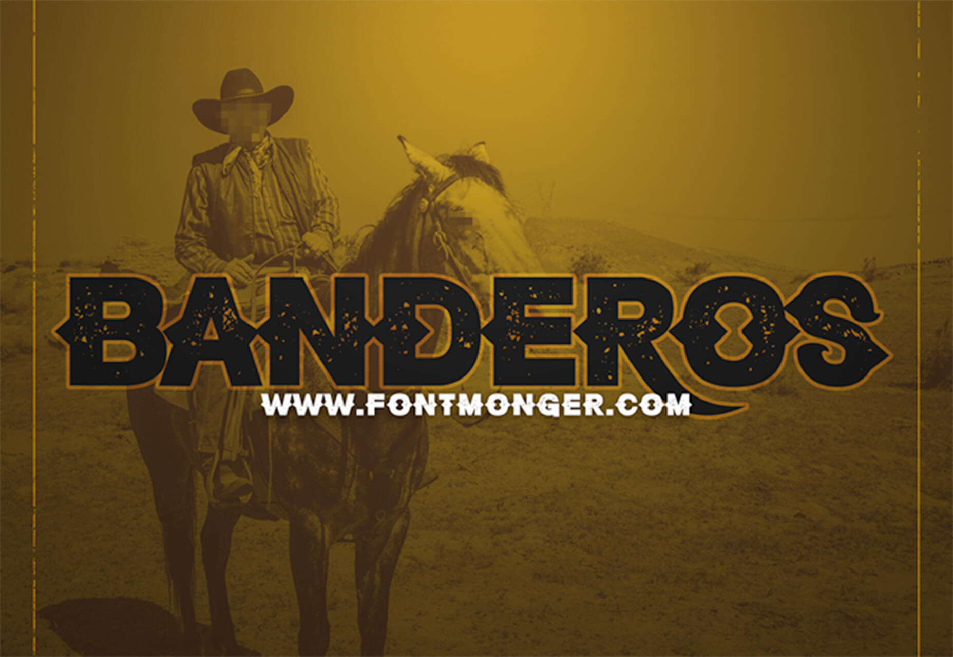
Bandero is a fun slab with a rough texture and interesting letterforms. The character set is a little limited and is best-suited for display use.

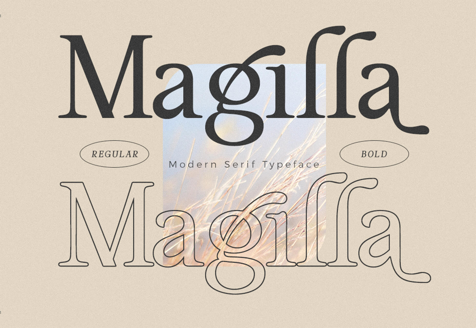
Magilla

Magilla is a stunning modern serif with great lines and strokes. The premium typeface family has six styles, including an outline option.

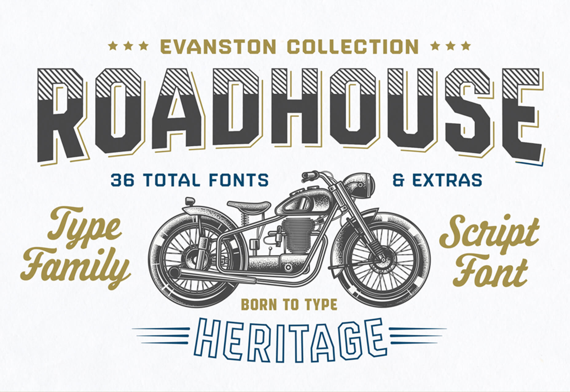
Roadhouse

Roadhouse is one of those slab fonts that almost screams branding design. The type designer must have had this in mind, too, with stripe, bevel, inline, half fill, outline, drop extrude, and script options included. (This family is quite robust, or you can snag just one style.)

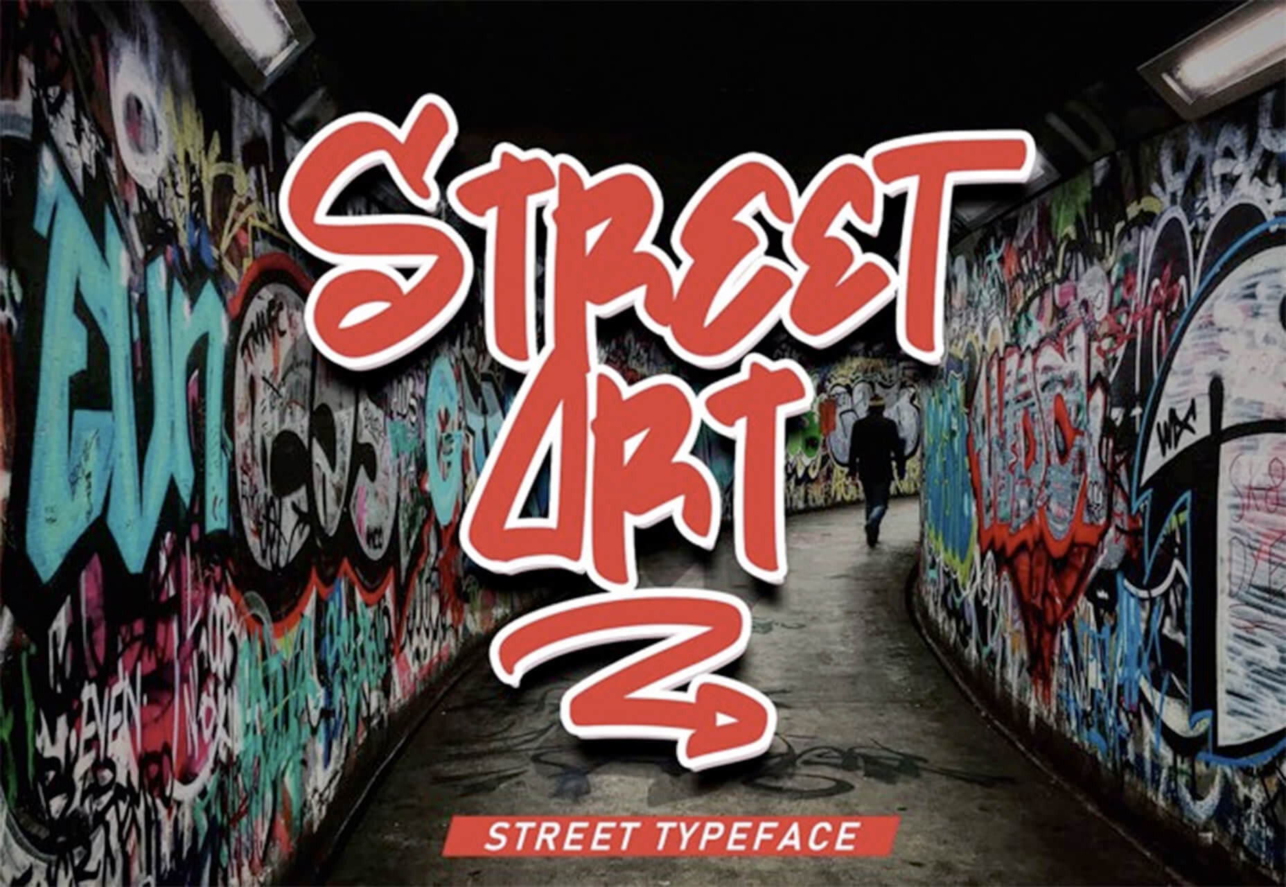
Street Art

Street Art is for those times when a graffiti style is all that will do. What’s nice about this option – free for personal use – is that the characters are highly readable.

Source

The post Exciting New Tools for Designers, January 2021 first appeared on Webdesigner Depot.


Source de l’article sur Webdesignerdepot

When starting a new business (or even venturing into the world of freelancing for the first time), there are some really big, important steps you have to take.

Step #1 is choosing the right business name for your brand identity.

Your business name isn’t something you can casually choose either — especially if you have lofty long-term goals for your company. It’s not as though you can’t change the name down the road, but that comes with a ton of work and will require you to rebuild pretty much everything all over again: your visual brand identity, your reputation, and your SEO…

So, it’s a good idea to spend time choosing a business name that’s going to work for you now and long into the future.

Today, we’re going to go through the process of how to name your brand. These questions will have you thinking beyond just “What name do I like the sound of?” and have you more focused on important questions like “What is my unique value proposition?”.

Let’s get started:

How to Name Your New Business

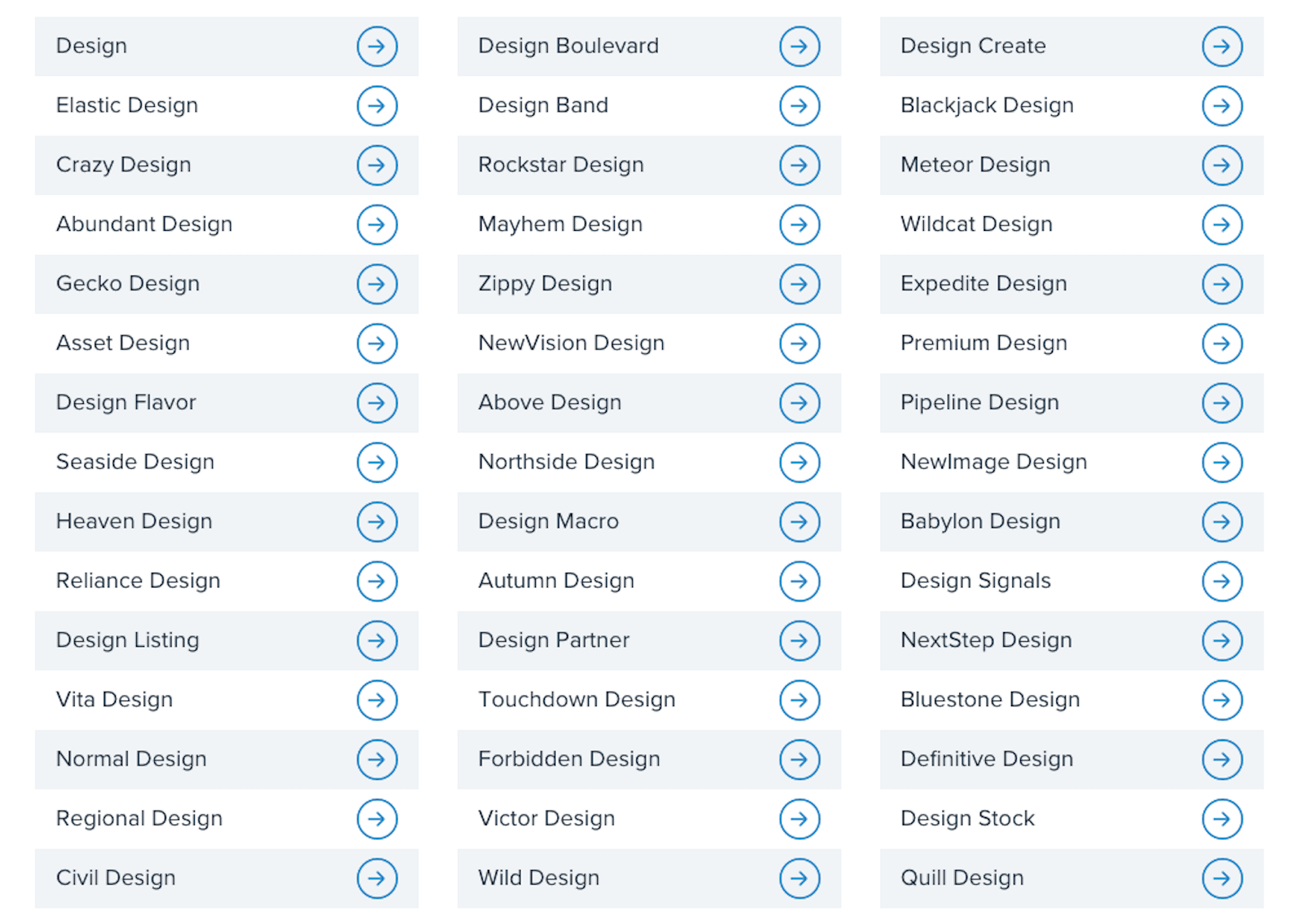
For those of you considering taking the easy way out and using a business name generator tool, let me show you why that’s a bad idea:

This is a list of business names suggested to me when I told the generator that my business is related to “design”:

  • Design
  • Normal Design
  • Regional Design
  • Design Partner
  • Design Stock

Even the more unique names on the list are unusable; they have no connection to me personally or to the kind of business I plan to start.

This is why it’s so important to sort out your brand identity and make sure you pick a business name that resonates with you, and your target audience. To do this yourself, answer the following seven questions:

1. What Services Will You Provide Or Products Will You Sell?

The one thing that name generators get right is including a descriptive word related to your business. That way, it doesn’t take an actual visit to your website or a look through your portfolio to figure out what you do.

Even if you have a very niche specialty, sum up your offering in one or two words. For instance:

  • Web design
  • Digital design
  • Design & development
  • UX design
  • Graphic design

Unless you run your business through your own name (which I’ll talk about shortly), your business name should include a simplified version of your offering in it.

2. Who Is Your Target User Persona?

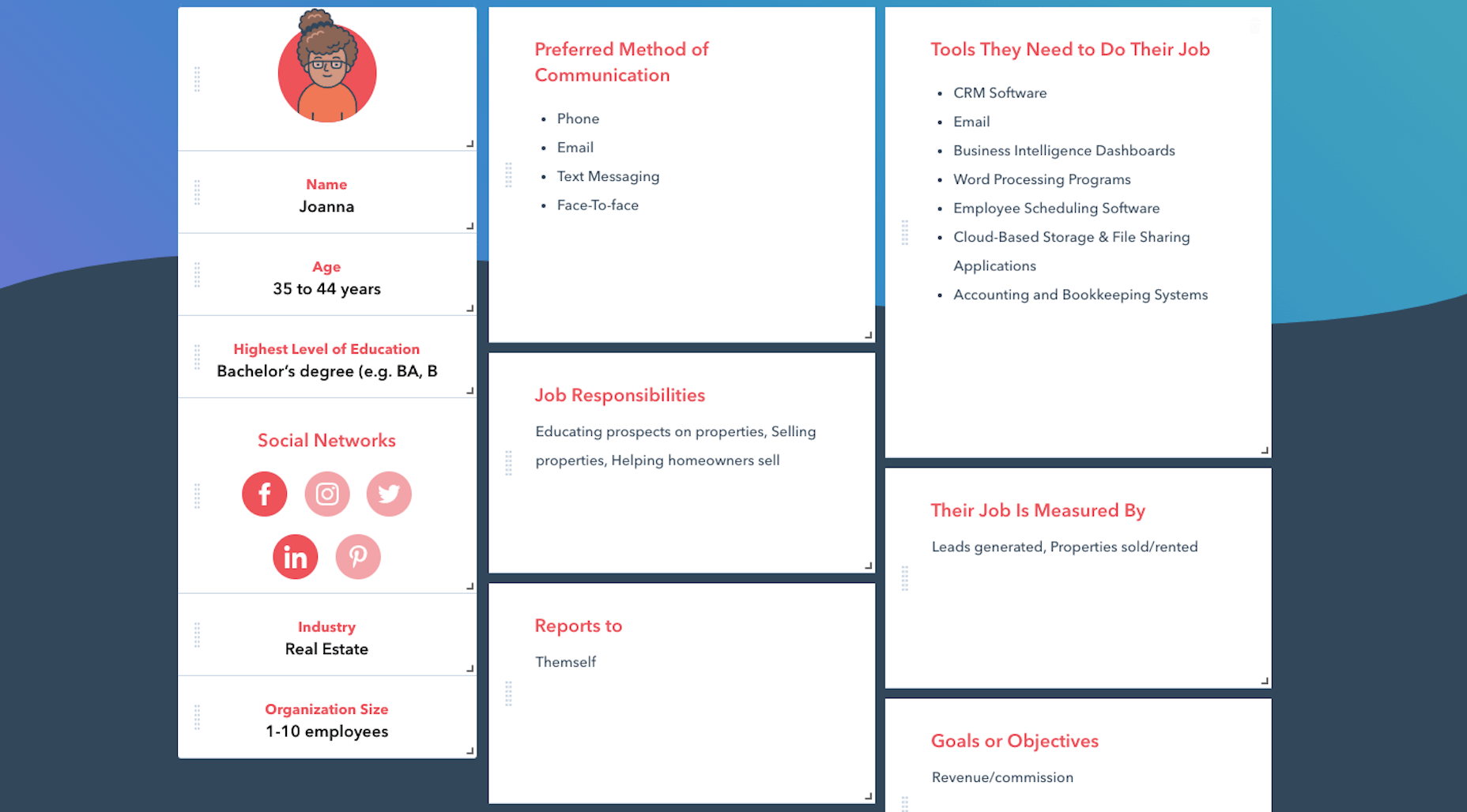
A user persona is a fictional character created using the demographics and psychology of your ideal customer or client. You can use Hubspot’s Make My Persona generator to create a card that documents these details:

Once you sort out who you serve, what makes them tick, and how it fits into the bigger picture of their business, you can better pitch your solution to them.

For instance, Joanna above is a real estate agent and owner whose primary goal is to capture leads and generate sales. You know how effective a real estate website can be for improving an agent’s visibility online and streamlining how they earn money.

So, including words in your business name that speak to that persona as well as their goals might be really useful.

Just keep in mind that web designers don’t always commit to one niche or stick with the same niche over the long run. So, you might not want to make your business name too specific to an industry (e.g. “Real Estate Design Solutions”) and more related to higher level themes and goals.

3. What Are The Names Of Your Top Competitors?

Do you know who your main competitors will be upon entering this space? If not, now’s the time to look them up.

When it comes to business names, you want to see if you can identify common threads among them. Perhaps they use puns or include location-specific descriptors. Or they just stick with the names they were born with.

While you don’t want to come off as a copycat, you can imbue your business name with a similar theme or tone if it’s proven to be successful with your shared audience. 

4. What Makes You Different?

Every business has a unique value proposition (UVP) — something that sets them apart from everyone else in the space. What’s yours?

Do you operate within a large metropolitan area where your prospective clients’ industry is booming?

Did you previously work in the industry for which you now build websites?

Are you an SEO expert who builds enterprise websites that rank?

In business, it’s good to be different — so long as it benefits your clients.

If you have a particular UVP that’s going to make you stand out, you’re going to use it everywhere to market yourself — your website, social media, sales pitches, etc. So, you might want to consider using a unique keyword from it within your business name.

5. Where Do You Envision Yourself In Five Years?

No one’s future is set in stone. However, if you’re seriously thinking about starting a new web design business, you have some ideas about where you want to go with it:

  • Do you like the idea of being a lifelong freelancer or digital nomad?
  • Would you like to operate your own design agency?
  • Do you have aspirations to build and sell website products, like plugins, themes, or UI kits instead?

If you expect to pivot your business at some point, be careful about choosing a business name that paints you into a corner. Keep it broader so that prospects don’t have to wonder what it is you really do.

And if you plan on scaling your business beyond yourself, using your own name might not be the best idea. You’ll want clients to associate the brand name with your agency, not with you specifically.

6. Will Your Business Name Be Easy To Remember?

At this point, you have some business names brewing. So, now we need to look at the more technical aspects of naming your brand.

Here’s what you need to do.

a. Write down no more than three to five business names you like.

For example:

  • Honeymooners Web Design
  • Charles Murphy Design & Development
  • FoREver Websites
  • SOLD Web Design Agency

b. Mash each name into one long lowercase string. Don’t include any punctuation.

For example:

  • honeymoonerswebdesign
  • charlesmurphydesignanddevelopment
  • foreverwebsites
  • soldwebdesignagency

c. Are any of the names difficult to read? Too long? Do any of them cause confusion and look like they mean something else?

If so, get rid of them as a matching domain name won’t work. Or, if you absolutely love them, fix the name so it’s clear, readable, and short. For instance:

charlesmurphydesignanddevelopment becomes charlesmurphydesign or just charlesmurphy.

7. Does The Name You Want Already Exist?

It’s a good idea to have a backup name in case you discover that the name you want already exists. Due to trademarking issues as well as possible confusion for your clients, you’ll want to avoid using a name that overlaps with or is the same as any other company (in or outside of web design).

Do a Google search for the business name you want to use. Check out the top 10 search results to see if there are any other matches.

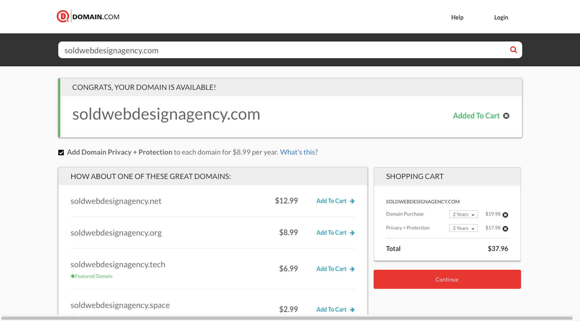
You’ll also want to test out the domain name. Go to Domain.com and run your business name string through it:

You have a few options if this happens:

  1. Choose a different top-level domain (e.g. .tech, .io, .design).
  2. Use an abbreviated version of your business name  (e.g. solddesignagency.com).
  3. Move your backup business name to the front of the line and see if it’s available.

It all depends on how attached you are to the business name you’ve chosen. Just make sure that any changes you make to it (like shortening the domain name or using an alternate TLD) doesn’t cause confusion for prospects who look you up online. You don’t want them confusing someone else’s domain name for yours if business name and domain name don’t line up.

Choosing a Business Name Is Just the First Step…

Once you’ve settled on your business name, share it with a few people you trust. They’ll let you know if you’ve totally missed the mark or if it’s something you should be excited to run with.

As soon as you’re 100% sure it’s the right name, buy the domain name and register your company. Then, it’ll be official!

Of course, this isn’t the end to branding your new business. In our next Branding 101 post, we’re going to look at the next step: How to create the visual identity for your business.

Stay tuned!


Featured image via Pexels.

Source


Source de l’article sur Webdesignerdepot

Web accessibility is important for two reasons:

  1. Being ADA & WCAG compliant is required by law (we’ll explain this further) so if your website isn’t compliant, you can get sued.
  2. It allows people with disabilities to browse your website, which increases your potential audience and it is the decent thing to do.

In this accessiBe review, we’ll cover:

How Does accessiBe Work

accessiBe is an automated solution that combines two applications to achieve full compliance.

Foreground application: the accessibility interface. This is the accessibility menu that allows users with disabilities to adjust the various UI and design elements on your website so it meets their unique needs.

Background application: proprietary AI technology that’s responsible for the ‘heavy lifting’, screen-reader, and keyboard navigation optimization.

The combination of these two applications is unique for accessiBe for a few reasons. While most available accessibility solutions offer just one of the two or rely on manual remediation, accessiBe checks both boxes and does it in a fully automated way.

Additionally, and most importantly, accessiBe continuously scans your website, every 24 hours, identifying and fixing new accessibility issues as they arise. Websites are dynamic – meaning, keep updating constantly with new content, pages, images and so on; being ADA and WCAG compliant is an ongoing concern, not a one-time fix.

How to Install and Setup accessiBe

You install accessiBe by inserting a single line of code on your website.

From your end, that’s all it takes.

The first thing that happens is that the accessibility interface appears on your website. The menu is available via the accessibility icon (that also appears automatically.)
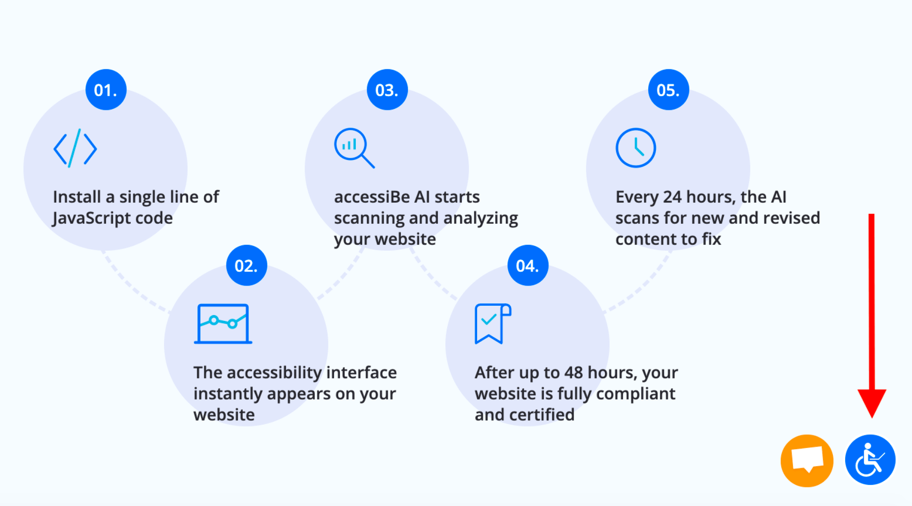
Source: accessiBe website

Next, the AI application scans and analyzes your website for accessibility issues and compatibility with screen-readers and keyboard navigation requirements and fixes them. This automated process takes 48 hours.

Once the initial 48 hours have elapsed, your website is compliant.

From here on, accessiBe automatically scans your website every 24 hours to identify and fix new accessibility issues as they arise due to website updates.

Why Ongoing Compliance is Important

We’ve mentioned this already, but it’s important to stress this point.

Whether you have an e-commerce website or a company website, you keep updating and changing your website; new items go up for sale, new videos and content pieces are added. Every addition or removal from your website has the potential of creating accessibility gaps (like missing alt text for images.)

By continuously scanning and fixing your website, accessiBe ensures that you stay compliant. An accessibility audit remediates your website for the specific point in time the audit took place. Meaning, you’ll need to audit your website periodically to remain compliant, which is a costly affair. With accessiBe you don’t need to worry about this.

accessiBe Front End Features – The Accessibility Interface

The accessiBe accessibility interface (the menu that is available for users) is installed automatically on your website once you insert the line of code. Let’s look at the various features that are available for people with disabilities.

Accessibility Profiles Explained

First, it allows you to choose from a pre-defined set of profiles optimized for various disability needs:
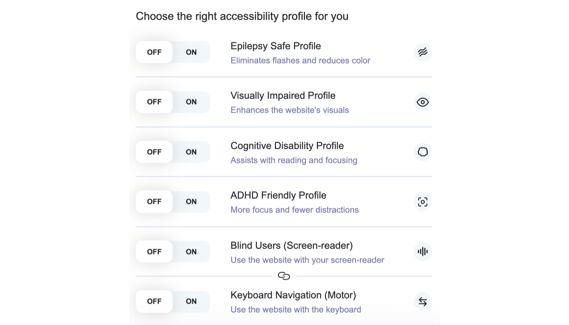
When one of the profiles is selected, the required adjustments are instantly applied to your entire website.

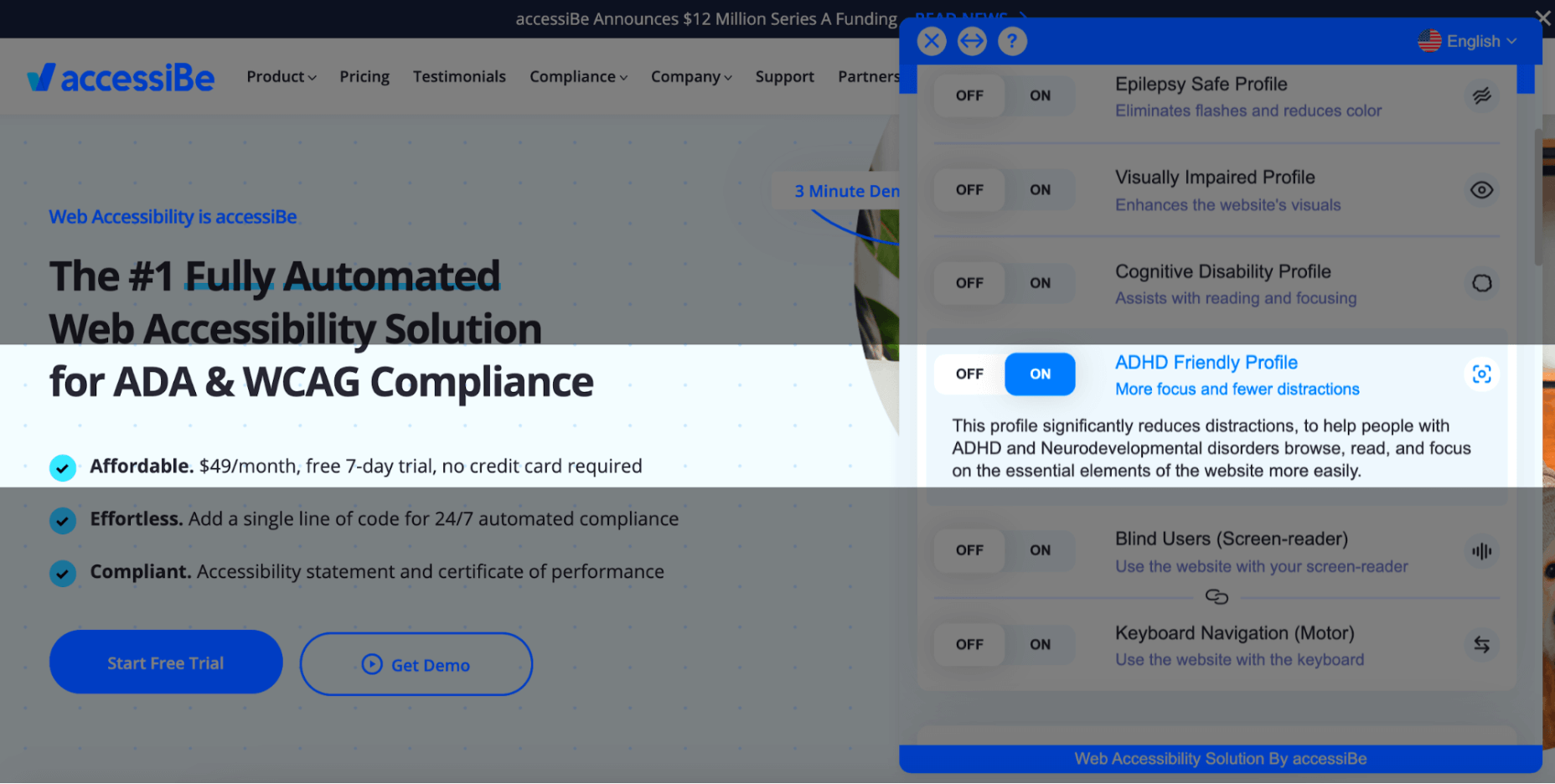
For example, The ADHD Friendly Profile creates a reading mark that follows your mouse movements that diminish distractions and allows better focus:
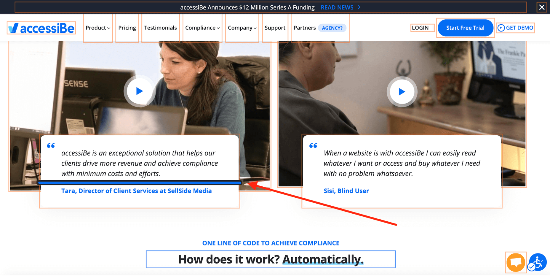
The Cognitive Disability Profile frames all the elements in bounding boxes and adds an ‘reading cursor’ that acts as your mouse to allow enhanced orientation:
Each of the predefined profiles includes a suite of features that target the unique accessibility needs of the disability; the Epilepsy Safe Profile prevents videos from playing automatically, dims all the colors on your website and eliminates flashing and blinking animations; the Visually Impaired Profile enhances all your website’s visuals, enlarges all fonts to allow most visual impairments conditions (degrading eyesight, tunnel vision, cataract, glaucoma and more) to be able to browse your website with ease.

The last two profiles, Blind Users and Keyboard Navigation, work in unison. They allow blind and motor-impaired individuals to browse and use your website as they are used to, through screen-readers and keyboard functionality, respectively.
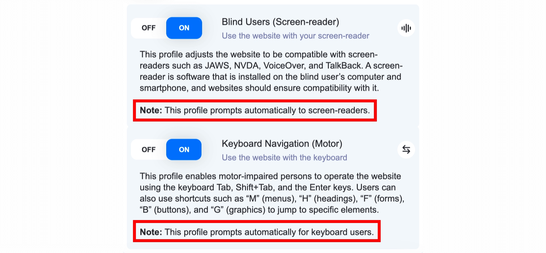
Two things need to be mentioned here:

  1. Blind individuals have screen-readers installed on their computers in the OS-level, meaning, on the hard drive of the computer. They use them to navigate the internet by having the software read for them every text that appears on the screen. As can be seen in the screenshot above, the Blind User profile is ‘launched’ automatically once accessiBe detects that the user is using a screen-reader. This is a crucial functionality since obviously blind users aren’t able to locate the accessibility icon.
  2. The same goes for individuals that are using the keyboard instead of a mouse to navigate the web, both the motor-impaired and the blind. accessiBe detects and automatically enables keyboard navigation on your website.

On top of the predefined accessibility profiles, accessiBe’s interface allows for further adjustments that can be controlled specifically to allow a personalized browsing experience according to the user’s needs. Let’s look at these adjustments.

Accessibility Content Adjustments Explained

The content adjustments allow you to control every aspect of the written content on your website. The menu looks like this:
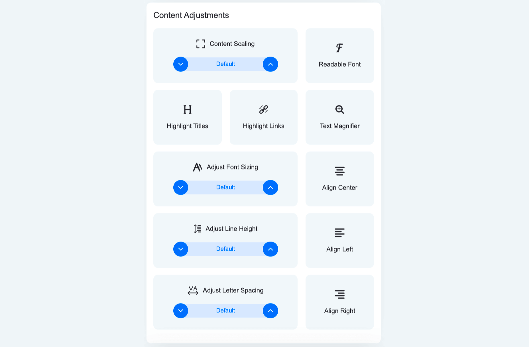
Each of these elements allows for granular control of the way content, or text, is presented. From altering the entire website’s text to a readable, sans-serif font that is easier to follow, to highlighting titles and links, to adjusting font size, the spacing between lines and letters and using a text magnifier that follows your cursor on the screen.

Here’s how it looks with Highlight Titles and Highlight Links turned on:

You can see all the links are highlighted with an orange bounding box while all titles are highlighted with a blue bounding box.

Accessibility Color Adjustments Explained

The color adjustments allows users to control every aspect of the color scheme on the website:
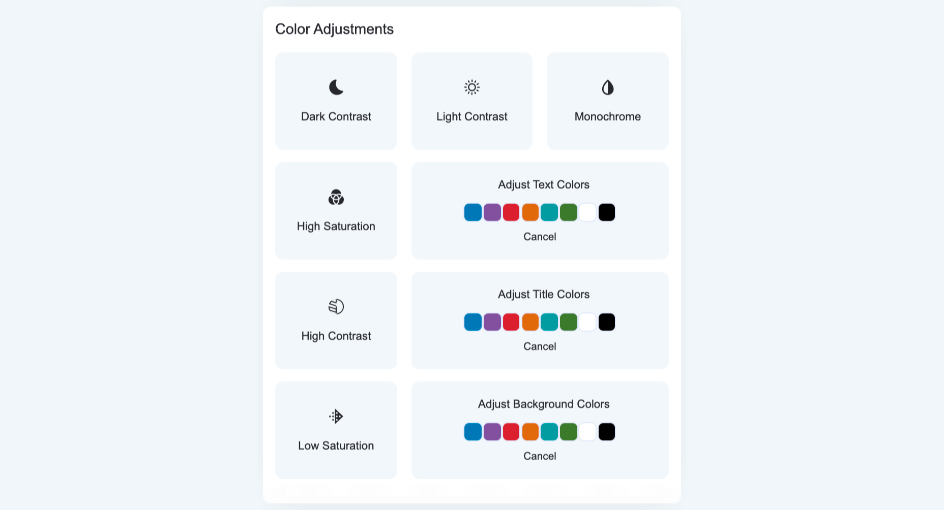
From adjusting contrast and saturation, to switching the entire website to a monochrome color scheme, to adjusting textual elements and background colors. Let’s look at a few examples.

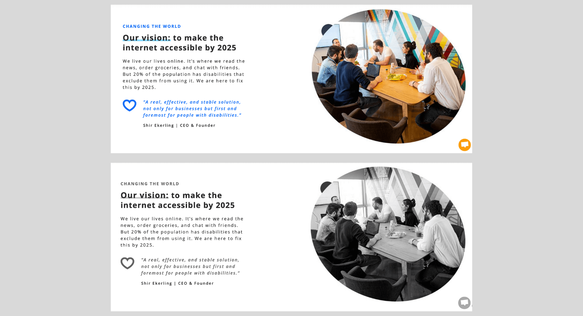
Here’s a side-by-side of default appearance and the Dark Contrast adjustment turned on:
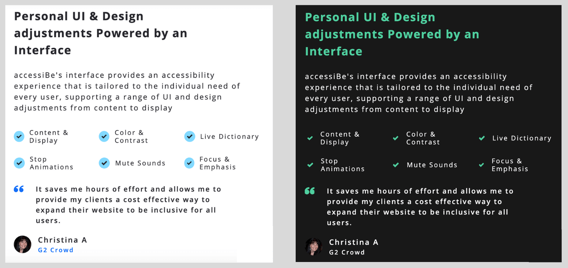
And here’s how it looks with the Monochrome adjustment turned on:
Accessibility Orientation Adjustments Explained

The orientation adjustments allow full control of ‘distractions’ that make it hard for individuals with epilepsy, ADHD, and cognitive disability to browse the web:
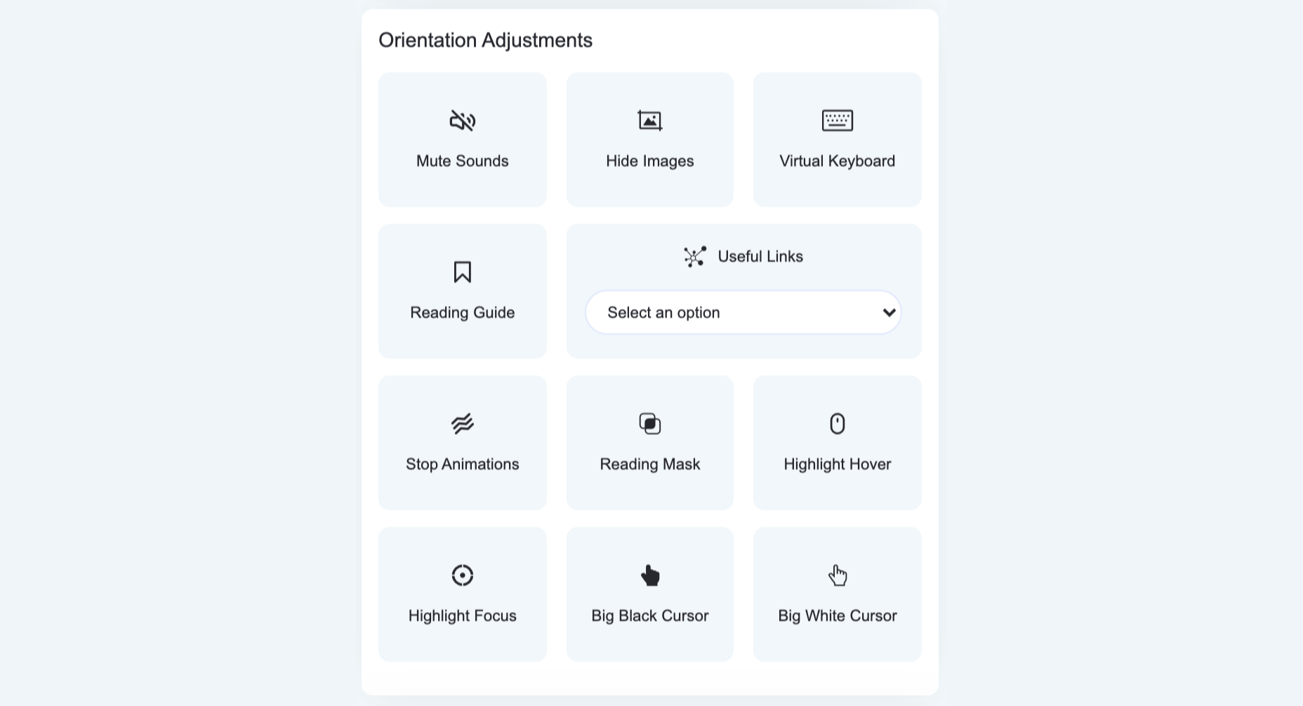
As such, the orientation adjustments allow users to mute sound, hide images, stop animations and additional ‘focus’ features such as an enlarged cursor and reading assistance that highlights the text being read.

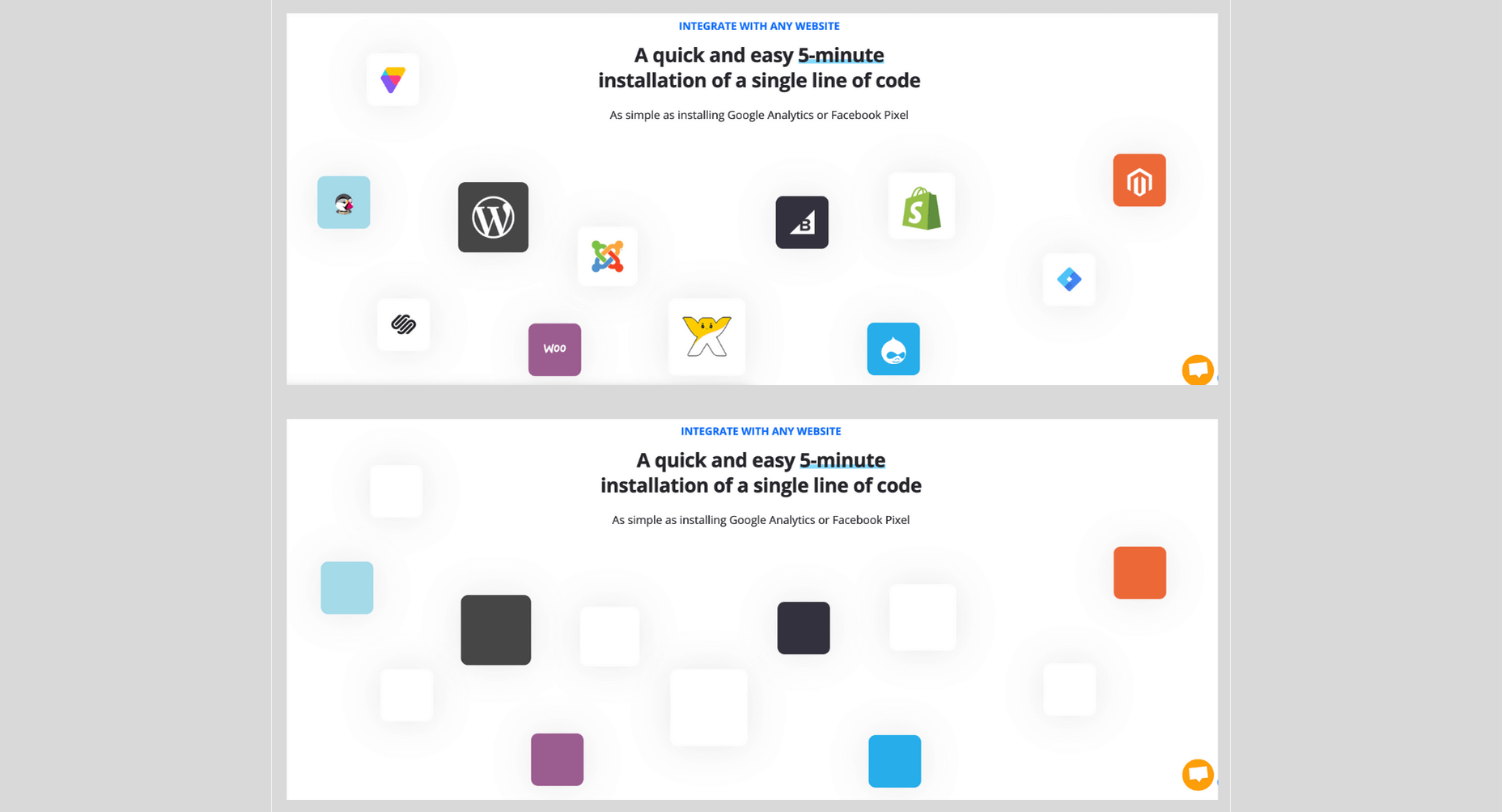
Here’s how the Remove Images adjustment works:
accessiBe Back End Features

Unlike ‘accessibility plugins’ (more on that later) accessiBe provides a comprehensive back end treatment to your website – automated, AI-powered analysis of compatibility with accessibility requirements and fixing of the elements that need adjustment.

It should be noted that 70% of the WCAG compliance requirements deal with screen-reader and keyboard navigation compatibility and all these requirements are not answered by installing an accessibility interface widget that merely makes UI and design adjustments.

For example, an accessibility widget will enable you to enlarge the font on your website, to adjust the saturation or to highlight links, but it won’t enable a blind individual to differentiate between a shopping cart icon and a checkout icon, nor will it enable a motor impaired individual to easily navigate a menu.

This is a crucial consideration to make when choosing a web accessibility solution. Being WCAG compliant is a YES / NO situation. Your website is either compliant or it’s not, there is no middle ground here.

accessiBe’s back end features come to solve and answer all these compatibility issues that enable full screen-reader and keyboard navigation functionalities.

Screen Reader Compatibility Explained

Screen Reader is a software for blind individuals to use computers and browse the web. As the name suggests, the software reads aloud what is seen on the screen for blind individuals.

The screen reader software is installed on the computer. But in order for it to work with websites, the website needs to be compatible with the software. To achieve compatibility with screen reader software, WCAG requires that a website should adhere to a set of attributes called Accessible Rich Internet Applications (ARIA) that are installed within the website’s code, allowing it to ‘communicate’ with the screen reader.

Let’s take social icons as an example. We are all familiar with those icons – Facebook, Twitter, Instagram – they are instantly recognizable for us visually. A screen reader software doesn’t actually ‘see’ elements on the screen, rather it scans the website’s code to understand what appears on the screen. As such, a Facebook icon code simply says ‘link’ and has the URL that directs the user when clicking the link.

So with a website that isn’t compatible with a screen reader, that doesn’t have ARIA tags implemented, the screen reader will read to the blind person “link” for the Facebook icon; not very helpful, is it?

When ARIA tags are implemented, additional information is added to the Facebook icon – and any other visual link on the website – that describes what is the link. So the screen reader will read to the blind person “Facebook link”.

It’s not difficult to imagine the scope and effort of the work needed in order to implement ARIA tags on your entire website.

Keyboard Navigation Compatibility Explained

Keyboard navigation means that motor-impaired individuals are using their computers only through their keyboard, rather than a mouse. Scrolling, clicking links and menu buttons, opening and closing tabs – everything is done using designated keys.

There are many issues relating to keyboard navigation as today’s websites are highly complex, layered with content elements, and react dynamically to user behavior. Any element of the website must be compatible to allow full keyboard navigation.

Let’s look at a popup as an example.

Popups can be triggered for a variety of reasons. For mouse users, it is a simple occurrence; you can bring the cursor to the area of the popup, click on one of the fields to input details or click the X to close the popup.

But how do you handle the popup using only the keyboard? How do you differentiate between ‘regular’ functionalities of the website and that of the popup? How do you ‘shift the focus’ of the keystrokes to a layered element? You need to allow unique keystrokes to operate the popup, keystrokes that are activated only when a popup appears.

It’s one example of the many challenges making your website compatible with keyboard navigation. The list of WCAG requirements for compatibility with keyboard navigation is a long one, and understandably so as it needs to enable motor-impaired individuals to navigate your website with the same ease as the rest of us using a mouse.

How accessiBe’s Background Processing Achieves Screen Reader and Keyboard Navigation Compatibility

Without getting too technical, what accessiBe does is scan the entire code of your website and adds keyboard functionalities and ARIA tags to various elements on your website directly. It won’t interfere with your site’s code, but rather add an additional ‘layer’.

accessiBe’s AI ‘learned’ all of ARIA’s tags and keyboard functionalities required by WCAG and when scanning your website’s code implements all the required adjustments to achieve full compliance.

How accessiBe Makes Menus Accessible

Menus are a good example for understanding what the accessiBe background processing does and the benefits it provides.

We recognize menus on websites instantly, because we saw thousands and thousands of them. We know how they look, we know what their functionality is, and we know where to hover and click in order to reach the various pages of the website.

But if you remember, we said that screen readers don’t ‘look’ at the screen, but rather scan the site’s code to understand structure, identify links and read them aloud with all the text that appears on the page.

So menus are coded as a list structure, because in a way they are. A screen reader will announce a menu as a list, which might be confusing for a blind user. Additionally, many menus have drop-down sub-menus, accessible via a hover or by clicking a little triangle. Without proper ARIA tagging, a screen reader will miss the sub-menu.

What accessiBe does is adding readable tags for every element in the menu so a screen reader will recognize and announce each element properly. The ‘list’ code structure will get a “menu” tag, and the sub-menu will get a tag for ‘sub-menu’, thus allowing the blind individual to utilize the full functionality of the website.

Additionally, accessiBe alternates the tags on-the-fly while the site is being browsed. Once a sub-menu has been opened, a tag that says “sub-menu open” will be added to indicate to the screen reader what has happened, and will be changed with the tag “sub-menu close” once the sub-menu has been closed.

Image Recognition

One of the key elements of accessibility compliance with screen readers is to provide accurate alternative descriptions for images, known as alt text.

accessiBe utilizes various image, object and character recognition technologies (OCR and Iris) to provide highly descriptive and accurate depictions of images displayed on the website. Without adding screen-reader compatible alt tags to images a blind individual would simply not be aware of the existence of images, and miss out on the information usually displayed on images.

Let’s look at the following banner images from an e-commerce website:

As you can see, valuable information is communicated via the images – sales and discounts – the kind of information any shopper would want to know.

This is the descriptive text that accessiBe’s AI assigned to these images, completely automated with no human intervention (from left to right):

  • Image contains: shopping,  shorts, woman, ashion; image text: extra 50% off shorts
  • Image contains: shopping, red top, woman, jeans, fashion; image text: 50% off bottoms
  • Image contains: shopping, blue jumpsuit, woman, fashion, bed, ; image text: 50% off jumpsuits & rompers
  • Image contains: shopping, shoes, ocean, woman, fashion; image text: 50% off shoes

Again, doing this kind of work for the hundreds to thousands of images that are displayed on every e-commerce website requires a lot of time and effort. accessiBe achieves this in a completely automated way, and every image added to your website instantly gets its alt text.

Comparison of accessiBe with Accessibility Plugins

There are many web accessibility plugins out there. They offer a ‘quick fix’ for ADA and WCAG compliance – add an accessibility menu and you’re done.

As tempting as it may sound, the distinction between an accessibility menu and being fully compliant must be made.

As we’ve mentioned earlier, there are two parallel tasks that need to handle in order to achieve ADA and WCAG compliance:

  • Front end – UI and design adjustments, achieved by the Accessibility Interface (the visible menu for content, font, color and orientation adjustments)
  • Back end – screen-reader and keyboard navigation compatibility, achieved by implementing ARIA tags and further code adjustments

Reminder: 70% of accessibility compliance requirements deal with back end adjustments, meaning, screen-readers, and keyboard navigation compatibility.

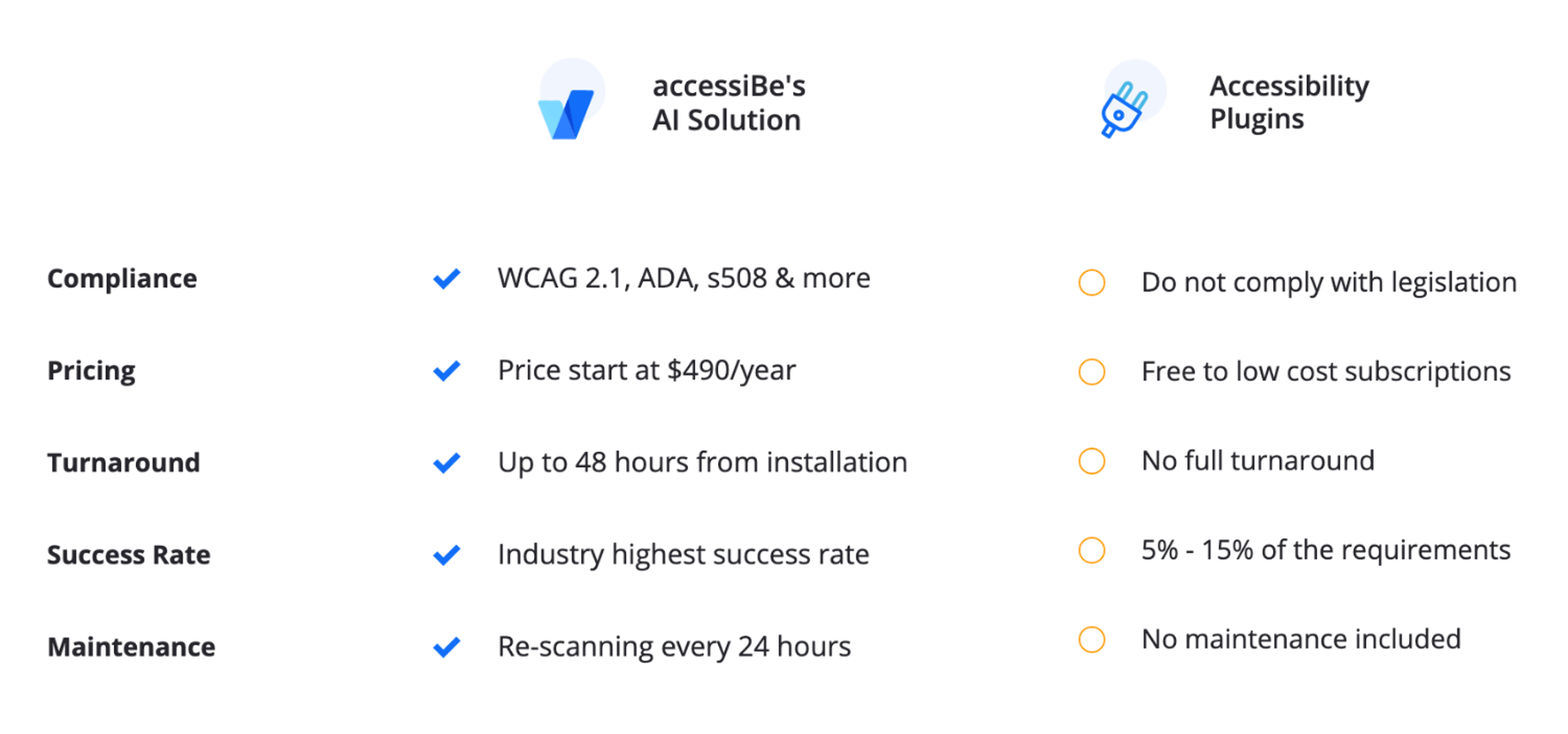
Accessibility plugins, whether free or paid, only answer the front-end requirements. Meaning, after installing an accessibility plugin, you are just 30% compliant. Since accessibility compliance is not a scale (you don’t ‘get points’ for making it halfway through) you’ll need to turn to an additional provider to do the back end work.

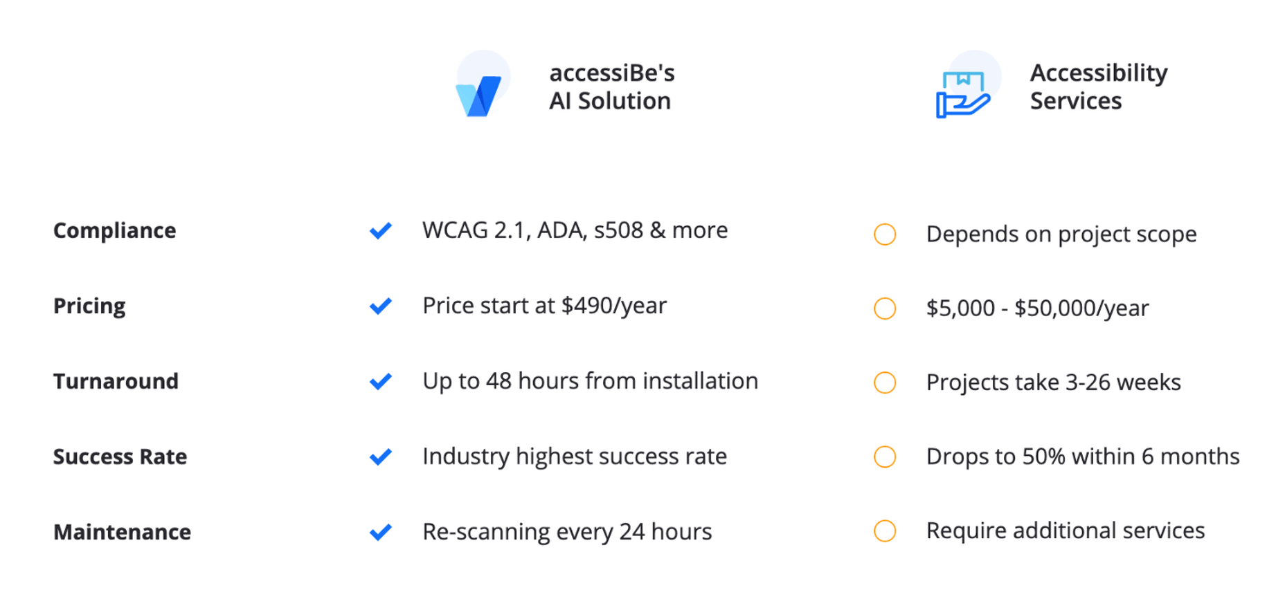
accessiBe, on the other hand, provides a full accessibility compliance solution, covering both UI and design requirements through the accessibility interface AND screen-reader and keyboard navigation compatibility requirements through it’s automated AI technology that analyzes and makes adjustments in the code-level of the website.

Benefits of Using accessiBe Over Accessibility Plugins

  • Achieving complete accessibility compliance
  • Dealing with a single provider, rather than two or more
  • Cost-efficiency (manual audit and remediation service are expensive)
  • Complete compatibility with screen-readers and keyboard navigation
  • Enabling true accessibility to individuals with disabilities
Comparison of accessiBe with Manual Accessibility Services

Manual accessibility services can help you achieve full accessibility compliance, but it comes with two major disclaimers:

  1. You’ll still need an additional solution for an accessibility interface, which the service companies don’t provide
  2. The compliance achieved is for the point in time the audit and remediation were performed. Let’s explain this point further.

Companies that offer a manual accessibility service assign a team of accessibility experts to do an audit of your website. The result of this audit is a lengthy document detailing all the accessibility faults that your website has. It is a valuable document as it gives you a precise depiction of what needs to be fixed in order to achieve compliance.

From here there are two possible paths:

You can either take the audit results to your development team and have them remediate your website accordingly.

Or, some of the service companies offer a remediation service, meaning, they’ll assign their own engineers to manually make the necessary changes in your website. Needless to say this extra service isn’t given for free.

In both cases, you are looking at a process that takes weeks if not months (depending on the number of pages your website has.)

Additionally, since it is a manual process done by experts, it comes with a hefty price tag.

But most importantly, the audit and remediation hold for the time they were done. Unless you have a 100% static website, meaning, you do not make any changes to your website – never add or remove products, never update content – the ‘effect’ of the audit and remediation fades away with time.

Since the process was manual, any changes you make to your website must be handled manually accessibility-wise. You added a new banner with a link to items on sale, you’ll need to go into the code and add ARIA tags. You added a new image, you’ll need to go into the code and add alt text compatible with screen-readers. And so on.

Some of the manual accessibility service companies offer maintenance services as well. They will periodically audit your website (manually) and provide a remediation document that will need to be implemented (manually) either by your development team or by theirs for an additional cost.

These costs add up. Having your website audited and remediated for compliance on an ongoing basis takes time, effort, and money. But you don’t have a choice. Being ADA and WCAG compliant is an ongoing task, since websites are dynamic and being updated regularly.

accessiBe, on the other hand, offers a 100% automated and ongoing compliance solution. The initial audit and remediation process is carried out – with no human intervention – in 48 hours (compared to weeks or months by a manual provider). Then, your website is scanned every 24 hours to identify and fix accessibility issues using accessiBe AI technology. Meaning, compliance maintenance is constantly carried out ‘in the background’ keeping you ADA & WCAG compliant at all times.

Which brings us to another crucial point regarding manual accessibility services. They make it extremely hard for you to scale up. Every business has a constant aim to grow, but with a manual accessibility service, scalability becomes a pain point. The more you grow the more time, effort and money you need to put in to remain compliant. You want to add another section to your website, you want to launch an additional website? Using a manual accessibility service will hold you back. You’ll need to account for additional time before going live to manually enable accessibility and additional funds. For fast-moving companies, time becomes a serious burden.

Since accessiBe offers an automated and ongoing accessibility solution, scalability is not an issue.

Benefits of Using accessiBe Over Manual Accessibility Services

  • Time-efficient
  • Cost-effective
  • 100% automated
  • Ongoing compliance
  • Infinite scale
  • Single provider for full compliance (front end and back end)
How to Check Your Web Accessibility Compliance Level

Before you get started on your path to being ADA & WCAG compliant it’s important to understand the current state of accessibility your website provides.

Obviously, if you’ve never taken any steps to make your website accessible to individuals with disabilities, there’s no need for this – your website isn’t accessible in any way.

This is actually highly important if you have taken steps to make your website accessible, like for example, installing one of the accessibility plugins. You might be under the impression that by doing so your website is both compliant and accessible to individuals with disabilities.

There’s a simple and quick way to face the accessibility reality.

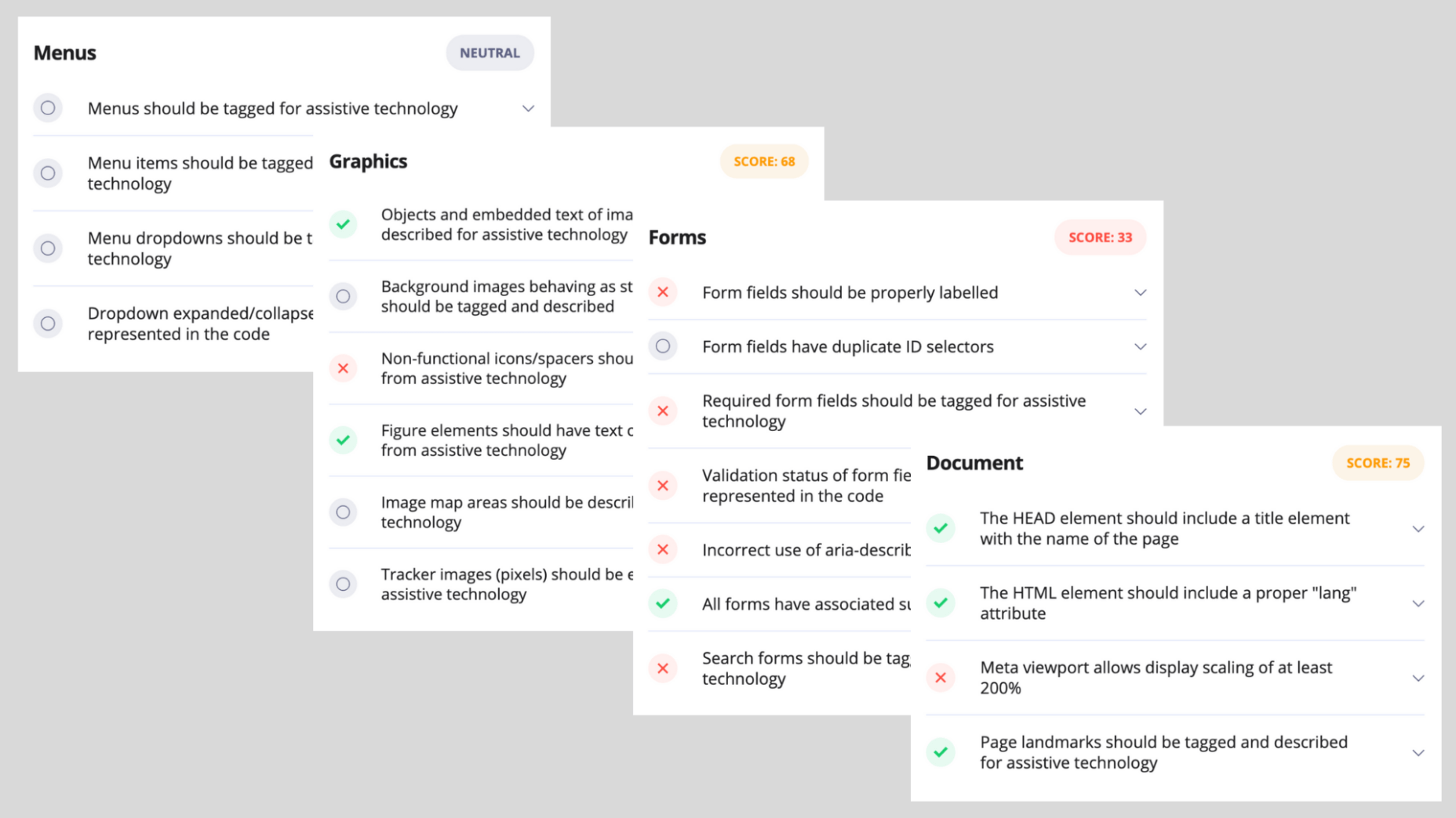
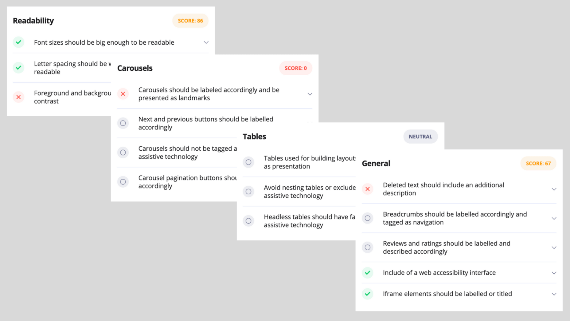
accessiBe offers a free, automated compliance audit tool available online named aCe. It uses accessiBe AI technology to scan your site, detect accessibility issues and provide quite a detailed report on the various elements that impact your website’s accessibility, and those include:

  • General score
  • Clickables
  • Titles
  • Orientation
  • Menus
  • Graphics
  • Forms
  • Documents
  • Readability
  • Carousels
  • Tables

Each of these elements is given a score and some explanations to the specific issues that need attention within the context of these elements.

In addition to gaining a compliance audit with the remediation steps needed to be taken in order to fix these issues, aCe gives you a very clear idea of where you stand and what needs your attention in order to achieve compliance.

We gave it a try. We ran a website that has installed one of the accessibility plugins (which was recognized, by name, by the aCe audit tool) and the results cement the point that these plugins aren’t comprehensive enough of a solution for true ADA & WCAG compliance.

Here are the results:
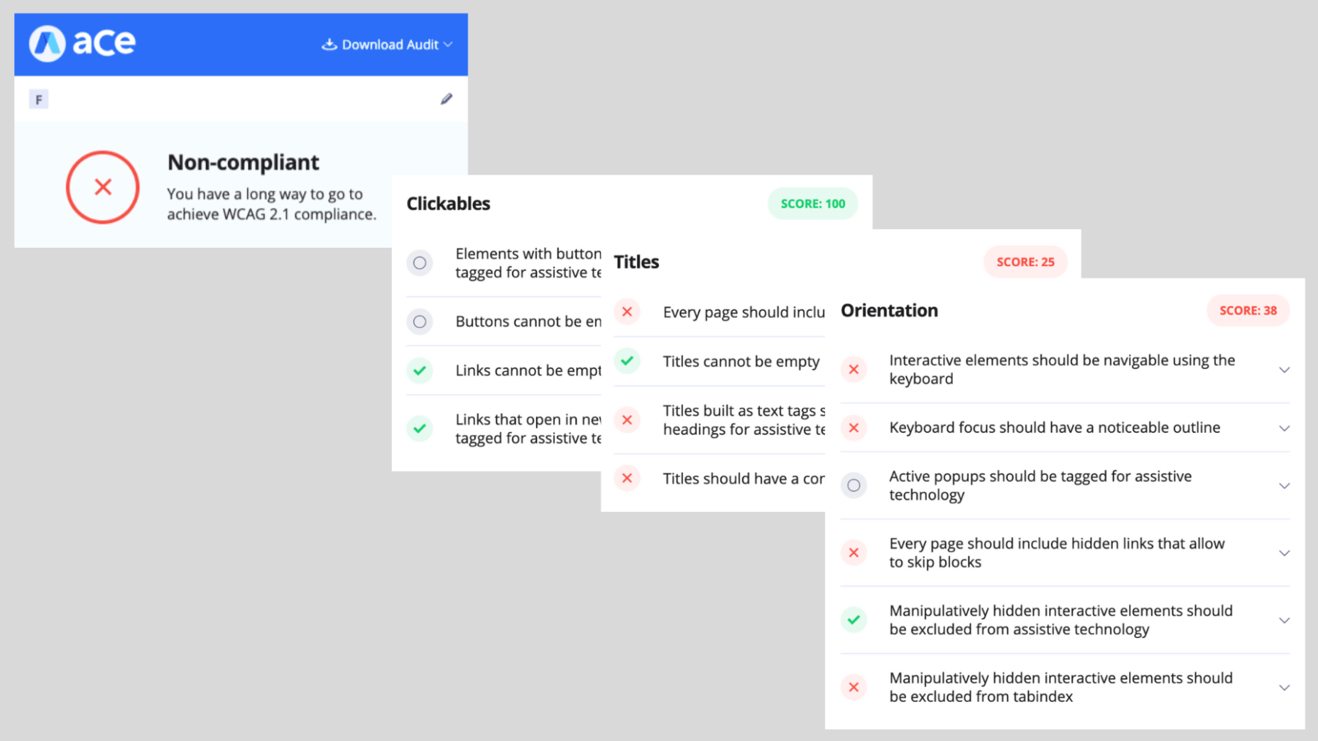
As can be expected, the UI and design side got relatively high scores, due to the accessibility plugin installed on the website, but anything that has to do with back end compatibility with screen readers and keyboard navigation got a failing score.

Conclusion

accessiBe is an automated and comprehensive web accessibility solution that achieves ongoing compliance with ADA and WCAG regulations for your website.

It offers a unique combination of front end and back end compatibility, meaning, it provides an end-to-end solution for both user-facing accessibility interface, and compatibility with screen readers and keyboard navigation.

The solution offered by accessiBe is a no-touch, no-code, continuous compliance utilizing proprietary AI technology that audits and remediates your website.

It is by far one of the most affordable web accessibility solutions, starting at $490 for websites with up to 1,000 unique pages.

When compared to accessibility plugins, accessiBe’s offering is robust and comprehensive, delivering full compliance that plugins aren’t able to.

When compared to accessibility manual services, accessiBe offers a speedy and automated audit and remediation process compared to the lengthy, manual and highly expensive offering of the service companies. Additionally, accessiBe, unlike accessibility manual services, delivers ongoing compliance and the ability to scale with ease and speed.

The combination of AI-based audit and remediation, the most comprehensive accessibility interface on the market, ongoing compliance, scalability, and a highly affordable plan makes accessiBe stand out from the competition by offering a unique end-to-end solution for achieving ADA and WCAG compliance in a fast and simple way.

Featured image via Unsplash.

Source de l’article sur Webdesignerdepot
It’s fun to see new website design tools that reflect current times and the state of the world. That’s very true this month with new databases devoted to diversity and women in technology, as well and resources to make your design life easier.
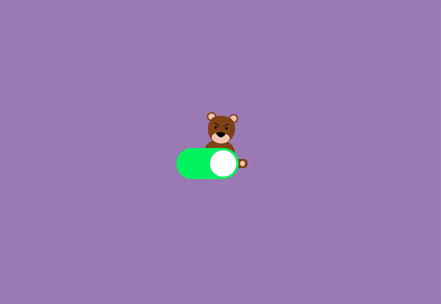
Here’s what’s new for designers and developers this month:

Ztext.js

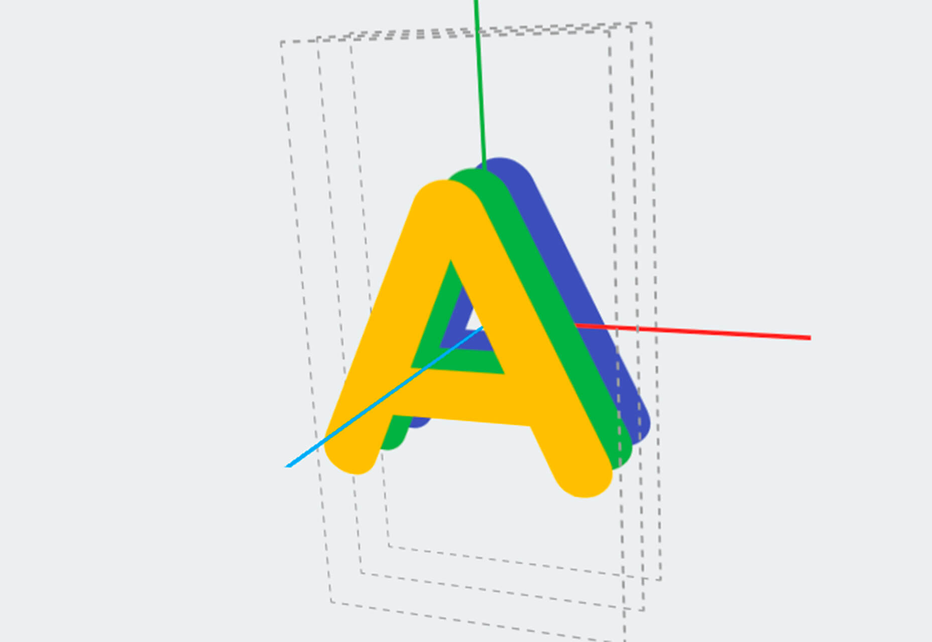
Ztext.js is an easy to implement, three-dimensional typography tool for the web that works with any font you want to use. With the popularity of 3D effects and animation, this tool has a lot of practical applications. Everything you need, including documentation, is available from developer Bennett Feely on his website and GitHub. (It’s free but you can show appreciation with a donation if you like it.)

Gradient Magic

Gradient Magic is a free gallery of fun and interesting CSS gradients. You can sort through a random selection or by category of color to find just the right gradient for your project. Some of them would make really neat backgrounds or image overlays.

Impossible Checkbox

Impossible Checkbox is a fun little divot that you’ll want to play with and emulate. Click or tap the slider to activate and a nifty little friend pops up. Now here’s the fun part: You can’t leave it checked, and take note of the changing expression of the checkbox character.

Diversify Tech

Diversify Tech isn’t your average job board; it is a collection of resources – and opportunities – for underrepresented people in technology. It includes a weekly roundup and everything from scholarships, to events, to jobs, to speaking opportunities.

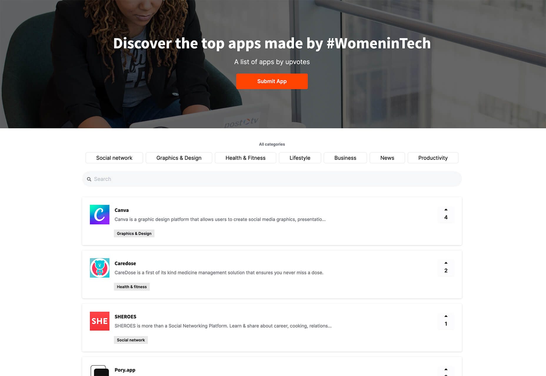
Women in Tech

Women in Tech is a list of apps made by women. The apps are ranked and chosen based on upvotes and is a good resource if you want to help support women-owned projects. Search or submit an app for inclusion.

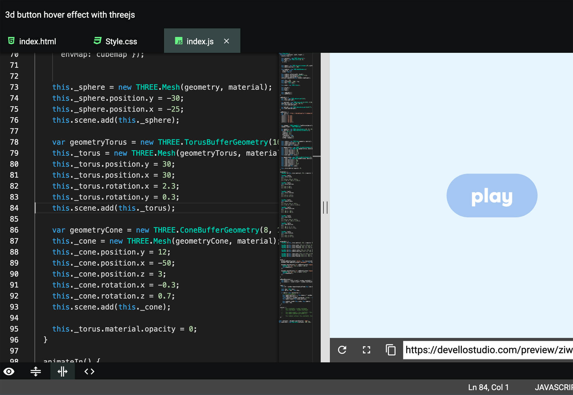
Devello Studio

Devello Studio is a tool that allows you to write code in the cloud. You don’t have to install anything and no matter where you are, just can open a project in-browser, and continue development where you had left off last time. Plus, it works with GitHub support built right in.

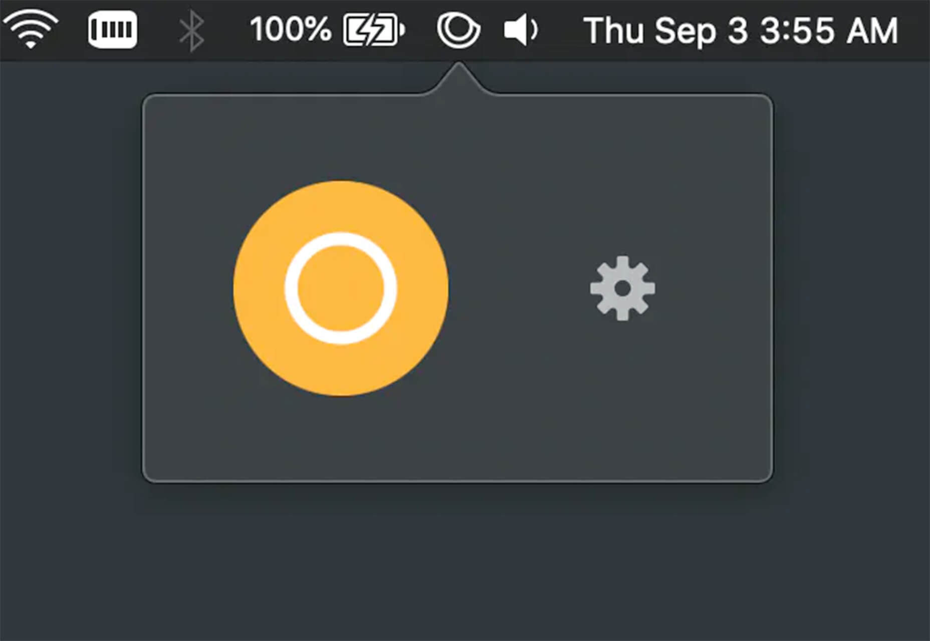
Hustl

Hustl is a premium Mac app that allows you to create time-lapse videos of your screen. Use it to show off work or projects or create a cool video for your portfolio. Plus you can use it to capture just one active app so you don’t have to do a lot of editing later.

FeedBaxley

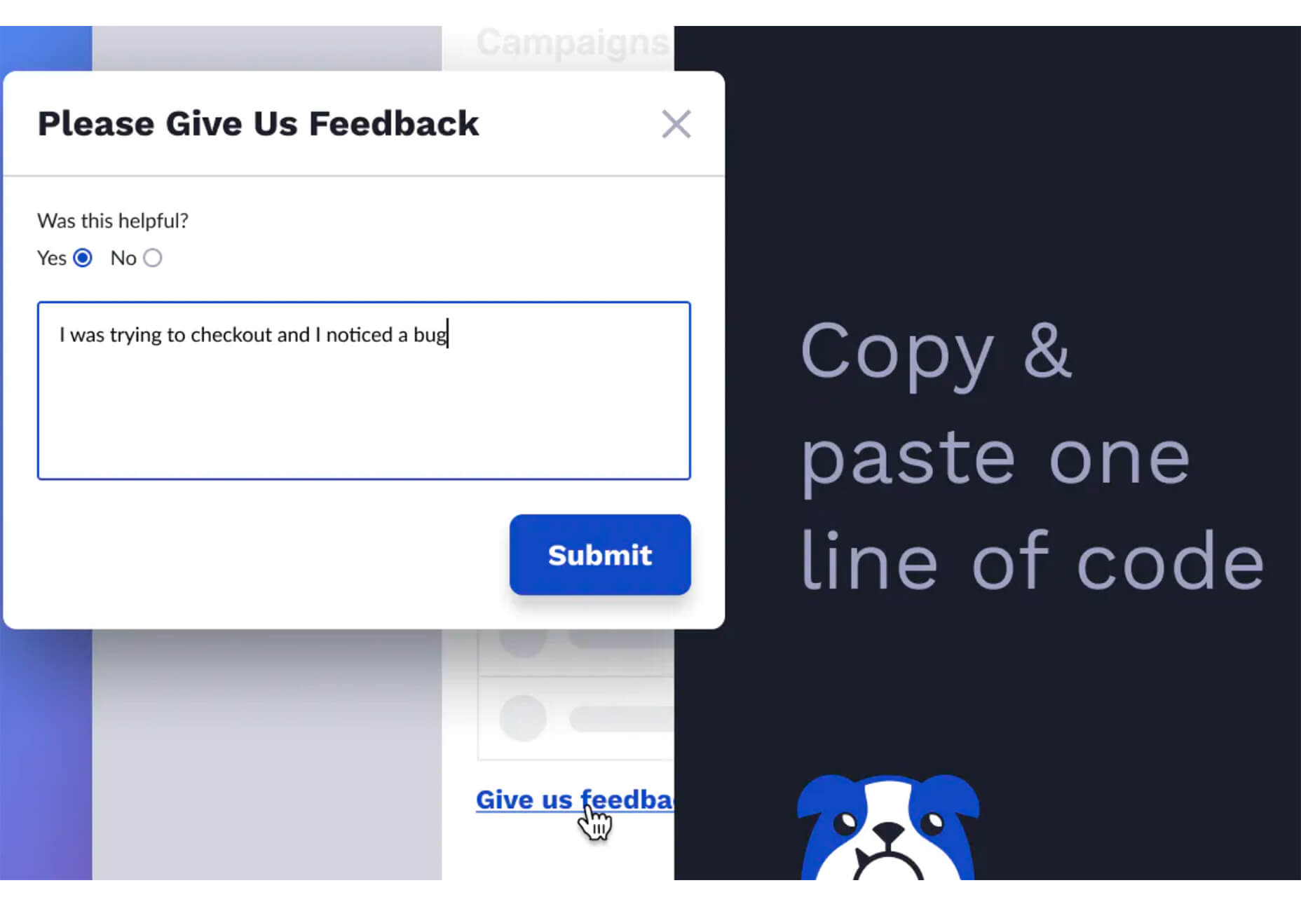
FeedBaxley is a user feedback tool that helps you (and users) figure out what’s frustrating before it becomes a real issue. You can customize everything to match your brand and set it up with copy and paste tools. Feedback integrates with Slack, making it easy for you to analyze information with a team.

BestTime

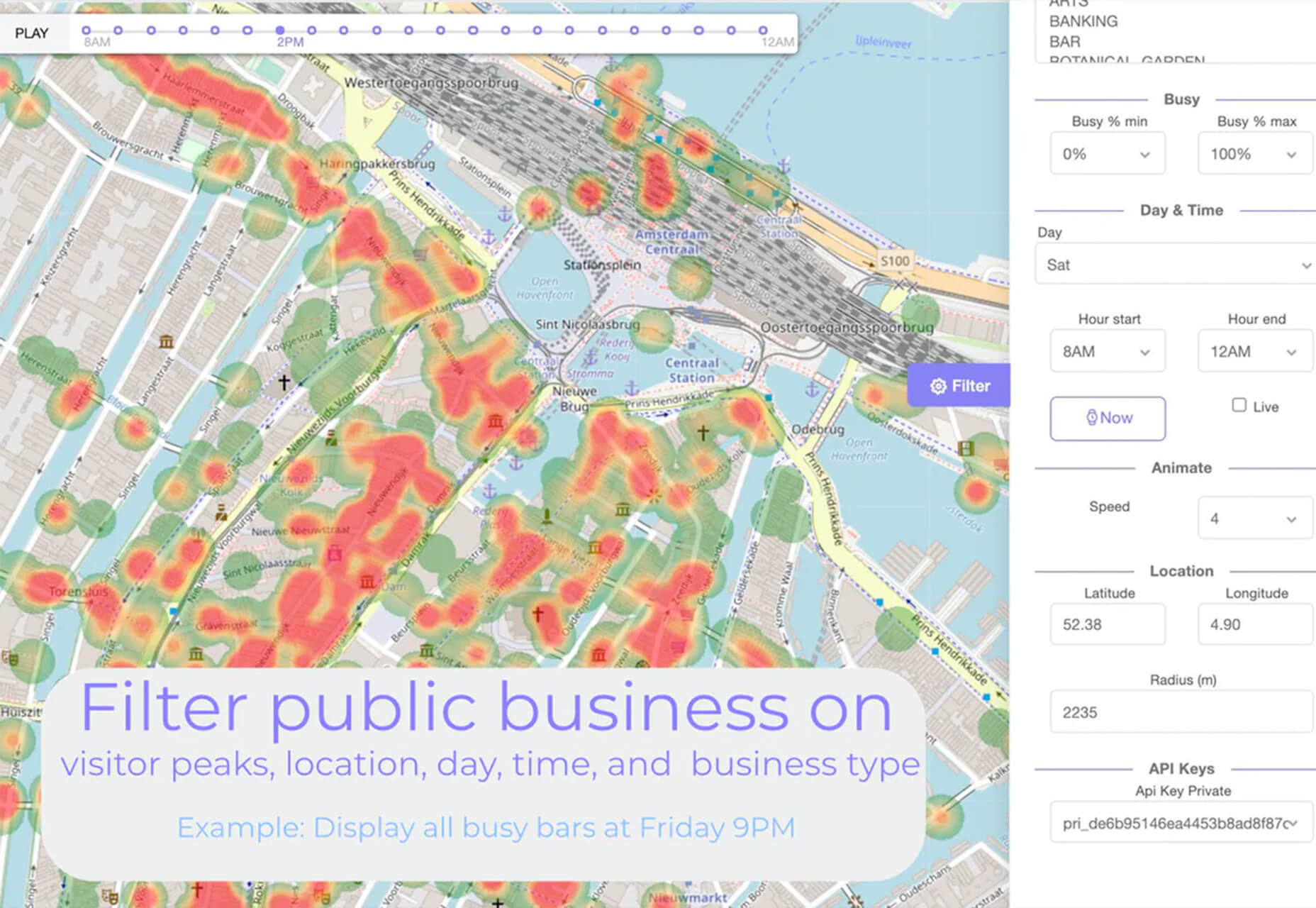
BestTime launched a major update with a new tool that makes it possible to analyze visitor peaks of public business (cafe, gym, etc) for whole areas. Using the heatmap API you can find businesses at popular times, locations, or by business type.

Pixeltrue

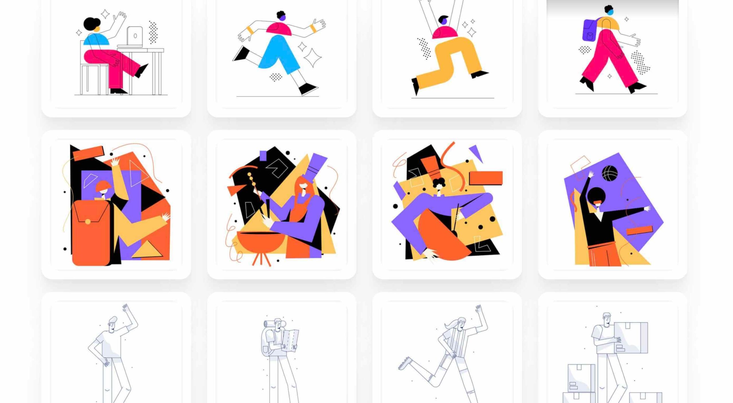
Pixeltrue is a new collection of free SVG illustrations and Lottie animations in a trendy style. They are available for commercial and personal use and add a bit of whimsical delight to website projects. (The error illustrations are particularly fun.)

Previewed

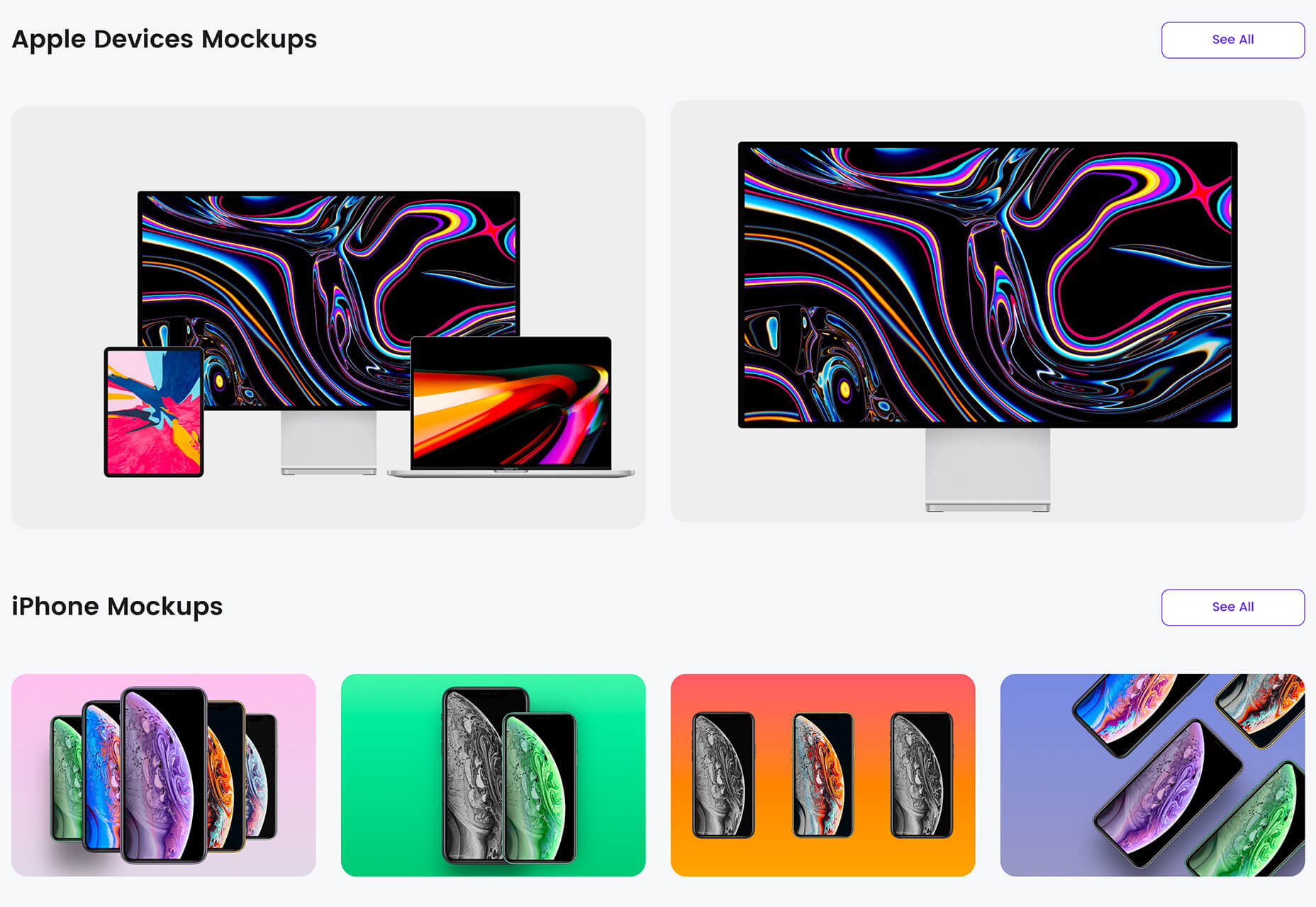
Previewed has tons of cool and realistic mockups that you can use to create the perfect setting for digital projects. You can find mockups for a variety of devices and cool panoramas that work perfectly for elements such as app store previews.

Alt Text Overlay Bookmarklet

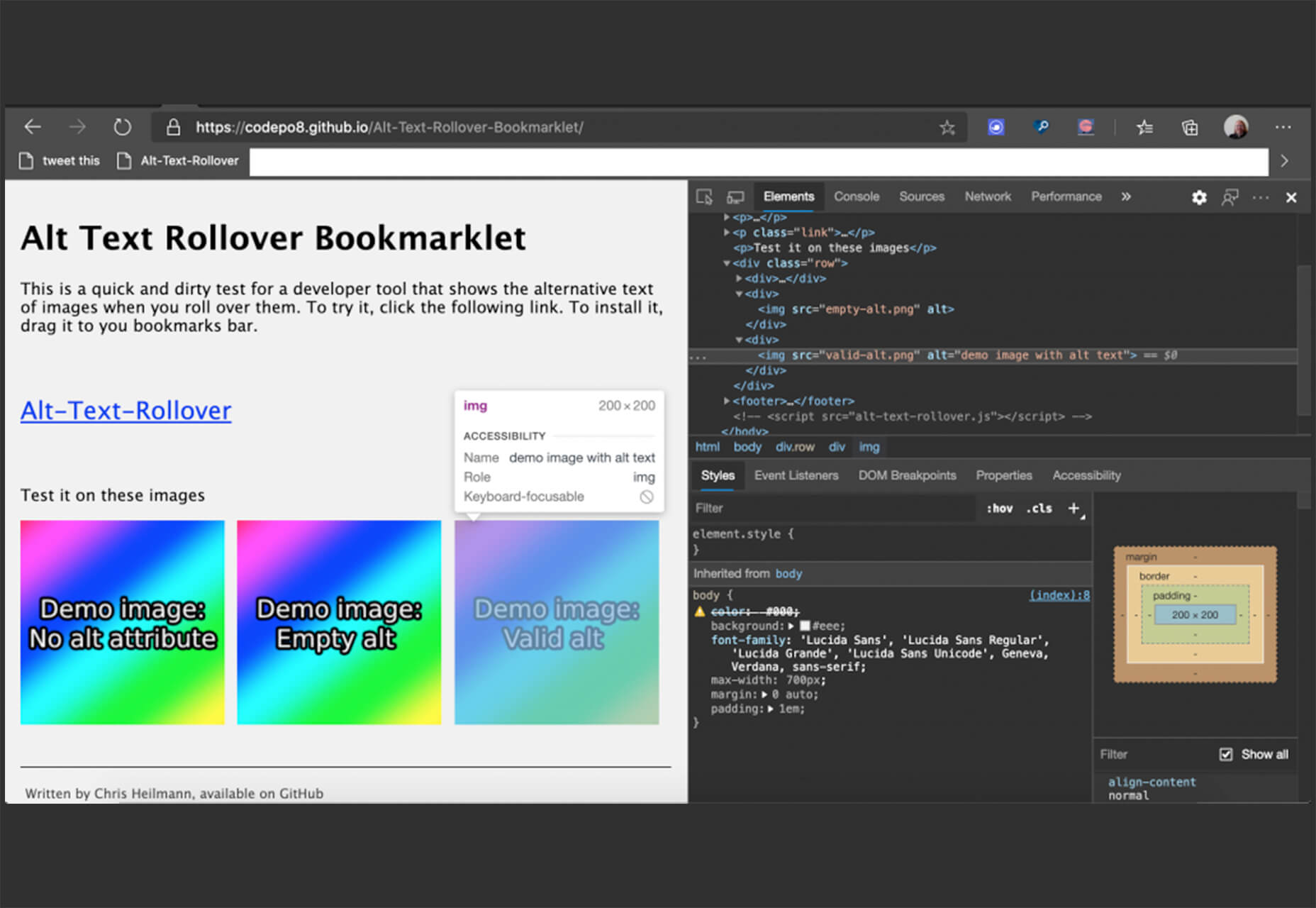
The Alt Text Overlay Bookmarklet solves a common problem: It shows what images use alt text and what that text is. The tool was created by Christian Heilmann and he’s put it on GitHub for you to play with and test.

MergeURL

MergeURL allows you to merge and shorten up to five links. Enter the links and mergeurl.com/o/xxxxx, for example, will open all the URLs associated with that link. The tool is free to use and you don’t have to register to use the service.

Infinity Search

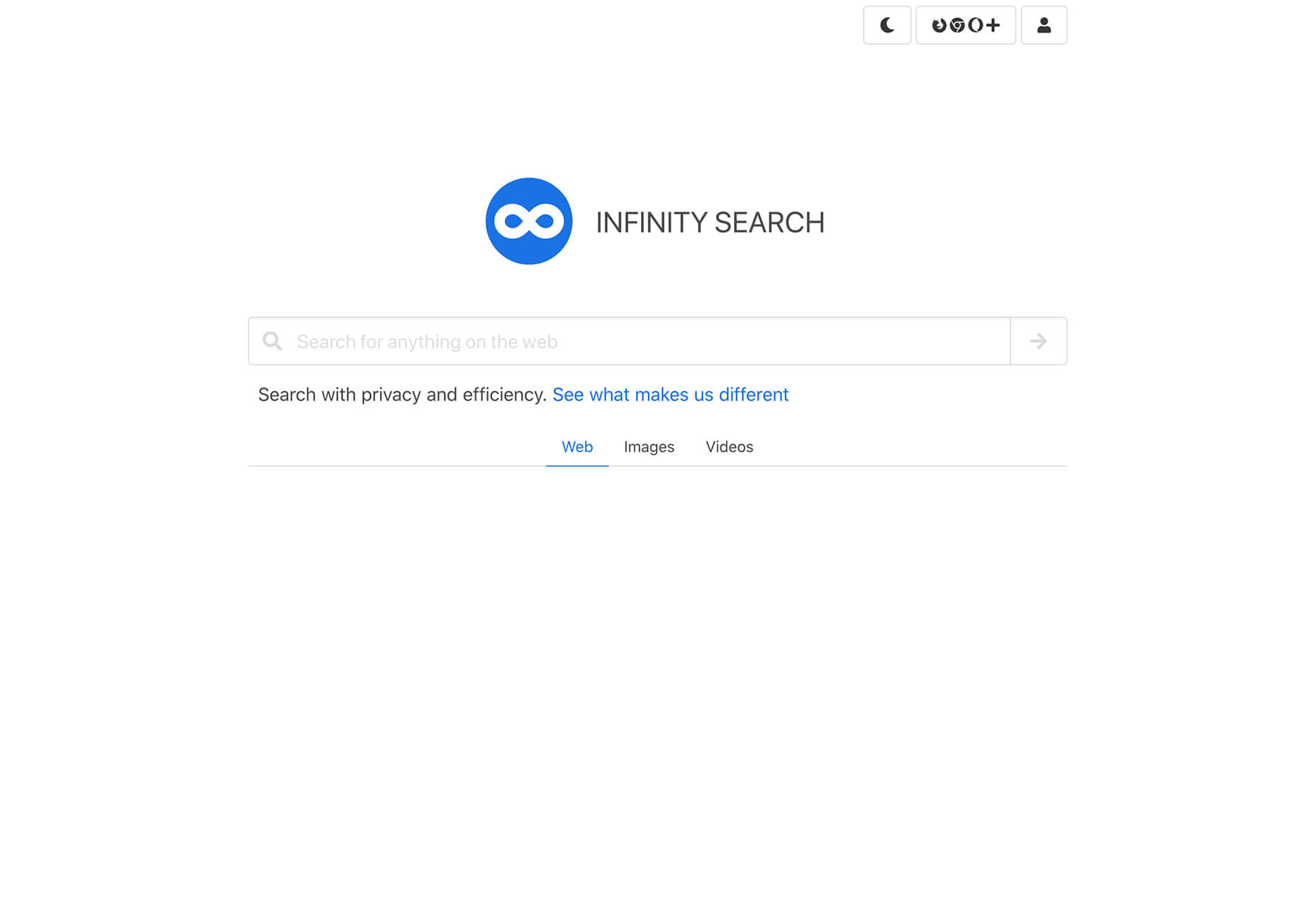
Infinity Search is a new search engine that lets you look for things privately and efficiently. Search the web, images, or videos. Here’s a little about how it works: “While we retrieve results from other search engines like Bing and Wikipedia, we also have our own indexes of links that are displayed in our search results. We are actively working on improving these indexes and they will only get better.”

Blade UI Kit

Blade UI Kit is a set of renderless components to use in Laravel Blade Views. It’s built for the tall stack and is completely open source. It includes 26 components and you can contribute as well.

Trusted News

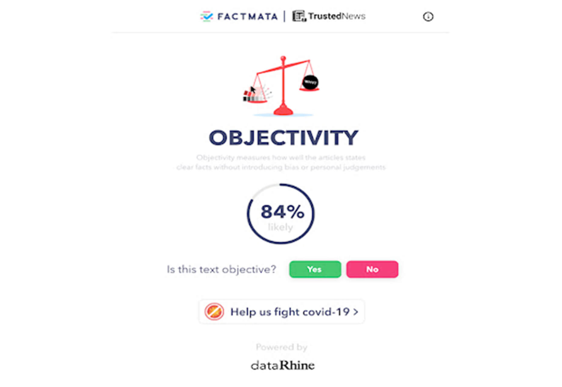
Trusted News is a Google Chrome extension that uses AI to assist in evaluating the quality of the online content. In its first release, it scores the objectivity for a selected article, testing whether it is written from a neutral perspective as opposed to a subjective one.

BaseDash

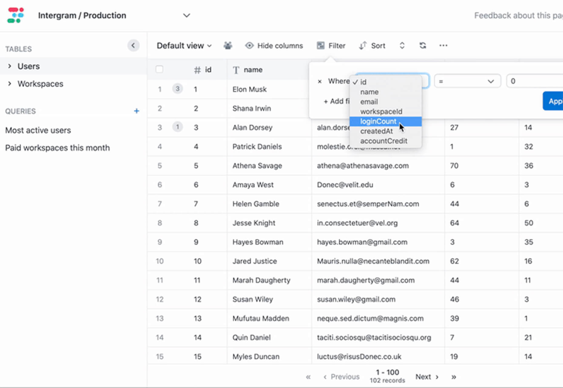
BaseDash allows you to edit production data without coding. You can make changes to the database with the ease of a spreadsheet. This tool makes it easy to find and edit information in a hurry. It works with all major databases including MySQL, PostgreSQL, Amazon Redshirt, Microsoft SQL Server, and more.

Email2Go

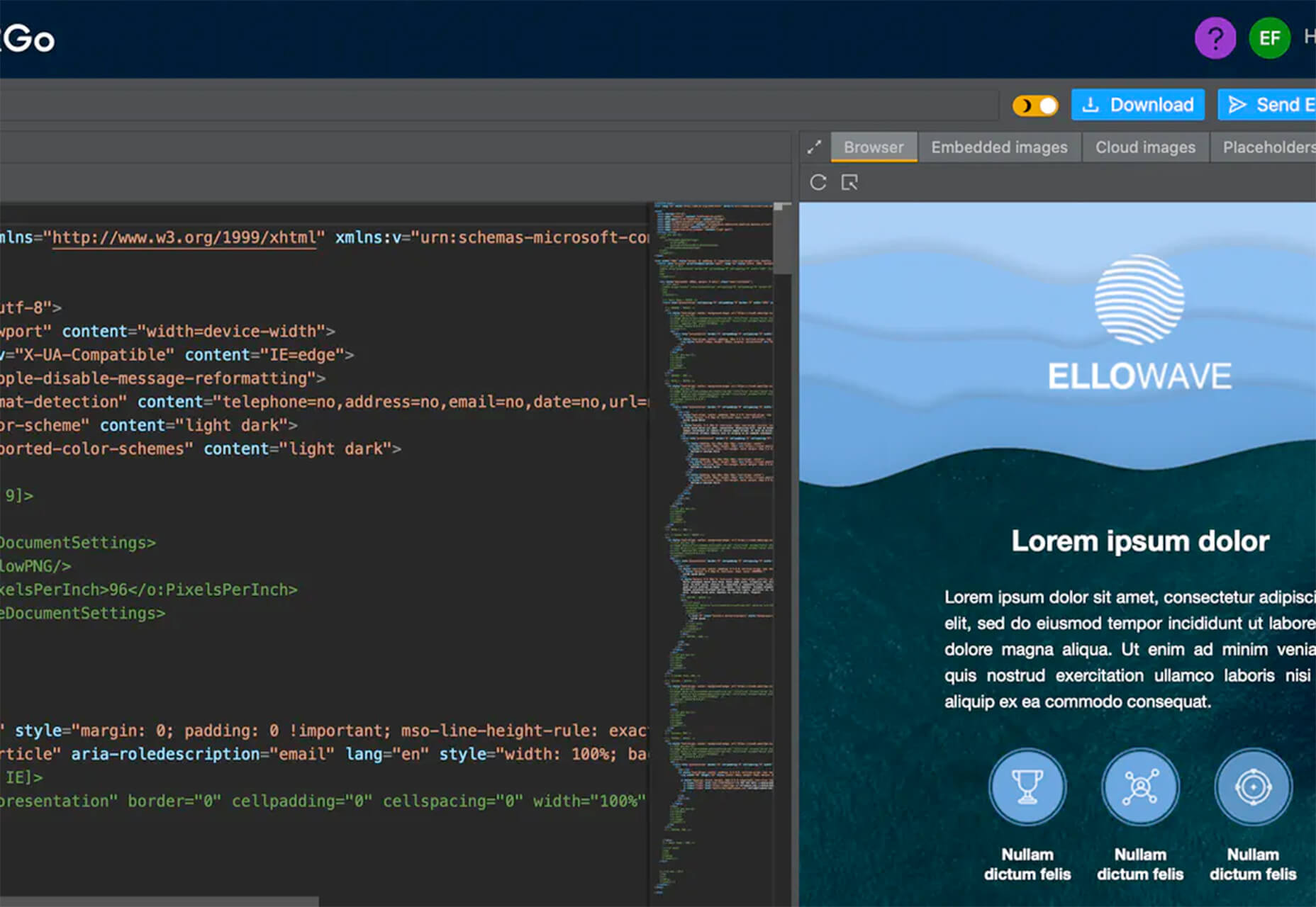
Email2Go is a service that helps you create email templates and test them on dozens of physical devices and applications. It’s free right now while it is in early release.

Iconscout Converter

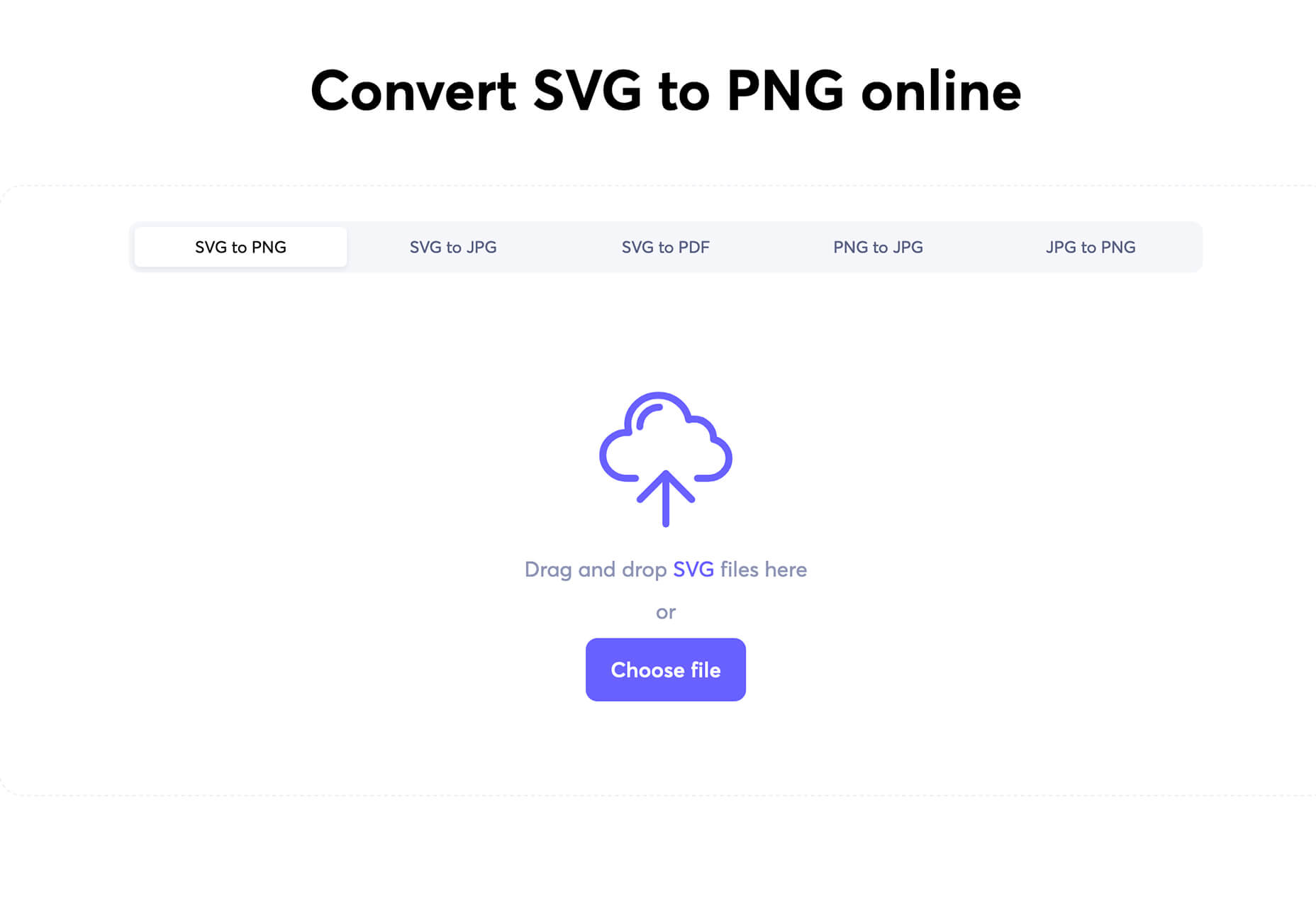
The Iconscout Converter allows you to convert icons and images from one file format to another for free. Convert SVG, PNG, JPG, and PDF with a single click.

Shape 2

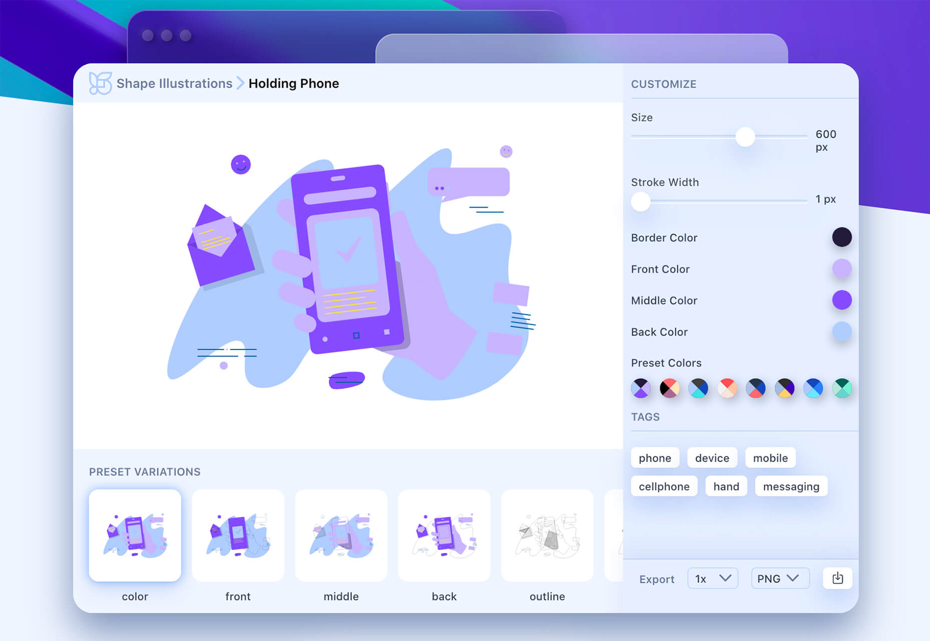
Shape 2 is a massive collection of 5,000+ unique icons and illustrations with a full-blown web editor. Customize colors, stroke width, size and full variations that can export to SVG, PDF, PNG, GIF, and React. This is a premium tool and includes a discounted release price for now.

Aestetico

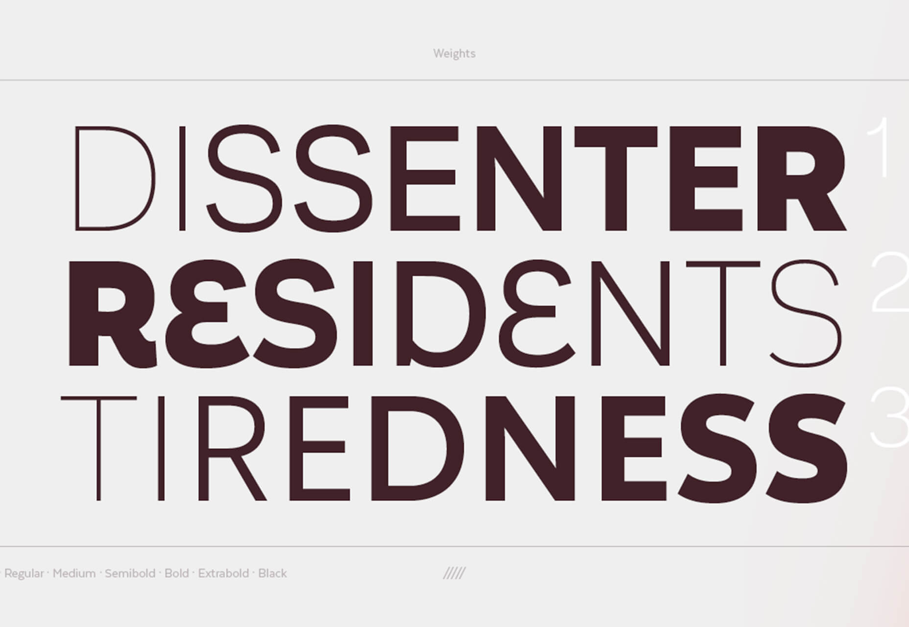
Aestetico is a beautiful sans serif that includes a massive family with 54 styles. This premium typeface is highly readable and has modern lines and curves that make it a great option for a variety of uses.

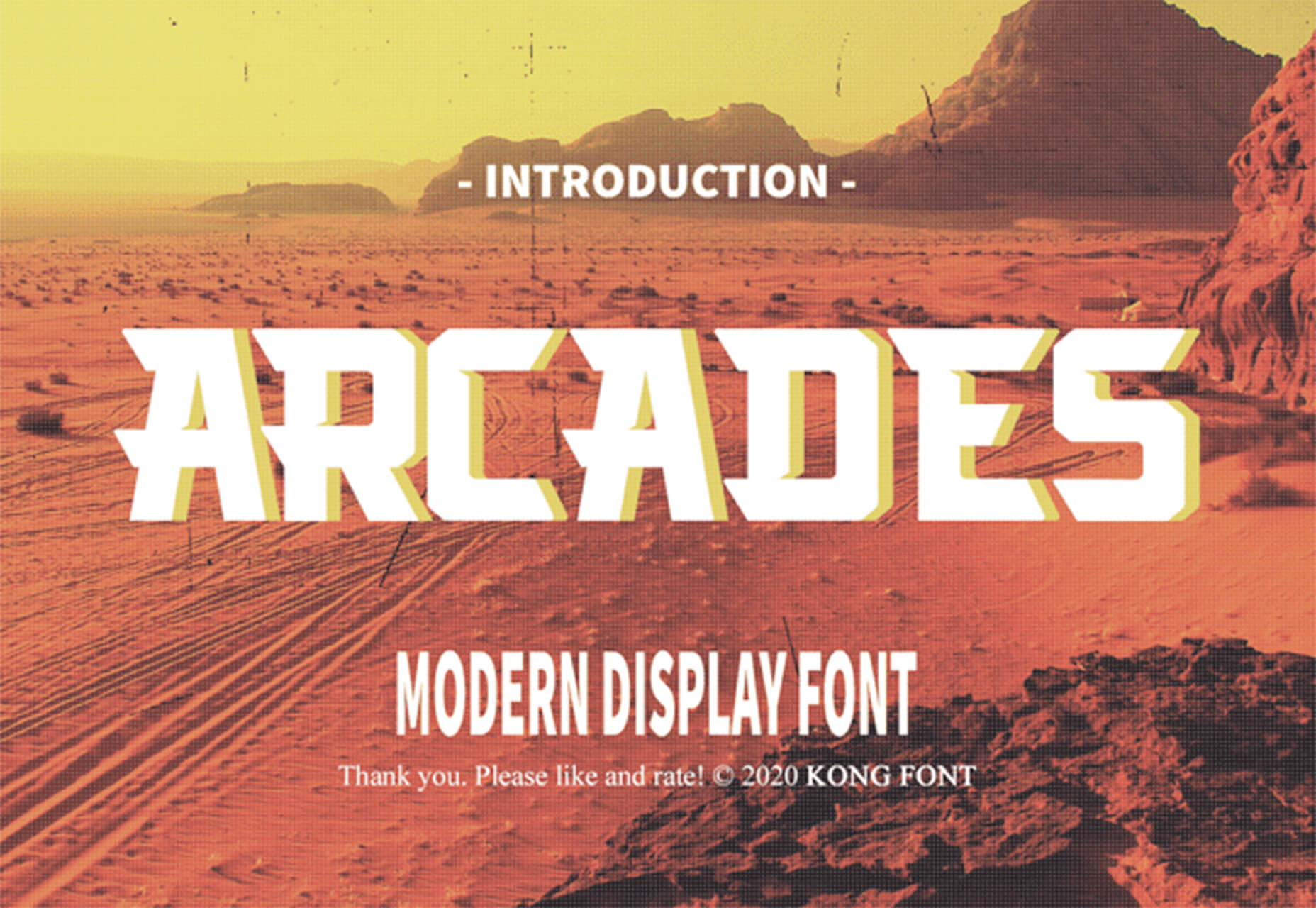
Arcades

Arcades is a modern display font with a retro, 1980s-style vibe. It includes regular and italic styles.

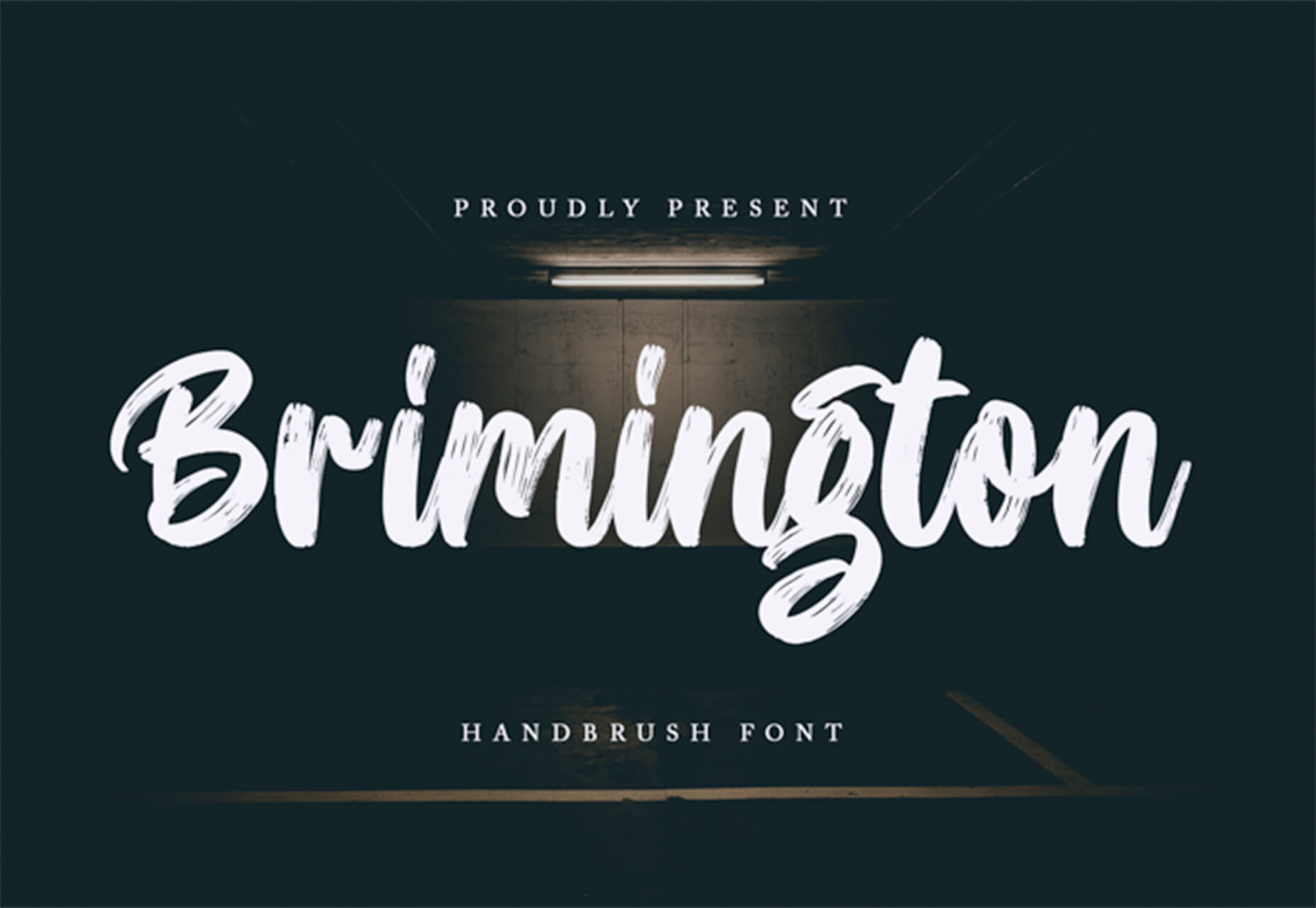
Brimington

Brimington is a handwriting style typeface with rough strokes and smooth curves. It includes a set of 227 characters and 219 glyphs in a readable design.

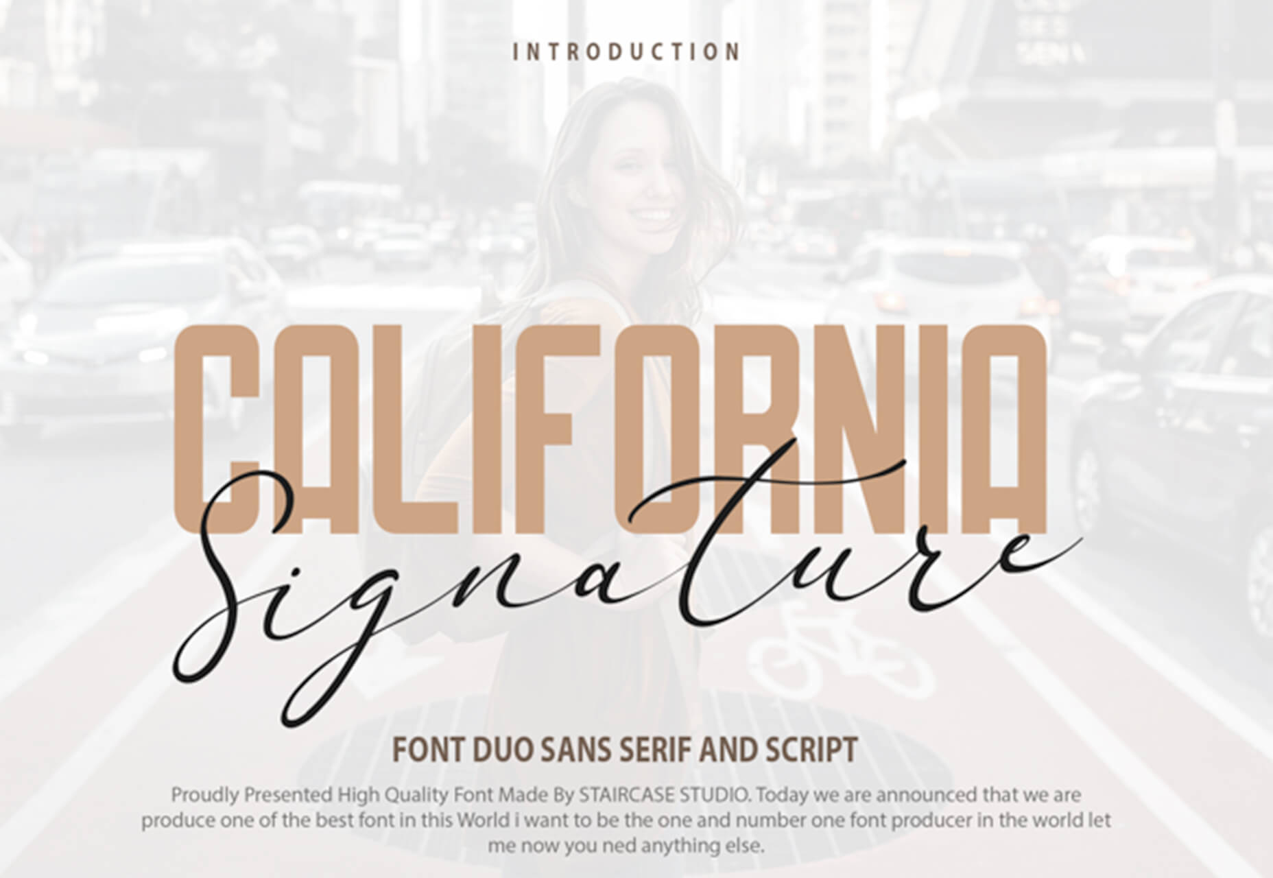
California Signature

California Signature is a typeface duo with a slab serif and handwriting style that are perfectly paired. The thick and thin options provide a yin and yang effect.

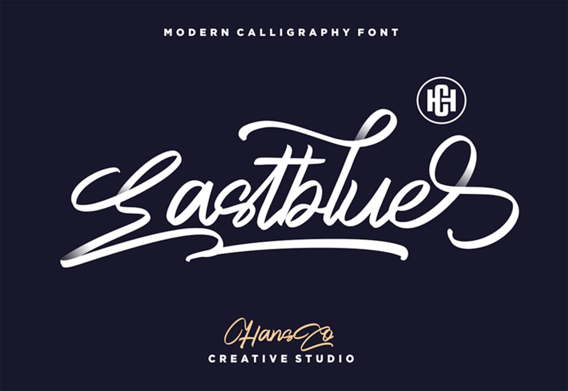
Eastblue

Eastblue is a script typeface with long swashes and interesting curves. It includes a solid character set and is free for personal use only.

Source


Source de l’article sur Webdesignerdepot