 There’s no shortcut to success when it comes to Google search results. That is unless you count pay-per-click advertising.
While pay-to-play will shoot your site to the top of the SERP immediately, it’s not a sustainable strategy for maintaining your position there. So, you’re going to have to get serious about SEO.
This guide will show you what to do to improve your SEO ranking and start seeing results this year:
- Use Google Analytics to track metrics
- Get an SSL certificate
- Improve mobile page speed
- Design a mobile-first UI
- Make your site accessible
- Optimize your images
- Create great content
- Structure your content for scannability and readability
- Create click-worthy title tags and meta descriptions
- Choose one focus keyword per page
- Improve your internal link strategy
- Use only trustworthy external links
- Get your site listed as a featured snippet
- Get high-quality backlinks
- Create a Google My Business page
- Refresh Your Content
- Regularly monitor Google Search Console
How to Increase Your Website’s SEO Ranking
If you can improve your SEO ranking — and get your pages closer to, if not on the highly coveted top SERP — you will:
- Boost your site’s overall visibility as its authority in search grows;
- Bring high-quality traffic to your pages;
- Drive-up your conversion rate.
That said, search engine optimization is most effective when it’s an ongoing strategy as opposed to something you set up and forget about. So, some of the suggestions below will only need to be implemented once, while others you’ll have to return to every six months or so to make sure your site is on track.
Let’s get started.
1. Use Google Analytics to Track Metrics
If you haven’t yet begun tracking your website’s activity with Google Analytics, it’s the very first thing you need to do.
While Google Analytics alone can’t tell you how well or poorly your website ranks, there’s valuable data in there about what happens to the traffic that arrives from Google. Or any search engine your visitors use.
You can find this information under Acquisition > Source/Medium:

What you want to see here is that (1) you’re getting lots of visitors from organic search results (as opposed to paid) and (2) that they’re highly engaged. So, that means:
- Longer times on site;
- Multiple pages visited;
- Lower bounce rates.
And if you configure Google Analytics to track different conversions on your site, you can see how well those organic visits convert.
Obviously, there’s a lot more you can track here. But you must understand if your SEO efforts are working in the first place, and that’s where you’ll get your confirmation.
2. Get an SSL Certificate
HTTPS has long been one of Google’s SEO ranking factors. Yet, of the two billion-plus websites that are online today, BuiltWith data shows that only 155 million have an SSL certificate installed:
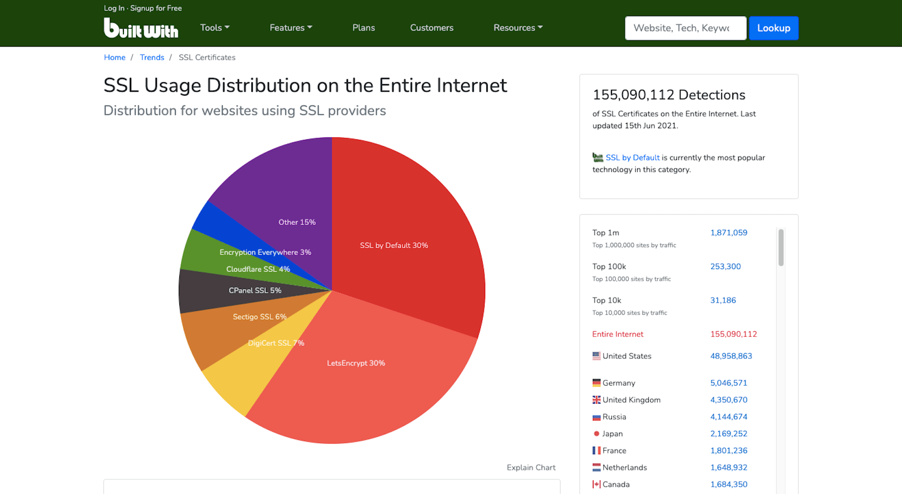
Security and privacy are major concerns for consumers. So if you want to increase their confidence in your website, installing an SSL certificate is an easy thing to do. And it’ll put you in Google’s good graces, too.
If you don’t have one already, get one for free from Zero SSL.
3. Improve Mobile Page Speeds
Mobile loading speeds became a Google ranking signal in July 2018.
It was something we saw coming ever since smartphones overtook the desktop as the primary device people used to access the Internet. Once it became a ranking factor, though, mobile page speed was something we could no longer treat as a “nice to have.” It became a must.
And with Google’s most recent Core Web Vitals algorithm update, there’s no ignoring how big of a role your site’s mobile loading speeds (i.e., performance) play in ranking it.

To ensure that your site meets Google’s expectations for speed, bookmark the Core Web Vitals tool. It’ll tell you how your site performs across all four of the major ranking categories.
You’ll find your speed-related issues at the bottom of the page, along with resources to help you resolve them.
Most of those tips will have to do with optimizing your code. However, there are other things you can do to make your site load quickly:
- Use well-coded themes and plugins;
- Remove unused themes, plugins, media, pages, comments, backups, and so on from your database and server;
- Install a caching plugin that’ll minify, compress, and otherwise make your site lightweight and fast.
It’s also not a bad idea to review your web hosting plan. You might not have the right amount of server power or resources to keep up with your existing activity.
4. Design a Mobile-First UI
On a related note, a mobile-first design can also improve your site’s loading speeds. Rebekah Carter wrote a really helpful guide on how to do this last year.
In addition to speeding things up — since you won’t be trying to jam a bunch of desktop-first design and content into a smartphone screen — it’s going to help your site rank better.
Just be careful when you do this. A mobile-first design doesn’t mean creating a scaled-back version of the larger site for smartphone users.
In fact, Google explicitly tells us not to do that and why:
“If it’s your intention that the mobile page should have less content than the desktop page, you can expect some traffic loss when your site is enabled mobile-first indexing, since Google can’t get as much information from your page as before.”
And if your response is that the content on desktop-only doesn’t matter, then it really shouldn’t be there. Don’t waste your visitors’ time with useless or repetitive content, as it’ll only give them more reason to abandon your site.
5. Make Your Site Accessible
Accessibility has come to the forefront of the SEO discussion thanks to Core Web Vitals.
Now, running your site through the tool will tell you if there are any inaccessibility issues that Google will ping you for. But that doesn’t make your site completely accessible.
Considering the rise in website accessibility-related lawsuits, you’ll want to take this seriously.

Because a bad experience due to inaccessibility won’t just cost you visitors and a lower search ranking, it’ll cost you a lot of money, too.
Here are some things you can do to ensure that your site and all its content is accessible.
6. Optimize Your Images
Technically, image optimization falls under the page speed tip. However, that’s not the only way you should be optimizing your images, which is why I wanted to address this separately.
According to HTTP Archive, the average weight of a mobile web page these days is 1917.5 KB. Images take up a sizable chunk of that weight:

Because of this, bloated image sizes are often to blame for slow pages.
You can do several things to optimize your images for speed, like using lightweight formats, resizing them, and compressing them. You’ll find 6 other image optimization tips here.
While those tips will help you speed up your site and, consequently, improve your SEO ranking, there’s something else you need to do:
Add alt text to your most important images.
One reason to do this is to improve accessibility. Another is so your web page can rank in both the regular Google search results and image results as this search for “WordPress by the numbers” does:

If you can write alt text that perfectly describes your graphic and matches the image searchers’ intent, you can create another ranking opportunity for your page.
7. Create Great Content
There are many technical ranking factors you have to pay attention to if you want to create a good experience for your visitors and rank well as a result. However, none of that will matter if your content sucks.
So, how do you make great content? It really depends.
Think about the difference between a page describing your web design services and a product page for a blender.
Your web design services page would need to:
- Explain why hiring a web designer is a must;
- What your design services entail;
- What they can expect in terms of results;
- Include some proof in the form of testimonials or portfolio samples;
- Have information on next steps or how to get in touch.
That would be a comprehensive and useful page. If business owners searched for “hire a web designer near me” or “should I hire a web designer?”, that page would sufficiently answer their query.
A product page, however, would need to:
- Provide a brief summary of the blender;
- Show photos of the blender, different angles of it, as well as different variations of the product;
- Display the price;
- Allow customers to Add to Cart or Save for later;
- Include technical specs of the blender;
- Recommend related products;
- Display sortable customer testimonials and ratings.
The last thing a shopper would want is to be directed to a product page that reads like one of your services pages.
So, great content not only needs to be well-written and error-free, but it needs to match the searcher’s intent and expectations. If you can do that, your visitors will stay as long as they need to read through everything, which will help strengthen the page’s ranking.
8. Structure Your Content for Scannability and Readability
Including necessary details and in the right format is an important part of making a page’s content valuable to the visitor. The structure is going to help, too.
For starters, you want to make sure every page is human-readable. So, that involves:
- Shorter sentences and paragraphs;
- Linkable table of contents for longer pages;
- Header tags every few hundred words;
- Descriptive and supportive imagery throughout;
- Text callouts like blockquotes and bolded phrases.
By making a page less intimidating to read and easier to scan for a quick summary of what it is, you’ll find that more visitors are willing to read it and follow your calls to action.
You can use a tool like Hemingway to improve your page’s readability. Quickly pop the text of each page into the editor and follow the recommended suggestions:

You’re also going to have to think about how well Google’s indexing bots can read your page. They’re smart enough to pick up on cues but not smart enough to sit down and read your article on the benefits of Vitamin D or how to install a new showerhead.
So, you’ll need to use HTML meta tags as well as hierarchical header tags to tell the bots what the page is about.
If you’re building a WordPress site, you can use the Yoast SEO plugin to analyze how scannable and readable each page of your site is (among other things):

9. Create Click-Worthy Title Tags and Meta Descriptions
To get eyeballs on your really great content, the brief preview users see of it in search results needs to be able to lure them in. Get more clicks to your site from search, and Google will take notice.
But they can’t just be superficial clicks. If Google notices that your page is getting a ton of traffic that almost immediately drops off once they see the content on the page, your page will not fare well in search results.
So, your goal is to stay away from clickbait-y title tags and meta descriptions and make them click-worthy.
The first thing to focus on is the length. Google only gives you a certain amount of space to make your pitch.
There are many tools you can use for this, but I prefer Mangools’s SERP Simulator:

It allows you to play around with your URL, title tag, and meta description and to watch in real-time as it fits the allotted space. You can also compare it to the pages that currently rank for the keyword you’re going after, which can be a really useful reference point. After all, if those sites have made it to the first SERP, then they’re doing something right.
Another thing to think about when writing click-worthy titles is how engaging they are.
The tool I recommend for this is CoSchedule’s Headline Studio:

I don’t find this useful so much for basic web pages. You don’t need to get creative with something like your About or Contact pages. But for content marketing? If you want to beat out competing articles for attention in Google, this tool will be very useful.
10. Choose One Focus Keyword Per Page
It’s not as though you can add a keyword tag to your page, and Google will automatically rank your site for it. That’s not what keyword optimization is.
Instead, what you do is select one unique keyword per page and write the content around it. So, it’s really more about creating a clear focus for yourself and then comprehensively unpacking the subject matter on the page.
Keep in mind, though, that if you want to improve your chances of ranking for the keyword, it needs to be relevant to your brand, useful for your audience, and your site needs to actually be able to compete for it.
You can use the Google Keyword Planner to find keywords that fit those criteria:

Ultimately, you should choose a keyword that:
- Has a decent amount of monthly searches — over 1,000 is what I aim for;
- Have “Low” to “Medium” amount of competition, but the lower, the better;
- Matches the user intent. So take that keyword, put it into Google and see what you find. Then, look at the sites on that first page of search results. Do they match what your own page will address? If so, then you’ve found a keyword that aligns with your users’ search intent.
Now, if you’re writing great content that addresses your visitors’ questions and concerns, then optimizing for your focus keywords will happen naturally. The same goes for related keywords you might want to target. As you write the content for each page, the keywords will organically appear.
But remember how I said Google’s indexing bots need certain HTML and header tags to “read” the content on the page? This means you’ll need to include the focus keyword in some of those areas, so there is no question about what the page is about.
Here’s where your focus keyword should show up:
- Title tag (H1);
- Meta description;
- Slug (hyperlink);
- Within the intro;
- The first H2 header tag;
- Alt text for the most important image on the page;
- Within the conclusion.
It should also appear throughout the page, along with variations of the keyword that people might search for.
You can use the Yoast SEO plugin to analyze this as well.

11. Improve Your Internal Link Strategy
Okay, so here’s where we start to get into SEO strategies that Google might not directly care about, but that can still drastically improve how well your site ranks.
Internal links, in particular, are valuable because they create an interconnected structure for your site. Here’s a basic example of why that’s important:

Let’s say these are the pages on your website. Each of them can be accessed from the home page and main navigation. This structure tells us that each page is related to the overall message and mission of the company, but they are not related to one another. And that doesn’t make sense, right?
When you’re educating visitors on your Web Design services, it’s naturally going to come up that you also happen to specialize in WordPress and eCommerce design. So, those internal links should appear on your Web Design page. And vice versa.
In addition, your Portfolio and Contact Us pages are likely going to be the most common CTAs on the site. Your prospective clients shouldn’t be forced to backtrack to the homepage or scroll up to the navigation to take action. By including these internal links or buttons within the content of the services pages, you’re giving them a quick and direct line to the next steps.
The more intuitive you make the user journey, the easier it will be for them to convert.
This is one reason why websites with a strong internal linking structure perform well in search results. Another reason is that internal links help Google’s bots find all of the content on your site and better understand how they relate to one another.
12. Use Only Trustworthy External Links
Link juice is one of the reasons why business owners are obsessed with getting backlinks. We’ll get to that shortly.
But it’s also something that comes into play when choosing external links to include on your site.
Link juice is the idea that one site can pass its authority to another through a dofollow link. So, by linking out to authoritative and trustworthy sources, your site may raise its own clout with the search engines because of that connection.
However, it works both ways. If you create external links to websites with misinformation that pose a security threat to visitors or are otherwise untrustworthy, that bad reputation can do your website harm.
So, make sure that every external link you use is necessary and reliable. If not, get rid of it.
13. Get Your Site Listed As a Featured Snippet
I said earlier in this post that pay-per-click advertising is the only way to shortcut the SEO process and get on the first page of Google. That’s not entirely true.
We’ve already seen how optimizing your images for Google Images search can shoot your site to the top of results. Another way to get ahead is by optimizing your page using structured data to land a spot as a featured snippet.
Like this page from Bankrate that answers the question “how do you get a loan”:

Remember that structured data alone won’t instantly move your web page into the featured snippet space. The content needs to be the best it can be, and the structured data needs to be well written.
Schema.org was created to help you pick the right category and write the structured data for it:

Use this to write up the relevant microdata for the pages to make the most sense to do so. For instance, an About page probably wouldn’t benefit from having structured data attached to it. However, a lengthy blog post that explains a step-by-step process would.
There are WordPress plugins (Yoast is one of them) that will help you insert this code into your pages if you prefer.
14. Get High-Quality Backlinks
Backlinks pointing to your website are a huge indicator to Google that your site is share-worthy and authoritative.
However, like everything else in SEO, you can’t cheat your way into a bunch of backlinks. They need to come from authoritative sources, and they need to be relevant. That’s why paying or bartering for backlinks isn’t usually effective. If your web page’s backlink doesn’t organically fit within the content on their site, visitors aren’t going to click on it.
There are lots of ways to go about building up a repository of backlinks that do generate authority for you and improve your SEO ranking in the process:
Get active on social media and become an authority there: The rule is generally that 80% of your posts need to be non-promotional. By sharing content from all kinds of sources that are relevant to your audience, you’re going to get more meaningful engagement. And this’ll eventually put the spotlight on your own content and get people to share it on social media, too.
This is something that Google will look at when ranking your site: What sort of social signals are coming from your brand?
Get featured as an expert: You don’t need to become an influencer for people to view you as an expert in your field. It’s all about your reputation.
By leveraging your reputation to get speaking gigs, you’ll grow your authority even more. Just make sure they’re relevant to what you do. So, look for podcasts, webinars, and conferences in your field that are looking for experts.
Become a guest blogger: If public speaking isn’t your forte, that’s okay. Turn your attention instead to lining up guest blogging gigs.
By writing high-quality content for authoritative websites (whether you get paid or not), you’ll bring more attention to your own brand. And Google will pass that authority onto your site.
15. Create a Google My Business Page
Any business can create a Google My Business page. There are a number of SEO-related benefits to doing this.
The first is that local businesses can literally put themselves on the map with Google My Business. Here’s what a Google search for “restaurants near me” looks like:

Even if your site doesn’t appear on the first SERP, the map that sits at the top of search results can give you a front seat anyway.
Another reason to create a My Business page is that you get to control your knowledge graph sidebar, like Ford’s Garage does here:

By including high-quality graphics, pertinent details about the business, and collecting positive customer reviews, this knowledge graph could do your brand’s reputation a lot of good in the eyes of Google and your prospects.
16. Refresh Your Content
This is useful for all of the content on your site, even your most high-performing pages.
If your site is starting to gain traction, take a close look at your Google Analytics data. You may find a few pages that no one seems to be paying attention to or, worse, that they always seem to bounce from.
In Google Analytics, go to Behavior > Site Content to figure out which pages are underperforming.

Then, ask yourself:
- Is this page even a necessary part of the user journey? If not, you can probably scrap it and have one less distraction on your site.
- If this page is necessary, what do you need to do to make it more valuable and relevant to your audience?
With the most popular pages on your site, it’s not unreasonable to expect that at least part of what you originally wrote will go stale or become irrelevant within a year or two. So, it’s a good idea to refresh these as well.
To do that, it’s simple. Do a search in Google for your focus keyword. Read through the top five results and see what sort of information your post is missing. Then update it accordingly.
Anything outdated or irrelevant should also be stripped out.
17. Regularly Monitor Google Search Console
Last but not least, you should keep your eyes on Google Search Console.
There’s a lot of valuable information in here that will tell you why your site might not be ranking as well as it could. You’ll find issues related to:
- Indexing
- Mobile usability
- Security
- Core Web Vitals
You’ll also find data on how well your site is ranking in general. You’ll find this under the Performance tab:

Use this to identify:
- Which keywords you’re ranking for and are driving traffic to your site;
- Which keywords you’re getting the most impressions from but not getting clicks from;
- Which keywords you’re getting the most clicks from but not a lot of impressions;
- Which keywords you rank low for and could stand to improve upon.
You can learn a lot about how strong your SEO strategy is. Just use the Clicks, Impressions, and Position tabs to sort your data so you can better understand what’s going on.
Then, prioritize fixing the pages that can and should be bringing your site highly qualified traffic but aren’t.
Wrap-Up
If you’re wondering how long it’ll take before you see an improvement in your SEO ranking, it depends. If your domain’s current authority is low, it can realistically take about six months to see major changes. That said, if you implement all of the suggestions above, you can certainly expedite that.
Just remember that there are no real shortcuts in SEO. You need to have an authoritative and trustworthy website and brand before anything else. So, take the time to build your credibility online so that these SEO tactics can really work.
Source
The post 17 Things You Can Do To Improve Your SEO Ranking In 2021 first appeared on Webdesigner Depot.

Source de l’article sur Webdesignerdepot

 One of the most talked-about digital elements of the new year leads our roundup of tools and resources this month – NFTs. The NFT landscape seems to be exploding right now and that includes tools for designers to get in on the game as well.


 With a new year here, it’s time to try out some new fonts.


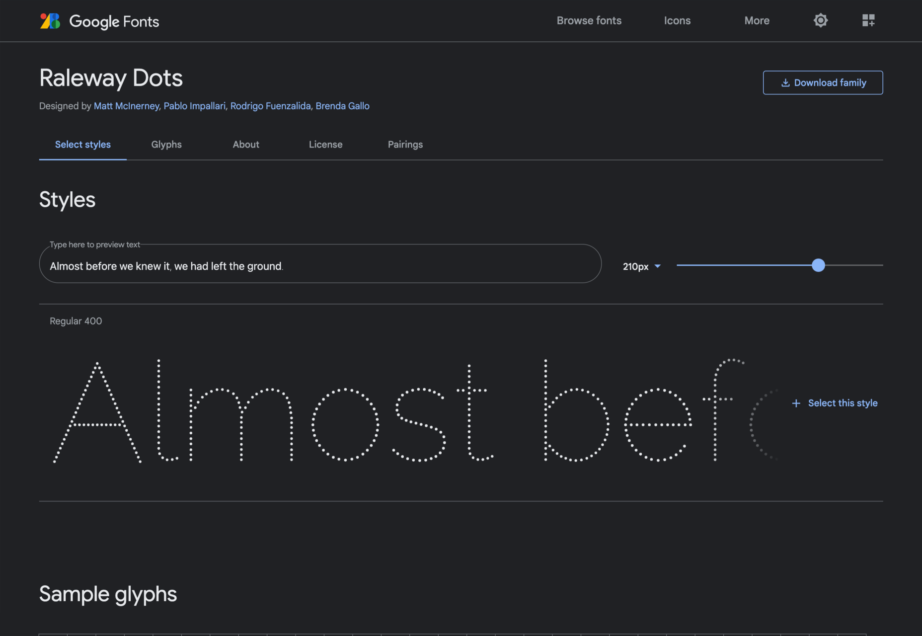
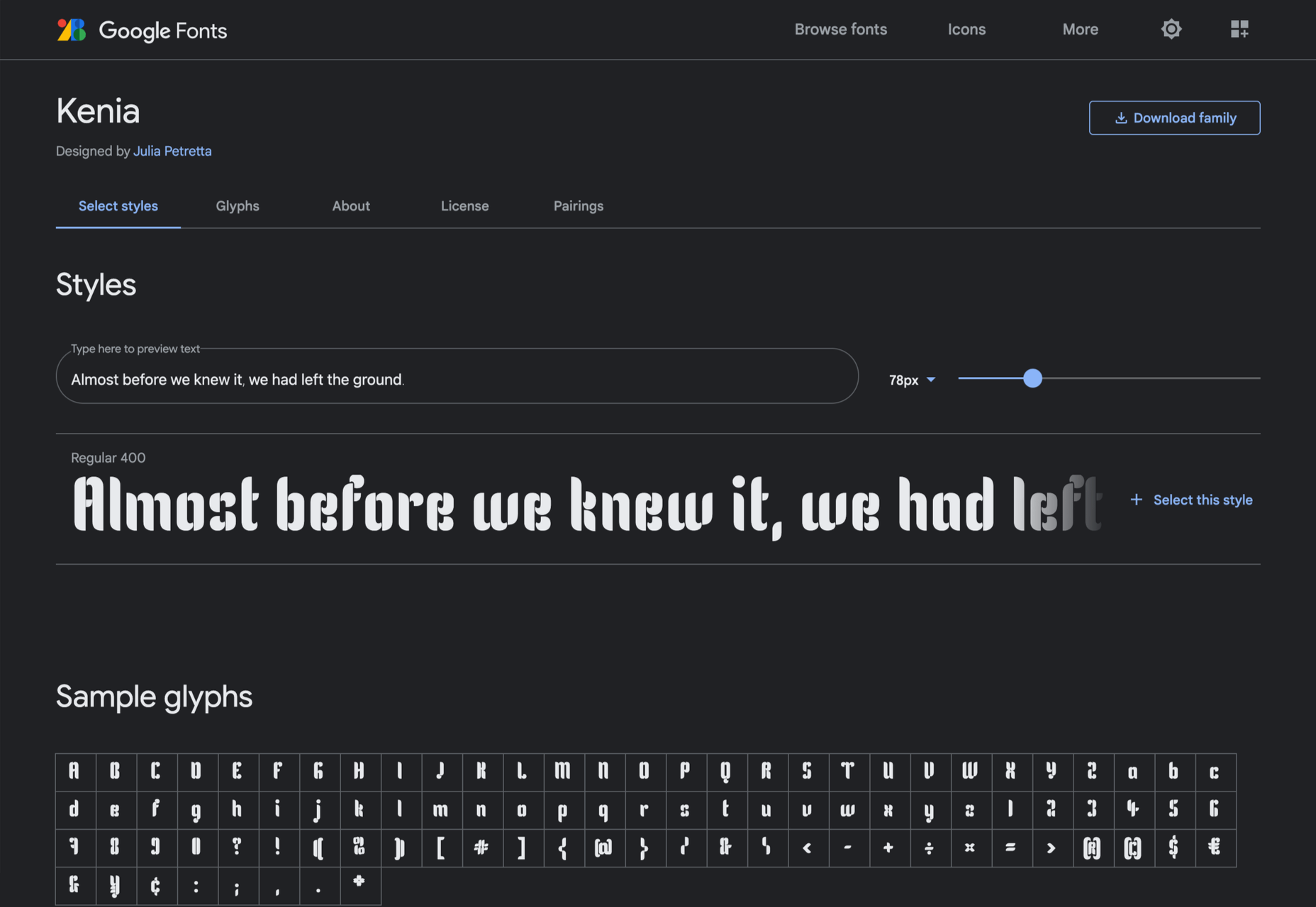
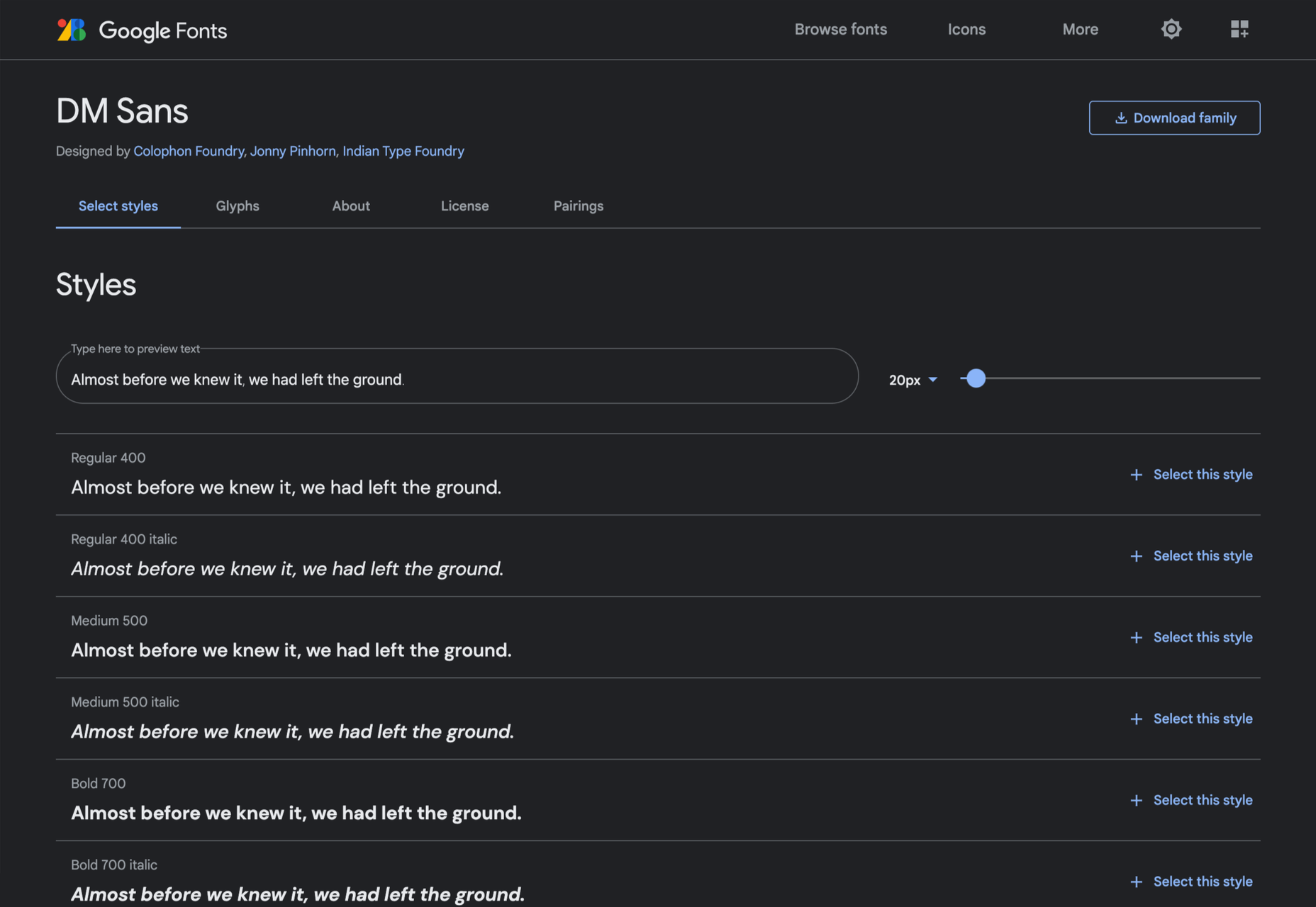
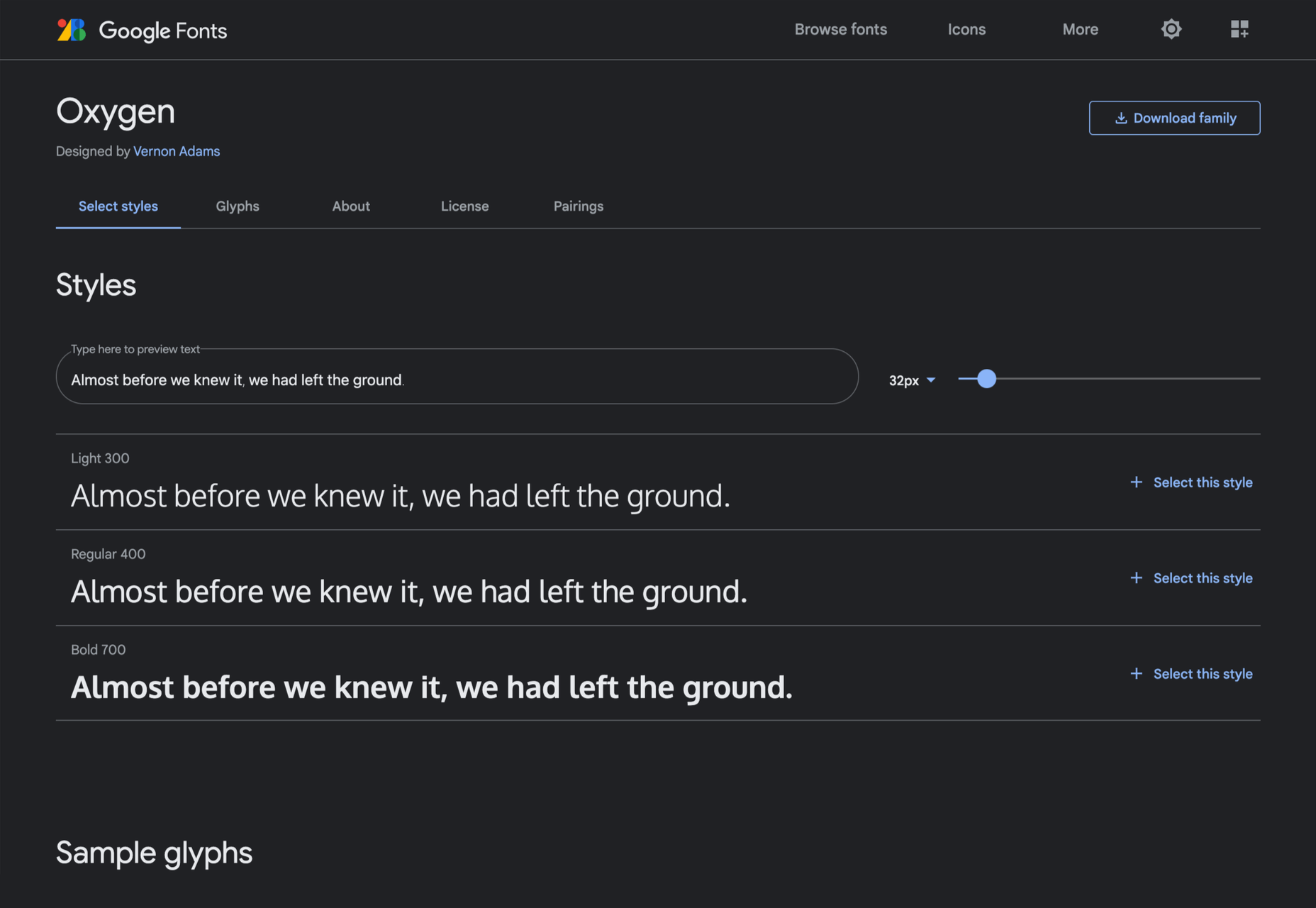
 Google Fonts may be the single most significant contribution Google has made to the evolution of the web — yes, more significant than search, advertising, or analytics.

 Since school is back in session, this month’s roundup has a learning focus. In addition to tools, many of the resources include guides, tutorials, and cheat sheets to help make design work easier.


 This month, you will either love or hate the featured design trends.


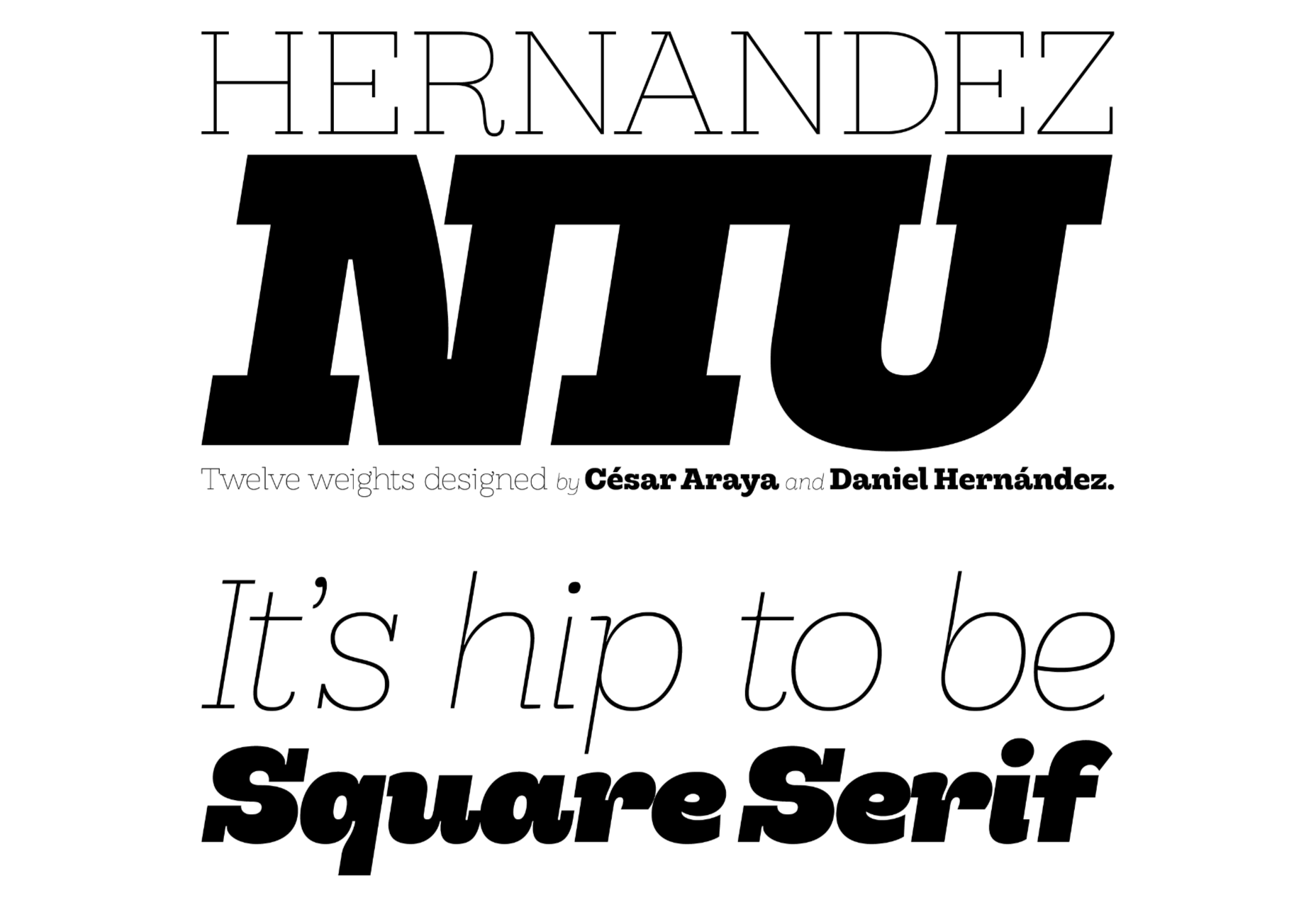
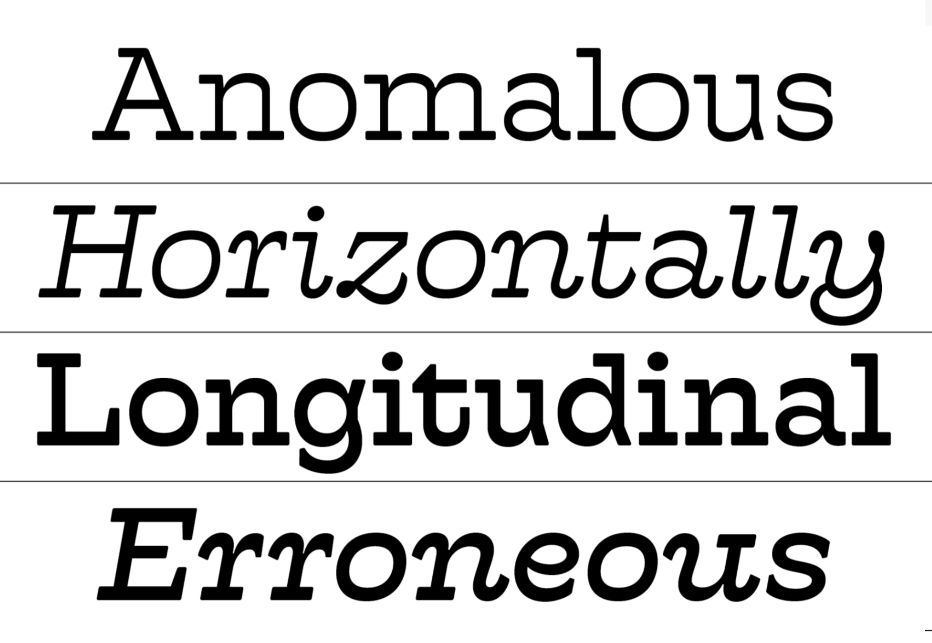
 Welcome to a new series of articles, in which we round up the best new fonts released from some of the top designers on the Web.


 If you are feeling like me right now, you have mixed emotions about the world in general. And this is translating into a pretty distinct design trend that’s happening almost across the board: Websites aren’t using many images of people right now.


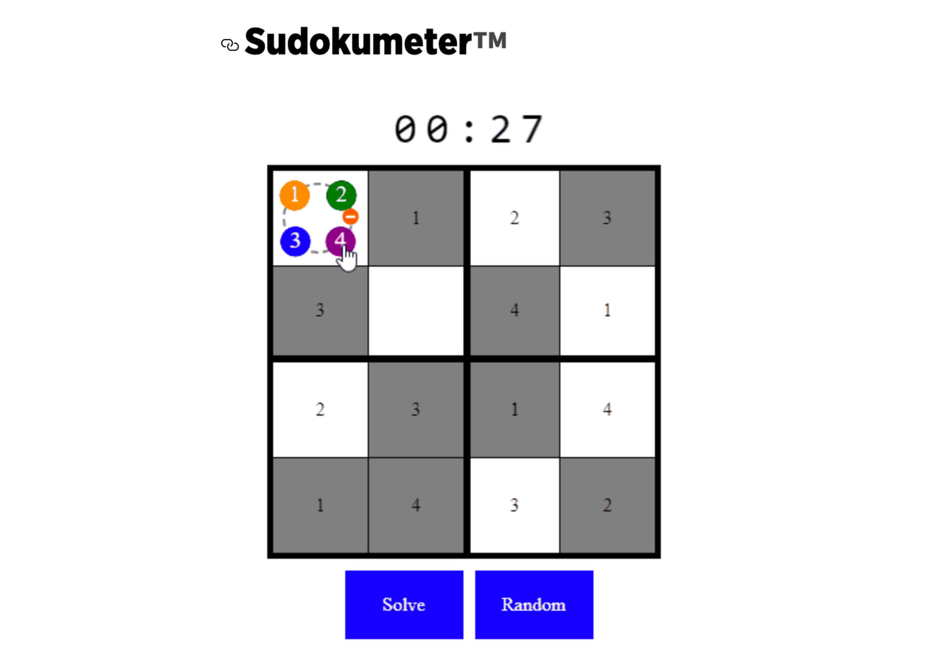
 From dev tools to productivity to a little bit of fun with sudoku, this month’s collection of new tools is packed with something for everyone.


 Every day design fans submit incredible industry stories to our sister-site,


