Articles

Do you ever get bored with design projects? Feel like you keep designing the same things on repeat?

This collection of trends – from fun angles to illustrations where you wouldn’t expect them to cool three-dimensional concepts – is sure to help you think a little more out of the box. It might be just the right inspiration to cure some of that design boredom.

Here’s what’s trending in design this month.

1. Angles for Attention

Working with angles is a fun technique because you can essentially point website visitors to what you want them to see on the screen.

Angles can be aggressive and have an obvious visual goal. They can also have an easier feel without so much direct intent. This trend can look a lot of different ways, making it a versatile option for designers.

Each of the three examples here takes a different approach to angles.

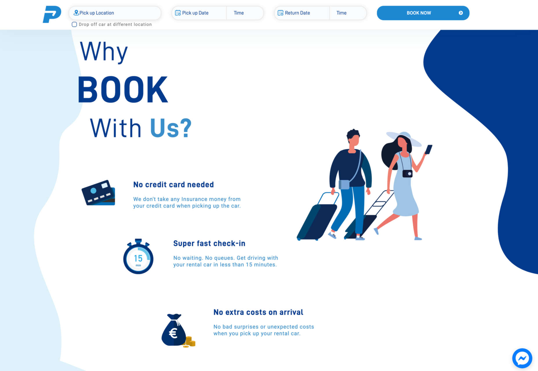
Bake Inc. uses various angles with imagery and whitespace to draw the eye past the visual elements to the brand name at the bottom of the screen. If you click through to the design, you’ll see that there isn’t just one angle-image design, but it’s a collection of changing images and angles that work beautifully in concert.

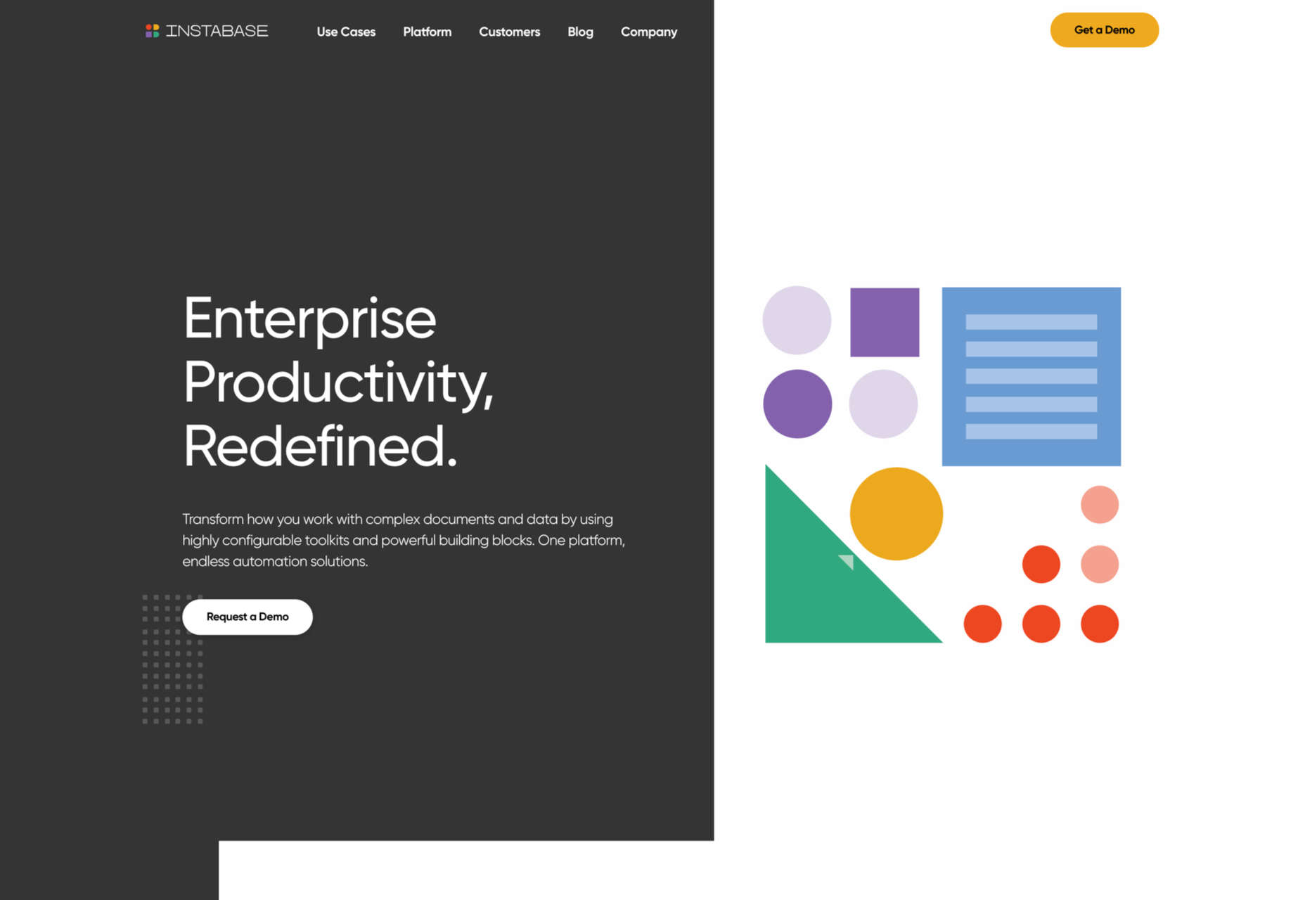
Instabase uses a collection of animated geometric shapes as the main visual element on the screen. Note the directional pull of the triangle in the bottom left of the group of shapes. It helps lead the user to the “Request a Demo” call to action on the other side of the screen.

Readymag’s Custom Cursor is one of those aggressive angles. The giant cursor is what the design is about, but because of the size and shape of the object, users are directed to the word “cursor” as well. That adds extra emphasis to what the design is about. With the combination and the oversized element and giant angle that are so in your face, you can’t help but get a quick understanding of what the design is about.


2. Unexpected Illustrations

This might be the most fun we’ve seen with a website design trend in a while – projects and companies are using illustrations in some of the most unexpected places.

The design surprise happens when an industry that you don’t expect uses this type of imagery. A simple illustration takes the design to another level, or illustrations mix with other elements to paint a whimsical overall scene. Those are the things you can find with each of these three examples.

Krivitzky is a website for a business law firm. This is not at all the type of website where you’d expect illustrations (including a dragon). While the design is fun to interact with, it’s hard to say if it works. If you needed representation, would this appeal to you? In terms of legal websites, this is a total disruptor and forces your attention. That could be a good thing.

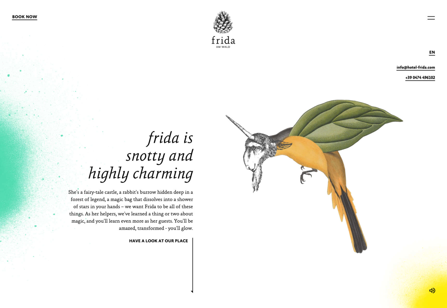
Studio Mesmer is one of those simply understated designs that’s almost perfect. The stark black background makes the simple illustration that much more striking. The eye also has a nice hover animation effect for an added surprise.

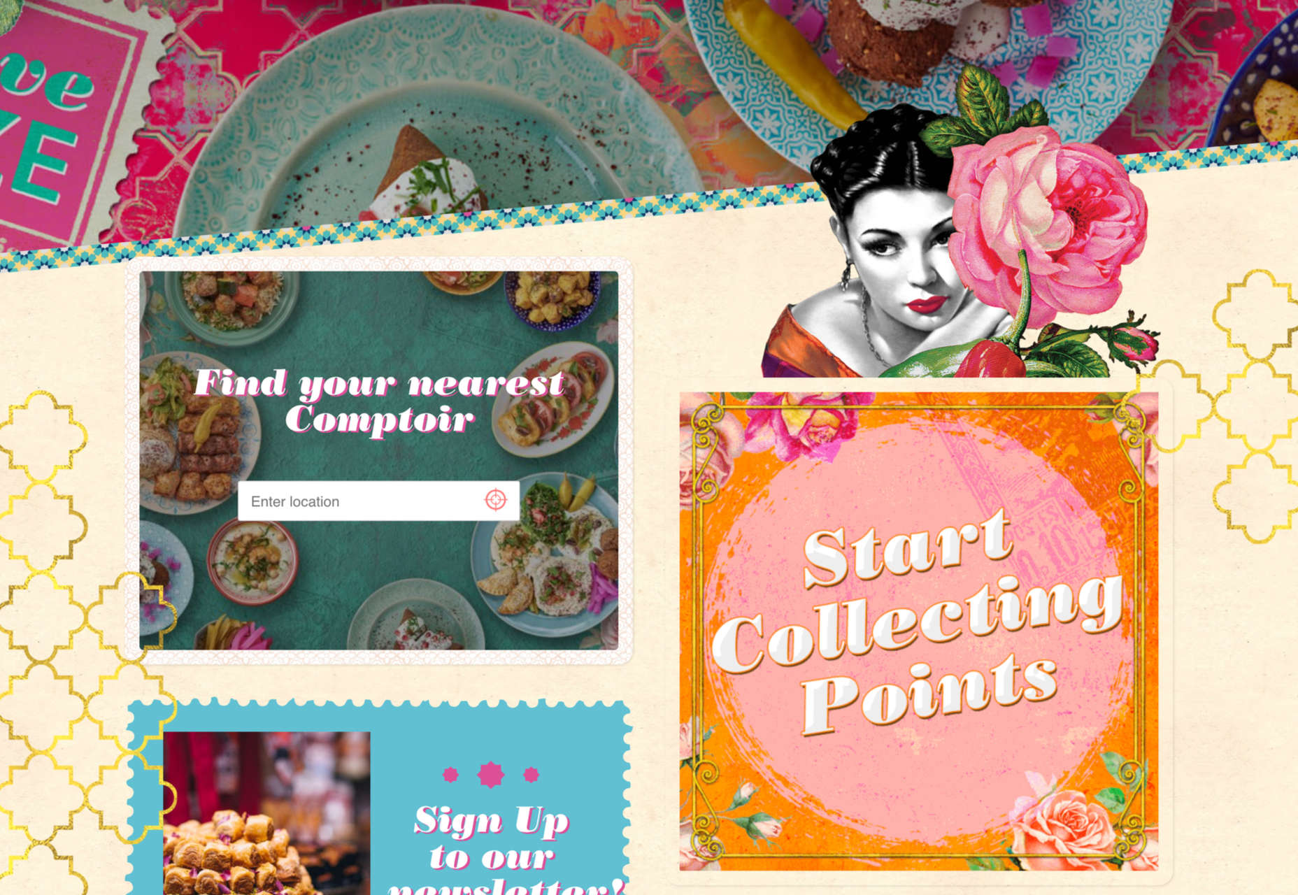
Kenn & Kitt mixes an illustration with real imagery to paint a more whimsical scene. What’s nice about the illustrated elements of the website design is that it helps connect the website to the product packaging, which uses illustrations while feeling “real” with the photo of a dog. It’s a bright and sunny combination of photos and illustrations that feels whimsical but has the right vibe for the product category.


3. 3D Depth

The three-dimensional website design trend keeps ebbing and flowing. And right now, it is flowing with full-screen 3D elements for maximum depth that makes you feel like you can almost dive into the screen.

While most of these designs use illustration with animation to create the 3D scene, you don’t have to abide by this example. The goal is to create something that looks and feels immersive so that users will want to take part in the experience.

The Match Maker has an 80s gamer vibe where you can feel yourself going down the tunnel on the screen. Additional hover animations move the screen, even more to help you get into the game.


Hafele Discoveries uses a wide-angle style animation with back and forth motion. The fish-eye style of the design adds an element of depth, which is further magnified by the foreground box with text and call to action elements. The design concept is attention-getting, but the motion can be a little dizzying if you leave it on the screen too long.

FiveT Hydrogen takes a more “traditional” approach to a three-dimensional website design with an illustration/animation that includes elements of depth. This is magnified on the scroll action of the design with shadows and layers and a variety of elements – real and illustrated – that make you feel like part of what’s happening on the screen. It’s an immersive learning experience about clean hydrogen that almost forces users to keep scrolling. The 3D effect is what takes it to another level.


Conclusion

Not every design trend is right for every project. Take a good look at what you are trying to accomplish and match it with a design concept.

If you want to try one of these trends, but they are a little too out there, experiment with a small area of the design or a landing page first. That’s a good place to test ideas and conversion rates to see if the design technique will work for your audience.

Source

The post 3 Essential Design Trends, September 2021 first appeared on Webdesigner Depot.


Source de l’article sur Webdesignerdepot

Creating an incredible brand experience for an end-user is about more than just designing the right home page or lining up a series of great product pages. 

Effective website design conveys crucial information about a company, through everything from font styles, to image choices. Nowhere is this representation of brand identity more important than on the about page. 

People frequently confuse the about page with the contact page or fail to leverage it correctly simply because they don’t know what to say. However, creating an about page that speaks to an audience can be immensely powerful. 

What is an About Page?

The first step in designing a great about page is understanding the purpose of the space. This isn’t just a page on a website explaining what a company does. 

The about page is an introduction to a company’s story, its brand essence, and personality. 

Done correctly, this page will demonstrate a crucial sense of affinity between a business and its customers. It will highlight values that resonate with a customer and make it easier for clients to trust businesses.

The Yellow Leaf hammocks company starts its about page with a video.

As you scroll through the interactive site, you discover new elements of the company’s tale, including what prompted the birth of the business to begin with and the brand’s mission. 

Yellow Leaf lets its visitors know what the company is all about by using authentic images of real people to external content and bold quotes. 

There are even snippets from customer case studies for social proof. 

About pages are relevant because they give customers a way to build a real human connection with a business. Harvard professors say that 95% of purchasing decisions are emotional; we don’t buy things just because we need them. Instead, we look for companies that we feel connections with to solve problems. 

Using an about page to convey an attitude, personality, or just what makes a business special is how designers can ensure that end-users will care more about the business. 

How to Make an About Page Stand Out

So, how do you make an about page stand out?

Since every company is different, there’s no one-size-fits-all strategy for everything.  However, there are a few essential steps to consider as you move through the design process. 

Here are some pro tips for successfully attracting attention with the about page…

Step 1: Decide What to Include

It’s tempting to assume that a complicated about page will lead to a stronger relationship between a brand and its customers. After all, the longer the story, the more the customer knows about the company – right?

While it’s essential to include plenty of valuable information in an about page, it’s also worth remembering that today’s customers are short on time. They don’t want to spend hours scrolling through one part of a website. Instead, they want access to quick, convenient snippets of information. 

The Joseph Payton about page is effective because it cuts the story down into bite-sized chunks. Each piece of information highlights valuable insights for the customer. Plus, hand-drawn images and animations make the experience feel like you’re getting to know Joe on a deeper level. 

Before you begin designing, ask yourself:

  • How much text does the page need? How much space does there need to be for copy? How can you spread the content out in a visually engaging way?
  • What sections should the page include? For example, does there need to be a link to the contact us page or a contact form somewhere?
  • How does the page connect to the rest of the website? For example, can you link to things like case studies and reviews with quotes to tie more of the website together?

Step 2: Make the Mission Statement Clear

In a world where emotion influences buyer behavior, clients and customers want to buy from companies they believe in. It’s not enough to have the right product or price point anymore. People want to know that they have a human connection with a business. 

On some about pages, it’s difficult to pinpoint the real mission of the company. It seems like you have to scroll through endless paragraphs of text to make your own assumptions about what matters to the company. However, a well-designed about page puts this crucial info front and center. 

For instance, on the Apptopia about us page, the subheading tells you everything you need to know about the brand. This heading instantly tells the audience whether it’s worth reading on to find out more. 

The best about us pages often include a lot more than just a single sentence of text. But it’s worth pinpointing some of the essential details from these pages and drawing extra attention to them. A larger font or a different font color could be perfect for this purpose. 

Alternatively, if it’s difficult to refine the company’s mission down into one message, it might be worth creating a whole segment at the top of the page dedicated to this information. That’s what the Toms shoe company does.

Step 3: Invest in the Right Trust Elements

People aren’t always sure who they can trust these days. 

There are millions of websites out there and billions of companies. Not all of them are going to appeal to every customer. Since an about page is all about making a crucial human connection between a business and its client, it’s important to implement as much trust as possible. 

The good news is that there are many trust elements you can embed into an about page to make it more reputable. Star ratings taken straight from companies like Trusted Reviews and Google are a great way to show that a company is already impressing its followers. 

Quotes plucked from your customers or segments of case studies that you can place throughout the About Page copy is another great way to show your authenticity. 

You could even take the same approach as Aja Frost here and embed genuine data and graphs into the about page.

One particularly helpful way to make a website’s about page more trustworthy without eating up too much space is to implement trust stickers. Badges that show all the right groups and regulators approve a company are a great start. 

Even showcasing the logos of companies that the business worked for before on a slideshow could be an excellent opportunity to add depth to their authority. 

Step 4: Convey Brand Personality

Brand personality is reflected in the tone of voice that a company uses for its content. You can see a company’s personality in the choice of colors it has on its website. It’s in the fonts that convey a message, and the videos, images, and other unique strategies that each business uses. 

Although a brand personality needs to shine through in everything the company does, it’s imperative on the about page. This is the environment where a customer is getting to know a business for the first time. As a result, the consumer should instantly recognize what kind of brand archetype they’re working with. 

Take a look at the Eight Hour Day about page, for instance. The first thing you see is a picture of two people laughing. That means you instantly get a sense of friendliness.

As you scroll through the page, you’re greeted by friendly, informal copy combined with bright colors and snippets of useful information. Everything feels comfortable and reassuring. 

When you reach the bottom of the page, you find a bunch of data that makes the company seem more trustworthy. There are links to its social media pages and a partial client list showcasing brands like JCPenny, Wired, and Purina.

Using the right combination of font, copy, and imagery, this About page tells you exactly what to expect before you begin interacting with the company. 

Step 5: Take Visitors on a Journey Through Time

Showing customers where a business is going with things like brand mission statements and values are great. However, it’s also worth giving people an insight into where a brand has already been. 

Many of today’s shoppers aren’t comfortable buying from brands that haven’t spent much time in their chosen industry. They want to see that the people they’re working with have experience, heritage, and plenty of background knowledge. 

What better way to demonstrate all of these things than with a timeline of accomplishments? Here’s an example of how Marshall showcases its history by mentioning various crucial historical milestones.

A timeline of events doesn’t have to be this complex, however. If you don’t want to overwhelm visitors with a wall of text, an actual timeline that offers quick and easy insights into what the business has done over the years could be a better option. 

Another option could be to have a few key statements from the company’s timeline, then link out to a separate “History” page for people who want to find out more. 

Step 6: Show the Human Side

People don’t buy from businesses; they buy from other people. 

An about page isn’t just a chance to show customers what a company does. It’s also an introduction to the people behind that organization. Showcasing the team members that contributed to the growth and continued development makes that organization more attractive. 

Obviously, if there are hundreds or thousands of employees in a team, you might not be able to mention them all on an about page. However, the page should generally include some insights into the c-suite and significant members of staff. 

A selection of company photos is a good way to introduce your team. However, you can consider other options too. For instance, to maintain their unique brand, the Tunnel Bear team designed to draw their own bear icons that represented their personalities.

The design is adorable, and it’s a wonderful way to showcase what makes the company so unique. At the same time, using this kind of illustration means you can avoid the hassle of trying to get all of your business photos to look consistent. 

Step 7: Show Values with Visuals

Finally, as we’ve mentioned frequently throughout this guide, an about page is an essential place to showcase the values of your business. These are the core principles that guide you in everything that you do. They help tell customers what matters most to you and prevent you from moving in the wrong direction. 

However, you’re not restricted to highlighting your values through copy and nothing else. You can also introduce customers to the things that matter most to you through visuals too. Graphics or illustrations that highlight important aspects of your business are a great way to share information without relying too heavily on text. 

Videos are another brilliant option, particularly if you have a lot to say but not a lot of time to say it in. That’s what Ben & Jerrys does.

You can also find a stream of “issues” the company cares about on the website too. This means that people can get more information on things like Democracy, Racial Justice, Fair trading, and what Ben & Jerry’s is doing about all of those things. 

Visual elements like this are a great way to give an about page more pizazz. Plus, they appeal to people who want to learn about your company but don’t want to spend forever reading through the text. 

Create Better About Pages

An about page shouldn’t be an afterthought. 

It’s a crucial part of showcasing a company’s unique style and personality. Used correctly, these pages convey crucial information about everything a business stands for. 

Use the tips above to give more meaning to your about page design, and remember to pay attention to how much your traffic and conversions evolve with every update you make. A better about page could even help you to drive more conversions.

Source

The post 7 Essential Design Tips for a Killer “About Us” Page first appeared on Webdesigner Depot.


Source de l’article sur Webdesignerdepot
The author, Jordan Hoggart, was not compensated by Ahana for this review.

The Background

At the base of Carbon’s real-time, first-party data platform is our analytics component, which combines a range of behavioral, contextual, and revenue data, which is then displayed within a dashboard in a series of charts, graphs, and breakdowns to give a visual representation of the most important actionable data. Whilst we pre-calculate as much of the information as possible, there are different filters that allow users to drill deeper into the data, which makes querying critical.

Source de l’article sur DZONE

Suppose you have an opportunity to create a project on AI. Consider these five stages before starting. These five are learning, programming language, knowledge representation, problem solving, and hardware.

1. Learning Process

Learning means adding new knowledge to the knowledge base and improving or refining previous knowledge.

Source de l’article sur DZONE

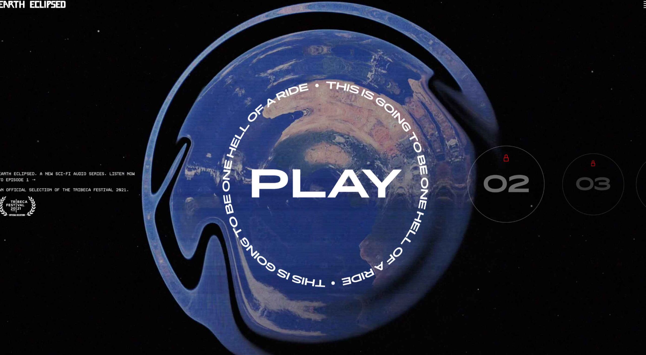
Design can make a statement. It evokes feeling and can encourage thought and conversation. That’s the common theme among the three trends in website design this month.
Each trend is rooted on the time and place where we live and includes elements that provoke thought. Kudos to these designers and design teams for jumpstarting conversations. Here’s what’s trending in design this month.

1. “Taking a Stance” Design

From social to environmental issues, design projects are echoing the sentiments of their audiences and organization in a way that take a stance on an issue.

Once taboo, this is becoming increasingly used as a technique for brands who are no longer worried about turning off a certain segment. The goal is to rally the core audience and people who feel the same way about an issue or cause.

There’s also a secondary thing happening here. Some designs aren’t really position based, but use imagery and language that resonates with a movement to associate with that feeling.

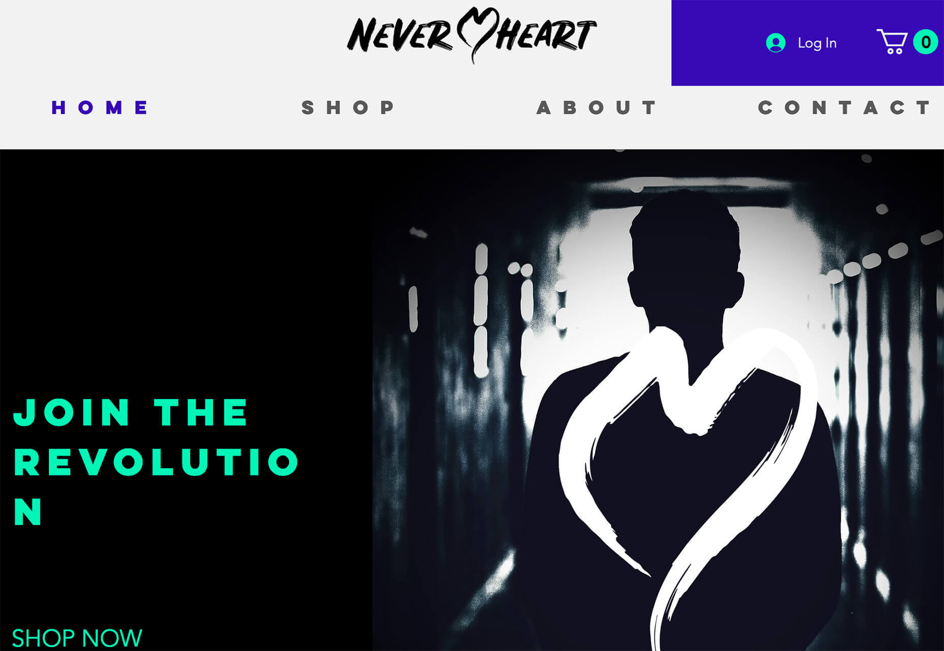
Never Heart uses “Join the Revolution” and a dark image with a heart to tug at your feelings. It can help create an association to a cause that you believe in without stating that cause directly. The design feels strong and inviting while making you feel like part of something.

Skye High uses “powerful” twice in the headline to convey a particular messages to women. The agency is looking to work with “powerful” women. It’s a timely statement and message that could resonate with a lot of business-women at various levels of their careers.

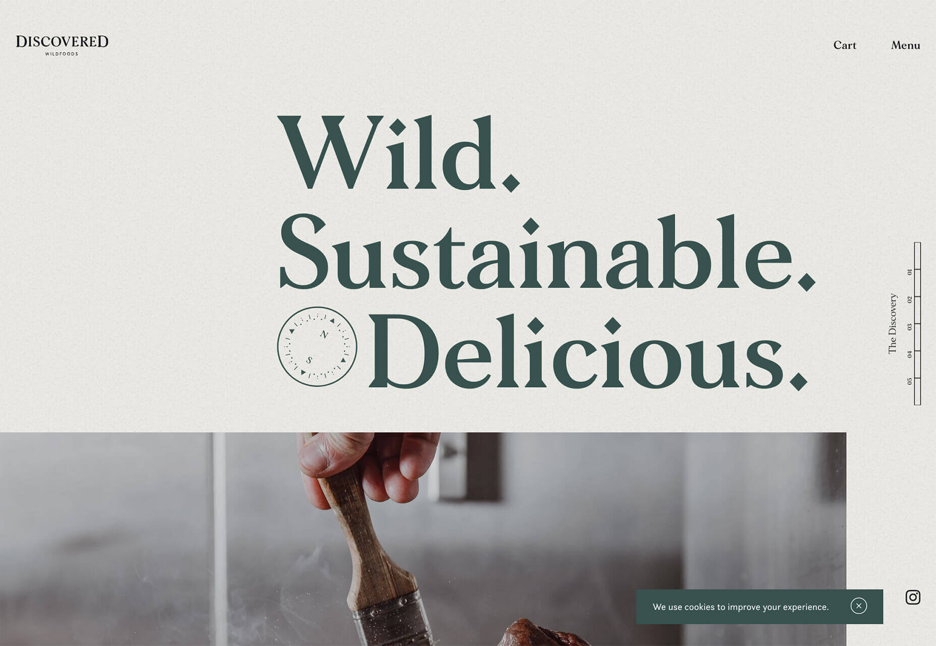
Discovered Wildfoods is a brand that is rooted in sustainability. The corporate model and responsibility of the brand shows through in the website. This type of design helps connect people with mutual feelings to the brand and products.

It’s refreshing to see more websites and brands embracing social causes and issues. It can be tricky for a number of reasons. But for some brands, it pays off.

2. Abstract Art Elements

If you are worried about a lack of images, or not sure how to portray images in an appropriate way due to the worldwide pandemic – groups or not, masked or not – abstract art elements can be the solution.

Widely used for startups and apps, more abstract design elements are everywhere. It’s an easy way to create strong visual interest without photography.

The most common use of abstract art elements is often in the form of geometric shapes with animation. This is something that almost anyone can understand and simple shapes and movement can be quite stunning when done well.

The good news is this aesthetic can work for almost any type of website. Try it for a redesign when you don’t have photography that feels appropriate in the current environment or if you want to create focus for content that drives website visitors to the words or scroll. This works with more abstract concepts when they are simple and help you move quickly from the visual to text.

Here’s how each of the examples handles abstract art elements:

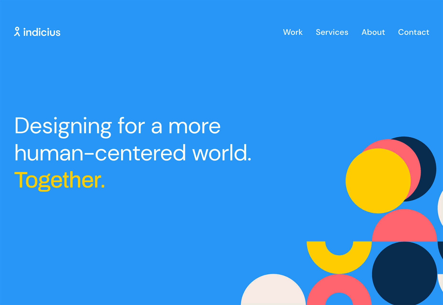
Indicius uses bouncing circles that move toward text and down the screen to drive users to the headline and scroll action.

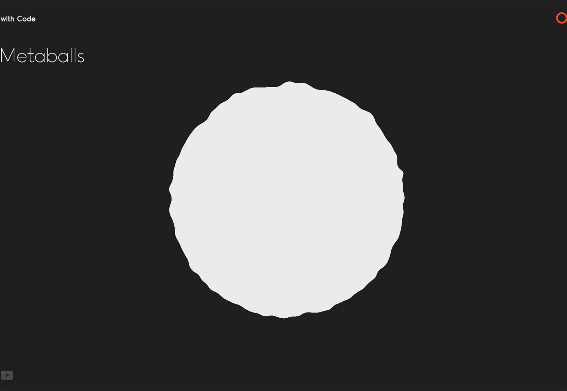
With Code uses a fun fuzzy circle with different animations to draw you in.

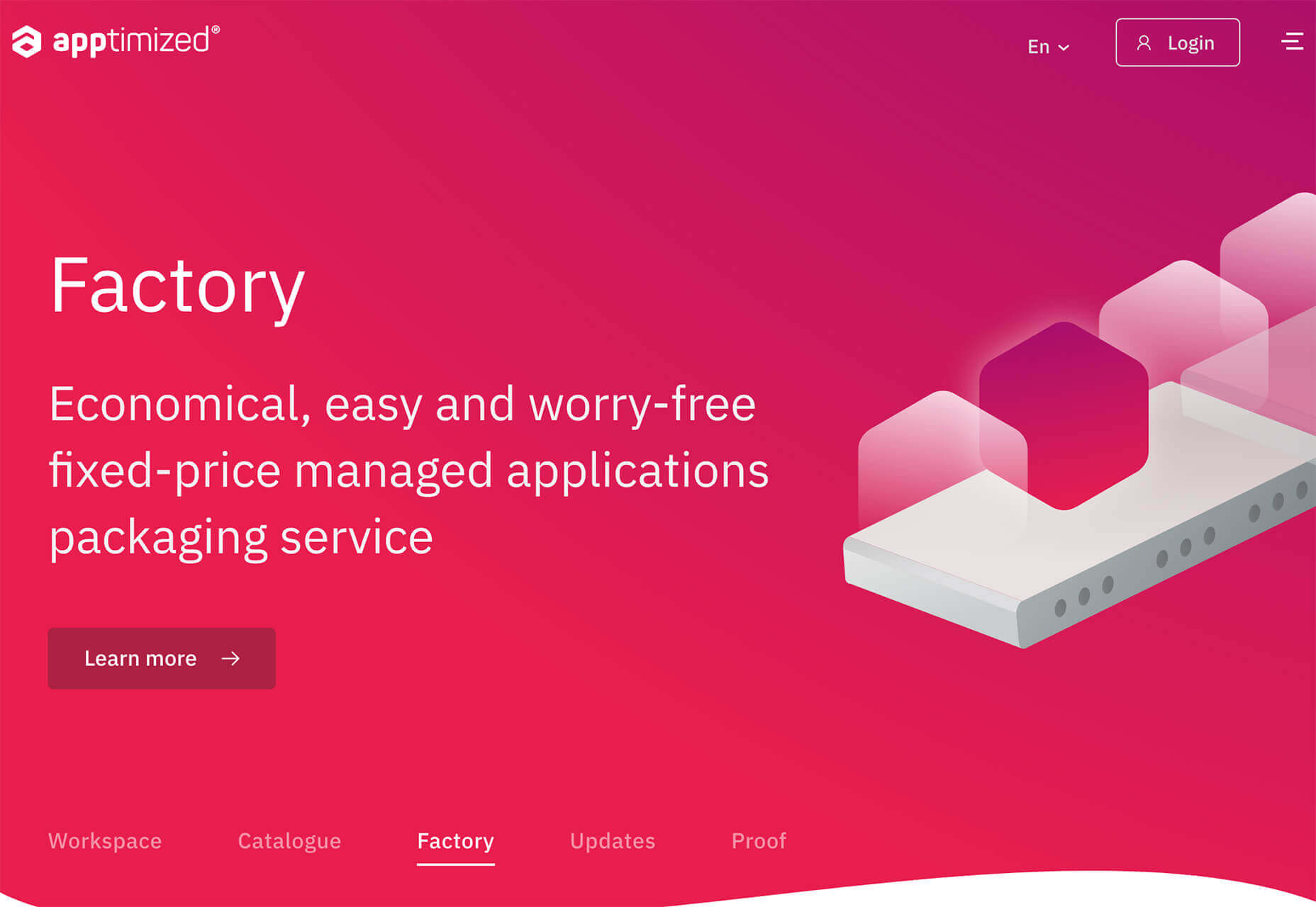
Appimized uses bright color and a monotone scheme with geometric shapes to sell its services.

3. Images That Make You Think

This might be the most visually interesting, and thought-provoking, website design trend we’ve seen in a while. These designs all feature images with a little something different or unusual that make you think.

There are a lot of different ways to do this – marry photographs and illustrations, create imaginary imagery, animations or effects, visual tricks that play on depth perception or create pseudo-3D effects.

The commonality is that the visual is so striking and unusual that website visitors stop and engage with the design. What do the “oddball” visuals mean? What message do they convey? How did they do that?

All of the questions could be associated with this different style of visual representation.

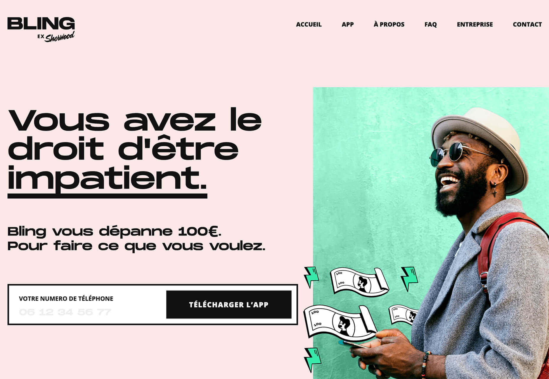
Bling uses a combination of a photo with illustrated animated elements to draw the eye. The yin and yang between reality and fantasy is quickly evident and makes you want to know more. (It doesn’t hurt that the animation uses dollars and lightning.)

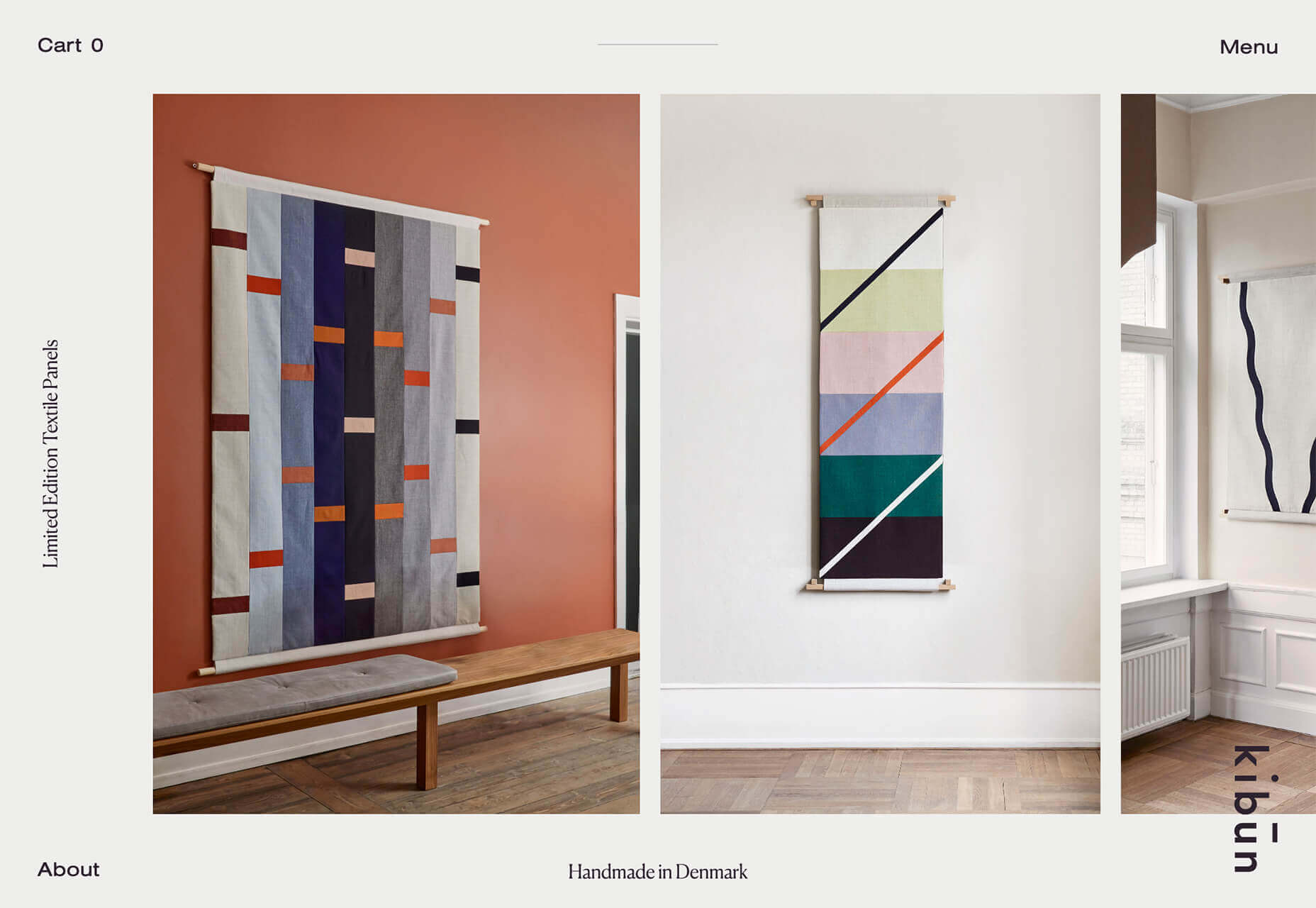
Kibun is interesting because the photo choices create an optical illusion of depth. It matches the content of the design well because the website features artistic textile panels with an artistic design. The illusion is in the angles and coloring of photographs and their placements on the screen. The only downside of this design is that it loses the artistic panache on mobile because the images stack.

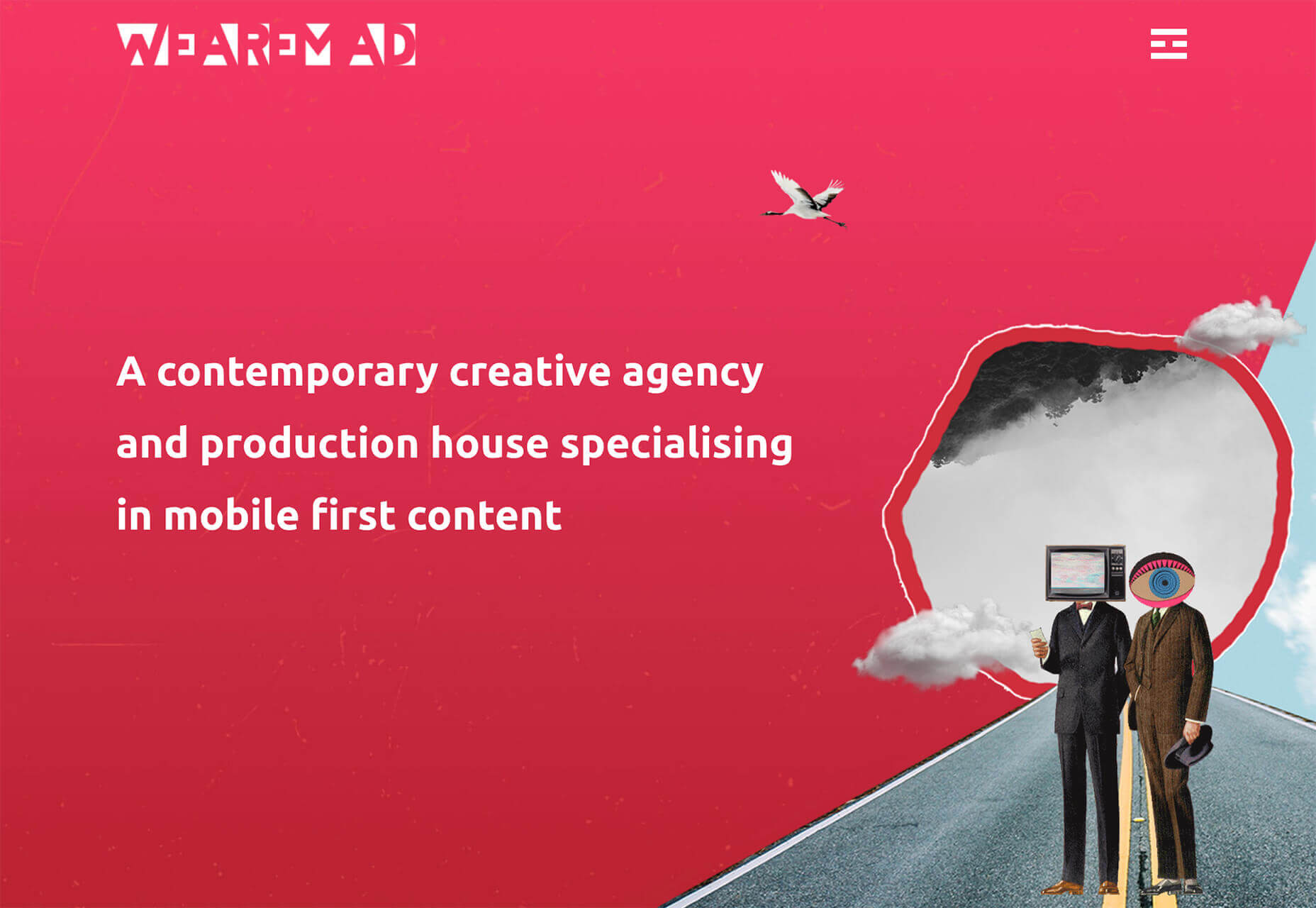
Oddball images can sell. We Are Mad stands out because it uses a contrived image, but doesn’t go oversized with it. The more subtle placement is ideal and arguably more attention-grabbing.

Conclusion

Website design can be a powerful thing, as these trends and examples show. Don’t discredit the power of choices in color, imagery, animation, and text when creating a digital experience. Design can mean a lot of different things depending on the audience as these examples show.

At the same time, these design trends are powerful and meaningful. They provide context into our world, our time, and our feelings. Don’t be afraid to experiment and make a statement with your design work. Just remember to keep in mind all potential impacts (positive and negative) before taking the project live.

Source


Source de l’article sur Webdesignerdepot

Some of the changes we are seeing with where we work are starting to pop up in the type of new tools made for designers and developers. More tools with remote collaboration as a key feature are increasing in popularity. (You’ll find a few of those here.)
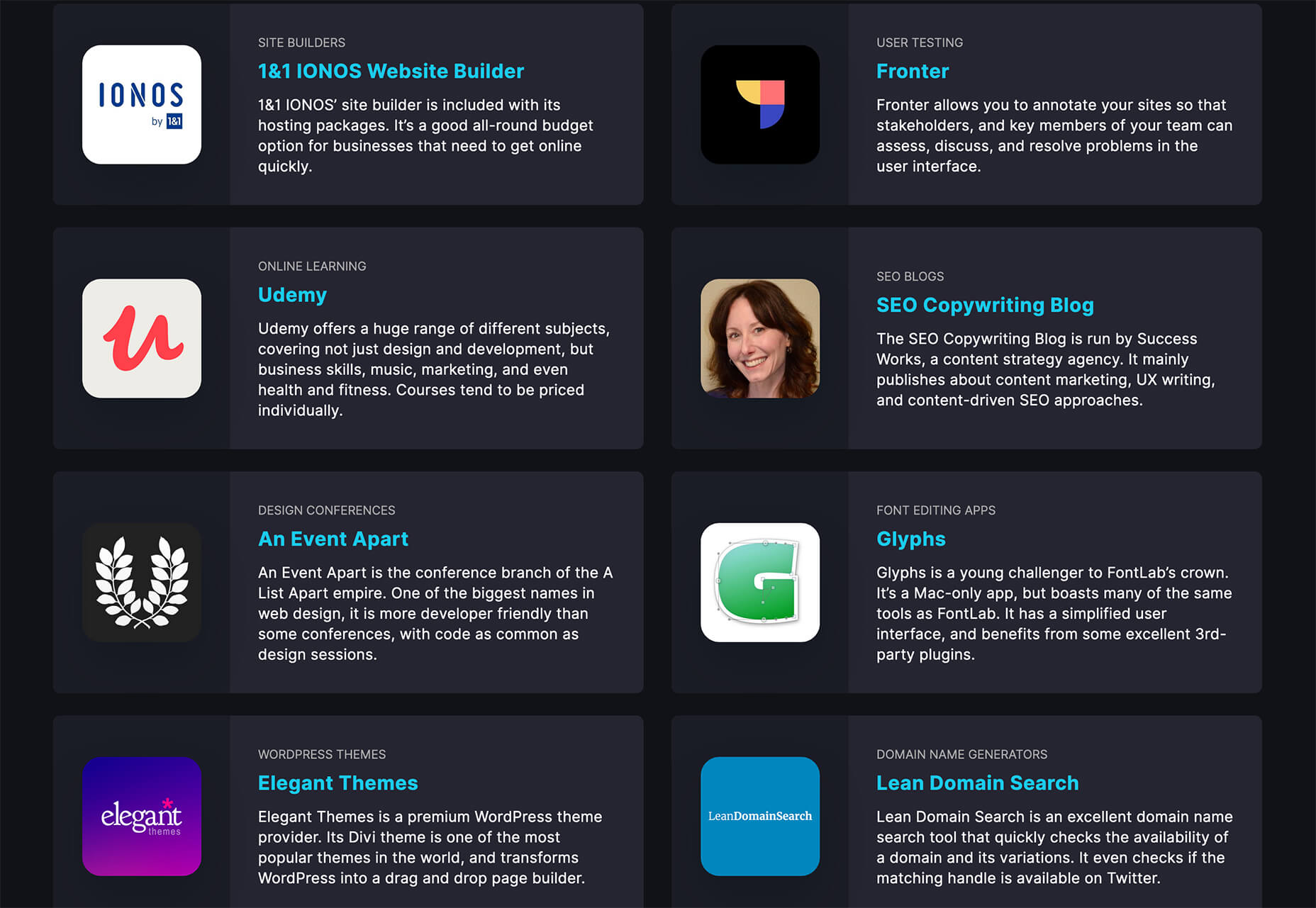
Here’s what new for designers this month.

Webdesign Toolbox

Webdesign Toolbox is a collection of tools, apps, and resources all in one location for designers and developers. The best part of this resource is that it is human-curated, so every tool is quality checked and makes the list because it has been tested and researched. Search the collection by design, dev, stock, typography, UX, or workflow tools (and more) and use them to help create more efficiently. The collection is constantly growing, too.

CodeStream

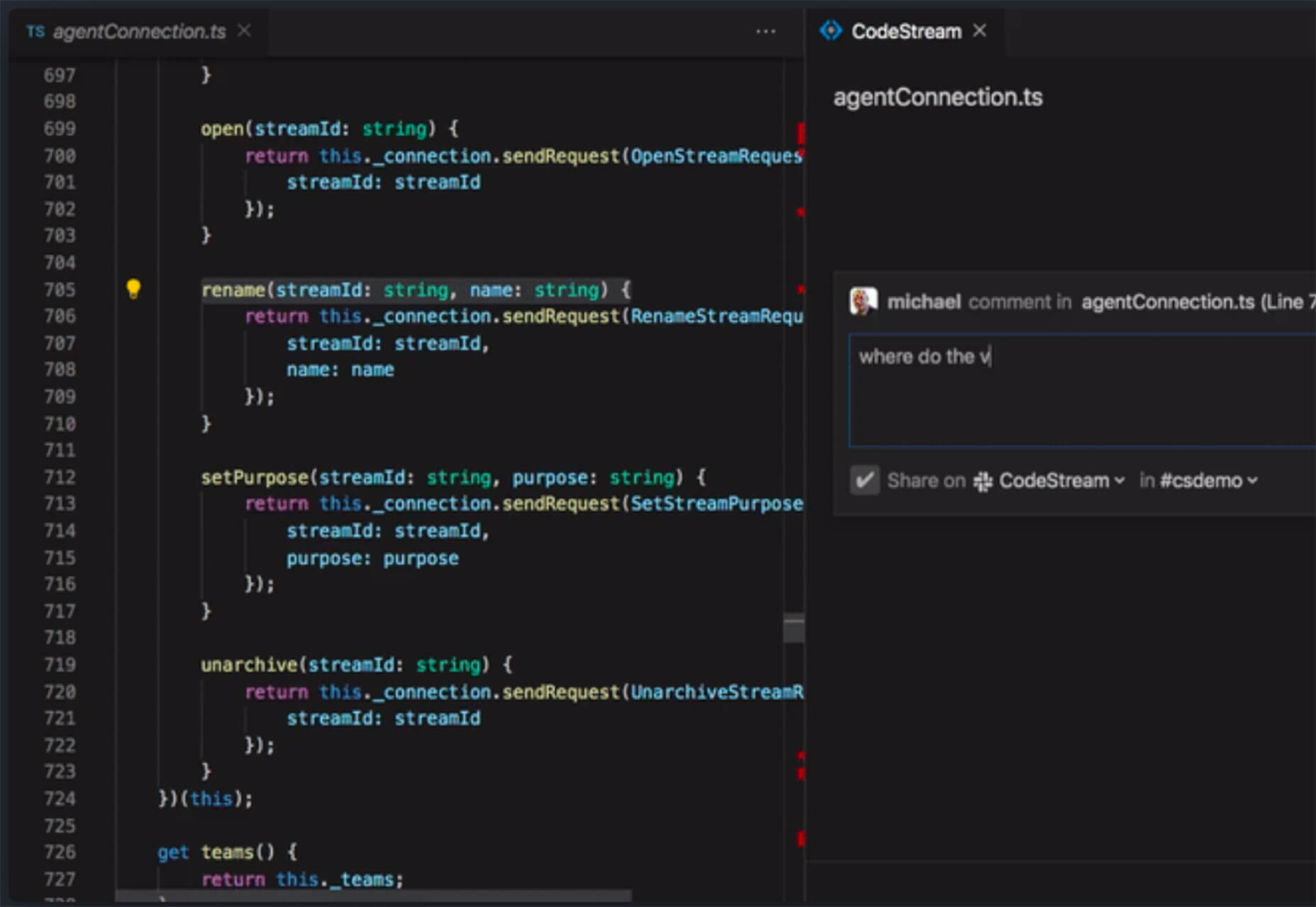
CodeStream might be the new-world workflow tool for web designers and developers. It is made for remote teams to review code right inside your IDE without breaking from development flow. You can post and review changes and comments are all independent of the code itself, even though they link to it.

Litur

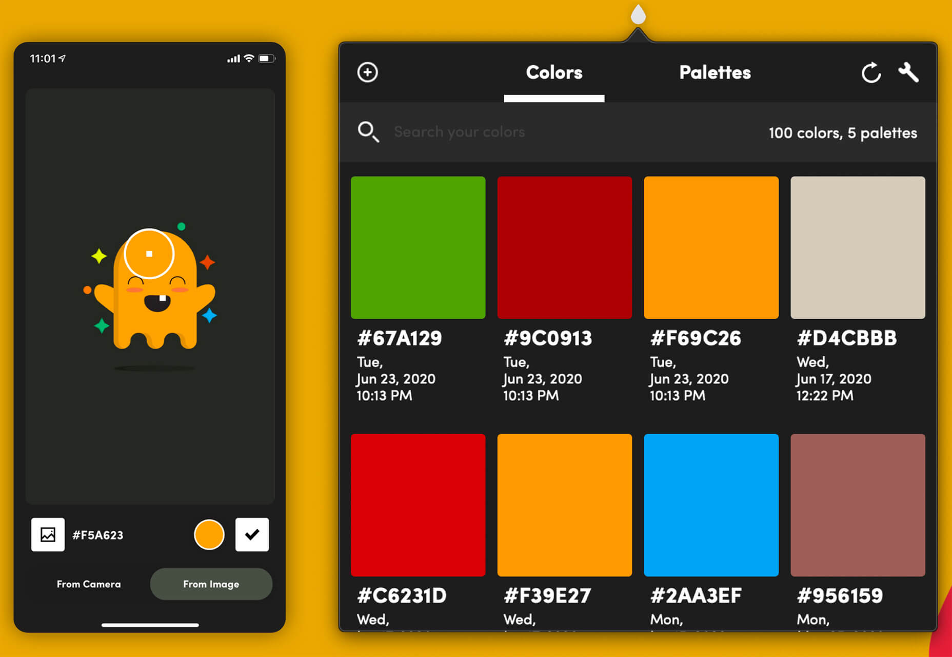
Litur is a color management app for iOS. Use it to find and collect color swatches, create custom palettes, and even check color combinations against accessibility standards. The app can even generate color codes for you from swatches you find from a photo or image upload or create. The app works on mobile and desktop Mac devices and is a paid app.

Editor X

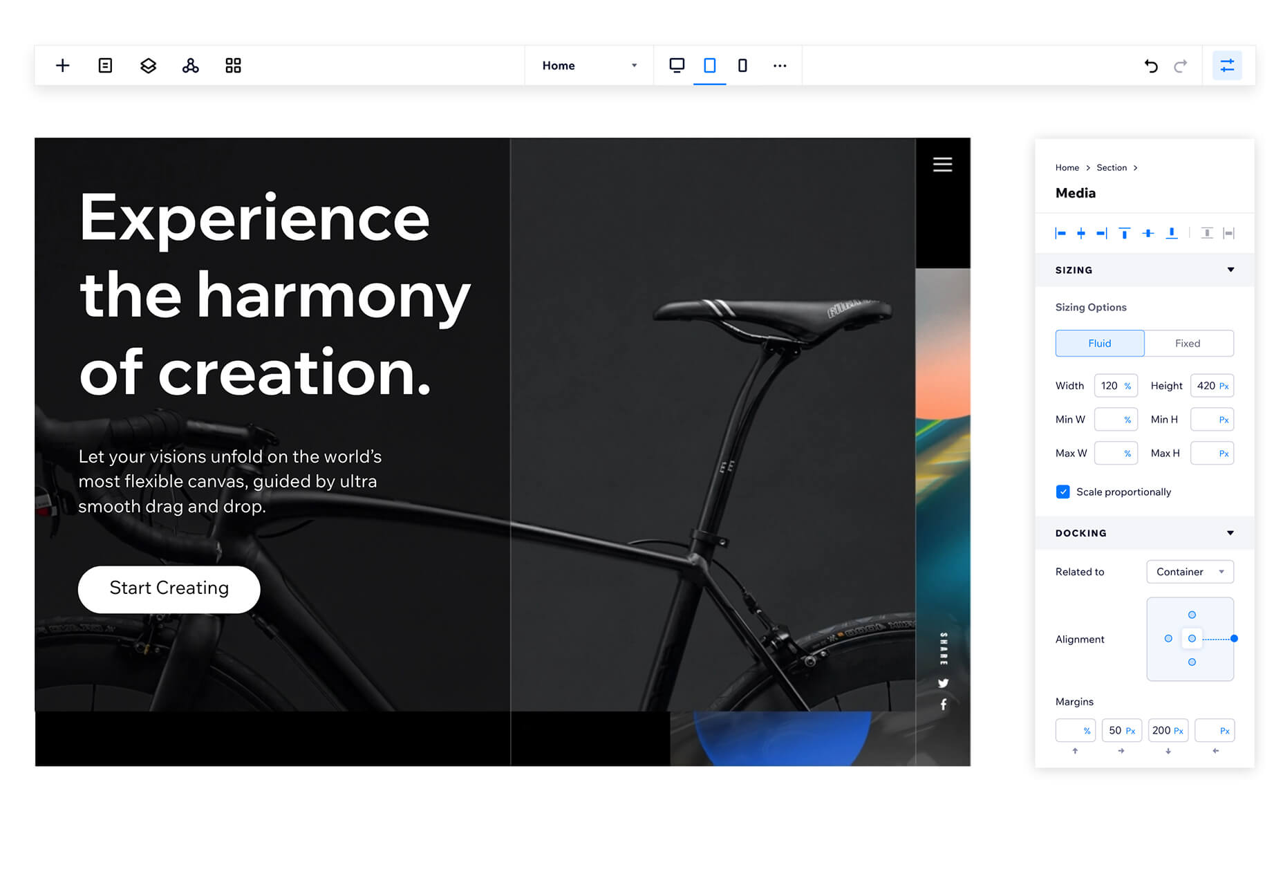
Editor X, which is still in beta, is a website building tool that combines advanced design and prototyping capabilities with secure web hosting and integrated business solutions. Go from an idea straight to production in a highly intuitive design workspace. The best feature might be exact design precision tools.

Grid Cheatsheet

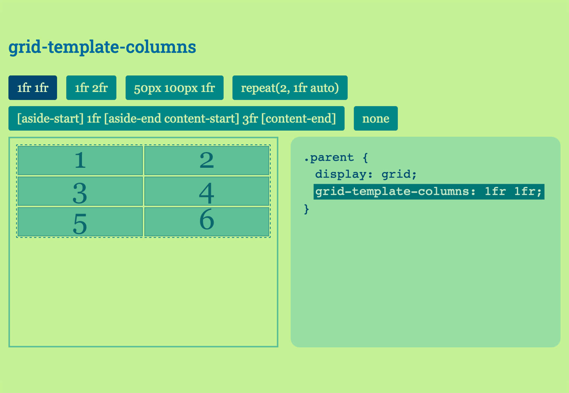
Grid Cheatsheet is a visual and code-based set of “cheats” based on the W3C CSS Grid Specifications. What’s nice is it makes these guidelines easier to understand and use if reading through them makes you a little uneasy.

Tutorialist

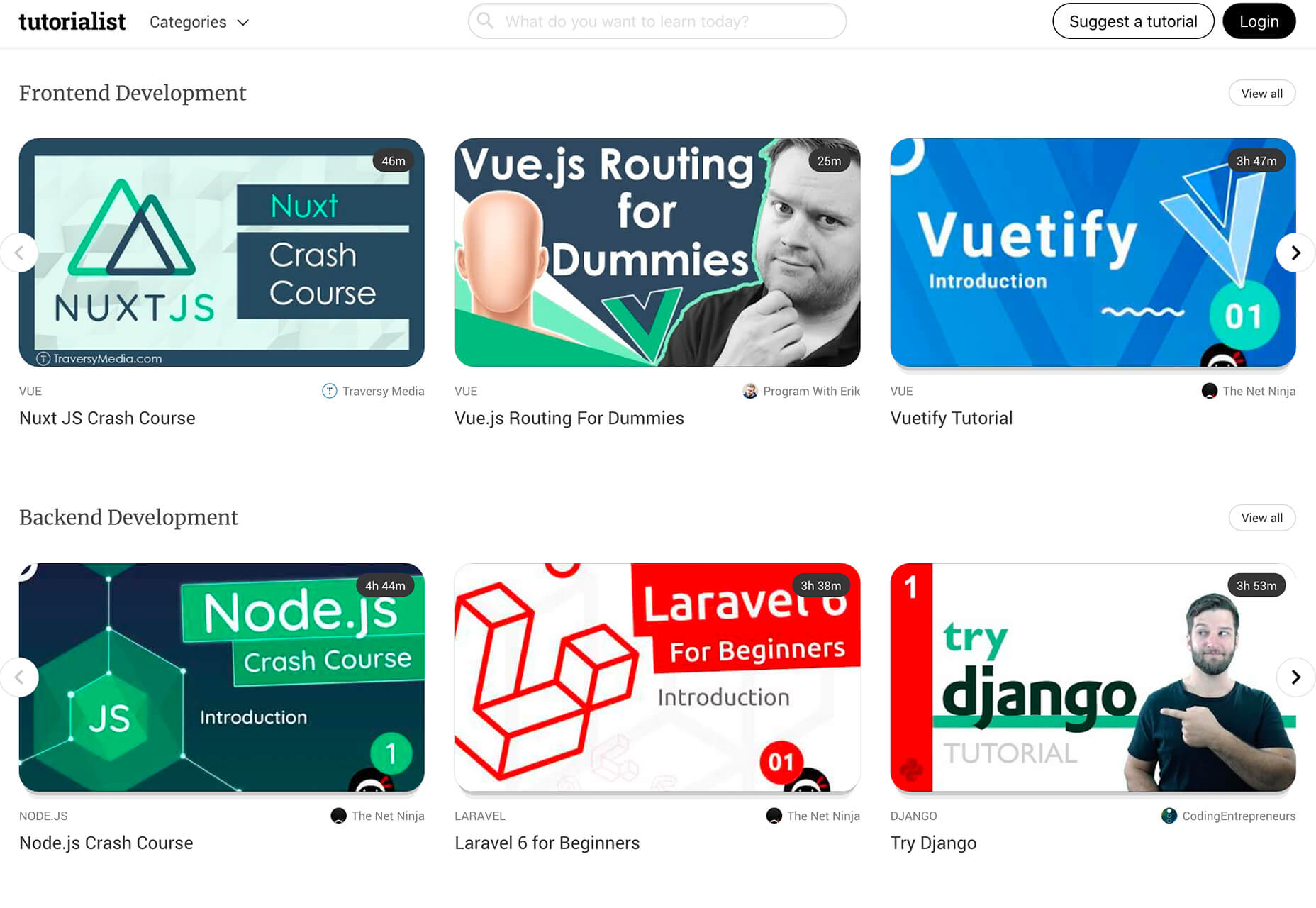
Tutorialist brings together some of the best development tutorials on the web. All of the tutorials are free videos available on YouTube, and this project collects them all in one place.

Pure CSS Halftone Portrait from JPG

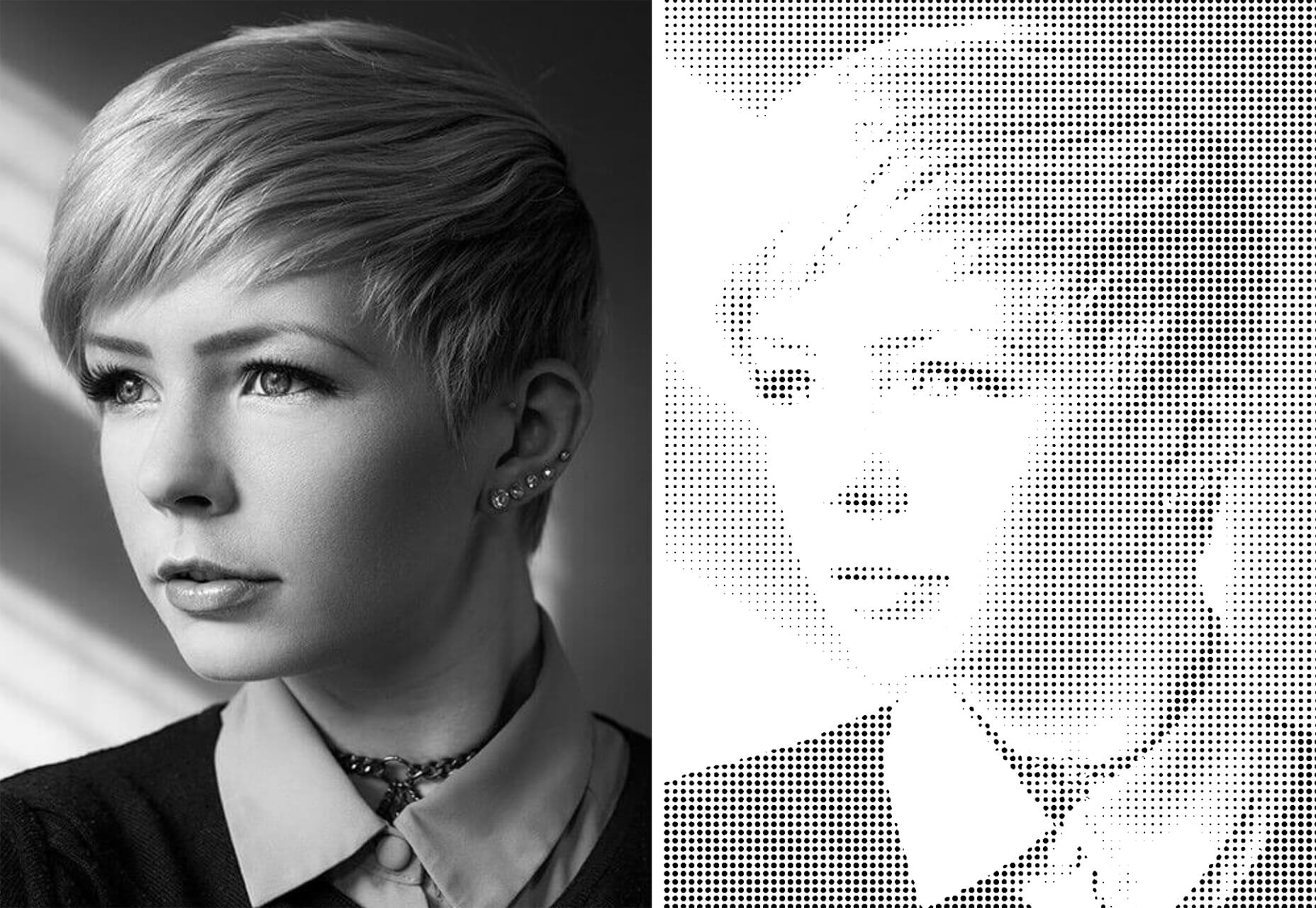
Pure CSS Halftone Portrait from JPG is a beautiful pen from Ana Tudor that shows how to change the visual representation of an image. The examples are brilliant and in true halftone fashion. The code snippet works with color, or black and white images as well.

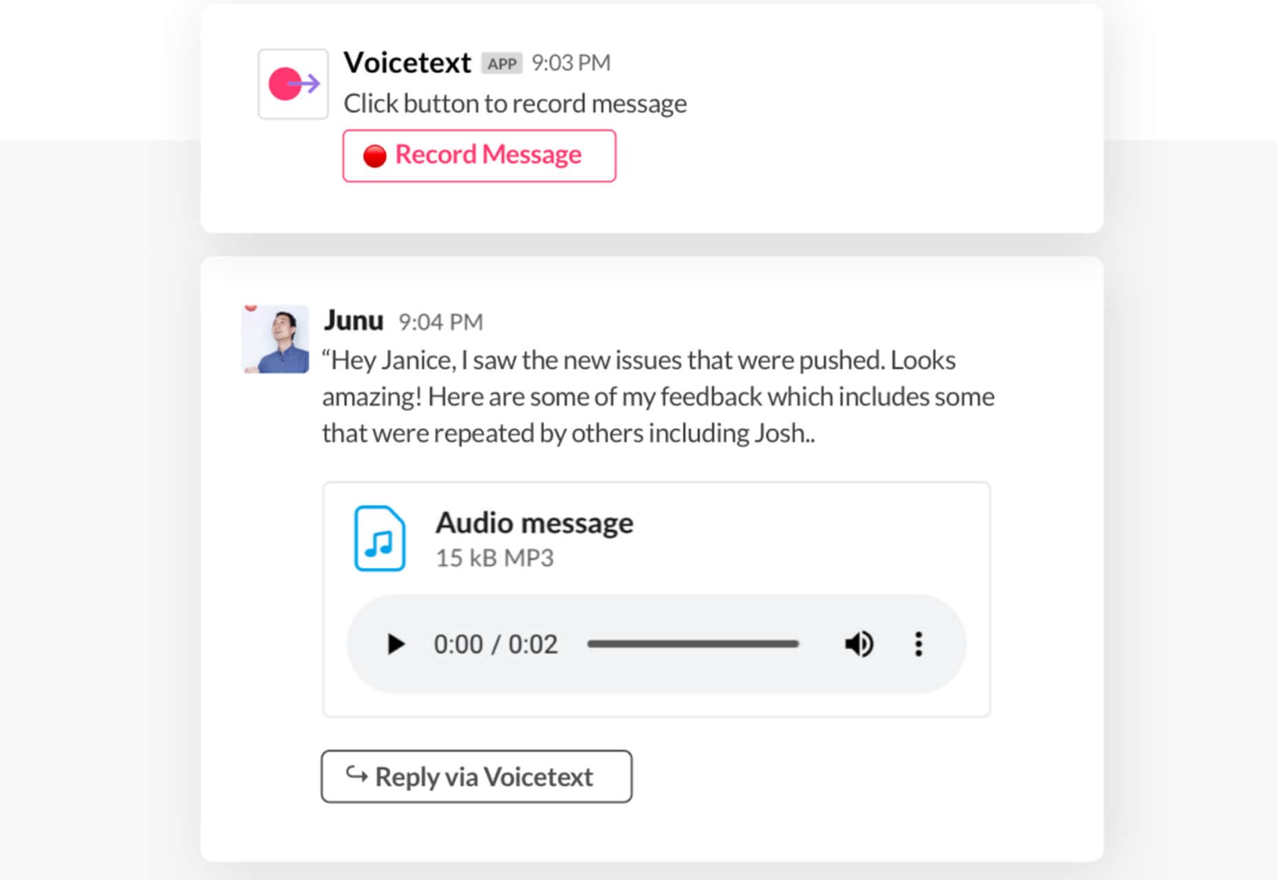
VoiceText for Slack

VoiceText for Slack is another work from home productivity tool. Integrate it with Slack and send messages with text that’s transcribed right in your channels. It’s a free integration and supports 18 languages.

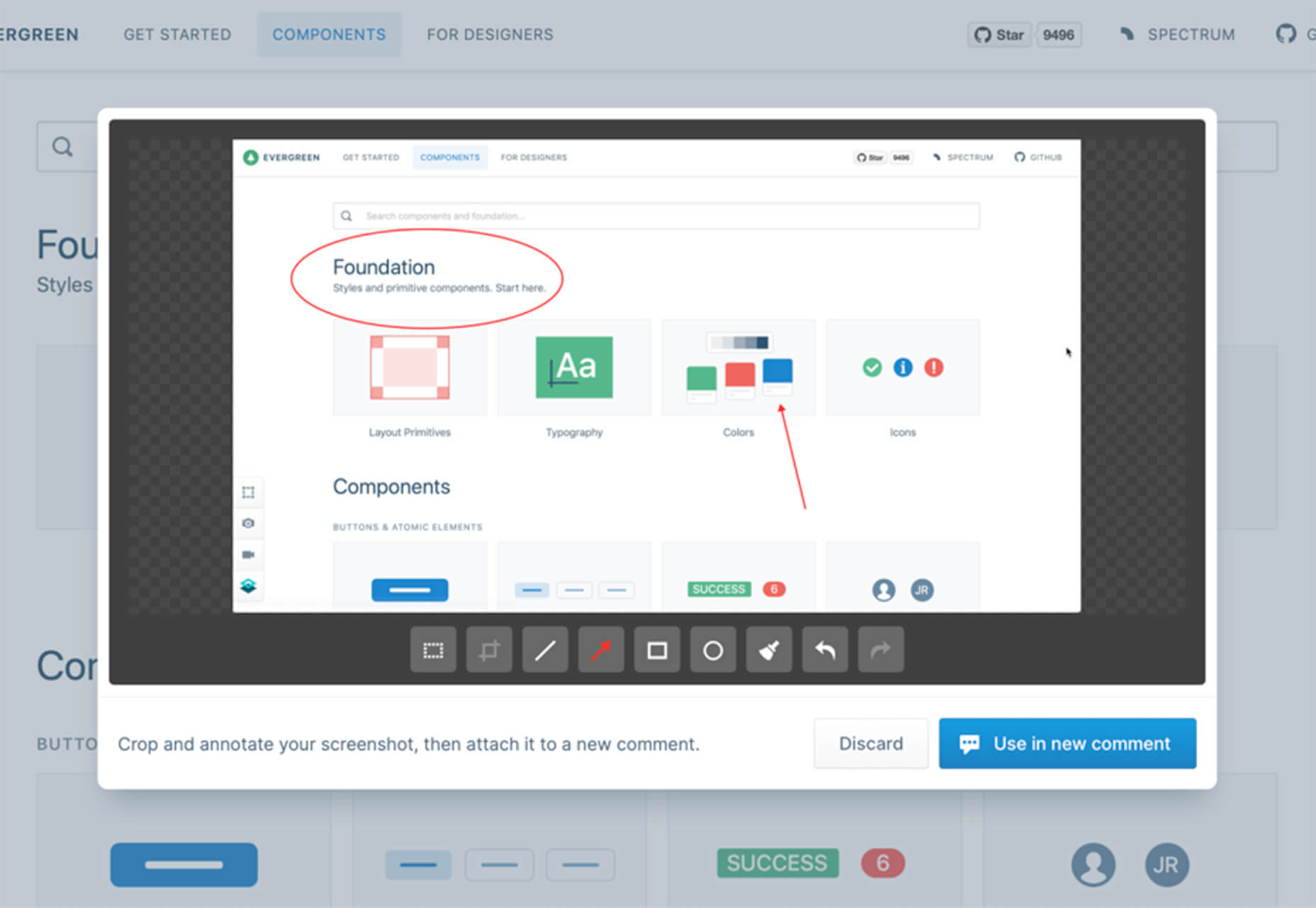
Feature Peek

Feature Peek is a developer tool that helps you get frontend staging environments on demand and gather team feedback earlier in the development process. It’s made for use with GitHub and works with a variety of other tools as well.

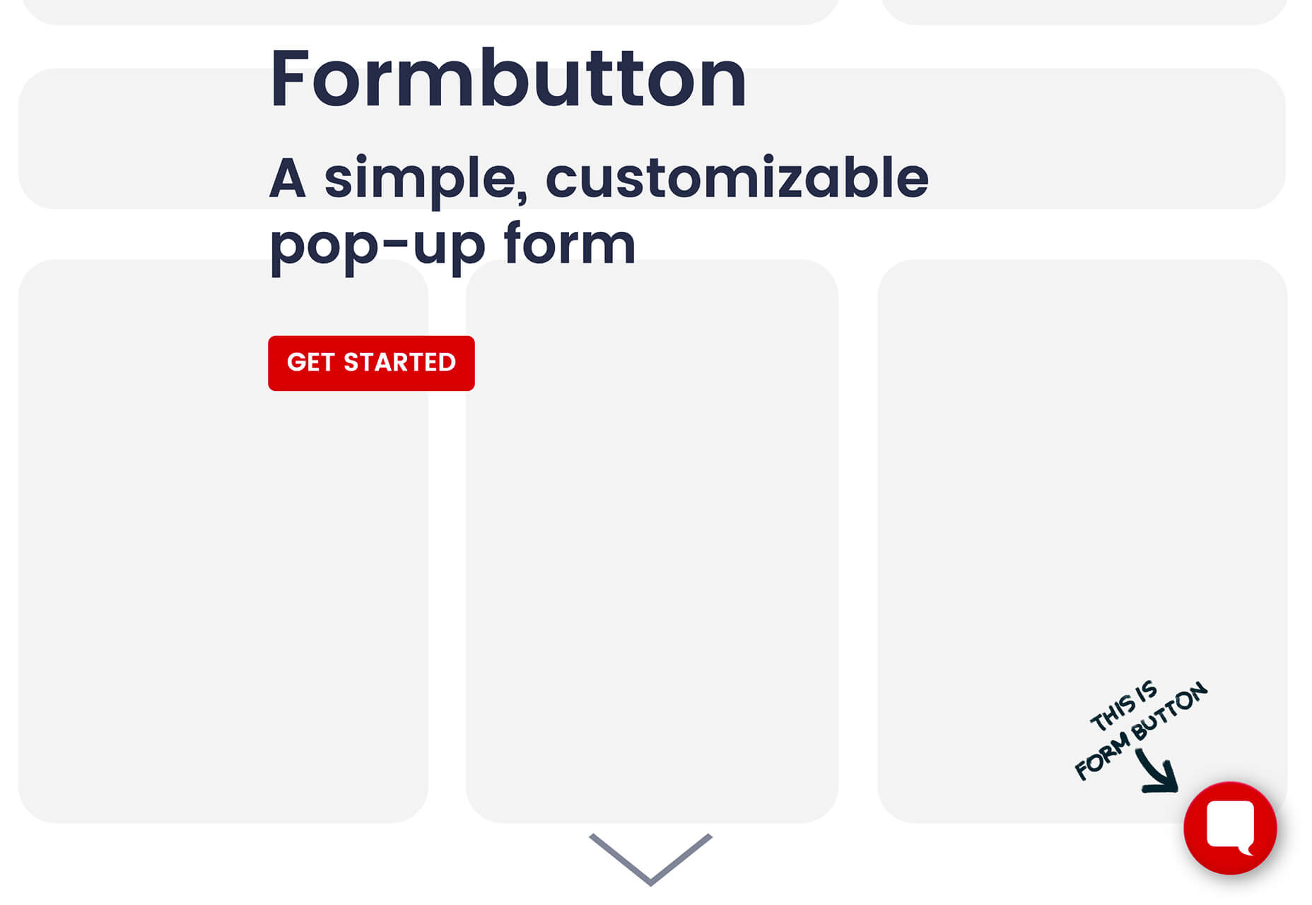
Formbutton

Formbutton is a simple and customizable pop-up form. (And we all know websites have plenty of them right now.) It connects to other services you already use, such as Google Sheets and MailChimp, and is simple to set up.

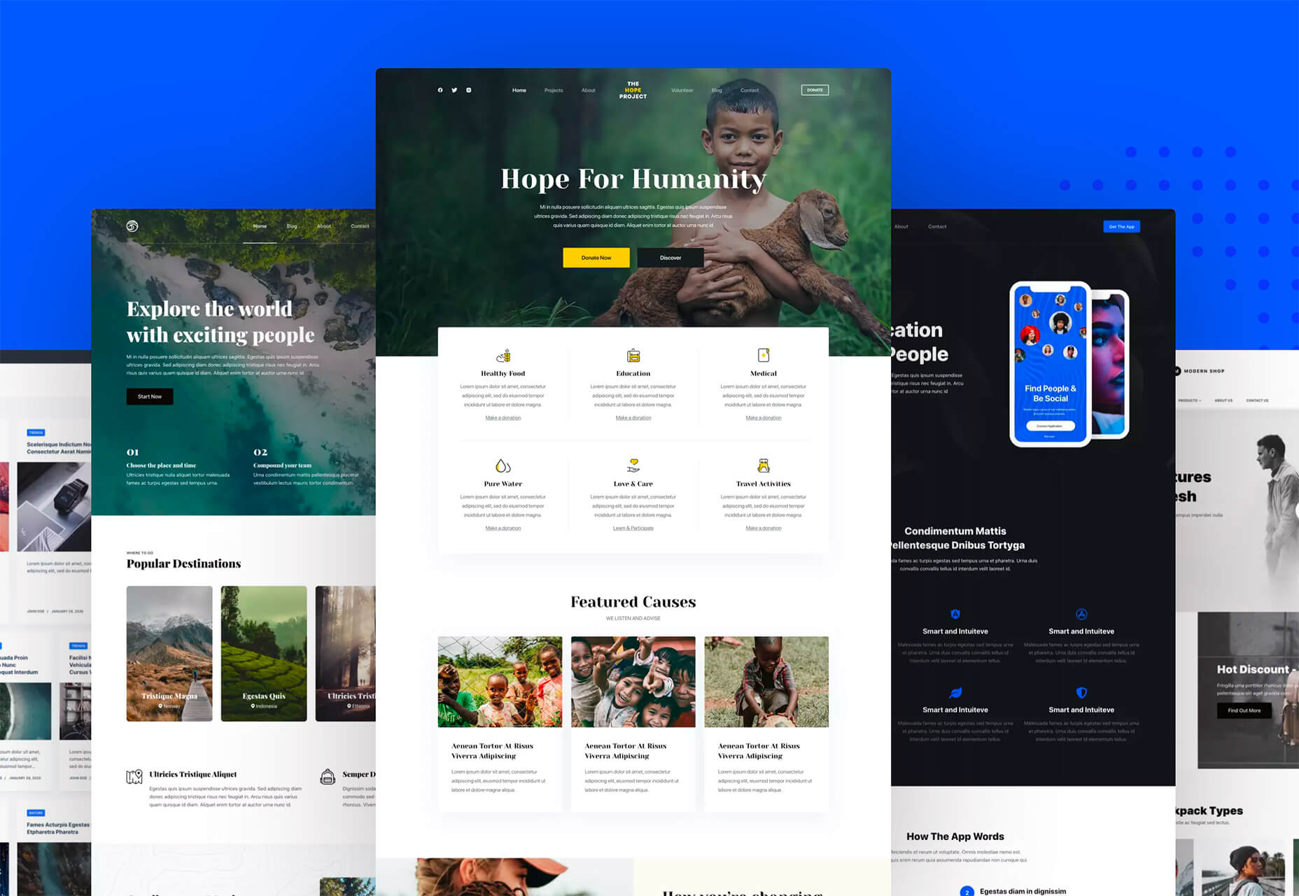
Blocksy Theme

Blocksy is a WordPress theme that’s made for non-coders. It’s a zippy and highly visual theme made for Gutenberg. It works with other builders and allows the user to customize pretty much everything visually. (There’s even a dark mode.) The theme is packed with tools and options and is a free download.

Oh My Startup Illustrations

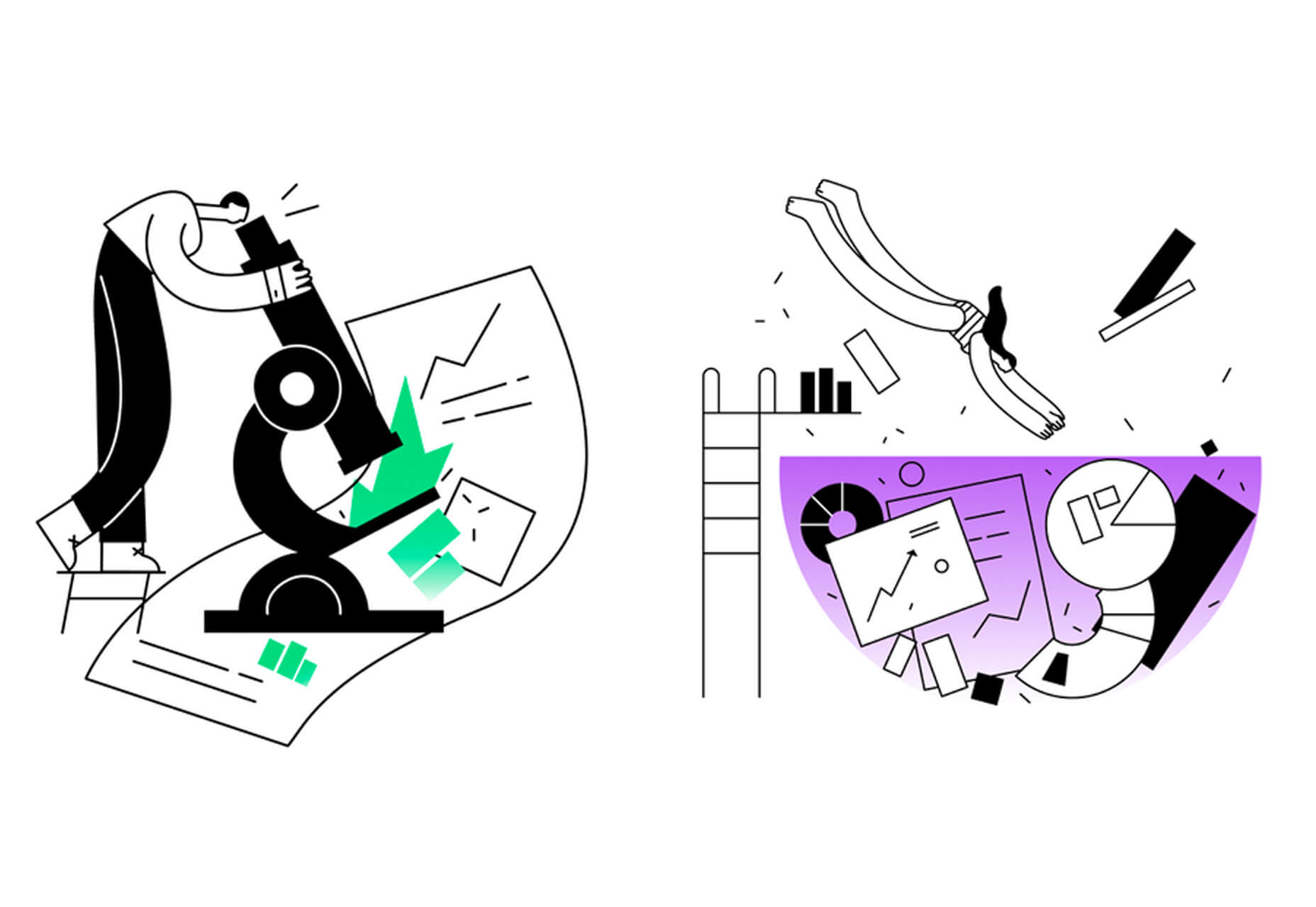
Oh My Startup Illustrations is a set of vector illustrations in several categories featuring a popular style on many projects. Use the characters and scenes to create a semi-custom story for your startup project.

1mb

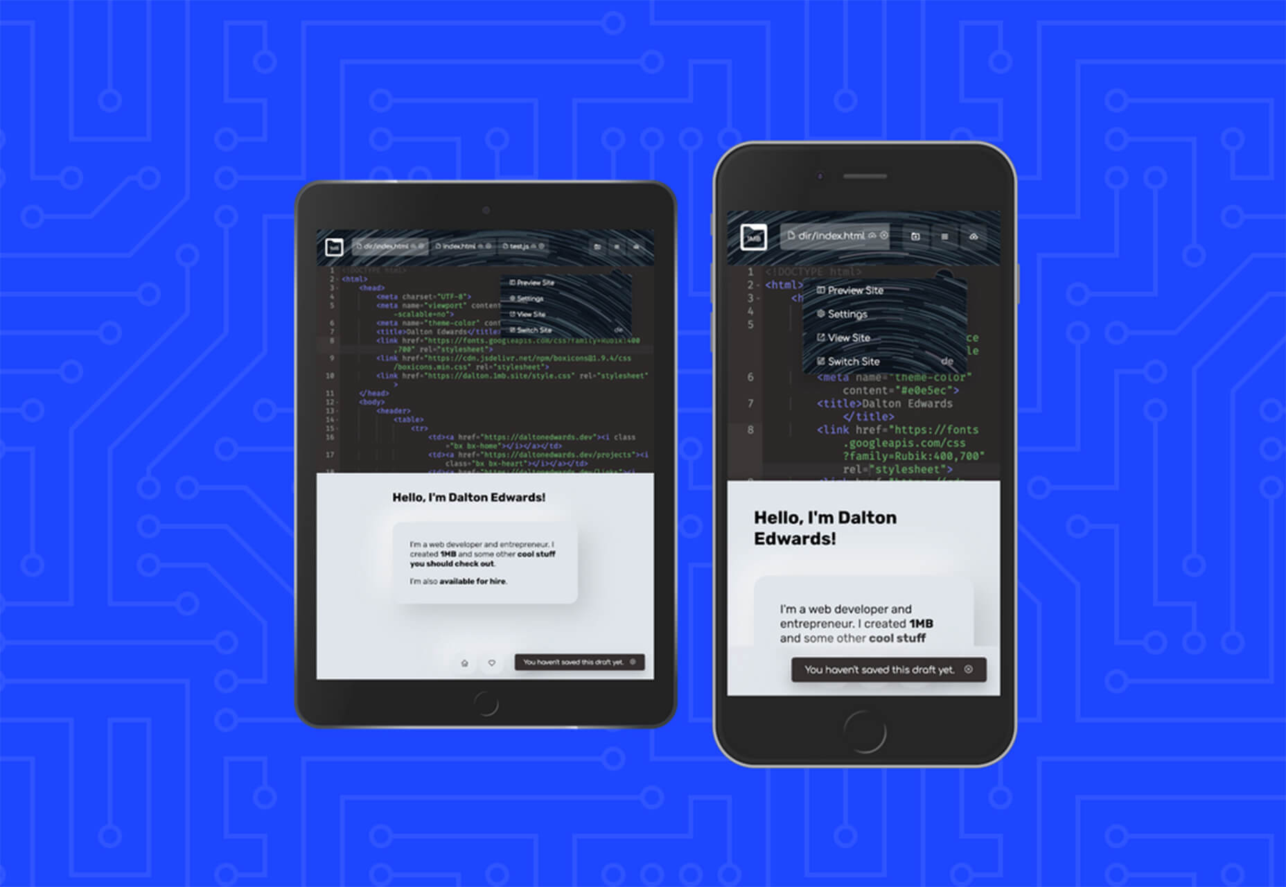
1mb is a code editor and host where you can create a static website with a custom domain and SSL included. The editor works in-browser and everything is saved in the cloud.

Linear

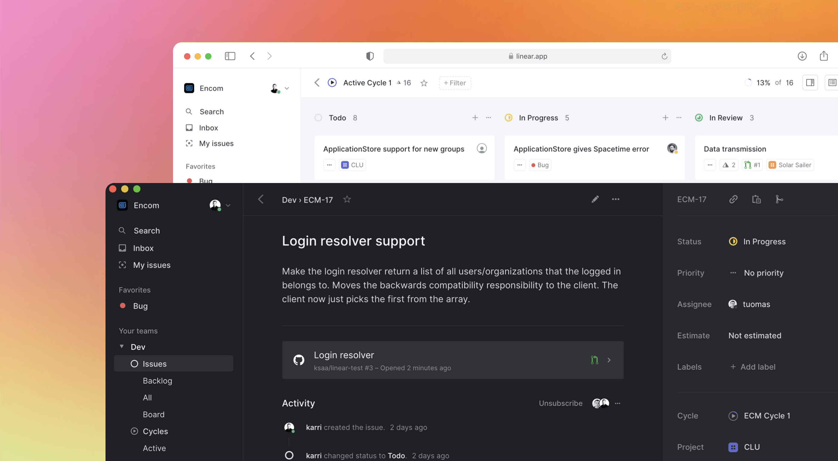
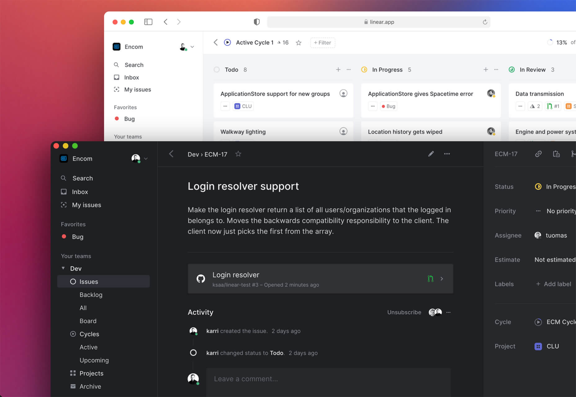
Linear is an issue tracking Mac app for teams. It’s designed to help streamline software projects, sprints, and tasks, and can integrate with standard tools such as Github, Figma, and Slack.

Hosting Checker

Hosting Checker solves a common issue – a client wants you to work on their website, but has no idea who hosts it. Hosting Checker shows the user hosting provider and IP address the website uses, along with where its server computers are located and the host’s contact details. It also claims to be 82% faster than other similar tools.

Spike

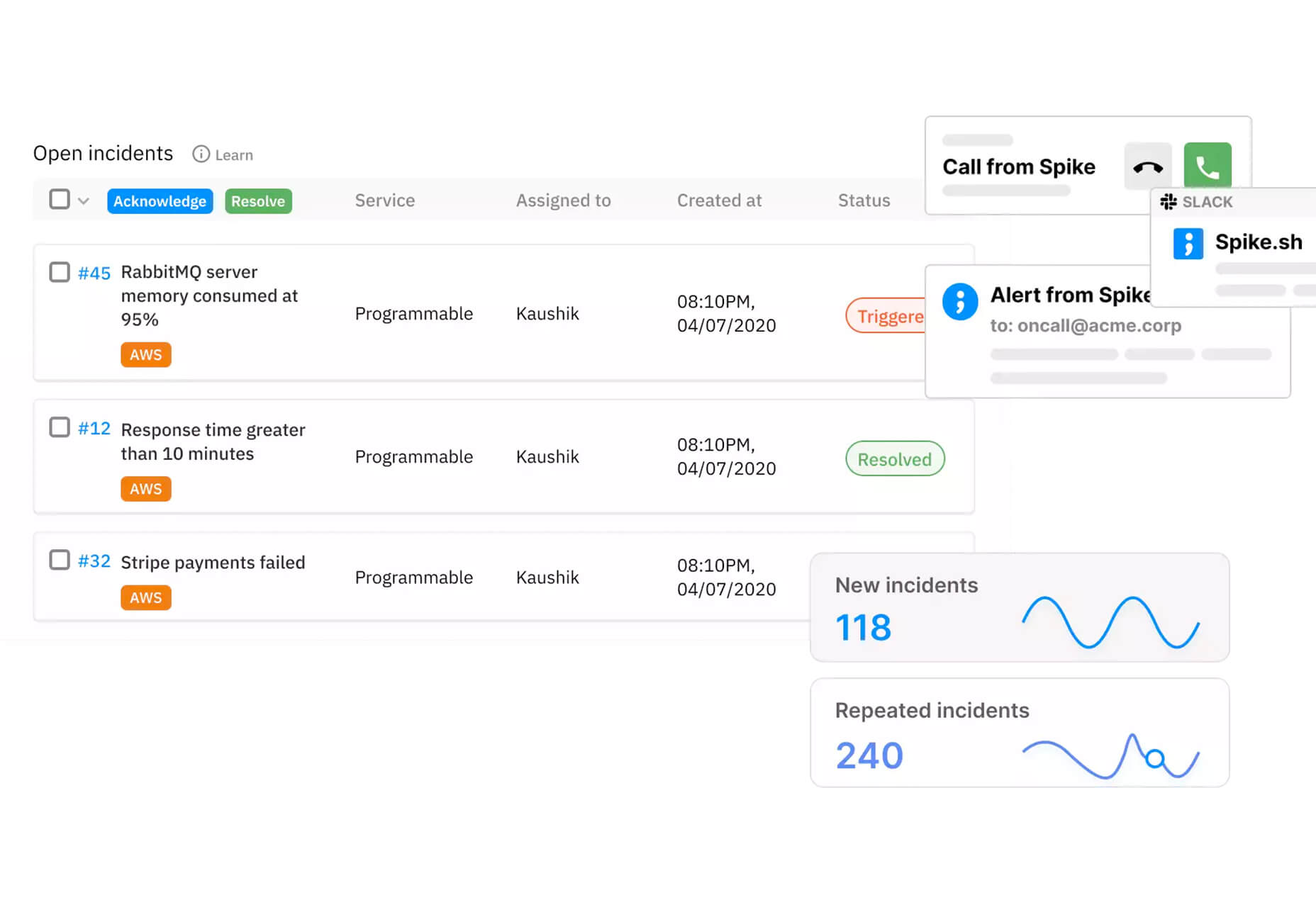
Spike alerts you to website incidents before customers. Create alerts and get a phone call, text message, email, or Slack notification right away. The tool provides unlimited alerts and integrations to you can stay on top of issues before they become real problems.

Magnus UI

Magnus UI is a framework that helps you building consistent user interfaces in React. It comes with plenty of components ready to use and you can customize the theme.

SpreadSimple

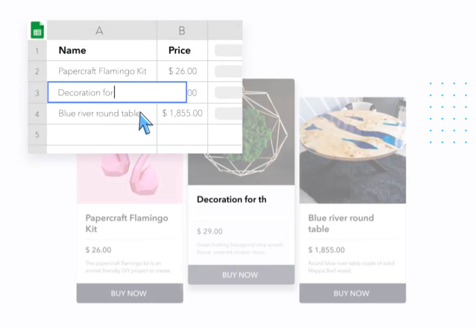
SpreadSimple uses data in Google Sheets to create styled websites with features such as filtering, search, sorting, cart, order collection via forms, and much more. Update the sheet and instantly see changes on the website.

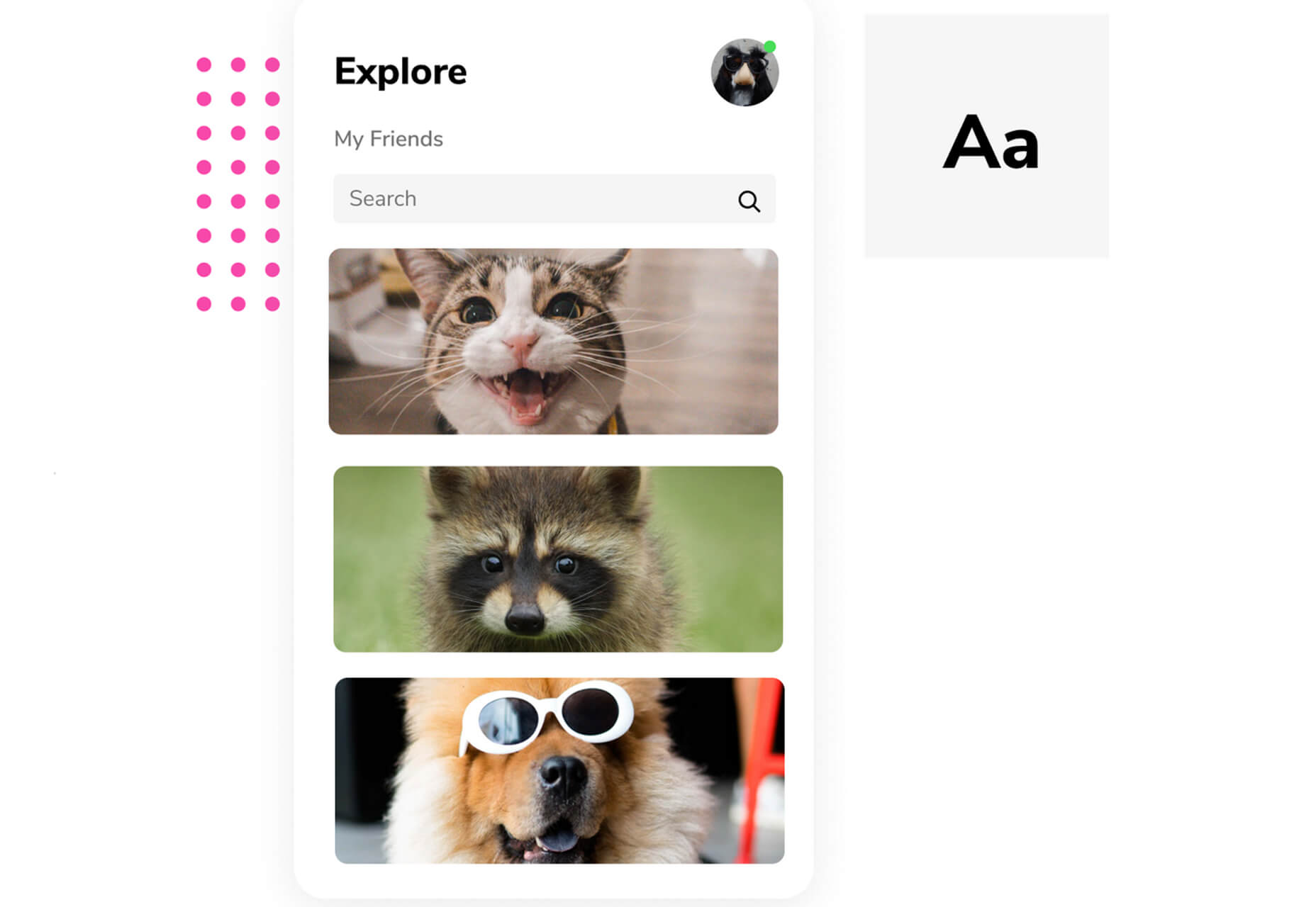
WebP vs. JPEG

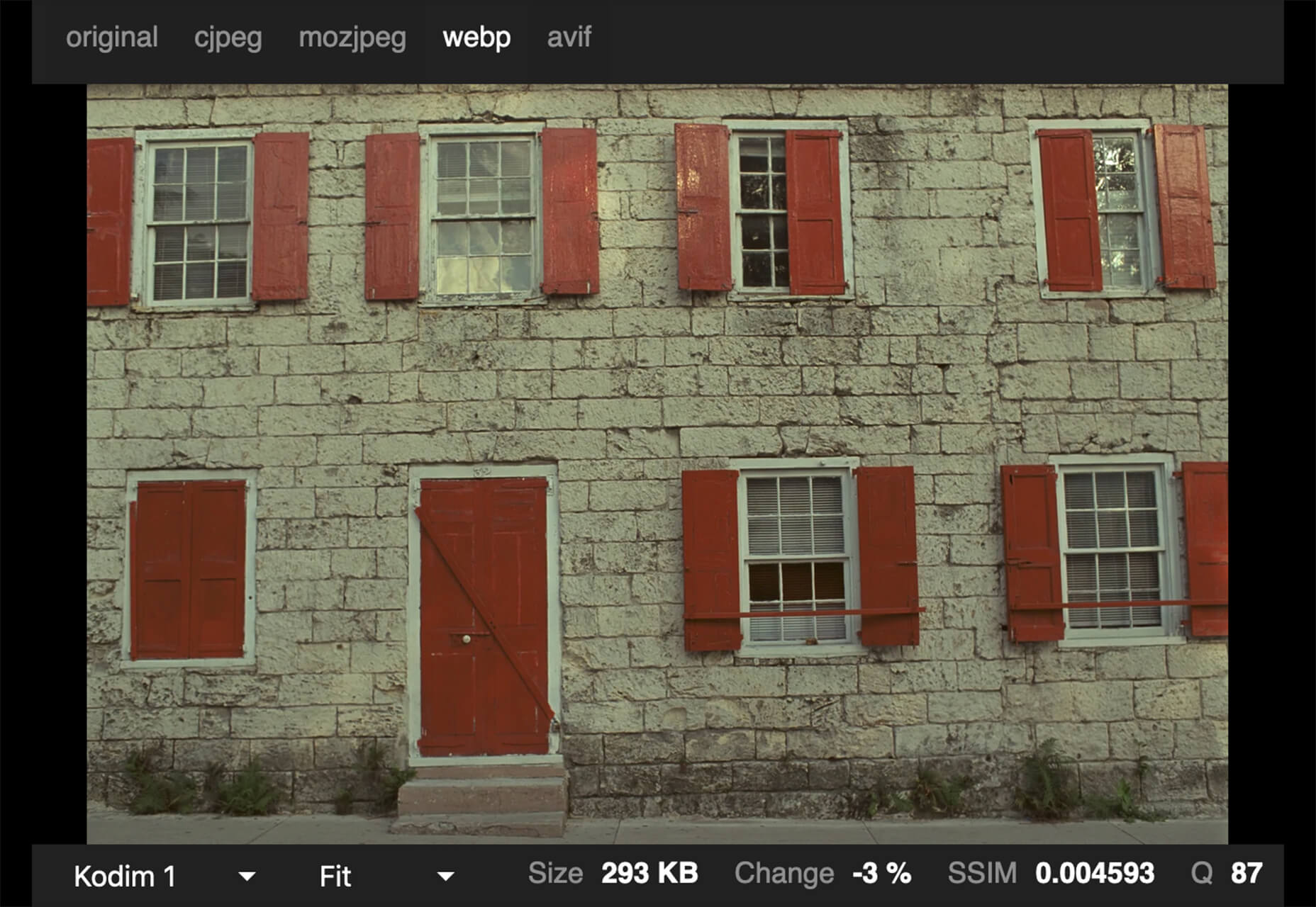
Google is starting to suggest using it’s WebP image format to decrease load times, because of the lighter file size. But is WebP better than the traditional JPEG? Developer Johannes Siipola tested the file types at different sizes to answer the question. The answer is a bit complicated, but sometimes it might be better; read the full analysis for more.

Oh Dear

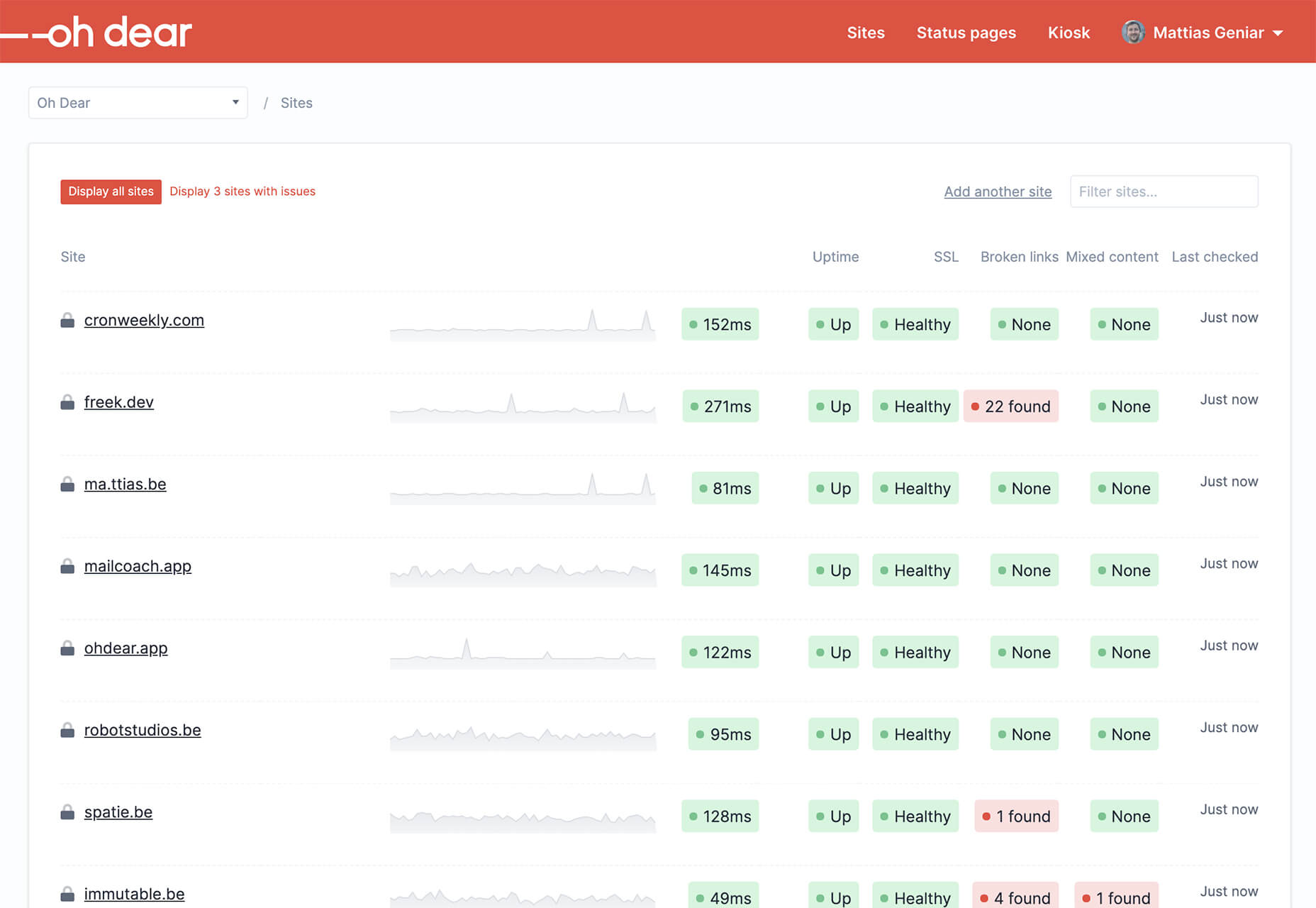
Oh Dear is a website monitoring tool that can help you keep a check on websites. Monitor uptime, SSL certificates, broken links, and more with notifications that come right to you if there’s an issue.

Airconnect

Airconnect is a Zoom video conferencing alternative that you can use for your brand with a custom header, colors, and portal for clients. The tool includes video calling as well as the ability for customers to access their data and automate your onboarding process.

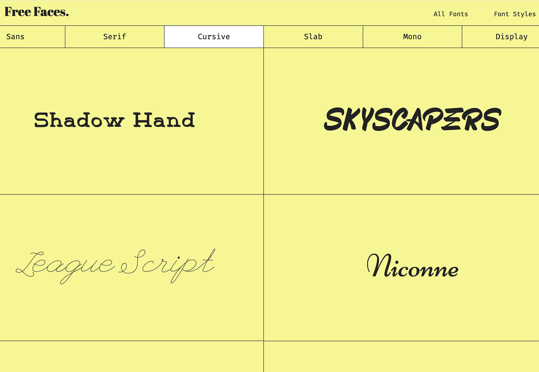
Free Faces

Free Faces is a curated collection of free typefaces that you can browse and use in projects. Search by type style with visual results that include a download link.

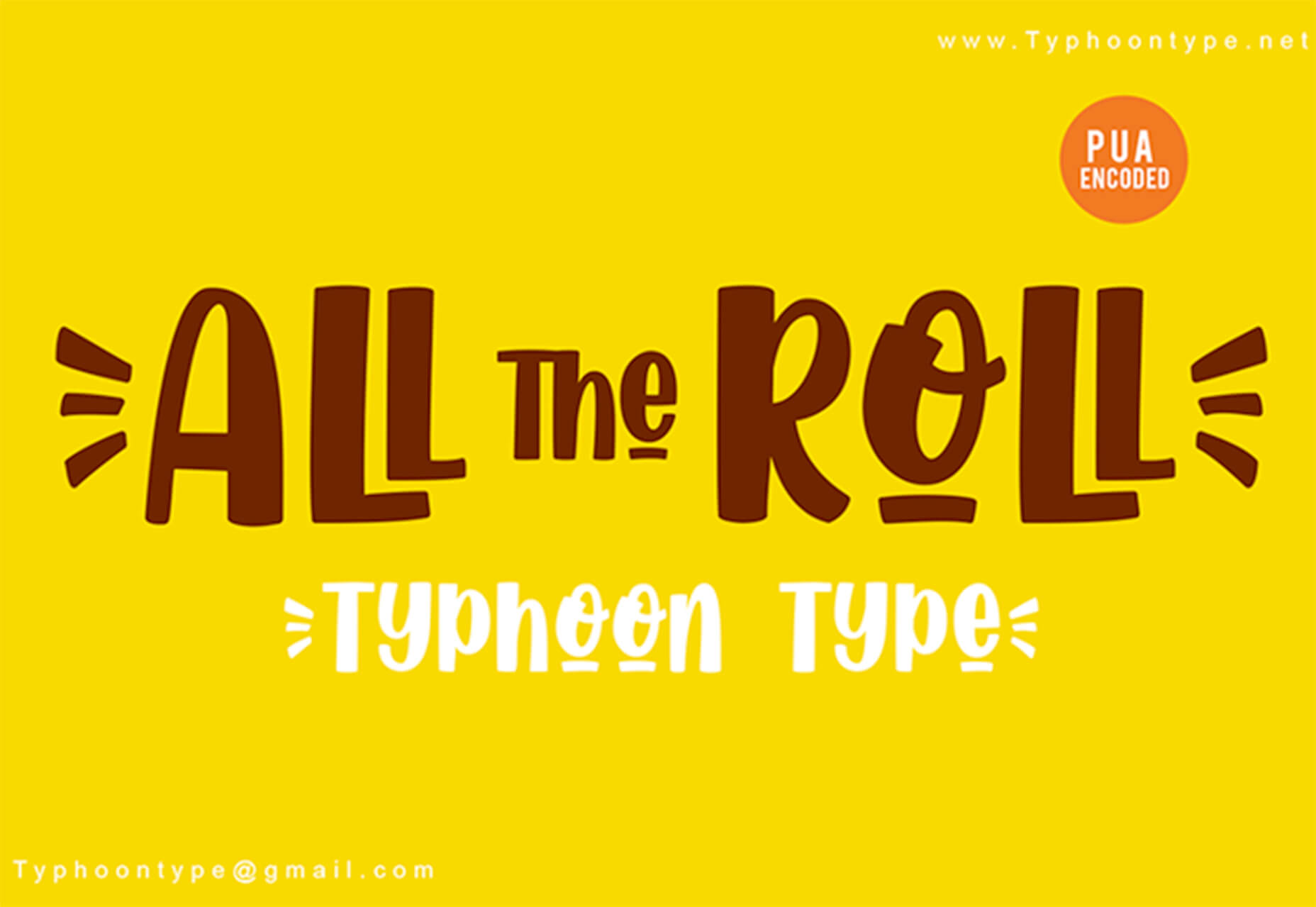
All the Roll

All the Roll is a fun novelty font for just the right type of project. It includes 167 characters with swash characters that can be added before or after certain letters.

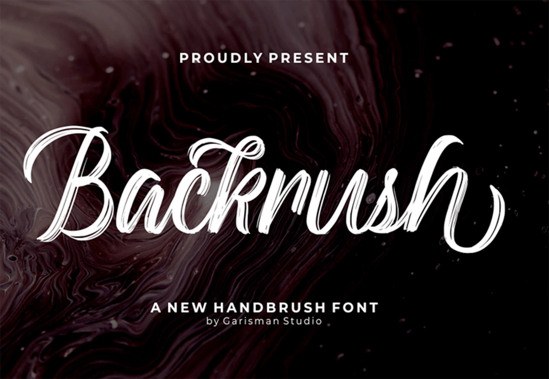
Backrush

Backrush is a handwriting-style typeface with easy strokes and a pen-like feel. It includes thicker letterforms with nice swashes and a full character set.

Thuner

Thuner is a slab display font with interesting quirks. It’s made for larger than life designs. It includes a full uppercase character set and numerals.

Source


Source de l’article sur Webdesignerdepot

Web developers have been the bedrock of any company’s business strategy for some time, and the industry is continuing to thrive and grow at a rapid pace. This is why it’s surprising that it is so lacklustre when it comes to diversity.
A recent study revealed 80% of those in the design industry are male, and more specifically 79% within the field of web design. According to WISE, just 23% of the people working in STEM roles (Science, Technology, Engineering and Maths) are female and women currently account for just 15.8% of the UK’s current generation of engineering and technology graduates.

Why the Lack of Diversity in Web Design?

The main reason for this, as cited by the Organisation for Economic Co-operation and Development (OECD) found that women still lack the confidence to pursue these careers, despite their school results being as good as (or better) than their male counterparts. Research has found that the professional and technical services sector has the fourth-highest gender pay gap of all UK industries. If more women were to join these higher-paid sectors it could help reduce the gender pay gap as a whole, as well as help female economic empowerment.

This division is seen in ethnic minority groups too. The numbers for BAME (Black, Asian, Minority Ethnic) employees in the British tech industry are unknown but is estimated by the British Computer Society to be at 1-2%, a ridiculously low number in this day and age. This is why groups and organisations are cropping up designed to promote an industry that reflects all of society rather than one part of it. Here are some of the organisations to pay attention to who are bridging the diversity gaps in web design.

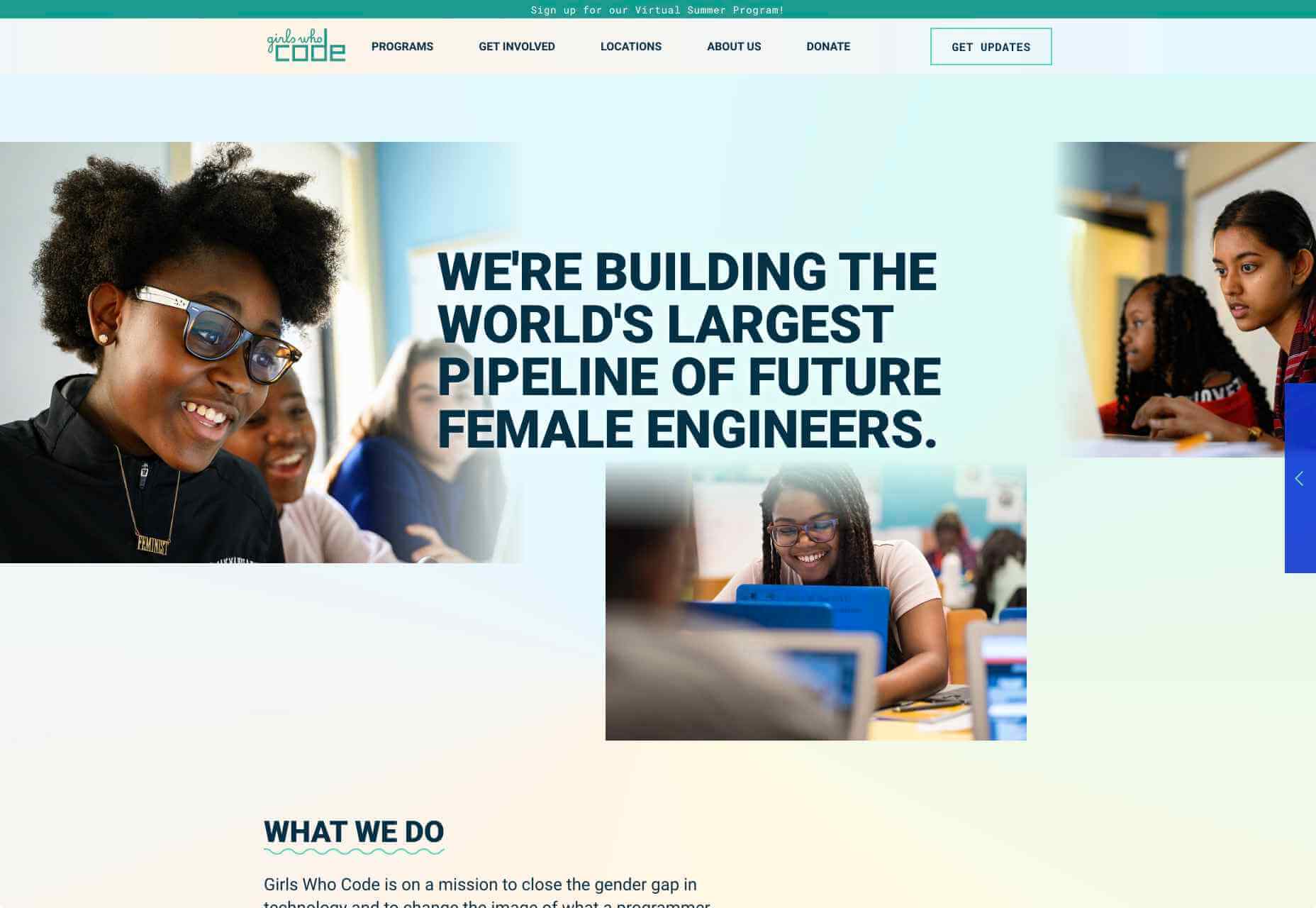
Girls Who Code

Girls Who Code are working to create opportunities for women within tech, aiming to deepen their computer science skills and confidence. They run a range of programs designed to equip women with the necessary computing skills to pursue opportunities in the field and to give chances that are often shunned due to society. Founder Saujani states that women are socialized to seek perfection, and this is something that needs to be overcome. One way to break that mentality at an early age, she says, is coding:

[Girls] walk into these classrooms and they feel like they will never be good at it, and when they learn how to create something, whether it’s a website or app, it changes their mindset and they stop giving up

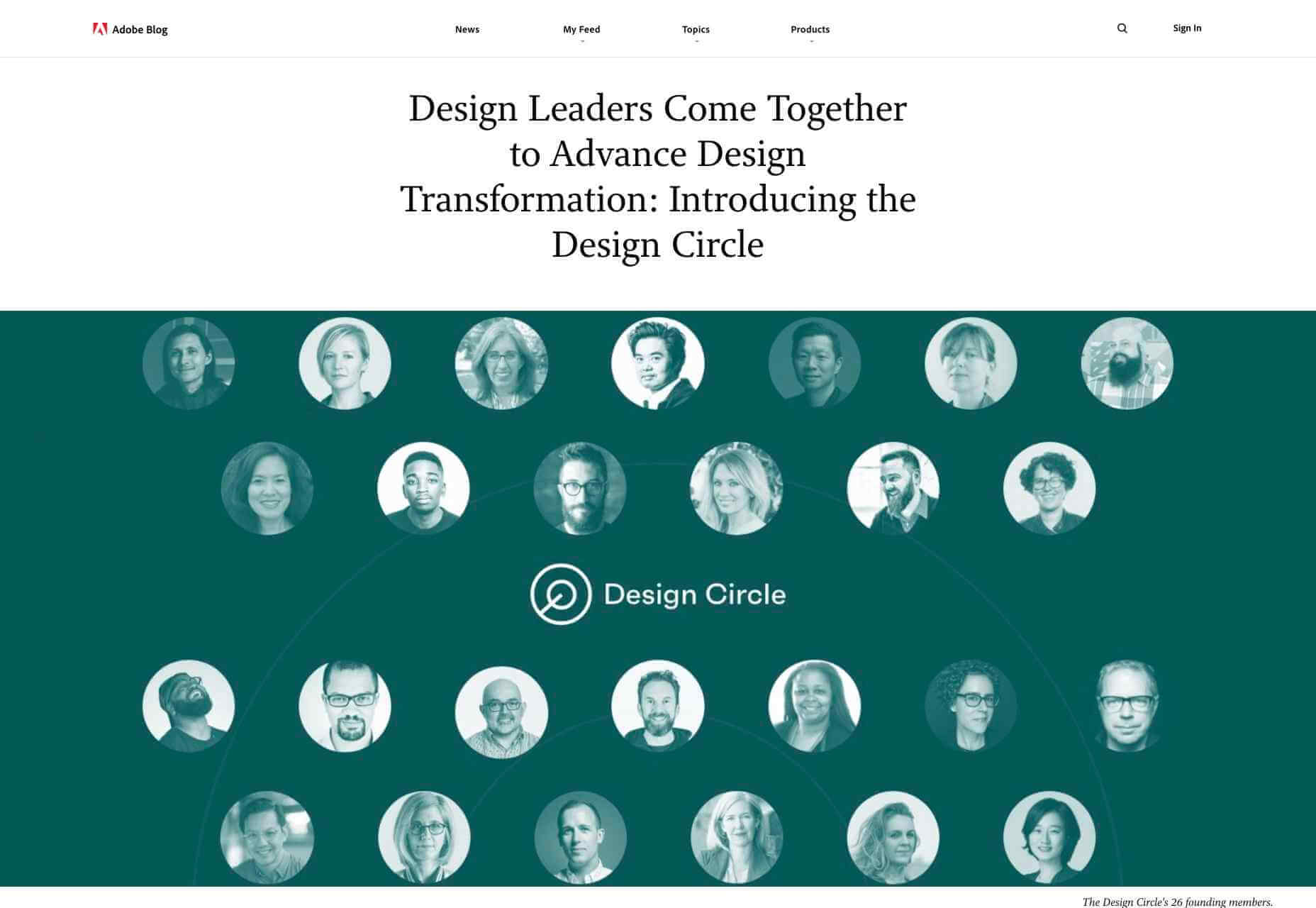
Adobe Design Circle

Adobe Design Circle is another initiative aiming to introduce all members of society to design. They want to create more visibility for design as a viable career path for anyone that might be considering it, and to help with youth entering the field. This is opening the opportunities of working in tech and web to aspiring designers at a young age who aren’t necessarily yet conditioned by the pressures of society and showing them it can be a realistic career path.

They have their own scholarships and mentoring initiative to support these goals too. The faces behind the team of Adobe Design Circle range through multiple ethnicities and have a fairly even male-female divide. This equal representation alone is inspiring. One of Adobe’s core missions is to offer youth the opportunity to learn and express themselves through creativity and technology, regardless of their economic or cultural backgrounds. With this they specifically encourage applicants of all backgrounds to apply and offer many other opportunities from mentoring to internships.

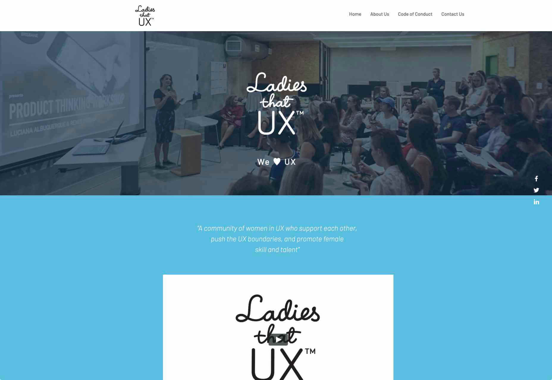
Ladies that UX

Ladies that UX are a collaborative community of women in UX aiming to “support each other, push the UX boundaries and promote female skill and talent.” It is a European-based initiative where each city involved runs slightly different events and groups decide together what they would like to get from their meetups. They assist each other with UX challenges, discuss topics, and brainstorm ideas. Ladies that UX was created in 2013 by Georgie Bottomley and Lizzie Dyson with the aim of bringing together women in the industry, offering support and creating connections around the world.

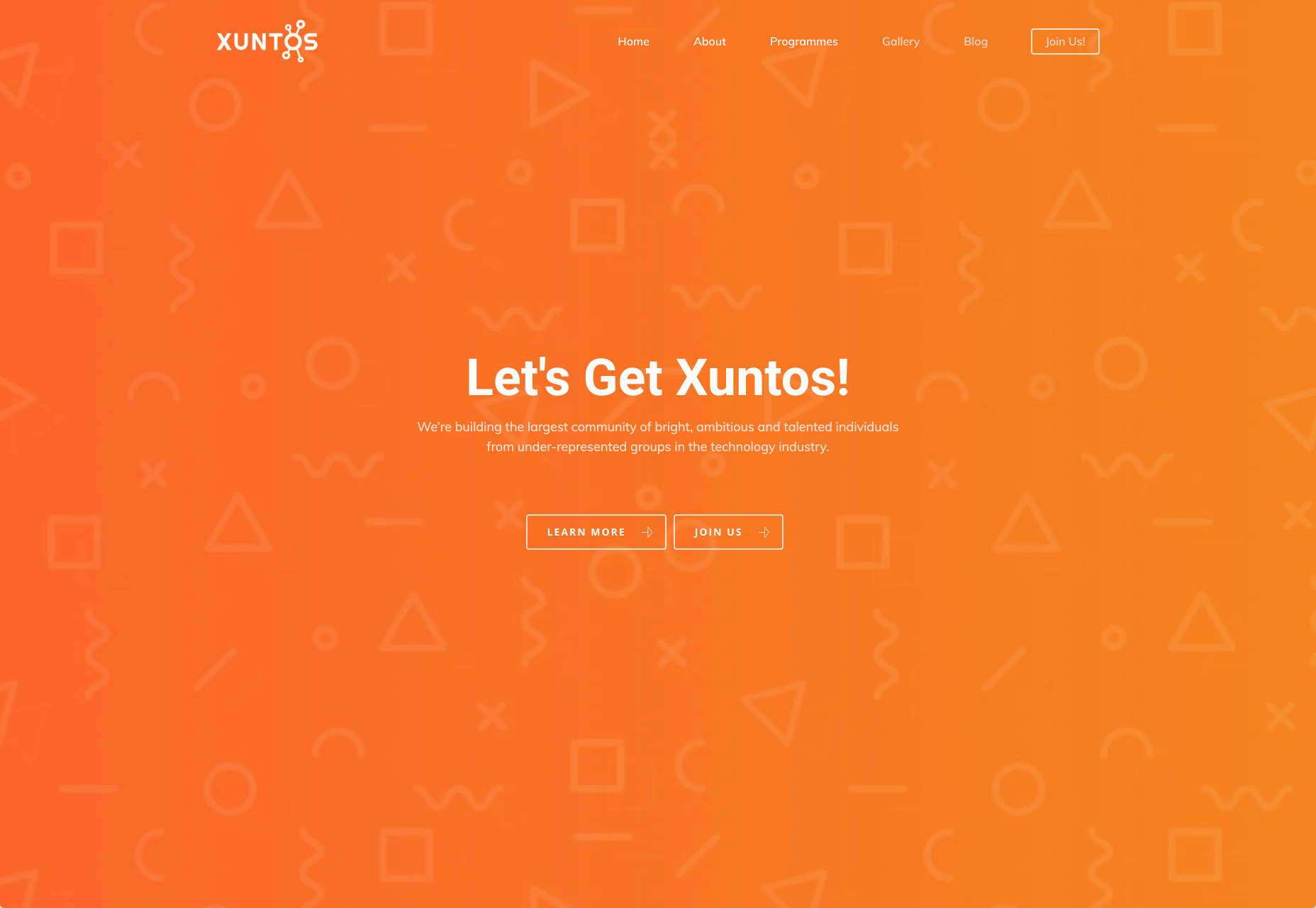
Xuntos

Xuntos is aiming to create the largest community of ambitious and talented individuals from under-represented groups in the technology industry. It works to nurture university students and recent graduates that are often overlooked in the tech industry by the means of educational workshops, university hubs, events and an active community. The very name “Xuntos” is a Galician word which means “together” and this is their most important factor. They want people to realise they are not alone and just because the representation isn’t there, doesn’t mean their capabilities aren’t.

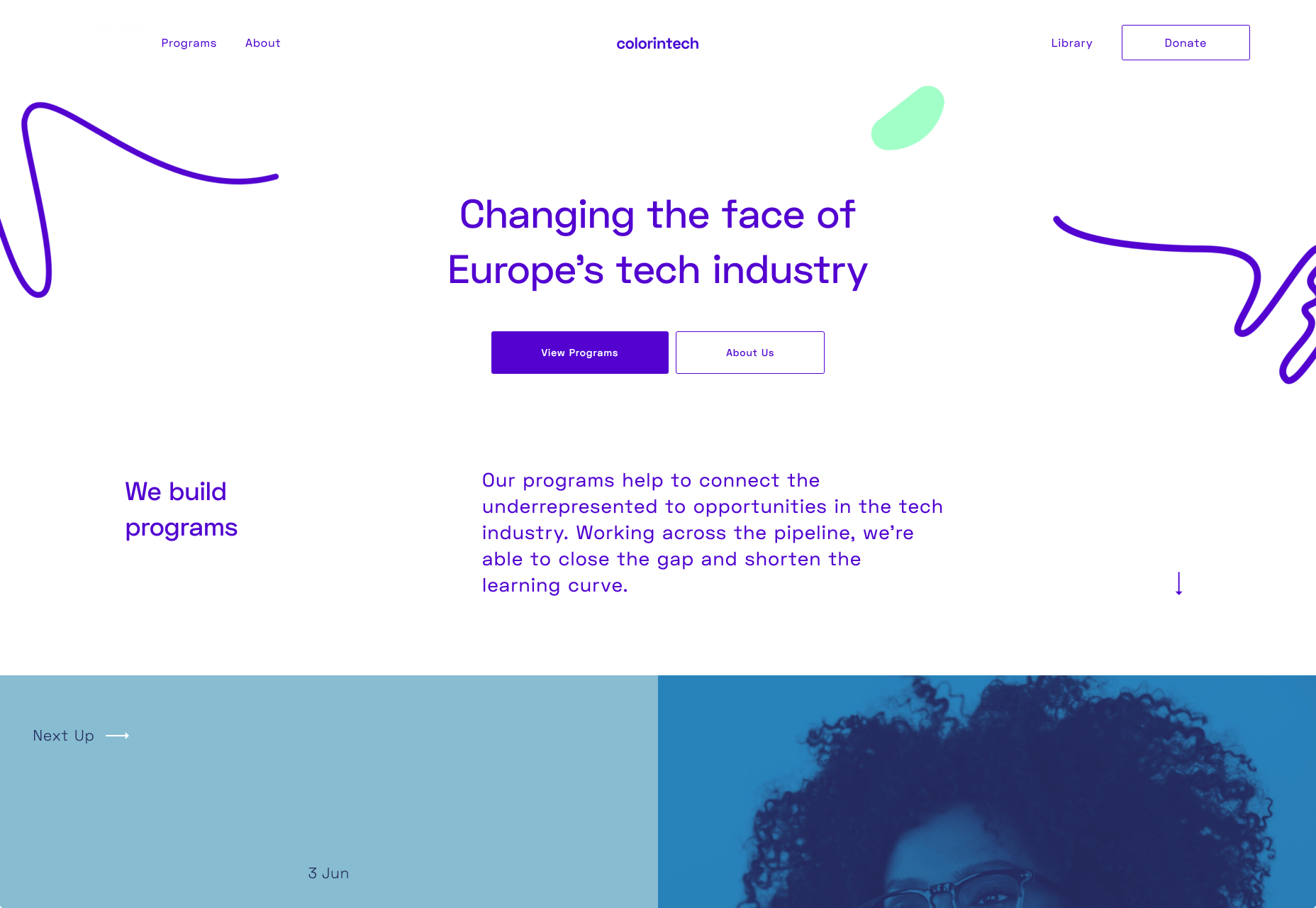
Colorintech

Colorintech is a non-profit organisation that was founded in 2016. It aims to close the gap and shorten the learning curve, with a strong community designed to help each other. The company was founded by Silicon Valley tech executive Dion McKenzie and ex-Googler Ashleigh Ainsley after they became frustrated at the few black individuals in the field. Since its inception 30,000 students, professionals, volunteers and tech companies have been impacted by their work, and over 450 minorities graduated from their programs in 2019 alone.

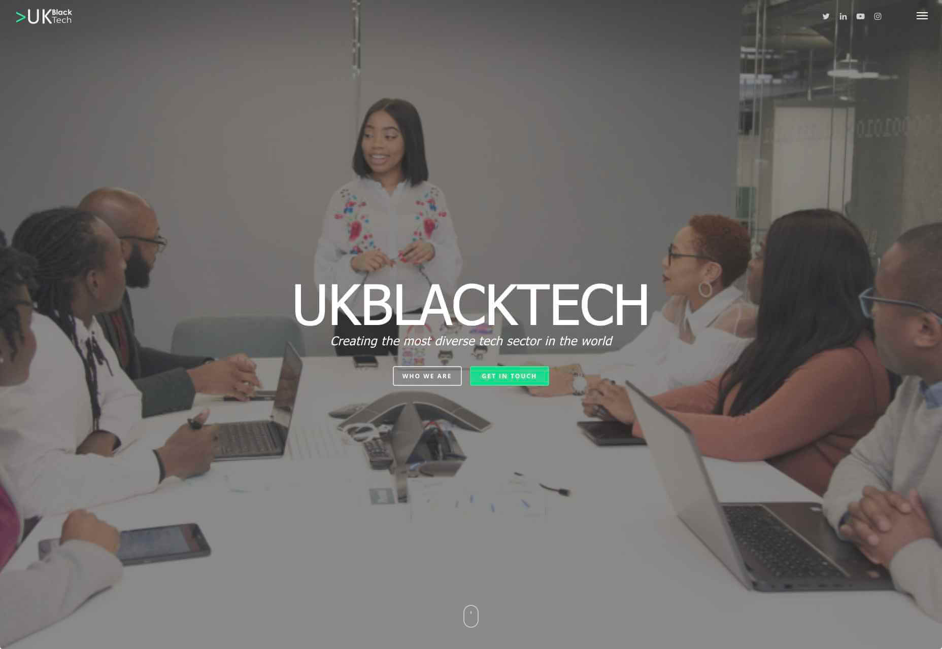
UKBlackTech

UKBlackTech are on a mission to create the most diverse tech sector in the world. Their aim is to encourage more ethnic minorities to enter the UK’s technology workforce and make an impact. To help with this, they design and implement different initiatives to help them get employed and retain employment, put on bespoke events that target aspects such as specific job roles or tech topics and promote different opportunities for members to apply to.

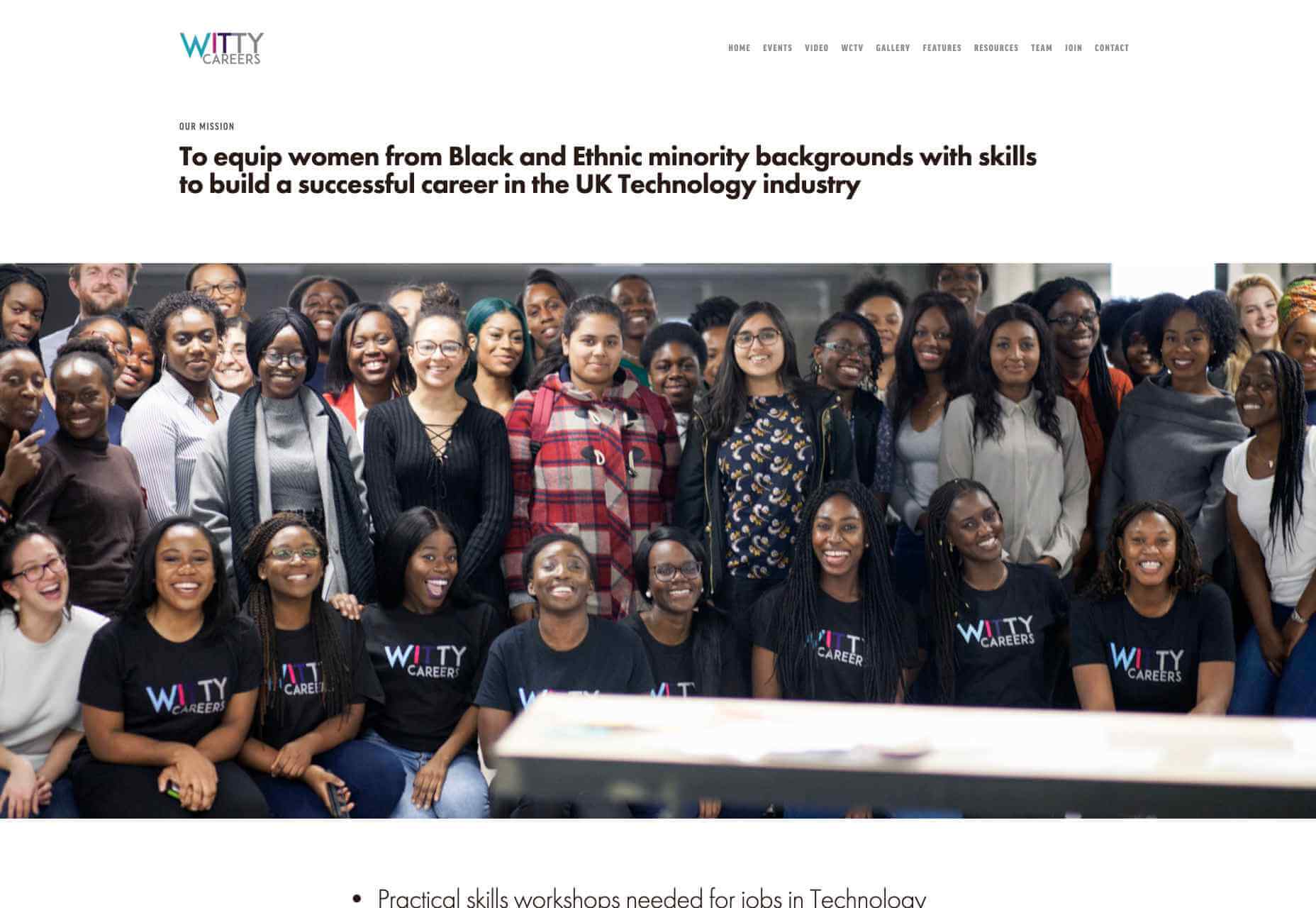
Witty Careers

Witty Careers was created with the aim to support women from black and ethnic minority backgrounds in the UK and equip them with the skills to build a career in the tech industry. They run different practical skills workshops and events which in the past have included visits to a Microsoft store, Uber, and Pivotal. They open doors for communications, networking and future career prospects for those in the minority. They also have a handy range of resources designed to help you get into the career you want. From CV writing advice to industry insights, they are all free of charge.

Featured image via Unsplash.

Source

p img {display:inline-block; margin-right:10px;}
.alignleft {float:left;}
p.showcase {clear:both;}
body#browserfriendly p, body#podcast p, div#emailbody p{margin:0;}


Source de l’article sur