Articles

There are some spook-tacular finds in this month’s October collection of resources and tools for designers and developers. From interesting tools that can help in the design process to boo-tiful typefaces, there’s something for everyone here.

Here’s what is new for designers this month…

Atropos

Atropos is a lightweight, open-source JavaScript library to create touch-friendly, three-dimensional hover effects. The results are stunning and have a nice parallax style. Everything is highly configurable and customizable. It’s available for JavaScript, React, and Vue.js and has zero dependencies.

CSS Gradient Editor

CSS Gradient Editor helps you create the perfect gradient style – you can start from presets – that you can use in projects. Design a background, fill, or almost any other gradient element you might need, make adjustments or customizations, and then get the CSS with one click so you can use it right away.

Octopus.do

Octopus.do is a fast visual sitemap builder that lets you work in real-time using the content brick method. Share and collaborate in real-time and there’s no signup required to use it.

Pirsch Analytics

Pirsch Analytics is a privacy-friendly, open-source alternative to Google Analytics — lightweight, cookie-free, and easily integrated into any website or directly into your backend. It includes filters to see metrics in the way you want and light and dark modes.

Basic Pattern Repository

Basic Pattern Repository is a collection of simple SVG patterns for projects. Everything is rooted in a simple style to help push projects along quicker. You can get it via GitHub or as a Figma Library.

Blobr

Blobr is a way to get a branded API portal, manage access, and monitor usage all in one place. Customize everything to fit your brand and the tool grows as you do with the ability to increase or change capacity. Plus, it is easy to set up and free to use.

HEXplorer

HEXplorer helps you better understand something you use all the time – HEX colors. This pen by Rob DiMarzo shows how the values for different colors come together to provide greater comprehension when it comes to this color format.

CCCreate

CCCreate is a curated collection of tools and resources for web creators. It includes some tools that have been around for a while as well as some newbies. Everything is grouped and sorted by type of resources – color, icons, type, layouts, animation, shapes, docs, and miscellaneous so you can find what you are looking for faster.

Glass

Glass is a photo-sharing app for photographers. It’s a social network of sorts that lets you share images with the greater photography community without “likes.” Just great images.

Revolt

Revolt is a chat app that’s still in beta and designed for easy communication without having to download apps. It’s an open-source project that is customizable and with an intuitive and recognizable interface. The thing that’s different about this app is that it is built on a privacy-first model.

Doodle Ipsum

Doodle Ipsum is the illustrated version of placeholder elements. Customize your doodles, grab the code, and use them on your web prototypes, landing pages, or no-code tools.

Mechanic

Mechanic is an open-source framework that helps you create custom, web-based tools that export design assets in your browser. The best part is you can try it right on screen using the “poster generator.” If you like what you see, there’s plenty of documentation to help you along the way.

Medio Website Template

Medio is an agency-style website design template for Bootstrap 5. The layout is perfect for a design agency or marketing group but can be adjusted for almost any multi-purpose design. The free template includes a minimal design and includes features such as parallax, popup video, and more.

Tutorial: Simplifying Form Styles with Accent Color

This tutorial is a life-saver when it comes to using and understanding the new CSS accent-color property. This quick lesson will help make your life easier and is simple to use. It starts with setting an accent-color property on the root element and then applying it.

Houdini.how

Houdini.how is a worklet library that is full of CSS and code examples to help you work smarter. See how different elements look cross-browser and learn to adjust the code and put them together in just the way you want. Houdini is a set of low-level APIs that exposes parts of the CSS engine, giving developers the power to extend CSS by hooking into the styling and layout process of a browser’s rendering engine.

Chainstarters

Chainstarters is a powerful, rapid, Web3-enabled platform for software developers. It eliminates the burden of setting up and maintaining a secure and scalable infrastructure, allowing you to focus on creating amazing technology.

Web Vitals Robot

Web Vitals Robot is a search optimization tool that monitors SEO metrics for you – so you can prevent your business from disappearing from Google.

Searchable

Searchable is a unified search tool that looks at local, cloud storage, and apps to find the files you are looking for. It returns results in a jiffy with previews so you don’t have to open every file to find what you are looking for.

Athlone

Athlone is a fun serif with lots of personality. The free demo version includes a limited character set for personal use only and the full version has everything you need for fun display or branding with this typeface.

Capitana

Capitana is a Geometric Sans typeface with humanistic proportions and open apertures. This means that all shapes are constructed from basic forms, the circle, triangle, and square, and are designed according to the classic proportions of the Roman Antiqua. Distinct ascenders and pointed apexes with deep overshoot give it a cool beauty and classic elegance. It includes 784 characters per style in nine weights from Thin to Black, it offers both light and extremely heavy weights for striking headlines.

Colours

Colours is a funky script with just enough texture to keep it interesting. The free version includes a partial character set and is for personal use only.

Flexible

Flexible is a variable typeface that includes 18 styles in the family. It’s made for creativity and display use. This typeface is made for experimenting because there are so many things you can do with this single family.

Singo Sans Serif

Singo Sans Serif is a simple and strong typeface that would make an excellent display option. The free version is for personal use only. Fun fact: Singo means Lion in Indonesia, which is where the name of this strong font comes from.

Source

The post Exciting New Tools For Designers, October 2021 first appeared on Webdesigner Depot.


Source de l’article sur Webdesignerdepot

PageSpeed Insights is a free performance measurement tool provided by Google. It analyzes the contents of a web page for desktop and mobile devices. It provides a single number score (from 1 to 100) that summarizes several underlying metrics that measure performance. If you have not run PageSpeed Insights on your website, then you should stop and do it now. It’s an important indicator of how Google scores and ranks your site.

If your PageSpeed Insights score is below 80, don’t panic. You are not alone. Many websites are not optimized for performance. The good news is that you can take steps that should immediately improve your score.

You will notice that PageSpeed Insights highlights issues that cause slow page loading. However, you might need more guidance to resolve these issues. Below, we walk you through how to resolve four common issues related to images. We also show you how ImageEngine, an image CDN, can simplify, automate, and deliver the best image optimization solution possible.

Performance Drives Google SEO Rankings

Why does the PageSpeed Insights score and performance matter? Isn’t SEO ranking all about content relevance, backlinks, and domain authority? Yes, but now performance matters more than it did a year ago. Starting in 2021, Google added performance metrics to the factors that impact search engine rankings. In a market where websites are constantly jockeying to match their competition’s pages (for content relevance, keywords, and other SEO issues), performance is making a difference in keyword search engine rankings.

What Are Core Web Vitals Metrics?

PageSpeed Insights relies on a set of performance metrics called Core Web Vitals. These metrics are:

Largest Contentful Paint (LCP): Measures the render time (in seconds) of the largest image or text block visible within the viewport, relative to when the page first started loading. Typically, the largest image is the hero image at the top of pages.

First Input Delay (FID): Measures the time from when a user first interacts with a page (i.e. when they click a link, tap on a button, or use a custom JavaScript-powered control) to the time when the browser is actually able to begin processing event handlers in response to that interaction.

Cumulative Layout Shift (CLS): Measures the layout shift that occurs any time a visible element changes its position from one rendered frame to the next.

Images and JavaScript are the Main Culprits

PageSpeed Insights breaks down problems into categories based upon how they impact these Core Web Vitals metrics. The top two reasons why you might have a low score are driven by JavaScript and images.

JavaScript issues are usually related to code that either blocks or delays page loading. For example, lazy-loading images might involve JavaScript that blocks loading. As a rule of thumb, do not use a third-party JavaScript library to manage image loading. These libraries frequently break the browser’s built-in image loading features. Lazy-loading may make above-the-fold images load slower (longer LCP) because the browser starts the download later and because the browser first has to execute the JavaScript.

Another JavaScript issue involves code that is large or unnecessary for the page. In other words, code bloat. There are good resources for resolving these issues on the web. However, in this blog, we will focus on image problems.

Images are a major contributor to poor performance. The average website payload is 2MB in 2021, and 50% of that is images. Frequently, images are larger than they need to be and can be optimized for size with no impact on quality…if you do it right.

Four Image Issues Highlighted by PageSpeed Insights

Largest Contentful Paint is the primary metric impacted by images. PageSpeed Insights frequently recommends the following four pieces of advice:

  1. Serve images in next-gen formats.
  2. Efficiently encode images.
  3. Properly size images.
  4. Avoid enormous network payloads.

That advice seems straightforward. Google provides some great advice on how to deal with images in its dev community. It can be summarized in the following steps:

  • Select the appropriate file format.
  • Apply the appropriate image compression.
  • Apply the right display size.
  • Render the image.
  • Write responsive image code to select the right variant of the image.

We call Google’s process the “Build-Time Responsive Syntax” approach. If you have a relatively static website where you don’t generate new pages or switch out images frequently, then you can probably live with this approach. However, if you have a large and dynamic site with many images, then you will quickly feel the pain of this approach. Google itself stresses that developers should seek to automate this image process. Why? Because the process has some serious workflow drawbacks:

  • Adds storage requirements due to a large increase in image variants.
  • Increases code bloat and introduces more code complexity.
  • Requires developers’ time and effort to create variants and implement responsiveness.
  • Requires logic to account for different browser’s support for next-gen image formats.
  • Doesn’t adapt to different contexts. It relies on best-guess (breakpoints) of what device visits the web page.
  • Needs a separate CDN to further increase delivery speeds.
  • Requires ongoing maintenance to adapt to new devices, breakpoints, image formats, markets, and practices.

Key Steps to Achieving High-Performance Images

Instead of using the Build-Time Responsive Syntax approach, an automated image CDN solution can address all of the image issues raised by PageSpeed Insights. The key steps of an image CDN that you should look for are:

  1. Detect Mobile Devices: Detection of a website visitor’s device model and its technical capabilities. These include: OS version, browser version, screen pixel density, screen resolution width and height, support for next-gen image and video formats. This is where ImageEngine is unique in the market. ImageEngine uses true mobile device detection to further improve image optimization. It has a huge impact on the effectiveness of the image optimization process.
  2. Optimize Images: An image CDN will leverage the device’s parameters to automatically resize, compress and convert large original images into optimized images with next-generation file formats, like WebP and AVIF. Frequently, an image CDN like ImageEngine will reduce the image payload by up to 80%.
  3. Deliver by CDN: Image CDNs like ImageEngine have edge servers strategically positioned around the globe. By pushing optimized images closer to requesting customers and delivering them immediately from the cache, it often provides a 50% faster web page download time than traditional CDNs.

Easy Integration Process for Image CDN

After signing up for an ImageEngine account and free trial, you will receive a Delivery Address. After adjusting your <img /> elements to include the Delivery Address, ImageEngine will start to pull the original images from your website (no need to move or upload them), automatically optimize them, and deliver them.

You can automate the addition of the Delivery Address to the img src tag by using plug-ins for WordPress and Magento. Developers can also use ImageEngine’s React, Vue, or Angular JavaScript frameworks to simplify the process.

Additionally, there are many ways to simplify implementation via adjustments to templates for many CMS and eCommerce platforms.

Results: Improved Performance, Better SEO

Most ImageEngine users see a huge improvement in LCP metrics, and consequently, a big improvement in the overall PageSpeed Insights score. ImageEngine provides a free demo analysis of your images before and after image optimization. In many cases, developers see improvements of many seconds on their LCP and Speed Index.

In summary, performance drives higher search rankings, and better UX, and increases website conversions for eCommerce. The steps you take to improve your image performance will pay for themselves in more sales and conversions, streamlined workflow, and lower CDN delivery costs.

Source

The post 4 Steps to Improve PageSpeed Insights Score and SEO first appeared on Webdesigner Depot.


Source de l’article sur Webdesignerdepot

Feedback is one of the most valuable resources for any business. Informative messages from your customers can tell you a lot about your company. They’re a way to check that your service strategies are paying off and a chance to learn which parts of your product need an upgrade.

Reviews and testimonials can also help you better understand your audience and the kind of solutions they’re looking for with your brand. 

Solid feedback is also how you improve your chances of gaining more customers in the long term. Brands with superior customer service generate about 5.7 times more revenue than their competitors. 

Of course, before you can begin tackling challenges like pulling trends from feedback or using your reviews to upgrade your business, you have one essential task to consider: How are you going to collect the valuable information your customers have to share?

There are a lot of options to choose from. You can reach out to clients individually with email messages or set up a feedback form on your website. You could even consider working with a review site to give your audience more options. 

Today, we will look at the steps you can take to collect customer feedback the right way.

Unlocking the Benefits of Customer Feedback

Customer feedback is the information and input shared by your community. It provides a behind-the-scenes view of people’s interactions with your team and shows you where you need to focus on beginning driving new opportunities. 

Customer feedback becomes a guiding compass for your organization when used correctly. It shows you what you’re getting right and wrong from your customer’s perspective. Positive feedback can even become part of your marketing campaigns. User-generated content in the form of reviews and testimonials makes for excellent tools to encourage new people to purchase your products. 

Case studies and in-depth reviews from your clients can also help generate trust among potential customers, so you’re more likely to earn crucial sales. 

Only around 3% of customers say that they find marketers and salespeople “trustworthy.” This means that no matter how good your marketing messages might be, you’re only going to be able to accomplish so much with the claims you make about your brand. Ultimately, your clients will turn to other customers like them to determine who they should buy from.

On average, buyers read around seven reviews before they’ll even consider trusting a business. 

The good news is that around two-thirds of customers will share their personal information with a brand. Clients are happy to provide feedback in the right circumstances. It’s your job to ensure that the process is as easy as possible for your customers.

So, how do you get customer reviews?

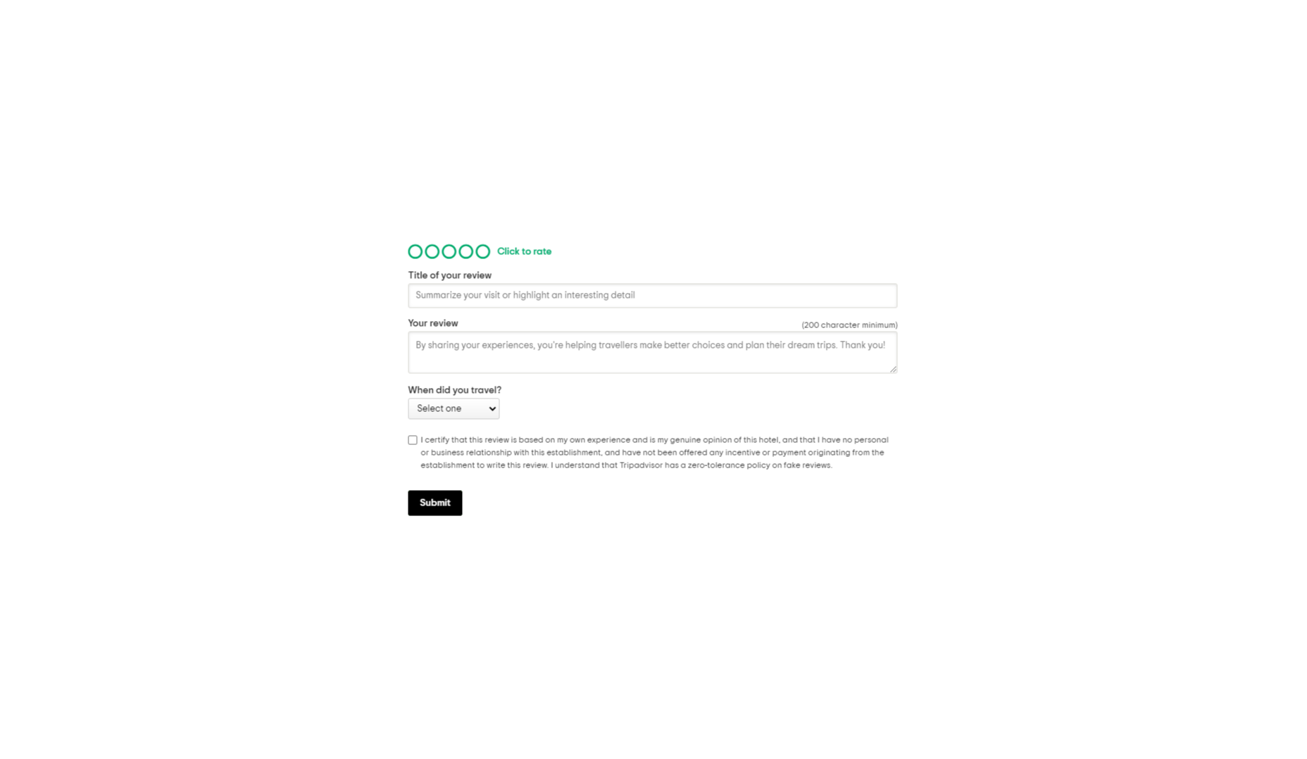
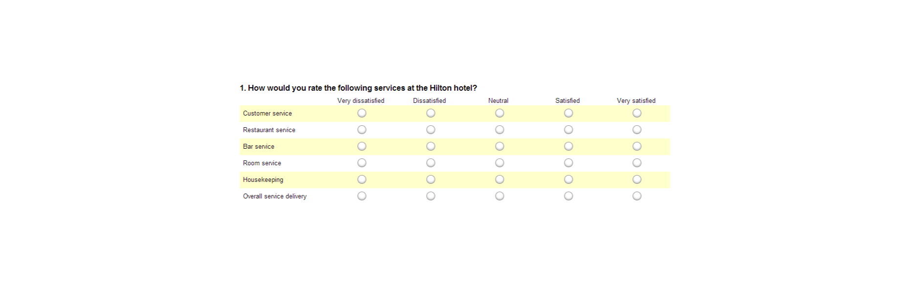
1. Design an Effective Feedback Survey

The most obvious way to encourage feedback from your customers is to ask for it. Unfortunately, designing a good customer survey isn’t always as simple as it seems. 

On the one hand, you’re keen to gather as much information as possible from your customer, which could mean that you want to ask many questions. On the other hand, asking too many questions could easily scare your audience away. 

To improve your audience’s chances of actually sharing information, keep the feedback requests as simple as possible.

One or two questions at a time should be enough to give you some helpful information about customer preferences and expectations. When choosing what to include in your survey, remember:

  • Only ask essential questions: If the answer to a question isn’t going to help you achieve your goals, don’t ask it. You don’t need to know someone’s age if you want to know if they had a good experience with your service reps. Keep it relevant. 
  • Make the questions thoughtful: Yes or no questions are great for collecting quick information. However, if you want more valuable feedback, leave your queries open-ended, and give customers room to explain themselves. 
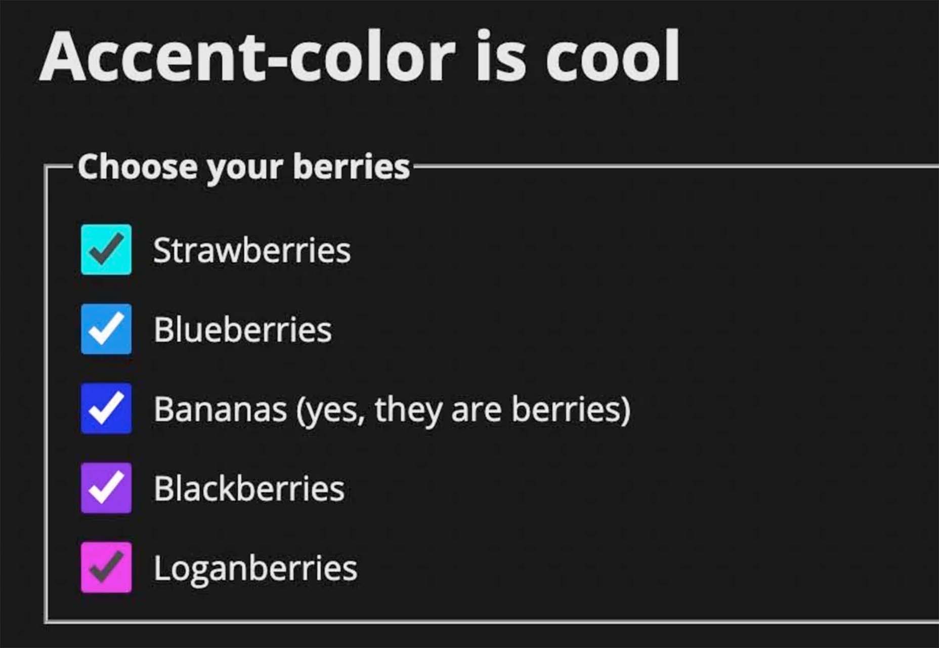
  • Use rating scales: If your customer doesn’t have time to respond to a question in your survey with a complete answer, a rating scale can give you some helpful insights with minimal effort from the client. 

Ensure none of the questions on your survey are leading or loaded. Customers don’t want to feel like you’re answering questions for them. It might also be worth showing your audience how much you value their data with a quick response. Hilton Hotels always responds to any adverse reactions to surveys within days of receiving the information. 

Customers can even see how their reviews contribute to the overall rating of the business. 

2. Master Your Emails and Customer Contact Forms

Email is one of the easiest and most effective ways to gather customer feedback. Because this is a standard support channel for most businesses, there are plenty of opportunities to generate feedback. 

The first step in using emails for feedback is to send a message thanking your customer for their recent interaction with you. If someone purchased a product from your company, immediately follow up to let them know you appreciate their custom. A couple of days after, when your customer has had a chance to use your product or service, that’s when you follow up with your feedback request. 

Ideally, your email request should be as short and straightforward as possible, with a clear call to action that tells your customer what to do next. This example from Papier keeps things as detailed as possible.

If you want to boost your chances of engagement, you can add elements to your email that might encourage a positive response, for instance:

  • Remind them of what they bought: Remind your customer of the item they purchased with a picture and a bit of information. Highlight the key features and benefits of that product, so they have some inspiration on what to write about in their review. 
  • Offer them a reward: If you want to boost your chances of your customers doing something for you, you need to offer something in return. This could be a discount on their next order, a chance of winning something, or even just free shipping on their next purchase. 
  • Personalize the message: Make your customer feel special by personalizing the message. Use their name and reference their previous interactions with your company. If they’ve been with your business for a while, mention that in the email.  

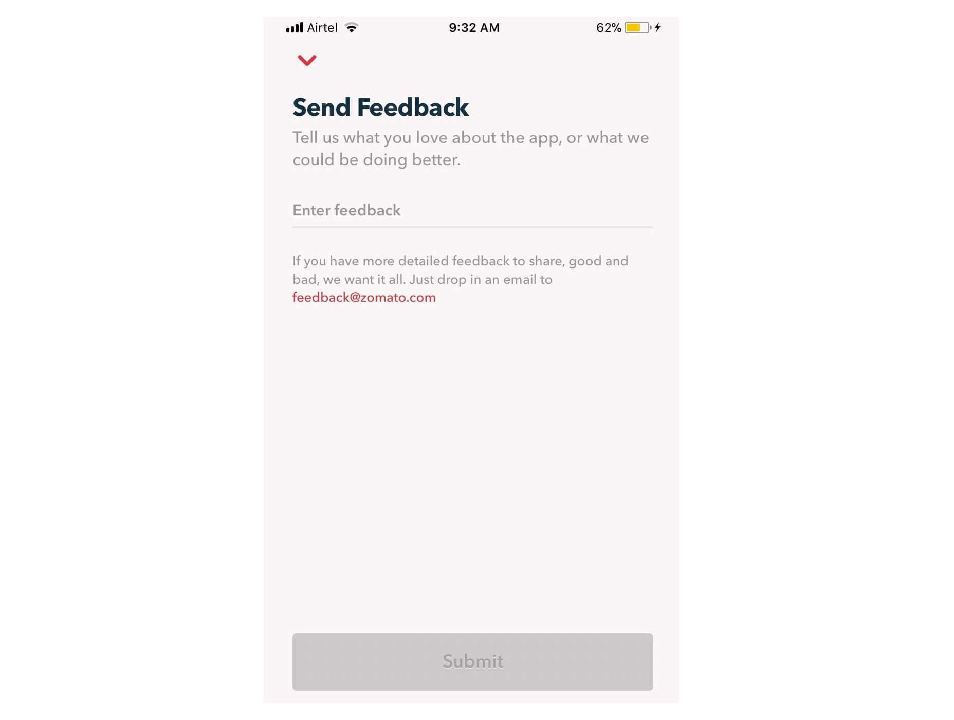
Remember, many of your customers are likely to check their emails on the go. That means that giving feedback should be as simple as possible, regardless of the tech your customer is using. For instance, in this Zomato example, users can choose to drop an email to the company or send feedback straight from the app. 

3. Create App Usability Tests

If you want some in-depth insights into your company, and your business processes, then a usability test could be the best way to generate valuable feedback. If you have your app, ask your customer to submit some information right there and then, after they’ve finished using the service. The great thing about this kind of input is it’s fresh.

Unlike other customer reviews that might come a day or two after your customer has used a product, usability tests allow you to get feedback at the moment. There’s a much better chance that you’re going to get some relevant and detailed responses here. 

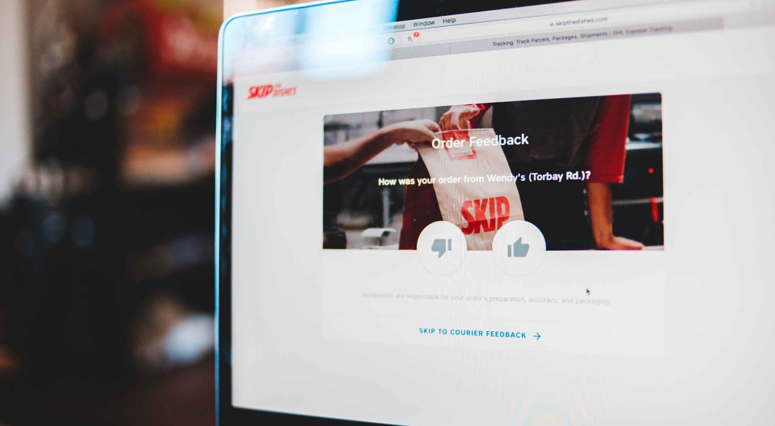
For instance, in this Skype lab feedback request, customers can tick boxes for any video or audio issues they had and leave a starred review. 

If there’s extra information to share, the customer can tap on the comment box to elaborate. However, they don’t need to do this part unless they want to. 

With usability tests, it’s a good idea to focus on a few key things that you want to learn about. For instance, Skype’s example above demonstrates that the company wants to check at least five user experience issues for both video and audio. 

Giving your customers options that they can choose from reduces the amount of work they need to put into leaving a review. It also means that you can get actionable information on which parts of your app or site need the most improvement. 

You can get the same kind of instant feedback on your website, too, mainly if you’re using a live chat app for customer service. 

Live chat is quickly becoming an essential part of the customer experience environment because it’s fast, easy to use, and efficient. It’s also highly affordable for most companies, thanks to evolving technology. Set up your Live Chat app to immediately request a review from your customer when the interaction is over.

For instance, SiteGround asks customers to rate their service provider with a picture of the employee they spoke to. The image lets the customer see that they were talking to a real person, which improves the relationship with the company. The statement about feedback improving the customer service and support that SiteGround can offer shows the customer how valuable their reviews are. 

4. Conduct Customer Interviews

Conducting a customer interview is a lot like sending out a survey. The main difference is that you ask the client to engage in a much more in-depth conversation. Usually, these interviews will be the initial research required for a published case study on a B2B website. 

Reaching out to valuable and loyal customers can give you a fantastic source of in-depth information to learn from. You’ll need to make sure that you have a good relationship with the customer in question before you attempt this, however. Most one-time clients won’t want to get involved with a time-consuming interview. 

Look at your CRM technology and find out who your most impressive VIP customers are. Reach out to them with a request for feedback, and make sure you offer something in return. For instance, tell them that you’d like to interview for a case study that you can display on your website. If they’re happy for you to do this, you can reward them with a discount on their next purchase or some gifts. 

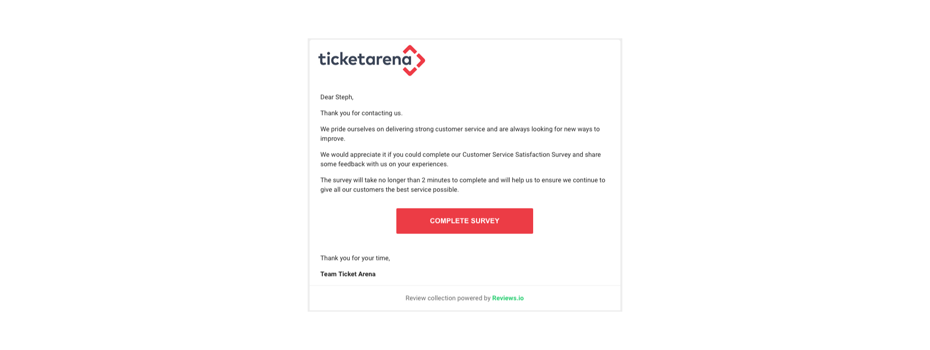
You could also follow up with a customer who recently contacted your team for an interview, like Ticket Arena does here. With this message, they promise the customer that their insights will make the customer experience better for future clients:

When requesting long-form qualitative feedback, remember to think through your questions carefully. In-depth stories from customers bring nuance and color to your quantitative data. They could even guide your business to making some crucial future decisions. 

When talking to your customers:

  • Start with an open-ended dialogue: Remember that open-ended questions are crucial to get as much detail as possible from your customers. These queries give your customers more flexibility to cover the details of their experiences.
  • Get more specific as you go: Start with simple questions, then build on them as your conversation evolves. Use the things you learn from your customers to dive into topics that are relevant to them. For instance, if a customer mentions your live chat app, go into a deeper discussion about the channels they prefer to use. 
  • Practice active listening: Make sure that you’re open and receptive to the information you’re given. Actively listen to customers, even if you’re not in the same room, by acknowledging what they say and providing valuable responses. 

5. Use Social Media

Sometimes, people are reluctant to give feedback for your business on your website because they’re not in the frame of mind. When customers come to your site, there’s a good chance they’re looking for information from you or want to check out a new product. 

They’re probably not in the right mood to start sharing their opinions. 

However, if you capture your customers on social media, there’s a good chance they’ll be feeling a lot more talkative. After all, social media platforms are where most customers discuss their issues with companies, talk about purchases with friends, and make their voices heard. 

Simply paying attention to when people talk about your company on social media can give you a lot of helpful feedback. Social listening tools allow you to collect post information every time someone mentions your business name or product. 

Alternatively, you can actively use the tools on social media to gather data from customers. For instance, Instagram has its own “poll” feature on Stories that allows companies to collect opinions. 

If you’re collecting feedback on social media, remember that you shouldn’t be asking any questions that are too complicated. Although people are more willing to share their opinions on social, they’re still looking for a relatively laid-back and casual experience.

Polls, where people can vote for their preferences with a single click, are more likely to garner engagement than a post asking people to tell you about the best purchasing experience they ever had with your brand. 

If you do want to encourage more in-depth feedback, the best option is to promise a reward in return for your follower’s effort. 

Make the experience fun by transforming it into a competition. 

For instance, ask your customers to share their favorite story involving your brand for a chance to win an impressive prize. You can ask each customer to tag their response with a branded hashtag so that relevant answers are easier to find. You could even add users to tag their friends in their posts too, to increase brand reach while you collect feedback:

With gifts and rewards to incentivize them, people will be much more likely to interact with your brand and put effort into the reviews they leave. You could even gather some user-generated content to put into your subsequent ad campaigns. 

6. Create a Dedicated Website Page

Finally, if you want to make it as simple as possible for people to leave feedback on your website and for you to collect all of that information into one space, then create a review page on your website. This can double up as social proof for people who need additional evidence to buy from your brand. 

A review page could be as simple as a page on your website listing the latest comments that your customers have left. You can include a form at the bottom of the page where people can add their thoughts. Just make sure that you carefully review these posts before they’re submitted to your website if you want to prevent spam from getting through. 

You could also create a case study or portfolio page that showcases the work you’ve done with other companies like Fabrik Brands does here:

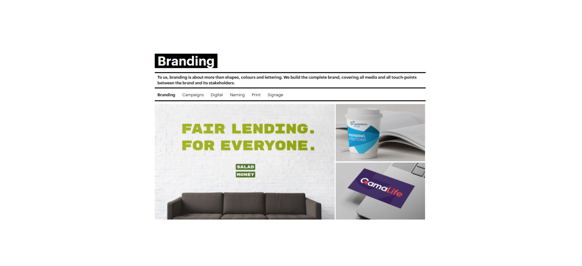
At the bottom of each case study, give your customers a unique email address they can reach out to if they want to be featured as your following case study. Or include a contact form where people can get in touch to discuss their own experiences. 

Having a dedicated review, case study, or testimonial page on your website could be enough to inspire more feedback from your customers. It’s also a fantastic way to demonstrate how credible your company is to potential buyers. 

Still, Struggling? Take the Customer Out of the Equation

If, even with all the suggestions above, you still can’t seem to convince your audience to give you some decent feedback, then take them out of the equation. You can learn things about your audience without asking them for information. Google Analytics and other tools will give you valuable insights into which of your blog pages get the most engagement and how many people click on individual buttons throughout your site. 

These fundamental insights might not be as good as valuable, contextual feedback from your audience, but they’re an excellent way to start figuring out how to invest in your future growth. 

Remember, feedback of any kind – even if it’s just statistics and numbers – gives your business the ability to grow and make informed decisions.

Gather as much feedback as you can, and make sure you use it!


Featured image via Pexels.

Source

The post 6 Tips for Collecting Customer Feedback (The Right Way) first appeared on Webdesigner Depot.


Source de l’article sur Webdesignerdepot

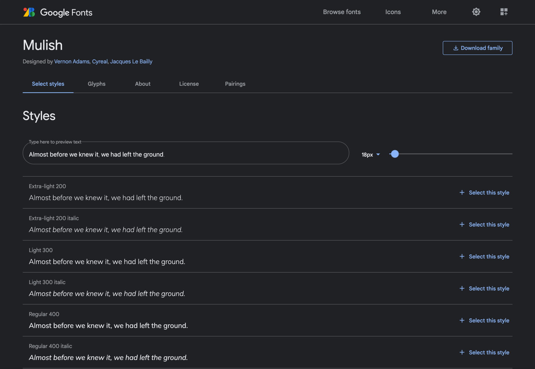
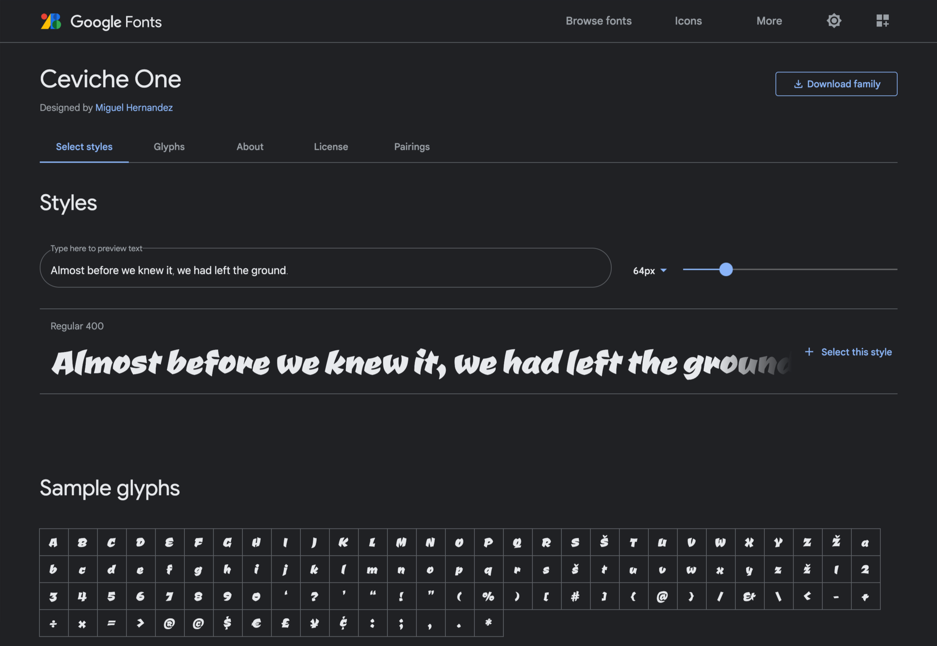
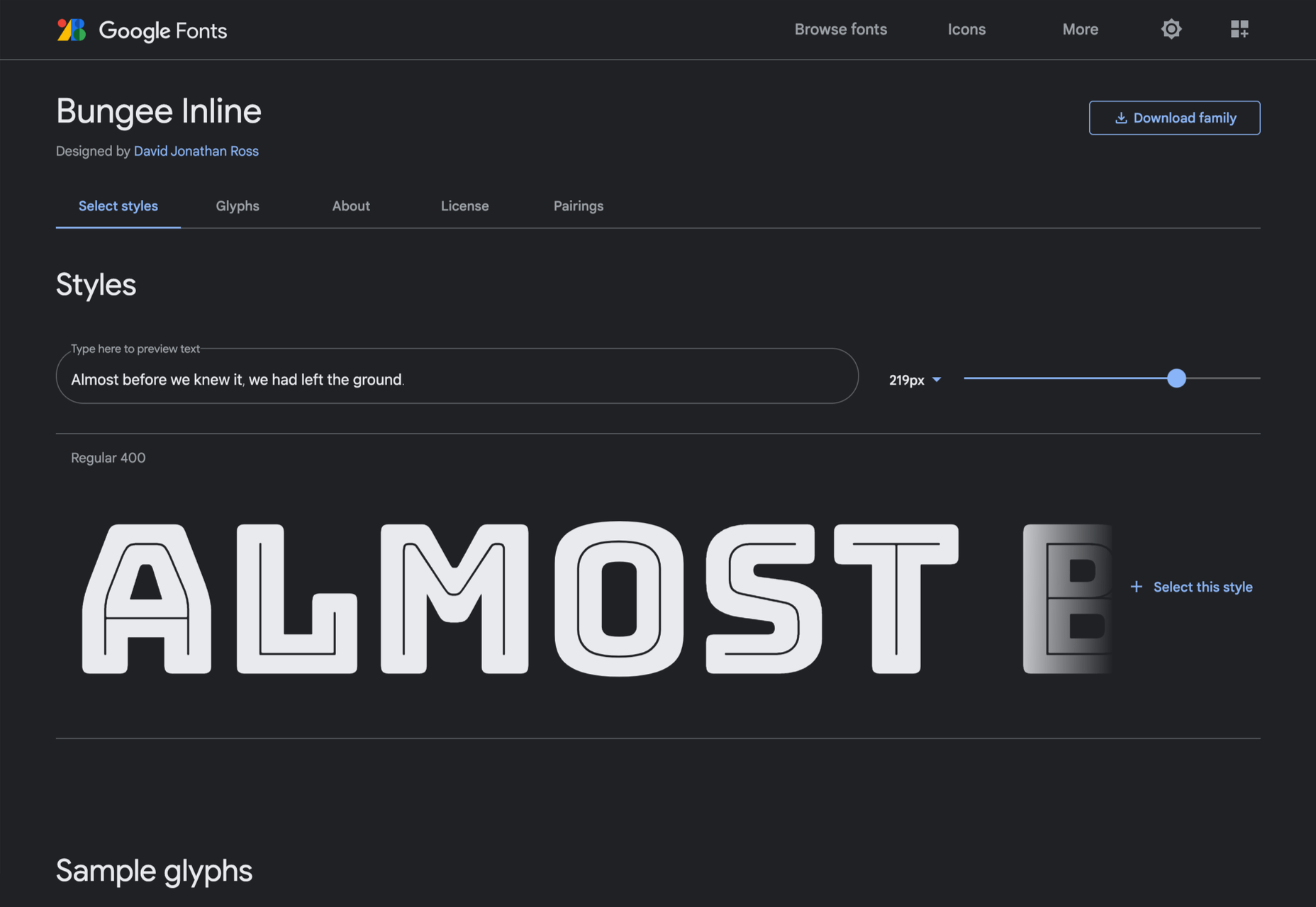
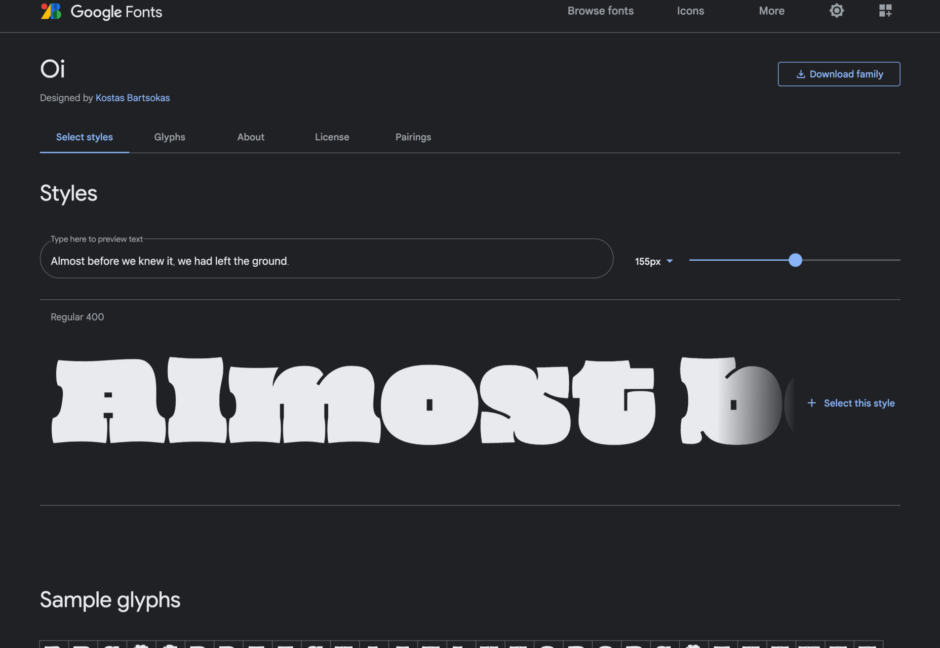
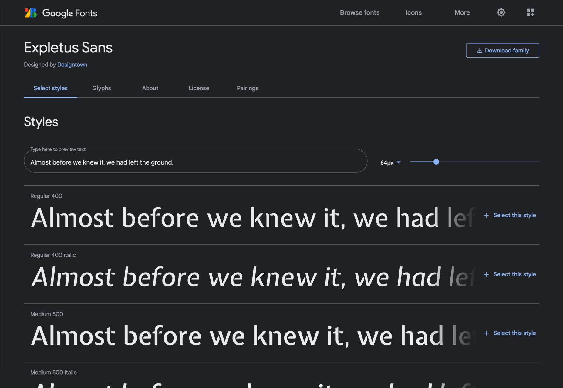
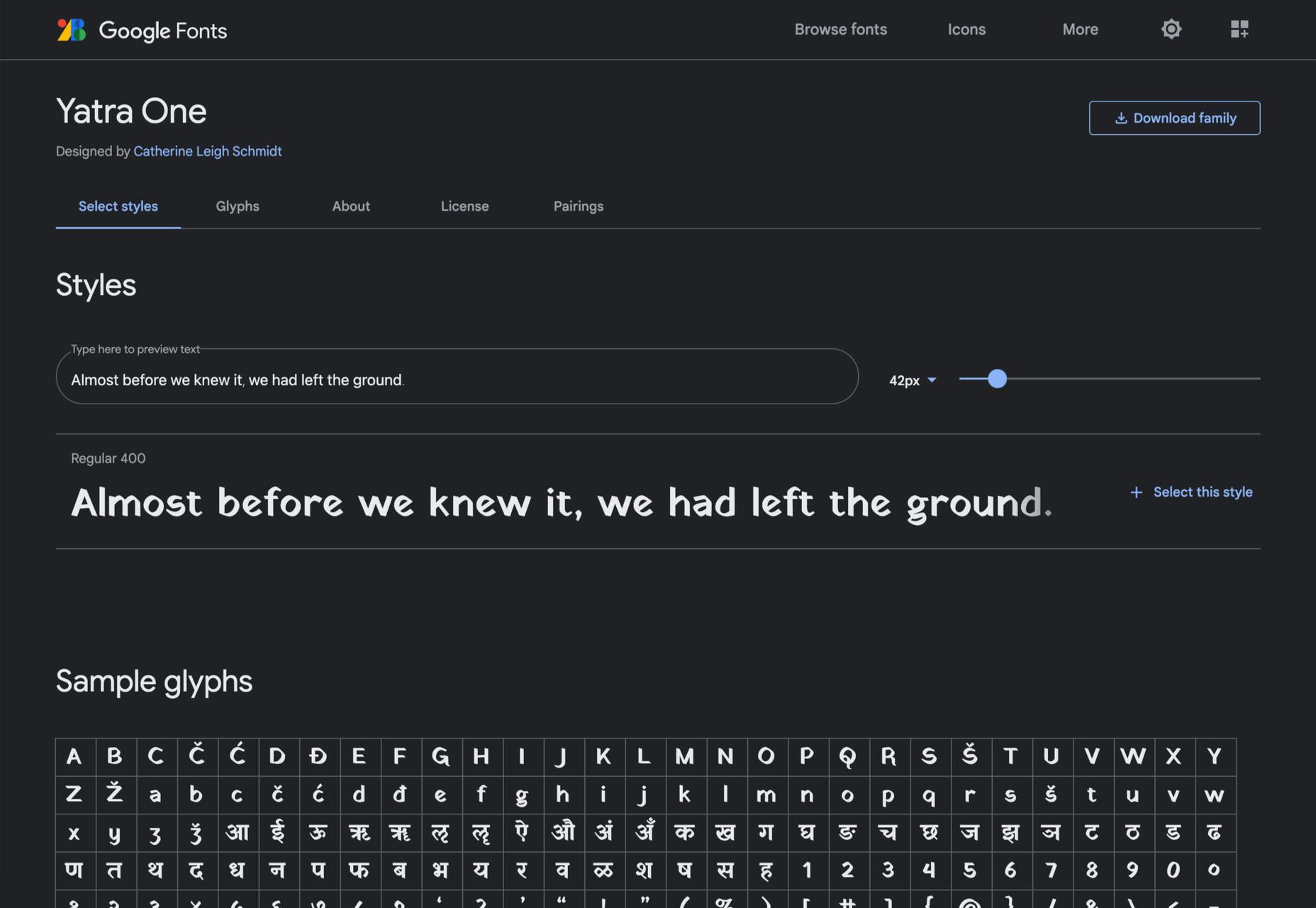
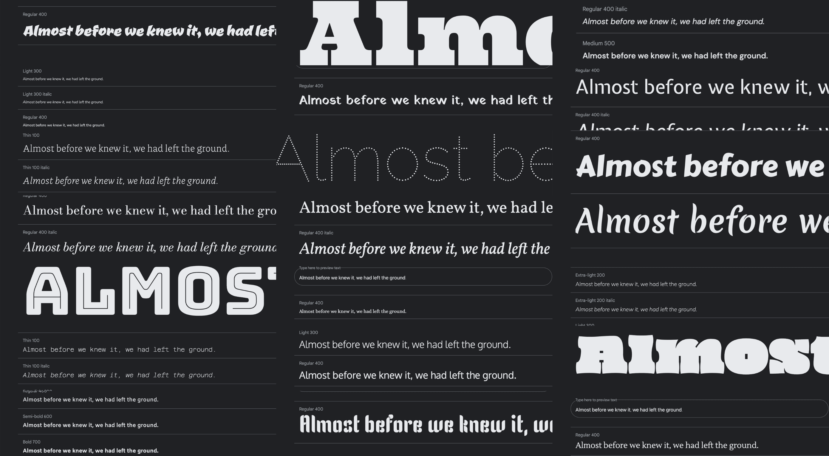
Google Fonts may be the single most significant contribution Google has made to the evolution of the web — yes, more significant than search, advertising, or analytics.

Google Fonts gives every business access to a visual voice with which to distinguish itself. Fonts can be downloaded for use in design software and then embedded using best practices for a consistent experience on the web.

If there’s anything wrong with Google Fonts, it’s that its default listings are based on “Trending,” a self-fulfilling criterion that keeps Noto Sans high up the list, destined to be over-used.

But if you spend a little time lower down the listings, you’ll find some exceptional typefaces that are hardly used. Yes, some of them are highly stylized, but there are also usable sans, serifs, and display fonts worthy of your consideration.

All you have to do is scroll; here’s a selection of some of the treasures you’ll find if you do…

Piazzolla

Piazzolla features dramatic and expressive angular shapes when previewed in large sizes, but its real strength is in setting large amounts of body text.

Mulish

If you’re looking for a solid workhorse sans, look no further than Mulish. Halfway between a humanist and geometric sans, there’s even a variable font version.

Ceviche One

Reminiscent of the cool lettering of 60s advertising, Ceviche One is packed with energy, thanks to the dramatic zig-zag formed along its baseline.

Vollkorn

Released by Friedrich Althausen in 2005, Vollkorn is an excellent typeface for body copy, excelling at small sizes. It now boasts a variable font option.

Merienda

Merienda is a delightfully energetic display script. The bold weight feels more confident, but both weights have a dancing rhythm that brings the page alive.

Raleway Dots

Raleway is a hugely popular — and perhaps overused font — but this dotted version is less known. It’s a simple geometric sans that functions as a display face.

Kenia

Kenia is a wonderful, uncategorizable typeface. The stencil forms result in entirely original letter constructions, and the lowercase s is magnificent.

DM Sans

DM Sans is a low-contrast geometric sans-serif that performs wonderfully well at smaller sizes. It only has three weights, but each comes with a matching italic.

Oxygen

Designed by Vernon Adams as part of the KDE project for GNU+Linux, Oxygen is a very readable sans-serif, with a generous x-height and a hint of pen stroke.

Alice

Ksenia Erulevich’s Alice was inspired by Lewis Carrol’s novel Alice’s Adventures in Wonderland. It presents itself as an Edwardian serif with fanciful flourishes.

Carter One

Carter One uses bold strokes, with a medium amount of contrast, to create a sans-style script. It has dozens of beautiful details like the notch on the lowercase o.

Bodoni Moda

Bodoni Moda is a didone-style serif with strong vertical strokes and high-contrast slab-like serifs. It’s the best variable font in this genre that I’ve found.

Ultra

Ultra is a slab-serif that you won’t even consider for body text. Its sculptural shapes are almost American-western. The counter on the lowercase n is charming.

Azeret Mono

Most mono-spaced fonts fail to inspire; practical they can be, charming they are not. But Azeret Mono bucks that trend, its bold weights being particularly fantastic.

Nunito

It’s tough to find a serious sans-serif with rounded terminals, but Nunito is it. There’s also a Nunito Sans with square terminals, but I love the rounded tips.

Bungee Inline

Designed for signage, Bungee is great for display sizes and works well vertically. There are several versions, but my favorite is this classy inline version.

Oi

Oi is unapologetically loud. A slab-serif that swallows its own detail, the counters and ink traps give it a 3D quality, and the curves feel almost nautical.

Expletus Sans

One of the significant trends in typography is the angled clip of adjoining strokes, creating the effect of shadow. This effect is brilliantly achieved in Expletus Sans.

Lustria

It’s comparatively unusual to find a serif face designed to work well at display sizes. At large sizes, Lustria’s rounded terminals evoke ink spread delightfully.

Yatra One

Yatra One is a Devanagari and Latin typeface that uses the Devanagari brush angle for its strokes, giving the Latin text an unusually slanted, stand-out character.

Amiko

Amiko is a highly legible typeface and excellent at tiny font sizes. It’s perfect as a secondary font if your main font is too fancy for elements like legal notices.

Keep Scrolling

It’s always tempting to leap at the first typeface you find that meets your needs, but if you dig a little deeper into Google Fonts, you’ll find a vast range of typefaces that offer both practicality and character.

Source

The post 21 Exceptional Google Fonts You Probably Haven’t Discovered Yet first appeared on Webdesigner Depot.


Source de l’article sur Webdesignerdepot

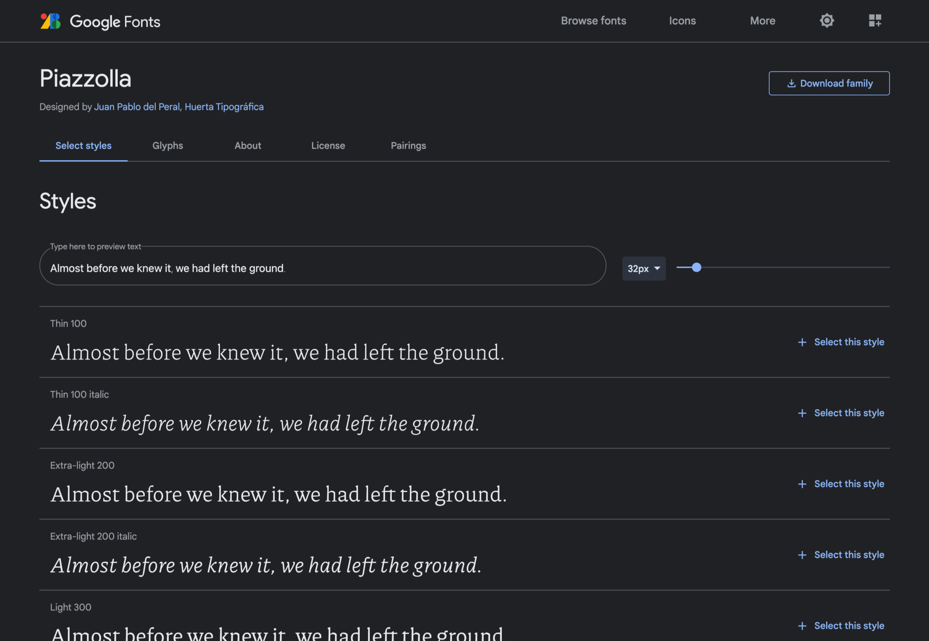
In my experience, the biggest challenge that freelancers face — more than winning clients or setting prices — is project management; take on too much work, and you’ll start missing deadlines, take on too little, and you’ll start missing your rent.

Some people are naturally organized; they rock up at their desk at 08:59, fully confident in what they will spend the next 8–12 hours working on. Let’s be kind and say that I am not one of them, and leave it at that. The only way I have managed to survive the industry is by self-consciously micro-managing my schedule on a daily basis.

When I worked in an agency, I knew what I would be working on days in advance. Now, I know 90% of what I’ll be working on, weeks in advance.

That level of organization requires very, very, very careful planning. I hold team meetings at the end of the day, yes, “team” meetings of one person. To do that I use a number of tools that suit me.

How to Choose a Project Management App

The most important aspect of any project is the end. That’s when the client will assess your work, and that’s when you get paid. So when you choose a project management solution, make sure it gives you a clear path to the project conclusion.

I know one freelancer who sets himself a hard stop at 7 pm every day. At 7 pm, he downs tools switches off, and walks away. I once heard him end a client call at 7 pm because he’d reached his cut-off point. It made me wince — I would have stayed on until the call concluded — but it hasn’t affected his business.

I know another successful freelancer who works on a budget. When she has earned the money she needs for that day, she stops. She bills by the hour to make this work, so when she sits down in the morning, she knows exactly what time she’ll finish.

Personally, I prefer a task-based approach. I know what I have to get done; if I can get ahead, then great, but my main focus is ensuring I don’t fall behind. I believe that if you hit your deadlines, everything else will take care of itself. Admittedly, there have been a few late-nights (and all-nights) over the years, but thankfully they’re less common these days.

No one style of project management suits everyone. And it doesn’t matter what approach you take, provided you take an approach.

8 Best Project Management Apps for Freelancers

As a freelancer, the most important thing characteristic you can have is reliability. Cultivate a reputation for delivering on your promises, and you’ll become invaluable to your clients. The best project management app is the one that helps you keep your promises.

There are some excellent tools on the market that facilitate project management, but most are aimed at SMEs, or project managers running a team of freelancers.

The tools here are listed from least, to most useful for the average freelancer. I’ve avoided too many time-tracking apps because I find these tend to encourage billing by the hour, which is potentially damaging to your business long term. If you do need pure time-tracking, check out Harvest. I’ve also avoided solutions that are too large-scale to benefit freelancers. If you’re looking for a project management tool for teams, then Basecamp, Jira, Project.co, and Redbooth are all worth considering.

Sadly none of these apps are perfect, and there’s a good chance you’ll need to use two or three to manage your projects.

8. Todoist

Todoist is hands down the best to-do app on the market. The downside is that its feature set is minimal.

Todoist really excels at lists. You can break down tasks into sub-tasks, and sub-sub-tasks. The downside is there’s no real scheduling or comparison of multiple projects in a single view.

The mobile apps are great, and Todoist recently introduced boards, a form of kanban board that gives you a good overview of everything. If it introduces a gantt chart, I can see myself relying on it more.

Todoist has a free forever plan that is fine for most freelancers, and the paid plans start at just $3 per month.

7. Bonsai

Bonsai is an excellent service for freelancers that grew from a simple invoicing app to include proposals, contracts, time-tracking, and more.

I used Bonsai for invoicing for a couple of years, and it does everything it claims to do. However, there are a couple of significant areas where it falls down. Firstly, its invoicing is super-aggressive and cannot be customized — make sure you’re on friendly terms with any client you send a Bonsai invoice to. Secondly, while it does a good job of tracking what you have done, it doesn’t help you plan what needs to be done beyond a formal proposal.

If you’re running a few simple projects, then it’s possible Bonsai is right for you. Pricing starts at $19 per month.

6. Monday

Monday is one of the biggest players in the project management market. It offers a dizzying array of options, and if this list were aimed at project management for agencies, Monday would be further along our countdown. Monday may suit freelancers, particularly those who have migrated from agency work, but for most, it’s more than we need.

There is a free-forever plan that covers almost everything you could want. However, if you need to view your projects as a gantt chart — and I strongly suggest you do — then you’ll need to update to the standard plan, which starts at $8 per user per month, with a minimum of three seats, meaning at least $24 per month when billed annually.

5. AND.CO

AND.CO stands out as a slick, easy-to-use option for managing a freelance business. Like Bonsai, it allows you to manage proposals, invoicing, time-tracking, expenses, and more.

AND.CO also has extremely well-liked customer support. An underestimated consideration when you don’t have your own accounts team to resolve problems.

As with other solutions of this type, the task-management is lacking. It does include a simple to-do list, but in my opinion, it’s not sufficient, and you’ll need to supplement it with something that supports gantt charts.

There’s a free forever plan, but it’s barely more than a free trial. Pricing for full-featured access starts at $18 per month when billed annually.

4. ClickUp

ClickUp is a SaaS that aims to replace just about everything else you could need. Unlike some options on this list, it includes a CRM, which is a bonus because there’s nothing worse than relying on the search function in your email to track down someone’s contact details.

ClickUp also offers a genuinely free-forever account with enough features to make it usable. If you choose to upgrade to a paid plan, it’s just $5 per user per month, which is excellent value.

If anything, there’s just too much in here. If you’re someone who considers themselves a power-user who enjoys digging into every nuance of a UI, then ClickUp could be for you. But, if, like me, you favor a simple tool that does what it’s told and gets out of the way, then there are better options.

3. Asana

Asana is probably the best-known project management tool on the market. It offers a tremendous number of options and is flexible enough for any style of project management.

There’s a free forever plan that is ideal for getting started and offers you most — you may be sensing a theme here — of the features you’ll need. But Asana’s best feature is its excellent timeline implementation of the gantt chart, for which you’ll need to upgrade to a premium plan costing $10.99 per user per month, with a minimum number of 2 seats that translates to a rather expensive $21.98 per month.

2. Trello

Trello is famous for its kanban boards, and many people prefer them to gantt charts, which has helped the app grow rapidly in the last few years.

If you’re prepared to pay $10 per user per month, Trello actually offers gantt charts as well, in the form of its timeline feature.

Trello is mainly designed for teams, not freelancers. However, if you do have the budget for a premium plan, Trello gives you an enviable ability to switch project management styles on a whim.

1. Toggl

Toggl is perhaps the perfect balance of time-tracking and gantt chart that is ideal for freelance projects.

As with most tools, Toggl is designed for teams, with billing starting at $8 per user per month. However, it offers a solo plan, designed for freelancers, that is free forever.

The main thing you miss out on with Toggl’s Solo plan is team timelines, which you won’t need unless you’re outsourcing work. One other obvious omission is unlimited planning boards, which you may find yourself paying for sooner or later.

But for a mixture of simplicity and powerful features available for $0, Toggl is hard to beat.


Featured image via Pexels

Source

The post 8 Freelance Project Management Apps for 2021+ first appeared on Webdesigner Depot.


Source de l’article sur Webdesignerdepot

Since school is back in session, this month’s roundup has a learning focus. In addition to tools, many of the resources include guides, tutorials, and cheat sheets to help make design work easier.

Here’s what’s new for designers this month.

ScrollingMockup.io

ScrollingMockup.io generates high-definition, animated scrolling mockups in minutes. All you have to do is paste your website URL, select from the expanding template gallery, add some music and post. You can create three mockups for free, and then this tool comes with a subscription model. The paid model allows for custom branding for mockups and more.

FilterSS

FilterSS is a curated collection of CSS image filters for use in projects. Upload an image, sort through the list, and then copy the code for the filter you want to use. It’s that easy!

Buttons Generator

Buttons Generator is a fun tool with so many button options in one place. Choose from three-dimensional, gradient, shadow borders, neumorphic, retro, animated, ghost, with arrows, and more all in one place. Click the one you like, and the code is copied right to your clipboard and ready to use in projects.

UI Cheat Sheet: Spacing Friendships

UI Cheat Sheet: Spacing Friendships is a fun – and memorable approach to figuring out spacing. This guide shows how close or far away elements should be based on “friend” circles with a couple of relatable instances. It’s one of the most relatable examples of this concept out there while emphasizing the importance of spacing in design.

PrettyMaps

PrettyMaps is a minimal Python library that allows you to draw customized maps from OpenStreetMap data. This tool can help you take online map design to the next level with cool, unique map visuals. It’s based on osmnx, matplotlib, shapely, and vsketch libraries.

Card.UX/UI

Card.UX/UI is a card-style generator with more than 20 templates and elements to create custom cards. Use the on-screen tools to design it the way you want and then copy the code for easy use.

Couleur.io

Couleur.io is a simple color palette builder tool that lets you pick a starting color and build a scheme around it. One of the best elements of the tool might be the quick preview, which shows your choices using the palette in context and in dark mode. Get it looking the way you want, and then snag the CSS to use in your projects.

CSS Accent-Color

CSS Accent-Color can help you tint elements with one line of CSS. It’s a time-saving trick that allows for greater customization for your brand in website design projects. Plus, it works equally well in dark or light color schemes. It supports checkboxes, radio, range, and progress bars.

Vytal

Vytal shows what traces your browser leaves behind while surfing the web. This scan lets you understand how easy it is to identify and track your browser even while using private mode. In addition, it scans for digital fingerprints, connections, and system info.

Imba

Imba is a programming language for the web that’s made to be fast. It’s packed with time-saving syntax tags and a memorized DOM. Everything compiles to JavaScript, works with Node and npm, and has amazing performance. While the language is still in active development, the community around it is pretty active and growing.

SVG Shape Dividers Creator

SVG Shape Dividers Creator is a tool that allows you to create interesting shapes with SVG so that your colors and backgrounds aren’t always rectangles. You can adjust and side, change the color, axis, and flip or animate it. Then snag the CSS, and you are ready to go.

Image Cropper

Image Cropper is a tool that allows you to crop and rotate images using the flutter plugin. It works for Android and IOS.

Noteli

Noteli is a CLI-based notes application that uses TypeScript, MongoDB, and Auth0. The tool is just out of beta.

Yofte

Yofte is a set of components for Tailwind CSS that help you create great e-commerce stores. The UI Kit is packed with components with clean and colorful designs that are customizable. The code is easy to export and clean. This premium kit comes with a lifetime license or a monthly plan.

UI Deck

UI Deck is a collection of free and premium landing page templates, themes, and UI kits for various projects. This is a premium resource with paid access to all of the tools. It includes access to more than 80 templates.

Star Rating: An SVG Solution

Star Rating: An SVG Solution is a tutorial that solves a common design dilemma: How to create great star rating icons for pages. This code takes you through creating an imageless element that’s resizable, accessible, includes partial stars, and is easy to maintain with CSS. It’s a great solution to a common design need.

Designing Accessible WCAG-Compliant Focus Indicators

Designing Accessible WCAG-Compliant Focus Indicators is another convenient guide/tutorial for an everyday application. Here’s why it is important: “By designing and implementing accessible focus indicators, we can make our products accessible to keyboard users, as well as users of assistive technology that works through a keyboard or emulates keyboard functionality, such as voice control, switch controls, mouth sticks, and head wands, to mention a few.”

Blockchain Grants

Blockchain Grants is a tool for anyone developing blockchain applications and in need of funding. It’s a database of grants from a variety of organizations for different applications. Start looking through this free resource to help secure additional funding for your projects.

Basement Grotesque

Basement Grotesque is a beautiful slab with a great heavy weight and plenty of character. There are 413 characters in the set with plenty of accents, numbers, and variable capitals.

Gadimon

Gadimon is a fun, almost comic book-style layered script. The font package includes a regular and extrude style.

Lagom

Lagom is a sleek and functional serif typeface with 16 styles in the robust family from ultralight to extra bold italic. It’s readable and has a lot of personality.

Striped Campus

Striped Campus fits our back-to-school theme with a fun, scholastic look and feel. The block letters have a thick outline stroke and some fun inline texture.

Source

The post Exciting New Tools for Designers, September 2021 first appeared on Webdesigner Depot.


Source de l’article sur Webdesignerdepot

It’s almost time for another season of change. Although the temperatures might not reflect it, this is the time of year where most of us start thinking about what’s next.

This collection of tools and resources for designers is just the spark to propel you forward with work as you think ahead. Here’s what’s new for designers this month.

Gradient.Art

Gradient.Art is a CSS-based gradient generator that’s packed with functionality and customization options. It’s more than just a color selector and is an actual gradient editor that allows you to work with a variety of controls to get just the color variations you want for projects. Create illustrations, patterns, icons, and more with this layer-based tool that’s still in beta.

Wicked Backgrounds

Wicked Backgrounds takes some of the headaches out of creating just the right background for website design projects. It’s another easy and customizable generator designed to help create backgrounds with great color, depth, and balance for various project types. The makers promise more features in the future as well.

Typedream

Typedream is not what you might expect from the name; it’s actually a website-building tool. It’s designed to help put the focus on the words of a design with a simple interface that most people can figure out. You can connect your own domain and then optimize for search with built-in SEO tags. It’s a zippy tool for simple sites.

Orbital

Orbital is a zero-friction, super-interactive, customizable place to gather online. Pop in for meetings, quick chats, open-door office hours, or cowork together through the day – all using the same link. This premium tool has super fun backgrounds and meeting spaces.

Access Guide

Access Guide is your one-stop guide to accessibility information for the web. It’s packed with articles and information to help you understand parts and all of the WCAG 2.1 guidelines, the official standard for accessibility online. (Plus, content is sorted into neat cards that make things easy to search and find.)

InLine

InLine is a free JavaScript library built to create a simple text editor for web applications and mobile apps. The tool claims to be the smallest WYSIWYG editor designed to fit into any layout. The plugin allows you to edit and customize text elements practically anywhere.

3D Bay

3D Bay is a collection of free three-dimensional stock images that you can use for various projects. Collections are searchable. Most of the images are actually 3D scene illustrations, a popular design element with many SaaS website designs.

MeisterNote

MeisterNote is a writing tool for teams. (It’s perfect for the new remote working world.) The interface is sleek and intuitive, and you can create customer workspaces for notes and teams to collaborate. One of the best functions might be the search feature, allowing you to find information in notes easily.

Shapecatcher

Shapecatcher solves an interesting problem. Have you ever visualized an element but don’t know what it is called or how to find it? This tool has a “drawbox” where you can sketch the element, and then it visually searches a database of 11,000-plus Unicode characters in multiple languages to find a close match that you can use online.

Batch Image Processing

Batch Image Processing allows you to edit, crop, and style or add watermarks groups of images all at once. It’s a web-based tool that does everything in a flash and allows you to redownloaded processed images for quick use. (It’s great if you need multiple photos with the same crop or size!)

Integrately

Integrately is an integration automation tool designed to help your apps, tools, and web elements talk back and forth. Connect apps to make tasks run on their own in ways that native software might not do alone. (Pro tip: Use it to connect with your email to send notifications or reports automatically.)

Vechai UI

Vechai UI is a set of high-quality, accessible React UI components with built-in dark mode using Tailwind CSS. Components include pre-designed headless UI and Radix UI.

Style Free HTML Bootstrap 4 Template

Style Free HTML Bootstrap 4 Template is a simple and minimally styled website template for a variety of project types. It’s a great website starter if you need to get a site up and running quickly.

Glass UI CSS Generator

Glass UI CSS Generator helps you create trending neumorphism/soft UI/glass UI style elements. The tool is a CSS generator that allows you to add some of your own elements and then pick styling options while outputting CSS and HTML.

Lineicons

Lineicons is a collection of more than 5,000 line icons that you can use for various projects. Every icon comes with free CDN, regular and light variations, an editor, and more to make it browsable and easy to use. The set has high legibility, and the free set of icons includes more than 500 options.

Carrd

Carrd is a simple, free, and responsive one-page website builder that you can do pretty much anything with. It’s perfect for personal profiles, landing pages, or one-page websites. All it takes is a little imagination.

AdonisJS

AdonisJS includes everything you need to create a fully functional web app or an API server. So stop wasting hours in downloading and assembling hundreds of packages and do it all with this framework for Node.js.

Eastman Condensed

Eastman Condensed is a beautiful and functional sans serif that’s easy to read. The demo version is free for personal use, but a commercial license for the full family is available.

Peachy Rose Font

Peachy Rose Font is a fun novelty option that is fun and light. Plus, it is free for any use, even commercial. The set is fairly large for a free option, with 233 characters.

Selga

Selga is an expressive and complex display font with a retro feel. The swashes and tails are especially nice on this typeface, which is free for personal use.

Source

The post Exciting New Tools For Designers, August 2021 first appeared on Webdesigner Depot.


Source de l’article sur Webdesignerdepot

As companies develop, they provide services at greater capacities. To achieve new heights, a company needs to improve the quality of the platform behind its success. Several software tests can improve your digital products. Software scalability tests are imperative for any company operating in the digital market.

Scalability testing and performance testing are ways to assess software capabilities. Performance testing focuses on response times and software quality. Scalability testing targets the software’s performance when adding new resources. Continuous testing plays a different role in the development process.

Source de l’article sur DZONE

One of the most challenging stages of a design project is laboriously producing all those assets that bring it to life.

Whether you’re a web designer in need of icons, or a brand designer looking for mockups, it’s a smart move to fall back on stock assets to speed up your turnaround, reduce costs, and enliven your designs.

With so many stock sites to choose from, which should you opt for? Today we’re going to take a look at DesignBundles.net and ask if it’s the right choice for your project.

What is Design Bundles?

Design Bundles is exactly what it sounds like: sets of design assets that you can download for free or at huge reductions on RRP.

Launched five years ago, Design Bundles is brought to you by the same team that delivers Font Bundles.

Over two million customers are already enjoying the benefits of Design Bundles’ weekly updates.

What Can You Download From Design Bundles?

There are currently over 800,000 products listed on Design Bundles, and the collection is growing all the time.

The files have been produced by 6,500 of the world’s leading independent designs. Because the products are top-quality, you can really make them work: scale them, flip them, distort them, recolor them; just about anything is possible when you’re using high-quality raw ingredients.

What’s really impressive is the range of products that are in the collection. You’ll find backgrounds, logos, icons, textures, patterns, and clip art. For product designers, there are mockups and web elements. Print designers will love the huge range of cards, invites, flyers, posters, and brochures. And if you’re looking for standard stock images, you’ll find a gargantuan range under popular themes such as technology, architecture, travel, and business.

Because Design Bundles is relatively new, you won’t find its collection padded out with out-of-date Gifs. In fact, Design Bundles is one of our favorite places for free SVGs, the best format for graphics on the web.

All the products are royalty-free and licensed for personal and commercial use, so you can relax knowing that you’re fully covered.

What Makes Design Bundles Different?

There are a lot of design bundles services online, so what makes Design Bundles different? Well, firstly, the quality; Design Bundles has a consistently high level of designs. We love the freebies. They make a huge difference and are great for trying out ideas you might not be ready to invest in.

Design Bundles differs from other stock sites because it offers curated bundles of complementary assets — you don’t just download a vector file; you download a set of vector files. This innovative approach means you don’t have to go hunting for matching images; once you’ve found the right download for your project, you have a whole range to enjoy.

The whole process of using Design Bundles is simple, from browsing through the available assets to choosing a design and through to the fast, simple checkout process. It’s all designed to make including design assets into your projects as simple as possible.

The website is user-friendly, and in the unlikely event that you’ll need them, the support team is friendly, helpful, and prompt to handle queries.

Is Design Bundles Good Value?

We’d be lying if we said that cost wasn’t a big bonus of using Design Bundles. Design Bundles offer up to 96% discounts on regular prices, meaning that you can get the same incredible assets that top design agencies use at a fraction of the price.

In terms of time-saved, inspiration-delivered, and graphics-acquired, your Design Bundles subscription will more than pay for itself.

Alongside the daily and weekly deals, you’ll find products you can try for free. For example, design Bundles provide a whole heap of free SVGs. And not just sample files. There are thousands of files to download and use in projects. You can’t get better value than free!

There are new freebies every week, so it’s worth subscribing just to ensure you don’t miss anything.

For freelancers, the licensing model is particularly attractive. Because there’s no limit on the places you can download design resources once you’ve bought them, you can download files at home, in the office, or at a client’s workspace — whatever is convenient. Meaning you carry a huge library of resources with you wherever you go.

Oh, and if you want to make the most of your new Design Bundles assets, don’t forget to check out its YouTube channel, where you can learn tons about how to create effects, edit images, and complete creative projects.

Should Designers Use Design Bundles?

When you’re designing a project, whether you’re a digital artist, a web developer, or a crafter, the result relies on the quality of its component parts.

Design Bundles offers you the chance to work with high-quality assets from some of the web’s top designers at a fraction of the price of creating them yourself.

We’re confident that if you give Design Bundles a go, you’ll quickly see the benefits for yourself. But if you’re still not sure, why not sign up for its newsletter and check out some of the daily and weekly deals and the freebies that are available to you.

Design Bundles is a recipe for success that you’ll be happy you discovered.


[— This is a sponsored post on behalf of Design Bundles —]

Source

The post Review: Should Designers Use Design Bundles? first appeared on Webdesigner Depot.


Source de l’article sur Webdesignerdepot

Businesses rely on designers to help them build the perfect relationship with visitors.

After all, as much as companies may wish it wasn’t true, many consumers still judge a book by its cover. A website that fails to prioritize concepts like trust and transparency could instantly lose the confidence of its target audience. 

As a designer, it can be tempting to focus on figuring out ways of convincing an audience to convert or give up their money instantly. However, while design experts know how to enhance conversions, they also understand how important it is to make sure that customers feel confident in a website.

Here’s what you need to know about cultivating confidence in user experiences.

How Does Transparency Affect Confidence? 

In a survey conducted in 2016, 94% of consumers stated that they would happily be loyal to a fully transparent brand. As customers continue to search for more honest and reliable companies, the demand for transparency in UX will likely continue. 

As a web designer, you can’t force a company to share all vital information with its clients. However, you can use your design knowledge to help the honesty of a company stand out.

Here are some other strategies that designers can use to build transparency for their clients. 

Create an Eye-Catching “About” Page

One of the first things that today’s businesses need to be honest about if they want to delight their customers is their people. 

For instance, creating a page where your client can highlight the nature of the products that they sell is an excellent first start. Maurele has a beautifully designed “About” page to tell its customers everything they need to know about the business. 

At the same time, drawing attention to the footer where customers can check things like the terms and policies of the website or FAQs that answer their most common questions is another fantastic way to build transparency. 

Giving a brand a human face makes it easier for that company to establish lasting connections. That’s why designers should always prioritize using real, authentic images over stock photos where possible. For example, a large feature image on an “About” page that addresses the company’s unique nature makes it easier to connect with a target audience. 

Make sure that there’s plenty of space on the “About” page to introduce significant members of staff that can give a face and personality to both the website and the brand. For instance, Mociun.com uses a fantastic hero image of a person with her cat.

Add Space for Testimonials and Customers

While you don’t need to post a customer’s entire consumer list online to prove that they’re a reputable company, it is worth highlighting some of their clients. No one wants to be the first person online to trust a new website. Testimonials and reviews from other people are how you add instant confidence to any experience. 

For designers, social proof can come in a lot of different formats. For instance, if you’re building a website for a company that sells directly to other businesses, you could add pictures of the logos of the brands that the company has worked with. Alternatively, for a B2C brand, basic reviews and quotes will often work wonders. For instance, there’s a list of great reviews included on the product pages of the PlaySuperlative.com website.

Unless customers leave comments directly on the web page themselves, remind your customer that they need to get permission from the client to use their quotes on any web page. 

Additionally, remember that adding pictures and names to testimonials where possible can sometimes make them more believable. 

Tell Your Client’s Story

When building a website for a client, there are many different things that you’ll need to think about. For instance, you need to focus on the company’s USP or whatever makes them unique. You’ll also need to ensure that clients have all the information they need to make purchases easily. 

At the same time, it’s important not to go over the top with too many features. Simplicity is often the key to good UX. 

Where possible, however, if you want to boost confidence for your client, it’s a good idea to highlight their unique motives and vision as a business. Ask the company that you’re designing for what their mission is. Do they want to transform the way people communicate and collaborate like Trello? Do they want to fill the world with information, like Google?

Focusing on the unique ambitions of the business, beyond the desire to make money, makes them seem more three-dimensional and real. 

Highlight Security

Use your skills to ensure that certain aspects of safety and security stand out for your client. For instance, notice how Fetching Fields instantly pulls attention to the fact that they’re using certified and organic, human-grade wellness solutions.

Other steps you can take include making sure there’s an SSL certificate installed to cement the website’s safety. Additionally, if your customer has any badges or certifications that can highlight their security strategies, it may be a good idea to include those too.

If your customer takes payments online, you can use several secure website seals to boost confidence. For instance, showing that you’re “Verified by Visa” or using Mastercard Secure Code is a wonderful choice. 

Make Sure Visitors Can Find Contact Information

As a website designer, one of the best things you can do for your customer is making sure that they have excellent navigation, complete with easy-to-find information. 

On any website, innovative navigation ensures that an audience can find the pages they need to make sure that they feel as comfortable as possible, making their purchases. 

Make it easy for visitors on a website to track down useful insights about the products they want to buy or the kind of services available from the company in question. Additionally, if your client has any FAQ pages or additional resources, make sure that customers will have no trouble tracking those down. 

The example above from Petersham Nurseries makes it easy for clients to find everything they need on the website, thanks to a convenient vertical navigation bar. 

Remember, one piece of information that should always be as easy as possible to find for your customers should be the contact page. A contact page shows that the business is willing to answer any questions a client might have via many channels. 

List a physical street address and phone number for the website where possible, or at the very least include an email address where people can get in touch. 

Make Sure Pricing is Clear

Finally, if you want to ensure that visitors can trust your client’s website, you need to avoid hiding any critical information with fine print or content hidden in the website’s footer. When designing product pages or service information, make sure that you’re as transparent as possible about the company’s pricing. 

You don’t want a customer to wait until they click through into the checkout page to discover that they have to spend a fortune on postage and packaging. And, no one purchasing a service wants to wait until they’ve got their credit card out to discover that they’re going to be paying extra for things like set-up fees. 

According to Jakob Nielsen, one of the top mistakes anyone can make on a website is not listing their pricing as clearly as possible. 

As tempting as it may be to hide certain expenses and send customers through to the checkout page faster, avoid any opportunity to hide information about costs. 

Designing for Confidence

Ultimately, many different things can make a website stand out today. 

Designers can experiment with unique strategies like dynamic loading and video-based backgrounds. You might even decide to explore new styles with the right company or adapt certain pages to take advantage of things like 5G and new connectivity options. 

However, before you can begin exploring new opportunities on any website, one of the most important things you can do is ensure that you get the foundations of the website’s credibility right. Take an approach to design that focuses on transparency and trust first, and the rest will naturally fall into place. 

In a world where consumers are less trusting of brands than ever before, people who design for transparency will be sure to stand out from the crowd. Don’t underestimate the power of embracing trust for your clients in 2020. 

Source

The post Cultivating Customer Confidence with UX first appeared on Webdesigner Depot.


Source de l’article sur Webdesignerdepot