 When it comes to increasing sales for your ecommerce store, there are 3 levers you can pull: You can increase your average order value; You can increase the amount of traffic to your site; You can increase your conversion rate.
While all of the above are important, the cheapest, most effective way to grow your sales is by improving your conversion rate.
For most online stores, low conversion rates are typically the result of a poor design or a bad user experience. Your visitors may not resonate with the look and feel of your website or they may have problems finding the information they need in order to make a purchase.
In this post, I will walk you through the exact steps I took to increase my desktop conversion rate by 46% and my mobile conversion rate by 39% with my last site redesign. I will also show you how you can apply these same design principles to optimize the conversion rate for your own online store.
Even if your ecommerce business is already performing well, this post will help you achieve even better results.
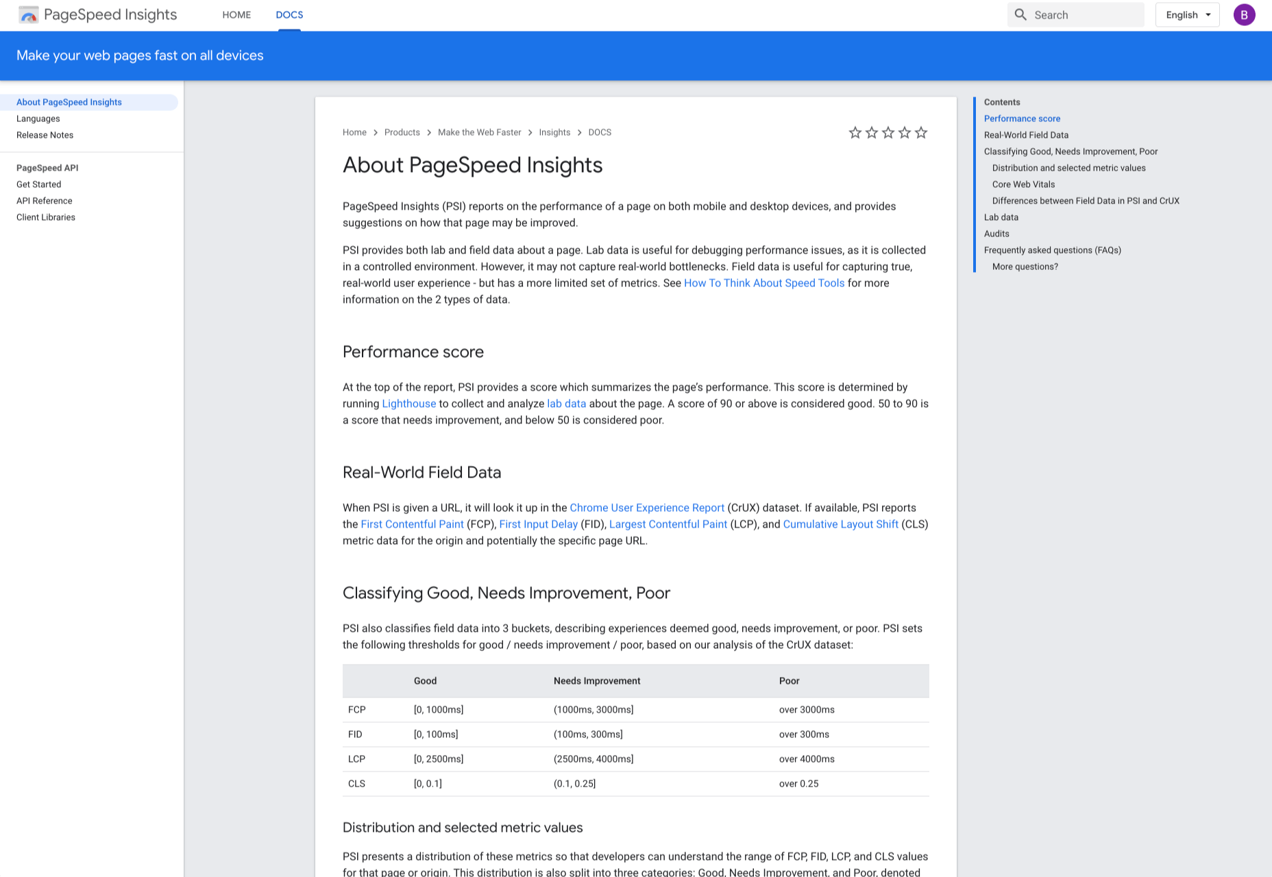
What Is Considered A Good Ecommerce Conversion Rate?
Monitoring your conversion rate is crucial to building a profitable ecommerce business. And most analytics tools can help you measure this data out of the box.
Your conversion rate is calculated by simply dividing the number of desired actions by the number of website visitors in a given period. For example, if your website is getting 50 conversions for every 5,000 visitors, your conversion rate is 1%.
Depending on the specific type of online business you run, your conversions may include online sales, email signups, add to carts, or any other KPI you wish to measure. But in the case of an ecommerce store, your primary focus should be your purchase conversion rate.
On average, ecommerce stores have a purchase conversion rate of 1% – 2%. What’s more, experts say a good conversion rate is anywhere from 2% to 5%. This should be your baseline as you measure your online store’s success.
The Conversion Results of My Last Site Redesign
Before we dive into the nitty gritty details of how I improved my conversion rate, here are my overall results and exactly how I conducted my experiment.
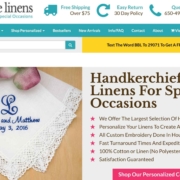
First off, I run Bumblebee Linens, an ecommerce store that sells handkerchiefs online.
Because my site gets a ton of traffic from content pages that do not directly convert to sales, I measured my conversion rate based on my most predictable traffic sources.
As a result, all of my conversion data was taken from targeted PPC ad traffic sources like Google Shopping and Google Adwords. After all, my Google ads traffic is very steady and always converts at a consistent percentage.
Before I redesigned my site, the conversion rate for my ecommerce store hovered at around 3% which is above average. But the look and feel of the site was dated and desperately needed a refresh. Overall, the entire redesign took approximately 7 weeks and cost me roughly $1840.
Here are the conversion results from my updated design compared to the original:
- Desktop conversion rates increased by 46%
- Mobile conversion rates increased by 26%
- Tablet conversion rates increased by 32%
The remainder of this post will highlight the specific elements of the redesign that contributed to these increases. (Note: I made all of my redesign changes live simultaneously so it’s difficult to determine which specific optimization contributed the most gains.)
8 Ecommerce Design Tips To Optimize Your Conversion Rate
If your ecommerce store is not performing as well as it should, there are many aspects of the user experience that could be negatively impacting sales. Even a seemingly innocuous design choice like your font size or the color of your buttons can have a significant impact on your overall conversion rate.
If you want to systematically improve the conversion rate for your ecommerce store, you should follow these 8 design steps.
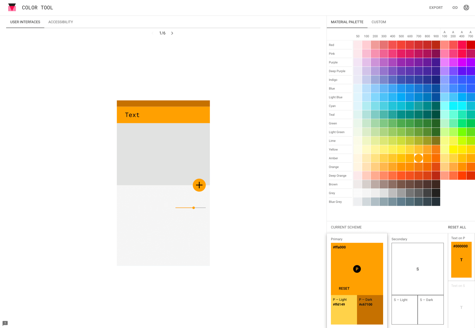
1. Use A Consistent and Complementary Color Scheme
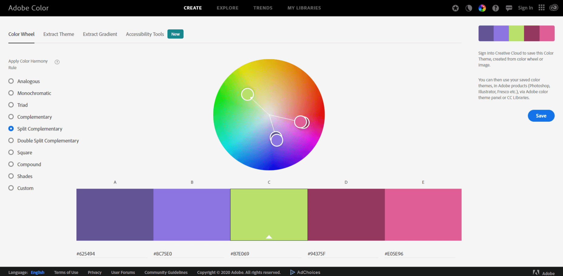
Use color.adobe.com to choose complementary colors when redesigning your website.
A well chosen color scheme can instantly attract a customer’s attention, evoke emotion, and drive users to take action. After all, how a customer feels about your website can be the deciding factor between completing checkout or bouncing from your shop.
A well designed ecommerce store should utilize at least 3 complementary colors that are consistently applied across every page of your website.
If you don’t have a good eye for color, you can use a free tool like color.adobe.com which will help you mix and match different colors that go well together.
For my site redesign, I wanted a modern feel so I chose teal, hot pink, and yellow for my color palette.
I also assigned each color a specific purpose on my site:
- Teal was applied to give the site a bright, overall color for a young and hip feel;
- Yellow was used to draw attention to marketing elements like free shipping and special offers;
- Hot Pink was used for all action buttons on the site.
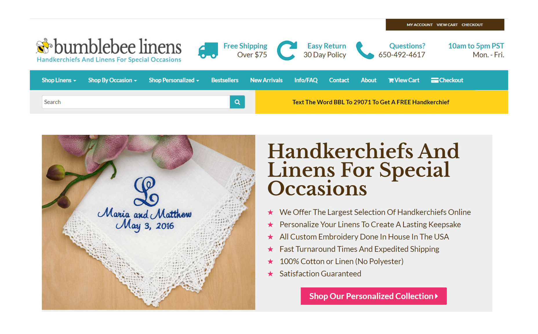
Overall, every single page of your ecommerce store should have 1 main call to action (using a bright color like hot pink) that guides a customer closer towards checkout.
For example on my front page, the hot pink button “Shop Our Personalized Collection” pops out of the page and catches a user’s attention right away. We want visitors to shop our personalized collection because our personalized products are the highest margin products in our store.
2. Simplify Your Navigation
Is your menu too complicated? Is your navbar taking up too much screen real estate?
A good rule of thumb for an ecommerce store is to minimize the number of clicks for a customer to add to cart. As a result, you should avoid nesting your product categories in more than 1 level of hierarchy.
If you have too many categories in your shop to display all at once, choose your best selling categories for your main menu and lump your less trafficked categories in a separate tab.
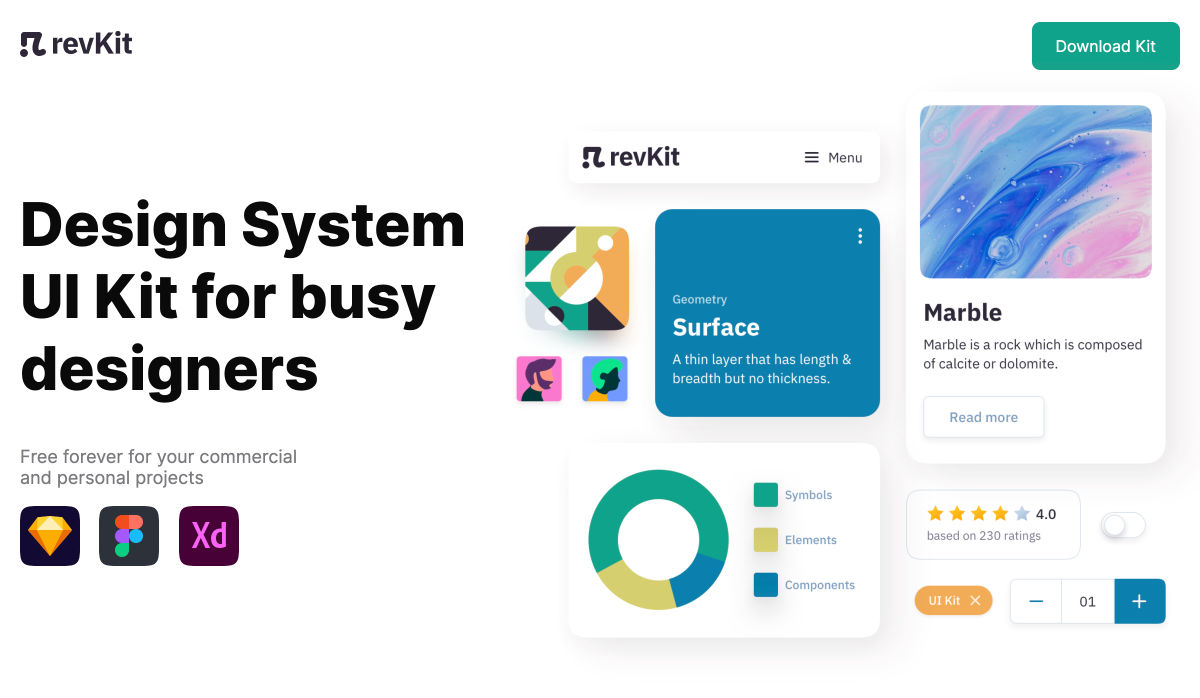
For my store, I decided to use a top-level, hover style drop-down menu as shown in the photo below.
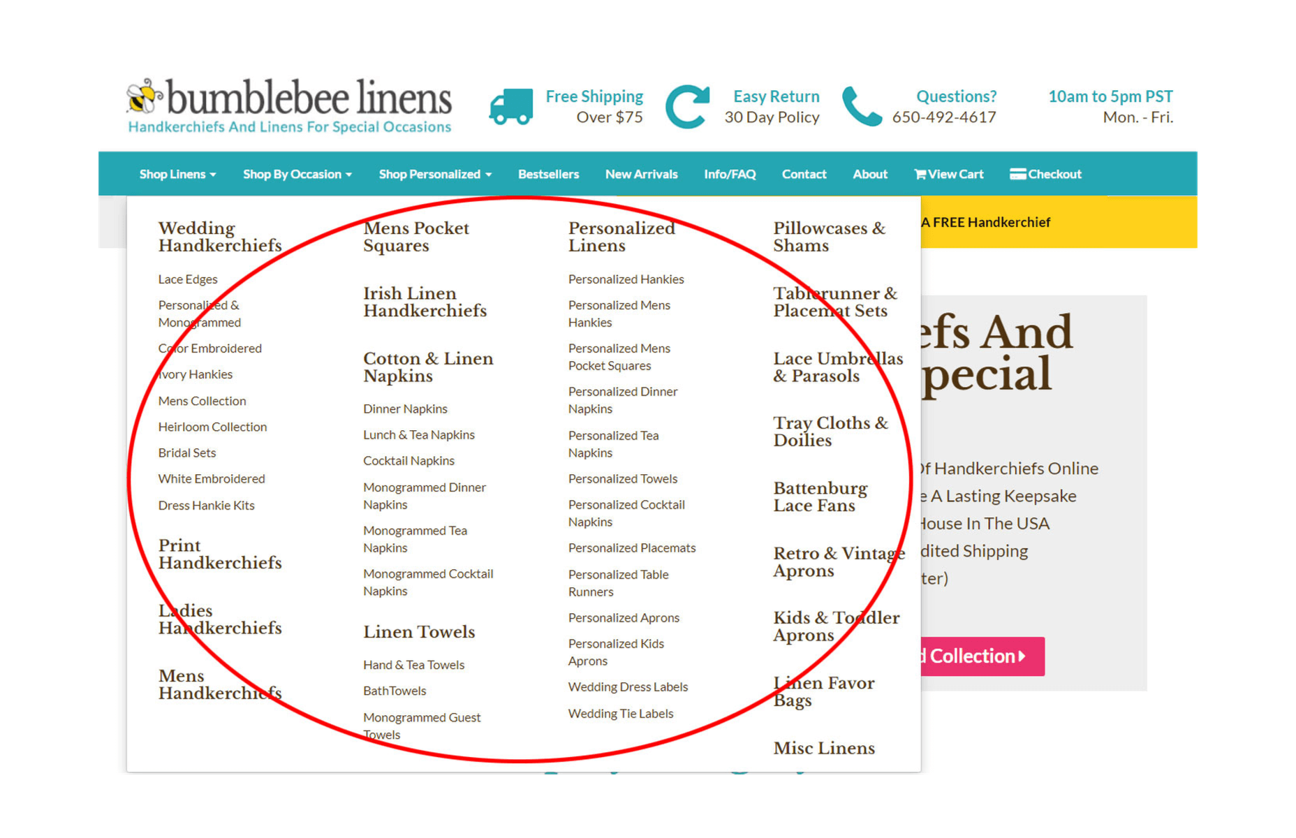
Top-level navigation is one way to organize and display your product categories.
My old design utilized left hand style navigation which took up too much screen real estate. And freeing up the extra space allowed me to blow up my category and product images by 300%. With my new navigation menu, every visitor can add to cart in just three clicks: One click to find a product category; One click to view the product description; One click to add to cart.
Once you’ve designed your menu, pretend that you are a customer and try to shop on your site. Is the content easy to read? Do the important elements pop out? Can you find the information you need right away? Analyzing your site from a customer’s perspective will help you improve your users’ shopping experience.
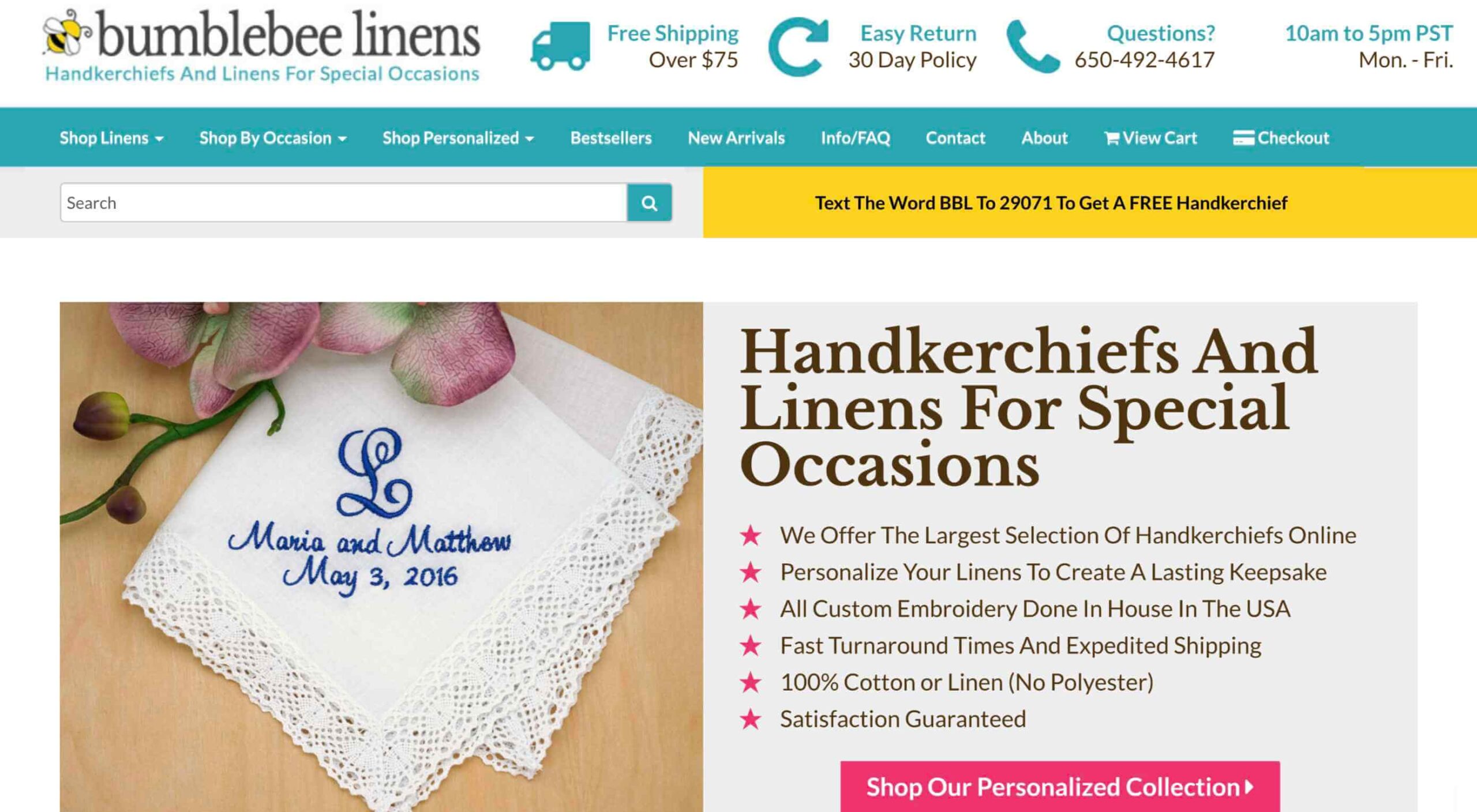
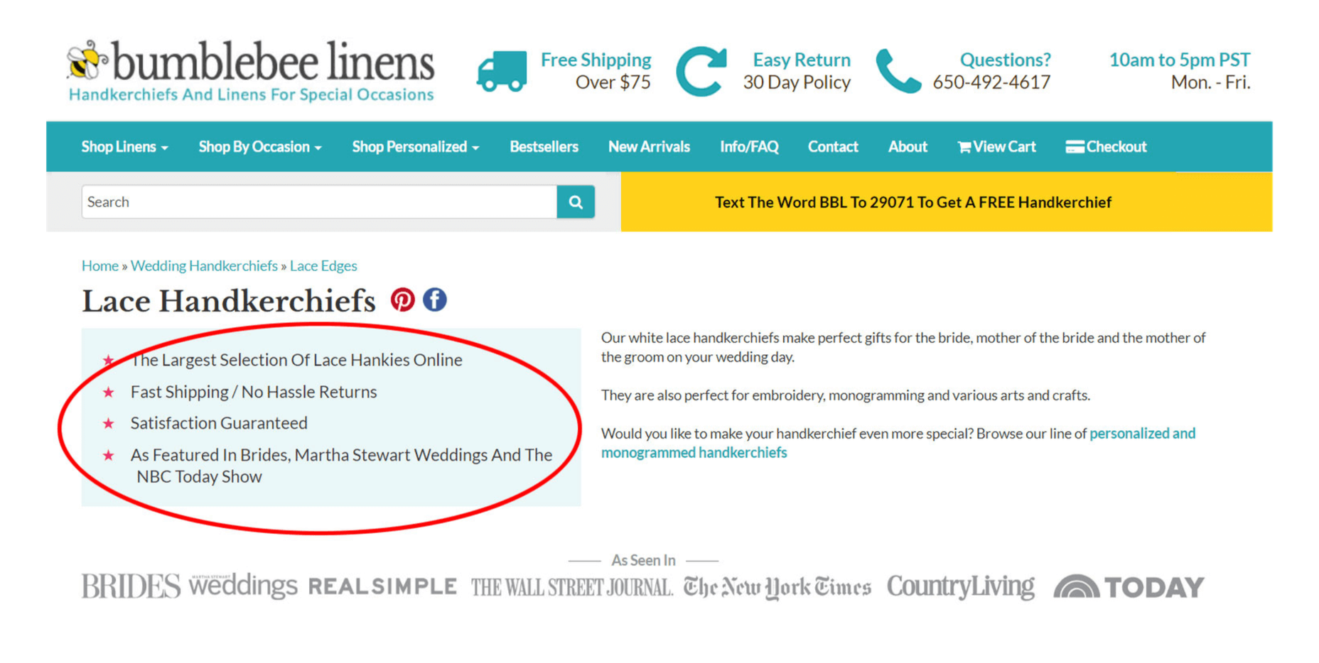
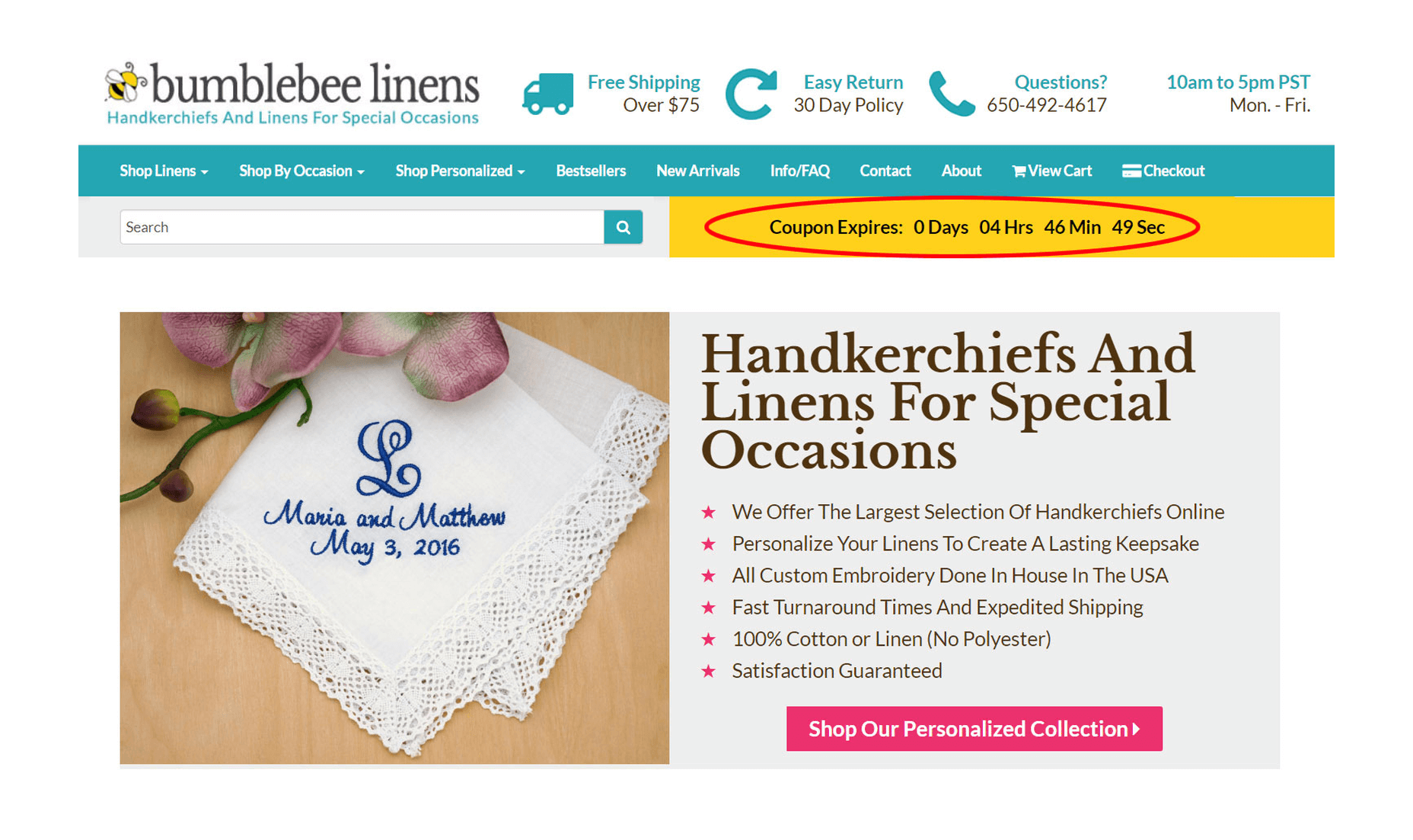
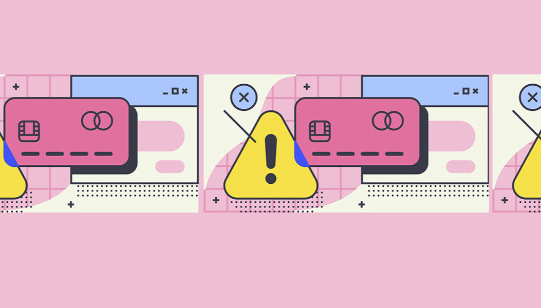
3. Display Trust Factors On Every Page
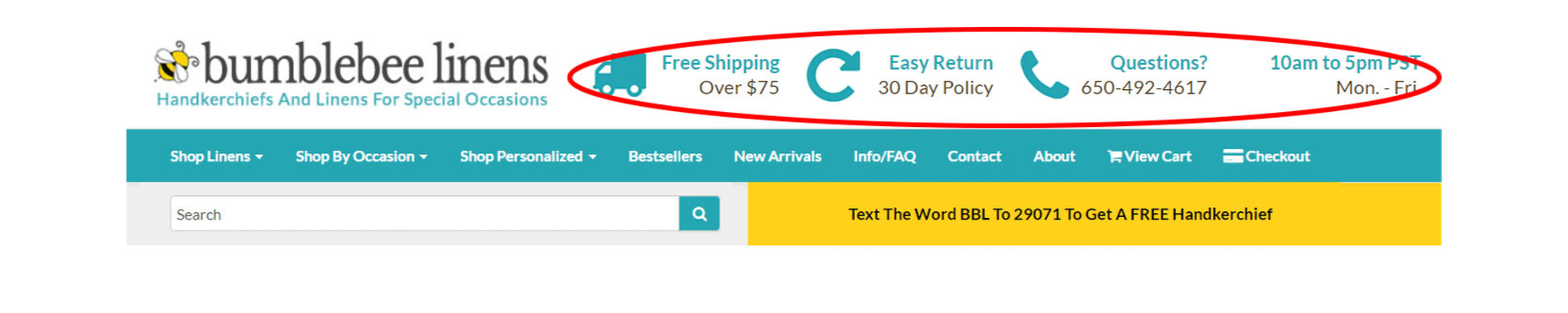
Free shipping, easy returns, and trust are crucial to driving conversions.
Trust is the most important value you must establish with your customer.
Unless you’re Amazon or a big box store, people have likely never heard of your brand and you have to reassure them that it’s safe to buy from your store.
Due to Amazon’s influence in the ecommerce space, most customers look for 3 things when shopping at an online boutique for the first time:
- Fast and free shipping;
- Easy returns;
- A way to reach customer support.
Displaying your phone number and email address is very important! Adding your store hours also helps to make your site look legit to new visitors. If you don’t have a recognizable brand, customers will want to know that they can reach a real human in case of problems or questions.
In the above image, you’ll notice that I placed my trust factors in the header, so they can be seen above the fold on every single page. We’ve also been featured on the Today show and a bunch of magazines. So I made sure to display this social proof on the bottom of every page.
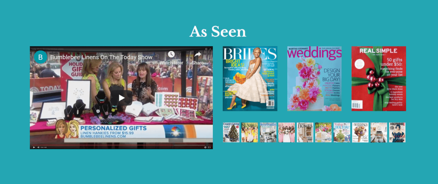
Don’t hesitate to flaunt your achievements to reinforce trust.
In addition, customer testimonials provide social proof and credibility to your website. As a result, it’s important to regularly reach out to happy customers for testimonials and endorsements. On our redesigned site, you’ll find the testimonials section right below our press mentions.
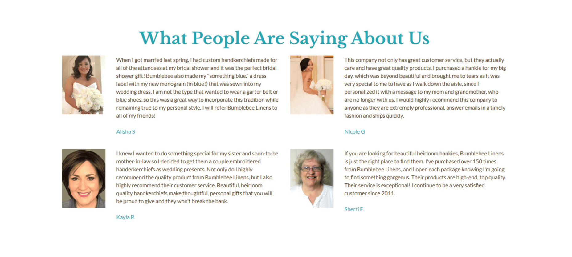
Testimonials lend social proof and credibility to your website.
Remember, to generate conversions as an unknown store or brand, you first have to gain your customers’ trust. Make it easy for them to contact you or get a full refund if anything goes wrong with their purchase. By showing a genuine concern for customer satisfaction, you’ll be able to build a solid reputation over time.
4. Emphasize Your Unique Value Proposition
Users spend an average of 5.59 seconds looking at your website’s written content. And in those 5.59 seconds, you must capture their interest or else they’ll bounce from your page. Right off the bat, you must convey to a user exactly what you sell and why they should buy from your store over a competitor.
What’s more, every single page on your site should communicate your unique value proposition. A unique value proposition is a concise statement that describes what makes your business special and outlines what your store does better than anyone else. The best way to show off your unique value proposition is to use an eye-catching image alongside compelling copy.
For example, here’s the first thing a user sees on my home page above the fold:

Right away, a user is shown a large image of one of our best selling personalized handkerchiefs. And right beside that image is a clear and concise value proposition, followed by a call to action to shop in our store.
Displaying your value proposition should not be limited to your home page. We also include our unique value proposition on every category page as well. Overall, you should include your value proposition on every landing page on your website.
5. Optimize The Visual Hierarchy Of Your Product Pages
Every page on your site should have a single objective. And for your product pages, your goal is to get a customer to add to cart.
When designing a product page, you must apply a logical visual hierarchy to your design. A visual hierarchy is the order in which a user processes information on a page and in the case of a product page, there must be a clear path to your add to cart button with as few distractions as possible.
Here’s a screenshot of my old product page:
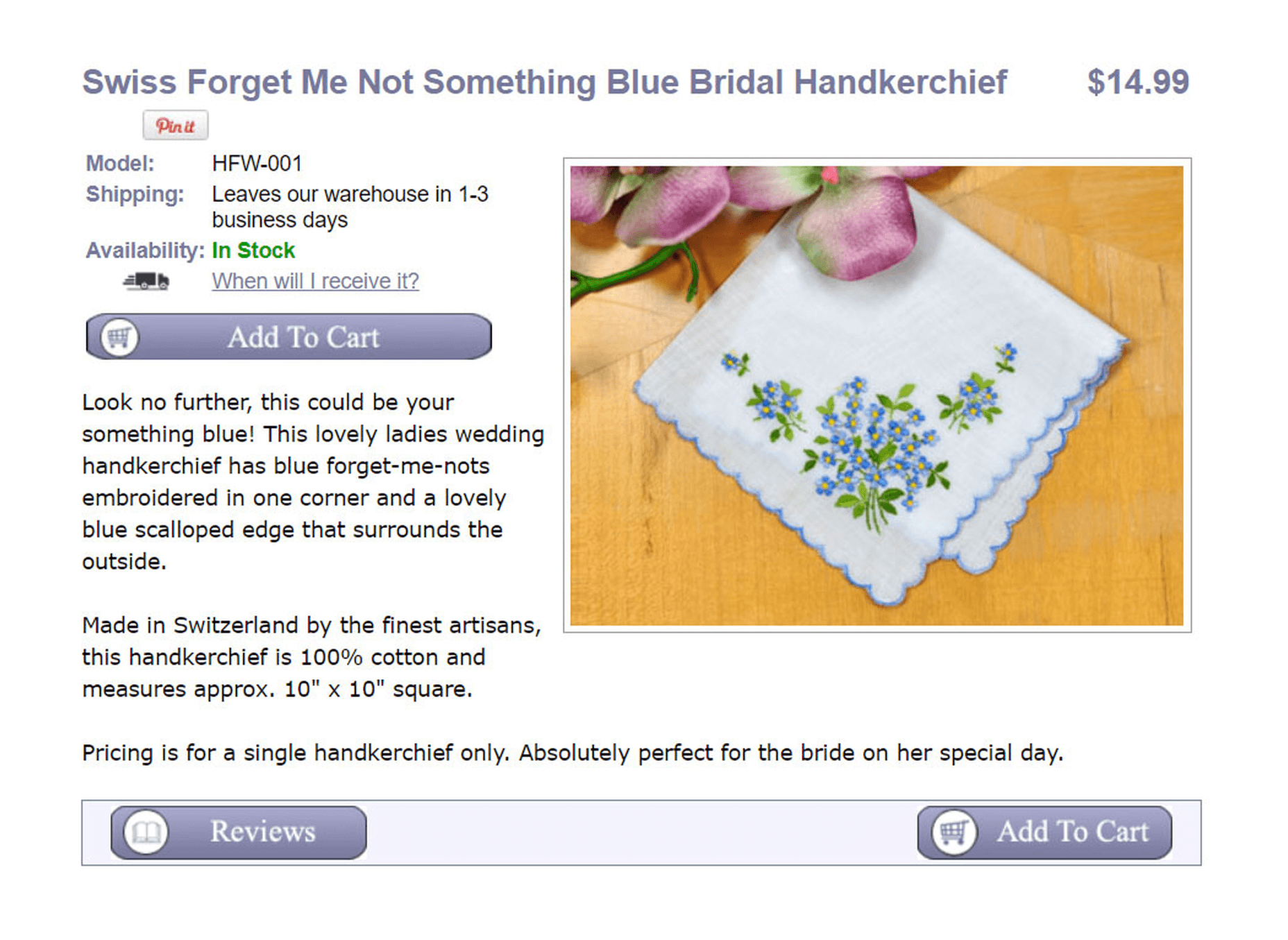
As you can see, my old product page is overwhelming. All of the design elements try to grab your attention at the same time and there are many different calls to action that blend together. To improve my product descriptions, I freshened up the color scheme and enlarged my product image by 266%. I also changed the placement of the buttons in a more logical flow.
Here’s what the redesigned product page looks like today:
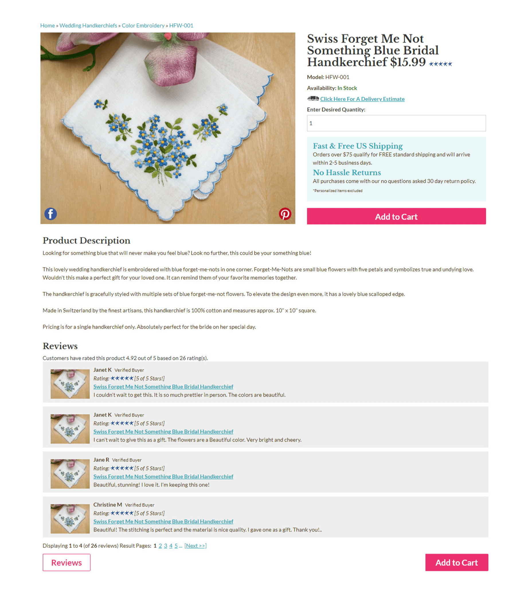
By adjusting the size, color, contrast, and alignment of the page elements, I now force the customer to process my product information in a set path that leads directly to my primary call to action. For example, the hot pink color draws attention to the “Add to Cart” button over the “Reviews” button. Also, by applying a blue text color and teal background, I reassure customers that shopping with us is safe and risk free.
Overall, rearranging the design elements this way nearly doubled my add to cart percentage.
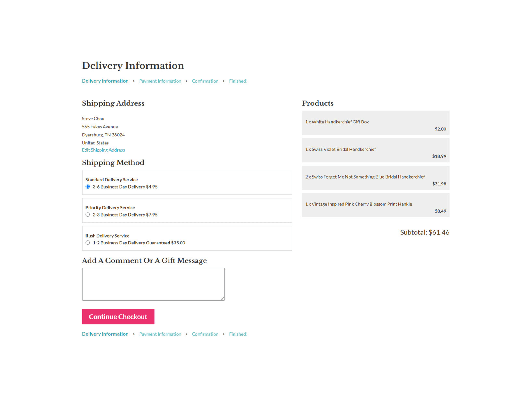
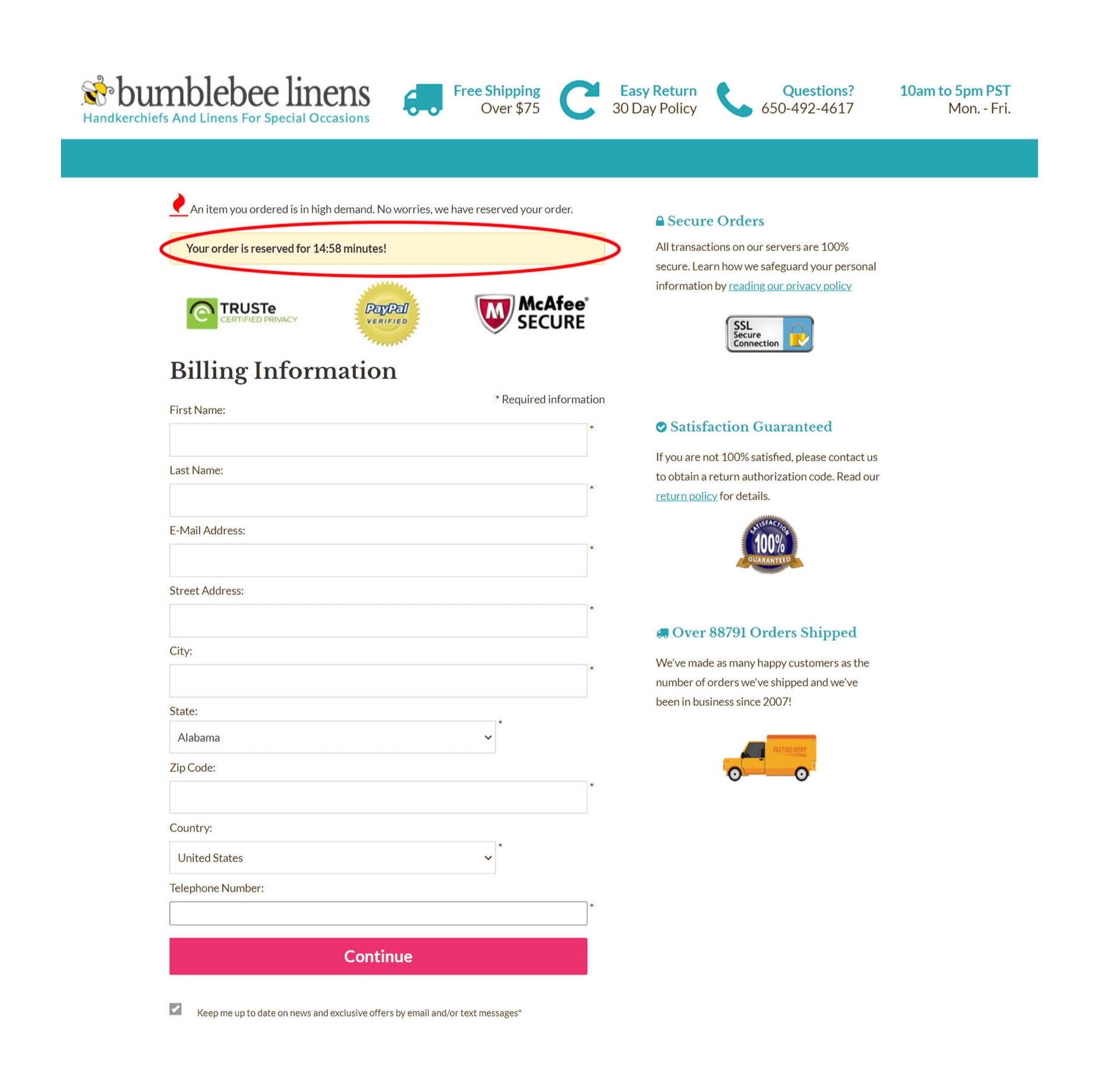
6. Simplify Your Checkout Process
With our old site design, we would regularly receive feedback from confused customers who weren’t sure if they needed an account to purchase our products.
Here’s what our old checkout page looked like:
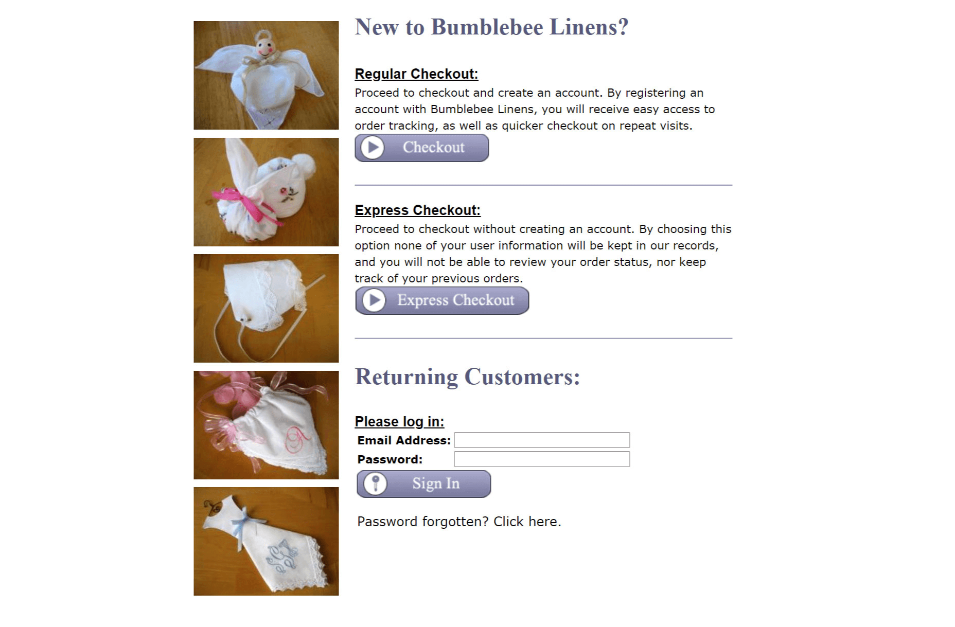
As you can see, there are too many choices. After all, a customer doesn’t need 3 ways to checkout and the choices are a little overwhelming.
Here’s what the checkout page looks like now:
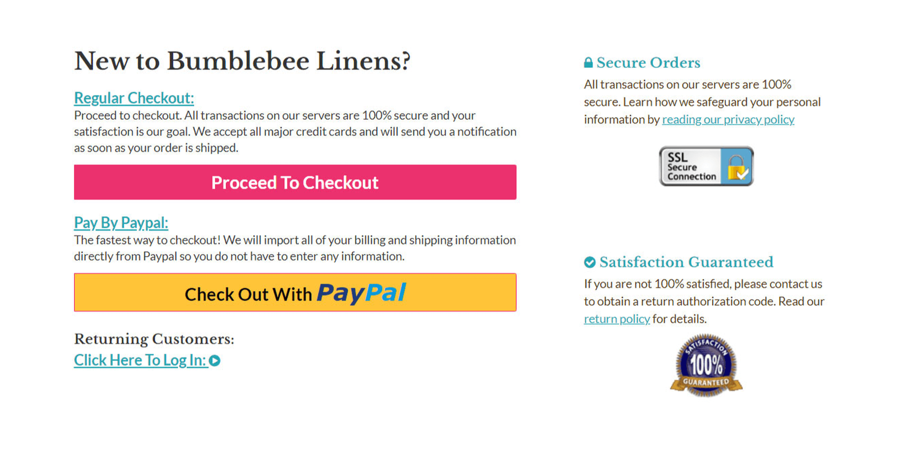
Instead of offering 3 separate options for checkout, I consolidated them all into one and added a separate Paypal option (more on this later). First off, less than 6% of customers create an account so there was no reason to offer account creation as a separate option. Furthermore, displaying a login form was causing more headaches than it was worth because the majority of customers don’t even have an account. As a result, I decided to hide the form altogether by default.
Overall, when you are designing your checkout process, keep these optimization principles in mind.
Principle #1: Remove all unnecessary elements from the page. Don’t make the customer think and hide all elements that are not frequently used.
Principle #2: Display trust logos to assure customers of a secure checkout. In the image above, you’ll find trust logos on the right-hand side of the checkout page.
7. Optimize The Checkout Process For Mobile Users
4 out of 10 mobile users abandon their carts if they have a hard time entering their personal information. People don’t like entering their contact and credit card information using a tiny keyboard. What’s more, small buttons and too many form fields drive away mobile users. 79% of smartphone users shop online with their mobile devices, which is why you should optimize for mobile.
These days, a responsive design is par for the course but you can still screw things up if you are not careful. Here’s what my checkout process looks like on a desktop:
And here’s how the checkout page looks on a mobile device:
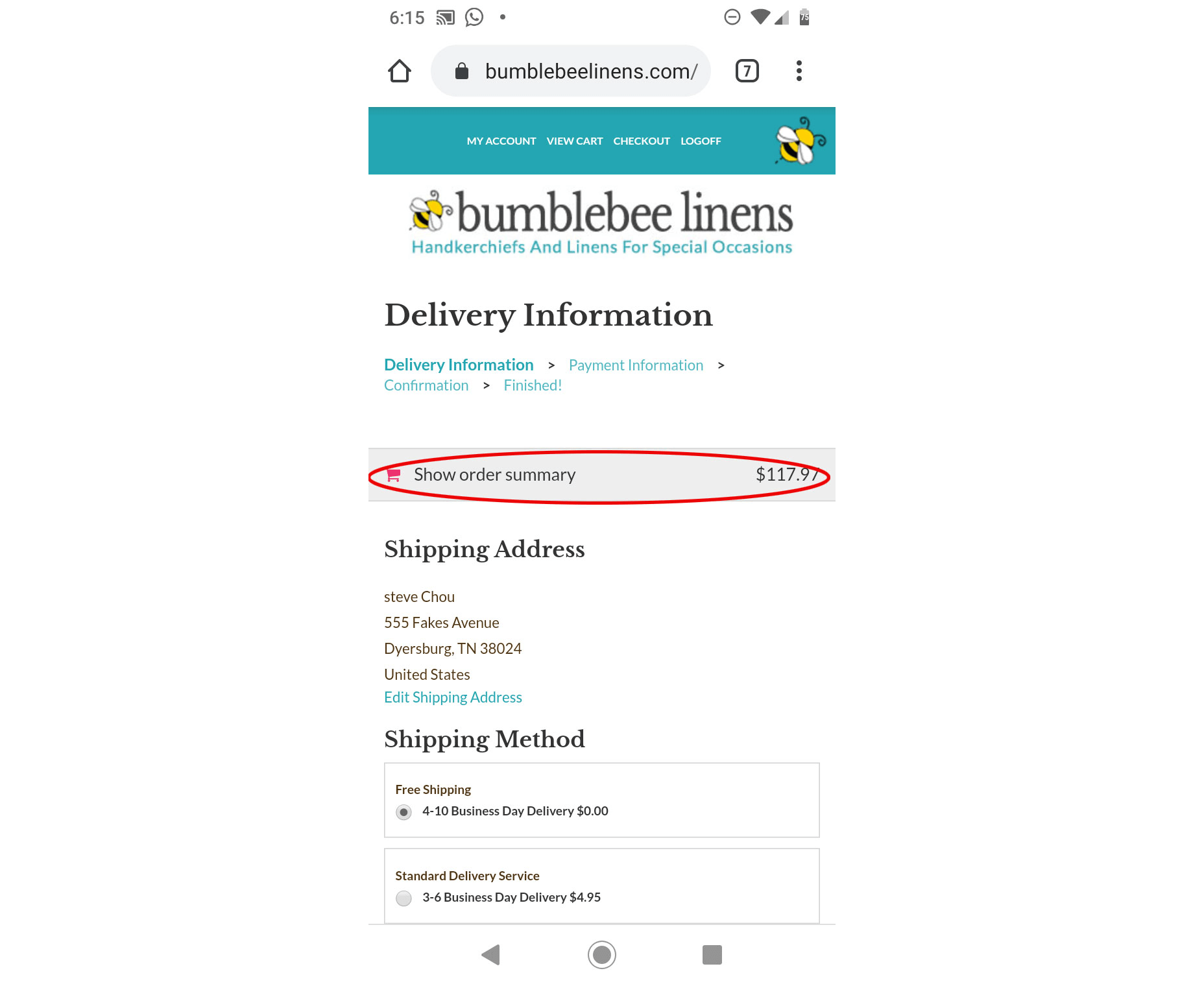
On mobile, the user’s cart contents are collapsed so it doesn’t occupy the entire screen. Overall, here were the mobile optimizations I made to checkout:
Optimization #1: Keep Your Checkout Form Short And Sweet
A mobile user should be able to tap buttons on your checkout page without accidentally hitting another option. Also, the buttons should be large enough to tap on a mobile device.
Given the smaller screen size of a mobile phone, keep your checkout form short and sweet with no extraneous options. Also, make sure you turn off autocorrect for your form fields. Otherwise, your phone’s autocorrect feature may frustrate users when they try to enter their address. In fact, we once had a customer get so frustrated trying to type in their city on their iPhone that they called us up and complained in frustration.
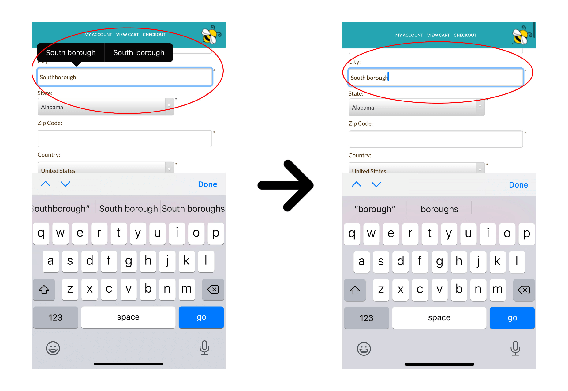
To fix this, you simply need to add the following tag to all of your text input fields.
<input type="text" name="name" autocorrect="off">
And to reduce frustration, you should also turn off auto-capitalization and auto-complete by adding auto-capitalization=”off” and auto-complete=”off” to all of your forms as well:
<input type="text" name="name" autocorrect="off" auto-capitalization="off" auto-complete="off">
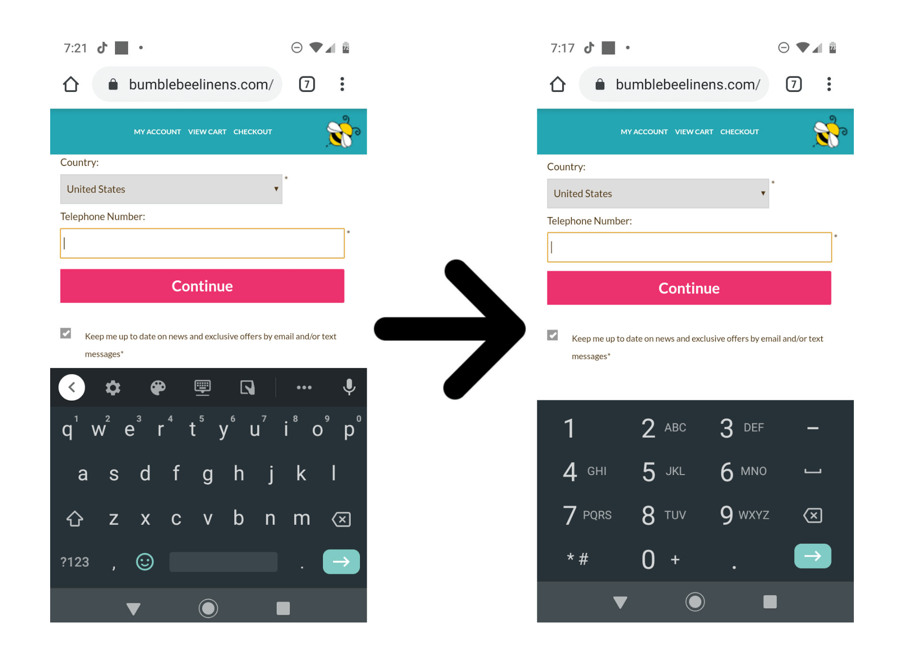
In addition, for phone number entry, you should always display a numeric keypad as opposed to a regular keyboard:
Optimization #2: Automatically Import Your Customer Data If Possible
The less information mobile users have to enter in, the better. Payment options like Paypal Express and Amazon Payments can simplify the checkout process. These third-party payment processors automatically fill out a customer’s billing and shipping information which reduces typing and increases conversion rates.
To offer a more convenient checkout, I implemented PayPal One Touch, which alone increased my mobile conversion rates by 31%.
Here’s a quick tip when implementing Paypal: Make sure you display the Paypal button early in the checkout process before a user has entered in their information. Otherwise, it defeats the purpose of importing their information! In the first step of my checkout process, I explain each payment option in depth.
These simple changes made a huge difference in my conversion rate. And the number of PayPal users on my site nearly doubled from 13% to 23%!
8. Add A Sense Of Urgency
Most customers like to window shop and the best way to get a visitor to take action is to create a sense of urgency.
Whenever I run a sale, a big yellow countdown timer is displayed on every page of the website.
Note: It’s important to note that we only utilize this timer when there is actually a sale going on. Otherwise, you risk desensitizing your customers or losing trust.
In addition, I also display a countdown timer on the checkout page to create a sense of urgency to complete the payment process:
These extra design elements force a customer to take action sooner rather than later.
Final thoughts
Optimizing your conversion rate is an ongoing process. And testing your results is the only way to track your improvement.
Never go with your gut and always listen to the data. After all, sometimes an ugly site can out-convert a beautiful one.
Regardless, the design tips I demonstrated above will give you a solid foundation to start with. From there, you can further improve your website and optimize your conversion rate through repeated testing and tweaks. Good luck!
Source

Source de l’article sur Webdesignerdepot

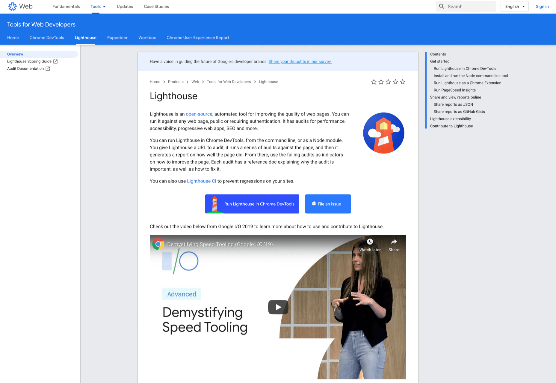
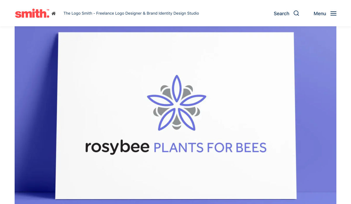
 Every week users submit a lot of interesting stuff on our sister site Webdesigner News, highlighting great content from around the web that can be of interest to web designers.


 Every week users submit a lot of interesting stuff on our sister site Webdesigner News, highlighting great content from around the web that can be of interest to web designers.


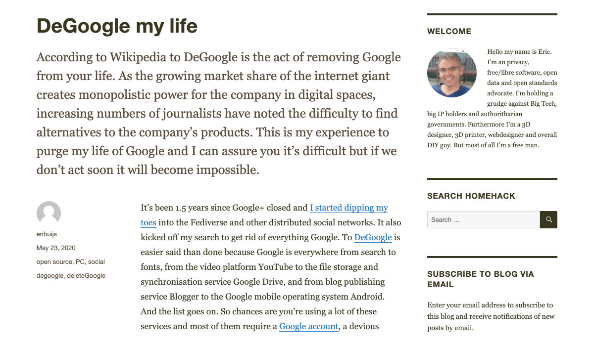
 Google resembles an iceberg: there’s the part above the water we can see and use everyday; there’s also the part beneath the water, that we don’t see and know little about.
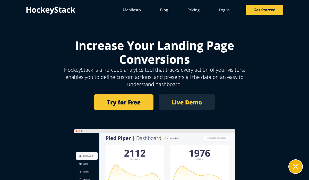
 Every week users submit a lot of interesting stuff on our sister site Webdesigner News, highlighting great content from around the web that can be of interest to web designers.


 Every week users submit a lot of interesting stuff on our sister site Webdesigner News, highlighting great content from around the web that can be of interest to web designers.


 Every week users submit a lot of interesting stuff on our sister site Webdesigner News, highlighting great content from around the web that can be of interest to web designers.

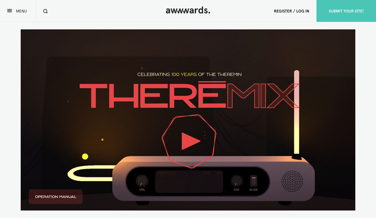


 Every week users submit a lot of interesting stuff on our sister site Webdesigner News, highlighting great content from around the web that can be of interest to web designers.


 Every week users submit a lot of interesting stuff on our sister site Webdesigner News, highlighting great content from around the web that can be of interest to web designers.


 Every week users submit a lot of interesting stuff on our sister site Webdesigner News, highlighting great content from around the web that can be of interest to web designers.


