 The underlying theme of this month’s collection of new tools and resources is development. Almost every tool here makes dev a little easier, quicker, or plain fun. There are a few great tutorials in the mix to help you get into the spirit of trying new things and techniques.
Here’s what is new for designers this month…
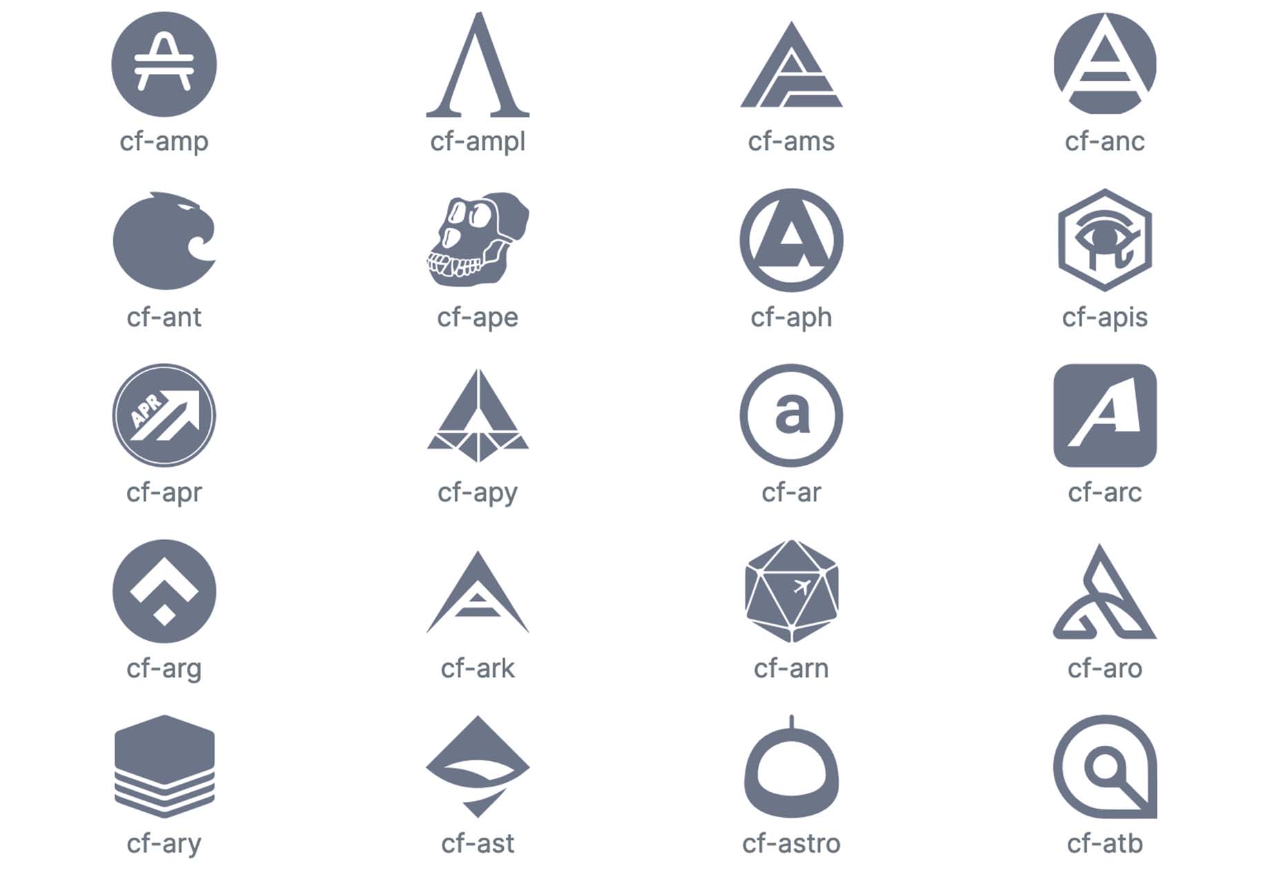
Cryptofonts
Cryptofonts is a huge open-source library of icons that represent cryptocurrencies. There are more than 1,500 CSS and SVG elements in the collection. Cryptofonts includes all scalable vector icons that you can customize by size, color, shadow, or practically anything else. They work with Sketch, Photoshop, Illustrator, Adobe XD, Figma, and Invision Studio, and there’s no JavaScript.
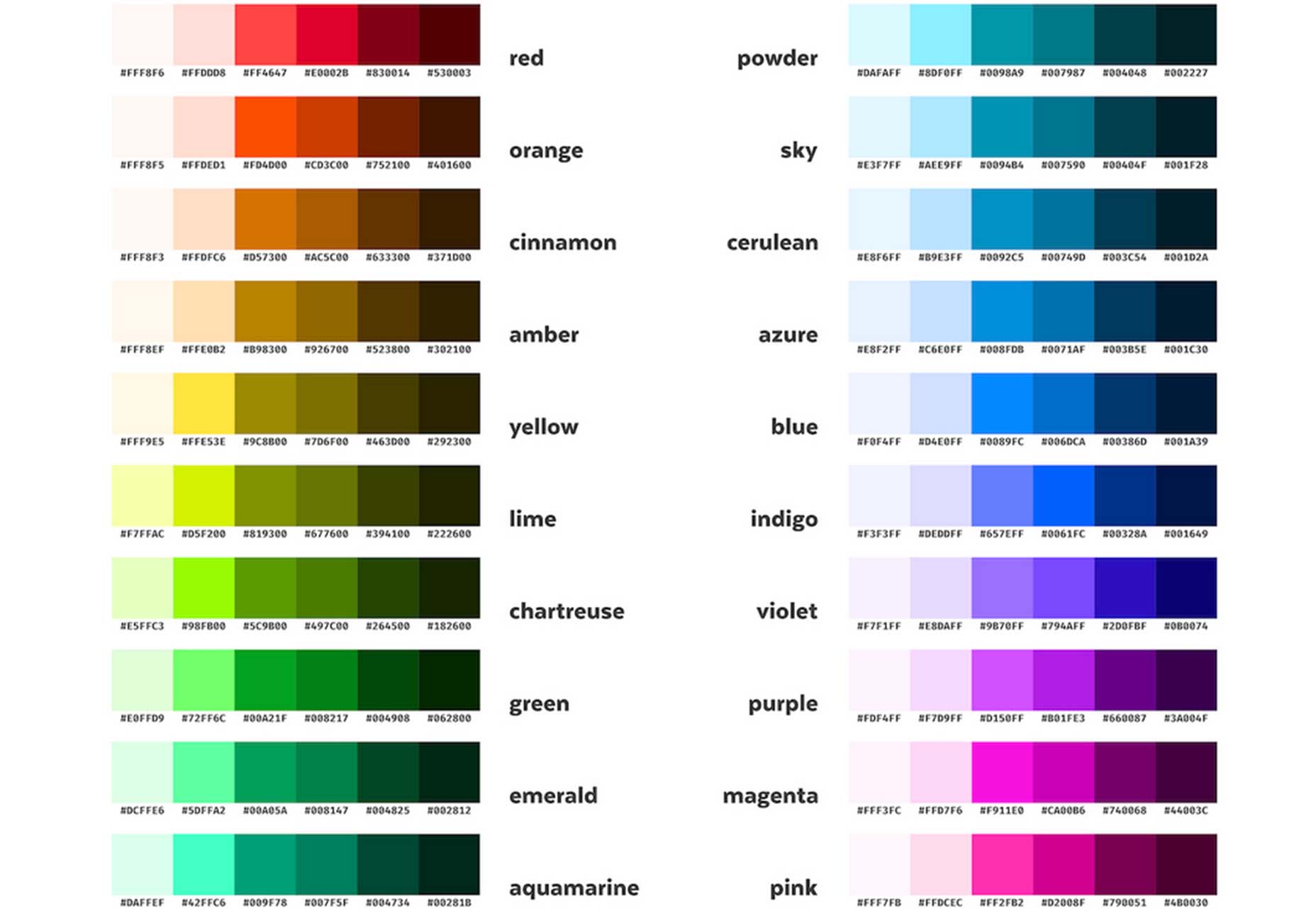
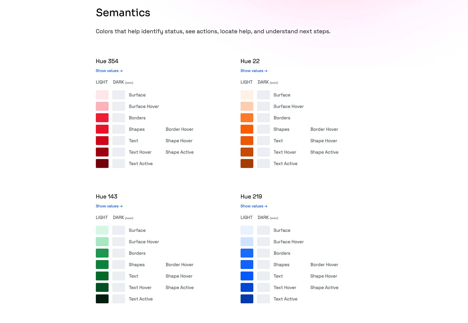
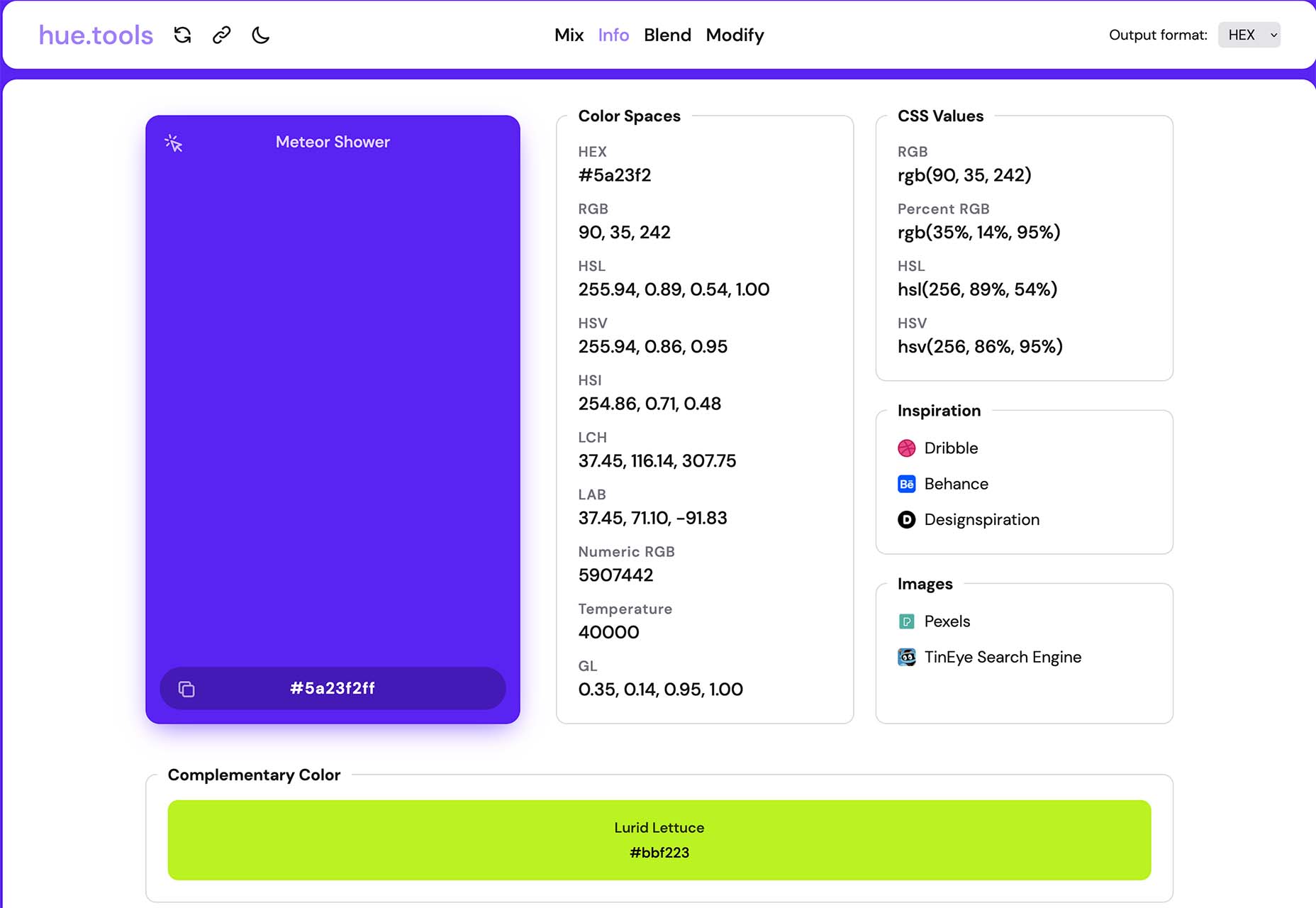
Reasonable Colors
Reasonable Colors is an open-source color system for building accessible and beautiful color palettes. Colors are built using a coded chart. Each color comes in six numbered shades. The difference between their shade numbers can infer the contrast between any two shades. The differences correspond to WCAG contrast ratios to help you create an accessible palette. This is a smart project and a valuable tool if you work on projects where color contrast and accessibility are essential (which is all of them).
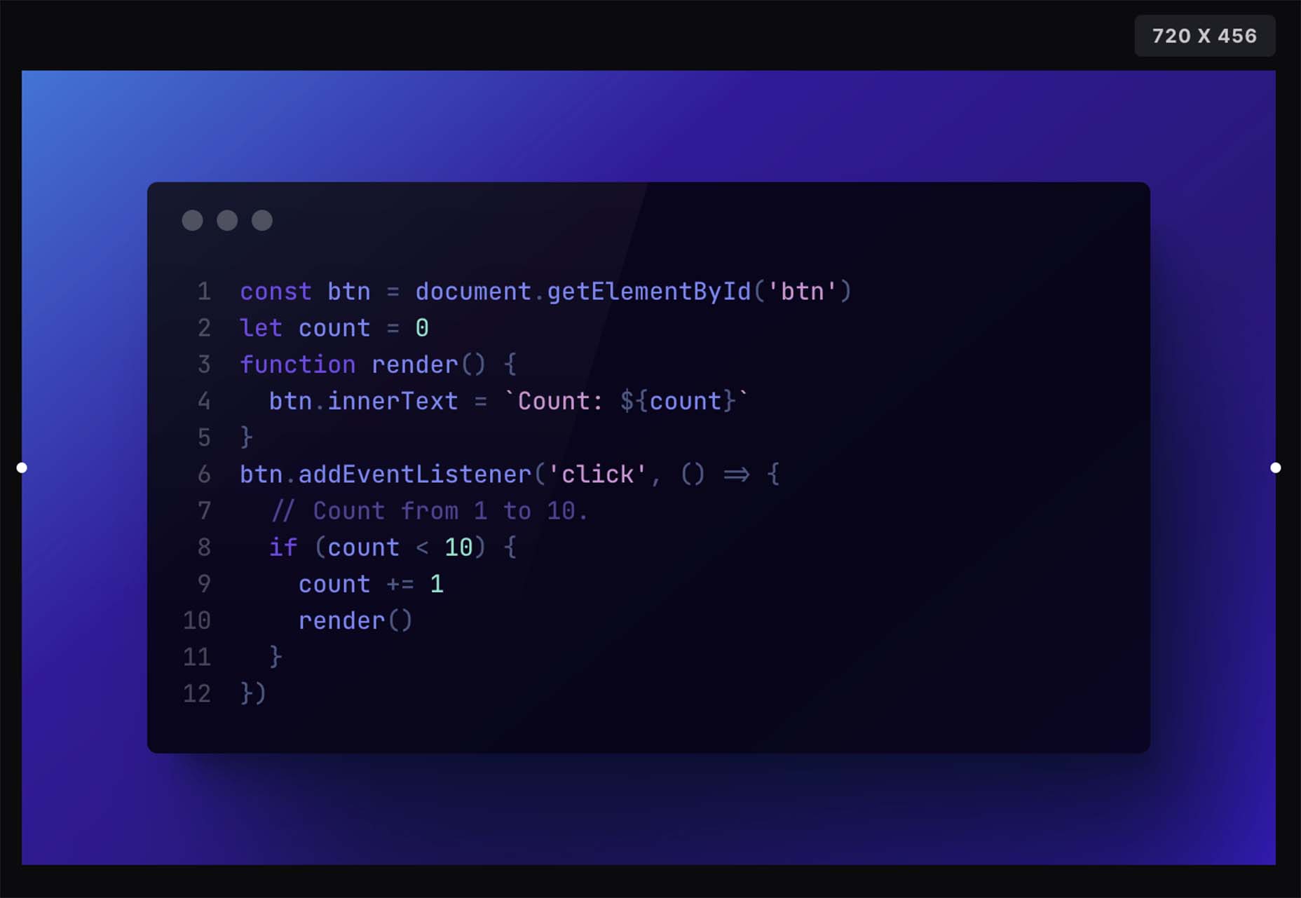
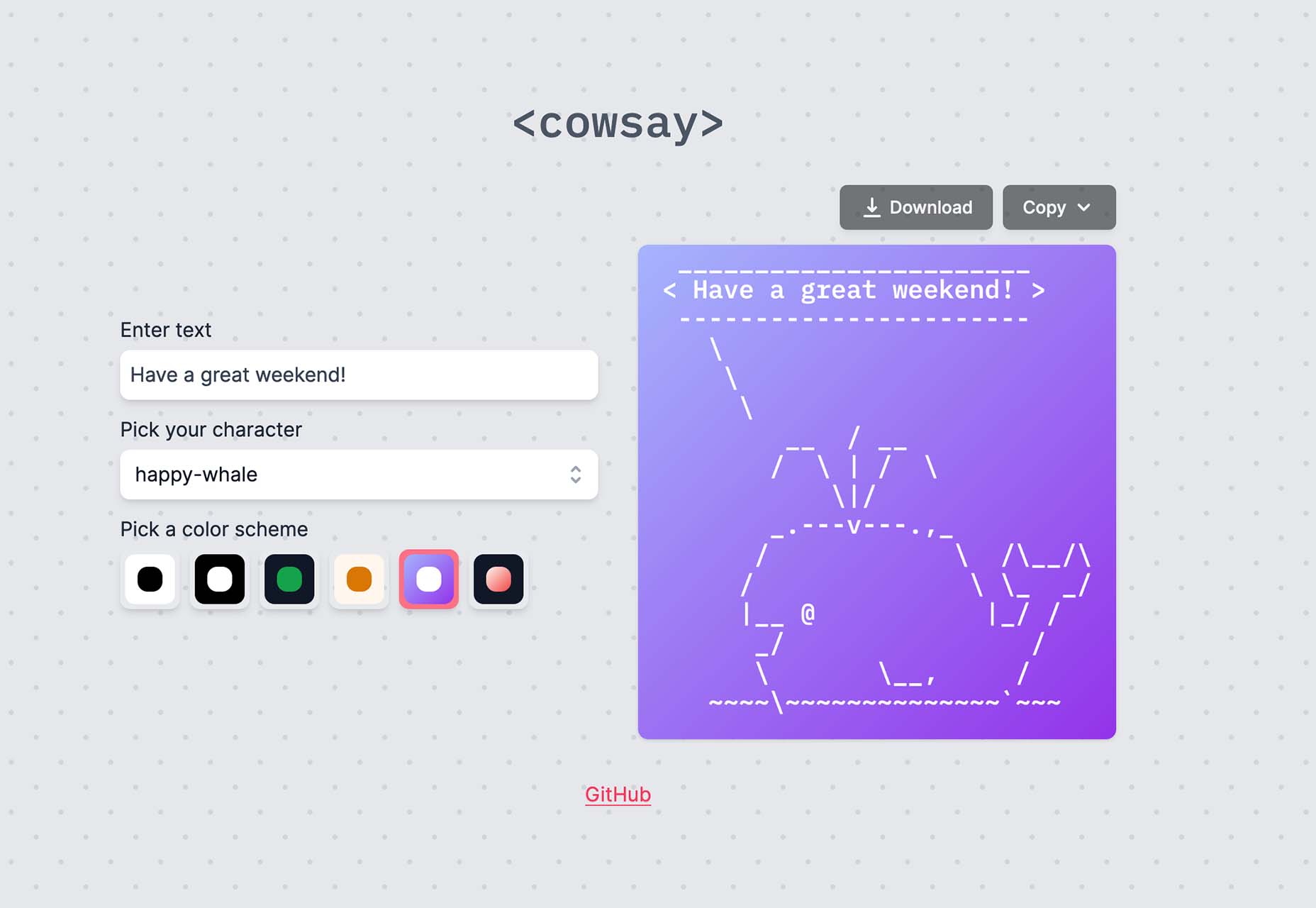
Chalk.ist
Chalk.ist is a fun tool to make your code snippets look amazing. Add your code (there’s a vast language selector), pick some colors and backgrounds, and then download it as a shareable image. Your code has never looked so beautiful!
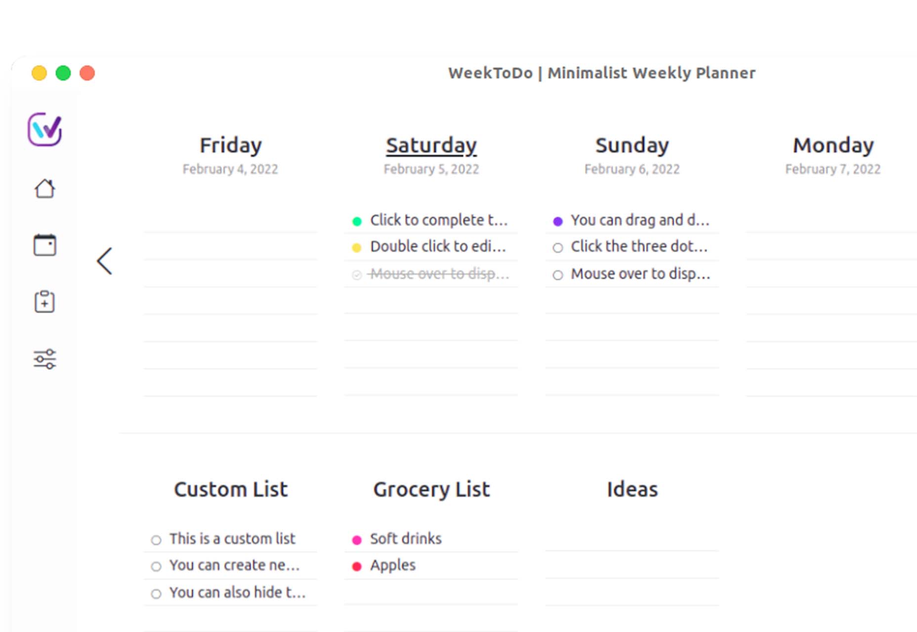
WeekToDo
WeekToDo is a free minimalist weekly planner. Improve productivity by defining and managing your week and life easily and intuitively. Plus, this tool is focused on privacy with data that is stored on your computer (in your web browser or the application). The only person who has access to it is you.
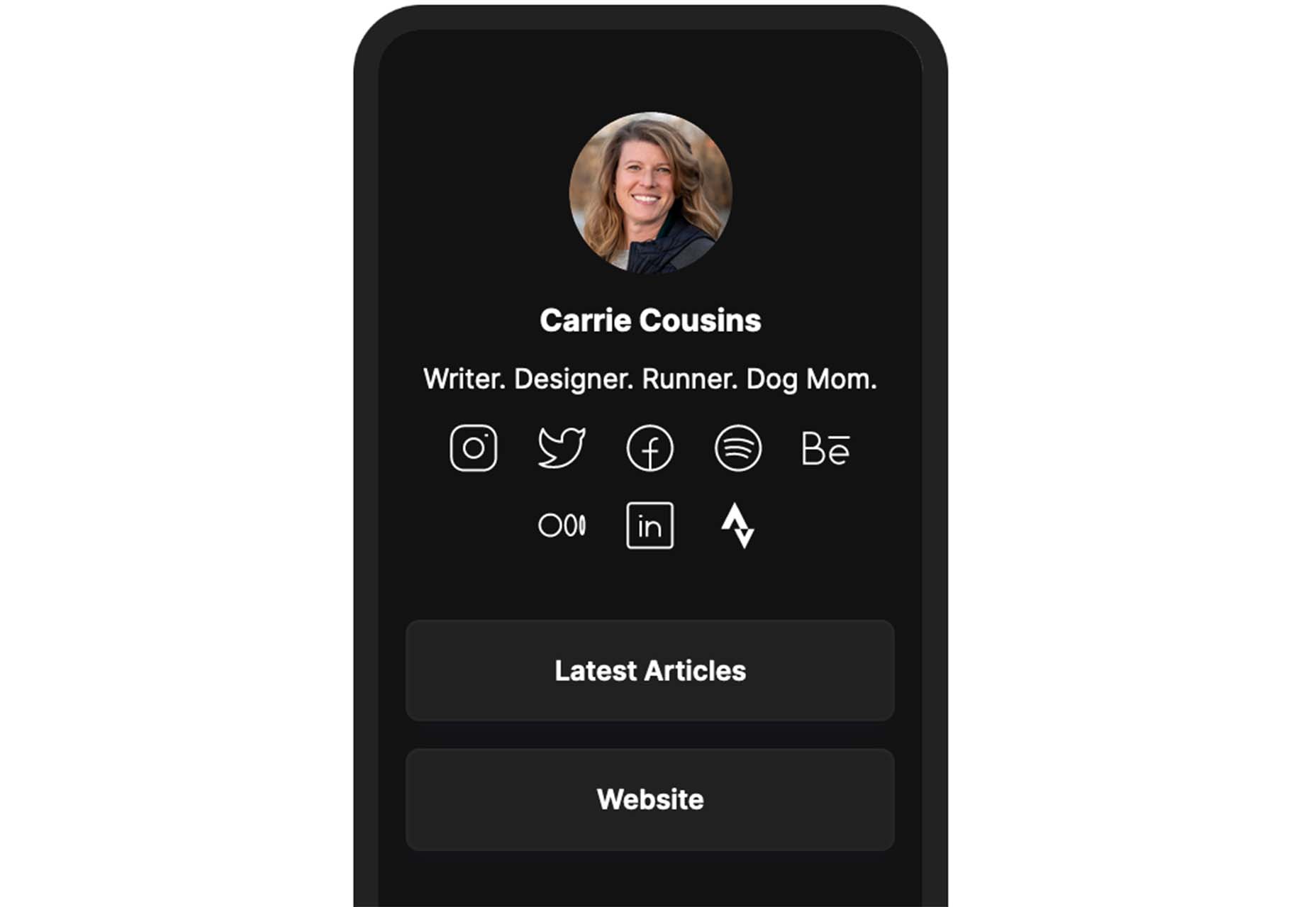
Bio.Link
Bio.Link is a tool that collects all your links – from social media to blog posts to any other kind of link you want to share. It’s free to use, includes 15 design themes, visitor stats, and is super fast.
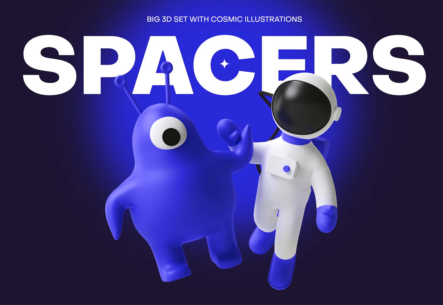
Spacers
Spacers are a set of three-dimensional space characters that you can use in projects. Characters are in multiple poses and ultra high-def formats to play with.
11ty
11ty is a super simple, static website generator. Try it for small projects and read the documentation to see everything you can do with this tool.
Scrollex
Scrollex is a react library that lets you build beautiful scroll experiences using minimal code. You can create scroll animations in all kinds of combinations – vertical, horizontal, almost anything you want to try. The documentation is fun and easy to understand if you’re going to see how it works.
GetCam
GetCam is an app that lets you turn your smartphone into a webcam for your computer. It works with any iPhone and a Mac or Windows computer. It works with most video conference and streaming tools as well as browser-based apps.
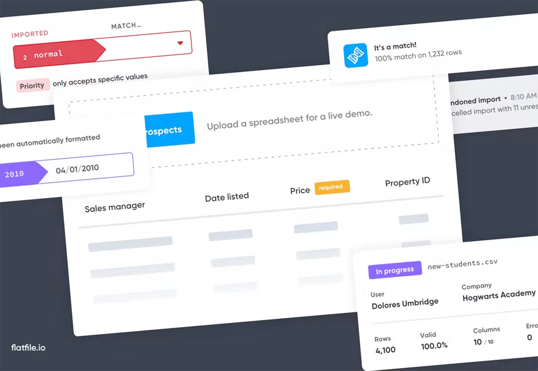
Flatfile
Flatfile is a data onboarding platform that intuitively makes sense of the jumbled data customers import and transforms it into the format you rely on. You won’t have any more messy spreadsheets or have to build a custom tool.
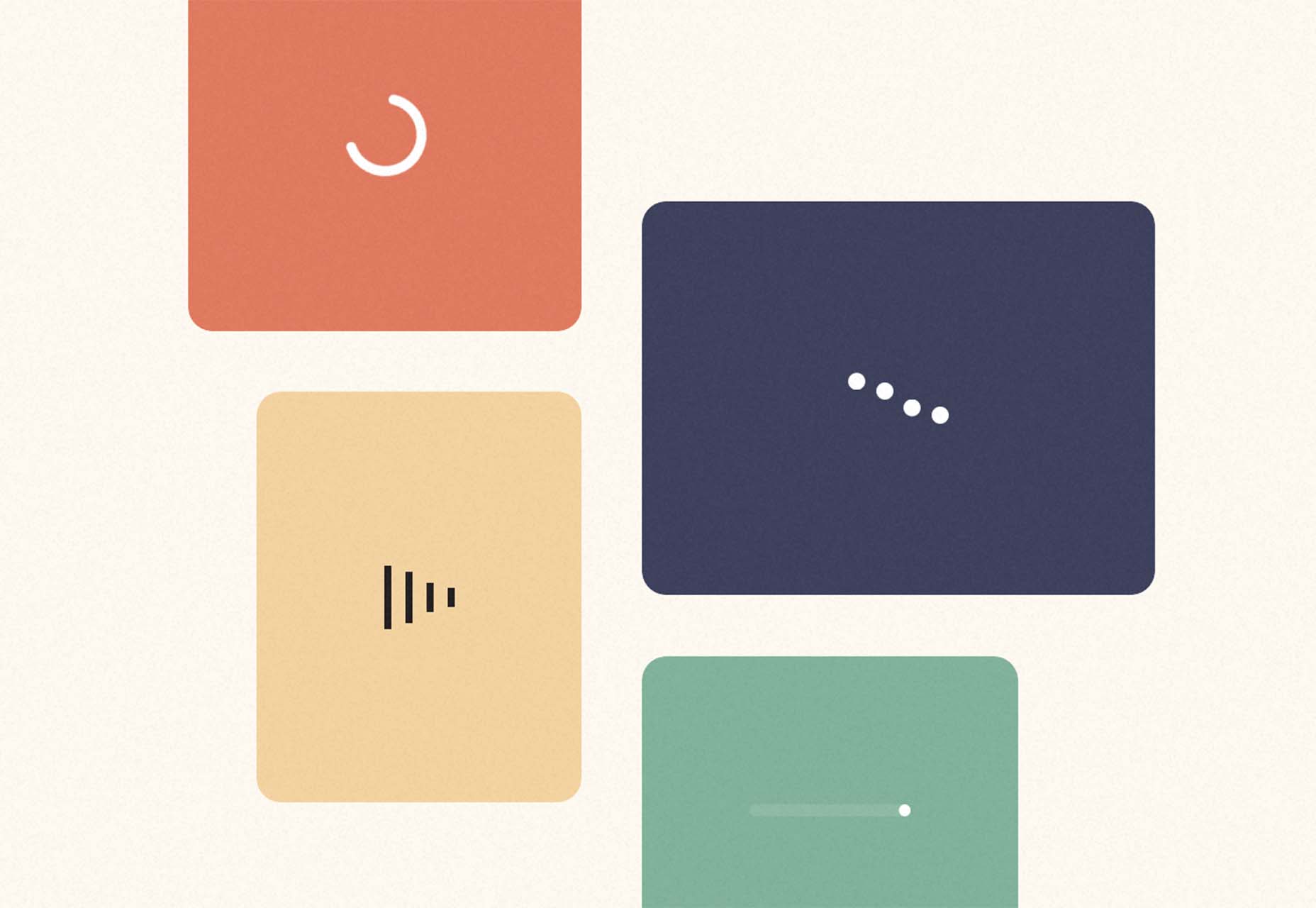
Loaders
Loaders is a collection of free loaders and spinners for web projects. They are built with HTML, CSS, and SVG and are available for React and copypasta.
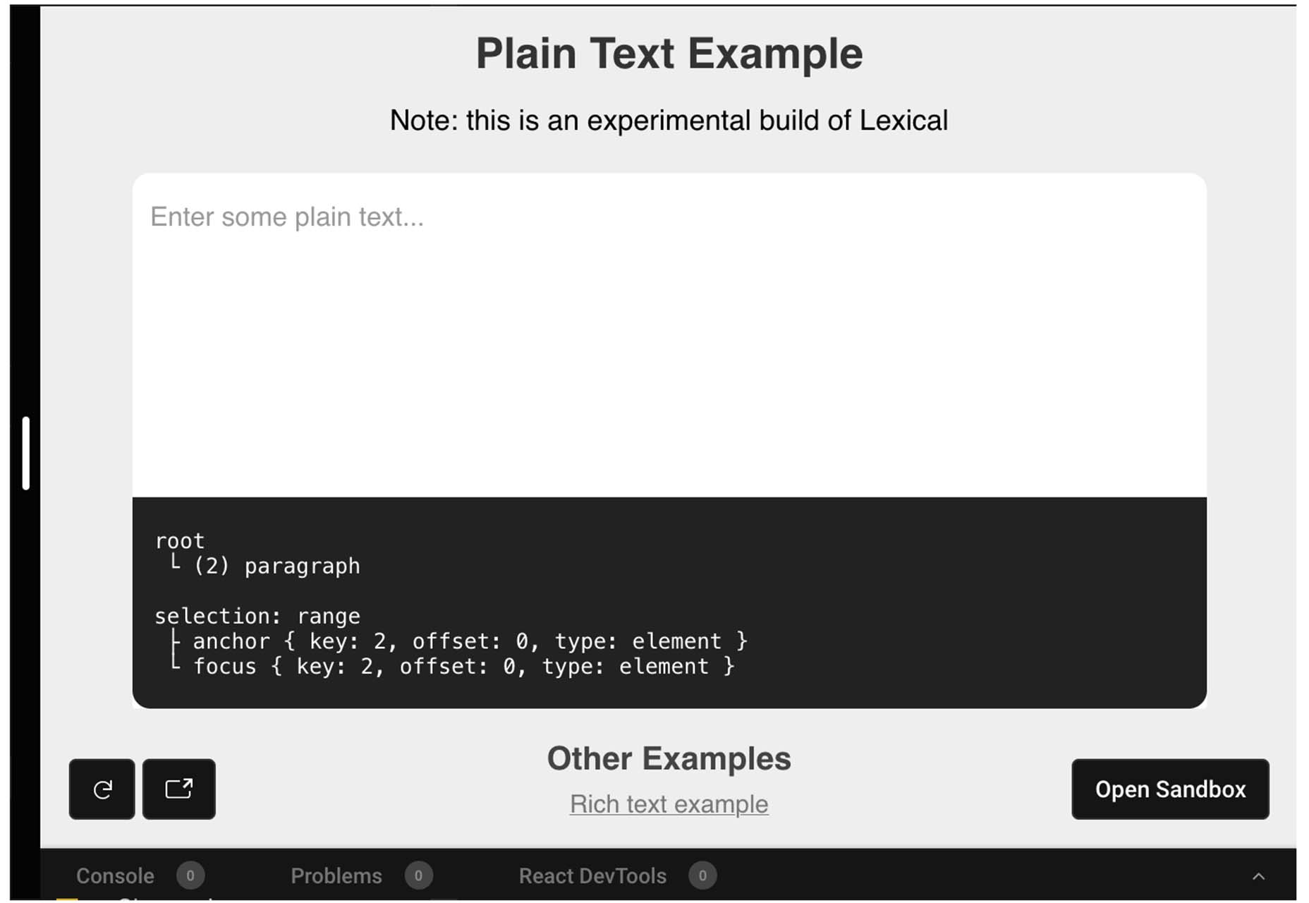
Lexical
Lexical is an extensible JavaScript web text-editor framework emphasizing reliability, accessibility, and performance. It’s made for developers, so you can easily prototype and build features with confidence. Combined with a highly extensible architecture, Lexical allows developers to create unique text editing experiences that scale in size and functionality.
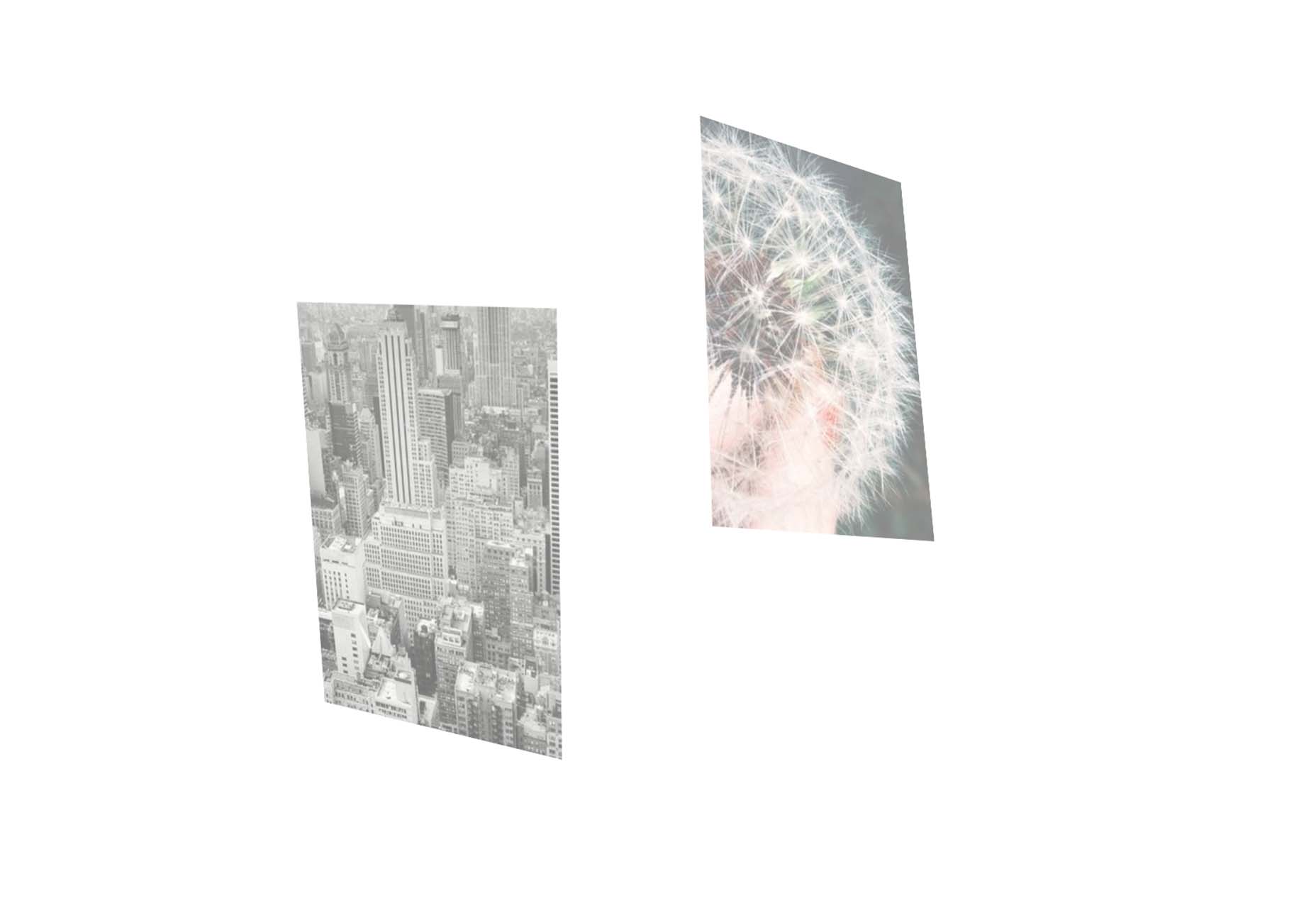
Picture Perfect Images with the Modern img Element
This tutorial is a primer on why the img element is such a powerful tool in your development box. Images are so prominent that they are part of the most important content in over 70% of pages on both mobile and desktop, according to the largest contentful paint metric. This post takes you through how to better optimize and improve core web vitals simultaneously.
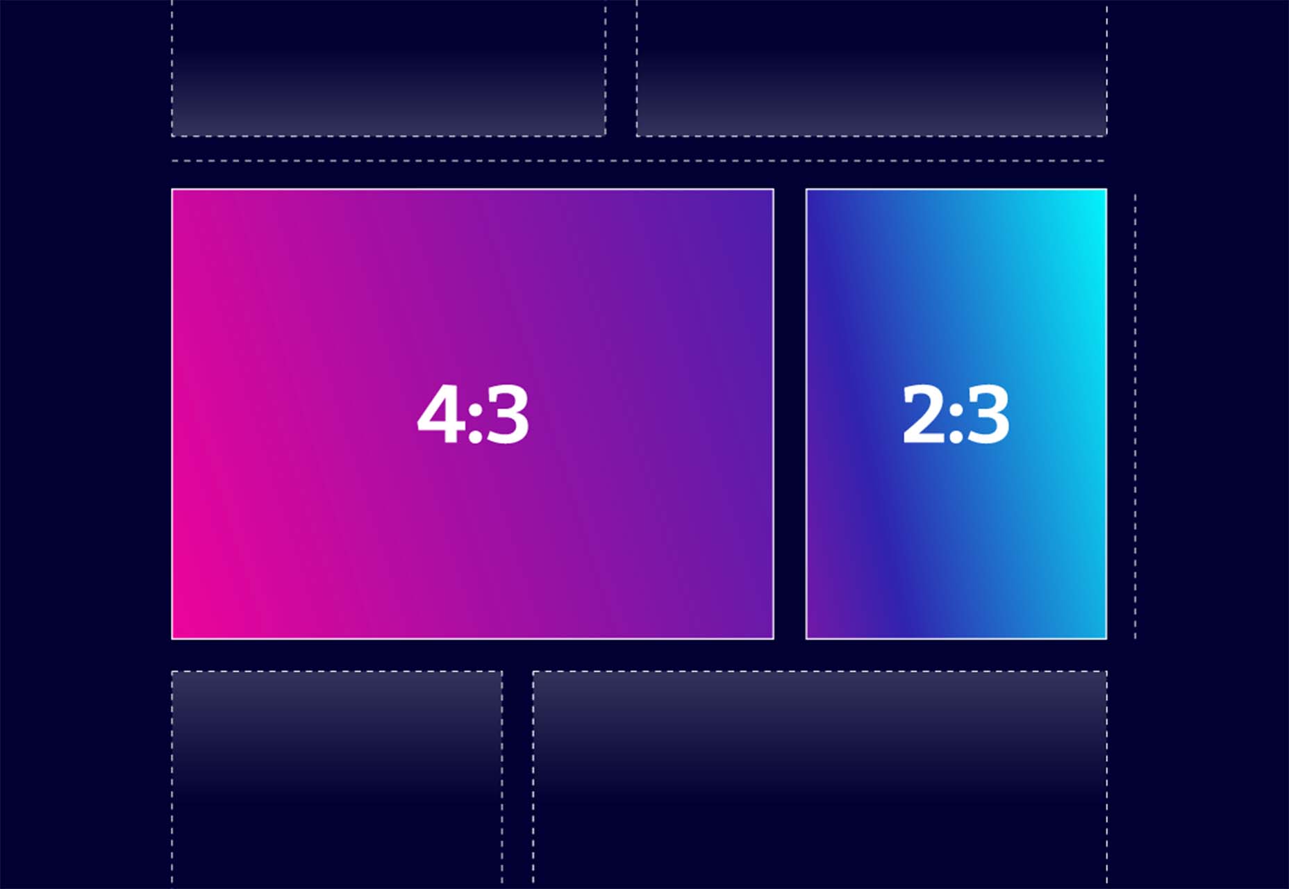
Building a Combined CSS-Aspect-Ratio-Grid
Building a Combined CSS-Aspect-Ratio-Grid provides two solutions for creating the title effect. You can define an aspect ratio for the row or use Flexbox with a little flex grow magic. Learn how to try it both ways.
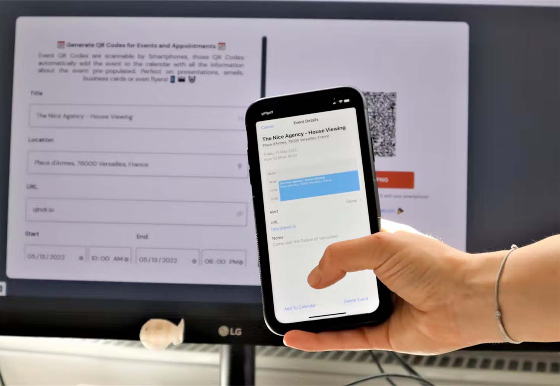
QIndR
QIndR is a QR code generator made for events and appointments. The form is designed to capture your event information so you can quickly build and use a QR code for listings and even allow users to add it to their calendars! It’s super quick and easy to use.
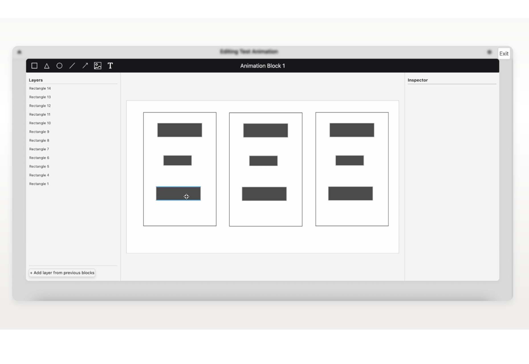
On-Scroll Text Repetition Animation
On-Scroll Text Repetition Animation shows you how to create an on-scroll animation that shows repeated fragments of a big text element. This is a fun and easy lesson that you can use right away.
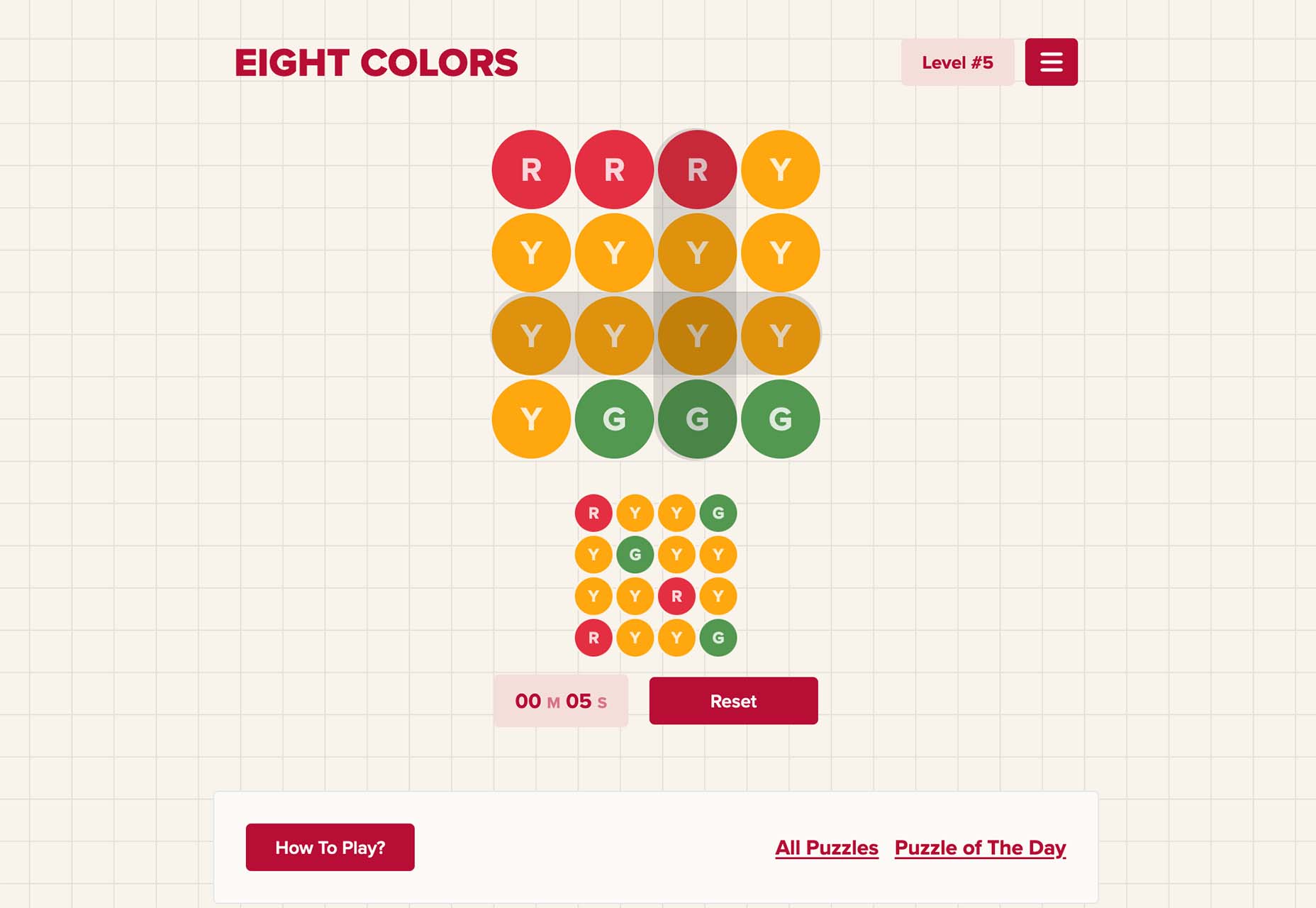
Eight Colors
Eight Colors won’t do anything for your productivity, but it is a fun game that you may not be able to stop playing. It is a block-shifting game with the goal to shift circular blocks to reach the target given.
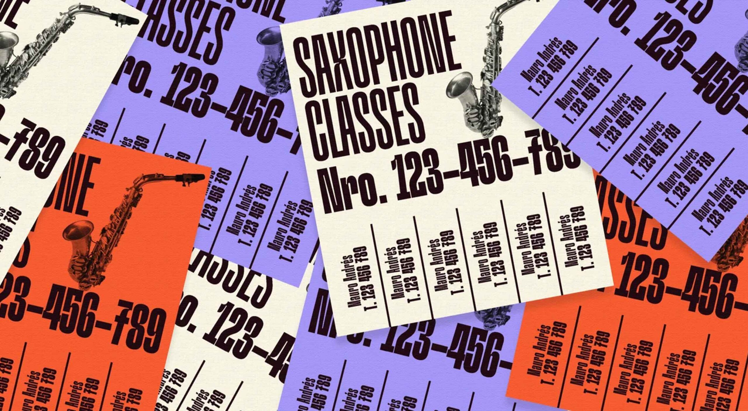
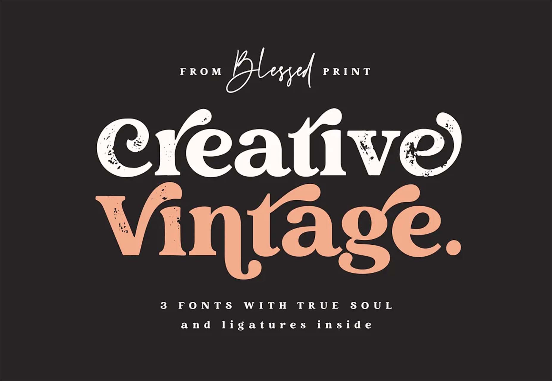
Creative Vintage
Creative Vintage is a pair of typefaces including a thin script and vintage slab serif (with rough and smooth styles). The pair is designed to work together for various uses or can be used independently.
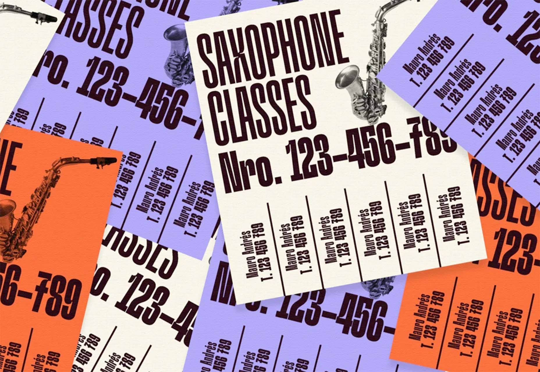
Hardbop
Hardbop is a vintage-style typeface with a lot of personality. It would work great for display, and the family includes seven full-style character sets.
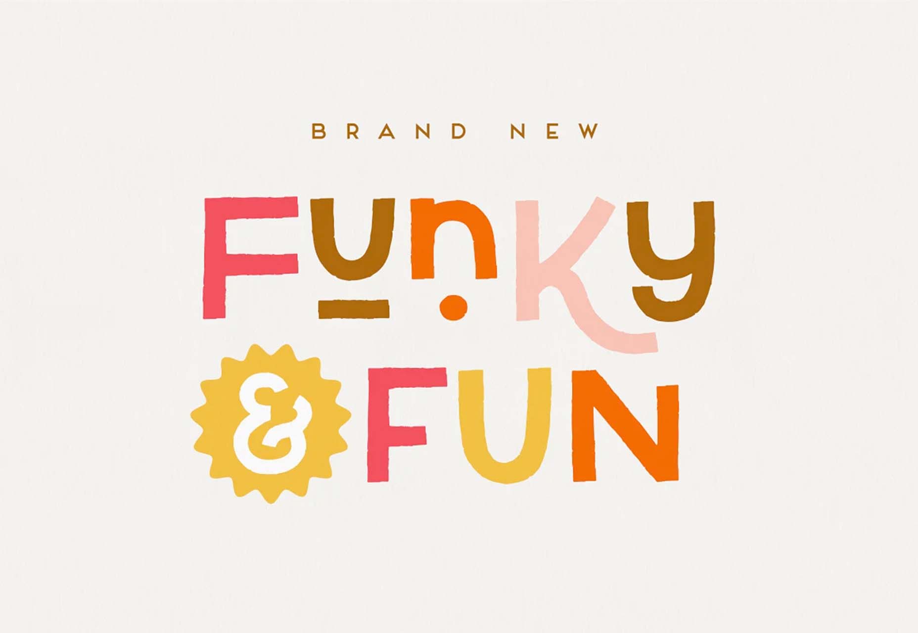
Kocha
Kocha is a funky ligature-style typeface perfect for lighter design elements, including logos or packaging. It includes clean and rough versions.
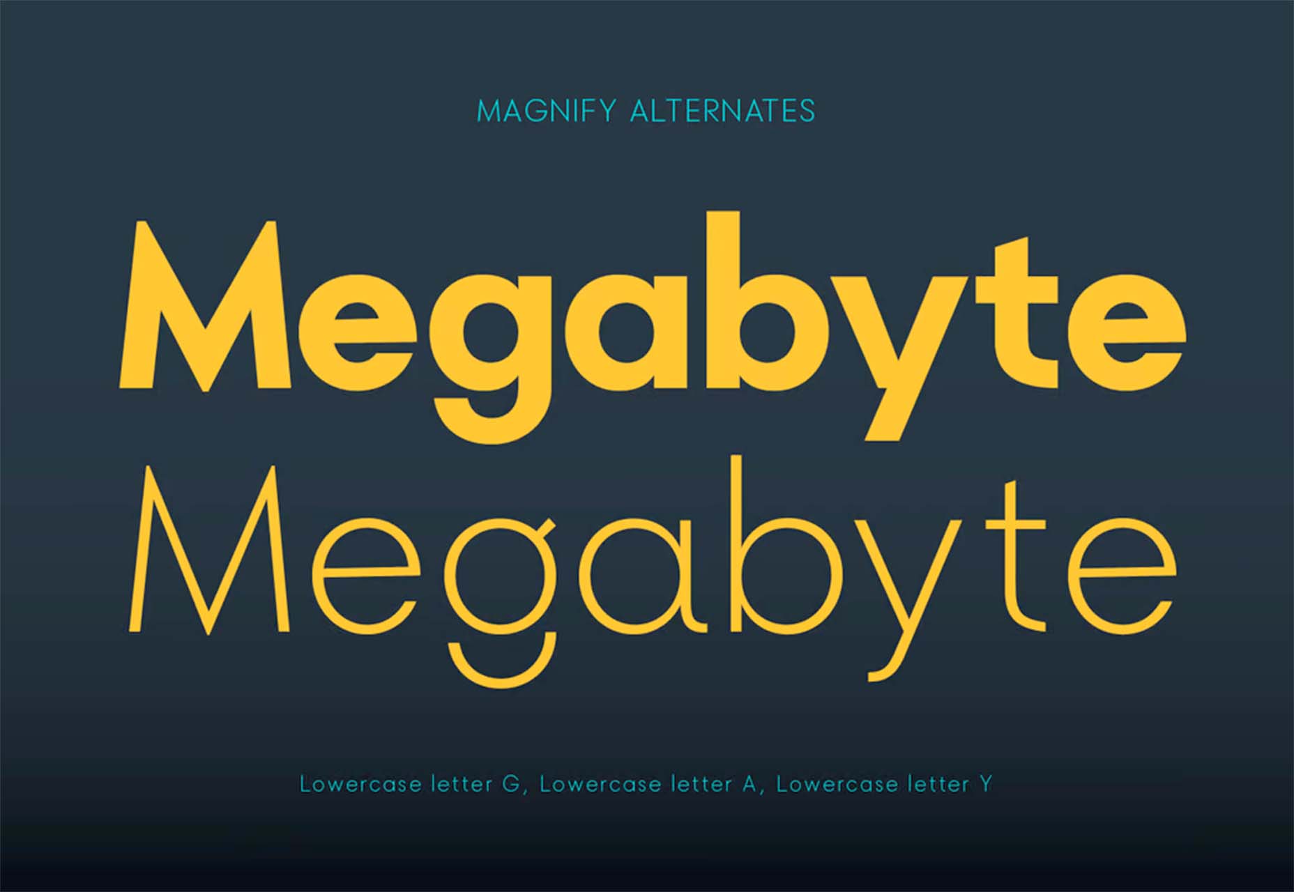
Magnify
Magnify is a large font family with 16 styles and plenty of fun alternates. You can use it straight or with the more funky styles that create less traditional character forms.
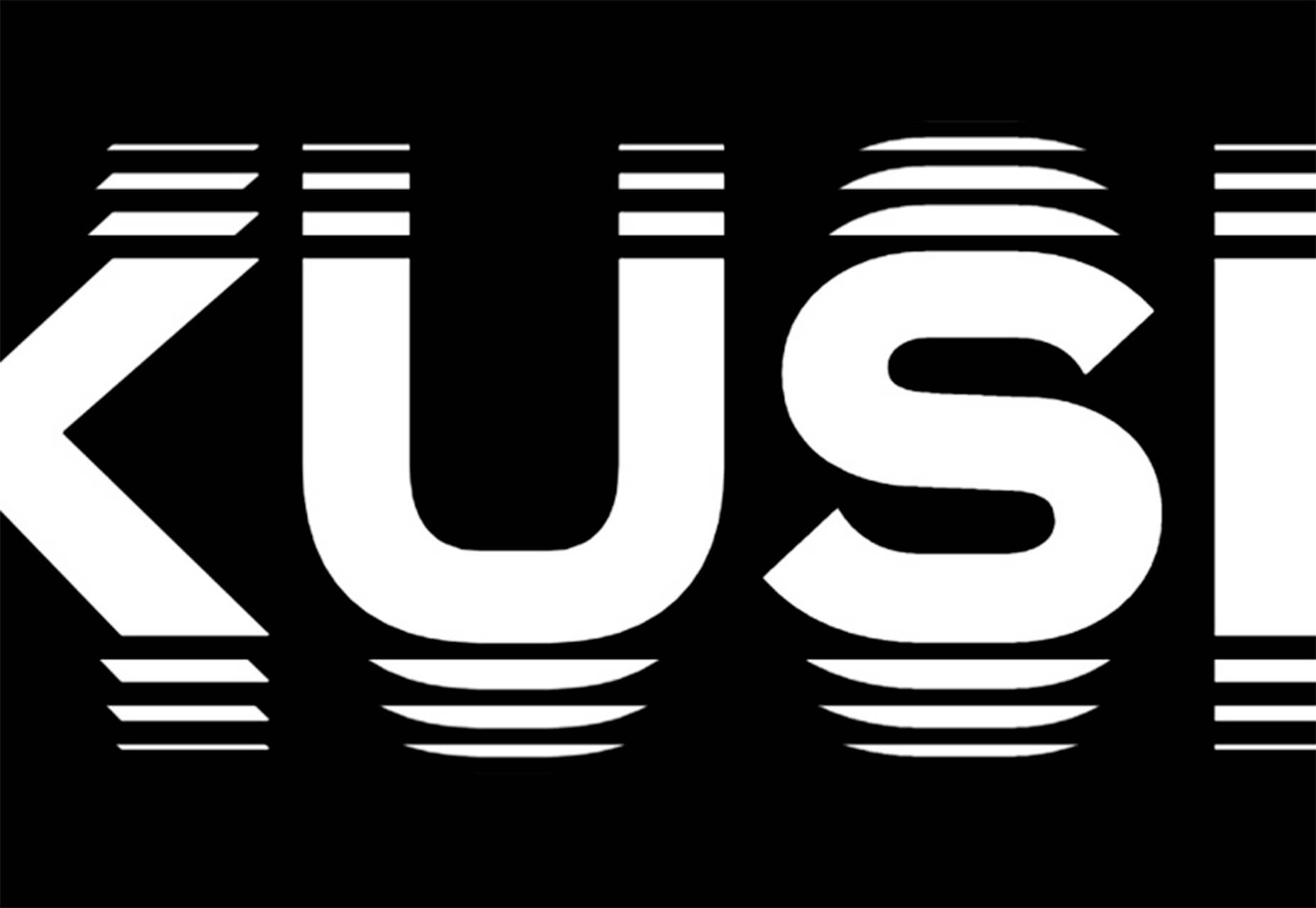
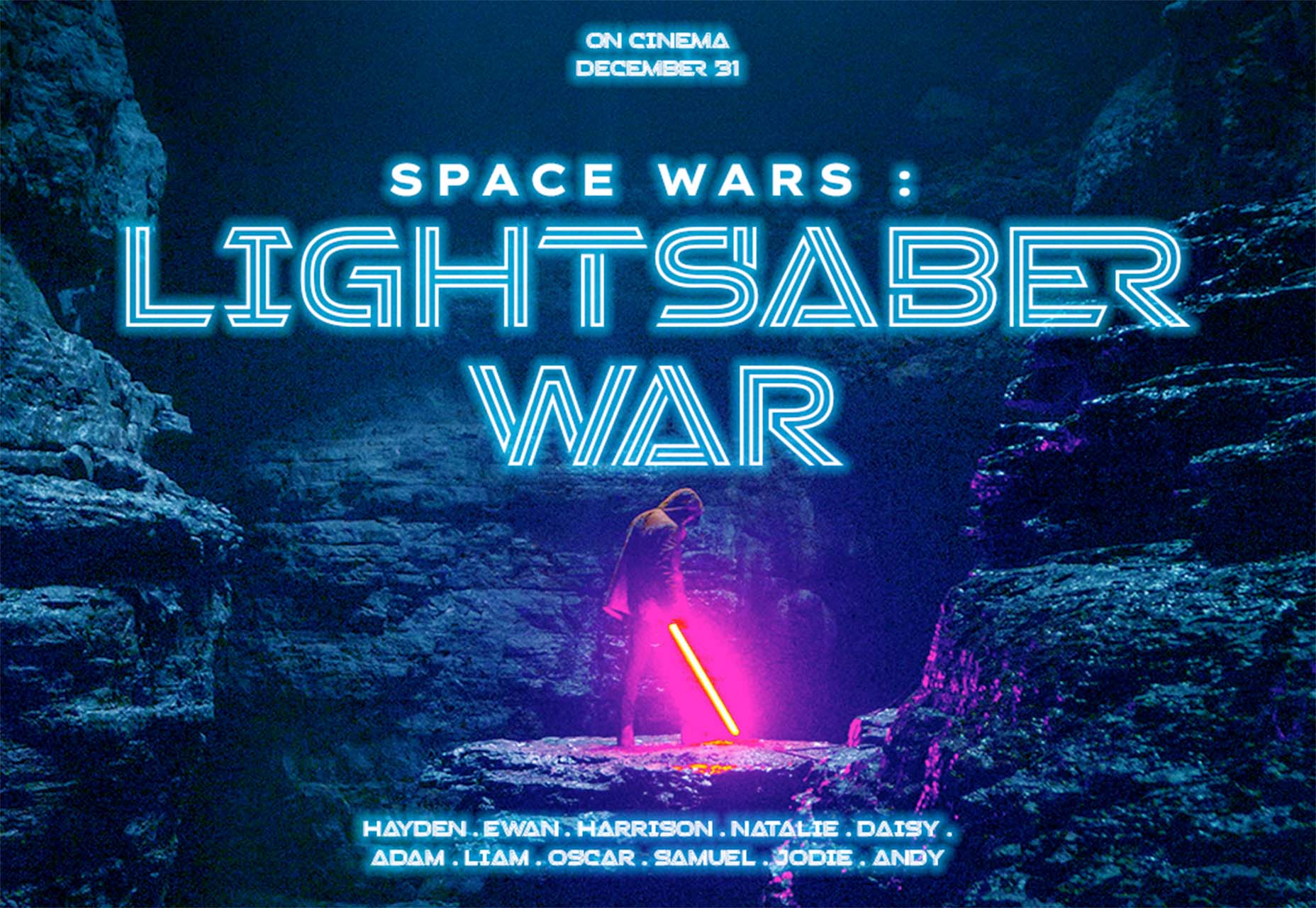
Stacker
Stacker is a fun and futuristic style font with a triple outline style. Use it for display when you really want to make an impression.
The post Exciting New Tools for Designers, May 2022 first appeared on Webdesigner Depot.
 Designing for user experiences is what all designers do. UX is often thought of as the preserve of app or web designers; however, even a print designer laying out a magazine anticipates reader reaction to the scale of type, the placement of adverts, and the art direction of successive stories.
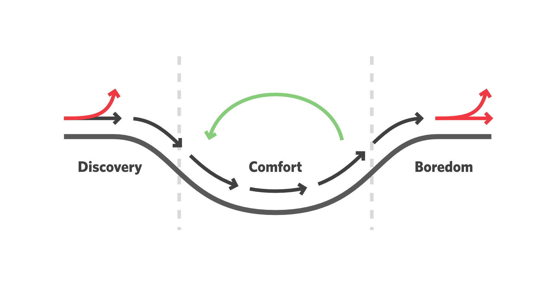
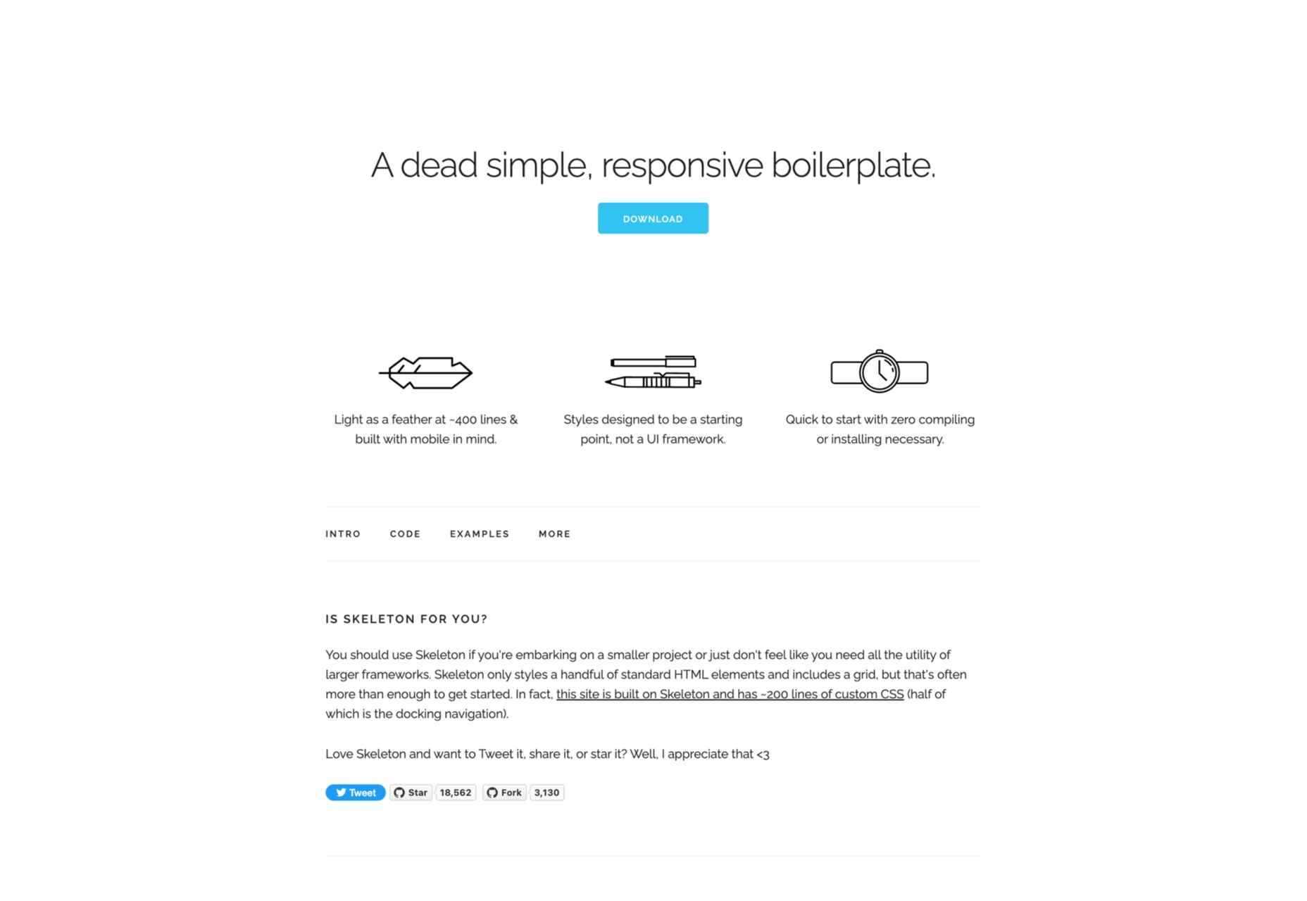
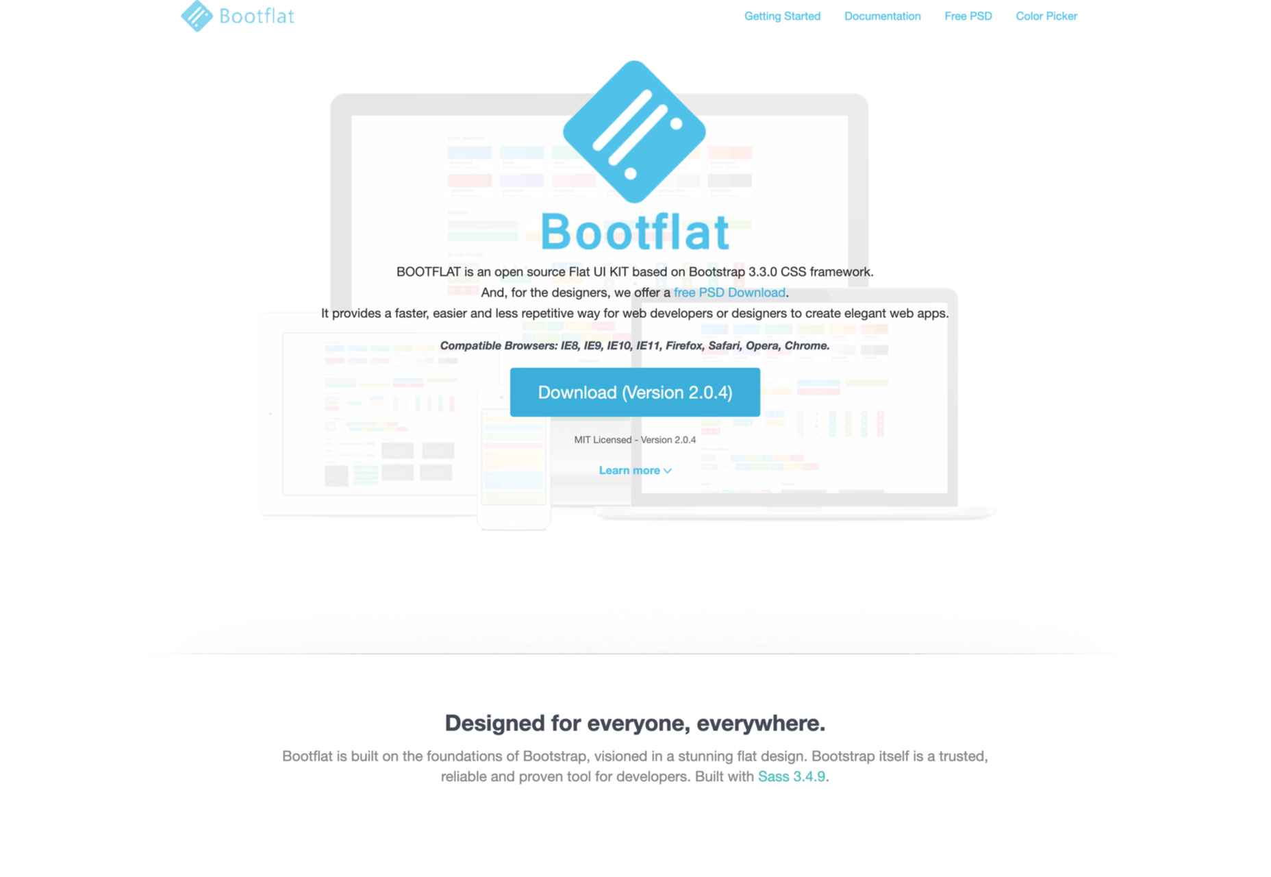
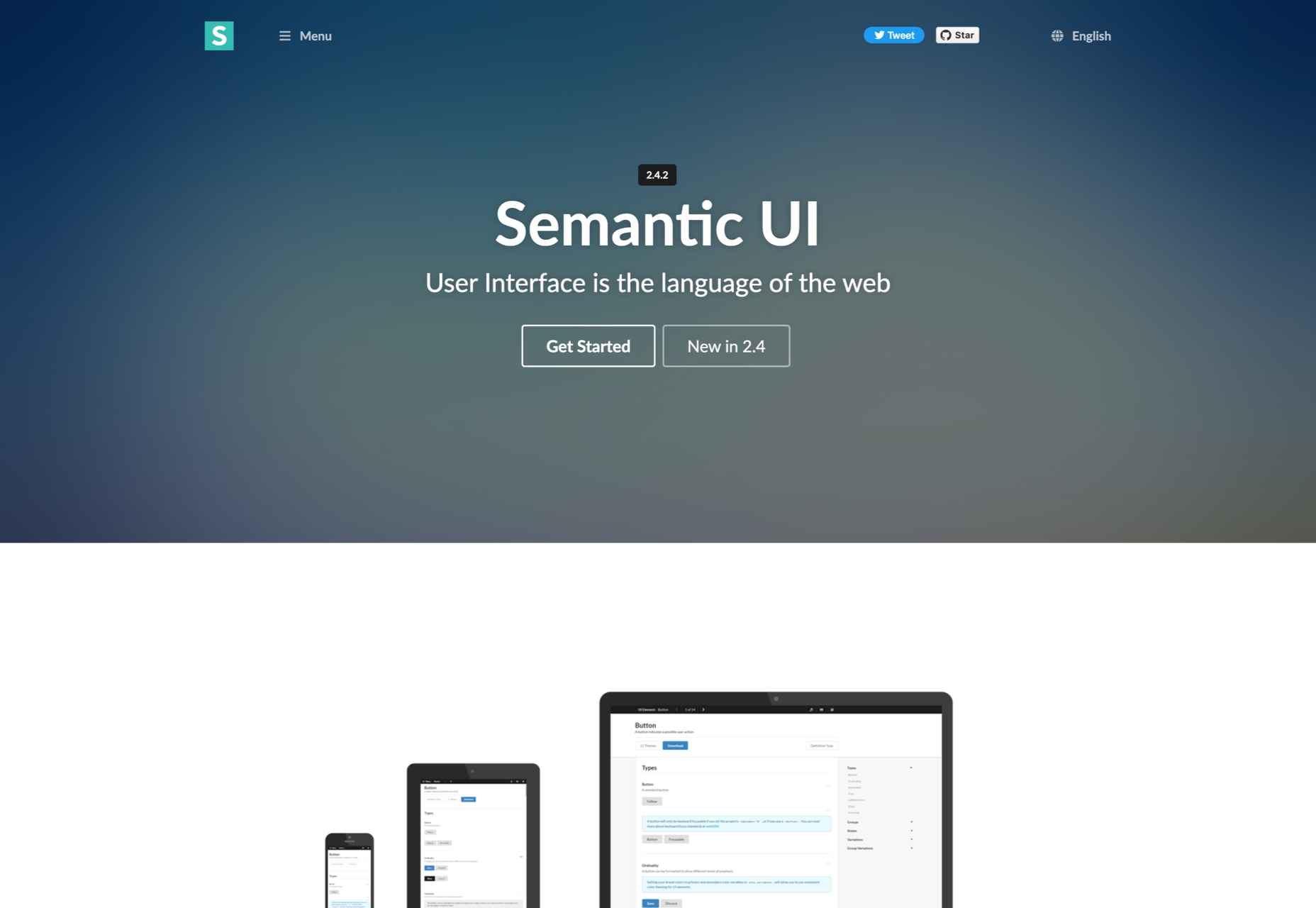
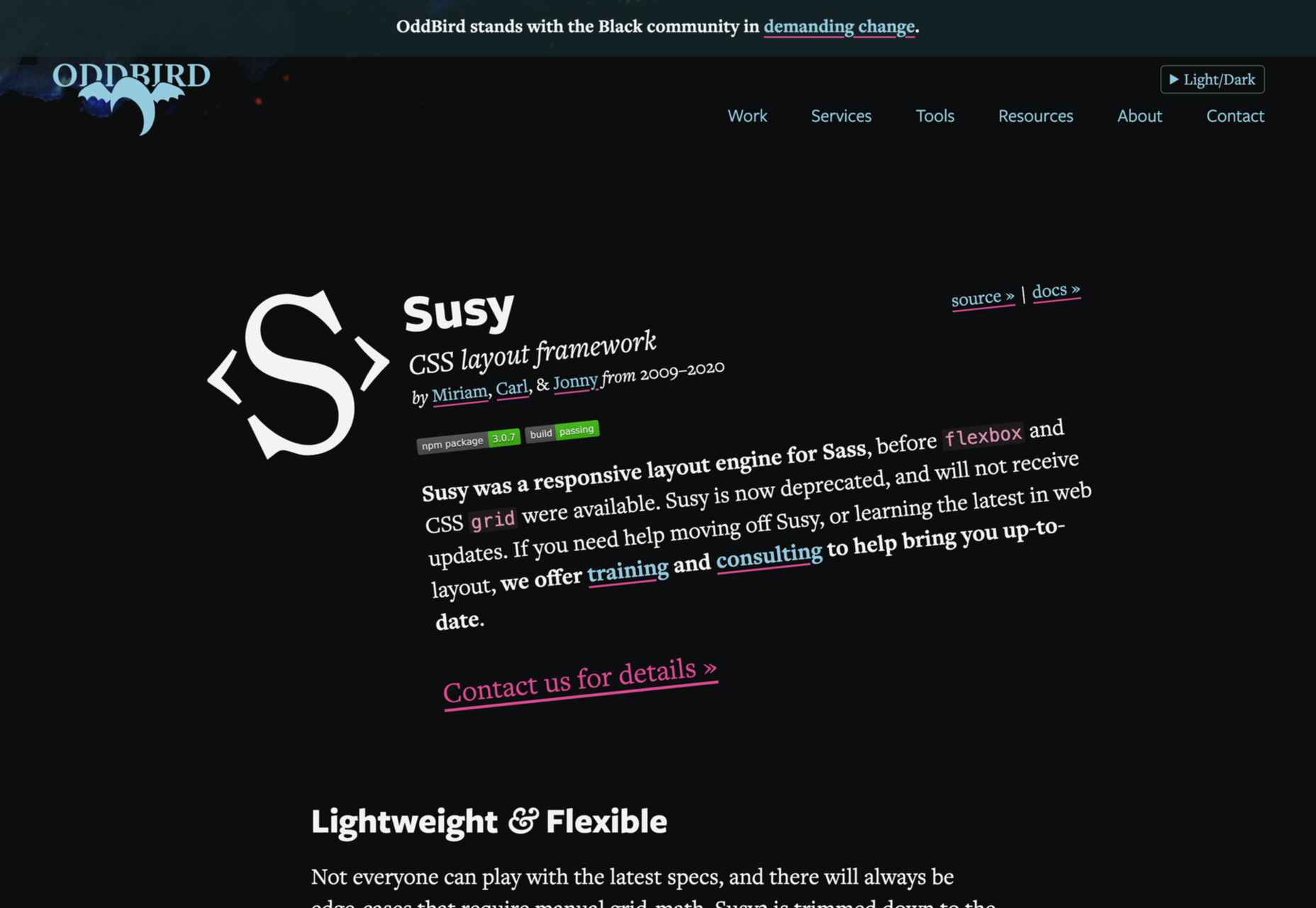
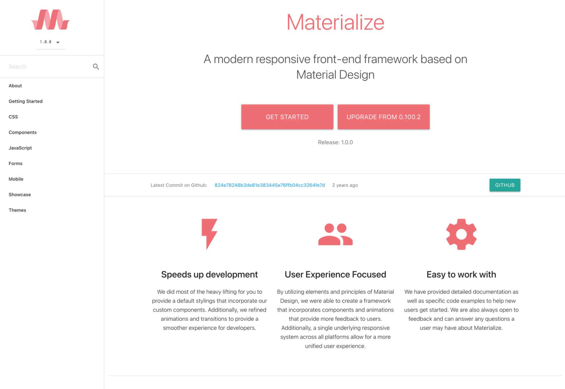
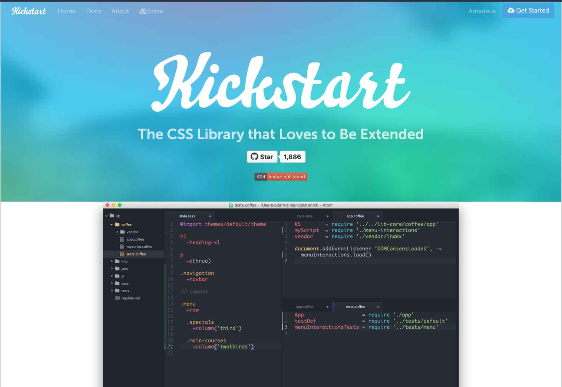
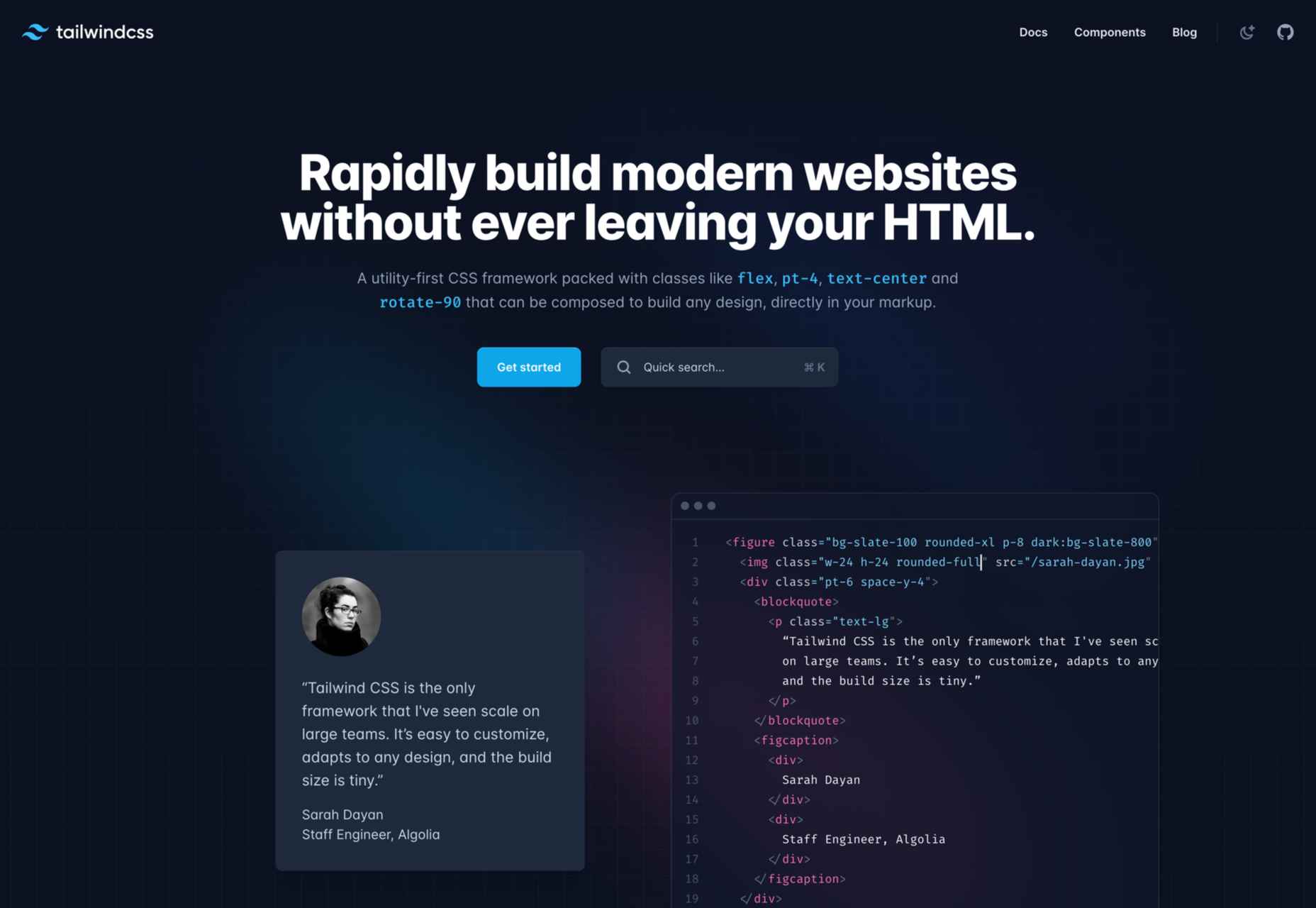
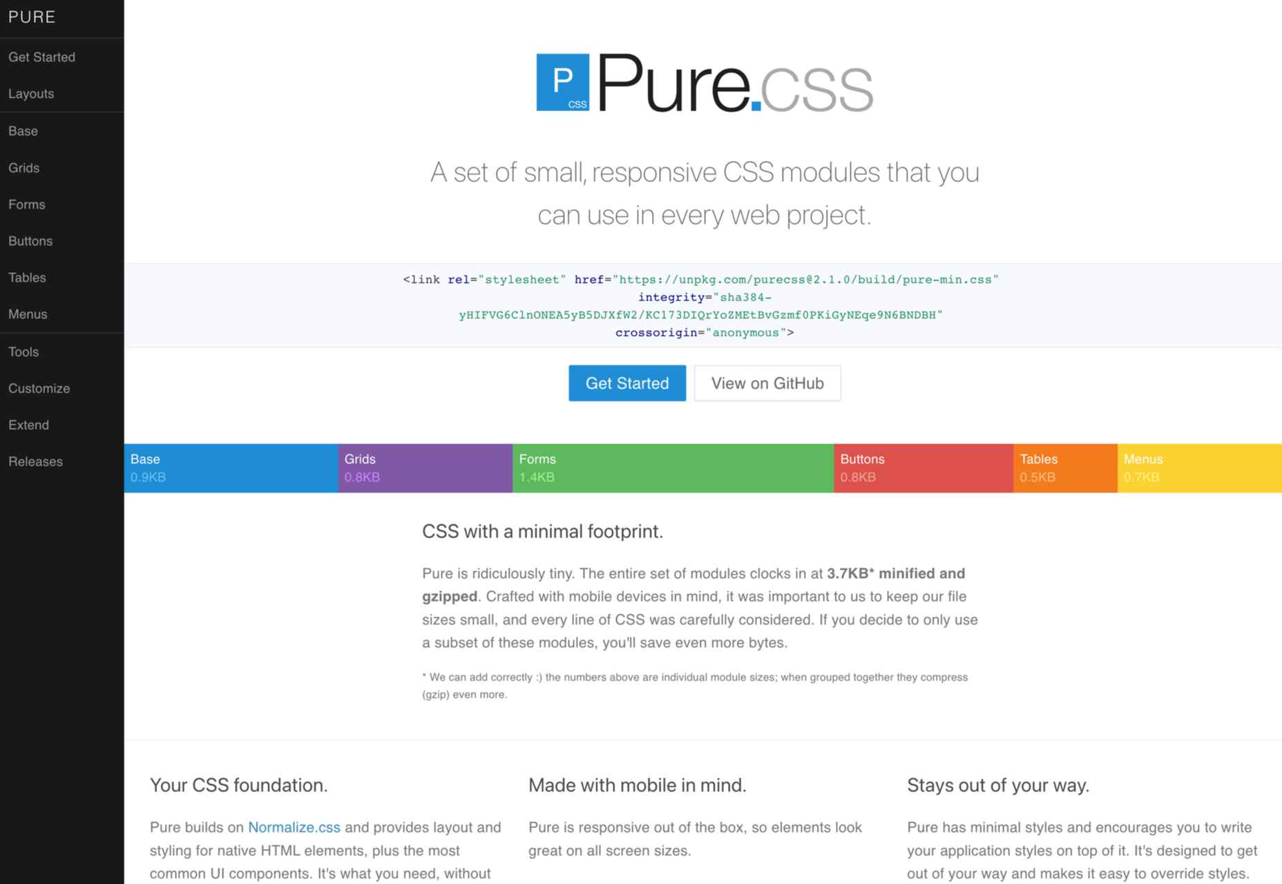
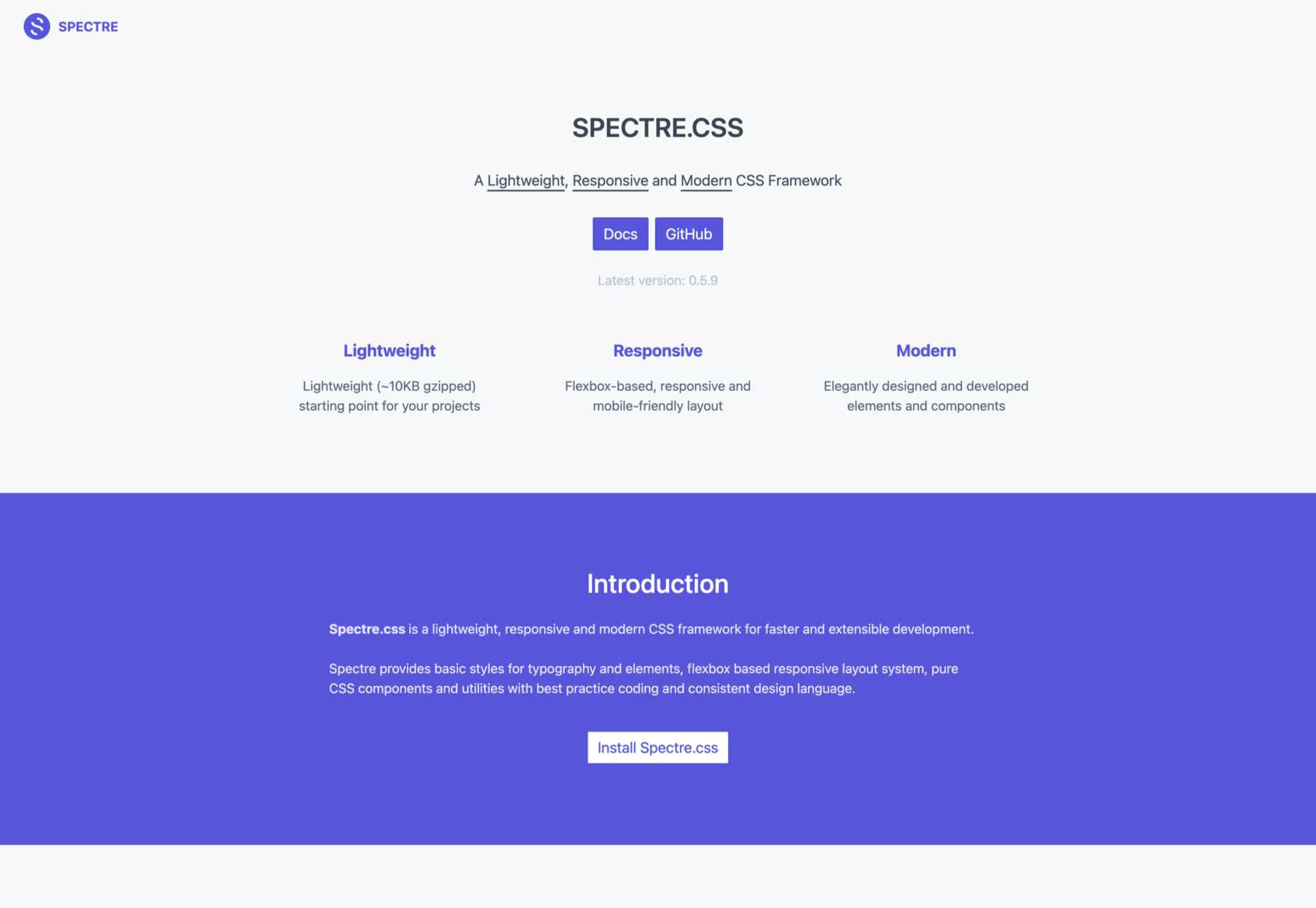
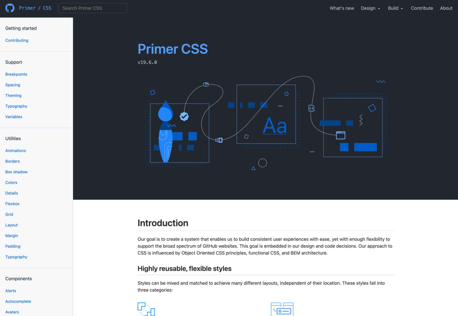
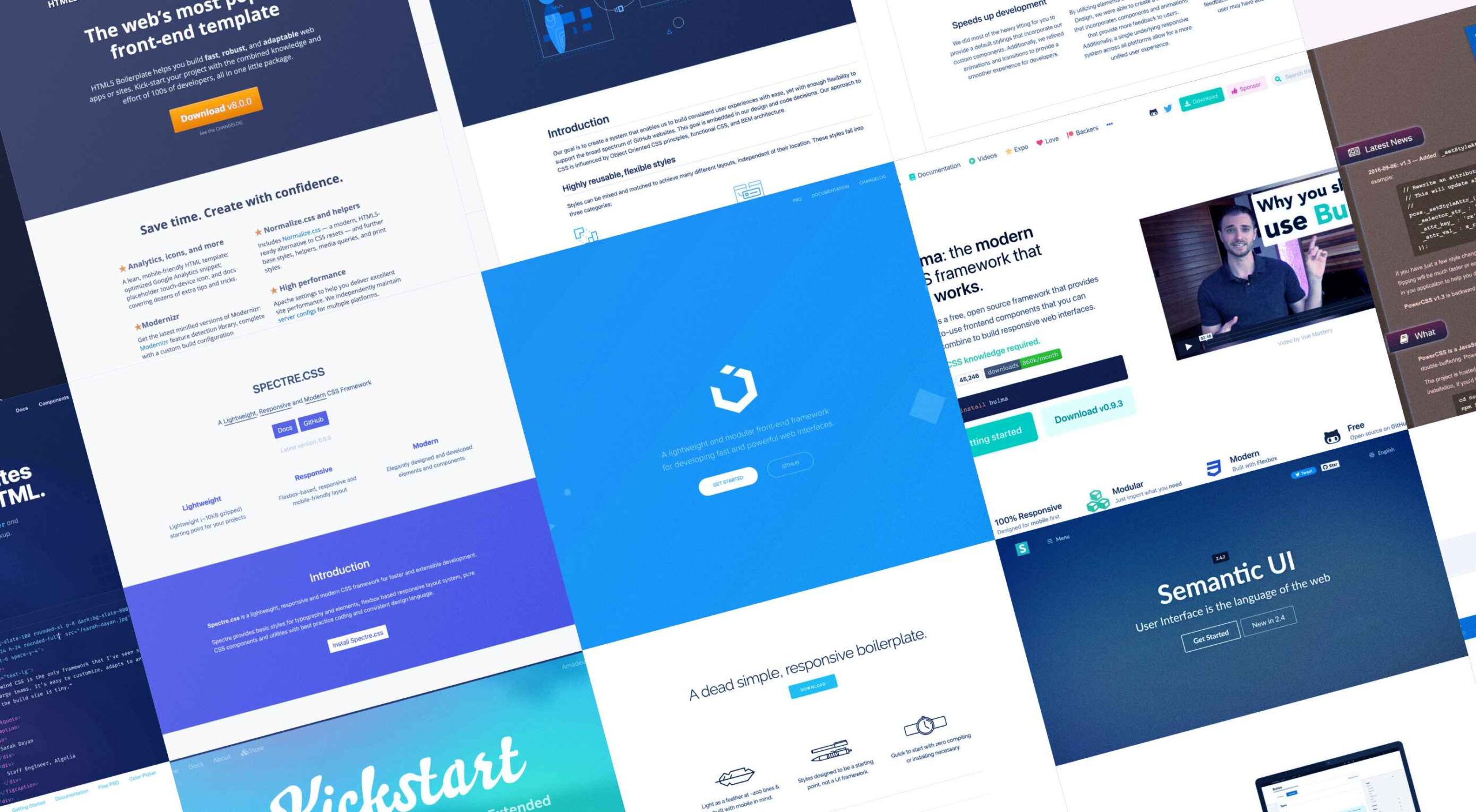 Whether you are a CSS expert or a front-end beginner, using the right CSS framework is crucial for your daily tasks. There are numerous frameworks whose ultimate goal is the same: helping developers target multiple screens, in the simplest possible way.

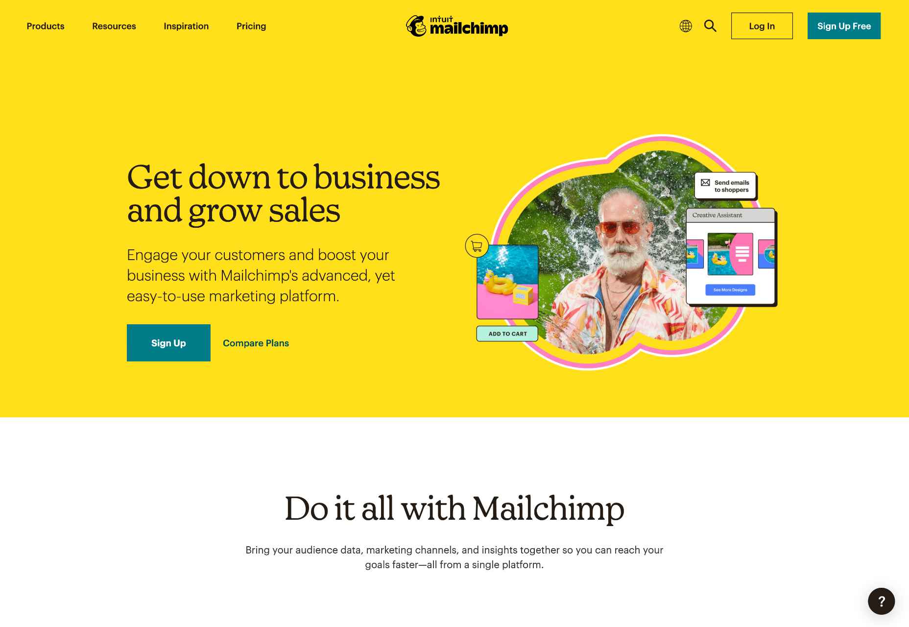
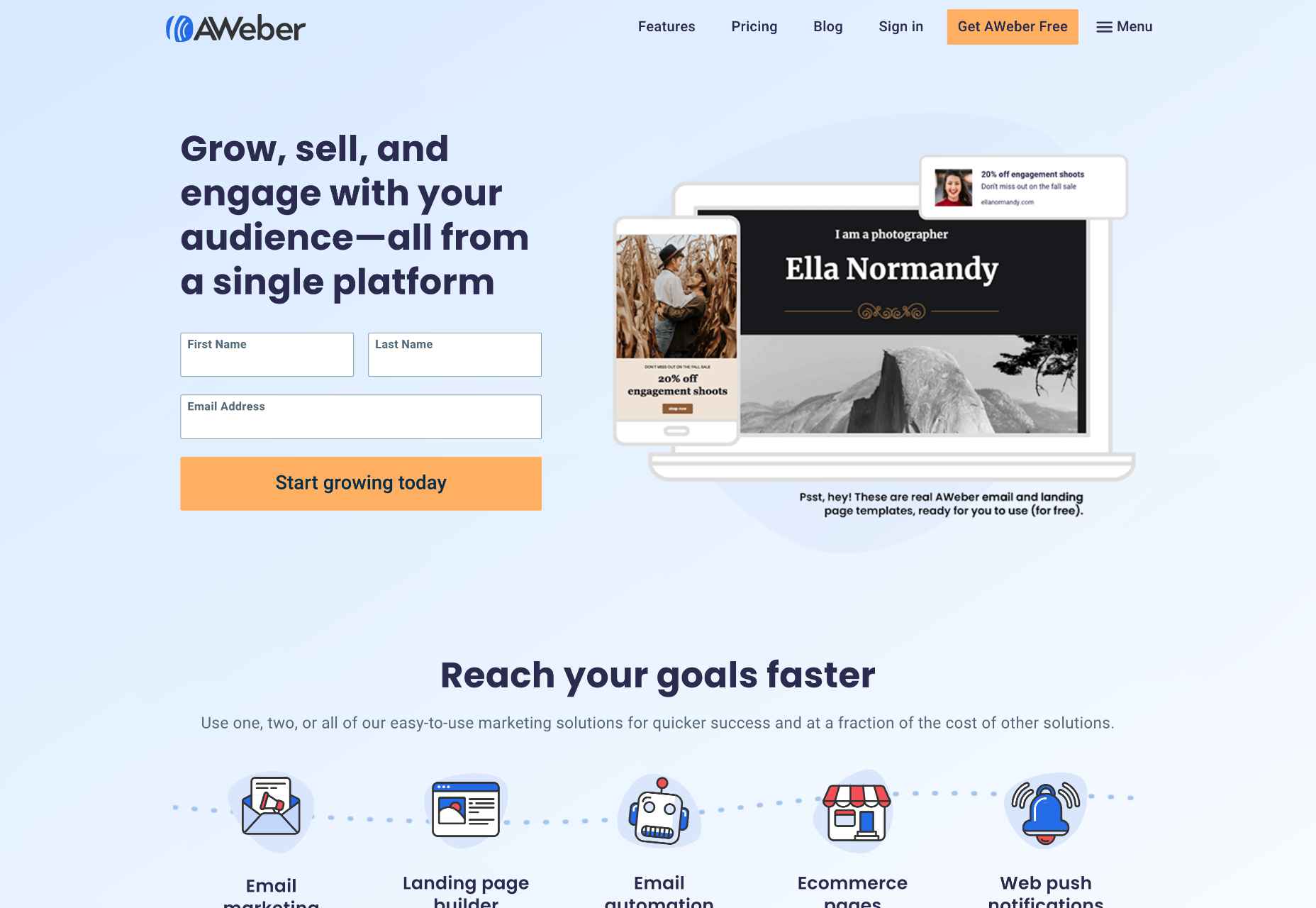
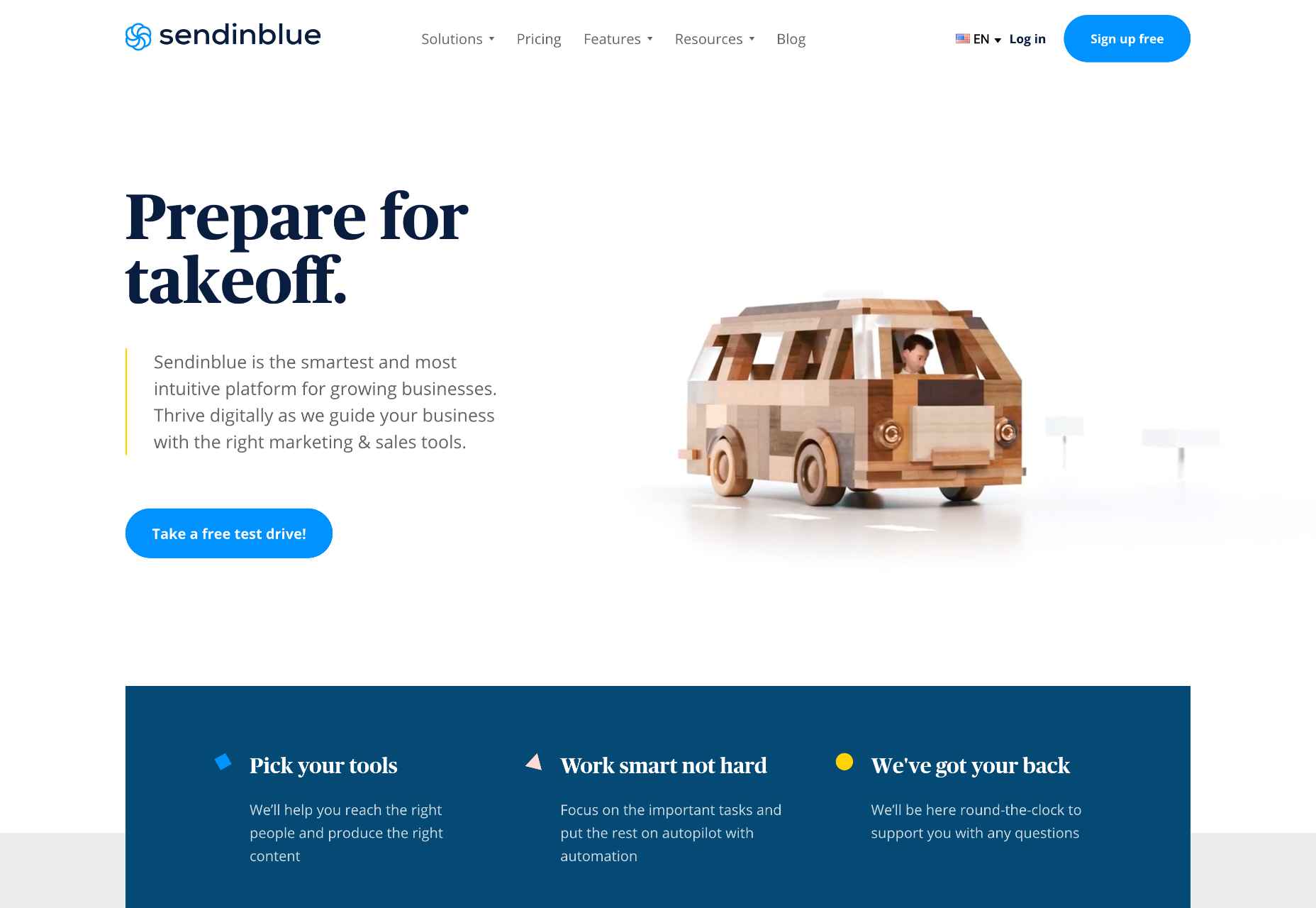
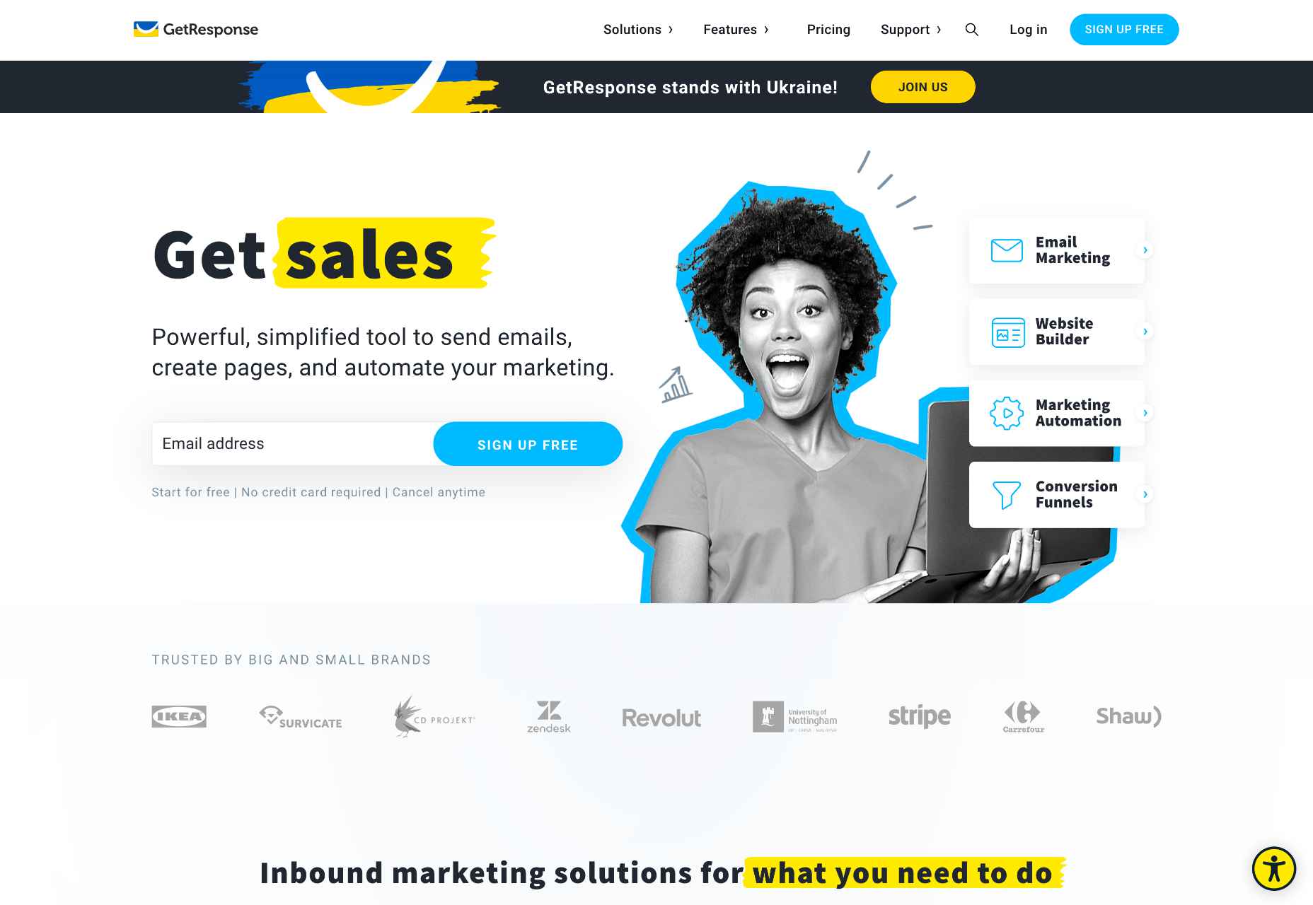
 If you don’t keep in touch with your customer base, it can become easy for them to drift away. Newsletters are an affordable and effective way to check in with your audience occasionally.
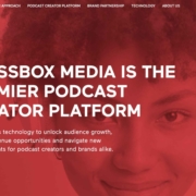
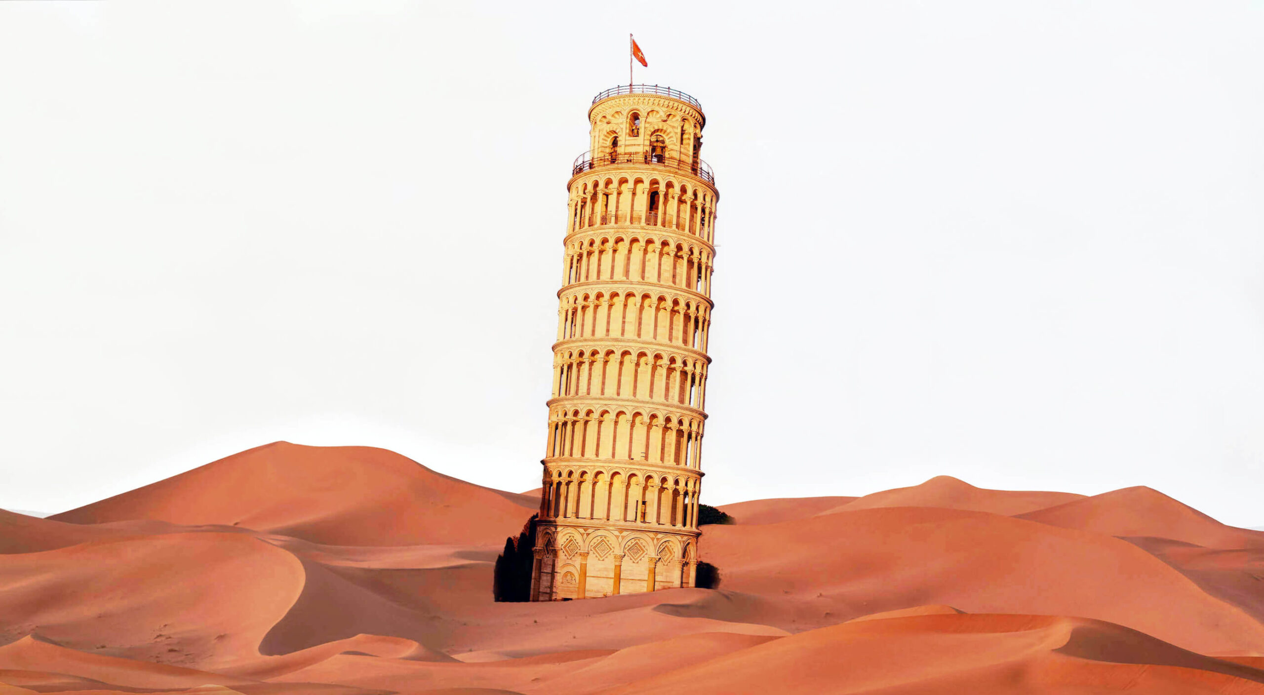
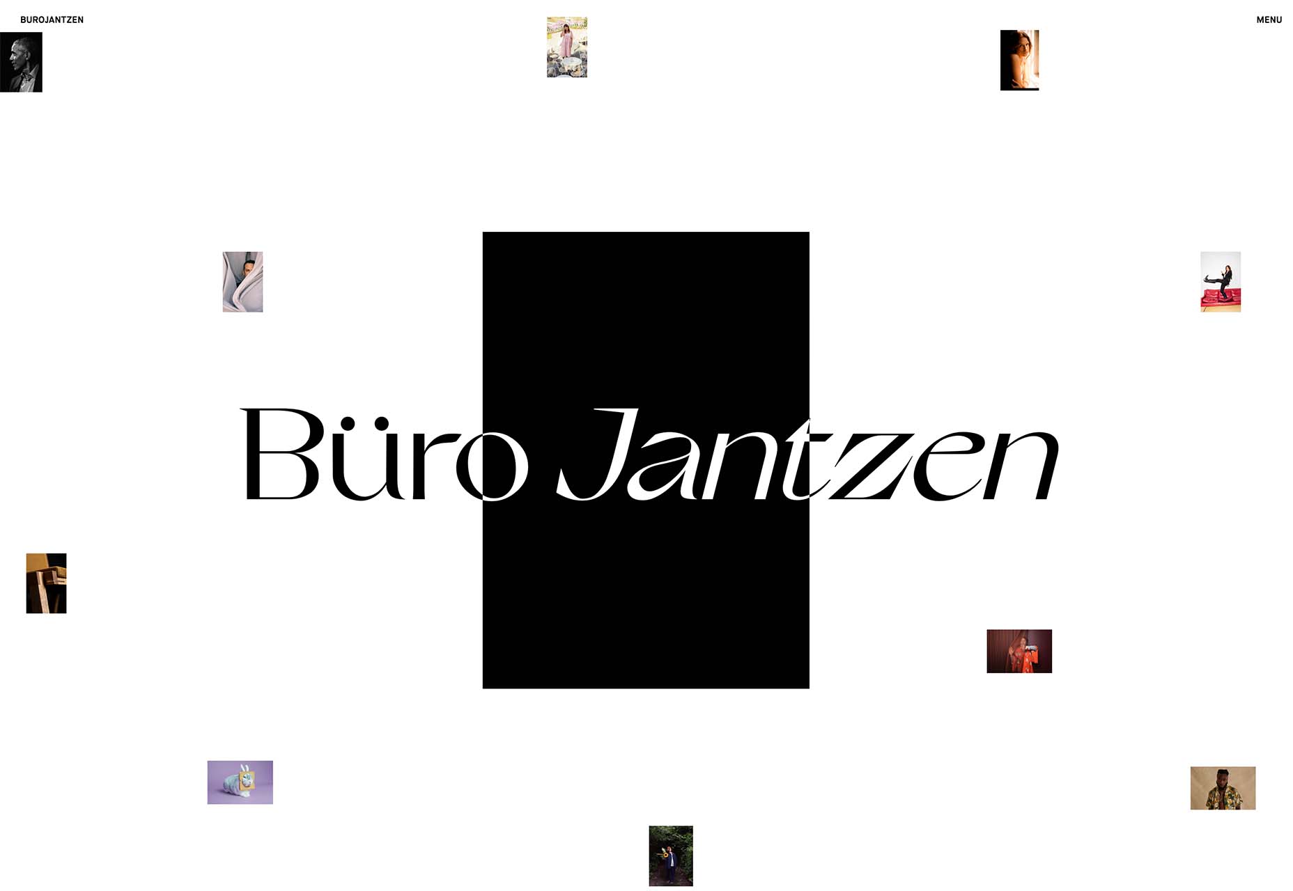
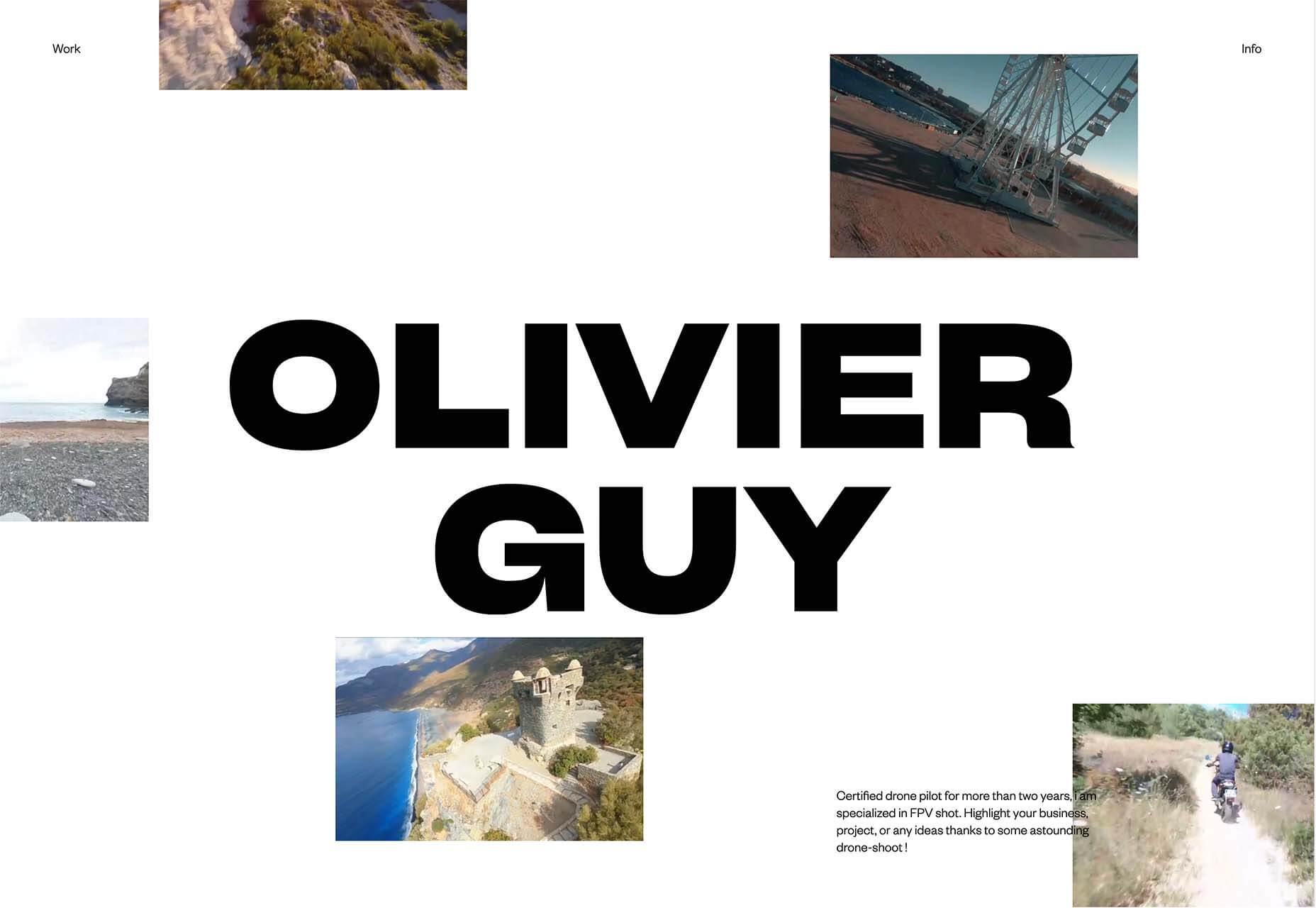
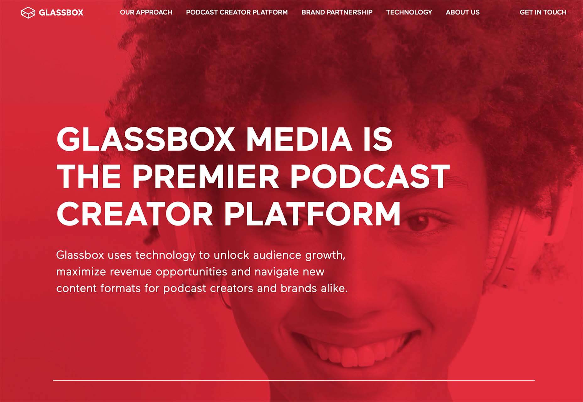
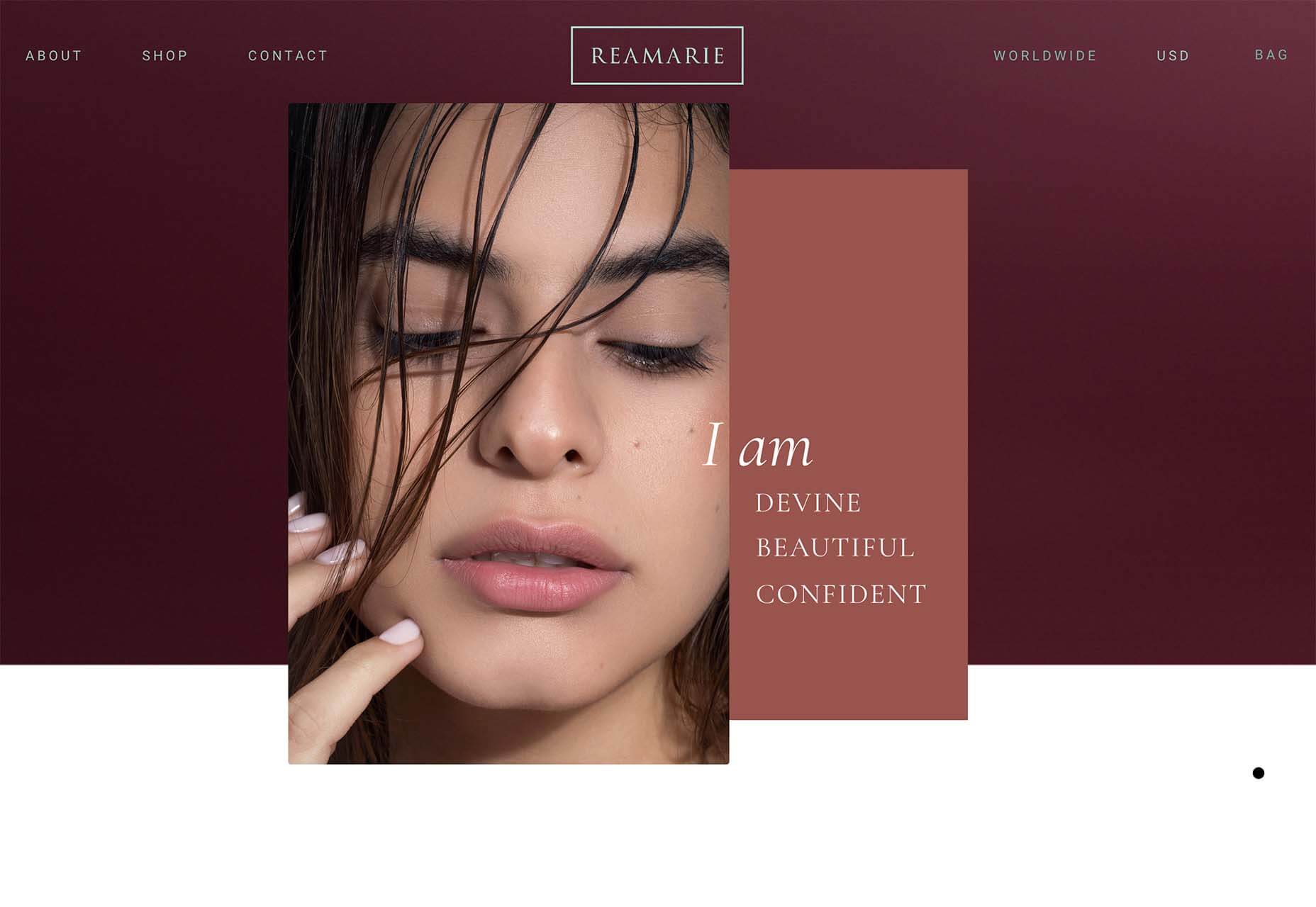
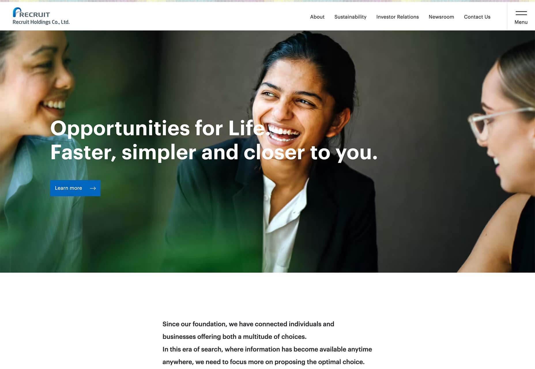
 This month all of our web design trends have a common theme – imagery. Whether it’s seasonal or just coincidence, there’s a shift in the styles and types of images on many designs right now. One thing that might push these design trends is a relaxation of COVID-spurred rules worldwide or even fatigue from the pandemic.
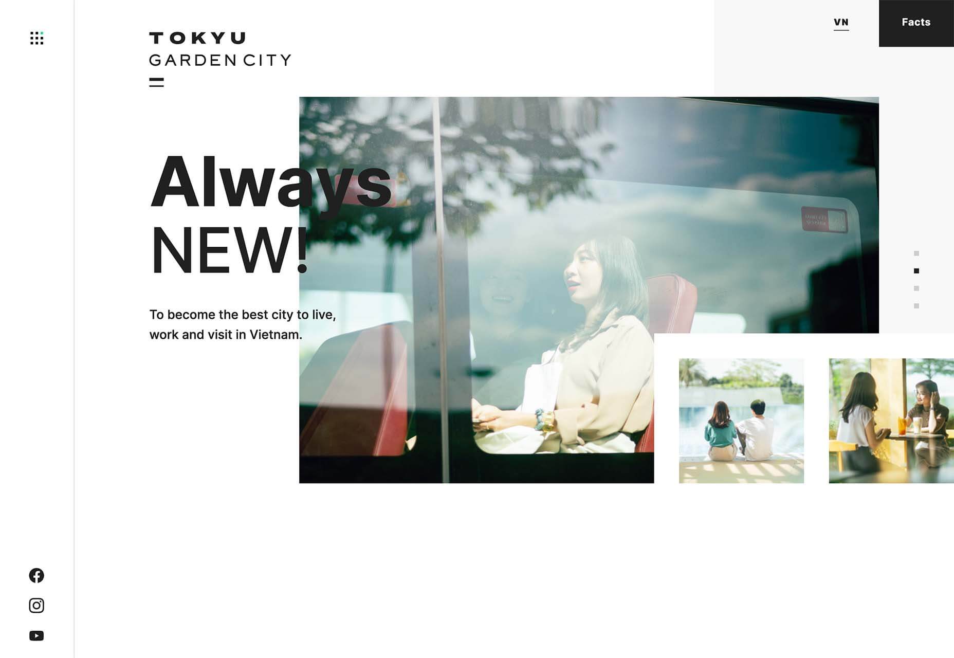

 No one likes talking about money. Most of us got into web design because we loved it. But the fact is, we’ve all got bills to pay.
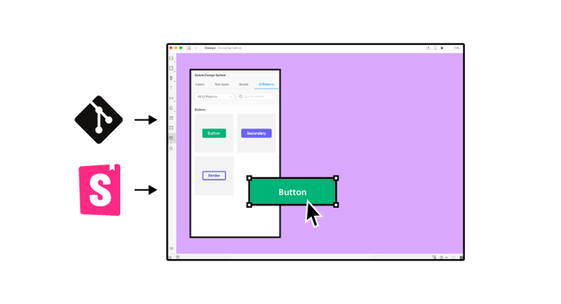
 It’s something every design team dreams about – a better design process and handoff procedure. Your design team is not alone if you are looking for a better solution.


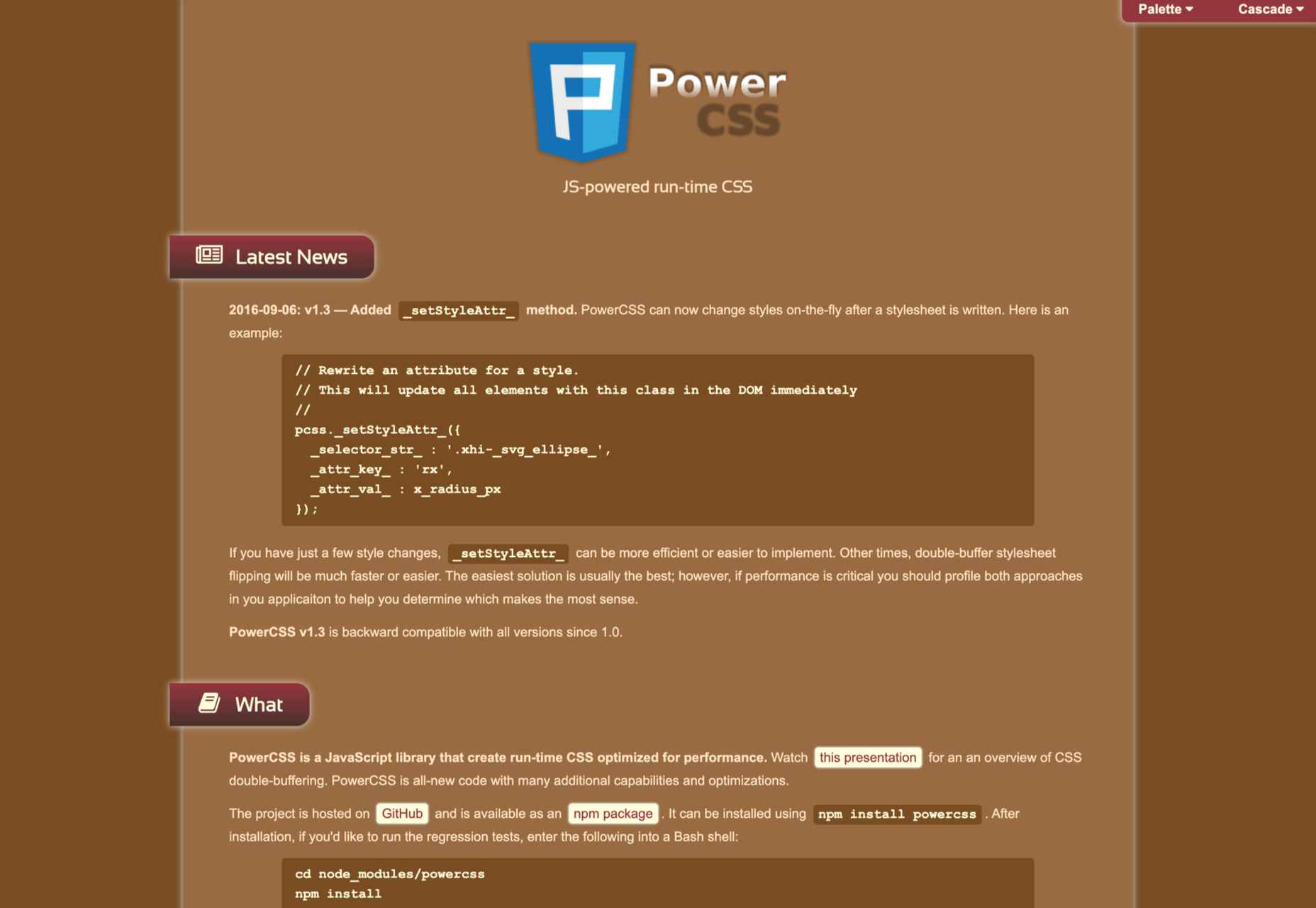
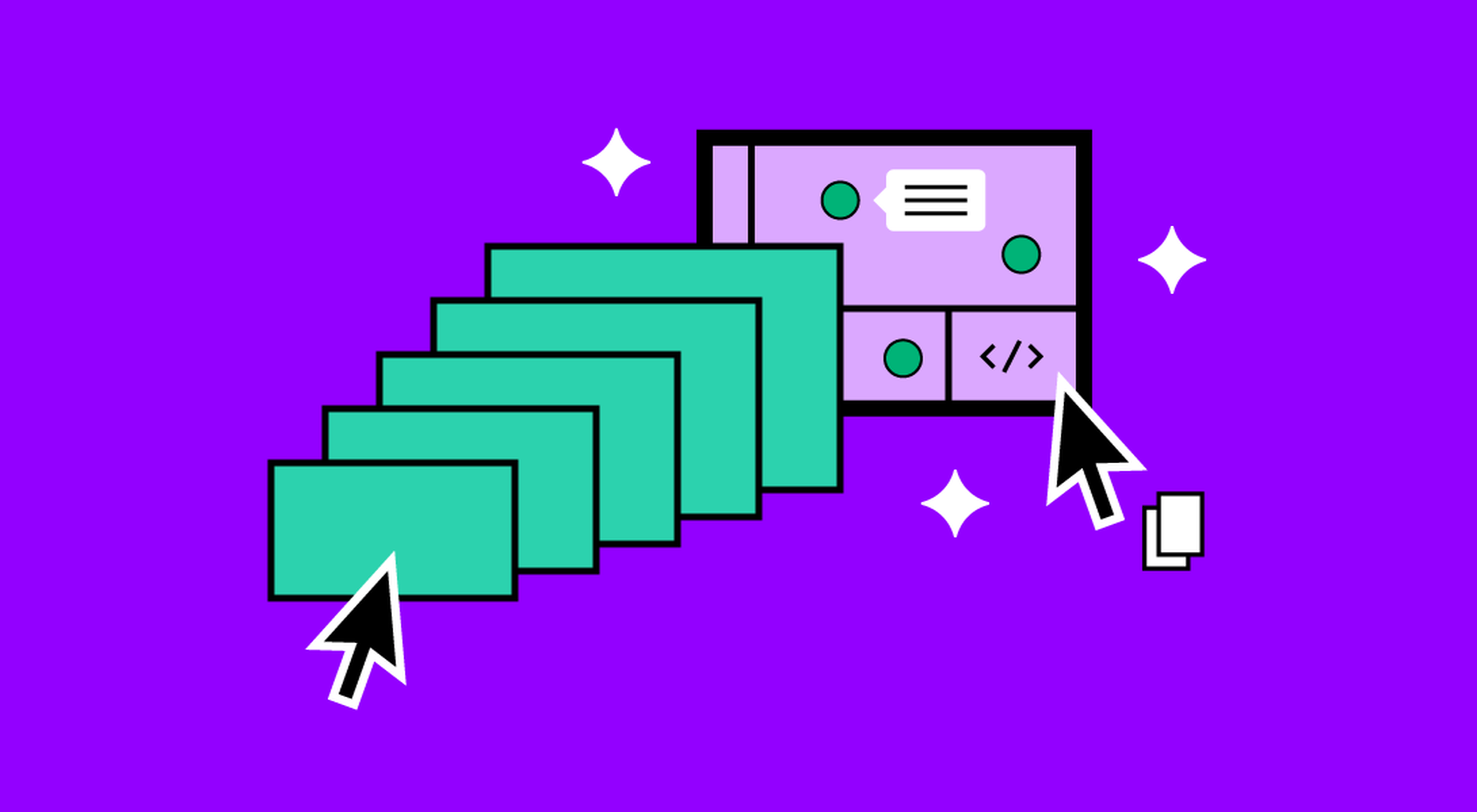
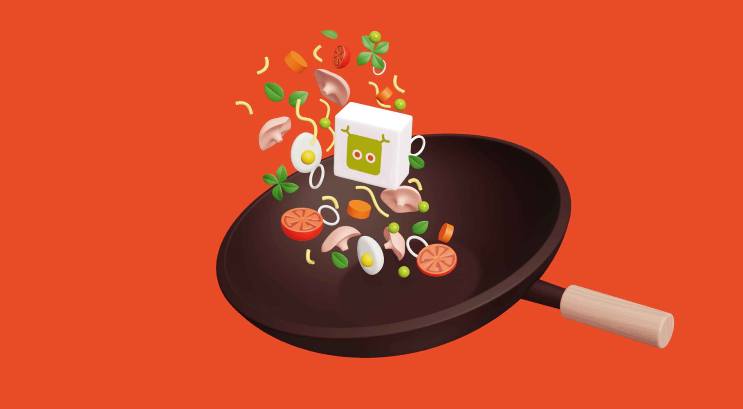 We’re going to have some fun this month. There are so many new tools and resources out there for designers that make life easier, and others are simply enjoyable.

