Articles

Sometimes the designs that make the most impact do a lot of unexpected things and break some of the most tried and true rules of visual theory.

Sometimes these design elements work brilliantly, and other times they are fleeting or fall flat. This month all of the examples here seem to break some conventional design rules. Here’s what’s trending in design this month…

1. Alternative Homepage Image/Video Crops

This trend breaks some traditional standards and is pretty refreshing – alternative homepage crops for images and video.

The full screen or 16:9 aspect ratio is out the window with vertical and square options that prove you can do more with your photo collection.

What’s great about this trend is that it’s super attention-getting because of the interesting use of space and imagery. Almost any design without the full-width hero header will grab your attention because it is different. These examples prove that point, and each design does it differently.

Now here’s the challenge: You have to make sure that this style has a solid fallback for mobile so that the result is equally impressive.

Janmaat Fotografie does a great job accounting for interesting photo shapes and flips the script on mobile. (Rather than what you might expect with text then photos because of the desktop placement, the photo stack uses the same shape and layering and is above the text on mobile.) The result is phenomenal.

N3 uses a very vertical image in an almost split-screen style design. It’s a sharp contrast to many of the other split screens we are accustomed to with an equal divide. The distinct shape of the image is interesting and intriguing. It’s definitely not a shape we see in website design frequently.

Bounce uses a similar split-screen effect in the opposite manner as the example above, with the tall, vertical space as an “empty” area and the right side filled with a square video. The shapes help push and pull your eyes across the screen to look at all of the elements and take in the overall design. It’s one of those ideas that if you only talked about it, you might talk yourself out of it, but here, it’s pretty striking.


2. On-Screen “Stickers”

Stickers are a design trend that has made its way from social media to website design.

These website stickers break design rules because they cover content or seem to be put on the canvas haphazardly. And that’s why they are so attention-getting!

The benefit to these stickers is that they can highlight specific items or content or help focus a call to action.

Friesday uses stickers in conjunction with hover effects to keep users interacting with the design. Multiple stickers can even pop onto the screen in the same location. The animation is simple and fun and feels like a digital sticker book.

August Eighth uses a center sticker as a call to action. It’s a true focal point in the center of the screen with an almost three-dimensional effect that lifts it off the background video. It’s a borderline dark pattern since the only way to get the box off the screen is to click through to the shopping part of the website.

EasyGreen has a bright yellow sticker in the bottom corner that feels almost like the sticker on a piece of fruit. This style and placement work well for the content and product featured. It’s bringing the digital and real-world a little closer with this design element.


3. Breaking Design “Rules”

The third trend this month is kind of a catch-all for general rule-breaking. While the other trends show certain design elements that aren’t the norm, each of these examples really tosses everything you traditionally think about design out the window. (And that’s ok.)

The trick to a rule-breaking design is that it has to be focused and simple enough to keep users interested and provide intuitive elements that tell them how to interact with the design. It’s a delicate balance.

Here’s how these sites do just that.

Supercontinent has a lot going on. At least four typefaces on the screen at a time, movement (using different shapes and aspect ratios), overlapping elements, hidden navigation, and you may even find a few more broken rules if you look closely. And somehow, it still works.

What’s pulling this design together is a key unbroken rule – the chaos is rooted in a grid system that keeps it all somewhat organized. Plus, there’s plenty of white space to keep elements from feeling crowded and overwhelming.

Source of Plastic Waste combines elements in unexpected ways. There’s no real navigation; the site is just a continuous scroll. That’s a big website usability rule broken right out of the gate. There are other design elements as well, from the “header”/logo moving to the top right corner to the almost over-designed transparent box for text elements. There are a lot of scroll elements and actions happening and layers of text on text in some of the screens.

But here’s the thing about this design. As many rules as it breaks, the story is interesting enough to keep you scrolling. The question is, how long and how far do you go without getting lost or confused.

The Debris of Attention is designed to show “bad design” with elements that are frustrating and annoying on websites. The gamified design allows you to hover on each element to remove it and clean up the design.

While this site breaks the rules on purpose, it is still an experiment in how long a user will hang on with so many visual effects happening at once.


Conclusion

While most of the time, people think about “breaking the rules” as a bad thing, that’s not always true in the design space. Sometimes breaking the rules can result in an unexpected delight.

The challenge is to make sure that when you break the rules, the design is still usable, functional, and understandable. If so, you’ve found a winning combination.

Source

The post 3 Essential Design Trends, August 2021 first appeared on Webdesigner Depot.


Source de l’article sur Webdesignerdepot

The dog days of summer are here. From vacations to pool time, you might not be thinking about work that much. But there are still plenty of new tools and resources popping up to help you become a better or more efficient designer.

Here’s what new for designers this month.

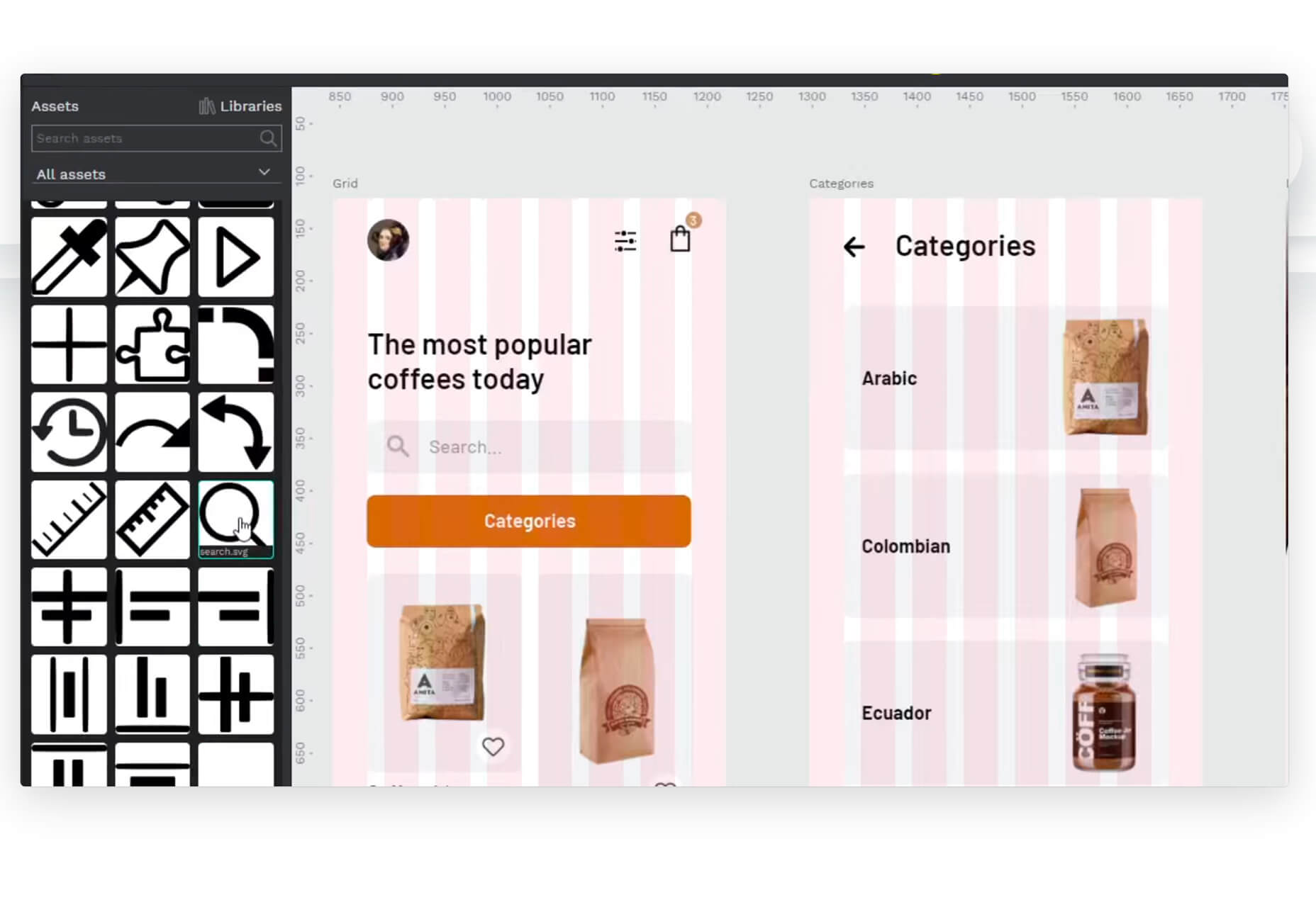
Haikei

Haikei is a web app that you can use to generate SVG shapes, backgrounds, and patterns in a web-based editor that you can use with any design tool or workflow process. Everything is customizable and it is free with access to 15 generator functions. (Additional templates and generators will be available when the pro plan is released later.)

Pixelhunter

Pixelhunter is a smart image resizer for social media platforms. It recognizes objects and crops pictures automatically. It supports 102 sizes and is free to use.

Compo

Compo is an Apple app that allows you to play with shapes and colors and create compositions on your own. You can see shapes and colors like the Bauhaus masters, creating from a blank canvas or shuffling in more creative ways. You can move, rotate, copy, overlap, and adjust shapes and colors to suit your style. Available for iPad and iPhone.

Backlight

Backlight is an all-in-one design system platform that allows you to build code and reference sites in a space where designers and developers can work together. It has a series of “starter kits” to help you with the technology you use from React to Chakra to Tailwindcss. It’s designed to be collaborative with everything in one place and integrates into your workflows. The tool is just launching and you can request early access to learn more.

Multi Color Text With CSS

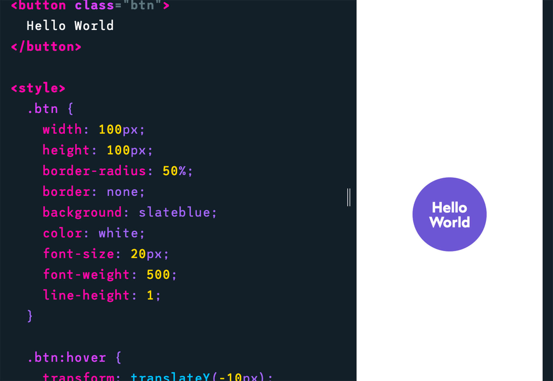
Multi Color Text With CSS is pure fun. Check out the pen by Shireen Taj.

Mega Creator

Mega Creator is an online graphic design tool that helps you create images, icons, illustrations, backgrounds, and more for a number of uses. It has templates that are sized for common uses such as social media. You can upload your own elements to work with (free) or use including graphic assets for a fee.

Noloco

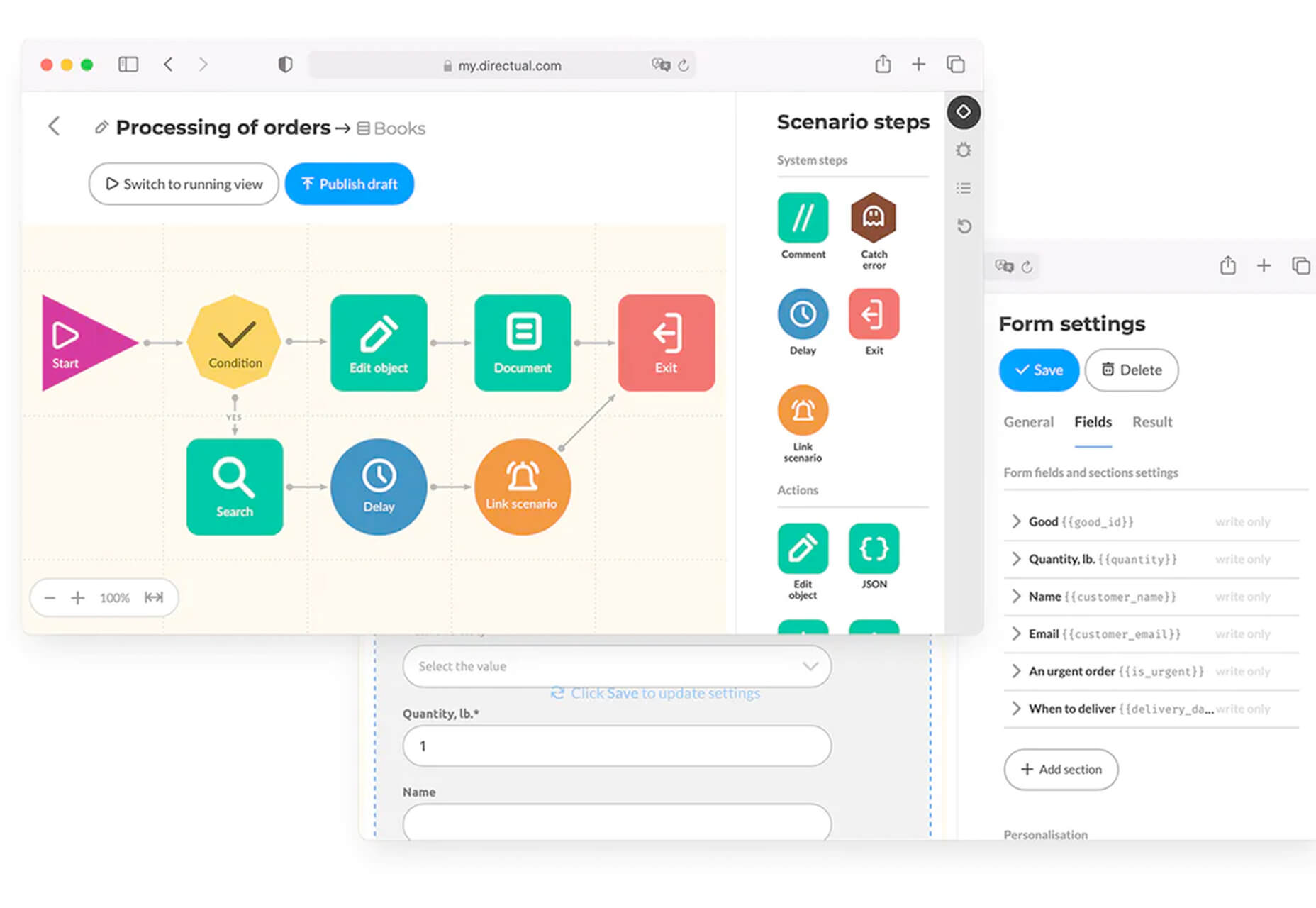
Noloco is a no-code solution for designers to build web apps. You can start building for free and design almost anything you can dream up from a set of drag-and-drop ready-made blocks. (And it will work across all screen sizes.)

Tinter

Tinter is a tiny web tool to generate color variations of images. The tool also generates monochrome colors of images with multiple variants, without hampering the quality of the image.

Radix Colors

Radix Colors is an accessible, open-source color system for designing gorgeous websites and apps. It includes 28 color scales with 12 steps each and includes support for dark mode as well as matching transparencies.

WP Cost Calculator

WP Cost Calculator is a smart, simple tool that allows you to easily create price estimation forms. It’s perfect for a number of industries that use online pricing.

TraveledMap

TraveledMap allows you to create customizable maps thanks to the use of markers, routes, and photos, which you can share or add to your website or blog. This tool is made for travelers and tourism pros.

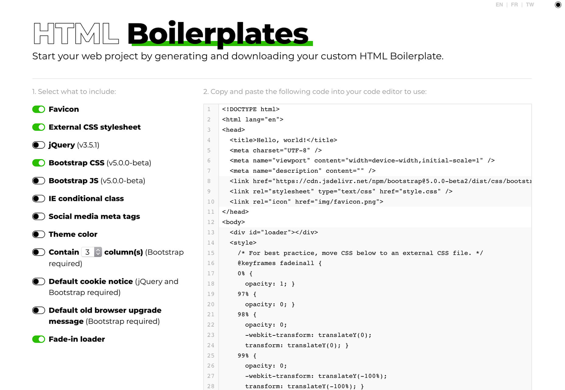
Glyph Neue Icons

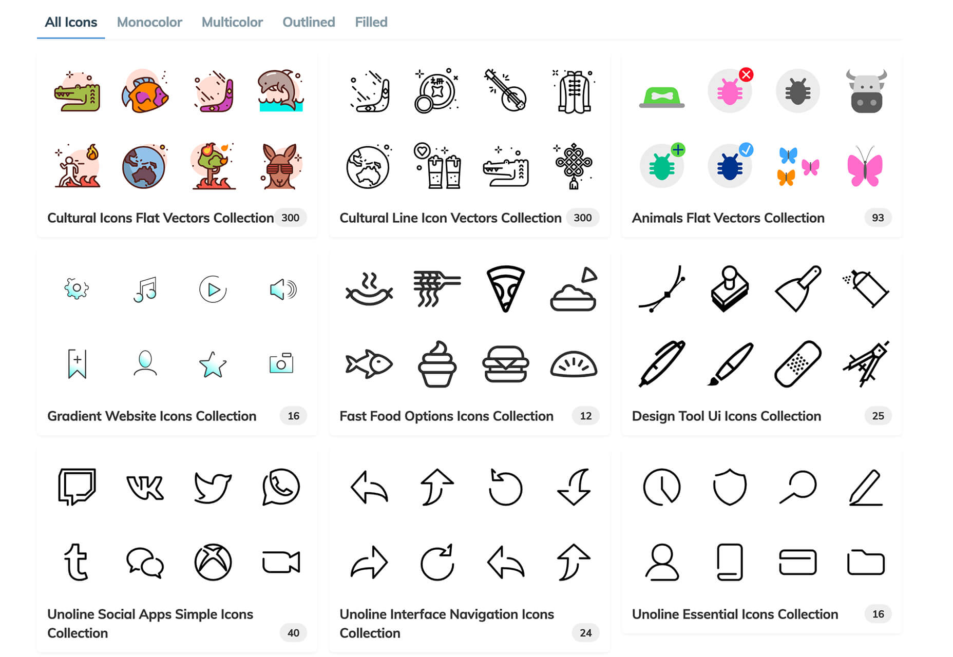
Glyph Neue Icons is a collection of 1,500 icons in SVG and PNG format. (They are free with a link.) Icons come in plenty of categories and styles for all types of use.

Streamline Icons

Streamline Icons is a set of thousands of icons in 12 different styles and themes that you can use for projects. They work through the Streamline app or a plugin for Figma, Sketch, or Adobe XD.

Health Icons

Health Icons is a set of free, open-source health icons for personal or commercial projects. They include filled and outline styles that are editable. There are more than 800 icons in the collection.

OMG, SVG Favicons FTW!

OMG, SVG Favicons FTW! Is a look at the benefits of using SVG favicons in web projects. It also examines some of the challenges – such as browsers support – with code snippets to help you get started.

Aspect Ratio in CSS

Aspect Ratio in CSS explores a design concept we talk about a lot in other places, but not so much with CSS. This piece by Ahmad Shadeed takes a look at how you can go beyond the “padding hack” and use native aspect ratio support in CSS to maintain image height and width ratios in responsive design.

Fight Kick

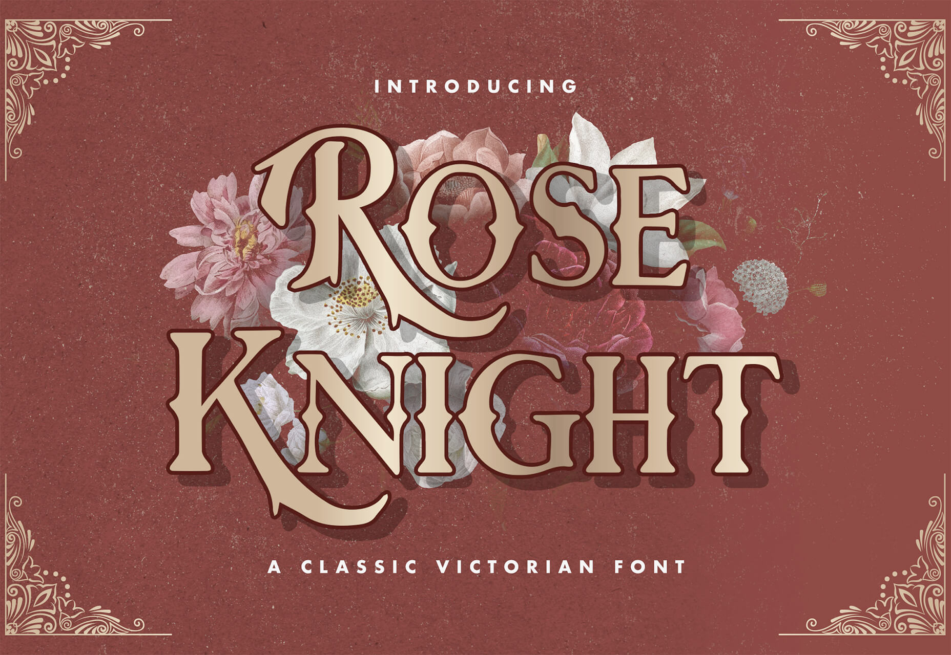
Fight Kick is a bold font with a lot of personality. The free demo version has 249 characters and is for personal use only.

Glow Better

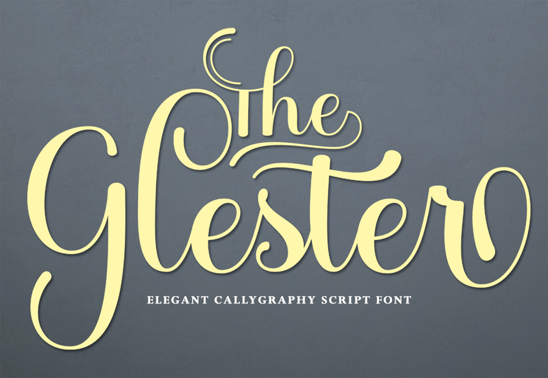
Glow Better is a beautiful premium typeface with a pair of options – a serif and script. Both contain letterforms with swashes and tails that are delightful.

Huggable Hedgehogs

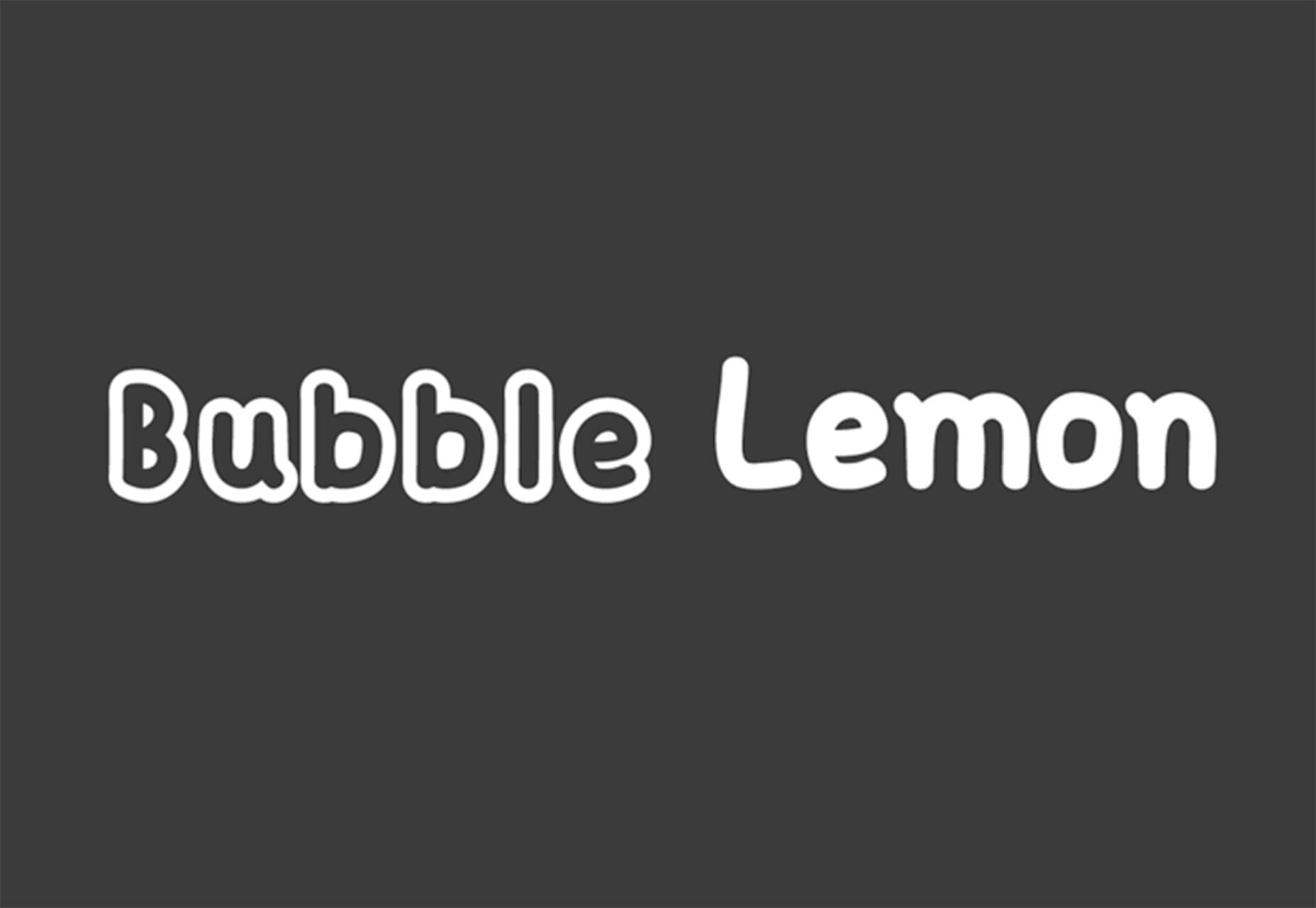
Huggable Hedgehogs is a playful font that’s perfect for children’s projects. Everything has a mono-height in the all uppercase typeface.

Monice

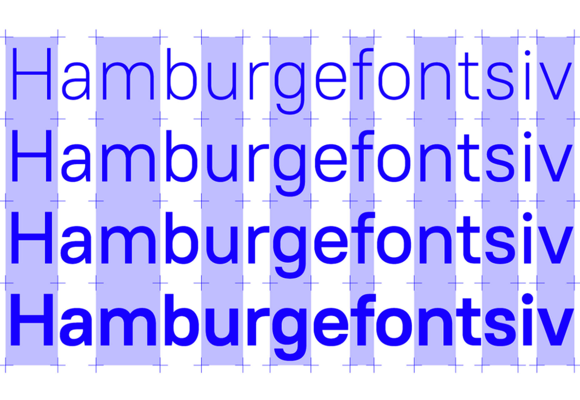
Monice is a rounded sans serif with thick lines and high readability. It includes bold, regular, and italic styles with free (demo, personal) and commercial options.

Rustica

Rustica is a robust premium typeface with 20 styles and family options. It has slim curves and an easy-to-read character set that would work for almost any use. It also supports 219 languages.

Source

The post Exciting New Tools for Designers, July 2021 first appeared on Webdesigner Depot.


Source de l’article sur Webdesignerdepot


Background

The Common Vulnerabilities and Exposures (CVE) tells us the whole story just by its name — these are exposures and vulnerabilities that are common. But what happens when uncommon issues are discovered and exploited by attackers? What if attackers just want us to think they’d only exploit common issues and vulnerabilities?

Securing CVEs sounds like it should be the right place to start from. Exploring common vulnerabilities and exposure is where script kiddies start from, that’s what bots are exploiting, and none of us want to end up in the security hall of shame, set aside for organizations that were exploited and affected by ransomware, thanks to an unpatched CVE from months ago.

Source de l’article sur DZONE

User experience design is something that most of us associate with websites. But why isn’t it something we extend beyond the website?

Here’s why I ask this:

As a consumer, it’s so rare that your only interaction with a brand is through its website. Take an ecommerce site, for example. You buy a product from it, and then what happens?

  • You get a confirmation email;
  • You get another email when the package ships;
  • You might get another email or SMS notification when the package is delivered;
  • You retrieve the package and open it;
  • You open up your purchase and use it.

These are all an extension of that initial user experience on the site. If there’s just one hiccup along the way, it could easily erode the trust and happiness you felt after quickly finding and buying what you needed on the site.

So, what I’d like to do today is look at 10 areas where UX design should extend beyond the website to ensure that the frictionless experience started there remains untarnished.

Extending UX Design Beyond the Website

As a web designer, you might be thinking that this part of the user experience doesn’t fall under the umbrella of your responsibilities. And you may be right about that.

For brands to truly be successful and profitable, someone needs to carefully examine the bigger picture and ensure that the user experience is flawless no matter how far away from the site it is. At the very least, you should share the UX research and strategy you do for a client’s site so their team can ensure it carries over to other areas of the business.

Here are some things to think about:

1. Mobile App

It’s not uncommon for websites to have mobile app counterparts these days. The layout doesn’t need to be identical since mobile users tend to behave differently than those on desktop.

That said, an app shouldn’t force users accustomed to the desktop experience to re-learn how to navigate or engage with the brand. So, the branding, UI design, speed, security, and navigation all need to be on par with what’s already been established in terms of usability.

2. Email

Most websites have a direct connection to email. For example, blog newsletters, purchase confirmation emails, and lead generation follow-ups all start on the website.

Consumers are well aware that when they hand over their email address, they will receive an email in return. In many cases, those emails are welcomed when they’re done right. But if something feels off, that bridge could easily burn between brand and consumer.

To preserve the UX, emails should come with the following:

  • The same branding and visual style as the website;
  • A personalized subject line, greeting, or offer;
  • Consistent messaging as the site, especially when it comes to the CTA.

Another thing to remember is that email isn’t the time to inject dark patterns into the experience. So, the “Unsubscribe” option should be in an easy-to-spot area and a sharply contrasting font color.

3. Social Media

Social media is another channel that’s commonly connected to a website. While you can’t control the aesthetics of social media websites themselves, the visuals and messaging in posts need to be on-brand.

That means that things like memes and emojis — which are popular means of communication on social — should only be used if they’re normally part of the brand identity. If not, you’ll need to find other ways to communicate engagingly.

Another part of the user experience to think about is customer support. Social media is a lot like going into a store. If someone has an issue with what they bought or the service they received, there will be many people around to witness the complaint. Social media only amplifies that — so the quality of customer care needs to be consistent with how the brand handles it everywhere else.

4. SMS

Not every brand will need to be connected to customers via text messaging. eCommerce companies, news sites, and personal services providers likely will, though.

However a brand uses SMS, the same UX guidelines apply here as they do across all other channels:

  • Keep messages concise;
  • Make sure they’re relevant and valuable;
  • Use branded messaging and design;
  • Don’t abuse the privilege and send too many;
  • Make it easy to opt out.

Basically, if you can’t make it a valuable extension of the brand’s offering, don’t use it.

5. Phone

Any website that publishes its phone number should expect to receive calls from prospects and customers. While there’s nothing to design here visually, the experience of getting on the phone with a company should be consistent with what they experience elsewhere.

One way to do this is to design an easy-to-follow routing system. It should be simple for callers to figure out which number to choose. What’s more, there should be no endless loops. If a caller has exhausted the options, they should be immediately directed to a representative.

Another way to ensure consistency is to adhere to a script — that goes for call centers for enterprises as well as the local lawyer’s office. Every caller should be greeted with the same tone and handled in the same manner (depending on the situation, of course).

6. Ads

There are a lot of places where brands can advertise these days:

  • Google search;
  • Social media;
  • Ad networks;
  • TV;
  • Radio;
  • Podcasts;
  • Blogs;
  • Billboards;
  • Direct mail.

When designing an ad campaign, there should be consistent messaging, aesthetics (when relevant), and CTAs presented. If branding isn’t consistent from ad to ad, there may be a delay in consumers recognizing the brand or its offer. Or, worse, not recognizing it at all.

7. Packaging

For brands that sell products, you have to think about how the packaging will impact the user experience. There are two types of packages to consider, too.

The first is the product’s own packaging. Branding should be clear as day and consistent with the site they bought it from.

It should also be easy to open. There’s nothing more frustrating than finally getting your purchase, only to realize you need tools to get it out of the packaging.

You also have to think about packaging for products that get shipped.

The product should fit well within the packaging. A too-roomy package will feel downright wasteful. So will excessive bubble wrap and paper filler.

Having a shipping label present in the package is also important. If the website makes it easy to make a purchase, the package should offer a convenient way to return the product if they’re not happy.

8. Product

The product itself has to align with the expectations set by the website.

Take the example of a SaaS. You’ve built an awesome landing page and mobile app store page to promote it. It looks great, it loads fast, and it’s easy to get around. But if the SaaS itself is ugly, disorganized, slow, or otherwise just clunky, all of the work you did to market it will end up being just false advertising.

So, make sure the expectations set before and during purchase naturally carry over to the experience with the product.

9. Business Exterior

For brick-and-mortar companies, the business’s exterior matters just as much as what happens inside it.

The most obvious thing to focus on is the aesthetics of the building. Does it look attractive? Is it in a safe area? Is there clear signage around it? Is it easy to find?

But you also have to think about user experiences that take place outside of the building. For example, there’s now a rise in curbside pickup. There are tons of things that can affect how happy the customer is with the experience — like if the pickup area is hard to find, there are never enough spots or the associates who deliver the orders always seem to be in a foul mood.

The business’s exterior should always set a good impression for what takes place inside.

10. Business Interior

Here are some things to think about when it comes to “designing” business interiors for a good UX:

  • Decor;
  • Layout;
  • Signage;
  • Furnishings;
  • Product discoverability;
  • Availability (of products or people);
  • Quality of customer service;
  • Checkout process.

It doesn’t matter what the company does — whether it’s a large retailer like Walmart or your own freelance design business. If a business’s establishment doesn’t look good, operate flawlessly, or provide a good person-to-person experience, it’s going to be very hard to get people to return.

So, all those things you do to design a streamlined website journey should be applied to a bricks-and-mortar business’s interior.

Wrapping Up

Depending on the types of companies you build sites for, some of the channels and suggestions above might not be relevant. Hopefully, this has got you thinking about other ways you (and your clients) can extend the UX design and strategy from the website.

If you can maintain the high-quality user experience from channel to channel, your clients’ brands will get more business, grow their profitability, and see a rise in loyalty, too.


Featured image via Pexels.

Source

The post UX Design Doesn’t End With Your Website first appeared on Webdesigner Depot.


Source de l’article sur Webdesignerdepot

Sometimes you just don’t give a damn anymore. Possibly the only thing worse than designer’s block is designer’s apathy: that sinking feeling you get when you realize that you just don’t care about this particular piece of work anymore is disheartening.

The dread of going back to it is paralyzing.

There are many reasons you can stop caring about your work. Maybe you’ve just done the same thing too many times in a row. Maybe your client is insisting on asking for things you know won’t work for them. Maybe something much more important just happened in your life, and you’ve got bigger things to worry about. You could be discouraged by the apparent ‘sameness’ of bandwagon-hopping designs.

I’ve been not caring about my work ever since I was first asked to pick up my toys

Whatever the reason, we all experience times when we know exactly what we have to do… we just don’t care.

I’m something of an expert on this phenomenon. I’ve been not caring about my work ever since I was first asked to pick up my toys. Worse, I have the attention span of a goldfish, even now.

Web design is different. When I discovered it, it was new, exciting, and I could do it on the computer. I loved it, and I still do. Writing code that makes design happen in a browser window will never get old for me.

But even so, sometimes, a particular project will make me want to throw up my hands in exasperation and play video games ‘til Judgement Day. I’d welcome Skynet with tacos and RPGs.

So what do we do about it? First, answer this question: who is the project for?

For A Client

If the project is for a client, it’s just gotta get done. There’s no way around that. You made a commitment. You’re going to follow through and give it your best possible effort because you’re a professional. Anything less would be wrong.

However, that doesn’t mean you have to just power through with only coffee and misery for company. There are things you can do to make the work easier on yourself. The less miserable you are while you work, the better quality you can deliver.

For Yourself

There are a couple of schools of thought here. The first is that it’s perfectly fine to give up on personal projects when you stop caring. I mean, it’s your free time. Why spend it on something you don’t care about?

On the other hand, is a commitment made to yourself any less important than a commitment made to someone else? Many people seem to be perfectly fine with breaking promises to themselves when they’d never willingly do that to a client. Is that wrong?

I usually buy myself a drink and forgive myself, but it’s worth thinking about.

The deciding factor for me is whether my personal project will have any sort of lasting benefit. If whatever I’m designing, writing, or making counts as a long-term investment in my career or quality of life, then it absolutely has to get done, even when I’m not feeling it. Otherwise, I call it a learning experience and move on.

How To Power Through

So, for whatever reason — whether because you have to, or you want to — you’re gonna power through. Here are five ways to do it in style:

1. Start

The hardest part of doing work you don’t care about is starting. This is when you’ll be tempted to procrastinate until the last minute. Try not to.

2. Switch To A Different Part Of The Project

If you can safely (without causing problems) work on a different aspect of the project for a while, try that. The mere variety, the break from the work in front of you before, can boost your morale.

Indeed, working on a different part of the project can give you ideas of getting the most troubling bits done faster or more easily.

3. Do Something Old In A New Way

This one has its pros and cons.

Pro: You can look at this project as a chance to try out a new grid framework, script, code editor, or another tool of some kind. Injecting the process of discovery into an otherwise boring project can make it a lot more fun and even make you look forward to working on it.

Con: You’ll need to plan for extra hours and use some version control; because bringing a new tool or process into play is almost guaranteed to make something interesting go wrong — when this happens, you probably shouldn’t bill the client for the extra hours spent on StackOverflow.

4) Make Like Aziz Ansari And Treat Yo’self

Celebrate the milestones of your project. Don’t celebrate with video games if you need to get any more work done that day. That can go very wrong. But do celebrate. Reward yourself because you’re doing something difficult.

Have a snack. Give yourself a round of applause. Whatever it takes, make yourself look forward.

5) Outsource It

As a last resort, you can always outsource the project to someone else. Just make sure it’s someone you can trust to deliver the same quality of work you would normally provide yourself. Make sure to check it over before handing it off to a client.

Alternatively, you could just outsource the bits of the work that you don’t like. Either way, this is a risky strategy because whoever you outsource to might experience delays or, ironically, not care about the project.

Conclusion

You can do it! I believe in you. The really, really boring projects can seem like huge sinkholes of sadness, but they don’t last forever.


Featured image via Pexels.

Source

The post How To Power Through Designer Apathy first appeared on Webdesigner Depot.


Source de l’article sur Webdesignerdepot

Il existe des centaines de systèmes ERP parmi lesquels choisir, avec un large panel de fonctionnalités, de points forts, de points faibles, d’applicabilité et de tarifs. Si cela peut sembler intimidant, un processus méthodique de comparaison des ERP peut guider votre équipe vers la bonne décision dans un délai raisonnable.

La méthodologie décrite ici, éprouvée, peut vous aider à trouver la solution qui répond le mieux aux besoins de votre entreprise. Elle peut sembler basique mais les entreprises qui se mettent en quête d’un fournisseur ERP sans suivre ces étapes logiques sont souvent confrontées à des retards, coûts supplémentaires et à une personnalisation inutile. Au contraire, les entreprises qui appliquent les meilleures pratiques gagnent généralement en fluidité dans le processus de sélection et dans les implémentations subséquentes. Elles peuvent ainsi profiter plus rapidement des avantages d’un système ERP moderne et être plus compétitives à l’ère du numérique.


Une méthodologie en 5 étapes pour évaluer les systèmes ERP

Une fois la décision prise de remplacer un ancien système ERP, la première étape consiste à monter une équipe pour piloter le processus de comparaison, de sélection et d’implémentation du logiciel ERP. L’équipe commence son travail par l’élaboration d’un plan initial, qui est plutôt à ce stade une stratégie générale.

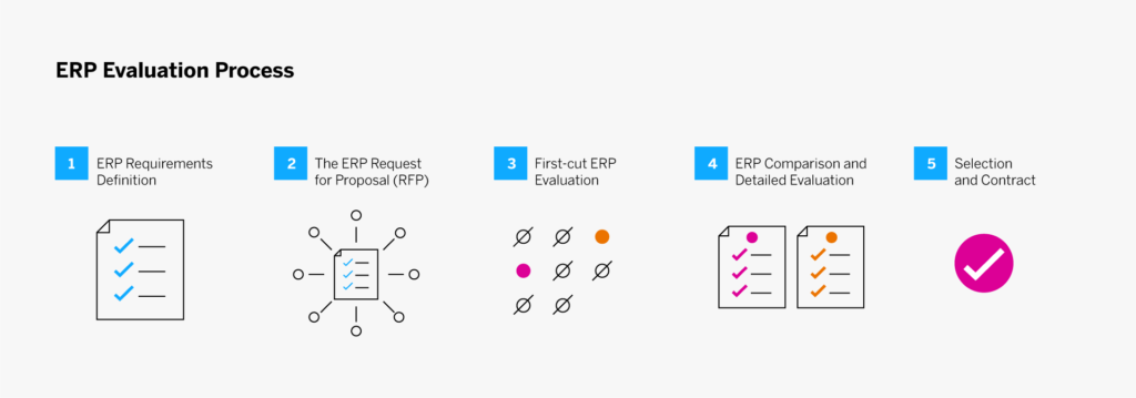
Le processus de sélection d’un fournisseur ERP se déroule en cinq étapes :

  1. Définition des besoins en matière d’ERP
  2. Appel d’offres
  3. Evaluation de pré-sélection
  4. Comparaison des ERP et évaluation détaillée
  5. Décision finale et contrat

Diagramme illustrant les 5 principales étapes du processus d'évaluation d'un ERP


1.      Définition des besoins en matière d’ERP

Vous devrez transmettre des informations concernant votre entreprise et ses besoins à vos fournisseurs ERP potentiels afin qu’ils puissent configurer, packager et tarifer correctement la solution appropriée. Commencez par identifier les principales ressources en ligne, telles que les démonstrations de produits et les blogs, qui racontent l’histoire de votre entreprise.

Décrivez votre entreprise et ses processus de manière générale plutôt que de créer de longues listes de besoins et processus spécifiques. Informez les fournisseurs de la taille de votre entreprise, de son volume d’activité et de transactions, de la complexité des différents processus et de toute caractéristique ou facteur spécifique. Concentrez-vous sur les critères et processus qui donnent à votre entreprise son avantage concurrentiel. Ce sont ces éléments qui différencieront les systèmes et qui vous permettront d’examiner de près la façon dont chacun peut être configuré pour les prendre en charge.

Indiquez les éléments que vous aimez dans votre système actuel. En effet, vous voudrez que votre nouveau système les gère au moins aussi bien. De même, indiquez les choses que votre système actuel ne fait pas (ou mal). Signalez les applications, fonctions ou modifications personnalisées qui doivent être prises en charge par des fonctionnalités standard ou une personnalisation simple du nouveau système (et non une modification). En d’autres termes, concentrez-vous sur les éléments qui sont uniques à votre entreprise et partez du principe que les éléments de base se feront d’eux-mêmes (vous vérifierez cette hypothèse lors des démonstrations et des évaluations finales).

« Concentrez-vous sur les éléments qui sont uniques à votre entreprise et partez du principe que les éléments de base se feront d’eux-mêmes. »

Principaux points à retenir et conseils

Ne vous fiez pas aux listes de contrôle / vérification des ERP. Ces check-lists, une vieille pratique courante dans le secteur, ne permettent pas de départager les solutions et ne vous aident pas vraiment à faire un bon choix. La majorité des éléments figurant sur ces listes sont des fonctions et caractéristiques proposées par tous les systèmes, au moins dans une certaine mesure. Et les fournisseurs en compétition sont susceptibles de cocher « oui » dans l’interprétation la plus large de la fonctionnalité.

Choisissez les bonnes personnes pour votre équipe projet. La spécification des besoins est une tâche difficile. Elle nécessite des collaborateurs engagés, qui connaissent bien l’entreprise et qui ont du temps à consacrer au projet. Refreinez la tentation de constituer une équipe de personnes enthousiastes mais inexpérimentées.

Assurez-vous que votre appel d’offres contient les informations suivantes :

  • Présentation de votre entreprise et de ses processus
  • Ce que votre système actuel fait bien
  • Ce qu’il ne fait pas aussi bien que vous le souhaiteriez
  • Ce que vous voulez que le nouveau système fasse d’autre (classé par ordre d’importance)

2. Appel d’offres ERP

L’étape suivante consiste à envoyer un appel d’offres à un groupe sélectionné de fournisseurs. Leur nombre peut varier, mais n’oubliez pas que vous devrez procéder à un examen détaillé pour chaque réponse. L’expérience a montré que plus le nombre de fournisseurs est réduit, plus les informations fournies sont détaillées et meilleures sont les réponses. Il est donc préférable d’identifier une douzaine (ou moins) des meilleurs candidats pour votre short list.

« L’expérience a montré que plus le nombre de fournisseurs est réduit, plus les informations fournies sont détaillées et meilleures sont les réponses. »

En réponse, les fournisseurs d’ERP doivent proposer un système qui offre les fonctionnalités et les caractéristiques requises pour répondre aux besoins que vous avez identifiés. Les propositions contiendront également des informations sur leurs sociétés, leurs produits, leur expérience dans le domaine, les ressources qu’ils consacreront à l’implémentation, ainsi que d’autres informations destinées à gagner votre confiance.

Alors comment identifier la douzaine (ou moins) de candidats sur lesquels concentrer vos efforts de sélection ? Comment réduire la liste des centaines de fournisseurs d’ERP pour n’en retenir que quelques-uns ? Commencez par consulter les publications spécialisées qui présentent des « success stories ERP  » (gardez à l’esprit que ces publications ne vous parleront probablement pas des difficultés rencontrées ou des échecs, mettez donc ces informations en perspective). Utilisez vos contacts – par exemple associations et groupes d’entreprises – pour identifier d’autres professionnels qui ont pu avoir une expérience récente de la sélection et de l’implémentation d’un ERP.

Il existe également de nombreux annuaires en ligne, outils de sélection et services de sélection de systèmes qui peuvent vous aider à identifier les logiciels qui possèdent les fonctionnalités dont vous avez besoin et/ou les fournisseurs qui ont de l’expérience dans votre secteur.

Pour obtenir des conseils personnalisés, vous pouvez passer un contrat avec la branche conseil de votre cabinet comptable ou trouver une ressource conseil indépendante dans votre région et/ou dans votre secteur d’activité. Veillez à vérifier leurs antécédents et leurs affiliations pour vous assurer qu’ils sont réellement indépendants et pas associés à un ou plusieurs fournisseurs de systèmes ERP.

Vous pouvez choisir d’inclure certains fournisseurs de systèmes ERP qui présentent un intérêt pour d’autres raisons. Peut-être qu’un ou plusieurs de vos clients les plus importants utilisent un système ERP et vous ont encouragé à utiliser le même système. Ou peut-être que votre société fait partie d’une grande entreprise ou d’un groupe qui a opté pour une plateforme ERP donnée. Demandez une proposition au fournisseur recommandé puis évaluez toutes les propositions de manière équitable et impartiale avant de prendre votre décision.

Principaux points à retenir et conseils

Veillez à ce que toutes les parties prenantes définissent leurs besoins. Votre appel d’offres doit inclure les contributions de toutes les parties prenantes. Dans le cas contraire, vous risquez de choisir un système ERP qui ne sert que certaines fonctions de votre entreprise, obligeant les autres départements à investir dans des systèmes autonomes. Évaluez les systèmes qui fonctionnent pour l’ensemble de l’entreprise et utilisez le calendrier de déploiement pour livrer les modules prioritaires en premier.

Faites attention au classement des besoins. Souvent, l’appel d’offres est divisé en domaines fonctionnels avec des sections à remplir par chaque service. Chaque département – qu’il s’agisse des RH ou des opérations – fait généralement un excellent travail de classement des fonctionnalités pour son unité opérationnelle, mais ses priorités peuvent ne pas correspondre aux objectifs globaux de l’entreprise. C’est à votre équipe projet d’ajuster les priorités dans une perspective plus large. Quelles sont les fonctionnalités vitales, importantes ou simplement souhaitables ?

Vérifiez la disponibilité effective des fonctionnalités. Les sociétés de logiciels ont d’excellents départements marketing ; certaines vendent des produits qui n’ont pas été entièrement développés et testés. Faites des recherches sur les fonctionnalités « à venir dans une prochaine version » par rapport à celles qui sont utilisées dans les références actuelles. Il est tout à fait envisageable de prendre en compte les fonctionnalités en cours de développement – mais ne pariez pas tout votre projet sur des fonctionnalités à venir si elles sont essentielles.

Évaluez vos processus. Les processus intégrés dans les ERP packagés sont considérés comme étant conformes aux « meilleures pratiques ». Les consultants et les experts de l’implémentation d’ERP vous diront qu’il est presque toujours préférable de modifier la procédure pour l’adapter au logiciel (en tenant compte de la dimension « meilleure pratique ») que de modifier le logiciel pour l’adapter à la procédure existante. Toutefois, c’est à vous de prendre cette décision. Mais n’oubliez pas que les nouveaux processus peuvent être à l’origine des progrès et des avantages que vous tirez d’un nouveau système. N’oubliez pas non plus que tous les logiciels ERP modernes sont personnalisables. Vous disposez donc d’une grande souplesse pour modifier l’affichage, les procédures, les caractéristiques des données et leur traitement, et bien d’autres choses encore – sans modifier le code.

Tenez compte du retour sur investissement de votre ERP. La plupart des entreprises exigent une analyse du retour sur investissement (ROI) comme condition préalable à l’autorisation et au financement de tout projet majeur. Comme son nom l’indique, il s’agit de la somme des coûts liés à l’achat et au déploiement du nouveau système, plus la différence des coûts d’exploitation par rapport à ceux du système existant. Le ROI tient également compte des avantages qui s’ajoutent aux économies directes, notamment l’amélioration du rendement, du service à la clientèle et de la productivité au travail.


3.      Evaluation de pré-sélection

L’évaluation se déroule en deux phases. Au cours de la première phase, toutes les propositions sont évaluées pour voir dans quelle mesure elles correspondent à votre environnement et aux exigences décrites dans votre appel d’offres (cette phase ne comprend pas la comparaison des fournisseurs, qui relève de la deuxième phase d’évaluation).

L’objectif à ce stade est d’écarter les offres qui ne remplissent pas vos critères et de classer celles qui semblent convenir. Il en résulte une short list des meilleures propositions. Celles-ci, et seulement celles-ci, seront soumises à une évaluation détaillée jusqu’à la sélection finale.

Si vous devez examiner de nombreuses réponses, les détails auront tendance à se brouiller et il vous sera difficile de vous souvenir des réponses particulièrement solides (ou celles insuffisantes) et dans quels domaines. Une échelle de notation numérique peut vous aider à ne pas perdre le fil et à documenter votre processus de décision. Voici quelques conseils supplémentaires pour vous aider lors de cette étape de documentation :

  • Mettez en place un formulaire ou une feuille de calcul agencée de manière à ce que les évaluateurs puissent noter chaque proposition en fonction des principaux critères que vous avez spécifiés. Demandez à chaque examinateur d’attribuer une note à chaque critère d’évaluation (l’échelle peut être de un à dix, de un à cinq, de un à trois, ou tout autre niveau de granularité que vous jugez approprié). Vous pouvez avoir autant ou aussi peu d’examinateurs que vous le souhaitez.
  • Laissez de la place pour des notes et des questions, pour le suivi. Vous pouvez demander des éclaircissements à ce stade ou attendre l’évaluation détaillée des propositions présélectionnées. Attribuez un coefficient à chaque critère en fonction de l’importance de la fonction ou du processus pour votre entreprise.
  • Multipliez la note donnée par chaque évaluateur par le coefficient de chaque critère et calculez une note globale pour chaque fournisseur. Le plus souvent, plusieurs d’entre eux se classeront en haut de l’échelle, plusieurs autres un peu plus loin dans le classement, et quelques-uns ne seront pas retenus. Vous devriez maintenant avoir votre short list de finalistes – idéalement trois à cinq candidats – pour l’évaluation finale.
  • Il y a de bonnes chances que vous puissiez identifier les meilleurs candidats, mais si ce n’est pas aussi clair, revenez aux évaluations individuelles et discutez-en avec l’équipe.

Principaux points à retenir et conseils

Traitez chaque fournisseur potentiel de la même manière. N’acceptez pas de démonstrations en direct, de réunions spéciales en présentiel ou de visites sur place, à moins que vous ne soyez prêt à offrir la même possibilité à tous les fournisseurs. Il est important de maintenir des règles du jeu équitables. Une technique courante consiste à organiser une « conférence des candidats » dans vos locaux pour faire visiter les lieux à tous les fournisseurs potentiels et répondre à leurs questions (devant tout le monde).

N’oubliez pas qu’une proposition est un document de vente. Les réponses contiendront les informations que vous avez demandées et bien plus. Partez du principe que toutes les affirmations sont véridiques ; vous pourrez vérifier la plupart, sinon toutes, au cours du processus d’évaluation. Mais sachez que les auteurs de la proposition répondront à vos questions de manière à présenter leurs produits sous le jour le plus favorable.

Recherchez les valeurs aberrantes. Accordez une attention particulière aux critères pour lesquels les notes varient considérablement. Si un évaluateur donne une note très élevée à une proposition pour un critère et qu’un autre évaluateur lui donne une note très basse, cela vaut la peine d’en discuter. Interrogez les deux évaluateurs de manière constructive pour savoir ce que chacun pensait. Il est probable que l’un ou l’autre ait remarqué quelque chose que les autres n’ont pas vu ou n’ont pas considéré comme important. À la suite de ces discussions, vous souhaiterez peut-être ajuster les notes pour un critère spécifique, ce qui pourrait modifier le classement général.


4. Comparaison des ERP et évaluation détaillée

Une fois que vous avez identifié trois à cinq finalistes, il est temps de vous mettre au travail pour vérifier leurs affirmations et valider leurs références.

Comment commencer votre évaluation

  • Prenez contact avec chacun des fournisseurs potentiels et annoncez-leur la bonne nouvelle : ils ont été retenus dans la short list ! (Il n’y a pas de mal à leur dire combien il y a d’autres finalistes et même à leur faire savoir avec quelles entreprises ils sont en concurrence, si vous êtes à l’aise pour le faire).
  • Dans certains cas, vous pouvez également leur demander d’affiner leurs propositions.
  • Discutez avec les utilisateurs actuels du système (ou rendez-leur visite), de préférence ceux de votre industrie (ou d’un marché comparable) et de la taille de votre entreprise.
  • Obtenez des références si les éditeurs ne les ont pas déjà fournies (les fournisseurs peuvent hésiter à fournir des références pour des raisons de concurrence. Mais vous devez insister. Rassurez-les sur le fait que vous signerez et respecterez les accords de non-divulgation).

Comment gérer les démonstrations

C’est également le moment d’inviter les candidats présélectionnés à effectuer des démonstrations détaillées de leurs systèmes – mais vous devez contrôler ces démonstrations.

  • Fournissez à chaque candidat un script ou une liste des fonctionnalités que vous souhaitez voir bien avant la démonstration prévue. Tous les fournisseurs potentiels devraient recevoir la même liste.
  • Permettez-leur de montrer les fonctions spéciales qu’ils souhaitent mettre en avant uniquement après vous avoir montré les fonctions et les processus décrits dans l’appel d’offres.
  • Assurez-vous que votre script ou votre liste inclut les exigences spécifiques identifiées à l’étape 1. Les systèmes ERP traitent les processus courants de la même manière ; ce sont les exceptions qui posent problème (par exemple, la possibilité d’entrer des commandes pour des articles qui ne sont pas en stock, de vendre des articles dans des packages, des kits ou des ensembles, ou encore la prise en charge d’un processus spécifique de rapprochement des factures).
  • Pendant la démonstration, vous voudrez voir comment le logiciel peut être configuré et adapté pour prendre en charge vos processus et procédures uniques. Cela dit, restez ouvert d’esprit dans la mesure où vous pourriez découvrir certaines meilleures pratiques dans ces fonctions standard qui amélioreraient les opérations et les résultats de votre entreprise.
  • Dans l’idéal, le démonstrateur sera en mesure de montrer le fonctionnement du système en utilisant vos propres données. Ce n’est pas toujours possible, mais lorsque c’est le cas, cela vous donnera une bien meilleure idée de la façon dont le système fonctionnerait dans votre environnement.

Principaux points à retenir et conseils

Ne vous laissez pas éblouir par les démonstrations. Les professionnels qui font la démonstration des logiciels sont généralement très expérimentés et ont une forte personnalité. Leur objectif est de vous convaincre et de vendre leur logiciel. Ne vous laissez pas distraire par la personne ou le discours de vente, aussi captivant soit-il. Concentrez-vous sur le fond.

Tirez le meilleur parti des visites de référence. Sélectionnez avec soin les visites que vous souhaitez faire. Passez un bref appel à votre interlocuteur pour vous assurer qu’il a bien déployé le logiciel et qu’il a obtenu les avantages promis. Convenez de ce qu’il vous montrera et des personnes que vous rencontrerez au cours de la visite. Une fois sur place, jugez soigneusement si leur succès est reproductible dans votre environnement. Posez également les questions difficiles : « Quelles ont été vos plus grandes surprises ? » et « Si c’était à refaire, que feriez-vous différemment ? ».

Continuez à poser des questions. Encouragez votre équipe à poser des questions, ne serait-ce que pour clarifier les réponses. Faites-le lors de l’examen de l’appel d’offres et pendant les démonstrations ; cela réduira considérablement les risques de mauvaises surprises. C’est le moment de découvrir les réponses qui ne vous plaisent pas – avant que les négociations ne commencent. N’oubliez pas non plus que vous obtenez vos réponses gratuitement à ce stade, alors apprenez-en le plus possible. Lorsque vous commencerez à implémenter le produit, il se peut que vous deviez attendre une assistance ou même payer des frais.


5. Décision finale et contrat

Une fois les évaluations détaillées terminées, vous constaterez probablement que deux ou trois fournisseurs répondent à vos critères. Sélectionnez celui qui, selon vous, répond le mieux à vos besoins actuels et futurs, mais n’écartez pas les autres. Faites-leur plutôt savoir qu’ils vous conviennent mais qu’ils ne sont pas votre premier choix ; cela laisse la porte ouverte au cas où vos négociations avec le meilleur candidat ne se déroulent pas comme prévu.

Vous pouvez maintenant commencer à négocier les détails du contrat avec le meilleur candidat. La plupart des entreprises savent comment cette étape est « censée fonctionner ». Mais comme pour toutes les autres étapes du processus d’évaluation et de sélection d’un ERP, vous risquez d’avoir des surprises.

Le pouvoir est de votre côté dans les négociations. Cependant, il est préférable de considérer le fournisseur comme un futur partenaire, et non comme un adversaire dans les négociations. Visez un accord équitable qui incite les deux parties à déployer le système de manière efficace et à en assurer le bon fonctionnement.

Chaque aspect de l’implémentation du système et du maintien de l’assistance doit être discuté et documenté – en détaillant le prix, la personne responsable et, dans certains cas, le temps nécessaire. Le contrat comporte de nombreux aspects, dont notamment (mais pas exclusivement) :

  • L’achat initial, la location ou la licence du matériel et des logiciels.
  • L’implémentation du matériel et des logiciels (en précisant ce qu’englobe le mot ‘ »implémentation »).
  • Coût et calendrier de la simulation d’implémentation (avant ou après le paiement du logiciel).
  • Coûts de formation initiale et continue
  • Maintenance continue du matériel et des logiciels (et à quel niveau).
  • Conversion des données et intégration à d’autres systèmes
  • Mise en réseau et sécurité
  • Personnalisations (initiales et avec les versions futures)

Principaux points à retenir et conseils

N’annoncez pas votre sélection finale avant les négociations. À la fin de la phase d’évaluation détaillée, l’équipe peut vouloir déclarer un « gagnant ». Cependant, informer le candidat principal qu’il est « l’élu » n’est pas dans l’intérêt de votre entreprise. Il n’est pas rare d’avoir des surprises au cours du processus de négociation et vous devrez peut-être revoir votre choix.

Planifiez à long terme. Lors du démarrage, veillez à examiner attentivement les coûts à long terme afin que vos estimations soient correctes et que vous ne faussiez pas les chiffres du retour sur investissement de l’ERP. Certains fournisseurs offrent davantage de services gratuits pendant une période plus longue et d’autres peuvent confier leur assistance à long terme à une entreprise qui facture à l’appel. Certains fournisseurs fixent un plafond pour l’augmentation des tarifs annuels de maintenance ou d’abonnement, mais beaucoup ne le font pas. D’autres vendent un abonnement SaaS (Software-as-a-Service) à bas prix, qu’ils augmentent considérablement après quelques années. Certains fournisseurs proposent une mise à jour annuelle, mais ne fournissent aucune assistance réelle lors du processus de mise à jour. Posez des questions et obtenez des réponses écrites pour être sûr de bien appréhender vos coûts à long terme.


L’importance de l’équipe projet

Le facteur le plus important pour le succès du processus d’évaluation du système ERP est l’équipe projet. Cette équipe doit être constituée très tôt et doit être le moteur de l’élaboration, de la diffusion et de l’évaluation de l’appel d’offres et de la sélection du nouveau système ERP.

D’après notre expérience, lorsque les équipes sont au milieu d’une investigation et d’une évaluation détaillées, elles prennent souvent des raccourcis. Mais si votre équipe projet suit ces cinq étapes et prête attention aux enseignements tirés, elle sera en mesure de trouver la solution optimale pour répondre aux exigences de votre entreprise, maintenant et pour l’avenir.


Publié en anglais sur insights.sap.com

The post Conseils pour bien choisir votre (nouveau) système ERP appeared first on SAP France News.

Source de l’article sur sap.com

Who is Grammarly for? Can a grammar checking tool like Grammarly replace a human editor and proofreader? Is the Grammarly checker worth it? Are the Grammarly free checks sufficient for me, or should I upgrade to Grammarly Premium? Should I install Grammarly on Chrome? How effective is Grammarly for Word? Is downloading the Grammarly desktop app worth it? You have questions…all of which we’re going to answer.

I have been using Grammarly regularly for proofreading my documents and emails since 2015 and have witnessed its evolution as a product firsthand. After checking over three million words during this period, I can confidently say that Grammarly has come a long way. Raising $200M in total funding at a valuation of $1B+ so far, and with more than a million downloads per month, Grammarly is now a top-1000 website by traffic worldwide.

I write a lot, so Grammarly has been my go-to writing assistant for correcting passages and enhancing my writing. I first tried the Free version, and in May 2020, I upgraded to the Premium version, finally! Grammarly Premium is a great tool that takes care of most of your writing, proofreading, and plagiarism-checking needs for intensive work.

In this article, I’ll explain what Grammarly is, its features, what it does (functions of all versions and products), the pros and cons of using Grammarly, my rating of Grammarly, who should use the Free version, and who should use the Premium version and the difference between the two. I’ll also explain how to use Grammarly properly. I’ll then compare it with other popular tools and suggest which ones suit your needs. In the end, I’ll leave you with my final assessment and FAQs.

What is Grammarly?

Grammarly is an online digital writing assistant that checks for a range of English grammar and spelling mistakes. It also helps enhance the writing through its excellent context-based clarity suggestions (Premium version).

Grammarly is a writing aid that checks not only for spelling slights, grammar rules, and clarity issues but also identifies the tone of the writing to provide relevant instructions through its Error Cards. It also has a plagiarism checking tool, which is available with the Premium version.

Grammarly employs AI (Artificial Intelligence) and NLP (Natural Language Processing) to check the content for all possible syntactic and semantic issues. Although it has an extensive database, it is still incomparable to human proofreading and professional editing, especially when it comes to understanding the context of the writing.

Grammarly Overview For Beginners – Compatible, Accessible

Grammarly is astonishingly easy to use, primarily due to its compatibility via the Browser Extension/Add-on, from which you can use it on millions of websites. Moreover, its other product forms, i.e., the Online Editor (Web App), Desktop Application, MS Word/Outlook Add-in, and the Grammarly Keyboard for iOS/Android, make it accessible everywhere.

How Does Grammarly Work?

It automatically detects issues in the content in the Desktop App, the Online Editor, and the browser (even in Google Docs, which is in Beta at this time) via its add-on. Yet, for the MS Word Add-in, you have to click the Grammarly button to activate the app. Grammarly explains all detected issues via an Error Card that contains relevant information for each item. You can implement it by clicking the suggestion, ‘Ignore’ the problem, or ‘Add to Dictionary’ (in case of a spelling issue). You can also provide feedback (if you think that the suggestion is wrong). The Free version checks only for spelling and critical grammar mistakes. The Premium version also reveals a ton of advanced ‘Clarity Issues.’

The Tone Detector helps you estimate the entire document’s tone, which can be valuable for many writers who target a particular audience, e.g., formal writing for the business audience.

Limitations of Grammarly (For Beginners)

Grammarly, overall, excels at almost all the things it does, and therefore the free version is recommended for everyone. Grammarly provides a generic readability score. Advanced grammar checks like the clarity checker, the plagiarism checker, and many other features are not available for the free version.

Grammarly is dominant amongst its competition, but it doesn’t solve all English language problems. It is useful at picking syntactic mistakes but still misses significant semantic errors, which can be a problem for people who are not particularly adept at English — as they won’t notice these slips.

The Good The Bad & The Ugly
Ease of use – simple, intuitive, and efficient interface English language only Tad expensive (notably the monthly subscription at $29.95 per month)
Context-based grammar checking Not 100% accurate (primarily misses linguistic bloopers) No free trial for the premium version.
Fantastic grammar checker Business account starts at three users and charges per number of users (can be a bit expensive for small businesses) Only one account (license) for the premium version. You can use it on up to five devices.
Convenient tone detector Insufficient as a standalone tool (doesn’t do everything) Incomplete sentences can sometimes go undetected
The insightful error cards are instructional and productive (they help you to improve your writing) Unlike ProWritingAid and Hemmingway Editor, it doesn’t provide much information about the whole passage, Grammarly’s scoring is generic right now No substitutes are suggested in many cases. Example: synonyms, rephrasing suggestions for the intricate text, etc.
Integrates well with MS Word, Outlook, WordPress, emails, social media, and millions of websites The free version is limited to fundamental grammar and spelling mistakes Cannot determine contextually incorrect sentences (it cannot perceive the meaning of the written document)
Knowledge-base The premium version identifies repeated words but sometimes doesn’t provide a suitable alternative to use Short on vocabulary suggestions (not as competent as the free thesaurus writing tool)
The Grammarly keyboard is available for Android & iOS for FREE Free version shows the number of advanced clarity mistakes but doesn’t tell you what those mistakes are and where they are The formatting tool is rudimentary. You have to write in another text editor and then import it to the Grammarly Editor to format your writing accurately
Personal dictionary Google Docs is not supported yet (in Beta). Restricted to English only, and it also doesn’t translate other languages as Ginger does.
The adjust goal option allows you to customize Grammarly’s feedback. It can miss simple semantic issues, which sometimes can be caught by text editors like Google Docs and MS Word.
Formatting remains the same if you import/upload a document, but it changes if you copy/paste. Plagiarism Detector is not available for the free version.
Weekly writing stats (sent to user email) can help you identify your problem areas The browser extension can malfunction, i.e., opening and closing the Grammarly editor within a website (sometimes) duplicates the content
Option to download the detailed performance statistics as a PDF Sometimes Grammarly doesn’t catch all mistakes on the first try. You have to refresh or scroll to let it run again and see if it finds new issues
Grammarly blog teaches English grammar rules, writing techniques, and more
Context-based checker is more accurate than competitors
Provides rephrasing suggestions for complicated sentences
The premium version excels at catching inconsistencies

Who Should Use Grammarly?

Free:

Everyone

Despite being limited, Grammarly (free version) is a phenomenal tool. Therefore, I would heartily recommend it to everyone. It’s free, and it’s convenient.

The free version should be everyone’s go-to tool for proofreading social media statuses, tweets, and comments. It is also crucial for editing all sorts of short-form writing, such as emails. Professional writers can also use the free version to catch typos and basic grammar mistakes.

Premium:

  • Professional Writers
  • Authors
  • Bloggers
  • Students
  • Businesses that require extensive writing
  • Marketers/Advertisers
  • Content Creators
  • Editors and Proofreaders

Apart from all the necessary features offered in the Grammarly free version, Grammarly Premium provides several other valuable elements such as an advanced clarity checker and a robust plagiarism checker. All these help you enhance your writing effectively.

Grammarly Premium is a helpful tool for people who are already adept at English as it still requires plenty of work on catching semantic errors. Businesses and Professional writers who do intensive writing should give the Premium version a go. From writing, editing, and proofreading to plagiarism checking, it is almost an All-in-One solution (though not a substitute for a human proofreader – at least yet).

Who Shouldn’t Use Grammarly?

Free:

  • Students
  • English Learners

People, especially students who cannot learn from their mistakes, should avoid relying on Grammarly as it can hinder their learning process.

Granted, Instructional Error Cards and Weekly Writing Stats (emailed to the user) can pinpoint your weak points, but educating yourself from there on is entirely up to you.

Just like ‘Auto-correct’ hinders people’s ability to learn proper spellings, Grammarly can do that for learning grammar rules.

Premium:

  • Amateur Writers
  • Infrequent Users

Grammarly is an excellent tool, but it still makes slips, which can be misleading for amateurs who don’t have a solid grip on the English language. Therefore, if you are not proficient enough in English, you should only subscribe to Grammarly Premium if you can remember that it is not a replacement for a human teacher or a proofreader. Or, you can continue using the Free version, which is competent enough to check fundamental grammar and spelling oversights.

Furthermore, businesses and professionals who are infrequent users can stick to the Free version if they feel they will not be making the most of the Premium version.

Grammarly vs. Basic Text Editors

A comparison with basic text editors will illustrate Grammarly’s true potential:

Microsoft Word

Microsoft Word is the most popular and feature-packed text editor. It includes a basic grammar and spelling checker that catches typos in real-time. However, MS Word is very limited in its grammar checking capabilities.

I’ve written many articles using Microsoft Word, which were considered error-free by the text editor. However, when I put the same documents in Grammarly’s Editor, there’d always be some critical mistakes caught by the Free version and some clarity or consistency mistakes pointed out by the Premium version.
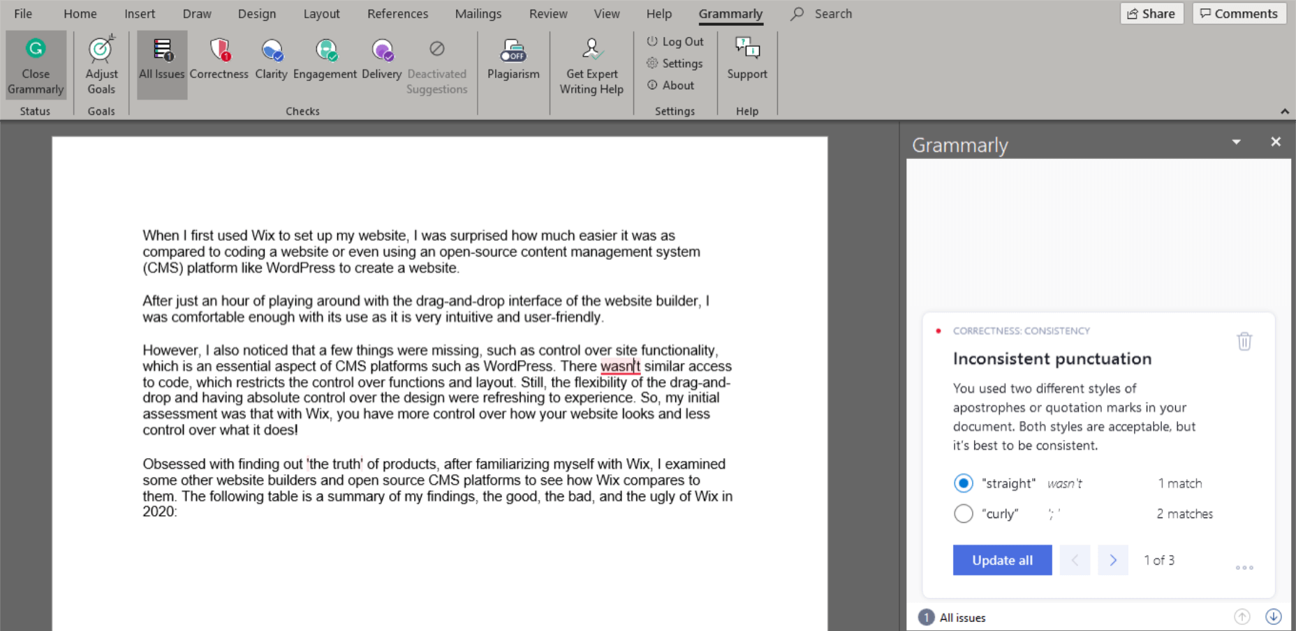
Grammarly finds inconsistent punctuation that MS Word missed.

Google Docs

Google Docs is another mighty text editor, which is free to use. It also has numerous features, including spelling and grammar checking. Google Docs’ grammar and spelling check software only flag issues with an alternative in its database; otherwise, it ignores them. It auto-corrects the obvious spelling blunders. It can also pick missing determiners (articles) better than Microsoft Word. However, once again, when compared to Grammarly, Google Docs falls far behind in exposing slip-ups.
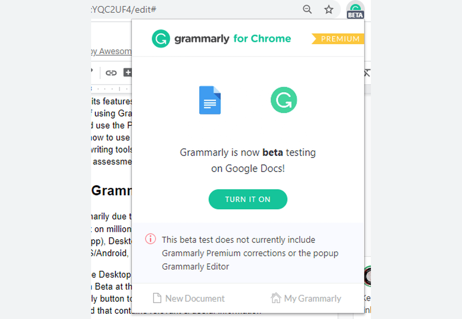
Grammarly in Google Docs.

Google Docs performs a little better than MS Word when it comes to punctuation, yet it is incomparable to Grammarly, which is in Beta for Google Docs.

How to Write Better With Grammarly

Grammarly proofreads content written in English (American, British, Australian, and Canadian) and gives detailed performance statistics. Weekly Writing Statistics are emailed to the user account, and you can download a complete PDF that extensively illustrates your performance.

From scoring to pointing out all mistakes and amendments, Grammarly doles out a comprehensive document that you can use to improve your weak areas. Grammarly can function as your teacher in this regard if you learn from these mistakes and try to improve your performance, especially in areas pointed out by the software.

Try Grammarly for yourself.

All Grammarly Products

Grammarly is available in the following product versions:

  1. Grammarly for Business (3 or more users)
  2. Grammarly @edu (for Educational Organizations/Institutes)
  3. Grammarly Premium
  4. Grammarly Free

All these versions are usable in the following product forms:

1. Online Editor

Grammarly’s web application acts as an online editor to upload a document, copy/paste content, or write directly. It has a 4MB size-limit and a 100,000 characters-limit (about 60 pages). When you upload a file, a pop-up tells you that your document formatting will restore when downloaded.

Grammarly’s interface for the online version and the desktop app is identical, and it is outstandingly intuitive and accessible. A dedicated writing assistant panel on the right side contains valuable information and choosable options. It also lists and categorizes all the errors found.

A bar at the bottom contains a few formatting options and some length-related info about the passage.

2. Browser Extension

Typing in any online text editor activates the ’Grammar and Spelling Checker’ when the extension is on. It underlines (in red) all the issues in real-time. Hovering over the problem pops up an Error Card that contains corrections and more information about the mistake.

You can use the Grammarly icon at the bottom-right of online text editors to activate or deactivate the tool. This option is beneficial because sometimes you want to check your content but don’t want distractions while writing. I recommend turning on the extension after you have completed your draft and now want to begin the editing phase. You can also open the Grammarly editor within a website for added convenience.

The Grammarly add-on is available on all popular browsers – Chrome, Firefox, Safari, Edge Chromium, etc. And it is compatible with millions of websites and the web versions of many desktop applications, including WordPress, emails, social media, work platforms, and many more. Grammarly for Google Docs is in Beta right now. The Grammarly extension also gives you the option to ’Show Definitions and Synonyms via Double Click,’ which works like a dictionary within any website.

The Grammarly icon within your text editors tells you the total number of issues found on the Grammarly pop-up. However, you have to scroll through the document and find those problems yourself. It is not as efficient as the online Editor. The extension only shows the critical issues inside your online editor. It gives you the option to open the online Grammarly Editor to see the errors pointed out by the Premium version. The browser extension also works slower for lengthy content. It is convenient but only for short-form writing.

3. Desktop Application

The desktop application, like all other products, is online only and doesn’t work offline. An internet connection is necessary as Grammarly uses its database to process the document. The desktop app is identical to the online editor.

4. Microsoft Word/Outlook Add-in

You can integrate Grammarly into Microsoft Word and Outlook through their Add-in. Unlike other Grammarly product forms, the MS Word Add-in activates when clicked — otherwise, it stays dormant. When enabled, a right panel appears with suggestions, Error Cards, and statistics, just like the Online Editor and the Desktop App. Grammarly has no character limit for the MS Word Add-in.

5. The Grammarly Keyboard App

You can download Grammarly Keyboard for both Android and iOS through their respective stores. Now available for iPad as well, it is easy to use as it works like the auto-correct feature available in the smart devices. It gives suggestions when Grammarly encounters any grammar or spelling lapses.

Grammarly Pricing Plans

Grammarly is a tad expensive when purchased as a monthly subscription, which costs $29.95 per month. The quarterly ($59.95) and annual ($139.95) subscriptions offer better value for money. Through its weekly newsletter and other channels, Grammarly presents discount offers to its free users from time to time, which you can avail yourself of to get an even cheaper deal for the Grammarly Premium subscription.
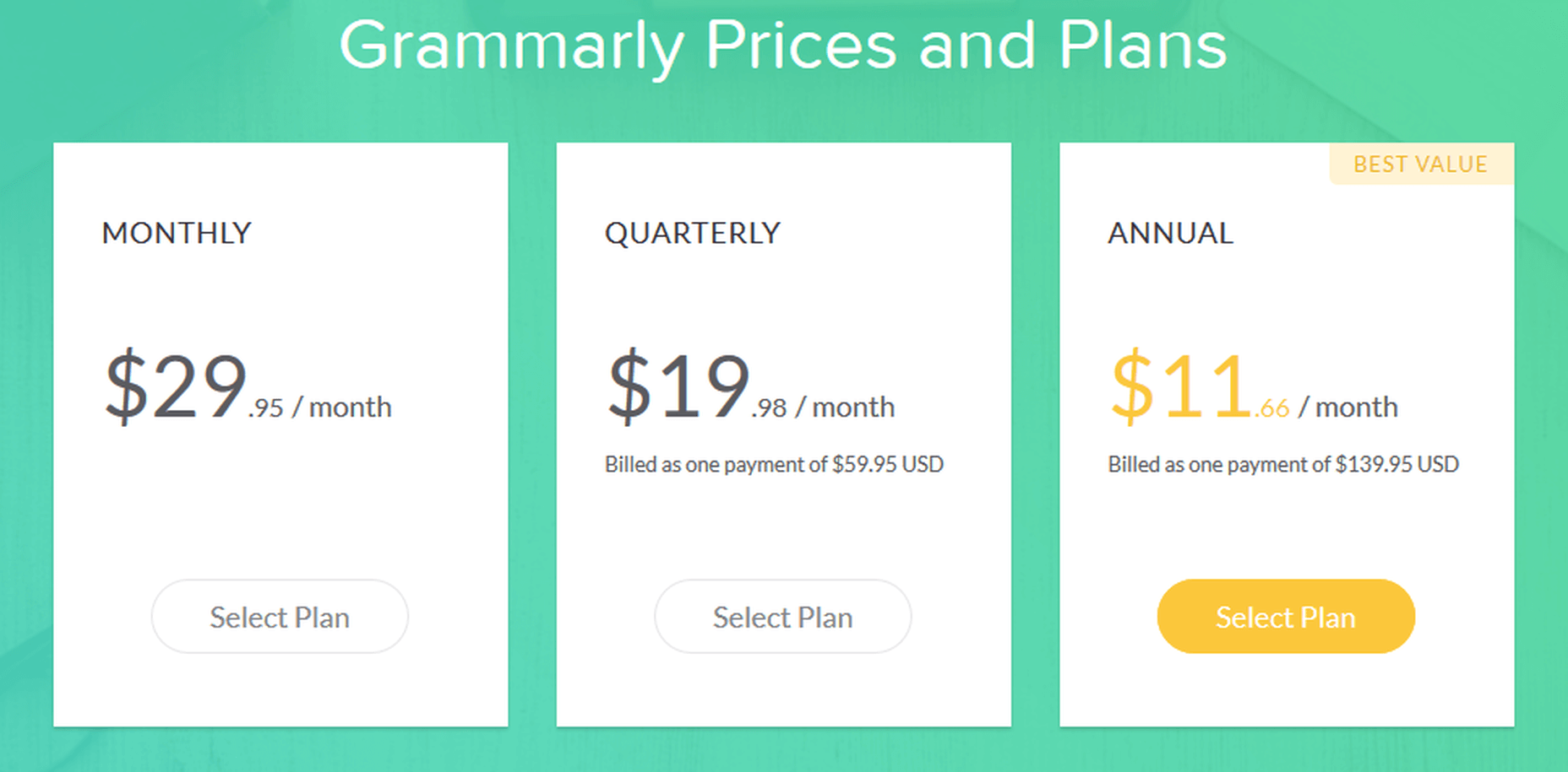
Grammarly Pricing Plans for Premium Version – Monthly, Quarterly, Annual

Free

Grammarly Free is limited but still adequate for many as it gives you critical grammar and spelling checking capabilities. It is usable in all product forms.

Premium

Grammarly Premium, along with Spelling and Grammar Checker, offers an advanced Clarity Checker, Plagiarism Checker, and experimental Tone Detector. All Grammarly features are available for the Premium version.

Business

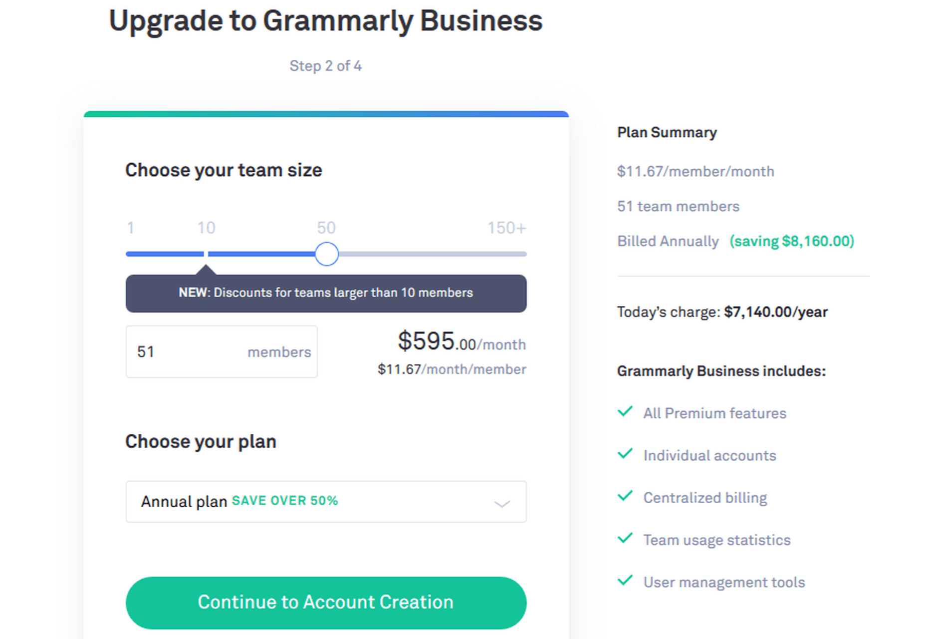
Grammarly for Business offers all the Premium features for three or more users. It also gives you an admin panel to customize your experience. You can add a personal dictionary, among other things, which will be accessible to all users. Grammarly for Business includes:

  • Individual accounts
  • Admin panel
  • Centralized billing
  • Team usage stats
  • Priority email support
  • Single sign-on

Grammarly Business Pricing Example

Grammarly @Edu

Grammarly @Edu is also an available option, of which educational institutes and organizations can avail themselves. It caters to a large number of accounts, as it targets students.

Grammarly Features

UI

Grammarly has hands-down the best interface among all the writing assistants. It is incredibly intuitive and user-friendly.

Compatibility

Grammarly integrates with millions of sites and text editors. It is also compatible with MS Word (both for Windows and Mac) and Outlook via an Add-in. It is still in Beta for Google Docs.

Grammarly is incompatible with some desktop apps, but you can use Grammarly in their web versions.

Supported Document Formats

For products where you can upload text documents, the supported document formats are: .docx, .rtf, .odt, .txt.

Languages

Grammarly is restricted to English only, including American, British, Canadian, and Australian English. Grammarly doesn’t support foreign language phrases, translation, etc., at the moment.

Grammarly Functions

Spelling Checker

Grammarly checks for spelling mistakes based on context. It is excellent at differentiating between commonly misspelled words. It can also tell Common and Proper Nouns apart (in most cases).

Grammar Checker

All Grammarly products on all plans help you check for grammatical errors and syntax issues in the provided document in real-time.

Plagiarism Checker

The Plagiarism Checker is not available for the free version. When I inquired about plagiarism in hard copy, patch plagiarism, and ProQuest, here’s what Grammarly Support had to say:

“We teamed up with ProQuest to provide even more accurate plagiarism checks: currently, Grammarly’s plagiarism checker searches major proprietary databases along with over 16 billion web pages. You can check ProQuest libraries here http://www.proquest.com/libraries/academic/databases/.

Please note that Grammarly catches verbatim plagiarism and slightly modified text that can be classified as unoriginal. As comprehensive as our algorithms are, significantly rephrased text oftentimes can’t be traced back to its source.”

Note: I checked this document with both; Grammarly Plagiarism Checker is not as robust as Copyscape, but it’s catching up fast.

Tone Detector

It detects a variety of tones based on the context of the given passage.
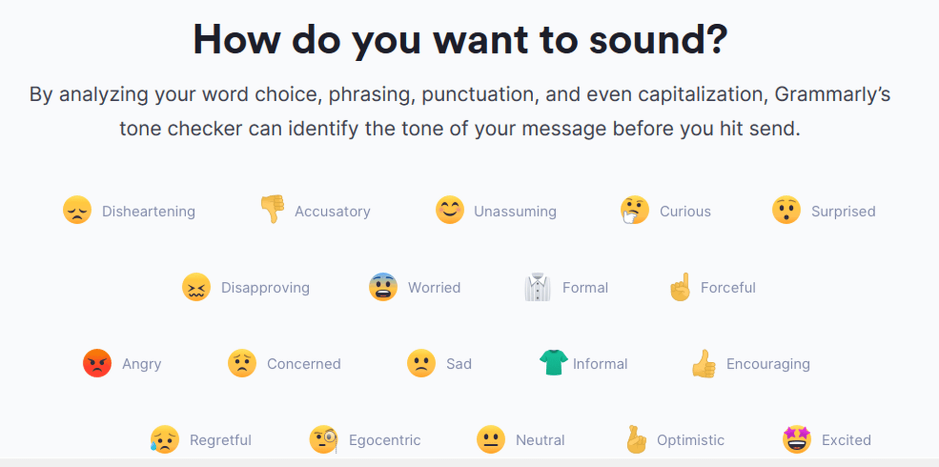
Grammarly Tone Detector

Clarity Checker

Grammarly checks for advanced issues for the Premium, Education, and Business versions. The Free version checks for limited conciseness; the rest is available on the Premium version only.

Grammarly Support

Grammarly offers support via its extensive, well-written, and user-oriented knowledge-base. Grammarly also provides support via email (24/7 for the Business version) if you can’t find a relevant answer in the knowledge-base.

Moreover, the Grammarly Blog teaches, among other useful things, the proper use of grammar in English.

Grammarly Blog

The Grammarly Blog teaches the rules of English grammar and gives tips on writing. It also specializes in teaching about the most common blunders, which are also a strong suit of the application.

Detailed Performance Statistics

You can view the ‘Statistics Summary Card’ by clicking the ‘See Performance’ button. Or you can download the detailed statistics via the Download PDF Report option. These statistics are in-depth and contain exhaustive information regarding the whole document, including your score, errors, reading time, speaking time, and more.
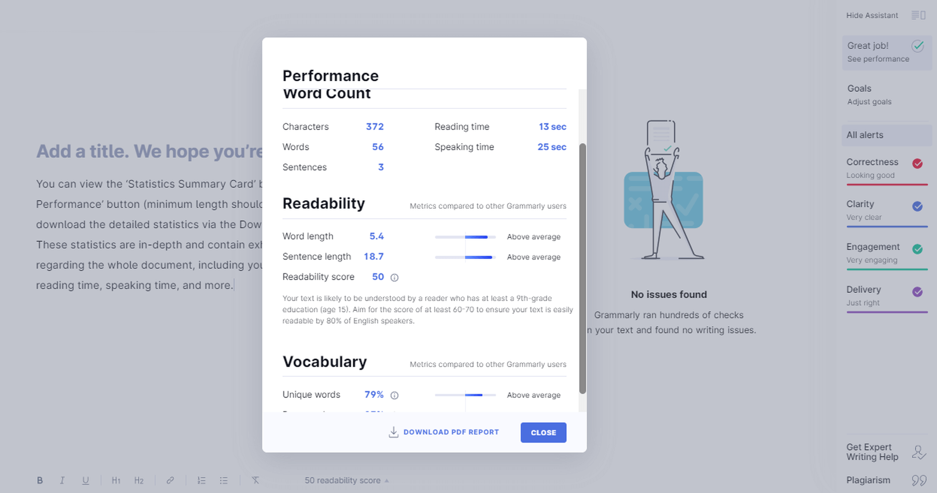
Grammarly Performance Stats

Adjust Goals

You can customize Grammarly’s feedback according to your needs. This option gives you an adjustable chart where you can set your preferences according to your needs. It helps with the document’s tone, the difficulty level depending on the target audience, and more.

Grammarly Adjust Goals

Get Expert Writing Help

Grammarly gives you the option to get your work checked by experts. It’s a particularly convenient option for those who cannot or do not want to rely on their proofreading skills better than finding and hiring someone yourself.
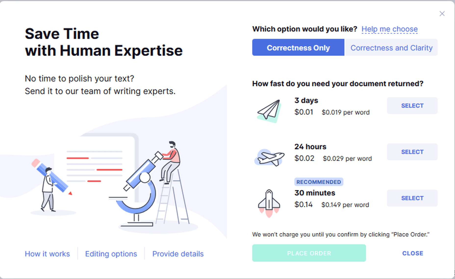
Grammarly Expert Writing Help

Is Grammarly Really Free to Use?

Grammarly has a free version with a powerful-enough spelling and grammar checker. It is available in all product forms – Online Editor, Browser Extension, Desktop Application, and Word Add-in. The Free version checks for up to 150 grammar rules.

It is superb at uncovering elementary grammar fallacies due to its context-based checking, powered by its robust AI and NLP software.

The Free version doesn’t show clarity issues. It reveals the number of clarity issues in the content, but it doesn’t tell you what and where those issues are.

Is Grammarly Premium Worth The Cost?

The Premium version shows advanced grammar issues such as clarity, conciseness, dangling modifiers, squinting modifiers, monotonous sentences, intricate text, split infinitives, and many more. It checks for over 400 rules of English grammar, far more than the Free version. Grammarly Premium also has a plagiarism checker within the interface, which is mighty-enough for online plagiarism checking.

Grammar Checks

When you run some text through any version and product form of the app, Grammarly will process the document for the following:

  1. Sensitivity
  2. Determiners
  3. Voice
  4. Conciseness
  5. Conjunctions
  6. References
  7. Nouns
  8. Fluency
  9. Word order
  10. Spelling
  11. Conventions
  12. Syntax
  13. Variety
  14. Formality
  15. Pronouns
  16. Prepositions
  17. Verbs
  18. Numerals
  19. Punctuation
  20. Modifiers
  21. Consistency
  22. Correctness
  23. Clarity
  24. Delivery
  25. Readability
  26. Engagement

However, Grammarly will not point out many of these mistakes for the Free version. It will only tell you the number of such problems in your content.
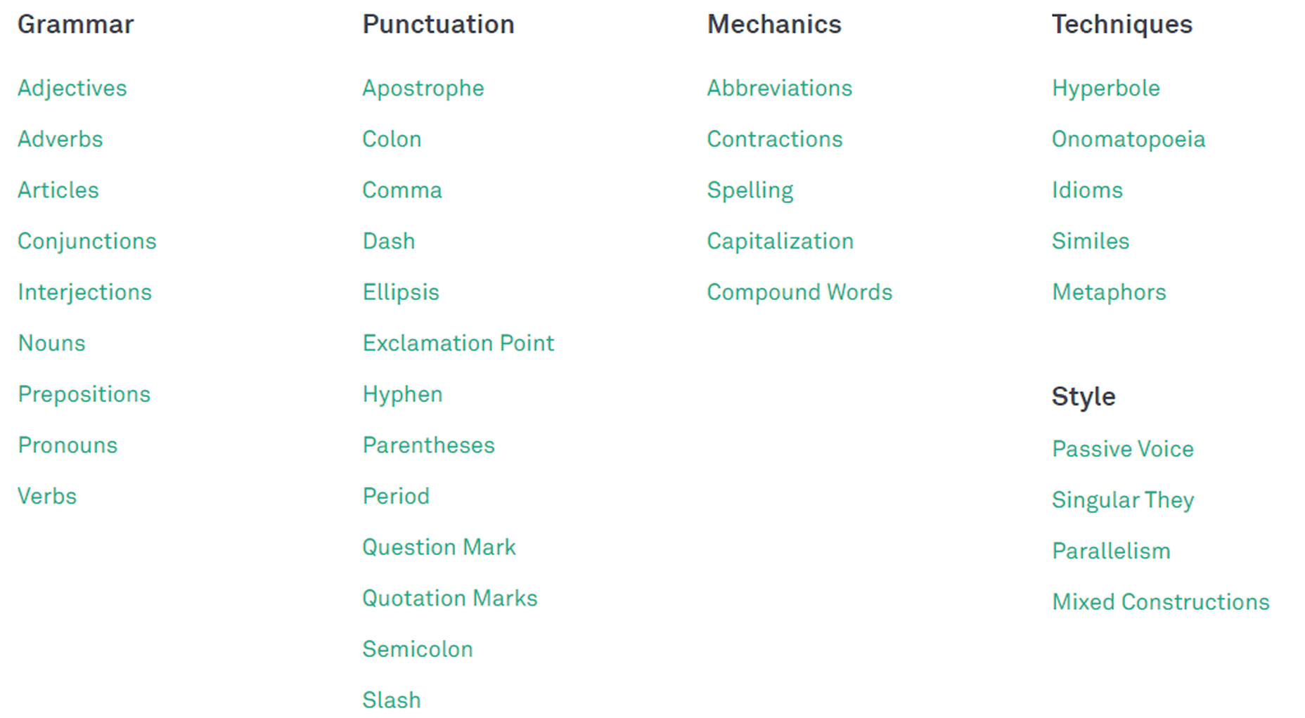
Grammarly Checklist

Grammarly Free in Action:

Let’s see some examples.

Verbs

Grammarly detecting the wrong form of a verb.

Context-Based Checking

Grammarly Context-Based Checking

Capitalized Words

Grammarly detects unknown words, and if you capitalize them, it considers them proper nouns. It can also miss the incorrect use of a term if you spell it correctly and put it within commas.
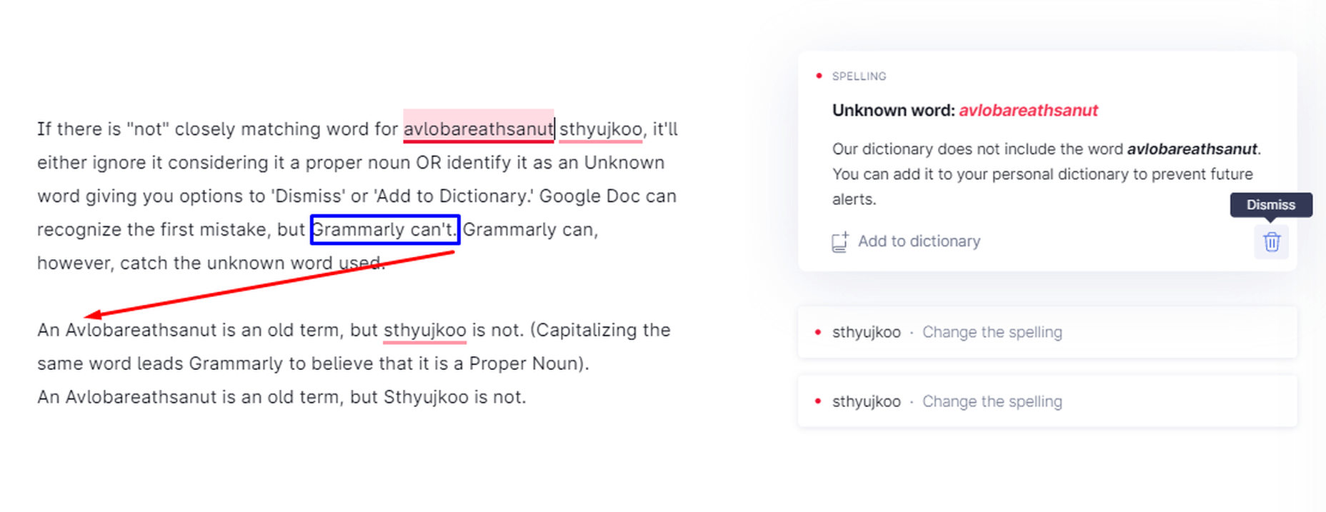
Grammarly while dealing with proper nouns, capitalization, and unknown words

Phrases vs. Sentences

Grammarly can differentiate between phrases and sentences. Therefore, you can write headings and subheadings in the form of expression.

Grammarly differentiating between sentences and phrases

Multiple Mistakes in One Sentence

Grammarly catching multiple mistakes in one sentence

Determiners

Grammarly pointing out the wrong determiner-article use

Incomplete Sentences

The Grammarly algorithm is not good enough yet at recognizing incomplete sentences. Grammarly is far from perfect, as evident from these examples. Google Docs suggested ’was because’ for the last line instead of ’is because,’ but Grammarly missed that.
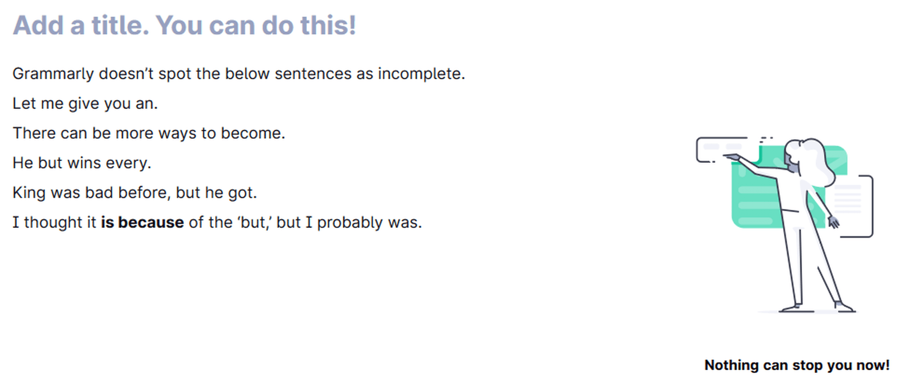
Grammarly can miss incomplete sentences.

Grammarly is only making one suggestion that the article use may be incorrect here in the below image.

Cannot detect incomplete sentences (sometimes) if other issues exist

Grammarly suggests you change the first line in the below image because it believes it’s caught a sentence fragment. You accept the suggestion, and it becomes the second line, which is, again, a sentence fragment, according to Grammarly.
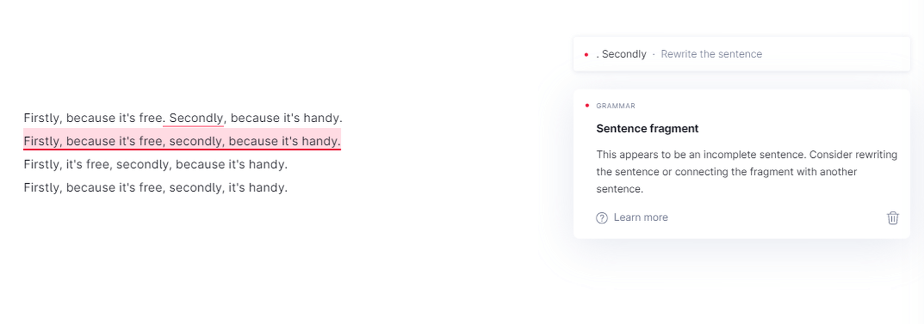
Grammarly ‘sentence fragment’ suggestions

Sometimes, the suggestions are right as well.

Grammarly recognizes sentence fragments in some cases

Punctuation

Comma

Grammarly is a sniffing-hound-on-steroids when it comes to commas — both missing and wrong ones. It pinpoints the exact location where you should place a comma in a sentence. Whether it is between clauses, a list of items, or something else, Grammarly knows if you have missed a comma or placed a wrong one. It also exposes the famous “Oxford Comma.” Grammarly now points out any inconsistent punctuation (curly vs. straight commas, for example) in your articles.

Grammarly pointing out the missing Oxford Comma

Hyphen

First, it points out the missing hyphen. Once you rectify the error, it points out the wrong capitalization. Grammarly works in steps for multiple errors in a sentence.

Grammarly catching a missing hyphen.

Semi-colon & Colon

Grammarly catches the incorrect use of the semi-colon & colon.

Period

Grammarly points out a missing period

Missing Apostrophes

Grammarly can catch missing apostrophes

Grammarly Premium in Action:

Apart from correctness that checks for critical grammar mistakes, the Premium version has options to check for clarity, delivery, and engagement, along with many more correctness checks.

Clarity

Clarity check is not available for the Free version; all other versions of the app have it. It catches linguistic issues that a fundamental grammar checker cannot reveal. These include dangling modifiers, split infinitives, misuse of passive voice, intricate text, inappropriate colloquialisms, etc.

Text Inconsistencies

Grammarly Premium can detect inconsistencies and gives you the option to select one form if a word has been used inconsistently in the same document. It can also detect inconsistent punctuation, for example, curly and straight commas.
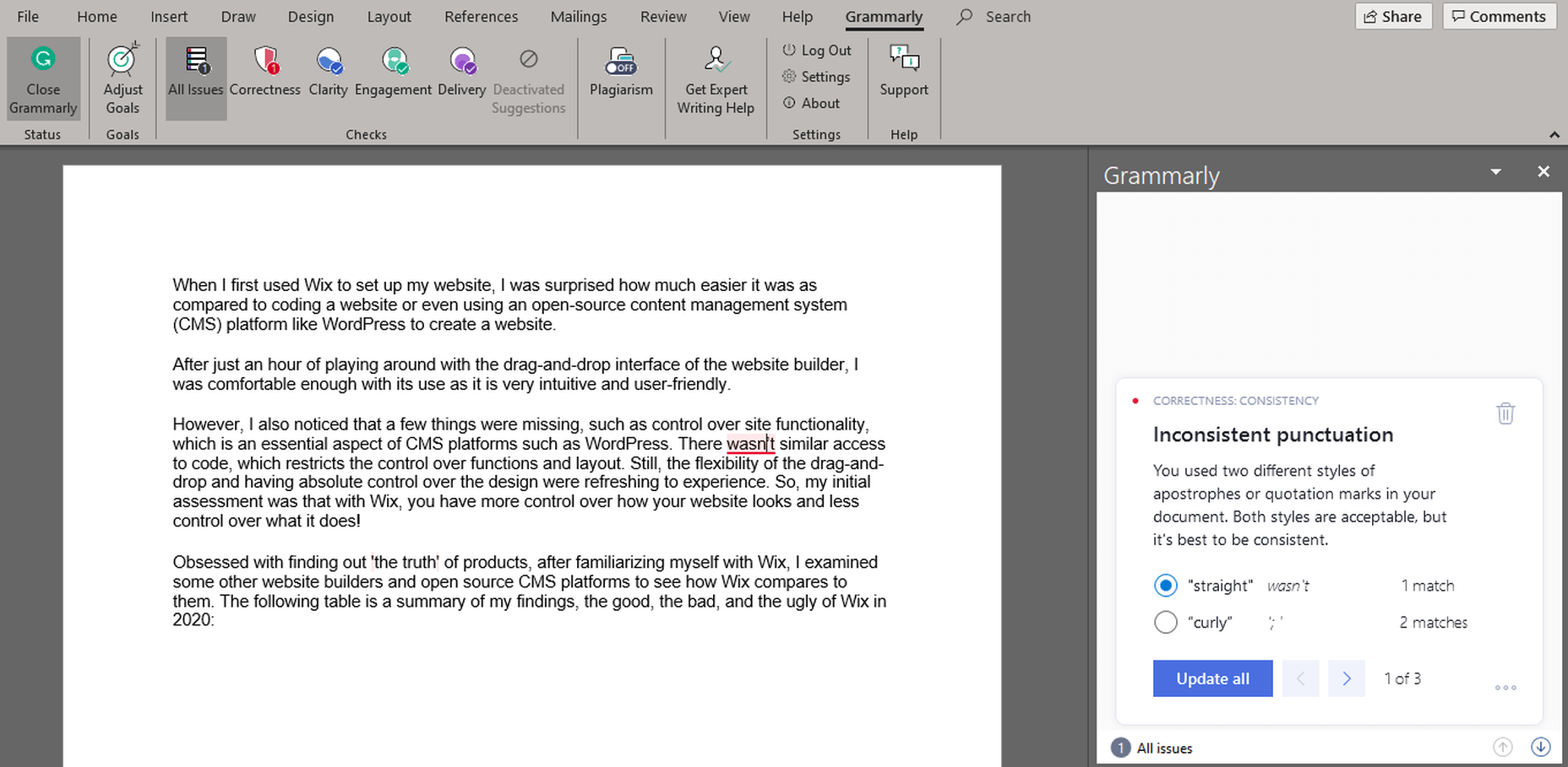
Grammarly Premium identifies text inconsistencies.

Rephrasing Suggestions

For unclear or complicated sentences where there might be an issue of a dangling modifier or something else, Grammarly suggests an alternative way to write the same sentence.
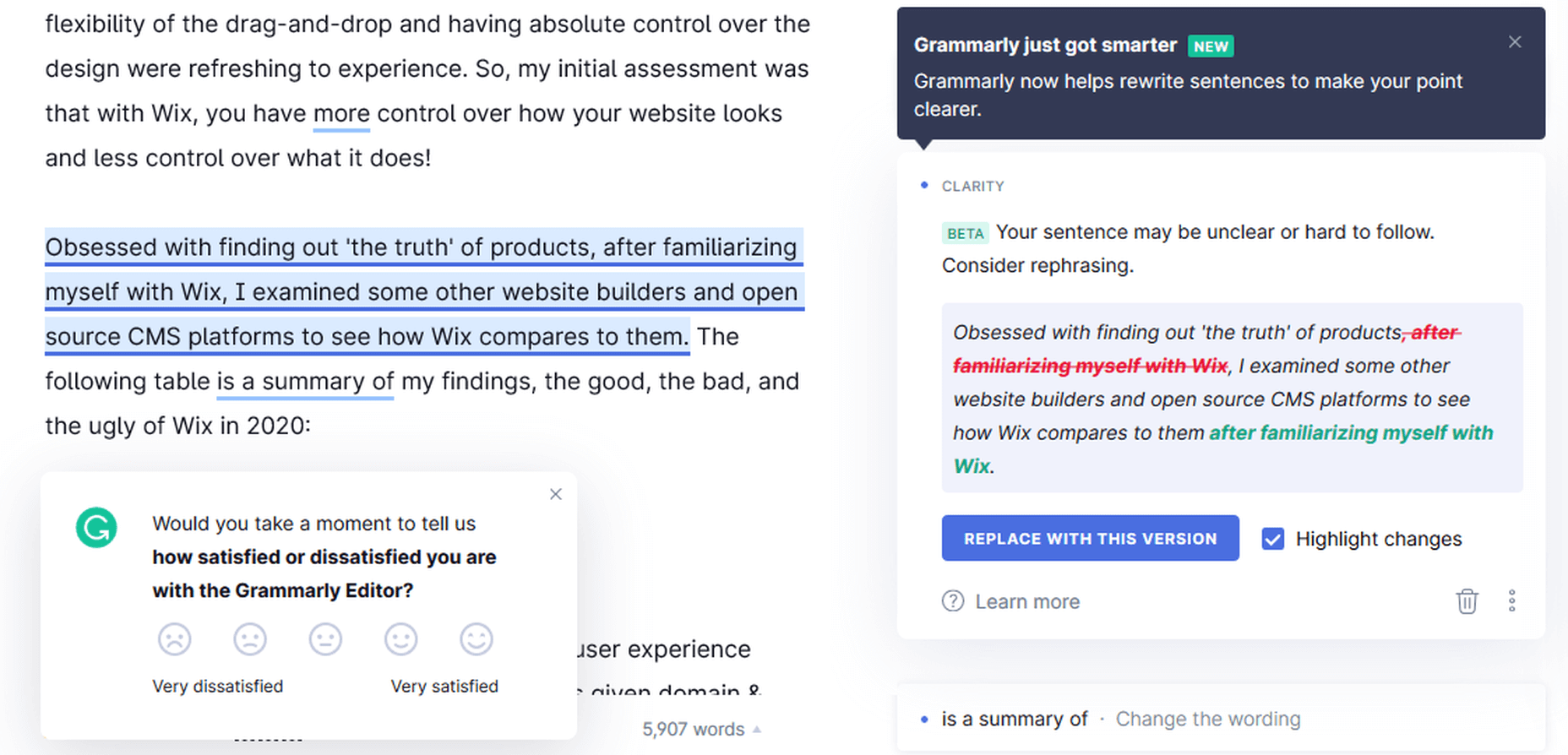
Grammarly Premium giving rephrasing suggestions

Wordy Sentences

Grammarly can also note if you have used many unnecessary words in a sentence. If there are more words and less content in a sentence, then it suggests you rephrase it. This option can help you make your content non-fluff.

Passive Voice Misuse

Grammarly is so-so at deciphering when the passive voice is right to use and when you should avoid it in a sentence. My experience is that, more often than not, it will recommend that you rewrite a sentence if it detects passive voice use anywhere.

Grammarly – always – detects passive voice use.

Intricate Text

Grammarly exposes unclear and hard-to-follow sentences in the written piece. Sometimes it gives alternatives (if one is available in its database), but usually, it only tells you to rephrase the sentence to make it more understandable.

Monotonous Sentences

If you continuously write similar sentences in a passage, Grammarly will detect these sentences’ monotonous nature and advise you to rephrase them.
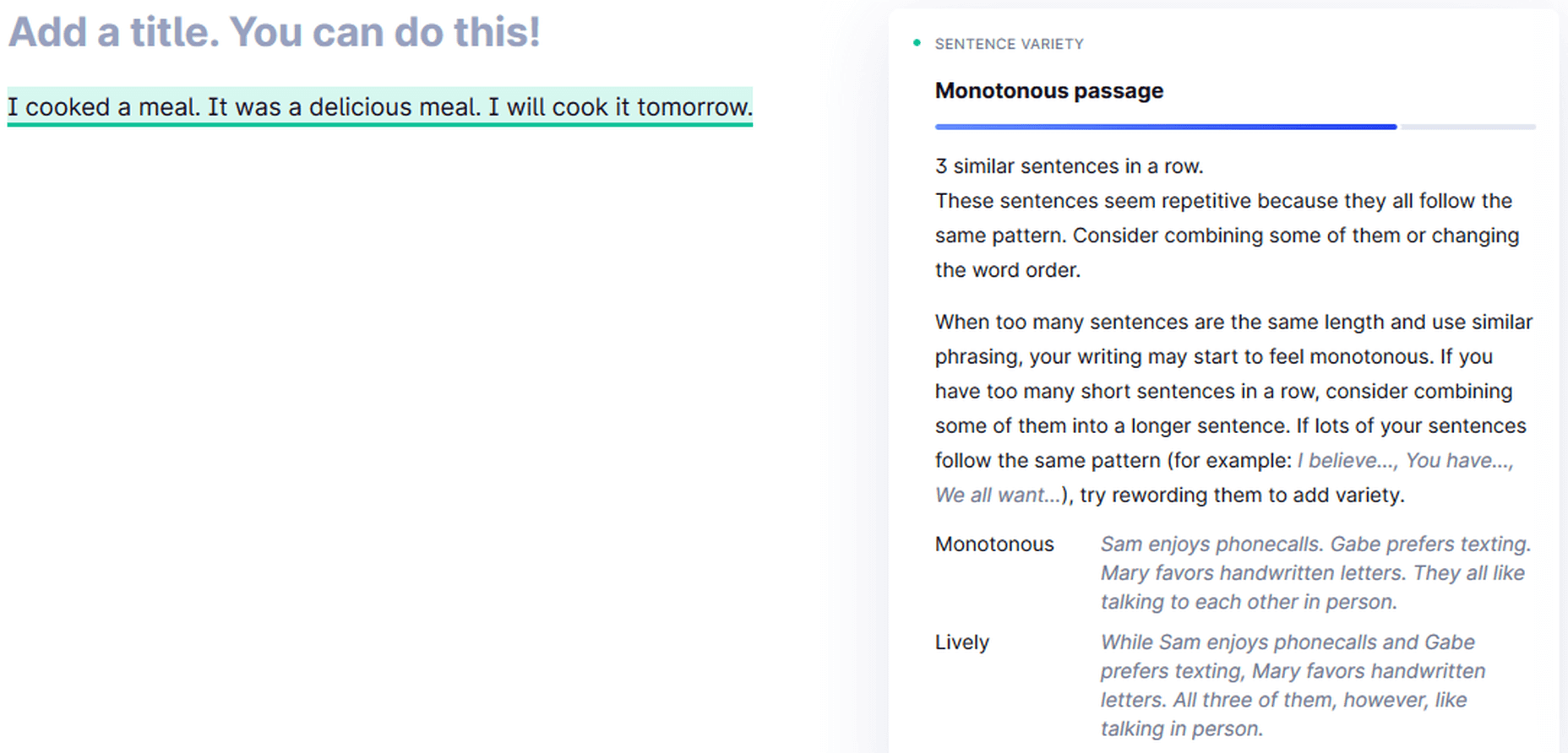
Grammarly detecting a monotonous passage

Sound Confident Suggestion

Grammarly suggesting alternatives to sound confident

Politeness Suggestion

Sound more diplomatic with Grammarly!

Delivery

Grammarly Premium catches informal sentence structure like a preposition at the end of a sentence. Some other informalities include inappropriate colloquialisms, split infinitives, etc.

Grammarly points out informality.

Engagement

Grammarly Premium points out overused words and suggests using an alternative here, but sometimes it doesn’t provide suitable options like the Thesaurus Writing Tool.

Grammarly suggesting engaging alternatives

Most of the time, the suggestions are worth considering, though.

Grammarly is suggesting more engaging alternatives

Grammarly Free vs. Grammarly Premium

The Grammarly Free version catches all critical issues as it checks for 150 Grammar Rules to determine errors in a document. The Premium version looks for over 400 Grammar Rules and detects far more problems than the Free version.

I wrote an article and checked it through both the Free and the Premium versions. Here is the difference between how the stats of both look like before making the suggested changes:
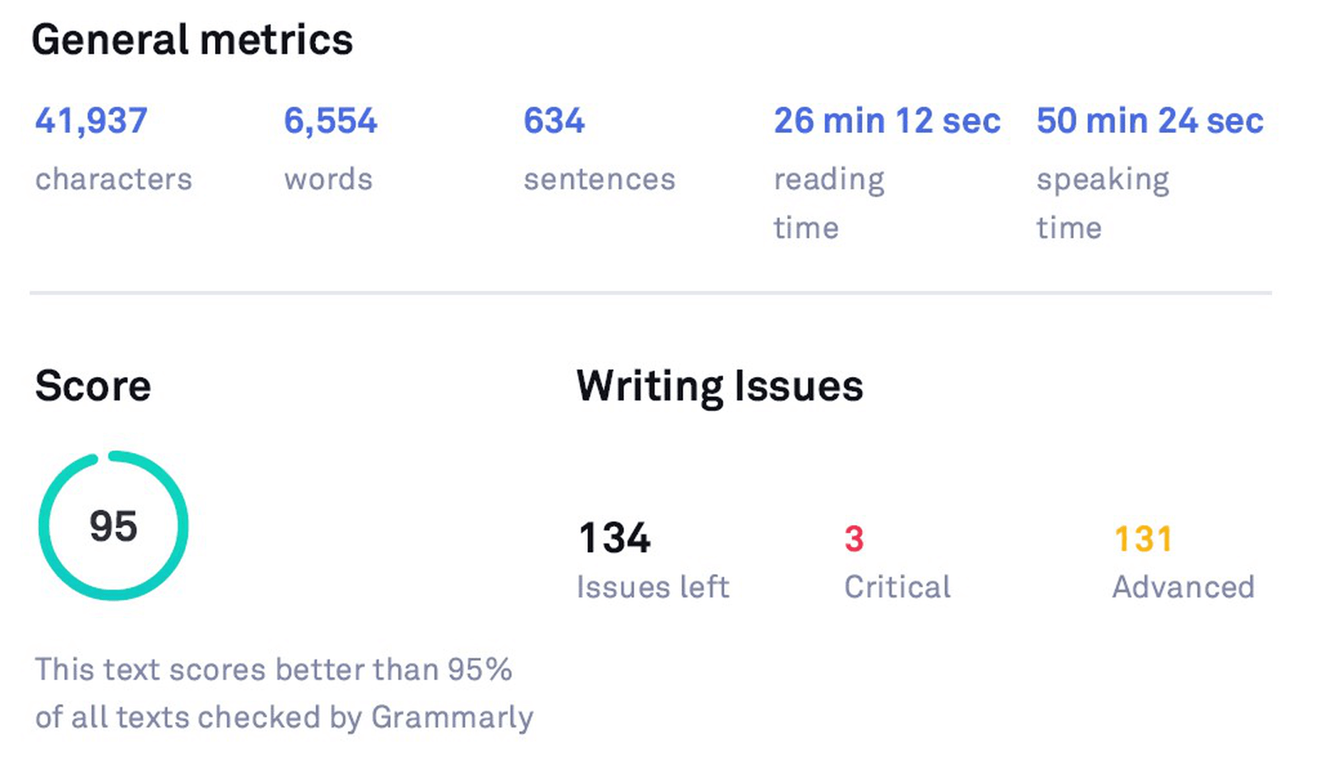
Original Stats (before checking with Grammarly Free)
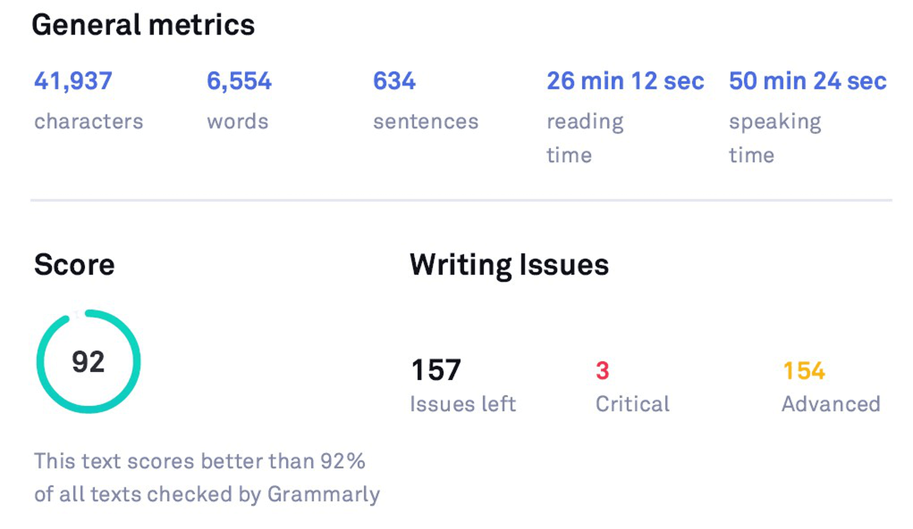
Original Stats (before checking with Grammarly Premium)

After editing another article and making the suggested changes, here’s how the Free version stats look like:
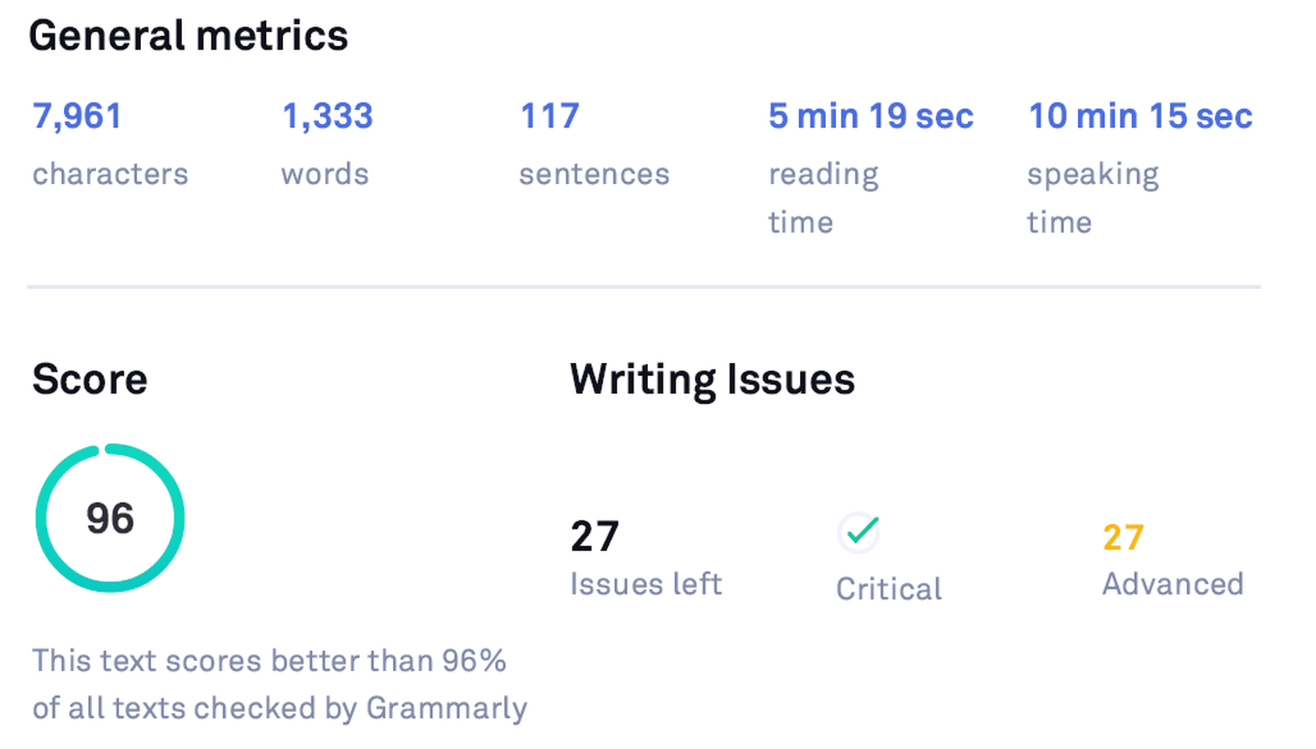
Grammarly Free Stats

After editing the same article using the Premium version, the stats look like the following:
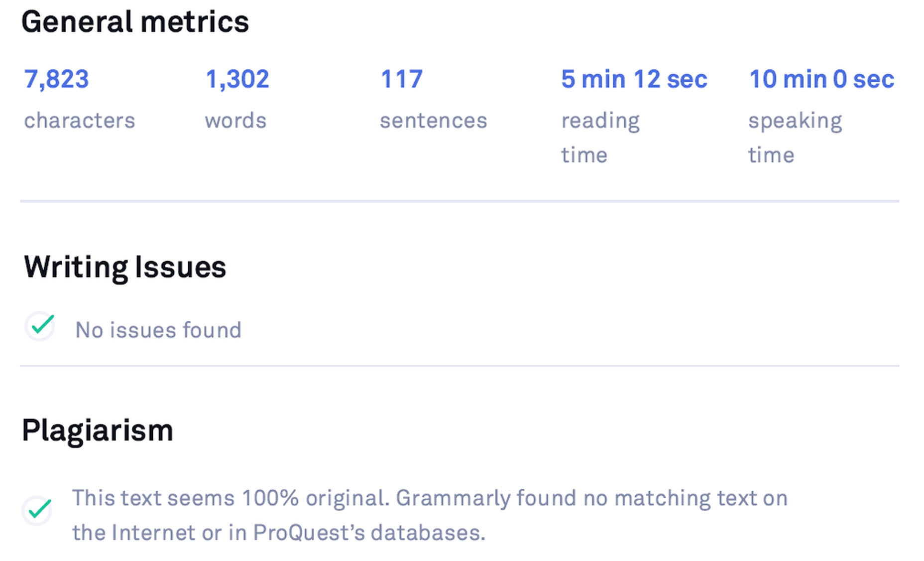
Grammarly Premium Stats

Grammarly vs. Human Proofreader

Grammarly is a marvelous tool, but it is incomparable to human proofreading. Grammarly cannot detect the sense and meaning of the written text. It catches blunders using English language and grammar rules as efficiently as a machine can. However, some mistakes can slip through Grammarly if there is no syntax error, but just a linguistic or semantic misuse.

Grammarly didn’t suggest anything for a nonsense sentence
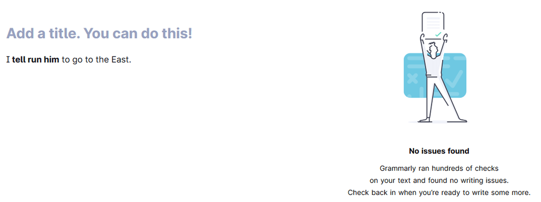
Grammarly is not an alternative to human proofreading

Pros of using Grammarly in 2021

Context-Based Grammar Checker

Grammarly is evolving with time and has gotten pretty accurate in identifying common mistakes. Its extensive database helps Grammarly recognize errors based on the context.

Real-Time Grammar and Spelling Checker

Grammarly scours the whole text for errors when you provide it a written document. Thankfully, it also checks for blunders as you write or edit your text in any product form – Chrome Extension, Online Editor, Word Add-in, Desktop App (Windows and Mac), and the Grammarly Keyboard for iOS and Android.

Accessible Interface and Robust Editing

With Grammarly, you get a highly-efficient software, which is not only a phenomenal editor but also incredibly easy to use.

Customizations – Set Goals and Personal Dictionary

You can customize your Set Goals and your Personal Dictionary with the ‘Add to Dictionary’ feature in the Error Cards. This element is convenient for proper nouns and personal vocabulary (even words from a different language).

Tone Detector

Based on your Goals, Grammarly, through its tone detector emojis, cautions you of your tone – the vocabulary and phrasing you are using. You can adjust goals keeping in mind your target audience and choose the most appropriate words to use.

Clarity Checker

Apart from basic grammatical mistakes, Grammarly helps you fix linguistic oversights. It tracks down a wide range of slip-ups, including dangling modifiers, intricate text, split infinitives, passive voice misuse, redundancies, and many other slips. In essence, the Clarity Checker elevates the level of your writing.

Plagiarism Checker

It is a bonus in all senses of the word. It might not be essential to the app, but it certainly assists users. Grammarly plagiarism checker is not the absolute best in the industry, but it does the job swiftly. It checks plagiarism across 16 billion pages on the internet and ProQuest’s database.

Error Cards

Error cards are compact, simple, and instructional. They serve their purpose elegantly. Any shortcoming that you experience in Grammarly’s usage so far is due to its still-not-so-extensive database. Error cards also fall short when it comes to giving suggestions due to this very reason. Otherwise, they are usually handy.

Free Version

You can proofread, remove typos, and analyze the content quickly via the app’s free version. You can also use it before buying the Grammarly Premium subscription.

The Grammarly Keyboard

Supported on both Android and iOS, The Grammarly Keyboard App functions like the auto-correct feature. It gives real-time suggestions about the proper use of grammar and spellings in the written text. Grammarly is now available for iPad and supports hardware keyboards as well.

Grammarly Support

Grammarly provides customer support via its extensive database and email. By now, almost all popular queries have a database entry. Furthermore, the Grammarly Blog assists with learning English grammar rules.

Knowledge-base

Grammarly has amassed a plethora of information in its database, which helps run the application smoothly. This knowledge allows the app to identify problems based on the context. You will find accurate solutions for most common issues, thanks to its extensive database growing with time.

Grammarly Blog

The Grammarly Blog focuses on teaching people English grammar rules and common mistakes in their writing. There are dedicated articles for each item; separate sections cover different punctuation like Commas, Hyphens, etc.

Writing Stats

The weekly writing stats sent via email and the downloadable detailed performance stats PDF give you comprehensive feedback on your writing. This feature helps you pinpoint your mistakes better than anything else available in the market.

Insights

Grammarly Insights are the real-time feedback that the application provides regarding your writing. It bases it on your Set Goals. You can customize this feedback according to your needs, which can be amazingly valuable if you cover different audiences. Insights also include the reading time and speaking time, which is particularly useful to Vloggers, YouTubers, etc., who can quickly determine how much time their script will take on the video.

Reliability

Grammarly is the most popular and best-in-class digital writing assistant tool, growing exponentially both in features and number of users, indicating that it will provide the best services to its customer base.

Grammarly is notably popular among professional writers, bloggers, publishers, marketers, and businesses, showing that Grammarly has a demanding clientele to please. Therefore, their standards are supposed to be (and they are) higher than the competition.

Product Investment

Having more than a million downloads per month and being a top-1000 website by traffic globally, Grammarly has raised $200M in total funding at a valuation of $1B+ so far, which speaks volumes of its success, investors’ trust in the product, and its projections.

Cons of using Grammarly in 2021

Free Version is Limited

The Free version identifies only critical grammatical errors, typos, and limited ‘conciseness.’ Moreover, it only lists the number of total advanced clarity issues in the text with an ‘Ad’ that keeps asking you to buy a Premium subscription for these issues. It also doesn’t support plagiarism checking.

Premium Version is a Tad Expensive

The biggest drawback of Grammarly is that it is a tad expensive for many. Grammarly Premium can be a costly subscription at $30 per month if you don’t have much writing to proofread.

Semantic Issues

Grammarly is good at picking fundamental grammar mistakes – even context-based grammar issues, but it still cannot understand what you have written. If you write a nonsense sentence with no grammatical fault, Grammarly will consider it a correct sentence. It can also happen with incomplete sentences.

Insufficient

Grammarly is a mighty grammar checker but lags behind when it comes to rating the whole document. Its scoring is based on mistakes and length of words and sentences only, unlike some other tools that provide a more comprehensive text scoring. Grammarly is also not an alternative to human proofreading as it can’t understand the meaning of the written content.

Limited Vocabulary

Grammarly has a limited vocabulary in its database so far, which leads to inaccurate synonym suggestions at times. The Thesaurus Writing Tool, another free digital writing assistant, has an extensive vocabulary due to its vast Thesaurus.com database and offers far more vocabulary suggestions and alternatives.

Alternatives Not Provided for Every Issue

For many suggestions like Intricate Text, Split Infinitives, etc., Grammarly doesn’t provide an alternative. You have to rephrase the sentence yourself. Grammarly only points out bloopers sometimes, which can be a little frustrating for amateur writers.

Not Supported Everywhere

Grammarly is not supported everywhere yet. The most prominent places are Google Docs (in Beta at the moment – which doesn’t include Grammarly Premium corrections and the Pop-up Grammarly Editor) and desktop applications. However, it works on the web versions of these desktop applications via its browser extension.

Insufficient Formatting Options in the Editor

Grammarly Editor is imperfect for writing purposes. It is incomparable to authoritative text editors like Microsoft Word and Google Docs. So you have to write your text in another editor and import it in Grammarly for proofreading if you want proper formatting of your document.

Irritating and Aggressive Advertising

Grammarly wants you to upgrade all the time. When using the Free version, you’ll get constant notifications to upgrade to Premium to check for issues that are not available in the Free version.

Only One Language Supported

Grammarly doesn’t offer support for languages other than English. There is also no option available for translation like Ginger.

Only One Account for Premium

The Grammarly Premium account gives you only one license for use on up to five devices. It is an obstacle for people with multiple accounts for different purposes. Grammarly Premium is already expensive, so buying two licenses is not feasible for the majority.

Top 5 Free Grammarly Alternatives 2021

Grammarly stands out as the most prominent and well-received tool when you compare all popular digital writing assistants. It has been endorsed and appreciated by countless publishers and writers. Grammarly has become a top product in the digital writing industry with its robust marketing and significant NLP and AI improvements.

Grammarly Inc. has secured enough funding as of late 2019 to improve its natural language learning database to enhance its AI-based application further. Keeping all this in mind, it is evident that Grammarly is dominating the market. Still, there are a few products that come close for one reason or the other. Here are the top 5 Grammarly alternatives in 2021:

ProWritingAid

Pros: Long-Form Writing (Books, etc.), Writing Insights, Separate Checking of Issues, MS Word Add-in, Efficient Browser Extension

Cons: Short-Form Writing, Fewer Errors Detected, Not for Amateurs, No Free Version

ProWritingAid is considered a worthy alternative to Grammarly (notably for long-form writing – books, etc.), but it falls far behind Grammarly for short-form writing.

ProWritingAid is accurate, feature-rich, and integrates well with apps and websites, but the interface is not as user-friendly as Grammarly’s. It also reveals fewer issues as Grammarly has advanced context-based grammar checking capabilities.

ProWritingAid offers better pricing and value for money (Premium is $60 per year, $70 with Plagiarism Checker), and it also has a Lifetime Plan. However, it doesn’t have a free plan like Grammarly. The Online Editor has no word limit, unlike Grammarly’s 60-pages or 100,000 character limit.

ProWritingAid provides many options/tabs to check for each issue separately, handy for longer articles or books. However, it is not as user-friendly for short writing pieces.

It also presents a better analysis of the whole document and provides a lot of information regarding your writing, which you can use to improve your writing style.

ProWritingAid has an easy-to-scroll-through panel at the right-side that contains corrections and suggestions, which you can use to see all issues without scrolling the entire document.

ProWritingAid has the following tabs to check for each issue separately:

  • Grammar
  • Spelling
  • Overused
  • Readability
  • Cliche
  • Sticky
  • Diction
  • All Repeats
  • Echoes
  • Thesaurus
  • Dialogue
  • Consistency
  • Pacing
  • Pronouns
  • Alliterations
  • Homonyms
  • Transition
  • Acronym

Ginger

Pros: Keeps Formatting, 60 Languages & Translation, Built-in Dictionary, Browser Extension, Free Version

Cons: Fewer Issues Detected, Fewer Insights, Interface is just OK, no MS Word plugin

Ginger is also a notable competitor of Grammarly. It has a free version, and it integrates well with different websites. However, it doesn’t have an MS Word plugin. It is also not as accessible due to its clunky interface.

Ginger is not as powerful as Grammarly, but it is still a decent alternative. Ginger’s annual subscription is $89.88 (cheaper than Grammarly’s).

Ginger keeps the original formatting of the text document, which is pleasant. It also has a Translator within the app that supports 60 languages. Also, there’s a built-in dictionary, which you can use to find alternatives to overused words.

WhiteSmoke

Pros: Cheap, Integrates with Platforms, Gimmicks – i.e., Templates, etc.

Cons: Interface is awful, Fewer Mistakes Caught

WhiteSmoke is cheap to use, but it has a horrible interface. It integrates with many platforms, but it is incomparable to an advanced tool like Grammarly. It has some useful gimmicks like templates for specific writing purposes, i.e., Sorry, Thank You, Condolences, etc.

The annual subscription of WhiteSmoke costs $79.99. However, it is not advanced enough to be considered better value for money.

Thesaurus Writing Tool

Pros: Free, Vocabulary suggestions on hovering the cursor over a word, Blog

Cons: Editor is dreadful to use, Ruins Formatting

Thesaurus Writing Tool is a free-to-use online text editor powered by Thesaurus.com. You can copy/paste or write directly in the Editor. It doesn’t retain the original formatting, which makes it a bit uncomfortable to use. Just click on the ‘Check for Grammar’ button, and it will work its magic. It also has a dedicated blog that teaches you how to write better.

The Thesaurus Writing Tool is unimpressive when checking grammatical errors, but it is highly potent in vocabulary suggestions. Its interface is simple but insufficient. Hover over any word, and it will show you a vocabulary card with a lot of synonyms. Clicking on any suggestion will replace the original term with the selected item. The replaced word gets a yellow underline. An undo option is available if you are not happy with your word selection.

Hemingway App

Pros: Free, Information about Text, Text Readability Score

Cons: Ruins Formatting, Fewer Mistakes Caught

Hemingway App is yet another incredible tool that is quite capable and straight-forward. It is convenient for analyzing your document as it scores the content based on its readability. It has a free web app and a paid desktop app. You can copy/paste into the online Editor or write directly, but it messes up the formatting.

Hemingway App identifies the use of passive voice, adverbs, and difficulty of reading. It recognizes long sentences – even the easy-to-read ones – as complex, which affects the document’s grade.

Final Verdict: Grammarly Review 2021

Using advanced NLP and AI, Grammarly free is hands-down the best and must-have writing, editing, and proofreading tool for everyone that checks for spelling and critical grammar mistakes. Easy to use, compatible with most popular products, and trusted by millions of users, Grammarly instantly elevates your writing everywhere; statuses, comments, emails, documents, tweets, you name it! Trying out the free version before upgrading to a premium plan also makes sense.

Grammarly Premium is a more robust and advanced tool with numerous amazing features like an advanced clarity checker, tone detector, and plagiarism checker. The Premium version is unparalleled when complemented with knowledge of the English language and some other tools. However, it is insufficient as a standalone tool because it can make slips (especially semantic ones).

I highly recommend Grammarly Premium to professionals (freelancers, writers, bloggers, authors, publishers, and editors) who require intensive use of the app. Similarly, Grammarly for Business is a good investment if your team does intensive writing. Non-intensive users should stick to the Free version as it suffices.

Aa one user said, “Grammarly Premium helps you sound like a pro, or at least helps you avoid looking like a fool!”

FAQs About Grammarly

Is Grammarly a good app?

Yes, Grammarly stands out among its competitors as it has advanced context-based grammar checking capabilities, thanks to its up-to-date natural language processing and artificial intelligence.

Is Grammarly Premium worth it?

Yes, for the most part. However, it is a tad expensive for many. It is suitable for professionals and businesses that have lots of writing needs. It identifies several advanced grammar issues that the Free version only counts. However, it is not a substitute for human proofreading as it can make linguistic mistakes that a human can easily find.

Is Grammarly supported in Google Docs?

It is in Beta at the moment. So, it should be available shortly. At the moment, it is imperfect as it only specifies the number of errors. You have to scroll the document to find those mistakes (underlined red) on your own. It has already started working in the comments, though.

Is Grammarly supported in Quora?

Yes, Grammarly works with Quora.

Is Grammarly supported in Medium?

Yes, Grammarly is available for Medium.

Can Grammarly replace a professional editor?

No, it can’t. Grammarly can make simple semantic mistakes because it doesn’t know the meaning of the written text, so it cannot replace a professional editor. It is only suitable for catching syntactic issues.

Is Grammarly supported in Microsoft Word?

Yes, a plugin is available. It is an efficient plugin as it gives similar options in Microsoft Word as it does in its online editor and desktop application. Grammarly is now available for both Windows and macOS versions of MS Word.

Is Grammarly available for Mac?

Yes, Grammarly’s desktop app is available for macOS. Grammarly is available for both Windows and macOS. Grammarly for MS Word is also available for Mac now.

Is Grammarly supported in WordPress?

Yes, it is supported. You can use Grammarly in WordPress via its browser extension.

Is Grammarly supported in Gmail?

Yes, it is. You can edit your email using the Grammarly browser extension within Gmail. However, it is not the best solution for lengthy content. For extended text, the Online Editor, the Desktop App, and the MS Word Add-in are better options.

Does Grammarly work offline?

No, it doesn’t. Grammarly uses its database to run the app, so an internet connection is necessary.

Does Grammarly help you improve your writing?

Yes. If you read the weekly stats, detailed performance stats PDF, and Grammarly Blog for grammar rules and writing tips and try to implement them in your writing, Grammarly can significantly improve your writing capabilities.

Is Grammarly Safe and Secure?

Yes, Grammarly is quite safe, as Google verifies it. Moreover, Grammarly is as secure as any other site that uses SSL/TLS encryption. It is also reliable for plagiarism checking as it doesn’t violate your privacy.

What is the Grammarly cancellation refund policy?

You can get your money back if you are not satisfied with the Premium subscription by contacting Grammarly support within ten days.

Is Grammarly a reliable checker?

Yes, Grammarly outperforms its competitors. Yet, it cannot surpass a professional human editor.

Is Grammarly available for Android/iOS?

Yes, it is. You can use the Grammarly Keyboard to edit your text for grammar and spelling errors by installing the Grammarly Keyboard app from the Play Store or the App Store. It works like the auto-correct feature. Grammarly is now available on iPad as well.

Check out Grammarly for yourself.


This article contains affiliate links to products and services. We may receive a commission for purchases made through these links.

Source

The post The Most Comprehensive Grammarly Review Ever first appeared on Webdesigner Depot.


Source de l’article sur Webdesignerdepot

Looking for something new to get you excited about design work? This list is packed with all kinds of goodies to help you feel inspired and ready to work.

Here’s what new for designers this month.

Top Picks for March

Same Energy

Same Energy, in beta, is a visual search engine. You can search with a minimum number of words or an image. The website is designed to help you find art, photography, decoration ideas, and practically anything. It uses deep learning and algorithms to create images on the home page, and you can create feeds in the same manner. The coolest part of this tool is that it tries to match the visual and artistic style you ask for with image mood and objects.

SVG Repo

SVG Repo is a collection of more than 300,000 SVG vectors and icons that you can download and use in projects for free (even commercial use). The site has a powerful search tool to help you find the right image, and the platform is designed so that you can contribute.

Penpot

Penpot is an open-source design and prototyping platform for cross-domain teams. It is a web-based tool that isn’t dependent on any operating system and works with open web standards. It’s designed to be zippy and interactive so your team can work fast.

Directual

Directual is a no-code platform for building scalable apps using a visual interface. (Perfect for designers with less development experience.) It includes integrations with other popular tools and is free to use while figuring out how the app works and how you can make it fit your business goals.

HTML Boilerplates

HTML Boilerplates helps you start web projects by generating a custom HTML boilerplate that you can download. Just choose the elements you want to include and then copy and paste the code into your editor.

6 Productivity Boosters

Rows

Rows is a spreadsheet tool with built-in web integrations that’s made for team collaboration. It works with other tools you already use, such as Google Analytics, Twitter, LinkedIn, Mailchimp, and so many others. Without scripts, you can use it to automate workflows, analyze data, share dashboards, and build forms and tools that make work simpler.

Form.Taxi

Form.taxi is a premium web-based form tool. You can create web forms without code or programming and connect them to your website. The tool then stores information, filters for spam, and notifies you of form submissions.

Verbz

Verbz is a voice productivity app that allows you to create notes, assign tasks, make announcements, run standups, or chat. Talk or type, listen or read. It works as your own voice assistant for teams. It’s available in Beta from the App Store, and there’s a waitlist for Android users.

Flameshot

Flameshot is a tool for grabbing screenshots. It has a customizable appearance, is easy to use, and lets you draw and edit screenshots as you work.

Kitemaker

Kitemaker is a collaboration tool for development processes. It can help you keep track of everything from tools such as Slack, Discord, Figma, and Github in one place. It helps you structure projects and keep discussions about work moving forward in one place.

This Code Works

This Code Works is a place to save code snippets that work for when you need them again. You can group and organize snippets and share with others. You might think of it as the “Pinterest of code.”

3 Icons and User Interface Elements

Sensa Emoji

Sensa Emoji is a collection of common emoji icons that you can use in your materials. Every element is fully vector and free to use.

Google Fonts Icons

Google Fonts now supports icons, starting with Material Icons. Choose between outlined, filled, rounded, sharp, or two-tone options in the open-source library.

Toolbox Neumorphism Generator

Toolbox Neumorphism Generator is a design tool that helps developers to generate CSS in the soft UI /neomorphism style for the elements with real-time output.

3 Tutorials and Demos

An Interactive Guide to CSS Transitions

An Interactive Guide to CSS Transitions explains everything you need to know about this great animation tool for website designers. This tutorial digs in with code and examples to help you create more polished animations and is designed for anyone from beginners to experienced designers with some pro tips throughout.

About Us Pop-Out Effect

The About Us Pop-Out Effect adds a special element to any team or contact page with a nifty pop animation. Each person seems to lift out of the circle frame in this pen by Mikael Ainalem.

Interactive Particles Text Create with Three.js

Interactive Particles Text Create with Three.js is a web element you could play with all day. Text shifts into particles and follows mouse movement in a fluid motion in the pen by Ricardo Sanprieto.

10 Fresh Fonts and Text Tools

Bitmap Fonts

Bitmap Fonts is a collection of various bitmap typefaces all pulled and stored in a single location. This is the perfect solution if you are looking for a bitmap option.

Uniwidth Typefaces

Uniwidth Typefaces for Interface Design is another collection of fonts for a specific purpose – here universal widths for interface design. Uniwidth fonts are proportionally-spaced typefaces where every character occupies the same space across different cuts or weights. This is both a tutorial on the type style as well as font collection.

Bubble Lemon

Bubble Lemon is a typeface for projects with a childlike feel. With an outline and regular style, the thick bubble letters look like some of the sketches you may have done in grade school.

Core Font

Core Font is an open-source project with a funky and modern style. It has a full upper- and lower-case character set, numerals, and a few punctuation marks.

GHEA Aram

GHEA Aram is a superfamily with a Central European flair, according to the type designer. The premium typeface includes everything from light to black italic and even some Armenian ligatures.

Make Wonderful Moments Duo

Make Wonderful Moments Duo is a script and sans serif font pair with a lighthearted feel and highly readable character set. The regular (sans serif) only has uppercase characters.

Ribheud

Ribheud is a slab-style display font with a heavy look and strong presence. What makes it interesting is the left-outline/shadow on each character.

Rose Knight

Rose Knight has an old-style feel that can take on multiple moods, depending on supporting design elements. All of the characters are uppercase with alternates. It could make a fun branding option.

The Glester

The Glester is a beautiful premium typeface in a calligraphic style. The most interesting element of this typeface is all of the extra decorations that allow you to change individual characters (380 glyph alternates).

Velatus

Velatus is a vintage-style typeface with plenty of swashes and flourishes that make it unique. It comes with 157 characters and 96 glyphs.

Source

The post 27 Exciting New Tools For Designers, March 2021 first appeared on Webdesigner Depot.


Source de l’article sur Webdesignerdepot

We’re going to try something a little different this month; with this roundup of tools and resources for designers, we’re going to pick a few of our favorites and group everything else in a manner that makes it even easier to find elements that will work for you, and your projects, right now.

Here’s what’s new for designers this month…

February’s Top Picks

Pika

Pika is a new Mac app that is an open-source color picker. It helps you find color swatches on-screen, saving time and design headaches. Plus, it’s packed with bonuses such as the ability to confirm accessibility compliance for colors, compact size and style, easy to access from your desktop, and format-friendly with plenty of color code options.

Iconduck

Iconduck is a searchable database of more than 100,000 icons in one place. (No more searching various marketplaces!) The goal of the project is to make open-source icons and illustrations more accessible. So, everything you find here is free! The site does all the heavy lifting for you by collecting icon sets, tagging them, and making them searchable.

Descript

Descript is a premium tool that eliminates some of the intimidation factors with audio and video editing. With a design that functions as a word document and allows you to transcribe, record the screen, publish, and edit, all with some cool AI features.

Persona

Persona is an all-in-one identity infrastructure that allows you to collect, verify, manage, and decide customer identities from a single dashboard. Everything is fully automated, and most users can be up and running in about 10 minutes. The premium tool does have a free version for small-scale verifications.

6 Productivity Boosters

Peekalink

Peekalink turns standard links into rich content that users will be delighted to share and engage in. And it’s easy to use. Just send a request to the API with a link and get a response back to use, including a rich link for your project.

LinkAce

LinkAce is an open-source and self-hosted archive to store and organize links that you want to save. You can search thanks to tags and lists, and all of the content is available thanks to automated backups and monitoring. There’s a demo you can try before installing it yourself.

Formality

Formality is a WordPress plugin that helps you make forms a little bit easier. It’s made to work with the Gutenberg-based form builder with a single block format to control the form. The plugin has a theme-agnostic design that works with any layout style and includes customizations to make it feel a little more personal.

Wondercall

Wondercall is an embeddable video call system for any website or app. You can make calls and schedule them with a widget you can embed right into your design.

Editor X

The Editor X website builder is out of beta and ready for mainstream use. The platform is designed for designers and agencies to create websites collaboratively and quicker. Features include live commenting, roles and permissions, and shared design libraries. Plus, the platform offers code-free interactions.

Shareful/h2>

Shareful is a Mac app that makes the system share menu more powerful. You can copy, save as, and open indirectly from the system share menu.

2 Icon Sets

Supercons

Supercons is a giant set of icons in React. They are all open-source, and there are plenty of choices to help you propel projects forward.

Plumpy Icons

Plumpy Icons are packed with style. The set of icons has a fun design, comes in duotone colors, and scales to any size. Plus, there are more than 4,000 icons in the collection. There are free and paid options depending on the file type and use.

3 Tutorials and Demos

Noise Planets

Noise Planets is a fun look at plotting random points in a circle to create amazing art pieces. You can generate fun shapes and textures and even animate your results with the tutorial and code snippets’ help.

CSS Polygon Shapes

CSS Polygon Shapes are generated using CSS-doodle and clip-path. You can go in and make adjustments to customize shapes further and use them in your website projects.

Mutsuacen

Mutsuacen is a little app that lets you create animated and interactive drawings. There’s a lot of potential with this tool if you have some true drawing chops, but it not; it’s just fun to play with. Create a doodle or sketch and export.

5 Fresh Fonts and Text Tools

Text Warping – Animated

Text Warping – Animated is a fun effect pen from Lokesh Dhakar. It feels funky while leaving text pretty readable. Play with it for sure.

Gazpacho

Gazpacho is a fun and flexible premium font family with 14 styles from thin to heavy italic. It’s a highly readable serif with a wider stance and great curves.

Stay Home

Stay Home is a simple, line-style all caps font. It has a limited character set but could have some fun applications.

Dogmeal Figure

Dogmeal Figure is an almost silly novelty typeface with dog faces and paw prints in the character set. It might make a fun option for a kids’ project.

Haster

Haster is a futuristic-style slab with a limited character set. It does have shapes and lines with a lot of impact for display use.

Covid Pandemic Lockdown

Covid Pandemic Lockdown is an interesting novelty font with thick lines and a brush-dot style. While it probably won’t read well small, it could be fun as a display option.

Valeria

Valeria is a simple typeface that’s a little wide but has a nice shape and structure. It includes upper- and lowercase letters.

Cornellia

Cornellia is a beautiful script that has amazing letter combinations for use with long swashes and tails. It can add extra elegance to almost any design project instantly.

Source

The post 23 Exciting New Tools for Designers, February 2021 first appeared on Webdesigner Depot.


Source de l’article sur Webdesignerdepot