Articles

Mulesoft DataWeave is a simple powerful tool to transform data inside a flow. Numerous core operators and functions are already present to perform various operations such as capitalize, camelize, upper, and lower.

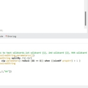
For string operations, there are no core functions present to resolve a wildcard. I hope the DataWeave(DWL 1.0) function below helps you to perform a requirement where you want to resolve a wildcard using a set of parameters.

Source de l’article sur DZONE

Type foundries have been putting out some really interesting fonts these last few months. Based on the collection of the best new fonts for February 2022, it looks like we’re going to see lots of throwbacks to the ‘70s in the coming year.

Do we have Burger King’s most recent and successful rebranding campaign to thank for that? I don’t know, but it looks like many font designers are going to try and emulate those fun retro vibes going forward.

1. Crafty Signs

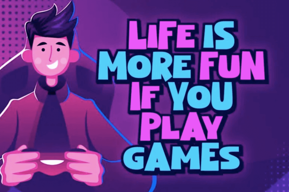
Crafty Signs is a display font that draws inspiration from old game shows — think Family Feud or anything on Nickelodeon in the ‘90s. This playful bubble font would work well for brands targeting children or ones that have a big personality and old school vibe.

2. Epicene Collection

Epicene is a Baroque font with beautifully exaggerated calligraphic details (like swirls and strokes). There are two families within Epicene — one for Display and one for Text — so you can use this single font collection to style your entire site.

3. Kingsad

It’s hard to call Kingsad a sans serif font when it has such a distinctly unique design to it. The font’s creator suggests using Kingsad for branding. I’d add that the curious structure of the characters would make this font perfect for branding in the science and tech spaces.

4. Lucius

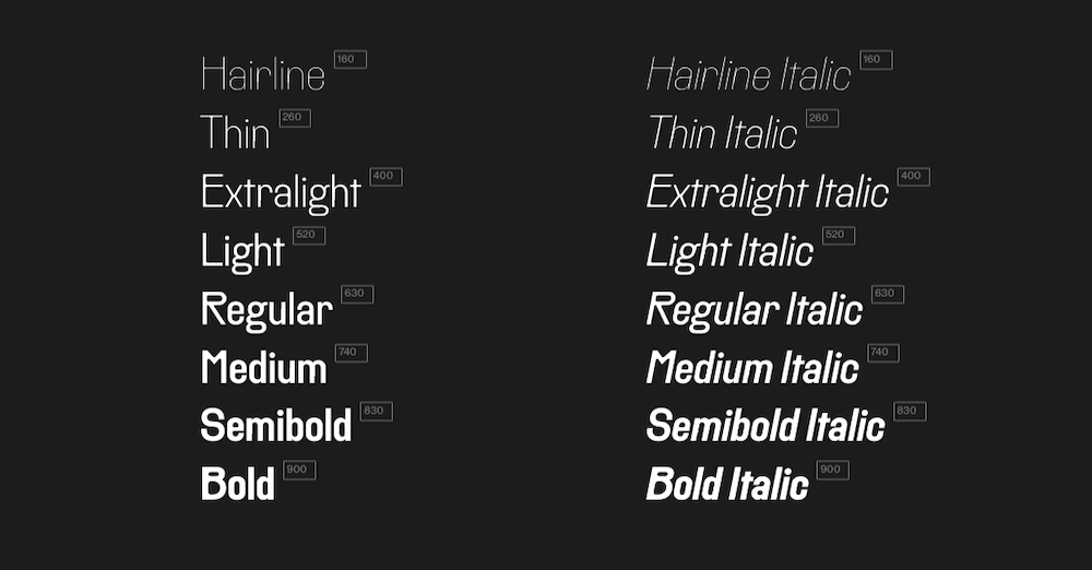
Lucius is a lively-looking font, combining serif and sans serif characteristics. There are eight weights in this font family, which can be used both for display and text purposes.

5. Manju

Manju is a retro font that the designer describes as “soft and chewy”. You don’t see it as much in the thinner styles, but the bolder, thicker styles definitely feel like the kinds of fonts you’d see on food packaging and candy wrappers in the ‘70s and ‘80s.

6. Midnight Sans

Midnight Sans is a font that comes in a single weight (Black) and also has two variants: Midnight Sans RD and Midnight Sans ST. It was originally designed for When Midnight Comes Around, a book about the emerging punk music scene in NYC in the ‘70s, so it has a somewhat grungy, nostalgic feel to it.

7. Nagel

Nagel is technically still in beta, so this may not end up being the finished font when it’s done. For instance, they still have the italic and variable styles to develop. That said, it’s a neat-looking sans serif font — easy to read, but has a bit of an edge to it as well.

8. Painless

What you see is what you get with Painless. It has just one style — a textured, bold sans serif. Because of its casual, hand-brushed feel, it won’t fit well with just any brand. Where it would look cool is on websites for brands that sell hardware, furniture, and other DIY products.

9. Recipient

Recipient is a monospaced font inspired by the typefaces that appeared on old typewriters. With five weights and a set of matching italics, this font can be used for standard paragraph text as well as for smaller headlines.

10. Sea Angel

Sea Angel is a beautiful serif font with elegant curves. This easy-on-the-eyes font would look great on websites for high-end retailers, luxury magazines, museums, fashion brands, beauty companies, and more.

11. Smack Boom

Comic books and graphic novels will never go out of style. Especially as their stories branch out into other channels, like TV and movies. Smack Boom will enable you to bring that exciting and heroic look to your logos and web designs.

12. Stoner Sport

Stoner Sport is an outline display font that brings a modern touch to a retro sporty style. This font would work especially well for sporting industries as well as businesses that are associated with them—retailers, sports complexes, automakers, publications, and so on.

13. Stormland

Stormland is a good example of what makes Scandinavian design so striking. The lettering is clean and simple, built using uniformly sized lines. However, the characters are wide, which gives them a sturdy and strong feeling as well.

14. Tellumo

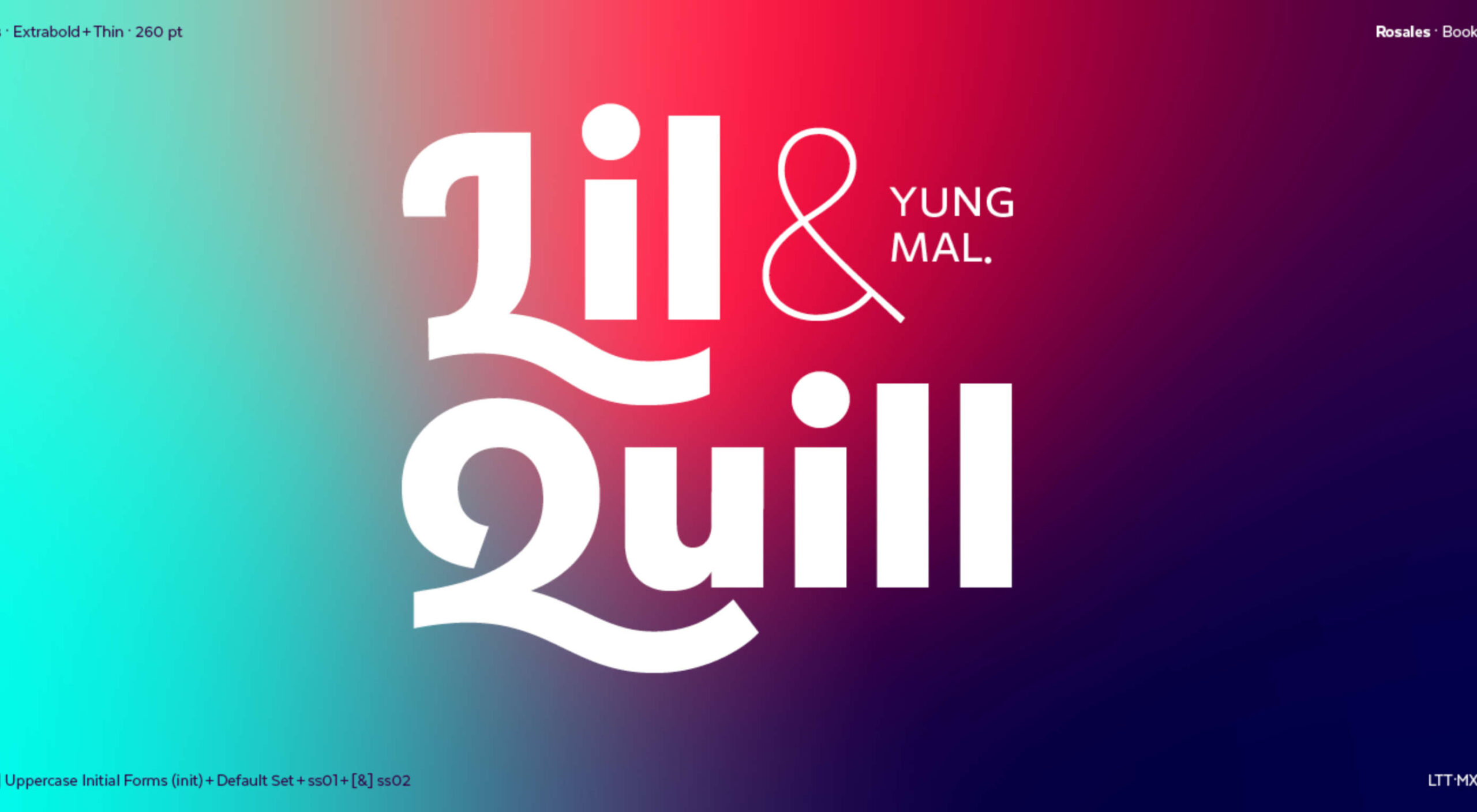
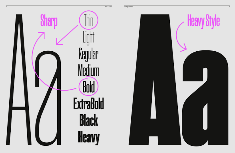
Tellumo is a humanist sans serif font family, ranging in styles from Thin to Extra Bold. What you see in the example below demonstrates some of the charm and warmth you can add to branding and designs with Tellumo’s swash caps. However, if you want to keep things simple and reap the benefits of the font’s clean and tidy design, you can use the regular character set.

15. Yamet Kudasi

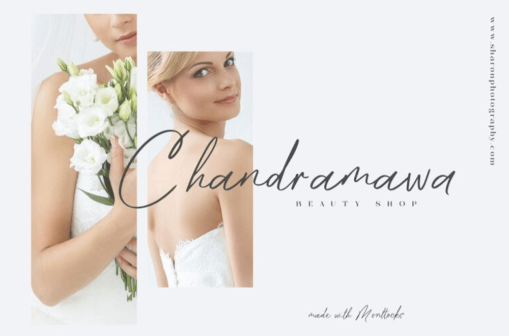
Yamet Kudasi is a script font that comes in just the one style. Based on where it’s used (like in a signature line vs. a hero image) and the background it’s framed against, this versatile font can be used in a variety of ways and for various niches.

Source

The post 15 Best New Fonts, February 2022 first appeared on Webdesigner Depot.

Source de l’article sur Webdesignerdepot

What stands out as an incredible web design project for you? Do you count your creation as a success if it’s modern, minimal, and accessible? Maybe you’re the kind of designer that’s constantly experimenting with the latest dynamic design tools or state-of-the-art technology. Perhaps your websites are vivid, animated, and brimming with unique components?

Sometimes, creating the ideal design means thinking carefully about what you want to accomplish for your client. The purpose of your web creation has a significant impact on the components that you need to consider. For instance, if you’re hoping for a highly emotive and human design, it may be worth combining some of your sleek lines and graphics with hand-drawn elements. 

The Value of Hand-Drawn Graphics in Web Design

Hand-drawn elements are just like the other components of web design; that way may use to express individuality in a cluttered digital environment. In a world where everyone focuses on futuristic and virtual creations, hand-drawn elements can pull attention back to the importance of humanity in your content. 

As web designers, we know that visual components often impact people more than text-based content. Illustrations are highly engaging functional elements that capture audience attention and convey relevant information. 

The main difference between hand-drawn elements and graphics built with vectors and other digital components is that one appears to be more influenced by the human hand than the other. Even if your illustrations are created on a screen, just like any other web design component, it pushes an audience to see something more straightforward, more natural, and authentic. 

For a brand trying to convey innocence and humanity in its personality, hand-drawn design can speak to the part of the human psyche that’s often unappreciated by web design. Perhaps more than any other visual, the content reminds your audience that there’s a human behind the web page

The Value of Hand-Drawn Features in Web Design

Any image can have a massive impact on the quality of your web design. Visuals deliver complex information in an easy-to-absorb format. In today’s world of fast-paced browsing, where distractions are everywhere, visuals are a method of capturing attention and delivering value fast. 

However, with hand-drawn elements, you go beyond the basic functionality of images to embrace the emotional side of the content. Benefits include:

  • A memorable experience: Web illustrations are becoming more popular among leading brands like Innocent Smoothies and Dropbox. However, the time that goes into these components means that they’re still scarce. If you want to stand out online, illustrations can help you do that. 
  • Brand personality: One of the most significant benefits of hand-drawn web design is showcasing your brand personality. The blocky lines of imperfect content that go into illustrated images highlight the human nature of your company. So many businesses are keen to look “perfect” today to make the human touch much more inviting. 
  • Differentiation: As mentioned above, hand illustrations are still rare in the digital design landscape. If you’re struggling to find a way to make your brand stand out, this could be it. Although there needs to be meaning behind your design, the result could be a more unique brand if you can convey that meaning properly. 

Tips for Using Hand Drawn Elements in Web Design 

Hand-drawn components, just like any other element of visual web design, demand careful strategy. You don’t want to overwhelm your websites with these sketches, or you could end up damaging the user experience in the process. 

As you work on your web designs, pulling hand-drawn elements into the mix, think about how you can use every illustration to accomplish a crucial goal. For instance:

Create Separation

Hand-drawn design components can mix and match with other visual elements on your website. They work perfectly alongside videos and photos and help to highlight critical points. 

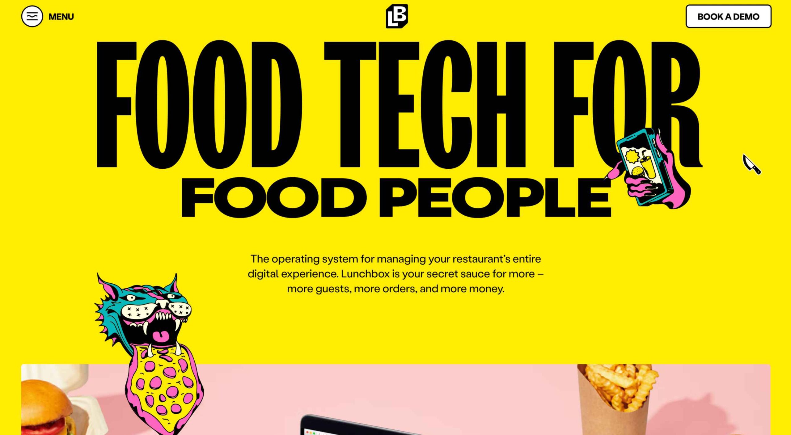
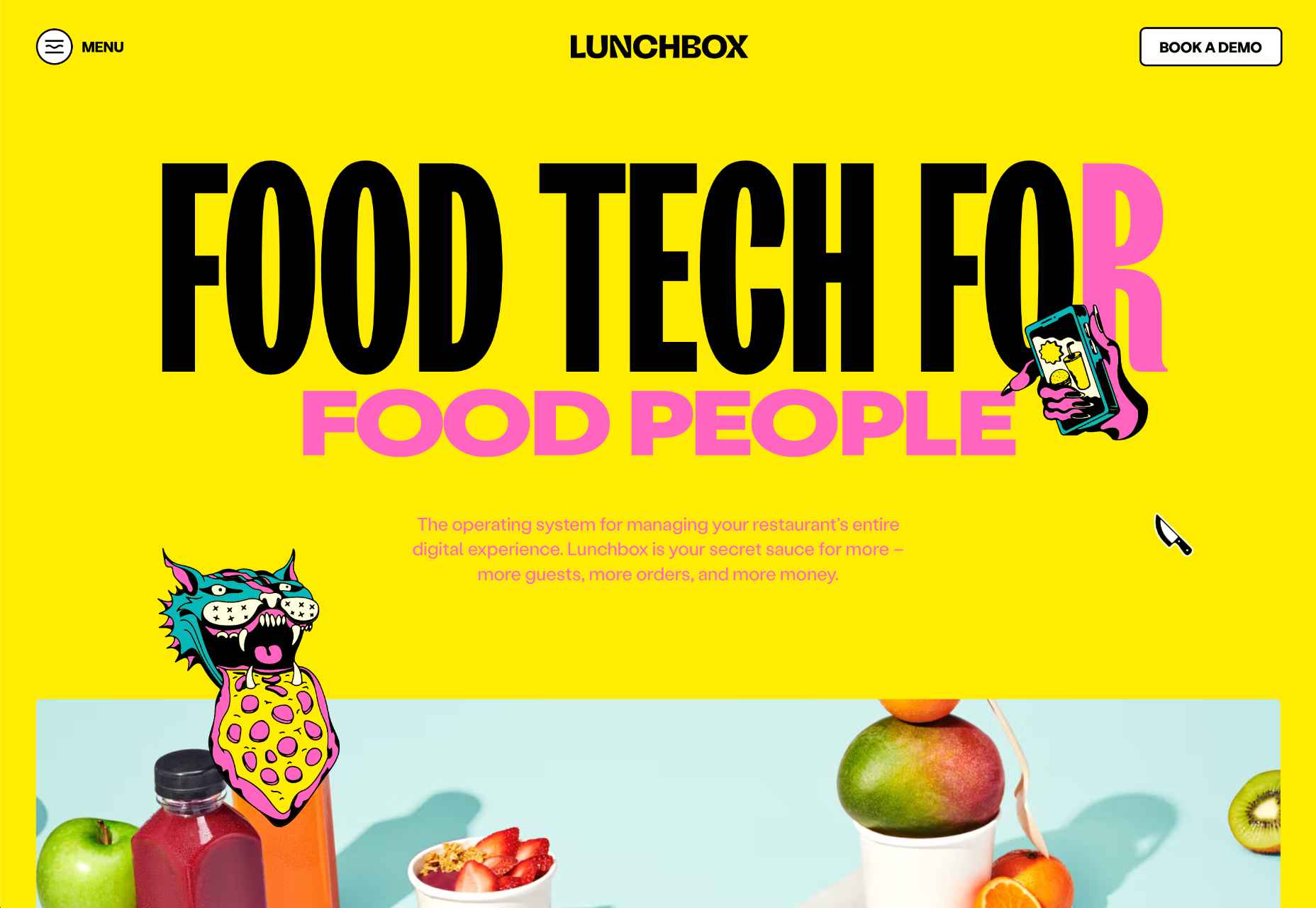
On the Lunchbox website, the company uses hand-drawn elements. This helps make the site stand out, and it provides additional context for customers scanning the website for crucial details.

Engage Your Audience

Sometimes, hand-drawn elements are all about connecting with end-users on a deeper, more emotional level. One of the best ways to do this is to make your hand-drawn elements fun and interactive pieces in the design landscape. 

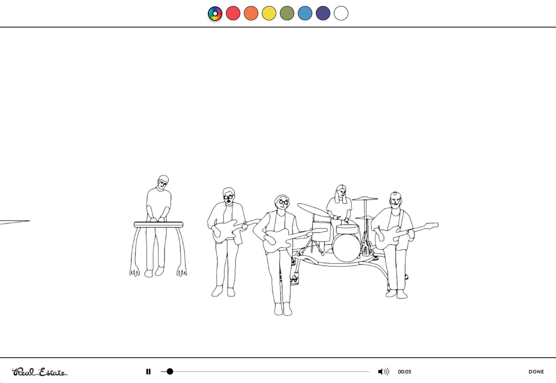
One excellent example of this is in the Stained Glass music video here. This interactive game combines an exciting web design trend with creative interactive components so that users can transform the web experience into something unique to them.

Highlight Headers with Typography

Sometimes, the best hand-drawn elements aren’t full illustrations or images. Hand-drawn or doodle-like typography can also give depth to a brand image and website design. 

Typography styles that mimic natural, genuine handwriting are excellent for capturing the audience’s attention. These captivating components remind the customer of the human being behind the brand while not detracting from the elegance of the website. 

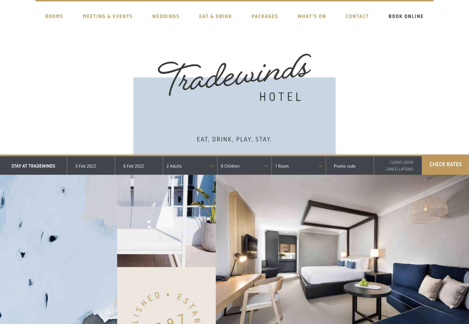
This example of hand-drawn typography from the Tradewinds hotel shows how designers can use script fonts to immediately capture customer attention. Notice that the font is still easy to read from a distance, so it’s not reducing clarity. 

Set the Mood

Depending on the company that you’re designing for, your website creation choices can have a massive impact on the emotional resonance that the brand has with its audience. Hand-drawn elements allow websites to often take on a more playful tone. They can give any project a touch of innocence and friendliness that’s hard to accomplish elsewhere. 

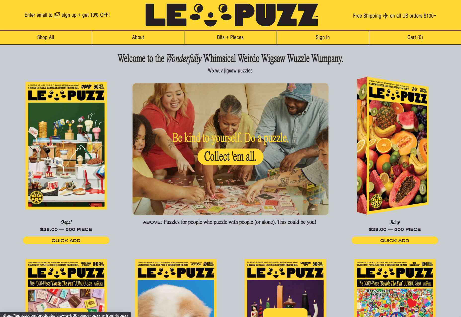
A child-like aesthetic with bright colors and bulky fonts combines with hand-drawn elements on the Le Puzz website. This is an excellent example of how web designers can use hand-drawn elements to convey a mood of creativity and fun.

Animated Elements

Finally, if you want to combine the unique nuances of hand-drawn design with the modern components of what’s possible in the digital world today, why not add some animation. Animated elements combined with illustrations can help to bring a website to life. 

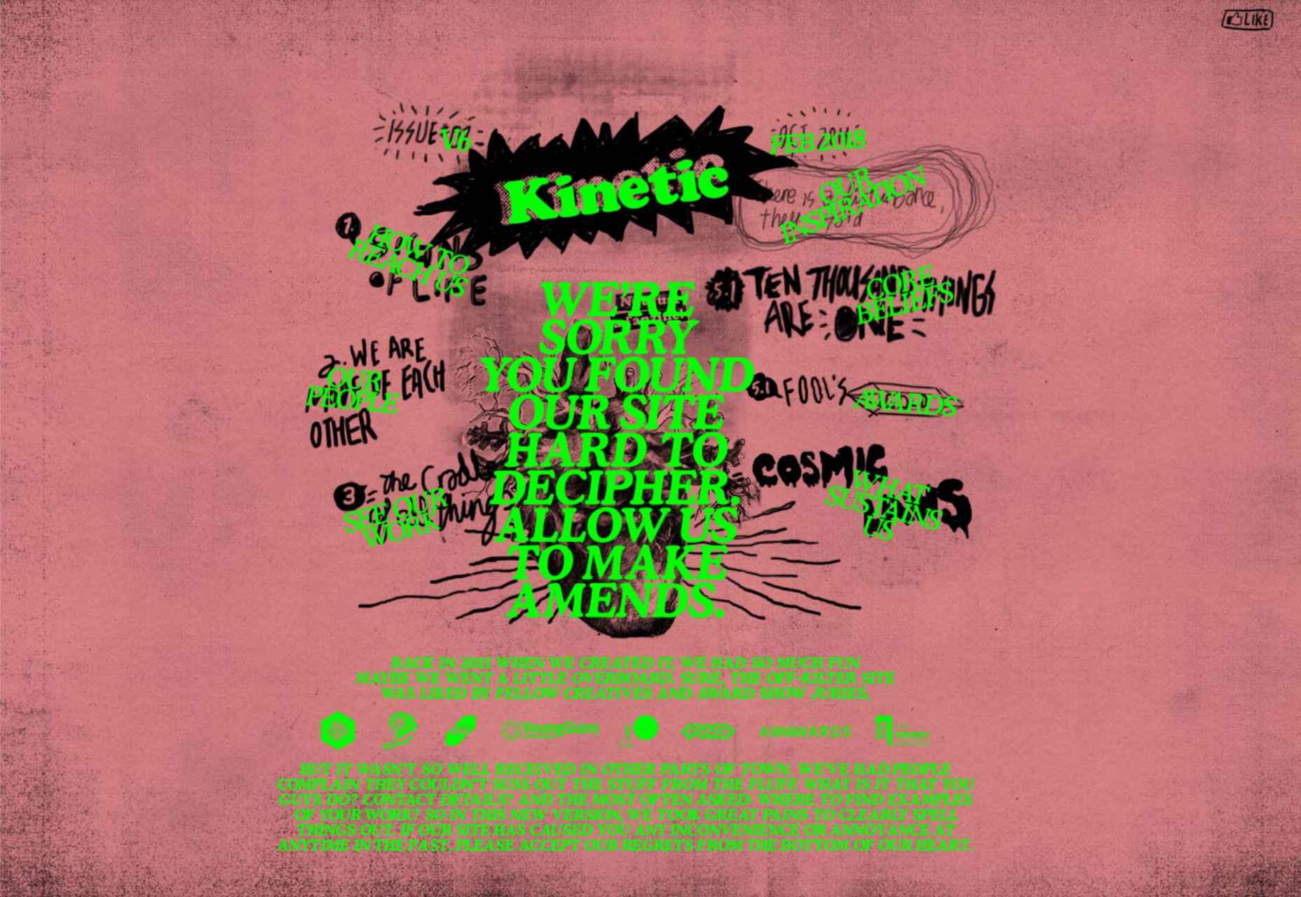
In the Kinetic.com website, the animated illustrated components help to highlight the punk-rock nature of the fanzine. It’s essential to ensure that you don’t go too over-the-top with your animations here. Remember that too many animations can quickly slow down a website and harm user-friendliness.

Finishing Thoughts on Hand-Drawn Elements

Hand-drawn elements have a lot to offer to the web-design world. 

Even if you’re not the best artist yourself, you can still simulate hand-drawn components in your web design by using the right tools and capabilities online. 

Although these features won’t fit well into every environment, they can be perfect for businesses that want to show their human side in today’s highly digitized world. Hand-drawn components, perhaps more than any other web design feature, showcase the innocence and creativity of the artists that often exist behind portfolio pages and startup brands. 

Could you experiment with hand-drawn design in your next project?

Source

The post How to Use Hand-Drawn Elements in Web Design first appeared on Webdesigner Depot.

Source de l’article sur Webdesignerdepot

With a new year here, it’s time to try out some new fonts.

Whether you’re designing a brand new website or redesigning an existing one, the following list of fonts has you covered. In addition to the dependable serifs and sans serifs we use to create attractive and readable content, this roundup also has some fun additions, including one you can use for websites advertising Valentine’s Day deals next month.

Antona

Antona is a geometric sans serif font family with 16 different styles. The solid structures and ample white space within the characters give off a safe and friendly vibe.

Aromanis

Aromanis is a small font family with just two variations: Regular and Shadow. This new font supports nearly 70 languages and has an extensive Latin character set with localized forms. This font works best in branding for youthful companies with a playful vibe — from logos to posters and everything in between.

Black Coopy

Black Coopy is an edgy display typeface that would work well for sporty brands. In addition to the standard alpha, numeric, and punctuation sets, the font also comes with a variety of “swash” characters that can be used to frame your bold headlines.

Cimory Love

Don’t wait until February to start thinking about how to infuse a little romance into your designs. Cimory Love is a script font that comes in two styles: Regular and Italic. In addition to using it to promote Valentine’s Day sales, this could also be a cute font to use on websites for small gift shops, bakeries, and so on.

Cotford

Cotford is a contemporary serif font with a ton of flexibility built into it. It comes with eight variations — three text and five display weights. Designers can use one of the many pre-designed styles or they can modify this dynamic font set to make it suit their specific needs.

Digno

Digno is a beautiful, informal serif font that’s easy on the eyes. The font family comes with 14 weights covering a wide spectrum — lights, mediums, heavies, and even a couple of “Book” weights are thrown in if you want to add some personality to those text-dense pages of yours.

Dogly Comika

Dogly Comika is a rounded display font with two styles: Regular and outline. While it’s promoted as a font for animals and pets, you could use it for any type of website hero image, mobile app splash screen, video game, or social media graphic for brands with a fun vibe.

Guzzo

Guzzo is a nostalgic typeface inspired by mid-century grotesques. With 24 styles ranging from Condensed Thin to Extended Black and unexpected character variations (like the random cursives in the italics), you could realistically create interesting font pairings right from within this family.

Idem

Idem is a contemporary serif with nine wide-ranging styles that would work well for headers and text alike. Inspired by literary publications and commercial artists from the earlier part of the 20th century, this font family has a highly legible structure with a bold flare.

Jantur Type

Jantur Type is a geometric sans font that supports over 200 Latin-based languages. While you could use one of the Thin or Regular weights for editorial content, this font will be most effective in shorter headers and paragraphs where it can make a greater impact on messaging.

Loretta

Loretta is an elegant serif designed specifically for the body of your web pages. Because of its calligraphic roots, this particular font would work great for high-end digital publications or blogs that promote luxury lifestyles and goods.

Rebrand

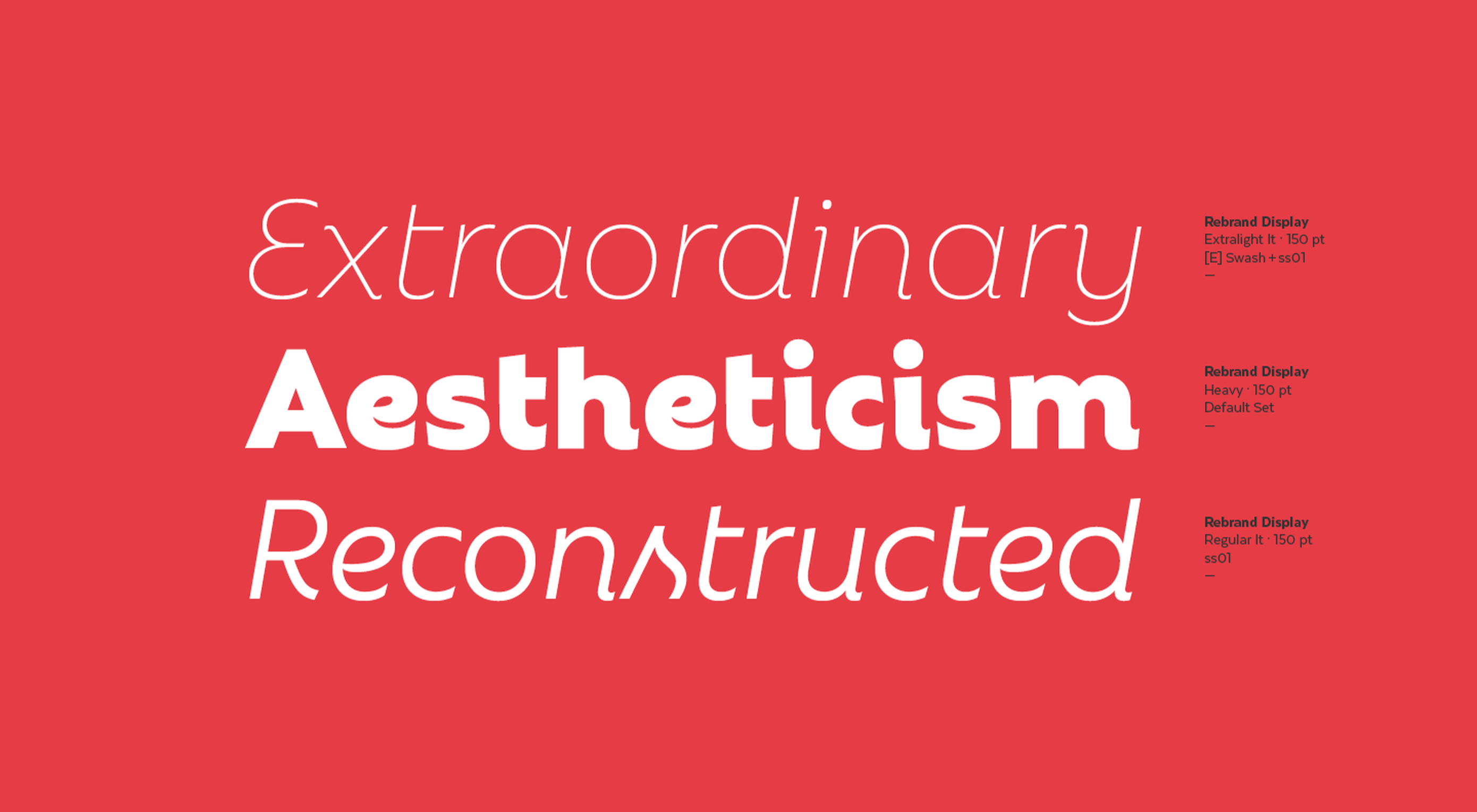
Rebrand is an exciting take on geometric sans. There are two sub-families in Rebrand: Display comes with nine weights as well as alternative characters and dingbats; Text comes with seven weights that cover a broad spectrum of styles. Because of the size and variety of this font family, you could easily make this the go-to font for a company’s branding, headers, and body type.

Royal Grotesque

Royal Grotesque is a resurrection of a 1914 sans serif font called Wotan. Only one version of this font is available (Regular) and it would work great pretty much anywhere on the web with its clean and neutral design.

Selva

Selva is an attractive Scotch typeface that has a traditional Roman serif family, an italicized version of each Roman, as well as a script family. If you’re considering using a script font for branding or headlines, the classic and delicate details of this particular font would make for an interesting choice.

Sunset Gothic

Sunset Gothic is a sans serif inspired by signage found near and around Los Angeles. Because this signage was often painted directly onto shop windows and building facades, the letterforms had to be extremely legible for passersby and drivers alike. This font draws upon the hand-painted, vector-based styling of those painted promotions.

Source

The post 15 Best New Fonts, January 2022 first appeared on Webdesigner Depot.

Source de l’article sur Webdesignerdepot

Today, in this article we will discuss basic concepts of Azure Function. An Azure Function is a perfect example of Serverless architecture or computes service. Using Azure Function, we can run the event-based code without managing any infrastructure. Since the Azure function is a trigger-based service, so it always executes a script of a block of code in response to a variety of events. 

An Azure Function can also be used to achieve the decoupling, high throughput or response, reusability of code, etc. So, we will discuss the Azure Functions in all aspects in four parts. Today, in the first part of this article series, we will discuss the below topics:

Source de l’article sur DZONE

There are some spook-tacular finds in this month’s October collection of resources and tools for designers and developers. From interesting tools that can help in the design process to boo-tiful typefaces, there’s something for everyone here.

Here’s what is new for designers this month…

Atropos

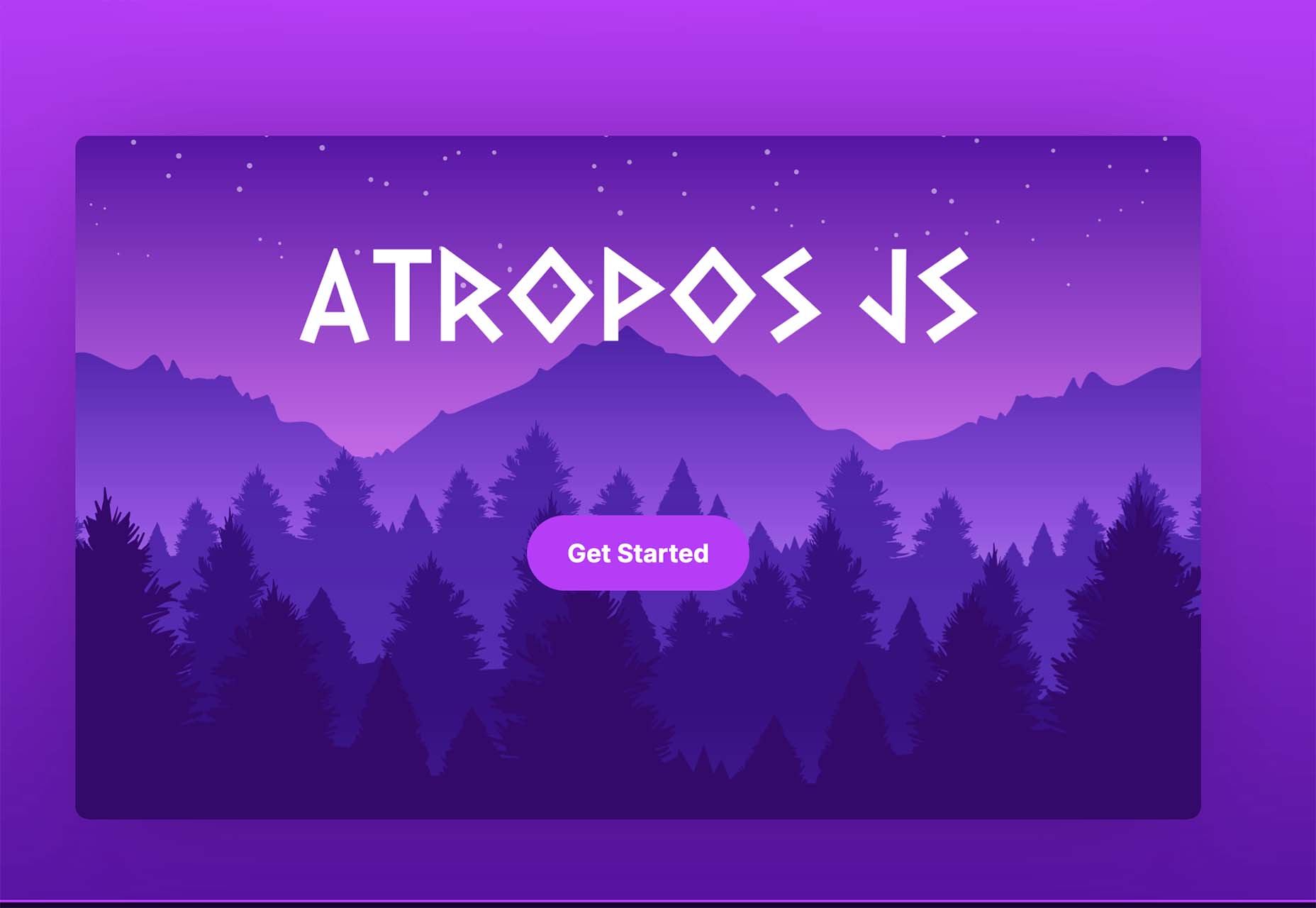
Atropos is a lightweight, open-source JavaScript library to create touch-friendly, three-dimensional hover effects. The results are stunning and have a nice parallax style. Everything is highly configurable and customizable. It’s available for JavaScript, React, and Vue.js and has zero dependencies.

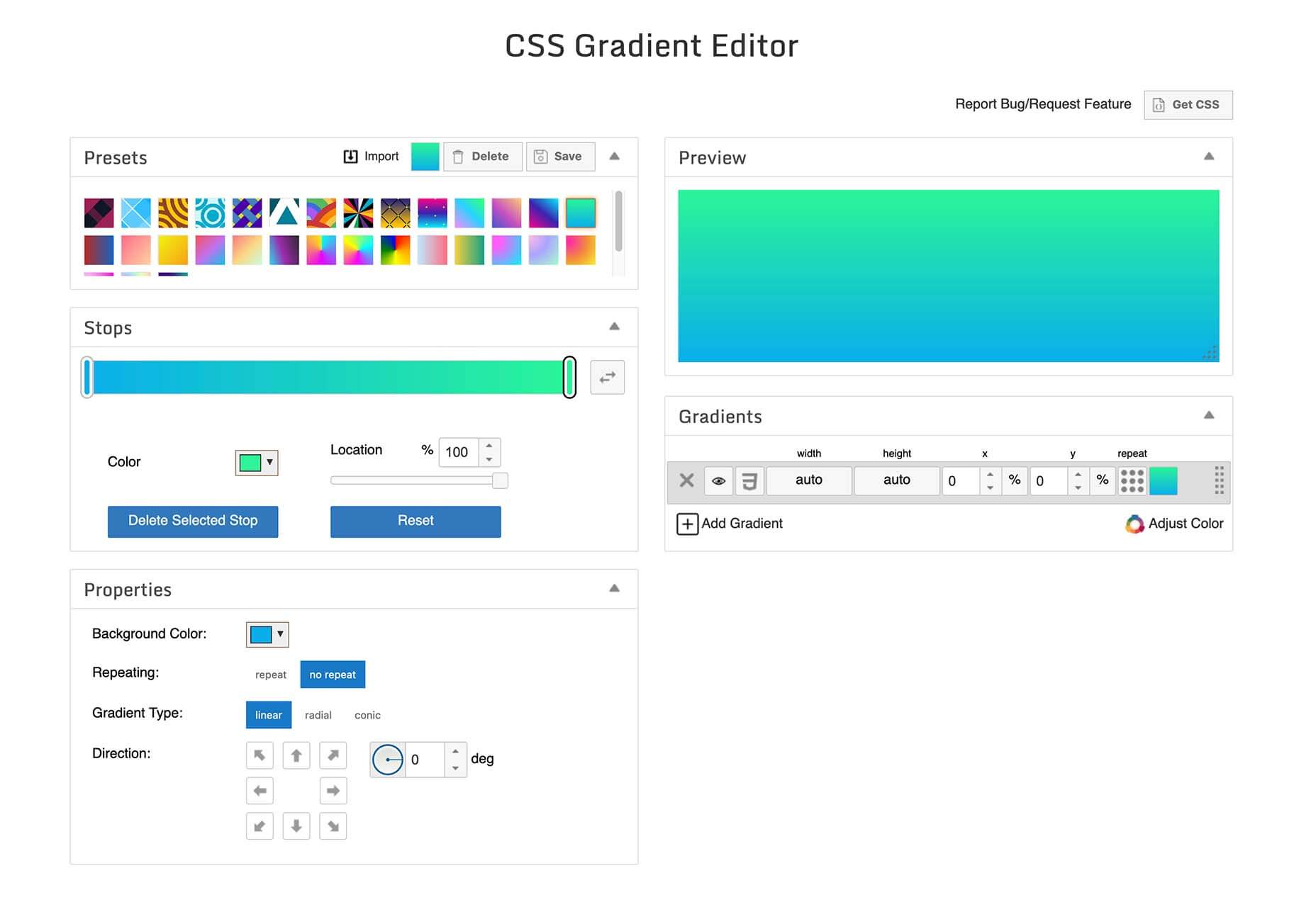
CSS Gradient Editor

CSS Gradient Editor helps you create the perfect gradient style – you can start from presets – that you can use in projects. Design a background, fill, or almost any other gradient element you might need, make adjustments or customizations, and then get the CSS with one click so you can use it right away.

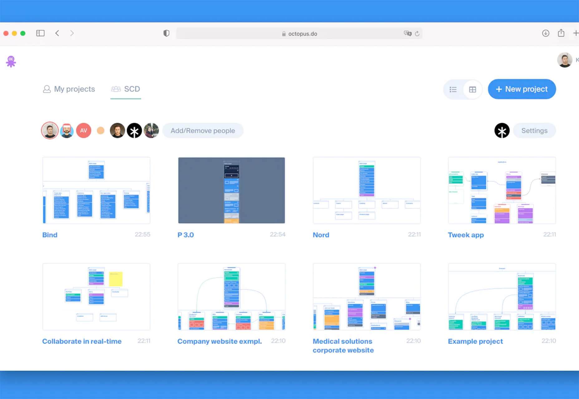
Octopus.do

Octopus.do is a fast visual sitemap builder that lets you work in real-time using the content brick method. Share and collaborate in real-time and there’s no signup required to use it.

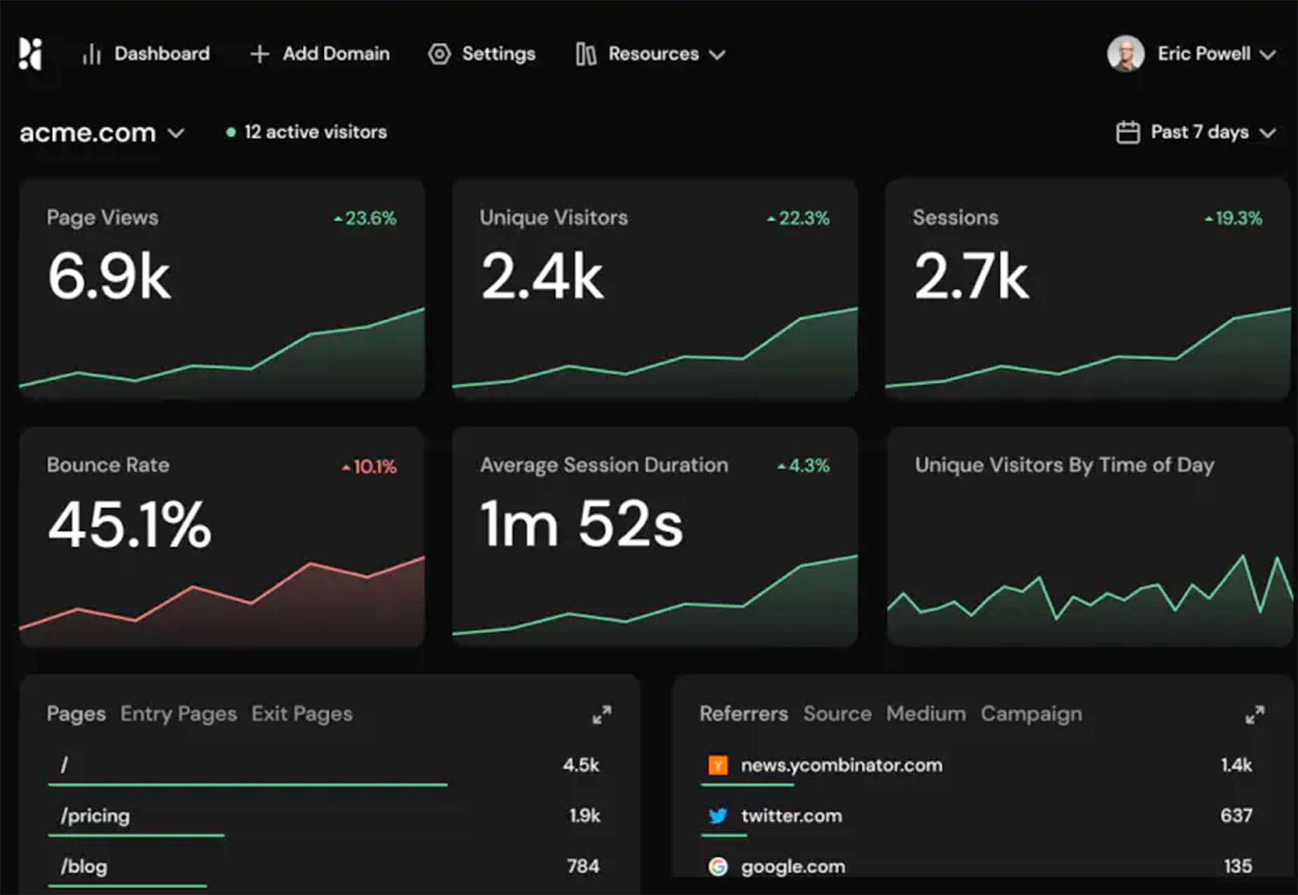
Pirsch Analytics

Pirsch Analytics is a privacy-friendly, open-source alternative to Google Analytics — lightweight, cookie-free, and easily integrated into any website or directly into your backend. It includes filters to see metrics in the way you want and light and dark modes.

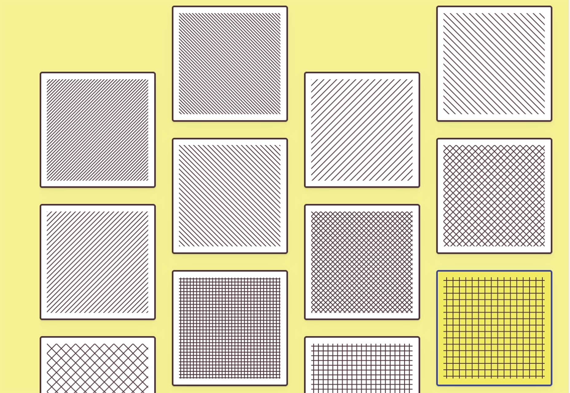
Basic Pattern Repository

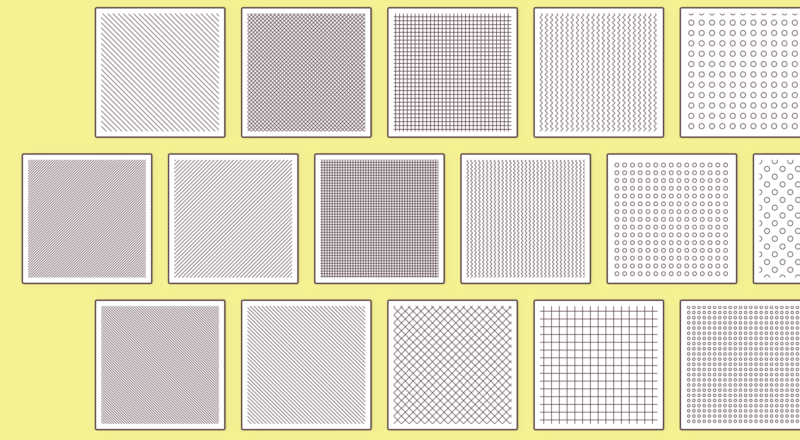
Basic Pattern Repository is a collection of simple SVG patterns for projects. Everything is rooted in a simple style to help push projects along quicker. You can get it via GitHub or as a Figma Library.

Blobr

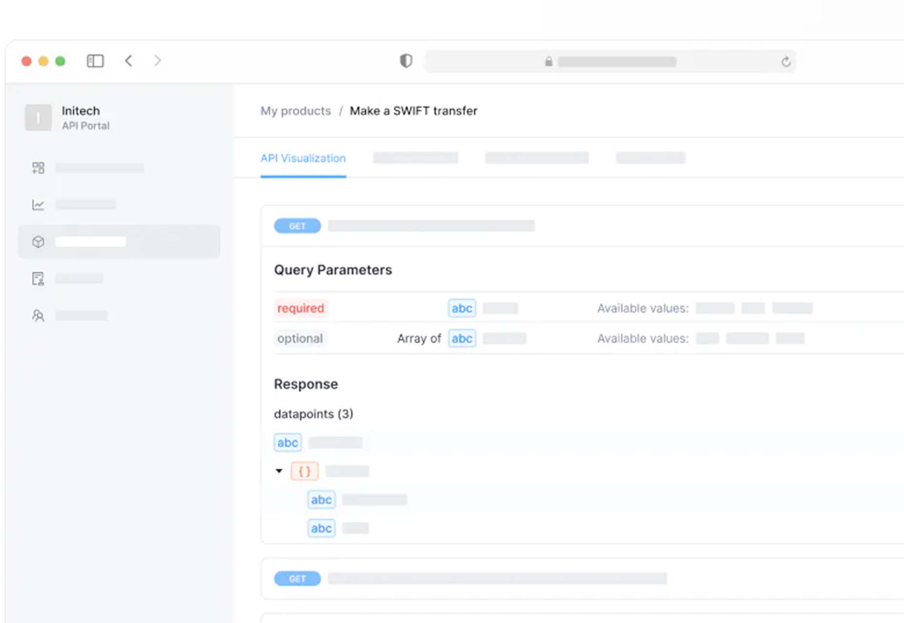
Blobr is a way to get a branded API portal, manage access, and monitor usage all in one place. Customize everything to fit your brand and the tool grows as you do with the ability to increase or change capacity. Plus, it is easy to set up and free to use.

HEXplorer

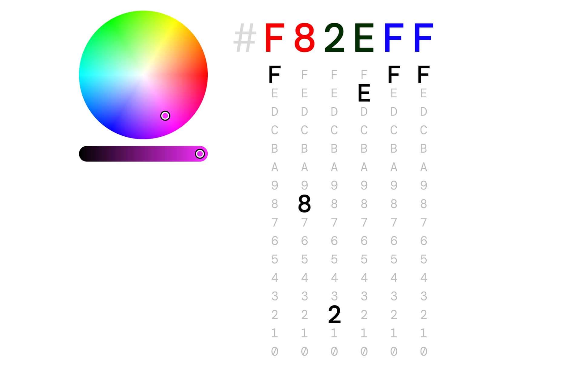
HEXplorer helps you better understand something you use all the time – HEX colors. This pen by Rob DiMarzo shows how the values for different colors come together to provide greater comprehension when it comes to this color format.

CCCreate

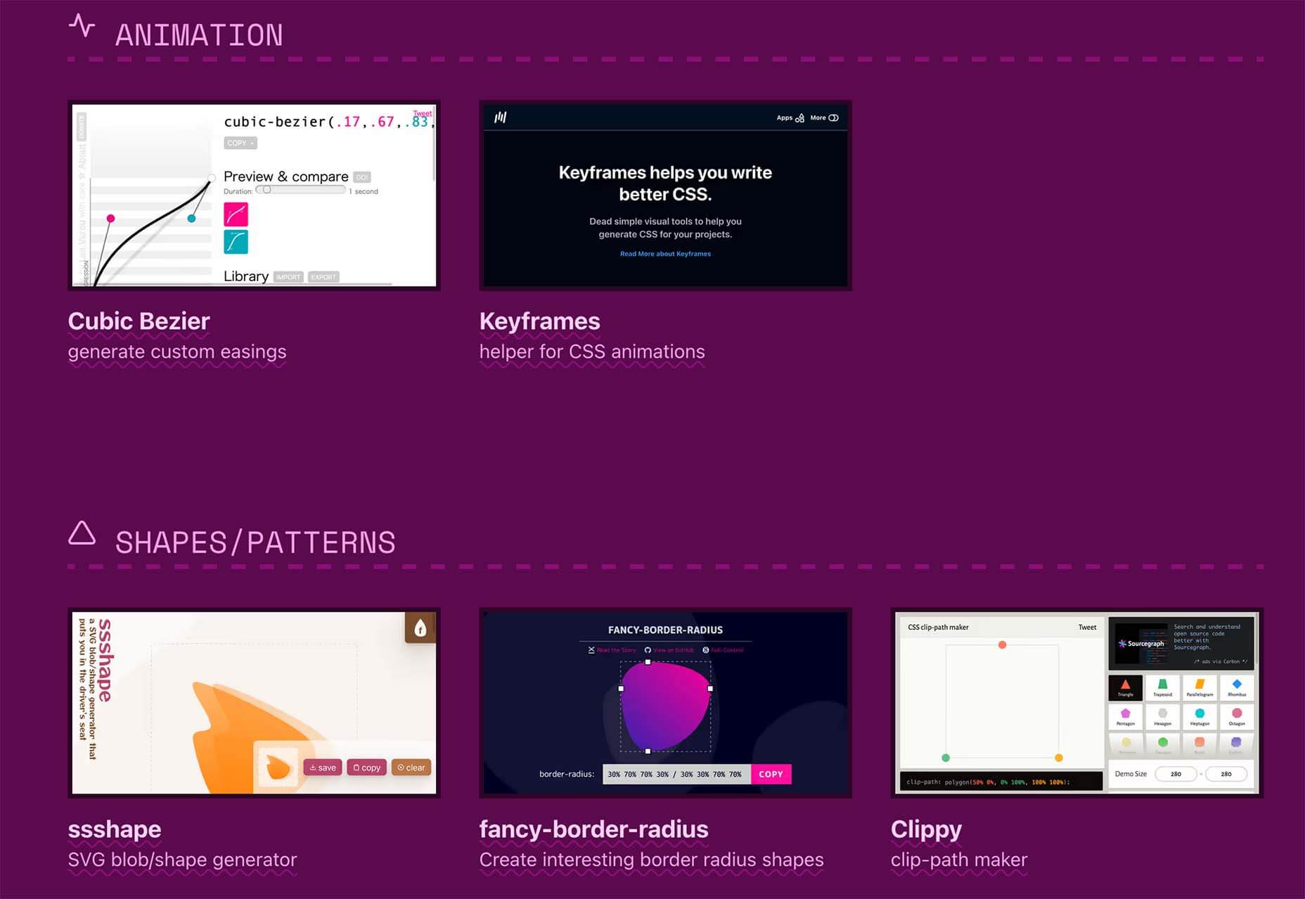
CCCreate is a curated collection of tools and resources for web creators. It includes some tools that have been around for a while as well as some newbies. Everything is grouped and sorted by type of resources – color, icons, type, layouts, animation, shapes, docs, and miscellaneous so you can find what you are looking for faster.

Glass

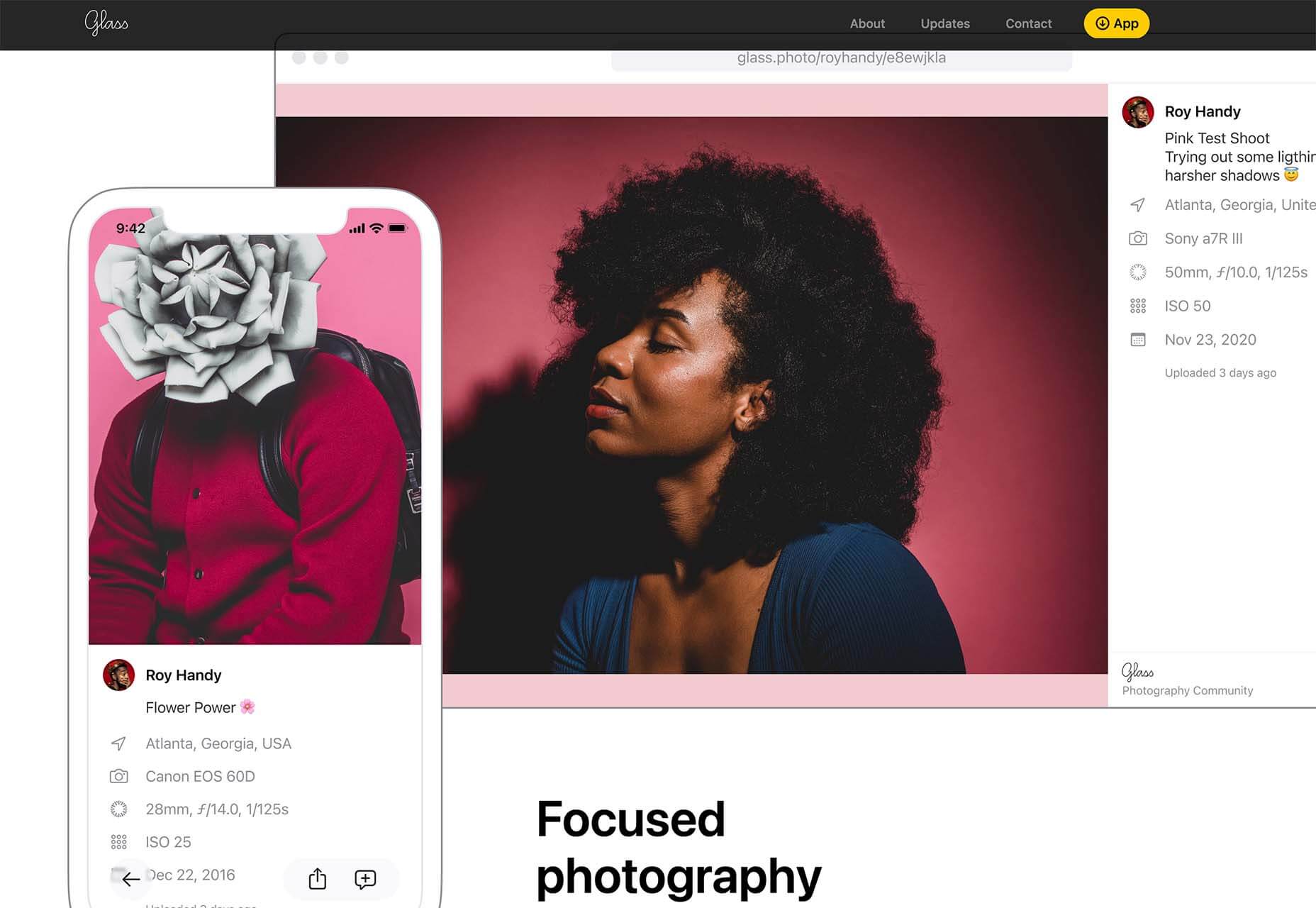
Glass is a photo-sharing app for photographers. It’s a social network of sorts that lets you share images with the greater photography community without “likes.” Just great images.

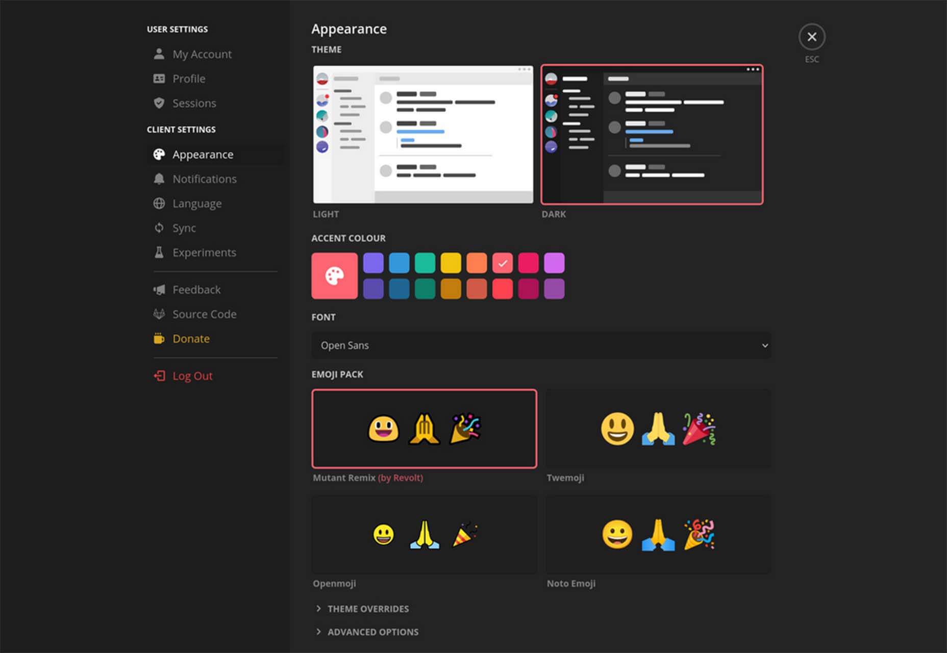
Revolt

Revolt is a chat app that’s still in beta and designed for easy communication without having to download apps. It’s an open-source project that is customizable and with an intuitive and recognizable interface. The thing that’s different about this app is that it is built on a privacy-first model.

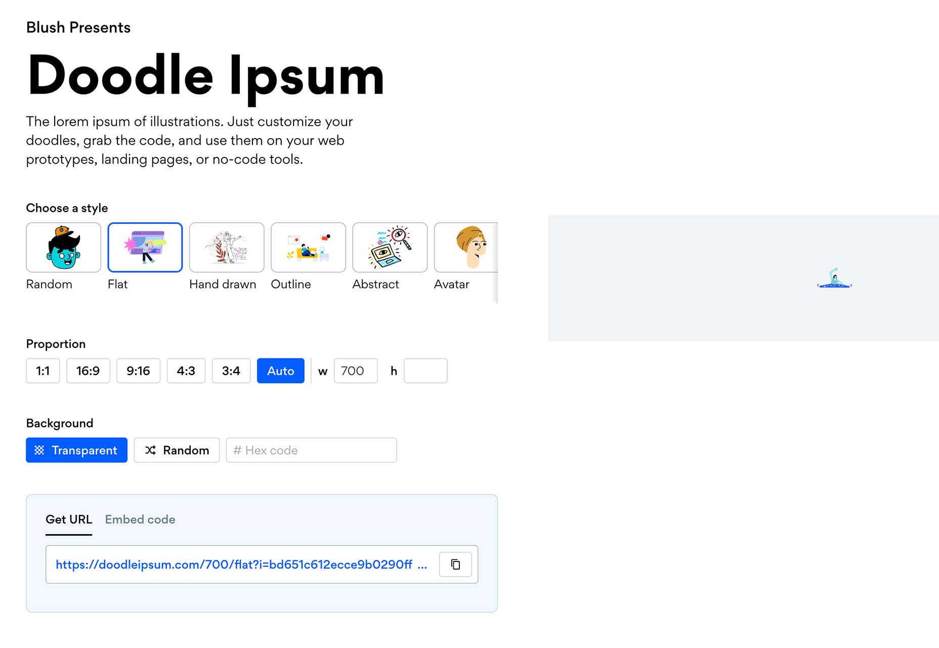
Doodle Ipsum

Doodle Ipsum is the illustrated version of placeholder elements. Customize your doodles, grab the code, and use them on your web prototypes, landing pages, or no-code tools.

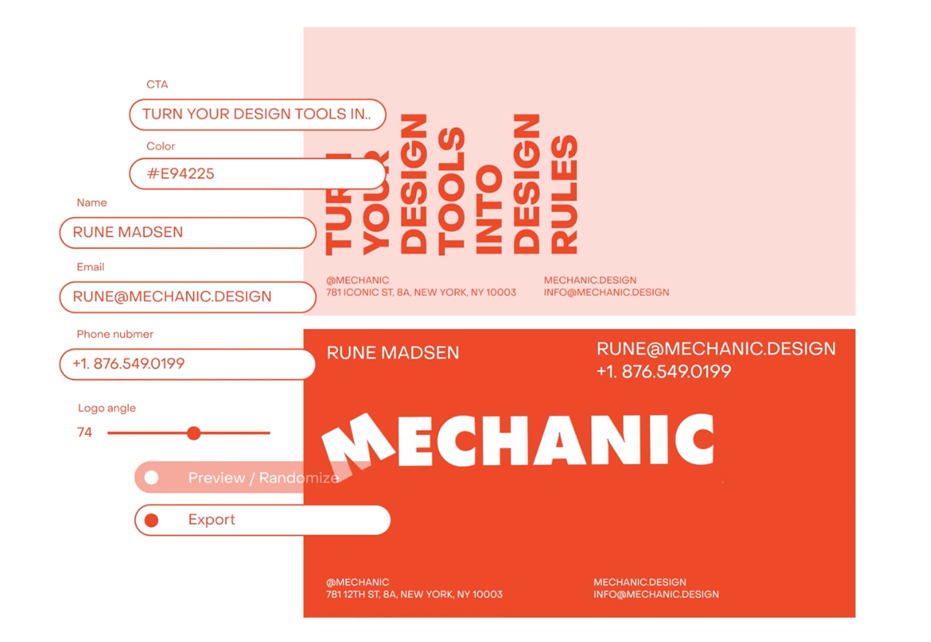
Mechanic

Mechanic is an open-source framework that helps you create custom, web-based tools that export design assets in your browser. The best part is you can try it right on screen using the “poster generator.” If you like what you see, there’s plenty of documentation to help you along the way.

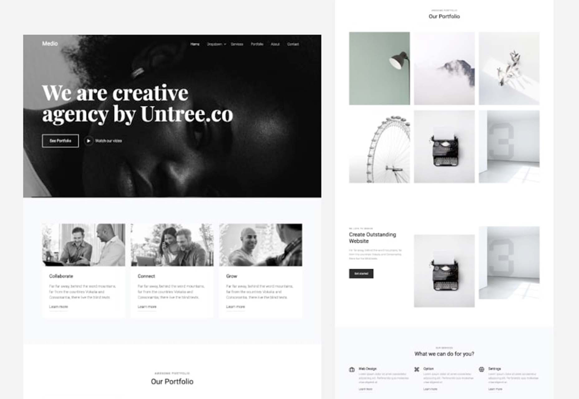
Medio Website Template

Medio is an agency-style website design template for Bootstrap 5. The layout is perfect for a design agency or marketing group but can be adjusted for almost any multi-purpose design. The free template includes a minimal design and includes features such as parallax, popup video, and more.

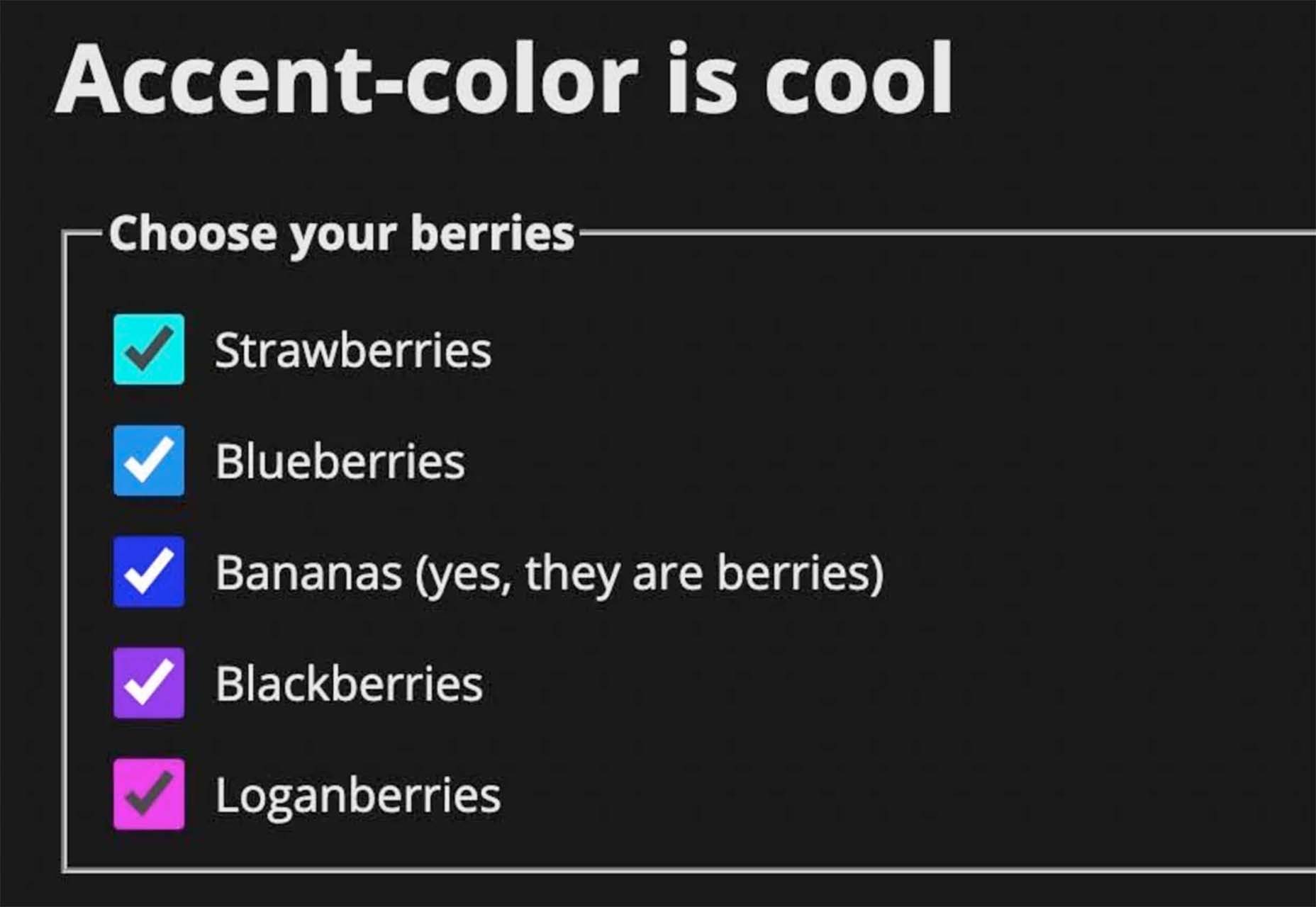
Tutorial: Simplifying Form Styles with Accent Color

This tutorial is a life-saver when it comes to using and understanding the new CSS accent-color property. This quick lesson will help make your life easier and is simple to use. It starts with setting an accent-color property on the root element and then applying it.

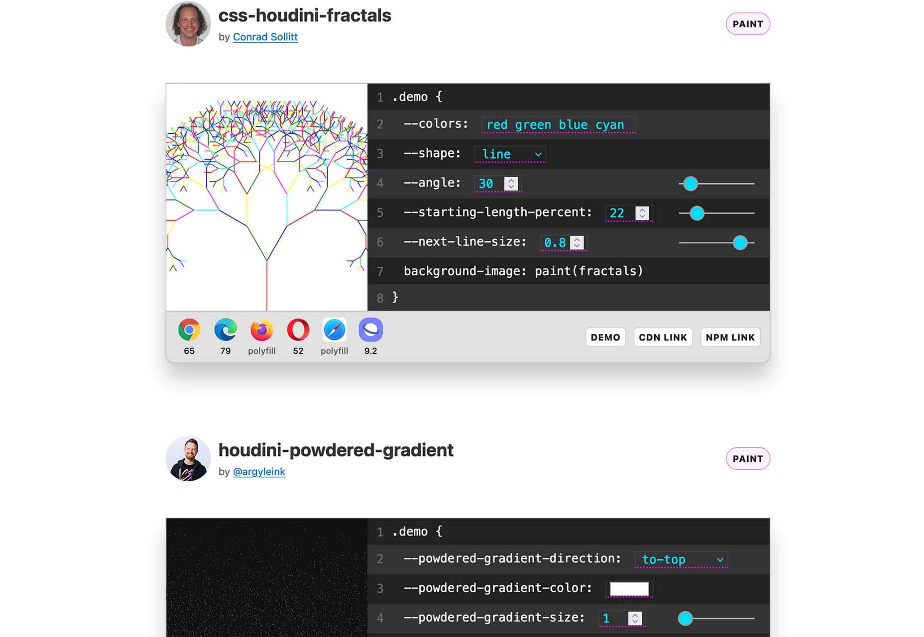
Houdini.how

Houdini.how is a worklet library that is full of CSS and code examples to help you work smarter. See how different elements look cross-browser and learn to adjust the code and put them together in just the way you want. Houdini is a set of low-level APIs that exposes parts of the CSS engine, giving developers the power to extend CSS by hooking into the styling and layout process of a browser’s rendering engine.

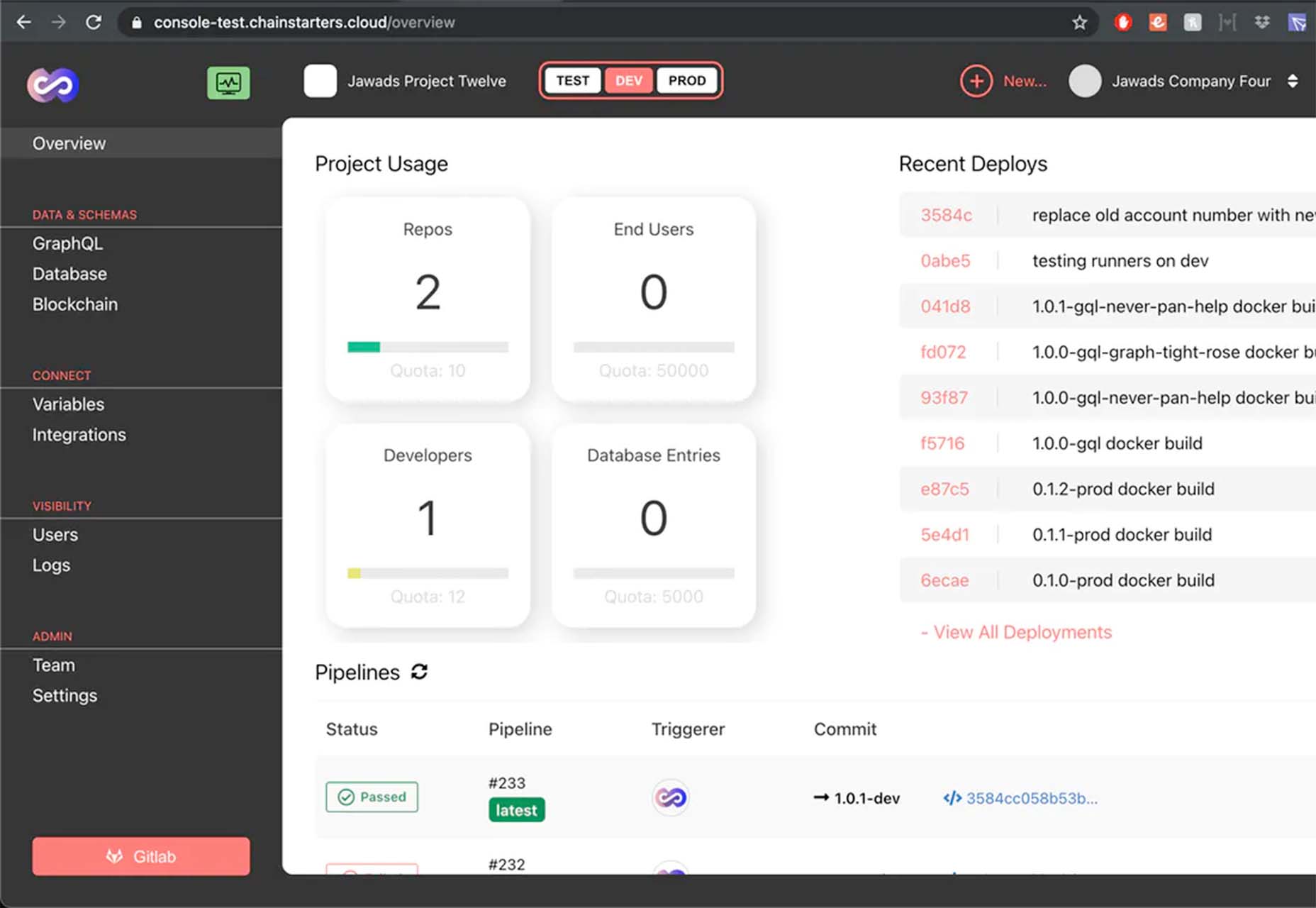
Chainstarters

Chainstarters is a powerful, rapid, Web3-enabled platform for software developers. It eliminates the burden of setting up and maintaining a secure and scalable infrastructure, allowing you to focus on creating amazing technology.

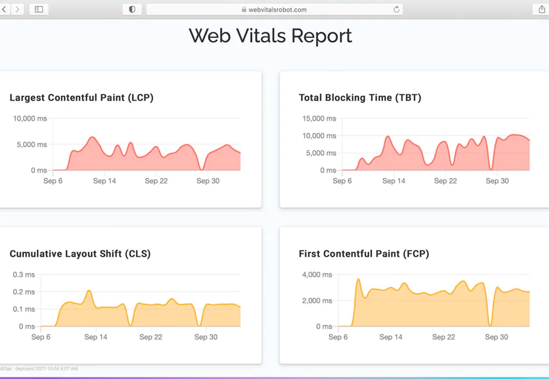
Web Vitals Robot

Web Vitals Robot is a search optimization tool that monitors SEO metrics for you – so you can prevent your business from disappearing from Google.

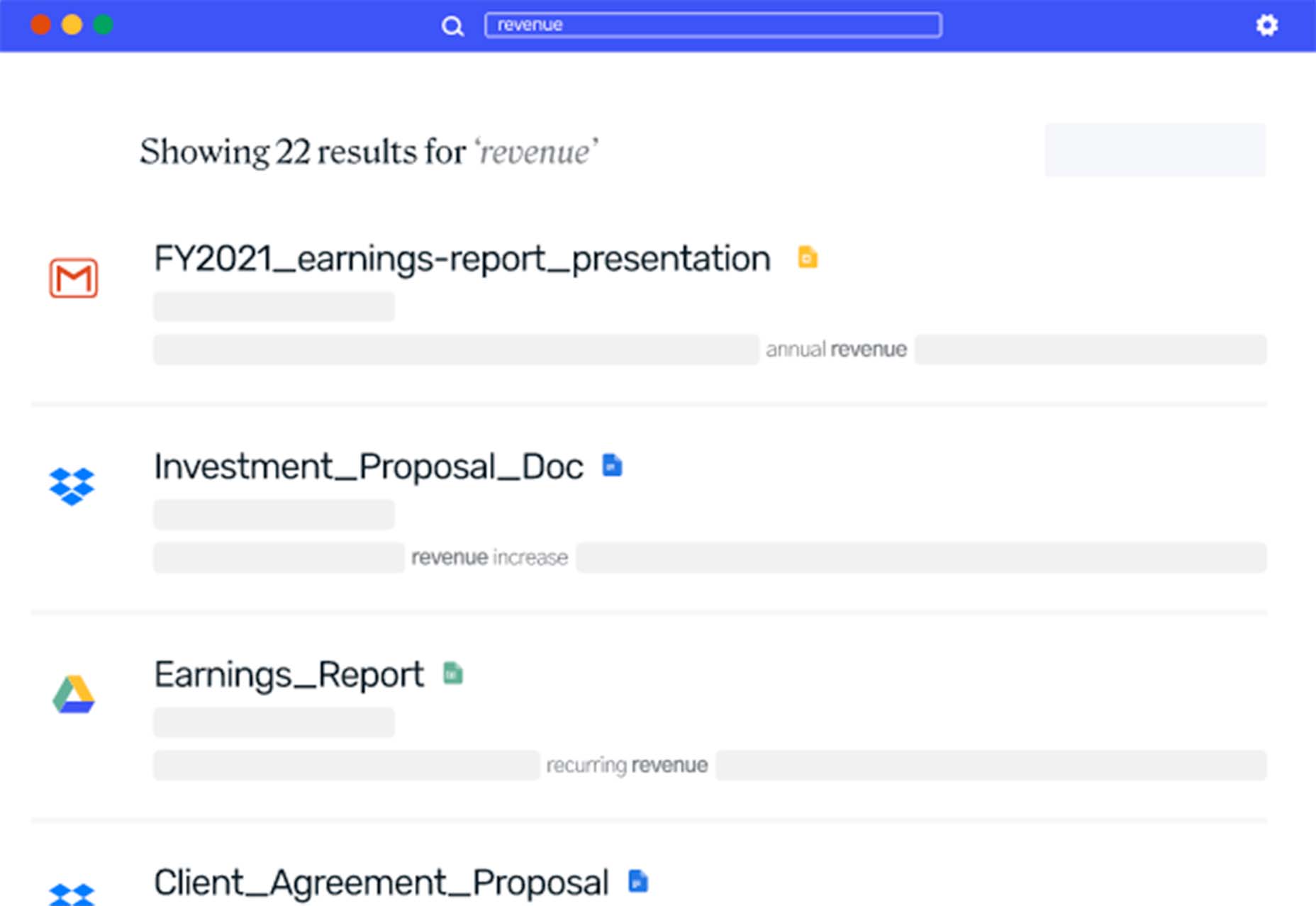
Searchable

Searchable is a unified search tool that looks at local, cloud storage, and apps to find the files you are looking for. It returns results in a jiffy with previews so you don’t have to open every file to find what you are looking for.

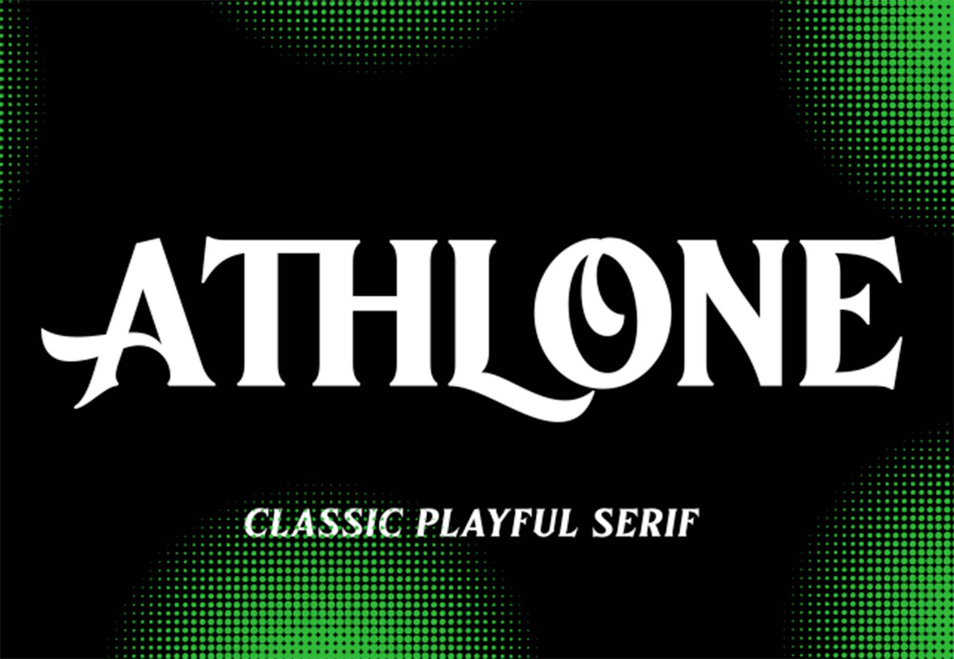
Athlone

Athlone is a fun serif with lots of personality. The free demo version includes a limited character set for personal use only and the full version has everything you need for fun display or branding with this typeface.

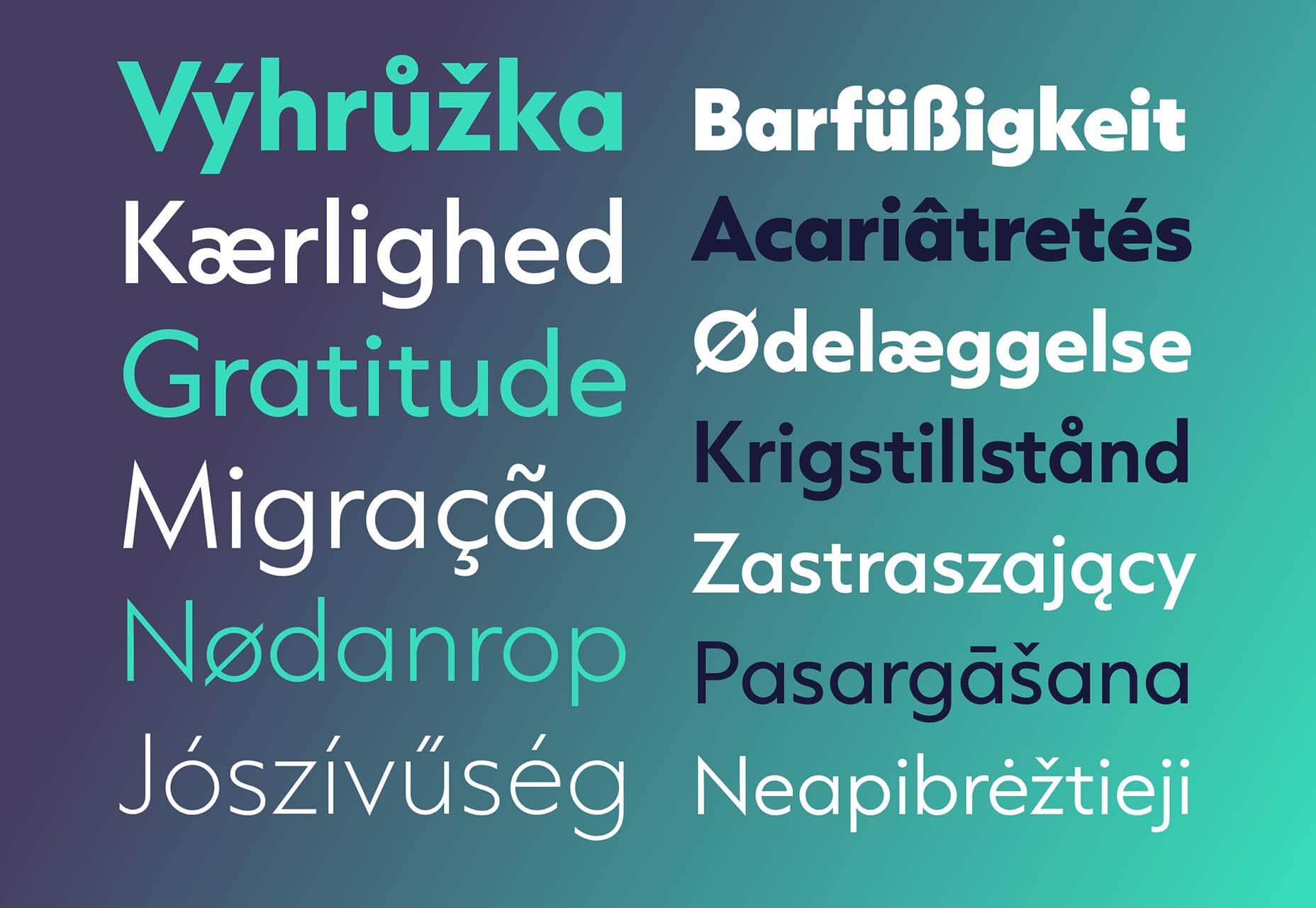
Capitana

Capitana is a Geometric Sans typeface with humanistic proportions and open apertures. This means that all shapes are constructed from basic forms, the circle, triangle, and square, and are designed according to the classic proportions of the Roman Antiqua. Distinct ascenders and pointed apexes with deep overshoot give it a cool beauty and classic elegance. It includes 784 characters per style in nine weights from Thin to Black, it offers both light and extremely heavy weights for striking headlines.

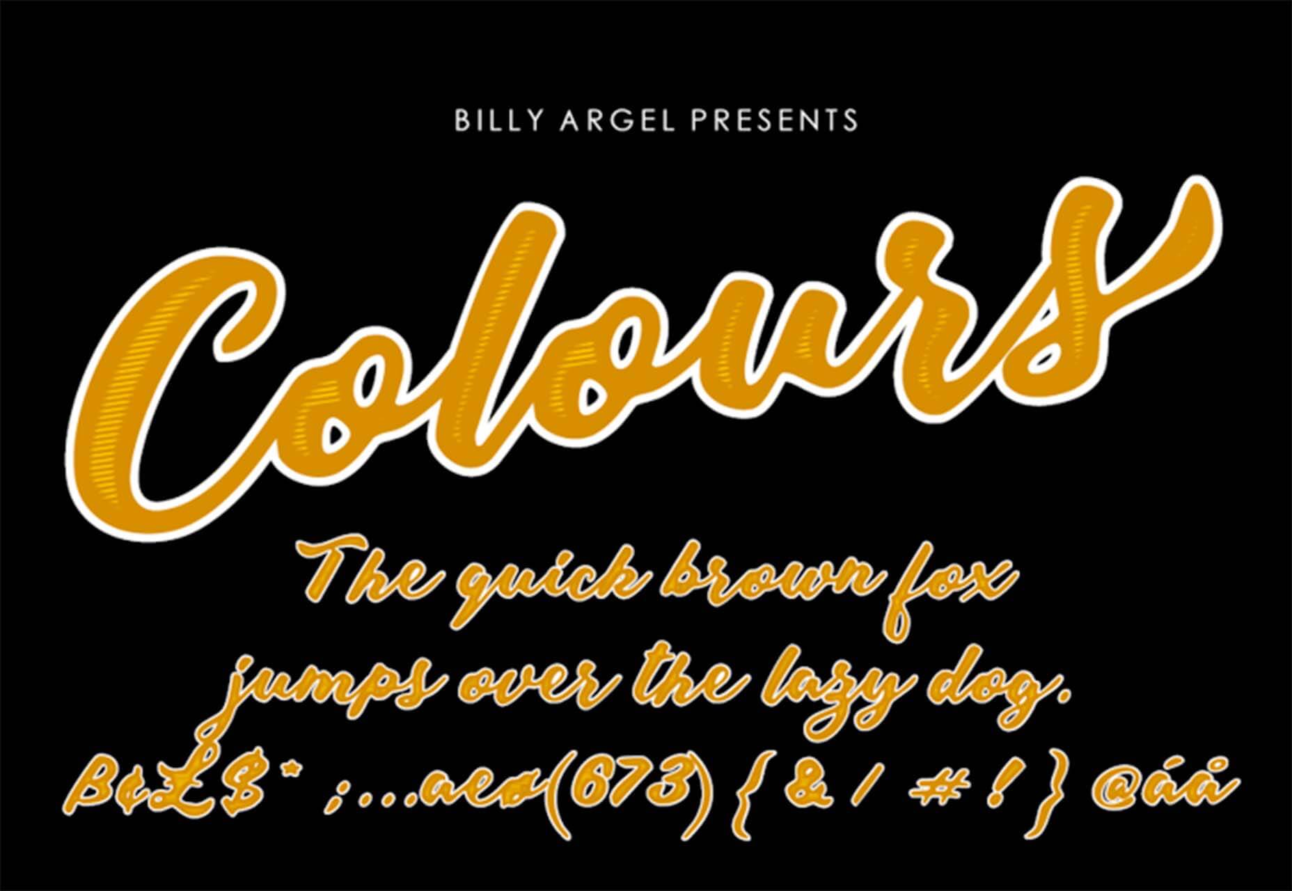
Colours

Colours is a funky script with just enough texture to keep it interesting. The free version includes a partial character set and is for personal use only.

Flexible

Flexible is a variable typeface that includes 18 styles in the family. It’s made for creativity and display use. This typeface is made for experimenting because there are so many things you can do with this single family.

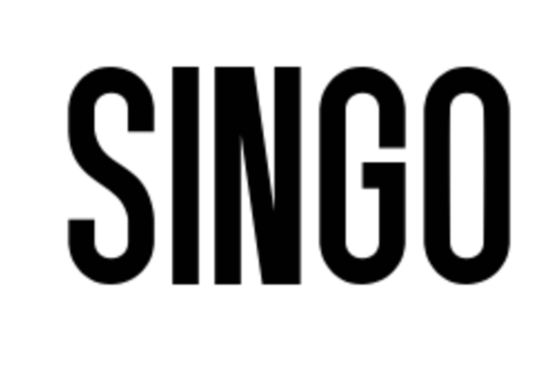
Singo Sans Serif

Singo Sans Serif is a simple and strong typeface that would make an excellent display option. The free version is for personal use only. Fun fact: Singo means Lion in Indonesia, which is where the name of this strong font comes from.

Source

The post Exciting New Tools For Designers, October 2021 first appeared on Webdesigner Depot.


Source de l’article sur Webdesignerdepot


JAVA_TOOL_OPTIONS

Imagine a scenario where you need to change a JVM parameter, but you can’t or is not a good solution to changing the start script of your server(s).

One of the challenges we had, when we were working with containers, was a way to change a parameter to a JVM without building the docker image again.
The application at the start time should read a JVM parameter where a _user profile_was defined.
For specific reasons we sometimes need to change this profile, for instance, to use a more controlled user where we can debug an issue. In these situations, we want to stop the container/pod, change the profile and start again, or even start a different container with a different profile.

Source de l’article sur DZONE

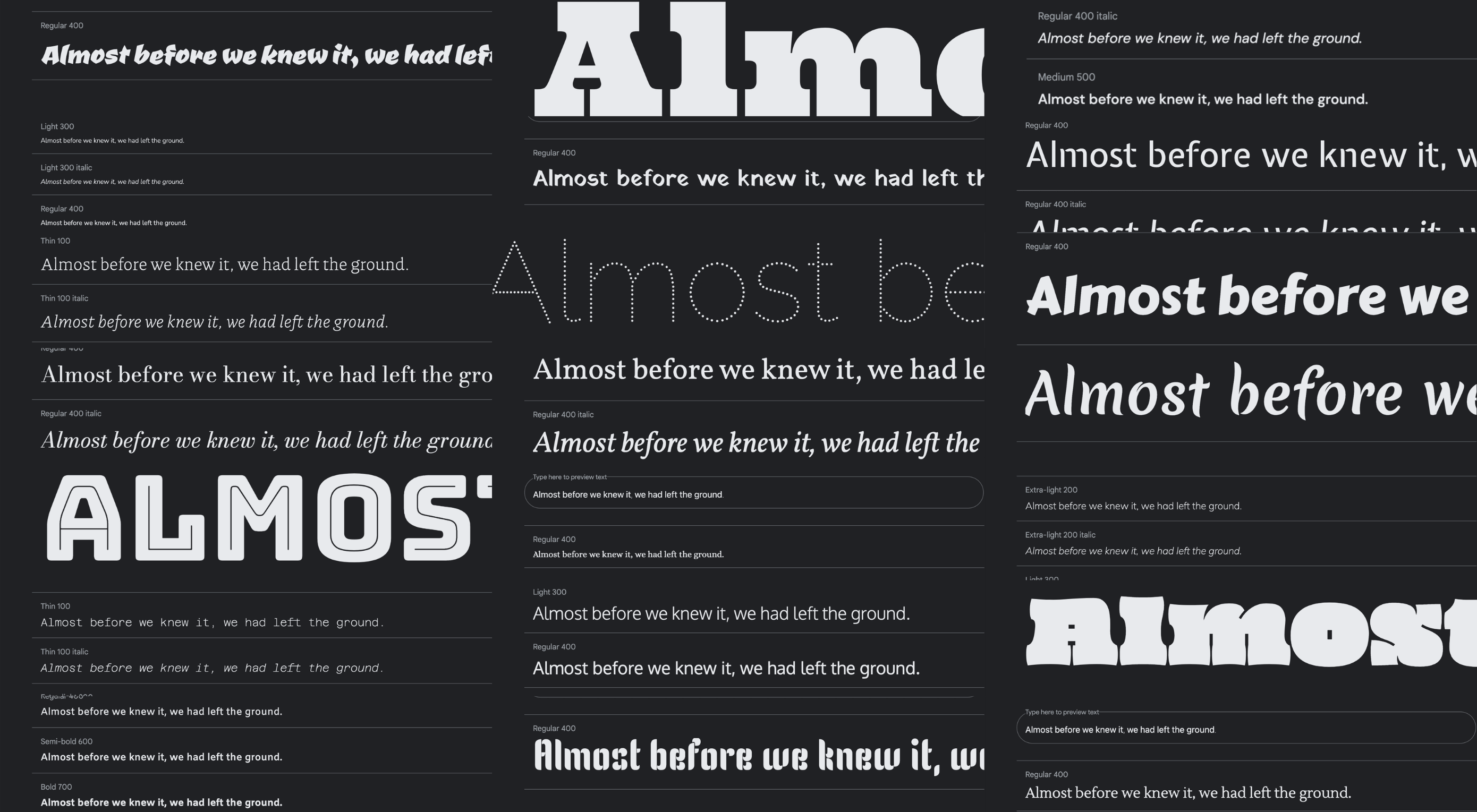
Google Fonts may be the single most significant contribution Google has made to the evolution of the web — yes, more significant than search, advertising, or analytics.

Google Fonts gives every business access to a visual voice with which to distinguish itself. Fonts can be downloaded for use in design software and then embedded using best practices for a consistent experience on the web.

If there’s anything wrong with Google Fonts, it’s that its default listings are based on “Trending,” a self-fulfilling criterion that keeps Noto Sans high up the list, destined to be over-used.

But if you spend a little time lower down the listings, you’ll find some exceptional typefaces that are hardly used. Yes, some of them are highly stylized, but there are also usable sans, serifs, and display fonts worthy of your consideration.

All you have to do is scroll; here’s a selection of some of the treasures you’ll find if you do…

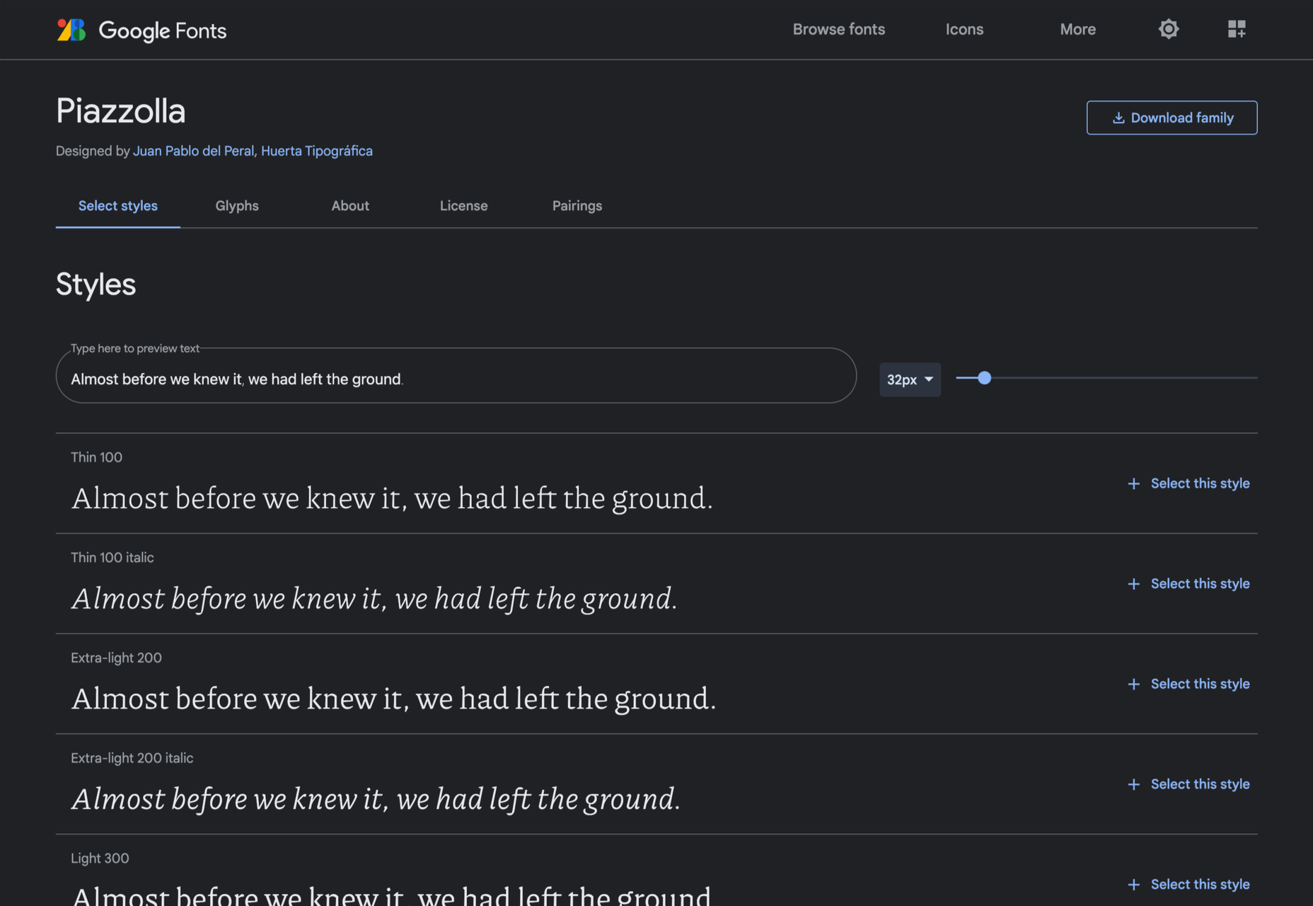
Piazzolla

Piazzolla features dramatic and expressive angular shapes when previewed in large sizes, but its real strength is in setting large amounts of body text.

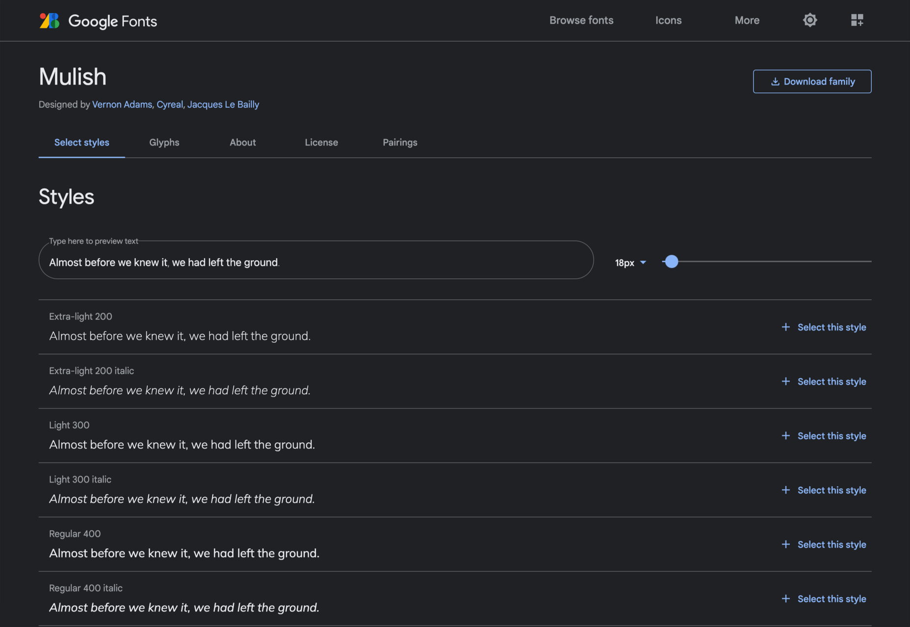
Mulish

If you’re looking for a solid workhorse sans, look no further than Mulish. Halfway between a humanist and geometric sans, there’s even a variable font version.

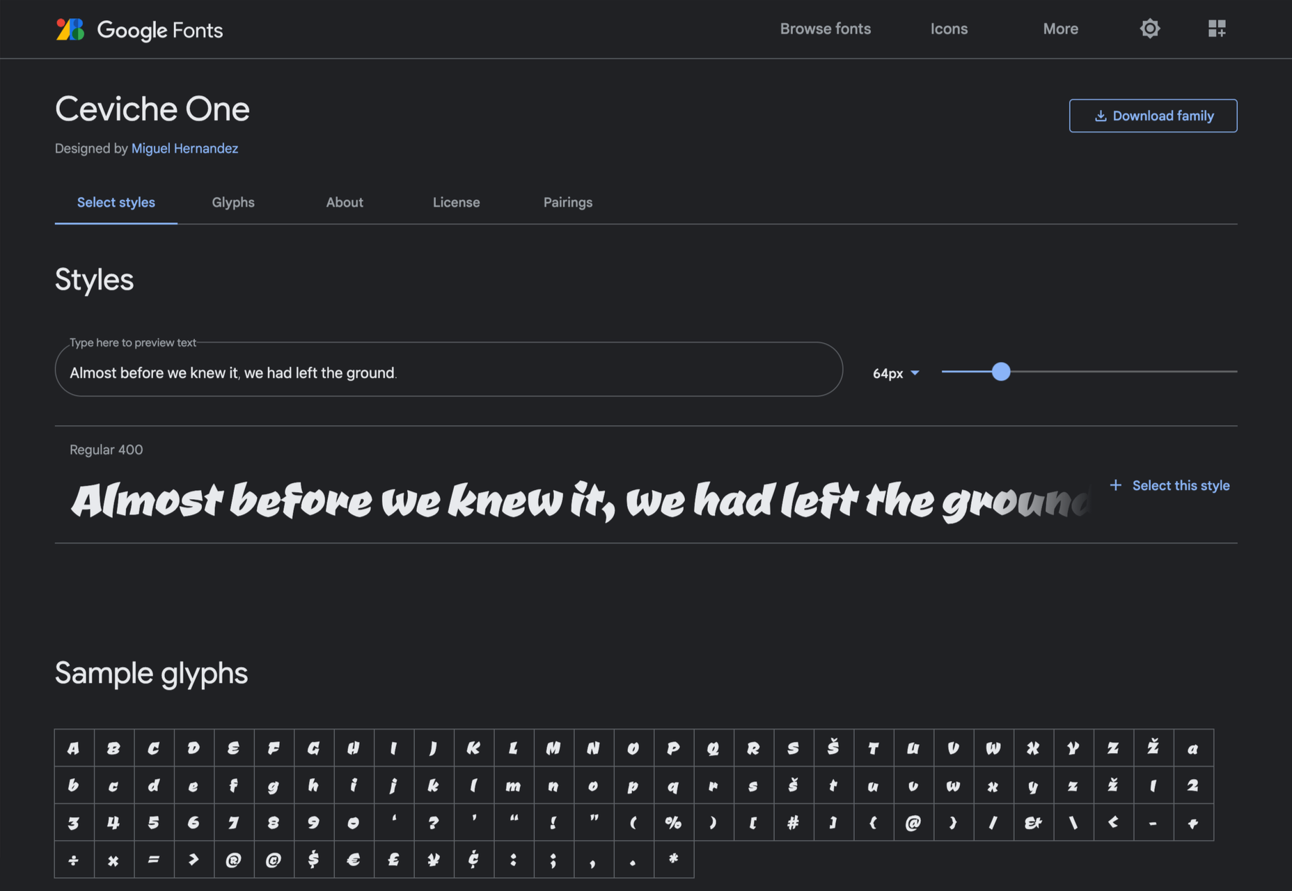
Ceviche One

Reminiscent of the cool lettering of 60s advertising, Ceviche One is packed with energy, thanks to the dramatic zig-zag formed along its baseline.

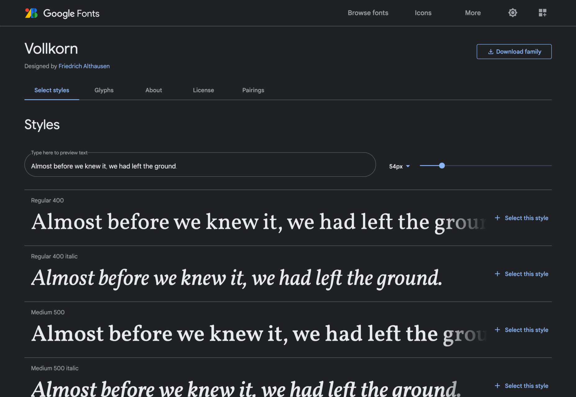
Vollkorn

Released by Friedrich Althausen in 2005, Vollkorn is an excellent typeface for body copy, excelling at small sizes. It now boasts a variable font option.

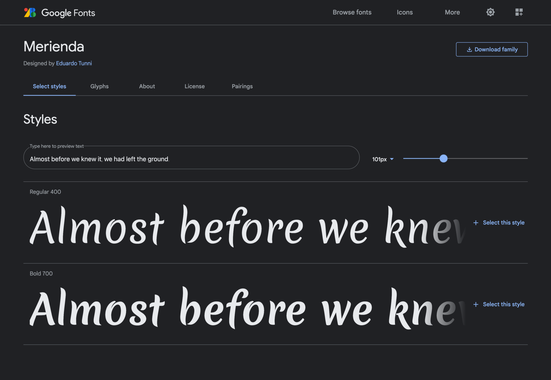
Merienda

Merienda is a delightfully energetic display script. The bold weight feels more confident, but both weights have a dancing rhythm that brings the page alive.

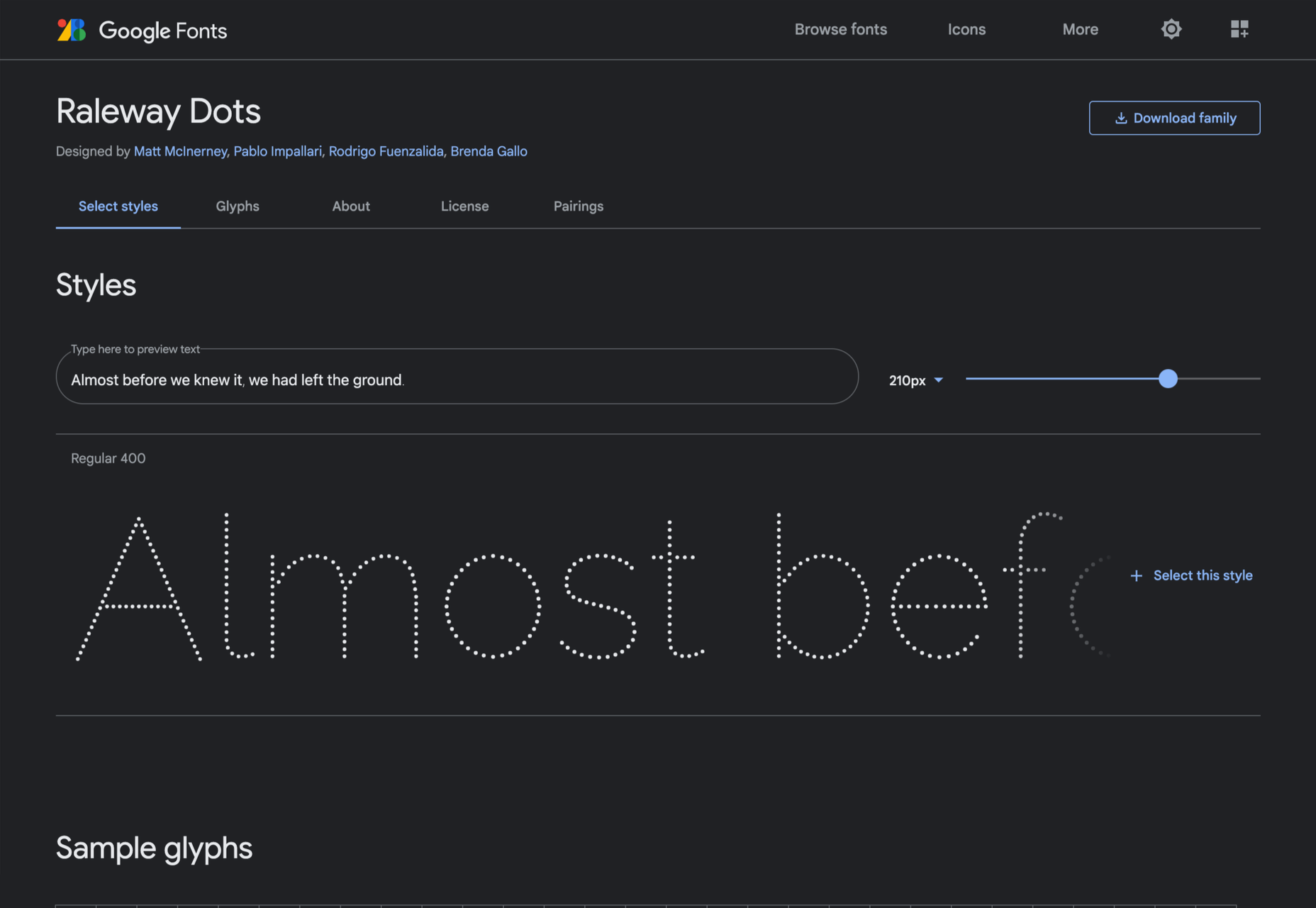
Raleway Dots

Raleway is a hugely popular — and perhaps overused font — but this dotted version is less known. It’s a simple geometric sans that functions as a display face.

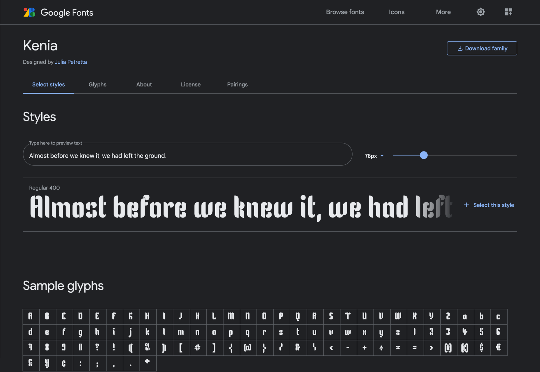
Kenia

Kenia is a wonderful, uncategorizable typeface. The stencil forms result in entirely original letter constructions, and the lowercase s is magnificent.

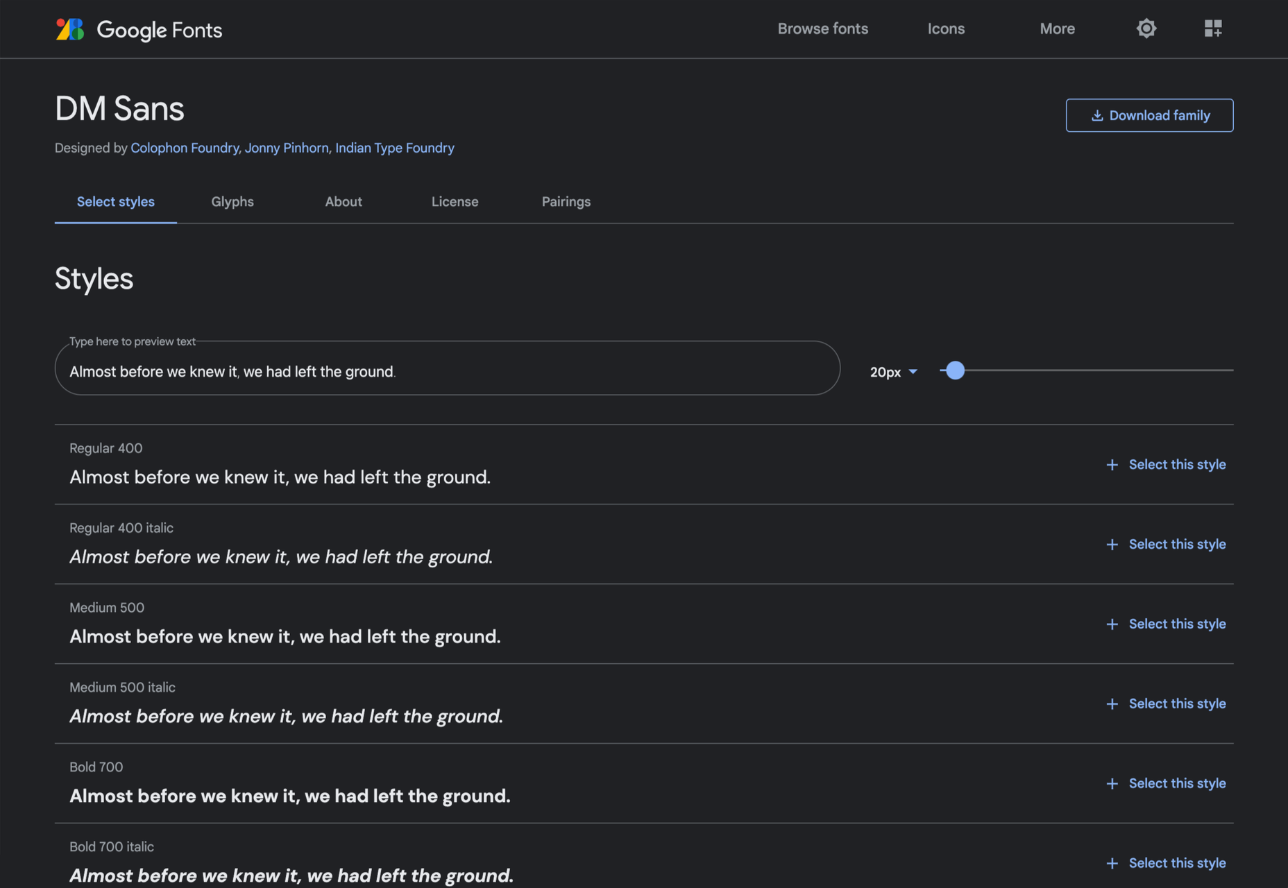
DM Sans

DM Sans is a low-contrast geometric sans-serif that performs wonderfully well at smaller sizes. It only has three weights, but each comes with a matching italic.

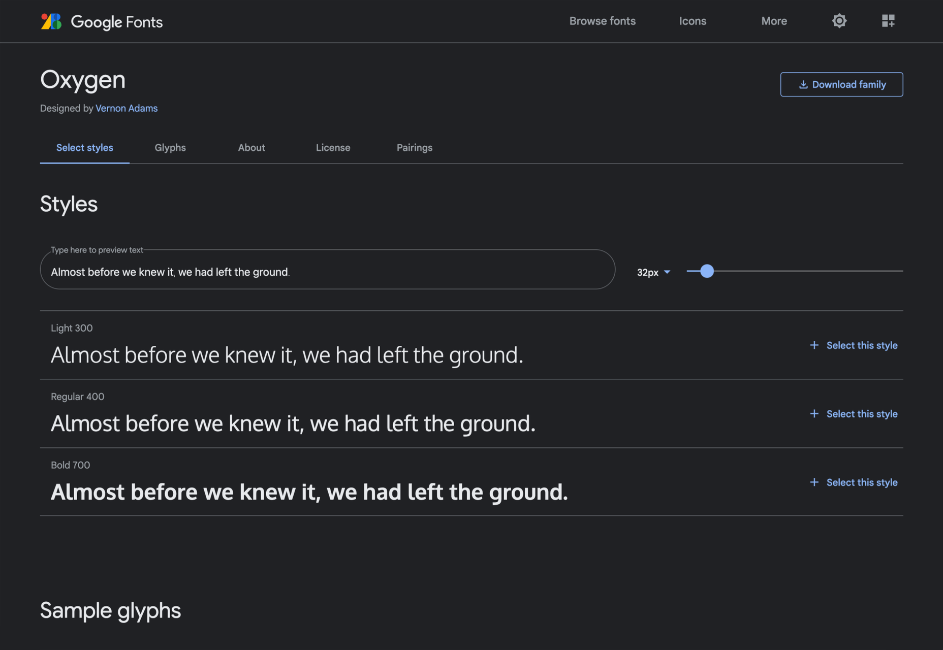
Oxygen

Designed by Vernon Adams as part of the KDE project for GNU+Linux, Oxygen is a very readable sans-serif, with a generous x-height and a hint of pen stroke.

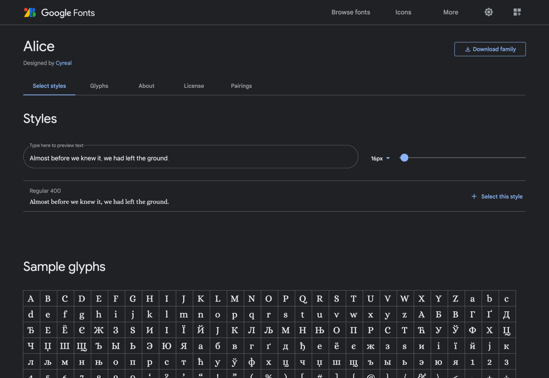
Alice

Ksenia Erulevich’s Alice was inspired by Lewis Carrol’s novel Alice’s Adventures in Wonderland. It presents itself as an Edwardian serif with fanciful flourishes.

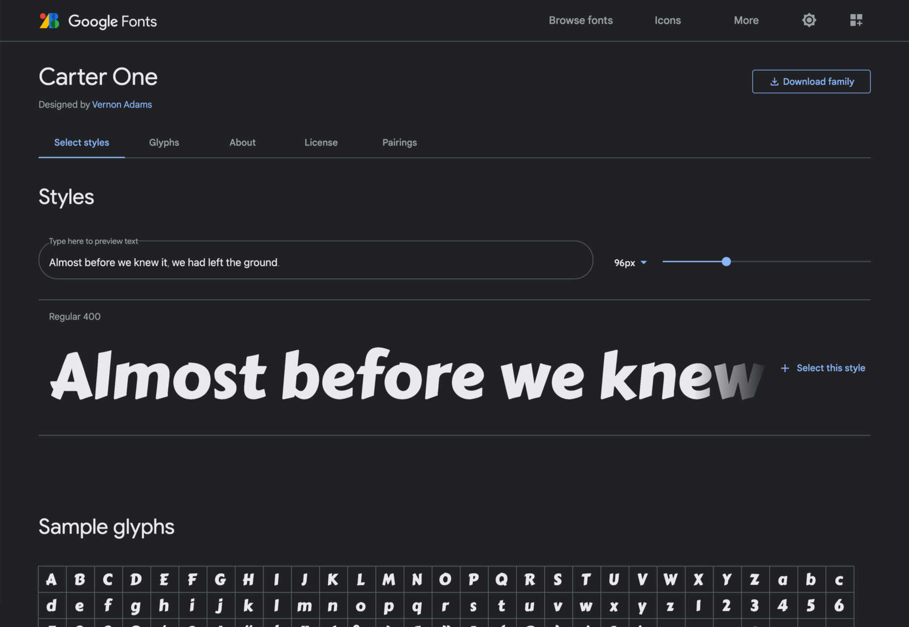
Carter One

Carter One uses bold strokes, with a medium amount of contrast, to create a sans-style script. It has dozens of beautiful details like the notch on the lowercase o.

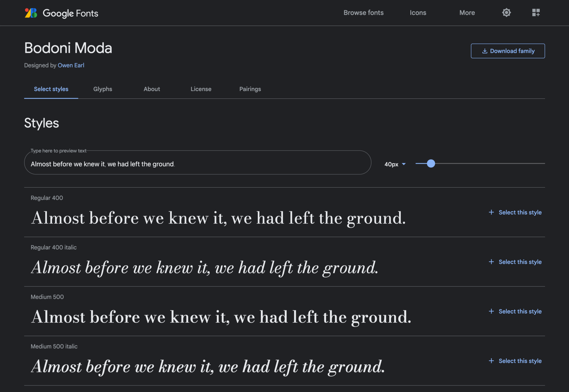
Bodoni Moda

Bodoni Moda is a didone-style serif with strong vertical strokes and high-contrast slab-like serifs. It’s the best variable font in this genre that I’ve found.

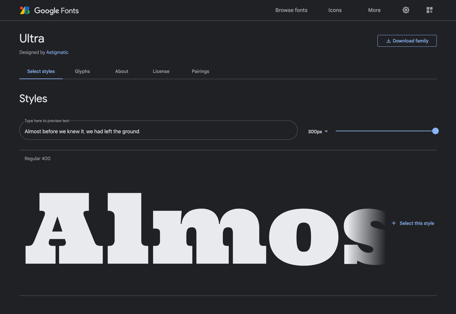
Ultra

Ultra is a slab-serif that you won’t even consider for body text. Its sculptural shapes are almost American-western. The counter on the lowercase n is charming.

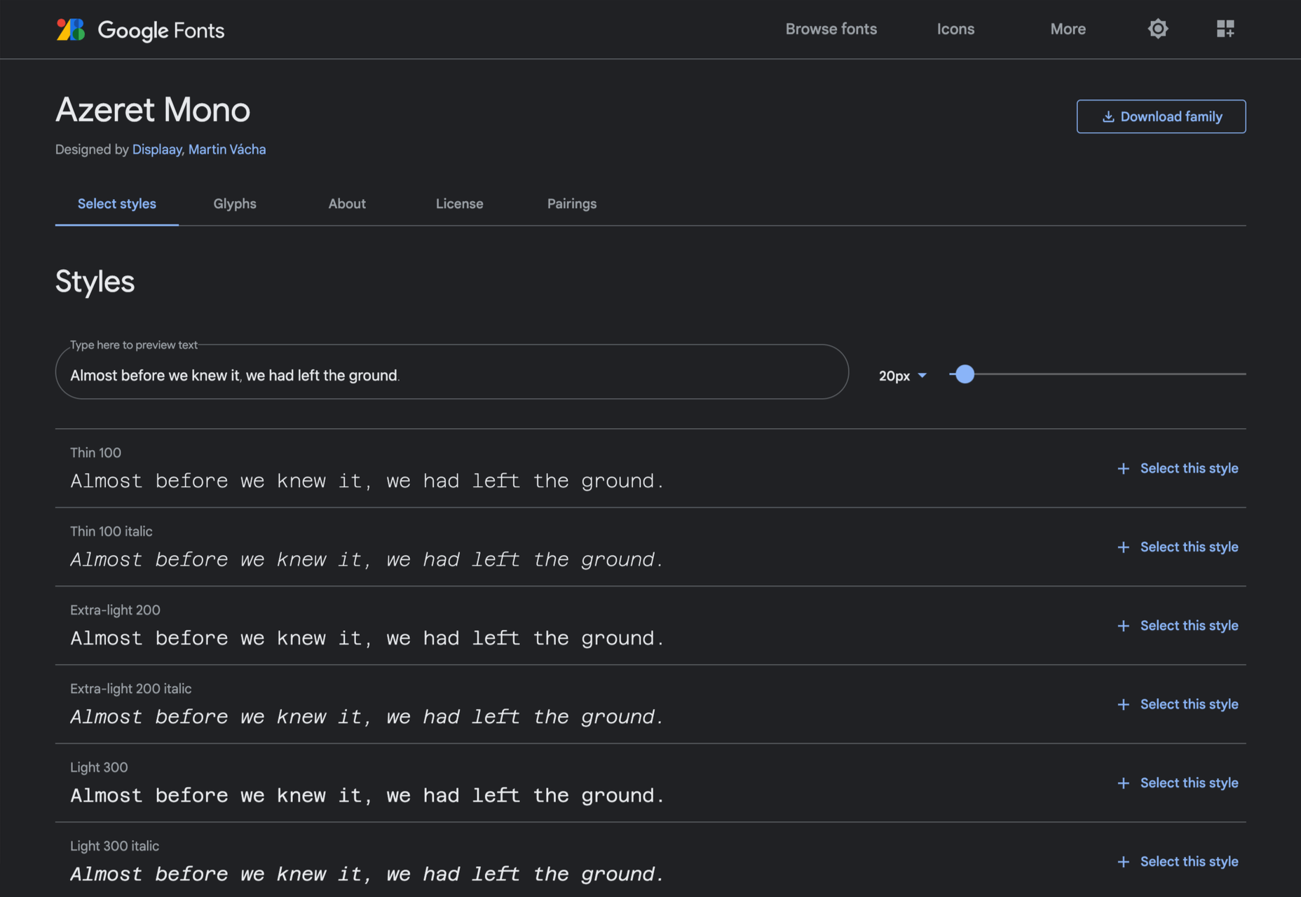
Azeret Mono

Most mono-spaced fonts fail to inspire; practical they can be, charming they are not. But Azeret Mono bucks that trend, its bold weights being particularly fantastic.

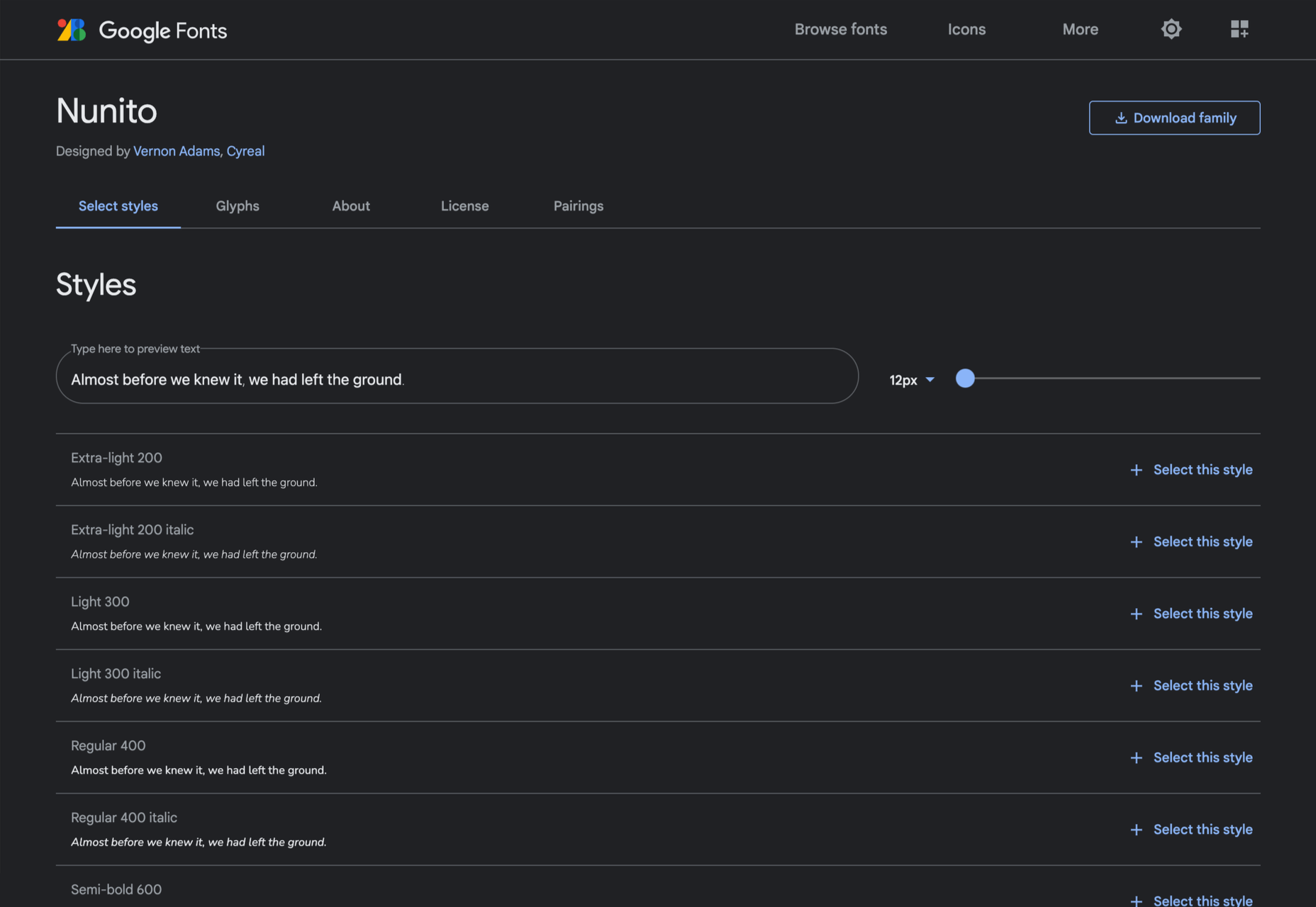
Nunito

It’s tough to find a serious sans-serif with rounded terminals, but Nunito is it. There’s also a Nunito Sans with square terminals, but I love the rounded tips.

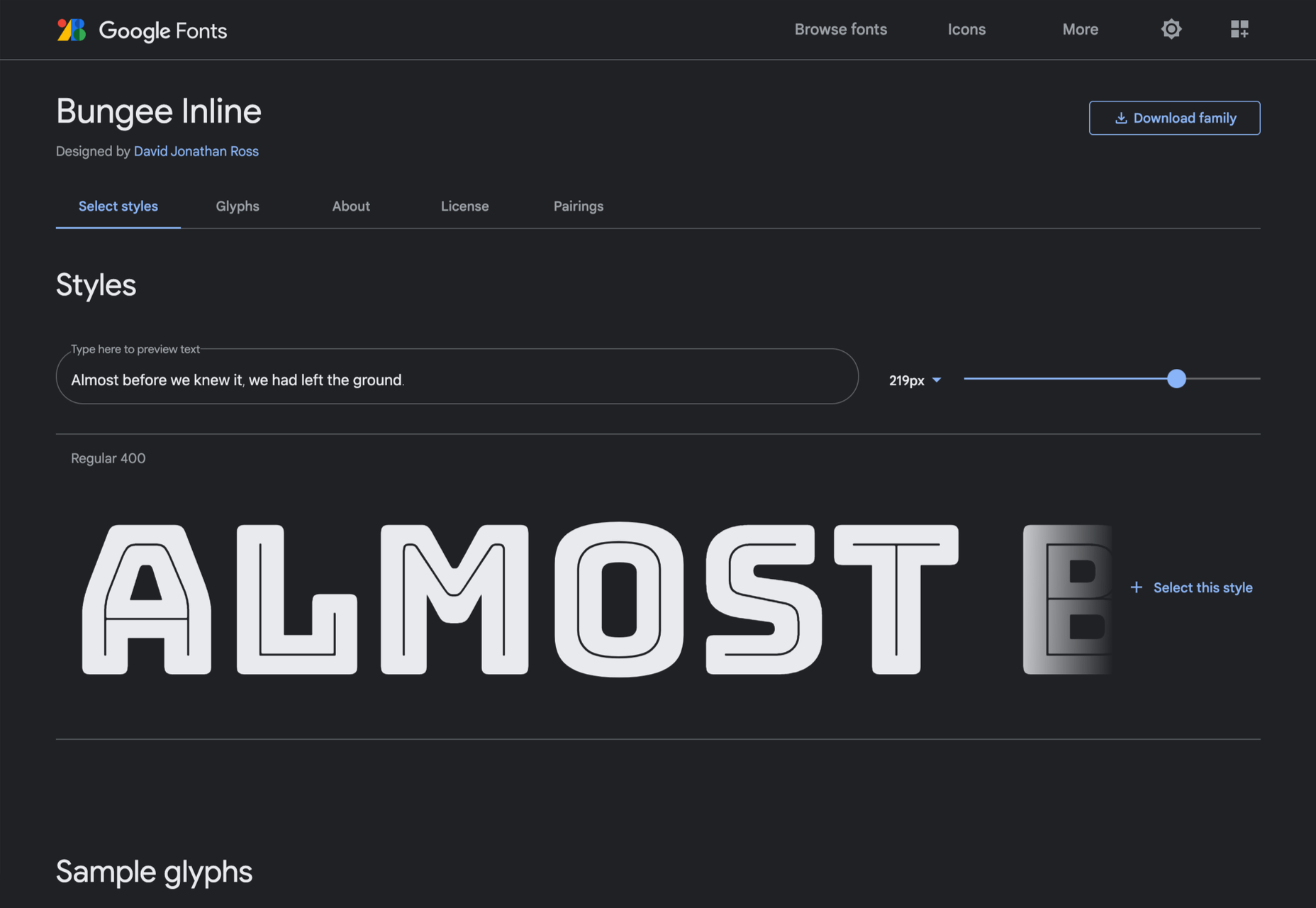
Bungee Inline

Designed for signage, Bungee is great for display sizes and works well vertically. There are several versions, but my favorite is this classy inline version.

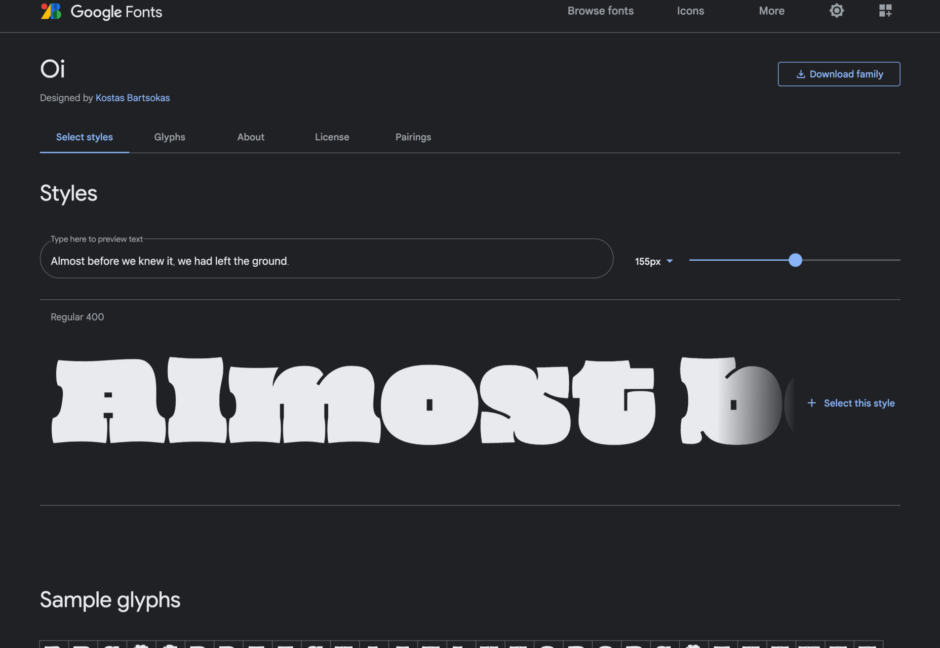
Oi

Oi is unapologetically loud. A slab-serif that swallows its own detail, the counters and ink traps give it a 3D quality, and the curves feel almost nautical.

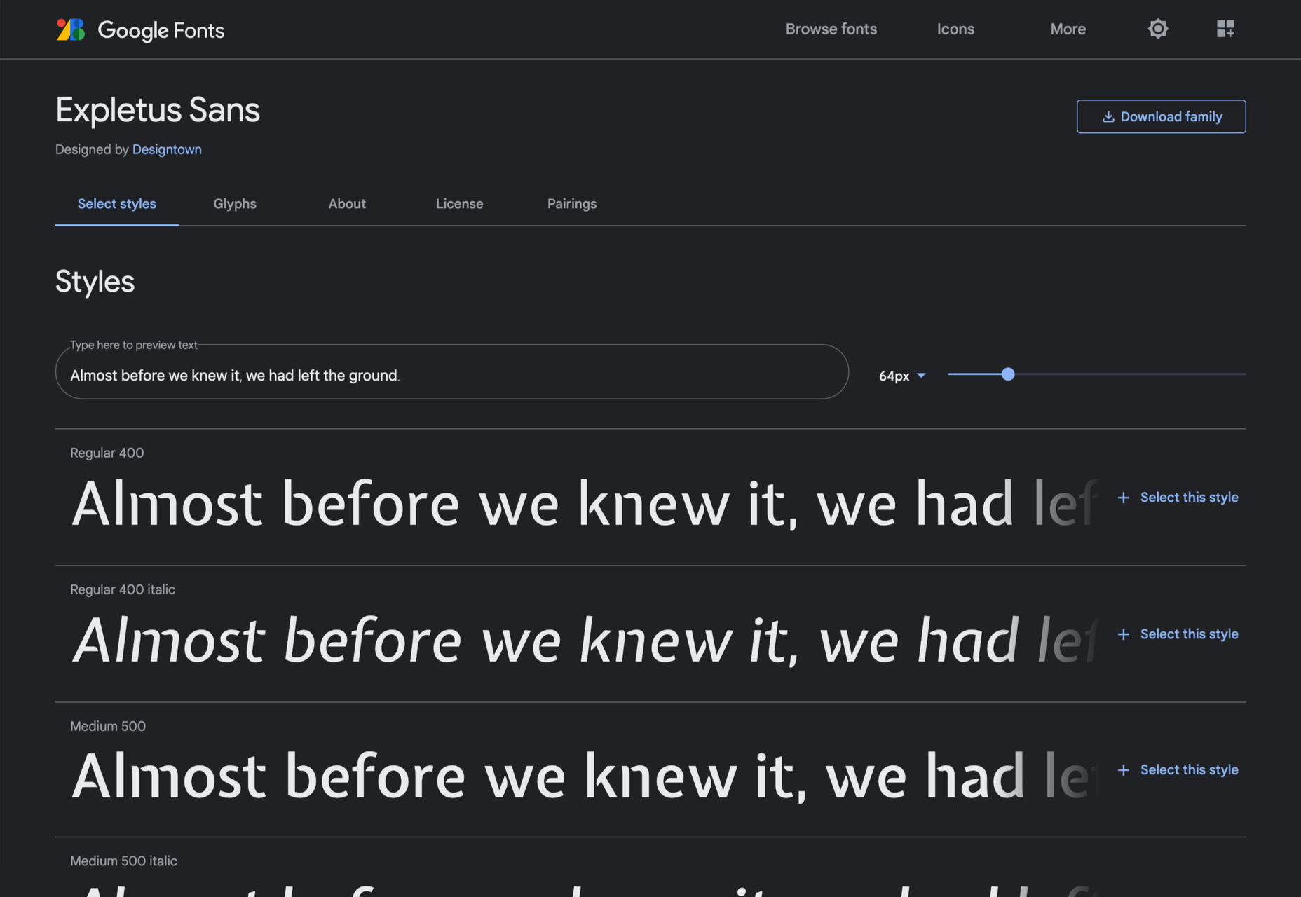
Expletus Sans

One of the significant trends in typography is the angled clip of adjoining strokes, creating the effect of shadow. This effect is brilliantly achieved in Expletus Sans.

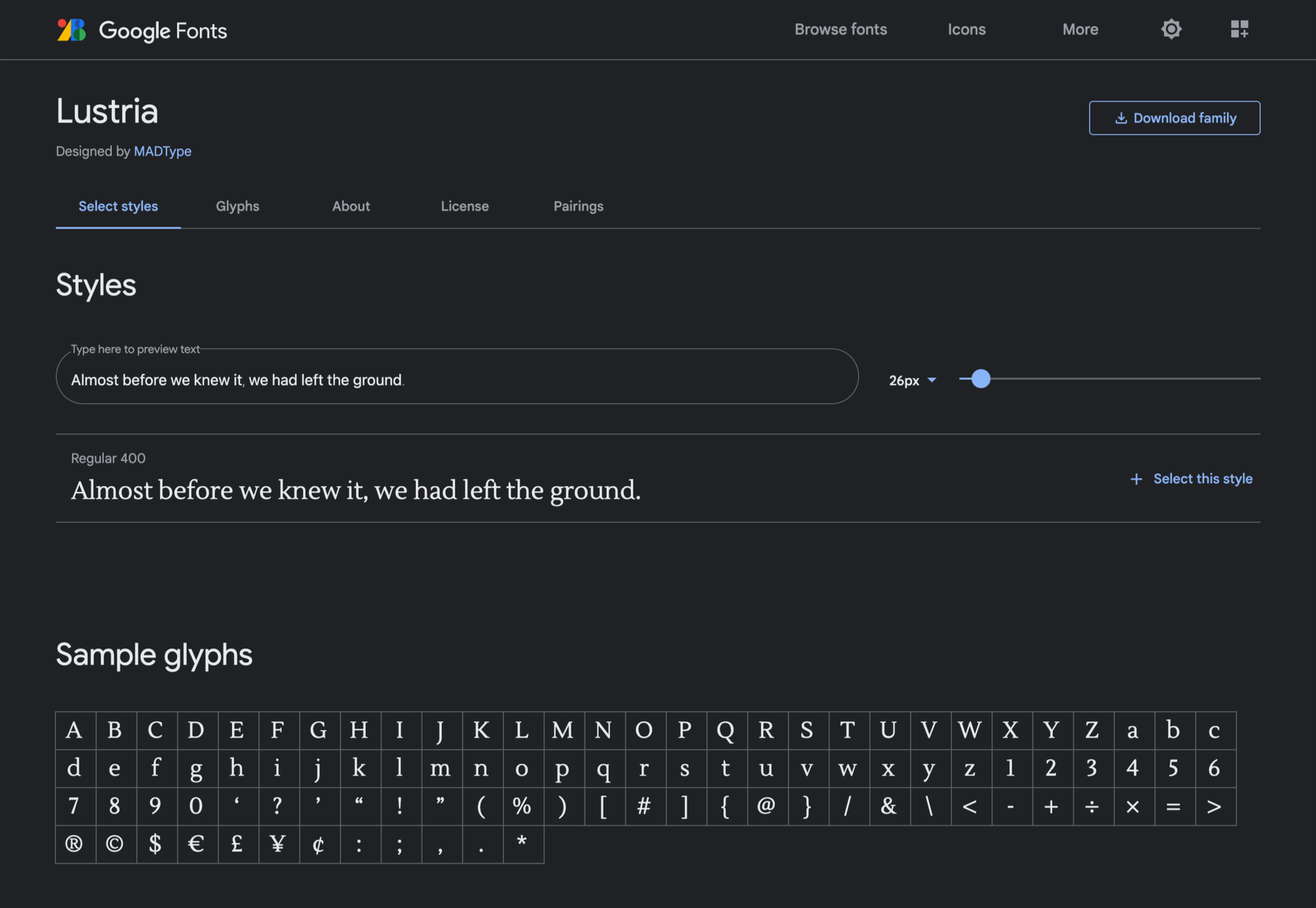
Lustria

It’s comparatively unusual to find a serif face designed to work well at display sizes. At large sizes, Lustria’s rounded terminals evoke ink spread delightfully.

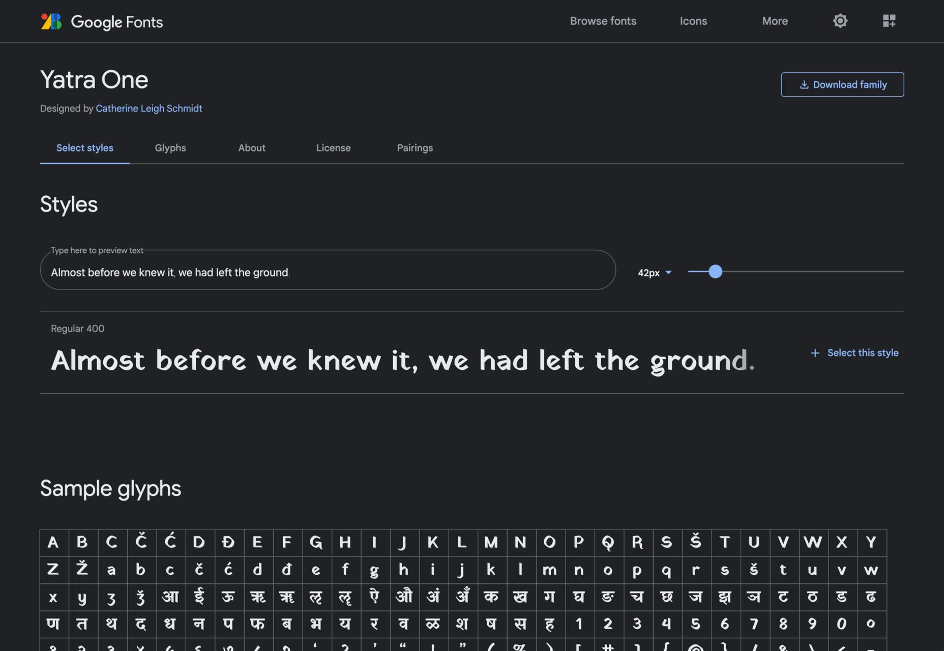
Yatra One

Yatra One is a Devanagari and Latin typeface that uses the Devanagari brush angle for its strokes, giving the Latin text an unusually slanted, stand-out character.

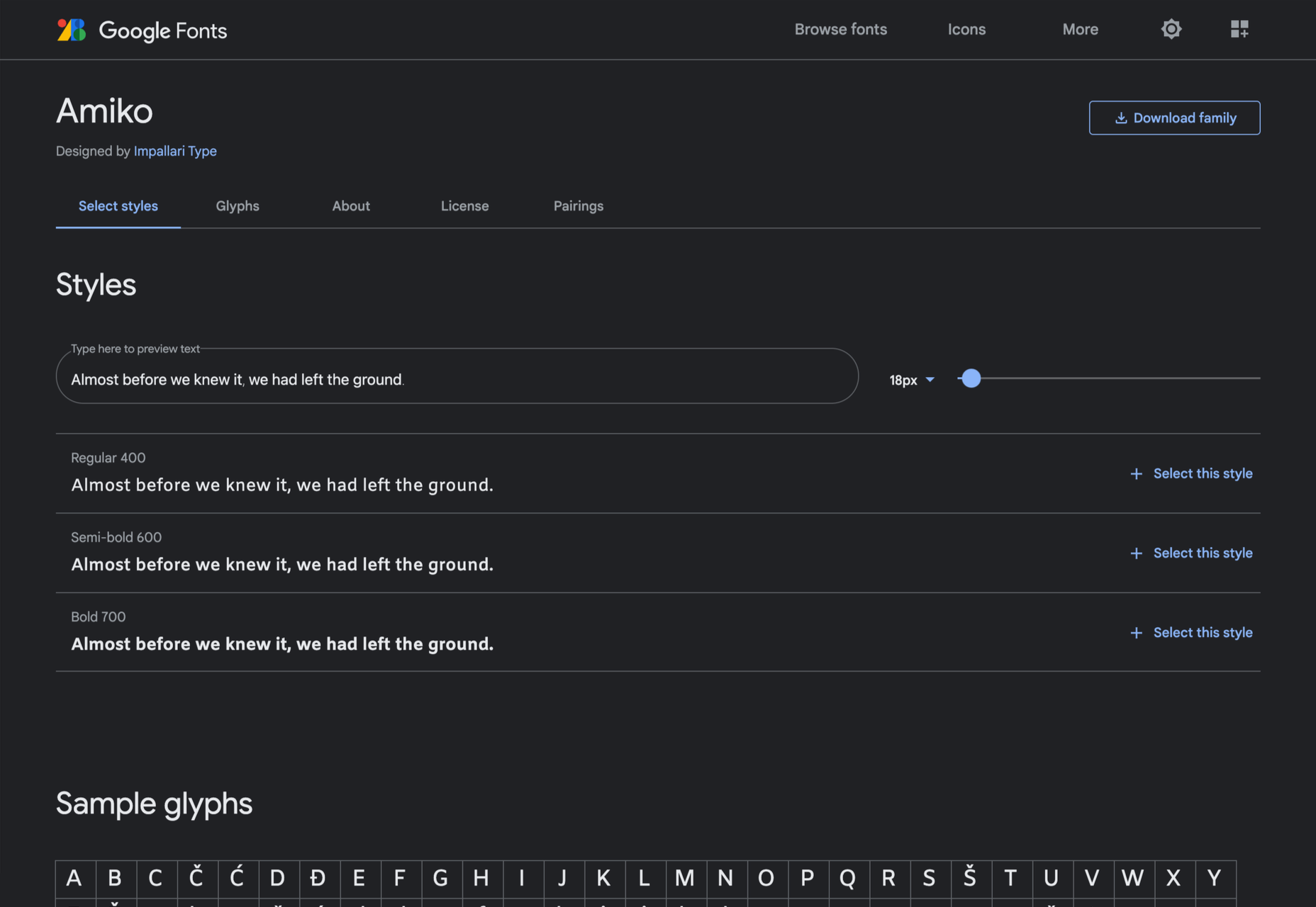
Amiko

Amiko is a highly legible typeface and excellent at tiny font sizes. It’s perfect as a secondary font if your main font is too fancy for elements like legal notices.

Keep Scrolling

It’s always tempting to leap at the first typeface you find that meets your needs, but if you dig a little deeper into Google Fonts, you’ll find a vast range of typefaces that offer both practicality and character.

Source

The post 21 Exceptional Google Fonts You Probably Haven’t Discovered Yet first appeared on Webdesigner Depot.


Source de l’article sur Webdesignerdepot

Since school is back in session, this month’s roundup has a learning focus. In addition to tools, many of the resources include guides, tutorials, and cheat sheets to help make design work easier.

Here’s what’s new for designers this month.

ScrollingMockup.io

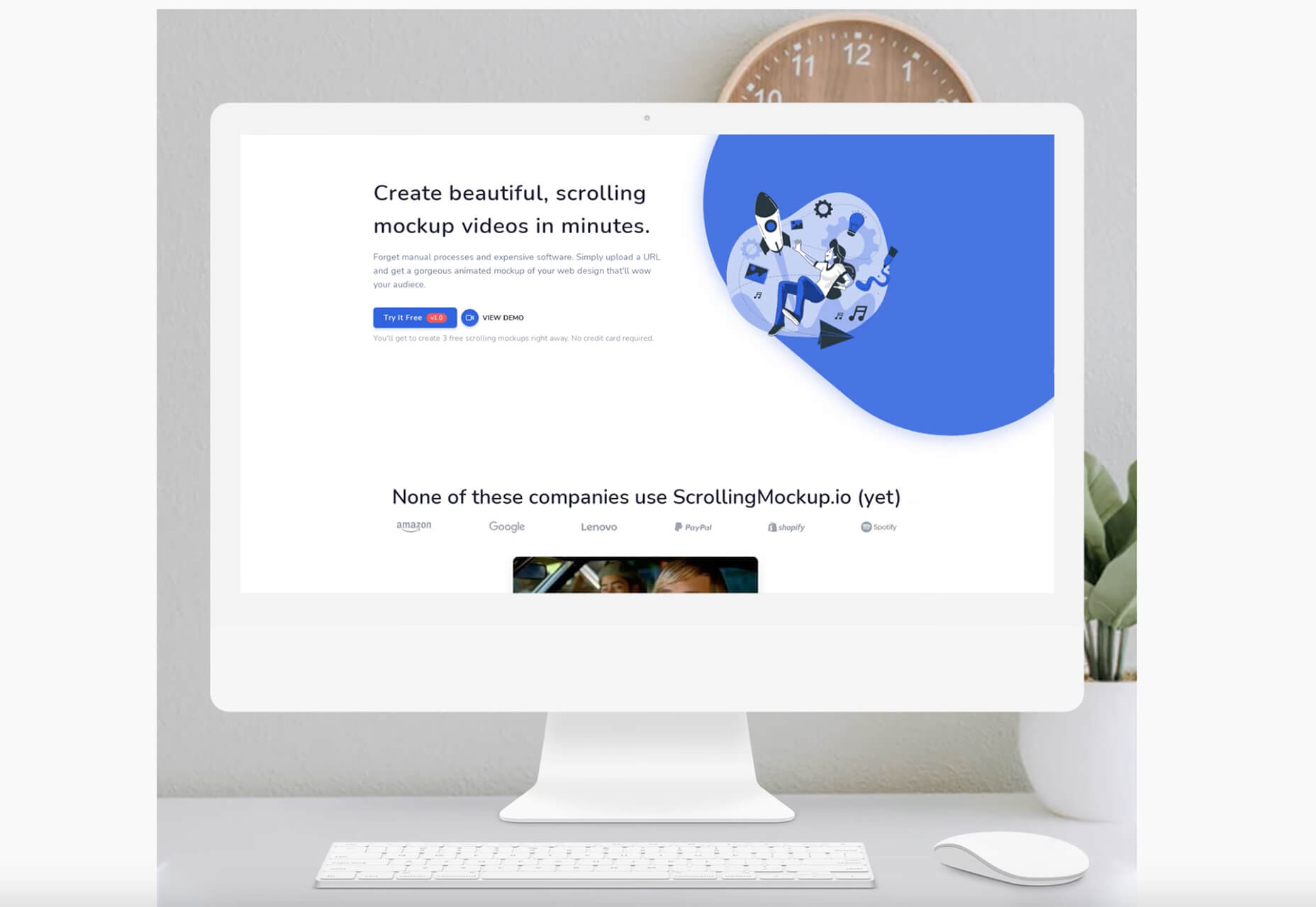
ScrollingMockup.io generates high-definition, animated scrolling mockups in minutes. All you have to do is paste your website URL, select from the expanding template gallery, add some music and post. You can create three mockups for free, and then this tool comes with a subscription model. The paid model allows for custom branding for mockups and more.
FilterSS

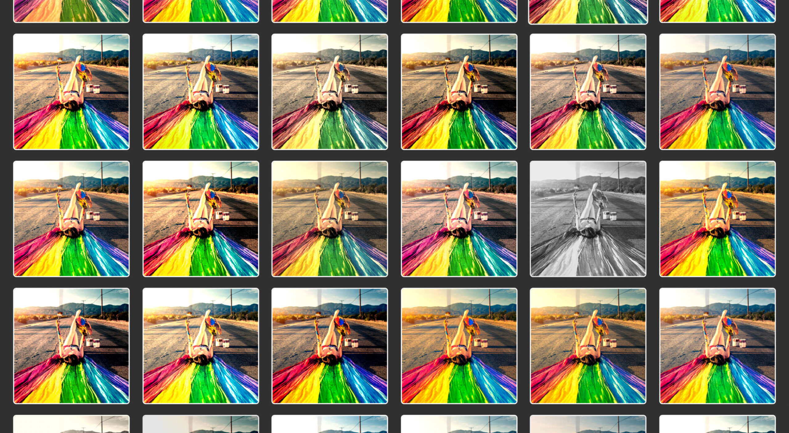
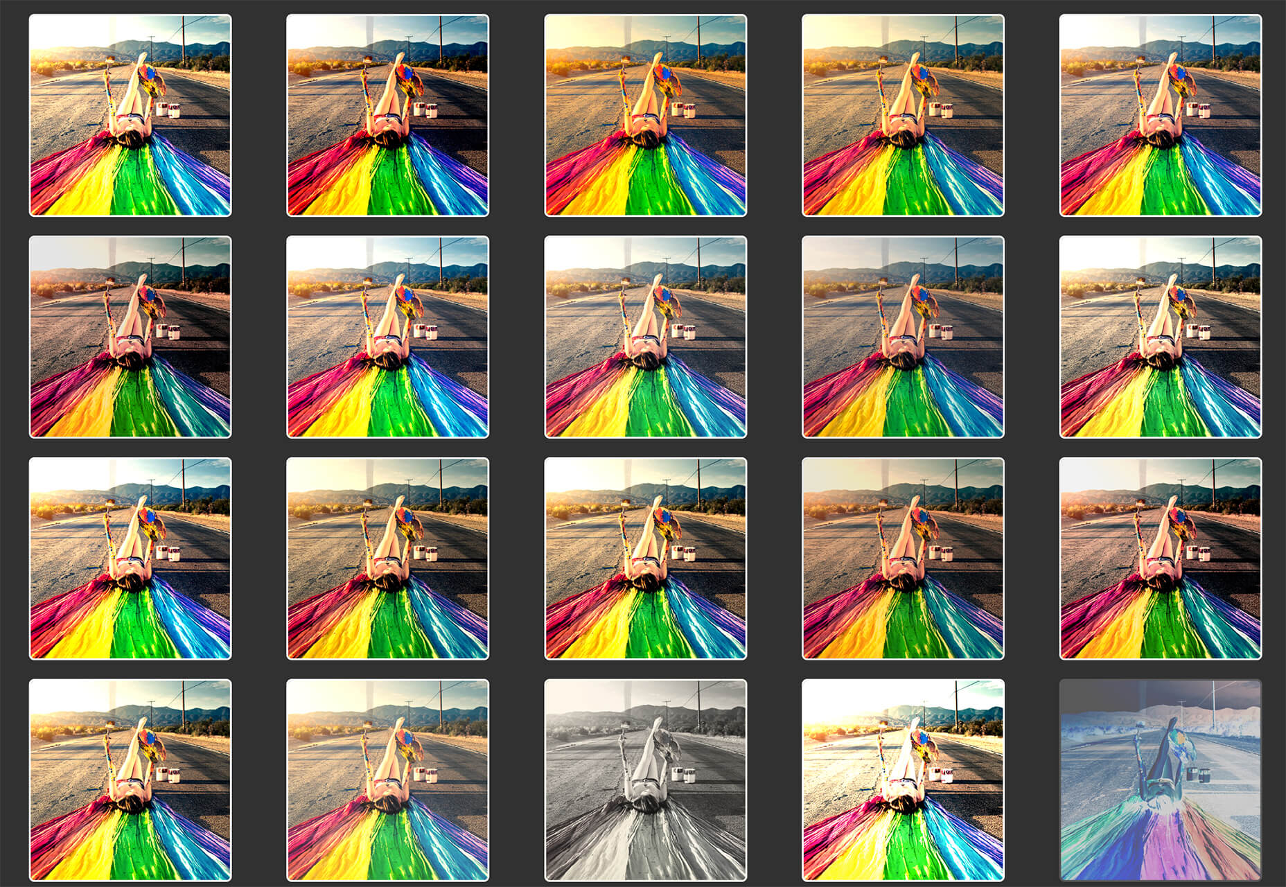
FilterSS is a curated collection of CSS image filters for use in projects. Upload an image, sort through the list, and then copy the code for the filter you want to use. It’s that easy!
Buttons Generator

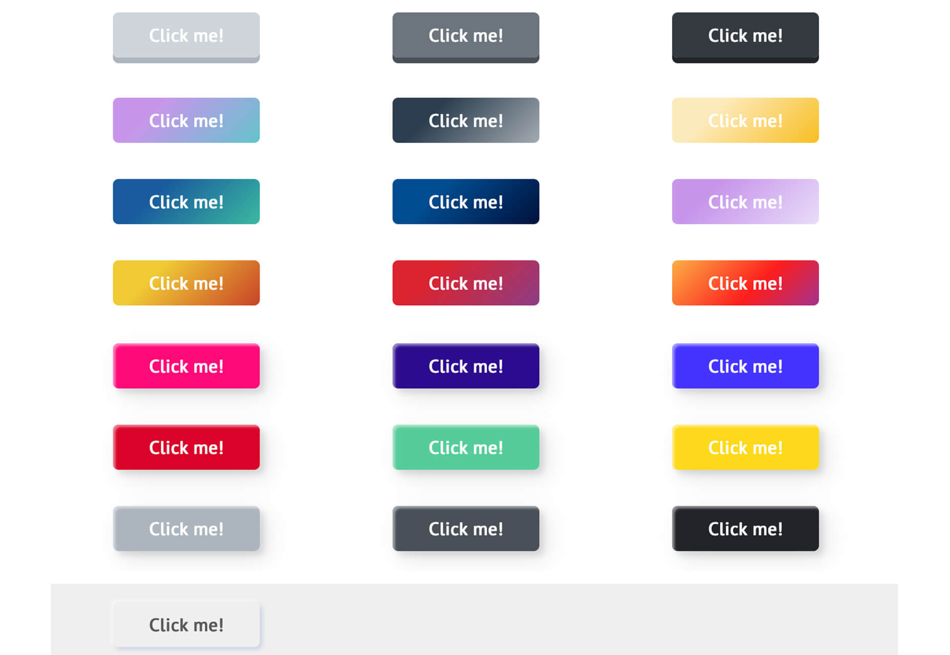
Buttons Generator is a fun tool with so many button options in one place. Choose from three-dimensional, gradient, shadow borders, neumorphic, retro, animated, ghost, with arrows, and more all in one place. Click the one you like, and the code is copied right to your clipboard and ready to use in projects.
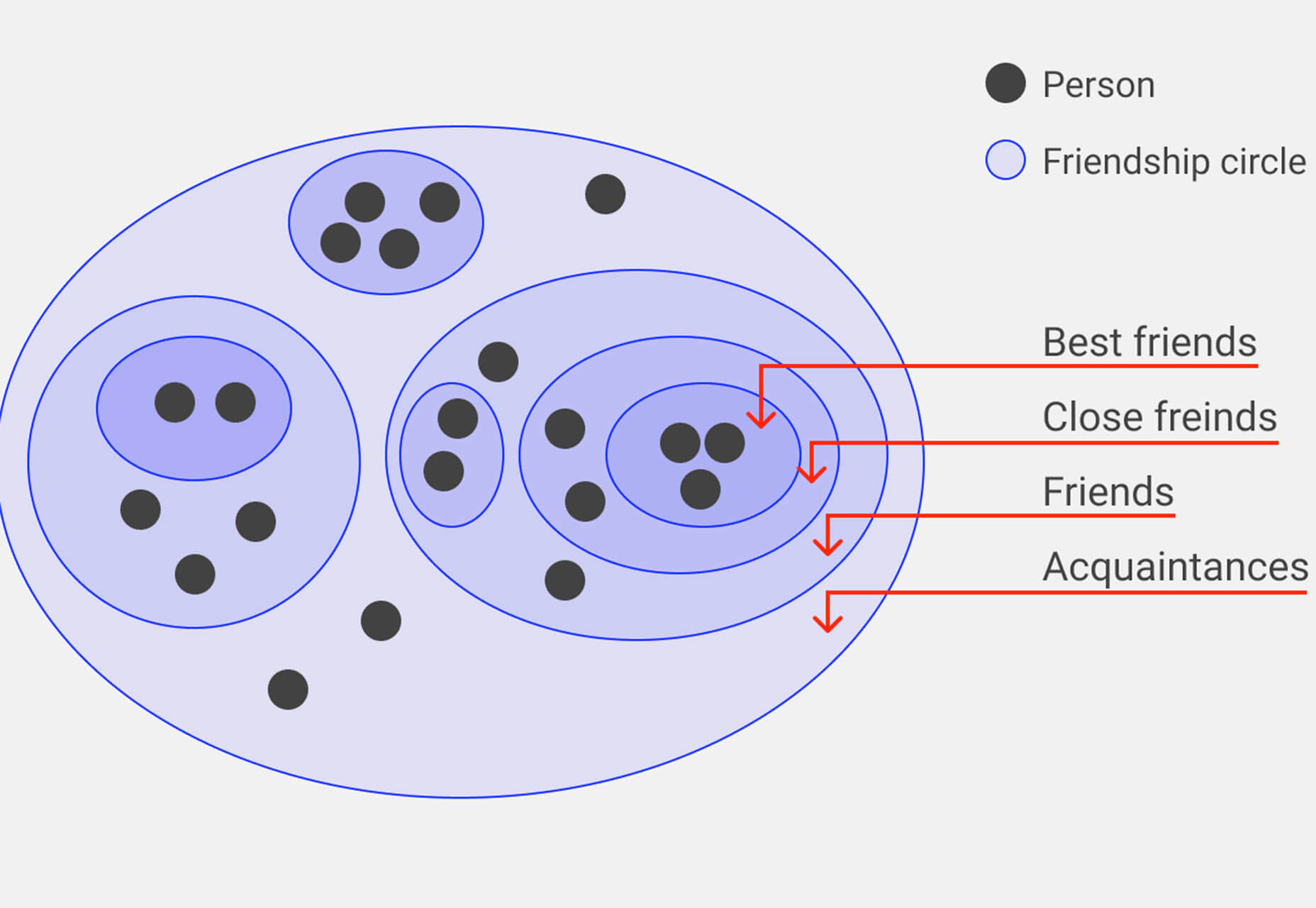
UI Cheat Sheet: Spacing Friendships

UI Cheat Sheet: Spacing Friendships is a fun – and memorable approach to figuring out spacing. This guide shows how close or far away elements should be based on “friend” circles with a couple of relatable instances. It’s one of the most relatable examples of this concept out there while emphasizing the importance of spacing in design.
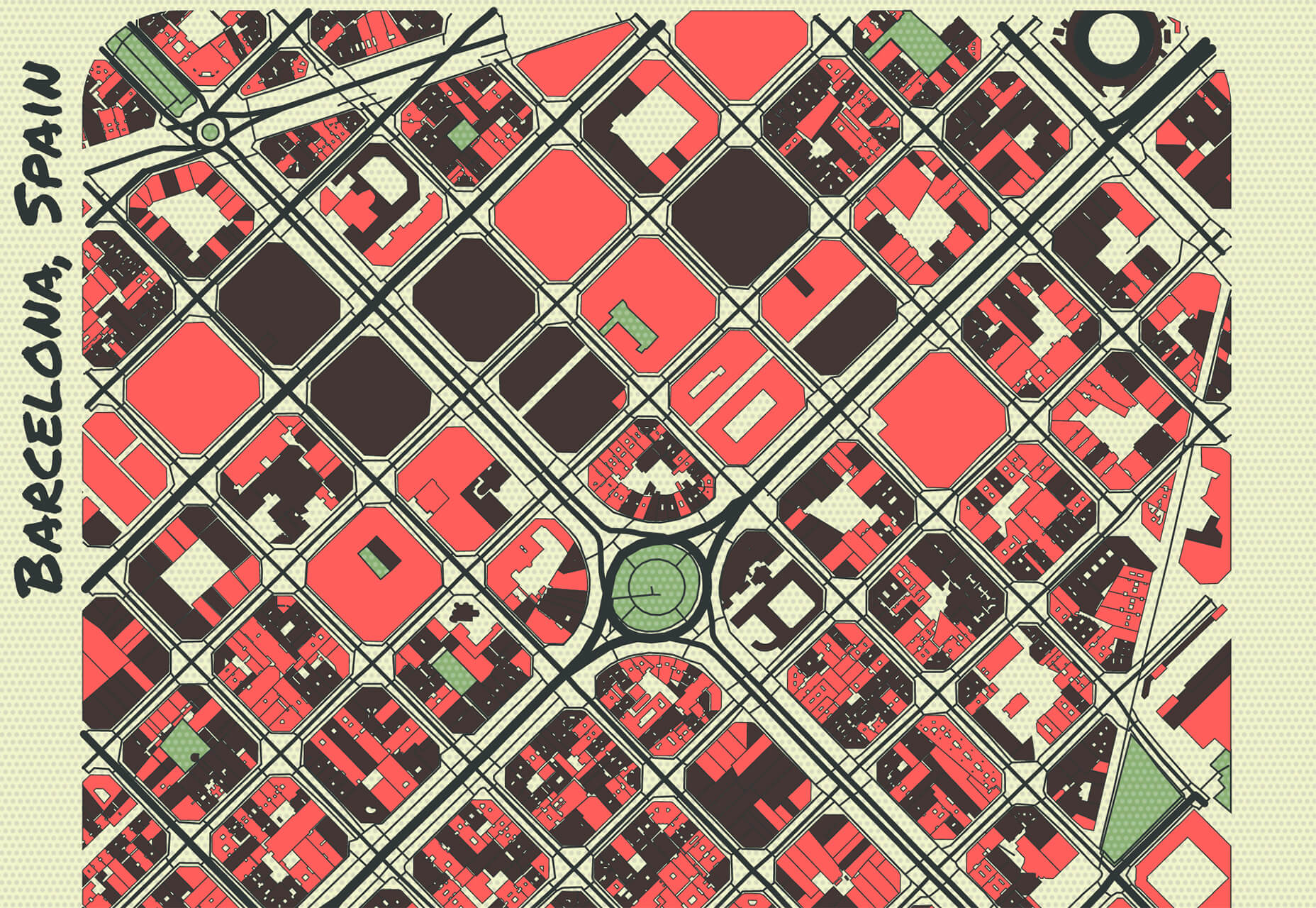
PrettyMaps

PrettyMaps is a minimal Python library that allows you to draw customized maps from OpenStreetMap data. This tool can help you take online map design to the next level with cool, unique map visuals. It’s based on osmnx, matplotlib, shapely, and vsketch libraries.
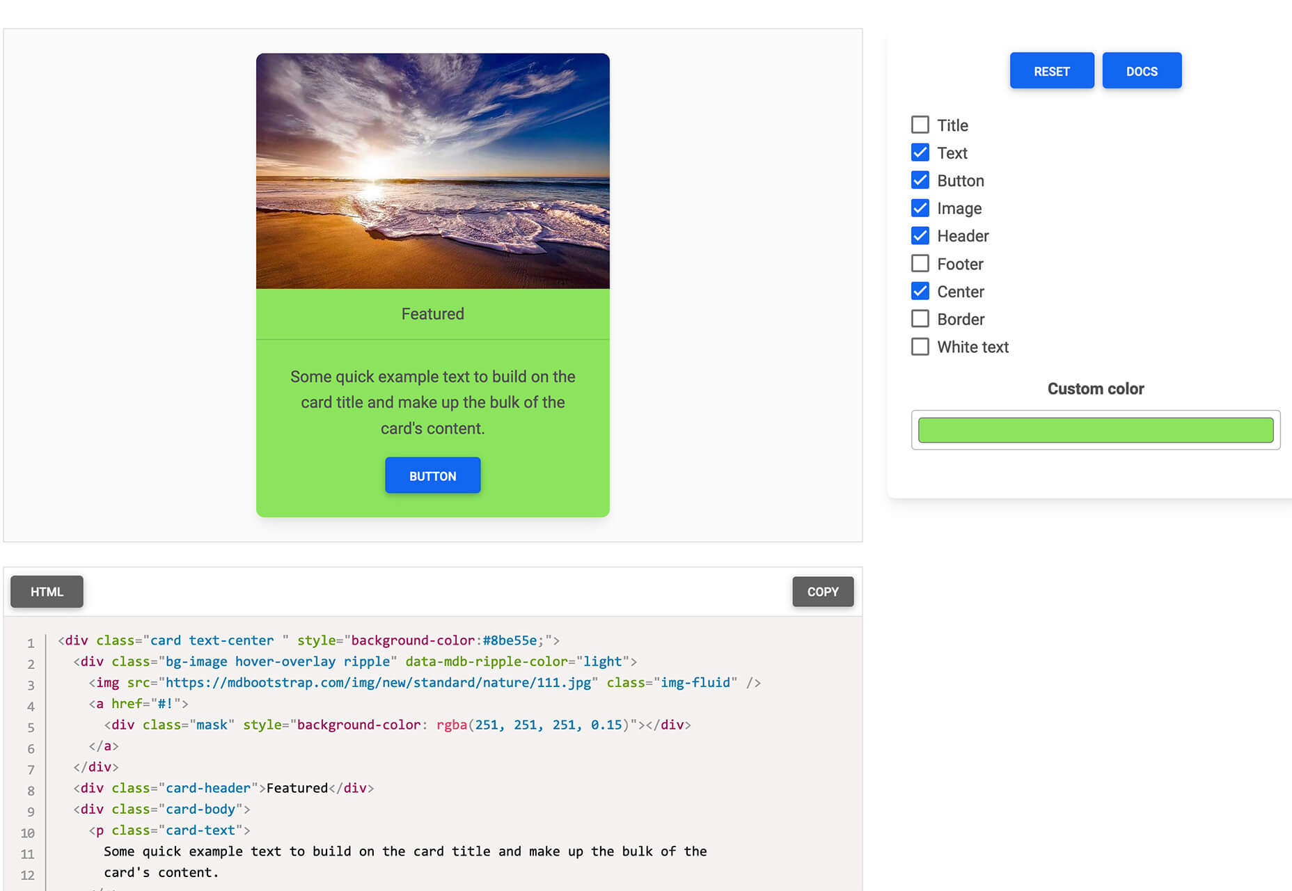
Card.UX/UI

Card.UX/UI is a card-style generator with more than 20 templates and elements to create custom cards. Use the on-screen tools to design it the way you want and then copy the code for easy use.
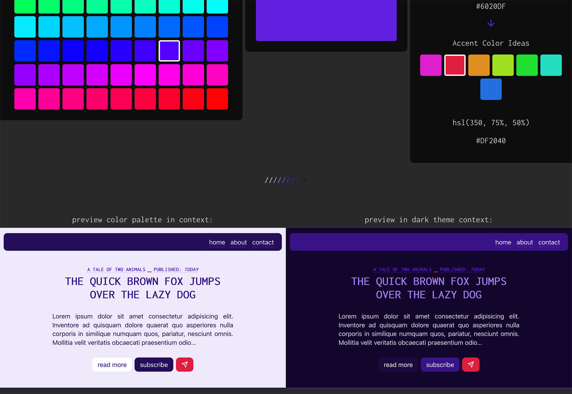
Couleur.io

Couleur.io is a simple color palette builder tool that lets you pick a starting color and build a scheme around it. One of the best elements of the tool might be the quick preview, which shows your choices using the palette in context and in dark mode. Get it looking the way you want, and then snag the CSS to use in your projects.
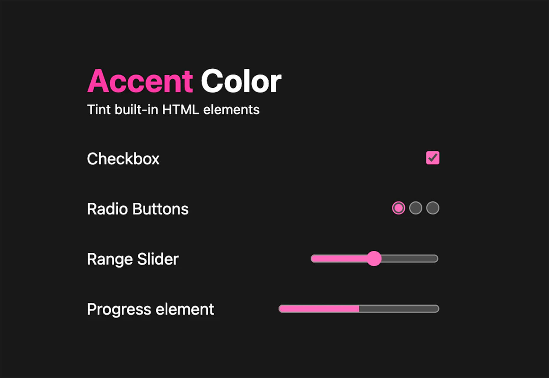
CSS Accent-Color

CSS Accent-Color can help you tint elements with one line of CSS. It’s a time-saving trick that allows for greater customization for your brand in website design projects. Plus, it works equally well in dark or light color schemes. It supports checkboxes, radio, range, and progress bars.
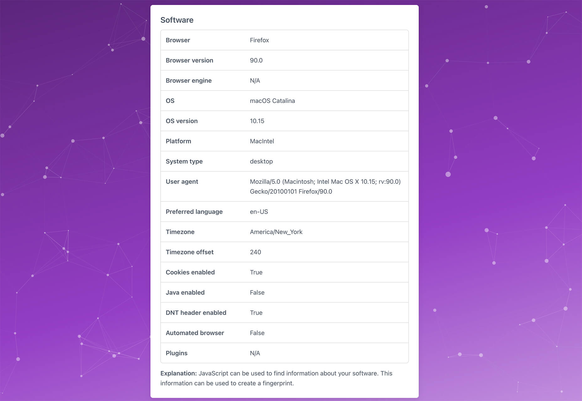
Vytal

Vytal shows what traces your browser leaves behind while surfing the web. This scan lets you understand how easy it is to identify and track your browser even while using private mode. In addition, it scans for digital fingerprints, connections, and system info.
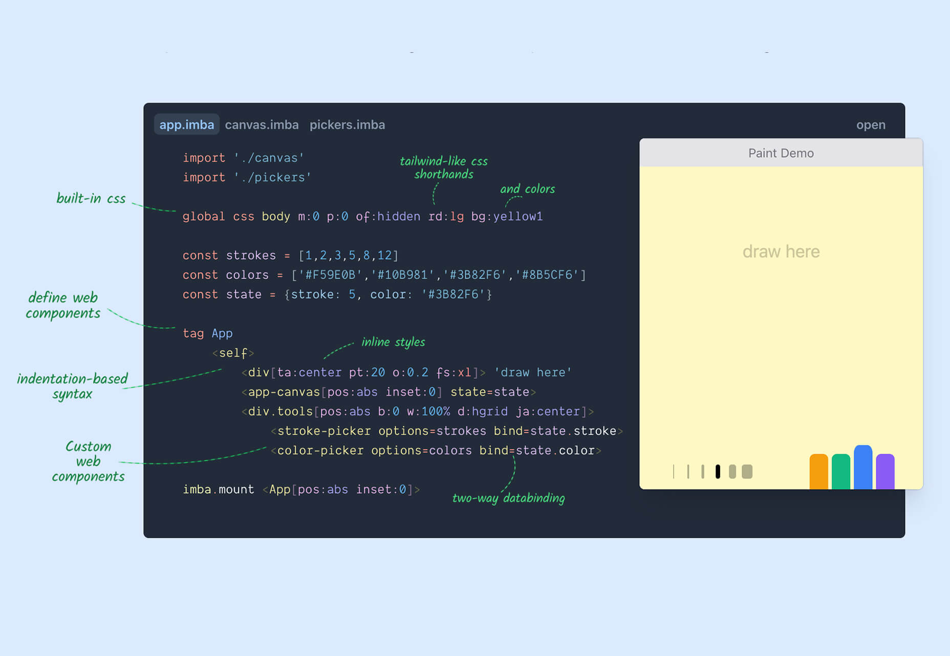
Imba

Imba is a programming language for the web that’s made to be fast. It’s packed with time-saving syntax tags and a memorized DOM. Everything compiles to JavaScript, works with Node and npm, and has amazing performance. While the language is still in active development, the community around it is pretty active and growing.
SVG Shape Dividers Creator

SVG Shape Dividers Creator is a tool that allows you to create interesting shapes with SVG so that your colors and backgrounds aren’t always rectangles. You can adjust and side, change the color, axis, and flip or animate it. Then snag the CSS, and you are ready to go.
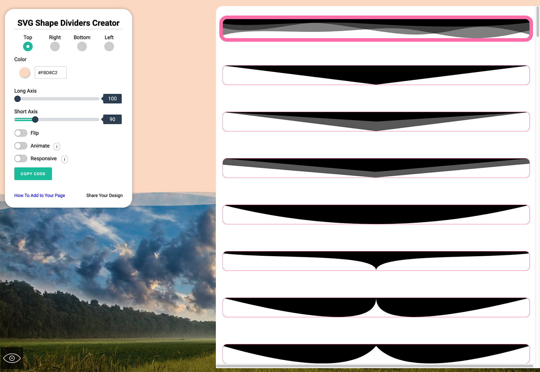
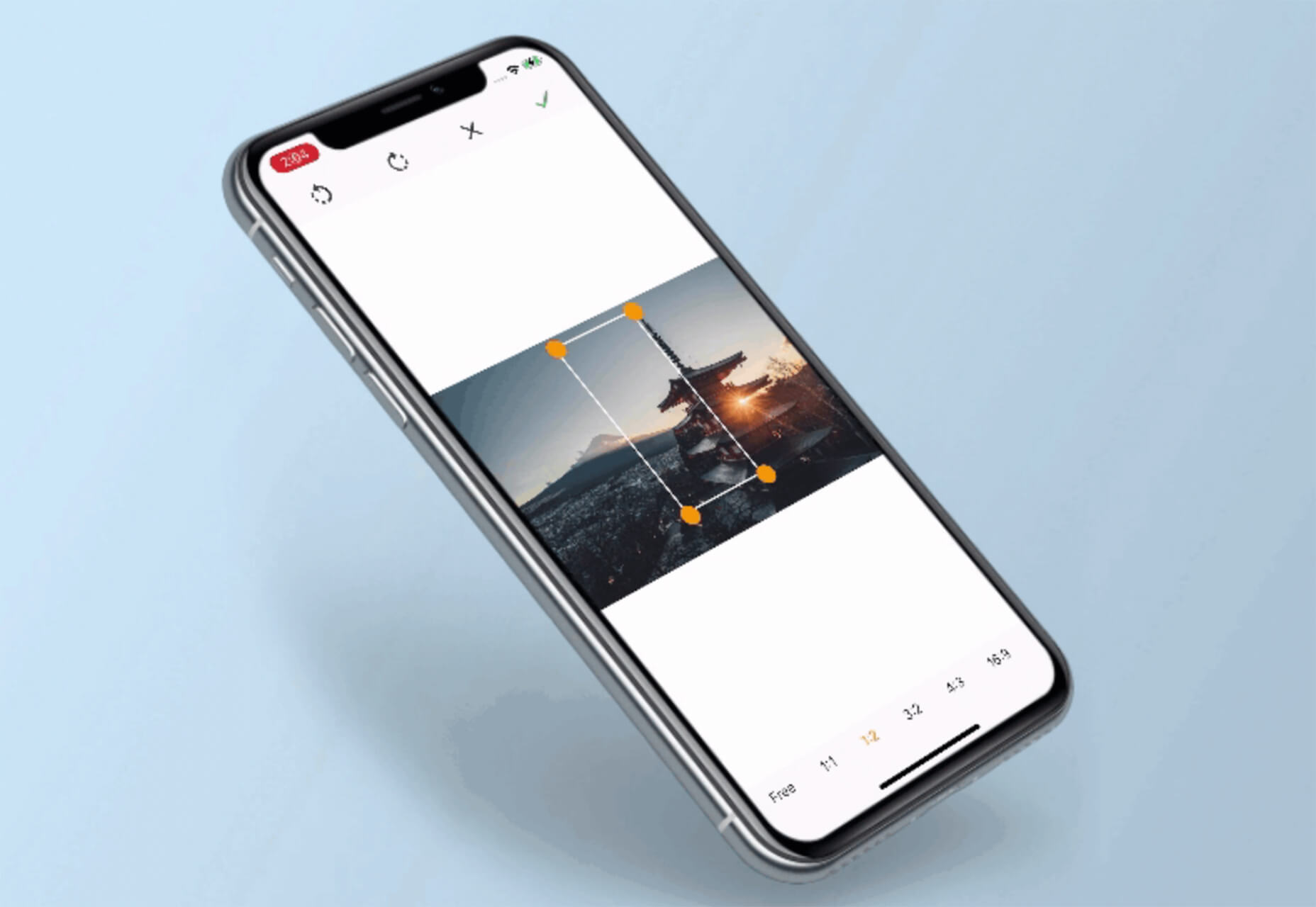
Image Cropper

Image Cropper is a tool that allows you to crop and rotate images using the flutter plugin. It works for Android and IOS.
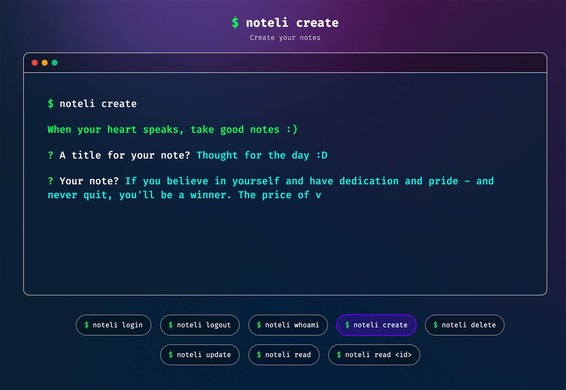
Noteli

Noteli is a CLI-based notes application that uses TypeScript, MongoDB, and Auth0. The tool is just out of beta.
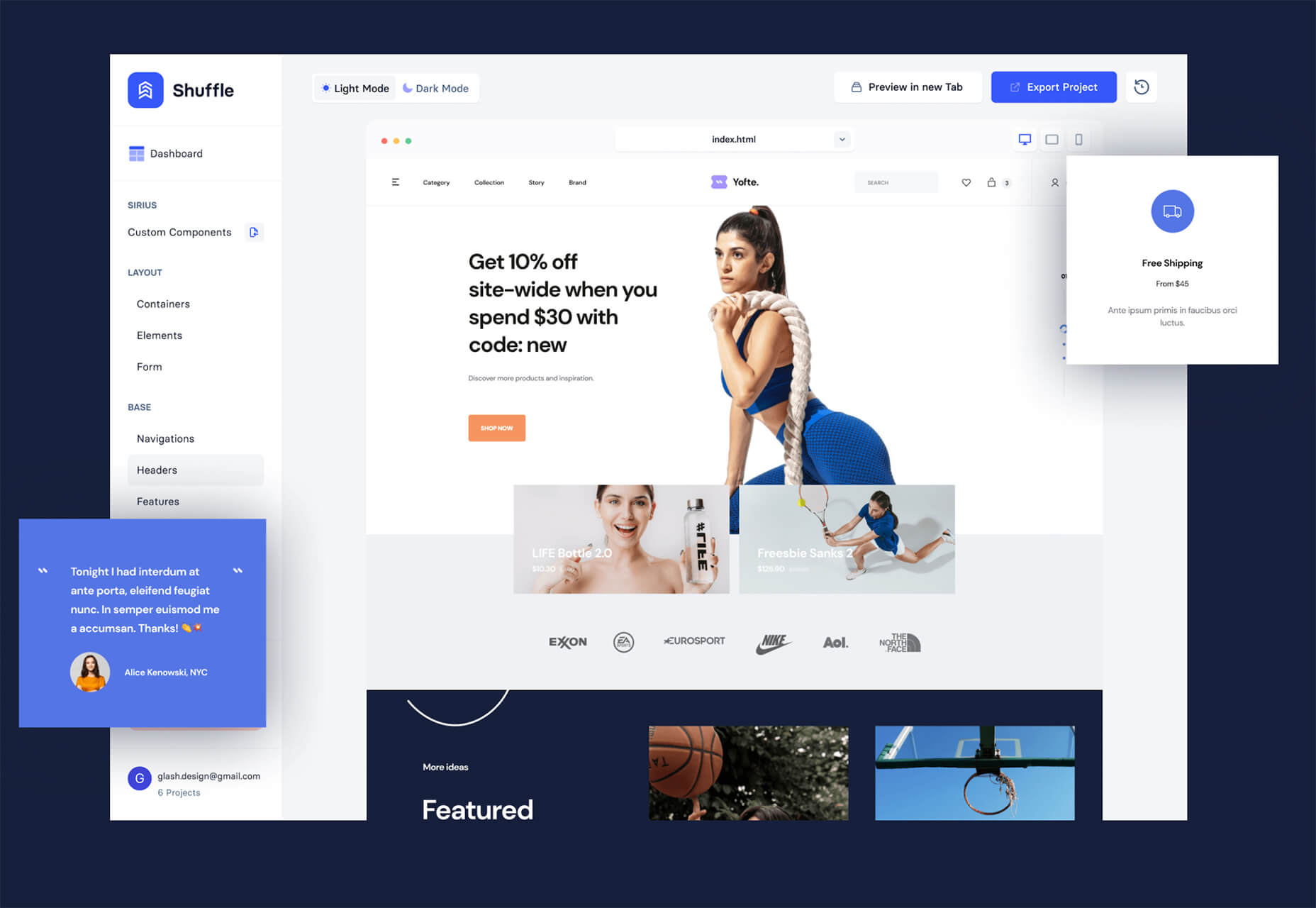
Yofte

Yofte is a set of components for Tailwind CSS that help you create great e-commerce stores. The UI Kit is packed with components with clean and colorful designs that are customizable. The code is easy to export and clean. This premium kit comes with a lifetime license or a monthly plan.
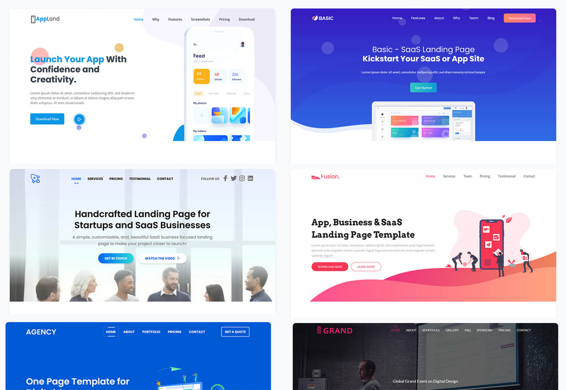
UI Deck

UI Deck is a collection of free and premium landing page templates, themes, and UI kits for various projects. This is a premium resource with paid access to all of the tools. It includes access to more than 80 templates.
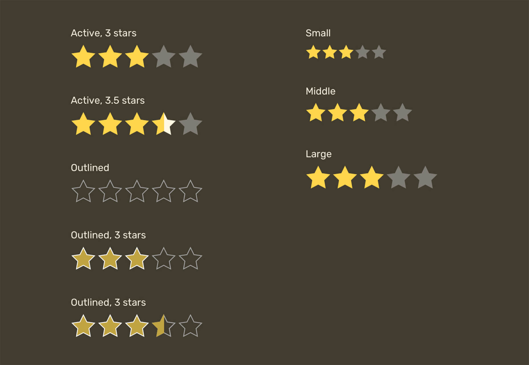
Star Rating: An SVG Solution

Star Rating: An SVG Solution is a tutorial that solves a common design dilemma: How to create great star rating icons for pages. This code takes you through creating an imageless element that’s resizable, accessible, includes partial stars, and is easy to maintain with CSS. It’s a great solution to a common design need.
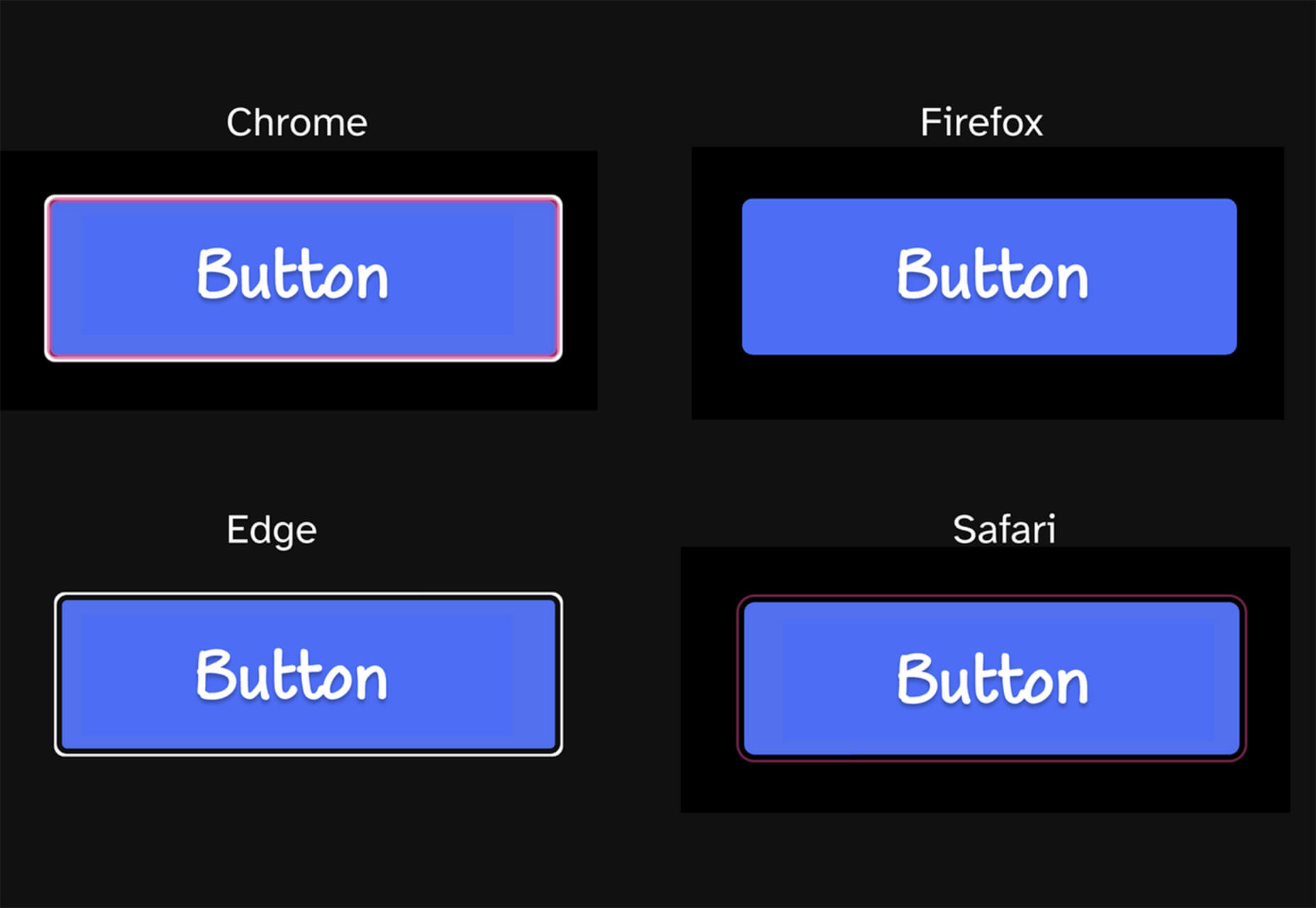
Designing Accessible WCAG-Compliant Focus Indicators

Designing Accessible WCAG-Compliant Focus Indicators is another convenient guide/tutorial for an everyday application. Here’s why it is important: “By designing and implementing accessible focus indicators, we can make our products accessible to keyboard users, as well as users of assistive technology that works through a keyboard or emulates keyboard functionality, such as voice control, switch controls, mouth sticks, and head wands, to mention a few.”
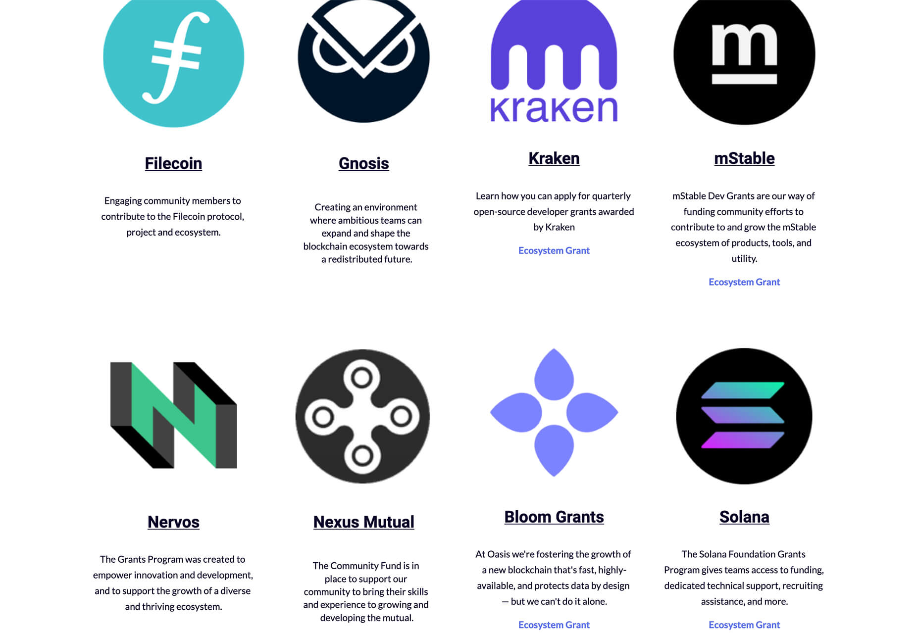
Blockchain Grants

Blockchain Grants is a tool for anyone developing blockchain applications and in need of funding. It’s a database of grants from a variety of organizations for different applications. Start looking through this free resource to help secure additional funding for your projects.
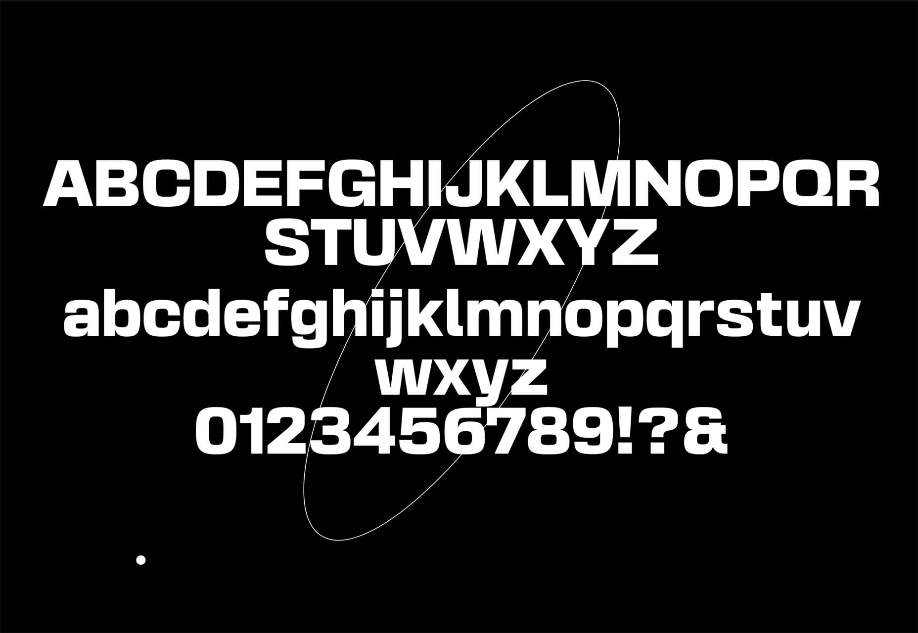
Basement Grotesque

Basement Grotesque is a beautiful slab with a great heavy weight and plenty of character. There are 413 characters in the set with plenty of accents, numbers, and variable capitals.
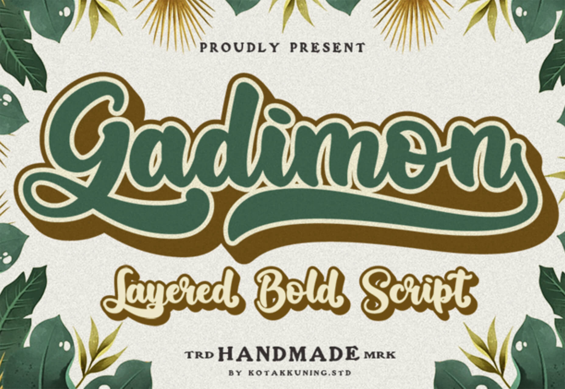
Gadimon

Gadimon is a fun, almost comic book-style layered script. The font package includes a regular and extrude style.
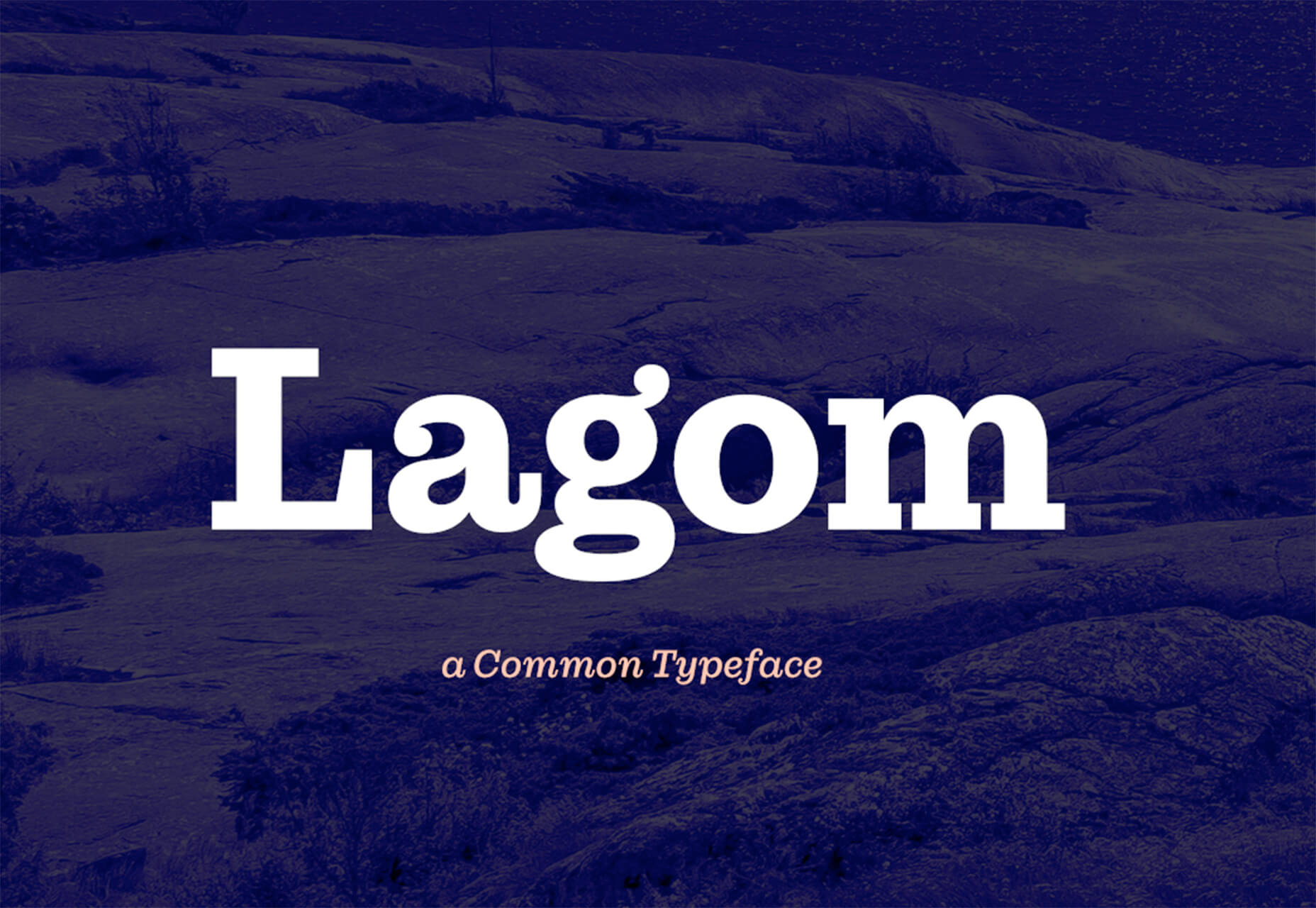
Lagom

Lagom is a sleek and functional serif typeface with 16 styles in the robust family from ultralight to extra bold italic. It’s readable and has a lot of personality.
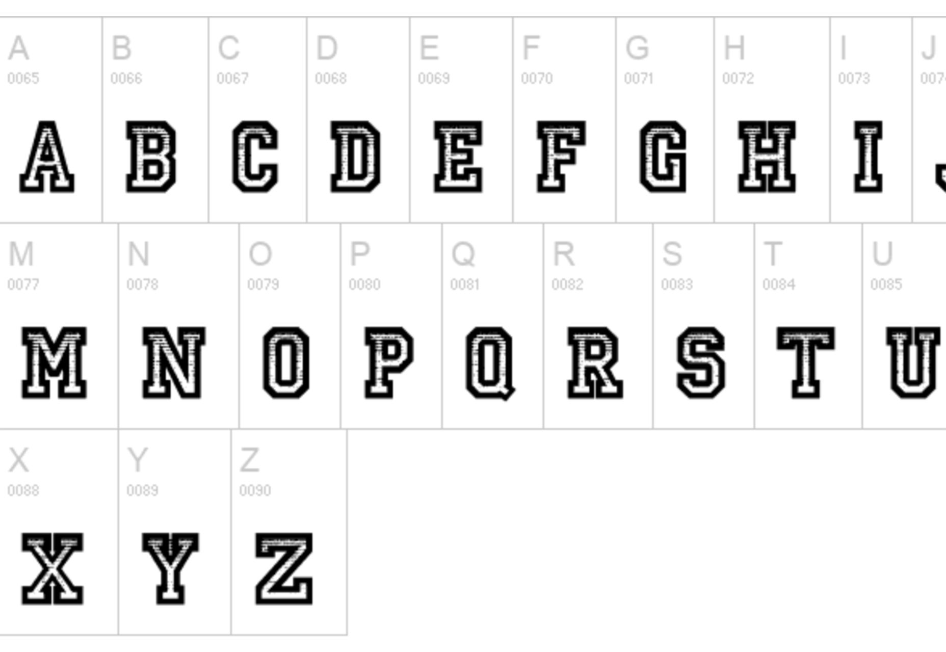
Striped Campus

Striped Campus fits our back-to-school theme with a fun, scholastic look and feel. The block letters have a thick outline stroke and some fun inline texture.
Source

The post Exciting New Tools for Designers, September 2021 first appeared on Webdesigner Depot.


Source de l’article sur Webdesignerdepot