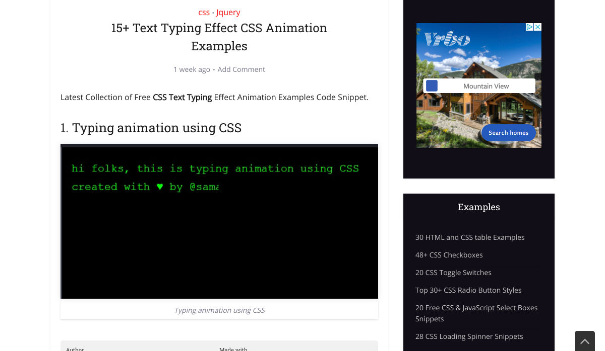
 Web design is an ever-evolving field. Those of us that have been in the industry a long time (i.e., six months plus) have seen the launch of more products, the establishment of more ideas, and the promise of more growth than most industries see over a whole career.
While the tools we use, the terminology we employ, and the goalposts we shoot for are constantly changing, core skills are transferable and long-lasting and will ensure you not only survive in the industry but thrive in it.
These skills are characteristics that you can learn, that will help you grow in 2021, 2022, and beyond.
1. Decision Making
Life is a series of decisions, from which pair of socks to wear to which crypto to store your life savings in. Each of us has a finite amount of decision-making fuel in the day — the more decisions you make, the sooner you reach decision fatigue.
Most people burn their decision-making fuel by second-guessing themselves; they make a decision and then remake the same decision over and over as doubt creeps in.
The ability to make a decision, and stick to it, separates those people who still have the fuel to make strategic decisions after close of business and those people who can’t decide what to have for dinner.
2. Clarity of Purpose
It’s never a bad idea to brush up on design fundamentals. From color theory to typography to UI and layout, these core skills are not only beneficial to your design practice, but they help you think about design on a higher level.
Too often, designers fail to see the wood for the trees, focusing on the project at hand instead of a wider picture. The wider picture doesn’t mean your portfolio; it means the whole history, culture, and design context.
Many musicians can play multiple styles, but they tend to favor one instrument; they made a fundamental decision that freed them to explore music in greater depth
Despite the term, design fundamentals aren’t universal; they’re personal to you. For example, should you pair a script with a serif? Your answer is probably, “it depends” because you’re an awesome designer; my answer is “no,” because, for me, that is a design fundamental.
Design fundamentals can be limiting, but by providing default answers to common questions, they also free you to consider larger questions about what you’re doing and why, which leads to clarity of purpose.
Many musicians can play multiple styles, but they tend to favor one instrument; they made a fundamental decision that freed them to explore music in greater depth.
3. The Holy Trinity
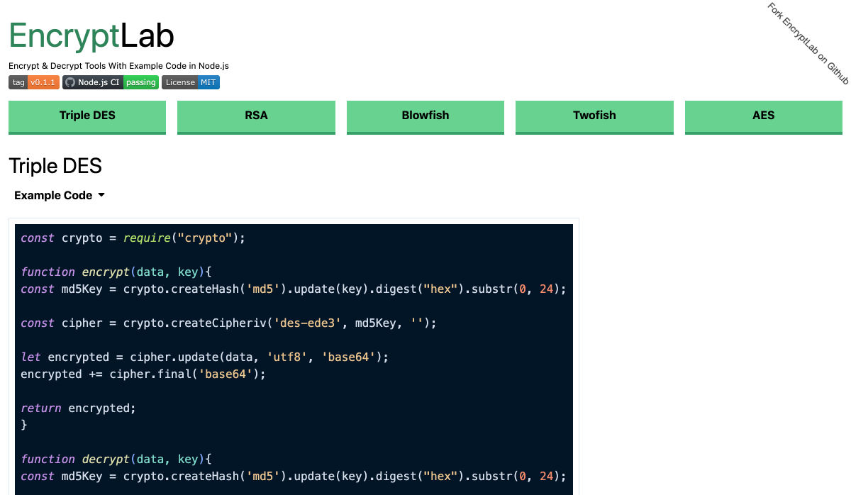
The holy trinity in web design is HTML, CSS, and JavaScript. Learn what they are and what they do.
You need to understand them well enough to hold an intelligent boardroom-level conversation about them. You don’t actually need to know how to code them — although I’ve never actually met someone who knew enough about their roles to hold a strategic conversation, who didn’t also know how to code them from scratch.
I’m not talking about frameworks, libraries, or the latest build tools. Those things are just macros for coders. I’m talking about understanding the building blocks of a site, so if someone asks you whether you really need the company logo in the site footer, you can answer, and back your answer up with facts.
4. Simple Presentation
No matter what field of design you’re in, you’re going to need to present your ideas to someone who doesn’t share your knowledge. Whether you’re explaining the basics to a client or explaining your decision-making to a colleague, presenting your ideas simply is the best way to be heard.
a pitch is most effective when you exclude extraneous detail
Often, a persuasive presentation utilizes the less-is-more approach. Just as a design is finished when you’ve removed everything unnecessary, so too a pitch is most effective when you exclude extraneous detail.
Often you’ll find metaphor useful, especially if you have a passing knowledge of the person’s own area of expertise because it translates a concept into a format the person understands and is comfortable with.
“We should…because it will improve [a metric] by approximately…%” is often the most welcome language. If the person you’re selling your decision needs more detail — and they probably don’t need to know details, that’s what they have you for — they can ask.
5. Strategic SEO
SEO (Search Engine Optimisation, for the two people in the world who don’t know what that acronym stands for) is a vast field with as many sub-divisions as there are UX job titles.
There are various branches of SEO that a site needs to consider. Technical SEO is the stuff that coders do; if you’re not a coder, you can ignore that. Content SEO is the stuff that marketers do; if you’re not a marketer, you can ignore that. Strategic SEO is a macro-view of a site’s plans; everyone on every project should understand strategic SEO.
Strategic SEO covers topics like landing pages, single-page sites, whether a blog is necessary, how, if at all, social media is employed. Strategic SEO feeds all other branches of SEO. It is so fundamental that it informs the earliest decisions about a site. If you want to do more than make things look pretty, learn more about strategic SEO.
6. A Second Language
You’ve probably noticed by now that the web extends beyond your town limits. It’s a global force, which means billions of people who don’t speak the same language.
If you’re not a native-English speaker, then it’s a no-brainer to learn a little English. You don’t need to be fluent; you certainly don’t need to be poetic, but the vast majority of documentation, GUIs, blog posts, forums, conferences, and the Web itself are in English, and translation code only gets you so far.
If you are a native English speaker, then learn something relevant to your region or the industry you specialize in. It doesn’t really matter what you learn; picking up a language, and culture, makes you a more rounded human being. And provided you don’t pick something obscure, you’re opening yourself up to millions or even billions of users you were previously missing out on.
7. Saying, “No.”
It doesn’t matter whether you’re a freelancer sofa-diving for spare pennies to meet the rent or a seasoned in-house designer with targets to meet; everyone struggles to say, “no.”
The fear is that if we decline a project, or a feature request, that we won’t be asked next time; eventually, we’ll be passed over for all projects until we have no career left.
The problem is that we only have so many hours in a day. If we do too much, we end up doing it badly, so there have to be limits. Every time you say “yes,” you’re increasing the chances that you will have to say “no,” to a future opportunity that’s great for you.
By all means, decline gracefully. Do it politely. Be kind. Offer to refer the client elsewhere. But it’s better to say “no” than to have to say “no” to the perfect project because you’re over-stretched.
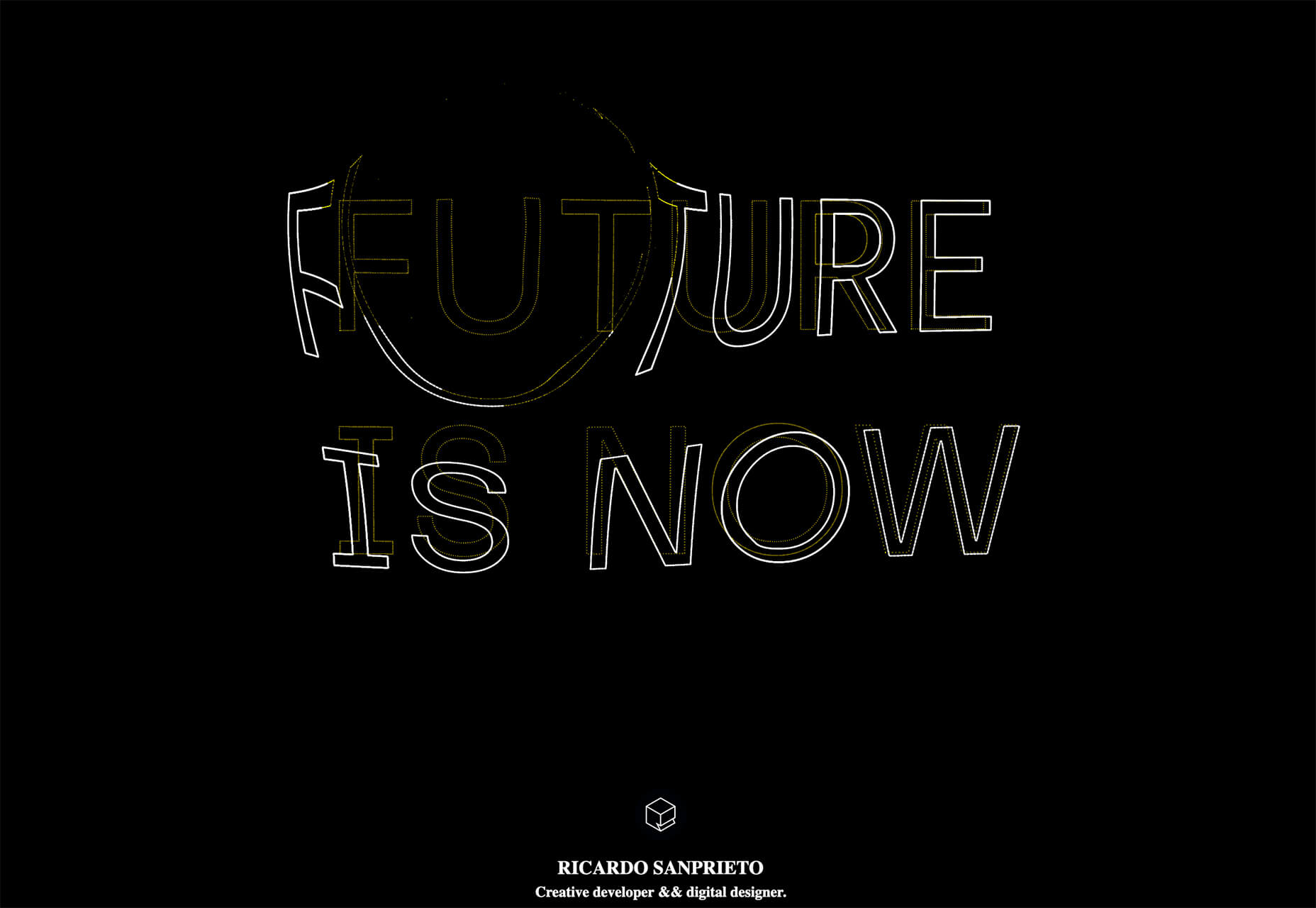
Featured image via Unsplash.
The post 7 Skills You Need To Thrive As A Web Designer In 2021 first appeared on Webdesigner Depot.

 A domain name is an essential element of every project, product, and company. It’s central to a brand and has a disproportionately large impact on user experience. Not only that, but it also impacts SEO and ultimately revenue.
 Looking for something new to get you excited about design work? This list is packed with all kinds of goodies to help you feel inspired and ready to work.

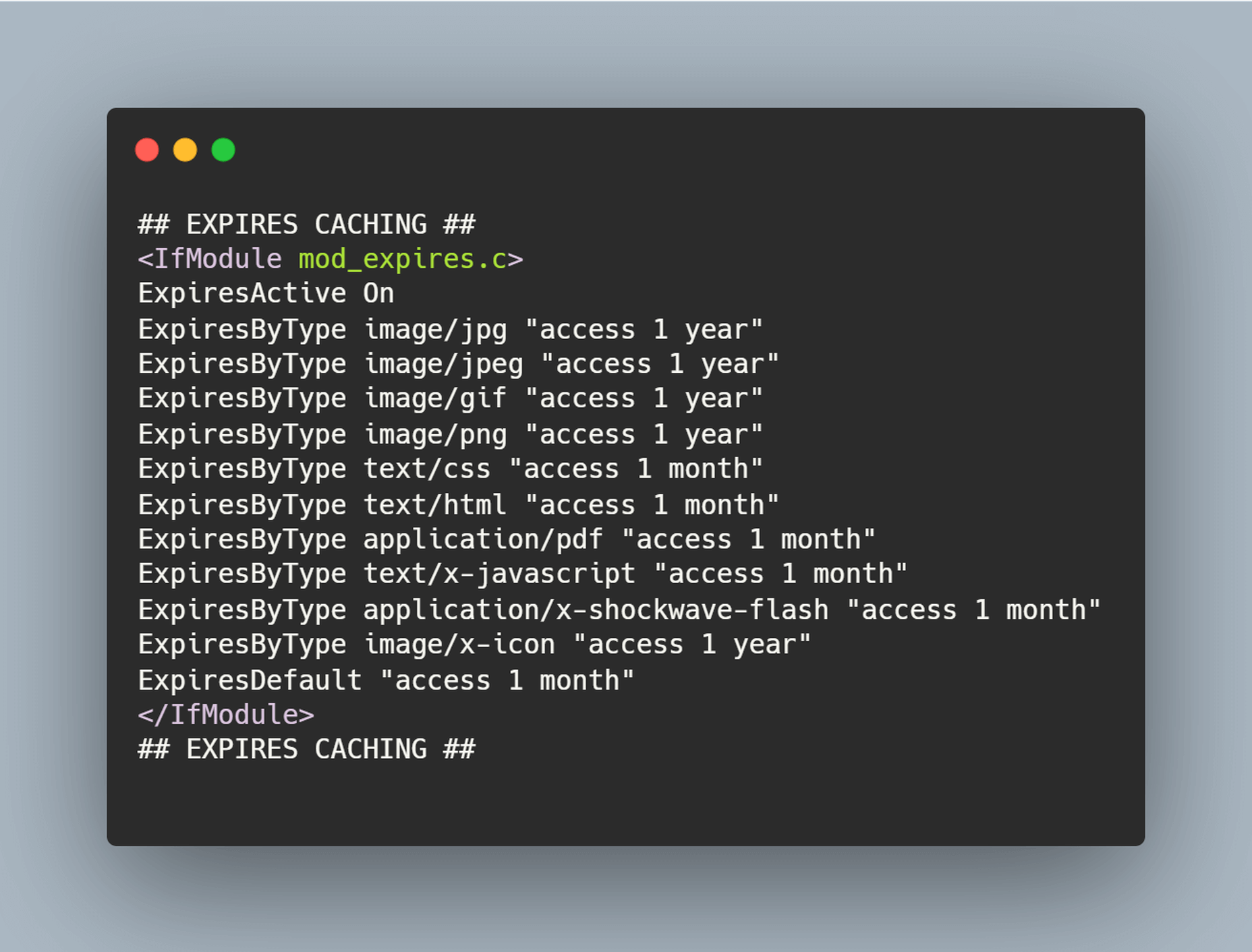
 The ‘need for speed’ is an essential item on every website’s bucket list these days. And why not? Enhanced speed is directly responsible for converting traffic into paying clients.

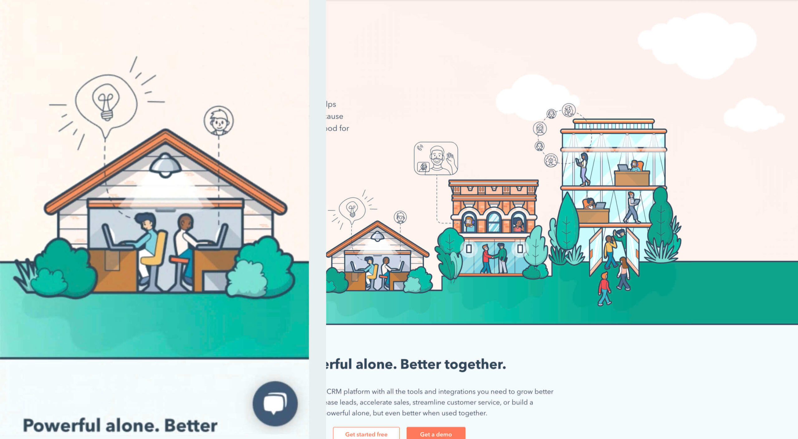
 User experience is one of the most important aspects of web design, but many experts overlook that UX doesn’t just apply to web pages. User experience as a concept encompasses all aspects of end-user interaction with a company.
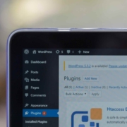
 Looking for the best new CMS plugins to take your website to the next level? Well look no further.
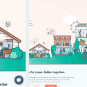
 By the end of the year, the number of global smartphone users is

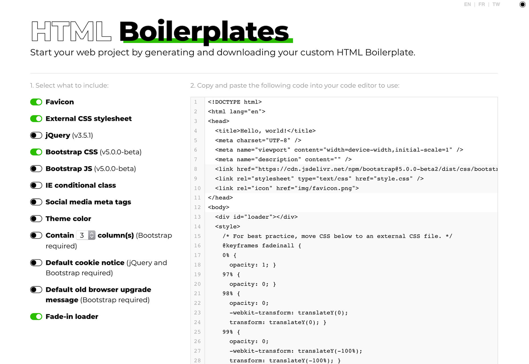
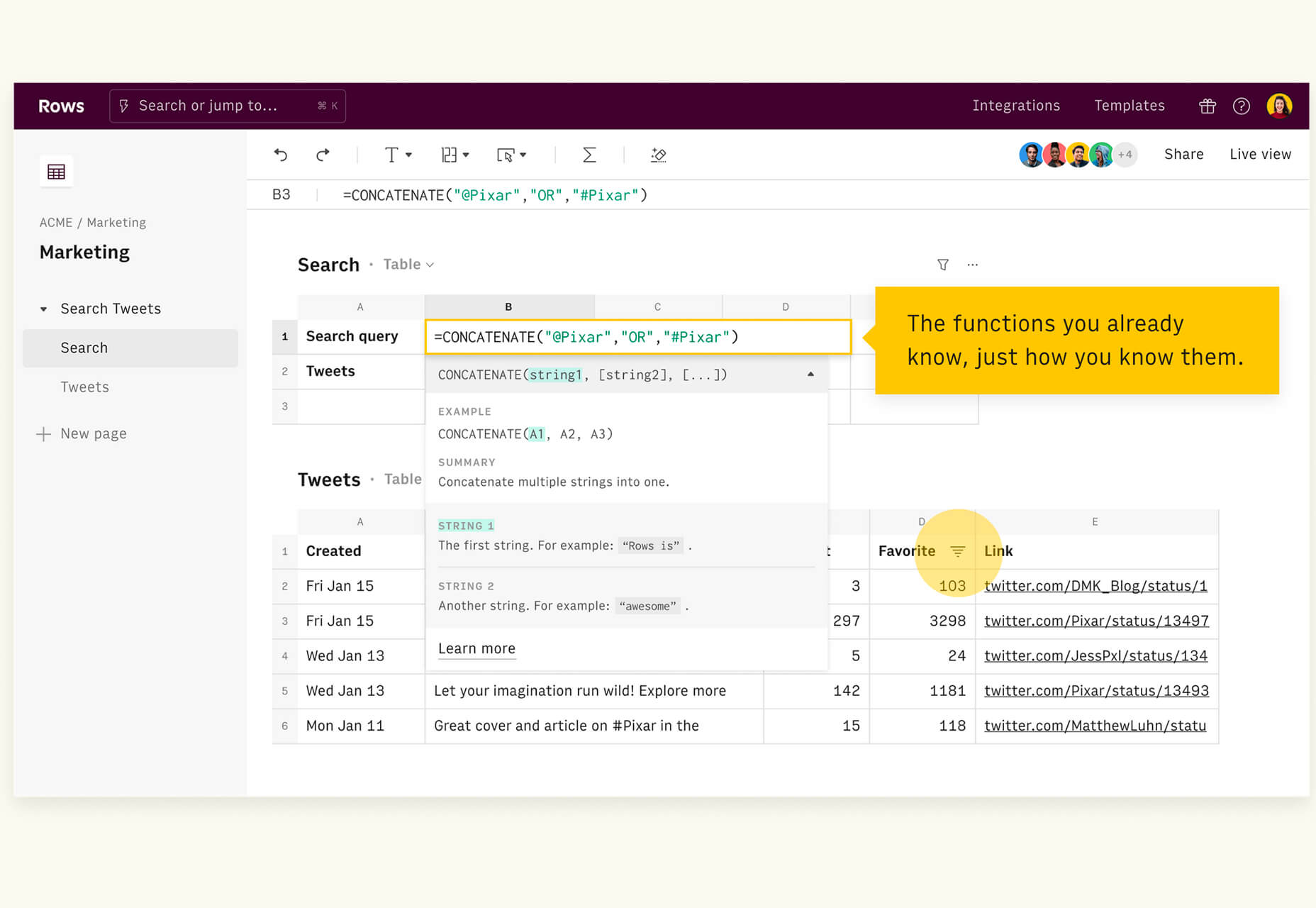
 Since there are so many CMS plugins out there, it can be overwhelming to choose the best ones for your website. We’ve done the research for you; this list contains the top new CMS plugins for November 2020. You’ll find useful plugins for WordPress, Craft, Shopify, and Joomla.


 Every week users submit a lot of interesting stuff on our sister site Webdesigner News, highlighting great content from around the web that can be of interest to web designers.
