Articles

It’s never been easier to set up an ecommerce store and start selling. There are a dizzying array of ecommerce solutions available in 2021, and most are feature-rich and competitively priced.

Ecommerce sites are notoriously difficult to migrate from platform to platform, so more often than not, you’ll be committed to your chosen solution for years. The key when choosing an ecommerce solution to maximize your return on investment, is to consider not just what your business needs today but what it will need tomorrow.

There are two basic approaches to ecommerce. The first is a dedicated platform that handles everything. The second is a plugin that adds ecommerce features to an existing CMS. Both approaches have benefits and drawbacks.

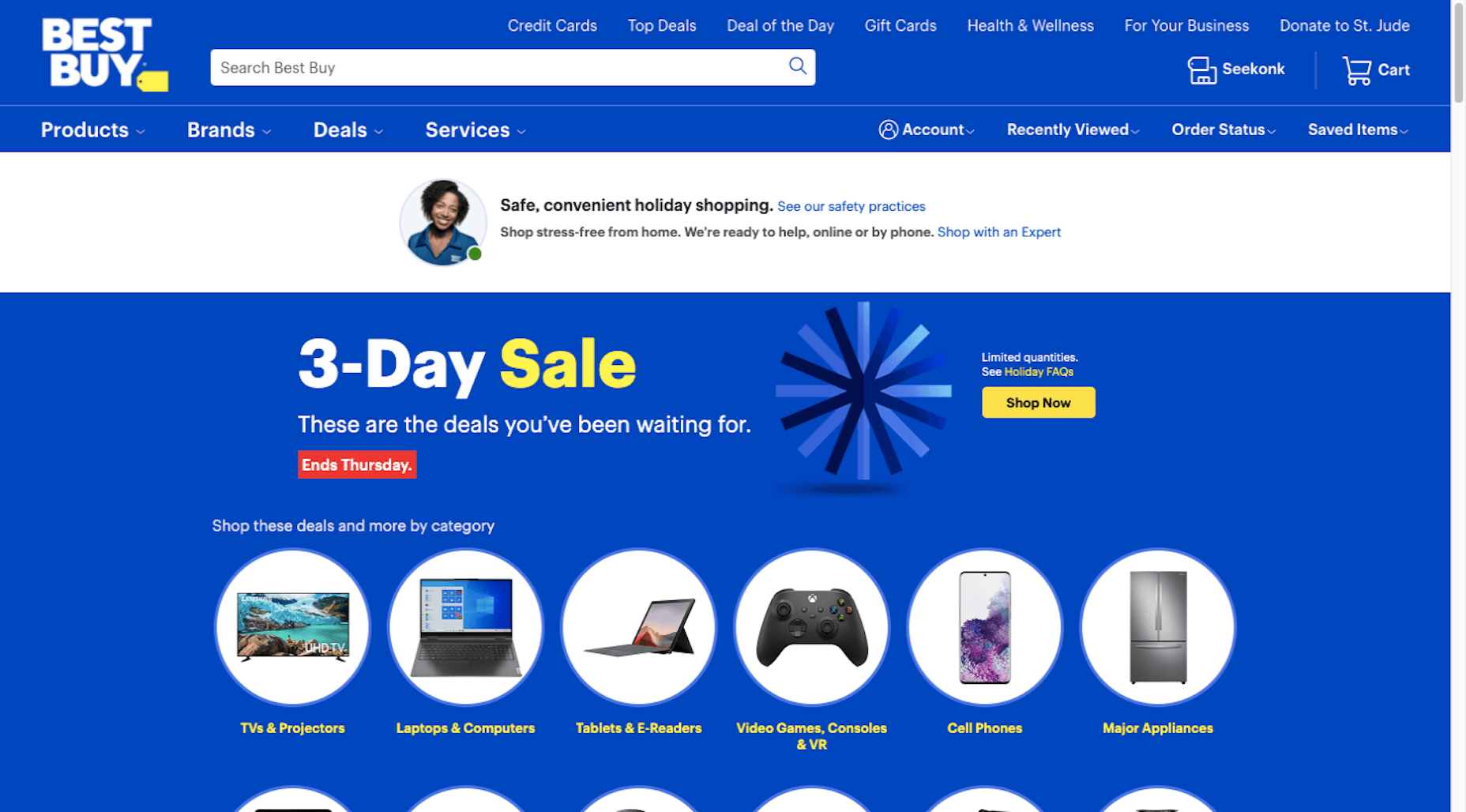
1. Shopify: Best for Almost Everyone

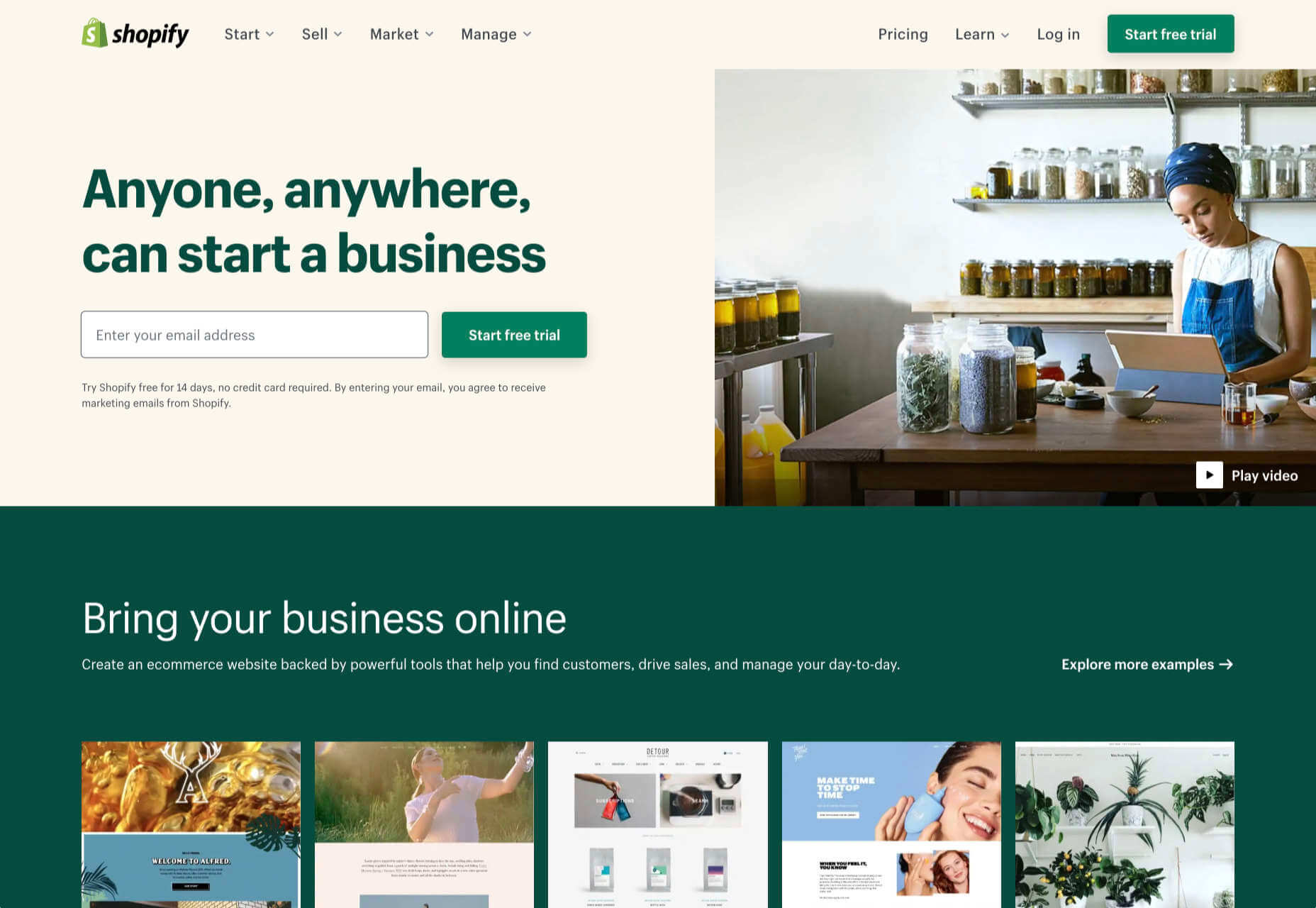
Shopify is a well-known, well-liked, and reliable dedicated ecommerce platform. As a system for getting a business off the ground and selling fast, it is peerless.

Shopify jealously guards developer access, with templates and plugins pre-vetted. Unlike some marketplaces, you can be confident that there are no hidden surprises in your shiny new store.

And because Shopify has passed the point of market saturation, it’s worthwhile for big players to provide their own plugins; credit services like Klarna and shipping companies like netParcel can be integrated with a few clicks.

The admin panel is a touch complex, as Shopify is designed to allow a single account to be linked to multiple stores. But once you’re set up and familiar with where to find everything, it’s a slick, streamlined business management system.

Whenever a client says, “we want to start selling online.” My first thought is, “Shopify.” And for 90% of clients, it’s the right choice.

And that’s where this roundup should end…except there’s still that 10% because Shopify isn’t perfect.

For a start, an all-in-one platform doesn’t suit everyone. If you already have a website you’re happy with, you’ll either need to migrate or lease a dedicated domain for your store.

Shopify’s platform is very secure, which inspires confidence in buyers, but the price of that security is a lack of flexibility in the design.

Then there’s the infamous variant limit. Shopify allows 100 variants on a product. Almost every client runs into that wall at some point. Let’s say you’re selling a T-shirt: male and female cuts are two variants; now add long or short sleeves, that’s four variants; now add seven sizes from XXS to XXL, that’s 28 variants; if you have more than three color options, you’ve passed the 100 variant limit. There are plugins that will allow you to side-step this issue, but they’re a messy hack that hampers UX for both customer and business.

Shopify should certainly be on every new store owner’s shortlist, but there are other options.

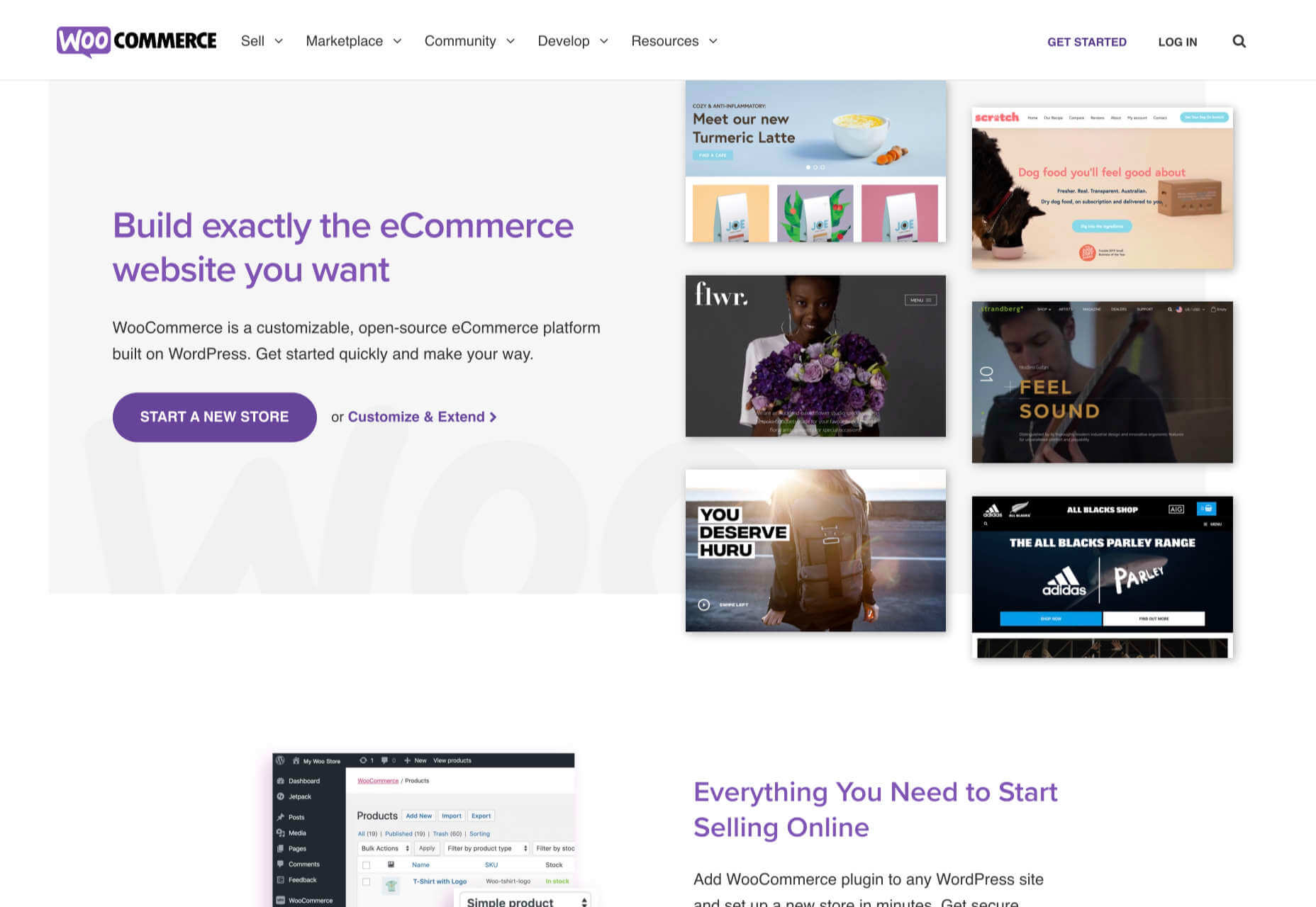
2. WooCommerce: Best for WordPress Users

If you’re one of the millions of businesses with a pre-existing site built on WordPress, then adapting it with a plugin is the fastest way to get up and running with ecommerce.

WooCommerce is regularly recommended as “Best for WordPress Users,” which is a back-handed compliment that belies the fact that WooCommerce reportedly powers 30% of all ecommerce stores. If running with the crowd appeals to you — and if you’re using WordPress, it presumably does — then you’re in the right place.

WordPress has a gargantuan plugin range. As such, there are other plugins that will allow you to sell through a WordPress site. The principle benefit of WooCommerce is that as the largest provider, most other plugins and themes are thoroughly tested with it for compatibility issues; most professional WordPress add-ons will tell you if they’re compatible with WooCommerce. If your business is benefitting from leveraging WordPress’ unrivaled ecosystem, it can continue to do so with WooCommerce.

The downside to WooCommerce is that you’re working in the same dashboard as the CMS that runs your content. That can quickly become unmanageable.

WooCommerce also struggles as inventories grow — every product added will slow things a little — it’s ideally suited to small stores selling a few items for supplementary income.

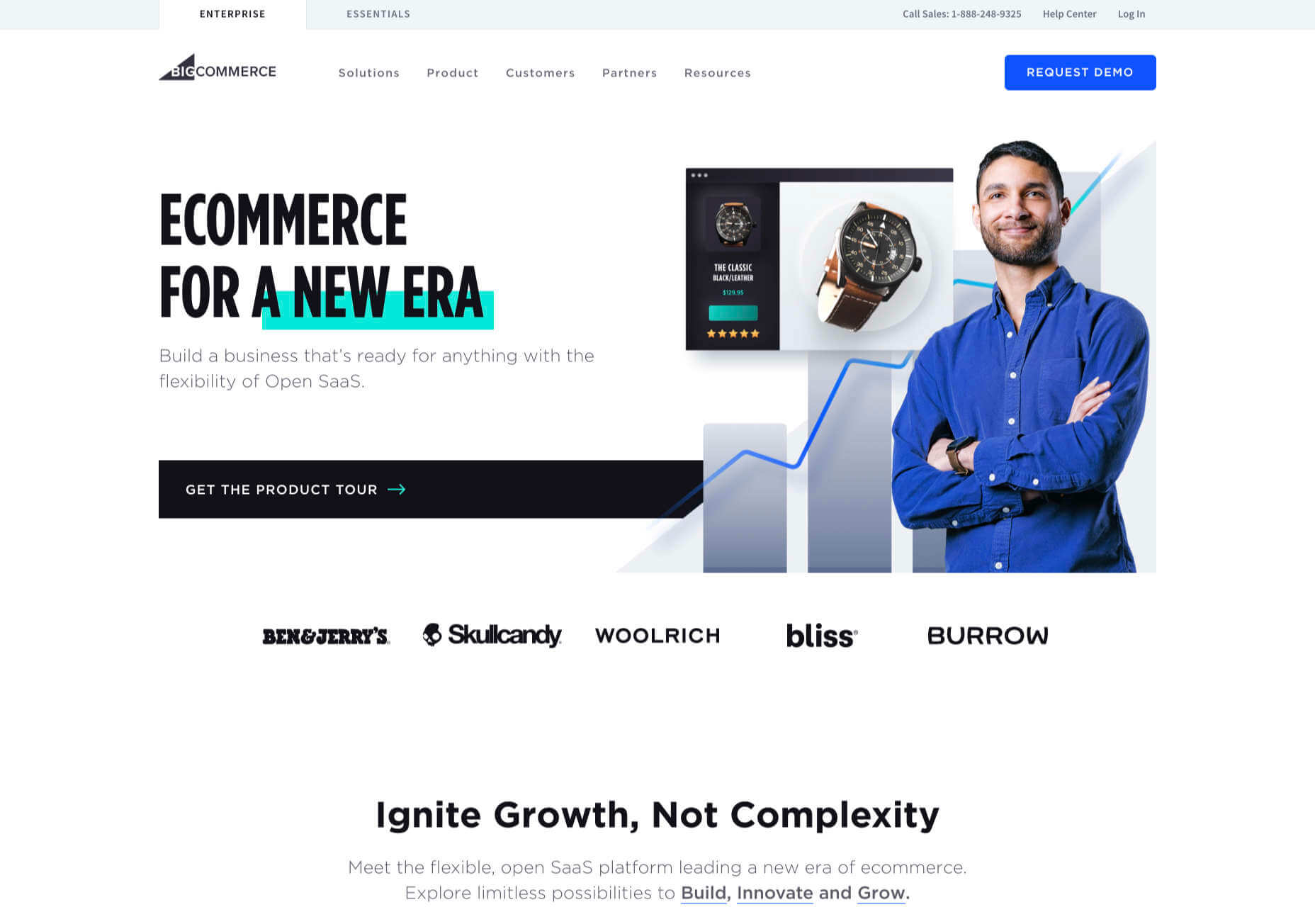
3. BigCommerce: Best for Growth

BigCommerce is an ecommerce platform similar to Shopify, but whereas Shopify is geared towards newer stores, BigCommerce caters to established businesses with larger turnovers.

The same pros and cons of a dedicated ecommerce solution that applied to Shopify also apply to BigCommerce. One of the considerable downsides is that you have less control over your front-end code. This means that you’re swapping short-term convenience for long-term performance. Templates, themes, and plugins — regardless of the platform they’re tied to — typically take 18 months to catch up with best practices, leaving you trailing behind competitors.

BigCommerce addresses this shortcoming with something Shopify does not: a headless option. A headless ecommerce platform is effectively a dedicated API for your own store.

Enabling a headless approach means that BigCommerce can be integrated anywhere, on any technology stack you prefer. And yes, that includes WordPress. What’s more, being headless means you can easily migrate your frontend without rebuilding your backend.

BigCommerce also provides BigCommerce Essentials, which is aimed at entry-level stores. It’s a good way to get your feet wet, but it’s not BigCommerce’s real strength.

If you have the anticipated turnover to justify BigCommerce, it’s a flexible and robust choice that you won’t have to reconsider for years.

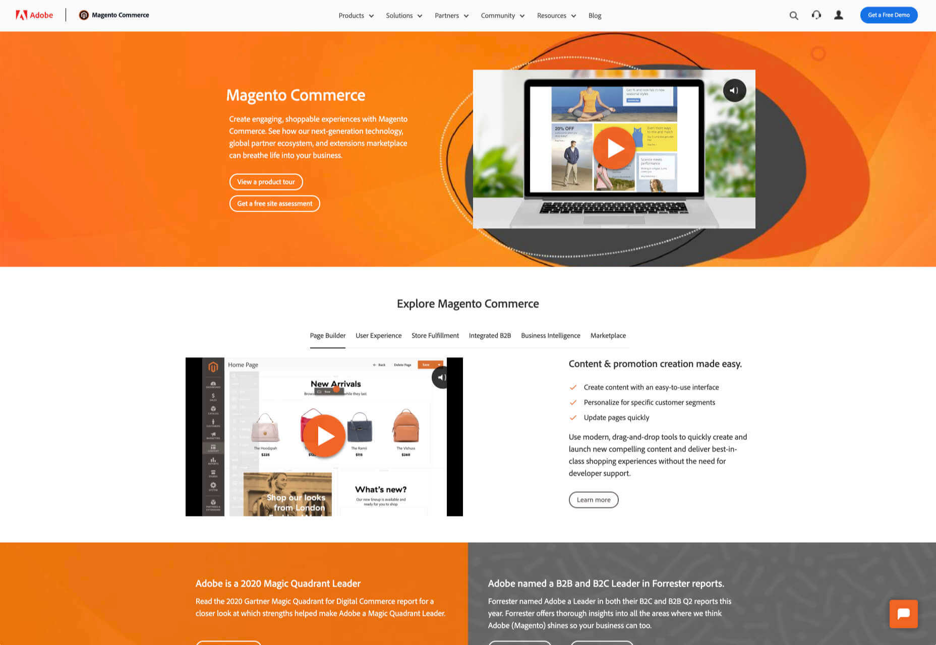
4. Magento: Best for Burning Budgets

If you have a development team at your disposal and a healthy budget to throw at your new store, then Magento could be the option for you.

You can do almost anything with a Magento store; it excels at custom solutions.

Magento’s main offering is its enterprise-level solution. You’ll have to approach a sales rep for a quote — yep, if you have to ask the price, you probably can’t afford it. Magento has the track-record and the client list to appeal to boards of directors for whom a 15-strong development team is a footnote in their budget.

That’s not to say that a Magento store has to be expensive; Magento even offers a free open source option. But if you’re not heavily investing in a custom solution, you’re not leveraging the platform’s key strengths.

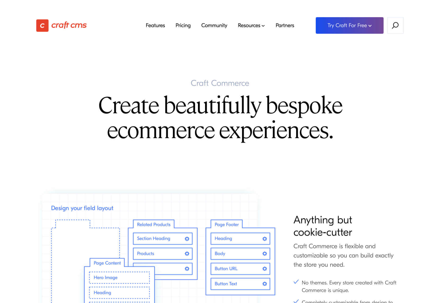
5. Craft Commerce: Best for Custom Solutions

If you’re in the market for a custom solution, and you don’t have the budget for something like Magento, then Craft Commerce is ideally positioned.

Like WooCommerce for WordPress, Craft Commerce is a plugin for Craft CMS that transforms it into an ecommerce store.

Unlike WordPress, Craft CMS doesn’t have a theme feature. Every Craft Commerce store is custom built using a simple templating language called Twig. The main benefit of the approach is that bespoke solutions are fast and relatively cheap to produce, with none of the code bloat of platforms or WordPress.

Because your site is custom coded, you have complete control over your frontend, allowing you to iterate UX and SEO.

You will need a Craft developer to set up Craft Commerce because the learning curve is steeper than a CMS like WordPress. However, once you’re setup, Craft sites are among the simplest to own and manage.

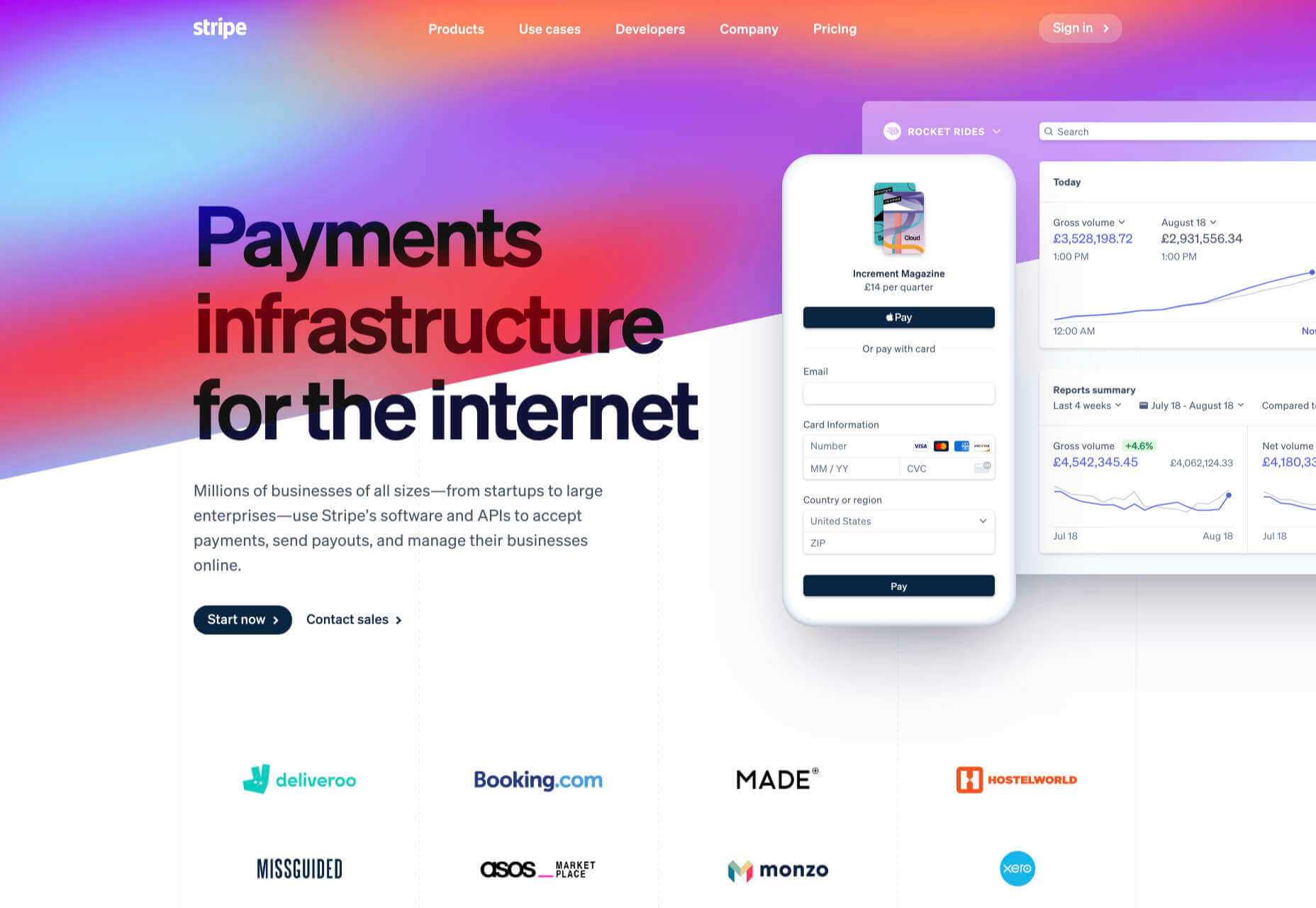
6. Stripe: Best for Outliers

Ecommerce solutions market themselves on different strengths, but the nature of design patterns means they almost all follow a similar customer journey: search for an item, add the item to a cart, review the cart, checkout. Like any business, they want to maximize their market share, which means delivering a solution that caters to the most common business models.

Occasionally a project happens along that doesn’t fit that business model. Perhaps you’re selling a product that’s uniquely priced for each customer. Perhaps you’re selling by auction. Perhaps you don’t want to bill the customer until a certain point in the future.

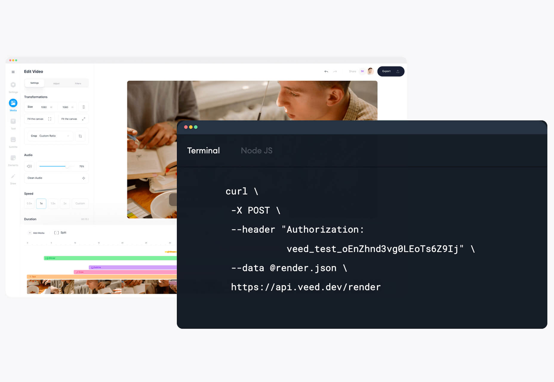
Whatever your reason, the greatest customization level — breaking out of the standard ecommerce journey — can be managed with direct integration with Stripe.

Stripe is a powerful payment processor that handles the actual financial transaction for numerous ecommerce solutions. Developers love Stripe; its API is excellent, it’s documentation is a joy, it’s a powerful system rendered usable by relentless iteration.

However, this approach is not for the faint-hearted. This is a completely custom build. Nothing is provided except for the financial transaction itself. Every aspect of your site will need to be built from scratch, which means hefty development costs before seeing any return on investment.

The Best eCommerce Solution in 2021

The best ecommerce solution is defined by three factors: the size of your store, the anticipated growth, and the degree of custom design and features you want or need.

Shopify is the choice of most successful small stores because you can be selling inside a day. For businesses with an existing presence and a smaller turnover, those on WordPress will be happy with WooCommerce. For larger stores planning long-term growth, BigCommerce’s headless option is ideal. Craft Commerce is a solid performer that marries low costs with flexibility for businesses that need a custom approach.


Featured image via Unsplash.

Source

The post 6 Best Ecommerce Solutions for 2021 first appeared on Webdesigner Depot.


Source de l’article sur Webdesignerdepot

If you already have a good idea of what you want a new website to look like, the next step would be to decide on the tools you’ll need to put into play to turn that vision into a reality.

  • Tools enable you to present its content in ways that will engage and captivate its audience and gain their trust.
  • Tools that will make your website perform flawlessly in all respects.

That is why choosing the right WordPress theme to get the job done is so important. You want a theme that features the page building tools and design aids that make your task far easier than anticipated.

The following 12 top WordPress themes and plugins have been selected with those purposes in mind. They will not only get the job done for you but do it better than most of the other website-building tools in the marketplace are capable of doing.

The choice is up to you. Whatever that choice may be, it should prove to be a winner.

1. BeTheme

A website-building toolkit that can boast of 40+ core features sounds like a pretty good-sized toolkit, and BeTheme is just that. In fact, this popular (200,000 sales) theme is the biggest WordPress theme of them all.

It’s unlikely you will need to put every one of these core features to use for your next project, but some will be essential, such as –

  • The Muffin Builder page builder, Admin Panel, and Shortcode Generator combine to make BeTheme easy to use, give you a ton of flexibility, and enable you to build your website without any need for coding.
  • Be’s library of shortcodes together with the many Header, Footer, and Grid options, and the new Header Builder extends your design options even more.
  • The Layout Generator will come in handy if you want to start a page from scratch.
  • You’ll love what may be the most important core feature of them all; Be’s selection of 600+ customizable pre-built websites. They cover most industry sectors and website types plus a variety of business niches.

Click on the banner to learn more.

2. Total Theme

Designed with excellence in mind, Total features an exceptional selection of tools and design aids to work with. Total is also well-known for its speed, ease of use, and the flexibility it offers its users.

  • Since you can disable any feature you want to, you won’t be distracted by or bothered with those you don’t intend to use.
  • Total’s 40+ quick import demos and one-of-a-kind theme cards are designed to get your projects off to a rapid start.
  • The Dynamic Template function is a driving force behind this WordPress theme’s remarkable flexibility.
  • You’re given a wealth of design options to work with, thanks to the live customizer and the advanced theme panel.
  • Total is a WordPress plugin and WooCommerce friendly.

Click on the banner to learn more.

3. Avada Theme

When a WordPress theme has the distinction of being the #1 best seller of all time, you can safely assume that those who created it got it right. Avada’s 450,000+ sales can’t easily be ignored.

Look closer, and you’ll see some of the many reasons behind Avada’s popularity.

  • There’s an impressive selection of one-click import demos, pre-built websites, and a wealth of supporting design elements.
  • The Fusion drag and drop builder and Fusion page and theme options enable designers to create complex websites without resorting to coding.
  • 5-star support and free updates ensure users that they will always be able to follow the latest design trends and create websites as they envision them.

Click on the banner to learn more.

4. MaxCoach – Online Courses, Personal Coaching & Education WP Theme

MaxCoach is a specialty tool that enables web designers to create an online distance learning and/or tutoring platform. This LearnPress theme was last year’s #1 coaching theme, and it will most likely be so in 2021 as well.

  • The platform is learner-centric
  • MaxCoach’s design is modern, trendy, and unique
  • Elementor is the drag and drop page builder of choice

Visit the site to see for yourself why this specialty theme has generated so much interest.

5. TheGem – Creative Multi-Purpose High-Performance WordPress Theme

TheGem, WordPress’s ultimate multiuse toolbox, gives its users:

  • A selection of more than 400 professionally-crafted pre-built multi-page and single-page websites
  • Two popular page builders – WPBakery and Elementor
  • Demos, layouts, and page sections you can mix and match to create a look that’s uniquely yours

The GemBlocks with its 300+ pre-designed section templates to speed up your workflow, plus WooCommerce layouts and design aids

6. Uncode – Creative Multiuse & WooCommerce WordPress Theme

The Uncode multi-use WordPress theme is ideal for entrepreneurs, creative individuals, agencies, and small businesses.

  • Its 80.000+ sales to date have made it a ThemeForest best-seller.
  • Features include a unique WooCommerce Custom Builder you can use to give site visitors a supreme shopping experience.

Viewing Uncode’s showcase of user-built websites is a must. Click on the banner to visit the site and prepare to be impressed.

7. Rey Theme

This highly modular popular theme is definitely worth a close look. It is simply one of the most innovative website building tools you’re likely to find on the market today,

  • Rey’s features include a library of professionally-designed templates and an imposing selection of WooCommerce site-building tools
  • It is easy to set up and easy to use
  • You will be more than satisfied with Rey’s robust performance

Rey has built-in SVG support and is user and developer-friendly.

8. Aurum – Minimalist WordPress Theme

With this multiuse minimalist WordPress theme at your fingertips, you’ll be able to create an online store that will give shoppers a fully satisfying shopping experience.

  • With Aurum, you can design megamenus to accommodate huge selections of products
  • Aurum’s page load times are super-fast, and Aurum’s pages are responsive to every screen size
  • Popular plugins are included, and all the popular WordPress plugins are supported

Click on the banner and check it out.

9. Hongo – Modern & Multipurpose WooCommerce WordPress Theme

Its trendy selections of creative design elements and ready-to-go store demos make Hongo an ideal choice for company, blogging, and eCommerce websites.

  • Premium plugins and WPBakery custom shortcodes are among the most popular of Hongo’s website-building features
  • This multipurpose theme also features an attractive selection of product-related tools that include product compare, quick view, wish lists, and product filter

You can expect and receive exceptional user support.

10. XStore – The Most Customizable WooCommerce Theme Ever

With its $39 price tag, XStore gives you more value for your money than you’ll find in any other WooCommerce theme.

  • For starters, there are 100+ good-to-go shops
  • A full Ajax shop is another popular feature
  • As is XStore’s single product page builder and its selection of product filters and display features

Check XStore out if you’re looking for a way to create an awesome online store in no time at all.

11. KnowAll – Knowledge Base Theme

Have you ever come across a FAQ page you really liked? It doesn’t happen often. 

Visitors that can’t find a good answer might decide to make a phone call (and be placed on hold). That answer is OK, but additional information would be more helpful.

With AI-based KnowAll, customers get answers 24/7, and they can search for other relevant information. They will be happier customers, which is obviously good for business.

12. Pofo – Creative Portfolio, Blog, and eCommerce WordPress Theme

Bloggers, creatives, agencies, and those looking to create an eCommerce site should give Pofo a good, hard look.

Pofo is fast, flexible, SEO optimized, and packed with useful features that include:

  • Trendy selections of pre-built design elements, ready-to-go home pages, and one-click import demo pages.
  • Premium plugins, including Revolution Slider and the WPBakery page builder.

Detailed online documentation is provided, and you’ll be more than pleased with this theme’s customer support.

A modern, fast-loading, and smoothly performing theme is what you need. It will help you create a website that will have a significantly positive impact on your business’ growth.

Themes like those presented here can do just that by enabling you to give your website the professional touch you’re looking for. You can do it without having to rely on a single line of code.

These 12 top WordPress themes are modern, trendy, and easy to work with. Trying to find the “best” of the bunch could admittedly be somewhat daunting. But, you can take comfort in the fact that you really can’t make a wrong or bad choice.


[– This is a sponsored post –]

Source

The post 12 Best WordPress Themes for 2021 first appeared on Webdesigner Depot.


Source de l’article sur Webdesignerdepot

Imagine a room with a wall of screens displaying closed-circuit video feeds from dozens of cameras, like a security office in a film. In the movies, there is often a guard responsible for keeping an eye on the screens that inevitably falls asleep, allowing something bad to happen. Although intuition and other distinctly “people skills” are useful in security, most would agree that the human attention span isn’t well-suited for always-on, 24/7 video monitoring. Of course, footage can always be reviewed after something happens, but it’s easy to see the security value of detecting something out of the ordinary as it unfolds.

Several cameras capturing different scenes.
Cameras capture our every move, but who watches them?

Now imagine a video artificial intelligence (AI) application capable of processing thousands of camera feeds in real-time. The AI constantly compares new footage to historical footage, then classifies anomalous events by their threat level. Humans are still involved, both to manage the system as well as review and respond to potential threats, but AI takes over where we fall short. This isn’t a hypothetical situation: from smart police drones to intelligent doorbells sold by Amazon and Google, AI-powered surveillance solutions are becoming increasingly sophisticated, affordable, and ubiquitous.

Source de l’article sur DZONE

Ecommerce design may seem fairly straight-forward; you build an online store that showcases a company’s products or services and gives customers a quick and pain-free way to purchase them.

While that formula will always hold true, ecommerce is undergoing some big changes, and web designers need to be prepared to keep up with them. This monthly ecommerce trends roundup will explore these new and evolving design, sales, and marketing trends.

1. Calmer Color Palettes

Although we’re not likely to see this trend go near the sites for big box stores, it’s something smaller ecommerce companies are adopting. And with good reason.

As consumers become wary about how much money they’re spending, they don’t need to feel pressured or rushed into a purchase. And ecommerce sites that employ calmer color palettes — like pastels and earth tones — will do a better job of putting their customers at ease.

Bicycle saddle manufacture Brooks England shows how this trend plays out in ecommerce design:

It’s not just outdoors or sporting goods companies that can use more natural-looking colors, either. CBD product vendor Cannaray is another company that uses a more subdued color palette:

Really, any store that wants to do a better job creating satisfying experiences for customers and gaining their long-time loyalty should consider toning things down with color.

2. No-rush Shipping Rewards

For years, we’ve seen consumers go crazy for brands that offer free and fast shipping. But thanks to the surge in online shopping in 2020, ecommerce companies, their shipping partners, and delivery service providers just haven’t been able to keep up with the pace.

When customers are unhappy with slow deliveries, they’re going to go to social media and review sites to bombard brands with complaints, as has been happening with Loft since November:

Although many ecommerce stores still don’t inform customers ahead of time about these delays, we’re starting to see a new checkout trend.

Here’s how Gap is encouraging and rewarding customers for choosing no-rush shipping:

Amazon is another ecommerce site that encourages no-rush shipping at checkout with a reward:

Not only does this set better expectations for customers before they finish their purchases, but it encourages everyone to slow down a bit so that ecommerce companies and their shipping/delivery partners can keep up.

3. More Human and Empathetic Assistance

Each year, design trend roundups suggest that AI will play a greater role in web design.

While that may be true for things like the search bar or personalized recommendations, ecommerce sites are pulling back the reins on automated support and assistance.

Best Buy, for instance, offers customers the option to “Shop with an Expert”:

After shoppers go through a quick survey, they’re given a variety of options — based on their own level of comfort and convenience — to work with the expert:

Something that might’ve been left in the hands of a self-service quiz or automated chatbot is being given the human touch once more.

We’re seeing a similar trend with retailers like Warby Parker. While it still offers a virtual AR try-on, the main navigation actually emphasizes the home try-on option:

Again, this is another example of ecommerce companies becoming less reliant on automated support to give their customers a better and more confident shopping experience.

Wrap-Up

Ecommerce trends are always evolving. Sometimes it’s due to new technologies. Other times it has to do with what’s happening in the world around us. And sometimes it’s simply to keep up with changing consumer expectations.

Stay tuned as we explore new and emerging ecommerce trends in the coming months…

Source

The post What’s New in Ecommerce, January 2021 first appeared on Webdesigner Depot.


Source de l’article sur Webdesignerdepot

There are dozens of factors that influence the UX of your site, app, or game. Most of them are beyond your control; user connection speed, end-system resources, even browser technology is all out of your hands. So when you do have the opportunity to influence your project’s infrastructure, you should seize it.

The world’s fastest muscle car can’t perform at its best when traffic is gridlocked bumper to bumper; likewise, the most finely tuned website can’t meet its potential running on shared hosting.

If you want your website, application, or service to run quickly and securely, maximizing both UX and SEO, then you need to look at the bare metal servers from OVHcloud.

Bare Metal Performance

Bare metal (or dedicated) servers aren’t uncommon. Still, most hosts only offer a single type of server, expecting small startups to pay for resources at the same rate as global giants, which can make dedicated hosting prohibitively expensive.

OVHcloud is different; it offers a range of bare metal server products optimized for a wide variety of challenges. That means small startups can invest in fast, easily scalable solutions that meet the most demanding security requirements without breaking the bank.

Whatever your aims, there’s a different OVHcloud solution configured for you:

OVHcloud Rise

Rise is the perfect option for a website, or web app hosting. With its low entry-cost, Intel-powered performance, bundled DDoS protection, and simplified administration, Rise is the natural choice for your first step into bare metal servers.

OVHcloud Advance

To meet SMEs’ need for reliable infrastructure to run mission-critical applications, OVHcloud configured Advance. From in-house CRMs to web-facing SaaS products, Advance is a solid foundation upon which to build your business.

OVHcloud Storage

Storage is ideal for storing large amounts of data securely. Hosting data on standard servers is a colossal waste of resources; with OVHcloud’s Storage product you can host up to 504TB and seamlessly access it via a performance-tuned server.

OVHcloud Infrastructure

For large companies with thousands of employees, global non-profits, colleges, and even local governments, OVHcloud Infrastructure offers scalability and flexibility beyond the average dedicated server.

OVHcloud High-End

For web apps that are leveraging cutting edge technology like machine learning and big data, OVHcloud’s High-End product is a no-compromise custom solution, the humdinger of bare metal servers, with every conceivable option available.

OVHcloud Game

If you’re developing video games, then lightning-quick, reliable streaming servers are essential. OVHcloud’s Game product delivers the type of speed your customers demand, with massive performance gains over comparable bare metal servers.

How to Choose a Bare Metal Server

It’s easy to get bogged down in detail, especially if this is your first foray into bare metal servers.

But here’s the good news: every OVHcloud bare metal server is a massive boost in performance over shared web hosting. That’s because, with a dedicated server, all of the server’s resources are…dedicated; that is, you don’t have to share with anyone. Shared hosting is pot-luck: You might wind up on a server with thoughtful users who don’t eat up all the resources, and you might end up on a server with one selfish user who hogs the processes and compromises the security. With a bare metal server, that’s not an issue.

Choosing a bare metal server is a two-step process. The first step is to think about what you intend to use it for:

Are you going to store a lot of data? If so, think about OVHcloud’s Storage product. But a lot of data doesn’t mean a WordPress blog. Let’s say you’re a polling company, collating millions of records that you hope to analyze to predict political movement; that requires a lot of storage. On the other hand, all servers have some storage. OVHcloud’s Rise product comes with 500Gb and can be configured with more. So if you’re planning to host something the size of a blog, then OVHcloud’s Storage might be using a sledgehammer to crack a nut.

The second step is to ask how complex the operations you’re going to ask the server to perform will be:

Hitting up a database to retrieve some data is not a complex operation. Even something like a complex search isn’t too taxing. If that’s the kind of process you expect to perform, OVHcloud’s Rise is more than adequate. But if you’re manipulating large amounts of data, like resizing hundreds of raster images dynamically; or using facial recognition to search through millions of biometric data records; or even managing your advertising application serving millions of ads to sites across the web; in those cases, you need the sort of performance OVHcloud’s Infrastructure product delivers.

OVHcloud’s products are all scaleable. Its High-End bare metal server product is entirely customizable. Whatever you choose, and however your needs change over time, you can be confident you’re running the optimum server for your project.

Why Choose OVHcloud

There are a mind-boggling array of processors, and OS, and a seemingly infinite — and increasingly expensive — amount of hardware on offer on the web. OVHcloud radically simplifies running a bare metal server by delivering a range of popular packages, tailored for everyday uses, that are both customizable and scaleable.

What OVHcloud delivers is a clear choice, letting you choose the right server for your product.

Whether you need lighting fast response times to maximize your SEO or the space to store a digital archive of the world’s most important art, for reliability and choice, opt for OVHcloud bare metal servers.


[— This is a sponsored post on behalf of OVHcloud —]

Source

The post How to Choose a Bare Metal Server From OVHcloud first appeared on Webdesigner Depot.


Source de l’article sur Webdesignerdepot

User experience is one of the most important aspects of web design, but many experts overlook that UX doesn’t just apply to web pages. User experience as a concept encompasses all aspects of end-user interaction with a company.
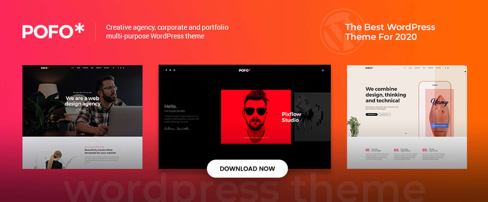
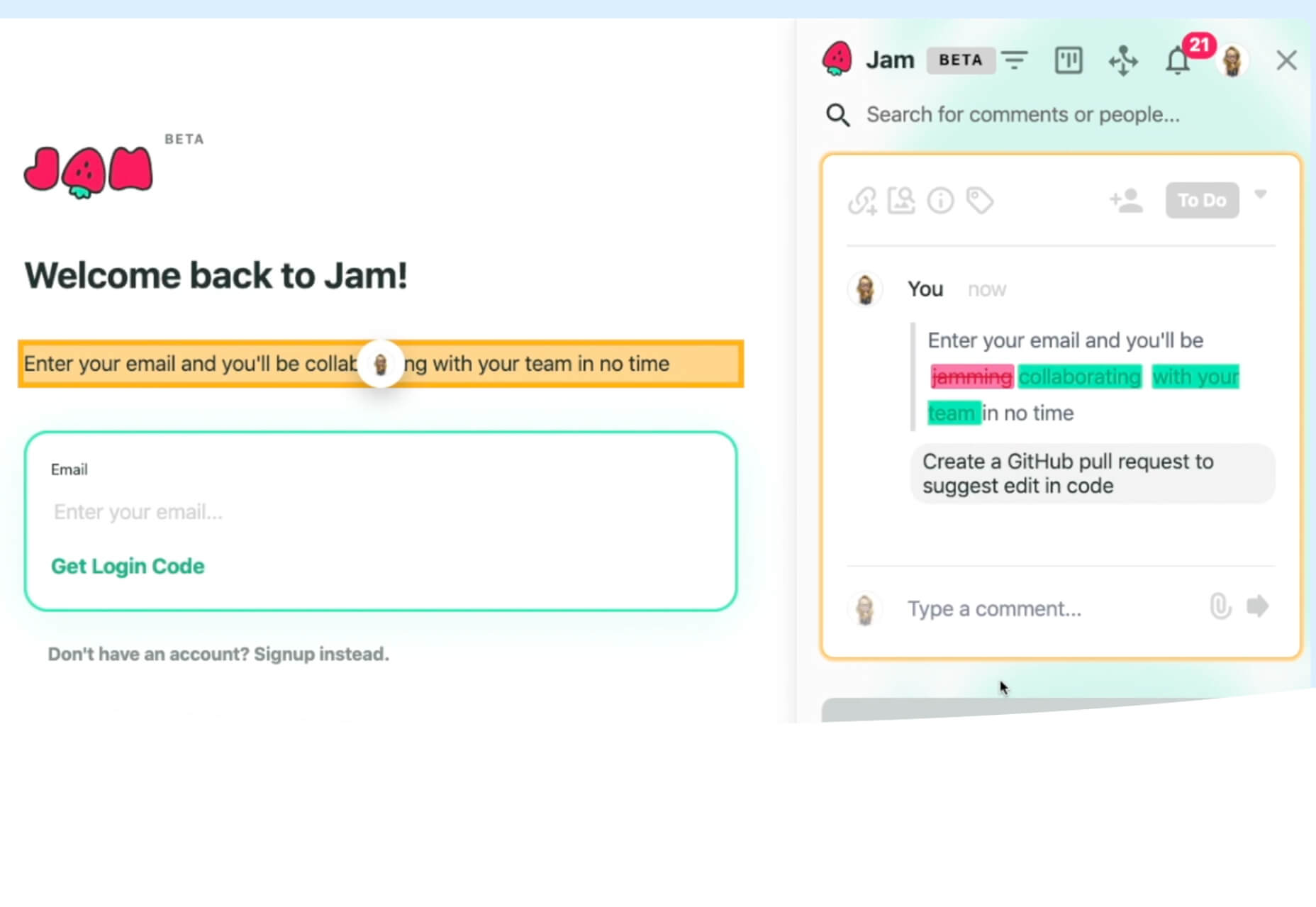
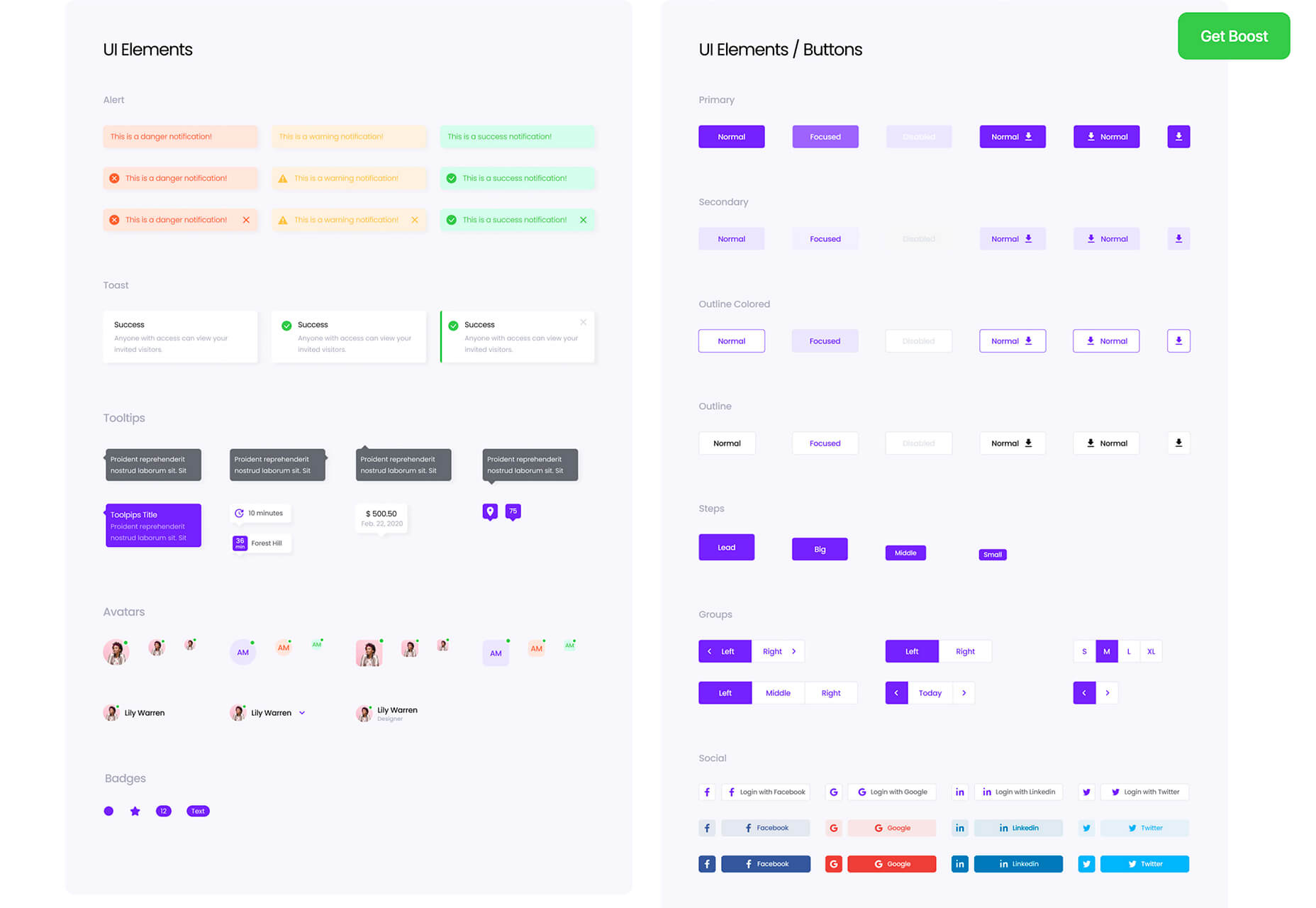
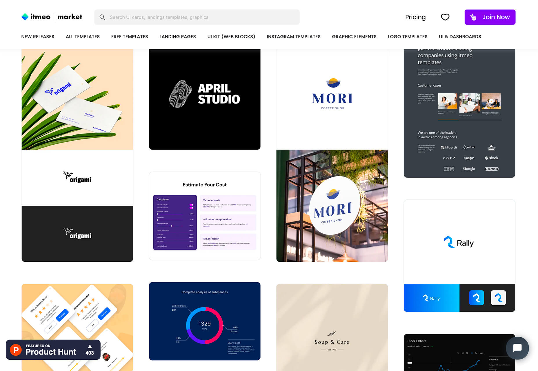
That means you need to discover the right UX strategies for everything from your homepage to your email marketing and even your listings on Google.

Today, we’re going to explore some of how you can apply UX principles to your client’s image on search engines.

Why Your Search Engine Listing Matters

Let’s start with the basics: 89% of customers start their purchasing process with a search engine. That means that whether you’re creating a portfolio to sell your services or building a website for a client, the first connection a customer has with your design isn’t on the homepage.

Most of the time, you’re driving a specific experience for an end-user before you even realize it. Before you can wow an audience with a beautiful site design or an amazing CTA offer, you need to convince them to click on your Google link.

When you invest in user experience, you think carefully about the journey that an end-user goes through when interacting with a brand. This often means considering things like the user’s intent, their needs, and their pain points.

Those same principles apply to create an impressive search engine listing.

UX on a website is all about giving your audience what they need in an informed, and strategic manner; UX in the search engine results works the same way.

How to Make Your Search Listing Stand Out with UX

So, how do you begin to apply the principles of UX to your Google Search results?

It’s much easier than you’d think.

Step 1: Show Immediate Value

Delivering an excellent experience on a website often means providing end-users with the information they need as quickly as possible. Imagine designing a landing page; you wouldn’t want your audience to scroll forever to find what they need. Instead, you’d make sure that the value of the page was immediately obvious.

When creating an image for your search engine listing, you’ll need to take the same approach. This often means thinking carefully about two things: your headline and your meta description.

Around 8 out of 10 users say that they’ll click a title if it’s compelling. That means that before you do anything else to improve your SEO strategy, you need to make sure that your web page’s title is going to grab your audience’s attention.

The best titles deliver instant value. These titles tell the audience exactly what they’re going to get when they click onto the page. The promise drives action, while clarity highlights the informed nature of the brand.

The great thing about using an excellent title for a page is that it doesn’t matter where you’re ranked on the search results. Whether you’re number 2 or number 5, your customers will click if they find something they want.

It’s just like using a CTA on a landing page. Make sure your titles are:

  • Informative — show your audience value immediately;
  • Optimized for mobile — remember, your audience might not see your full title on some screens; this means that you need to make the initial words count;
  • Easy to read — keep it short, simple, and clear, speak the end-users’ language.

Step 2: Build Trust with Your URLs

Trust factors are another essential part of good UX.

When you’re designing a website for a new brand, you know that it’s your job to make visitors feel at ease. Even in today’s digital world, many customers won’t feel comfortable giving their money or details to a new company.

Within the website that you design, you can implement trust symbols, reviews, and testimonials to enhance brand credibility. On search engines, it all starts with your URL.

Search-friendly URLs that highlight the nature of the page will put your audience’s mind at ease. When they click on a page about “What is SEO” in the SERPs, they want to see an URL that matches, not a bunch of numbers and symbols

Use search-friendly permalink structures to make your listing seem more authoritative. This will increase the chances of your customer clicking through to a page and make them more likely to share the link with friends.

Once you decide on a link structure, make sure that it stays consistent throughout the entire site. If a link doesn’t appear to match the rest of the URLs that your audience sees for your website, they may think they’re on the wrong page. That increases your bounce rate.

Step 3: Be Informative with Your Meta Description

To deliver excellent UX on a website, you ensure that your visitor can find all of the answers to their most pressing questions as quickly as possible. This includes providing the right information on each page and using the correct navigational structure to support a visitor’s journey.

In the SERPs, you can deliver that same informative experience with a meta description. Although meta descriptions often get ignored, they can provide a lot of value and help you or your client make the right first impression.

To master your meta descriptions:

  • Use the full 160 characters — make the most of your meta description by providing as much useful information as you can within that small space;
  • Include a CTA — just as CTAs help to guide customers through the pages on a website, they can assist with pulling in clicks on the SERPS; a call to action like “read about the” or “click here” makes sense when you’re boosting your search image;
  • Focus on value — concentrate on providing your customers with an insight into what’s in it for them if they click on your listing.

Don’t forget that adding keywords to your meta description is often helpful too. Keywords will boost your chances of a higher ranking, but they’ll also show your audience that they’re looking at the right result.

Step 4: Draw the Eye with Rich Snippets

You’ve probably noticed that the search engine result pages have changed quite a bit in the last couple of years. As Google strives to make results more relevant and informative, we’ve seen the rise of things like rich snippets. Rich snippets are excellent for telling your audience where to look.

On a website, you would use design elements, like contrasting colors and animation, to pull your audience’s attention to a specific space. On search engines, rich snippets can drive the same outcomes. The difference is that instead of telling a visitor what to do next on a page, you’re telling them to click on your site, not a competitor’s.

When Google introduced rich snippets, it wanted to provide administrators with a way of showcasing their best content. Rich snippets are most commonly used today on product pages and contact pages because they can show off reviews.

Install a rich snippet plugin into your site if you’re a WordPress user or your client is. When you enter the content that you need into the website, use the drop-down menu in your Rich snippet tool to configure the snippet.

Ideally, you’ll want to aim for the full, rich snippet if you want to stand out at the top of the search results. Most featured snippets have both text and an image. It would help if you aimed to access both of these by writing great content and combining it with a relevant image.

Step 5: Provide Diversity (Take Up More of the Results)

As a website designer or developer, you’ll know that different people on a website will often be drawn to different things. Some of your visitors might immediately see a set of bullet-points and use them to search for the answer to their question. Other visitors will want pictures or videos to guide them. So, how do you deliver that kind of diversity in the SERPS?

The easiest option is to aim to take up more of the search result pages. Google now delivers a bunch of different ways for customers to get the answers they crave. When you search for “How to use Google my Business” on Google, you’ll see links to blogs, as well as a list of YouTube Videos and the “People Also Ask” section.

Making sure that you or a client has different content ranking pieces for the same keywords can significantly improve the experience any customer has on the search engines. Often, the process of spreading your image out across the SERPs is as simple as creating some different kinds of content.

To access the video’s benefits, ask your client to create YouTube videos for some of their most commonly asked questions or most covered topics. If you’re helping with SEO marketing for your client, then make sure they have an FAQ page or a way of answering questions quickly and concisely on articles, so they’re more likely to appear in “People Also Ask”:

Step 6: Add Authority with Google My Business

Speaking of Google My Business, that’s another excellent tool that’s perfect for improving UX in the search results. GMB is a free tool provided by Google. It allows business owners to manage how information appears in the search results.

With this service, you can manage a company’s position on Google maps, the Knowledge Graph, and online reviews. Establishing a company’s location is one of the most important things you can do to help audiences quickly find a business. Remember, half of the customers that do a local search on a smartphone end up visiting the store within the same day.

Start by setting up the Google Business listing for yourself or your client. All you need to do is hit the “Start Now” button and fill out every relevant field offered by Google. The more information you can add to Google My Business, the more your listing will stand out. Make sure you:

  • Choose a category for a business, like “Grocery store”;
  • Load up high-quality and high-resolution images;
  • Ensure your information matches on every platform;
  • Use a local number for contact;
  • Encourage reviews to give your listing a five-star rating.

Taking advantage of a Google My Business listing will ensure that your audience has all the information they need to make an informed decision about your company before they click through to the site. This means that you or your client get more warm leads and fewer people stumbling onto your website that might not want to buy from you.

Step 7: Use Structured Data Markup to Answer Questions

If you’re already using things like rich snippets in your Google listings, you should also have a structured schema markup plan. Schema markup on Google tells the search engines what your data means. This means that you can add extra information to your listings that will guide your customers more accurately to the support they need.

Providing additional schema markup information to your listings gives them an extra finishing touch to ensure that they stand out from the competition. You might add something like a “product price” to a product page or information about the product’s availability.

Alternatively, you could provide the people who see a search result with other options. This could be an excellent option if you’re concerned that some of the people who might come across your listing might need slightly different information. For instance, you can ask Google to list other pages along with your search results that customers can “jump to” if they need additional insights.

Baking structured data into your design process when you’re working on a website does several positive things. It makes the search engine’s job easier so that you can ensure that you or your client ranks higher. Additionally, it means that your web listings will be more thorough and useful.

Since UX is all about giving your audience the best possible experience with a brand, that starts with making sure they get the information they need in the search results.

Constantly Improve and Experiment

Remember, as you begin to embed UX elements into your search engine listings, it’s important to be aware of relevant evolutions. Ultimately, the needs of any audience can change very rapidly. Paying attention to your customers and what kind of links they click on the most will provide you with lots of valuable data. You can use things like Google analytics to A/B test things like titles, pictures, featured snippets, and other things that may affect UX.

At the same time, it’s worth noting that the Google search algorithms are always changing. Running split tests on different pages will give you an insight into what your customers want. However, you’ll need to keep an eye on the latest documentation about Google Search if you want to avoid falling behind the competition.

Like most exceptional UX aspects, mastering your SERP position isn’t a set it and forget it strategy. You’ll need to constantly expand your knowledge if you want to show clients that you can combine UX and SEO effectively.

It’s easy to forget that there’s more to UX than making your buttons clickable on mobile devices or ensuring that scrolling feels smooth. For a designer or developer to deliver wonderful UX for a brand, they need to consider every interaction that a company and customer have. Most of the time, this means starting with the way a website appears when it’s listed on the search engines. Getting your SEO listing right doesn’t just boost your chances of a good ranking. This strategy also improves your reputation with your audience and delivers more meaningful moments in the buyer journey.


Featured image via Unsplash.

Source


Source de l’article sur Webdesignerdepot

Jumpstart your next design project or speed up a workflow with some of these new tools and resources. With so many new tools being developed all the time, you are almost certain to find something that can help you with projects.

Here’s what new for designers this month.

Everypixel Patterns

Everypixel Patterns solves a common design problem: Creating seamless patterns with graphic editors is such a long and exhausting process. That’s why some people choose to get patterns from stock websites but that can be a challenge too (and difficult to search). This tool makes getting patterns less time-consuming. It includes a gallery of well-designed content, which you can customize and edit as needed.

Multiavatar

Multiavatar is a free and open-source multicultural avatar maker. Type something in the input field and generate one of 12 billion avatars. (Everything is randomly generated and free to use.)

Lobe

Lobe is a machine learning app from Microsoft that helps you create and train models. Start by showing the app examples of what you want it to learn and it will train a model for you. The tool is pretty easy to understand and you don’t need or experience or code knowledge to use it and you can train an app for free on your computer.

Laser Cat

Laser Cat is a silly and fun Google Chrome extension that adds a cartoon cat to your browser that allows you to zap away anything you want to remove in the browser window. It’s light and fun. Go play!

Pattern Collect

Pattern Collect is a curated gallery of patterns by various designs and illustrators. You can download patterns for use in projects or submit your own to share with the design community. The library is searchable and you can get new patterns via email if you subscribe.

FarbVelo

FarbVelo is a color palette generator that shows a new and random scheme with every refresh. The color choices are fresh and could work for a variety of projects, too.

CSS Clip Path Editor

CSS Clip Path Editor is a cool little pen by Mads Stoumann that puts an image inside of almost any clip path you can imagine. There are presets to choose from or you can adjust the settings and paths to create your own image shape.

Responsive & Configurable SVG Waves

Responsive & Configurable SVG Waves is a soothing pen by Jhey. Change the background and wave elements for a simple and cool animation in SVG.

Veed

Veed lets you host, edit, and deliver videos in the cloud using a REST API. It works on any browser, device, and bandwidth, and keeps your website light, even when delivering heavy video content.

Overlay

Overlay is a plugin for Figma or Sketch that transforms components and symbols into clean and reusable React, Vue, or HTML code. The benefit? Use it to create more consistent websites and design systems more quickly and in a pixel-perfect manner.

List.js

List.js is a library for adding search, sort, filters, and flexibility to tables, lists, and other HTML elements. It is built so that it will work on existing HTML and be invisible. Plus, it is simple to install and use.

What Are Design Tokens?

Design tokens are a “hot term” says Andy Bell. So, he wrote an explainer that breaks down what they are and how they might look in a standard data format like JSON. Read the explainer and you’ll be able to identify design tokens and understand them.

SVG Path Editor

SVG Path Editor makes it easy to manipulate paths for any SVG element. The grid – if you choose to use it – helps edits stay symmetrical and easy to manage.

Operator Lookup

Operator Lookup is a practical and fun tool. Enter a JavaScript operator in the search box to learn more about what it does. (You can also choose from a “keyboard” of options.) Thanks for the tutorial, Josh W. Comeau.

Beacon

Beacon is a tool designed to help you write, run, and share SQL in Slack. It makes collaboration easy so you can work on and run queries, debug, and resolve issues all in a single platform.

Plaiceholder

Plaiceholder transforms your images into lightweight placeholders using pure CSS or SVG.

Machine Translation

Machine Translation is available as Cloud API, on-premise translation server, and SDK that can be easily integrated into lots of business cases. Both solutions work with 110 languages.

Draggable Blend Generator

Draggable Blend Generator does just what the name implies. Change the blend mode of a background and foreground using a draggable tool so that you can see the changes in real time. Just enter the URL of a background image or pattern and color swatch and you are ready to go.

Jam Wand

Jam Wand is a “magic wand” for making changes on your website, starting with copy. Click on any text, edit it, and submit the change to GitHub to be merged into the code. Copy changes as easy as click, type, and click again. (This tool is still in beta.)

Boost UI Kit

Boost UI Kit is a collection of elements and components that will help you finish website design projects using a bright and airy style. It works with Figma for easy integration.

Romanizer

Romanizer is a fun game that tests your knowledge of Roman numerals. With two modes – a randomizer and a challenge you can participate in – you’ll learn to convert numbers visually in minutes.

Itmeo Market

Itmeo Market is a new online graphics marketplace with exclusive and ready-to-use templates for a variety of projects. Templates include elements for logos, UI kits, graphic elements, Instagram templates, landing pages, and more. (This is a paid/subscription-based resource.)

Bellmoco Handcola

Bellmoco Handcola is a beautiful decorative typeface with fun swashes and serifs. The free version is for personal use only.

Bondie

Bondie is a handmade brush typeface with fills in many of the letterforms. It contains 106 characters and is free for personal use.

Bovino

Bovino has multiple weights that can work for display or body text. The modern serif is free for personal use.

Estilistica

Estilistica is a thin modern style sans serif with smooth lines and a vertical profile. It is best suited for display use and is free for personal use.

Source


Source de l’article sur Webdesignerdepot

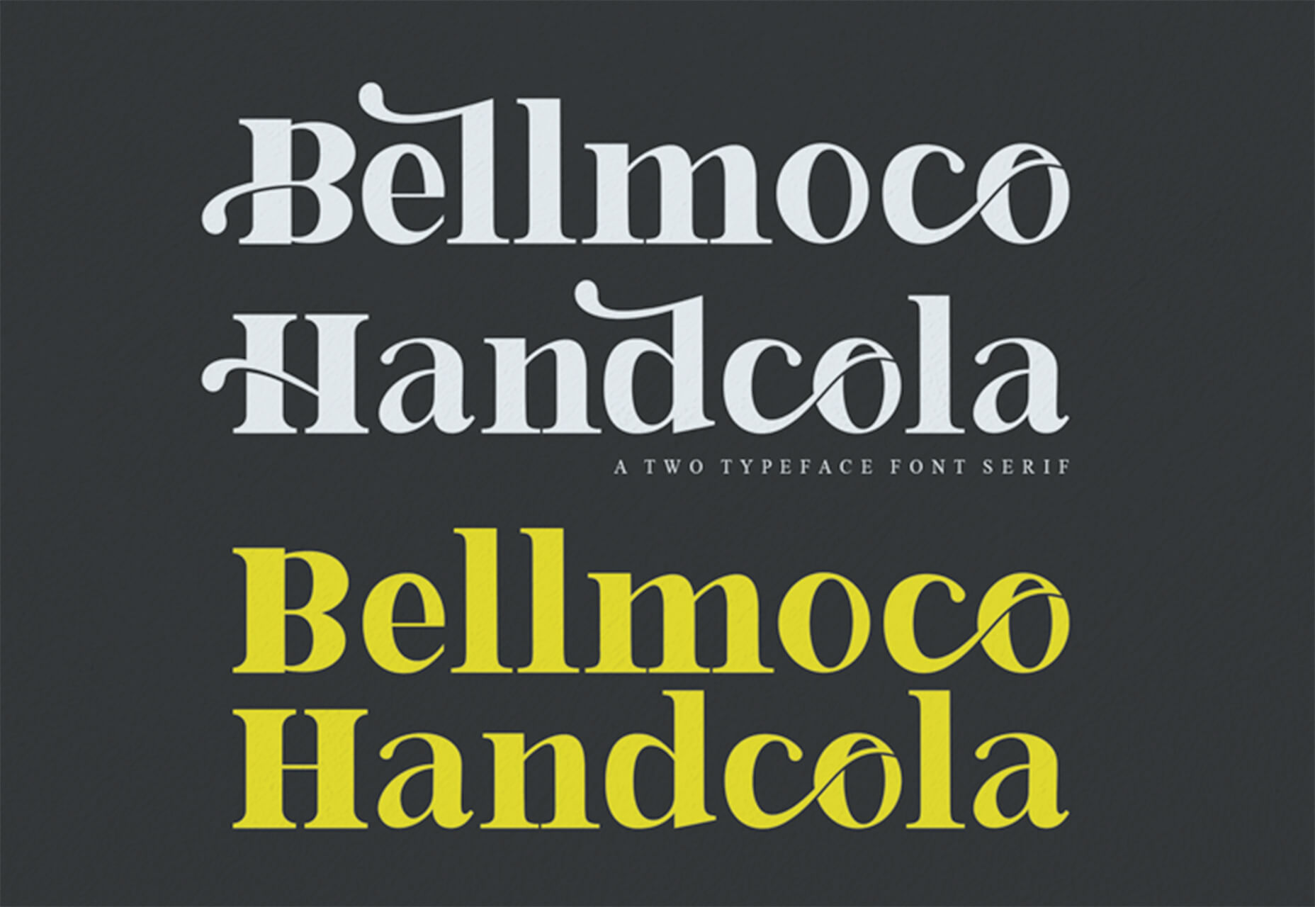
Sass – the extended arm of CSS; the power factor that brings elegance to your code.

With Sass, it is all about variables, nesting, mixins, functions, partials, imports, inheritance, and control directives. Sass makes your code more maintainable and reusable.

And now, I will show you how to make your code more structured and organized.

The organization of files and folders is crucial when projects expand. Modularizing the directory is necessary as the file structure increases significantly. This means structuring is in order. Here is a way to do it.

  • Divide the stylesheets into separate files by using Partials
  • Import the partials into the master stylesheet – which is typically the main.sass file.
  • Create a layout folder for the layout specific files

Types of Sass Structures

There are a few different structures you can use. I prefer using two structures — a simple one and a more complex one. Let’s have a look.

Simple Structure

The simple structure is convenient for a small project like a single web page. For that purpose, you need to create a very minimal structure. Here is an example:

  • _base.sass — contains all the resets, variables, mixins, and utility classes
  • _layout.sass — all the Sass code handling the layout, which is the container and grid systems
  • _components.sass — everything that is reusable – buttons, navbars, cards, and so on
  • _main.sass — the main partial should contain only the imports of the already mentioned files

Another example of the same simple structure is the following:

  • _core.sass — contains variables, resets, mixins, and other similar styles
  • _layout.sass — there are the styles for the header, footer, the grid system, etc
  • _components.sass — styles for every component necessary for that project, including buttons, modals, etc.
  • _app.sass — imports

This is the one I usually use for smaller projects. And when it comes to making a decision of what kind of structure to be used, the size of the project is often the deciding factor.

Why Use This Structure?

There are several advantages why you should use this organisational structure. First of all, the CSS files cache and in doing so, the need to download a new file for every new page visit is decreased. In this way, the HTTP requests decrease as well.

Secondly, this structure is much easier to maintain since there is only one file.

Thirdly, the CSS files can be compressed and thus decrease their size. For a better outcome, it is recommended to use Sass/Less and then do concatenation and minification of the files.

In case files become disorganized, you would need to expand the structure. In such a case, you can add a folder for the components and break it further into individual files. If the project broadens and there is a need for restructuring the whole Sass structure, consider the next, more complex pattern.

The 7-1 Patterned Structure

The name of this structure comes from 7 folders, 1 file. This structure is used by many, as it is considered to be a good basis for projects of larger sizes. All you need to do is organize the partials in 7 different folders, and one single file (app.sass) should sit at the root level handling the imports. Here is an example:

sass/
|
|- abstracts/
| |- _mixins // Sass Mixins Folder
| |- _variables.scss // Sass Variables
|
|- core/
| |- _reset.scss // Reset
| |- _typography.scss // Typography Rules
|
|- components/
| |- _buttons.scss // Buttons
| |- _carousel.scss // Carousel
| |- _slider.scss // Slider
|
|- layout/
| |- _navigation.scss // Navigation
| |- _header.scss // Header
| |- _footer.scss // Footer
| |- _sidebar.scss // Sidebar
| |- _grid.scss // Grid
|
|- pages/
| |- _home.scss // Home styles
| |- _about.scss // About styles
|
|- sections/ (or blocks/)
| |- _hero.scss // Hero section
| |- _cta.scss // CTA section
|
|- vendors/ (if needed)
| |- _bootstrap.scss // Bootstrap
|
- app.scss // Main Sass file

In the Abstract partial, there is a file with all the variables, mixins, and similar components.

The Core partial contains files like typography, resets, and boilerplate code, used across the whole website. Once you write this code, there is no further overwriting.

The Components partial contains styles for all components that are to be created for one website, including buttons, carousels, tabs, modals, and the like.

The Layout partial has all styles necessary for the layout of the site, i.e., header, footer.

The Pages partial contains the styles for every individual page. Almost every page needs to have specific styles that are to be used only for that particular page.

For every section to be reusable and the sass code to be easily accessible, there is the Section/Blocks partial. Also, it is important to have this partial so that you don’t need to search whether particular code is in the home.sass or about.sass files in the Pages partial.

It is a good idea to put each section in a separate .sass file. Thus, if you have two different hero sections, put the code in the same file to know that there you can find the code for the two sections. And if you follow this pattern, you will have the majority of files in this folder.

The Vendors partial is intended for bootstrap frameworks so, if you use one in your project, create this partial.

I recommend you use app.sass as the main folder. Here is how it should look:

// Abstract files
@import "abscracts/all"; // Vendor Files
@import "vendor/bootstrap.scss"; // Core files
@import "core/all"; // Components
@import "components/all"; // Layout
@import "layout/all"; // Sections
@import "sections/all"; // Pages
@import "pages/all";

Instead of having a lot of imports in the file, create an all.sass file in every folder. Each all.sass file should contain all the imports for that folder — and to make it more visible and understandable, create a main file.

Organisation

The biggest benefit of this structure is organisation.You always know where to check if you need to change something specific. For example, if you want to change the spacing on a Section/Block you go directly to the Sections/Blocks folder. That way, you don’t need to search in the folder to find the class in a file.

Facilitation

When the code is structured, the processes are promptly facilitated. They are streamlined and every segment of the code has their own place.

Final Words

Organizing code is essential for developers and together with all other skills, it is the most effective way to improve the functioning of the site. And even though there are multiple ways of organisation and different strategies, opting for simplicity helps you avoid the dangerous pitfalls. And finally, there is no right or wrong choice since everything depends on the developer’s work strategies.


Featured image via Reshot.

Source


Source de l’article sur Webdesignerdepot

By the end of the year, the number of global smartphone users is expected to reach 3.5 billion. That’s a significant 9.3% increase over the last 12 months.

In a world where everyone is constantly connected to their mobile devices, it makes sense that web developers and designers would need to consider new rules for how they create engaging experiences. After all, most of us find browsing from our smartphones to be much more convenient than sitting down at a laptop each day.

With a little luck, you’re already taking steps to mobile optimize your website but standards are changing all the time. To make sure your website is up to scratch, here’s your guide to prioritizing your site for mobile, ready for the new year.

Understanding Mobile-First Design

The first step in updating your web design and development principles, is understanding the concept of mobile first design, and how it’s changed.

With a responsive website, you create something that adjusts to the screen size of any device; with a mobile-first site, you’re focusing first-and-foremost on the user experience that people get when they’re on mobile, taking that as your starting point, and building from there. Instead of building your website for the desktop and using mobile as an afterthought, you start with a consideration of mobile.

Even Google is highlighting the demand for this process lately, with the mobile-first indexing algorithm. If you can’t design for mobile-first, then you could risk your clients being unable to rise up the search engine ranks.

So, how do you get started?

1. Start With the Right Tools

Web developers and designers are nothing without a great toolkit.

The good news is that there are solutions out there that can help you to master the right skills for a mobile-focused user experience. For instance, Skeleton is excellent for small-scale projects that require fluid grids and minimal compiling.

Alternatively, Bootstrap can offer a one-size-fits-all solution for the front-end development for mobile devices. There’s a default grid system available, plenty of components, and JavaScript plugins to work with.

With the right tools, you can minimize and prioritize the content that’s most valuable for your website projects. This is crucial for maximizing website speed and creating clarity when it comes to content and imagery.

For instance, check out the ESPN website; it’s split into very easy-to-follow categories of content that are perfect for scrolling on a smartphone. The grid of videos makes it feel like you’re using a tool like YouTube.

2. Prioritize Mobile-First Elements

Once you have the right tools to assist you, it’s time to begin building your mobile-first website from the ground up. Rather than jumping straight into considerations of the latest design trends, it’s important to start with the foundations.

For instance, navigation within a mobile page is usually hidden under a hamburger button. However, you can take this concept to the next level too. For example, the Shojin mobile website only demonstrates the most important website options within the navigation bar to avoid overwhelming users.

The key here is to keep things as simple as possible, without restricting what your audience can do when they visit your website. Although you want to keep the number of interactive elements on your site small, you also need to ensure that those elements are easy to find and use.

All buttons and CTAs should be clear and tappable. Fonts need to be large enough to read from any screen, and your navigation system needs to be 100% simple, without slowing anything down.

On average, we recommend making all clickable elements at least 48 pixels in height.

3. Use Responsive Imagery and SVGs

Images are a crucial part of any website. They add context and appeal to your design. However, they can also seriously slow down your website if you’re not careful.

Remember, different devices have different demands when it comes to imagery. A desktop page may need a 1200px wide image, while a mobile-only needs the image to be 400px wide at most. The old way of making your images work was to load a large resolution image and use the same file on every platform. Unfortunately, this slows downloading time significantly.

Instead, it’s better to have at least two different versions of the same image for your mobile and desktop solutions. You can also consider SVG.

SVGs are incredibly scalable – more so than bitmaps. With SVG, you can ensure any icon or graphic continues to look sharp and clickable across all devices. Because these files are often smaller, your site loads quicker too! Hubspot is great at using SVGs.

Intricate illustrations are a massive component of HubSpot’s brand. If those images were saved as PNGs or other alternative files, then they would take forever to load. Because they’re all SVGs, you can enjoy the same consistent experience across desktop and mobile.

4. Get the Typography Right

It’s not just the big graphics and images that make a huge difference to your website when it comes to mobile-first design. You also need to think about the legibility and clarity of your website across all devices and platforms. If people can’t read the value proposition of the company that you’re designing for, you’re going to have a major problem.

Focus on making your content as easy to read as possible. Look into the typefaces that seem most appealing on a range of devices.

Remember to balance the body and heading font sizes for the device size too. You’ll need to ensure that the experience feels consistent and smooth as your users scroll through each page. Just take a look at the mobile version of the IMPACT website, for instance.

The headings aren’t as huge as they are on the desktop version of the website, and they’re displayed below, rather than above the featured image. However, this helps to give a more immediately eye-catching and structured experience to mobile users.

There’s even a handy “Search Engine Optimization” tag included, that users can click on if they want to find more related articles.

When it comes to typography, remember that it’s not just size and clarity that matter, but how things are structured throughout your website too. Your type should naturally guide your visitors along the page.

5. Master Available Device Features

Finally, on smartphones, you can accomplish a range of amazing things that you might not be able to do when using a desktop device. Your users can make calls, open apps, send messages, and more, all from within their mobile browser. They can also move their smartphone around a room, taking advantage of concepts like AR and VR.

Taking advantage of the unique capabilities that smartphone design can offer gives you a chance to get unique with your user experience.

Making the most of the mobile experience can be much simpler than you’d think. For instance, on a desktop site, you could list your phone number on a contact page. On a mobile site, the number can begin a call when clicked. You can also take the same approach with email addresses, and social media icons too.

Depending on how experimental you feel, there’s also plenty of opportunities to go above and beyond with your mobile features. You may decide to create a mobile app version of a website that your customers can download onto their phones.

Alternatively, you can look into things like AR technology. This could allow your users to practice placing items of furniture that they may be thinking of buying from an online retailer into their house, so they can see how well they work with their other interior design choices.

Making the Most of Mobile-First Design

Ultimately, having a responsive website that works on both mobile and desktop devices is mandatory in the modern world. However, going above and beyond with mobile-first design is a great way to get ahead of the game.

If you can focus on building a website that puts the experiences of mobile users first, then you can create something that’s much more likely to grab audience attention and deliver amazing experiences.

If nothing else, showing your clients that you have what it takes to design for mobile is an excellent way to ensure that you can gain as many new project opportunities as possible.

Source


Source de l’article sur Webdesignerdepot