 When starting a new business (or even venturing into the world of freelancing for the first time), there are some really big, important steps you have to take.
Step #1 is choosing the right business name for your brand identity.
Your business name isn’t something you can casually choose either — especially if you have lofty long-term goals for your company. It’s not as though you can’t change the name down the road, but that comes with a ton of work and will require you to rebuild pretty much everything all over again: your visual brand identity, your reputation, and your SEO…
So, it’s a good idea to spend time choosing a business name that’s going to work for you now and long into the future.
Today, we’re going to go through the process of how to name your brand. These questions will have you thinking beyond just “What name do I like the sound of?” and have you more focused on important questions like “What is my unique value proposition?”.
Let’s get started:
How to Name Your New Business
For those of you considering taking the easy way out and using a business name generator tool, let me show you why that’s a bad idea:
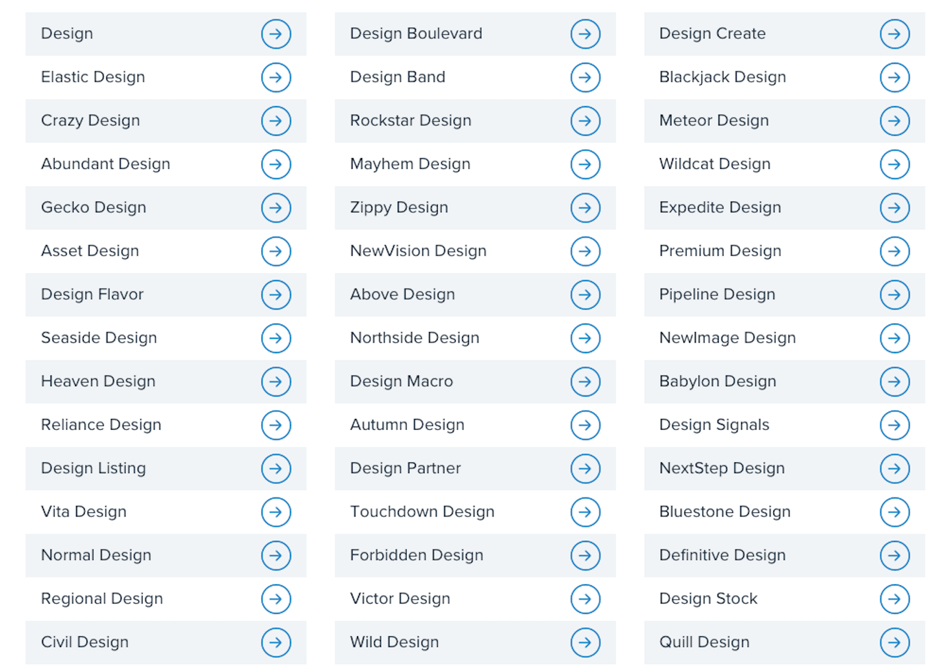
This is a list of business names suggested to me when I told the generator that my business is related to “design”:
- Design
- Normal Design
- Regional Design
- Design Partner
- Design Stock
Even the more unique names on the list are unusable; they have no connection to me personally or to the kind of business I plan to start.
This is why it’s so important to sort out your brand identity and make sure you pick a business name that resonates with you, and your target audience. To do this yourself, answer the following seven questions:
1. What Services Will You Provide Or Products Will You Sell?
The one thing that name generators get right is including a descriptive word related to your business. That way, it doesn’t take an actual visit to your website or a look through your portfolio to figure out what you do.
Even if you have a very niche specialty, sum up your offering in one or two words. For instance:
- Web design
- Digital design
- Design & development
- UX design
- Graphic design
Unless you run your business through your own name (which I’ll talk about shortly), your business name should include a simplified version of your offering in it.
2. Who Is Your Target User Persona?
A user persona is a fictional character created using the demographics and psychology of your ideal customer or client. You can use Hubspot’s Make My Persona generator to create a card that documents these details:
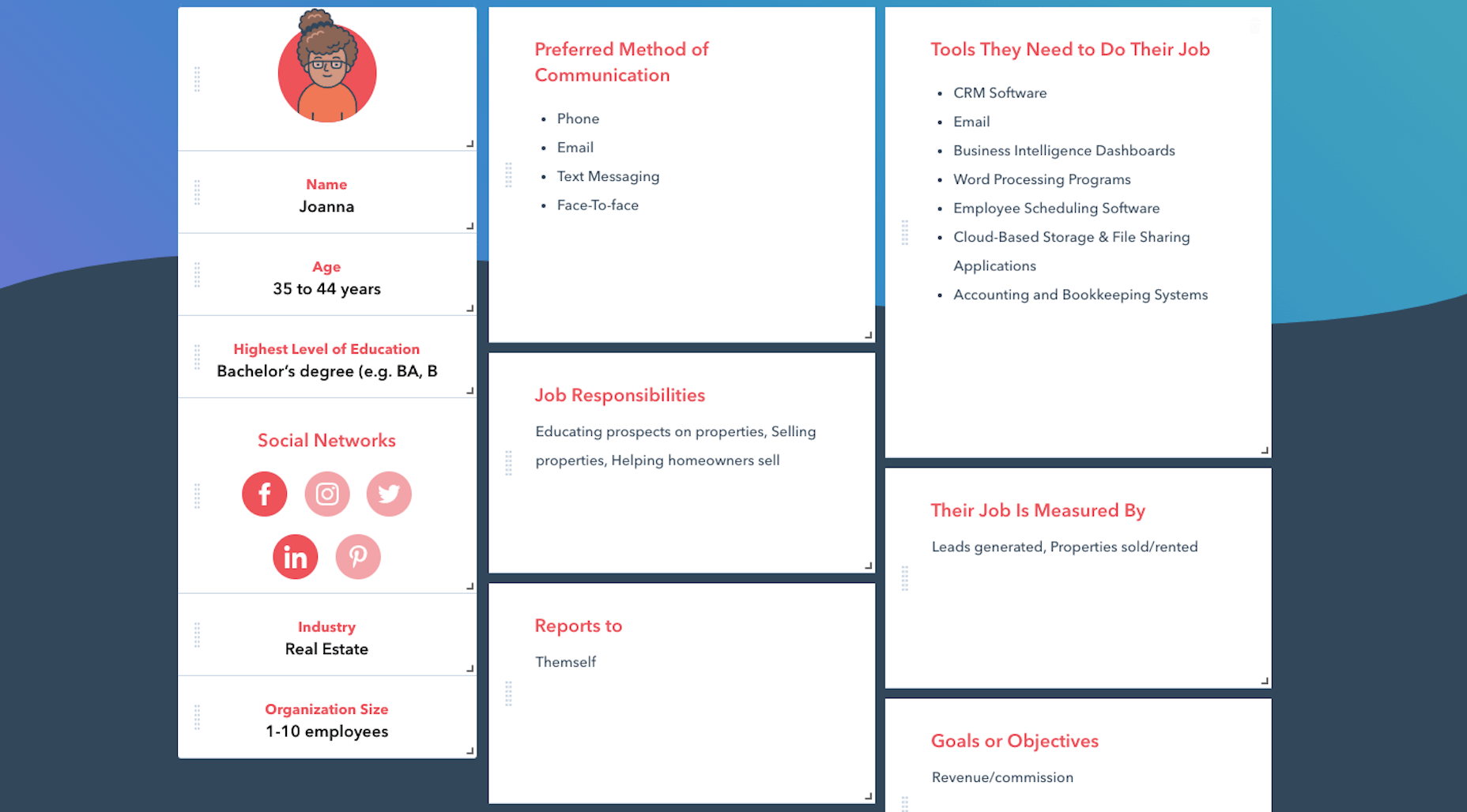
Once you sort out who you serve, what makes them tick, and how it fits into the bigger picture of their business, you can better pitch your solution to them.
For instance, Joanna above is a real estate agent and owner whose primary goal is to capture leads and generate sales. You know how effective a real estate website can be for improving an agent’s visibility online and streamlining how they earn money.
So, including words in your business name that speak to that persona as well as their goals might be really useful.
Just keep in mind that web designers don’t always commit to one niche or stick with the same niche over the long run. So, you might not want to make your business name too specific to an industry (e.g. “Real Estate Design Solutions”) and more related to higher level themes and goals.
3. What Are The Names Of Your Top Competitors?
Do you know who your main competitors will be upon entering this space? If not, now’s the time to look them up.
When it comes to business names, you want to see if you can identify common threads among them. Perhaps they use puns or include location-specific descriptors. Or they just stick with the names they were born with.
While you don’t want to come off as a copycat, you can imbue your business name with a similar theme or tone if it’s proven to be successful with your shared audience.
4. What Makes You Different?
Every business has a unique value proposition (UVP) — something that sets them apart from everyone else in the space. What’s yours?
Do you operate within a large metropolitan area where your prospective clients’ industry is booming?
Did you previously work in the industry for which you now build websites?
Are you an SEO expert who builds enterprise websites that rank?
In business, it’s good to be different — so long as it benefits your clients.
If you have a particular UVP that’s going to make you stand out, you’re going to use it everywhere to market yourself — your website, social media, sales pitches, etc. So, you might want to consider using a unique keyword from it within your business name.
5. Where Do You Envision Yourself In Five Years?
No one’s future is set in stone. However, if you’re seriously thinking about starting a new web design business, you have some ideas about where you want to go with it:
- Do you like the idea of being a lifelong freelancer or digital nomad?
- Would you like to operate your own design agency?
- Do you have aspirations to build and sell website products, like plugins, themes, or UI kits instead?
If you expect to pivot your business at some point, be careful about choosing a business name that paints you into a corner. Keep it broader so that prospects don’t have to wonder what it is you really do.
And if you plan on scaling your business beyond yourself, using your own name might not be the best idea. You’ll want clients to associate the brand name with your agency, not with you specifically.
6. Will Your Business Name Be Easy To Remember?
At this point, you have some business names brewing. So, now we need to look at the more technical aspects of naming your brand.
Here’s what you need to do.
a. Write down no more than three to five business names you like.
For example:
- Honeymooners Web Design
- Charles Murphy Design & Development
- FoREver Websites
- SOLD Web Design Agency
b. Mash each name into one long lowercase string. Don’t include any punctuation.
For example:
- honeymoonerswebdesign
- charlesmurphydesignanddevelopment
- foreverwebsites
- soldwebdesignagency
c. Are any of the names difficult to read? Too long? Do any of them cause confusion and look like they mean something else?
If so, get rid of them as a matching domain name won’t work. Or, if you absolutely love them, fix the name so it’s clear, readable, and short. For instance:
charlesmurphydesignanddevelopment becomes charlesmurphydesign or just charlesmurphy.
7. Does The Name You Want Already Exist?
It’s a good idea to have a backup name in case you discover that the name you want already exists. Due to trademarking issues as well as possible confusion for your clients, you’ll want to avoid using a name that overlaps with or is the same as any other company (in or outside of web design).
Do a Google search for the business name you want to use. Check out the top 10 search results to see if there are any other matches.
You’ll also want to test out the domain name. Go to Domain.com and run your business name string through it:
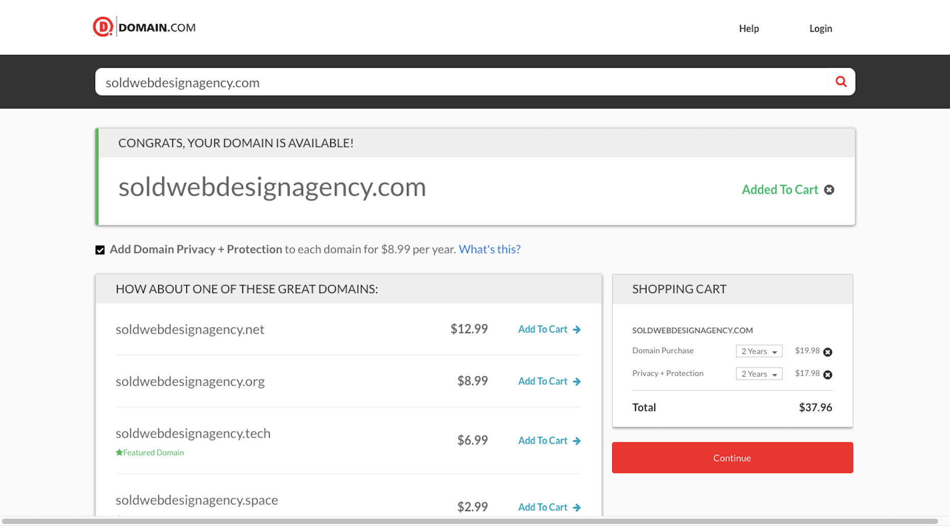
You have a few options if this happens:
- Choose a different top-level domain (e.g. .tech, .io, .design).
- Use an abbreviated version of your business name (e.g. solddesignagency.com).
- Move your backup business name to the front of the line and see if it’s available.
It all depends on how attached you are to the business name you’ve chosen. Just make sure that any changes you make to it (like shortening the domain name or using an alternate TLD) doesn’t cause confusion for prospects who look you up online. You don’t want them confusing someone else’s domain name for yours if business name and domain name don’t line up.
Choosing a Business Name Is Just the First Step…
Once you’ve settled on your business name, share it with a few people you trust. They’ll let you know if you’ve totally missed the mark or if it’s something you should be excited to run with.
As soon as you’re 100% sure it’s the right name, buy the domain name and register your company. Then, it’ll be official!
Of course, this isn’t the end to branding your new business. In our next Branding 101 post, we’re going to look at the next step: How to create the visual identity for your business.
Stay tuned!
Featured image via Pexels.
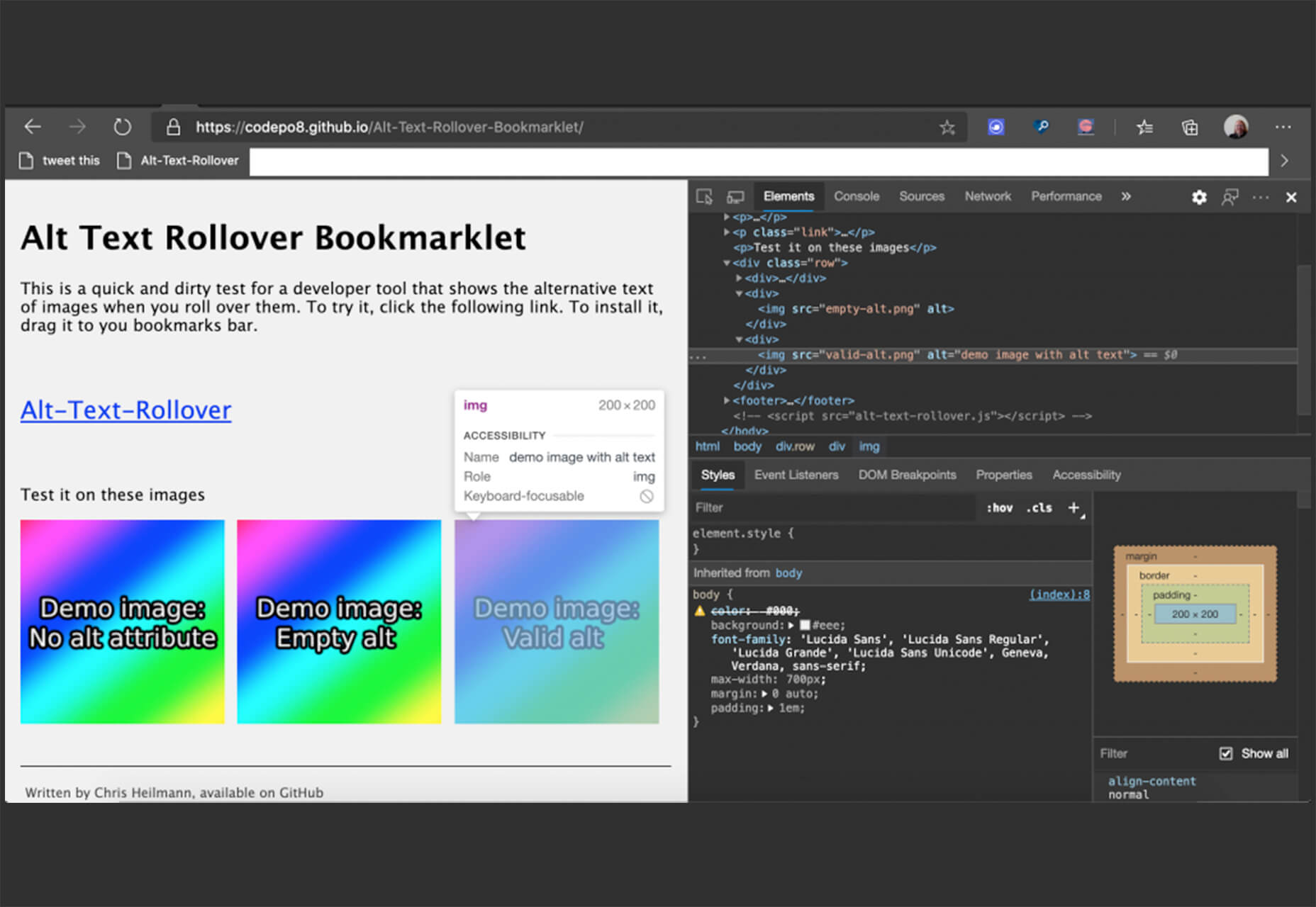
 Every week users submit a lot of interesting stuff on our sister site Webdesigner News, highlighting great content from around the web that can be of interest to web designers.


 And it does this 24 hours a day, 7 days a week, 52 weeks a year without ever asking for a pay raise.
 Artificial intelligence. Just hearing the phrase has been a trigger for many in the technology world since that creepy Haley Joel Osment film circa 2001. But more recently, artificial intelligence and machine learning strike fear into the hearts of skilled workers for an entirely different reason: job security, or lack thereof.
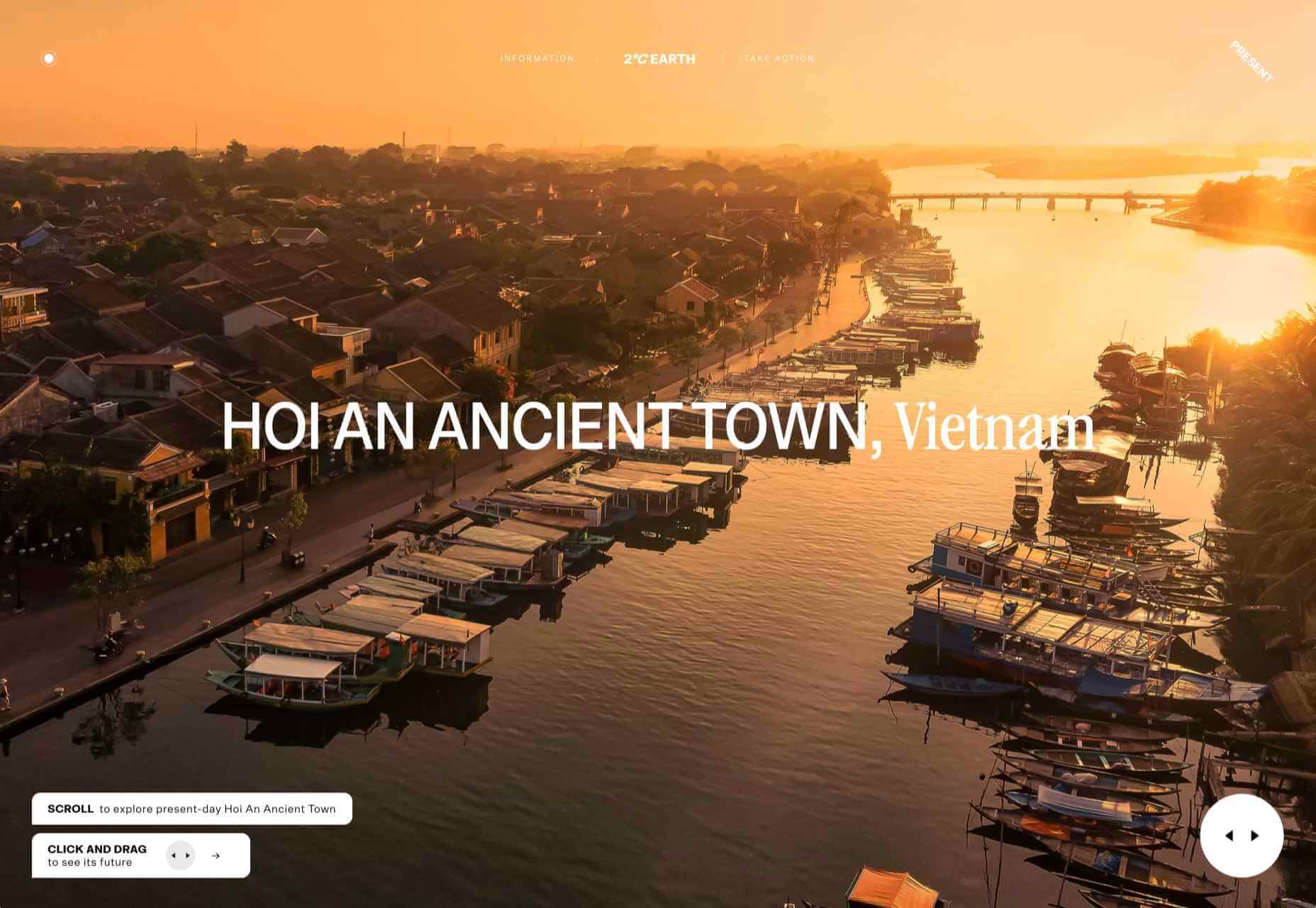
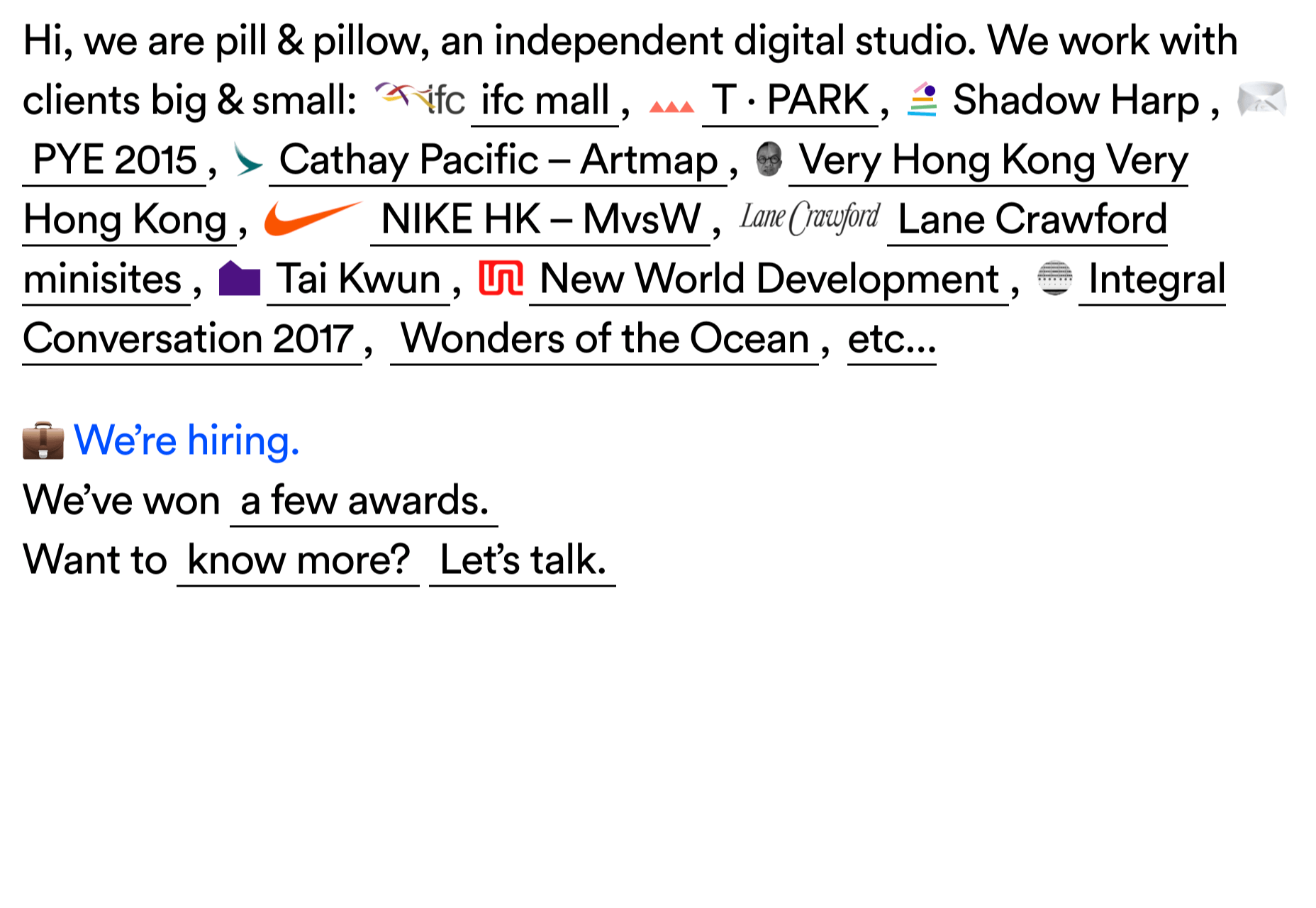
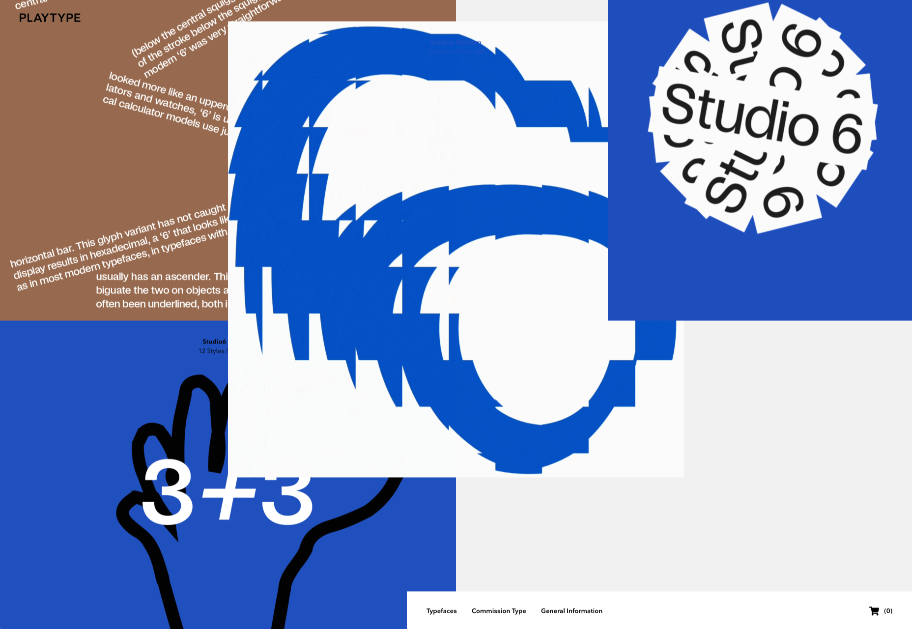
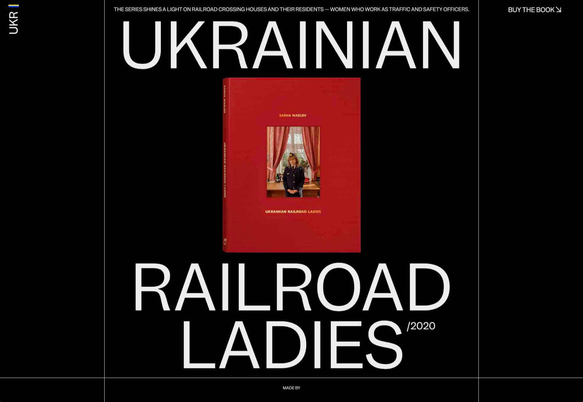
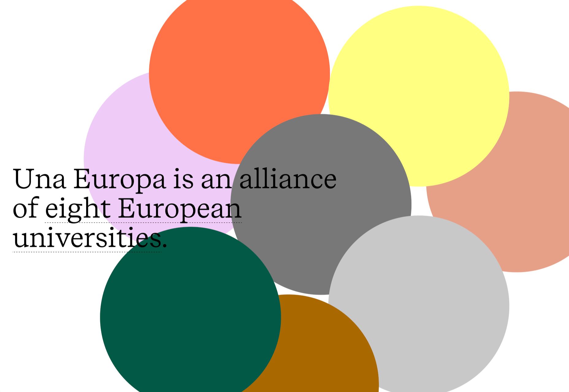
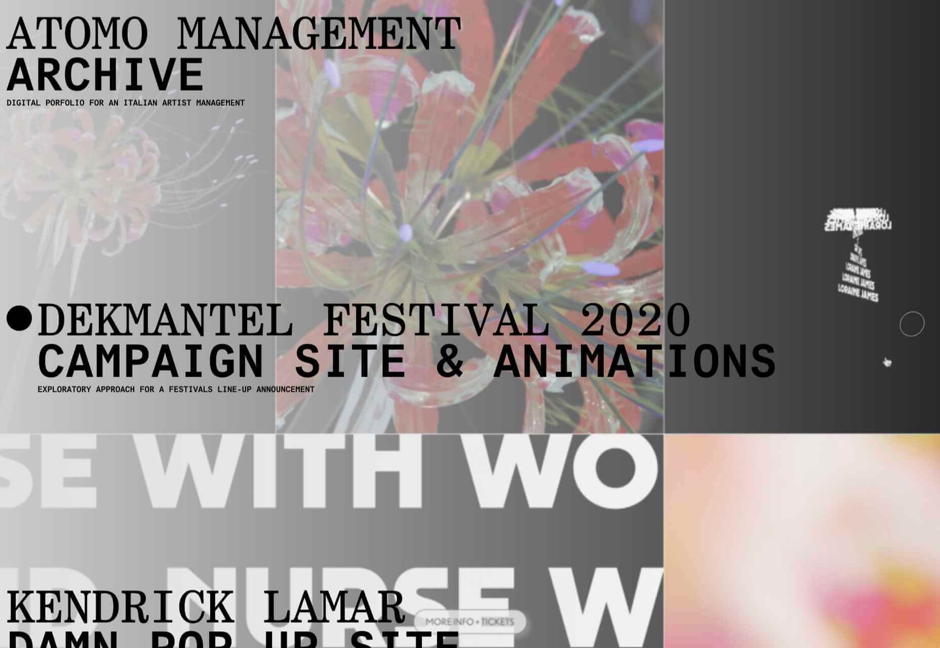
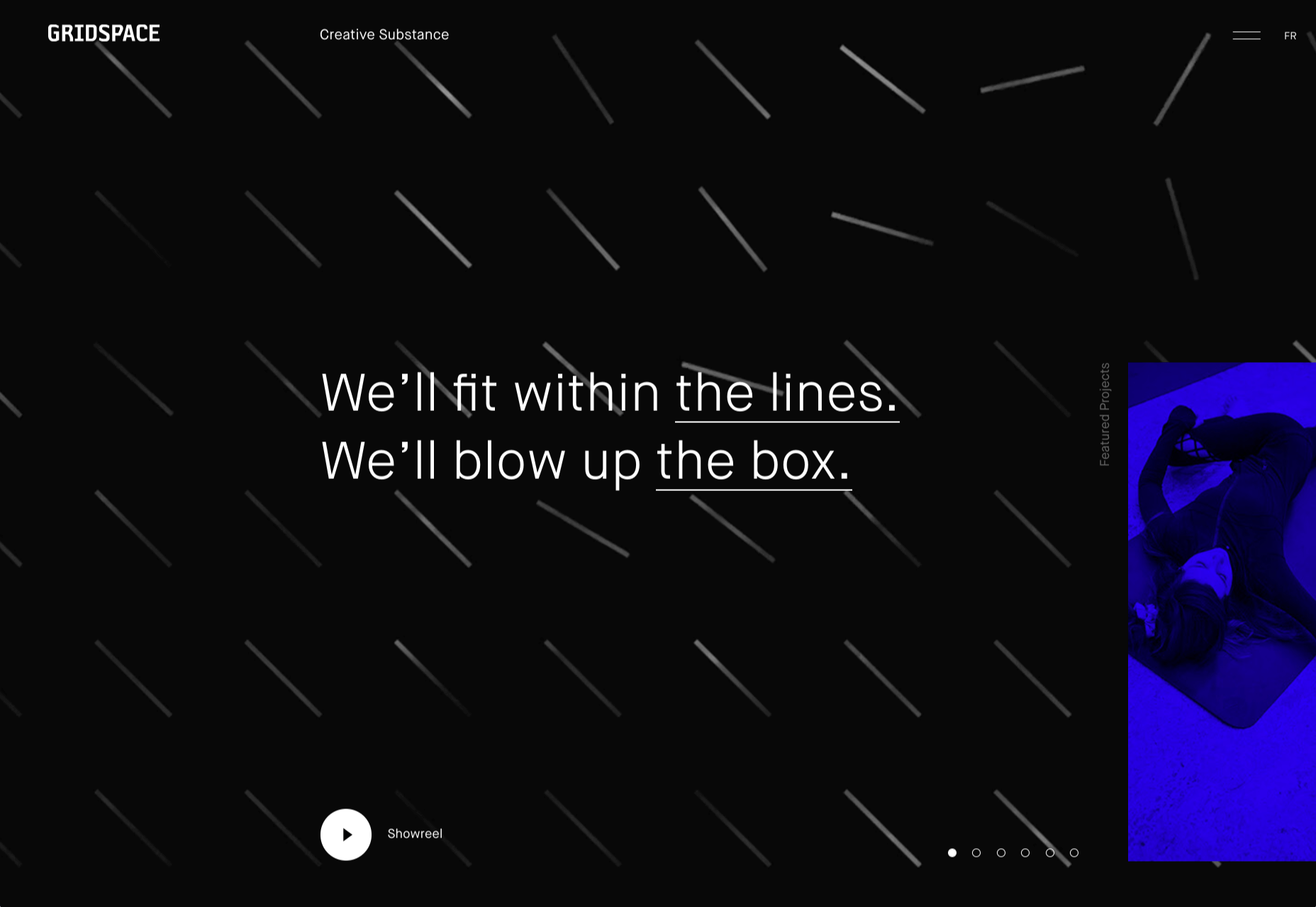
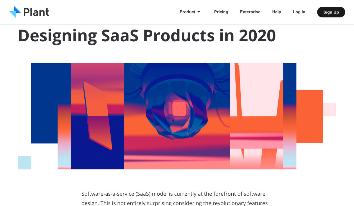
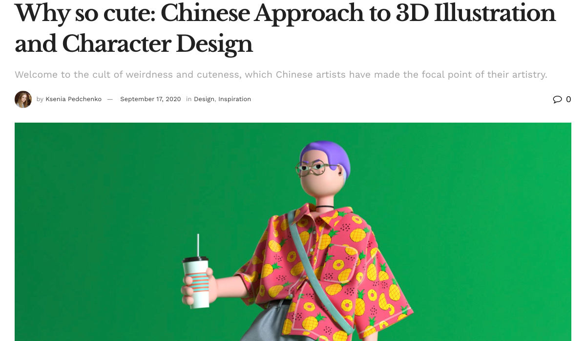
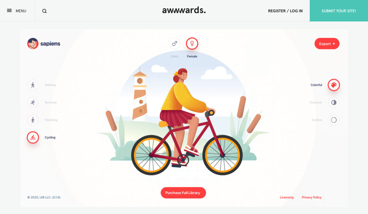
 This month we’re going big and bold. Oversized type, strong colors, in-your-face layouts, and little touches of playfulness exude confidence and make a statement. There are some quieter moments too, with thoughtful illustration and more gentle use of color. Animation still features strongly in the details, with circles proving popular in rollover effects. Enjoy.
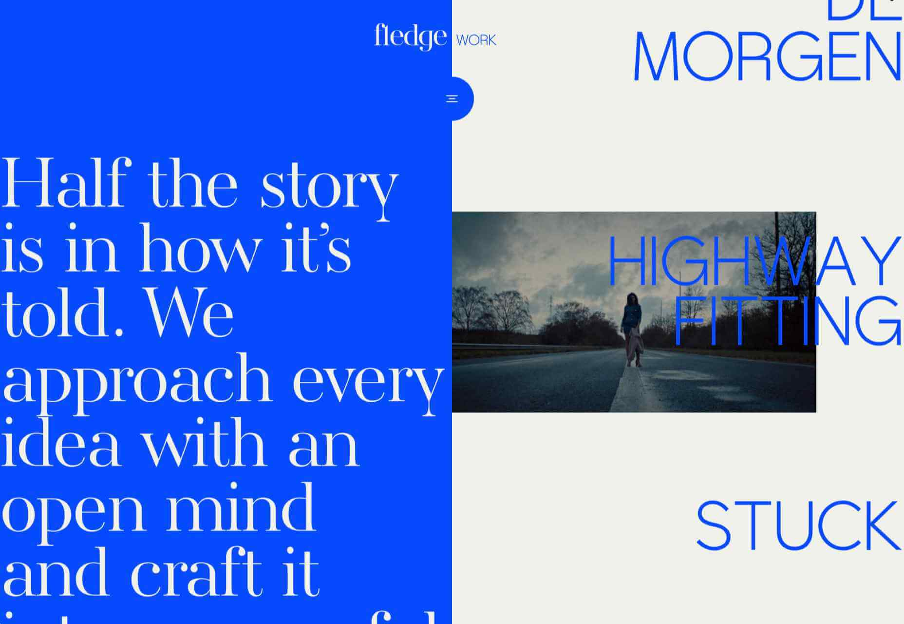


 Every week users submit a lot of interesting stuff on our sister site Webdesigner News, highlighting great content from around the web that can be of interest to web designers.


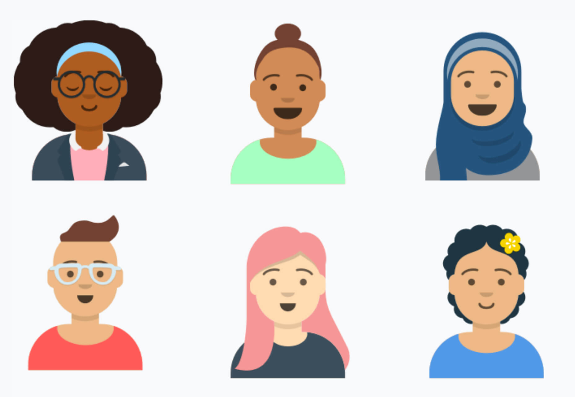
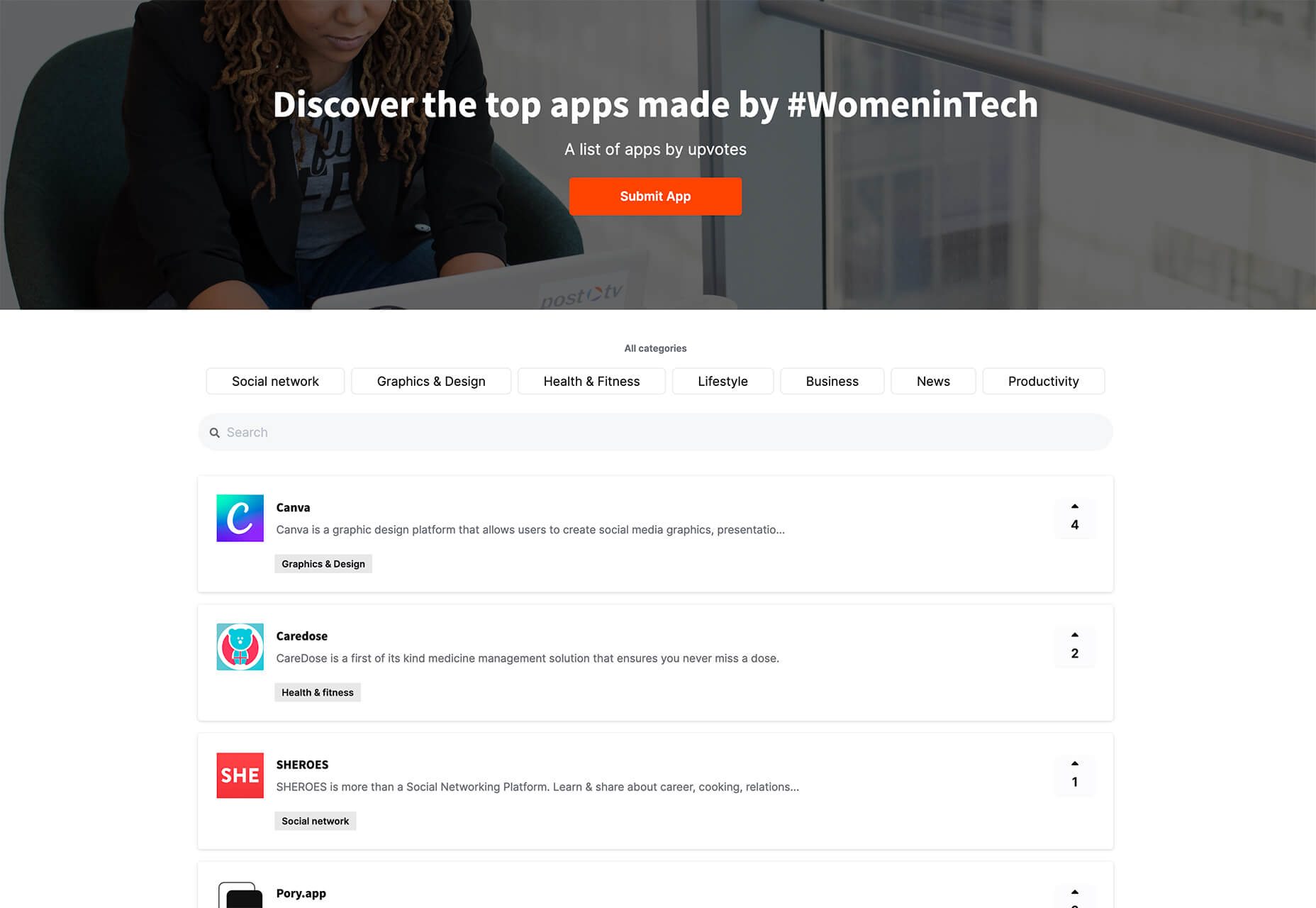
 It’s fun to see new website design tools that reflect current times and the state of the world. That’s very true this month with new databases devoted to diversity and women in technology, as well and resources to make your design life easier.

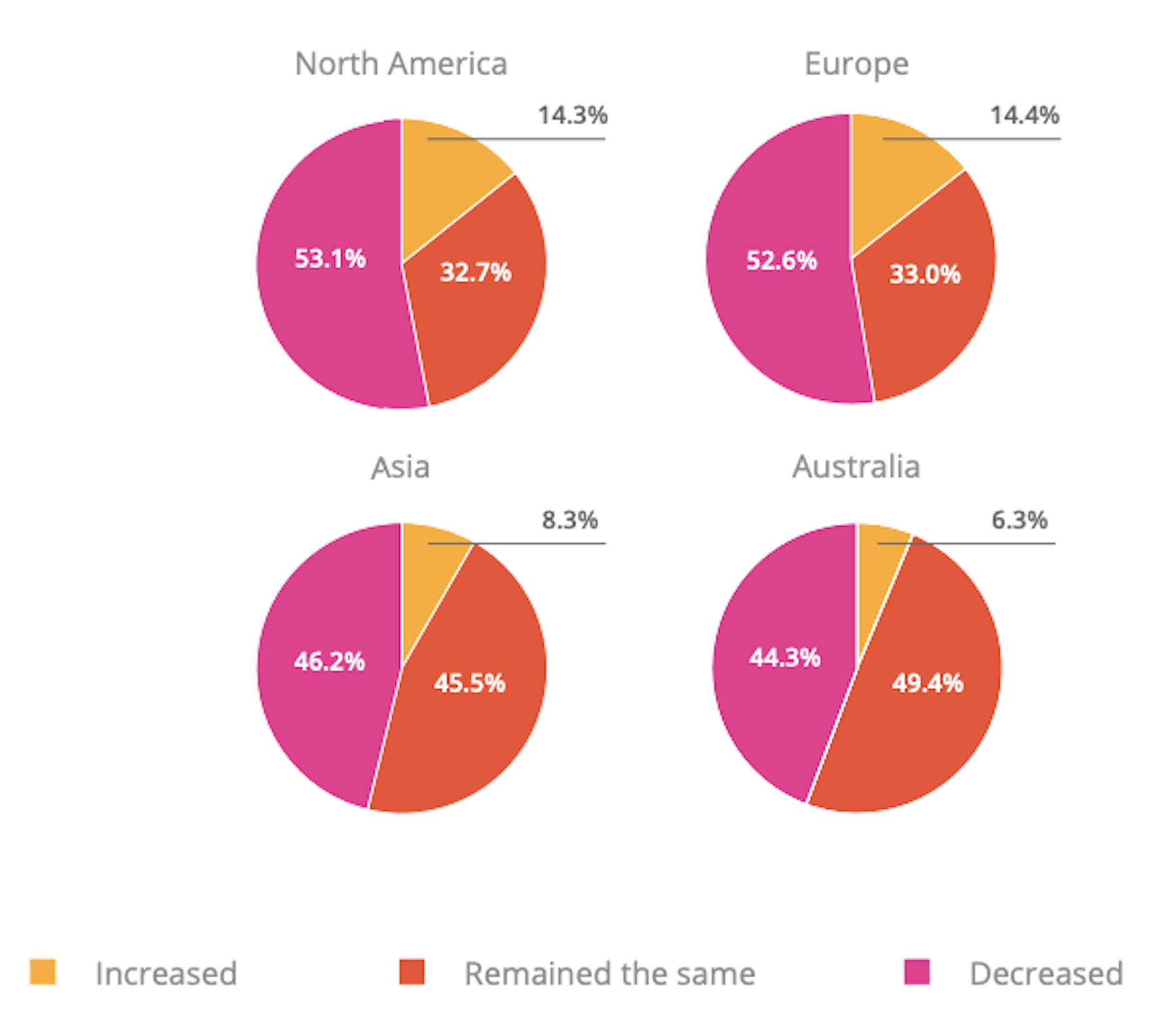
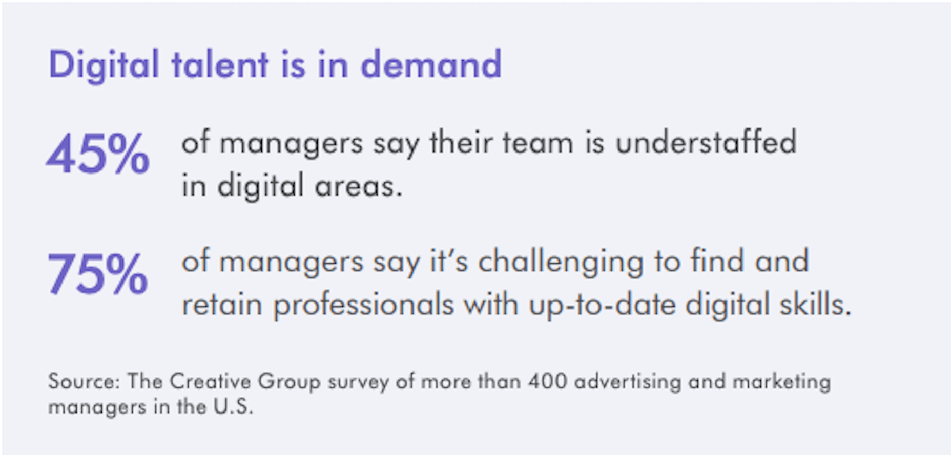
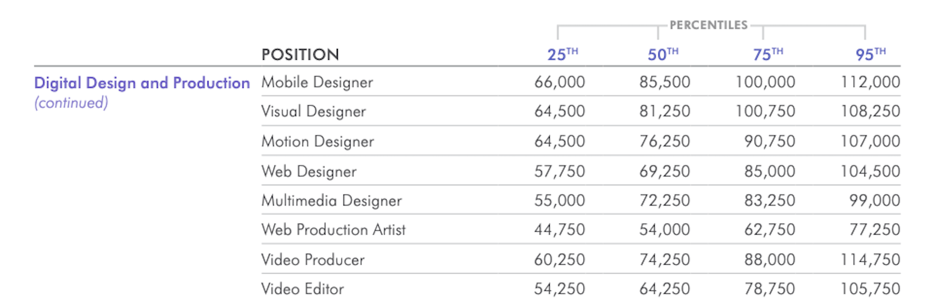
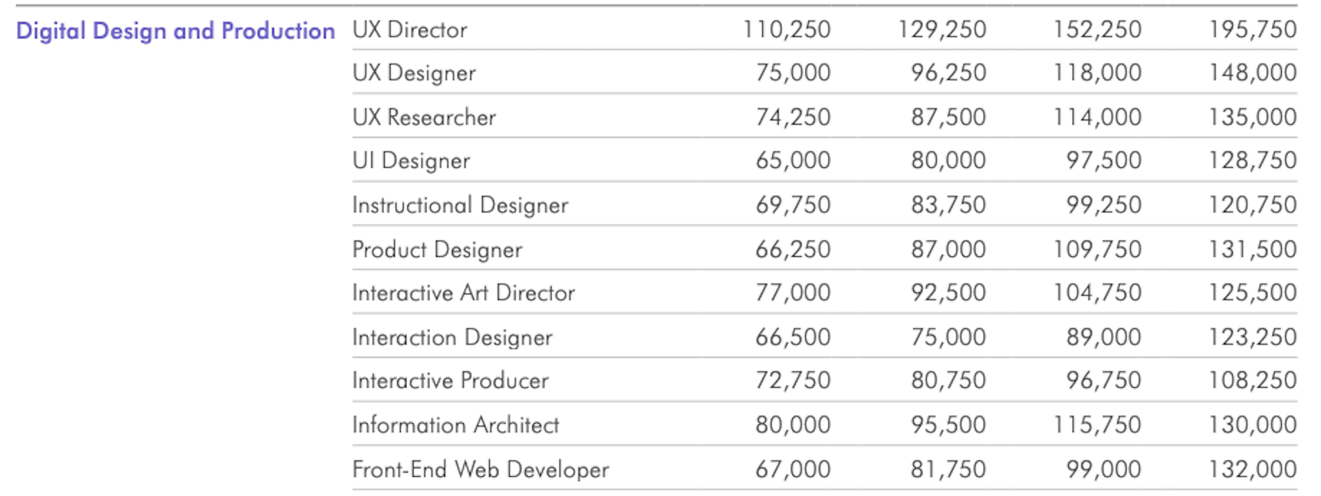
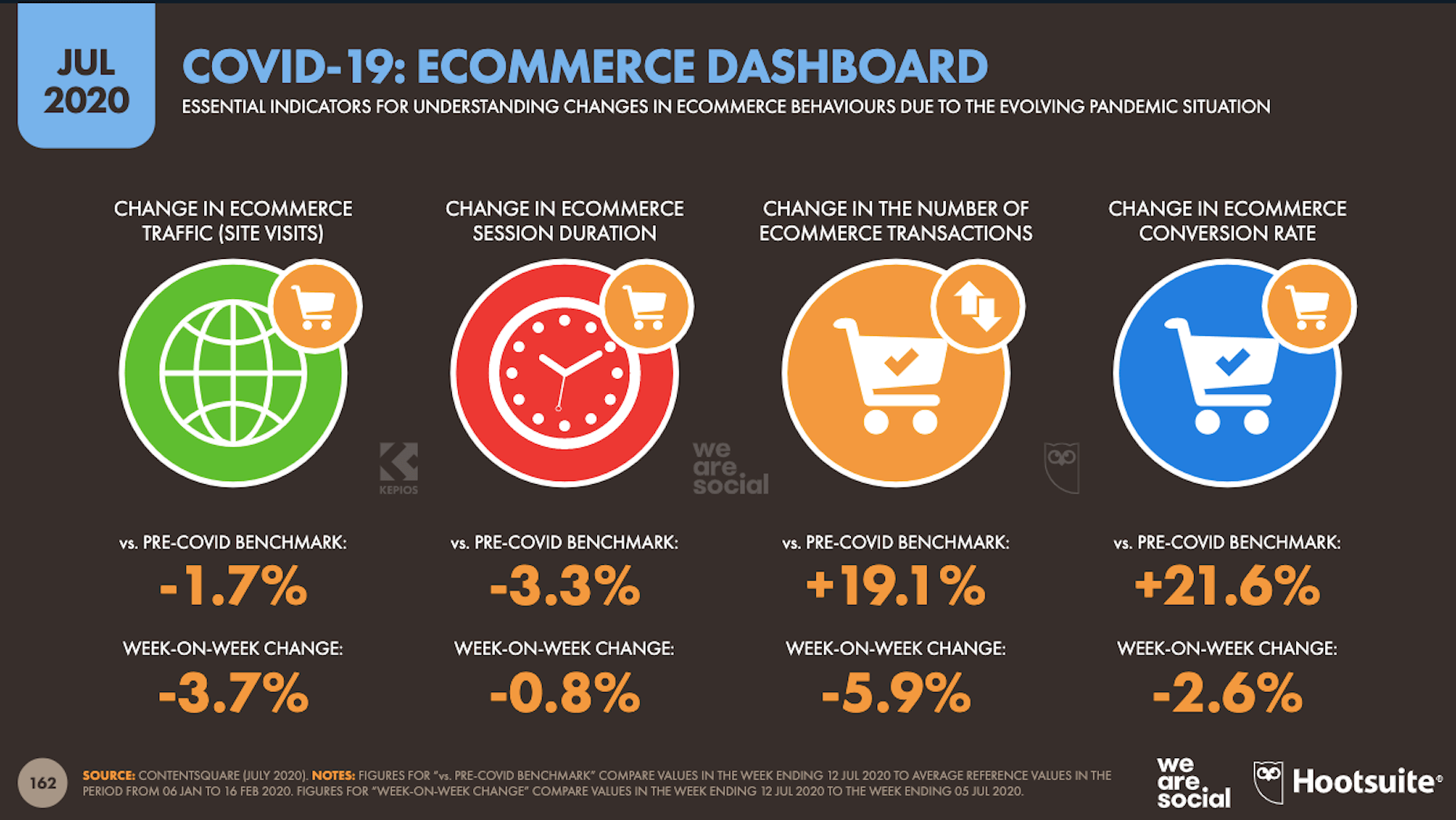
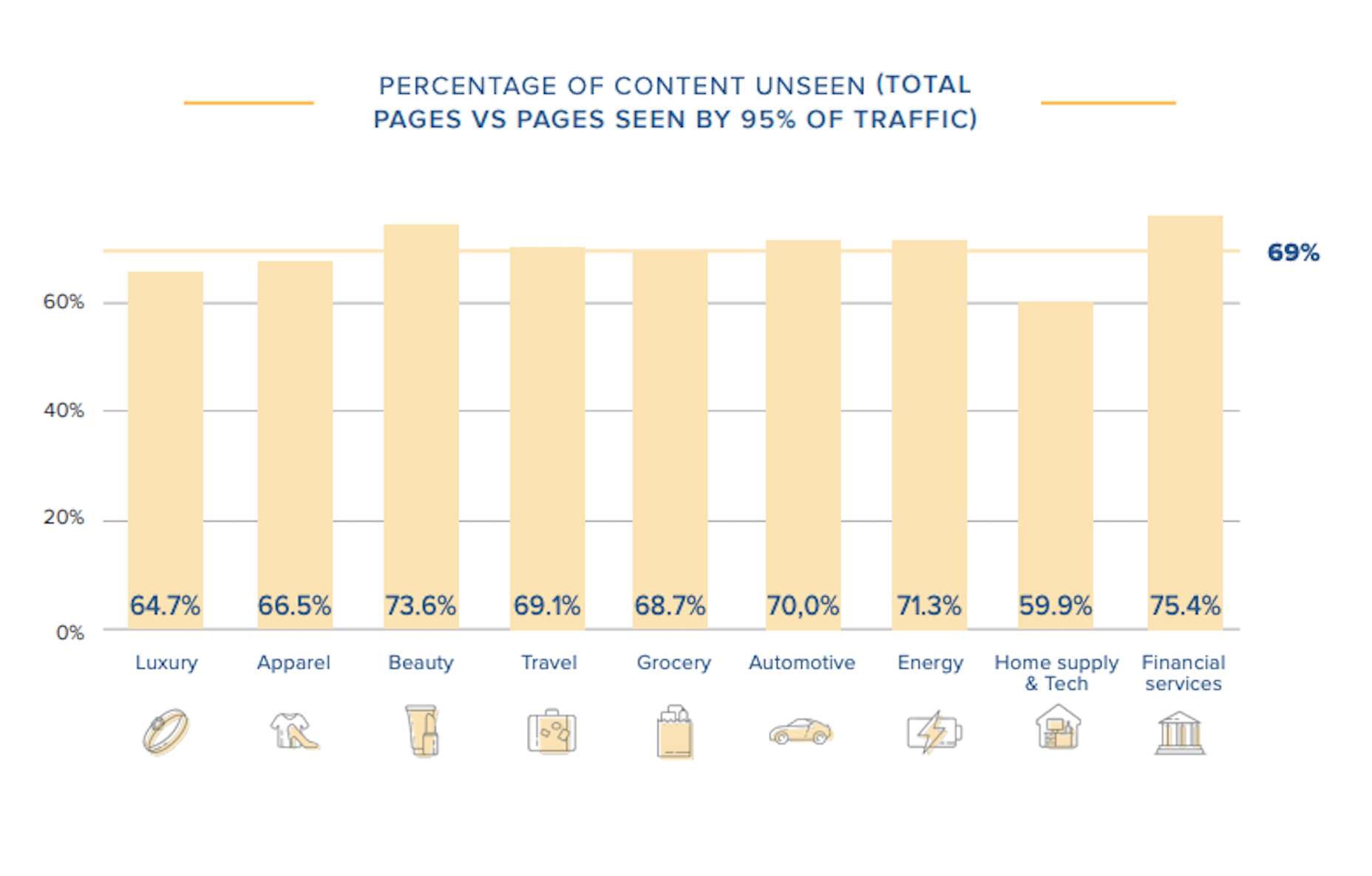
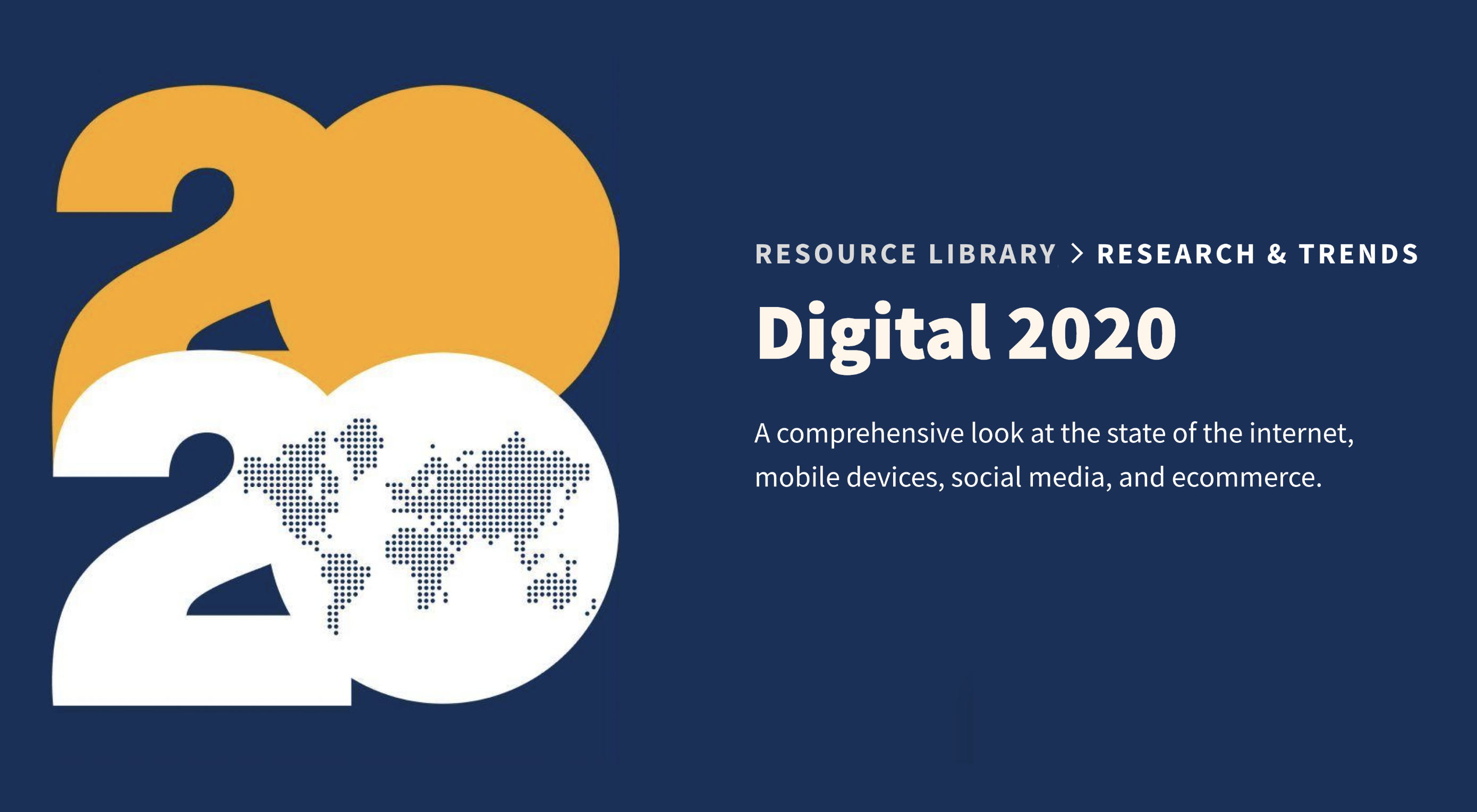 In today’s look at the latest research for web designers, we’re going to look at studies and reports from Payoneer, Robert Half, Hootsuite, and Contentsquare to see what they have to say about things like:
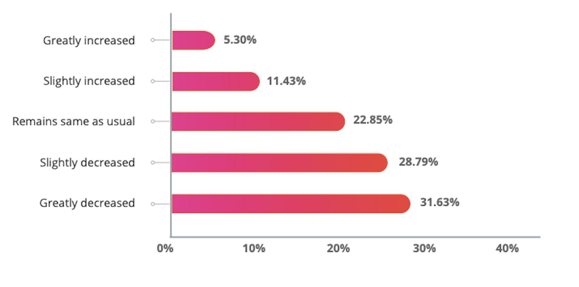
 Google resembles an iceberg: there’s the part above the water we can see and use everyday; there’s also the part beneath the water, that we don’t see and know little about.