Articles

In today’s look at the latest research for web designers, we’re going to look at studies and reports from Payoneer, Robert Half, Hootsuite, and Contentsquare to see what they have to say about things like:

  • Current freelancer demand
  • Web designer earning potential
  • A change in ecommerce shopping trends
  • Unseen content rates

1. There’s Light At the End of the COVID-19 Tunnel for Freelancers

Payoneer’s The State of Freelancing During COVID-19 had to take a different approach to reporting on the freelancer workforce than in years passed.

Here’s why:

When 1000+ freelancers around the globe were asked how demand for their services changed during COVID-19, this was the response:

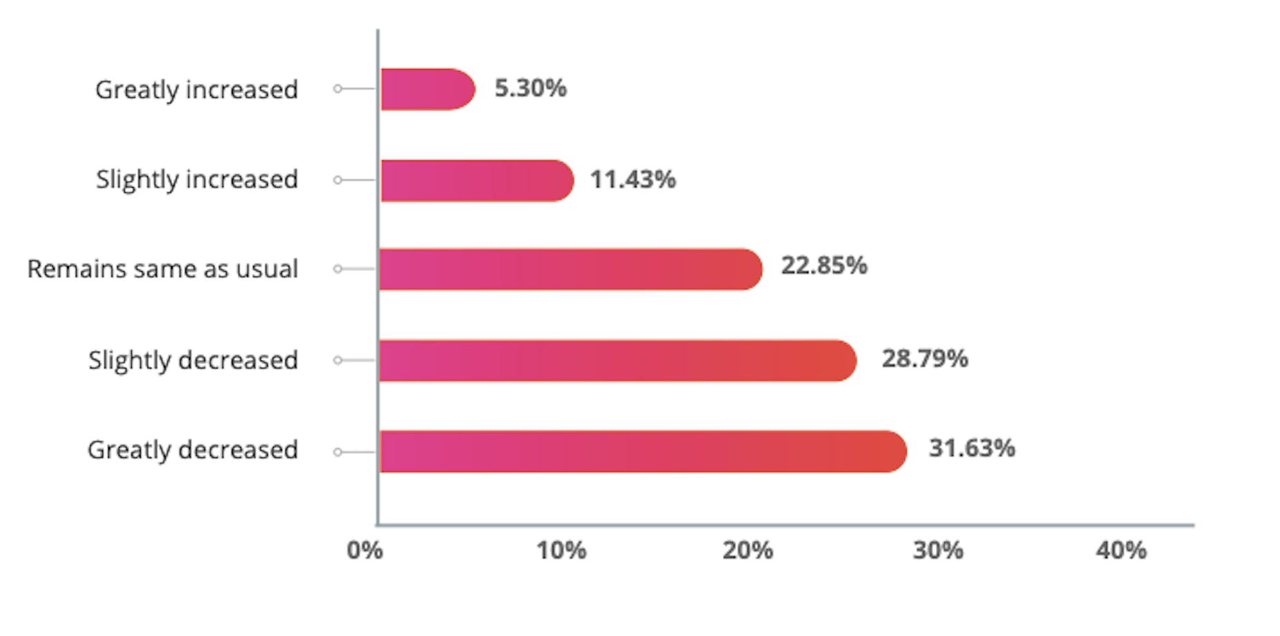
Less than 17% of freelancers experienced an increase in demand for their services and less than 23% saw demand remain the same.

An overwhelming majority of freelancers experienced a shrink in demand, with nearly 29% saying it slightly decreased while almost 32% said it greatly decreased.

However, the data collected wasn’t just assessed on a global scale. Payoneer also looked at freelancing demand trends in various parts of the world:

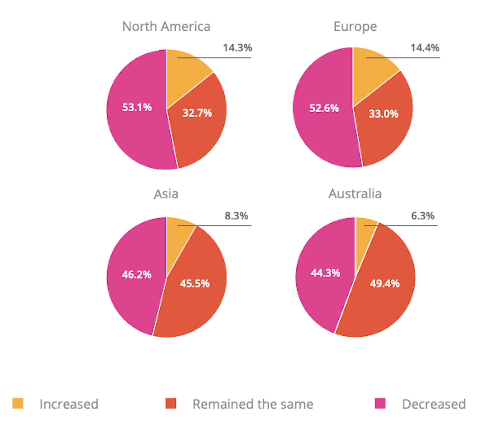
Notice the differences between Asia and Australia (who were hit with COVID-19 earlier) and North America and Europe (where the pandemic arrived a little later).

It appears as though Asian and Australian freelancers are, economically speaking, already starting to feel the effects of recovery from the pandemic with demand working in their favor.

So, if you’re feeling like there’s no end to the hardships you’ve faced during COVID-19, and were considering dropping your prices, hold on for just a little bit longer. Freelancers are starting to feel optimistic about demand for their services increasing. If you go devaluing yourself now, it’ll be hard to return to where you were before COVID-19 when things get back to normal.

2. Robert Half’s Salary Guide Breaks Down the Earning Potential for Web Designers

On a related note, let’s talk about demand from the employer’s point of view.

According to Robert Half’s 2020 Salary Guide for creative marketing professionals, there’s big demand for digital talent:

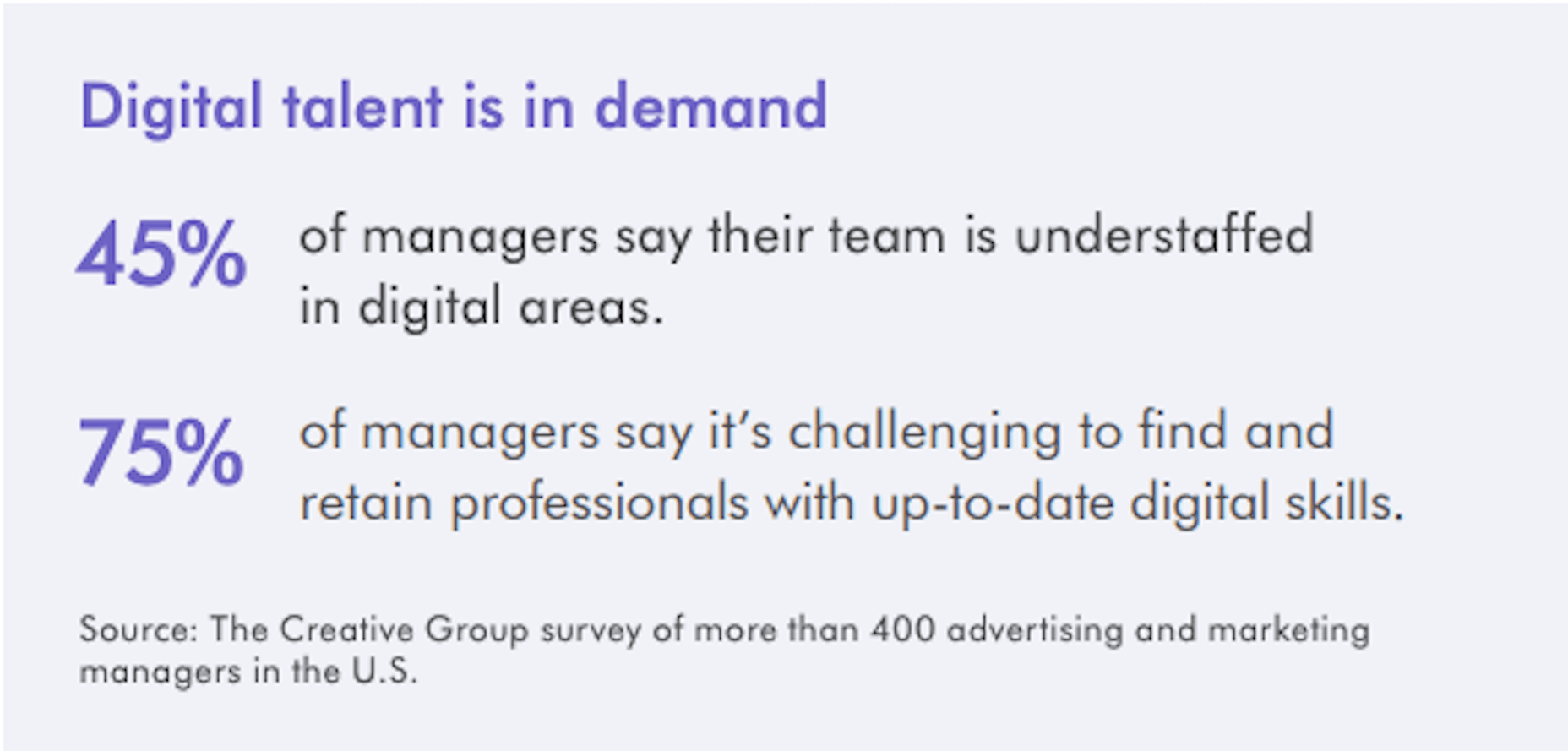
So, that’s number one. We know that almost 50% of hiring managers feel as though their digital teams are inadequately staffed. That’s good news for web designers.

However, these same managers complain about creative marketing professionals’ lack of up-to-date skills as the biggest barrier to hiring or retaining them. Although the report doesn’t say so, I’m going to assume this refers both to employees as well as contractors.

This should be a no-brainer. By keeping up with the latest web design trends and techniques, you can make top-dollar for your services — and hold onto those valuable client relationships for a long time.

According to the report, this is how much you stand to earn working in web design (in the U.S.) today:

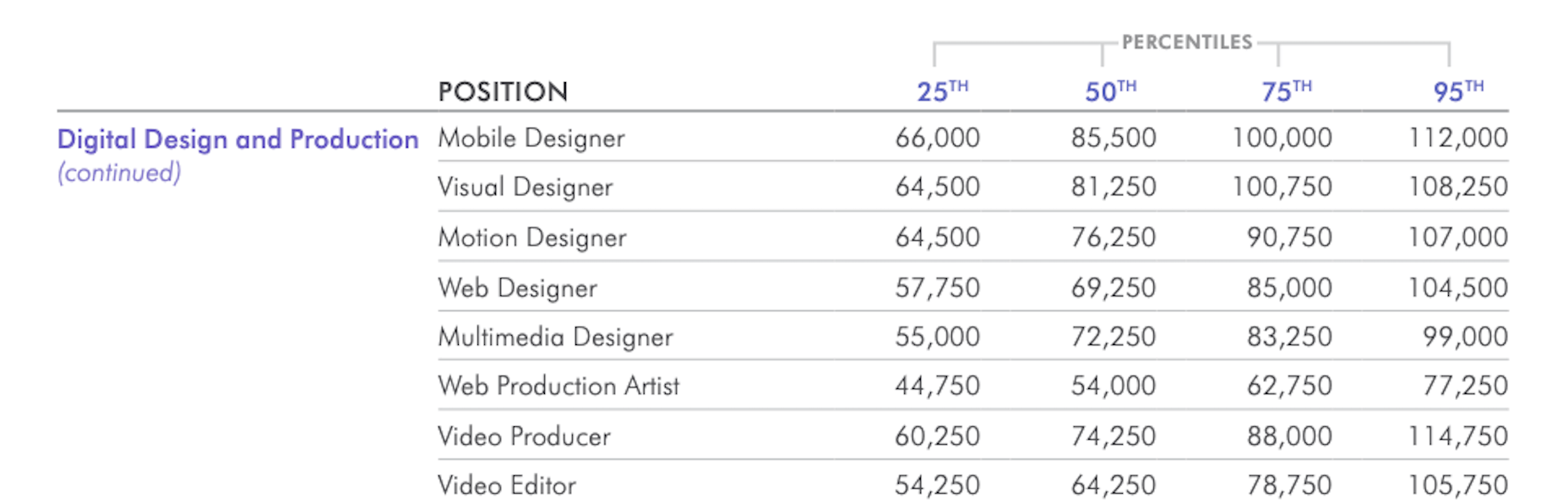
If you’re eyeballing those salaries in the 95th percentile, then you know what you need to do. Hiring managers have spoken up about what’s holding them back from hiring.

For those of you who feel as though you’ve gone as far as you can as a web designer, it might be worth exploring a new specialty. Like one of the following:

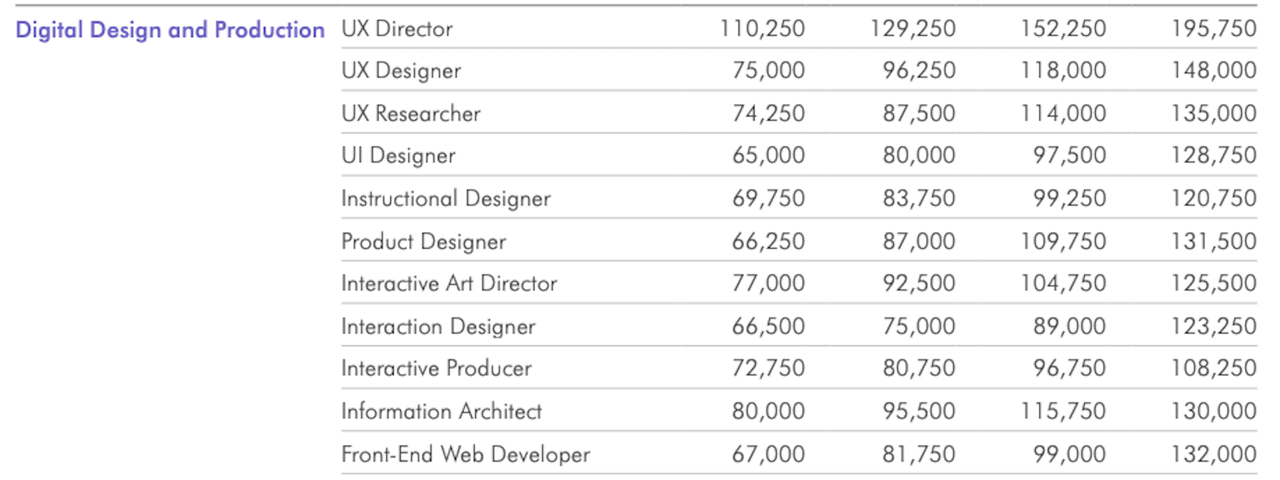
As you can see, designers in the UI, UX, and interactive space (along with web developers) have the opportunity to make more money, even earlier on in their careers. You may also find that more job opportunities are available as you move into these niches (because of less competition), which might cut down on any demand issues you’ve been experiencing because of COVID-19.

3. Hootsuite’s Digital 2020 Report Reveals an Interesting Trend in Ecommerce

Hootsuite’s Digital 2020 report is always a great resource for learning about social media marketing trends. That said, that’s not why I read it.

It’s for hidden gems like these:

It’s no surprise that we’re seeing changes in retail and ecommerce during COVID-19. What is a surprise, however, is how consumers’ online shopping habits have changed.

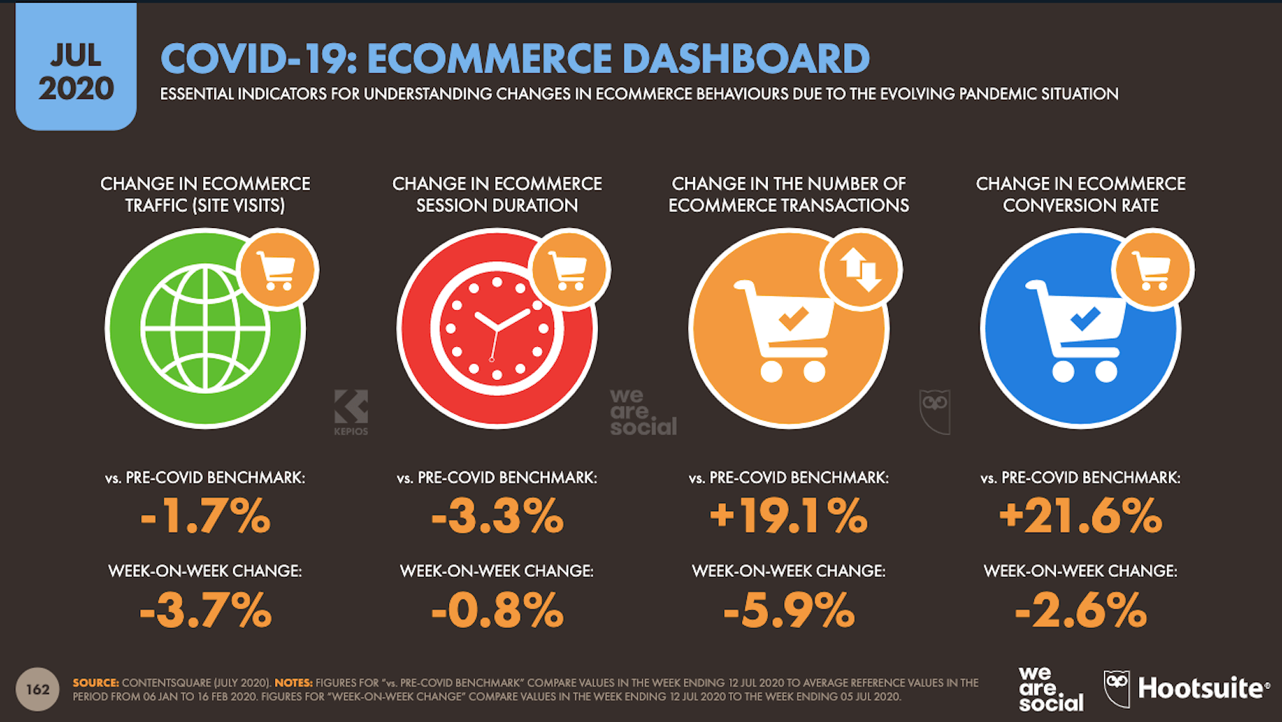
Here’s what we’re seeing when we compare 2020 ecommerce data with the pre-COVID benchmarks:

Site visits are 1.7% lower than expected. That would make sense considering how budget-conscious consumers are right now. It likely keeps them from going on unnecessary shopping sprees.

Session durations are 3.3% lower. This could be related to fewer site visits. It might also indicate greater consumer confidence. If they come to a website with a plan for what they need to buy, they’re going to take a straight line to conversion instead of spending time window shopping that prolongs their session.

The number of transactions is 19.1% higher and the conversion rate is 21.6% higher. Considering shoppers aren’t spending as much time with ecommerce websites, this point suggests that there’s a massive shift happening from in-store shopping to online shopping.

If that’s the case (even if consumers are currently spending less money), that means web designers need to set their sights on the ecommerce space. With the holiday shopping season expected to start sooner rather than later this year, now is the time to get in there and make sure these sites provide as streamlined an experience as possible.

4. Contentsquare Studies the Unseen Content Rates By Industry

Contentsquare analyzed more than 7 billion user sessions globally to create the 2020 Digital Experience Benchmarks report.

There’s some interesting data in here about website traffic and conversion trends, but what I find the most valuable is the breakdown by industry.

It was this chart, in particular, that really caught my eye:

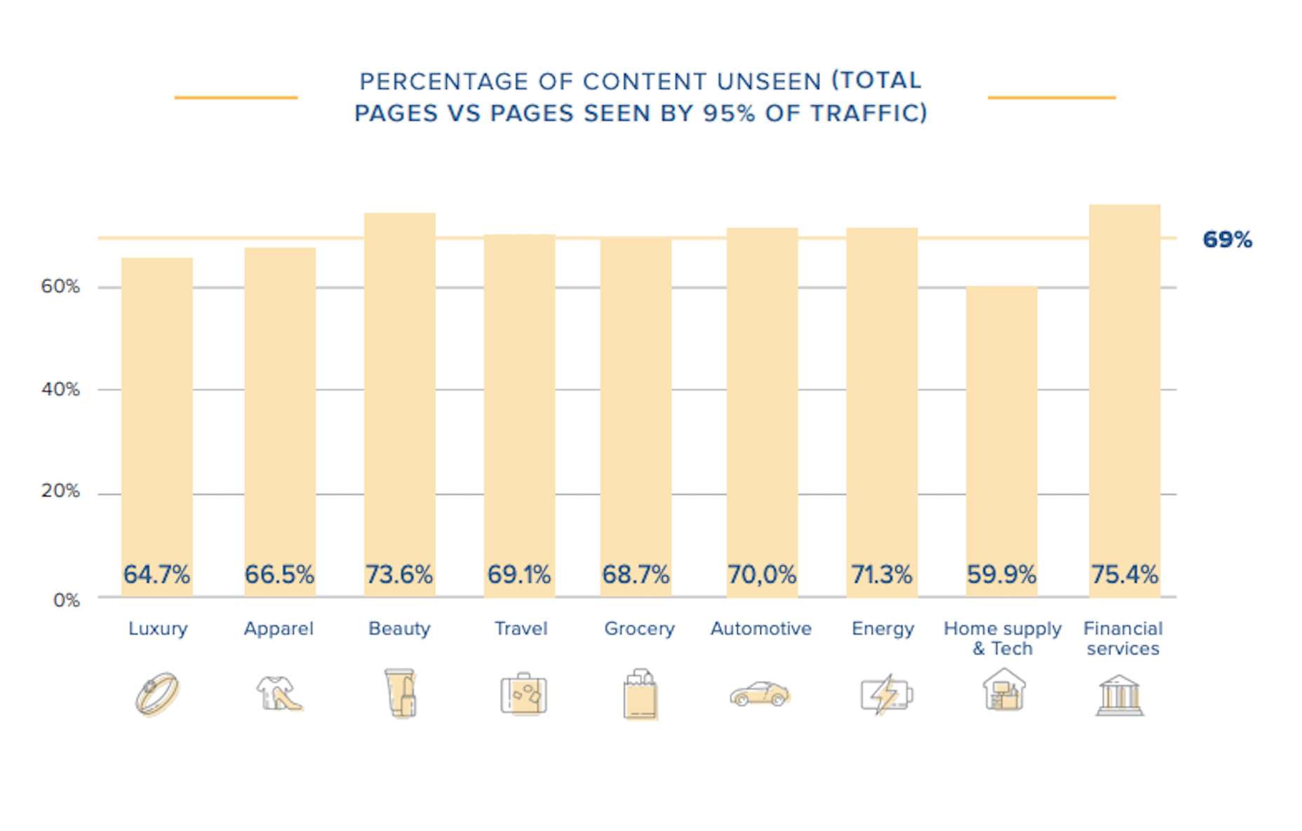
According to Contentsquare’s data, between 60% and 75% of a website’s content is unseen. Some industries fare better than others, like home supplies and luxury retailer websites, but the numbers still aren’t flattering.

For example, what does it mean when consumers miss 75% of a financial service provider’s content?

Does this mean that the financial advisory content — which I’m assuming comprises the bulk of the pages on the site — is useless or irrelevant? Or perhaps it’s an issue of discoverability since blog content and other resources often take a backseat to service and product promotion?

What about ecommerce brands in the apparel or beauty space?

If two-thirds of their pages are unseen, does that mean their websites are overrun with obsolete inventory? Or, again, is it an issue of navigability and discoverability around the store?

As a web designer, I’d suggest performing your own unseen content analysis on the websites you’ve built. If over 60% of your pages never get any views, you’re going to have to decide what to do with them:

Option 1: Fix the navigation or search function so people can actually find these unseen pages.

Option 2: Remove them from the site and make room for content your visitors actually find valuable.

Wrap-Up

As you encounter research and reports online — whether it’s written specifically for web designers or other creative professionals — spend some time looking for hidden gems.

As you can see above, there’s a ton of relevant research for web designers out there, even if it’s hiding behind the mask of a larger issue or matter. And it’s this data that will help you get a leg up on the competition since it’ll get you thinking about your business and your approach to design in different ways.

Source


Source de l’article sur Webdesignerdepot

Voice is one aspect of technology that is getting bigger and bigger, and showing little sign of relenting. In fact, 2019 data revealed that 22% of UK households owned a voice-controlled digital home assistant device such as an Amazon Echo or Google home. This is double the figure recorded in 2017 and it is predicted that over the next five years nearly 50% of all homes will have one. Smart home adoption rates are increasing, and it shows how voice control is something we are all becoming more accustomed to.

With these high figures, does it follow that voice should be something web designers build into sites? Or is it merely a gimmick that will die out and render sites with hardware and complex design issues? You only have to look at the failed introduction of Google glass to see that certain technological advancements don’t always have the outcome that might be expected.

Multiple Voices

One of the first issues with voice is establishing whether you want sites to recognise everyone’s voices, or just those who have registered. If you’re using the site in a crowded room will it pick up on snippets of conversation from others and think these are instructions? Google Home has a feature whereby you have to register your voice with its app to use more personalised features such as the shopping list. Is this the sort of thing websites would need?

Accents

The implementation of voice is complex, not only does it need to understand certain languages (such as English), but all the accents and variations too. With 160 English dialects alone, that is a lot that the technology needs to understand – not including mispronunciations, slang, and colloquialisms. Also, if a site is used all over the world (which many are) how many languages will it need to know?

Privacy Issues

if there are clips of your voice out there on the web…it can easily be imitated

If a website involves a feature such as online shopping or other functions which require sensitive details to be input, this could put people off using voice. Users need to know where this saved data is being stored, how it will be used and if it is secure. In 2018, HMRC had signed up about 6.7 million people to its voice ID service and HSBC said over 10,000 were registering each week. This shows many trust the service, but experts say that if there are clips of your voice out there on the web (such as in a podcast) it can easily be imitated. Bringing with it security and privacy issues.

According to futurologist Dr Ian Pearson, who invented the text message back in 1991, it won’t be long until we can complete a financial transaction with just a few words and a gesture. This can be a time-saver for things such as online shopping, but we need to ensure there are the correct security steps in place.

Users Don’t Talk The Way They Type

When speaking we tend to use shortened and more colloquial language as opposed to when we type. The voice function on a website will need to be able to adapt for this. One example is if you are filling in a form or comment box by voice for a website, you will need to tell it what to punctuate, letting it know where to add a comma, exclamation mark etc.

Website Processes Need to be Simpler

With the web as we use it now, we often browse through pages, reading other snippets of information before clicking through to the page we want. With voice recognition it will cut out these middle steps. For example, if you are looking for a recipe of something specific, you will just say the command “Show me the … recipe” and it will take you straight there. This direct access to what we are looking for could lead to a simplification of websites.

Regular Updates

With websites as they are now, they need updates semi-regularly, depending on how they are built, how complex they are, and what features we have built into them. A voice-based site will need updating regularly, whether to add new words or processes or to keep up with the fast-adapting technology. It might end up being quite a complex process.

Mistrust

While there are more of us now than ever using voice control via tech such as Alexa, Google, and Siri, there is still a level of mistrust over it. It’s still not quite clear where data is being stored, if it is being stored, and how easy it could be to abuse.

Larger Storage and Bandwidth

If a site is built for voice, will it utilise a ready-built plugin or will it have its own software built by developers? Will this feature require a greater amount of storage and bandwidth to cope with it? These are further factors to consider when thinking of the future of implementing voice to websites.

We Still Don’t Know Where It Will Go

Voice technology while working in some respects, is still a bit of a grey area when it comes to future use. Will it be the next big thing as many have predicted, or will it simply die down?

Look at Google Glass – highlighted as the big new technology, they soon died down and were eventually discontinued. Smart watches were another thing. You can see their initial downfall by reading an article published in 2017 about smartwatches – how major smartwatch makers such as Apple and Samsung rushed into the market before the technology was ready and they subsequently failed. Motorola exited the smartwatch market, Pebble and Jawbone shut down and Fitbit sold 2.3 million fewer devices than in their previous quarter. It was perceived as being a fad. However, fast forward to 2020 and more people than ever are wearing and using smartwatches. The smartwatch market was valued at shipment volumes of 47.34 million in 2019 and is expected to reach 117.51 by 2025, reaching a growth of 15.4 over the next five years.

Will voice follow a similar trend?

No More Impulse Buying

People enjoy browsing websites and many businesses rely on user’s impulse buying and ask their websites to be designed to reflect this. With voice taking you directly to the page’s users want to find, will they bypass these potential selling traps and just buy what they want – rather than added extras? Will it end up being a negative for businesses and see users not as satisfied for the experience?

Voiceless Still Matters

You will also have to remember that not all devices might work with voice, or people might be browsing somewhere where voice cannot be used. This means in the design process it needs to work both for voice instruction and manual use. It needs to work just as well for both to ensure the customer journey isn’t affected.

There are many ways voice can affect how we design websites in the upcoming future. It’s important to take note of market trends and usage – seeing how people use voice and thinking of the customer journey. It’s vital we don’t forget the end goals of websites – whether it’s to inform or to sell, the implementation of voice needs to assist this process not make it harder.


Featured image via Unsplash.

Source


Source de l’article sur Webdesignerdepot

In this post, you will learn about how to train a decision tree classifier machine learning model using Python. The following points will be covered in this post:

  • What is decision tree?
  • Decision tree python code sample

What Is a Decision Tree?

Simply speaking, the decision tree algorithm breaks the data points into decision nodes resulting in a tree structure. The decision nodes represent the question based on which the data is split further into two or more child nodes. The tree is created until the data points at a specific child node is pure (all data belongs to one class). The criteria for creating the most optimal decision questions is the information gain. The diagram below represents a sample decision tree.

Source de l’article sur DZONE

Web design clients come from a wide variety of backgrounds. One day, you’ll be designing a portfolio website for a voiceover artist, the next you’ll be creating a comprehensive ecommerce site for a leading retailer. In an ideal world, you’ll get to a point where you eventually specialize in a niche. However, you’ll need to master both avenues first.

The more time you spend in this industry, the more you’ll learn that every client comes with their own unique requirements and challenges to consider. However, there’s a particularly huge divide between the kind of web design projects you do for B2B clients, and the ones you do for B2C customers.

Both B2B (Business to Business) and B2C (Business to Consumer) websites need to be clear, concise, and aesthetically pleasing. They should always have a strong focus on user experience, and they need to work consistently across devices. However, being aware of the difference between B2B and B2C projects will help you to deliver better results to your customers.

Defining the Differences Between B2B and B2C Sites

Some web design trends remain consistent in any environment.

Whether you’re creating a site for a hairdresser, or a leading SaaS company, you’ll need to deliver responsive design, intuitive navigation, and excellent site security.

Your process is unlikely to differ from B2B to B2C much in terms of project milestones, phases, prototyping and wire-framing. The differences that arise between B2B and B2C projects often come in the approach you take to building certain elements.

Let’s take a closer look at the things you might need to consider:

1. The Target Audience

In any design project, it’s always important to keep the end customer in mind. Knowing your client’s target audience will help you to create both an image and a tone of voice that appeals to the right people.

B2B Websites

With B2B websites, you’ll be speaking to a range of highly-educated individuals who already have a general knowledge of your service. The aim here will be to show the end-user how you can help them achieve better results. For instance, m.io highlights “syncing communication” so you can “effortlessly chat” with your team.

The language and content of the website is all about highlighting the key benefits of the products, and the kind of outcomes that they can deliver. The Nielsen Norman Group reports that there’s often a lot of discussion between decision-makers when they’re checking out a B2B website.  

Designers need to work harder at convincing B2B buyers that they’re making the right decision. This is particularly true when you’re selling something like a software subscription that requires a lot of long—term investment.

B2C Websites

On the other hand, while B2B customers make decisions based on logic, information, and well-explained benefits, B2C customers are more influenced by emotion. They want quick solutions to their problems, and the opportunity to purchase from a brand that “understands” them.

Look at the Firebox website, for instance. It instantly highlights an ongoing sale at the top of the homepage, addressing any concerns a customer might have about price. That combined with a quirky layout full of authentic photos and bright colors means that customers are more inclined to take action.

2. The Purpose

Another factor that can vary from B2C to B2B websites, is the motive behind a customer’s purchase. Knowing what’s pushing a target audience to interact with a brand will help you to create a website that appeals to specific goals.

B2B Websites

B2B websites often aim to solve expensive and time-consuming problems for companies. To sell a decision-maker on the validity of a solution, it’s important to thoroughly explain what the solution is, how it works, and how it addressees a specific pain point.

Look at the Zoom website for instance, they don’t just tell people that they offer video conferencing, they address the practical applications of the platform:

B2C Websites

Consumers are a lot easier to appeal to in terms of emotional impact, because many of them come to a website looking to fulfill an urgent need. Because of this, many web designers can take advantage of things like urgency and demand to encourage conversions. For instance, look at this website from TravelZoo. It takes advantage of a customer’s desire to get away:

A B2B website needs to focus on providing information that helps companies to make more confident decisions. What’s more, with B2B sites, decisions are often made by several stakeholders, while B2C sites ask a single person to make a choice. A B2C website needs to address immediate concerns and connect with customers on an emotional level. B2C buyers still want to do their research on products or services, but the turnaround is much quicker, and often requires less information.

3. The Design Elements (Visual Appearance)

Just as the focus of your website design and the audience that you’re creating the experience for can differ from B2B to B2C websites, the visual elements of the design might change too.

B2B Websites

In most cases, B2B websites are all about presenting a highly professional and respectable image. You’ll notice a lot of safe and clear choices when it comes to typography and imagery. It’s unusual to see a B2B website that takes risks with things like illustrations and animations.

Look at the Green Geeks website for instance. Everything is laid out to encourage clarity and understanding. Information is easy to find, and there are no other issues that might distract a customer.

B2C Websites

On the other hand, B2C websites can be a little more daring. With so many different options to choose from, and most customers buying out of a sense of urgency or sudden demand, designers are under pressure to capture attention quick. This means that it’s much more likely to see large pieces of eye-catching imagery on B2C sites, with very little text.

Movement, like slideshows and animations often play more of a role here. Additionally, there’s a good chance that you’ll be able to experiment more aggressively with color. Take a look at the Yotel website, for instance. There’s very little textual information here, but the appeal of the website is conveyed through sliding images:

4. Website Content

The way that information is conveyed on a B2B website is very different to the messages portrayed on a B2C site. Usually, everything from the language, to the amount of content that you use for these projects will differ drastically.

B2B Websites

When designing for a B2B website, you’ll need to be careful with content, as you’ll be speaking to a very mixed audience. If your site caters to different industries, you’ll need to ensure that you show authority, without using too much jargon. Some companies even create different pages on their site for specific customers. The aspin.co.uk website covers the benefits from a company, sale and integration perspective:

Rather than try to talk to all business owners about their differing communication pains, G-Suite anticipates its audience and creates pages for each.

B2C Websites

Alternatively, B2C websites can make things a little simpler. For instance, on glossybox.co.uk, there’s no need to provide a ton of information for different types of shopper, designers can appeal to one audience, i.e. the “beauty addict”:

In both B2B and B2C websites, the aim of the content should always be to answer any questions that the end user might have.

5. CTA Buttons

Call to Action buttons are often a crucial part of the web design journey. However, it’s sometimes difficult to determine where they should be placed, or how many buttons you need.

B2B Websites

Because the decision to buy something won’t always happen immediately with a B2B website, these kinds of sites often use a variety of CTAs. For instance, you might have a “Request a Quote” button at the top of a page, as well as a Sign in button.

On the Klaviyo site, for instance, you can request a demo, sign up or log in:

You can place CTAs lower on the page with B2B websites too, as it’s more likely that your customers will be scrolling through the site to collect more information before they decide to buy.

B2C Websites

On the other hand, with B2C websites, you usually don’t need to give your visitors as many options. A single option to “Add to Cart”, or perhaps an extra choice to “Add to Favorites” is all your user will need. Customers need to instantly see what they need to do next as soon as they arrive on a page:

On the Evil Hair website, you immediately see how to add a product to your cart.

Remember, the sales process is a lot quicker with B2C customers. This means that you need your CTA buttons to be front and center as soon as someone clicks on a page.

6. Contact Forms

In a similar vein, the way that you design your contact forms will also depend on the end-user that the website wants to appeal to. There’s a very different process for getting in touch on a B2B website, compared to a B2C site.

B2B Websites

B2B websites often require longer contact forms, as clients need to collect additional information about a prospect’s position in a company, and what that company does. B2B companies need to share things like what they’re looking for in a service, and how many users they have, so a sales team knows what kind of demonstration to give.

As with any strategy for contact form design, you should always only include the fields that your client needs and no more. If you demand too much from any client, you could send them running in the opposite direction. Check out this straightforward option from Ironpaper, for instance:

The form addresses as many relevant questions as possible without overwhelming the customer. Because the site handles things like design, it makes sense that they would ask for a link to the company’s existing website.

B2C Websites

On a B2C website, there are very different approaches to contact forms. You may have a dedicated contact form on your website where people can get in touch if they have any questions. A FAQ page where customers can serve themselves is another great way to help your client stand out from the competition. Check out this option from River Island, for instance:

On the other hand, you might implement pop-up contact forms into a website if your client wants to collect emails for email marketing. In that case, it’s important to make sure that you’re only asking for the information you need, and nothing more.

The easier it is to sign up for a newsletter, the more likely it is that customers will do it. Being able to enter their name and email address and nothing else will make the signup seem less tasking.

7. Search Bars and Navigation

Whether you’re designing for B2B or B2C companies, navigation will always be a critical concern. End users need to find it easy to track down the information that they need about a company, whether they’re looking for a particular product or a blog.

B2B Websites

On a B2B website, the search bar often takes up a lot less prominence than it does on a B2C site. That’s because all of the information that a client needs, and the buttons they need to take their next steps, are already visible front-and-center.

As a designer, it will be your job to push as many people to convert as possible, by making the purchasing journey the most appealing path for visitors. For instance, on the Copper website, the “Try Free” buttons are much easier to see than “Continue with Google” or “Login”:

With B2B sites, the focus is on a very specific goal. Although navigation still needs to be available, it doesn’t need to be as obvious as it is on a B2C site.

B2C Websites

On the other hand, most B2C websites offer a wide range of products, and they’re perfectly happy for their customers to purchase anything, as long as they eventually convert. Because of this, they make navigation a much more significant part of the customer journey.

The search bar is often presented at the very top of the screen where customers can see it immediately. Additionally, there may be multiple pages within certain product categories, so that customers can browse through the items they’re most interested in. For instance, look at the homepage on the IWoot website:

The navigation elements in B2C websites need to be a lot more obvious, because consumers are more likely to use them when they’re searching through their options.

8. Social Proof and Testimonials

Finally, social proof is one of the things that will work well for improving conversions on any kind of website. When your customers aren’t sure whether or not they should buy from you, a review or testimonial could be just the thing to push them over the edge.

B2B Websites

On a B2B website, the decision-making process takes a lot longer. Because of this, it’s worth including as much social proof as possible in every part of the website. Client testimonials, reviews and ratings, and even high-profile company logos make all the difference. Many B2B websites include a page dedicated to case studies highlighting the success of other brands.

Your client might even go as far as to ask for a page that highlights their awards and recognition or showcases comparison tables that pit their products against the competition.

For instance, Authority Hacker has a “what the pros say about us” section as social proof:

B2C Websites

With a consumer website, you can include consumer ratings and reviews wherever you like. However, it’s most likely that you’ll want to have a place where customers can see the reviews of other clients on the product pages themselves. On the EMP website the company gives users the option to click on the star review section to jump to a different space on the page where testimonials are listed. This ensures that customers don’t have to scroll through a lot of excess information if they just want to add an item straight to their cart.

Designing for B2B vs B2C

In the world of web design, no two customers are ever the same. While you’ll need to adapt your processes to suit each customer you interact with, you can set your expectations in advance by learning the differences between B2B and B2C strategies.


Featured images by Chris Ross Harris and Mike Kononov.

Source

p img {display:inline-block; margin-right:10px;}
.alignleft {float:left;}
p.showcase {clear:both;}
body#browserfriendly p, body#podcast p, div#emailbody p{margin:0;}

Source de l’article sur

Today we held an internal, yep, an internal only mini Red Hat Summit.

This is a chance for talks to be presented select content to an internal worldwide audience at Red Hat, but that does not mean that all the content is confidential. That means I would be remiss if I didn’t share my session content.

Source de l’article sur DZONE

For most developers, staying abreast of the latest tech skills is just another day at the office. As HackerRank’s 2019 Developer Skills Report put it, “Developers are voracious learners by nature and necessity.” Indeed, given the extremely rapid pace of technological innovation these days, devs certainly won’t fare well clinging to outdated concepts.  

But if you peruse the numerous articles out there offering guidance on how developers can fast track their careers, there is one piece of advice that invariably appears, suggesting this thirst for knowledge may not actually be as insatiable as it needs to be. “Anyone can do the technical stuff,” explains a recent piece in SD Times, “but the soft skills are the ones that some architects may struggle with.” Another article in CIO echoes this sentiment: “Technology is constantly changing, and while technical skills are valuable, soft skills are much more noteworthy to businesses in the long run.”

Source de l’article sur DZONE