
 Spring and fresh designs are in the air. This month, it’s obvious that designers are feeling creative with new and interesting concepts that range from a new style for cards, homepage experimentation with multiple entry points or calls to action, and risky typography options.
Here’s what’s trending in design this month.
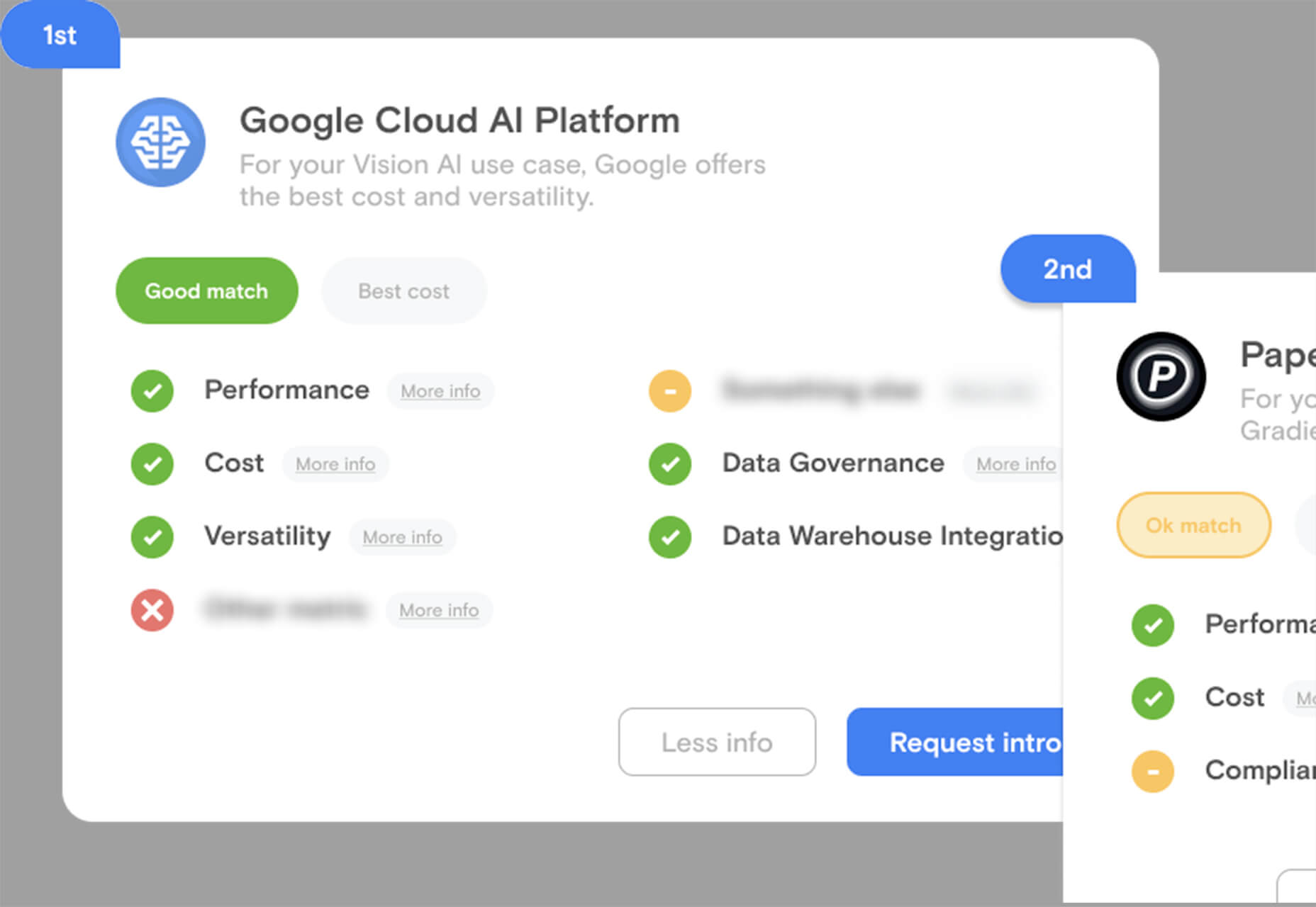
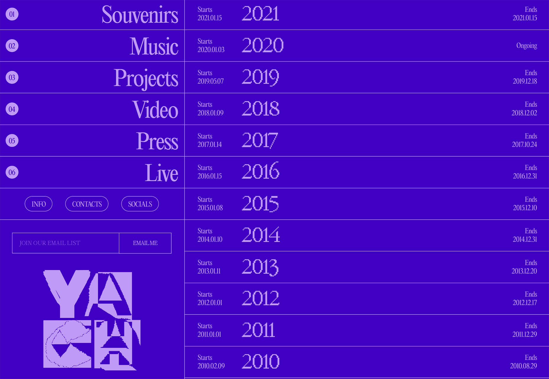
1. “Flat” Cards
Card-style design elements that allow users to click through to other content aren’t new, but the design of these cards is fresh and interesting.
Rather than more heavily designed cards with shadows and layers of content, flat styles are trending. Expect this trend to explode thanks to usage by Google for a shopping experience page.
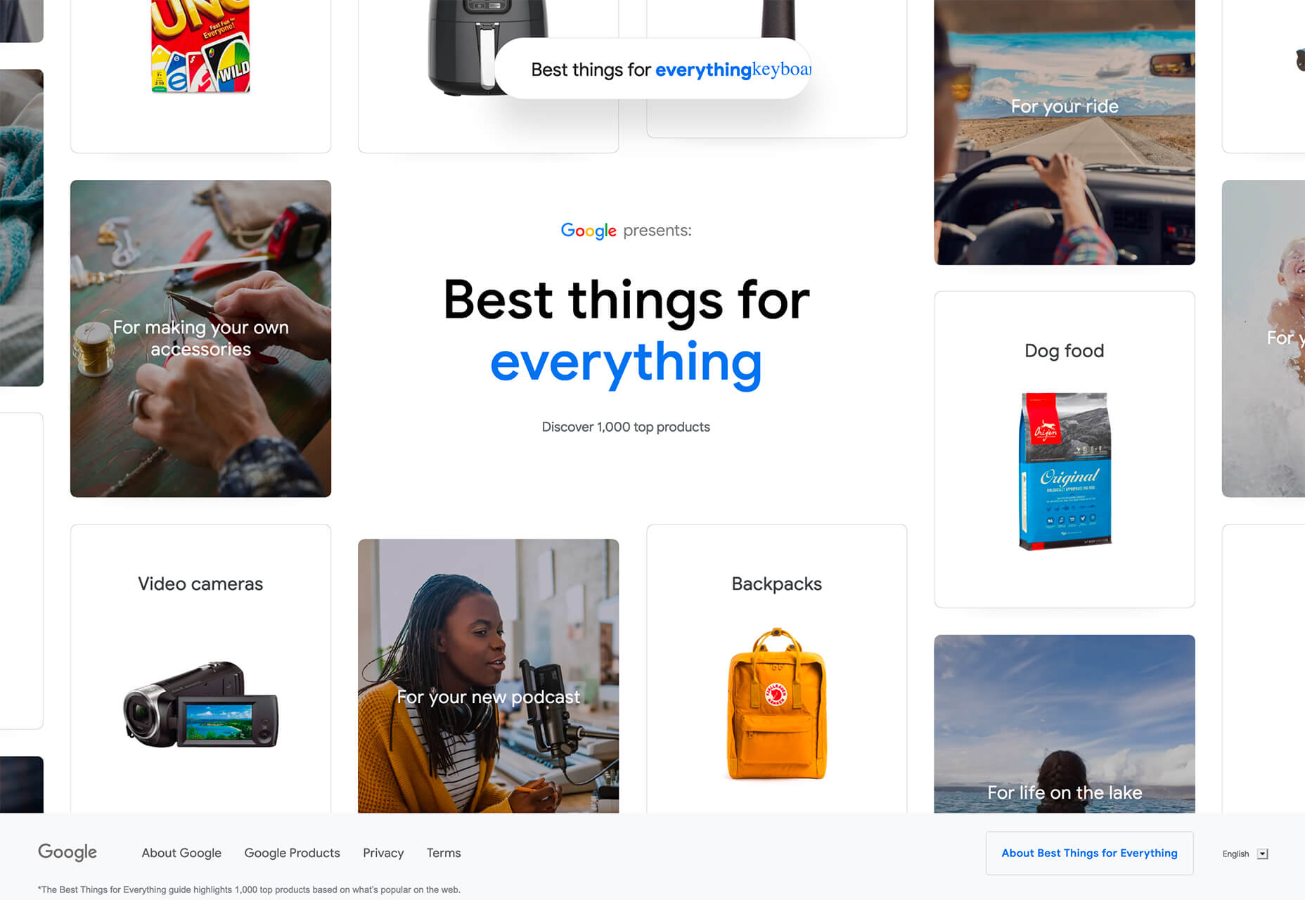
The Google example below is interesting because Google’s Material Design guidelines are what helped card-style elements grow in popularity previously. However, those cards did include more layers, color options, buttons inside the cards, and shadows.
Today’s trending cards are completely flat. And beautiful.
Each of these websites does it in a slightly different way.
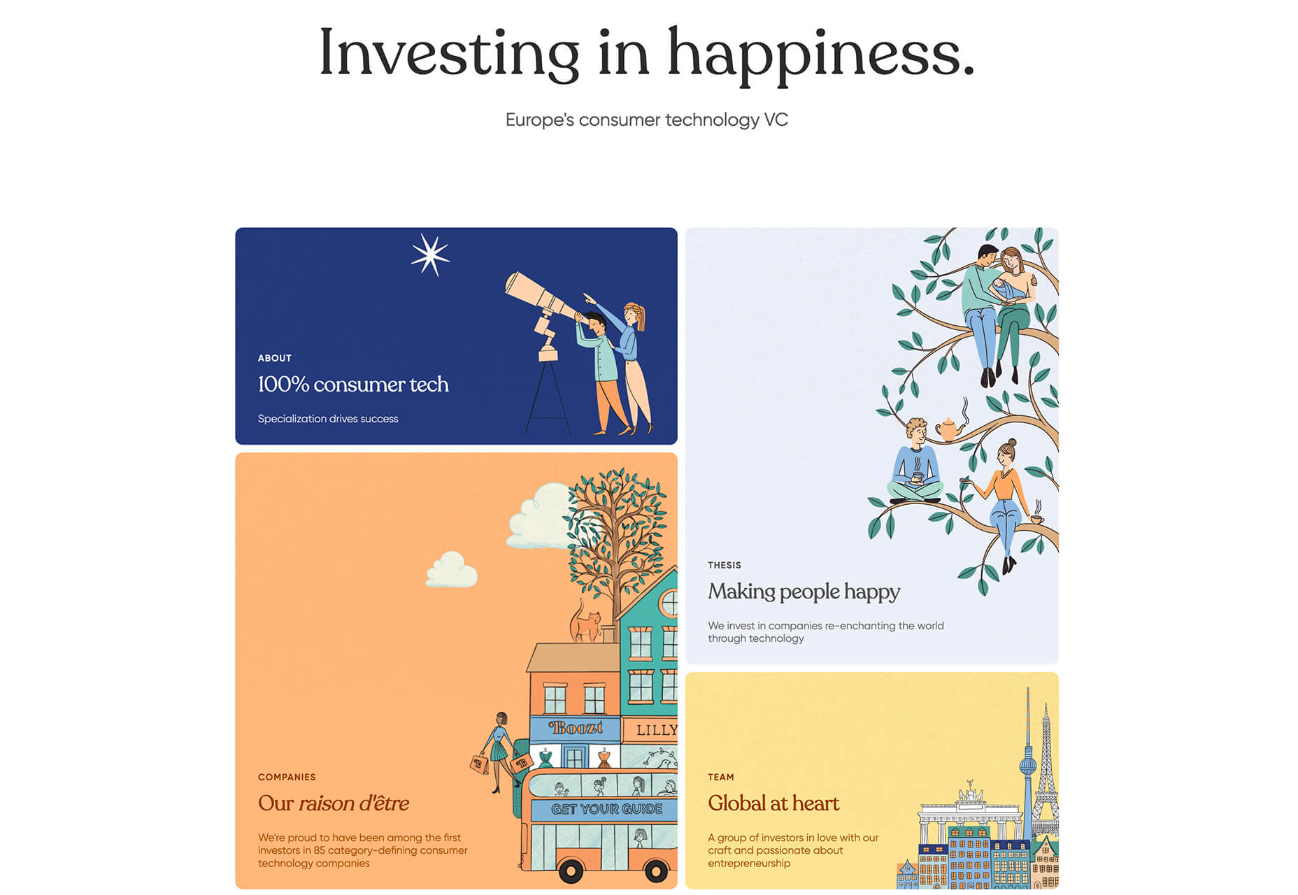
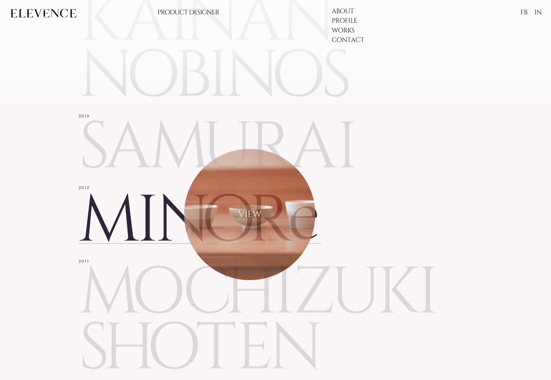
Heartcore, a consumer technology VC company, uses a series of flat cards as a navigation element to help users find their way through the website. Each features a bright color background with an illustration and a simple text block.
Each card has a nice hover state where only the illustration zooms inside the card frame. This is an interesting effect because it is exactly the opposite of the previous iteration of cards, which zoomed the entire card as a hover state.
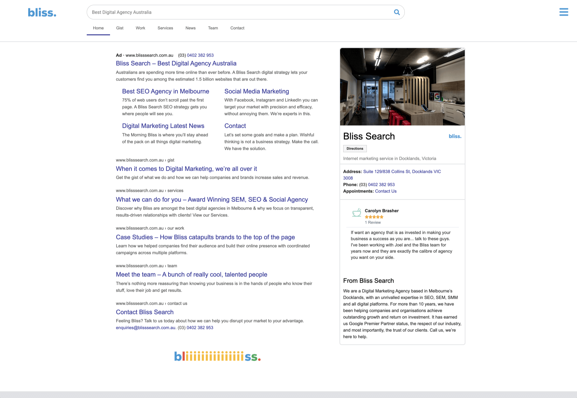
Google Shopping uses that whole card bounce hover state (plus a not-so-flat shadow) for each card. The initial design is sleek with the pairing of white and image cards with simple text in each. You are enticed to click around to see what happens.
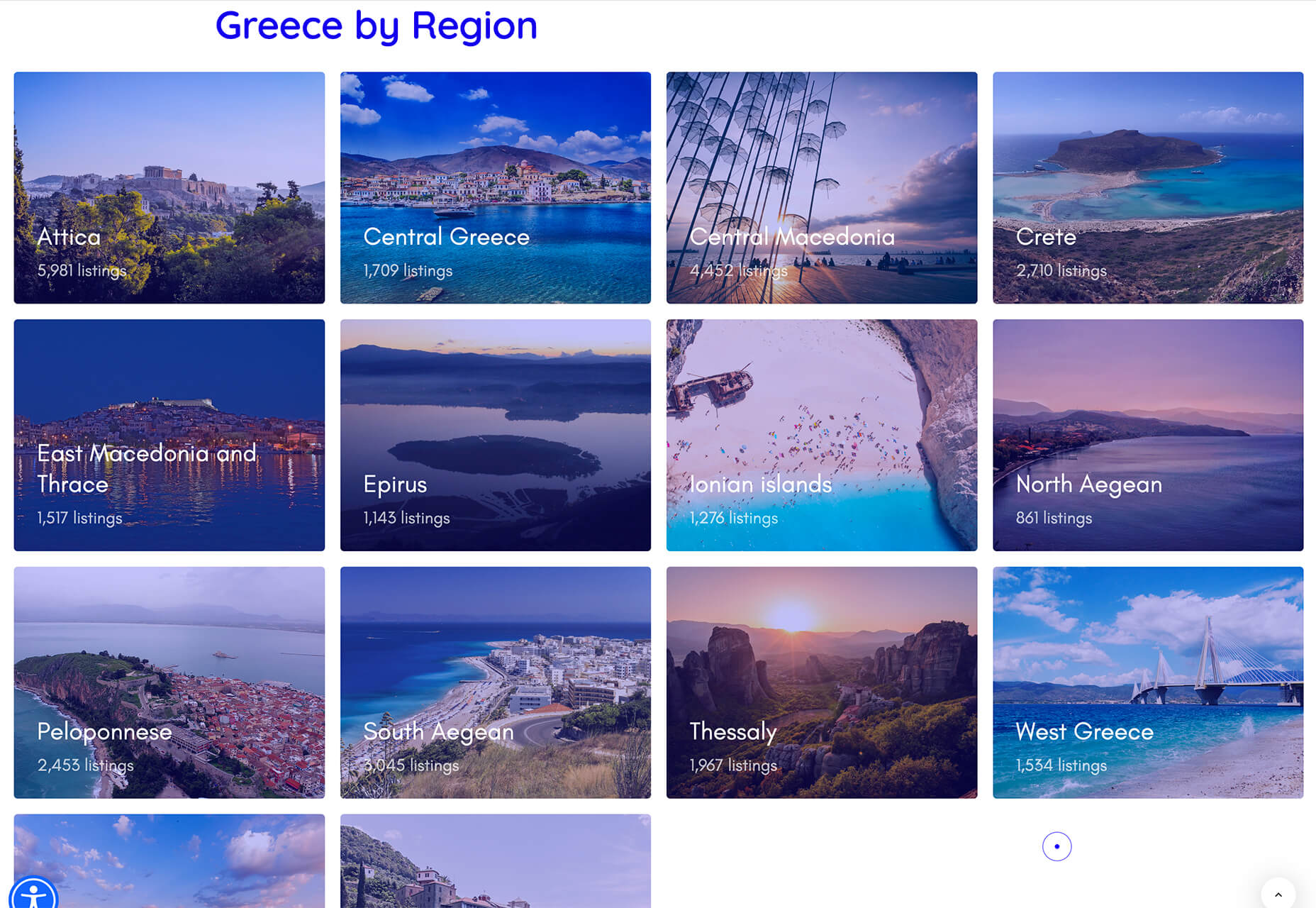
Click on Greece is a travel website design that uses simple cards with a minimal color and text overlay. The consistency of these cards makes the design pop and the beauty of the images draw you in. Each card also has a hover state with a darker color mask to guide navigation and make text elements easier to read.
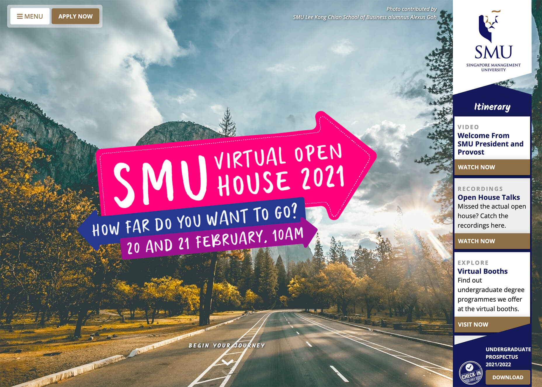
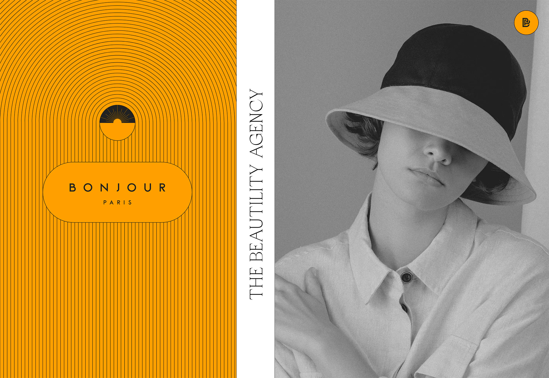
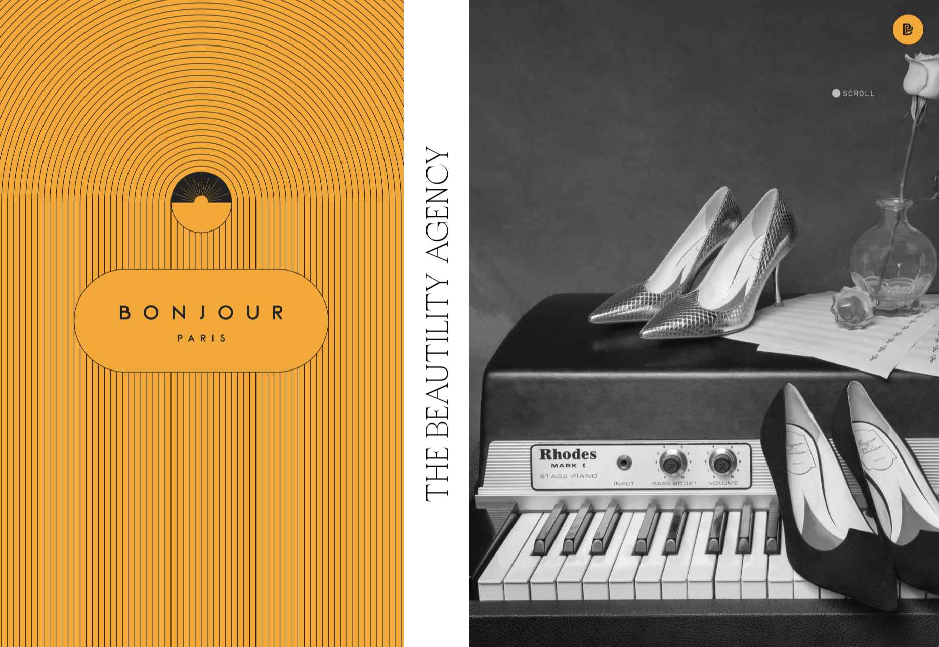
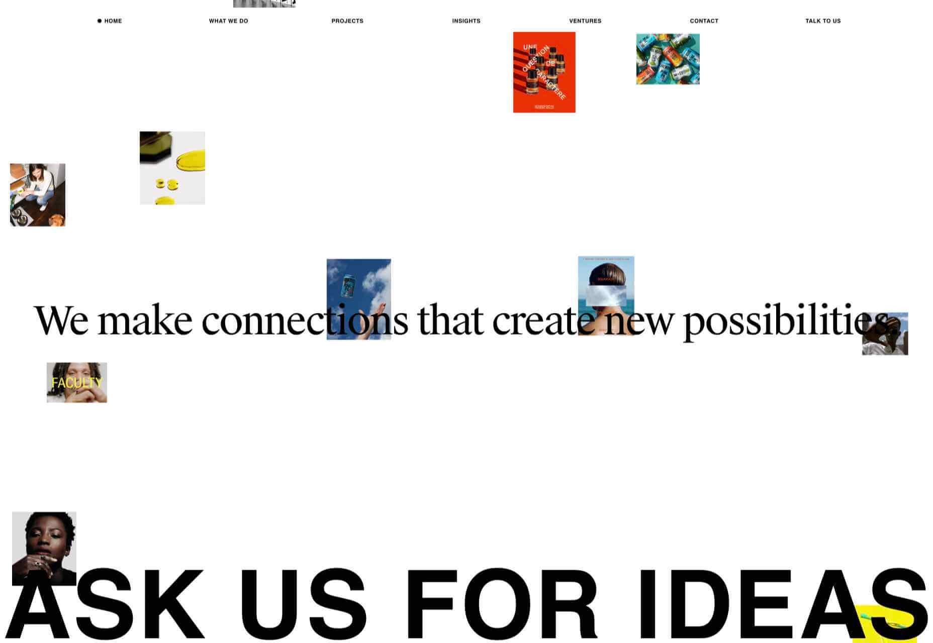
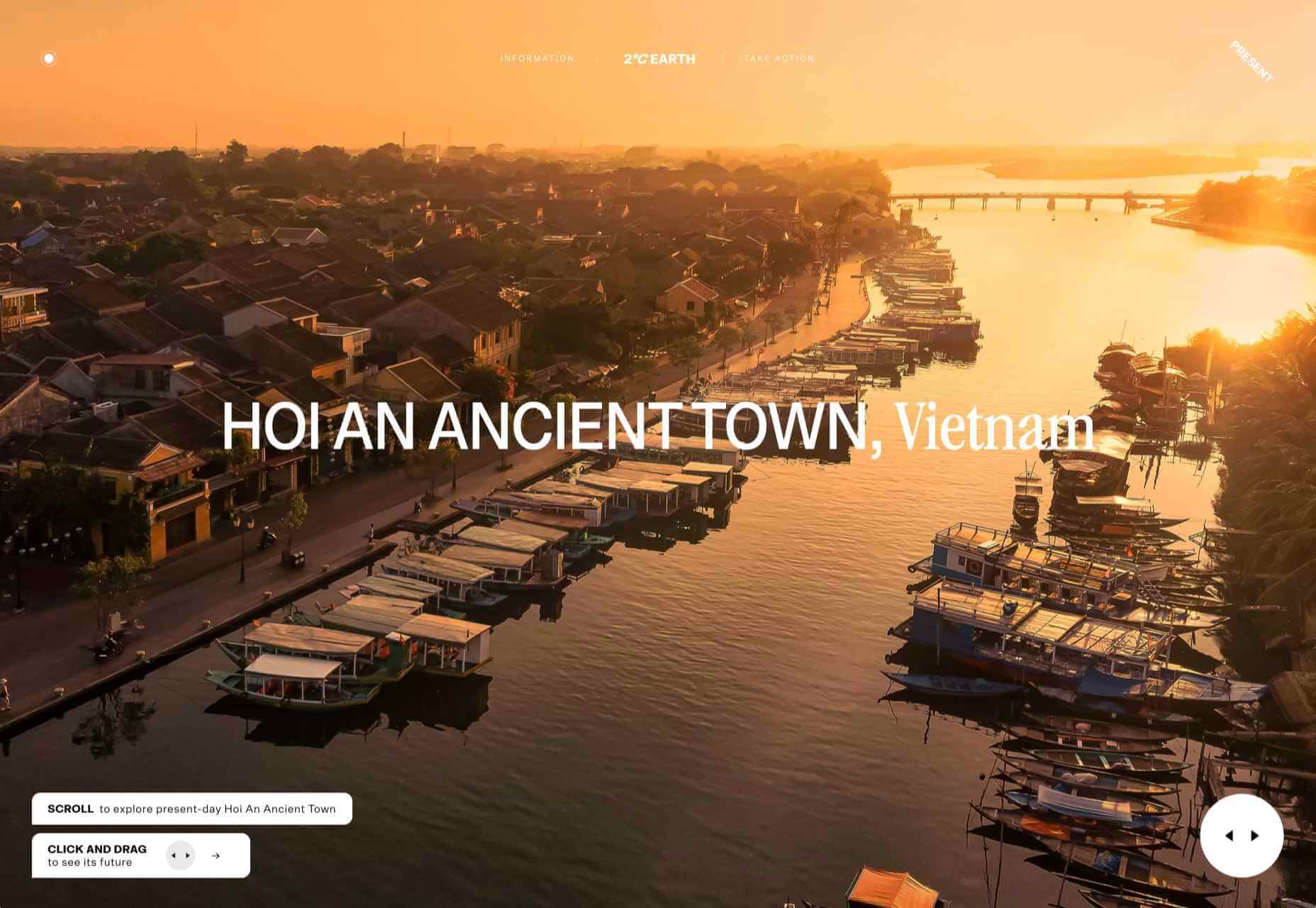
2. Multiple Homepage Entry Points
For a long time, designers have been working off the philosophy that the homepage should have one direct entry point, creating a direct funnel for the user experience.
These designs throw that idea out the window, with multiple entry points and click elements.
You can think of it as the “create your own adventure” option for these designs.
It can be a risky concept if you are diving into analytics to pay attention to user paths. You want to make sure you know what choices users are making so that you can help them on the journey to the content and information that you want them to get from the visit.
But this type of design scheme does feel somewhat personalized, putting the user in more control.
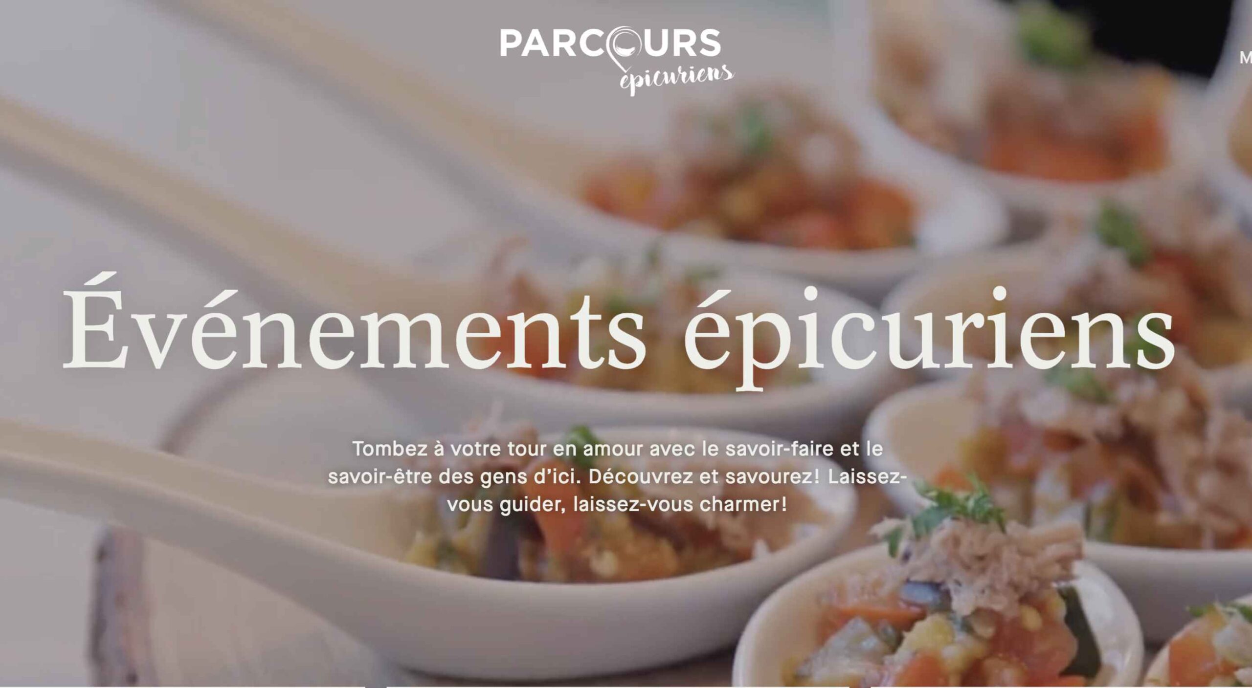
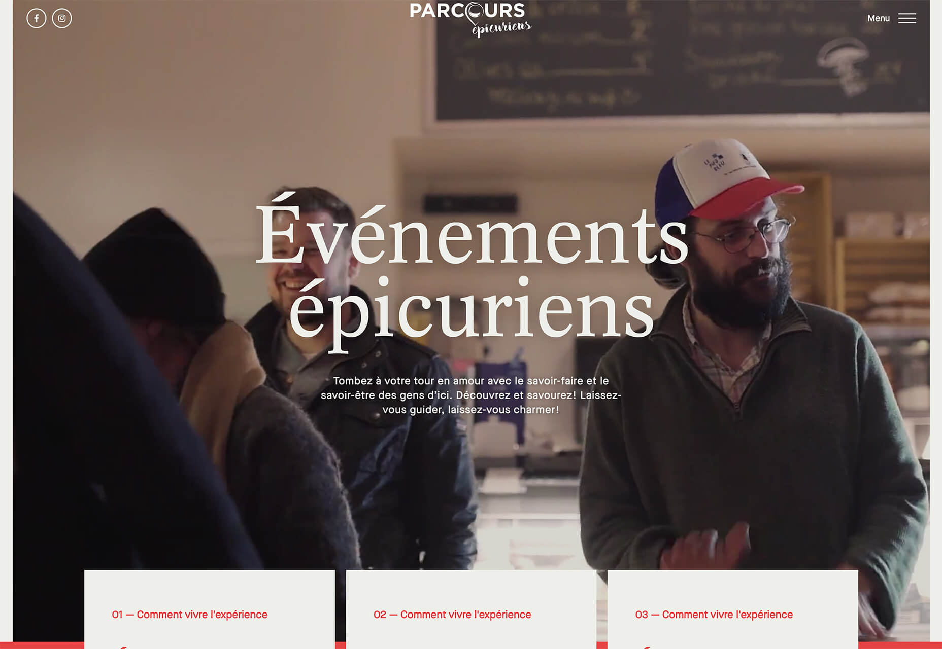
Parcouse Epicuriens uses three flat card-style elements to help users pick what they want to see from the home page. There’s no other button or direct call to action, which is somewhat uncommon in today’s website design landscape. Users have to pick from one of the cards, scroll, or enter using the hamburger menu icon.
Tasty Find uses search options to help users start their journey. What’s interesting here are the choices – search for the food you want, pick something random, or (in the small print) find even more options. Users get three choices to begin their journey with the website.
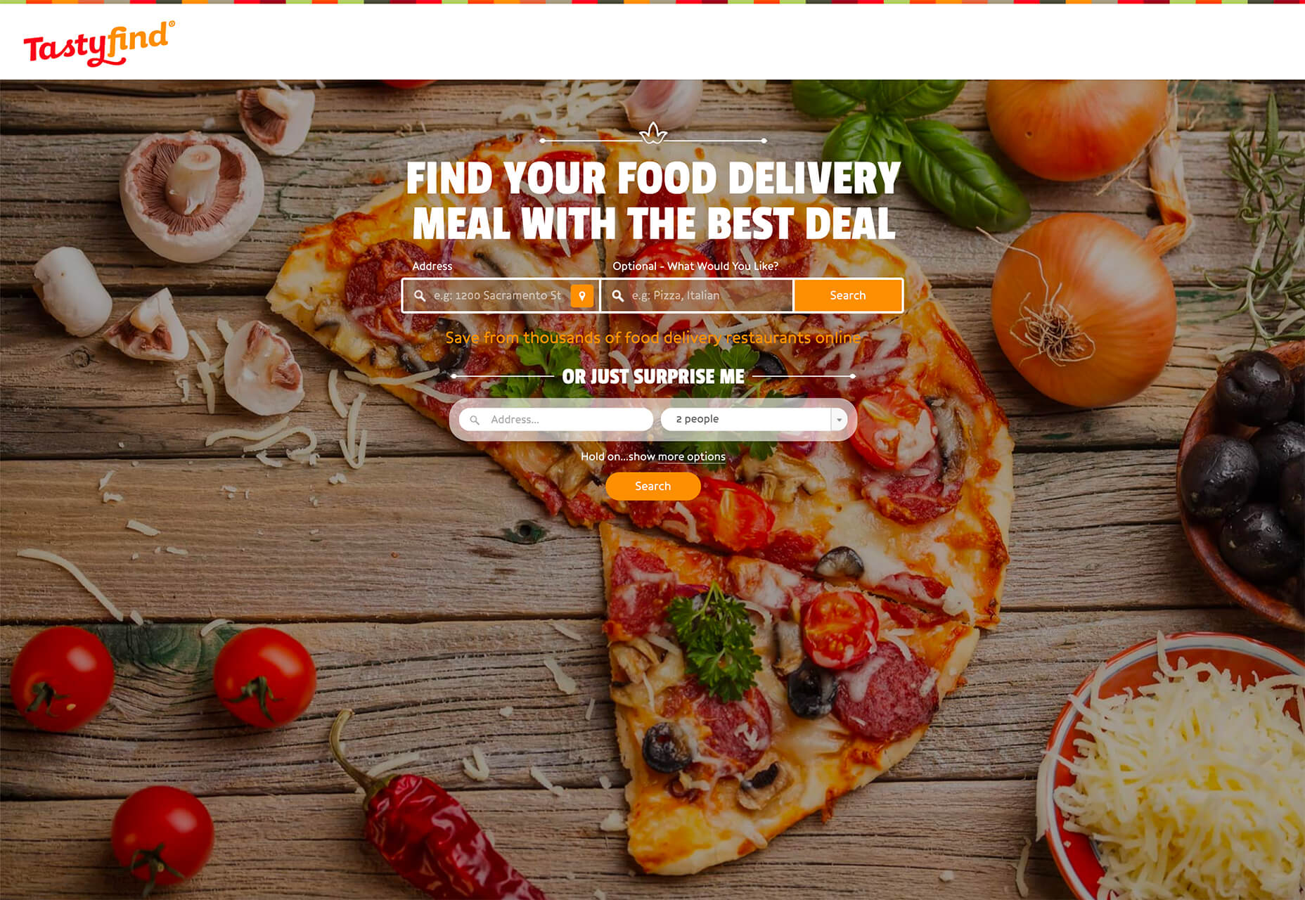
What’s interesting is how simple this complex user journey looks. The design is easy to digest, but so many options could overwhelm users. This is one of those situations where you have to watch return search data and information and weigh the risk versus the reward of so much choice. It’ll be interesting to watch this design over time and see if the options decrease in number.
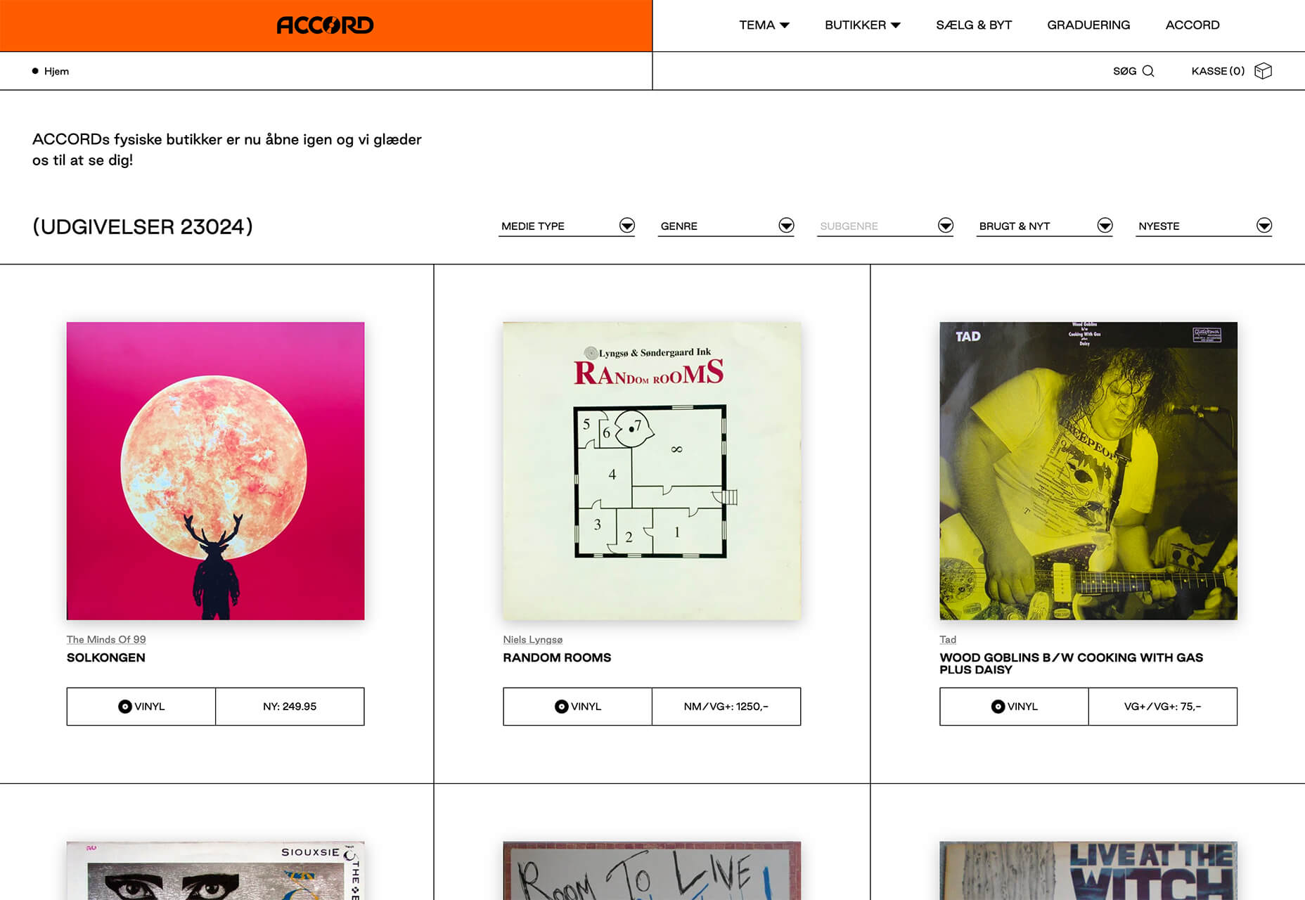
Accord also has several levels of user engagement opportunity. Option 1: Every block contains a click element. Option 2: Use the search at the top to narrow choices. This is an interesting configuration as the homepage for an e-commerce website because they get right to product selection and shopping without a softer sell or introduction.
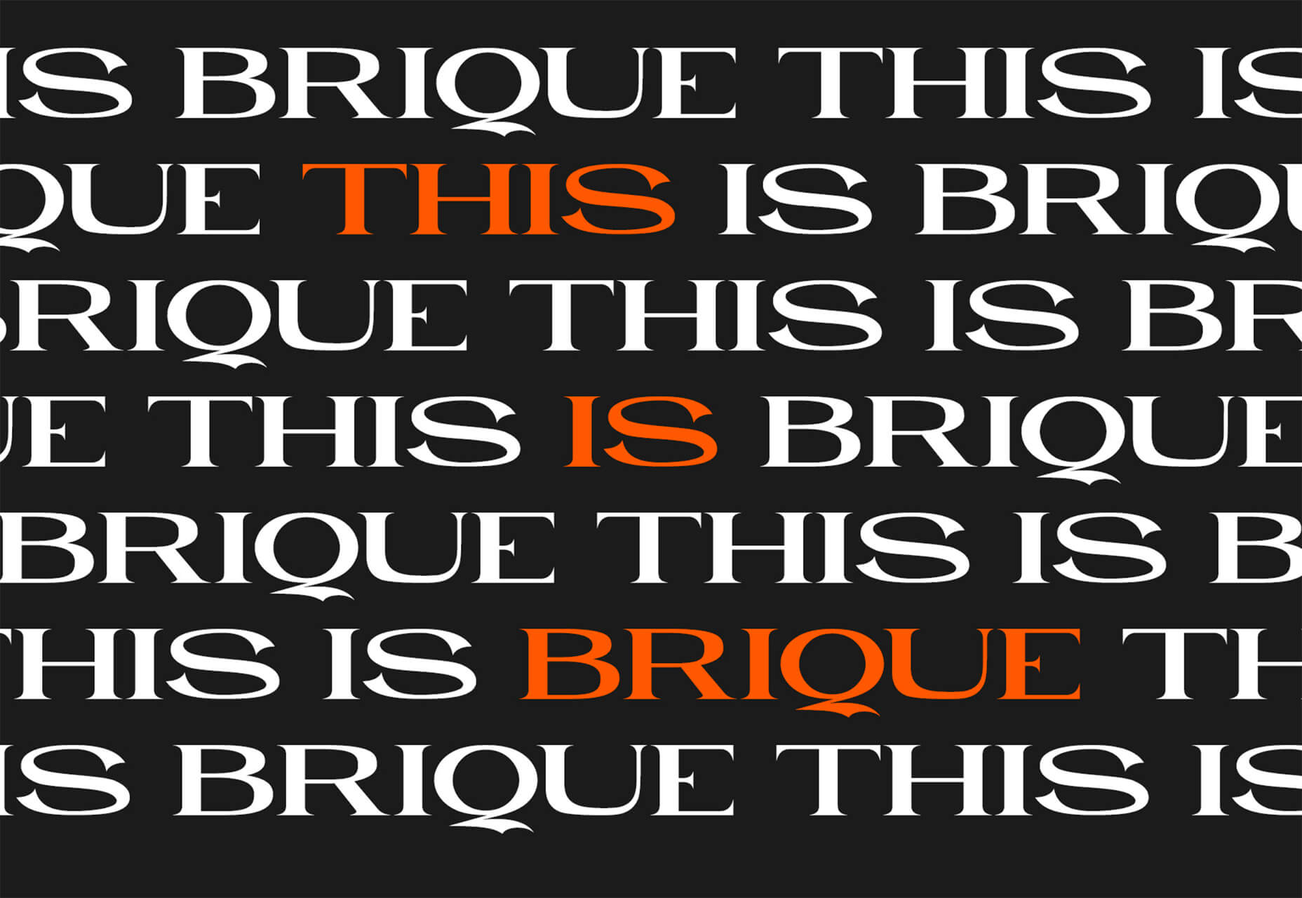
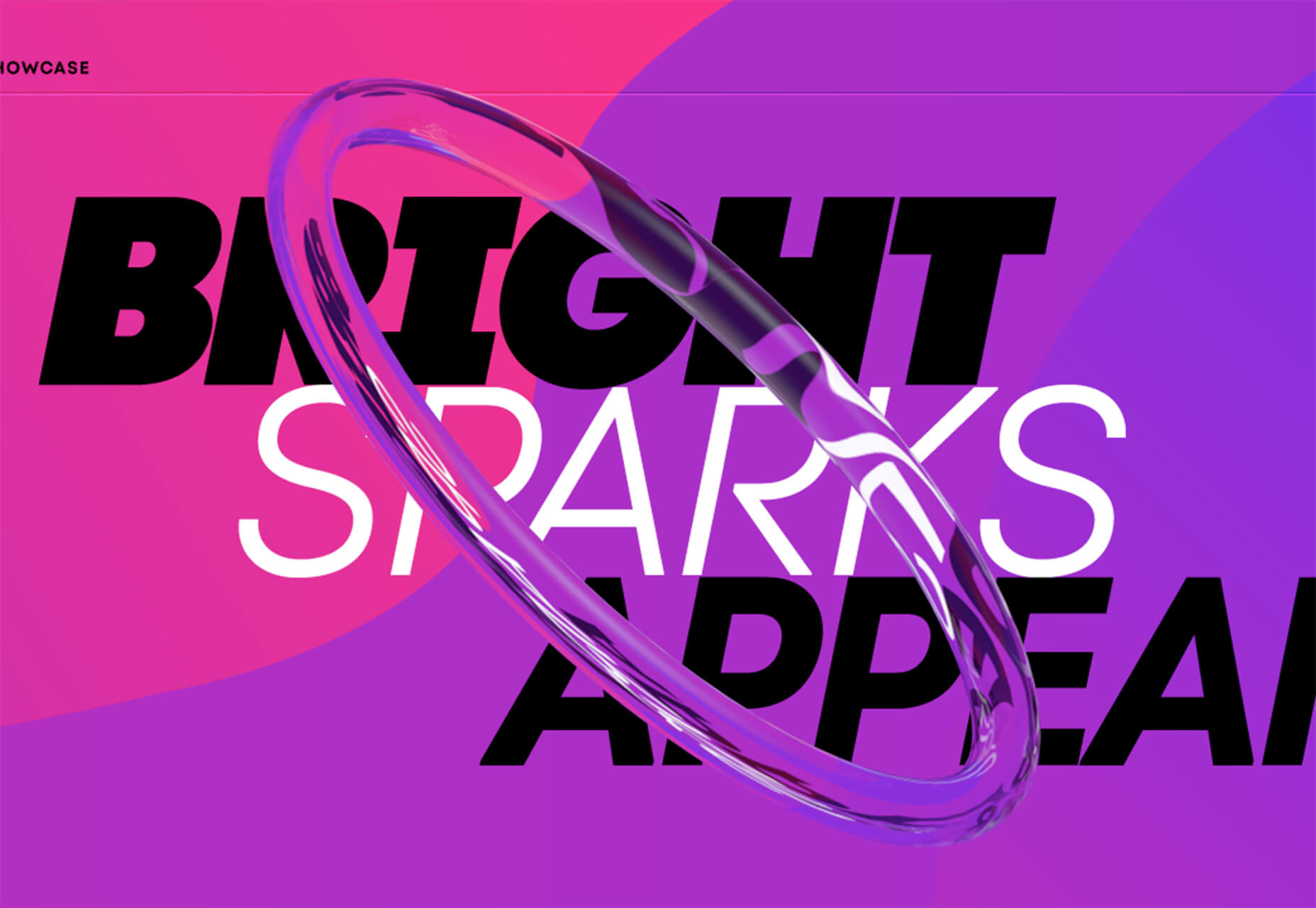
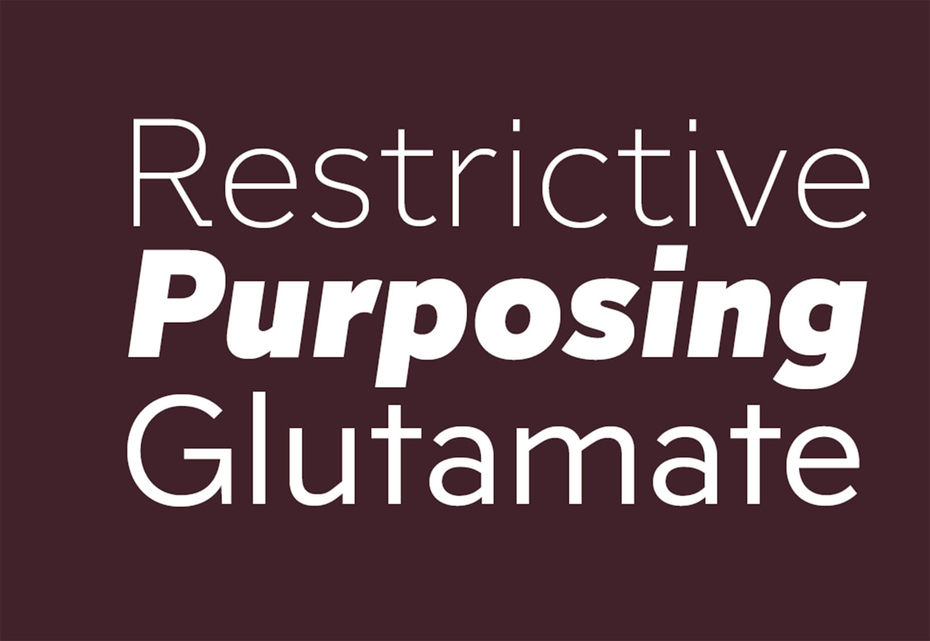
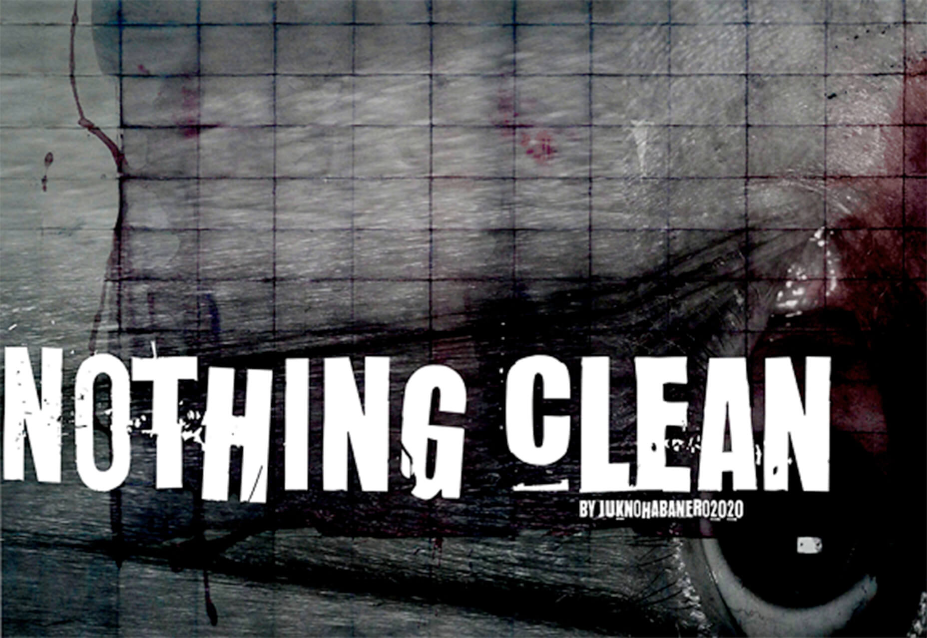
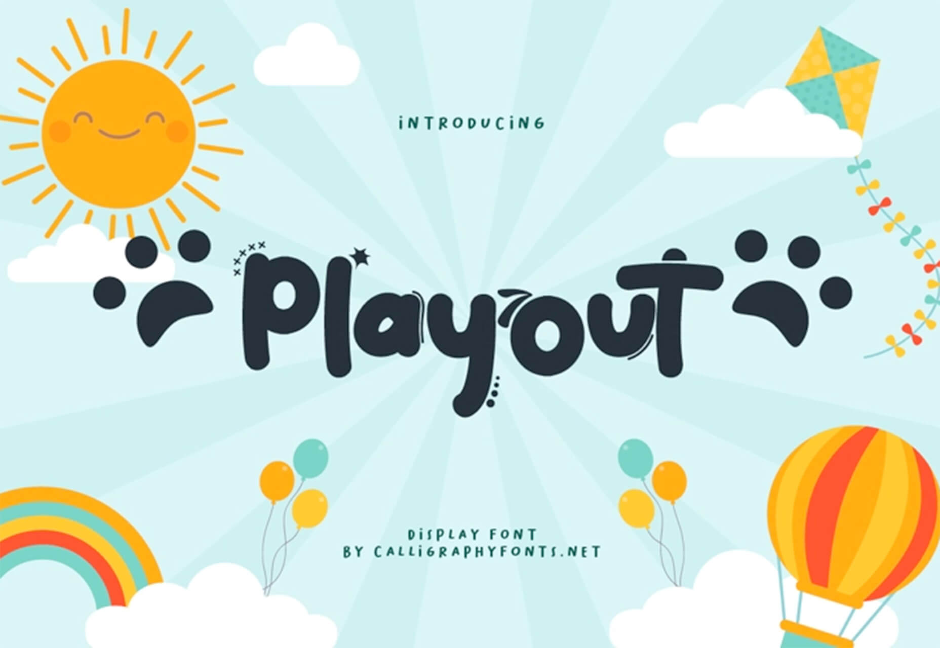
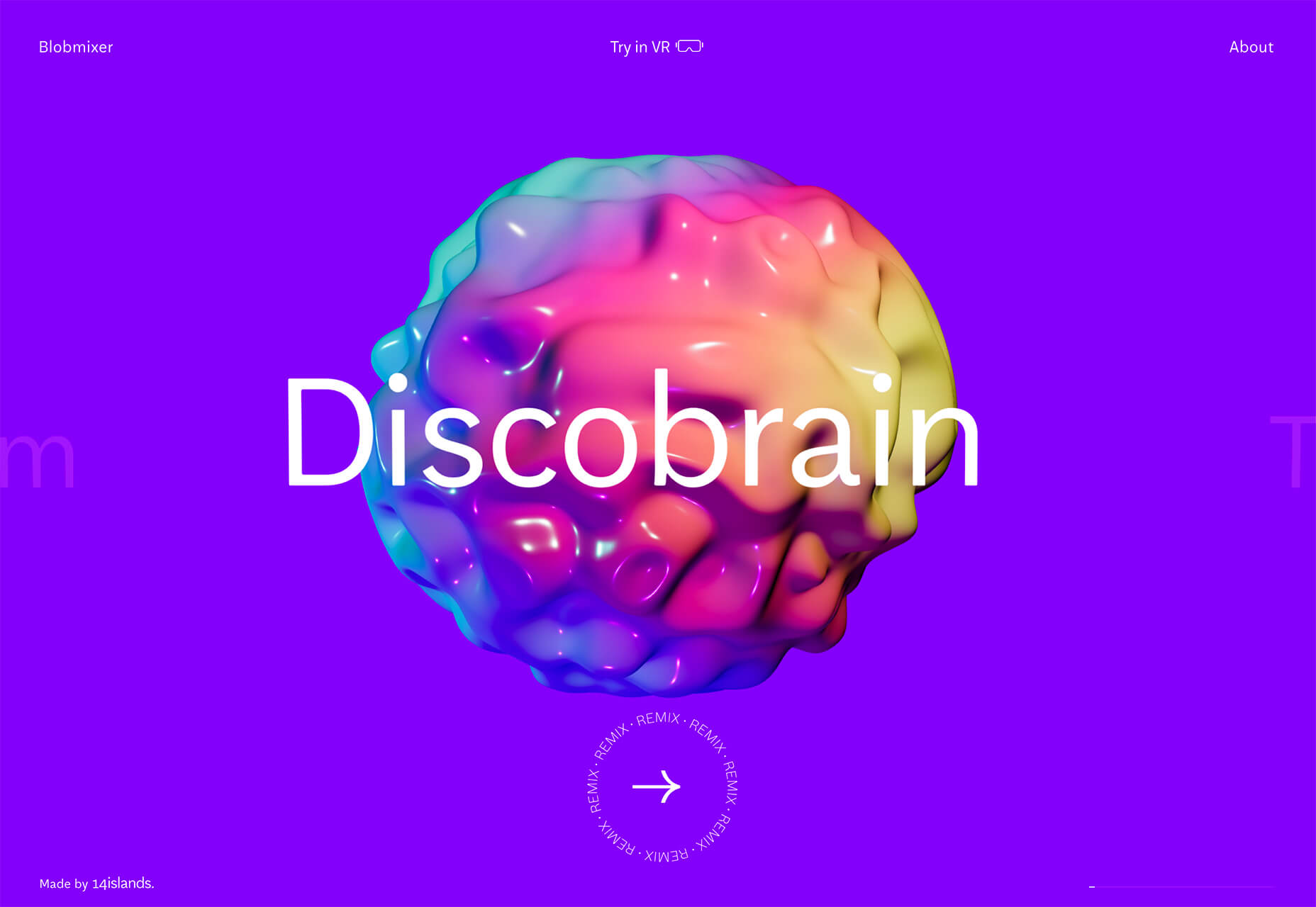
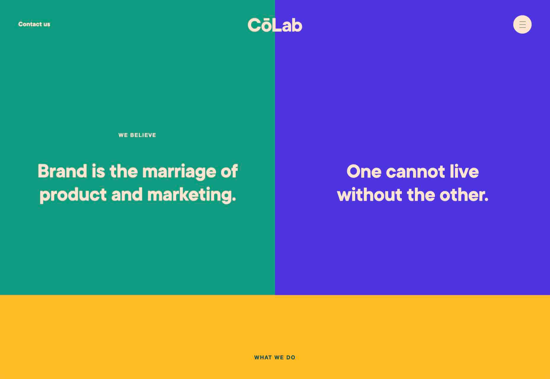
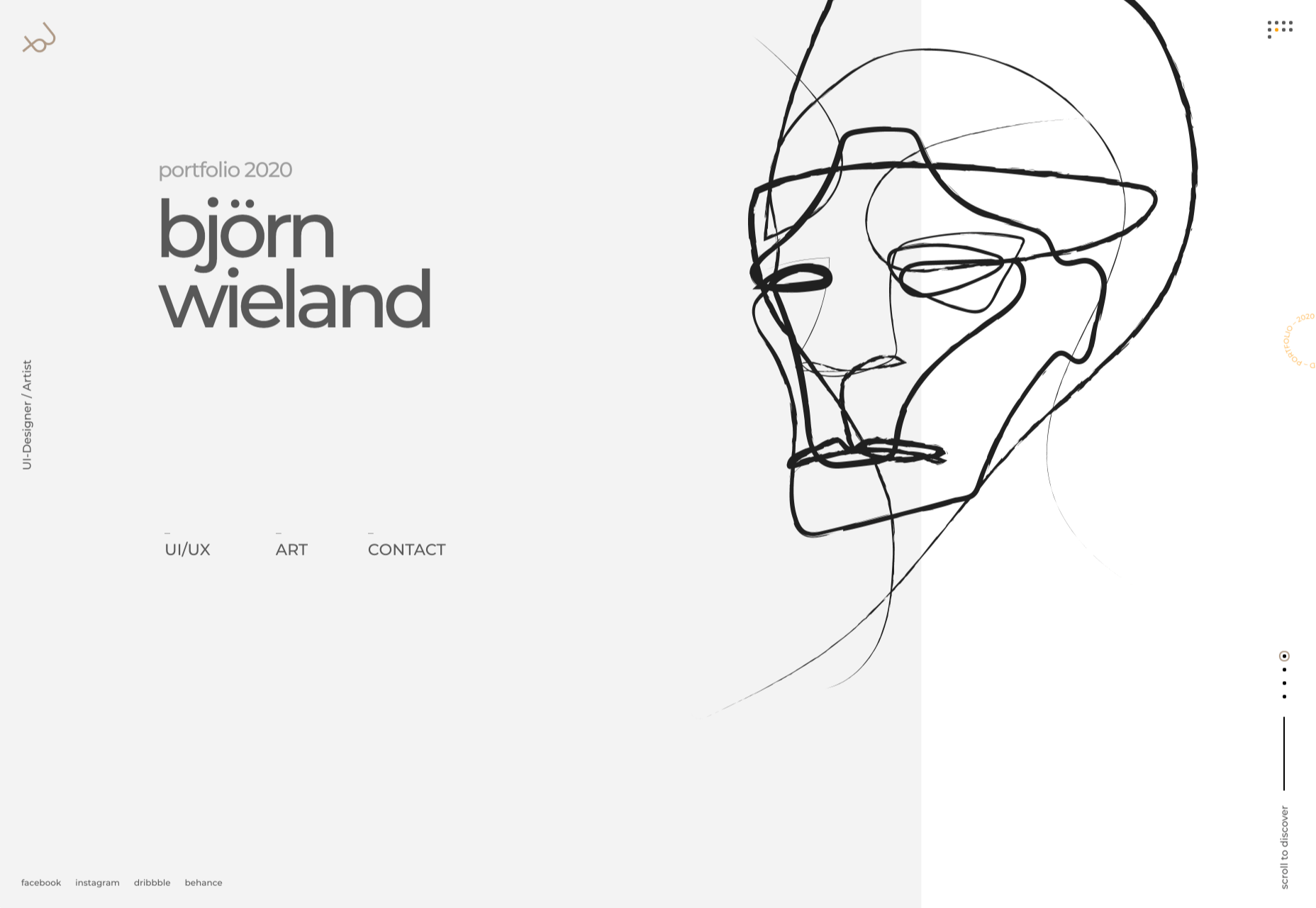
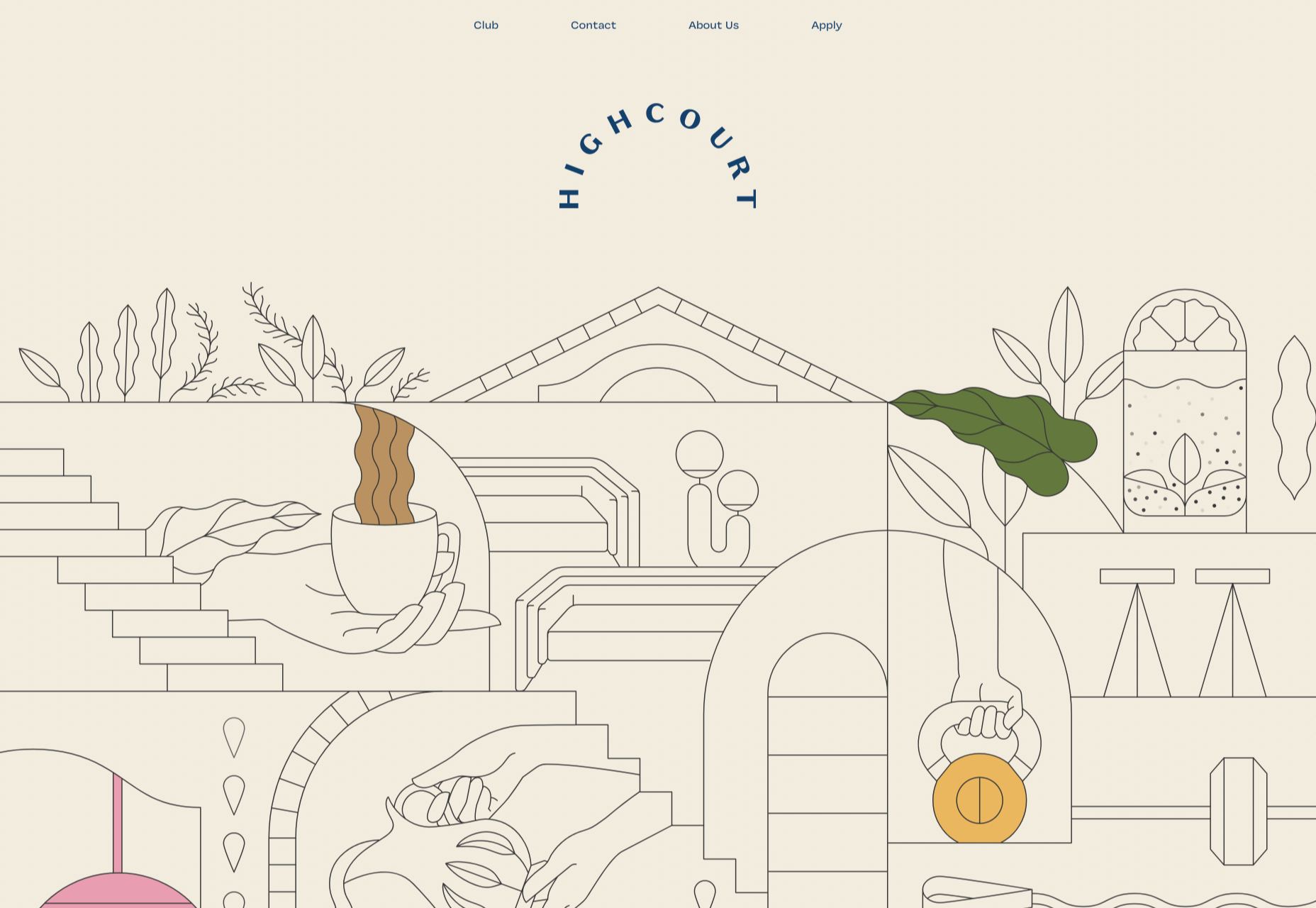
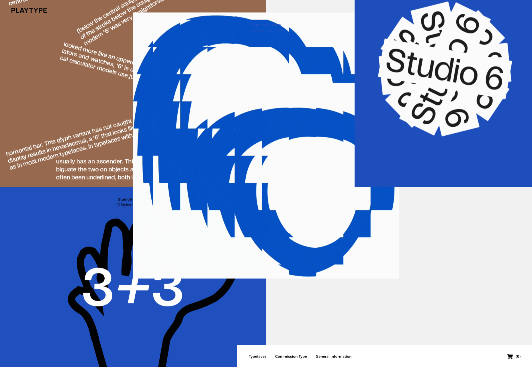
3. Risky Typography
Typographic risk has been an ongoing theme for a little while. Designers are embracing experimental and novelty typefaces to stand out in the cluttered website space. Sometimes it works beautifully, and other times, it can fall short.
Here, each of these trending website designs uses a risky typography treatment. The risks are a little different for each design, from readability to comprehension to font delivery.
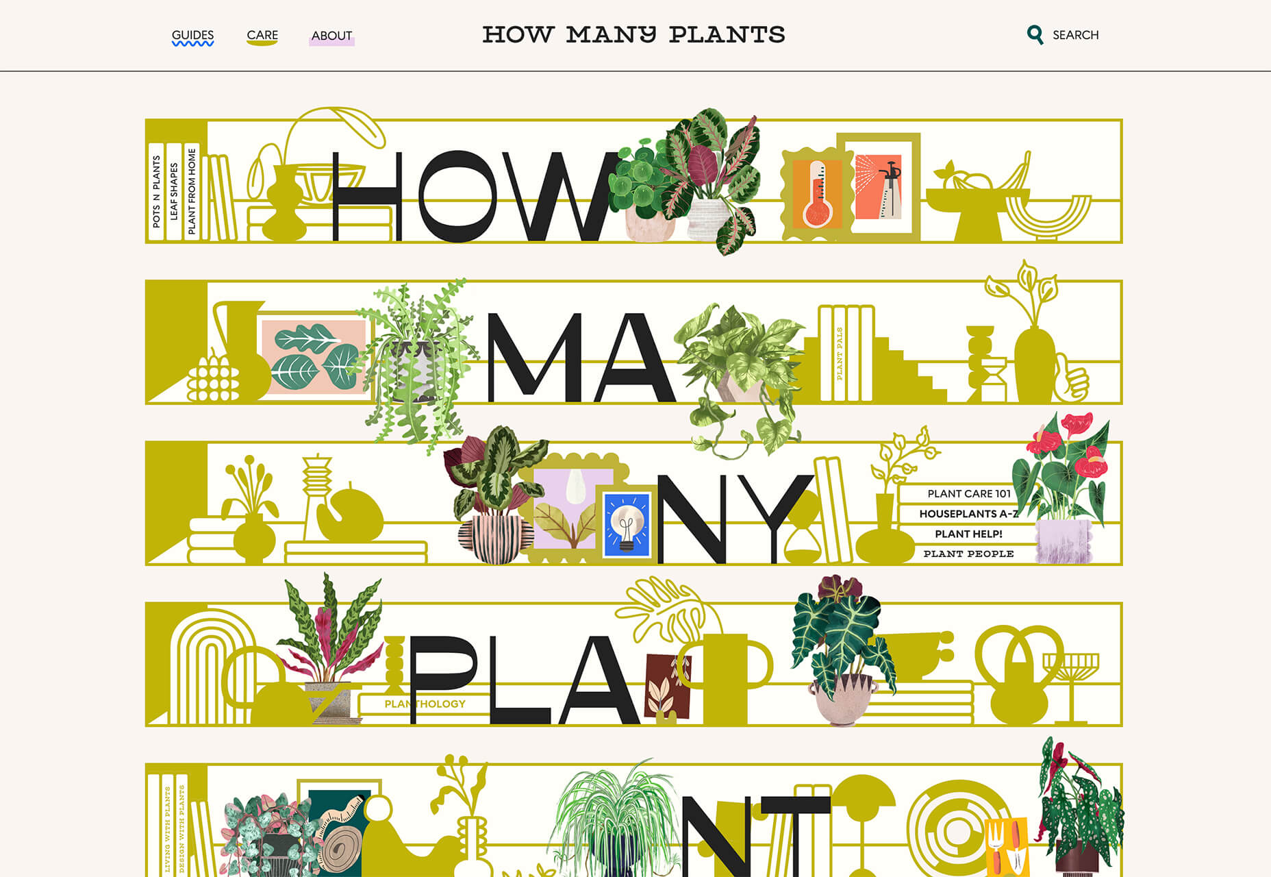
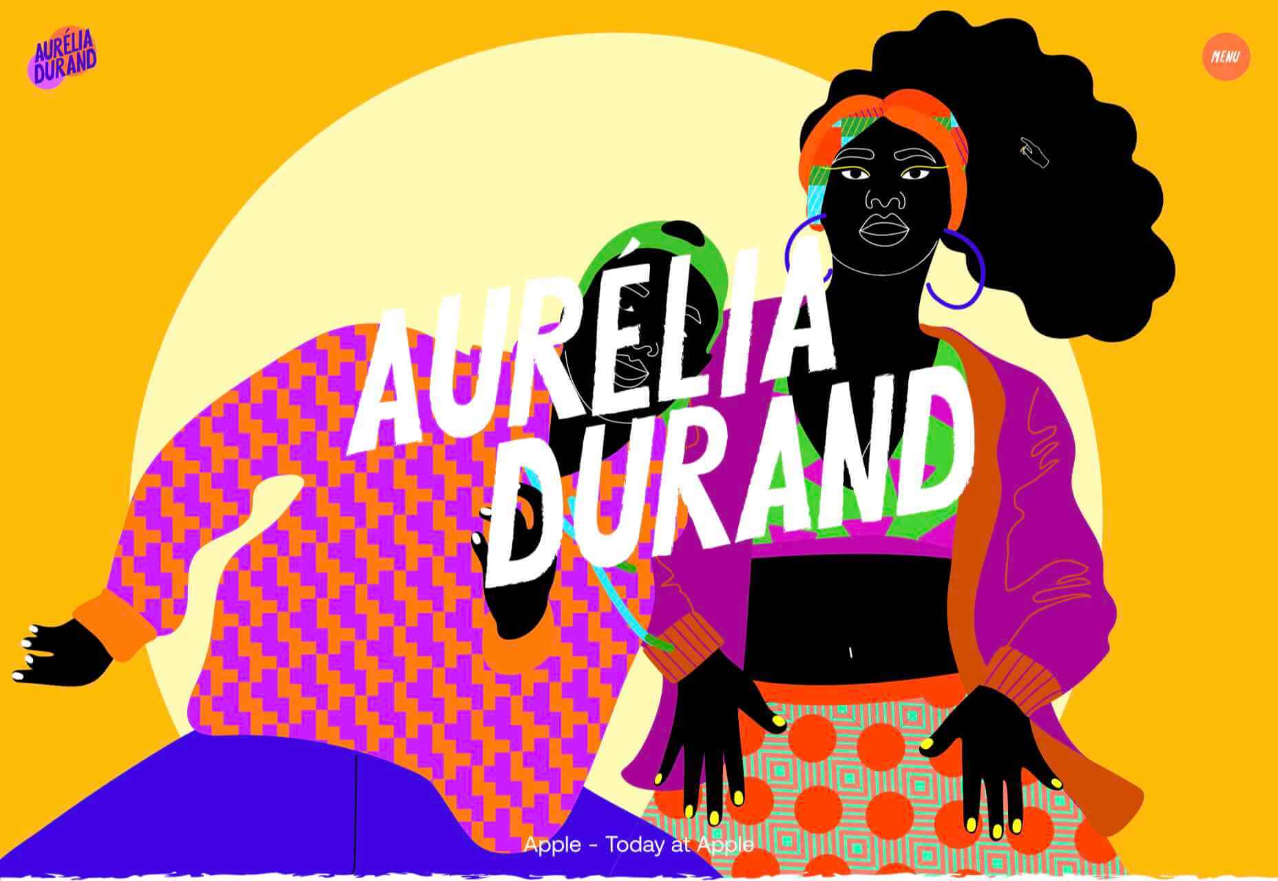
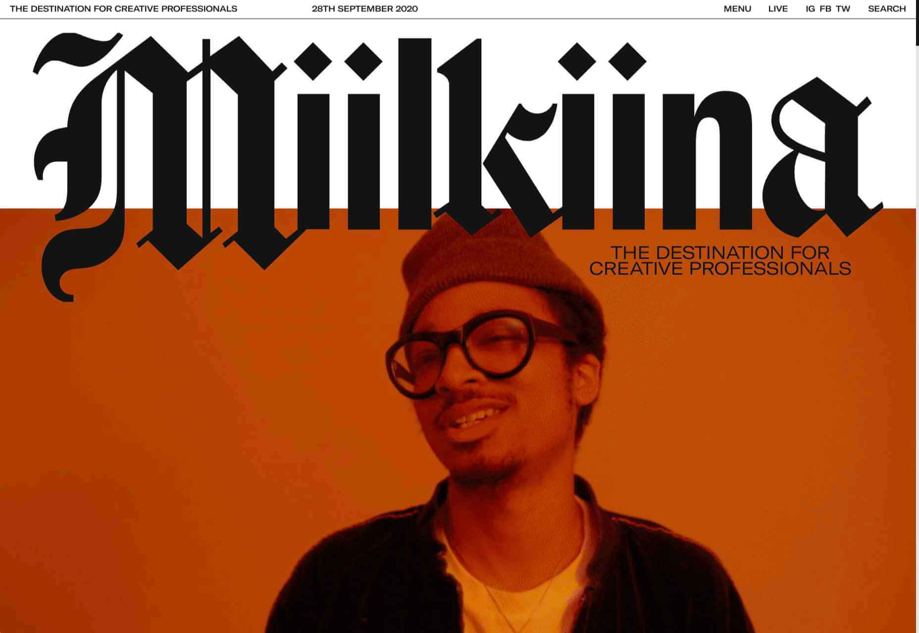
How Many Plants has duel typography risks: A funky typeface paired with odd word breaks. Interestingly enough, readability isn’t as big of a concern as you might think. This is likely because there aren’t many words, and they are short. Plus, the imagery ties in nicely.
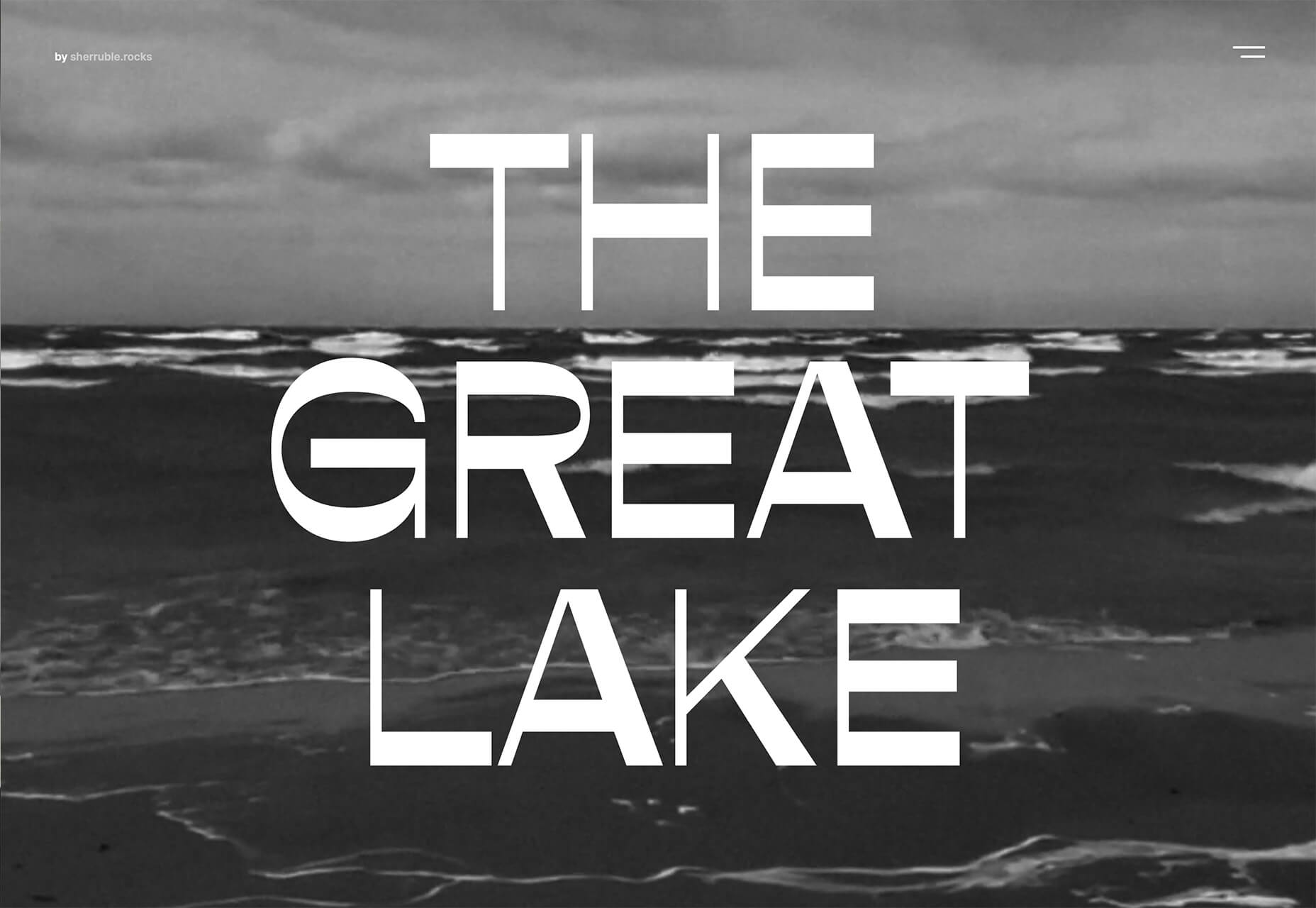
Do you notice a similarity between How Many Plants and The Great Lake? The typography has the same style with a blocky, slab, sans serif with alternating thick and thin strokes. (It’s the same font.)
The risk in the typography design for The Great Lake isn’t in the homepage display, although you might wonder what the design is about. It is carrying this font throughout the design. While it looks great large and with only a few words, it gets a little more difficult the more you see it. This type of mental reading weight can be difficult for visitors over time, creating an element of risk.
Zmaslo uses an interesting typeface with a liquid effect on top of an unusual word. That combination of text elements makes you think hard to read the homepage, despite its neat looks. The risk here is weighing visual interest against comprehension. Depending on the audience, this risk can be worth the chance.

Conclusion
Spring always seems to be that time of year where designers start thinking about new, fresh design elements. That might explain some of the “riskier” design choices and experimentation here.
Regardless of the motivation, it is always fun to see the creative stretch happen. It can be even more interesting to see what elements from these trends continue to grow in the coming months.
The post 3 Essential Design Trends, May 2021 first appeared on Webdesigner Depot.
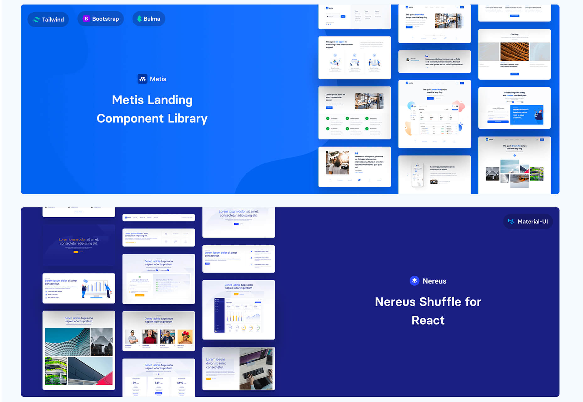
 Rather than spring cleaning, do some spring “shopping” for tools that will make your design life easier. Packed with free options this month, this list is crammed full of tools and elements that you can use in your work every day.
 March is that time of year where the feeling of newness starts, from the first Spring days to fresh design projects. These trends are no exception, with fun new takes on some classic concepts.
 It’s February, and the spring sun is finally starting to peep through the winter clouds. While many of us are still largely restricted to our homes, the web has kept on growing.
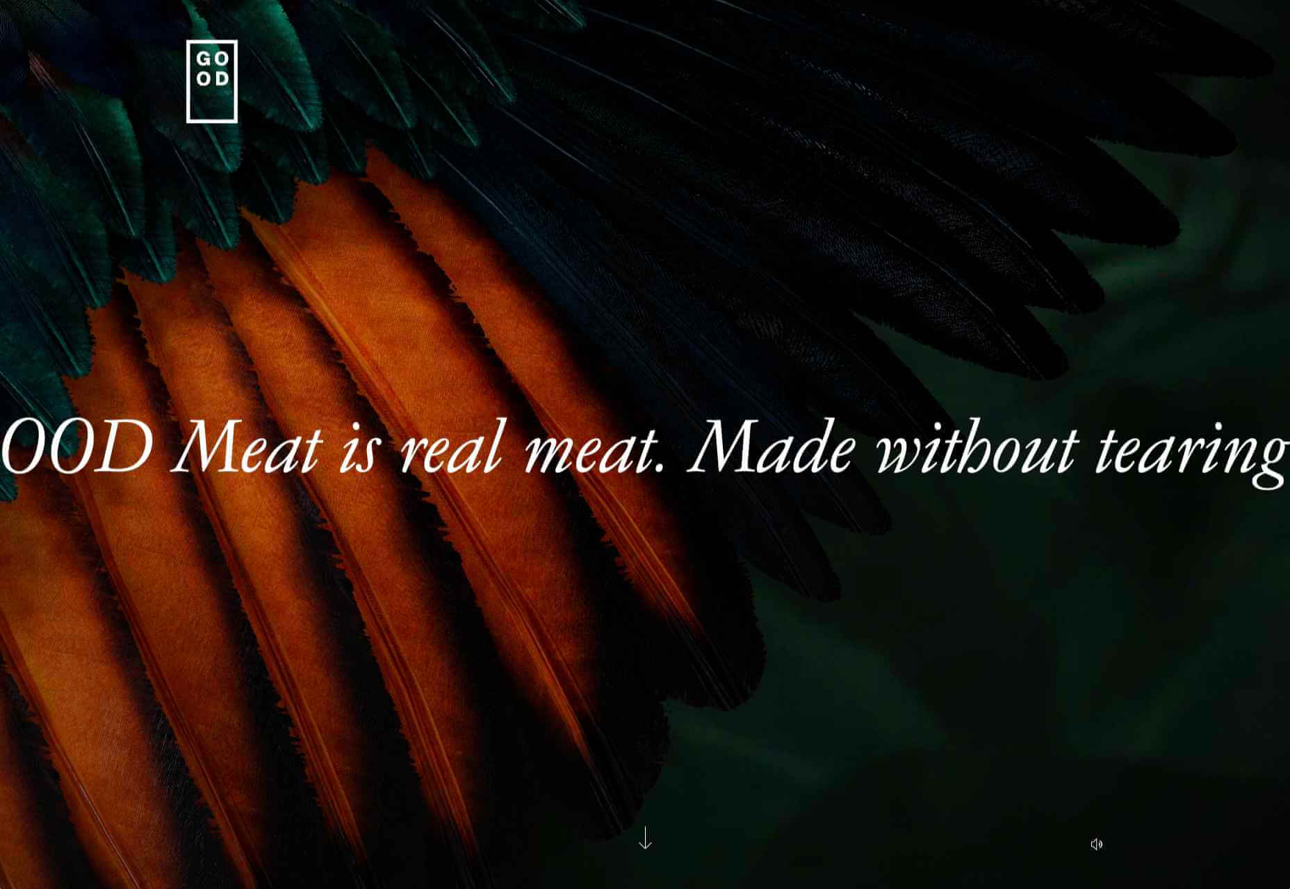
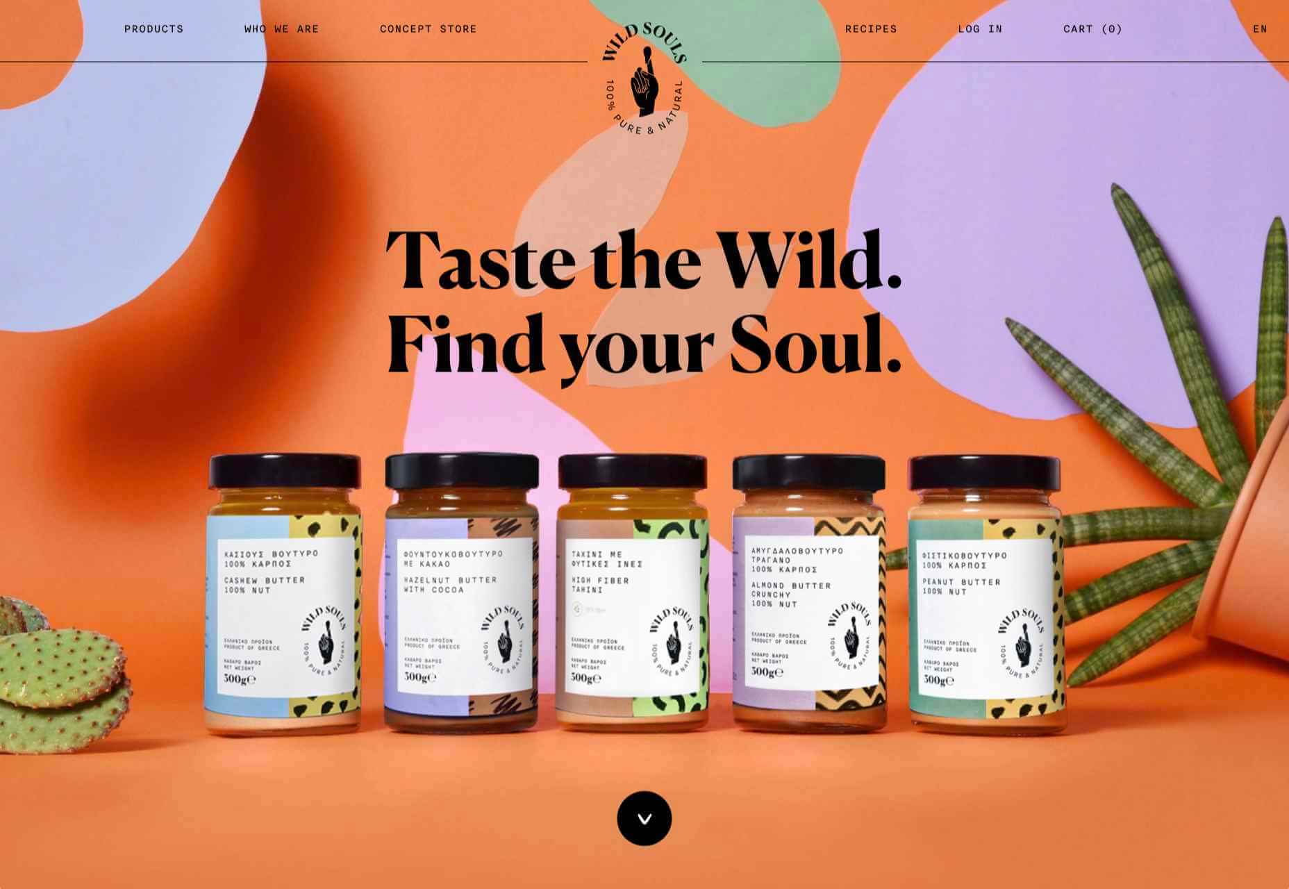
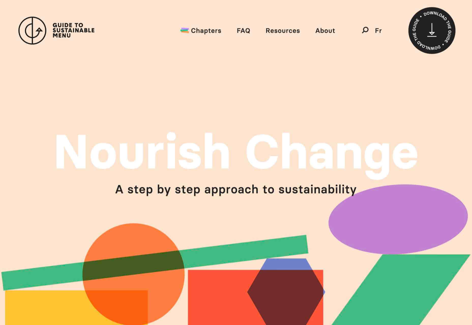


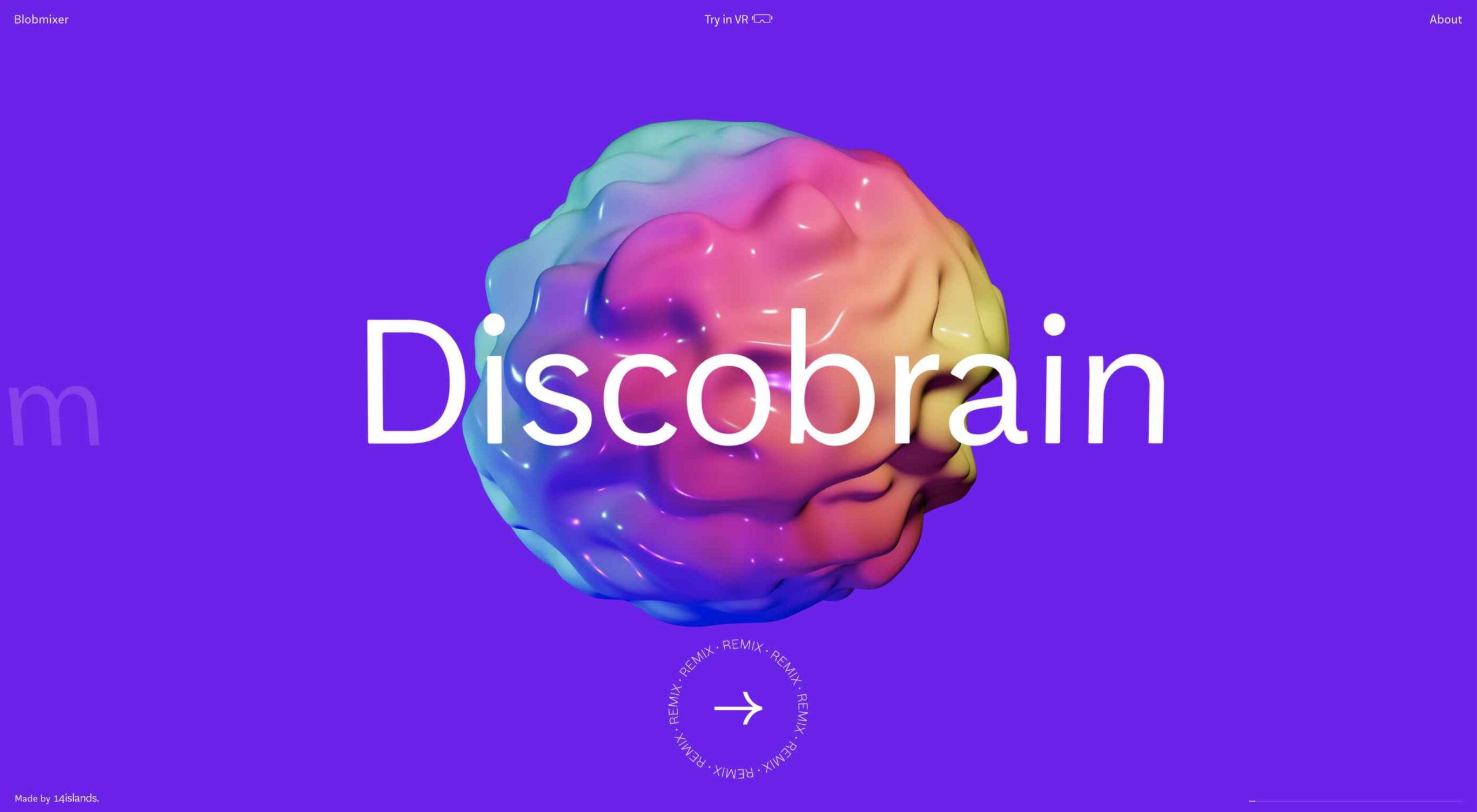
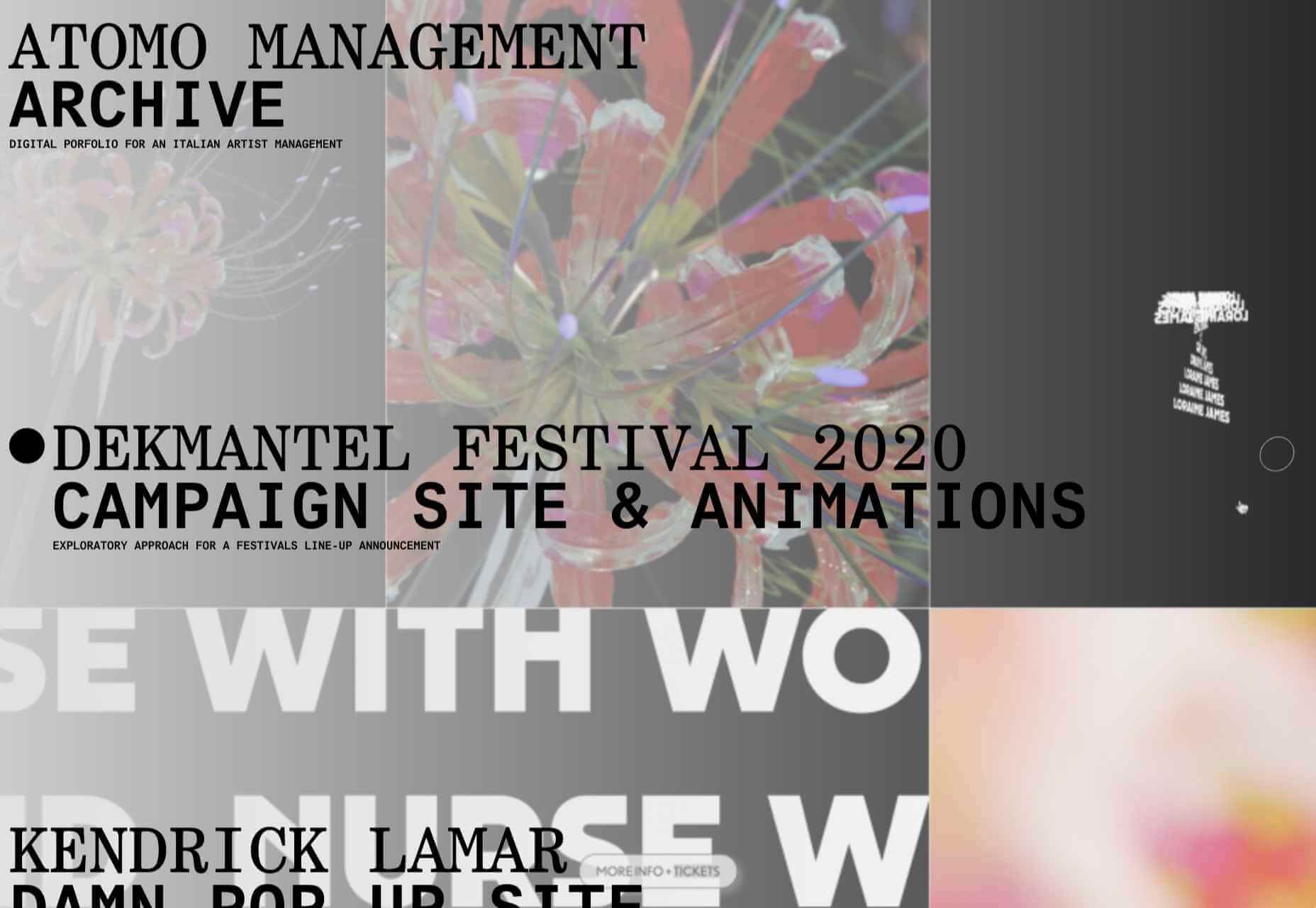
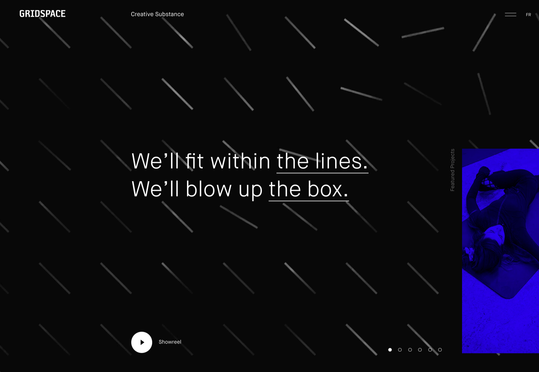
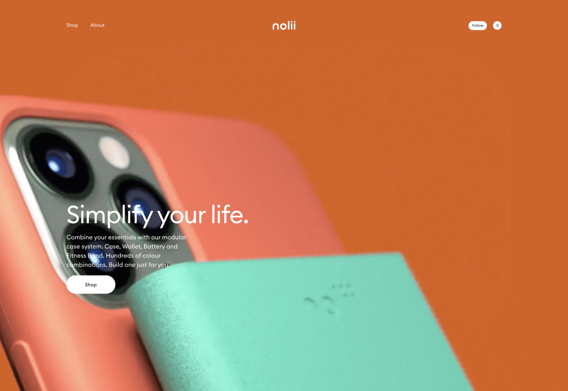
 This month we’re going big and bold. Oversized type, strong colors, in-your-face layouts, and little touches of playfulness exude confidence and make a statement. There are some quieter moments too, with thoughtful illustration and more gentle use of color. Animation still features strongly in the details, with circles proving popular in rollover effects. Enjoy.
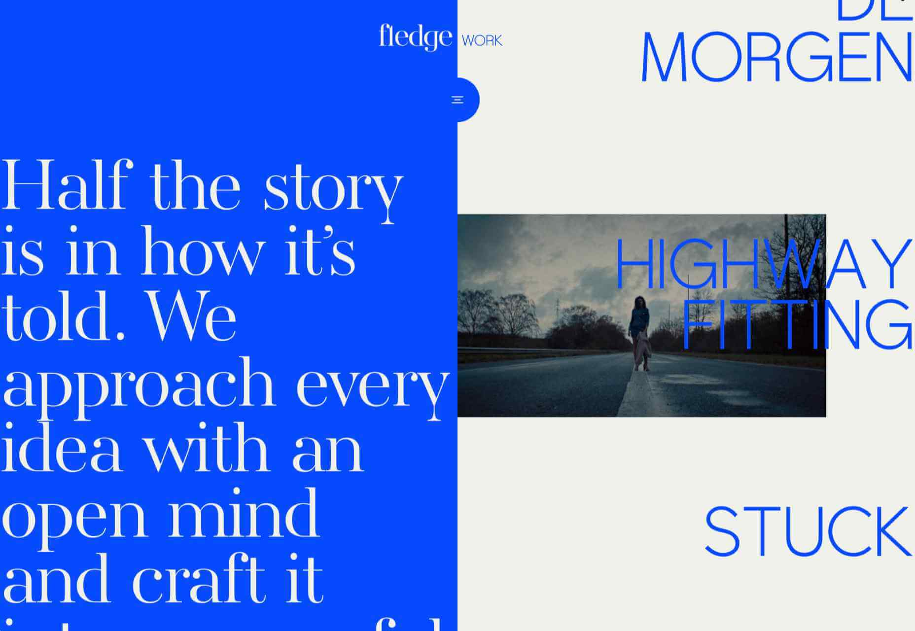
