 Navigating the world of web design can be difficult. There is so much conflicting and outdated advice.
How many times have you been advised to obey the 3-Click Rule? It states that users must reach the content they want in three clicks. But, according to the Nielsen Norman Group, no research supports the 3-Click Rule. It’s just a guess, the web’s equivalent of an urban myth.
There are dos and don’ts of effective web design in 2022. In this post, we’ll present the most important so that you can design websites with confidence.
Do: Make Use of Design Patterns
Design Patterns sound like a complex technique. All it means is copying standard, well-known approaches. Jakob’s Law says that most people spend most of their time on other sites, so they will understand your site better if it is like those other sites.
You can’t make your site like every other, so your job is to pick and choose which design patterns will be most helpful to your target demographic.
Some of the most recognized design patterns include placing the logo in the top left of the viewport, underlining links, and placing essentials like shipping information in the footer.
Do: Make It Inclusive
Inclusive design holds the opinion that the web is for everybody. It hasn’t always been that way. Just a few years ago, it was common to see sites excluding some demographics to reduce development costs.
Excluding anyone from your website is wrong. In many jurisdictions, it’s so wrong it’s illegal. But, perhaps more importantly, excluding 5% of users deducts 5% from your profits.
It’s never been easier to be inclusive. The first step is to make your website responsive so that it caters to every device. Then, follow accessibility guidelines to ensure that you welcome everyone. Finally, be ready to listen to your users, and adapt to their needs.
Do: Keep It Simple
As a website designer, you’ve undoubtedly looked in envy at some of the more original sites out there. It’s important to remember that many of the most experimental sites are usually targeting other designers. Something that works well on a portfolio site won’t translate well to a local convenience store.
99 times out of 100, the simple choice is the right choice. Most people aren’t interested in an original design. They’re interested in accomplishing a task. The less effort expended to complete the task, the better the experience.
Complexity most often creeps into navigation. Start with a logical structure, and use simple, hierarchical navigation.
Do: Stay Focussed
Every website has goals. It might be promotion, profit, utility, or a combination. Each part of that website, every single page, should have one goal.
Hick’s Law says that the time it takes to make a decision increases when there are more choices. And the Goal-Gradient Effect says that a customer is more likely to complete a process the closer they are to the completion. Combine the two, and it means that giving users one CTA (call to action) on a page increases the chances of them taking it.
It’s OK to still have navigation, links, and secondary goals provided each page has a single clear purpose.
Do: Keep Your UI Consistent
Consistency is often referred to as the hallmark of quality. It means that you’ve paid attention to details. But consistency isn’t just about giving a good impression. Consistency is also essential for good UX (user experience).
Users learn to navigate your website as they go. They learn your website’s ‘rules’ or the logic as they interact with it. If your UI (user interface) is consistent, they’ll learn the rules faster and feel more confident.
Areas that often fail the consistency test are the corner radius of boxes, the style of links, and the tone of writing.
Don’t: Ignore Aesthetics
Design isn’t all about usability studies and reliance on design patterns. Design should also be beautiful.
Beauty is often seen as shallow and unimportant. However, the Aesthetic-Usability Effect states that a beautiful website is more likely to be seen as usable by customers.
A pretty design is a high-converting design.
To ensure your design is pretty, pay attention to your typography hierarchy, color scheme, and the symmetry of your layout.
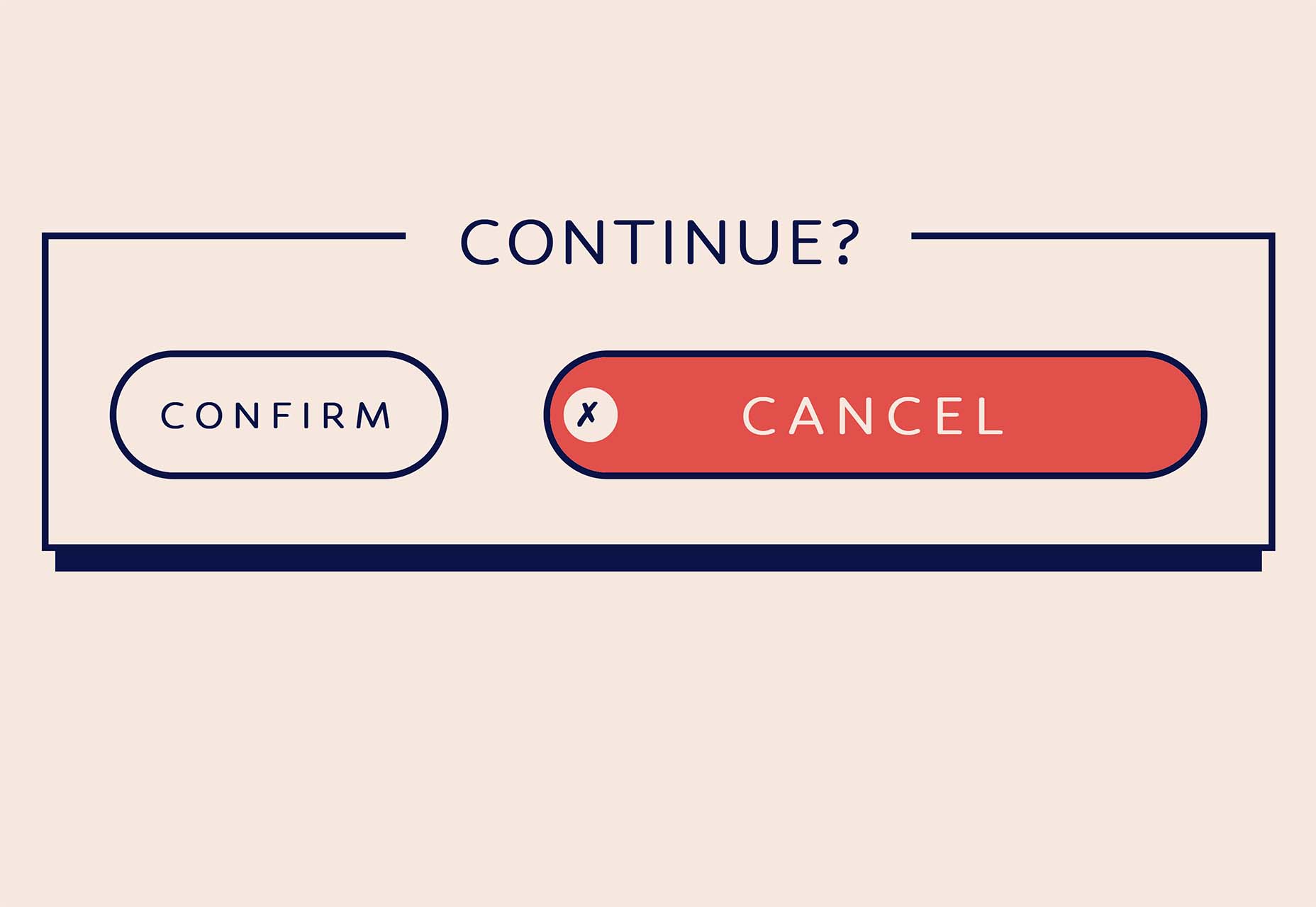
Don’t: Make Users Wait
The worst thing you can do is make users wait. The more technology advances, the faster connections get the higher user expectations.
Your site needs to load in under a second and be interactive in under two seconds. Otherwise, you’ll lose customers who bounce back to their search engine and try one of your competitors instead.
Delays don’t only apply to the speed of your site. You need to ensure that the information or product a customer wants is easy to access. Don’t bury it multiple levels deep in your site. If users are delayed by complicated navigation or unpredictable structure, they will exit your site as surely as if it took 10 seconds to load.
Users have zero amounts of patience.
Don’t: Block the Screen
Browsing through the web, the number of designers that block users from seeing the content on a website is astounding.
The most common culprits are newsletter subscription offers. How can a customer know whether they want to sign up for your newsletter when they haven’t yet seen your products?! Let the user browse your site, and then offer them a newsletter subscription.
Another common culprit is cookie notices. Most sites require a modest cookie notice to stay on the right side of the Law. And yet they display a huge, site-blocking modal as if the cookie notice were the most critical content on the site.
Don’t: Leave Content Until Last
Content is frequently left until last. That’s because it’s hard. Just because we learned to read and write as kids doesn’t mean we can write persuasive, engaging sales copy.
Content is vitally important for SEO (search engine optimization), but more importantly, it’s essential for CX (customer experience).
Most websites make three big mistakes with their content.
Mistake one is unbalanced copy. That means writing 25 words about your flagship product and 5,000 words about the company’s history.
Mistake two is writing for the company, not for the customer. That means organizing content around the company structure rather than customer tasks.
Mistake three is too much content at once. Walls of text are a turn-off. Instead, write short, scannable snippets that will keep customers engaged.
“Don’t try to be original…
…Just try to be good.”
That quote is from the titan of twentieth-century design, Paul Rand.
It boils down to this: originality is about you, and quality is about the website. Great designers care more about their output than their reputation.
Featured image via Pexels.
Source
The post 10 Dos and Don’Ts of Web Design in 2022 first appeared on Webdesigner Depot.
Source de l’article sur Webdesignerdepot


 While we’ve featured a lot of script fonts in previous months, this newest batch of the best new fonts is going to extremes. If you’re looking to have a bit more fun with typography in the coming months — especially for modern tech brands — you’ll find something here worth trying out here.
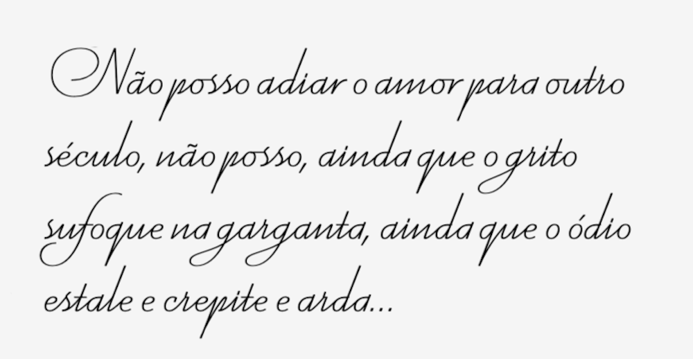


 Bored with the same old design tools? There are plenty of new toys to experiment with, from fun divots to functional design tools that could become your new go-to’s.


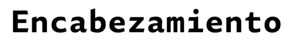
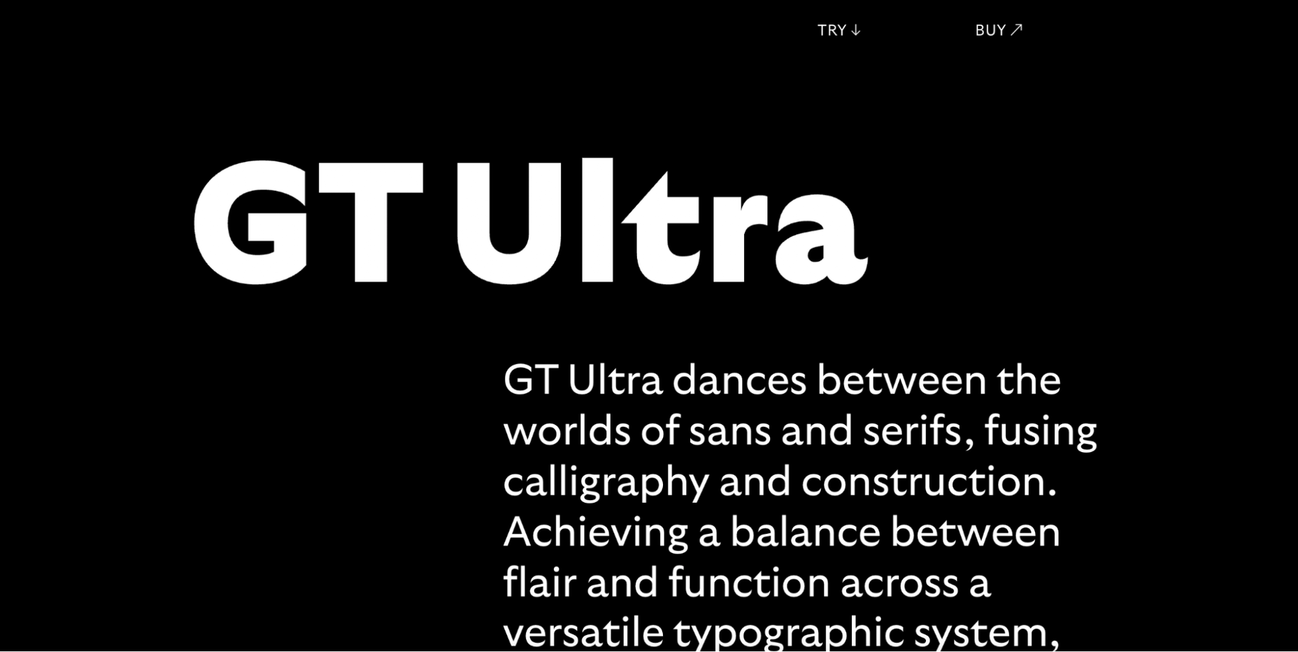
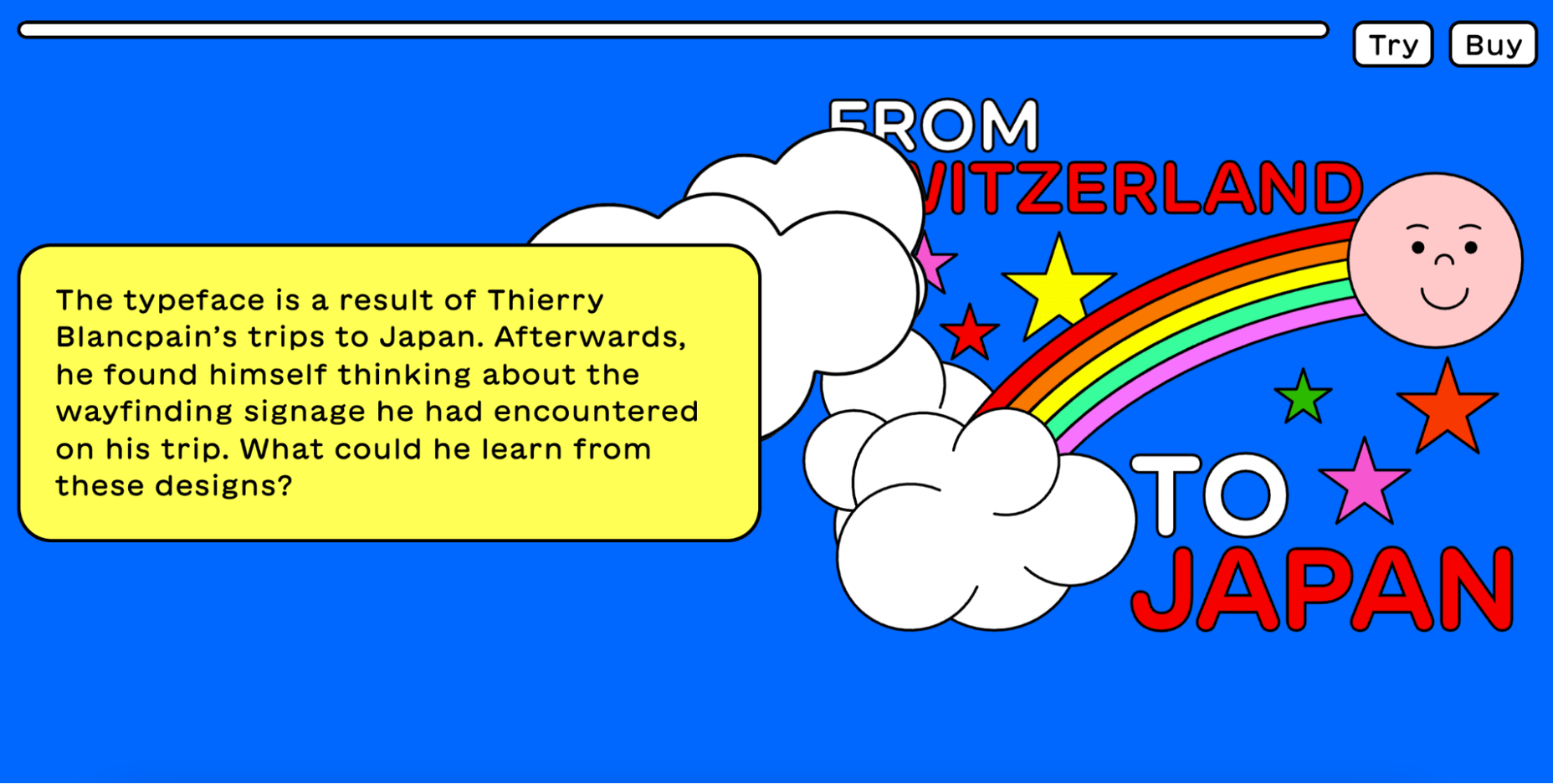
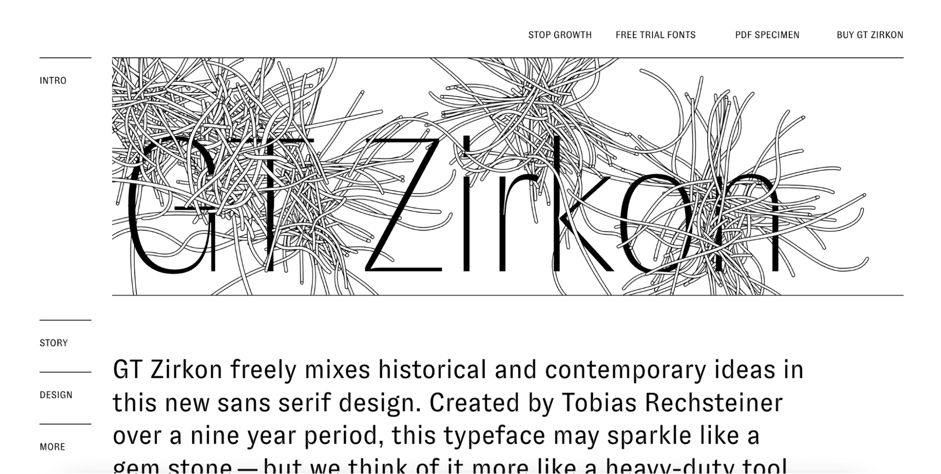
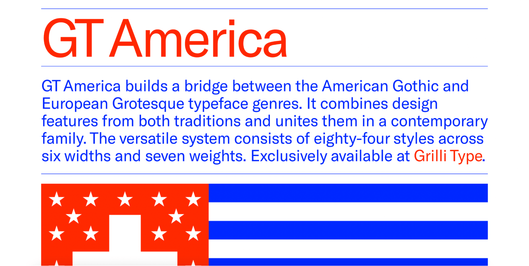
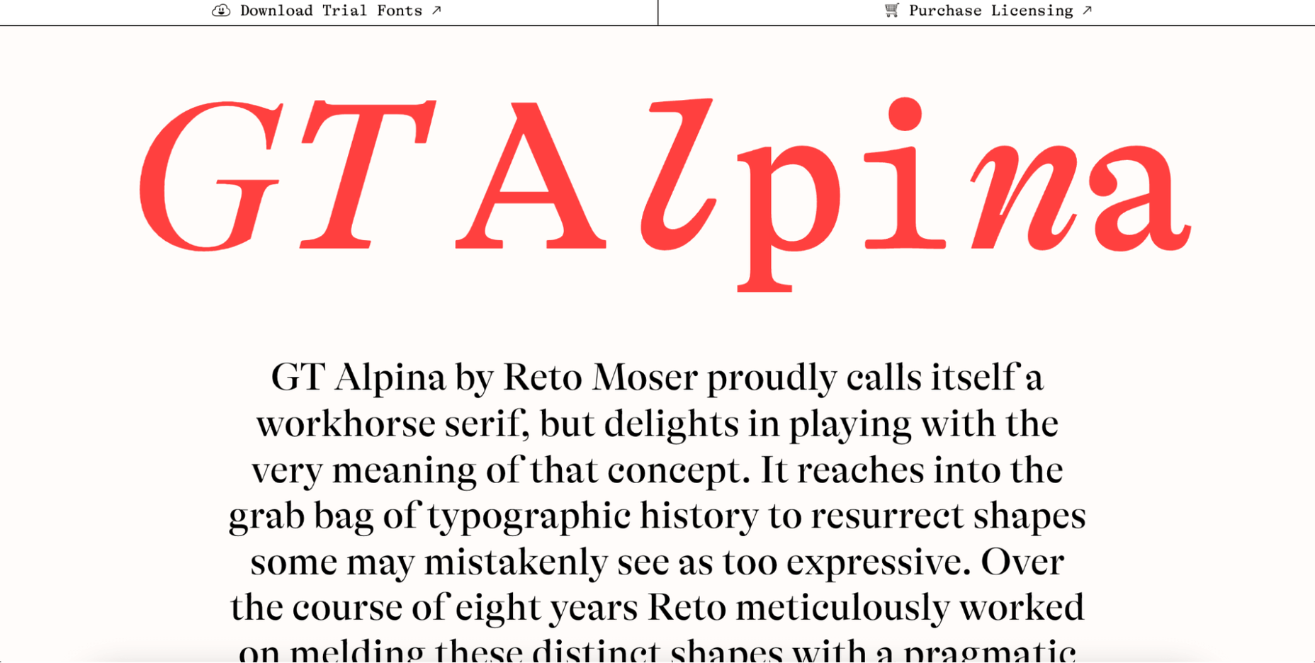
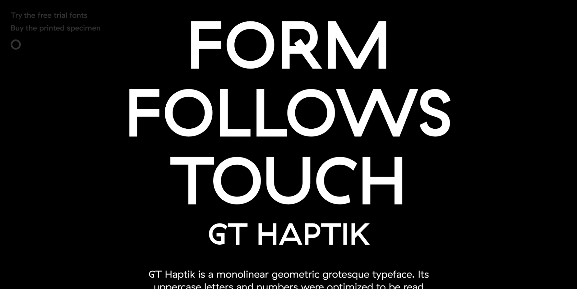
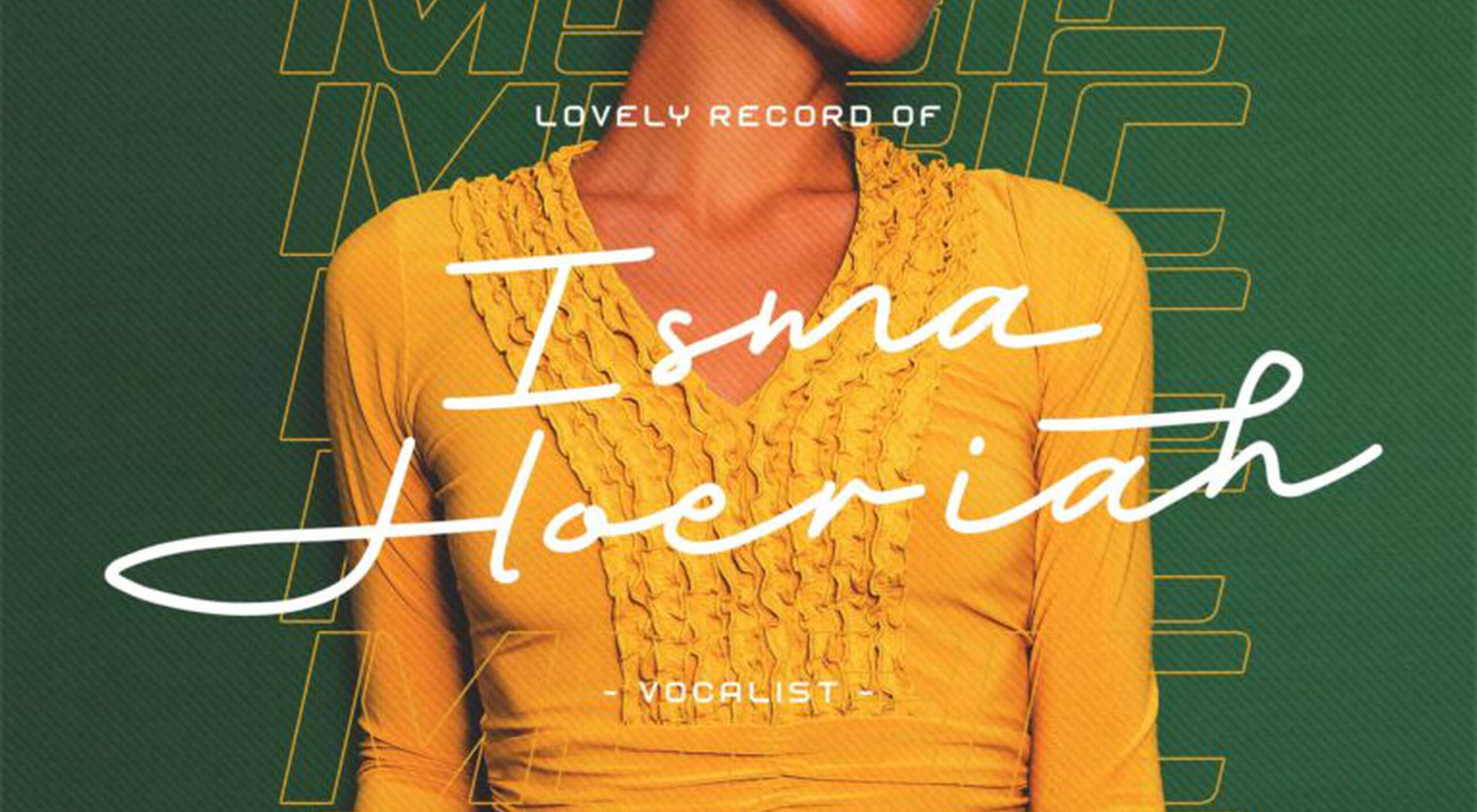
 Are you looking for a unique font that will make your next project shine? Or maybe you need a typeface with a beautiful design and rich history behind it. Luckily, mini-sites for fonts allow us to creatively explore a font’s origins and history. We know (from our own experience) how important it is for UI and UX designers to have a variety of fonts for our designs.
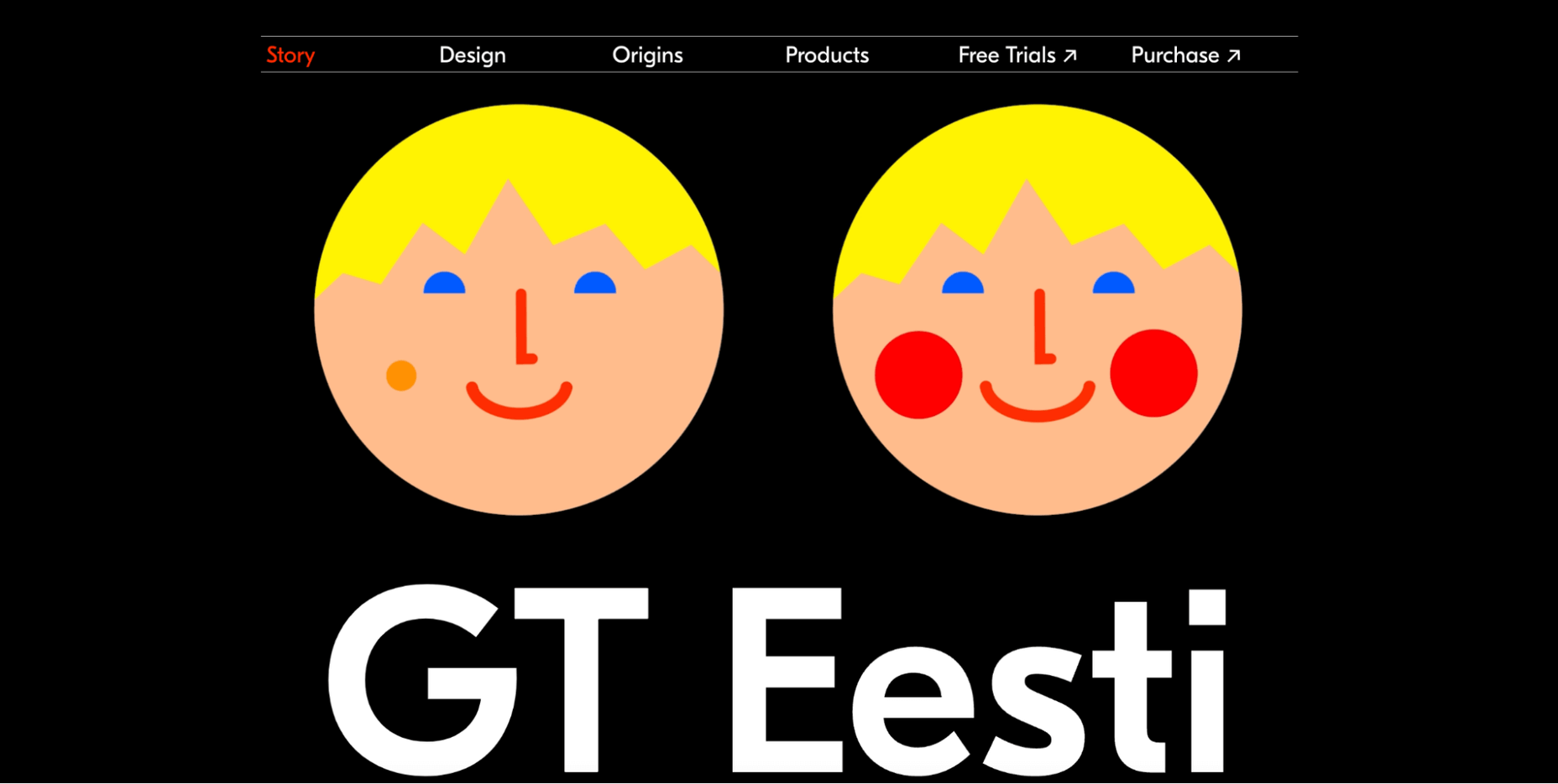
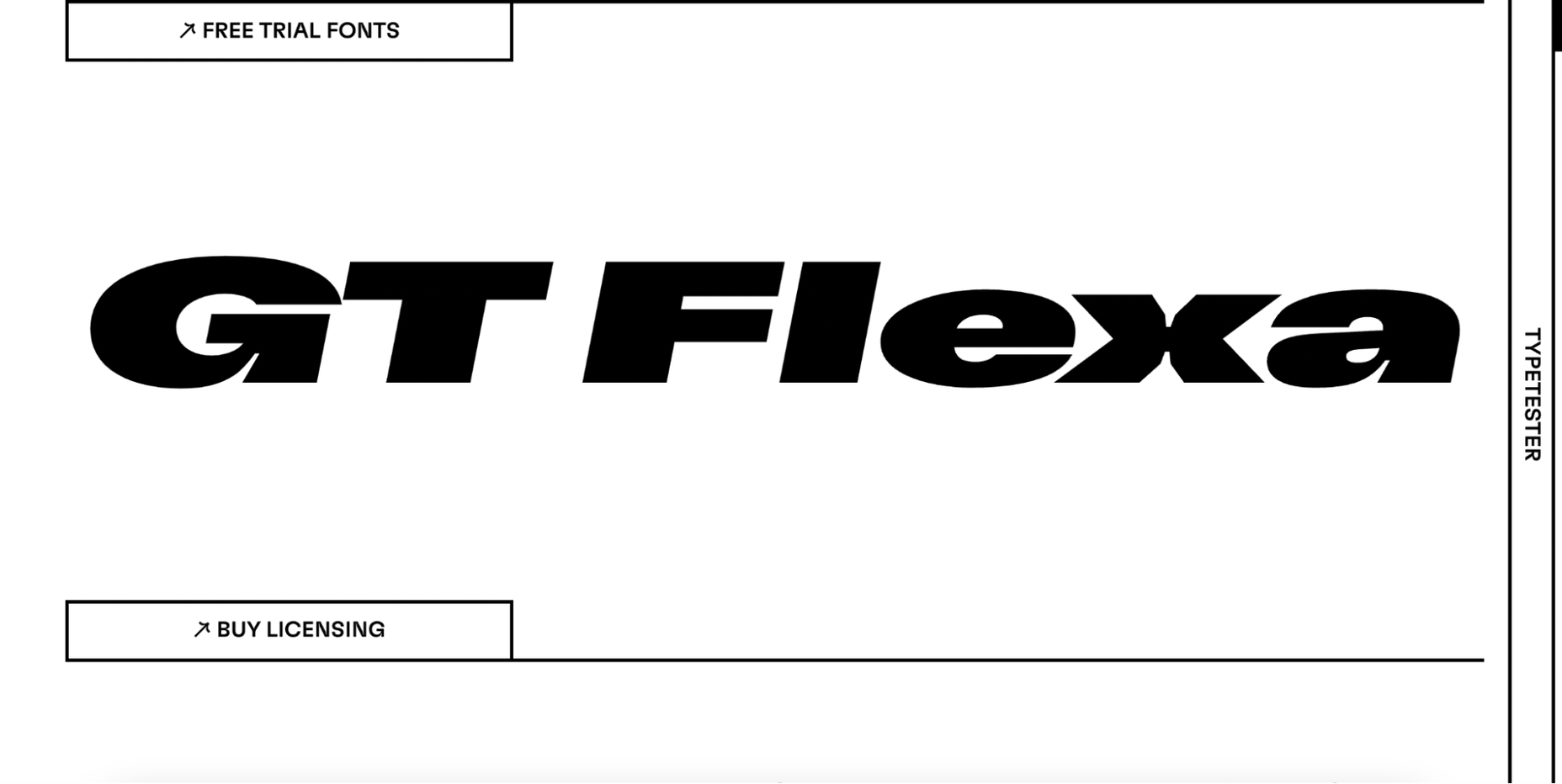
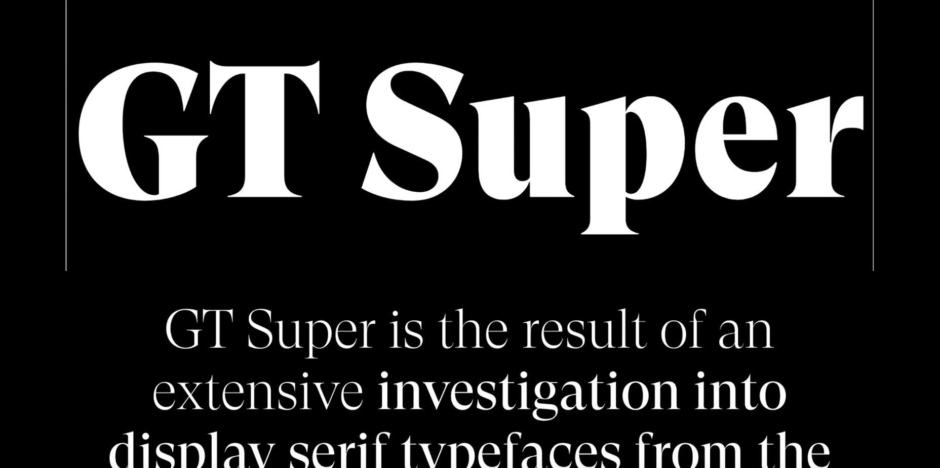
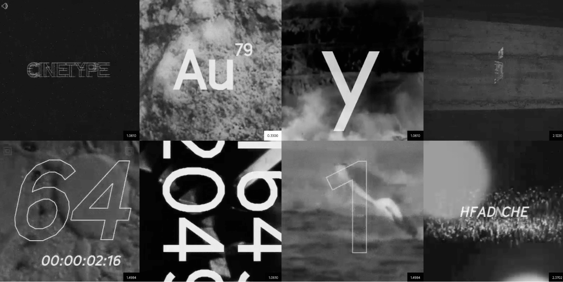
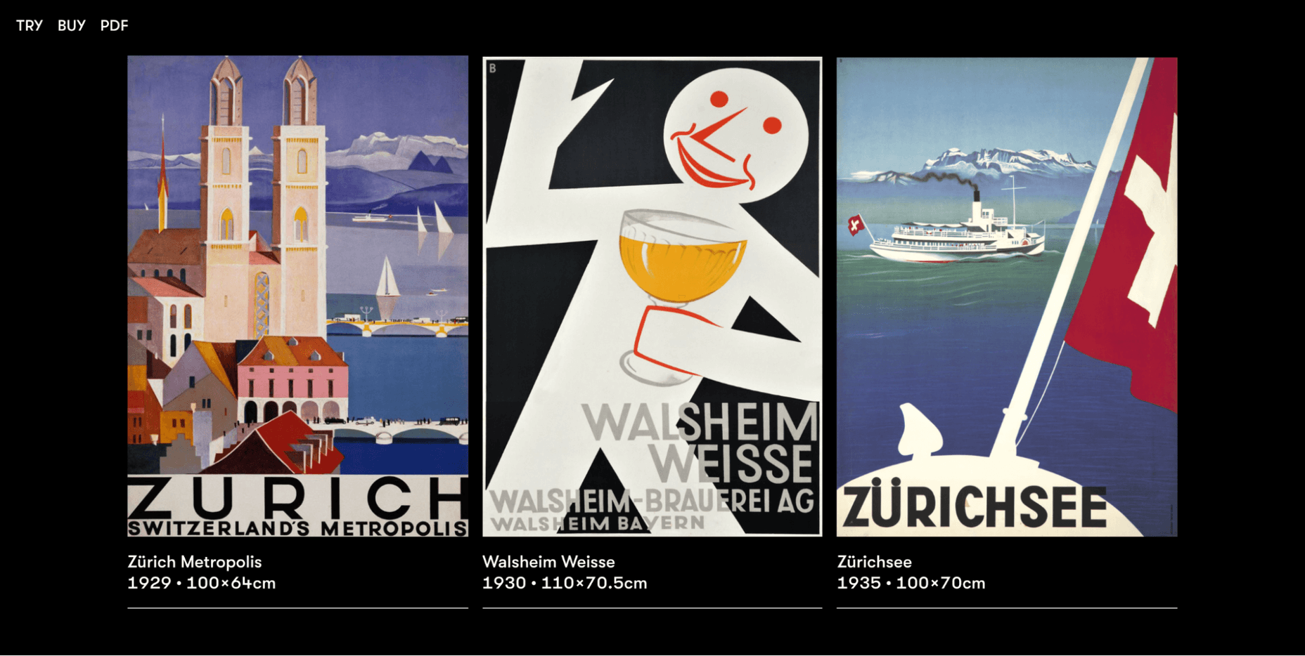
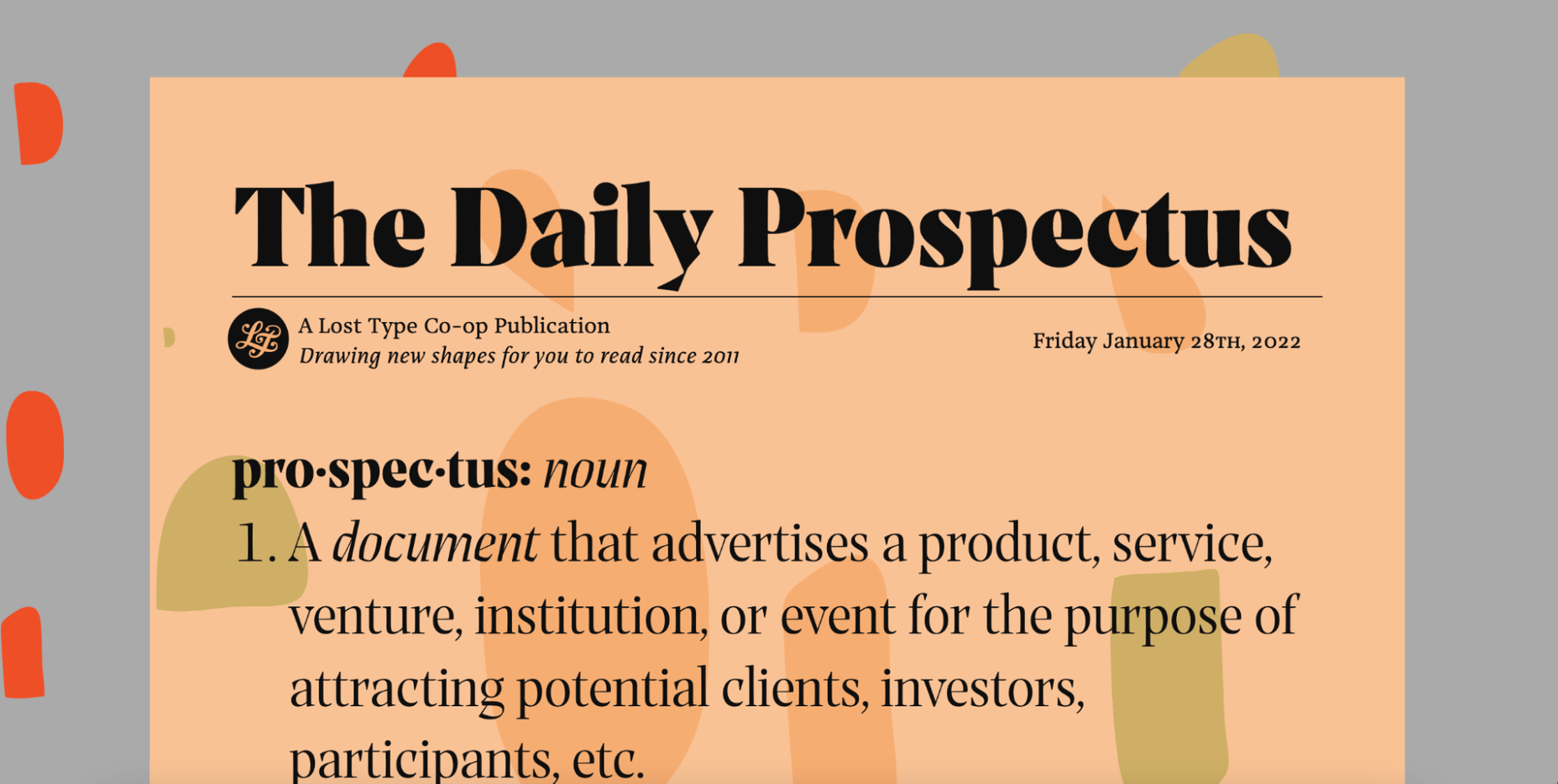
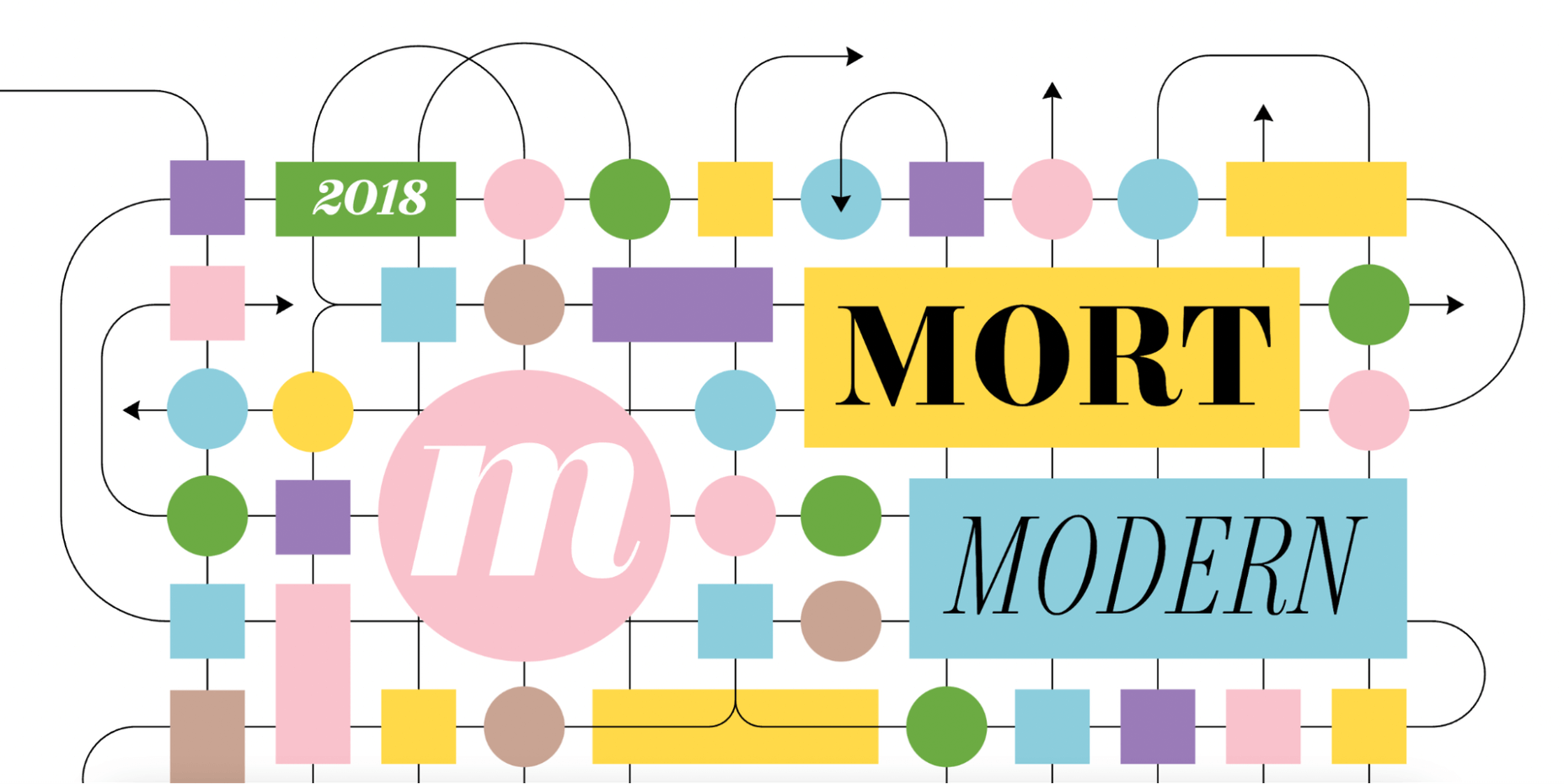

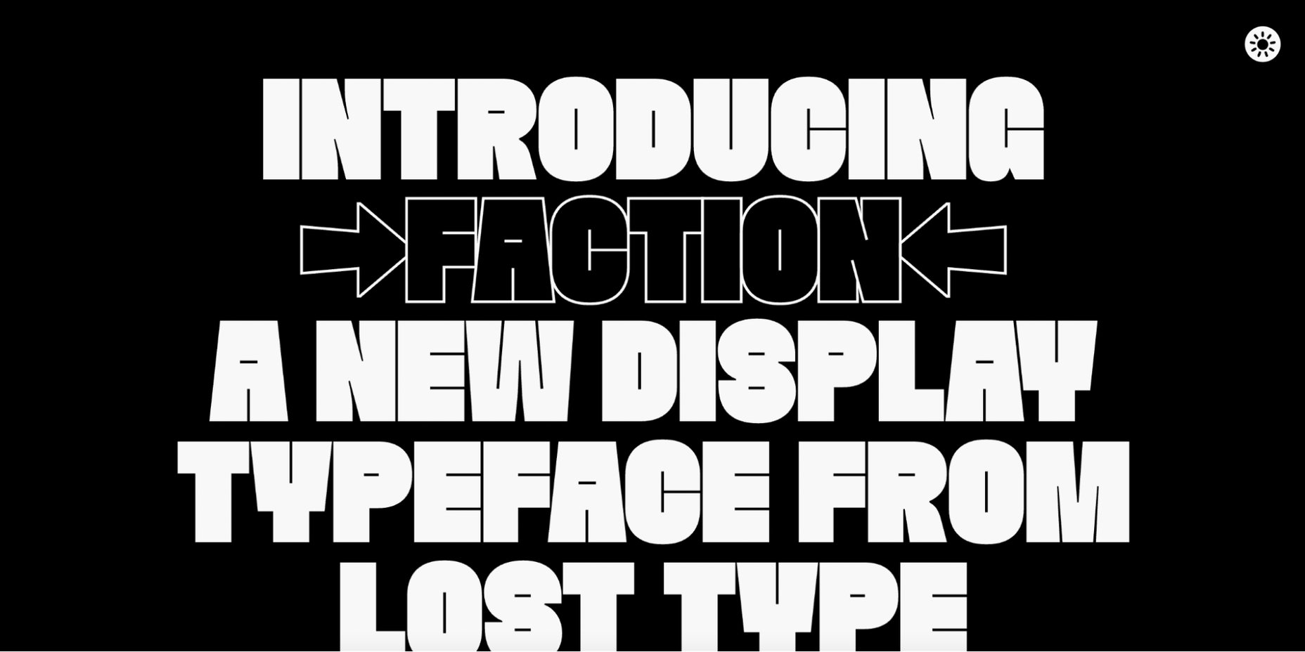
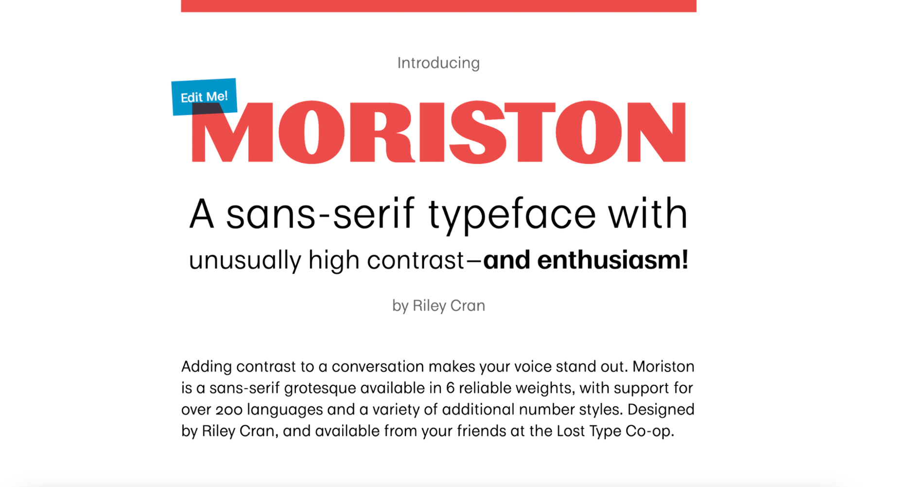
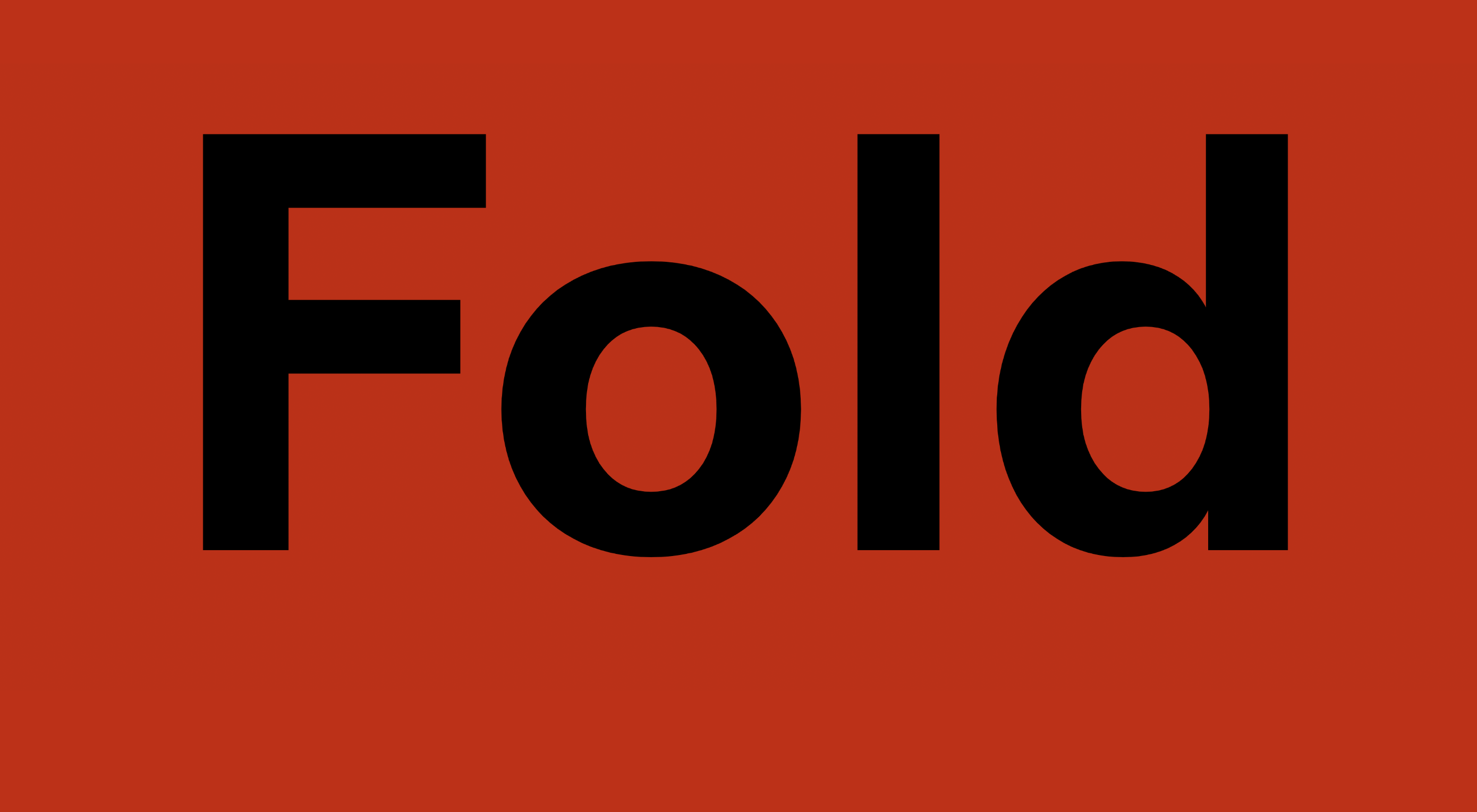
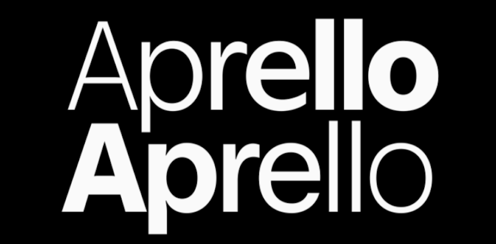
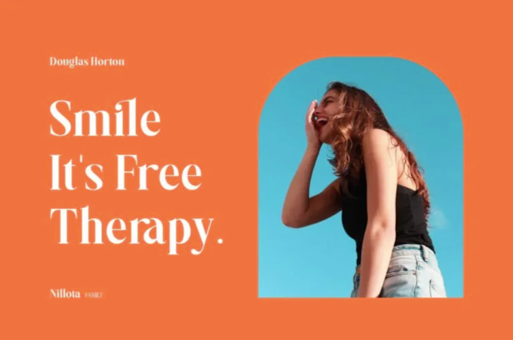
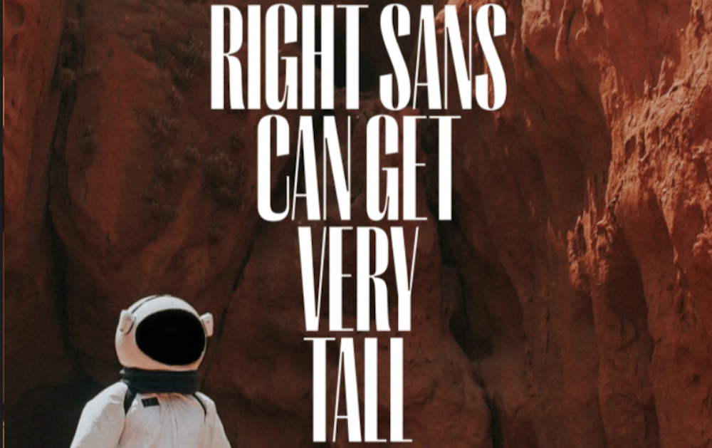
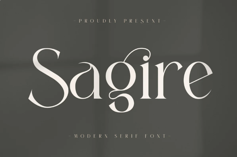
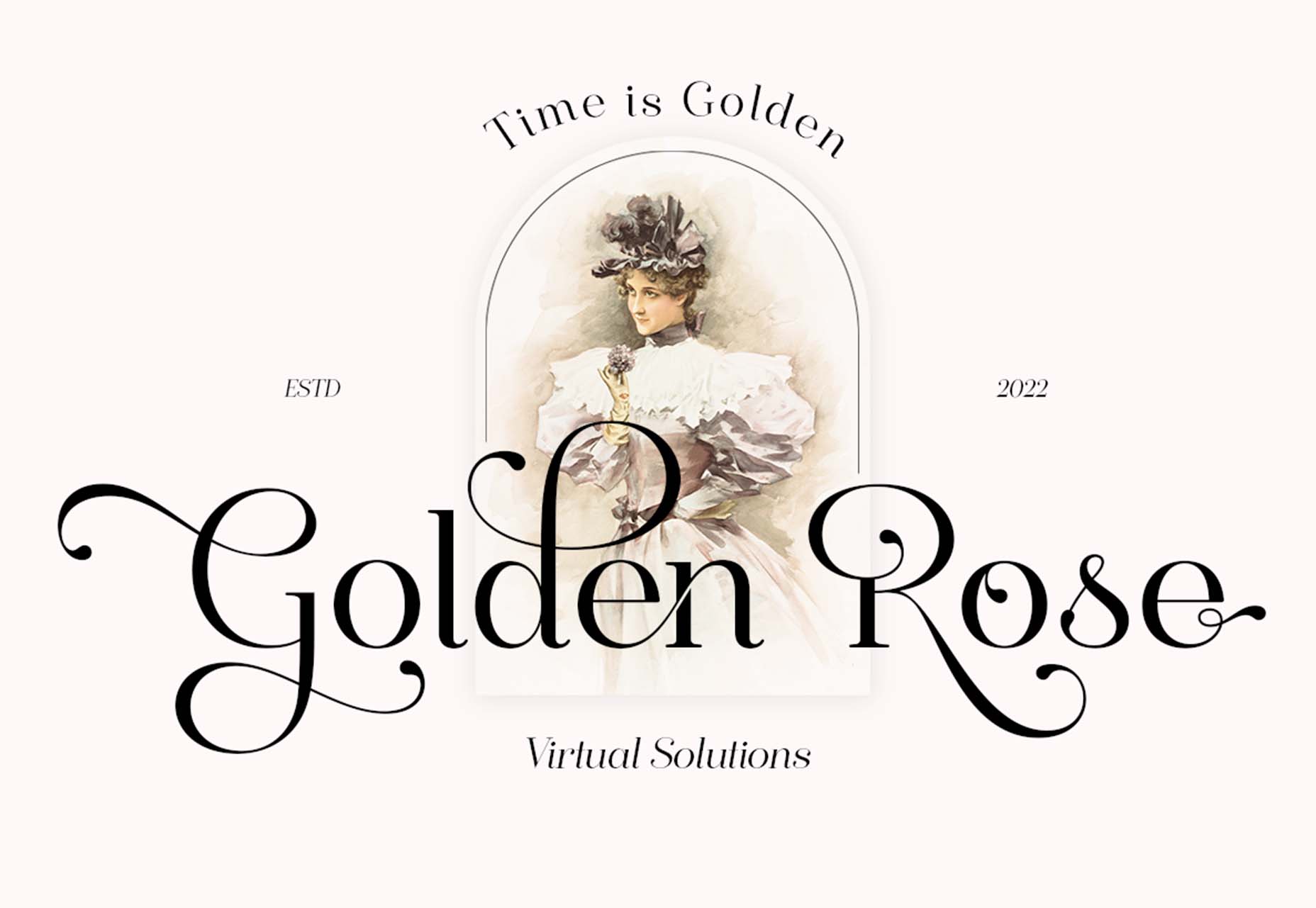
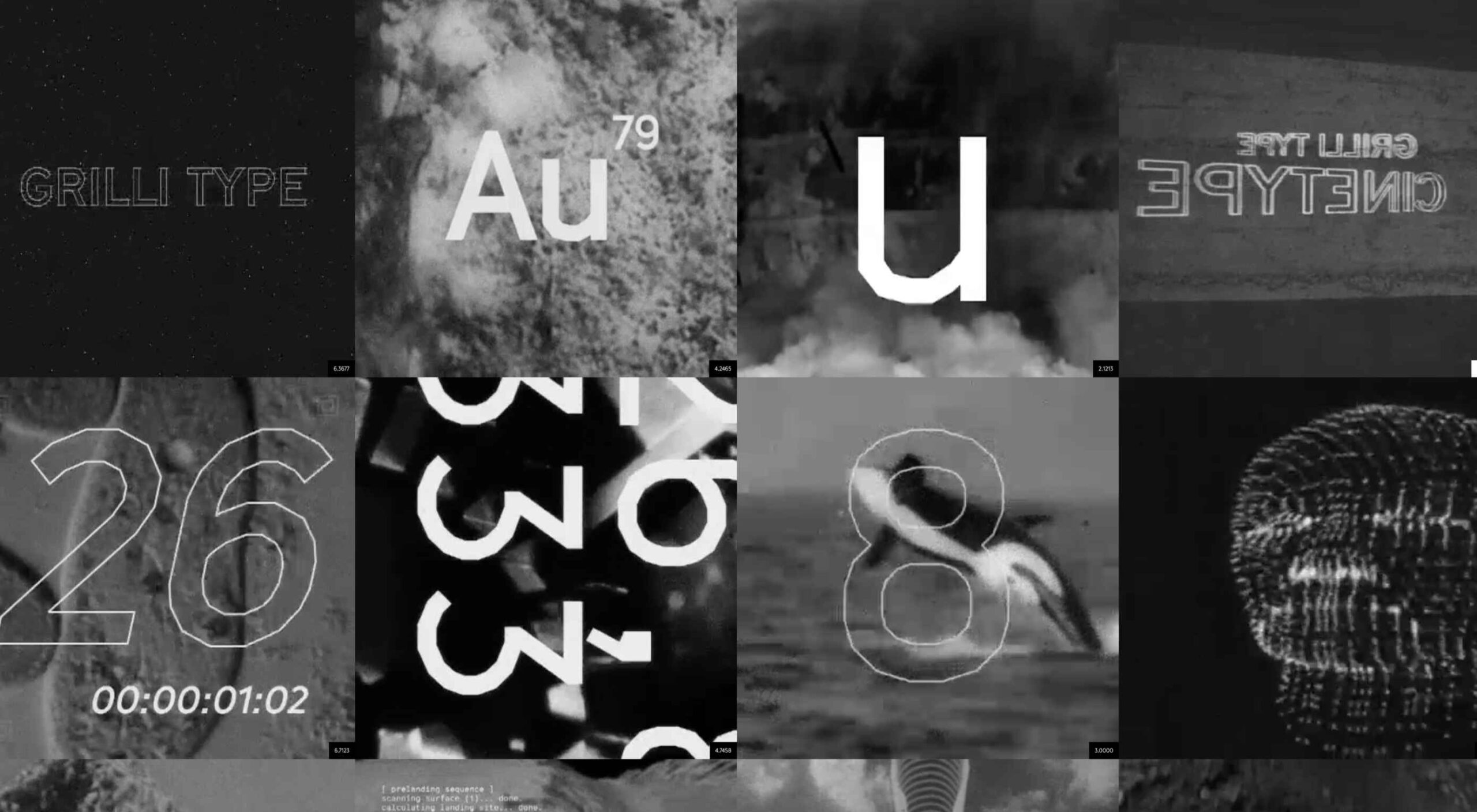
 Type foundries have been putting out some really interesting fonts these last few months. Based on the collection of the best new fonts for February 2022, it looks like we’re going to see lots of throwbacks to the ‘70s in the coming year.


