Articles

The term “web design” refers to the process of planning, organizing, and editing content online. On the surface, it seems like a simple enough concept. However, the reality is what we consider “web design” can change over time, influenced by our perception of the “web.” 

In 2022, a professional web designer might create custom websites from scratch, but they may also be responsible for: 

  • UX Design: Creating elements focused on user experience
  • App design: Building digital components of a website or online experience.
  • Theme design: Creating visual tools for supplementing web design. 

Web design isn’t just about making a site look attractive anymore. The definition goes beyond the aesthetic to include a complete consideration of the functionality, performance, and abilities of countless assets we engage within the digital world.

What is Web Design? The Definition Today

Web design is the practice responsible for creating a website’s overall look and feel or web asset (such as web and mobile apps). It involves the process of planning and building elements of your project, from structure and layout choices to graphics and presentation. 

Web design has various components that work together to create the final “experience” of a website, including graphic design, interface design, user experience design, search engine optimization, content creation, etc. These elements determine how a web asset looks, feels and performs on various devices. 

Though the definition of web design in 2022 has evolved, it’s still different from web development, which refers to the actual coding which makes a website work. When you’re building a website, you’ll need web design and web development. 

Elements of Web Design in 2022 

When designing a website, modern designers need to consider two overlapping concepts: the overall appearance of the website and its functionality. The proper connection between these elements will maximize the site’s overall performance and usability, and make a design more memorable (for all of the right reasons). 

Let’s break down the elements of web design into its visual and functional components.

Visual Elements of Web Design

Visual elements of web design influence how a design looks. The various visual components of a design should still follow the basic principles of graphic design. In other words, designers should be thinking about contrast, balance, unity, and alignment simultaneously. The visual elements of web design include: 

  • Written copy and fonts: A website’s appearance and the text on the site often go hand in hand. Designers need to work together with content writers to ensure written copy makes sense structurally and uses the correct fonts for legibility. 
  • Colors: Colors for web design are usually chosen based on factors like color psychology, which demonstrates a color’s ability to affect how someone feels, and branding. Most brands have specific colors they use consistently throughout their visual assets; this helps create a sense of cohesion and unity in designs.
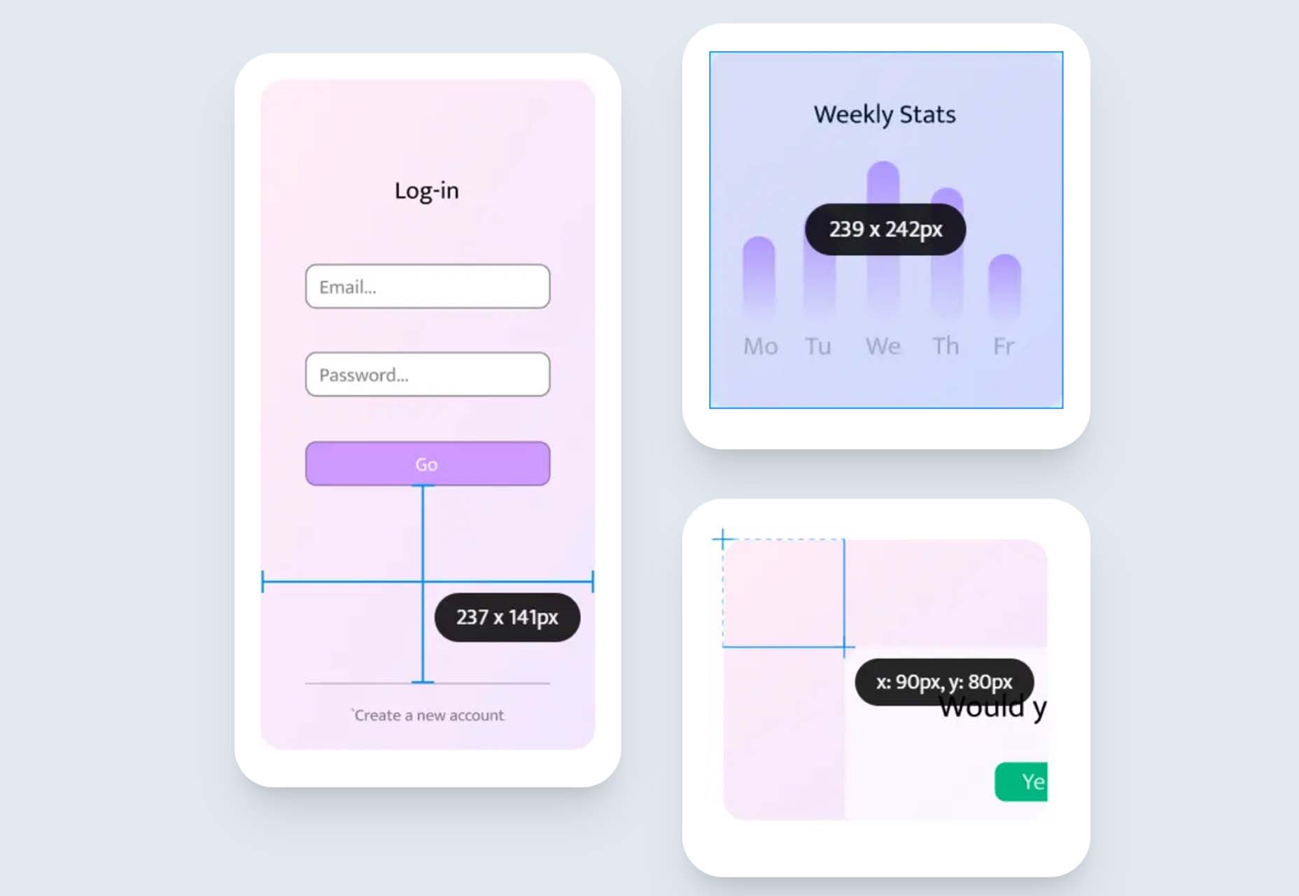
  • Layout and spacing: Layout and spacing influence how content is arranged in an app, website, or another visual asset. The right layout helps to create a visual hierarchy, guiding a viewer through a page and drawing their attention to the correct information in order. Spacing helps to separate components on a page and create legibility. 
  • Images, icons, and shapes: Images, icons, and shapes help convey significant amounts of information. The right ideas and icons can strengthen a brand message, direct a customer’s attention using a web app, and bring context to a design. 
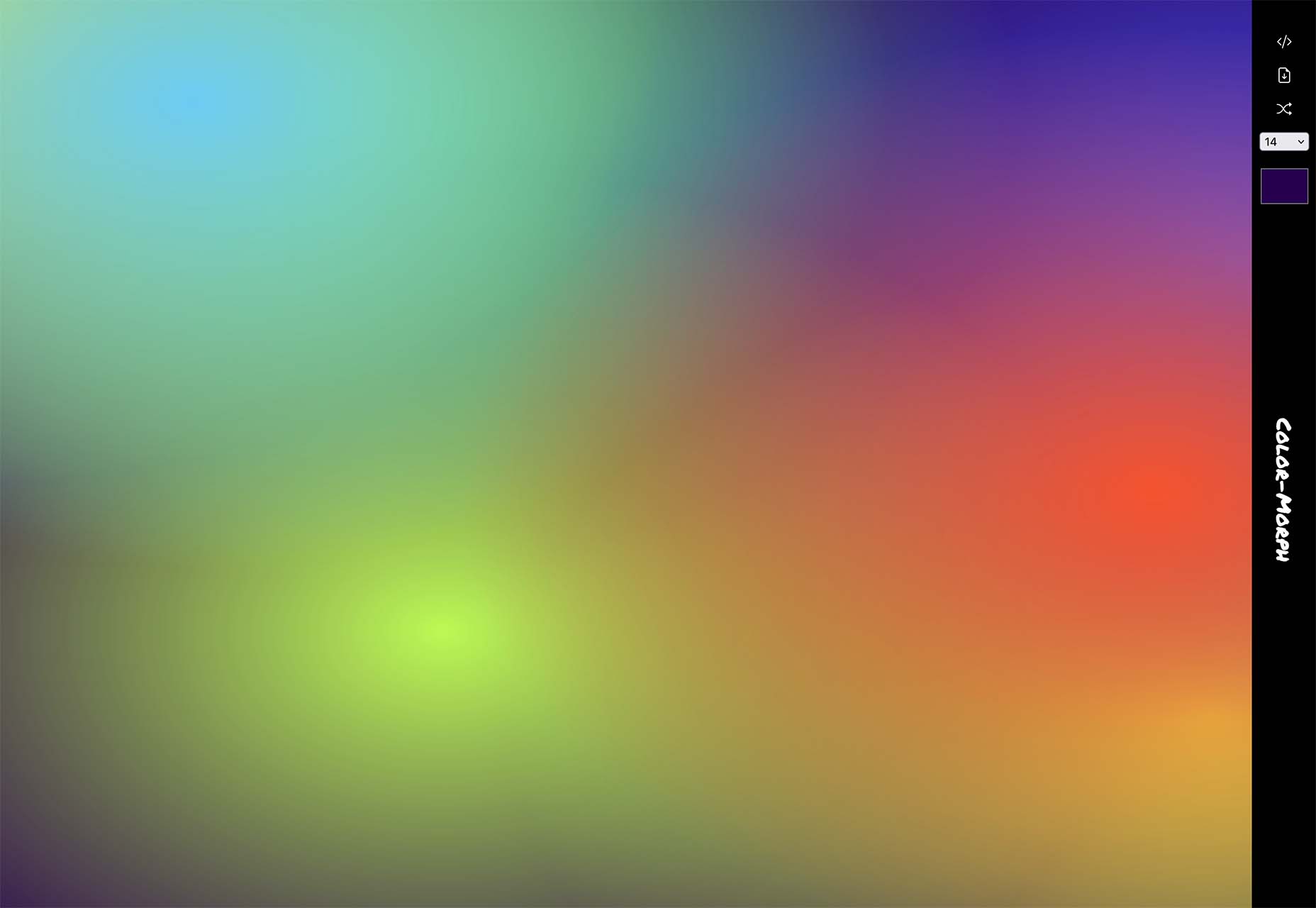
  • Videos and animations: Videos and animations are becoming increasingly common in today’s web design strategies. Videos can include 360-degree videos, which help immerse someone in a space, video streams, and short content clips.

Functional Elements of Web Design

Functional elements in web design are the practical components designers need to consider to ensure websites and assets work as they’re supposed to. A website, app, or any other web asset needs to function correctly to be accessible to users.

Functional elements of web design may include:

  • Navigation: The navigation elements of a website or app are among the main components determining whether a site is functioning properly and ensuring a good user experience. Audiences need to be able to move around the app or website quickly. 
  • User interactions: Your site visitors may have multiple ways of communicating with your web app or website, depending on their device. You’ll need to make sure people can scroll and swipe on smartphones and tablets and click on desktops. If your website has VR or AR elements, you’ll also need to consider these immersive components in your design.
  • Speed and performance: While web development elements can also influence a web design’s speed or performance, it’s also essential for a designer to show elements of the composition don’t weigh down the functionality. Designs need to load quickly and correspond with the demands of browsers on various devices.
  • Structure: A website’s structure plays a critical role in user experience and SEO requirements. Users need to easily navigate through a website without encountering any issues like getting lost or ending up on broken pages.
  • Compatibility: A good design should look perfect on all devices, from a wide range of browsers to the various devices users might leverage today. 

What Does Good Web Design Look Like in 2022?

More than ever, achieving high-quality web design is crucial to success in any industry or landscape. More than half of the world’s population is active online. If you’re not appealing to this audience correctly, you’re missing out on endless opportunities.

Notably, while elements of good web design can be subjective, such as which themes or colors someone might prefer for their website, the underlying foundations of strong web design are the same for everyone in 2022.  

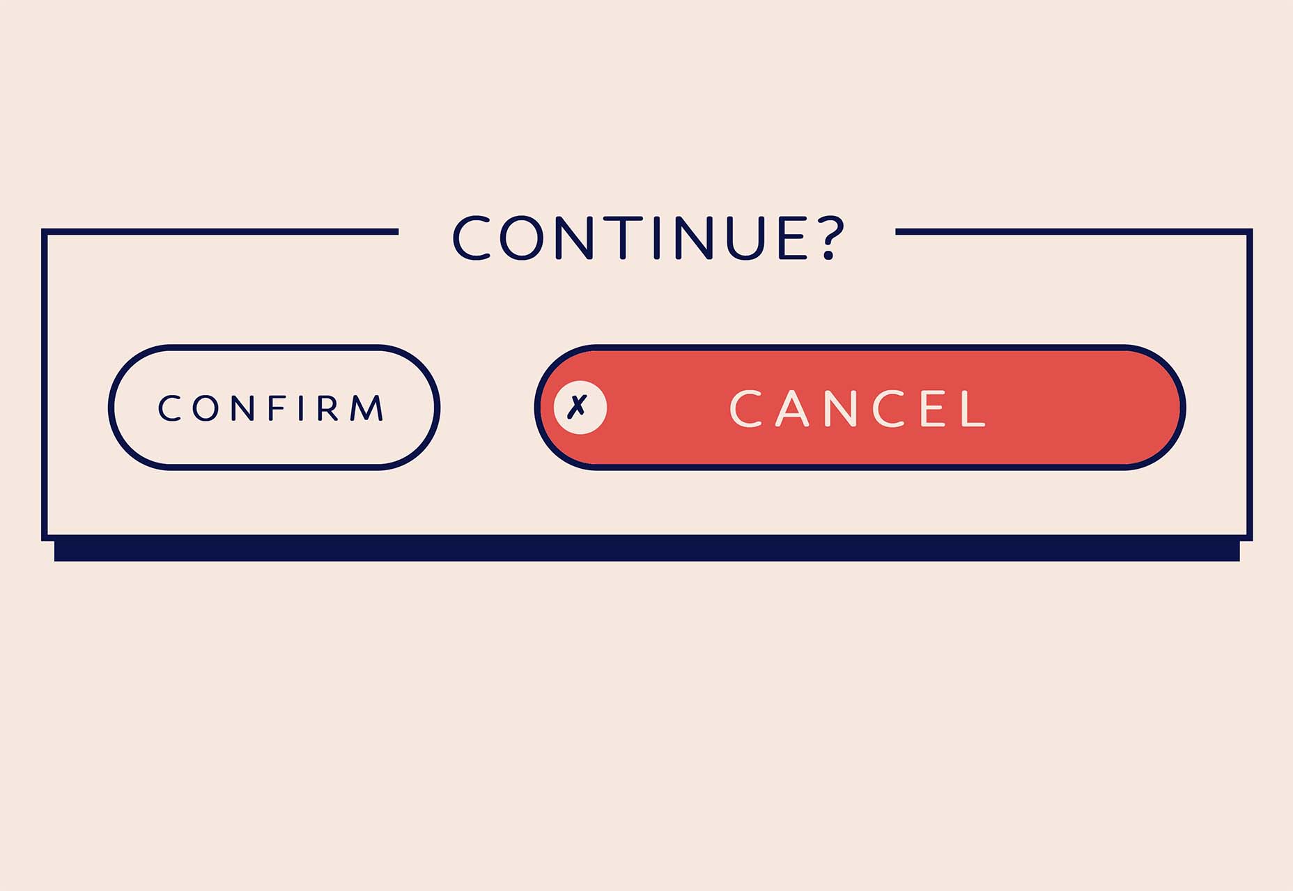
Good web design is any design that looks good, performs as it should, and delivers the best possible experience to your target audience. Effective web design should include components like:

  • Effective use of white space for organization and structure.
  • Clearly presented choices and navigation options for the user.
  • Clear calls to action to drive user activities from one page to another.
  • Limited distractions and a straightforward user journey. 
  • No clutter or unnecessary components irrelevant to the needs of the user. 
  • Responsive, flexible design accessible on any browser or device.
  • High-quality content and images are designed to hook a reader’s attention.
  • Appropriately sized fonts and legible typography.
  • A good balance between images and text on a page. 

Other elements like eye-catching imagery and professional photography can help your web design stand out. Using the right building blocks, like a strong color palette and the right shapes or icons in your design is helpful. 

Of course, there is some scope for variation in good web design. A web designer in 2022 needs to be able to adapt their use of the various essential elements of design to suit a specific target audience or the unique identity of a brand.

What Doesn’t Work for Web Design in 2022?

Just as web design elements seem to appear consistently in all excellent examples, there are also parts of web design we’ve left behind over the years. Simpler, more straightforward designs have replaced cluttered spaces, flashing images, and endless animations. 

The focus in 2022 is on creating an experience that’s simple, engaging, and intuitive, capable of speaking to the right audience without confusion or being visually overwhelming. In most cases, some of the top components to avoid include:

  • Clunky performance: Non-responsive website design, slow pages, and other examples of clunky functionality are a no-go in 2022. Websites need to be quick and responsive.
  • Distracting content: Flashing images, animations, and complex backgrounds are a thing of the past for a good reason. Websites today need to be clean, simple, and clear. Any elements which don’t add to the value of the design should be removed.
  • Generic content: Filler text, irrelevant stock photos, unclear buttons, and links can be removed from today’s website designs. A web design should be specific to the audience’s needs and the brand’s identity. Generic components don’t work.

Creating Web Designs in 2022

Today, the underlying definition of web design has a lot of similarities to the definition we’ve known for several years already. Creating a great website or web asset still requires focusing on user experience, aesthetic appeal, and functionality. However, today’s web designers generally have more components and different devices. 

Web design in 2022 is about creating high-quality experiences for customers that can support various environments and devices. The best web designs are aesthetically appealing, functionally reliable, and capable of adhering to the latest trends in web creation, like augmented reality, 360-degree video, and ultra-high resolution. 


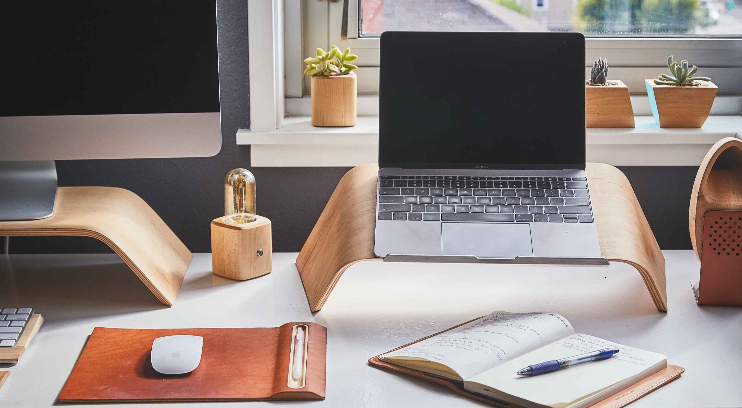
Featured image via Pexels.

Source

The post What Even Is Web Design in 2022? first appeared on Webdesigner Depot.

Source de l’article sur Webdesignerdepot

A combination of AWS Lambda and Amazon API Gateway is a widely-used architecture for serverless microservices and API-based solutions. They enable developers to focus on their applications, instead of spending time provisioning and managing servers.

API Gateway is a feature-rich offering that includes support for different API types (HTTP, REST, WebSocket), multiple authentication schemes, API versioning, canary deployments, and much more! However, if your requirements are simpler and all you need is an HTTP(S) endpoint for your Lambda function (for example, to serve as a webhook), you can use Lambda Function URLs! When you create a function URL, Lambda automatically generates a unique HTTP(S) endpoint that is dedicated to your Lambda function.

Source de l’article sur DZONE

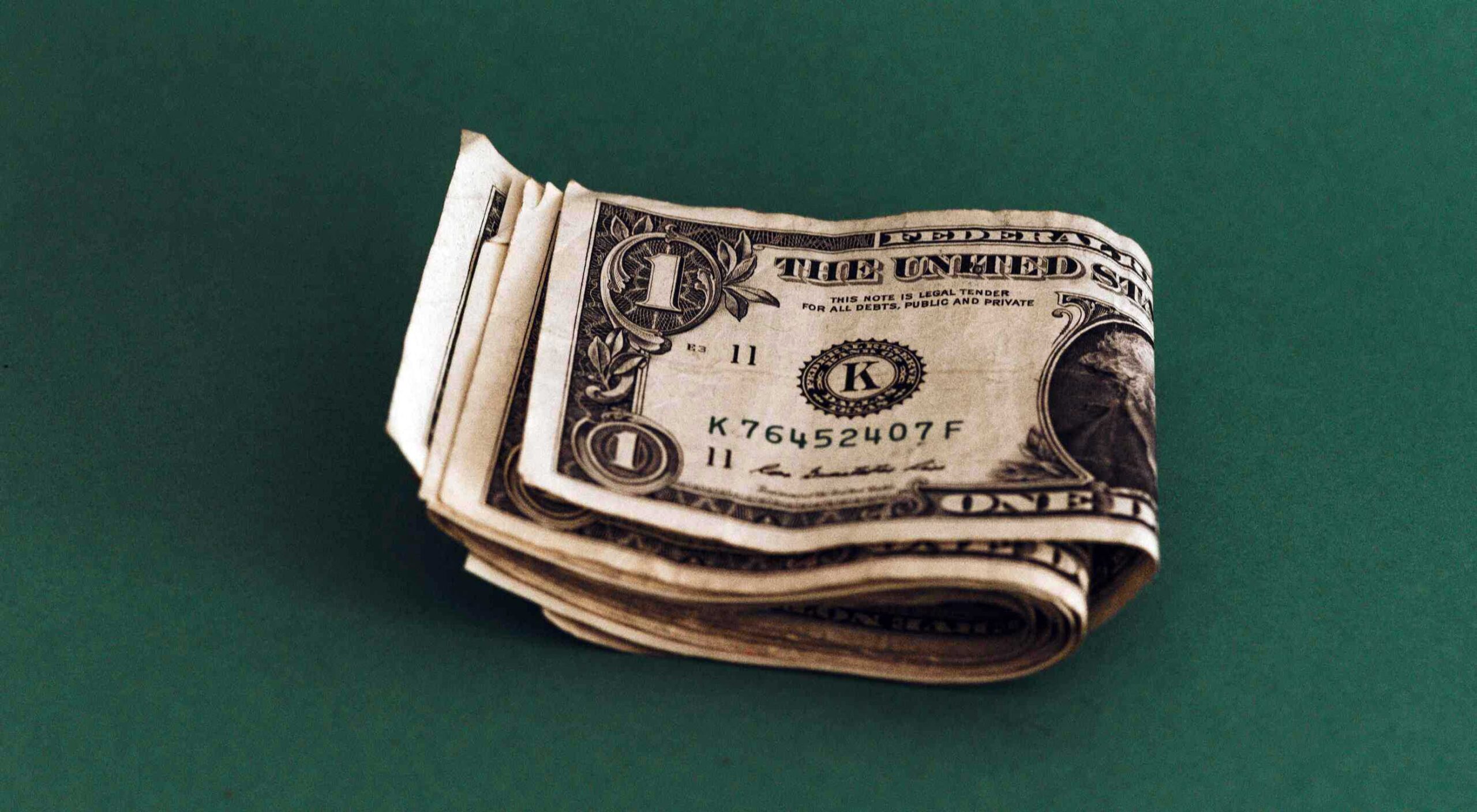
A career as a web designer can be extremely lucrative. The average web designer in the US makes around $50-55,000 per year, equating to an hourly rate of around $25. Of course, not every designer will automatically get a full-time, high-paying job as soon as they earn their web design credentials.

Sometimes, you might need to generate a little extra cash, perhaps to supplement your part-time income or keep the lights on while you’re taking some new courses. You can even use your web design skills to earn some extra money on the side while working a standard 9-to-5.

Today, we will be looking at some of the most effective ways to make extra cash on your web design skills.

1. Freelance

Starting with the simplest option, working as a freelancer is one of the best ways to start making cash with your design skills. There are dozens of websites out there to help freelancers find clients these days. Some of the best options include:

  • Toptal: For web developers, designers, and software experts;
  • Upwork: For all kinds of design freelancing;
  • 99Designs: Excellent for selling your designs whenever you like;
  • Dribbble: Display your work and find new clients;
  • Behance: Sell everything from animations to videos;
  • Envato Studio: Sell packages for web design.

As a freelancer, you’ll be able to choose which hours you want to work, and which projects to work on. You can make money from all kinds of design skills this way, from making pages for a website to designing widgets and applications.

However, you’ll also be responsible for tracking down potential leads, building your portfolio, and managing your own taxes, so keep this in mind.

2. Sell Design Assets

As a web design professional, you’ll end up with a lot of assets over the years. Whether you’re working freelance or full-time, not every asset you create is going to be picked up by your customers. Sometimes, you’ll end up with unused content sitting on your computer.

Fortunately, you can leverage these assets for some extra cash. You can sell things like icons, backgrounds, UI assets, and more. You can even sell themes on sites like ThemeForest if you’ve built something your clients weren’t happy with.

There’s a market out there for just about every asset, from icons and PSD templates to documents, fonts, UI assets, backgrounds, and brushes. You might even build your own website where you can sell assets in the future.

3. Design and Sell NFTs

Feel like getting in on the cutting-edge of a new marketplace? NFTs are probably one of the hottest topics in the digital world today. As concepts like Web 3.0 and the metaverse gain traction, NFTs will only become more valuable.

Countless companies and innovators are looking for people to design their NFTs for them these days. If you don’t mind dedicating some of your free time to creating digital graphics, you’re in for a significant amount of earning potential.

If you learn enough about the NFT landscape and blockchain, you could even create your own NFTs. However, this would probably require a lot of time and research. You can learn more about the NFT design and art landscape here.

4. Become a Consultant

Don’t have time to build endless new websites right now? No problem, just help other people build their sites instead. Consultants are people in any industry with expertise and insights they can share to support other people. As a web design consultant, you can offer your expertise to other upcoming freelance designers or business leaders.

You’ll need to invest some time into building your personal brand as a consultant. This means developing your social media pages (like LinkedIn) and creating a portfolio. It also helps to have an air of thought leadership. This usually means you’ll need to share at least some content online.

Consulting can be an excellent way to share your skills with other people without having to do all the work of building a design course.

5. Teach Web Design

On the other hand, if you like the idea of being a teacher, you can make money almost passively with web design courses and webinars these days. While you do have the option of selling one-on-one education to students, this will usually take up a lot of your time.

If your focus right now is on a side hustle to increase your earnings, it’s often much easier to use a site like Udemy or Skillshare. The great thing about teaching web design these days, it’s much easier than you might expect. The majority of solutions on the web allow you to drip content to your clients automatically. This means you only have to create the content once.

You can create a handful of videos, quizzes, and downloadable assets, and make money off your educational resources while you sleep.

6. Create a Web Design Blog

Blogging is still a surprisingly lucrative way to make money. If you have a creative streak and you know how to write about web design in a way other people can understand, you can turn this into an excellent side hustle.

Start by building your own website using your design skills, then start publishing regular blogs with the content you know your customers would be interested in. It’s a good idea to cover a range of topics, from Photoshop, to how to design widgets and more. You can even share reviews of various web design tools and add affiliate links to earn money that way.

Make sure you use SEO strategies to improve your chances of customers actually seeing your blog and promote your content as often as you can across social media. Once you have your blog, you can make money from it by:

  • Working as an affiliate and promoting design products;
  • Showing banner ads or sponsored posts on your website;
  • Selling digital products through your blog (like themes).

If you decide to take the affiliate route, here are some excellent programs to consider.

7. Contribute to other Websites

If you don’t have time to launch your own website and build a following for your blog, you can still make money from writing in other ways. Becoming a freelance web design writer means you can sell your blogs and content to other leading publications.

Many popular websites are constantly looking for new content to add to their blog. If you develop a strong relationship with some of these site owners, you could get yourself a regular gig.

Contributing to other sites as a writer helps you to develop your thought leadership. Many companies will even allow you to link back to your social media pages or profile.

At the same time, you get to earn some extra money writing about things you enjoy.

8. Sell Themes and Templates

A lot of web designers today rely on other themes and templates created for WordPress to help them build their websites. Access to themes and templates can make building a new website a much easier, straightforward process.

If you’ve got some excellent coding prowess, you can develop and sell a host of website themes and templates, and sell them wherever you choose. As mentioned above, there are a number of websites available for selling web design assets. Alternatively, you can sell your own packages and templates on your website, depending on your needs.

If you create a particularly valuable theme, you can actually earn a full-time passive income over time. Placing your themes and templates on marketplace sites will also get you a lot of attention from potential clients in the future.

9. Flip Websites

If you’ve ever seen one of those shows where someone buys a house, makes it look great, and then sells it for a higher price, you’ll understand the basic premise of flipping websites. The idea is to purchase an existing website for a low price (preferably with a good domain name), then fix it up to sell on a website selling directory.

If you want to earn a decent amount of money for your website, you’ll need to dedicate a decent amount of time to building traffic, improving the appearance of the site, and so on. However, it can be fun to take on these projects in your free time if you’re looking for a way to hone your skills.

You might learn some important lessons about how to make websites more profitable while you’re flipping your various sites, which could make you more appealing to customers in the long term.

10. Write a Book

Similar to flipping websites or producing an income from a high-traffic blog, writing a book isn’t something that’s going to give you a lot of extra income overnight. However, it can be an excellent source of passive income in time if you know how to use this strategy correctly.

If you have a specialist skill in web design, or you serve a specific niche, you can generate a lot of attention for an eBook or physical book sharing plenty of accurate and specific information. Remember, writing about web design, in general, will usually make it harder to earn money because there’s already a lot of competition out there.

Writing a book is a fantastic way to create a possible extra source of income as a side hustle, and it can also make you more credible if you decide to go full-time with your web design skills in the future. It’s definitely more impressive to present yourself to clients as a published author.

Remember to advertise your book whenever you can to improve your chances of additional sales.

Find Your Side Hustle

Web design skills are highly sought after in various parts of the digital world. If you’re willing to devote a little time and creativity to exploring the various avenues above, they can all deliver an excellent source of income to you and your potential business. All you need to do is figure out which side hustle makes the most sense for you.

Remember, there’s no one-size-fits-all. In some cases, you might even be able to run multiple side hustles at the same time, particularly if you’re using strategies for passive income, like writing your own book or selling your own course.


Featured image via Unsplash.

Source

The post Side Hustles for Web Design Professionals: How to Make Some Extra Cash first appeared on Webdesigner Depot.

Source de l’article sur Webdesignerdepot

The reasons Scrum Masters violate the spirit of the Scrum Guide are multi-faceted. Typical Scrum Master anti-patterns run from ill-suited personal traits to complacency to pursuing individual agendas to frustration with the team itself.

Read on and learn in this post on Scrum anti-patterns how you can identify if your Scrum Master needs support from the team.

Source de l’article sur DZONE

Designing for user experiences is what all designers do. UX is often thought of as the preserve of app or web designers; however, even a print designer laying out a magazine anticipates reader reaction to the scale of type, the placement of adverts, and the art direction of successive stories.

Because all designers design user experiences, the role of UX Designer has come to mean someone focused on creating a product or service utilizing research and testing to guide decision-making.

To research and test anything, you need metrics: a baseline and a target against which to measure. No one set of metrics is suitable for all projects, but because UX tends to be for financial profit, the Pirate Metrics Framework — Acquisition, Activation, Retention, Referral, Revenue — is a good starting place.

You might seek out very different metrics in some cases. For instance, a museum might measure the success of its education program based on how many students go on to study paleontology. However, those types of metrics are notoriously difficult to quantify. Excepting a few niche cases, successful UX increases user productivity, decreases errors, reduces the cost of support, and increases sales.

So if it’s as easy as counting dollars, why does UX go bad?

UX vs. Design Principles

To understand what UX is, you need to understand what UX is not.

One of the most straightforward design principles to understand is hierarchy: bigger is more important, i.e., a heading is visually stronger than a sub-heading, a sub-heading is visually stronger than the body text.

Design principles stem from one thing: human-centered design. At the most basic level, bigger is more important because the bigger a saber-toothed tiger appears, the more likely it intends to eat me.

The evolution of human beings is so slow that had a smartphone existed at the time, a neanderthal would have been able to tap a button with the same level of precision as me. Prehistoric man shares the same minimum button size as modern man: 48 x 48px. Design principles don’t change, don’t require research, and don’t need verifying with tests.

On the other hand, a neanderthal would not have understood a smartphone, let alone an app. You only need to step back by a single generation to find perfectly intelligent people baffled by a commonly employed design pattern.

Unlike design principles, user experience is a house built on sand. When the sand shifts, the walls crack. The bricks are still solid, but the rain gets in.

Because effective UX is temporary, so is the ROI.

Technology Breaks UX

Technology unfolds at a rapid pace. As technology develops, the user experience defined by that technology changes.

The classic example is the mobile revolution, but technological change does not necessarily mean hardware. One of the most significant shifts in UXD (User Experience Design) in my career has been the popularisation of AJAX — the process of using JavaScript to load new data without refreshing the page. This seamlessness has been around since the early 2000s, but it’s only in the last ten years, as the code to achieve it has simplified, that it’s been widely used.

Jakob’s Law states that users spend most of their time on other sites and, as a result, prefer your site to function like other sites by following familiar design patterns.

Even if your UX is rigorously tested and optimized, when other sites and services carry out their own research, they are testing against the background of younger technology, and the “other sites” Jakob Nielsen refers to begin to change. As a result, the UX of your site is gradually eroded.

The consequence of continual technological change is that user research is constantly invalidated. The UX of an app, site, or service begins to degrade as soon as it is created.

User-Experience Lifecycle

Human beings have two deep-seated motivations: survival and procreation. The most important, survival, depends on discovery — new food sources, new routes through dangerous territory, new ways to skin a mammoth. We are biologically programmed to seek out the new.

A typical user passes through three phases of a relationship with a site, app, or service: discovery > comfort > boredom. Churn, or drop-off, tends to occur in the discovery phase (if the comfort phase is too slow in developing) or the boredom phase. The sweet spot is the comfort phase. That’s the part of the business-customer relationship in which the customer requires minimal support and is least likely to drop off.

The most effective form of UX — meaning the one that satisfies most metrics — rapidly moves a user from discovery to comfort and then continually eases the user back to the start of the comfort phase without tipping back into discovery.

This can be achieved with numerous micro-discoveries, tiny chunks of new experience, from simple functionality tweaks to style revisions.

Summary

All UXD, regardless of the quality, level of investment, and skill of the practitioner, begins to degrade the moment it is created.

Design principles like simplicity are good indicators of successful UID (User Interface Design) and are timeless; comprehensive design systems, brand assets, and content offer good ROI.

The most effective UX is broadly familiar and continually refreshed in small ways, allowing users to enjoy the comfort of the familiar while also experiencing the excitement of discovery again and again.


Featured image uses photos by Wolfgang Hasselmann & Shainee Fernando.

Source

The post When UX Goes Bad (and How to Fix It) first appeared on Webdesigner Depot.

Source de l’article sur Webdesignerdepot

Ask any seasoned web app developer about their choice of programming language, and they are sure to mention PHP. PHP is a widely-used general-purpose scripting language that is especially suited for Web development and can be embedded into HTML. As per Builtwith, 3,090,319 live websites are still using PHP. However, when it comes to developing massive projects without lag or stability issues, developers tend to use frameworks, and PHP has two remarkable frameworks: 1) Laravel and 2) Yii. Both frameworks have a lot of followers in terms of full-grown communities globally, and there may be questions arising about which to choose.

What Are Laravel and Yii?

Laravel is a simple PHP framework frequently used for web-based or web application development initially created as a better alternative to Codeigniter. It is known for MVC Support, articulated ORM systems, reliability, modularity, and uncomplicated coding rules. Some of the key features of Laravel Framework are:

Source de l’article sur DZONE

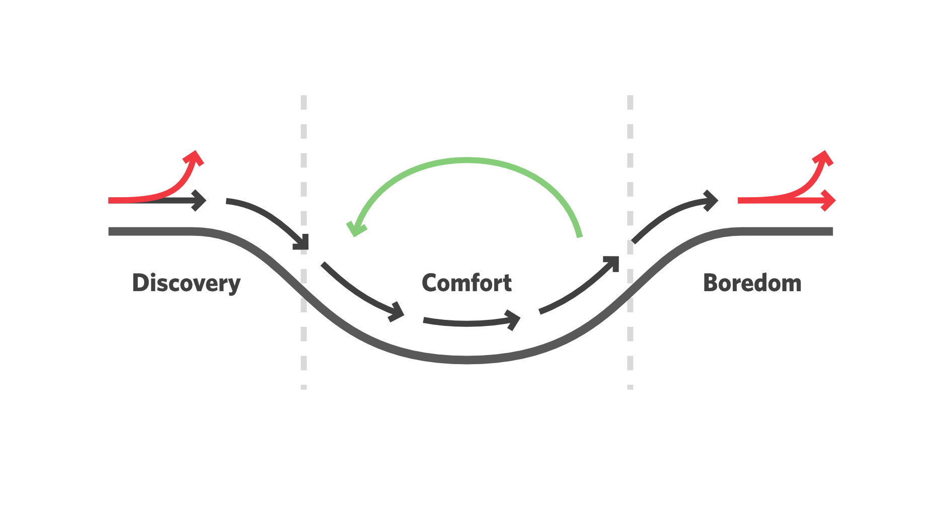
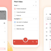
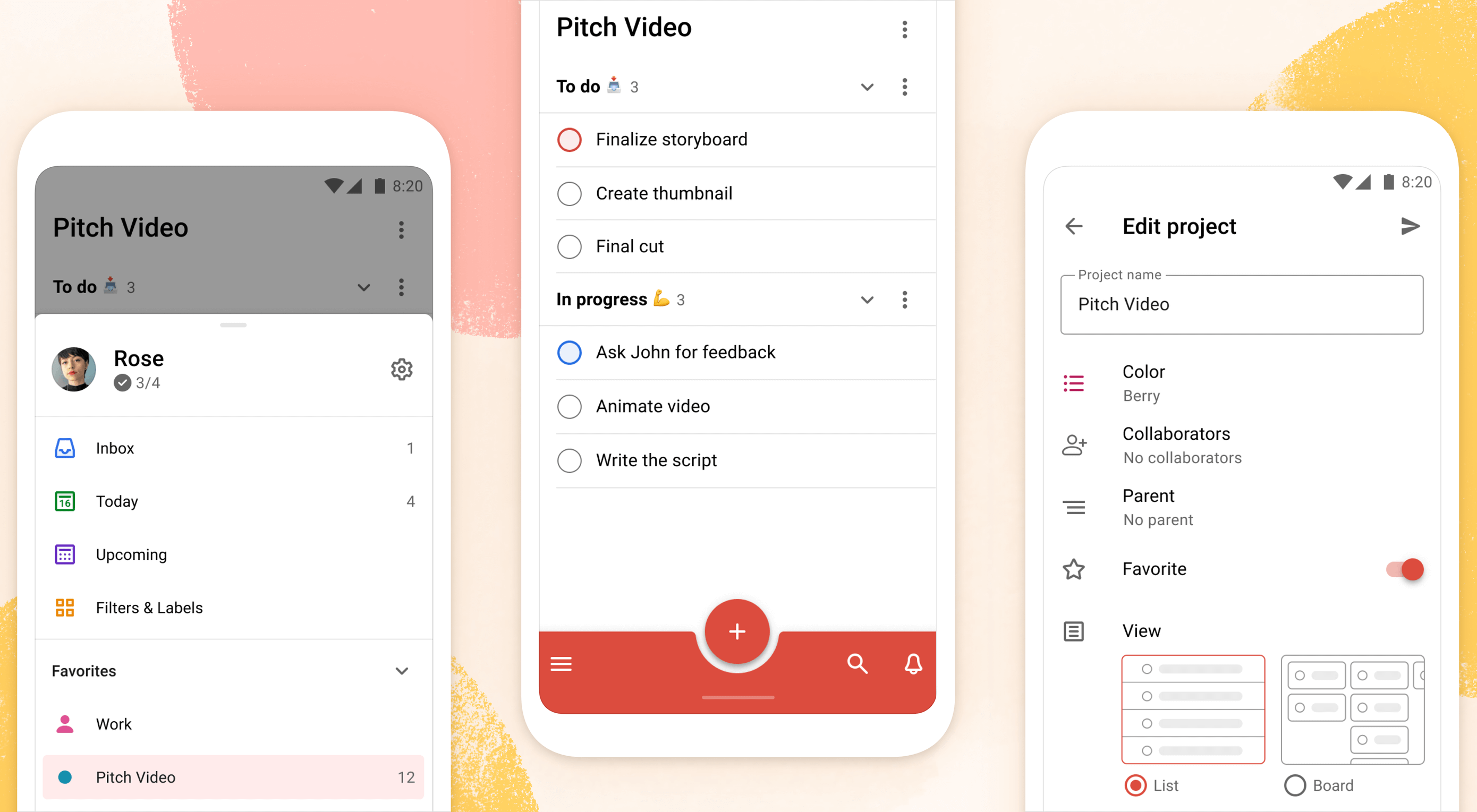
Todoist is a to-do list app that 25 million people rely on every day to keep their lives organized. As part of the Doist design team’s goals for 2021, we aimed to redesign the Todoist Android app to take advantage of the latest Google Material Design guidelines.
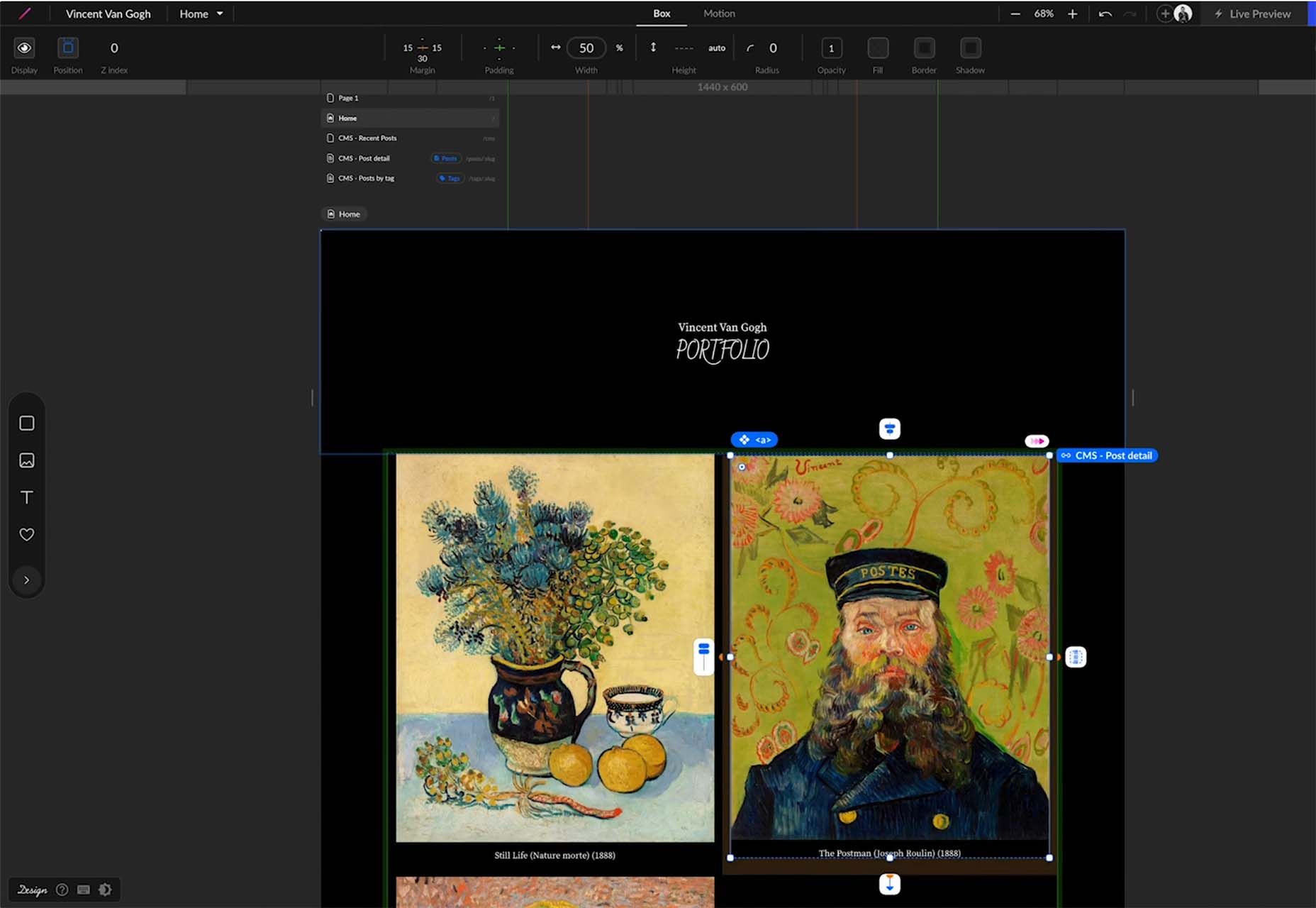
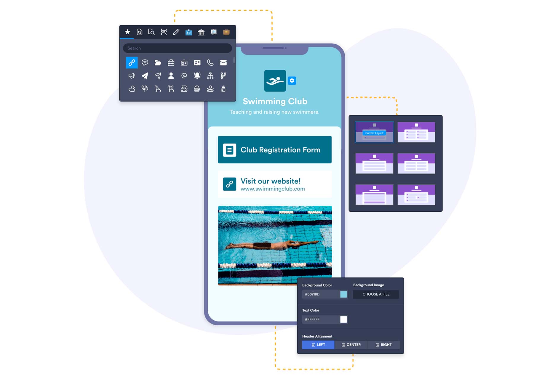
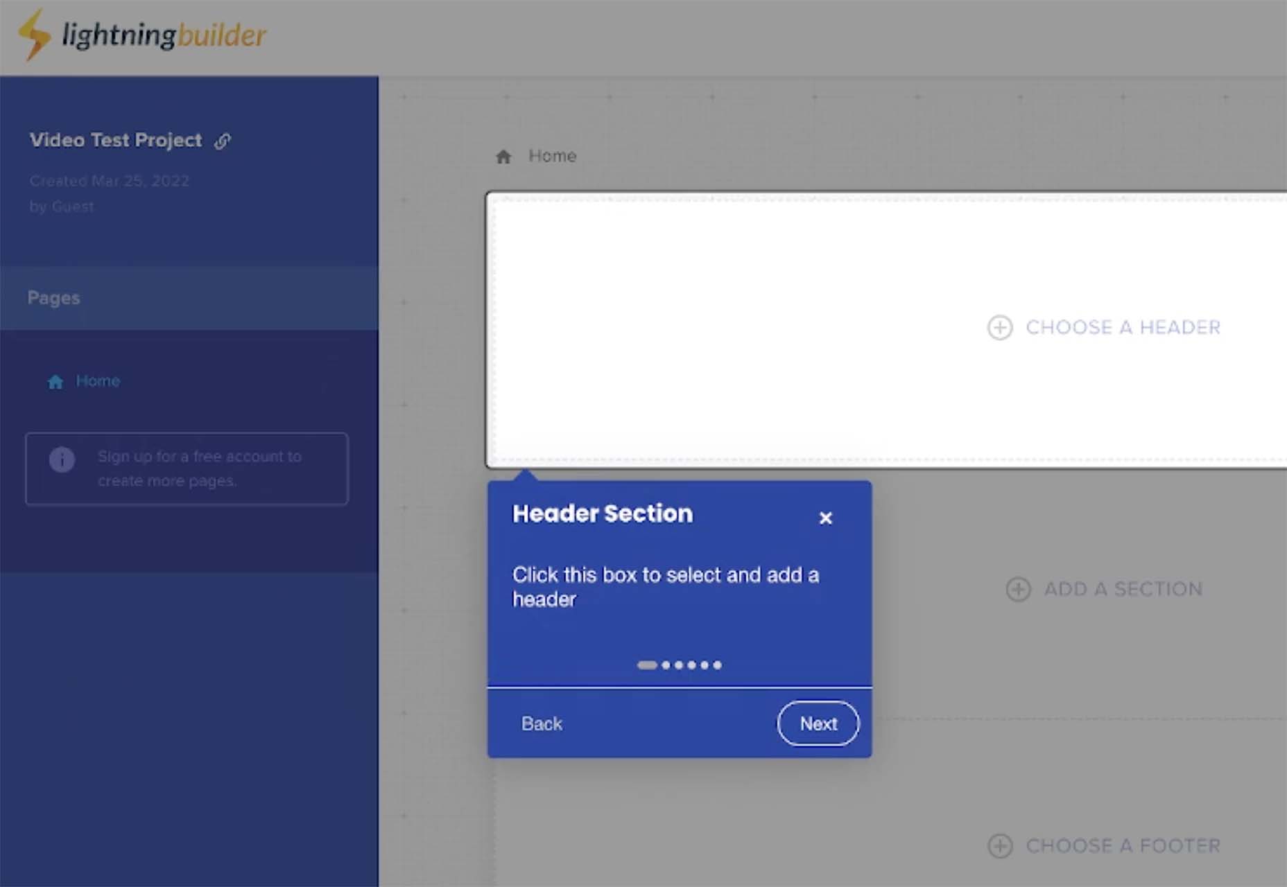
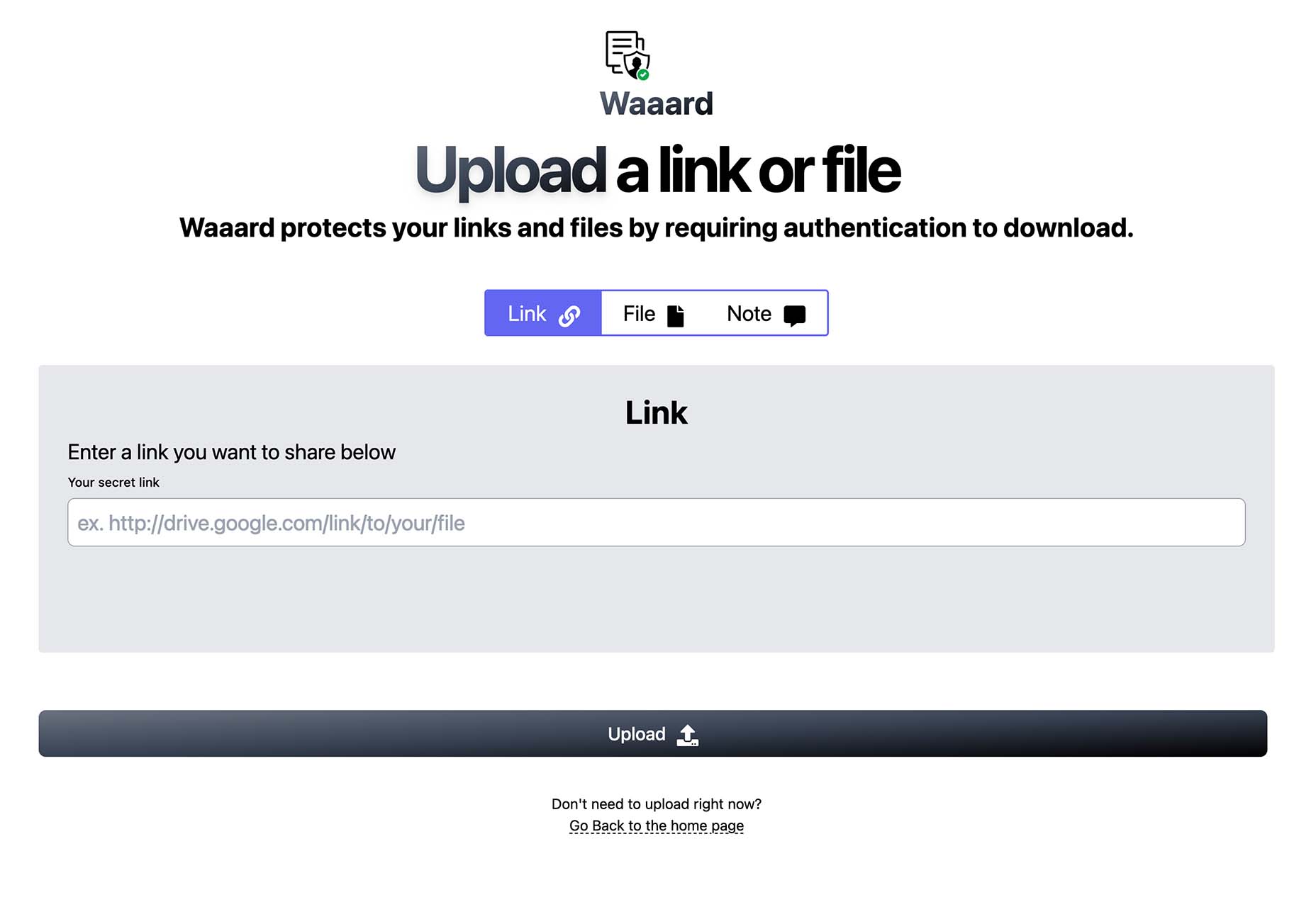
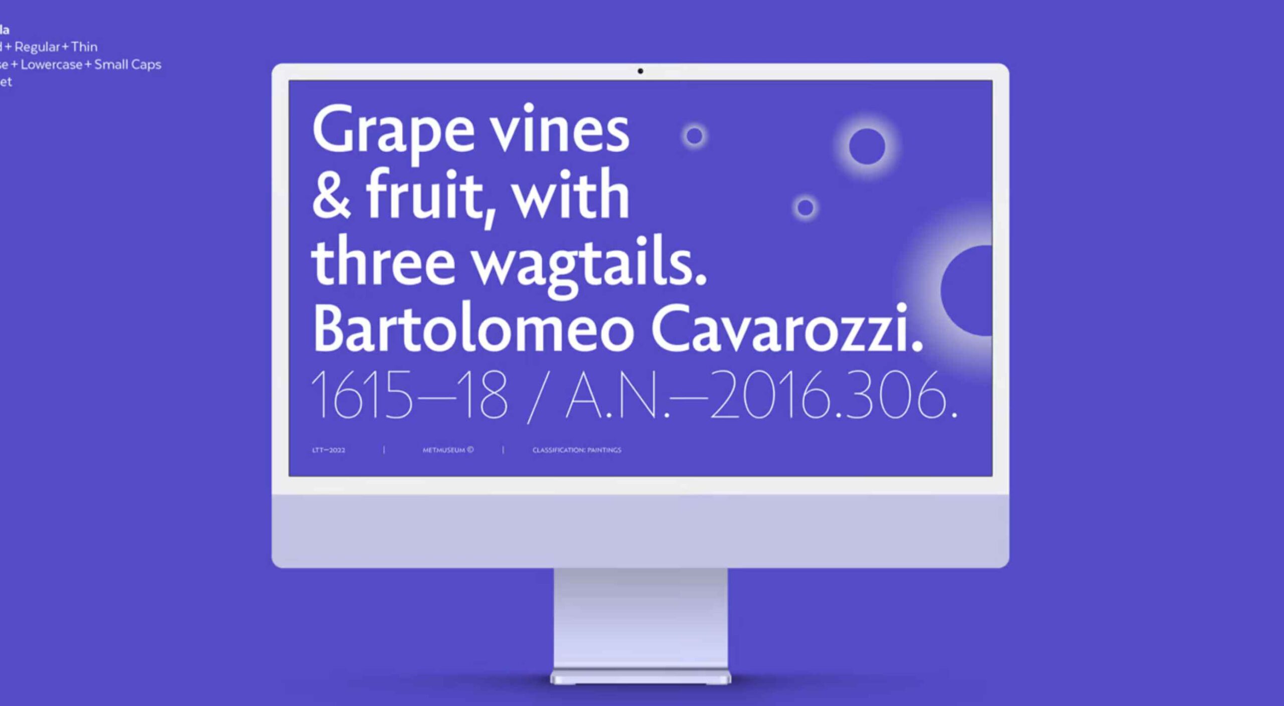
In this post, we cover the design decisions and processes behind redesigning the Todoist Android app for Material Design. We explore the Design and Android team’s collaboration practices that brought the app update to life, which resulted in winning the Material Design Award 2021 in the large screen category. Let’s get started!

Opportunity

When we started the project, our design implementation on Android was ready for a major overhaul. The last milestone redesign on Android was initiated after the release of the first Material Design guidelines in 2016. Since then the team successfully worked on continuous improvements to the Android app, but we saw the opportunity to improve Todoist on Android on a more holistic level.

We set out to clean up instances of older UI components, colors, and text styles and update them with the latest Material Design components. We observed that some interactions and navigational patterns had become inconsistent with what users were expecting on newer Android devices and were eager to modernize this experience. With new hardware and software changes in mind, we set out to make the experience on larger phones and tablets even better, so Todoist could take full advantage of the latest generation of devices. Material 2 and 3 provided an incredible new framework to rethink the current app experience. With this in mind, we set out to challenge what a modern Android app should look like and innovate on top of the default user experience.

Solution

The team set itself the goal of redesigning our Todoist Android app and aspiring to make it the best-designed productivity app on Android. The project was ambitious and scheduled to take several months to complete. We set ourselves the following targets while working on the project:

  • Review the current implementation and older design specs.
  • Study the latest Material Design Guidelines and assess what is relevant for our project.
  • Research great Material Design apps and case studies and learn from their execution.
  • Define the new Todoist Android app design language and document the changes.
  • Design and development work together to assess the proposed solution and implementation.
  • Test an early version of the new app internally to gather feedback and make adjustments.
  • Invite beta testers to the new app to gather feedback and make adjustments.
  • Refine the app and address core issues before launching to the public.

Review

The project was kicked off by reviewing the current Todoist Android app implementation, noting down what areas needed to be fixed and what was up to date. While reviewing, we took screenshots of the app implementation for reference. This way we could easily see the current state of the app and compare it to the new design proposals that would be created. Once the review process was finalized, we had a comprehensive overview of the current state of the app and the layout, component, and styling changes we wanted to make.

Study

We continued the project by studying the latest Material Design Guidelines, assessing the components and practices that were most relevant to Todoist.

When the project kicked off in February 2021, Material 2 was the most recent version of their design system. Since Material 2 had already been released for quite some time, we anticipated that design changes to Material would be announced soon at the Google I/O event in May 2021. Rather than wait, because we expected the changes to be iterative, we pushed ahead with our work.

We identified 25 components and UI patterns that we wanted to change across the app. The changes included buttons, forms, menus, sheets, navigation drawer, app bar, system bars, text and color styles, and more. We started by creating a table view in a Dropbox Paper document with the component changes and references links to Google’s Material Design Guidelines.

This components list was a starting point for discussion to plan the scope and complexity of the changes. Close async discussions between the design and development team in Twist and Dropbox Paper comments helped us make decisions about scope and complexity early on and set a solid foundation for the project.

Research

In the initial Material Design study, we also researched inspiring Material Design apps, Material studies, Play Store apps, and Google Workspace apps to learn from their execution.

We started out by studying the Material Design Award Winners 2020 and tested out the products that were showcased. The showcased winners struck a good balance between implementing the Material Design Guidelines while maintaining their own product’s brand within the system. This balance between Google’s guidelines and the Todoist brand was also key for us to get right and so we strived to find this mix across the work we created and implemented in the project.

Along with the MDA winners, we researched the Material Studies that Google produced to showcase what apps could look like with branding and Material Design guidelines applied. It was a great reference to see how far components could be customized while maintaining the core platform principles. The Reply case study in particular offered valuable insight to us as its content type and layout came closest to Todoist. It showcased how components like the app bar, navigation drawer, and large screen layouts worked while being customized.

We continued our research by searching the Google Play store for inspiring app examples. Google Tasks, Press, Periodic Table, and Kayak stood out to us as the level of polish and quality of the apps were on par with the experience we were aspiring to create.

Sometime later in the project when Material You was released (more on that later), we stumbled upon the Google Workspace apps blog post which previewed Material 3 changes that Google was introducing to their own products. It offered a great glimpse at what was to come before the Material 3 Design Guidelines were officially released. This post sparked new internal discussions and further design explorations that we considered for future Todoist Android updates.

Design Spec

As we started to define the new Todoist Android app design language and document the changes, we opted to create a design framework, focusing on creating components rather than designing every screen in the app. This allowed us to consistently apply the design system in the app. We did so by using the previously defined component list that we created during the review and study process.

Core screens from different areas of the app were chosen to demonstrate how the components could be applied. We chose to mock up the Todoist project view, navigation drawer menu, project view edit screen, settings, and project detail view, among others. These screens gave us a good overview of how buttons, forms, drawers, lists, and other components would work together and in different states; selected, pressed, disabled, etc.

During the project, we were transitioning our Doist design system to Figma and started creating our first components in the new Doist Product Android Library. We started by using some components from the Material Design UI kit – Components library from the official Google Figma resource file and added them to our Doist design system. We then continued to build up the Product Android Library file with our Todoist-specific components such as task list & board views, detail views, sheets, colors, typography, etc.

We continued by documenting color and typography changes that were based on the Material Design guidelines. The design team opted to implement a new Design Token framework that would share the same values between our design system and the development implementation. The development team would output the values they had in the current implementation and the design team would analyze which values were needed and which could be merged, changed, or deleted. This informed the new Design Token color and typography system which we then documented and discussed with the team to implement. Later in the project, we were happy to see a similar token system introduced by Material 3 in the latest guidelines which validated our thinking and principles behind the new design system.

The design documentation expanded to hold other edge-case mockups that could sit alongside the design system. We documented different responsive screen experiences between phones and tablets against the previous implementation. Additional sections were created to document the motion that should be used for certain components and screens by referencing existing Material Design guidelines examples or prototyping custom motion in Principle and After Effects. The design spec also touched on haptic feedback that should appear on touch targets, how dark mode should work across the new components, documenting Todoist themes within the new design language, and more.

Design Implementation

At Doist, the benefit of the squad is that cross-team collaboration is built into the make-up of the team. Designers, developers, support, and product managers work together in a squad to deliver the project. This close collaboration from the start is key to bridging the gap between scope, estimations, design, development, and delivery. The squad discussed their findings on a daily basis and came up with the best plan of action together.

Designers started by creating components in Figma and shared them with developers in Dropbox Paper. We used screenshots to document the current implementation next to the new designs and linked to the default Google Material Design components. This allowed the team to compare all references in one place. Developers shared their feedback, adjustments would be brainstormed together as the designs were iterated.

Designers on the project would share their work in progress on a weekly basis with the rest of the design team in a design review Twist thread. Here details about the designs were discussed, alternatives mocked up and bigger picture plans made. Design reviews brought up topics like FAB (Floating Action Button) placement, theme options, accent color usage on components, consistency with other platforms, navigation options, and shadow elevation. After thorough discussions and alternative mockups were presented, the design team aimed to find the right balance between Material Design and Todoist brand guidelines. The development team, also part of the design reviews, gave their feedback on the solution and raised technical complexities early on.

Eventually, the design was stabilized and consistencies updated across components and mockups. The design spec was kept up to date so the development team could always review the latest designs in Figma.

Testing

As soon as the development process started, the Android team provided early screenshots and videos in Twist threads while they were implementing the design spec. This practice allowed us to review the app implementation early and often. Designers could review the development work and share feedback in Twist, which resulted in getting the implementation to a high quality. Alongside Twist discussions, the team set up a Todoist project to track ongoing issues and fix bugs. Designers logged new issues, developers would solve them and share the new implementation for designers to review.

When the team had the first stable version of the Android app, we shared it internally at Doist to get more insight and feedback. Other Doisters could access the redesign via a feature flag that could be turned on in the app settings and test the new version for however long they wanted. The feature flag system allowed people to give us early feedback on the design decisions we made and report bugs. Feedback was submitted by the wider team through a dedicated Twist thread and designers and developers could discuss how best to address the feedback during the active project implementation.

After we refined the app implementation further and addressed early feedback we opened up the app update to our beta users. Here users had access to the new Android redesign and were able to give us feedback. Our support team gathered feedback and shared it with us in a dedicated Twist thread. The squad aimed to analyze every comment and looked for patterns where we could make tweaks and improvements to the user experience.

As part of these tweaks, we made changes to how the bottom bar and navigation drawer worked. Some users reported frustrations with the way the new bottom navigation and menu drawer worked. In its first implementation, the drawer was half raised when opened and had to be swiped up to be raised again to see the full content list. This was an issue for some users as it was slower to get to the content below the list. So we decided to fully raise the drawer by default when opening. We also made it easier to open the navigation drawer by sliding up from the bottom app bar. This was a small shortcut but it enabled users to get to their content faster.

Material You

While we were in the testing phase and about to wrap up the project, Google unveiled Material You, and sometime later the Material 3 Guidelines were published. With the newly announced resources, we went back to study the latest guidelines and references we could find to see where the Todoist Android app redesign fits in and which adjustments we might need to make now or in the future.

Dynamic Color was a big new feature that was announced as part of the Material You update. As Todoist supports many different themes the Material You Dynamic Color feature seemed like a good fit for our product. We decided to prioritize this feature and implement Dynamic Color light and dark themes as part of our Todoist theme settings options.

To implement Dynamic Color, the development team started off by creating a demo prototype that utilized the Dynamic Color system and showcased how we could select from a range of color choices that the system defined based on the wallpaper choice. From there, we tried to incorporate system behavior in our design mockups. We designed a range of different color mockups and components to see which ones could fit with which components. We then came up with a color system that worked for the Todoist app and the new themes. These new Dynamic Color themes would sit alongside our current theme options in the Todoist app settings. From here users could choose between Dynamic Color Light and Dark themes.

Along with Dynamic Color, the team also created a customizable bottom app bar, allowing users to set up the app in a way that’s most convenient to their workflow. The location of the Dynamic Add Button can be changed to the center, left, or right corner of the screen. The order of the Menu, Search, and Notification buttons can be rearranged to best fit the ergonomics of the user’s dominant (left or right) hand and optimize their navigation patterns.

Launch

As critical beta feedback was addressed and stability tweaks were made, the squad felt ready to release the new Todoist Android app to the public. The team logged the issues that could not immediately be addressed for future reviews and updates.

The design and marketing team readied the launch by creating What’s New banner artwork and copy that are displayed within the app when launching the update. The Doist marketing team also created release notes and shared the app update announcements on our social channels. The brand and product design team worked together to create custom image assets and copy that summarised the project work in a simple and beautiful way.

What’s Next: Material 3

After a successful launch of the redesigned Todoist for Android app, Google contacted Doist to announce that Todoist was selected as the Material Design Award 2021 winner in the Large Screen category. The team was excited to be recognized for their hard work and it felt like we achieved the goal we had set out to accomplish.

Internally, designers and developers continued to study and discuss the Material 3 updates. The design team started exploring mockups and design changes inspired by Material 3 and Google’s Workspace app updates. Some of our current Todoist explorations include changing the FAB styling, updating the app bar, further removing elevation shadows, and more. Here is a preview of what a future Todoist update could look like.

We hope these insights into Doist’s design process and collaboration practices have sparked your interest. Thank you for reading and stay tuned for future design updates!

Takeaways

  • Study the Material guidelines, Material Design winners, Material studies, and Google Workspace apps to make informed design decisions when designing your next product or app update.
  • Evaluate which Material Design components and practices are right for you and implement them into your product.
  • Carefully balance the Material Design guidelines with your brand guidelines to create a unique and consistent experience between your product and the platform it lives on.
  • Collaborate with your Android developers early and often to ship app updates efficiently and increase the design implementation quality.
  • Use design components and build a design system along with practical mockups to create an efficient design spec.
  • Consider how the latest Android features fit into your product and which have the most impact on your users before deciding to implement them.
  • Test and review builds with your internal team and external beta users to get valuable feedback and make adjustments before releasing them to the public.
  • Create announcement artwork to showcase your latest app or feature update along with a clear description to share in-app and on social media.

Source

The post Case Study: Redesigning Todoist for Android first appeared on Webdesigner Depot.

Source de l’article sur Webdesignerdepot

Amazon Web Services (AWS) is the biggest cloud platform in the world, with over 200 features. In this article, we break down 10 AWS services that support at least some SQL syntax, talk about their use cases, and give examples of how to write queries.

Service Description SQL Support Use Case
RDS Postgres, MySQL, etc. Full Small-medium web apps
Aurora Serverless databases Full Serverless apps
Redshift Data warehouse Full OLAP, Petabytes of data, analytics
DynamoDB NoSQL database Some – PartiSQL Ecommerce, building fast
Keyspaces Managed Cassandra (key value) Some – CQL Messaging
Neptune Graph database Some – openCypher Social networks
Timestream Time series database Partial IOT, Logging
Quantum Ledger Cryptographically verified transactions Some – PartiSQL Finance
Athena Ad-hoc queries on S3 Some – CTAS Historical data
Babelfish MSFT SQL Server on Aurora Full .NET

The table above shows how SQL support varies between the services. A graph database cannot be queried in the same way as a classic relational database, and various subsets of SQL, like PartiQL, have emerged to fit these models. In fact, even within standard SQL, there are many SQL dialects for different companies like Oracle and Microsoft.

Source de l’article sur DZONE

Given CockroachDB scales with vCPU, there’s a hard limit to how many active connections we can support per vCPU before a serious problem arises. PGBouncer stretches the limits a bit making it a cost-effective option. In serverless architectures, there is no client-side connection pooling, and using middleware like PGBouncer can alleviate the problem of connection storms. Please see my previous articles on the topic for more details.


Previous Articles

  1. Using PGBouncer with CockroachDB
  2. Using PGBouncer with Cockroach Cloud Free Tier
  3. Exploring PGBouncer auth_type(s) with CockroachDB

Motivation

We’ve covered how to deploy PGBouncer with a self-hosted CockroachDB cluster. Today, I’m going to demonstrate how to run PGBouncer along with the Cockroach Cloud free-forever tier database. The overall concepts are identical, but we will highlight some of the major differences in deploying PGBouncer with a cloud product.

Source de l’article sur DZONE