Articles

Sometimes you just don’t give a damn anymore. Possibly the only thing worse than designer’s block is designer’s apathy: that sinking feeling you get when you realize that you just don’t care about this particular piece of work anymore is disheartening.

The dread of going back to it is paralyzing.

There are many reasons you can stop caring about your work. Maybe you’ve just done the same thing too many times in a row. Maybe your client is insisting on asking for things you know won’t work for them. Maybe something much more important just happened in your life, and you’ve got bigger things to worry about. You could be discouraged by the apparent ‘sameness’ of bandwagon-hopping designs.

I’ve been not caring about my work ever since I was first asked to pick up my toys

Whatever the reason, we all experience times when we know exactly what we have to do… we just don’t care.

I’m something of an expert on this phenomenon. I’ve been not caring about my work ever since I was first asked to pick up my toys. Worse, I have the attention span of a goldfish, even now.

Web design is different. When I discovered it, it was new, exciting, and I could do it on the computer. I loved it, and I still do. Writing code that makes design happen in a browser window will never get old for me.

But even so, sometimes, a particular project will make me want to throw up my hands in exasperation and play video games ‘til Judgement Day. I’d welcome Skynet with tacos and RPGs.

So what do we do about it? First, answer this question: who is the project for?

For A Client

If the project is for a client, it’s just gotta get done. There’s no way around that. You made a commitment. You’re going to follow through and give it your best possible effort because you’re a professional. Anything less would be wrong.

However, that doesn’t mean you have to just power through with only coffee and misery for company. There are things you can do to make the work easier on yourself. The less miserable you are while you work, the better quality you can deliver.

For Yourself

There are a couple of schools of thought here. The first is that it’s perfectly fine to give up on personal projects when you stop caring. I mean, it’s your free time. Why spend it on something you don’t care about?

On the other hand, is a commitment made to yourself any less important than a commitment made to someone else? Many people seem to be perfectly fine with breaking promises to themselves when they’d never willingly do that to a client. Is that wrong?

I usually buy myself a drink and forgive myself, but it’s worth thinking about.

The deciding factor for me is whether my personal project will have any sort of lasting benefit. If whatever I’m designing, writing, or making counts as a long-term investment in my career or quality of life, then it absolutely has to get done, even when I’m not feeling it. Otherwise, I call it a learning experience and move on.

How To Power Through

So, for whatever reason — whether because you have to, or you want to — you’re gonna power through. Here are five ways to do it in style:

1. Start

The hardest part of doing work you don’t care about is starting. This is when you’ll be tempted to procrastinate until the last minute. Try not to.

2. Switch To A Different Part Of The Project

If you can safely (without causing problems) work on a different aspect of the project for a while, try that. The mere variety, the break from the work in front of you before, can boost your morale.

Indeed, working on a different part of the project can give you ideas of getting the most troubling bits done faster or more easily.

3. Do Something Old In A New Way

This one has its pros and cons.

Pro: You can look at this project as a chance to try out a new grid framework, script, code editor, or another tool of some kind. Injecting the process of discovery into an otherwise boring project can make it a lot more fun and even make you look forward to working on it.

Con: You’ll need to plan for extra hours and use some version control; because bringing a new tool or process into play is almost guaranteed to make something interesting go wrong — when this happens, you probably shouldn’t bill the client for the extra hours spent on StackOverflow.

4) Make Like Aziz Ansari And Treat Yo’self

Celebrate the milestones of your project. Don’t celebrate with video games if you need to get any more work done that day. That can go very wrong. But do celebrate. Reward yourself because you’re doing something difficult.

Have a snack. Give yourself a round of applause. Whatever it takes, make yourself look forward.

5) Outsource It

As a last resort, you can always outsource the project to someone else. Just make sure it’s someone you can trust to deliver the same quality of work you would normally provide yourself. Make sure to check it over before handing it off to a client.

Alternatively, you could just outsource the bits of the work that you don’t like. Either way, this is a risky strategy because whoever you outsource to might experience delays or, ironically, not care about the project.

Conclusion

You can do it! I believe in you. The really, really boring projects can seem like huge sinkholes of sadness, but they don’t last forever.


Featured image via Pexels.

Source

The post How To Power Through Designer Apathy first appeared on Webdesigner Depot.


Source de l’article sur Webdesignerdepot

Our Self-presentation skills far supersede our verbal communication
We speak more through our bodies than our words. The posture we assume, the expression on our face, hand gestures, and our eye movement conveys far more than we would like to expose.
A subtle smile in a meeting can indicate a willingness to engage in a dialogue, while a stern look can instantly kill the conversation. Constantly checking the phone or looking at the watch can signal disengagement, while focusing on the other person signals interest.
Rolling our eyes expresses distrust or disgust in another person’s idea or behavior, while our eyes light up when we are genuinely curious about others. Keeping head down while walking in the hallway shows a lack of presence while acknowledging people passing by through a simple nod creates warmth. A firm handshake to begin an interview can exude confidence and power, while a limp handshake can reveal nervousness and weakness.
These non-verbal cues form a part of our body language that speaks even when we are silent, revealing how we are thinking and feeling in the moment.
Olivia Fox Cabane who has lectured at Stanford, Yale, Harvard, MIT, and the United Nations says:

In the scope of human evolution, language is a relatively recent invention. But we’ve been interacting well before this through nonverbal modes of communication. As a result, nonverbal communication is hardwired into our brains, much deeper than the more recent language-processing abilities. This is why nonverbal communication has a far greater impact.

She then points out ‘Without our realizing it, our bodies send out thousands of signals every minute. Just like our breath and heartbeat, these signals are part of the millions of bodily functions controlled not by our conscious mind but by our subconscious mind.’
Understanding the power of our body language and the role it plays in workplace communication and collaboration can bring us together by adopting positive communication styles as opposed to setting us apart through bridges of misunderstanding.

Importance of Body Language in Communication

Our body language plays a key role in impression management, the art of influencing how we are perceived by others.
A positive body language can show our enthusiasm to contribute, confidence in our abilities, being comfortable in taking on challenges, passion to drive results, and present to recognize future demands. It can open a world of new possibilities.
A negative body language can send strong signals of our resistance to contribute, doubt of our abilities, uneasiness to take on challenges, indifferent and uncaring attitude towards outcomes, and disconnected from reality to be able to handle future potential. It can close doors to success and growth.
Maya Angelou said, ‘People may not remember what you said, but they will remember how you made them feel.’
Since our emotions drive a large part of our decision-making, guess who will get the attention when a new project or a position opens up — a person who exhibited confidence in their body language or someone who looked like a nervous wreck?
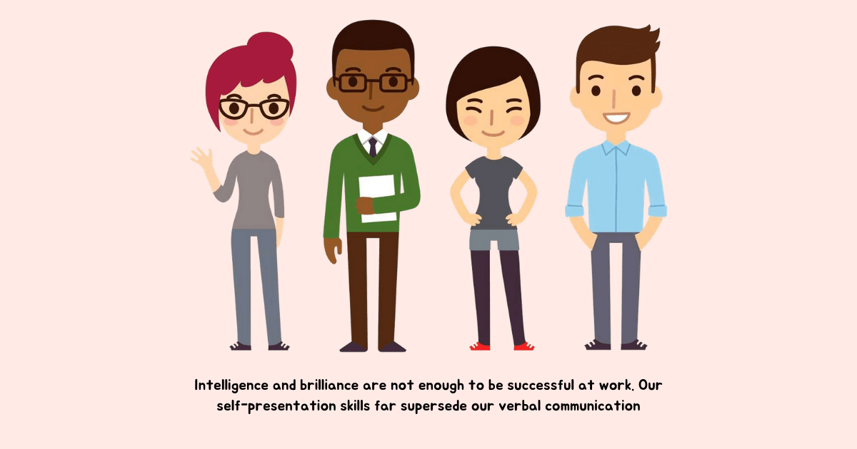
Intelligence and brilliance are not enough to be successful at work. Our self-presentation skills far supersede our verbal communication.

The way you carry yourself is a source of personal power — the kind of power that is the key to presence. It’s the key that allows you to unlock yourself—your abilities, your creativity, your courage, and even your generosity. It doesn’t give you skills or talents you don’t have; it helps you to share the ones you do have. It doesn’t make you smarter or better informed; it makes you more resilient and open. It doesn’t change who you are; it allows you to be who you are. — Amy Cuddy

What happens when what we say is not in alignment with what we believe? We can lie through our words, but our bodies will reveal the truth. The non-verbal cues that we send through our body speak stronger than words.
Consider this. Someone approaches you with advice on a new strategy. Instead of expressing your true opinion, you simply nod in agreement. But, the tension around your eyes, the tone of your voice, and many other non-verbal cues can make the other person uncomfortable and leave them feeling unsure of your advice with the decision to never trust you again.
The idea is not to be inauthentic through your body language but to be aware of its implications. 
Research shows that we form impressions about others within a few minutes of meeting them and then our confirmation bias guides us in picking data that confirms our point of view. Anything that strengthens our belief system is readily accepted and that which contradicts it is rejected.
Being aware of the role our body language plays in forming this impression can help us twist the outcome of an interview in our favor.
For someone in a leadership position, body language is extremely important since people in an organization mimic not only the way leaders talk but also pick on their non-verbal cues.
A leader with positive body language appears approachable, open to feedback and shows a willingness to change while a leader with negative body language appears inaccessible, closed to feedback, and arrogant to adapt and change with the future demands.
Amy Cuddy asks, ‘Our non-verbals govern how others think and feel about us, but do our non-verbals govern how we think and feel about ourselves?’
Absolutely. Mastering the art of non-verbal communication not only leads to better communication with others, but it benefits us too. Presenting our best self forward by adopting positive body language enables us to be the creator of our future as opposed to being a victim of other’s perceptions. It leads to more opportunities for growth with higher chances of success.

4 Body Language Mistakes and How to Fix Them

1. Mind Is Not Attuned to The Body

When our mind is not in congruence with our body, we may try to portray a state which is in conflict with our inner self by controlling our posture and expression on our face, but sooner or later this incongruence will show up in our body language.
A positive body language cannot keep up with the negative mental state — what goes up in our mind will show up in our body. Without our realization, these ‘microexpressions’ will be noticeable to the people around us.

Our body language expresses our mental state whether we like it or not. Our facial expressions, voice posture, and all the other components of body language reflect our mental and emotional condition every second. Because we don’t control this flow consciously, whatever is in our head will show up in our body language — Olivia Fox Cabane

How to Align Our Mind and Body:

Research shows that our mind cannot distinguish imagination from reality. So, whatever our mind believes, our body will project.
We can bring out the desired body language by catching ourselves in those moments of negative mental states — disagreement, insecurity, angst, frustration, anxiety, criticism, and self-doubt, and choosing to get into a positive one.

  1. When you need to project confidence, seek inspiration.
  2. When you feel angst due to a disagreement, ask yourself ‘What can I learn from the other person?’ and ‘How are my biases causing me to be closed-minded?’
  3. When all you can see is negativity, choose to ask ‘What’s the one positive thing I can think about this situation.’
  4. When self-doubt consumes you, tell yourself ‘I need to let go of my fears to create a better version of myself.’
  5. When you exaggerate a negative outcome, ask yourself ‘What’s the worst that can happen?’ and ‘Is it really that bad or am I making up stories?’
Adopting a positive frame of reference and moving from a problem to a solution mindset can help us shift gears from a negative internal state to a positive one.

2. We Do Not Make a Commitment to Be Present

‘Being present—paying attention to what’s going on rather than being caught up in your thoughts — can yield immense rewards. When you exhibit presence, those around you feel listened to, respected, and valued,’ explains Olivia Fox Cabane.
When we are not engaged in a conversation, consumed in our own thoughts, and pretend to listen, it clearly shows up in the non-verbal signals we send to the other person.
We may start fidgeting with our phone or laptop showing signs of distraction, look here and there instead of making eye contact signaling we are not interested in what they have to say and may even shift too many times in our position out of discomfort.
Without our awareness, our body language will convey disrespect and distrust to the other person.
How to Be Present:

You must commit to a conversation, even the brief ones, or walk away. If you’re too distracted, admit that to both yourself and the other person. Be present or be gone. — Celeste Headlee 

It’s more polite to walk away from a conversation that doesn’t interest you than pretend to be present.
Once you decide to participate, you first need to convince and tell yourself that you want to be present. Say ‘I choose to be present,’ and then adopt body language that aligns with it — look at the other person with enthusiasm, lean just a little to build interest, and try to grasp what the other person intends to say.
You may occasionally drift away, but by choosing to be mentally present, you can bring your mind back to the conversation. Active listening though difficult is the most effective form of non-verbal communication that requires continuous practice and training of the mind.

3. We Ignore Context

When we talk to someone, their perception of us is based on the context of the meeting, their expectations, and their own personal and cultural filters.
Without recognizing that people operate within a certain context, we may send non-verbal signals that conflict with their values, contradicts their mental state, or even violates their sense of self.
How to Apply Context:
When engaged in a difficult conversation, without empathizing with how the other person might be feeling in the moment, we may appear cold, unemotional, and downright rude. By adopting kindness and warmth in our body language, we can convey the right message without necessarily making them feel bad.
When someone is passed up for a promotion, showing an attitude of indifference without understanding the value it holds in their life can make them resent you. Body language that shows presence and concern by giving them an opportunity to express their feelings can build better relationships.
When a co-worker is grieving a personal loss, you may appear too intrusive in your body language when all they need is space to let the feelings subside. It could be a personal preference or a cultural nuance, but without understanding their context you may actually do more harm than good.
When dealing with difficult people, your body language may switch to a fight-or-flight response. But, if you take a moment to analyze the situation without being at the effect of a fundamental attribution error, you may understand the rationale behind their behavior.
Every situation is unique. We need to project the right body language for each person by taking their context and personal filters into account.

4. We Tell a Conflicting Story

We may believe that we are highly approachable, but others may find us unapproachable. We may also think that we are open-minded, while others may find us biased. We may assume that we provide a psychologically safe environment to our people, but our employees may be terrified to make mistakes.
Now, it’s easy to say that ‘it’s just them, not me. I have already communicated to them multiple times.’ But really, is that the true story? Your intention may be far from the reality of your situation.    

Just after we observe what others do and just before we feel some emotion about it, we tell ourselves a story. We add meaning to the action we observed. We make a guess at the motive driving the behavior. Why were they doing that? We also add judgment — is that good or bad? And then, based on these thoughts or stories, our body responds with an emotion. — Kerry Patterson

When our body language doesn’t match our words, people pick up on our non-verbal signals — the sign of contempt on our face when someone makes a mistake, pacing back and forth when conveying bad news, showing nervousness by fidgeting when asking for feedback, rolling eyes when we disagree, making hand gestures that signal blame and so on.
So, while you may communicate one thing with your words, your body may speak the opposite. And when people get confusing signals, they tend to go with what they observed and not what they heard.
How to Tell the Right Story:
Bring your body language in sync with the message you wish to convey. People find it easy to trust a person when their body language reflects their words.
When asking for feedback, look the person in the eye and don’t be distracted. When someone makes a mistake, show curiosity in your face to enable them to learn from their mistakes. When telling people to feel comfortable to approach you, make open arm-hand gestures. When communicating bad news, be intense but show confidence in your ability to make things right by looking at people with passion and hope.
People spend a lot of time perfecting their speech without verifying what their speech is conveying through their body. When it comes to making the right impression, don’t just speak through your words, make your body language count too.

Summary

Master the art of non-verbal communication in the workplace by:

  1. Tuning to a positive state of mind: Be self-aware of your negative mental states and choose to get into a positive one.
  2. Committing to being present: Practice active listening and engage fully in the conversation instead of being simply present.
  3. Taking context into account: Connect with the other person by taking their values, mental state, and sense of self into account.
  4. Telling the right story: Bring your body in sync with the message you wish to convey.
Previously published here.

Source de l’article sur DZONE

Illustration is a big trend in 2021. Every designer should have some ability to illustrate, whether that’s producing icons, creating lettering, mocking up layouts, or crafting full-blown illustrations.
Designers’ workflows are as varied as their work, and one designer’s favorite tool is a frustrating mess to the next designer. Most design apps have a free trial, so it’s worth trying out a few before committing.

Counting down to the best illustration app for designers in 2021, all of the apps on this list are worthy of at least a second glance:

10. Vectr

Vectr is a simple vector design tool. It is heavily geared towards layout and even product design. It’s difficult to use it for many illustration jobs, but simple icon and UI creation are possible. It scrapes into our top ten thanks to the fact that it’s free to use.

9. Paper

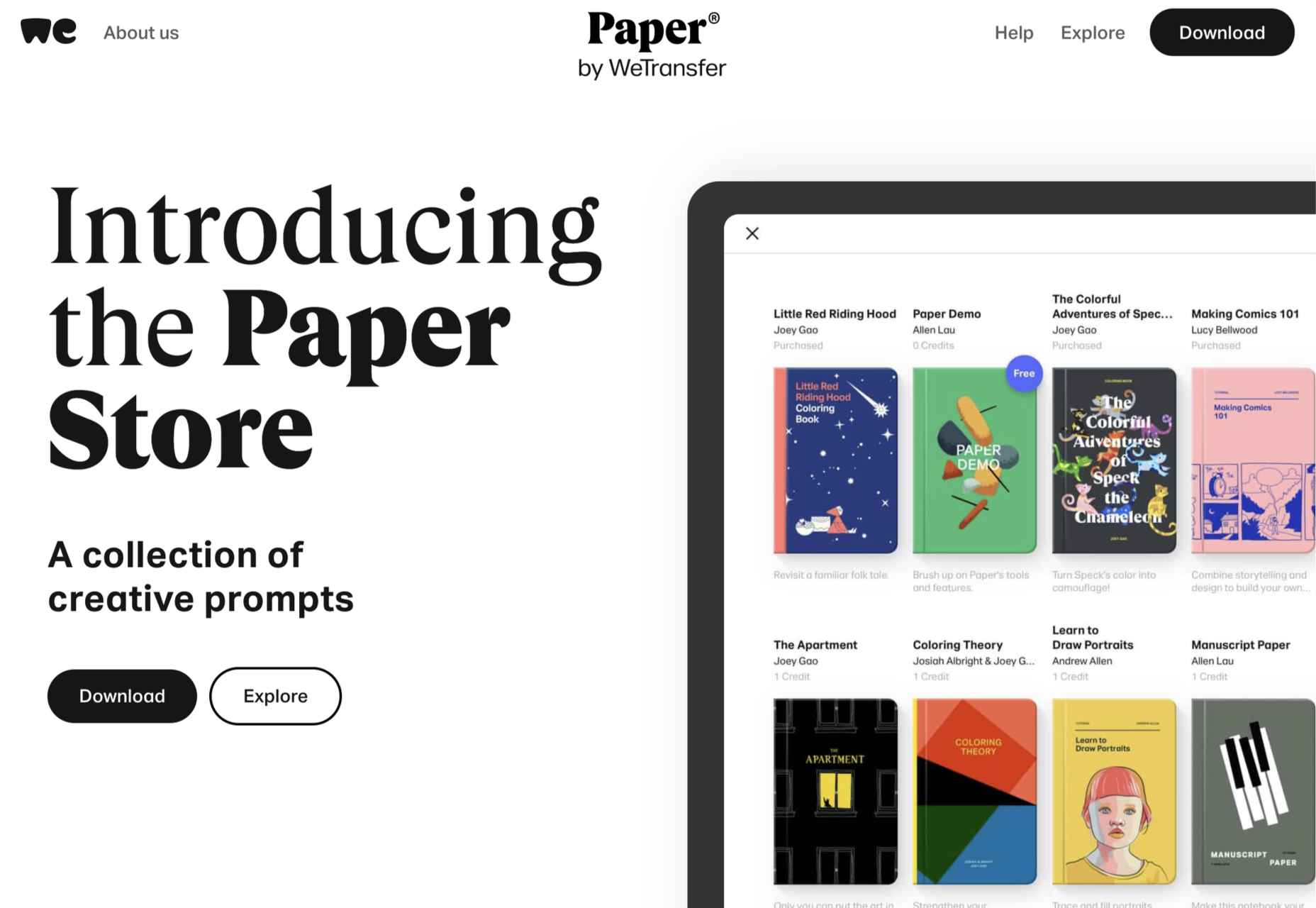
Paper is a sketching app developed by WeTransfer. It grabs number nine in our top ten thanks to its simplified interface that is perfect for generating ideas. It may not be the most flexible app, but it’s free to download, making illustration accessible to anyone with an iOS device.

8. Inkscape

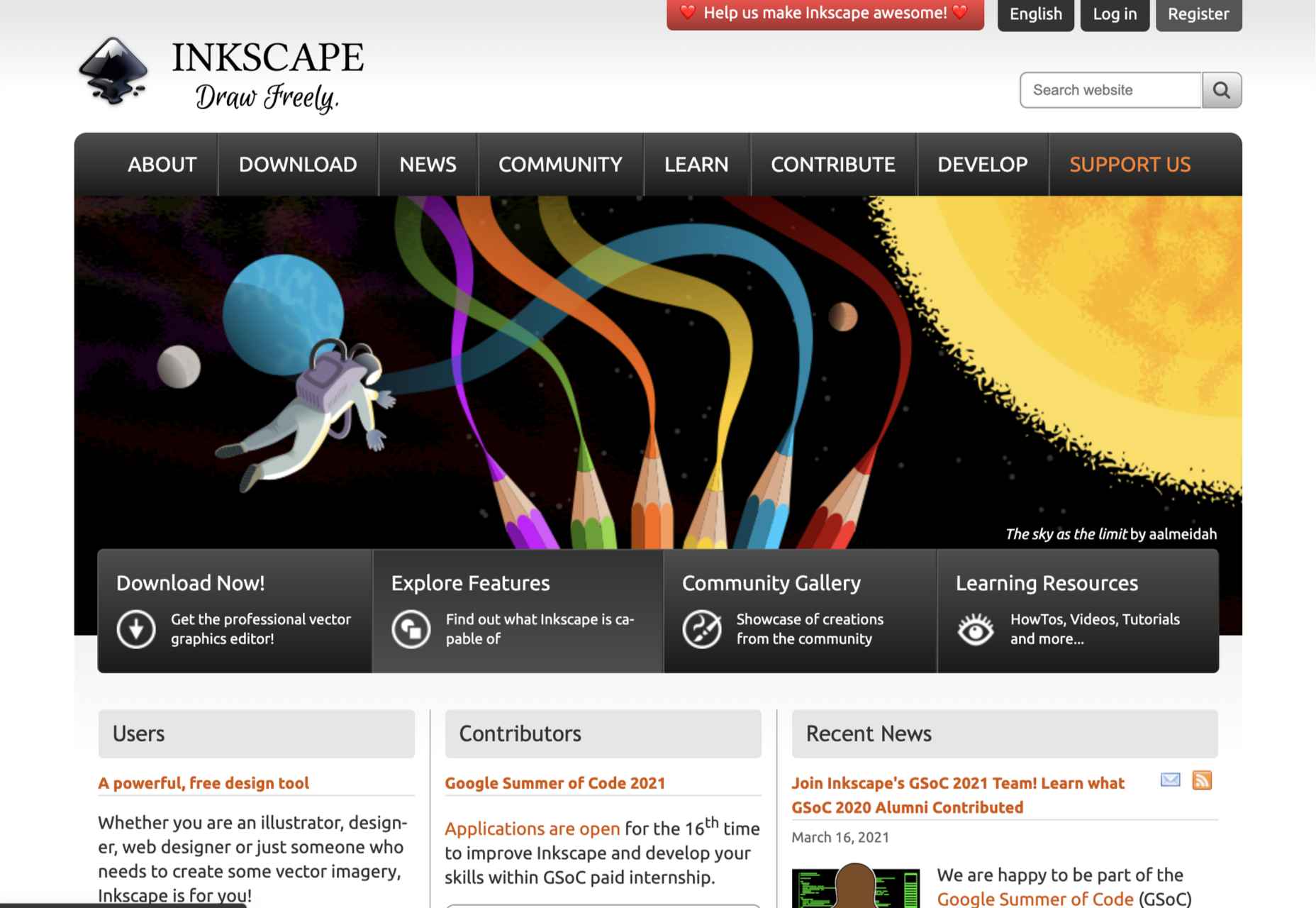
We love the fact that there’s someone out there producing a professional-grade artwork app for free. Inkscape is available for GNU/Linux, Windows, and macOS. If you’re interested in exploring this design area without signing up for a subscription or buying an iPad, Inkscape is a great place to start.

7. Assembly

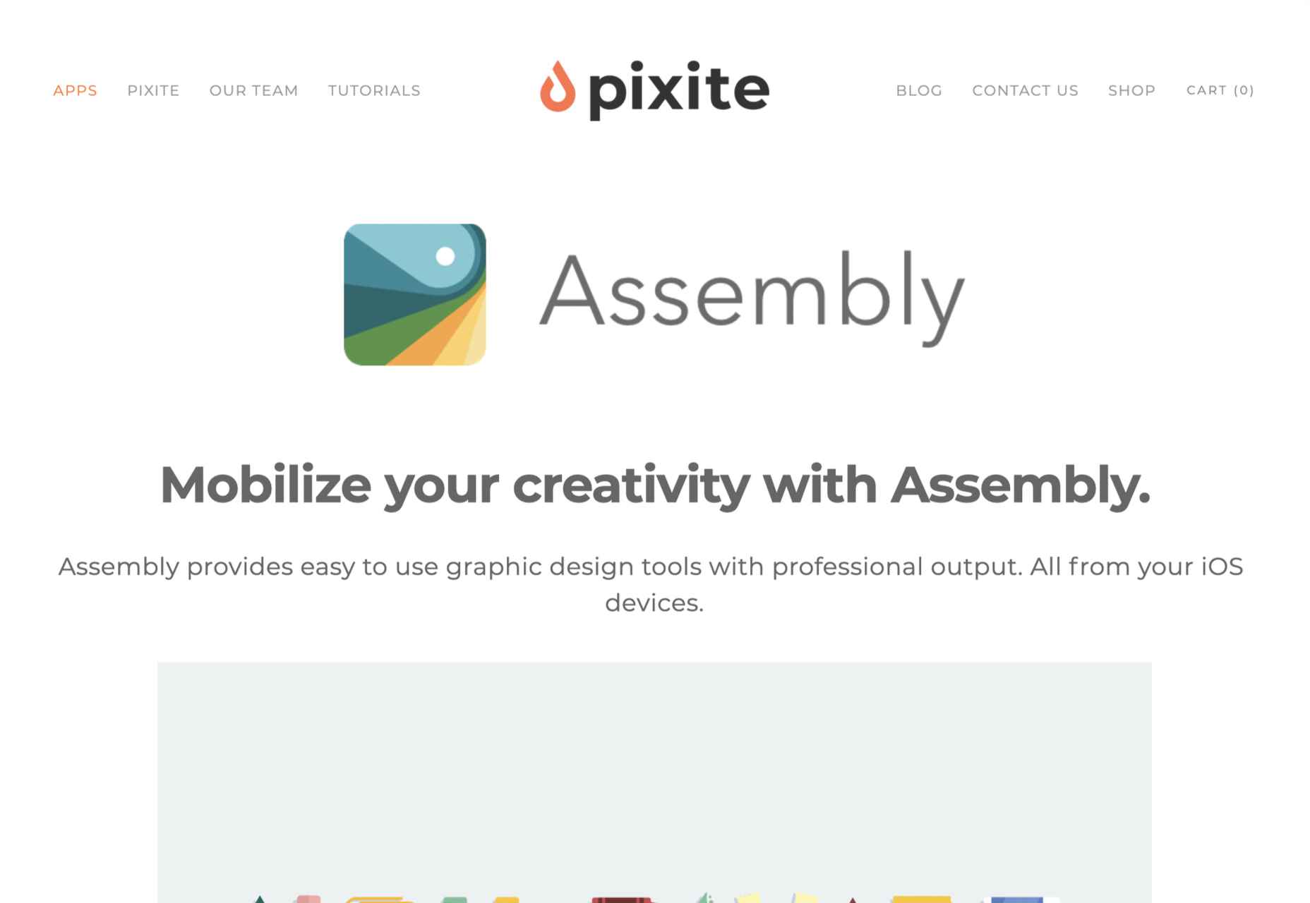
Assembly is another app that’s dependent on the transition of illustrators from desktop machines to mobile devices and is available for iOS. Assembly does things a little differently; instead of manipulating boolean curves, Assembly builds illustrations out of shapes. If you’re someone who thinks they can’t draw (spoiler alert: everyone can draw), this is the app for you.

6. Sketch

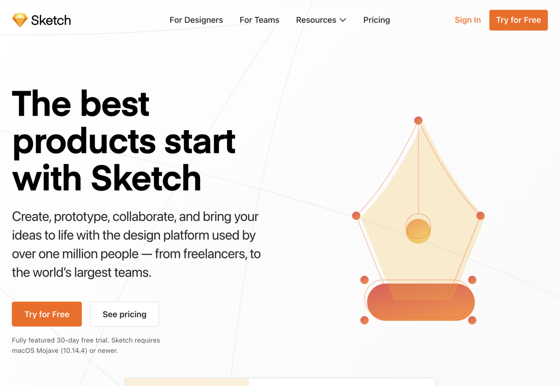
It’s a shock low-rating for Sketch, the highly popular product design app doesn’t make it out of the bottom half of our list. The reason for the lower ranking? Sketch is an incredible design app, but its greater investment in prototyping features has come at the cost of drawing innovation. It’s still a great choice for crisp icon design, but it’s not flexible enough to take a higher spot in our list.

5. CorelDRAW

If you’re getting the impression that design apps are mostly for macOS or iOS, then you’d not be alone. CorelDRAW Graphics Suite is one of the few that began its life on Windows before being rebuilt for Mac. CorelDRAW is a premium option, but like Adobe’s offering, it is a suite of tools that cover everything you’ll need to create any form of design work you could ever need.

4. Vectornator

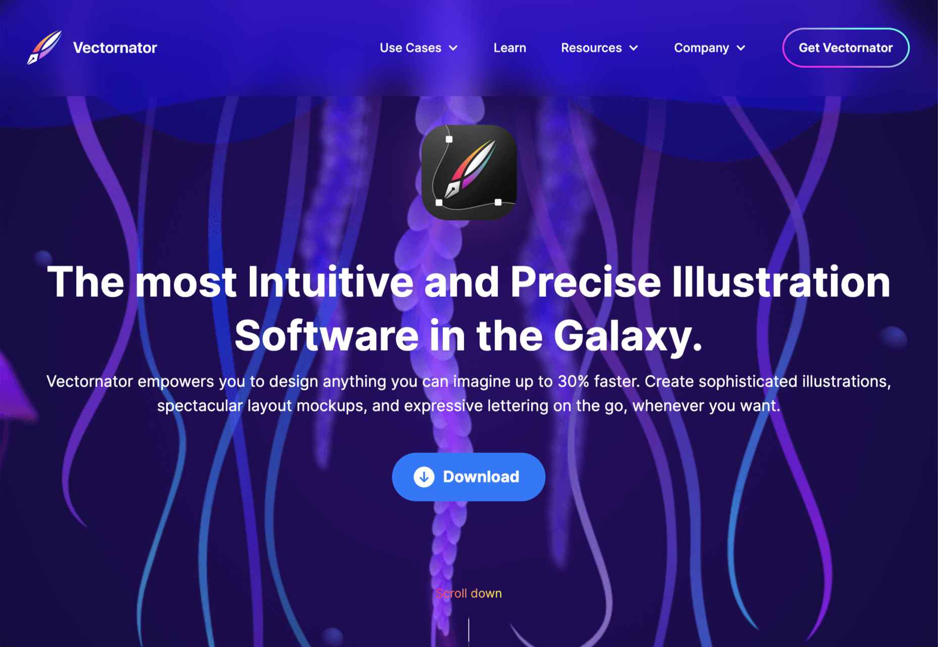
Moving closer to the top spot, Vectornator is an up-and-coming tool. Like many other apps further up our chart, Vectornator does a lot more than simply illustration. Its underlying tools provide a solid foundation for a flexible set of tools that you can use for any artwork. Vectornator does an awful lot, awfully well. 

3. Procreate

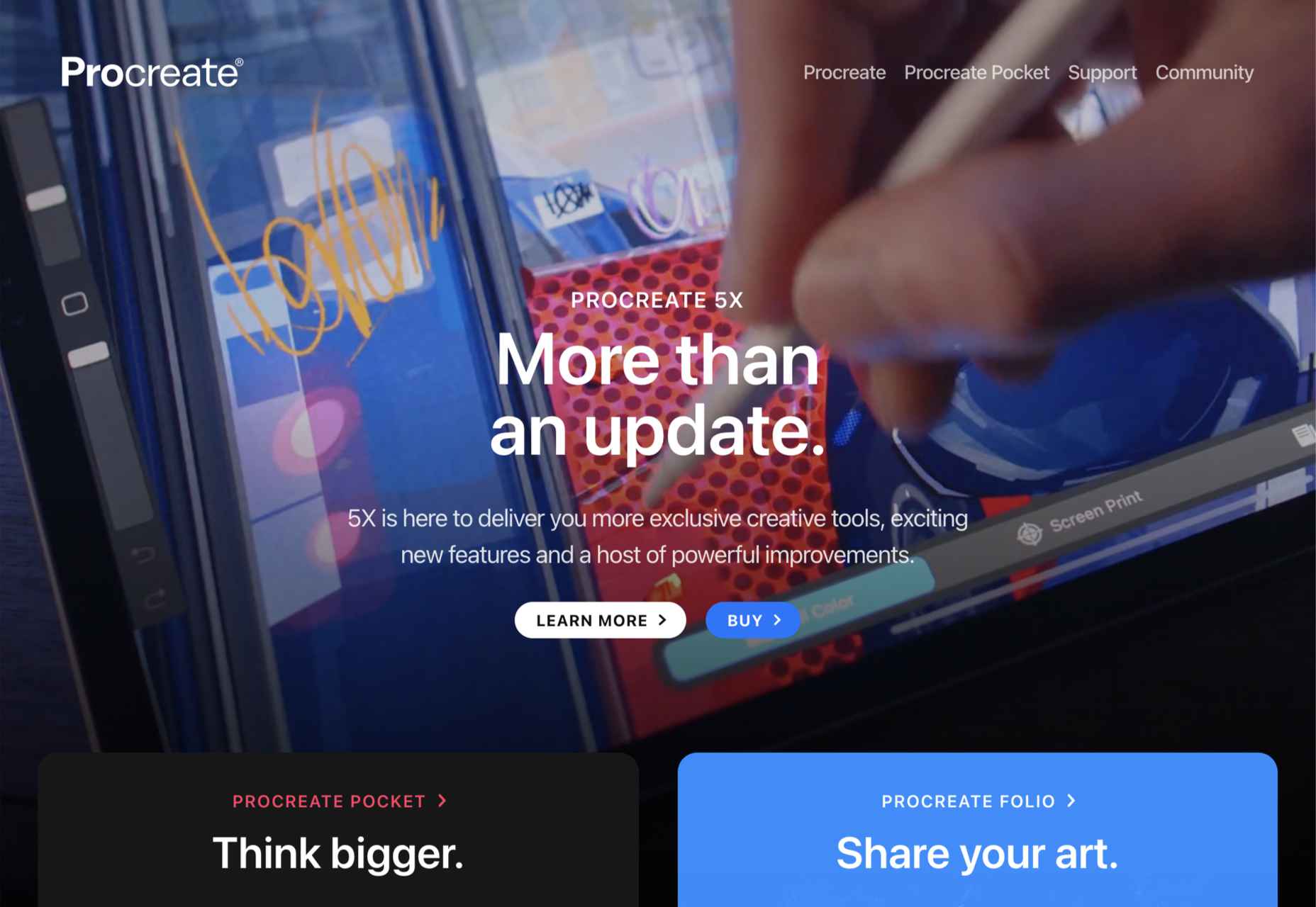
Procreate is one of the finest apps on this list, thanks in main to its incredible brush studio; being able to edit the marks you make is essential for any expressive artwork. Procreate enables expressive illustration, typography, and simple sketches. The only downside to this app is that it’s iOS only; if available on more platforms, it might have been even further up the list.

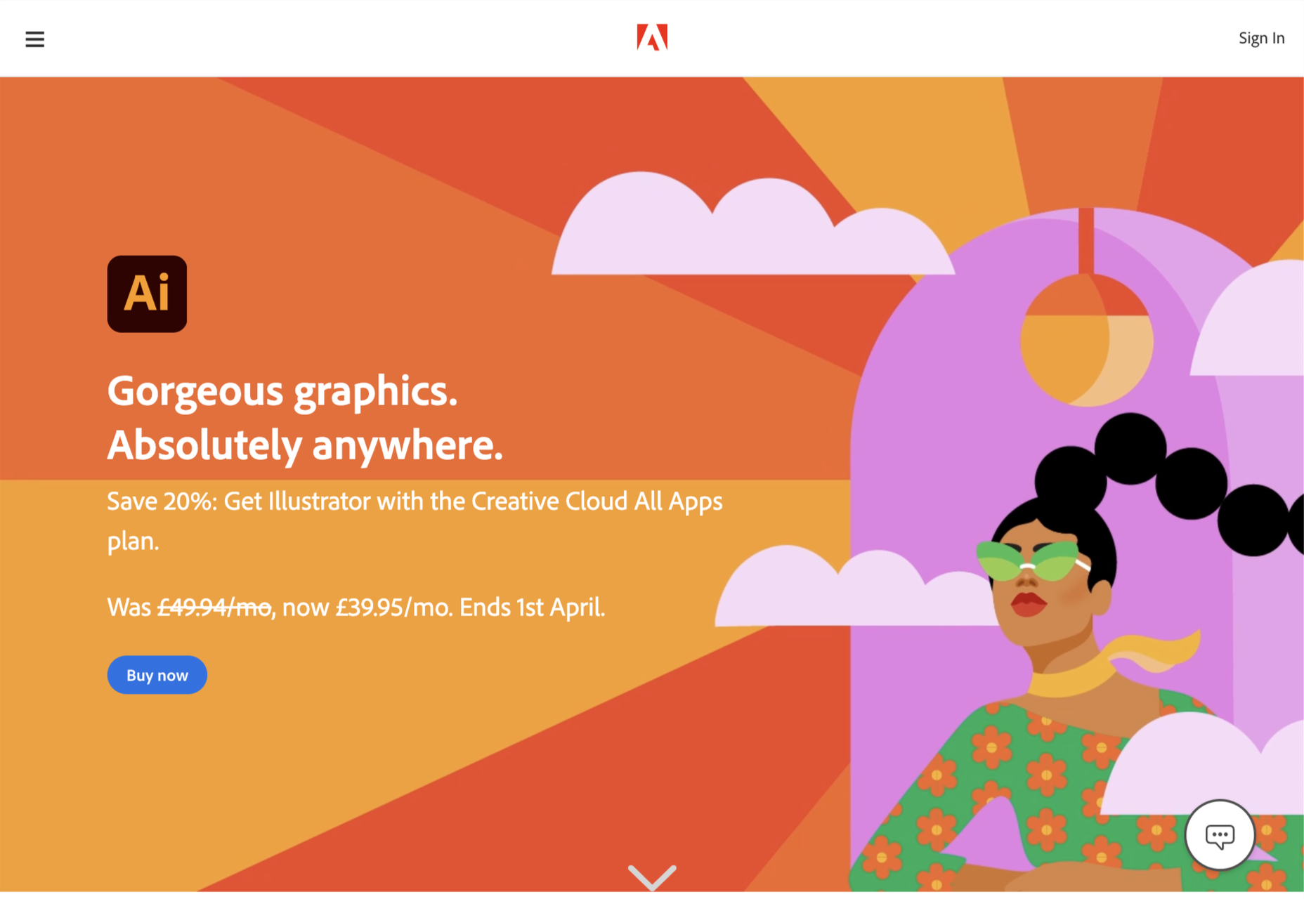
2. Adobe Illustrator

That’s right; we don’t think design giant Adobe’s illustration app Illustrator is worthy of the number one spot.

Illustrator is an excellent tool and arguably deserves to be considered Adobe’s flagship product. Since Adobe relented and allowed individual app subscriptions, it is also reasonably priced. It does everything you could want in an illustration app, from designing icons to creating original artwork.

So why not the top spot? It wasn’t so much that Illustrator fell down anywhere, as a different app pipped it to the post…

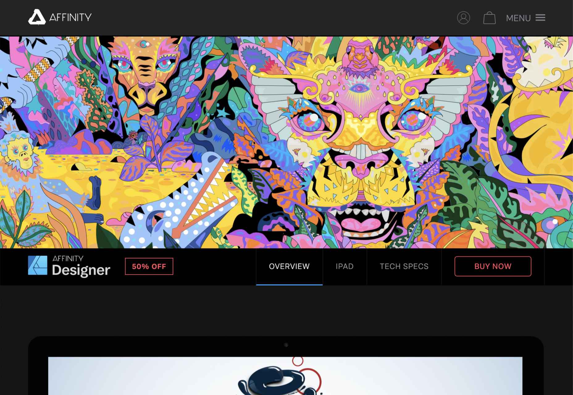
1. Affinity Designer

The best app for illustration in 2021 is Affinity Designer. We’ve been fans since its first beta version, and we’ve watched it go from underdog to champion.

On top of being an excellent vector app, Designer is comfortable with raster graphics. Although it certainly can’t compete with Photoshop (Affinity built Photo for that), Designer is more than adequate for many image tasks, making it a great all-around design app. Designer was also the first design app to support macOS’ new M1 chip natively.

The knockout blow is that Affinity Designer is available as a desktop app and an iOS app; the two apps have minor differences in their interfaces; what matters is that both apps use the exact same file format. You can seamlessly switch between desktop, iPad, and back to desktop, taking advantage of the precision of a mouse and the expression of a stylus.

It’s this kind of flexibility that bends Affinity Designer to your workflow instead of the other way around, and that’s why it’s top of our list.

Source

The post Ranked: Top 10 Illustration Apps in 2021 first appeared on Webdesigner Depot.


Source de l’article sur Webdesignerdepot

A domain name is an essential element of every project, product, and company. It’s central to a brand and has a disproportionately large impact on user experience. Not only that, but it also impacts SEO and ultimately revenue.
Domain names are also one of the most commonly retailed elements in web technology, with most designers hoarding a small empire’s worth of domain names “just in case” the right side-project comes along.

Because so much of the information and advice on domain names is provided by companies selling domain names and is therefore not impartial, we wanted to bust some of the myths you’ll encounter.

Myth 1: Anyone Can Own a Domain Name

In fact, almost no one can own a domain name. As demonstrated by the (probably) annual renewal notices you receive, you are merely renting a domain name.

You pay a registrar, who registers the domain with ICANN (The Internet Corporation for Assigned Names and Numbers) — or an entity to whom ICANN has delegated the responsibility for a particular TLD.

Even when renting a domain, you do not have the right to use it; thousands of UK-based businesses have had .eu domains stripped from them as a result of being removed from the EU.

Myth 2: There’s a Perfect Domain For Every Project

Domains do not have inherent value; they acquire value over time.

25 years ago, if you were building a search engine, the ‘perfect’ domain might have been search.com, find.com, or perhaps look.com — the particularly cynical might have opted for webads.com. You almost certainly wouldn’t have registered google.com because it says nothing about search.

Any domain name can acquire value through longevity, SEO, and branding

google.com acquired its value through a simple, relentless branding strategy and a generous dollop of luck.

Any domain name can acquire value through longevity, SEO, and branding.

Myth 3: Your Domain Name Should Contain Keywords

If you’re at the point of registering a domain name, either your business is new, or your digital strategy is. In either case, you have hopefully carried out keyword research, but without a live site, your keyword research hasn’t been validated. In other words, you don’t know what your keywords are.

Even if you’re confident that you know exactly what your keywords should be at this time, your keywords may change. The pandemic has required most businesses to pivot to some degree. eatoutny.com isn’t much use if legal restrictions have forced you to switch to a delivery business — unless you’ve also registered eatinny.com.

Furthermore, in the area of ecommerce, customers tend to view keyword-heavy domain names as budget options because they are like generic-brand goods. It may be that your business will only ever be a budget option, but it’s not a wise business decision to restrict your options.

There is an SEO benefit to keywords in a domain, but it is minimal and will almost certainly vanish in the next few years — even for EMD (Exact Match Domains) — because it is too close to gaming the system.

Myth 4: You Don’t Need a .com

As frustrating as it may be to seek out a .com you’re happy with, nothing says “late to the party” like a .biz domain.

A .co extension is slightly better in some regions because the .co.** format is commonly used; .co.jp for example. However, .co tends to be typed as .com by users accustomed to the more common format.

nothing says “late to the party” like a .biz domain

It’s possible to opt for pun-based names using regionally specific TLDs like buy.it, or join.in. This kind of strategy will play havoc with your local search strategy because computers don’t understand puns; you’ll potentially do quite well in Italy or India, though.

If you’re registering a domain for a non-profit, then .org is perfectly acceptable. However, carefully consider whether a domain is worth the lost traffic if you can’t also register the .com (because people will type .com).

The one exception is industry-specific TLDs that communicate something about the domain’s contents to a target demographic. For example, .design is a great extension for designers, and .io is fine for an app if it targets developers (i.e., people who understand the joke). You should also register the .com if you can, and if you can’t, carefully consider whom you’re likely to be competing with for SERPs.

This is not to say that anything other than a .com is worthless, just worth less than the .com.

Myth 5: A Trademark Entitles You to Register a Domain

Trademark registration and domain registration are two entirely different processes, and one does not entitle you to the other. This has been legally challenged a few times and fails far more often than it succeeds.

Trademarks are rarely blanket registrations, which means the trademark owner needs to declare the industry in which it will operate; there was no enmity between Apple Inc. and Apple Corp Ltd. until the former moved into music publishing and no one could download the White Album onto their iPod.

There is, however, a limited value in registering a domain that has been trademarked elsewhere. Not least because you will be competing against their SEO, and if they’re big enough to trademark a name, they’ve probably grabbed the .com.

Myth 6: Premium Domains Are a Good Investment

Premium domains are domains that have been speculatively registered in the hope of attracting a huge resale fee. The process is commonly referred to as ‘domain squatting.’

Domain squatters bulk-register domains in the hope that one of them will be valuable to someone. As a result, they are forced to charge exorbitant fees to cover their losses; a premium domain will cost anything from 1000–100,000% of the actual registration cost.

Setting aside the cost — which would be better spent on marketing — premium domains often come with legacy issues, such as a troubled search engine history, that you do not want to inherit.

Myth 7: A Matching Handle Must be Available on Social Media

The business value of a social media account varies from company to company and from platform to platform. Even if it is valuable to you, numerous marketing strategies will accommodate a domain name: prepending with ‘use,’ or ‘get,’ or appending with ‘hq,’ for example.

More importantly, it’s unwise to allow a third-party to define your long-term brand identity; sure, Facebook is huge now, but then so was the T-Rex.

Myth 8: You Need a Domain Name

A domain name is an alias, nothing more. You don’t actually need a domain name — what you need is an IP address, which a domain name makes human-friendly.

Think of domain names as an accessibility issue; humans are less able to read IP addresses than computers, and domains bridge the gap. (See how helpful accessibility is?)

While a domain name is beneficial, question whether a sub-domain or even an IP address would do. Registering a domain is an exciting stage of a project that many people never get past, leaving themselves with a huge collection of domains that they pay an annual fee for, and never actually develop.

What Makes a Good Domain Name

Now we’ve dispelled some of the myths surrounding domain names, let’s look at the key characteristics shared by good domain names:

A Good Domain Name is Brandable

A brandable domain is non-generic. It’s the difference between a sticky-plaster and a band-aid. Unique is good, rare is acceptable, generic is a waste of money.

A Good Domain Name is Flexible

Keep it flexible. Don’t tie yourself to one market or one demographic. Your domain name needs to work now and fifty years in the future.

A Good Domain Name is Musical

Six to 12 characters and two to three syllables is the sweet spot. Names in that range have a musical rhythm our brains find it easier to retain and recall.

A Good Domain Name is Phonetic

There are 44 word sounds in the English language. Other languages have similar totals. If you use a domain name that is pronounced phonetically, it will be easy to communicate.

Source

The post 8 Domain Name Myths Every Web Designer Should Know first appeared on Webdesigner Depot.


Source de l’article sur Webdesignerdepot

When you think of installing analytics, you probably reach for Google Analytics. And you wouldn’t be alone. The platform’s tight integration with SEO and the implication that using Google products is beneficial to ranking means that Google Analytics is the most commonly installed analytics solution globally.
Google Analytics isn’t a bad choice: it’s free, it’s fairly comprehensive, and it does indeed tie most SEO efforts up with a nice bow.

But Google Analytics is also slow, extremely bad for privacy — both yours and your users’ — and for many people, it’s too unwieldy, having grown organically over the years into a relatively complex UI.

Some alternatives are fast, privacy-friendly, and geared towards different specialisms. Today we’re rounding up the best…

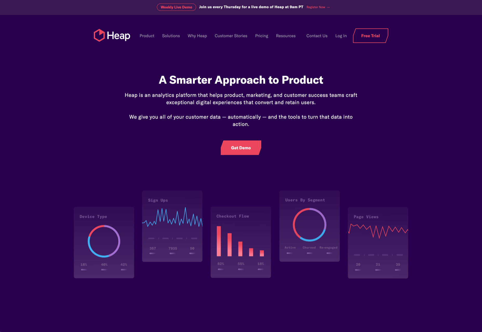
1. Heap

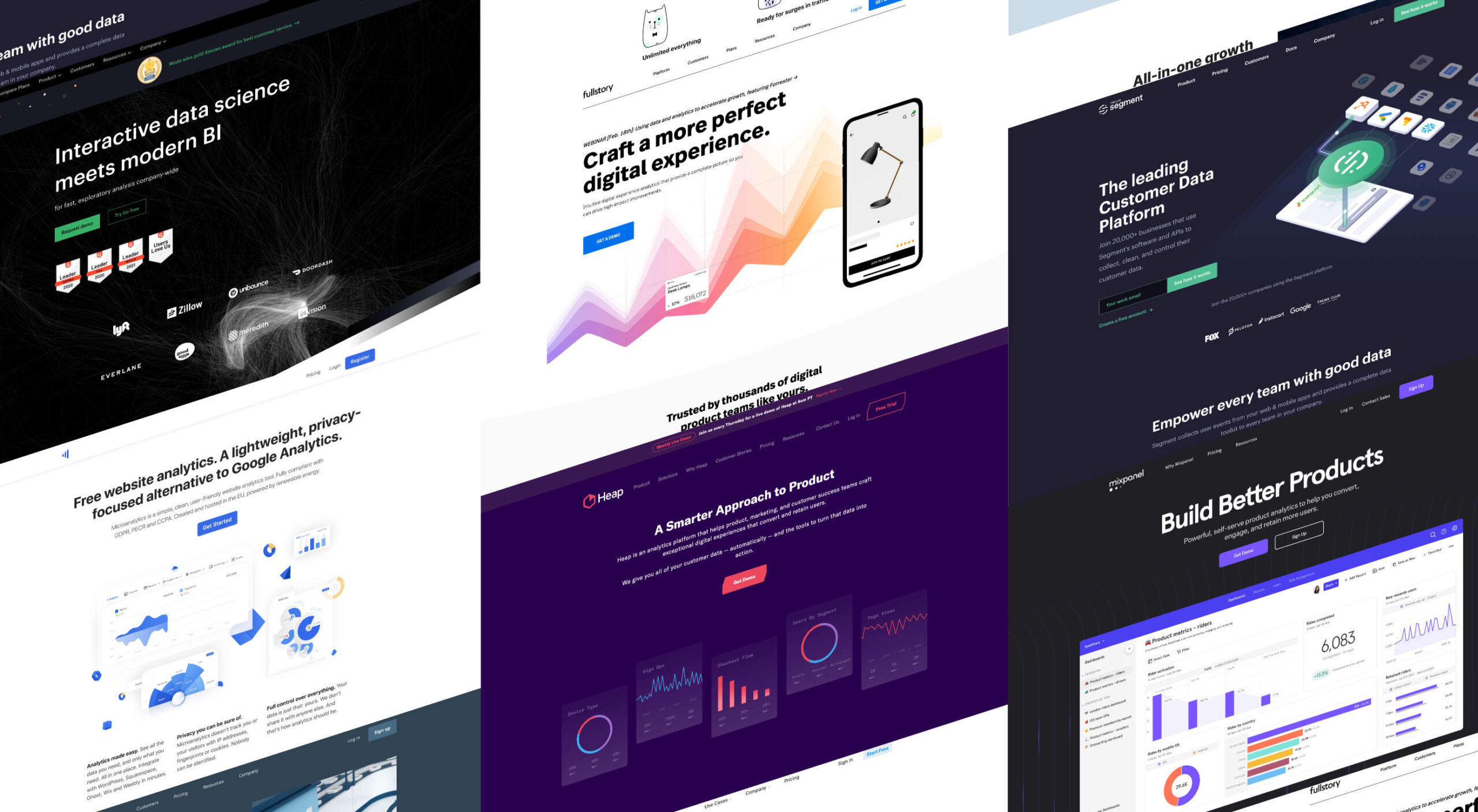
Heap is an event-based analytics platform. That means you can tell not just how many people visited your site but what actions they took when they were there. This isn’t a unique proposition, but Heap is one of the best implementations.

Heap offers an auto-track tool, which is ideal for new installations because you can get up and running immediately and fine-tune the details later. That makes it great for startups, although it’s also the choice of major corporations like Microsoft.

Heap’s free plan includes 60k sessions per year and 12 months of data history, but when you outgrow that, the business plans start at $12,000/year.

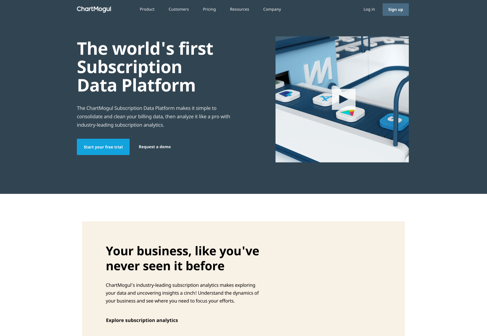
2 ChartMogul

ChartMogul is geared towards SaaS that offer subscription plans, staking a claim as the world’s first subscription data platform.

Services like Buffer and Webflow use ChartMogul to monitor their revenue and analyze the ROI of changes to their features, design, and user experience.

Ideally suited for startups, ChartMogul pricing is based on monthly recurring revenue; it has a free plan for up to $10,000 MMR; after that, pricing starts at $100/month.

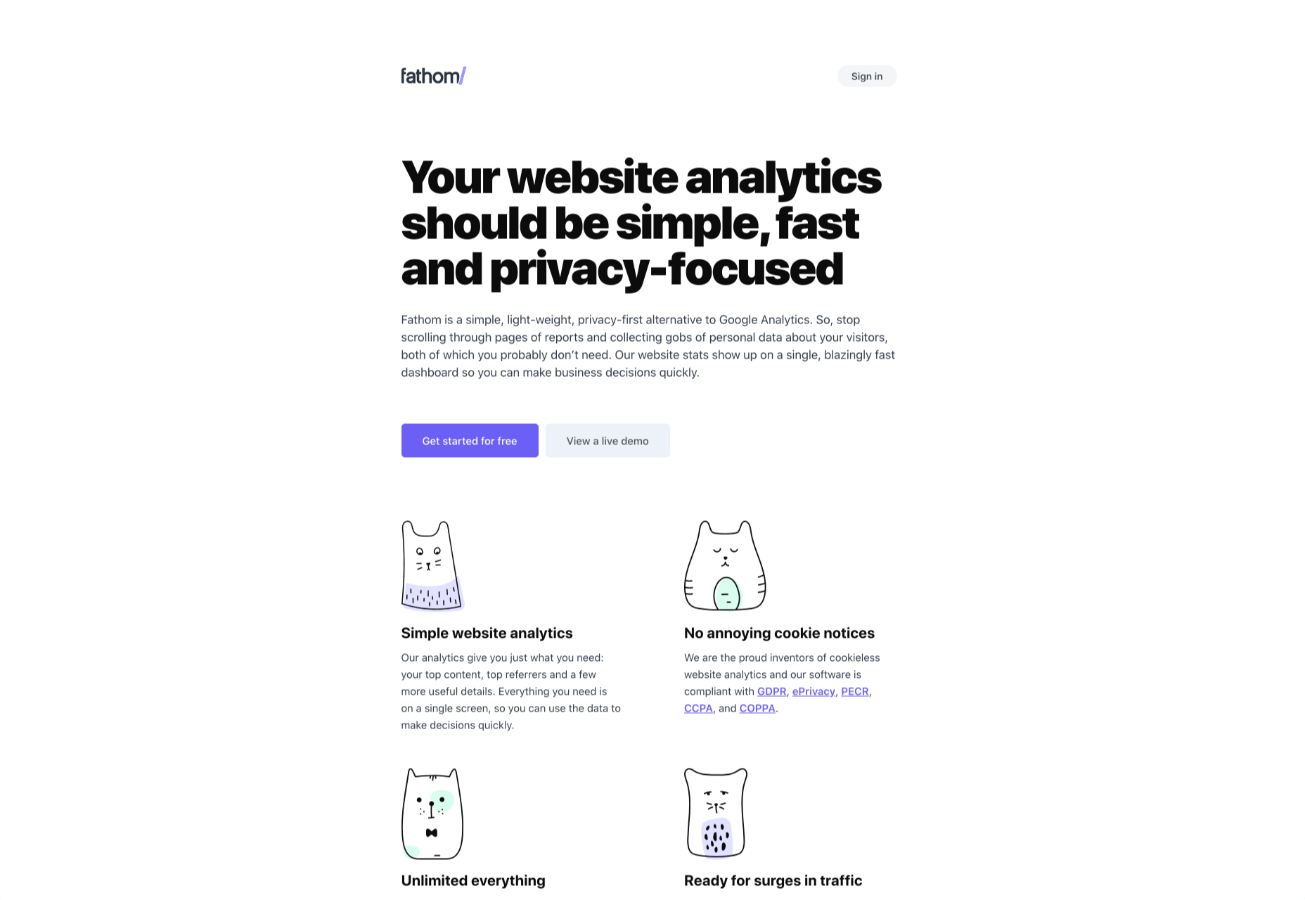
3. Fathom

Fathom is an awesome, privacy-first analytics solution. It offers a simple dashboard and is ideal for anyone looking for simple analytics information to verify business decisions.

Fathom is ideally suited to freelancers, or entrepreneurs with multiple projects, as it allows you to run multiple domains from a single account. Fathom is entirely cookieless, meaning you can ditch that annoying cookie notice. It’s GDPR, ePrivacy, PECR, CCPA, and COPPA compliant.

There’s a seven-day free trial; after that, Fathom starts at $14/month.

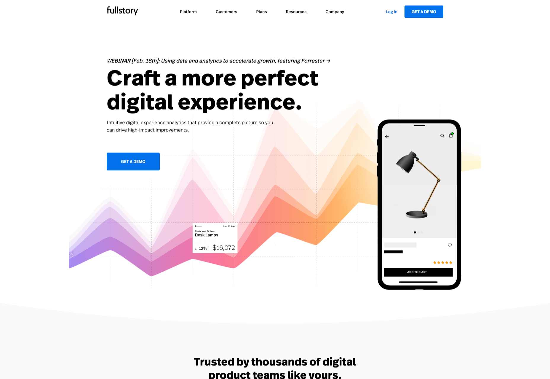
4. FullStory

FullStory is designed to help you develop engaging online products with an emphasis on user experience.

FullStory is a set of tools, making it ideal for large in-house teams or in-house teams working with outside agencies or freelancers. It pitches itself as a single source of truth from which everyone from the marketing department to the database engineers can draw their insights, helping digital teams rapidly iterate by keeping everyone in the same loop.

FullStory uses AI to track and interpret unexpected events, from rage clicks to traffic spikes, and breaks those events down to a dollar-cost, so you can instantly see where your interventions will have the most impact.

There’s a free plan for up to 1k sessions per month; once you outgrow that, you need to talk to the sales team for a quote.

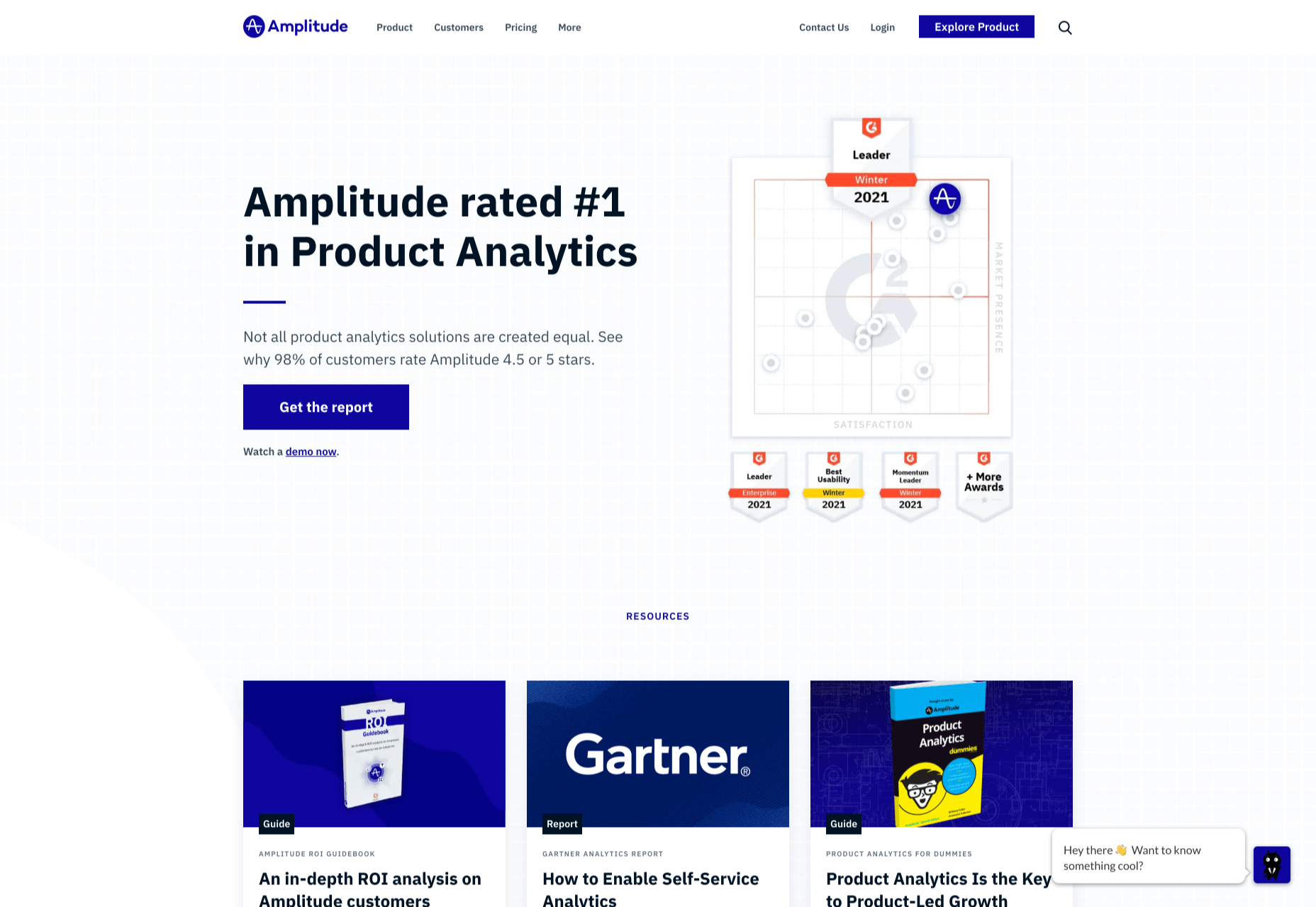
5. Amplitude

Amplitude has one of the most user-friendly dashboards on this list, with tons of power behind it. For project managers trying to make science-based decisions about future development, it’s a godsend.

The downside with Amplitude is that to make the most of its powerful data connections, you need to pump a lot of data in. For that reason, Amplitude is best suited to sites that already have a substantial volume of traffic — among those customers are Cisco and PayPal.

Amplitude provides a free plan, with its core analytics and up to 10m tracked actions per month. For premium plans, you have to contact their sales team for a quote.

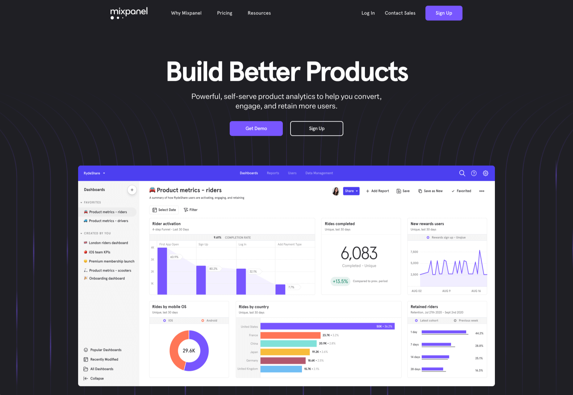
6. Mixpanel

Mixpanel is a little bit more than an analytics program, aiming to be a whole suite of web tools it has ventured into split testing and notifications.

Mixpanel is laser-focused on maximizing your sales funnel. One look at the dashboard, and you can see that Mixpanel, while very well designed, has too many features to present them simply; Mixpanel is ideally suited to agencies and in-house development teams with time to invest — you probably want to keep the CEO away from this one.

Mixpanel has a generous free plan for up to 100k monthly users, with its business plans starting at $25/month.

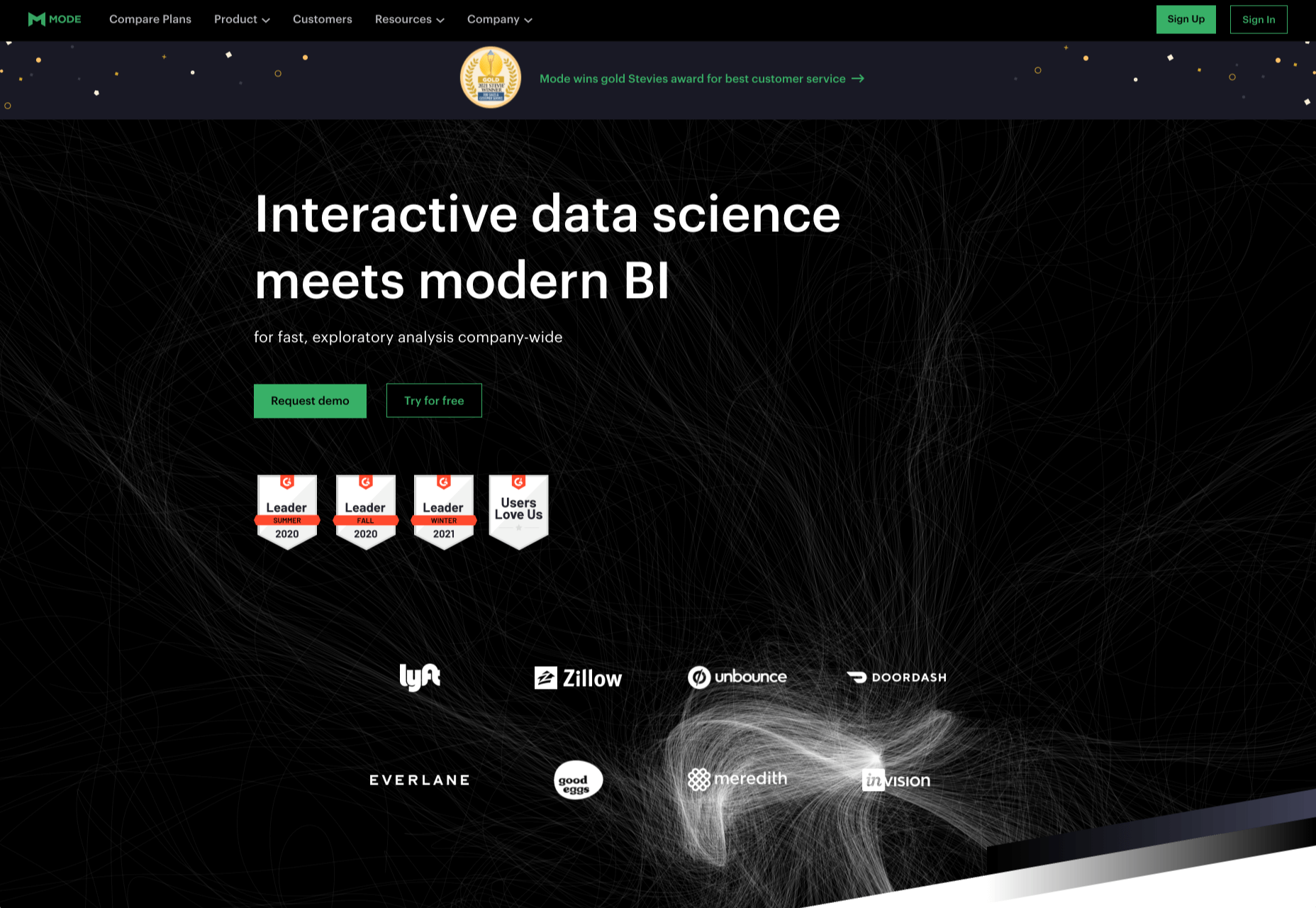
7. Mode

Mode is a serious enterprise-level solution for product intelligence and decision making.

Ideally suited to in-house teams, Mode allows you to monitor financial flow and output the results in investor-friendly reports. You can monitor your entire tech stack and, of course, understand how users are interacting with your product. Wondering who handles the analytics for Shopify? That would be Mode.

Mode has a free plan aimed at individuals, but this tool’s scope is really beyond freelancers, and the free plan’s only likely to appeal to high-price consultants and tech trouble-shooters. For the full business plan, you need to contact Mode’s sales team for a quote.

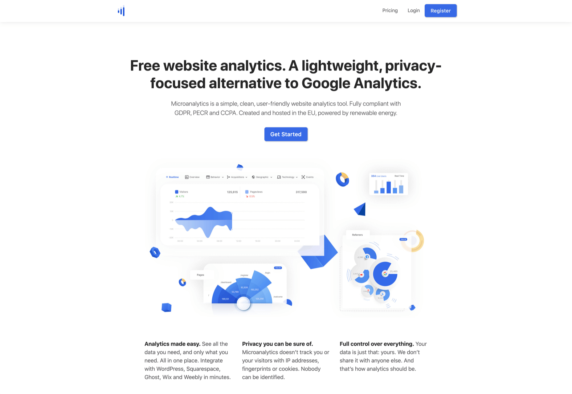
8. Microanalytics

Microanalytics is a relatively new analytics program with a lightweight, privacy-focused approach.

Microanalytics provides a simple dashboard with acquisitions, user location, technology, and the all-important event tracking to monitor user behavior. Microanalytics is compliant with the web’s most stringent privacy laws, including GDPR, PECR, and CCPA. The tracking code is just 1kb in size, meaning that you’ll hardly notice its footprint in your stats.

Microanalytics is free for up to 10k pageviews/month; after that, the monthly plan starts at $9.

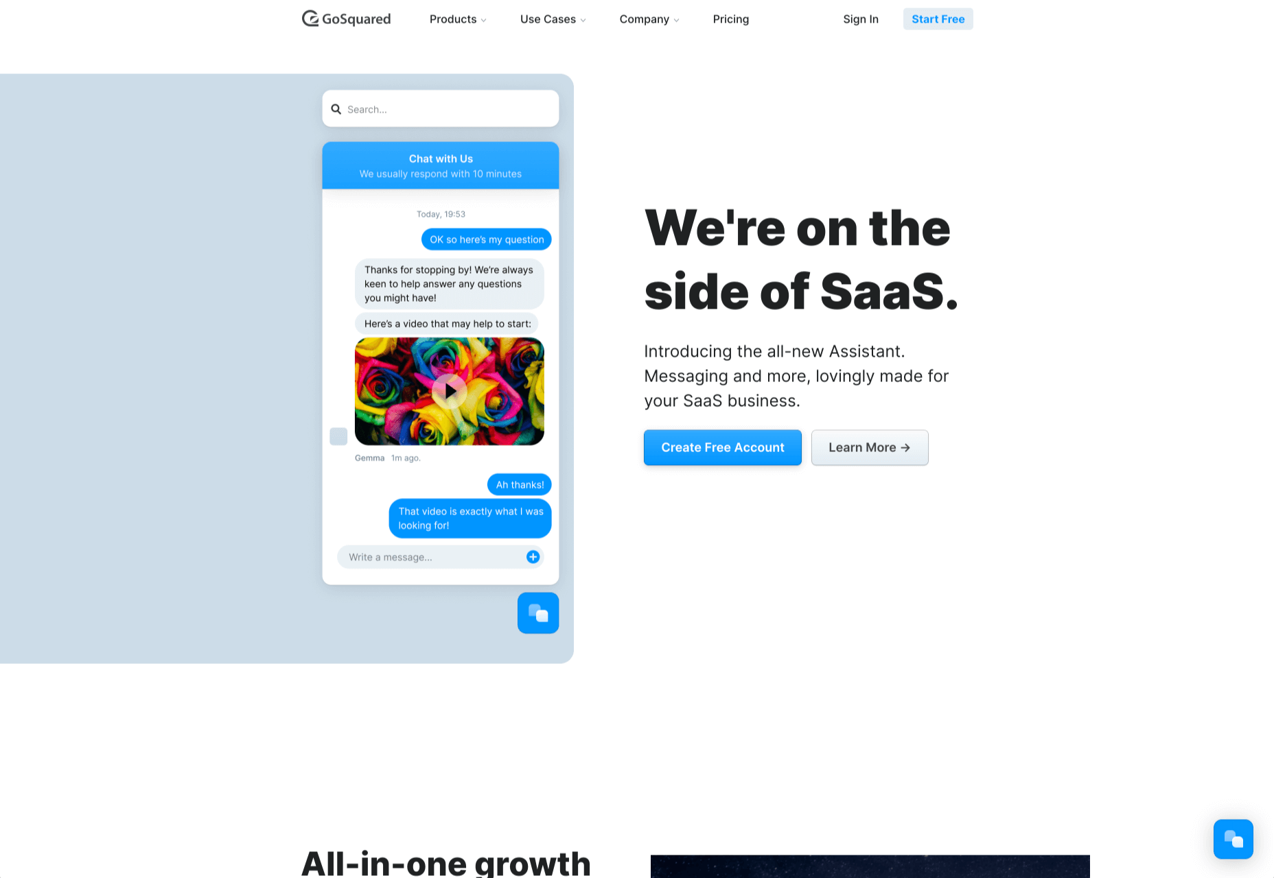
9. GoSquared

GoSquared is another suite of tools, this time aimed at SaaS. Its primary product is its analytics, but it also includes live chat, marketing tools, and a team inbox.

If you’re tired of comparing multiple tools to help make the most of your startup, GoSquared kills several birds with one stone. Perhaps most importantly, if you’re beginning to build a team and don’t have any engineers onboard yet, GoSquared has an award-winning support team and an idiot-proof setup process.

GoSquared has a free plan that’s fine for evaluating the suite and integrating data from day one. As you begin to grow, paid plans start at $40/month.

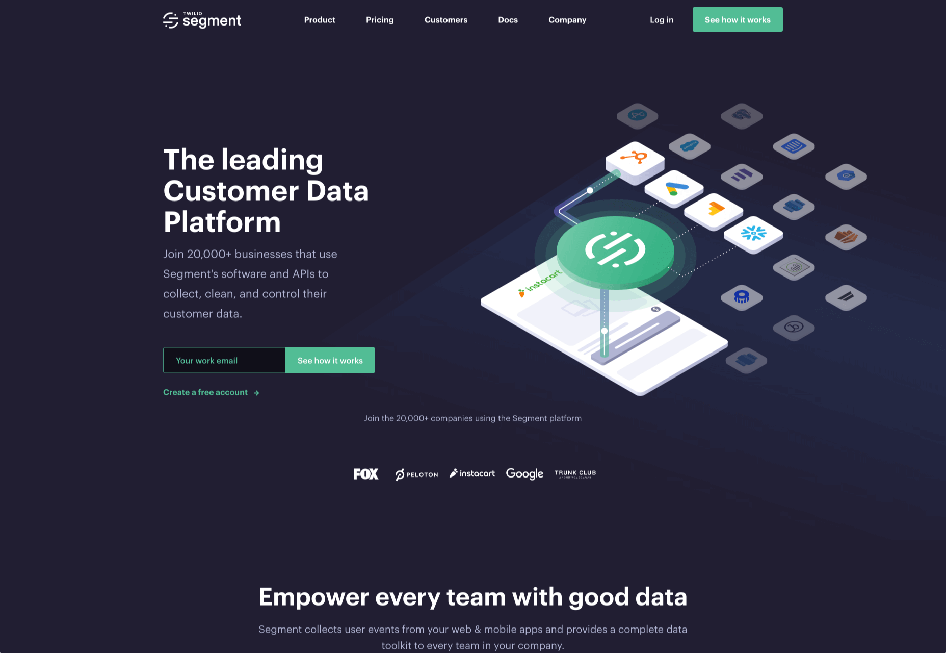
10. Segment

Segment is a little different from the other analytics tools on this list; Segment is a layer that sits between your site and your analytics. It integrates with many of the tools on this list.

There are several benefits to this approach. The main one is that different teams within your enterprise can access analytics data in a form that suits them — designers can access complex data, and management can stick to revenue flow. It also means that you can switch analytics programs with a single setting in Segment and even migrate historical data into new apps. If you’re an enterprise that wants to future-proof its customer intelligence gathering, Segment is worth considering.

Segment is trusted by some of the web’s best-known names, from IBM to Levis, and…ahem…Google.

Segment is free for up to 1k visitors per month, and after that, the team plan starts at $120/month.

Source

The post 10 Best Alternatives to Google Analytics in 2021 first appeared on Webdesigner Depot.


Source de l’article sur Webdesignerdepot

One of the few bright spots in 2020 has been the creativity companies and individuals alike have exhibited in dealing with what, at times, seemed to be overwhelming problems.
The world of web design was no different. Designers and agencies had to adapt and implement new color schemes or design new shopping experiences, which made some of the previous design trends not fit for the current design problems.

We’ll take a look at these newest design trends and the rationale behind them. As we do so, we’ll also take a look at some of BeTheme’s 600+ pre-built sites that have already put them to good use.

1. Comforting Color Palettes Lighten the Load

In years past, bolder color schemes were one of the hallmarks of web design trends. Their purpose was to quickly engage a visitor and prompt him or her to respond emotionally.

Given all the drama and turmoil we were subjected to through most of 2020, we’ve come to welcome the use of toned-down colors in marketing instead of the bolder, brasher, and more “in-your-face” color schemes. 

Bellroy’s website puts toned-down colors to good use. This company’s product line of wallets, bags, and the like, are designed to keep people’s belongings organized, safe, and secure. A wild color scheme simply wouldn’t be fitting.

How, then, are brightly-colored products dealt with? Thanks to judicious uses of white space and background photos, this website still emphasizes a toned-down color palette.

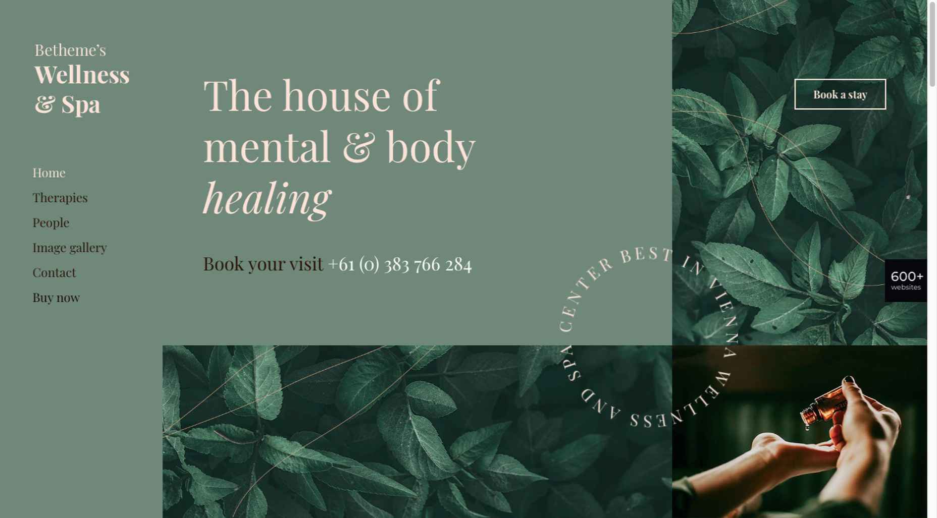
The BeSpa pre-built website is another example of a color scheme that almost immediately puts the mind at ease.

Calm and soothing? Yes.

Boring? Definitely not.

Comfort and security are the emotional drivers in this example.

2. Seamlessly Intermingle and Balance Physical and Digital Imagery

People confined to their homes because of Covid-based restrictions spent many more hours looking at their screens in 2020. Online programming began to take on the appearance of a reality show that blurred the boundaries between the real and the digital.

Whereas web designers tended in the past to rely on either photos or illustrations in their designs, these same designers have started to integrate these blurring effects into their designs, with results that range from amusing and quirky to highly informative.

Check out this example from fashion designer Constance Burke

It’s not every day you see real models wearing hand-drawn fashion sketches. But it’s just one example of how the physical can be blended with the digital.

The BeSki pre-built site does the same blending of the two, but in a totally different way:

The sections’ designs switch from predominantly physical to largely digital and back again, an excellent approach that provides a maximum amount of useful information.

It’s also worth noting how snowbanks are effectively used to seamlessly transition from one section to the next.

3. Create Well-Organized and Helpful Shopping Experiences

More people spending more time at home has created a surge in online shopping. As a result, many online store owners are now feeling the effects of increased competition.

Consumers look for brands they believe they can trust. At the same time, they want their online shopping experiences to be as quick and painless as possible. They look for (and expect) quick and effective product search capabilities, helpful and effective product displays, one-page product descriptions, and the like.

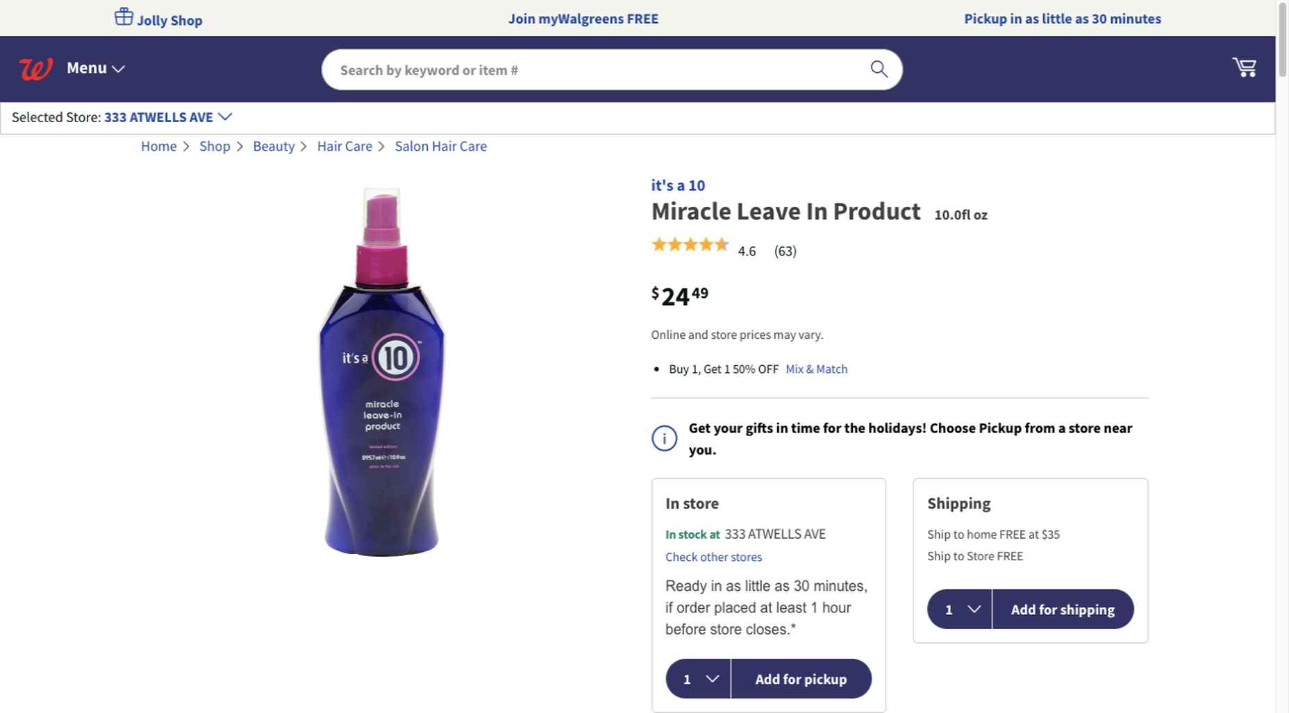
Walgreen’s product page design is especially well-suited for 2021 ecommerce shoppers: 

Everything shoppers usually need to know is presented above-the-fold. They can easily proceed to the next step or scroll down for reviews or additional product specifications. 

BePestControl’s pre-built website uses a similar product design approach: 

In this example, the main selling points are up-front and are kept short and sweet. The shopper can either hit the ‘Add to Cart’ button or look below the button for additional information.

In both examples, a visitor doesn’t have to mull over what step to take next since one of the design objectives is to make the shopping experience as easy and as satisfying as possible.

4. Take Advantage of the Benefits of User-Controlled Video Content

Once upon a time, video content was “the thing” to incorporate in a website. Hero background videos proved to be particularly engaging, and “how-to” videos presented much more useful information than illustrations or blocks of text could.

On the other hand, Auto-play videos, those that started on their own, all too often had a tendency to irritate rather than inform, especially when their content didn’t address a visitor’s immediate concern.

Thanks to Zoom and similar video platforms that came into widespread use in 2020 and to website designs that include video “Play” buttons, users have become much more comfortable with the medium. As an example, Shoppers have been given total control over if or when they want to view a given video. 

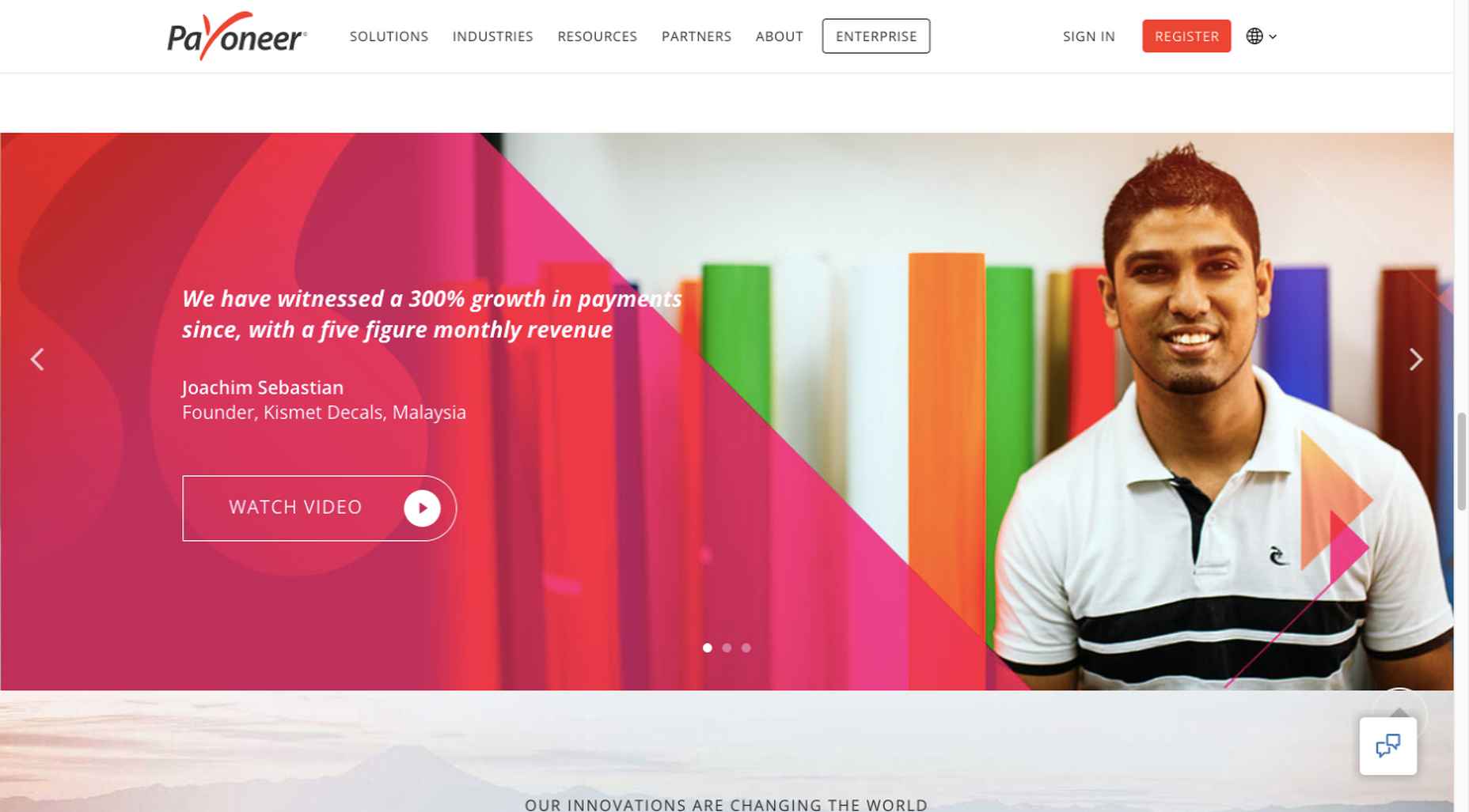
This is the design approach Payoneer has taken: 

The white “Pay” button is impossible to miss, and while it is designed to encourage a visitor to watch a testimonial, doing so is completely optional.

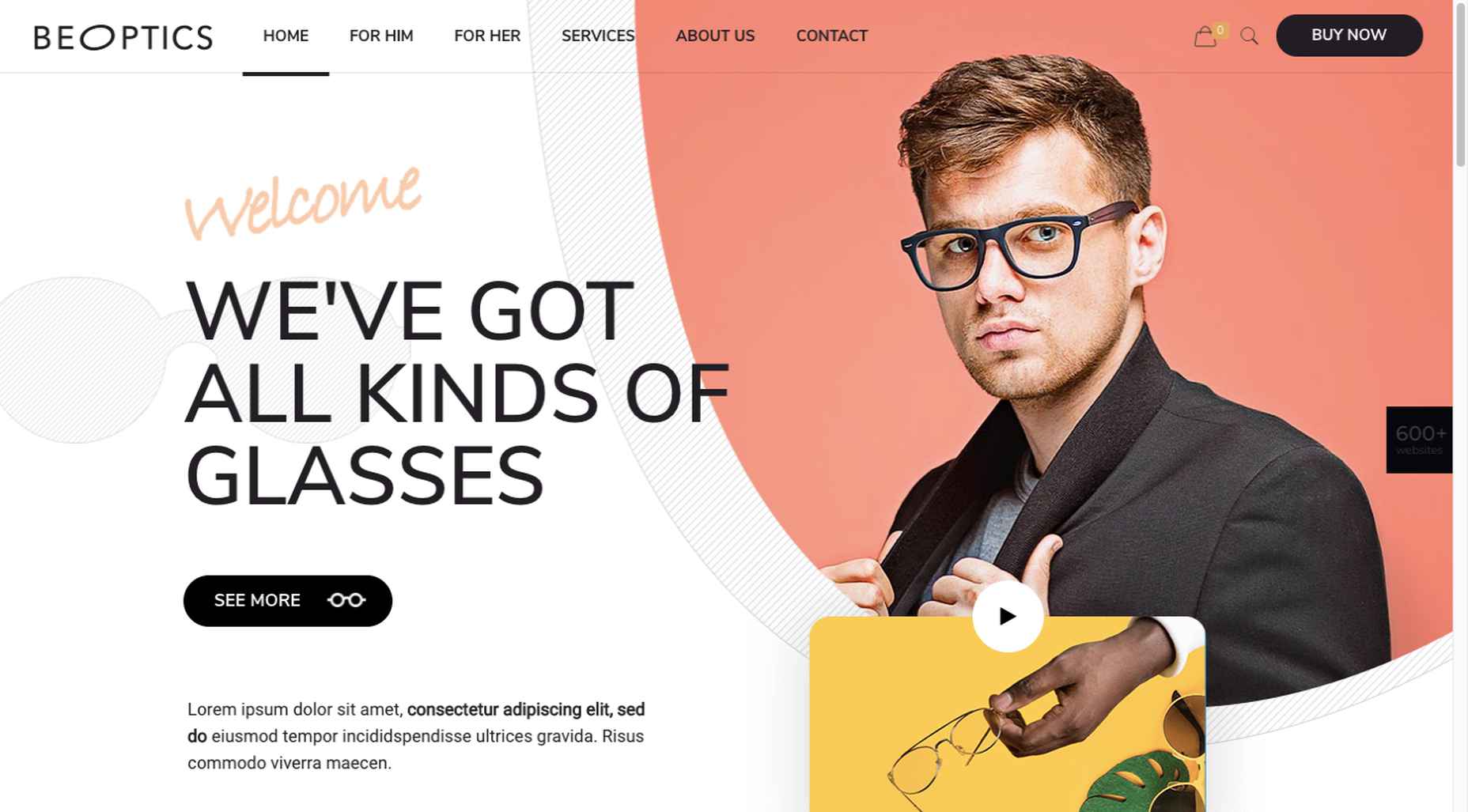
The BeOptics pre-built website cleverly slips in a video play option as well: 

In this example, when visitors hover over the “See More” button, it lets them know that they have the option to watch the video if they want to learn more.

5. Trust Builders Should be Non-Negotiable Web Design Elements

There are various ways in which products are organized or showcased in brick and mortar businesses to instill trust. Helpful and friendly staff also contribute to instilling trust.

Some of these trust-builders are easily incorporated into eCommerce designs. Others, though more difficult to fit in, can usually be satisfactorily addressed.

Digital trust builders can include.

  • Logos (familiar, whimsical, innovative, engaging)
  • Portfolios and/or product pages
  • Customer reviews, product ratings, and client testimonials
  • Case studies and product or price comparisons
  • Safety and security seals, e.g., Better Business Bureau, PayPal checkout
  • Charts, graphs, counters, and other data visualization techniques
  • Proof of social, charitable, or community-related actions and contributions

Put, trust-building content will beat hard-sell techniques every time, especially if you would like your customer base to include referred and repeat customers.

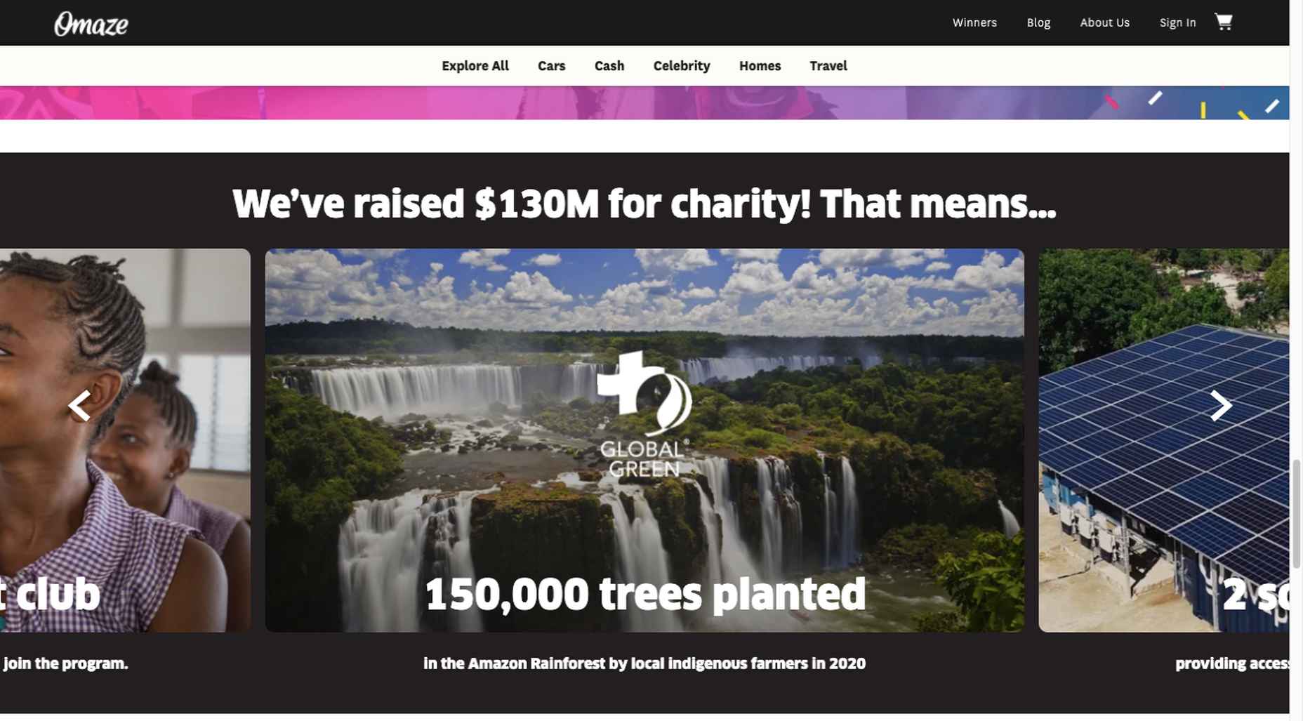
Omaze, for example, gives people entries for prizes based on their donations while at the same time highlighting the good things it and its donors have brought about.

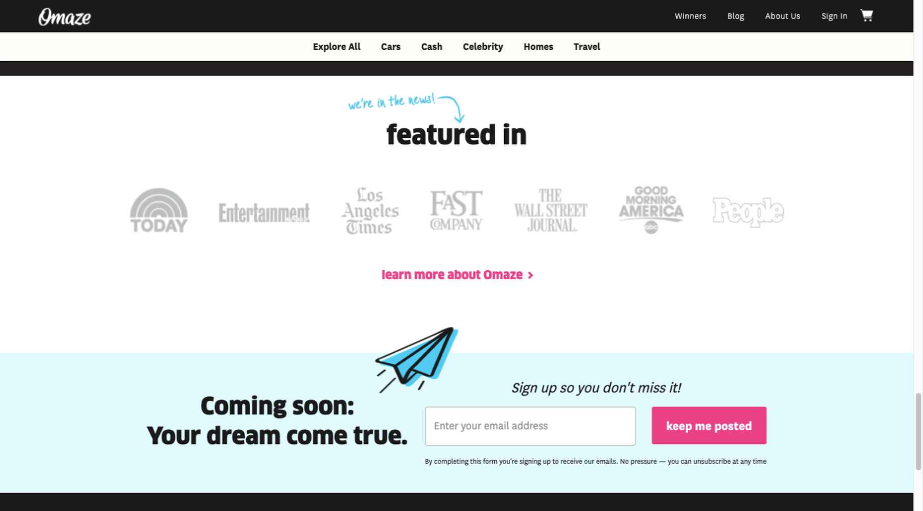
To help build trust, the site devotes space to highlighting publications that have featured Omaze and the work it has done and is doing.

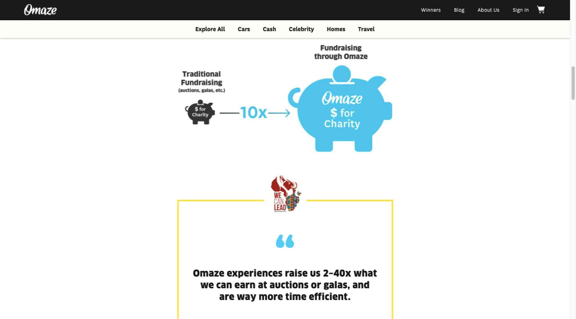
Plus, it puts data visualization and non-profit testimonials into play to give visitors an added insight into what is going on behind the scenes: 

As you can see, it doesn’t have to be difficult to incorporate genuine trust-building content into your website designs.

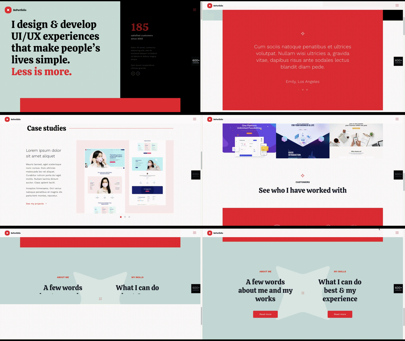
BePortfolio is a great example of how you might go about doing this for a portfolio site, whether it’s your own or a site for a client:

The home page alone has plenty of space for including trust-building content:

  • A satisfied customer counter
  • Product usage case studies and testimonial
  • Portfolio highlights
  • Client and partnership logos

And it can only get better as a visitor moves through the site, but only if you’ve chosen to make that happen.

Have You Started to Take These New Web Design Trends to Heart?

We’re not suggesting that you throw the baby out with the bathwater, but some trends will need to be discarded to enable you to adjust to a new normal. Other 2020 design trends, like minimalism and headline topography, are likely to remain popular for years to come.

New trends that incorporate calming color palettes, image blending, more efficient eCommerce UX designs, user-controlled video, and trust-building elements should give your customers the feeling of comfort and security they will be seeking in 2021.

If you want to implement some or all of these new trends in your 2021 website designs, BeTheme’s 600+ pre-built sites make doing so an easy task.


[– This is a sponsored post on behalf of BeTheme –]

Source

The post 5 Web Design Trends and Ideas for 2021 first appeared on Webdesigner Depot.


Source de l’article sur Webdesignerdepot

When creating a website, it’s vital to remember that not only does it need to work and look great on the device you are creating it on, but on all the other devices, it might be used on too.
Mobile and tablet optimization is important not only for the user journey but from an SEO point of view too, and badly created mobile sites just don’t cut it anymore.

With more and more devices entering the market, you need to check any website you create is compatible across the board. One bad experience and users are likely to leave and not come back again, which can be catastrophic for a business, particularly if it is just starting out.

It’s vital to check how a site looks and behaves when browsed differently from how you would use it. A common mistake is to assume users only browse websites on mobile devices in portrait mode; they don’t; landscape browsing is common, especially if the user is used to watching video.

Here are some of our top tools for testing websites on devices without the need for an entire device library:

1. Multi-Screen Test

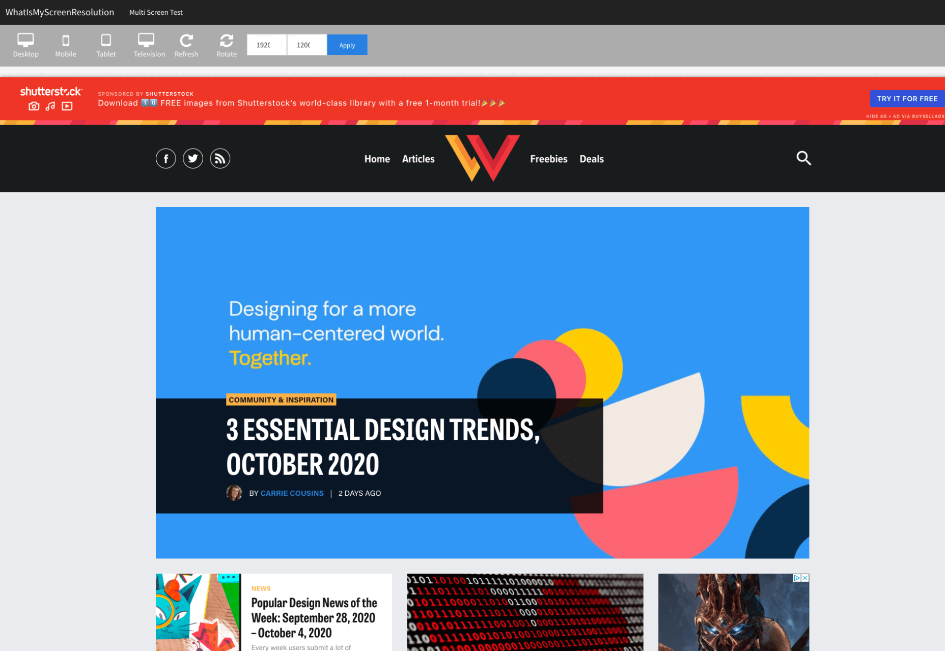
WhatIsMyScreenResolution offers a great little tool to test how your site will look on different devices easily, and it costs absolutely nothing. You put the URL and choose between desktop, mobile, tablet, and television and then the orientation. Each device can also be broken down into different sizes and resolutions (or you can enter your own), making it easier than ever to test what a site will look like on different devices.

2. Responsinator

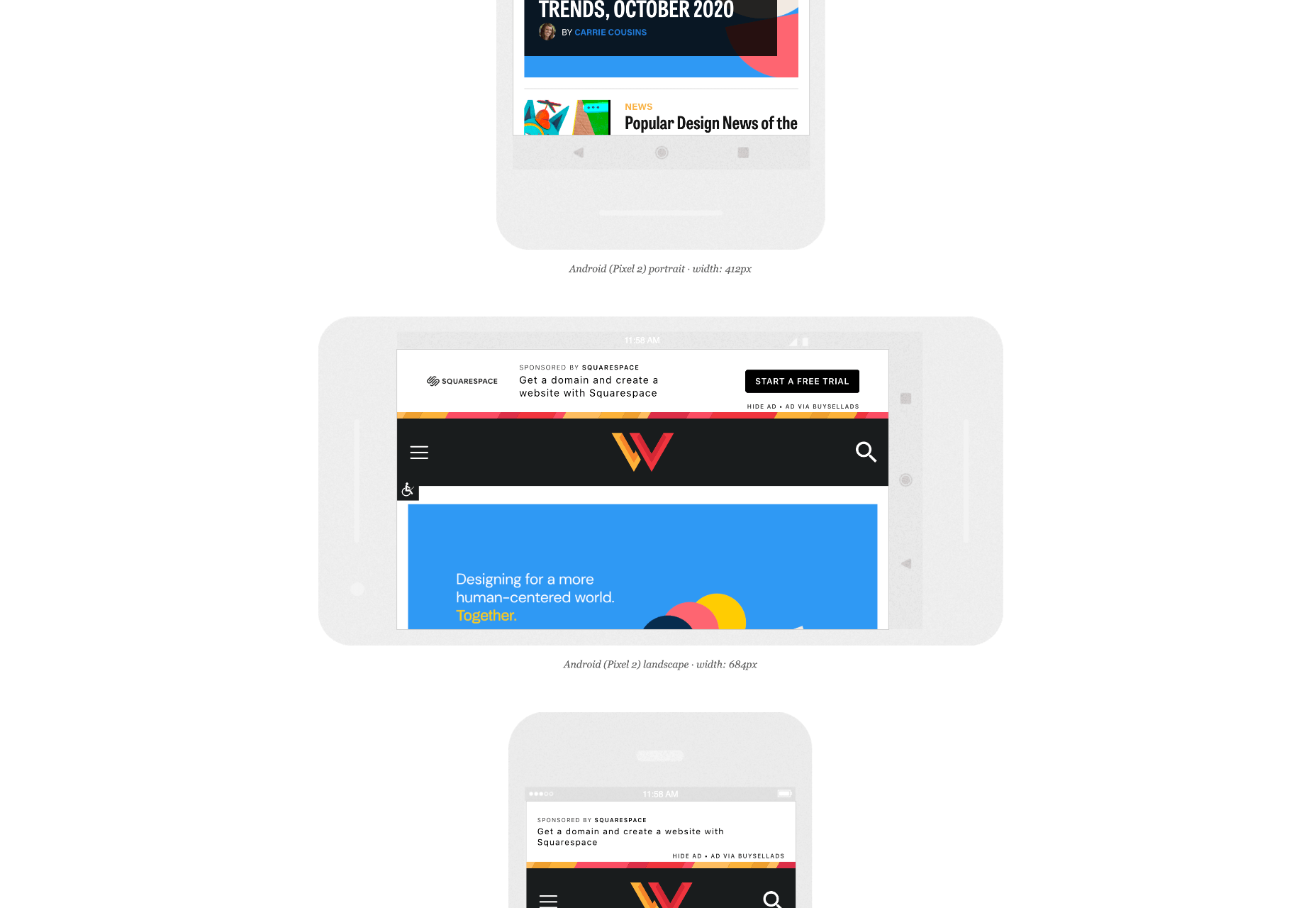
Responsinator is another great tool to test how a site looks on other devices without dipping into your wallet. Put your URL in the top bar, and it will instantly show you what it looks like on generic devices. This is a great, easy to use tool, and you can click through any links on your site to check the usability of multiple pages. This site is free, but if you want to “create your own” template, you need to sign up.

3. Google Dev Tools

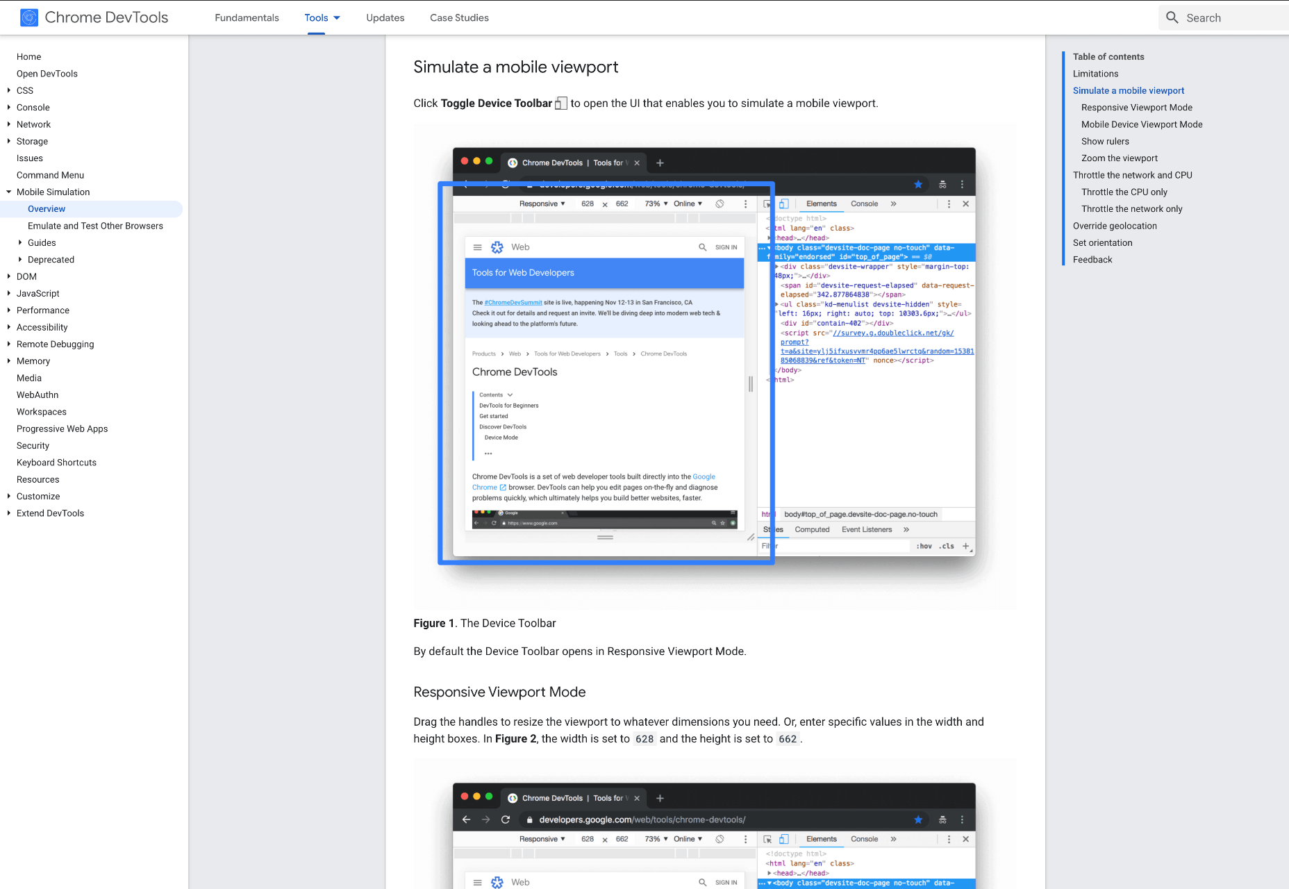
Google Dev Tools is one of the most commonly used free tools. Add it to Chrome, and you can see how your site looks in a multitude of different screen sizes and resolutions. You can simulate touch inputs, device orientation, and geolocation to test how they work. It’s great to easily spot problems using their remote debugging tool to view, change, debug and profile a page’s code directly from your laptop or computer while viewing it on your mobile device.

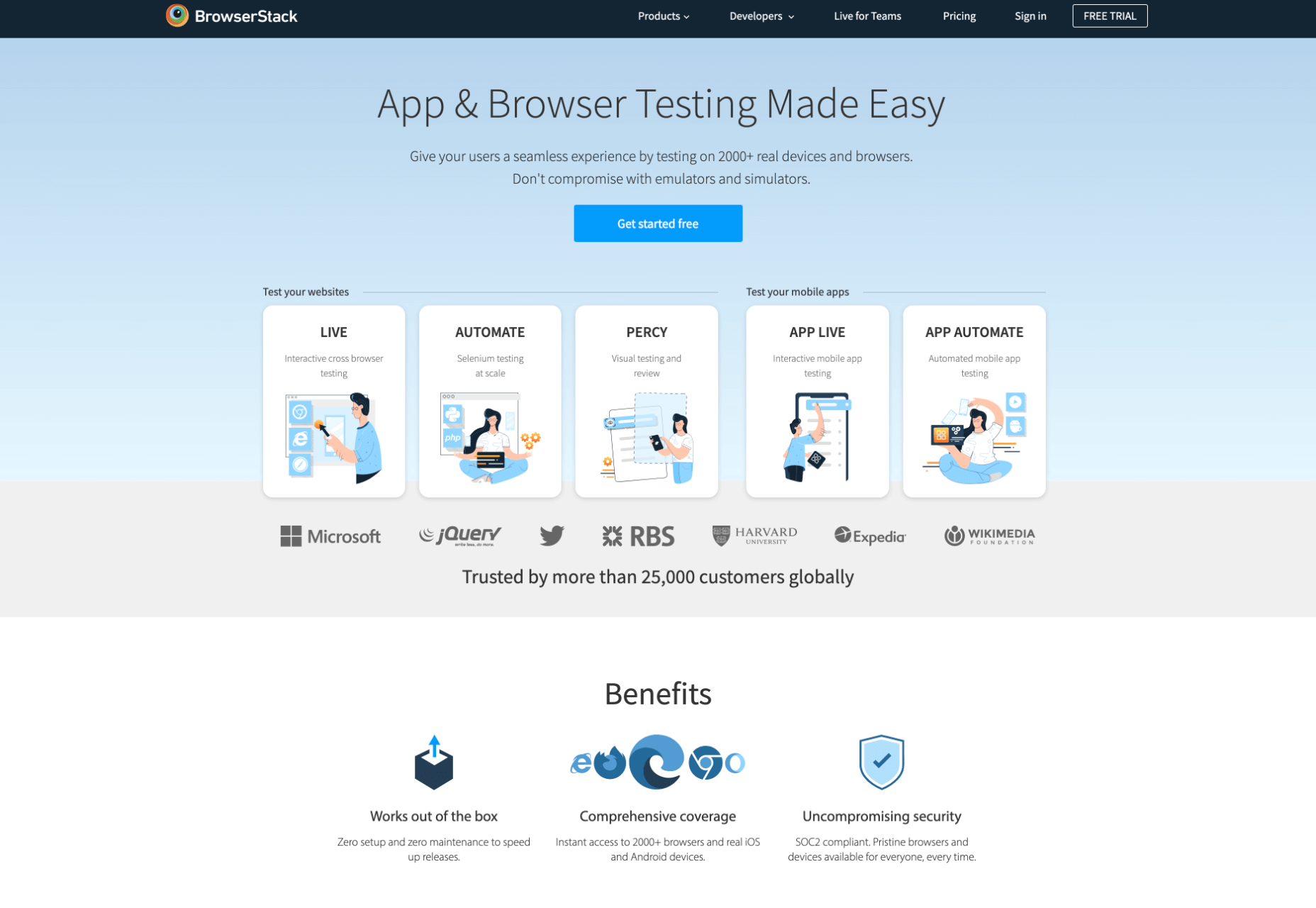
4. Browser Stack

Browser Stack allows you to test your site on over 2,000 real devices and browsers, enabling you to see in real-time how your site looks. It is no hassle to set up, and it can be seamlessly integrated into your setup. As it tests on real browsers on real machines, you know the results are more reliable and accurate. It also enables you to debug in real-time using their pre-installed developer tools for ease of editing. The tests are all run securely on tamper-proof physical devices and are wiped clean of all data after each session, so you don’t need to worry about security being compromised.

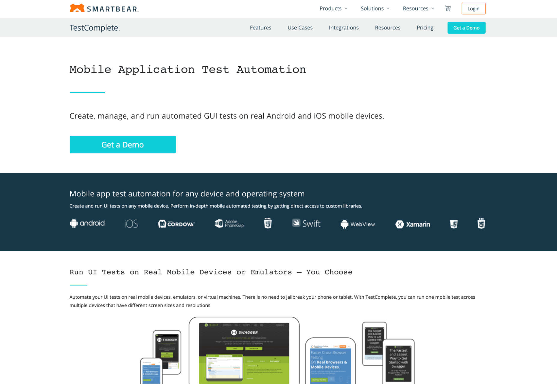
5. TestComplete Mobile

TestComplete Mobile allows you to create and run UI tests across real mobile devices, virtual machines, and emulators. You can test both mobile device layouts and apps with script-free record and replay actions. This can help you to edit and fix any potential issues that may arise during the tests. Due to them being conducted on real devices, you know it is less likely to have errors in the system than a simulated device. This is free for 30 days then can get pricier, so make sure you take advantage of the trial and try the service before committing to it.

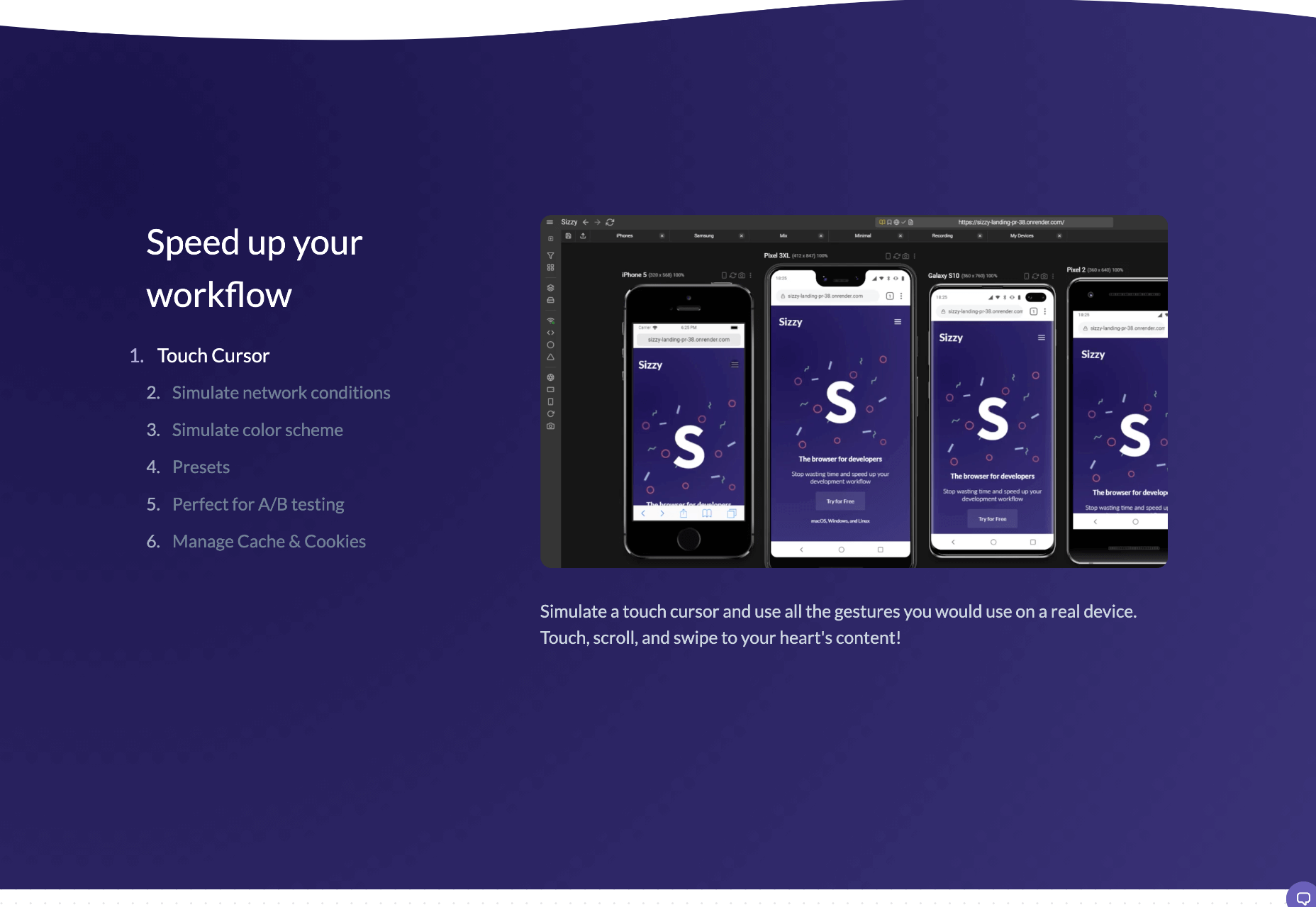
6. Sizzy

Sizzy is a great tool for checking sites, and it has a host of features to assist you. You can rotate the screen between portrait and landscape, filter by OS and device type, switch themes, and take screenshots. These little things mean it’s a super easy to use and convenient tool. It claims to simulate each device’s viewport and user agent, meaning the results are the same as what you would actually see on that phone/ tablet, etc. It can’t simulate different browser rendering engines however, so there’s a chance there might be some minor differences compared to the actual thing. Sizzy offers a free trial or has different price packages starting at $5 per month.


Featured image via Unsplash

Source

The post 6 Tools for Rapid Cross-Device Website Testing first appeared on Webdesigner Depot.


Source de l’article sur Webdesignerdepot

The holidays are fast approaching. But that doesn’t mean it’s too late to get a new website online or to make your existing one look festive for the holiday season.
When it comes to decking the halls of your website with a little festive cheer, how do you do this without spending loads of money and time on it?

You’re in luck. BeTheme has a variety of pre-built websites to help you do just that. Not only that, but you can use these festive websites for a variety of occasions, like:

  • Hanukkah
  • Kwanzaa
  • Christmas
  • Boxing Day
  • New Year’s

You could also just use one of these sites to make your website feel more seasonal as the temperatures get colder and the snow starts to fall. (If that’s what your winter wonderland looks like!)

Let’s have a look at 4 ways you can bring a little seasonal or holiday cheer to your visitors with a festive website from BeTheme:

Tip #1: Use a Page Builder That Makes it Easy to Swap in Festive Content

Unless you’re running a business like the Christmas Tree Shops, it doesn’t make a lot of sense to have holiday imagery up all year long.

The only problem, though, is that it can be a real pain having to go in, find a new theme, and then redesign your site around it… For only a month or two.

That issue is easily resolved with BeTheme, which comes with over 600 pre-built websites and two page builders — Muffin and Elementor.

Because there are so many pre-built sites available, you can easily switch to a non-festive website once the holiday season is over.

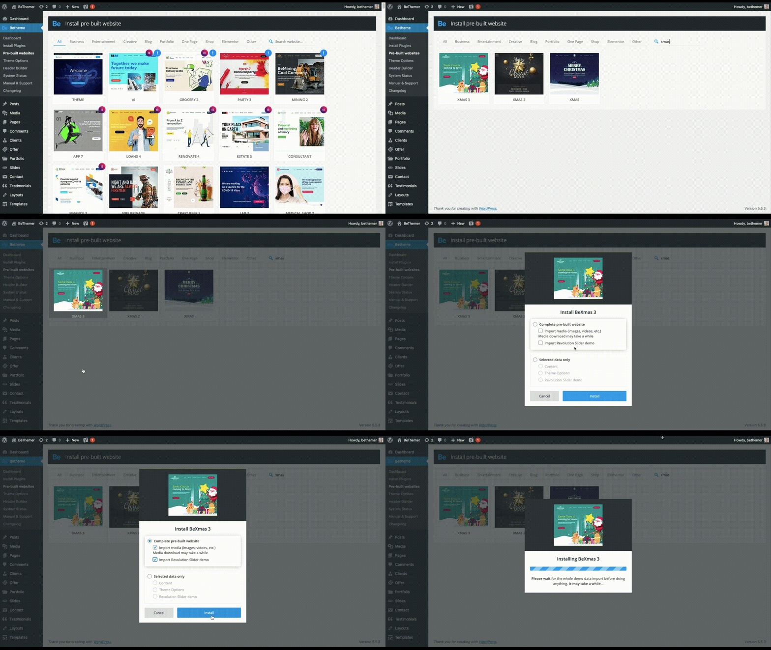
In order to swap out this design with a festive website, you’d first have to reset your theme (which Be provides instructions on how to do). Then, install the new site you want to use.

Like BeXmas:

And if you only want, say, a new hero image in the top of your website, you can cherry-pick which parts of the pre-built site you install.

Tip #2: Effortlessly Switch From One Holiday to the Next

Let’s be honest, the winter holiday season can feel a little nuts — not just because your business has to keep up with the change of pace, but because your website has to keep in step with what’s going on.

So, let’s say you have an ecommerce site that changes frequently for upcoming sales, holidays, events, and so on. For this, you could use the BeMall pre-built site (all year long, mind you):

As you can see, it currently has a Black Friday message on the homepage. It’s not uncommon to have to transition from Black Friday or Cyber Monday into the December holidays.

Here’s how you might do that:

The update can be as minor or major as you want. So long as you use graphics and content that stay on-brand, you can easily swap out as much of your imagery as you like.

Tip #3: Use Small Animations to Bring the Holidays to Life

Holidays should be a time to lift spirits. Having a website that’s able to satisfy your customers’ needs during the holiday season will certainly help.

You might also want to think about adding small animations to your design, too.

The animations themselves don’t have to be festive, but you can use them to call attention to holiday-themed content. Take, for instance, BeParty:

You don’t need to have champagne bottles popping or streamers flying across the screen to get your point across.

This animation gives the New Year’s party balloons a gentle and natural feeling of bobbing up and down. An attention to a detail this small is sure to bring a smile to your visitors’ faces.

Tip #4: A Little Hint of Seasonal Flavor Can Go a Long Way

Holiday celebrations aren’t always big blowouts. Unless your entire business is going all-in on the holidays (or it’s a totally holiday-themed business), there’s no reason your site should have to go all out either.

Sometimes a more understated approach is best.

In that case, you’d keep your normal branded elements, imagery, and content in place on the website. But to make it feel a little more festive, you could infuse your site (at the very least, the homepage) with slight seasonal or festive touches.

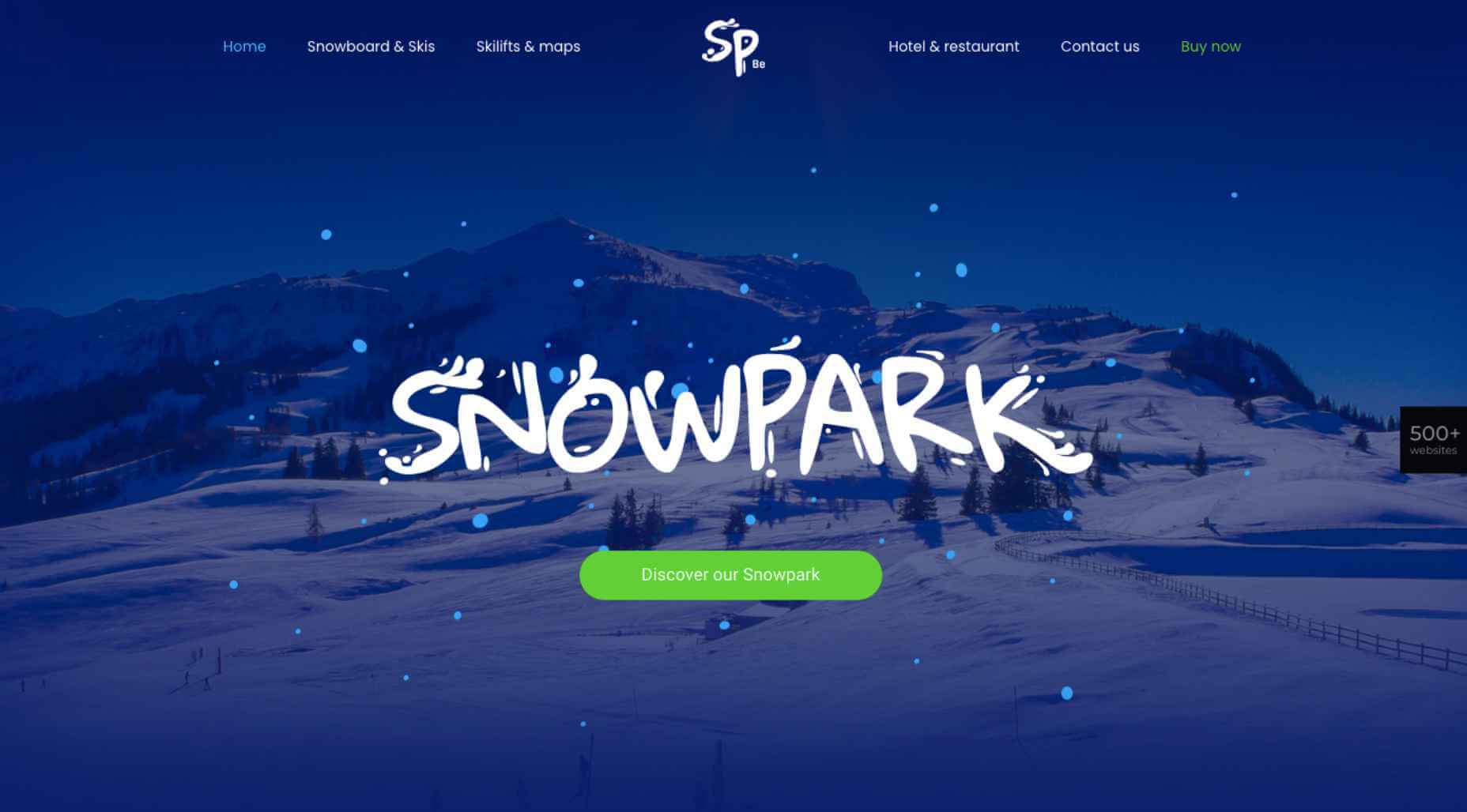
For instance, let’s say you’ve built a website for a popular ski resort. Your website might look like the BeSnowpark site does normally:

The main draw of the resort is skiing, so it wouldn’t make much sense to change the graphics. However, you could do something like this:

It’s a small enough change, but the gift emoji and bigger lettering in the green button might inspire loyal snowbirds as well as first-time visitors to more quickly book their much-needed holiday getaway.

Get Your Festive Website for Christmas, New Year’s, and More

There are many science-backed reasons why a festive website is a good idea.

Holiday decorations, in general, stir up positive feelings of nostalgia for many people. They can also help alleviate some of the stress that’s built up over the course of the year:

What’s more, holiday decorations can visually signal to others that you’re friendly and accessible, even if they don’t know you.

Sounds exactly like how you want visitors and prospects to feel, right?

As you can see, there are many ways to decorate your website for the holidays. To do it quickly and affordably — and not completely turn your regular website upside-down — a BeTheme pre-built site is the way to go.


[– This is a sponsored post on behalf of BeTheme –]

Source


Source de l’article sur Webdesignerdepot

In the spirit of fall feasts, this month’s collection of tools and resources is a smorgasbord of sorts. You’ll find everything from web tools to icon libraries to animation tools to great free fonts. Let’s dig in.
Here’s what new for designers this month.

The Good Line-Height

The Good Line-Height is the tool you won’t be able to live without after using it a few times. The tool calculates the ideal line-height for every text size in a typographic scale so that everything always fits the baseline grid. Set the font size, multiplier, and grid row height to get started.

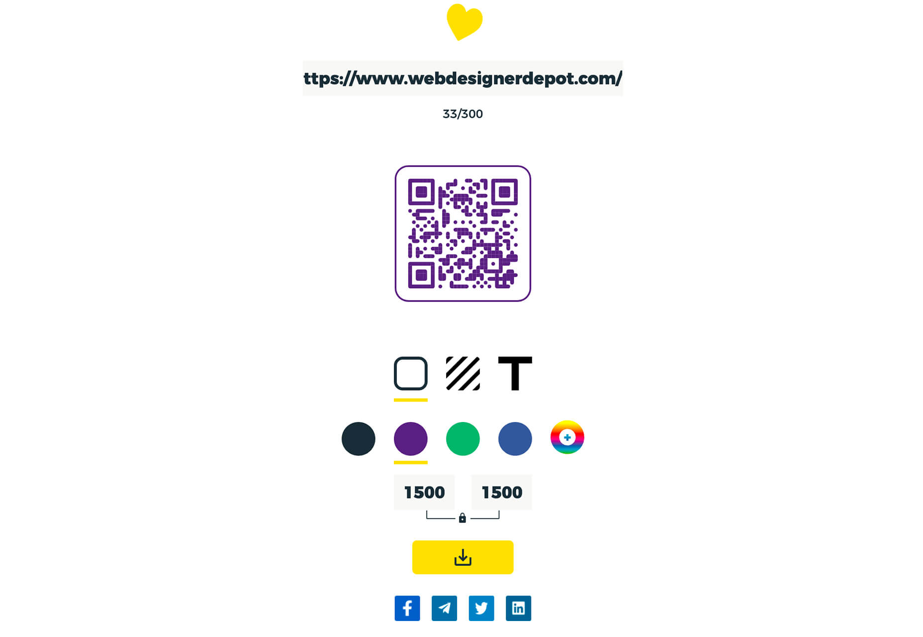
Link-to-QR

Link-to-QR makes creating quick codes a breeze. Paste in your link and the tool creates an immediate QR code that you can download or share. Pick a color and transparency, plus size, and you are done.

Quarkly

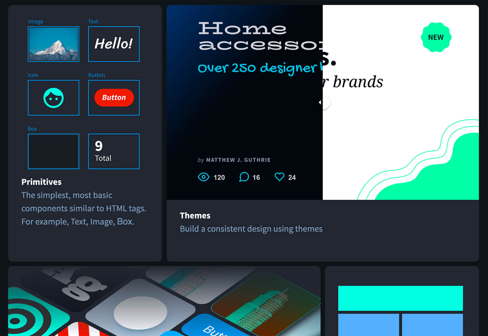
Quarkly allows you to create websites and web apps both using a mouse and typing code – you get all the pros of responsive editing, but can also open the code editor at any time and manually edit anything and it all synchronizes. The tool is built for design control and is in beta.

UnSpam.email

Unspam.email is an online spam tester tool for emails. Improve deliverability with the free email tester. The service analyzes the main aspects of an email and returns a spam score and predicts results with a heat map of your email newsletter.

Filmstrip

Filmstrip allows you to create or import keyframe animations, make adjustments, and export them for web playback. It’s a quick and easy tool for modern web animation.

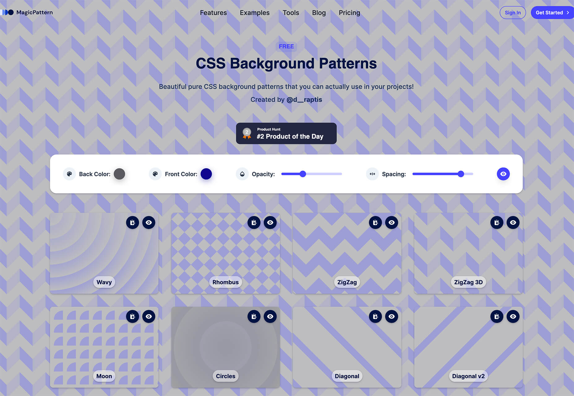
CSS Background Patterns

CSS Background Patterns is packed with groovy designs that you can adjust and turn into just the right background for your web project. Set the colors, opacity, and spacing; then pick a pattern; preview it right on the screen; and then snag the CSS. You can also submit your own patterns.

Neonpad

Neonpad is a simple – but fun – plain text editor in neon colors. Switch hues for a different writing experience. Use it small or expand to full browser size.

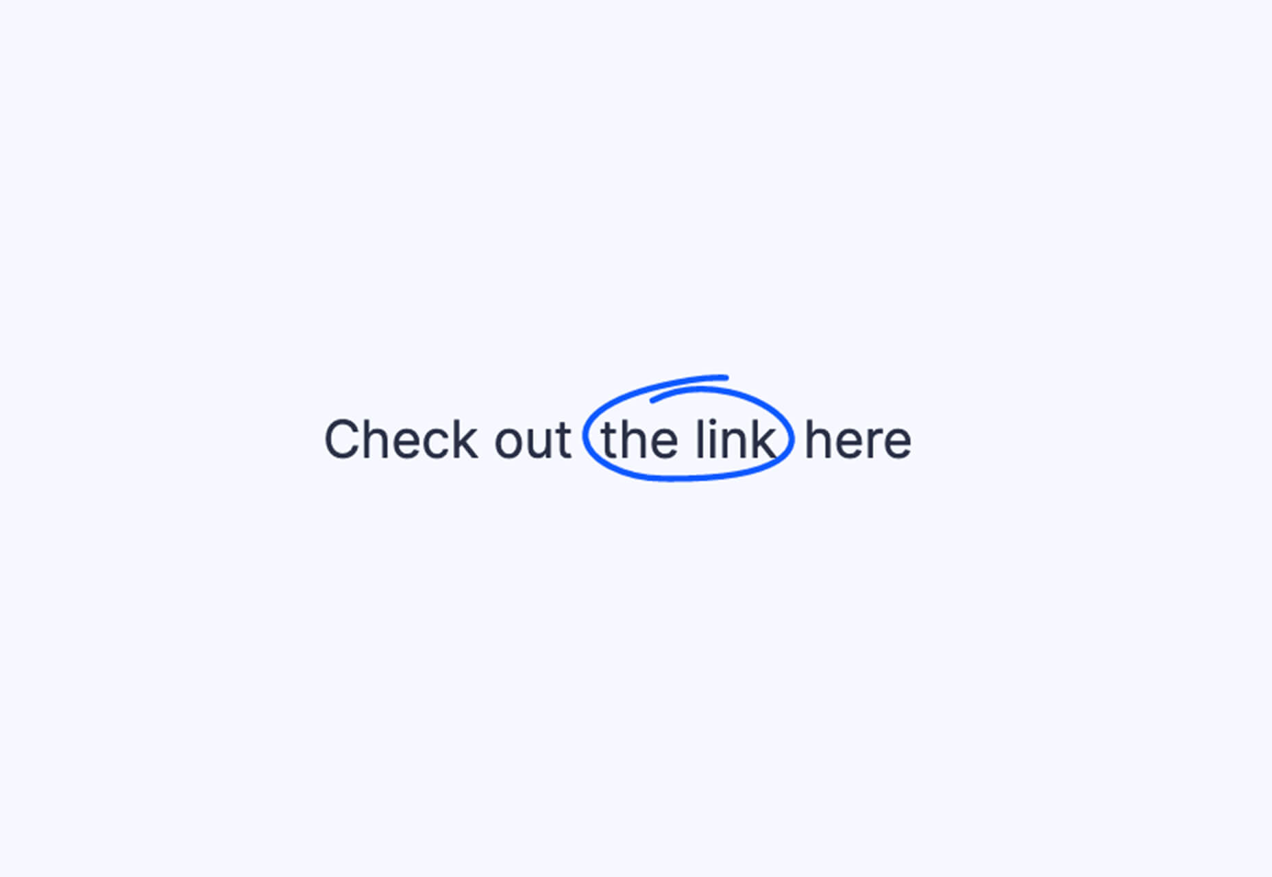
Link Hover Animation

Link Hover Animation is a nifty twist on a hover state. The animation draws a circle around the link!

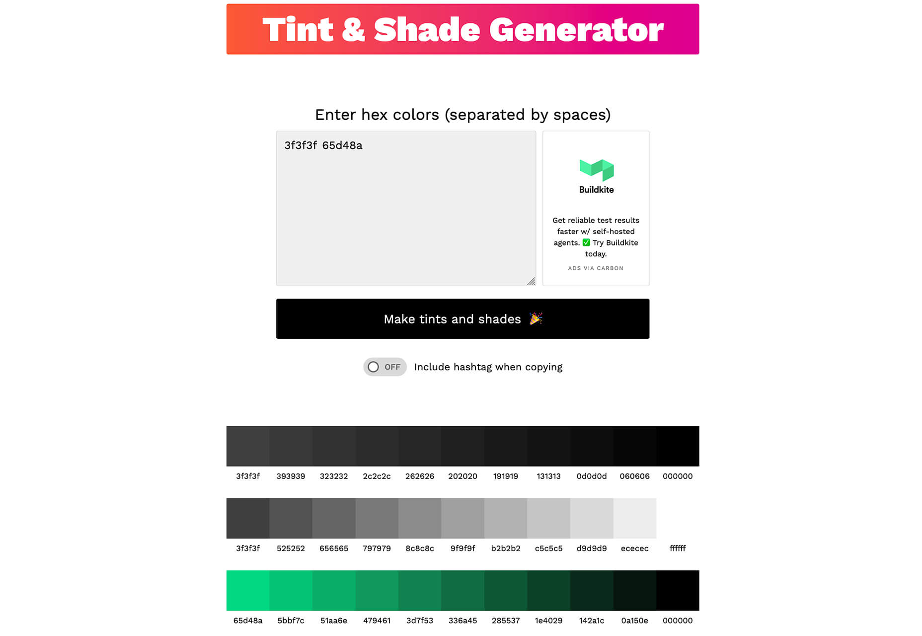
Tint and Shade Generator

Tint and Shade Generator helps you make the most of any hex color. Start with a base color palette and use it to generate complementary colors for gradients, borders, backgrounds, or shadows.

Pure CSS Product Card

Pure CSS Product Card by Adam Kuhn is a lovely example of an e-commerce design that you can learn from. The card is appealing and functional.

Free Favicon Maker

Free Favicon Maker allows you to create a simple SVG or PNG favicon in a few clicks. You can set a style that includes a letter or emoji, font and size, color, and edge type and you are ready to snag the HTML or download the SVG or PNG file.

Ultimate Free iOS Icon Pack

The Ultimate Free iOS Icon Pack is a collection of 100 minimal icons in an Apple style. With black and white version of each icon and original PSD files, you can create sleek icons for your iPhone screen in minutes. And it’s completely free! No email address or registration required.

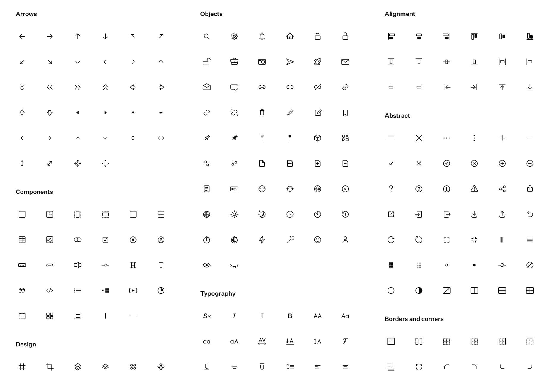
Phosphor Icon Family

Phosphor is a flexible icon family for all the things you need icons for including diagrams and presentations. There are plenty of arrows, chats, circles, clocks, office elements, lists, business logos, and more. Everything is in a line style, filled, or with duotone color. Everything is free but donations are accepted.

3,000 Hands

3,000 Hands is a kit of hands that includes plenty of gestures and style in six skin tones and with 10 angles of every gesture. They have a 3D-ish shape and are in an easy to use PNG format. This kit has everything you need from a set of hand icons.

Radix Icons

Radix Icons is a set of 15px by 15px icons for tiny spaces. They are in a line style and are available in a variety of formats including Figma, Sketch, iconJar, SVG, npm installation, or GitHub.

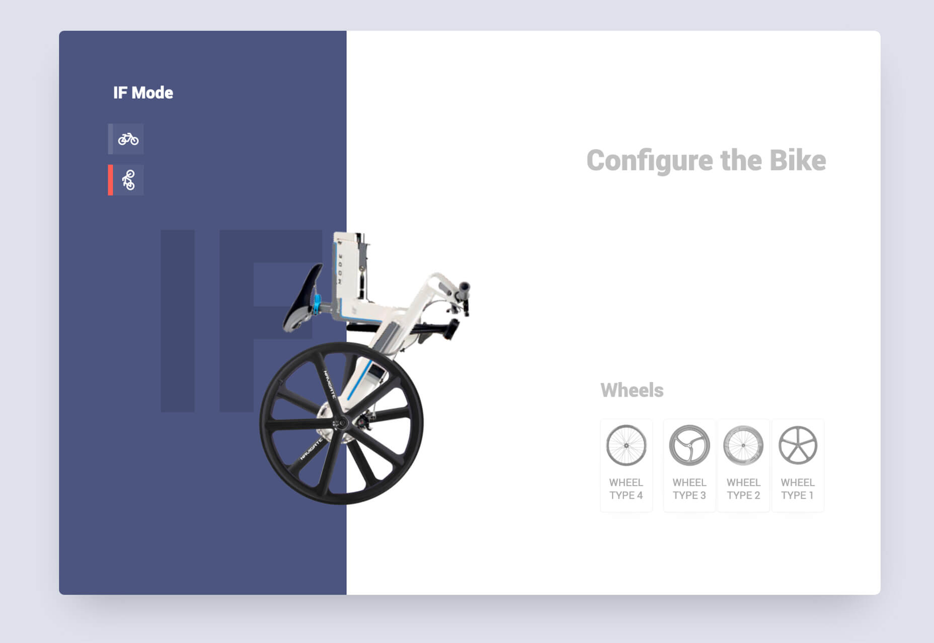
Deepnote

Deepnote is a new kind of data science notebook. It is Jupyter-compatible with real-time collaboration and running in the cloud and designed for data science teams.

ZzFXM Tiny JavaScript Music Generator

ZzFXM is a tiny JavaScript function that generates stereo music tracks from patterns of note and instrument data. Instrument samples are created using a modified version of the super-tiny ZzFX sound generator by Frank Force. It is designed for size-limited productions.

Image Tiles Scroll Animation

Image Tiles Scroll Animation is a different type of scrolling pattern using Locomotive Scroll. The grid creates a smooth animation in a fun and modern style.

Bubbles

Bubbles is a Chrome extension that allows you to collaborate by clicking anywhere on your screen and then dropping a comment to start a conversation with anyone. This is a nice option for work from home teams.

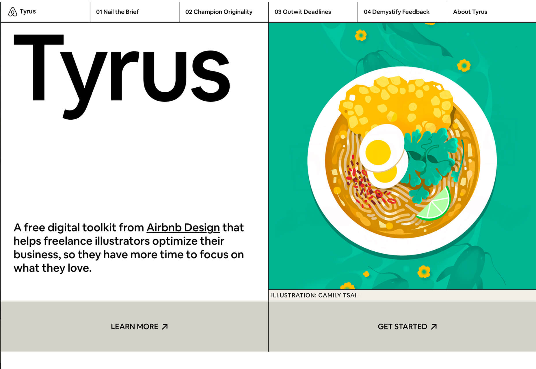
Tyrus

Tyrus is a toolkit from the design team at Airbnb to help illustrators make the most out of their design businesses. It is broken into sections to help you with design briefs, originality, deadlines, and feedback.

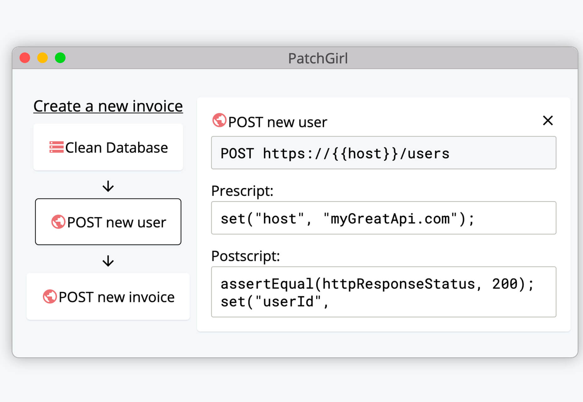
PatchGirl

PatchGirl is an automated QA tool for developers. You can combine SQL and HTTP queries to build any possible state of your database.

Apparel

Apparel is a beautiful premium typeface family with plenty of versatility in a modern serif style. It is a contemporary, classy, and fresh serif typeface with a laid-back. Its medium-large x-height makes it ideal for headlines and brand identity design.

Christmas Story

Christmas Story is a nice solution if you are already starting to think ahead to holiday projects or cards. The long swashes and tails are elaborate and fun.

Nafta

Nafta is a fun handwriting style font that has a marker-style stroke. It’s a modern take on the popular Sharpie font. It includes all uppercase letters.

Safira

Safira is a wide and modern sans with ligatures and a stylish feel. The rounded ball terminals are especially elegant.

Shine Brighter Sans

Shine Brighter Sans is a super-thin sans-serif with a light attitude. The limited character set combined with its light weight is best for display use.

Source


Source de l’article sur Webdesignerdepot

A hacked WordPress site is as damaging as having your home burgled. It can completely shatter your peace of mind and adversely impact your online business. 

Why do hackers target WordPress sites? The answer is relatively simple: WordPress is the single biggest platform for website creation these days, so there’s a larger base to attack; this attracts the attention of online criminals. 

So, how can a hack impact your website? 

Depending on the type of attack, your website could suffer any of the following:

  • It could be defaced completely;
  • It could load or operate very slowly on any device;
  • It could completely crash and malfunction;
  • It could display the dreadful “White Screen of Death”;
  • Its incoming visitors could be redirected to other suspicious websites;
  • It could lose all your valuable customer data.

This list is not exhaustive but you get the idea.

Now that we know how a successful hack can impact your website and online business, let us look at the top 10 reasons behind WP hacks and prevent them.

1. An Insecure Web Host 

Like any website, WordPress is hosted on a web host or server. Unfortunately, most site owners do not pay much attention to the web host they select and choose the cheapest they can find. For example, it is more affordable to host a website on a shared hosting plan — one that shares its server resources with many other websites like yours.

This can make your site vulnerable to hackers as a successful hack into any website on the shared server. A single hacked site can consume the overall server bandwidth and impact all the other sites’ performance.

The only way to fix this problem is to opt for a reliable host and a virtual or dedicated server.

Pro tip: If you’re already using a shared hosting plan, check with your hosts if they offer VPS hosting and make the switch.

2. Use of Weak Passwords

Weak passwords are the main reason behind successful brute force attacks that target your account. Even to this day, users continue to use weak and common passwords like “password” or “123456”; if you’re one of them, your website could land in trouble!

Guessing weak passwords allows hackers to enter the admin accounts where they can inflict the maximum damage.

How do you fix this problem? Simple, ensure all your account users (including admin users) configure strong passwords for their login credentials. With at least 8 characters, passwords must be a mix of upper- and lower-case alphabets, numbers, and symbols. 

For added safety, install a password management tool that can automatically generate and store strong passwords.

Pro tip: You can use a plugin to reset passwords for all your users.

3. An Outdated WP Version

Outdated software is among the most common reasons why websites get hacked. Despite being free to download, most site users defer updating their site to the latest version, for fears of updates causing their site to crash.

Hackers take advantage of any vulnerability or bug in an older version and cause issues like SQL Injections, WP-VCD Malware, SEO Spam & other major issues like website redirecting to another site.

How do you solve this problem? When you see a notification about an update on your dashboard, update your site as soon as possible.

Pro tip: If you are worried about updates crashing your live website, you can first test the updates on a staging site.

4. Outdated WP Plugins and Themes

Similar to the previous point, hackers also take advantage of outdated, unused, or abandoned plugins and themes installed on websites. With over 55,000 plugins and themes that are available, it is easy to install a plugin or theme, even from unsafe or untrusted websites. 

Plus, many users do not update their installed plugins/themes to the latest version or do not find the updated version. This makes it easier for hackers to do their job & infect sites.

How do you avoid this problem? As with the core WP version, update each of your installed plugins/themes on your site regularly. Take stock of all the unused ones and remove them or replace them with better alternatives.

You can update your plugins/themes from your hosting account.

Pro tip: We suggest setting aside time every week to run updates. Test them on a staging site and then update your site.

5. Common Admin Usernames 

In addition to weak passwords, users also create common usernames that are easy to guess. 

This includes common usernames for admin users like – “admin”, “admin1”, or “admin123”. Common admin usernames make it easier for hackers to get into admin accounts and control backend files in your WP installation.

How do you avoid this problem? If you are using any such usernames that are easy to guess, change them immediately to a unique username. The easiest way of doing it is through your hosting account’s user management tool, by deleting the previous admin user and creating a new admin user with a unique username.

As the first step, change the default username of your admin user and limit users who have administrator privileges.

Pro tip: WordPress has 6 different user roles with limited permissions. Only grant admin access to users who really need it.

6. Use of Nulled Plugins/Themes 

Coming back to the importance of plugins/themes, users have access to many websites that sell nulled or pirated copies of popular and paid plugins and themes. While these are free to use, they are often riddled with malware. They can compromise your website’s overall security and make it easier for hackers to exploit. 

Being a pirated copy, nulled plugins/themes do not have any available updates from its development team, hence will not have any security fixes.

How do you fix this problem? Simple, for a start, only download original plugins and themes from trusted websites and marketplaces.

Pro tip: If you don’t wish to pay for paid or premium plugins and themes, opt for a free version of the same tools that will have limited features but are still safer to use than the nulled version. 

7. Unprotected Access to wp-admin Folder

To take control of your site, hackers often try to break into and control your wp-admin folder in your installation. As the website owner, you must take measures to protect your wp-admin directory.

How can you protect your wp-admin folder? First, restrict the number of users having access to this critical folder. Additionally, apply for password protection as an added layer of security for access to the wp-admin folder. You can do this using the “Password Protection Directories” feature of the cPanel in your web host account.

Pro tip: Besides these fixes, you can also implement Two Factor Authentication (or 2FA) protection for all your admin accounts.

8. Non-SSL Website

You can easily migrate your HTTP website to HTTPS by installing an SSL certificate on your site. SSL (or Secure Socket Layer) is a secure mode of encrypting any data transmission between your web server and the client browser.

Without this encryption, hackers can intercept the data and steal it. Plus, a non-secure website can have many negative implications for your business – lower SEO ranking, loss of customer trust, or a drop in incoming traffic.

How do you fix this problem? You can quickly obtain an SSL certificate from your hosting company or SSL providers. It encrypts all data that is sent from and received by your website. 

Pro tip: You can get a free SSL certificate from places like Let’s Encrypt, but these provide limit protection that will only be sufficient for a starter site or small site.

9. No Firewall Protection

Lack of firewall protection is another common reason why hackers can bypass website security measures and infiltrate the backend resources. Firewalls are the last line of defence against hackers and work like the security alarm installed on your house. Firewalls monitor web requests coming from various IP addresses, including the suspicious (or bad) ones. 

They can identify and block requests that are known to be malicious in the past, thus preventing easy access for hackers to your website domain. Web application firewalls can thwart various attacks, including brute force attacks, XSS, and SQL injections.

Pro tip: A firewall provides much-needed security and is  your first line of defence. But it’s important to also have a malware scanner installed.

10. Lack of WordPress Hardening Measures

Typically, hackers target the most vulnerable areas or weaknesses within a WP installation, to illegally access or damage the website. The WordPress team has identified these vulnerable areas and has devised a list of 12 hardening measures recommended for every website.

A few of these include:

  • Disabling the File Editor;
  • Preventing PHP execution in untrusted folders;
  • Changing the security keys;
  • Disallowing plugin installations;
  • Automatic logout of inactive users;

How do you implement these hardening measures? While some steps are easy to understand, others require the technical expertise of how WordPress works. 

Pro tip: You can implement hardening measures on your own. However, some measures require technical expertise so in these cases, it’s much easier and safer to use a plugin.


Featured image via Pexels.

Source


Source de l’article sur Webdesignerdepot