Articles

This month we’re going big and bold. Oversized type, strong colors, in-your-face layouts, and little touches of playfulness exude confidence and make a statement. There are some quieter moments too, with thoughtful illustration and more gentle use of color. Animation still features strongly in the details, with circles proving popular in rollover effects. Enjoy.

Fledge

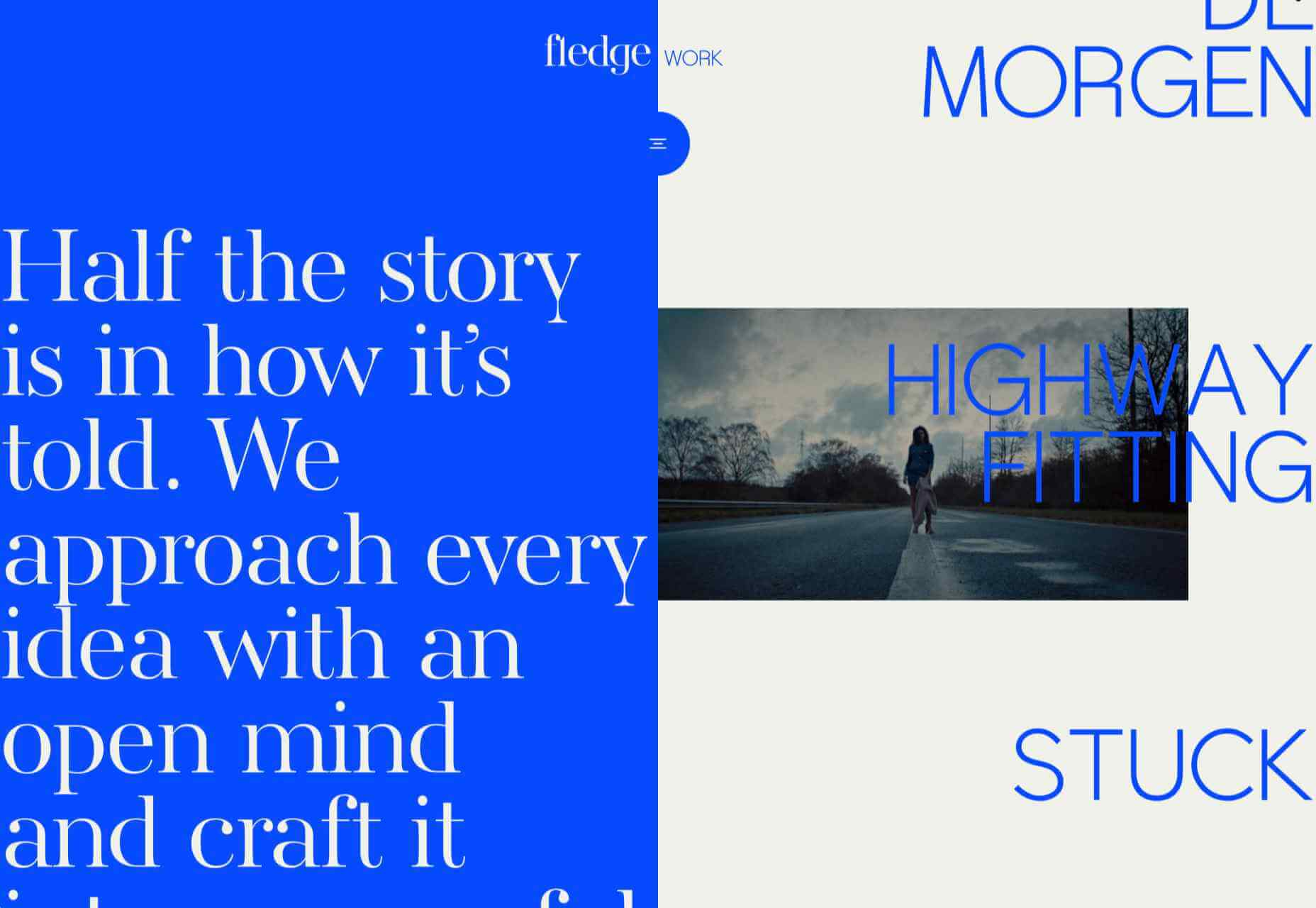
Fledge is a film production company based in Belgium. Their site uses split screen with looped text scrolling in opposite directions on each side. A minimal color palette adds extra punch.

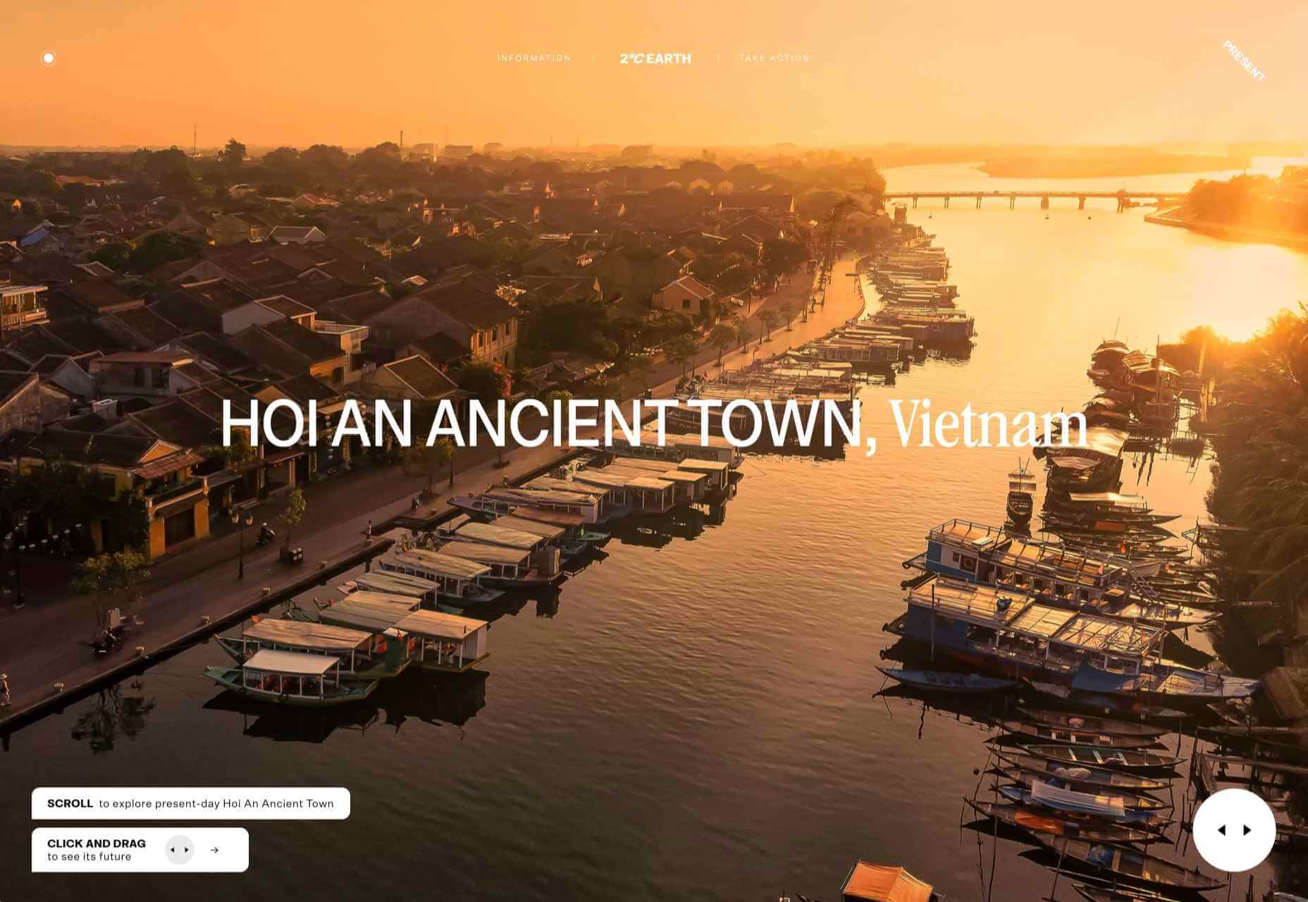
2ºC Earth

2ºC Earth is a beautiful and also scary website that explores the effects of rising global temperatures by focusing on 5 specific locations. Some stunning photography and subtle use of sound take you to these locations as they are now, then show what they could become. The experience is both immersive and unsettling.

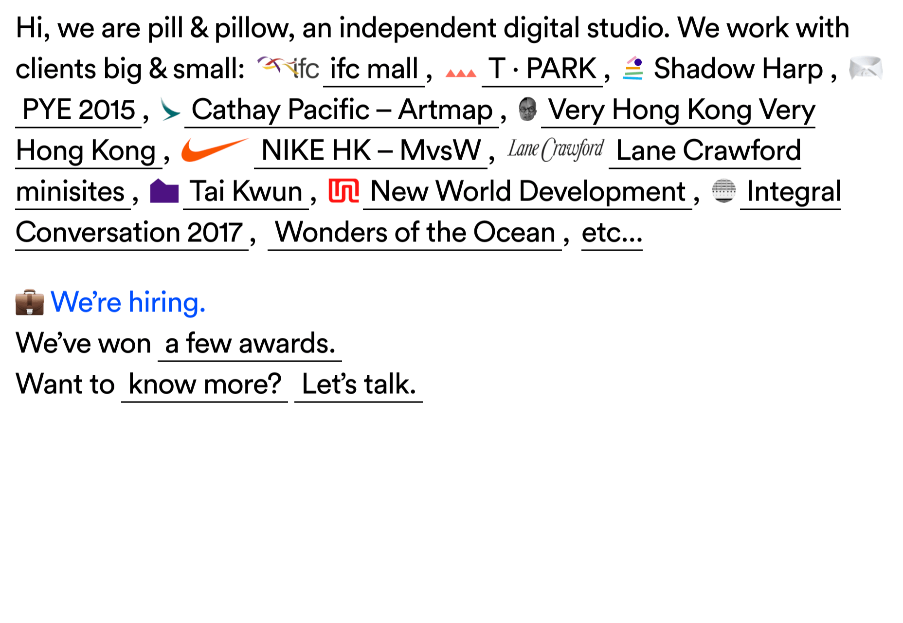
pill&pillow

Unlike many digital studios who use the design of their own site to demonstrate their skills, pill&pillow have taken a very basic approach. It is very self-assured, and it works. Random colored strikethroughs on visited links add a nice touch of playfulness.

Ferrum Pipe

Metal fencing is not the most interesting of subjects to most of us, but this site for Ferrum Pipe is surprisingly appealing. On scroll animation and some off-grid image layout brings life to what would normally be, well, a bit dull.

Lucciano’s

With its focus on mouth-watering photography and videography, the site for gelato makers Luccianos, will have you checking your freezer for any leftover salted caramel or stracciatella. The zoom on rollover is a nice effect, and the use of circles with ice cream color backgrounds for rollover text reinforces the gelato theme.

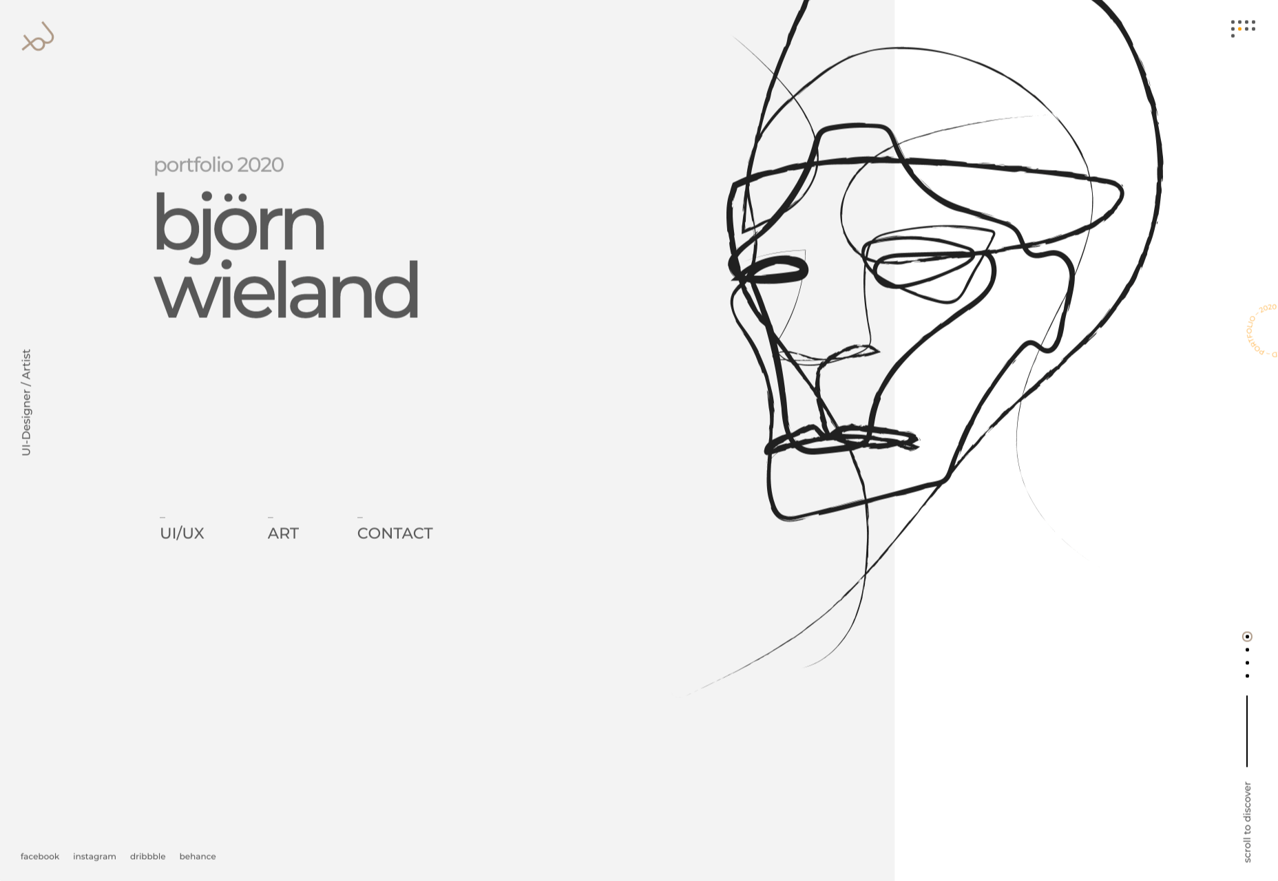
Björn Wieland

UI designer and artist Björn Wieland has created a portfolio site with a simple, relaxed feel and pleasing transitions. It feels simple, but behind the scenes there is quite a lot going on.

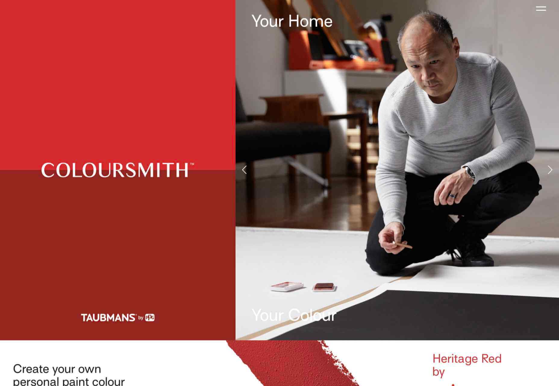
Coloursmith

Coloursmith is a tool from Taubmans paint company which allows you to create a custom paint color by uploading a photo. You name your color and can add a story, then you order a test pot. colors are presented well, in different light and with suggestions for complementary colors.

Finn 

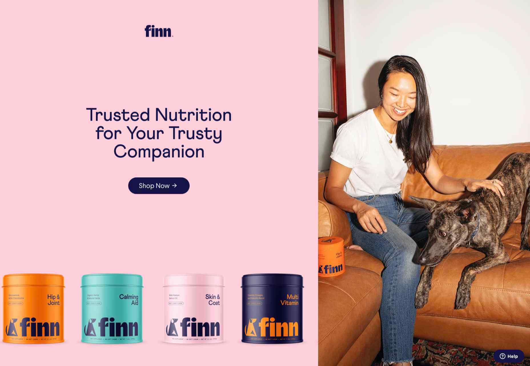
Finn make diet supplements for dogs. Their site is fun, modern and clean. Bright colors and an illustration that manages to be cute but not too cutesy make a bold impression.

Highcourt

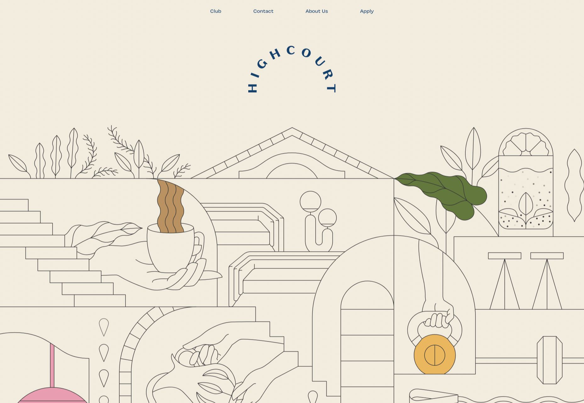
Highcourt is a new private membership leisure club set to open in New York in spring 2021. Dark blue text on cream gives a softer edge than black on white. The background color changes on scroll are pleasing, and simple line illustrations with occasional gentle animation add to the overall sense of calm.

Elevence

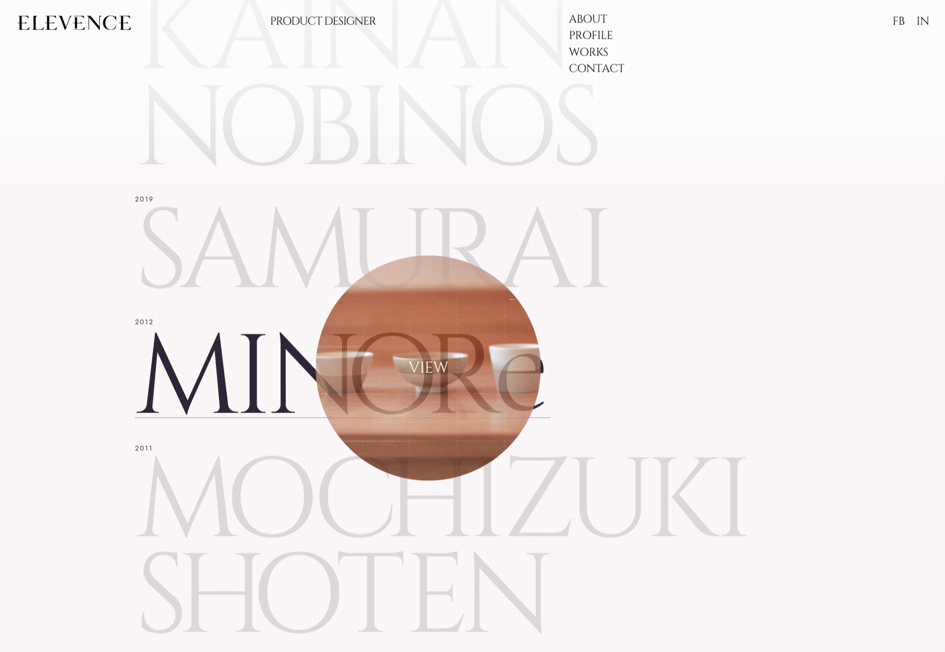
Elevence is the company of product designer Kazuo Kobayashi. The site uses only black, white, and grays allowing the color photos of his work to really stand out. Circular thumbnails are used to good effect, appearing on rollover.

Playtype

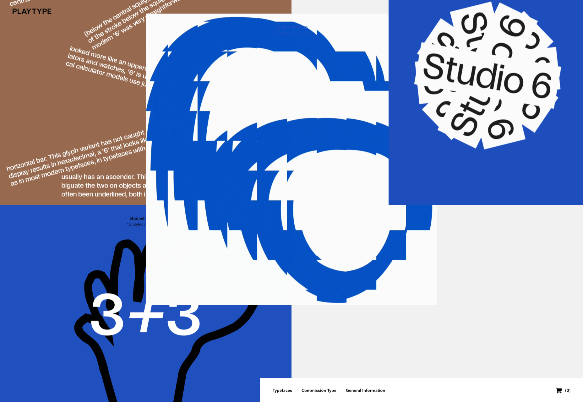
Playtype is a Danish type foundry whose site seems to fit their name. It has a playful, almost chaotic feel, with bright blocks of color and occasional animation. Some pretty nice typefaces too.

Neri Oxman 

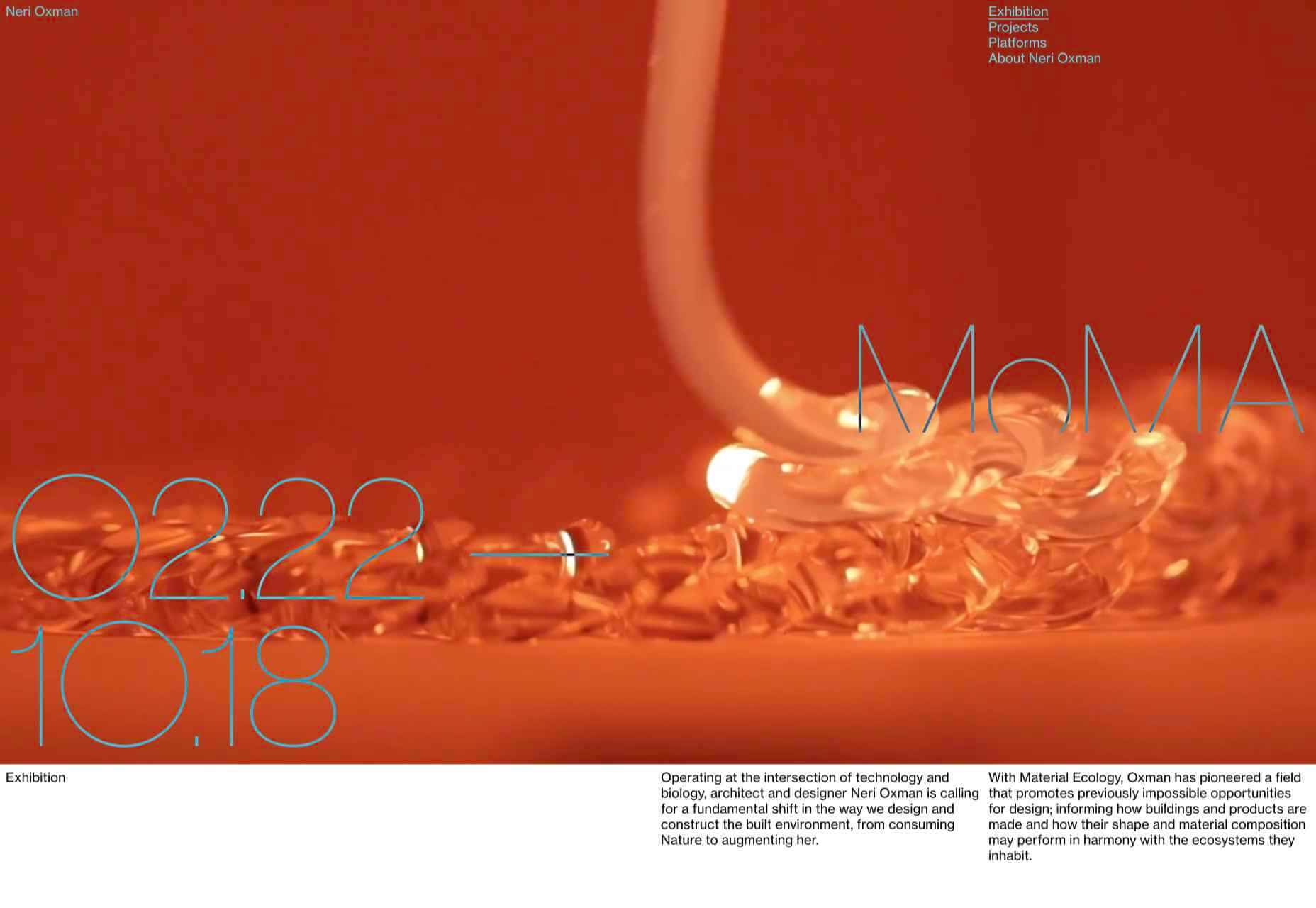
Neri Oxman is many things: architect, scientist, engineer, inventor, and designer. This site feels like a really beautiful coffee table art book that you want to pick up and look through every so often. There are some nice details too, like the lens ‘reveal’ effect on rollover in a few places.

Modern Recovery

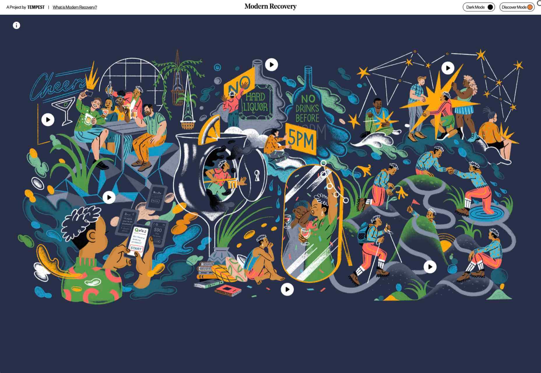
Modern Recovery is a project by sobriety program Tempest. The interactive illustration encourages exploration, to discover different stages of recovery from alcohol abuse and insights from others who have followed the program. The aim is to change our social attitudes towards alcohol and not drinking.

Bliss

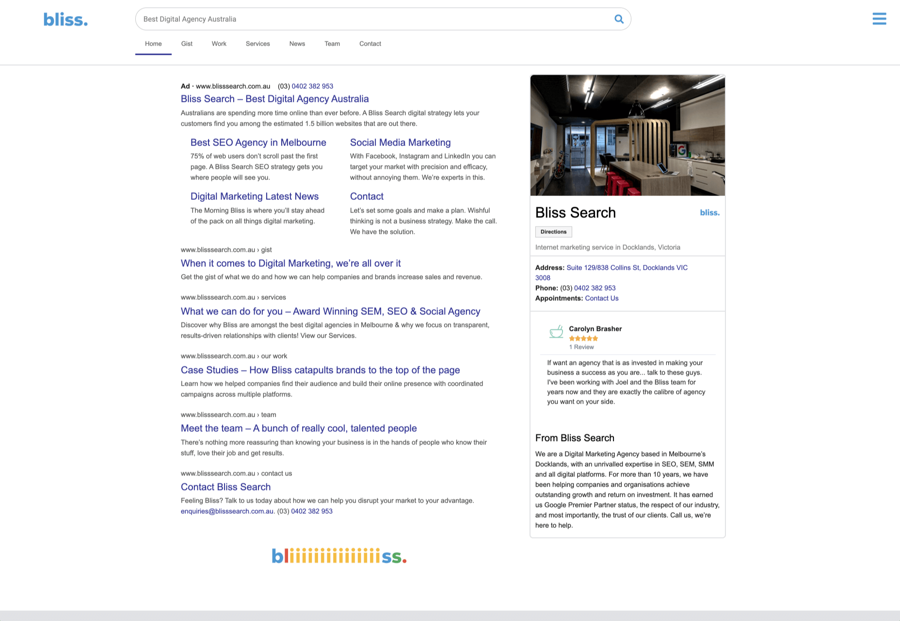
Have you clicked on the link to visit Bliss Search? Yes, the link is correct, no you haven’t been redirected to a Google search results page. This Australian digital marketing company have copied the appearance of different well-known sites for their pages — Google, Instagram, LinkedIn, Tinder all make an appearance. The humor in this approach shows confidence, and makes it memorable.

Miilkiina

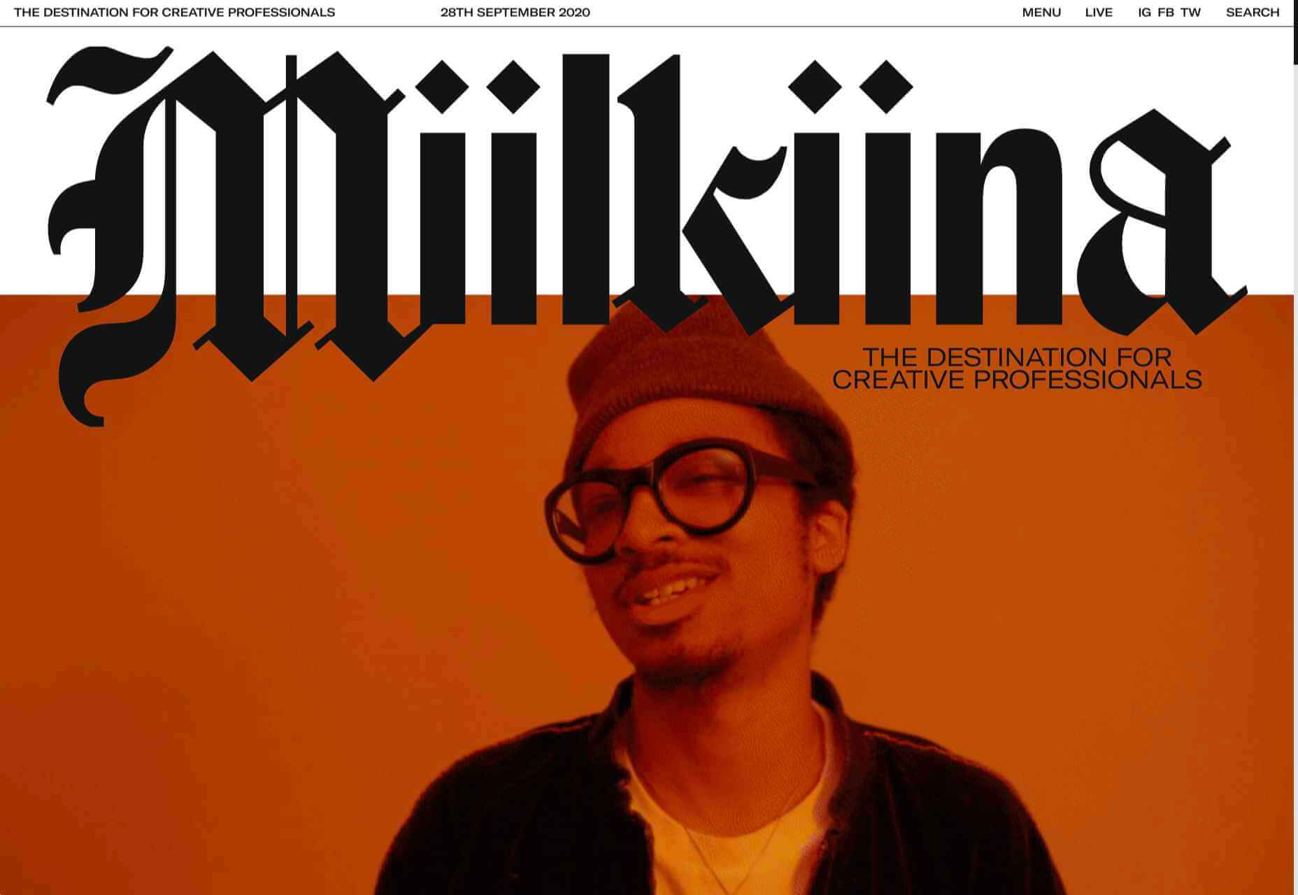
Miilkiina describe themselves as a digital media space and creative agency. Punchy typography, with great use of blackletter, well chosen images, and a strong header video give this home page an in-your-face edge.

Ukrainian Railroad Ladies

Ukrainian Railroad Ladies is a book by photographer Sasha Maslov. Its subjects are the, mostly, women who work as traffic controllers and safety officers at railroad crossings in Ukraine. It’s a simple site — outsized type, black and white, basic image grid, only very brief text — but it is effective in its simplicity.

Una Europa

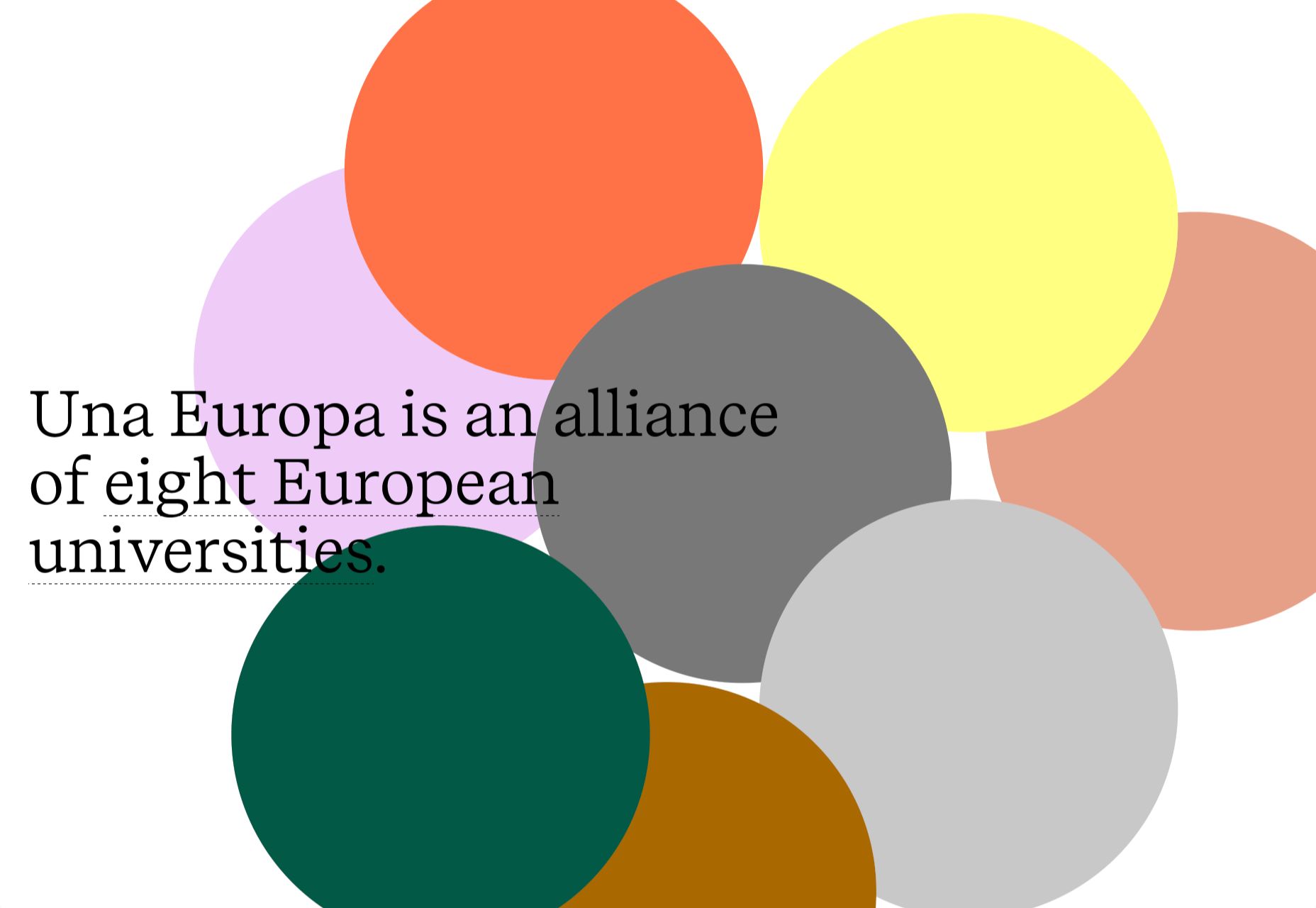
Una Europa is an alliance of 8 European universities with the aim of offering joint research and study programs. There is some playful scrolling behavior with geometric shapes moving and changing color that enlivens what could otherwise be quite a dry site.

Bureau Cool

There’s a bit of an old school feel about the site of digital design studio Bureau Cool, with its recent traffic animation. The changing backgrounds on scroll are a nice touch.

Gridspace

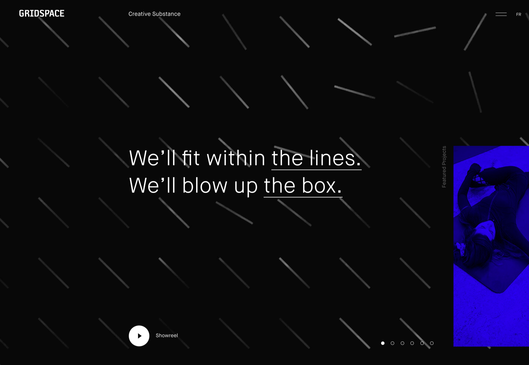
Gridspace is a multimedia entertainment studio based in Montreal, and their website is a visual feast. Lots of movement, lots of video, some good use of sideways scrolling.

Nolii

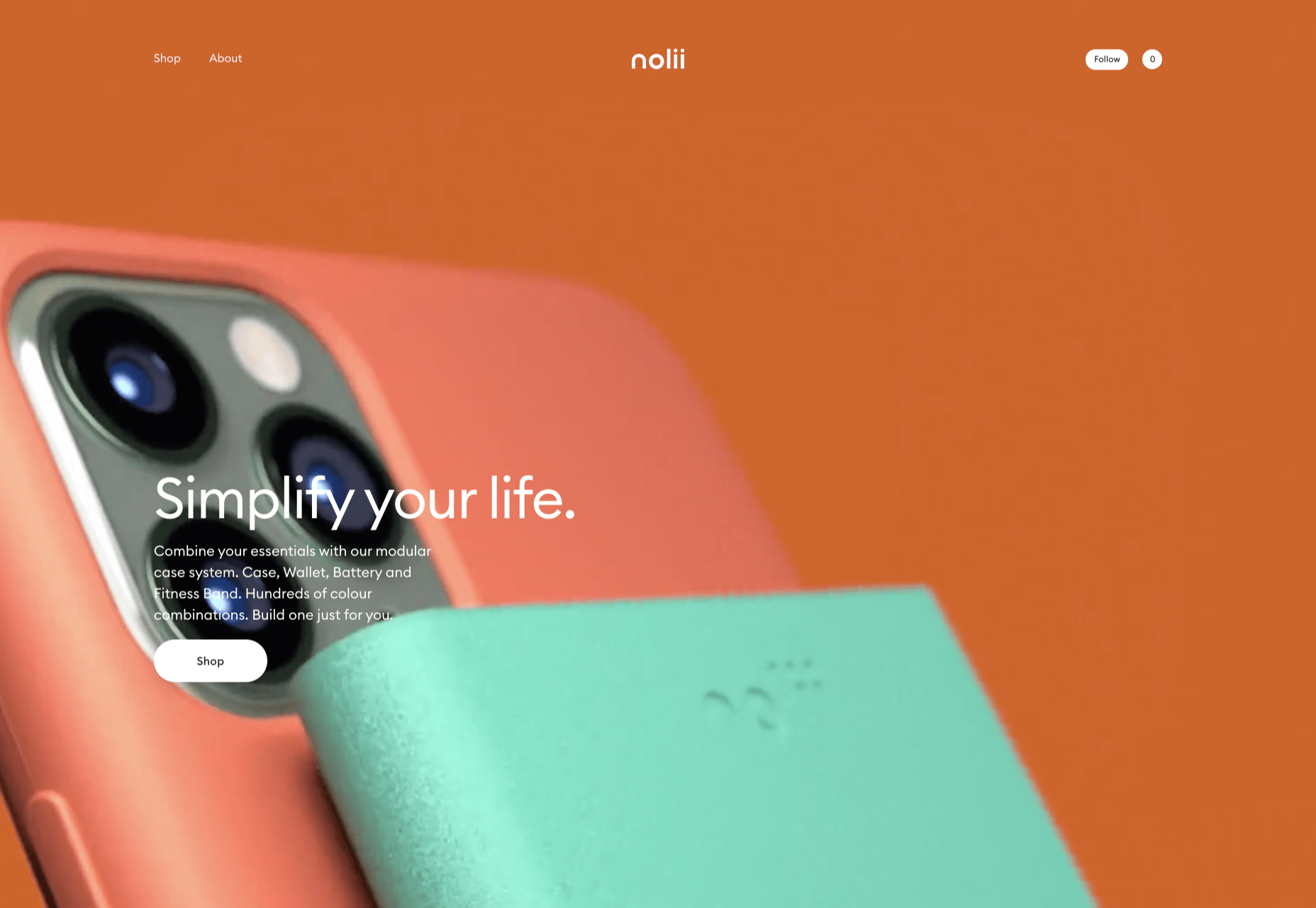
Nolii make cases and accessories for iPhone that work together. The sorbet color palette complements the product colors and the block layout provides a visual reflection of the interlocking of the different products.

Source


Source de l’article sur Webdesignerdepot

Though I have worked on Java for more than a decade, I have not had a chance to work on Groovy. While working for API Integration into Jenkins CI/CD pipeline, I extensively used Groovy to invoke REST API, validate the user input parameters, and business logic for that. After that, I found that Groovy is a fascinating program language for Java developers.

Why Is Groovy Easy for Java Developers?

It allows to use the Java syntax liberally and tries to be as natural as possible for Java developers. It is an object-oriented dynamic programming language for Java virtual machine (JVM) and can be integrated smoothly with any Java Program. The groovy syntax is lucid, familiar, and direct that makes to develop projects faster and easier. It demands a shorter learning curve for Java Developer to develop, test, and integrate to make production-ready code in a short span.

Source de l’article sur DZONE

It’s fun to see new website design tools that reflect current times and the state of the world. That’s very true this month with new databases devoted to diversity and women in technology, as well and resources to make your design life easier.
Here’s what’s new for designers and developers this month:

Ztext.js

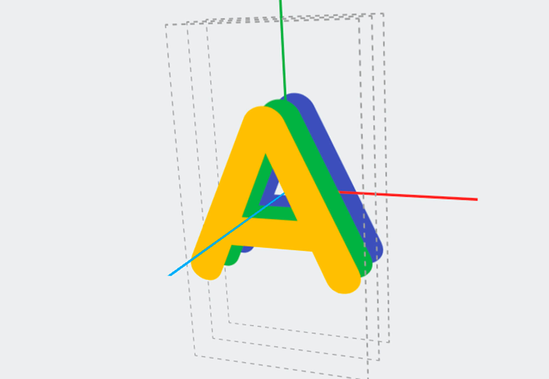
Ztext.js is an easy to implement, three-dimensional typography tool for the web that works with any font you want to use. With the popularity of 3D effects and animation, this tool has a lot of practical applications. Everything you need, including documentation, is available from developer Bennett Feely on his website and GitHub. (It’s free but you can show appreciation with a donation if you like it.)

Gradient Magic

Gradient Magic is a free gallery of fun and interesting CSS gradients. You can sort through a random selection or by category of color to find just the right gradient for your project. Some of them would make really neat backgrounds or image overlays.

Impossible Checkbox

Impossible Checkbox is a fun little divot that you’ll want to play with and emulate. Click or tap the slider to activate and a nifty little friend pops up. Now here’s the fun part: You can’t leave it checked, and take note of the changing expression of the checkbox character.

Diversify Tech

Diversify Tech isn’t your average job board; it is a collection of resources – and opportunities – for underrepresented people in technology. It includes a weekly roundup and everything from scholarships, to events, to jobs, to speaking opportunities.

Women in Tech

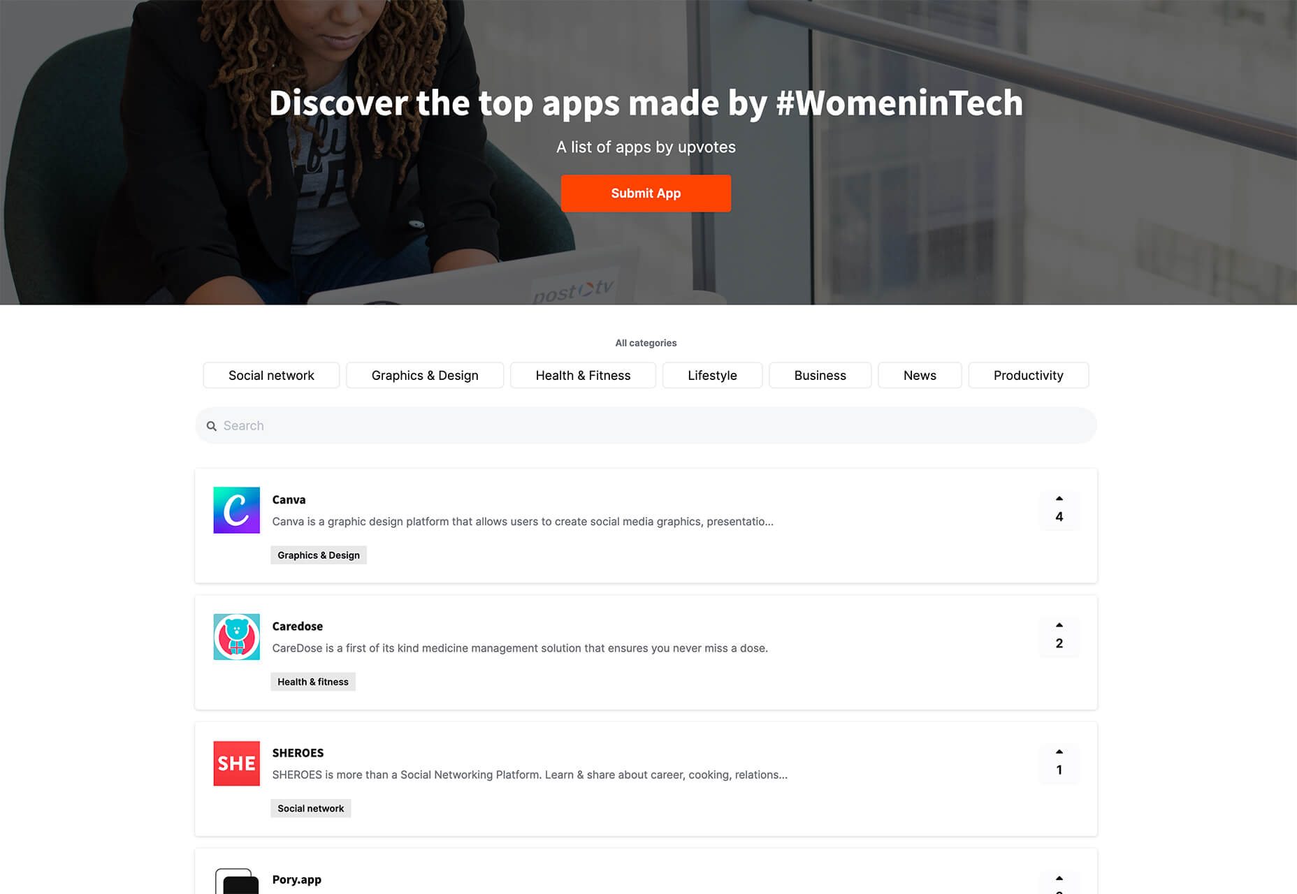
Women in Tech is a list of apps made by women. The apps are ranked and chosen based on upvotes and is a good resource if you want to help support women-owned projects. Search or submit an app for inclusion.

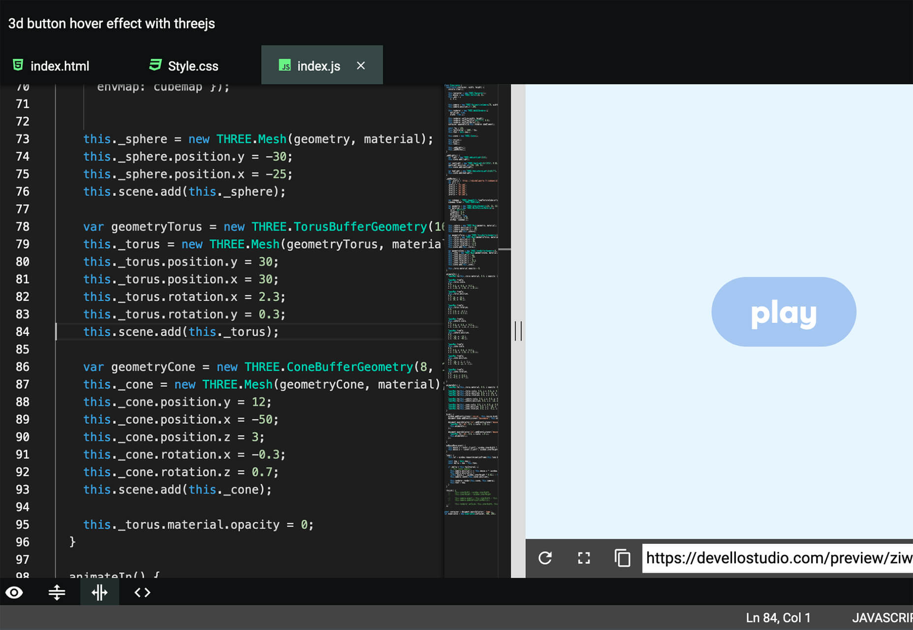
Devello Studio

Devello Studio is a tool that allows you to write code in the cloud. You don’t have to install anything and no matter where you are, just can open a project in-browser, and continue development where you had left off last time. Plus, it works with GitHub support built right in.

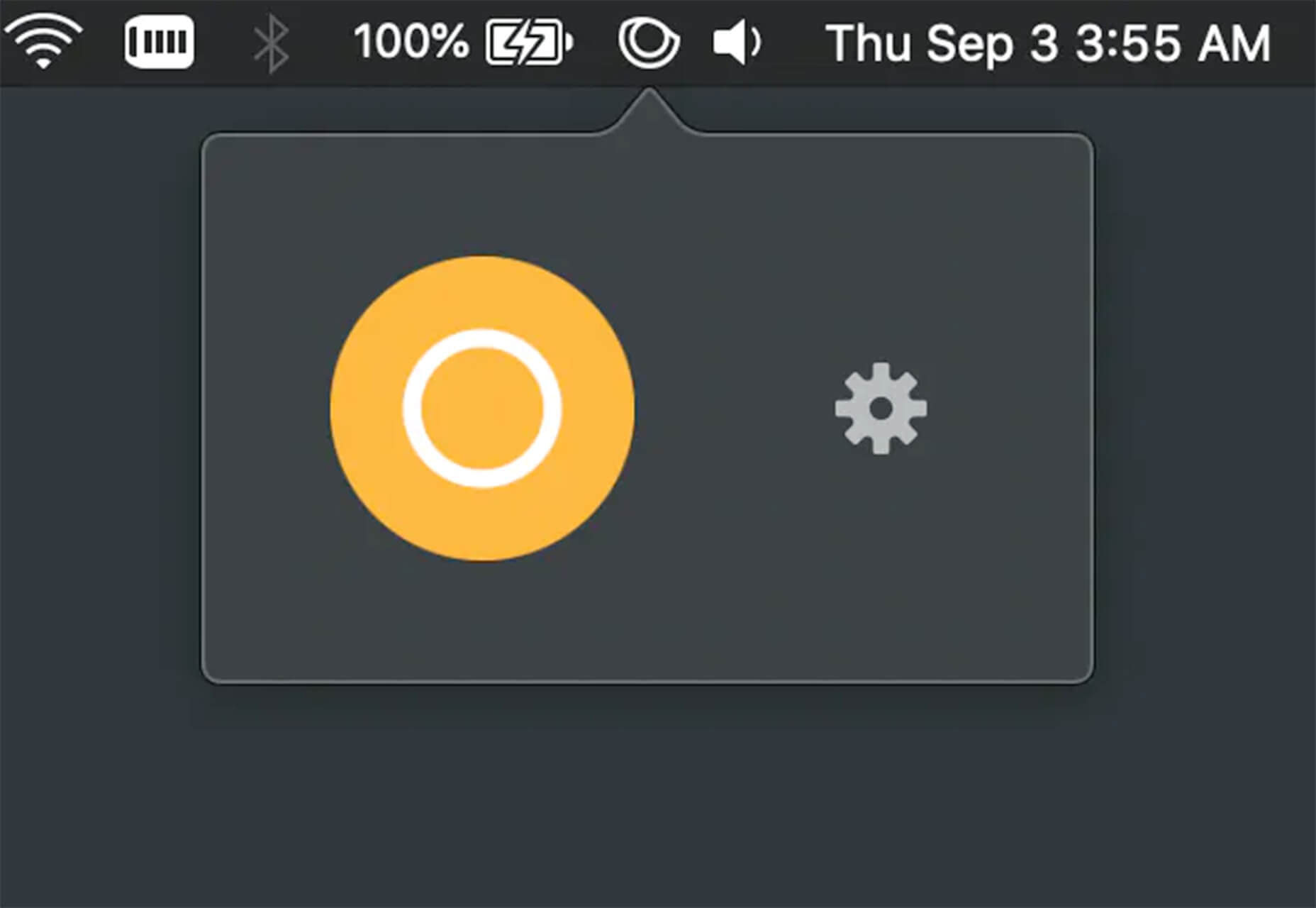
Hustl

Hustl is a premium Mac app that allows you to create time-lapse videos of your screen. Use it to show off work or projects or create a cool video for your portfolio. Plus you can use it to capture just one active app so you don’t have to do a lot of editing later.

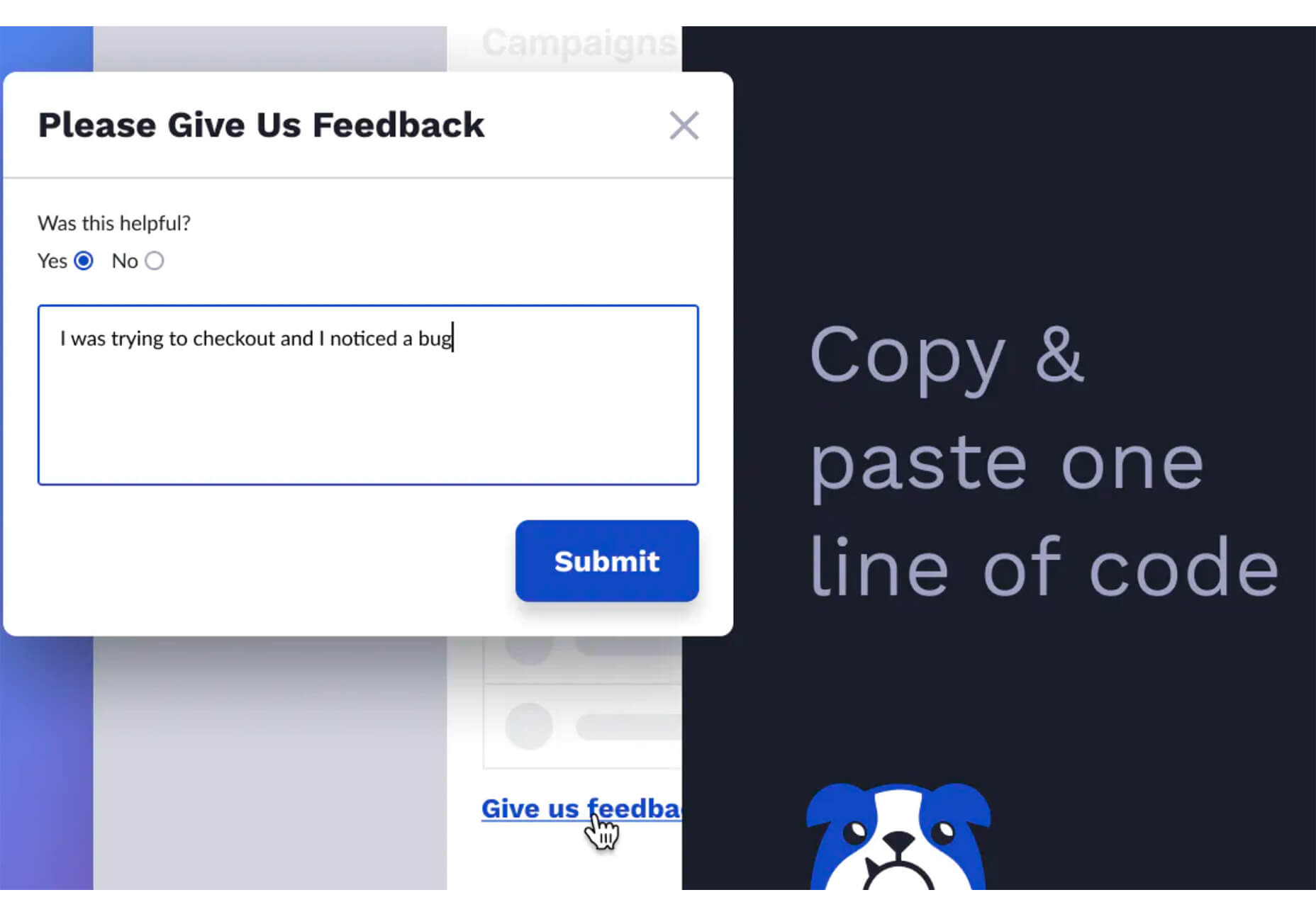
FeedBaxley

FeedBaxley is a user feedback tool that helps you (and users) figure out what’s frustrating before it becomes a real issue. You can customize everything to match your brand and set it up with copy and paste tools. Feedback integrates with Slack, making it easy for you to analyze information with a team.

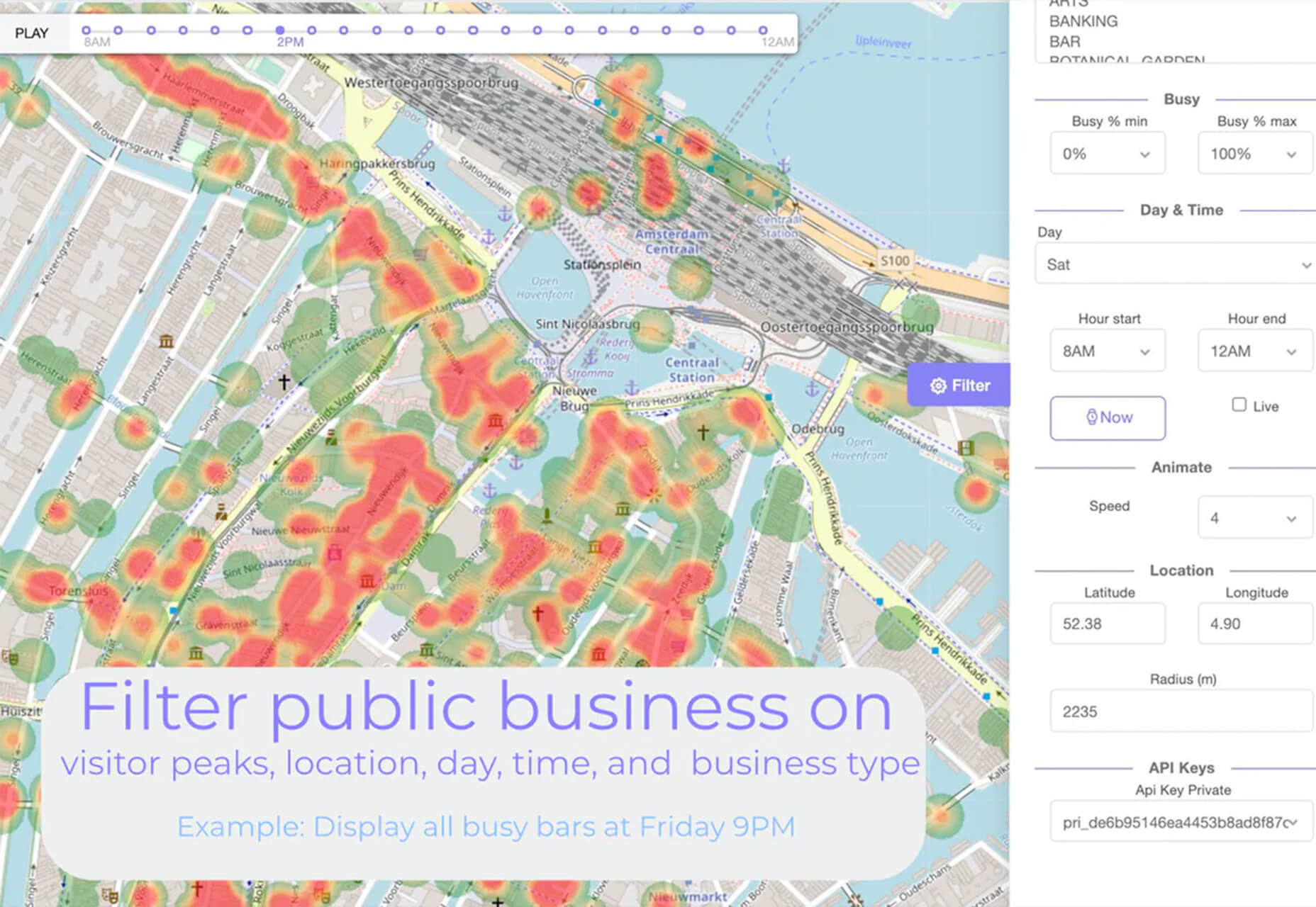
BestTime

BestTime launched a major update with a new tool that makes it possible to analyze visitor peaks of public business (cafe, gym, etc) for whole areas. Using the heatmap API you can find businesses at popular times, locations, or by business type.

Pixeltrue

Pixeltrue is a new collection of free SVG illustrations and Lottie animations in a trendy style. They are available for commercial and personal use and add a bit of whimsical delight to website projects. (The error illustrations are particularly fun.)

Previewed

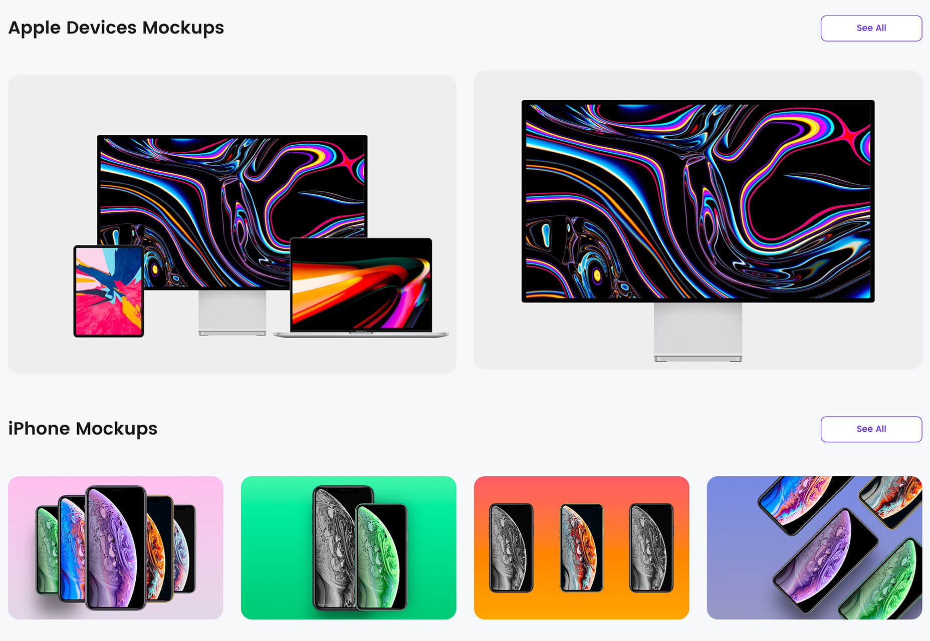
Previewed has tons of cool and realistic mockups that you can use to create the perfect setting for digital projects. You can find mockups for a variety of devices and cool panoramas that work perfectly for elements such as app store previews.

Alt Text Overlay Bookmarklet

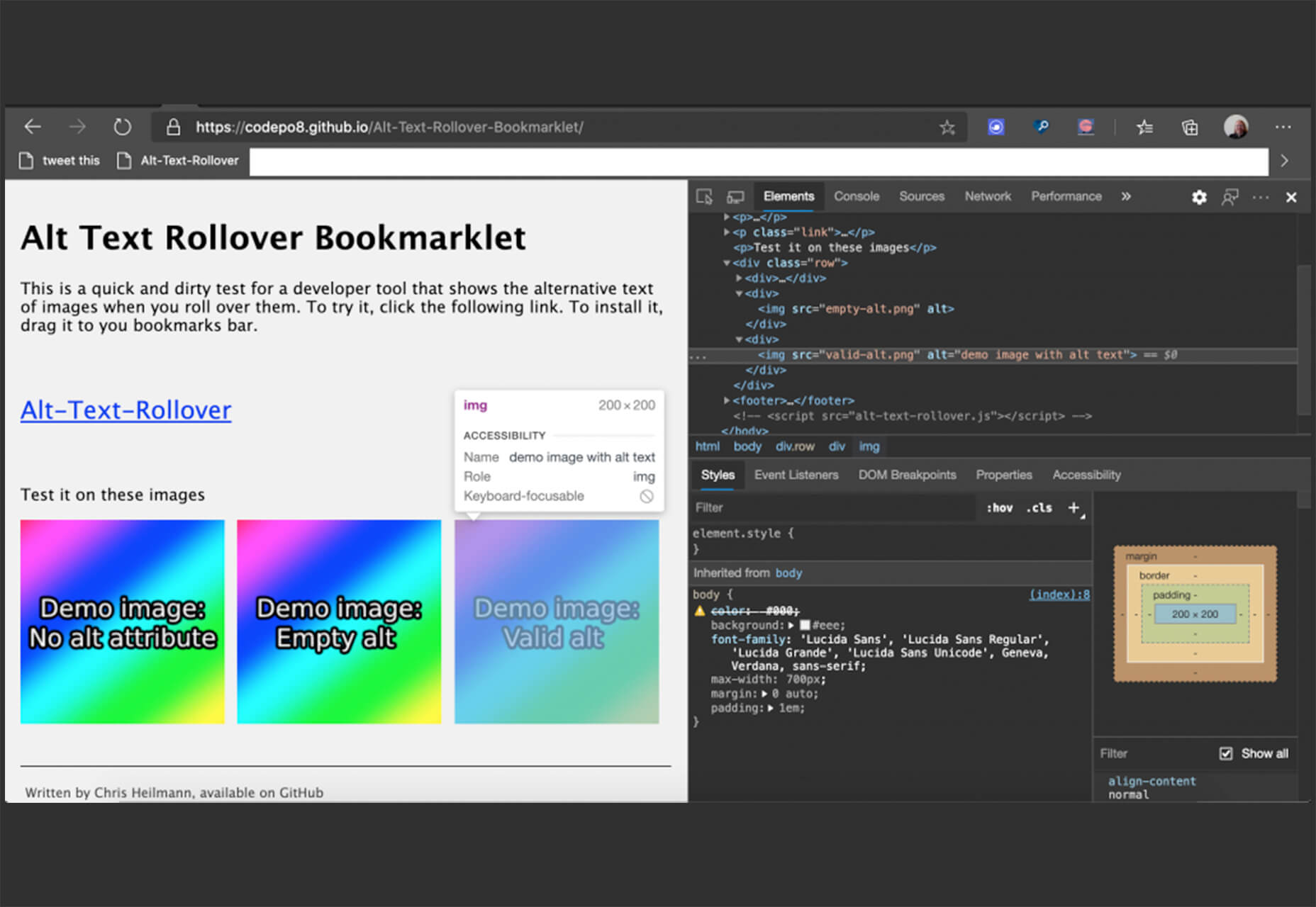
The Alt Text Overlay Bookmarklet solves a common problem: It shows what images use alt text and what that text is. The tool was created by Christian Heilmann and he’s put it on GitHub for you to play with and test.

MergeURL

MergeURL allows you to merge and shorten up to five links. Enter the links and mergeurl.com/o/xxxxx, for example, will open all the URLs associated with that link. The tool is free to use and you don’t have to register to use the service.

Infinity Search

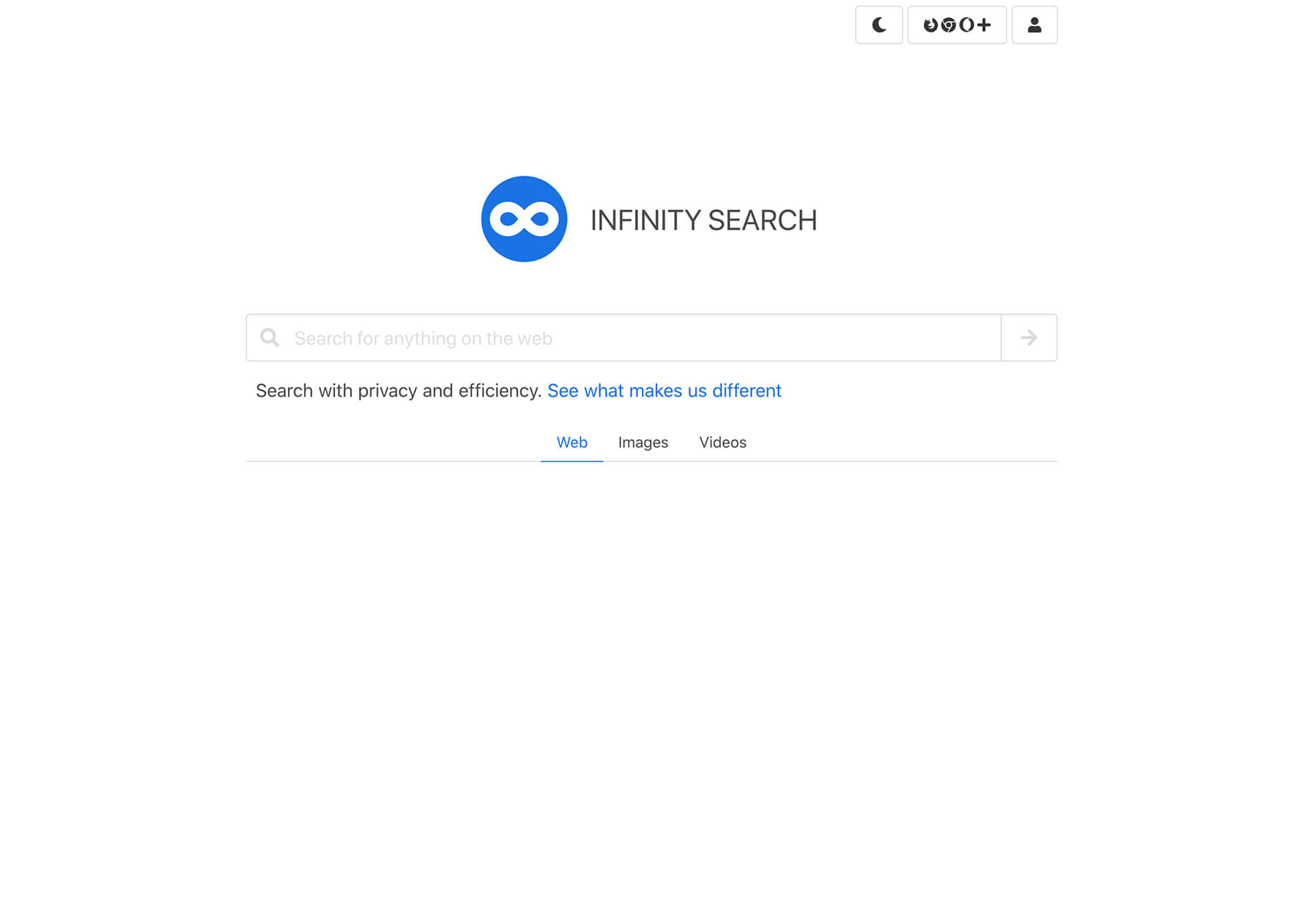
Infinity Search is a new search engine that lets you look for things privately and efficiently. Search the web, images, or videos. Here’s a little about how it works: “While we retrieve results from other search engines like Bing and Wikipedia, we also have our own indexes of links that are displayed in our search results. We are actively working on improving these indexes and they will only get better.”

Blade UI Kit

Blade UI Kit is a set of renderless components to use in Laravel Blade Views. It’s built for the tall stack and is completely open source. It includes 26 components and you can contribute as well.

Trusted News

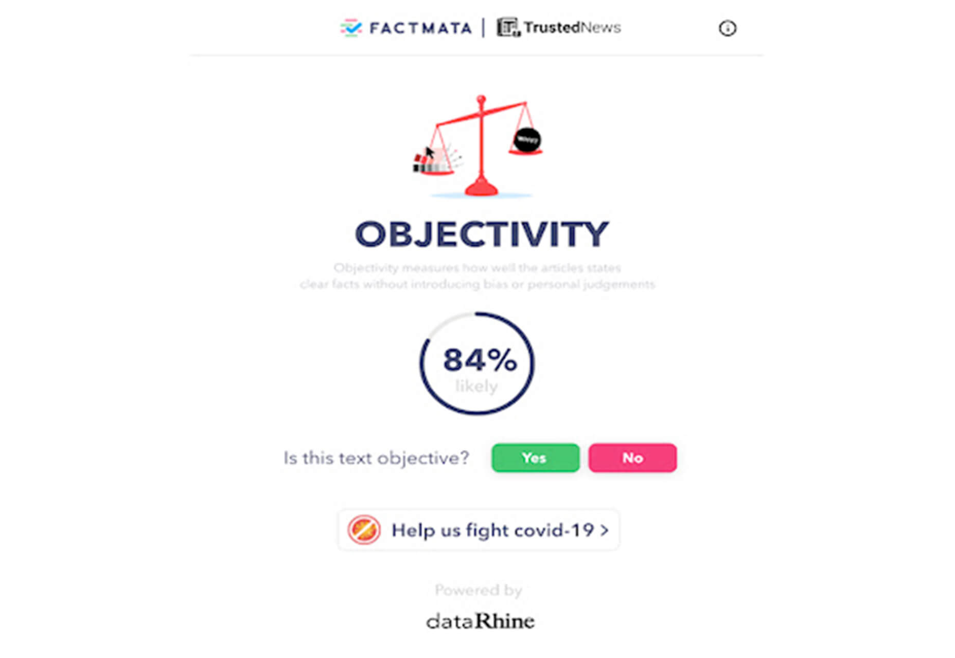
Trusted News is a Google Chrome extension that uses AI to assist in evaluating the quality of the online content. In its first release, it scores the objectivity for a selected article, testing whether it is written from a neutral perspective as opposed to a subjective one.

BaseDash

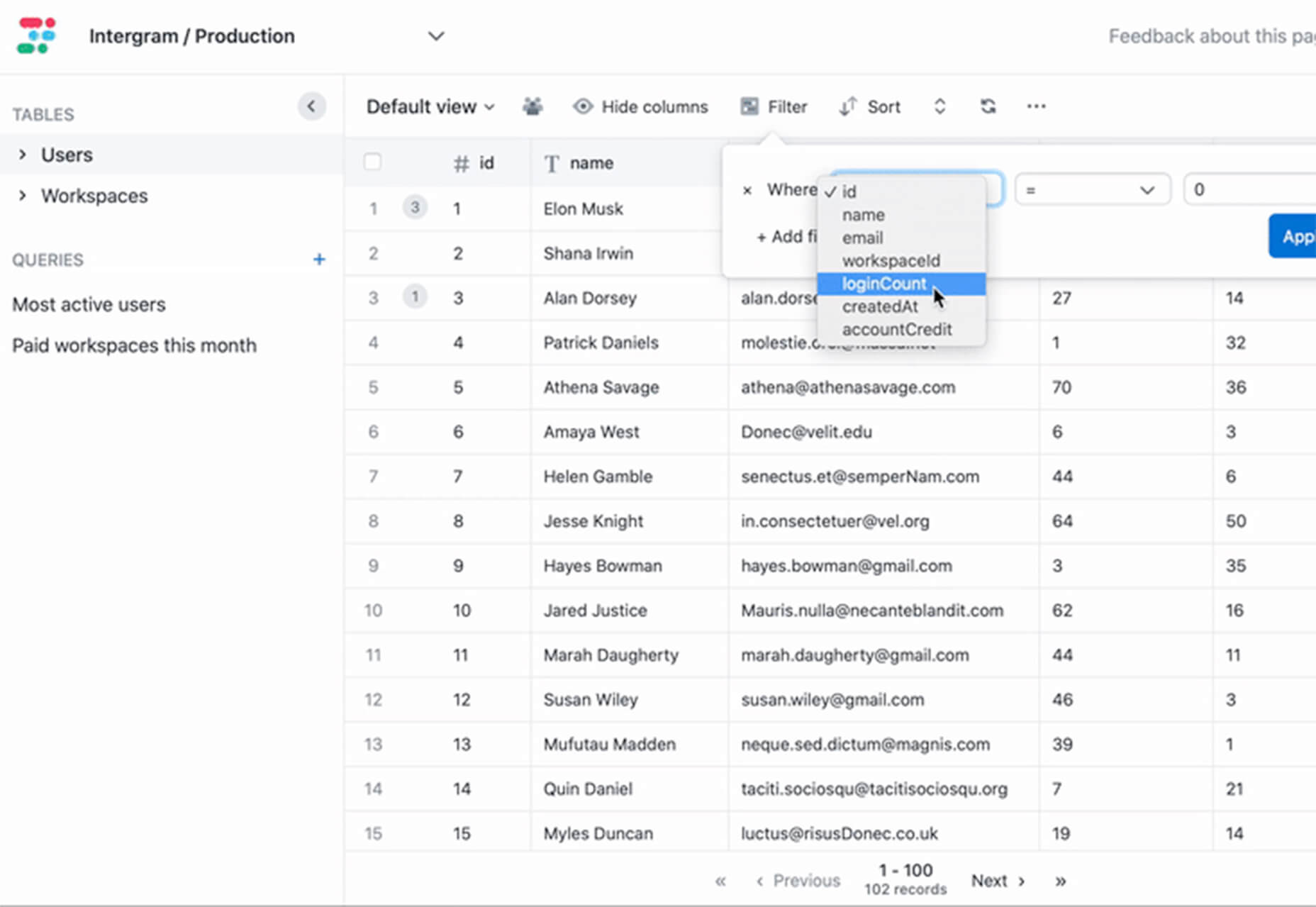
BaseDash allows you to edit production data without coding. You can make changes to the database with the ease of a spreadsheet. This tool makes it easy to find and edit information in a hurry. It works with all major databases including MySQL, PostgreSQL, Amazon Redshirt, Microsoft SQL Server, and more.

Email2Go

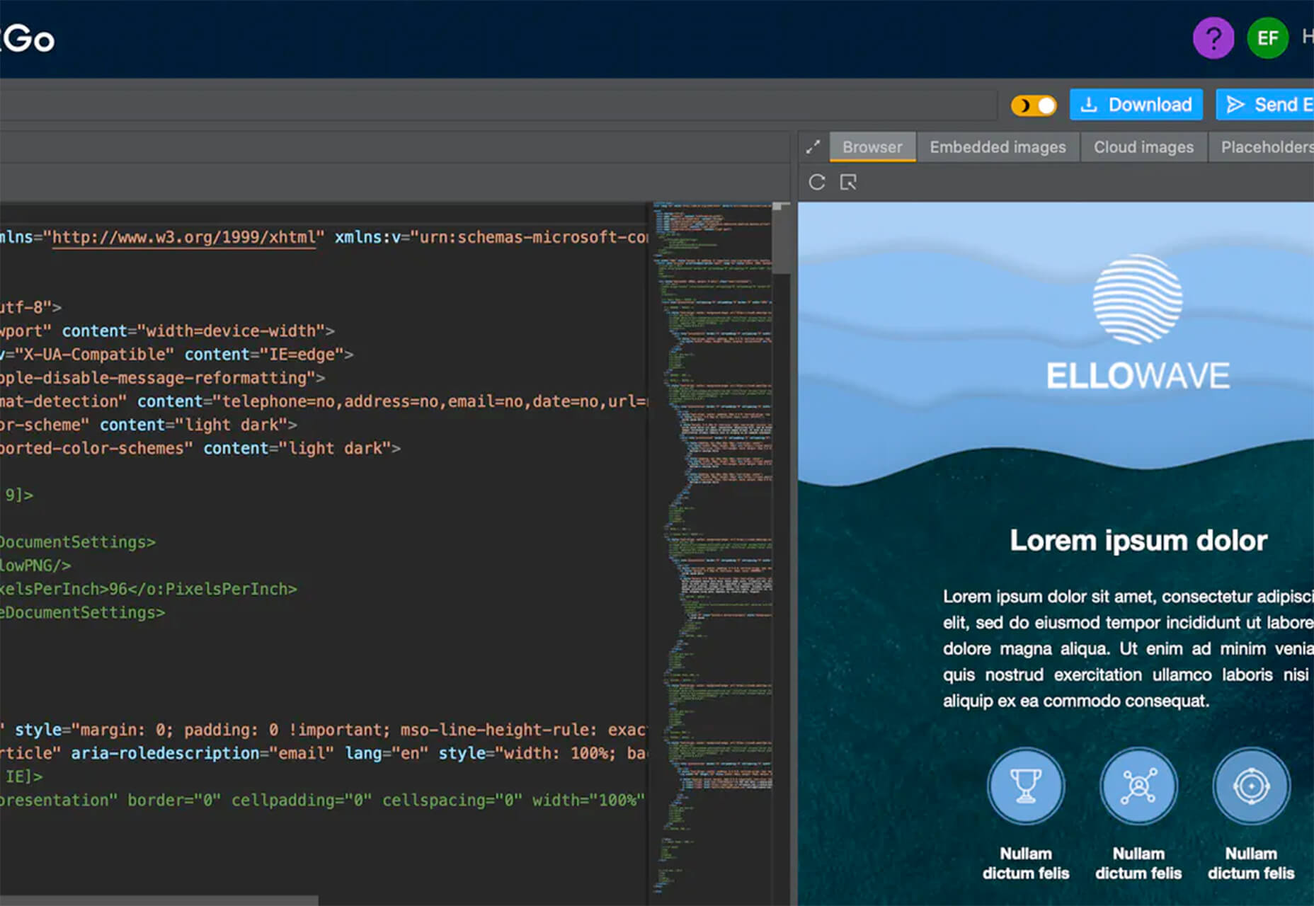
Email2Go is a service that helps you create email templates and test them on dozens of physical devices and applications. It’s free right now while it is in early release.

Iconscout Converter

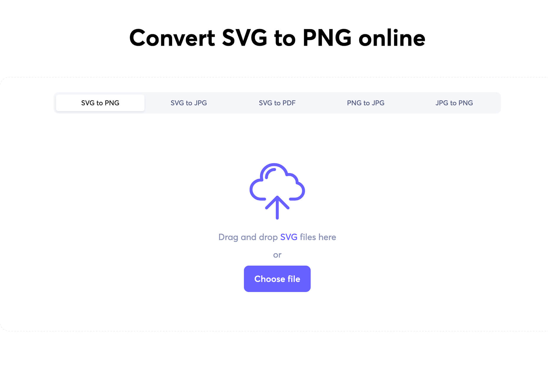
The Iconscout Converter allows you to convert icons and images from one file format to another for free. Convert SVG, PNG, JPG, and PDF with a single click.

Shape 2

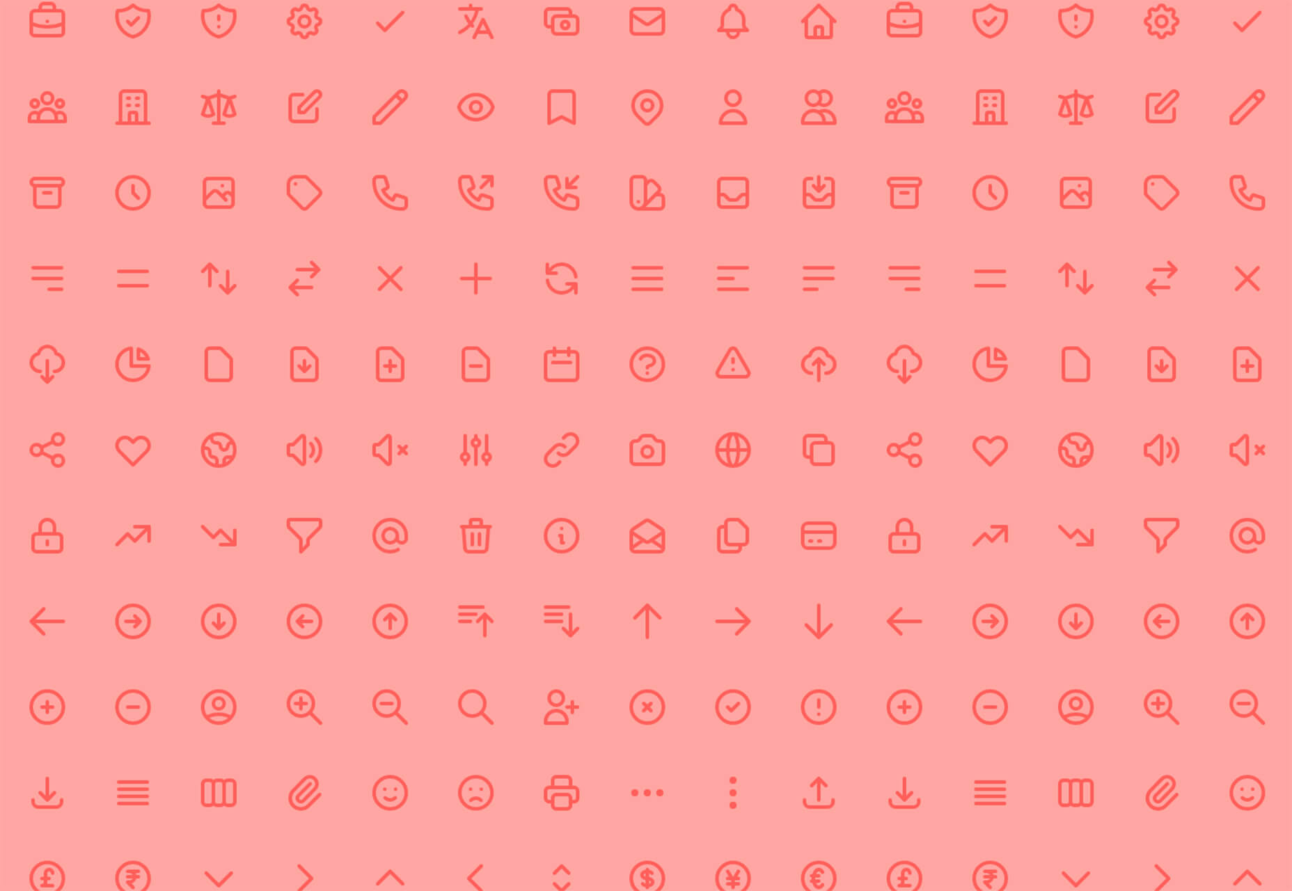
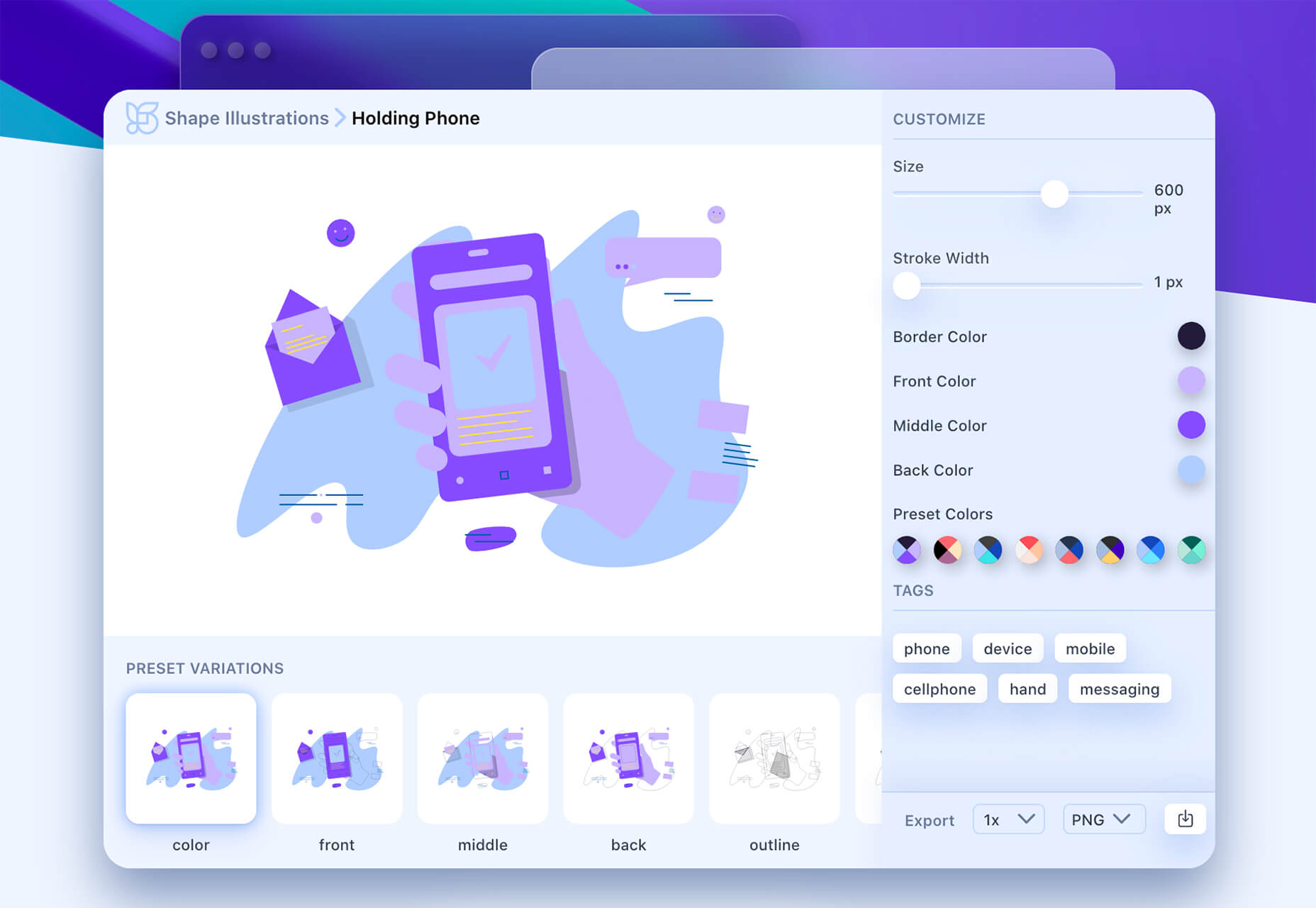
Shape 2 is a massive collection of 5,000+ unique icons and illustrations with a full-blown web editor. Customize colors, stroke width, size and full variations that can export to SVG, PDF, PNG, GIF, and React. This is a premium tool and includes a discounted release price for now.

Aestetico

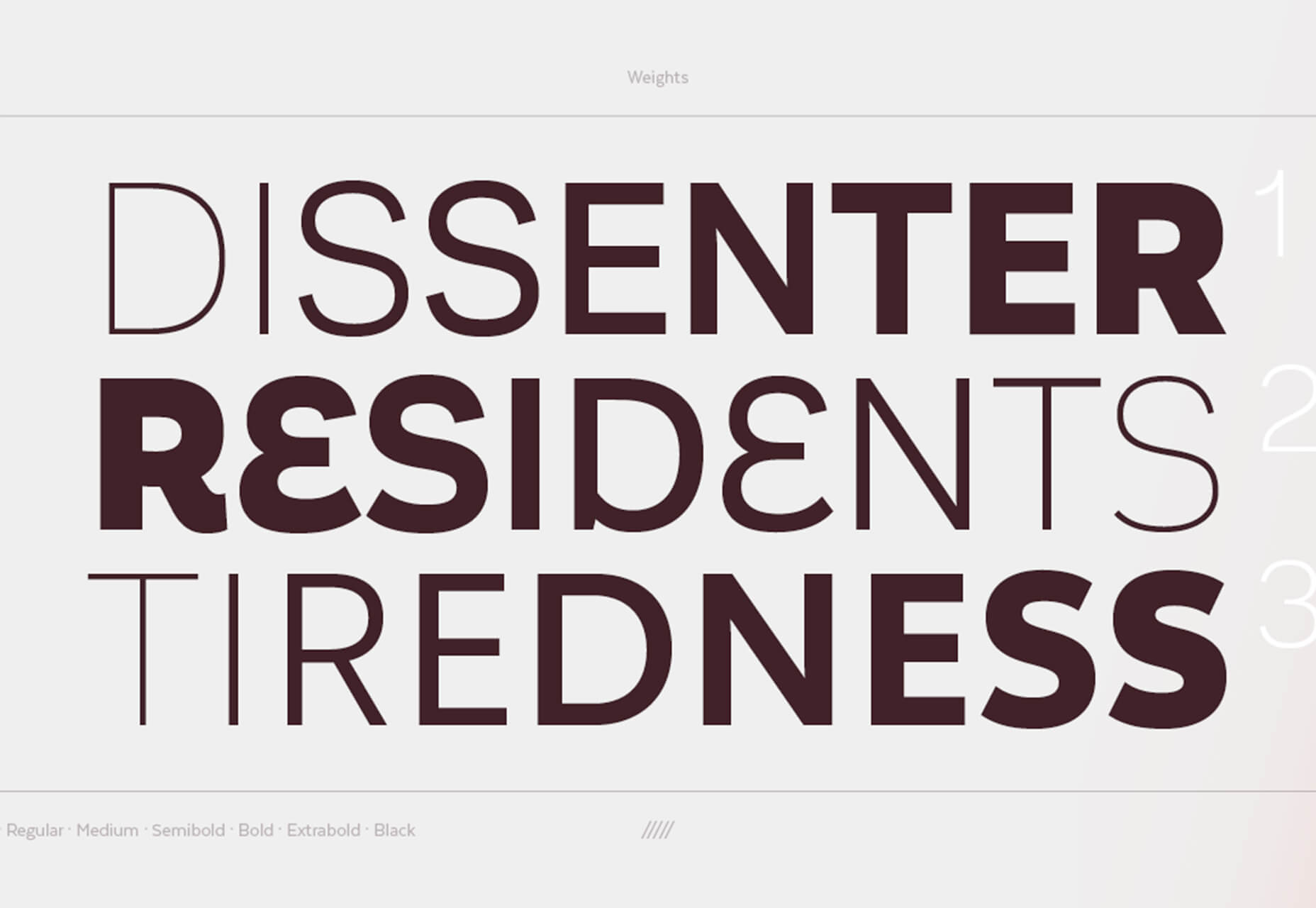
Aestetico is a beautiful sans serif that includes a massive family with 54 styles. This premium typeface is highly readable and has modern lines and curves that make it a great option for a variety of uses.

Arcades

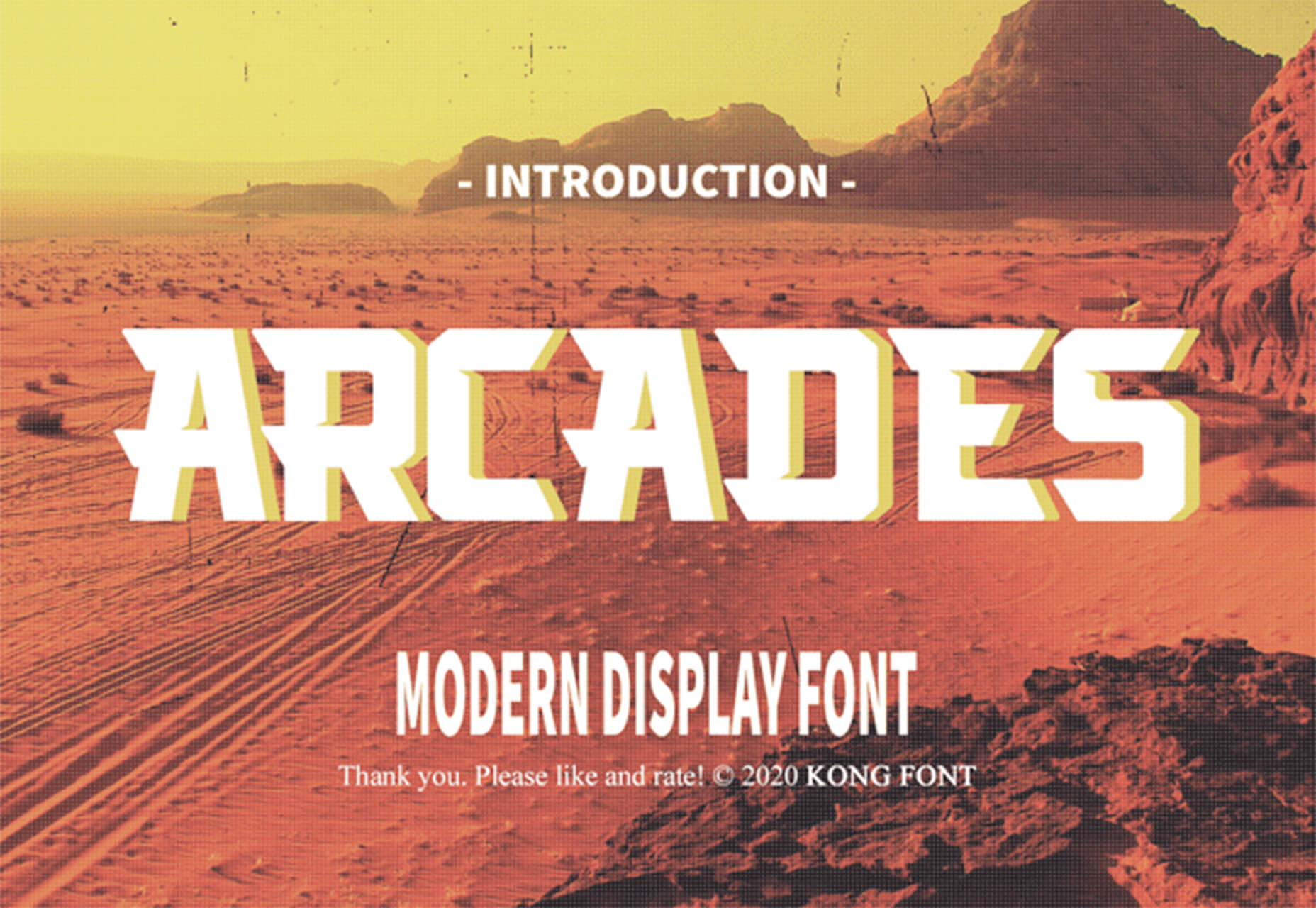
Arcades is a modern display font with a retro, 1980s-style vibe. It includes regular and italic styles.

Brimington

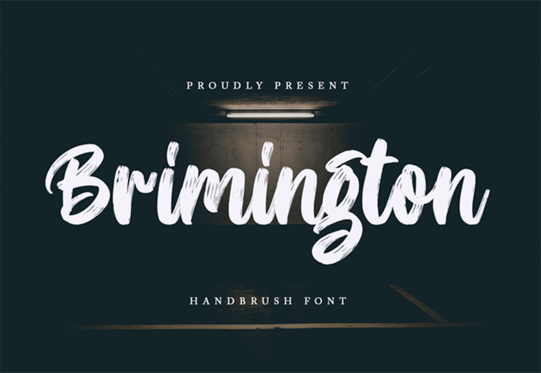
Brimington is a handwriting style typeface with rough strokes and smooth curves. It includes a set of 227 characters and 219 glyphs in a readable design.

California Signature

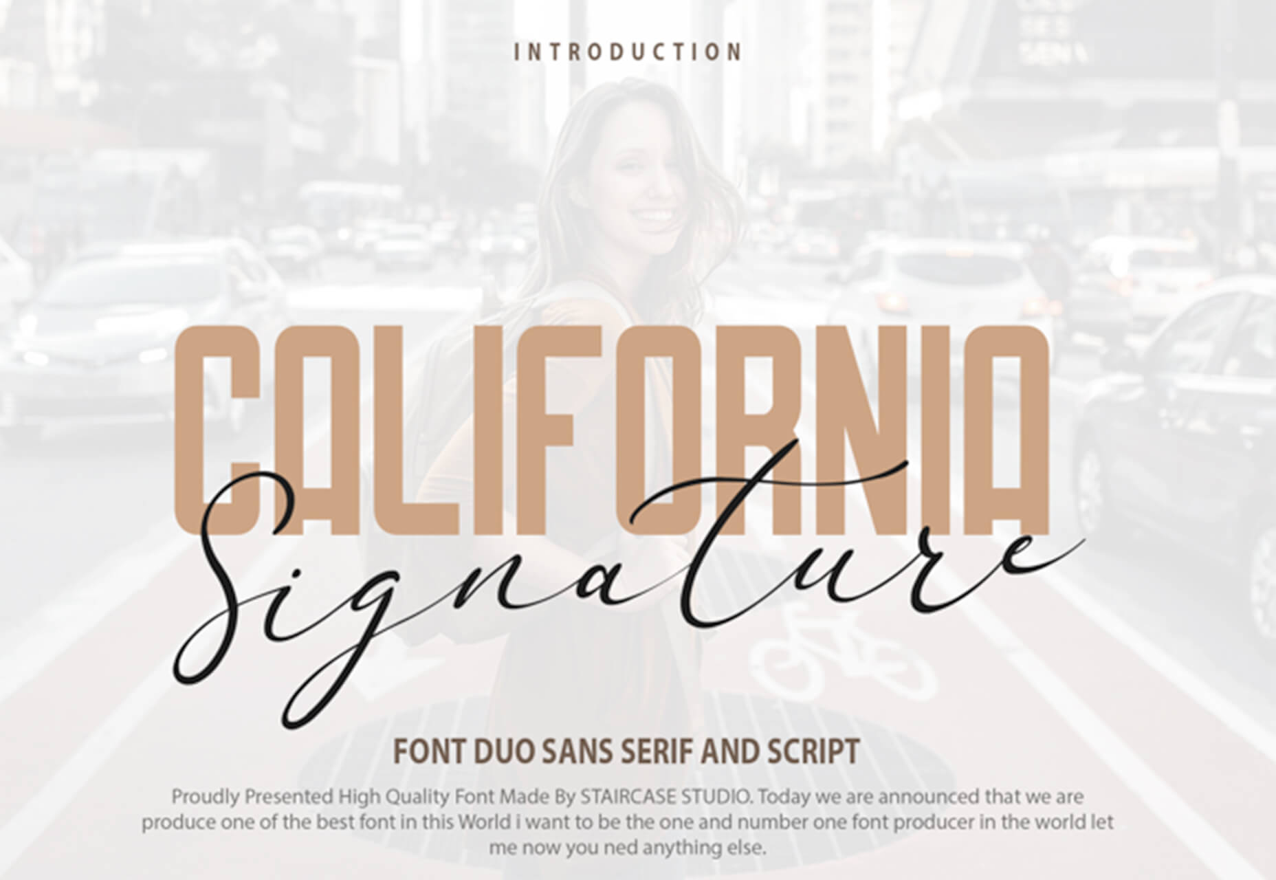
California Signature is a typeface duo with a slab serif and handwriting style that are perfectly paired. The thick and thin options provide a yin and yang effect.

Eastblue

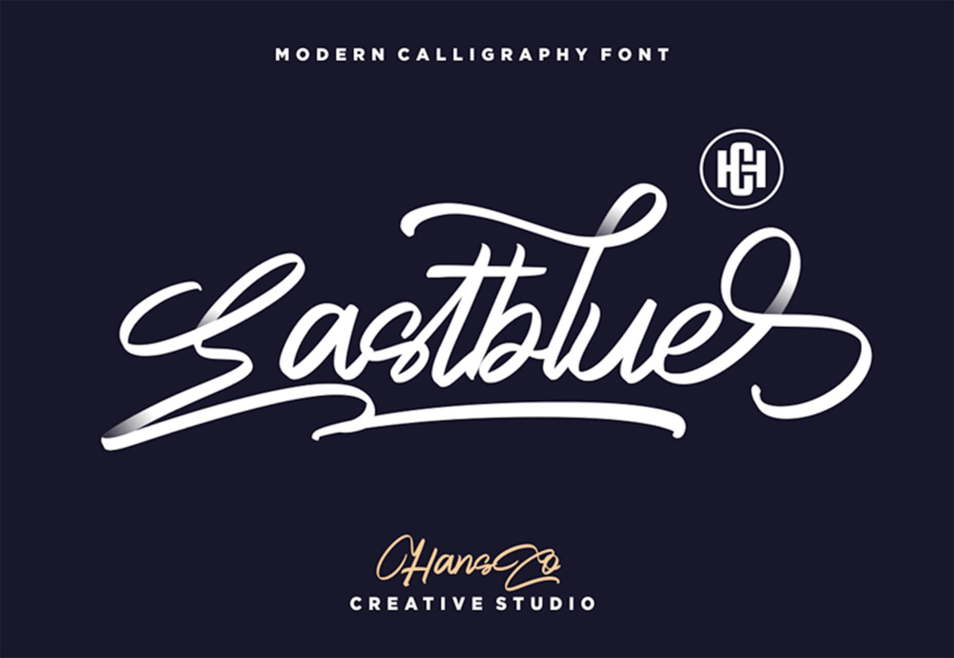
Eastblue is a script typeface with long swashes and interesting curves. It includes a solid character set and is free for personal use only.

Source


Source de l’article sur Webdesignerdepot


Agile 

AI

Big Data

Cloud

Database

DevOps

Integration

  • Mulesoft 4: Continuous Delivery/Deployment With Maven by Ashok S — This article is a great example of what we want every tutorial to look like on DZone. The main aim of this article is to provide a standard mechanism to release project artifacts and deploy to Anypoint Platform, from the local machine or configure in continuous delivery pipelines.
  • Integration With Social Media Platforms Series (Part 1) by Sravan Lingam — This article helps you to build a RESTful API through MuleSoft that integrates with LinkedIn and shares a post on behalf of one’s personal account. I like this article because, in the age of social media, it’s so important for businesses to be connected and integrated!

IoT

Java

Microservices

Open Source

Performance

  • What Is Big O Notation? by Huyen Pham — Aside from a silly name, this article is an example of an in-depth analysis on a little-spoken-about concept. In this article, take a look at a short guide to get to know Big O Notation and its usages.
  • Is Python the Future of Programming? by Shormisthsa Chatterjee — Where is programming going? This article attempts to answer this question in a well-rounded way. The author writes, "Python will be the language of the future. Testers will have to upgrade their skills and learn these languages to tame the AI and ML tools".

Security

Web Dev

  • A Better Way to Learn Python by Manas Dash: There’s so many resources available for learning Python — so many that it’s difficult to find a good and flexible place to start. Check out Manas’ curated list of courses, articles, projects, etc. to get your Python journey started today. 
  • Discovering Rust by Joaquin Caro: I’m a sucker for good Rust content, as there’s still so many gaps in what’s available. Joaquin does a great job of giving readers his perspective of the language’s features in a way that traditional docs just 

Source de l’article sur DZONE

As a freelance web developer, how many clients do you get from your website? If you’re like most, you’re probably lucky to get one client every 2-3 months. Unfortunately, that’s very common.
These days it’s not enough just to be a web developer if you want to make really good money. You have to be able to differentiate yourself in the marketplace to get more opportunities. If you can do this successfully, I’m 100% sure that it will help you win more projects and charge higher rates.

So today I’d like to share with you a little bit of my own story. In the last 4 months, I was able to position myself as a specialist with my personal site that ultimately helped me win more projects and get better clients.

The Importance of Niching Down

The first thing that I would invite you to do is to shift your thinking a little bit.

If you want to be a high-paid professional (especially if you’re a freelancer), you need to learn how to market and sell yourself. And the first rule of marketing is to identify your target audience and the result that you help them achieve.

I can’t over emphasize the importance of this.

You need to know exactly who you help and the outcome that you provide. That is ultimately what you get paid for. So you need to define your ideal client.

My suggestion is to pick a market segment that you would love to work with, that has the money to afford you and (ideally) those that have already done some projects for. Once you have identified your target market, you need to create your positioning statement. Your positioning statement should immediately tell who you help and what results you help them achieve.

Here is a formula that you can use to create your positioning statement:

I help __ (target audience) __ do (build/achieve/overcome) ___ (problem that you help them solve).

For example: I help startup SaaS companies build highly converting websites. You can go even narrower if you want, but this is already much better than just saying, “I’m a web developer.”

If your positioning statement is “I help startup SaaS companies build highly converting websites” it can still be narrowed down and improved. As you gain more experience and work with more clients, you can refine it to something like: “I help healthcare SaaS companies build highly converting websites.”

Now imagine if a SaaS startup founder from a healthcare niche came to your site and saw that positioning statement vs a very generic one like “I’m a web developer”. How much easier would it be for you to differentiate yourself and gain a huge advantage over your competitors in the marketplace?

4 Elements of a Perfect Landing Page

“I am passionate about coding, I have 10+ years of experience, client satisfaction is my main goal…” 

Have you ever seen statements like that on someone’s portfolio site? Or maybe it even says that on your own site. From my experience, statements like that don’t really help you convert site visitors into customers.

If you personally go to a company’s website, what would you like to see yourself as a visitor? Somebody saying how good they are, or to find out if they can be a good fit to solve your problem? I think that most of the time the latter is what you’re after. That’s what other people usually go to your website for; they want to know how you can help them solve their problems.

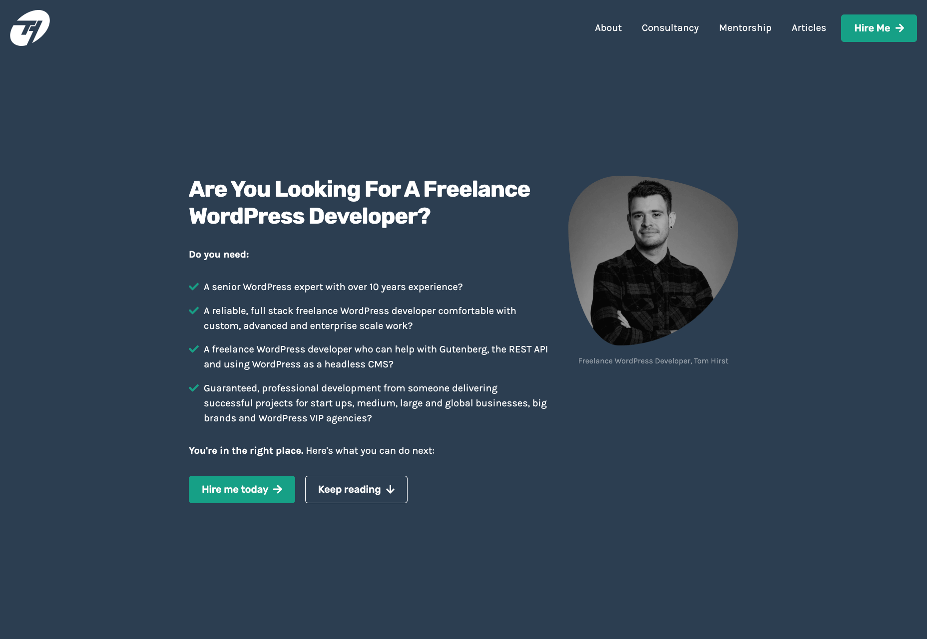
For instance, take a look at this section from Tom Hirst’s website:

As you can see, this immediately helps the visitors understand if Tom is a good fit for them or not. He doesn’t just boast about how good he is, but rather helps the client understand what problems he can solve for them. Another important part here is that Tom doesn’t use a lot of technical terms. Since a lot of his visitors may be not as tech-savvy as he is, there is no point in confusing them with technical jargon. The more you can speak their language – the easier it will be for you to build trust and connection that will later help you during the sales process.

Let me tell you a bit about the 4 parts of my site that I think have contributed significantly to having me win more projects. The 4 elements are problem, solution, proof, and call to action. Let me go over them 1 by 1 and explain why they’re important.

1. Problem

A good way to start your landing page sales letter is by identifying the problem of the client. If you know their pain points and you mention them, you should be able to hook them into reading your copy. And a well-written copy plays a significant role in persuading your visitors to take the next action.

2. Solution

Once you have mentioned their problem, you need to present them with a solution that you provide. You need to show them how working with you can solve their problems. Whatever their problems are, you have to show them that you understand them and can help solve them.

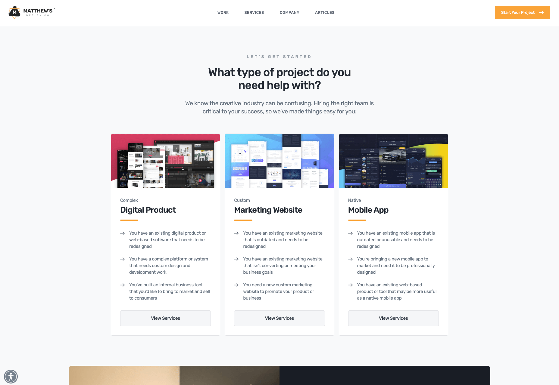
That’s what UX designer Matt Oplinski is doing on his website is doing. He knows that his clients might need help with 3 types of projects: Digital Products, Marketing Websites or Mobile Apps. For example, the clients who are seeking a redesign of their website may have an issue with their current conversion rates. And that’s exactly what Matthew lists in the middle section under “Custom Marketing Website” headline. I would even argue that he may have been a bit more specific with the solutions that he can offer.

The main takeaway here is that it’s important to be very specific with the result that you can help your clients achieve. The more accurate it is, the better it is going to convert.

3. Social Proof

Social proof plays an extremely important role in converting a lead into a customer. When someone comes to your site, they don’t know if they can trust you. If they were to spend one, two, five, ten or even more thousand dollars – they need to feel comfortable with you. They need to have at least some level of trust. That’s why they want to see as many signs as possible that you’re trustworthy.

Social proof obviously can come in many different forms. The most popular and important ones, in my opinion, are case studies with results that you’ve produced and testimonials. They will be absolutely crucial to persuade your clients and be able to differentiate yourself from others.

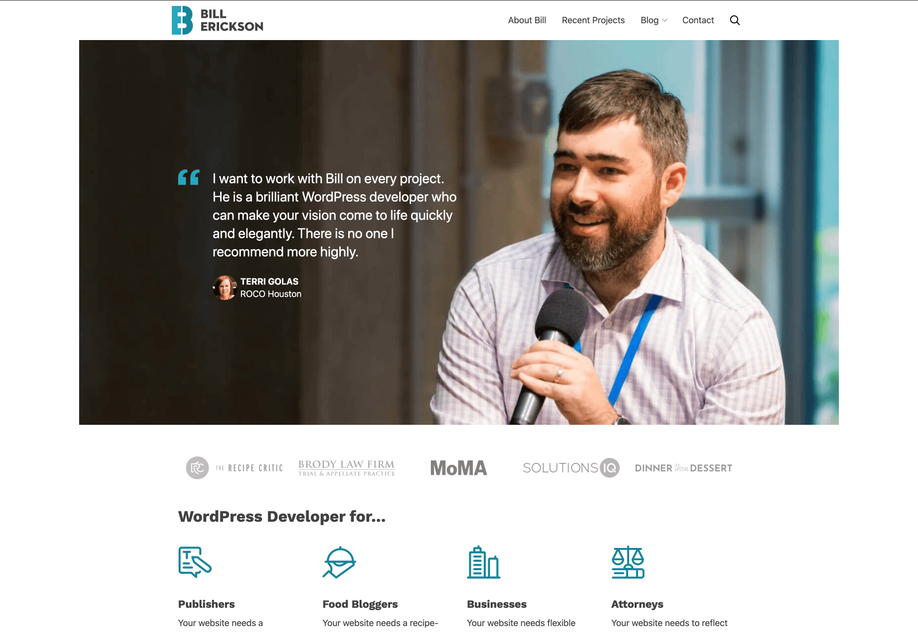
Here is a good example from Bill Erickson’s site:

Ideally, your testimonials should showcase a particular business goal that you’ve helped your client to achieve. But even if you don’t have those, you can use ordinary testimonials that your clients give you. That alone is better than no testimonials at all.

4. Call to Action

Last but not least you should have a single call to action on your site. Most likely it will be a button to contact you, or book a call with you.

In my opinion, it’s important to have a single call to action because if you give people too many options they will not be so focused on taking an action that you actually want them to take.

I also suggest that you have a call to action button at least 2-3 times on the page: one on the first screen where you have your positioning statement and/or your offer, and one at the very bottom of the page so that when they finish reading they don’t need to go back to the top to take action. Having another call to action in the middle of your page is also a good idea. My advice would be to add it after you’ve described the problem, your solution and presented yourself as someone who can help your leads with their problems.

Results

I started niching down and created my own website four months ago. Being a member of multiple freelance platforms, I’ve been fortunate enough to get enough leads in my target market to test out my strategy. So far the results are pretty amazing.

It has become a lot easier for me to win projects, get clients that respect my knowledge, and my process. Besides that, I’ve been able to significantly increase my rates for my work. A great thing about working with similar projects every time is that you automate and streamline a lot of things, improve your delivery process and become much more efficient. You can even create a productized service. This is something that is very hard to achieve if you’re constantly working on custom projects that have different requirements and involve different technologies.

To be completely transparent, I’m still in the process of building my authority in the niche, polishing my offer and gaining experience. I still have a long way to go. What I can certainly say today is that it has been one of the best decisions in my professional career.

To become a high paying professional in your industry you have to do things differently. Today I tried to show you one of the ways that you can improve your career or freelancing business fast. It probably won’t happen overnight, but in a matter of a few months you can be so much ahead of your competition if you deploy some of the strategies that I’ve shared with you today.

I really hope that this article has helped you gain some perspective and you will start to consider doing a similar thing that I did to achieve amazing results.


Featured image via Unsplash.

Source


Source de l’article sur Webdesignerdepot

As you already know, TestNG or Test Next Generation is one of the most frequently used automation testing frameworks in Java. Inspired by JUnit and NUnit, Cedric Beust created TestNG with the idea of covering almost all types of testing models, be it functional or end-to-end. The annotations, functionalities, usability, features, and ease-of-use make TestNG a very popular choice of framework. Listed below are some of the major benefits of using TestNG-

We are moving toward a future where everything is going to be autonomous, fast, and highly efficient. To match the pace of this fast-moving ecosystem, application delivery times will have to be accelerated, but not at the cost of quality. Achieving quality at speed is imperative and therefore quality assurance gets a lot of attention. To fulfill the demands for exceptional quality and faster time to market, automation testing will assume priority. It is becoming necessary for micro, small, and medium-sized enterprises (SMEs) to automate their testing processes. But the most crucial aspect is to choose the right test automation framework. So let’s understand what a test automation framework is.

What Is a Test Automation Framework?

A test automation framework is the scaffolding that is laid to provide an execution environment for the automation test scripts. The framework provides the user with various benefits that help them to develop, execute, and report the automation test scripts efficiently. It is more like a system that was created specifically to automate our tests. In a very simple language, we can say that a framework is a constructive blend of various guidelines, coding standards, concepts, processes, practices, project hierarchies, modularity, reporting mechanism, test data injections, etc. to pillar automation testing. Thus, the user can follow these guidelines while automating applications to take advantage of various productive results.

Source de l’article sur DZONE

Google resembles an iceberg: there’s the part above the water we can see and use everyday; there’s also the part beneath the water, that we don’t see and know little about.
While many of us are concerned about the aspects of Google we don’t see — the parts that threaten our privacy, or monopolize the web — there’s no denying that Google offers some amazing products and tools, many of them free, all from the convenience of a single login.

Today we’re going to take a look at 12 tools from Google that really do bring something positive to the table.

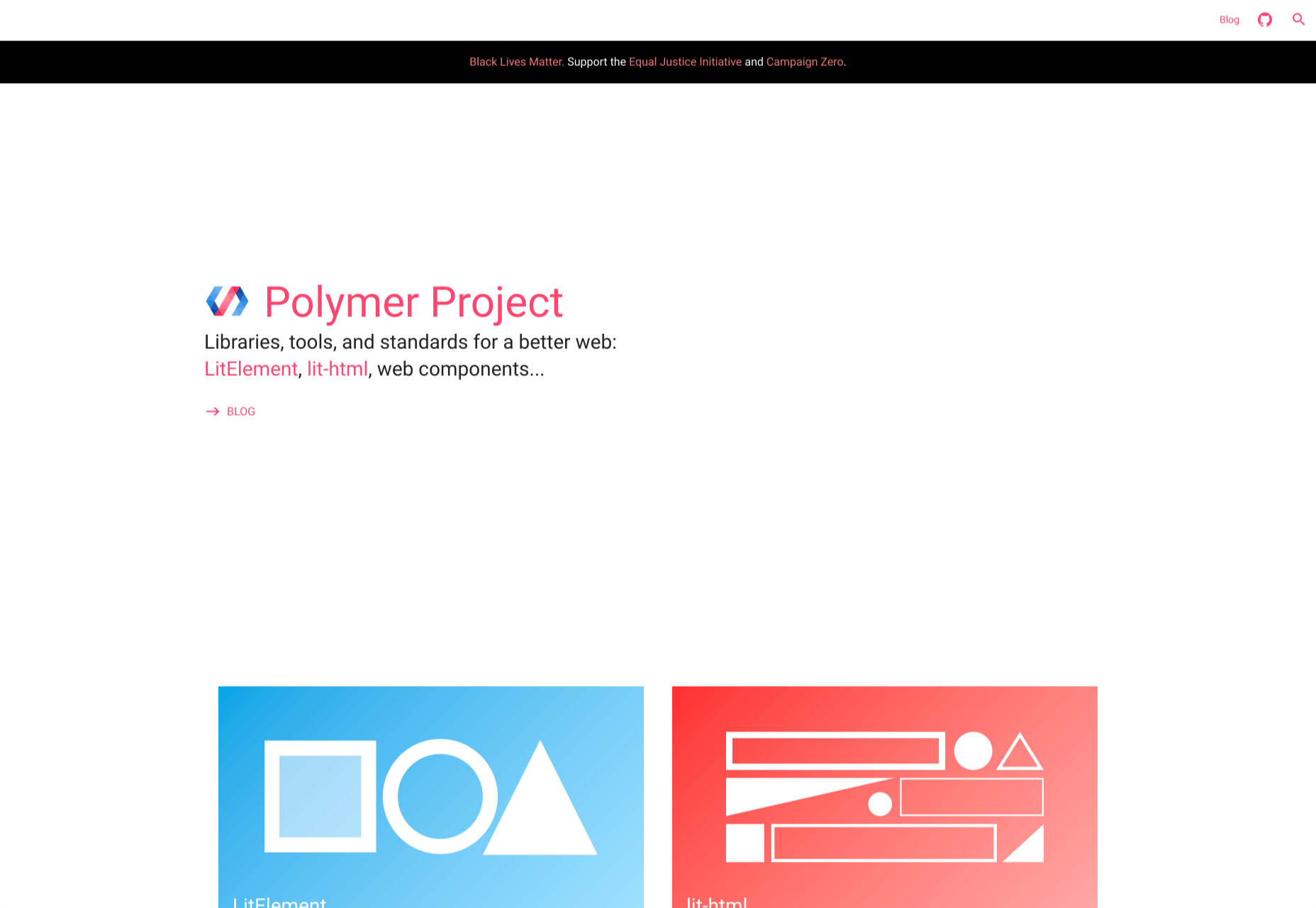
1. Polymer

Polymer is an open-source JavaScript library from Google for building web applications using Web Components. The platform comes with a ton of libraries and tools to help designers and developers unlock the web’s potential by taking advantage of features like HTTP/2, Web Components, and Service Workers. 

The main feature of Polymer is Web Components. With Web Components, you can share custom elements to any site, work seamlessly with any browser’s built-in elements, and effectively use frameworks of all kinds. Products like LitElement (a simple base class for creating fast, lightweight web components) and PWA Starter Kit make Polymer easy to use. If you like, you can build your app entirely out of Web Components.

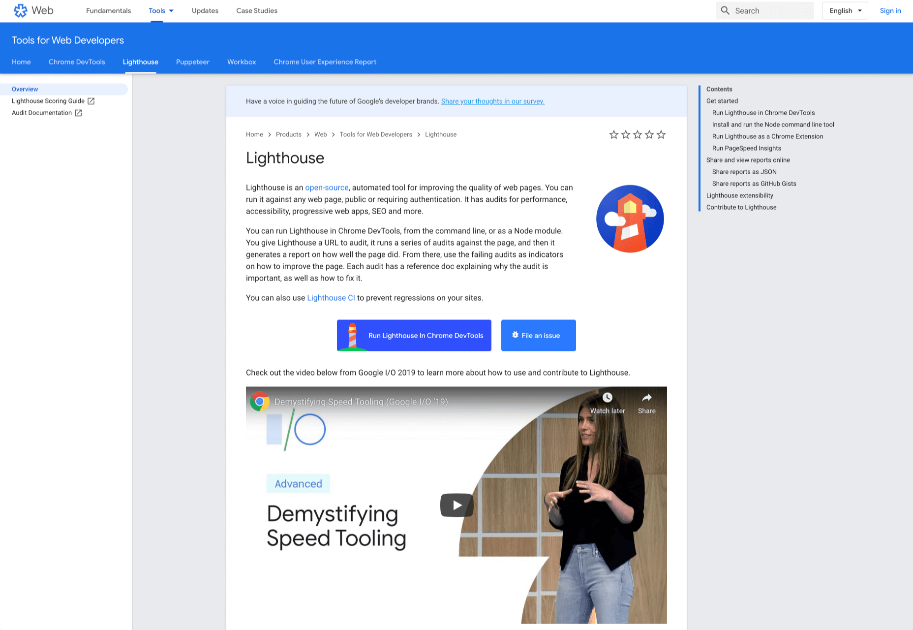
2. Lighthouse

Google Lighthouse is an open-source, automated tool for improving the quality of web pages. The software allows you to audit web pages for performance, SEO, accessibility, and more. You can run Lighthouse using ChromeDevTools, directly from the command line, or as a Node module. 

To use Lighthouse in Google Chrome, just go to the URL you want to audit (you can audit any URL on the web), open ChromeDevTools, and click the Audits tab. After you have run the audit, Lighthouse will give you an in-depth report on the web page. 

With these reports, you will see which parts of your web page you need to optimize. Each report has a reference doc that explains why that audit is important and also shows you the steps you can take to fix it. 

You can also use Lighthouse CL to prevent regression on your sites. Using Lighthouse Viewer, you can view and share reports online. You can also share reports as JSON or GitHub Gists. 

Lighthouse also comes with a feature called Stack Packs that allows Lighthouse to detect what platform a site is built on. It also displays specific stack-based recommendations.

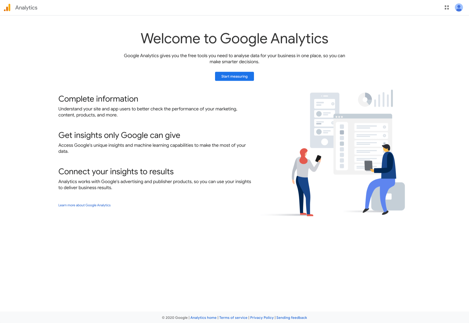
3. Google Analytics

Google Analytics is the gold standard of analytics services. Google analytics can be installed on your site for free with a small amount of JavaScript and allows you to see all kinds of details about your site visitors, like what browser they’re using, and where they’re from.

By using Google Analytics you can make decisions about your site based on science, and therefore be somewhat confident that the decisions you make will result in the outcome you are expecting.

4. Flutter

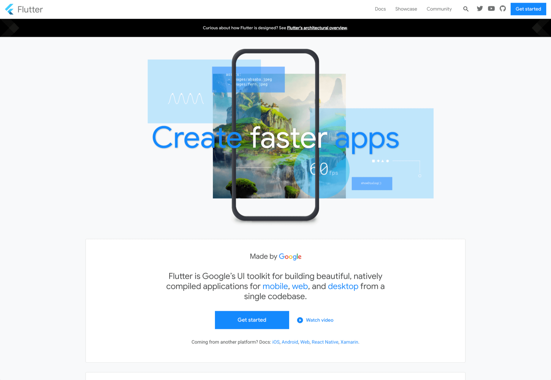
Flutter is Google’s UI toolkit for building natively compiled applications for mobile, web, and desktop from a single codebase. The toolkit is open source and free to use. The best part of Flutter is that it works with existing code. 

The toolkit has a layered architecture that allows for full customization, which results in fast rendering and flexible designs. It also comes with fully-customizable widgets that allow you to build native interfaces in minutes. With these widgets, you will be able to add platform features such as scrolling, navigation, icons, and fonts to provide a full native performance on both iOS and Android.

Flutter also has a feature called hot reload that allows you to easily build UIs, add new features, and fix bugs faster. You can also compile Flutter code to native ARM machine code using Dart native compilers. 

5. Google API Explorer

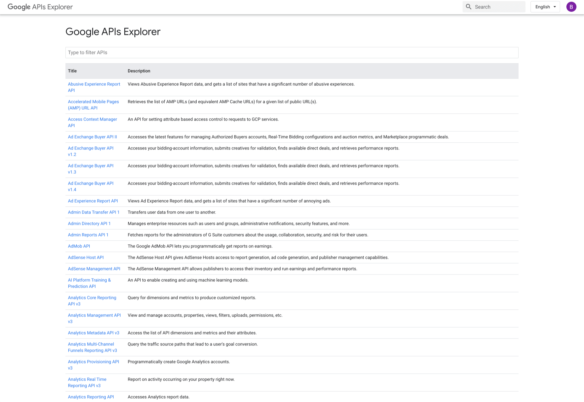
Google has a huge library of APIs that are available to developers but finding these APIs can be difficult. Google API Explorer makes it easy for developers to locate any API. On the Google API Explorer web page, you will see a complete list of the entire API library. You can easily scroll through the list or use the search box to filter through the API list. 

The best part of Google API Explorer is that each link to a reference page comes with more details on how to use the API. API Explorer is an excellent way to try out methods in the Monitoring API without having to write any code.

6. Puppeteer

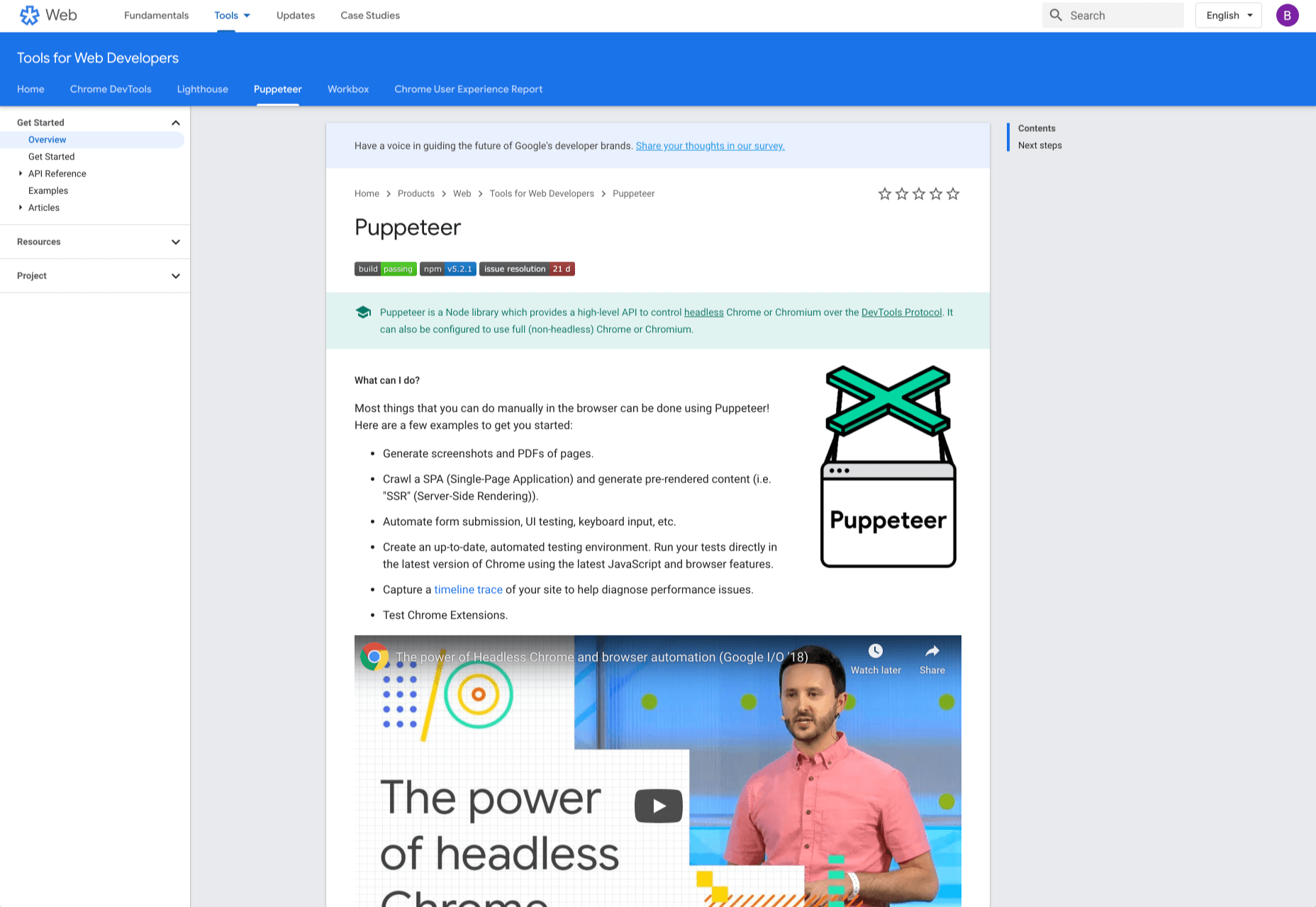
Puppeteer is a project from the Google Chrome team. The platform enables web developers to control a Chrome (or any other Chrome DevTools Protocol based browser) and execute common actions, much like in a real browser. Puppeteer is also a Node library and it provides a high-level API for working with headless Chrome. It is also a useful tool for scraping, testing, and automating web pages. 

Here are some things you can do with Puppeteer: generate screenshots and PDFs of pages, UI testing, test Chrome Extensions, automate form submission, generate pre-rendered content, and crawl Single-Page Applications. 

7. Codelabs

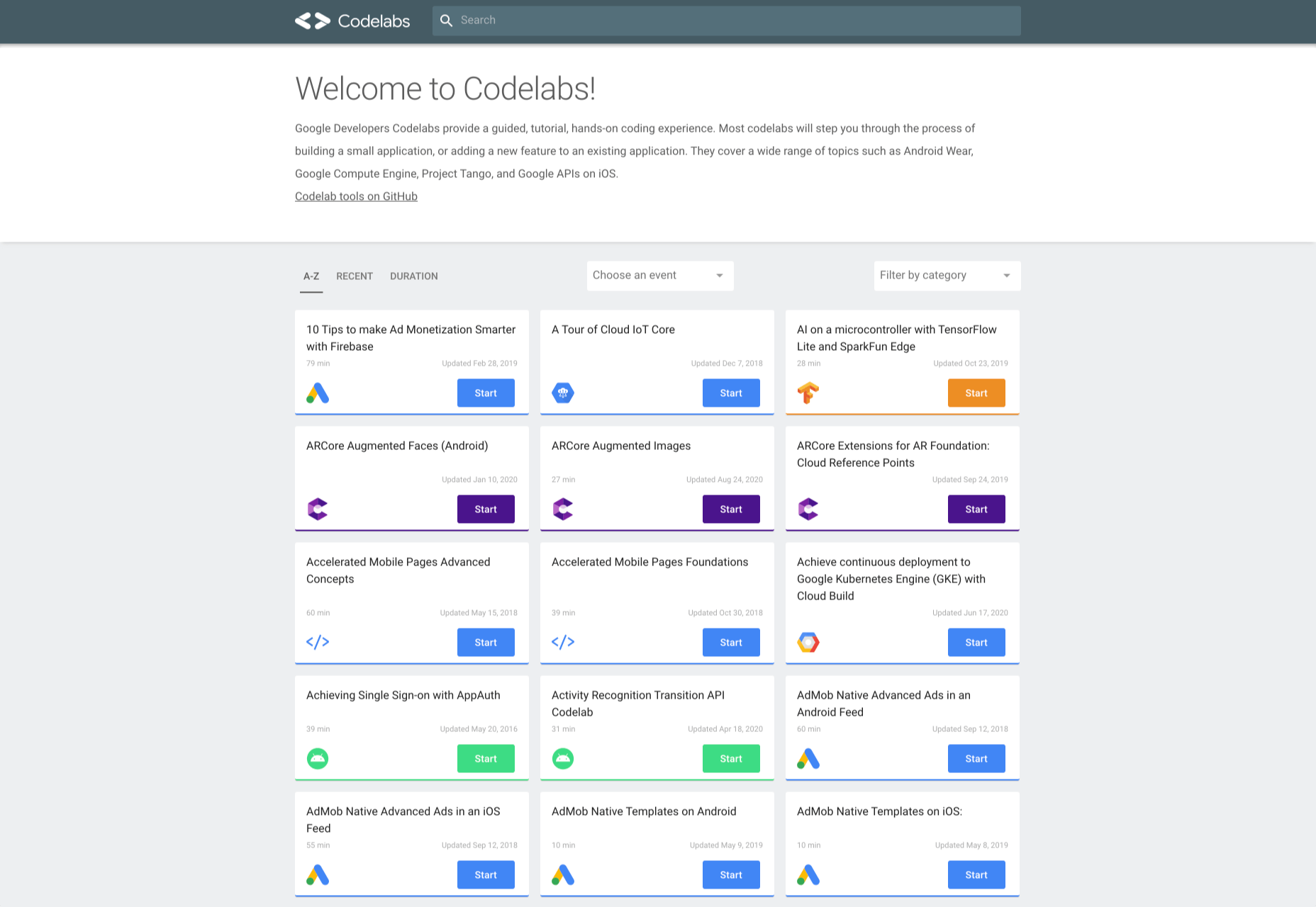
Google Developer Codelabs is a handy tool for beginner developers and even advanced developers who want to improve their knowledge. Codelabs provide a guided, tutorial, hands-on coding experience. Codelabs’ site is broken down into several tutorial sessions on different topics. 

With the tutorials on Codelabs, you can learn how to build applications from scratch. Some of the tutorial categories include Augmented reality, TensorFlow, Analytics, Virtual Analytics, G Suite, Search, Google Compute Engine, and Google APIs on iOS. 

8. Color Tool

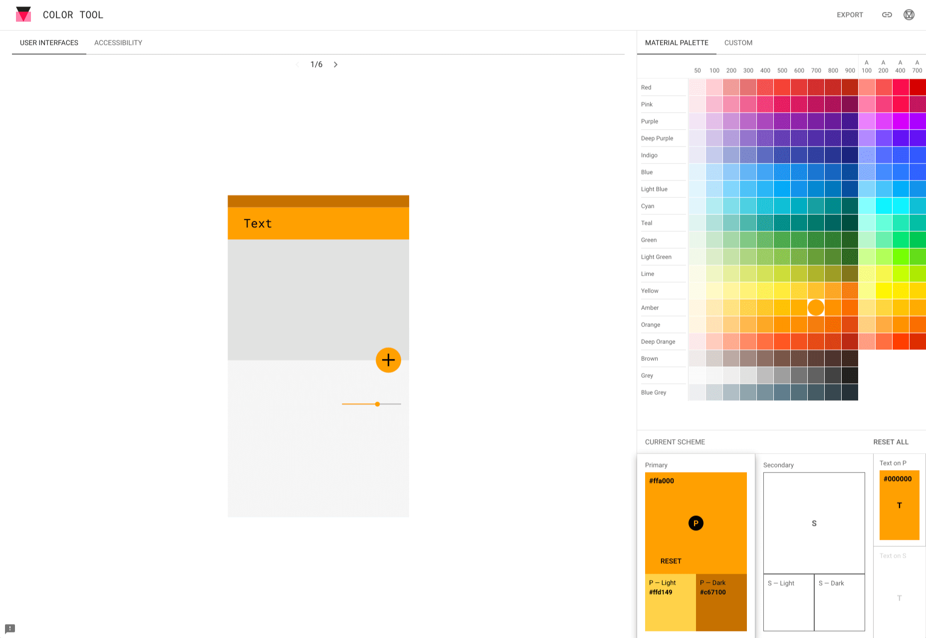
Color Tool makes it easy for web designers to create, share, and apply colors to their UI. It also measures the accessibility level for any color combination before exporting to the palette. The tool comes with 6 user interfaces and offers over 250 colors to choose from. 

The tool is also very easy to use. All you need to do is pick a color and apply it to the primary color scheme; switch to the secondary color scheme, and pick another color. You can also switch to Custom to pick your own colors. After you have selected all your colors, use the Accessibility feature to check if all is good before exporting it to your palette. 

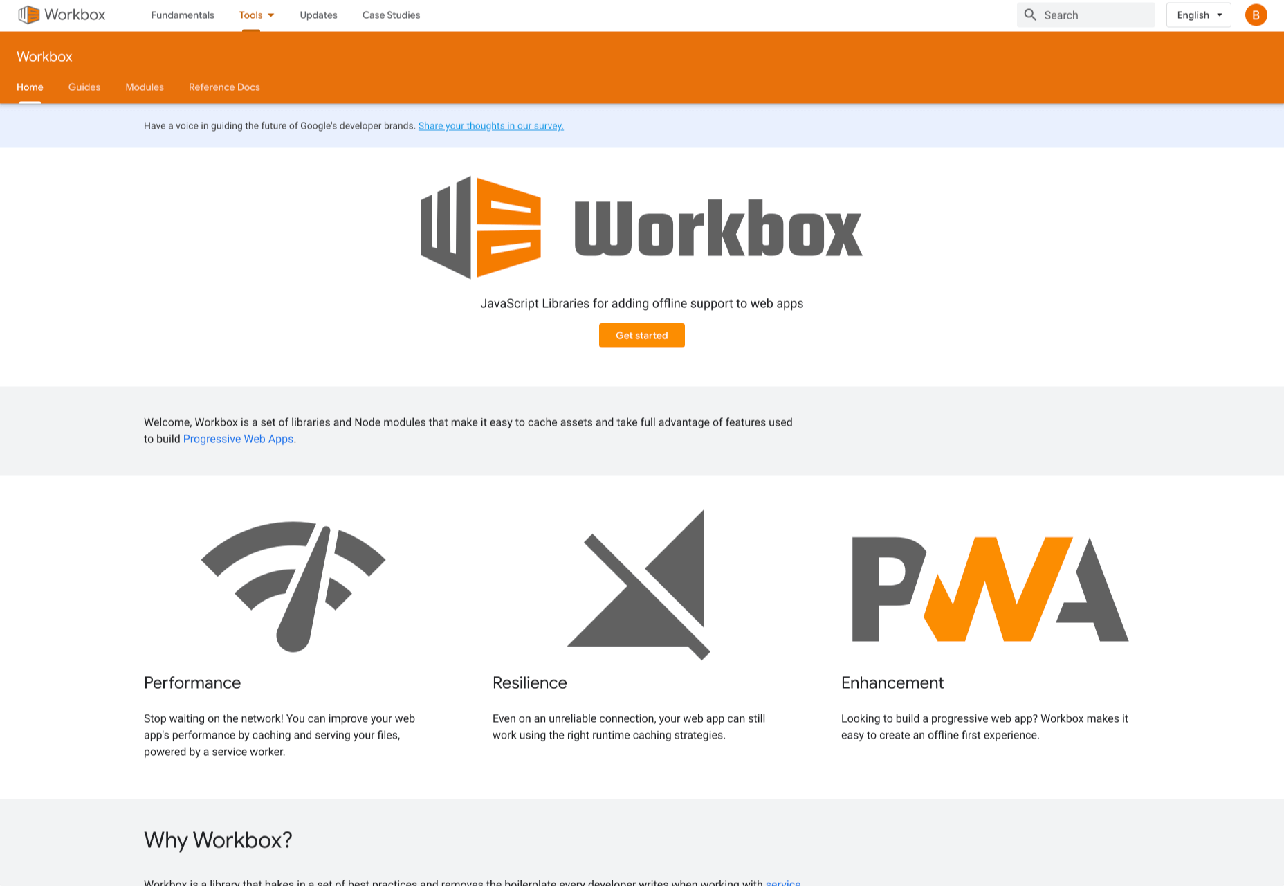
9. Workbox

Workbox is a set of JavaScript libraries and Node modules. The JavaScript libraries make it easy to add offline support to web apps. The Node modules make it easy to cache assets and offer other features to help users build Progressive Web Apps. Some of these features include pre-caching, runtime caching, request routing, background sync, debugging, and greater flexibility than sw-precache and sw-toolbox. 

With Workbox, you can add a quick rule that enables you to cache Google fonts, images, JavaScript, and CSS files. Caching these files will make your web page to run faster and also consume less storage. You can also pre-cache your files in your web app using their CLI, Node module, or webpack plugin. 

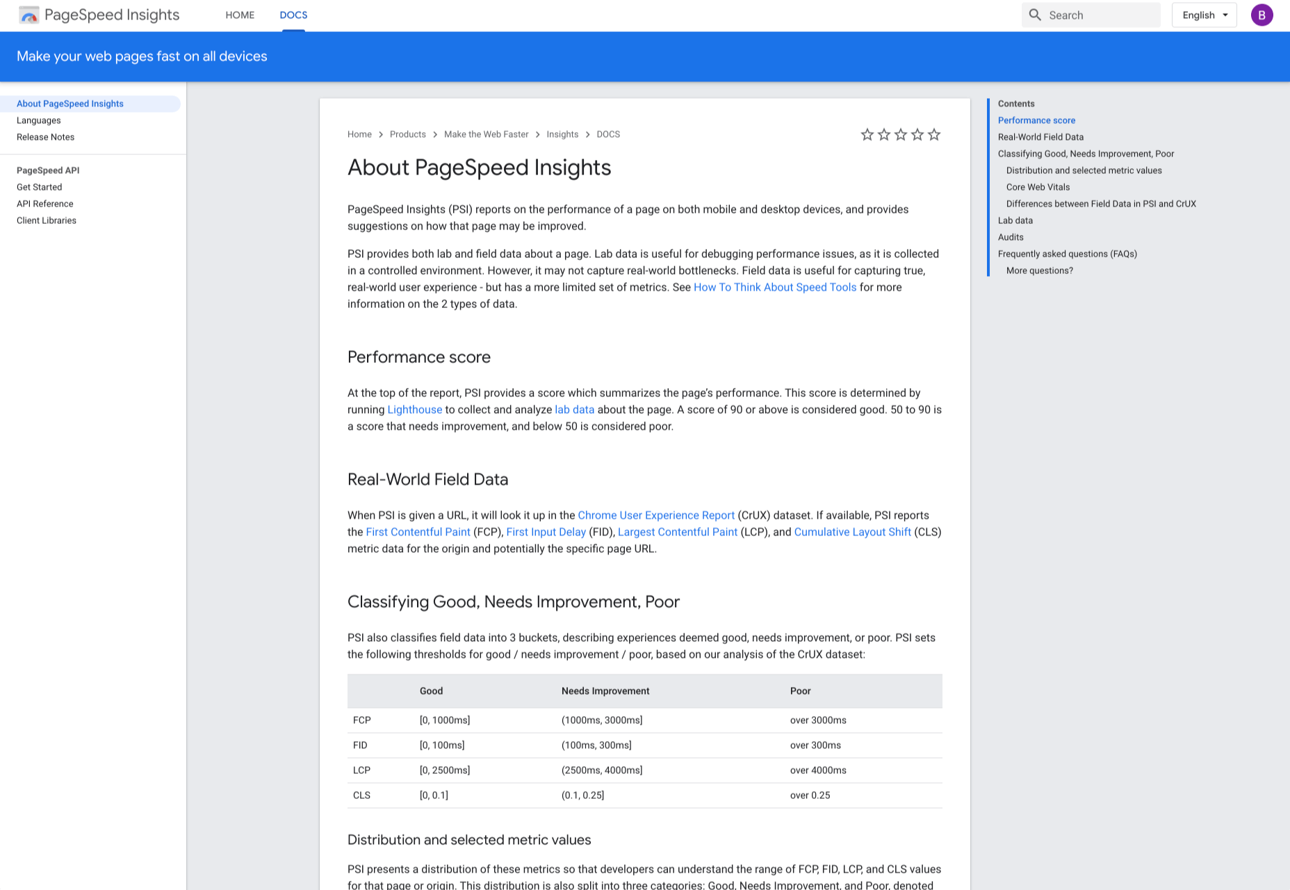
10. PageSpeed Insights

PageSpeed Insights is a handy tool from Google Developers that analyzes the content of a web page, then generates suggestions on how to make the page faster. It gives reports on the performance of a web page on both desktop and mobile devices. At the top of the report, PageSpeed Insights provides a score that summarizes the page’s performance. 

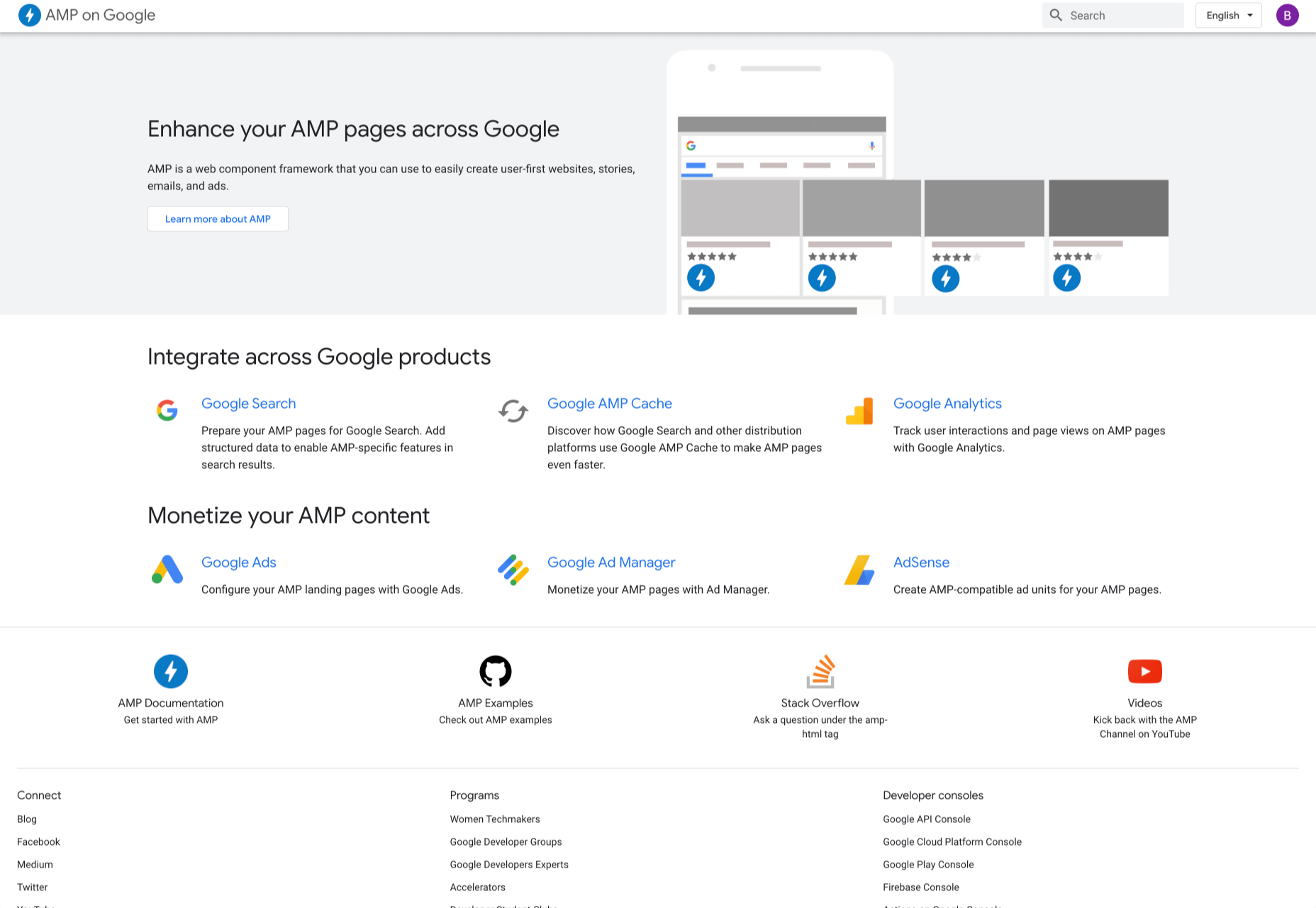
11. AMP on Google

AMP pages load faster and also look better than standard HTML pages on mobile devices. AMP on Google allows you to enhance your AMP pages across Google. It is a web component framework that allows you to create user-first websites, ads, emails, and stories. One benefit of AMP is that it allows your web pages to load almost instantly across all devices and platforms hence improving the user’s experience. 

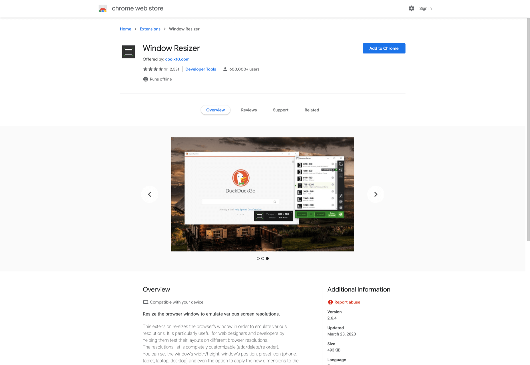
12. Window Resizer

When creating websites, it is important that developers test them for responsive design – this is where Window Resizer comes in. Window Resizer is a Chrome extension that resizes the browser window so that you can test your responsive design on different screen resolutions. The common screen sizes offered are desktop, laptop, and mobile, but you can also add custom screen sizes. 


Featured image via Unsplash.

Source


Source de l’article sur Webdesignerdepot

Loops in a programming language is a piece of code that get executed repeatedly until the specified condition becomes false. A loop consists of two parts, a block of statements and a condition that control the loop.

Loops mainly consisted of three statements – initialization condition, test condition, update condition.

Source de l’article sur DZONE

It’s no secret that the senior population is growing. By 2030, people over the age of 65 are predicted to make up 20.6% of the population of the US. 
Around the world, people are living longer and remaining more active in the later years of their lives. What’s more, despite what you might have heard in the past, seniors aren’t as wary of the internet as they used to be. In 2019, the Pew Research institute revealed that 73% of people over the age of 65 were connected to the web. 

So, what does that mean for web designers?

your main focus needs to be on ability…people age differently

Well, first of all, it’s time for all of us to start thinking about user experience from different perspectives. We need to stop expecting our audiences to be made up entirely of iPhone-using millennials and start thinking about the needs of seniors too. After all, designing websites for seniors opens you up to a wide selection of potential visitors in the future.

What’s more, according to the US Census Bureau, people over the age of 65 generally have the highest household wealth figures of any age group. That’s a big deal. 

So, how do you adapt UX for seniors?

Creating Senior-Friendly Web Designs

When it comes to designing websites and applications for seniors, your main focus needs to be on ability. Age is just a number, and people age differently. 

That means that one person in their 70s might have no problem browsing through Netflix to watch the latest shows, while someone else wouldn’t be able to tell you what ‘streaming’ means. 

Rather than worrying specifically about age, think about how different people in older age groups might have different requirements when it comes to things like movement control, hearing, vision, and even device bias. 

Get the Visual Elements Right

Vision loss is by far the most common disability reported by elderly individuals in the US. Around one in six people over the age of 70 have some manner of visual impairment. That’s why UI designers need to think carefully about visual accessibility when creating the right websites. 

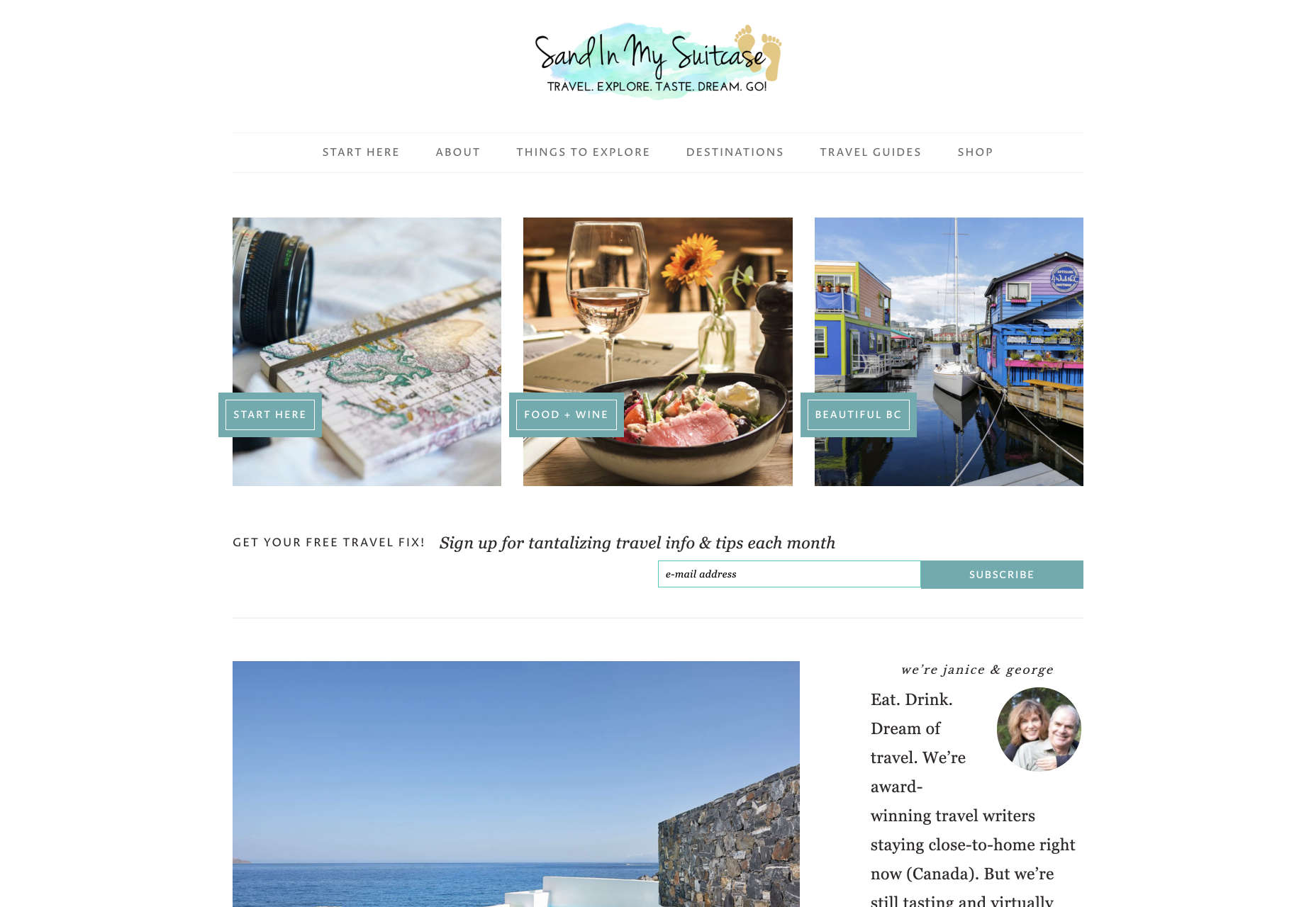
For instance, text and button sizes should always be kept large. Anything that needs to be read or clicked needs to be scaled up, to ensure that everyone can see the information clearly. For instance, on the Sandinmysuitcase.com website, you’ll find clear typography, combined with big buttons that tell you to “Start Here” so you know exactly what to do next.

Remember to stick to icons that are clearly labelled wherever possible. Stay away from anything that your customers might not understand. “Start Here” is easier to read and understand than “Submit”. 

It’s also worth sticking to the color and contrast guidelines laid out by basic UX design when you’re creating something for optimal visibility.  Colors that are too close together might create a nice pastel or gradient effect on a website – but they’ll also make things difficult to read. 

Concentrate on Usability

Over the age of 55, motor skills and coordination can begin to decline for some people. These changes make it harder for people to interact with complex UIs. The mouse on a computer can be a particular problem for people with diminishing motor skills – as can the touchscreen of a tablet or smartphone. 

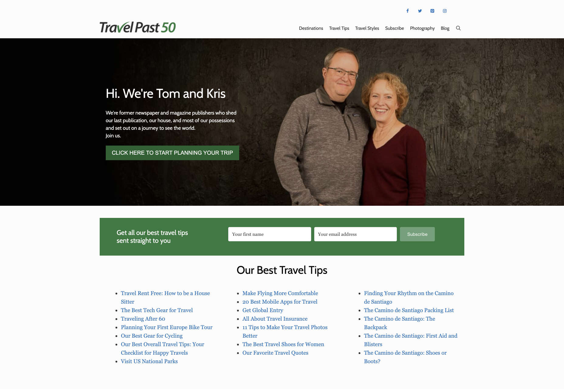
When you’re working on the perfect UX, think about how you can make things as easy to click as possible for people who have a hard time hitting their targets. For instance, in this website for people traveling over the age of 50, you’ll see not only fantastic large font choices but big buttons that are descriptive and easy to understand too: “Click here to start planning your trip”:

The scrollbar can also be a bit of a problem for people with impaired motor skills. Because of this, it’s best to keep your focus on designing above the fold. Make sure that users don’t need to scroll far to find the information that they need and keep scrollbars simple in terms of their look and feel.

While you’re working on usability, remember that it will be important to keep interactions to a minimum wherever possible. Where you can engage younger audiences with double-taps, swiping and scrolling, it’s much easier to connect with seniors through simple one-tap interactions. The less actions your user needs to take to reach their goals, the better. 

Deliver Smooth Navigation 

Navigating from point A to B on your website needs to be as simple as seamless as possible. Remember, crowded pages on your websites and apps are often overwhelming – even for younger browsers. Seniors are generally just searching for “must know” information, so they don’t want anything to get in their way as they navigate through their website. 

As you work on your site or app design, ask yourself if every element on the page absolutely has to be there. If it doesn’t deliver value, then get rid of it. 

Additionally, remember that seniors don’t always have the best memories and concentration levels. That means that they need your navigation experience to be as simple as possible. Basic horizontal menu bars that show everything at once are often a good idea – even if they’re not very exciting.

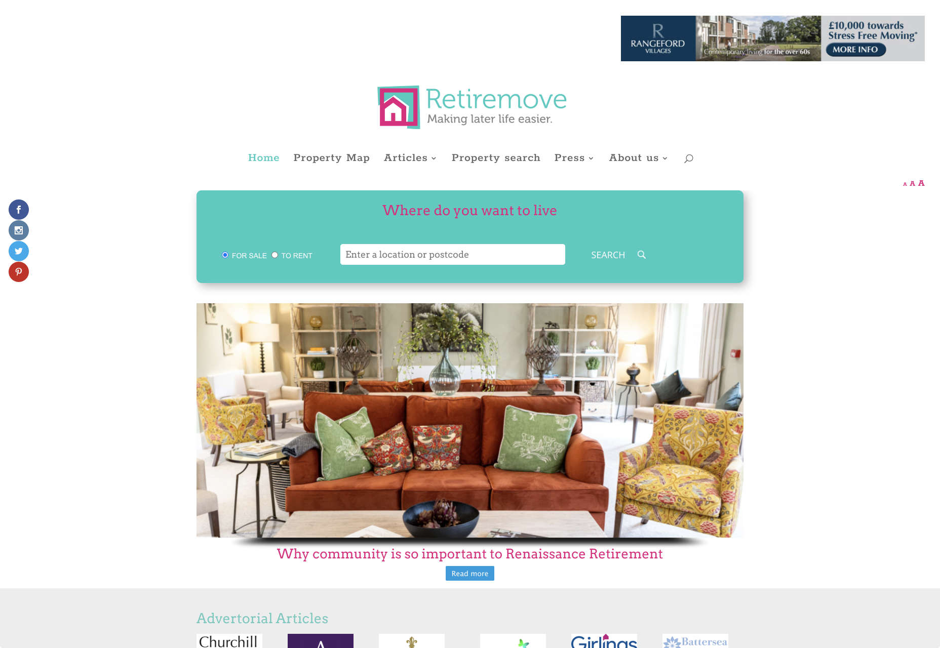
Look at this helpful navigation experience from RetireMove.com, for instance. Everything you need is located at the top of the page, and you can even just enter your postcode to get started:

Cognitive decline happens regularly with age. Although not all older adults will have issues with their memory and concentration, it’s important to be prepared for an audience that might process information a little more slowly. It’s worth double-checking that your viewer’s attention isn’t being diverted to multiple parts of the page at once.

Get to the Point Quickly

While younger generations have quickly implemented technology into every aspect of their lives, older consumers use tech a little differently. These people don’t want to spend forever fiddling around with different parts of your website. They want to get the answers to their questions as quickly and easily as possible. 

Applications that are complicated or difficult to access are usually instantly rejected by seniors. Even if you’ve offered everything that we’ve covered above, from seamless navigation to minimalist design, you still won’t get the interactions you’re looking for if older adults don’t consider your design to be useful. 

Because of this, you need to highlight the point of a website or application to your seniors as quickly as possible. Avoid worrying about things like gifs, animations and gamification. Instead, focus on making sure that your designs are useful and simple. 

For instance, from the moment your senior user arrives on a web page, they should have instant access to clear instructions on how to use the application or service, and what they need to do next. Keep in mind that this is particularly important when you’re creating mobile apps, as apps are still a relatively new concept to older generations. 

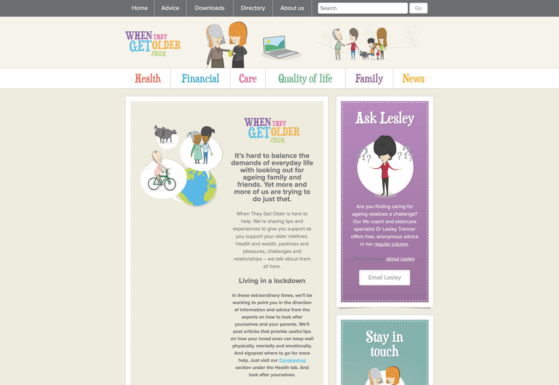
On the “When They Get Older” website, you can instantly find the information you need in a well-organized navigation bar that’s labelled clearly:

A clear interface like this, combined with simple, step-by-step guidance that shows elderly individuals how to get the information that they want is the key to keeping these users coming back for more. 

Bringing a Mature Perspective to Web Design

These days, most designers focus heavily on younger audiences when creating websites and apps. After all, it’s these users that allow us to experiment more with the latest tools and concepts, like augmented reality, artificial intelligence, and robust animations. 

However, there’s still a market out there for the seniors of the world that want more opportunities to get online. This audience often goes ignored and under-served. However, as the value of older consumers grows, and their ability to interact online increases, you’ll find that more businesses begin to search for web designers who can provide immersive experiences for a more mature audience. 

The steps above will give you an excellent insight into how you can start designing for a different kind of customer base. However, remember that the best way to make sure that you’re delivering the right solution for any customer, is to test. User testing will provide you with the exclusive insights that you need to determine whether your senior UX is really working, or whether you’re still struggling to get into the shoes of an older user. 


Featured image via Unsplash.

Source


Source de l’article sur Webdesignerdepot