Articles

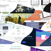
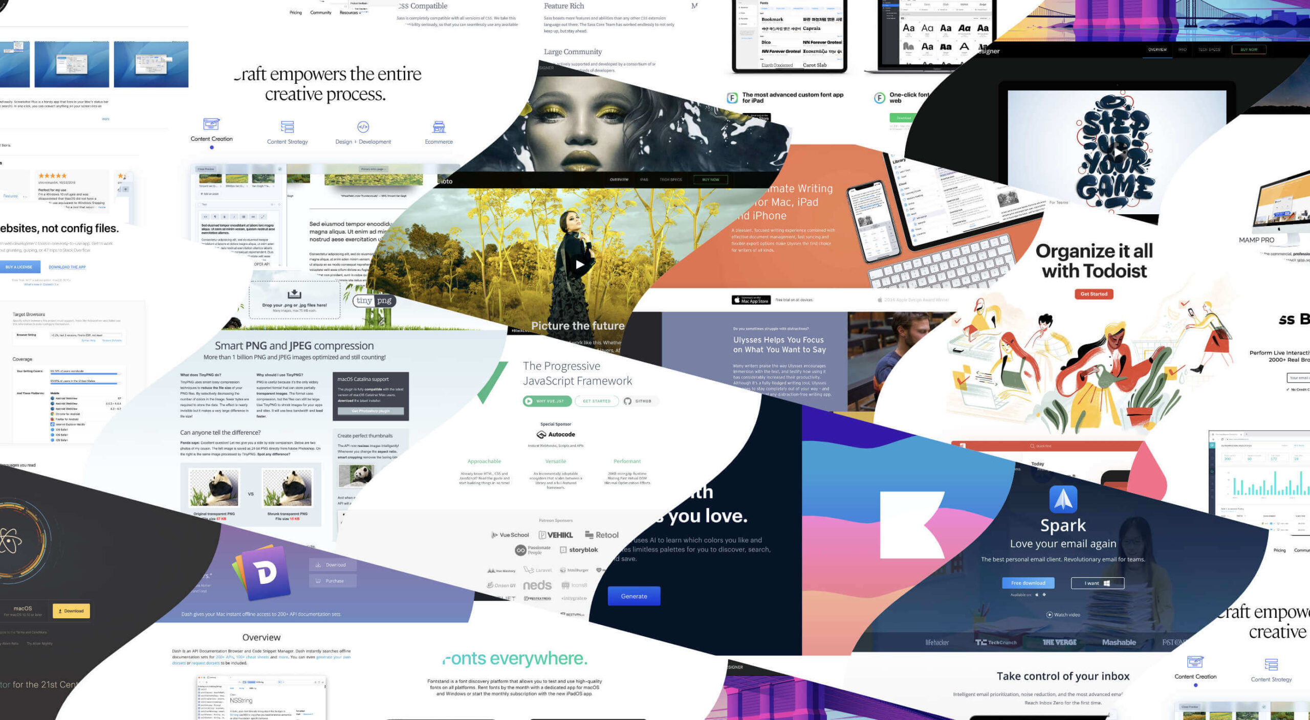
As a web designer, you’re constantly being bombarded with messages that tell you to acquire new skills, try new tools, and keep on hustling.

But if you’re constantly changing things up, does it do the opposite of what you originally set out to do? In other words, if you always have to start over, is it possible to ever really achieve anything?

I think it ultimately depends on why you’re making the change.

When Change Is the Right Move for Web Designers

One of the reasons I despise New Year’s resolutions is because it’s change for the sake of change:

It’s a new year, so it’s time to get all hyped up about this one thing I need to change about myself!

There’s a reason why so many resolutions fail by February. When you force a change, it’s really hard to stay invested in it, especially if it’s something you’ve chosen to do because everyone else has.

Change should be driven by necessity.

That said, when it comes time to make changes as a web designer, is it ever really necessary? Or are you learning new skills, trying new tools, or switching up your client list simply because it’s what you believe you have to do?

It’s important to be open to change, but you should only invest your time, money, or effort when it’s the absolute right move for you. Here are some ways you’ll know when that’s the case:

Learn New Skills To…

…Round Out the Basics

If you’re a new designer and there are gaps in your education and training (and I don’t mean formally, just in general), then there’s no reason to hesitate in spending time to acquire those skills.

This doesn’t just go for basic skills as a web designer or as a coder. This also goes for skills you need to become a successful freelancer.

…Add Evergreen Skills to Future-Proof Your Position

As you move up in your career, you’ll eventually find other skills worth learning. Just make sure they’ll help you move the needle.

The best way to do that is to focus on acquiring evergreen skills that’ll always be useful to you, no matter what stage you’re at in your career or how the design landscape changes. They should also go beyond the average skill set of a designer, so they help you stand out further from the pack.

… Create a Better Situation for Yourself

The web is constantly evolving, which means that your responsibilities and skills as a web designer will have to change in order to adapt. Whenever one of these shake-ups occurs, you should either be ready to master the needed skill right away or, better yet, have been working on it beforehand.

Take, Google’s mobile-first indexing, for instance. It announced it was going to be making this shift years before website rankings were impacted. Designers had plenty of time to not only learn what was needed to design for the mobile-first web, but to get all their existing clients’ sites in shape for it.

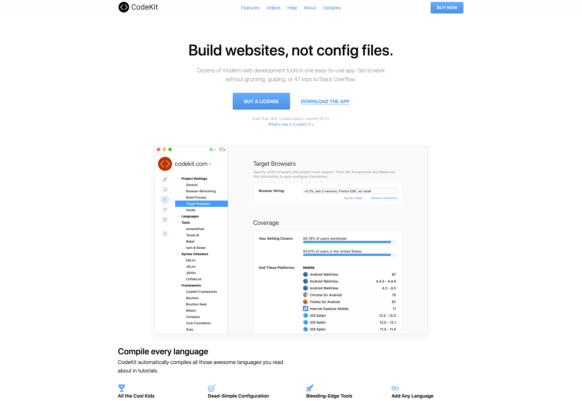
Adopt New Tools When…

…Your Existing Ones Are Slowing You Down

If you’re doing a lot of things from-scratch (like writing emails to clients or creating contracts), that’s a good sign your toolbox needs some improvement.

As a web designer, you should be focused on creating, not on the tedious details involved in running a business or communicating with clients. That’s just not a good use of your time. A lot of this stuff can easily be automated with tools and templates.

…You’re Turning Down Business

In some cases, it’s the right thing to say “no” to prospective clients — like when they’re a bad fit or can’t afford your rates. However, there are other times when you desperately want to be able to say “yes”, but you don’t have the capacity for the job or you’re unable to cover the full scope of what they need.

This is where new tools come in handy. For instance, let’s say you’ve been approached by a ecommerce company that not only wants you to build a new store, but also needs it fully optimized for search (it’s not the first time this has happened either). Rather than turn something like that down, you may find that the addition of an SEO tool to your toolbox is all you need to be able to say “yes”.

…You Have Extra Room in Your Budget

Obviously, you don’t want to throw away money on a bunch of tools simply because a ton of people are talking about them. But you’ll eventually get to a point where the tools that served you well in the first year of business need to be replaced.

If you get to a point where you have extra time to experiment and there’s room in your budget for upgraded tools, go ahead and assess what you currently have and test out replacement solutions that will help you work better, faster, and smarter.

Look for New Business Opportunities If…

…You’re Not Doing Well

“Well” here is subjective. For instance:

  • If you’re not doing well financially, you probably need to look for more clients;
  • If you’re not doing well in terms of how you get along with clients, you should explore a niche that’s a better fit;
  • If you’re not happy with your job because burnout and stress have overtaken your life, then you might consider exploring other avenues of work.

When something has been amiss for awhile, the last thing you should do is lean into it and hope it gets better.

…The Web is Changing

Notice a trend here? Each of these changes (skills, tools, and now business opportunities) is often driven by the fact that the web is always changing. And as the web changes, you have to be ready to evolve.

In terms of business opportunities, what you’ll realistically need to do is look for new kinds of design work as technologies make your job obsolete. Take website builders like Wix or Shopify, for example. As business owners and entrepreneurs take it upon themselves to build their own websites, more and more web designers will need to find other kinds of clients and jobs to take on.

…You Want to Diversify Your Income

This is something many web designers are doing already as they’ve discovered how beneficial it is to have predictable recurring revenue streams.

But even if you’ve already found one way to diversify and stabilize your income (like by offering website maintenance services), you may become interested in exploring other opportunities along the way. If you have the capacity to pursue them, then go for it.

Is Change a Good Idea?

As you can see, change can be a very good thing for a web designer, their business, and their clients. However, there should be a very good reason for the change and you need to prepare yourself for how it’s going to impact what you’re doing now before implementing it. No amount of change can happen without some level of sacrifice.


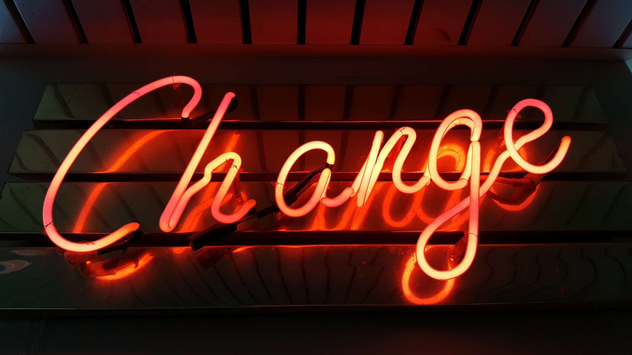
Featured image via Unsplash.

Source


Source de l’article sur Webdesignerdepot

I think of a creative practice as a combination of an approach (a design philosophy) and a series of techniques (craft skills); a good tool facilitates a technique, which in turn supports an approach.

It wasn’t until I sat down to write a list of tools I can’t design without, that I realized just how many tools I rely on as an integral part of my creative process. The danger of tools is that they promote certain techniques, and that bias can alter your approach.

First and foremost a good tool does no harm, it does not dictate, or obstruct your approach. Secondly, a good tool offers flexibility in the techniques you choose. Thirdly a good tool is invisible, it leaves no marks on the end product.

If I’d written this post a year ago the list would have been different, and I hope that in a year it will be different again. These are the tools that I currently find enabling, that have contributed to my craft, and supported my approach.

Affinity Designer

I’ve always used Adobe products. Photoshop and Illustrator were the de facto graphic tools for half my life. I’ve never had an issue with the subscription licensing of Creative Cloud, which I think is proportionate for a professional set of tools. Then, around 18 months ago I got very frustrated with how sluggish Illustrator had become.

I’d written an early review of Affinity Designer, I’d been impressed at the time, so I decided to give it another try expecting the sojourn to last an hour or two before I gravitated back to Illustrator. Running the latest version of Affinity Designer was a revelation, I’ve simply never wanted to switch back.

Why not Sketch? Well, I do occasionally jump into Sketch, especially for pure vector wireframing. I was an early adopter of Sketch, but the reliability issues (long since resolved) poisoned my relationship with it. Why not Figma? Well, Figma’s real strength is in collaboration, something that I get with Sketch, and personally I find some of Figma’s features unintuitive.

Affinity Designer isn‘t perfect. I dislike the color tools, especially the gradient tool, which I find clunky. But it’s the first design app I’ve used in years that syncs closely with my creative process.

Affinity Photo

I don’t do a lot of photo manipulation, so when I switched away from Creative Cloud for design work, I was relaxed about switching from Photoshop to Affinity Photo.

In my experience, Affinity Photo is stronger than Photoshop in some areas, and weaker in others. Affinity Photo’s bitmap scaling is much better than Photoshop’s, largely due to Lanczos 3 sampling.

Affinity Photo also solves a lot of little irritations that Adobe has chosen not to address for legacy or philosophical reasons, such as the toggleable ratio setting when resizing the canvas — I’ve lost track of the hours I’ve spent in Photoshop manually calculating vertical whitespace so that it’s proportionate to the horizontal.

TinyPng

Both Affinity Photo and Photoshop are poor at web format optimizations. Photoshop perhaps has the edge, but its output certainly isn’t acceptable for production.

I run bitmaps through TinyPng, which on average halves the size of the file without any appreciable loss of quality. (It stripped 66% off the images for this post.)

Fontstand

When I started to drift away from Creative Cloud, the one service that delayed me was Adobe Fonts (née Typekit). Not so much for the webfonts — which are faster and more reliable self-hosted — but for the ability to sync desktop fonts into my design apps.

I tried Fontstand when it was first released, and I loved the concept, but was worried about the small library. When I took a second look and discovered the library is now substantial for both workhorses and experimental typefaces, it was an easy decision to switch.

Fontstand is a desktop font rental service. Once you’ve found a typeface you’re interested in, you can activate an hour-long trial, then choose to rent the font for a small fee. You can auto-renew the rental if you need to, and if you rent the font for 12 months it’s yours forever.

If there’s one tool on this list I genuinely could not design without it’s this one. Fontstand makes working with fonts from independent foundries affordable for freelancers, and it’s enriched the typographic palette available to me.

Khroma

Every designer has strengths and weaknesses. Since day one of art school, my weakness has been color. It just doesn’t come naturally to me, and I have to work quite hard at it.

An incredibly helpful tool that I’ve been using for a few months is Khroma. It helps my eyes warm up before approaching color, and helps me find a starting point that I can then refine. Comparing my design work before, and after Khroma, the latter color choices are cleaner, more vibrant, and more interesting.

Atom

A good code editor is essential, and I’ve never found one that I’m completely happy with. For years I’ve flitted back and forth between Brackets, Sublime Text, and BBEdit. I think that probably reflects the changes in the type of coding I’m doing.

For now, I’ve settled on Atom. It’s fast, reliable, and it’s not biased to front or back-end code.

CodeKit

I held out on compilers longer than I should have, using apps like Minify to minify CSS and JavaScript, and the command line to process Sass (see below). Then I found CodeKit and it’s been essential to my workflow ever since.

What I like best about CodeKit is that it’s a GUI. Which means I can change settings while coding, like toggling off the JavaScript linting, without switching mental gears into another language.

MAMP

MAMP is a tool that allows you to run a local server environment, meaning I can run PHP and MySQL without the tedious process of FTPing to a server to test a change. Mac comes with Apache, so this isn’t strictly necessary, but it’s simple to use and works well with both CodeKit and Craft (see below).

There’s a pro version of MAMP, which allows you to switch seamlessly between projects, but it’s heavily geared towards WordPress. I’m still trying to find the time to evaluate Laravel Valet.

Dash

When you first start coding you try and memorize the entire language. It’s very possible to become fluent in the core of a language, but there are always nuances, defaults, and gotchas that you miss. As you grow more experienced, you realize that all professional coders Google the answer at least once per day.

When I got tired of Googling I started using Dash which is a superb app that combines the docs of numerous different languages into a searchable window. I use it daily for everything from SVG to Twig.

LambdaTest

It doesn’t really matter what you’re building, even the indy-web needs to be tested. Ideally you’ll test on real devices, but if you can’t afford a device library — and who but the largest agencies can — you need a live testing solution.

There are a few upstarts, but your choice is basically between BrowserStack and LambdaTest. I went for LambdaTest because I prefer the style of the UI, but that’s entirely subjective. If you’re not sure, toss a coin, you’ll get the same results with both.

Sass

I can’t write CSS without Sass — and I mean that literally. If I try and write vanilla CSS I guarantee I’ll nest something with @at-root and it will throw an error.

Craft CMS

Stating any preference for a CMS online that is not WordPress inevitably invites impassioned protests from developers whose career is built on the WordPress platform. So let me say preface this by saying: if WordPress works for you, and more importantly for your clients, then more power to you; I think it’s a dog.

Shopping around for a CMS is challenging, and I’ve gone through the process several times. A good CMS needs to be in sync with your mindset, and it needs to be appropriate for your clients — all of them, because unless you’re in a large agency with multiple coders, you need to commit to a single solution in order to master it.

I have looked and looked, and finally settled on Craft CMS. Craft makes it easy to build and maintain complex, high-performance sites. It has a shallow learning curve that grows exponentially steeper, making it easy to get started with plenty of room to grow.

Vue.js

Way back when Flash went kaput I switched to jQuery, and that was a really easy route into JavaScript — ignore the people who tell you to master the core language first, do whatever it takes to start using a language, that’s how you learn. But jQuery is heavy, and I found I needed it less and less.

These days 90% of the JavaScript I write is progressive enhancements in vanilla JavaScript to keep the dependencies low. Occasionally I encounter a job that requires complex state management, and then I fall back on Vue.js. JavaScript developers are as partisan as CMS aficionados, so let’s just say I favor Vue.js because it’s not controlled by a mega-corp and leave it at that.

Ulysses

As editor at WDD, I cannot emphasize enough that the right way to write copy for the web is markdown.

Markdown is faster to write so you don’t lose the thread of your thought process, and it doesn’t impose formatting so you can easily migrate to a CMS. If you’ve ever spent 20 minutes stripping the class, id, and style tags out of a file created in Word, Pages, or (by far the worst offender) Google Docs, then you don’t need to be sold on this point.

There are a few markdown-based writing apps available, I tested half a dozen, and the one I settled on was Ulysses. I like its distraction-free mode, I love its clean exports. Everything I write, I write in Ulysses.

Screenshot Plus

Much like markdown editors, there’s no shortage of screenshot apps. My current favorite is Screenshot Plus.

Screenshot Plus has one feature that makes it standout for me, and that is its Workflows. It sounds like a small problem, but when you’re taking screenshots of a dozen sites, the extra clicks to save, switch to your editor, and open the file are laborious. I have several workflows setup in Screenshot Plus that allow me to take a screenshot, save it to a specified folder on my local machine, and then open it in Affinity Photo, all with a single click.

Spark

I get a lot of email, a lot. At one point the influx was so bad I was using multiple email apps to segment it. Yes, I use Slack daily, but it doesn’t eliminate the need for email.

I‘ve been using Spark for around six months and it’s radically sped up my workflow. I’m a big fan of the smart inbox that allows me to compartmentalize email like newsletters, and email that warrants a reply. I like that I can switch to a chronological list if I’m looking for something specific. I love the ability to pin, or snooze messages, which helps me triage my inbox.

Todoist

I’m one of those people who can’t make it through the day without being organized. I need lists and sublists, and I need something native that opens automatically when I boot my Mac, and something that sits on the home screen of my Android.

There are as many to-do apps as there are things to do. When I’m working in a team I’ll use whichever task-tracking system it prefers. But by choice I always use Todoist thanks to its balance of simplicity and power. At this point it’s something of a meta-tool, and the app I open first every morning.

Source


Source de l’article sur Webdesignerdepot

In today’s Quality Sense episode, Federico Toledo sits down for a chat with a colleague and friend, Sofia Palamarchuk. She’s a Director and Board Member of Abstracta and the co-founder and CEO of Apptim, a tool that helps you to test and analyze native mobile app performance.

After beginning her career as a performance engineer at Abstracta, she led our expansion to the United States – heading up business development. After seeing the challenges that mobile development teams face, in 2019, she embarked on a mission to transform the way global mobile teams create quality apps.

Source de l’article sur DZONE

As the great Mark Twain once wrote in response to reading his own obituary in May of 1897 , "reports of my death have been greatly exaggerated." Fast forward nearly a hundred years to 1995, and a Finnish computer scientist named Tatu Ylönen created a secure transport protocol known simply as Secure Shell (SSH). What do these things have to do with each other? Nothing, aside from perception.

In its most practical terms, SSH enables users to establish a secure, remote connection with a Linux-based machine via a Command Line Interface (CLI). SSH is the de facto standard for secure server access, and has survived the test of time, despite a significant shift in how infrastructure is operated in the cloud.

Source de l’article sur DZONE

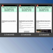
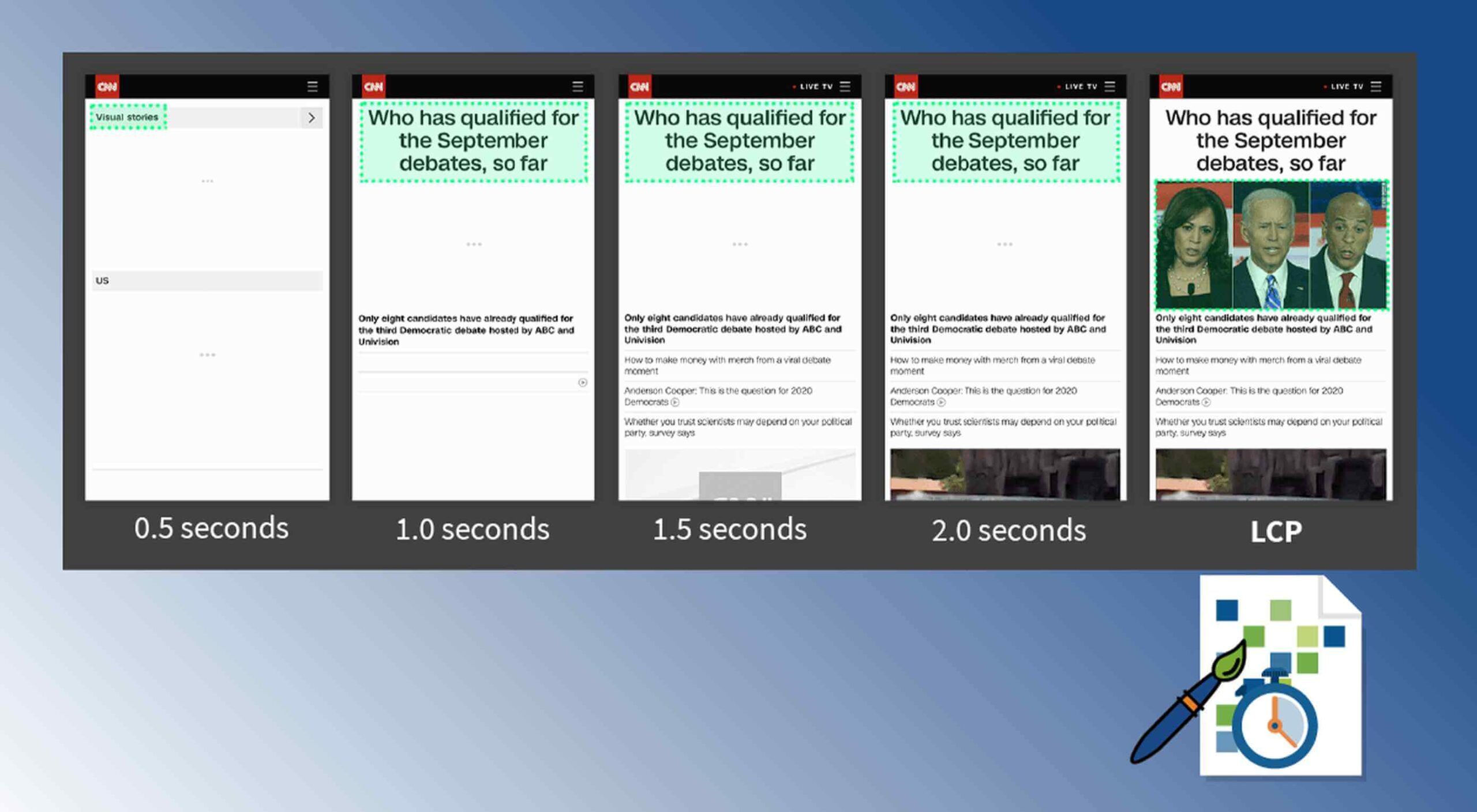
Contentful; Webster’s Dictionary defines “contentful” as… not found. Clearly someone made up this word, but that is not necessarily a bad thing.

The world of user experience metrics is moving quickly, so new terminology is needed. Largest Contentful Paint (LCP) is one of a number of metrics measuring the render time of content on a web page.

What is Largest Contentful Paint?

Google defines LCP as “the render time of the largest content element visible within the viewport.” For what we are talking about in this blog, we will consider “content” to be an image, typically a JPEG or PNG file. In most cases, “largest” points to a hero image that is “above the fold” and is one of the first images people will notice when loading the page. Applying optimization to this largest content is critical to improving LCP.

It is probably more instructive to view LCP relative to other metrics. For example, First Contentful Paint (FCP) and Visually Complete book end LCP.

Each metric has its pros and cons, but LCP is a happy medium. LCP marks when web page loading starts to have a substantial impact on user experience.

In Google’s opinion, to provide a good user experience, LCP should occur within 2.5 seconds of when the page first starts loading. Poor values are anything greater than 4 seconds.

How Does Largest Contentful Paint Impact Lighthouse Scores and SEO?

LCP is now part of several “Core Web Vitals” scores that Google will measure in its ranking algorithm. Each of the Core Web Vitals represents a distinct facet of the user experience, is measurable in the field, and reflects the real-world experience of a critical user-centric outcome.

In the case of the overall Google Lighthouse score, LCP represents 25% weighting on the performance score of Lighthouse version 6.0. This makes LCP the most important Core Web Vitals metric in determining the performance score.

While Google has indicated that content is still the most important factor in SEO ranking, a better user experience (as measured by Core Web Vitals) will generate higher rankings in a crowded field. If there are many websites competing for the top search engine spots, then Largest Contentful Paint will play a critical factor in rankings.

How to Improve Largest Contentful Paint

Now that you know that LCP is important, what can you do to improve it by making content load faster? Google provides a number of suggestions, but the most effective technique is to optimize content for the device requesting it.

For example, a website includes an 800kb JPEG image that is intended for high resolution desktops. On a smartphone, that would be optimized down to less than 100kb, with no perceptible impact on quality. LCP can improve by more than 60% — or several seconds — through this single optimization.

Find Savings in Largest Contentful Paint by using Image Speed Test

Image Speed Test is a great tool offered by ImageEngine.io that provides an analysis of LCP improvement opportunities. Just paste in the URL of the web page you are interested in optimizing, and the test will show you:

  • Image Payload Reduction
  • Speed Index
  • Largest Contentful Paint
  • Page Load Time (Visually Complete)

It also provides a video of the web page loading with and without optimizations. Finally, it analyses each image to provide an estimate of payload savings. In this case, the “largest content” on the page is this image. With optimizations, the image payload is reduced by 94%. That delivers a huge improvement in LCP.

How Does ImageEngine Improve LCP

ImageEngine is an image content delivery network (CDN) service that makes image optimization simple. Basically, for each image on the page, the image CDN will:

  1. Detect the device model requesting the web page;
  2. Optimize the image in terms of size, compression, image format;
  3. Deliver via a CDN edge server that is geographically closest to the user.

ImageEngine improves web performance for every image on the page, including the largest. You can learn more about ImageEngine here, and also sign up for a free trial.

Best Practices: Preconnect

In addition to using an image CDN like ImageEngine, a few other best practices can improve LCP. Using the resource hints to provide a preconnect for your content can streamline the download process.

For example, putting the following link statement in the HTML will accelerate the download process. The link statement will make the browser connect to the third party as early as possible so that download can start sooner. ImageEngine’s optimizations make each image download smaller and faster, but preconnect save time in the connection phase.

Best Practices: Minimize Blocking JavaScript and CSS

When JavaScript or CSS is “blocking” it means that the browser needs to parse and execute CSS and JavaScript in order to paint the final state of the page in the viewport.

Any website today relies heavily on both JavaScript and CSS, which means that it is almost impossible to avoid some render blocking resources. On a general note: be careful with what kind of CSS and JavaScript is referenced inside the <head> element. Make sure that only the strictly necessary resources are loaded in <head>. The rest can be deferred or loaded asynchronously.

When looking to improve the LCP specifically, there are some practices worth looking into more deeply.

Inline Critical CSS

It is not an easy task, but if the browser can avoid making a request to get the CSS needed to render the critical part of the page – usually the “above the fold” part – the LCP is likely to occur earlier. Also you will avoid content shifting around and maybe even a Flash of Unstyled Content (FOUC).

The critical CSS — the CSS needed by the browser to set up the structure and important styles of the part of the page shown above the fold — should in-inlined. This inlined CSS may also refer to background images, which of course should also be served by an Image CDN.

Do Not Use JavaScript to (lazy) Load Images

Many modern browsers natively support lazy loading, without the use of JavaScript. Because images usually are heavily involved in the performance of LCP, it is best practice to leave image loading to the browser and avoid adding JavaScript in order to lazy load images.

Lazy loading driven by JavaScript will add additional latency if the browser first has to load and parse JavaScript, then wait for it to execute, and then render images. This practice will also break the pre-parser in the browser.

If an image CDN is used to optimize images, then the benefits of lazy loading become much smaller. Especially large hero images that are above the fold have a large impact on LCP and will not benefit from being lazy loaded with JavaScript. It is best not to make JavaScript a blocking issue for rendering images, but rather rely on the browser’s own ability to select which images should be lazy loaded.


[– This is a sponsored post on behalf of ImageEngine –]

Source


Source de l’article sur Webdesignerdepot

Au cours des derniers mois, les entreprises et les employés ont été mis au défi de réaliser le plus grand test de télétravail au monde. Aujourd’hui, cependant, les entreprises – y compris SAP – cherchent des moyens de repeupler leur bureau pour aider les employés aux rôles critiques et ceux qui manquent d’infrastructures à domicile, ainsi que pour relever les défis potentiels de productivité.

Pour beaucoup, il n’y a pas de moyen de revenir dans un avenir proche au statu quo pré-pandémie avec des bureaux en open space, une utilisation élevée de l’espace et des coins café très fréquentés. Nous trouverons néanmoins des moyens de faire revivre les bureaux, car ce ne sont pas seulement des lieux de travail qui facilitent la productivité. Ils rassemblent les gens et les mettent en relation de manière unique, ce qui peut susciter l’innovation et de nouvelles idées.

La sécurité des employés au bureau est une priorité absolue

Avant de réintégrer progressivement les collaborateurs dans les bureaux, il est important de comprendre comment ils se sentent et s’ils sont à l’aise avec la possibilité de retourner dans leur espace de travail. Une étude récente de Qualtrics révèle que deux tiers de la main-d’œuvre américaine ne sont actuellement pas confiants quant à leur retour sur le lieu de travail. Ils sont fortement préoccupés par les réglementations en matière de santé et de sécurité et par les mesures d’éloignement physique. Ils veulent être le moins possible exposés aux autres personnes présentes dans le bureau.

Afin de répondre à ces réserves bien réelles, SAP s’efforce d’aider ses clients à traverser ces périodes d’incertitude. Jan Gilg, responsable de SAP S/4HANA, voit la mission de SAP dans le soutien dédié à ses clients. « Cette crise sans précédent appelle une réponse qui place les gens au premier plan », déclare M. Gilg. « Nous fournissons à nos clients notre technologie pour leur permettre de reprendre les opérations depuis le bureau de manière sûre et contrôlée. Mais l’objectif premier est de faire en sorte que les employés se sentent en sécurité grâce à des communications transparentes ».

Une réouverture sous contrôle du bureau

Pour aider les entreprises à gérer la réouverture de leurs espaces et à ramener progressivement les employés au bureau de manière sûre et contrôlée, SAP a introduit l’application Workspace Booking pour SAP Cloud for Real Estate. Elle permet aux professionnels de l’immobilier d’entreprise et aux gestionnaires d’installations de communiquer et d’appliquer des directives concernant l’éloignement physique pendant qu’ils sont en train de rouvrir des installations.

De cette façon, les entreprises ont plus de contrôle sur la gestion des capacités des bureaux. Par exemple, elles peuvent définir des seuils d’occupation des espaces au niveau mondial, par emplacement ou même par espace, et voir l’impact sur les indicateurs clés de performance (KPI) critiques. En fonction de l’utilisation, les entreprises peuvent alors prendre des décisions fondées sur des données pour les processus et les services connexes, comme le nettoyage ou le fonctionnement de la cantine.

De plus, l’application Workspace Booking aide les entreprises à communiquer de manière transparente les directives et les mesures qu’elles appliquent à leur personnel. En pratique, les employés peuvent réserver un espace de travail à l’avance dans leur lieu de travail préféré tout en respectant les restrictions de capacité fixées par les responsables de l’établissement. Ils peuvent indiquer quand ils veulent travailler au bureau dans la semaine qui suit. Cette solution étant conforme aux réglementations légales, elle contribue à la sécurité et à la productivité des employés.

Naviguer dans la nouvelle normalité

Aussi longtemps que la pandémie restera une menace pour l’homme et l’économie mondiale, l’action visant à ramener les employés dans les bureaux devra être fortement réglementée et contrôlée pour garantir un retour en toute sécurité. L’utilisation des données permet de faciliter cette réouverture contrôlée et profite tant aux employés qu’aux entreprises.

Cet exercice mondial de travail à distance a prouvé que l’avenir du travail évolue plus rapidement que jamais, en s’orientant vers une plus grande acceptation des modèles de travail flexibles. Les solutions SAP pour la gestion immobilière soutiennent une approche basée sur les données et aident à équiper les entreprises pour la gestion immobilière de l’avenir.

En savoir plus sur l’offre à prix réduit de l’application Workspace Booking pour SAP Cloud for Real Estate, valable six mois dans la boutique SAP Store.

The post SAP aide les entreprises à faire revenir leurs employés au bureau appeared first on SAP France News.

Source de l’article sur sap.com

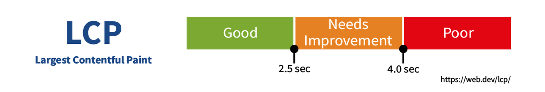
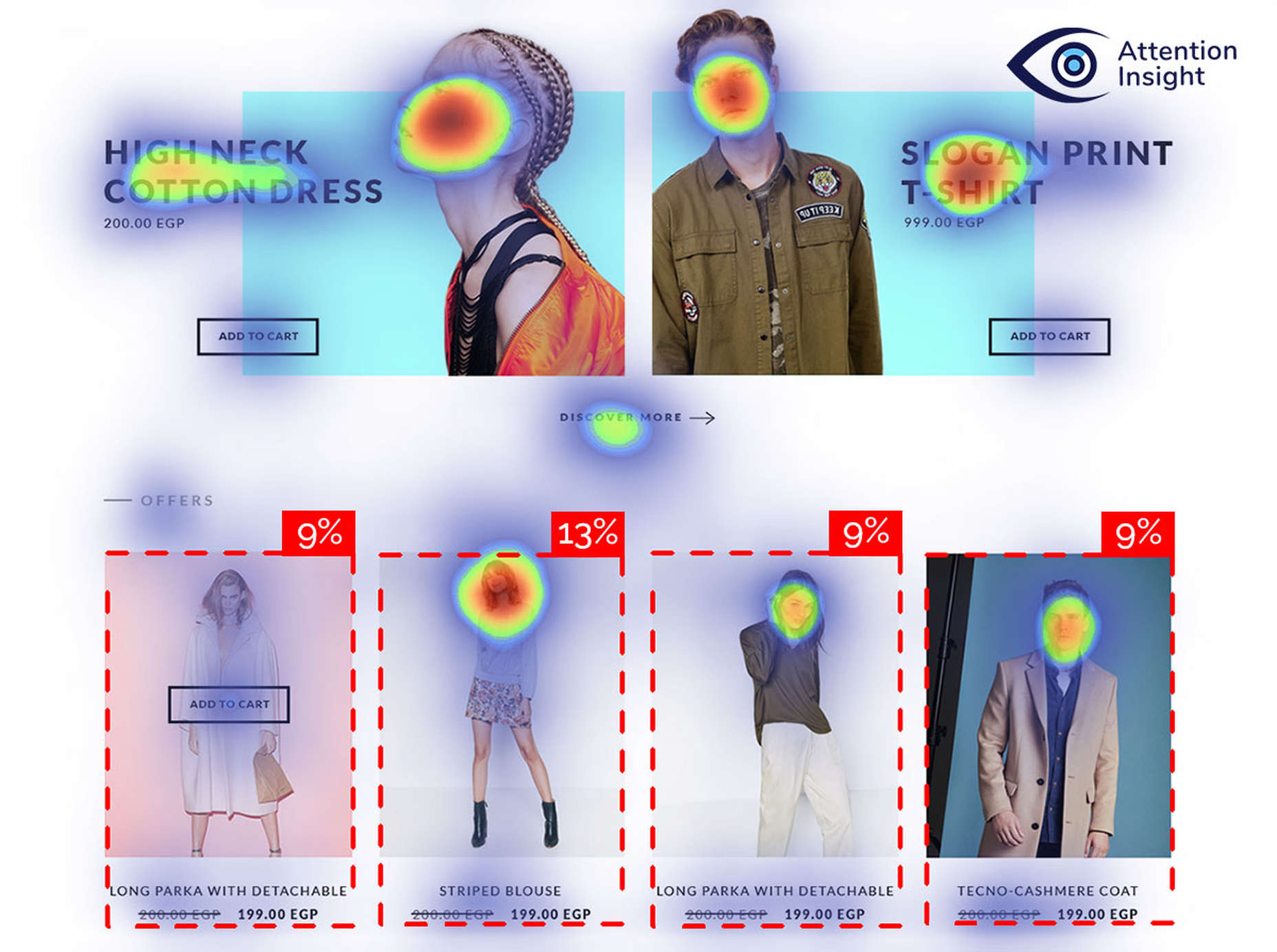
Attention is the new gold; brands are in a constant competition for our attention.

A big portion of our time we spend online, where we are bombarded with insane amounts of information and advertisements. It’s hard not to become overwhelmed in this world of consumerism. We have had to become good at quickly evaluating which information is important, especially on the internet.

Good marketing specialists know that they have mere seconds to turn a potential customer into a lead. People are not going to spend a lot of time examining your advertisement or landing page, either it clicks or not. Moreover, most users do not read the articles, they scan them. First impression plays a huge role in the success of your business, so do not leave that to a chance.

You really don’t want your customer to ignore that special sale, subscription option, or another call to action on your webpage. That is why you need to know where that gold-worthy attention goes when a user opens your landing page. Here’s where technology can come in handy.

Eye-Tracking in Web Design

It is very important to know where your website visitor’s attention goes first. How to get that info? Eye-tracking is the answer.

Eye-tracking technology can be used to optimize your website conversions. By tracking eye movements, technology will recognize which content is most intriguing for the users. It will reveal whether people pay most attention where you want them to, which elements are distracting or not visible enough, and where sales are lost. This information is invaluable if you want to succeed in the current market.

This information is invaluable if you want to succeed in the current market

How does it work? An eye tracker, such as webcam or goggles, measures movement of an eye. Collected data is analyzed and presented as a heatmap, highlighting which elements of your design attract most attention. Having in mind that browsing time rarely exceeds a few seconds, this information is very valuable when you try to understand your audience.

You wouldn’t want to spend much time on your website design just to discover it does not generate desired conversion rate. By employing this technology you can make changes based on reliable data rather than intuition and guarantee your business future success.

By now you may think that you definitely need to carry out this eye-tracking study, but there is a catch. A high-quality behavioral observation or eye-tracking is a time-consuming, budget eating complicated process.

If you want to draw conclusions from heatmaps, you would need to include at least 39 participants in a study. One individual test may last from 20 minutes to an hour. Time quickly adds up when you include preparation and analysis of the results. The average eye tracker price is around $17,500 and it may vary between several thousand dollars and $50 000. Of course you can hire a company to carry out this research for you but it may cost you several hundred dollars a month. Luckily, technological innovations allow us to acquire the same insights about users’ attention flow much cheaper and faster than conducting or buying an actual eye-tracking study.

Technological innovations replace real eye-tracking study

AI-Powered Automatization of Eye-Tracking

In this task of understanding how internet users are interacting with your website, Artificial Intelligence (AI) seems to be an answer. AI-based technologies already have become prevalent in various services we use on a daily basis. For example, Netflix’s highly predictive algorithm offers viewers personalized movie recommendations. Medical researchers utilize eye tracking to diagnose conditions like Alzheimer’s disease or Autism. As these algorithms become better every year, AI also becomes an irreplaceable tool in business.

Over the years researchers have collected so much data that human behavior becomes really predictable

How can AI help you to understand your customer’s attention? The main feature of AI is that it can mimic human intelligence and constantly improve itself by learning from data. Predictive eye-tracking is based on deep learning and trained with previous eye tracking study data. Over the years researchers have collected so much data that human behavior becomes really predictable. Technology predicts which specific areas of your website attract most interest. In this way, AI enables you to speed up the UX research process and get insights about your design in a matter of seconds.

Too good to be true? There are already several available tools on the market, such as Attention Insight or EyeQuant. These predictive design tools are based on deep learning and trained with previous eye-tracking studies data. Up to date, they have achieved an 84-90% accuracy.

AI-powered attention heatmap

AI solutions for designers and marketers have already become major competitors to traditional eye-tracking studies. Due to active competition, predictive eye-tracking tools are constantly innovating and recently started generating heatmaps for videos. Another useful feature that provides decision-makers with quantitative data is a percentage of attention. Users can define an object that they want to test and get an exact percentage of attention that the object receives.

Conclusion

Since all digital products are competing for user’s limited attention, it has become one of the most valuable resources. Due to fierce competition, it is not enough to rely on your intuition and gut instinct while making important decisions anymore. Designers have a choice in this economy of attention, though.

Yes, there are eye-tracking studies that require a significant amount of time and financial resources.

However, you can make user-centric, data-driven decisions in a quick, scalable, and private way while your product is still under development. AI-powered predictive eye-tracking tools might be an answer. Attention is a new currency, and you must measure it.

Source

p img {display:inline-block; margin-right:10px;}
.alignleft {float:left;}
p.showcase {clear:both;}
body#browserfriendly p, body#podcast p, div#emailbody p{margin:0;}

Source de l’article sur

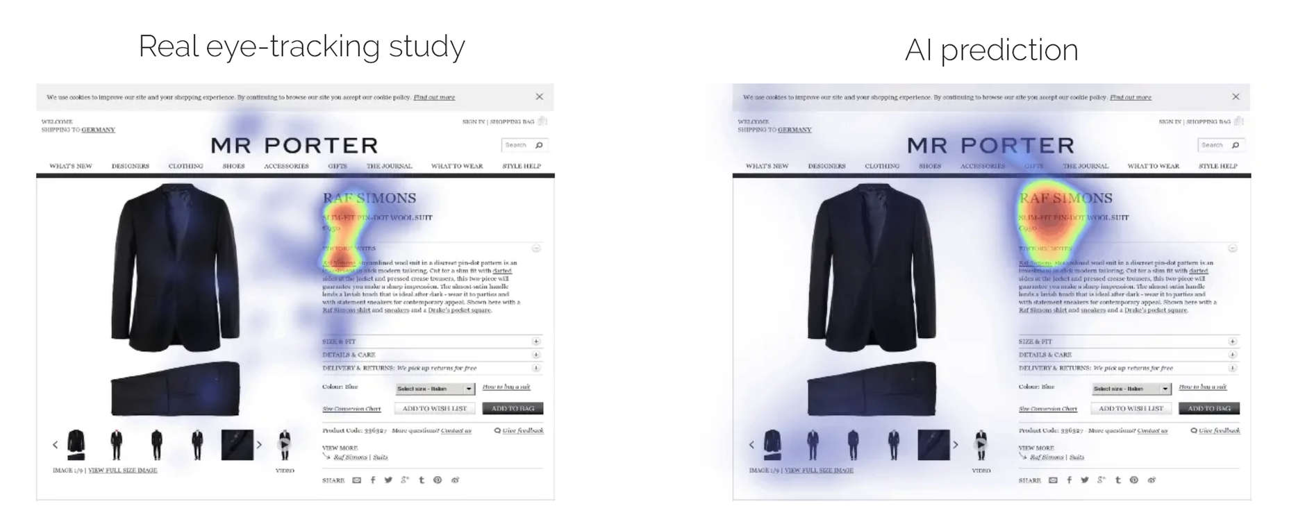
If we don’t question this kind of design homogenization, do we put ourselves at risk of perpetuating the same mistakes in the years to come? Or is it even a mistake to begin with?

Today, I’m going to look at four things that are likely causing this, and what you can do to break the mold.

1. Education

We used to have a design school in every city in the world, each with its own design style or, at the very least, the encouragement of its designers to be creative and come up with something new.

These days, though, traditional design education isn’t as popular as it once was. According to Design Census 2019, only about a third of working designers have a formal education and degree:

The rest have been trained through a variety of means:

  • Online learning (17%)
  • Self taught (12%)
  • Workshops (10%)
  • Mentorship (6%)
  • Certificate programs (4%)

Cost and convenience are definitely two factors influencing this shift towards online learning methods. And with a wealth of resources online to teach them how to design and code, why not go that route? Plus, designers have to keep learning new things in order to remain competitive, so it’s not as though a degree is the be-all and end-all of their design training.

Plus, there isn’t as much demand for it from employers. Unless you plan on working for one of the top global marketing agencies, many hiring companies just want to see proof in the form of a portfolio and maybe have you do a test job.

Now, I’m not saying that online courses and other informal design education don’t foster creativity. However, in order to make them cost-efficient and quick to get through, they have to focus on teaching essential best practices, which means less room for experimentation. Perhaps more importantly, their curriculums are guided by fewer voices. So, this could likely be one of the culprits.

2. Design Blogs and Vlogs

You have to wonder if all the design blogs out there (yes, like Webdesigner Depot) impair designers’ ability to break free from the homogeneity of websites.

I think the answer to that is both “yes,” and “no”.

Why, Yes?

What is the purpose of a web design blog? Mainly it’s to educate new and existing designers on best practices, new trends, and web standards.

By their very nature, they really should be teaching web designers the same kinds of things. Let me show you an example.

This is a Google search for “web design trends 2020”:

Most design blogs will publish trends predictions around January 1. And herein lies the problem. The writers/designers can only deviate so far from what we know to be true when writing on the same topic… so these sites end up with similar recommendations.

For instance, the top search results recommended similar things for 2020:

  • Dark mode
  • Hand-drawn illustrations
  • Immersive 3D
  • Glowing colors
  • Minimalist navigation
  • Geometric shapes
  • Inclusivity
  • Accessibility

When web designers receive the same guidance no matter where they turn, it’s only logical that they’d end up creating websites that adhere to those same practices.

Why, No?

Because I write for web design publications, I can tell you that there’s a big difference in the kinds of content some of them publish.

For instance, I find that WebDesigner Depot isn’t interested in rehashing what everyone else is writing about this month. We’re given topics that challenge us to think outside the box and present readers with meaningful insights and recommendations.

So, I think that finding design blogs that push the boundaries and don’t just want to recap what everyone else is saying is really important. That’s how web designers are going to master the basic skills they need to succeed while getting inspired to try new things.

3. Designs Tools and Frameworks

This is another one that’s not as cut and dried. I think it depends on the tools used and the intent to use them.

Where Issues Start to Arise

There are certain site builder solutions that you’re going to be hard-pressed to create something innovative with. The same goes with using templates from sources like Dribbble. It’s just the nature of the beast.

If your goal is to create a cheap website very quickly for a client, then you’re probably going to use a cheap builder to do so. With ready-made templates and a lot of the work already done for you, you can create something that looks good with little effort.

When you’re limited by time and cost, of course you’re going to rely on shortcuts like cheap site builders or boring (but professional) design templates.

How to be More Careful

You can run into these kinds of issues with more flexible content management systems like WordPress or frameworks like Bootstrap, too.

Whenever you rely heavily on ready-made templates, pre-defined styles, or pre-built components, you run the risk of someone else’s work informing your own.

The solution is simple: Use demos, templates, UI kits, and so on as a base. Let them lay down the foundation that you work from.

But if you want your website to look different from the sea of lookalikes, you’re going to have to spend much more time developing a unique visual style that’s equally as effective in its mission. Which also means moving beyond clients that have small budgets or low expectations.

4. User Data

Data gathering is an important part of the job you do as a web designer.

You research the target user (or the existing user, when applicable). You look at industry trends as well as the competition to formulate an idea of what you need to build and how you’re going to do it. And you also use resources like Nielsen Norman Group and Think with Google that put out definitive research on what users want.

Even with the most niche of audiences, consumers’ wants and needs are all basically the same. So, obviously, you have to design experiences that align with them. If you deviate too much from what they expect from your site or brand, you run the risk of creating too much friction.

Is This a Bad Thing?

It’s not in terms of usability. If we build simple, predictable and user-friendly interfaces based on data that successfully drive visitors to convert, that’s great. So long as the content remains strong and the UI attractive, there’s nothing wrong with that approach.

But…

This is the same issue presented by templates and site builders. If you do exactly what’s needed and not much more, your site is going to look and act just like everyone else’s. Which comes at the cost of your brand reputation.

Just look at Google’s Material Design. This design system may have made it easier for web and app designers to create new solutions that were user-friendly and responsive, but there was just too much spelled out. And this led to a slew of Material Design lookalikes everywhere you turned.

This is the whole reason why companies take the time to craft a unique selling proposition. Without a USP, brands become interchangeable in the eyes of consumers.

So, again, my suggestion here is to use data to formulate a strategy for building your website. But don’t forget to spend time adding a unique style, and voice of the brand to the site.

Wrap-Up

It seems like, despite all that we’ve learned to do, websites are becoming less and less diverse in terms of design. And I think a lot of that is due to the fact that it’s much easier to design websites today than it was ten, or even five years ago.

Modern-day education, resources, tools, and consumer data take a lot of the questions and the work out of building websites. Which is good… but only to a point.

Unless you’re building websites for clients who have absolutely no budget, you can’t afford to skimp on the creativity and personalization that will set their website apart. Yes, you need to adhere to tried-and-true practices and standards, but beyond that, you should be experimenting.


Featured image uses photo by Kari Shea.

Source

p img {display:inline-block; margin-right:10px;}
.alignleft {float:left;}
p.showcase {clear:both;}
body#browserfriendly p, body#podcast p, div#emailbody p{margin:0;}

Source de l’article sur

Les personnes handicapées sont confrontées à des défis spécifiques, lors de la saisie de la main-d’œuvre. Selon l’organisation des Nations Unies (ONU), dans les pays en développement, 80 à 90% des personnes en âge de travailler handicapées sont au chômage. Dans les pays industrialisés, le taux de chômage des personnes handicapées est au moins le double de ceux qui n’ont pas de handicap. Dans certains pays, il devrait être aussi élevée que 50 à 70 pour cent.

Cette grande inexploité main-d’œuvre crée des opportunités pour les organisations – l’accès à de nouveaux viviers de talents et d’engager des personnes qui apporte des points de vue de leurs équipes. Comme beaucoup de diversité et d’inclusion des sujets, le vrai changement nécessite délibérée des cotisations à un milieu de travail inclusif de la culture. Accenture a constaté que les sociétés avec des haut de l’insertion des personnes handicapées sont deux fois plus susceptibles d’avoir plus de rendement total des actionnaires par rapport à leurs pairs. En outre, les entreprises qui ont amélioré leur inclusion des personnes handicapées, au fil du temps, sont quatre fois plus susceptibles d’avoir rendement total des actionnaires qui se démarquent de leurs pairs.

Définition d’une Fondation

Soixante-dix pour cent de handicap non visible
Vous pouvez penser que vous n’avez pas quelqu’un dans votre équipe ou dans votre milieu de travail qui a un handicap, mais les chances sont que vous faites. Avec de nombreux handicaps être nonvisible, il est important de ne pas faire de suppositions. Plutôt, de créer un milieu de travail inclusif où chacun peut se connecter et de contribuer.

Apprendre le jargon
Les mots sont importants, et il est important d’avoir une compréhension de base lors de la communication avec ou à propos des personnes handicapées. La plupart des individus préfèrent personne comme première langue, ce qui signifie qu’ils identifient comme une personne et ayant une déficience. Par exemple, au lieu de dire “personne sourde”, vous pouvez dire “quelqu’un avec la perte de l’audition” ou “quelqu’un qui est sourd”. Chacun de nous est différent et a des préférences individuelles, donc si vous n’êtes pas sûr, demandez à la personne.

Rencontrer et de saluer
Au moment de l’introduction de quelqu’un avec un handicap, de leur serrer la main, ou les salue toutefois vous le feriez avec n’importe qui d’autre. Si la personne est aveugle, verbalement identifier vous-même et les autres autour de vous. Si la personne est accompagnée par un interprète ou un fournisseur de soins, de parler directement à la personne handicapée.

Demander d’abord
Vous pouvez voir une occasion d’aider quelqu’un avec un handicap – l’ouverture d’une porte, de guider quelqu’un vers le bas d’un couloir, ou de modification de l’éclairage dans une pièce. Au lieu de supposer que la personne a besoin d’aide, demandez-leur si vous pouvez les aider et d’attendre que l’offre soit acceptée. Ils connaissent leurs capacités meilleurs. Aussi, demandez avant de toucher un appareil ou d’un animal qui peut être utilisé pour de l’aide. Un chien-guide peut être en mode de travail et votre interaction pourrait interférer avec la capacité du chien à guider en toute sécurité de la personne.

Nous sommes tous juste de vivre nos vies
Tout le monde est différent et a sa propre personnalité et de ses besoins. Si vous avez rencontré une personne avec un handicap, c’est exactement ce que vous avez fait, rencontré une personne avec un handicap. Ne présumez pas que la prochaine personne avec un handicap, vous rencontrer a les mêmes préférences. Posez des questions lorsque vous ne connaissez pas et d’apprendre de chaque personne que vous interagissez avec.

Quelqu’un n’est pas d’inspiration parce qu’ils ont un handicap
Une personne est une source d’inspiration si ils ont accompli quelque chose de grand, avec ou sans handicap. Même si votre intention peut être gratuit, appeler quelqu’un “d’inspiration” ne peuvent être prises que de dénigrer. Si personne ne fait l’éloge vous pour voyageurs se rendant à une réunion d’affaires, pourquoi gush plus de cela pour quelqu’un d’autre?

Votre Impact dans la Création d’un milieu de Travail Inclusif de la Culture

Fournir un contenu accessible
Utilisez la fonction de l’accessibilité aux dames de s’assurer que ceux qui sont malvoyants ou aveugles peuvent consommer le contenu. Si vous fournissez des copies papier de documents, assurez-vous d’avoir une version électronique vous permet de le partager. Ajouter le sous-titrage et l’audio-description pour les vidéos.

Réévaluer les événements l’équipe de
Si votre équipe moral événements n’ont pas changé en une décennie, il peut être intéressant de regarder de plus près. Nous avons tous probablement entendu parler des “bro culture” et d’éviter de l’équipe de liaison des événements qui sont centrées autour de l’alcool, mais avez-vous également considéré comme l’accessibilité de vos événements? Par exemple, c’est l’espace physiquement accessibles pour quelqu’un ayant une mobilité réduite? L’activité inclure un environnement avec des lumières et des bruits forts que quelqu’un sur le spectre de l’autisme pourrait être sensible?

Mettre en œuvre inclusive réunion de pratiques
Préréglage de l’ordre du jour et partager des ressources à l’avance. Ceci n’a pas seulement l’efficacité de l’entraînement et de la collaboration, mais elle crée également de l’inclusion. Les individus auront plus de temps pour traiter l’information et d’être prêt à contribuer. Vous pouvez également envisager d’autres moyens pour quelqu’un de s’exprimer verbalement, l’ajout d’un commentaire sur le document, par messagerie instantanée, ou après la réunion en une seule conversation.

Supprimer les obstacles dans le processus d’embauche
Si vous êtes un recruteur ou gestionnaire d’embauche, d’évaluer l’accessibilité de votre processus de demande. Si vous êtes à profit pour interviewer un candidat, examiner les objectifs de vos questions. Qu’essayez-vous évaluer? Est-il une autre manière de poser la même question que peut-être le plus inclusif? Par exemple, une commune de la technique d’entretien est de demander à un candidat pour expliquer un concept particulier de l’enquêteur, comme s’ils étaient un enfant. L’intention est susceptible d’évaluer les connaissances du candidat du concept — peuvent-ils briser le concept en facile-à-comprendre les pièces? Cependant, au lieu de mettre en valeur le candidat de l’expertise sur le sujet, il peut être sans le savoir, dépistage de talent, car il évalue leurs compétences en communication, plutôt que de leur expertise sur le sujet.

Découvrir votre propre risque de biais
Nous avons tous des préjugés, y compris certains que nous ne réalisent même pas que nous avons. En savoir plus sur les biais implicites en prenant de l’université de Harvard Handicap Test d’associations Implicite et le blocage de 15 minutes sur leurs calendriers à réfléchir sur les résultats.

Évaluer votre organisation du handicap de l’équité
Handicap:EN fournit une compression à l’outil d’analyse comparative pour l’insertion des personnes handicapées. En savoir plus ici.


Devan Vaughn est directrice de la Diversité et de l’Inclusion et de la Responsabilité Sociale de l’Entreprise chez SAP, d’Accord.
Cette histoire est initialement paru sur le SAP Accord des salles de rédaction.

Source de l’article sur SAP News Center

La NASA continue de développer, et de tester son moteur ionique qui prendra le relais des réacteurs traditionnels pour les missions dans l’espace lointain.
Source de l’article sur GNT