
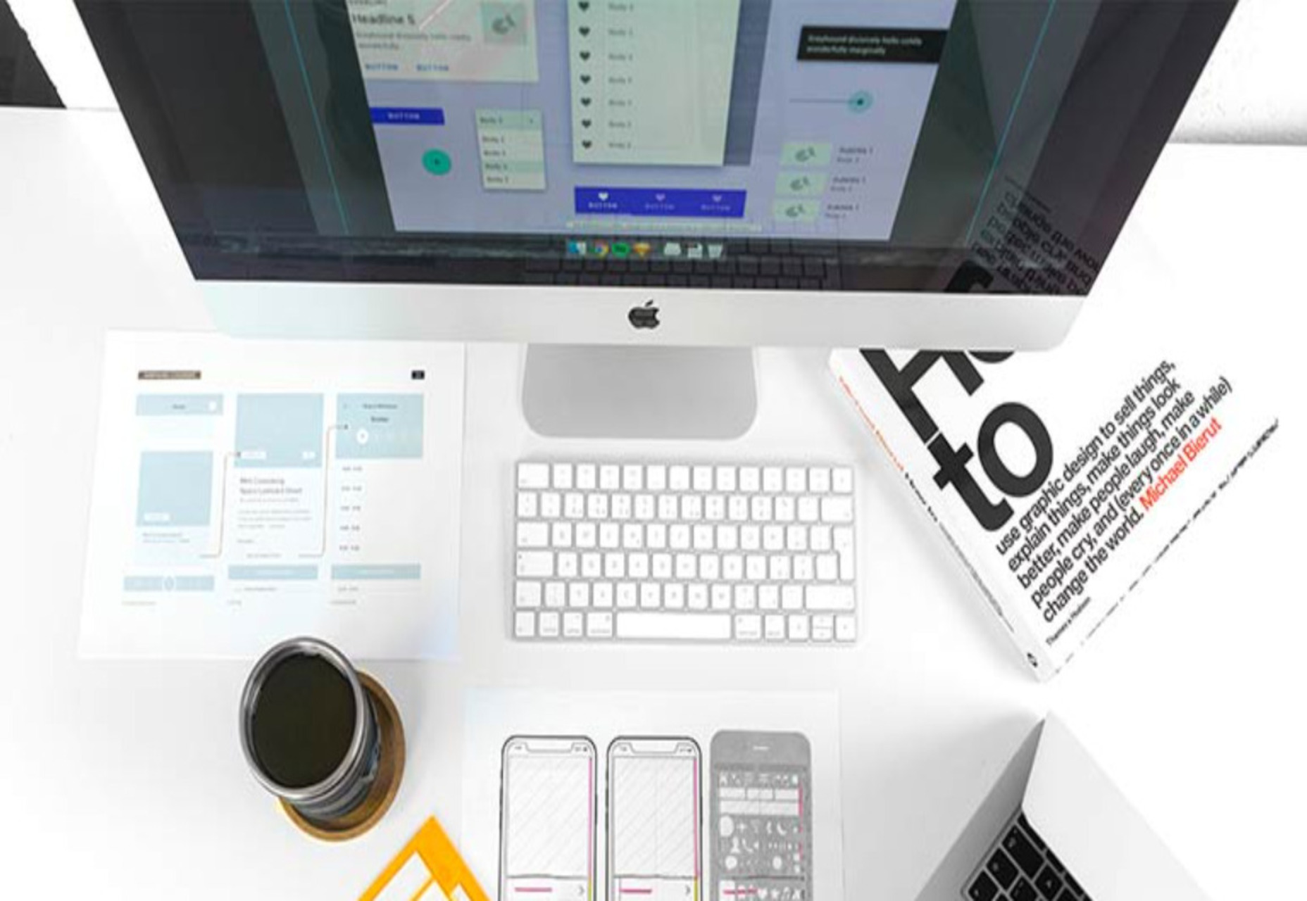
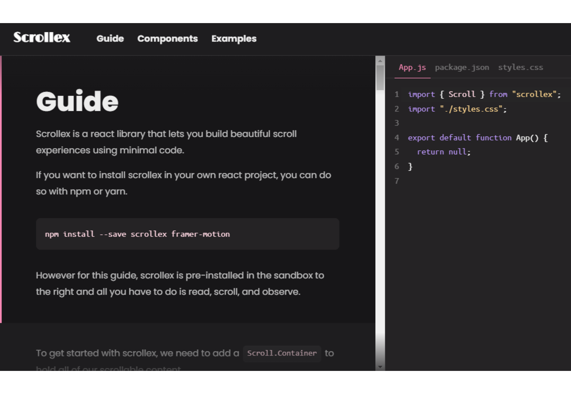
 Starting your own business is a process with a fair share of challenges. Even in the web design world, where you can potentially minimize costs by working from home and collaborating with freelance contractors, many expenses exist.
To run a successful web design business, you need enough money to invest in everything from skilled colleagues to resources (like fonts and themes), software subscriptions, and technology tools. Finding a way to fund your company can be the most complicated part of ensuring its success.
For most new companies, the easiest option to generate opportunities is “bootstrapping.” Learning how to bootstrap a web design business means knowing how to bring your business to life with virtually no starting capital.
Here’s how to get started.
What is Bootstrapping?
Successful bootstrappers take an idea, such as creating a web design company and create a fantastic company without the backing of investors. It takes significant dedication, commitment, and single-mindedness to accomplish your goals, but some of the world’s greatest entrepreneurs, like Steve Jobs and Sam Walton, got their start this way.
The term “bootstrapping” comes from the phrase “to pull yourself up by the bootstraps,” which indicates overcoming challenges on your own without any external support.
The pros and cons of bootstrapping include:
Pros:
- Full control: Bootstrapping allows entrepreneurs to retain full ownership over their business. Alternatively, engaging with investors means allowing other professionals to own a portion of your company or make a share of the decisions.
- Innovation: Business owners in a bootstrapping model are forced to invest in agile and innovative business models. You must develop processes to produce immediate, lasting cash flow from day one.
- Accomplishment: Building something from the ground up creates a powerful sense of satisfaction and accomplishment.
- Ownership: You won’t have to sell any equity in your business to other investors, which means you can benefit fully from the company as it grows.
Cons:
- Risks: Self-funded businesses generally run out of funds faster and struggle to scale as quickly as other companies, limiting the brand’s ability to reach its potential.
- Limited support: Traditional financing methods (like working with investors) also provide networking opportunities and support from specialists who want to see your company succeed.
- Pressure: Bootstrapping businesses need to be meticulous about everything from keeping books to making the right decisions for brand growth.
- Hard work: With limited resources, connections, and options, bootstrapping entrepreneurs need to work harder than most and take on more roles.
How to Bootstrap Your Web Design Business: Step by Step
Bootstrapping a web design business can be complicated, but it works for many companies if you follow the right strategy. The good news is web design companies generally don’t require as much initial capital as some other types of companies, like standard retail brands or companies with a need for brick and mortar offices.
However, there are still steps you’ll need to follow to ensure success.
Step 1: Source Some Initial Funds
While you might not work with investors when bootstrapping your web design business, you’ll still need some essential initial funds. To run a web design business, you won’t necessarily need a massive initial investment, but you will need something.
To determine how much capital you need to raise from your income, savings, a line of credit, or other common bootstrapping sources, think about:
- Where you’re going to work: The upfront costs of operating your own web design business will be a lot lower if you choose to work from home and with remote specialists. The less you have to pay for office space, the better.
- Business fees: You may need to pay fees for registering your business name, hosting your own website for advertising, and dealing with any registration costs.
- Equipment and software: Think about what you will use daily for web design. Subscription-based services like Adobe Creative Cloud can cost quite a bit to access. You’ll also need a good computer, and perhaps a tablet for sketching.
Step 2: Find a USP
The easiest way to ensure a bootstrapped web design business is a success is to ensure you are offering specific clients something they genuinely need. In a service-based landscape like web design, you need to know what your customers want and offer something they can’t get elsewhere.
For instance, can you differentiate yourself from other web design companies by helping with modern trends like 360-degree video and XR-ready design? Can you build apps for companies from scratch and provide ongoing maintenance for the websites you make?
An excellent way to find your USP is to examine your competitors. Find out what other companies in your area are offering their customers, and listen to consumers in your industry when they talk about what they need from a website designer.
Step 3: Choose a Cash Flow Optimized Model
Since you’re relying only on your cash and the money you make from your web design business to fuel its growth, choosing a model optimized for consistent cash flow is essential. Bootstrapping a business often means you place most of the profit you gain from your company back into the development of the brand.
With this in mind, consider how you’ll offer services and charge your customers. Are you going to ask for a portion of the fees up-front before starting a web design project? Can you provide your customers with subscription models to improve your revenue consistently?
For instance, you could provide help with ongoing maintenance, development, and support rather than just offering to build websites for companies. Another way to make additional income is with professional services, like consulting.
Make sure there’s a market for the services you’ll offer before launching your business by examining the surrounding environments and services your competitors provide.
Step 4: Keep Costs Low and Profits High
Keeping costs low will be essential to ensuring your success when bootstrapping a business. Fortunately for web designers, it’s relatively easy to cut down on fees. For instance, WordPress is free to use for your development projects, making it an excellent choice for many web design strategies.
You can also look into common free and cheap alternatives to web design tools online, like GIMP. Shop around for the things you will be paying ongoing fees with. For instance, it’s best to check out multiple vendors when looking for web hosting and marketing support.
While keeping your costs low, it’s also essential to accelerate profits as much as possible. You can look for ways to boost customer retention by building stronger relationships with your clients and offering them deals on long-term subscriptions.
If you have time outside of your web design business, you can also try taking on some side hustles. Options include:
- Selling web design assets on sites like ThemeForest
- Offering your services on a freelance basis with sites like Dribbble and Toptal
- Designing and selling NFTs for the metaverse
- Teaching web design or selling webinars
Step 5: Grow Cautiously
Finally, while the goal of successfully bootstrapping your web design business will be to grow as rapidly and consistently as possible, it’s important to be cautious. For instance, you’ll need to be able to afford the fees of every new designer you bring onto your team, so consider looking for freelancers and contractors rather than permanent hires.
Use organic channels for marketing your services, like blogging and content marketing which can help improve your SEO standing and attract attention among clients. Plus, encourage your customers to recommend your services to other brands.
As new clients approach your business, ensure you only take on as many customers as you can reasonably handle. Compromising on quality will damage your relationships with customers and harm your reputation.
Good Luck Bootstrapping Your Business
When you’re bootstrapping a business, you get the benefit of being able to eliminate any outside influences from your growth. You’re free to focus on building relationships with companies of your choice, and you get to make decisions about your growth. However, there are downsides, too, like significant stress and limited financial opportunities.
While bootstrapping your business is tough, if you manage to complete the process successfully, the results can be fantastic.
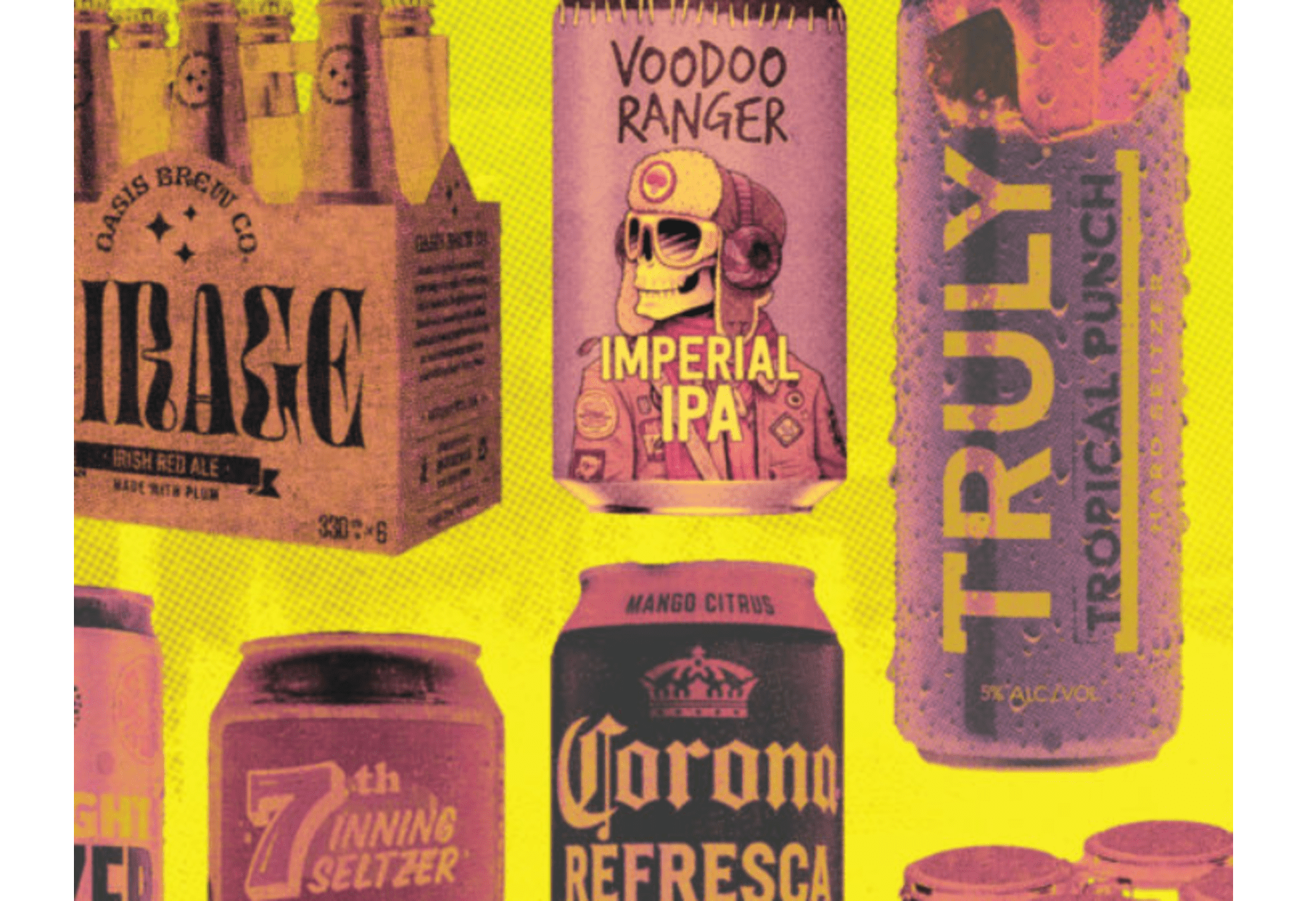
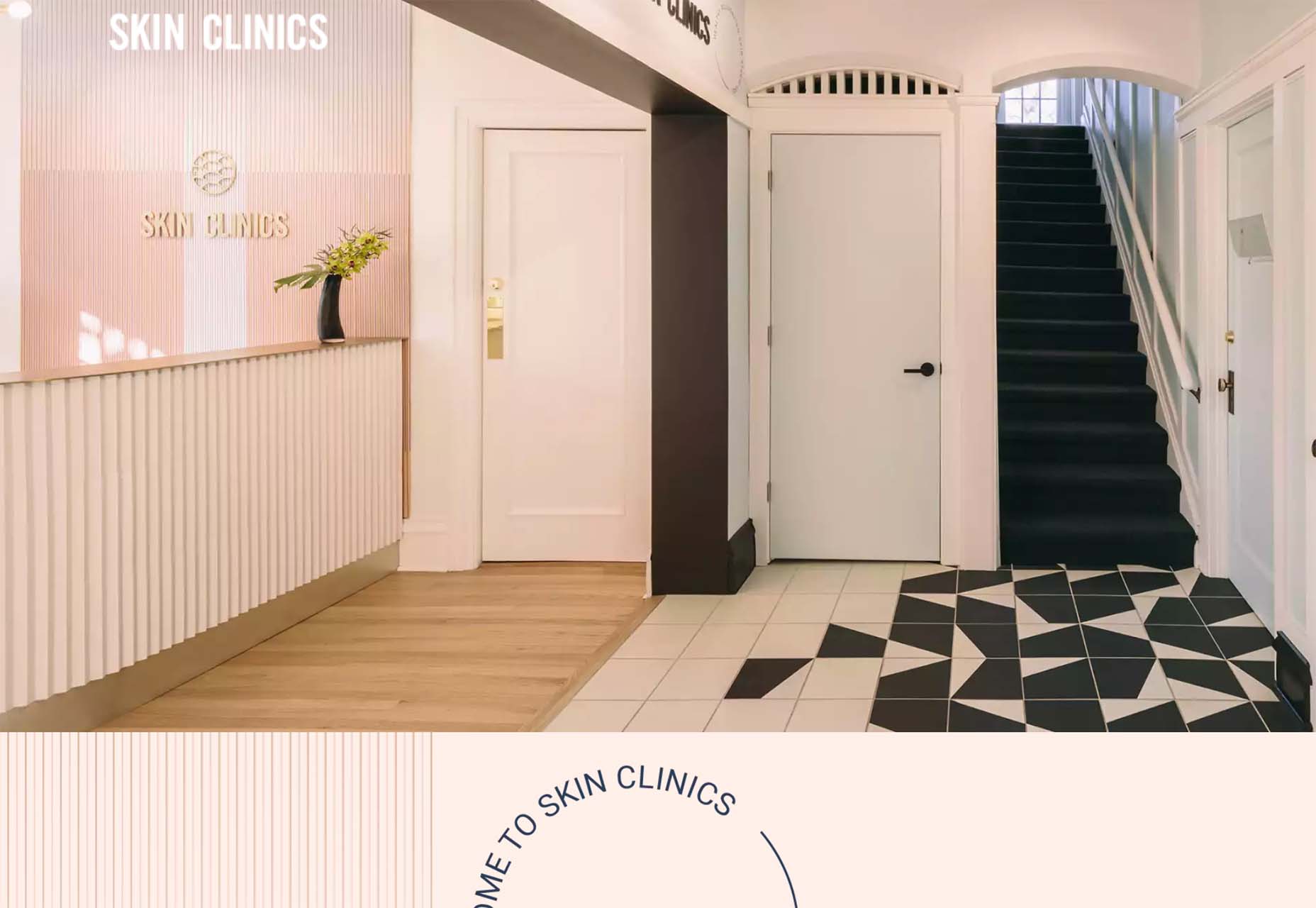
Featured image via Unsplash.
The post How to Bootstrap a Web Design Business first appeared on Webdesigner Depot.
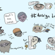
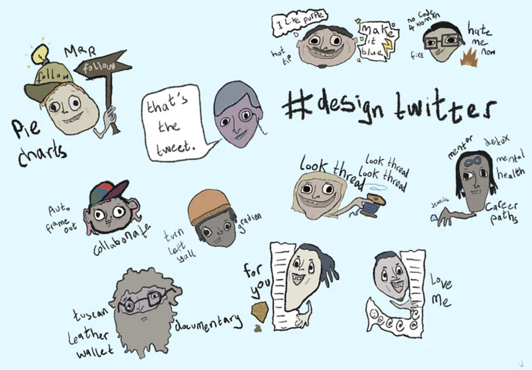
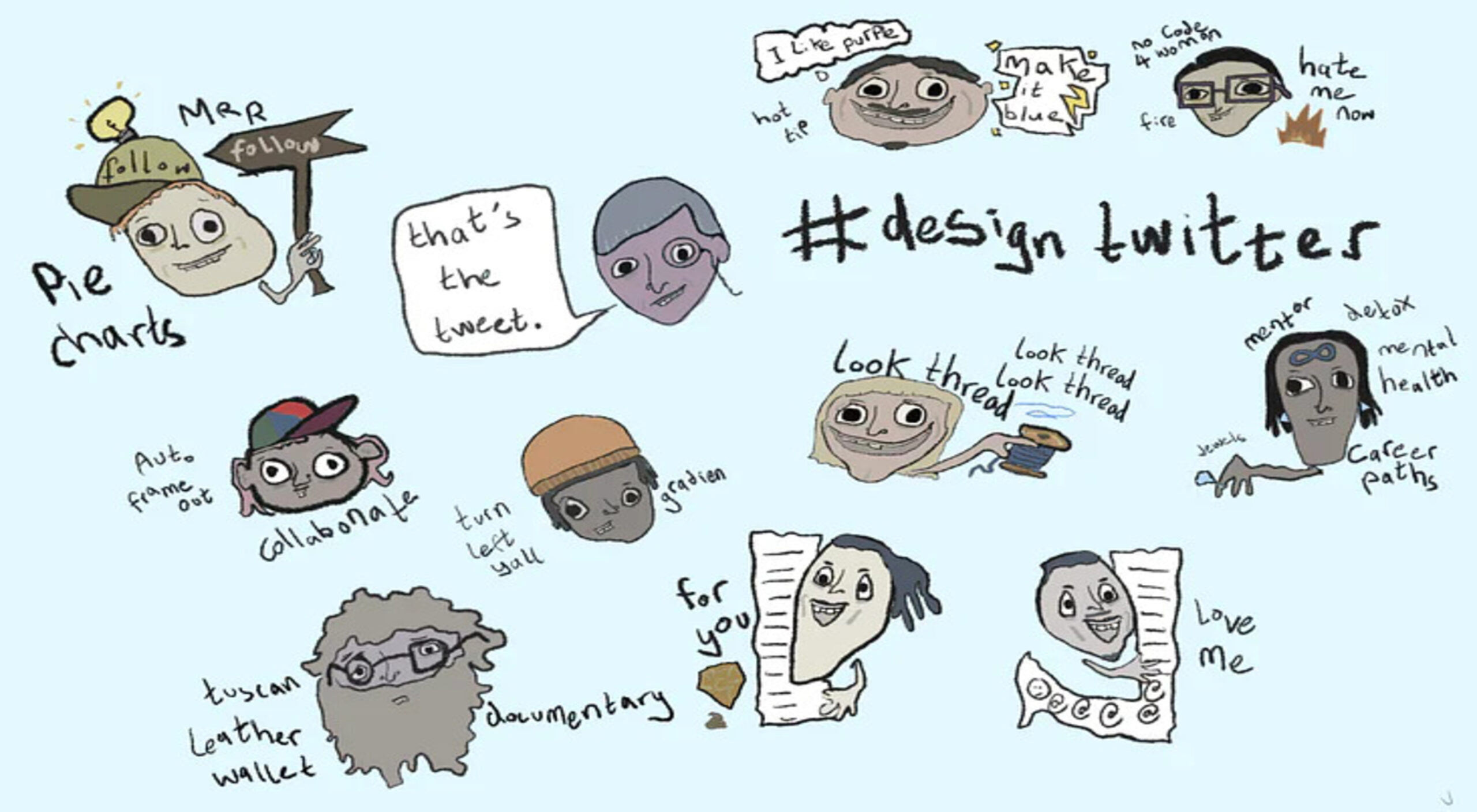 Every day design fans submit incredible industry stories to our sister-site, Webdesigner News. Our colleagues sift through it, selecting the very best stories from the design, UX, tech, and development worlds and posting them live on the site.
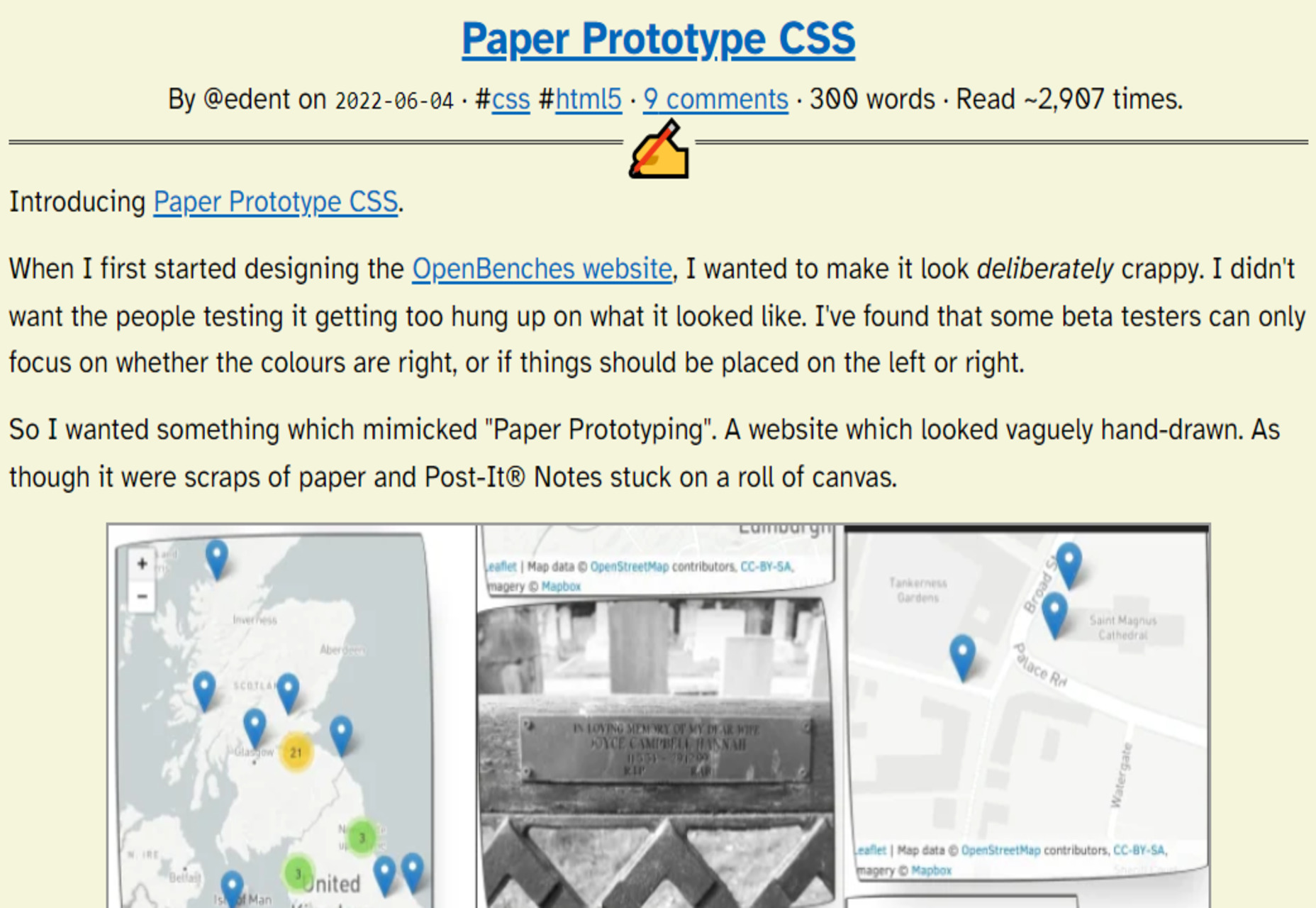
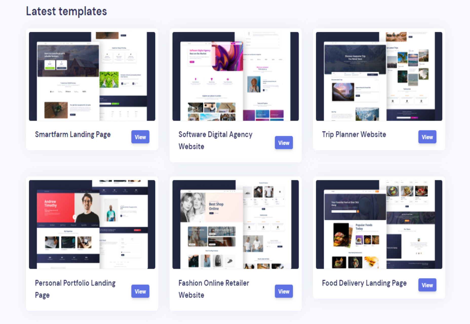


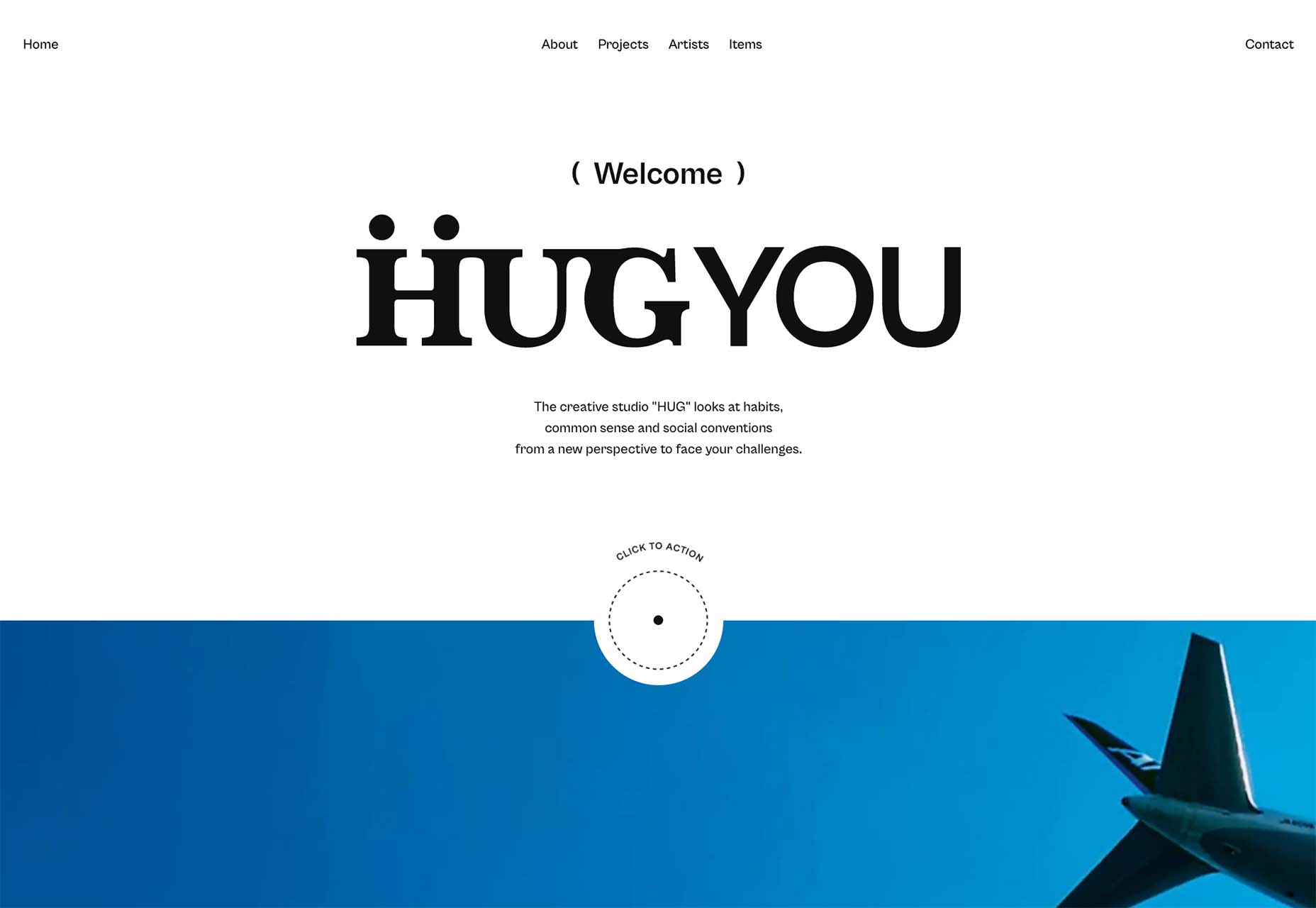

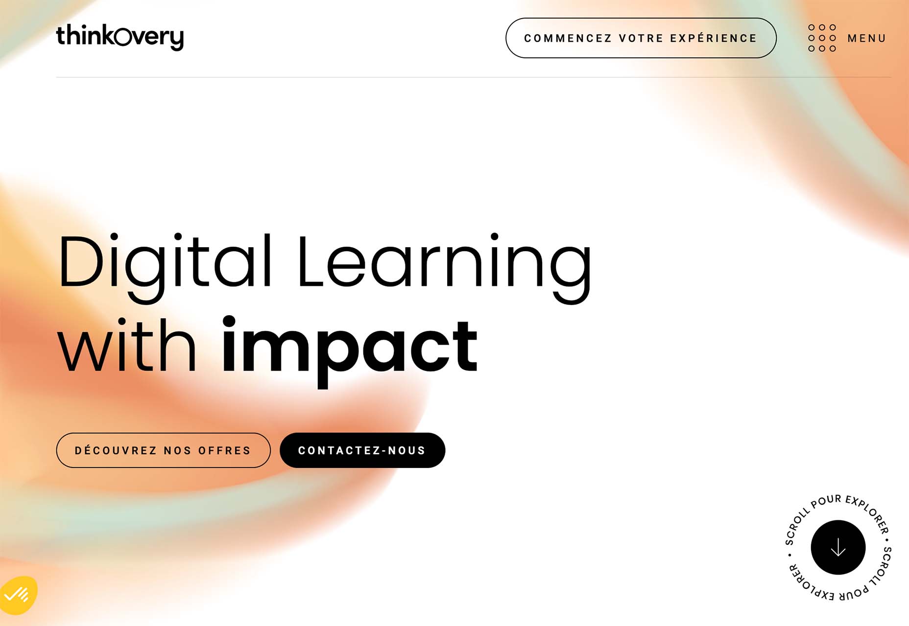
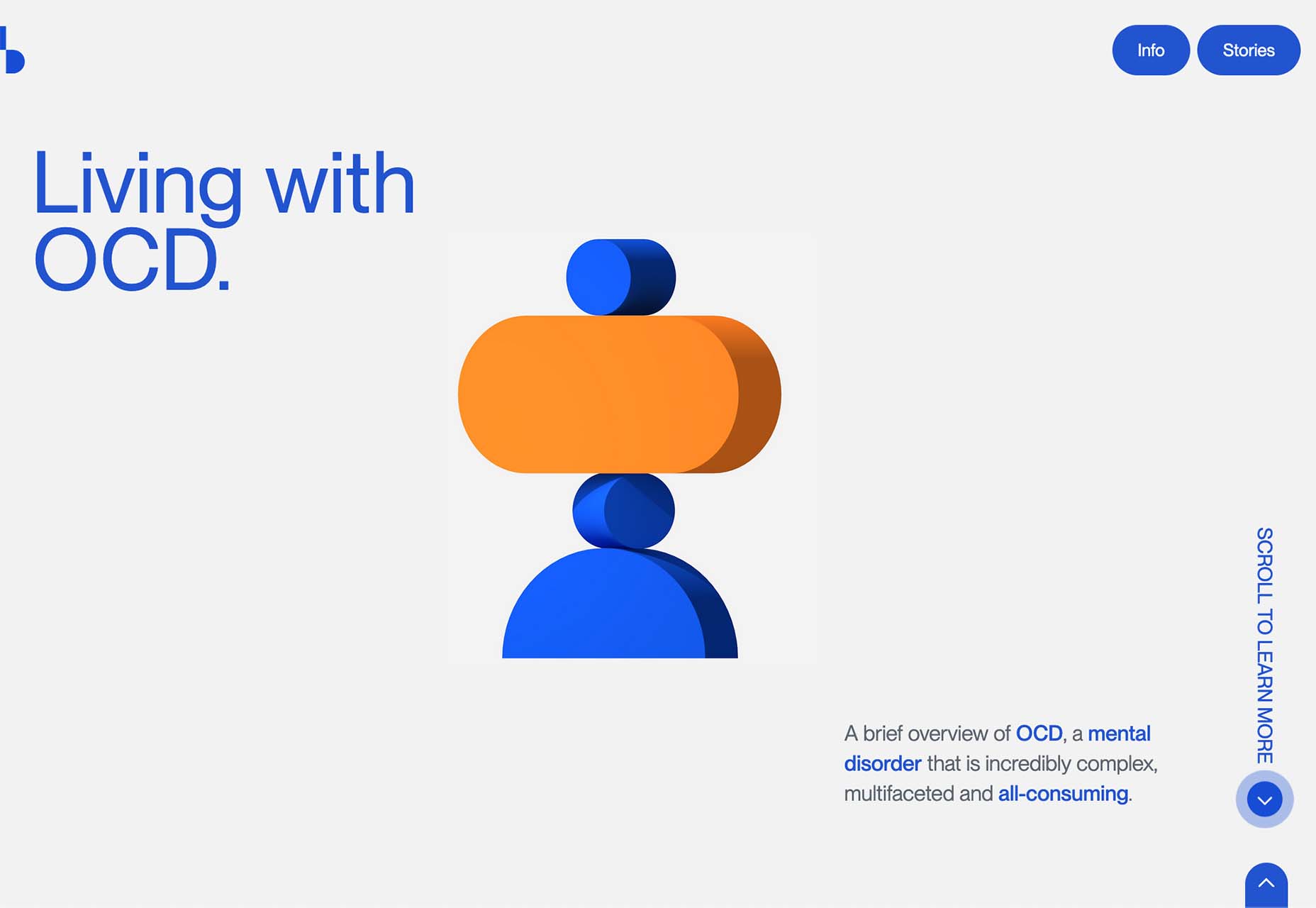
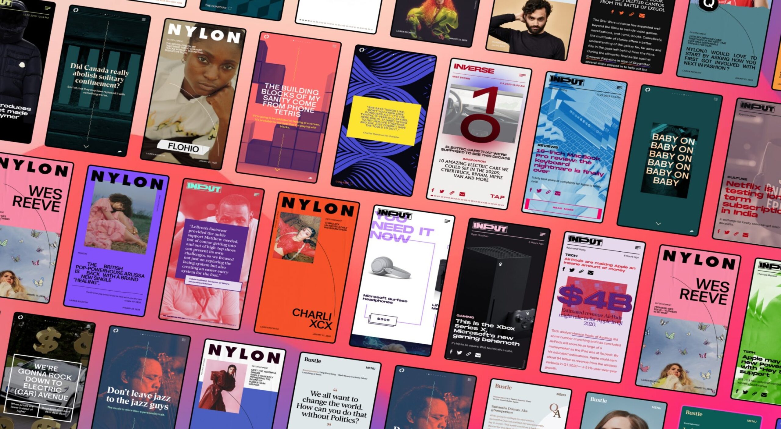
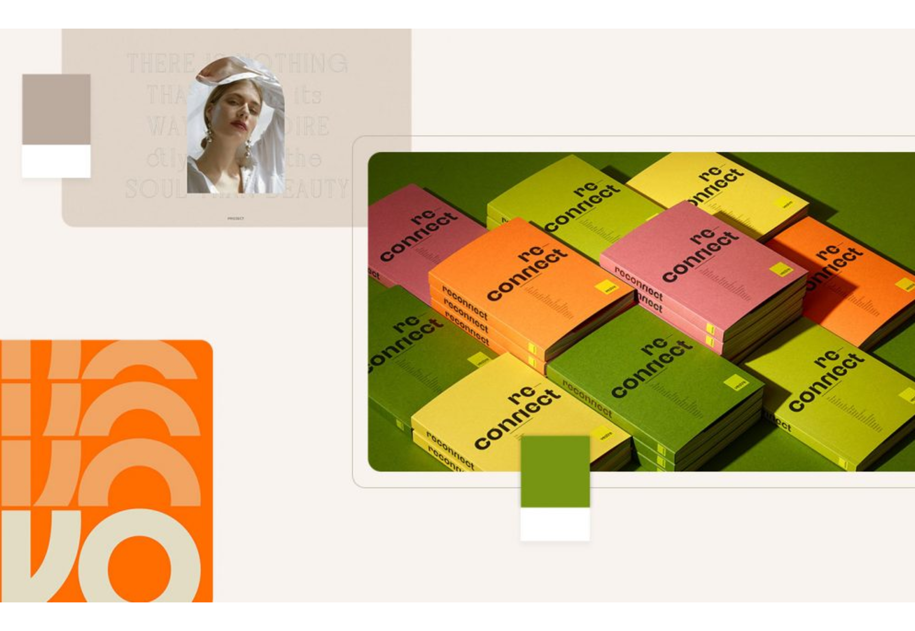
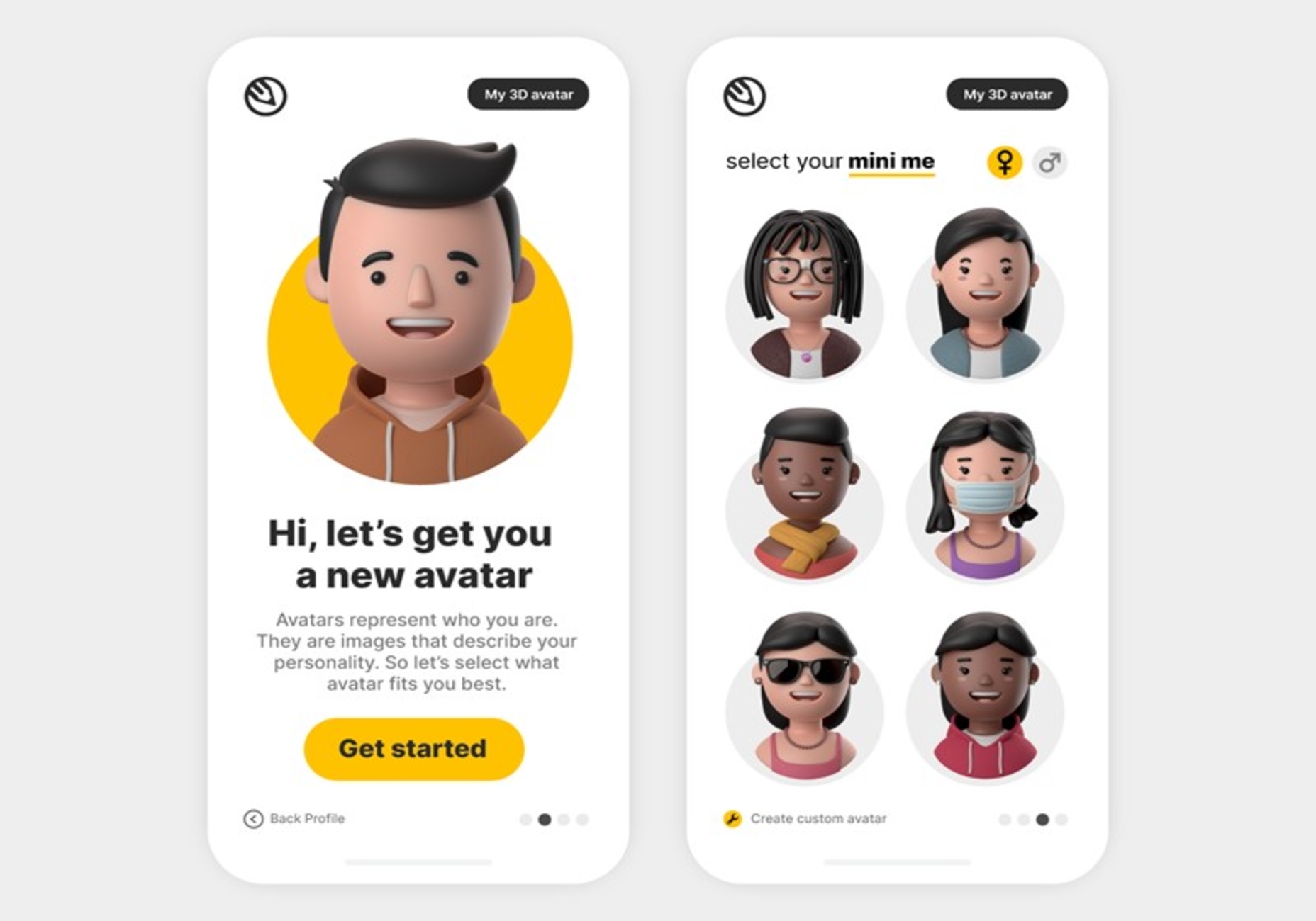
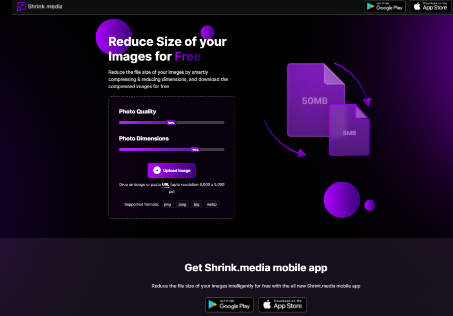
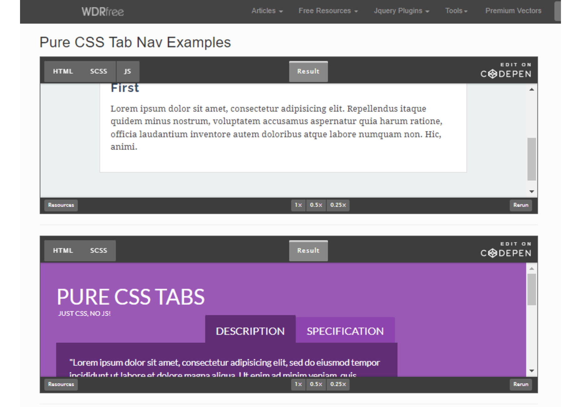
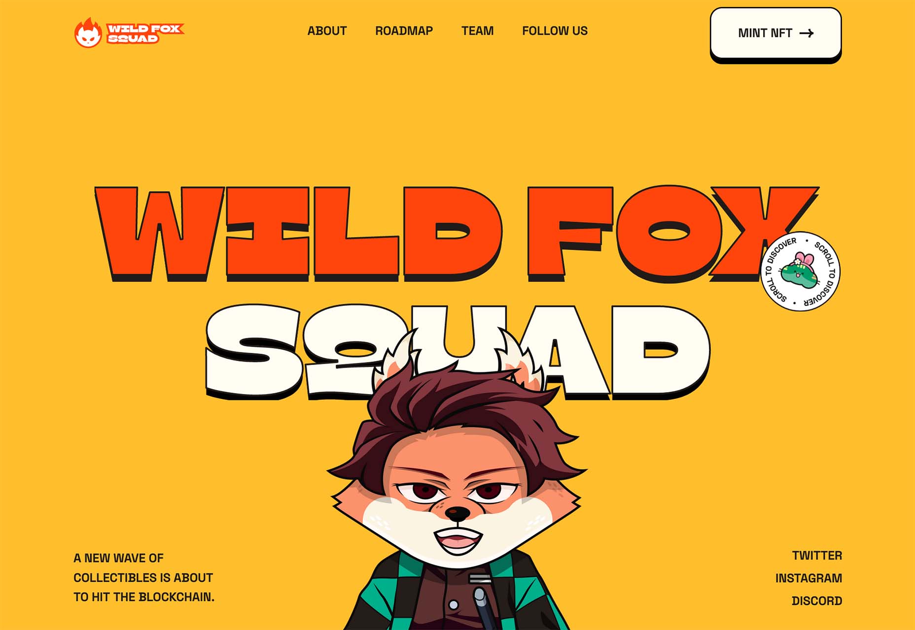
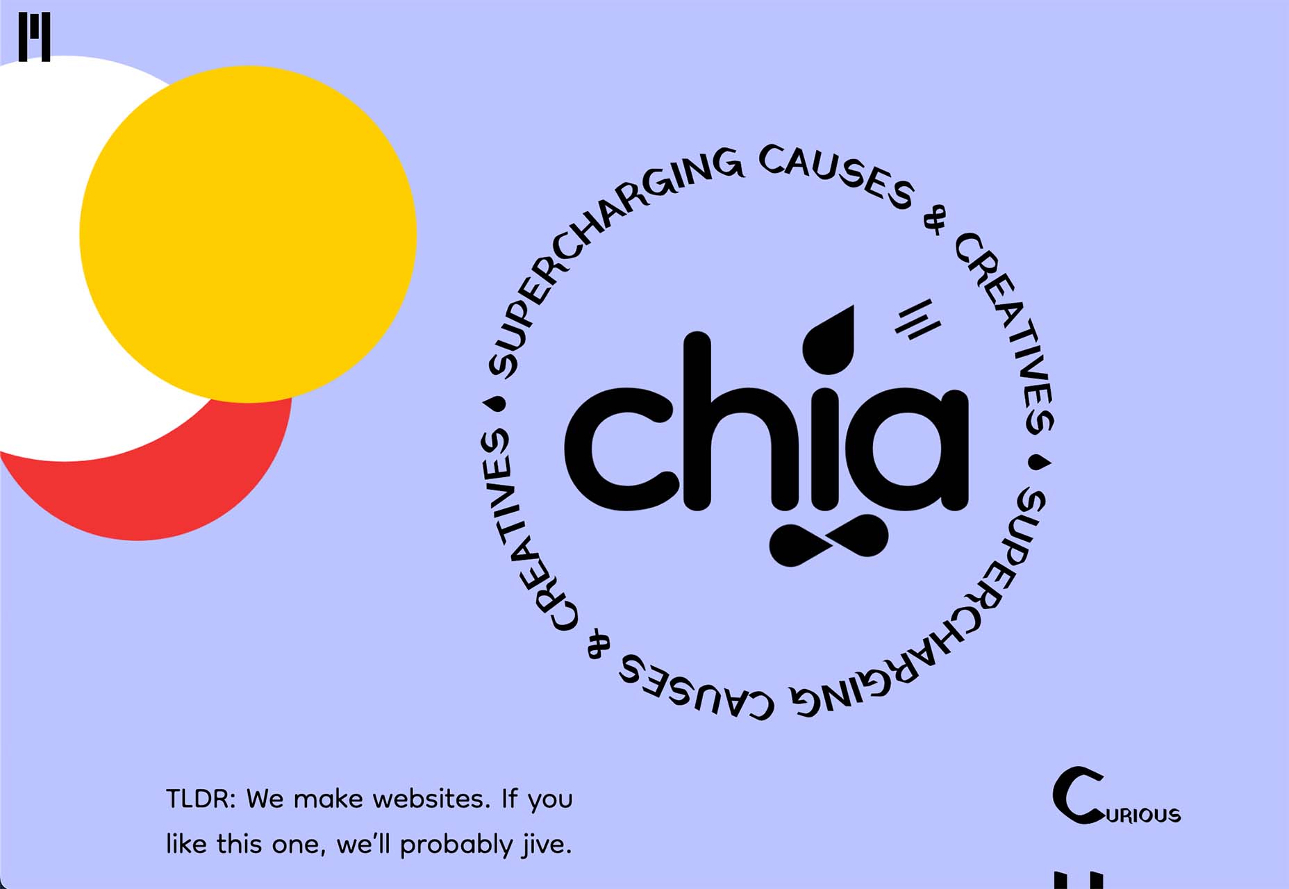
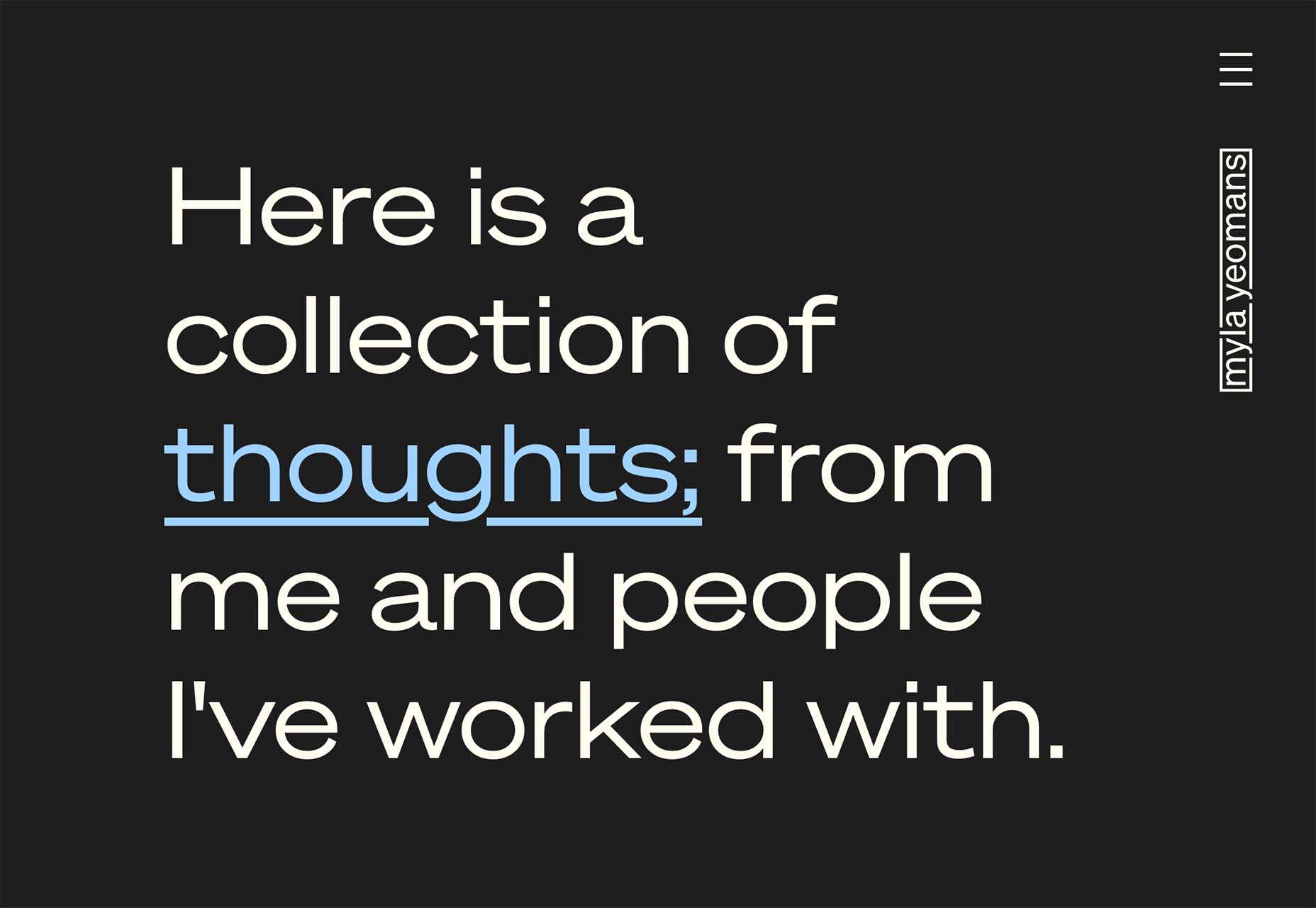
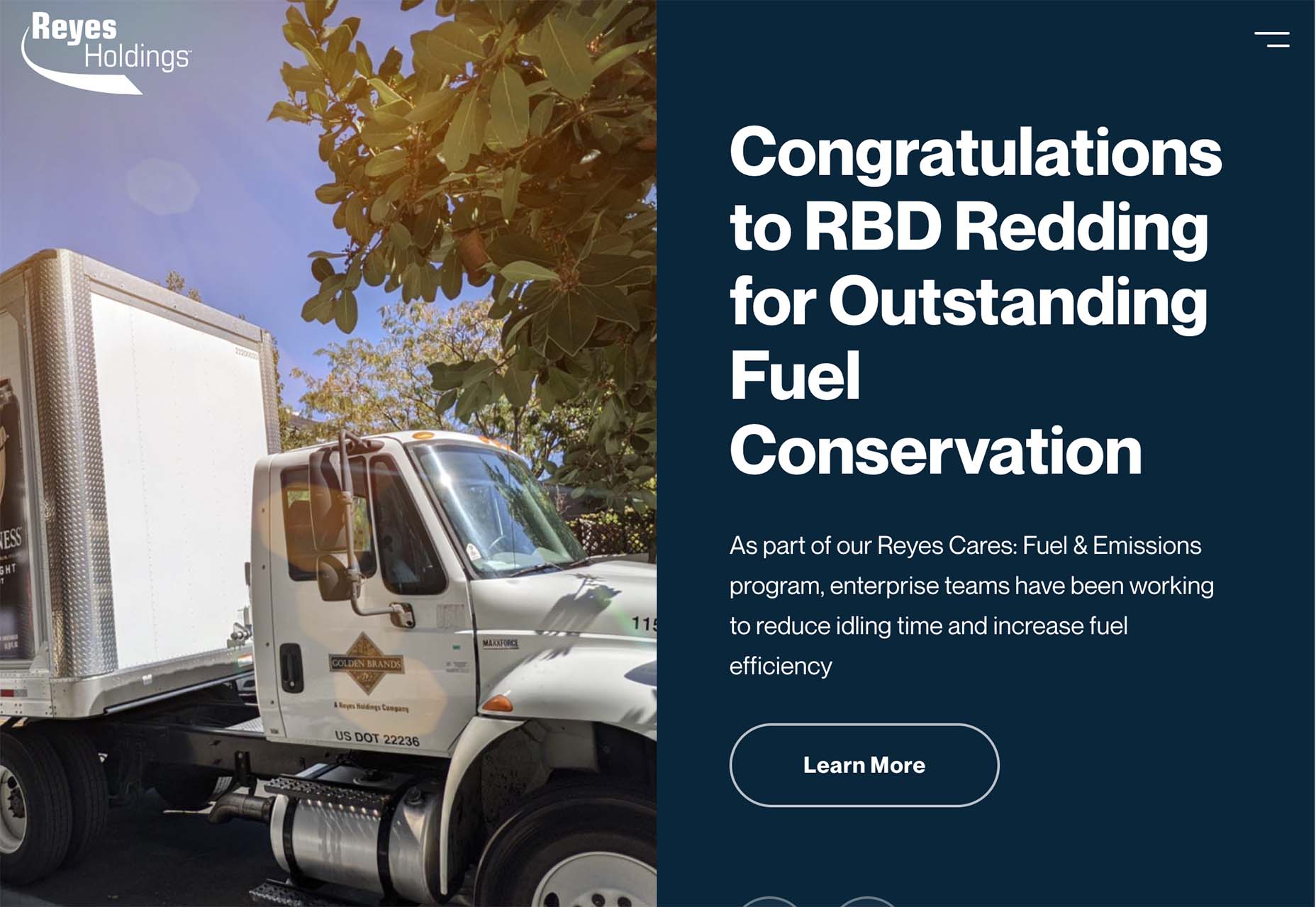
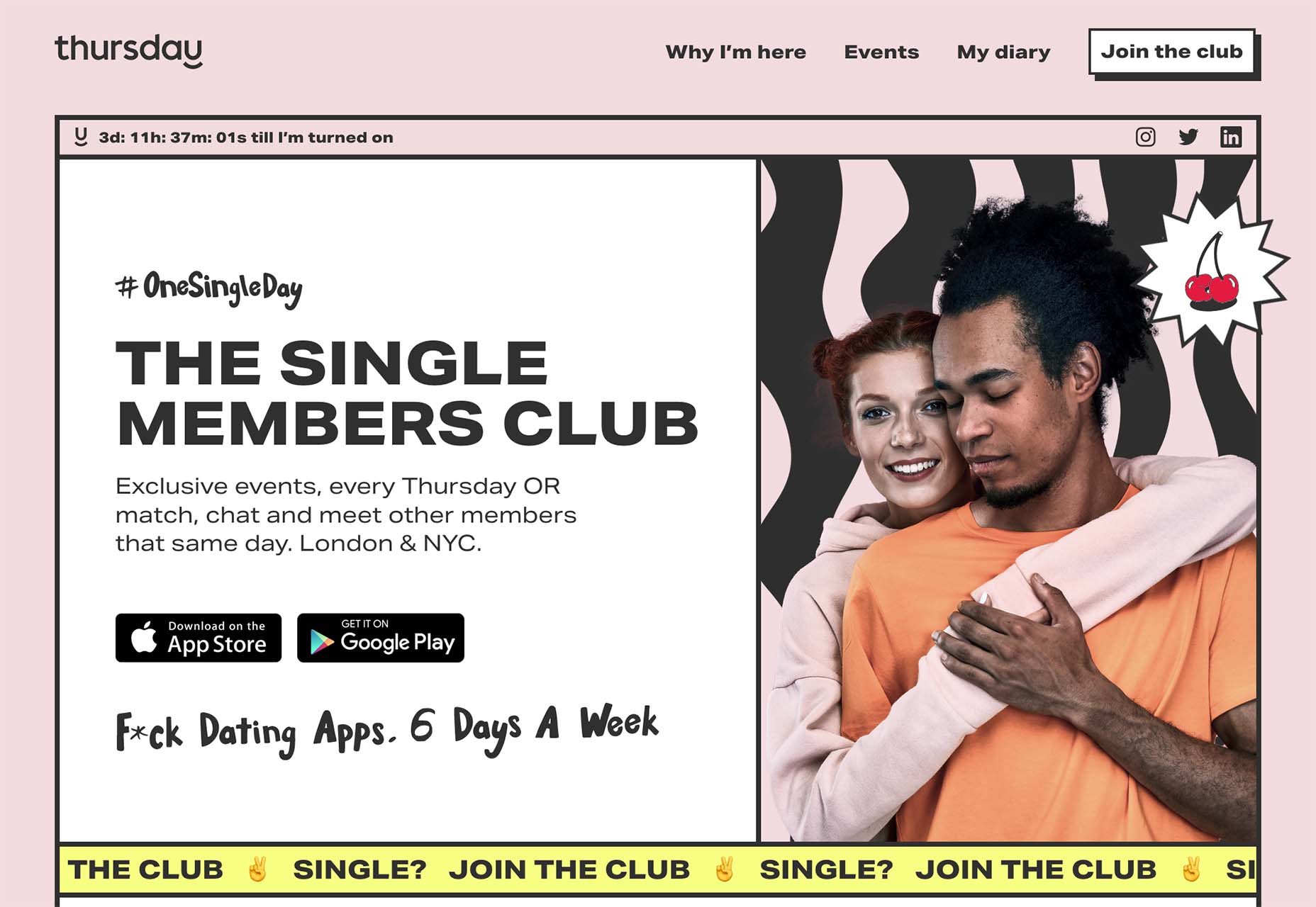
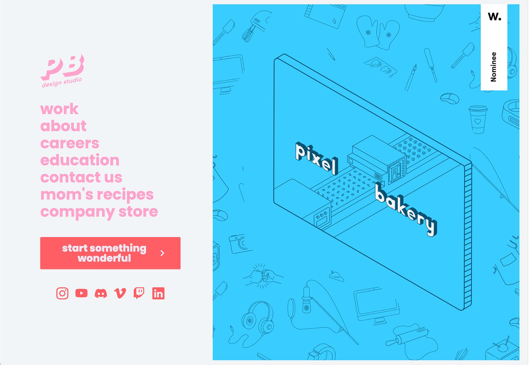
 Are you bored with some of your current design projects? This month’s collection of website design trends can help break you out of that rut with some fun and funky alternatives.
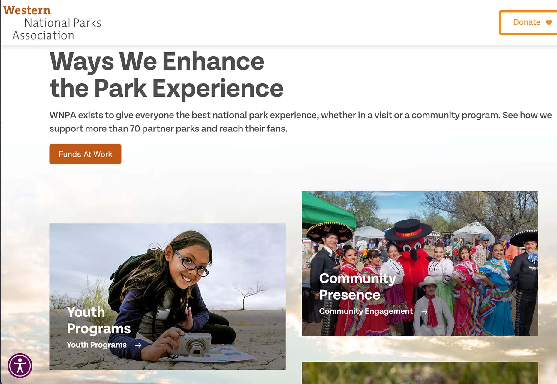


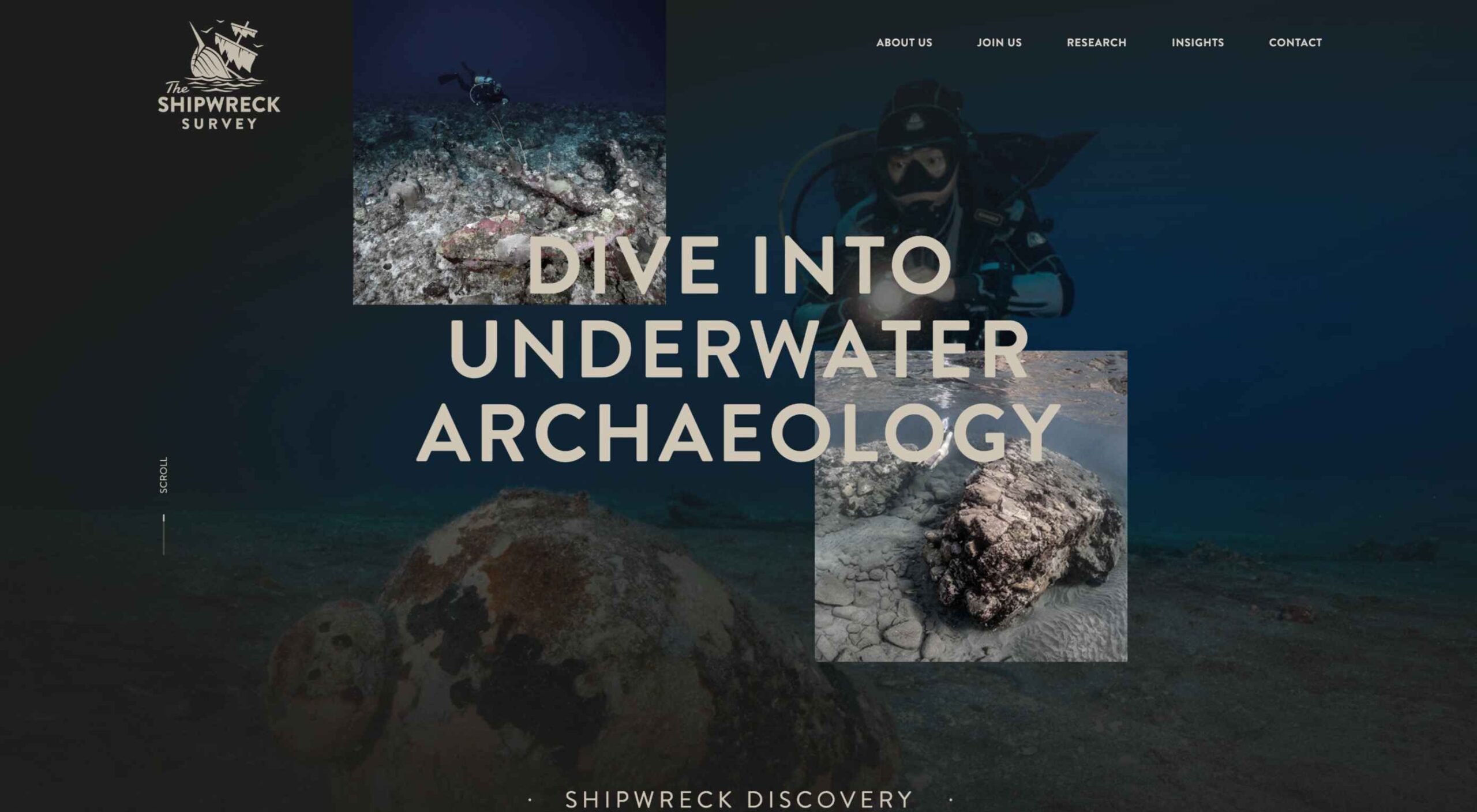
 Websites haven’t always been as adaptable as they are today. For
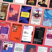
 Every day design fans submit incredible industry stories to our sister-site, Webdesigner News. Our colleagues sift through it, selecting the very best stories from the design, UX, tech, and development worlds and posting them live on the site.


 Every day design fans submit incredible industry stories to our sister-site, Webdesigner News. Our colleagues sift through it, selecting the very best stories from the design, UX, tech, and development worlds and posting them live on the site.
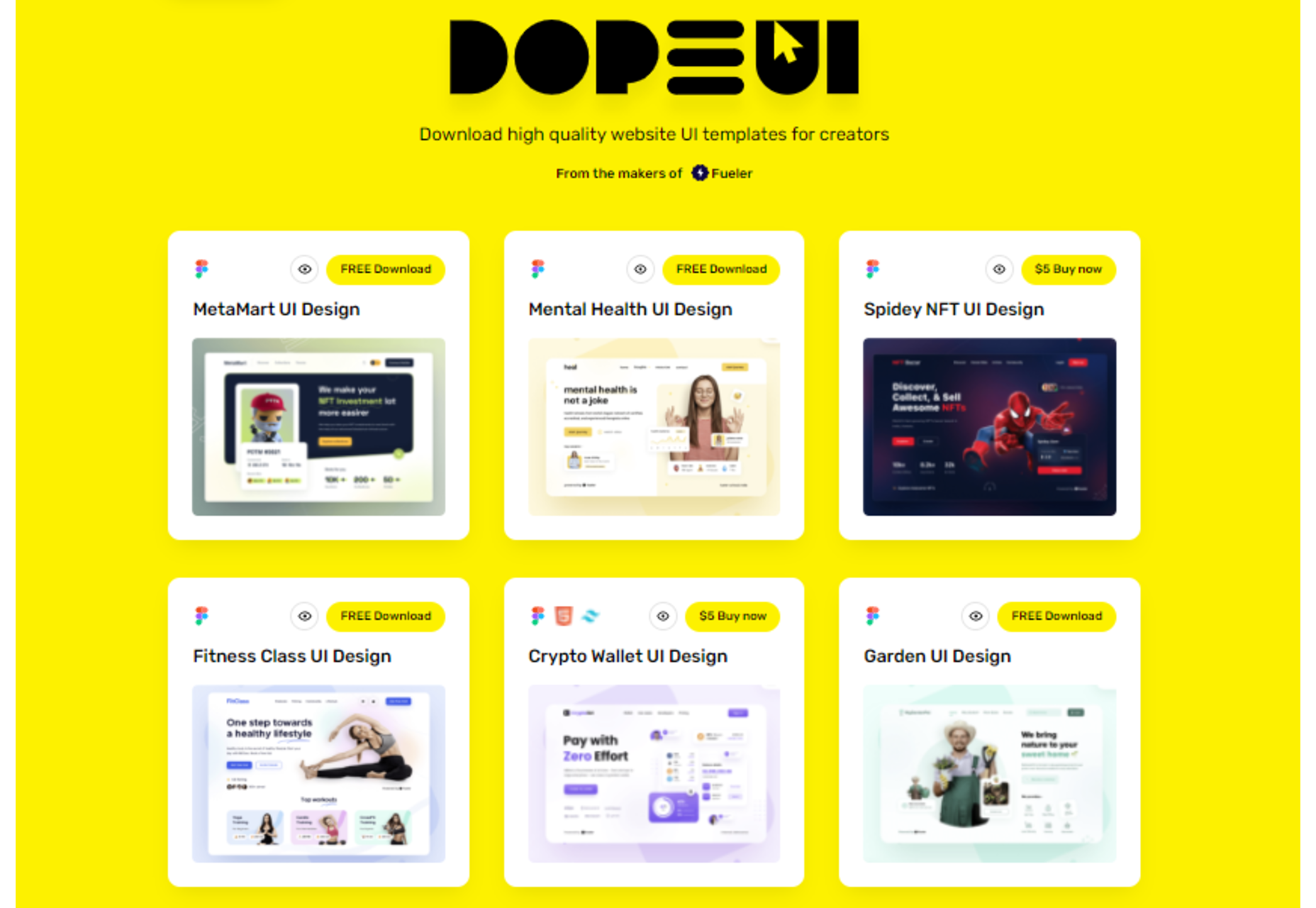


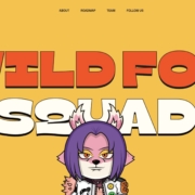
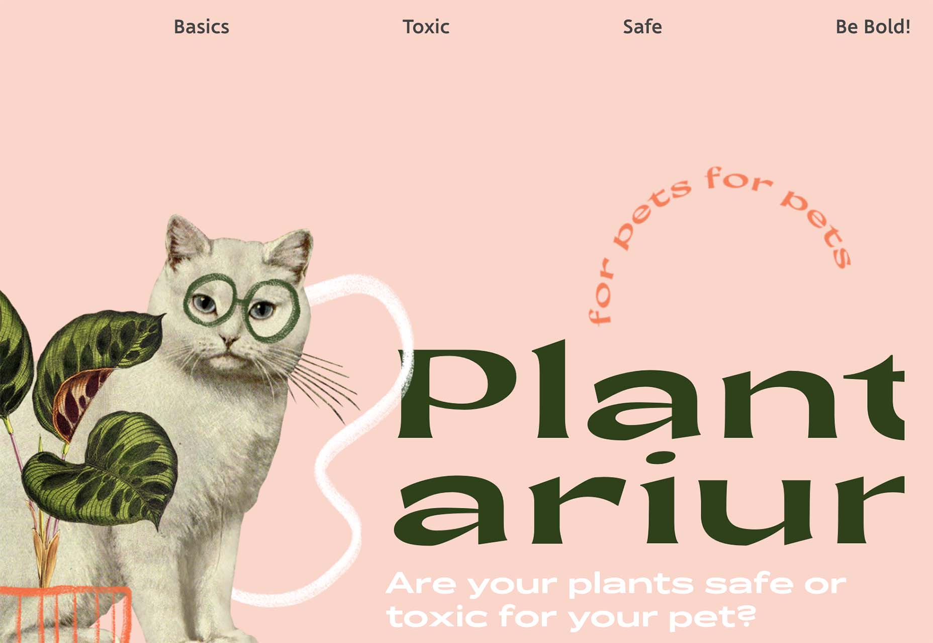
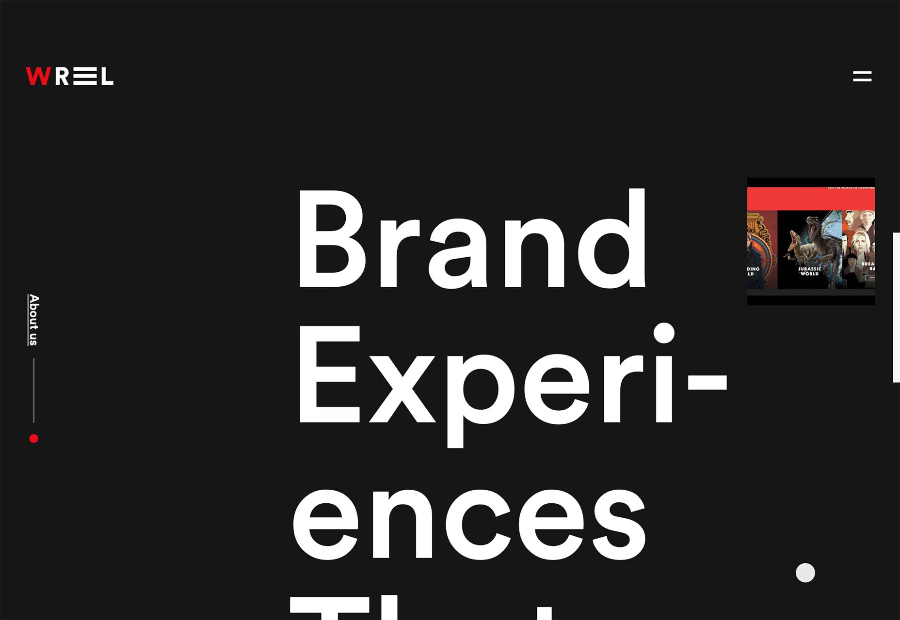
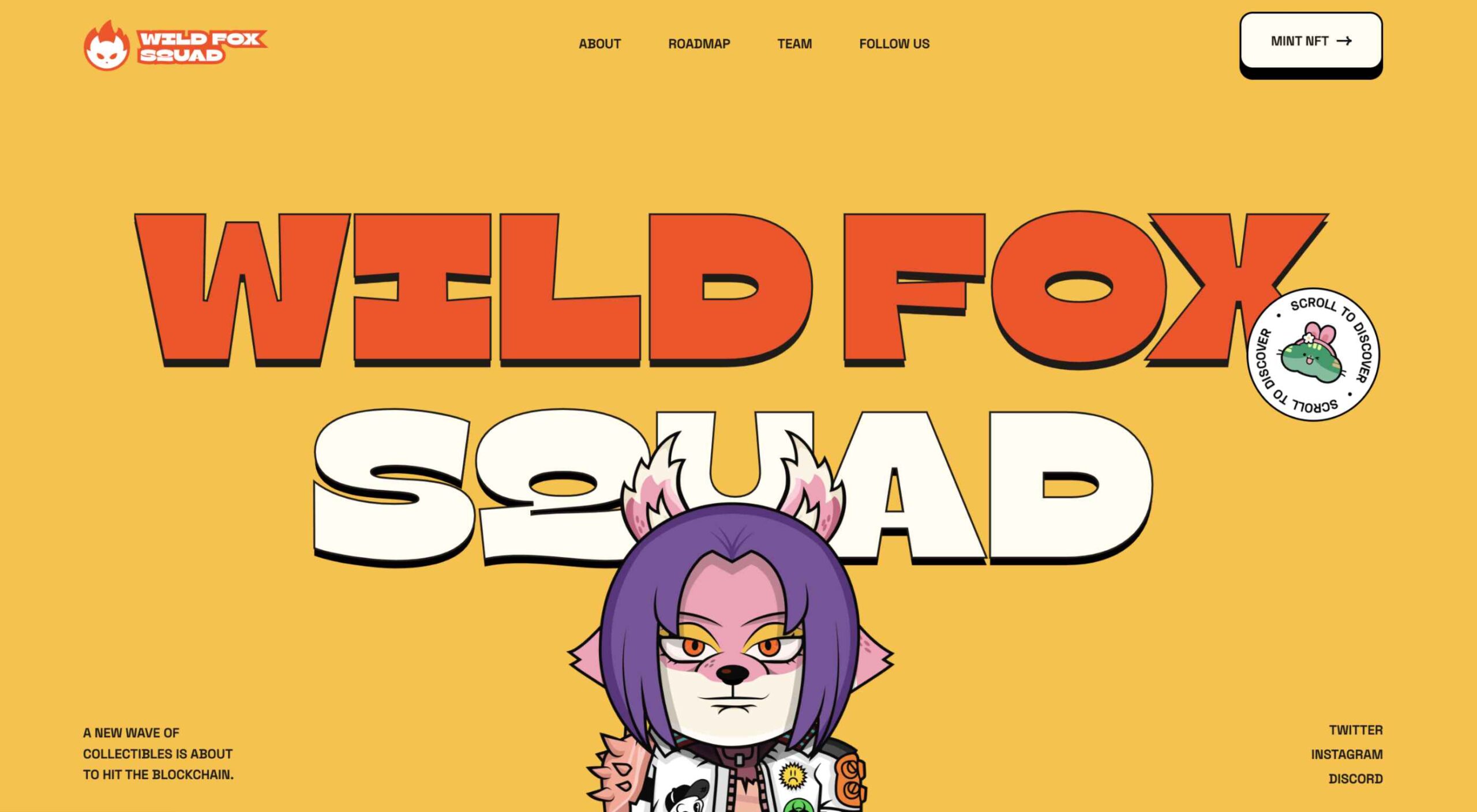 Do you ever look at a website and think, why did they do that? Sometimes with website design trends, that’s the exact thought that can come to mind. What about an element works (or doesn’t) and why did it get so popular so fast? That’s the theme of this month’s roundup.
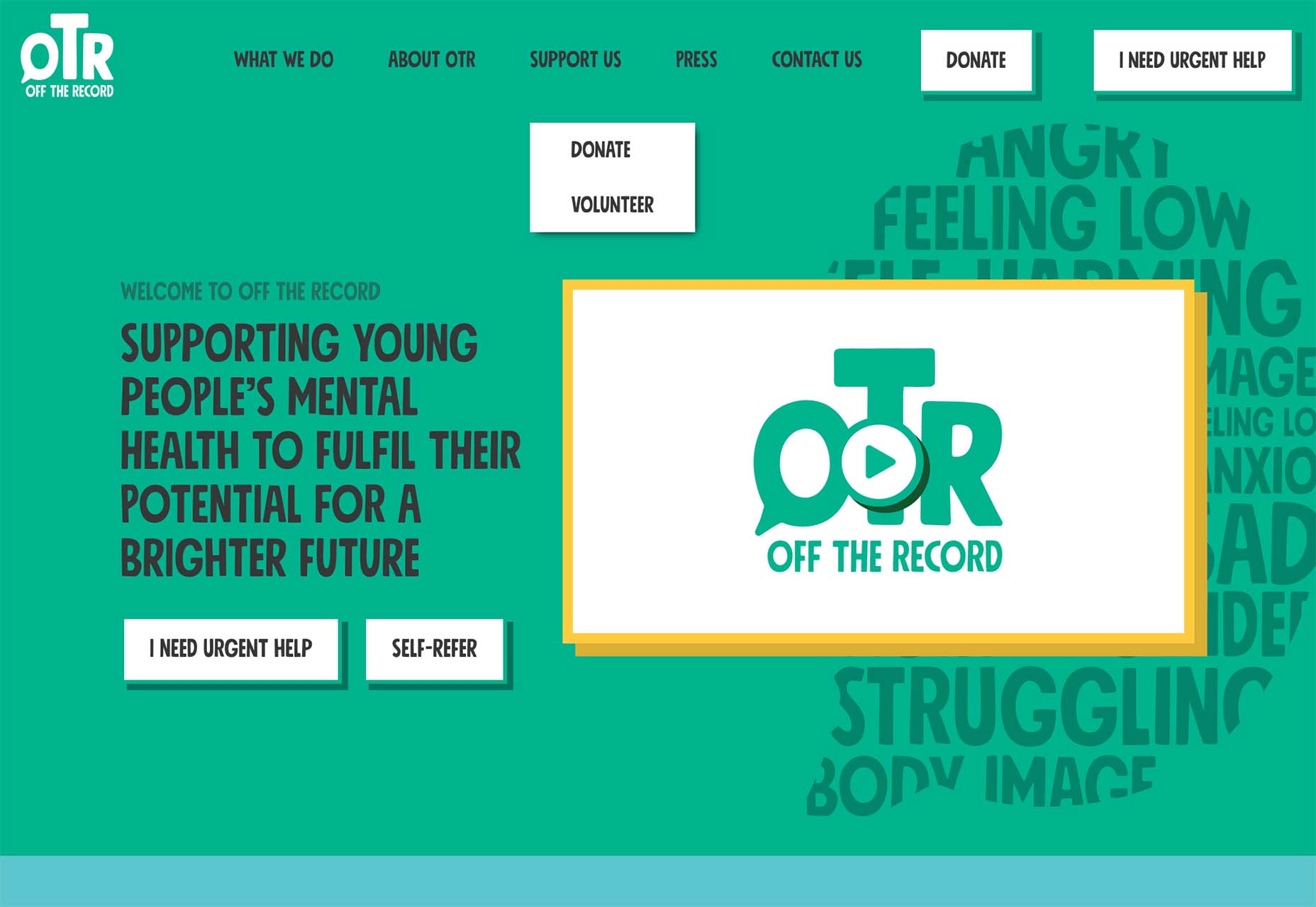
