
 Are you bored with some of your current design projects? This month’s collection of website design trends can help break you out of that rut with some fun and funky alternatives.
And all of these options are anything but boring. From visual display to technique, these trends present a different set of challenges.
Here’s what’s trending in design this month.
1. Layers on Layers
These website designs have so many layers of information that you almost don’t know where to look or where the design elements start and stop.
This can be a complex technique to make work because of the number of elements competing for the same attention in the design.
What you are likely to see with this design tend includes an image or video background with some motion but not anything that truly demands attention. Then add on a few still images in smaller frames throughout the design. Layer on text as well for a three-deep effect.
If you interact with these designs, you’ll find that they are not flat either. They all include animated elements, hover states, and interactions that help direct you through the layers of what can be a somewhat complex design.
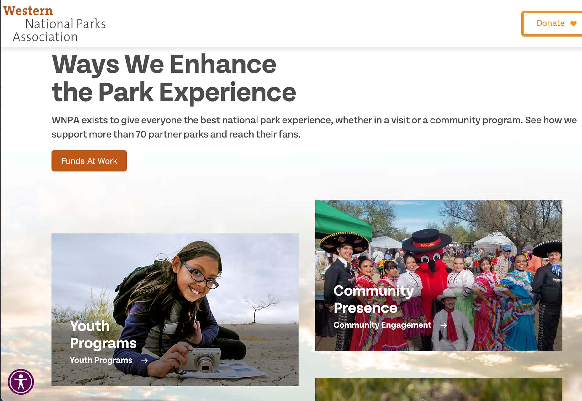
Western National Parks Association uses a background image, middle images with animations, and multiple text layers (some on the pictures and some on the background). There’s also scroll animation to help build the design. A lot is going on, but it does not feel too busy.
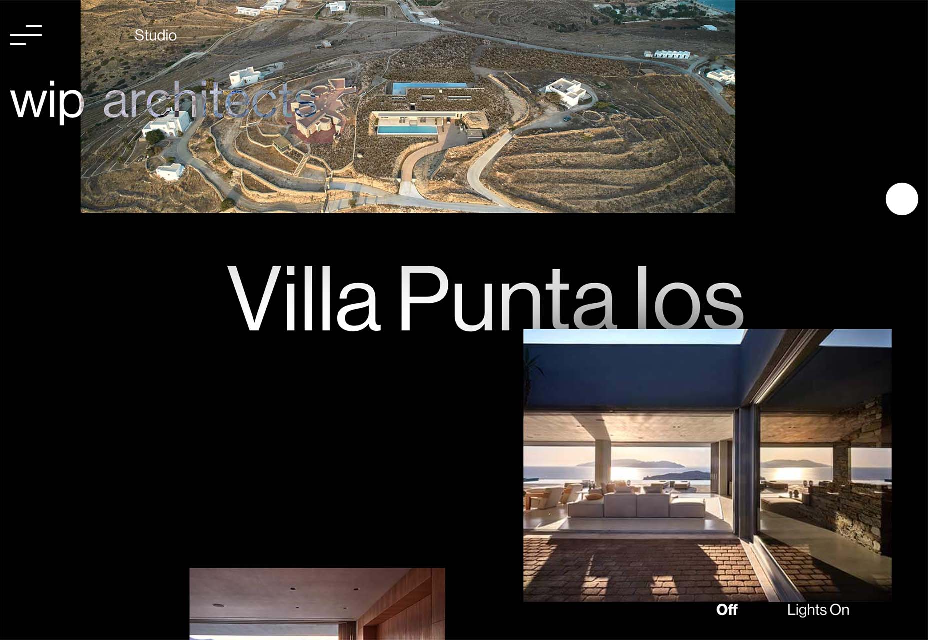
WIP Architects is another design with layers that interact with each other and include motion. With a lot of scroll animation and layers that go in front of and behind other elements, engagement helps this site work.
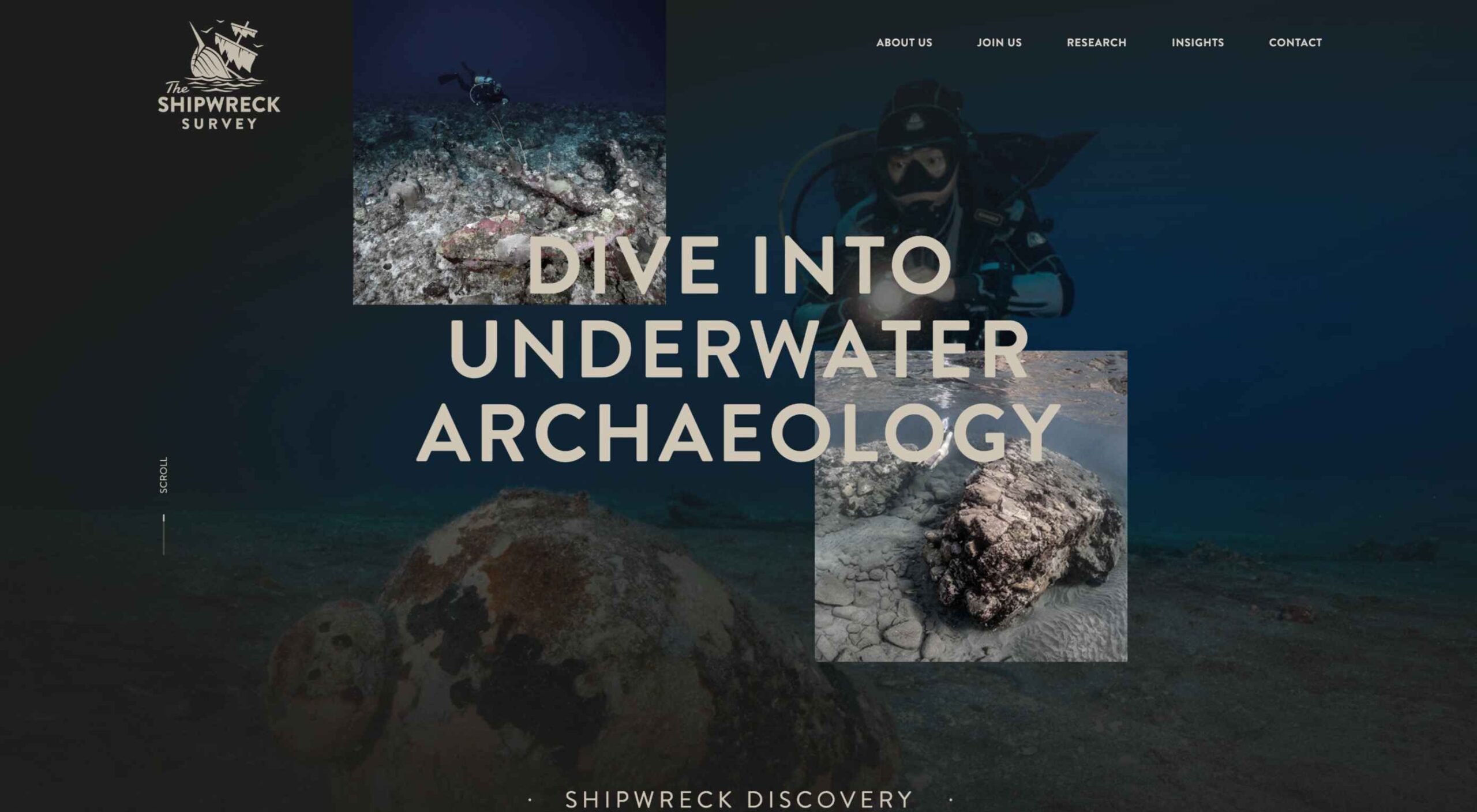
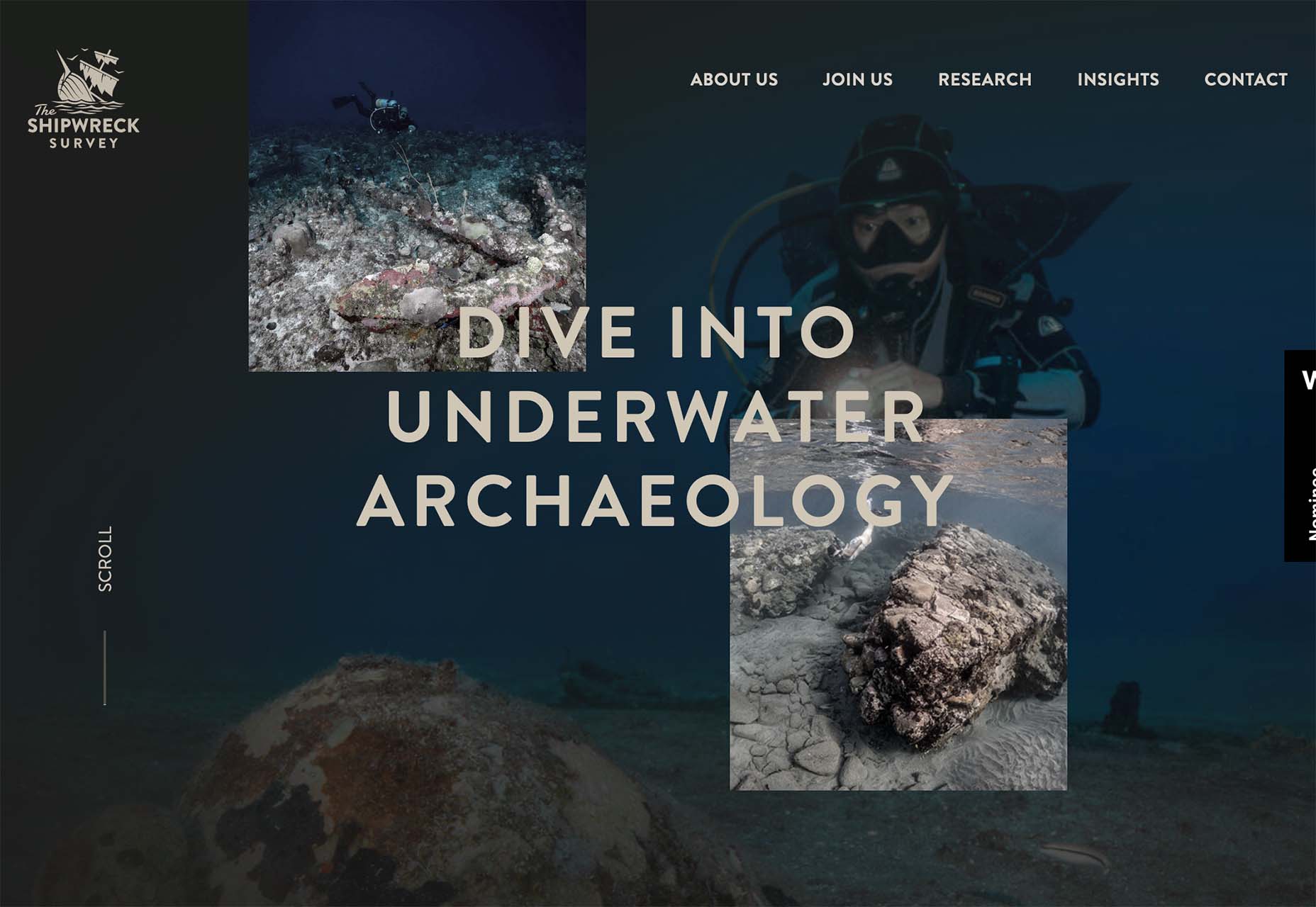
The Shipwreck Survey uses the same basic layer outline with a little more overlap between elements and less overall animation. The primary animated effect on the homepage is the scroll bar.
2. Directed Click Actions
This interesting website design trend can be incredibly useful or a wasted element – directed click actions. These are buttons, icons, and animations that tell you to click somewhere in the design to move to the next stage of interaction.
The direct approach ensures that users see and have the best possible chance of doing what the design is intended for. On the other hand, if you need this much instruction, is the design too complicated? Or is there a middle ground where this trend looks great and is usable?
In each of the examples below, these directed click actions are a bit different.
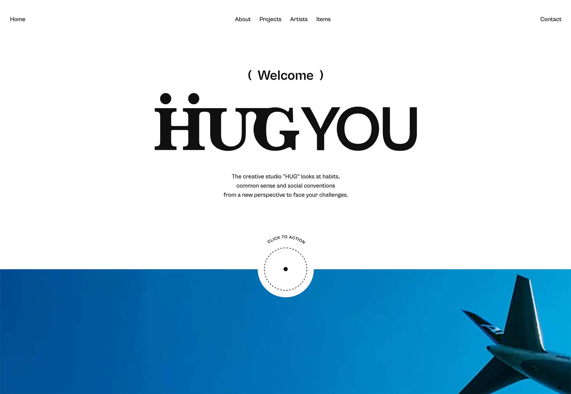
HUG Co has a big circle to click in the bottom third of the screen. It’s almost designed like a bullseye, and you can’t miss it. The thing that is interesting here is that most of the video falls below the scroll. The click action also has two emojis to denote action – a smiling face or pointer when you are ready to click. (The click extends the video to full screen.)
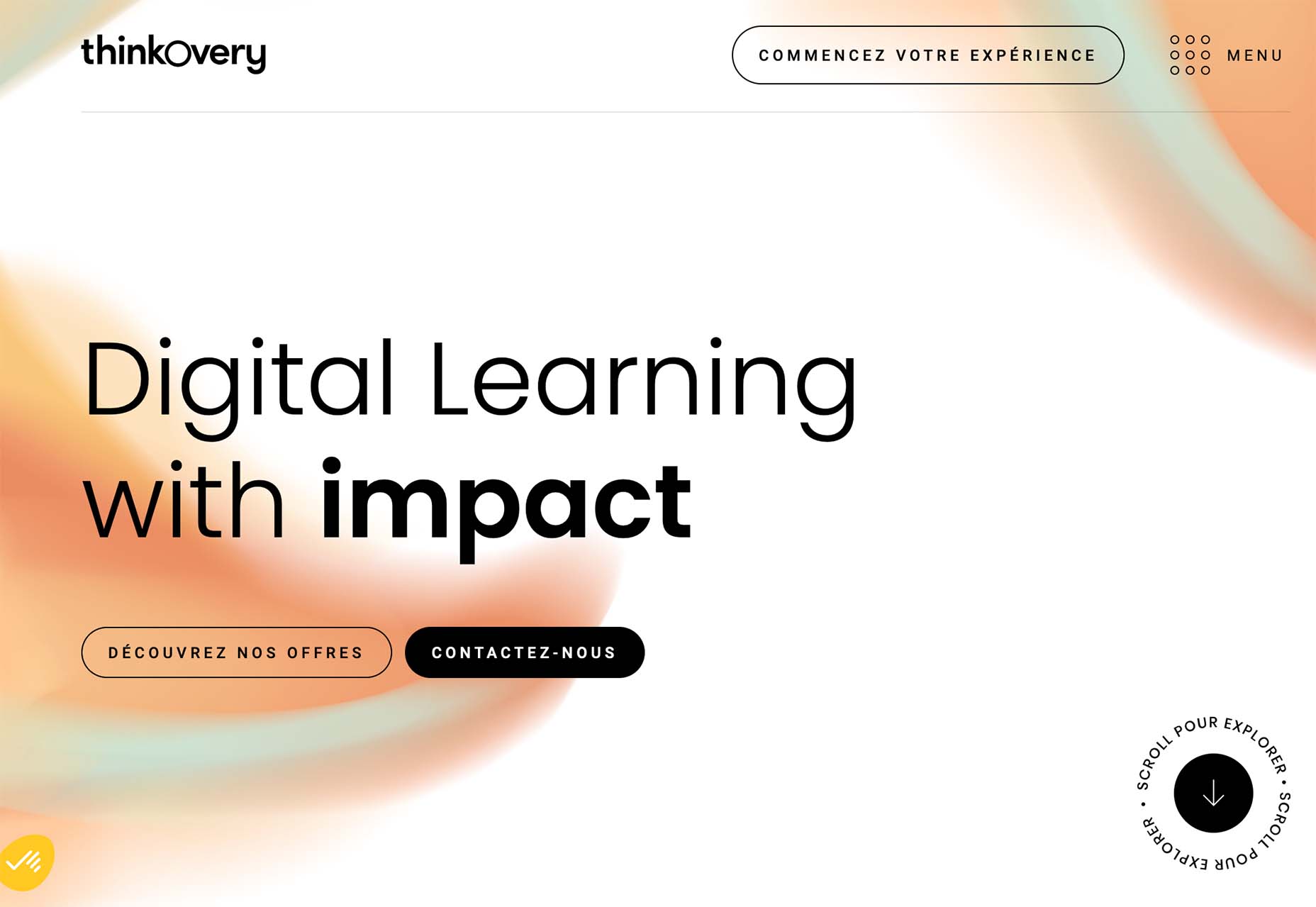
ThinkOvery also uses a similar circular click icon. It also takes you to the next screen in a single movement so that you can continue to explore the design.
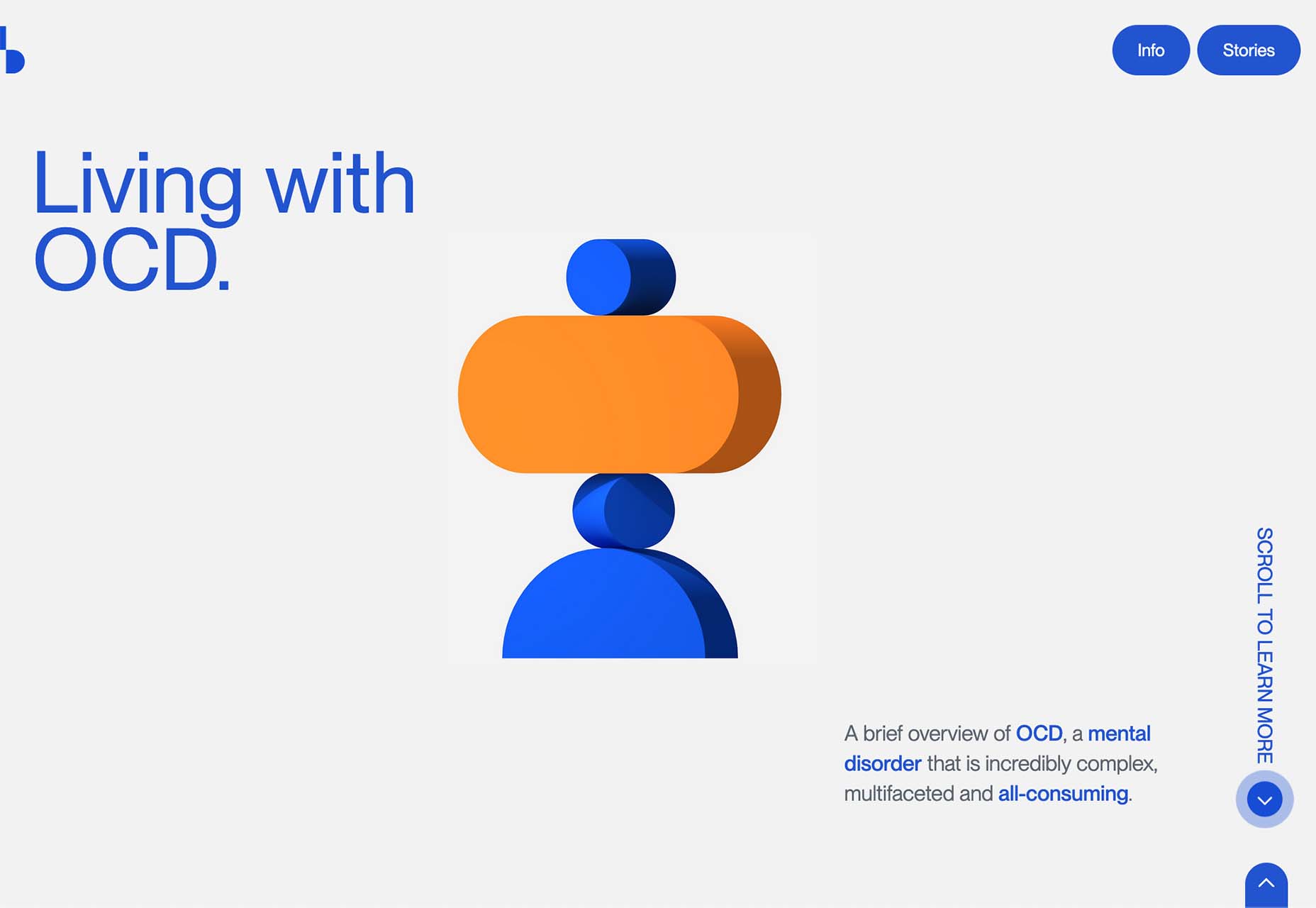
Living with OCD has a different approach with scroll and back-to-top icons paired in the bottom right corner. The scroll option includes words to help create direction and instruction. It consists of a small animation and an interactive hover state when you get close to the interactive element. The interesting thing here is that it is not actually a button, and you use a traditional scroll to interact.
3. Word Breaks
If you are a stickler for readability, this design trend might make you cringe.
In each of these designs, words are broken across lines – some with and some without hyphens. For the most part, there’s not much confusion about what the words are, but it does make you pause and think during the page experience.
Why would this be a design trend?
It’s a combination of using large typography, long words, and figuring out a solution to create a common experience between large and small screens. Many of these words would not fit on mobile screens, for example, with the same weight, scale, and impact as the desktop counterparts.
Hence, the word break solution. It creates a consistent user experience across devices.
This technique should be used only if you think your audience is savvy enough to understand what you are trying to communicate with the word break. It can be a tricky proposition!
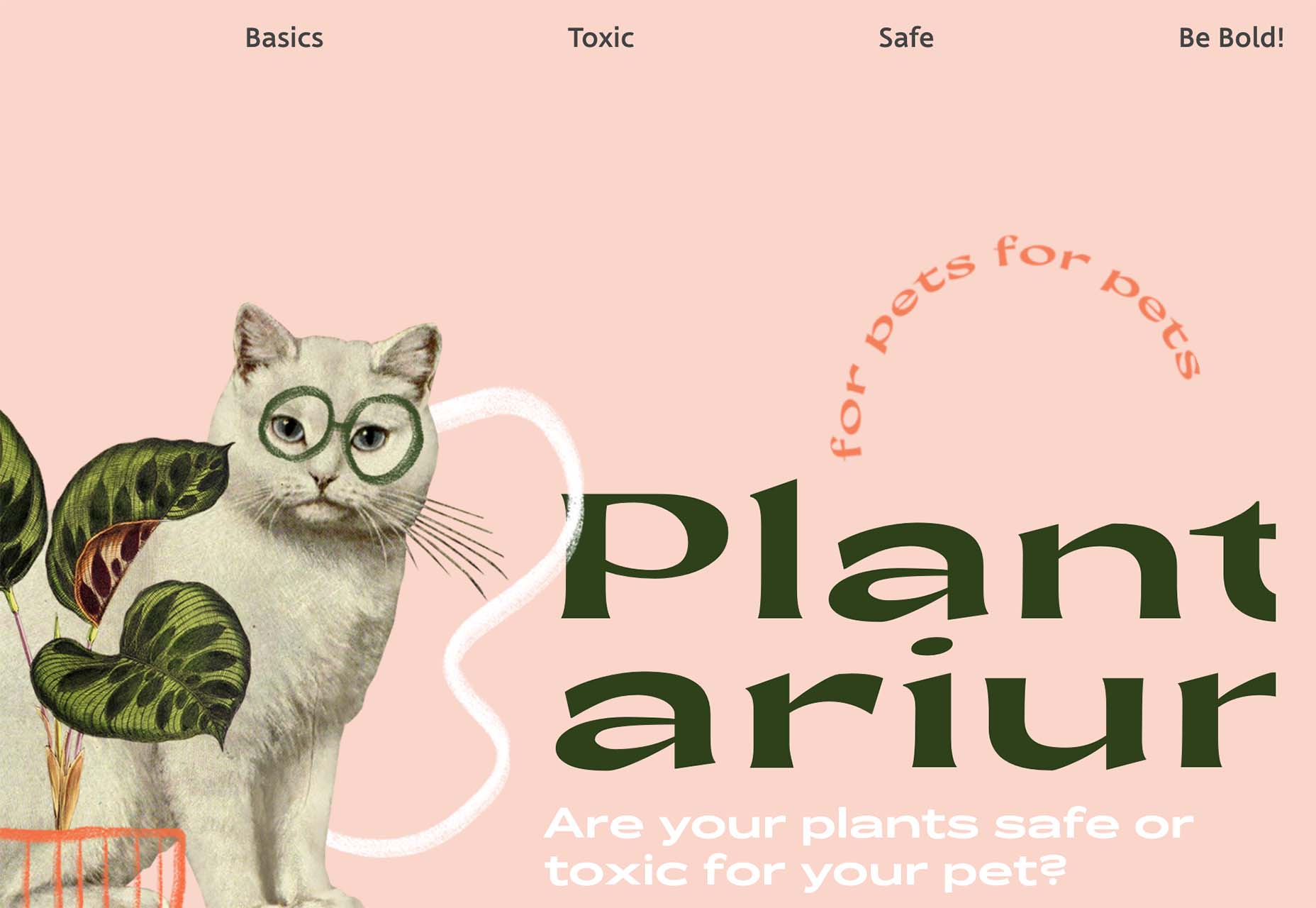
Plantarium breaks at “plant” with a word that’s made up. But with the imagery and supporting terms, you still know immediately what the design is about.
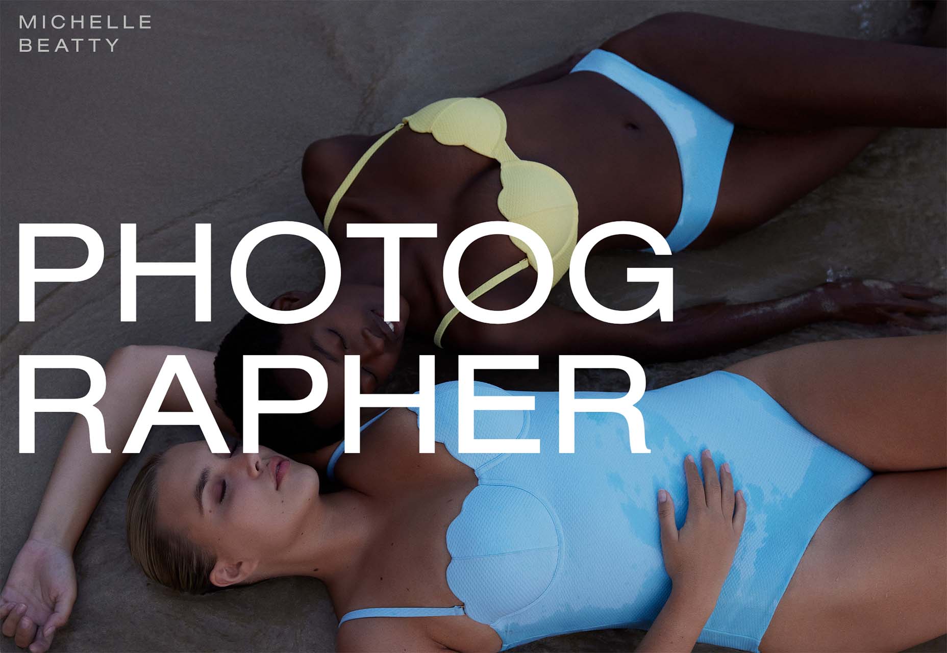
Michelle Beatty takes a common word and breaks it. Because “photog” and “rapher” are the only letters on the screen, it’s pretty easy to figure out. What’s interesting is that the word break is not on the syllable, but the letters do stack nicely with this break visually.
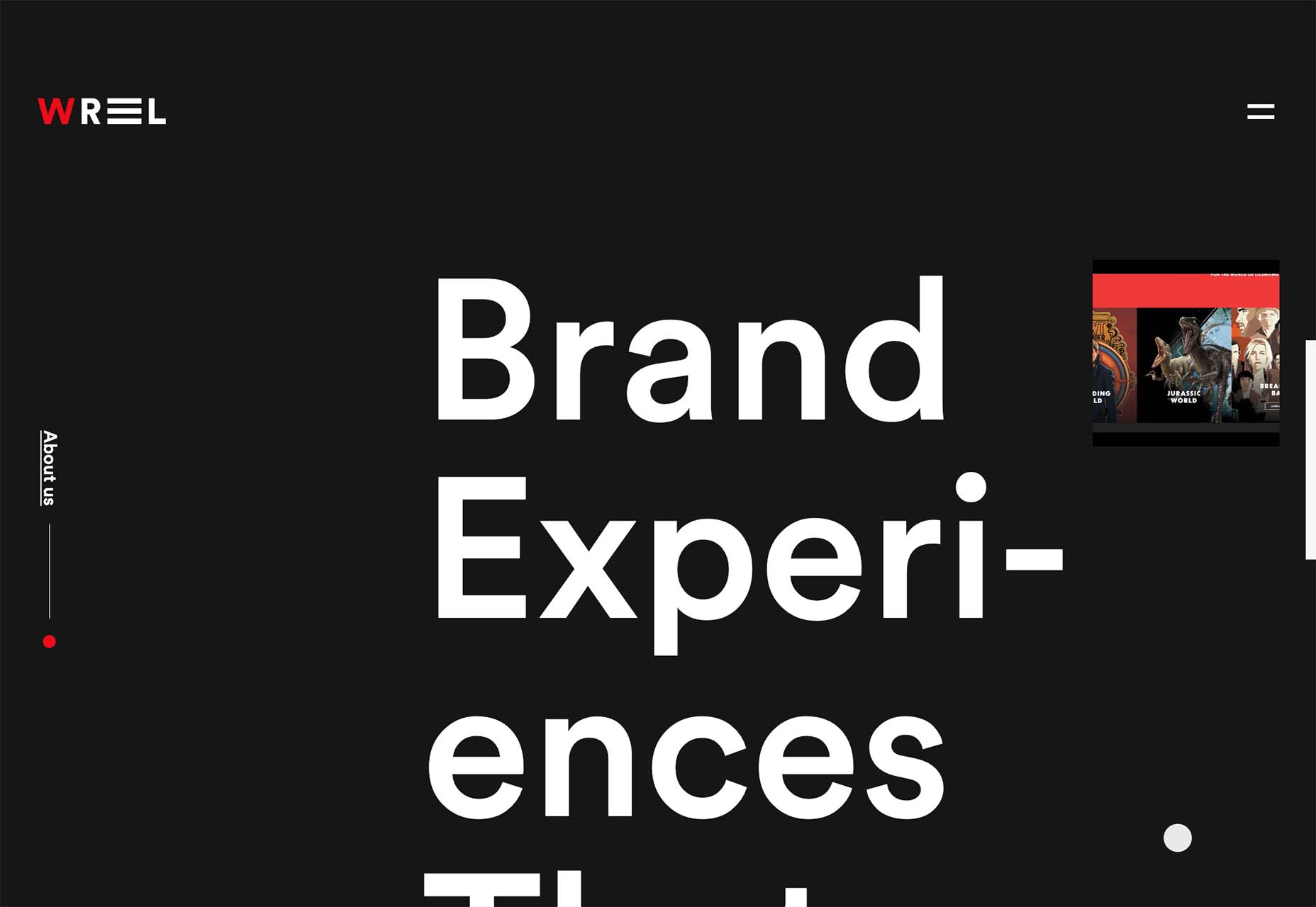
Wreel Collective breaks a word with a hyphen in giant letters – something we rarely see in website design. Hyphens are not often used in this medium. Because of this, it gets your attention and makes you think about the words and the design.
Conclusion
There are a lot of rule-breaking trends in this month’s collection. They are interesting, fun, and require a certain level of risk to execute.
Could you see yourself (or your clients) opting for a design that features one of these trends? Time will tell if these visual compositions grow in popularity or begin to fade fast.
The post 3 Essential Design Trends, June 2022 first appeared on Webdesigner Depot.


