Articles

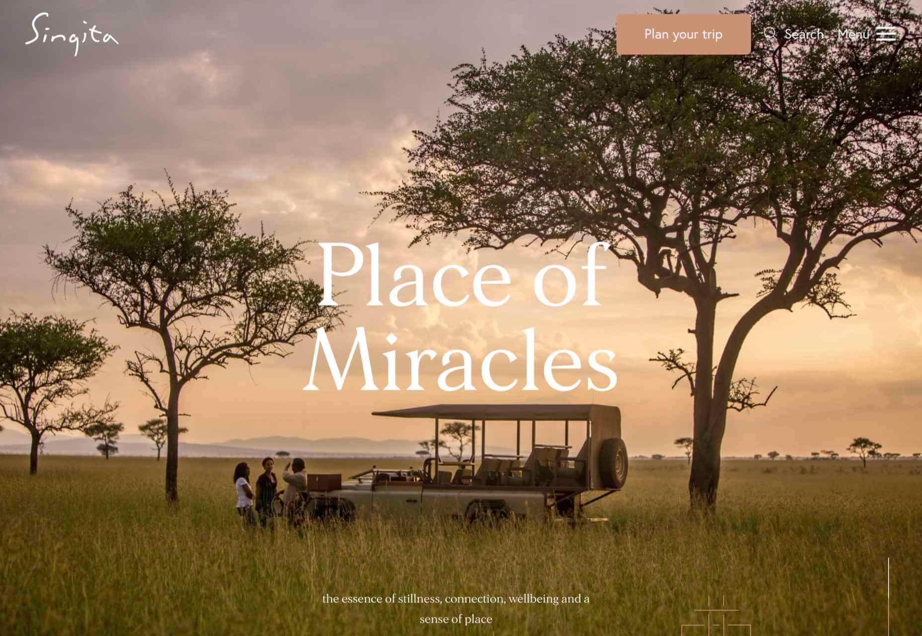
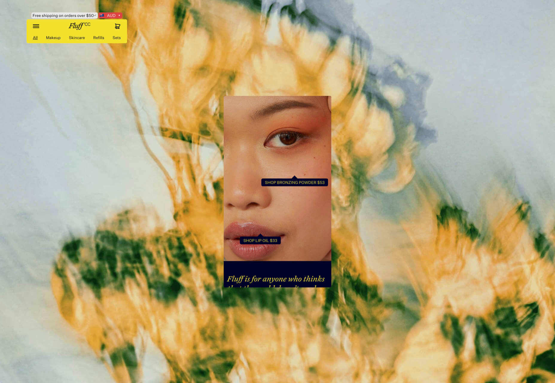
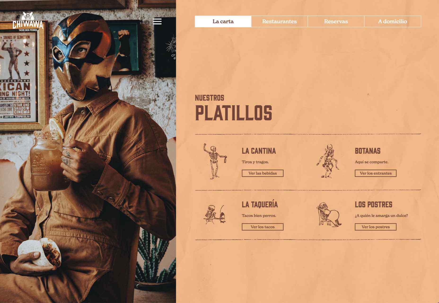
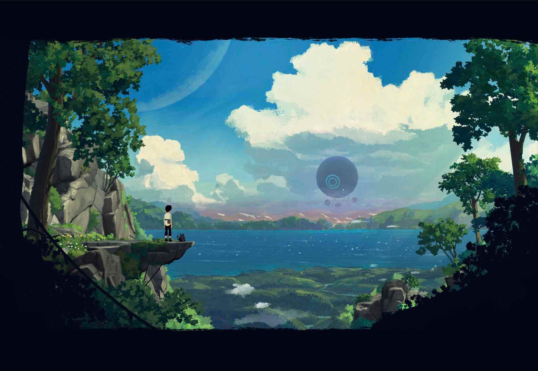
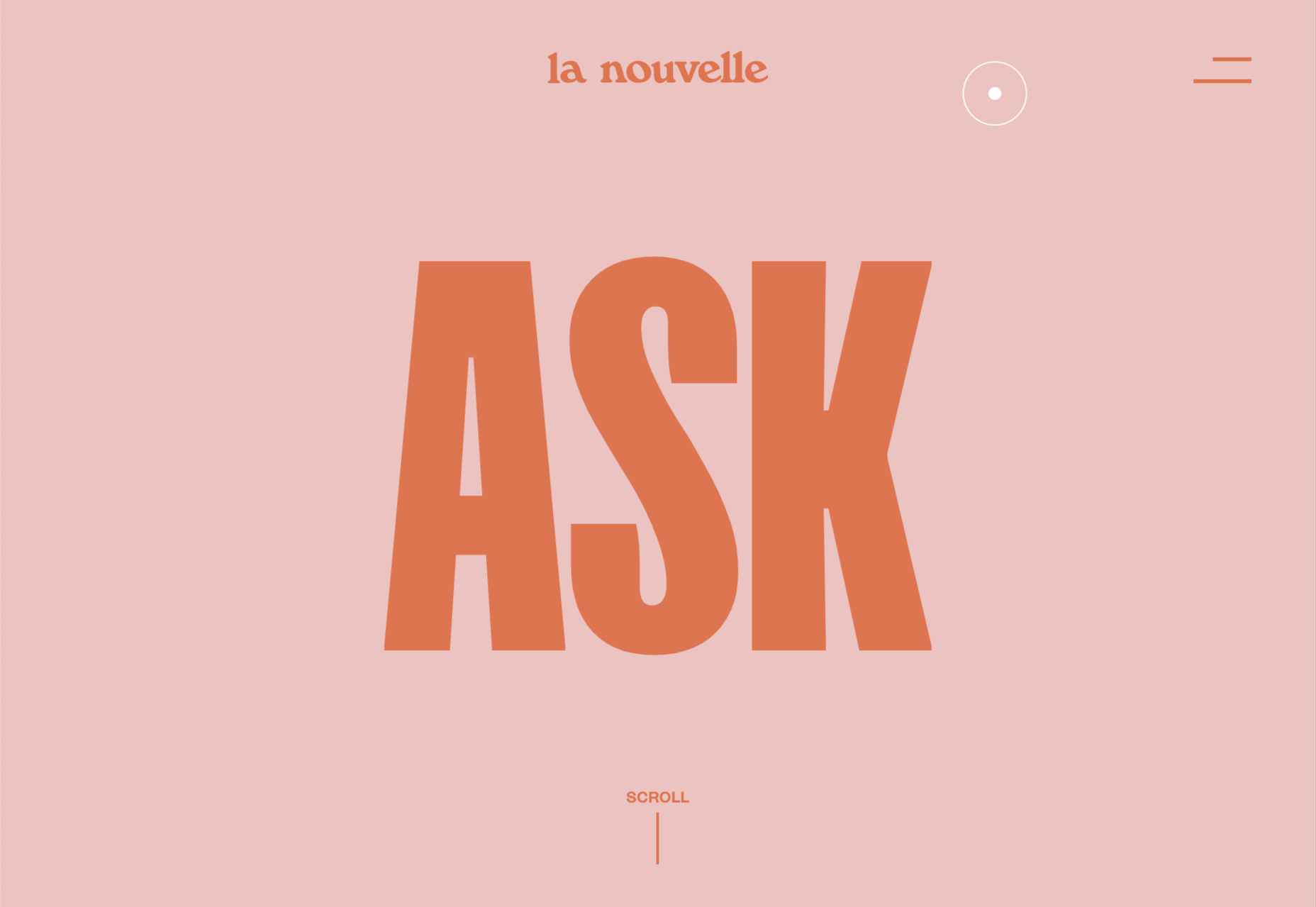
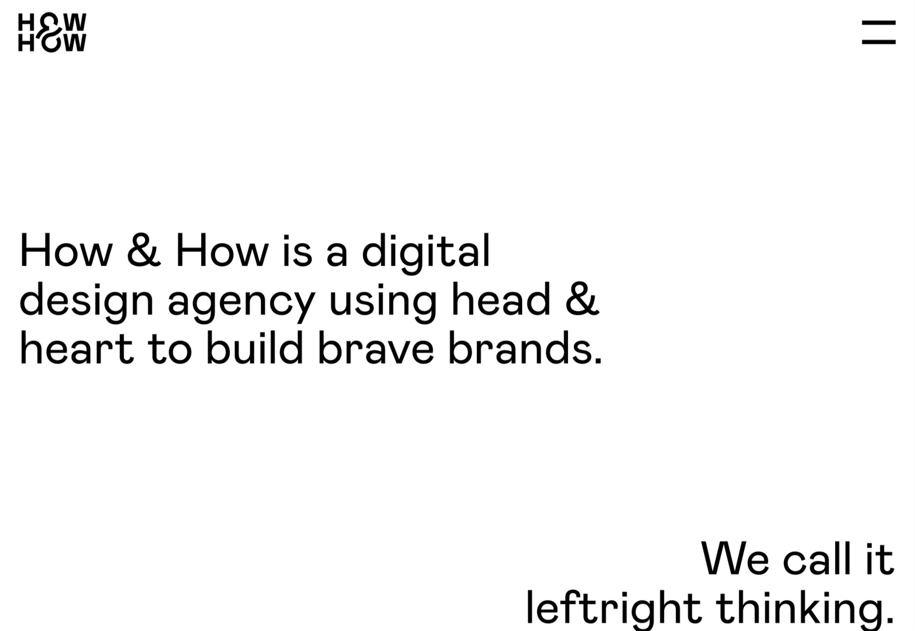
What stands out as an incredible web design project for you? Do you count your creation as a success if it’s modern, minimal, and accessible? Maybe you’re the kind of designer that’s constantly experimenting with the latest dynamic design tools or state-of-the-art technology. Perhaps your websites are vivid, animated, and brimming with unique components?

Sometimes, creating the ideal design means thinking carefully about what you want to accomplish for your client. The purpose of your web creation has a significant impact on the components that you need to consider. For instance, if you’re hoping for a highly emotive and human design, it may be worth combining some of your sleek lines and graphics with hand-drawn elements. 

The Value of Hand-Drawn Graphics in Web Design

Hand-drawn elements are just like the other components of web design; that way may use to express individuality in a cluttered digital environment. In a world where everyone focuses on futuristic and virtual creations, hand-drawn elements can pull attention back to the importance of humanity in your content. 

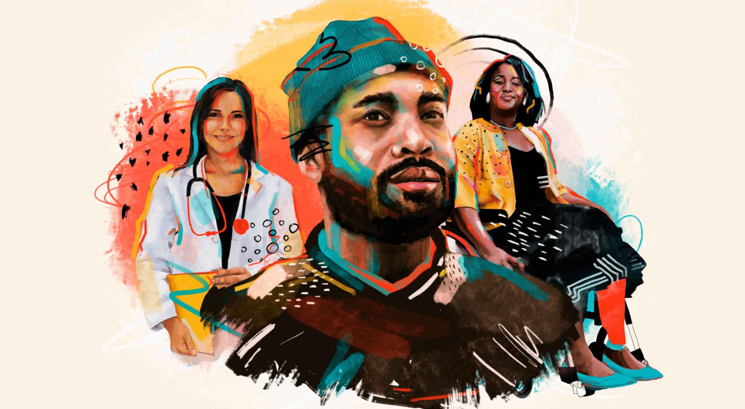
As web designers, we know that visual components often impact people more than text-based content. Illustrations are highly engaging functional elements that capture audience attention and convey relevant information. 

The main difference between hand-drawn elements and graphics built with vectors and other digital components is that one appears to be more influenced by the human hand than the other. Even if your illustrations are created on a screen, just like any other web design component, it pushes an audience to see something more straightforward, more natural, and authentic. 

For a brand trying to convey innocence and humanity in its personality, hand-drawn design can speak to the part of the human psyche that’s often unappreciated by web design. Perhaps more than any other visual, the content reminds your audience that there’s a human behind the web page

The Value of Hand-Drawn Features in Web Design

Any image can have a massive impact on the quality of your web design. Visuals deliver complex information in an easy-to-absorb format. In today’s world of fast-paced browsing, where distractions are everywhere, visuals are a method of capturing attention and delivering value fast. 

However, with hand-drawn elements, you go beyond the basic functionality of images to embrace the emotional side of the content. Benefits include:

  • A memorable experience: Web illustrations are becoming more popular among leading brands like Innocent Smoothies and Dropbox. However, the time that goes into these components means that they’re still scarce. If you want to stand out online, illustrations can help you do that. 
  • Brand personality: One of the most significant benefits of hand-drawn web design is showcasing your brand personality. The blocky lines of imperfect content that go into illustrated images highlight the human nature of your company. So many businesses are keen to look “perfect” today to make the human touch much more inviting. 
  • Differentiation: As mentioned above, hand illustrations are still rare in the digital design landscape. If you’re struggling to find a way to make your brand stand out, this could be it. Although there needs to be meaning behind your design, the result could be a more unique brand if you can convey that meaning properly. 

Tips for Using Hand Drawn Elements in Web Design 

Hand-drawn components, just like any other element of visual web design, demand careful strategy. You don’t want to overwhelm your websites with these sketches, or you could end up damaging the user experience in the process. 

As you work on your web designs, pulling hand-drawn elements into the mix, think about how you can use every illustration to accomplish a crucial goal. For instance:

Create Separation

Hand-drawn design components can mix and match with other visual elements on your website. They work perfectly alongside videos and photos and help to highlight critical points. 

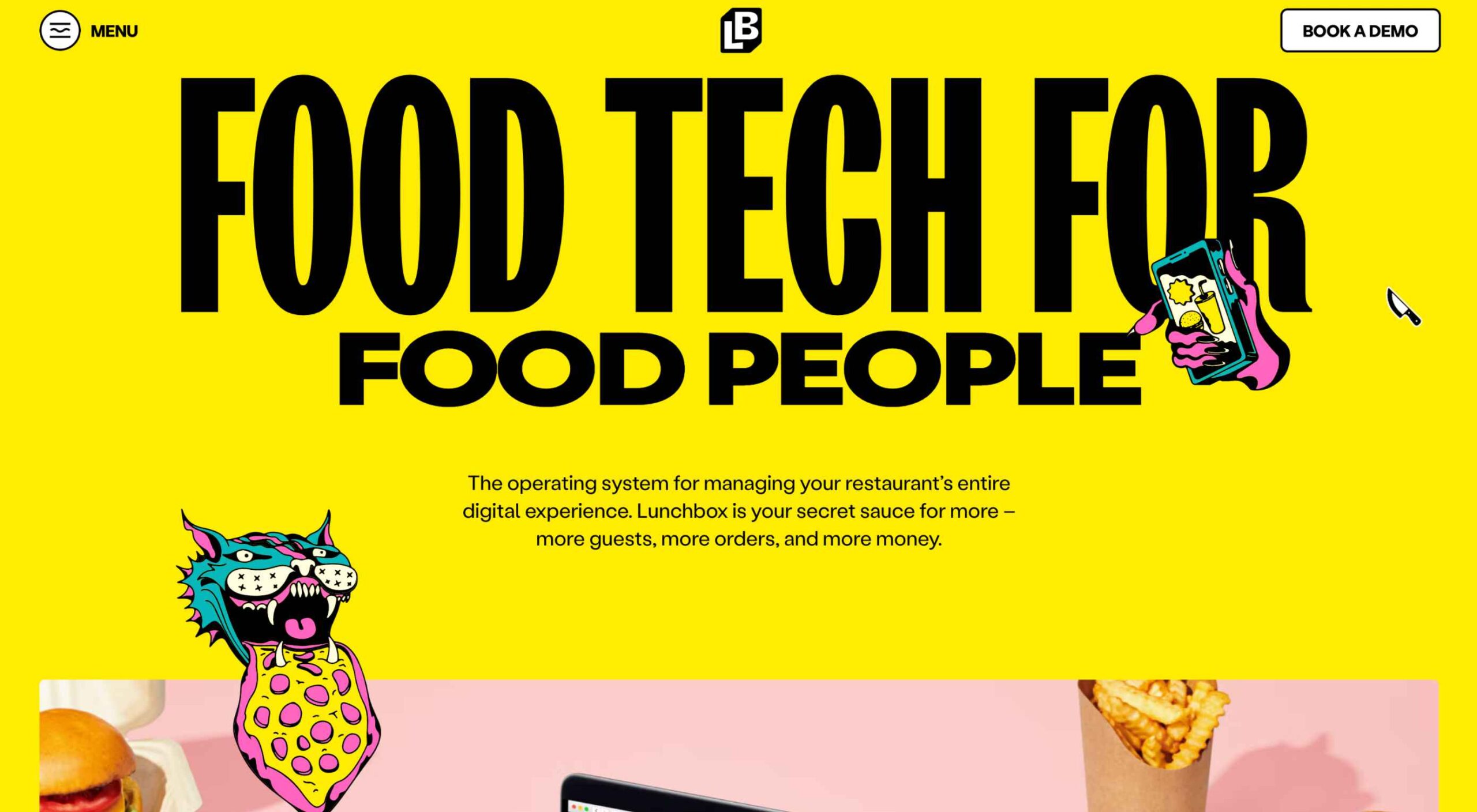
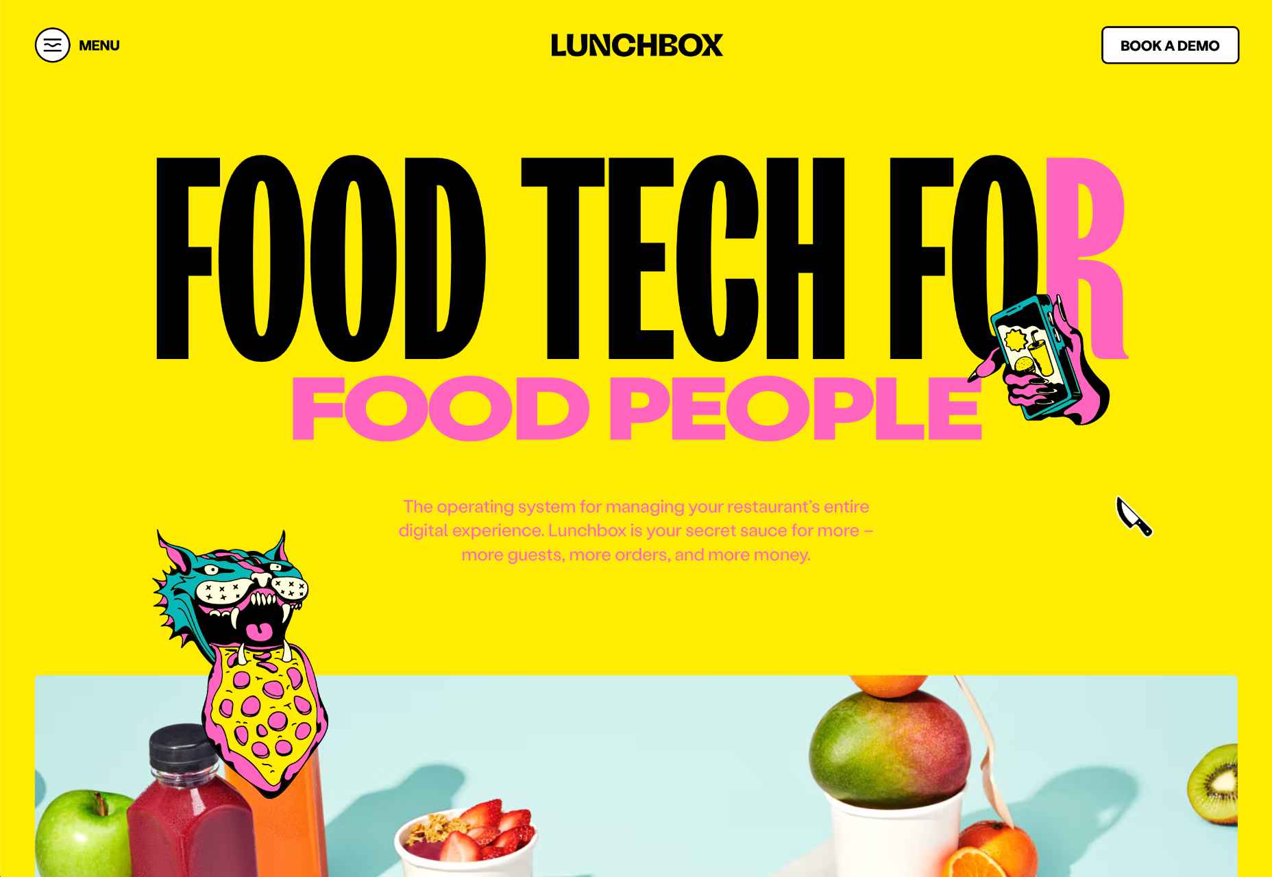
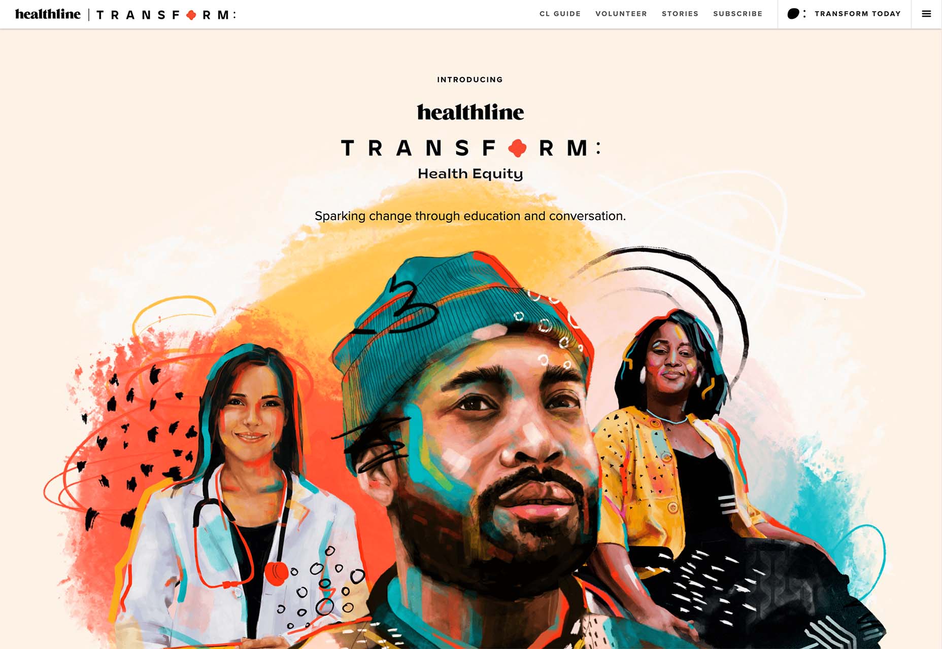
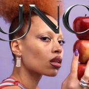
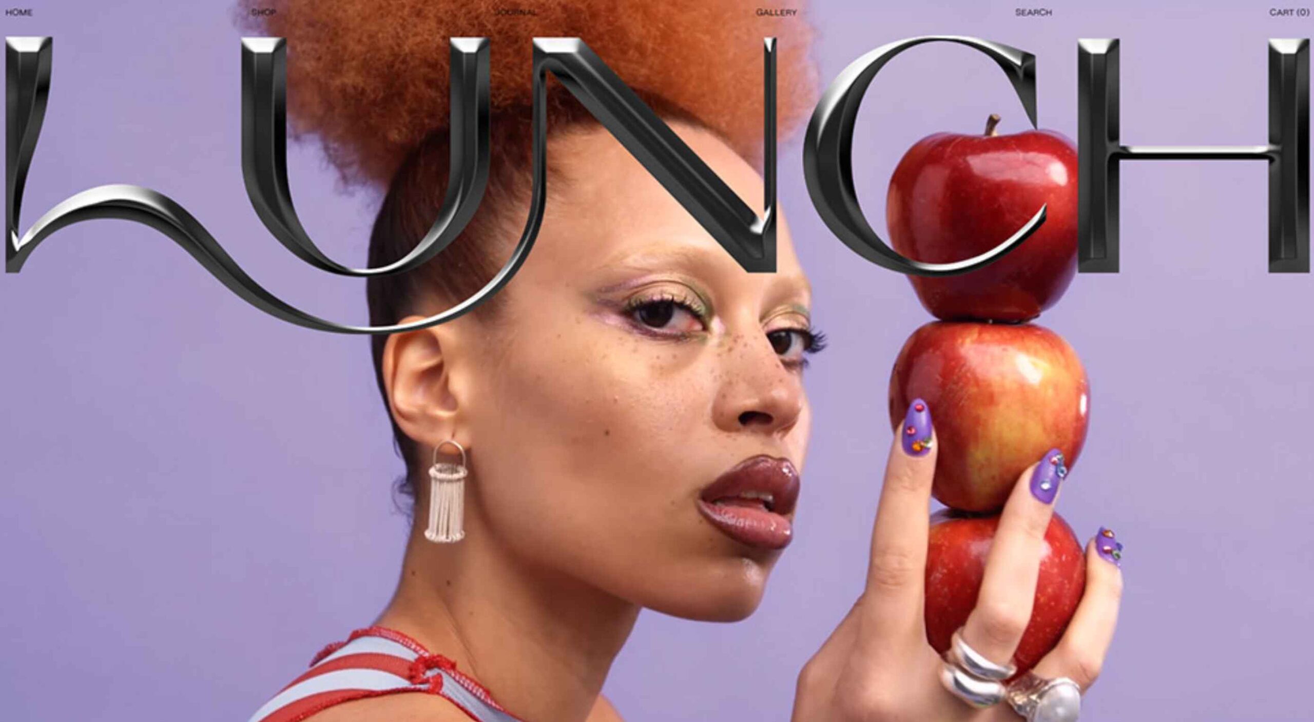
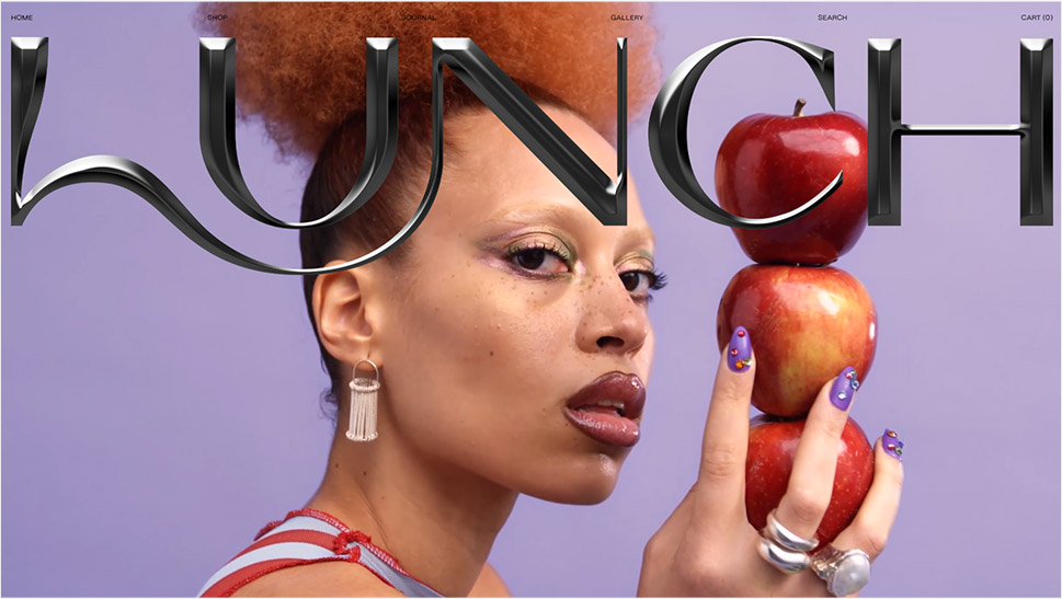
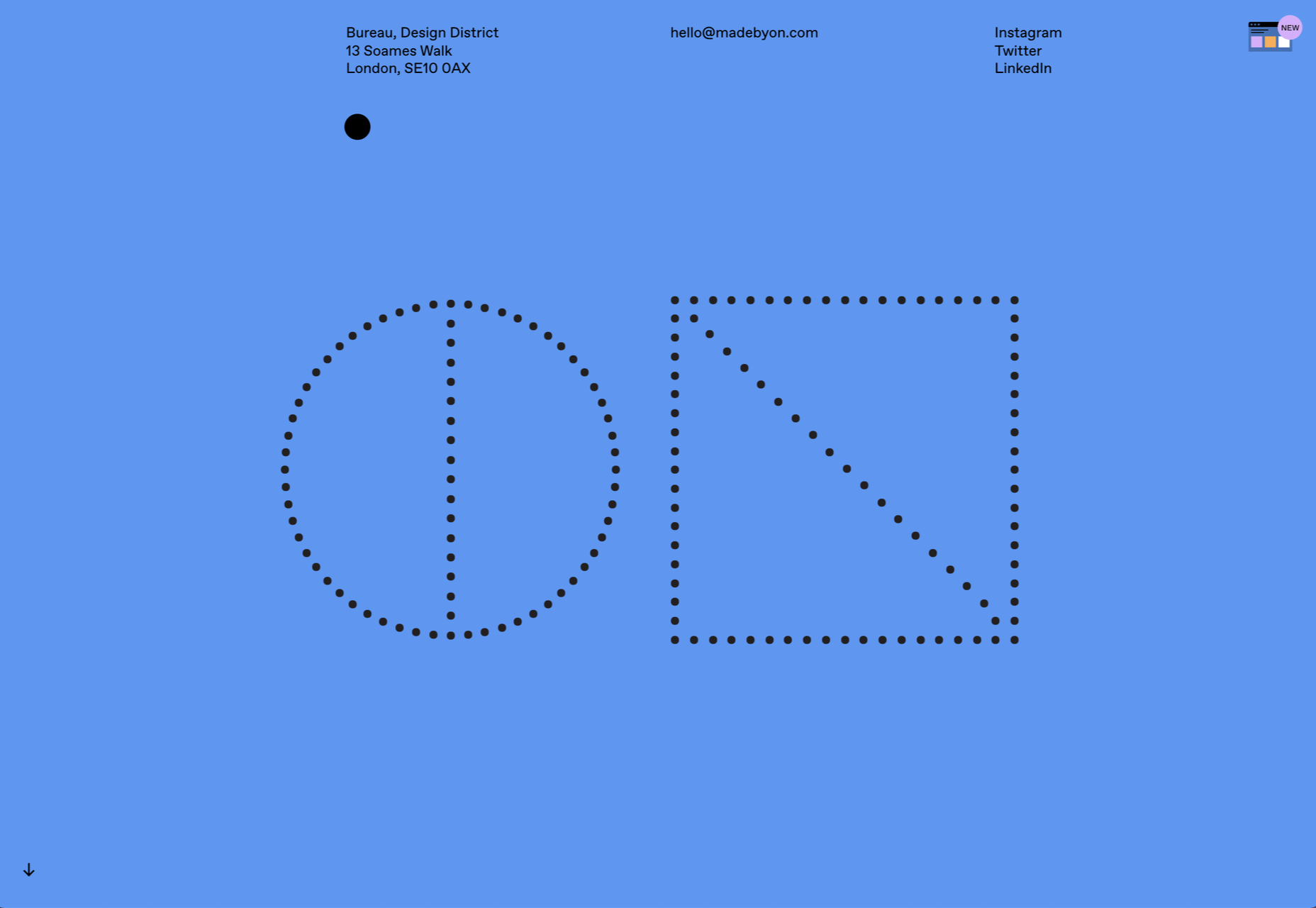
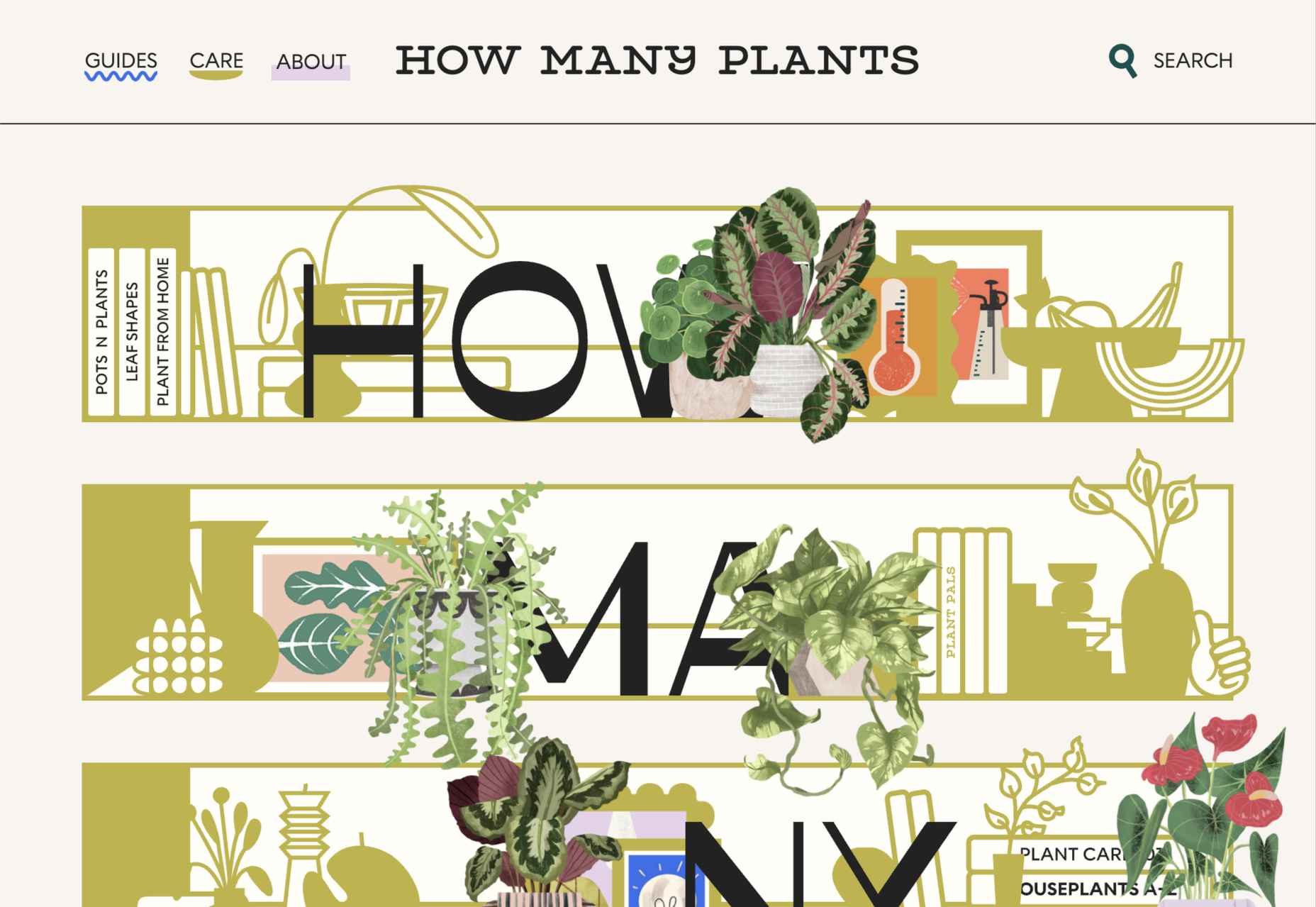
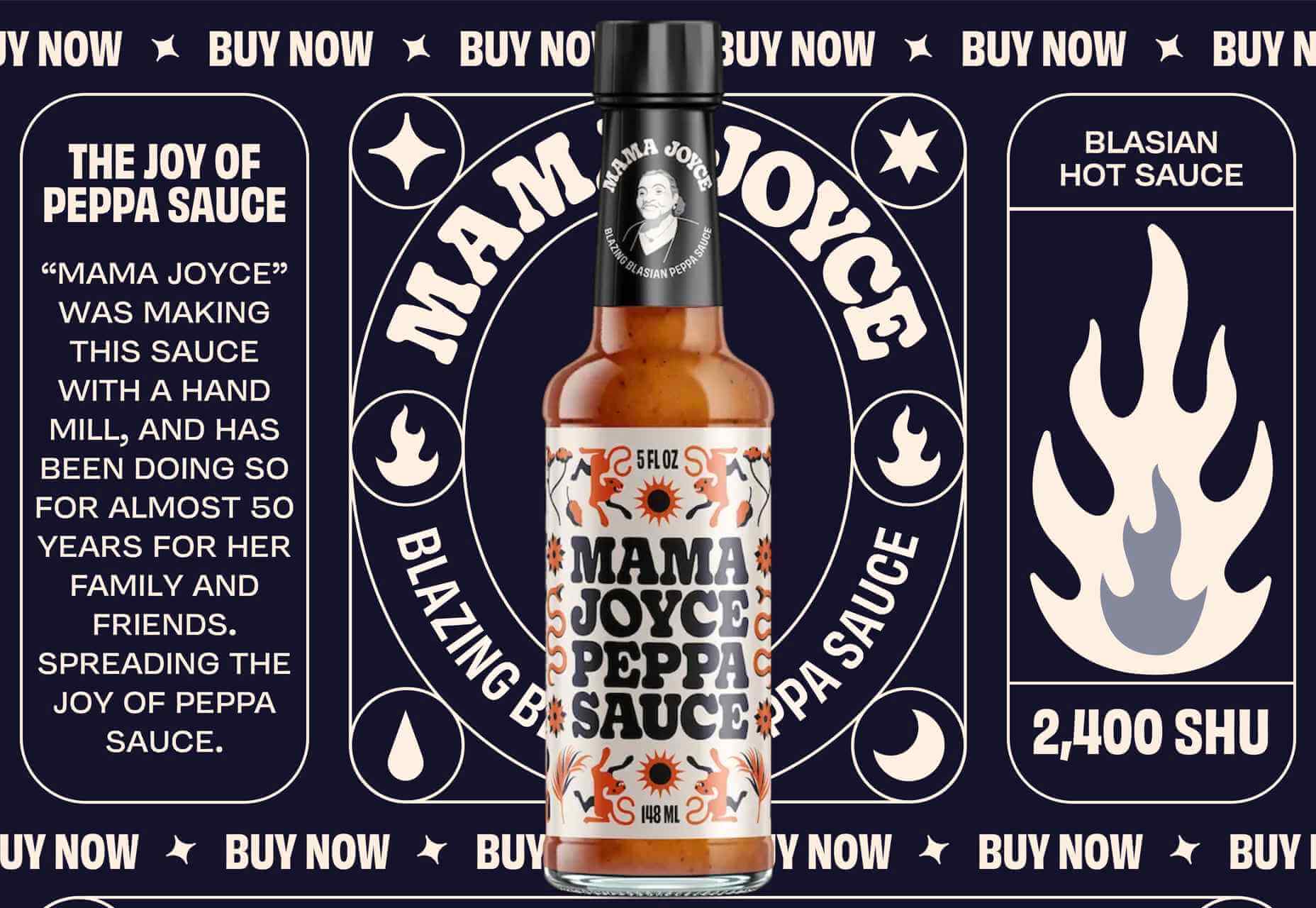
On the Lunchbox website, the company uses hand-drawn elements. This helps make the site stand out, and it provides additional context for customers scanning the website for crucial details.

Engage Your Audience

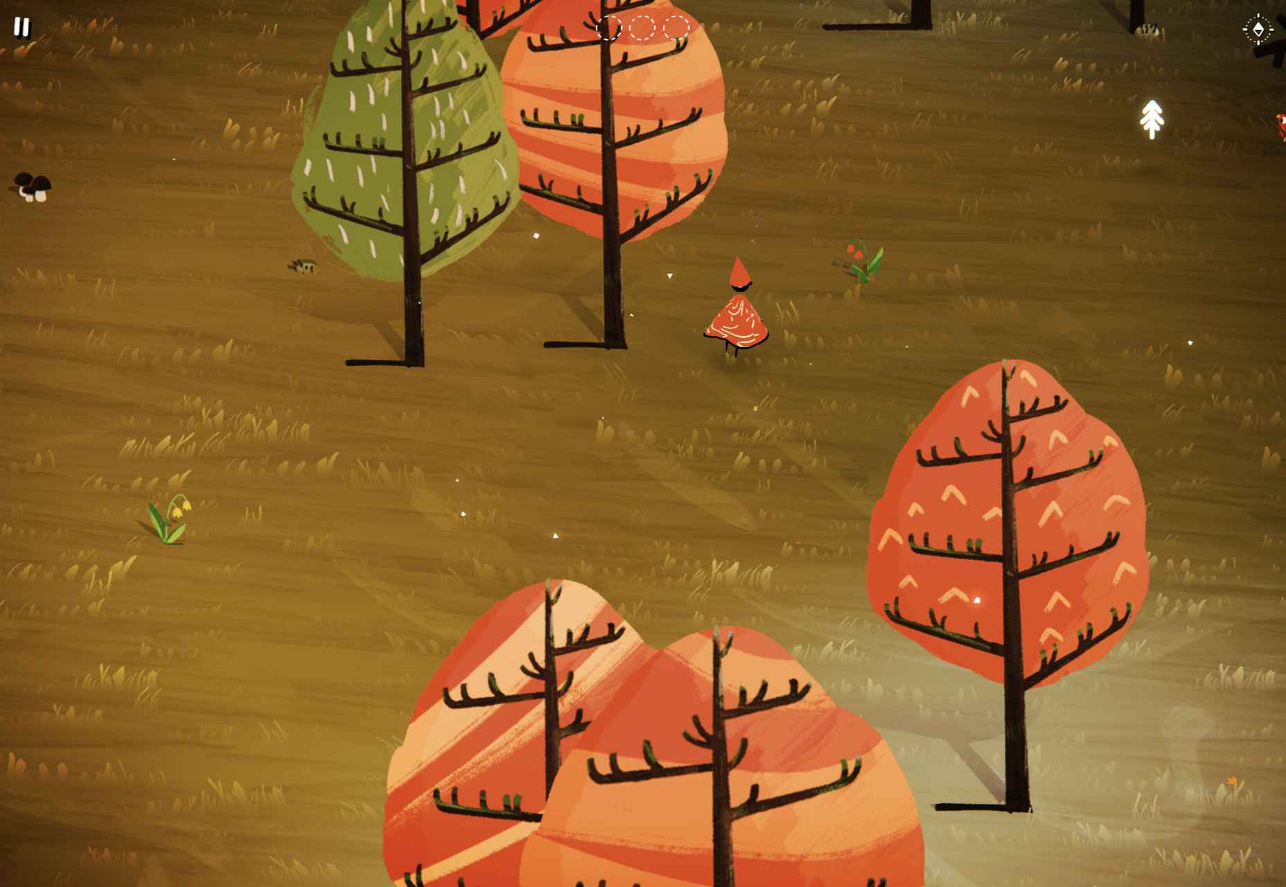
Sometimes, hand-drawn elements are all about connecting with end-users on a deeper, more emotional level. One of the best ways to do this is to make your hand-drawn elements fun and interactive pieces in the design landscape. 

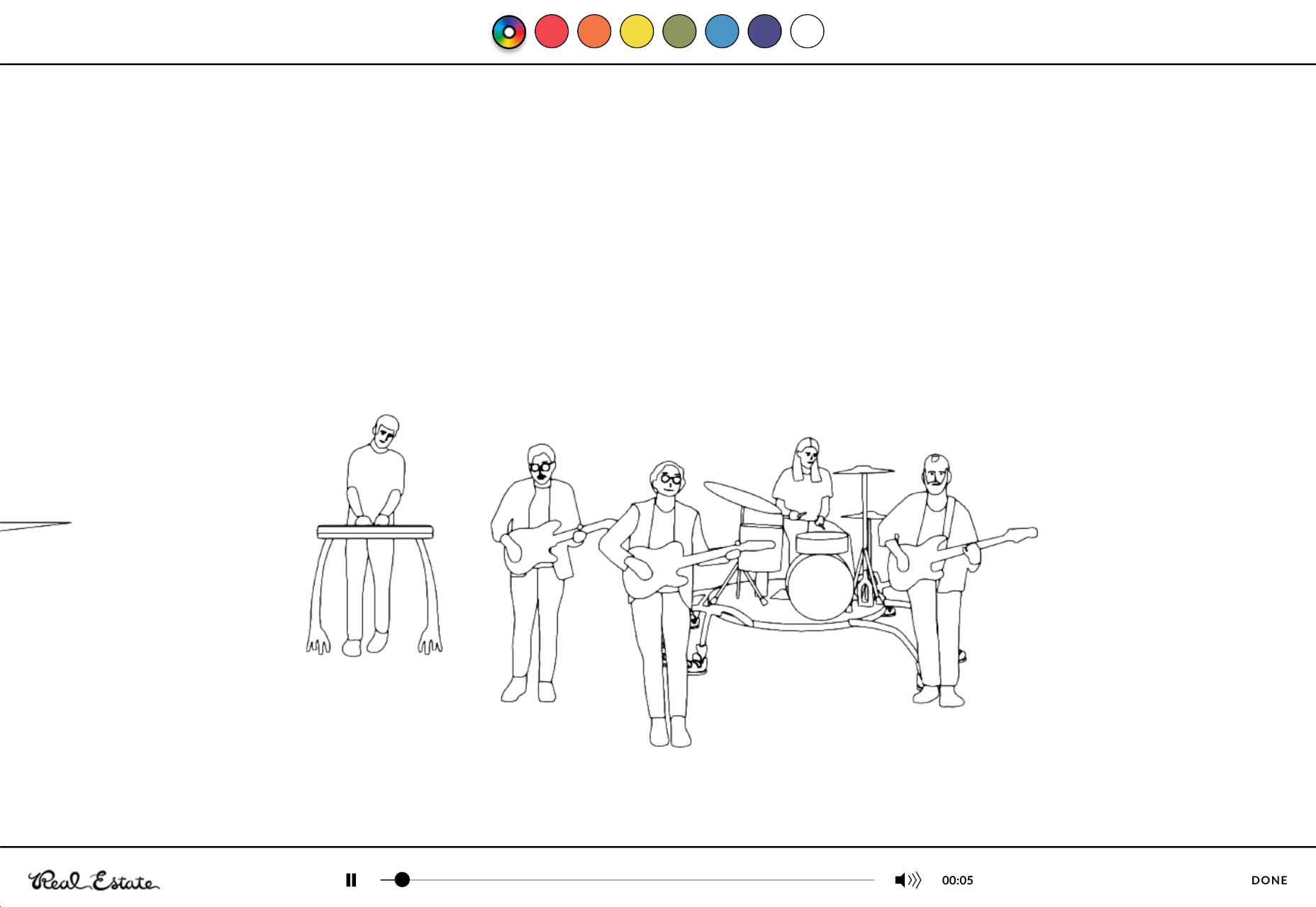
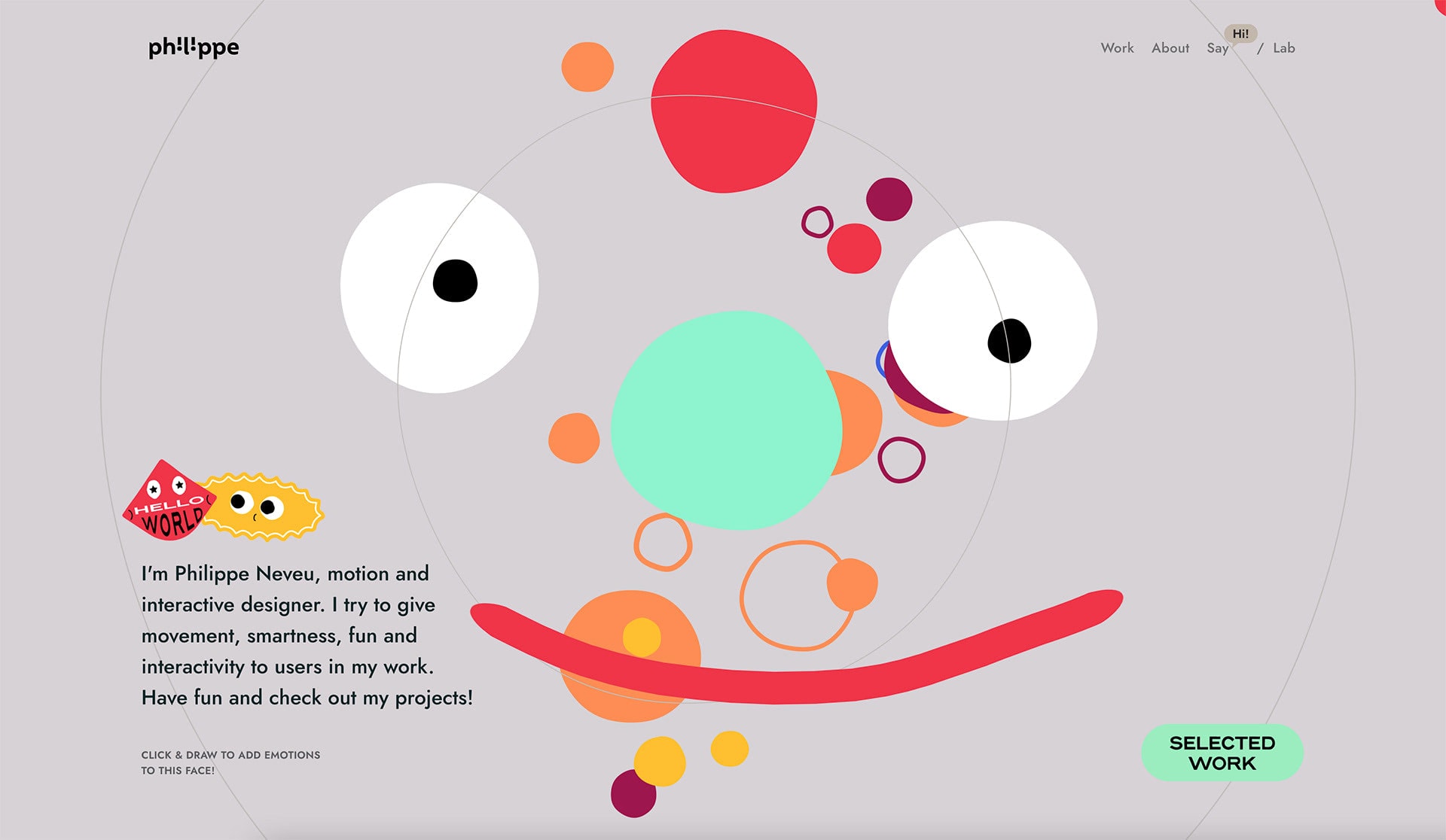
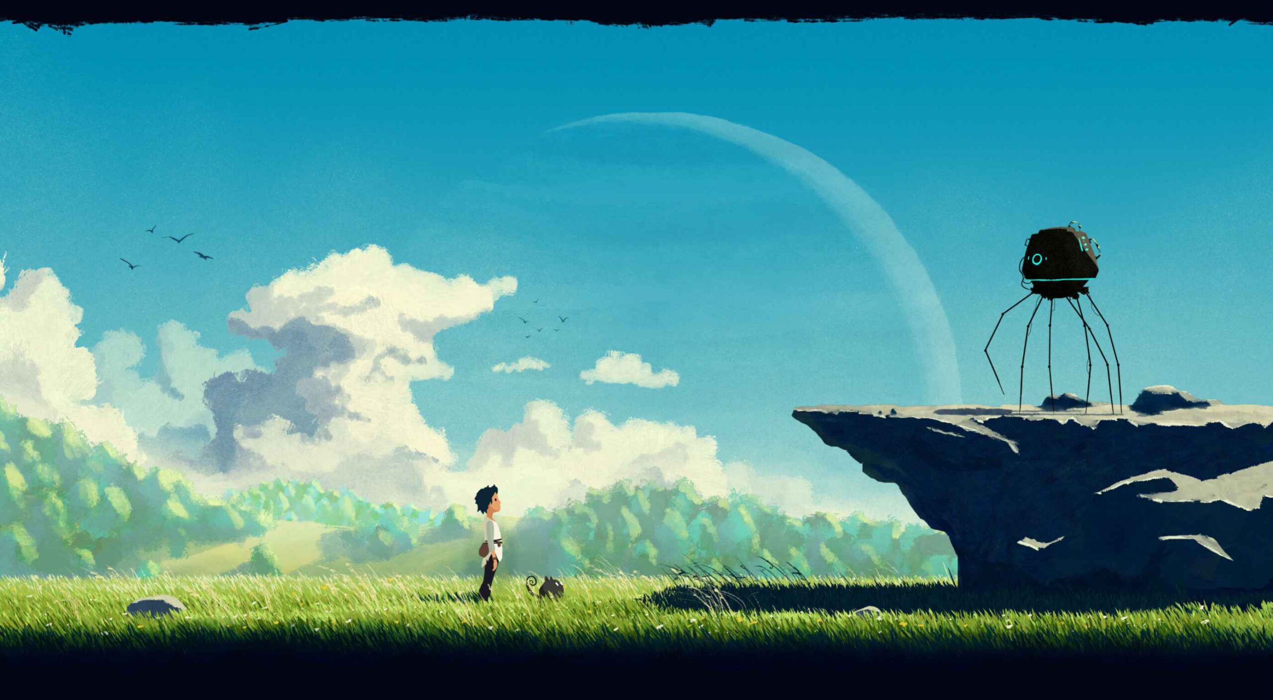
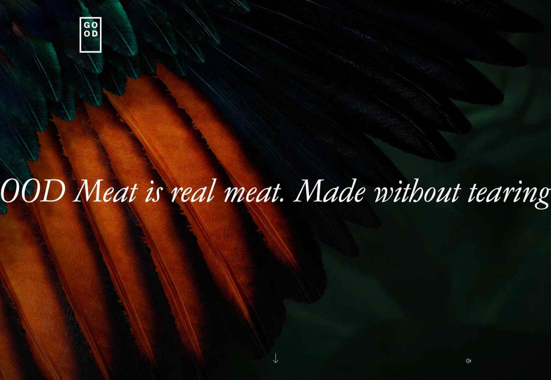
One excellent example of this is in the Stained Glass music video here. This interactive game combines an exciting web design trend with creative interactive components so that users can transform the web experience into something unique to them.

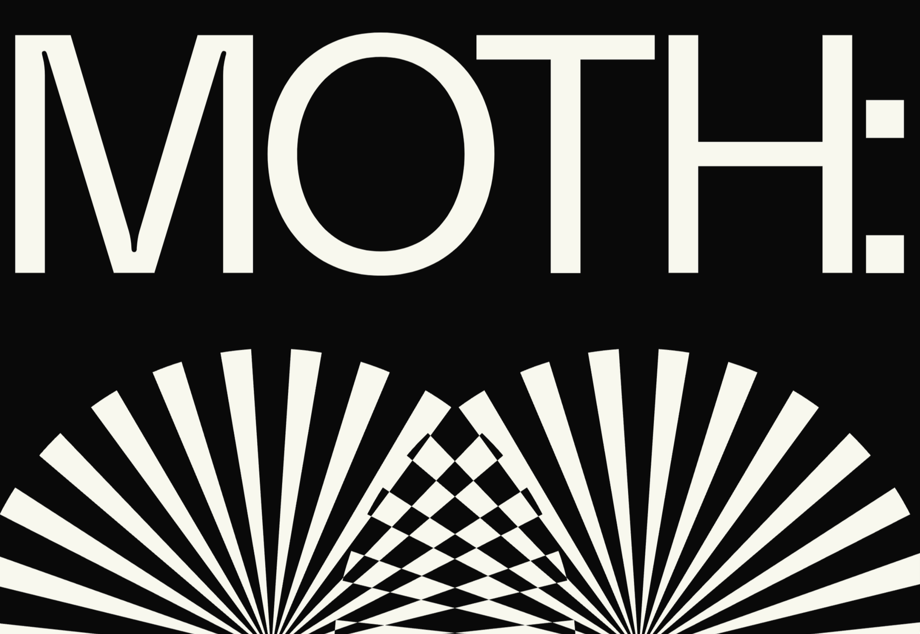
Highlight Headers with Typography

Sometimes, the best hand-drawn elements aren’t full illustrations or images. Hand-drawn or doodle-like typography can also give depth to a brand image and website design. 

Typography styles that mimic natural, genuine handwriting are excellent for capturing the audience’s attention. These captivating components remind the customer of the human being behind the brand while not detracting from the elegance of the website. 

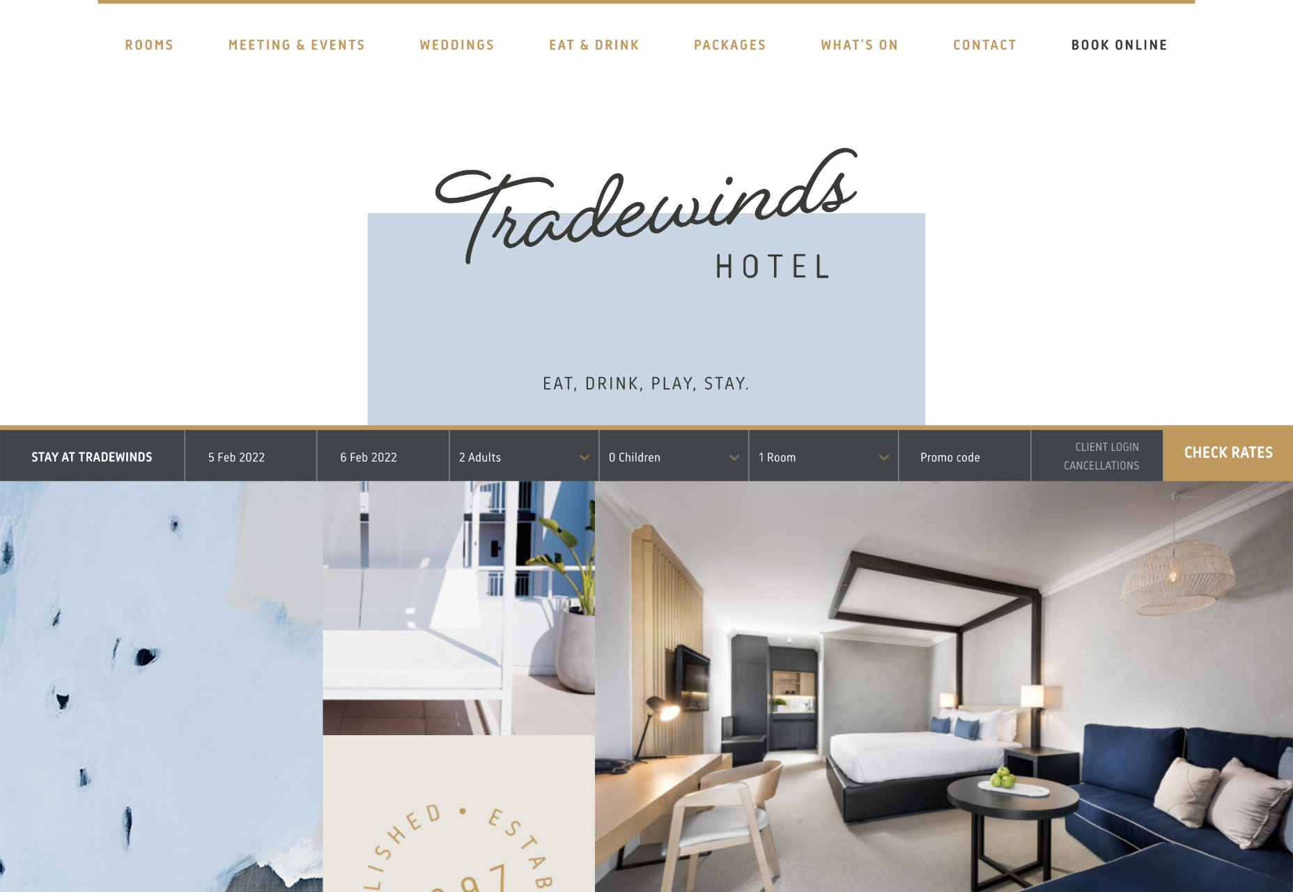
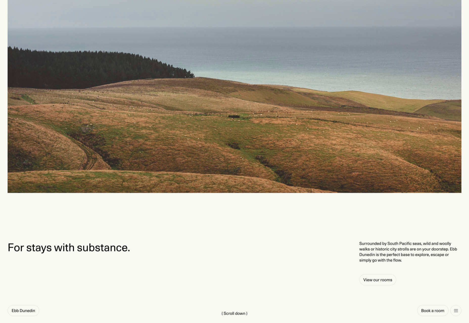
This example of hand-drawn typography from the Tradewinds hotel shows how designers can use script fonts to immediately capture customer attention. Notice that the font is still easy to read from a distance, so it’s not reducing clarity. 

Set the Mood

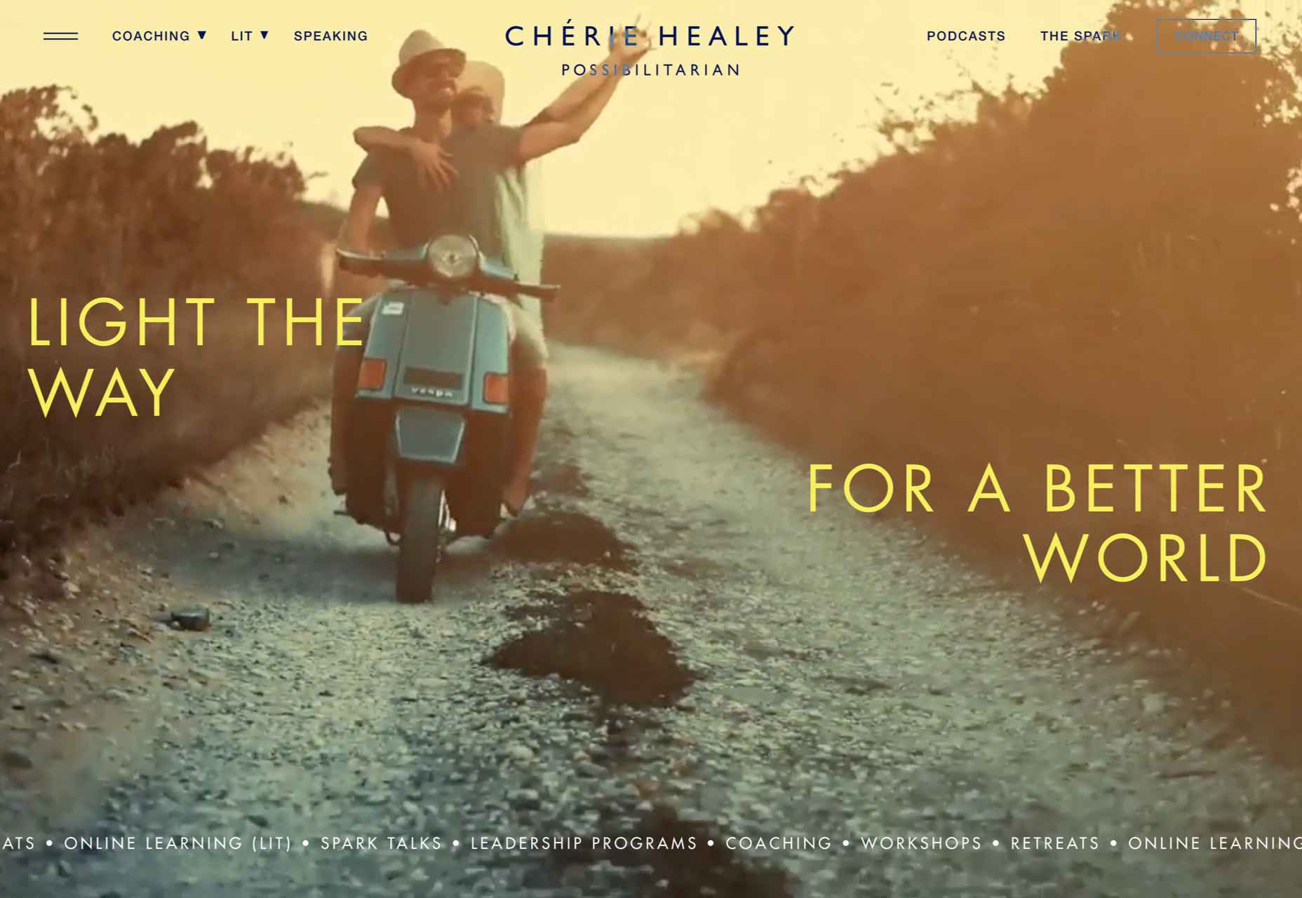
Depending on the company that you’re designing for, your website creation choices can have a massive impact on the emotional resonance that the brand has with its audience. Hand-drawn elements allow websites to often take on a more playful tone. They can give any project a touch of innocence and friendliness that’s hard to accomplish elsewhere. 

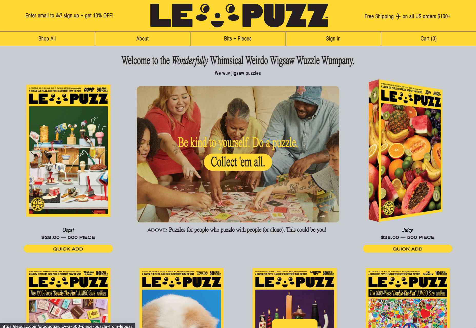
A child-like aesthetic with bright colors and bulky fonts combines with hand-drawn elements on the Le Puzz website. This is an excellent example of how web designers can use hand-drawn elements to convey a mood of creativity and fun.

Animated Elements

Finally, if you want to combine the unique nuances of hand-drawn design with the modern components of what’s possible in the digital world today, why not add some animation. Animated elements combined with illustrations can help to bring a website to life. 

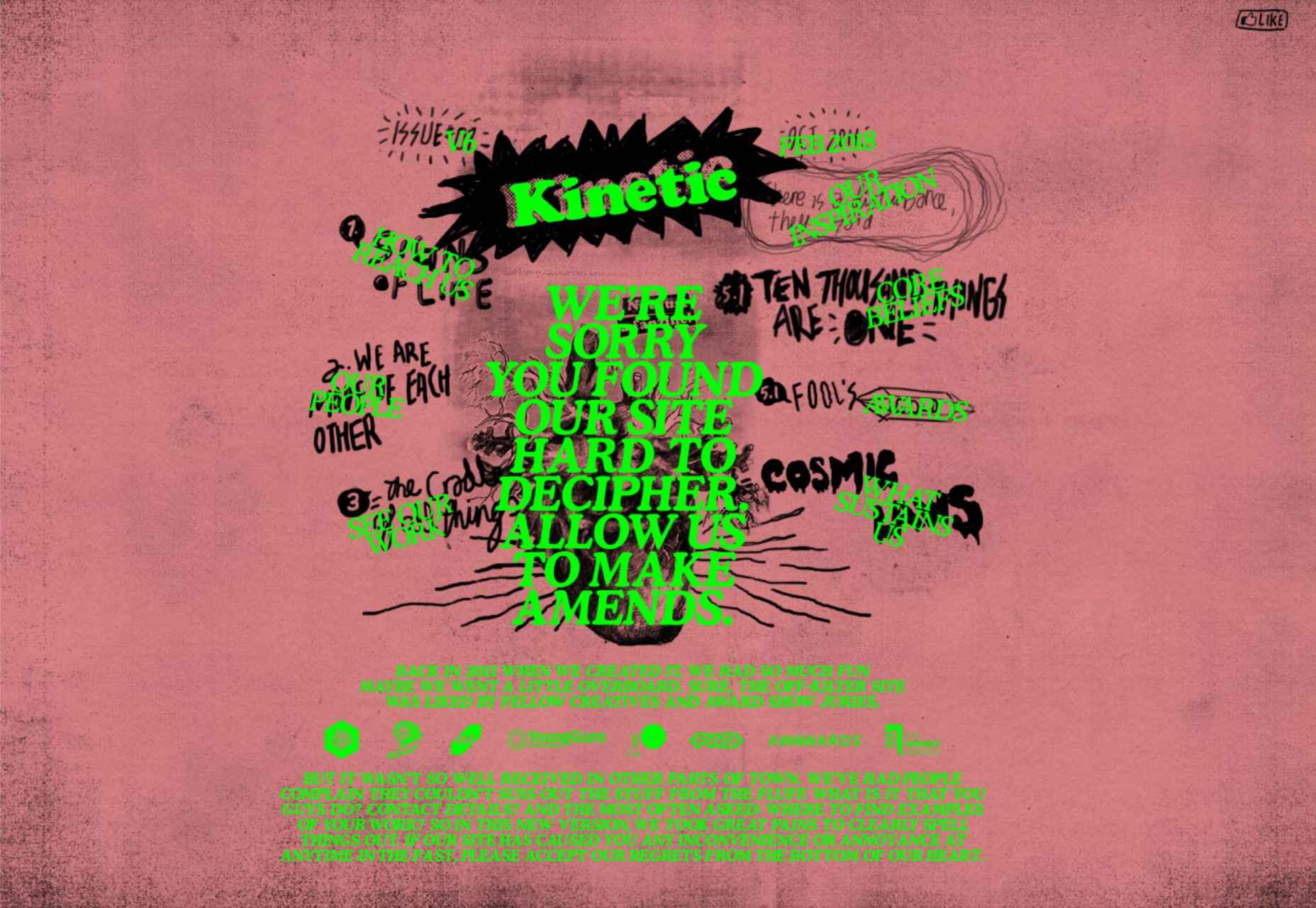
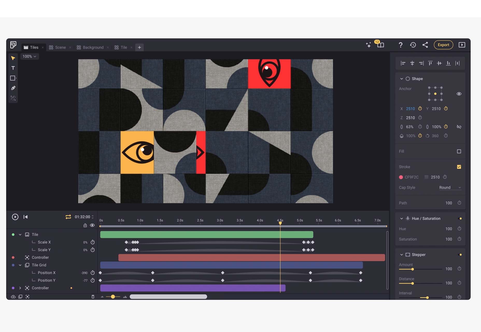
In the Kinetic.com website, the animated illustrated components help to highlight the punk-rock nature of the fanzine. It’s essential to ensure that you don’t go too over-the-top with your animations here. Remember that too many animations can quickly slow down a website and harm user-friendliness.

Finishing Thoughts on Hand-Drawn Elements

Hand-drawn elements have a lot to offer to the web-design world. 

Even if you’re not the best artist yourself, you can still simulate hand-drawn components in your web design by using the right tools and capabilities online. 

Although these features won’t fit well into every environment, they can be perfect for businesses that want to show their human side in today’s highly digitized world. Hand-drawn components, perhaps more than any other web design feature, showcase the innocence and creativity of the artists that often exist behind portfolio pages and startup brands. 

Could you experiment with hand-drawn design in your next project?

Source

The post How to Use Hand-Drawn Elements in Web Design first appeared on Webdesigner Depot.

Source de l’article sur Webdesignerdepot

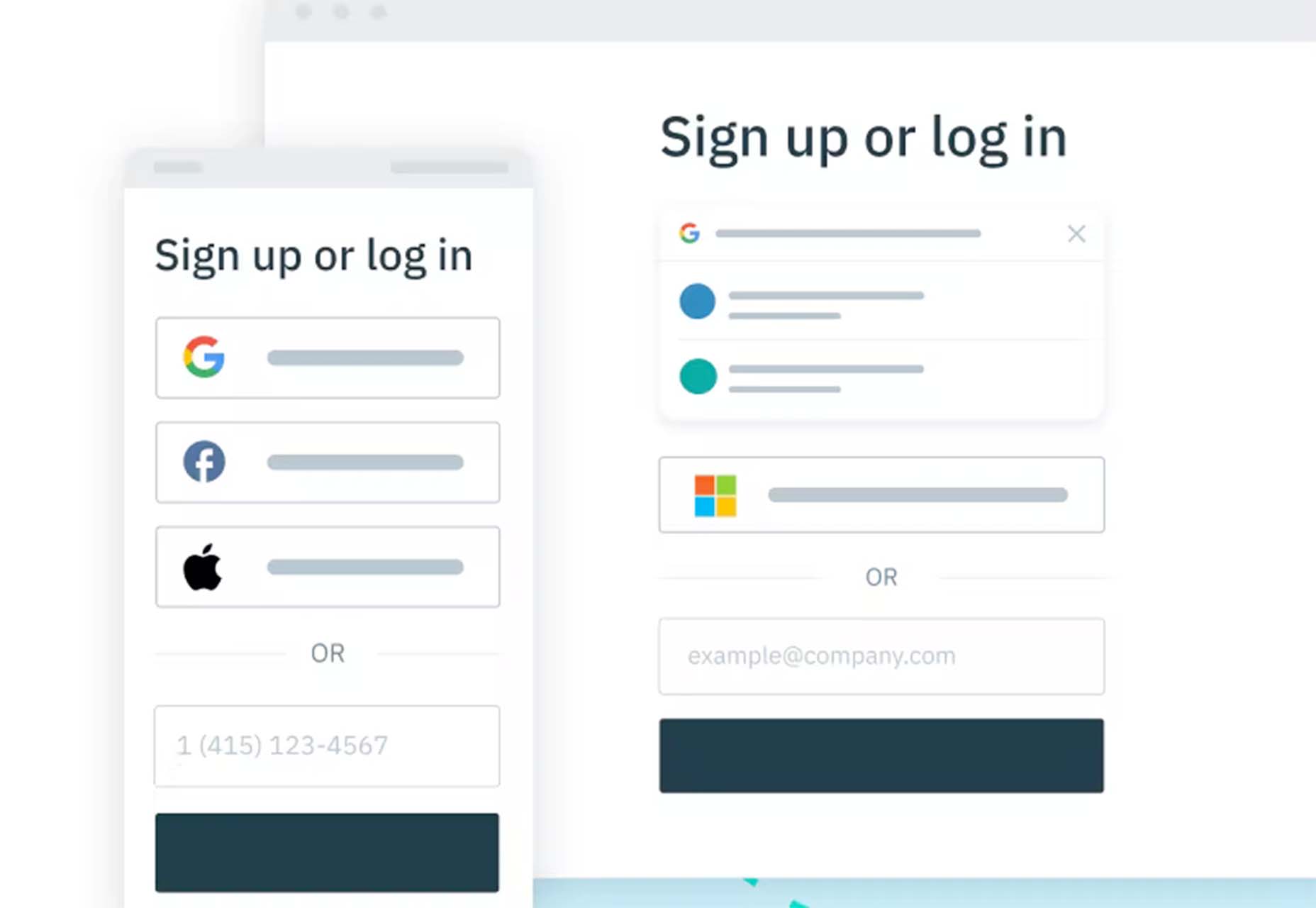
User Experience (UX) design and User Interface (UI) design are two terms people sometimes mistakenly use interchangeably. While aspects of each are interconnected, there are distinct differences between UI/UX design.

According to Internet Live Stats, there are over 1.9 billion websites, but not all are active at the same time. No matter how you slice it, there’s a lot of competition to grab and keep user attention. Good UX is just part of the equation. For a genuinely stellar site, you must also offer an excellent interface.

Learning the ins and outs of good UI and UX requires a bit of knowledge of how the two differ and what works. Although they weave in and out of the same design, they are different.

What Is the Biggest Difference Between Good UX and UI?

UI is the functionality of the design and what users see. How do they interact with various elements? UX is more the way things come together — both visual and interactive features — to create a feel for the user. You can certainly see why people confuse the two as they both apply to interacting with a website or app.

Top design firms often have team members specializing in each discipline. However, UX designers are also aware of UI, and UI designers are also mindful of UX. How can you ensure you’re offering excellent UI/UX design while covering the full spectrum of requirements for each?

Ensuring Effective UX Design

Good UX design increases conversion rates by 400% or more. The site visitor walks away feeling understood and not frustrated. What are some of the most important aspects of good UX design?

1. Create a Good Structure

What is the hierarchy of your site? What is the first thing the user sees when they pull it up? How do they navigate from one page to the next? A well-designed website classifies different aspects of the page, and new content naturally falls into the appropriate category as it grows.

When creating a structure for your site, think about how it might expand in the next five years. You want the hierarchy to work from day one, but you also want to think through significant shifts in the content you might see down the road.

Even your navigational hierarchy should accommodate new areas easily. Plan for the unexpected, so you know how to work it into the overall design when you must.

2. Choose Beautiful Aesthetics

You have a few seconds to make an excellent impression on your site visitors. Take the time to make sure your design functions and is visually appealing. Your color palette should work, images should be crisp and relevant, and typography should be readable and engaging.

Step back from your computer and look at your design from a distance. Does anything stand out that isn’t pleasing to the eye? Get feedback from visitors about what they like and dislike. Since the focus is on user experience, your best source of constructive criticism is from your target audience. Listen to their concerns and ideas.

3. Communicate With Site Visitors

Most experts agree that users want an element of interactivity on sites and apps. People want to know you hear them and get a response. Some ideas include adding a live chat option to your site or engaging in SMS customer support.

Put yourself in their shoes. A customer may visit your site for the first time, having never heard of your brand. They have no reason to trust you or that you’ll follow through on your promises. Potential leads may have a few questions before parting with their hard-earned dollars.

Adding various ways to communicate shows them you’ll be there should they have a problem. It’s much easier to trust a company when you know you can phone, engage in live chat or shoot off an email and get an almost immediate response.

4. Add Clear Direction

Excellent UX is intuitive. You should add calls to action (CTAs) and images pointing the user where they should go next. You can use graphics of arrows, people looking or pointing toward the next step, words, or CTA buttons.

Get feedback on how clear the directions are and tweak them as needed. The user should never have to stop and ponder what to do next. Everything on the page should guide them toward the ultimate goal.

5. Break Down Complex Data

Every industry has complicated data that is difficult for non-experts to understand. Part of good UX is breaking down complex information and sharing it in a simplified way.

One example might be the registration process. Instead of just showing text, a good UX designer would number the steps. Visualizations help add to understanding.

Embracing Effective UI Design

User Interface impacts UX and involves how the design works. The UI designer thinks through visitor expectations and then creates an interface that isn’t frustrating. UI works within the framework of a website to develop functional features. User experience isn’t the complete focus of UI, but it does tie into the planning phases. What are some elements of good UI design?

1. Set Standards

For a design to have good UI, it must perform as expected. Have you ever clicked on a button, and nothing happened? Determine how you want things to work and the minimum acceptable standards for your site.

For example, what happens when someone clicks on a link or button? How does the user know their action created the expected result? Consistency is crucial to how a site performs.

2. Choose the Right Colors

While UX designers look at the emotional impact of various colors, UI designers look at whether the shades match branding and how well the different ones contrast for readability and usability. UI/UX design often bridges a single designer’s work, so the employee ensures everything works as intended, both emotionally and functionally.

You may work with another designer to make the site aesthetically pleasing while also tapping into the emotions driving users. For example, some people love blue, so a blue button can have positive results.

UX and UI designers utilize split testing to see which users respond best to. Then, make adjustments as indicated by how site visitors respond.

3. Focus on Cognitive Matters

According to the Interaction Design Foundation, people can only retain around five things in their short-term memory. Designers should work with recognition instead, as users tend to rely on cues to find what they need.

UI designers may develop an intuitive navigation system and then use the same cues on every page, such as placement, color, and language. Users can then recognize the system without having to memorize it.

4. Prevent Errors

Your job is to ensure errors are kept to a minimum when designing a website or app. One of the most significant parts of a designer’s job is testing and retesting.

Think about all the potential problems a user might run into, such as broken links, images not showing, or incomplete actions. How can you keep those problems from occurring in the first place?

Error prevention is particularly vital when designing software as a service (SaaS) or apps. Users grow frustrated quickly and will find another solution rather than troubleshooting an issue. You’re much better off avoiding the error in the first place.

How Do UX and UI Work Together?

You’ve likely already figured out how closely UX and UI entwine to create a usable experience. The UX designer pays attention to function and interactivity, and the UI designer thinks through how the interface looks.

UX pays attention to the flow of the website and where users start, go next and end up. On the other end, UI figures out how the elements look to the viewer and where everything is placed.

The UX team may decide to add an extra button to the page. The UI team must determine where to place it, if any sizing needs must occur, and how it impacts usability on desktop and mobile devices.

Although each has a different function, user experience and user interface must work together to create a usable site the target audience responds to. You can’t have excellent UX without excellent UI, and vice versa. The best designers consider both and implement them to their fullest potential.


Featured image via Pexels.

Source

The post What’s the Difference Between Good UI and Good UX? first appeared on Webdesigner Depot.

Source de l’article sur Webdesignerdepot

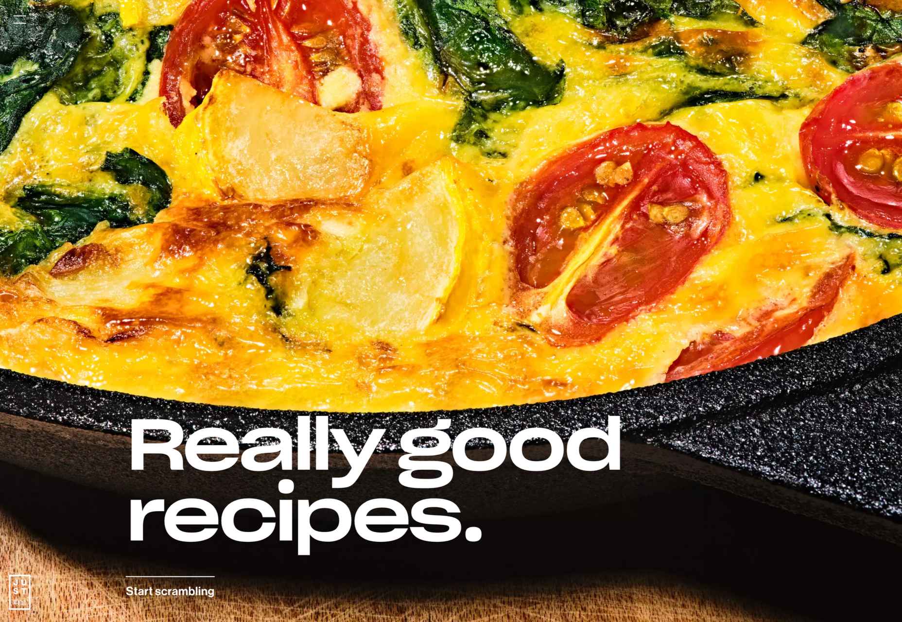
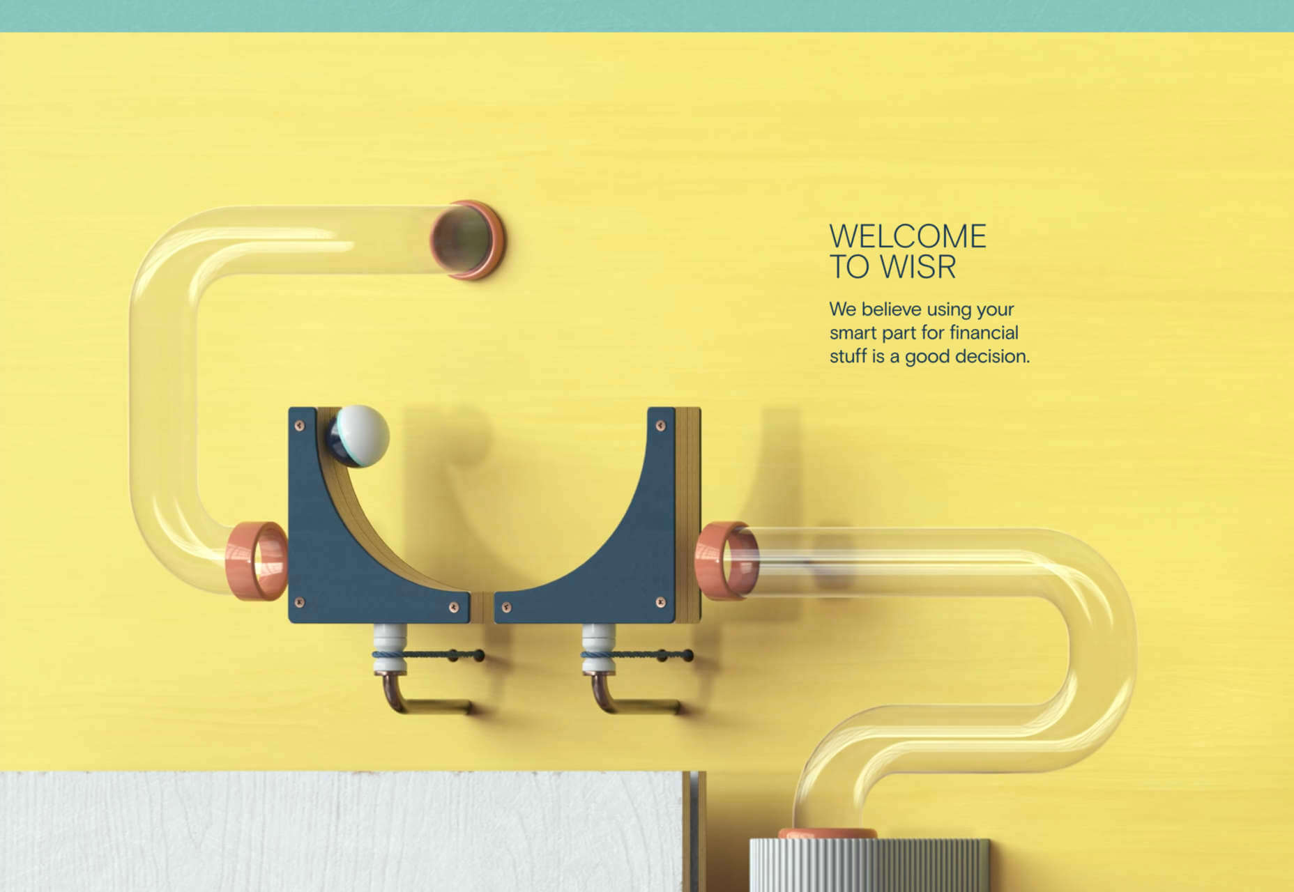
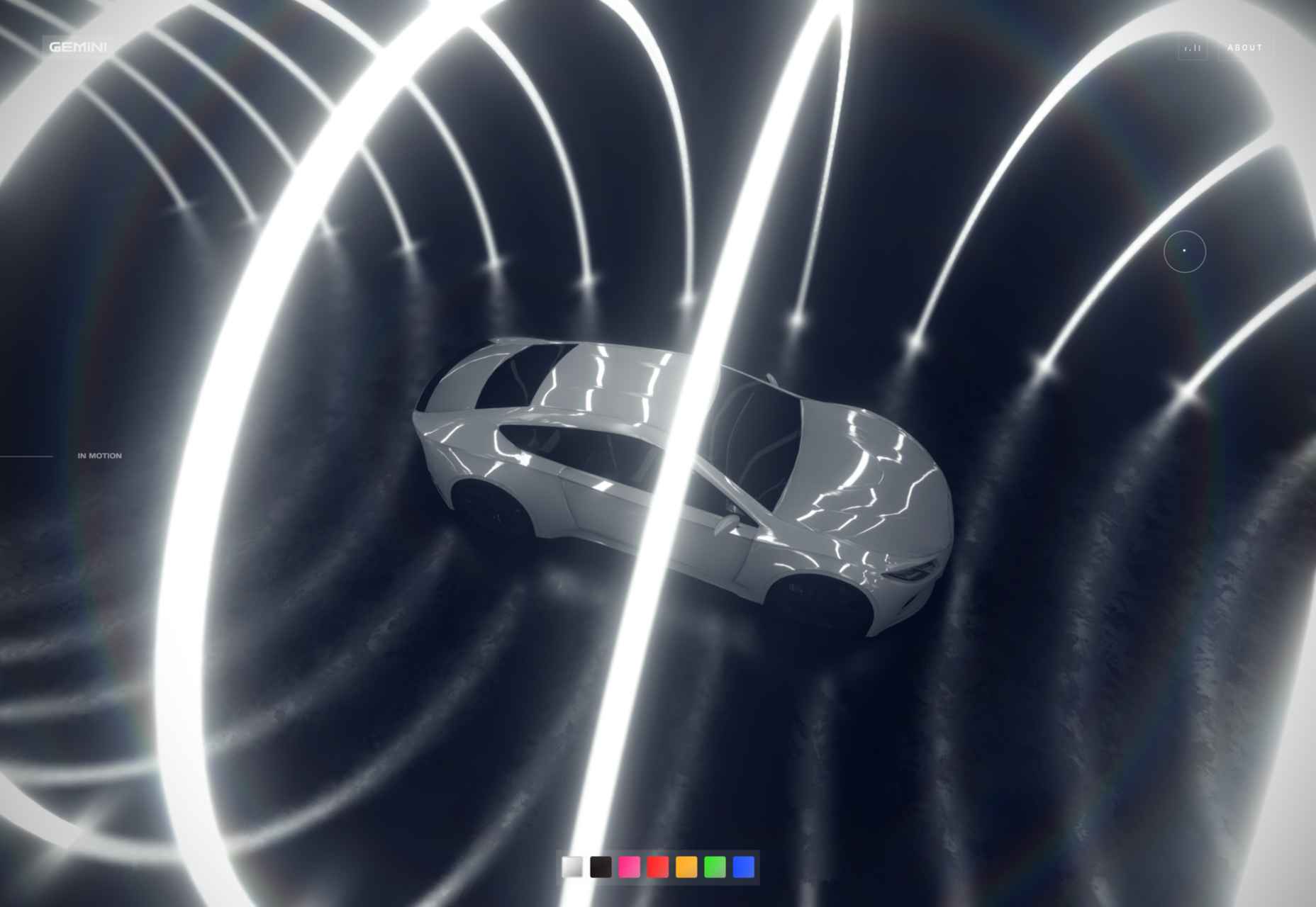
Happy New Year, fabulous new website design trends!

This month’s design trends are a collection of the somewhat unexpected – from NFT website design to large text to illustrations; you won’t see a single photo or video here. Here’s what’s trending in design this month.

NFT Websites

This website design trend has more to do with the greater trends in digital marketplaces and commerce but has value in the design space as well. NFT websites are popping up everywhere.

Marketplaces for non-fungible tokens use modern design effects to draw users in and help them make purchases and view available images. If you haven’t delved into the world of NFTs, they are data units – often in the form of gifs – stored on a blockchain digital ledger. You can buy, sell, and trade these digital nuggets on various marketplaces.

The designs of NFTs could be explained as a trend of their own. Here, we’re focusing on the look and feel of the websites surrounding them. While some designs are relatively primitive, the best marketplaces have a full e-commerce feel with easy-to-use interfaces and a modern design.

Each of these three NFT marketplaces does it a little differently.

Styllar puts a focus on NFT avatars with a minimal aesthetic that gives plenty of room to individual NFTs. Sit on the website too long, though, and hundreds of options begin to cover the screen. Each visual element has a small text element to match that explains each image. It feels like a modern e-commerce experience that instills trust with users because of clean visual patterns. The site itself is just a gateway to a more traditional marketplace, but the calls to action are large, clear, and easy to follow.

OpenSea treats the NFT marketplace more like an art gallery with card-style buttons to look at different elements and images. Everything about the website design is tailored for the mobile user and quick browsing with large areas to click in the card format and easy-to-read headers that help you find your way through the NFT space, whether you want to buy, create, or sell. The site also does one more thing that’s not as common with e-commerce – it explains how to get started in this new digital territory with plenty of resources.

Rarible has an almost social media feel with lots of small blocks showing different NFTs. Digestible content in a grid-based design helps you navigate from images to rankings to what’s trending in NFTs. This site design is set up for high interaction and engagement, also featuring card-style elements and the ability to favorite items before bidding.

The key commonality with NFT website designs is that they are made for mobile users. These sites look good on desktops, but they are highly focused on a mobile, instant gratification user.


Text-Based Hero Headers

A trend in website design from 2021 is bleeding into 2022 with a lot of popularity: Hero headers that are mostly text. These designs have background texture and color, but for the most part, they don’t have a lot of other visuals.

These designs often rely on powerful language or messaging to help get user engagement. A secondary theme is the use of bright colors to help add focus and attention to the typography.

Font choices seem to be fairly neutral, with a lot of thicker sans serifs for the main headline and something a little lighter for secondary text options.
WeTransfer uses a smaller text block with multiple lines to create weight. The off-center placement draws the eye and is interesting even with the neutral background. Stacking elements create a nice focal area that encourages reading.

Halborn Blockchain Security goes with a less traditional font option and flips the color to the text to enhance the visual display. This design also uses an off-center, asymmetrical approach to create focus on the text element. The dark counterweight on the screen is an excellent guide to draw you back to the main hero headline.

FWD goes with giant oversized text elements to create a strong visual focus with this design. Other than the faint animation of the arrows next to “Here’s what they said,” everything is still and static. The color and blocky depth of the background help draw the eye through the text and to clickable elements so that you know what to do next.


Intricate Illustrations

Another trending design element is the use of intricate illustrations on homepages. These highly detailed images can tell a visual story, help add meaning to messaging, or serve as a remarkable visual element when you don’t have a photo or video.

The great thing about this trend is that the only limitation is your imagination.

Once you find someone to create the illustration (if you can’t do it yourself), the world is open to interpretation.

We are seeing three major themes within this trend, as showcased in the examples.

Multi-layer illustrations with hints of animation, such as the one from Highvibe Network. This illustration used lots of colors, layers, unexpected elements within outlines, and a little animation to pull it all together. The effect is rather stunning and provides a lot of interest for the user.

Realistic, painting-style illustrations, such as the one from Healthline, bring the content to life without real people or images. This technique is especially nice for industries where you may want to anonymize people in images. (Perfect for a healthcare website design because you don’t know if the illustrations are of real people or not.)

Detailed geo shapes and lines, such as the design from Radio Meuh Circus Festival. With great color and lines that draw the eye, this design can keep you looking and finding new depth for a long time. Color also helps draw you into the striking imagery.


Conclusion

What’s nice about all these design trends is that they have flexible elements that you can use and replicate across industries and projects. The common factor is that they lack traditional dominant imagery, which works exceptionally well.

These trends are likely a result of the worldwide pandemic as well. With less social contact, creating without conducting photo or video shoots is an ideal situation. Good luck trying some of these trending design elements on your own.

Source

The post 3 Essential Design Trends, January 2022 first appeared on Webdesigner Depot.

Source de l’article sur Webdesignerdepot

Every year, at this time, blogs like this one like to try and predict what’s going to happen in the year ahead. It’s a way of drawing a line under the archive and starting afresh. A rejuvenation that, as humans, we find life-affirming.

Ten years ago, I would have had high confidence in these predictions — after all I was eventually right about SVG adoption, even if it took a decade. But the last few years have shown that web design is tightly interwoven with the muggle world, and that world is anything but predictable.

So as we look at what might occur in the next year (or five), think of it less as a set of predictions and more as a wishlist.

Last Year’s Predictions

When I write this post every January, I like to keep myself honest by glancing back at the previous year’s predictions to gauge how accurate (or not) my predictions have been.

Last year I predicted the long-term trend for minimalism would end, WordPress would decline, cryptocurrency would go mainstream, and then hedged my bets by saying we’d make both more and fewer video calls.

Gradients, maximalism, and the nineties revival pulled us away from minimalism. It’s still popular, just not as dominant.

WordPress is still the biggest CMS in the world and will continue to be for some time. But the relentless grind of no-code site builders at the low end, and being outperformed by better CMS at the high end, mean that WordPress has passed its peak.

Over-inflated predictions for BitCoin reaching $100k by December 2021 turned out to be a damp squib. In the end, Bitcoin only tripled in value in 2021. However, with micro-tipping and major tech companies moving into the arena, it’s clear digital currency arrived in the public consciousness in 2021.

And how could I be wrong about more but also fewer video calls? So I’m calling that my first clean sweep ever. With that heady boast, let’s take a look at the next twelve months.

What Not to Expect in 2022

Do not expect the Metaverse to be significant in anything but marketing speak. Yes, the hardware is slowly becoming more available, but the Metaverse in 2022 is like playing an MMORPG on PS5: theoretically, great fun, until you discover that absolutely none of your friends can get their hands on a console.

Ignore the blog posts predicting a noughties-era retro trend. All those writers have done is looked at the nineties-era trend and added a decade. Fashions aren’t mathematical; they’re poetic. Retro happens when people find a period that rhymes with present-day hopes and fears. After the last couple of years, if we revisit a decade, it’s likely to be the late-forties.

Finally, don’t expect seismic change. Material design, parallax scrolling, and jQuery are still with us and are still valid choices under the right circumstances. Trends aren’t neat; they don’t start in January and conclude in December.

5 Web Design Predictions for 2022

Predictions tend to be self-fulfilling. So we’ve limited ourselves to five trends that we believe are either positive or, at worst harmless. Of course, there are no guarantees, but if these come to pass, we’ll be in good shape for 2023.

1. The Blockchain is Coming

Underpinning the cryptocurrency industry are blockchains. In simple terms, they’re a set of data that can be appended to but can’t be edited or deleted. Think of it as version control for data.

As with most technology, the first wave has been a way to make a fast buck. However, the exciting development is blockchain technology itself and the transformative nature of the approach. For example, Médecins Sans Frontières reportedly stores refugees’ medical records on the blockchain.

Imagine the Internet as a set of data, editable for a micro-fee, and freely accessed by anyone anywhere. Instead of millions of sites, a single, secure, autonomous source of truth. Someone somewhere’s working on it.

2. Positivity & Playfulness & A11y

Even before world events descended into an endless tirade of grim news, time was running out for dull, corporate, geometric sans-serif design.

We added gradients, we added personality, we embraced humor. And contrary to the established business logic, we still make money. Over the past few years, there have been extraordinary efforts by designers and developers to examine, test, and champion accessibility, and thanks to them, inclusive design is no longer reliant on the lowest common denominator.

In 2022 you can get experimental without obstructing 10%+ of your users.

3. Everything Green

Green is a fascinating color, the primary that isn’t (except in RGB, when it is).

Green has the same visual weight as blue, is substantially more flexible, and yet to date, has been radically underutilized in digital design.

Green has a prominent cultural association with the environment. At a time when tech companies are desperate to emphasize their ethical credentials, marketing companies will inevitably begin promoting a brand color shift to green as a quick fix for all those dumped chemicals, strip mines, and plastic-filled seas.

We’ve already seen earthy hues acquire popular appeal. At the other end of the vibrancy scale, neons are popular. Green spans both approaches with everything from calm sages to acidic neons.

In 2022, if you’re looking for a color to capture the moment, look to green.

4. Hero Text

A picture is supposed to be worth 1000 words, although I’m not sure anyone has actually tried to measure it. The problem is that sites increasingly rely on stock images, so the 1000 words that we’re getting may or may not accurately reflect 100% of our message.

In 2022, a handful of well-chosen words will be worth more than an image, with hero images taking a back seat to large hero text. This is aided by a number of minor trends, the most notable of which is the willingness of businesses to look beyond the geometric sans-serif to a more expressive form of typography.

Reading through the prediction posts on sites other than this, almost everyone agrees on large hero text replacing images, which virtually guarantees it won’t happen. Still, at the start of 2022, this seems to be the direction we’re taking.

5. Bring the Noise

One of the unexpected consequences of the past couple of years has been a renewed connection with nature. The effortless complexity in nature is endlessly engaging.

We’ve already begun to popularise gradients — there are no flat colors in nature — and the next logical step is the addition of noise.

In visual terms, noise is the grainy texture that sits so beautifully in vector illustrations. Noise has dipped in and out of trends for years, hampered a little by the leap in file size it creates. However, with WebP and Avif file types, noise is now usable on production sites.

Designing in 2022, when in doubt, throw some noise at it.


Featured image via Unsplash.

Source

The post 5 Big Web Design Predictions for 2022 first appeared on Webdesigner Depot.

Source de l’article sur Webdesignerdepot

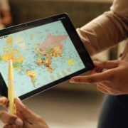
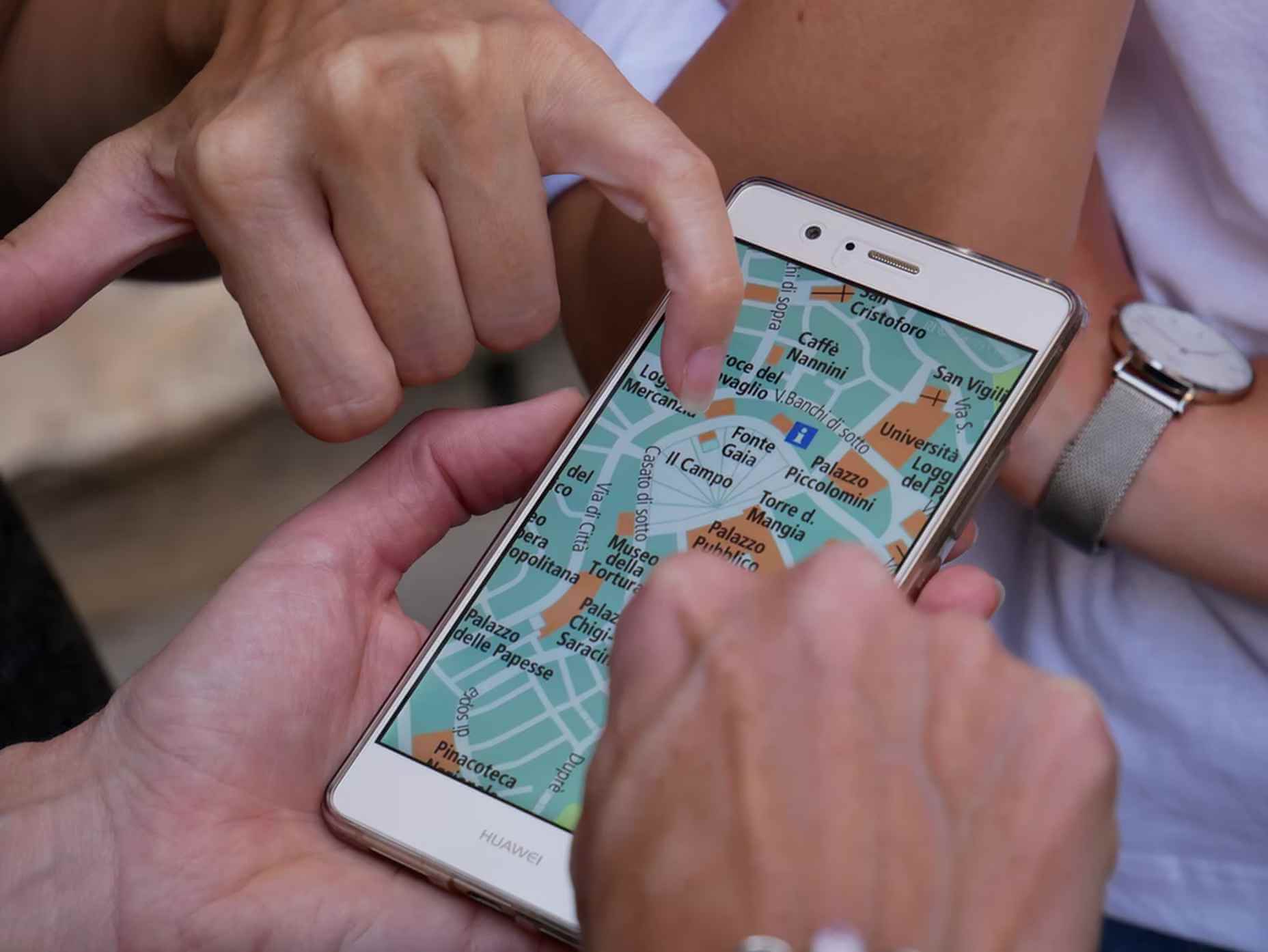
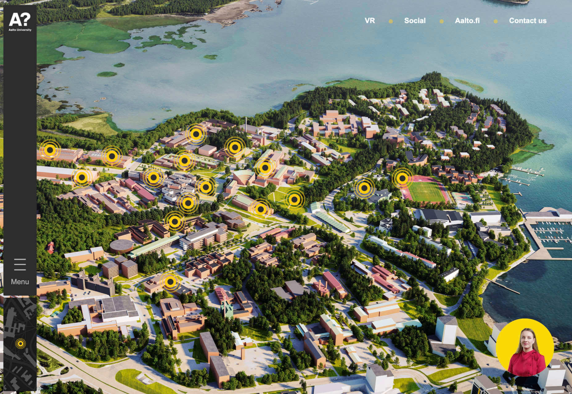
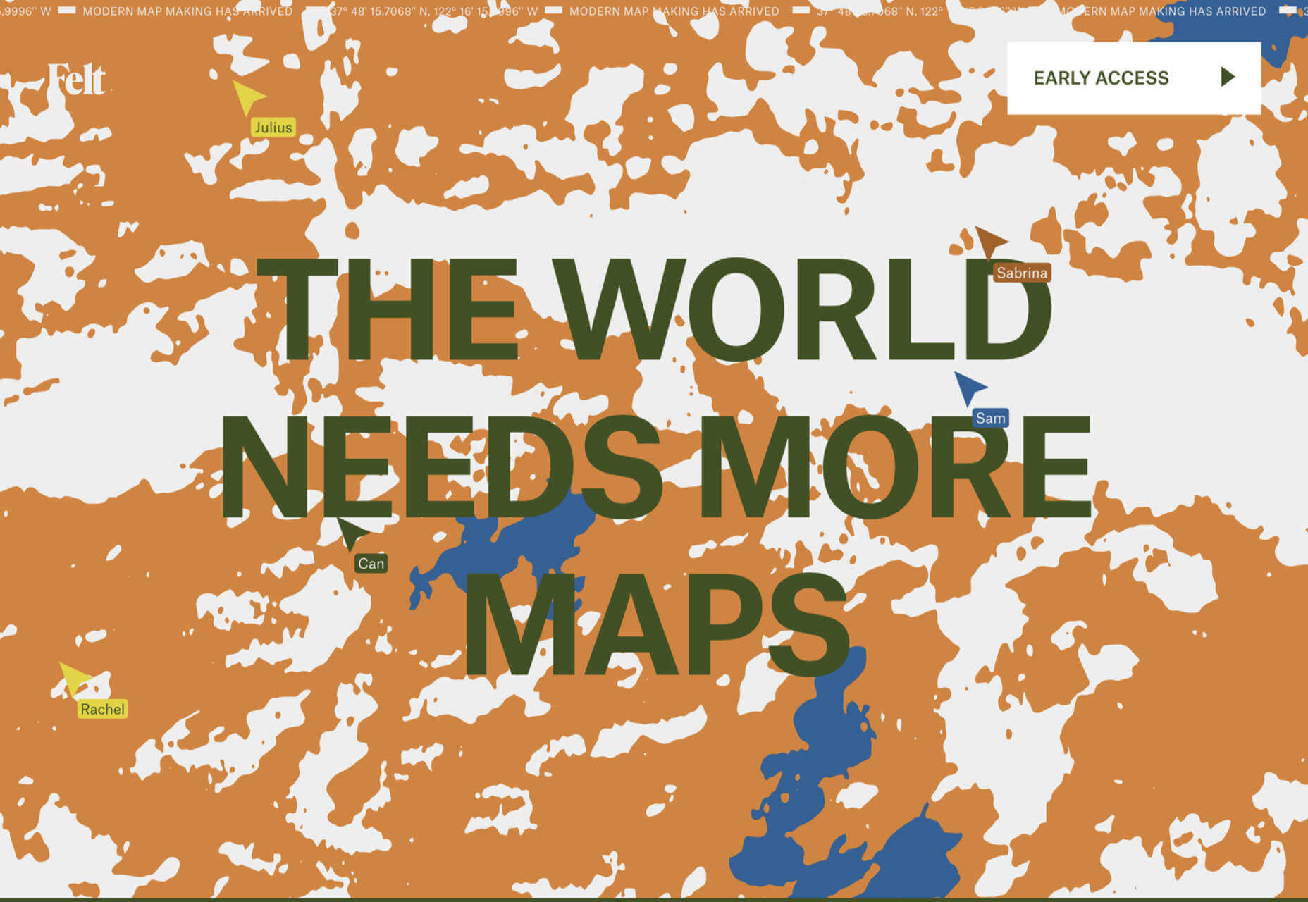
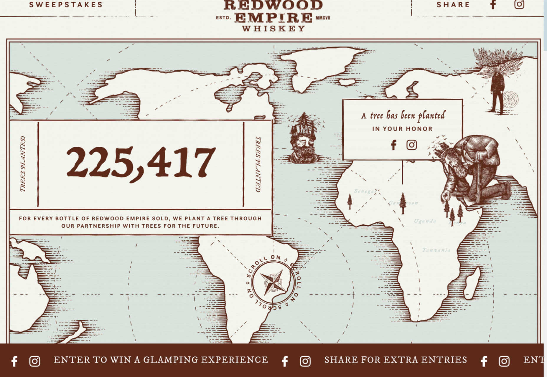
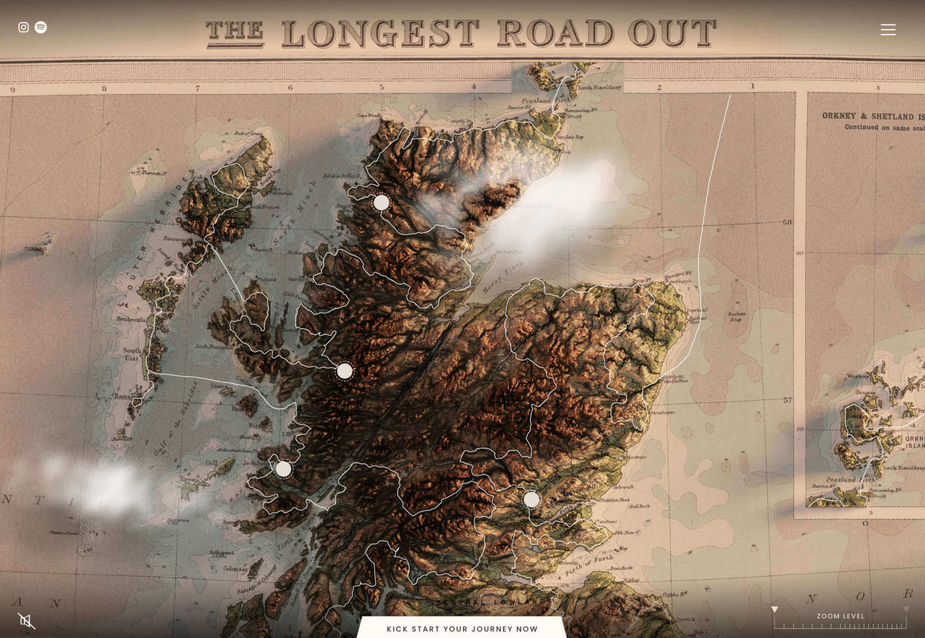
Maps are a fascinating method for delivering content. At their best, they can create an intuitive way of presenting information and interacting with it. This is the advantage that digital maps, through mobile apps and websites, have over print maps and images where no interactivity is possible.

But it’s important to understand that more data ≠ better experiences. We all now have so much data available to us through multiple services that, arguably, the greatest challenge isn’t sourcing information but filtering it out. We can only handle so much information input before we become overloaded. This issue risks being omnipresent with maps. There are so many potential points of interest on a map that it’s essential to be clear about what needs to be exposed to users.

Also, UX design, map design, and user interface are all critical. While maps can be a powerful way of drawing people in, if end-users feel that you didn’t even consider the visual design, they’ll ‘bounce off’ your site or app in moments.

Common Use Cases

When are maps useful, and what problems do they solve? Let’s dive right into the most common use cases for maps used in web design.

Navigation and Direction

Like Google Maps shows, navigation and direction are arguably the classic case study for interactive maps. You are in one place and need to get to another. You can enter your destination, your current location, and the map will present suggestions for getting there. You can select the method of travel and adjust desired departure or arrival times. But you need to understand first what functionality your users need. How these options are exposed to users is a critical piece of UX design.

Also, if users are searching for options such as somewhere to eat, it’s not so straightforward. Then, how your map handles panning in real-time as users swipe around a city is going to be a big issue.

Showing Relationships and Trends Geographically

This is something that you’ll see in every election in any western country. We’re all used to seeing maps that give us a state-of-play for which state or seat is held by which party. Then, we might see projections based on voter intentions and projected voting swings deriving from that. Then, exit poll data can be projected with the map updated on an ongoing basis until the final result is confirmed.

The capability to do this is essential because if a static map were used, it’d be out of date any time a new poll was released. Also, voting intentions can change over a campaign, so such maps need to be dynamic. Of course, such maps are only as accurate as the available data, as the US 2016 election map showed.

Show Points of Interest

As mentioned previously, there’s a lot of data that can be exposed to map users. However, that doesn’t automatically mean that it should be. Usability is key. For example, when you look at a map, you’ll typically first see key points of interest. Which points of interest are going to be presented to you can vary.

One variant is zoom level. If your map is currently showing an entire city, the level of detail the map presents is deliberately limited. You’ll see districts, large roads, or geographic features such as rivers. If more detailed information were presented, users on mobile devices, in particular, would be overwhelmed. Even at this level, you’ll notice typography differences. These can include the city name being in bold or the names of different areas in capital letters. So the level of detail is coupled with the scale of the map. Zooming in a few notches will expose significant points of interest, such as museums. Zooming in to specific districts will reveal restaurants, coffee shops, and universities. This visual hierarchy is a critical way of managing the exposed level of information.

But information is still being abstracted away. It’s not until you tap on the museum that you’ll see information on opening hours and busy times. This is also typically presented with user photos and reviews. Context is also taken into account, so you’ll start to see local hotels and restaurants. So it’s not just individual points of interest that are important, but the connections between them.

6 Tips For Improving Interactive Maps

What are the challenges of creating effective maps, and how do people address the data overload problem? We’ll answer this question and go over the must-know aspects of map creation.

1. Ensure Security and Brand Trust

GDPR or General Data Protection Regulation. This is a critically important European law that extends a wide range of legal protection to European citizens regarding personal data. It’s not possible here to cover the full extent of the law, but here are some quick key points:

  • Consent is required for the processing of personal data; it cannot be assumed
  • You need to have a retention policy for information that’s capable of identifying people

Be aware that the latter doesn’t just cover commercial purposes. Research students have to submit GDPR forms that address what kind of data they’re sourcing and how they’ll be retaining it.

But the most crucial context is commercial. If a business suffers a data breach, it can be fined up to 20 million euros or 4% of annual worldwide turnover in the preceding financial year, whichever is greater. Therefore, any business storing data that could identify their customers will need to assess risk and compliance. Remember: it’s 4% of worldwide turnover, not EU turnover.

Also, anything of your business that you expose to your customers or users is an extension of your brand. Therefore, you need to assess your maps for brand compliance too. If you have primary brand colors and your map doesn’t abide by them, that’s a very poor look. Source the color hex codes directly from your brand team and involve them in design.

2. Use the Appropriate Type of Map

It’s also important to consider what type of map is most appropriate for your use case. Think carefully about what your users need, what you’re trying to communicate, what information you need to present, and how best to present it.

For example, points of interest style maps in a tourist app will be way more helpful than heat maps: people want to know where something is, key data like opening hours, and how to get there. A heat map showing the number of visitors to each attraction or area of a city is unlikely to be useful to tourists. However, it could be useful to the attractions themselves to map their visitors by heat map over time. This could help larger museums chart which exhibits are most popular.

Transport for London is charting passenger movement on the London Underground by detecting when a device with Wi-Fi comes into range and then passes out of range. They’re using this to understand overall user journeys and movements within individual stations to better manage disruptions.

3. Avoid Pop-Ups

It should go without saying by now that auto pop-ups are despised. It doesn’t matter what they’re doing or what they’re offering; an unwanted pop-up can only get in the way. The level of impact is even greater on a phone where pop-ups take up even more screen space.

Given this, many users close them without even reading them. So if you’re using pop-ups, don’t kid yourself. You’re likely just irritating users and increasing the likelihood that they’ll ‘bounce off’ or uninstall.

4. Avoid Auto-Geolocation

Auto-geolocation sounds incredibly convenient but can result in some real problems. For example, if there are any bugs with auto-geolocation, you could get false results. If someone connects through public building Wi-Fi, you could get false results. If they’re connecting through a VPN then, unless you get the user’s IP address and check if it’s the exit portal of a VPN, you could get false results.

The problem is most significant with mobile maps. If a map user is looking at a points of interest map, they likely have a specific and immediate use. This means it’s in their best to get the most accurate results possible. So why not just ask them?

Precision and Accuracy

These terms have specific meanings in geolocation. ‘Precision’ is the exactness of the data. ‘Accuracy’ is how closely the information on a map matches the real world. So you want precision and accuracy to be spot on, or data risks losing value. This applies not just to the gathering of data but to the representation of it. For example, if you have street-level data but your maps don’t present individual streets, then any representation of data on that map is likely to have poor accuracy. That map might succeed in abstracting irrelevant information but presenting an imprecise and inaccurate view.

5. Avoid Map Legends as Much as Possible

In many cases, primarily points-of-interest maps, they’re just not needed anymore. An essential part of user experience design isn’t just visual hierarchy but information hierarchy. You can mouse over on a desktop or laptop to get the essentials of a location, e.g., the museum’s name and its opening hours. On a mobile device, you can tap on that location to get the essentials, and you can tap on another location to move on; you don’t even have to press back. Given that, a legend would get in the way. So this simple piece of information design solves information overload issues.

As with all rules, there are exceptions. A good one is a heat map where a density of what’s being measured needs to be communicated. It doesn’t matter what the data is; it just needs to be something where mapping provides greater insight, especially if it informs decision-making. Sales is an excellent example for a national or multinational company. Of course, weather forecasting can make use of literal heat maps.

6. Accessibility Compliance

Not everyone has perfect eyesight. Even if someone has excellent vision, they could still be colorblind (8% of men and 0.5% of women are). Given that, take the W3C’s accessibility standards into account and treat them as a baseline or minimum barrier to entry for compliance. You shouldn’t feel good about the possibility of excluding 8% of your potential audience or customers. Ensure you keep your UX designers involved and don’t shy away from creating senior-friendly web designs.

Put simply: imagine if you could appeal to a new demographic that’s not catered to. If your competitors ignore them, you could give them a real reason to choose you instead by taking some straightforward steps. If your competitors are catering to them, you also need to. If you don’t, you’re just giving potential customers a big reason to ignore you.

Conclusions

The key takeaway is that there’s far more to creating good maps than just good cartography. That can be critical, too, though this may vary depending on the use case.

This will be a team effort because your map will involve data sets, design decisions, and, yes, cartography. You’re going to need to involve brand and IT too. So think about design principles and development methodologies.

First and foremost, what are your users’ needs? If you haven’t done any user research or taken the time to understand the customer journey, are you adding anything or getting in the way? It’s easy to see the department that requested the map as stakeholders, but you should probably view your users as stakeholders too.

This sounds complex, but as you hopefully now appreciate, a map is probably more complicated than you thought.


Featured image via Pexels.

Source

The post The UX of Maps in Web Design first appeared on Webdesigner Depot.

Source de l’article sur Webdesignerdepot

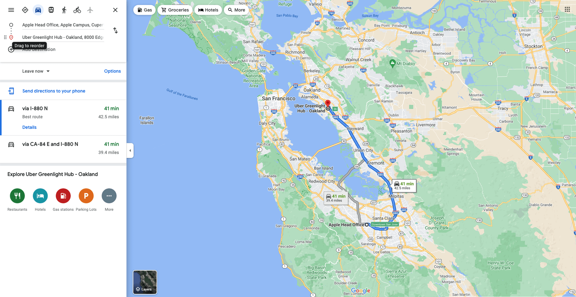
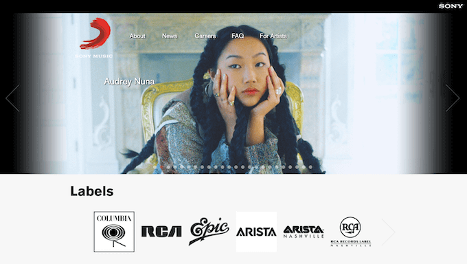
Every day design fans submit incredible industry stories to our sister-site, Webdesigner News. Our colleagues sift through it, selecting the very best stories from the design, UX, tech, and development worlds and posting them live on the site.

The best way to keep up with the most important stories for web professionals is to subscribe to Webdesigner News or check out the site regularly. However, in case you missed a day this week, here’s a handy compilation of the top curated stories from the last seven days. Enjoy!

Logo Design Trends 2022: The Future of Logos

Paperback – Simpler and Tidier Alternative to Wiki Pages

10 Captivating Examples of the Liquid Metal Effect in Web Design

Micro Digital Tools

Master Typography for Free with Google Fonts Knowledge

Windows 11 Officially Shuts Down Firefox’s Default Browser Workaround

40+ Most Notable Big Name Brands That are Using WordPress

Pixel Patterns

Top Web Design and UI Trends for 2022

WordPress 5.9 Delayed Until January 2022

Source

The post Popular Design News of the Week: December 20, 2021 – December 26, 2021 first appeared on Webdesigner Depot.

Source de l’article sur Webdesignerdepot

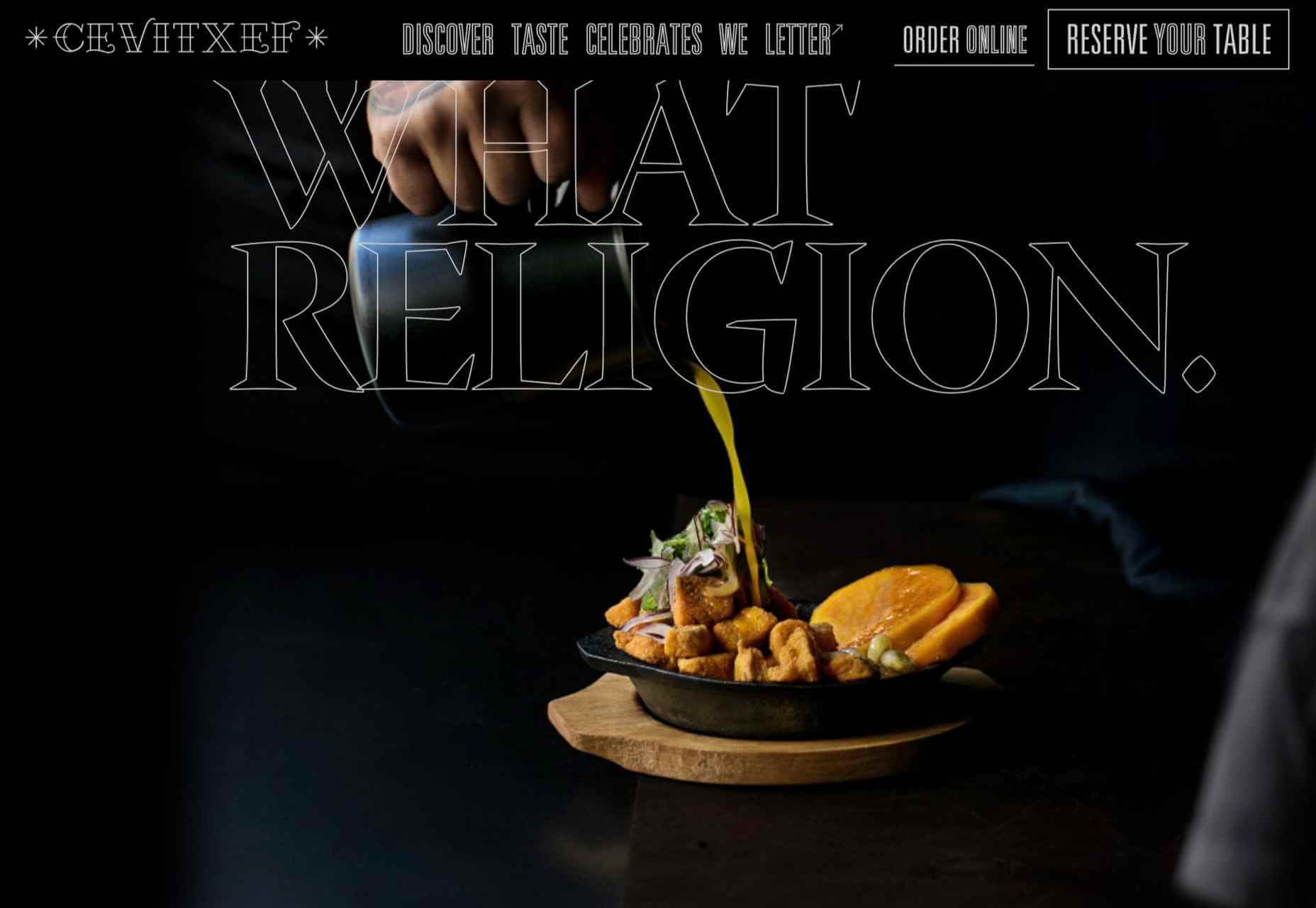
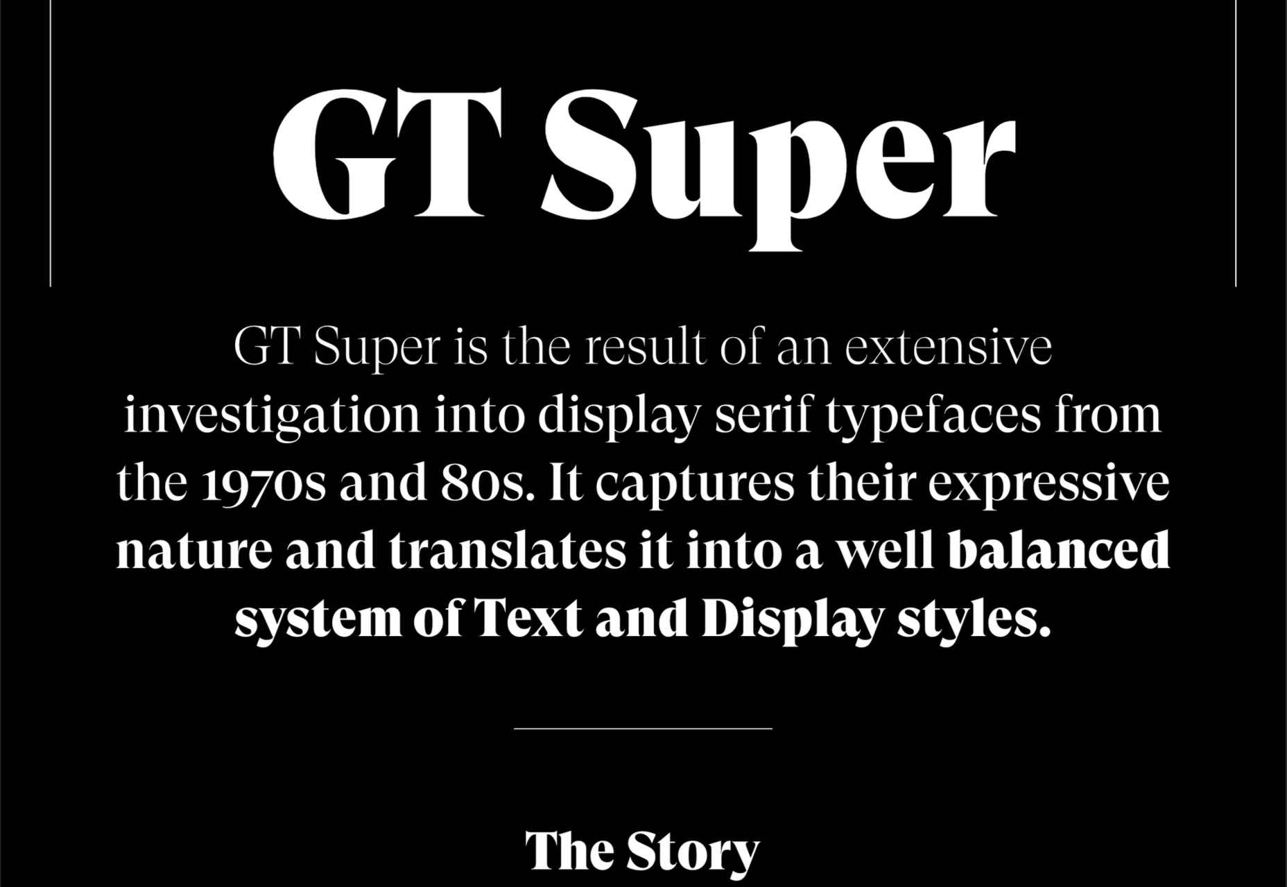
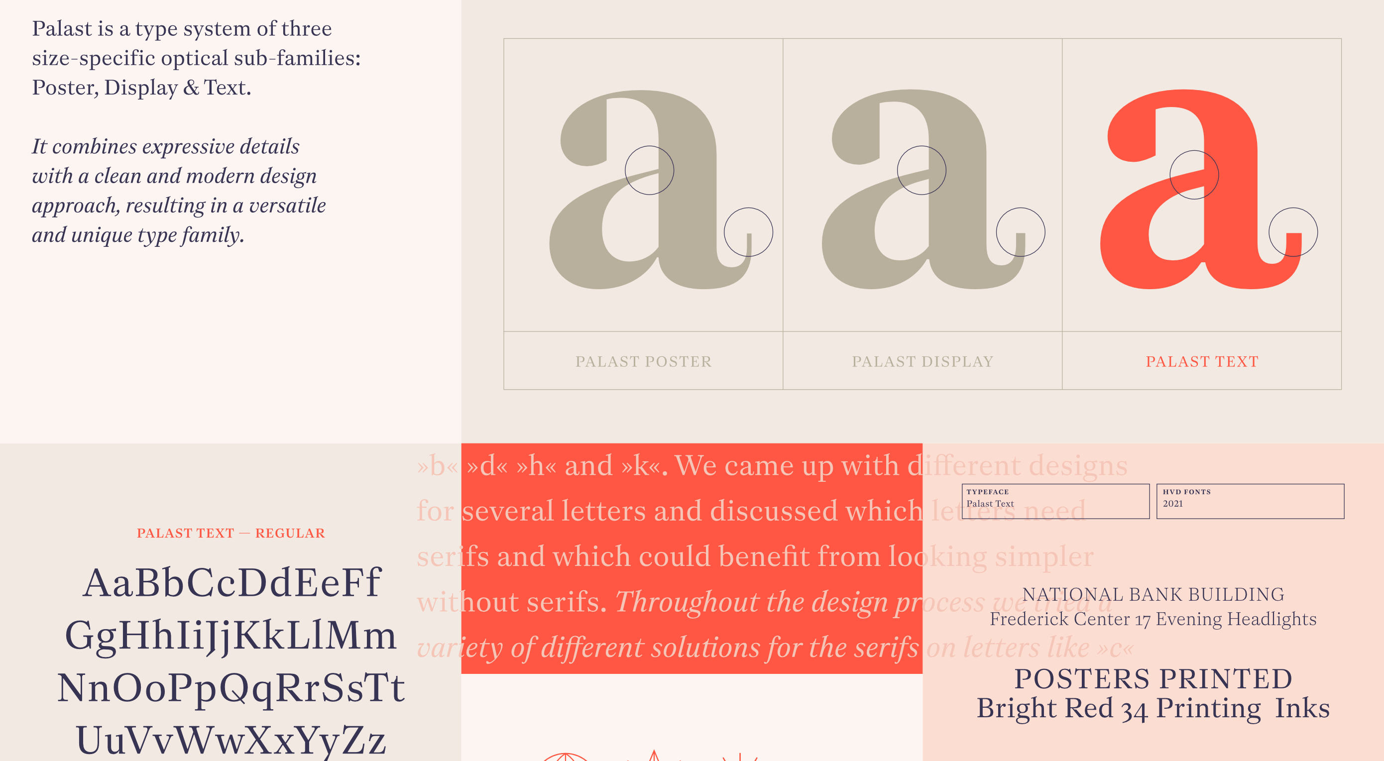
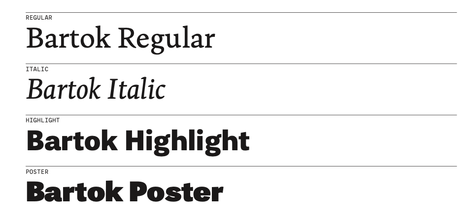
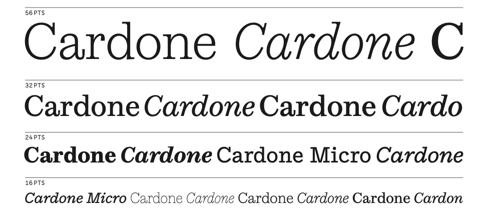
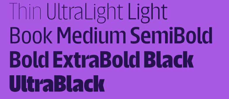
The choice of typeface is one of the most critical factors in any design; it gives the text its voice. It can be desperately frustrating to find the right voice for your project, only to discover it’s outside your client’s budget.

Who doesn’t love a free font? There’s no question that something for nothing is an attractive proposition. When it comes to fonts, the problem is that high-quality fonts require months, sometimes years of work; high-quality fonts are expensive to produce; as a result, many free fonts have to cut corners.

However, decreasing costs for font design software and an open-source culture is making the industry more accessible, leading to hundreds of free fonts as good, if not better, than their premium rivals.

The challenge for designers is where to look. The solution is Typewolf’s Definitive Guide to Free Fonts. This tremendous, 107 page PDF covers everything you need to know to find the best, high-quality free fonts on the web.

Typewolf is one of the most trusted names in digital typography, with an excellent track record of educational guides; you can be sure the suggestions in this guide are second to none.

The guide is split into four sections:

  • Section one covers the closest free alternative to every font on Typewolf. The free alternatives list focuses on the popular, and in many cases, the most expensive fonts used by professional designers. That means you’ll have access to over 1,000 recommendations, all listed alphabetically for easy look-ups. Simply find the premium font you want, and you’ll find the closest free font available listed alongside it. In many cases, there are multiple suggestions to give you some agency.
  • Google Fonts is an excellent source of free fonts, but its own recommendations are weak. So the second section of the guide is dedicated to the ten best serif and sans-serif combinations on Google Fonts. The best serif and sans-serif combinations include visual examples, and explanations of why these typefaces complement each other, so you don’t find yourself designing in the dark. This section is excellent for anyone who’s unsure where to start with free fonts and needs to identify an effective pairing quickly.
  • As good as Google Fonts is, it’s not the only source of free fonts, and if you only look there, you’ll miss out on some real gems. That’s why section three of this guide introduces the 40 best free fonts that aren’t on Google Fonts. Each font listed is carefully presented to preview it at display and body sizes.
  • Lastly, to finish off this excellent ebook are the ten best free “hipster” fonts. You know the ones: they’re perfect for coffee shops, small-batch brewers, tattoo parlors, and anywhere Rockabilly is still in style.

All told, there are enough recommendations in this guide to last you an entire career. So no matter what you’re looking for, whether it’s a free version of a particular typographic voice or some fresh inspiration, you’ll find it in this essential ebook.

What’s more, you’ll receive lifetime updates for free. With new content added weekly, this ebook will be a source of knowledge and inspiration you return to again and again. Lifetime access means you can re-download the guide every time you have a project that needs free fonts. You’ll also get access to an exclusive section of Typewolf that showcases only free fonts, so you can see how free fonts can be used well.

Every good designer understands the value of high-quality typography, but not every project has the budget to allow you to use premium fonts from top type foundries. This guide helps you leap that hurdle by offering carefully selected, free alternatives. If you’re new to the world of typography, this helpful guide will give you some practical insight on how to locate free fonts for use in your design work.

This guide will save you hours trying to find the suitable typeface for your project, as well as introduce you to some excellent designs that you might not have considered.

You can download Typewolf’s Definitive Guide to Free Fonts today for the bargain price of $39. You could even gift it to the typophile in your life.

Source

The post Typewolf’s Definitive Guide to Free Fonts first appeared on Webdesigner Depot.

Source de l’article sur Webdesignerdepot

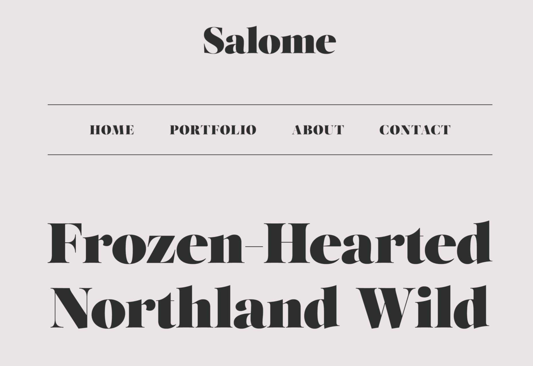
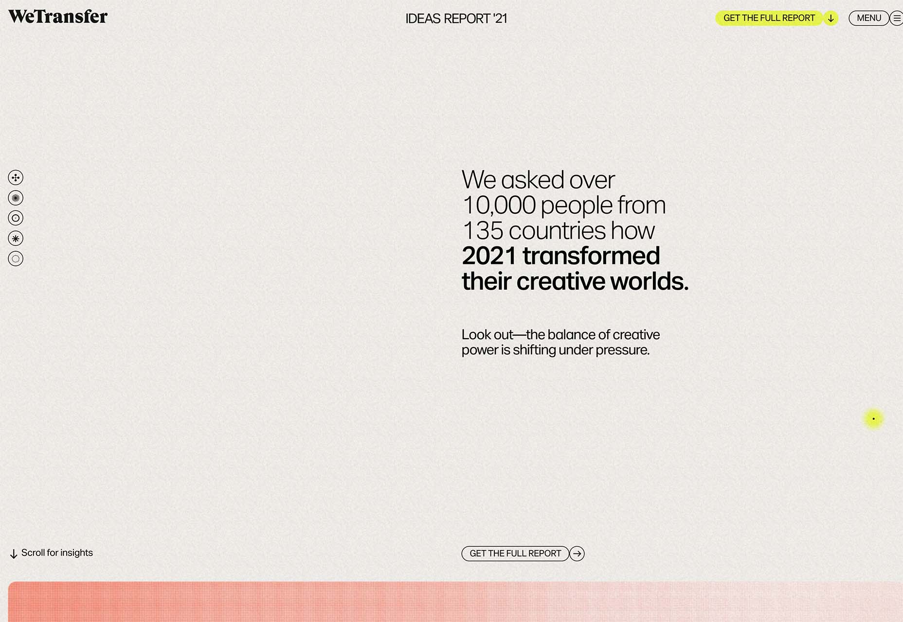
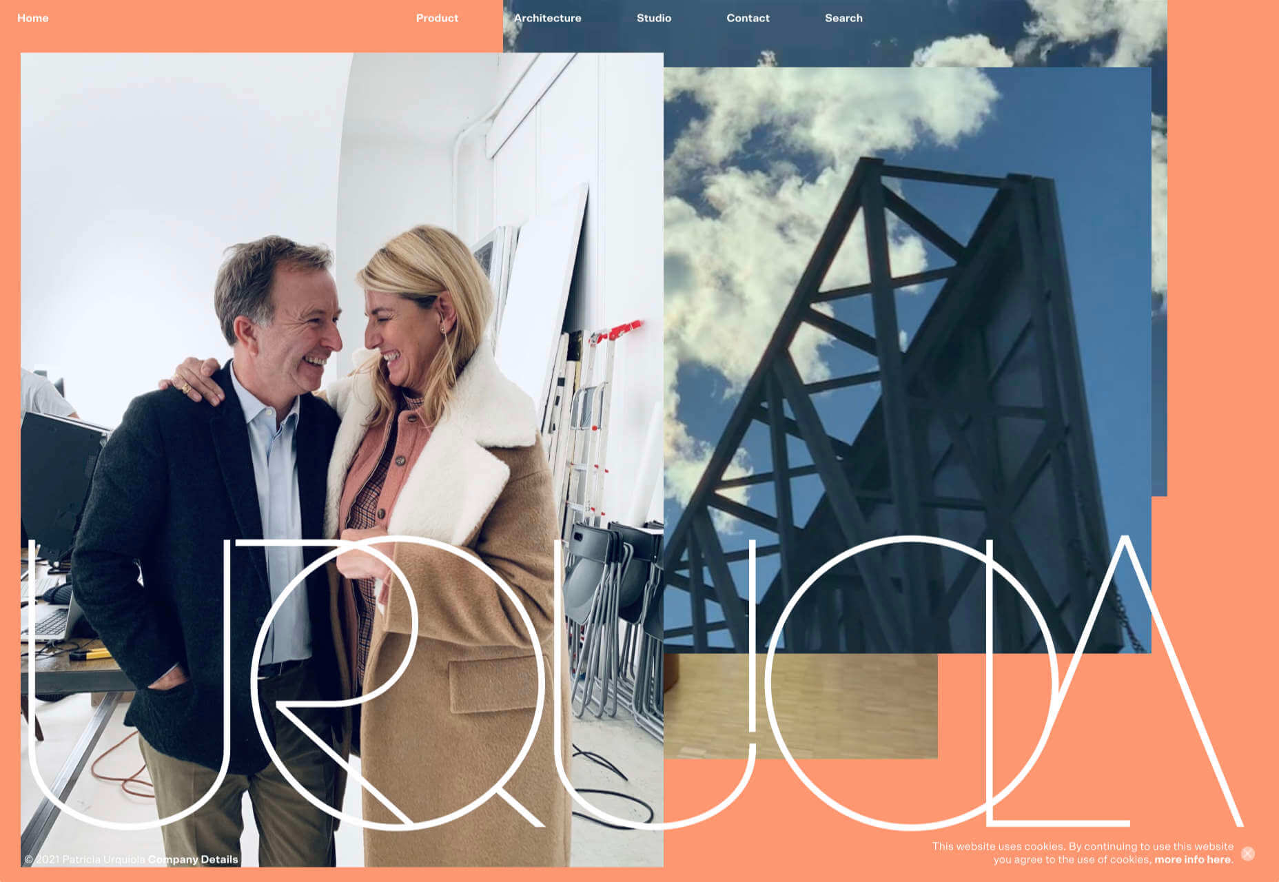
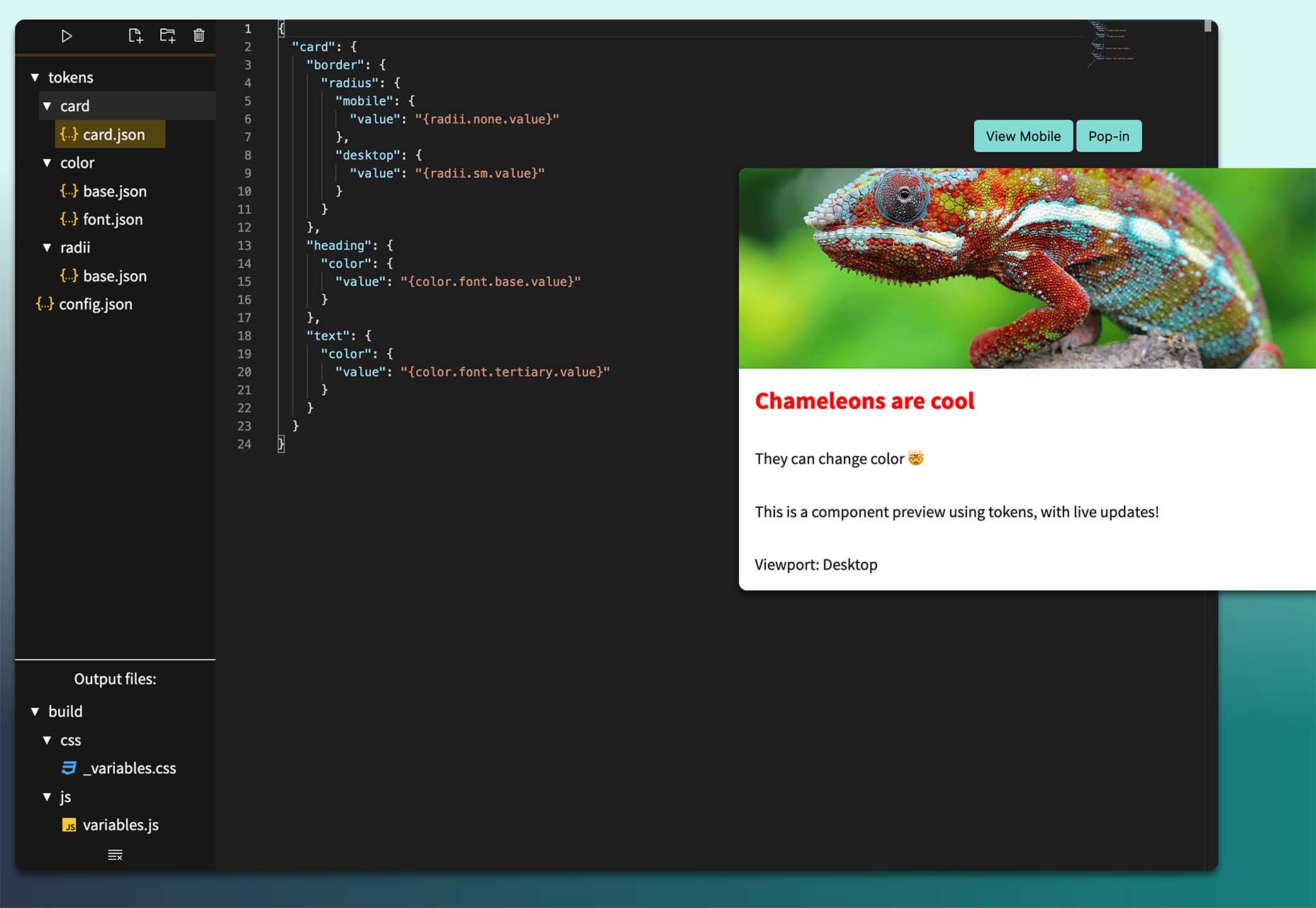
2021 has been both memorable and instantly forgettable. Pop stars were freed from modern-day servitude, some people tried to overthrow democracy, and we all vacationed at home.

Despite the weirdness of the times, the web kept growing, kept changing, and kept on pushing boundaries. We saw a wealth of new sites launch or relaunch with significant updates.

Here are the 50 best sites launched on the web this year. Enjoy!

Crusta C

In April, seafood company Crusta C cleverly used the simple logomark ‘C’ to apply a cutout video effect.

Slow

Slow is a collective of creatives aiming to implement slow movement principles. Its site reflects those aims, creating a sense of calm and deliberation.

hnst

2021 saw tons of brutalist-inspired design. hnst’s take on the style works thanks to the bright red in place of the standard black.

Marram

This site for boutique hotel Marram uses a soft color palette to create an impression of soft golden light and calm.

Levitate

In July, we loved this site for running-blade brand Levitate. The site is clean and light, with a sense of inherent motion in the photography.

Niarra Travel

There’s some beautiful photography on this site for eco-conscious, bespoke travel agency Niarra Travel.

Plunt.co

The core of this site for Plúnt is a combination chooser which feels pleasingly reminiscent of an animal flipbook.

Moth Drinks

Moth makes classic cocktails in a can. The striking black and white graphics and masking effects for its holding page stunned us back in March.

Seed

Selling supplements is hard; people are understandably skeptical. So this site for Seed packs in research and scientific information and avoids the hard-sell.

Wavemaker

Another excellent portfolio site in 2021, this time for creative media agency Wavemaker. The site is uber-confident while still being playful.

Wild Souls

Wild Souls makes nut butters, tahini, and other Greek delicacies. Its site is colorful and warm, and the site typography is soft and appealing.

JUST Egg

JUST Egg produces egg-like food from plant material. The huge photography and bold typography do a great job of making a new concept appealing.

Aalto University

One of the most popular designs of 2021 was Aalto University’s site with its in-depth campus tour. The simple navigation inspired several imitators.

Wisr

Scroll interactions were big in 2021, and Wisr features a Heath Robinson-style machine that ‘runs’ as the user scrolls down the page.

Cevitxef

This site for Cevitxef ceviche restaurant in Bilbao does a great job of making us hungry. Drama is created by oversized text, heavily-styled photography, and lots of movement.

On

The best digital agencies keep their own sites simple, like this site for On digital technology studio that uses black on light blue and adds infinite scrolling.

Acayaba + Rosenberg

We found Acayaba + Rosenberg’s use of architectural photography and subtle scrolling a pleasing browsing experience.

Madre

This site for home linen company Madre uses extraordinary fine-art style still-life photography to enrich a very simple site.

Hyperframe

“Show, don’t tell” is a well-worn mantra. Hyperframe’s site implements it by demonstrating the product’s major selling point on scroll.

Gemini

This exceptional WebGL experiment was built to show what’s possible in the technology. Have a play with the car; it’s a ground-breaking demo.

Felt

In 2021, collaborative mapping tool Felt launched in private beta. Its excellent site does a great job of creating interest while doubling as a recruitment notice.

imNativ

Not every project is exciting, but this excellent site for imNativ uses macro photography to great effect to promote upholstery fabric.

Websmith Studio

Excellently named Websmith Studio uses color to highlight, and the noise effect applied to the background adds subtle interest.

Singita

High-quality photography and a terracotta-based color scheme create an inviting ambiance for Singita, an African eco-tourism and conservation brand.

Fluff

A fullscreen background behind a mobile view for desktop? It sounds like a horrible idea, but this site for cosmetics brand Fluff pulls it off.

Chiwawa

This great site for Chiwawa cantina features wrestling masks, skeletons, and tone-on-tone color to create a lively and distinctly Mexican site.

Nothing

This site for Nothing’s ear(1) earbuds is packed with confidence. Appropriately, it looks even better on mobile.

Chérie Healey

Lots of experts have tried to tell us how to live our lives in the last couple of years, but Chérie Healey’s site manages to stay on the right side of positive without slipping into clichés.

Wayfinder

Wayfinder, a game about our connection to nature using generative code, AI, machine learning, and data mining, could not have been more 2021 if it tried.

Green Angel Syndicate

Not too many investment groups are thought of as ethical, but Green Angel Syndicate specializes in funding companies fighting climate change.

Tether

As the days got darker in the Northern hemisphere, we were wowed by this site for Tether, a cycle safety system using video and illustration to explain its clever approach to bike safety.

Patricia Urquiola

Back in January, we loved the new site for Patricia Urquiola design studio, thanks to its bright, bold colors that we thought inspired confidence.

Headup

Headup’s businesslike approach is created thanks to a pleasing color palette and geometric graphics.

Redwood Empire

For Earth Day on April 22nd, Redwood Empire Whiskey created a microsite promoting a competition styled to match their bottle labels.

GT Super

The one-pager for GT Super has a certain drama in keeping with the font itself and allows you to play around with the size, weight, and style.

Planet of Lana

Due for release in 2022, Planet of Lana is a game from Wishfully Studios, and its teaser page launched back in June has kept us intrigued ever since.

The Longest Road Out

This charming site for The Longest Road Out is a travel map and journal based on the creators’ road trip around Britain, Ireland, and the outlying islands.

Made Thought

Made Thought has a bold aesthetic and approach that explains its outstanding client list.

Miti Navi

Miti Navi makes extraordinary sailing boats. We were attracted to how its site presented a luxury product in an original way.

La Nouvelle

Another powerful digital design agency site was La Nouvelle’s, which used a combination of contrasting and complementary color combinations to catch the eye.

Caleño

Caleño makes non-alcoholic distilled spirits. They relaunched their website in March with bright, joyful colors that reflect the character of the brand.

Capsul’in — Aluminium

This demo site for a coffee pod manufacturer isn’t a site as such, but it demonstrates that even in 2022, there’s room for parallax scrolling.

How Many Plants

Everyone needs a few more houseplants, and How Many Plants is a great guide to how to own and look after them. The illustration style is friendly but efficient.

How & How

One of the most approachable design agency sites of 2021 was How & How’s. It keeps things light and clean, and effective.

The Hiring Chain

Part of a campaign encouraging businesses to employ talented people with Down Syndrome, The Hiring Chain website dispels myths with clearly presented facts.

Virgile Guinard

Back in February, we couldn’t get enough of photographer Virgile Guinard’s portfolio site. Blocks of color pulled from each image hide the image allowing you to focus on one image at a time.

Studio Nanna Lagerman

Studio Nanna Lagermann’s site excels at creating a sense of space and calm. The color palette is soft and neutral. The type is large but clean and sophisticated.

GOOD Meat

Veganism is a growing trend, and one of the sites promoting it with gorgeous colors is this site for lab ‘grown’ meat.

Mama Joyce Peppa Sauce

This one-page site for Mama Joyce Peppa Sauce is big and bold. Click almost anywhere, and two bottles of sauce go into your cart.

Ebb Dunedin

The site bucks the trend for luxury hotel design and instead is styled to complement its interiors. We could have done with time at this boutique hotel in 2021, maybe next year…

Source

The post 50 Best Websites of 2021 first appeared on Webdesigner Depot.

Source de l’article sur Webdesignerdepot

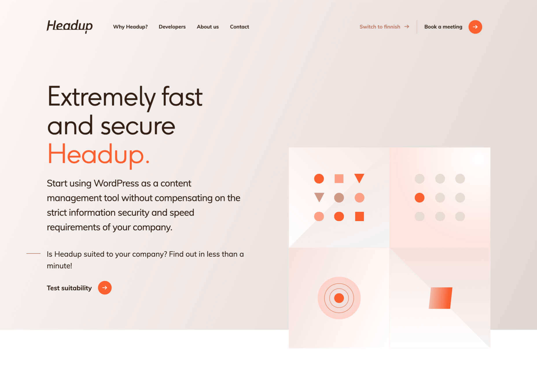
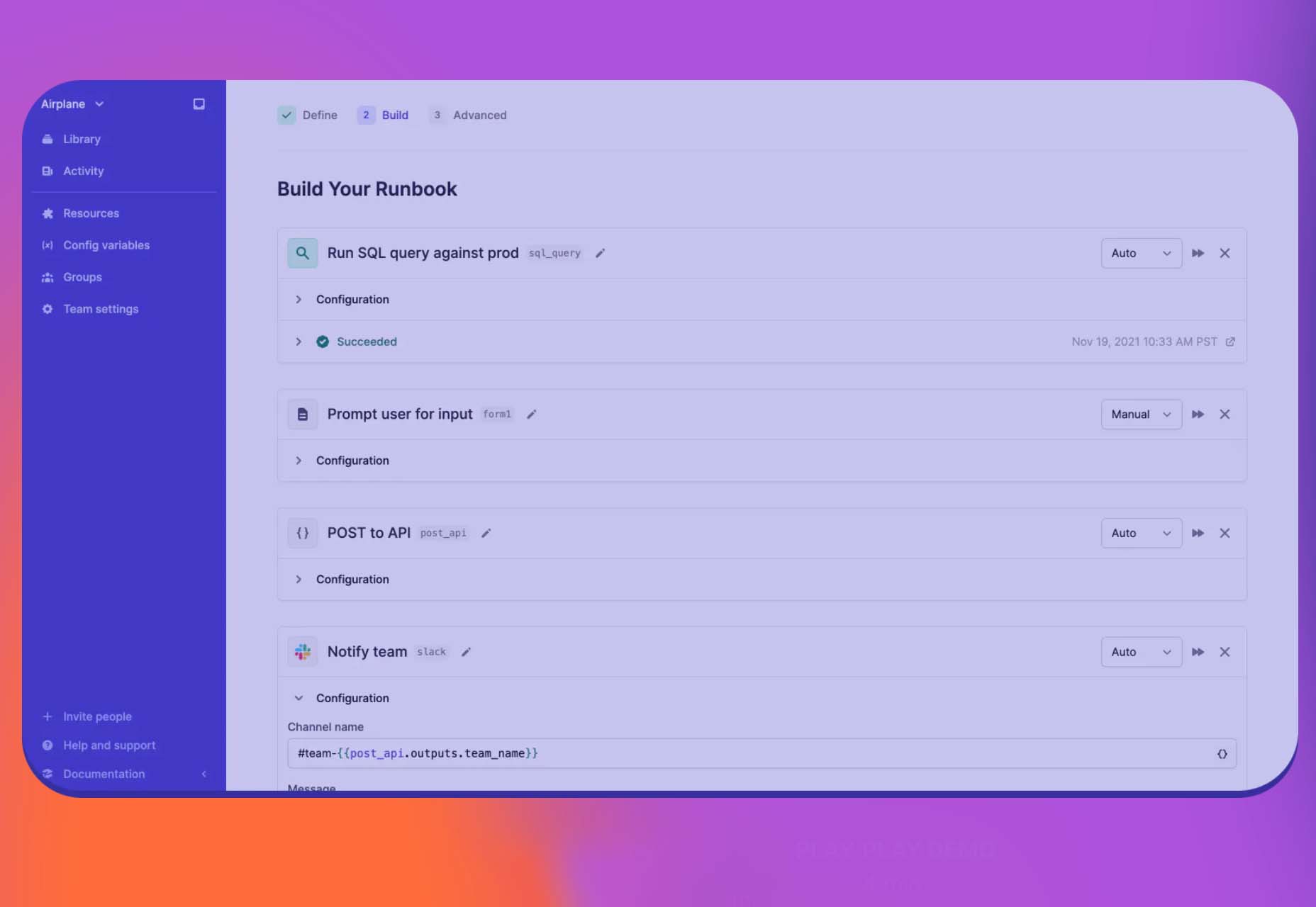
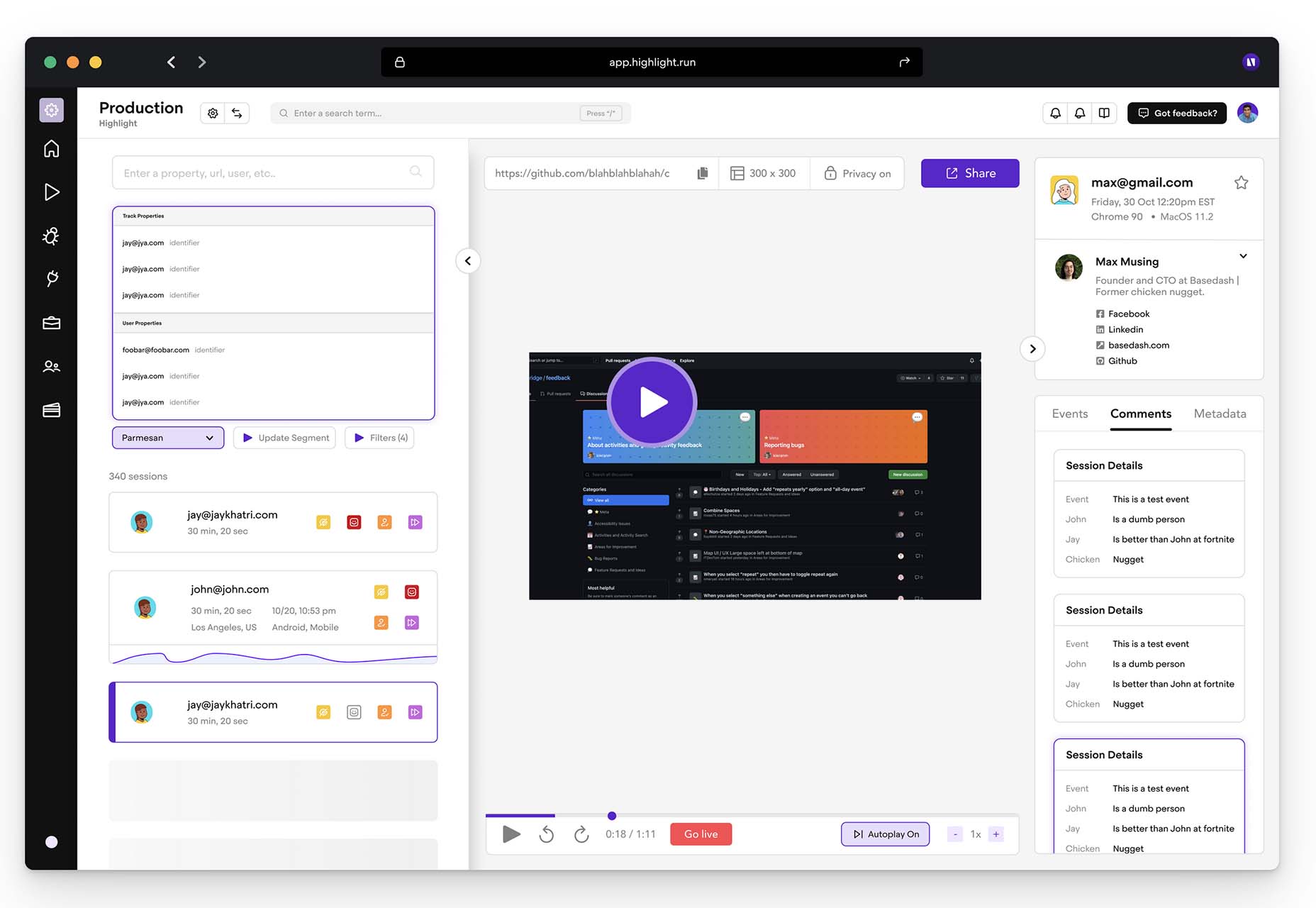
The year’s winding down as everyone segues into a much-needed holiday R&R. But that doesn’t mean there aren’t some awesome new tools and resources for website design projects.

Check them out, and hit the ground running in January. Here’s what’s new for designers this holiday period. Enjoy!

Fancy Border Radius Generator

Fancy Border Radius Generator is a fun tool that allows you to create exciting shapes for elements. Use the included templates or create your own border shapes and then export the CSS/HTML for a variety of uses.

Pulsetic

Pulsetic answers the question: “Is your website down?” Get website downtime alerts by phone call, SMS, email, or Slack. Create beautiful status pages and incident management reports and keep visitors (and your team) updated.

Ffflux SVG Generator

Ffflux SVG Generator makes it easy to generate fluid and organic-feeling gradients. You can use the resulting graphics as backgrounds to elements on a page to give a colorful fluid look to page elements. Choose colors and styles, then save or copy your SVG for use.

Fable

Fable is a web-based motion design platform to help you tell moving stories. It’s designed to be easy enough for beginners to use but has tools that even the most experienced motion designers can appreciate. This is a premium tool, but you can try it free.

Modern Fluid Typography Editor

Modern Fluid Typography Editor takes the guesswork out of sizing and scale for type sizes on different screens. Set a few preferences and see ranges your type styles should fall in. This typography calculator is visual and easy to use.

Emoji to Scale

Emoji to Scale is a fun look at emojis in a real-world relationship to each other. Make sure to also note the Pokemon to Scale project, which is just as much fun.

Page Flip Text Effect

Page Flip Text Effect is a fun and straightforward PSD asset that adds a nice element to design projects. Everyone can use some fun, colorful animation, right?

Nanonets

Nanonets is a practical tool for automated table extraction. You can snag tables from PDFs, scanned files, and images. Then capture relevant data stored in tabular structures on any document and convert to JSON Excel, or CSV and download.

Browsers.page

Browsers.page shows browser name and version, matched with a list of the browsers you support as a company or project. It’s a visual reminder to update if you are working with some browser lag. It’s a free tool and includes a frontend API.

UKO UI

UKO UI is a Figma dashboard and design system bundle packed with components and pages to build from. It’s free for personal use.

Floating UI

Floating UI is a low-level library for positioning “floating” elements like tooltips, popovers, dropdowns, menus, and more. Since these types of elements float on top of the UI without disrupting the flow of content, challenges arise when positioning them. It exposes primitives, which enable a floating element to be positioned next to a given reference element while appearing in view for the user.

Style-Dictionary-Play

Style-Dictionary-Play lets you experiment with a style dictionary in your browser with a live preview and mobile and desktop views. It’s an open-source tool and allows for URL project sharing, and you can use it without logging in or signing up.

Airplane Runbooks

Airplane Runbooks makes it easy to turn small amounts of code into complex internal workflows. Model onboarding flows, admin operations, cron-like schedules, and more and share with your team. It’s like Zapier but for first-party operations that touch prod data.

Shoelace

Shoelace is a forward-thinking library of web components that works with any framework. It’s fully customizable – and has a dark mode. It’s built with accessibility in mind, and the open-source tool is packed with components.

Tutorial: Coloring with Code

Coloring with Code is an excellent tutorial by the team at Codrops that will help you create beautiful, inspiring, and unique color palettes/combinations, all from the comfort of your favorite text editor. It’s practical and easy to follow along as you work through the steps on your own.

Stytch

Stytch is a full-stack authentication and authorization platform whose APIs make it simple to seamlessly onboard, authenticate and engage users. Improve security and user experience by going passwordless with this premium tool.

Highlight

Highlight keeps web apps stable. With pixel-perfect session replay, you’ll get complete visibility into issues and interactions that are slowing down users. You can start using this premium tool in minutes, and it works on every framework.

Source

The post Exciting New Tools For Designers, Holidays 2021 first appeared on Webdesigner Depot.

Source de l’article sur Webdesignerdepot

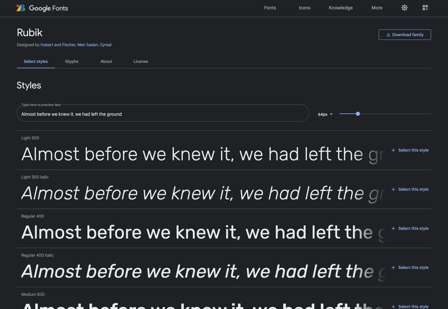
Are you tired of using the same old Google fonts from website to website? You’re in luck!

In this month’s roundup of the best new fonts, we’re showcasing the latest and greatest fonts from independent type foundries and designers worldwide.

Astronef Super

Astronef Super is a retro-futuristic font collection with seven styles that are meant to be mixed and matched. While the font is modular in design, there are wild variations in weight that you can have a lot of fun with.

Auguste

Auguste Serif and Auguste Sans Serif were originally drawn as a single stencil font that combined serif and sans serif styles. They ultimately became two separate fonts, with four weights apiece, that can be scaled up and down in size based on your needs.

Bartok

Bartok is an exciting font as it breaks with the concept of creating a family of unified styles. Instead, each of the four styles uses different structures and weights, meaning this font can be repurposed for a wide variety of brands and styles.

Cardone

Cardone is a type of serif known as Scotch Roman, designed for functionality and legibility. With its sturdy and brutal design, this serif is perfect for editorial content.

Champ

Champ is a fun and friendly font with nine weights. Because of its bold footprint, this serif performs best in branding and headlines.

Columba

Columba is modeled after old-style printing press typefaces. With its narrow, legible serif forms, Columba is most useful in text-heavy environments — both on the web as well as for printed brand materials.

Deia

Deia is a bracketed serif font with seven fonts. Thanks to the curved stroke transitions in Deia’s character set, this font is full of personality and would work great in product packaging and website branding.

Garton

Garton is a 19th century-inspired typewriter typeface that would look great on literary and editorial websites. This uniquely elegant font has three weights with italic companion sets for each.

Halisa

Halisa is an extensive font family with 60 styles, five widths, and six weights (plus italics). The designer drew inspiration from 19th-century factory signs to come up with this legible semi-constructed grotesque typeface.

Helvetica Now Variable

Helvetica Now Variable is an upgrade on Helvetica Now and the original 1957 Helvetica design. This one, however, adds over a million new Helvetica styles to the fold (all in one font file), which designers can use to create all kinds of digital and print content, including typographic animations.

Palast

Palast is a type system that consists of three sub-families: Palast Text, Palast Display, and Palast Poster. Designers can use this carefully crafted serif font family pretty much anywhere they want — from clients’ websites to promotional print graphics.

Parco

Parco is part of the new wave of humanistic typographic design. With Parco’s compact spacing and tall characters, this font will help designers craft eye-catching and highly legible headlines and branding.

Right Gothic

Right Gothic is a huge font family, containing 98 styles — seven weights, seven widths, 20-degree italics, and an adjustable contrast axis. While this contemporary font is a sans serif, it draws upon typical serif anatomy with its high contrast between thick and thin strokes.

Rund Text

Rund Text is a geometric sans serif that looks both stylish yet comfortable. It also has a companion Display family available to designers who want to bring the same type of functional design to larger headlines or branding.

Sculpin

Sculpin is another variable font to make this list of the best new fonts. This sans serif font was designed as if a chisel and brush had been used, giving it a structured, hand-crafted feel.

Source

The post 15 Best New Fonts, December 2021 first appeared on Webdesigner Depot.

Source de l’article sur Webdesignerdepot