Articles

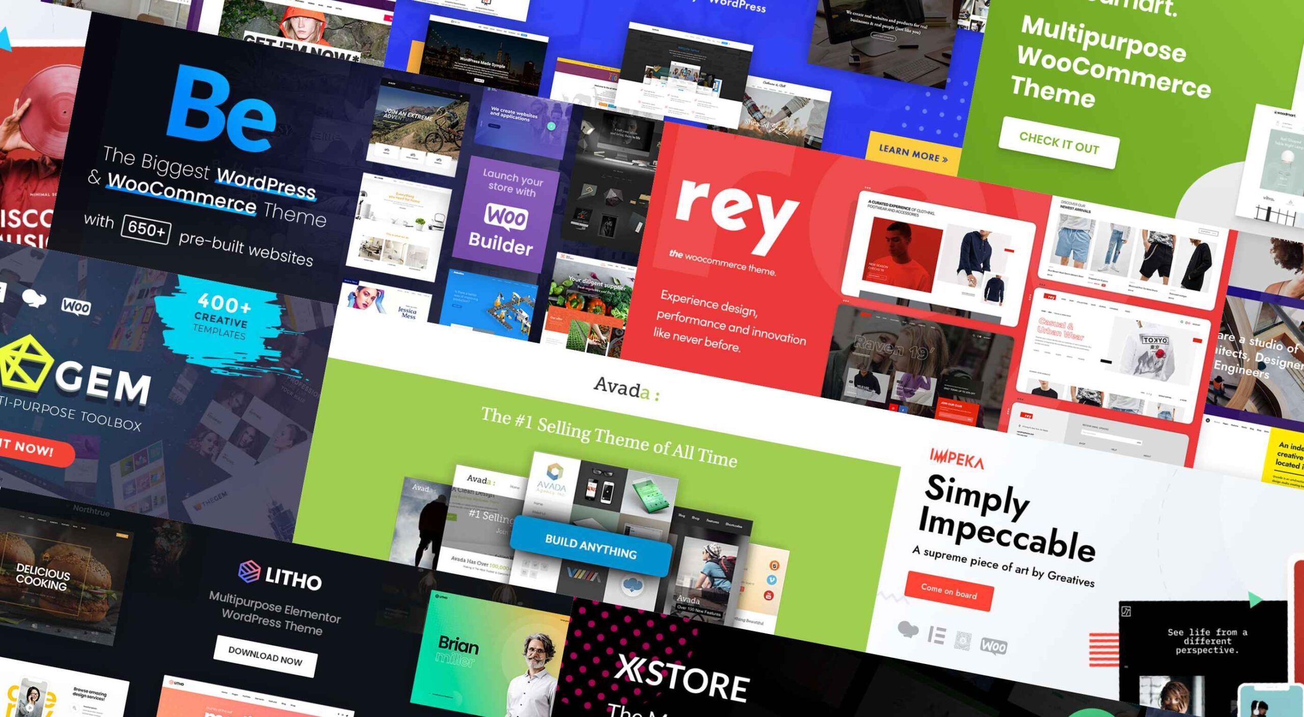
If you’re looking for a WordPress theme for your 2022 projects, it never hurts to see what the experts consider to be the best of the bunch. That’s not to say that experts don’t have their favorites. They often do, and we are no different.

We’ve tried, successfully, we believe, to avoid any biases we may have in compiling what we believe to be the 10 top WordPress themes going into 2022.

Working with a WordPress theme has the advantage of giving you a great starting point. It makes it much easier to create an attractive website that will charm any visitors who stop by and convince them to linger awhile.

Another advantage of using a theme can be its cost-effectiveness. Most of the popular WordPress themes are reasonably priced, they save you time, and they can save you money as well.

The main problem you’re apt to encounter is finding the right one since many of them are out there. You could spend hours and hours making comparisons among a host of candidates that appear to be reliable and easily customizable. Or you could select from among the following 10 top WordPress themes, all of which are guaranteed to give you your money’s worth and more. 

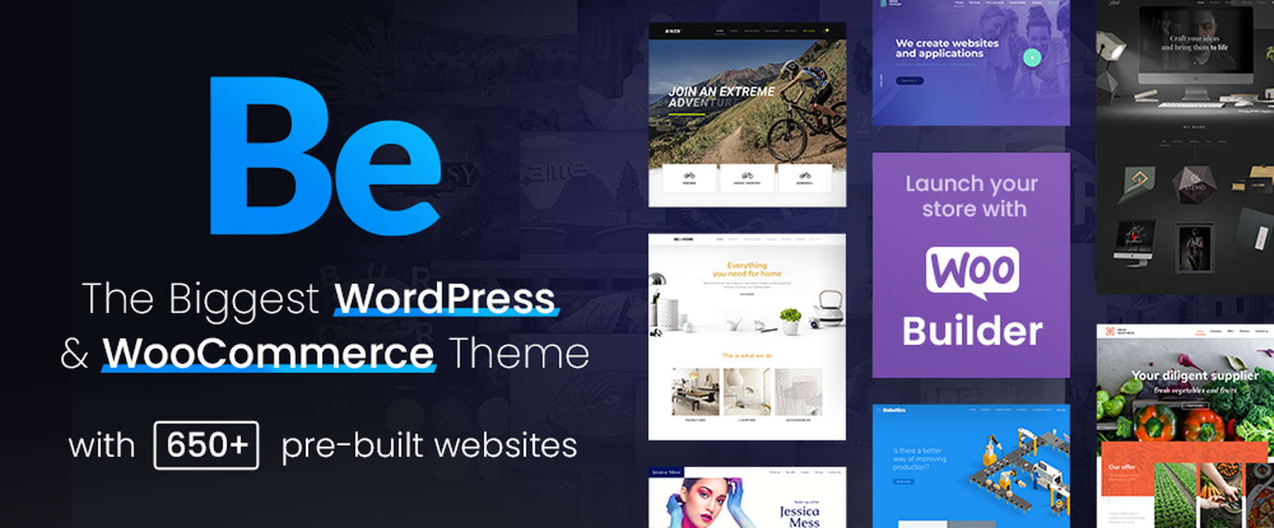
1. BeTheme – The Biggest Multipurpose WordPress Theme with 650+ Pre-Built Websites

BeTheme justifiably lays claim to being the biggest WordPress and WooCommerce theme of all for several reasons.

  • BeTheme’s 40+ core features give its users a complete tool kit to work with that includes 650+ pre-built websites and tons of design elements, aids, and options.
  • A 240,000+ customer base also contributes to making this the biggest WordPress theme of them all.

It’s not just about size, of course. Performance is all-important, and BeTheme has it in spades thanks to:

  • The Muffin Live Builder lets users edit live content visually and create, save, and restore design elements, blocks, and sections.
  • The WooCommerce Builder helps users design engaging shop and single product layouts and is packed with customer-centric features and options.
  • Full Elementor compatibility, with 30+ unique design elements and 120+ dedicated pre-built websites.
  • Assurance that every website is 100% responsive.
  • The Muffin Builder: this old standby is more intuitive than any other page builder on the market.
  • Regular Updates, plus BeTheme purchasers also receive free lifetime updates.

Click on the banner. There’s much, much more to see.

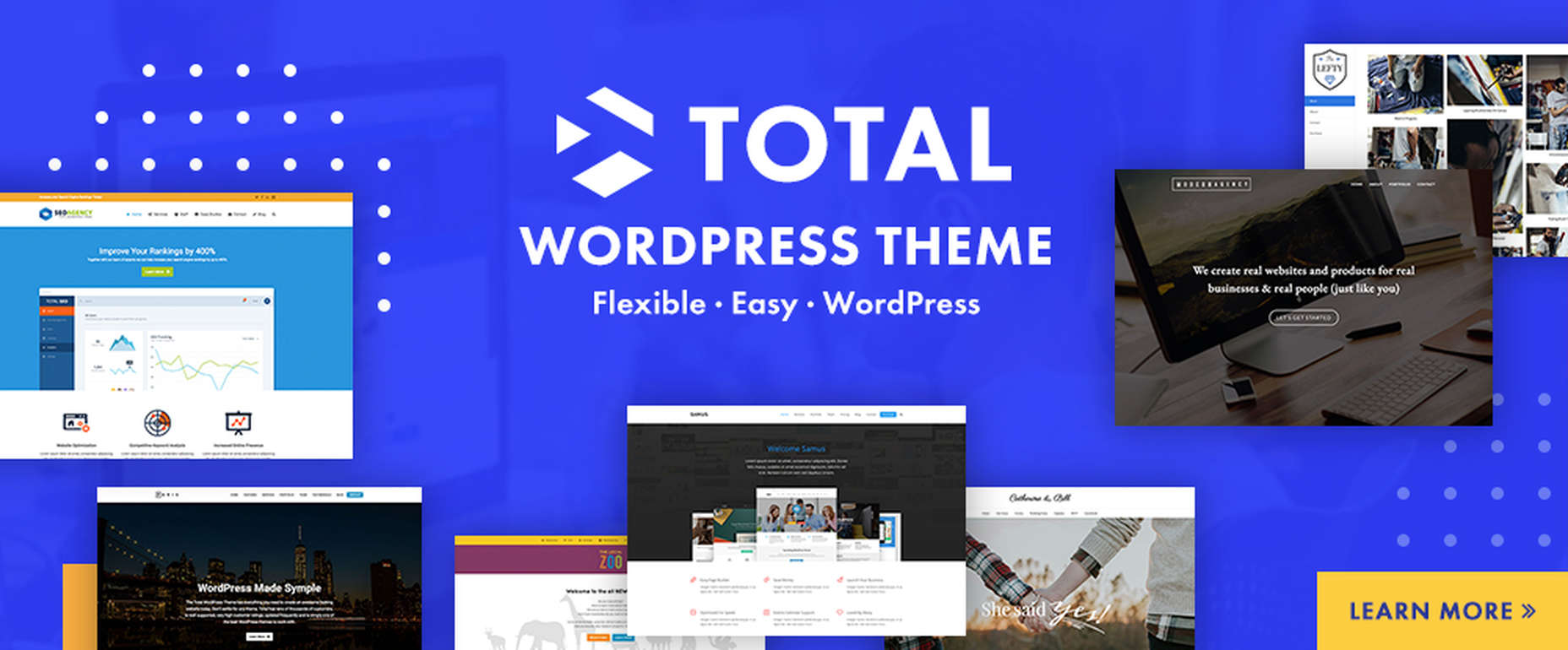
2. Total WordPress Theme

Total is aptly named because of the tools it gives its users; tools that include a premium page builder, demo and template libraries, an assortment of design and layout options, and cool navigation features.

  • The premium page builder is an extended version of the popular WPBakery frontend drag and drop page builder. Slider Revolution, another premium design aide, also comes with the package.
  • Design options include more than 500 live customizer options and 100+ customizable builder blocks, page builder block animation capabilities, custom backgrounds, and custom title backgrounds.
  • Layout options range from boxed and full-width and dynamic layouts to page and post designs and one-page site layouts.
  • Header styles, local scroll menus, and mobile menu styles contribute to website navigation capabilities.

Total is easy to set up and work with, plus it is 100% responsive. Click on the banner to find out more.
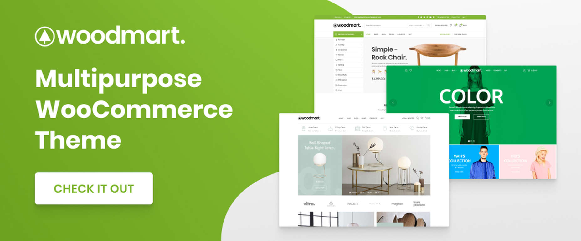
3. WoodMart

WoodMart is a premium WordPress theme that has been designed from the ground up to enable its users to create superlative WooCommerce online stores. WoodMart doesn’t require the use of multiple plugins as the most important tools, and features users simply must have come right out of the box.

They include:

  • For starters, a supply of 70+ demo layouts, 370 premade sections, plus an extensive template library for Elementor and WP Bakery.
  • A powerful Theme Settings Panel with a graphics interface to make changes quickly and easily.
  • AJAX techniques that guarantee the super-fast loading that is so important with multi-product pages and galleries.

WoodMart-built websites are search engine friendly, multilanguage ready, 100% responsive, and RTL and retina ready, and GDPR compliant.

Click on the banner to see what your WooCommerce store could look like.

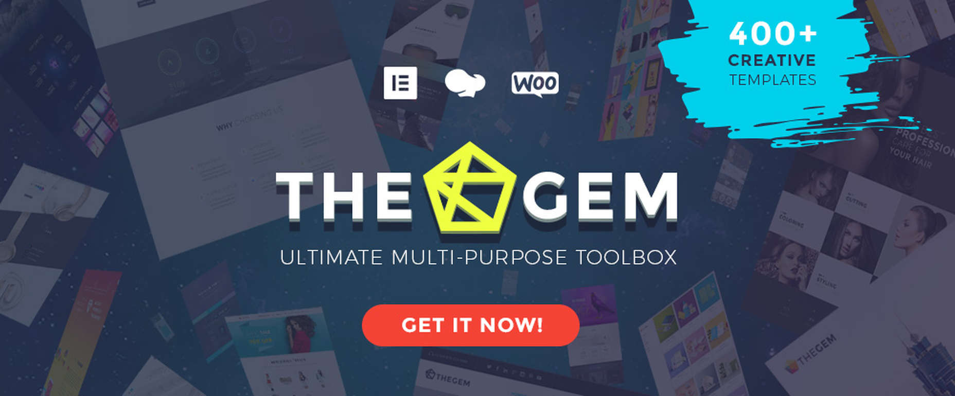
4. TheGem – Creative Multi-Purpose & WooCommerce WordPress Theme

TheGem is the best-selling theme on ThemeForest, which isn’t surprising since its multiplicity of features has led to it being called the Swiss Army Knife of WordPress themes.

Key features include –

  • 400+ beautiful websites and templates for any purpose or niche.
  • TheGem Blocks with its 300+ pre-designed section templates to speed up your workflow – a genuine game-changer.
  • Elementor and WPBakery page builders.
  • An outstanding collection of WooCommerce templates for any shop type.

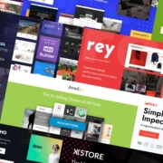
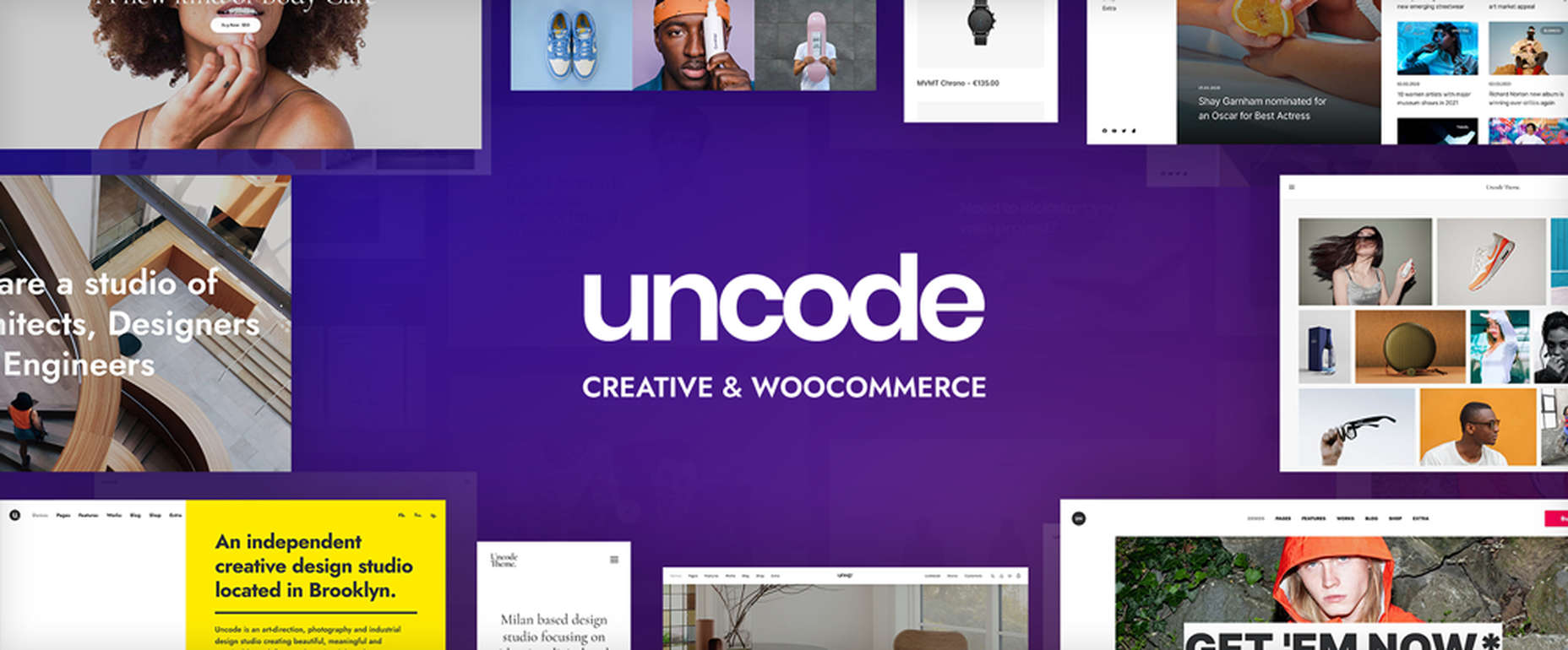
5. Uncode – Creative & WooCommerce WordPress Theme 

Uncode is a pixel-perfect theme packed with dozens of advanced and unique features designed to produce a pixel-perfect website.

These features include:

  • An enhanced Page Builder with a juiced-up Frontend editor
  • A WooCommerce Custom Builder
  • A wireframes plugin for importing 550+ professionally designed section templates

Uncode has sold more than 85,000 copies to date. It is the ideal WordPress theme for building an impressive blog, portfolio, eCommerce, and magazine sites.

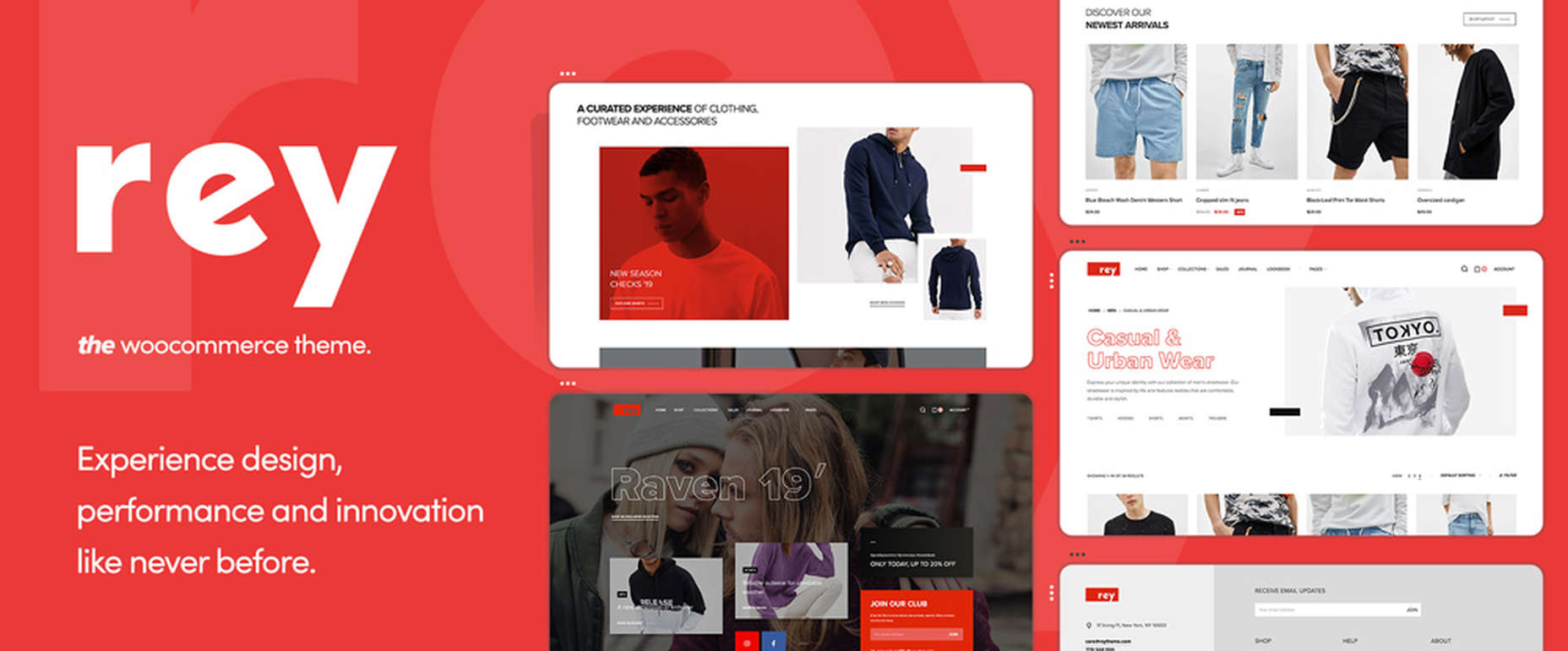
6. Rey Theme for WooCommerce

eCommerce is said to rest on four pillars – filtering, search, navigation, and presentation. This WooCommerce-oriented WordPress theme fully addresses each one. Rey lets you experience design, innovation, and performance in ways you could only dream of before.

There’s:

  • The powerful and popular Elementor page builder with built-in features supplemented with Rey’s extra spices.
  • Ajax navigation, including infinite loading.

Rey is multilanguage-ready, obviously responsive, SEO friendly, developer-friendly, and performance-oriented.
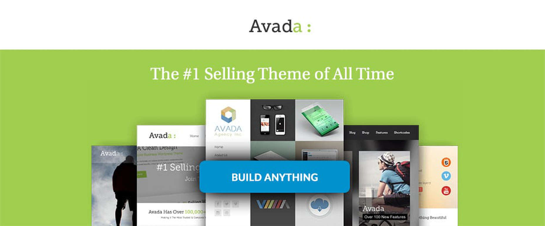
7. Avada Theme

One easy way to know you’ve picked the right theme is to select Avada, the #1 best-selling theme of all time, a popular theme that is loved by 450,000+ happy users.

  • Avada’s Fusion Theme Options, Fusion Page Options, and Fusion Builder will give you more than enough flexibility, while its 40+ free eye-candy demos provide the inspiration.
  • Avada also gives you easy access to some of the most popular premium plugins.

And that’s just the beginning.

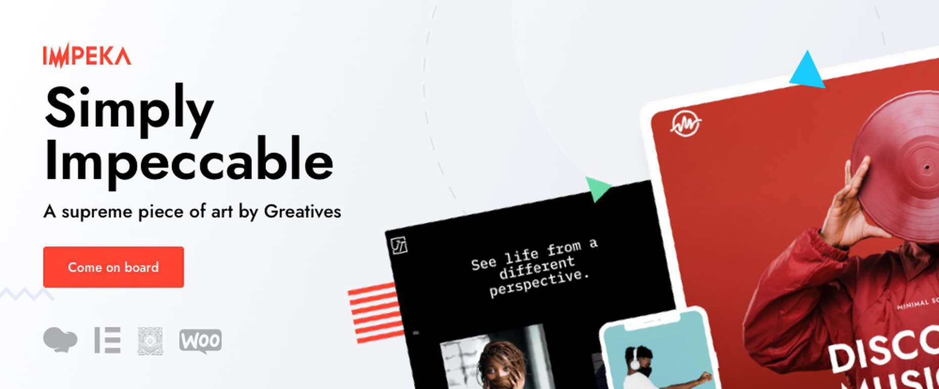
8. Impeka – Creative Multipurpose WordPress Theme

This simply impeccable WordPress theme is filled with potential for the advanced user and, at the same time, easy for a beginner to use. Using Impeka simply involves:

  • Selecting Elementor, Gutenberg, or an enhanced WPBakery as your page builder.
  • Using WooCommerce to build your online shop.
  • Sifting through a multitude of features that include the Mega Menu and Footer and Popup builders.

Your website will be super-attractive, lightning-fast, fully responsive, and SEO perfected.

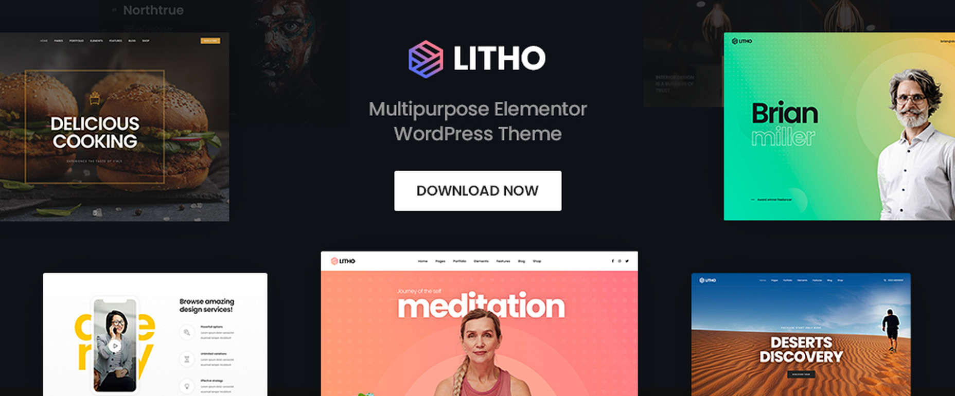
9. Litho – Multipurpose Elementor WordPress Theme

This popular multipurpose WordPress theme is built with Elementor, the world’s #1-page builder.

  • Litho can be used to build websites of any type and for any business niche.
  • It is excellent for building portfolio, blog, and eCommerce websites.
  • There are 37+ home pages, 200+ creative elements, and 300+ templates to get you started and assist you along the way.

Litho-built websites are fast loading and deliver healthy SEO results.

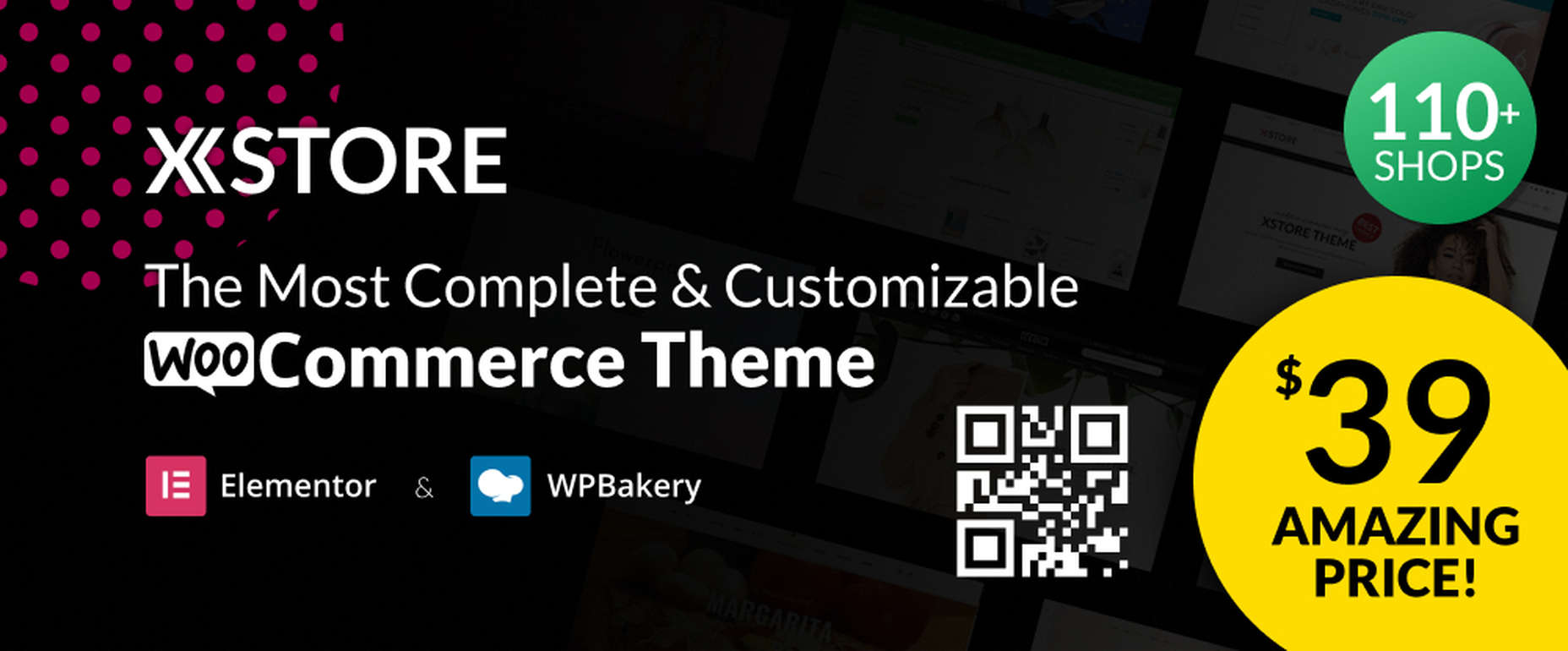
10. XStore – Best Premium WordPress WooCommerce Theme for eCommerce

You can start with one of XStore’s more than 110 amazing pre-built shops, or start from scratch and let Elementor or WPBakery and more than 550 pre-built blocks help you along the way, together with:

  • $559 worth of premium plugins.
  • A Live Ajax theme option.
  • A header builder and a single product page builder.
  • A built-in WooCommerce email builder.

You can get this complete and highly customizable WooCommerce theme for an amazing $39.

One of the benefits of using WordPress is the number of great WordPress themes you can work with. Whatever your niche, your target audience, or your skill level may be, there’s a premium WordPress theme out there that looks and feels as though it was made, especially with you in mind.

If you’re planning to create a fresh and beautiful website for 2022, or you want to completely rebuild an existing one, or simply make some design changes, this roundup of the most popular and the best WordPress themes in the market is meant for you. And we really mean it!


This is a sponsored post.

Source

The post 10 Top WordPress Themes for 2022 first appeared on Webdesigner Depot.

Source de l’article sur Webdesignerdepot

There are a lot of factors that contribute to a better user experience on a website. Pages need to load quickly to give users peace of mind and efficiency. Navigation must be clear and straightforward, with direct pathways for visitors to follow when finding your contact pages, blog posts, and products. Your colors need to work seamlessly together while providing just enough contrast in the areas that need it most.

Excellent user experience needs to be considered for every part of your website that acts as a touchpoint with a potential customer or user.

One of the most significant touchpoints of all is your forms.

All websites need some form of interactive content to thrive. Users need to be able to do something with the site, whether it’s looking for information with a search bar, contacting a team for a quote, making a booking, or completing a purchase. Forms power the majority of the interactive activities available on websites.

If you know how to master great UX on a form, you can contribute to more meaningful interactions between your brands and their customers. But not all web forms are the same. Here are some of the top types of forms you need to master and how you can optimize them.

The “Opt-In” Form

The Opt-in Form is probably the best-known form in the digital landscape. It’s essentially a form that asks visitors to “opt-in” to a specific offer. Sometimes, this means signing up for a webinar; other times, it’ll be agreeing to an email newsletter or a regular series of blog updates.

Opt-in forms grab attention quickly and ask for something specific from the audience. For instance, this example from HuffPost encourages visitors to “Subscribe to the Morning Email.”

Opt-in forms are all about generating action.

Sometimes, they’re placed at the bottom of a landing page after a company has had a chance to explain precisely what they’re offering. Other times, you’ll find the opt-in form situated on a sidebar of a website, constantly enticing people to “sign up” if they like what they see on a blog post or article.

It’s also common for opt-in forms to appear as pop-ups and exit pop-ups on modern websites. For example, a brightly colored opt-in form that promises an immediate benefit to a customer could encourage them to hand over their details before they abandon your website.

How to Design a Great Opt-In Form

So what kind of best practices go into an excellent opt-in form?

  • Start with simplicity: If you’re asking your visitors to do something, don’t overwhelm them with too big of a request straight away. Keep the form short and simple, so it doesn’t seem like too much extra work for the visitor. Something like “Subscribe to our newsletter” should ask for nothing more than an email. 
  • Highlight the benefits: Most customers won’t want to give you a place in their inbox or the opportunity to interact with them further unless you can offer something in return. Even if you’re asking for something small, like an email address, let the customer know what’s in it for them. In the HuffPost example above, the company highlights that you can wake up to the day’s “most important news.” 
  • Give the visitor the power: Let your visitor know they’re in control here. They want to see that they’re getting exactly what they need from you in exchange for their contact details. This means reassuring them that their email address won’t be used for spam, like H&B Sensors does here: 

The Contact Form 

The Contact Form is another crucial part of building an effective UX for your website – but it’s also an element that web designers and business owners often overlook. When customers decide they want to learn more about a business, they need a quick and easy way to get in touch.

Contact forms need to be easy to find and use on any website. Usually, your user will expect to see a link to the contact form situated somewhere at the bottom of your webpage. It might be called “Contact Us” or “Customer Support.” Avoid anything that would go over the user’s head.

Aside from being easy to track down, your contact form also needs to reassure an audience that they’re making the right decision by getting in touch. Therefore, the content needs to be short, sweet, and authoritative—highlight why the user might contact your company and how they can do so.

Avoid any unnecessary information in the contact form. For example, you don’t need to know your client’s age and their job to answer a question about where their nearest physical branch is. Keep form fields to the point, or you’ll chase customers away.

How to Design a Great Contact Form

Design something personalized but straightforward to make the most of your contact form. Use features like smart content and conditional logic, if possible, to adapt the page to the user’s needs. Dynamic content is becoming increasingly valuable these days. Other best practices include:

  • Set the right expectations: Let your customers know how active you are and how quickly they can expect to hear back from you. Imagery and the right fonts can also set expectations about the kind of communication your audience can expect. For example, this contact page from the Marvel app is fun and playful, like the company itself:

  • Provide multiple options: If your customer doesn’t want to use your contact form, give them another way to get in touch. Ensure the contact page includes information like where to find you on social media and your professional phone number. 
  • Simplify things on your end: To ensure that you can contact your audience as quickly as possible, allow your customers to choose a specific subject that their query is connected to. Allowing them to choose “Sales” or “Order issues” means you can automatically direct the message to the right team member on the back-end. 

The Online Payment Form 

Sometimes, when your customers have seen what you have to offer and they’ve checked out the competition, they decide to go ahead with their purchase. To facilitate this, you’re going to need an online payment form. Online forms ensure that your customers can safely enter their credit or debit card details to purchase whatever you have to offer.

Most payment processing companies like PayPal, Square, and Stripe come with payment forms included, so you can easily embed them into a website in minutes. However, there’s always the option to customize those payment forms.

For instance, ideally, you’ll need a payment form that keeps your customer on the same page, so they don’t have to log into another browser to make their purchase. The fewer transitions your client has to make, the safer they’ll feel.

How to Design a Great Payment Form

When designing any payment form, simplicity and security are the two most important factors. Your customer should be able to enter their information quickly and easily and get through the transaction process without worrying about their details.

Remember to:

  • Keep it simple: The fewer fields the visitor has to fill out, the better. Customers still feel uncomfortable sharing personal information and payment details online. Make the experience as painless as possible. If your client already has an account with your business, you might create a system that automatically fills some of the fields, such as their email address, name, and billing address. 
  • Offer the right integrations: The proper payment forms will integrate with the payment services your customers prefer to use. Options include PayPal, Stripe, Square, Verified by Visa, and Mastercard. Get a developer to integrate the right APIs with your form to give your customers the broadest range of options. 
  • Ensure security: Give customers peace of mind by providing as much security evidence as possible. An SSL certificate that places the padlock on the top of the browser next to the URL is a great way to make customers feel more secure. Integrating verification options so your customers can avoid fraud issues is another significant step. Sometimes just putting logos from the card types you accept on the page will make a customer feel more secure. 

Support Forms

Some companies bundle the contact form and the support form together. Others have a separate support form to get their queries routed directly to the people most capable of helping them. If you want to take the second route, it might be a good idea to design a “help” section on your website where you can locate the support form.

The “Help” section on a site often appears alongside other links on the footer. For instance, it could appear alongside “About” links and “Contact” options. Here’s an example of Hubspot’s Customer Support options:

The best customer support pages come with various ways for clients to help themselves and find answers to their most pressing questions. For example, you might have a search bar where your audience can search for the answers to their queries or a knowledge base full of helpful blogs.

Hubspot allows users to choose between a blog, knowledge base, academy training center, community forum, developer discussion board, and assistance from a certified partner.

How to Design a Great Customer Support Form

Designing a good customer support form is about getting your audience the information they need as quickly as possible. Once again, you’ll need to stick to as few form fields as possible here to avoid angering an already frustrated customer. Also, remember to:

  • Ask for the right information: Find out what the query is about by giving the customer a drop-box menu full of possible topics to choose from. If you need a product reference number or something similar, ask for that at the top of the form, then allow the customer to provide extra information about their query underneath. 
  • Set expectations: Let your customers know when they can expect to get a response to their concerns and provide them with advice on what to do next. For instance, you could invite them to check out your knowledge base while they wait for a response. 
  • Keep it simple: Avoid using technical jargon on your support request forms. Be direct in your requests for summaries of the issue at hand, contact information, and other supplemental data. 

Customer Feedback Forms

According to Microsoft, around 96% of customers say that customer service is crucial in determining their loyalty to a specific brand. Another 52% of global customers believe that companies need to respond to the feedback provided by customers.

To ensure your customer service strategies are on-par with what your customers expect, you need to get feedback from your audience. That’s where a feedback form comes in. Customer feedback forms often appear after a client has finished purchasing on the “thank you” screen. They may also occur after a customer has completed a service interaction online.

Here’s an example of an Apple feedback form:

How to Design a Great Customer Feedback Form

By leaving you feedback, your customer is doing you a massive favor. They’re giving you a chance to learn from your mistakes and improve the service you can give next time around. Feedback is one of the best tools for any business that wants to grow and thrive.

If you want your customers to use your feedback forms, you’ll need to make them as simple as possible. Your customers don’t have time to waste on a complex form.

  • Don’t make any fields mandatory: Don’t stop your customers from submitting a form unless they’ve completed every field. Allow them to enter the information they consider to be the most important, and that’s it. You can even fill some of the form out for your customer, if possible, by entering their name and email address if they’re already a member of your site.
  • Make it mobile responsive: Remember there are around 3.5 billion smartphone users worldwide. You can’t afford to lose feedback because your form isn’t responsive. Every form should look and feel incredible on any device. 
  • Include a rating option: If your customers don’t have much to say about your service, or they’re not wordsmiths, they might prefer a rating option instead. A one-to-five rating system that allows your customer to judge your product or service on a scale of poor to wonderful is a great way to gain quick information. Check out the Uber Engineering example here:

Though you can pre-enter some information on a feedback form to make your customer’s life easier, don’t overstep your bounds. Adding your customer’s email address to the form is fine if they’re already a customer with you. Pre-selecting the “very satisfied” rating above would look presumptuous.

Top Tips to Improve Every Form Design

The online form is an essential part of any web design project, but it’s also frequently overlooked. Unfortunately, without a good set of forms, your customers will struggle to interact with your company in a meaningful way.

When creating any form, remember:

  • Reduce friction: Reduce the friction for your customers by asking as few questions as possible. The less your customer has to answer, the better. If you can pre-populate forms with information like your customer’s name and email address, this could help. 
  • Keep it simple: Make sure that the form is clean and easy to use. Your customers shouldn’t be confused about where to click or how to submit their information. A single-column design is often better than a multi-column option.
  • Be clear in error messages: Don’t just tell your visitors that something has gone wrong. Let them know what they need to do to submit the form successfully. If possible, use inline validation with real-time feedback to let your audience know that you recognize the information they’ve submitted.
  • Keep data secure: Make sure your audience feels safe by letting them know how you will use this information and why you’re asking for it. If you’re asking for an email address, make the benefits of entering that information clear. 
  • Make fields optional: Allow your audience to add more information to a form if they want to – but don’t demand it. Give some freedom to the visitor. 

The better your forms are, the more effective your interactions with customers will be. Remember, it’s not just the face-to-face interactions that your customers judge when making decisions about your business and whether to trust you. Today’s digital world has prompted a new demand for more meaningful virtual experiences.

Your form could be the first interaction you have with a client, whether it’s a contact form, a booking form, or something else entirely. Get that right, and you can improve your chances of your customers coming back to interact with you again later.


Featured image via Pexels.

Source

The post The Top 5 Form Types to Use in Your Web Design  first appeared on Webdesigner Depot.

Source de l’article sur Webdesignerdepot

Much of the software development world has adopted new methodologies, such as agile, that enable them to deliver changes and updates to critical systems more quickly and efficiently.

In this 2-part blog series, I explain what agile development is and how it helps deliver software faster and then explore how you can implement this approach in SAP.

Source de l’article sur DZONE

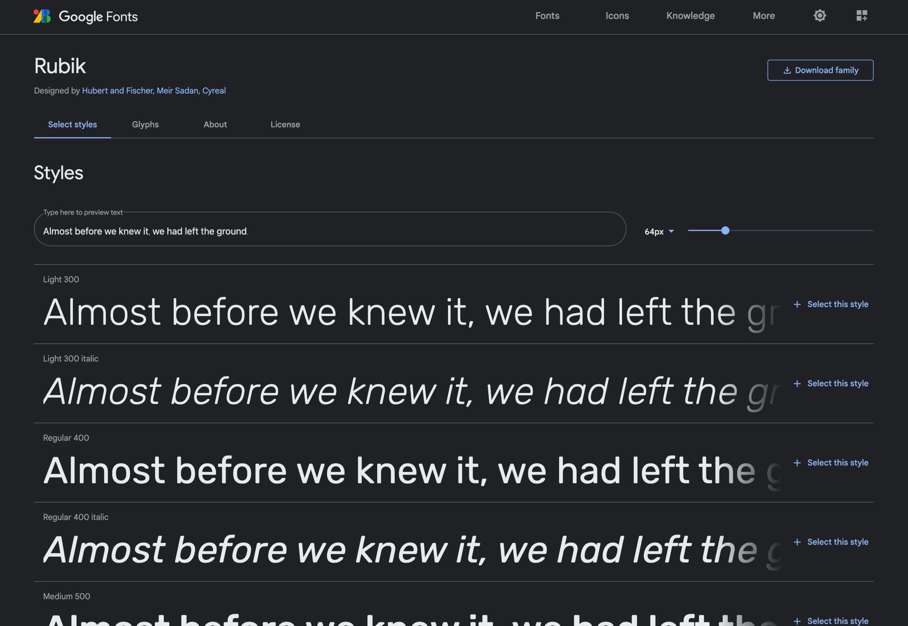
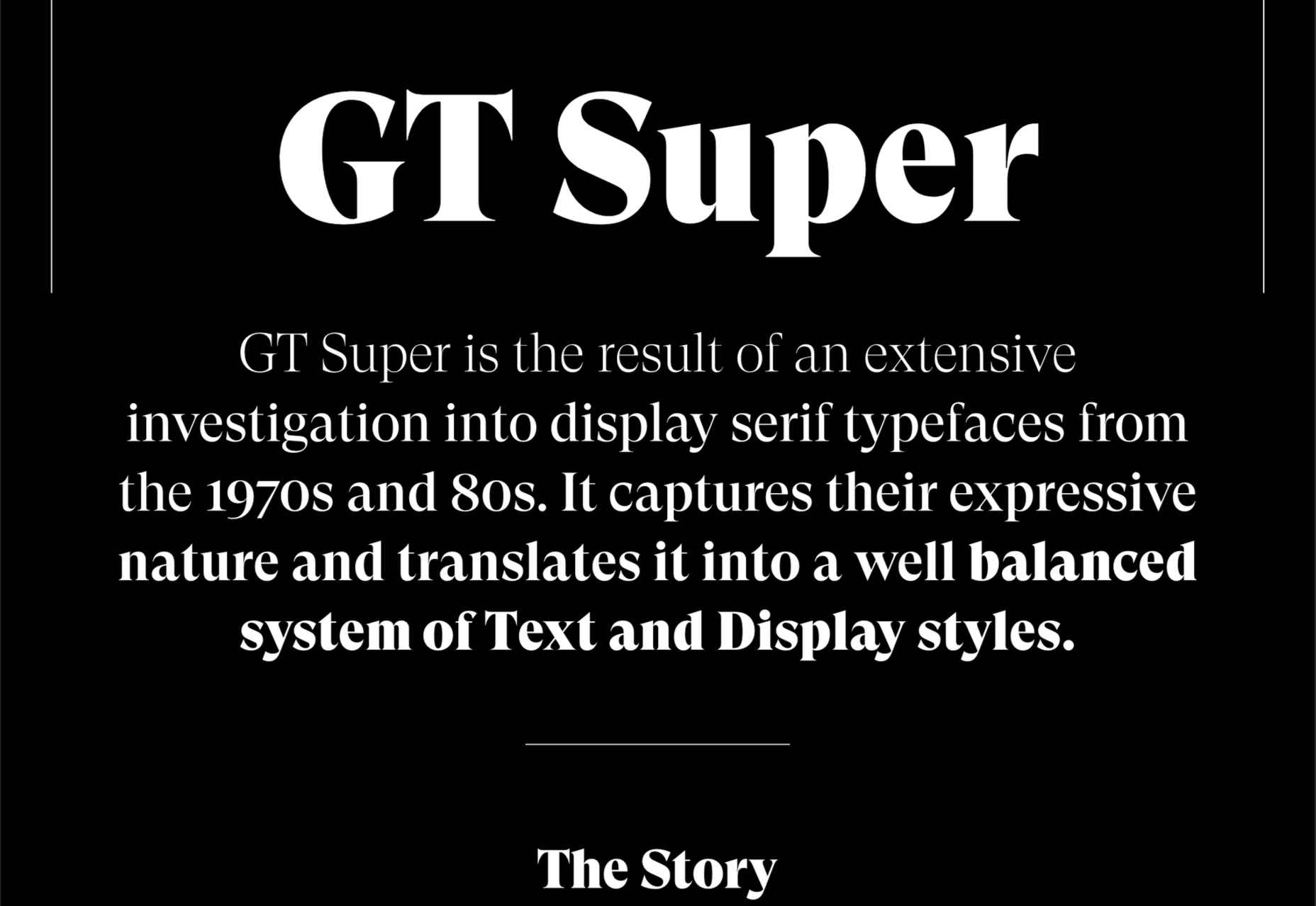
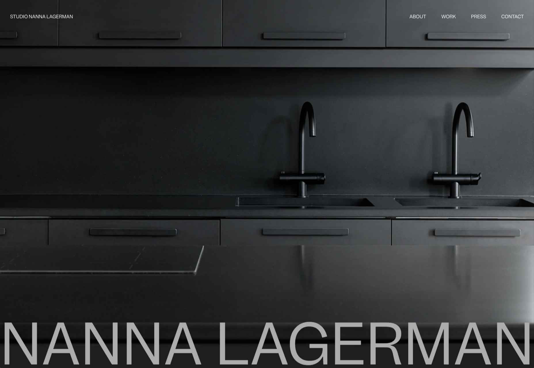
The choice of typeface is one of the most critical factors in any design; it gives the text its voice. It can be desperately frustrating to find the right voice for your project, only to discover it’s outside your client’s budget.

Who doesn’t love a free font? There’s no question that something for nothing is an attractive proposition. When it comes to fonts, the problem is that high-quality fonts require months, sometimes years of work; high-quality fonts are expensive to produce; as a result, many free fonts have to cut corners.

However, decreasing costs for font design software and an open-source culture is making the industry more accessible, leading to hundreds of free fonts as good, if not better, than their premium rivals.

The challenge for designers is where to look. The solution is Typewolf’s Definitive Guide to Free Fonts. This tremendous, 107 page PDF covers everything you need to know to find the best, high-quality free fonts on the web.

Typewolf is one of the most trusted names in digital typography, with an excellent track record of educational guides; you can be sure the suggestions in this guide are second to none.

The guide is split into four sections:

  • Section one covers the closest free alternative to every font on Typewolf. The free alternatives list focuses on the popular, and in many cases, the most expensive fonts used by professional designers. That means you’ll have access to over 1,000 recommendations, all listed alphabetically for easy look-ups. Simply find the premium font you want, and you’ll find the closest free font available listed alongside it. In many cases, there are multiple suggestions to give you some agency.
  • Google Fonts is an excellent source of free fonts, but its own recommendations are weak. So the second section of the guide is dedicated to the ten best serif and sans-serif combinations on Google Fonts. The best serif and sans-serif combinations include visual examples, and explanations of why these typefaces complement each other, so you don’t find yourself designing in the dark. This section is excellent for anyone who’s unsure where to start with free fonts and needs to identify an effective pairing quickly.
  • As good as Google Fonts is, it’s not the only source of free fonts, and if you only look there, you’ll miss out on some real gems. That’s why section three of this guide introduces the 40 best free fonts that aren’t on Google Fonts. Each font listed is carefully presented to preview it at display and body sizes.
  • Lastly, to finish off this excellent ebook are the ten best free “hipster” fonts. You know the ones: they’re perfect for coffee shops, small-batch brewers, tattoo parlors, and anywhere Rockabilly is still in style.

All told, there are enough recommendations in this guide to last you an entire career. So no matter what you’re looking for, whether it’s a free version of a particular typographic voice or some fresh inspiration, you’ll find it in this essential ebook.

What’s more, you’ll receive lifetime updates for free. With new content added weekly, this ebook will be a source of knowledge and inspiration you return to again and again. Lifetime access means you can re-download the guide every time you have a project that needs free fonts. You’ll also get access to an exclusive section of Typewolf that showcases only free fonts, so you can see how free fonts can be used well.

Every good designer understands the value of high-quality typography, but not every project has the budget to allow you to use premium fonts from top type foundries. This guide helps you leap that hurdle by offering carefully selected, free alternatives. If you’re new to the world of typography, this helpful guide will give you some practical insight on how to locate free fonts for use in your design work.

This guide will save you hours trying to find the suitable typeface for your project, as well as introduce you to some excellent designs that you might not have considered.

You can download Typewolf’s Definitive Guide to Free Fonts today for the bargain price of $39. You could even gift it to the typophile in your life.

Source

The post Typewolf’s Definitive Guide to Free Fonts first appeared on Webdesigner Depot.

Source de l’article sur Webdesignerdepot

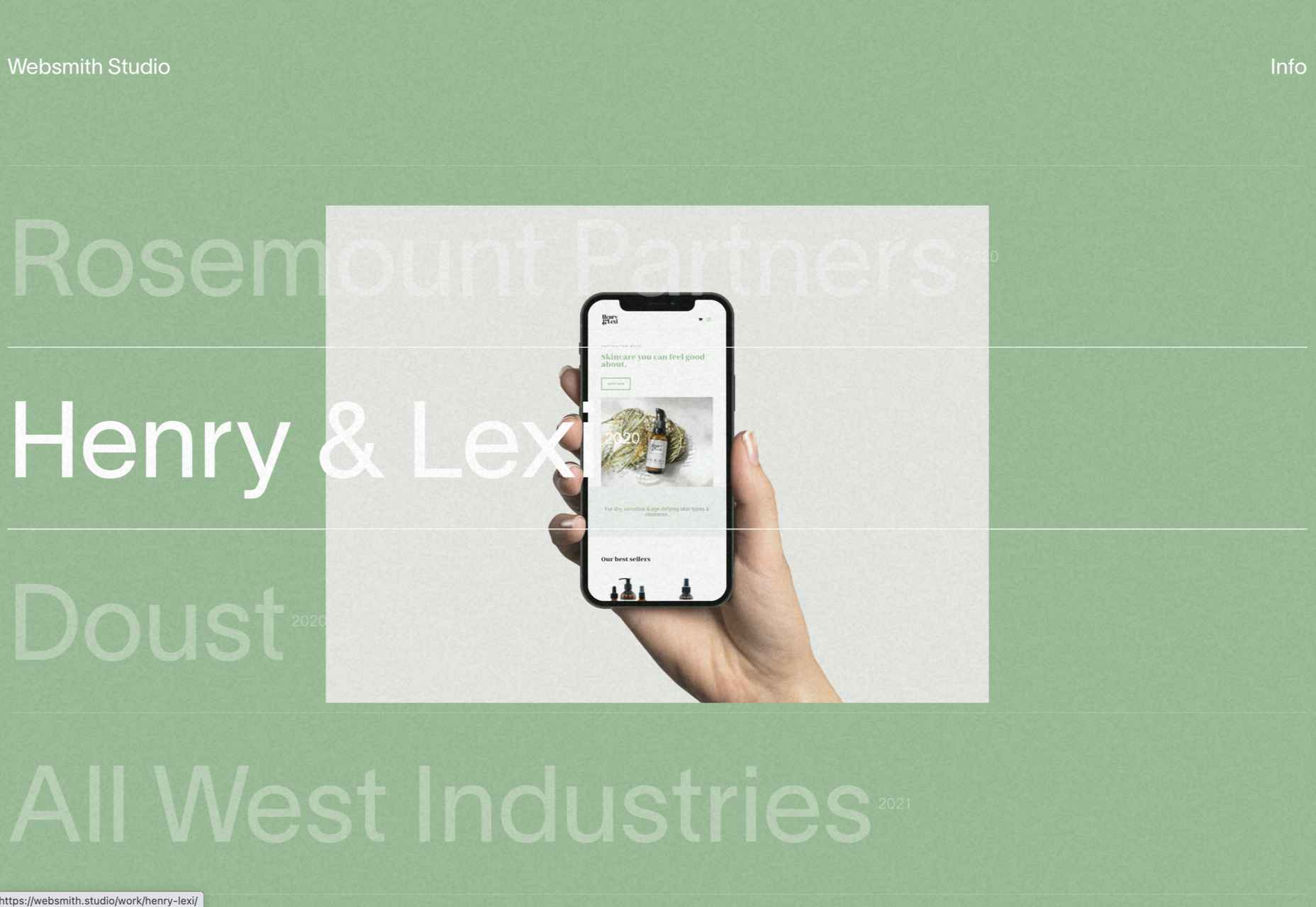
2021 has been both memorable and instantly forgettable. Pop stars were freed from modern-day servitude, some people tried to overthrow democracy, and we all vacationed at home.

Despite the weirdness of the times, the web kept growing, kept changing, and kept on pushing boundaries. We saw a wealth of new sites launch or relaunch with significant updates.

Here are the 50 best sites launched on the web this year. Enjoy!

Crusta C

In April, seafood company Crusta C cleverly used the simple logomark ‘C’ to apply a cutout video effect.

Slow

Slow is a collective of creatives aiming to implement slow movement principles. Its site reflects those aims, creating a sense of calm and deliberation.

hnst

2021 saw tons of brutalist-inspired design. hnst’s take on the style works thanks to the bright red in place of the standard black.

Marram

This site for boutique hotel Marram uses a soft color palette to create an impression of soft golden light and calm.

Levitate

In July, we loved this site for running-blade brand Levitate. The site is clean and light, with a sense of inherent motion in the photography.

Niarra Travel

There’s some beautiful photography on this site for eco-conscious, bespoke travel agency Niarra Travel.

Plunt.co

The core of this site for Plúnt is a combination chooser which feels pleasingly reminiscent of an animal flipbook.

Moth Drinks

Moth makes classic cocktails in a can. The striking black and white graphics and masking effects for its holding page stunned us back in March.

Seed

Selling supplements is hard; people are understandably skeptical. So this site for Seed packs in research and scientific information and avoids the hard-sell.

Wavemaker

Another excellent portfolio site in 2021, this time for creative media agency Wavemaker. The site is uber-confident while still being playful.

Wild Souls

Wild Souls makes nut butters, tahini, and other Greek delicacies. Its site is colorful and warm, and the site typography is soft and appealing.

JUST Egg

JUST Egg produces egg-like food from plant material. The huge photography and bold typography do a great job of making a new concept appealing.

Aalto University

One of the most popular designs of 2021 was Aalto University’s site with its in-depth campus tour. The simple navigation inspired several imitators.

Wisr

Scroll interactions were big in 2021, and Wisr features a Heath Robinson-style machine that ‘runs’ as the user scrolls down the page.

Cevitxef

This site for Cevitxef ceviche restaurant in Bilbao does a great job of making us hungry. Drama is created by oversized text, heavily-styled photography, and lots of movement.

On

The best digital agencies keep their own sites simple, like this site for On digital technology studio that uses black on light blue and adds infinite scrolling.

Acayaba + Rosenberg

We found Acayaba + Rosenberg’s use of architectural photography and subtle scrolling a pleasing browsing experience.

Madre

This site for home linen company Madre uses extraordinary fine-art style still-life photography to enrich a very simple site.

Hyperframe

“Show, don’t tell” is a well-worn mantra. Hyperframe’s site implements it by demonstrating the product’s major selling point on scroll.

Gemini

This exceptional WebGL experiment was built to show what’s possible in the technology. Have a play with the car; it’s a ground-breaking demo.

Felt

In 2021, collaborative mapping tool Felt launched in private beta. Its excellent site does a great job of creating interest while doubling as a recruitment notice.

imNativ

Not every project is exciting, but this excellent site for imNativ uses macro photography to great effect to promote upholstery fabric.

Websmith Studio

Excellently named Websmith Studio uses color to highlight, and the noise effect applied to the background adds subtle interest.

Singita

High-quality photography and a terracotta-based color scheme create an inviting ambiance for Singita, an African eco-tourism and conservation brand.

Fluff

A fullscreen background behind a mobile view for desktop? It sounds like a horrible idea, but this site for cosmetics brand Fluff pulls it off.

Chiwawa

This great site for Chiwawa cantina features wrestling masks, skeletons, and tone-on-tone color to create a lively and distinctly Mexican site.

Nothing

This site for Nothing’s ear(1) earbuds is packed with confidence. Appropriately, it looks even better on mobile.

Chérie Healey

Lots of experts have tried to tell us how to live our lives in the last couple of years, but Chérie Healey’s site manages to stay on the right side of positive without slipping into clichés.

Wayfinder

Wayfinder, a game about our connection to nature using generative code, AI, machine learning, and data mining, could not have been more 2021 if it tried.

Green Angel Syndicate

Not too many investment groups are thought of as ethical, but Green Angel Syndicate specializes in funding companies fighting climate change.

Tether

As the days got darker in the Northern hemisphere, we were wowed by this site for Tether, a cycle safety system using video and illustration to explain its clever approach to bike safety.

Patricia Urquiola

Back in January, we loved the new site for Patricia Urquiola design studio, thanks to its bright, bold colors that we thought inspired confidence.

Headup

Headup’s businesslike approach is created thanks to a pleasing color palette and geometric graphics.

Redwood Empire

For Earth Day on April 22nd, Redwood Empire Whiskey created a microsite promoting a competition styled to match their bottle labels.

GT Super

The one-pager for GT Super has a certain drama in keeping with the font itself and allows you to play around with the size, weight, and style.

Planet of Lana

Due for release in 2022, Planet of Lana is a game from Wishfully Studios, and its teaser page launched back in June has kept us intrigued ever since.

The Longest Road Out

This charming site for The Longest Road Out is a travel map and journal based on the creators’ road trip around Britain, Ireland, and the outlying islands.

Made Thought

Made Thought has a bold aesthetic and approach that explains its outstanding client list.

Miti Navi

Miti Navi makes extraordinary sailing boats. We were attracted to how its site presented a luxury product in an original way.

La Nouvelle

Another powerful digital design agency site was La Nouvelle’s, which used a combination of contrasting and complementary color combinations to catch the eye.

Caleño

Caleño makes non-alcoholic distilled spirits. They relaunched their website in March with bright, joyful colors that reflect the character of the brand.

Capsul’in — Aluminium

This demo site for a coffee pod manufacturer isn’t a site as such, but it demonstrates that even in 2022, there’s room for parallax scrolling.

How Many Plants

Everyone needs a few more houseplants, and How Many Plants is a great guide to how to own and look after them. The illustration style is friendly but efficient.

How & How

One of the most approachable design agency sites of 2021 was How & How’s. It keeps things light and clean, and effective.

The Hiring Chain

Part of a campaign encouraging businesses to employ talented people with Down Syndrome, The Hiring Chain website dispels myths with clearly presented facts.

Virgile Guinard

Back in February, we couldn’t get enough of photographer Virgile Guinard’s portfolio site. Blocks of color pulled from each image hide the image allowing you to focus on one image at a time.

Studio Nanna Lagerman

Studio Nanna Lagermann’s site excels at creating a sense of space and calm. The color palette is soft and neutral. The type is large but clean and sophisticated.

GOOD Meat

Veganism is a growing trend, and one of the sites promoting it with gorgeous colors is this site for lab ‘grown’ meat.

Mama Joyce Peppa Sauce

This one-page site for Mama Joyce Peppa Sauce is big and bold. Click almost anywhere, and two bottles of sauce go into your cart.

Ebb Dunedin

The site bucks the trend for luxury hotel design and instead is styled to complement its interiors. We could have done with time at this boutique hotel in 2021, maybe next year…

Source

The post 50 Best Websites of 2021 first appeared on Webdesigner Depot.

Source de l’article sur Webdesignerdepot

Jamstack (JAMstack), is one of the most popular (and rapidly growing) tools for app and website creation. A unique ecosystem of functionality, Jamstack promises developers the support they need to create powerful websites and progressive applications. 

For a while, Jamstack was mostly written off as just another buzzword in the developer space. However, today, it’s growing to become a powerful investment for many business leaders. Even big companies are getting involved, like Cloudflare, with Cloudflare pages, and Microsoft with Azure Static Web Apps. Elsewhere, we’ve seen brands like Shopify, PayPal, and Nike getting involved too.

So, what exactly is Jamstack, and is it time you transitioned over? Let’s find out…

What is Jamstack?

Jamstack, otherwise known as “JAMstack,” is the name of a developer ecosystem made up of JavaScript, APIs, and Markup (hence: JAM). The solution is a web development architecture allowing developers to access static website benefits, such as higher security and better performance, while still unlocking dynamic database-oriented CMS.

The Jamstack solution allows companies and developers to build a dynamic website where real assets are pre-rendered static files in a CDN. The dynamic environment runs on JavaScript client-side, through serverless functions. 

For a better insight, let’s compare Jamstack to the LAMP stack development strategy, which originated from the four open-source components many developers used to build sites: Linux, Apache HTTP, MySQL, and PHP.

With LAMP, each user request for a page forces the server to query a database — unless the page is cached — and combine the result with page markup data and plugins. Jamstack websites serve pre-built optimized assets and markup solutions quickly because the files are already compiled on a CDN. There’s no need to query the database. 

Jamstack workflows dramatically reduce cumbersome issues with development and excess maintenance, making them highly appealing to developers. 

What Are the Benefits of Jamstack?

Jamstack won’t be the ideal development tool for everyone, but it has a lot of benefits to offer. By fetching HTML from a CDN, the system doesn’t have to wait for HTML to be combined and returned to clients. The solution also provides an improved developer experience with static methods. 

Using Jamstack, developers can build fantastic static files ready to serve by request, hosted on a global CDN. Some of the biggest benefits of Jamstack include:

  • Performance: Because you’re serving pre-built static files from a CDN directly, you’ll achieve much faster loading times, unmatched by typical server-side rendering options. Because you’re serving static files, you’re also better equipped to handle any traffic spikes you might encounter, with minimal slowdown.
  • User experience: Better website performance significantly improves user experience and website traffic, as well as SEO efforts. User experience has always been a critical factor in ensuring the success of a website, and it’s essential to keeping your customers around for as long as possible. Websites optimized for performance will always delight users. 
  • Security: With Jamstack, there are no servers or databases to worry about. You use third-party solutions to handle these issues for you. The architecture of Jamstack means the back and front end of your development processes are decoupled, and you can rely on APIs to run server-side processes easily. Jamstack also comes with security benefits other approaches can lack. Clear separation of services is essential here. 
  • Hosting and scaling: Scaling and hosting can often be problematic in the development world, but because you’re serving files from a CDN, you’re less likely to encounter issues. CDNs are almost infinitely scalable, so you get excellent extensibility built into your development environment. CDN hosting for static files is also cheaper than traditional hosting, so you can keep costs low. 
  • Maintenance: Jamstack makes it easy to push your front end to the edge rather than managing infrastructure directly. Ditching plugins, databases, and other hosting services can help you to save more time and money on a significant scale. 
  • Developer experience: From a developer perspective, there are tons of benefits from Jamstack. You get the ease of a Github, CI/CD, CDN flow, and auto previews with simple rollback to reduce the need for backups. Local developer environments and the ability to run and debug cloud functions locally are all fantastic.

Does Jamstack Have any Limitations?

In a lot of ways, Jamstack is an innovative and revolutionary solution for development. It can help you to create a far more engaging website and present your company in an incredible way. Of course, that doesn’t mean there are no limitations to be aware of. 

Jamstack is developer-friendly, for instance, but it’s not beginner-friendly. You will need at least some knowledge of web development to start unlocking the benefits. You’ll need to understand things like Vue or React, but you should develop a tool anyone can use with a bit of work.

There’s also a handful of things you can’t pre-generate, like user-specific and real-time data. So, this means you may not be able to use Jamstack effectively on projects requiring these kinds of data. Building an analytics dashboard, for instance, probably isn’t a good idea with Jamstack. Other issues for some developers may include:

  • API complexity: It can be overwhelming to try and find the right solution for your needs among so many different options. Of course, this could also be something you’d say about the WordPress ecosystem and its huge variety of plugins. An API usually won’t break your production website, at least. 
  • Long building processes: If you have a large number of pages, there’s more likely to be an extensive building process to think about. Whenever you make a change to a single page, even a little one, you’ll need to rebuild your entire website. This is a problem if you run into a website with thousands of pages. There are solutions to this problem available, however.
  • Handling dynamics: Going with Jamstack doesn’t mean abandoning your backend. An important part of the approach is accessing serverless functions, which are becoming more effective over time. These serverless functions can also be executed on the edge. The backend parts of your website will require regular maintenance as they scale.

Best Jamstack Tools to Check Out

Now you know the basics of Jamstack, let’s look at some of the tools you can use to design an incredible website or application within the Jamstack environment. 

The Git Tool Landscape

There are tons of tools within the Git ecosystem common among Jamstack developers. Starting with Git itself. Git represents a powerful free, and open-sourced distributed version control system. With this solution, companies can handle everything from small to enterprise-level projects with efficiency and speed. The solution is extremely easy to use and learn, and outclasses a range of tools like Perforce, ClearCase and Subversion. 

GitHub Pages and GitLab pages are two hosting services for Git repositories with built-in services to host static pages from out of your codebase. This makes the two solutions fantastic for when you’re building a Jamstack website. You can access the functionality for free too. 

GitLab gives you a comprehensive DevOps platform to work with, where you can enjoy a comprehensive CI/CD toolchain out of the box. The comprehensive solution, delivered as a single application, changes the way security, development, and Ops teams integrate and collaborate. Gitlab helps to accelerate software delivery on a massive scale.

AWS Amplify

AWS Amplify, created by Amazon Web Services, is a development platform packed full of useful features for people in the Jamstack environment. The Amplify offering aims to reduce the complexities associated with Amazon Web Services for mobile and web deployment. You get 12 months of hosting for free with new accounts, and you get Storage with Amplify too. 

The Amazon Amplify solution dramatically improves the regular AWS workflow, especially if you’re just a novice user. There’s a huge documentation hub to help you too, which is way more convenient than Amazon’s usual documentation solutions. Amplify is still accessed from a somewhat bloated console, however. 

With AWS Amplify, companies can access features like a comprehensive data store to sync data between the cloud and websites. There’s also easy-to-use interface access across all different categories of cloud operations. The service works well with a range of JavaScript central tools. 

Netlify

Netlify is a pioneering solution in the Jamstack environment, allowing users to go dynamic with their websites and applications on their own terms. You can access a range of add-ons and integration, access your favorite tools, and make your own. The flexible environment enables developers to run websites on a multi-cloud infrastructure designed for speed and scale automation. 

Built to be entirely secure from the ground up, Netlify makes it easy to build a site that’s custom-made for performance and deployed directly. You don’t need to worry about managing, scaling and patching web services, which means you can more quickly implement your Jamstack architecture. 

Unlike other large legacy apps, Jamstack projects are neatly separate from your front-end pages and UI from the backend databases and apps with Netlify. Using this service, the entire front-end can be pre-built with highly optimized static assets and pages, and developers can deliver new web projects faster than ever before.

Next.JS

Inspired by the functionality of PHP, Next.JS is a solution for pre-rendered JavaScript modules. The solution allows developers to easily export the components of their apps and perform individual tests to determine how each element works. You can also access a wide range of components and modules from NPM. The Next offering allows developers to save time, removing the need to use webpack bundles and transform with compilers. 

The full solution is extremely intuitive, ensuring developers can create solutions quickly. What’s more, the technology you build will allow you to load only the bundle needed from your JavaScript workflow, rather than all the JavaScript at once. Pre-fetching, one of the features of Next.JS, also picks up where standard code-splitting leaves off, allowing for optimized bundles of code to load seamlessly. 

Next.JS also supports hot-module replacement. This means instead of reloading an entire application when you change the code, you only recreate the modules you’ve altered.

Angular

Probably the most widely-recognized of all the JavaScript frameworks, Angular, designed by Google engineers, appeared first in 2012, offering developers a new way to create dynamic pages. Before this technology, there were other opportunities for creating dynamic pages, but they were nowhere near as convenient or speedy. 

Angular is probably one of the most essential tools companies can use when building a Jamstack website or environment. The front-end web development tool attracts developers from all over the world. Every version is packed with features and constantly upgraded to ensure you can generate the best results. 

Angular extends HTML file functionality with powerful directives, and it requires very little effort to enable these directives too. All you do is add the ng- prefix to your HTML attributes and you’re ready to go. Angular also allows developers to create widgets leveraging editable data with two-way binding. This means developers don’t have to write code that syncs constantly between the model and view. 

With Angular, developers also get access to things like virtual scrolling, which can help with displaying large lists of elements performantly, rendering on the items that fit on the screen to reduce loading times. 

React

Another must-have tool in the JavaScript world for Jamstack, the React solution was launched first in 2013, and has won thousands of customers across the globe thanks to fantastic functionality. Today, the full landscape is maintained by Facebook, along with all the members of the standard developer community. The solution is used by some of the biggest giants in the tech industry, like Netflix, PayPal, and Apple. 

React is a true pioneer in the Jamstack ecosystem, with its sensational approach to simple and straightforward solutions for JavaScript management. You’ll be able to access batched and virtual DOM updates, which makes it easier to unlock components quickly, and write your components the way you see them. There’s also the added benefit that React is compatible with a lot of tools. 

You can build a comprehensive app or website with the help of React, and you’ll have no trouble accessing some of the top features, particularly with plenty of support available from the React community. 

Gatsby

Created from the ground up to improve user experience on a comprehensive level, Gatsby is a static site generator with heavy focus on things like SEO, performance, and accessibility. The solution offers plenty of out-of-the-box features to help developers deliver the most immersive solution for their users, without unnecessary complexity. 

Gatsby users pre-configuration to develop static websites giving developers faster loading pages, stronger code splitting, and server-side rendering. You can also access features like data prefetching, asset optimization, and quick image loading. Gatsby boasts excellent documentation and starter packs to help you get your site up and running more quickly.

The GraphQL data layer of Gatsby also means the system can collect your data from anywhere, including your CMS, JSON, Markdown, and APIs. More than just your standard site generator, this is a tool built specifically with performance in mind. 

Agility CMS

Developing an effective Jamstack website means having access to the right CMS technology. Agility CMS wasn’t the first CMS solution to support Jamstack, but it is one of the better-known options. As one of the first headless CMS solutions to hit the market, the company has quickly captured the attention of a huge range of developers worldwide.

Agility CMS is a Jamstack pioneer, capable of helping developers to build a foundation for any online ecosystem. The technology is an API-first CMS with support for REST APIs, so developers can connect all the third-party apps and front-end frameworks they like.

The technology also gives developers the freedom to code their solutions their way. You don’t have to follow a specific set of guidelines for how content is created, but templates are available to fast-track development. Agility CMS also hosts and abstracts your database, so you don’t have to worry about connection strings, backups, and maintenance. 

With a strong content architecture to help companies manage digital content and a partnership with Gatsby, Agility is ideal for Jamstack development strategies. 

Building Your Jamstack Website

The Jamstack solution is more than just a buzzword in today’s development world. This unique approach to building incredible development experiences delivers an excellent advantage to both developers and their end-users. Fast, scalable, and full of solutions for customization, Jamstack is a powerful way to bring websites to life with simplicity and speed. 

Every day, more companies take advantage of the Jamstack environment, and we’re constantly seeing a wide selection of new tools, APIs and offerings emerging to help enhance the Jamstack landscape too. This environment is definitely worth consideration for any developer looking to significantly speed up their development strategy.


Featured image via Pexels.

Source

The post Is it Time to Transition to JAMStack? first appeared on Webdesigner Depot.

Source de l’article sur Webdesignerdepot

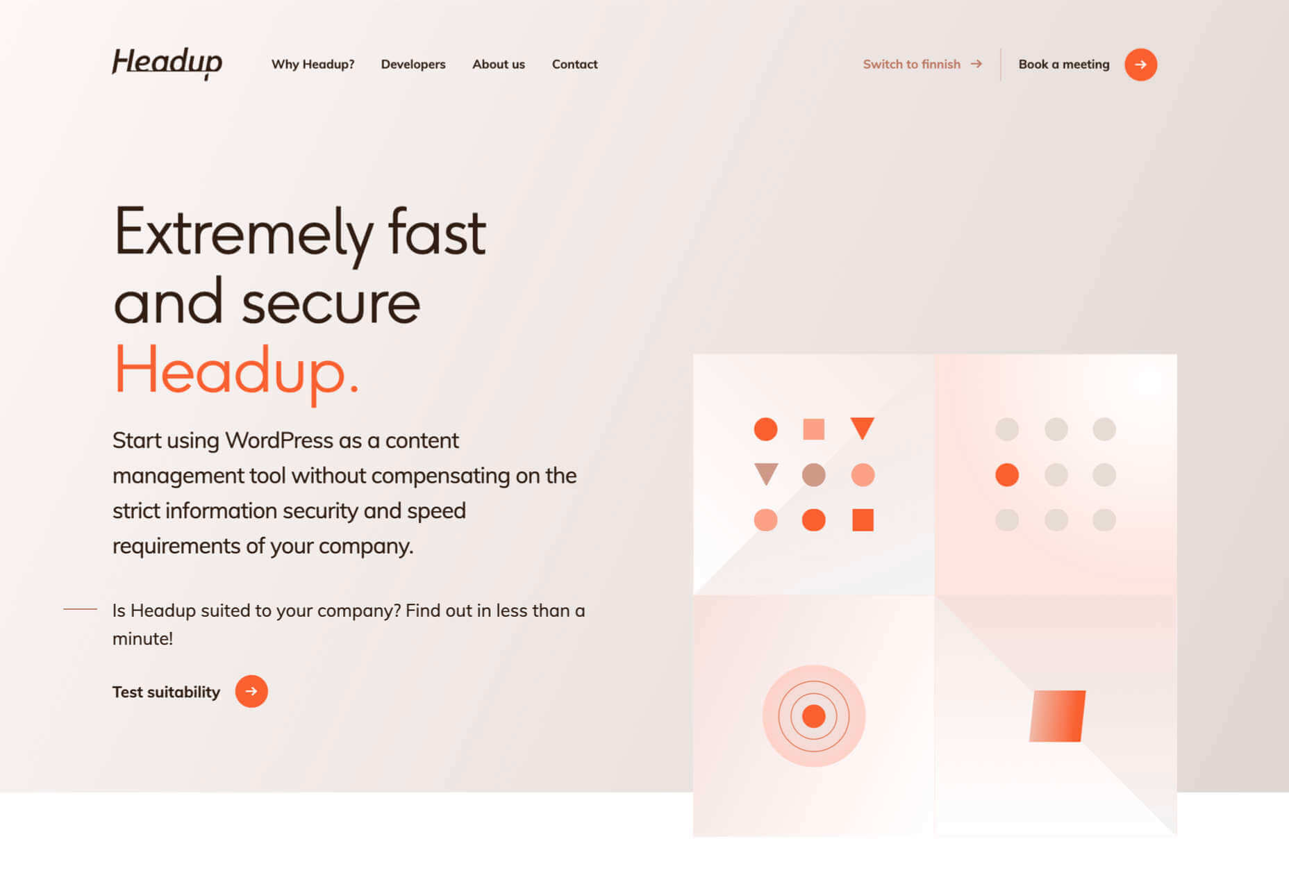
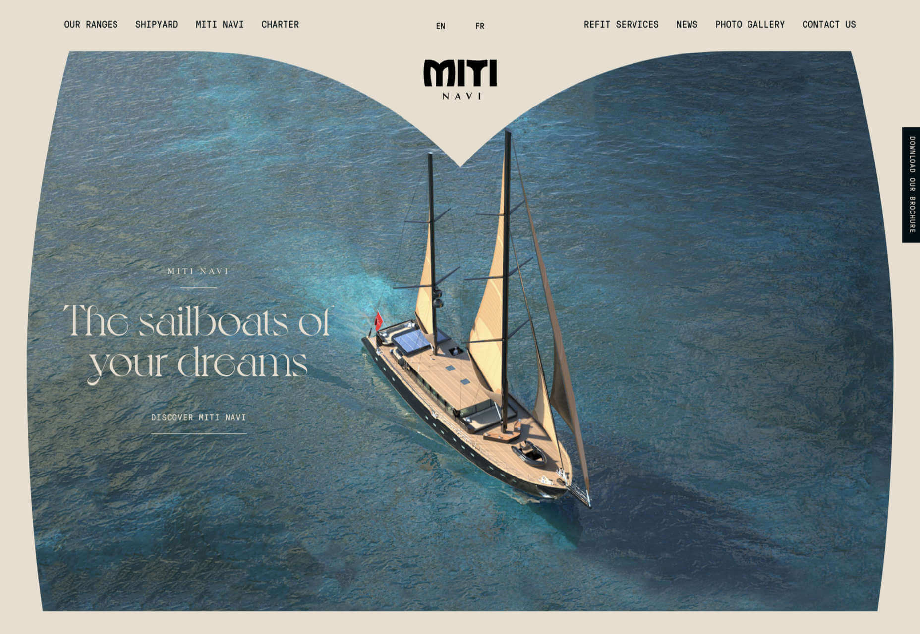
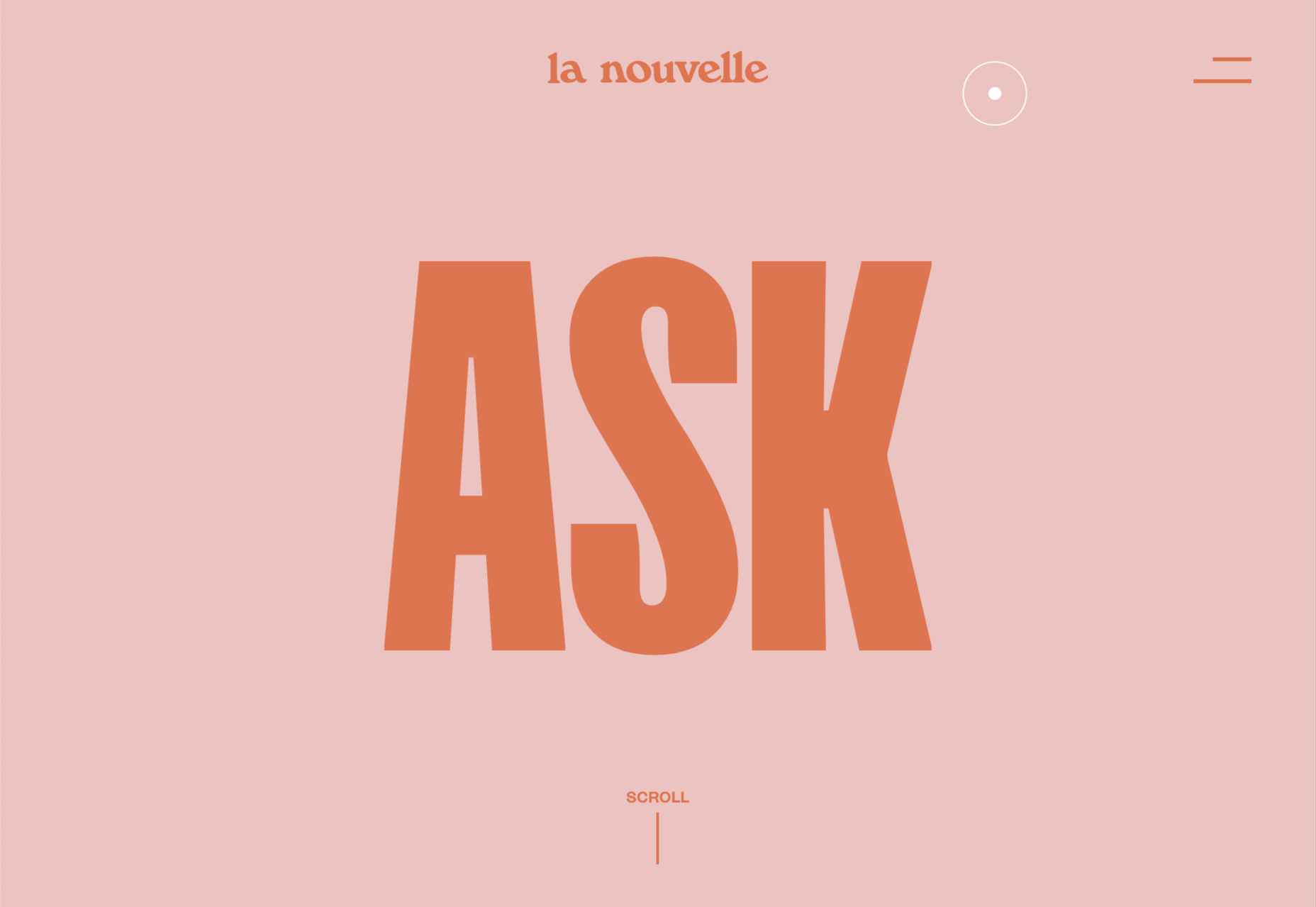
As a web designer, you’re responsible for a lot of things. Your client is relying on you to ensure that their website is user-friendly, accessible, eye-catching, and even good enough on the back-end to capture the attention of the search engines. 

However, what many business leaders and clients don’t realize is that they also have a part to play in ensuring that they get the right results from their site; there’s more to the client and contractor relationship than an exchange of funds. 

Today, we’re going to examine some of the most common mistakes that clients make when they begin working with a website designer for the first time. After all, when a client makes a mistake, it’s up to you to show them how to get back on track. 

Client Mistake 1: Providing Minimal Insight

Creativity, for the most part, is the responsibility of the designer in any web-building project. You know best what you can do for a client. 

When you’re discussing an upcoming project with a business owner, you can walk them through concepts like dark mode design or strategies for digital accessibility. However, you’re still reliant on your client to let you know if there’s anything specific they need. 

An insufficient brief in a web design project usually means that you waste time on a project because you have to go back and forth multiple times, making updates and edits. Getting a brief ironed out properly from day one can reduce misunderstandings and mistakes. 

To get your client started, ask them to share some details like:

  • Who’s the target audience? Do they have a user persona they can share?
  • What specific features does the site need? Landing pages, forms, widgets, etc.?
  • Competitor sites they like: What do they appreciate about those designs?
  • Brand colors and assets: What kind of hues and shades should you use?
  • Technical feature requirements: Does the site need to have its own app, integrate with APIs, or have a checkout solution, for instance?

Client Mistake 2: Underestimating The Workload

Perhaps one of the most common mistakes that clients make when seeking help from a designer is that they have no idea how much work it will take to create the kind of site they want. If they haven’t provided a great brief in the first place, they might not have had a chance to see all the work they’re asking for written down. Walking your client through the brief process can help here. 

On the other hand, if your client has already provided a brief, along with an unrealistic deadline for completion, you might need to have a discussion with them about what you need to do. Walking your client through some of the processes involved in creating their website could give them an insight into how long it will realistically take to bring their ideas to life. 

Additionally, ensuring that your customers fully understand the amount of work you’re taking on could also mean that they can better grasp why you’re charging a certain price for your services. That brings us neatly to the next mistake…

Client Mistake 3: Not Having The Right Budget

Pricing your design services can be a complicated process for web designers. You need to make sure that you’re charging enough to cover the cost of things like essential software and hardware for your company. At the same time, with so many other designers out there, you also need to ensure that your costs are competitive. 

After you’ve gone through the hard work of figuring out what your pricing structure should be, you also need to be capable of justifying that expense to your client. It’s common for many customers to go into their work with a web designer expecting that they’ll be able to get an entire website, blog, and app for less than a couple of hundred dollars. 

Make sure that your client is aware of your pricing immediately to avoid any confusion. If possible, have a pricing page on your website or portfolio which highlights the cost of different packages and precisely what your clients are going to get. 

If your customers can see the value in your services and even equate to an hourly workload or skillset, they might be better equipped to set the proper budget. 

Client Mistake 4: Making Too Many Technology Decisions

You’ll find that you work with many different types of client during your time as a web designer. Sometimes, you’ll have people who come to you not really knowing what they want or need. This means that you may need to spend some time speaking to them about their expectations and discussing what’s possible. 

On the other hand, there’s always a chance that you could work with a client who thinks that they should be making all of the decisions themselves. While it’s true that your client should have some control over things like the style of their website and what features it has, it’s up to you to make technical decisions like what kind of tools you’re going to use. 

If your client tries to dictate everything you do and how you’re going to do it, this could make it difficult for you to deliver your best work. Explain your processes to your customer in advance and find out why they want you to use specific technology. 

For instance, if your client wants to use a specific kind of website builder because they’ve heard it’s “the best,” you can explain what you like most about the product you’re already using. 

Client Mistake 5: Being Too Attached To An Idea

This is a problem that happens in a lot of creative industries. A client goes out and finds something that they like on another website. It might be an attractive landing page or a specific checkout process. They’re so excited by what they see there that they refuse to compromise on that idea when working with their designer – even if the concept isn’t suitable. 

For instance, your client might come to you wanting a website that’s full of dynamic animations and videos. However, if they only have a limited amount of bandwidth from their hosting provider, this could mean that they end up with a slow site that aggravates their customers. 

The best thing you can do when this happens is to present the issue to your client in a way that they can understand. For instance, if you’re worried something will slow down their website, talk to them about how speed is essential to good customer experience. You could even share some page speed stats like: if a page takes more than 3 seconds to load, over half of all visitors will abandon it. 

Seeing the stats for themselves could mean that your clients are more likely to change their minds. 

Client Mistake 6: Working With The Wrong Designer

Finally, one of the biggest mistakes any client can make is working with the wrong website designer. There are a lot of professionals out there, each with their unique skills to offer in things like UX design, ecommerce page creation, and so much more. However, it’s not always easy to know what you need as a business owner getting online for the first time. 

The good news for web design clients is that there’s a lot of information out there that you can use to get informed fast. The bad news for designers is that this means you’re going to need to work at keeping your skills on the cutting edge if you want to attract the widest selection of customers. 

To ensure that you’re more likely to be the right designer for your customers, stay up to date with the latest web design standards, and check out what’s trending in your industry. Webinars, articles, and even TED talks can be an excellent way to brush up your knowledge and make your portfolio much more appealing. 

Strengthen Your Client/Designer Relationships 

Succeeding as a web designer isn’t just about building a robust portfolio full of excellent websites where you can showcase your skills. While it’s true that you need to stay on the cutting edge with your design talents, you also need to make sure that you can create positive relationships with every client that comes to you. 

Like designers, clients can make mistakes too, but not knowing what they want, trying to take too much control, or simply failing to understand the scope of a product. Rather than letting those mistakes hold you back, prove your mettle as a designer by helping your clients navigate these issues. The result will be more streamlined project experiences, happier customers, and better reviews for your company. 


Featured image via Unsplash.

Source

The post Protect Your Design Clients From These 6 Easy Mistakes first appeared on Webdesigner Depot.


Source de l’article sur Webdesignerdepot

Customer reviews are incredibly valuable to your company. Around
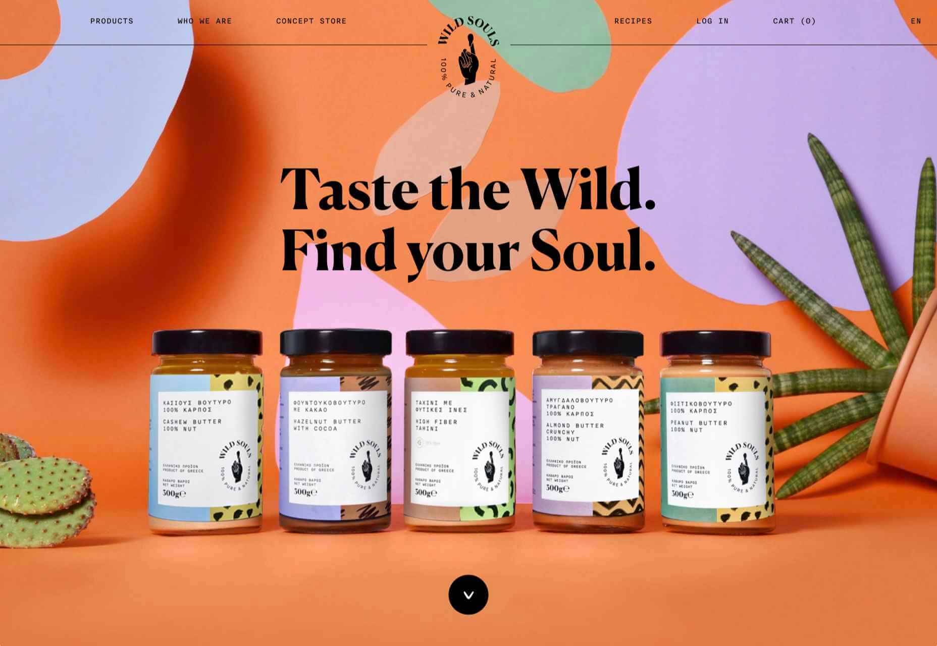
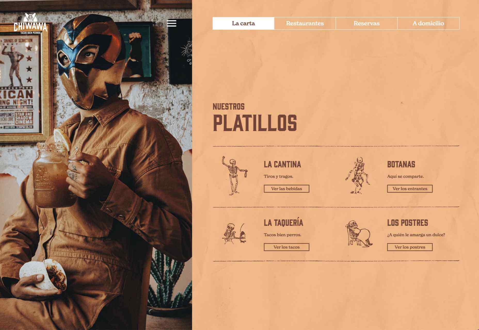
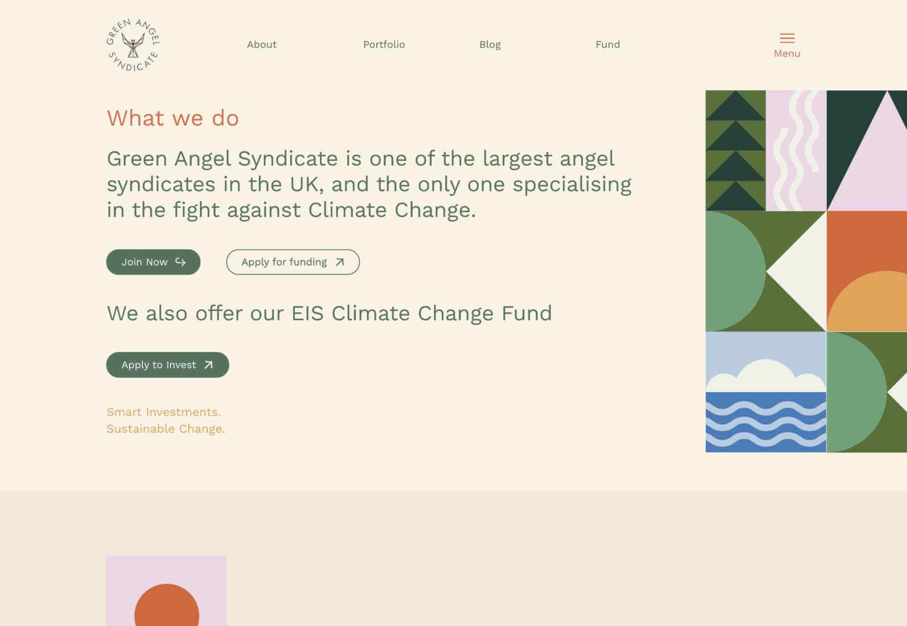
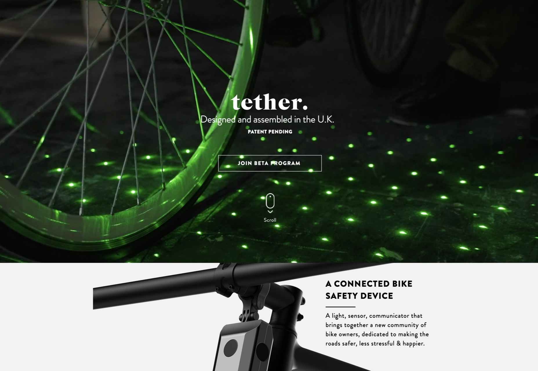
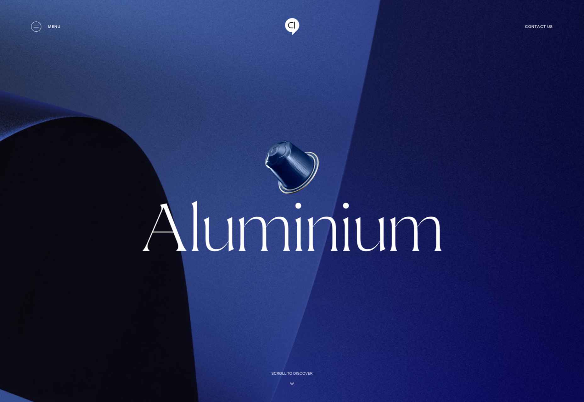
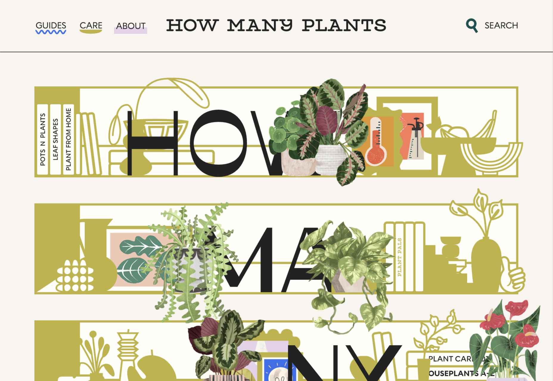
 95% of customers say they read reviews before they make a purchase. Another 72% say that they won’t even consider buying your items until they’ve read the reviews associated with your business or product. 

No matter how good your marketing and promotion strategies might be, your audience will always turn to other customers for a credible insight into what buying from your brand is really like. That’s why it’s so important to leverage as much social proof as you can.

Unfortunately, gathering reviews and displaying them correctly on your website can be challenging.

In this article, we’re going to look at what you can do to make your reviews stand out when you’re ready to display them online. 

The Different Kinds of Review

Before we get into looking at all the different ways you can effectively display your reviews on your website, let’s get the basics out of the way. 

There’s more than one type of review. Some are simply comments left on the bottom of your product pages by customers that were impressed by whatever you sold. Other reviews are available in the form of videos or badges. When you want your website to look as credible as possible, the best thing you can do is decide which types of reviews will have the most impact. 

Ideally, you’ll want a combination of different review types to add depth to your site. Putting various kinds of reviews on your website increases your credibility while also boosting your SEO

Here are your main options:

The Testimonial

Testimonials are one of the most common types of review. Essentially, these are the messages shared by your customers that highlight the things they liked and didn’t like about your product. Testimonials often include a picture of the person leaving the message, and their name, to give them a greater sense of authenticity. You might also include a link to a website or case study with a testimonial to give it more depth. 

Most testimonials go at the bottom of pages. You can showcase these reviews on your home page to start generating credibility as soon as someone interacts with your brand. Alternatively, you could allow users to place their reviews on product pages. Here’s an example of what a testimonial might look like from ducttapemarketing.com:

Review Badges and Widgets

If your customers tend to leave reviews about your company on other sites, like Angie’s List or Yelp, then you can add a widget or badge to your website that makes it easier for other customers to find them. Sometimes, you’ll just include a small button on the bottom of a website pay that says, “find us on Yelp.” Other times, you can add your star rating too.

Some review sites will also give you the option to showcase the actual reviews in a widget that frequently updates with new messages. 

If you’re only showing reviews from one third-party site on your website, it’s best to focus on Google reviews, as it’s one of the most recognizable options. 

Provided that you’re using them correctly, badges and review widgets shouldn’t slow your website down too much, and many can be customized to suit the style of your site too. However, it’s essential to ensure that you don’t add too many widgets to your site if you want to avoid performance issues. 

Case Studies

Case studies go beyond the basics of the standard review and provide potential leads with a tremendous amount of information about how you’ve previously interacted with other companies. With a case study, you’ll often create a structured document that demonstrates a customer’s problem and your strategies to overcome those issues. 

Case studies often exist on their own pages, so you can go in-depth with sharing valuable information. For example, you’ll include an overview that introduces the customer you worked with and details on the outcomes you achieved together. 

Although it’s much harder to interview customers for complete case studies and get all the statistics and numbers that make these reviews appealing, it’s often worth the effort. Particularly if you’re running a B2B company, case studies demonstrate the effort you go through to support your customers. They also act as proof of your success and set valuable expectations for customers. Here’s an example of a case study page by Fabrikbrands.com:

The Rating

If you’re just posting basic five-star ratings on your website or asking your customers to give you a number between one and ten for how positively they’d rate your service, then you can use a few handy automation tools to create one of these visuals. 

All you need to do is add a little basic CSS to your website or use a star rating widget that automatically calculates your average score based on all of the reviews that you collect from customers. 

Just make sure that your star ratings are positive not just on your website but on other review sites too. For instance, if you give yourself five stars by adjusting the CSS and then get three stars from Yell, customers will begin questioning your authenticity. 

Notably, while star ratings grab customer attention, they are a little basic if you’re trying to convert people and convince them to buy an expensive product. Most customers will often need more information than a basic star rating can provide. 

How to Display Reviews on Your Website

Now that you know what kind of reviews customers can leave about your product or brand, you can start exploring ways to display them on your website. 

You could decide to let your reviews show up on other third-party sites and leave it at that. For instance, if you’re a hotel manager, you may know that your customers are already leaving reviews on Booking.com and TripAdvisor. However, leaving your audience to seek your reviews out for themselves means that they spend less time where you want them – on your website. 

There’s also a risk that failing to add reviews to your site will make you look less credible. If you don’t own your rating or score, customers might wonder what you have to hide. 

Fortunately, we’ve got some great options to help you get started.

1. Create a Testimonials Page

The first and perhaps most accessible option for showcasing your reviews and testimonials is to design a page where your customers can easily find all the information they need about your brand. Having a dedicated testimonials page can be a great way to demonstrate transparency as a brand and show your customers that you’re not hiding anything. 

You could even add a form at the bottom of your testimonials page that allows other customers to leave their reviews and information. Just make sure that you have a CAPTCHA or another security measure in place to prevent people from spamming your site. 

It makes sense to showcase some of your most positive reviews at the top of your page, so your customers see those first. However, it could also be a good idea to showcase some negative reviews alongside them. That’s because customers generally expect to see at least some negativity associated with your brand. If all your reviews are positive, they might assume that you’re hiding something.

When displaying your negative reviews, make sure you also show that you’ve responded to them and are working hard to address any issues. You can even publish the “thank you” you get from an unhappy customer after rectifying the problem. 

2. Show Reviews in Your Website Header

The great thing about using reviews and testimonials on your website is that if you have a little coding knowledge and the correct information, you can display them wherever you choose. Most companies leave the reviews at the bottom of the website, but this could mean you’re missing out on an excellent opportunity to connect with your audience as soon as they visit you. 

Having a positive review highlighted at the top of your page could immediately boost your credibility and give your audience a reason to keep reading. Remember that a picture of the person sharing the review and their name can make them look a lot more credible when you’re trying to build trust. 

3. Add Some Reviews to Your About Us Page

It’s best not to hide your reviews somewhere your customers will have to search for them, but that doesn’t mean that you can’t scatter a few testimonials around other pages. A great way to give more credibility to your brand and your website is to create a sidebar on your “About Us” page or just showcase a handful of reviews underneath the description of your business. 

Suppose you don’t want to show customer testimonials on your About Us page. In that case, you could always show different kinds of reviews, like badges that show your certification with certain industry bodies or awards and recognition you’ve received.

Showing that you’re connected with major industry groups and that you’ve been recognized in your sector is a kind of review in itself. It indicates that other people have already assessed your business and see you in a positive light. 

Every review doesn’t necessarily have to come from your customers. Any business or person who can give more credibility to your business deserves some representation too!

4. Embed a Carousel on Your Site

As your business begins to grow, the number of regular reviews and testimonials you get from happy customers should start to skyrocket too. You might even get to a point where you’re not sure how to fit all the reviews you want to showcase onto the same page of your website. If you already have a dedicated “reviews” page where people can go to get more insights into your growing collection of social proof, try a carousel. 

Carousels are a great and dynamic way to showcase customer reviews while getting your audience more involved with your website. Give them a button they can click so that they can browse through a broader range of reviews after they’ve seen the ones that show up straight away on your carousel. It’s also worth including a link nearby the carousel widget that the user can click to visit your review page or your company’s page on a dedicated review website. 

If you want to go beyond putting carousels on your home page, remember that you can add them to your product pages and menus too. Online reviews impact around 67.7% of purchasing decisions, so it makes sense to put them somewhere your customers will see them when they’re figuring out whether or not they should hit the buy button. 

5. Add Reviews to Your Social Media Ads

Reviews can be an excellent way to add an extra spark to your advertisements elsewhere in the digital landscape. Telling your audience on Facebook that you have the best steaks in the country is great – but it’s not going to make a significant impact on most of them. That’s because every business claims to be the best. Most of your clients expect you to speak well of yourself. 

However, if you can combine an attractive image on social media with a quoted review from one of your happy customers, your ads will make more of an impact. You can include the quote from your customer in the text above your Facebook ad or create an image to display it instead.

Remember to add any hashtags and extra information that might make your ad more appealing and share it as often as you can with the right audience. Targeting your audience carefully towards people who are in the “consideration” stage of the buyer journey may help you to get more conversions. 

While customers usually scroll past dozens of social media ads every day, a genuine statement from a real person still shakes up the status quo and grabs attention. Include a button below the ad so your customer can learn more about the product the customer is talking about. 

6. Link to Reviews in Email Signatures

Finally, social media ads aren’t the only way to bring attention to your reviews outside of your website. If you want to get more external customers to go and check out your products or rediscover what your business is all about, you can add review links to your email signature too. These links can go directly to the case study or review pages on your website, reminding customers what it is that makes your service or product special. Alternatively, you can get dedicated signatures for your email that link to specific review sites too. 

Showing your clients how many ratings you have on Yelp or how many stars your products have earned with Google Reviews gives every message you send a lot more credibility. Most email marketing software solutions make it relatively easy to add information like this to the footer of your email.

Remember, your signature shouldn’t take up too much space in your email, so don’t add any specific reviews from customers. A star rating and a link back to a page where consumers can get more information will spruce up your content without weighing down your emails. 

Show Off Your Social Proof

Successfully collecting positive reviews that show your prospects how much customers love your company can be challenging enough. However, that’s just the first piece of the puzzle. Once you’ve got all those great reviews, you also need to show them off in the most effective way. From dedicated pages on your website to scrolling carousels and Facebook ads, there are a million ways to prove your credibility to your customers with testimonials.


Featured image via Pexels.

Source

The post How To Leverage Social Proof Successfully first appeared on Webdesigner Depot.


Source de l’article sur Webdesignerdepot

In the “Leveraging Salesforce Using Spring Boot” article, I navigated the course for introducing a Spring Boot service that would leverage the well-established Salesforce RESTful API. The goal of this service is to act as a middleware layer to allow clients not written in Salesforce to retrieve and update contact data stored in Salesforce. This backend service implements its own caching layer to provide a faster response time and also cut down on the number of times Salesforce needed to be called.

In the “Leveraging Salesforce Using a Client Written In Svelte” article, I introduced a simple client written in Svelte, which provided the ability to make updates to the Salesforce data using an inline editor—again, without actually using the Salesforce client.

Source de l’article sur DZONE