 User experience design is something that most of us associate with websites. But why isn’t it something we extend beyond the website?
Here’s why I ask this:
As a consumer, it’s so rare that your only interaction with a brand is through its website. Take an ecommerce site, for example. You buy a product from it, and then what happens?
- You get a confirmation email;
- You get another email when the package ships;
- You might get another email or SMS notification when the package is delivered;
- You retrieve the package and open it;
- You open up your purchase and use it.
These are all an extension of that initial user experience on the site. If there’s just one hiccup along the way, it could easily erode the trust and happiness you felt after quickly finding and buying what you needed on the site.
So, what I’d like to do today is look at 10 areas where UX design should extend beyond the website to ensure that the frictionless experience started there remains untarnished.
Extending UX Design Beyond the Website
As a web designer, you might be thinking that this part of the user experience doesn’t fall under the umbrella of your responsibilities. And you may be right about that.
For brands to truly be successful and profitable, someone needs to carefully examine the bigger picture and ensure that the user experience is flawless no matter how far away from the site it is. At the very least, you should share the UX research and strategy you do for a client’s site so their team can ensure it carries over to other areas of the business.
Here are some things to think about:
1. Mobile App
It’s not uncommon for websites to have mobile app counterparts these days. The layout doesn’t need to be identical since mobile users tend to behave differently than those on desktop.
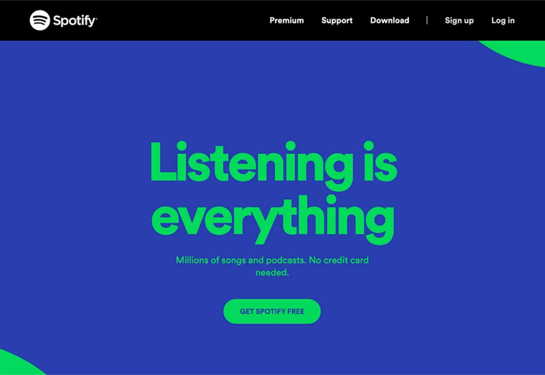
That said, an app shouldn’t force users accustomed to the desktop experience to re-learn how to navigate or engage with the brand. So, the branding, UI design, speed, security, and navigation all need to be on par with what’s already been established in terms of usability.
2. Email
Most websites have a direct connection to email. For example, blog newsletters, purchase confirmation emails, and lead generation follow-ups all start on the website.
Consumers are well aware that when they hand over their email address, they will receive an email in return. In many cases, those emails are welcomed when they’re done right. But if something feels off, that bridge could easily burn between brand and consumer.
To preserve the UX, emails should come with the following:
- The same branding and visual style as the website;
- A personalized subject line, greeting, or offer;
- Consistent messaging as the site, especially when it comes to the CTA.
Another thing to remember is that email isn’t the time to inject dark patterns into the experience. So, the “Unsubscribe” option should be in an easy-to-spot area and a sharply contrasting font color.
3. Social Media
Social media is another channel that’s commonly connected to a website. While you can’t control the aesthetics of social media websites themselves, the visuals and messaging in posts need to be on-brand.
That means that things like memes and emojis — which are popular means of communication on social — should only be used if they’re normally part of the brand identity. If not, you’ll need to find other ways to communicate engagingly.
Another part of the user experience to think about is customer support. Social media is a lot like going into a store. If someone has an issue with what they bought or the service they received, there will be many people around to witness the complaint. Social media only amplifies that — so the quality of customer care needs to be consistent with how the brand handles it everywhere else.
4. SMS
Not every brand will need to be connected to customers via text messaging. eCommerce companies, news sites, and personal services providers likely will, though.
However a brand uses SMS, the same UX guidelines apply here as they do across all other channels:
- Keep messages concise;
- Make sure they’re relevant and valuable;
- Use branded messaging and design;
- Don’t abuse the privilege and send too many;
- Make it easy to opt out.
Basically, if you can’t make it a valuable extension of the brand’s offering, don’t use it.
5. Phone
Any website that publishes its phone number should expect to receive calls from prospects and customers. While there’s nothing to design here visually, the experience of getting on the phone with a company should be consistent with what they experience elsewhere.
One way to do this is to design an easy-to-follow routing system. It should be simple for callers to figure out which number to choose. What’s more, there should be no endless loops. If a caller has exhausted the options, they should be immediately directed to a representative.
Another way to ensure consistency is to adhere to a script — that goes for call centers for enterprises as well as the local lawyer’s office. Every caller should be greeted with the same tone and handled in the same manner (depending on the situation, of course).
6. Ads
There are a lot of places where brands can advertise these days:
- Google search;
- Social media;
- Ad networks;
- TV;
- Radio;
- Podcasts;
- Blogs;
- Billboards;
- Direct mail.
When designing an ad campaign, there should be consistent messaging, aesthetics (when relevant), and CTAs presented. If branding isn’t consistent from ad to ad, there may be a delay in consumers recognizing the brand or its offer. Or, worse, not recognizing it at all.
7. Packaging
For brands that sell products, you have to think about how the packaging will impact the user experience. There are two types of packages to consider, too.
The first is the product’s own packaging. Branding should be clear as day and consistent with the site they bought it from.
It should also be easy to open. There’s nothing more frustrating than finally getting your purchase, only to realize you need tools to get it out of the packaging.
You also have to think about packaging for products that get shipped.
The product should fit well within the packaging. A too-roomy package will feel downright wasteful. So will excessive bubble wrap and paper filler.
Having a shipping label present in the package is also important. If the website makes it easy to make a purchase, the package should offer a convenient way to return the product if they’re not happy.
8. Product
The product itself has to align with the expectations set by the website.
Take the example of a SaaS. You’ve built an awesome landing page and mobile app store page to promote it. It looks great, it loads fast, and it’s easy to get around. But if the SaaS itself is ugly, disorganized, slow, or otherwise just clunky, all of the work you did to market it will end up being just false advertising.
So, make sure the expectations set before and during purchase naturally carry over to the experience with the product.
9. Business Exterior
For brick-and-mortar companies, the business’s exterior matters just as much as what happens inside it.
The most obvious thing to focus on is the aesthetics of the building. Does it look attractive? Is it in a safe area? Is there clear signage around it? Is it easy to find?
But you also have to think about user experiences that take place outside of the building. For example, there’s now a rise in curbside pickup. There are tons of things that can affect how happy the customer is with the experience — like if the pickup area is hard to find, there are never enough spots or the associates who deliver the orders always seem to be in a foul mood.
The business’s exterior should always set a good impression for what takes place inside.
10. Business Interior
Here are some things to think about when it comes to “designing” business interiors for a good UX:
- Decor;
- Layout;
- Signage;
- Furnishings;
- Product discoverability;
- Availability (of products or people);
- Quality of customer service;
- Checkout process.
It doesn’t matter what the company does — whether it’s a large retailer like Walmart or your own freelance design business. If a business’s establishment doesn’t look good, operate flawlessly, or provide a good person-to-person experience, it’s going to be very hard to get people to return.
So, all those things you do to design a streamlined website journey should be applied to a bricks-and-mortar business’s interior.
Wrapping Up
Depending on the types of companies you build sites for, some of the channels and suggestions above might not be relevant. Hopefully, this has got you thinking about other ways you (and your clients) can extend the UX design and strategy from the website.
If you can maintain the high-quality user experience from channel to channel, your clients’ brands will get more business, grow their profitability, and see a rise in loyalty, too.
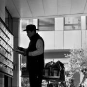
Featured image via Pexels.
Source
The post UX Design Doesn’t End With Your Website first appeared on Webdesigner Depot.

Source de l’article sur Webdesignerdepot

 Every day design fans submit incredible industry stories to our sister-site, Webdesigner News. Our colleagues sift through it, selecting the very best stories from the design, UX, tech, and development worlds and posting them live on the site.

 Parallax is a term that is applied loosely and frequently in the world of web design. As a trend, it has been

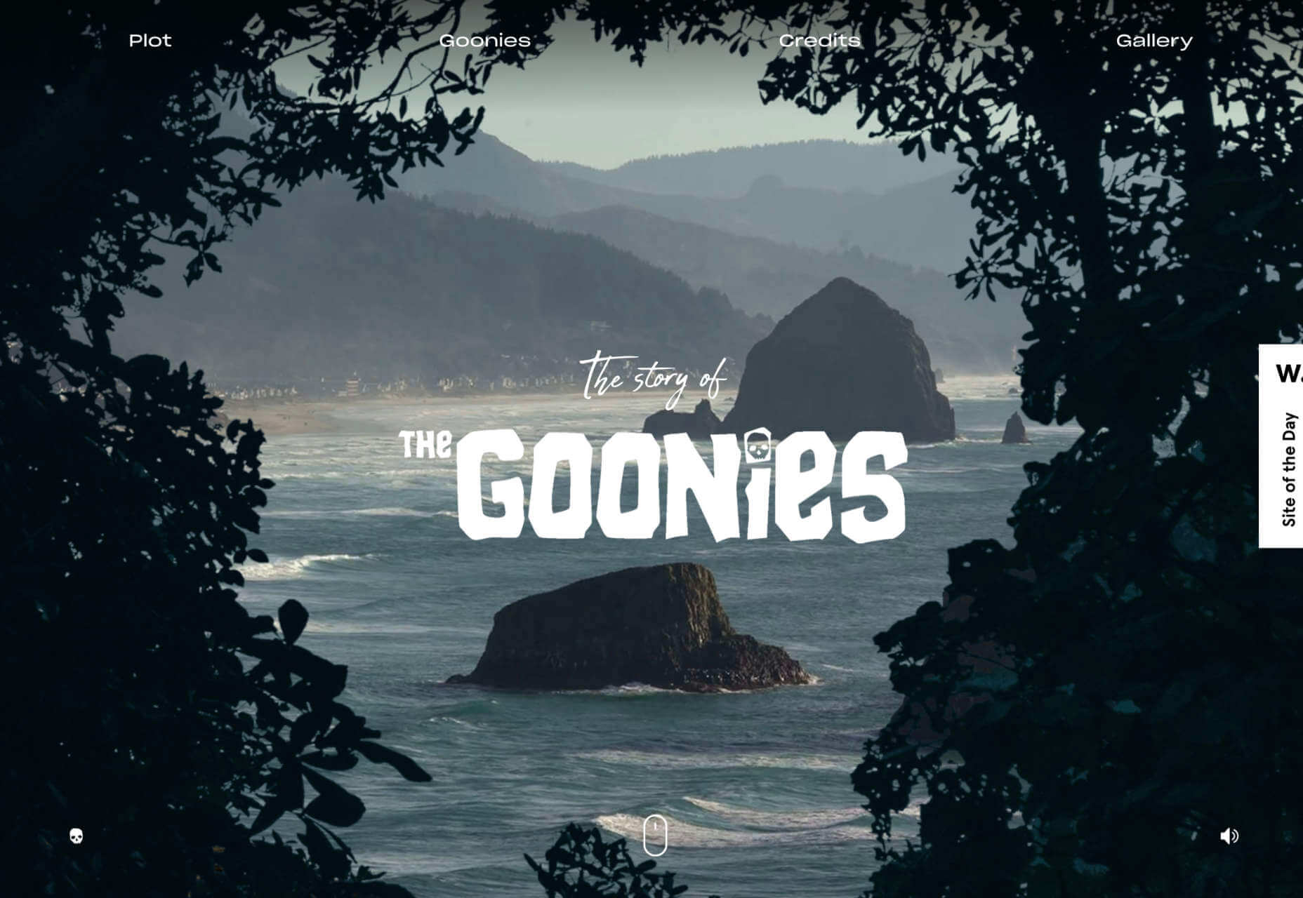
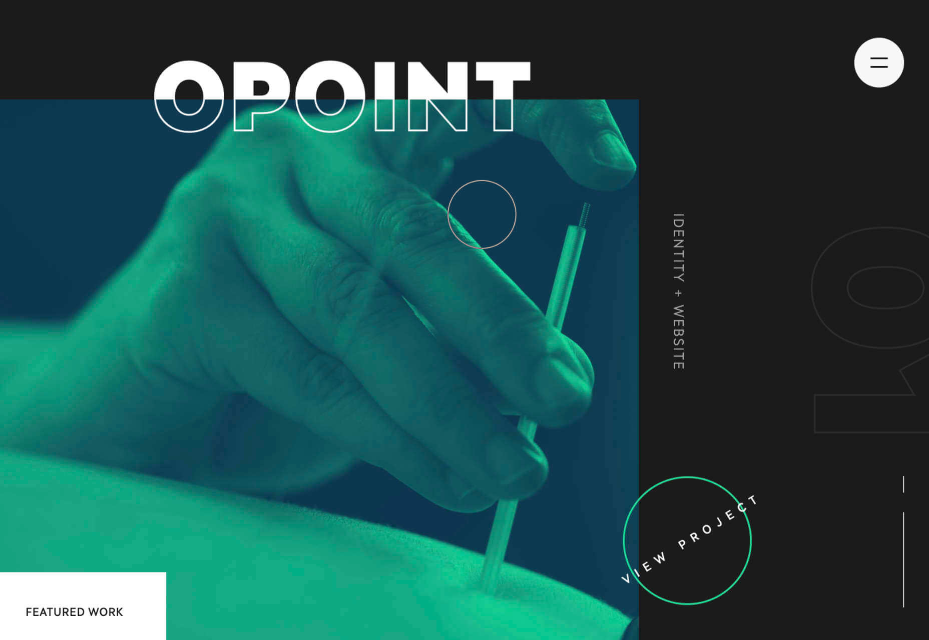


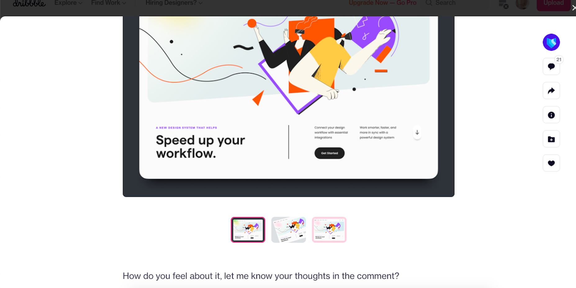
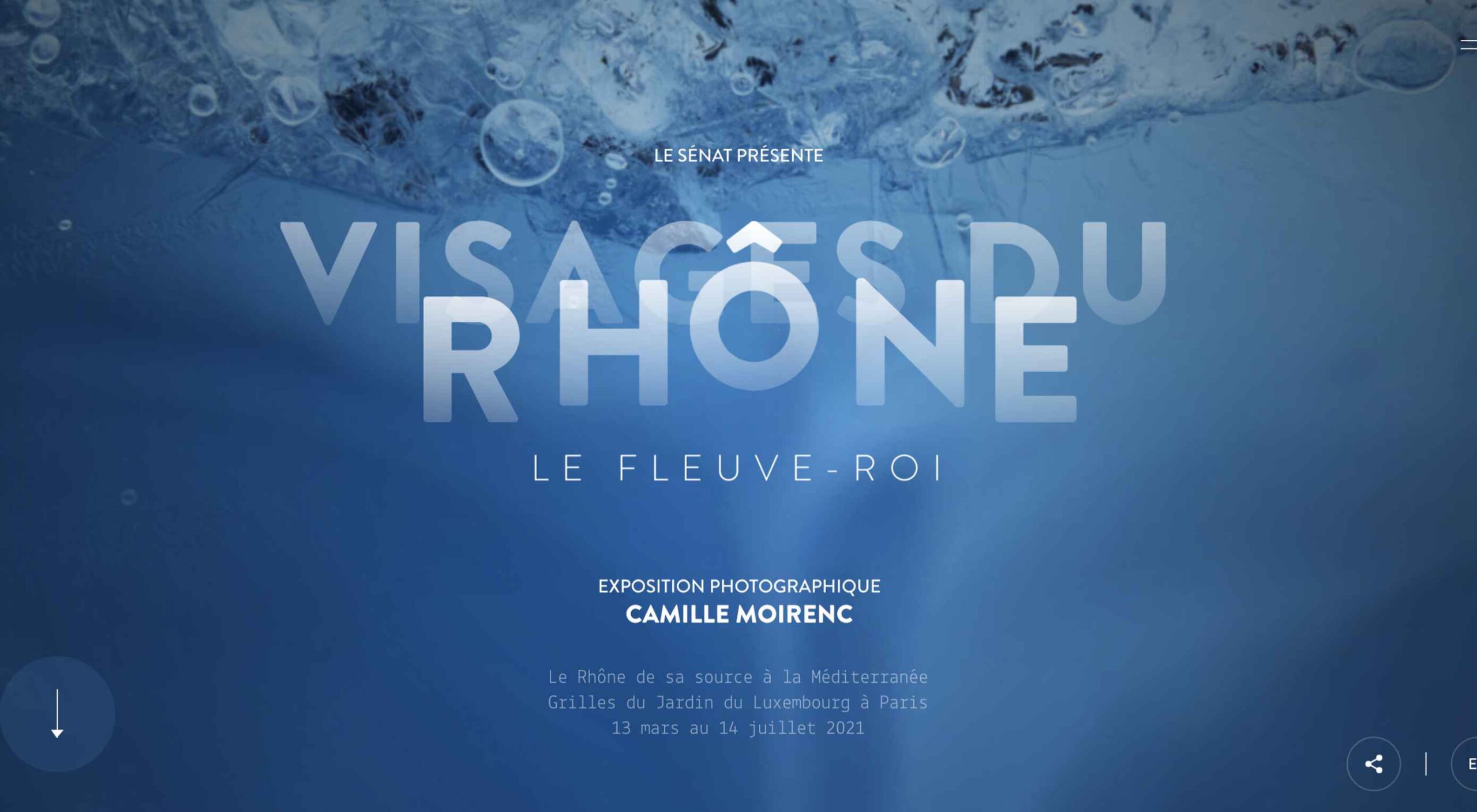 The best thing about writing about website design trends each month is looking at all the great sites that are being developed. Designers are stretching creatively and exploring new techniques and ways of doing things all the time.
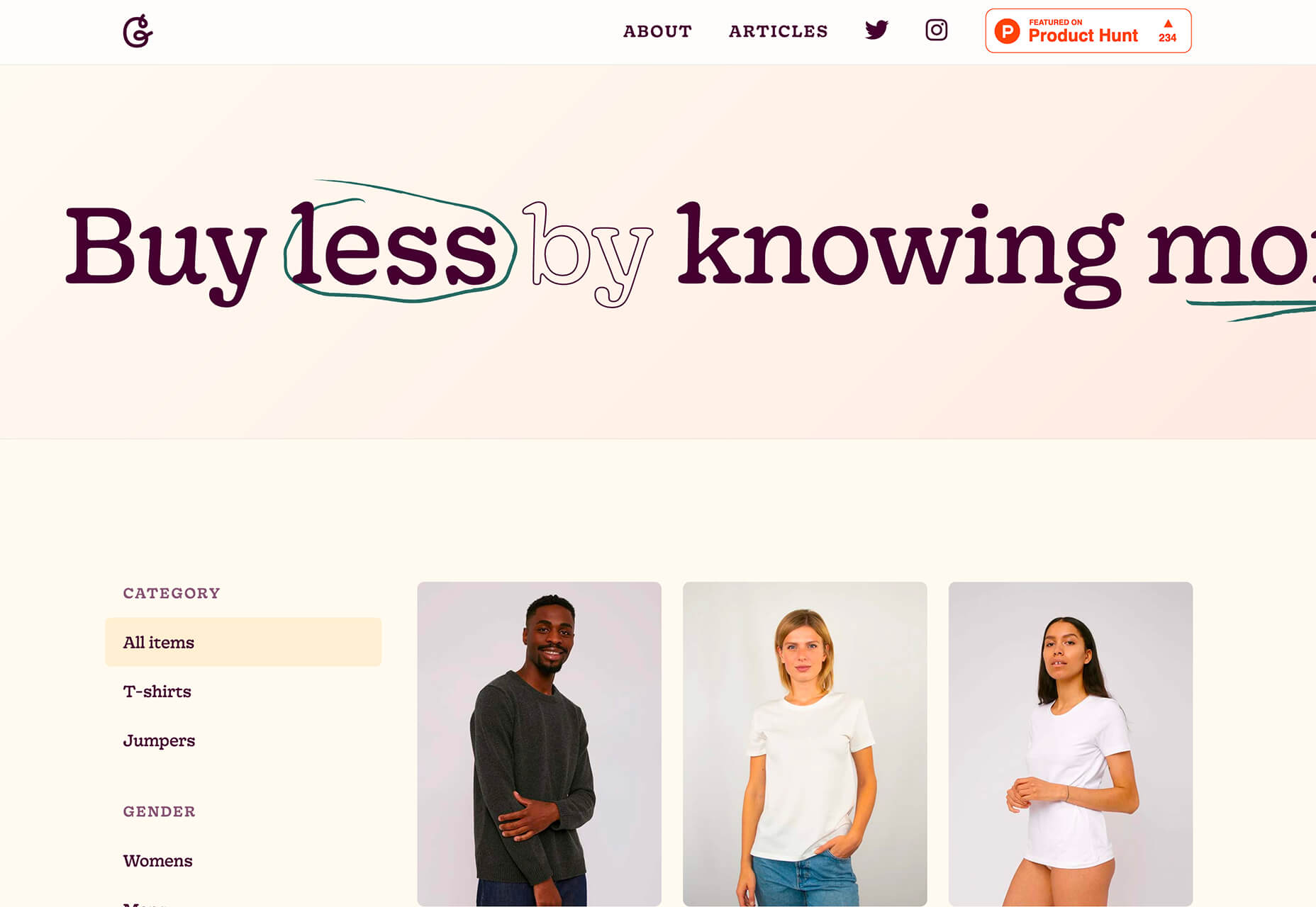
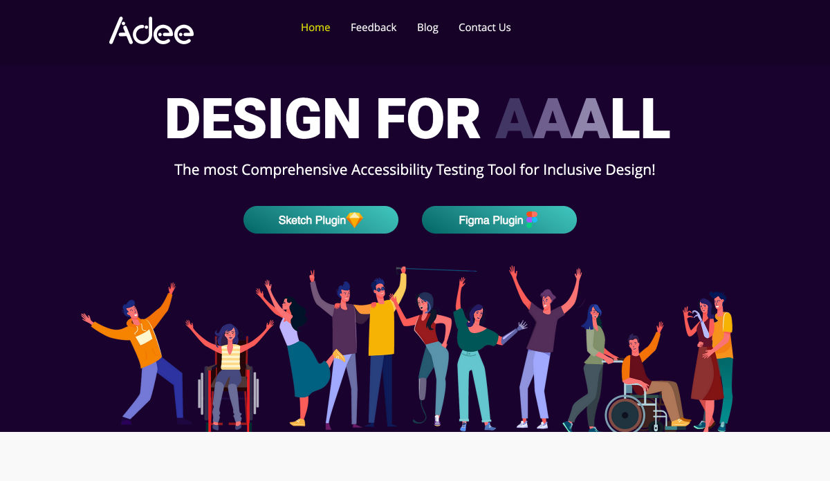
 A key part of designing successful websites for clients is making sure that as many end-users as possible can access and enjoy that site.

 There are many reasons you might be wanting to improve your design skills this year. Perhaps you have extra time on your hands and want to put it to good use. Or maybe you’re new to web design and finding that there’s a lot you still don’t know how to do. It could also be that you recognize that the web is changing, and your skills could use some refreshing to keep up.

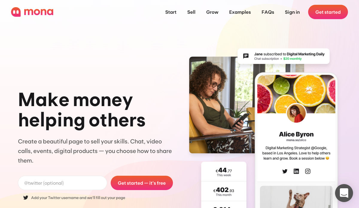
 Every week users submit a lot of interesting stuff on our sister site Webdesigner News, highlighting great content from around the web that can be of interest to web designers.
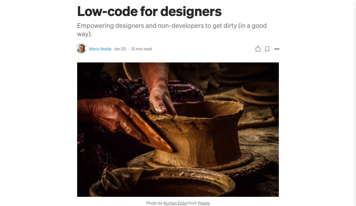
 Every week users submit a lot of interesting stuff on our sister site Webdesigner News, highlighting great content from around the web that can be of interest to web designers.


 Every week users submit a lot of interesting stuff on our sister site Webdesigner News, highlighting great content from around the web that can be of interest to web designers.