Articles

Every week users submit a lot of interesting stuff on our sister site Webdesigner News, highlighting great content from around the web that can be of interest to web designers.

The best way to keep track of all the great stories and news being posted is simply to check out the Webdesigner News site, however, in case you missed some here’s a quick and useful compilation of the most popular designer news that we curated from the past week.

Quarkly – Design Tool for Creating Websites and Web Apps


Create your Personal Branding Strategy in 4 Simple Steps


How to Design a Landing Page


No Code MBA – Learn to Build Real Apps and Websites Without Code


Your Computer Isn’t Yours


Swatches – Generate Colors for Every Purpose


Markabaly – Cross-platform Markdown Editor


12+ Bootstrap Hero Image Examples


The UX of Among Us: The Importance of Colorblind-friendly Design


No, your Clean Code won’t Save the Planet


My Side Project Rocks – Share and Discover Side Projects


How to Test Content like a Pro: A Step-by-step Guide


MacOS Big Sur is Here


Free Fonts for Prototyping and Wireframing


Gamification: The Broken Way of Carrot and Stick


Everything You were Wondering About Apple’s New M1 Chip


Please Unsubscribe – Fwd Emails to Unsubscribe from Marketing


The Fonts in Popular Things Identified Vol. 2


How to Become a Self-taught Graphic Designer


Using PowerPoint’s Animated GIF Function


Scribbble.io – A Blogging Platform for Developers


How to Work with WordPress Block Patterns


The Power of Happiness: Being Safe, Free, and Supported


How to Handle Scope Creep in Web Design


Building Products


Want more? No problem! Keep track of top design news from around the web with Webdesigner News.

Source


Source de l’article sur Webdesignerdepot

How can your customer reach you? If a client arrives on your website after searching on Google, what can they do to take the next step in a relationship with your brand, without buying anything?

One of the primary aims of any website is to drive conversions. However, it usually takes between 5 and 8 touchpoints to generate a viable sales lead. People don’t want to convert straight away.

Since building a relationship with customers is crucial to success, it makes sense that the contact page would be an essential part of driving results. Unfortunately, a lot of website owners pay virtually no attention to that page. They ask their designer to create a page with their address and phone number on – and that’s it.

What many business owners don’t realize, is that the contact page is the door to deeper, more lucrative relationships with potential prospects. The design of this essential website element needs to be fantastic to drive results.

So, where do you start?

Defining a Well-Designed Contact Page

Let’s start with the basics, what makes a great contact page?

The complete answer to that question depends on the target audience. Some customers will want to see fun and friendly contact pages, complete with social media sharing buttons. Others will want to see a map that shows them exactly how to reach an office or business.

There are a few golden rules to keep in mind, of course. Contact pages should be:

  • Easy to find: Don’t hide the link to the contact page on the website footer. Make it easy for customers to find out how they can get in touch.
  • Simple: Don’t put too much content on this page or it will overwhelm your audience. Just let them know where they can go to get answers to various questions.
  • Professional: Even if you have a friendly brand personality, your contact form still needs to be grammatically correct and well-designed to show a professional edge.
  • Convenient: Make your phone number clickable so customers can use it on Skype. The same can apply for your email address. Provide easy access to social media profiles, and if you have a contact form – keep it short and sweet.
  • Informative: Include all of your contact information in the same place. This may include your address, a map to your location, social media pages, email addresses, and even forums.
  • Accurate: Ensure that the information on your contact page matches the information listed elsewhere. Check directories and Google my Business listings to be sure.
  • Attractive: Yes, a contact page needs to look good too. Plenty of white space will make essential information stand out. A good layout will guide the eye through the page.
  • Consistent: Make sure the contact form on your website matches the brand personality that appears on all of your other pages.

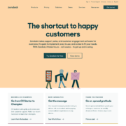
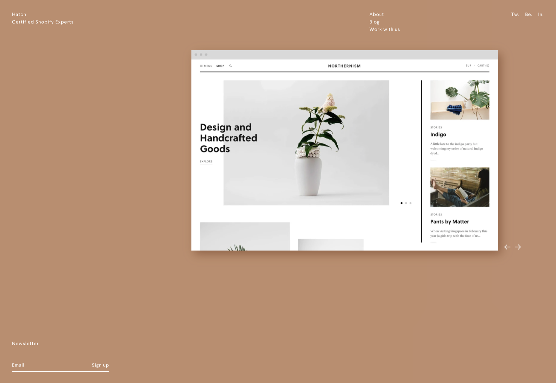
Take a look at the Tune Contact page:

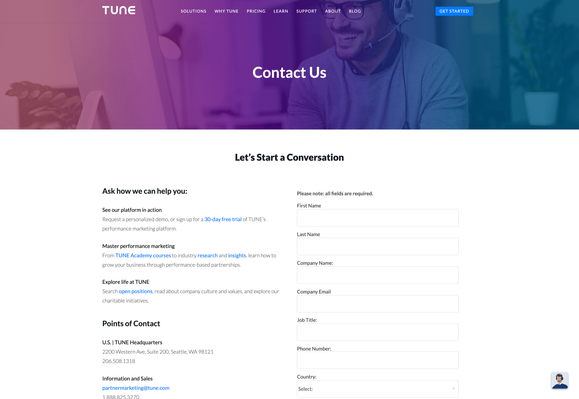
It’s beautifully laid out, with clear information that’s easy to read. The company shows exactly why customers might want to get in touch and how they can reach out. As you scroll through the page, you’ll find additional office locations, email addresses for different teams (sales and support), and links to social media accounts too.

How to Drive Engagement on a Contact Us Page

A good contact page needs to look fantastic, showcase the company’s personality, and capture audience attention. However, there’s a big difference between a contact page that gets the job done, and one that convinces your audience they have to connect with you.

Here are some excellent ways to make your contact us page stand out.

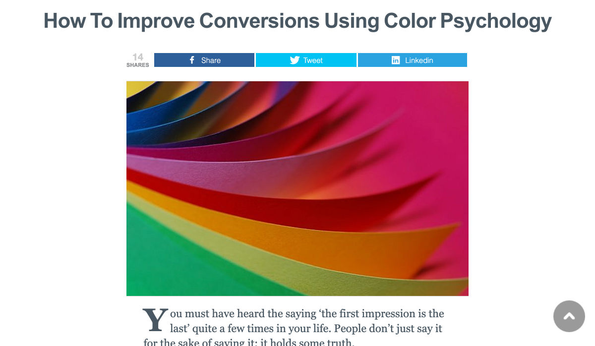
Step 1: Using Color Correctly

Color and color psychology have a massive impact on user experience.

Studies constantly demonstrate the conversion powers of having the right shades on certain pages throughout your website. For instance, changing a CTA button from red to green can increase click-through rates by 27%.

However, every audience is different. The colors that drive engagement on a contact page for your company will depend on your target customer. A/B testing color palettes that match your brand personality is a good way to get started.

One interesting example of colors that make the right impact on a Contact Us page comes from Hubspot. Here, the brand maintains it’s brand color (orange), but it also introduces some new shades that convey trustworthiness and professionalism.

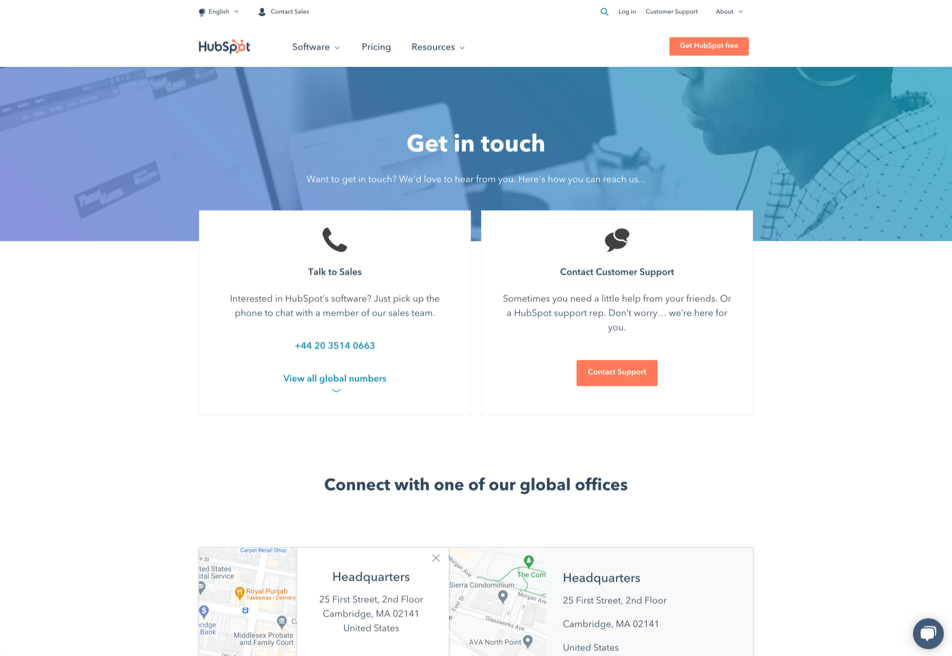
Blue is the most calming and credible color for any brand, The gradient that Hubspot uses here blends perfectly with its brand identity, allowing for a stunning contact page, with CTA buttons that still stand out.

Experiment with colors that can generate the right emotional response from your audience, but don’t ignore the golden rules of color in web design. You still need to showcase your brand identity, and you still need a way of making crucial information stand out.

Step 2: Humanizing the Customer Service Team

Some of the customers that arrive at a contact page are interested in your product or inspired by the potential of your service. Other customers will be looking for assistance because they’re frustrated with something or stressed out.

If you’ve ever had a problem with a product and wanted to reach out to the brand about it, you’ve probably noticed how annoying it is to find a blank contact page with nothing but an email address. The lack of effort and humanity in the contact page is enough to convince you that you probably won’t get a response.

But what if you add some happy smiling faces to the page?

Research indicates that brains are fine-tuned to recognize and appreciate human faces. Having a picture of your customer service team, or just any human being on your contact page makes you instantly more approachable. Your customers start to feel like they’re reaching out to a person – not an empty website.

Look at how engaging and personalized this contact page from Amber McCue looks:

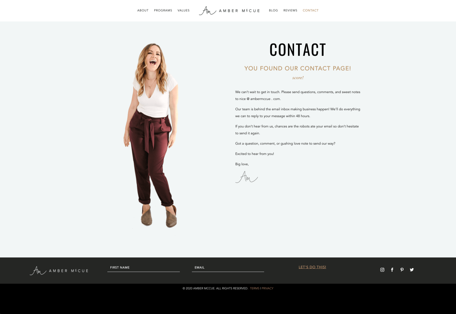
Although you can show any human face on your contact page and potentially get results, showing your actual agents will be more likely to drive positive results. It’s a great way to showcase the authenticity and humanity of your team.

Step 3: Making it Easy to Find

A surprisingly large amount of the time, companies shove their contact information into the footer of their website, forcing customers to spend forever looking for them. However, your audience might not want to spend an age searching for your details if they’re in a hurry to get answers.

Stowing a contact page in a footer is also a problem for those visiting your website via mobile, as they might not be able to see all your footer details and links as well.

A Contact Us page doesn’t have to be a massive part of your website navigation if you don’t want it to be. However, it should be one of the first things your audience can see. Putting the information on the header of your website, or even sticking it to the top of the page as your users scroll is very helpful.

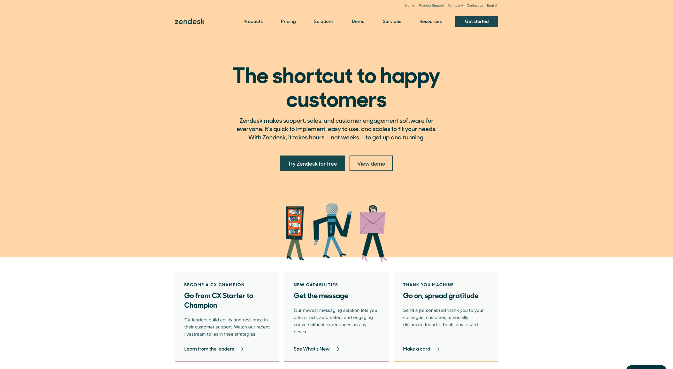
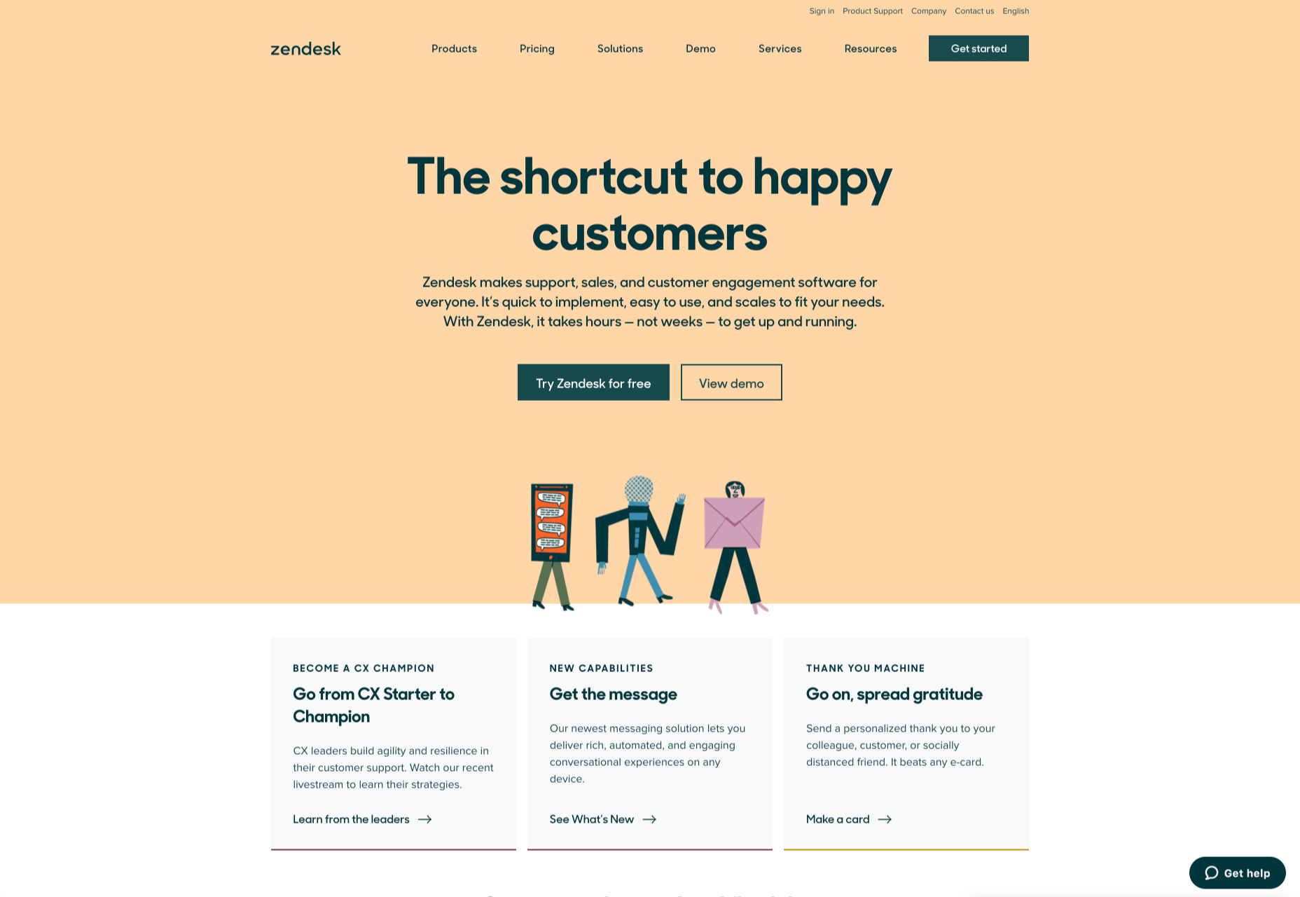
Zendesk makes it easy for customers to get in touch in multiple ways. First, the Contact section of the website is clear at the top of the page. Secondly, if you start scrolling through the Zendesk website, a “Get Help” button pops up, so you don’t have to scroll back to find assistance:

Remember, aside from making sure that your contact page appears in the right part of your website, it’s also worth ensuring that it’s easy to understand. Don’t use unusual terms like “Chat”, or “Chill with us”. Stick to tried-and-true options like Help, Contact, or Support.

Step 4: Making the Experience Relevant

There’s a reason why it’s practically impossible to find a one-size-fits-all contact page.

It’s because different customers need different things from your brand.

Some customers will be looking for the answer to a question; others will want to discuss something with your sales team. That’s why many companies are using adaptive contact pages that can change to suit the situation.

For instance, you may start by asking customers what they need help with. Zapier takes this approach with its Contact page:

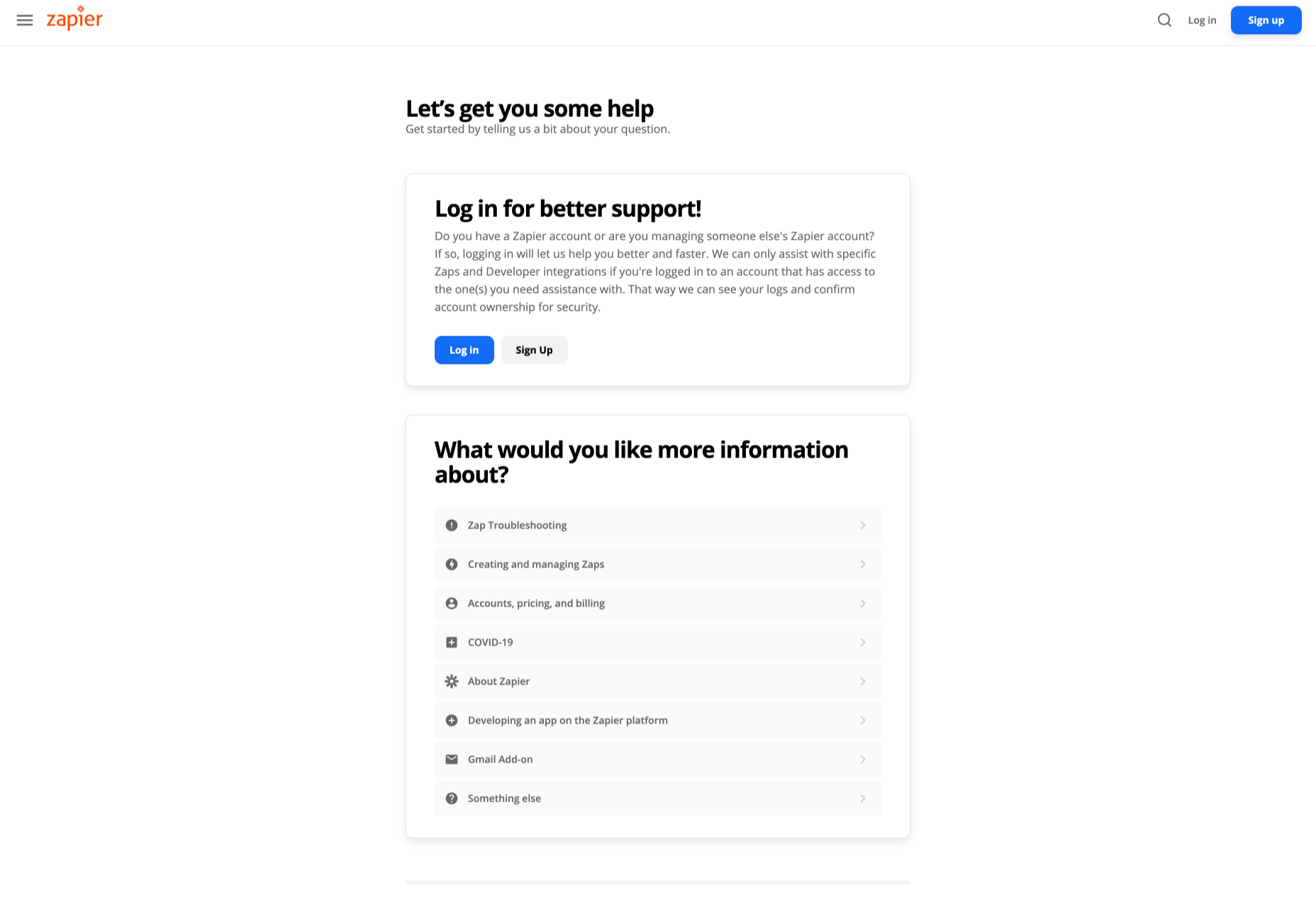
By asking the client what they need straight away, Zapier can make sure that the visitor finds the right information, and the right number or email address for the appropriate agent. You can even scroll down the help page and look for something in the available help centre, using the search bar. Or you can click on View our experts to hire a Zapier pro.

Creating a dynamic and customized experience like this does a few things. First, it ensures that the customer will reach the right person to help them first-time around. This reduces the number of inappropriate calls your employees have to deal with, and the number of transfers.

Secondly, you deliver a better experience overall for your client, because they don’t have to repeat their issue to multiple people or start a massive email thread. They get the support they need immediately.

Dynamic contact pages can even save you some money and time. If clients decide to solve an issue themselves, using your resources, that’s great for your busy agents.

Step 5: Direct People to the Right Place

The central focus of your contact us page needs to be the available contact options. Centralizing the contact options on a page is an excellent way to make sure that they get the right amount of attention. Centralizing also means that your customers can spend less time searching for the contact details that they need, which is great for usability.

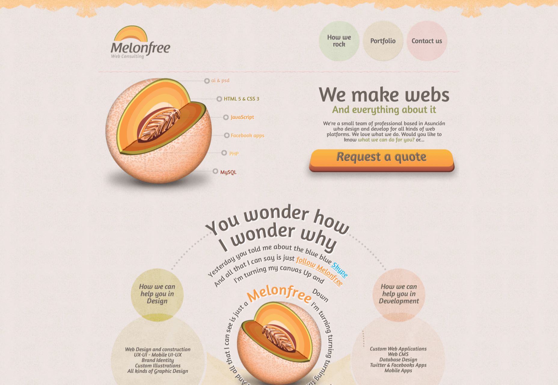
The Melonfree.com website uses a contact us form that’s centralized to immediately pull attention to the customer’s options for getting help.

Centralization isn’t the only way of using design principles to guide visitors on a contact page. According to Ray Hyman and Edmund Hick, increasing the number of choices on a page often increases the time it takes for people to make a decision.

When it comes to connecting with a brand, the right option for each customer will depend on the person and the situation they’re trying to overcome. For instance, a customer that needs to reset their password will probably be able to get the solution they need from an FAQ page.

On the other hand, someone who needs help using a new feature might need the guidance of a professional. To help guide customers to the right solution, Basecamp gives customers a variety of steps to follow to get the right solution fast.

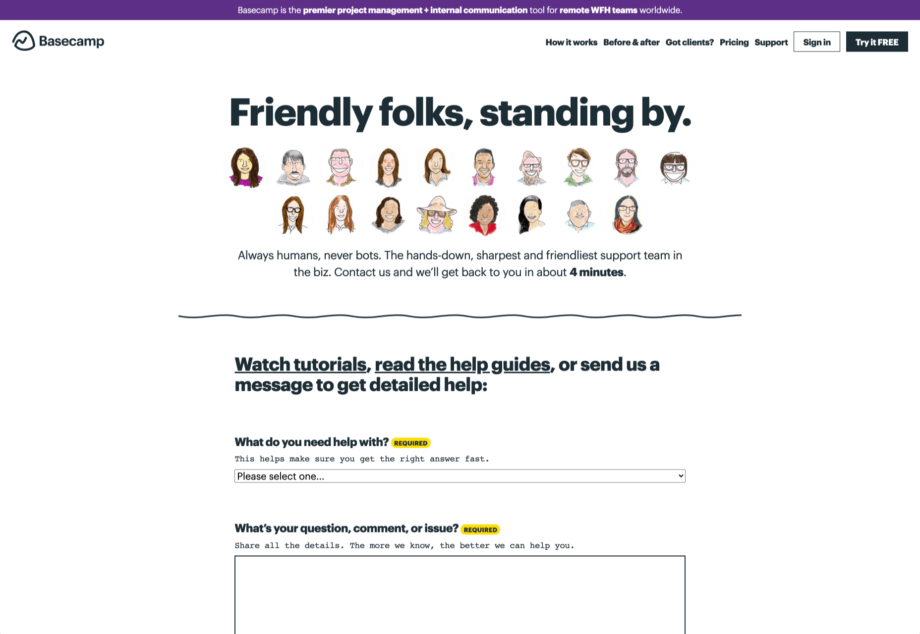
The main purpose of the contact page is to help customers get the right answer with an informative form. However, there are unobtrusive alternative options available too. If all you’re looking for is a way to help yourself fix a problem, you can click on the help guides link before you ever scroll down to the form.

Step 6: Support the Contact Team Too

The best contact us pages aren’t just a great way to improve customer experience. Well-designed solutions also help the customer service team to save time and stay productive.

One of the primary metrics that companies consider when evaluating the success of a service team, is the number of replies required before an issue is resolved. However, if the initial question from a customer doesn’t contain enough information, this number often increases.

Using the design of the contact form to access the right information helps with:

  • Automatically routing people to the right team member: Companies can set up segmentation rules that automatically send certain emails to different employees based on keywords. You might have questions that go to the sales team, and separate queries that you direct straight to the customer service team.
  • Show appropriate support options and FAQs: Remember to give the audience a chance to help themselves before they reach out for extra support. Links to an FAQ page or self-service options can really reduce the pressure on a team. Some companies even add automated chatbots to the mix to help with self-service.
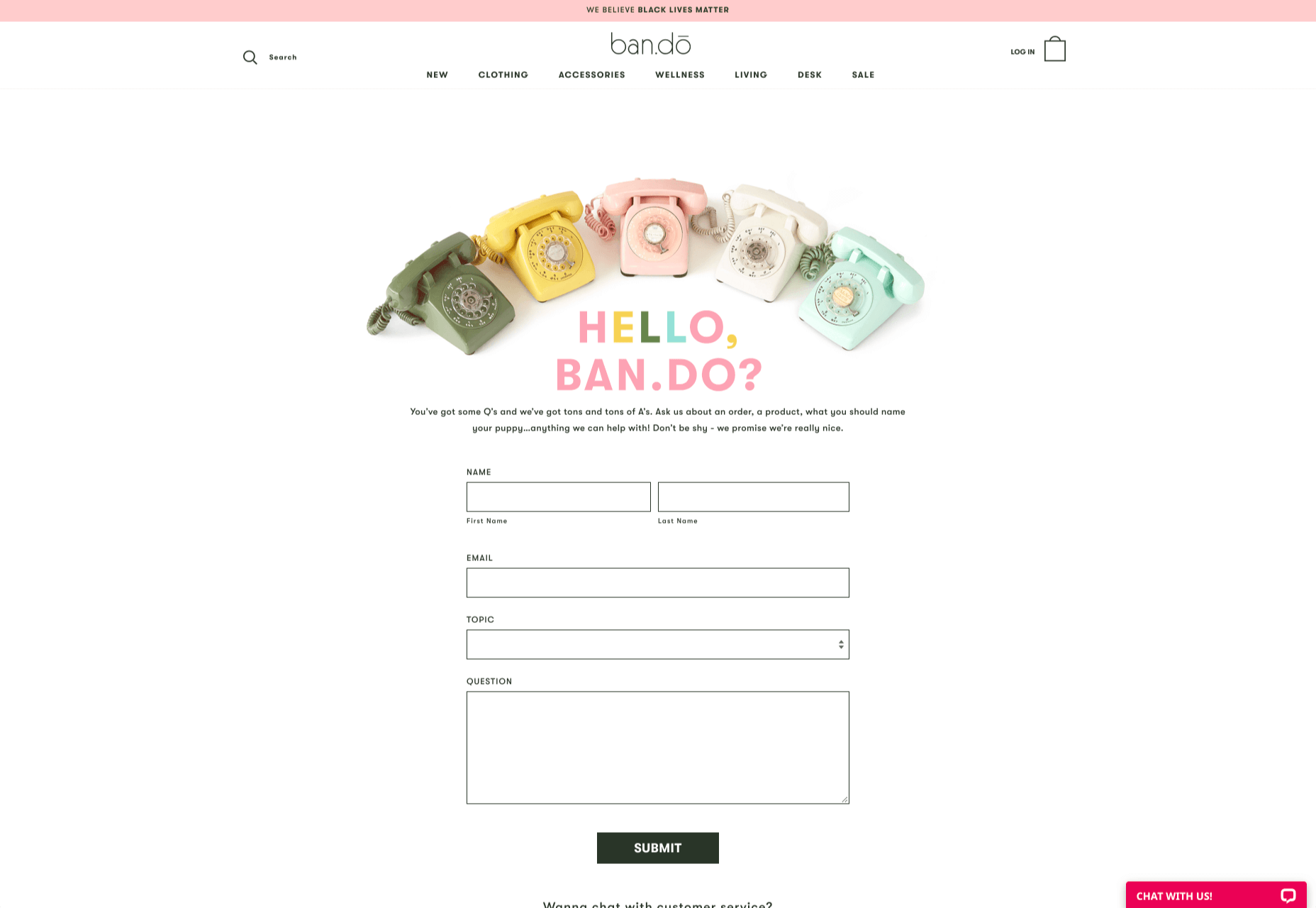
  • Prompt for extra context: Although not every customer will take advantage of an opportunity to add extra information to a form, some will. Adding a box to your contact form for “anything we need to know?” is a great way to generate more information. Ban.do includes a simple “question” box where customers can add as much detail as they like. An option to add screen shots or documents might be a nice touch too.

Building Your Own Contact Us Page

Every customer has their own specific set of needs. The right contact page for another business might not be the right one for you. That’s why it’s so important to take some time getting to know your customers and speaking to your support team.

When you’re planning your contact page, it helps to ask yourself some basic questions about what you want to achieve. For instance:

  • What kind of channels will our customers want to use to connect with us? Look at things like social media messaging, email, or phone calls. If you’ve got a relatively tech-savvy audience, then they might want to use things like instant messaging with chat bots too.
  • How can we direct clients to the appropriate channels in as little time as possible? Having a system in place to automatically route your customers to the right agent will reduce the time to resolution for your customers. The faster you solve problems, the better your reputation becomes.
  • What can we do to set customer expectations and build confidence before they speak to us? Designing a professional-looking contact page will increase customer confidence, while an FAQ section shows that you’re ready to answer common questions.
  • How can we showcase a unique brand personality without making the page complicated? Everything from using distinct brand colors on a contact page, to adding images and illustrations reminds customers that they’re in the right place.
  • What can we do to reduce the friction points in a customer’s path to contact? Avoid adding too many input options to a contact form and ensure that it’s easy to reach out when your clients have a problem.

Understanding exactly what your audience needs from you, and what they’re looking for when they come to your team for help reduces the effort involved for your client when they reach out for help. Remember, today’s digitally-savvy customers expect their interactions with companies to be as streamlined and simple as possible.

Make the Most of Your Contact Page

Contact pages are frequently an afterthought in the website design process. However, they’re one of the most valuable tools your company has. With a good contact page, you ensure that your customers can always reach you when they have problems. What’s more, you boost your chances of people wanting to reach out to the sales team too!

Good luck creating a contact page that encourages engagement from your target audience. Don’t forget to track your results from each design, and A/B test for optimization.

Source


Source de l’article sur Webdesignerdepot

Every week users submit a lot of interesting stuff on our sister site Webdesigner News, highlighting great content from around the web that can be of interest to web designers.

The best way to keep track of all the great stories and news being posted is simply to check out the Webdesigner News site, however, in case you missed some here’s a quick and useful compilation of the most popular designer news that we curated from the past week.

Minimal CSS Frameworks


Responsive Grid Design: Ultimate Guide


The New Facebook Design Sucks


The No-Code Generation is Arriving


15+ Text Typing Effect CSS Animation Examples


AppSheet by Google Workspace – No-code App Building Platform


Ecommerce Development Trends: The 2021 Edition


How Videos Can Boost your Website Ranking Results


5 Small Business Website Essentials You Need for your Site


The Psychology of User Decisions


Overflow for Windows – User Flow Diagramming Tool for Designers


How to Create an AI that Chats like You on WhatsApp


‘50 Shades of Blue’


Here’s Why Developers are in Love with Functional Programming


Apple Building Search Engine to Take on Google, Report Claims


A Faster Way to View Search Results with Less Clicking


Dark Mode in UI Design for Mobile Apps: Beauty Born in the Darkness


EncryptLab – A Collection of Free and Comprehensive Encryption Tools


Part of your World: Why We’re Proud to Build a Truly Native Mac App


Why I will not Call Myself a Junior Designer - and Neither Should You


10 Usability Mistakes Most Designers Make on Checkboxes


People Problems


Practical Guide to Color Theory for UI Designers


Following the 2020 U.S. Election with Google


React Vs Svelte – A Comprehensive Comparison Between Javascript Libraries


Want more? No problem! Keep track of top design news from around the web with Webdesigner News.

Source


Source de l’article sur Webdesignerdepot

Today, great design isn’t just about conveying the right amount of information in a certain number of pages. 

There’s more to creating the perfect website than experimenting with visuals and sound. Designers need to think carefully about how each element of their site impacts the overall user experience. 

After all, with billions of websites available to explore, it takes something truly immersive to convince your client’s audience that they should stay on their pages. The more convenient and attractive your websites are, the more likely it is that visitors will want to stick around. 

Minimalism, one of the more popular styles of web design from the last few years, can sometimes assist designers in making attractive and effective websites more functional.

The less clutter and confusion there is on a page, the easier it is to navigate. 

So, how do you embrace the benefits of functional minimalism?

Understanding Functional Minimalism

Many webs designers are convinced that minimalism is all about aesthetics. 

They see a website like Hugeinc.com and assume that the minimalist appearance is all about making the website as attractive as possible.

However, the underlying ideas of minimalism in web design go much deeper than this.  The history of minimalist design begins with Japanese culture. Japan has long focused on balancing simplicity and beauty with its architecture, interior design, and even graphic design. In the Western world, minimalism got its day in the sun in the web design environment, after customers endured years of cluttered and complicated web pages with difficult navigation, overwhelming information and clashing graphics. 

Designers began to experiment with the idea that less really could be more — particularly when it came to the digital landscape. 

The Functional Rules of Minimalist Web Design

For a while, minimalism was the most popular style for a website. During 2018, in particular, minimalist web design soared to the top of the designer demand list, as companies fell in love with a combination of white space, simple navigation and bold text. 

While now, there are other design trends stepping into the industry, designers can still benefit from exploring some of the essential rules of functional minimalism. After all, visual complexity has been proven to damage a person’s perception of a website

Additionally, a study conducted by the EyeQuant group found that a clean and simple design can lead to a lower bounce rate. Minimalism gives viewers less to contend with on a page, which can allow for a simpler and more straightforward experience. Additionally, a clean website can also drive additional benefits, including faster loading times, better responsivity between screen sizes and more.

Because you’re only using a few images and well-spaced text, you can even experiment with different strategies, like graphics and dynamic fonts. Look at the Manuel Rueda website, for instance, it’s a great example of how a minimalist design can be brimming with activity.

So, how can any designer use the principles of functional minimalism?

1. Focus on the Essentials

First, just like when designing a landing page, designers need to ensure that they’re concentrating only on the elements in the page that really need to be there.

This means removing anything on the website that doesn’t support the end-goals of the specific page that the viewer is using. Any pictures, background noise, buttons, or even navigation features that aren’t going to support the initial experience that the visitor needs, must go. 

Think about what’s going to distract your visitors from the things that are important and concentrate on giving everything a purpose. For instance, the Plus63.org website instantly introduces the visitors to the purpose of the website, then allows users to scroll down to get more information. The data is spread clearly through the home page, pulling the viewer into a story. 

2. Embrace the Positives of Negative Space

Negative space is one of the fundamental components of good minimalist web design. 

Every part of a good website doesn’t need to be filled with noise to make a difference. White, or negative space can help to give your viewer the room they need to fully understand the experience that they’re getting. 

From a functional perspective, it’s the difference between placing someone in an overflowing storage container and asking them to find what they need or placing them in a room where items are carefully spaced out, labelled, and waiting for discovery. 

The Hatchinc.co website uses negative space to ensure that information is easy to consume. You can find the different pages of the site easily, the social media buttons, and the newsletter subscription tool. Plus, you get a chance to see some of the work behind the site.

3. Make it Obvious

One of the biggest problems that consumers have encountered in recent years, is the concept of “choice overload”. 

Whether you’re in a store, or on a website, you’re never sure what to do first. Do you check out the blog posts on the site to learn more about the authority of the company? Do you visit the “About” page, to see where the brand come from? Do you head to their product pages?

As a designer, functional minimalism can help you to make it obvious what your audience should do next. As soon as you arrive on the AYR.com website, you’re not overwhelmed with choice. You can either head to your bag, “shop now”, or check the menu. 

Since the “Shop Now” CTA is the biggest and most compelling, the chances are that most visitors will click that first, increasing the company’s chance of conversions. 

4. Simplify the Navigation (But Don’t Hide It)

The AYR.com example above brings us to another concept of functional minimalism. 

While minimalism and simplicity aren’t always the same thing, they should go hand-in-hand. When you’re designing for functional minimalism, you should be concentrating on helping visitors to accomplish tasks as quickly and easily as possible, without distraction. 

That means that rather than overwhelming your audience with a huge selection of pages that they can visit at the top or side of the screen, it may be worth looking into simpler navigation options. A single menu icon that expands into a full list of items remains a popular design choice – particularly in the era of mobile web design. 

For instance, look at the simple menu on newvision-opticien.com.

With this basic approach, designers can ensure that visitors are more likely to click through to the pages that their clients want their customers to visit. They can still find what they need in the menu, but it’s not taking up space on the page, or distracting them. 

5. Set Great Expectations with the Top of the Screen

Functional minimalism can also help today’s designers to more quickly capture the attention of their visitors from the moment they click into a website. 

The content that’s visible at the top of the page for your visitors is what will encourage them to take the next step in their online experience. Make sure that you’re providing something that keeps your audience interested and gives them the information they need. 

That way, you’ll lower the risk of high bounce rates for your clients, while also taking advantage of minimalism’s ability to deliver quick access to information for your audience. 

At the top of the page, the Kerem.co website instantly introduces the visitor into what the website is all about, and what they should do next. 

You can even deliver more information in one chunk at the top of the page, without cluttering the environment, by using good UI animation. 

Consider implementing a slideshow of pictures that flip from one image to the next, or a font section that dynamically changes as your audience has chance to read each sentence. 

6. Use Functional Minimalism in the Right Spaces

Remember, functional minimalism isn’t just for home pages. 

Depending on what you want to accomplish for your client, you could also embed the components of minimalism into landing pages, portfolios, and squeeze pages too. 

After all, when there’s less clutter and confusion on a page to distract a potential audience, there’s a greater chance that your visitors will scroll to the bottom of the page and complete a conversion. For instance, look at how simple and attractive the Muzzleapp.com landing page is.

The page provides useful information and tells customers exactly what they need to do next. There’s no confusion, no complexity, and nothing to hold visitors back. 

Just be careful. While functional minimalism can be very useful, it won’t be right for every website. A lack of elements can be harmful to websites that rely heavily on content. That’s because low information density will force your user to scroll excessively for the content that they need. Using functional minimalism correctly requires a careful evaluation of where this technique will be the most suitable. 

Minimalism Can be Functional

A minimalist design isn’t just an aesthetic choice. The right aspects of minimalism can simplify interfaces on the web by eliminating unnecessary elements and reducing content that doesn’t support an end goal. 

The key is to ensure that you’re focusing on a combination of aesthetics and usability when creating the right design. An easy-to-navigate and beautiful website can be a powerful tool for any business.  

Source


Source de l’article sur Webdesignerdepot

Every week users submit a lot of interesting stuff on our sister site Webdesigner News, highlighting great content from around the web that can be of interest to web designers.

The best way to keep track of all the great stories and news being posted is simply to check out the Webdesigner News site, however, in case you missed some here’s a quick and useful compilation of the most popular designer news that we curated from the past week.

34 Impressive Examples of Fullscreen Navigation Menus


Radix Icons – An Open Source Crisp Set of 15×15 Icons


Nocode – Turn Google Docs into a Website


How to Design a Great Dashboard for your UI


The Most Futura. Ever.


5 Mistakes to Avoid When Designing your Nonprofit Website


UCalc – Functional Calcs and Forms


AreYouInterested – A Super-Simple Landing Page Builder for Bulk Idea Validation


Unlearning to Learn Design


Just FYI: Acronyms are Hurting your UX and ROI


3 Concrete Steps to Learning a Programming Language


MathJax – Beautiful and Accessible Math in all Browsers


What is a WordPress Child Theme?


How to Create a UX Writing Portfolio


A Step-By-Step Guide to User Experience Research


5 Most Common Mistakes in FinTech Design


31 Ways to Improve your Web Design Skills


Designing the Ada Lovelace Hashflag Emoji


Powered by Buttons – An Acquisition Channel Nobody is Talking About


Top 10 Tools for Managing Remote Teams Efficiently


Email Design Accessibility: Why it is Important to Improve it


Why Web Design Client Referrals Aren’t a Slam-Dunk


Host Rider: A Game for Learning CSS Flexbox


Stanza – Learn Coding Concepts Faster


How to Present your Logos to the Client


Want more? No problem! Keep track of top design news from around the web with Webdesigner News.

Source


Source de l’article sur Webdesignerdepot

The digital world is a place of constant change. Just as you get used to a new design trend, another one appears, forcing you to rethink the way that you approach each client project. 

As a web designer, it’s up to you to make sure that you have your finger on the pulse on the latest transformations in the industry. However, it can be challenging to know for sure which trends you should be taking seriously, and which you can simply ignore. 

One option to refine and enhance your design journey is to pay attention to influencers. 

Influencers aren’t just there to guide customers into making purchasing decisions. These people are thought-leaders in their field. They spend all of their time tracking down ideas and concepts that really work. That way, they can maintain a successful reputation online.

Sourcing information and motivation from the following UX influencers could help you to create some truly amazing websites in 2020: 

1. Andrew Kucheriavy 

Andrew Kucheriavy is the phenomenal co-founder and CEO of a company named Intechnic. Andrew was one of the first people in the world to be given the “Master in User Experience” award. This means that he’s an excellent person to pay attention to if you want help understanding the ins and outs of user experience design

As one of the leading visionaries in UX, business strategy, and inbound marketing, Andrew has a lot of useful information to offer professionals and learners alike. Andrew is particularly active on Twitter, where he’s constantly sharing insights on design and marketing. You can also find input from Andrew on the Intechnic blog. 

2. Jeff Veen 

Another must-follow for designers who want to learn more about understanding their audience and their position in the marketplace, Jeff Veen is a leader in UX and product design. Veen got his start with the founding team for Wired, before he created the Adaptive Path company for UX consulting. Jeff Veen is also known for being responsible for various aspects of Google Analytics. 

Over the years, Jeff has expanded his knowledge in the design space, and mentored various companies, from WordPress to Medium. He also has a fantastic podcast that you can listen to for guidance when you’re on the go. 

3. Jared Spool 

Jared Spool has been tackling the most common issues of user experience since before the term “UX” was even a thing. Excelling in the design world since 1978, Jared has become one of the biggest and most recognizable names in the user experience environment. He’s the founder of the User Interface Engineering consulting firm. The company concentrates on helping companies to improve their site and product usability. 

Jared offers plenty of handy information to stock up on in his Twitter feed. Additionally, you can find plenty of helpful links to blogs and articles that he has published around the web on Twitter too. He’s followed by Hubgets, PICUS, and many other leading brands. Make sure that you check out his collection of industry-leading talks on UIE. 

4. Jen Romano Bergstrom

An experimental psychologist, User Experience Research coach, and UX specialist, Jen is one of the most impressive women in the web design world. She helped to create the unique experiences that customers can access on Instagram and Facebook. Additionally, she has a specialist knowledge of eye-tracking on the web. You can even check out Jen’s books on eye-tracking and usability testing

When she’s not writing books or researching user experience, Jen is blogging and tweeting about usability and researching new strategies in the web design space. It’s definitely worth keeping up with Jen on Twitter, particularly if you want to be the first to know about her upcoming seminars and learning sessions. 

5. Katie Dill 

Katie Dill is the former Director of Experience for Airbnb, so you know that she knows her way around some unique experiences. With an expertise in working with companies that harness new technologies and UX design, Katie Dill is at the forefront of the user experience landscape. Dill attends various UX conferences throughout the year, and publishes a range of fantastic videos on YouTube. 

You can find blogs and articles from Katie published on the web; however, you’ll be able to get the most input from her by following Katie on her Twitter account. 

6. Khoi Vinh 

Khoi Vinh is one of the most friendly and unique UX bloggers and influencers on the market today. He knows how to talk to people in a way that’s interesting and engaging – even about more complicated topics in UX design. Vinh is a principle designer at Adobe, and he has his own podcast called Wireframe. However, he still finds time to keep his followers engaged on Twitter. 

Over the years, Khoi has worked as a Design Director for Etsy and the New York Times. Vinh also wrote a book called “Ordering Disorder” which examines grid principles in web design. According to Fast Company, he’s one of the most influential designers in America. Additionally, Khoi has a brilliant blog where you can check out all of his latest insights into UX design. 

7. Cory Lebson

Cory Lebson is a veteran in the world of web design and user experience. With more than 2 decades of experience in the landscape, Cory has his own dedicated UX consulting firm named Lebsontech. Lebson and his company concentrate on offering UX training, mentoring, and user experience strategy support to customers. Cory also regularly speaks on topics regarding UX career development, user experience, information architecture and more. 

Cory is an excellent influencer to follow on Twitter, where you’ll find him sharing various UX tricks and tips. You can also check out Cory’s handbook on UX careers, or find him publishing content on the Lebsontech blog too. 

8. Lizzie Dyson

Another amazing woman in the industry of UX, Lizzie Dyson is changing the experience landscape as we know it. Although she’s a relatively new figure in the web design world, she’s recognized world-wide for her amazing insights into the world of web development. Lizzie also helped to create a new group specifically for women that want to get involved in web design. 

The Ladies that UX monthly meet-up welcomes a community of women into the digital landscape, helping them to learn and expand their skills. Lizzie regularly publishes content online as part of Ladies that UX. Additionally, she appears on the Talk UX feed – an annual design and tech conference held for women around the world. 

9. Chris Messina 

Chris Messina is a product designer and a technical master who understands what it takes to avoid disappointing your users. With more than a decade of experience in the UX design landscape, Messina has worked for a variety of big-name brands, including Google and Uber. He is best known as the inventor of the hashtag!

Chris is a highly skilled individual who understands the unique elements that engage customers and keep people coming back for more on a website. You can see Chris speaking at a selection of leading conferences around the world. Check out some of his talks on YouTube or track down his schedule of upcoming talks here. Chris also has a variety of fantastic articles on Medium to read too. 

10. Elizabeth Churchill

Last, but definitely not least, Elizabeth Churchill is a UX leader with an outstanding background in psychology, research science, psychology, artificial intelligence, cognitive science, human interaction with computers and more. She knows her way around everything from cognitive economics, to everyday web design. Churchill also acts as the director of UX for Google Material Design. 

A powerhouse of innovation and information, Churchill has more than 50 patents to her name. She’s also the vice president of the Association for Computing Machinery too. When she’s not sharing information on Twitter, Elizabeth also has a regular column that you can tune into on the ACM Interactions magazine. 

Who Are You Following in 2020?

Whether you’re looking for inspiration, guidance, or information, the right influencers can deliver some excellent insights into the world of web design. There are plenty of thought leaders out there in the realm of user experience that can transform the way that you approach your client projects. You might even discover a new favourite podcast to listen to, or an amazing series of videos that help you to harness new talents. 

Influencers are more than just tools for digital marketing; they’re an excellent source of guidance for growing UX designers too.


Featured image via Pexels.

Source


Source de l’article sur Webdesignerdepot

Every week users submit a lot of interesting stuff on our sister site Webdesigner News, highlighting great content from around the web that can be of interest to web designers.

The best way to keep track of all the great stories and news being posted is simply to check out the Webdesigner News site, however, in case you missed some here’s a quick and useful compilation of the most popular designer news that we curated from the past week.

6 Great Open Source SVG Icon Libraries You Should Check Out Now


Codedamn – Teach Yourself to Code


Zoop – Unlimited Serverless Hosting


Sitemaps: A Complete Guide


Shoelace 2.0: A Forward-thinking Library of Web Components


How to Become a UX Designer – No Matter What You Studied at Uni


Buttons that Spark Joy


How to Solve any Design Problem by Understanding its Roots


Ooooops I Guess We’re* Full-Stack Developers Now


Blue People Illustrations, or How to Kill a Brand


How to Pick More Beautiful Colors for your Data Visualizations


Stop Doing Design System Projects


Please Don’t do That: 4 Things to Ask Clients to Avoid


What’s Driving so Many Car Brands to Redesign their Identity?


How to Prepare Sites for 2020 Holiday Shopping


Nova


Show Off your Design Skills by Crafting Eye-Catching iOS 14 Layout Themes


How to Create Onboard and Login Screens for a Dating App Template in Figma


Bidirectional Scrolling: What’s not to Like?


Basic Guidelines to Product Sketching


The Era of UI Unification


The Typography of Star Trek: The Motion Picture


The Guide to UX Research


In Search of Illustration: Design Process for Illustration Set


Looking at an Online School Through a Web Designer’s Eyes


Want more? No problem! Keep track of top design news from around the web with Webdesigner News.

Source


Source de l’article sur Webdesignerdepot