Articles

Every week users submit a lot of interesting stuff on our sister site Webdesigner News, highlighting great content from around the web that can be of interest to web designers.

The best way to keep track of all the great stories and news being posted is simply to check out the Webdesigner News site, however, in case you missed some here’s a quick and useful compilation of the most popular designer news that we curated from the past week.

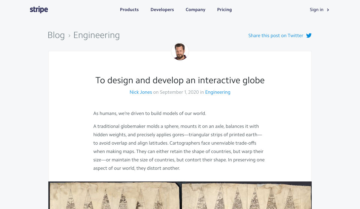
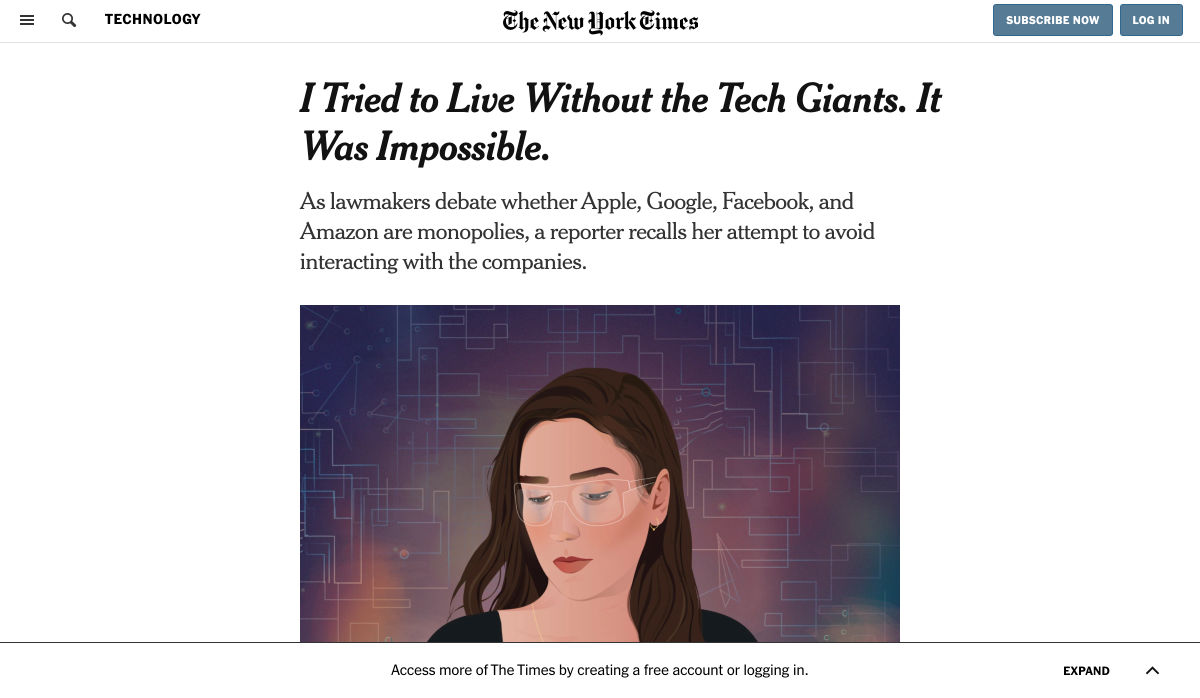
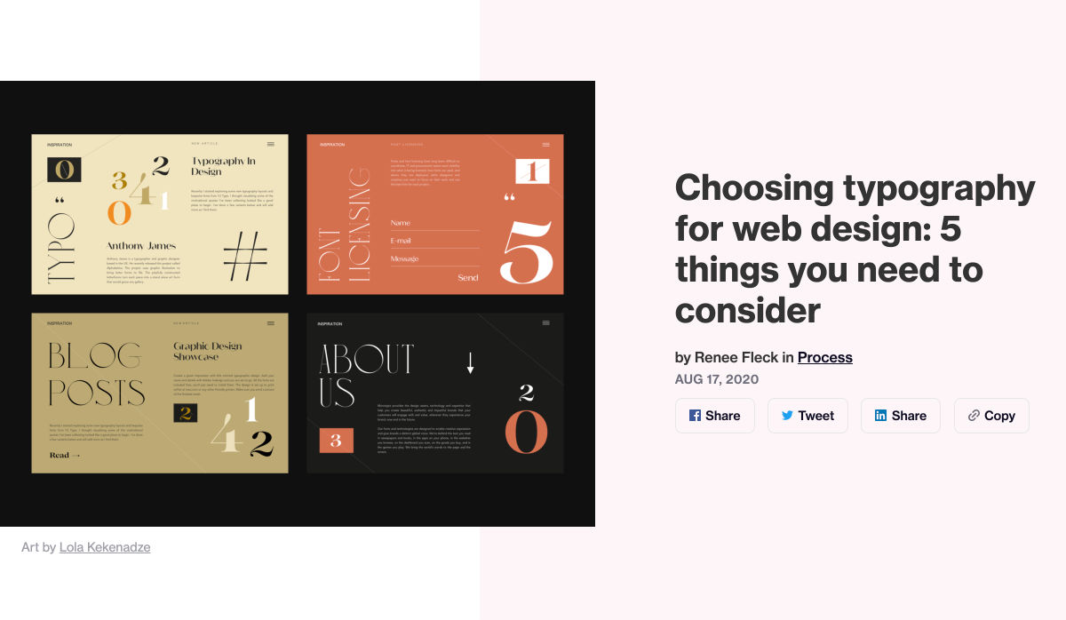
The Core Concepts of Bold Web Design


Chrome Extensions Every Web Developer Must Have


How to Use Email Infographics to Engage Subscribers


30+ Free Graphic Templates for SaaS Social Media


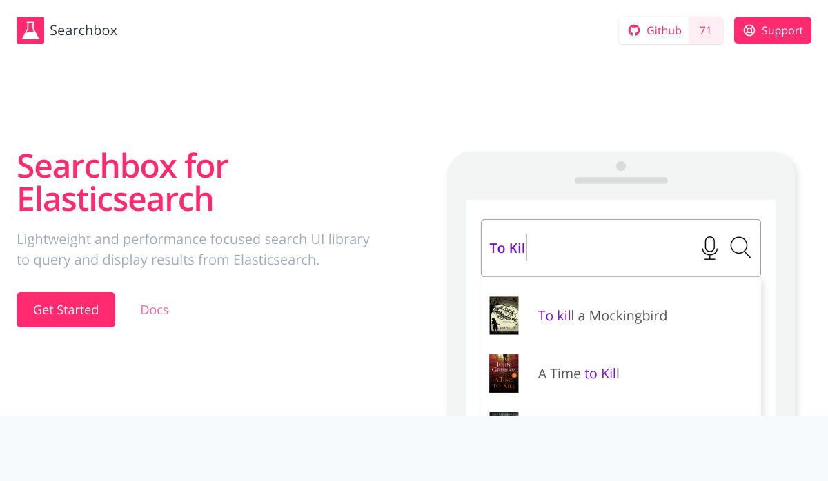
Searchbox – A Lightweight JavaScript Library for Building Search UIs


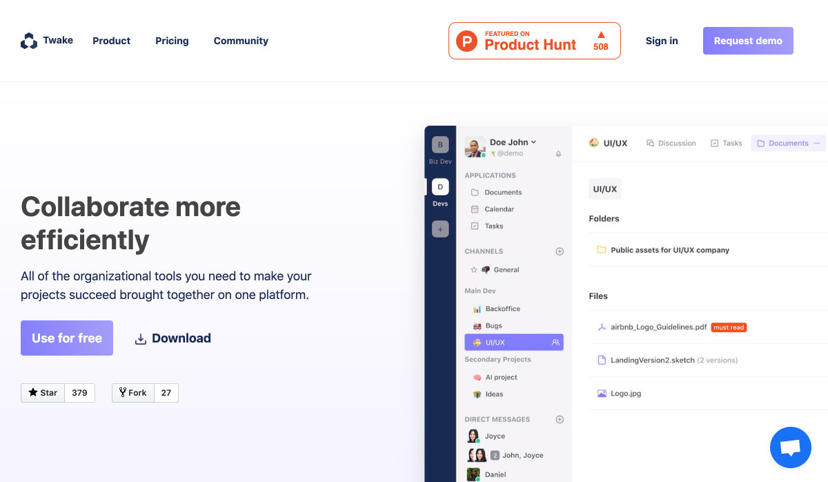
Twake – Open Source Collaboration Platform for Teams


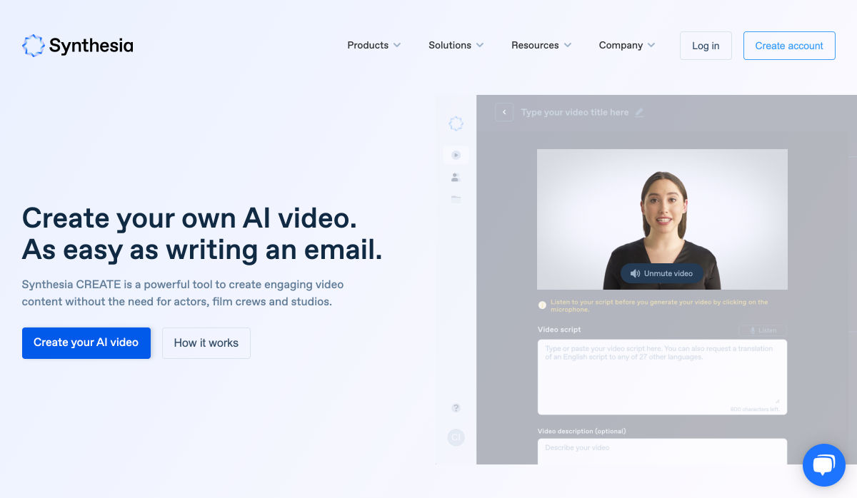
Synthesia – Generate Professional-looking AI Videos from Text in Minutes


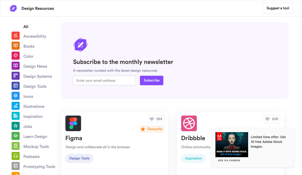
Design Resources


19 Trippy & Glitchy CSS Distortion Effects


Update on Firefox Send and Firefox Notes


The Rounded User Experience


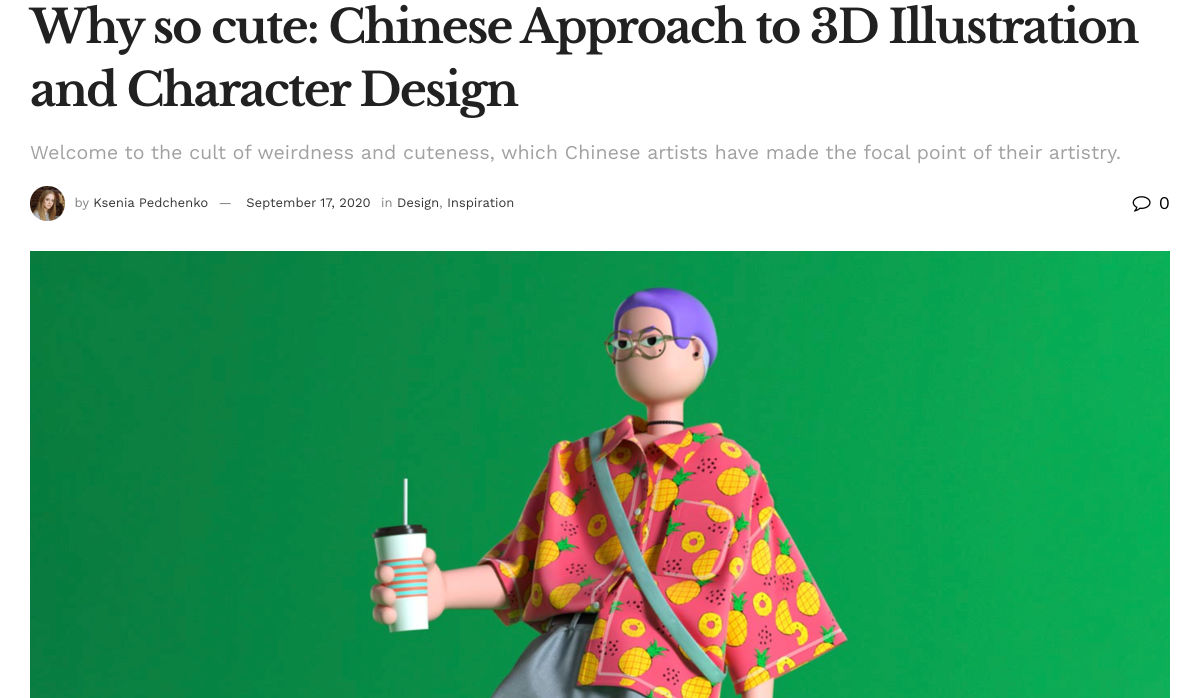
Chinese Approach to 3D Illustration and Character Design


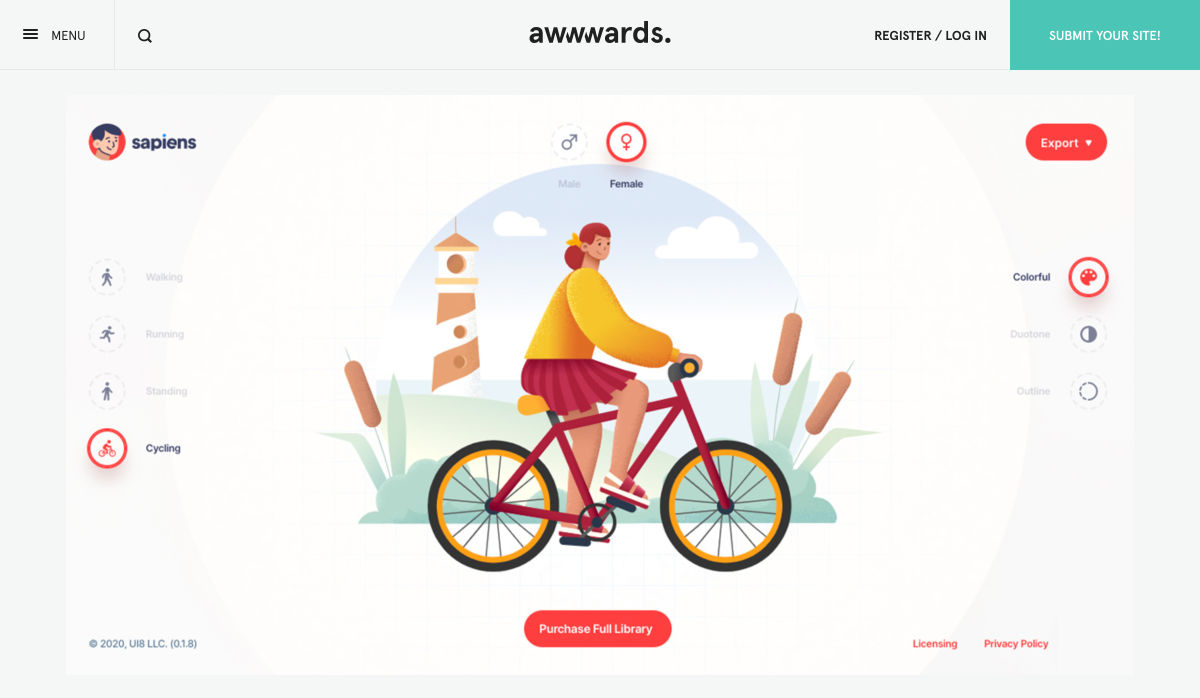
Sapiens Character Builder


ComicA11y


Here’s How You Measure the Success of a UX Design Project


Tools Should not Only Be for Experts – They Should Turn Us into Them


Designing with Accessible Color Contrast on the Web


The Future of Experiences, According to a Theme Park Designer


How to Make an App – The Ultimate Guide


Page Experience: A Guide on Google’s Newest Ranking Factor


Visual Mind AI – How Attractive is your Website?


The Untold History of MacOS System Preferences


Bringing Context to Design Systems


How to Market Yourself as a Creative Entrepreneur


Magic Startup Shell – Validate your Startup Idea


Want more? No problem! Keep track of top design news from around the web with Webdesigner News.

Source


Source de l’article sur Webdesignerdepot

Designing for emotion in and of itself is not a problem. Websites are bound to elicit an emotional reaction from visitors, even if it’s as simple as them feeling at ease because of the soft, pastel color palette you’ve designed the site with.

I don’t want to outright villainize emotional design. Unless there is some form of unethical manipulation at play, designing for your visitors’ emotions can actually provide them with a more positive experience.

So, here’s what I’d like to look at today:

  1. What is emotional design?
  2. When does emotional design cross a line?
  3. What’s the right way to design for emotions?

1. What Is Emotional Design?

When we look at emotional design in the context of a website, we’re focused on three types of emotional reactions:

a. Visceral Reactions

Visceral reactions are instinctive ones. Usually, visitors experience these as their first impressions of a website or web page. For instance, a cluttered or otherwise poorly designed homepage might leave visitors feeling overwhelmed, hesitant, or wanting to flea.

A minimally designed homepage interface, on the other hand, might have visitors not feeling much of a reaction at all. In this case, no feeling is a good feeling.

Like Irene Au said:

b. Behavioral Reactions

Behavioral reactions stem from the usability of a website. There’s a lot that can stir up negative emotions here, like:

  • Extra-long contact forms
  • Confusing menus
  • Error-ridden content
  • Slow-loading pages
  • And more

Again, if a website is easy to get through and attractively designed, visitors aren’t likely going to “ooh” and “aah” with every step they take on the site. And that’s a good thing. If they’re focusing more on how the design looks, they’re not paying attention to the brand’s actual offer.

c. Reflective Reactions

Reflective reactions are the third type of emotions we design for.

This is complicated because there’s a lot wrapped up in how visitors feel about a website after the fact. Sometimes the most well-designed interfaces and experiences can’t save them from a bad experience, whether they realized too late that the products were overpriced or they were treated poorly by a live chat representative.

As a web designer, all you can really do is to make sure you’re working with reputable companies and then aligning the designs of their sites with their values.

When Does Emotional Design Cross a Line?

There’s already enough social pressure online; your website doesn’t need to be one of those places, too

Emotional design shouldn’t be about manipulating consumers’ emotions. In most cases, emotional design is about controlling the environment of the website so that emotions don’t go spinning wildly out of control — in either direction.

It’s when we take what we know about influencing someone’s emotional state to monetarily benefit from it that emotional design becomes problematic.

Here are some ways in which you might negatively impact the emotions of your visitors through design:

FOMO

The fear-of-missing-out isn’t always a bad marketing strategy. However, when FOMO is used for the purposes of rushing consumers to take action now and without time to really think it through, it definitely can be.

Chances are good they’ll feel badly no matter what. Either because they regret the rushed (and probably unnecessary, or expensive) decision or they blame themselves for missing out on an opportunity to be like everyone else.

There’s already enough social pressure online; your website doesn’t need to be one of those places, too. So, be careful with how you present customers with limits (on time, on products, etc.) or how you frame the call-to-action (“If you don’t buy this now, expect to fail/be miserable/suffer even more”).

Analysis Paralysis

It doesn’t matter why people specifically seek out your website. They have a problem or a hole in their life, and they’re looking for something to fix it.

Now, you can’t help it if the website has too much to offer in the way of options or solutions. Companies have to provide every possible solution/option so their users don’t feel like they have to go somewhere else to get what they need. However, the way you design these options can lead to a negative emotional state if you’re not careful.

For instance, your visitors might experience analysis paralysis, where there are so many options that it becomes impossible to take action. Similar to FOMO, this can lead to regret either with the decision they made or the one they were incapable of making.

By simplifying how many choices are presented at once, or designing a clear and supportive pathway to the right option of many, your website will leave visitors feeling much more positively about the whole experience.

Trendy Nostalgia

Nostalgia can be a great way to play upon the positive associations and emotions consumers feel towards an era gone by or a place they once knew. But, again, it depends on how you design with it.

For example, if you design a vintage website for an agency launched in 2019 and run by a group of 20-somethings, it might come off feeling disingenuous once customers start to catch on.

For a restaurant known as the oldest bar in the state, that would be a different story. That nostalgically designed website would be a real part of its story; not just done as a sales gimmick. As a result, customers would likely embrace those warm feelings for the “good ol’ days” they get from the website.

Also, think about how quickly nostalgia fades if it’s done to align with a trend. Unless you’re committed to redesigning a website the second that nostalgic feeling falls out of favor, you could be condemning your client to an outdated website mere months after launch.

What’s the Right Way to Design for Emotions?

Like I said before, there’s nothing wrong with designing for emotions. You just have to make sure your website visitors don’t feel manipulated and that they welcome the pleasant feelings the site gives them.

make sure your website visitors don’t feel manipulated

It might seem harmless at the time. After all, what are they doing on the site if they weren’t interested in the first place? And it’s not like they were bullied into spending their money, right?

But if they sense in any way that their response was driven by an emotion they wouldn’t have otherwise felt, they’re not going to be happy. While it might not be enough for them to cancel their subscription or services, or to return products they bought, it will definitely leave a bad taste in their mouth. And, ultimately, it can cost your website loyal visitors and customers.

So, if you’re going to use emotional design on a website, do it to improve their experience, not to put more money into your clients’ pockets. That means your emotional design choices need to be honest, transparent, and focused on eliciting naturally positive emotions like:

  • Satisfaction
  • Feeling impressed
  • Trust
  • Calm
  • Feeling valued

Go back to the three emotional reactions I brought up earlier. If you can design a website to give off a positive first impression, and to be pain-free and usable, you can spend the rest of your time injecting small bits of happiness and positivity into the website with color choices, friendly micro-interactions, personalized content, and more.


Featured image via Unsplash.

Source


Source de l’article sur Webdesignerdepot

Every week users submit a lot of interesting stuff on our sister site Webdesigner News, highlighting great content from around the web that can be of interest to web designers.
The best way to keep track of all the great stories and news being posted is simply to check out the Webdesigner News site, however, in case you missed some here’s a quick and useful compilation of the most popular designer news that we curated from the past week.

The Beginner’s Guide to Responsive Web Design in 2020


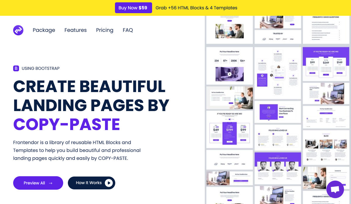
Frontendor – HTML Templates and Blocks to Help Build Beautiful Websites


Why these Developer Job Titles are Ridiculous and Shouldn’t Exist


Emblemicons – Open-Source Free to Use Library of 1000+ Beautiful Icons


Disrespectful Design – Users Aren’t Stupid or Lazy


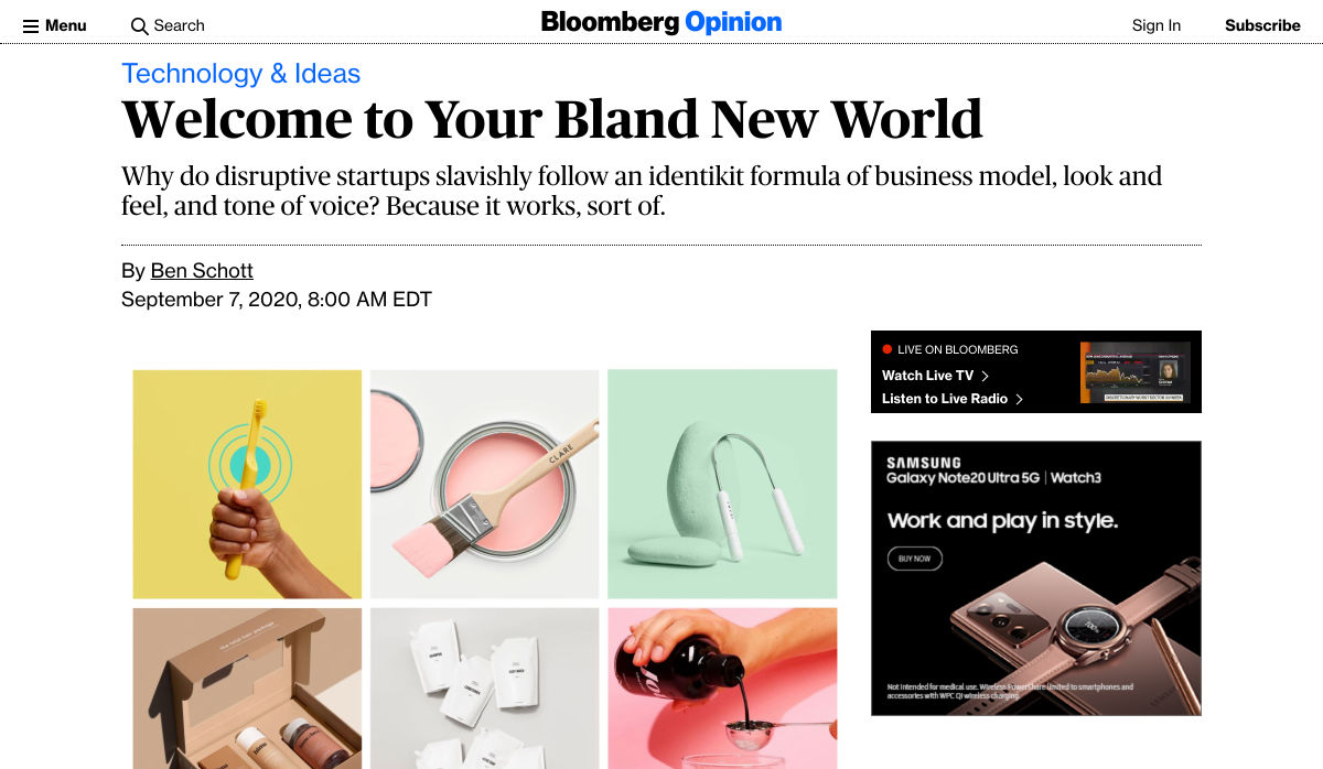
Welcome to your Bland New World


Playing with Fonts


The 50 Best Fonts for Creating Stunning Logos


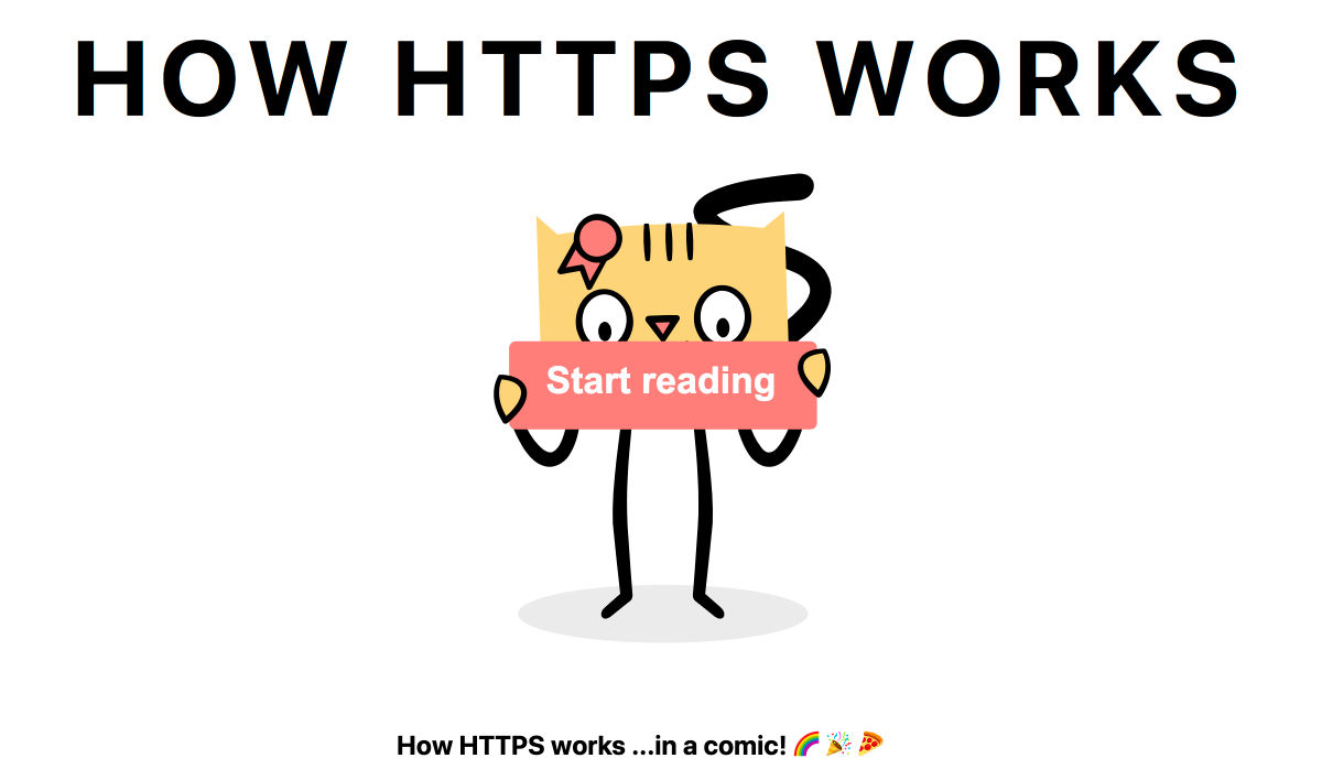
How HTTPS Works


Nova – Beautiful, Fast, Flexible, Native Mac Code Editor


How to Be a Great Email Designer: Essential Tools


10 UX Lessons I Learned Building my Product from Scratch


5 Fears that Creatives Must Overcome


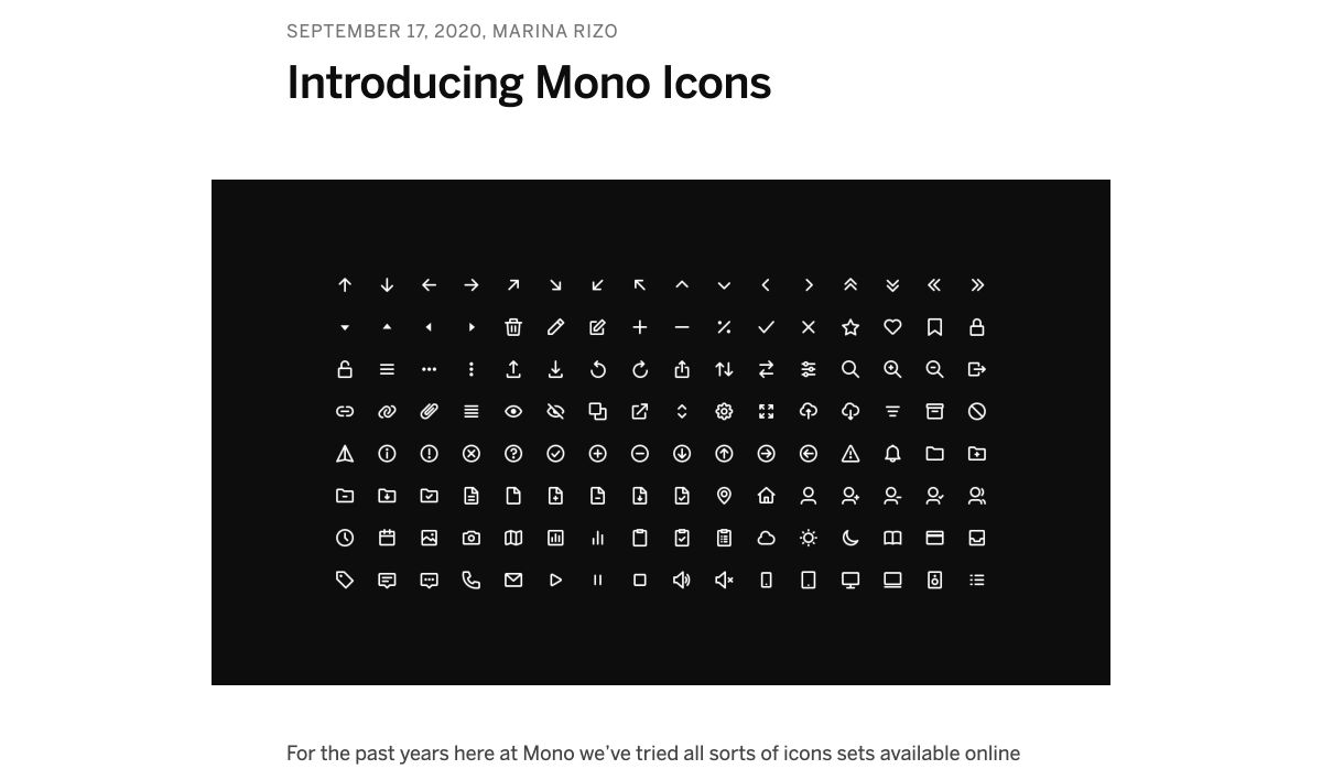
Introducing Mono Icons


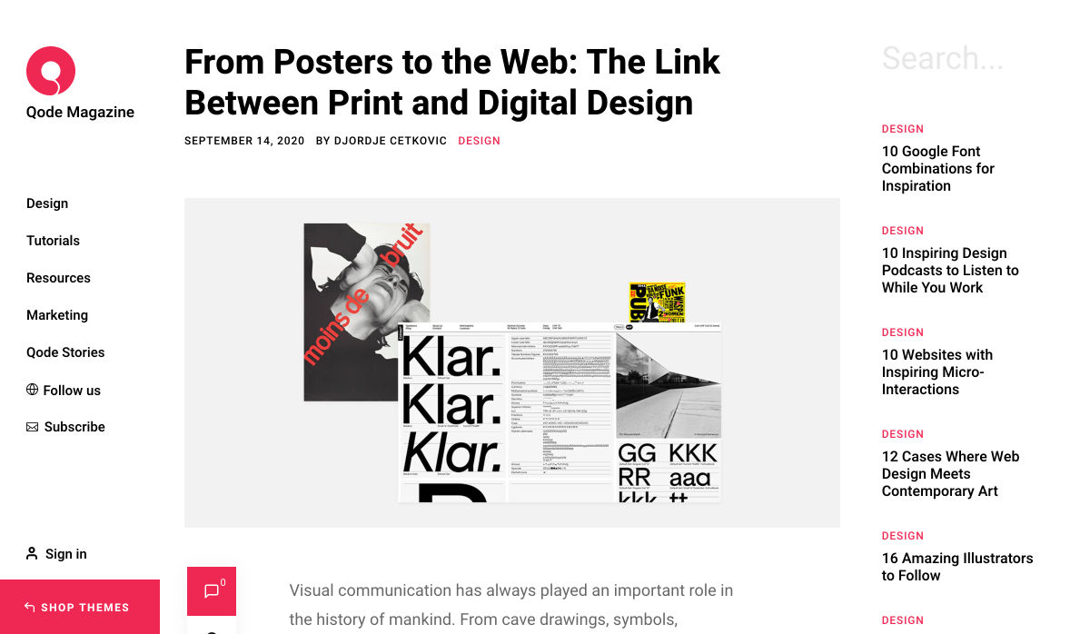
From Posters to the Web: The Link Between Print and Digital Design


Designing SaaS Products In 2020


User Experience: What Is, its Guidelines and How to Apply it on your Website


The Evolution of the Google Sign up Form: 2005 → 2020


Principles for Naming a Brand


How to Choose the Right Website Fonts


Design Principles: What, Why, and How


5 Basic Types of Images in Web Design


Documenting is Designing: How Documentation Drives Better Design Outcomes


How to Create Dreamy Color Blurs in Adobe Illustrator


The Entrepreneur Vs the Linchpin: Which Type of Designer are You?


Want more? No problem! Keep track of top design news from around the web with Webdesigner News.

Source


Source de l’article sur Webdesignerdepot

Every week users submit a lot of interesting stuff on our sister site Webdesigner News, highlighting great content from around the web that can be of interest to web designers.
The best way to keep track of all the great stories and news being posted is simply to check out the Webdesigner News site, however, in case you missed some here’s a quick and useful compilation of the most popular designer news that we curated from the past week.

UX Design for Navigation Menus


How to Choose UI Colors for Mobile and Web Design Wisely


A Step-By-Step Guide to Create your own WordPress Theme


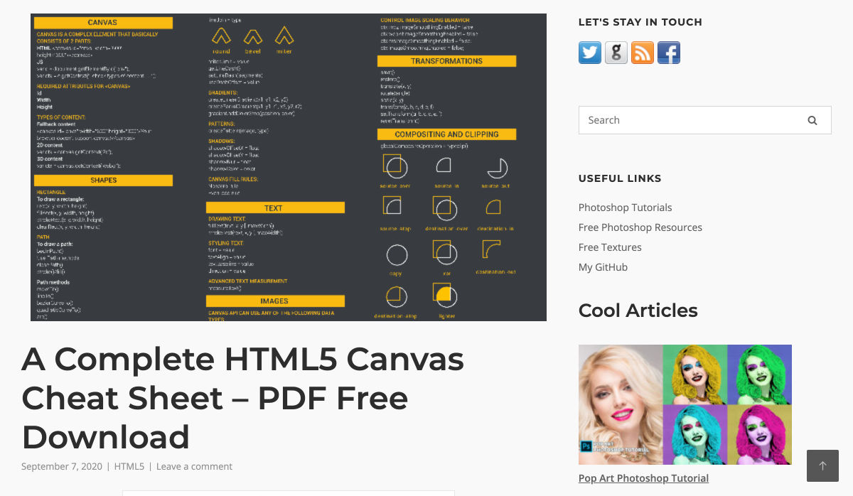
HTML5 Canvas Cheat Sheet [PDF]


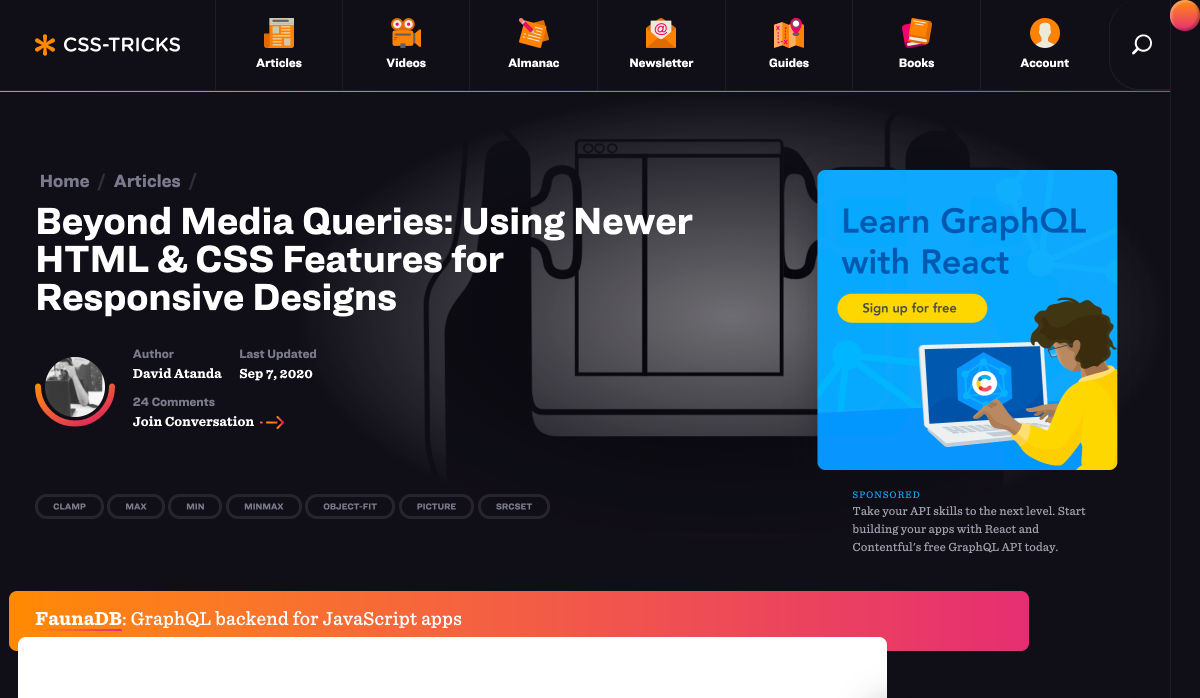
Beyond Media Queries: Using Newer HTML & CSS Features for Responsive Designs


The Power of not Messing Around


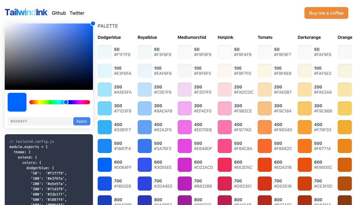
Tailwind Ink: AI Color Palette Generator for Tailwindcss


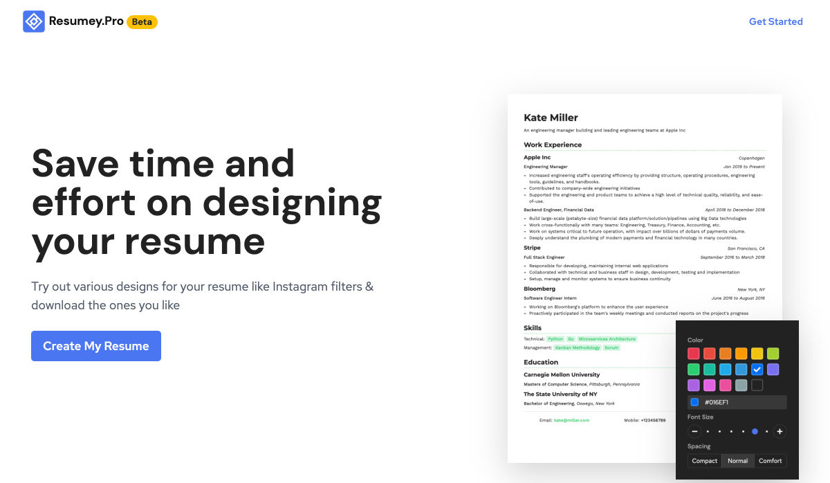
Resumey.Pro – Save Time and Effort on Designing your Resume Using Markdown


The Ultimate List of YouTube Channels to Boost your Web Dev’t and Programming Skills


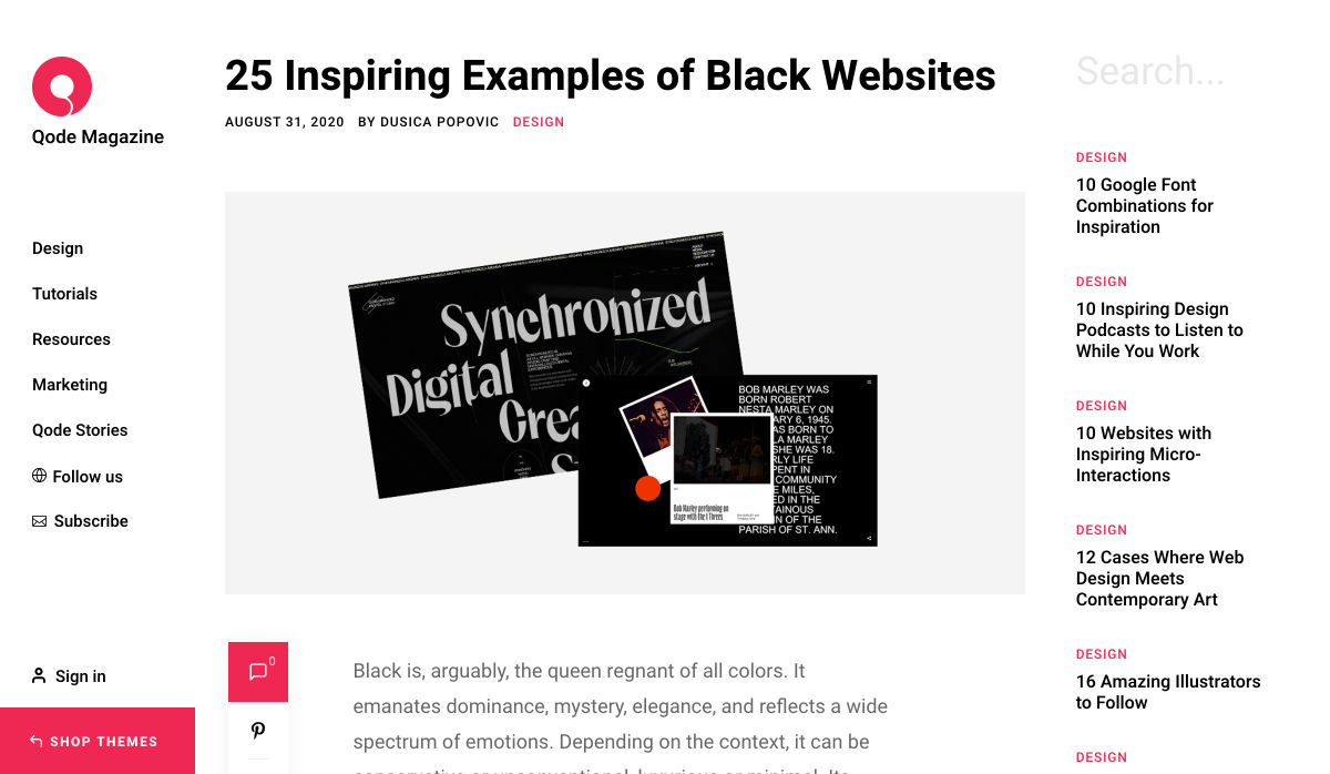
10 Google Font Combinations for Inspiration


Everything You Need to Know About WordPress 5.5


How to Create Stronger Layouts with the 8pt Grid


TEDx Talk: Good UX is a Problem


All the Ways to Make a Web Component


Landing Page 101: How to Design a Landing Page that Converts


30 Free HTML and CSS Book Effects and UI Design


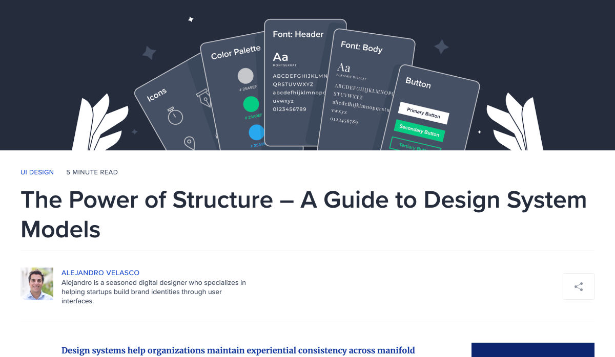
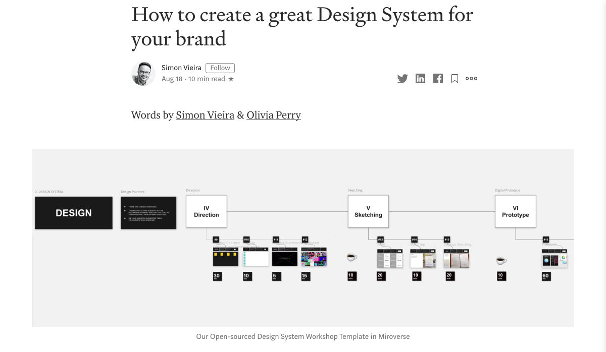
A Guide to Design System Models


15 Designer Curated Color Palettes to Inspire your Next Project


My Thoughts About Editors in 2020


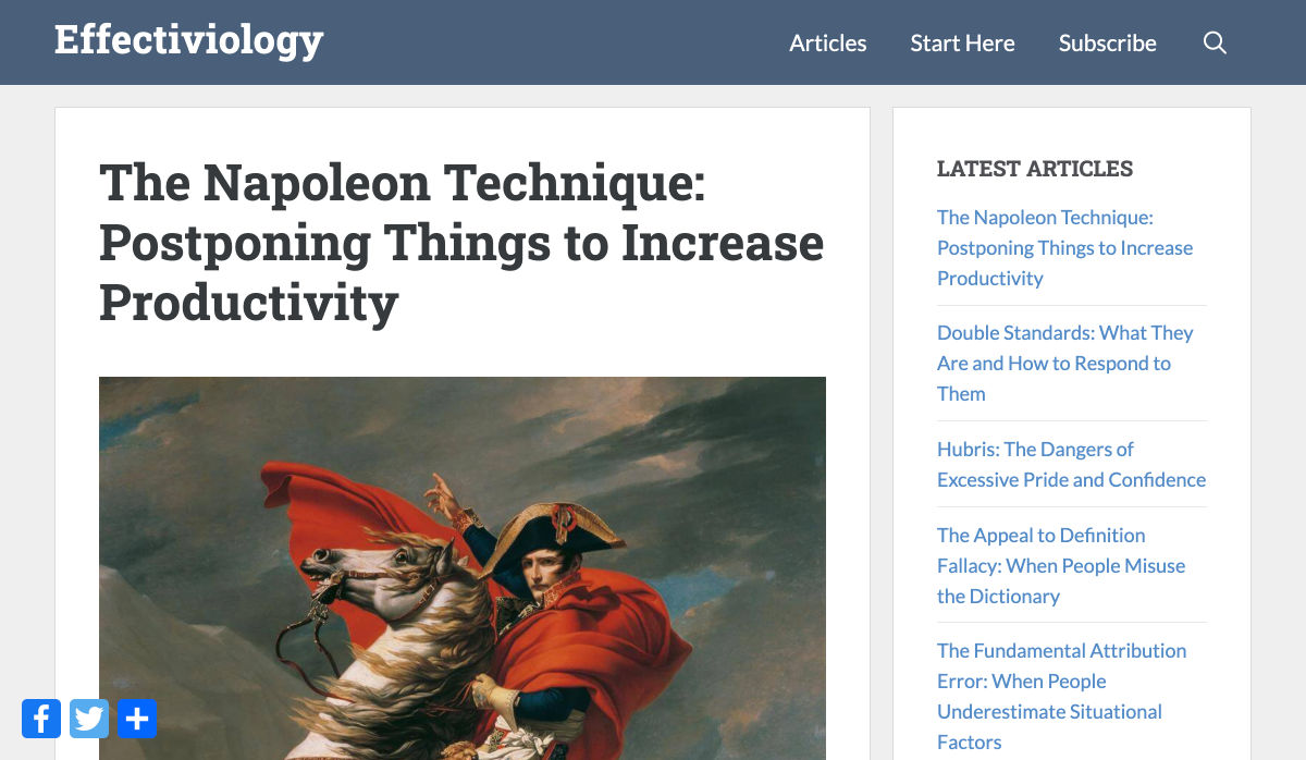
The Napoleon Technique: Postponing Things to Increase Productivity


Announcing TypeScript 4.0


Un-Cancelling 2020: Virtual Conferences for Designers


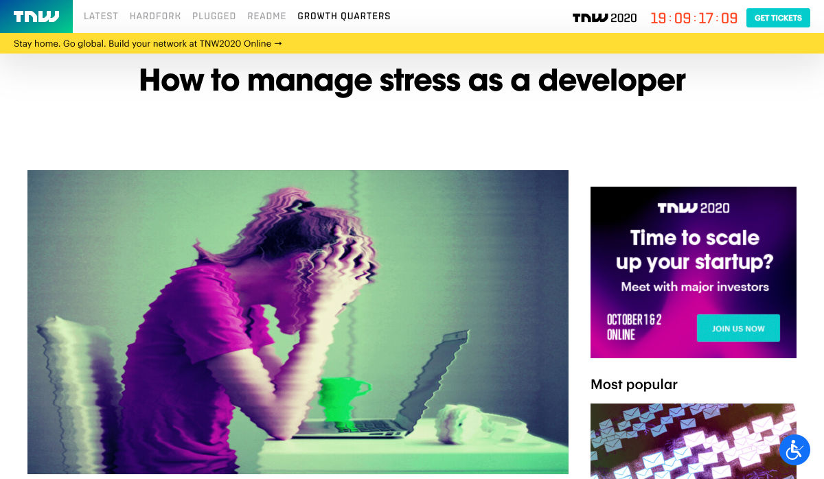
How to Manage Stress as a Developer


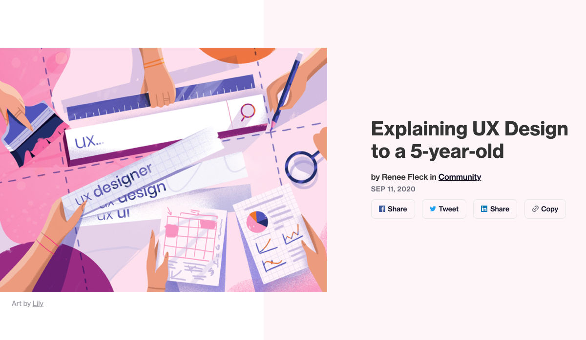
Explaining UX Design to a 5-year-old


How to Win Over Skeptics with Qualitative Research


Want more? No problem! Keep track of top design news from around the web with Webdesigner News.

Source


Source de l’article sur Webdesignerdepot

As you already know, TestNG or Test Next Generation is one of the most frequently used automation testing frameworks in Java. Inspired by JUnit and NUnit, Cedric Beust created TestNG with the idea of covering almost all types of testing models, be it functional or end-to-end. The annotations, functionalities, usability, features, and ease-of-use make TestNG a very popular choice of framework. Listed below are some of the major benefits of using TestNG-

To understand why user onboarding is such an indispensable tool, we need to empathize with the people using our products; we all come from different backgrounds and cultures, we make different assumptions, and we see the world differently.

User onboarding helps mitigate these differences by making your product’s learning curve less steep.

However, companies often make unfortunate mistakes that hinder user experience and cause frustration. In today’s article, we’ll take a look at eight ways companies ruin their products’ onboarding process.

Let’s dive right in, shall we?

1. No User Onboarding at all

As a part of the team that created a product, you’ve probably spent hundreds of hours going over its features and the most minute detail. Naturally, you know the product like the back of your hand. The user does not.

Naturally, you know the product like the back of your hand. The user does not

We may believe that the app we’ve worked on is straightforward and that user onboarding is probably overkill — but that’s almost never the case. Guiding our users through a product will help with retention, conversion, and their overall satisfaction.

However, there are very rare cases when you can do without user onboarding, here are a few:

  • Your product is too straightforward to cause any confusion;
  • Your product has a formulaic structure, similar to that of other products’ in your category, i.e., social media or e-commerce;
  • Your product relies heavily on Google or iOS design guidelines with common design patterns;
  • Your product is too complex (enterprise or business-oriented) — in such cases, users need special training, rather than just an onboarding;

2. Assuming That Users “Get It”

 One of the vital UX mottos we should always be mindful of is that “we are not our users.” When onboarding them, we always need to assume that they’re at square one. We should communicate with them as if they have no prior knowledge of our product, its terminology, and the way it works.

Providing freshly-registered users with highly contextual information will most likely confuse them. As a result, this will render your attempts to create a helpful onboarding process useless.  

3. Onboarding Users on a Single Touchpoint

it’s tempting to brainstorm which features should make it into the onboarding, then design and code them; that’s a very bad idea

The main problem with the previous point is that it’s too contextual for new users. However, providing no context altogether can be problematic as well. This is commonly found in onboarding processes that focus on a single touchpoint while leaving out the rest of the product.

By choosing to inform users of our product’s features, we force them to detour from their “normal” course of action. This comes at the cost of the user’s frustration.

Since we’re asking people to pay this price, it’s best to provide them with information that will also help them navigate the entire product. As a result, this will decrease the number of times we’ll have to distract them from their ordinary flow.

4. Forcing Users Through Onboarding

We’ve previously mentioned that we mustn’t assume that users have any background knowledge about our products.

The opposite argument can be made — experienced users don’t need a basic onboarding process. It will most likely frustrate them, and it won’t provide them with any real value. Also, forcing users through this process will most likely take the onboarding frustration to a whole other level.

This is why it’s essential that we allow them to skip the parts they don’t find useful. This way, we’ll address the knowledge gaps of the people who really want it and need it.

5. Onboarding Based Purely on Assumptions

This is yet another point that’s implicit in “we are not our users”. Oftentimes, it’s tempting to brainstorm which features should make it into the onboarding, then design and code them; that’s a very bad idea.

Here’s what every designer should do instead:

  • Do user interviews: You should conduct these before having anything designed; user interviews will help you shortlist and prioritize features in terms of their significance, so that the onboarding is focused around the features that matter most.
  • Do usability testing: Once you have a good idea of what features your users consider most important, design onboarding that reflects that; having completed your design, make sure to conduct at least 5 usability testing sessions with users, so that you can make sure that your design works.

6. Just Letting Users Quit

While we shouldn’t force people to go through onboarding, it doesn’t mean we shouldn’t nudge them in the right direction.

find that sweet spot between being front of mind and annoying

People choose not to onboard for many reasons, but showing them around will benefit both parties. Therefore, it’s never wrong to remind them that they can always resume onboarding via email or push notifications (unless you’re too pushy). Make sure to find that sweet spot between being front of mind and annoying. 

Similarly, these two mediums are a great way to deliver valuable information as well.

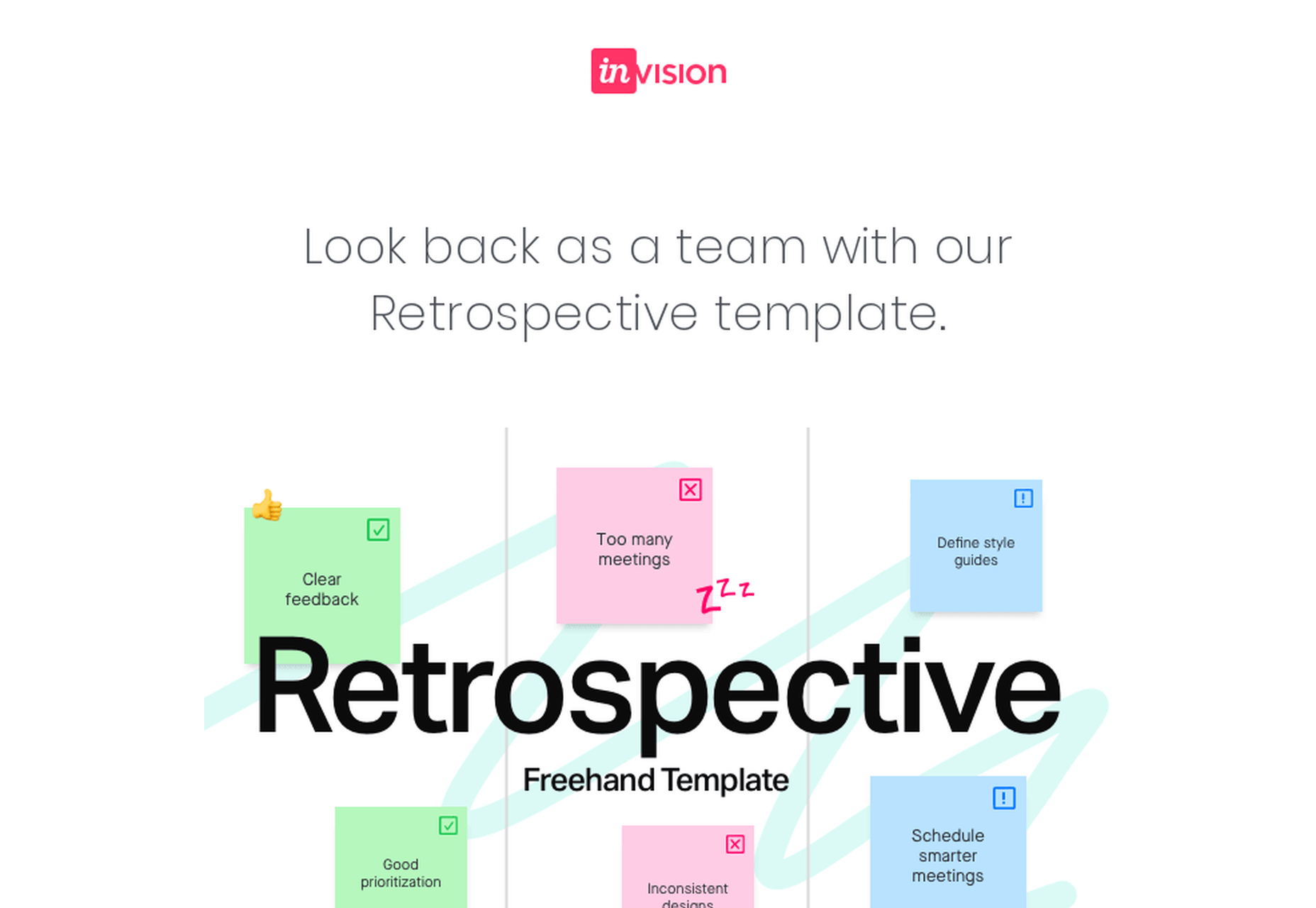
Here’s a great example of an onboarding email from InVision:

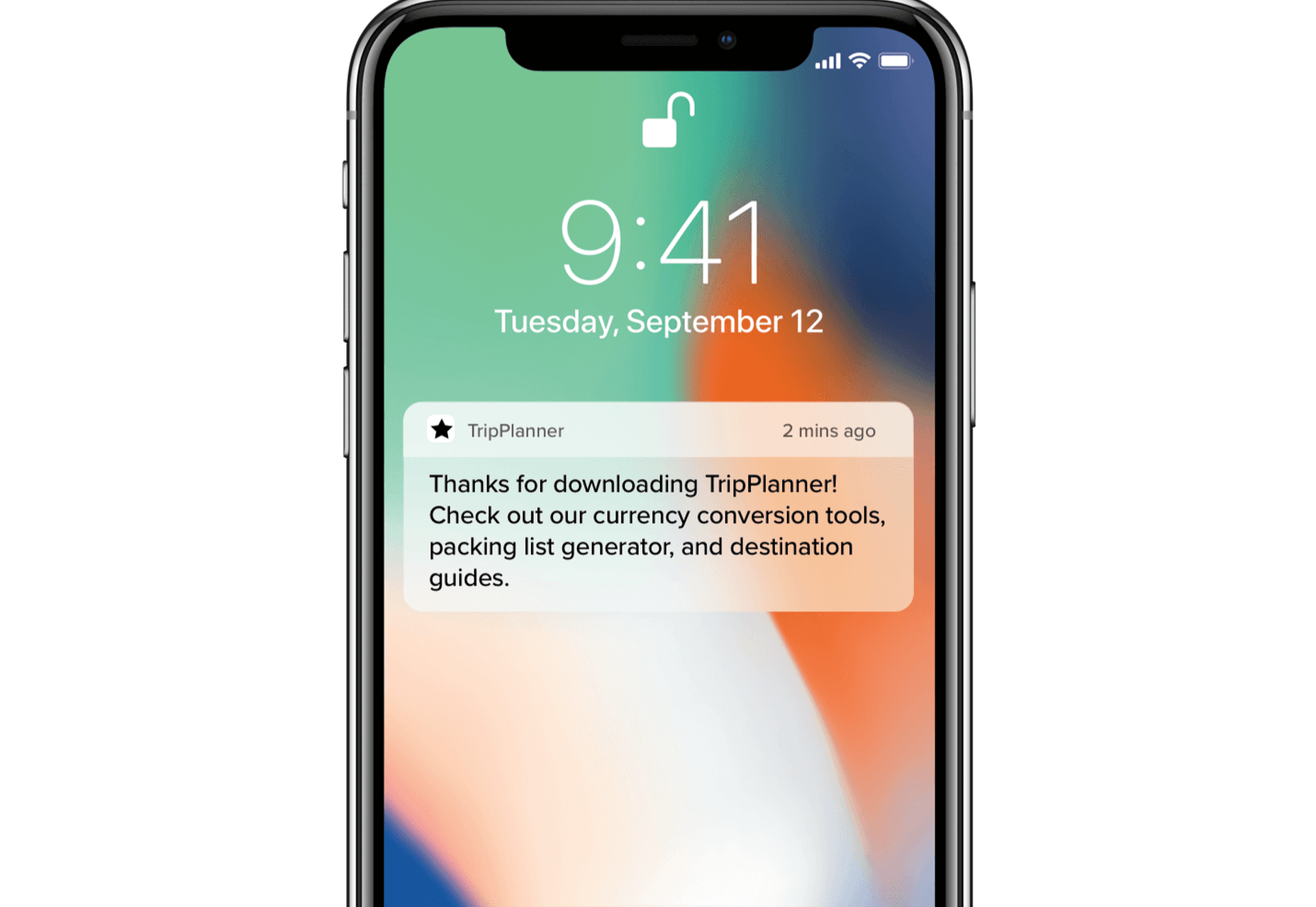
And here’s a clever notification from TripPlanner:

Source: clevertap.com

7. Asking For Too Much Information

We need to always be mindful of the fact that the product’s spokesperson should act as a guide during onboarding. Its goal at the very beginning is to build trust.

We can ask for small favors when we’ve built a solid and lasting relationship

Not only is asking for too much information from the get-go unproductive, but it will also undermine the trust that the user already gave us.

It’s best to abstain from asking freshly-registered users for their credit card information. Nearly 100% of businesses care about profits — and there’s no shame in it. However, today’s most successful companies make money by providing users with value. So it’s best to stimulate users to share their financial data in subtler ways while focusing on customer experience.

The same can be said about subjecting the people using your service to extensive questionnaires. At the first steps of our interaction, it’s all about giving and gaining trust. We can ask for small favors when we’ve built a solid and lasting relationship.

8. Onboarding for the Sake of Onboarding

While there are dozens of reasons why you should guide your users through your product, it needs to be done well. A pointless onboarding process that doesn’t provide users with value is more frustrating than the lack thereof.

Onboarding can be a bit frustrating at times. Pointless onboarding will just raise eyebrows. It will slow users down and disengage them, which is exactly the opposite of what we want.

Conclusion

The process of introducing your users to your product is one of the factors that will define its success.

A critical aspect of user onboarding that we need to always take into account is value. Is this detour from our user’s ordinary course of action valuable to them? Will this improve their experience with the product?

Onboarding demands careful and continuous tailoring. Once perfected, this process will help you win new users’ hearts and help you build brand loyalty.


Featured image via Unsplash.

Source


Source de l’article sur Webdesignerdepot

Every week users submit a lot of interesting stuff on our sister site Webdesigner News, highlighting great content from around the web that can be of interest to web designers.
The best way to keep track of all the great stories and news being posted is simply to check out the Webdesigner News site, however, in case you missed some here’s a quick and useful compilation of the most popular designer news that we curated from the past week.

How to Make Halftone Gradient in Photoshop


Drawing Simple Line Patterns Using HTML5 Canvas


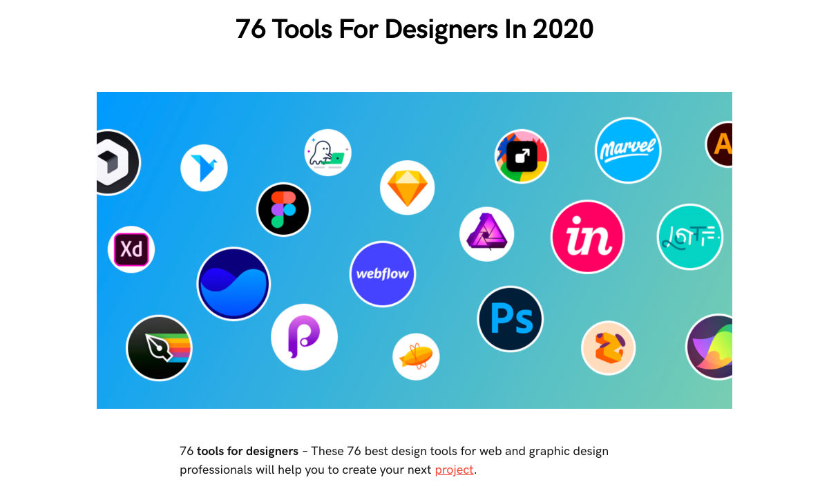
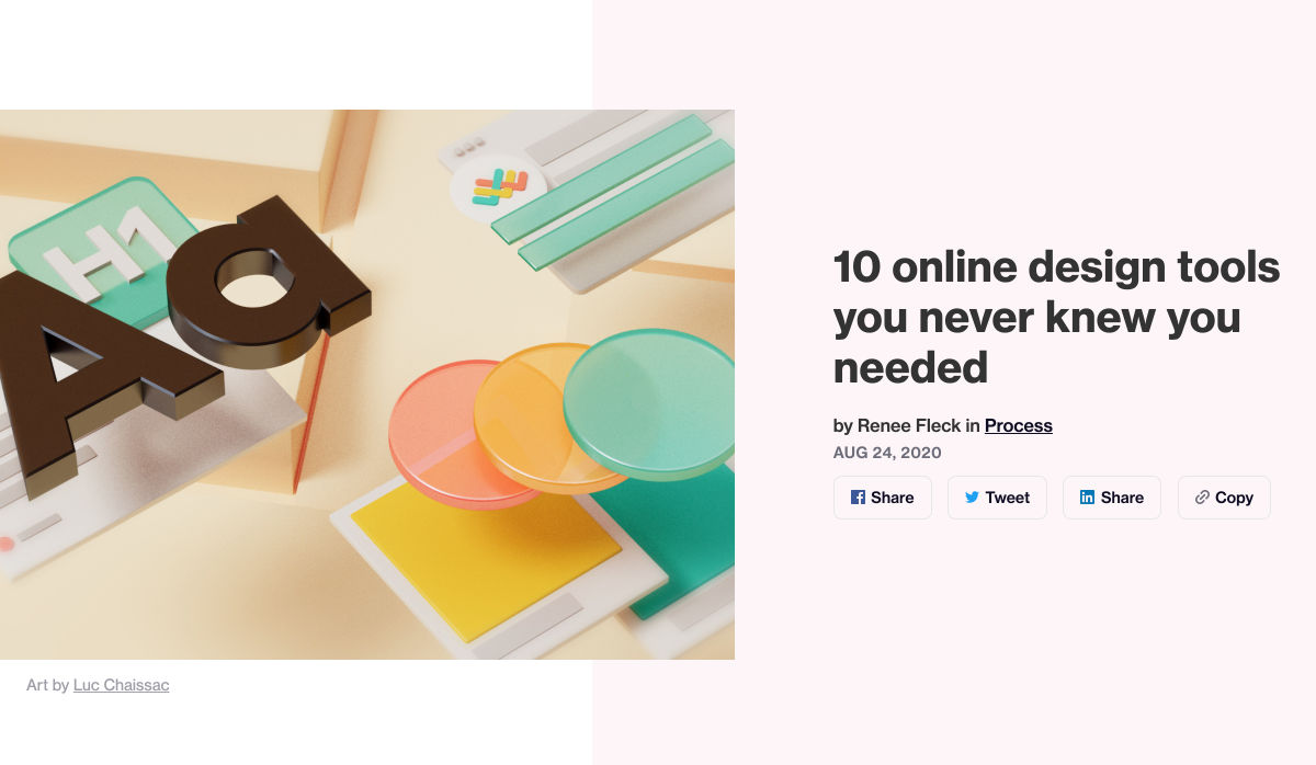
10 Online Design Tools You Never Knew You Needed


4 Best Content Management Systems (CMS) for Marketing


9 Mistakes Designers Still Make


6 Visual Design Principles that UX Designers Should Be Aware of


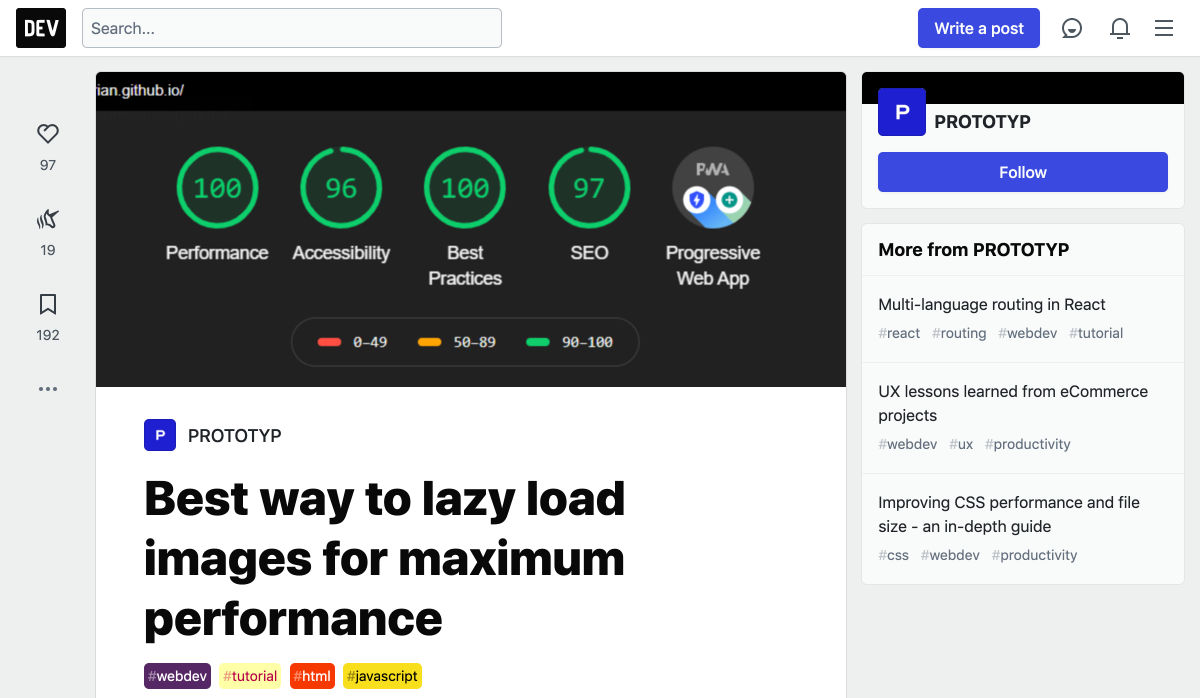
Best Way to Lazy Load Images for Maximum Performance


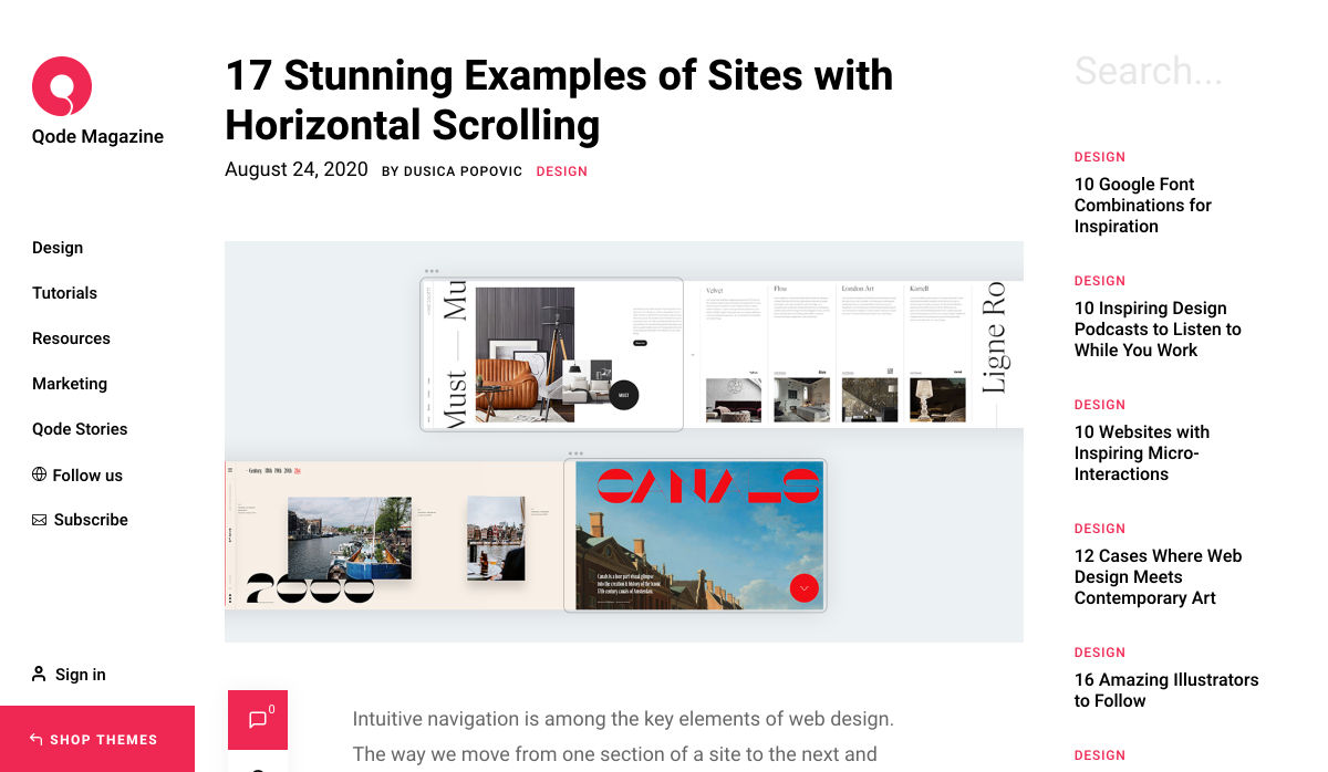
17 Stunning Examples of Sites with Horizontal Scrolling


Less is a Bore. Why Tech is Finally Embracing Maximalism


What Does it Mean to Have a High-Quality Website in 2020?


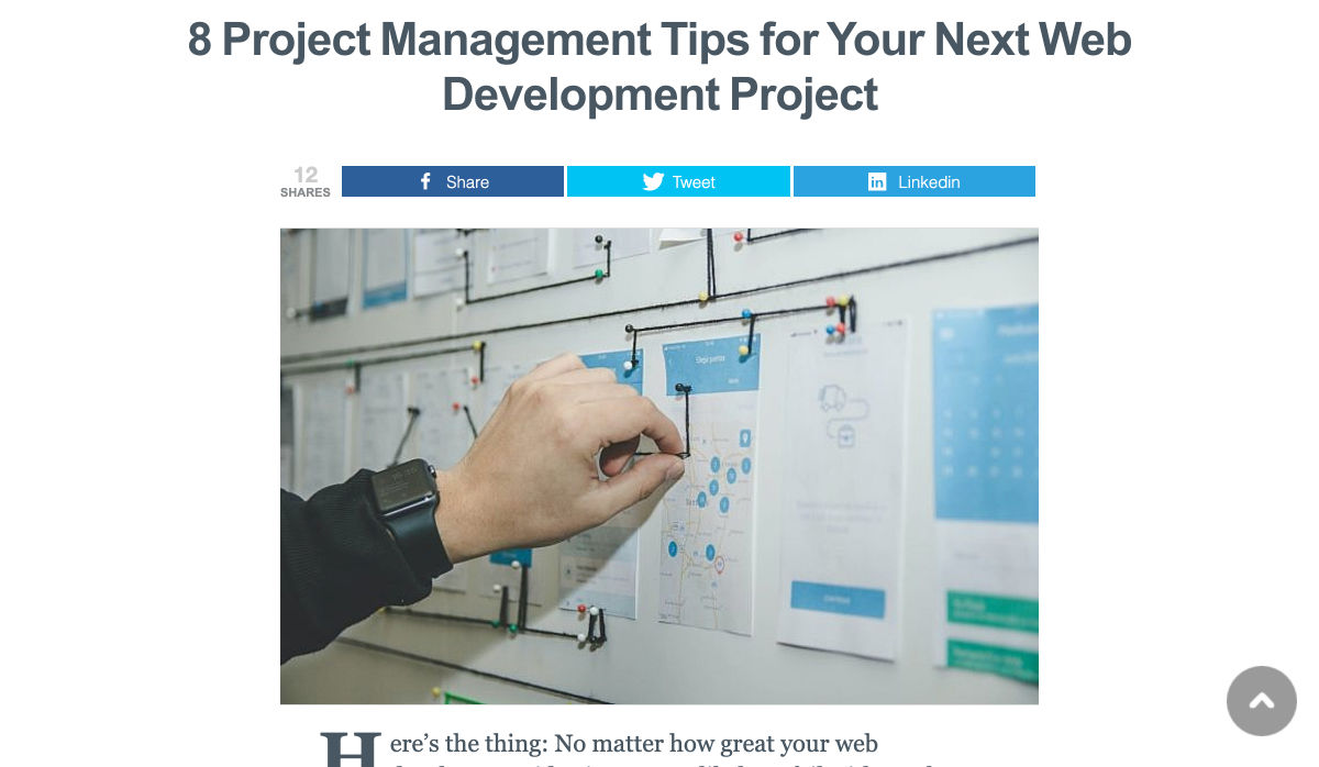
8 Project Management Tips for your Next Web Development Project


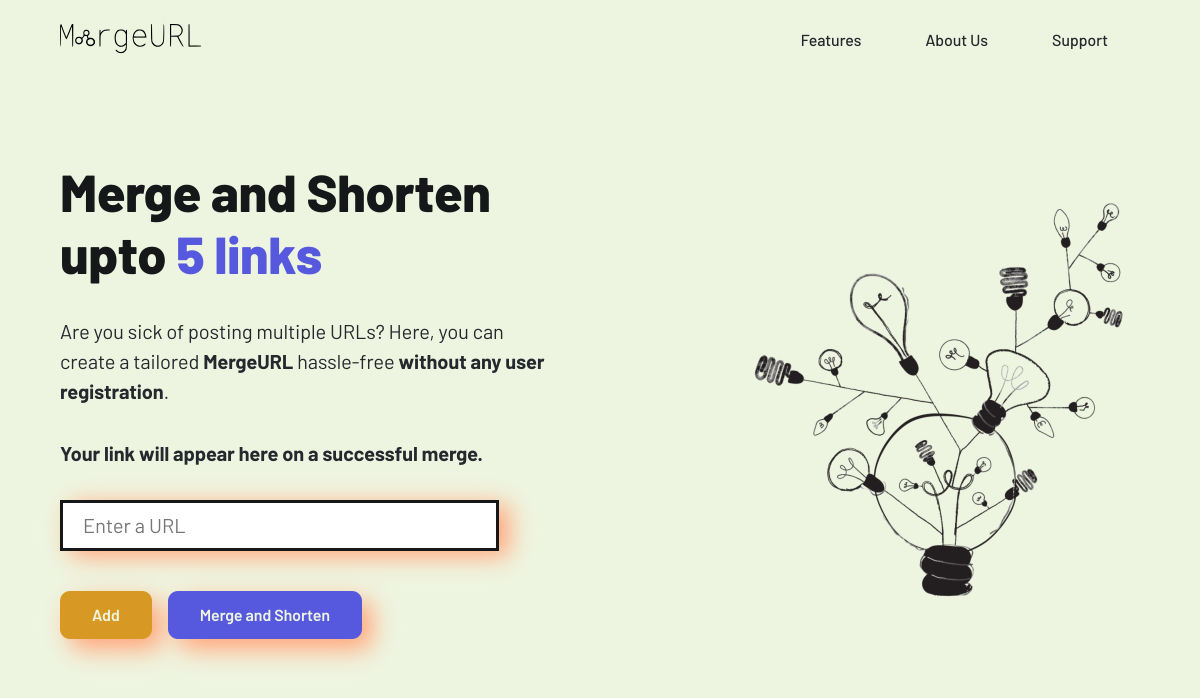
MergeURL – Shorten Urls for Free Without User Registration


13 Design Challenges to Improve and Showcase your Skills


How to Find Web Design Clients


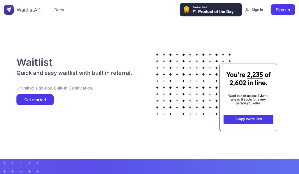
Waitlist API – Quick and Easy Waitlist with Built in Referral


What is the Small Web?


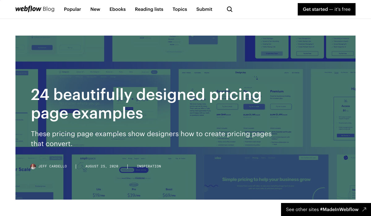
24 Beautifully Designed Pricing Page Examples


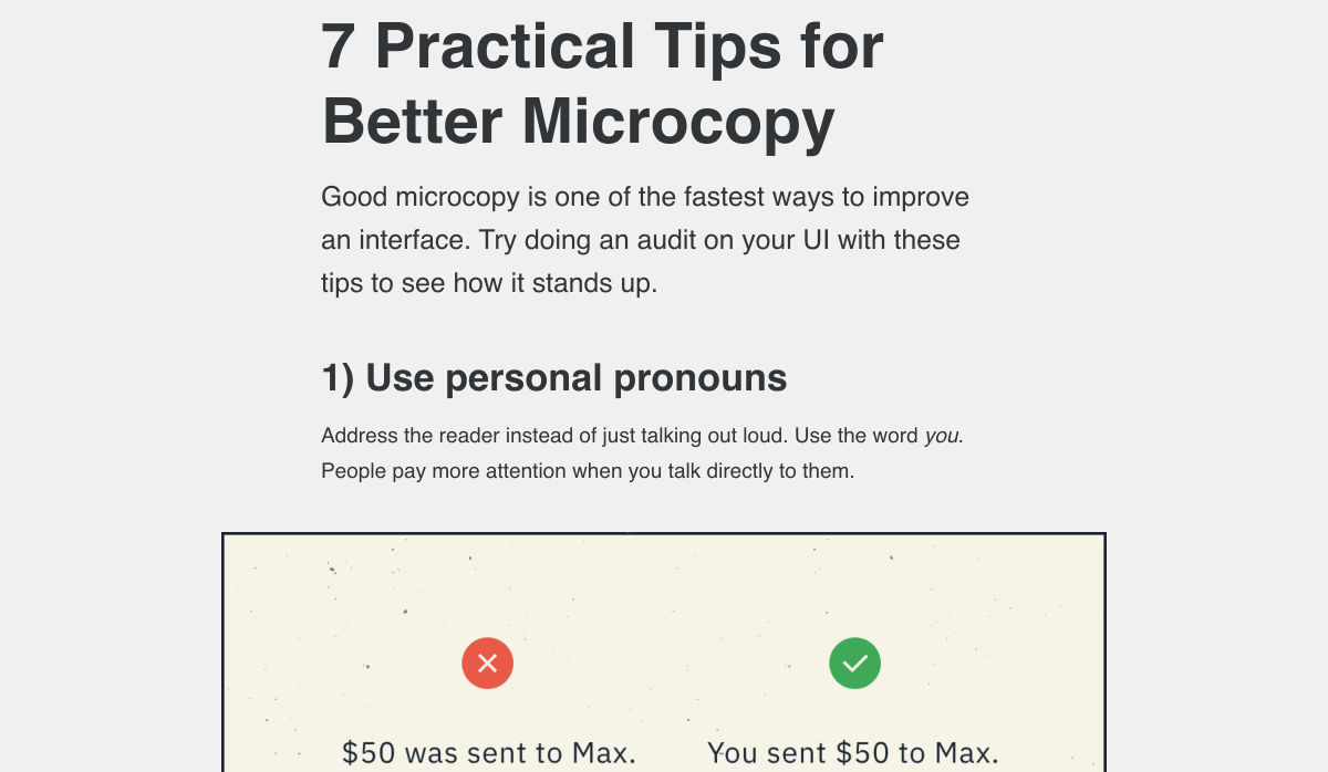
7 Practical Tips for Better Microcopy


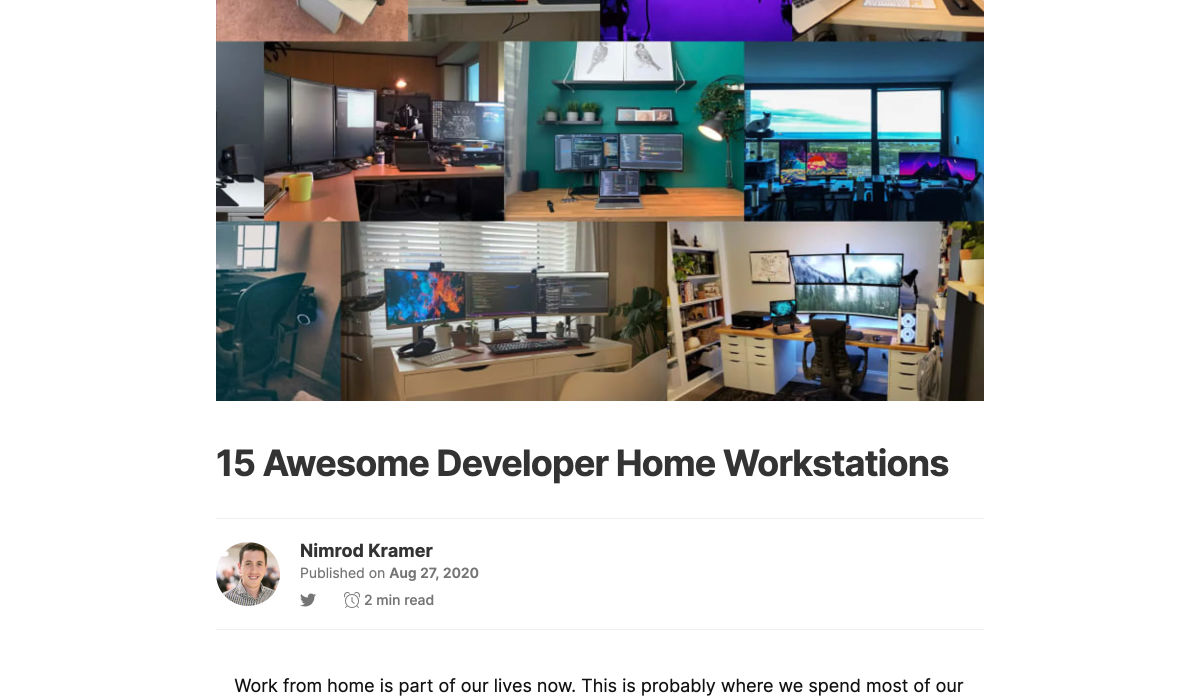
15 Awesome Developer Home Workstations


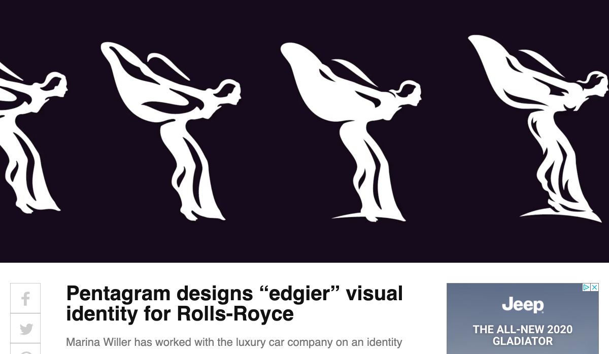
Pentagram Designs “edgier” Visual Identity for Rolls-Royce


Gorgeous Gradients: A Curated Collection of Dreamy Color Transitions


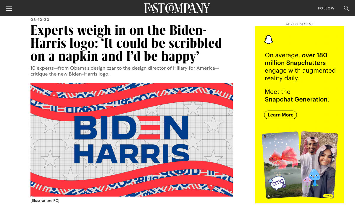
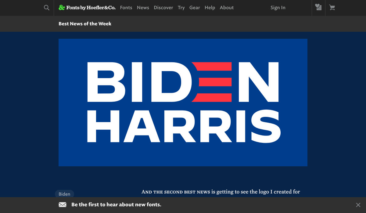
Experts Weigh in on the Biden-Harris Logo


50+ Modern Fonts to Use on your WordPress Website in 2020


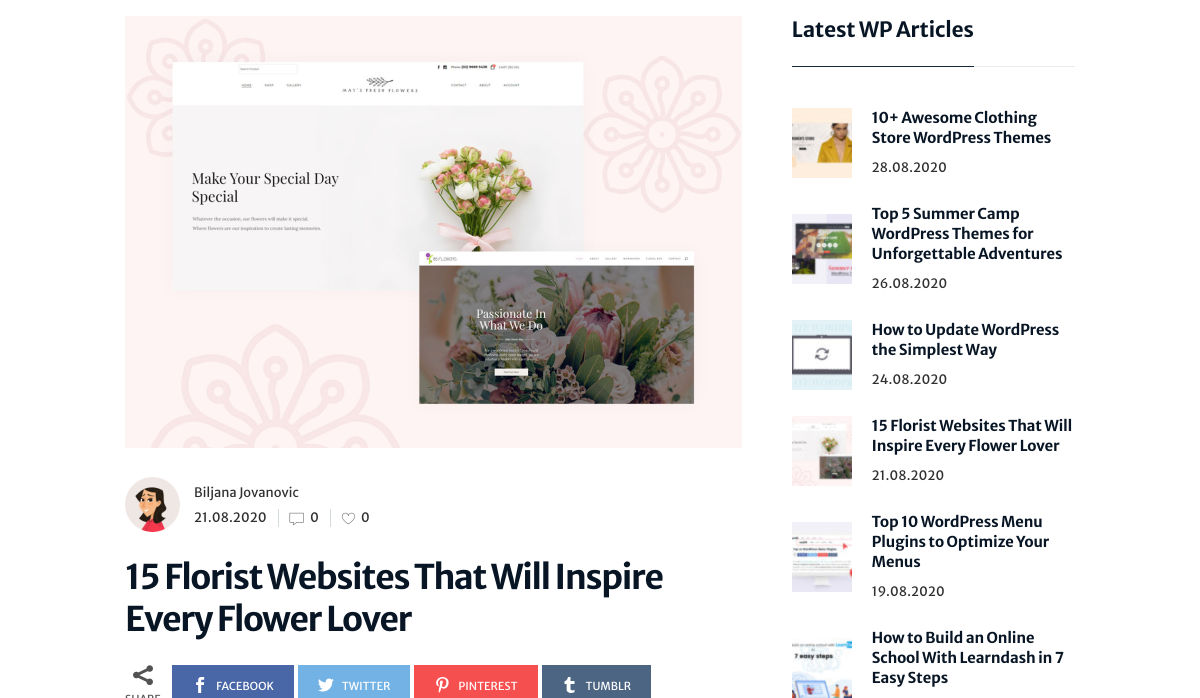
15 Florist Websites that will Inspire Every Flower Lover


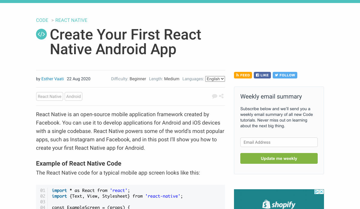
Create your First React Native Android App


Want more? No problem! Keep track of top design news from around the web with Webdesigner News.

Source


Source de l’article sur Webdesignerdepot

While a lot of the research for web designers that’s come out this year has to do with COVID-19, we’re starting to see a light at the end of the tunnel. Many of these reports aren’t just looking at the effects of the pandemic on business and marketing today. They’re now looking at what consumers plan to do once the pandemic is gone.
So, I have some very interesting research for you here today. Three of the reports have to do with coronavirus side effects — pertaining to ecommerce, market research, and freelancing — and one of them is just a really great argument against using PDFs on websites.

1. The Digital 2020 Survey Says Ecommerce Growth Will Continue Post-Coronavirus

Obviously, everyone is paying close attention to COVID-19’s impact on the world. For the purposes of the work you do as a web designer, you should be clued into what it’s doing to the business and marketing fields. Because, if those opportunities dry up or companies begin to pivot, you need to be ready to adapt.

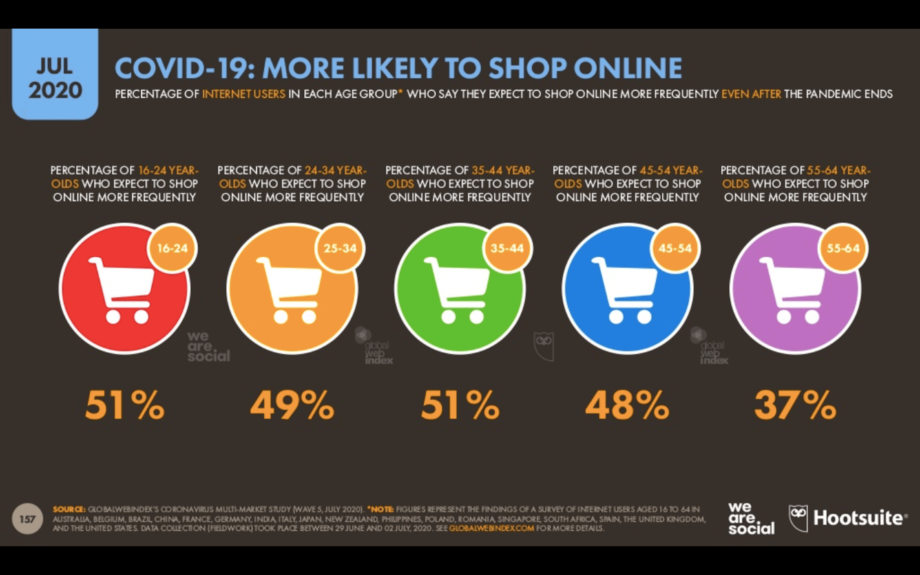
The Digital 2020, a joint monthly report from we are social and HootSuite, brings interesting news about the state of ecommerce thanks to COVID-19.

Because the pandemic has forced consumers indoors, online shopping has increased. But, according to about half of those surveyed for this report, this isn’t some temporary solution. They plan on doing more online shopping even after the pandemic ends.

This means that web designers are sitting in an enviable position now and for the foreseeable future. If you’re not already helping businesses sell through their websites, now is the time to do so as more and more businesses are going to need reliable online stores to sell their offerings through.

2. eMarketer Shares Data on Social Listening

When conducting research at the beginning of a design project, what kinds of sources do you turn to for quick and reliable information? Your client provides you with information on their business, industry, and the competition, of course, but what else?

You can conduct user surveys and interviews, but those take time and resources. It also usually means working with clients who have existing businesses and user bases to tap into. Unless you’re working as a UX designer where that’s a big part of the work you do, you might not have the ability to do that level of research.

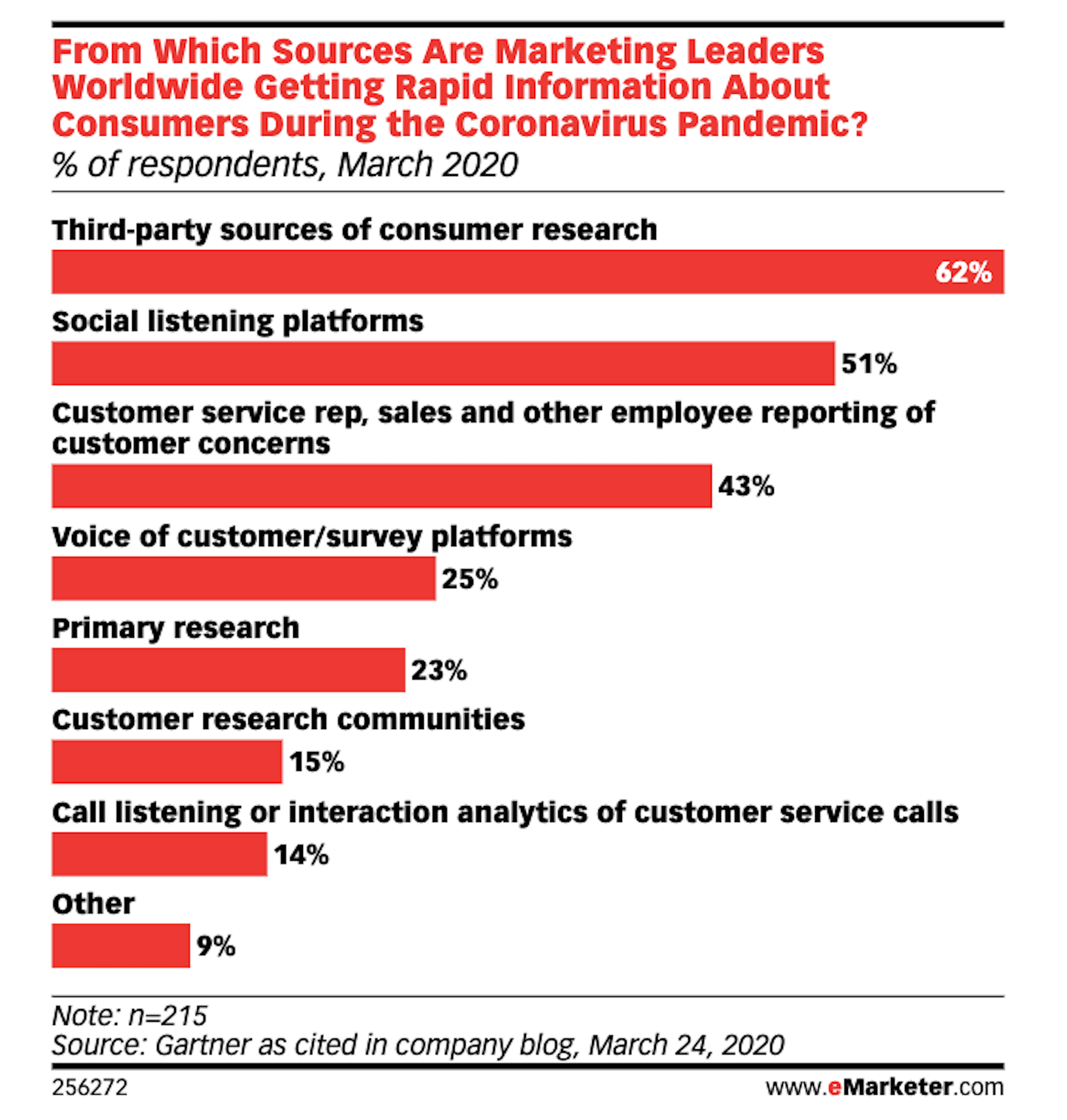
As reported by Gartner (via eMarketer), leading marketers are now learning about their target audiences through the following channels:

Thanks to the surge of traffic online right now, social listening platforms have become really useful resources for learning about one’s users, with 51% of marketing leaders using them.

If you feel as though your initial research and planning phases could use a boost, I’d recommend taking advantage of one of these social listening tools now.

If you build websites for a specific niche, you can set up keywords/hashtags that are universally relevant to (most of) your clients. By listening in on these conversations regularly, you can become more attuned to what the visitors of your websites actually need and you can proactively build better experiences for them as a result.

3. Upwork Reports Increasing Numbers of Freelancers Entering the Market

The main focus of the Upwork 2020 Future Workforce Report is on how employers are changing their approaches to hiring now and in the near future. And the basic premise is this:

  • It’s long been predicted that more and more of the workforce would be allowed to work remotely.
  • COVID-19 has escalated those predictions to the point where most of the workforce is remote right now.
  • Businesses see the value in remote work arrangements, especially if it enables them to get work done more quickly and cost-effectively by freelancers.

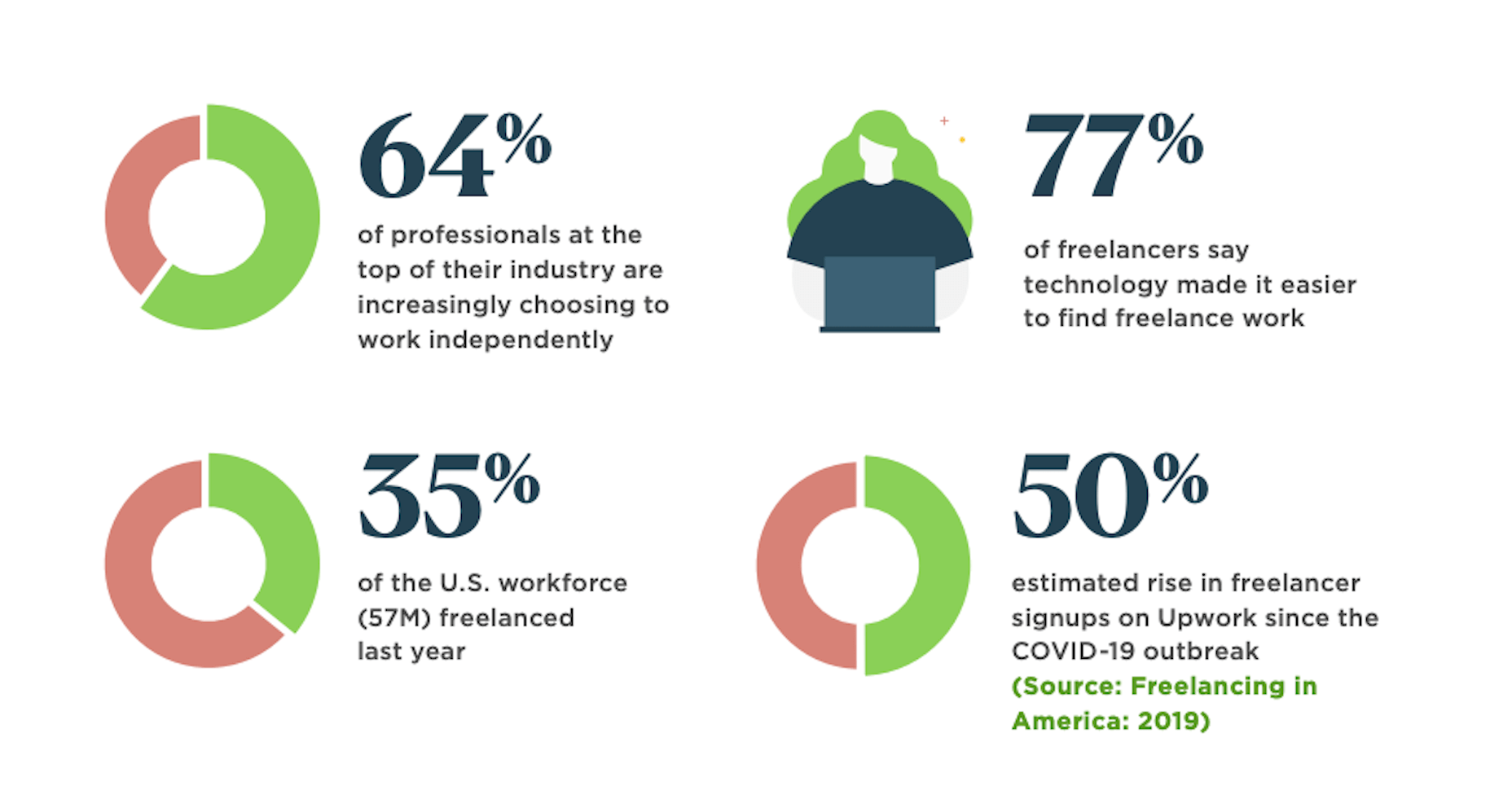
While this is certainly great news for web designers looking for new clients, the report also provides us with this data:

64% of professionals in the top of their field work independently. That statistic alone means you’re up against some tough competition. But there’s also the 50% rise in signups on freelancer marketplaces that should have you worried.

Even though business demand for freelance talent is growing, this unprecedented rise in freelance competition may pose some problems. So, if you’re not already doing everything you can to position yourself as the web designer in your niche, get going on that now so you don’t get drowned out by the rising number of competitors.

4. NNG Says That PDFs Are Unsuitable for the Web

While I don’t have statistics to share with you from the Nielsen Norman Group’s post on why the PDF is “Still Unfit for Human Consumption”, I do have a ton of usability arguments against them that are worth summing up here:

  1. PDFs are written in the style of print documents, which means that strategies we use to design content on websites — like making a page scannable and accessible — don’t apply.
  2. They’re not designed to be as concise or attractive as a web page.
  3. They don’t operate like a website, which disrupts the seamless experience you’ve worked so hard to create when one is opened up from your site.
  4. The website navigation disappears and any sense of orientation (besides the browser “Back” button) goes out the window.
  5. There’s no way to build an internal navigation in a PDF document, save for internal linking or a table of contents.
  6. If they’re formatted for paper sizes, scrolling through them can be difficult for mobile users.
  7. They load more slowly the bigger they get, so unless it’s something like a small and optimized menu, expect visitors to wait for the download to appear.

And those are just the arguments that came from NNG’s researchers. Take some time to read through real user complaints about PDFs and you’ll never want to include one on a client’s website again.

Wrap-Up

Thankfully, the research for web designers and marketers is finally starting to move away from the confusion and speculation we saw a lot of earlier this year.

Just as with anything we do on the web, the more time you give it, the more data you can collect. And, luckily for us, the data suggests that there’s a pretty positive outlook for web designers if they position themselves the right way now.


Featured image via Unsplash.

Source


Source de l’article sur Webdesignerdepot