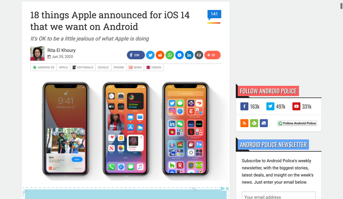
 If we don’t question this kind of design homogenization, do we put ourselves at risk of perpetuating the same mistakes in the years to come? Or is it even a mistake to begin with?
Today, I’m going to look at four things that are likely causing this, and what you can do to break the mold.
1. Education
We used to have a design school in every city in the world, each with its own design style or, at the very least, the encouragement of its designers to be creative and come up with something new.
These days, though, traditional design education isn’t as popular as it once was. According to Design Census 2019, only about a third of working designers have a formal education and degree:
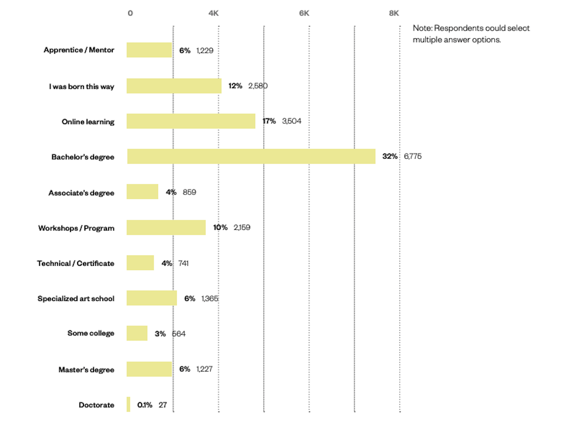
The rest have been trained through a variety of means:
- Online learning (17%)
- Self taught (12%)
- Workshops (10%)
- Mentorship (6%)
- Certificate programs (4%)
Cost and convenience are definitely two factors influencing this shift towards online learning methods. And with a wealth of resources online to teach them how to design and code, why not go that route? Plus, designers have to keep learning new things in order to remain competitive, so it’s not as though a degree is the be-all and end-all of their design training.
Plus, there isn’t as much demand for it from employers. Unless you plan on working for one of the top global marketing agencies, many hiring companies just want to see proof in the form of a portfolio and maybe have you do a test job.
Now, I’m not saying that online courses and other informal design education don’t foster creativity. However, in order to make them cost-efficient and quick to get through, they have to focus on teaching essential best practices, which means less room for experimentation. Perhaps more importantly, their curriculums are guided by fewer voices. So, this could likely be one of the culprits.
2. Design Blogs and Vlogs
You have to wonder if all the design blogs out there (yes, like Webdesigner Depot) impair designers’ ability to break free from the homogeneity of websites.
I think the answer to that is both “yes,” and “no”.
Why, Yes?
What is the purpose of a web design blog? Mainly it’s to educate new and existing designers on best practices, new trends, and web standards.
By their very nature, they really should be teaching web designers the same kinds of things. Let me show you an example.
This is a Google search for “web design trends 2020”:
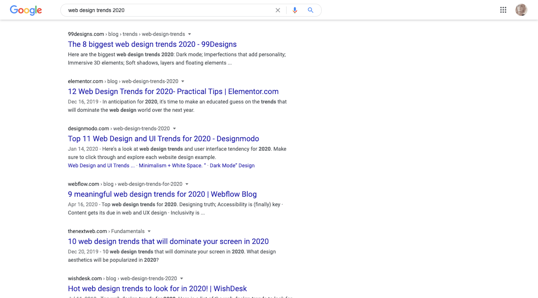
Most design blogs will publish trends predictions around January 1. And herein lies the problem. The writers/designers can only deviate so far from what we know to be true when writing on the same topic… so these sites end up with similar recommendations.
For instance, the top search results recommended similar things for 2020:
- Dark mode
- Hand-drawn illustrations
- Immersive 3D
- Glowing colors
- Minimalist navigation
- Geometric shapes
- Inclusivity
- Accessibility
When web designers receive the same guidance no matter where they turn, it’s only logical that they’d end up creating websites that adhere to those same practices.
Why, No?
Because I write for web design publications, I can tell you that there’s a big difference in the kinds of content some of them publish.
For instance, I find that WebDesigner Depot isn’t interested in rehashing what everyone else is writing about this month. We’re given topics that challenge us to think outside the box and present readers with meaningful insights and recommendations.
So, I think that finding design blogs that push the boundaries and don’t just want to recap what everyone else is saying is really important. That’s how web designers are going to master the basic skills they need to succeed while getting inspired to try new things.
3. Designs Tools and Frameworks
This is another one that’s not as cut and dried. I think it depends on the tools used and the intent to use them.
Where Issues Start to Arise
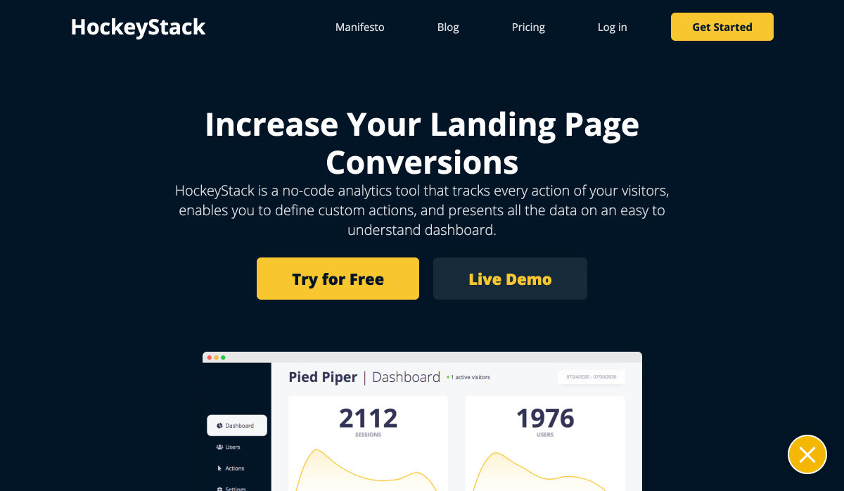
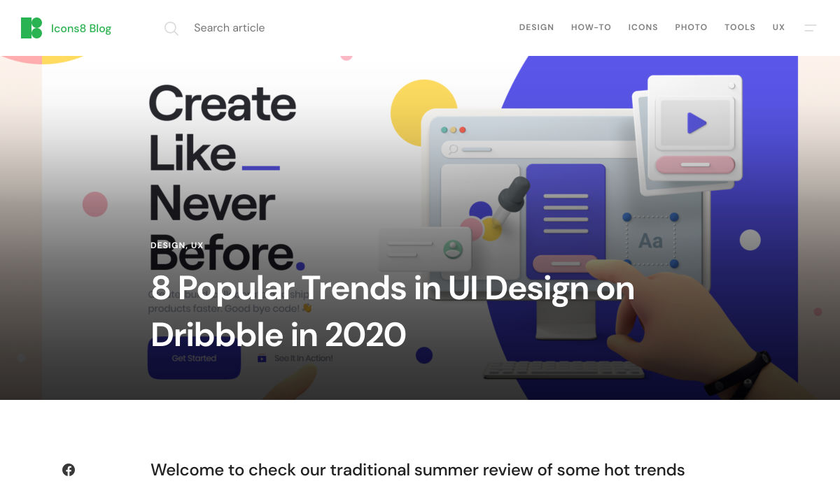
There are certain site builder solutions that you’re going to be hard-pressed to create something innovative with. The same goes with using templates from sources like Dribbble. It’s just the nature of the beast.
If your goal is to create a cheap website very quickly for a client, then you’re probably going to use a cheap builder to do so. With ready-made templates and a lot of the work already done for you, you can create something that looks good with little effort.
When you’re limited by time and cost, of course you’re going to rely on shortcuts like cheap site builders or boring (but professional) design templates.
How to be More Careful
You can run into these kinds of issues with more flexible content management systems like WordPress or frameworks like Bootstrap, too.
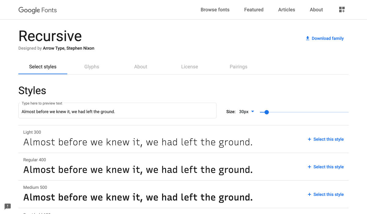
Whenever you rely heavily on ready-made templates, pre-defined styles, or pre-built components, you run the risk of someone else’s work informing your own.
The solution is simple: Use demos, templates, UI kits, and so on as a base. Let them lay down the foundation that you work from.
But if you want your website to look different from the sea of lookalikes, you’re going to have to spend much more time developing a unique visual style that’s equally as effective in its mission. Which also means moving beyond clients that have small budgets or low expectations.
4. User Data
Data gathering is an important part of the job you do as a web designer.
You research the target user (or the existing user, when applicable). You look at industry trends as well as the competition to formulate an idea of what you need to build and how you’re going to do it. And you also use resources like Nielsen Norman Group and Think with Google that put out definitive research on what users want.
Even with the most niche of audiences, consumers’ wants and needs are all basically the same. So, obviously, you have to design experiences that align with them. If you deviate too much from what they expect from your site or brand, you run the risk of creating too much friction.
Is This a Bad Thing?
It’s not in terms of usability. If we build simple, predictable and user-friendly interfaces based on data that successfully drive visitors to convert, that’s great. So long as the content remains strong and the UI attractive, there’s nothing wrong with that approach.
But…
This is the same issue presented by templates and site builders. If you do exactly what’s needed and not much more, your site is going to look and act just like everyone else’s. Which comes at the cost of your brand reputation.
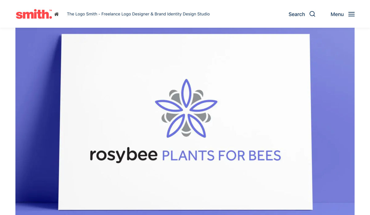
Just look at Google’s Material Design. This design system may have made it easier for web and app designers to create new solutions that were user-friendly and responsive, but there was just too much spelled out. And this led to a slew of Material Design lookalikes everywhere you turned.
This is the whole reason why companies take the time to craft a unique selling proposition. Without a USP, brands become interchangeable in the eyes of consumers.
So, again, my suggestion here is to use data to formulate a strategy for building your website. But don’t forget to spend time adding a unique style, and voice of the brand to the site.
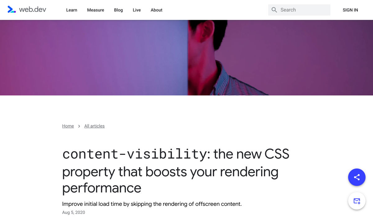
Wrap-Up
It seems like, despite all that we’ve learned to do, websites are becoming less and less diverse in terms of design. And I think a lot of that is due to the fact that it’s much easier to design websites today than it was ten, or even five years ago.
Modern-day education, resources, tools, and consumer data take a lot of the questions and the work out of building websites. Which is good… but only to a point.
Unless you’re building websites for clients who have absolutely no budget, you can’t afford to skimp on the creativity and personalization that will set their website apart. Yes, you need to adhere to tried-and-true practices and standards, but beyond that, you should be experimenting.
Featured image uses photo by Kari Shea.
Source
p img {display:inline-block; margin-right:10px;}
.alignleft {float:left;}
p.showcase {clear:both;}
body#browserfriendly p, body#podcast p, div#emailbody p{margin:0;}

Source de l’article sur

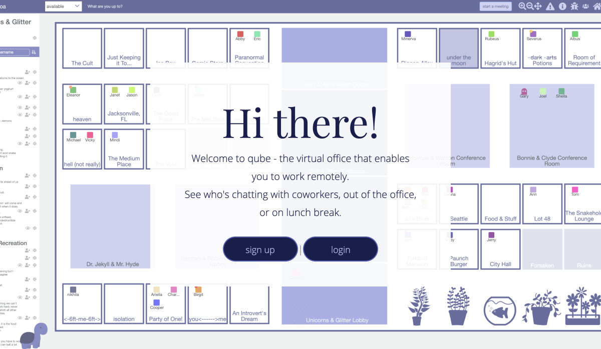
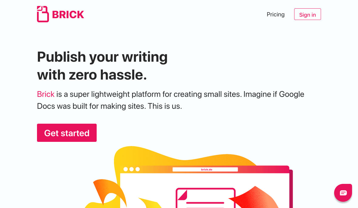
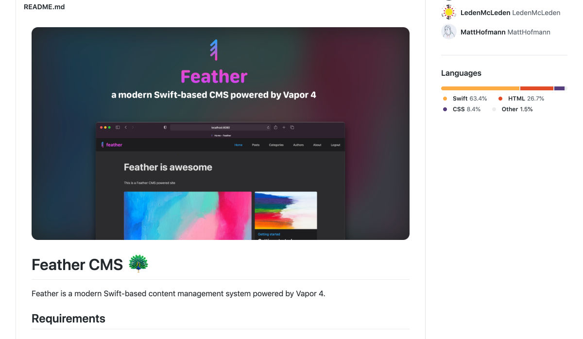
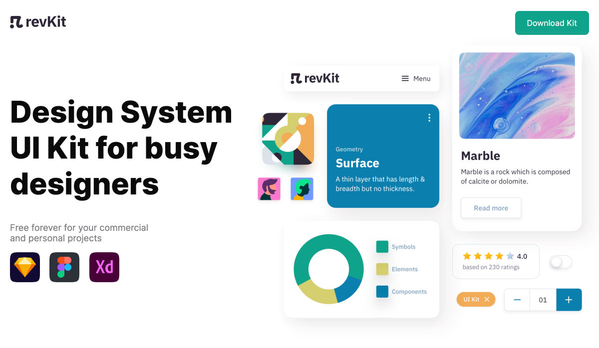
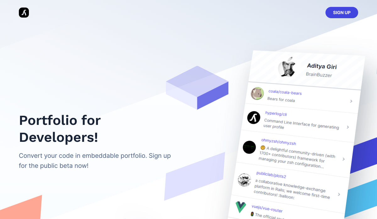
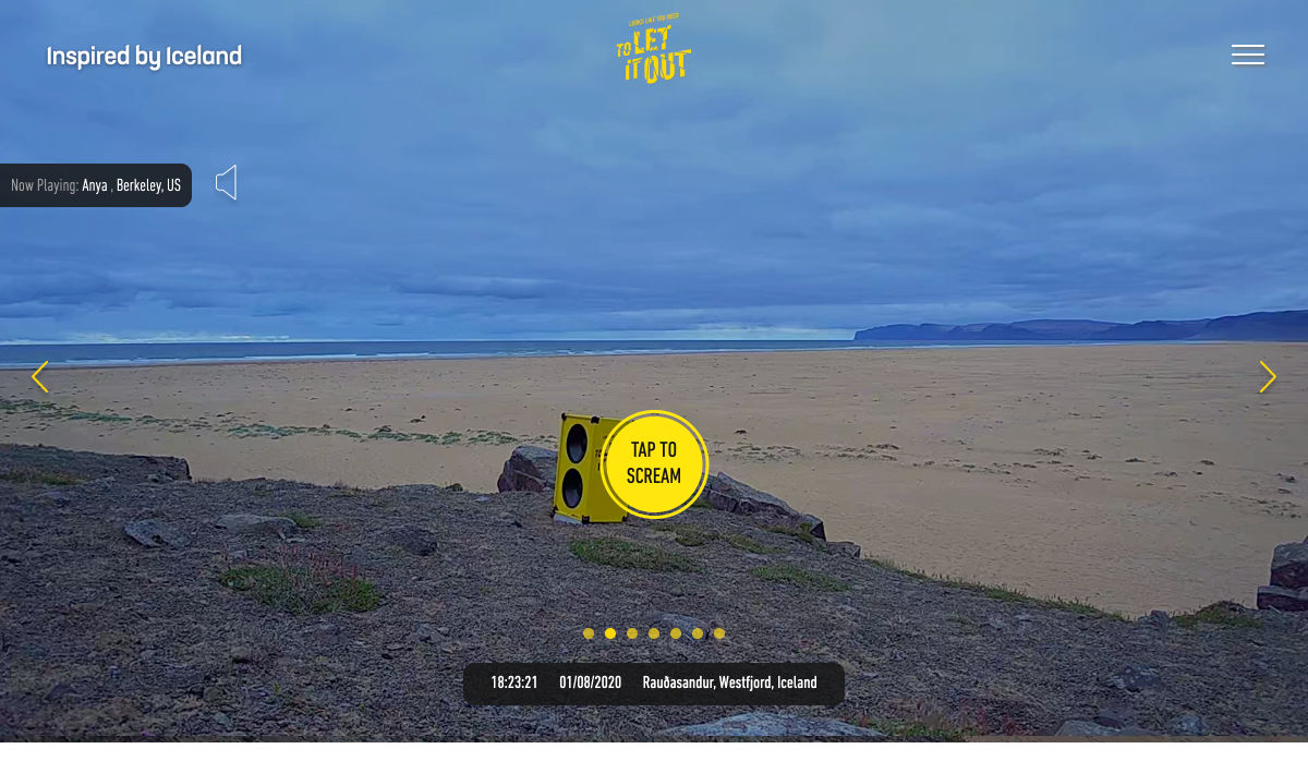
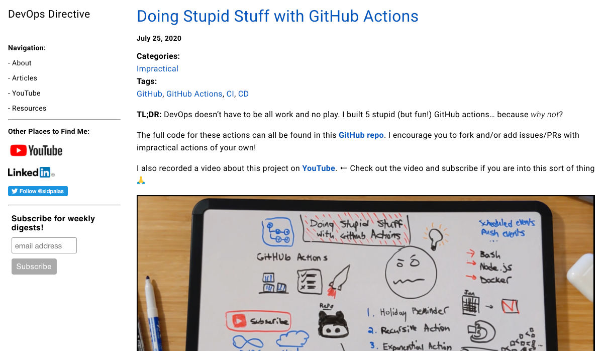
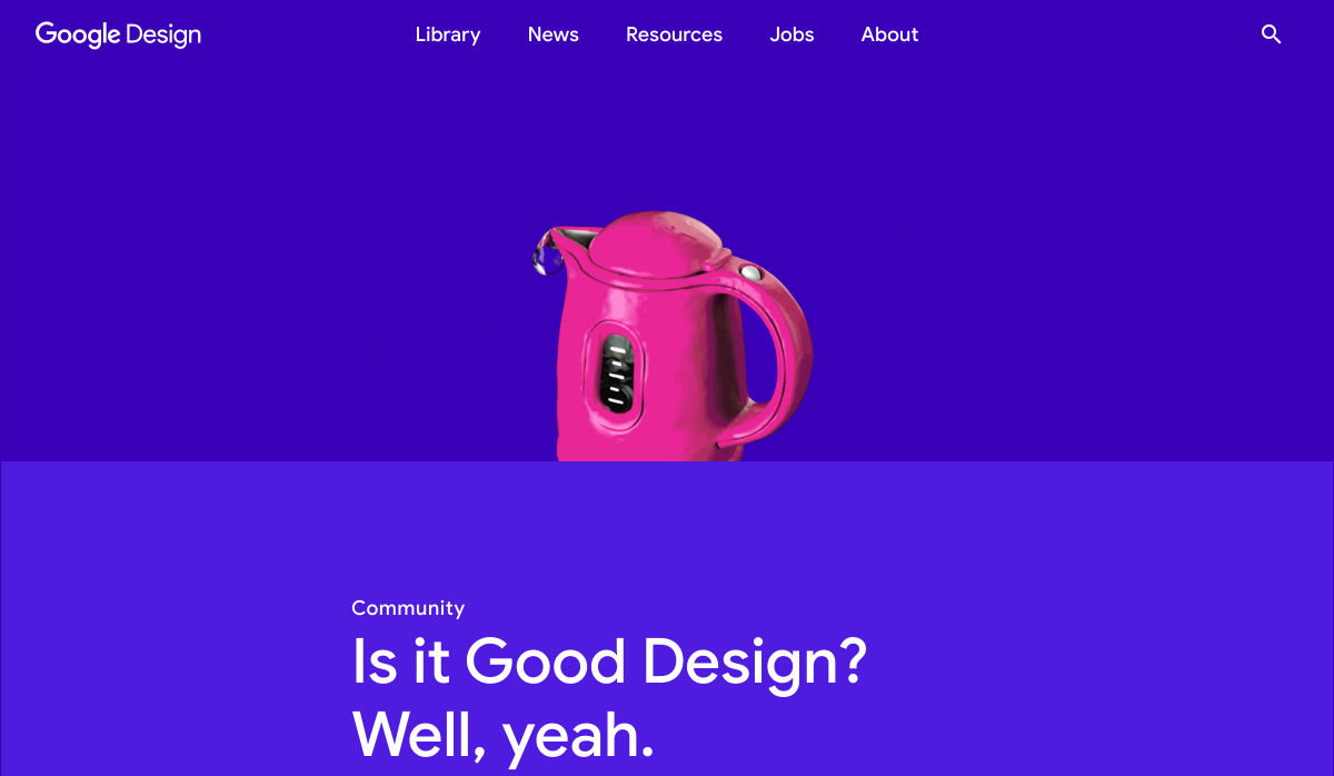
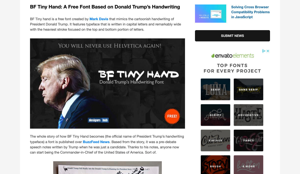
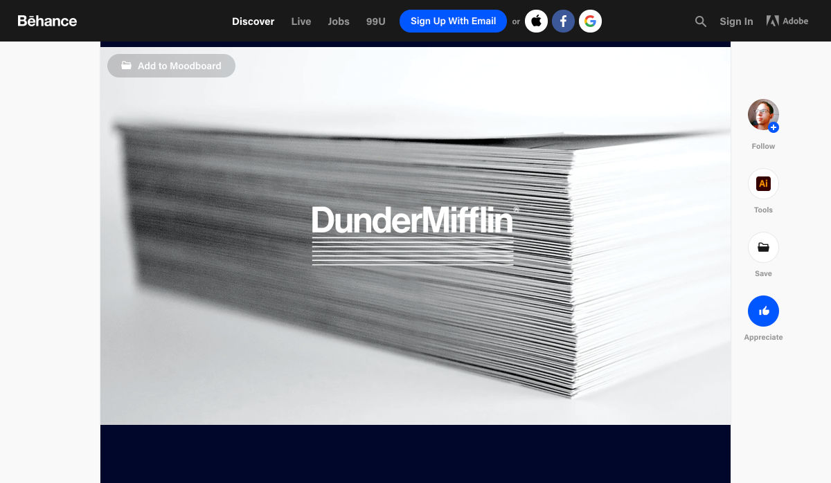
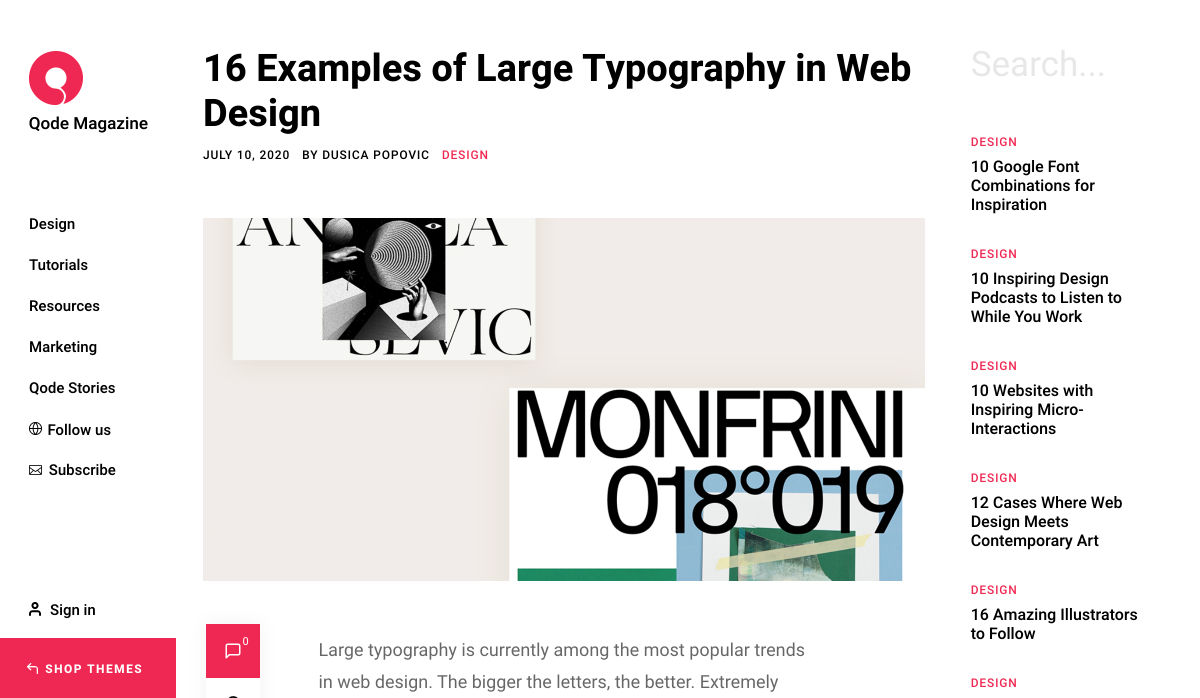
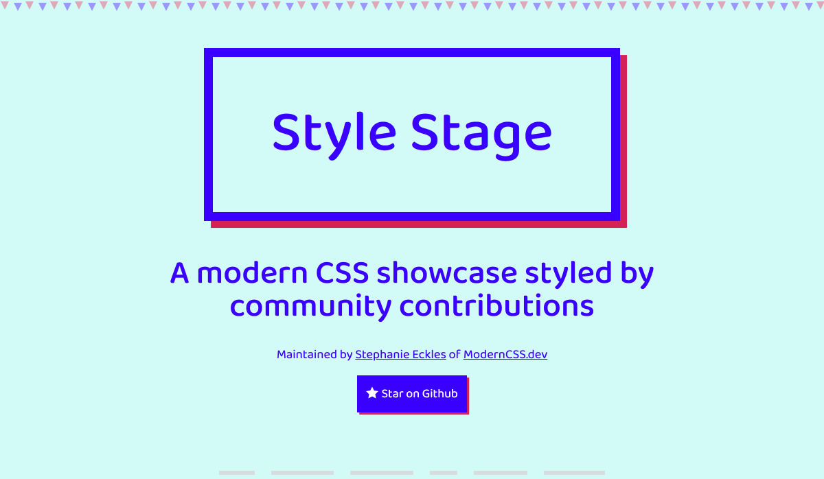
 Every week users submit a lot of interesting stuff on our sister site Webdesigner News, highlighting great content from around the web that can be of interest to web designers.


 Every week users submit a lot of interesting stuff on our sister site Webdesigner News, highlighting great content from around the web that can be of interest to web designers.


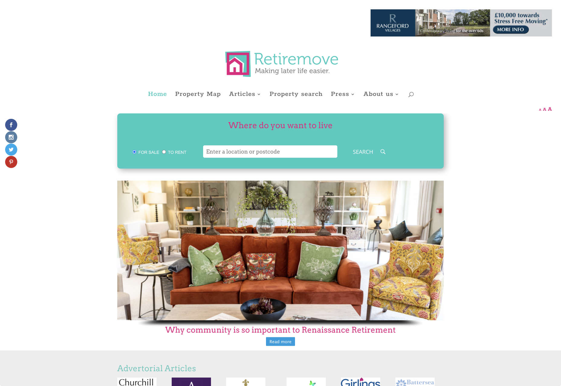
 It’s no secret that the senior population is growing. By 2030, people over the age of 65 are predicted to make up

 Every week users submit a lot of interesting stuff on our sister site Webdesigner News, highlighting great content from around the web that can be of interest to web designers.

 Every week users submit a lot of interesting stuff on our sister site Webdesigner News, highlighting great content from around the web that can be of interest to web designers.


 Every week users submit a lot of interesting stuff on our sister site Webdesigner News, highlighting great content from around the web that can be of interest to web designers.


 Every week users submit a lot of interesting stuff on our sister site Webdesigner News, highlighting great content from around the web that can be of interest to web designers.


 Every week users submit a lot of interesting stuff on our sister site Webdesigner News, highlighting great content from around the web that can be of interest to web designers.


 Every week users submit a lot of interesting stuff on our sister site Webdesigner News, highlighting great content from around the web that can be of interest to web designers.

