Articles

It’s something every design team dreams about – a better design process and handoff procedure. Your design team is not alone if you are looking for a better solution.

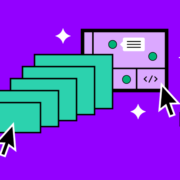
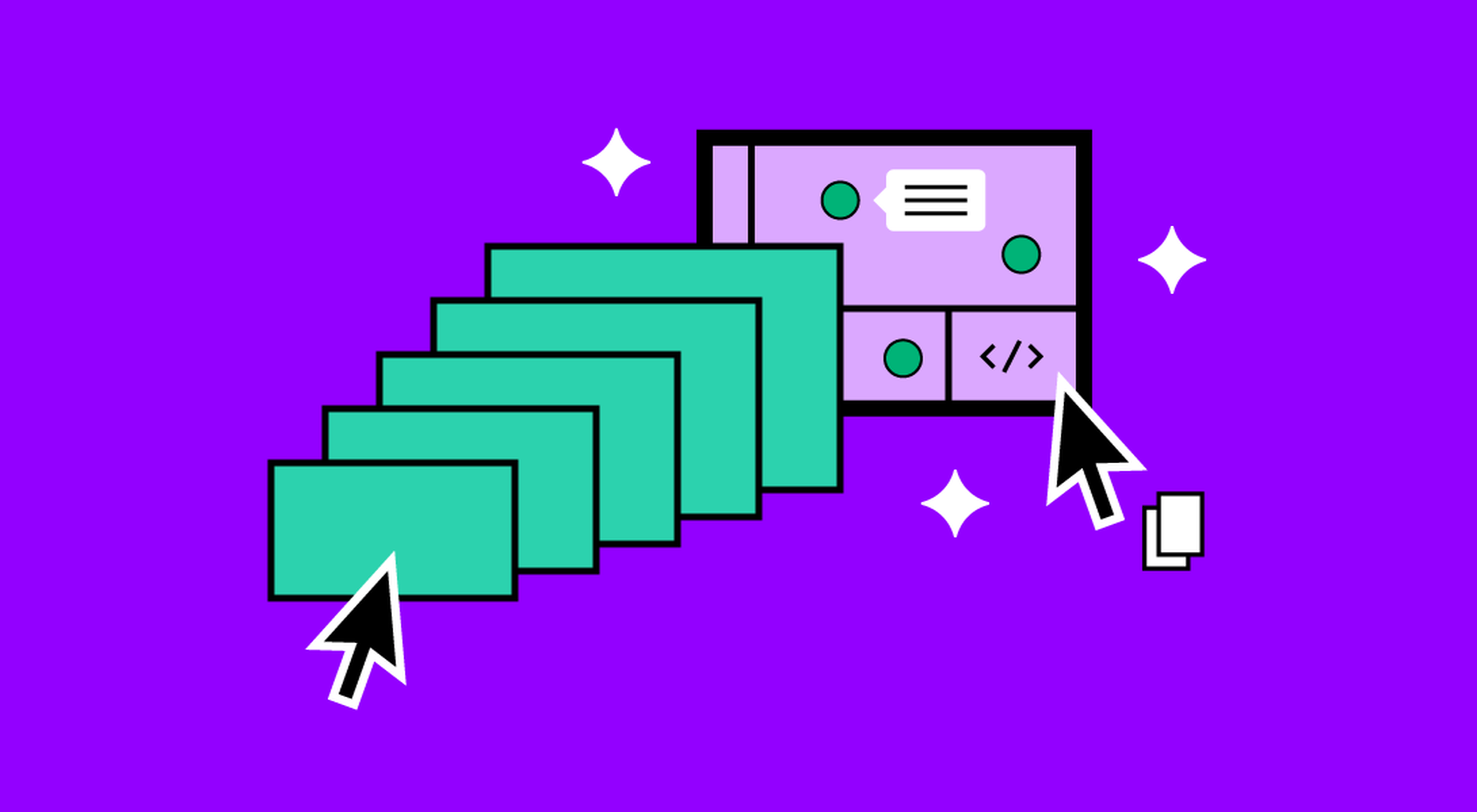
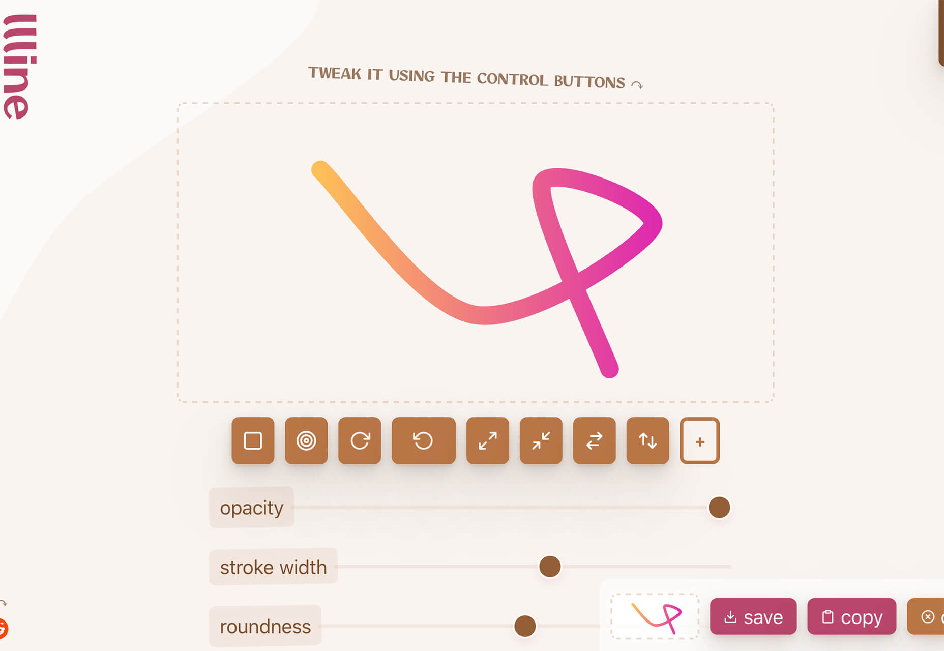
Imagine what your workflow would look like if you could forgo the struggles of image-based technology, design and handoff with accurate components that have interactive features. Projects in the design phase will look more like final products and, most importantly, interact like final products. 

Let’s imagine a new design process together.

Challenges of an Image-Based Design Process

Here’s what we all know – image-based design tools provide pictures of components in the visual form but lack the interactivity and conditions that exist in the end-product. There’s not a high level of functional fidelity there, and it can cause confusion among design teams and rework.

These tools require you to redraw the fundamental components and design with boxes and rectangles, which takes too much time and can create a disconnect between the design and development teams. 

Further, you don’t fully maximize the potential of a design system because of inconsistencies between code-powered systems that developers use and these image-based systems for designers. There’s an innate gap between maintaining the environments and creating consistency in components. 

The final and maybe most difficult challenge with an image-based design process is in usability testing. You just can’t test an image the way you can working components. If the prototype is not interactive enough, you lose valuable feedback in the testing process. Functional fidelity is a must-have design and development tool in 2022. 

Iress, market-leading financial software, had many of these same problems in its design system process. You can probably relate to its story, which includes a designer and engineer who aren’t entirely on the same page, hit the deadline and have to deliver, and then get customer feedback. The result was a lot of extra headaches and work. 

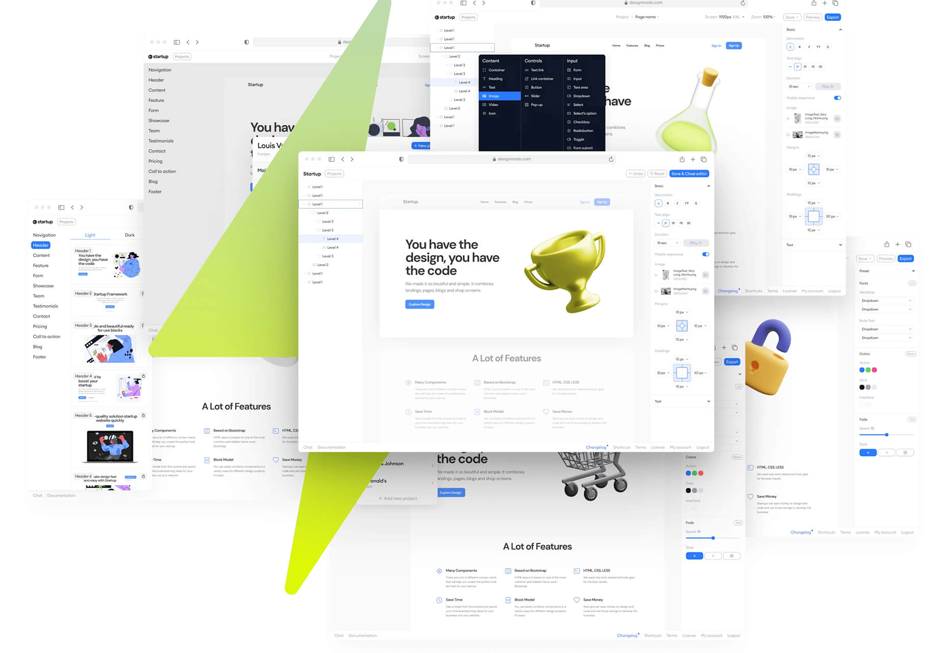
But there is a better way: Import all user interface components into a code-powered design system in sync with a design tool so that your team can work in harmony to build, scale, and handoff projects with ease. 

Scale Design With Accurate Components

Here’s what most design and development teams want en route to building products: Accurate components with built-in interactivity, states, and conditions. No redrawing boxes and rectangles; no trying to figure out what states and interaction should be.

And if you can do it with ten times the speed and agility? Now you’re really in business. 

“It used to take us two to three months just to do the design. Now, with UXPin Merge, teams can design, test, and deliver products in the same timeframe,” said Erica Rider, Senior Manager for UX at PayPal. “Faster time to market is one of the most significant changes we’ve experienced using Merge.”

The time and workflow savings come from the ability to maintain only one environment as a product team. Rather than image-based tools, a code-powered design system that will push updates to components as the design evolves is the modern way to work. This workflow can also eliminate duplicate documentation so that your team has a single source of truth for whole product teams. 

Now you can be more agile in the design process and scale. And as Rider hinted at, there is a solution already available in UXPin Merge. 

Scalability with accurate design components has other benefits as well. 

Teams can onboard people faster because the design system is in the design tool. There’s less searching for answers with drag and drop-ready building blocks. New team members will find more success and be more valuable to the team quicker due to fewer inconsistencies and errors. 

Testing also gets a boost as you scale with a single source of truth. You can actually create better usability tests with a high-fidelity, functional version of the prototype, allowing users to leave more valuable and detailed feedback that can improve your product in the early stages. 

Better Handoffs Start Here

As you imagine a better design process, take it one step further. Better handoffs are a goal for most teams. 

An interactive component-based design tool can eliminate the need for multiple iterations of the same meeting to explain how a prototype works. Everyone can see and interact with it for themselves with accurate, true components that ensure the prototype works the same as the product. 

Designers will feel more like their vision is making it into the final product, and developers have a better idea of how to work. Everyone has the exact same components written in code. Thanks to the single source of truth, devs can speed up as they build the product because they start with components that include production-ready code.

A typical design to developer handoff might have multiple steps: Create vector design elements, create a model for interactions, and then send the prototype with documentation. Not to mention the meetings that are required to make sure everyone is on the same page.

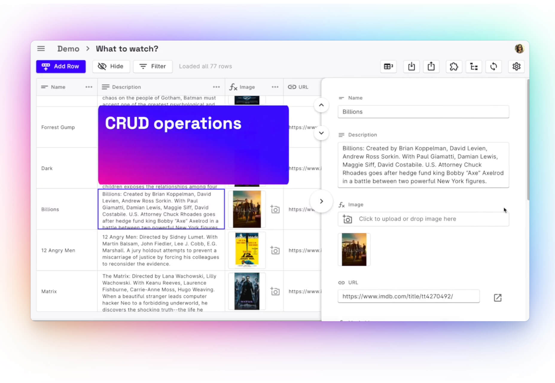
In a model with interactive component elements, the developer handoff is fast and easy; they create a prototype with true components and all the built-in properties. The developer copies the JSX code and pastes it into his tool to build the final product. All the component properties and their coded interactions already exist in the source code. This is possible because the source of truth is the code itself, the source code.

Quick Tool Solution and Technical Use

This solution to this common challenge is not somewhere in the future; it’s already here.

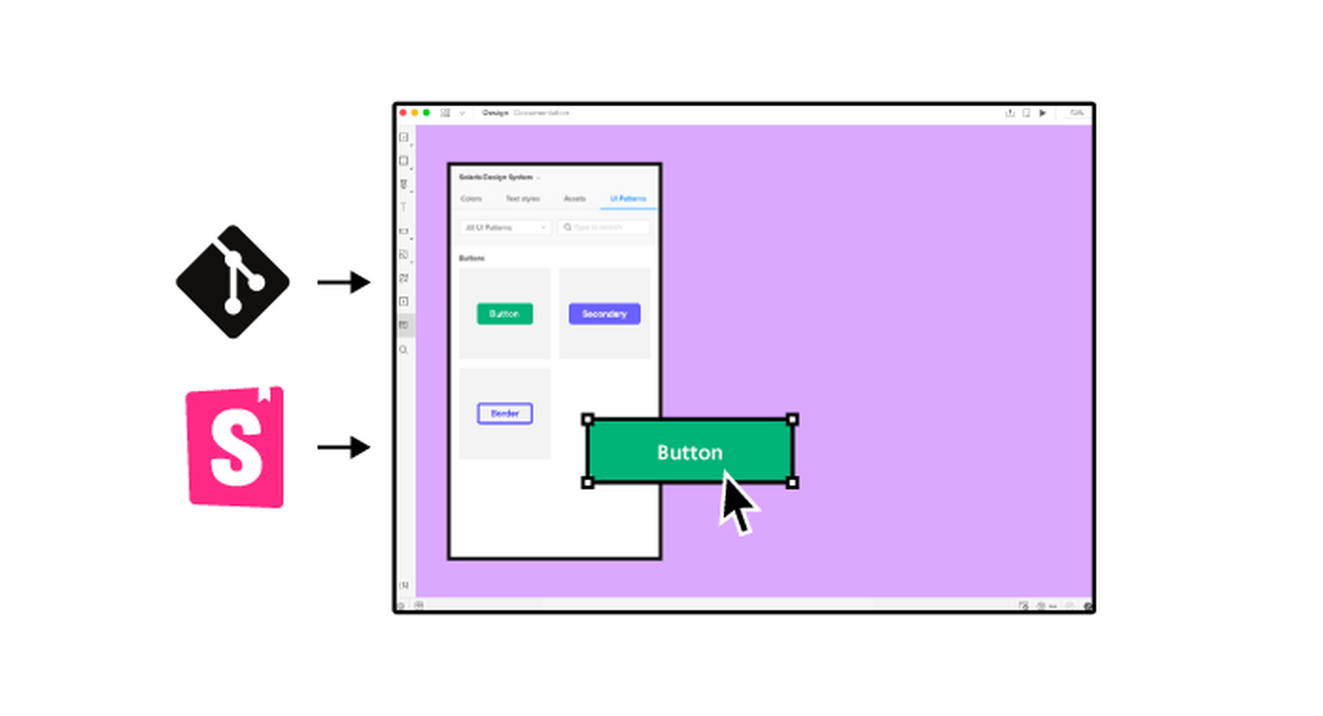
UXPin, a code-based design tool, has Merge technology, which allows you to bring all interactive components into UXPin. Then you can use your own, or the open-source library with the ready-made building blocks to get products ready faster.

Here are just a few of the things you can do with Merge by UXPin:

  • Integrate your developer’s storybook to use it as a single source of truth (works for all frameworks)
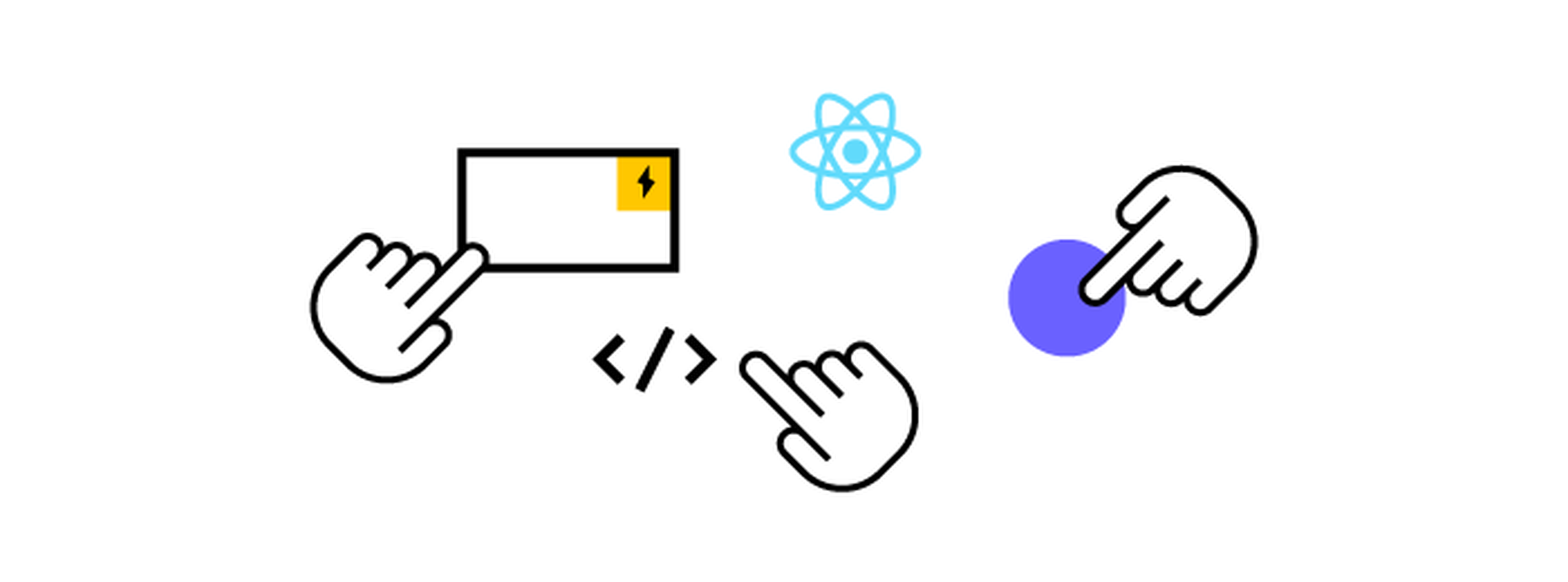
  • Import design system components from a dev’s Git repository, such as GitHub, Bitbucket, GitLab, or others (works with React)
  • Work with the built-in MUI library
  • Add the npm component package to UXPin on your own (no developer required)
  • Design with the confidence that your work can be ideally reflected by developers
  • Create and share a library of interactive components

Summary 

Say bye-bye to redrawing rectangles – build more accurate prototypes easier and end-products faster with Merge by UXPin.

Now is the time to solve one of your biggest design challenges while upgrading and scaling the design process and improving handoffs. 

Merge by UXPin is user-friendly and made for scalable projects of almost any size. The line between design and development blurs with quicker product release and a fully-interactive solution. Request access today.


[– This is a sponsored post on behalf of UXPin –]

Source

The post How to Scale Your Design Process and Improve Handoff first appeared on Webdesigner Depot.

Source de l’article sur Webdesignerdepot

User Experience (UX) design and User Interface (UI) design are two terms people sometimes mistakenly use interchangeably. While aspects of each are interconnected, there are distinct differences between UI/UX design.

According to Internet Live Stats, there are over 1.9 billion websites, but not all are active at the same time. No matter how you slice it, there’s a lot of competition to grab and keep user attention. Good UX is just part of the equation. For a genuinely stellar site, you must also offer an excellent interface.

Learning the ins and outs of good UI and UX requires a bit of knowledge of how the two differ and what works. Although they weave in and out of the same design, they are different.

What Is the Biggest Difference Between Good UX and UI?

UI is the functionality of the design and what users see. How do they interact with various elements? UX is more the way things come together — both visual and interactive features — to create a feel for the user. You can certainly see why people confuse the two as they both apply to interacting with a website or app.

Top design firms often have team members specializing in each discipline. However, UX designers are also aware of UI, and UI designers are also mindful of UX. How can you ensure you’re offering excellent UI/UX design while covering the full spectrum of requirements for each?

Ensuring Effective UX Design

Good UX design increases conversion rates by 400% or more. The site visitor walks away feeling understood and not frustrated. What are some of the most important aspects of good UX design?

1. Create a Good Structure

What is the hierarchy of your site? What is the first thing the user sees when they pull it up? How do they navigate from one page to the next? A well-designed website classifies different aspects of the page, and new content naturally falls into the appropriate category as it grows.

When creating a structure for your site, think about how it might expand in the next five years. You want the hierarchy to work from day one, but you also want to think through significant shifts in the content you might see down the road.

Even your navigational hierarchy should accommodate new areas easily. Plan for the unexpected, so you know how to work it into the overall design when you must.

2. Choose Beautiful Aesthetics

You have a few seconds to make an excellent impression on your site visitors. Take the time to make sure your design functions and is visually appealing. Your color palette should work, images should be crisp and relevant, and typography should be readable and engaging.

Step back from your computer and look at your design from a distance. Does anything stand out that isn’t pleasing to the eye? Get feedback from visitors about what they like and dislike. Since the focus is on user experience, your best source of constructive criticism is from your target audience. Listen to their concerns and ideas.

3. Communicate With Site Visitors

Most experts agree that users want an element of interactivity on sites and apps. People want to know you hear them and get a response. Some ideas include adding a live chat option to your site or engaging in SMS customer support.

Put yourself in their shoes. A customer may visit your site for the first time, having never heard of your brand. They have no reason to trust you or that you’ll follow through on your promises. Potential leads may have a few questions before parting with their hard-earned dollars.

Adding various ways to communicate shows them you’ll be there should they have a problem. It’s much easier to trust a company when you know you can phone, engage in live chat or shoot off an email and get an almost immediate response.

4. Add Clear Direction

Excellent UX is intuitive. You should add calls to action (CTAs) and images pointing the user where they should go next. You can use graphics of arrows, people looking or pointing toward the next step, words, or CTA buttons.

Get feedback on how clear the directions are and tweak them as needed. The user should never have to stop and ponder what to do next. Everything on the page should guide them toward the ultimate goal.

5. Break Down Complex Data

Every industry has complicated data that is difficult for non-experts to understand. Part of good UX is breaking down complex information and sharing it in a simplified way.

One example might be the registration process. Instead of just showing text, a good UX designer would number the steps. Visualizations help add to understanding.

Embracing Effective UI Design

User Interface impacts UX and involves how the design works. The UI designer thinks through visitor expectations and then creates an interface that isn’t frustrating. UI works within the framework of a website to develop functional features. User experience isn’t the complete focus of UI, but it does tie into the planning phases. What are some elements of good UI design?

1. Set Standards

For a design to have good UI, it must perform as expected. Have you ever clicked on a button, and nothing happened? Determine how you want things to work and the minimum acceptable standards for your site.

For example, what happens when someone clicks on a link or button? How does the user know their action created the expected result? Consistency is crucial to how a site performs.

2. Choose the Right Colors

While UX designers look at the emotional impact of various colors, UI designers look at whether the shades match branding and how well the different ones contrast for readability and usability. UI/UX design often bridges a single designer’s work, so the employee ensures everything works as intended, both emotionally and functionally.

You may work with another designer to make the site aesthetically pleasing while also tapping into the emotions driving users. For example, some people love blue, so a blue button can have positive results.

UX and UI designers utilize split testing to see which users respond best to. Then, make adjustments as indicated by how site visitors respond.

3. Focus on Cognitive Matters

According to the Interaction Design Foundation, people can only retain around five things in their short-term memory. Designers should work with recognition instead, as users tend to rely on cues to find what they need.

UI designers may develop an intuitive navigation system and then use the same cues on every page, such as placement, color, and language. Users can then recognize the system without having to memorize it.

4. Prevent Errors

Your job is to ensure errors are kept to a minimum when designing a website or app. One of the most significant parts of a designer’s job is testing and retesting.

Think about all the potential problems a user might run into, such as broken links, images not showing, or incomplete actions. How can you keep those problems from occurring in the first place?

Error prevention is particularly vital when designing software as a service (SaaS) or apps. Users grow frustrated quickly and will find another solution rather than troubleshooting an issue. You’re much better off avoiding the error in the first place.

How Do UX and UI Work Together?

You’ve likely already figured out how closely UX and UI entwine to create a usable experience. The UX designer pays attention to function and interactivity, and the UI designer thinks through how the interface looks.

UX pays attention to the flow of the website and where users start, go next and end up. On the other end, UI figures out how the elements look to the viewer and where everything is placed.

The UX team may decide to add an extra button to the page. The UI team must determine where to place it, if any sizing needs must occur, and how it impacts usability on desktop and mobile devices.

Although each has a different function, user experience and user interface must work together to create a usable site the target audience responds to. You can’t have excellent UX without excellent UI, and vice versa. The best designers consider both and implement them to their fullest potential.


Featured image via Pexels.

Source

The post What’s the Difference Between Good UI and Good UX? first appeared on Webdesigner Depot.

Source de l’article sur Webdesignerdepot


Article Image

Chatbots Are Here To Stay

Chatbots have been around for a long time and based on the global chatbot market size (and the expected growth), they will stick around for a long time and gain importance. In the past, they’ve rarely met customer expectations or provided much positive experience. However, over the last few years, advances in conversational AI have transformed how they can be used. Since chatbots offer a wide range of applications, in certain cases, they become responsible for collecting and protecting personal information as well. 
Consequently, they are a great attraction for hackers and malicious attacks too. The responsibility of ensuring chatbot security has become more evident after the introduction of GDPR in Europe. As statistics show that this technology will be a determining factor in our lives, security testing must also become part of our daily tasks, so that these chatbots can be used with confidence.

Security Risks, Threats, and Vulnerabilities                 

The words risk, threat, and vulnerability are often confused or used interchangeably when reading about computer security, so let’s first clarify the terminology:

  • Vulnerability refers to a weakness in your software (or hardware, or in your processes, or anything related). In other words, it’s a way hackers could find their way into and exploit your systems.
  • A threat exploits a vulnerability and can cause loss, damage, or destruction of an asset – threats exploit vulnerabilities.                
  • Risk refers to the potential for lost, damaged, or destroyed assets – threats + vulnerability = risk! 
The well-known OWASP Top 10 is a list of top security risks for a web application. Most chatbots out there are available over a public web frontend, and as such, all the OWASP security risks apply to those chatbots as well. Out of these risks, there are two especially important to defend against, as in contrast to the other risks, those two are nearly always a serious threat — XSS (Cross-Site Scripting) and SQL Injection.
In addition, for artificial intelligence-enabled chatbots, there is an increased risk for Denial of Service attacks, due to the higher amount of computing resources involved.

Vulnerability 1: XSS – Cross-Site Scripting

A typical implementation of a chatbot user interface:           


  • There is a chat window with an input box.
  • Everything the user enters in the input box is mirrored in the chat window.
  • Chatbot response is shown in the chat window.

The XSS vulnerability is in the second step — when entering text including malicious Javascript code, the XSS attack is fulfilled when the web browser is running the injected code:

 <script>alert(document.cookie)</script>              

Possible Attack Vector

For exploiting an XSS vulnerability the attacker has to trick the victim to send malicious input text. It can be done through one of the following ways:

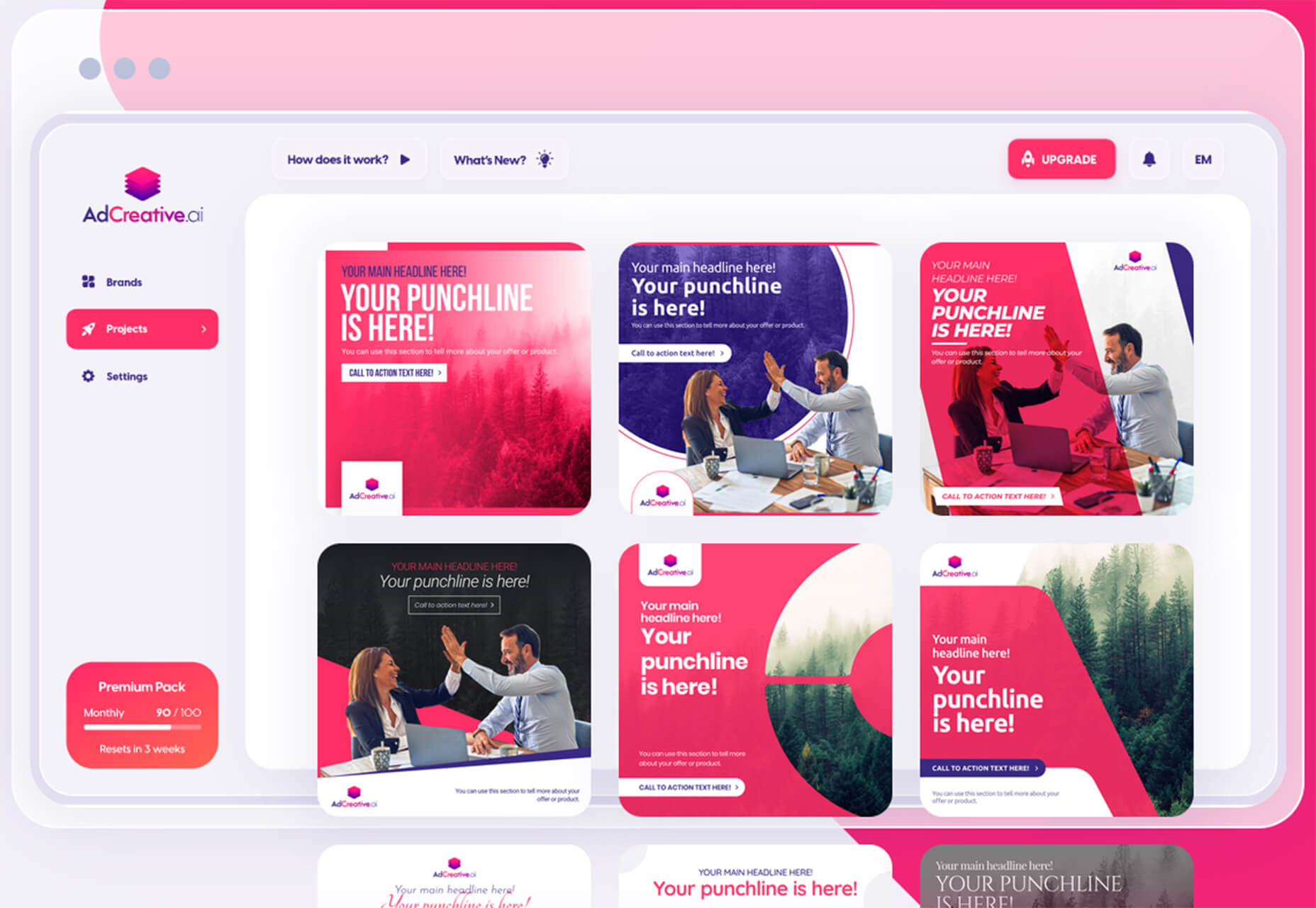
Many people believe that UX design is all about creating slick, engaging images and top-notch user flows. While those things have their merits, UX designers do much more than that.

UX writing is an essential skill in developing an app or solving a UX problem for a client. UX writing is when we craft UI text to communicate with a product/service user. UX writing includes valuable text like instructions, buttons, menus, just-in-time warnings, etc.

This article will analyze what you need to look out for even before you start writing. After that, we will explore ten crucial tips for UX writing that every UX designer should know.

Practical Tips and Tricks to Improve Your UX Writing

As with UX design in general, UX writing is about achieving a goal. Think of a wireframe you have created: The first thing you do when designing is to identify the real problem and set out to find the right solution. The same goes for UX writing.

Accordingly, before you start writing, make sure that you:

  • Have identified the UX problem;
  • Understand the goals of the client’s digital product;
  • Are familiar with the target audience;
  • Know the style and tone of voice you should use.

Once you are familiar with all of the above, you are ready to start writing. Let us explore all the tips and tricks you can follow to improve your UX writing.

1. Be Concise

This is one of the most important tips concerning UX writing. UX designers should always seek the shortest path from point A to point B. This is not only true for UX writing.

So conciseness is all about shortening your sentences and writing only what is necessary. This way, you’ll achieve a better user experience. Remember that most people tend to quickly scan instead of actually reading.

2. Be Clear and Helpful

If you are concise, the text you write will be clear and valuable. Since our goal is a compelling user experience, you should avoid being wordy. Our text needs to be helpful to the reader. What does a user need to know about the product or service?

All you need to do is anticipate what users need and what they are concerned about. Then, by analyzing your target audience, you can easily remove unnecessary text and make your UX text clear and useful.

3. Be Positive

You want the user to have a positive feeling when they first engage with your digital product. Well, for the target audience to be positive, your writing needs to be positive as well. To achieve that, you should avoid negative statements.

Of course, this is not a rule that you must always follow. For example, using “don’t” is not always bad because you can use it for emphasis. Nevertheless, try to avoid such words when describing your product or service.

4. Be Consistent 

Consistency has everything to do with sticking to the guidelines you (or a client) set at the beginning of the UX project. Your UX text must always match the style and tone you have chosen.

Try to pay attention to details. For example, when it comes to numbers, you can write 2,000 follows, 2.000 follows, and 2000 follows. It does not matter which you choose, as long as you remain consistent throughout the project.

5. Use Active Voice

Although it is not always wrong to write in the passive voice, the active voice is generally more helpful for UX writing. Your text will be more precise, tailored to your audience, and more potent with the active voice. And when your written text is clear and powerful, it is also more engaging.

6. Don’t Get Wordy

In most cases, when you are done writing, you believe that your text is clear and valuable. And that’s reasonable. However, it is wise to reread your text and delete all the filler words.

Adjectives and adverbs are usually unnecessary, and you can remove them from your UX text.

7. Choose Strong Verbs

But if you have no adjectives and adverbs, how can you emphasize and strengthen your text? All you need to do is use the correct persuasive verb. Strong verbs help you formulate compelling CTAs without being wordy.

8. Use “You” Words

Now that we have mentioned CTAs, there is nothing more convincing than the word “you.” Words and phrases like “you,” “you will,” “you are,” “you have,” “your,” “yours,” etc., are the best way to connect with your target audience and let them be the leading character on your UX Journey Map.

9. Avoid Articles and Exclamation Points

Although it may sound bizarre, the use of articles is not necessary for people to understand what you are saying. The same goes for exclamation points. Of course, you can use exclamation points for emphasis, but not always. Save them for the most exciting aspects of your project.

10. Don’t Use UX Writing to Point Out UI

This is a widespread mistake made by us UX designers. If you have to point out an interface element of your design with text, there is probably something wrong with the design.

Remember, UX text is not about explaining your user interface; it’s about providing valuable and transparent information about your digital product.

Wrap Up

You should keep in mind that the above tips are only guidelines and not strict rules. For example, there are occasions when the passive voice or an exclamation point should be used in UX writing. In any case, you will be one step closer to your goal if you make sure that your UX text is concise, clear, valuable, and consistent.


Featured image via Unsplash.

Source

The post 10 Tips for Effective UX Writing first appeared on Webdesigner Depot.

Source de l’article sur Webdesignerdepot

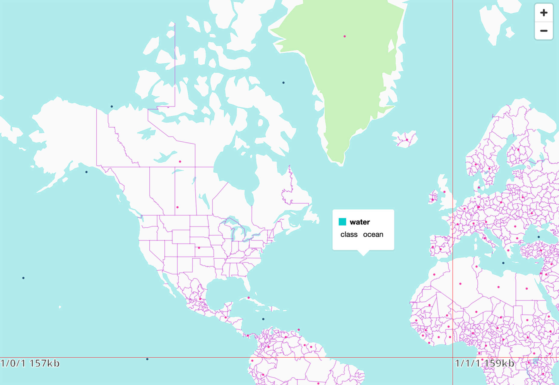
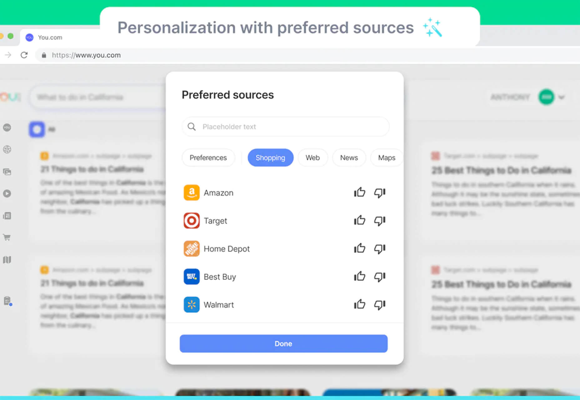
Maps are a fascinating method for delivering content. At their best, they can create an intuitive way of presenting information and interacting with it. This is the advantage that digital maps, through mobile apps and websites, have over print maps and images where no interactivity is possible.

But it’s important to understand that more data ≠ better experiences. We all now have so much data available to us through multiple services that, arguably, the greatest challenge isn’t sourcing information but filtering it out. We can only handle so much information input before we become overloaded. This issue risks being omnipresent with maps. There are so many potential points of interest on a map that it’s essential to be clear about what needs to be exposed to users.

Also, UX design, map design, and user interface are all critical. While maps can be a powerful way of drawing people in, if end-users feel that you didn’t even consider the visual design, they’ll ‘bounce off’ your site or app in moments.

Common Use Cases

When are maps useful, and what problems do they solve? Let’s dive right into the most common use cases for maps used in web design.

Navigation and Direction

Like Google Maps shows, navigation and direction are arguably the classic case study for interactive maps. You are in one place and need to get to another. You can enter your destination, your current location, and the map will present suggestions for getting there. You can select the method of travel and adjust desired departure or arrival times. But you need to understand first what functionality your users need. How these options are exposed to users is a critical piece of UX design.

Also, if users are searching for options such as somewhere to eat, it’s not so straightforward. Then, how your map handles panning in real-time as users swipe around a city is going to be a big issue.

Showing Relationships and Trends Geographically

This is something that you’ll see in every election in any western country. We’re all used to seeing maps that give us a state-of-play for which state or seat is held by which party. Then, we might see projections based on voter intentions and projected voting swings deriving from that. Then, exit poll data can be projected with the map updated on an ongoing basis until the final result is confirmed.

The capability to do this is essential because if a static map were used, it’d be out of date any time a new poll was released. Also, voting intentions can change over a campaign, so such maps need to be dynamic. Of course, such maps are only as accurate as the available data, as the US 2016 election map showed.

Show Points of Interest

As mentioned previously, there’s a lot of data that can be exposed to map users. However, that doesn’t automatically mean that it should be. Usability is key. For example, when you look at a map, you’ll typically first see key points of interest. Which points of interest are going to be presented to you can vary.

One variant is zoom level. If your map is currently showing an entire city, the level of detail the map presents is deliberately limited. You’ll see districts, large roads, or geographic features such as rivers. If more detailed information were presented, users on mobile devices, in particular, would be overwhelmed. Even at this level, you’ll notice typography differences. These can include the city name being in bold or the names of different areas in capital letters. So the level of detail is coupled with the scale of the map. Zooming in a few notches will expose significant points of interest, such as museums. Zooming in to specific districts will reveal restaurants, coffee shops, and universities. This visual hierarchy is a critical way of managing the exposed level of information.

But information is still being abstracted away. It’s not until you tap on the museum that you’ll see information on opening hours and busy times. This is also typically presented with user photos and reviews. Context is also taken into account, so you’ll start to see local hotels and restaurants. So it’s not just individual points of interest that are important, but the connections between them.

6 Tips For Improving Interactive Maps

What are the challenges of creating effective maps, and how do people address the data overload problem? We’ll answer this question and go over the must-know aspects of map creation.

1. Ensure Security and Brand Trust

GDPR or General Data Protection Regulation. This is a critically important European law that extends a wide range of legal protection to European citizens regarding personal data. It’s not possible here to cover the full extent of the law, but here are some quick key points:

  • Consent is required for the processing of personal data; it cannot be assumed
  • You need to have a retention policy for information that’s capable of identifying people

Be aware that the latter doesn’t just cover commercial purposes. Research students have to submit GDPR forms that address what kind of data they’re sourcing and how they’ll be retaining it.

But the most crucial context is commercial. If a business suffers a data breach, it can be fined up to 20 million euros or 4% of annual worldwide turnover in the preceding financial year, whichever is greater. Therefore, any business storing data that could identify their customers will need to assess risk and compliance. Remember: it’s 4% of worldwide turnover, not EU turnover.

Also, anything of your business that you expose to your customers or users is an extension of your brand. Therefore, you need to assess your maps for brand compliance too. If you have primary brand colors and your map doesn’t abide by them, that’s a very poor look. Source the color hex codes directly from your brand team and involve them in design.

2. Use the Appropriate Type of Map

It’s also important to consider what type of map is most appropriate for your use case. Think carefully about what your users need, what you’re trying to communicate, what information you need to present, and how best to present it.

For example, points of interest style maps in a tourist app will be way more helpful than heat maps: people want to know where something is, key data like opening hours, and how to get there. A heat map showing the number of visitors to each attraction or area of a city is unlikely to be useful to tourists. However, it could be useful to the attractions themselves to map their visitors by heat map over time. This could help larger museums chart which exhibits are most popular.

Transport for London is charting passenger movement on the London Underground by detecting when a device with Wi-Fi comes into range and then passes out of range. They’re using this to understand overall user journeys and movements within individual stations to better manage disruptions.

3. Avoid Pop-Ups

It should go without saying by now that auto pop-ups are despised. It doesn’t matter what they’re doing or what they’re offering; an unwanted pop-up can only get in the way. The level of impact is even greater on a phone where pop-ups take up even more screen space.

Given this, many users close them without even reading them. So if you’re using pop-ups, don’t kid yourself. You’re likely just irritating users and increasing the likelihood that they’ll ‘bounce off’ or uninstall.

4. Avoid Auto-Geolocation

Auto-geolocation sounds incredibly convenient but can result in some real problems. For example, if there are any bugs with auto-geolocation, you could get false results. If someone connects through public building Wi-Fi, you could get false results. If they’re connecting through a VPN then, unless you get the user’s IP address and check if it’s the exit portal of a VPN, you could get false results.

The problem is most significant with mobile maps. If a map user is looking at a points of interest map, they likely have a specific and immediate use. This means it’s in their best to get the most accurate results possible. So why not just ask them?

Precision and Accuracy

These terms have specific meanings in geolocation. ‘Precision’ is the exactness of the data. ‘Accuracy’ is how closely the information on a map matches the real world. So you want precision and accuracy to be spot on, or data risks losing value. This applies not just to the gathering of data but to the representation of it. For example, if you have street-level data but your maps don’t present individual streets, then any representation of data on that map is likely to have poor accuracy. That map might succeed in abstracting irrelevant information but presenting an imprecise and inaccurate view.

5. Avoid Map Legends as Much as Possible

In many cases, primarily points-of-interest maps, they’re just not needed anymore. An essential part of user experience design isn’t just visual hierarchy but information hierarchy. You can mouse over on a desktop or laptop to get the essentials of a location, e.g., the museum’s name and its opening hours. On a mobile device, you can tap on that location to get the essentials, and you can tap on another location to move on; you don’t even have to press back. Given that, a legend would get in the way. So this simple piece of information design solves information overload issues.

As with all rules, there are exceptions. A good one is a heat map where a density of what’s being measured needs to be communicated. It doesn’t matter what the data is; it just needs to be something where mapping provides greater insight, especially if it informs decision-making. Sales is an excellent example for a national or multinational company. Of course, weather forecasting can make use of literal heat maps.

6. Accessibility Compliance

Not everyone has perfect eyesight. Even if someone has excellent vision, they could still be colorblind (8% of men and 0.5% of women are). Given that, take the W3C’s accessibility standards into account and treat them as a baseline or minimum barrier to entry for compliance. You shouldn’t feel good about the possibility of excluding 8% of your potential audience or customers. Ensure you keep your UX designers involved and don’t shy away from creating senior-friendly web designs.

Put simply: imagine if you could appeal to a new demographic that’s not catered to. If your competitors ignore them, you could give them a real reason to choose you instead by taking some straightforward steps. If your competitors are catering to them, you also need to. If you don’t, you’re just giving potential customers a big reason to ignore you.

Conclusions

The key takeaway is that there’s far more to creating good maps than just good cartography. That can be critical, too, though this may vary depending on the use case.

This will be a team effort because your map will involve data sets, design decisions, and, yes, cartography. You’re going to need to involve brand and IT too. So think about design principles and development methodologies.

First and foremost, what are your users’ needs? If you haven’t done any user research or taken the time to understand the customer journey, are you adding anything or getting in the way? It’s easy to see the department that requested the map as stakeholders, but you should probably view your users as stakeholders too.

This sounds complex, but as you hopefully now appreciate, a map is probably more complicated than you thought.


Featured image via Pexels.

Source

The post The UX of Maps in Web Design first appeared on Webdesigner Depot.

Source de l’article sur Webdesignerdepot

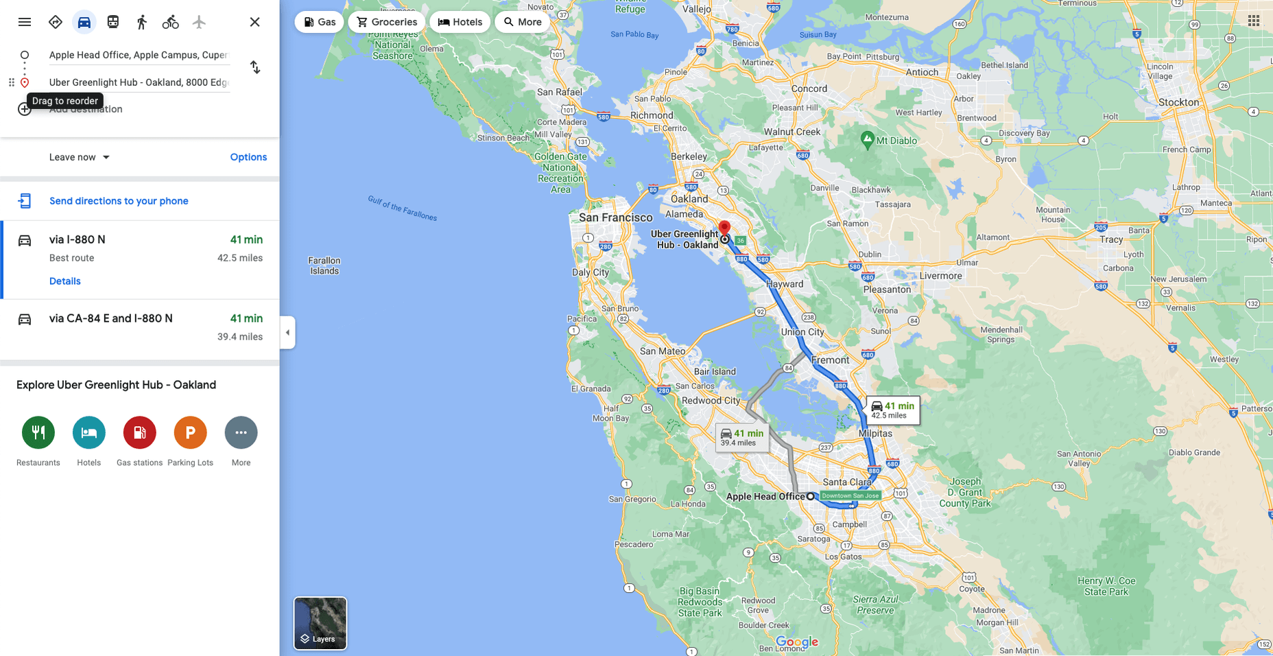
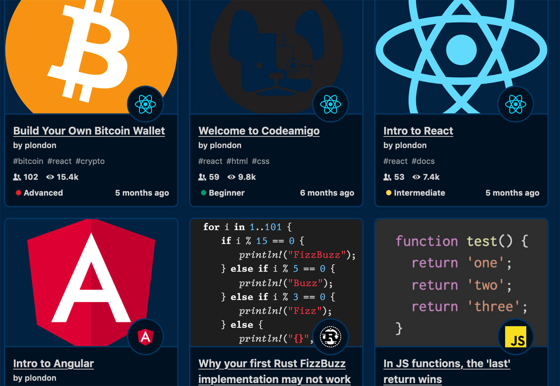
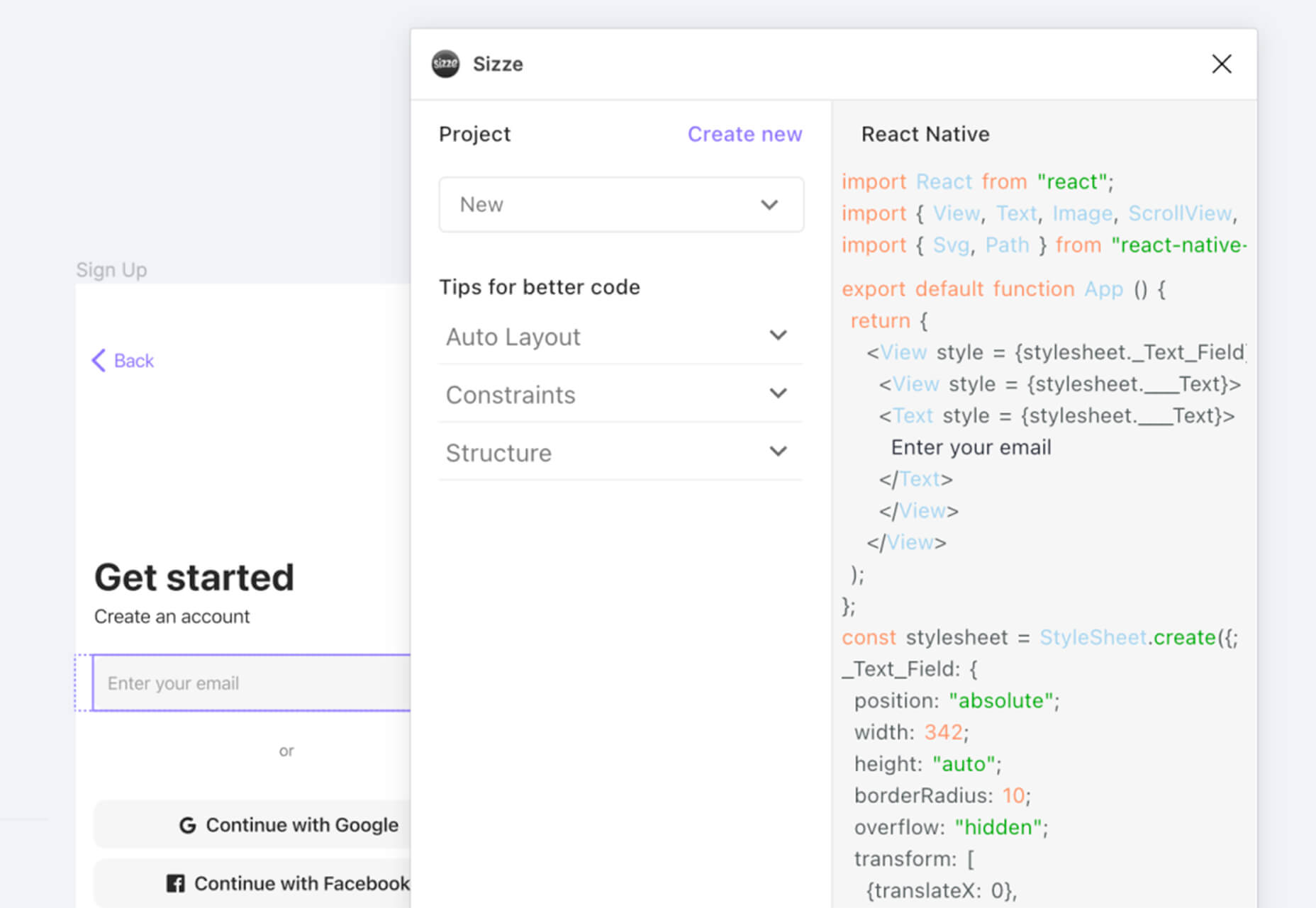
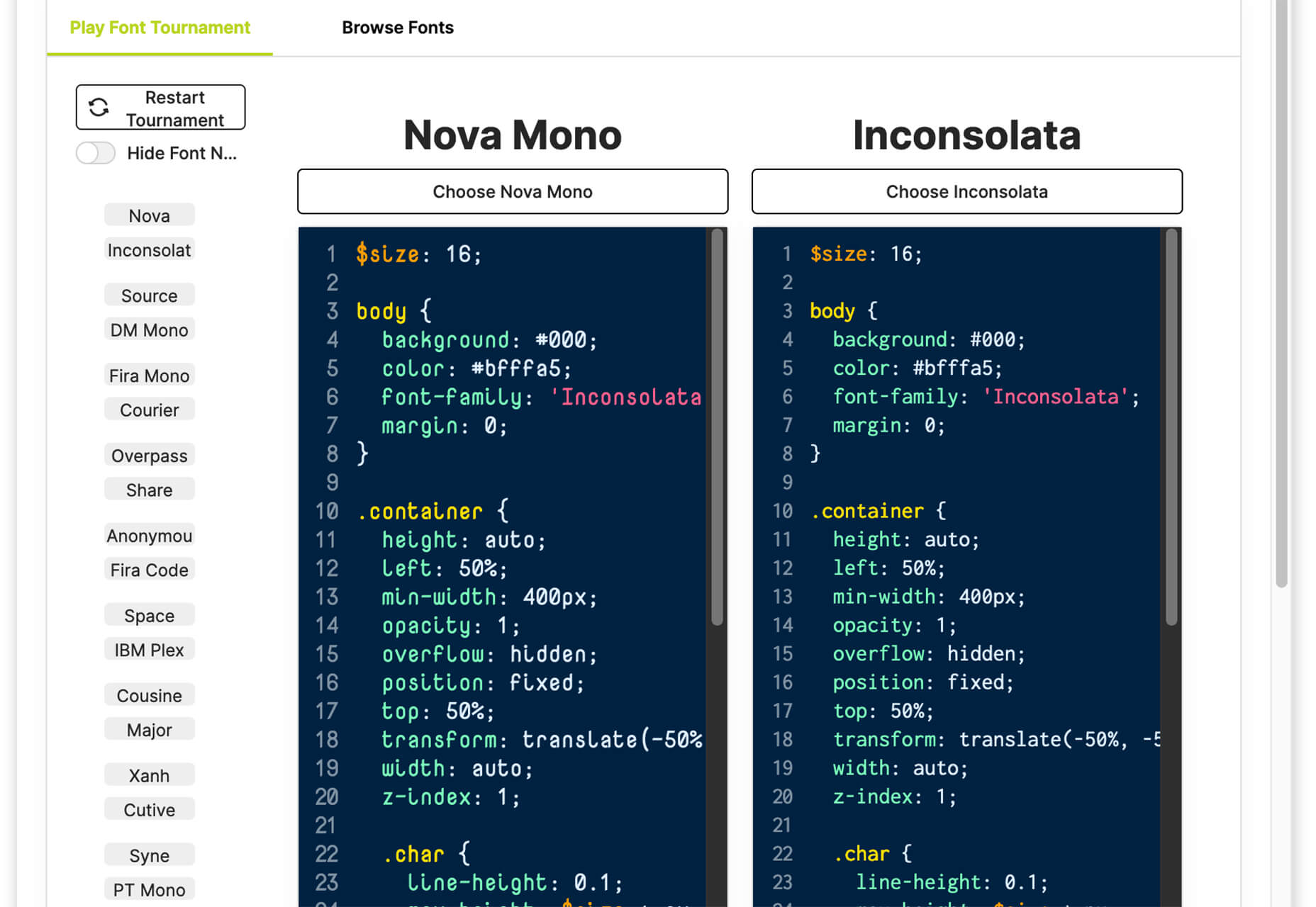
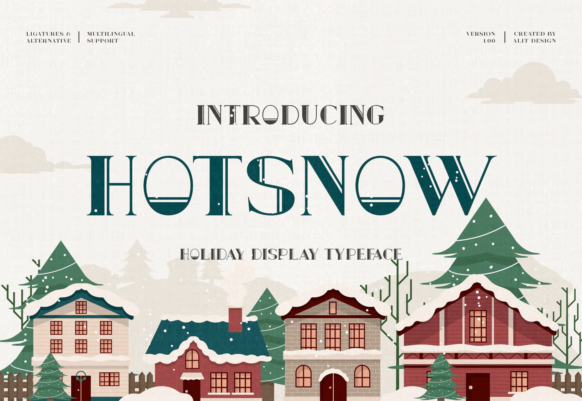
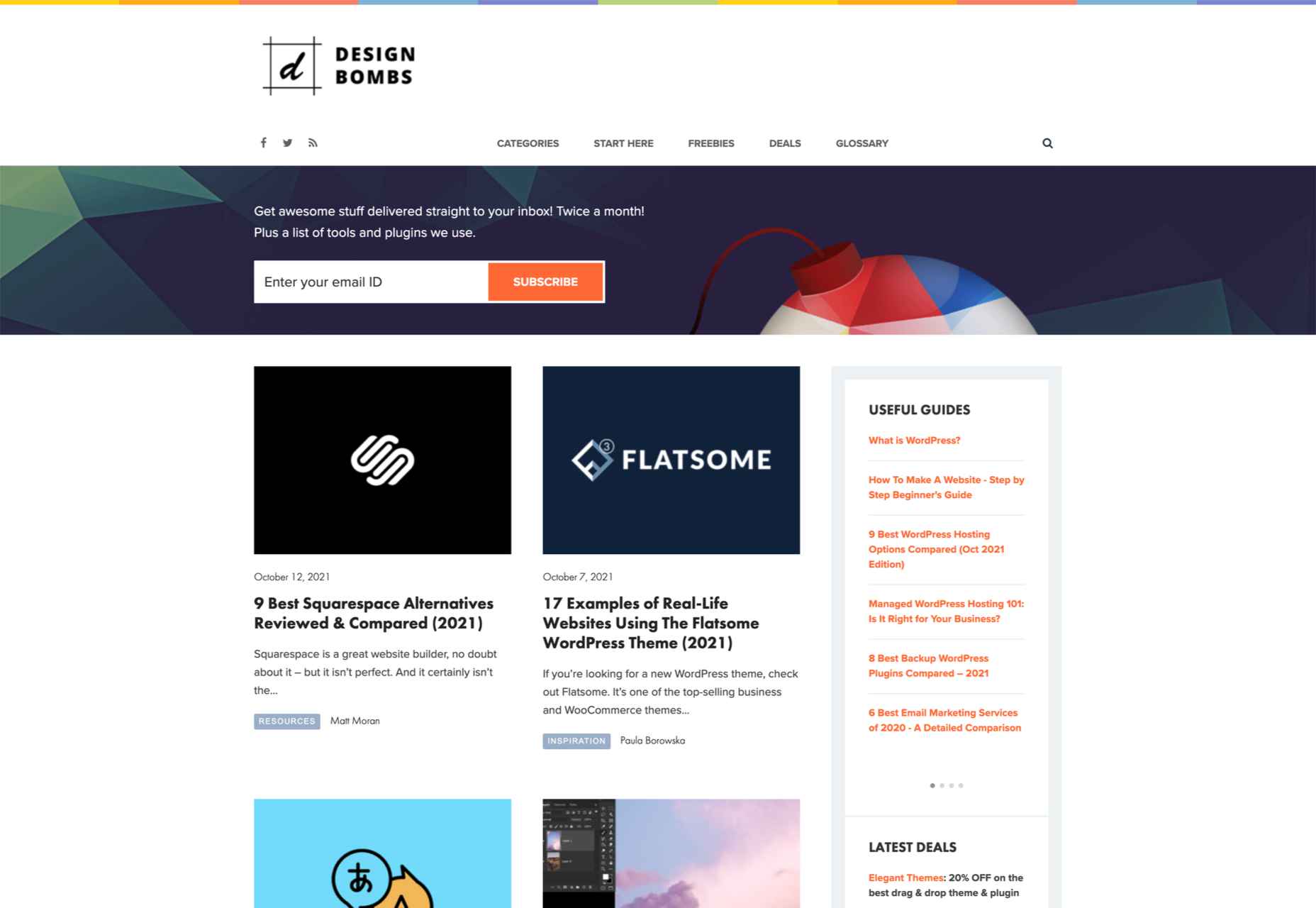
With the holidays fast approaching, there are plenty of fun gifts for you in this roundup of new tools and resources for web designers. Make sure to share anything you find helpful with others to spread additional holiday cheer.
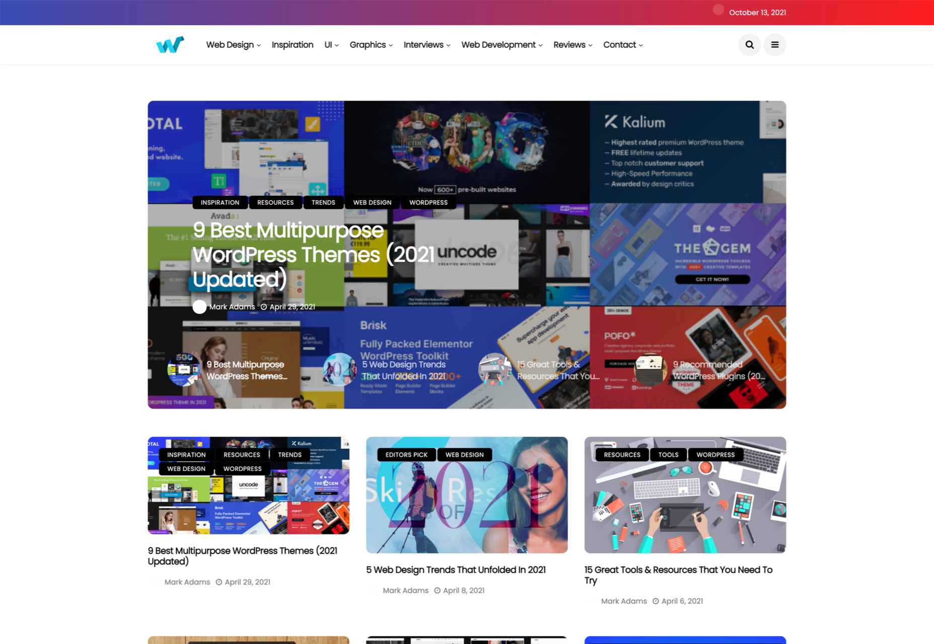
Here’s what is new for designers this month…

Volley

Volley, billing itself as Snapchat for work, is a new way to collaborate with remote teams. The tool addresses the two main problems of remote teams (lack of communication and loneliness) with an async video messaging app with interactive transcriptions neatly organized into workspaces. Volley emphasizes talking over typing (76% of volleys sent are video), doesn’t require you to coordinate schedules (it’s 100% asynchronous), and lives in a threaded conversation with context that’s neatly organized. Plus, the tool is free to use.

Upnext

Upnext is a new type of reading list. It’s designed to help you save, organize, and focus on fantastic content while expanding your knowledge on your favorite topics. You can create playlists with almost any type of content that you can refer to later and follow “thinkers” that you love. Search and filter content, focus on reading, integrate videos, and even highlight and note specific content in your customized library. This brand-new web app has a waitlist that you can join to get access soon.

Startup 5

Startup 5 is a new version of the popular website builder, and it’s a perfect tool to create your online presence. With Startup, it’s fast and easy to get your business online with pre-designed blocks. It includes a visual editor with 150+ blocks with pre-designed and pre-coded elements and styles you can easily customize in a drag and drop interface. It’s an easy tool for building a website quickly without a coding background. Most users can publish a website quickly and easily.

Flatmap

Flatmap generates Mapbox Vector Tiles from geographic data sources like OpenStreetMap. It is memory-efficient so that you can build a map of the world in a few hours on a single machine without any external tools or database. Vector tiles contain raw point, line, and polygon geometries that clients like MapLibre can use to render custom maps in the browser, native apps, or a server. Flatmap packages tiles into an MBTiles (SQLite) file that can be served using tools like TileServer GL or even queried directly from the browser.

Cleanup.Pictures

Cleanup.Pictures is a web-based tool to remove objects, people, text, or other defects from your images before using them in projects. It’s an AI-based alternative to other photo-editing software.

Linkz.ai

Linkz.ai helps you make smart link preview popups for your website to help encourage greater engagement and interaction for links. It works with a line of code you can install quickly and easily, and then you get smart link previews (in two style options) for every link on your site.

Llline

Llline is an SVG generator that helps you create smooth and organic lines and strokes with plenty of customization options for almost any application. This tool helps create graphic elements in just a few clicks, allowing you to add a few points to a canvas and then draw a smooth curve using these points. You can then tweak the resulting SVG graphic by rotating it, changing its color, giving it a gradient, making it a dashed line, and then you can download or copy the SVG markup.

Lorem.Space

Lorem.Space is a valuable placeholder image tool. With just a little bit of code, you can pop cool placeholder images – from movie posters to shoes – right in your website mockup so that the design is easier to visualize. It’s a great solution that’s fun and keeps you from having to put empty boxes throughout the design. And everything can be randomized, so you don’t spend time looking for placeholders.

Huetone

Huetone can help you create more accessible color palettes by making use of the Advanced Perceptual Contrast Algorithm. The contrast ratios and color combinations show on one screen to help you quickly develop palettes and combinations. Plus, the tool has hotkeys that make it easy to change hues, toggle, and adjust quickly. Then you can export everything to Figma.

Rowy

Rowy is an open-source tool to build on the Google Cloud Platform. You can manage Firestore data in a spreadsheet-style user interface, write Cloud Functions in the browser, and connect to third-party platforms.

AdCreative.ai

AdCreative.ai uses artificial intelligence to help create better ad creative. To get started, you upload logos and color files, connect social and other accounts, pick the sizes you need, write text, pick a background, and upload product images, and let the AI do the work. Once you have the creative you like, you can connect to your online ad accounts for easy use. This is a premium tool that’s free to try.

Flowrift

Flowrift is a tool to browse and then copy and customize Tailwind CSS blocks in groups of collections. Filter by block type and then experiment with the options. It even has e-commerce blocks.

Layout Patterns

Layout Patterns is a collection of layout patterns built using modern CSS APIs to help you build common interfaces such as cards, dynamic grid areas, and full-page layouts.

You.com

You.com is a new private search engine that summarizes the web. The tool is in open beta and includes superior privacy choices, actionable results, extensible apps, and personalization through preferred sources.

3D Icons

3D Icons is a fun set of three-dimensional, full-color icons that are free for all uses. (Donations are accepted.) They integrate with pretty much any web design tool you are using and come in four color styles – clay, gradient, color, and premium – so you can get just the right look for your project. Each icon also includes three rendering views – dynamic, side, and isometric.

Arco Design

Arco Design is a comprehensive React UI components library based on the Arco Design system. It includes a customizable theme and more than 60 crafted components that you can use out of the box.

Seekvectors.com

Seekvectors.com is a search tool to find free resources in five different formats, PNG, SVG, JPG, EPS, and AI.

Outline to Single Stroke

Outline to Single Stroke is a tool in the Figma community that works just like the name implies. Select a filled vector on the canvas, and then you can outline it to a single stroke and adjust the line weight if you like.

Codeamigo

Codeamigo is a new self-paced platform to help you learn coding skills. It’s packed with various lessons for different languages and templates and has something for every level from beginner to advanced.

Sizze

Sizze is a Figma to React Native export tool to create app prototypes and instantly export to code.

CodingFont

CodingFont is an excellent game that can help you pick a font to use for coding that you like! If you spend a lot of time looking at code each day, the right font can help reduce eye strain and make the work a little easier to see.

Christmas Revue

Christmas Revue is the first in a trio of holiday typefaces that you can use this season. This SCG color font is fun and perfect for the holidays with exciting glyphs. It is free for personal use only.

Hotsnow

Hotsnow is a fun display font that has interesting fills and shapes in an all-caps character set. It is free for personal use.

Marlwich

Marlwich is a feminine handwriting-style typeface that has the feel of signing a holiday letter or card. It contains upper- and lower-case characters and is only for non-commercial use for free. (A paid option is available for commercial projects.)

Source

The post Exciting New Tools For Designers, December 2021 first appeared on Webdesigner Depot.

Source de l’article sur Webdesignerdepot

The world of web design is incredibly dynamic. Every year, new trends and opportunities emerge, primarily driven by the arrival of modern technology. 

In recent years, we’ve seen various updates to the web design landscape, such as the arrival of AR and VR solutions for making mixed media. Video content has increased in quality, while the demand for inclusivity and usability has transformed the way that we build everything from websites to apps. 

Yet, for the most part, web design trends have continued to focus on the visual. 

When we hear the word “interface,” we often think of the graphical user interface – the ultimate way to connect users with sites. However, now we have a new, more natural way for customers to interact with their digital tools… The era of voice is here. 

Designing for the Age of Voice

The technology sector has made incredible progress in the development of things like Automated Speech Recognition and Natural Language Understanding. 

Thanks to updates in the way that machines process and understand human language, voice recognition accuracy is now at 90% and above. More than ever before, users can speak to a smart assistant, speaker, or phone-based application, and get the results that they’re looking for without error. 

The simplicity of communicating with technology via voice means that users have adopted this technology at an incredible pace. Half of all searches will be made with voice by the end of this year.

We’re standing on the edge of a fundamental shift in the way that we interact with computers and critical tools. As designers and developers, we need to be ready to embrace this new medium. 

With that in mind, here’s what designers need to think about when designing for voice UI. 

1. Decide How to Experiment with Voice

There are various steps involved in making a website more “conversational.” One of the first steps for any designer or developer is to think about the kind of voice-based interactions they’re going to enable for an app or website. 

For instance, rather than embedding voice technology into a website, you might decide to create a separate Amazon Alexa “Skill” for devices like the Echo. Companies like Capital One have already invested in this technology so that users can ask their smart speaker about their balance, rather than opening a laptop and logging into the site. 

To determine what kind of voice experiences you should be creating for your client, work with them on a customer journey map. Using this map of interactions that the customer has with your client on a regular basis, you can highlight areas where voice interactions might fit into the user flow. 

For instance, if customers are constantly asking questions about a brand or its service, an FAQ page that’s equipped with a bot that can respond to voice queries could be an excellent choice. 

UI design should always solve problems. Examining the frictions and frustrations that your client’s end-users encounter during their journey will help you to decide which direction to take with your voice UI experience. 

2. Examine the Anatomy of Voice Commands

Before designers can create a dialog flow for their voice UI, they need to understand how voice commands work. The key to success in a successful design for voice is understanding the objective of the interaction. A voice consists of three crucial factors for designers to consider:

  • Intent: Intent represents the subject and context of the voice command. A high utility interaction involves a request for a specific task. For instance, your users might request that your app gives them a list of five-star hotels in a specific area. Designing for these requests is often straightforward because what the voice algorithm needs to do is clear. However, low-utility requests can be harder to decipher, such as “hotels near me,” because there’s less specificity for the bot to work with. 
  • Utterance: Utterance refers to how a user phrases a command. For instance, in the case of looking for five-star hotels in Amsterdam, the customer might say “show me hotels,” or they might ask for “places to stay”. Designers must consider every variation of an utterance for their voice command UI. 
  • Optional variables: This refers to the extra filters that your voice UI needs to be aware of. In the case of five-star hotels in Amsterdam, the descriptor “five stars” is optional. The optional input needs to overwrite default values and bring more detail to the search. 

SideChef, for instance, is a voice-activated recipe app that offers narrated guidance to users and allows customers to search for recipes based on their specific needs. The app comes with a wide range of variables built-in, allowing users to customize their searches according to descriptors like “vegetarian” or “quick” meals. 

3. Learn How to Prototype with Dialog Flows

Learning how to leverage a complex UI strategy like VUI takes time and practice. Prototyping designers will often have to think like scriptwriters, designing various dialog flows to suit the different needs of customers, and the numerous interactions they might face. 

Dialog flows will outline:

  • Keywords that lead to the interaction
  • Branches that represent where the conversation might lead
  • Example dialogs for the user and the voice assistant. 

Practicing your dialog flows with scripts that illustrate the back-and-forth between the voice assistant and user will help designers and developers to understand the various nuances that can appear in a customer to robot interaction. 

Remember, while a crucial part of good voice UI design is keeping the communication conversational and straightforward, you will need to ensure that there is a dialog flow in place for every discussion that may occur between end-users and their apps, website, or digital tools. Users don’t want to feel overloaded and overwhelmed, but they need to ensure that they can complete their tasks too.

Consider the voice-based game RuneScape: One Piercing Note, for instance. 

The developers behind this app allowed players to speak with other in-game characters and use commands like “pull the lever” or “open the chest.” In designing the playable components of the game, the designers needed to think about every possible interaction that a player might have with different parts of the story while ensuring that users didn’t stray off track. 

A Few Tips for Voice UI Design 

Voice UI design can be very complex, mainly if you’ve never created something using voice as your only input before. However, once you get used to creating dialog flows, the whole process starts to feel a lot easier. 

As you’re designing, remember to:

  • Always confirm when a task is complete: When designing a checkout flow for an eCommerce page, one of the most crucial screens for a designer is the confirmation page. It shows the customer that the transaction has successfully been completed and stops them from worrying whether they’ve done the right thing. The same concept applies to Voice UI design. If your client’s end-user asks a voice-activated app to book an appointment with their therapist, for instance, they want to know that the appointment has been successfully booked and added to their calendar. Determine how you’re going to deliver the peace of mind your customers need. 
  • Create a strong strategy for errors: Designers and developers are still in the very early stages of experimentation with voice UI. This means that there’s a good chance that something could go wrong with your applications and tools from time to time. Having a strong error strategy in place is crucial. Always design a dialog flow scenario that allows the assistant to respond if they don’t understand a request, or don’t hear anything at all. You can also implement analytics into these situations to identify misinterpretations and improve usability in the future.  
  • Add extra layers of security: Various Voice UI solutions like Google Assistant and Alexa can now recognize individual voices. This is a kind of biometric security that’s similar to face or touch ID. As voice recognition continues to improve, it’s essential to ensure that you’re adhering to the latest guidelines in security. Additional authentication may be required for some companies. For instance, passwords, face recognition, or fingerprints might be needed for things that require payments and transactions. For instance, the Duer voice assistant uses face recognition to both approve payments, and make meal recommendations based on previous purchases. 

Are You Ready for the Voice UI Revolution?

Voice-based user interfaces are here to stay.

In the years to come, the chances are that developers and designers will need to learn how to use voice more consistently as part of their interface strategies. 

The good news is that although voice takes some getting used to as a design tool, it’s easy enough to make sure that your projects are moving in the right direction. Just like any other kind of design, implementing voice means thinking about whether the interactions and experiences that you’re delivering to end-users are seamless, effective, and valuable. 

Succeeding in voice UI isn’t just about adding the capacity for voice into your designs. It’s a matter of learning how to make user’s lives easier with the power of voice.


Featured image via Unsplash.

Source

The post Designing UI for the Voice Era first appeared on Webdesigner Depot.


Source de l’article sur Webdesignerdepot

The user interface, or UI for short, is the aspect of an app or website that users interact with naturally. Since the UI is the part that is most commonly used, it leaves a lasting impression on users that can either be positive or negative.

The design of the user interface and it’s functionality are what can make or break programs. That’s why UI testing has become integral in the world of software and web development.

Source de l’article sur DZONE

The idea behind building a mobile app has been to offer a faster, easier, and innovative experience on various devices to users, doing away with their need to browse websites. However, in a bid to stay relevant to consumers amidst competition, companies try to bundle up a million features together rather than offer a full-proof and specific solution for a certain user need. Being overwhelmed with numerous unnecessary features and functionalities, an app poses various inhibitions to a great user experience. In this blog, we will take a look at how a micro-app can help enterprises solve this issue.

What is a Micro-App?

It is a web/mobile-based, a customized app built to enable end-users to perform a certain, narrowed-down function. Unlike a conventional mobile app, which is bundled with multiple features and pages, the micro-app is smaller in size, more consumer-oriented, and built to offer certain functionality, has an easy user interface, with a dynamic loading that bypasses the app store. For instance, a Personal Banking app has several functions, such as viewing the balance, getting mini statements, changing the ATM password, money transfers, etc. However, if you build a micro-app for this, it will accomplish only that specific task, such as getting transaction history. 

Source de l’article sur DZONE