Articles

Rather than spring cleaning, do some spring “shopping” for tools that will make your design life easier. Packed with free options this month, this list is crammed full of tools and elements that you can use in your work every day.

Here’s what new for designers this month:

April’s Top Picks

Charts.css

Charts.css makes creating beautiful online charts that much easier. It’s a modern CSS framework that uses CSS utility classes to style HTML elements as charts. It’s accessible, customizable, responsive, and open source. There’s a quick start option and available source code to work with.

Haikei SVG Generator

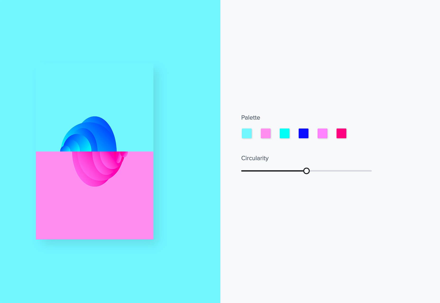
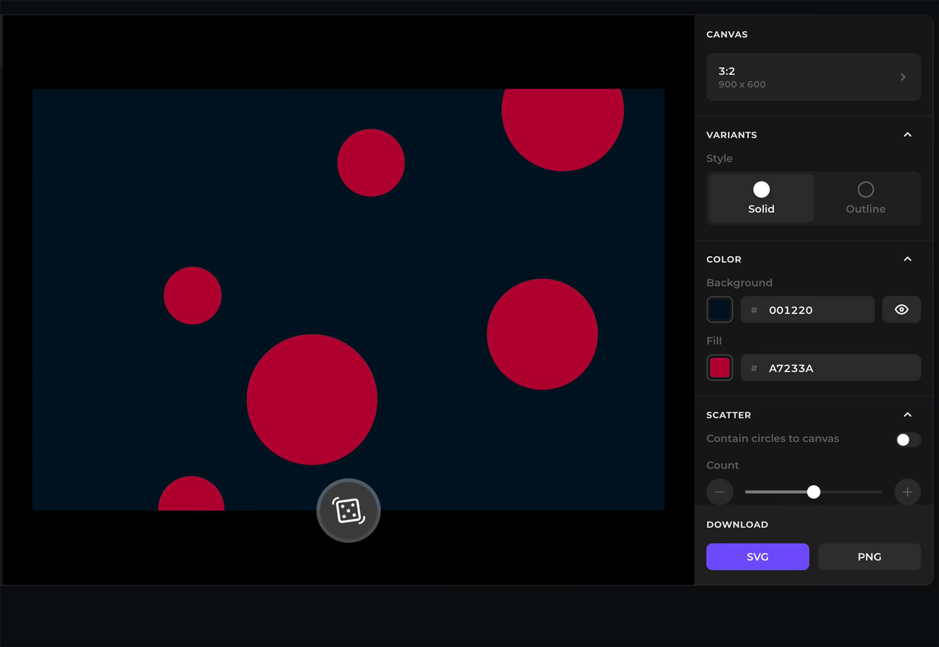
Haikei is a web app that helps you generate SVG shapes, backgrounds, and patterns in all types of shapes to use in projects. Everything can be exported into the tools you are already using for easy integration, and every element is customizable. The tool is free right now – no credit card needed – and you get access to 15 generators and can export in SVG and PNG format. A premium option is on the way, and you can sign up to get notified for access.

Fluid Space Calculator

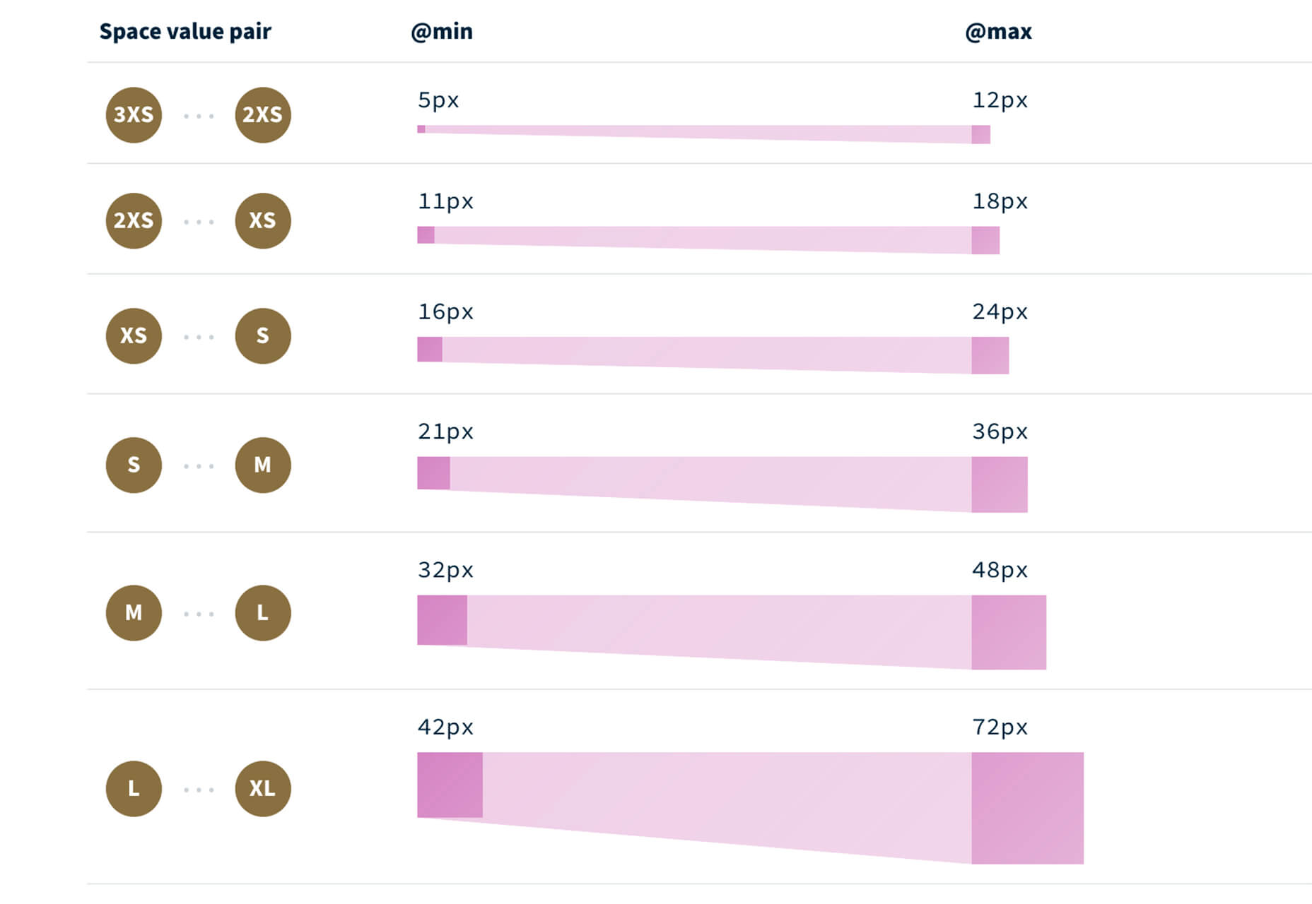
Fluid Space Calculator helps you create a related space system and export the CSS to implement it. The calculator allows you to add space value pairs and multipliers and see the impact on the screen before snagging the related code. It’s great for determining how things will look in different viewports and for creating custom space pairs.

Night Eye WordPress Plugin

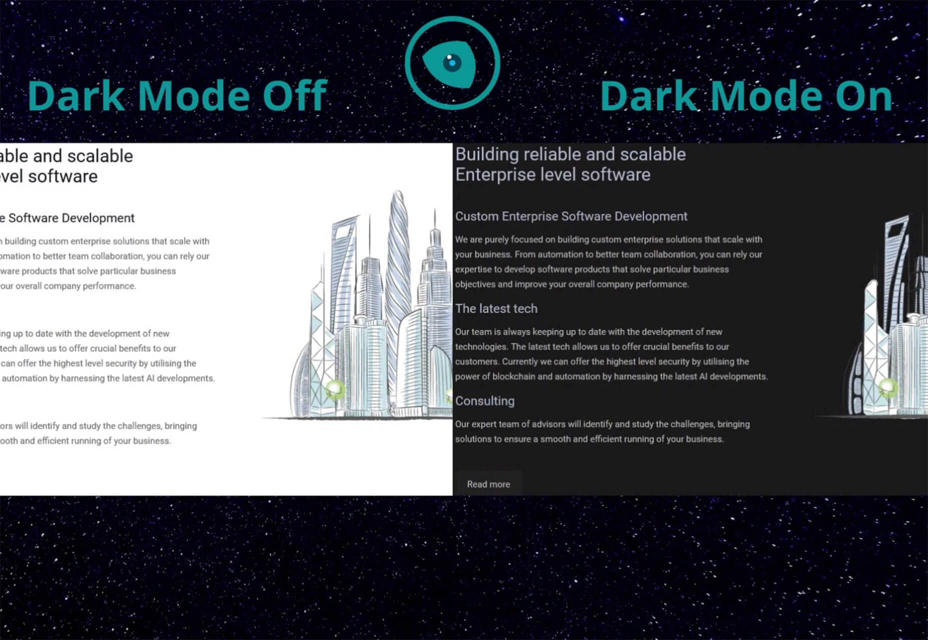
Night Eye WordPress Plugin helps you create a dark mode option for your WordPress website with ease. It’s completely customizable, schedulable, and one of those things that users are starting to expect. The plugin has free and paid versions – the only difference is a link to credit the developer.

3 Productivity Boosters

Macro

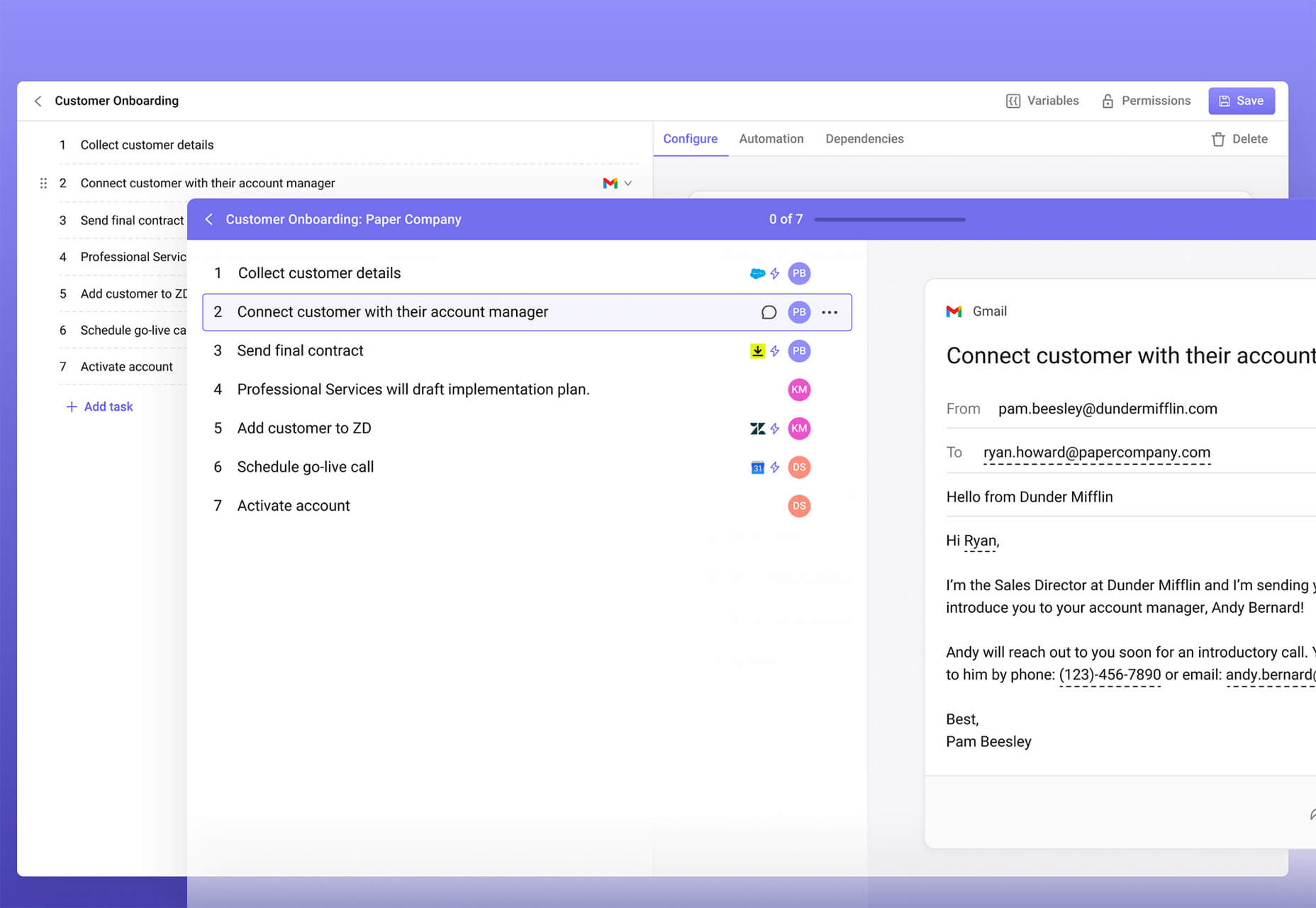
Macro is a supercharged checklist app for recurring processes. It’s designed to help teams document, assign, track, and automate for maximum efficiency. Now is the time to test this tool because it is free in public beta.

Writex.io

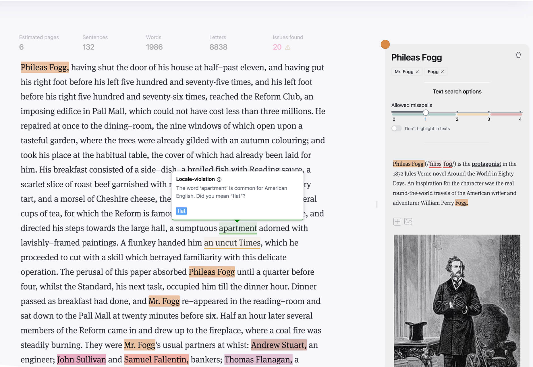
Writex.io is a free writing app that uses AI and smart features to help you write more efficiently. It can check readability as you write, make suggestions, check spelling, and allows you to work with versioning. All the settings are customizable, so you can get help and suggestions when you want them and avoid things you don’t want.

Taloflow

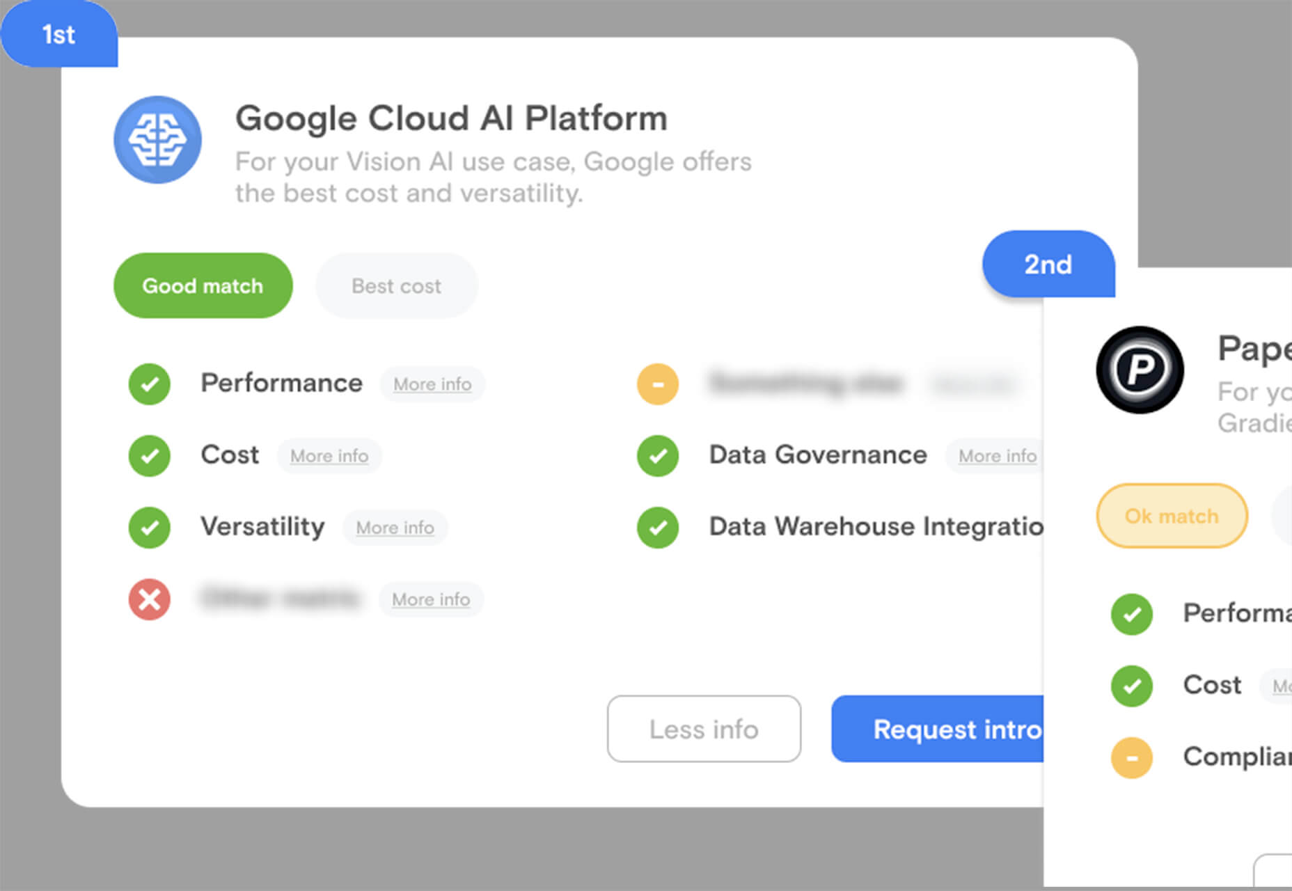
Taloflow, which is in beta, is a tool that helps you find the top cloud and dev tools for your use case. This is designed to be a time-saving solution to finding the right infrastructure and API products for your work.

8 Kits with Illustrations and User Interface Elements

Skribbl

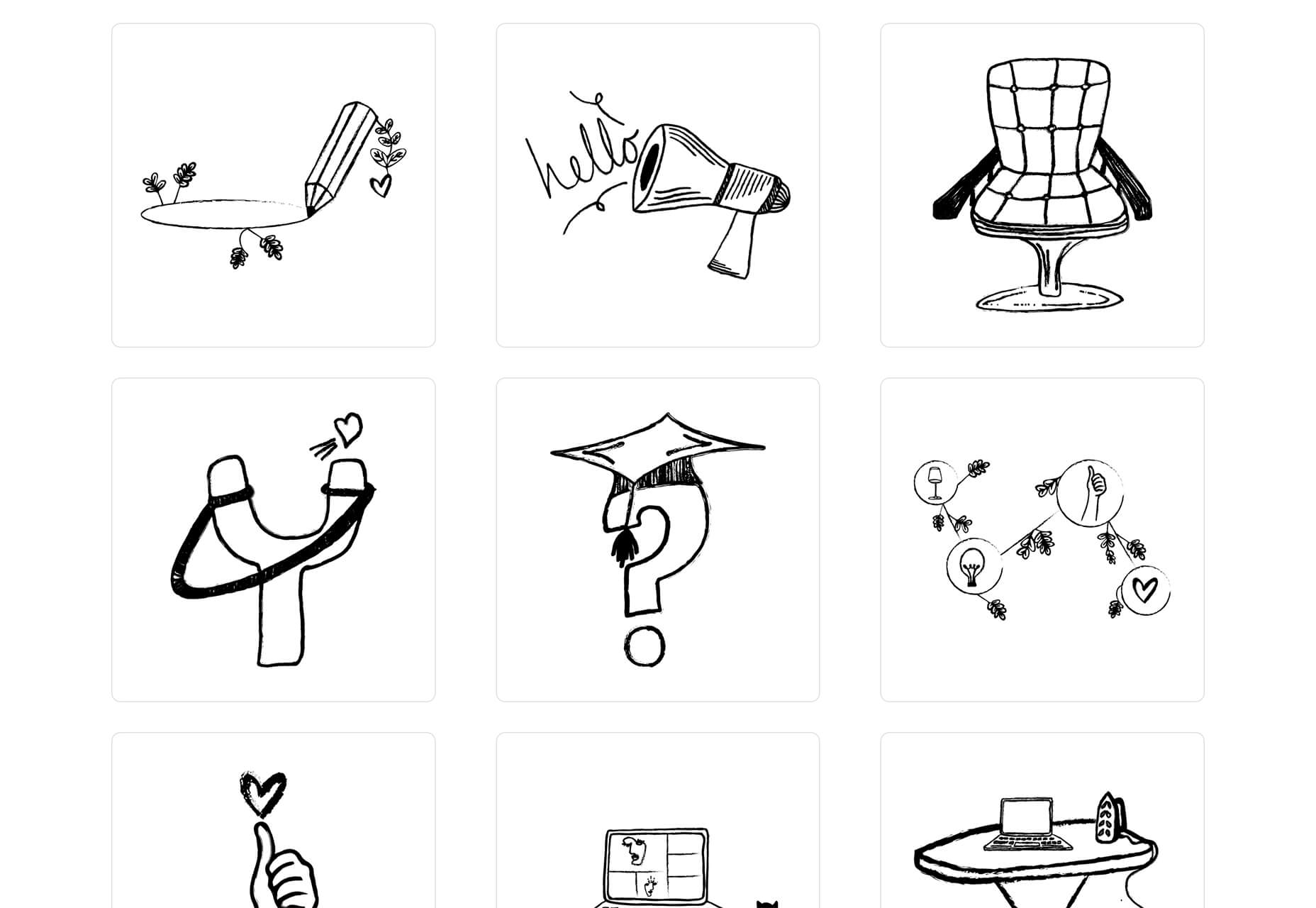
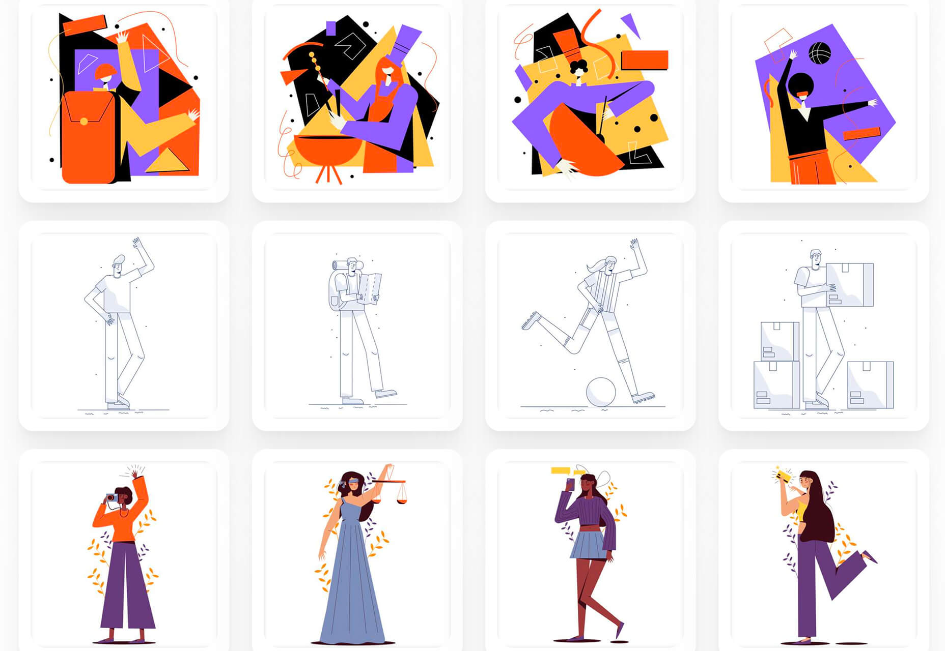
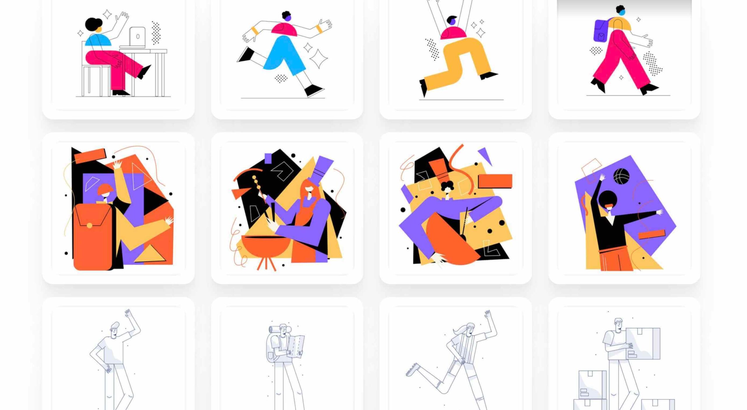
Skribbl is a collection of free, hand-drawn illustrations in a light and fun style. The black and white sketches are friendly, and the collection keeps growing. Plus, the illustrators are allowing them to be used free for any use.

Mobile Chat Kit

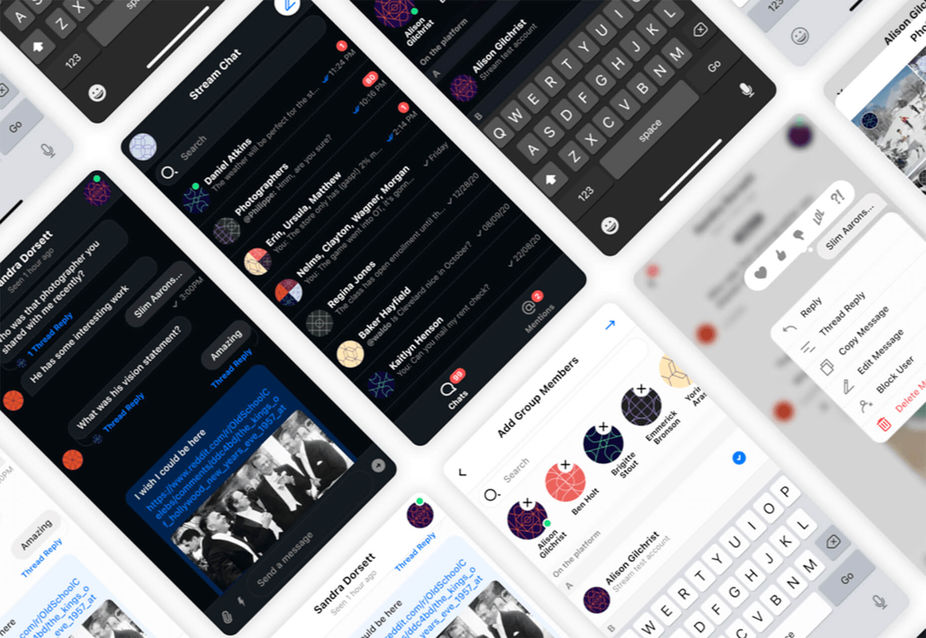
Mobile Chat Kit is a free starter kit for building apps in Figma, Sketch, and Adobe XD. It includes more than 50 screen options with mapped-out flows for a quick-start project.

Flowchart.fun

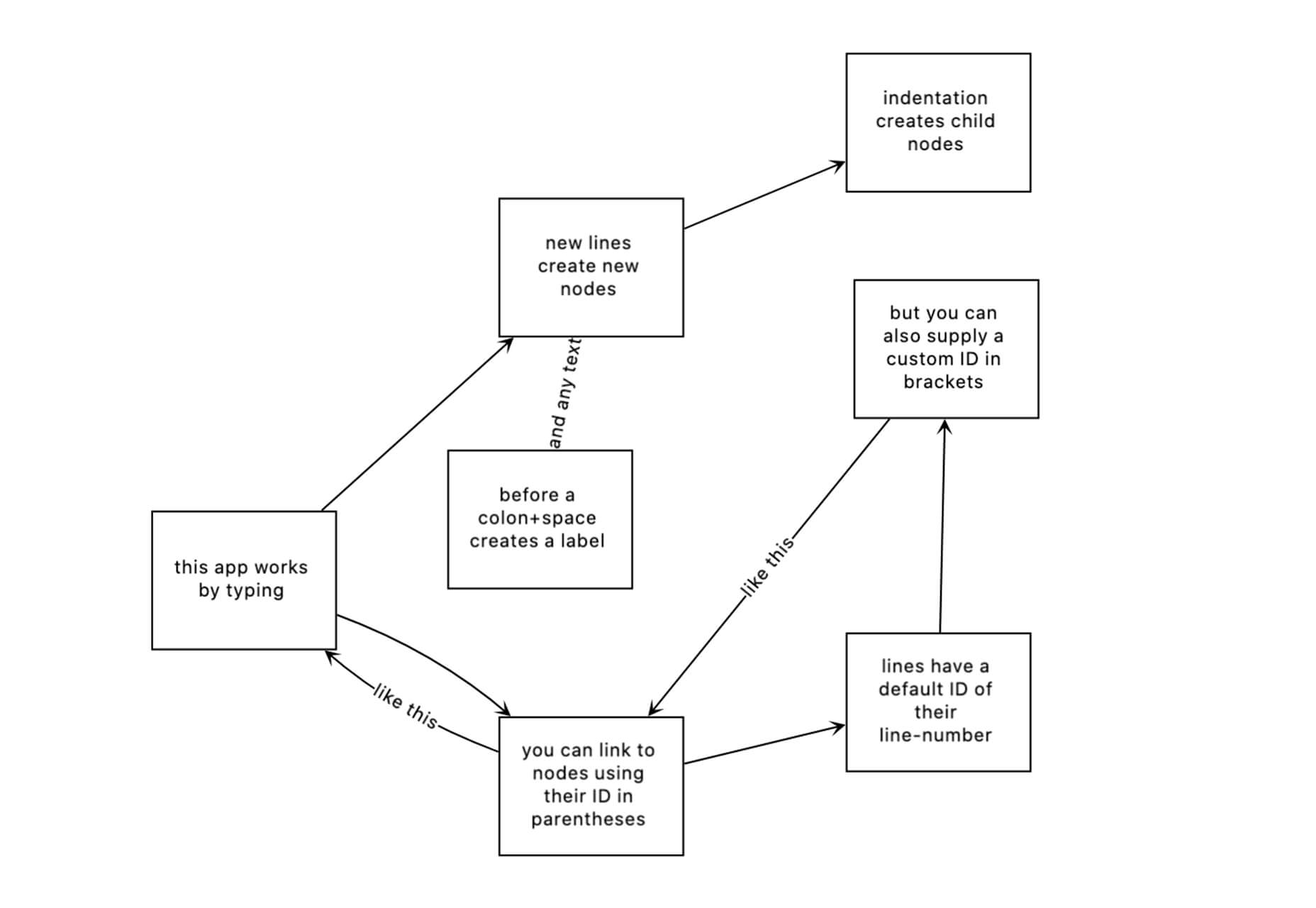
Flowchart.fun is exactly what the name implies. The app allows you to type, create nodes, and link elements to develop simple flow charts quickly. Then you can alter shape and size with drag and drop. Export it for use as an SVG, JPG, or PNG.

Shuffle

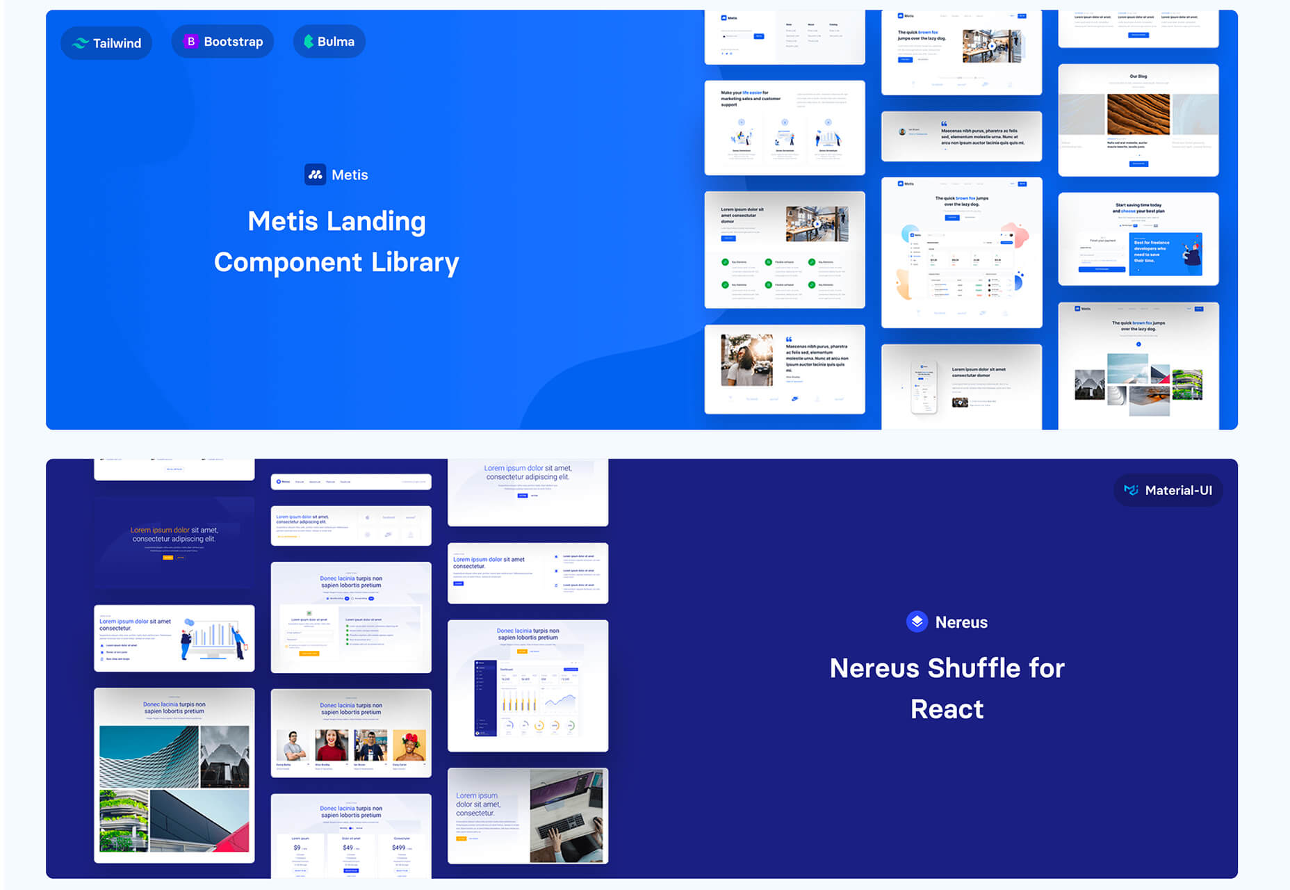
Shuffle is a marketplace packed with UI libraries to help you with a variety of digital projects. There are more than 1,500 pre-built components to choose from with professional designs. This premium tool comes with a monthly subscription or lifetime license.

Cryptocurrency 3D Pack

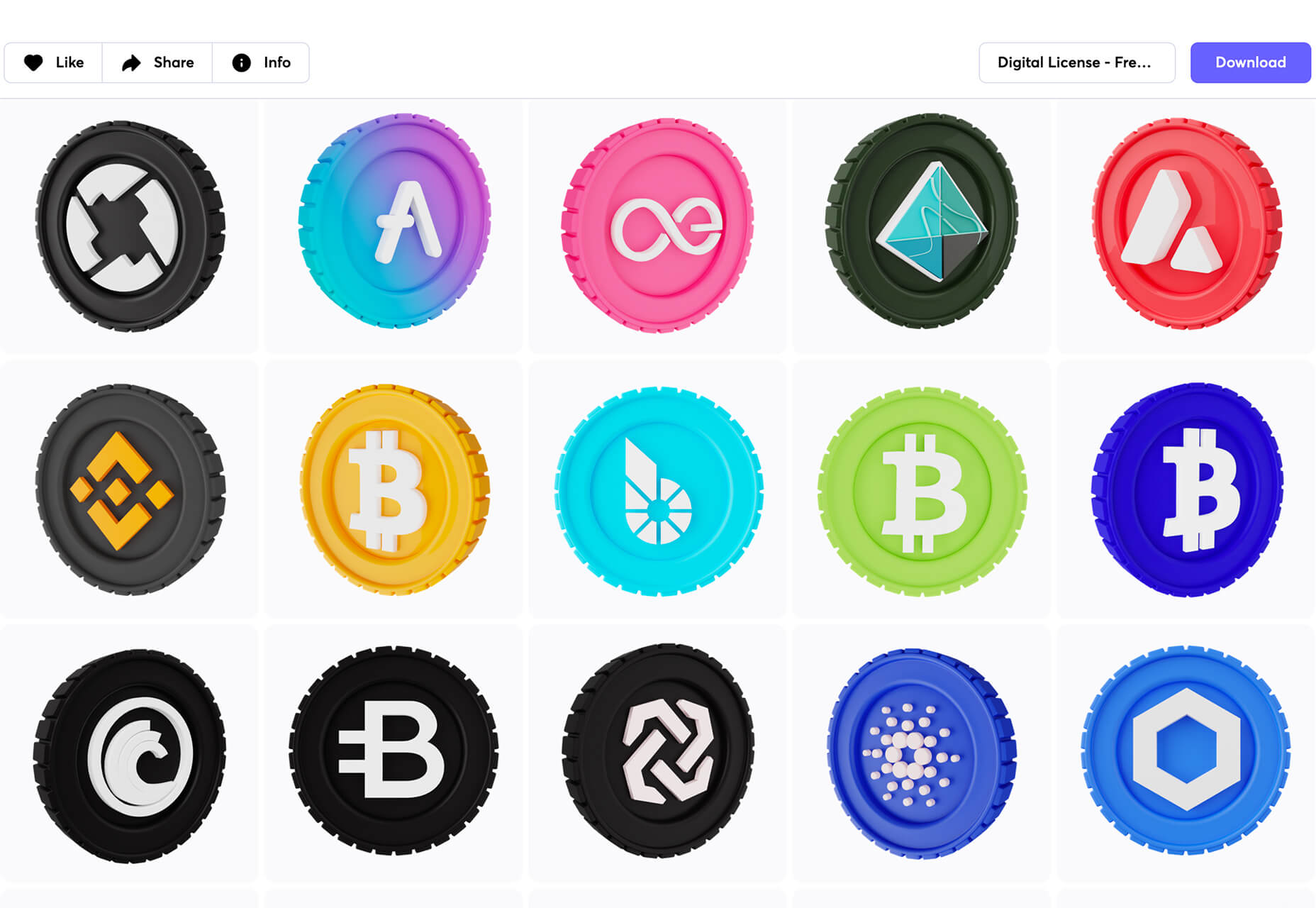
Cryptocurrency 3D Pack is a set of icons with fun colors in three-dimensional shapes that you can use to represent different crypto elements. The pack includes 55 #D icons in PNG and BLEND formats.

Stratum UI Kit for Figma

Stratum UI Kit for Figma includes nine free screens that are ready to use. Options include API documentation, Kanban, document, data dashboard, ecommerce product list, ecommerce product options, payments spreadsheet, cloud storage, and newsfeed.

Conic.css

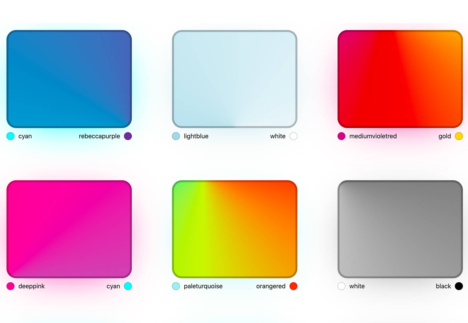
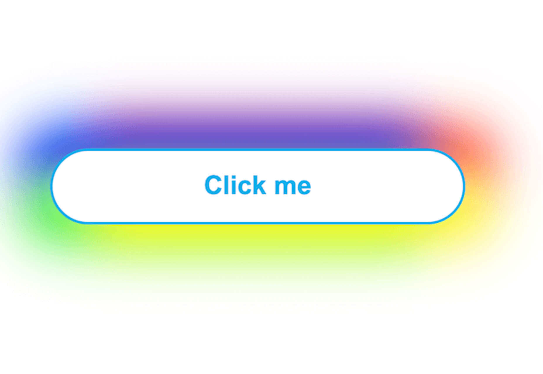
Conic.css is a collection of simple gradients that you can browse and then click to copy the code into your CSS to use them in projects. It’s quick and easy while using trendy color options.

Artify Illustrations

Artify Illustrations is a Figma plugin that allows you to access more than 5,000 SVG and PNG illustrations within the app. It’s got a built-in search feature, everything is high-resolution, and the huge library includes various styles.

2 Tutorials

A Complete Guide to Accessible Front-End Components

A Complete Guide to Accessible Front-End Components is an amazingly comprehensive guide from Smashing Magazine with everything you need to know about accessible components. From tabs to tables to toggles to tooltips, you’ll find it all here and learn how to use it the right way.

Grid CheatSheet in 2021

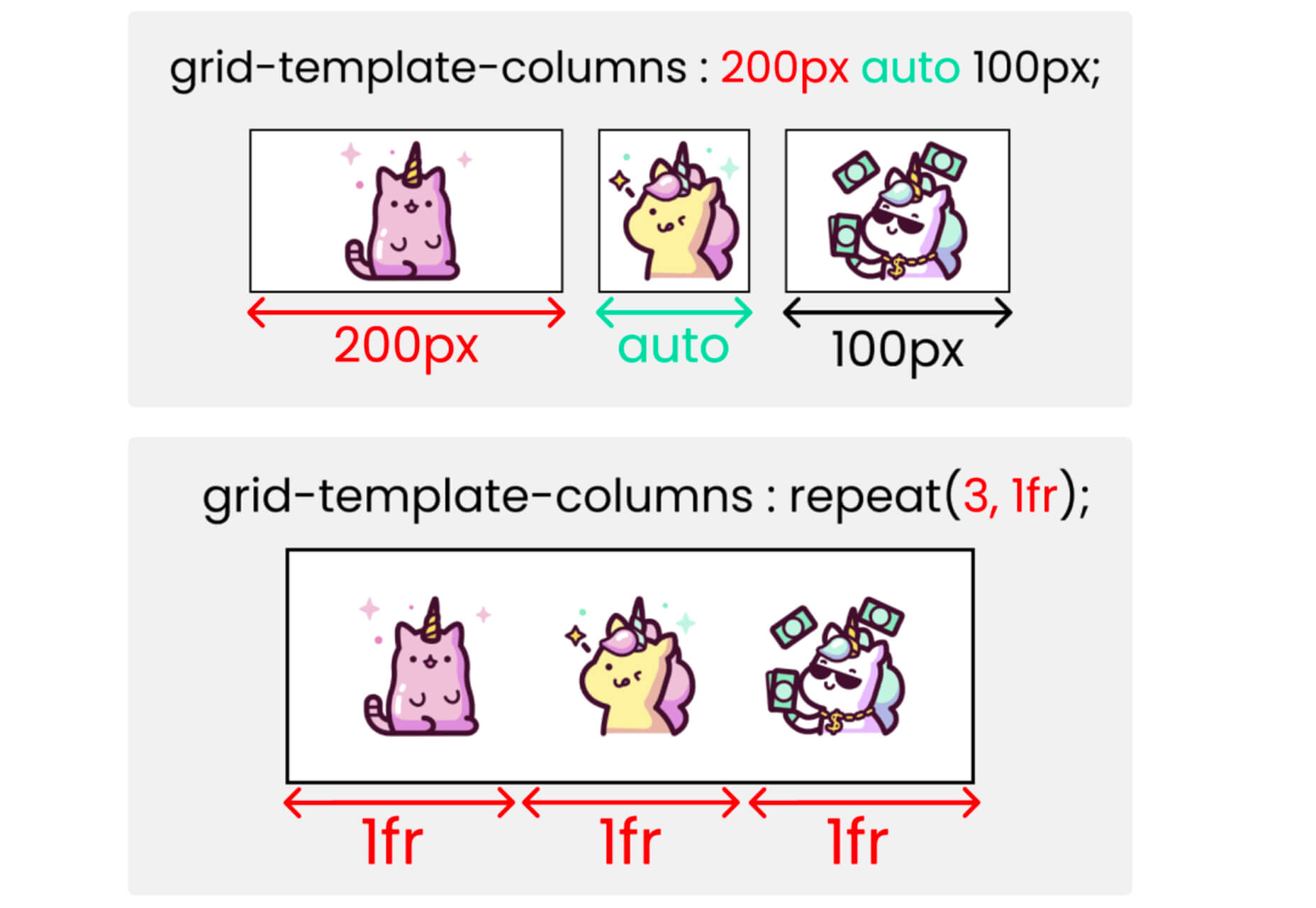
Grid CheatSheet in 2021 is a useful guide of everything you can do with CSS Grid. Plus, it has plenty of fun illustrations and an accompanying video.

8 Fresh and Fun Fonts

Athina

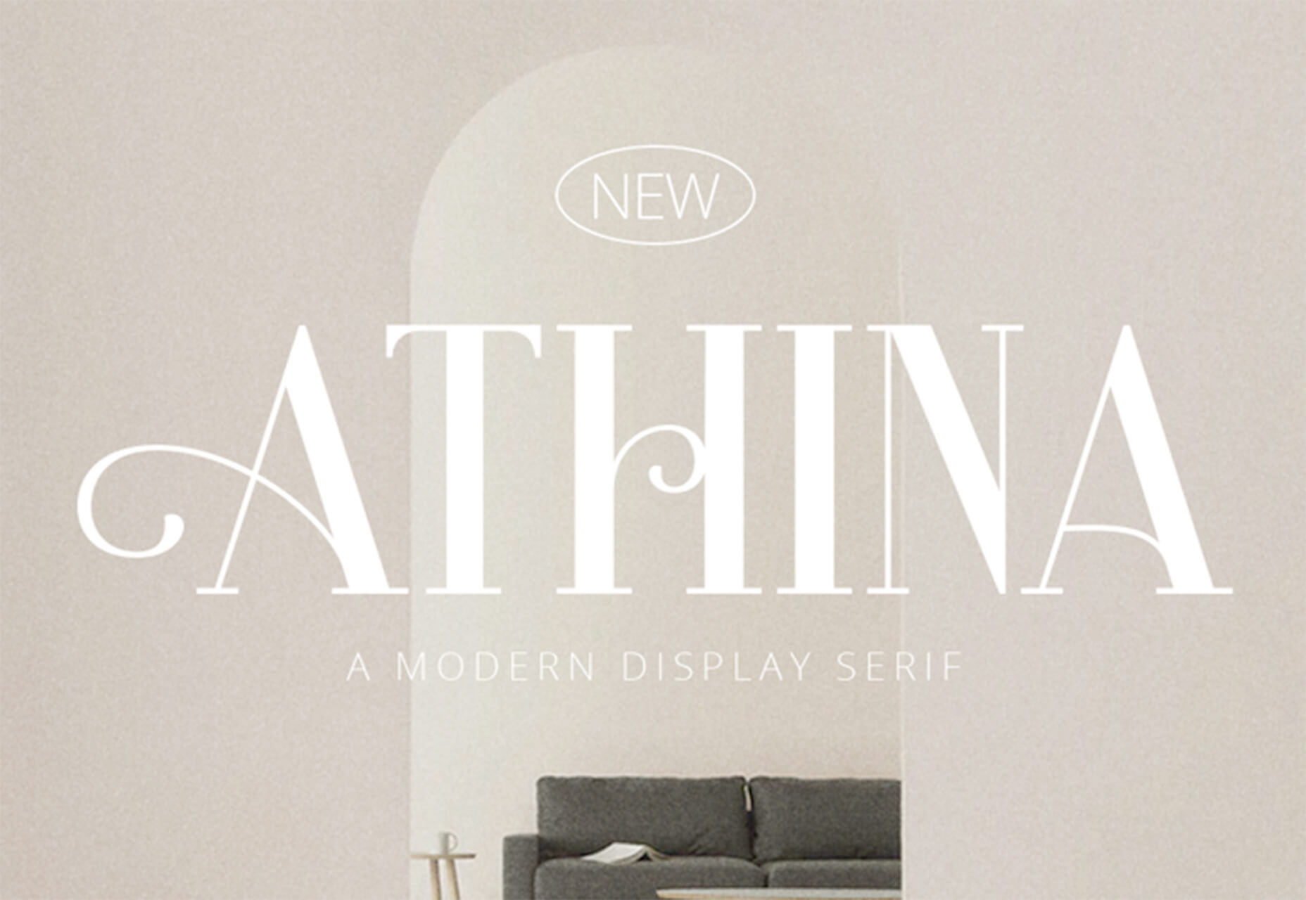
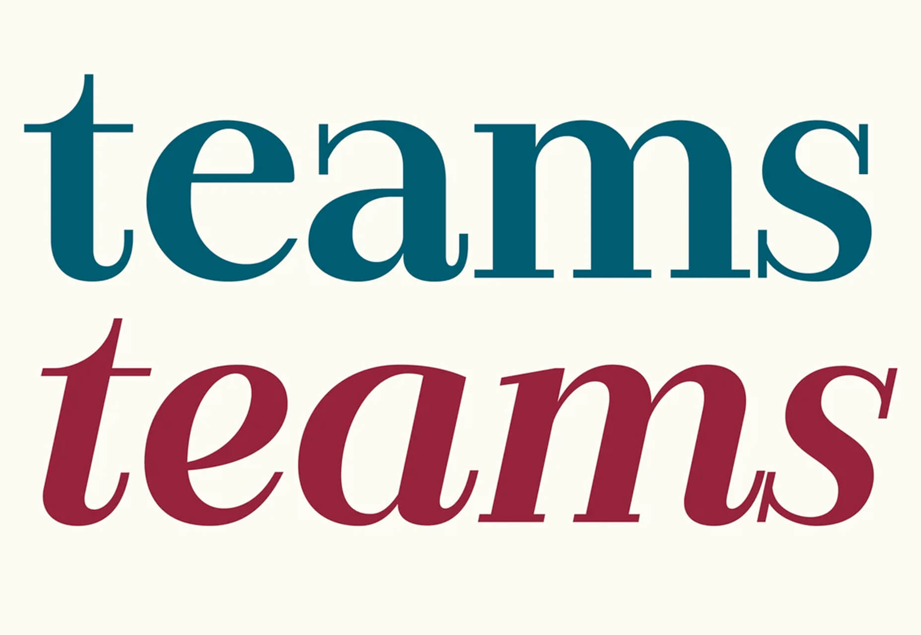
Athina is a modern display serif with beautiful connector strokes. The free version is a demo, and there’s a full family that you can buy.

Brique

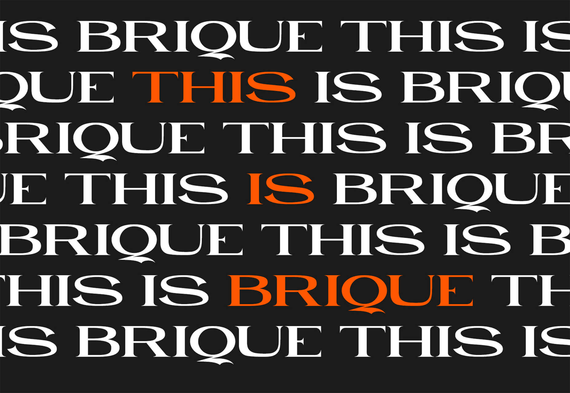
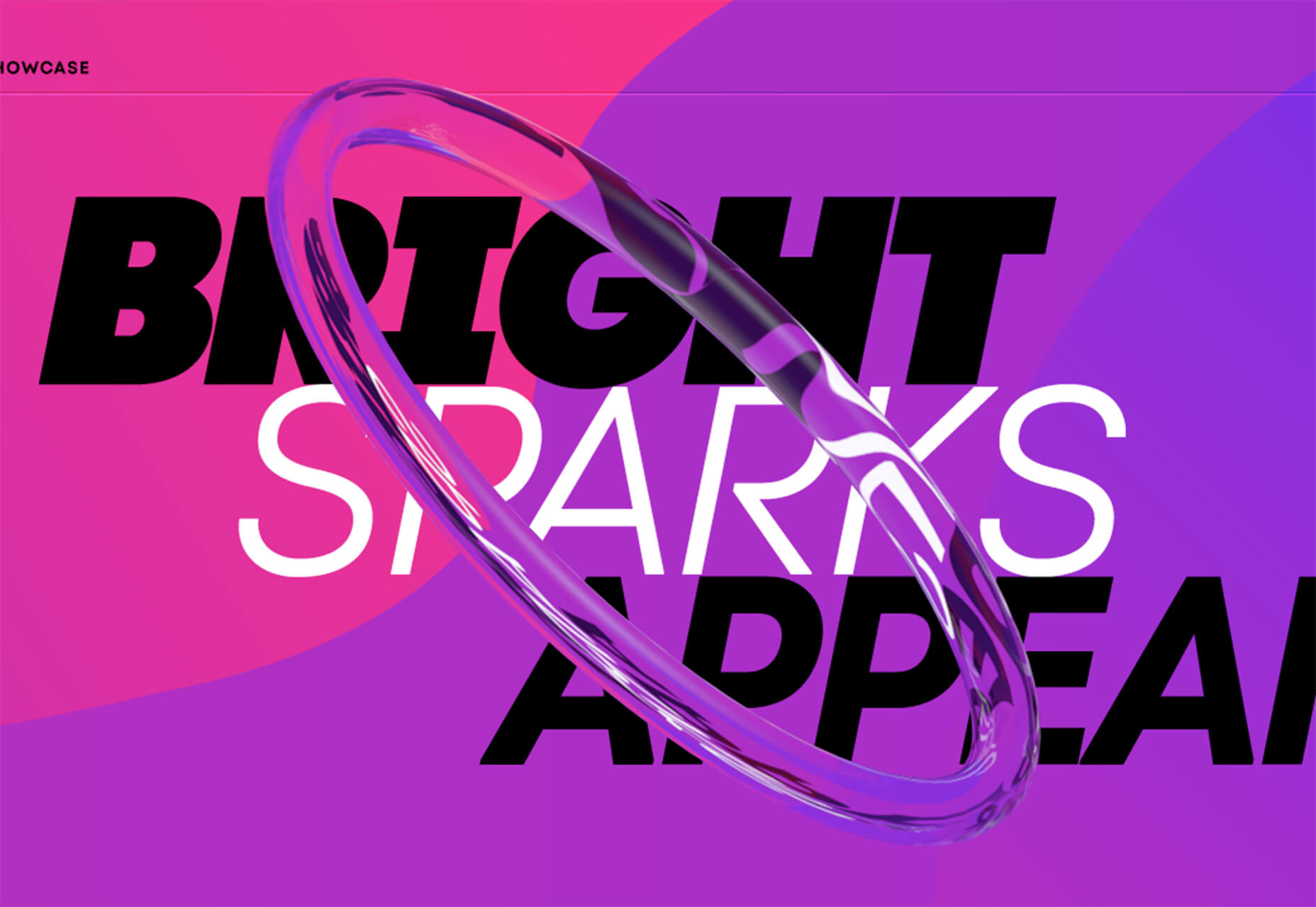
Brique is a free (personal and commercial) display font with a wide stance and uppercase character set. The letters have a lot of personality and a readable configuration.

Code Next

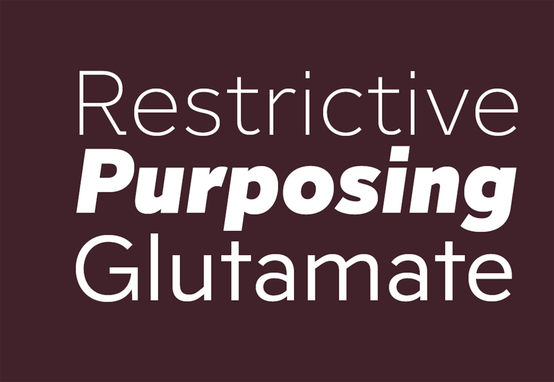
Code Next is a great geometric sans serif with a full family of styles. Including two variable fonts. It’s highly readable and would work for almost any application.

Inter

Inter is a simple and functional sense serif family with everything from extra light to heavy weights. The extra character personality makes this a fun and functional font option.

Nothing Clean

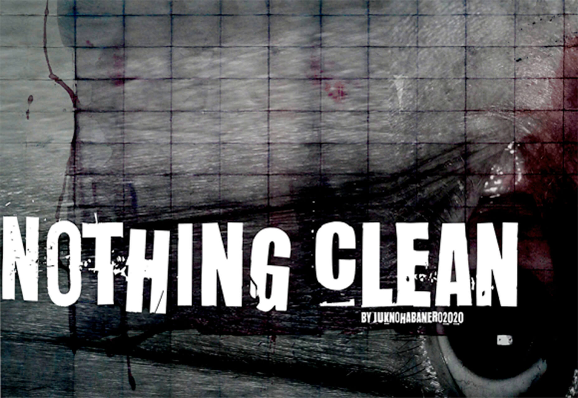
Nothing Clean is a fun grunge-type option. It’s an all uppercase character set with alternates.

Playout

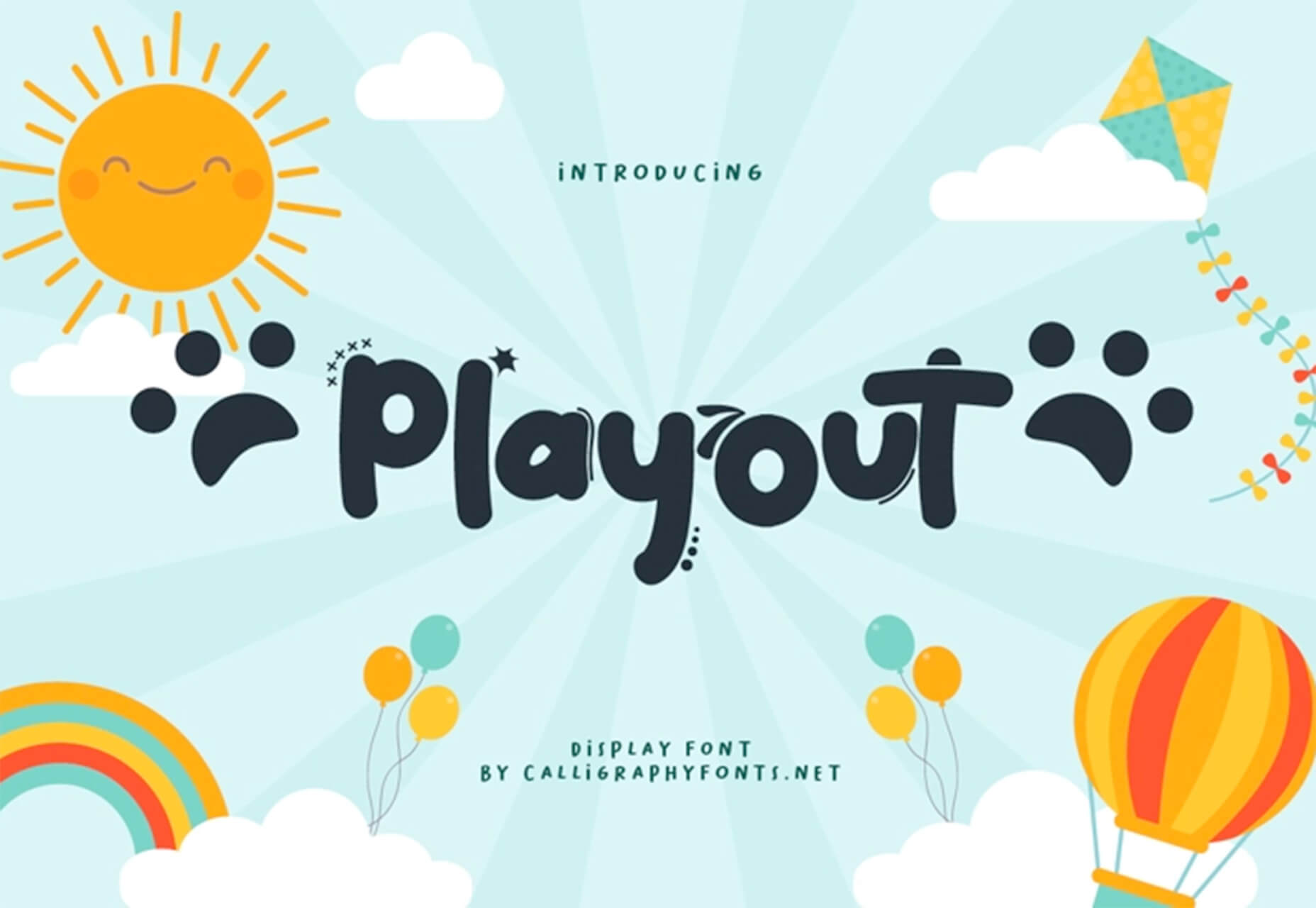
Playout is a fun, hand-drawn style typeface with interesting glyphs and alternate characters. The most fun feature might be the pawprint characters in the demo set.

Rockford Sans

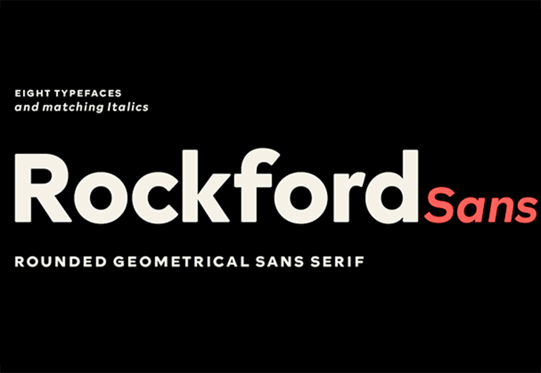
Rockford Sans is a geometric typeface with subtly rounded edges. It has eight weights and italics. With its large x-height and round features, it’s legible and friendly. It’s suited to cover a wide variety of tasks from editorial to brand design and advertising.

SpaceType

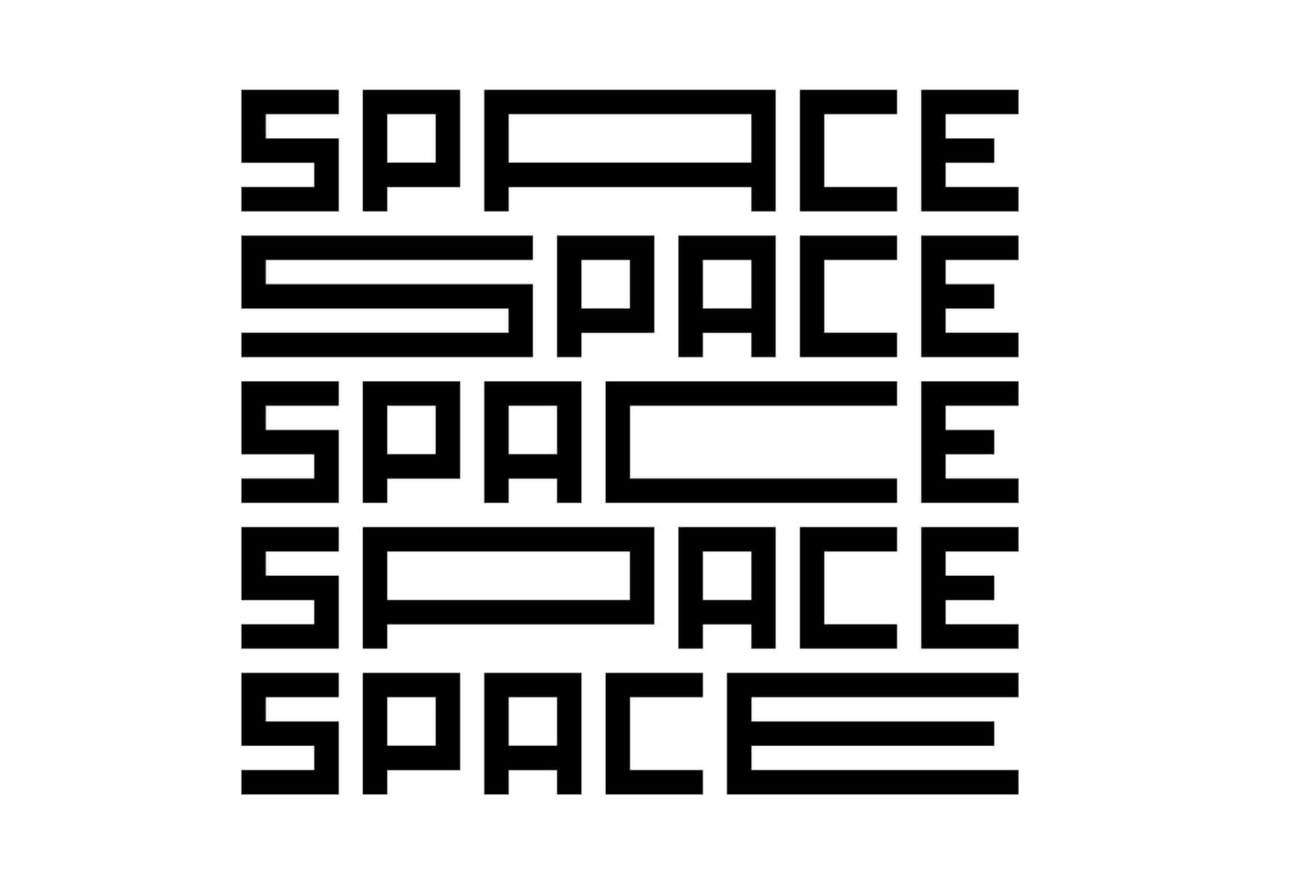
SpaceType is a fun and funky typeface in regular and expanded styles. The stretched letterforms make interesting alternates for display purposes.

Source

The post 25 Exciting New Tools For Designers, April 2021 first appeared on Webdesigner Depot.

Source de l’article sur Webdesignerdepot

Looking for something new to get you excited about design work? This list is packed with all kinds of goodies to help you feel inspired and ready to work.

Here’s what new for designers this month.

Top Picks for March

Same Energy

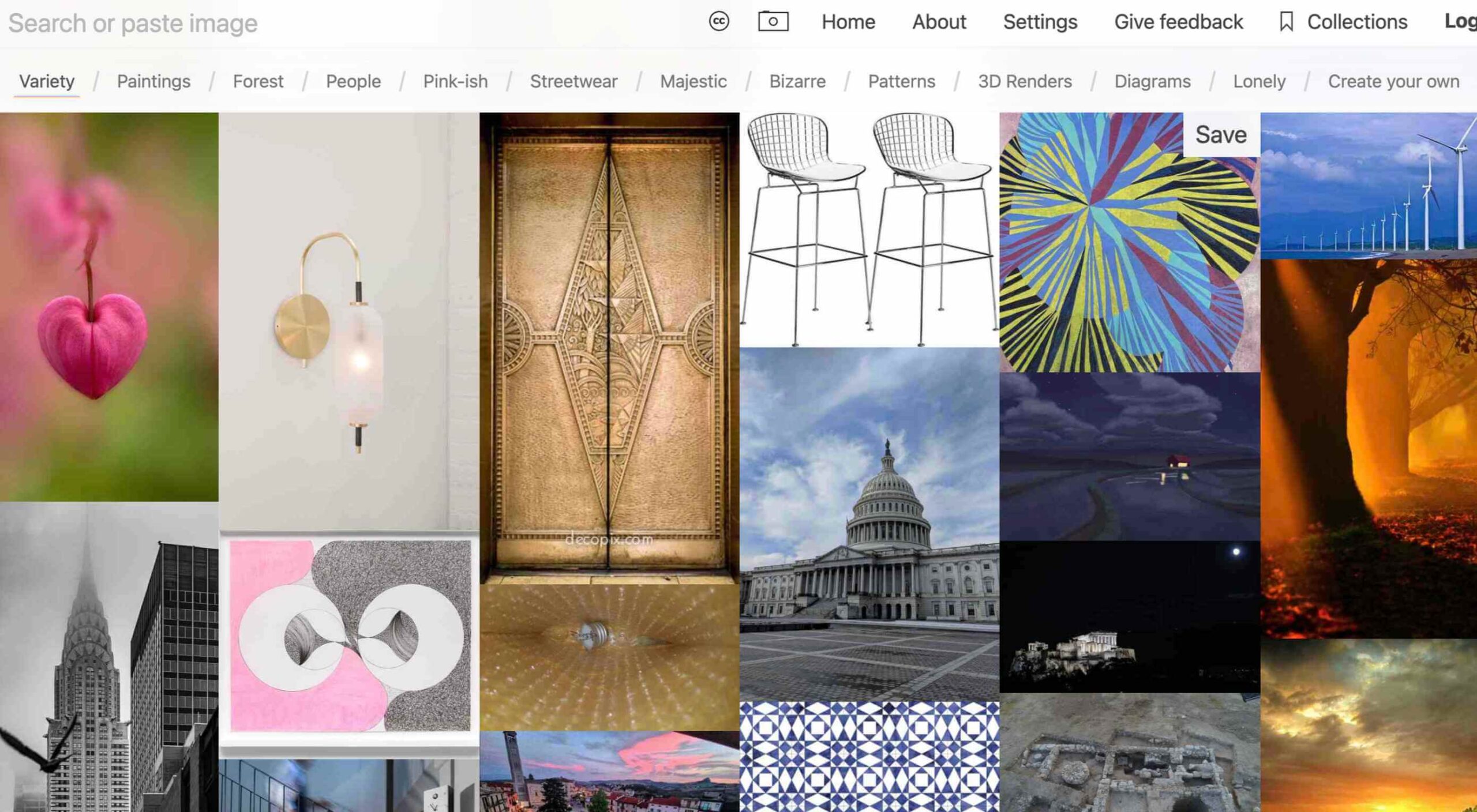
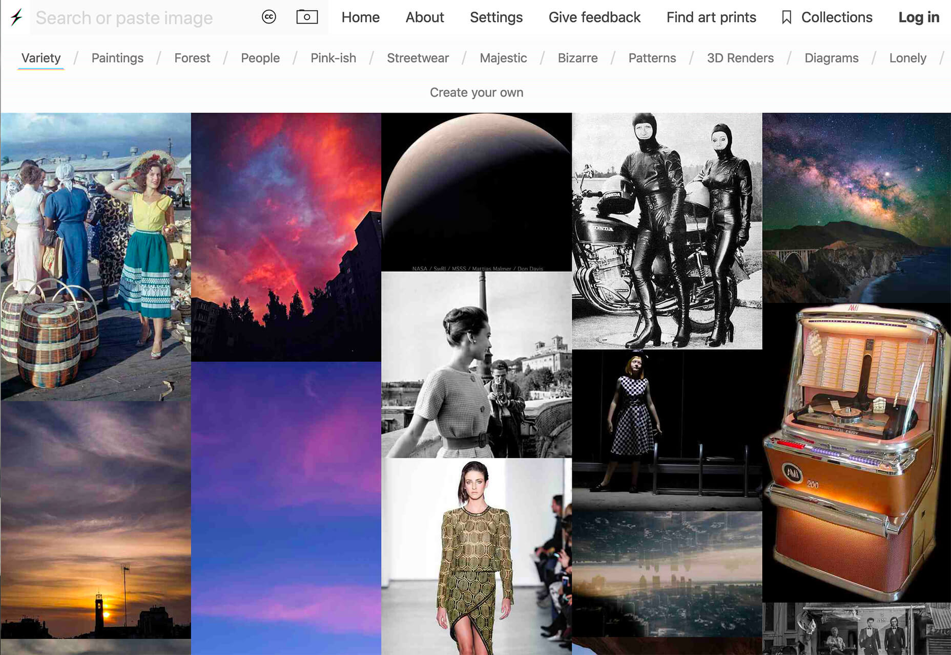
Same Energy, in beta, is a visual search engine. You can search with a minimum number of words or an image. The website is designed to help you find art, photography, decoration ideas, and practically anything. It uses deep learning and algorithms to create images on the home page, and you can create feeds in the same manner. The coolest part of this tool is that it tries to match the visual and artistic style you ask for with image mood and objects.

SVG Repo

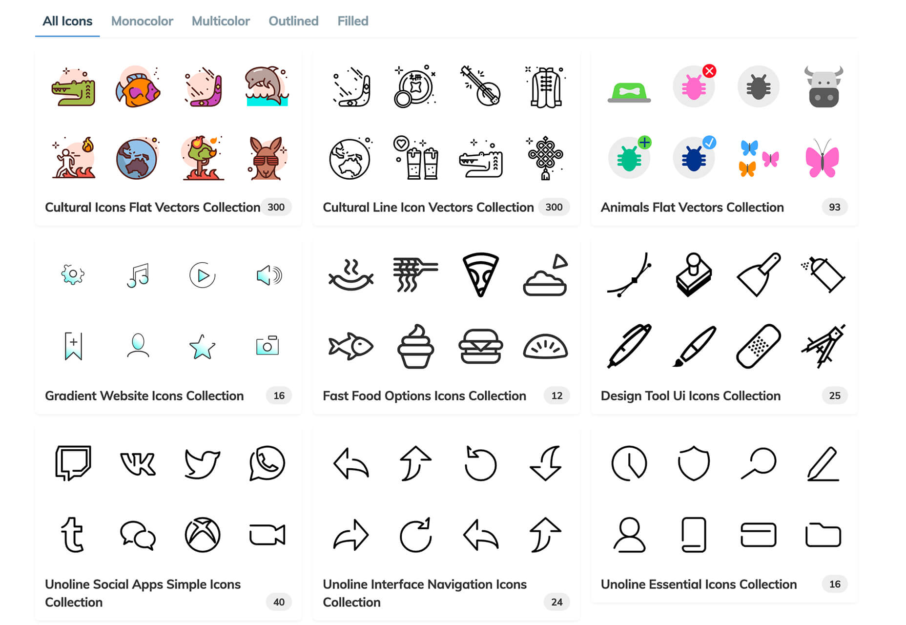
SVG Repo is a collection of more than 300,000 SVG vectors and icons that you can download and use in projects for free (even commercial use). The site has a powerful search tool to help you find the right image, and the platform is designed so that you can contribute.

Penpot

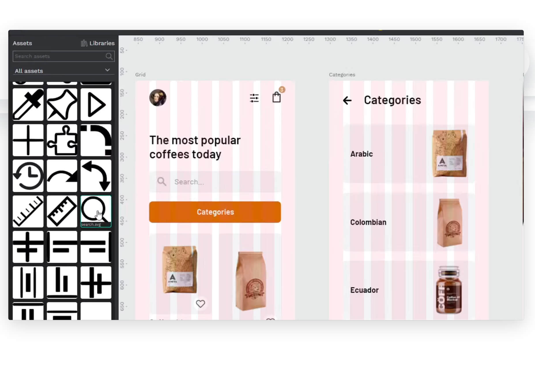
Penpot is an open-source design and prototyping platform for cross-domain teams. It is a web-based tool that isn’t dependent on any operating system and works with open web standards. It’s designed to be zippy and interactive so your team can work fast.

Directual

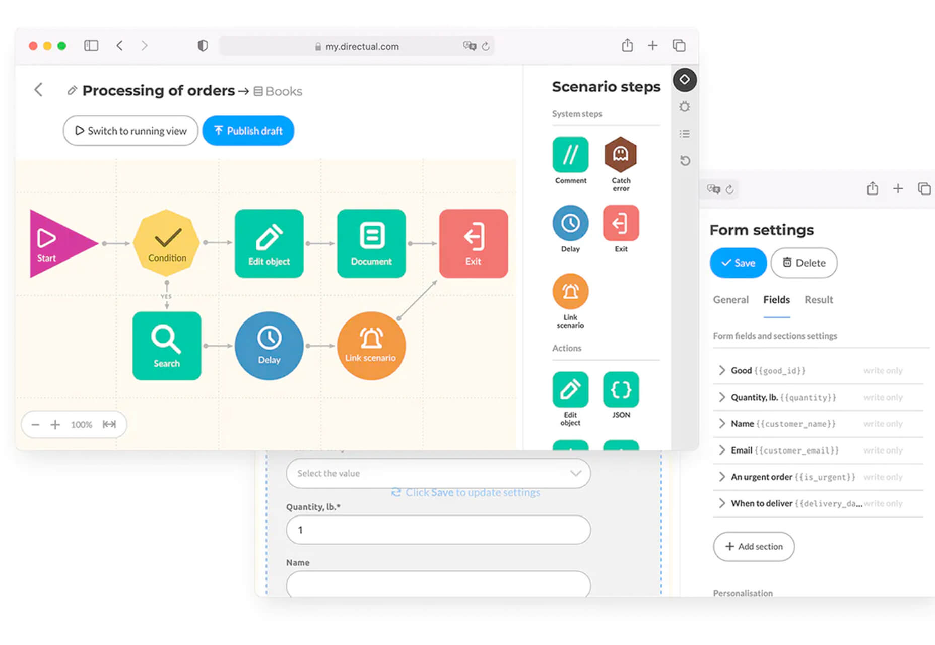
Directual is a no-code platform for building scalable apps using a visual interface. (Perfect for designers with less development experience.) It includes integrations with other popular tools and is free to use while figuring out how the app works and how you can make it fit your business goals.

HTML Boilerplates

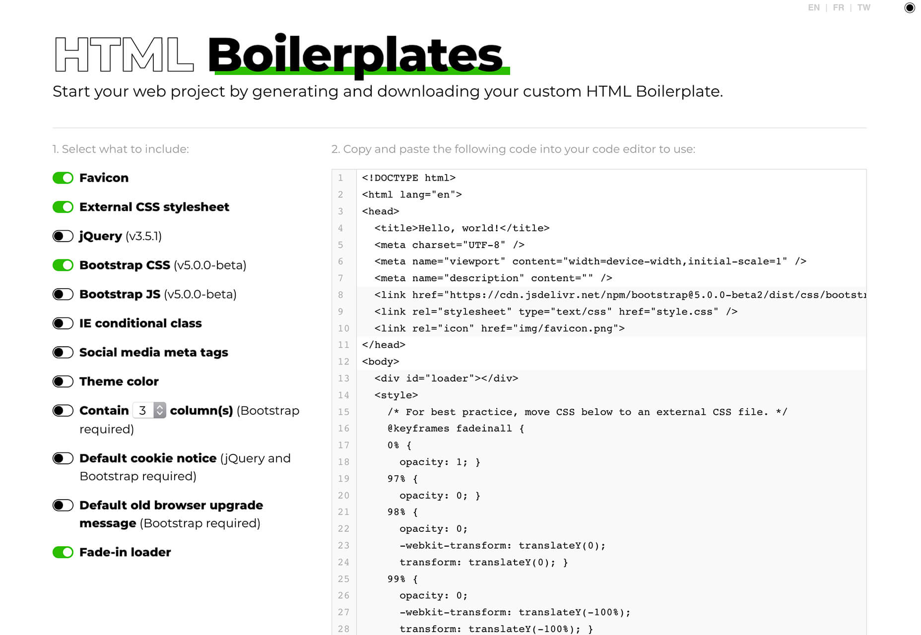
HTML Boilerplates helps you start web projects by generating a custom HTML boilerplate that you can download. Just choose the elements you want to include and then copy and paste the code into your editor.

6 Productivity Boosters

Rows

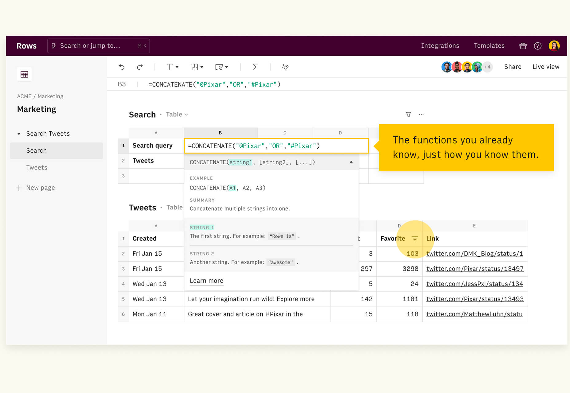
Rows is a spreadsheet tool with built-in web integrations that’s made for team collaboration. It works with other tools you already use, such as Google Analytics, Twitter, LinkedIn, Mailchimp, and so many others. Without scripts, you can use it to automate workflows, analyze data, share dashboards, and build forms and tools that make work simpler.

Form.Taxi

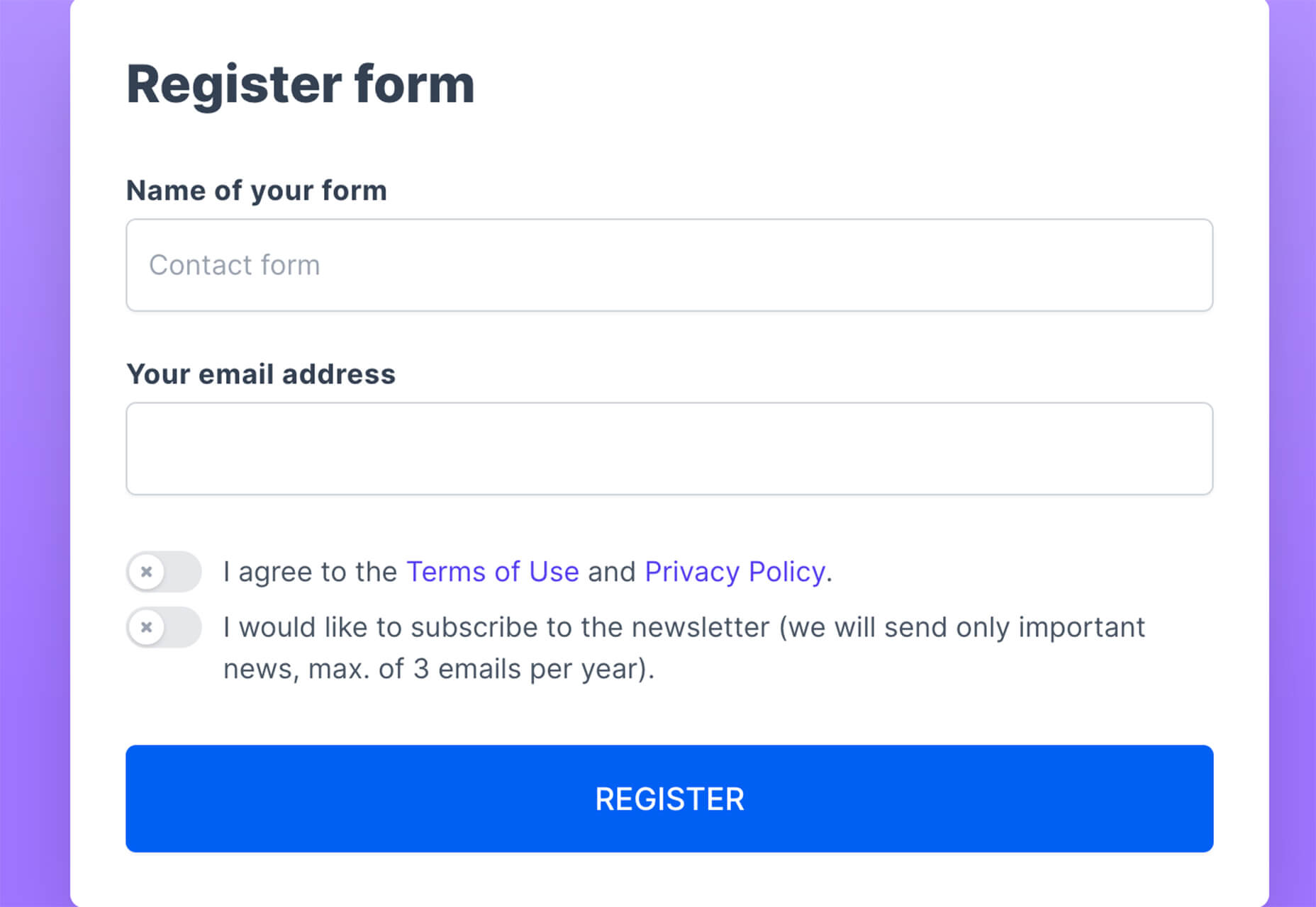
Form.taxi is a premium web-based form tool. You can create web forms without code or programming and connect them to your website. The tool then stores information, filters for spam, and notifies you of form submissions.

Verbz

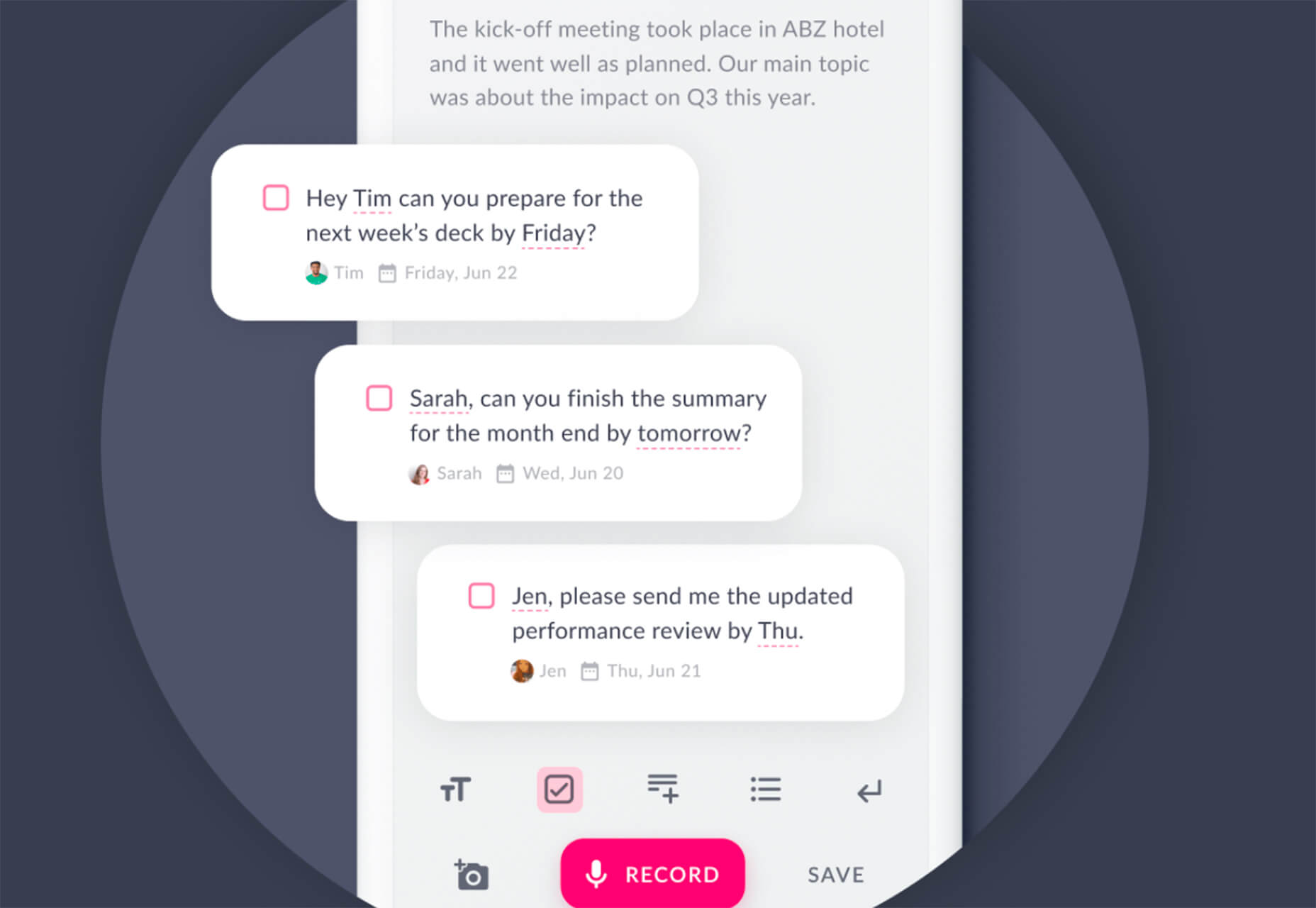
Verbz is a voice productivity app that allows you to create notes, assign tasks, make announcements, run standups, or chat. Talk or type, listen or read. It works as your own voice assistant for teams. It’s available in Beta from the App Store, and there’s a waitlist for Android users.

Flameshot

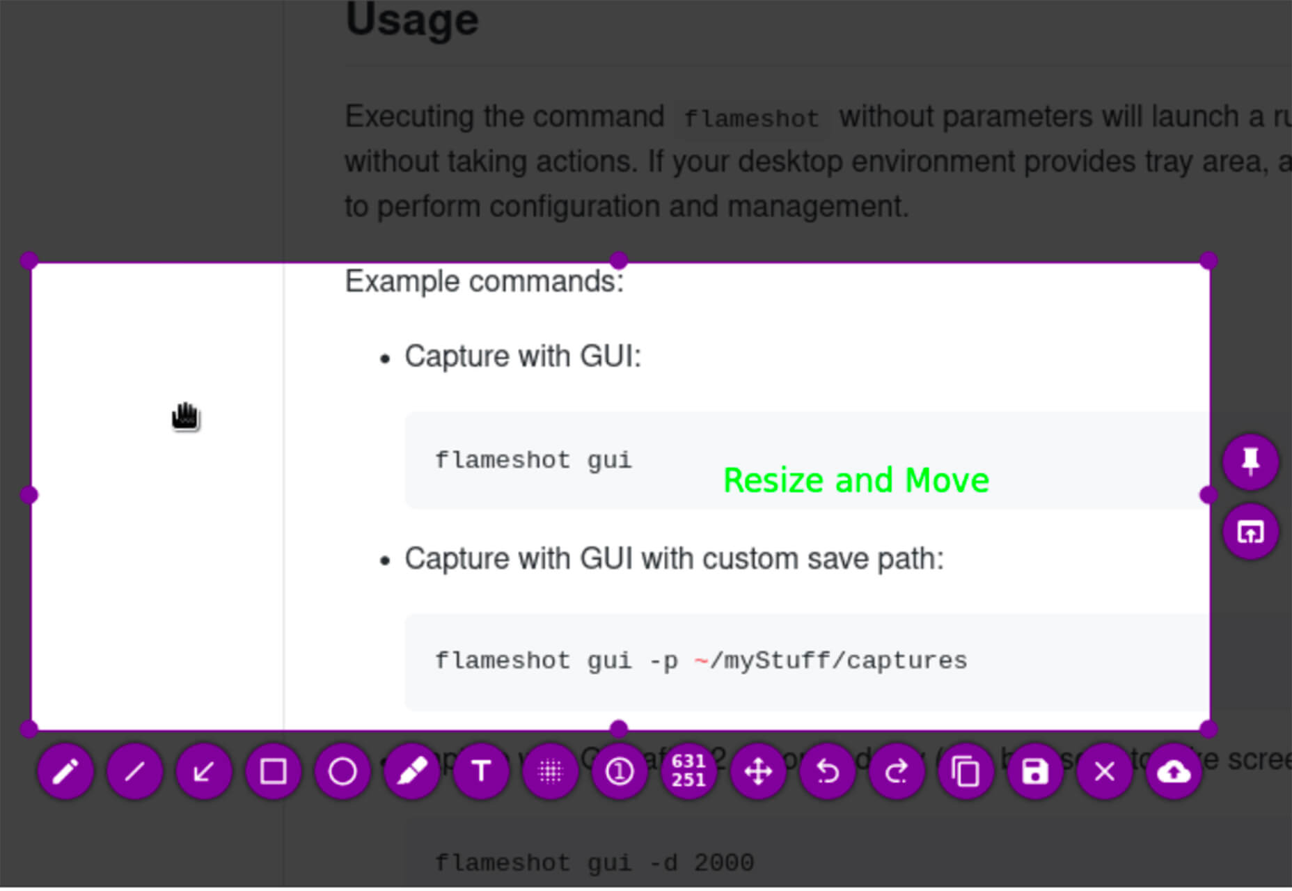
Flameshot is a tool for grabbing screenshots. It has a customizable appearance, is easy to use, and lets you draw and edit screenshots as you work.

Kitemaker

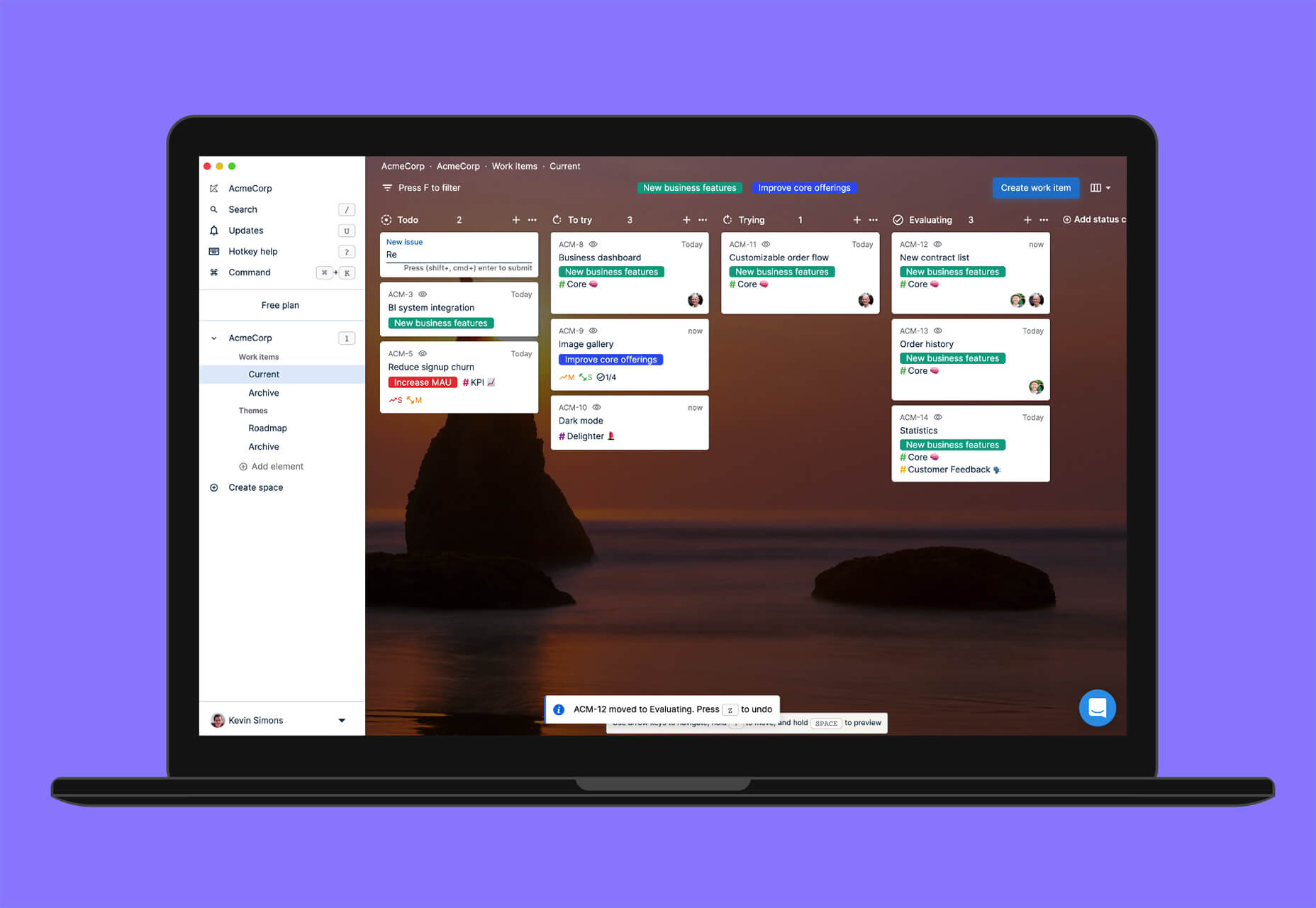
Kitemaker is a collaboration tool for development processes. It can help you keep track of everything from tools such as Slack, Discord, Figma, and Github in one place. It helps you structure projects and keep discussions about work moving forward in one place.

This Code Works

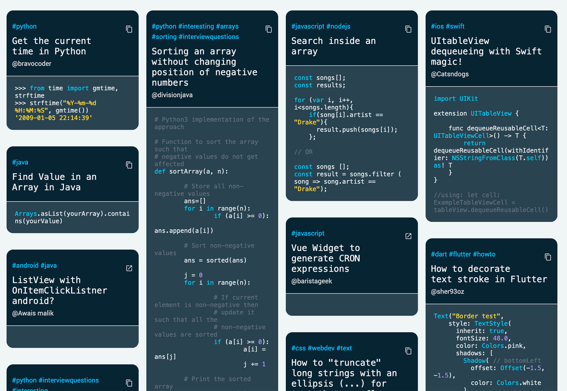
This Code Works is a place to save code snippets that work for when you need them again. You can group and organize snippets and share with others. You might think of it as the “Pinterest of code.”

3 Icons and User Interface Elements

Sensa Emoji

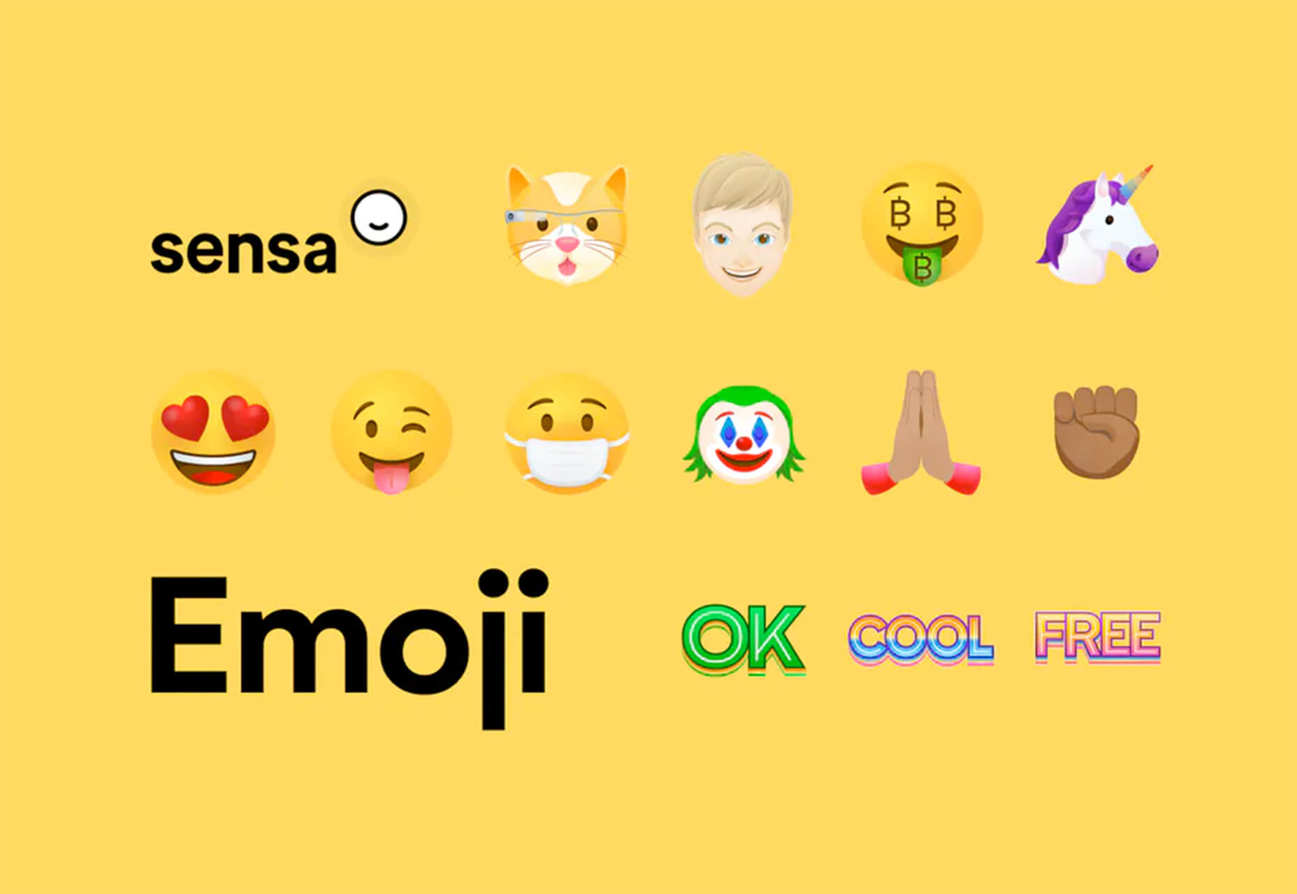
Sensa Emoji is a collection of common emoji icons that you can use in your materials. Every element is fully vector and free to use.

Google Fonts Icons

Google Fonts now supports icons, starting with Material Icons. Choose between outlined, filled, rounded, sharp, or two-tone options in the open-source library.

Toolbox Neumorphism Generator

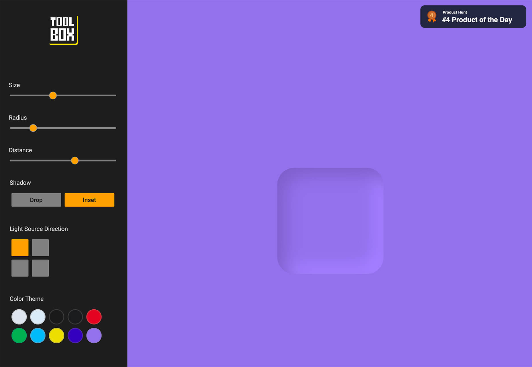
Toolbox Neumorphism Generator is a design tool that helps developers to generate CSS in the soft UI /neomorphism style for the elements with real-time output.

3 Tutorials and Demos

An Interactive Guide to CSS Transitions

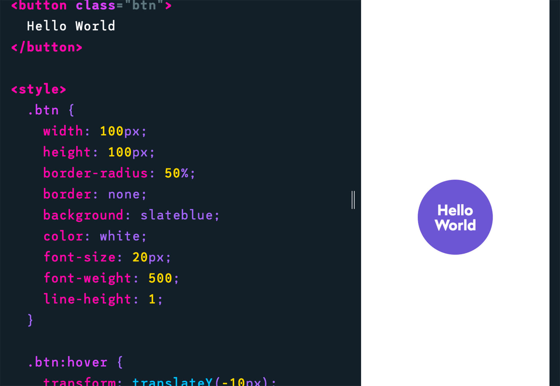
An Interactive Guide to CSS Transitions explains everything you need to know about this great animation tool for website designers. This tutorial digs in with code and examples to help you create more polished animations and is designed for anyone from beginners to experienced designers with some pro tips throughout.

About Us Pop-Out Effect

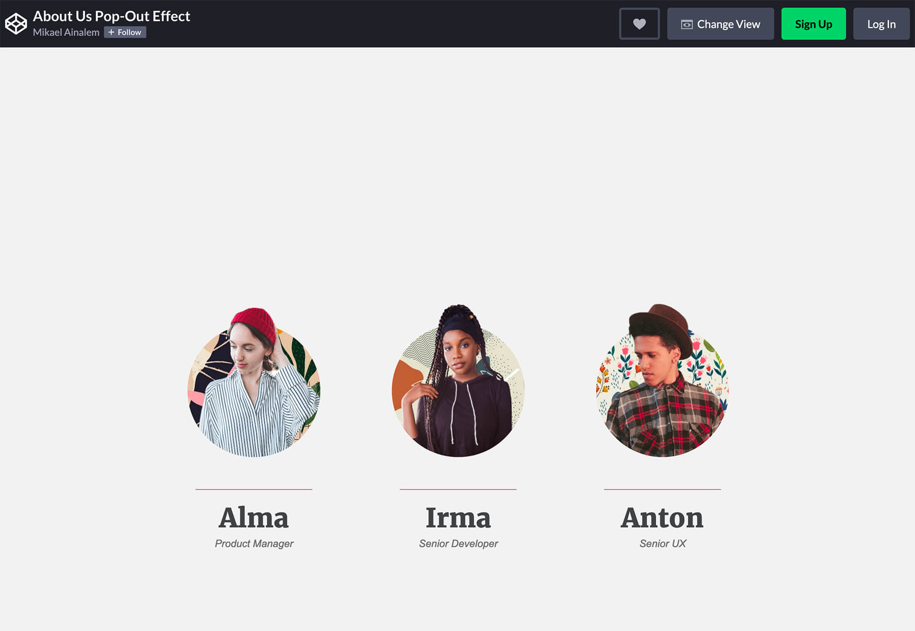
The About Us Pop-Out Effect adds a special element to any team or contact page with a nifty pop animation. Each person seems to lift out of the circle frame in this pen by Mikael Ainalem.

Interactive Particles Text Create with Three.js

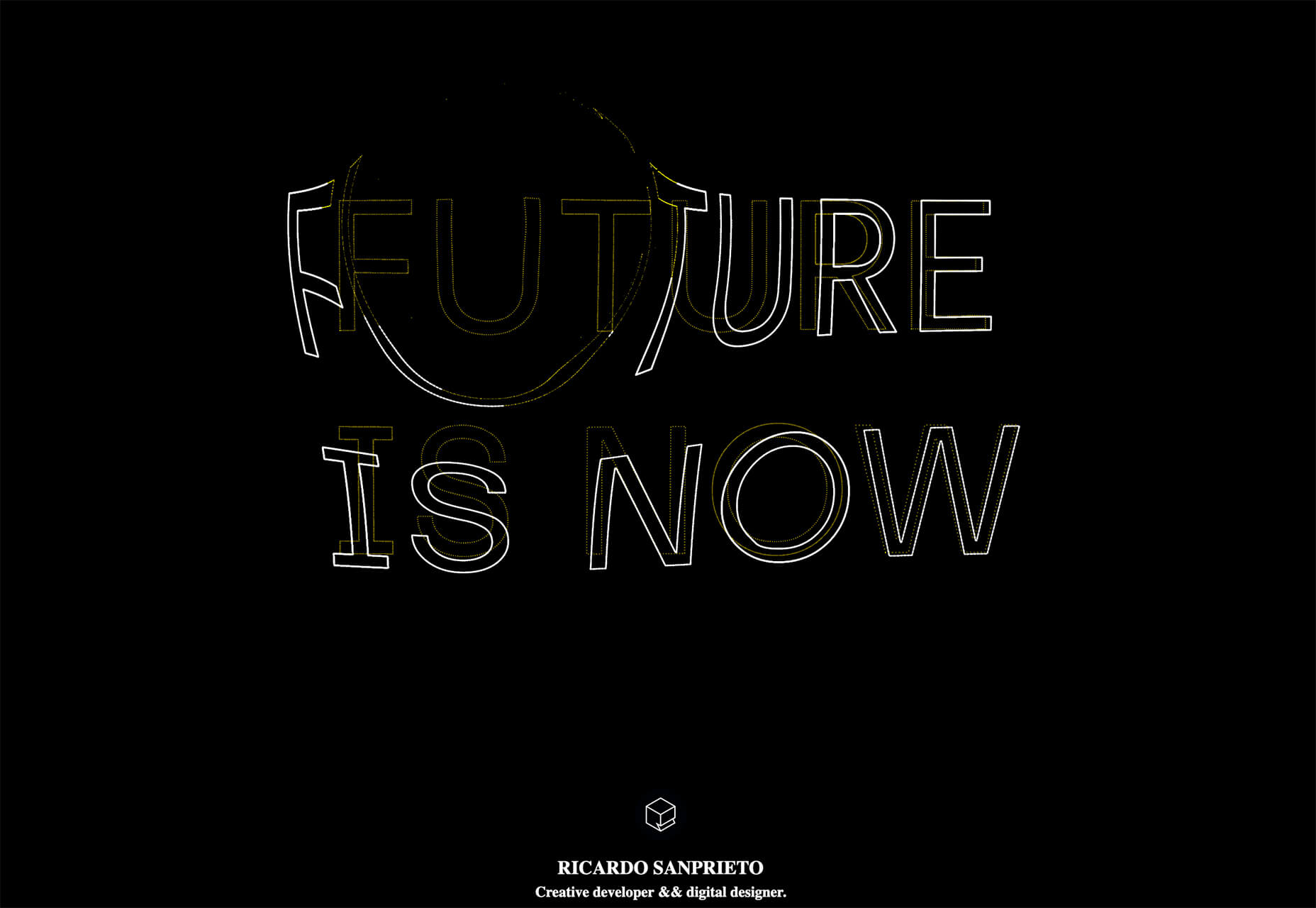
Interactive Particles Text Create with Three.js is a web element you could play with all day. Text shifts into particles and follows mouse movement in a fluid motion in the pen by Ricardo Sanprieto.

10 Fresh Fonts and Text Tools

Bitmap Fonts

Bitmap Fonts is a collection of various bitmap typefaces all pulled and stored in a single location. This is the perfect solution if you are looking for a bitmap option.

Uniwidth Typefaces

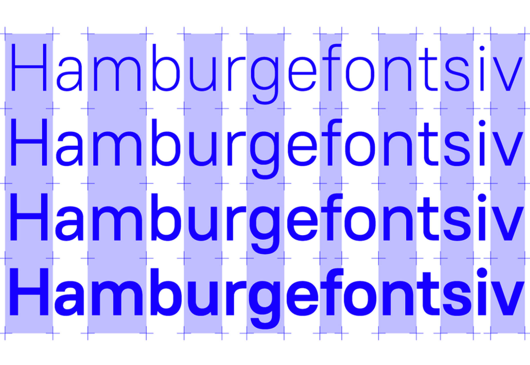
Uniwidth Typefaces for Interface Design is another collection of fonts for a specific purpose – here universal widths for interface design. Uniwidth fonts are proportionally-spaced typefaces where every character occupies the same space across different cuts or weights. This is both a tutorial on the type style as well as font collection.

Bubble Lemon

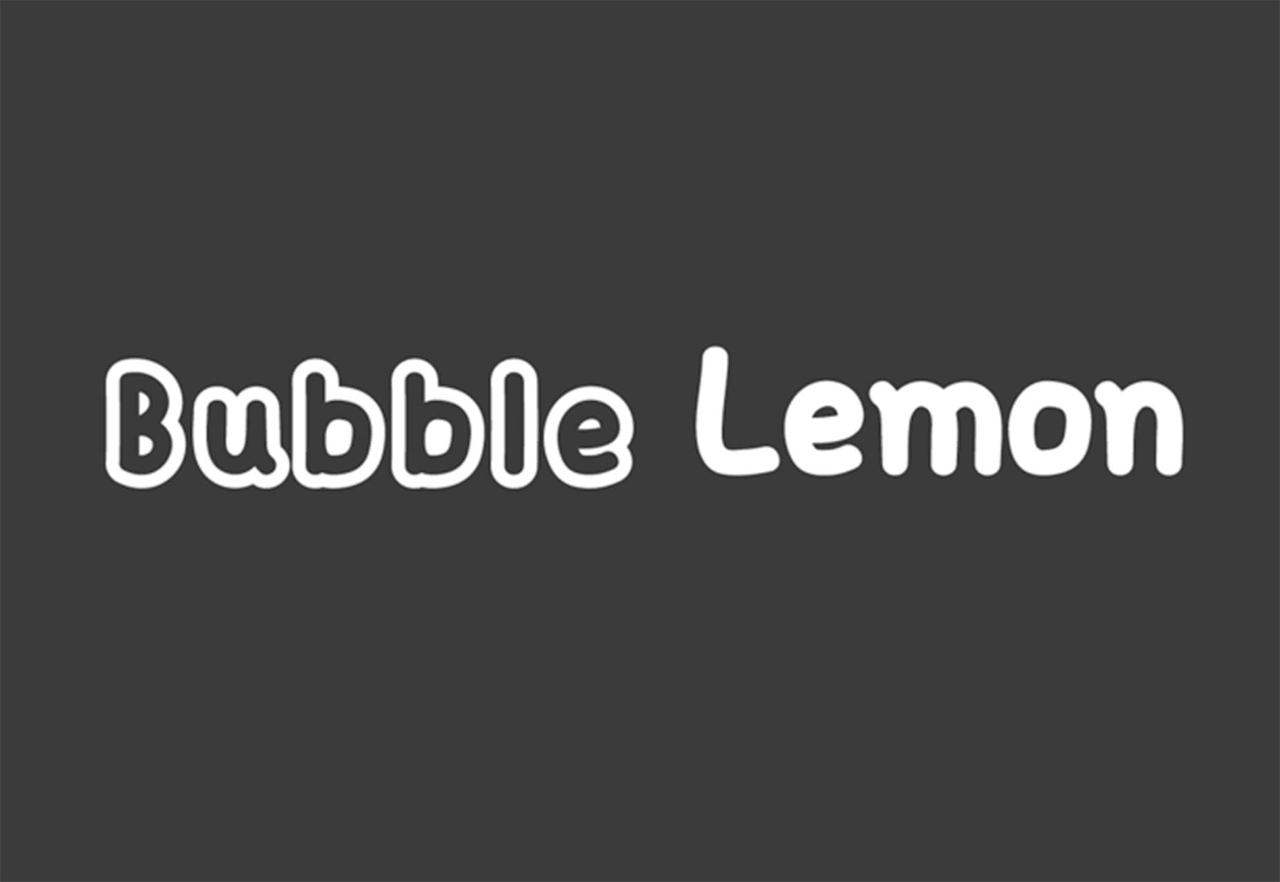
Bubble Lemon is a typeface for projects with a childlike feel. With an outline and regular style, the thick bubble letters look like some of the sketches you may have done in grade school.

Core Font

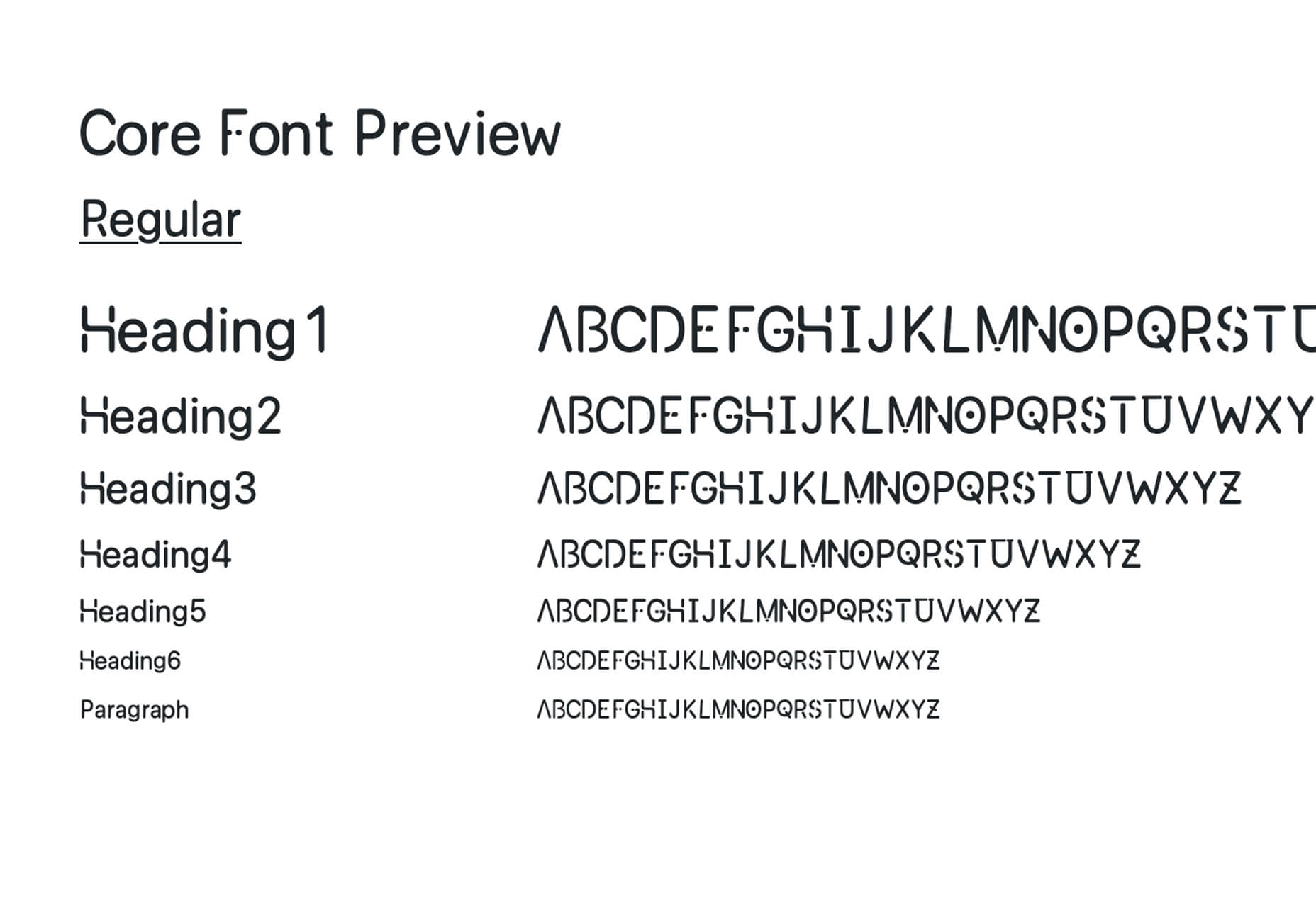
Core Font is an open-source project with a funky and modern style. It has a full upper- and lower-case character set, numerals, and a few punctuation marks.

GHEA Aram

GHEA Aram is a superfamily with a Central European flair, according to the type designer. The premium typeface includes everything from light to black italic and even some Armenian ligatures.

Make Wonderful Moments Duo

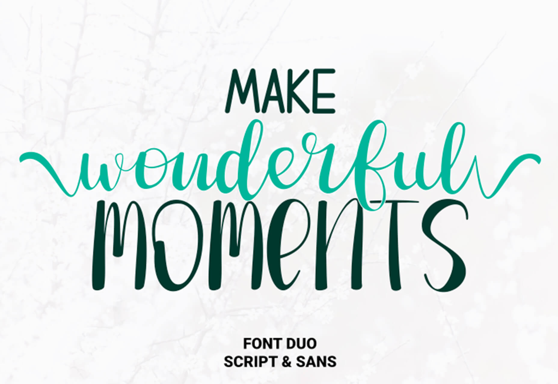
Make Wonderful Moments Duo is a script and sans serif font pair with a lighthearted feel and highly readable character set. The regular (sans serif) only has uppercase characters.

Ribheud

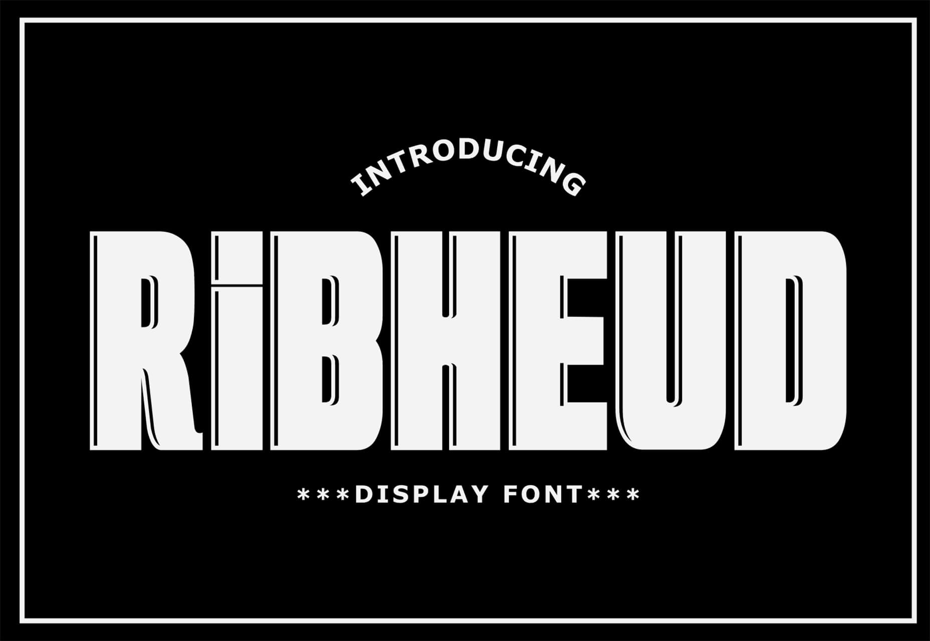
Ribheud is a slab-style display font with a heavy look and strong presence. What makes it interesting is the left-outline/shadow on each character.

Rose Knight

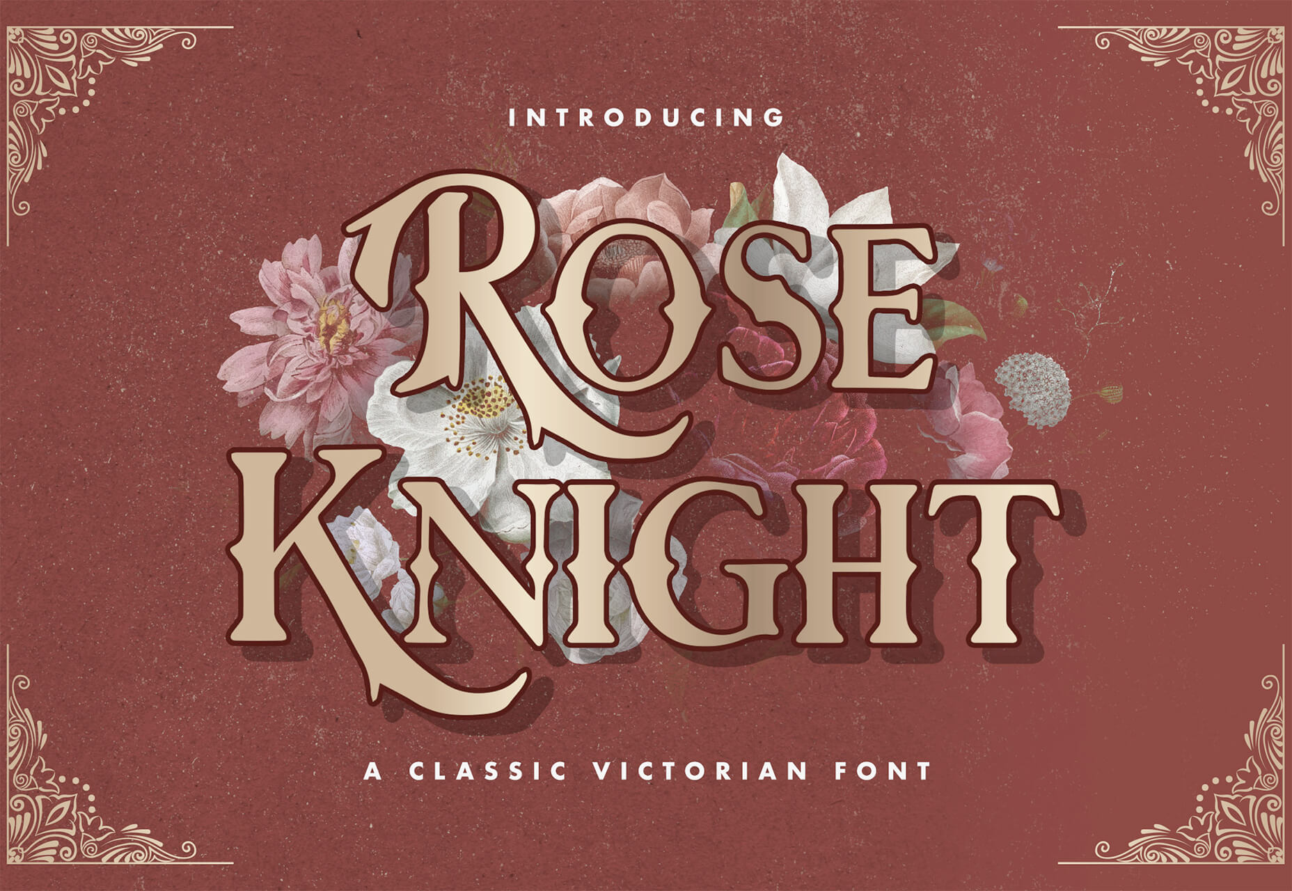
Rose Knight has an old-style feel that can take on multiple moods, depending on supporting design elements. All of the characters are uppercase with alternates. It could make a fun branding option.

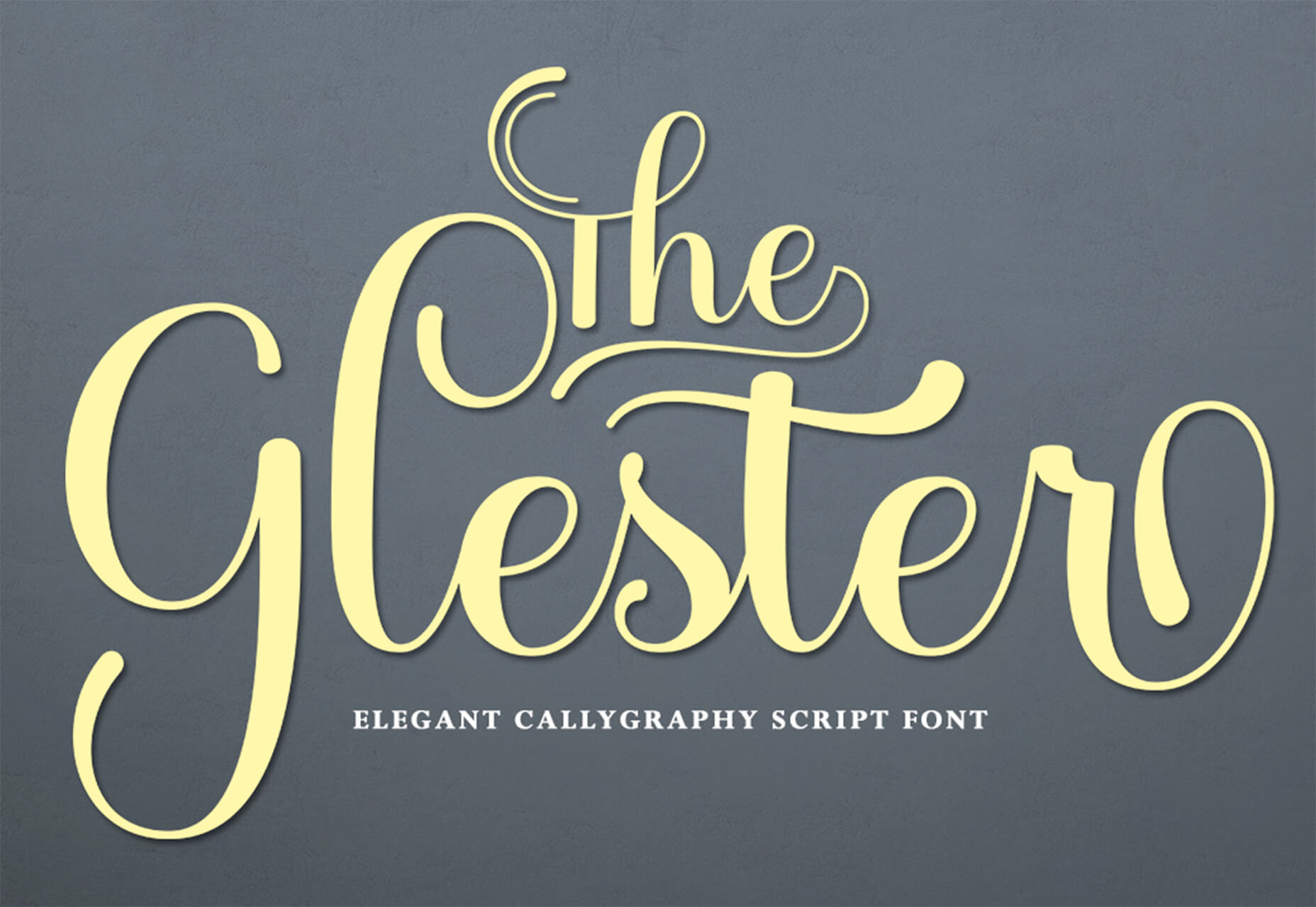
The Glester

The Glester is a beautiful premium typeface in a calligraphic style. The most interesting element of this typeface is all of the extra decorations that allow you to change individual characters (380 glyph alternates).

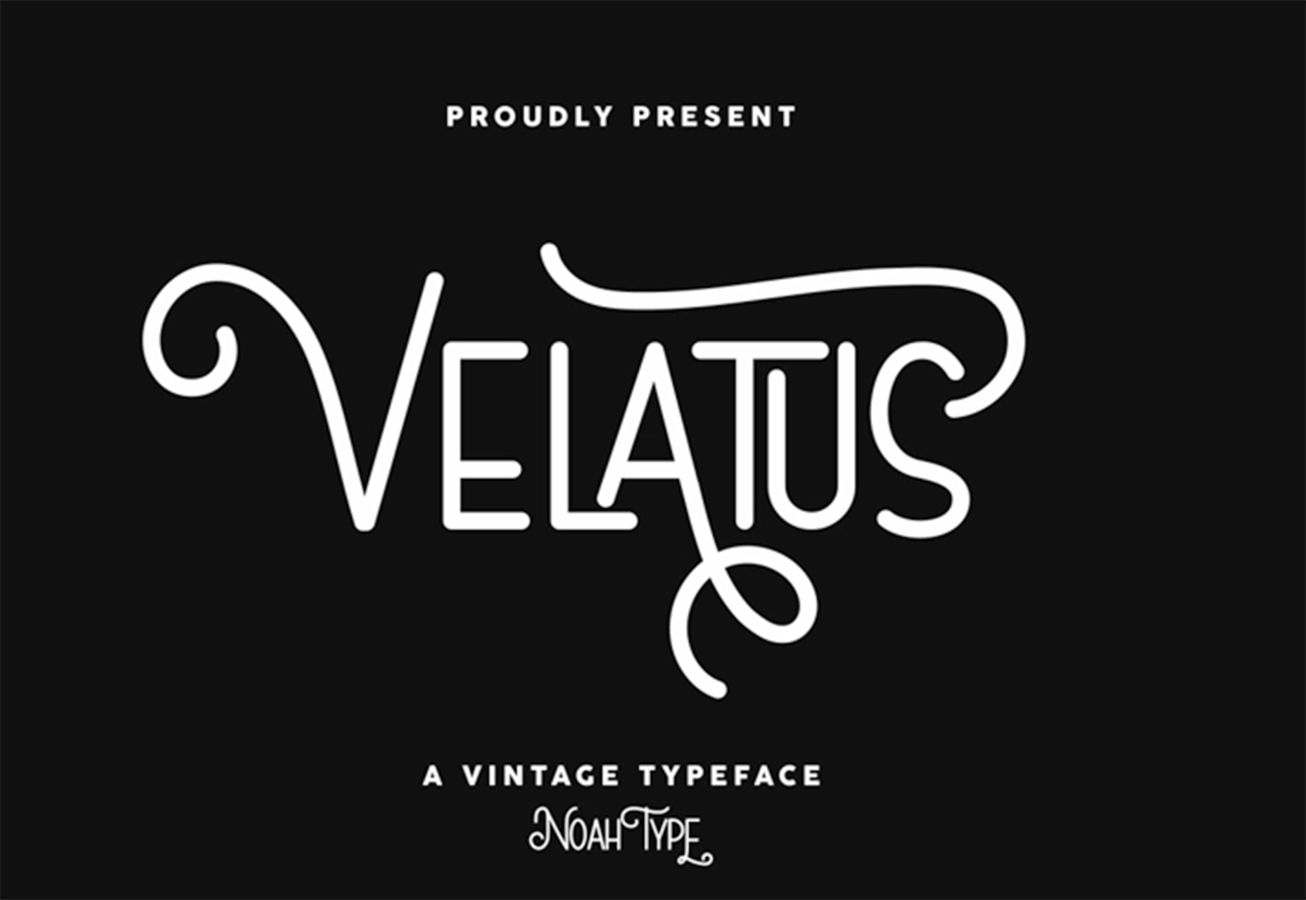
Velatus

Velatus is a vintage-style typeface with plenty of swashes and flourishes that make it unique. It comes with 157 characters and 96 glyphs.

Source

The post 27 Exciting New Tools For Designers, March 2021 first appeared on Webdesigner Depot.


Source de l’article sur Webdesignerdepot

March is that time of year where the feeling of newness starts, from the first Spring days to fresh design projects. These trends are no exception, with fun new takes on some classic concepts.

Circles are always popular, but the top trend is an animated take on the traditional element; plus, fun pink and purple color palettes and a few faux split screen designs round out trending styles.

Here’s what’s trending in design this month.

Circle Animations

Circles are one of those shapes that never leave the design sphere. They have a lot of classical meaning and are flexible in terms of design options.

Designers are having a lot of fun with this shape right now. From animations to text circles to image frames, they seem to be all over the place.

More recently trending is more circle-shaped animations. This trend maintains a circle’s properties as a unified and harmonious element with movement to create more engagement and make you look at the design just a little bit more.

Each of these examples uses circles in a different but equally interesting – and animated – way.

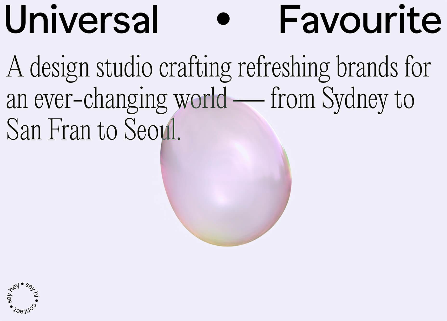
Universal Favourite uses a circular blob. It’s almost like a giant bubble. It wiggles and flows, and stretches within the space without any help from the user. It has a smoothly quality that makes you want to stare at it. The color here helps, with the circle and background not having an immense amount of contrast. Also, note the cute little circle button in the bottom corner.

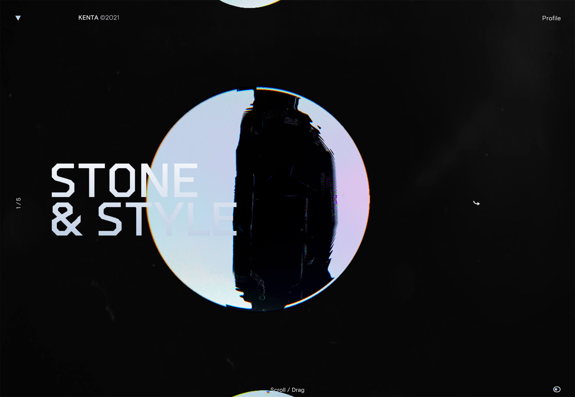
Kenta Toshikura put most of the subtle animation for this design inside the circle. With a hover state, the entire circle moves on the screen with a second layer of animation, and the cursor is also a circle that hops around the black background.

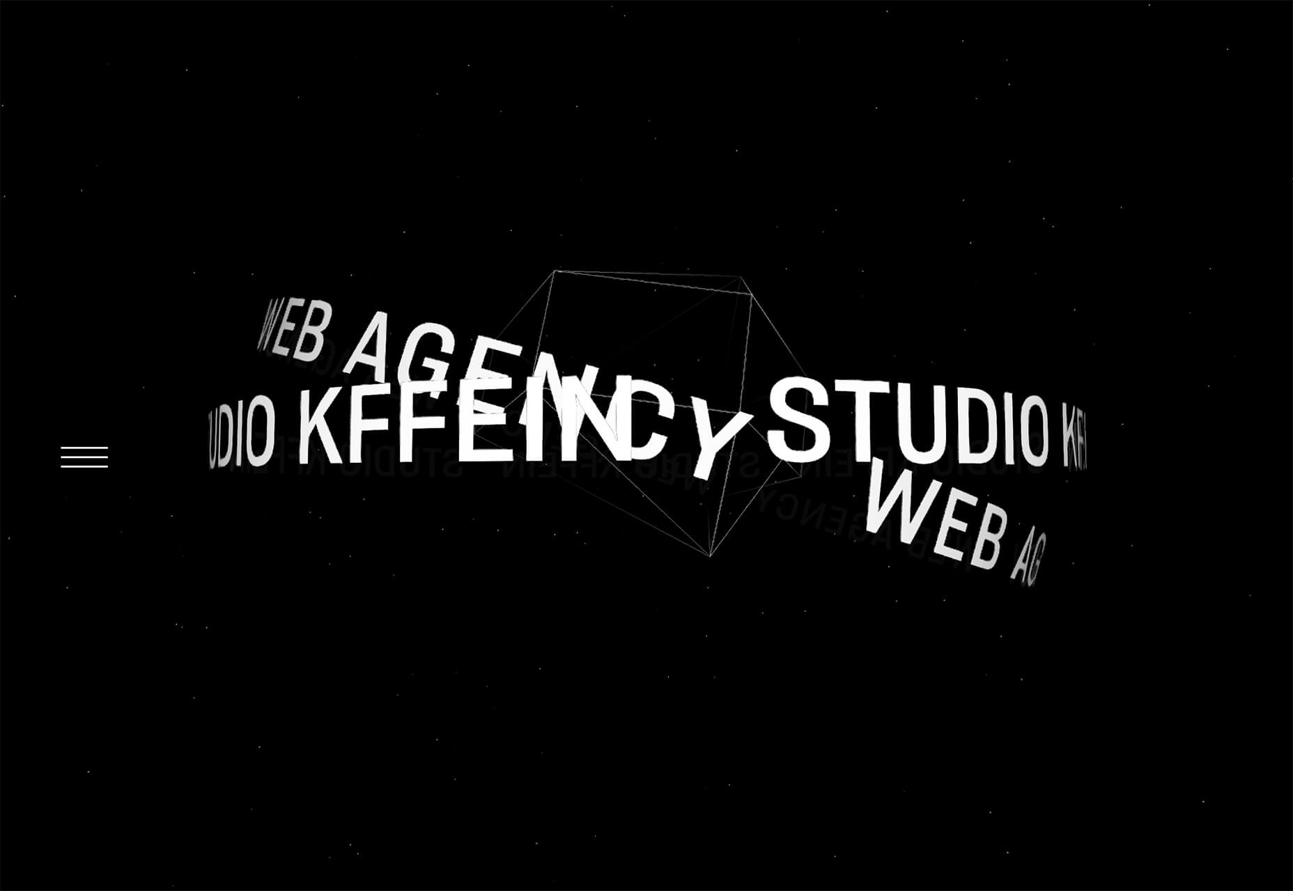
Kffein takes a totally different approach with a circle made from the primary test elements. Identifying website information rotates in a circle around another geo shape on the main plane. Not only is there a circular animation, but an almost three-dimensional effect that happens due to the way elements are layered here.


Pink and Purple Palettes

The prevalent pink and purple color combination isn’t for everyone – although you wouldn’t know it from the number of designs using similar colors.

This bright combination almost screams “spring” and has a lightness to it that almost seems to lift the mood of any project. (Maybe color selection is a reflection of how we all want to feel.)

What’s nice about these colors is that they flow into one another nicely. They can also be expanded to fall into neighboring hues on the color wheel, such as red from pink and blue from purple.

Maybe the most popular use of this color pair is as a gradient. You can find pink to purple everywhere, from background gradients to image overlays to buttons and user interface elements. There’s no lack of use here.

Each of these examples shows opportunities with this color combination.

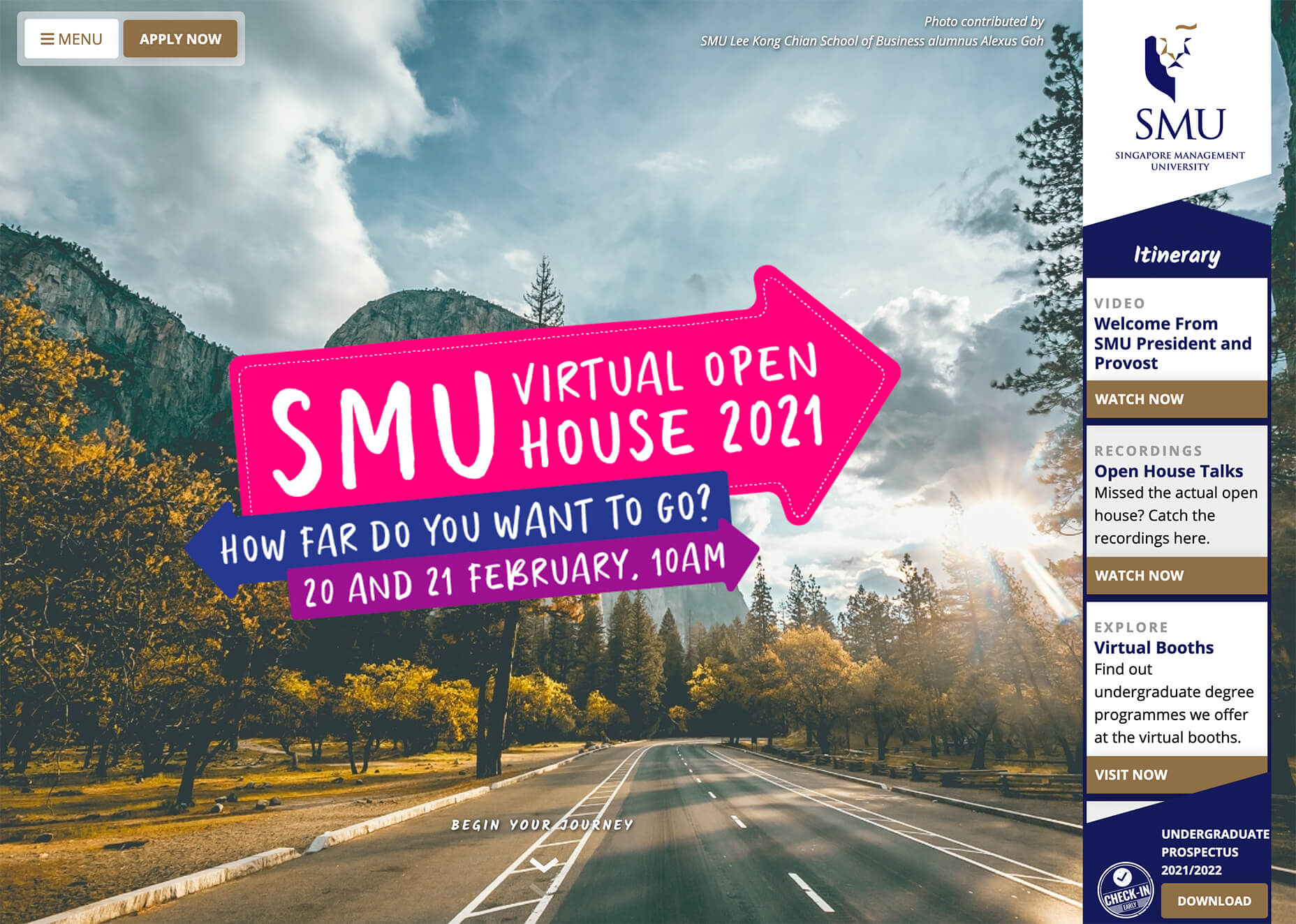
SMU uses bright pink, blue, and purple to create a giant “road sign” in the design that jumps out from the rest of the project. The sign almost seems out of place and doesn’t fit as part of the normal color palette. This is what draw you right to it.

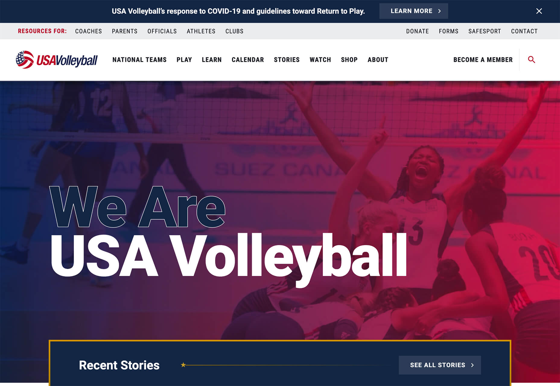
USA Volleyball uses the popular gradient option and extends the pink to the purple palette to hints of blue and red. What’s great about this design is that it uses a super trend element and color option and makes it work with their current color palette. You can almost imagine the design conversation when someone wanted to use a pink to purple gradient for a brand that features red, white, and blue. The gamble paid off, and it works beautifully without being off-brand.

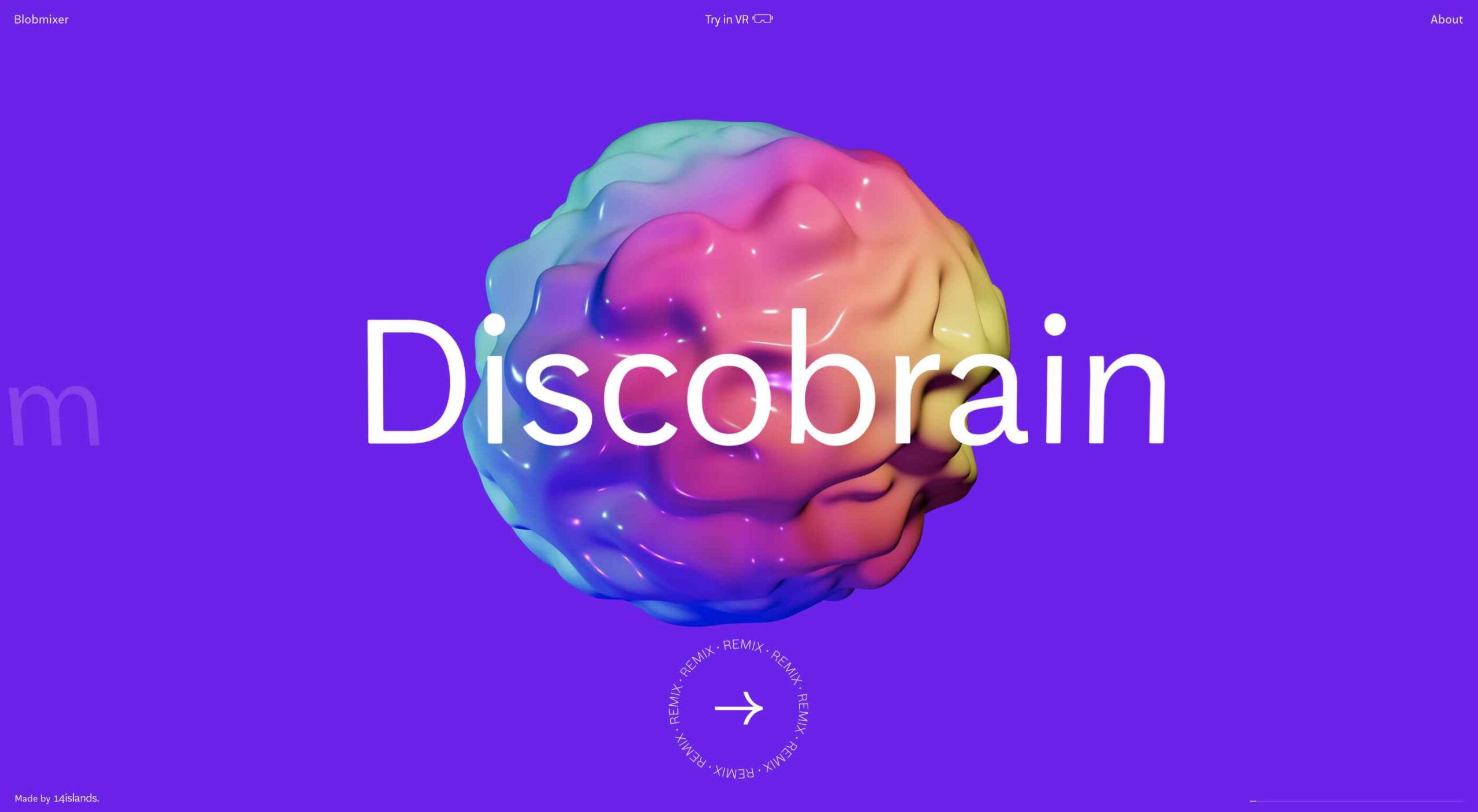
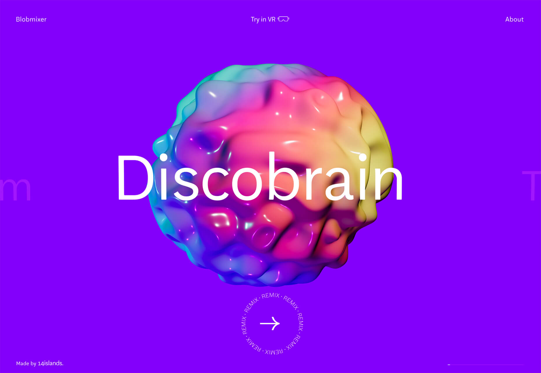
Blobmixer uses purple, pink, and a few other bright colors – note the animated circles, too – to draw users into the design. The entire project is a fun, customizable experience that you can play with, and the color choices are what make you interested enough to try. This design also offers a great example of tactile animation and elements that feel real even when you interact with them using a mouse on the screen.


Faux Split Screens

Split-screen designs were a huge trend for about two years. The aesthetic was also functional for content that required a this or that choice on the part of users.

Now, we see the design elements but without the function. (Maybe because it just looks nice and creates a sense of balance without a symmetrical design.)

These projects look like they might offer multiple gateways to content, but there is only one call to action on the dual-screen aside from navigation elements.

What this design option does is help draw the eyes across the screen. One side will immediately appeal to you, and when done well, you’ll feel a subtle push of pull from the color, text, and images to look at the other side as well.

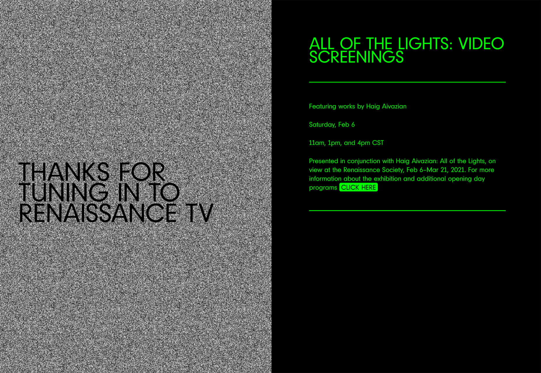
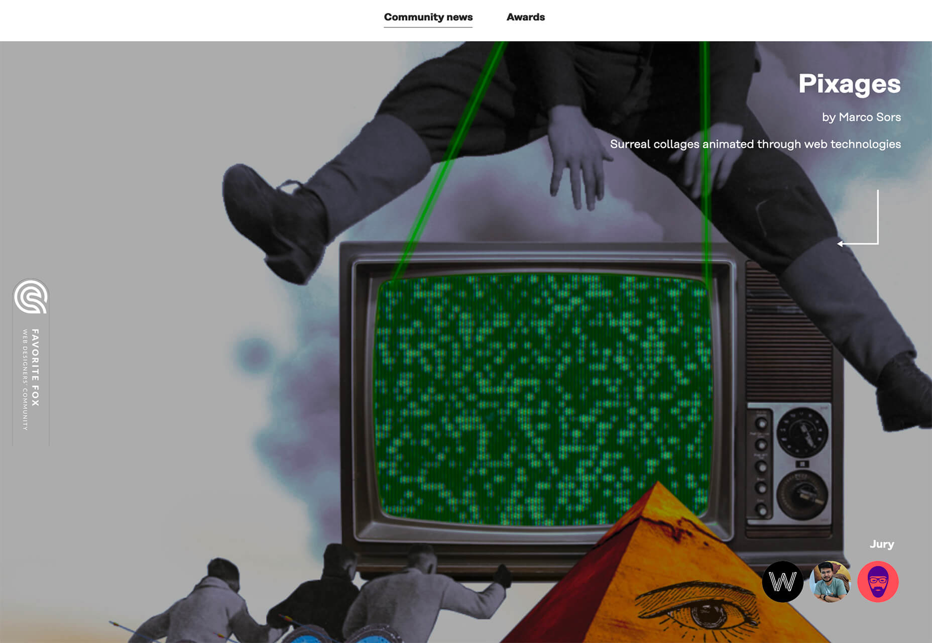
Renaissance TV does it with heavy animation with “dancing dots” from an old TV that doesn’t work. But then you need to look at the green text to understand what is happening.

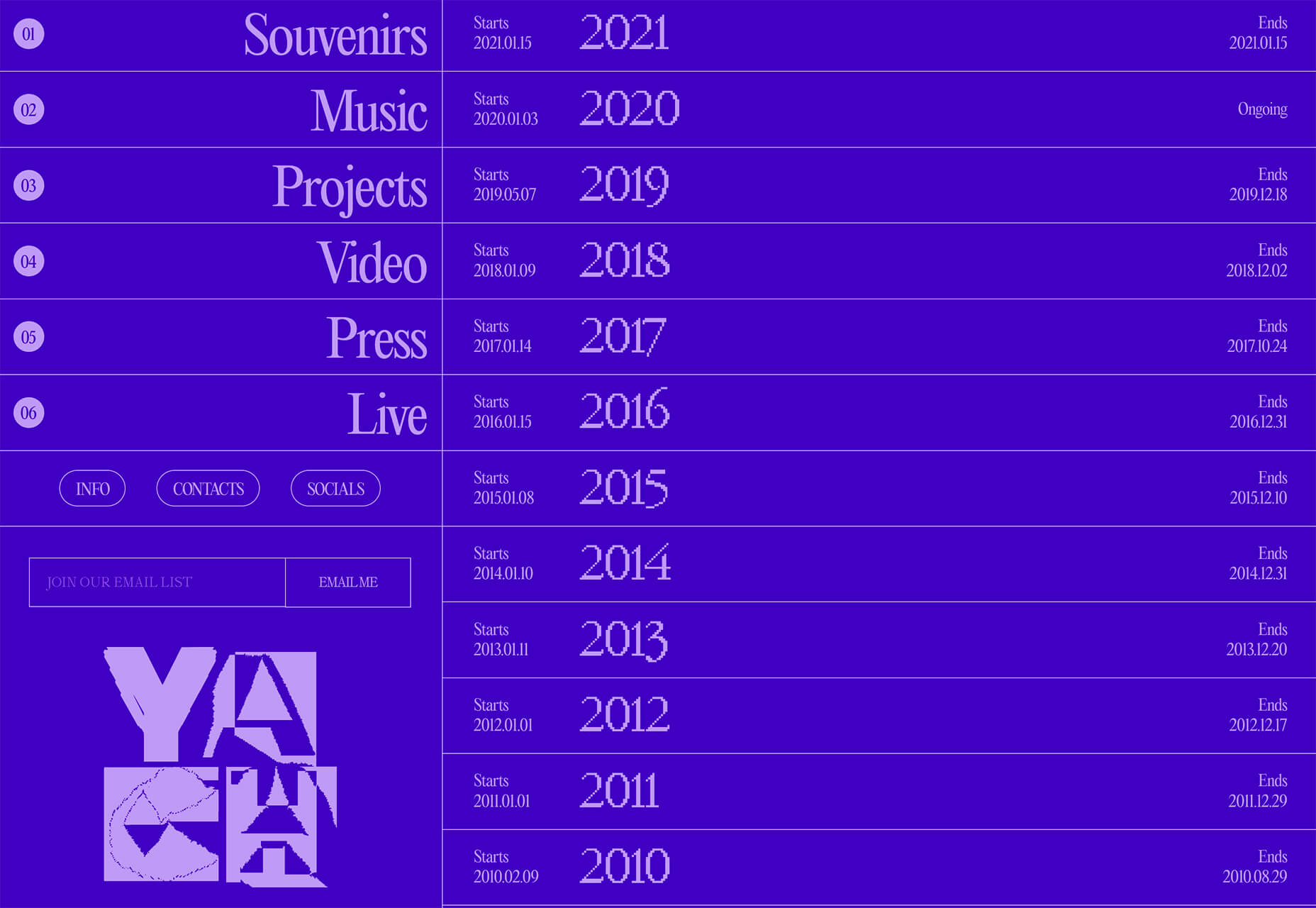
Yacht uses text weight and space to push the eyes across the screen. Almost everyone will go to the heavier areas first and then gaze across the screen through blocks of space to the final small text on the right side. And it all happens in a fraction of seconds.

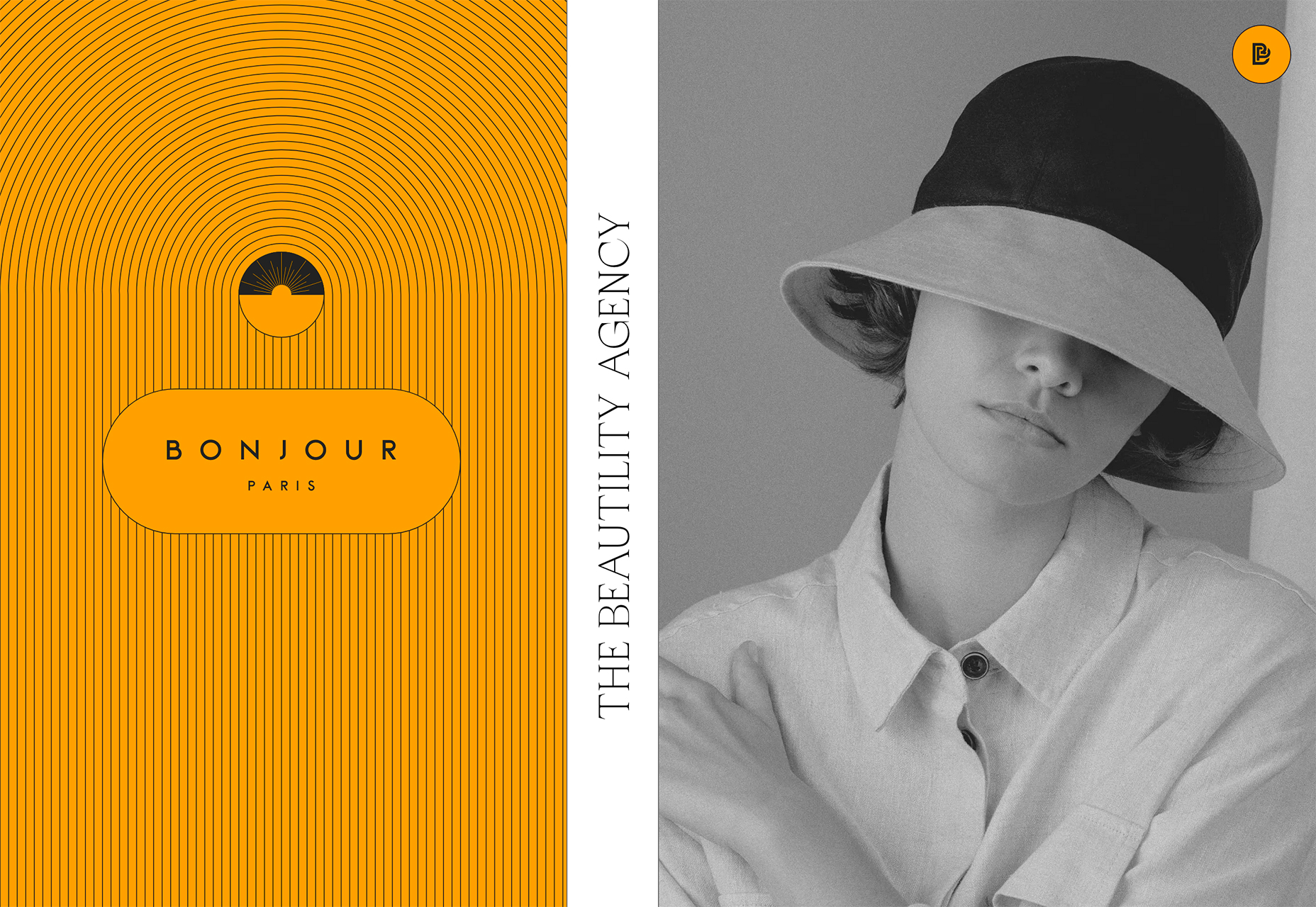
Bonjour Paris pairs bold color with black and white images. You may look at either side first, depending on personal preference, but the other half of the screen is necessary for a complete understanding of the website.


Conclusion

While all of these design trends are evident in new and recent projects, the use of pink and purple color palettes – particularly with a gradient – seems to be everywhere you look. These color choices are popular and come in a lot of forms.

Maybe the most obvious is with brighter pink and purple gradients, but other variations are also trending. It’s definitely one to watch in the longer term.

Source

The post 3 Essential Design Trends, March 2021 first appeared on Webdesigner Depot.

Source de l’article sur Webdesignerdepot

The new year is often packed with resolutions. Make the most of those goals and resolve to design better, faster, and more efficiently with some of these new tools and resources.

Here’s what new for designers this month.

Radix UI

Radix UI is an open-source UI component library for building high-quality, accessible design systems and web apps. It includes examples and guidelines for all kinds of user interface elements that provide guidance and really make you think about accessible website design. (And everything is usable!)

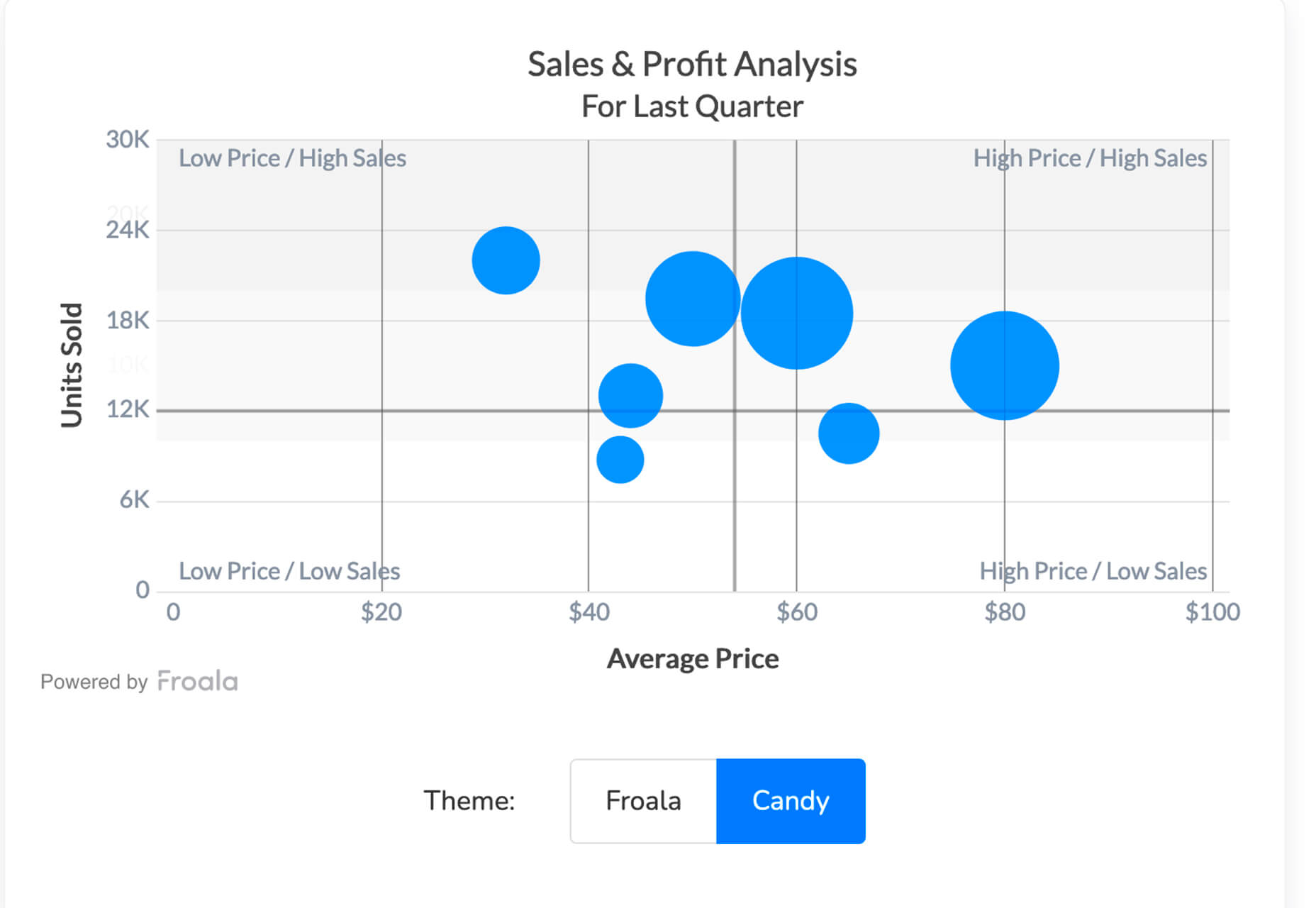
Froala Charts

Froala Charts is made to help you create data visualizations for web or mobile apps. Build any chart you can imagine – bar, line, area, heat map, sankey, radar, time series, and more. Plus, you can customize anything and everything, so it all matches your brand. This premium tool is enterprise-level and comes with a one-time license fee.

CSSfox

CSSfox is a collection of designs that you can use for inspiration. The curated community project includes posts, reviews, and award nominees and winners.

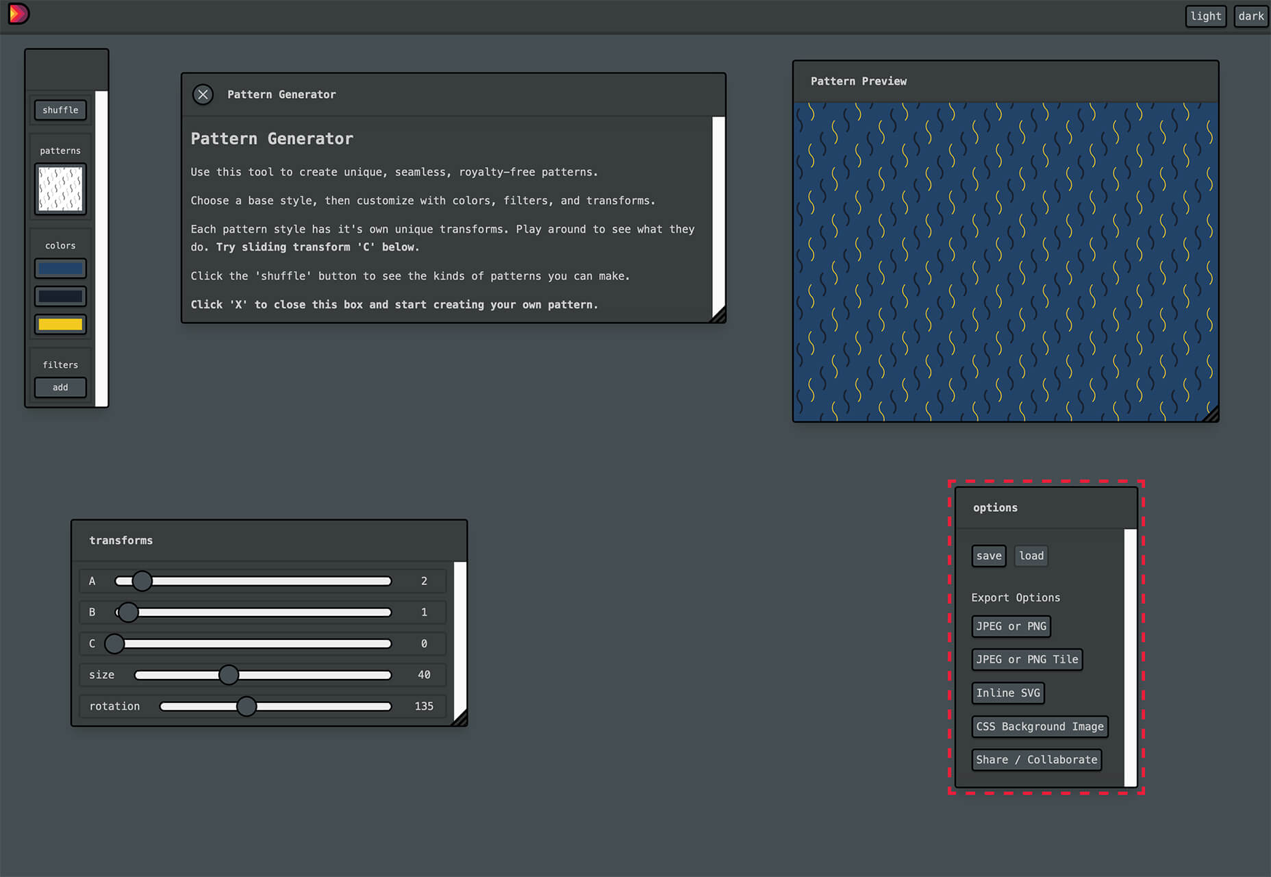
Pattern Generator

Pattern Generator is a tool to create seamless and royalty-free patterns that you can use in projects. Almost every element of the pattern design is customizable, and you can “shuffle” to get new style inspiration. Design a pattern you like and export it for use as a JPG, PNG, SVG, or CSS.

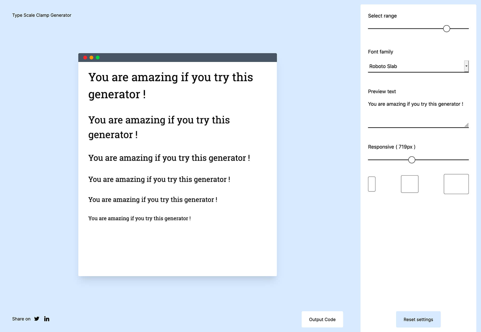
Type Scale Clamp Generator

Type Style Clamp Generator helps you create a visualize a typographic scale for web projects. Pick a font and determine a few other settings and see the scale right on the screen. You can even put in your own words to see how they would look. Then, flip to see how sizes appear on different devices. Find a scale you like and snag the code with a click.

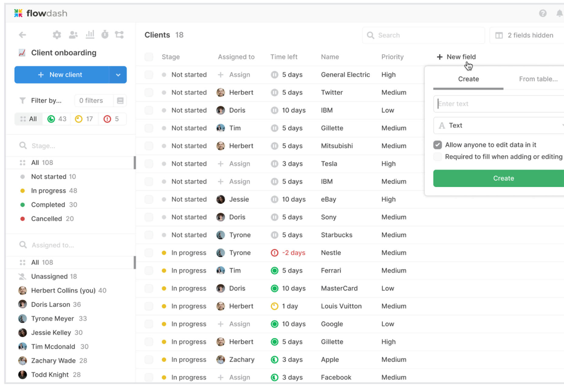
Flowdash

Flowdash is a premium app that helps you build custom tools, data sets and streamline your business operations with one tool. Manage data and processes without code. The tool combines a spreadsheet’s familiarity with a visual workflow builder, plus built-in integrations to automate repetitive tasks so your team can focus on what matters.

Scale

Scale is a website that provides new and open-source illustrations that you can use for projects. Maybe the illustration generator’s neatest part is that you can change the color with just a click to match your brand. Then download the image as an SVG or PNG.

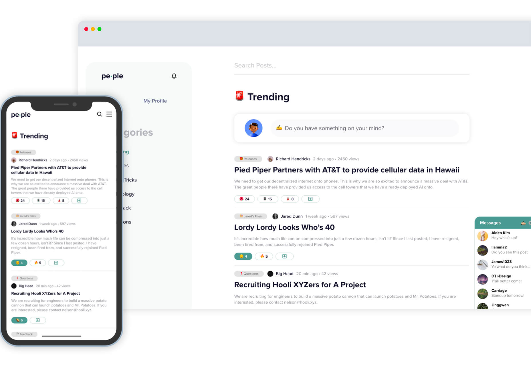
Pe•ple

Pe•ple is a tool that adds a “customizable community” to any website to help grow your fanbase and provide a boost to SEO. It allows you to integrate chat, commenting, emojis, and passwordless login, among other things.

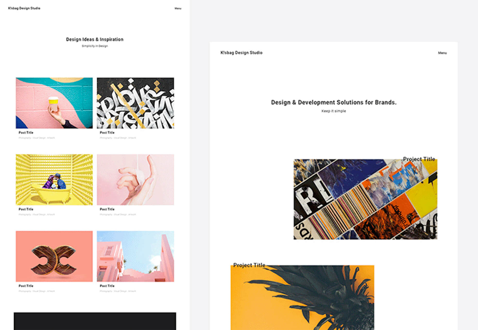
K!sbag: Free Minimal Portfolio Template

K!sbag is a free minimal website template that’s made for portfolio sites. (Did you resolve to update yours in 2021?) It includes 6 pages in a ready-made HTML format and PSD.

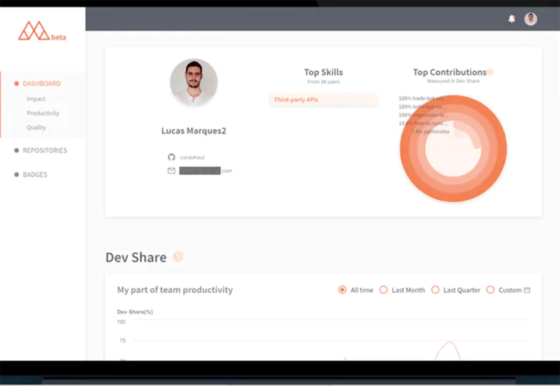
Merico Build

Merico Build is like a fitness tracker for code. It uses contribution analytics to empower developers with insight dashboards and badges focused on self-improvement and career growth. Sign up with tools you already use – Github or Gitlab.

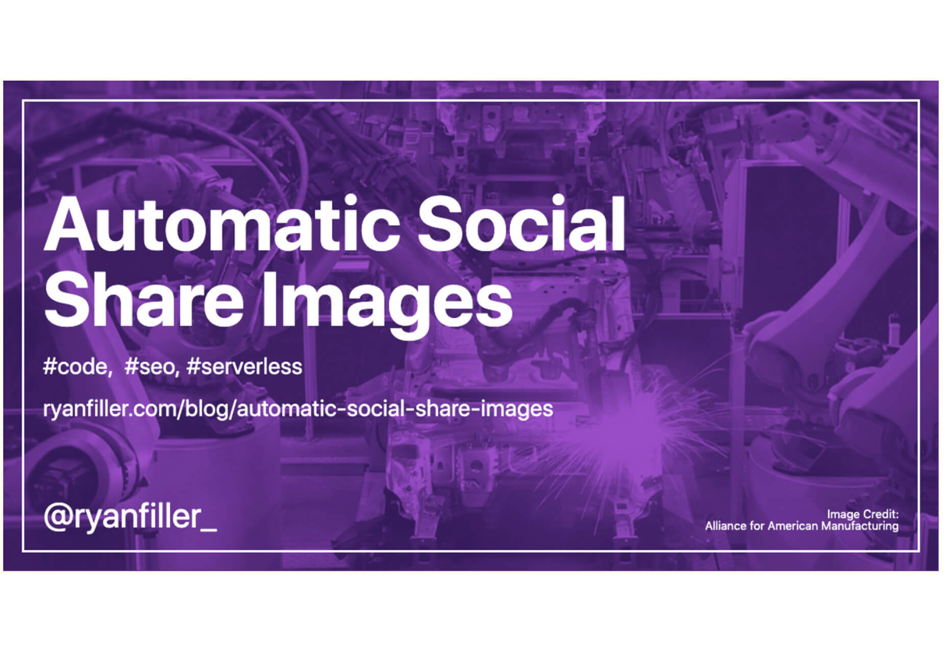
Automatic Social Share Images

Automatic Social Share Images solves a common website problem: Missing or broken images when posts or pages are shared on social media. This tutorial walks you through the code needed to create the right meta tags so that popular social media channels pick up the image you want for posts. The best part is this code helps you create a dynamic preview image, so you don’t have to make something special every single time.

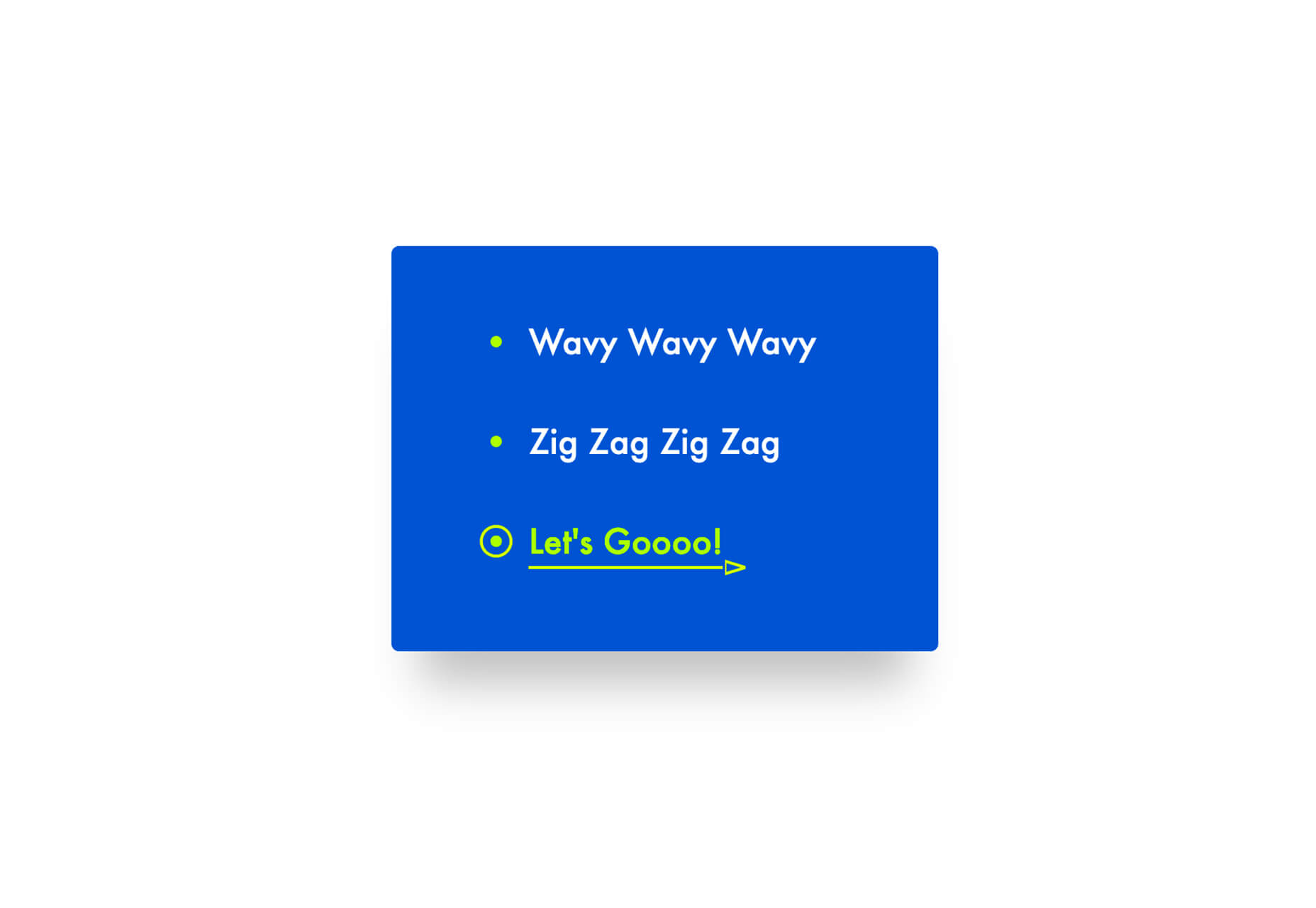
Animated SVG Links

Animated SVG Links can add a little something special to your design. This pen is from Adam Kuhn and includes three different link styles.

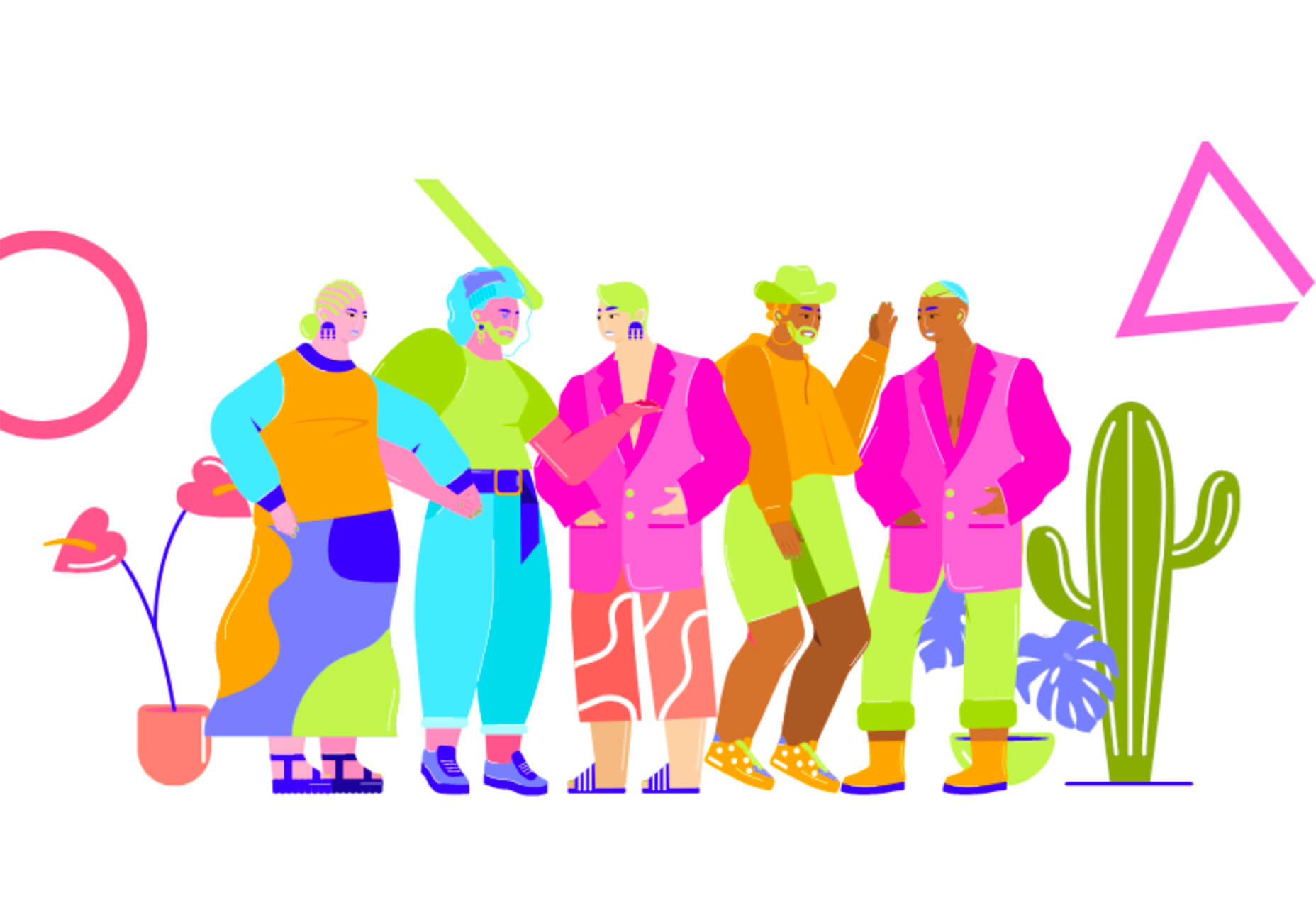
Blush

Blush helps you create illustrations. With collections made by artists across the globe, there’s something for everyone and every project. All art is customizable, so you can play with variations to create something unique.

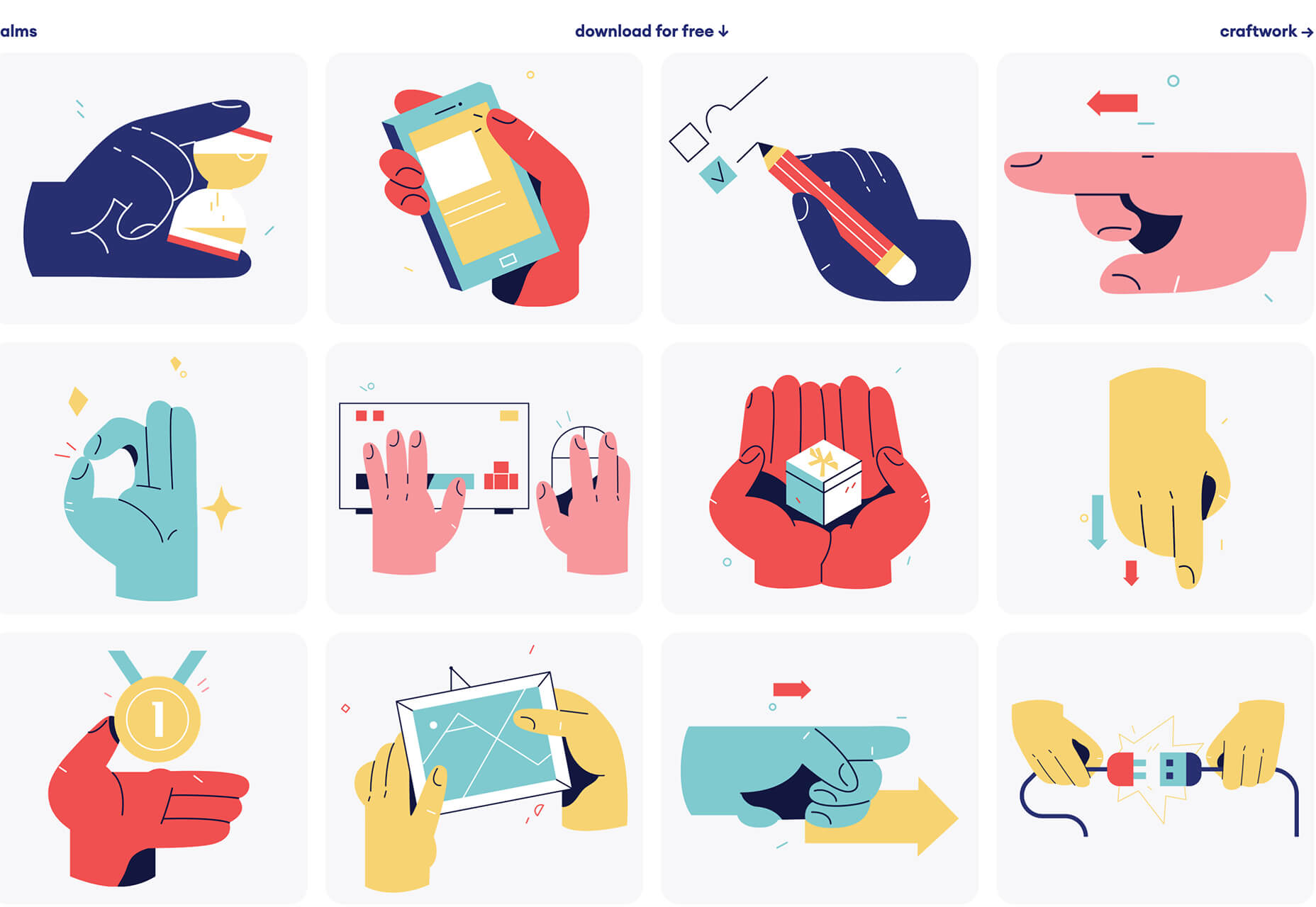
Palms

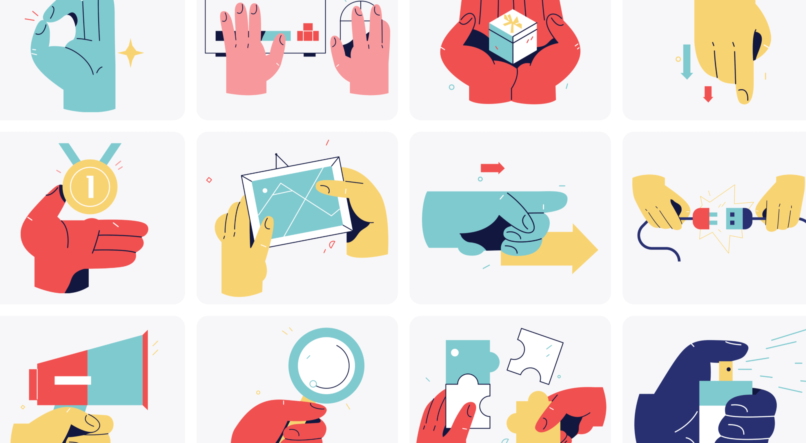
Palms is a set of 43 sets of hands to help illustrate projects. Each illustration is in a vector format and ready to use.

Tabbied

Tabbied allows you to create and customize patterns or artwork in a minimal style for various projects or backgrounds. Tinker with your artwork and patterns and then download a free, high-resolution version.

How to Create Animated Cards

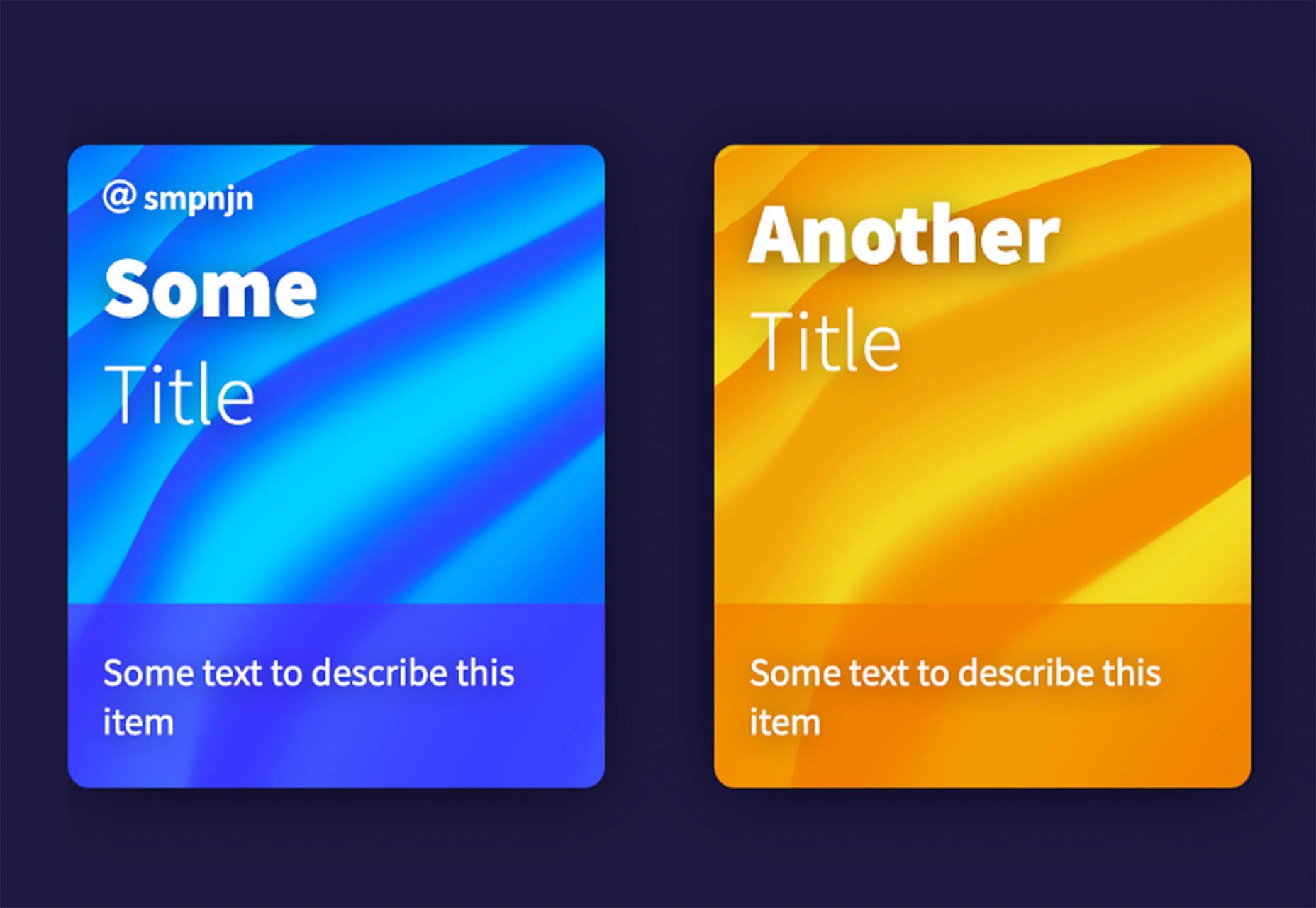
How to Create Animated Cards is a great little tutorial by Johnny Simpson that uses WebGL and Three.js to create a style like those on Apple Music. The result is a stylish modern card style that you can follow along with the CodePen demo.

Bandero

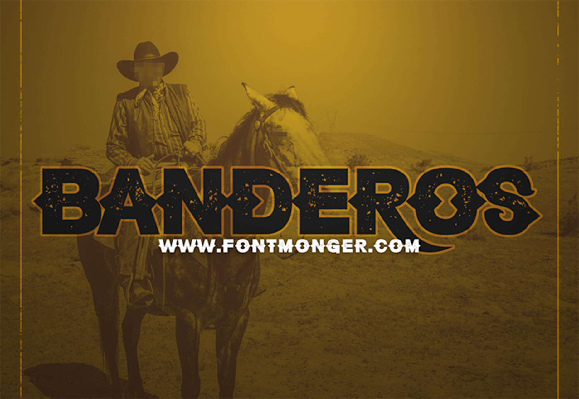
Bandero is a fun slab with a rough texture and interesting letterforms. The character set is a little limited and is best-suited for display use.

Magilla

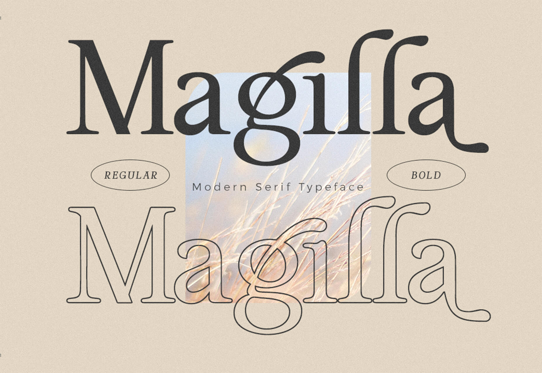
Magilla is a stunning modern serif with great lines and strokes. The premium typeface family has six styles, including an outline option.

Roadhouse

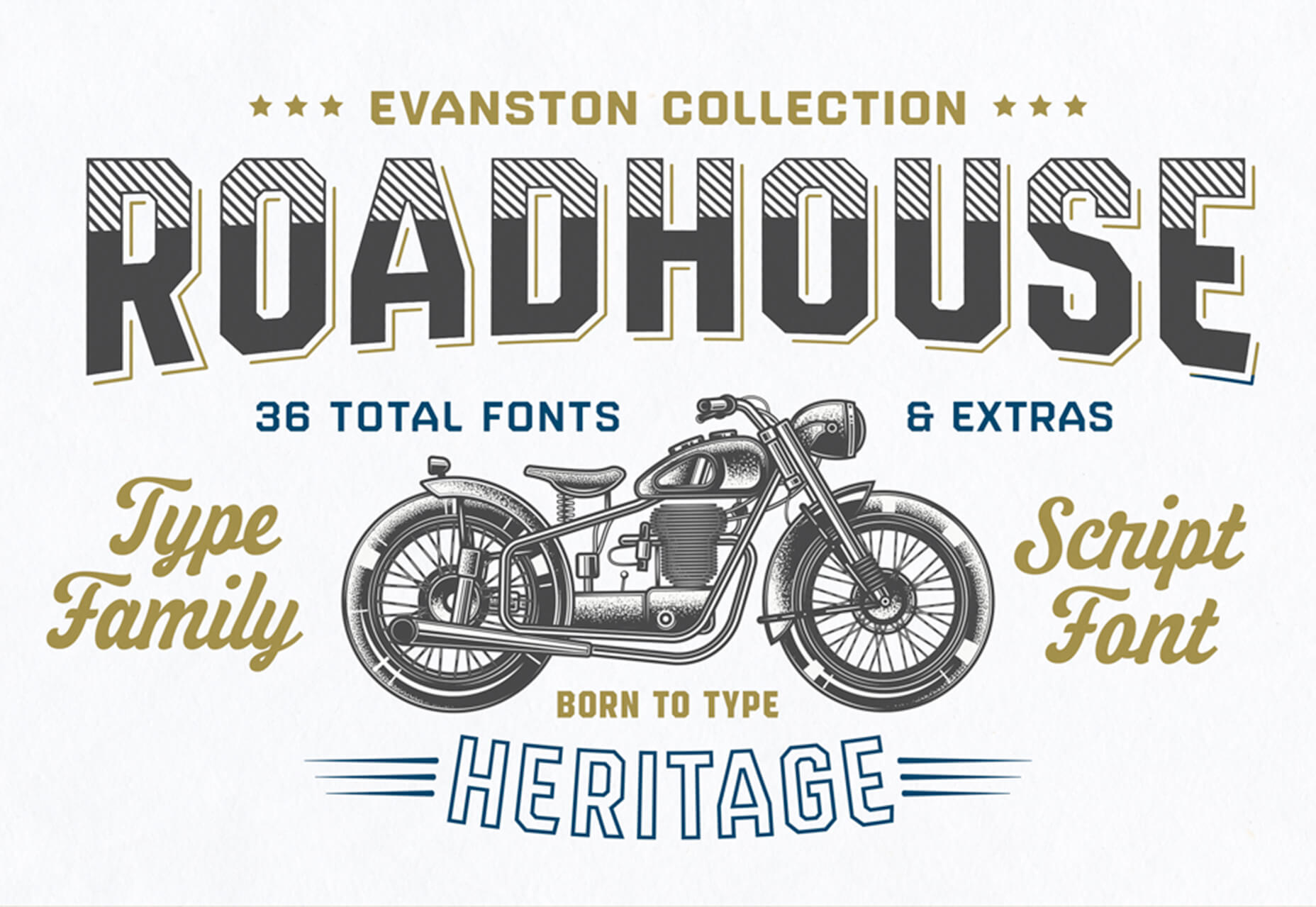
Roadhouse is one of those slab fonts that almost screams branding design. The type designer must have had this in mind, too, with stripe, bevel, inline, half fill, outline, drop extrude, and script options included. (This family is quite robust, or you can snag just one style.)

Street Art

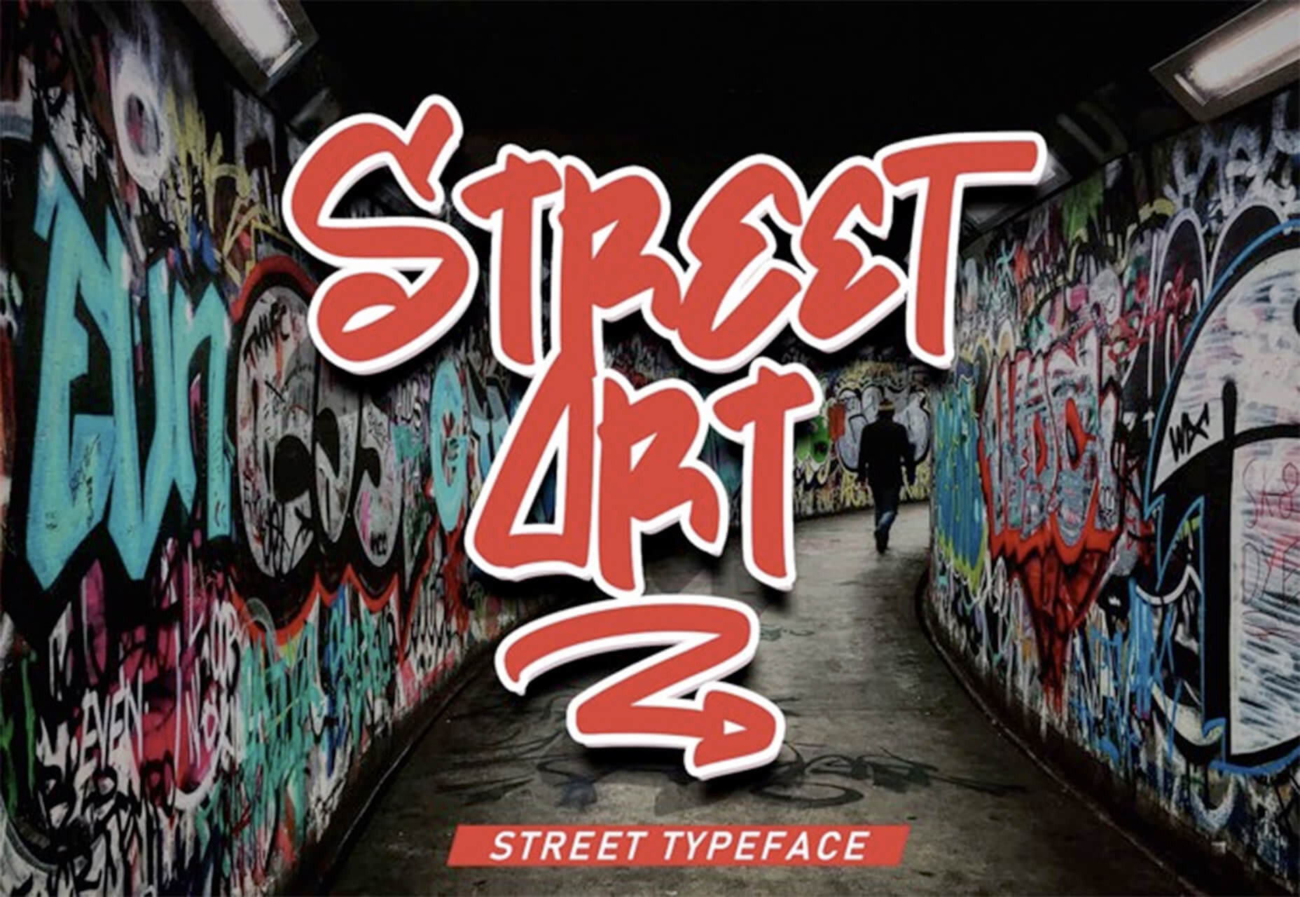
Street Art is for those times when a graffiti style is all that will do. What’s nice about this option – free for personal use – is that the characters are highly readable.

Source

The post Exciting New Tools for Designers, January 2021 first appeared on Webdesigner Depot.

Source de l’article sur Webdesignerdepot

Don’t drop the ball on these website design trends for the new year. All of the trends featured here this month are visual in nature – not as many user interface elements as previous months, but all just as stunning and usable.
Here’s what’s trending in design this month.

1. 3D Scenes on White (Light)

Three-dimensional scenes are not just a trend this month but are likely to be one of the biggest website design trends that you see all year.

They offer a great way to show off product imagery, design something with illustrations or animation for visual impact, and provide usability and understandability cues for users.

It’s a versatile technique that can work with real or created images and are also “COVID-friendly,” something designers have had to think a lot about in the past few months. (Appropriate imagery in design is a real concern, as is trying to design projects without the ability to produce traditional photoshoots.)

What’s neat about all of these projects – and plenty of others – is that they root the design in white or light backgrounds. The light effect creates an easier visual mood that’s clean and emphasizes the imagery.

This website design trend solves a lot of those problems and looks good doing it.

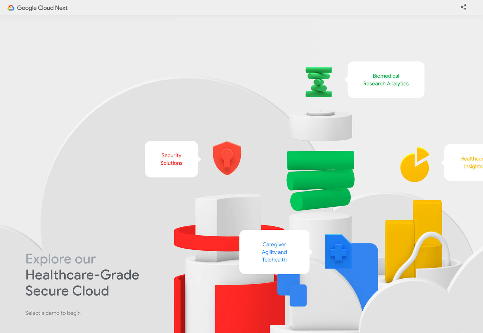
Google’s Cloud design uses 3D illustrated animation on a white background with plenty of depth elements. The primary color palette of illustrated objects pulls it all together and guides the eye through each of the callout labels.

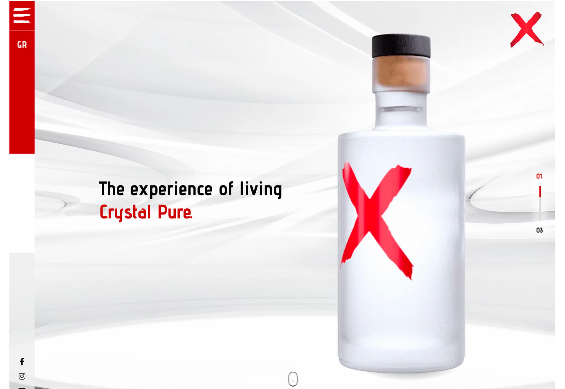
The red words on the screen Crystal Pure fit perfectly with the white-on-white 3D imagery of this design. Red accents pull you into different places on the screen, and it all has a clean feel.

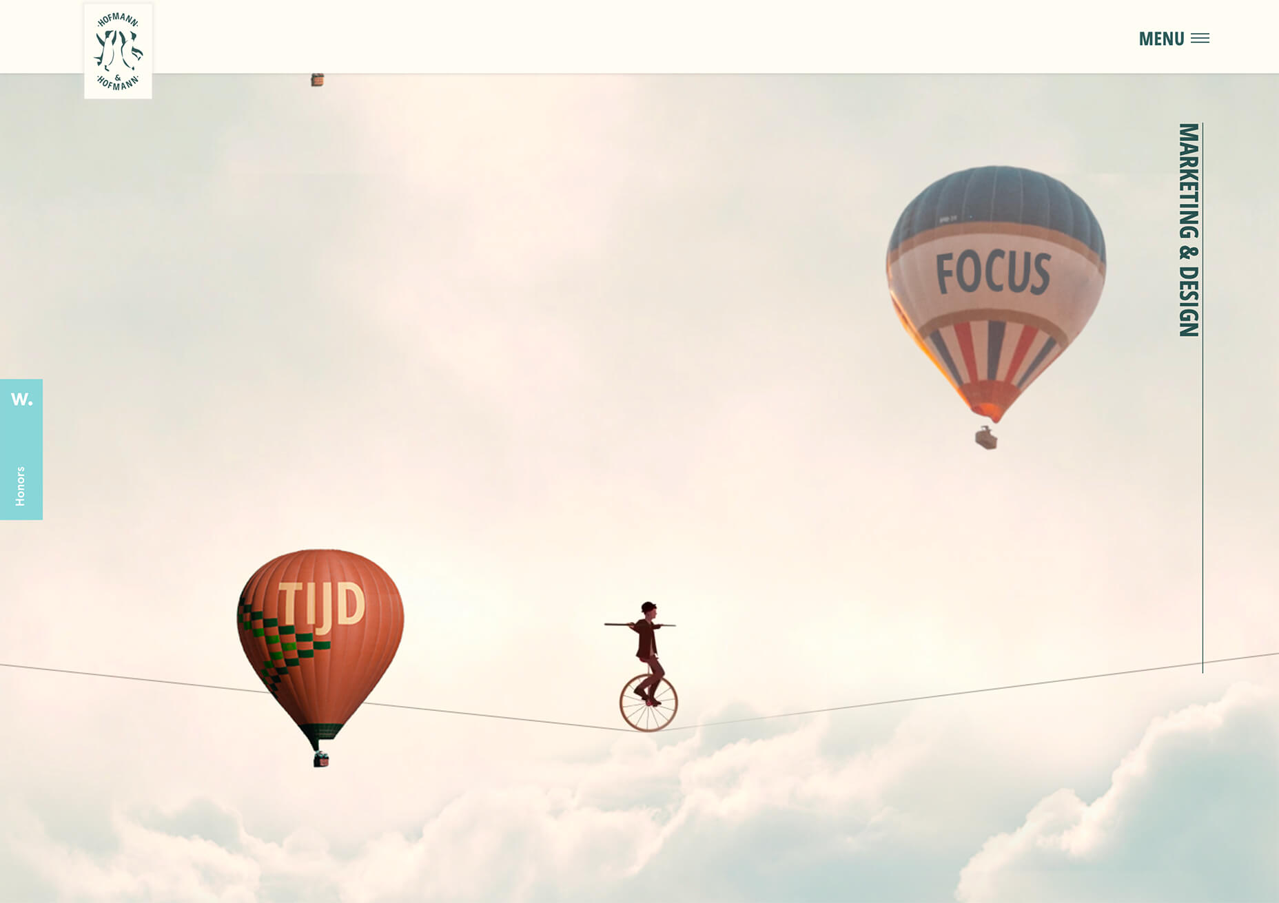
Hofmann & Hofmann uses the same concept with a slightly different approach. The background is still light with a realistic feel and 3D objects, but it is a lot less stark and white. The feel is a little warmer and more inviting than a flat white aesthetic.


2. So Many Stacked Capitals

If you don’t have great artwork or imagery, make your own with typography.

This trend seems like it might be yelling at you just a little, but it still works for the most part — well, as long as you don’t land on too many of these website designs in a row!

What’s interesting about this trend is that many of the designs feature all caps type and serifs. These styles have been making a bit of a comeback, but this use is interesting for many reasons.

The hardest part when using all caps is maintaining readability. That’s why you see some variances in regular, italics, and bold weights, as well as the use of multiple typefaces. The goal is to create a good reading flow with a stunning visual presence.

This trend works best when you have “easy” words on the screen to facilitate scanning. Too many long or complicated letter combinations can get challenging quickly.

Make sure to look for the Easter eggs in each of these projects:

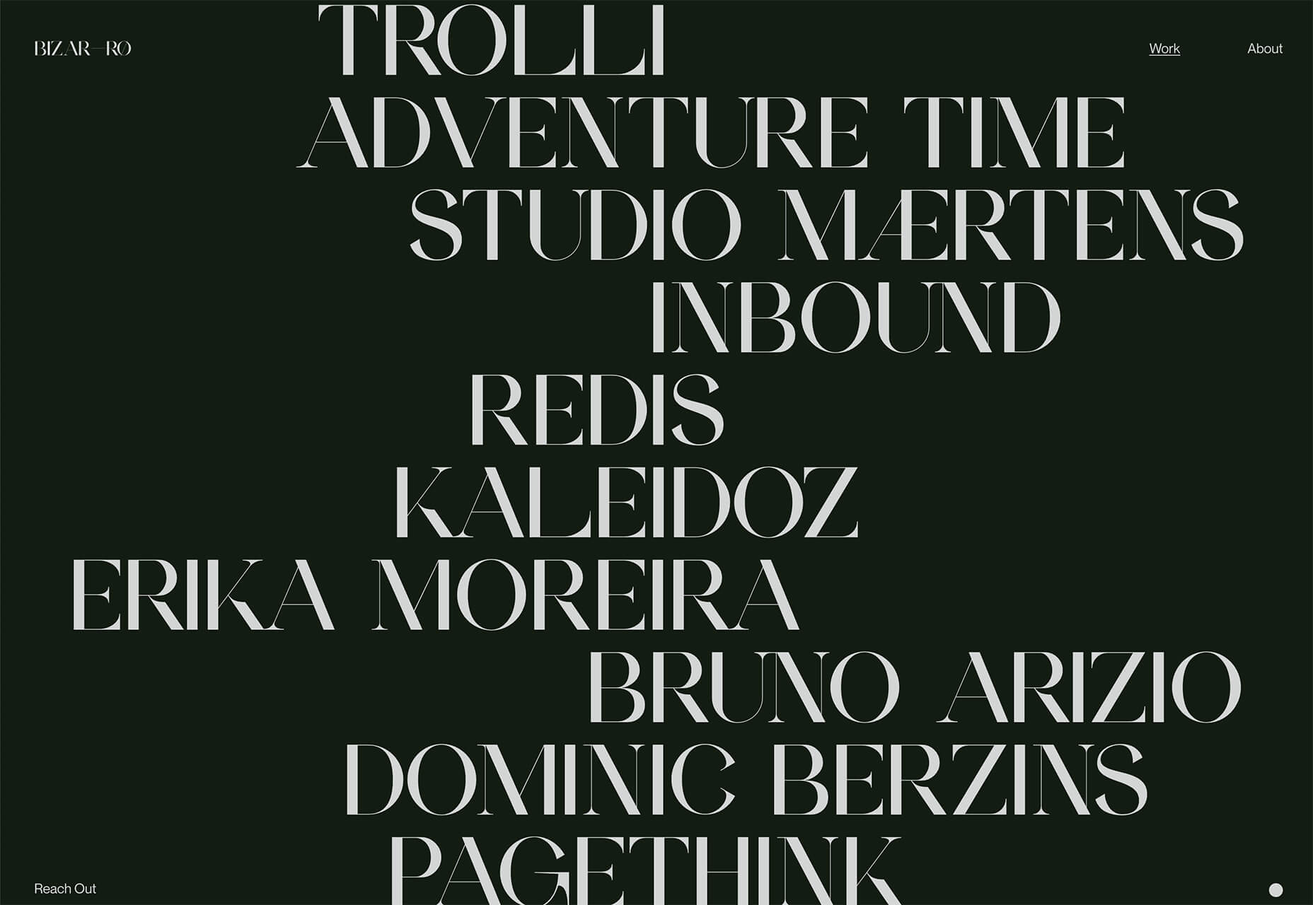
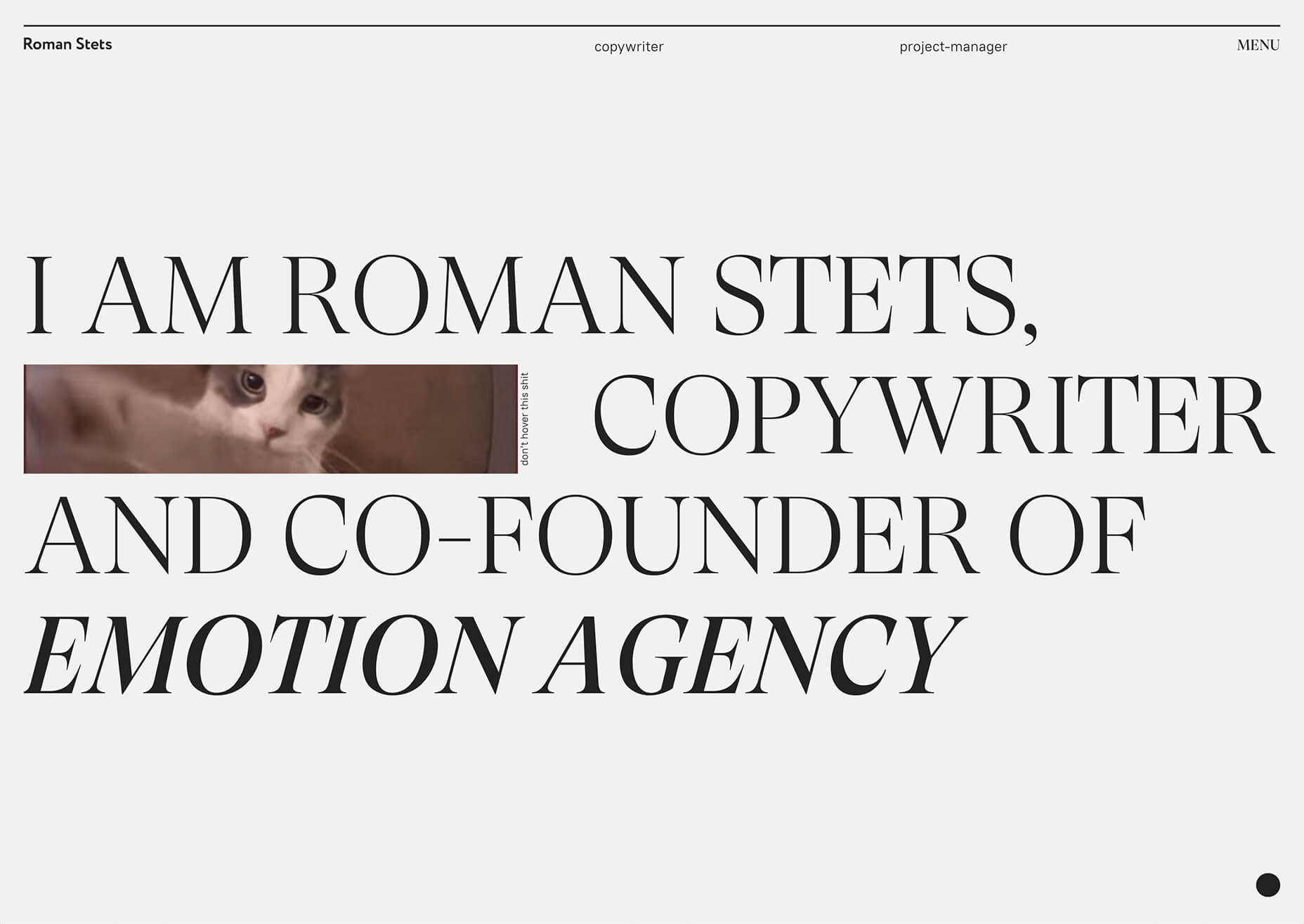
Emotion Agency has tiny “waving” illustrations next to each word (which doubles as the navigation) when you hover over them.

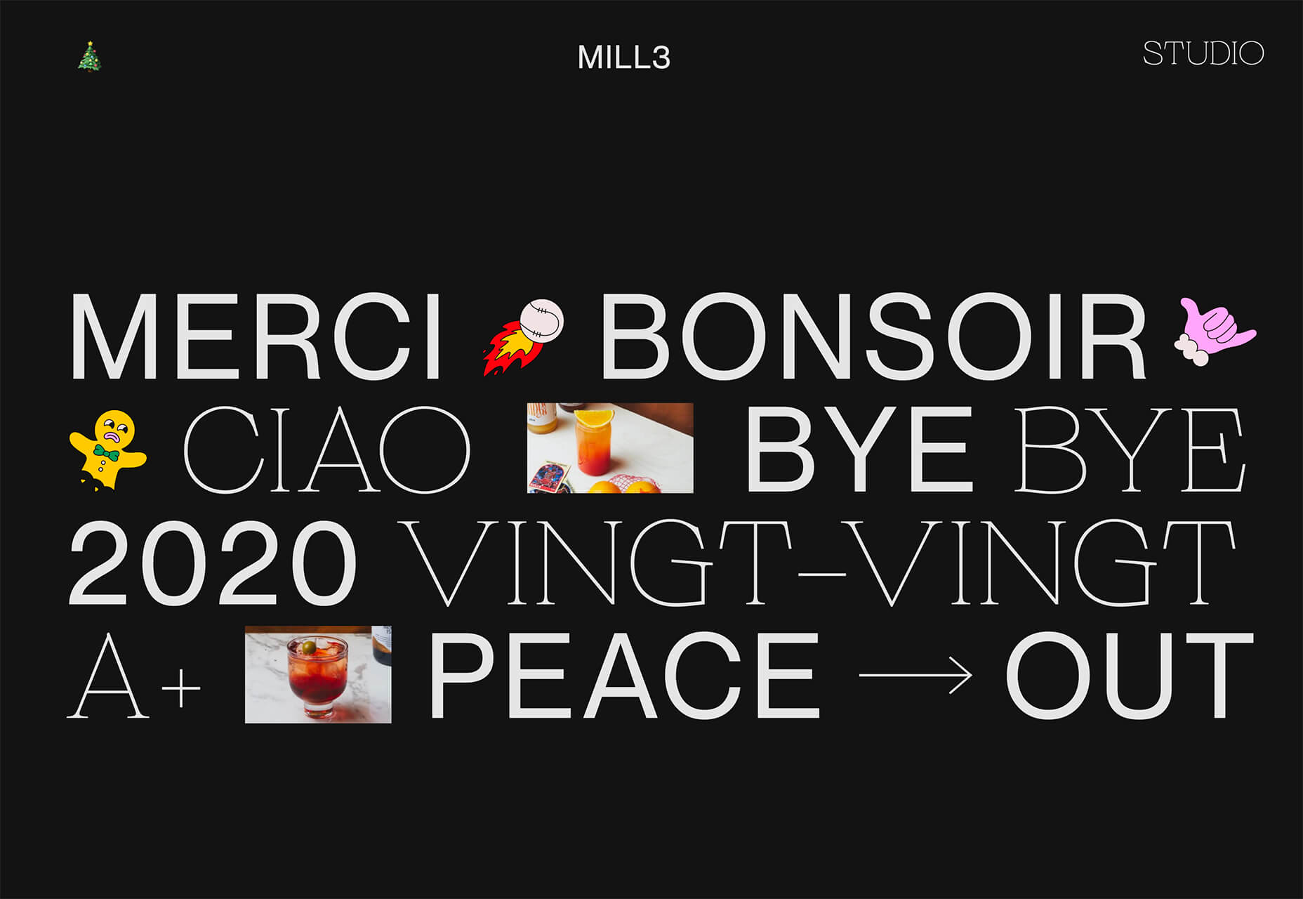
Mill3 Studio has a few animations, from the text flying in and out on load and scroll to subtle movements in the emojis.

Bizarro has this fun little cat video with a tiny warning not to hover over it, but you definitely should.


3. Empty Places

The final trend in this roundup is a stark reminder of current times. Each of the website design features empty places or locations.

This style of imagery would have been avoided pre-pandemic because tourism locations would want visitors to feel like a part of a bustling environment. Not today. If you travel, chances are you may feel safer or want to be in a more secluded environment.

All of the images and videos from these locations show just that.

Designers are doing this with new stark imagery that stands alone for the design or inserting a few empty place frames into video clips or among images that show more populated times. Even scenes that contain people show very few people and focus on more solitary activities.

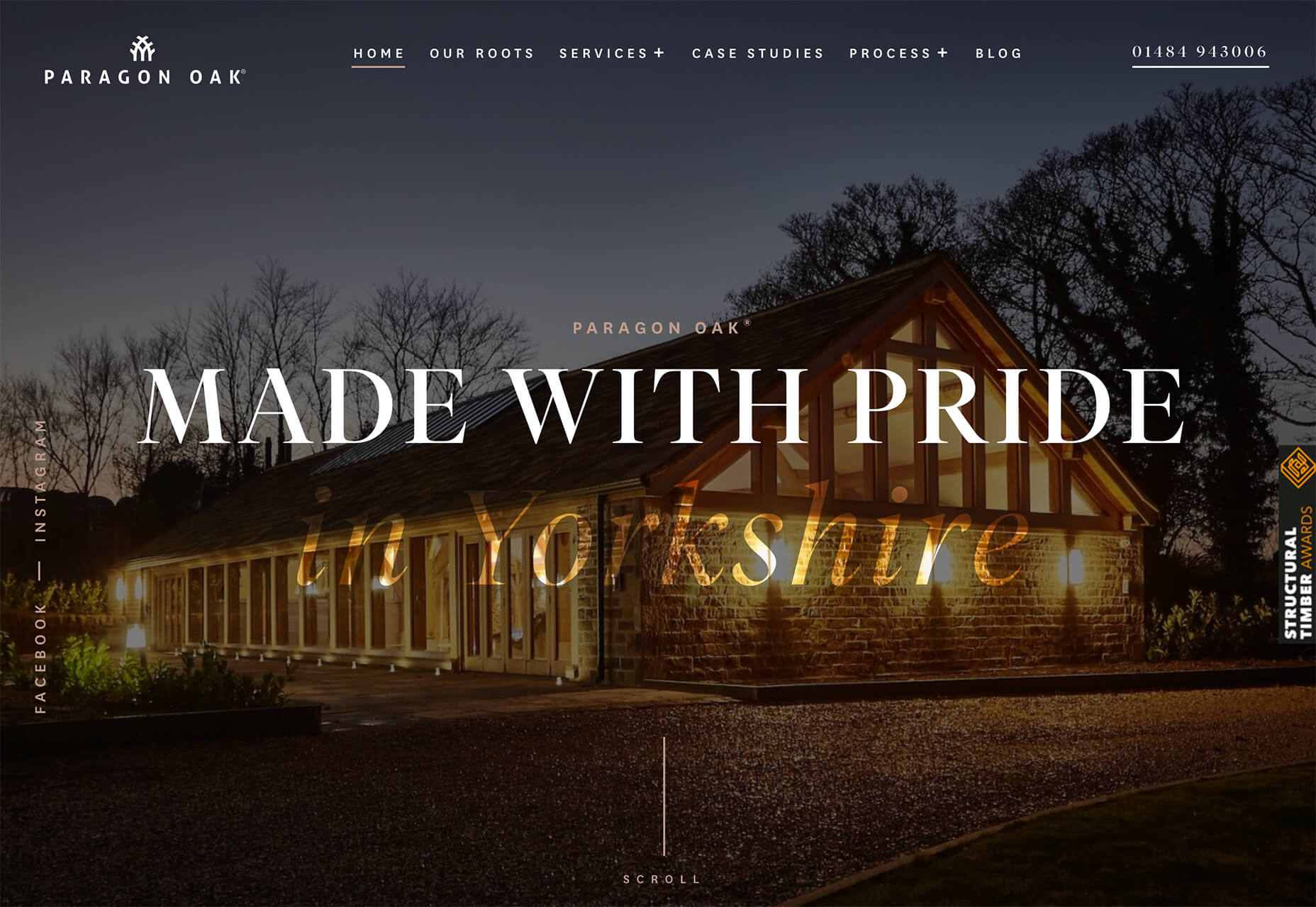
Paragon Oak does this by showing a beautifully lit location at night. Note that using a nighttime photo eliminates questions about where the people are or what they are doing. (This is a clever option when showing imagery of an empty place.)

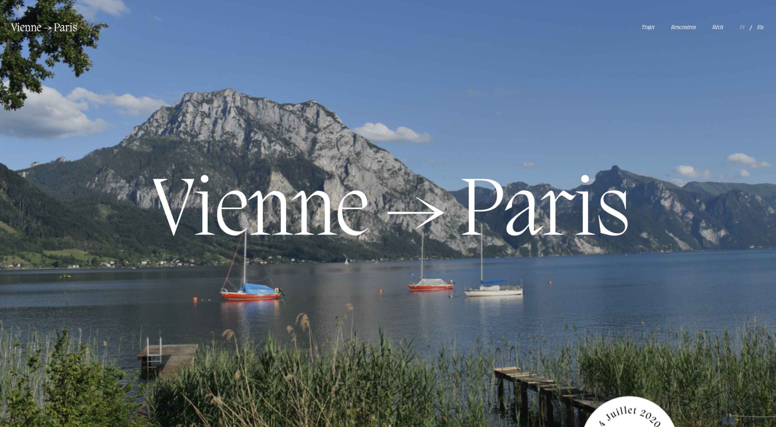
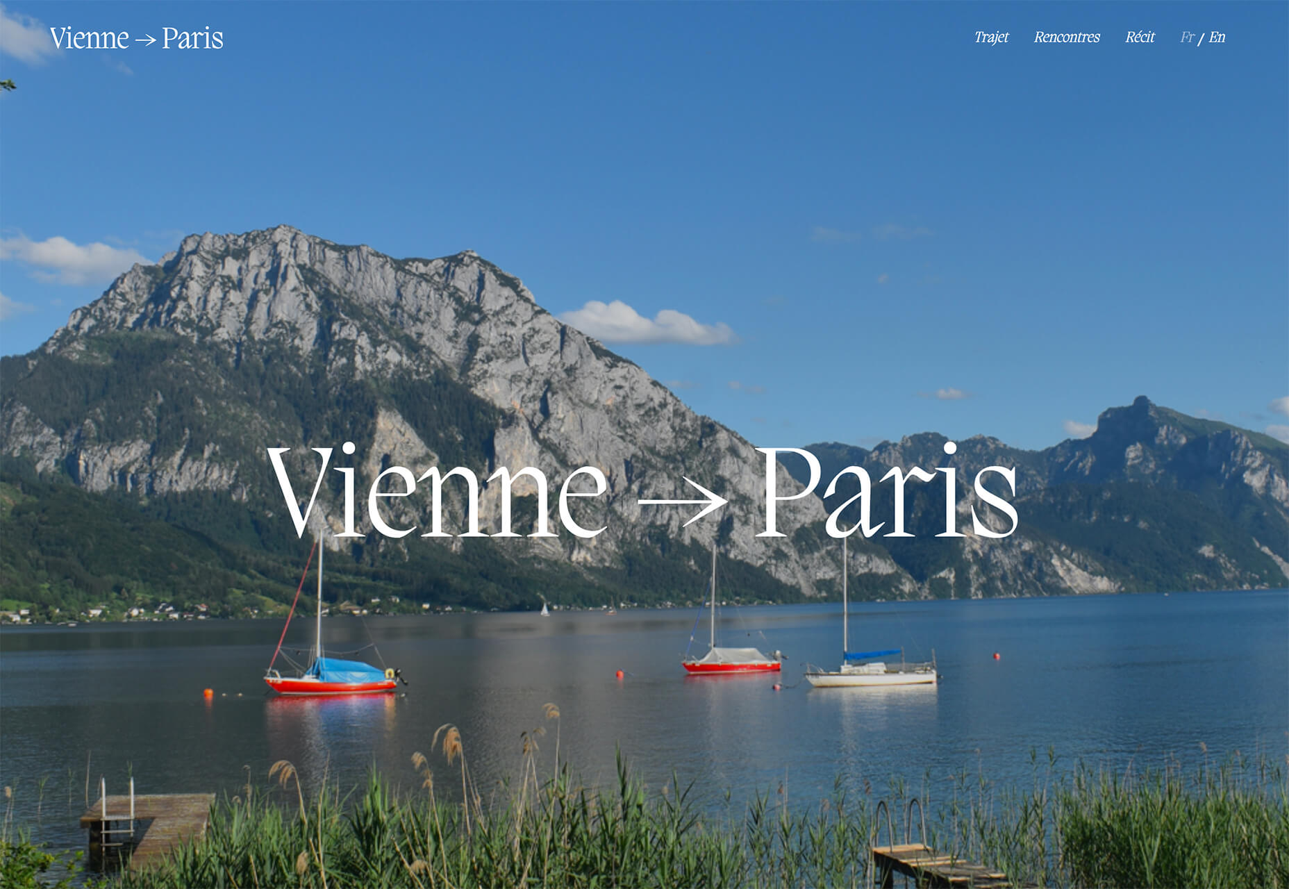
Vienne to Paris shows boats on the water with a beautiful background. While you assume there are people on the water vessels; you don’t see them and get the feeling that everyone is separated in their own “pod,” a pandemic-friendly option for travel.

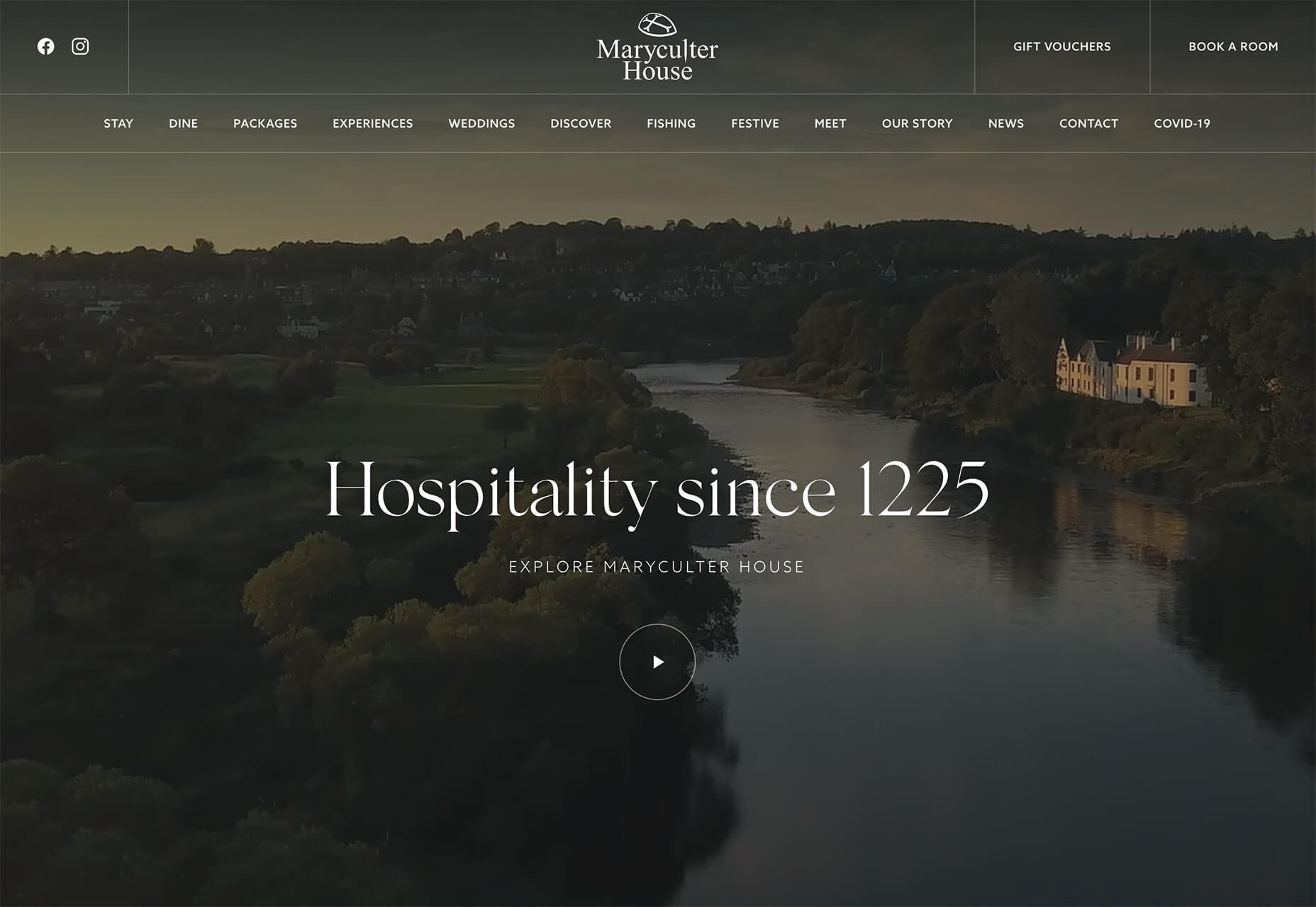
The Maryculter House shows various images without people – the resort’s location on beautiful grounds; empty, but immaculate rooms, and a few images of a person alone on the grounds. Again, the empty nature of the place feels more appropriately welcome for the time we live in.


Conclusion

One of the things that we’ve seen with design trends in the past year is pandemic-related. The composition of images to the way elements are arranged on the screen influences every aspect of our lives.

While the empty place image and video trend is big now, it may fade post-pandemic. Although, it could still be relevant for quite some time. It will be interesting to see what happens as the year progresses with this trend – will it hold on or fade away?

These trends might continue to hold well into 2021.

Source


Source de l’article sur Webdesignerdepot

With billions of internet users worldwide spending several hours online each day, the online presence of brands is now a necessary avenue for building, boosting, and maintaining positive value and attracting and interacting with customers. 

This has created increasing pressure for web design agencies when creating and managing websites. This pressure is multiplied by all the projects that web design agencies have to handle at one time. This is because different clients demand different things for their websites, whether it’s a signature feature or specialized functionality. 

Hence, it’s vital that the tools the agencies use to work are simple enough and suited to the tasks they have to accomplish in order to build and maintain these projects. Having the right tools can increase efficiency and effectiveness in managing websites.

Challenges in Modern Web Design

Building a website with all the essentials in mind is always easier said than done. Websites have to be both functional and easy on the eyes to invite traffic, disseminate information, or appeal a product or service to a target audience, and all while having an attractive and convenient interface.

The good news is that it’s perfectly possible to design a quality website and without spending a fortune to do so. Below are some of the challenges that web design agencies face when trying to deliver and reconcile efficient user experience and effective user interface in web design.

1. Appealing User Experience

Designing a good website means ensuring that the user experience is appealing to a general audience, but this is one of the most difficult parts of web design. Agencies must be careful not to turn off users with a confusing user experience. For instance, making important information difficult to find on web pages, using technical jargon that ordinary users wouldn’t understand, and focusing too much on the design rather than the overall experience are a few big mistakes that no designer should ever commit.

Instead, web design agencies should focus not only on making the design look good but also on making the experience smooth and fast for the regular site visitor. This includes improving design elements to make navigation easier as well as optimizing webpage load speeds.

2. Working With a Budget

It’s common for the client and the web design agency’s budgets to not line up at all times. Either the client will find the project quote too high, or the designer will find the client’s budget too low. The cost of a web design project can vary greatly, depending on what needs to be done. 

Although having to build a good website on a budget may be difficult, it’s important for both parties to come up with a set amount before the project even starts. The client should always specify what they want to achieve and how much they’re willing to pay to get it, and the agency should let the client know beforehand if this is possible.

3. Integrating Third-Party Functionality

Sometimes, clients may make requests for third-party functions that may not be easily integrated into the site. To prevent this, web design agencies should always consider integration when building a site. Most businesses and companies now have at least one social media account, so it doesn’t make sense for their site to remain disconnected.

When a website visitor shares an excerpt on a social media site like Facebook, Pinterest, or Twitter, other people who can see their posts may become interested in visiting the original post on the website. Properly integrating third-party applications and functions into a website can get it more online presence and popularity.

4. Suitability to Different Devices

There are many devices that people can use to access the web. From smartphones to desktop computers, from cars to game consoles, and even wristwatches and digital cameras, all of these can be web-enabled as long as there’s an available internet connection. 

Websites nowadays should always be compatible with any of the devices people might use to go to the website. They should look pleasing and load fast regardless of what device a visitor is using.

5. Security of Personal Information

Most websites require personal or financial information, whether for account verification, for website subscription, or something else. Websites should be designed with personal security in mind, which is even more important since hacking has been on the rise since the coronavirus hit.

One of the biggest threats that websites face today is phishing, or when an attacker will pretend to be a trusted contact and attempt to compel you to click a malicious link. Another is ransomware, or where cybercriminals hold customer data for ransom and attempt to extort online business owners. Yet one more is SQL injections, or where hackers will attempt to execute malicious SQL commands in your website’s database. 

The best practices in regards to web design to mitigate these risks include third-party plugins and themes, keeping all of your software up to date, setting your web applications so they run the fewest privileges possible, and utilizing SSL certificates and HTTPS protocols. 

Adopting Site-Building Platforms

Gone are the days where you had to be technologically gifted to design a website from scratch, usually through manual HTML codes. Back then, you had to know your way around the web if you wanted to set-up and manage a site of your own.

Now, there are a lot of good website builders that allow you to create websites in a faster period of time. Even web design agencies now make use of such builders in order to make the job easier and more convenient. Not to mention, it allows agencies to focus on the design alone.

Although these platforms offer predesigned templates based on the most common purposes of websites, they normally allow the user to white label the website into the branding specific to the business or agenda of the website owner. The text styles, colors, and sizes coordinated to the website’s theme, and colors can be designed specifically to match the business or organization’s image and identity. 

Simply put, creating websites through a web builder platform can provide web design agencies with easy-to-understand tools that their teams and members can all uniformly use to more effectively and more efficiently handle all their projects.

With services that allow mobile optimization, site management, and even drag-and-drop editing, web design agencies can now better manage their projects and finish with their tasks more quickly.

Not only that, by using white labelling, services can conserve their time and energy into focusing on creating the best website for their client. With all the website builders currently available on the market today, just picking the right one can give web design agencies the best tools to use when creating, designing, and maintaining websites. 


Featured image via Pexels.

Source


Source de l’article sur Webdesignerdepot

The digital world is a place of constant change. Just as you get used to a new design trend, another one appears, forcing you to rethink the way that you approach each client project. 

As a web designer, it’s up to you to make sure that you have your finger on the pulse on the latest transformations in the industry. However, it can be challenging to know for sure which trends you should be taking seriously, and which you can simply ignore. 

One option to refine and enhance your design journey is to pay attention to influencers. 

Influencers aren’t just there to guide customers into making purchasing decisions. These people are thought-leaders in their field. They spend all of their time tracking down ideas and concepts that really work. That way, they can maintain a successful reputation online.

Sourcing information and motivation from the following UX influencers could help you to create some truly amazing websites in 2020: 

1. Andrew Kucheriavy 

Andrew Kucheriavy is the phenomenal co-founder and CEO of a company named Intechnic. Andrew was one of the first people in the world to be given the “Master in User Experience” award. This means that he’s an excellent person to pay attention to if you want help understanding the ins and outs of user experience design

As one of the leading visionaries in UX, business strategy, and inbound marketing, Andrew has a lot of useful information to offer professionals and learners alike. Andrew is particularly active on Twitter, where he’s constantly sharing insights on design and marketing. You can also find input from Andrew on the Intechnic blog. 

2. Jeff Veen 

Another must-follow for designers who want to learn more about understanding their audience and their position in the marketplace, Jeff Veen is a leader in UX and product design. Veen got his start with the founding team for Wired, before he created the Adaptive Path company for UX consulting. Jeff Veen is also known for being responsible for various aspects of Google Analytics. 

Over the years, Jeff has expanded his knowledge in the design space, and mentored various companies, from WordPress to Medium. He also has a fantastic podcast that you can listen to for guidance when you’re on the go. 

3. Jared Spool 

Jared Spool has been tackling the most common issues of user experience since before the term “UX” was even a thing. Excelling in the design world since 1978, Jared has become one of the biggest and most recognizable names in the user experience environment. He’s the founder of the User Interface Engineering consulting firm. The company concentrates on helping companies to improve their site and product usability. 

Jared offers plenty of handy information to stock up on in his Twitter feed. Additionally, you can find plenty of helpful links to blogs and articles that he has published around the web on Twitter too. He’s followed by Hubgets, PICUS, and many other leading brands. Make sure that you check out his collection of industry-leading talks on UIE. 

4. Jen Romano Bergstrom

An experimental psychologist, User Experience Research coach, and UX specialist, Jen is one of the most impressive women in the web design world. She helped to create the unique experiences that customers can access on Instagram and Facebook. Additionally, she has a specialist knowledge of eye-tracking on the web. You can even check out Jen’s books on eye-tracking and usability testing

When she’s not writing books or researching user experience, Jen is blogging and tweeting about usability and researching new strategies in the web design space. It’s definitely worth keeping up with Jen on Twitter, particularly if you want to be the first to know about her upcoming seminars and learning sessions. 

5. Katie Dill 

Katie Dill is the former Director of Experience for Airbnb, so you know that she knows her way around some unique experiences. With an expertise in working with companies that harness new technologies and UX design, Katie Dill is at the forefront of the user experience landscape. Dill attends various UX conferences throughout the year, and publishes a range of fantastic videos on YouTube. 

You can find blogs and articles from Katie published on the web; however, you’ll be able to get the most input from her by following Katie on her Twitter account. 

6. Khoi Vinh 

Khoi Vinh is one of the most friendly and unique UX bloggers and influencers on the market today. He knows how to talk to people in a way that’s interesting and engaging – even about more complicated topics in UX design. Vinh is a principle designer at Adobe, and he has his own podcast called Wireframe. However, he still finds time to keep his followers engaged on Twitter. 

Over the years, Khoi has worked as a Design Director for Etsy and the New York Times. Vinh also wrote a book called “Ordering Disorder” which examines grid principles in web design. According to Fast Company, he’s one of the most influential designers in America. Additionally, Khoi has a brilliant blog where you can check out all of his latest insights into UX design. 

7. Cory Lebson

Cory Lebson is a veteran in the world of web design and user experience. With more than 2 decades of experience in the landscape, Cory has his own dedicated UX consulting firm named Lebsontech. Lebson and his company concentrate on offering UX training, mentoring, and user experience strategy support to customers. Cory also regularly speaks on topics regarding UX career development, user experience, information architecture and more. 

Cory is an excellent influencer to follow on Twitter, where you’ll find him sharing various UX tricks and tips. You can also check out Cory’s handbook on UX careers, or find him publishing content on the Lebsontech blog too. 

8. Lizzie Dyson

Another amazing woman in the industry of UX, Lizzie Dyson is changing the experience landscape as we know it. Although she’s a relatively new figure in the web design world, she’s recognized world-wide for her amazing insights into the world of web development. Lizzie also helped to create a new group specifically for women that want to get involved in web design. 

The Ladies that UX monthly meet-up welcomes a community of women into the digital landscape, helping them to learn and expand their skills. Lizzie regularly publishes content online as part of Ladies that UX. Additionally, she appears on the Talk UX feed – an annual design and tech conference held for women around the world. 

9. Chris Messina 

Chris Messina is a product designer and a technical master who understands what it takes to avoid disappointing your users. With more than a decade of experience in the UX design landscape, Messina has worked for a variety of big-name brands, including Google and Uber. He is best known as the inventor of the hashtag!

Chris is a highly skilled individual who understands the unique elements that engage customers and keep people coming back for more on a website. You can see Chris speaking at a selection of leading conferences around the world. Check out some of his talks on YouTube or track down his schedule of upcoming talks here. Chris also has a variety of fantastic articles on Medium to read too. 

10. Elizabeth Churchill

Last, but definitely not least, Elizabeth Churchill is a UX leader with an outstanding background in psychology, research science, psychology, artificial intelligence, cognitive science, human interaction with computers and more. She knows her way around everything from cognitive economics, to everyday web design. Churchill also acts as the director of UX for Google Material Design. 

A powerhouse of innovation and information, Churchill has more than 50 patents to her name. She’s also the vice president of the Association for Computing Machinery too. When she’s not sharing information on Twitter, Elizabeth also has a regular column that you can tune into on the ACM Interactions magazine. 

Who Are You Following in 2020?

Whether you’re looking for inspiration, guidance, or information, the right influencers can deliver some excellent insights into the world of web design. There are plenty of thought leaders out there in the realm of user experience that can transform the way that you approach your client projects. You might even discover a new favourite podcast to listen to, or an amazing series of videos that help you to harness new talents. 

Influencers are more than just tools for digital marketing; they’re an excellent source of guidance for growing UX designers too.


Featured image via Pexels.

Source


Source de l’article sur Webdesignerdepot

Every week users submit a lot of interesting stuff on our sister site Webdesigner News, highlighting great content from around the web that can be of interest to web designers.
The best way to keep track of all the great stories and news being posted is simply to check out the Webdesigner News site, however, in case you missed some here’s a quick and useful compilation of the most popular designer news that we curated from the past week.

Elevator.js – A “back to Top” Button that Behaves like a Real Elevator


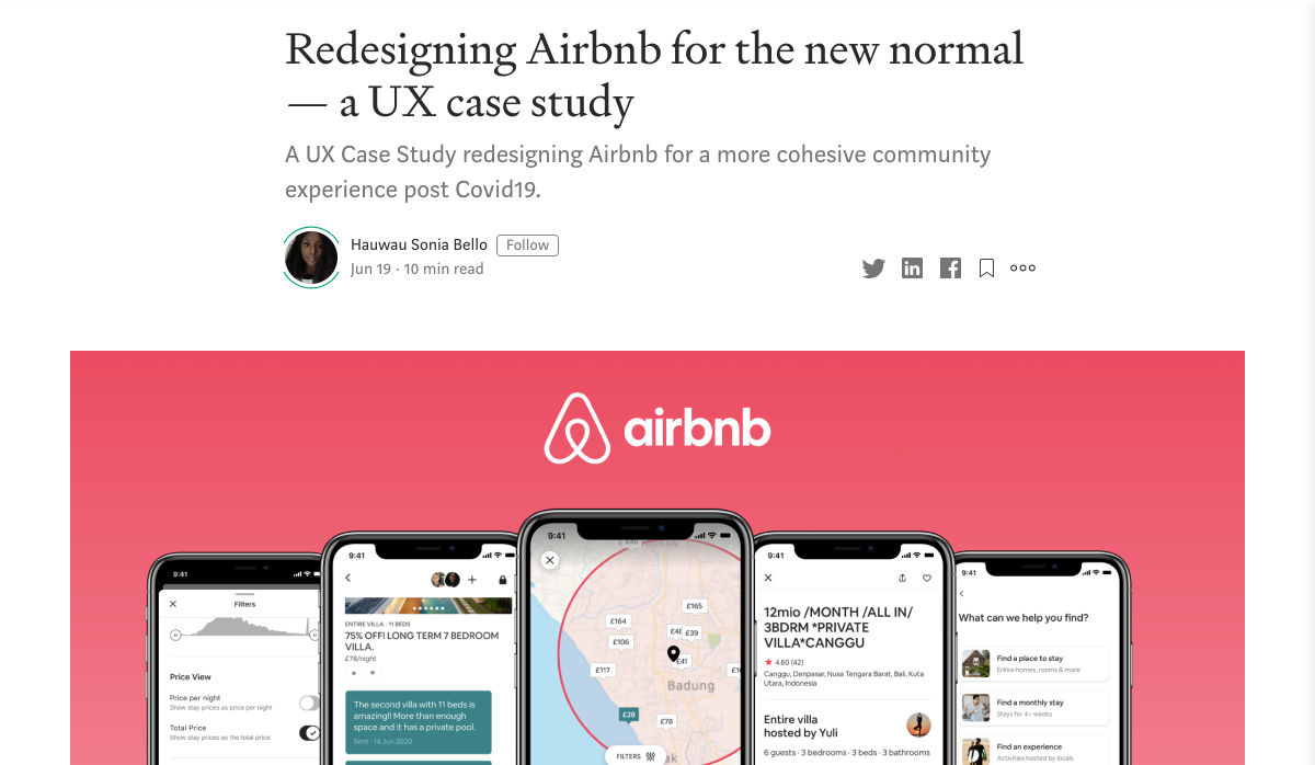
Redesigning Airbnb for the New Normal – a UX Case Study


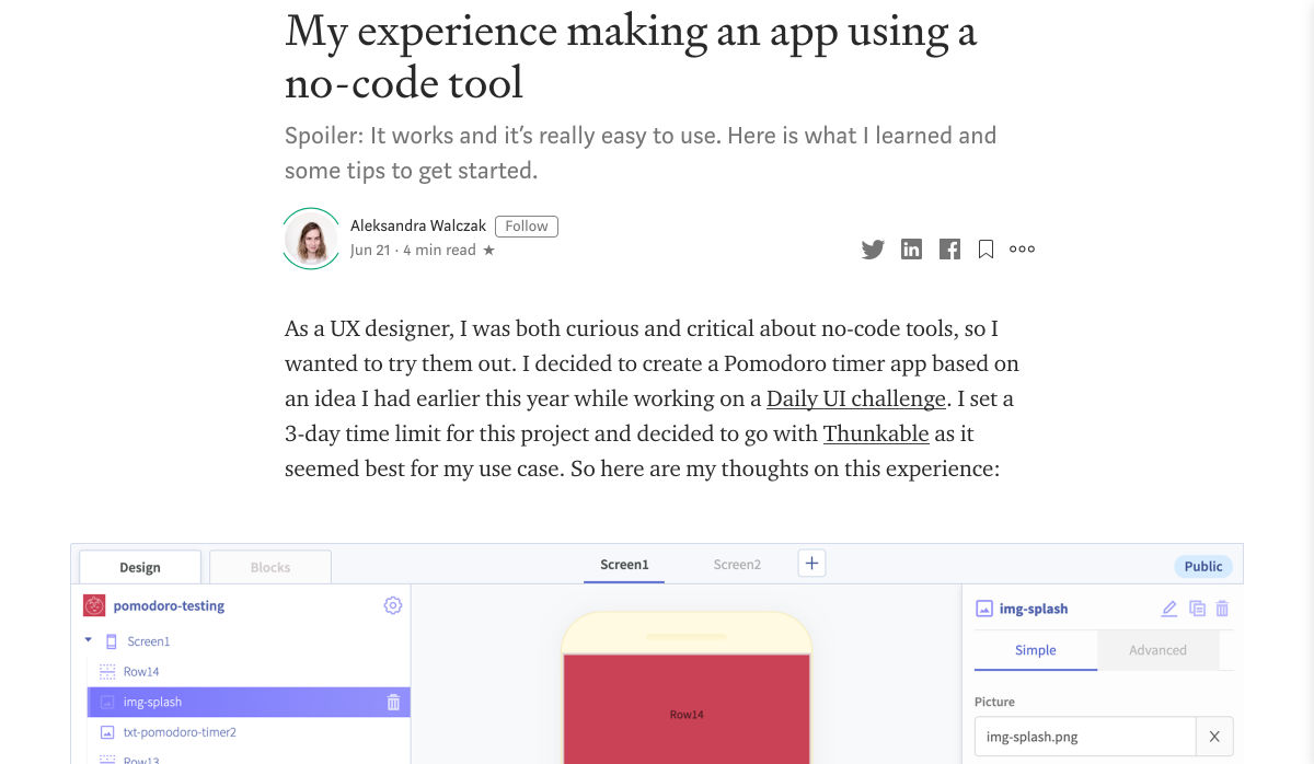
My Experience Making an App Using a No-Code Tool


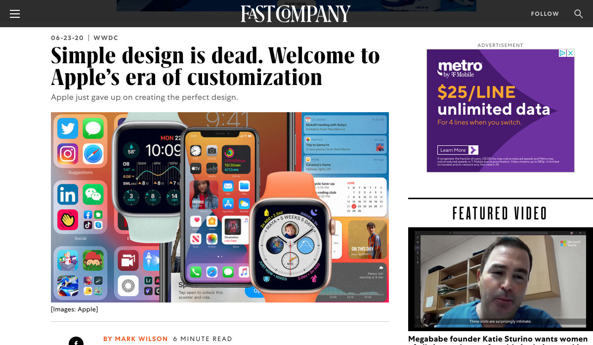
Simple Design is Dead. Welcome to Apple’s Era of Customization


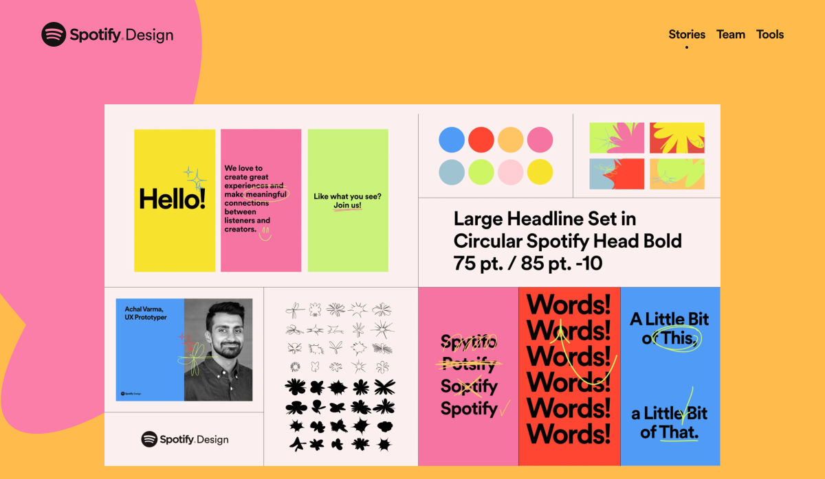
Making the Brand: Redesigning Spotify Design


Neon Mode: Building a New Dark UI


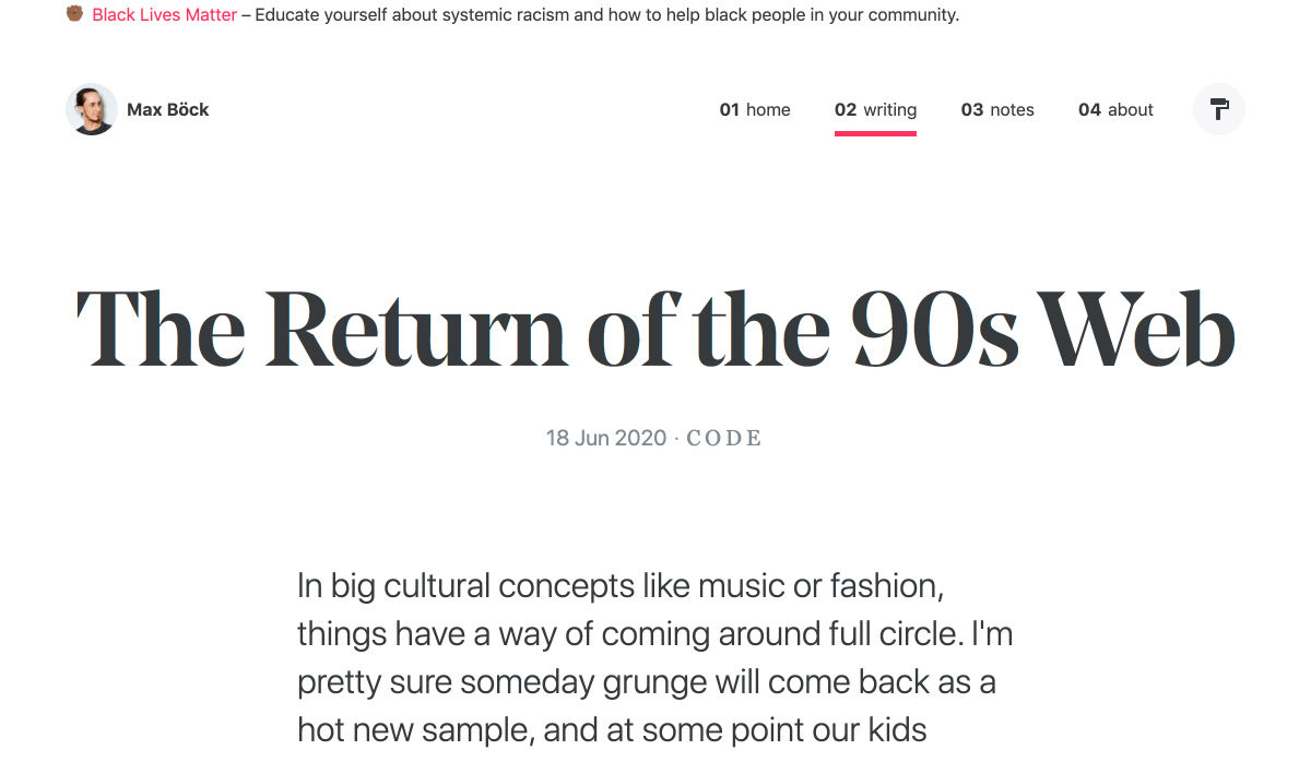
The Return of the 90s Web


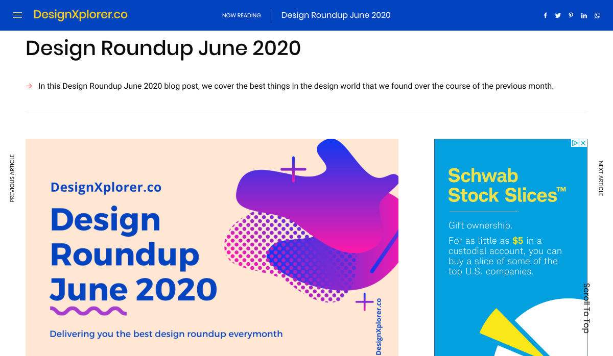
Design Roundup June 2020


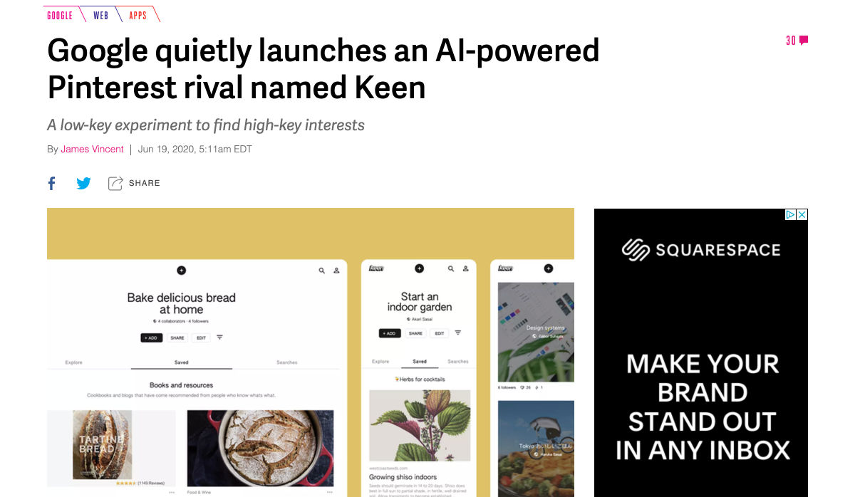
Google Quietly Launches an AI-powered Pinterest Rival Named Keen


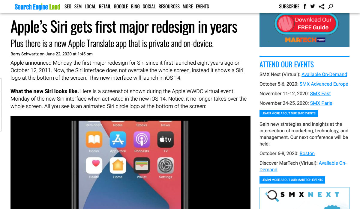
Apple’s Siri Gets First Major Redesign in Years


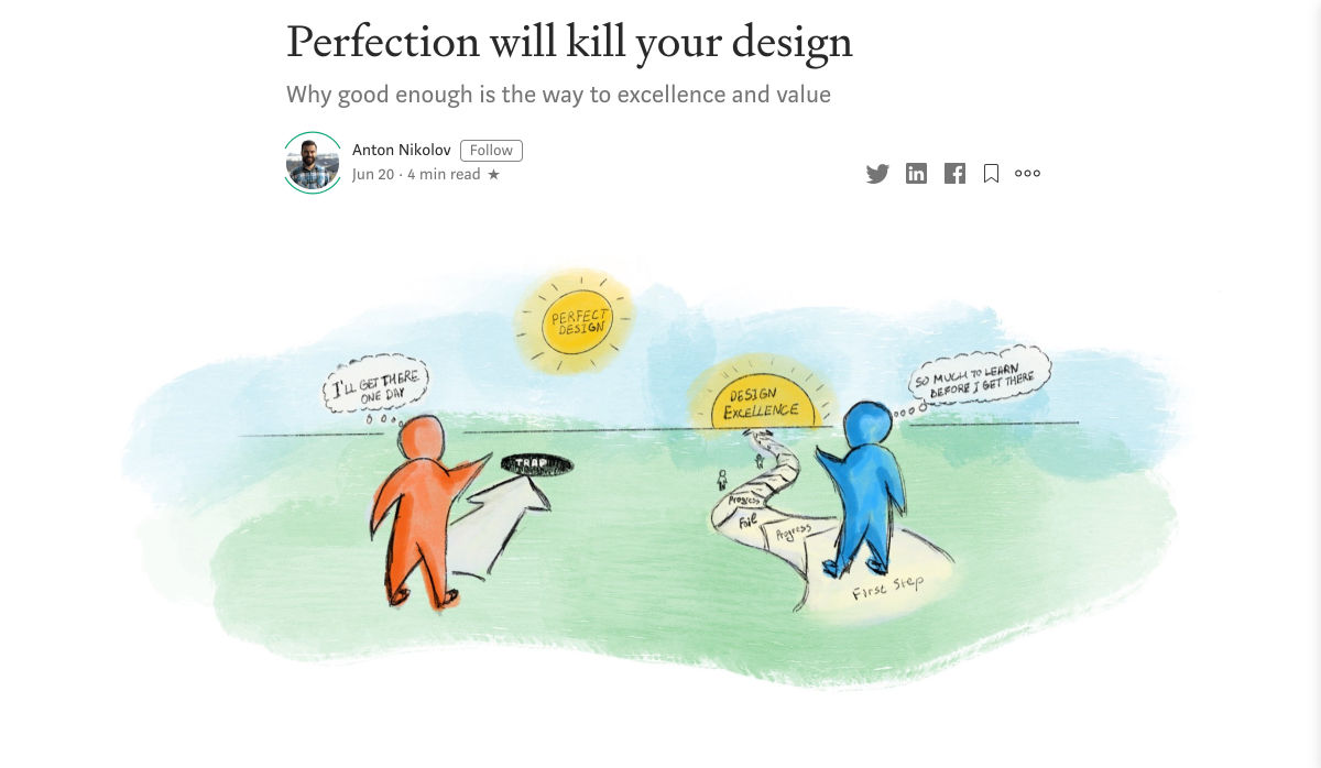
Perfection will Kill your Design


Using 6 Google Analytics Features to Improve UX and Website Metrics


Yale Rebrands for Warmth and a Digital Future


3 Awesome Digital Marketing Strategies to Boost your Web Presence


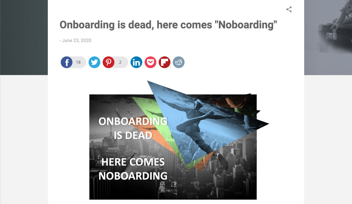
Onboarding is Dead, Here Comes Noboarding


User Experience (UX) Testing: 4 UX Best Practices


8 Ways to Promote your Business Without a Marketing Budget


10 Interaction Design Rules You Must Never Break


On Racism and Sexism in Branding, User Interface, and Tech


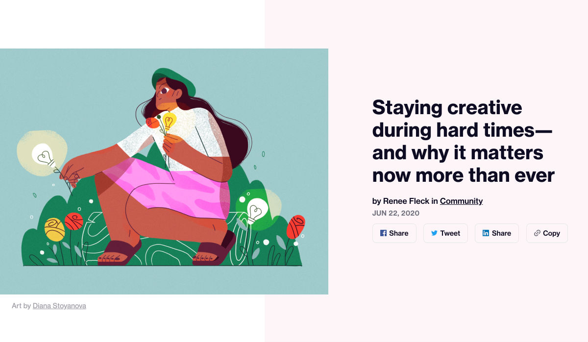
Staying Creative During Hard Times


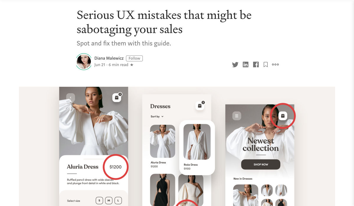
Serious UX Mistakes that Might Be Sabotaging your Sales


10 Key Things a Small Business Website Must Have


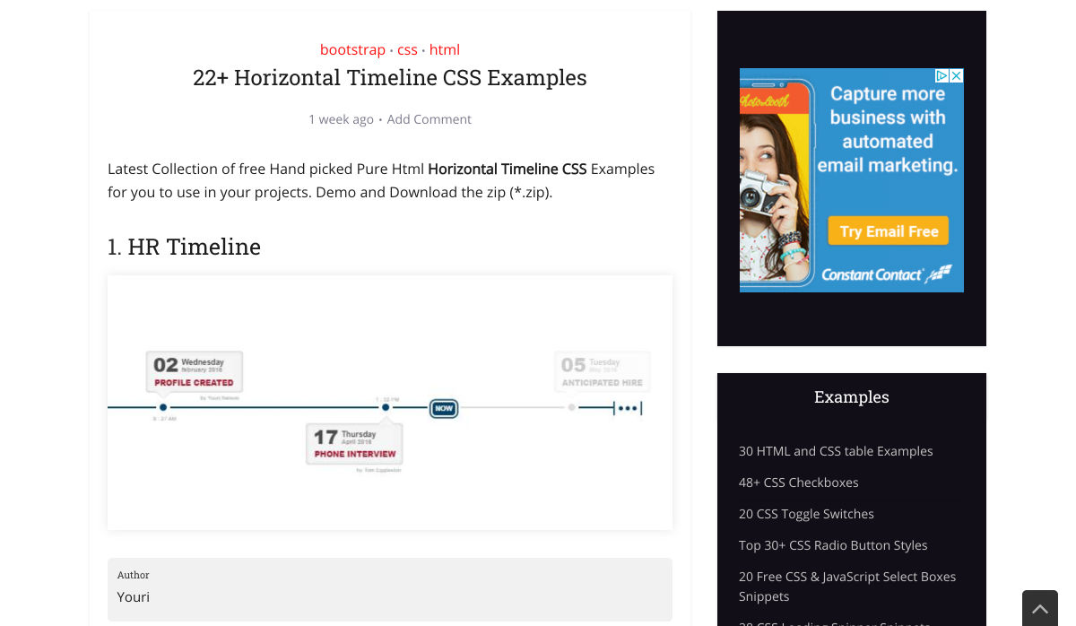
22+ Horizontal Timeline CSS Examples


How to Write an Effective Design Brief in 9 Easy Steps


Creative Exercises to Help You Through your Anxiety


Want more? No problem! Keep track of top design news from around the web with Webdesigner News.

Source

p img {display:inline-block; margin-right:10px;}
.alignleft {float:left;}
p.showcase {clear:both;}
body#browserfriendly p, body#podcast p, div#emailbody p{margin:0;}

Source de l’article sur


Abstract

A user interface to create, read, update or delete records (CRUD) is an essential component of any computer system. The existing user interfaces and activities in record management can be further optimized. Some existing CRUD interfaces involve migrating to a few different pages with a different set of controls and different functionalities. This proposed model is developed to achieve all the functions related to record management on the same page with the same set of controls. This model can achieve all the CRUD functionality in a single page with the same set of controls using minimal interactions. This model ensures a higher level of user-friendliness with more efficient resource management. The proposed model can be extended easily to accommodate specific requirements in different situations.

Introduction

Several entities need to have CRUD functionality even in a simple software solution. The users may view records through the user interface. They may update the viewed record or delete that. The users also need to create new records. This functionality is currently achieved by different systems using a combination of pages. Each page involved has different components with different actions on each page. These systems could have been improved to achieve the same functionality in a simpler and more user-friendly manner. This article discusses a simple, yet powerful model to manage records and have a more user-friendly UI and fewer interactions to achieve the same CRUD operations. This proposed model can achieve all CRUD functions in a single page with the same set of control with minimal interactions.

Source de l’article sur DZONE

A UICollectionView is a way of arranging a content grid or a list of subviews (UICollectionViewCells) in a scrollable view. Collection views are ubiquitous: Instagram’s Search page, Chrome’s tabs overview, or your Favorites lists on media streaming services like Netflix and Crave. All of these examples use a UICollectionView to display cells.

For this article, I’ve been working with Clearbridge Mobile iOS Developer, Conor Masterson, to learn about collection views and resolving the issue of code clutter that sometimes happens when recycling UICollectionViewCells. This post will specifically explore how to implement a protocol for brevity in collection view code. Credit goes to Conor for writing the sample application that goes along with this article. If you’d like to look at the full configuration code, there is a GitHub link at the end of the post.  

Source de l’article sur DZONE