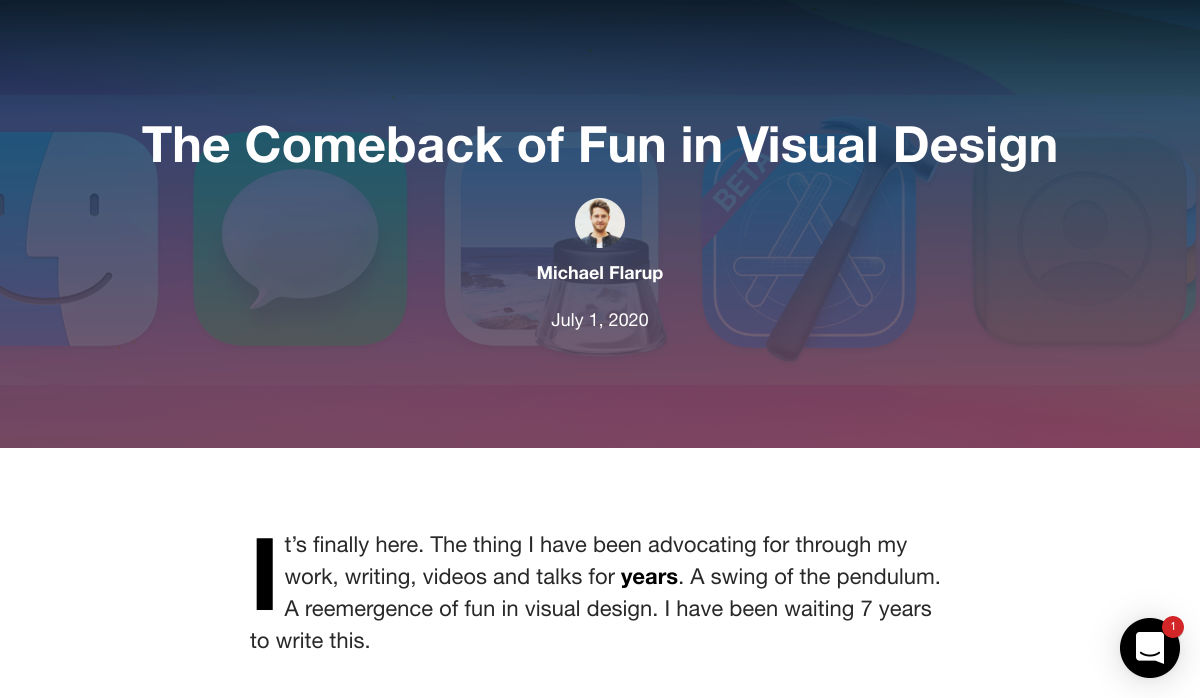
 It’s no secret that the senior population is growing. By 2030, people over the age of 65 are predicted to make up 20.6% of the population of the US.
Around the world, people are living longer and remaining more active in the later years of their lives. What’s more, despite what you might have heard in the past, seniors aren’t as wary of the internet as they used to be. In 2019, the Pew Research institute revealed that 73% of people over the age of 65 were connected to the web.
So, what does that mean for web designers?
your main focus needs to be on ability…people age differently
Well, first of all, it’s time for all of us to start thinking about user experience from different perspectives. We need to stop expecting our audiences to be made up entirely of iPhone-using millennials and start thinking about the needs of seniors too. After all, designing websites for seniors opens you up to a wide selection of potential visitors in the future.
What’s more, according to the US Census Bureau, people over the age of 65 generally have the highest household wealth figures of any age group. That’s a big deal.
So, how do you adapt UX for seniors?
Creating Senior-Friendly Web Designs
When it comes to designing websites and applications for seniors, your main focus needs to be on ability. Age is just a number, and people age differently.
That means that one person in their 70s might have no problem browsing through Netflix to watch the latest shows, while someone else wouldn’t be able to tell you what ‘streaming’ means.
Rather than worrying specifically about age, think about how different people in older age groups might have different requirements when it comes to things like movement control, hearing, vision, and even device bias.
Get the Visual Elements Right
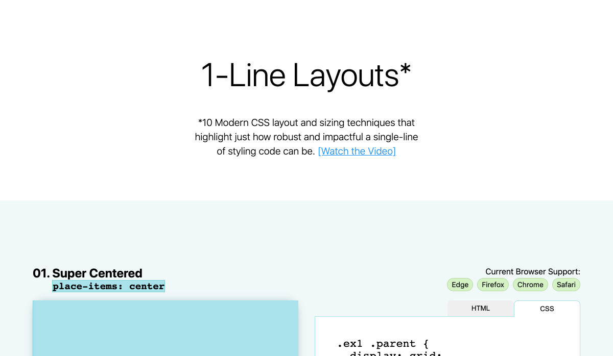
Vision loss is by far the most common disability reported by elderly individuals in the US. Around one in six people over the age of 70 have some manner of visual impairment. That’s why UI designers need to think carefully about visual accessibility when creating the right websites.
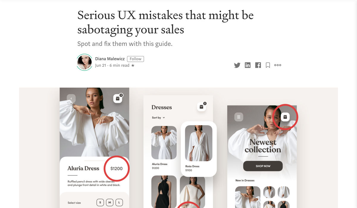
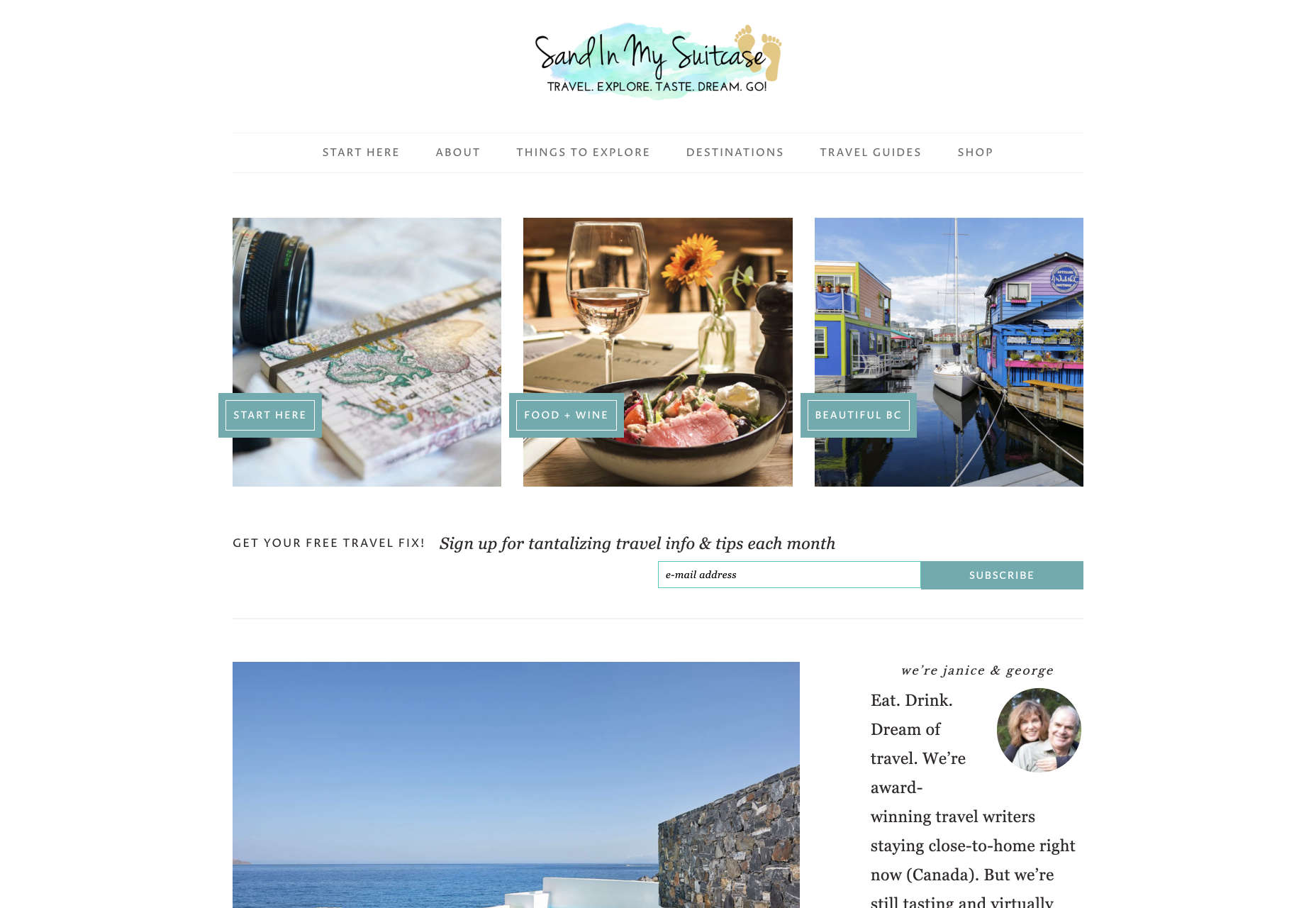
For instance, text and button sizes should always be kept large. Anything that needs to be read or clicked needs to be scaled up, to ensure that everyone can see the information clearly. For instance, on the Sandinmysuitcase.com website, you’ll find clear typography, combined with big buttons that tell you to “Start Here” so you know exactly what to do next.
Remember to stick to icons that are clearly labelled wherever possible. Stay away from anything that your customers might not understand. “Start Here” is easier to read and understand than “Submit”.
It’s also worth sticking to the color and contrast guidelines laid out by basic UX design when you’re creating something for optimal visibility. Colors that are too close together might create a nice pastel or gradient effect on a website – but they’ll also make things difficult to read.
Concentrate on Usability
Over the age of 55, motor skills and coordination can begin to decline for some people. These changes make it harder for people to interact with complex UIs. The mouse on a computer can be a particular problem for people with diminishing motor skills – as can the touchscreen of a tablet or smartphone.
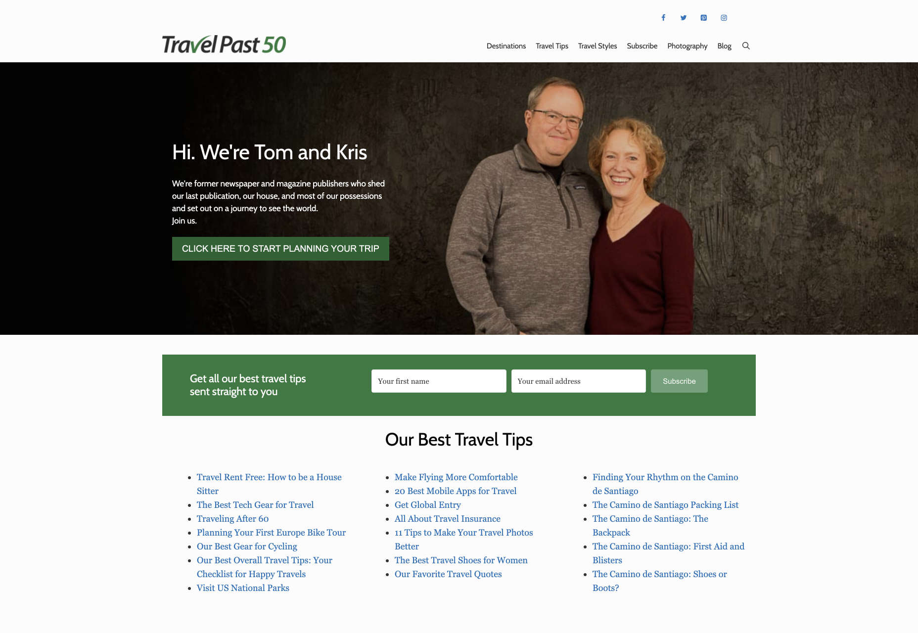
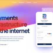
When you’re working on the perfect UX, think about how you can make things as easy to click as possible for people who have a hard time hitting their targets. For instance, in this website for people traveling over the age of 50, you’ll see not only fantastic large font choices but big buttons that are descriptive and easy to understand too: “Click here to start planning your trip”:
The scrollbar can also be a bit of a problem for people with impaired motor skills. Because of this, it’s best to keep your focus on designing above the fold. Make sure that users don’t need to scroll far to find the information that they need and keep scrollbars simple in terms of their look and feel.
While you’re working on usability, remember that it will be important to keep interactions to a minimum wherever possible. Where you can engage younger audiences with double-taps, swiping and scrolling, it’s much easier to connect with seniors through simple one-tap interactions. The less actions your user needs to take to reach their goals, the better.
Deliver Smooth Navigation
Navigating from point A to B on your website needs to be as simple as seamless as possible. Remember, crowded pages on your websites and apps are often overwhelming – even for younger browsers. Seniors are generally just searching for “must know” information, so they don’t want anything to get in their way as they navigate through their website.
As you work on your site or app design, ask yourself if every element on the page absolutely has to be there. If it doesn’t deliver value, then get rid of it.
Additionally, remember that seniors don’t always have the best memories and concentration levels. That means that they need your navigation experience to be as simple as possible. Basic horizontal menu bars that show everything at once are often a good idea – even if they’re not very exciting.
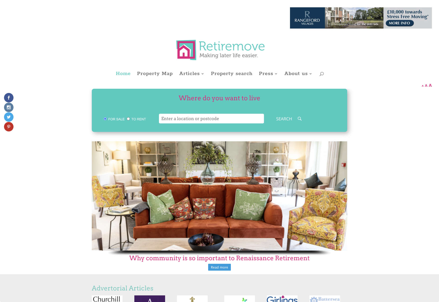
Look at this helpful navigation experience from RetireMove.com, for instance. Everything you need is located at the top of the page, and you can even just enter your postcode to get started:
Cognitive decline happens regularly with age. Although not all older adults will have issues with their memory and concentration, it’s important to be prepared for an audience that might process information a little more slowly. It’s worth double-checking that your viewer’s attention isn’t being diverted to multiple parts of the page at once.
Get to the Point Quickly
While younger generations have quickly implemented technology into every aspect of their lives, older consumers use tech a little differently. These people don’t want to spend forever fiddling around with different parts of your website. They want to get the answers to their questions as quickly and easily as possible.
Applications that are complicated or difficult to access are usually instantly rejected by seniors. Even if you’ve offered everything that we’ve covered above, from seamless navigation to minimalist design, you still won’t get the interactions you’re looking for if older adults don’t consider your design to be useful.
Because of this, you need to highlight the point of a website or application to your seniors as quickly as possible. Avoid worrying about things like gifs, animations and gamification. Instead, focus on making sure that your designs are useful and simple.
For instance, from the moment your senior user arrives on a web page, they should have instant access to clear instructions on how to use the application or service, and what they need to do next. Keep in mind that this is particularly important when you’re creating mobile apps, as apps are still a relatively new concept to older generations.
On the “When They Get Older” website, you can instantly find the information you need in a well-organized navigation bar that’s labelled clearly:
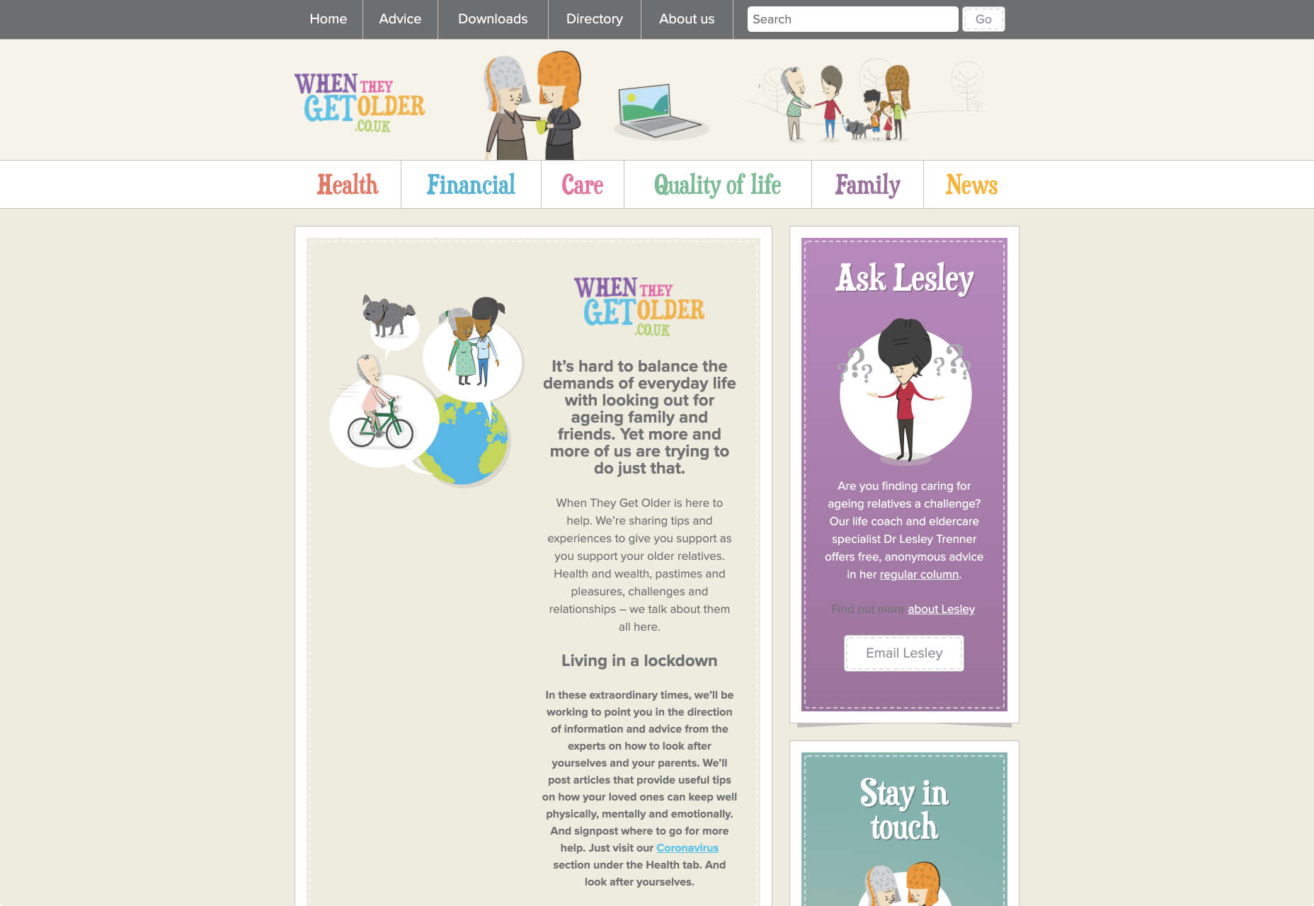
A clear interface like this, combined with simple, step-by-step guidance that shows elderly individuals how to get the information that they want is the key to keeping these users coming back for more.
Bringing a Mature Perspective to Web Design
These days, most designers focus heavily on younger audiences when creating websites and apps. After all, it’s these users that allow us to experiment more with the latest tools and concepts, like augmented reality, artificial intelligence, and robust animations.
However, there’s still a market out there for the seniors of the world that want more opportunities to get online. This audience often goes ignored and under-served. However, as the value of older consumers grows, and their ability to interact online increases, you’ll find that more businesses begin to search for web designers who can provide immersive experiences for a more mature audience.
The steps above will give you an excellent insight into how you can start designing for a different kind of customer base. However, remember that the best way to make sure that you’re delivering the right solution for any customer, is to test. User testing will provide you with the exclusive insights that you need to determine whether your senior UX is really working, or whether you’re still struggling to get into the shoes of an older user.
Featured image via Unsplash.

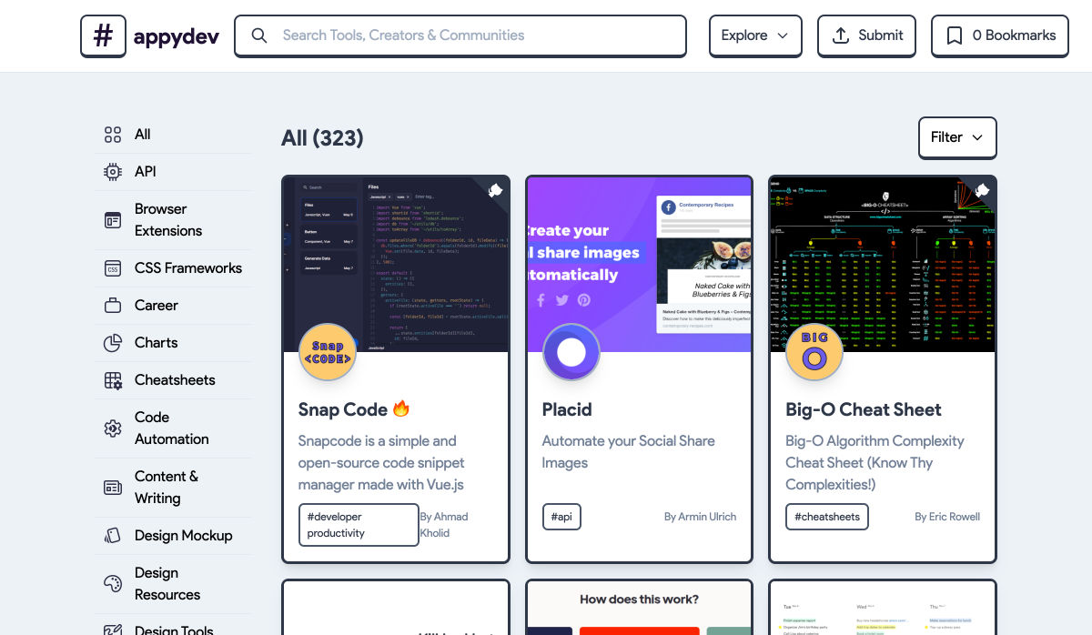
 Every week users submit a lot of interesting stuff on our sister site Webdesigner News, highlighting great content from around the web that can be of interest to web designers.


 Every week users submit a lot of interesting stuff on our sister site Webdesigner News, highlighting great content from around the web that can be of interest to web designers.


 Every week users submit a lot of interesting stuff on our sister site Webdesigner News, highlighting great content from around the web that can be of interest to web designers.


 Every week users submit a lot of interesting stuff on our sister site Webdesigner News, highlighting great content from around the web that can be of interest to web designers.


 Every week users submit a lot of interesting stuff on our sister site Webdesigner News, highlighting great content from around the web that can be of interest to web designers.


 Every week users submit a lot of interesting stuff on our sister site Webdesigner News, highlighting great content from around the web that can be of interest to web designers.