Articles

One of the few bright spots in 2020 has been the creativity companies and individuals alike have exhibited in dealing with what, at times, seemed to be overwhelming problems.

The world of web design was no different. Designers and agencies had to adapt and implement new color schemes or design new shopping experiences, which made some of the previous design trends not fit for the current design problems.

We’ll take a look at these newest design trends and the rationale behind them. As we do so, we’ll also take a look at some of BeTheme’s 600+ pre-built sites that have already put them to good use.

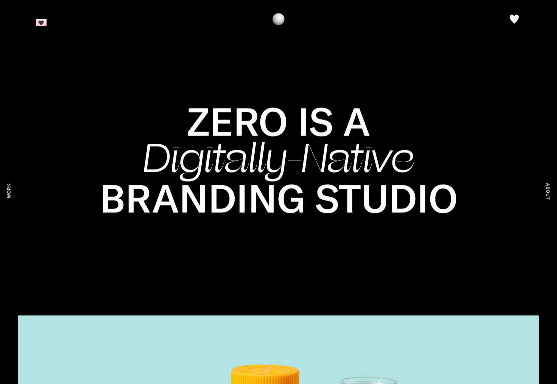
1. Comforting Color Palettes Lighten the Load

In years past, bolder color schemes were one of the hallmarks of web design trends. Their purpose was to quickly engage a visitor and prompt him or her to respond emotionally.

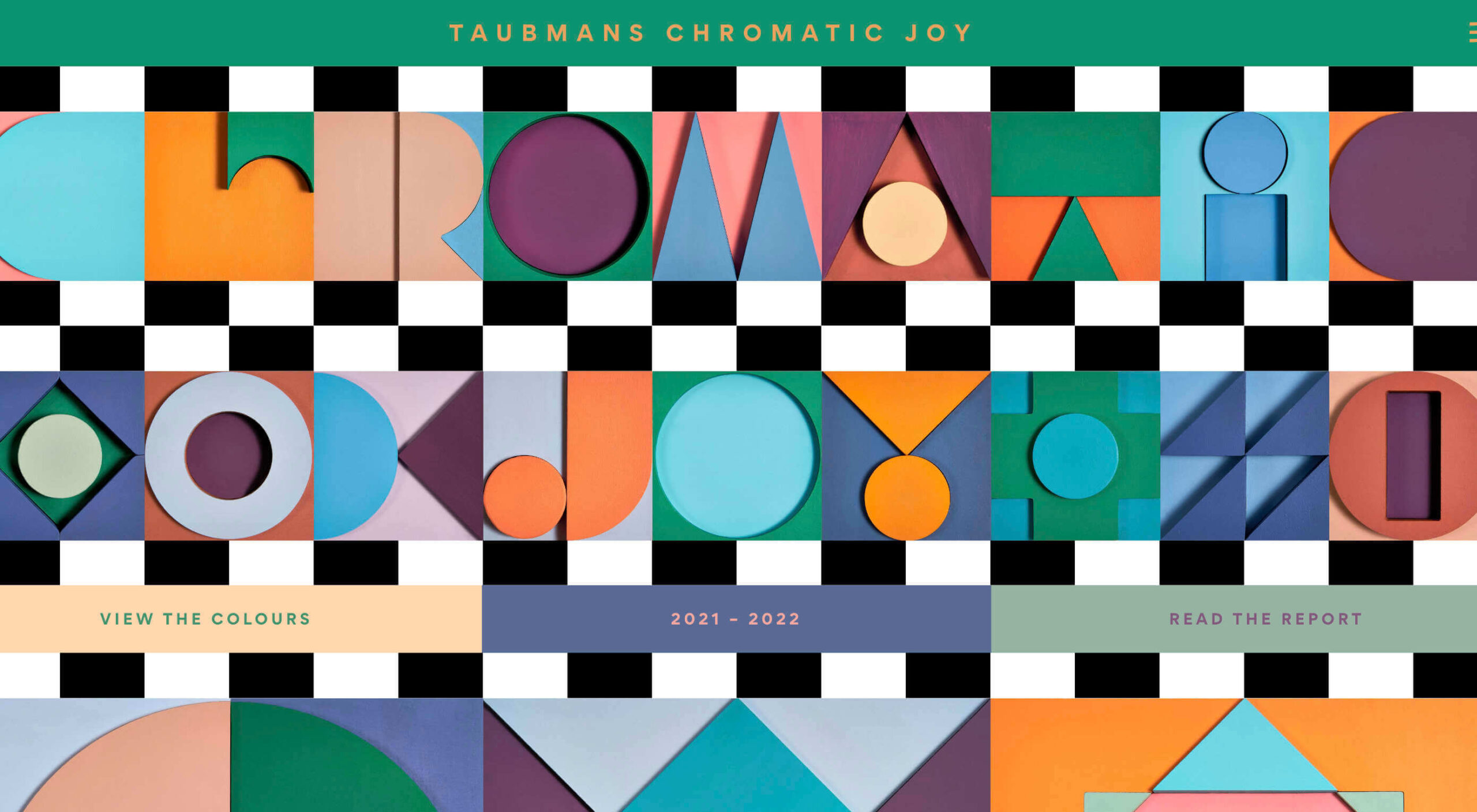
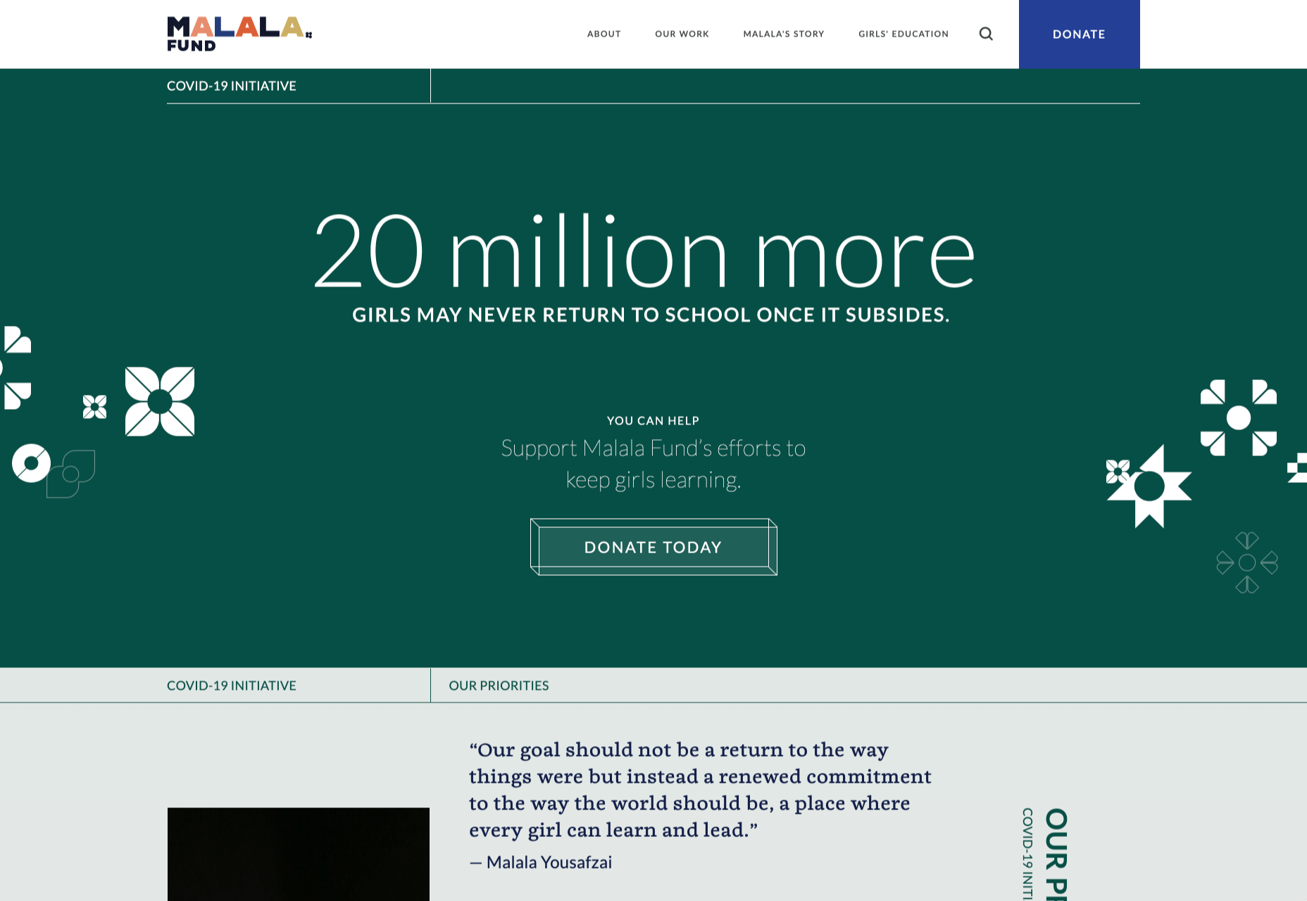
Given all the drama and turmoil we were subjected to through most of 2020, we’ve come to welcome the use of toned-down colors in marketing instead of the bolder, brasher, and more “in-your-face” color schemes. 

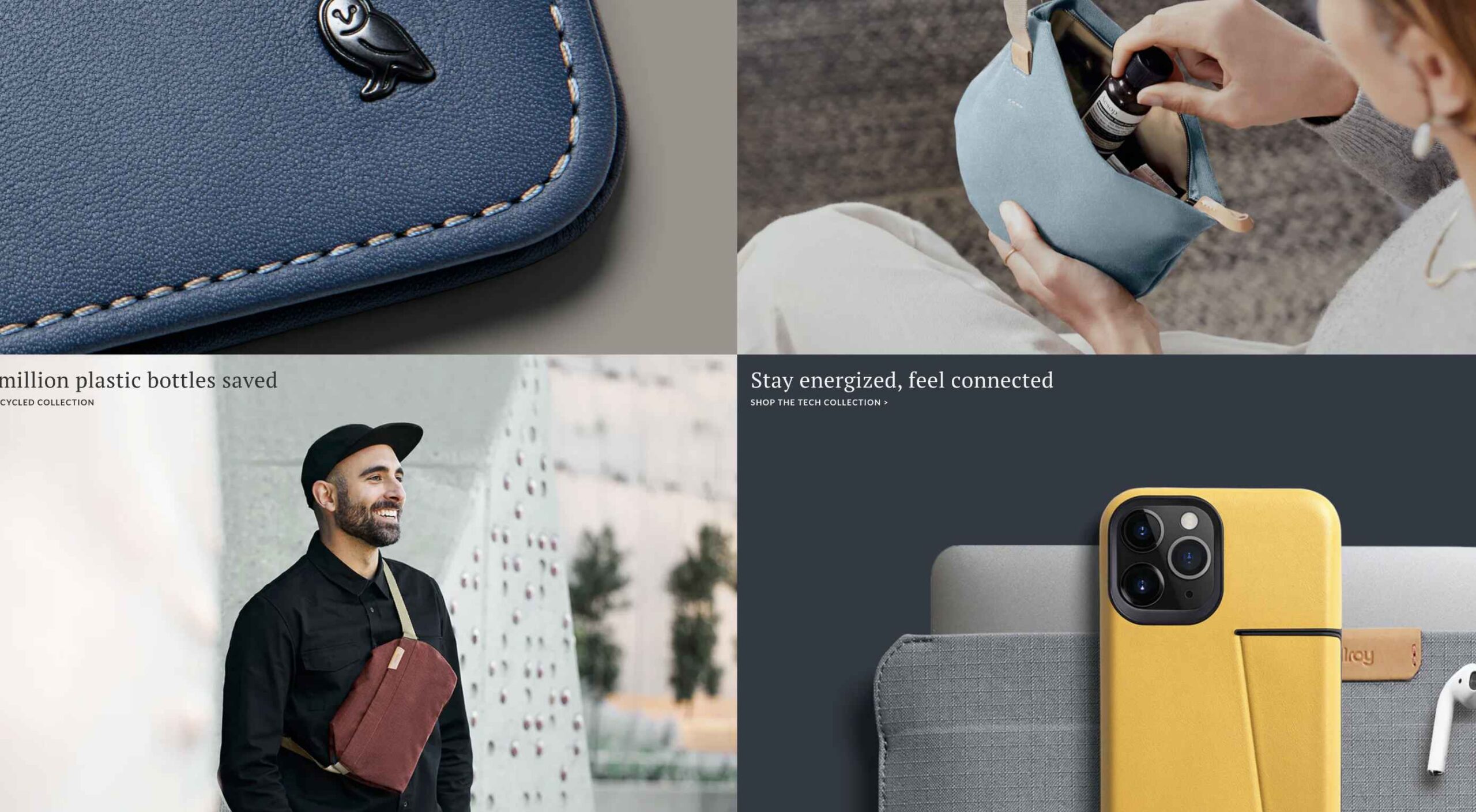
Bellroy’s website puts toned-down colors to good use. This company’s product line of wallets, bags, and the like, are designed to keep people’s belongings organized, safe, and secure. A wild color scheme simply wouldn’t be fitting.

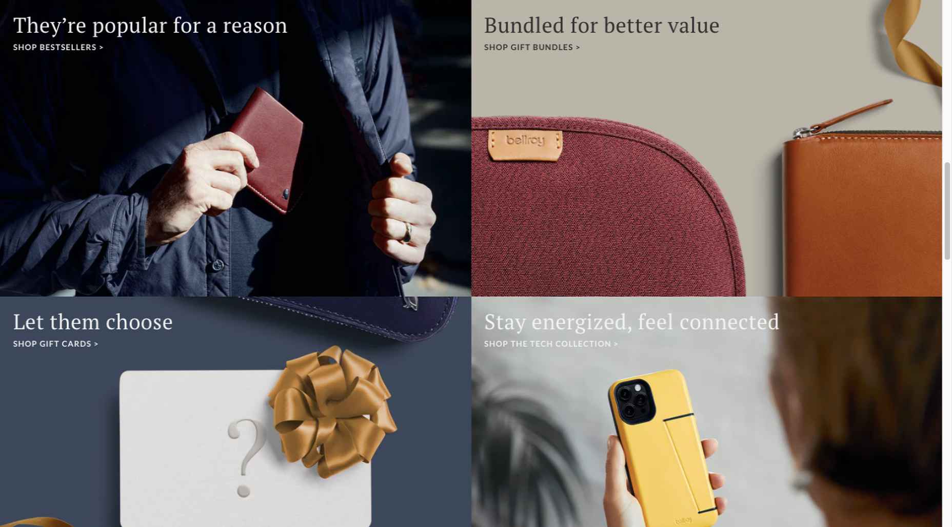
How, then, are brightly-colored products dealt with? Thanks to judicious uses of white space and background photos, this website still emphasizes a toned-down color palette.

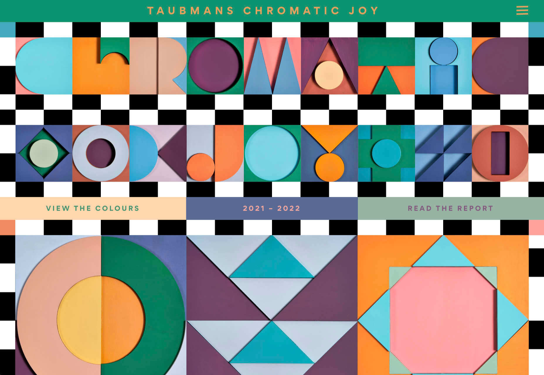
The BeSpa pre-built website is another example of a color scheme that almost immediately puts the mind at ease.

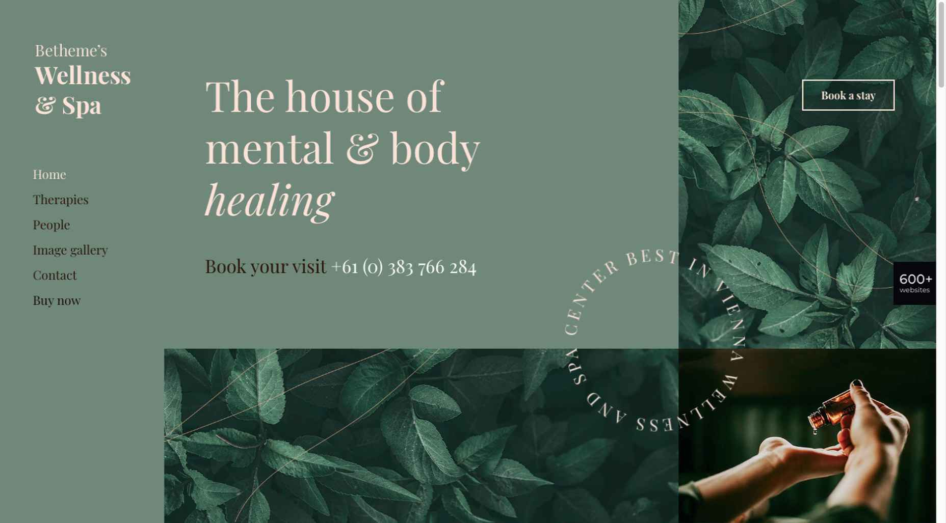
Calm and soothing? Yes.

Boring? Definitely not.

Comfort and security are the emotional drivers in this example.

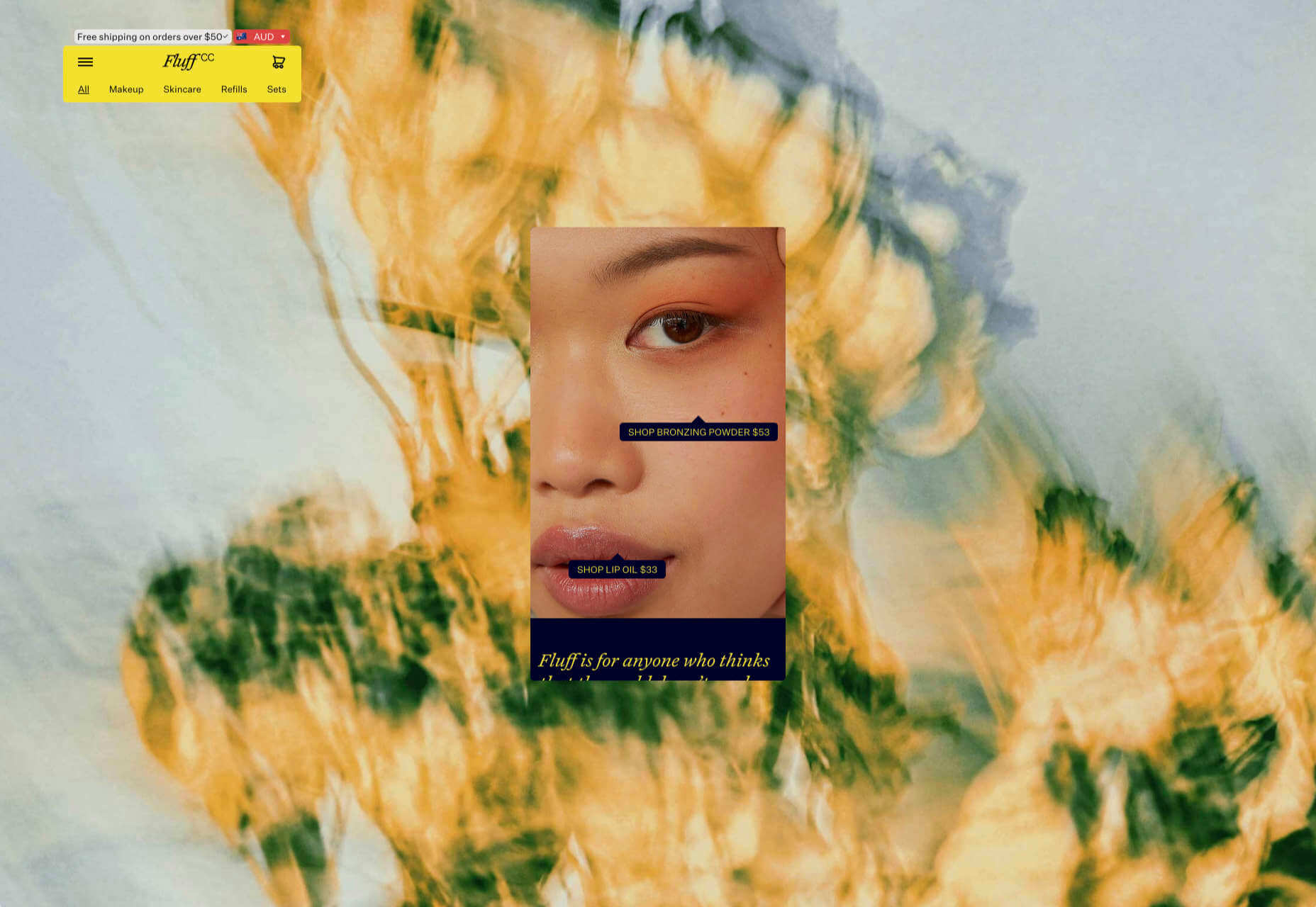
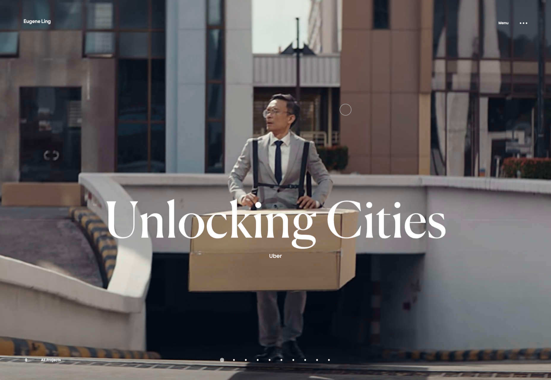
2. Seamlessly Intermingle and Balance Physical and Digital Imagery

People confined to their homes because of Covid-based restrictions spent many more hours looking at their screens in 2020. Online programming began to take on the appearance of a reality show that blurred the boundaries between the real and the digital.

Whereas web designers tended in the past to rely on either photos or illustrations in their designs, these same designers have started to integrate these blurring effects into their designs, with results that range from amusing and quirky to highly informative.

Check out this example from fashion designer Constance Burke

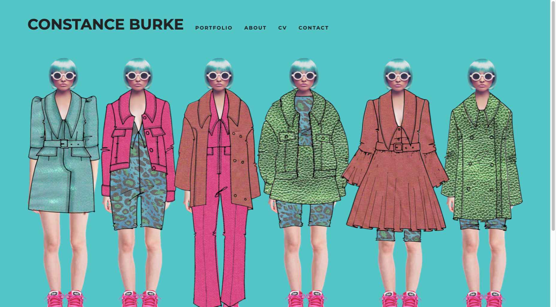
It’s not every day you see real models wearing hand-drawn fashion sketches. But it’s just one example of how the physical can be blended with the digital.

The BeSki pre-built site does the same blending of the two, but in a totally different way:

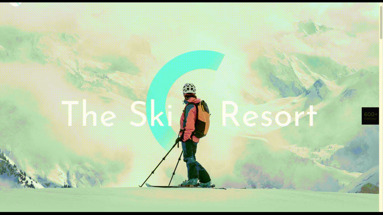
The sections’ designs switch from predominantly physical to largely digital and back again, an excellent approach that provides a maximum amount of useful information.

It’s also worth noting how snowbanks are effectively used to seamlessly transition from one section to the next.

3. Create Well-Organized and Helpful Shopping Experiences

More people spending more time at home has created a surge in online shopping. As a result, many online store owners are now feeling the effects of increased competition.

Consumers look for brands they believe they can trust. At the same time, they want their online shopping experiences to be as quick and painless as possible. They look for (and expect) quick and effective product search capabilities, helpful and effective product displays, one-page product descriptions, and the like.

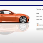
Walgreen’s product page design is especially well-suited for 2021 ecommerce shoppers: 

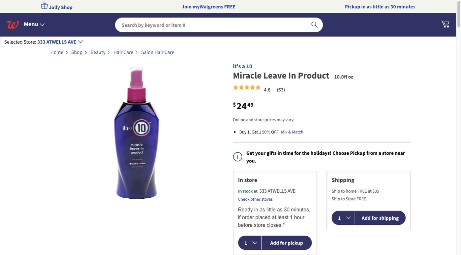
Everything shoppers usually need to know is presented above-the-fold. They can easily proceed to the next step or scroll down for reviews or additional product specifications. 

BePestControl’s pre-built website uses a similar product design approach: 

In this example, the main selling points are up-front and are kept short and sweet. The shopper can either hit the ‘Add to Cart’ button or look below the button for additional information.

In both examples, a visitor doesn’t have to mull over what step to take next since one of the design objectives is to make the shopping experience as easy and as satisfying as possible.

4. Take Advantage of the Benefits of User-Controlled Video Content

Once upon a time, video content was “the thing” to incorporate in a website. Hero background videos proved to be particularly engaging, and “how-to” videos presented much more useful information than illustrations or blocks of text could.

On the other hand, Auto-play videos, those that started on their own, all too often had a tendency to irritate rather than inform, especially when their content didn’t address a visitor’s immediate concern.

Thanks to Zoom and similar video platforms that came into widespread use in 2020 and to website designs that include video “Play” buttons, users have become much more comfortable with the medium. As an example, Shoppers have been given total control over if or when they want to view a given video. 

This is the design approach Payoneer has taken: 

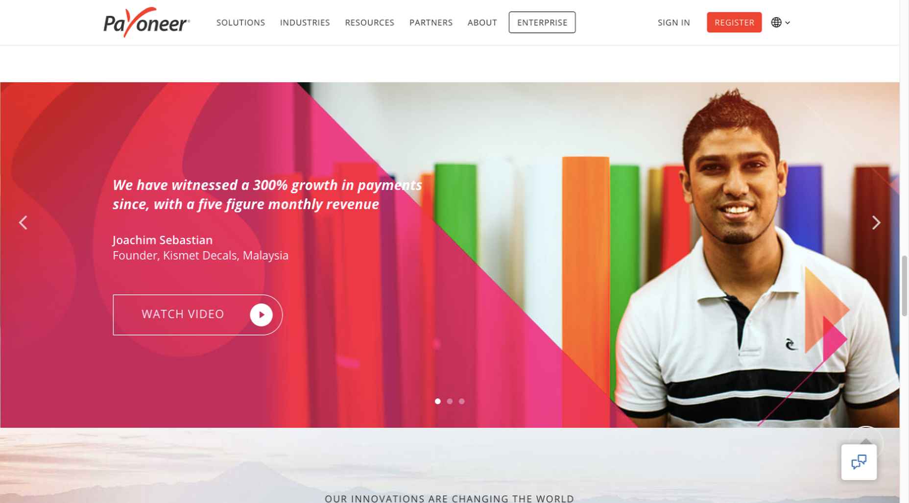
The white “Pay” button is impossible to miss, and while it is designed to encourage a visitor to watch a testimonial, doing so is completely optional.

The BeOptics pre-built website cleverly slips in a video play option as well: 

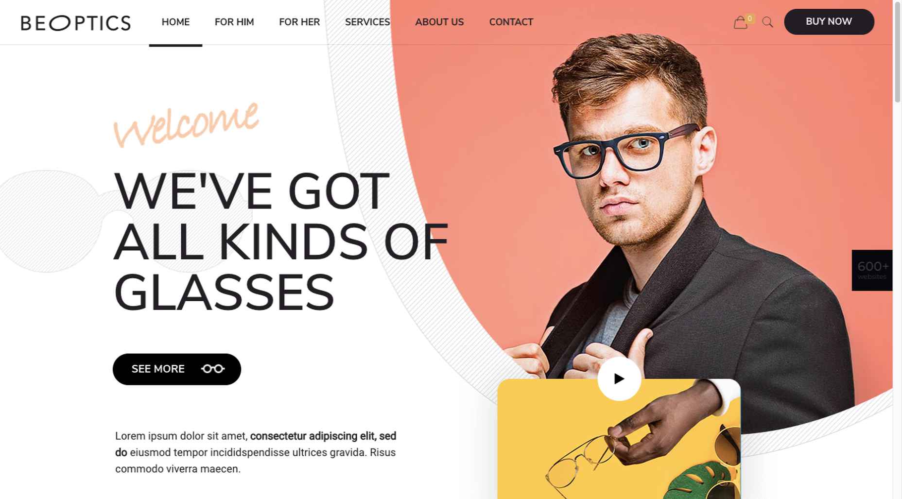
In this example, when visitors hover over the “See More” button, it lets them know that they have the option to watch the video if they want to learn more.

5. Trust Builders Should be Non-Negotiable Web Design Elements

There are various ways in which products are organized or showcased in brick and mortar businesses to instill trust. Helpful and friendly staff also contribute to instilling trust.

Some of these trust-builders are easily incorporated into eCommerce designs. Others, though more difficult to fit in, can usually be satisfactorily addressed.

Digital trust builders can include.

  • Logos (familiar, whimsical, innovative, engaging)
  • Portfolios and/or product pages
  • Customer reviews, product ratings, and client testimonials
  • Case studies and product or price comparisons
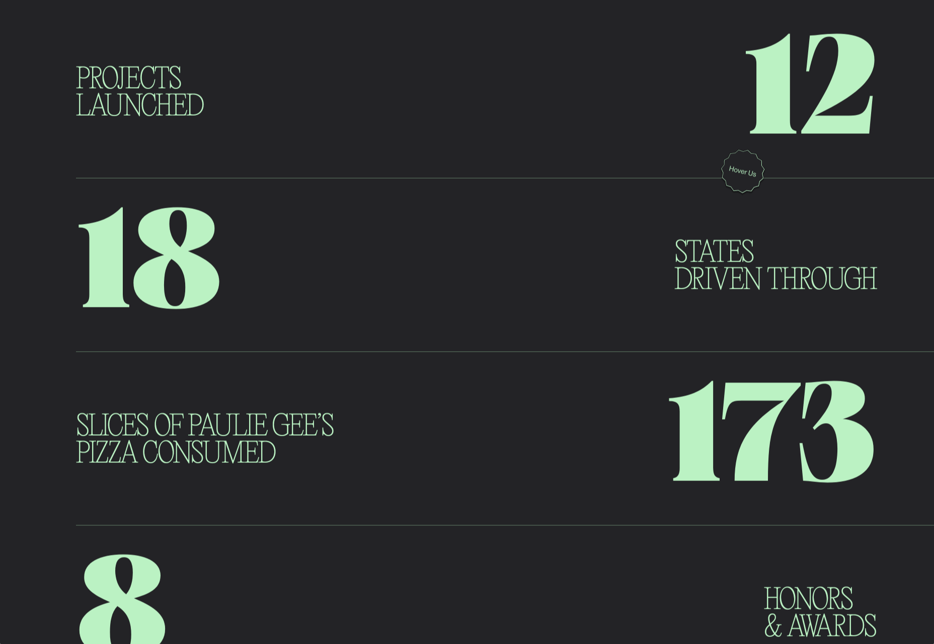
  • Safety and security seals, e.g., Better Business Bureau, PayPal checkout
  • Charts, graphs, counters, and other data visualization techniques
  • Proof of social, charitable, or community-related actions and contributions

Put, trust-building content will beat hard-sell techniques every time, especially if you would like your customer base to include referred and repeat customers.

Omaze, for example, gives people entries for prizes based on their donations while at the same time highlighting the good things it and its donors have brought about.

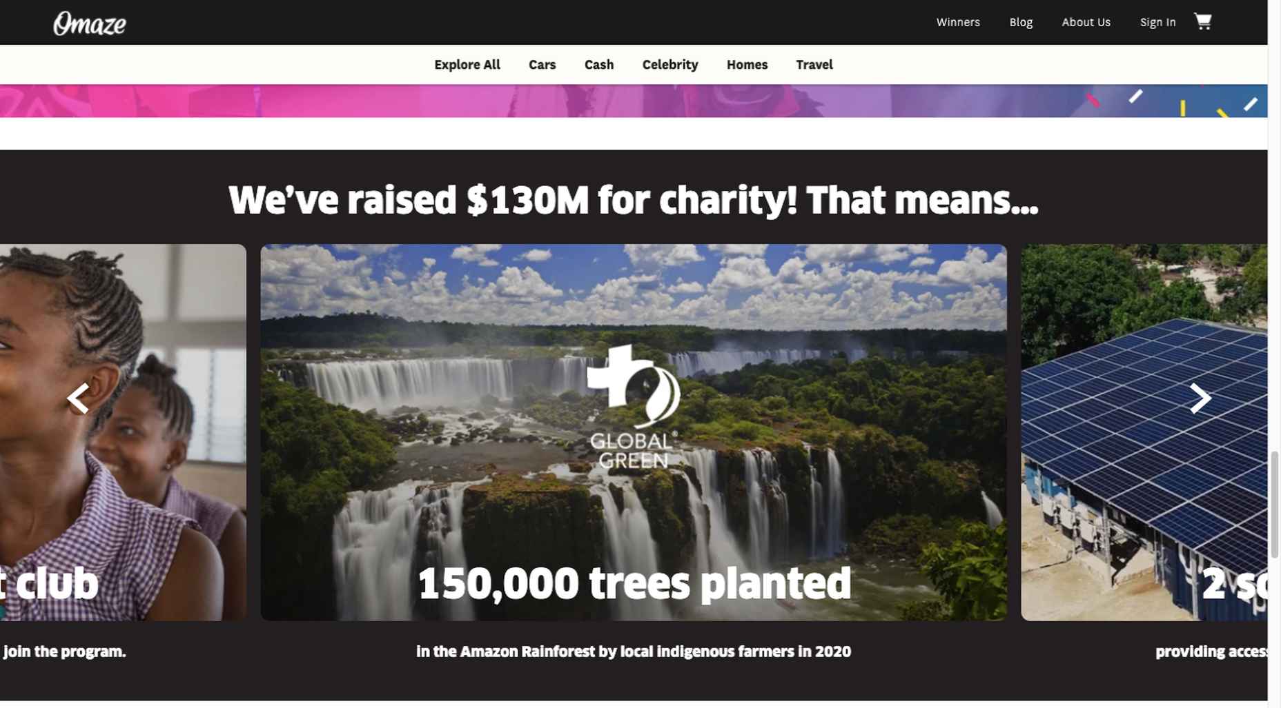
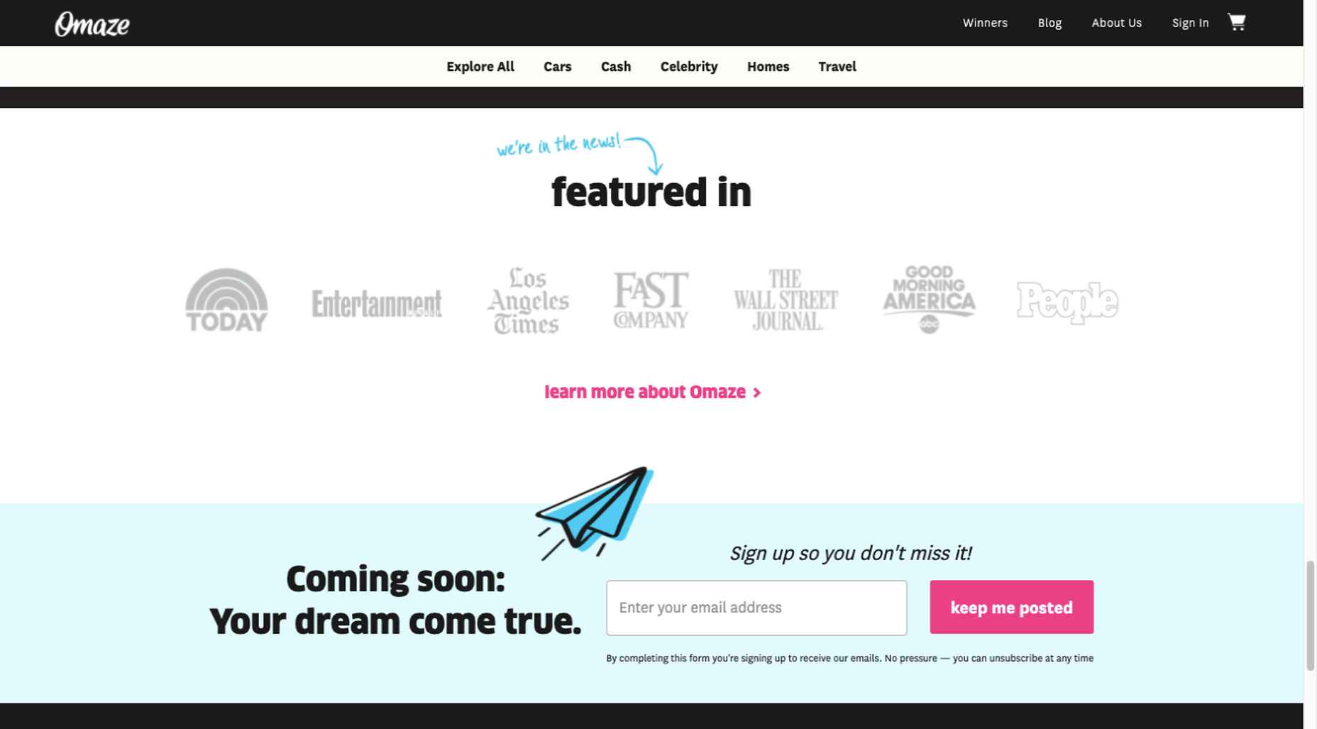
To help build trust, the site devotes space to highlighting publications that have featured Omaze and the work it has done and is doing.

Plus, it puts data visualization and non-profit testimonials into play to give visitors an added insight into what is going on behind the scenes: 

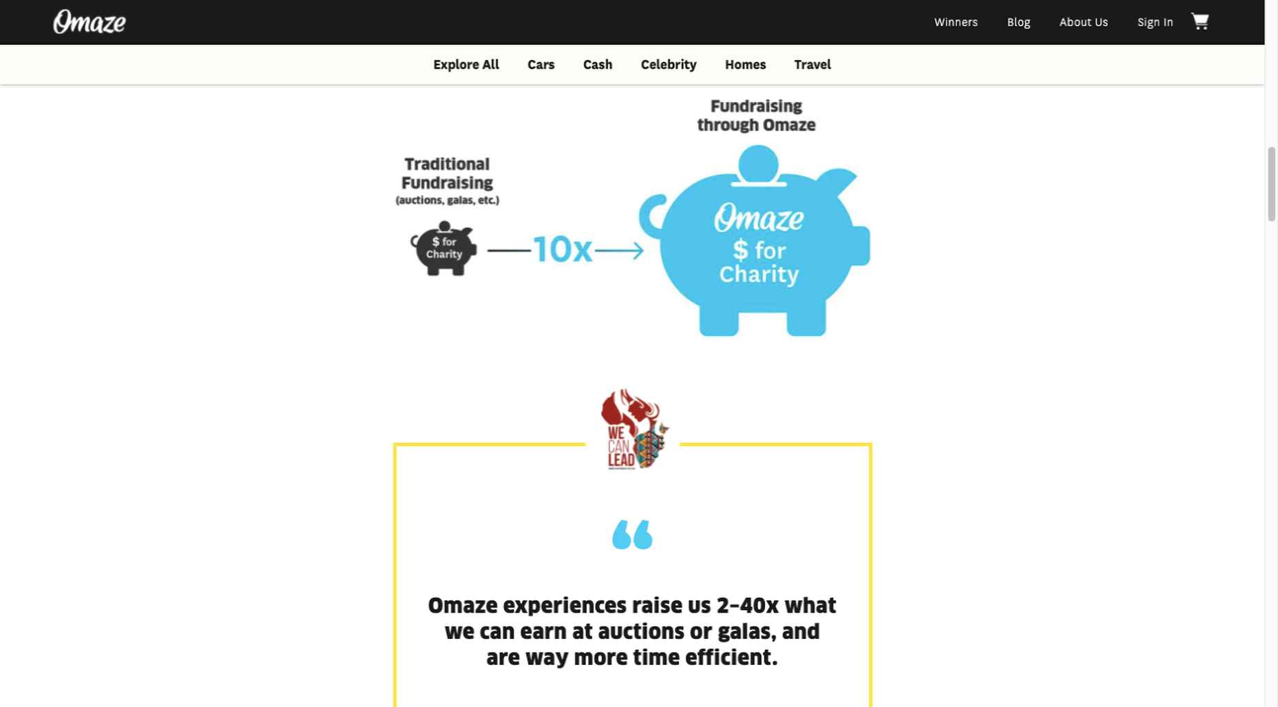
As you can see, it doesn’t have to be difficult to incorporate genuine trust-building content into your website designs.

BePortfolio is a great example of how you might go about doing this for a portfolio site, whether it’s your own or a site for a client:

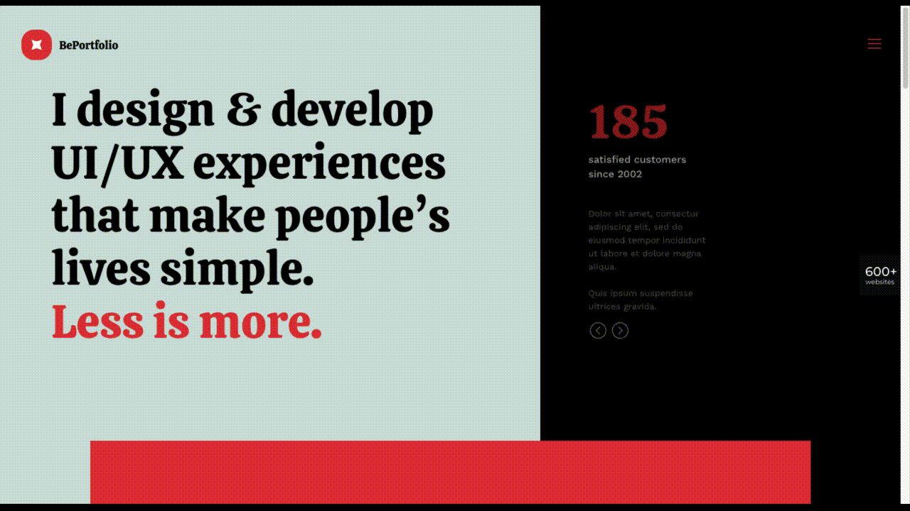
The home page alone has plenty of space for including trust-building content:

  • A satisfied customer counter
  • Product usage case studies and testimonial
  • Portfolio highlights
  • Client and partnership logos

And it can only get better as a visitor moves through the site, but only if you’ve chosen to make that happen.

Have You Started to Take These New Web Design Trends to Heart?

We’re not suggesting that you throw the baby out with the bathwater, but some trends will need to be discarded to enable you to adjust to a new normal. Other 2020 design trends, like minimalism and headline topography, are likely to remain popular for years to come.

New trends that incorporate calming color palettes, image blending, more efficient eCommerce UX designs, user-controlled video, and trust-building elements should give your customers the feeling of comfort and security they will be seeking in 2021.

If you want to implement some or all of these new trends in your 2021 website designs, BeTheme’s 600+ pre-built sites make doing so an easy task.


[– This is a sponsored post on behalf of BeTheme –]

Source

The post 5 Web Design Trends and Ideas for 2021 first appeared on Webdesigner Depot.


Source de l’article sur Webdesignerdepot

This is the eighth article documenting what I’ve learned from a series of 13 Trailhead Live video sessions on Modern App Development on Salesforce and Heroku. In these articles, we’re focusing on how to combine Salesforce with Heroku to build an “eCars” app—a sales and service application for a fictitious electric car company (“Pulsar”) that allows users to customize and buy cars, service techs to view live diagnostic info from the car, and more. In case you missed my previous article, you can find the link here.

Just as a quick reminder: I’ve been following this Trailhead Live video series to brush up and stay current on the latest app development trends on these platforms that are key for my career and business. I’ll be sharing each step for building the app, what I’ve learned, and my thoughts from each session. These series reviews are both for my own edification as well as for others who might benefit from this content.

Source de l’article sur DZONE

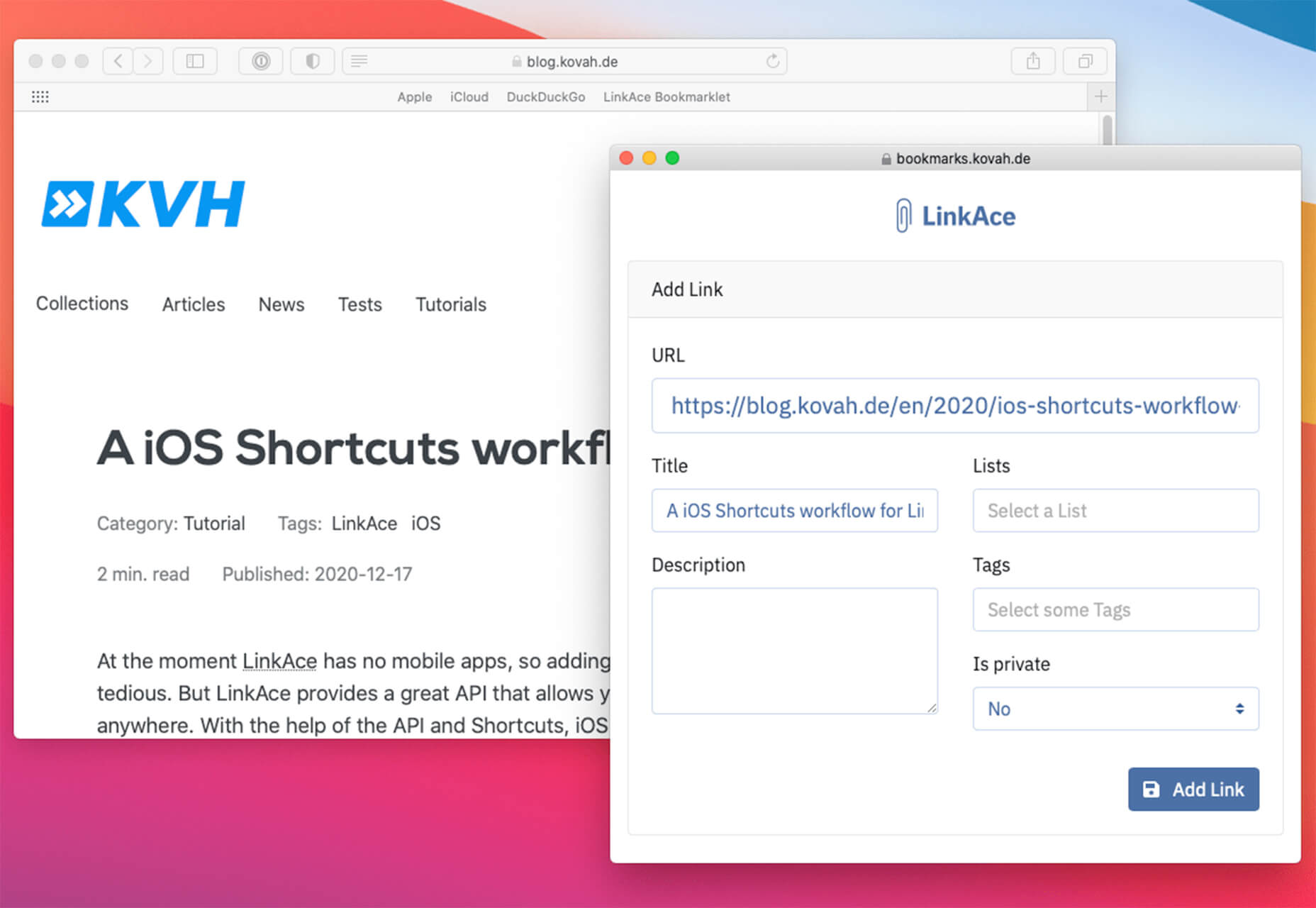
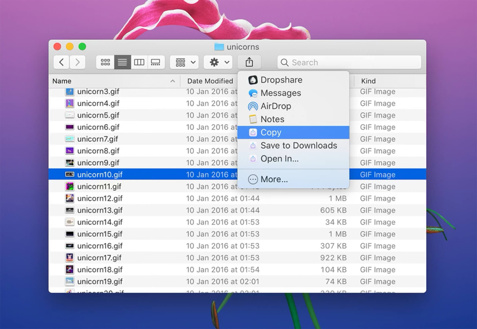
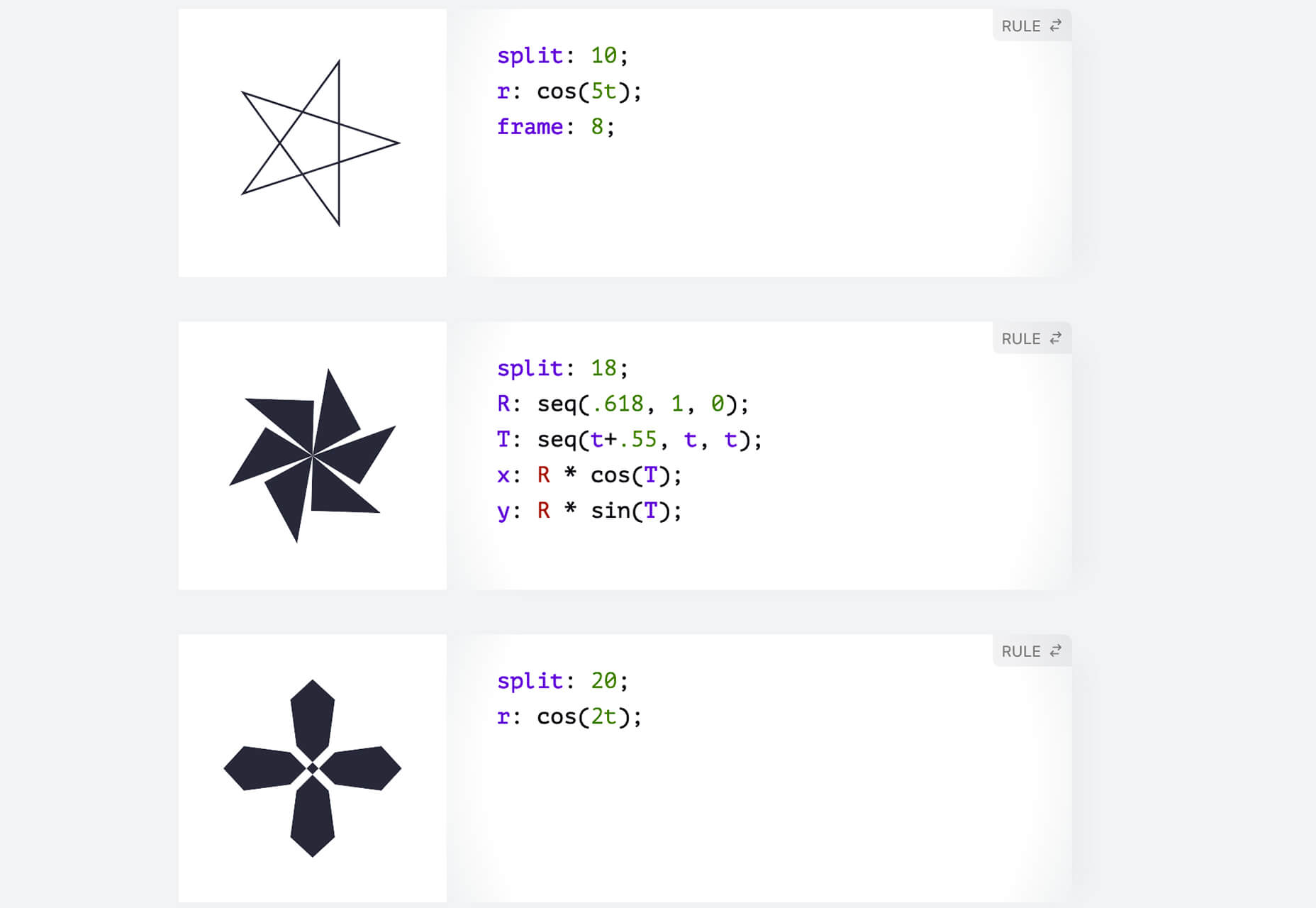
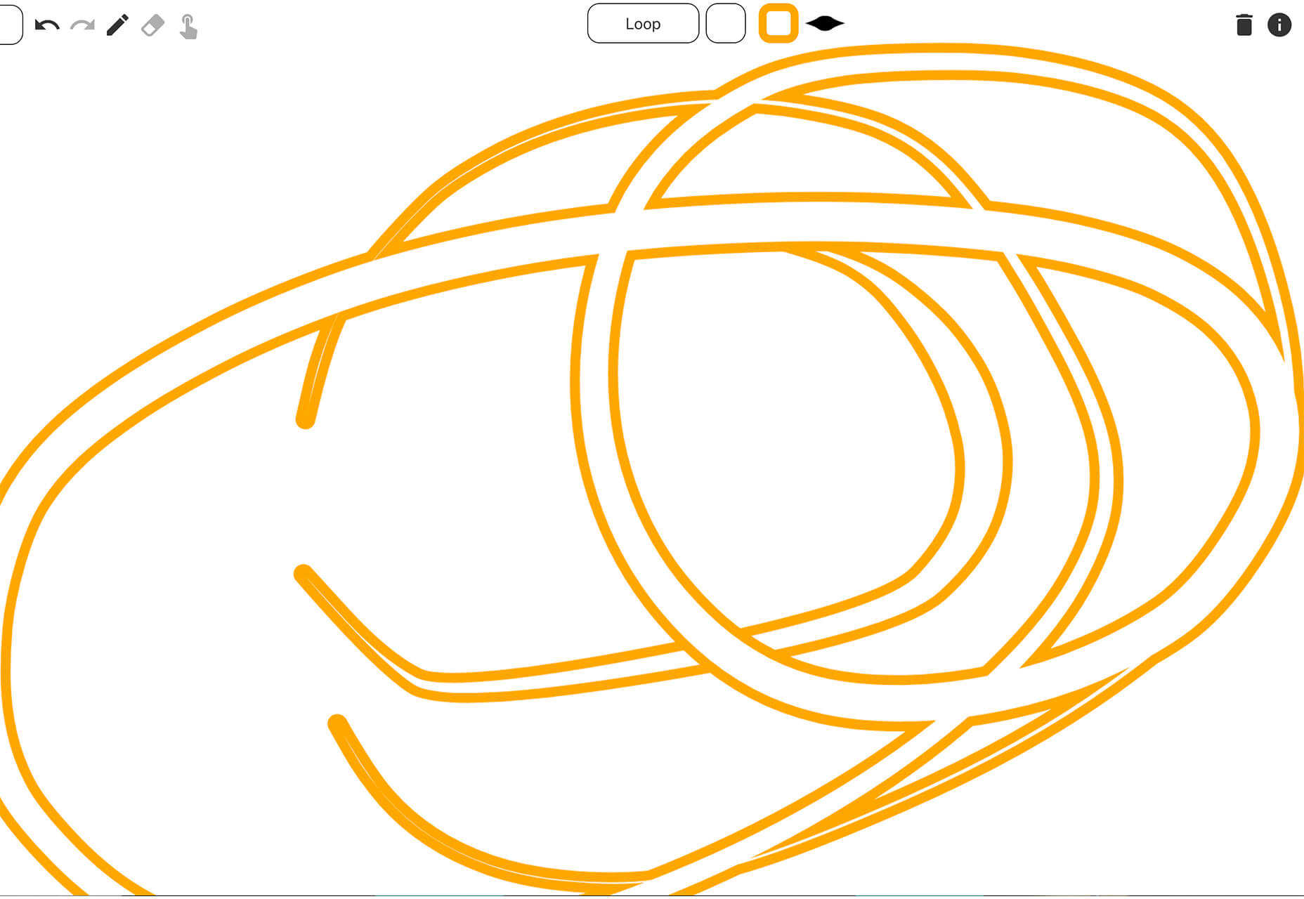
We’re going to try something a little different this month; with this roundup of tools and resources for designers, we’re going to pick a few of our favorites and group everything else in a manner that makes it even easier to find elements that will work for you, and your projects, right now.
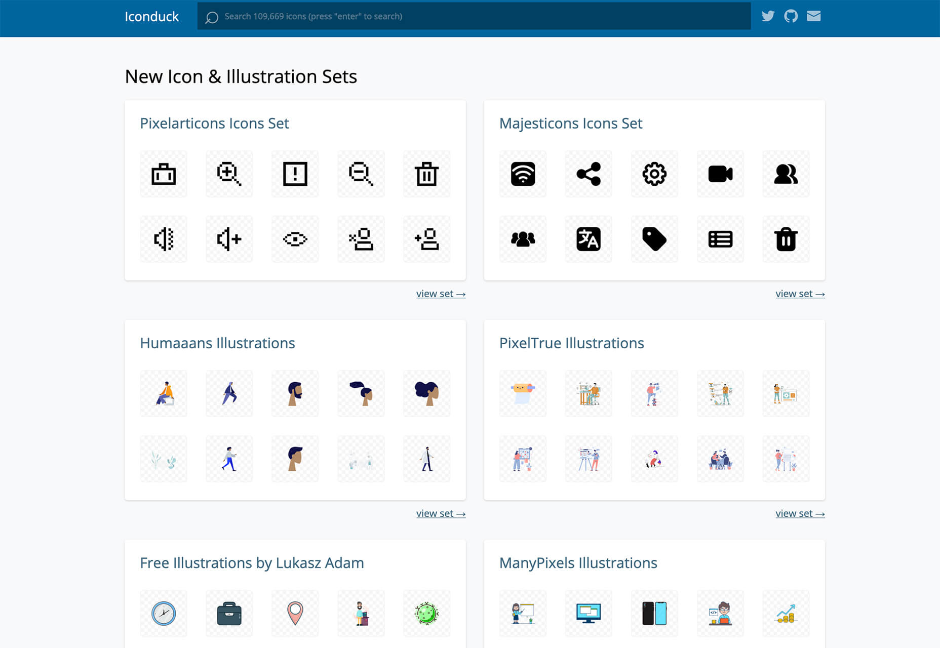
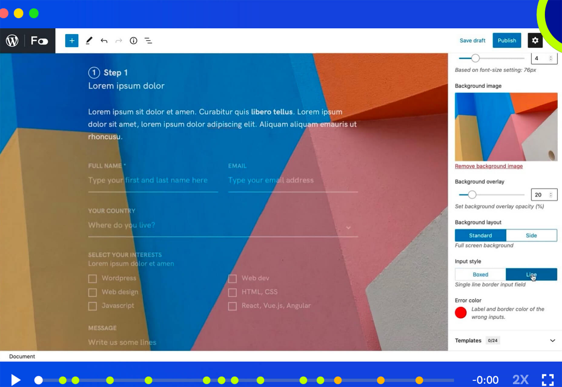
Here’s what’s new for designers this month…

February’s Top Picks

Pika

Pika is a new Mac app that is an open-source color picker. It helps you find color swatches on-screen, saving time and design headaches. Plus, it’s packed with bonuses such as the ability to confirm accessibility compliance for colors, compact size and style, easy to access from your desktop, and format-friendly with plenty of color code options.

Iconduck

Iconduck is a searchable database of more than 100,000 icons in one place. (No more searching various marketplaces!) The goal of the project is to make open-source icons and illustrations more accessible. So, everything you find here is free! The site does all the heavy lifting for you by collecting icon sets, tagging them, and making them searchable.

Descript

Descript is a premium tool that eliminates some of the intimidation factors with audio and video editing. With a design that functions as a word document and allows you to transcribe, record the screen, publish, and edit, all with some cool AI features.

Persona

Persona is an all-in-one identity infrastructure that allows you to collect, verify, manage, and decide customer identities from a single dashboard. Everything is fully automated, and most users can be up and running in about 10 minutes. The premium tool does have a free version for small-scale verifications.

6 Productivity Boosters

Peekalink

Peekalink turns standard links into rich content that users will be delighted to share and engage in. And it’s easy to use. Just send a request to the API with a link and get a response back to use, including a rich link for your project.

LinkAce

LinkAce is an open-source and self-hosted archive to store and organize links that you want to save. You can search thanks to tags and lists, and all of the content is available thanks to automated backups and monitoring. There’s a demo you can try before installing it yourself.

Formality

Formality is a WordPress plugin that helps you make forms a little bit easier. It’s made to work with the Gutenberg-based form builder with a single block format to control the form. The plugin has a theme-agnostic design that works with any layout style and includes customizations to make it feel a little more personal.

Wondercall

Wondercall is an embeddable video call system for any website or app. You can make calls and schedule them with a widget you can embed right into your design.

Editor X

The Editor X website builder is out of beta and ready for mainstream use. The platform is designed for designers and agencies to create websites collaboratively and quicker. Features include live commenting, roles and permissions, and shared design libraries. Plus, the platform offers code-free interactions.

Shareful/h2>

Shareful is a Mac app that makes the system share menu more powerful. You can copy, save as, and open indirectly from the system share menu.

2 Icon Sets

Supercons

Supercons is a giant set of icons in React. They are all open-source, and there are plenty of choices to help you propel projects forward.

Plumpy Icons

Plumpy Icons are packed with style. The set of icons has a fun design, comes in duotone colors, and scales to any size. Plus, there are more than 4,000 icons in the collection. There are free and paid options depending on the file type and use.

3 Tutorials and Demos

Noise Planets

Noise Planets is a fun look at plotting random points in a circle to create amazing art pieces. You can generate fun shapes and textures and even animate your results with the tutorial and code snippets’ help.

CSS Polygon Shapes

CSS Polygon Shapes are generated using CSS-doodle and clip-path. You can go in and make adjustments to customize shapes further and use them in your website projects.

Mutsuacen

Mutsuacen is a little app that lets you create animated and interactive drawings. There’s a lot of potential with this tool if you have some true drawing chops, but it not; it’s just fun to play with. Create a doodle or sketch and export.

5 Fresh Fonts and Text Tools

Text Warping – Animated

Text Warping – Animated is a fun effect pen from Lokesh Dhakar. It feels funky while leaving text pretty readable. Play with it for sure.

Gazpacho

Gazpacho is a fun and flexible premium font family with 14 styles from thin to heavy italic. It’s a highly readable serif with a wider stance and great curves.

Stay Home

Stay Home is a simple, line-style all caps font. It has a limited character set but could have some fun applications.

Dogmeal Figure

Dogmeal Figure is an almost silly novelty typeface with dog faces and paw prints in the character set. It might make a fun option for a kids’ project.

Haster

Haster is a futuristic-style slab with a limited character set. It does have shapes and lines with a lot of impact for display use.

Covid Pandemic Lockdown

Covid Pandemic Lockdown is an interesting novelty font with thick lines and a brush-dot style. While it probably won’t read well small, it could be fun as a display option.

Valeria

Valeria is a simple typeface that’s a little wide but has a nice shape and structure. It includes upper- and lowercase letters.

Cornellia

Cornellia is a beautiful script that has amazing letter combinations for use with long swashes and tails. It can add extra elegance to almost any design project instantly.

Source

The post 23 Exciting New Tools for Designers, February 2021 first appeared on Webdesigner Depot.


Source de l’article sur Webdesignerdepot

I am an « automation fundamentalist ». What I mean by that, is that I will go through large amounts of pain to avoid having to manually type code if I am able to have my computer do it automatically for me. The reasons are fairly self evident, because all bugs originates from a human being having written code at some point in time. Hence, if I can completely avoid manually writing code, the argument is that I can create 100% perfect software systems, that won’t even in theory be allowed to contain bugs of any kind. This idea extends to writing Unit Tests too.

Therefor, I created the ability to automatically generate Unit Tests in Magic. To understand how, watch the following video, where I demonstrate how I invoke an HTTP REST endpoint, for then to persist the invocation, allowing me to « replay » it later. The idea of course, is that being able to replay an HTTP invocation, can help me sanity check my system further down the road, as I modify it for whatever reasons I have to modify it.

Source de l’article sur DZONE

Here we are into a brand new year, and although we’re far from out of the woods yet, there is a feeling of renewed hope on many fronts.

In this first collection of the year, we have a mix of retrospectives, brand new ventures, and business as usual. There is an eclectic mix of styles on offer, from glossy and slick to minimalist and brutalist, but all confident and looking to a better world in the year ahead.

Clar

Brand strategists Clar have a simple but strong site. Aside from a few personnel profile shots and the odd bit of line animation, it is all text. The typography is good, and the use of color holds interest.

Ebb Dunedin

This boutique hotel, opening in March 2021 (COVID permitting), has bucked the usual luxury hotel trend and bravely gone for a more minimal design style to complement its interiors.

Aplós

Perfect for Dry January, Aplós is a new, non-alcoholic spirit that can be drunk on its own, with a mixer or in a cocktail. The site design and branding aesthetic is sophisticated calm.

Malala Fund COVID Initiative

Subtle color and simple line decorations keep this site for the Malala Fund’s COVID Initiative clean but warm and appealing.

Taubmans Chromatic Joy

This micro-site promoting Taubmans’ new paint color collection is bursting with color and makes a big nod to the Memphis style of the 1980s.

Myriad

Myriad video production agency’s site uses small amounts of bright colors really well. And they quote Eleanor Shellstrop.

The Ocean Cleanup

Cleaning all the plastic crap out of the oceanic garbage patches is a grim job, but it’s getting done, and The Ocean Cleanup site explains how and why in a not grim way.

Photo Vogue Festival

This site displaying the work and talks from Vogue Italia’s 2020 Photo Festival mixes a hand-drawn style with clean type and a strong grid.

Zero

Zero is a digital branding agency. Their site is glossy with lots of high-quality images, smooth transitions, and a clear structure. The background options are a fun touch.

Fluff

This site for cosmetics brand Fluff takes an old school approach to designing for different viewports — sticking a fullscreen background behind your mobile view for desktop sounds like a terrible idea, but here it works.

Patricia Urquiola

The new site for Patricia Urquiola design studio is bright, bold, and assured, inspiring confidence.

Breathing Room

Breathing Room describes itself as a volunteer creative coalition that designs spaces for black people to live without limits through art, design, and activism. The design radiates confidence and optimism.

A Year in Review

A microsite from Milkshake Studio, highlighting their work over the past year. Some good scrolling animation.

Umamiland

Umamiland is an animated interactive introduction to Japanese food, with links to Google search results for individual items or where to get them.

Acqua Carloforte

Carloforte is the town on the island of San Pietro, near Sardinia, and the scents of the island inspire the perfumes of Acqua Carloforte. Cue beautiful photography.

Eugene Ling

Eugen Ling’s portfolio site is simple and straightforward with little or no marketing-speak and a lovely, understated slider transition.

CWC Tokyo

Cross World Connections is an Illustration and Creative Agency based in Japan and represents illustrators from all over the world.

Lions Good News

Following the cancellation of the Cannes Lions Festival of Creativity in 2020, this site was set up to highlight good news in creativity during the pandemic. A carousel of paper flyers forms the main navigation and creates a lo-fi, DIY feel.

G!theimagineers

G!theimagineers is a production studio for events and entertainment. White lines on black, horizontal concertina navigation, and lots of circles.

Sgrappa

Sgrappa is handmade grappa with attitude, and this site has an uncompromising, in your face vibe.

Source

The post 20 Best New Websites, January 2021 first appeared on Webdesigner Depot.


Source de l’article sur Webdesignerdepot

Imagine a room with a wall of screens displaying closed-circuit video feeds from dozens of cameras, like a security office in a film. In the movies, there is often a guard responsible for keeping an eye on the screens that inevitably falls asleep, allowing something bad to happen. Although intuition and other distinctly “people skills” are useful in security, most would agree that the human attention span isn’t well-suited for always-on, 24/7 video monitoring. Of course, footage can always be reviewed after something happens, but it’s easy to see the security value of detecting something out of the ordinary as it unfolds.

Several cameras capturing different scenes.
Cameras capture our every move, but who watches them?

Now imagine a video artificial intelligence (AI) application capable of processing thousands of camera feeds in real-time. The AI constantly compares new footage to historical footage, then classifies anomalous events by their threat level. Humans are still involved, both to manage the system as well as review and respond to potential threats, but AI takes over where we fall short. This isn’t a hypothetical situation: from smart police drones to intelligent doorbells sold by Amazon and Google, AI-powered surveillance solutions are becoming increasingly sophisticated, affordable, and ubiquitous.

Source de l’article sur DZONE

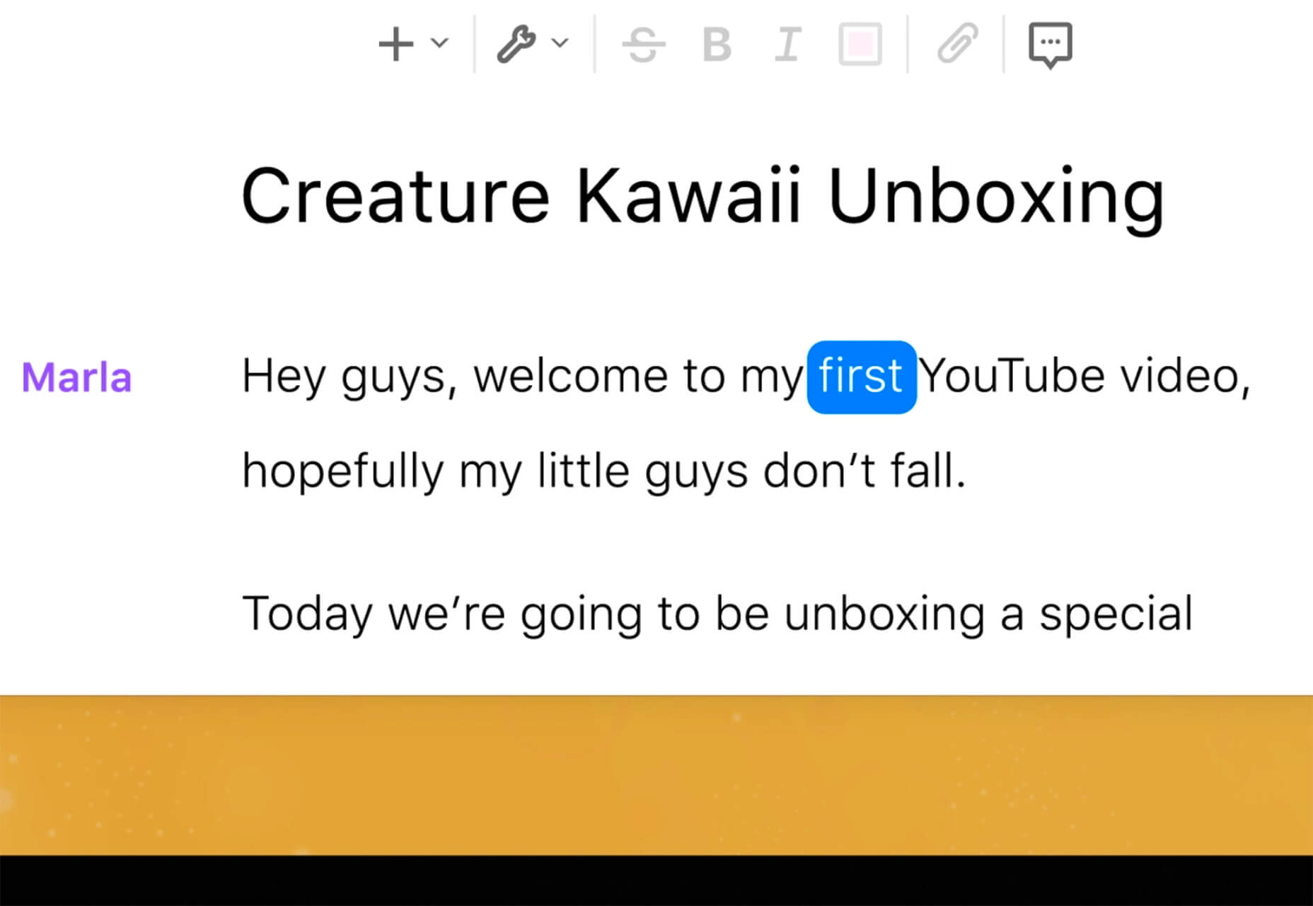
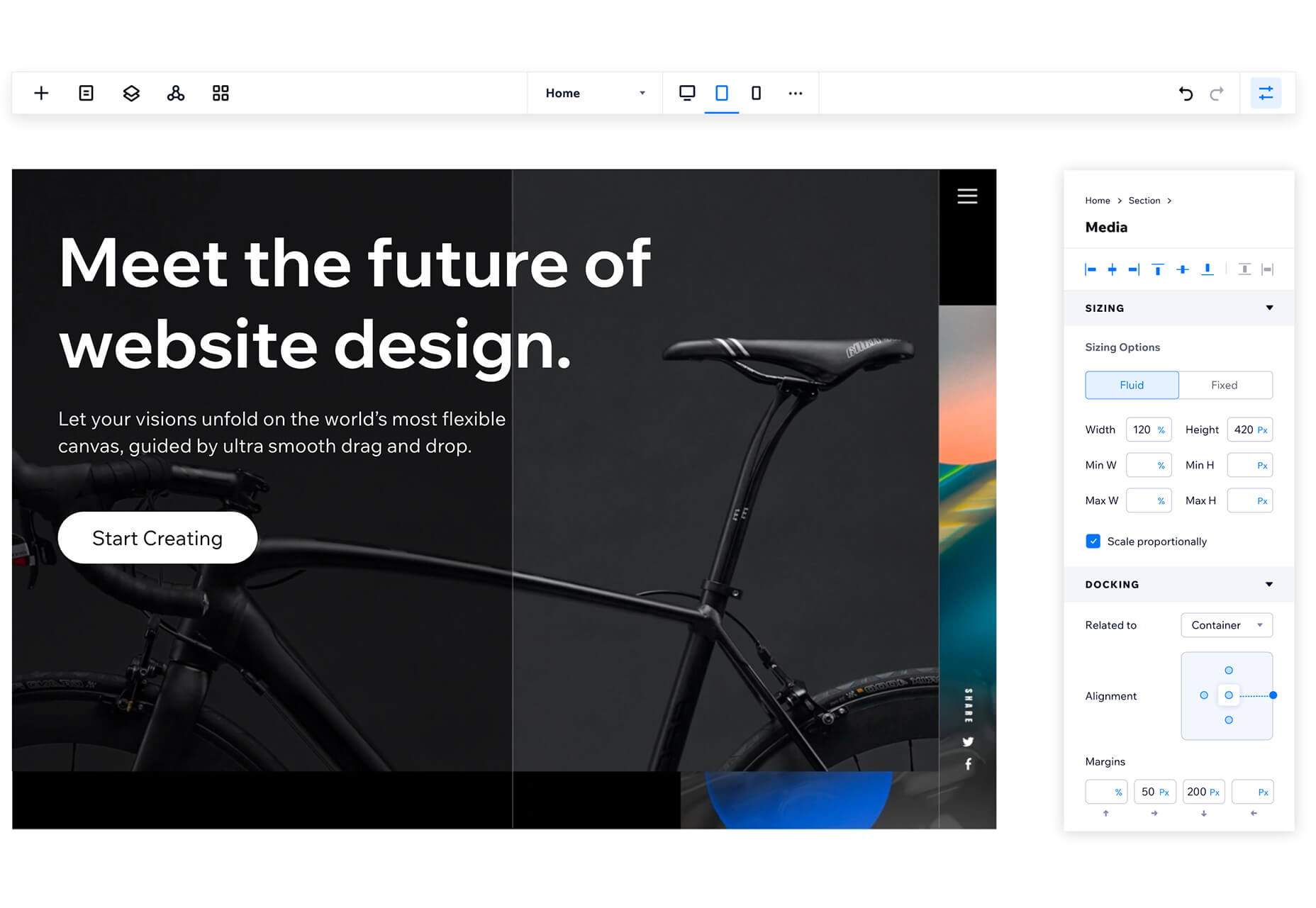
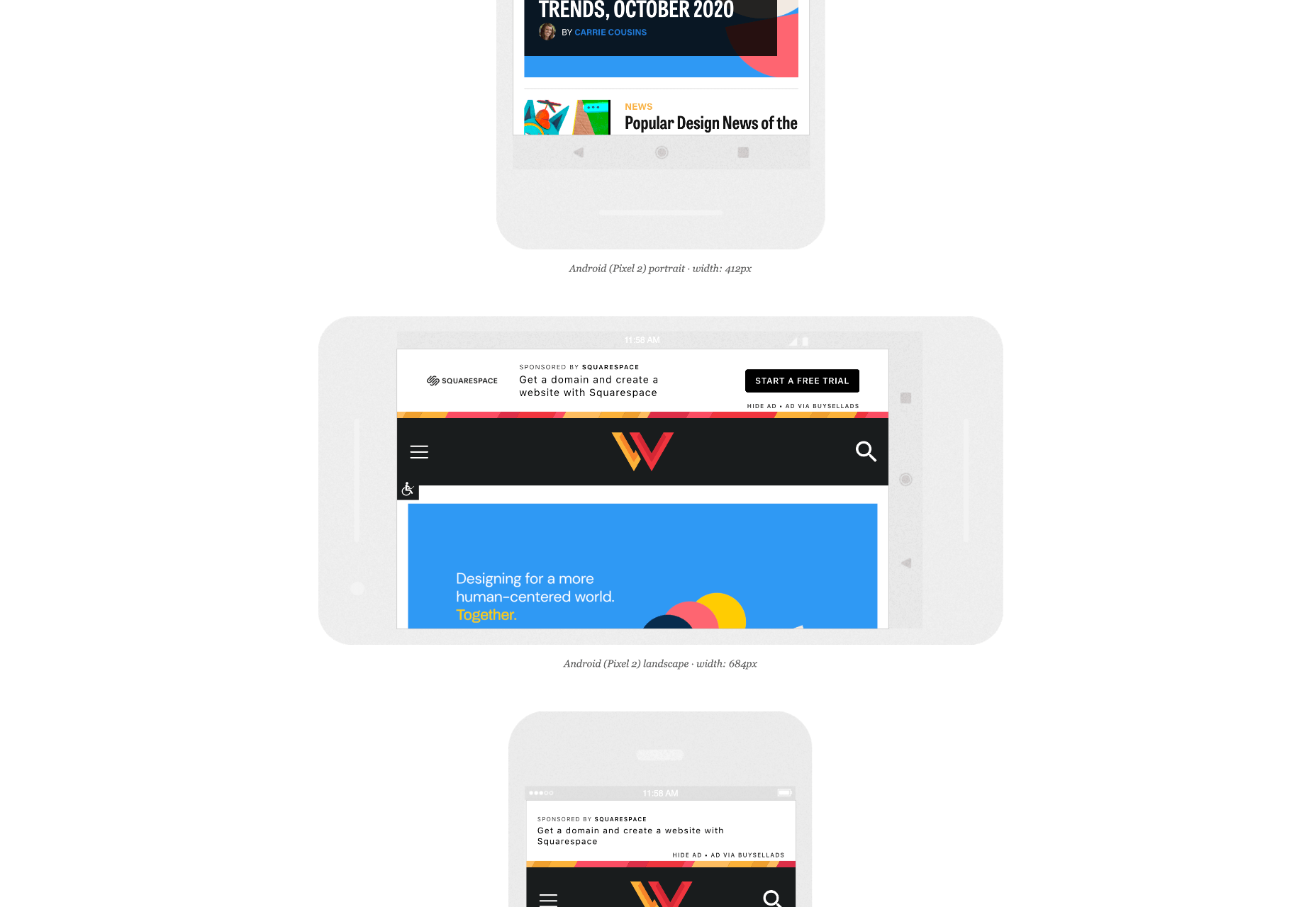
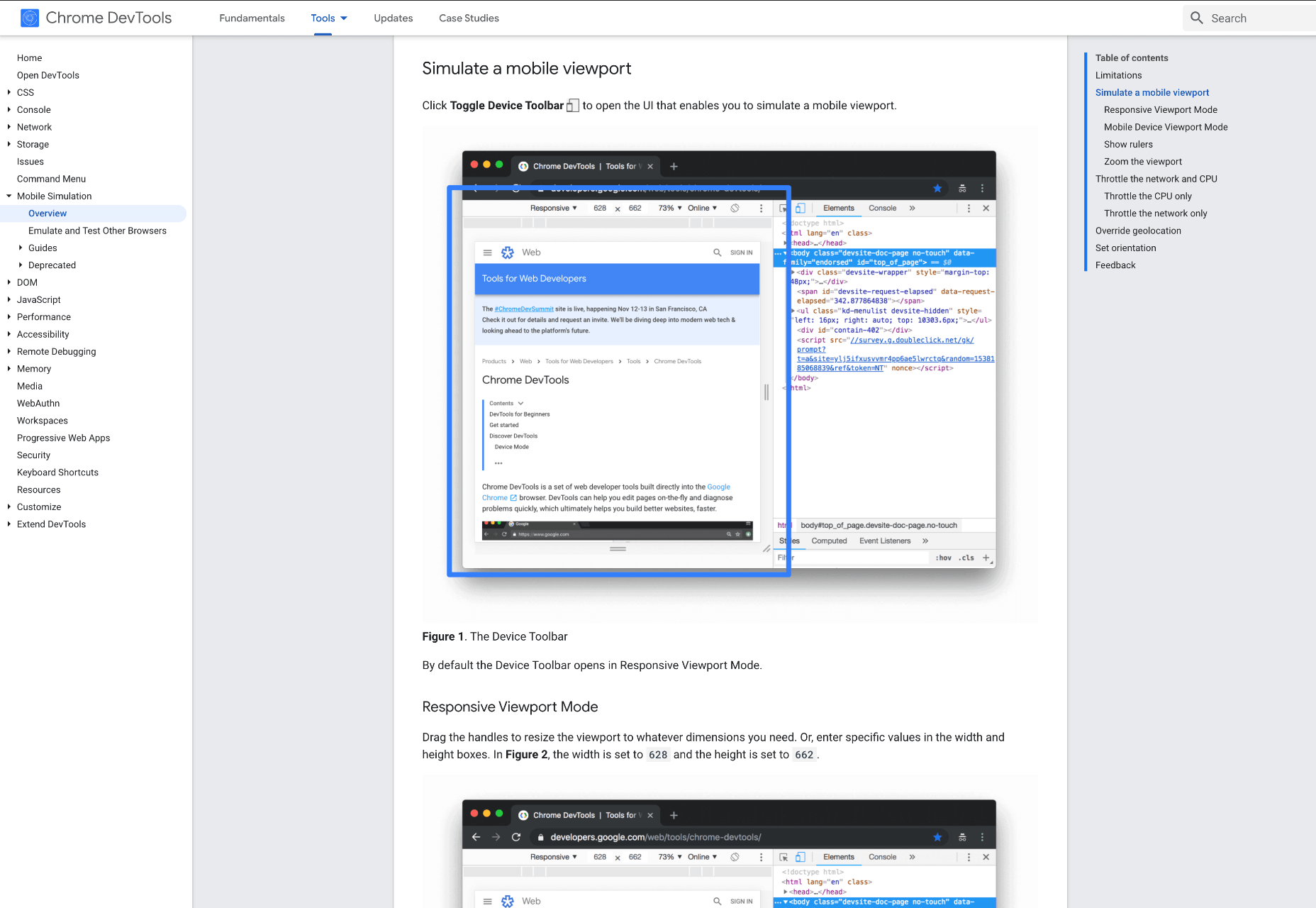
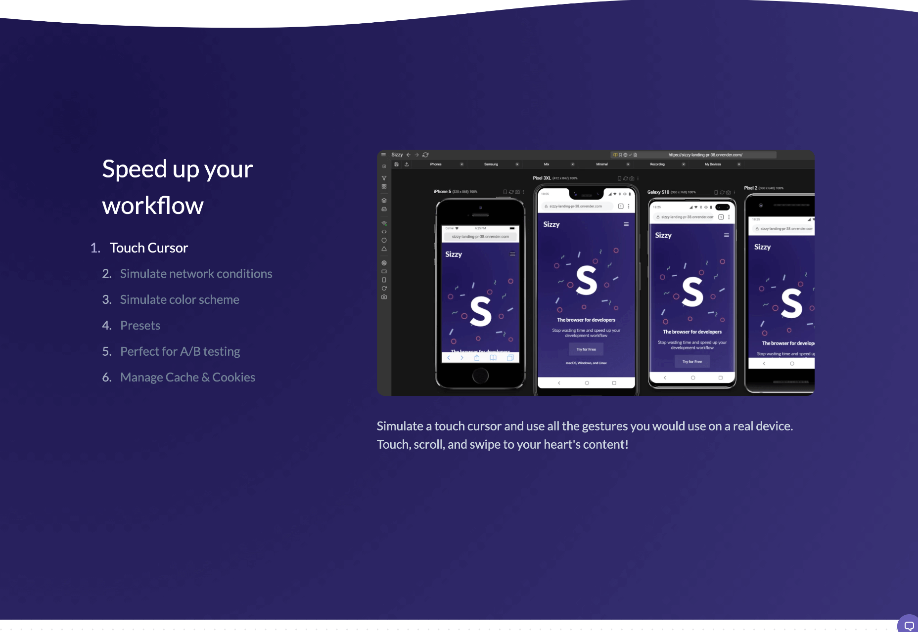
When creating a website, it’s vital to remember that not only does it need to work and look great on the device you are creating it on, but on all the other devices, it might be used on too.
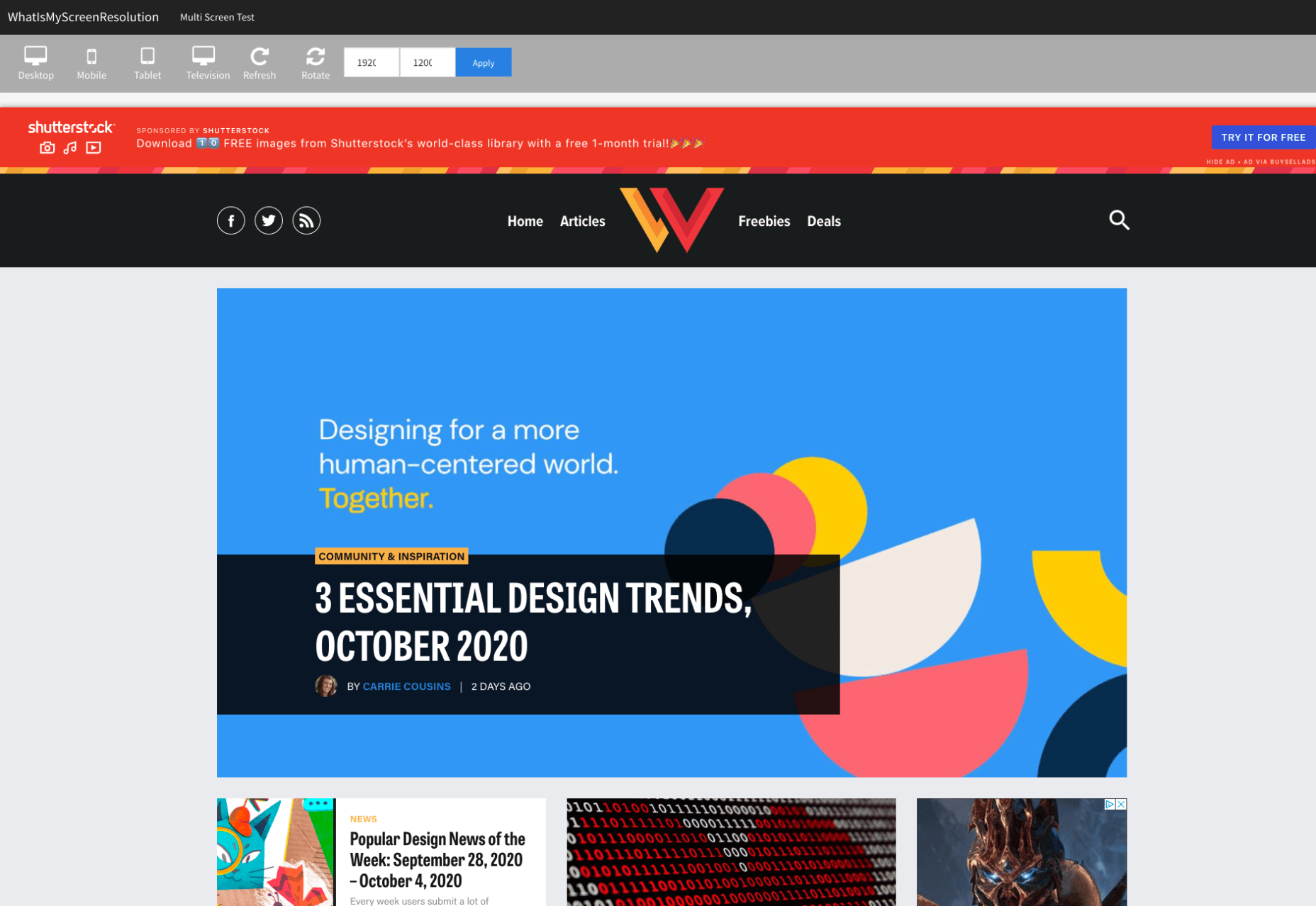
Mobile and tablet optimization is important not only for the user journey but from an SEO point of view too, and badly created mobile sites just don’t cut it anymore.

With more and more devices entering the market, you need to check any website you create is compatible across the board. One bad experience and users are likely to leave and not come back again, which can be catastrophic for a business, particularly if it is just starting out.

It’s vital to check how a site looks and behaves when browsed differently from how you would use it. A common mistake is to assume users only browse websites on mobile devices in portrait mode; they don’t; landscape browsing is common, especially if the user is used to watching video.

Here are some of our top tools for testing websites on devices without the need for an entire device library:

1. Multi-Screen Test

WhatIsMyScreenResolution offers a great little tool to test how your site will look on different devices easily, and it costs absolutely nothing. You put the URL and choose between desktop, mobile, tablet, and television and then the orientation. Each device can also be broken down into different sizes and resolutions (or you can enter your own), making it easier than ever to test what a site will look like on different devices.

2. Responsinator

Responsinator is another great tool to test how a site looks on other devices without dipping into your wallet. Put your URL in the top bar, and it will instantly show you what it looks like on generic devices. This is a great, easy to use tool, and you can click through any links on your site to check the usability of multiple pages. This site is free, but if you want to “create your own” template, you need to sign up.

3. Google Dev Tools

Google Dev Tools is one of the most commonly used free tools. Add it to Chrome, and you can see how your site looks in a multitude of different screen sizes and resolutions. You can simulate touch inputs, device orientation, and geolocation to test how they work. It’s great to easily spot problems using their remote debugging tool to view, change, debug and profile a page’s code directly from your laptop or computer while viewing it on your mobile device.

4. Browser Stack

Browser Stack allows you to test your site on over 2,000 real devices and browsers, enabling you to see in real-time how your site looks. It is no hassle to set up, and it can be seamlessly integrated into your setup. As it tests on real browsers on real machines, you know the results are more reliable and accurate. It also enables you to debug in real-time using their pre-installed developer tools for ease of editing. The tests are all run securely on tamper-proof physical devices and are wiped clean of all data after each session, so you don’t need to worry about security being compromised.

5. TestComplete Mobile

TestComplete Mobile allows you to create and run UI tests across real mobile devices, virtual machines, and emulators. You can test both mobile device layouts and apps with script-free record and replay actions. This can help you to edit and fix any potential issues that may arise during the tests. Due to them being conducted on real devices, you know it is less likely to have errors in the system than a simulated device. This is free for 30 days then can get pricier, so make sure you take advantage of the trial and try the service before committing to it.

6. Sizzy

Sizzy is a great tool for checking sites, and it has a host of features to assist you. You can rotate the screen between portrait and landscape, filter by OS and device type, switch themes, and take screenshots. These little things mean it’s a super easy to use and convenient tool. It claims to simulate each device’s viewport and user agent, meaning the results are the same as what you would actually see on that phone/ tablet, etc. It can’t simulate different browser rendering engines however, so there’s a chance there might be some minor differences compared to the actual thing. Sizzy offers a free trial or has different price packages starting at $5 per month.


Featured image via Unsplash

Source

The post 6 Tools for Rapid Cross-Device Website Testing first appeared on Webdesigner Depot.


Source de l’article sur Webdesignerdepot

In this sample, we will implement the server-side of a client-server style messaging app. To do so, you could use your preferred programming language, but for speed, we’ll use Linx, a low-code developer tool for backend APIs, integrations, and automation.

For a quick review of Linx and how it works, see this video.

Scope

We will implement some web methods, which will be useful for creating a messaging client. However, the following items fall outside the scope of this sample:

Source de l’article sur DZONE