Articles

2020 has been an interesting year, to say the least. And although I’m sure many of you can’t wait until the calendar flips ahead to 2021, it doesn’t look as though we’re going to be able to say goodbye to 2020 so easily. Many of the changes we’ve had to make this year are now expected to stay with us — a least for the following year.

The latest research gives us some hints about what’s to come.

If you want to start preparing for 2021 now, then these reports and surveys from organizations like 99designs, Upwork, Content Marketing Institute, and McKinsey & Company are a must-read:

1. 99designs Reports on the Common Challenges Freelancers Faced in 2020

I don’t want to make 99designs’s Design Without Borders 2020 report sound like it’s all doom-and-gloom. Because it’s not.

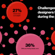
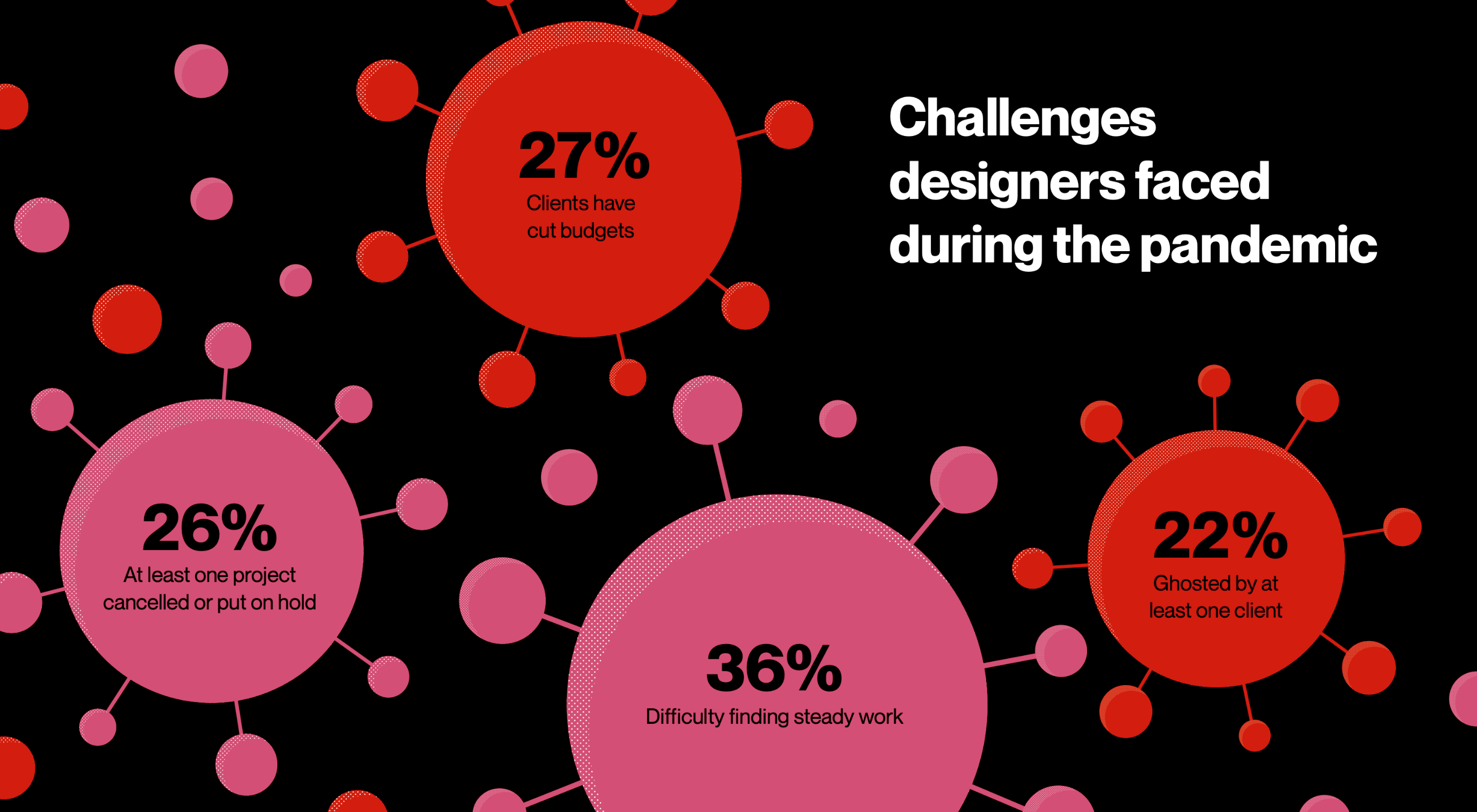
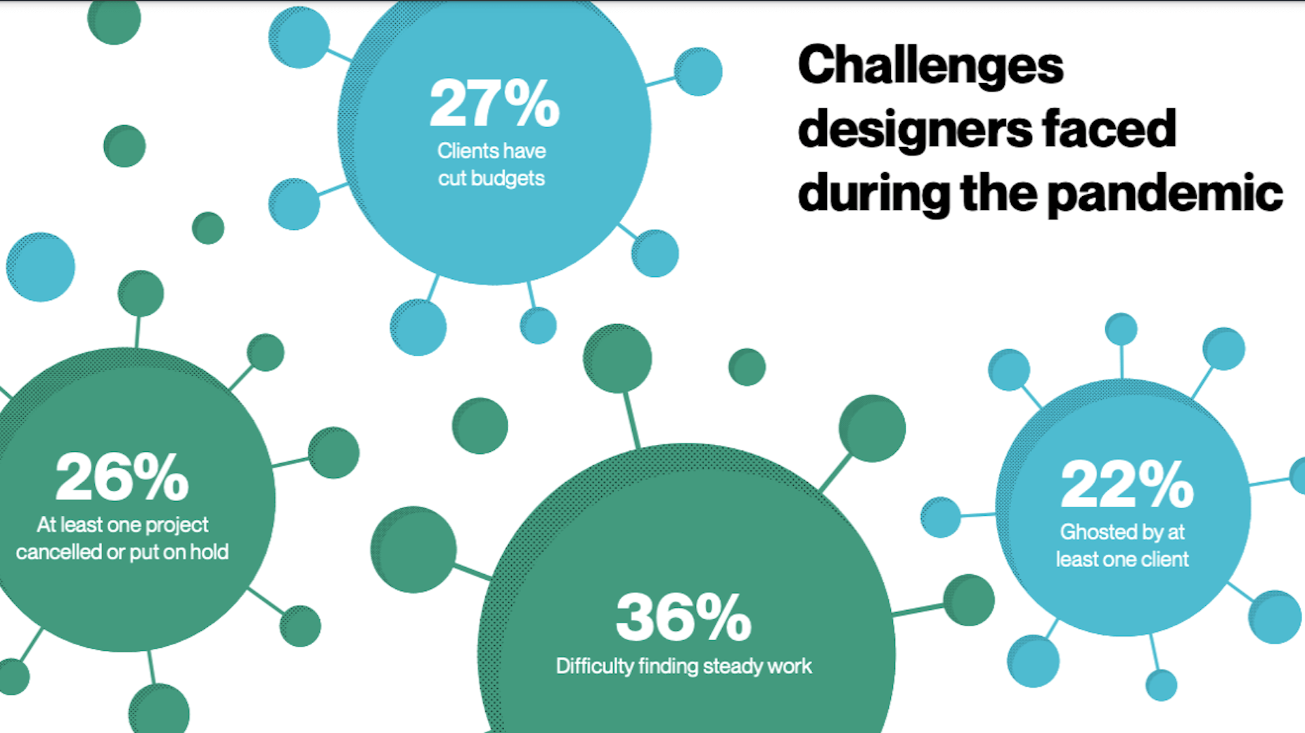
That said, 2020 has been a rough year and it would be irresponsible for me not to acknowledge the challenges that all of us freelancers have encountered this year. This report is one of the few I’ve found that includes data on the major challenges freelancers have dealt with this year, including:

  • 36% have struggled to maintain a steady flow of work or a stable client base;
  • 27% had clients who cut their business budgets and, consequently, their freelancers’ workloads;
  • 26% had at least one project cancelled or indefinitely paused;
  • 22% have been ghosted by at least one client.

Beyond working more hours and hustling to find new clients all the time, what else can freelancers do to weather a business disruptor like COVID-19? There are a number of things.

For starters, it would be really helpful to have a crisis management plan for your finances. It would also be beneficial to refocus your efforts on finding clients who pay for the value you provide and not for the hours you spend building websites. Clients who see the value in what you do will be less likely to ghost or drop you at the first sign of trouble.

2. Upwork’s Survey Reveals Educational Opportunities for Freelancers

Upwork commissioned Edelman Intelligence to put together its very first Freelance Forward survey. The goal of the ensuing report was to shed light on the state of freelancing, how the pandemic has changed it, and what we can expect in the future as a result.

One of the data sets I think web designers should pay close attention to is this:

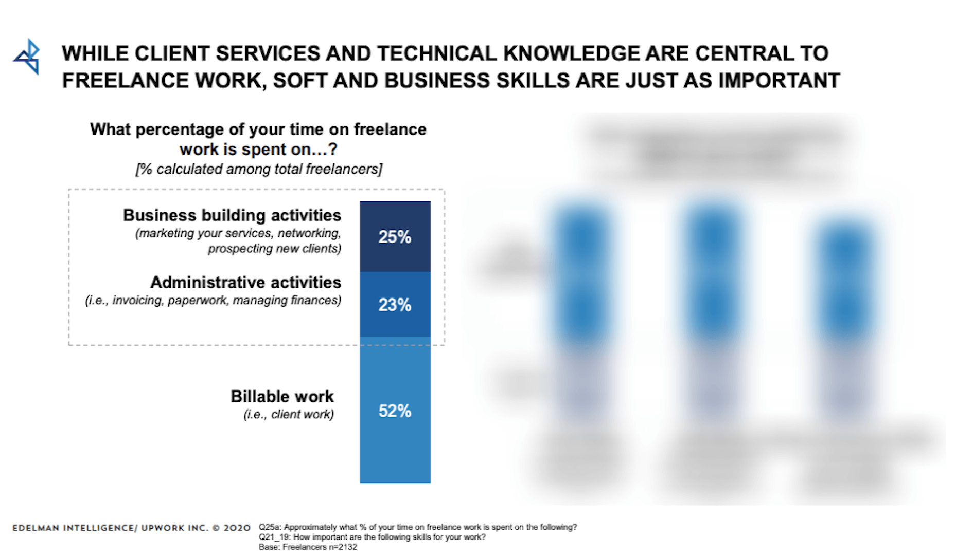
According to this survey, freelancers only spend about 52% of their time on billable work.

Now, one of the reasons why entrepreneurs and enterprise companies make so much money is because tasks are relegated to different team members. For instance, if a design agency owner is good at building relationships with prospects, they’re going to spend time on sales calls and managing social media. The day-to-day admin tasks would then get offloaded to virtual assistants and billable project work would go to designers, developers, writers, and so on.

But as a freelancer, you don’t have the ability to delegate and scale when you’re working solo.

Rather than burn yourself out trying to handle all these things yourself, the report suggests there’s something else you can do:

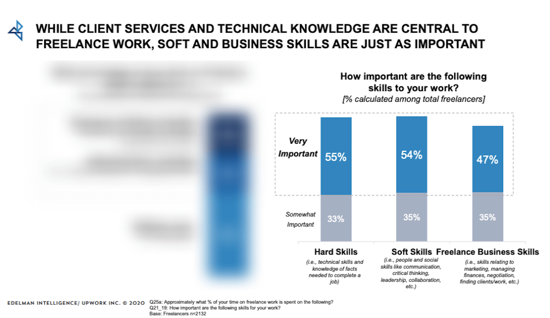
Although freelancers recognize how important soft skills and business skills are, the first data set suggests that not enough attention might be paid to them.

What I suggest is that you take a look at the division of your work hours. If you’re spending less than half of your time on billable work, it might be a good idea to strengthen your non-design skills. That way, things like marketing, contract preparation, and client management won’t consume so much of your time in the future and you can bill more.

3. CMI’s Annual Report Reveals Profitable Opportunities for Web Designers

Content Marketing Institute’s annual B2B Content Marketing Report is, once again, chock full of useful tidbits about the state of content marketing.

While a lot of the data is focused around marketing organizations and how they’ve pivoted during the pandemic, I thought this bit of info would be really helpful for web designers:

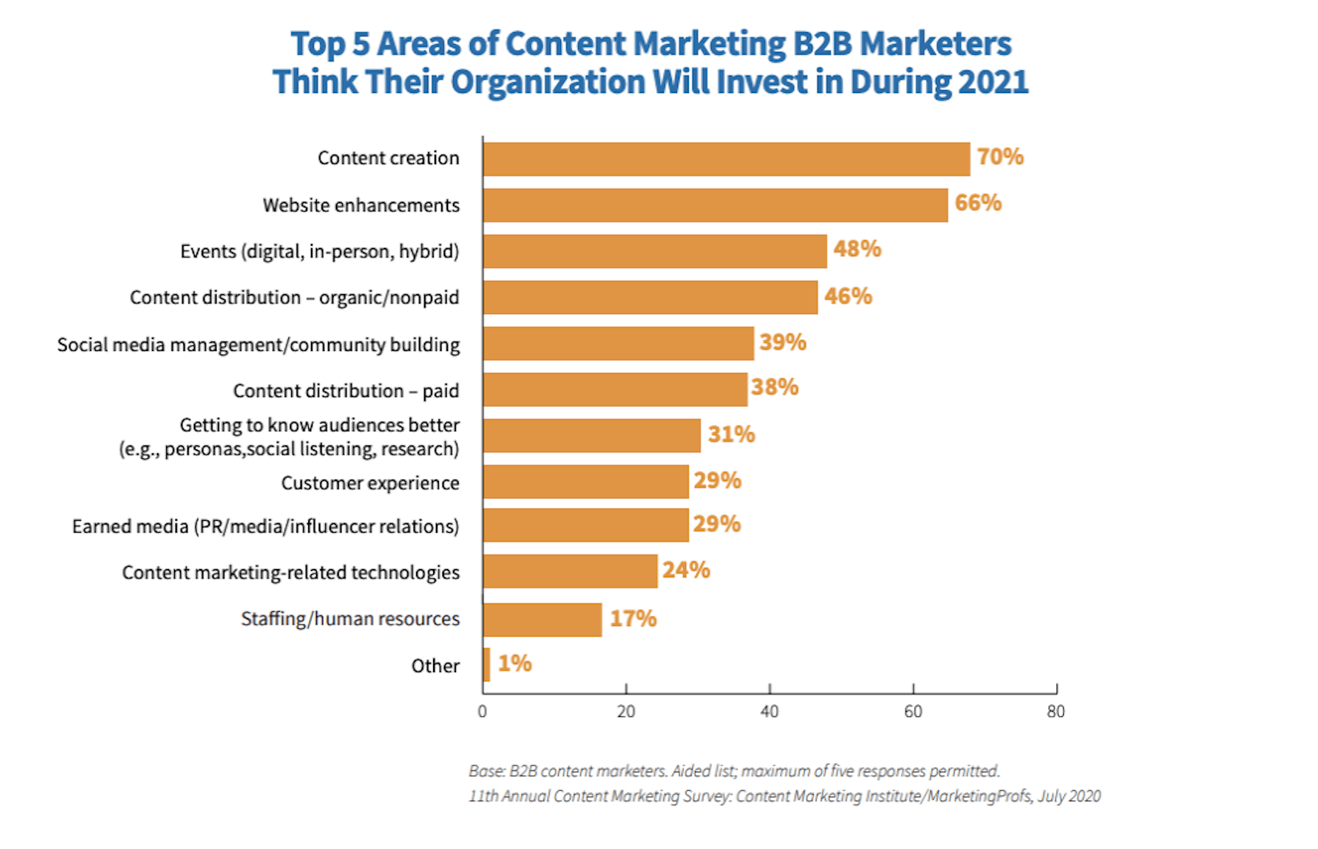
For those of you who design B2B websites, take note of where these companies plan to invest in 2021. If 2020 has been particularly hard on you, or you simply want to expand your horizons, there are some other opportunities worth jumping into:

B2B Marketing Investment => Web Designer Opportunity
Content creation => Blog graphic design, infographic design, and schema markup creation
Website enhancements => Website redesign, website audits
Content distribution => Social media ad design, Google ad design, schema markup creation
Getting to know audiences better => UX research, UX design
Customer experience => Chatbot/live chat development, support portal creation

4. McKinsey B2B Analysis Suggests That Digital Is Here to Stay

For those of you who’ve worked for a B2B sales organization before, you know how important in-person interactions are to them. It’s not as though they can just sell their products or services online the way B2C ecommerce companies can. The key to B2B success is through customer (and partner) relationship building.

Prior to 2020, this meant lots of in-person meetings, phone calls, and emails. But something has changed this year, on both sides of the fence.

This chart from McKinsey suggests that digital relationship building and customer service aren’t just a temporary solution for COVID-19. B2B decision-makers are coming around to the idea that this is going to be their “next normal” (as McKinsey refers to it).

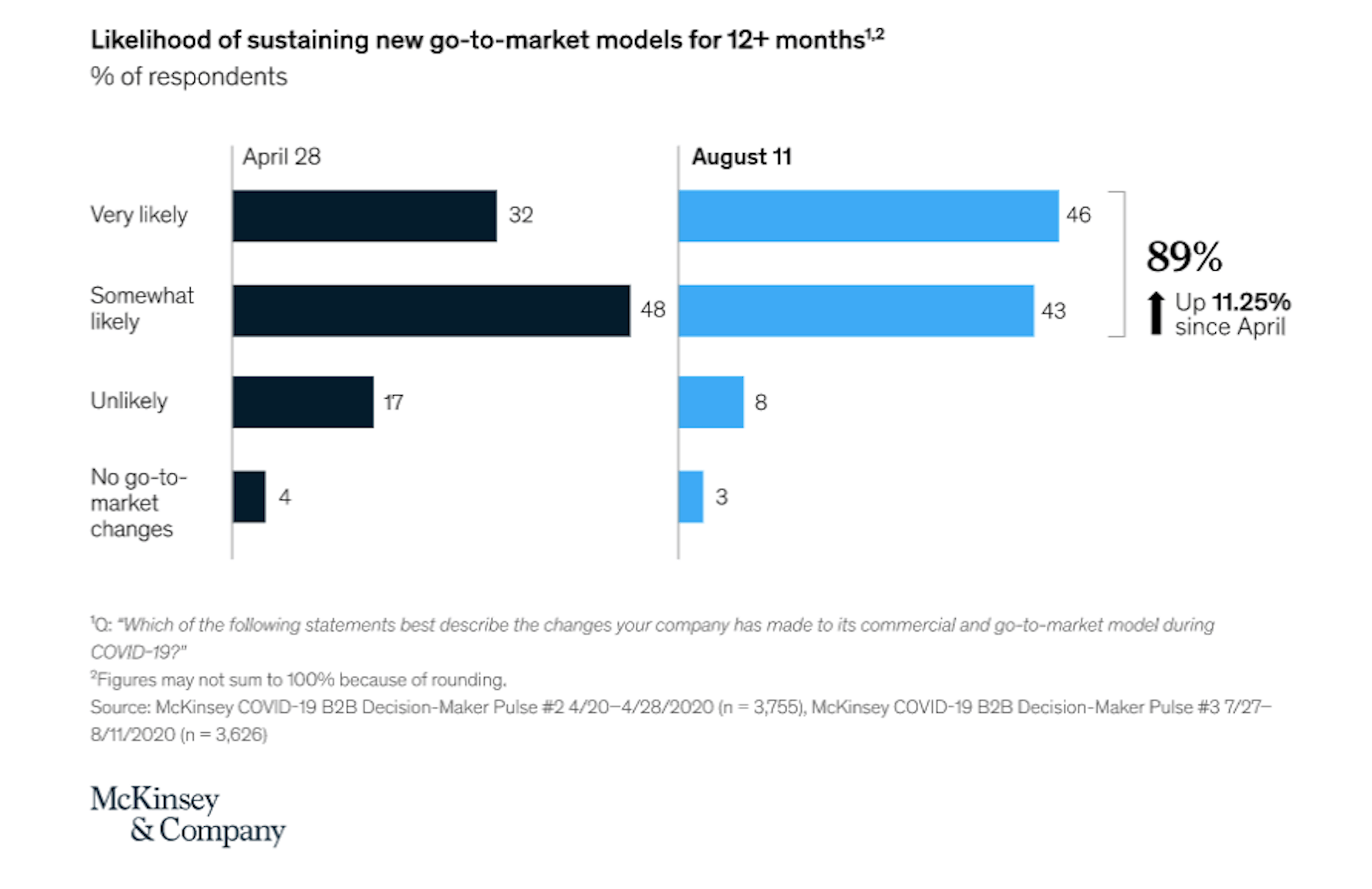
These new “go-to-market models” include the following:

  1. Talk to prospects, customers, and partners via video calls;
  2. Digital self-service options for customers who prefer the DIY method.

As a web designer, you can help your B2B clients level up their efforts to achieve this next normal.

For starters, you can integrate scheduling into their websites. This’ll empower prospects to schedule video meetings (for demos, discovery calls, etc.) with your clients’ sales teams.

Another thing you can do is build out self-service elements like live chat or chatbots, FAQs pages, knowledgebases, and support portals. As consumers become more confident with doing business online, these self-service options will make a world of difference in their experience with brands.

Wrap-Up

I know, I know. 2020 sucked. But at least we have a good amount of research and experience that gives us a much clearer idea of what we’re getting ourselves into with the coming year. (At least, I hope so.)

Source


Source de l’article sur Webdesignerdepot

As we approach our first winter holiday season since the pandemic set in, the world could feel like a very scary place; there is a great deal of uncertainty about the future for businesses, for young people in education, for jobs, for travel. Celebrations are certainly going to be a lot quieter this year.

And yet, the web is far from showing doom and gloom. We’re seeing confidence and positivity in designs across the board. As businesses and people adapt to the demands of social distancing and WFH, we’re seeing a focus on simplifying, appreciating quality over quantity, taking better care of ourselves and our world, and making the most of our time. And this is reflected through design in a variety of ways: visually minimal style, pared down content, fresh colors, statement type, great photography, illustration.

There is confidence in abundance on the web. Enjoy…

Mammut Expedition Baikal

Mammut make outdoor clothing and equipment, and this microsite is for its Eiger Extreme collection. Stunning photographs of Swiss speed climber Dani Arnold climbing at Lake Baikal in Siberia are cleverly interspersed with details of the company’s products he can be seen wearing, along with links to buy. It feels natural, rather than forced.

Wavering Stripes

This a beautifully made site highlighting the experiences of people held in immigration detention centers in the US. The illustrations belie the grimness of the stories told — on the landing page there is a warning as to the nature of the content.

Juan Mora

Proof that holding pages don’t have to be boring, this ‘under construction’ site for interface designer Juan Mora is a far cry from the warning-barrier and stick-figures-at-work gifs of the web’s early days.

Cafecrema

Cafecrema’s simple, one page site creates the atmosphere of 1950s coffee shops through its illustration style, a jazz soundtrack, and a very mid-century modern color palette.

A N Other

Perfume brand A. N Other prioritises quality ingredients and materials, simplicity, craftsmanship, and the environment. Its website captures this perfectly, and invokes a sense of luxury as the result.

Puddle Sound

Puddle is an architectural and interior design company, who also do product and furniture design. For a Tokyo hotel project they created a vacuum tube amplifier, that is the subject of this site. It is as simple as can be with only the barest essential information, and with all attention focused on the product shots.

Hous

Hous Luxe Woningen are a Dutch company who build luxury homes. The high quality images, muted color scheme and generous use of white space in its website reflects this sense of luxury perfectly.

Who Cares?

Who Cares? is an interactive game designed to raise public awareness of endangered animal species. The illustration style is very pleasing, and there are some lovely little details in the animation and sound.

Ugly

This site for sparkling water company Ugly, uses bold, cartoonish typography and illustrated characters to add a lot of character to, well, water.

Glyphs

Glyphs font editor version 3 was released on 16th November. The accompanying site has a fresh feel, mainly due to its striking color scheme. The on scroll animation showcasing variable fonts is a nice touch.

Ruler Agency

Ruler Digital Agency uses color only in the images of work on its own site. Everything else is grayscale, even the images, which can be a really effective technique when it is used well, as it is here.

Zoë Pepper

Zoë Pepper is a collective of freelance brand strategists who work with early stage startups. The site is minimal without feeling empty, and utilises quirky illustration and scrolling animation to good effect.

Karst

Karst make notebooks using paper made from stone, and woodless pencils. Its site has a simple, clean feel with a muted, neutral color scheme that complements the colors of its notebook covers.

London Alley

London Alley is a production company who concentrate on music videos and advertising. Its site is simple and striking with plenty of video, and effective use of split screen.

LoveSeen

LoveSeen makes false eyelashes, and nothing else. The site has a fun, inclusive feel — more girl(and boy)friends together than glossy, high fashion magazine. It’s appealing and persuasive.

Chartogne-Taillet

This site for wine-growers Chartogne-Taillet uses illustration and an animated, ‘hand’ drawn map to create a sense of heritage, appropriate for a family with a long history of making wine in the Champagne region. It is reminiscent of a label on a good bottle of wine.

Refusi Studio

Refusi Studio is a design agency from Italy. This portfolio site is simple, with strong colors and big, statement typography. And a giant cartoon eye.

Yesterday, Today, Tomorrow

Yesterday, Today, Tomorrow is an interactive project from the National Film Board of Canada. It uses tweets to trace emotional ‘waves’ throughout the Covid-19 pandemic.

Boost

Boost is a gummy (chew) vitamin supplement for the immune system. Big type, big graphics and lots of orange and purple — the colors associated with vitamin C and antioxidants — make vitamins cool.

Philiber

Philiber is a meal delivery subscription service, available in urban centers in Quebec. The site is clean and modern, with a comforting color scheme and a nice mix of photography and flat style illustrations.

Source


Source de l’article sur Webdesignerdepot

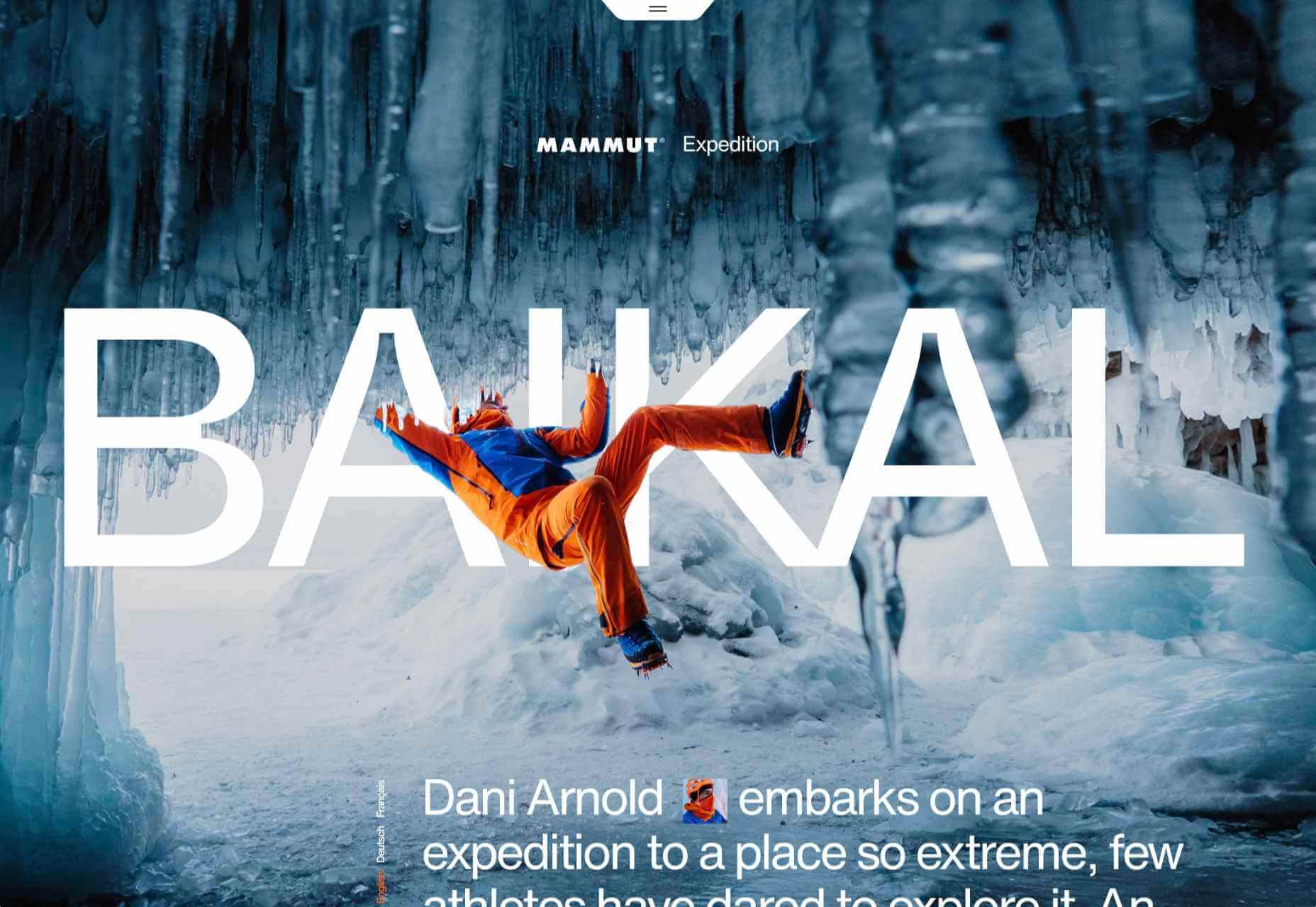
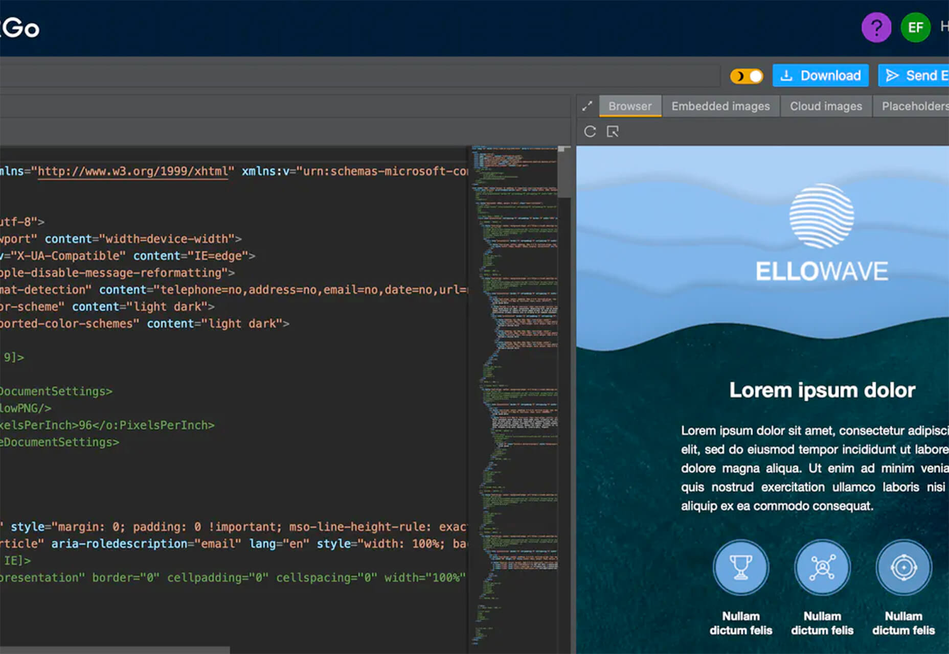
Since there are so many CMS plugins out there, it can be overwhelming to choose the best ones for your website. We’ve done the research for you; this list contains the top new CMS plugins for November 2020. You’ll find useful plugins for WordPress, Craft, Shopify, and Joomla.

Let’s get started…

WordPress

404 Page Editor

404 Page Editor is a simple WordPress plugin that helps you add custom text to the default 404 page on your website. The plugin comes with seasonal and industry-related 404 templates. One useful feature of the plugin is that it backups your current 404 page before changing it. So you can restore the backup page anytime you choose. The plugin duplicates your current 404.php page to wp-content/uploads/404-page-editor/ so you can easily find it. You can also change the text on the plugin to fit your local dialect. 

UnusedCSS Power-Up

Most WordPress themes and plugins load their CSS in the wrong areas of your website. This can slow down your site. A slow website will reduce user experience and lead to increased bounce rates.

UnusedCSS will help reduce the size of your website’s CSS files by up to 95%. The best part is that the plugin works automatically. It will remove any unused CSS when visitors view any page on your website. UnusedCSS will automatically reduce your website’s load times by reducing your CSS files and page size. The plugin also optimizes the performance of other WordPress plugins and extensions. UnusedCSS also works with WooCommerce themes and plugins.

Simple Redirects

Simple Redirects is a WordPress plugin that helps you to automatically redirect requests to another page on your site or any other place on the web. The plugin allows you to easily redirect users from your old web pages to new pages using 301 or 302 redirects. You don’t have to worry about losing backlinks or page rank. Any incoming links to the old web page will be automatically passed along to the new page. The page rank on the old page is also transferred to the new page. The plugin is useful when migrating a WordPress site when don’t want to retain the URL structure. 

HTML Validation

HTML Validation plugin helps you identify any HTML validation errors on your website. The plugin works automatically in the background of your website and will send you regular reports. There is a progress bar on the report screen to show you the progress of the scan. The plugin uses WordPress Cron to scan the content of your website. There is also an option for the plugin to automatically fix any HTML validation issues on your website. You can also choose to fix the issues manually. 

Just Highlight

Just Highlight is a simple WordPress plugin that helps you highlight text in your posts or pages. You can use this plugin to highlight any portion of the page you want to draw the reader’s attention to. You can highlight the background of the page and also add animation to the highlighted text. In the WordPress admin area, you can change the speed and color of the animation. The plugin is compatible with Gutenberg, and the WordPress classic editor. 

DeviantArt Embed

DeviantArt Embed is a simple plugin that helps you embed any work from Deviant Art into a post. The plugin provides a block for the WordPress block editor so you can easily embed the image. It uses a DeviantArt oEmbed API to pull the images and their descriptions, and creates an embedded image. 

Static Optimizer

Static Optimizer is a static file optimization plugin that serves and optimizes static files on your website. The plugin will help you increase your website speed by automatically compressing your static files. It is easy to set up, you just need an API key to get started. Other useful features that the plugin offers include automatic JS and CSS minification, automatic image optimization, and processing of responsive images. You don’t have to worry about losing your files if their server is down. The plugin automatically backs up your files and will load your original files when their servers are down (either because of an upgrade, maintenance, or outage).  By default, only images are compressed when you activate the plugin; you can also choose to optimize fonts, CSS, and JS files. 

RankBear

RankBear is a keyword rank tracker plugin that helps you analyze your SEO efforts. With RankBear, you can track the keywords for each of the posts and pages on your site. While the plugin has a paid plan, you can track up to five keywords for free. On the free plan, you will receive weekly reports on each keyword you are tracking. You can search for the rank and volume of a keyword in every location supported by the Google search engine. RankBear is a lightweight software-as-a-service plugin hosted by Amazon Cloud Services. The plugin also offers the option to download the keyword reports to CSV. 

Table of Contents Block

Table of Contents Block is a plugin that allows you to easily create a Table of Contents for your WordPress posts. The plugin is lightweight and will automatically add a Table of Content in your website’s posts and pages. You can select the heading tags you want to add to the Table of Content. It also has a dedicated support team to assist you. The plugin works fine with all standard WordPress themes. 

Markease For WooCommerce

Markeaze is an all-in-one communication plugin that allows you to add live chat to your online stores. The plugin will help you improve your customer service by decreasing your response times. With the plugin, you can collect your visitor’s contact information via a widget. This feature is useful in building a subscriber database. You can also use the plugin to track customer behavior on your site, inform customers about new products, help customers with active orders, and collect customer feedback. You can also use the auto-reply function to answer commonly asked questions. 

Craft CMS

Image Toolbox

Image Toolbox is a Craft CMS plugin that offers image-related tools for your templates. The plugin will automatically create a WebP variant of the images you upload. It also has a fallback for browsers that do not support WebP images. Other useful features the plugin offers include automatic creation of placeholder images and generation of responsive images with multiple variants. The plugin also supports Imager-X (or old Imager). 

Element Panel

Element Panel plugin allows you to add elements and an eager-loading panel to the debug toolbar. This feature will help you benchmark your templates in Craft CMS. For elements, the panel has a dashboard that shows how many elements are populated. It also shows how many elements are duplicates. The plugin also shows you how many eager-loading elements are detected. Duplicate elements are grouped by field name. 

Shopify 

VStore Shoppable Videos

VStore Shoppable Videos is a Shopify plugin that allows your customers to shop directly from your videos. The plugin allows you to embed your products into any video. Since videos have a high engagement rate, this plugin will significantly improve your store’s conversion rates. 

ProofMotion Video Testimonials

ProofMotion Video Testimonials plugin helps you to easily collect video testimonials. The plugin sends an automated email or SMS requests to customers asking for their satisfaction feedback after making a purchase. The responses are analyzed to determine whether the customer had a negative or positive experience. Customers that offer negative feedback are sent to customer care to help them with the problem they encountered. Happy customers are prompted to make video testimonials of their positive shopping experience. ProofMotion guides the customer through the interview so they can give the best testimonial. They also offer an on-site widget so you can easily share your testimonials. 

Real ID

Real ID is a Shopify plugin that allows you to verify customers’ real identity using a photo ID and facial biometrics. The plugin is perfect for orders that have an age restriction, verifying flagged fraud goods, and selling expensive goods. Real ID will help you identify whether a government-issued-ID is fake during fulfilment. All the customer needs to do is take a selfie on their phone. This way, even if a customer has access to a stolen physical ID, they won’t still be able to make any purchase. The plugin can verify documents such as passports, visas, national IDs, driver licenses, and more. Real ID will help you handle GDPR compliance. The plugin is available in hundreds of countries around the world. 

Joomla

Accessibility

Accessibility is a Joomla plugin that allows your website visitors to easily access your website content. The plugin will remove any barrier between the visitor and your Joomla site. There is no coding required and you can customize the plugin directly from the module manager. The plugin has a useful feature called Dyslexic Readability; this feature allows your visitors to set the entire document font to a dyslexic-friendly font. Visitors can also grayscale the page, resize the fonts, and resize the word space. From the backend module, you can add any custom CSS and JS. The plugin is also available in 12 different languages. 

Reading Time

Reading Time is a simple plugin that will help you easily show the reading time of your Joomla articles. The plugin is easy to set up and does not require any coding. You can customize every parameter, including the text, in minutes. You can also choose to exclude categories, articles, and menu items. Reading Time also allows you to easily add custom CSS code from the plugin parameters. 


Featured image via Pexels.

Source


Source de l’article sur Webdesignerdepot

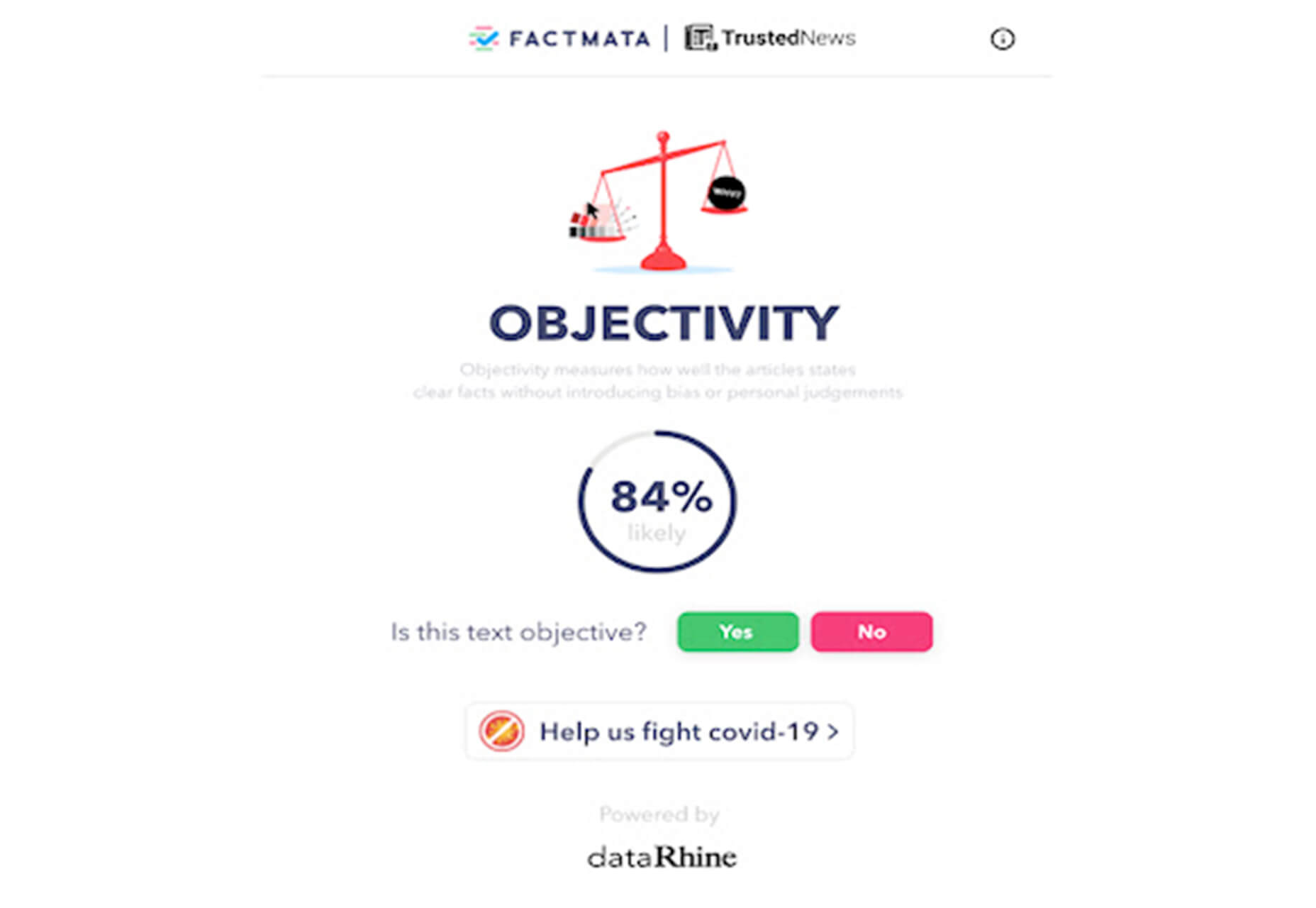
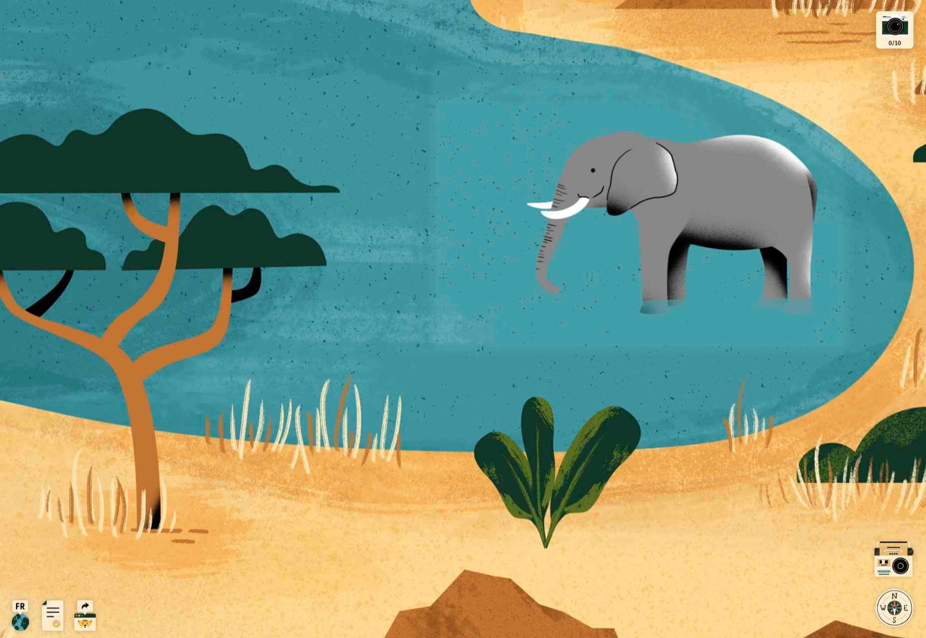
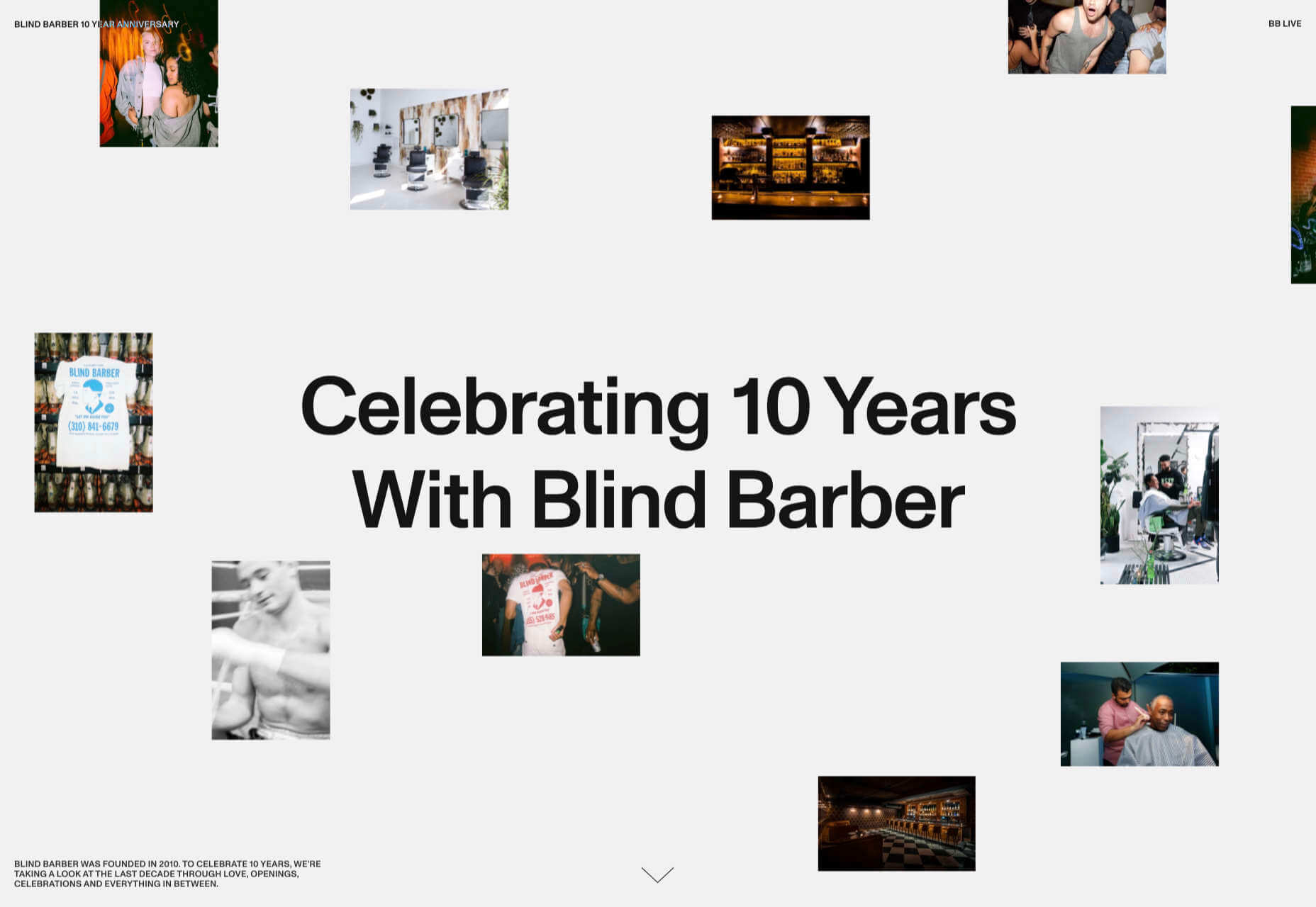
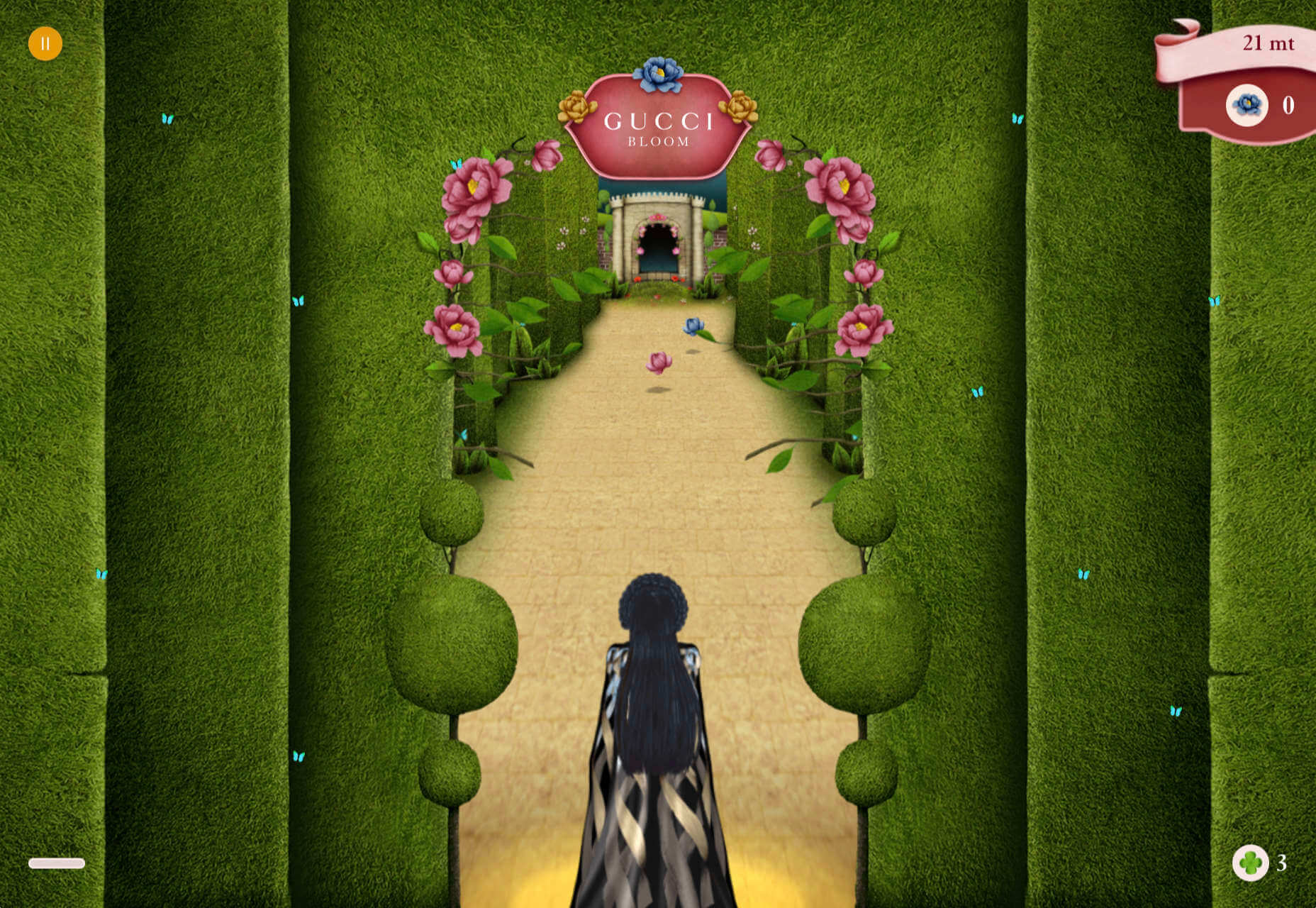
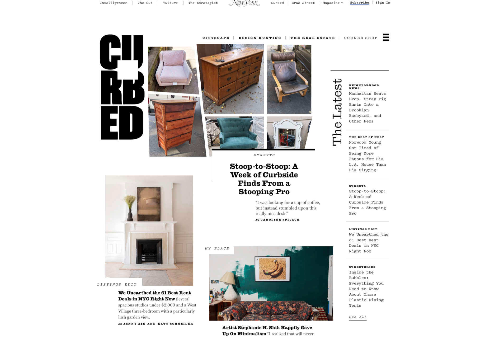
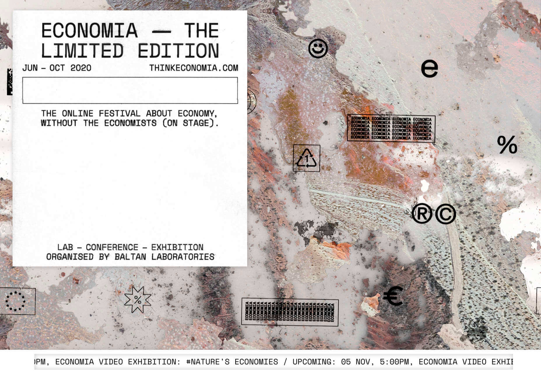
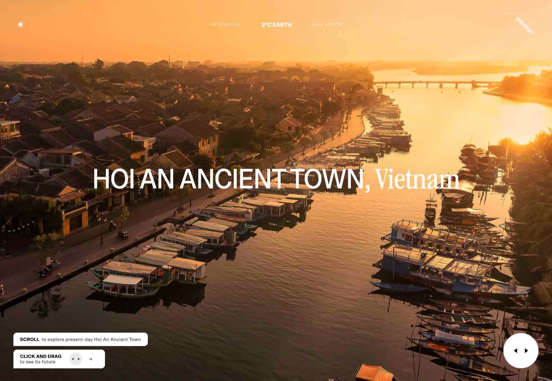
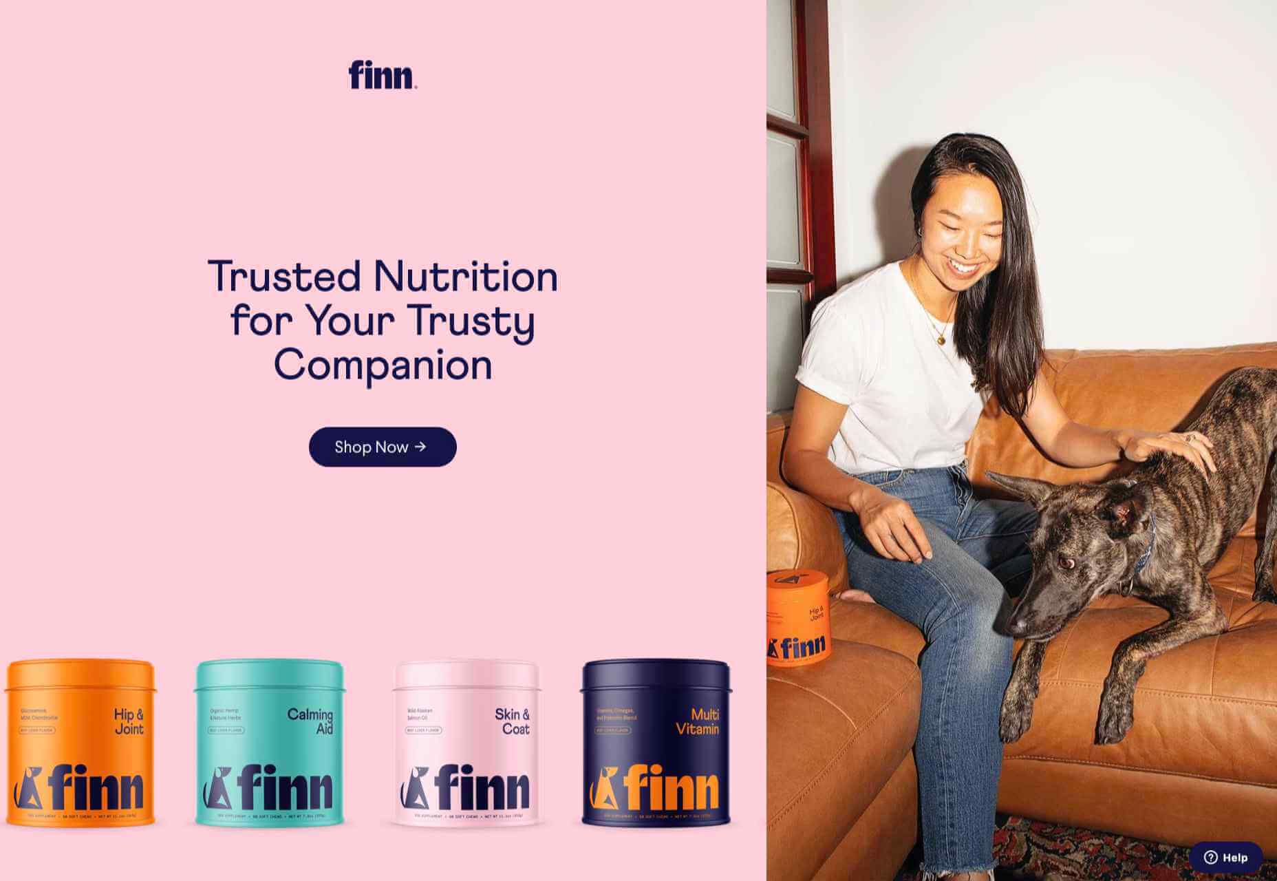
We have become so used to using web sites just to buy stuff that it is easy to forget that the web has more to offer. So this month we’ve included some because-it’s-interesting sites, some micro-sites and some just-for-the-sake-of-it projects.

Many of these are about selling or promoting products and services too, but in a more oblique way that is frequently more engaging than a straightforward sales site.

Micro sites can be a great way of including content that doesn’t fit in neatly with the rest of the main site, or is temporary, or to show a lighter, more fun side of a brand. And a well thought out micro site can act as a gateway to pull in even more visitors to its ‘parent’ site.

Your World Your Way

Your World Your Way is an interactive portal for the University of Auckland. An optional questionnaire customizes the experience, and clearly a lot of effort has gone into this in terms of the questions and possible answers, and the presentation. It is engaging and enjoyable to use, and the information provides links to the main University of Auckland website.

Blind Barber

This micro site is to celebrate 10 years of barber shop chain Blind Barber, which started as one shop with a bar in the back room, in New York’s East Village. An entirely black and white design provides a clean backdrop for color photos and videos, and some great scrolling animations give a pleasing flow to the content.

Brews & Grooves

Brews & Grooves pairs records with different beer. Although a ‘fun’ project, it is still a well designed piece of work with some vintage style typography and some pleasing rollover animation effects. It is an effective advert for those involved in creating it, as listed in on its ‘credits’ page.

Gucci Bloom

As part of a new campaign to promote it’s ‘Bloom’ perfumes, Gucci have created a Gucci Bloom game. The player has to pick up flowers and perfume bottles, but miss a flower and the vines get in your way.

808303Studio

808303Studio is a digital musical instrument that emulates a Roland TR-808 drum machine and TB-303 bass synthesizer, created in conjunction with the Design Museum (London). It’s fully programmable and there is even short video tutorial with A Guy Called Gerald on how to use it.

Aelfie

Aelfie is a home furnishings brand with a focus on bold patterns and bright color. Their site reflects this with its use of block color, irregular grid, drawings, and type that feels a little off-kilter. It creates a hand-made feel that embodies the brand aesthetic rather well.

Media Election 2020

As we approach one of the most significant, not to mention acrimonious, elections in US history, Media Election 2020 uses AI to analyze the volume of media attention each candidate receives, in real time.

Curbed

Magazine website Curbed has now become a part of New York magazine, and had a redesign in the process. It follows a discernible grid, but distorts it just enough to create an edge. The highlighter color frames, and underlines on rollover, add movement and ‘cool’.

WFN

The WFN (Women’s Funding Network) is an alliance of funds and foundations working to promote gender equity and social change internationally. The site is clean, with strong typography and a sophisticated color palette.

The Fabric of America

Internet, telephone and TV service provider Xfinity is behind the Fabric of America project. It is a collection of voice recordings, the idea being that each voice, and each person’s story, is a thread that makes up the flag that we see on the screen.

Minimal Ceramics

Minimal Ceramics is a concept site, showcasing the work of London based potter, Tom Crew. The design of the site reflects the simplicity of the showcased work, using great photography and simple typography.

Normal Now

Normal Now is part of an awareness campaign to highlight to consumers the positives of electric cars. Taking a fun approach to engage consumers in a serious subject, it uses a fake retro tech style.

Superfood Gin 

Superfood Gin is a gin made using superfood botanicals, that claims to be fruity and fresh rather than crisp and peppery. The soft color palette, along with the soft lines and curves in the background illustrations, reflect this well.

Maison Louis Marie

Maison Louis Marie is a natural fragrance company. While this site does nothing really groundbreaking, it does it well. Botanical drawings on a white background, along with clean typography, help create a refined, luxury feel.

Think Economia

Think Economia is a platform taking a fresh look at economics and the future of economic growth. It doesn’t sound like the most exciting subject, but it is presented here in a playful and intriguing way.

Chernobyl

From Uprock, a Russian design studio that also offers courses in web design, Chernobyl is a thought provoking exposition of the Chernobyl disaster. The design aesthetic is muted, allowing the images their deserved impact, and the brief sections of text to be absorbed.

Declamatuus

Declamatuus is a lingerie company selling gift sets. What stands out here is what you don’t see — live models in underwear. Instead the outline of the body is created with animated particles.

Odisea

Odisea Expedition is a documentary series following two friends, a surfer and a snowboarder, as they explore remote parts of the world. The photographs and video are everything here, and all other elements are kept minimal to avoid detracting from them.

Riffyn

Riffyn Nexus is a ‘Process Data System’ for storing and analyzing scientific data for laboratories. It is a very corporate site and yet it is put together in such a way that doesn’t feel dull.

Maison du Net

This site for digital design agency Maison du Net takes a risk mixing corporate with cutesy, but it works. Offset frames and underlines create interest without overdoing it, and the very bright green is used sparingly enough to liven things up without being overwhelming.

Source


Source de l’article sur Webdesignerdepot

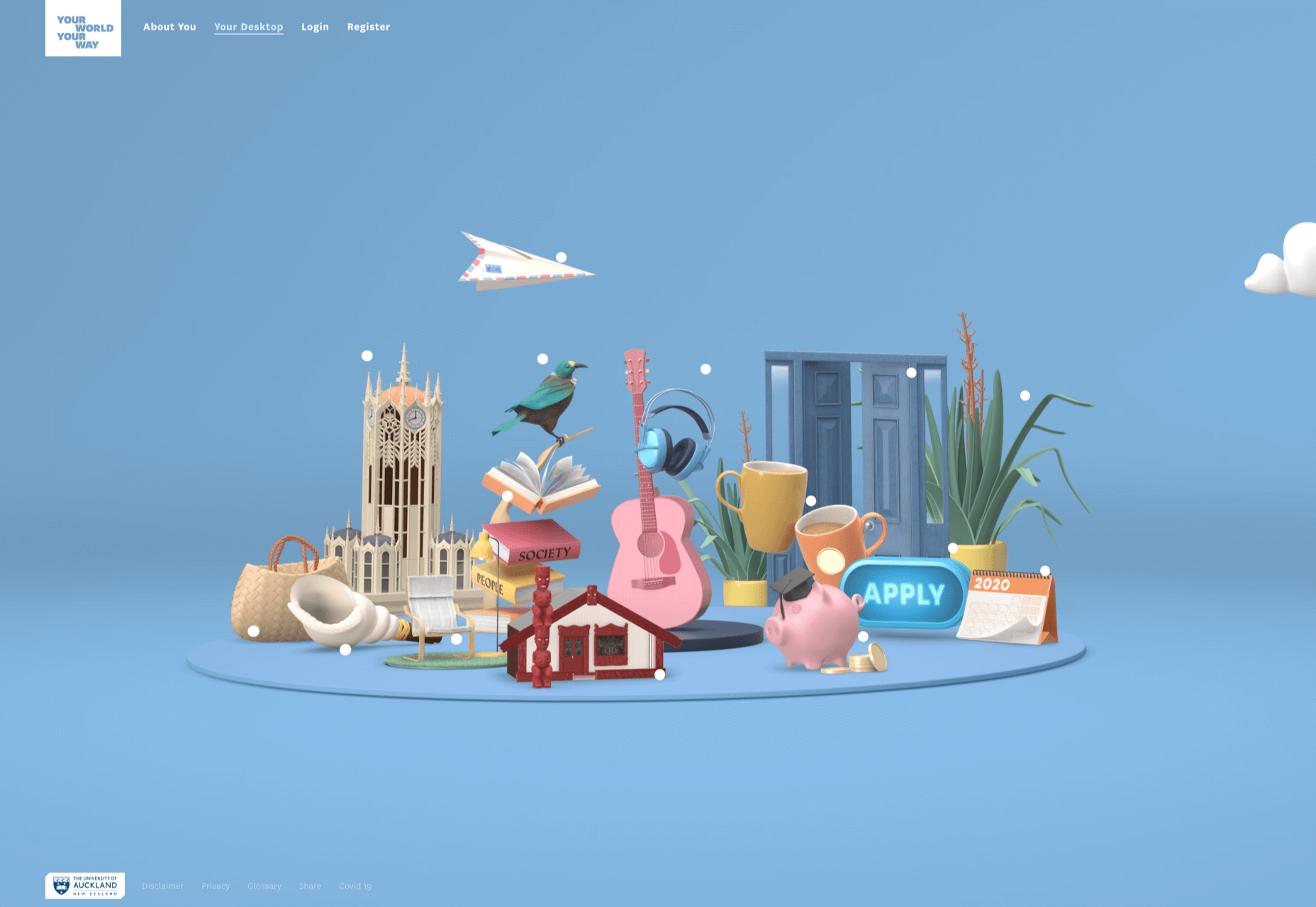
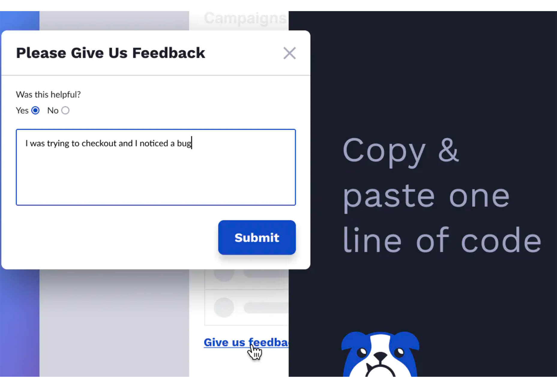
Plugins offer a ton of benefits to developers and website administrators; from flexibility, to saving time in development, the right plugin is priceless to a project.

In this article, we’ll cover a list of the best new plugins for October 2020. You’ll find useful plugins for WordPress, Craft, Shopify, and Joomla.

Let’s get started.

WordPress

Sticky Post Expire

Sticky Post Expire is a simple plugin for WordPress that allows you to add an expiration date to your sticky posts. When the expiration date you set on a post expires, the post will automatically no longer be sticky. All you need to do is install/enable the plugin and a meta checkbox will appear in your posts admin area. It’s in this checkbox you will set the post’s expiration date.

Product page shipping calculator for WooCommerce

The Product Page Shipping Calculator plugin allows your customers to calculate the cost of shipping before adding the product to their cart. The plugin also allows customers to see the available shipping methods for their area. If the product cannot be shipped to the customer’s location, the plugin will notify the customer. All calculations are done using Ajax, so you don’t have to worry about the plugin slowing down your site.

Payment Page

Payment Page makes it easy to collect payments on your WordPress website. The plugin allows you to connect to any payment gateway platform of choice. You can also receive one-time or recurring payments using Payment Page. The plugin comes with beautifully designed templates that you can customize to fit your brand and style. The form builder helps you increase your sales and conversions. You can collect payment in any currency. After payment, customers will also receive a confirmation message.

WP Roadmap

Wp Roadmap is a product feedback board for WordPress. The plugins allow you to display your company’s product roadmap on your WordPress website or blog. The plugin will display your new products, business developments, upcoming events, achievements, awards, and future projects on your site. WP Roadmap also gives you the option to collect and create feedback boards. The plugin comes with an intuitive interface and works with any WordPress theme.

LiveSession

LiveSession is a session replay plugin for WordPress. The plugin allows you to record everything happening on your site, including clicks, scrolls, and mouse movements. This plugin helps you understand how your visitors interact with your website. You can rewatch the videos as many times as you like. Instead of recording every single visitor on your site, LiveSession will record visitors with a high engagement score.

The plugin also comes with a feature called Rage Clicks. This feature helps you identify when visitors encounter Javascript errors. The plugin also has a beta feature called Clickmap. It helps you identify the specific elements on your site that visitors clicked and how many times. There is also a heatmap feature that identifies which pages on your site get the most interaction. The plugin is very useful in improving your user experience (UX) and conversion rates. It easily integrates with Google Analytics, Segment, Intercom, LiveChat, HelpScout, Olark, Wix, Shopify, and WooCommerce.

Auction Feed

Auction Feed makes it easy to display eBay items on your WordPress website. Visitors to your website will be able to search and buy products directly from your site. The plugin comes with a variety of styles to fit any WordPress theme. You can also add a product description above or below the product image. Customers won’t have to leave your website before making their purchases. The plugin is also free to use.

Floating Related Posts

Floating Related Posts is a WordPress plugin that allows you to display a banner with a list of related posts on your website. The banner can appear at the top or bottom of the web page. You can set the banner to pop up using a time filter or scroll trigger. The plugin is also compatible with Google Analytics. You can customize the banner background color, font size, button style, and text color. The plugin can be translated into any language.

Simple Restrict Content

The Simple Restrict Content plugin allows you to restrict the content that visitors can access on your WordPress site. You can choose who can access content on your website by setting up roles. The simple lightweight plugin restricts different content types, including, posts, web pages, and WooCommerce products. The plugin is available in Spanish and English.

Easy Video Publisher

Easy Video Publisher is a WordPress plugin that allows you to easily publish YouTube videos on your website. You can import YouTube videos from multiple channels. You can also schedule the YouTube videos to automatically upload to your website. Note that a YouTube API key is needed to import multiple videos at a time from a specific channel. The plugin allows you to use multiple API keys.

Preloader Awesome

Preloader Awesome is a preloader plugin for WordPress that allows you to create a page preloader interface while the rest of the webpage is still loading. Preloaders are interface elements that notify visitors that your website hasn’t crashed, just processing before serving content. Some of the features of the plugin include 14 page transition styles, progress bar, GIF support, 10+ default CSS loader, progress status counter, unlimited color, and counter font size options. The plugin is responsive and works on all modern browsers.

Menu Hover Effect

The Menu Hover Effect plugin allows you to add hover effects to the menu bar on your website. With this plugin, you don’t need to learn CSS. This plugin gives you 20 CSS menu hover options to choose from. It is a lightweight plugin and won’t affect your website speed.

Better Comments

The Better Comments plugin allows WordPress users to easily customize the comment section of their website. With the plugin, you can customize the look of your comment form fields, match the submit button with the colors of your site, and hide the comment’s date. The plugin also allows you to create a comment policy section. You can further customize the comment fields to highlight when they are selected and typed in. If you find rounded avatars common, the plugin also offers a hexagonal avatar option.

WP Pocket URLs

WP Pocket URLs is a handy WordPress Plugin that helps you manage your affiliate links. The plugin allows users to automatically shorten and track any affiliate link on their website. You can also manually shorten the links on your website. Each time a visitor clicks on a link you get access to information like click date/time, country, IP address, etc. You can also categorize your links and also create custom permalinks. There is also a dashboard widget that displays your top 10 links. On the “Reports” page, you can generate clicks reports. You can filter the reports by Month/Year, link category, country, and link title.

Craft CMS

Formie

Formie is a Craft CMS plugin that allows you to create user-friendly forms. The plugin comes with a drag and drop builder for creating forms. You can store user form submissions in your control panel in case you want to review them later. When a user submits a form, you will get an email notification. Formie also has an in-built keyword blocking feature to protect you from spam. The plugin has several integrationS: API for Elements, Address Providers, Captchas, CRM tools, Webhooks, and Email Marketing software. You can also create your custom integration. You can add over 25 fields to your forms using Formie.

Craftagram

Craftagram is a Craft CMS plugin for adding any Instagram feed to your website. Since the plugin uses the official Instagram API, you don’t have to worry about your website getting blacklisted. Craftagram also handles pagination for your Instagram feed. 

Shopify

We’re Open

We’re Open is a handy plugin for Shopify users. The plugin lets your customers know when you are open to receive new orders. Once your business hours are close, customers won’t be able to make new orders. A message will be displayed in your store that you are closed. The plugin ensures that you only receive orders when you are open. It works in any time zone and the API easily integrates with mobile apps.

Punch Metrics

Punch Metrics is a Shopify Plugin that helps you track your store’s visitors and also analyze their behavior. The plugin offers real-time data on your site’s visitors, the pages that see the most engagement, and which devices are the most popular. You can also record and replay visitors’ sessions so you can know exactly what they did on your site. Punch Metrics also has a heatmap tracking feature to understand which elements on your site get the most clicks.

Joomla

Simple Sliders

Simple Sliders is a content plugin for Joomla. The plugin allows users to easily create accordion sliders in their articles. You can add the sliders to your Joomla articles by adding this code:

{s​lider title="Slider 1 Title" class="blue"}
Slider 1 content.
{s​lider title="Slider 2 Title" class="red"}
Slider 2 content.
{/s​liders}

Jitsi Conferencing

Jitsi Conferencing is a video conferencing plugin for Joomla. The plugin will allow you to host meetings and easily connect with your clients. The module is simple and effective to use.


Featured image via Unsplash.

Source


Source de l’article sur Webdesignerdepot

This week, we take a look at API vulnerabilities in HashiCorp Vault, Azure App Services, and more. There is also an introductory video on finding information disclosure in JSON and XML API responses, and another cheat sheet and a webinar on OWASP API Security Top 10.

Vulnerability: HashiCorp Vault

Felix Wilhelm from Google’s Project Zero has written a very detailed write-up on an authentication bypass he found in the Amazon Web Services (AWS) and Google Cloud Platform (GCP) integration of HashiCorp Vault. As a central storage of credentials, Vault makes an attractive target for attackers, and therefore a vulnerability in it is also very bad news. Looking for the silver linings, this attack was definitely quite advanced, and thus not easily exploitable.

Source de l’article sur DZONE

And it does this 24 hours a day, 7 days a week, 52 weeks a year without ever asking for a pay raise.

But this is true only if your website landing page is designed well, maintained, and optimized to the gills. The art and science of a flawless landing page is beyond the scope of a single article, but we can start with helping you spot seven of the most common – and damaging – trouble spots.

1. Unclear Value Statement

Typically, new visitors to your page will only stay on it 3 to 15 seconds before they get distracted. In that span of time, you must offer a clear and visible reason to stick around and interact with the page.

That reason is your value statement. What value do your readers get in exchange for the time you ask them to spend? High-quality content is a must (and hopefully a given), but you also need to pull them in so they experience that content.

Does your landing page do that? If yes, great! If no, you should fix that. If you’re not sure, ask yourself:

  • Is there a compelling, visible headline that expresses the end benefits clearly and succinctly?
  • Is there a subheadline explaining your offering in more detail?
  • Are there supporting graphics that pull the eye toward your headline and subheadline?

If there aren’t, add them now.

2. Poor Signposting

Your landing page isn’t just there to be pretty. It’s meant to convince people to take action. If you don’t make it easy to find your call to action, most viewers won’t look for it.

deliver enough value to make it worth the hassle

You must make it clear — in as succinct and efficient terms as possible — why the action you want a reader to take will deliver enough value to make it worth the hassle. Tell them, in words that stand out from the rest of the page, what you want them to do next and what they’ll receive for doing so.

Improving your signposting stats by asking yourself the following questions:

  • Do you have a clear understanding of what the next step in a visitor’s customer journey should be?
  • Is it easy to find and take that step on your website?
  • Does your copy make a clear and compelling argument in favor of taking that step?

If you can answer yes to all three questions, your signposting is likely good (or at least good enough for now). If not, now you know what you have to do to improve it.

3. Slow Loading Time

Remember that 3 to 15-second maximum time limit we mentioned earlier? That span includes time spent waiting for your landing page to load, and every microsecond of that wait increases a reader’s likelihood of bailing on the whole thing. You must get your loading time to be as quick as possible.

Viewers who exit your landing page early – including while still waiting for it to load – increase your site’s bounce rate. Higher bounce rates reduce your rankings on Google and other search engines, meaning a page that loads too slowly not only impresses fewer viewers, but it also gets fewer viewers overall.

Improving your loading time is usually a job for your tech team or whoever in the office is responsible for overseeing your hosting service. That said, here are a few of the most important ways to optimize this important factor:

  • Optimize image size, file format, and compression;
  • Clean up your database by deleting saved drafts, old revisions, unused plugins, and similar virtual detritus;
  • Confirm that your WordPress theme (if applicable) is optimized for quick loading;
  • Use a content distribution network for file storage;
  • Analyze server response time with your hosting service, and work with them to reduce it;
  • Install tools that leverage browser caching;
  • Fix all your broken links;
  • Remove all render-blocking from JavaScript;
  • Reduce the number of redirects necessary to reach your page;
  • Optimize your code, especially in CSS, JavaScript, and HTML;
  • Enable file compression — except for on images;
  • Replace all PHP content with HTML wherever possible.

This is technical, detailed work, but it’s important. If you don’t have team members up to these tasks, it can be worth hiring an outside consulting company to do it for you.

4. Only One Landing Page

You have a good idea of your ideal customer’s hopes, fears, pain points, demographics, likes and dislikes, and other important information. If you have several different types of customers, you can’t use the same landing page for each of your customer groups. Each group has different characteristics that will prompt them to follow your call to action, so you don’t want to offer just one landing page.

Similarly, you also probably have more than one product or set of content and offerings to generate sales. Having only one landing page can lose leads because the page is only optimized for one of those products or content sets.

Ideally, you should have a unique landing page with a tailored offer for each of your customer models that would send those individuals to each of the products and content sets. An ad for professionals in their 30s making over $50,000 a year would lead to a landing page built for them, while an ad for heads of households working from home would lead to a landing page built for them.

Yes, that means a company with three profiles and four content sets would need 12 landing pages. And yes, it’s worth that kind of effort.

5. Insufficient Visuals

“A picture is worth 1,000 words” is ancient wisdom, but it’s far from true in the internet world – it’s actually worth more. A quick look at social media and blog performance will tell you many people will look at, enjoy, and share a photo or video, but not many will read an entire 1,000-word post on the same topic.

How well your landing page performs depends on the images you use and how you present them. Does your page’s layout conform to the best practices of visual web design:

  • Including images that emotionally reinforce the value expressions of your product’s core benefits;
  • Containing sufficient white space to not be intimidating;
  • Providing data images to indicate the worth of what you do;
  • Using visual design cues to lead the eye toward your conversion points;
  • Applying color gradients to highlight offers and your call to action;
  • Using infographics to replace the dreaded “wall of text”.

If you can say yes for half of these things, carry on. If not, this point may be among the better places to start with a landing page redesign.

6. Asking For Too Much, Too Soon

Craft a custom calls to action that meet all levels of interest, need, and desire

Not every landing page visitor is created equal. Some are hardcore fans and experts in what you do, ready for a 10,000-word white paper that dives deeply into the research supporting your use case. Others might have heard about your industry on an Instagram page and want to know the basics of what you do.

There’s nothing worse than going to a website and being asked for all of your personal information right away. If your call to action requires too much knowledge, too deep a commitment, or even too much personal information, consider scaling back. Otherwise, you risk turning away potential customers.

Better yet, go back to No. 5 above and build a new landing page for beginners and early-stage leads. Craft a custom calls to action that meet all levels of interest, need, and desire.

7. No Trust Elements

Offering some type of authentic customer referral or testimonial is important. It all boils down to the same thing: telling those who read your landing page that other people already like what you do and how you do it.

Examples of effective modern trust elements include:

  • Quotes from positive reviews next to a photo of the reviewer;
  • Screenshots of social media posts praising your company or product;
  • Short video interviews of happy clients;
  • Blurbs for industry thought leaders approving of you;
  • Images portraying business credentials and certifications;
  • Links to positive press coverage;
  • Logos of known business customers who buy and trust your brand.

Final Thought: What’s Next?

There isn’t one guaranteed way to turn a landing page from something full of holes into something perfect. But first, run an audit of your landing page using this list as a guide. Note which errors are there. Next, sort them in order of what takes the least time to fix to what takes the most time to fix.

Then, fix them in that order. We find that getting the quick fixes done builds excitement and momentum, whereas starting with a harder fix can mire down the whole process.

If none of these errors exist on your landing page, congratulations. There’s still lots of work to do on your website and content marketing, but it’s not among these rookie mistakes.


Featured image via Pexels.

Source


Source de l’article sur Webdesignerdepot

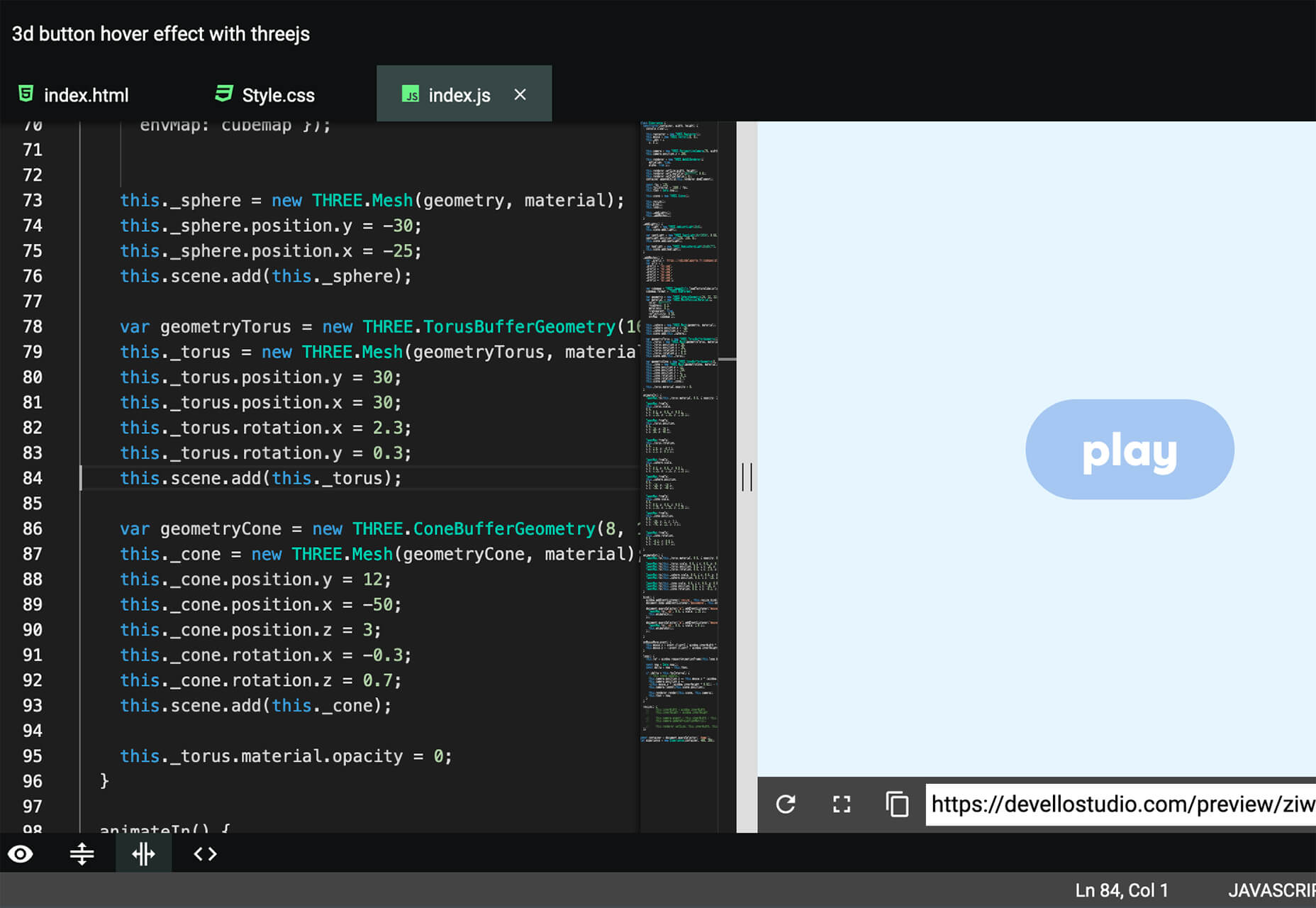
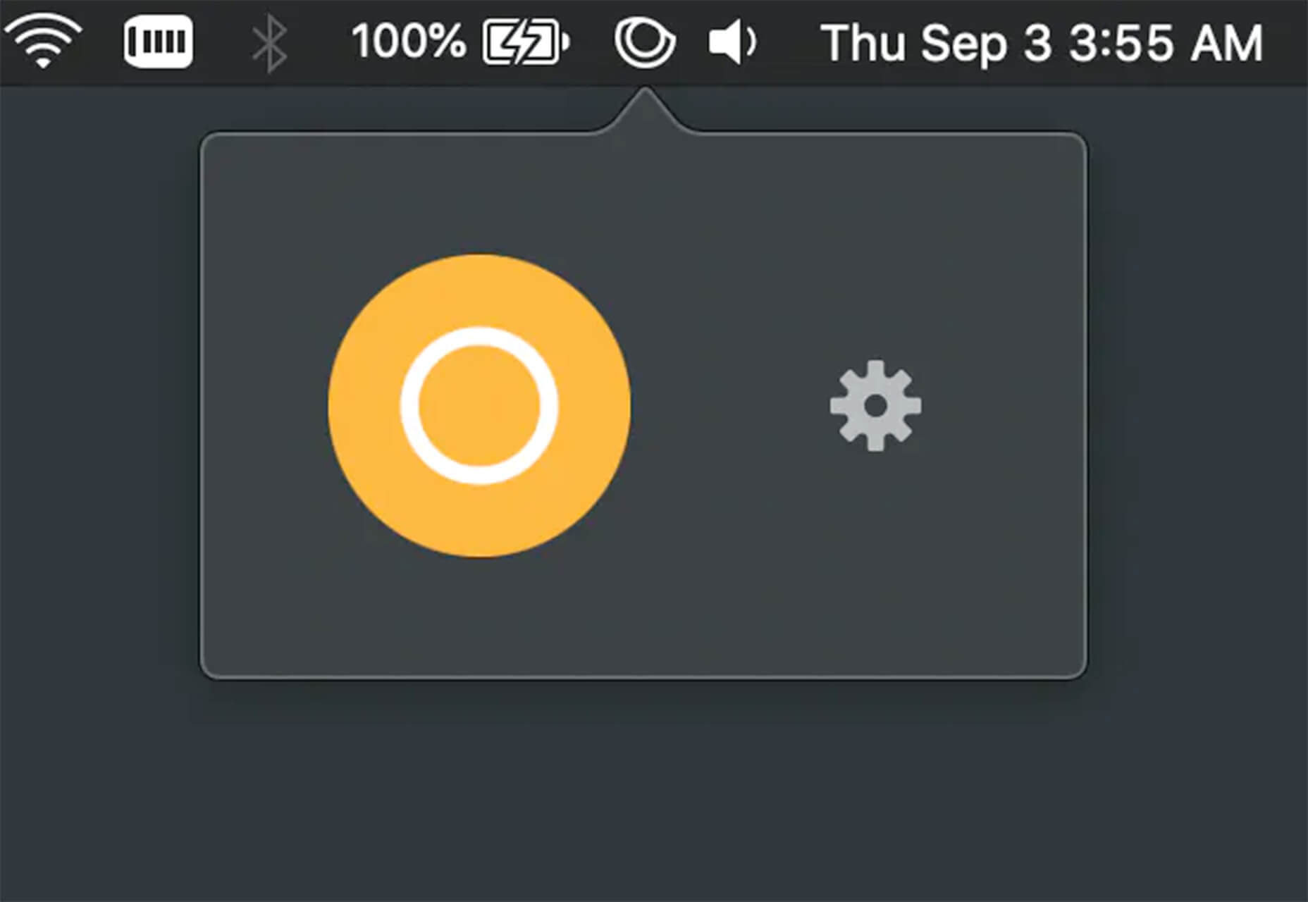
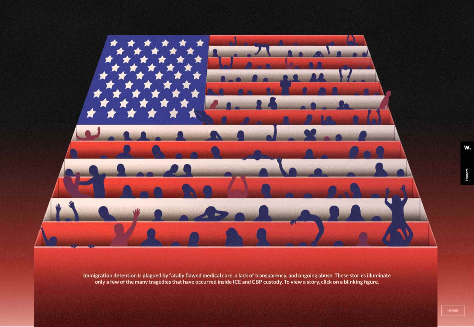
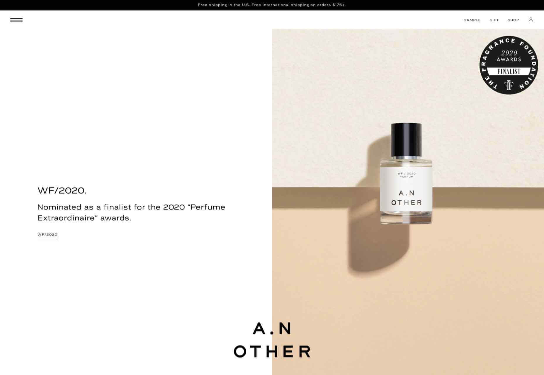
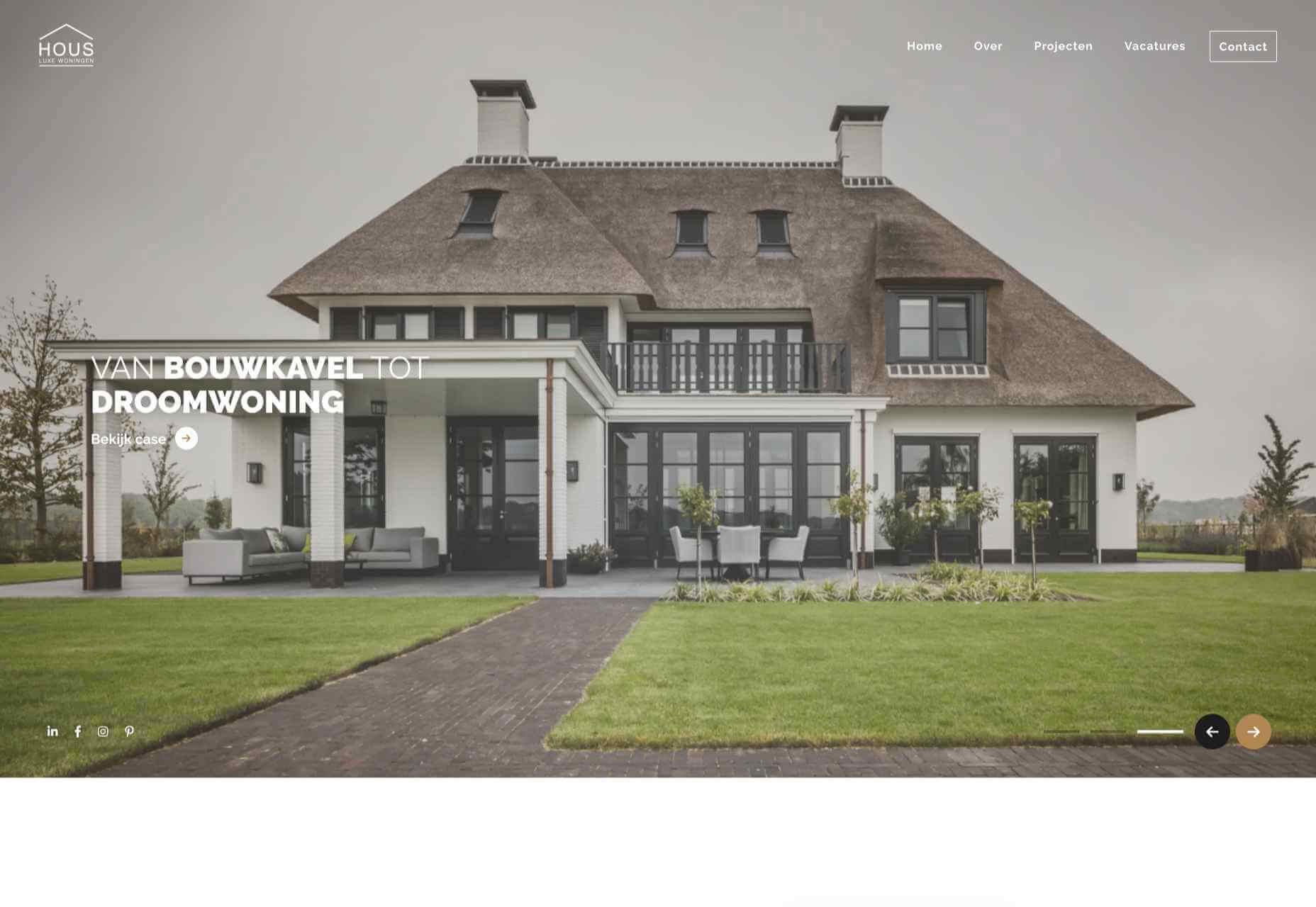
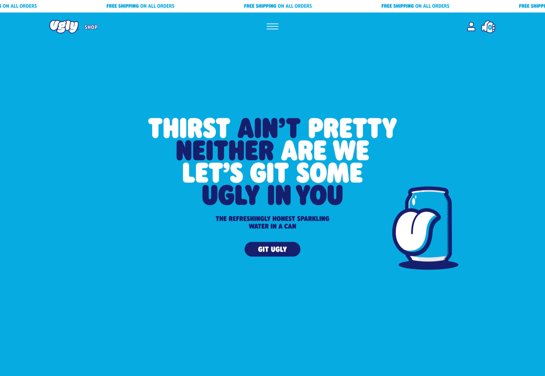
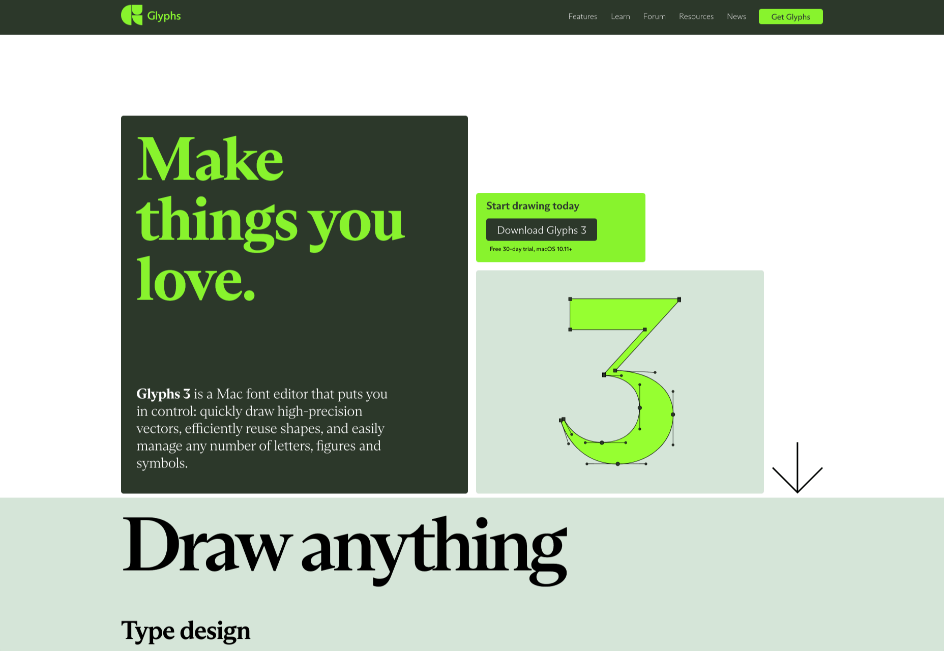
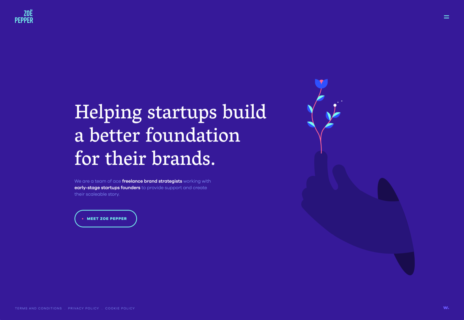
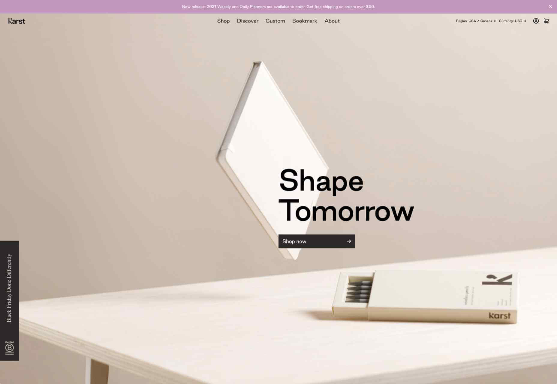
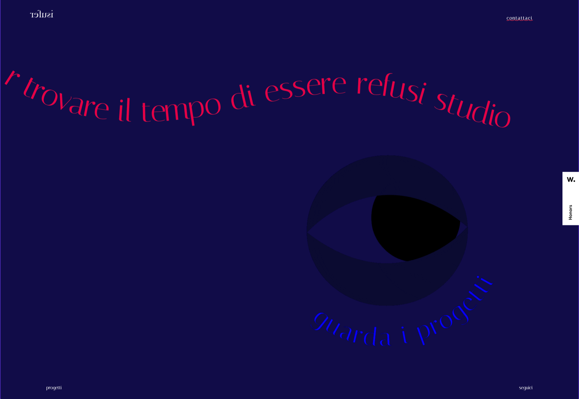
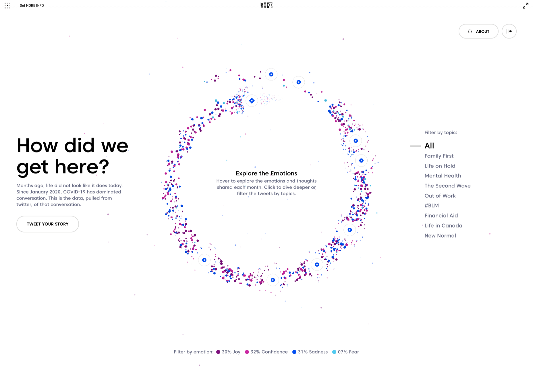
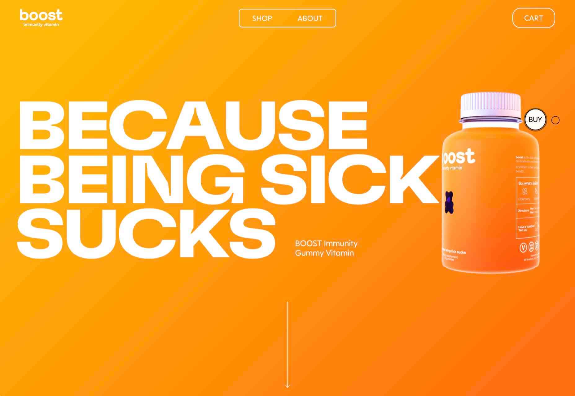
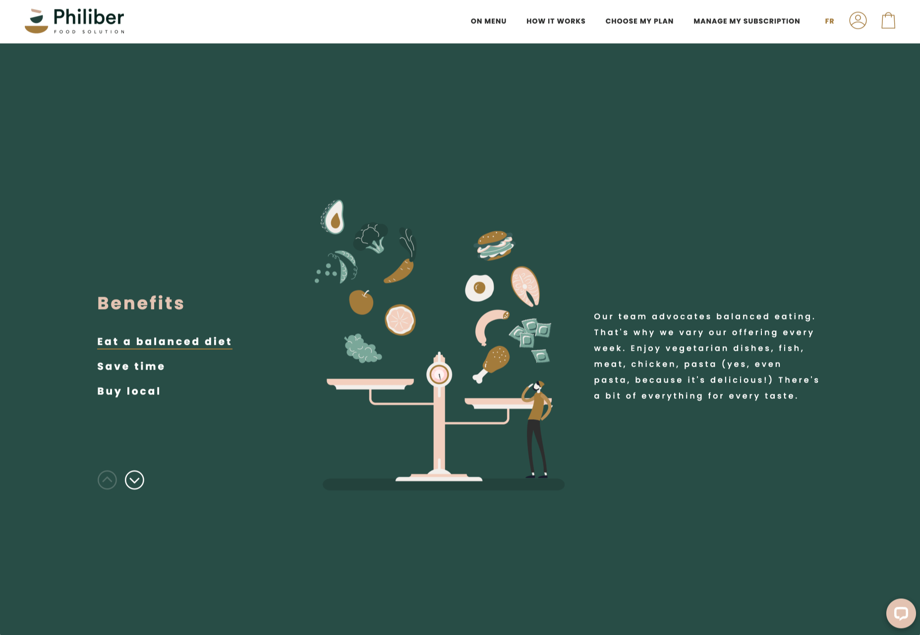
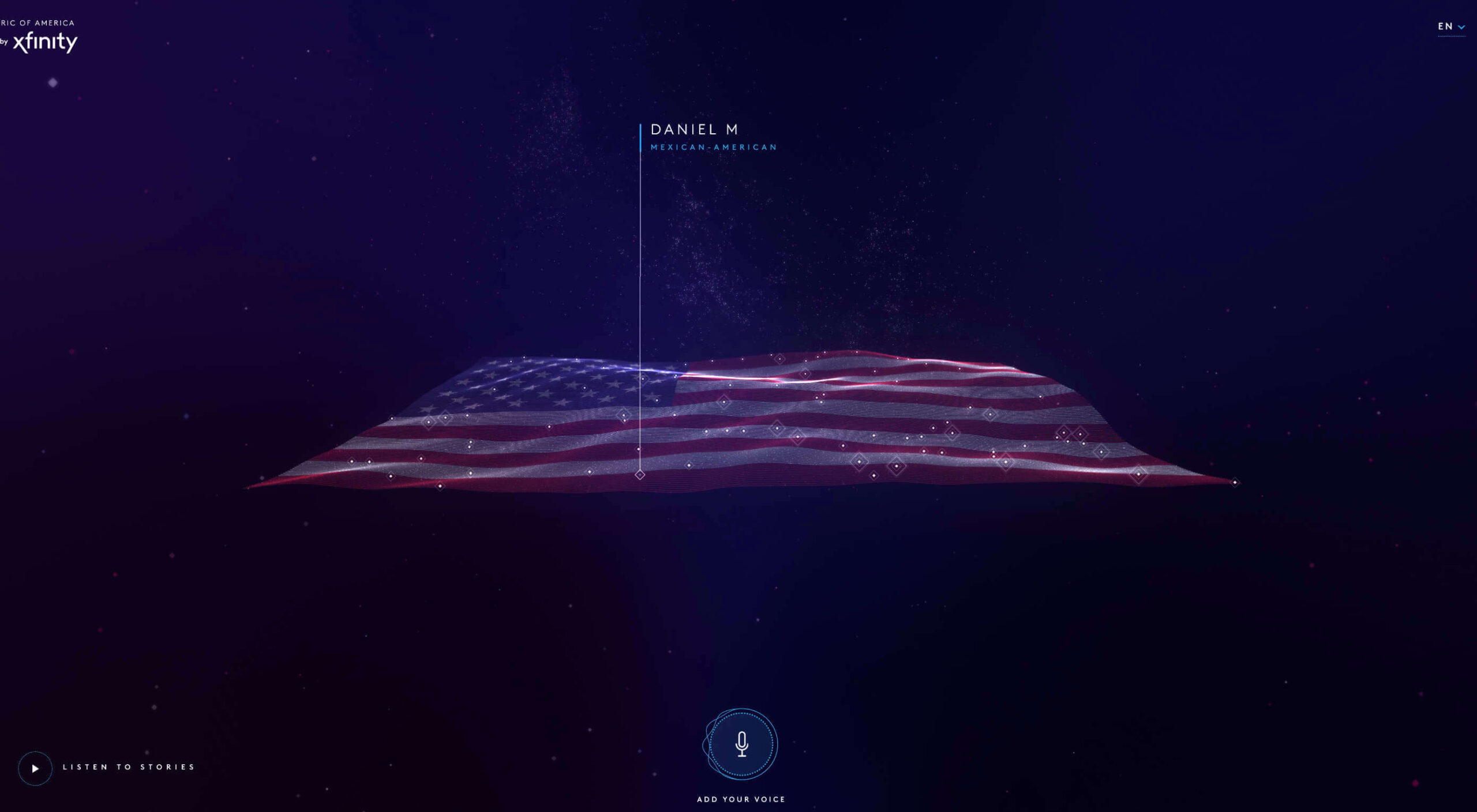
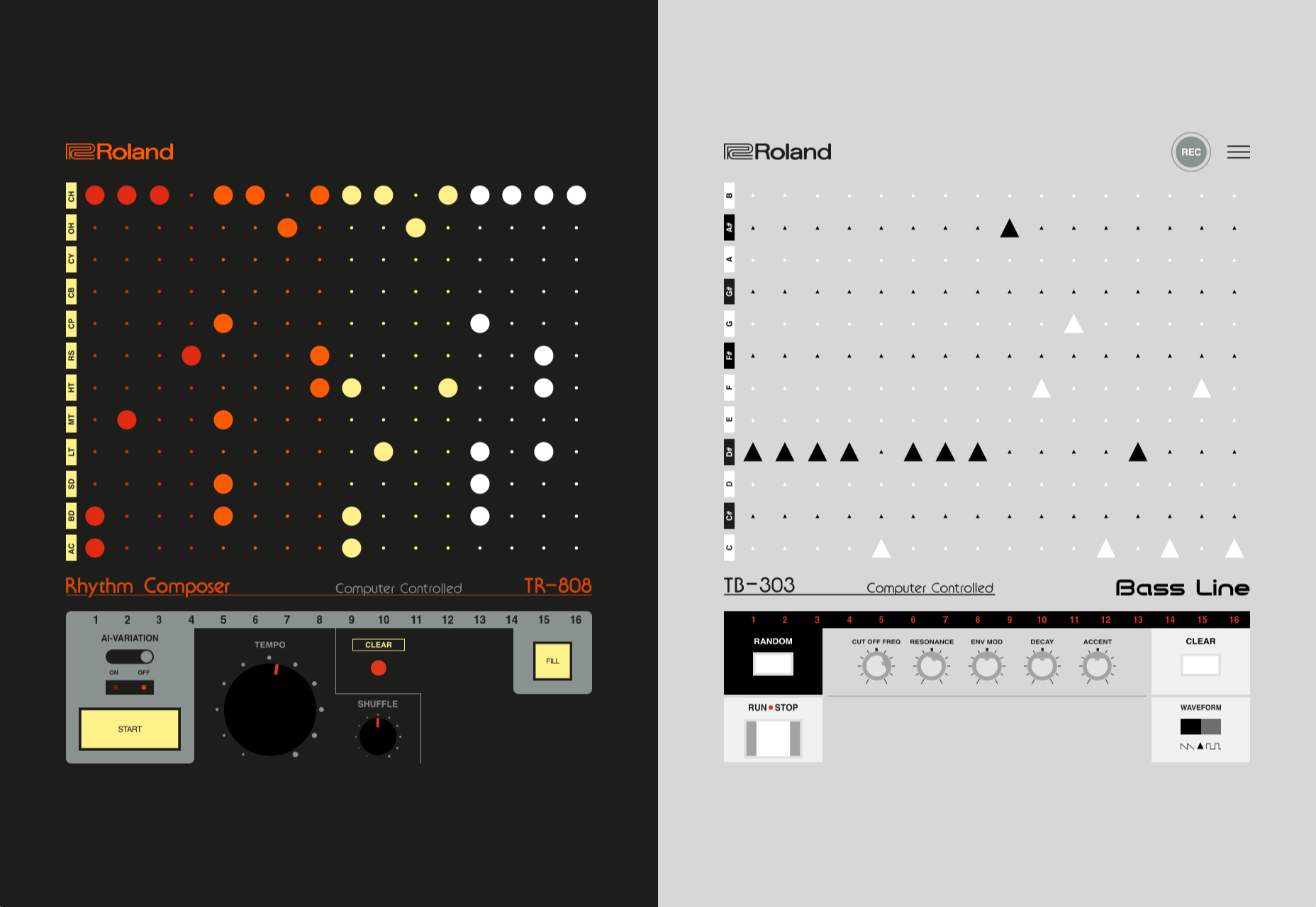
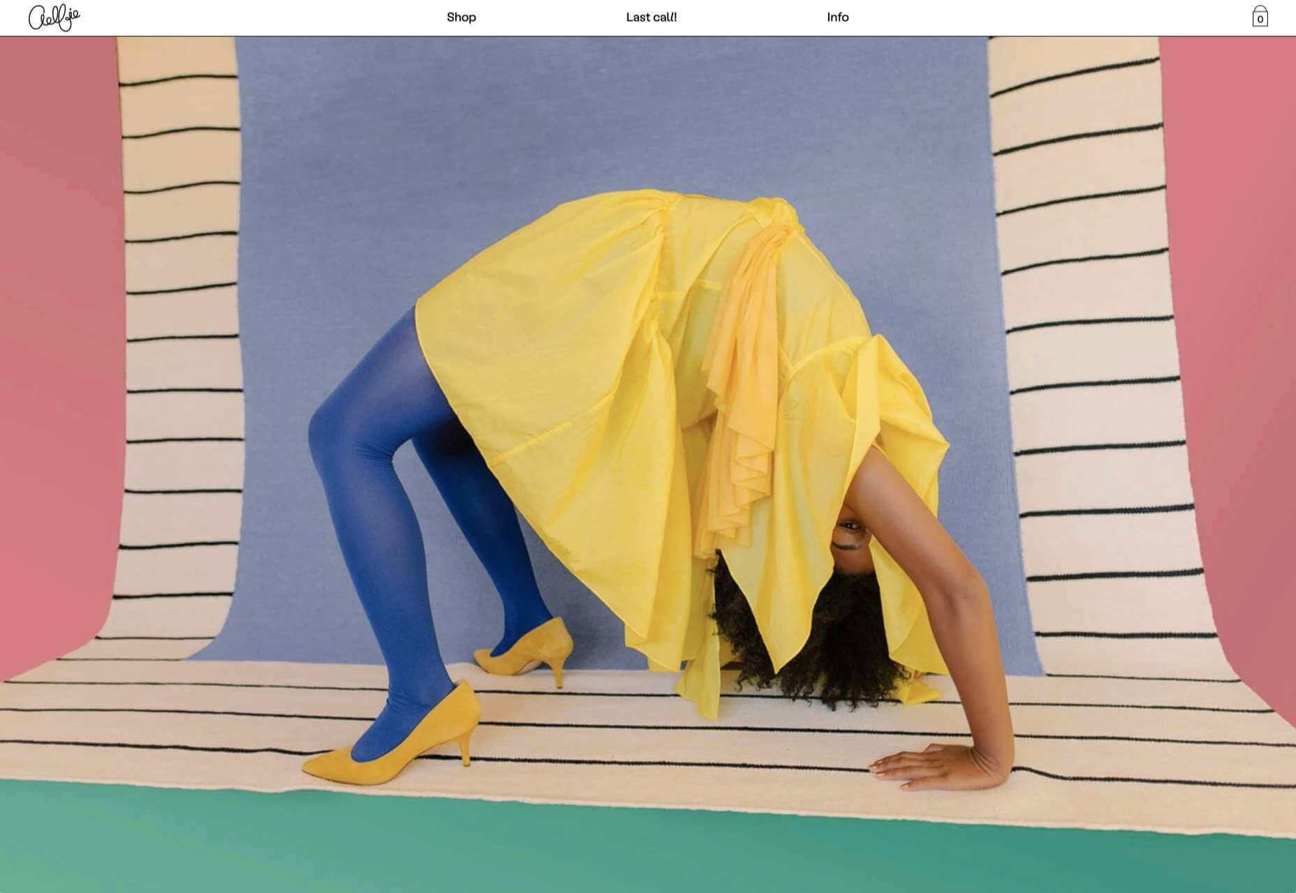
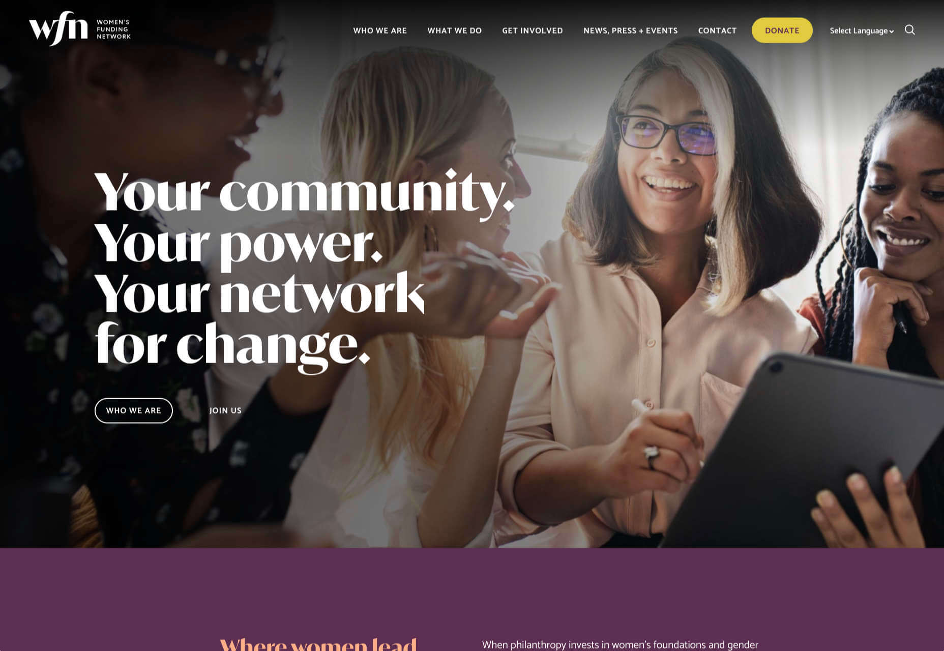
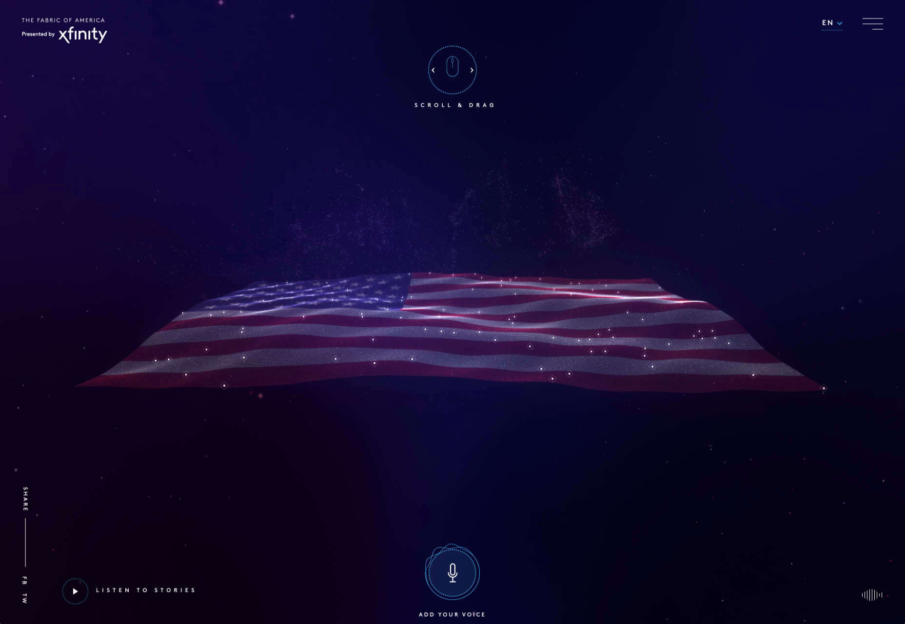
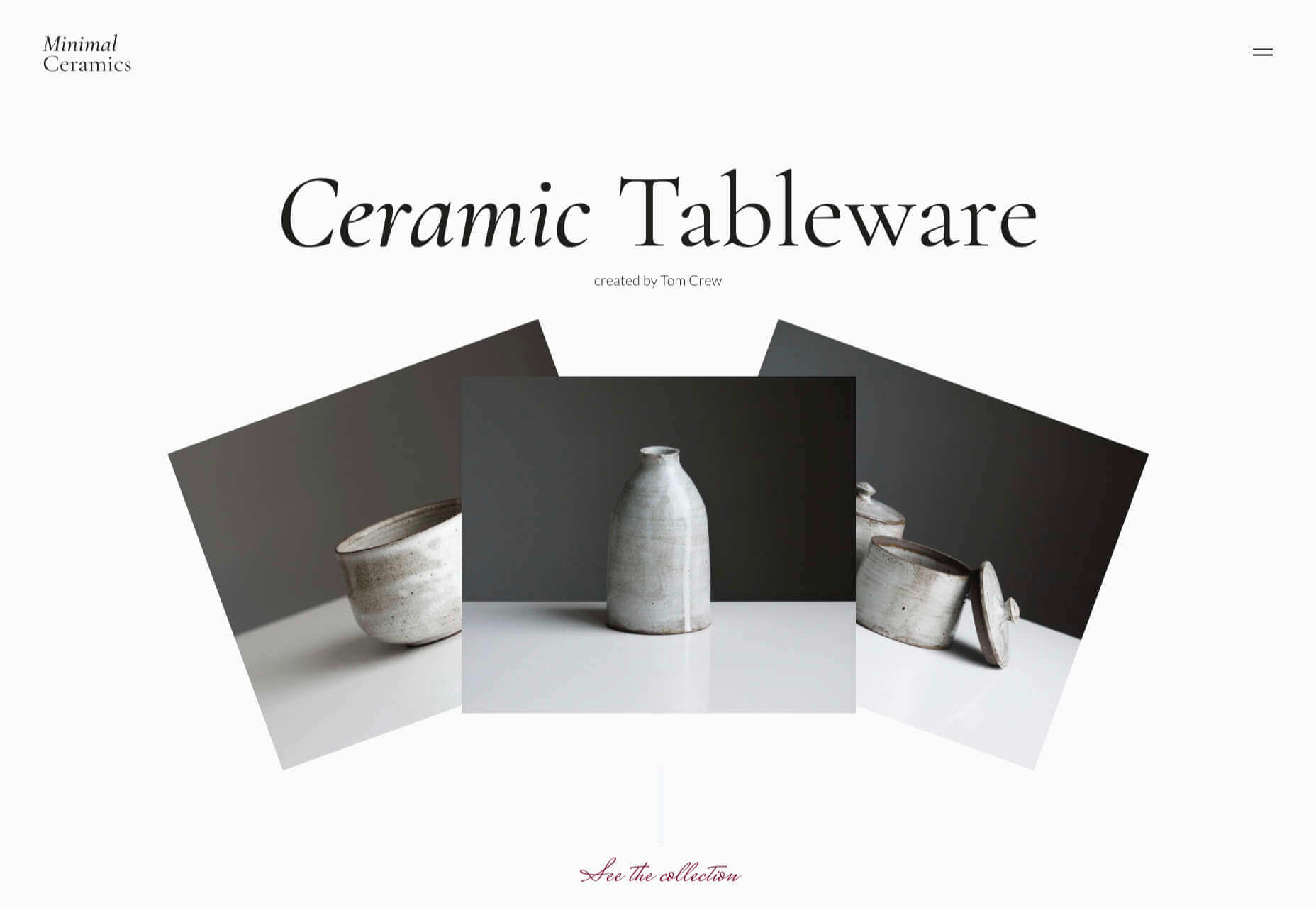
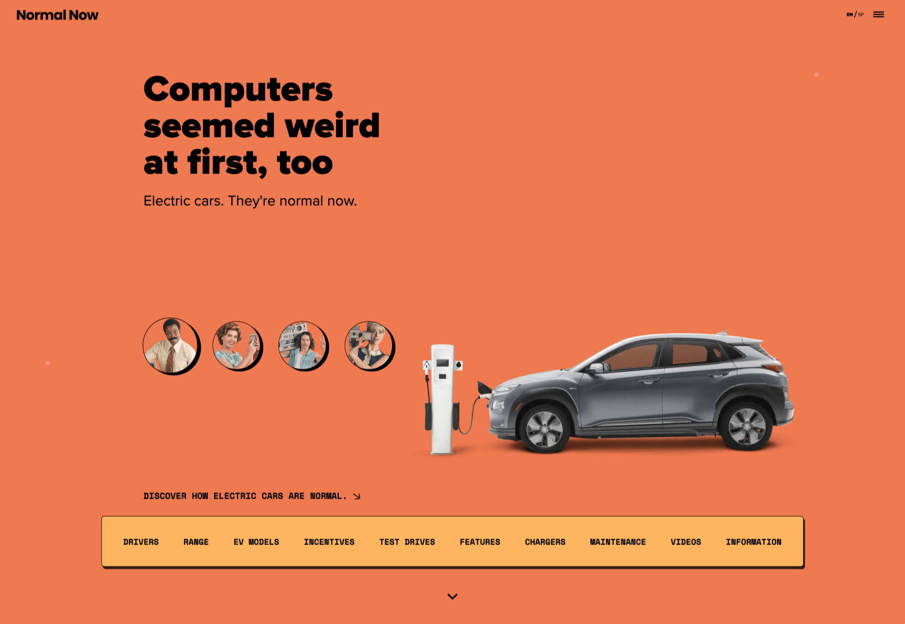
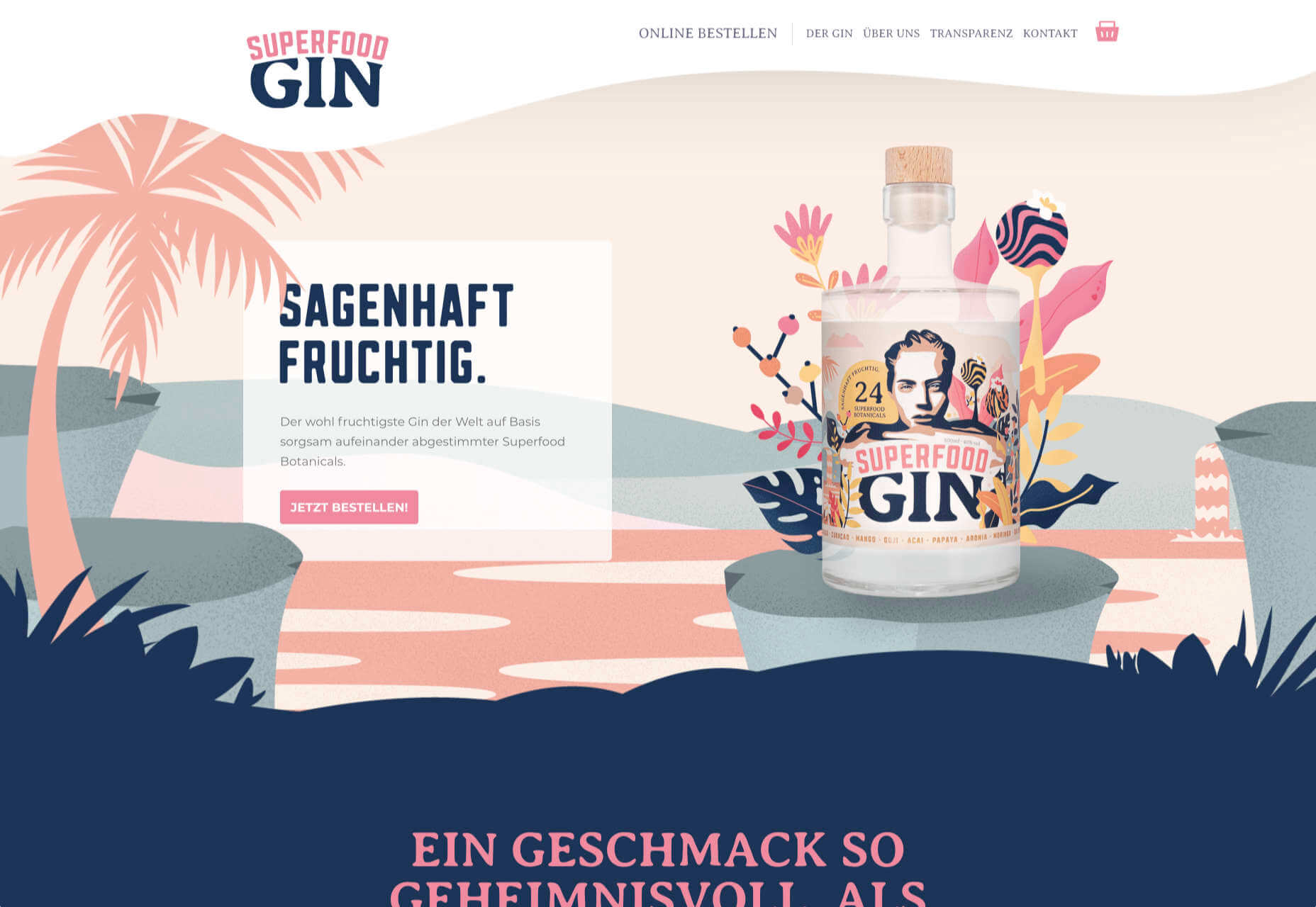
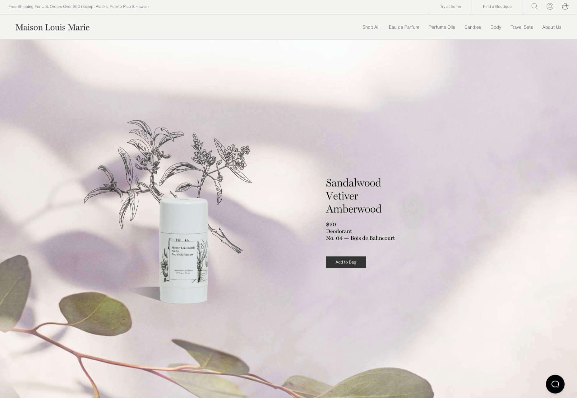
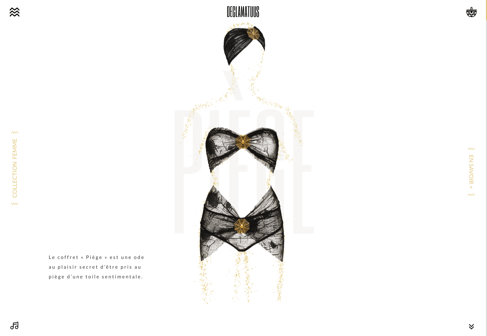
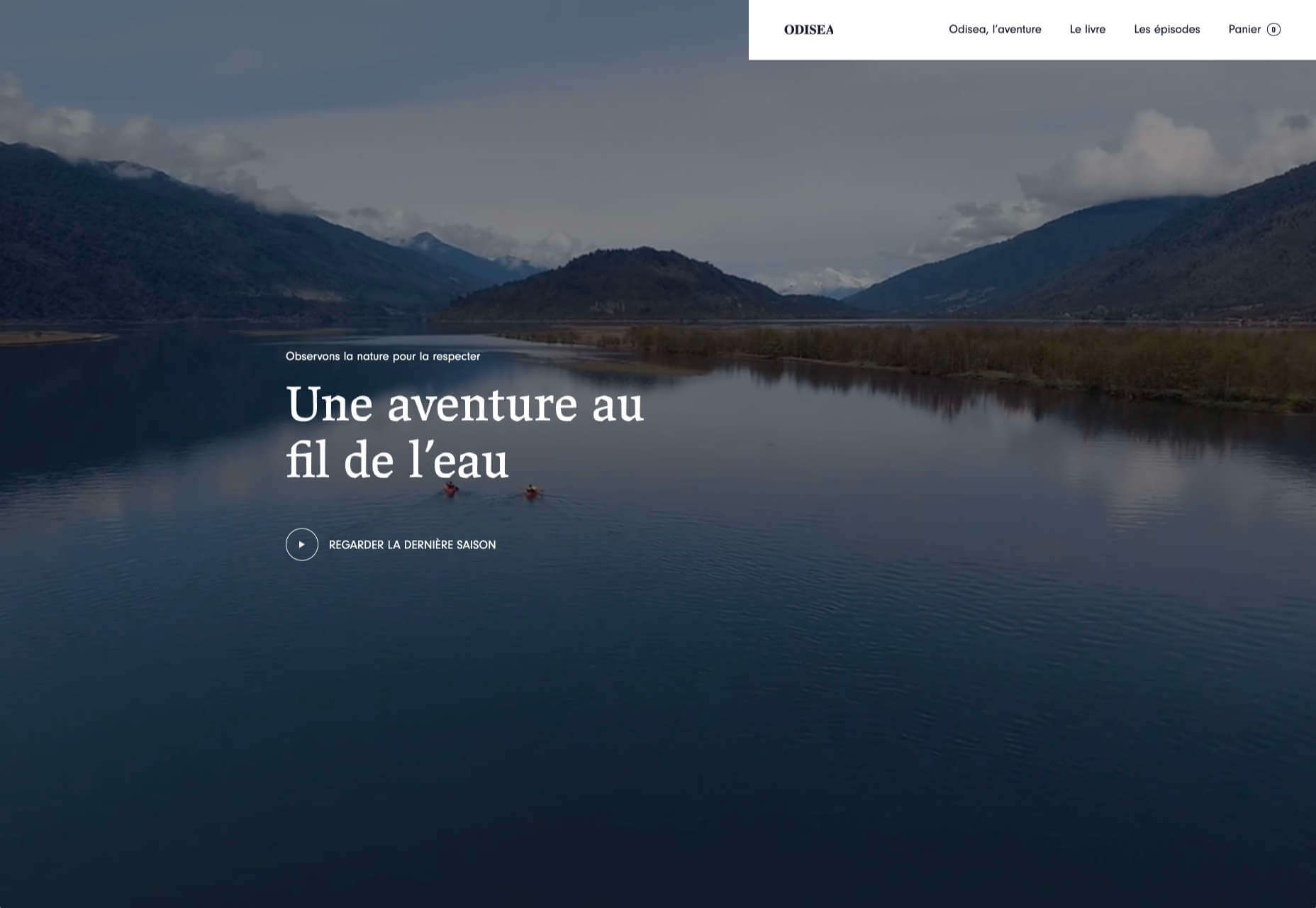
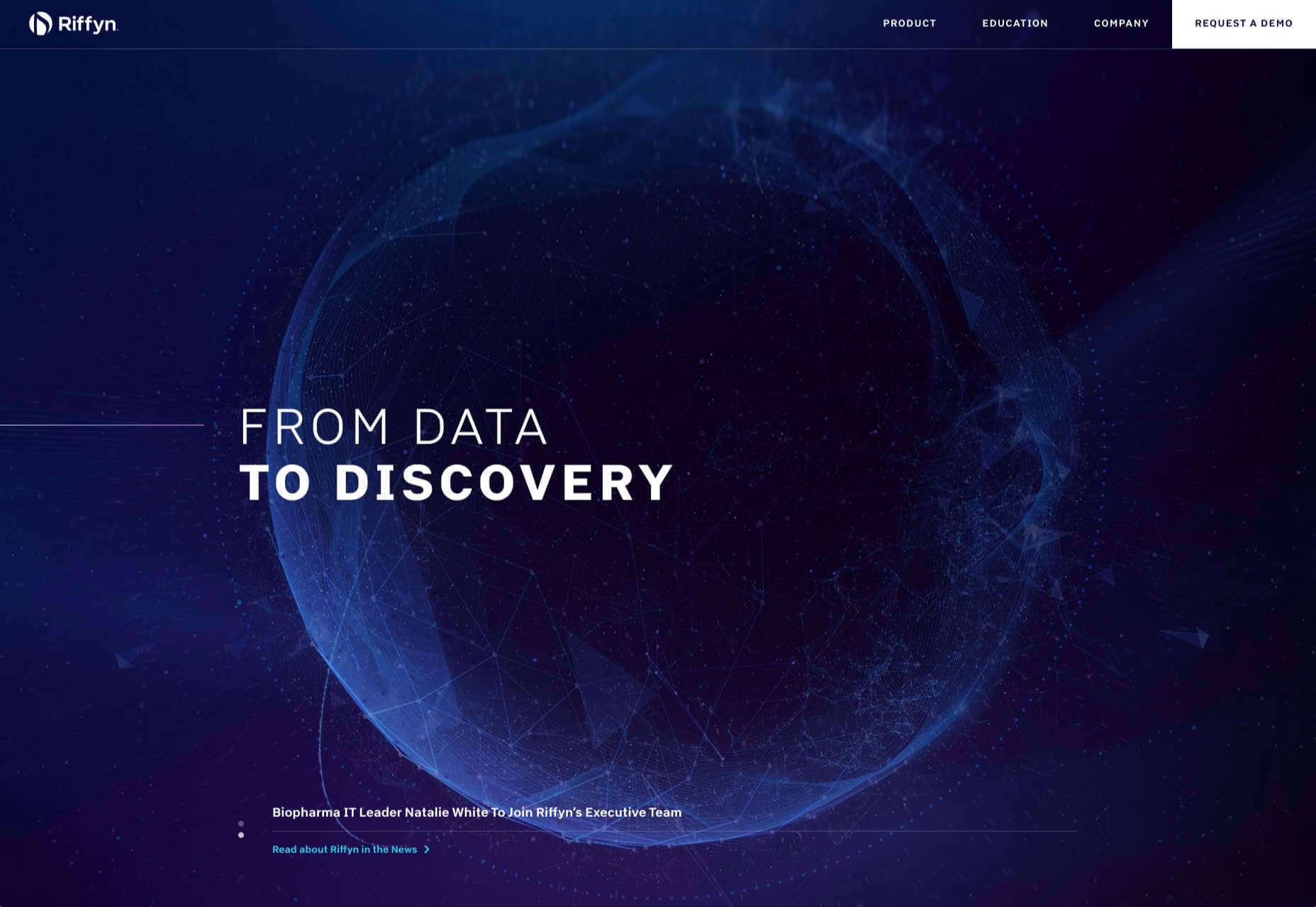
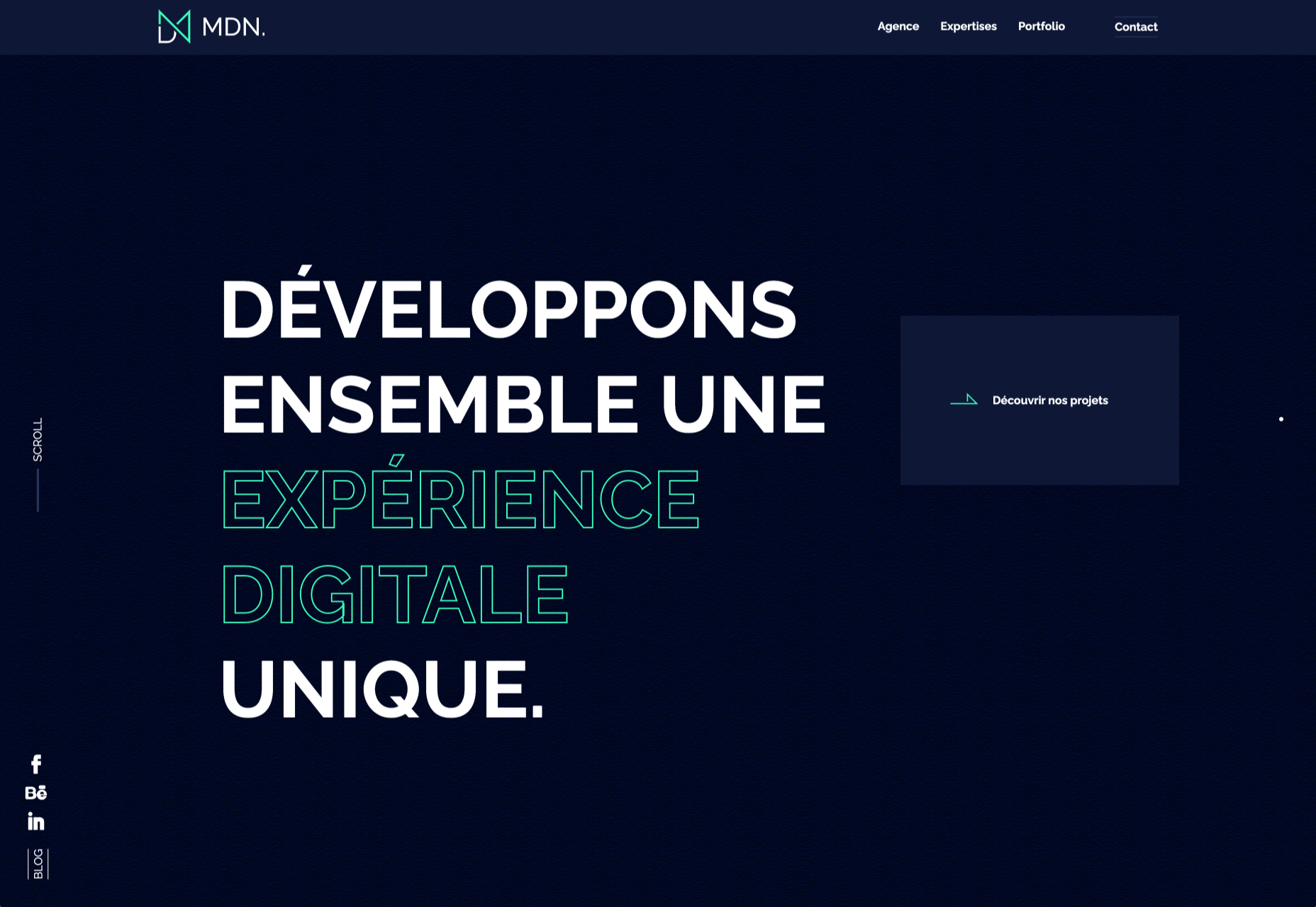
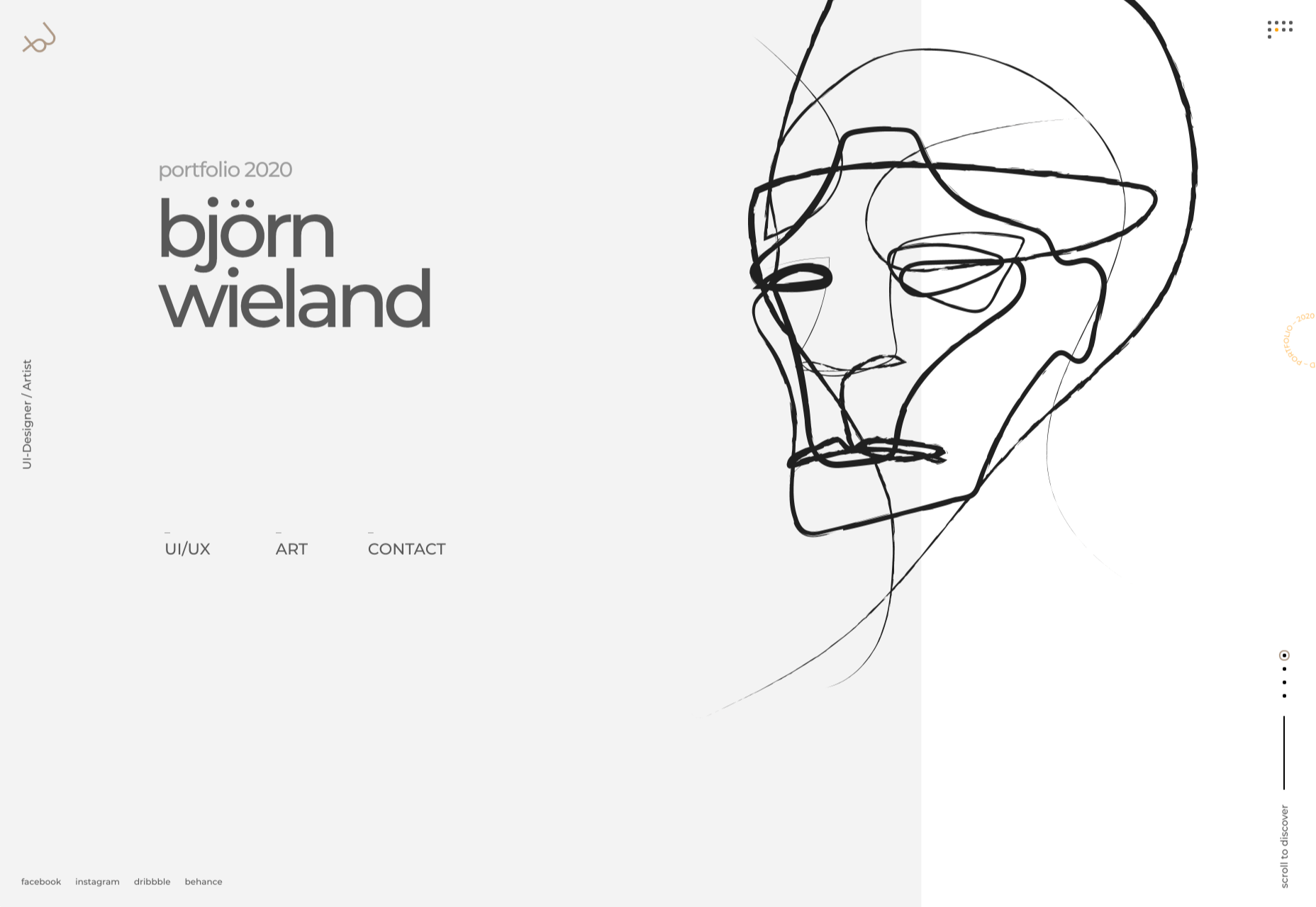
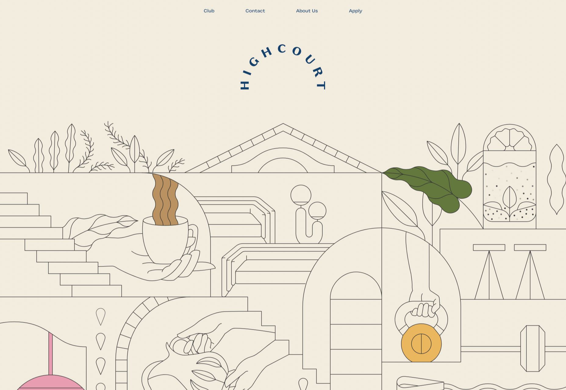
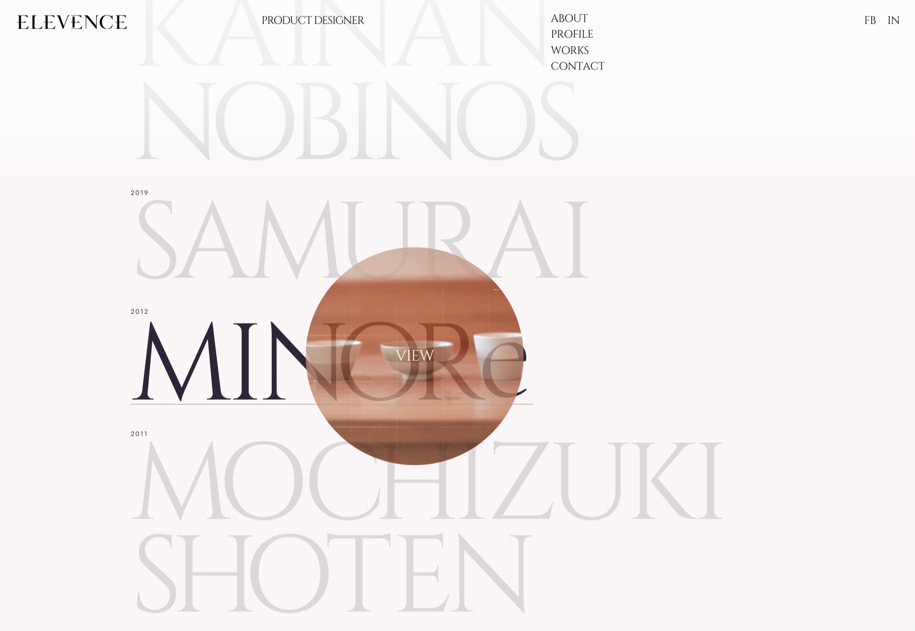
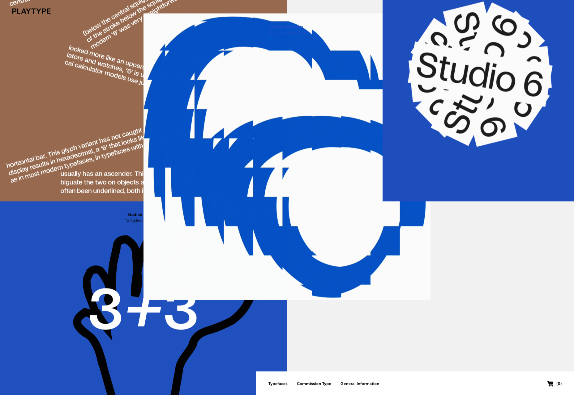
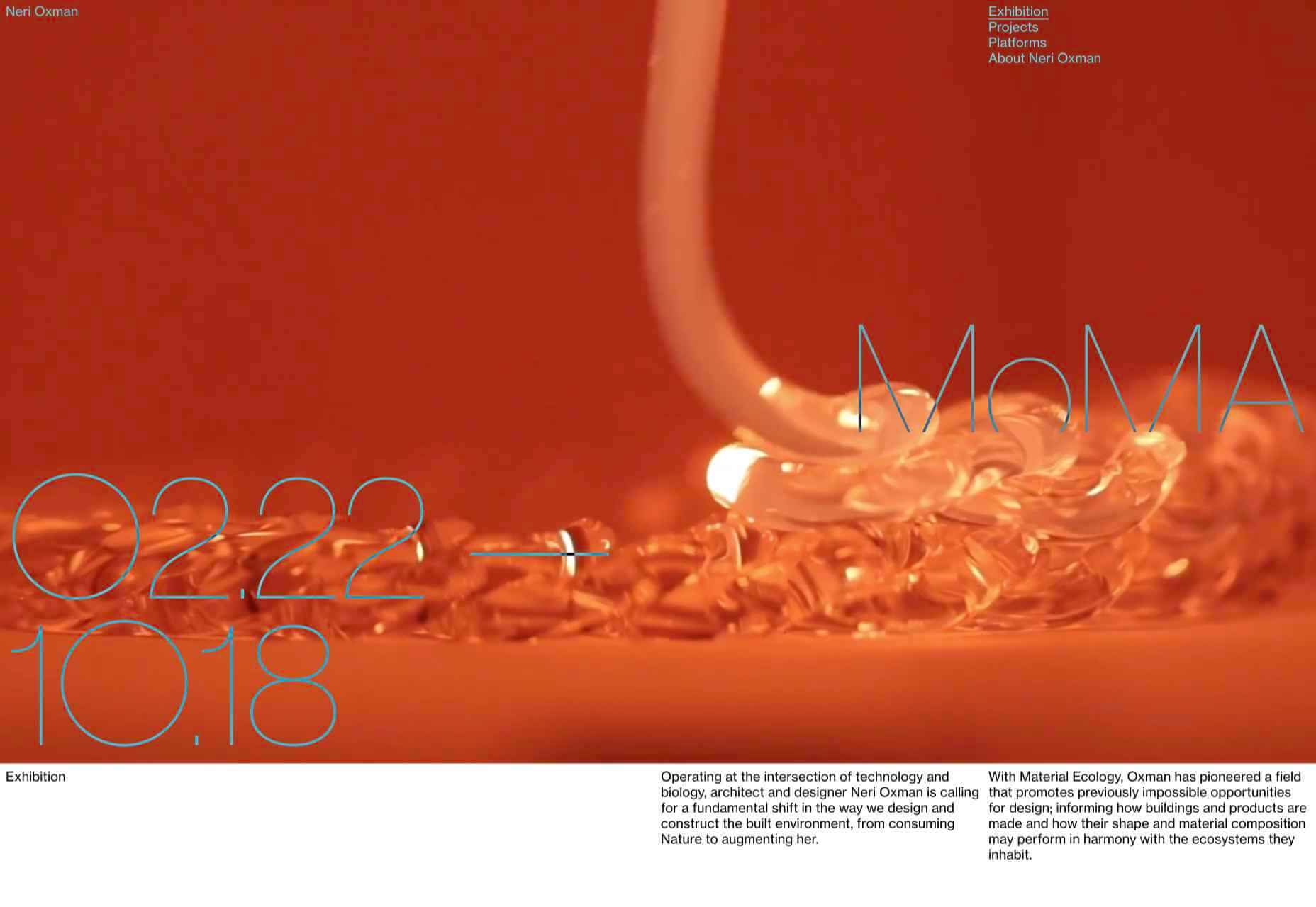
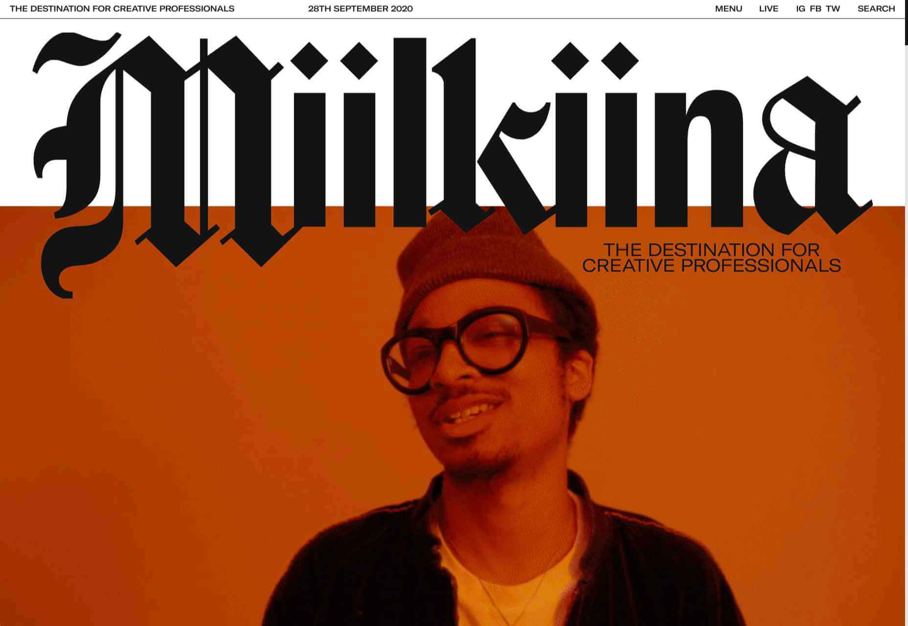
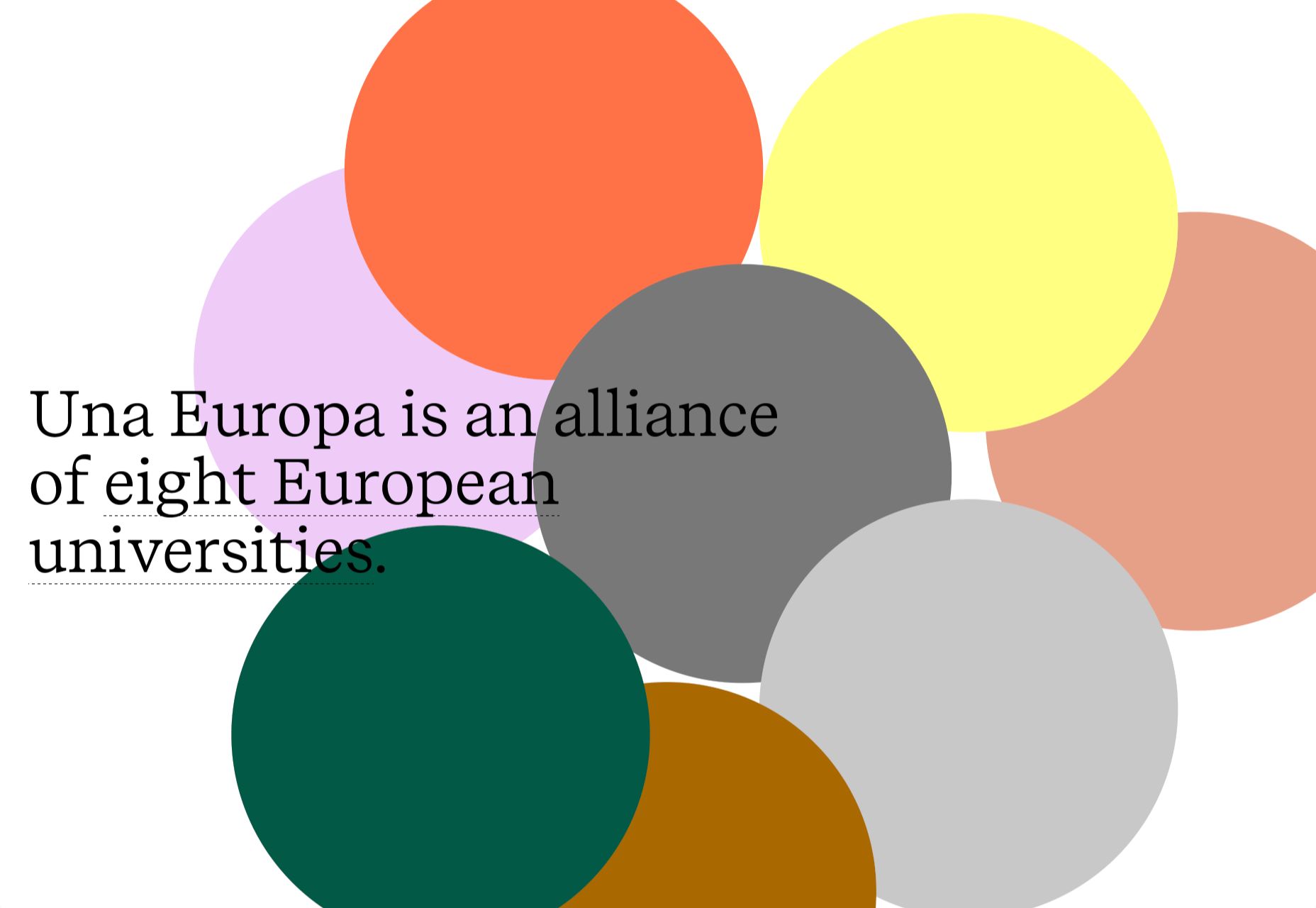
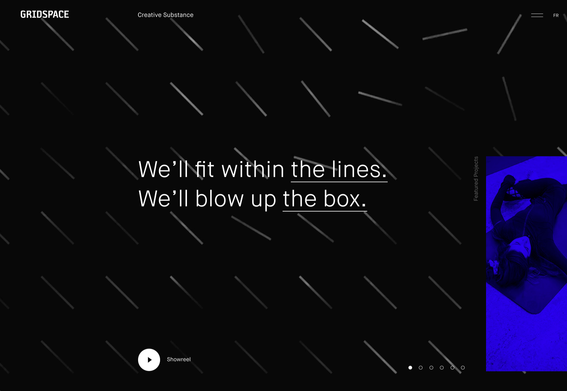
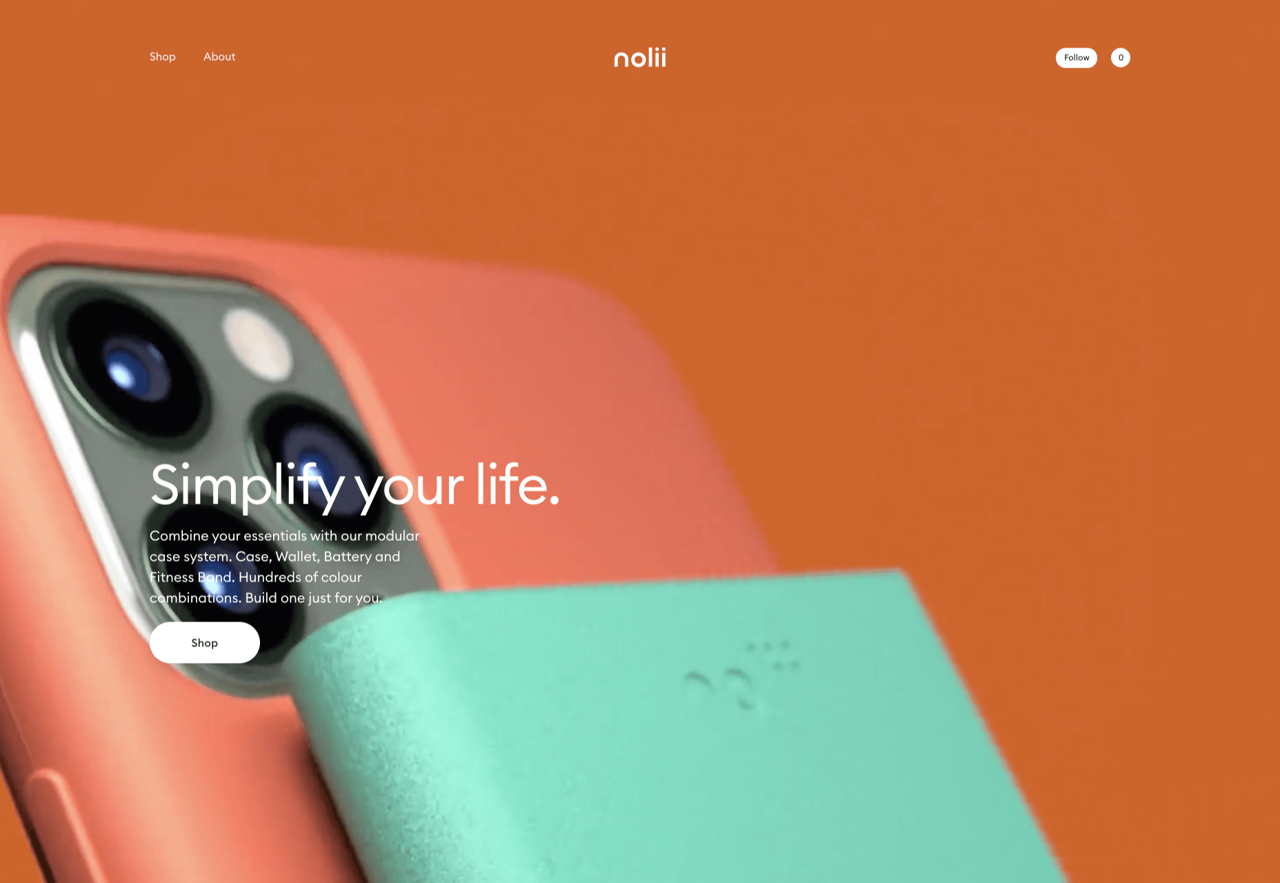
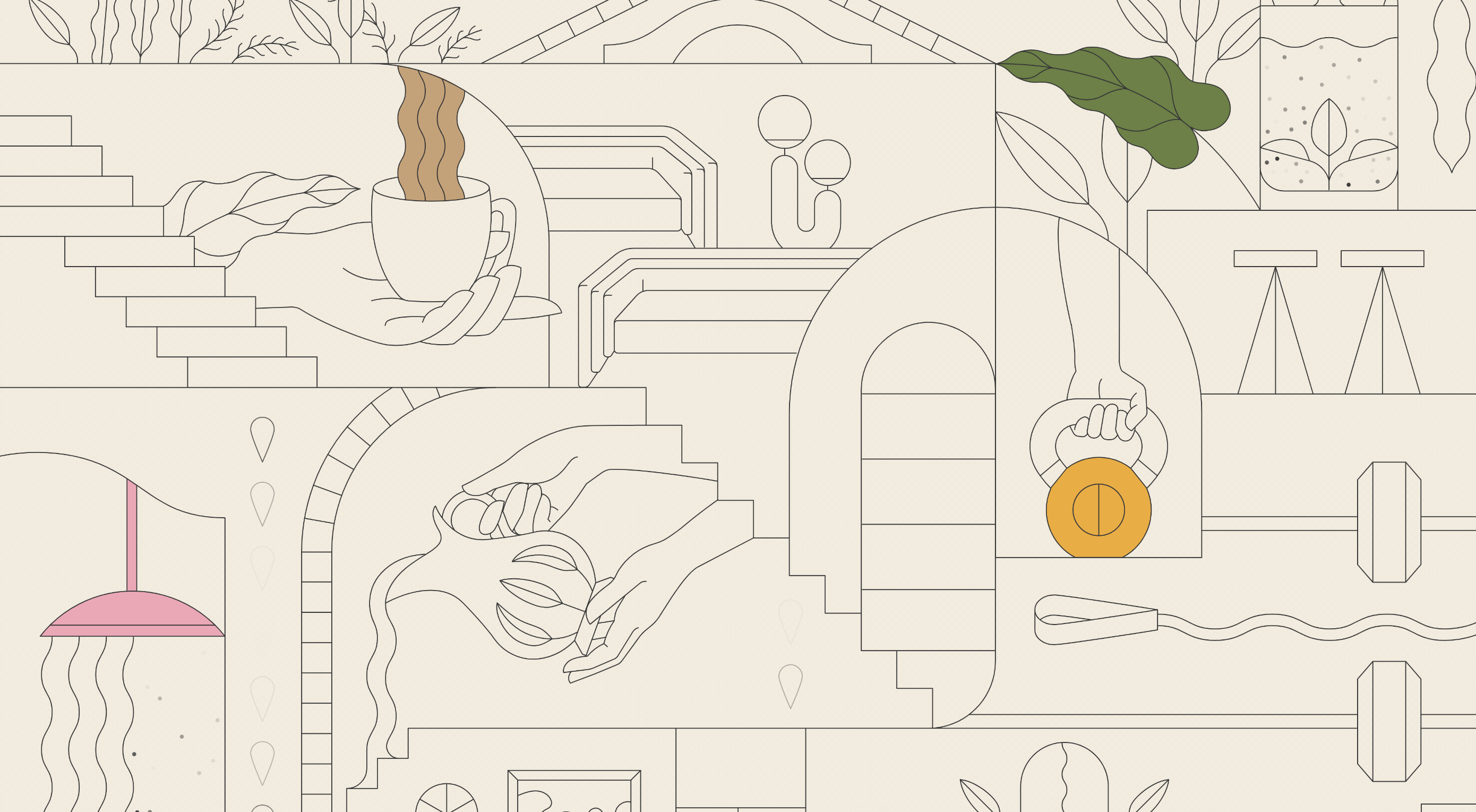
This month we’re going big and bold. Oversized type, strong colors, in-your-face layouts, and little touches of playfulness exude confidence and make a statement. There are some quieter moments too, with thoughtful illustration and more gentle use of color. Animation still features strongly in the details, with circles proving popular in rollover effects. Enjoy.

Fledge

Fledge is a film production company based in Belgium. Their site uses split screen with looped text scrolling in opposite directions on each side. A minimal color palette adds extra punch.

2ºC Earth

2ºC Earth is a beautiful and also scary website that explores the effects of rising global temperatures by focusing on 5 specific locations. Some stunning photography and subtle use of sound take you to these locations as they are now, then show what they could become. The experience is both immersive and unsettling.

pill&pillow

Unlike many digital studios who use the design of their own site to demonstrate their skills, pill&pillow have taken a very basic approach. It is very self-assured, and it works. Random colored strikethroughs on visited links add a nice touch of playfulness.

Ferrum Pipe

Metal fencing is not the most interesting of subjects to most of us, but this site for Ferrum Pipe is surprisingly appealing. On scroll animation and some off-grid image layout brings life to what would normally be, well, a bit dull.

Lucciano’s

With its focus on mouth-watering photography and videography, the site for gelato makers Luccianos, will have you checking your freezer for any leftover salted caramel or stracciatella. The zoom on rollover is a nice effect, and the use of circles with ice cream color backgrounds for rollover text reinforces the gelato theme.

Björn Wieland

UI designer and artist Björn Wieland has created a portfolio site with a simple, relaxed feel and pleasing transitions. It feels simple, but behind the scenes there is quite a lot going on.

Coloursmith

Coloursmith is a tool from Taubmans paint company which allows you to create a custom paint color by uploading a photo. You name your color and can add a story, then you order a test pot. colors are presented well, in different light and with suggestions for complementary colors.

Finn 

Finn make diet supplements for dogs. Their site is fun, modern and clean. Bright colors and an illustration that manages to be cute but not too cutesy make a bold impression.

Highcourt

Highcourt is a new private membership leisure club set to open in New York in spring 2021. Dark blue text on cream gives a softer edge than black on white. The background color changes on scroll are pleasing, and simple line illustrations with occasional gentle animation add to the overall sense of calm.

Elevence

Elevence is the company of product designer Kazuo Kobayashi. The site uses only black, white, and grays allowing the color photos of his work to really stand out. Circular thumbnails are used to good effect, appearing on rollover.

Playtype

Playtype is a Danish type foundry whose site seems to fit their name. It has a playful, almost chaotic feel, with bright blocks of color and occasional animation. Some pretty nice typefaces too.

Neri Oxman 

Neri Oxman is many things: architect, scientist, engineer, inventor, and designer. This site feels like a really beautiful coffee table art book that you want to pick up and look through every so often. There are some nice details too, like the lens ‘reveal’ effect on rollover in a few places.

Modern Recovery

Modern Recovery is a project by sobriety program Tempest. The interactive illustration encourages exploration, to discover different stages of recovery from alcohol abuse and insights from others who have followed the program. The aim is to change our social attitudes towards alcohol and not drinking.

Bliss

Have you clicked on the link to visit Bliss Search? Yes, the link is correct, no you haven’t been redirected to a Google search results page. This Australian digital marketing company have copied the appearance of different well-known sites for their pages — Google, Instagram, LinkedIn, Tinder all make an appearance. The humor in this approach shows confidence, and makes it memorable.

Miilkiina

Miilkiina describe themselves as a digital media space and creative agency. Punchy typography, with great use of blackletter, well chosen images, and a strong header video give this home page an in-your-face edge.

Ukrainian Railroad Ladies

Ukrainian Railroad Ladies is a book by photographer Sasha Maslov. Its subjects are the, mostly, women who work as traffic controllers and safety officers at railroad crossings in Ukraine. It’s a simple site — outsized type, black and white, basic image grid, only very brief text — but it is effective in its simplicity.

Una Europa

Una Europa is an alliance of 8 European universities with the aim of offering joint research and study programs. There is some playful scrolling behavior with geometric shapes moving and changing color that enlivens what could otherwise be quite a dry site.

Bureau Cool

There’s a bit of an old school feel about the site of digital design studio Bureau Cool, with its recent traffic animation. The changing backgrounds on scroll are a nice touch.

Gridspace

Gridspace is a multimedia entertainment studio based in Montreal, and their website is a visual feast. Lots of movement, lots of video, some good use of sideways scrolling.

Nolii

Nolii make cases and accessories for iPhone that work together. The sorbet color palette complements the product colors and the block layout provides a visual reflection of the interlocking of the different products.

Source


Source de l’article sur Webdesignerdepot

Hyper implies web, and lambda implies function – Hence, Hyperlambda translates into "web functions", and this is a fairly accurate description. However, hyper also implies "super fast", and by super fast here, I mean super fast! 1 minute and 45 seconds was what I needed to create CRUD endpoints wrapping my database table, manually creating my endpoints in the following video, while explaining how I did it simultaneously.

According to modern studies in the subject, the number of lines of code your project consists of, is directly proportional to the amount of energy and resources you’ll need to spend maintaining it. Hence, the fewer lines of code, the fewer resources are required to maintain it. In the video above, I copy and paste 50 lines of code, and I end up with 4 HTTP REST CRUD endpoints. Comparing this to C# is arguably unfair. Simply the boiler plate code for my Controller, would probably end up exceeding this number. You can find my code for all endpoints below.

Source de l’article sur DZONE

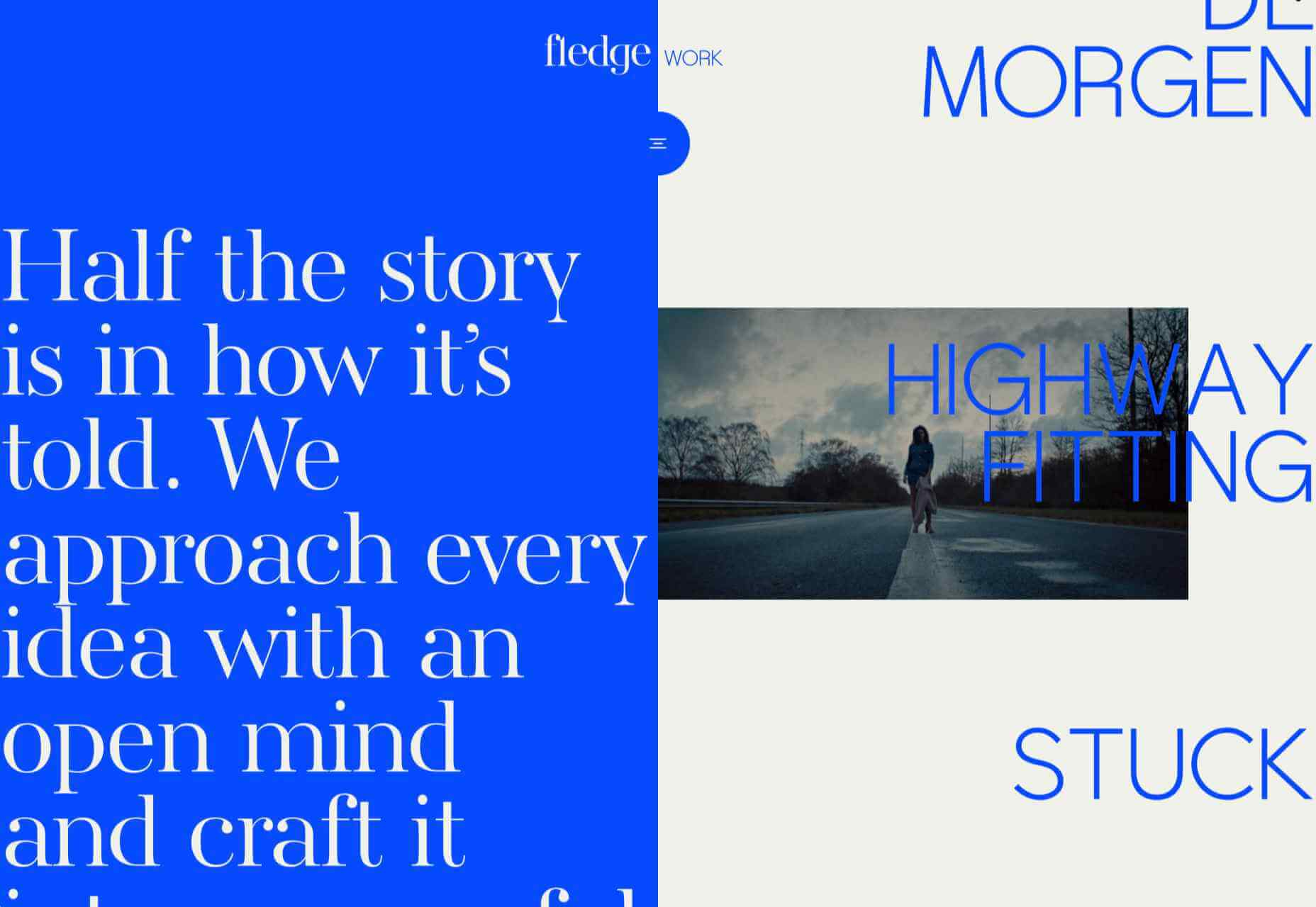
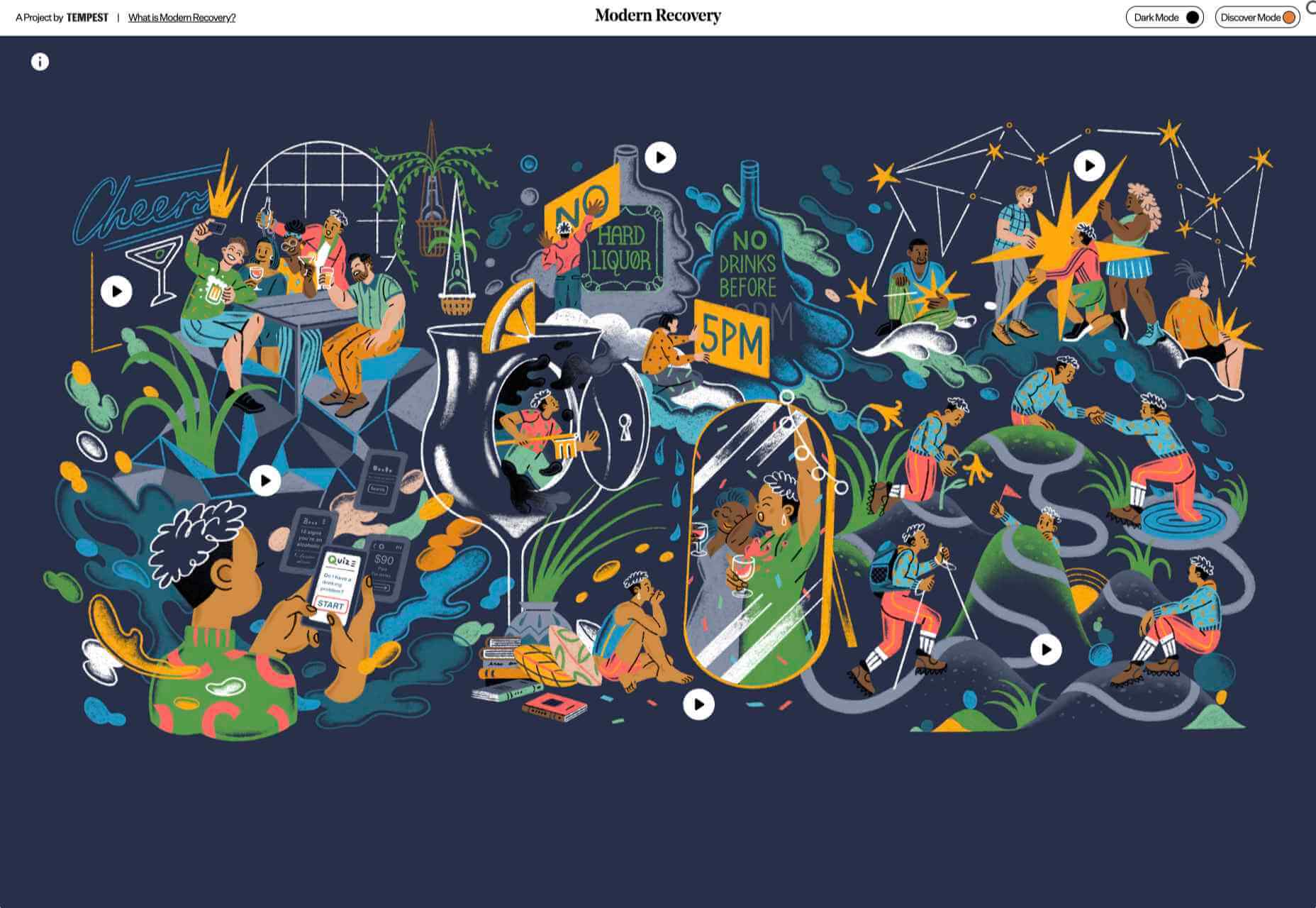
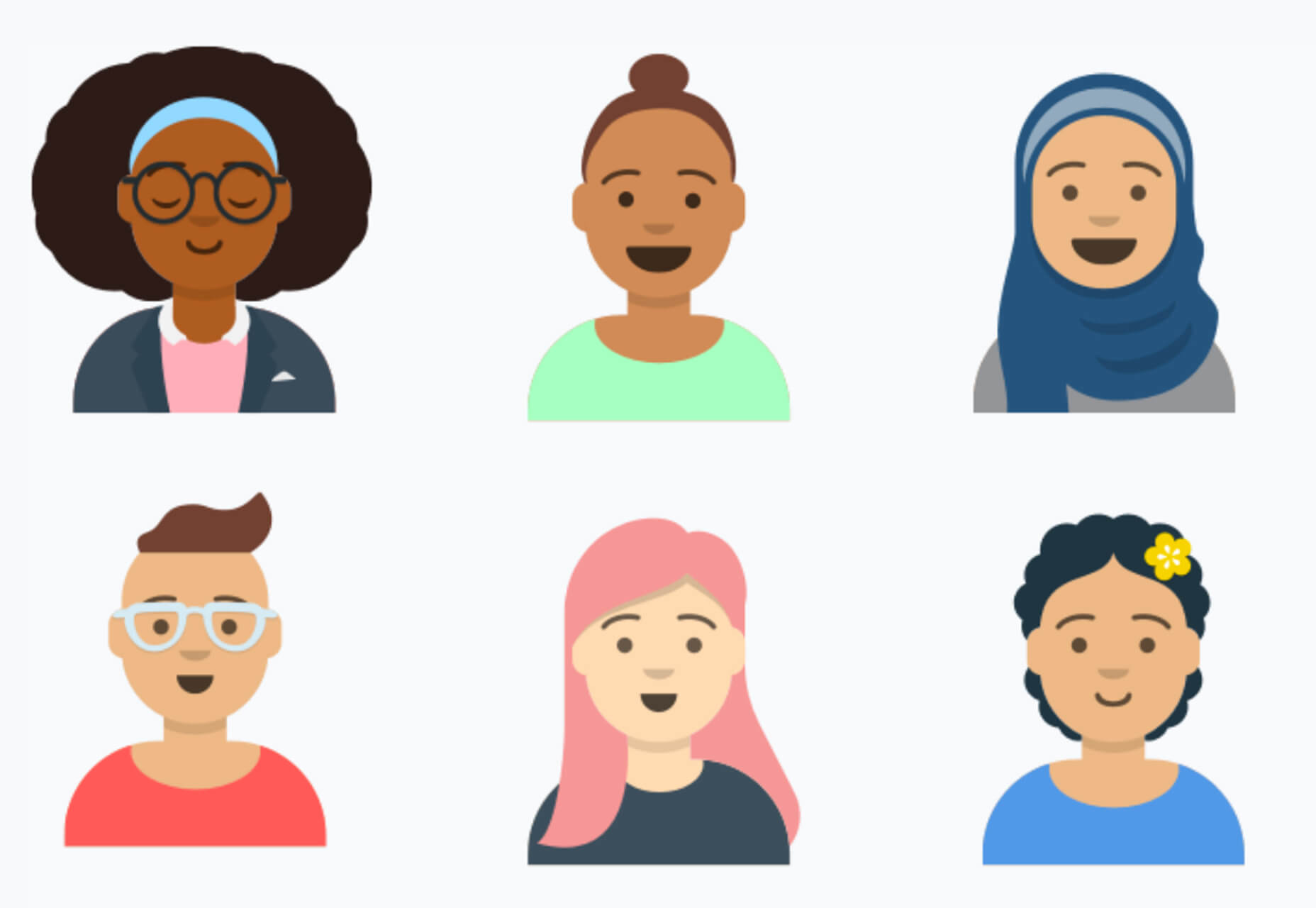
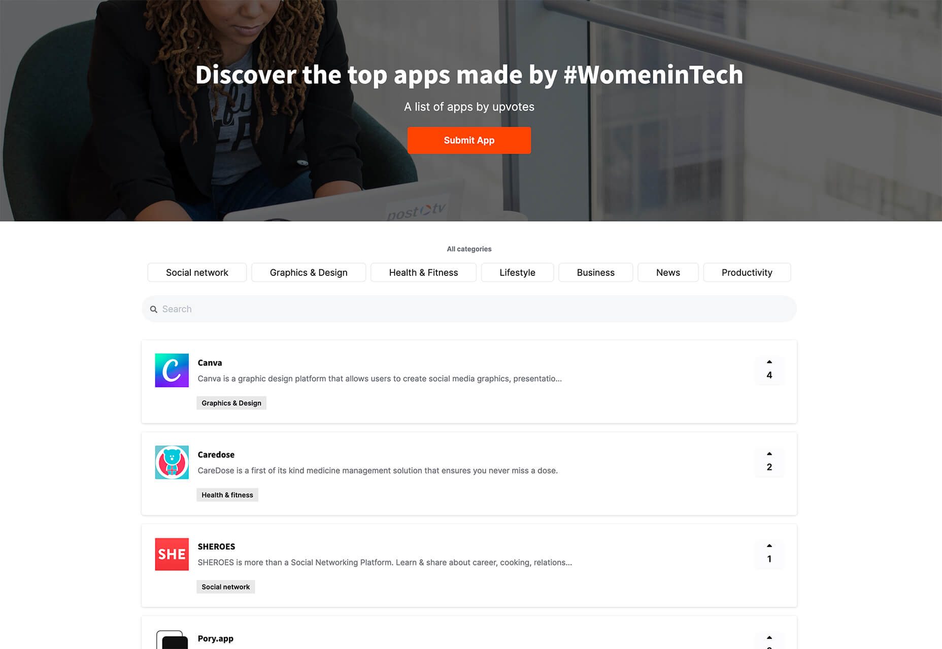
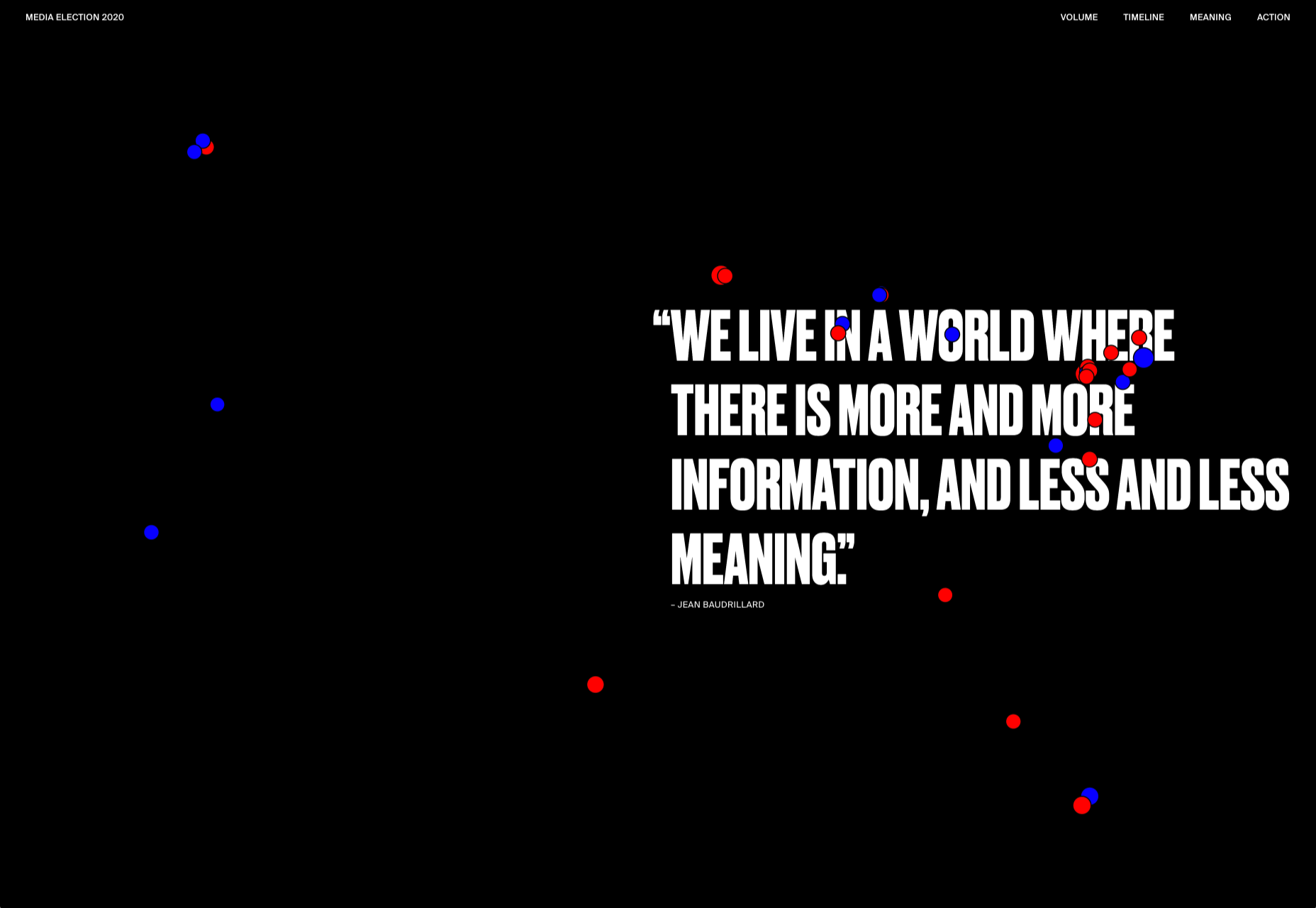
It’s fun to see new website design tools that reflect current times and the state of the world. That’s very true this month with new databases devoted to diversity and women in technology, as well and resources to make your design life easier.

Here’s what’s new for designers and developers this month:

Ztext.js

Ztext.js is an easy to implement, three-dimensional typography tool for the web that works with any font you want to use. With the popularity of 3D effects and animation, this tool has a lot of practical applications. Everything you need, including documentation, is available from developer Bennett Feely on his website and GitHub. (It’s free but you can show appreciation with a donation if you like it.)

Gradient Magic

Gradient Magic is a free gallery of fun and interesting CSS gradients. You can sort through a random selection or by category of color to find just the right gradient for your project. Some of them would make really neat backgrounds or image overlays.

Impossible Checkbox

Impossible Checkbox is a fun little divot that you’ll want to play with and emulate. Click or tap the slider to activate and a nifty little friend pops up. Now here’s the fun part: You can’t leave it checked, and take note of the changing expression of the checkbox character.

Diversify Tech

Diversify Tech isn’t your average job board; it is a collection of resources – and opportunities – for underrepresented people in technology. It includes a weekly roundup and everything from scholarships, to events, to jobs, to speaking opportunities.

Women in Tech

Women in Tech is a list of apps made by women. The apps are ranked and chosen based on upvotes and is a good resource if you want to help support women-owned projects. Search or submit an app for inclusion.

Devello Studio

Devello Studio is a tool that allows you to write code in the cloud. You don’t have to install anything and no matter where you are, just can open a project in-browser, and continue development where you had left off last time. Plus, it works with GitHub support built right in.

Hustl

Hustl is a premium Mac app that allows you to create time-lapse videos of your screen. Use it to show off work or projects or create a cool video for your portfolio. Plus you can use it to capture just one active app so you don’t have to do a lot of editing later.

FeedBaxley

FeedBaxley is a user feedback tool that helps you (and users) figure out what’s frustrating before it becomes a real issue. You can customize everything to match your brand and set it up with copy and paste tools. Feedback integrates with Slack, making it easy for you to analyze information with a team.

BestTime

BestTime launched a major update with a new tool that makes it possible to analyze visitor peaks of public business (cafe, gym, etc) for whole areas. Using the heatmap API you can find businesses at popular times, locations, or by business type.

Pixeltrue

Pixeltrue is a new collection of free SVG illustrations and Lottie animations in a trendy style. They are available for commercial and personal use and add a bit of whimsical delight to website projects. (The error illustrations are particularly fun.)

Previewed

Previewed has tons of cool and realistic mockups that you can use to create the perfect setting for digital projects. You can find mockups for a variety of devices and cool panoramas that work perfectly for elements such as app store previews.

Alt Text Overlay Bookmarklet

The Alt Text Overlay Bookmarklet solves a common problem: It shows what images use alt text and what that text is. The tool was created by Christian Heilmann and he’s put it on GitHub for you to play with and test.

MergeURL

MergeURL allows you to merge and shorten up to five links. Enter the links and mergeurl.com/o/xxxxx, for example, will open all the URLs associated with that link. The tool is free to use and you don’t have to register to use the service.

Infinity Search

Infinity Search is a new search engine that lets you look for things privately and efficiently. Search the web, images, or videos. Here’s a little about how it works: “While we retrieve results from other search engines like Bing and Wikipedia, we also have our own indexes of links that are displayed in our search results. We are actively working on improving these indexes and they will only get better.”

Blade UI Kit

Blade UI Kit is a set of renderless components to use in Laravel Blade Views. It’s built for the tall stack and is completely open source. It includes 26 components and you can contribute as well.

Trusted News

Trusted News is a Google Chrome extension that uses AI to assist in evaluating the quality of the online content. In its first release, it scores the objectivity for a selected article, testing whether it is written from a neutral perspective as opposed to a subjective one.

BaseDash

BaseDash allows you to edit production data without coding. You can make changes to the database with the ease of a spreadsheet. This tool makes it easy to find and edit information in a hurry. It works with all major databases including MySQL, PostgreSQL, Amazon Redshirt, Microsoft SQL Server, and more.

Email2Go

Email2Go is a service that helps you create email templates and test them on dozens of physical devices and applications. It’s free right now while it is in early release.

Iconscout Converter

The Iconscout Converter allows you to convert icons and images from one file format to another for free. Convert SVG, PNG, JPG, and PDF with a single click.

Shape 2

Shape 2 is a massive collection of 5,000+ unique icons and illustrations with a full-blown web editor. Customize colors, stroke width, size and full variations that can export to SVG, PDF, PNG, GIF, and React. This is a premium tool and includes a discounted release price for now.

Aestetico

Aestetico is a beautiful sans serif that includes a massive family with 54 styles. This premium typeface is highly readable and has modern lines and curves that make it a great option for a variety of uses.

Arcades

Arcades is a modern display font with a retro, 1980s-style vibe. It includes regular and italic styles.

Brimington

Brimington is a handwriting style typeface with rough strokes and smooth curves. It includes a set of 227 characters and 219 glyphs in a readable design.

California Signature

California Signature is a typeface duo with a slab serif and handwriting style that are perfectly paired. The thick and thin options provide a yin and yang effect.

Eastblue

Eastblue is a script typeface with long swashes and interesting curves. It includes a solid character set and is free for personal use only.

Source


Source de l’article sur Webdesignerdepot