Articles

Private, public, or hybrid, cloud solutions for any business domain are designed to provide the freedom to grow and security for the organization and customer data. For cloud-based multimedia solutions, there is cloud-based custom transcoder IP that supports automated Video-On-Demand (VOD) pipelines. Cloud services offer solutions that ingest source videos, processes video for playback on a wide range of devices using cloud media converter, and store transcoded media files for on-demand delivery to end-users.  

Custom IP integration along with other cloud services showcases better feasibility of using Open-Source codec, to use one’s transcoder instead of cloud media-converter for multimedia solutions. In this blog, we will see how an Open-Source codec like AV1 is selected as a custom IP for encoding to integrate over the cloud as a service.  

Source de l’article sur DZONE

In the video below, we take a closer look at the State Design Pattern in Java. This tutorial includes an introduction, real-time examples, class/sequence diagram, and implementation. Let’s get started!

Source de l’article sur DZONE

This post and video were co-created by David La Motta (Kong), Ross McDonald (Kong), and Alex Dworjan (Red Hat).

Murphy’s Law

“Anything that can go wrong will go wrong.”

Source de l’article sur DZONE

In the video below, we take a closer look at the adapter design pattern in Java (Mobile Charger). This tutorial includes an introduction, example, implementation, and more. Let’s get started!

Source de l’article sur DZONE

So here we are, in a brand spanking new year—time for looking forward with fresh ideas and renewed hope for the year ahead. We are kicking off 2022 with a mixed bag and, we hope, something for everyone.

Whether you’re looking for inspiration to update your site or a fresh approach to work for a new client or want to spend a little while browsing around some corners of the internet you might not usually, welcome to the first collection of the year. Enjoy!

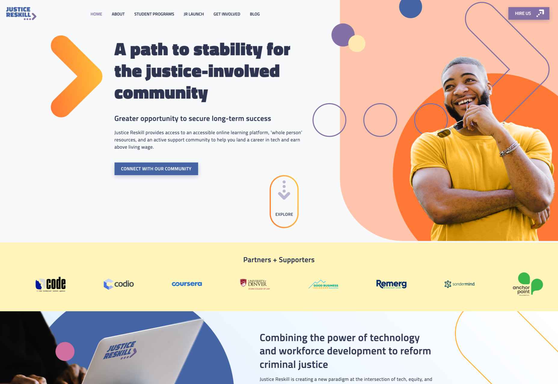
Justice Reskill 

Justice Reskill offers a learning platform and support for people who have been through the justice system. Information is presented clearly in a positive, uplifting tone, emphasized by a bright color scheme and friendly type.

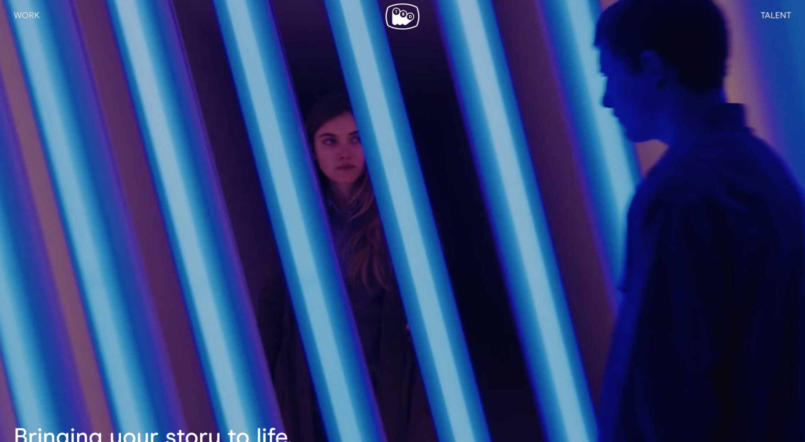
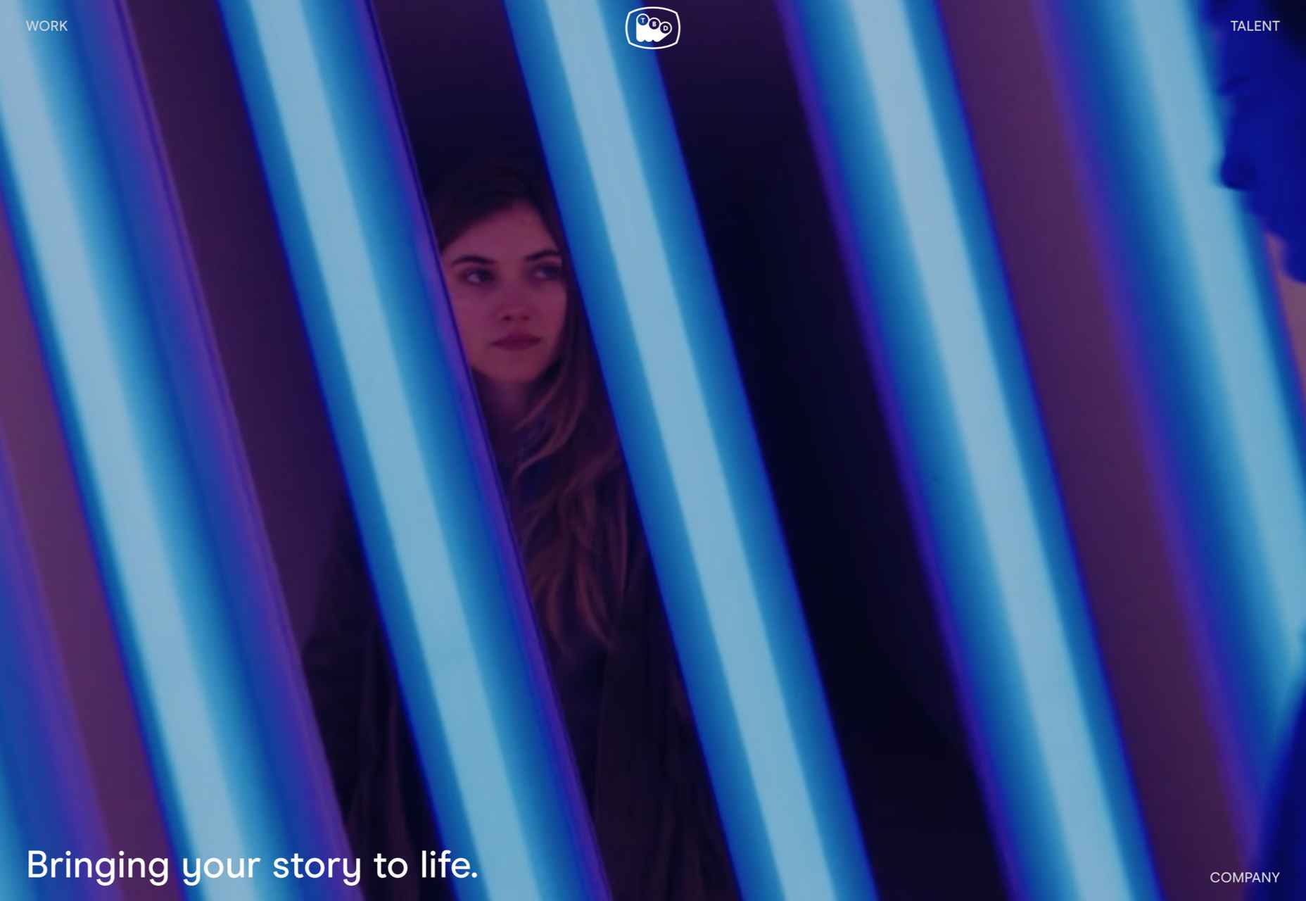
TBD Post 

TBD Post’s site is fuss-free, clean, and pleasant to navigate. Work is well presented, in an organized way, with just the right amount of supplementary information.

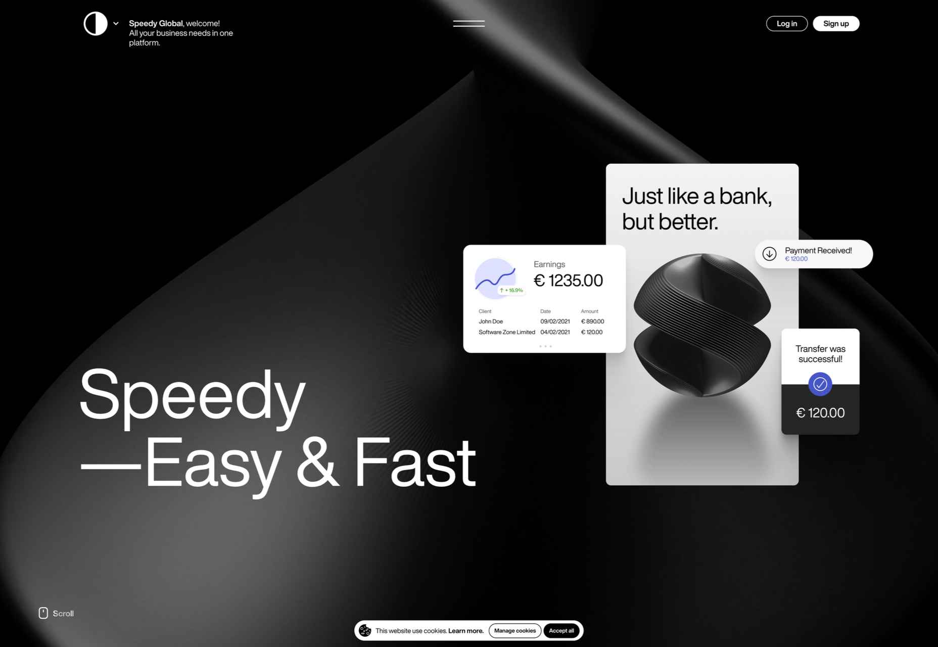
Speedy 

Speedy is an online business bank, and this is a pretty standard, slick fin-tech site for the most part. The added extra is that the five versions of the site–with the same content in each–have different color accents based on the flag of the specific country listed.

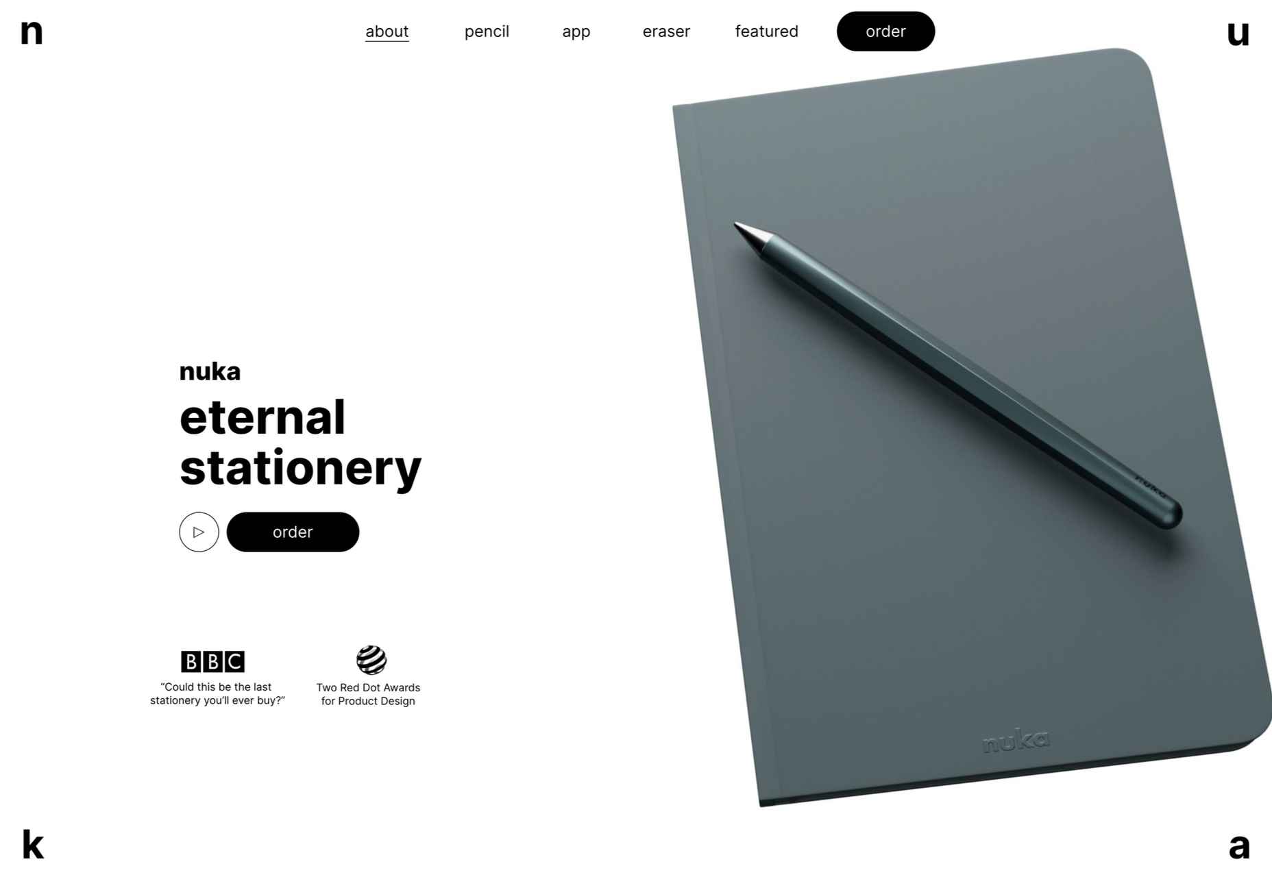
Nuka 

This site for Nuka eternal stationery is a beautifully simple single page. The use of handwritten type in places adds an intimacy while emphasizing the nature of the products.

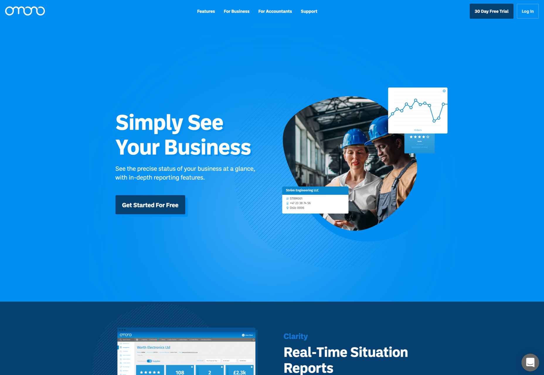
Omono 

This site for online business management app Omono presents a lot of information clearly, and with a calmness projected by the use of blues and greys and subtle animation.

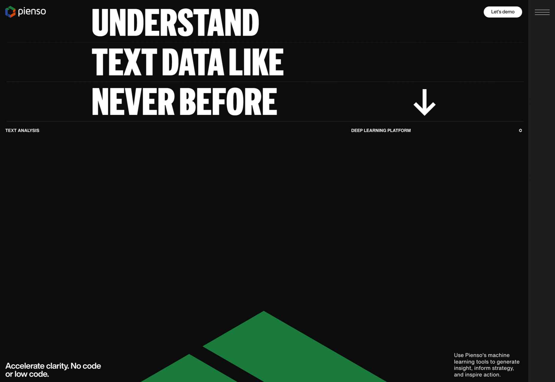
Pienso 

A combination of bold type, a slightly tweaked red, green, and blue color scheme, and on-scroll animations makes this site for Pienso pop.

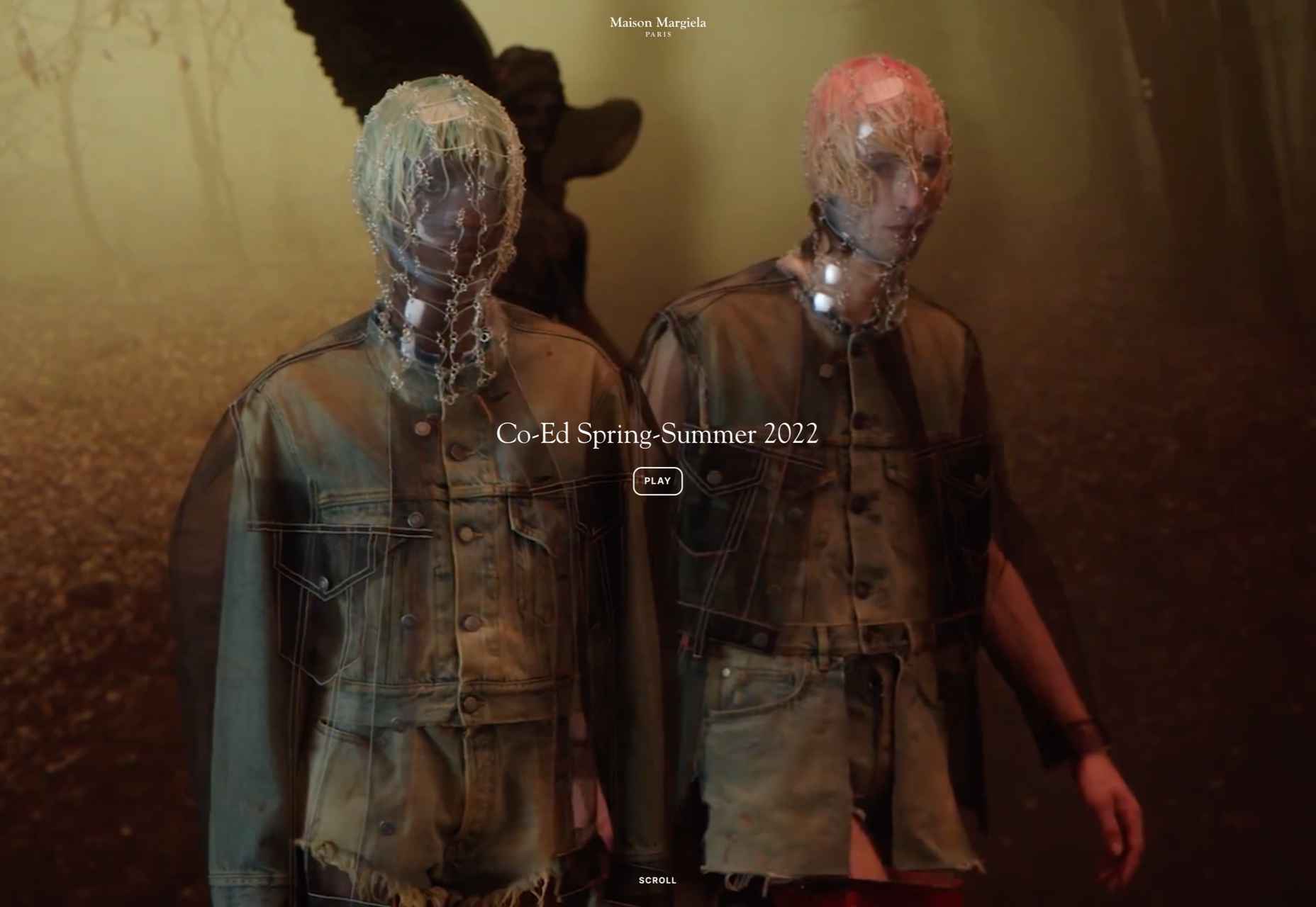
Maison Margiela 

Maison Margiela fully embraces the digital alternative to a live catwalk with this blend of single video and edited clips.

Marie O’Shepherd 

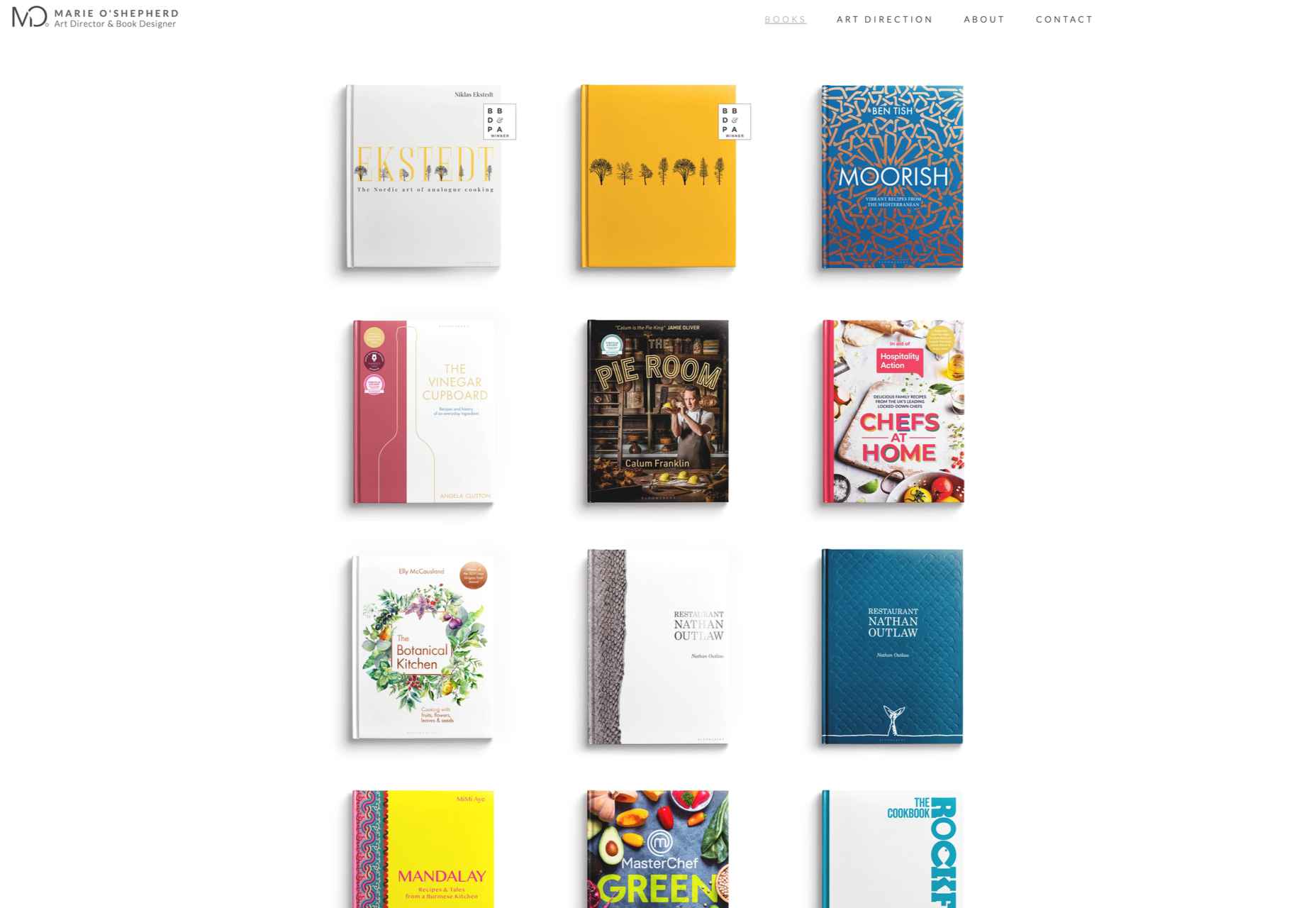
This portfolio site for book designer and art director Marie O’Shepherd takes a minimal approach and allows the work to take center stage.

Angry Ventures

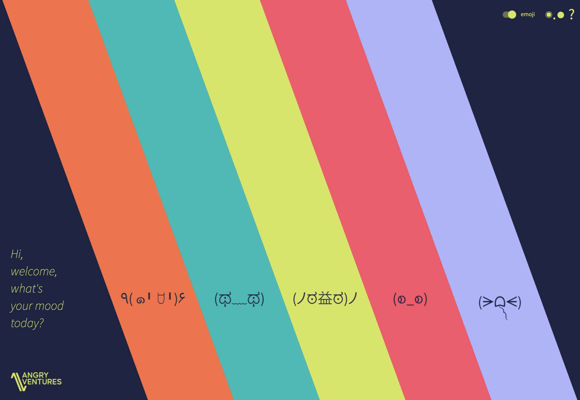
Angry Ventures add personality and humor to their site to draw the user in and entertain, while their actual portfolio is only available on request.

Chapter One 

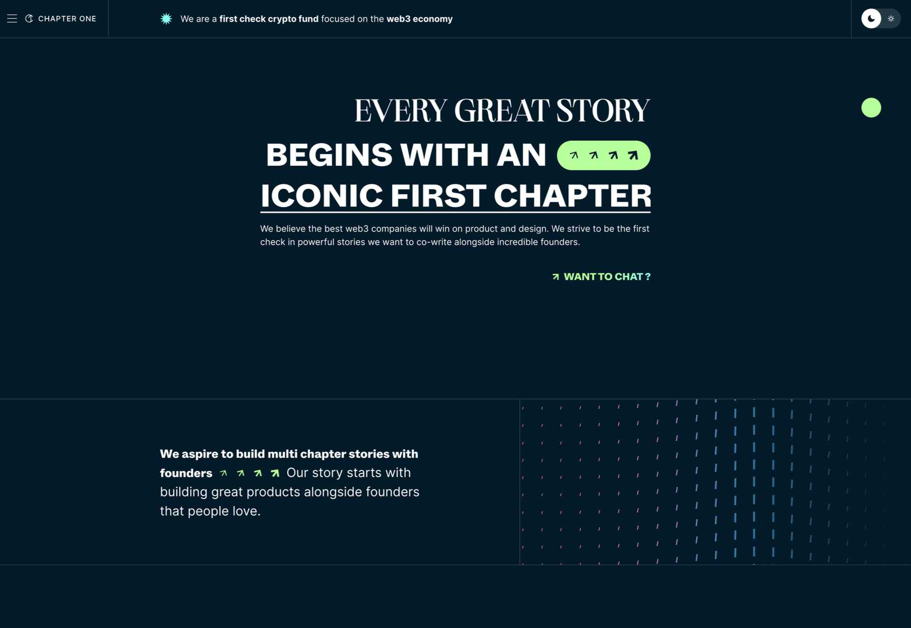
Chapter One’s site has light and dark theme options and some engaging animated graphics.

Vesti il Futuro 

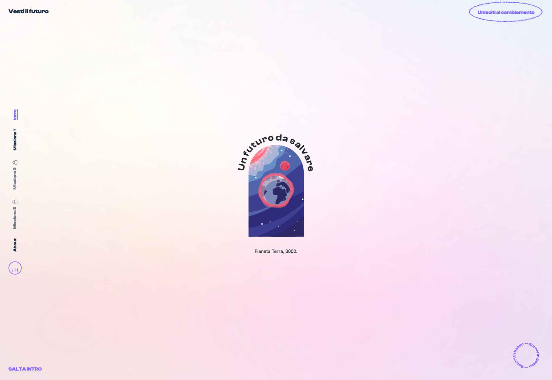
Vesti il Futuro for Mani Tese uses comic book-style interactive graphics to raise awareness of issues surrounding the environment and fast fashion.

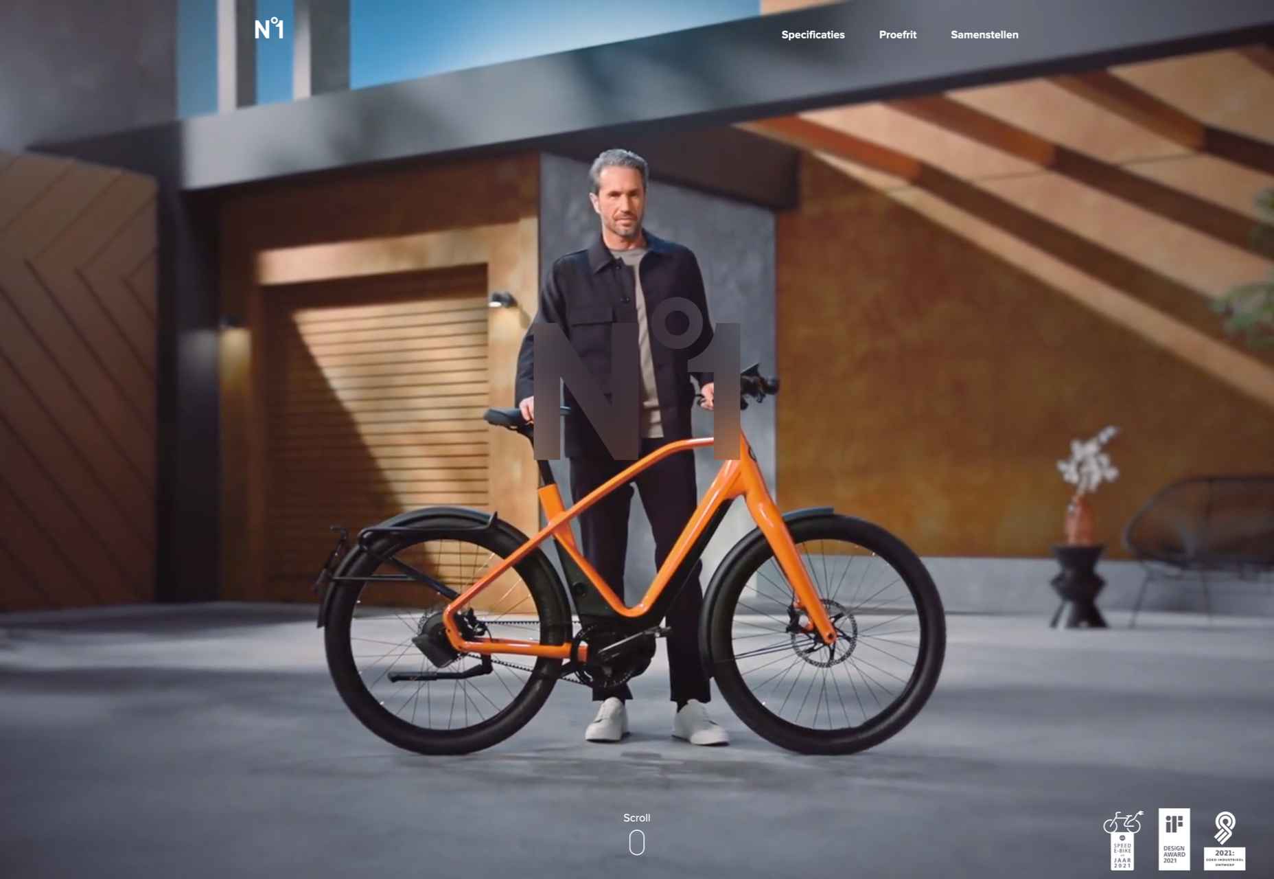
Gazelle No.1 

Some scroll-activated video enlivens this single-page site for Gazelle’s No.1 model.

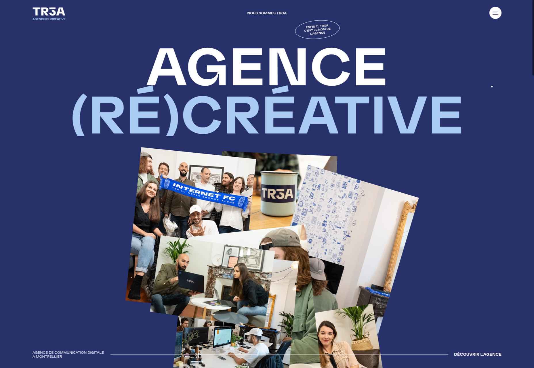
TROA 

This site for creative agency Troa is an excellent example of the effectiveness of a monochrome color scheme, and there are some pleasing transitions too.

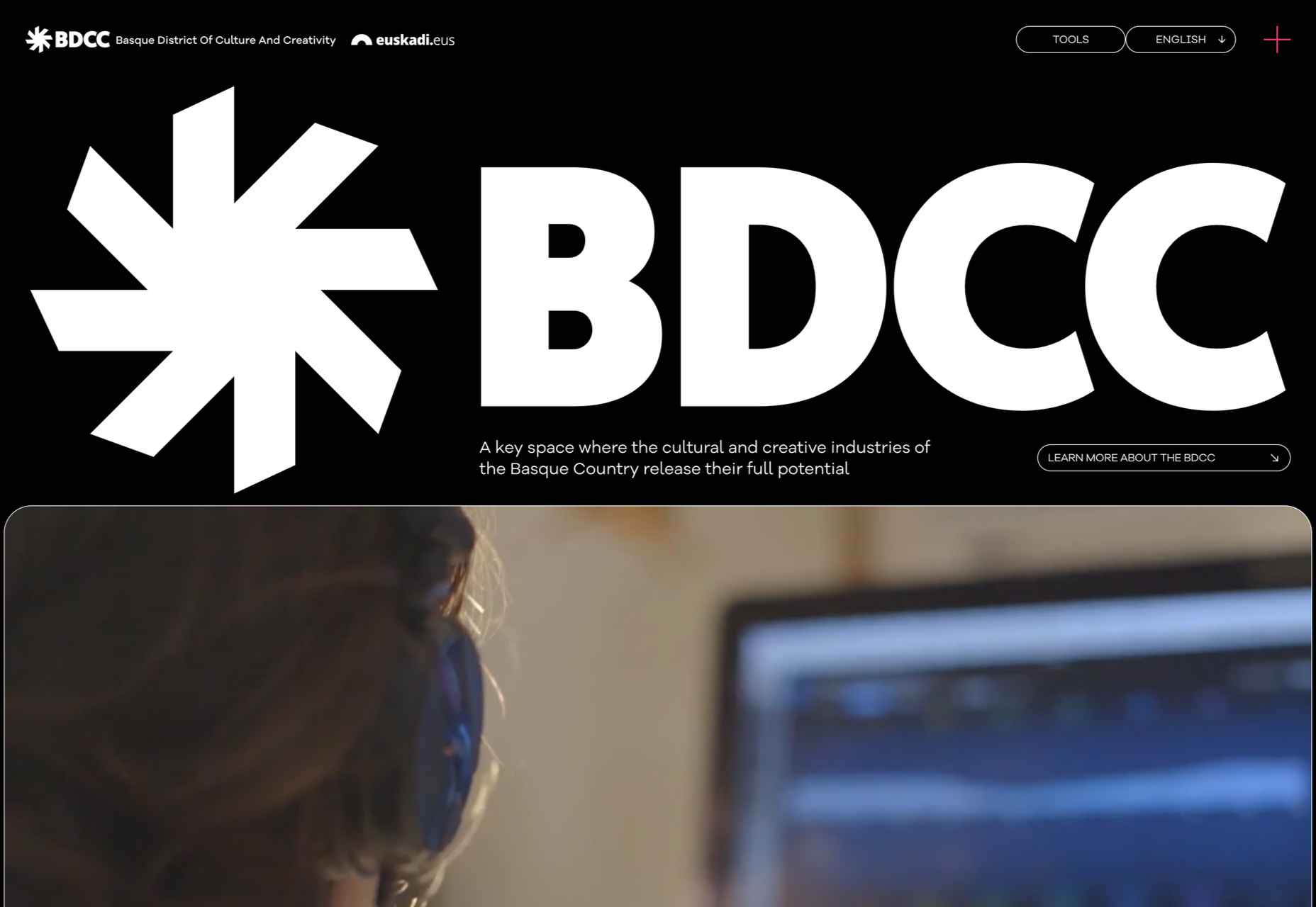
BDCC 

BDCC’s site has a bold, slightly jumbled feel that works really well. The falling lozenge menu items are a nice feature.

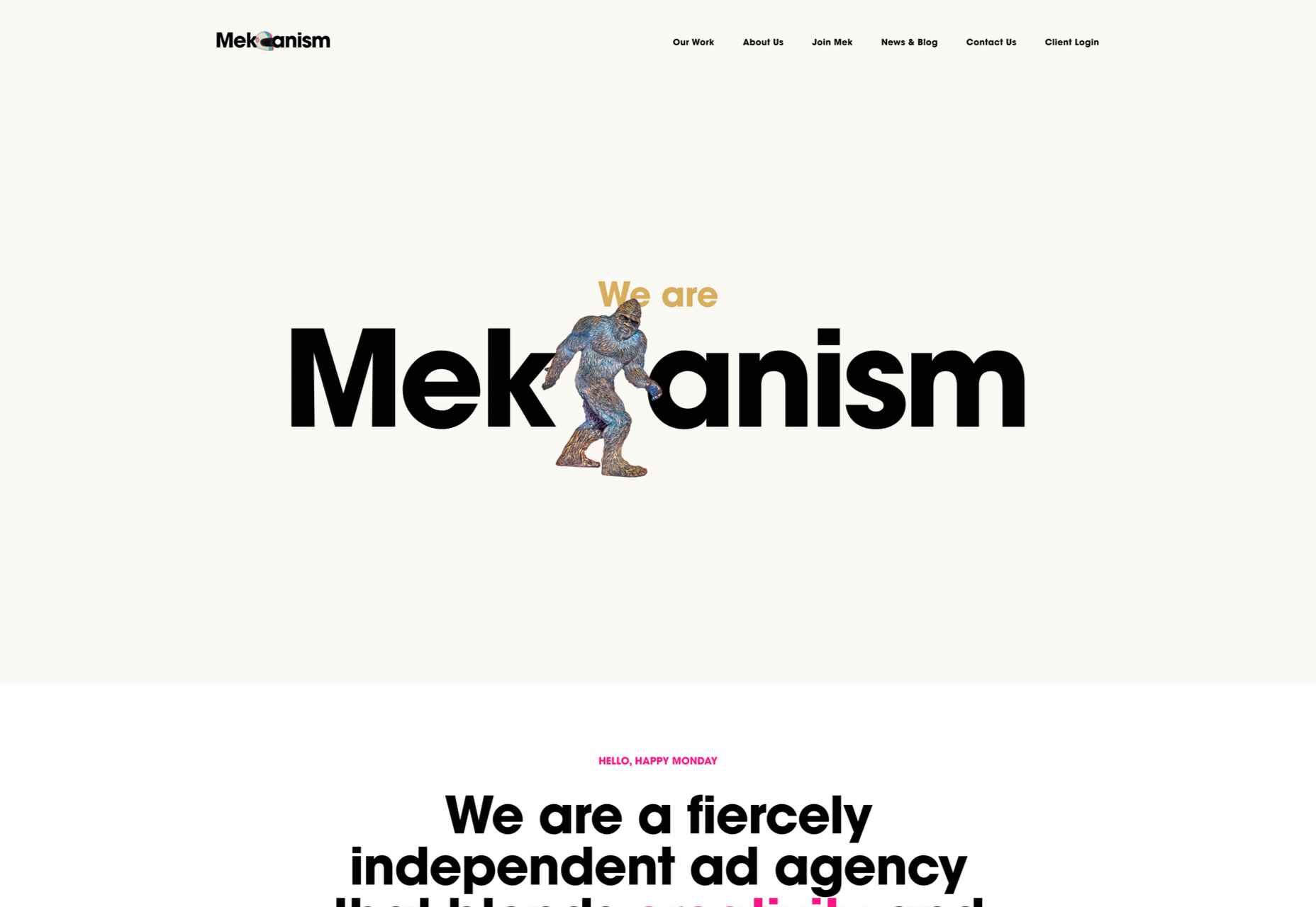
Mekanism

This is a great example of a stylish website for an agency portraying itself as well-established and super polished.

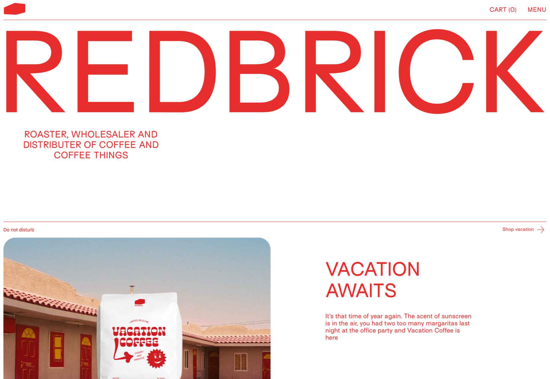
Redbrick 

Redbrick’s site has a youthful, vibrant feel with colors that change to match the product branding.

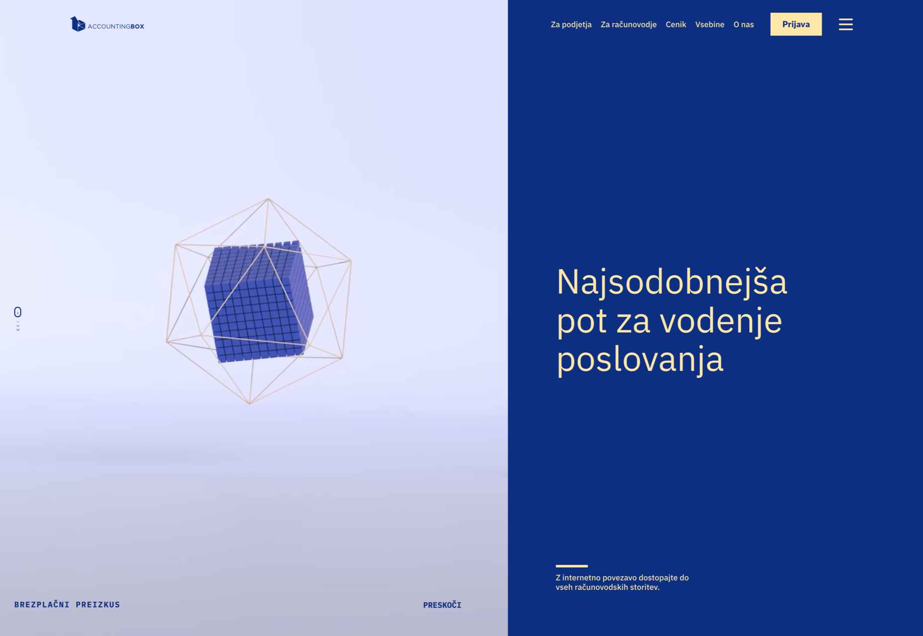
Accounting Box 

This site for Accounting Box makes good use of split-screen swapping from a vertical split on desktop to a horizontal split on mobile. The animations are pleasing too.

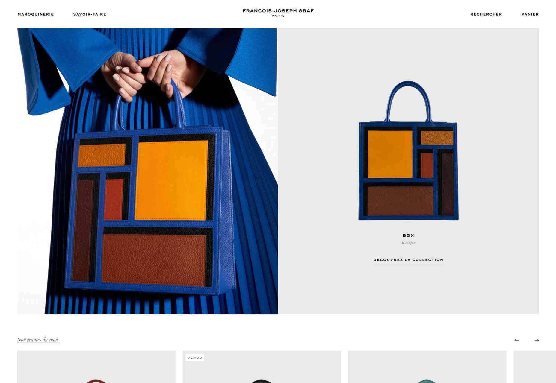
François-Joseph Graf 

The design for François-Joseph Graf’s site does the right thing by getting out of the way to avoid competing with the rather stunning products on show.

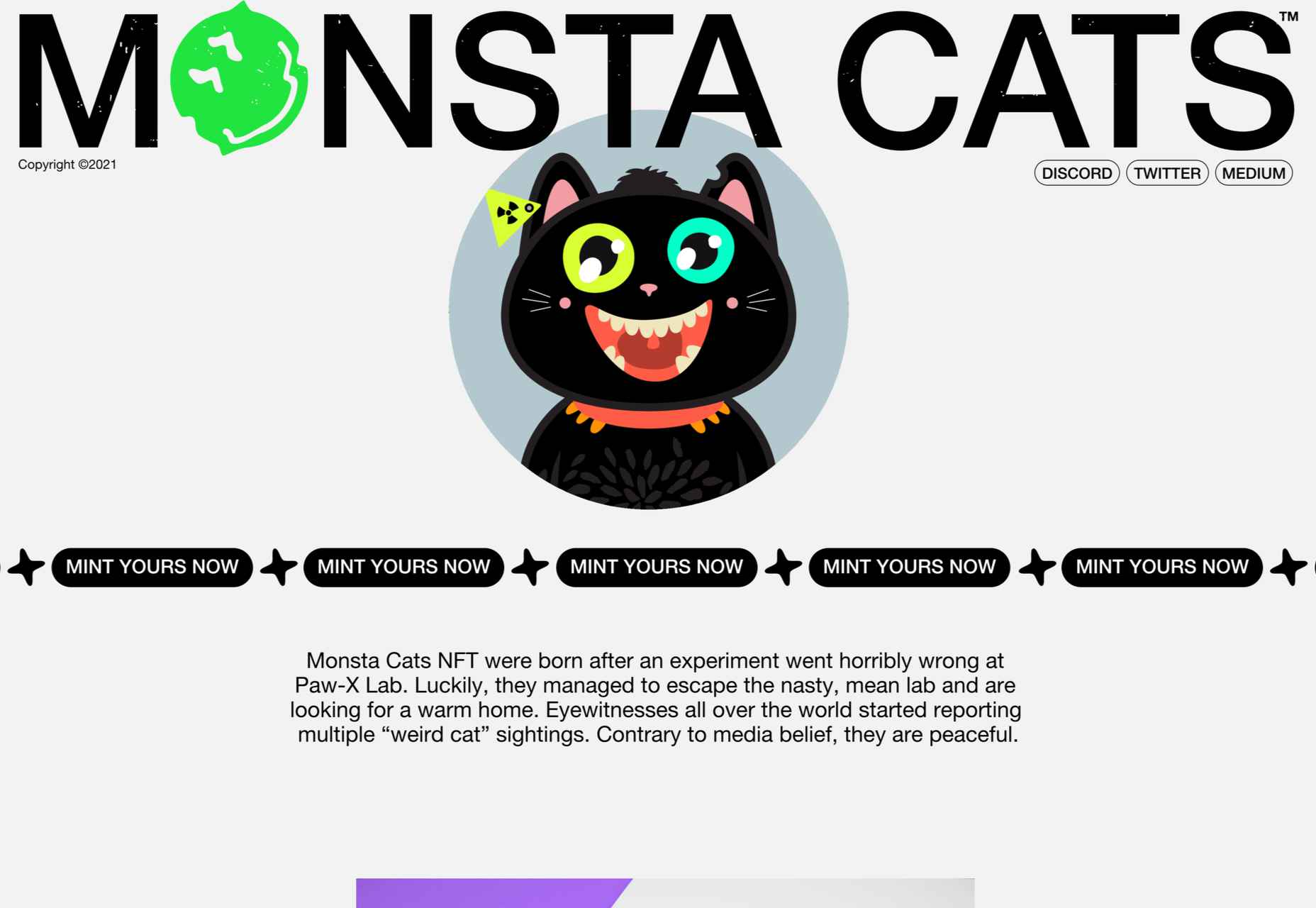
Monsta Cats 

Monsta Cats is a site dedicated to community focussed NFTs. The site is suitably anarchic and fun to browse.

Bien Fondé 

And finally, some customizable good wishes for the year ahead from digital agency Bien Fondé.

Source

The post 20 Best New Websites, January 2022 first appeared on Webdesigner Depot.

Source de l’article sur Webdesignerdepot

This is the first piece in a series on developing XR applications and experiences using Oracle.  Specifically, I will show applications running with the following:

  • Oracle database and cloud technologies
  • Hololens 2 (Microsoft Mixed Reality Headset)
  • MRTK (Mixed Reality Toolkit) APIs (v2.7.2)
  • Unity (v2021.1.20f) platform (leading software for creating and operating interactive, real-time 3D content)

Throughout the blog, I will reference a corresponding workshop video found at https://youtu.be/MBaQ8ohI80E.

Source de l’article sur DZONE

There was a point at which I was very close to losing my business, and I didn’t realize how close.

I wasn’t always a good planner, and I didn’t plan to start an agency. One day I was a freelance graphic designer, my job list grew, I hired some help, and suddenly I was managing a team.

There isn’t a guidebook for new business owners, you have to learn on the job, and there’s no one-size-fits-all approach. We expanded rapidly from two to four people, then seven, and suddenly we hit 16 employees in just 18 months. It was pretty scary and felt like driving on the freeway without brakes. A client shared a story that they were turning over $20m, and the owner was only taking home $30k. It felt like where I was headed. At that point, I could easily have lost it all.

I took a hard look at the numbers and realized that we were barely breaking even, let alone profitable. That needed to change to stabilize the business and regain control of my operations. The change wasn’t easy, and there were some hard lessons, but 11 years later, with a strong local team and 40+ awards for our work, I’m thankful for that wake-up call.

There are other people in my position struggling with the same issues I faced, so I’d like to share the four key things I did that helped turn things around and move us from surviving to thriving.

1. Don’t Diversify Your Services

I wanted to do it all, and as the business owner, it was hard to turn down a new client. Our instincts are to help, and declining opportunities feels wrong. In our industry, digital agencies, especially web design agencies, try to cover all bases from marketing, SEO, adwords, design, photography, and coding. Everyone wants to be a one-stop shop for clients. I used to be that person: I would wash your car and shine your shoes if I could.

Do not give in to that fear.

When you’re a generalist, you spread yourself too thin. I know: a decade ago, we were offering dozens of services outside of the web design realm: packaging, branding, copywriting, sticker design, SEO, hosting, analytics, you name it, we provided it. We used over seven different CMS for our projects. If a client wanted it, we tried to offer it, no matter how unsuitable it was for us.

On the surface, we fulfilled our projects, and our clients were always thrilled with the results. But below the surface, our operations were dissolving into a mess. Our eyes weren’t on the prize; we were always chasing after each little job for cash. It took too much time to learn new skills. When I looked at our timesheets and deducted the unbillable hours, our projects would hardly break even.

What hurt us even further is that with diversifying, we had to manage multiple workflows, software, and systems: Sketch, Illustrator, Photoshop, WordPress, Joomla, Drupal, Google Analytics, Final Cut Pro, etc. It was expensive with minimal return. It was like an Olympic swimmer signing up for a swimming-diving-ice-skating club when their passion is swimming.

So I took a step back. I boiled it down to what we enjoyed and excelled at. Ask yourself: for what do you want to be known? For us, it was psychology-driven, conversion-focused web design. This was the service our team had the most skills in and collectively could give the best value to our clients. Once I’d figured that out, it was easy to eliminate those other services and specialize.

You can niche down by service or industry and be the specialist in what you offer.

2. Know Your Numbers

The first red flag that my business was in trouble was when I said to my accountant, “I feel like my business is doing great.” He replied, “I don’t care how you feel. The facts are in the numbers. Show me your accounts, and I’ll tell you if you’re actually doing well.” As an intuition-driven guy, it was a real eye-opener; I’d only ever relied on gut instinct.

At one point, we had a ton of work coming in, so I hired a few juniors to help the rest of the team. The team grew to 16, and the vibes in the studio were great, but the numbers weren’t. Instead of increasing efficiency, projects took 40 hours longer than they should have done. Why? The seniors and mid-level designers were taking time out to train the juniors! Reassessing the team showed me I needed to hire experienced staff, so projects ran on time and budget. It was a hard decision but a necessary one to keep us afloat.

The crucial numbers for any design agency are your timesheets, where bottlenecks lie, how much you’re spending, how long a project takes; these determine your actual margins. Setting up quantitative software like Toggl, Gantt, and Asana were a game-changer for us. They gave our project management real purpose and potential. Knowing the average hours our primary type of project took made it easy to give clients realistic deadlines, anticipate the need for fresh hiring, and know when our plates were full. You do not want to bite off more than you can chew.

3. Become The Best Fit For Your Target Market

You can’t please everyone, and frankly, you shouldn’t be trying to. One type of bait won’t attract every kind of fish. First, identify the type of fish you want to catch, the pond where this type of fish lives, and finally, bait your hook with something that type of fish can’t resist.

Your sales team should be able to identify them instantly, and all you then need to do is streamline your team, process, and systems towards being the best fit for them.

4. Double Down On Marketing That Works

There are many different marketing avenues you can go down, but go down too many, and it becomes a tangled web of confused messaging.

Remember, just because your competitors are doing it does not mean it’s the most effective approach for your target market.

There are really only inbound and outbound types of strategies, and it’s a great idea to list out the pros and cons (and the ROI of each) concerning your target market. Or, you can approach marketing based on your existing skillset — for example, if you detest being in front of a camera and don’t want to do video marketing, then just don’t do it.

Identify what works for you, and then be consistent. Consistency is the secret to a successful marketing strategy.

Source

The post How I Saved My Design Agency & Tripled My Profits first appeared on Webdesigner Depot.

Source de l’article sur Webdesignerdepot

Happy New Year, fabulous new website design trends!

This month’s design trends are a collection of the somewhat unexpected – from NFT website design to large text to illustrations; you won’t see a single photo or video here. Here’s what’s trending in design this month.

NFT Websites

This website design trend has more to do with the greater trends in digital marketplaces and commerce but has value in the design space as well. NFT websites are popping up everywhere.

Marketplaces for non-fungible tokens use modern design effects to draw users in and help them make purchases and view available images. If you haven’t delved into the world of NFTs, they are data units – often in the form of gifs – stored on a blockchain digital ledger. You can buy, sell, and trade these digital nuggets on various marketplaces.

The designs of NFTs could be explained as a trend of their own. Here, we’re focusing on the look and feel of the websites surrounding them. While some designs are relatively primitive, the best marketplaces have a full e-commerce feel with easy-to-use interfaces and a modern design.

Each of these three NFT marketplaces does it a little differently.

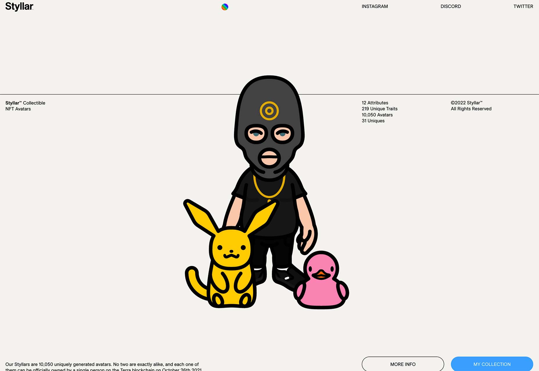
Styllar puts a focus on NFT avatars with a minimal aesthetic that gives plenty of room to individual NFTs. Sit on the website too long, though, and hundreds of options begin to cover the screen. Each visual element has a small text element to match that explains each image. It feels like a modern e-commerce experience that instills trust with users because of clean visual patterns. The site itself is just a gateway to a more traditional marketplace, but the calls to action are large, clear, and easy to follow.

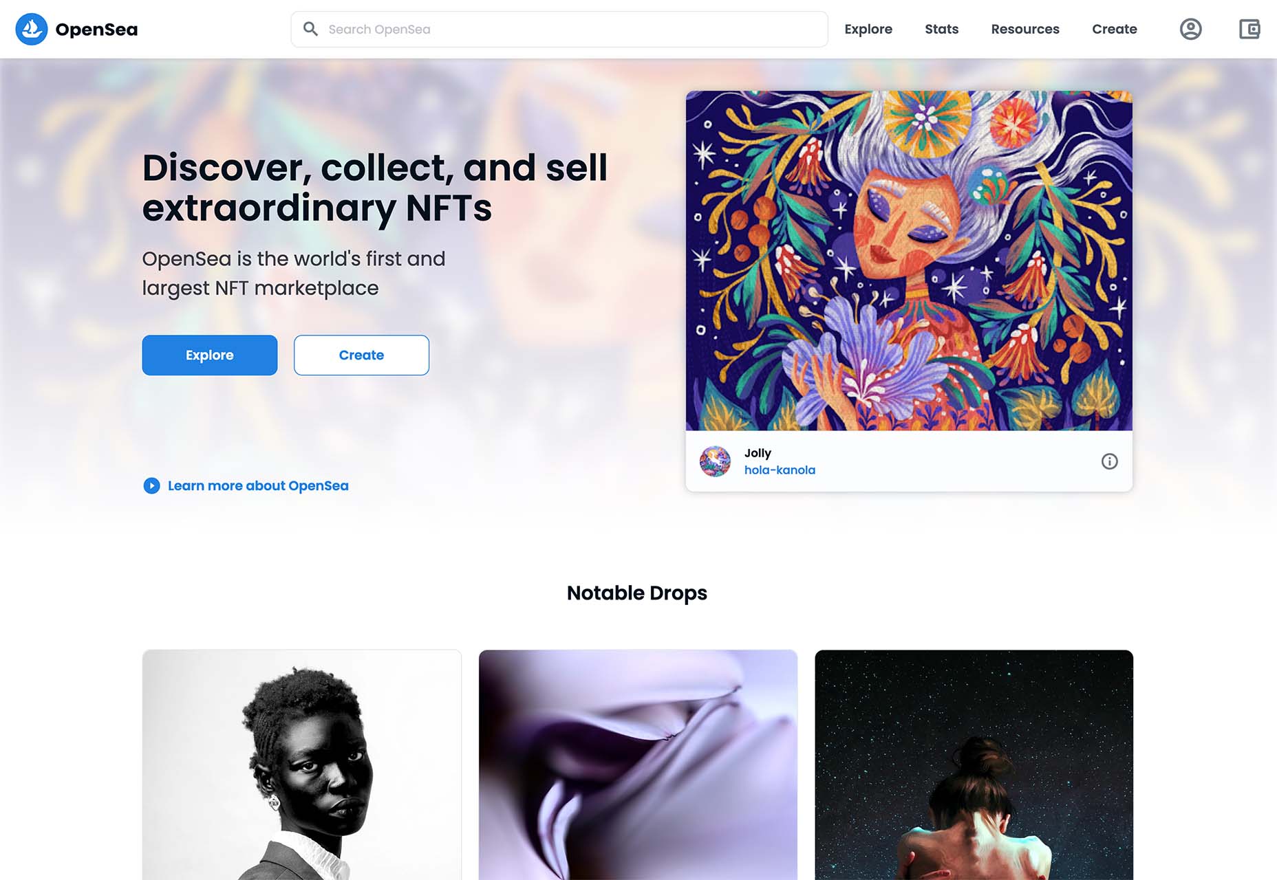
OpenSea treats the NFT marketplace more like an art gallery with card-style buttons to look at different elements and images. Everything about the website design is tailored for the mobile user and quick browsing with large areas to click in the card format and easy-to-read headers that help you find your way through the NFT space, whether you want to buy, create, or sell. The site also does one more thing that’s not as common with e-commerce – it explains how to get started in this new digital territory with plenty of resources.

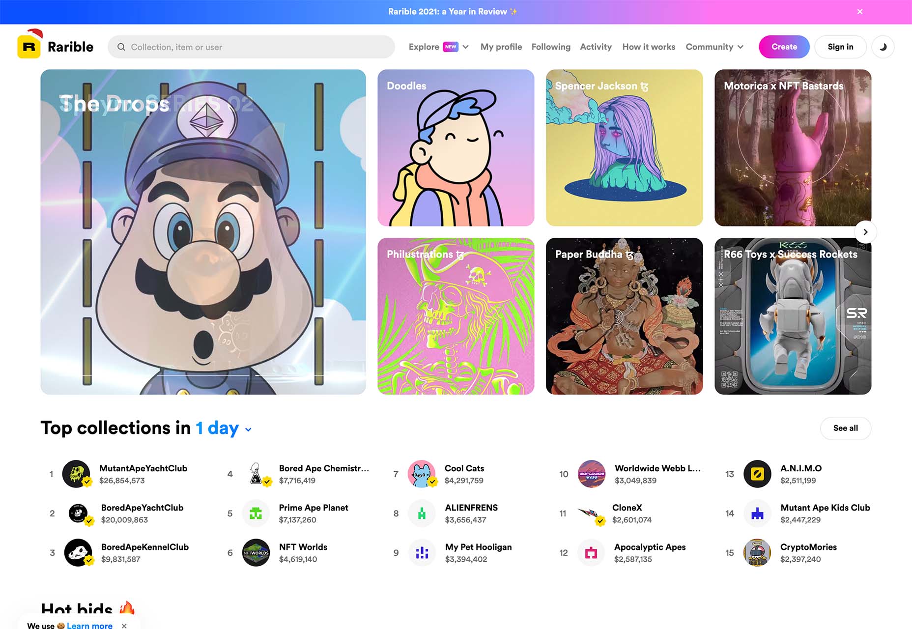
Rarible has an almost social media feel with lots of small blocks showing different NFTs. Digestible content in a grid-based design helps you navigate from images to rankings to what’s trending in NFTs. This site design is set up for high interaction and engagement, also featuring card-style elements and the ability to favorite items before bidding.

The key commonality with NFT website designs is that they are made for mobile users. These sites look good on desktops, but they are highly focused on a mobile, instant gratification user.


Text-Based Hero Headers

A trend in website design from 2021 is bleeding into 2022 with a lot of popularity: Hero headers that are mostly text. These designs have background texture and color, but for the most part, they don’t have a lot of other visuals.

These designs often rely on powerful language or messaging to help get user engagement. A secondary theme is the use of bright colors to help add focus and attention to the typography.

Font choices seem to be fairly neutral, with a lot of thicker sans serifs for the main headline and something a little lighter for secondary text options.
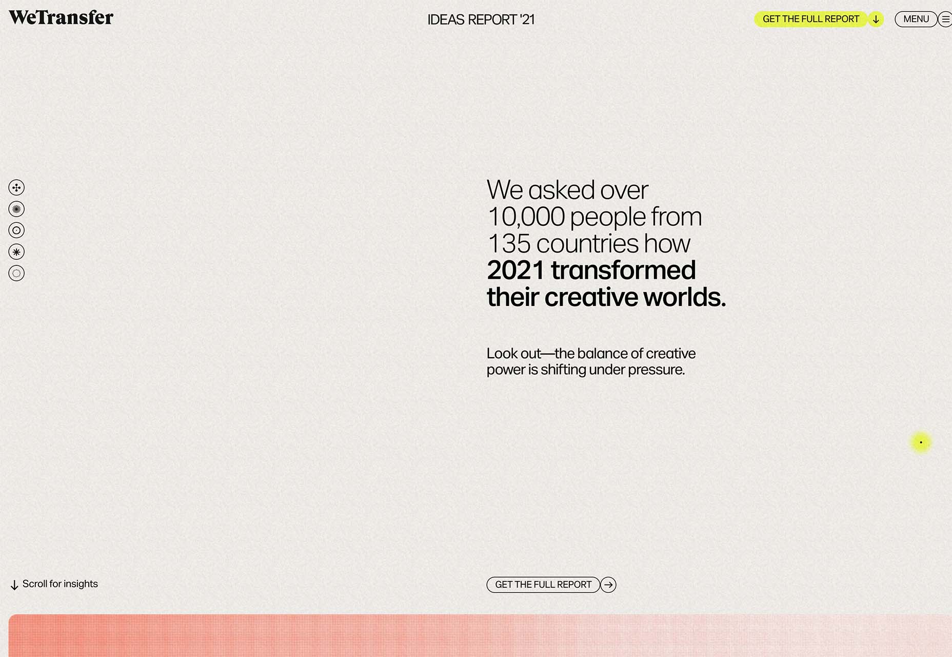
WeTransfer uses a smaller text block with multiple lines to create weight. The off-center placement draws the eye and is interesting even with the neutral background. Stacking elements create a nice focal area that encourages reading.

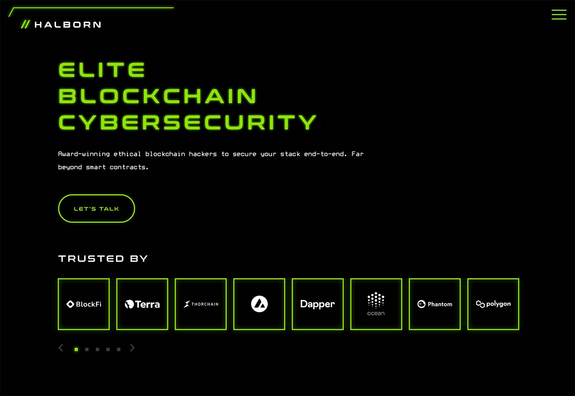
Halborn Blockchain Security goes with a less traditional font option and flips the color to the text to enhance the visual display. This design also uses an off-center, asymmetrical approach to create focus on the text element. The dark counterweight on the screen is an excellent guide to draw you back to the main hero headline.

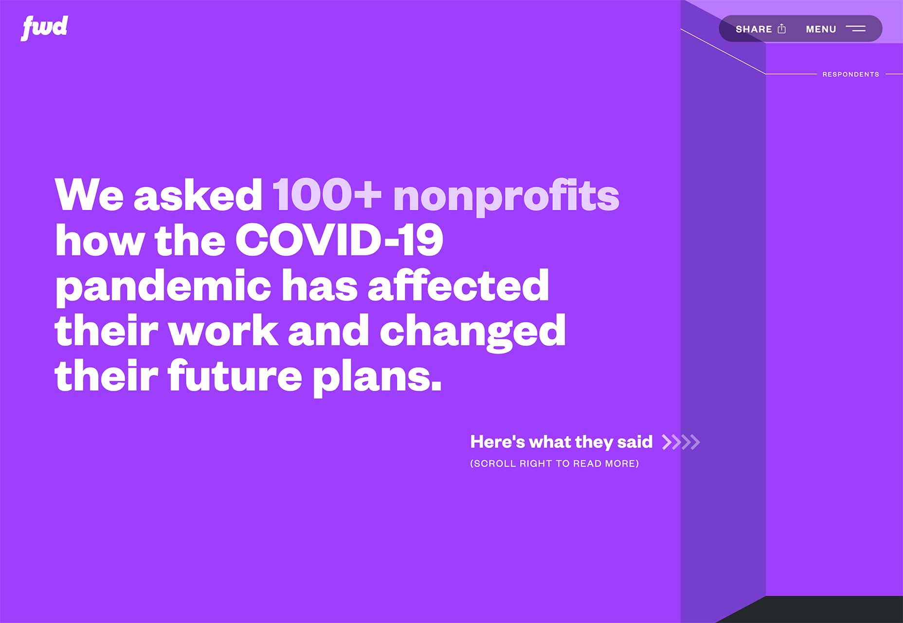
FWD goes with giant oversized text elements to create a strong visual focus with this design. Other than the faint animation of the arrows next to “Here’s what they said,” everything is still and static. The color and blocky depth of the background help draw the eye through the text and to clickable elements so that you know what to do next.


Intricate Illustrations

Another trending design element is the use of intricate illustrations on homepages. These highly detailed images can tell a visual story, help add meaning to messaging, or serve as a remarkable visual element when you don’t have a photo or video.

The great thing about this trend is that the only limitation is your imagination.

Once you find someone to create the illustration (if you can’t do it yourself), the world is open to interpretation.

We are seeing three major themes within this trend, as showcased in the examples.

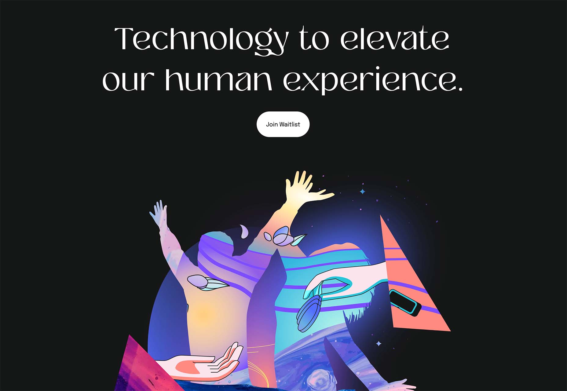
Multi-layer illustrations with hints of animation, such as the one from Highvibe Network. This illustration used lots of colors, layers, unexpected elements within outlines, and a little animation to pull it all together. The effect is rather stunning and provides a lot of interest for the user.

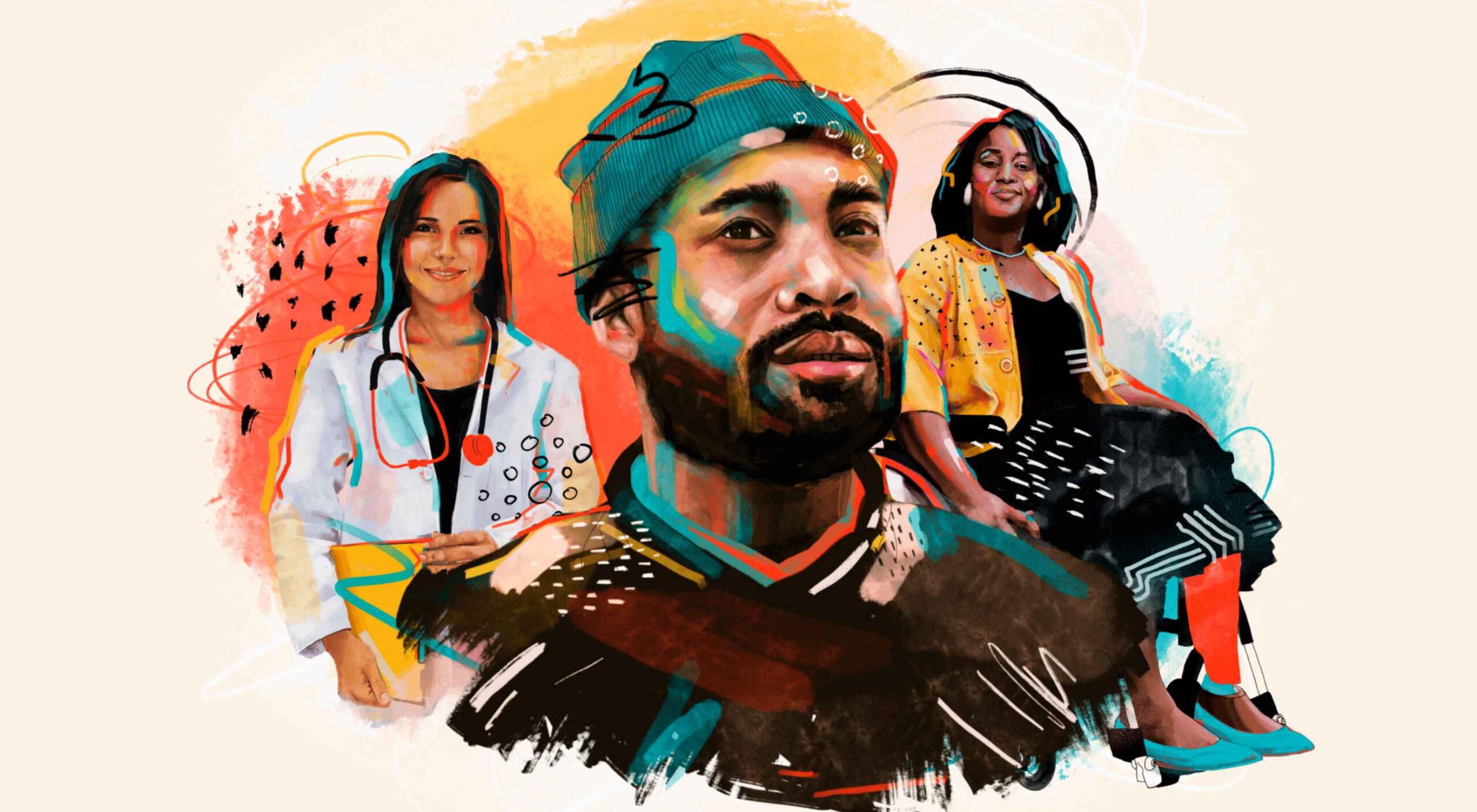
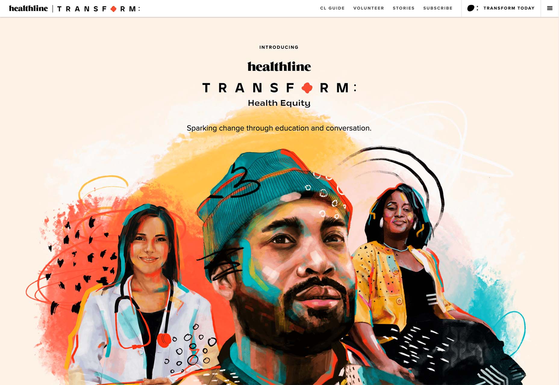
Realistic, painting-style illustrations, such as the one from Healthline, bring the content to life without real people or images. This technique is especially nice for industries where you may want to anonymize people in images. (Perfect for a healthcare website design because you don’t know if the illustrations are of real people or not.)

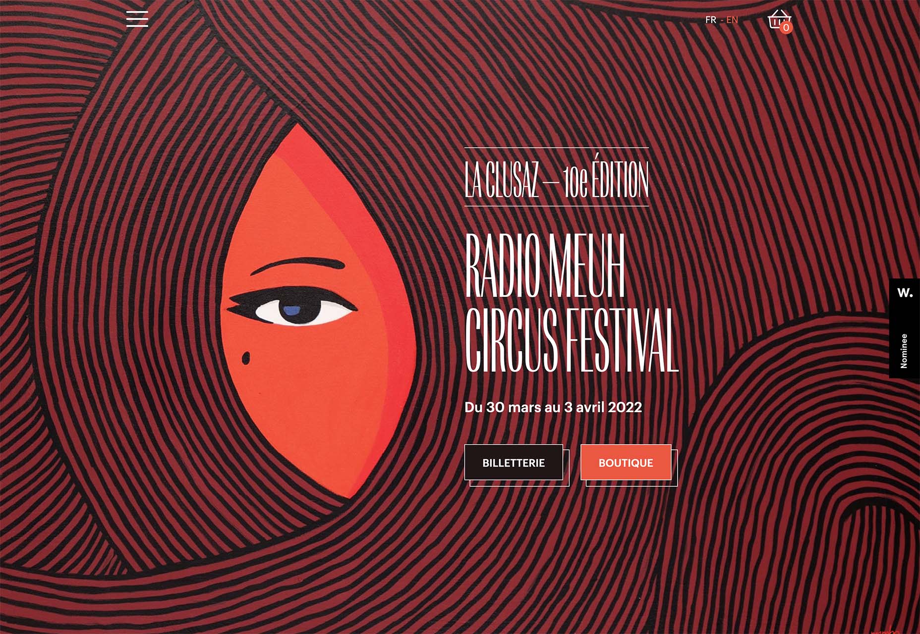
Detailed geo shapes and lines, such as the design from Radio Meuh Circus Festival. With great color and lines that draw the eye, this design can keep you looking and finding new depth for a long time. Color also helps draw you into the striking imagery.


Conclusion

What’s nice about all these design trends is that they have flexible elements that you can use and replicate across industries and projects. The common factor is that they lack traditional dominant imagery, which works exceptionally well.

These trends are likely a result of the worldwide pandemic as well. With less social contact, creating without conducting photo or video shoots is an ideal situation. Good luck trying some of these trending design elements on your own.

Source

The post 3 Essential Design Trends, January 2022 first appeared on Webdesigner Depot.

Source de l’article sur Webdesignerdepot

Every year, at this time, blogs like this one like to try and predict what’s going to happen in the year ahead. It’s a way of drawing a line under the archive and starting afresh. A rejuvenation that, as humans, we find life-affirming.

Ten years ago, I would have had high confidence in these predictions — after all I was eventually right about SVG adoption, even if it took a decade. But the last few years have shown that web design is tightly interwoven with the muggle world, and that world is anything but predictable.

So as we look at what might occur in the next year (or five), think of it less as a set of predictions and more as a wishlist.

Last Year’s Predictions

When I write this post every January, I like to keep myself honest by glancing back at the previous year’s predictions to gauge how accurate (or not) my predictions have been.

Last year I predicted the long-term trend for minimalism would end, WordPress would decline, cryptocurrency would go mainstream, and then hedged my bets by saying we’d make both more and fewer video calls.

Gradients, maximalism, and the nineties revival pulled us away from minimalism. It’s still popular, just not as dominant.

WordPress is still the biggest CMS in the world and will continue to be for some time. But the relentless grind of no-code site builders at the low end, and being outperformed by better CMS at the high end, mean that WordPress has passed its peak.

Over-inflated predictions for BitCoin reaching $100k by December 2021 turned out to be a damp squib. In the end, Bitcoin only tripled in value in 2021. However, with micro-tipping and major tech companies moving into the arena, it’s clear digital currency arrived in the public consciousness in 2021.

And how could I be wrong about more but also fewer video calls? So I’m calling that my first clean sweep ever. With that heady boast, let’s take a look at the next twelve months.

What Not to Expect in 2022

Do not expect the Metaverse to be significant in anything but marketing speak. Yes, the hardware is slowly becoming more available, but the Metaverse in 2022 is like playing an MMORPG on PS5: theoretically, great fun, until you discover that absolutely none of your friends can get their hands on a console.

Ignore the blog posts predicting a noughties-era retro trend. All those writers have done is looked at the nineties-era trend and added a decade. Fashions aren’t mathematical; they’re poetic. Retro happens when people find a period that rhymes with present-day hopes and fears. After the last couple of years, if we revisit a decade, it’s likely to be the late-forties.

Finally, don’t expect seismic change. Material design, parallax scrolling, and jQuery are still with us and are still valid choices under the right circumstances. Trends aren’t neat; they don’t start in January and conclude in December.

5 Web Design Predictions for 2022

Predictions tend to be self-fulfilling. So we’ve limited ourselves to five trends that we believe are either positive or, at worst harmless. Of course, there are no guarantees, but if these come to pass, we’ll be in good shape for 2023.

1. The Blockchain is Coming

Underpinning the cryptocurrency industry are blockchains. In simple terms, they’re a set of data that can be appended to but can’t be edited or deleted. Think of it as version control for data.

As with most technology, the first wave has been a way to make a fast buck. However, the exciting development is blockchain technology itself and the transformative nature of the approach. For example, Médecins Sans Frontières reportedly stores refugees’ medical records on the blockchain.

Imagine the Internet as a set of data, editable for a micro-fee, and freely accessed by anyone anywhere. Instead of millions of sites, a single, secure, autonomous source of truth. Someone somewhere’s working on it.

2. Positivity & Playfulness & A11y

Even before world events descended into an endless tirade of grim news, time was running out for dull, corporate, geometric sans-serif design.

We added gradients, we added personality, we embraced humor. And contrary to the established business logic, we still make money. Over the past few years, there have been extraordinary efforts by designers and developers to examine, test, and champion accessibility, and thanks to them, inclusive design is no longer reliant on the lowest common denominator.

In 2022 you can get experimental without obstructing 10%+ of your users.

3. Everything Green

Green is a fascinating color, the primary that isn’t (except in RGB, when it is).

Green has the same visual weight as blue, is substantially more flexible, and yet to date, has been radically underutilized in digital design.

Green has a prominent cultural association with the environment. At a time when tech companies are desperate to emphasize their ethical credentials, marketing companies will inevitably begin promoting a brand color shift to green as a quick fix for all those dumped chemicals, strip mines, and plastic-filled seas.

We’ve already seen earthy hues acquire popular appeal. At the other end of the vibrancy scale, neons are popular. Green spans both approaches with everything from calm sages to acidic neons.

In 2022, if you’re looking for a color to capture the moment, look to green.

4. Hero Text

A picture is supposed to be worth 1000 words, although I’m not sure anyone has actually tried to measure it. The problem is that sites increasingly rely on stock images, so the 1000 words that we’re getting may or may not accurately reflect 100% of our message.

In 2022, a handful of well-chosen words will be worth more than an image, with hero images taking a back seat to large hero text. This is aided by a number of minor trends, the most notable of which is the willingness of businesses to look beyond the geometric sans-serif to a more expressive form of typography.

Reading through the prediction posts on sites other than this, almost everyone agrees on large hero text replacing images, which virtually guarantees it won’t happen. Still, at the start of 2022, this seems to be the direction we’re taking.

5. Bring the Noise

One of the unexpected consequences of the past couple of years has been a renewed connection with nature. The effortless complexity in nature is endlessly engaging.

We’ve already begun to popularise gradients — there are no flat colors in nature — and the next logical step is the addition of noise.

In visual terms, noise is the grainy texture that sits so beautifully in vector illustrations. Noise has dipped in and out of trends for years, hampered a little by the leap in file size it creates. However, with WebP and Avif file types, noise is now usable on production sites.

Designing in 2022, when in doubt, throw some noise at it.


Featured image via Unsplash.

Source

The post 5 Big Web Design Predictions for 2022 first appeared on Webdesigner Depot.

Source de l’article sur Webdesignerdepot