In the video below, we take a closer look at Iterator Design Pattern in Java. This tutorial includes an introduction, example, and key points. Let’s get started!
Articles
In this video tutorial, we take a closer look at Object Pool Design Pattern in Java. This tutorial includes an introduction, example, and key points. Let’s get started!
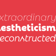
 With a new year here, it’s time to try out some new fonts.
Whether you’re designing a brand new website or redesigning an existing one, the following list of fonts has you covered. In addition to the dependable serifs and sans serifs we use to create attractive and readable content, this roundup also has some fun additions, including one you can use for websites advertising Valentine’s Day deals next month.
Antona
Antona is a geometric sans serif font family with 16 different styles. The solid structures and ample white space within the characters give off a safe and friendly vibe.
Aromanis
Aromanis is a small font family with just two variations: Regular and Shadow. This new font supports nearly 70 languages and has an extensive Latin character set with localized forms. This font works best in branding for youthful companies with a playful vibe — from logos to posters and everything in between.
Black Coopy
Black Coopy is an edgy display typeface that would work well for sporty brands. In addition to the standard alpha, numeric, and punctuation sets, the font also comes with a variety of “swash” characters that can be used to frame your bold headlines.
Cimory Love
Don’t wait until February to start thinking about how to infuse a little romance into your designs. Cimory Love is a script font that comes in two styles: Regular and Italic. In addition to using it to promote Valentine’s Day sales, this could also be a cute font to use on websites for small gift shops, bakeries, and so on.
Cotford
Cotford is a contemporary serif font with a ton of flexibility built into it. It comes with eight variations — three text and five display weights. Designers can use one of the many pre-designed styles or they can modify this dynamic font set to make it suit their specific needs.
Digno
Digno is a beautiful, informal serif font that’s easy on the eyes. The font family comes with 14 weights covering a wide spectrum — lights, mediums, heavies, and even a couple of “Book” weights are thrown in if you want to add some personality to those text-dense pages of yours.
Dogly Comika
Dogly Comika is a rounded display font with two styles: Regular and outline. While it’s promoted as a font for animals and pets, you could use it for any type of website hero image, mobile app splash screen, video game, or social media graphic for brands with a fun vibe.
Guzzo
Guzzo is a nostalgic typeface inspired by mid-century grotesques. With 24 styles ranging from Condensed Thin to Extended Black and unexpected character variations (like the random cursives in the italics), you could realistically create interesting font pairings right from within this family.
Idem
Idem is a contemporary serif with nine wide-ranging styles that would work well for headers and text alike. Inspired by literary publications and commercial artists from the earlier part of the 20th century, this font family has a highly legible structure with a bold flare.
Jantur Type
Jantur Type is a geometric sans font that supports over 200 Latin-based languages. While you could use one of the Thin or Regular weights for editorial content, this font will be most effective in shorter headers and paragraphs where it can make a greater impact on messaging.
Loretta
Loretta is an elegant serif designed specifically for the body of your web pages. Because of its calligraphic roots, this particular font would work great for high-end digital publications or blogs that promote luxury lifestyles and goods.
Rebrand
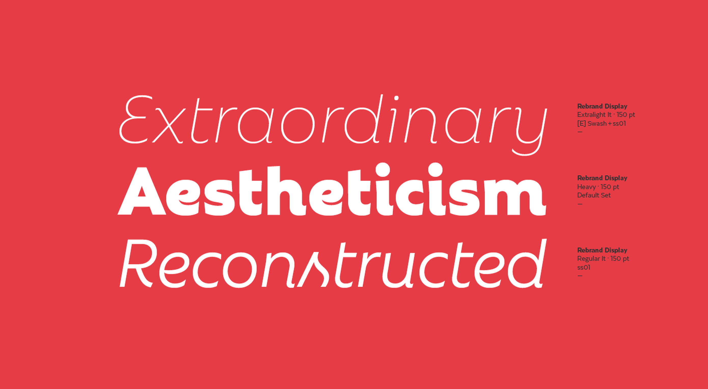
Rebrand is an exciting take on geometric sans. There are two sub-families in Rebrand: Display comes with nine weights as well as alternative characters and dingbats; Text comes with seven weights that cover a broad spectrum of styles. Because of the size and variety of this font family, you could easily make this the go-to font for a company’s branding, headers, and body type.
Royal Grotesque
Royal Grotesque is a resurrection of a 1914 sans serif font called Wotan. Only one version of this font is available (Regular) and it would work great pretty much anywhere on the web with its clean and neutral design.
Selva
Selva is an attractive Scotch typeface that has a traditional Roman serif family, an italicized version of each Roman, as well as a script family. If you’re considering using a script font for branding or headlines, the classic and delicate details of this particular font would make for an interesting choice.
Sunset Gothic
Sunset Gothic is a sans serif inspired by signage found near and around Los Angeles. Because this signage was often painted directly onto shop windows and building facades, the letterforms had to be extremely legible for passersby and drivers alike. This font draws upon the hand-painted, vector-based styling of those painted promotions.
The post 15 Best New Fonts, January 2022 first appeared on Webdesigner Depot.
 2021 has been both memorable and instantly forgettable. Pop stars were freed from modern-day servitude, some people tried to overthrow democracy, and we all vacationed at home.
Despite the weirdness of the times, the web kept growing, kept changing, and kept on pushing boundaries. We saw a wealth of new sites launch or relaunch with significant updates.
Here are the 50 best sites launched on the web this year. Enjoy!
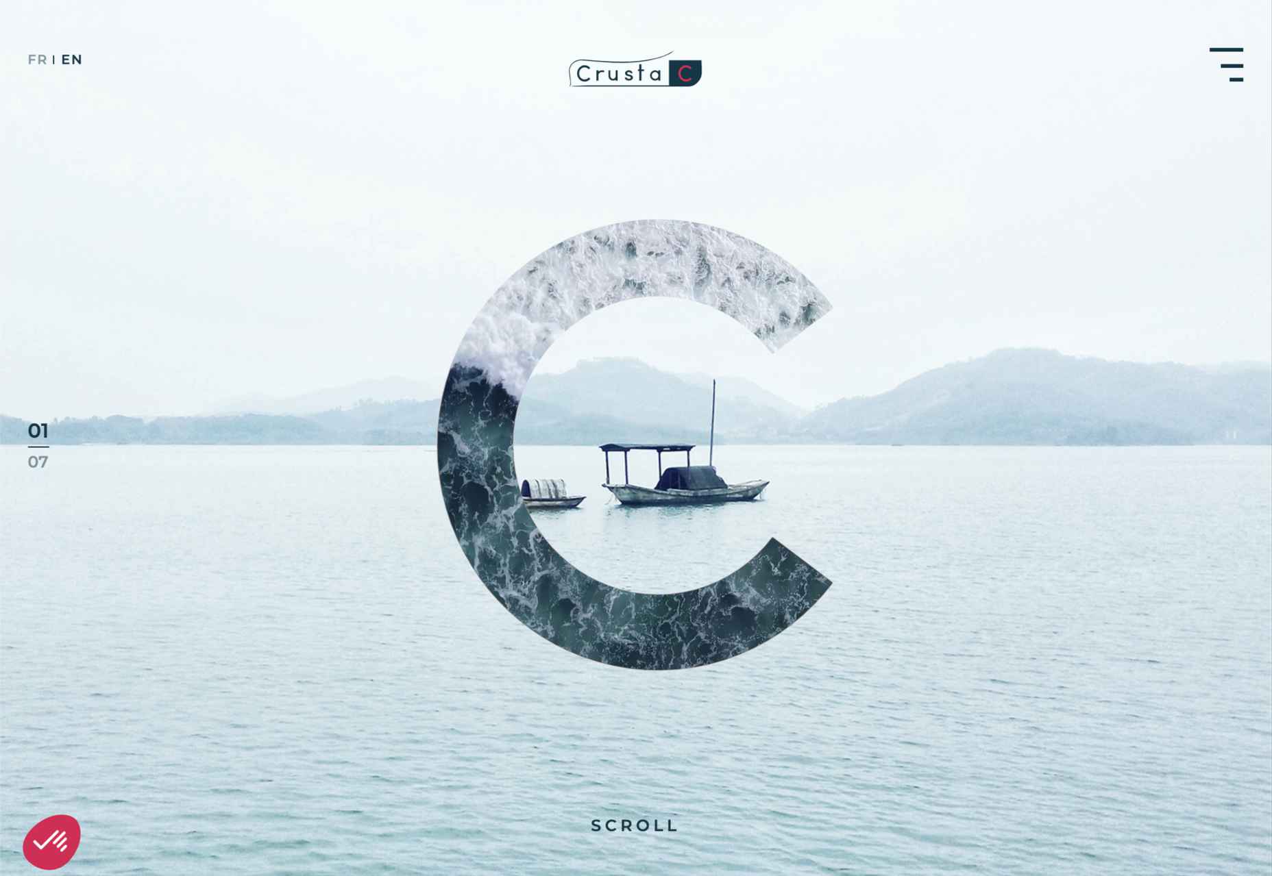
Crusta C
In April, seafood company Crusta C cleverly used the simple logomark ‘C’ to apply a cutout video effect.
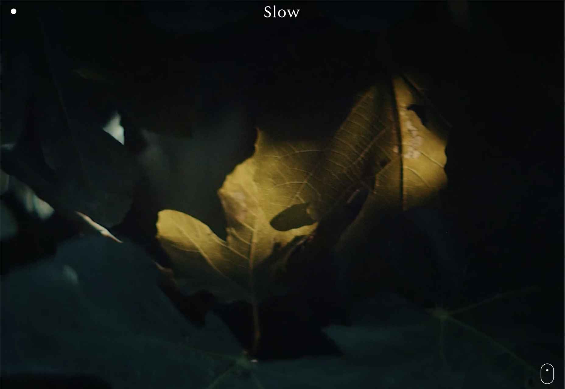
Slow
Slow is a collective of creatives aiming to implement slow movement principles. Its site reflects those aims, creating a sense of calm and deliberation.
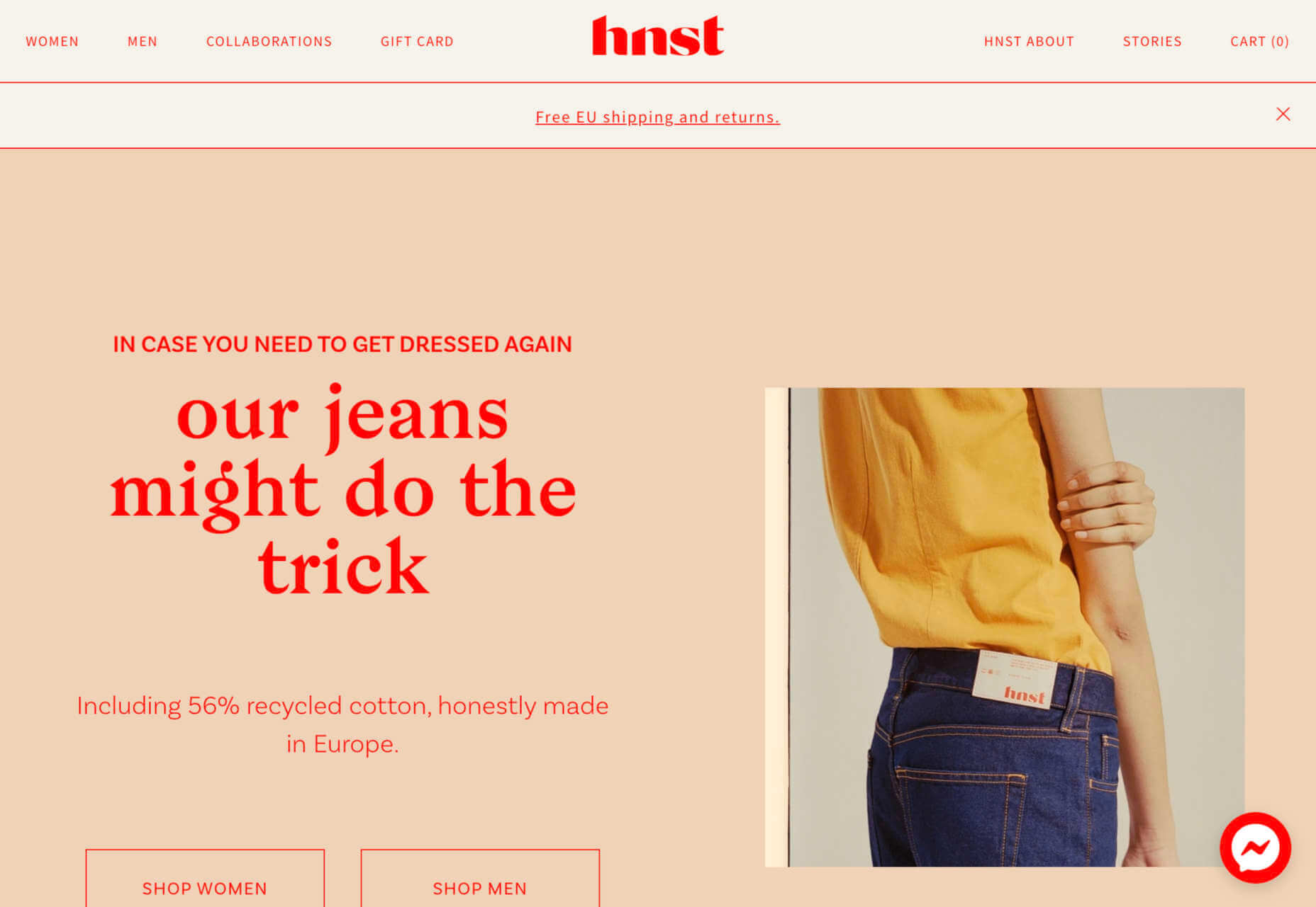
hnst
2021 saw tons of brutalist-inspired design. hnst’s take on the style works thanks to the bright red in place of the standard black.
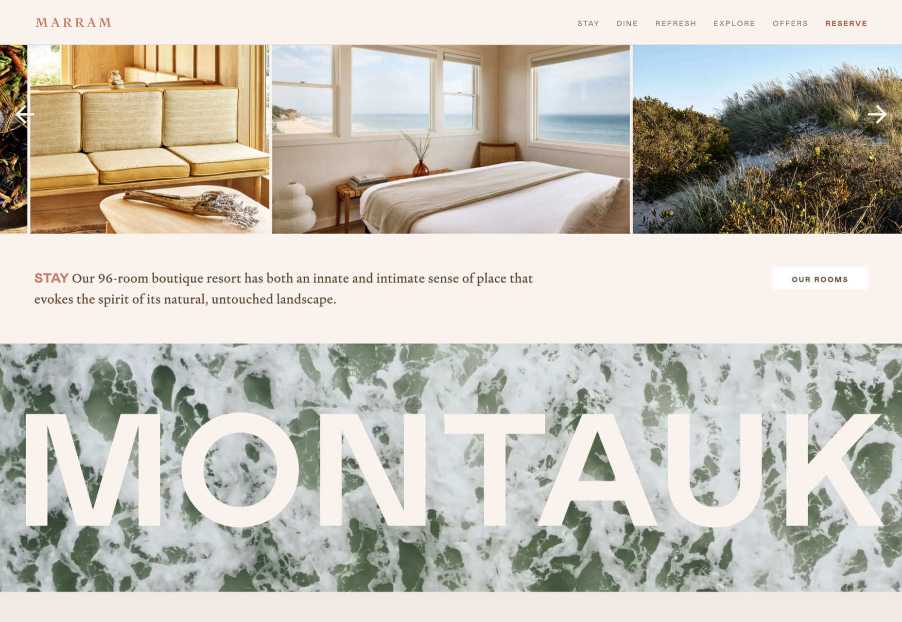
Marram
This site for boutique hotel Marram uses a soft color palette to create an impression of soft golden light and calm.
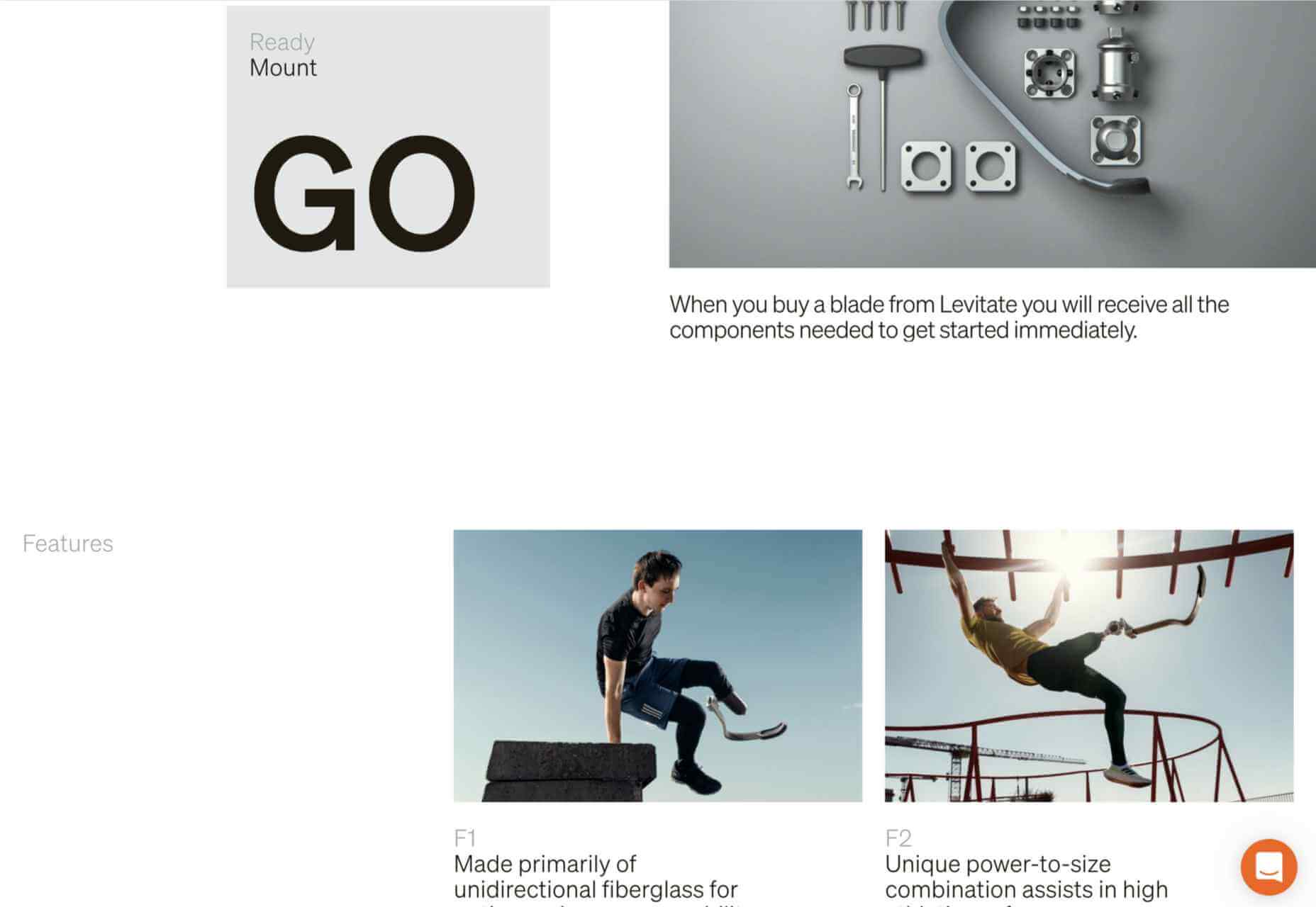
Levitate
In July, we loved this site for running-blade brand Levitate. The site is clean and light, with a sense of inherent motion in the photography.
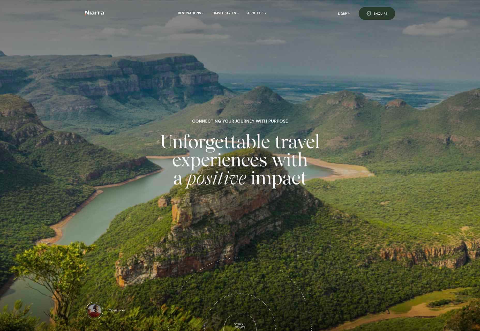
Niarra Travel
There’s some beautiful photography on this site for eco-conscious, bespoke travel agency Niarra Travel.
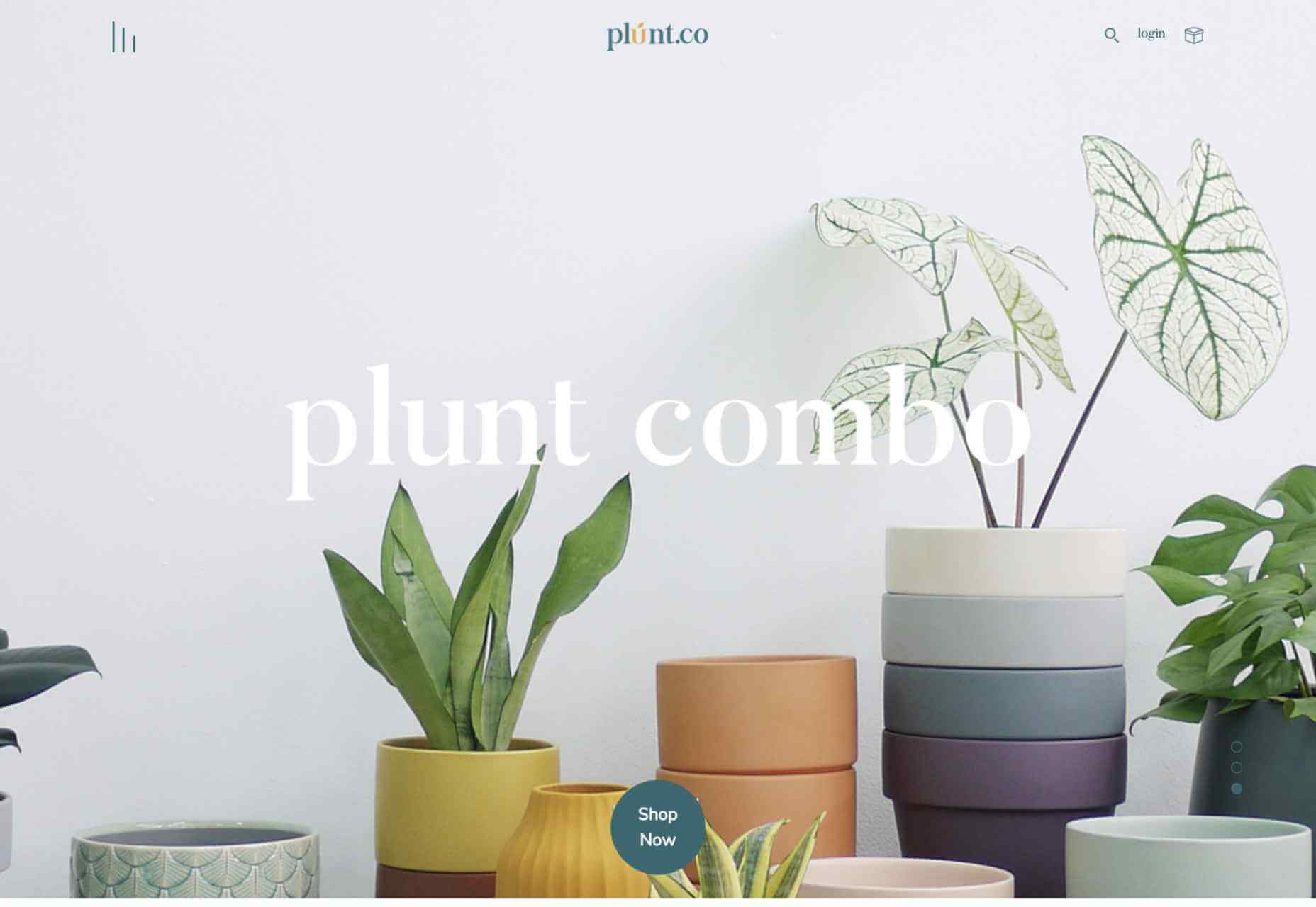
Plunt.co
The core of this site for Plúnt is a combination chooser which feels pleasingly reminiscent of an animal flipbook.
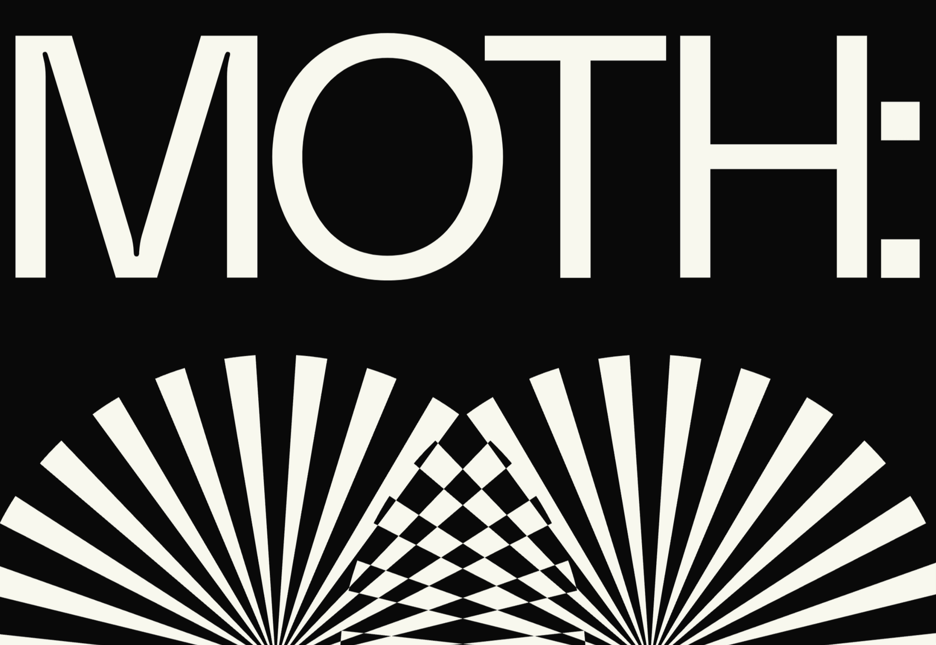
Moth Drinks
Moth makes classic cocktails in a can. The striking black and white graphics and masking effects for its holding page stunned us back in March.
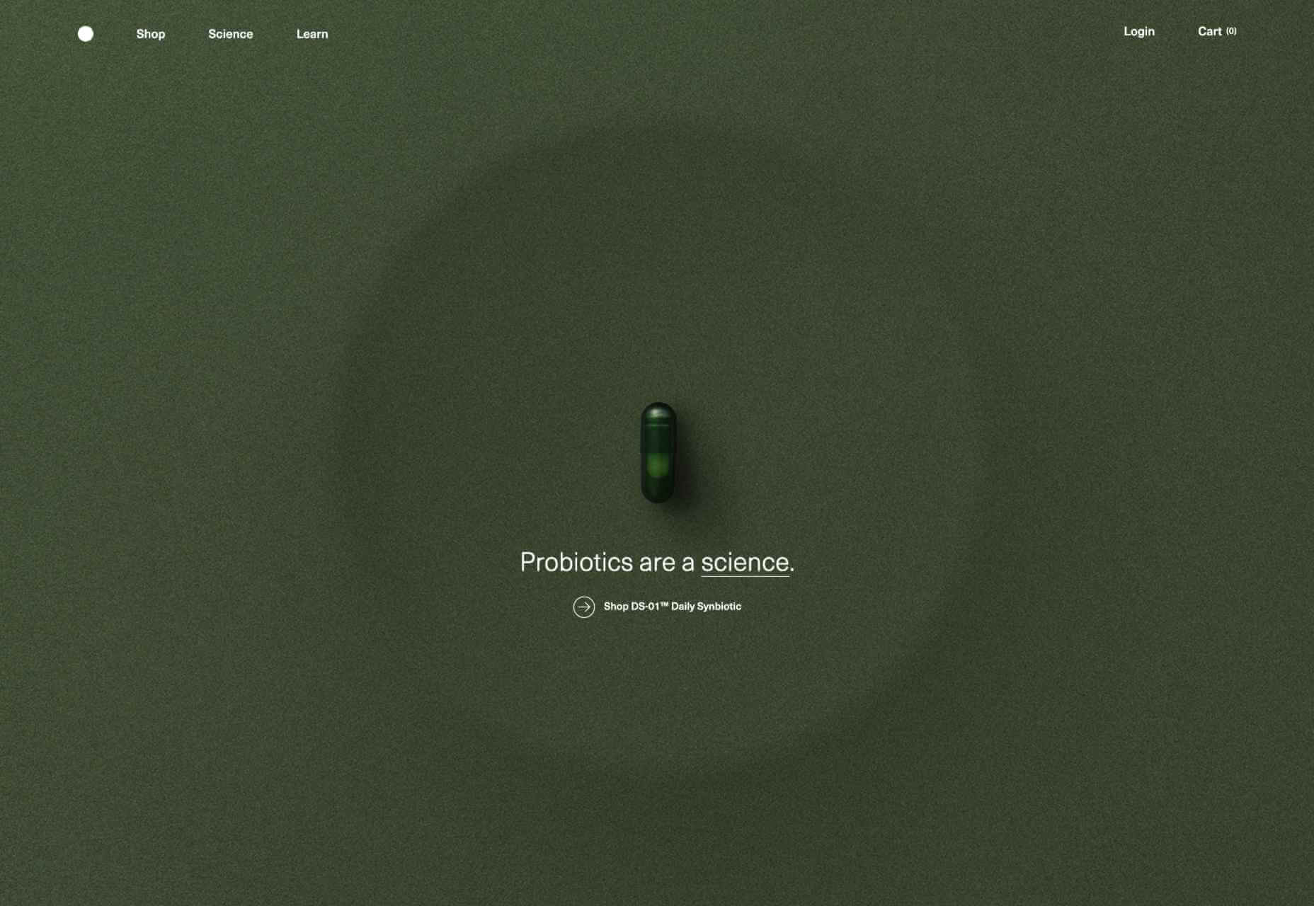
Seed
Selling supplements is hard; people are understandably skeptical. So this site for Seed packs in research and scientific information and avoids the hard-sell.
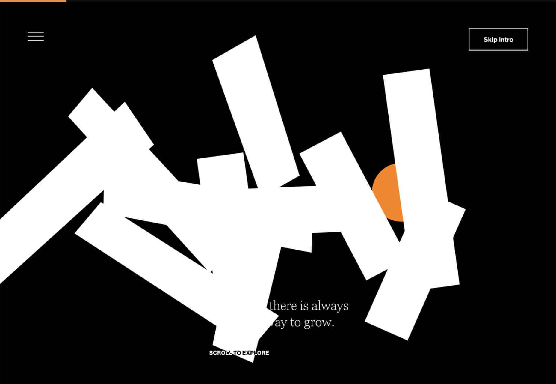
Wavemaker
Another excellent portfolio site in 2021, this time for creative media agency Wavemaker. The site is uber-confident while still being playful.
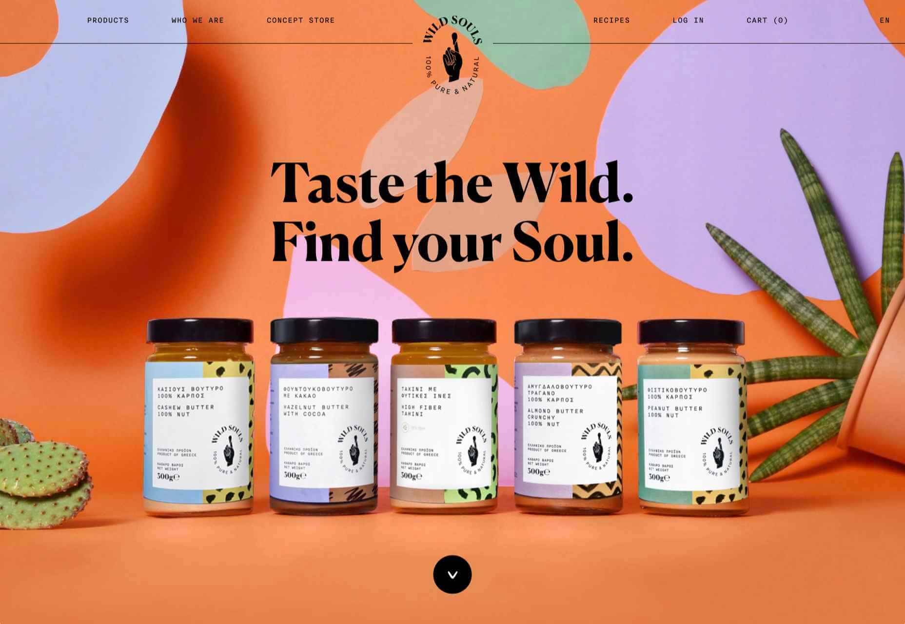
Wild Souls
Wild Souls makes nut butters, tahini, and other Greek delicacies. Its site is colorful and warm, and the site typography is soft and appealing.
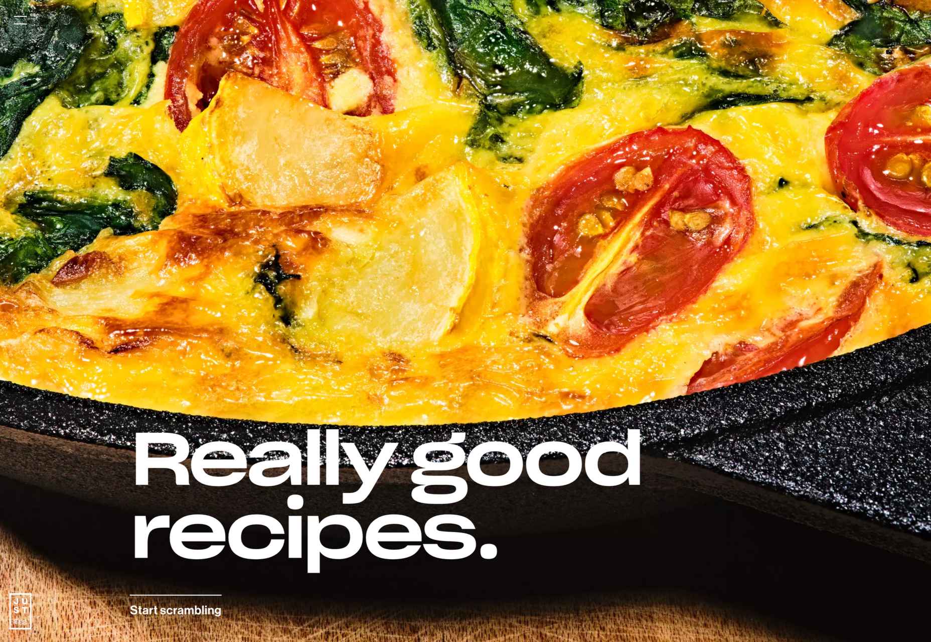
JUST Egg
JUST Egg produces egg-like food from plant material. The huge photography and bold typography do a great job of making a new concept appealing.
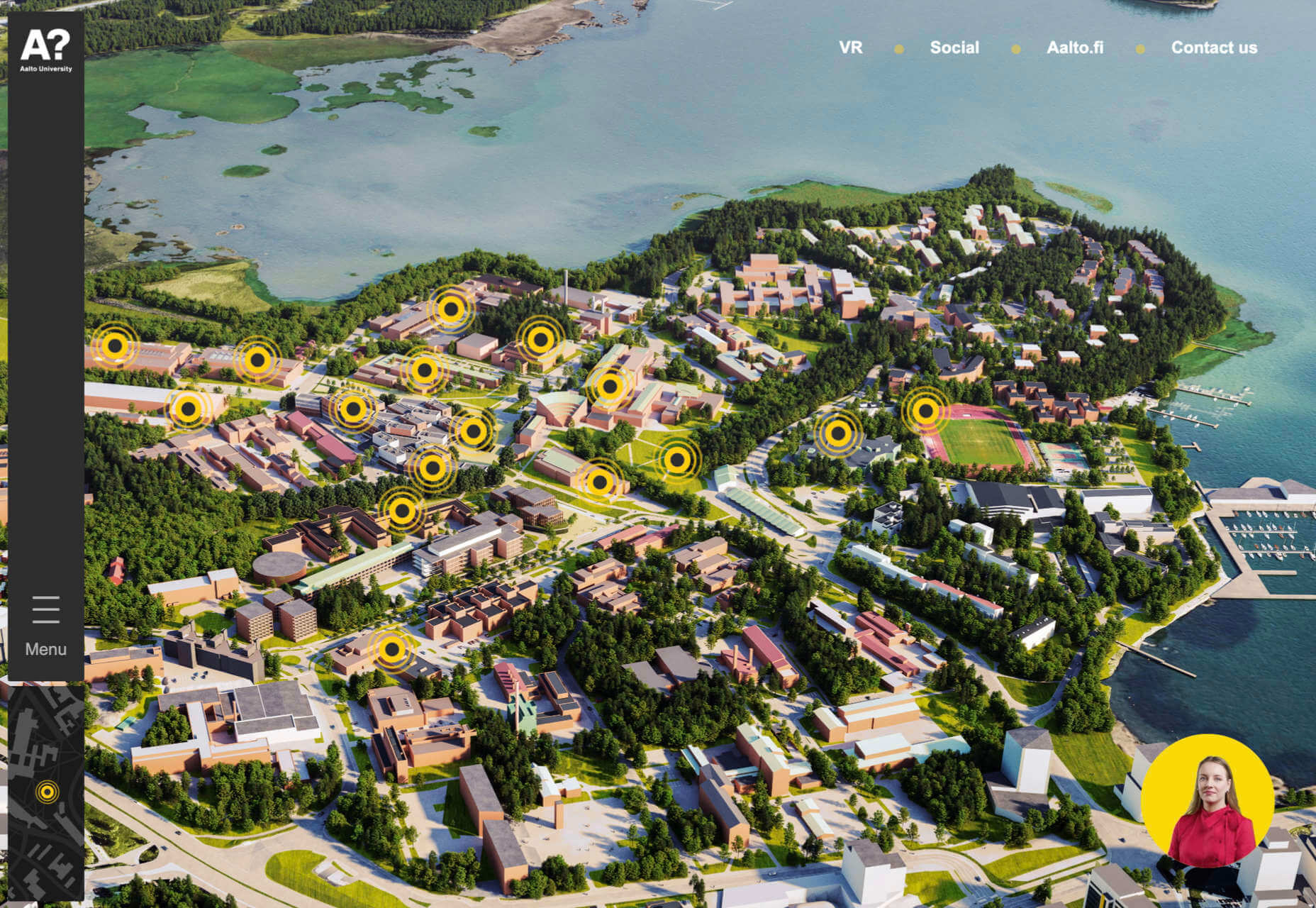
Aalto University
One of the most popular designs of 2021 was Aalto University’s site with its in-depth campus tour. The simple navigation inspired several imitators.
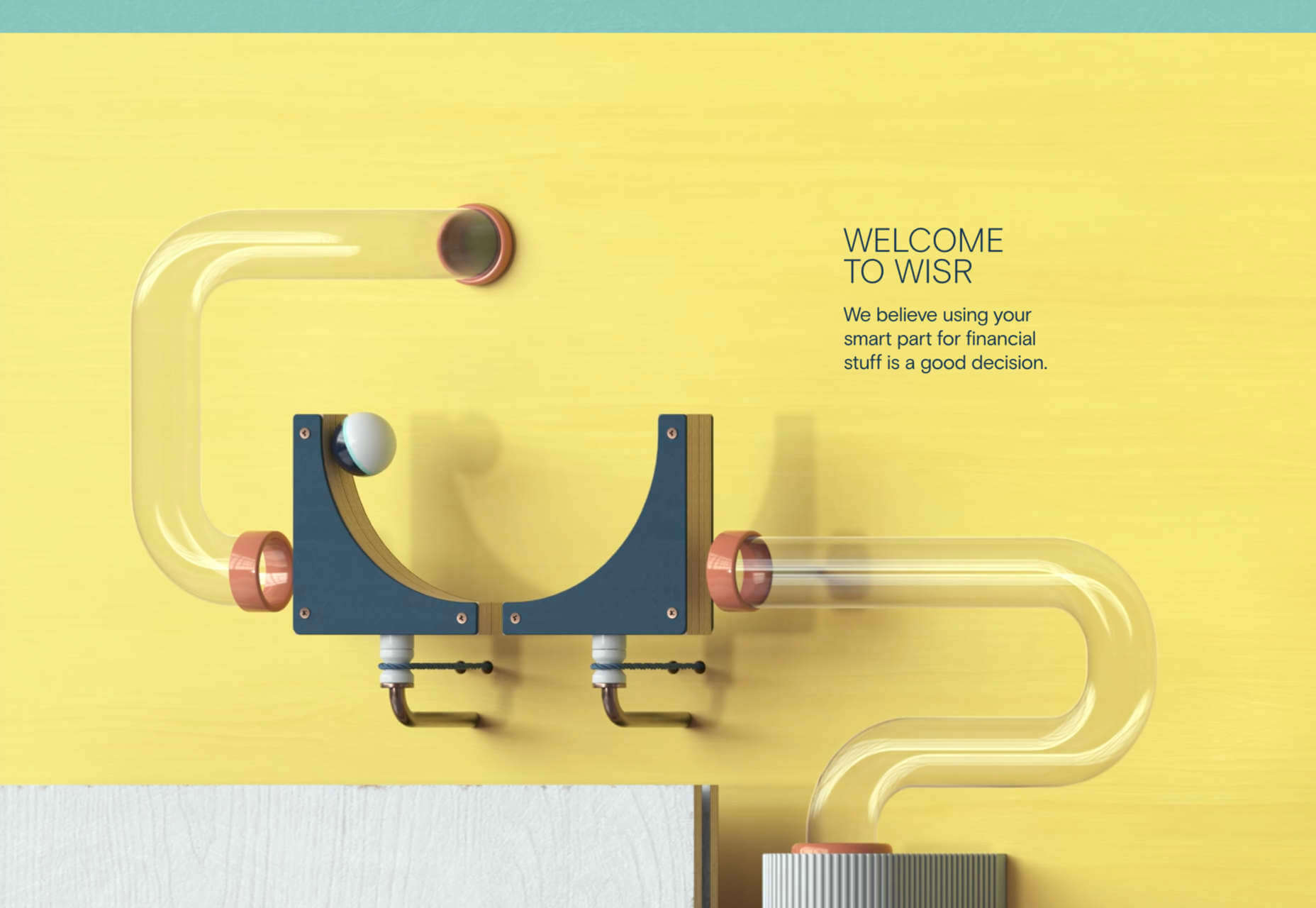
Wisr
Scroll interactions were big in 2021, and Wisr features a Heath Robinson-style machine that ‘runs’ as the user scrolls down the page.
Cevitxef
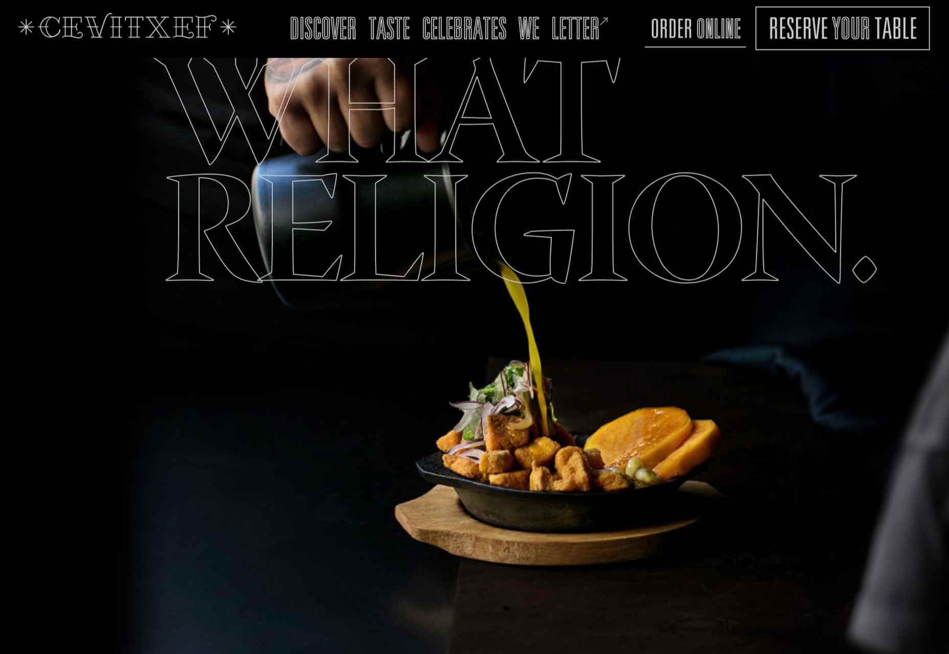
This site for Cevitxef ceviche restaurant in Bilbao does a great job of making us hungry. Drama is created by oversized text, heavily-styled photography, and lots of movement.
On
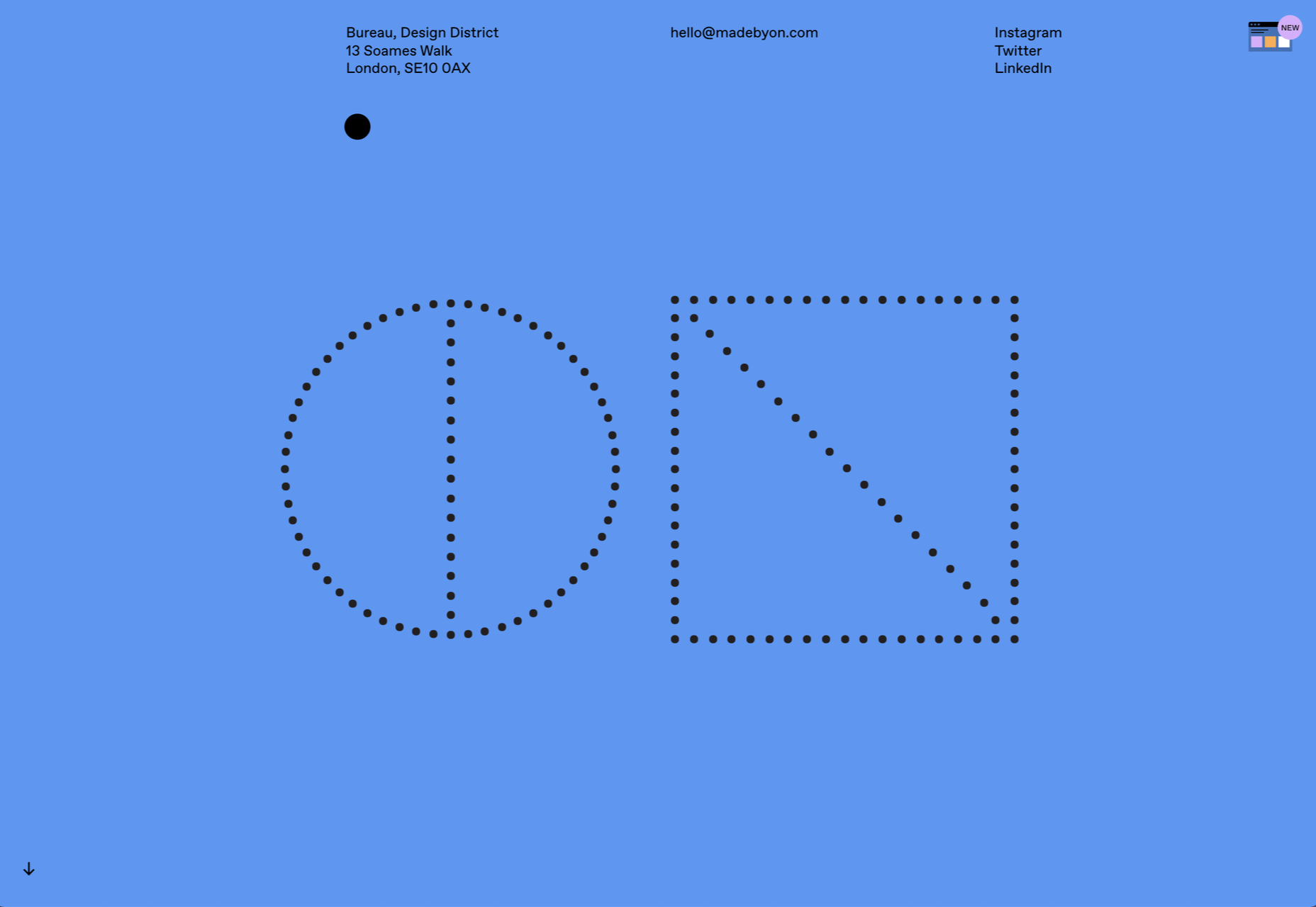
The best digital agencies keep their own sites simple, like this site for On digital technology studio that uses black on light blue and adds infinite scrolling.
Acayaba + Rosenberg
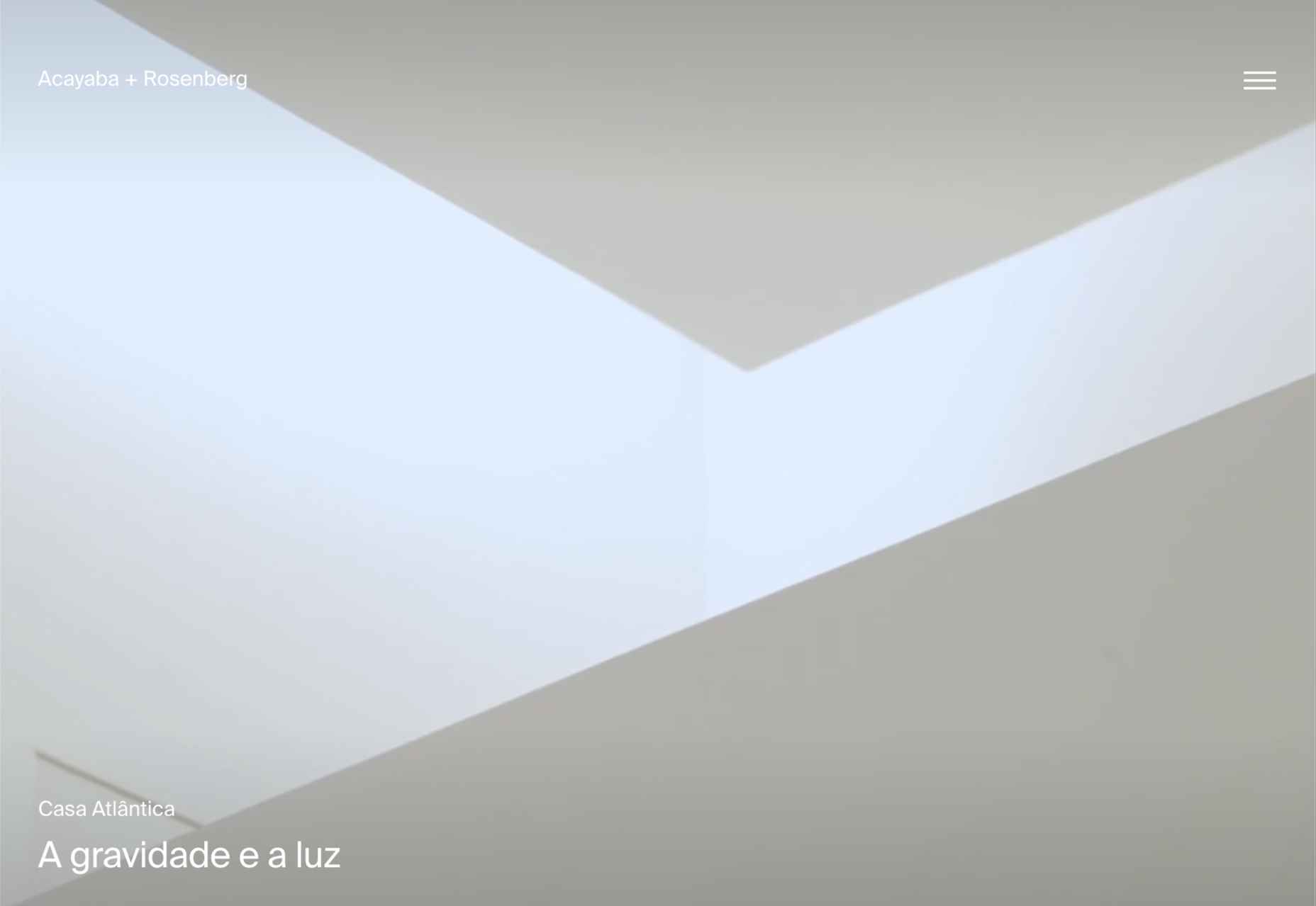
We found Acayaba + Rosenberg’s use of architectural photography and subtle scrolling a pleasing browsing experience.
Madre
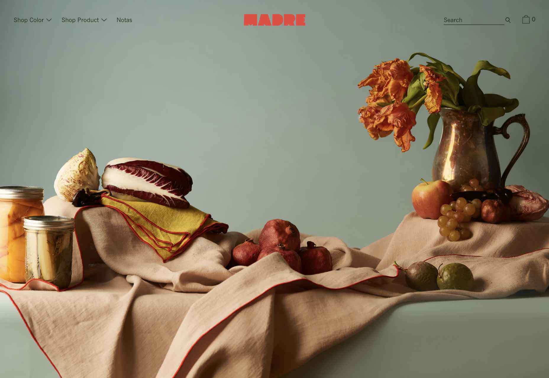
This site for home linen company Madre uses extraordinary fine-art style still-life photography to enrich a very simple site.
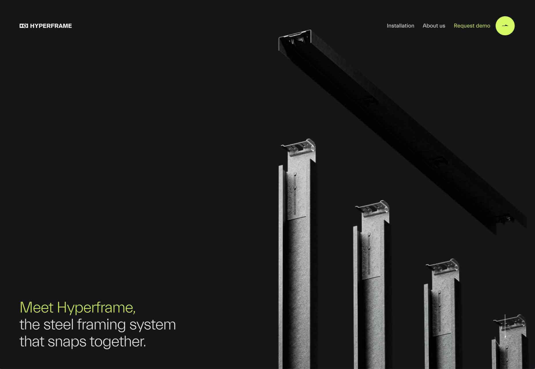
Hyperframe
“Show, don’t tell” is a well-worn mantra. Hyperframe’s site implements it by demonstrating the product’s major selling point on scroll.
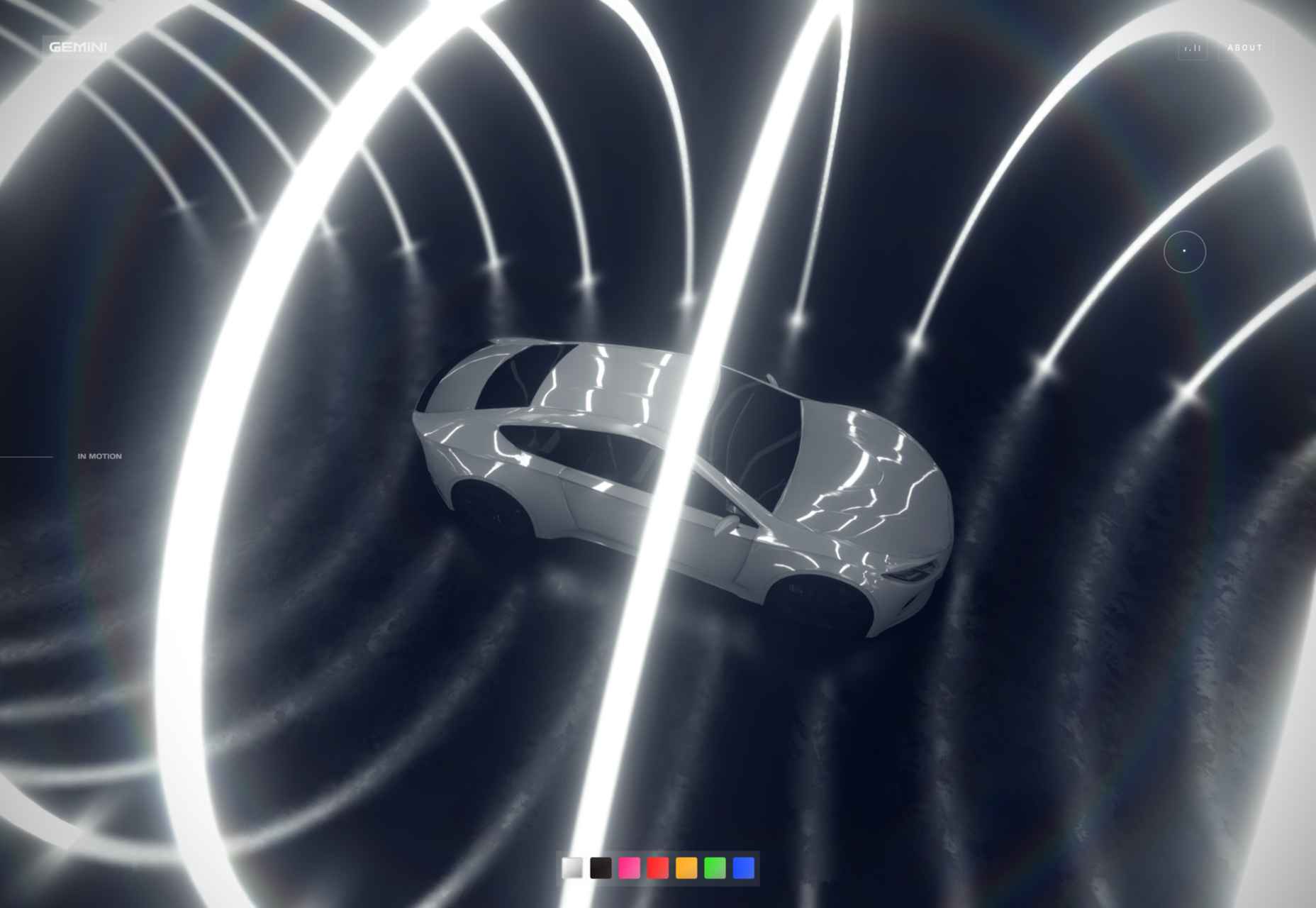
Gemini
This exceptional WebGL experiment was built to show what’s possible in the technology. Have a play with the car; it’s a ground-breaking demo.
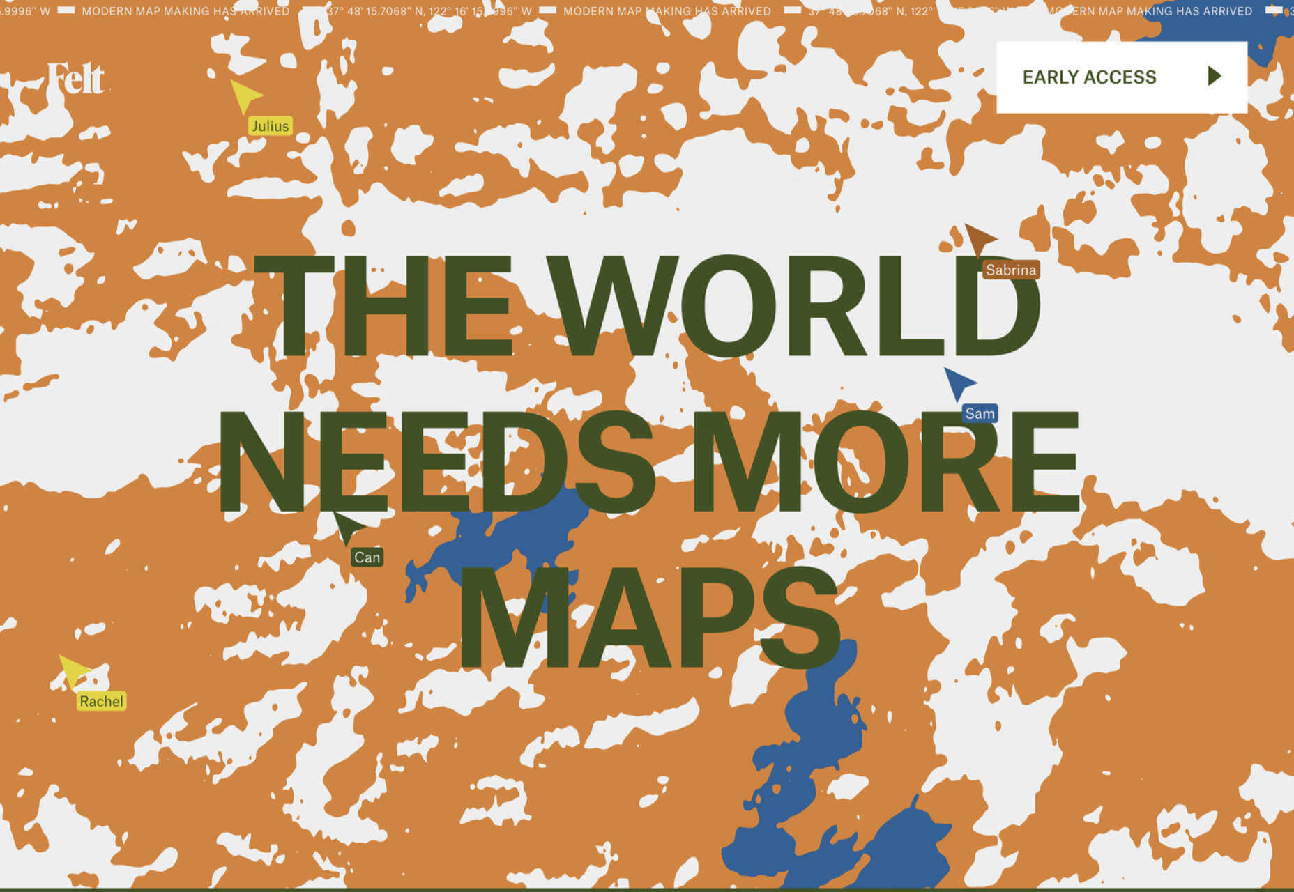
Felt
In 2021, collaborative mapping tool Felt launched in private beta. Its excellent site does a great job of creating interest while doubling as a recruitment notice.
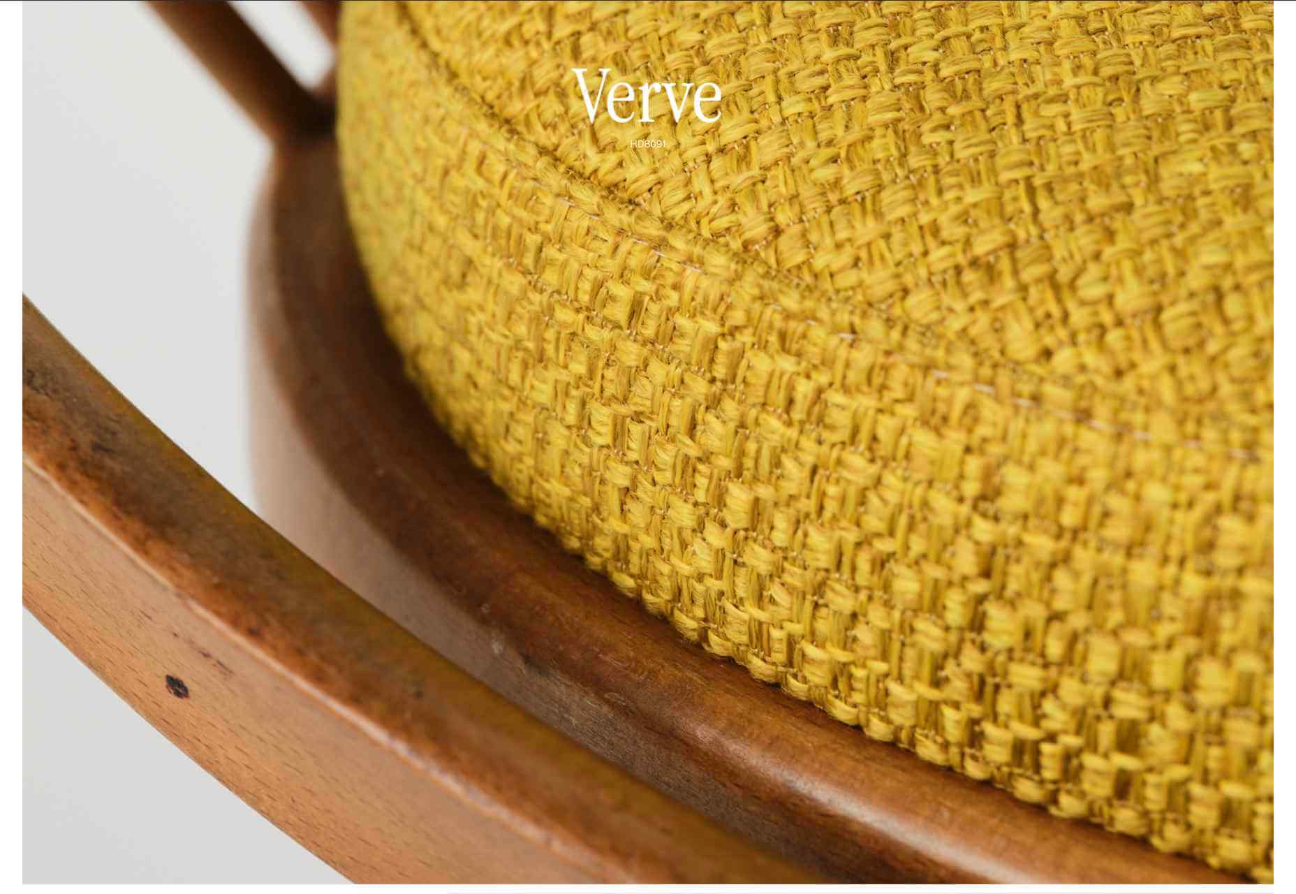
imNativ
Not every project is exciting, but this excellent site for imNativ uses macro photography to great effect to promote upholstery fabric.
Websmith Studio
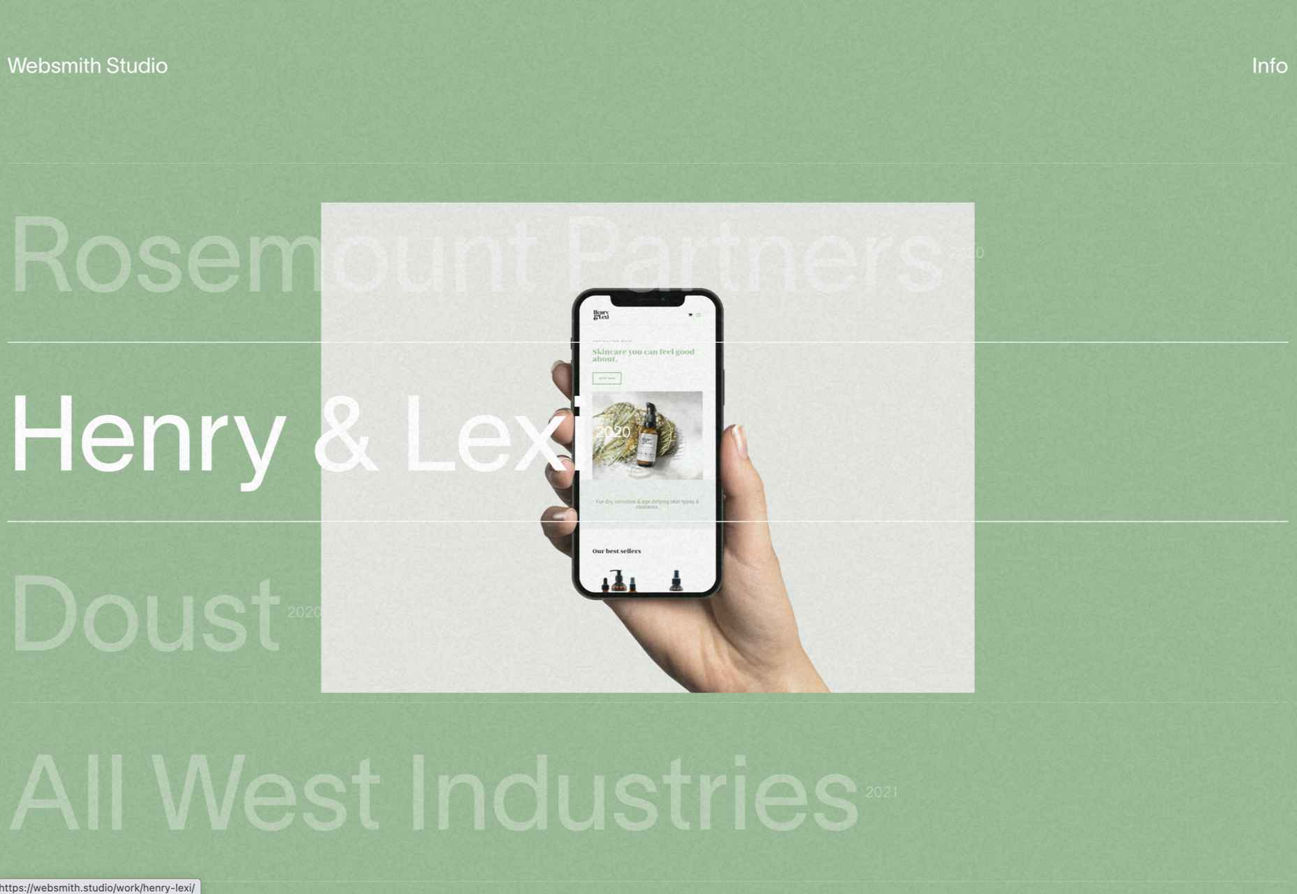
Excellently named Websmith Studio uses color to highlight, and the noise effect applied to the background adds subtle interest.
Singita
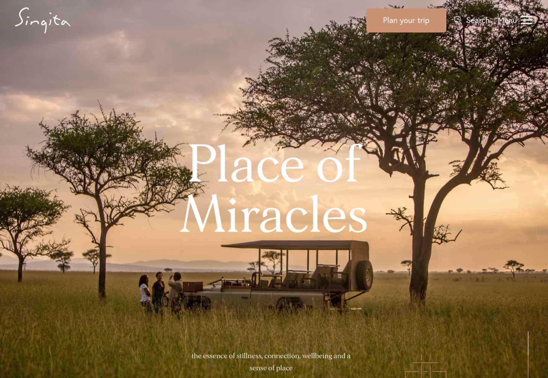
High-quality photography and a terracotta-based color scheme create an inviting ambiance for Singita, an African eco-tourism and conservation brand.
Fluff
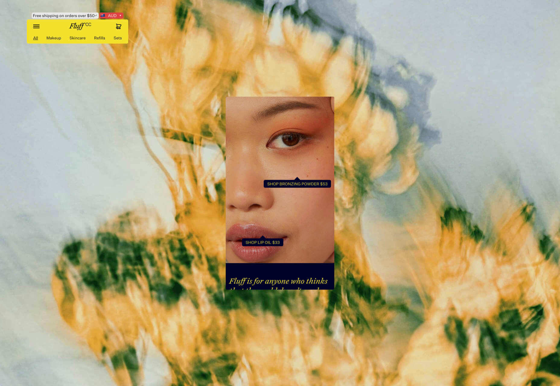
A fullscreen background behind a mobile view for desktop? It sounds like a horrible idea, but this site for cosmetics brand Fluff pulls it off.
Chiwawa
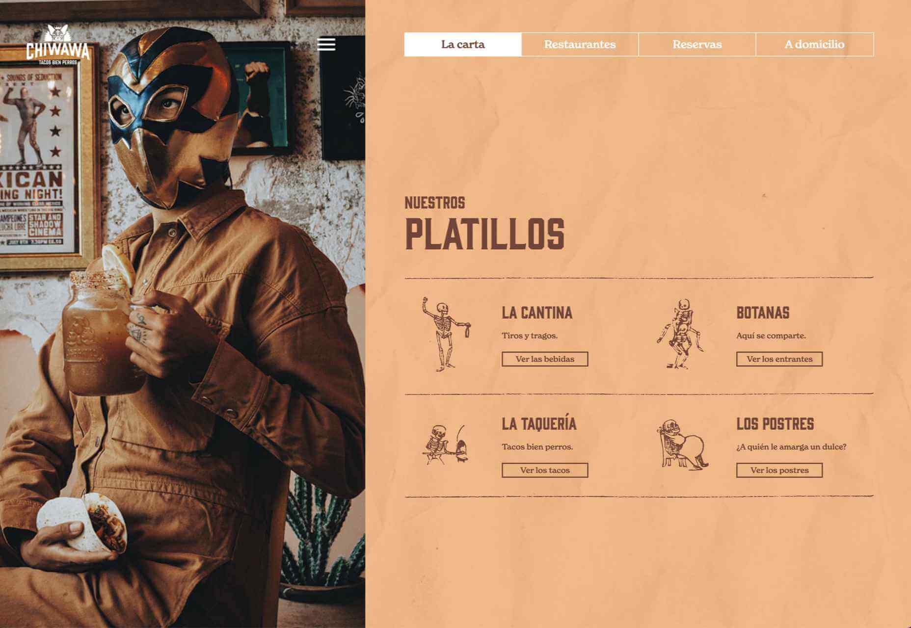
This great site for Chiwawa cantina features wrestling masks, skeletons, and tone-on-tone color to create a lively and distinctly Mexican site.
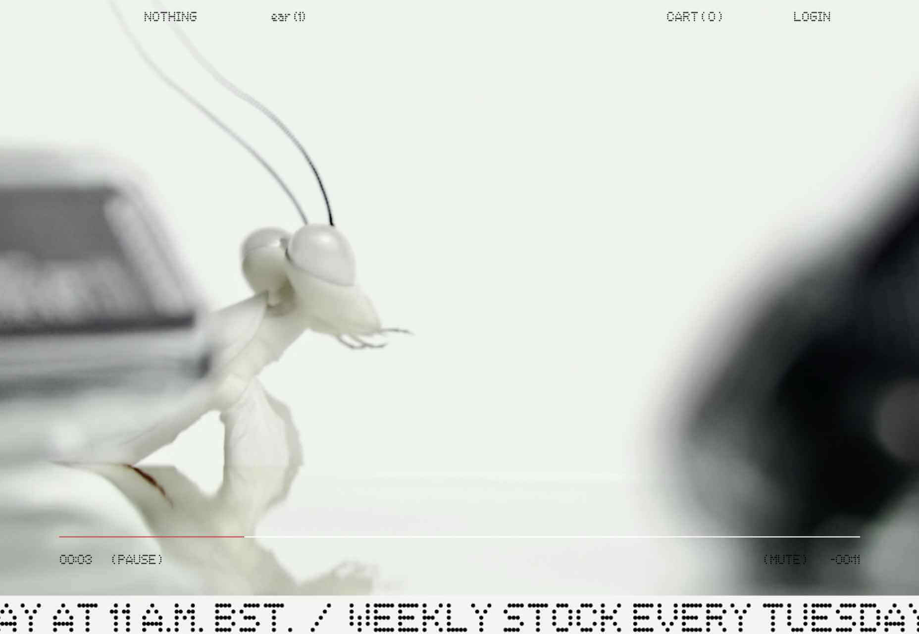
Nothing
This site for Nothing’s ear(1) earbuds is packed with confidence. Appropriately, it looks even better on mobile.
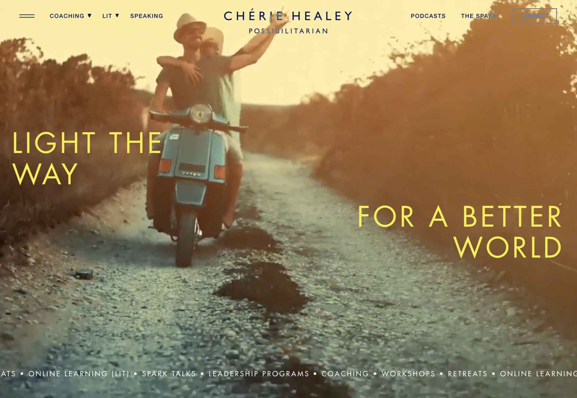
Chérie Healey
Lots of experts have tried to tell us how to live our lives in the last couple of years, but Chérie Healey’s site manages to stay on the right side of positive without slipping into clichés.
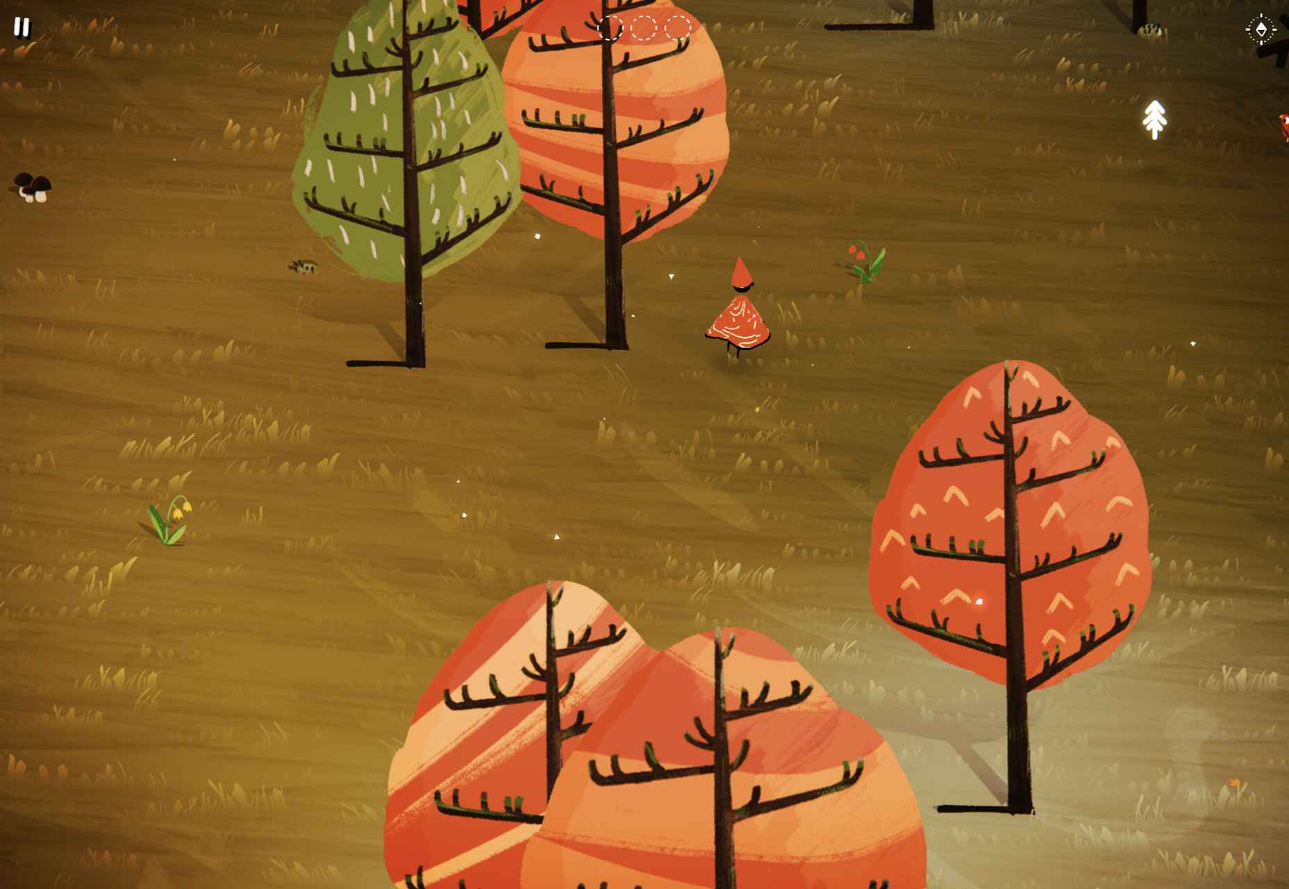
Wayfinder
Wayfinder, a game about our connection to nature using generative code, AI, machine learning, and data mining, could not have been more 2021 if it tried.
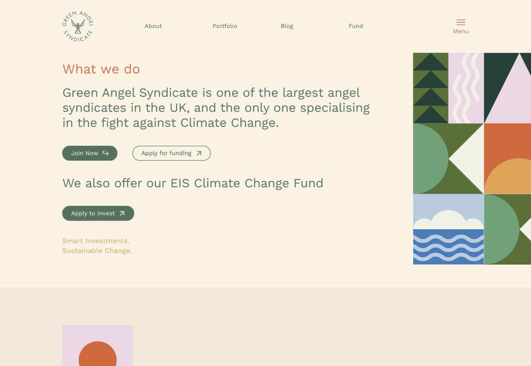
Green Angel Syndicate
Not too many investment groups are thought of as ethical, but Green Angel Syndicate specializes in funding companies fighting climate change.
Tether
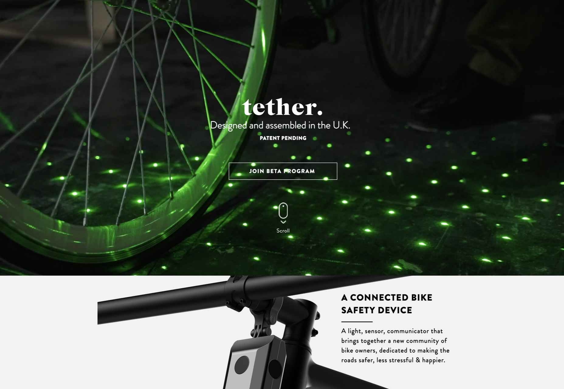
As the days got darker in the Northern hemisphere, we were wowed by this site for Tether, a cycle safety system using video and illustration to explain its clever approach to bike safety.
Patricia Urquiola
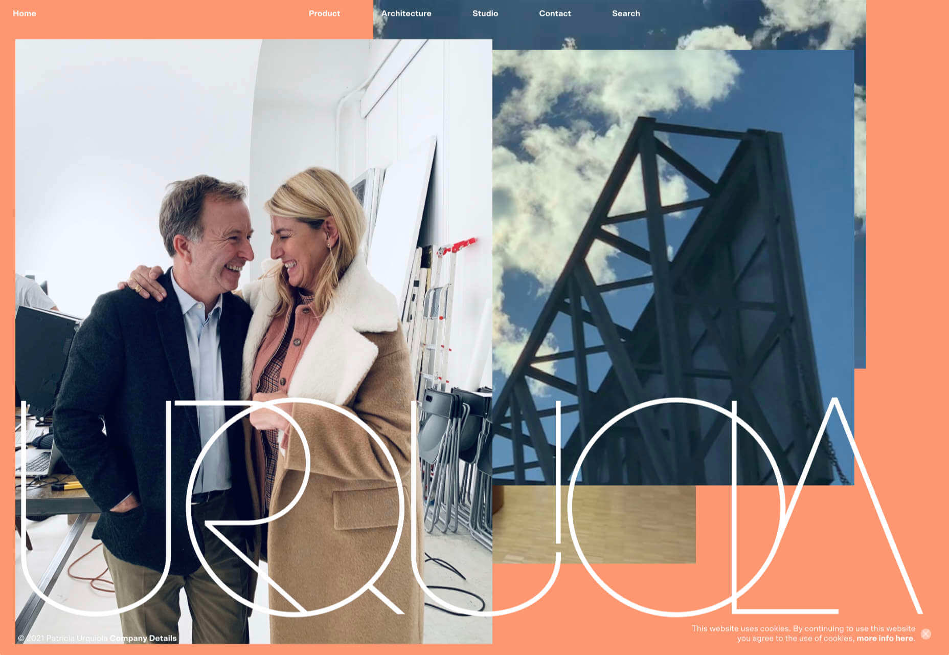
Back in January, we loved the new site for Patricia Urquiola design studio, thanks to its bright, bold colors that we thought inspired confidence.
Headup
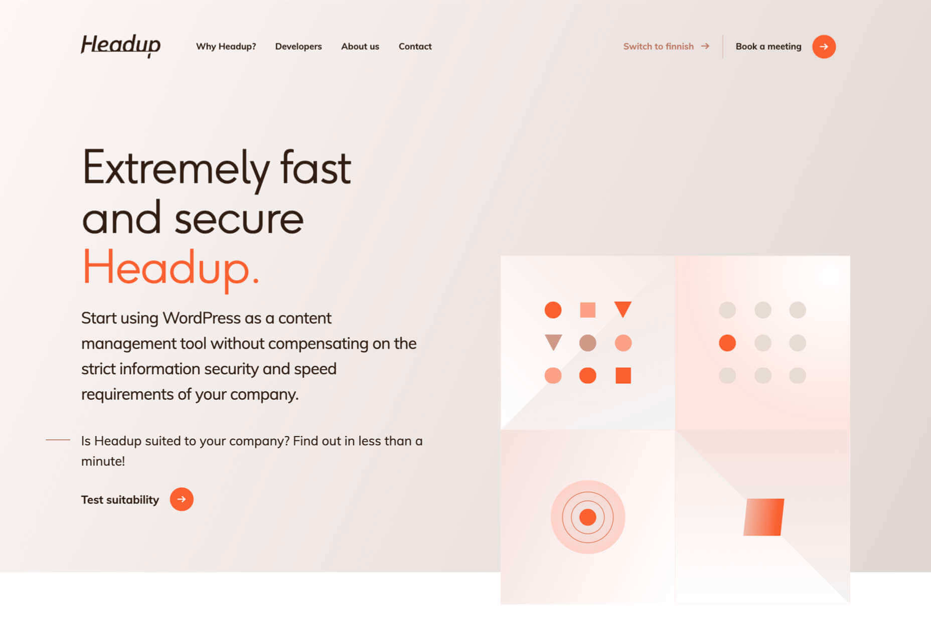
Headup’s businesslike approach is created thanks to a pleasing color palette and geometric graphics.
Redwood Empire
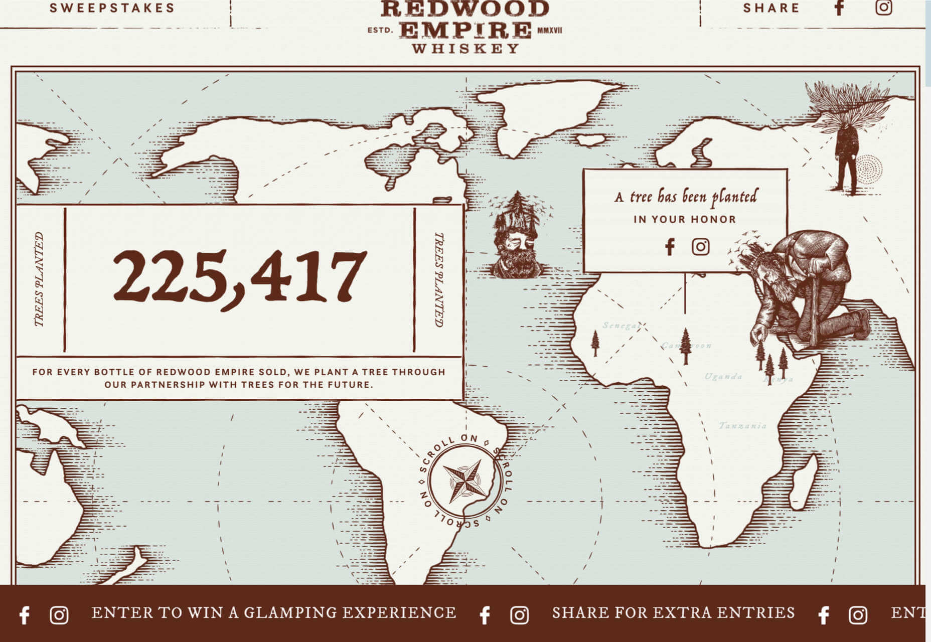
For Earth Day on April 22nd, Redwood Empire Whiskey created a microsite promoting a competition styled to match their bottle labels.
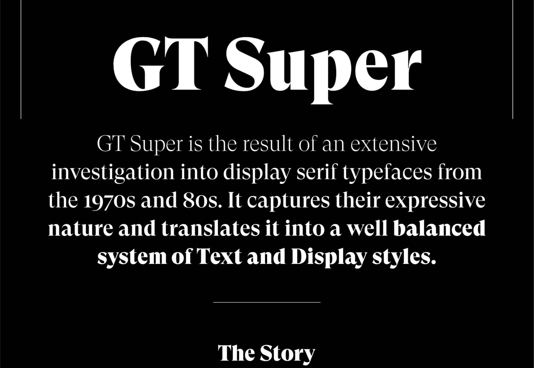
GT Super
The one-pager for GT Super has a certain drama in keeping with the font itself and allows you to play around with the size, weight, and style.
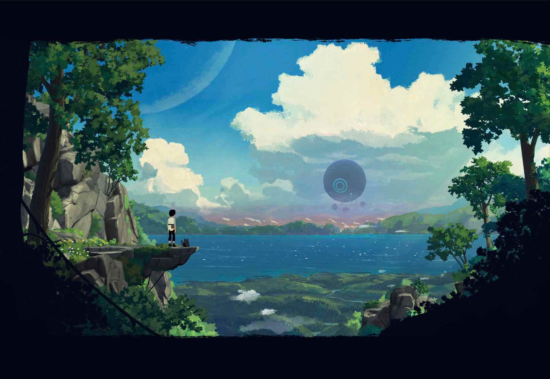
Planet of Lana
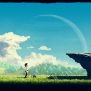
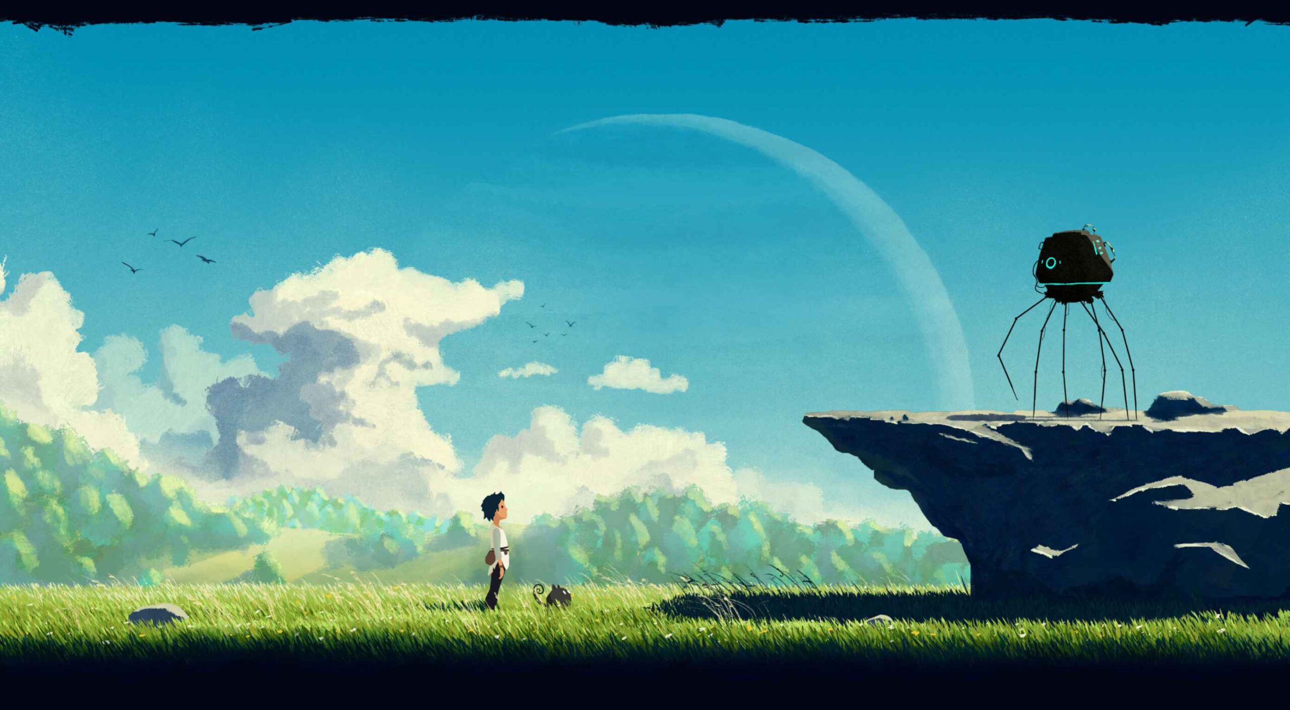
Due for release in 2022, Planet of Lana is a game from Wishfully Studios, and its teaser page launched back in June has kept us intrigued ever since.
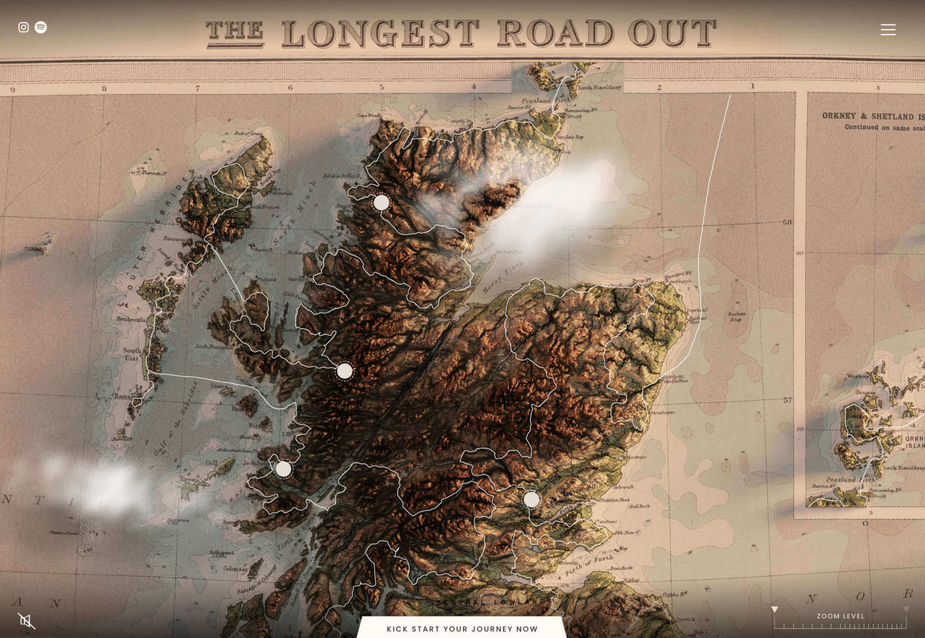
The Longest Road Out
This charming site for The Longest Road Out is a travel map and journal based on the creators’ road trip around Britain, Ireland, and the outlying islands.
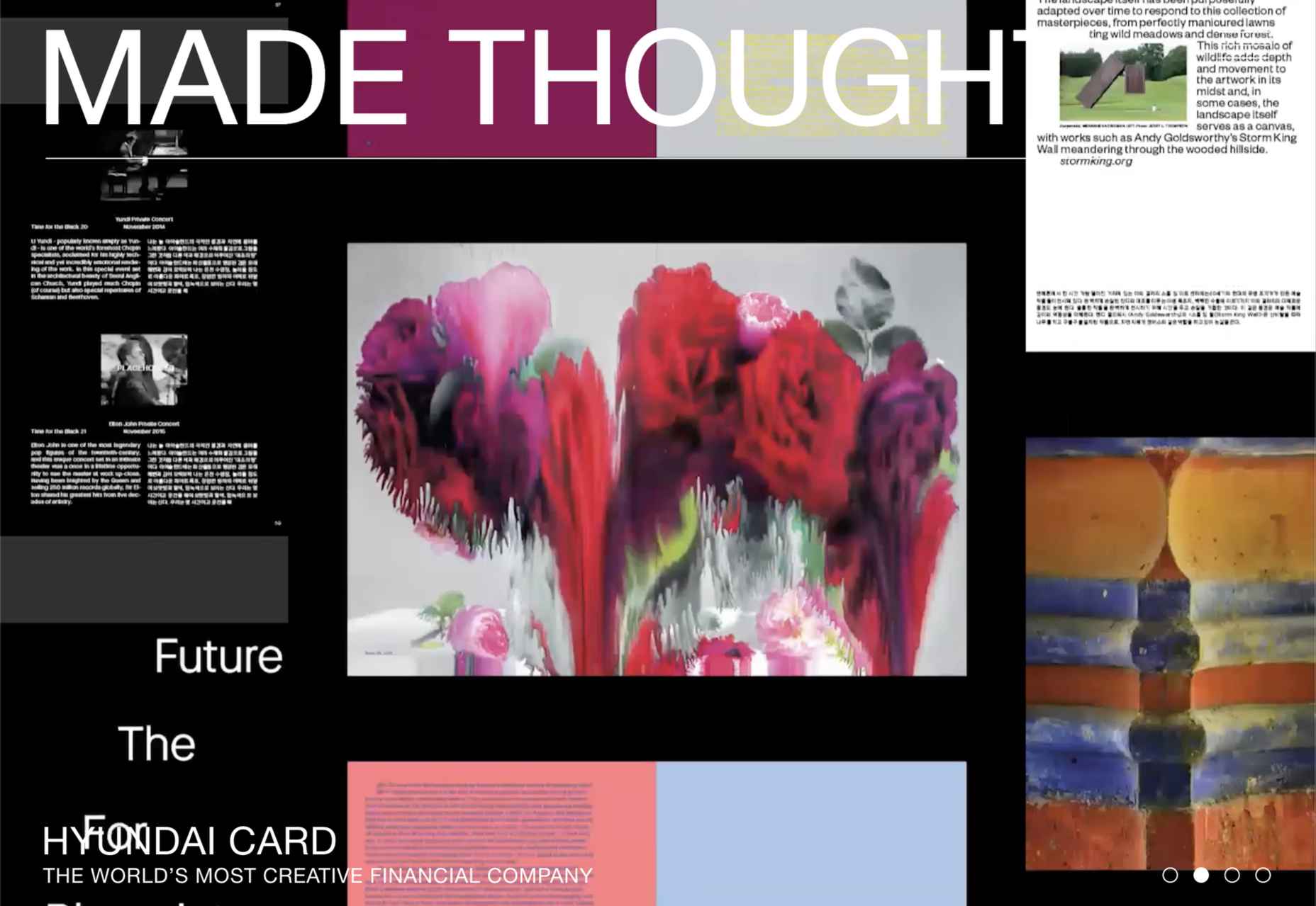
Made Thought
Made Thought has a bold aesthetic and approach that explains its outstanding client list.
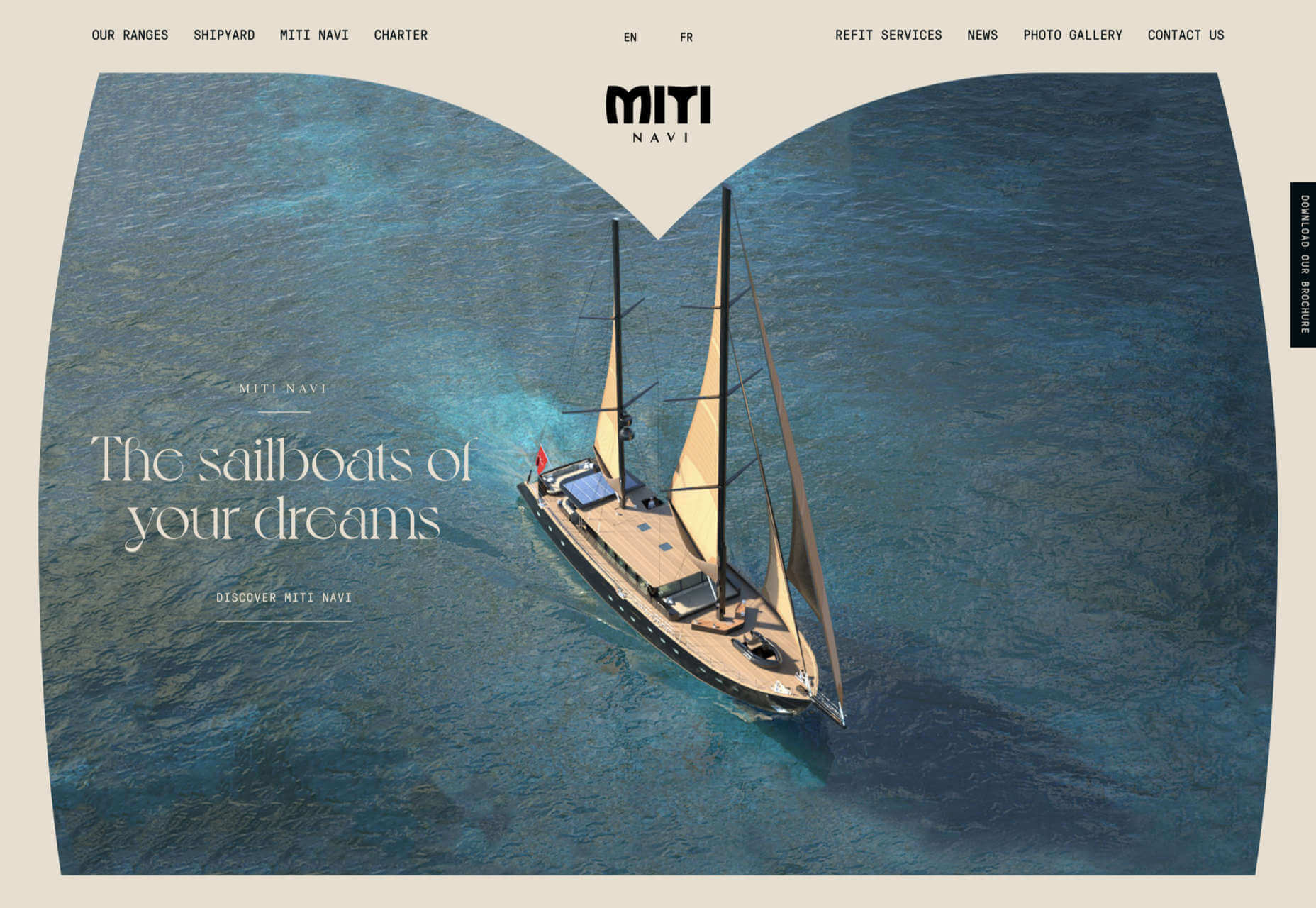
Miti Navi
Miti Navi makes extraordinary sailing boats. We were attracted to how its site presented a luxury product in an original way.
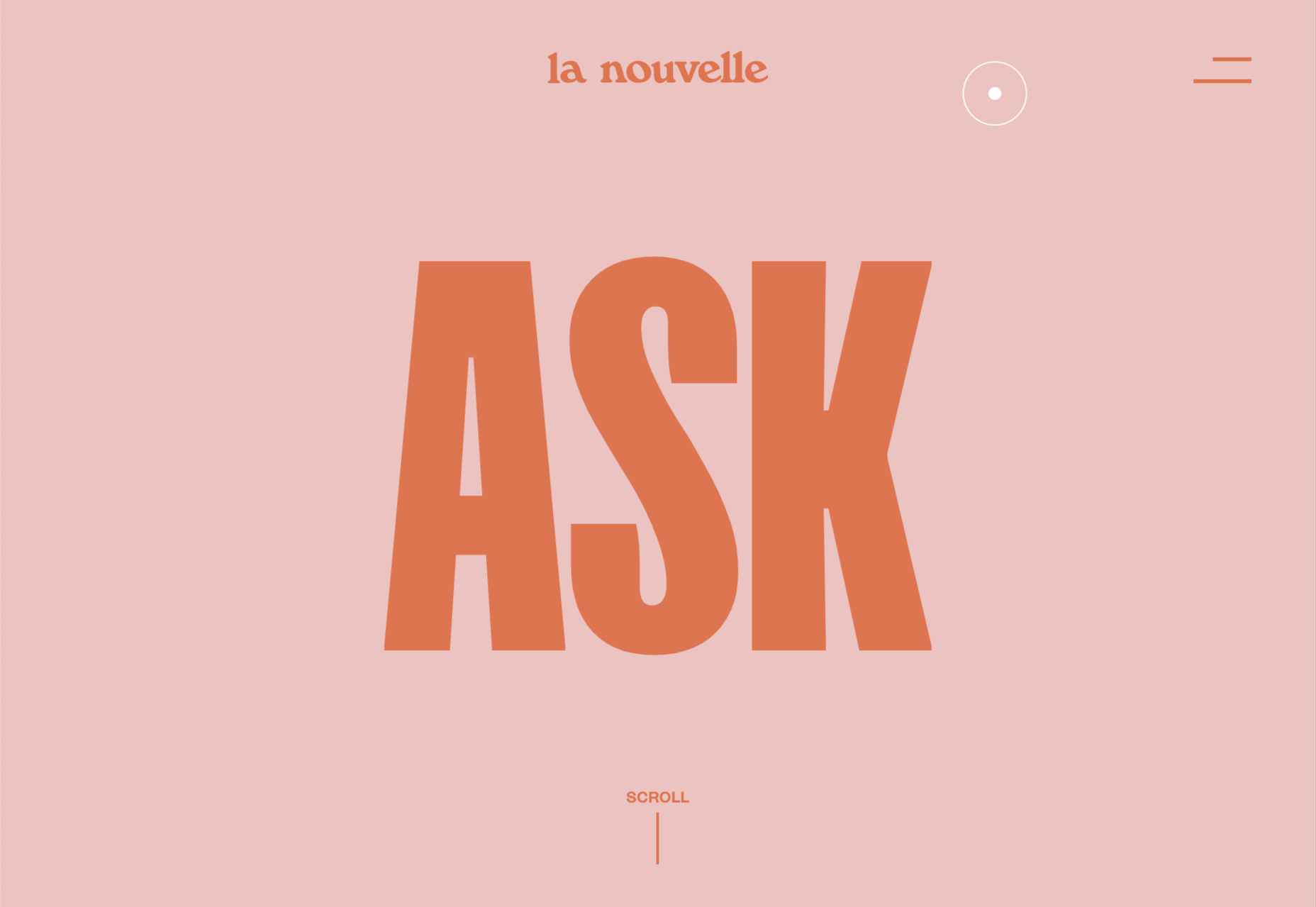
La Nouvelle
Another powerful digital design agency site was La Nouvelle’s, which used a combination of contrasting and complementary color combinations to catch the eye.
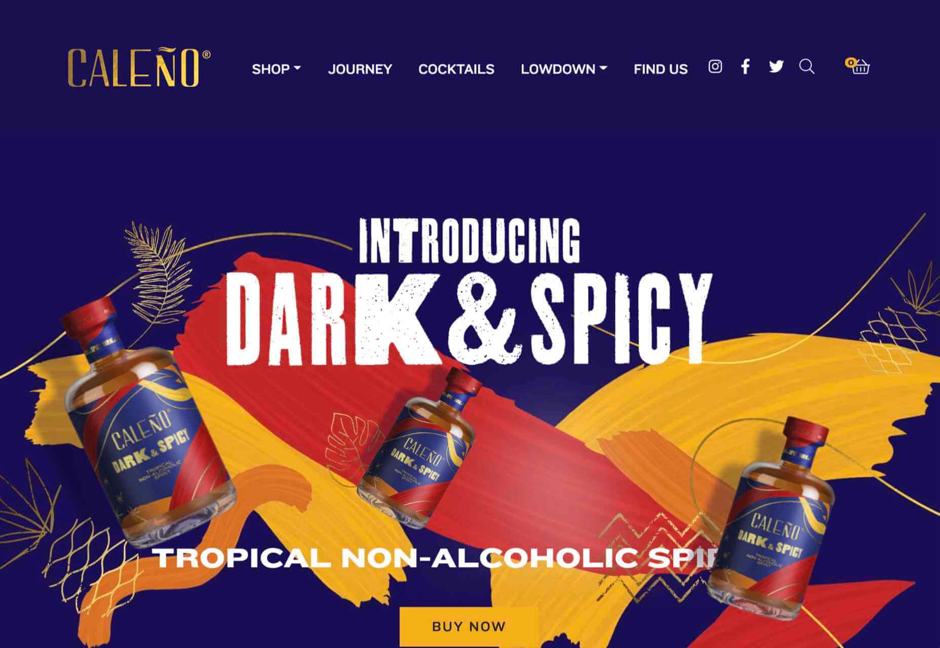
Caleño
Caleño makes non-alcoholic distilled spirits. They relaunched their website in March with bright, joyful colors that reflect the character of the brand.
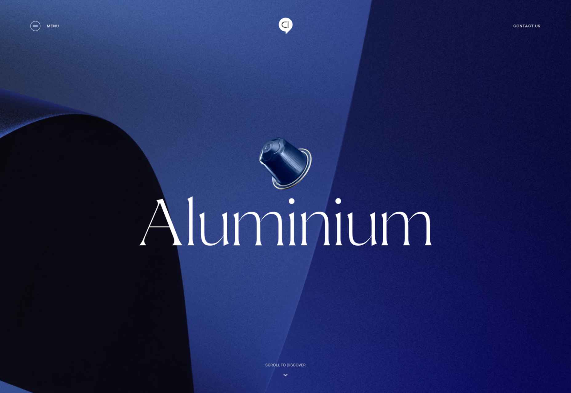
Capsul’in — Aluminium
This demo site for a coffee pod manufacturer isn’t a site as such, but it demonstrates that even in 2022, there’s room for parallax scrolling.
How Many Plants
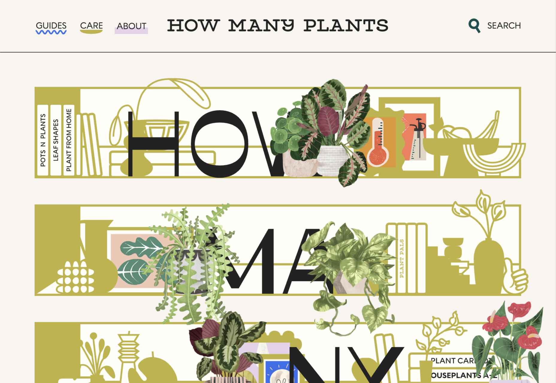
Everyone needs a few more houseplants, and How Many Plants is a great guide to how to own and look after them. The illustration style is friendly but efficient.
How & How
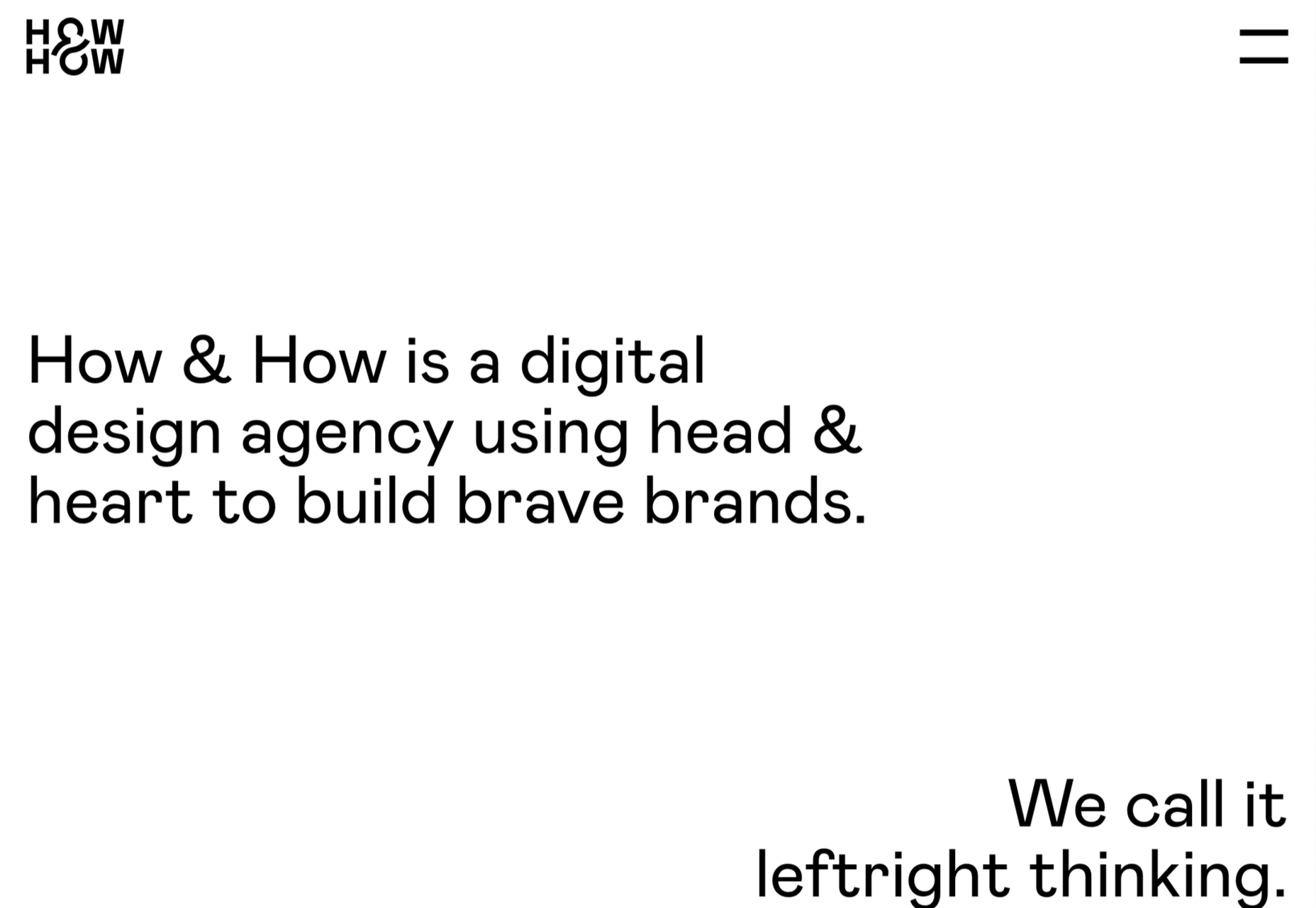
One of the most approachable design agency sites of 2021 was How & How’s. It keeps things light and clean, and effective.
The Hiring Chain
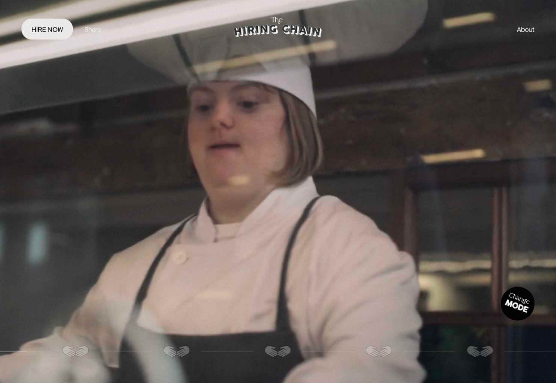
Part of a campaign encouraging businesses to employ talented people with Down Syndrome, The Hiring Chain website dispels myths with clearly presented facts.
Virgile Guinard
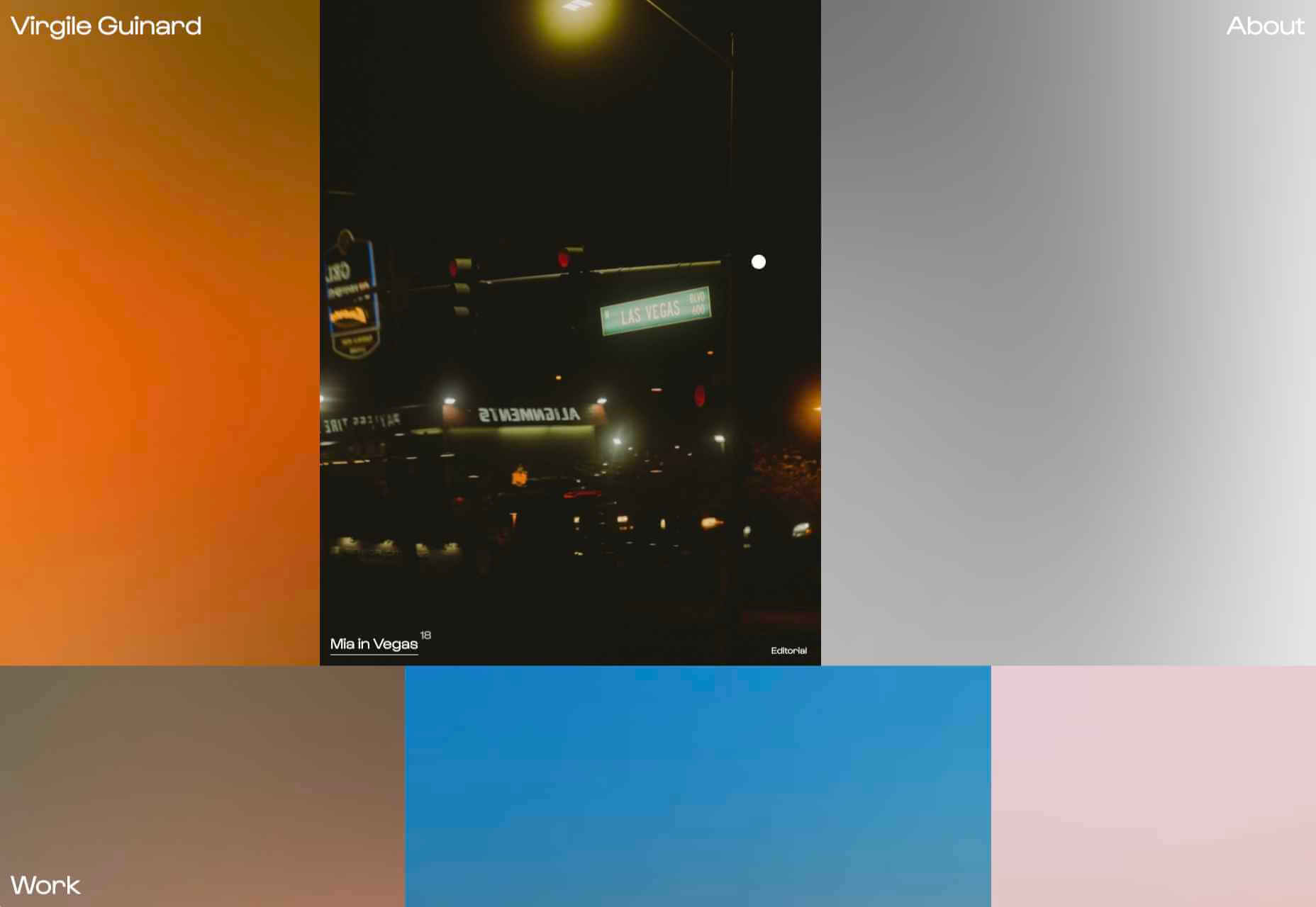
Back in February, we couldn’t get enough of photographer Virgile Guinard’s portfolio site. Blocks of color pulled from each image hide the image allowing you to focus on one image at a time.
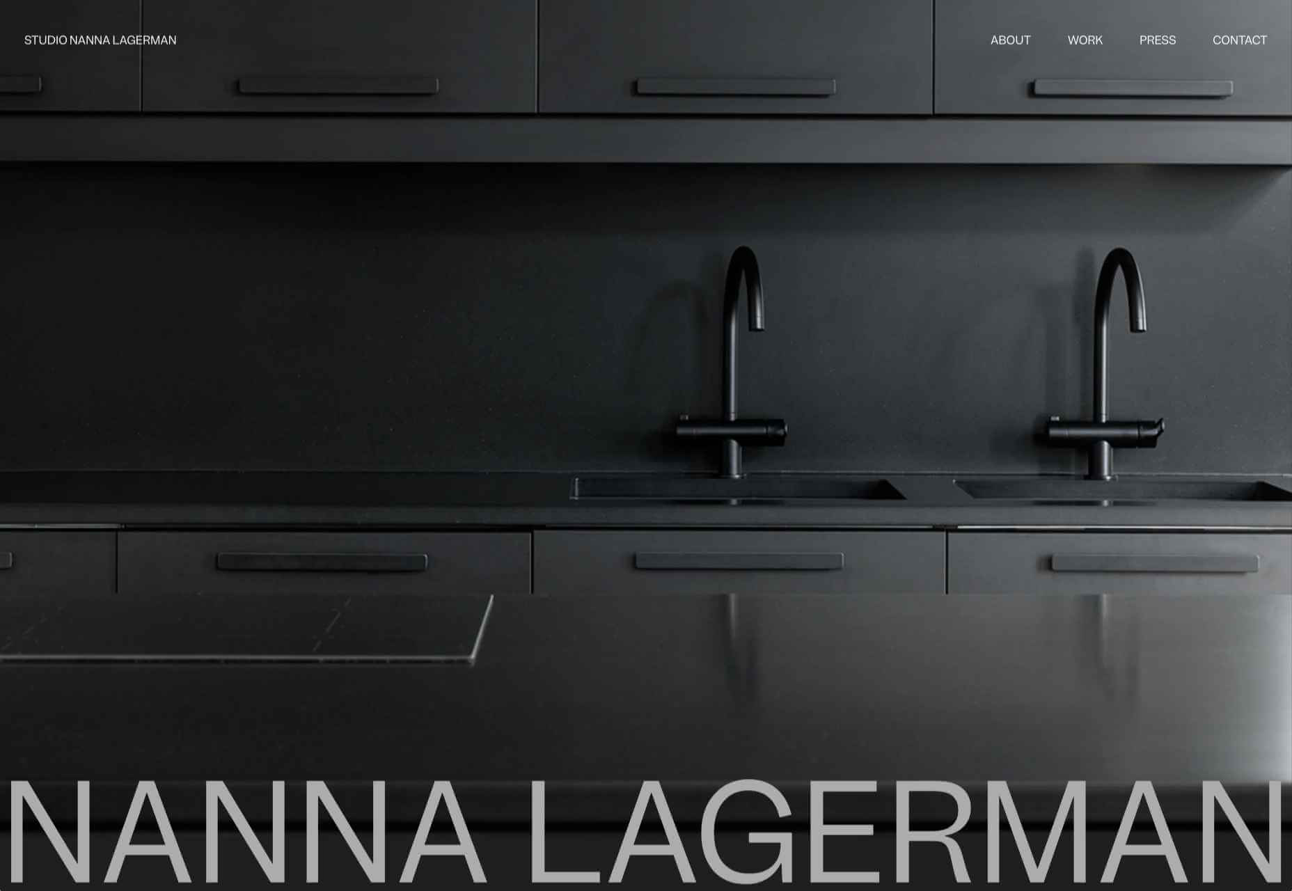
Studio Nanna Lagerman
Studio Nanna Lagermann’s site excels at creating a sense of space and calm. The color palette is soft and neutral. The type is large but clean and sophisticated.
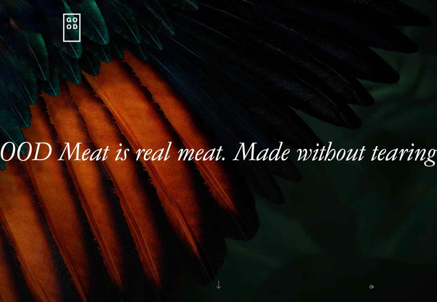
GOOD Meat
Veganism is a growing trend, and one of the sites promoting it with gorgeous colors is this site for lab ‘grown’ meat.
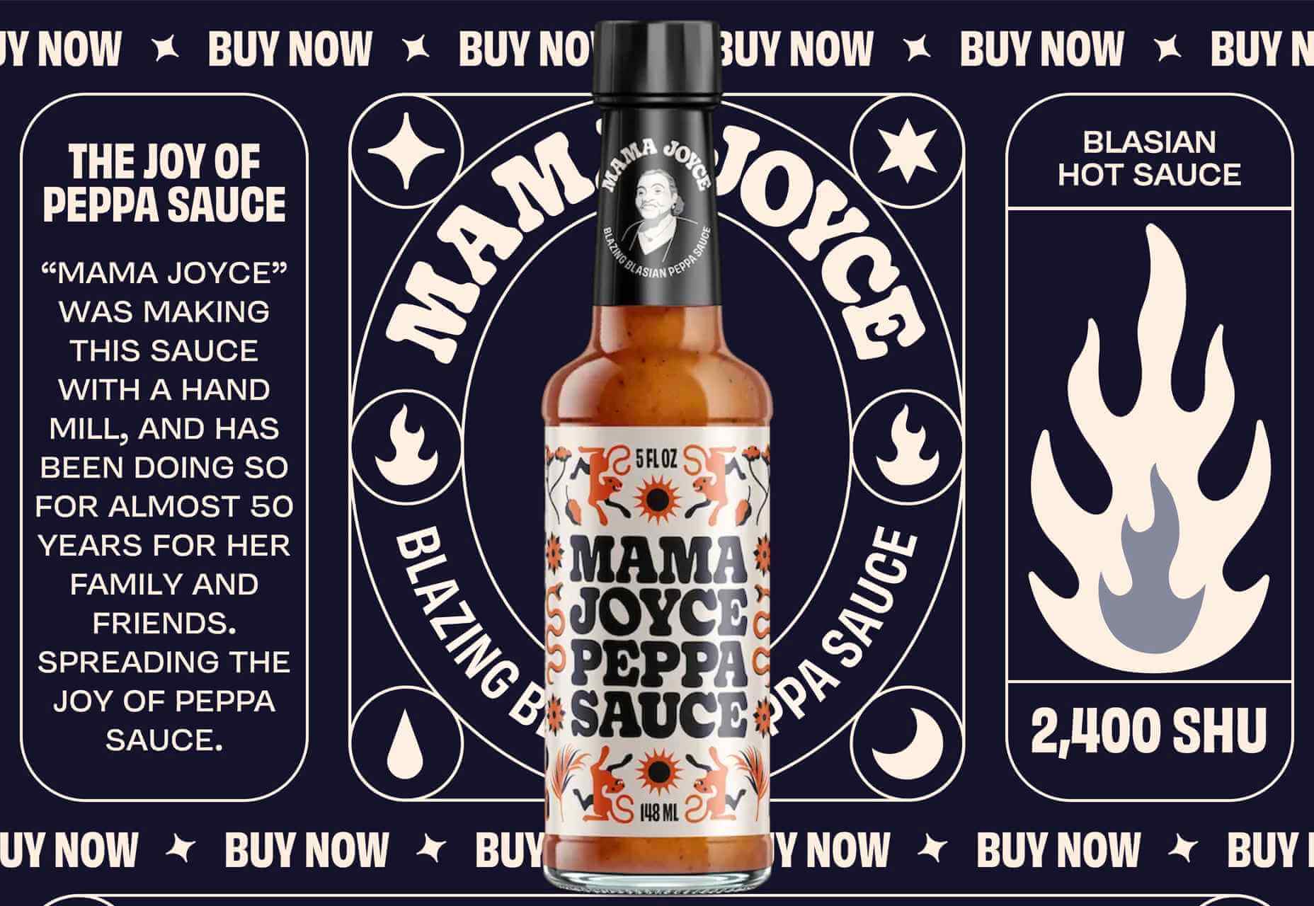
Mama Joyce Peppa Sauce
This one-page site for Mama Joyce Peppa Sauce is big and bold. Click almost anywhere, and two bottles of sauce go into your cart.
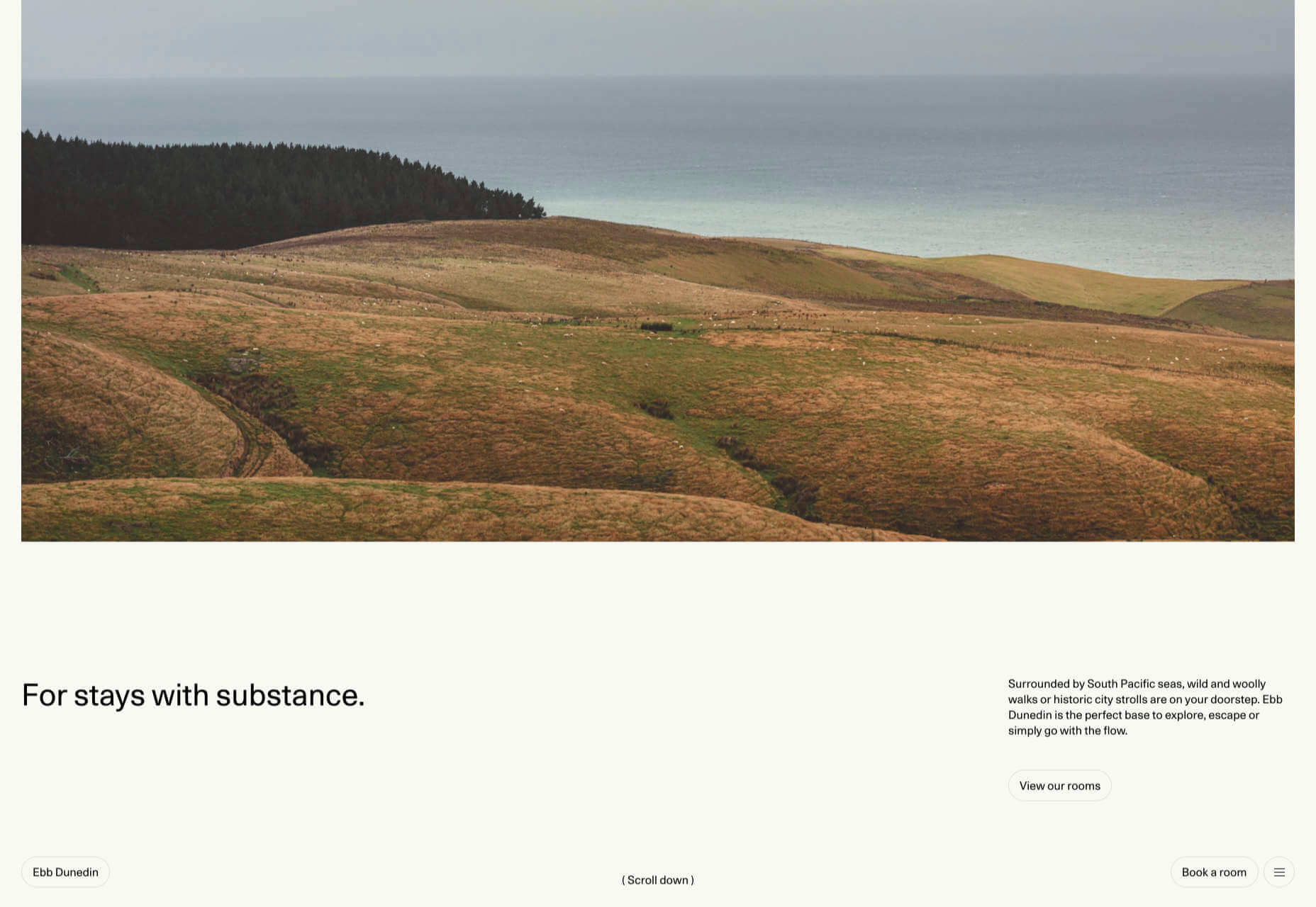
Ebb Dunedin
The site bucks the trend for luxury hotel design and instead is styled to complement its interiors. We could have done with time at this boutique hotel in 2021, maybe next year…
The post 50 Best Websites of 2021 first appeared on Webdesigner Depot.
 AR (Augmented Reality) continues to build as one of the most exciting technology innovations to appear in recent years. More accessible than virtual reality experiences, since no specialist headset is required, AR has quickly emerged as a crucial tool for building unique experiences.
Although interest in AR as a tool for customer interaction and experience has been growing, demand has skyrocketed in recent years. In addition, since the pandemic of 2020, companies no longer have the same in-person opportunities available to create meaningful relationships with customers.
To ensure a client is fully invested in your brand today, you need to find a new way of building that emotional link. As an immersive, experience-led solution for brand building, AR can improve a company’s chance of earning brand loyalty. What’s more, around 71% of consumers say they would shop more often if AR technology were available.
The question is, how do you develop your own AR branded experiences?
Creating Branded Experiences in AR
For an augmented reality experience to be effective, you need more than just the right technology; you need a strategy for how you’re going to engage, empower, and support your target audience.
The best AR branded experiences aren’t just multi-dimensional advertisements; they’re tools intended to engage, inform, and entertain your audience in a new, highly immersive realm. Before you can begin to work on your AR app, you need to think about what kind of branded experience you want to develop. Here are some excellent examples to get you started.
AR Try-Before-You-Buy Interactions
Globally, ecommerce sales are growing at an astronomical pace. Going forward, there’s no question that the digital landscape will become the new platform for shopping and transactions. But, unfortunately, there are some limitations when it comes to shopping online.
While the right website developer or designer can create a stunning site packed with information about a product or service, there’s only so much that a webpage can do. Delivering a truly immersive user experience for your target audience involves replicating the kind of in-person experiences they would get in a digital format.
The best example of this is the “try-before-you-buy” AR app. Most commonly seen in the clothing and beauty industries, this app allows customers to use AR filters to see what everything from a new hair color to a shade of lipstick might look like on them. The experience is highly accessible and engaging because it builds on customers’ familiarity with filters and similar effects on social media channels like TikTok and Instagram.
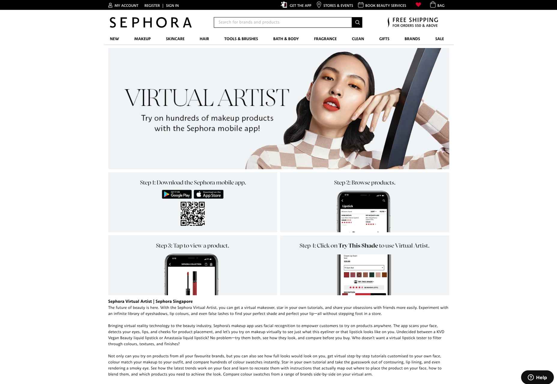
A popular example of an AR try-before-you-buy experience comes from Sephora, with the “Virtual Artist” application. Originally installed within the Sephora app in 2016, the technology uses Modiface to scan and track the eyes and lips of the customer using a smartphone camera. After that, the system can overlay eye-shadows, lipsticks, and other products, to give the customer idea of what they might look like in real-life.
As AR applications become more mainstream, new solutions are emerging for companies concerned about things like privacy. Consumers who don’t want to load their image into a system for try-before-you-buy experiences can still access the benefits of AR with the right tools.
For instance, ASOS created the new “See My Fit” service in 2020 to help customers shop for clothing during the pandemic. The solution allows users to see what clothing will look like on a model with a similar body type to their own. This helps to show shoppers how products realistically look in similar bodies while reducing the risk of returns.
Today, my team and I have launched at @ASOS ‘See My Fit’, an innovative experience aiming to help customers understand if a product will suit them through AI. This feature is a stepping stone allowing customers to see an item of clothing on a ‘model like them’.
pic.twitter.com/WDuAmCvNeX
— Linda Martins (@Lindas_Martins) January 13, 2020
ASOS certainly saw the benefit of this innovation, with an increase in revenues of around 24% in the six months leading to the end of February 2021.
AR for Product Catalogs and Visualization
We all remember what it was like to flick through the glossy pages of a magazine or catalog for our favorite stores. Unfortunately, in today’s digital age, these paper brochures are far from the most efficient tool for shopping. We need a more digital experience that allows us to select products, see what they will look like, and add them to our virtual baskets.
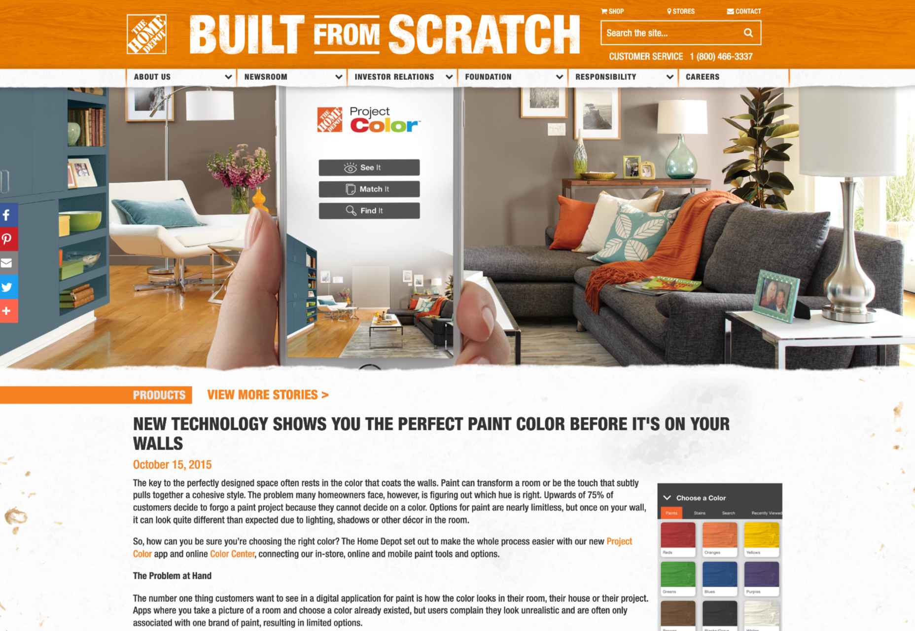
One excellent example of how companies can use AR to improve the overall shopping and visualization experience for customers comes from Home Depot. The brand was one of the first to upgrade its user experience strategy with a new Project Color application in 2015. Although this app might seem a little outdated by today’s standards, it’s still an excellent insight into what companies can do to improve their customer’s brand experience.
The Home Depot app used AR to scan a room and implement the color a customer chose for their walls into that space, considering things like furniture, shadow, and lighting, to allow for a more realistic insight. The app has updated significantly over the years to become increasingly immersive.
Visualizing products in a real, contextual space is hugely beneficial for a customer’s purchasing experience and perception of a specific brand. If your customer sees buying the right product from you as simple and convenient, they’re more likely to stick with your organization long-term.
The product catalog and visualization approach to AR in brand development has grown increasingly popular in the last two years, perhaps driven by the demand for more online shopping opportunities. In 2020, Wayfair announced the release of an updated version of its “View in Room” app, which now uses LiDAR technology to provide enhanced utility when shopping for home products.
According to Wayfair, the LiDAR technology and “RealityKit” software give customers a more authentic and realistic view, so they can make better decisions about what they want to buy. According to Apple, customers are 11 times more likely to buy an item of furniture if they have seen how it looks in their home using AR.
Creating Unique Brand Experiences
AR is one of the technology innovations in our current landscape, helping blur the lines between digital worlds and reality. In a future defined by the rise of the metaverse, AR could have a significant impact on how we spend our time in a more virtual world.
Already, companies are taking advantage of this, with things like virtual pop-up shops and temporary experiences intended to differentiate their brands. For instance, Machine-A, a London-based concept store, is usually committed to showcasing contemporary fashion designs.
When it became apparent that London fashion week for 2020 would be virtual, Machine-A came up with a virtual boutique enabled by AR. By scanning a QR code embedded into billboards and posters across London, users could enter the boutique virtually from their phones and experience the designs themselves.
The concept created by Machine-A has opened the minds of countless business brand teams and marketers to new methods of increasing engagement and awareness among customers. In a world where you can’t necessarily interact with your top customers in person, providing them with a new and immersive experience can be a great way to generate loyalty.
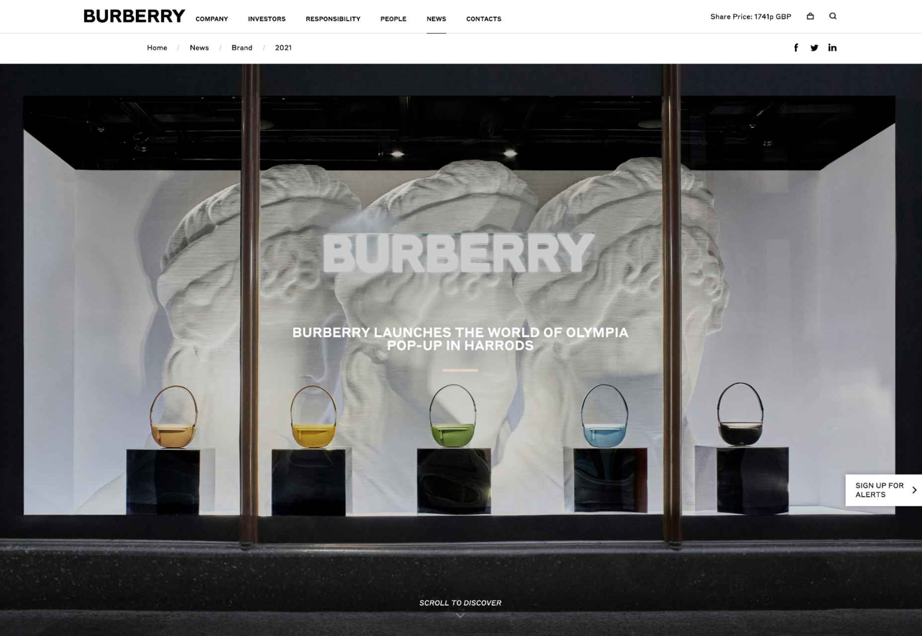
The companies more willing to invest in innovative solutions like AR are also more likely to stand out as innovators in their field. Other companies have experimented with similar “pop-up” experiences and unique ways to capture audience attention. For example, Burberry placed a QR code in a Harrods store, which customers could scan to visit a branded experience, where an Elphis statue walked around in their surroundings through the lens of their smartphone camera.
It’s even possible to use AR experiences to attract the attention of new audience groups. For instance, the retail brand, Pull & Bear launched an AR game created with Facebook to help the company reach the 90% of Gen Z customers who identify as “gamers.”
Provide New Levels of Customer Support
As many of today’s businesses know, memorable branding isn’t just about having the right image or website; it’s also about providing the correct level of customer service and support. Most purchasing and brand loyalty decisions made today are based on customer experience.
Providing customers with unique experiences to improve their shopping journey is sure to make your company stand out in the new digital age. But it’s also possible to go even further with AR in your brand CX strategy too.
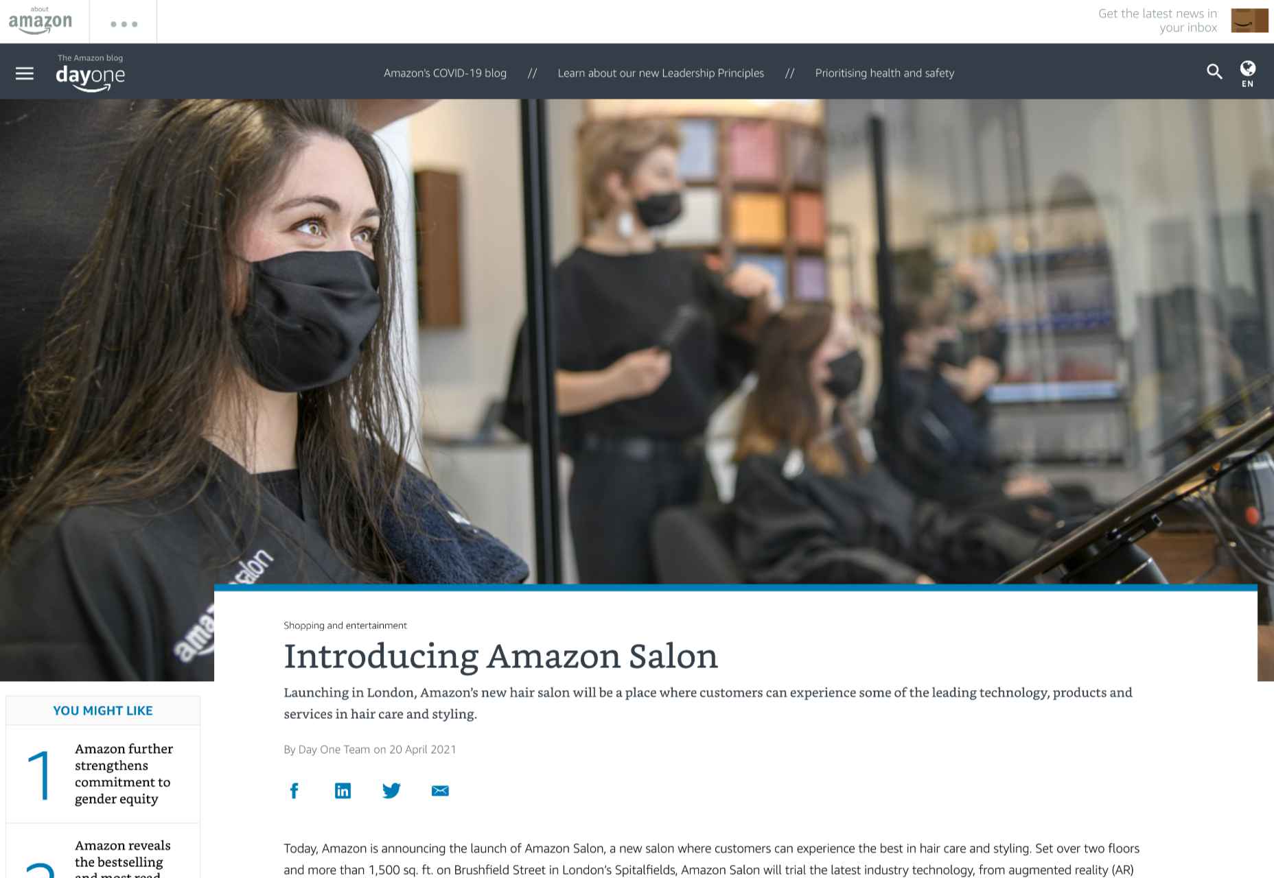
Amazon Salon, for instance, the first bricks-and-mortar hair salon created by Amazon, was partially established to test new technology. The “point and learn” service, for example, allowed customers to point a product they were interested in on a display or shelf and immediately access educational content. Users could also scan QR codes to visit the product page on the QR site.
This helps customers immediately get to the product they want to buy without relying on input from human services agents. In a similar vein, AR could be an excellent way to onboard a customer, learning how to use a new product for the first time.
Imagine having a user’s manual your customer can enjoy scanning through, thanks to AR technology. All your customer needs to do is scan the QR code on the back of a product, and they can see the item they need to build or install coming to life in front of them. This reduces the risk of customers having to call for help from tech support and means clients can see the value in their purchases a lot faster.
Companies can embrace AR as a virtual learning experience, helping users collect information and learn how to do things through an immersive first-hand experience. This kind of immersive technology could help to make any brand stand out as more user-experience-focused. Even car companies could essentially provide their customers with a complete virtual HUD showing them how each button and dial on their dashboard works.
Upgrade Website Design
Perhaps the most common way companies will be using AR to create branded experiences today is by updating their website. You’ve probably already seen examples of AR being used in a host of retail sites, with new experiences designed specifically for the age of augmented reality.
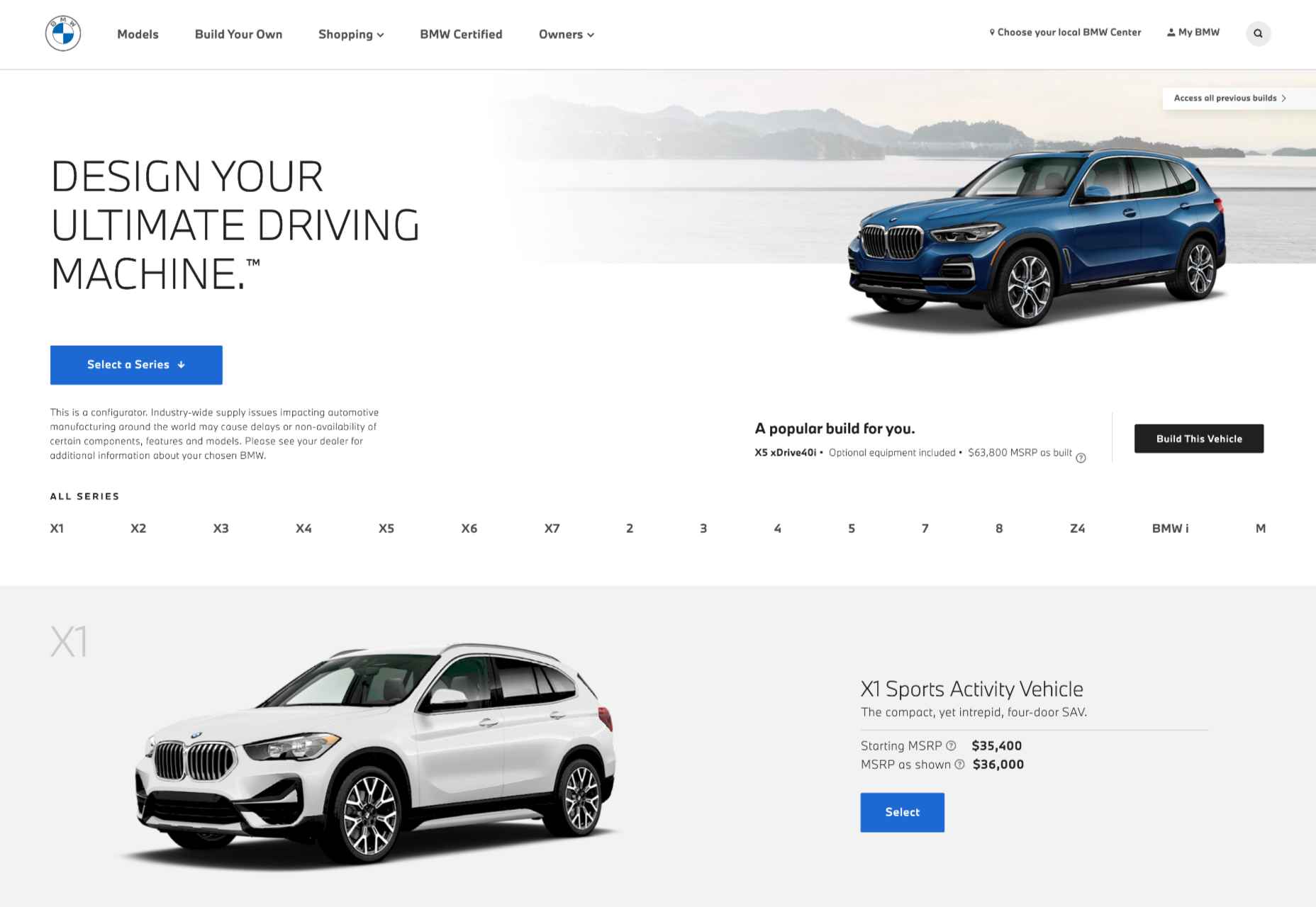
360-degree images, for instance, allow customers to essentially “look around” a product, and see it from different angles, just like they would if they were looking at the item in-store. We can see an excellent example of this on the BMW build-your-own web page, where vehicle browsers can see their vehicles from every angle.
The 360-degree product viewing experience lets you check everything from the side molding to the sculpted edges in perfect detail.
QR codes and app downloads can also allow customers to take their AR experience even further, looking at things like what life would be like behind the wheel of one of these virtually augmented vehicles.
As AR becomes more commonplace and the tools available for designers in this arena continue to expand, there will be even more opportunities available to bring AR into the website experience. Even essential website upgrades today might include allowing customers to upload pictures of themselves or their homes, then using augmented reality technology to implement parts of a product catalog into the space.
AR Virtual Events
Finally, when it comes to exploring all the unique ways you can build a better brand experience and excellent customer relationships with AR, it’s worth looking at the event space. The event landscape has struggled significantly over the last couple of years. The pandemic forced most live events to be canceled, and although the post-pandemic era holds new hope for upcoming in-person experiences, the landscape will be very different.
Going forward, most companies plan to avoid a complete shift back to in-person events by creating “hybrid” experiences and augmented reality events instead. Augmented and virtual reality tools allow customers to step into an event arena from wherever they are.
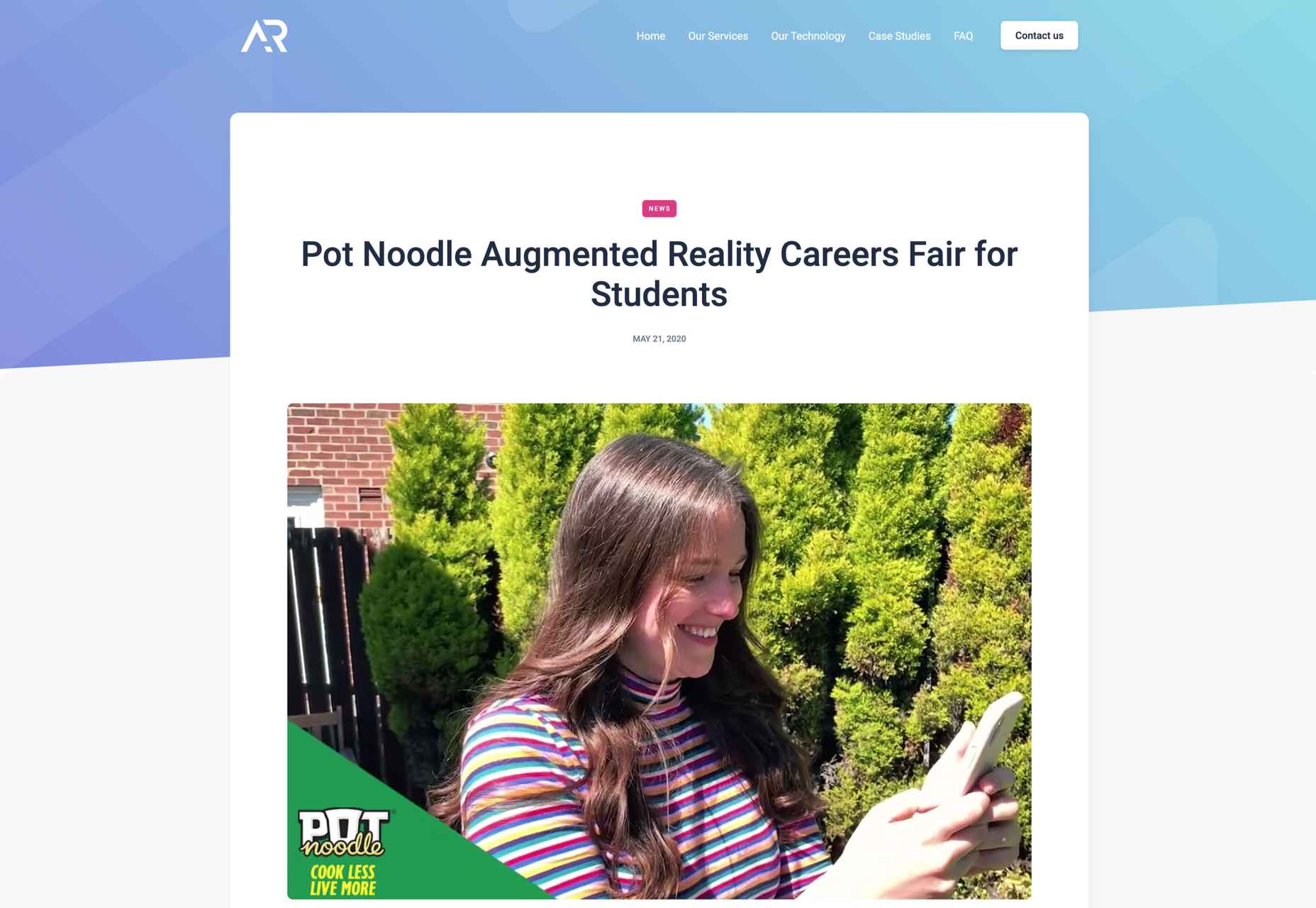
For instance, the Pot Noodle Unilever brand hosted a virtual alternative careers fair in AR, where people could use their phones to navigate through a range of graduate employer booths. The unique career fair experience was designed to replace the more common in-person interactions graduates might have as they approached the end of their education.
The custom-developed 3D booths featured a range of different employers, and students could tap on the booth screen they were interested in to see a video from each employer. As an added bonus, the connection to the Pot Noodle AR careers fair website meant that students could also instantly apply for any of the jobs they were interested in.
Similar events could help brands recreate some of the meaningful experiential experiences that their customers have been missing out on in the last couple of years. They could also act as a valuable tool for bringing together people in a hybrid event, where someone visiting an in-person demo table could scan a QR code to send virtual demonstrations of a product back to their team.
This would reduce the number of people who needed to be present in an event environment at any given time, reducing the risk of health issues.
Bringing Brands to Life with AR
In the new consumer landscape, brand relationships are more important than ever. As a result, customers are making more careful choices about who they purchase from, based on their understanding of that company’s values and differentiators.
Now that you won’t always have an opportunity to interact with customers in-person to earn their trust, AR could be the solution for a lot of companies in search of new engagement tools. All you need to do is figure out how you’ll leverage all the benefits AR can offer.
Will you be creating an app, building a new website with enhanced 360-degree photos, or designing in-person experiences? Hopefully, these examples have inspired you to start exploring your options.
Featured image via Unsplash.
The post How to Use AR in Brand Experiences first appeared on Webdesigner Depot.
In the video below, we will take a closer look at Spring Boot – RESTful web service endpoint to delete user and addresses @OneToMany relationship. Let’s get started!
Thanks for watching!
 Websites as we know them are going to change very soon. The days of text, images, and basic interactions in a 2D browser window have served us well, but virtual, augmented, and mixed reality experiences are getting better all the time. Developers and designers need to think beyond the browser window and prepare for an immersive future.
Many have been very skeptical about VR and AR in the past because despite grand promises about what they would achieve, they’ve mostly failed to deliver on the scale that the industry hoped for.
But it’s different this time: industry leaders like Meta, Apple, and Microsoft are pursuing a range of different mixed reality projects; they see the opportunity and are dropping hints about what’s next.
In a survey from Perkins Coie LLP and the XR Association, nearly 9 in 10 respondents said that by the year 2025, immersive technologies—including augmented reality, virtual reality, and mixed reality — will be as ubiquitous as mobile devices.
That’s a bold prediction, but it could be our new reality.
Use Cases
VR and AR aren’t a logical fit for every website, and that’s fine. There’s no need to force an immersive experience on something better suited to a standard viewing experience.
But when they’re done right, 3D experiences can add a lot to your website. Check out the demo experience from Mozilla, the 3D tours from Matterport, and the immersive storytelling from Within.
Here are a few areas where these technologies shine:
- Retail – VR can be used to provide a virtual showroom where customers browse through products. AR can even bring the products into your home by showing you how a piece of furniture will fit in your room, what a painting will look like on your wall, or in Apple’s case, how a product will look on your desk.
- News – Coverage of events can be enriched by providing a 360-degree view and placing viewers in the center of the story.
- Training – AR can generate virtual overlays over physical equipment so employees can have hands-on training that’s more effective.
Define Your Platform
Adding immersive experiences to your website will require various skills based on what you’re trying to create. Whether you’re new to web development or are a seasoned developer with many years of experience, the main difference from classic web development is that you’re switching from a 2D to a 3D experience. Development in VR/AR is much closer to developing 3D video games than creating web applications.
First of all, you need to decide on the hardware that you’re building for. Are your viewers mainly using computers, smartphones, or a headset like the Oculus Quest? Each hardware category offers a different set of capabilities for what’s possible.
Next, when we look at 3D engines and frameworks on the market, some big names like Unity, Unreal Engine, and CRYENGINE stand out. Most of these engines were spun out of game development and are based on programming languages like C, C++, or C#. While very powerful, they’re overkill for anyone trying to create a basic immersive web experience.
The good news for web developers is that the WebXR Device API is an open standard specified by the W3C with a JavaScript API that makes immersive experiences possible in the browser. So if you already have a background in web development, you can use your knowledge of JavaScript to get started.
There are some useful frameworks and platforms that make working with WebXR more convenient:
- A-Frame – A web framework for building 3D experiences.
- React 360 – A framework for the creation of interactive 360-degree experiences that run in the web browser. As the name already suggests, it builds on React and reuses the concepts you already know.
- Amazon Sumerian – A managed service that lets you create and run 3D, AR, and VR applications. Since it’s integrated into the AWS ecosystem, it’s also possible to add AI-enabled elements into your generated world.
Create Your Content
No one wants to read long blocks of text in 3D. Since we’re talking about visual experiences, it’s logical that the emphasis should be on creating content that is pleasing to the eye and interesting to look at. What works on a normal website probably isn’t going to feel natural in a 3D environment, so you need to decide what visuals you should create to suit the format.
What high-resolution images and assets do you need? Can you add videos? How about 360-degree videos? Will viewers just be looking at something, or will they be able to interact with it?
You also can’t forget about sound because it’s a critical part of immersive experiences. What music and sounds should you create to make the content come alive?
Not everyone is going to have the latest and greatest device or 5G coverage. The requirements for bandwidth and transmission quality are much higher with 3D content. A few milliseconds of latency can go unnoticed on a typical website, but in a VR/AR setting, it can make the experience laggy or unusable.
Try to optimize your content to be the highest quality it can be within a reasonable file size. If the experience starts to suffer from too many assets downloading at the same time, it’s better to create a more streamlined experience that maintains a high performance rate.
It’s important to consider your hosting infrastructure, as well. This shouldn’t be a big problem, but it is worth mentioning that you need to add new content types to your configurations, and your CDN needs to support these new types, too.
Make Your Content Flexible
When we’re talking about getting your website ready for immersive experiences, we’re not just talking about having people scroll through your regular website in VR. That isn’t compelling for your audience.
The idea is to take some content that’s already on your website and separate it from the presentation layer so you can use it in a 3D environment or any other platform that you want. Classic content management takes place in silos, which means you cannot easily reuse the content from your website.
This separation can be achieved by using a classic database, but if you want developers and content teams to collaborate, a headless CMS is front-end agnostic and more user friendly.
Start Experimenting Today
Building 3D content experiences may seem intimidating, but as we’ve seen, you likely already have the web development skills necessary to get started and try out some different ideas.
What you build today will prepare you for the 3D future of tomorrow.
Featured image via Pexels.
The post How to Prepare for the Immersive Web first appeared on Webdesigner Depot.
 The year might be coming to an end, but plenty of design trends are still beginning to emerge. It’ll be interesting to see how many of these website design elements remain popular into the new year. From vintage elements to circles to happier feelings, there’s a lot to play with here.
Here’s what’s trending in design this month…
Old-School Print Inspired
Vintage design elements seem to circle back in new iterations at a pretty frequent pace. This time website designers are finding inspiration from old-school print design.
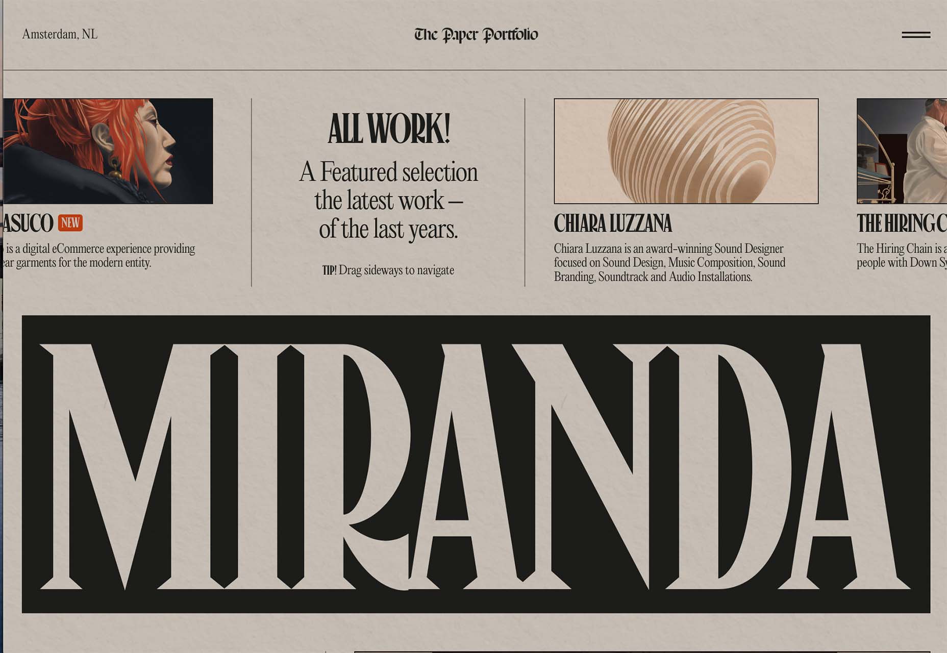
These projects mimic the look of old newspapers and magazines with styles that look like news or advertising content. One of the most exciting takeaways might be color, with beige backgrounds that almost seem like aged paper.
Note the font choices, scale, and imagery as well. All of these things have an old-school feel that’s modern enough to help encourage interaction.
Each of these designs keeps visitors engaged with trendy effects that pair with the vintage aesthetic so that while there’s an old-school look, the overall design is modern and fresh.
The portfolio of Niccolo Miranda feels like a “WAR” day on the front page of a major newspaper, but with modern touches – computer illustrations, animated images, and button-style icons.
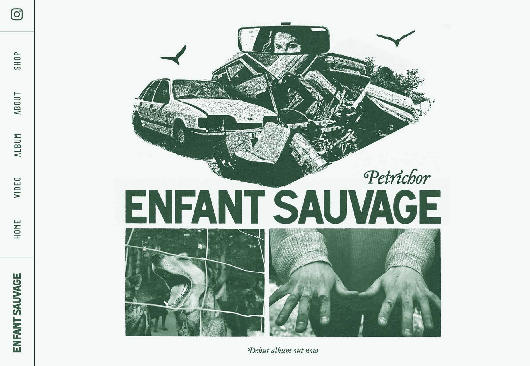
Enfant Sauvage Music takes on the feel of an old-style newspaper or magazine ad with a single color design and grainy imagery. An oversized funky pointer on hover and side navigation keeps the design interesting.
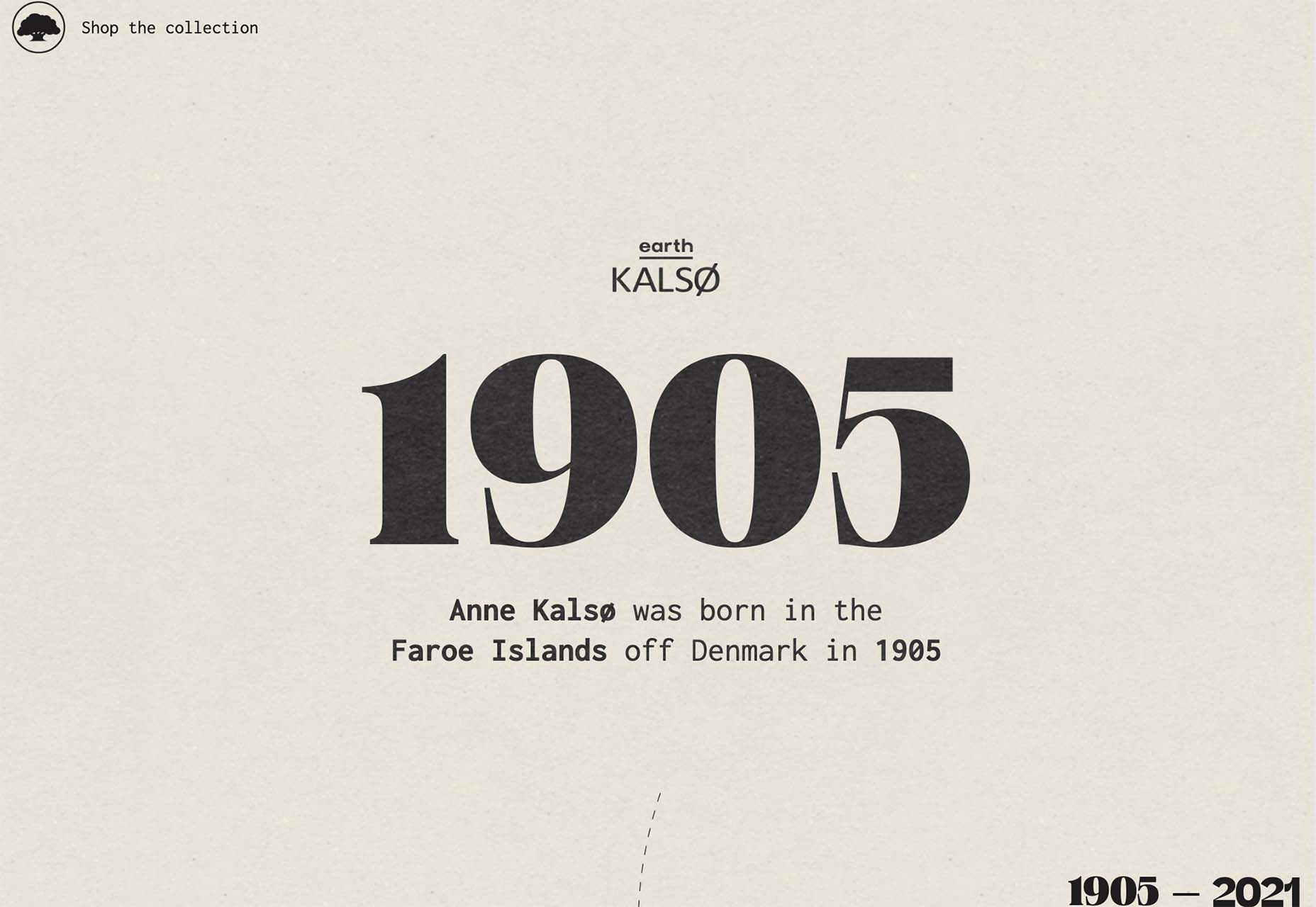
Kalso uses a giant timeline with typography and effects that mimic the era on the screen. Animation and motion keep the design with the times and on-trend.
Center-Screen Circles
Circles seem to be a website design trend that just never goes out of style – it only evolves.
The newest iteration includes center-screen circles. And you can use them in all kinds of different ways. The nice thing about a circle is the shape is innately harmonious and can pull a design together and make everything feel together and unified.
They can be an excellent container for text or other elements or serve as a button.
Circles work with almost any overall design pattern, in any color, and with virtually any type of image or video. The shape is practically perfect! (That’s why it’s a trend that never really gets old.)
Each of these examples uses a center-screen circle in a slightly different way.
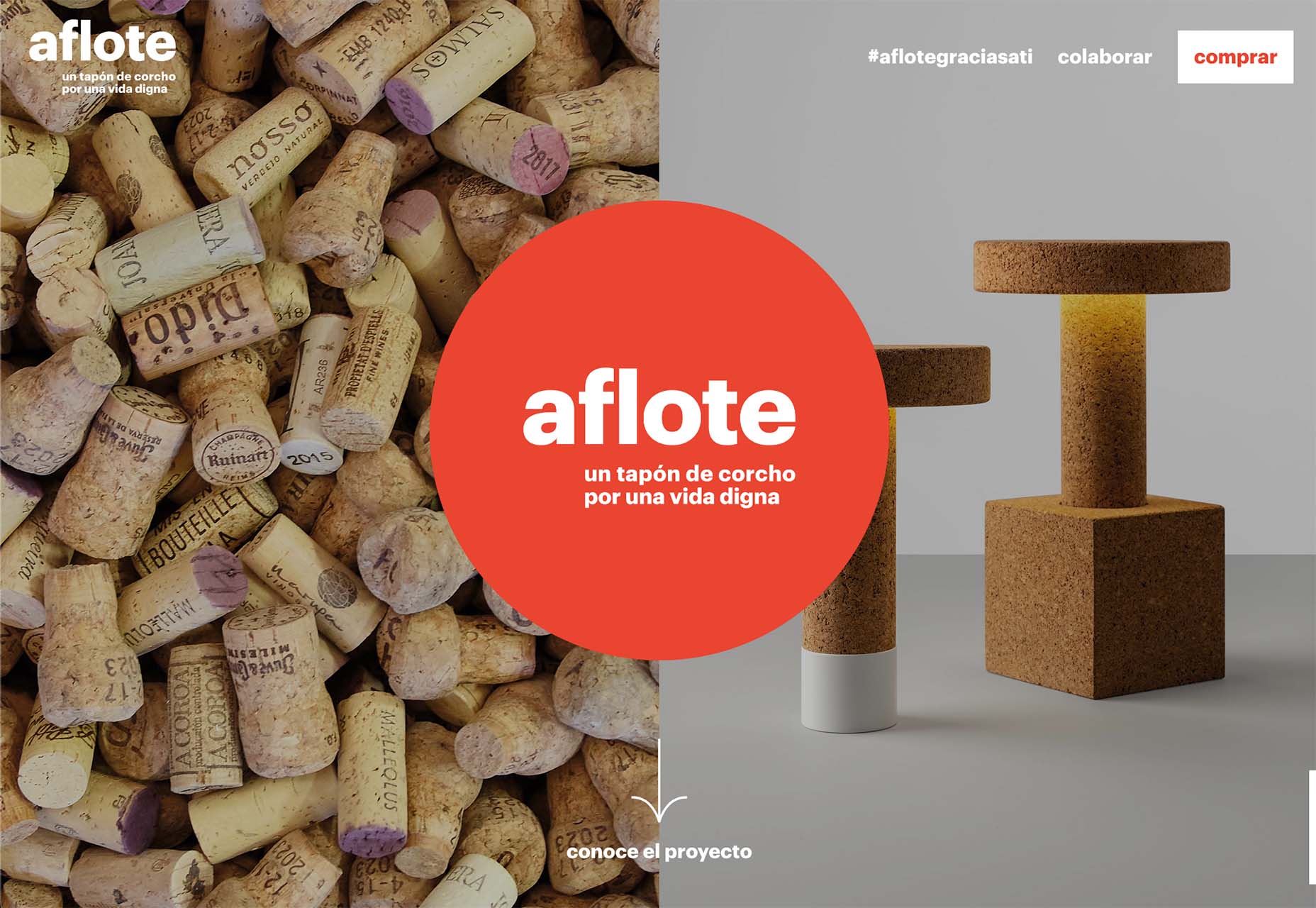
Aflote uses a center circle as part of its overall branding effort and to help draw the eye from the split-screen images to the center arrow, encouraging users to scroll to the next bit of content. Color helps here, and the circle is a container for brand and some other content with a nice layer on top of the images.
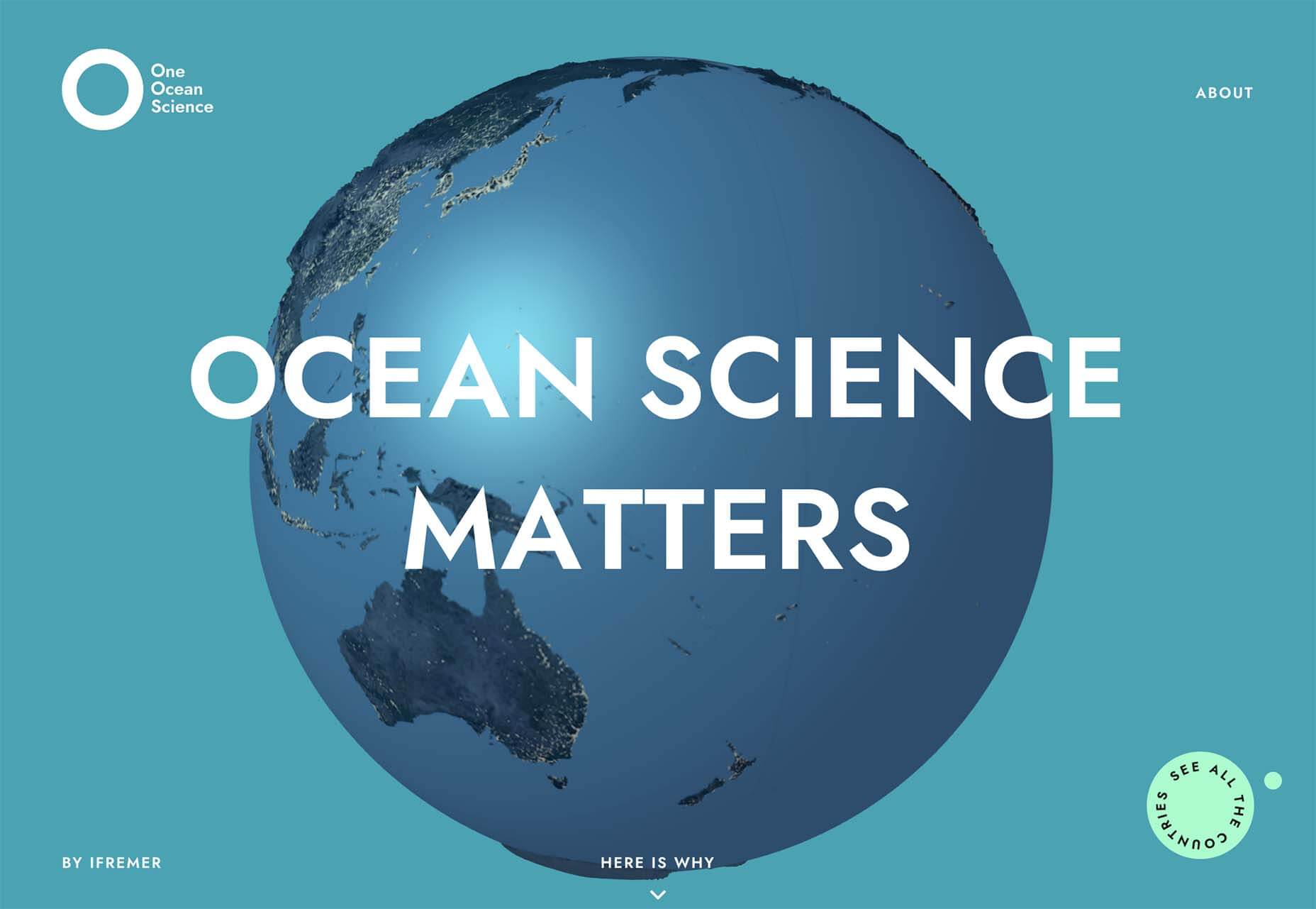
One Ocean Science uses one of the oldest circles we know – the globe – as a dominant art element that rotates in the center of the screen. The layer on top – the exact text in multiple languages – gets extra attention thanks to the center placement. The design also uses a top left corner circle for branding and a bottom right corner circle as a CTA, helping create a visual flow through the design from top to center to bottom to click.
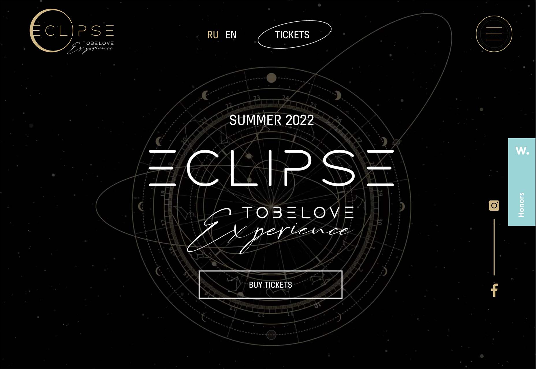
To Be Love uses a fantastic animated set of concentric circles to pull together the name of the event and draw interest to the CTAs. The circle is just the right size in a sea of black sky to draw the eye to the content in the middle of the screen.
Lighter, Happier Designs
After a couple of years of pandemic life and a world that’s just been a little less than cheery, website designers include lighter, happier elements to projects. This might just be the design trend we all need right now.
This effect can be designed in several ways, including color, imagery, animation, scale, and even typography. It’s hard to pinpoint what makes a design lighter and happier until you see it, but when you do, you’ll know it. (It might just be that little grin at the corner of your mouth when you see it.)
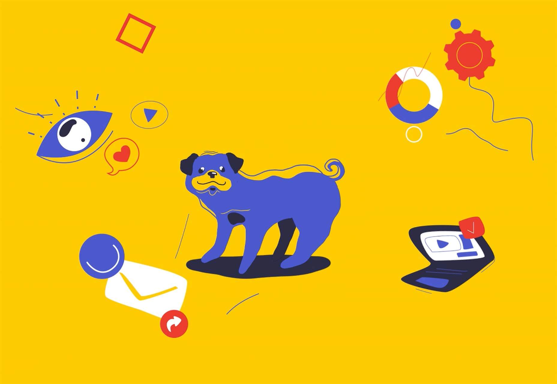
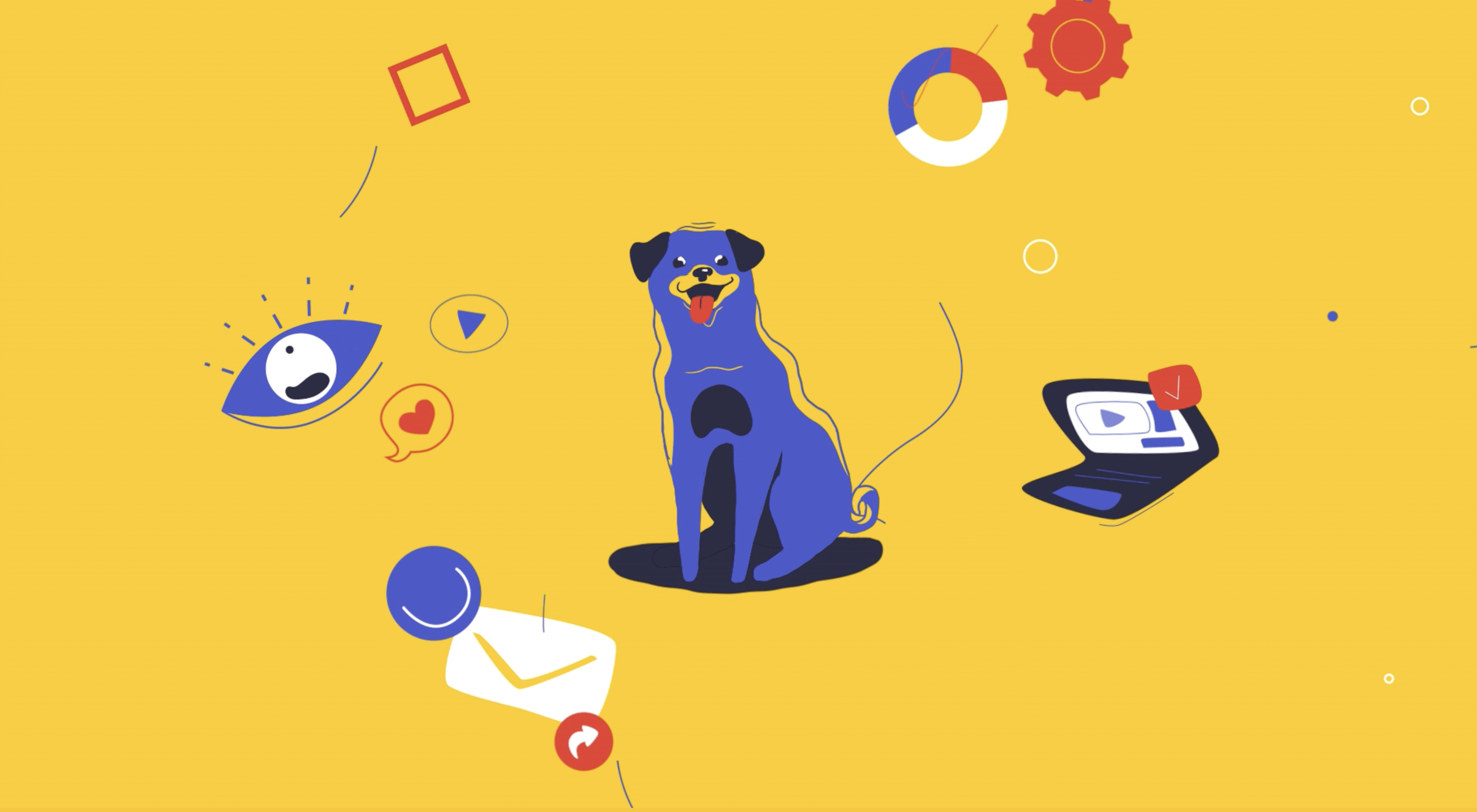
Meanpug uses fun, animated illustrations as a load screen with a full-text homepage (you’ll have to click through to see it). Between color and animation, you can’t help but feel good looking at the design. What might be most interesting is that the website is for a marketing agency that works with law firms. (Probably not what you expected at all.)
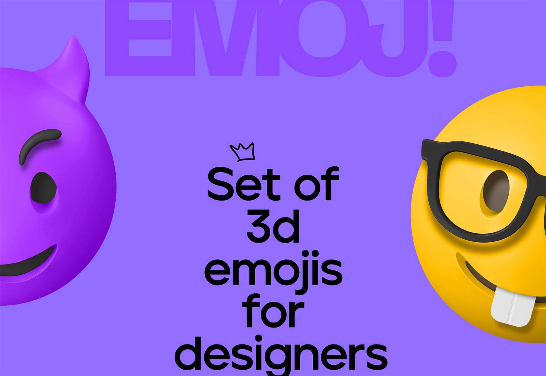
Happy smiling faces are hard not to feel good about. Even the devil emoji seems somewhat joyful. Add in big, bold typography and the yellow smiley, and the world just feels a little less dark.
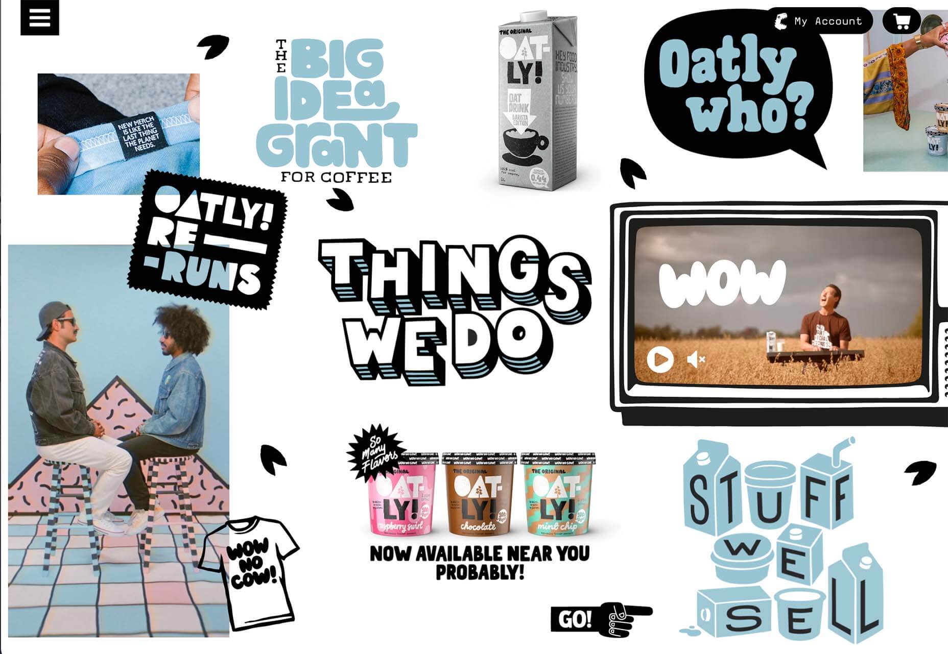
Oatly uses lots of small elements in a cartoon-style aesthetic that is light and interesting. In addition to fun fonts and animation, all of the words on the website also contribute to a feeling of ease and happiness. It’s a solid strategy for sales; make people feel good about what they are thinking of buying to help propel them toward a purchase.
Conclusion
One of the most exciting things that we’ve seen with design trends in the past year is how world events – from the pandemic to isolation to working remotely – have impacted design projects as a whole.
We’ve seen fewer faces, more illustrations and typography, and an overall shift in feeling to some of the lighter, happier design elements featured here. Cheers to 2022!
The post 3 Essential Design Trends, December 2021 first appeared on Webdesigner Depot.
In the Spring Boot video tutorial below, we take a closer look at the user form submission example with Spring Boot and FreeMarker. Let’s get started!
In the video below, we take a closer look at User Form Validation and Data Binding Example with Spring Boot and FreeMarker | Spring Boot Tutorial. Let’s get started!

