 Landing pages are crucial for conversions. User-friendly landing pages rank higher in the search engines and generate the maximum leads.
Interestingly, user behavior changes every year, and new website design trends should be kept in mind to continue acquiring sales from your existing landing pages.
If your high-performing landing pages in 2019 have suddenly started underperforming in 2021, then it is a clear indication that your landing pages need a strategic revamp to record higher conversions.
Landing page revisions are necessary for reduced bounce rate, more visitor time on the page, and better user actions.
This article will discuss some of the top web design trends of 2021 that brands have adopted to revamp their landing page designs. You can learn from the trends and apply your own custom design intelligence to redesign your landing pages for 2022 and convert the maximum number of visitors.
Let’s begin…
Why Landing Page Design Is Crucial For Conversions
Landing pages are the first stop on your consumers’ online buying journey and the first chance to put an impression.
People on the internet are becoming less patient. It takes only about 50 milliseconds for a visitor to form an opinion about a brand and decide whether they want to stay or leave the website.
Convincing modern customers to buy products or fill up query forms on a landing page is not easy with traditional website elements.
In 2021, it is now harder to impress visitors landing on your website than in 2019. Keeping in mind the audience of 2021 and beyond, an ideal landing page should be user-friendly, engaging, innovative and should encourage users to take action.
Here are some of the top reasons why landing page design is so crucial for conversions:
- You get barely 7 seconds to create a strong impression. It is a time span in which visitors roughly scan the page and make their decisions.
- Publishing 40+ effective landing pages at regular intervals can generate 12X more leads.
- The average conversion rate from the landing page across all industries is only 2.35%.
- Using the right types of targeting and testing can boost landing page conversion rates by up to 300%.
Considering the above stats, it can be easily said that a landing page has to be impressive and quick enough to impact the visitors positively.
7 High Converting Landing Pages & Lessons You Can Learn From Each
Below are some of the best high-converting landing pages, which were just updated recently in 2021. For each page, we list a lesson you can learn to inspire your next design revision in 2021 and ahead:
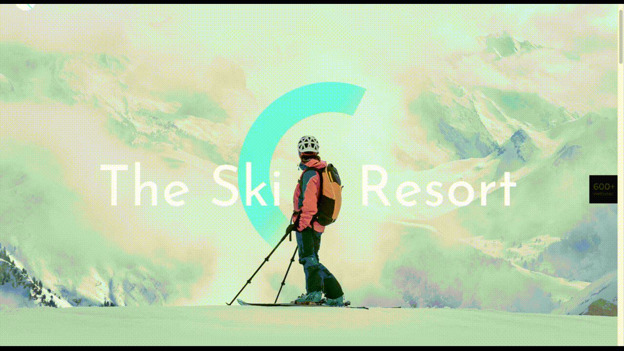
Example #1 – Replace Boring Customer Info Forms With An Interactive Quiz
Landing Page: Nextiva’s Unified Communications Readiness Quiz Landing Page
Industry: Voice Over IP software
Conversion Measured By: Leads fill out a form if they are interested
Redesign focus: Improve the quantity and quality of leads
Solution: Substitute online form with an interactive quiz
In 2019 and even 2020, many businesses were practicing the trend of including a customer form on their landing pages as a call to action to initiate a quick customer action.
The customer information form was useful for businesses because it helped them generate quick leads. However, at the same time, there was no real reason pushing the customer to fill in the lead forms especially if it consisted of more than 2-3 fields.
Nextiva used its creativity to replace boring lead forms with interactive quizzes. In its 2021 page design, the company added a quiz for visitors to participate in.
The aim is to have interactive pages to keep visitors engaged and persuade them to stay on the page.
Here are the comparisons of both the designs:

2019

2021
Key Takeaways:
- The 2021 landing page now has a free Unified Communications Readiness Quiz that allows business owners to fill the form interactively. Adding a quiz with the number of pages mentioned at the top tells the user how many steps are left to complete the quiz, making their waiting time easier.
- The background image is replaced with communication icons to simplify the message of the kind of services they offer.
- The page looks neater and appears to be easier to scan at a glance.
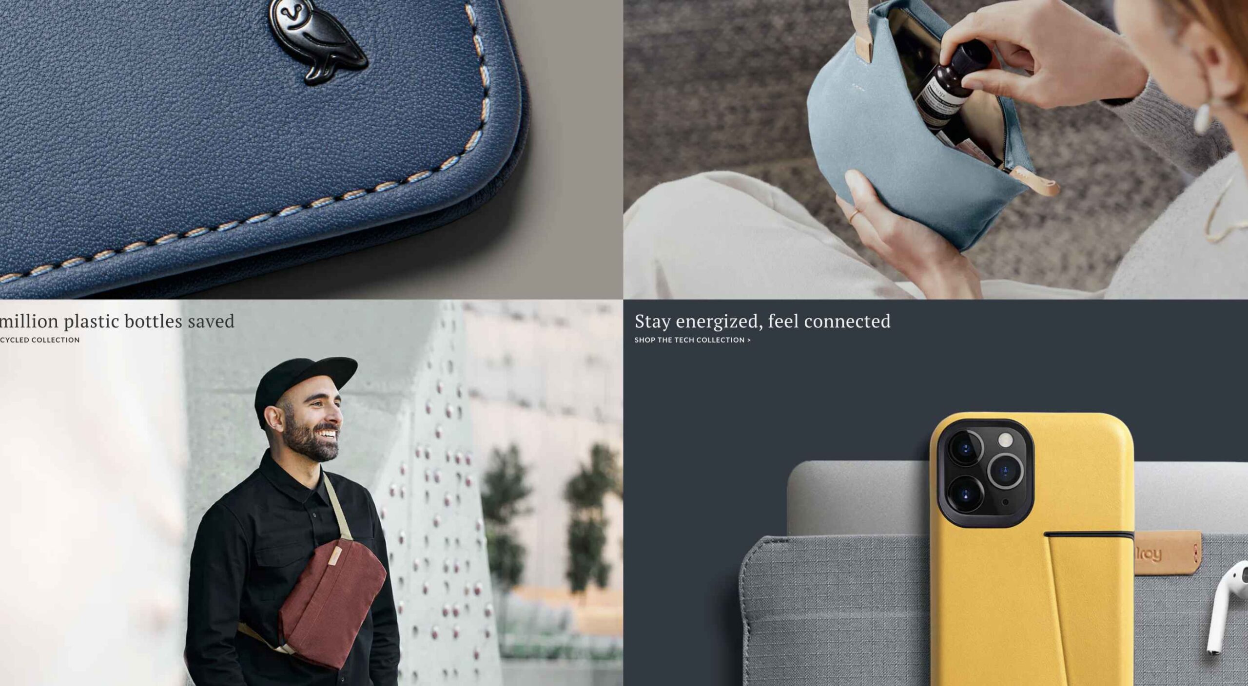
Example #2 – Emphasize Strong Visuals and Copy that Stresses on Product Details
Landing Page: Western Rise Homepage Variation
Industry: Ecommerce
Conversion Measured By: Apparel purchase
Major redesign focus: Improve the number of leads
Solution: Improve the copy and visuals
Western Rise, a clothing eCommerce company, realized the importance of having impressive images and detailed product information on its landing page.
The 2021 page replaced ordinary product images with strong visuals of the models wearing Western Rise clothing. Also, the product image includes extensive product details, which were missing on the older page.
Here is a clear comparison of the 2019 vs. 2021 landing pages of Western Rise:

2019


2021
Key Takeaways:
- The new landing page has a powerful headline – Performance Clothing for Travel, Work, and Play. In just a couple of words, the brand tells everything about itself. ‘Performance Clothing’ is their unique selling proposition (USP) that tells the customers that their product is durable. Besides, the caption ‘Travel, Work, and Play’ tells what the product is about. Modern customers like products that fulfill a particular need, and Western Rise made it easier for the users to realize the importance of their products which fulfilled their specific needs.
- The bold visuals in the new page capture contemporary shots of the models that put a strong impression on the audience. Every image is clicked mindfully to explain the style and quality of the Western Rise clothing line.
- The products displayed on the new page include every minor detail and feature that often other clothing brands ignore, such as the specialty of the product, occasions to wear, and weight other than colors, fabric, fitting, etc.
Example #3 – Use Strong Social Proof To Increase Conversions
Page: Aura Save 50% Landing Page
Industry: Identity Theft Software
Conversion Measured By: Online registration or an inbound call
Major redesign focus: Improve the number of signups
Solution: Add strong social proof
It is a known fact that social proof on sales pages is essential for increased conversions. But in 2021, the importance of social proof has gone too far.
Aura is an identity theft protection service that aims to build trust with its prospective customers when they first browse their landing page. Take a look at how Aura displays customer reviews above the fold to catch user’s attention.
Unlike others, Aura combined the rating stars and the review to prove customer satisfaction and emphasize their expertise in the field.


BONUS:
Another example of using strong social proof is the Exploding Topics newsletter landing page.
Exploding Topics is a newsletter with a pro subscription for content marketers and anyone interested in trending topics about any topic. It’s an excellent example that uses a lot of social proof on landing pages that give something away for free, like a weekly newsletter or an eBook.
If you could notice, the latest landing page below has multiple forms of social proof on a single page. First, they feature a list of brands that trust Exploding Topics. Secondly, they quote Wired Magazine founder Kevin Kelly’s feedback, followed by the logos and tweets praising the newsletter.


Key Takeaways:
- Exploding Topics uses several different types of social proof that appeal to different demographics.
- Their “trusted by” logos of world-renowned companies stand out to potential B2B subscribers.
- Kevin Kelly’s quote is catching the attention of tech-savvy readers.
- Despite packing the page with social proof, the opt-in form is still well above the fold. It is the best landing page practice that applies to nearly all pages.
- The landing page uses actually embedded tweets (not screenshots), which help demonstrate that the tweets are legit.
While Exploding Topics have smartly used social proof on its page, the ideas of leveraging social proof are not limited to this only.
Example #4 – Focus On Visually Appealing Above the Fold Content
Landing Page: Perfect Keto Homepage Variation
Industry: Supplements
Conversion Measured By: Online purchase
Major redesign focus: Improve the number of purchases
Solution: Improve Above The Fold Content
Above the fold content greatly impacts customer’s decision-making. Perfect Keto lacked that appeal on its 2019 landing page design.
Hence, the 2021 design was revamped with better visuals and more professional looks.
The 2021 page received major changes in above-the-fold content, such as the top menu bar with the brand name not losing the user’s attention anymore and an additional menu bar giving a quick overview of what the brand offers.
The older page did have many social proofs, but those were limited to customers only. The 2021 design also highlighted the publications where the brand appeared, which proved exceptional in building customer trust.
Take a look at the two landing pages of Perfect Keto in 2019 and 2021:

2019


2021
Key Takeaways:
- The 2021 landing page heading is more compelling because it clearly conveys what their product is all about. The older page was missing the actual purpose of the product.
- An additional section on the new page to educate customers about the Keto diet and how to start it helps visitors understand the product even better.
- The inclusion of a product image above the fold attracts user attention and makes the product trustworthy. People now know what they will be buying right at first sight of the page.
- The new page proudly displays the products featured in the publications, such as Women’s Health, Healthline, Reader’s Digest, and Popsugar, which again helped customers trust the brand.
- The page also features a video of the Perfect Keto founder that is brilliantly working in gaining visitor’s attention and faith.
Example #5 – Make The Call to Action More Compelling
Landing Page: Zendesk HelpDesk Softwage Landing Page
Industry: SaaS
Conversion Measured By: Online registration
Major redesign focus: Improve the number of registrations through the website
Solution: Make The CTA More Compelling
Zendesk did a clever job by replacing the sign-up form with a single button. On the older page, it was unclear to the user if the company has a trial option for free unless they move to linked pages. Such confusions often resulted in traffic bounces.
Adding the start free trial button on the 2021 page makes it easier for the users to understand that the product comes with a free trial. At the time, it helps the user take quick action.
Similarly, the ‘Get started’ button at the top was replaced with ‘Free trial’ with the same intention.
Moreover, chat support was added to guide users at any stage of the buyer journey. Live chats are vital to help visitors better understand the product and move a step ahead in the customer journey.
Take a look at below two images:

2019

2021
Key Takeaways
- The CTA buttons have more actionable text and look more prominent.
- The color choice for the button is in contrast with the background but matches the page theme.
- The older page missed sales support, which is included in the new page for a better customer experience.
- The tabs in the menu bar were reduced to four to make the page simple to use for users.
Example #6 – Use Contrast To Highlight Specific Copy On The Page
Landing Page: GetResponse Website Building Landing Page
Industry: Online Software
Conversion Measured By: Online signup
Major redesign focus: Improve the number of signups
Solution: Use contrast around important copy on the page
GetResponse focuses on attracting visitors’ attention towards the offerings from their business. Starting from above the fold section, the landing page highlights the texts that are important and need the visitors’ attention.
The infographic on the landing page is the next thing that promises to grab user attention while beautifully describing how this website builder works and is useful to the user.


Key Takeaways:
- The text highlighted on the landing page draws the user’s attention towards what the business has to offer or unique selling points.
- The infographics briefly explain the working of the tool in an easy-to-understand manner.
- The Yellow color is used prominently on the landing page to attract user attention and persuades users to try the tool by listing its advantages.
Summary
Landing pages provide the first opportunity to create an impression in the minds of the consumers. A well-structured and mindfully designed page sets the right tone for your brand message and encourages users to choose your business.
However, the strategy for landing pages needs innovations from time to time for better results. The examples and tips shared above prove how landing pages in 2019 have seen significant improvement in 2021.
In the coming year, use these ideas to create landing pages that influence customer decisions and encourage them to take quick actions.
Source
The post 7 Landing Pages Comparisons To Improve Your Conversions in 2022 first appeared on Webdesigner Depot.

Source de l’article sur Webdesignerdepot

 Every day design fans submit incredible industry stories to our sister-site, Webdesigner News. Our colleagues sift through it, selecting the very best stories from the design, UX, tech, and development worlds and posting them live on the site.


 Every day design fans submit incredible industry stories to our sister-site,
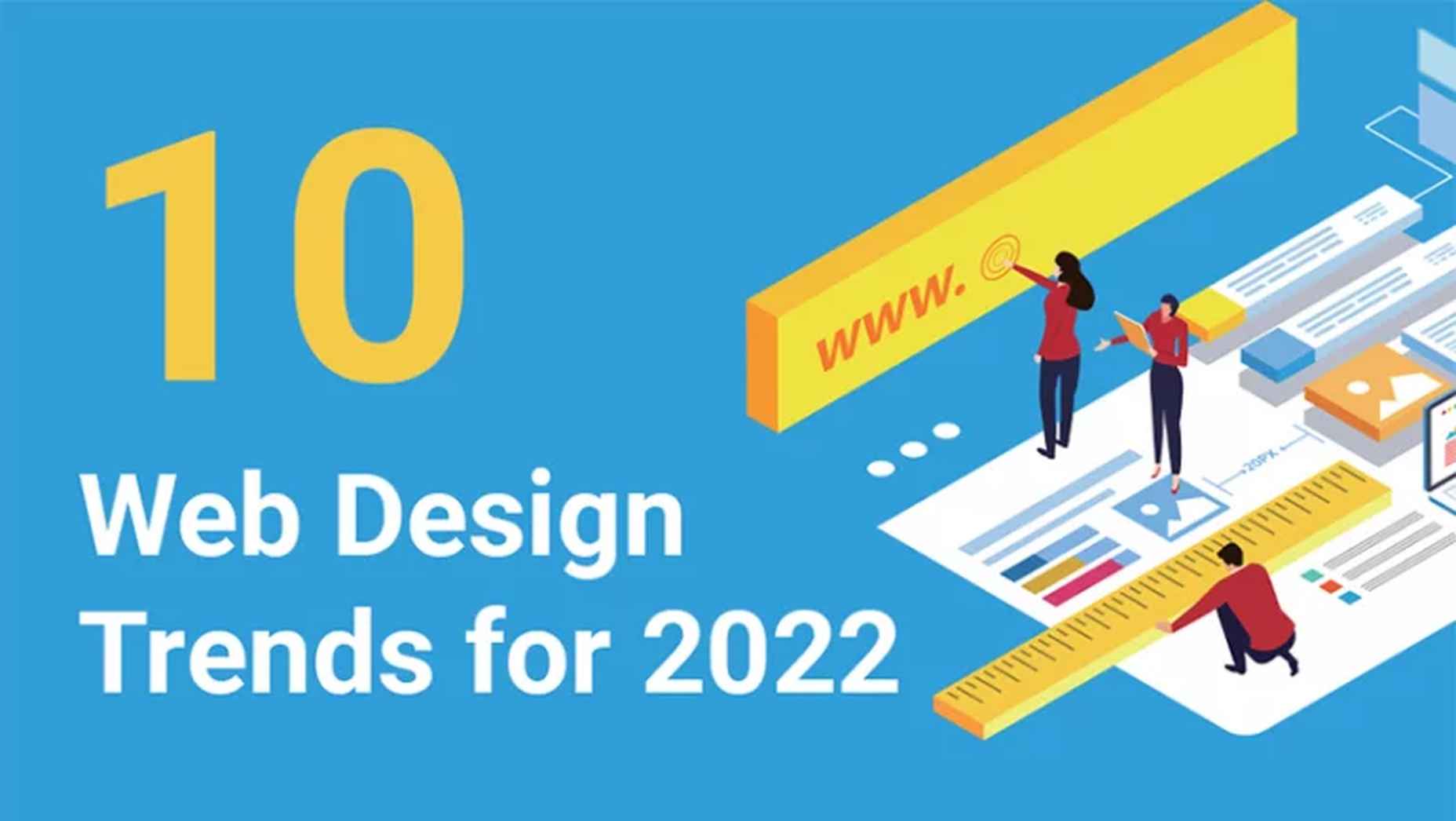


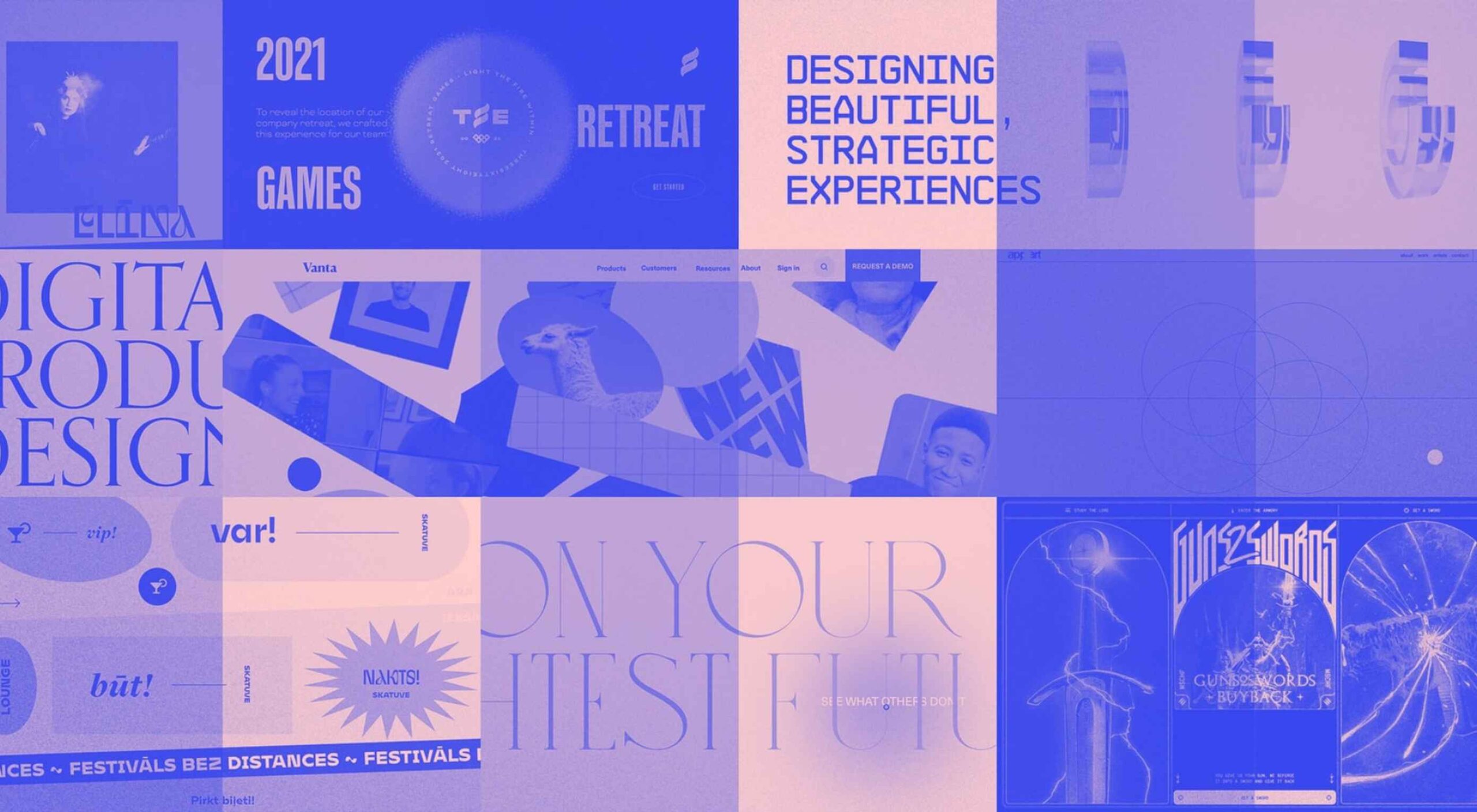
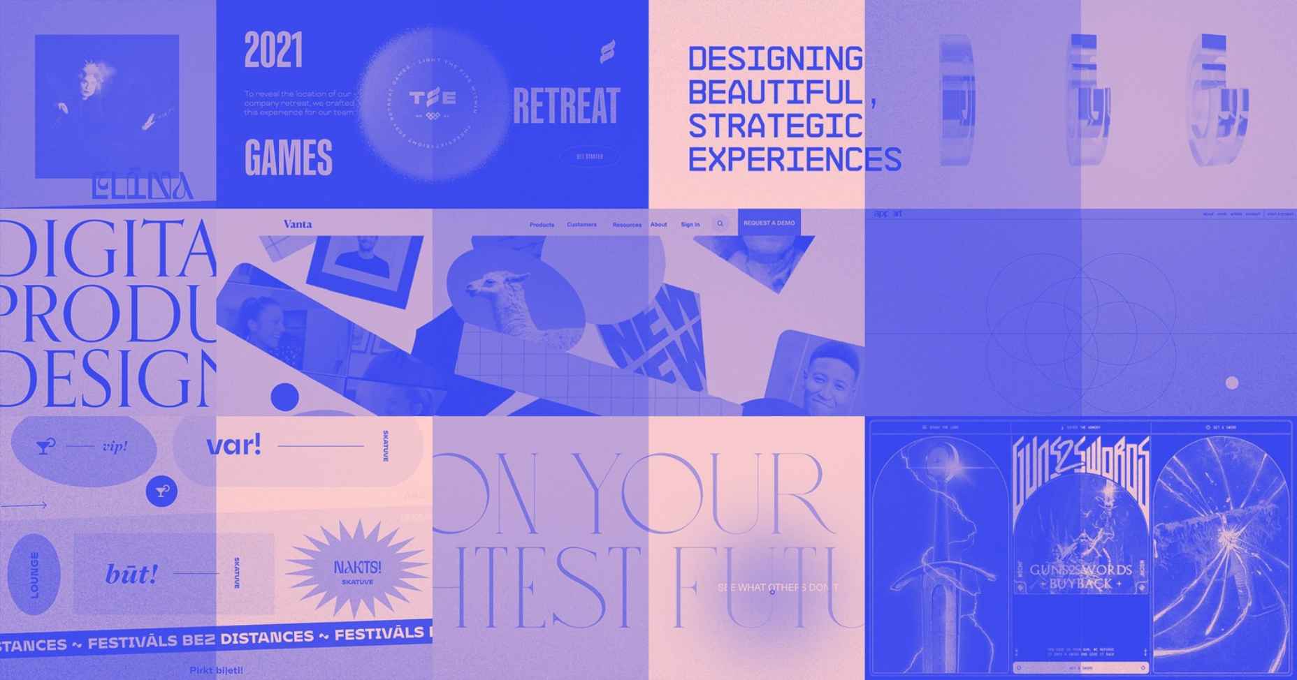
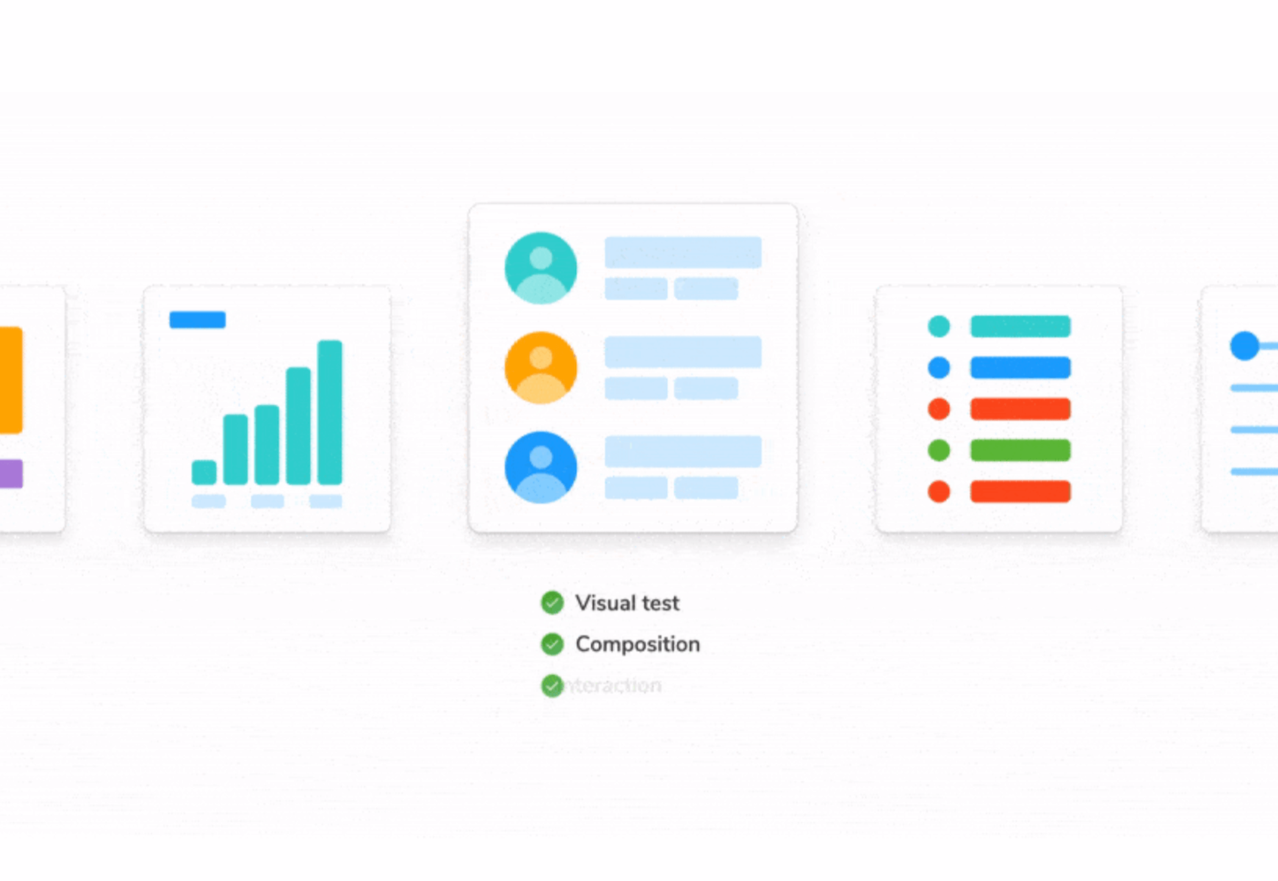
 The world of web design is incredibly dynamic. Every year, new trends and opportunities emerge, primarily driven by the arrival of modern technology.
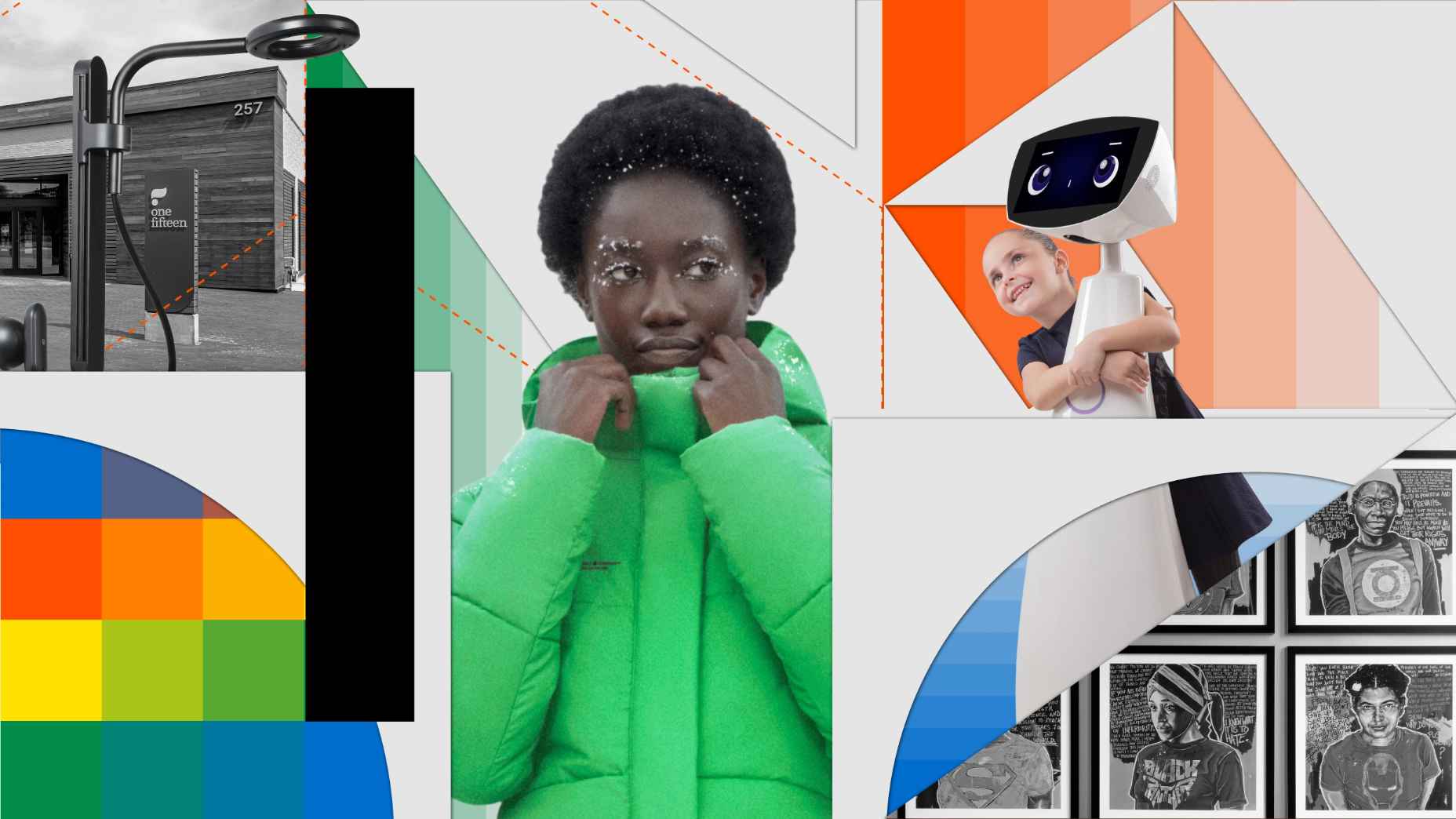
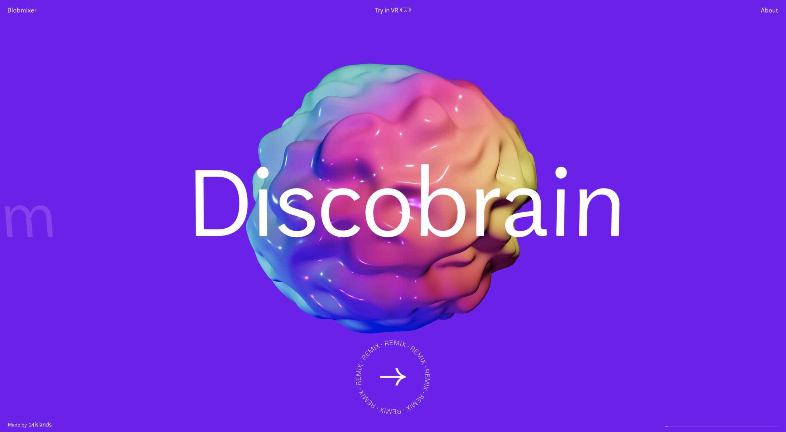
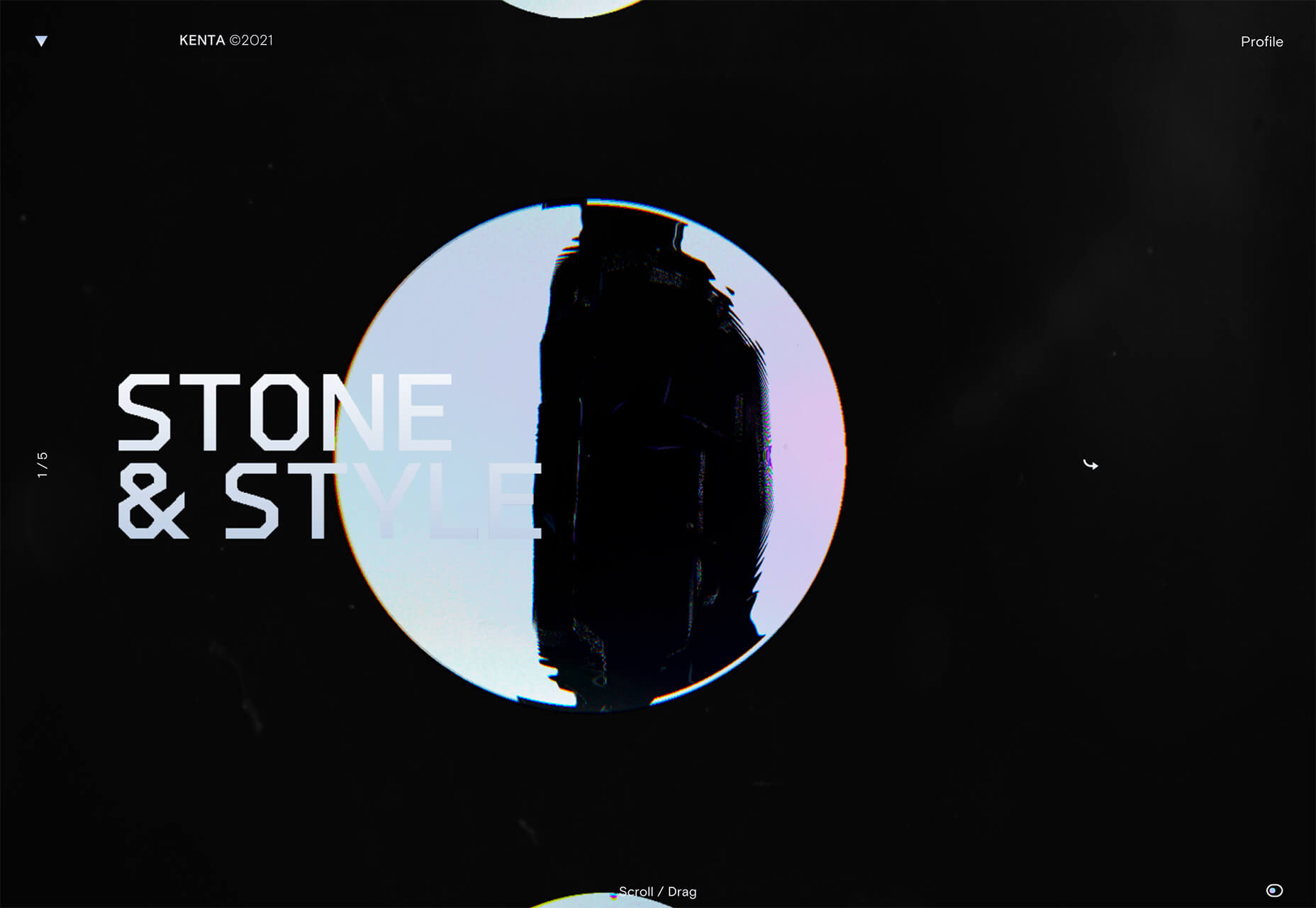
 Sometimes the designs that make the most impact do a lot of unexpected things and break some of the most tried and true rules of visual theory.


 Every day design fans submit incredible industry stories to our sister-site,


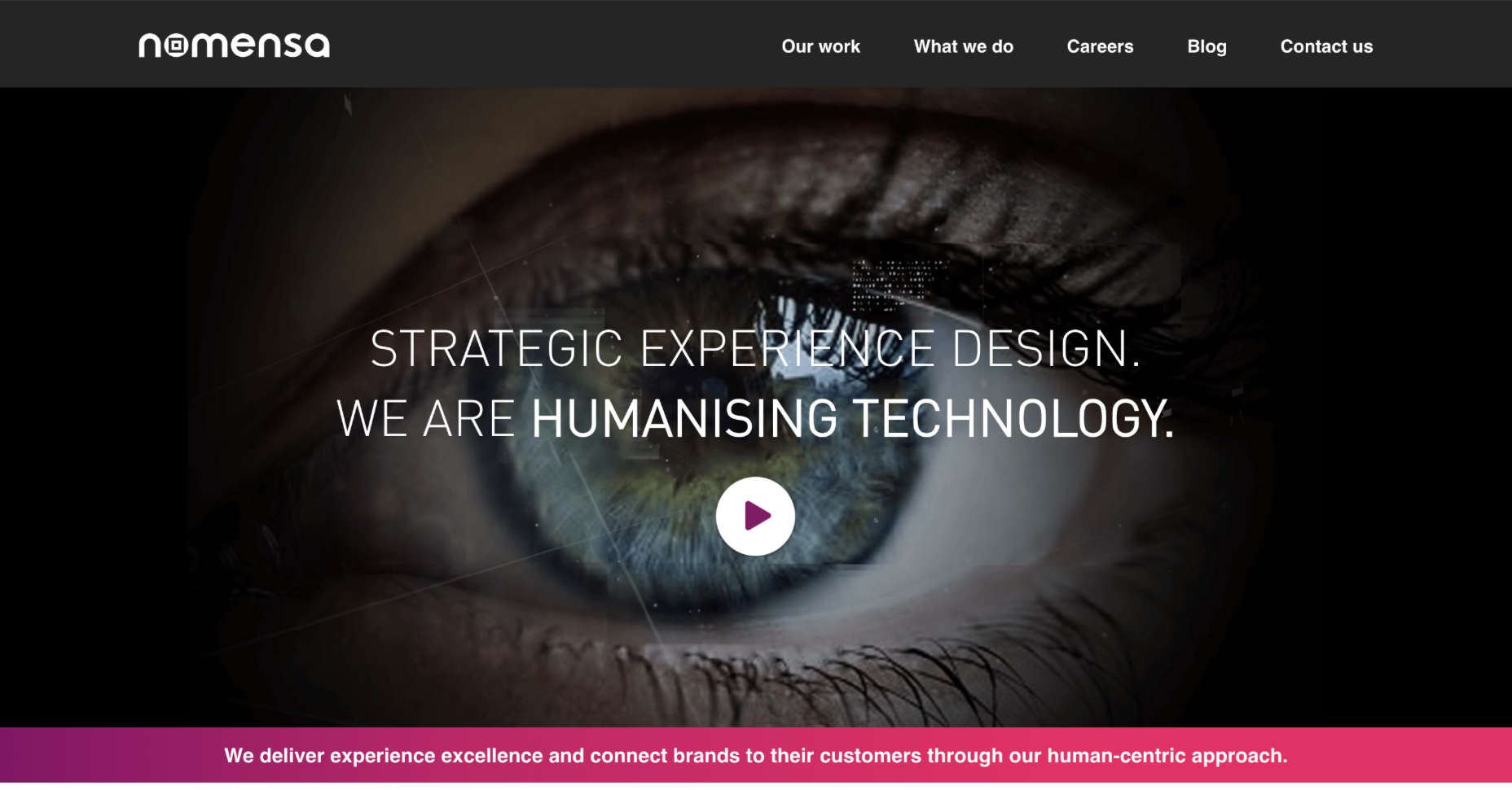
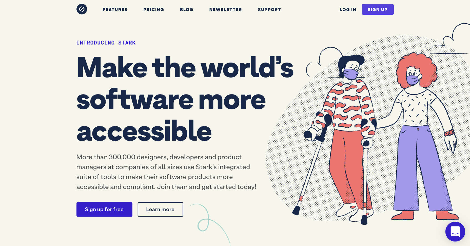
 A key part of designing successful websites for clients is making sure that as many end-users as possible can access and enjoy that site.
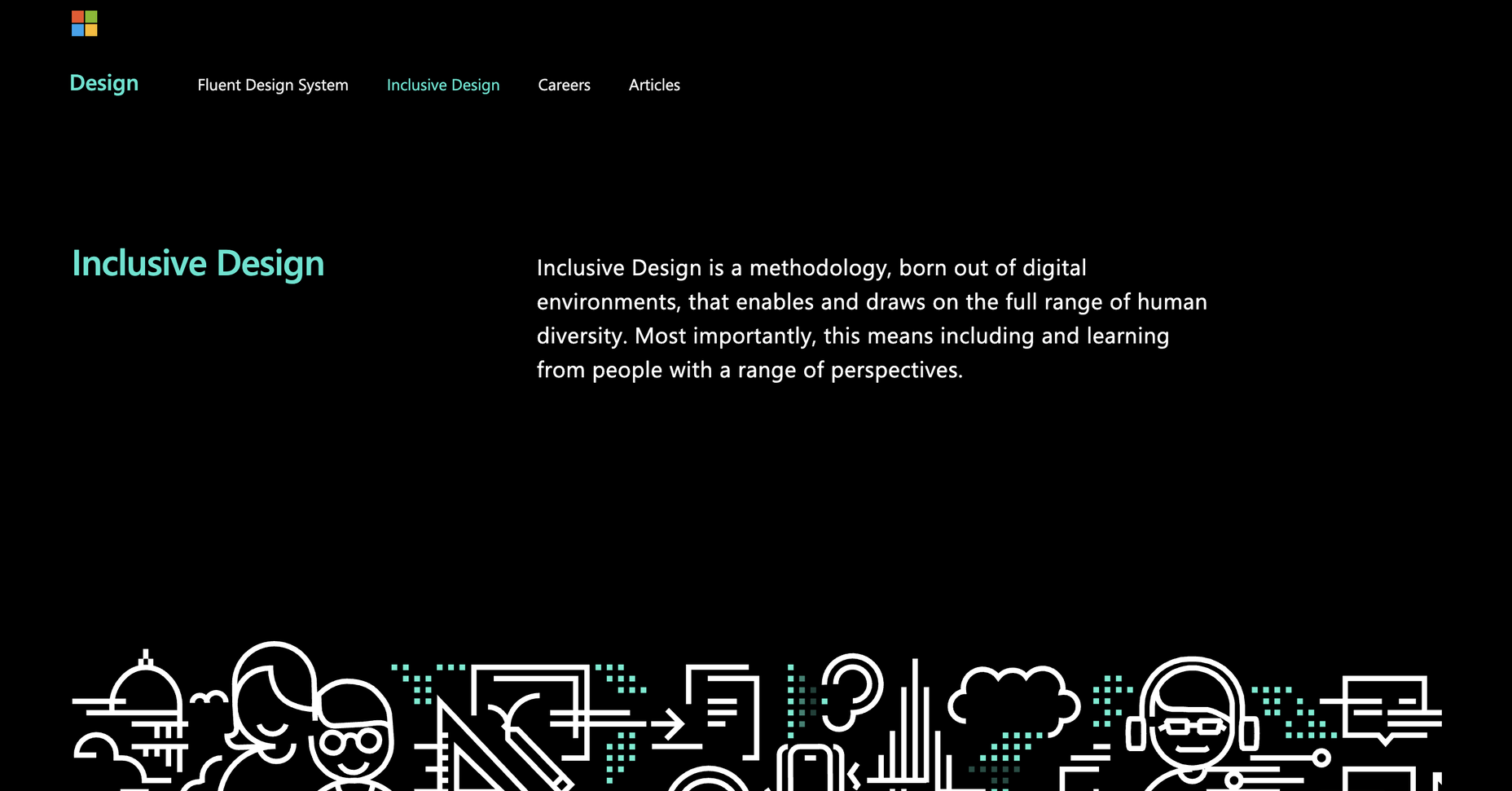
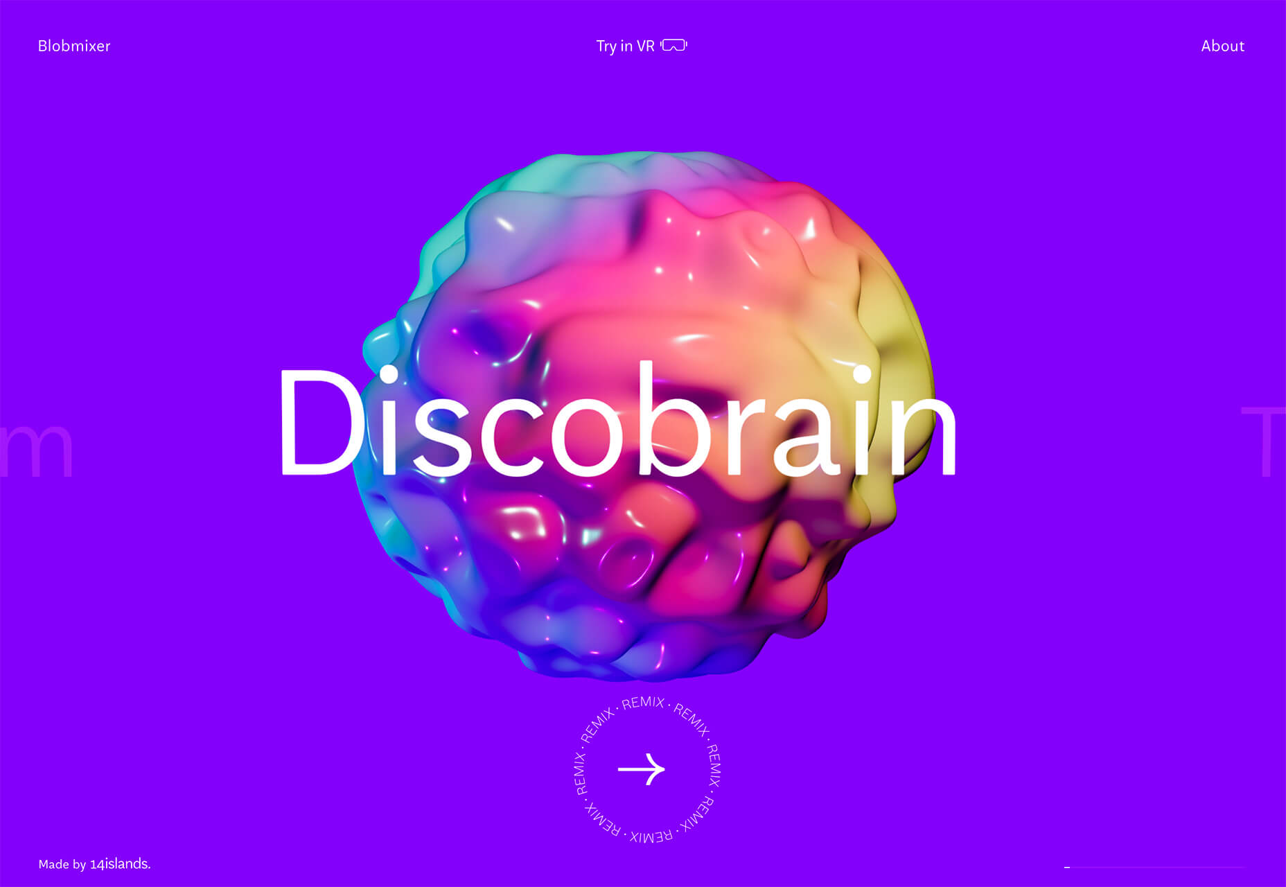
 March is that time of year where the feeling of newness starts, from the first Spring days to fresh design projects. These trends are no exception, with fun new takes on some classic concepts.
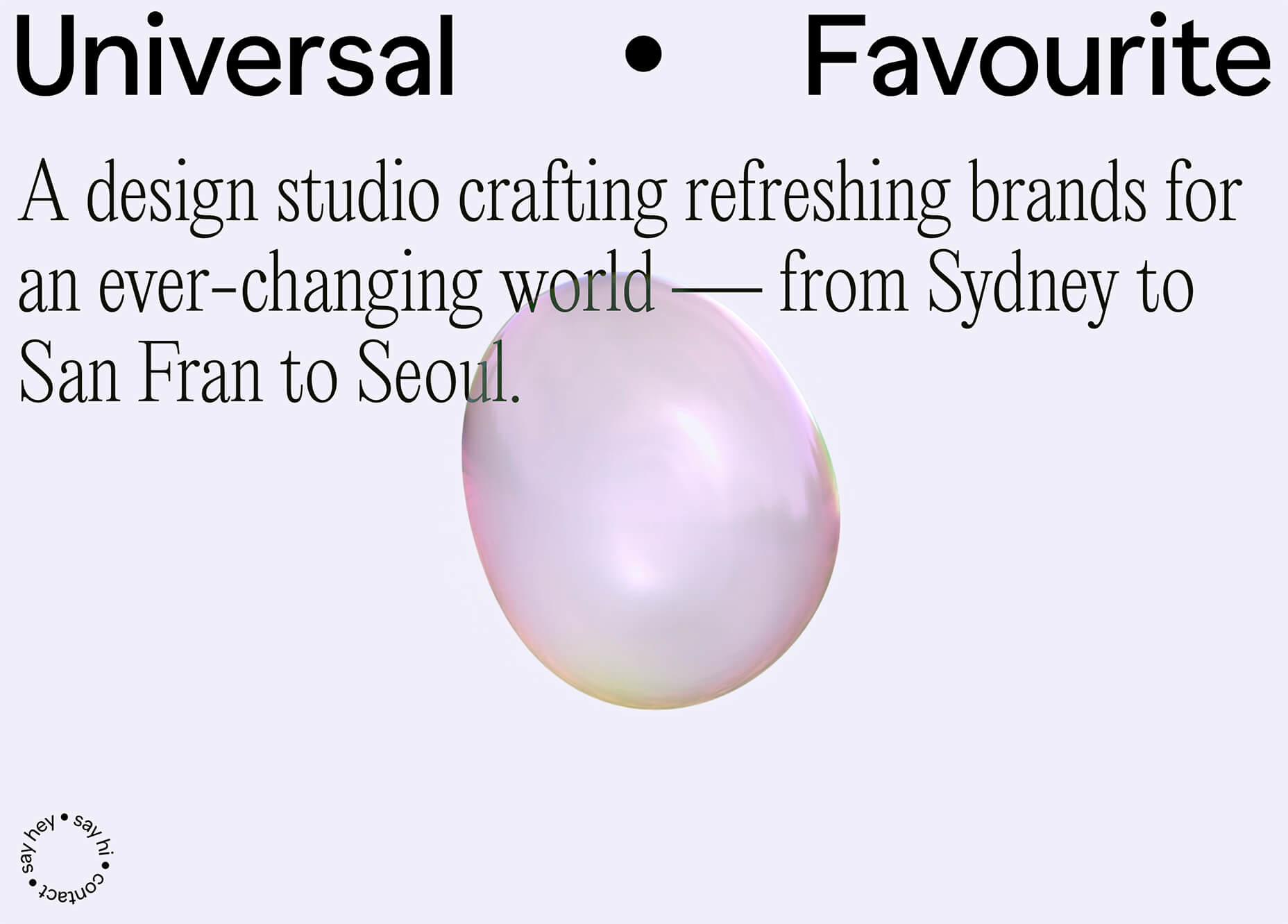

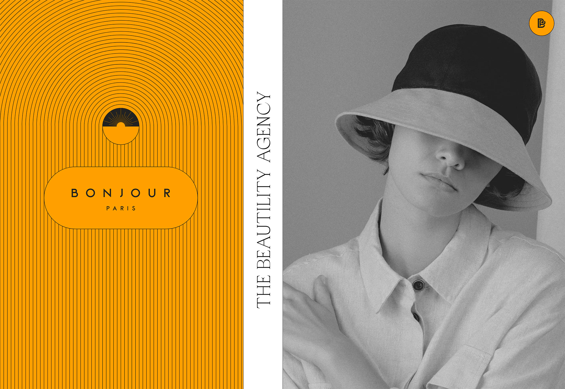

 Since the skeuomorphism of the early 00s, the design trend of choice has been minimalism. In fact, minimalism has been de rigueur for substantially longer than that.
 One of the few bright spots in 2020 has been the creativity companies and individuals alike have exhibited in dealing with what, at times, seemed to be overwhelming problems.
