
 There was a point at which I was very close to losing my business, and I didn’t realize how close.
I wasn’t always a good planner, and I didn’t plan to start an agency. One day I was a freelance graphic designer, my job list grew, I hired some help, and suddenly I was managing a team.
There isn’t a guidebook for new business owners, you have to learn on the job, and there’s no one-size-fits-all approach. We expanded rapidly from two to four people, then seven, and suddenly we hit 16 employees in just 18 months. It was pretty scary and felt like driving on the freeway without brakes. A client shared a story that they were turning over $20m, and the owner was only taking home $30k. It felt like where I was headed. At that point, I could easily have lost it all.
I took a hard look at the numbers and realized that we were barely breaking even, let alone profitable. That needed to change to stabilize the business and regain control of my operations. The change wasn’t easy, and there were some hard lessons, but 11 years later, with a strong local team and 40+ awards for our work, I’m thankful for that wake-up call.
There are other people in my position struggling with the same issues I faced, so I’d like to share the four key things I did that helped turn things around and move us from surviving to thriving.
1. Don’t Diversify Your Services
I wanted to do it all, and as the business owner, it was hard to turn down a new client. Our instincts are to help, and declining opportunities feels wrong. In our industry, digital agencies, especially web design agencies, try to cover all bases from marketing, SEO, adwords, design, photography, and coding. Everyone wants to be a one-stop shop for clients. I used to be that person: I would wash your car and shine your shoes if I could.
Do not give in to that fear.
When you’re a generalist, you spread yourself too thin. I know: a decade ago, we were offering dozens of services outside of the web design realm: packaging, branding, copywriting, sticker design, SEO, hosting, analytics, you name it, we provided it. We used over seven different CMS for our projects. If a client wanted it, we tried to offer it, no matter how unsuitable it was for us.
On the surface, we fulfilled our projects, and our clients were always thrilled with the results. But below the surface, our operations were dissolving into a mess. Our eyes weren’t on the prize; we were always chasing after each little job for cash. It took too much time to learn new skills. When I looked at our timesheets and deducted the unbillable hours, our projects would hardly break even.
What hurt us even further is that with diversifying, we had to manage multiple workflows, software, and systems: Sketch, Illustrator, Photoshop, WordPress, Joomla, Drupal, Google Analytics, Final Cut Pro, etc. It was expensive with minimal return. It was like an Olympic swimmer signing up for a swimming-diving-ice-skating club when their passion is swimming.
So I took a step back. I boiled it down to what we enjoyed and excelled at. Ask yourself: for what do you want to be known? For us, it was psychology-driven, conversion-focused web design. This was the service our team had the most skills in and collectively could give the best value to our clients. Once I’d figured that out, it was easy to eliminate those other services and specialize.
You can niche down by service or industry and be the specialist in what you offer.
2. Know Your Numbers
The first red flag that my business was in trouble was when I said to my accountant, “I feel like my business is doing great.” He replied, “I don’t care how you feel. The facts are in the numbers. Show me your accounts, and I’ll tell you if you’re actually doing well.” As an intuition-driven guy, it was a real eye-opener; I’d only ever relied on gut instinct.
At one point, we had a ton of work coming in, so I hired a few juniors to help the rest of the team. The team grew to 16, and the vibes in the studio were great, but the numbers weren’t. Instead of increasing efficiency, projects took 40 hours longer than they should have done. Why? The seniors and mid-level designers were taking time out to train the juniors! Reassessing the team showed me I needed to hire experienced staff, so projects ran on time and budget. It was a hard decision but a necessary one to keep us afloat.
The crucial numbers for any design agency are your timesheets, where bottlenecks lie, how much you’re spending, how long a project takes; these determine your actual margins. Setting up quantitative software like Toggl, Gantt, and Asana were a game-changer for us. They gave our project management real purpose and potential. Knowing the average hours our primary type of project took made it easy to give clients realistic deadlines, anticipate the need for fresh hiring, and know when our plates were full. You do not want to bite off more than you can chew.
3. Become The Best Fit For Your Target Market
You can’t please everyone, and frankly, you shouldn’t be trying to. One type of bait won’t attract every kind of fish. First, identify the type of fish you want to catch, the pond where this type of fish lives, and finally, bait your hook with something that type of fish can’t resist.
Your sales team should be able to identify them instantly, and all you then need to do is streamline your team, process, and systems towards being the best fit for them.
4. Double Down On Marketing That Works
There are many different marketing avenues you can go down, but go down too many, and it becomes a tangled web of confused messaging.
Remember, just because your competitors are doing it does not mean it’s the most effective approach for your target market.
There are really only inbound and outbound types of strategies, and it’s a great idea to list out the pros and cons (and the ROI of each) concerning your target market. Or, you can approach marketing based on your existing skillset — for example, if you detest being in front of a camera and don’t want to do video marketing, then just don’t do it.
Identify what works for you, and then be consistent. Consistency is the secret to a successful marketing strategy.
The post How I Saved My Design Agency & Tripled My Profits first appeared on Webdesigner Depot.

 There are a lot of factors that contribute to a


 Every year, at this time, blogs like this one like to try and predict what’s going to happen in the year ahead. It’s a way of drawing a line under the archive and starting afresh. A rejuvenation that, as humans, we find life-affirming.
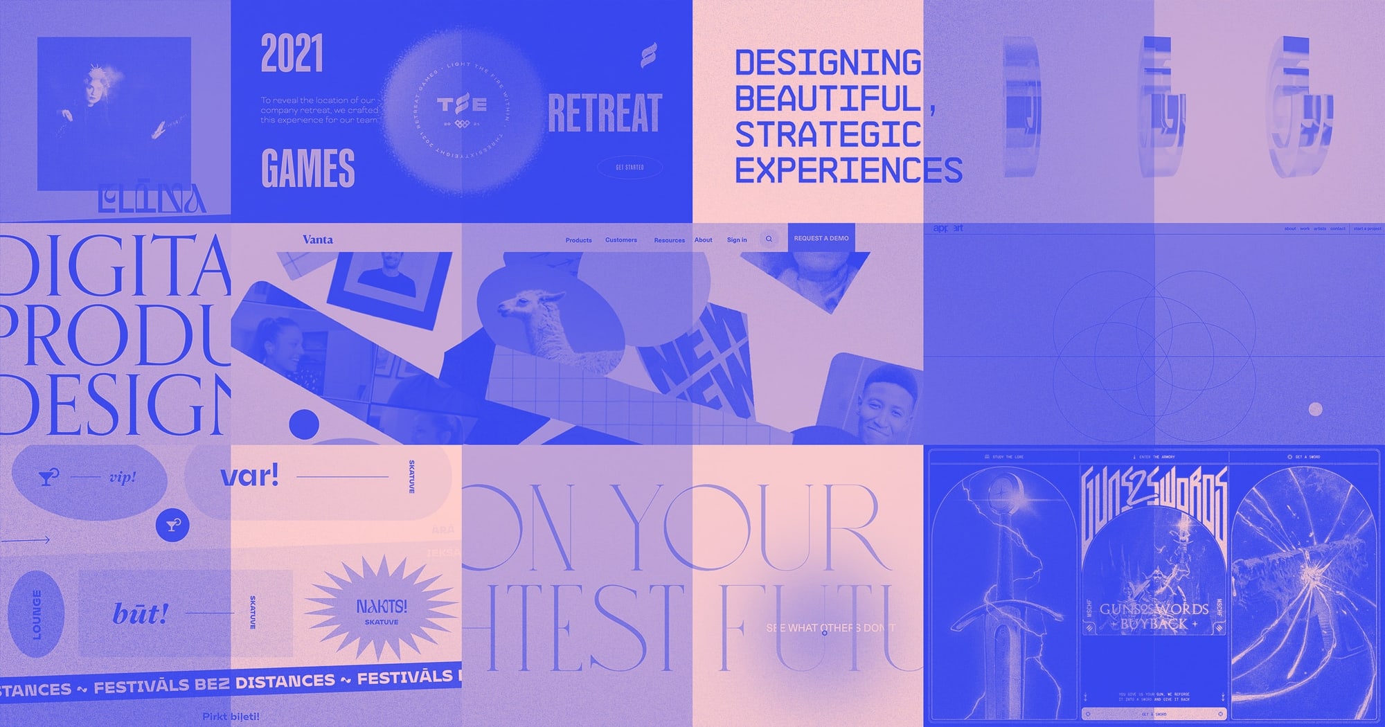
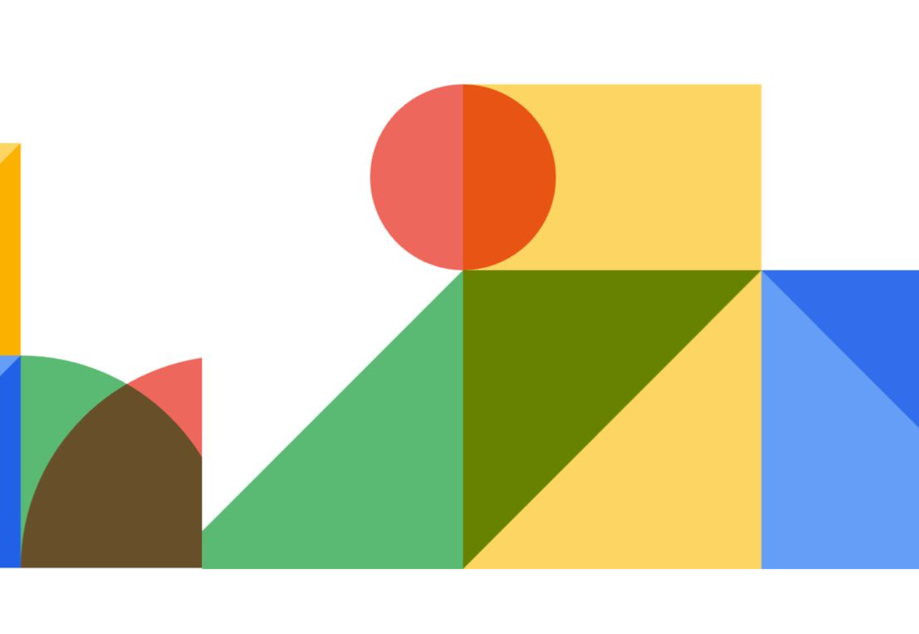
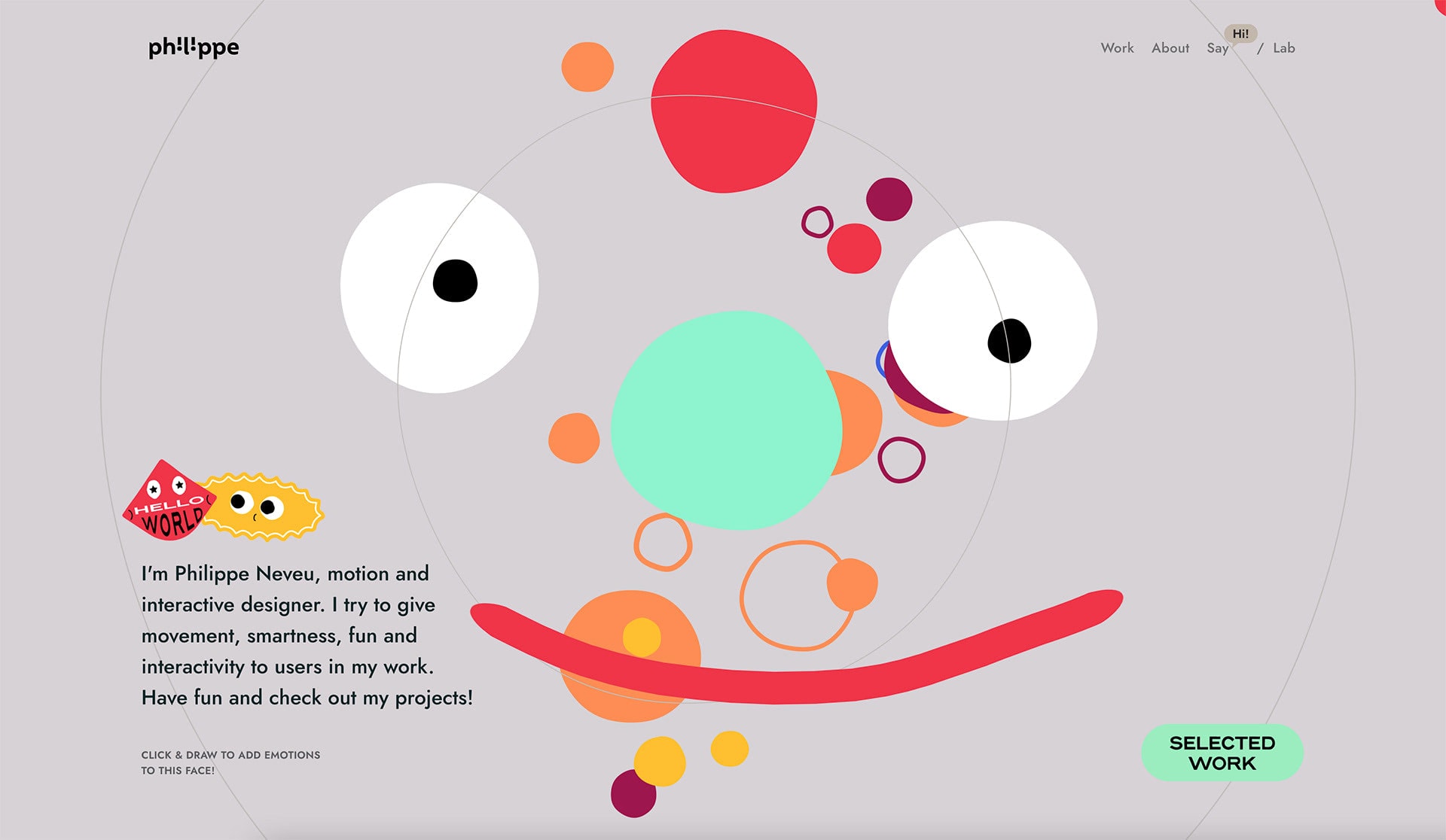
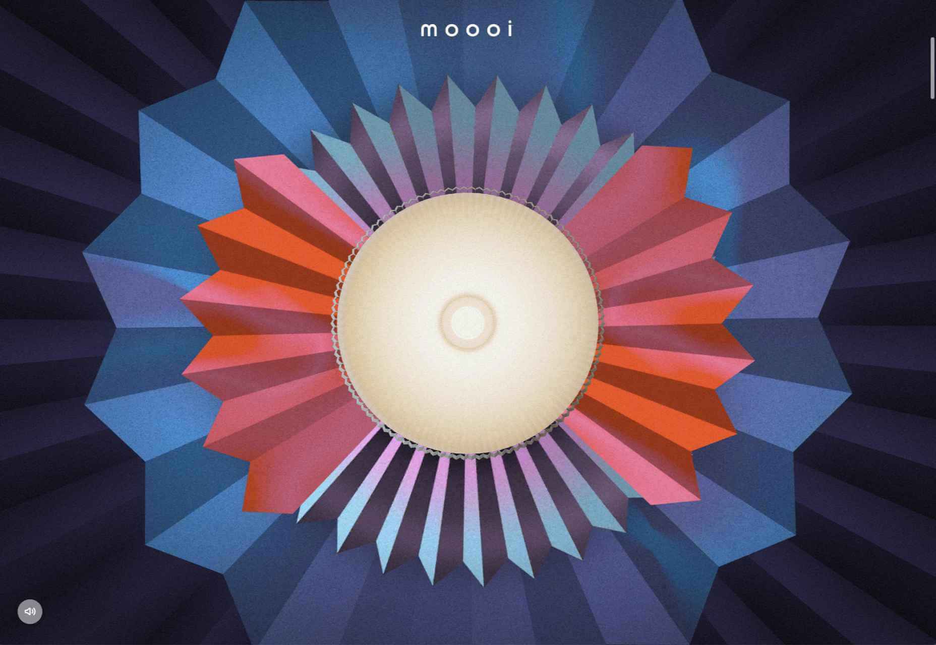
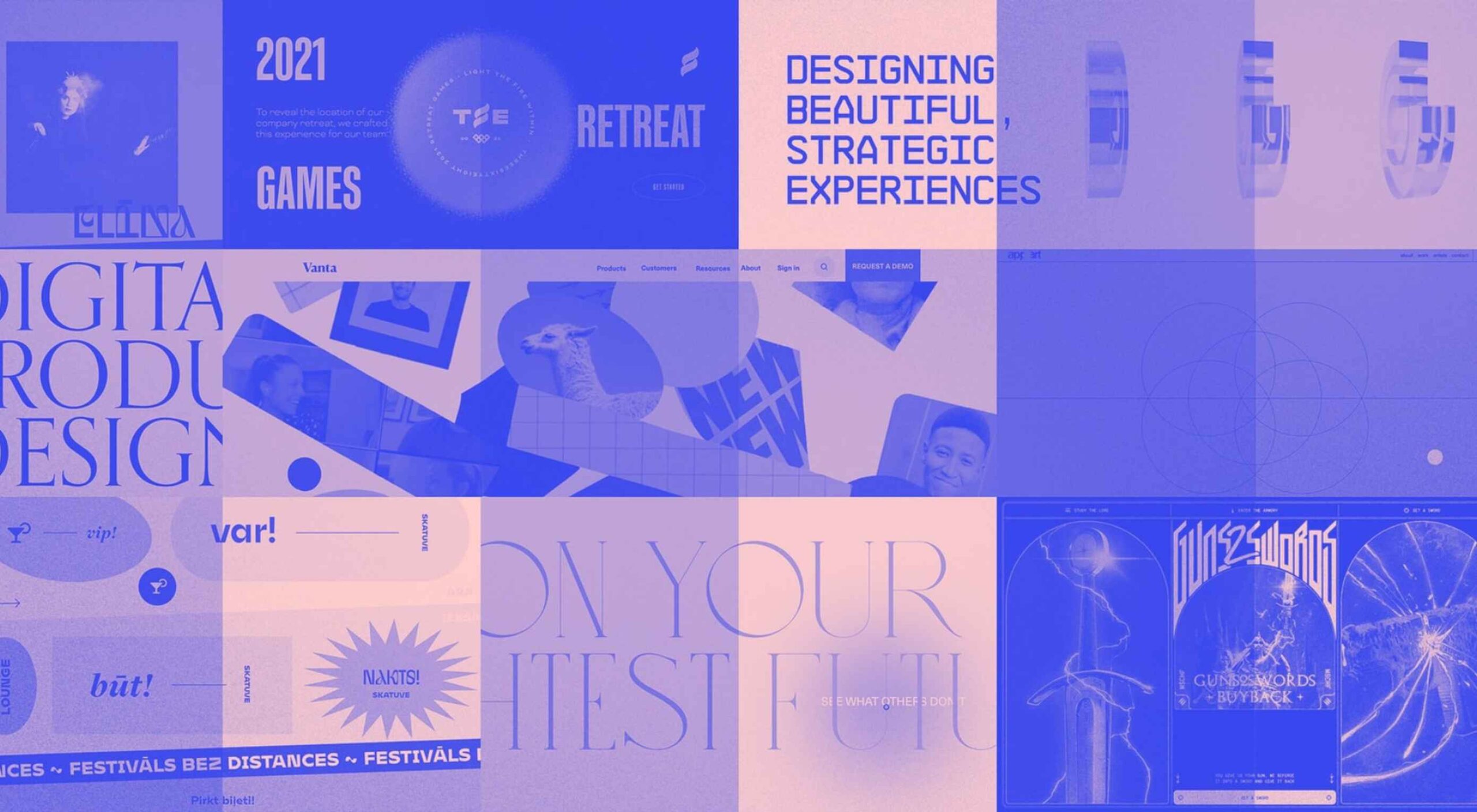
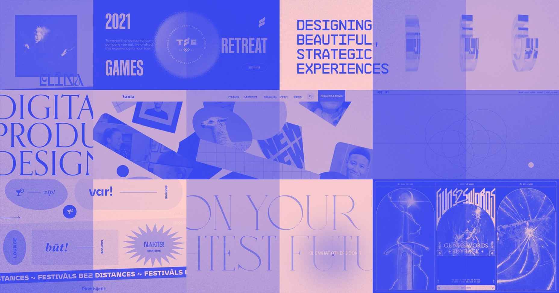
 Every day design fans submit incredible industry stories to our sister-site,


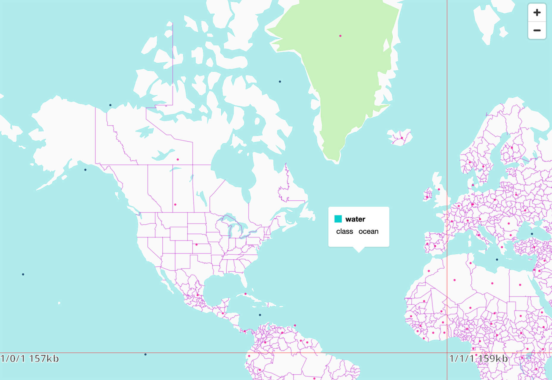
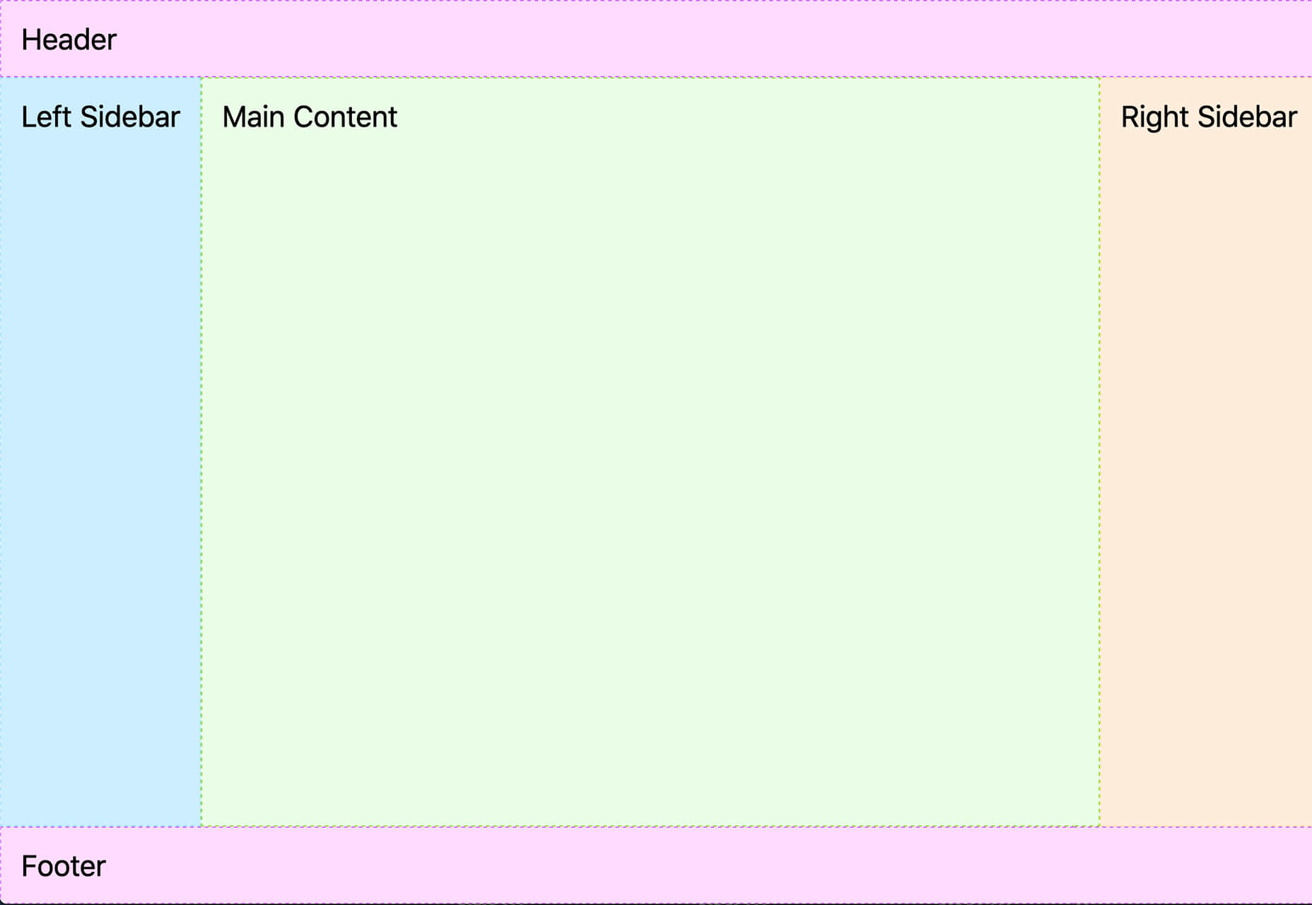
 Maps are a fascinating method for delivering content. At their best, they can create an intuitive way of presenting information and interacting with it. This is the advantage that digital maps, through mobile apps and websites, have over print maps and images where no interactivity is possible.
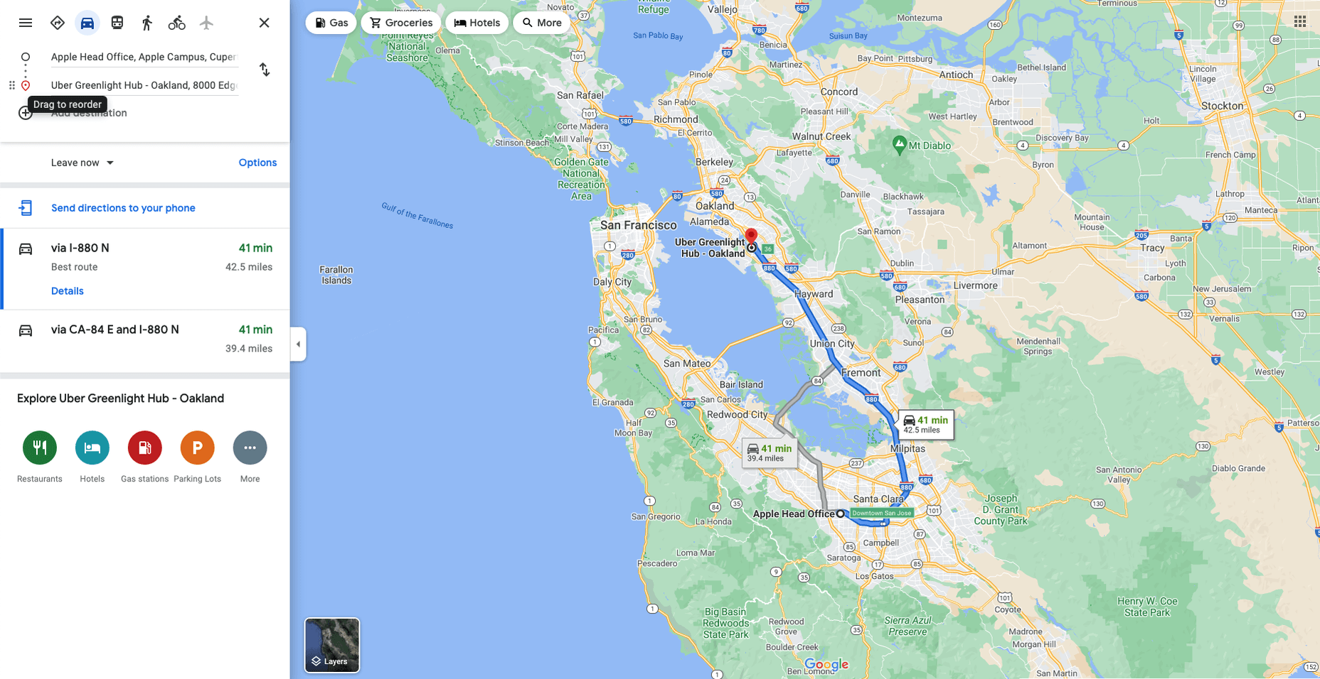


 Every day design fans submit incredible industry stories to our sister-site,


 Every day design fans submit incredible industry stories to our sister-site,


 Every day design fans submit incredible industry stories to our sister-site,
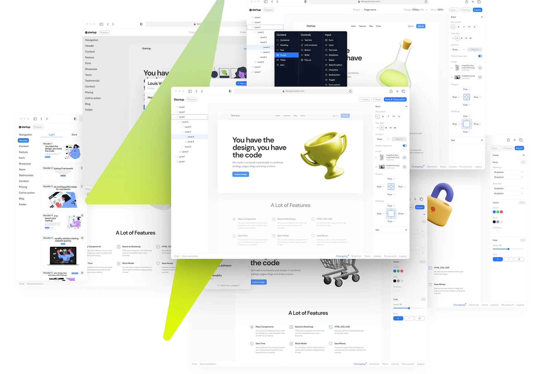


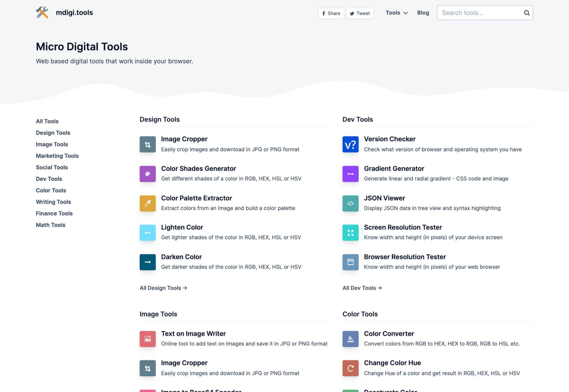
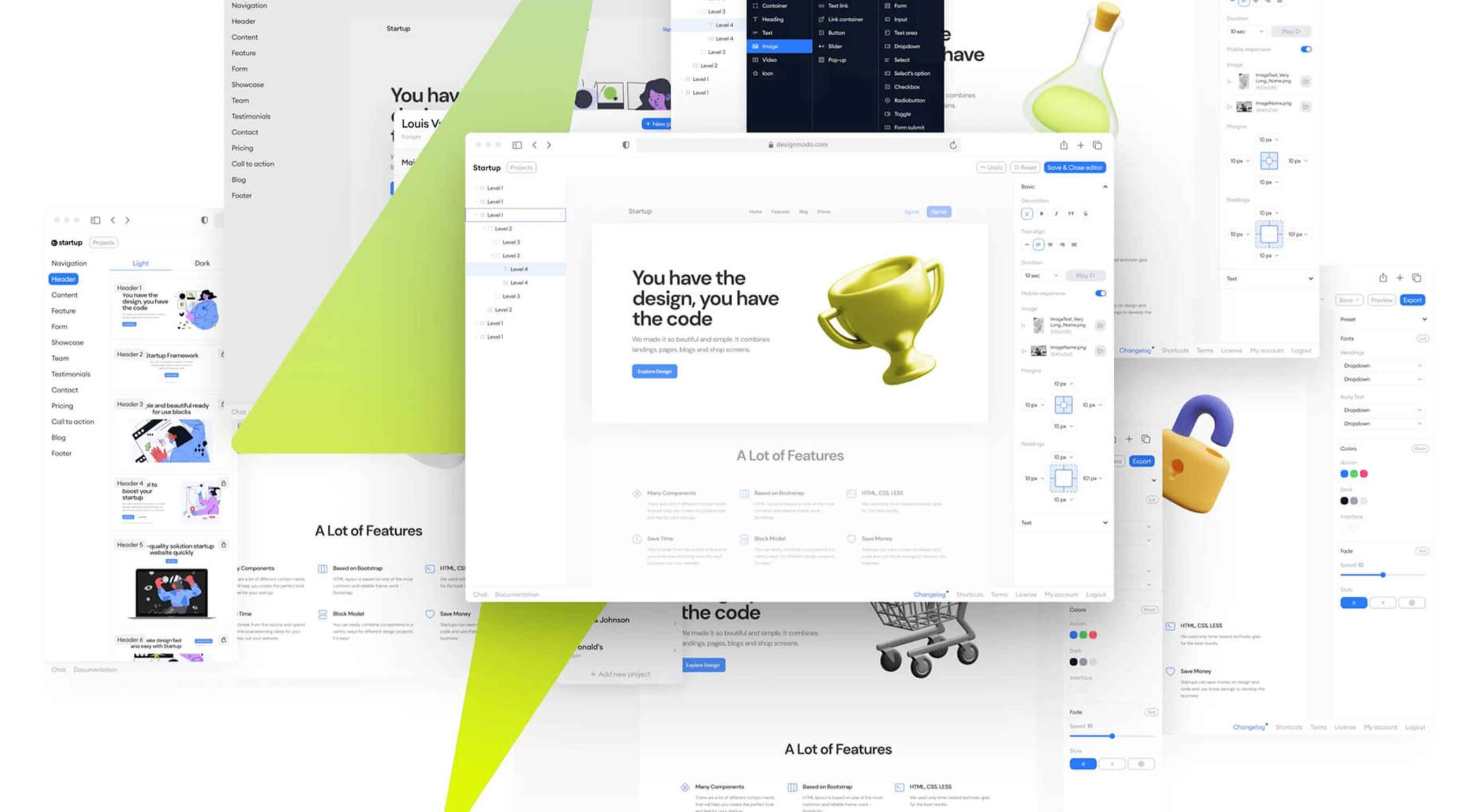
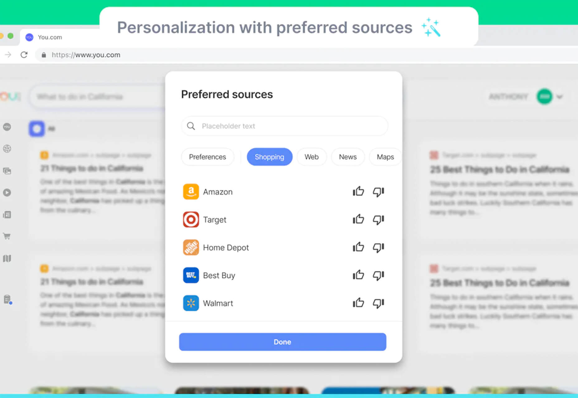
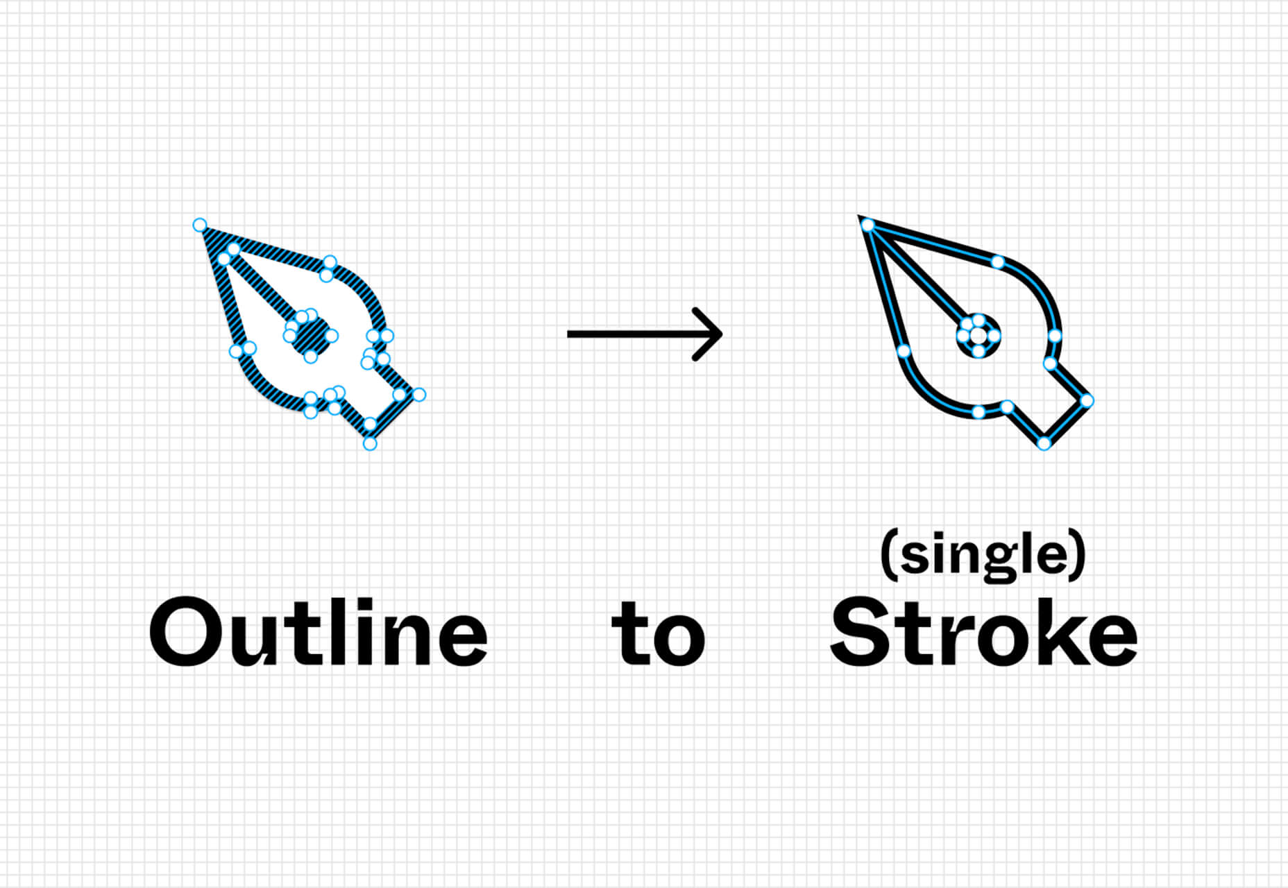
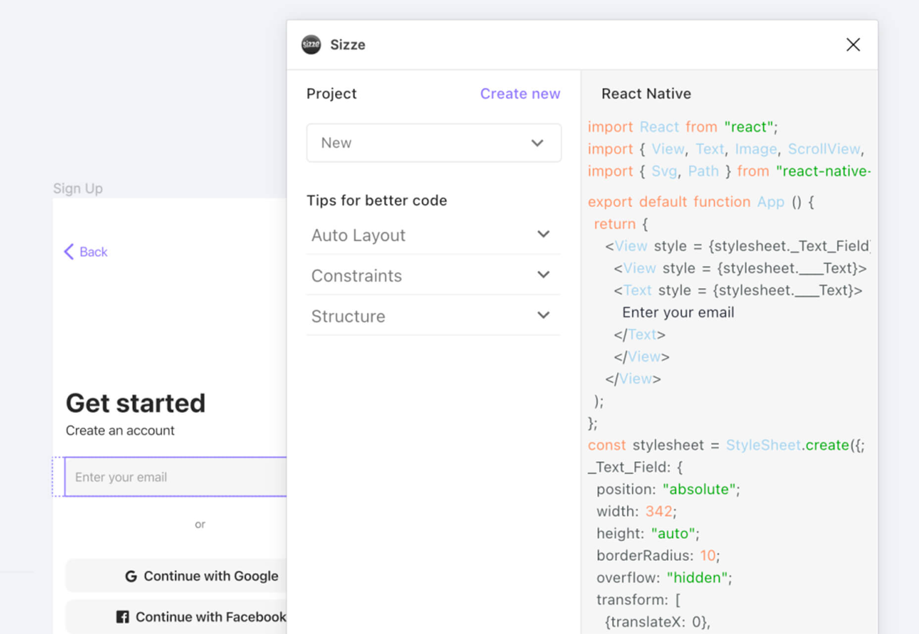
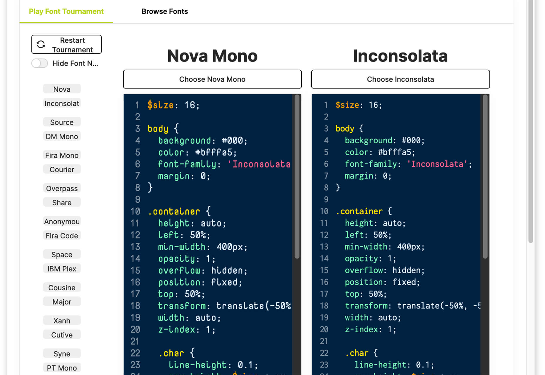
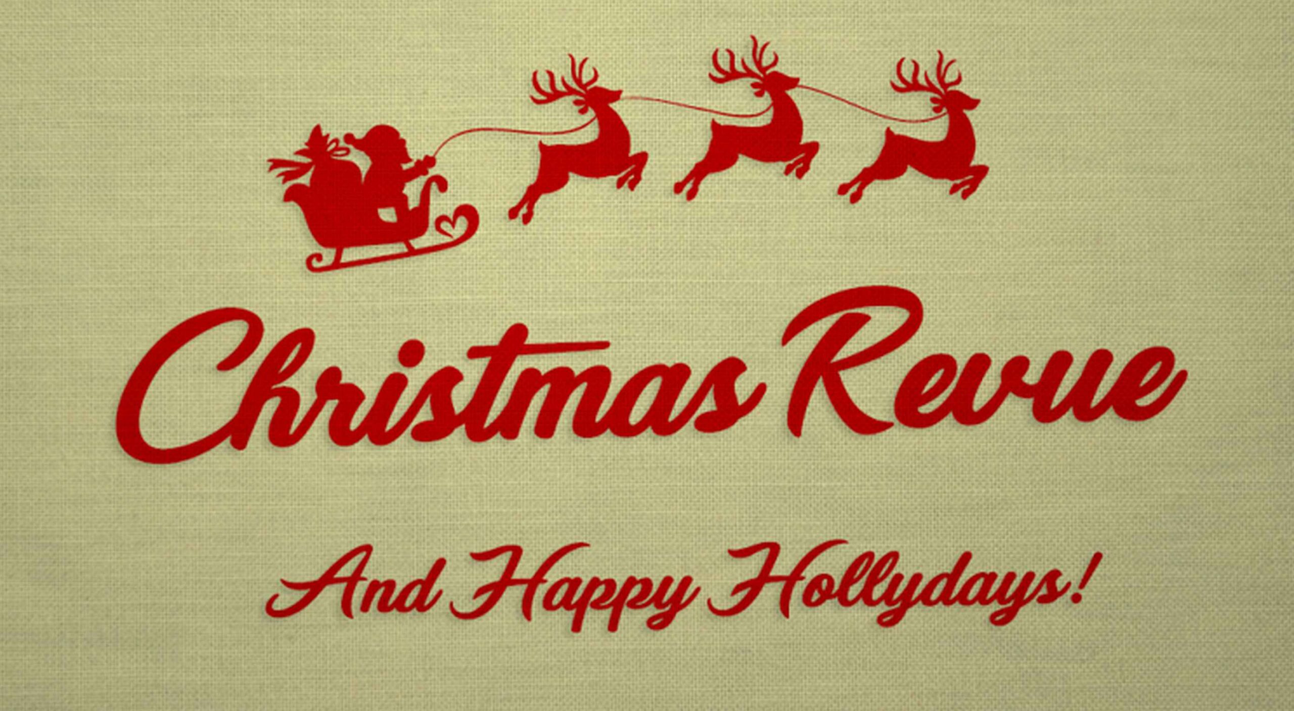 With the holidays fast approaching, there are plenty of fun gifts for you in this roundup of new tools and resources for web designers. Make sure to share anything you find helpful with others to spread additional holiday cheer.
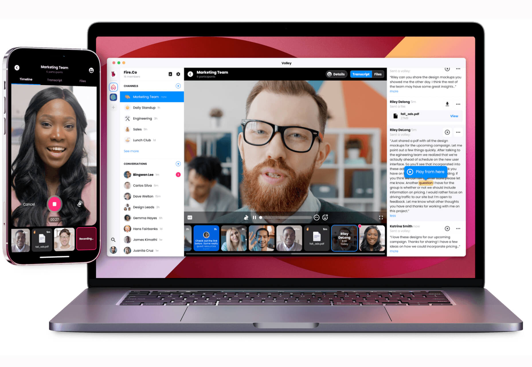
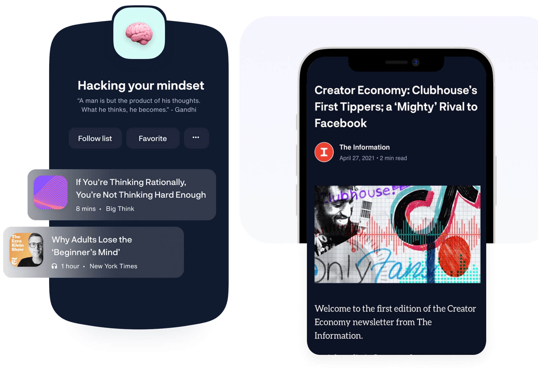


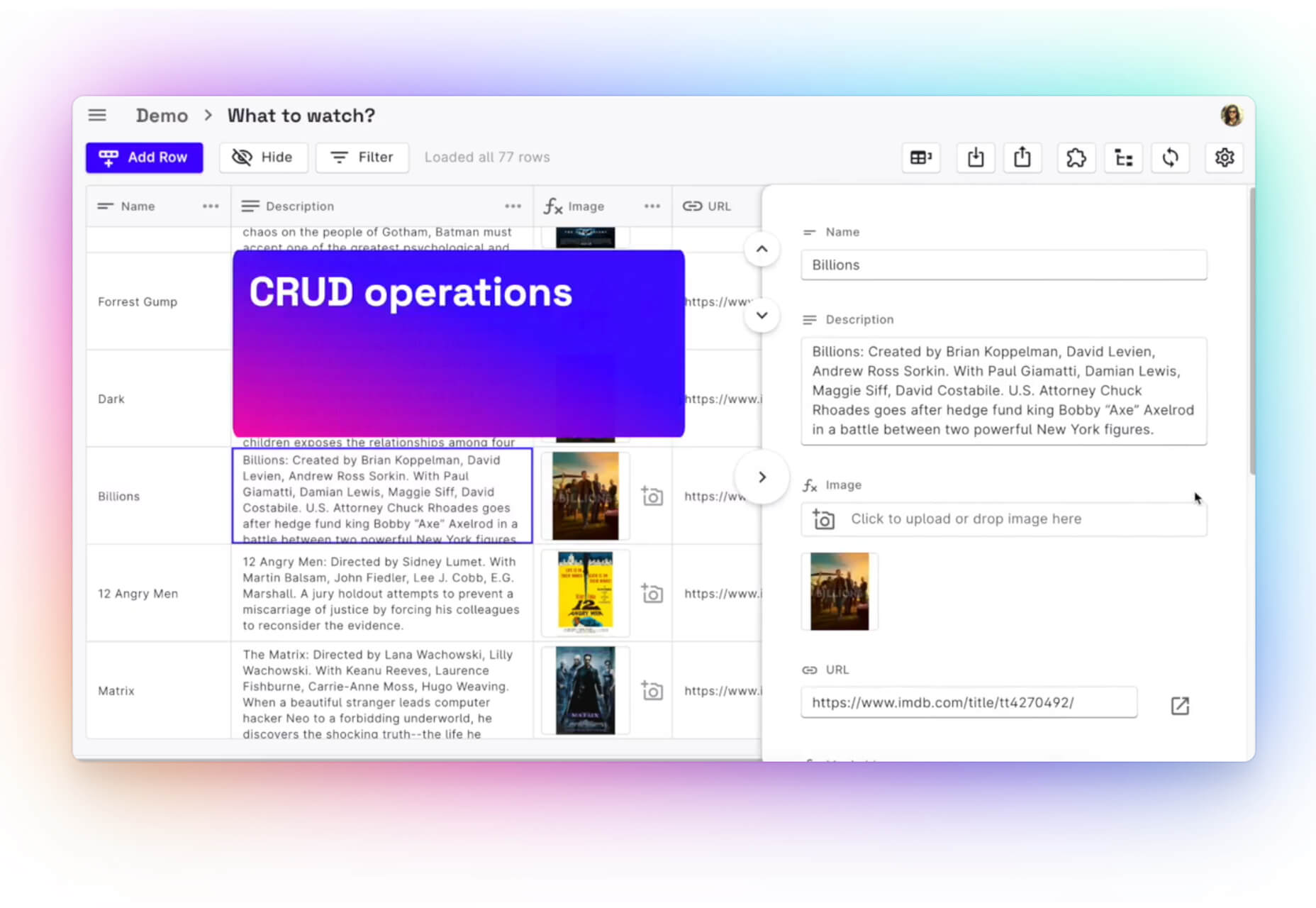
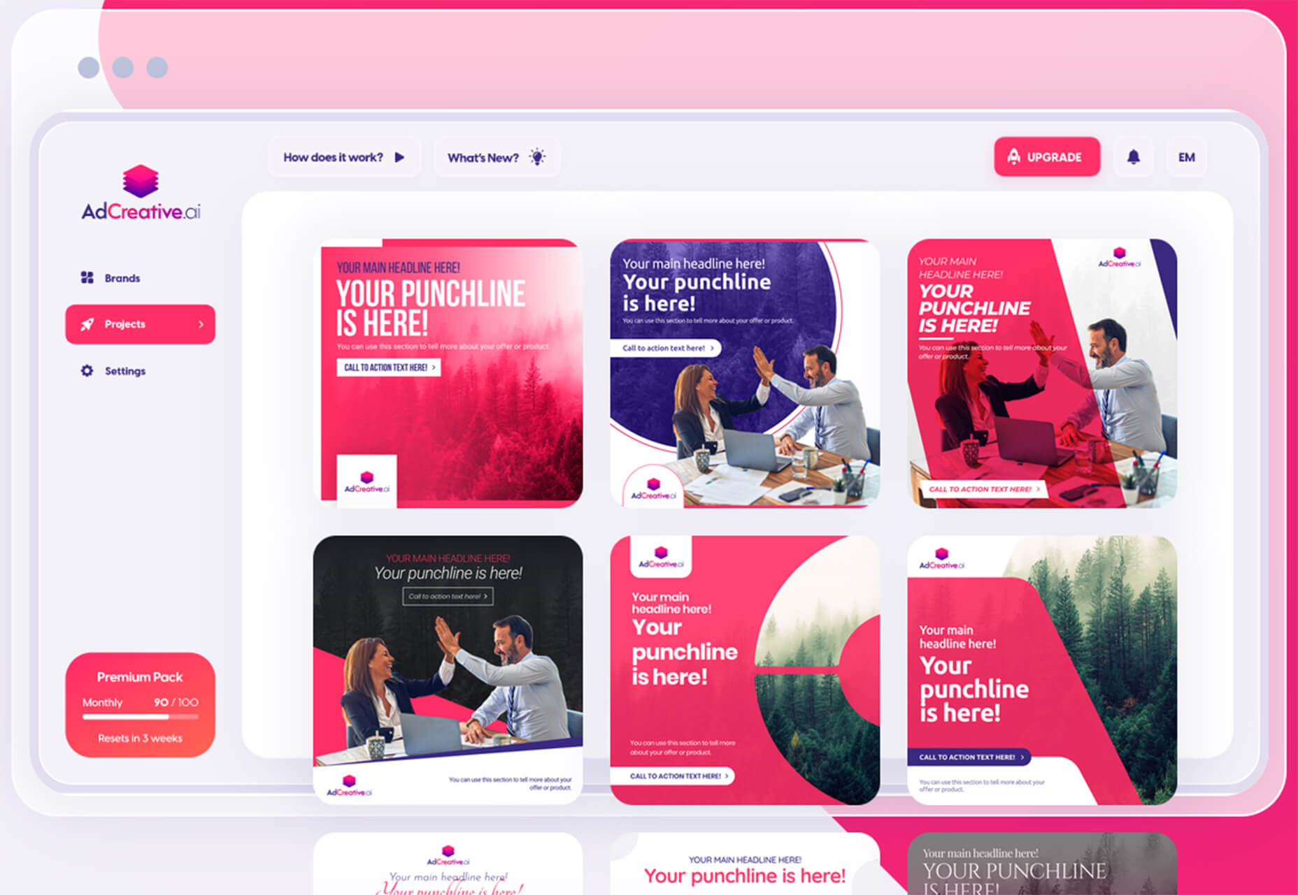
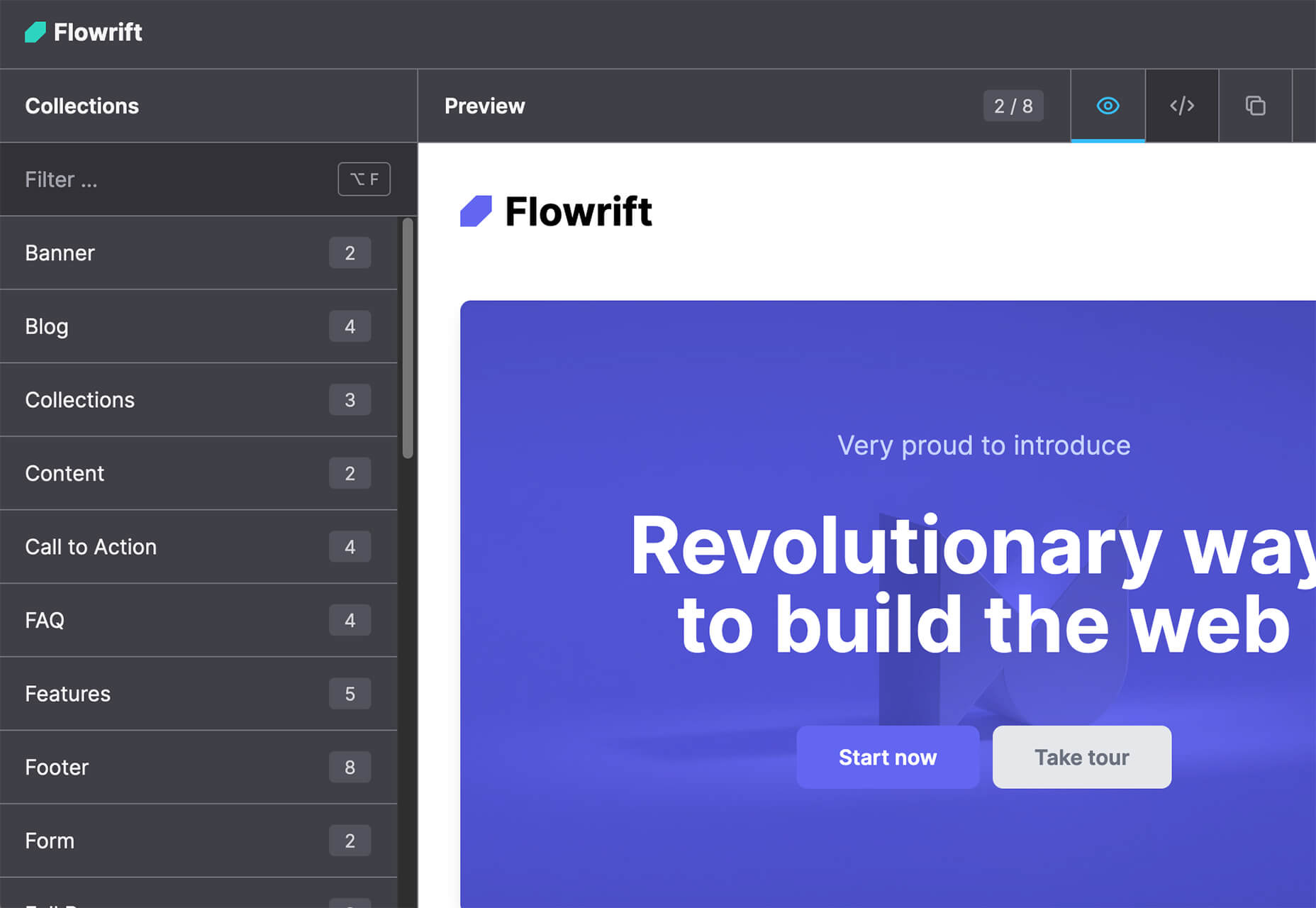


 Every day design fans submit incredible industry stories to our sister-site,


