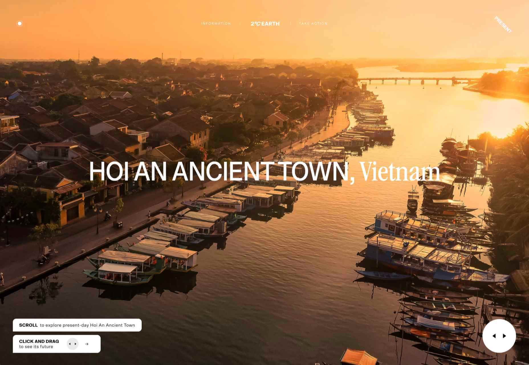
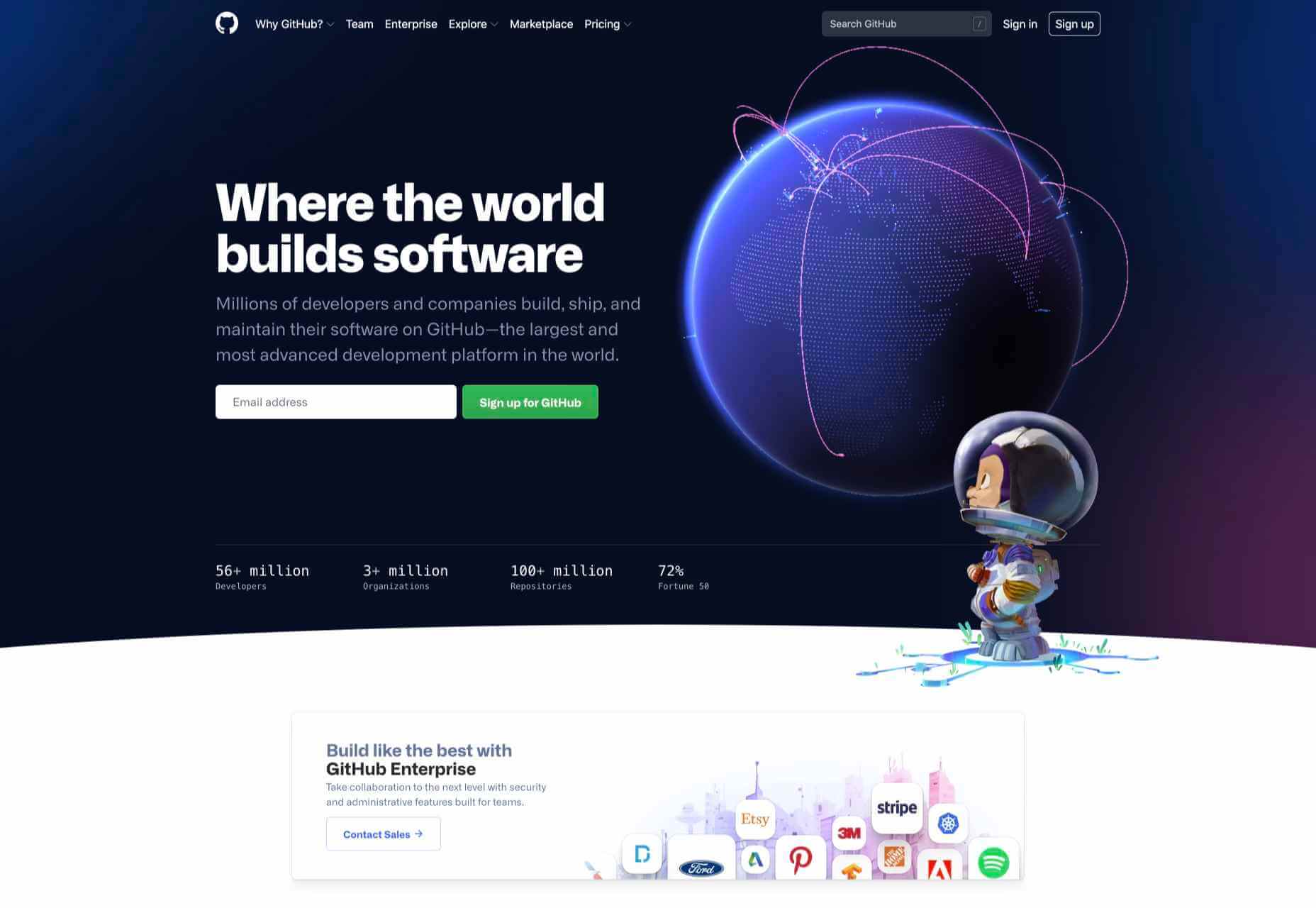
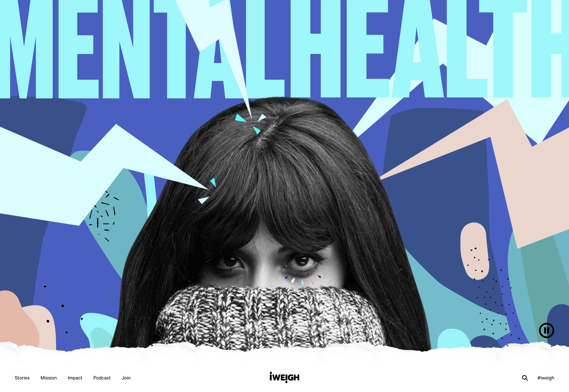
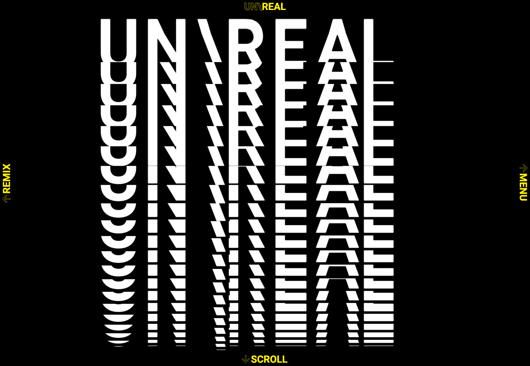
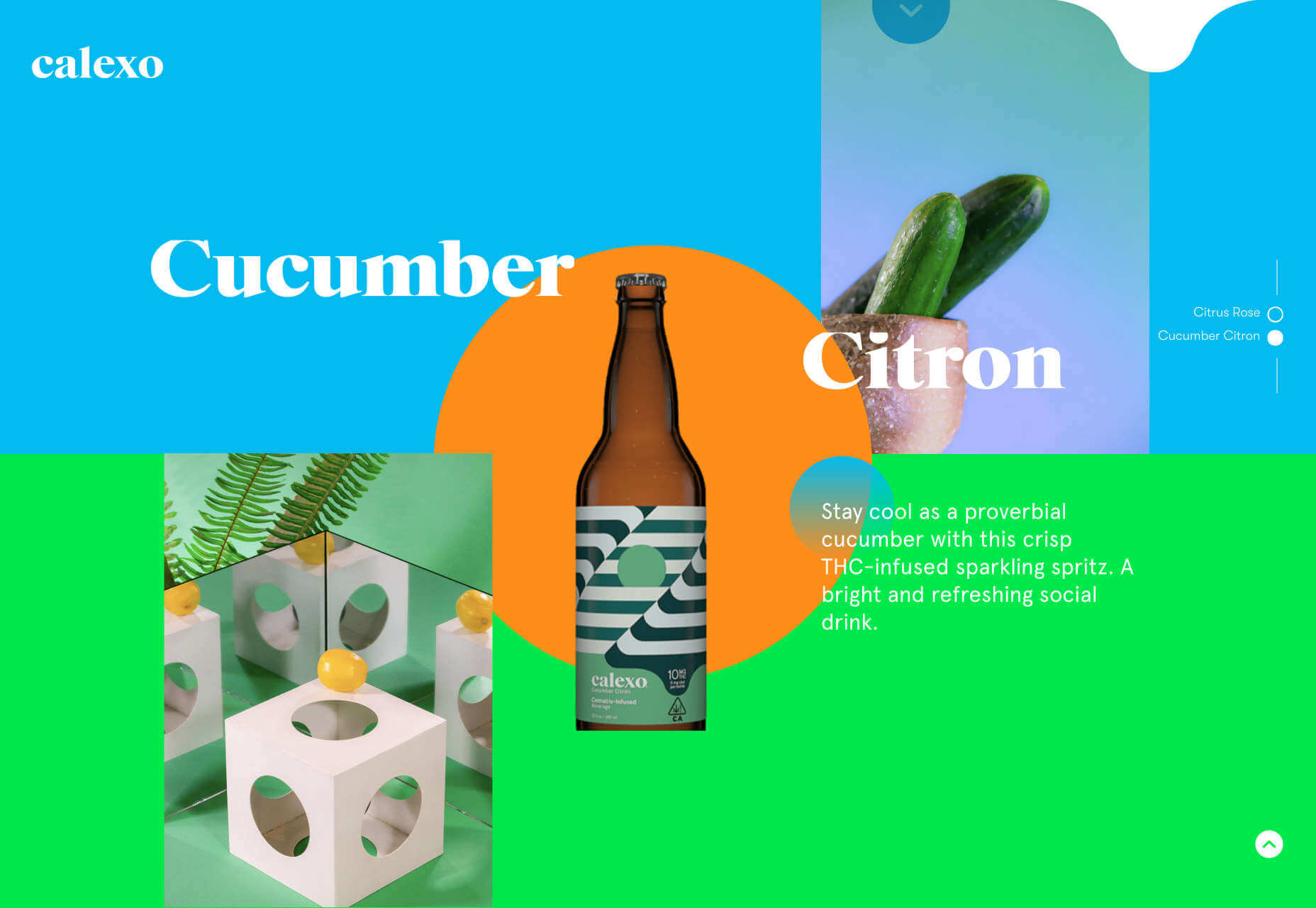
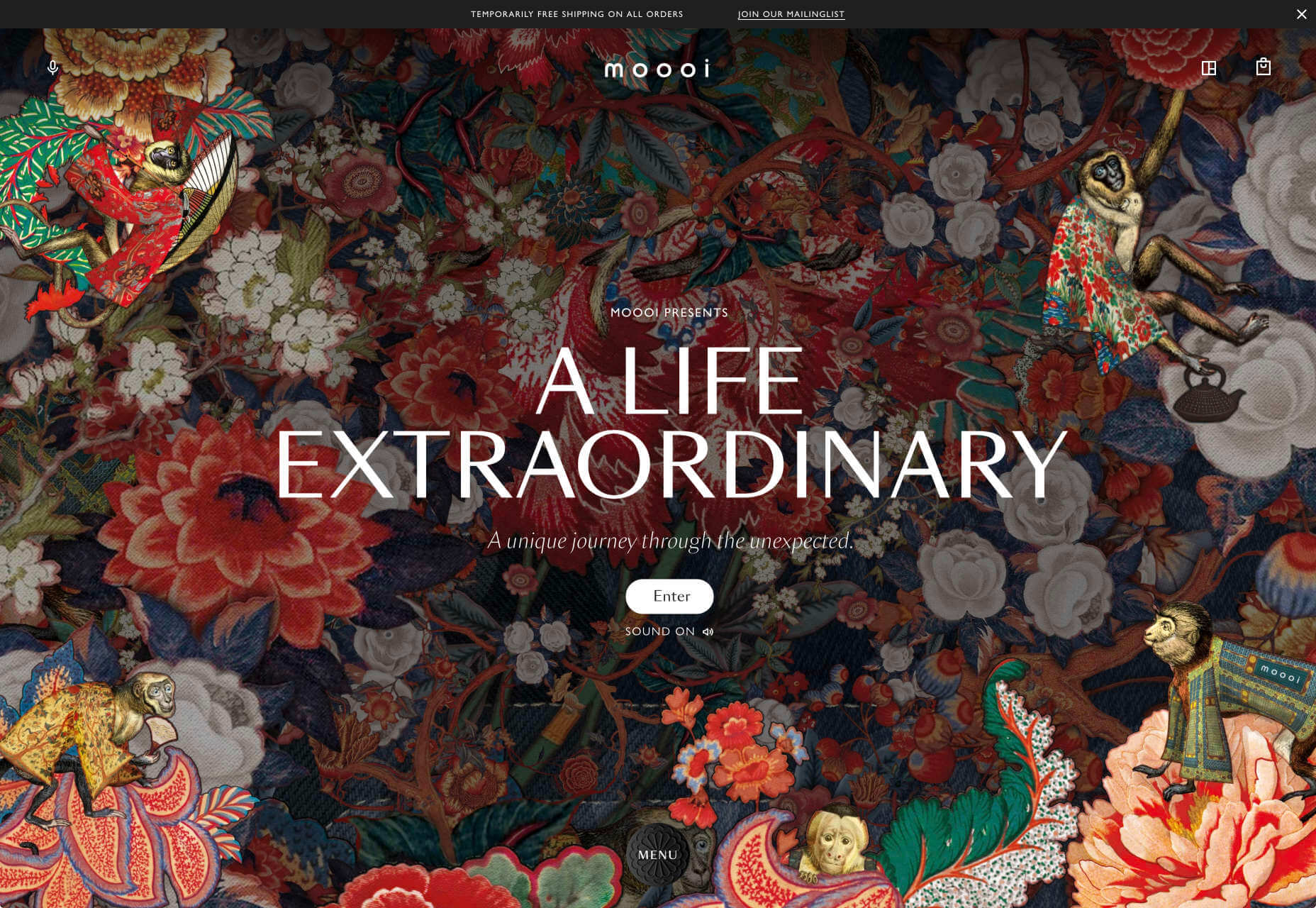
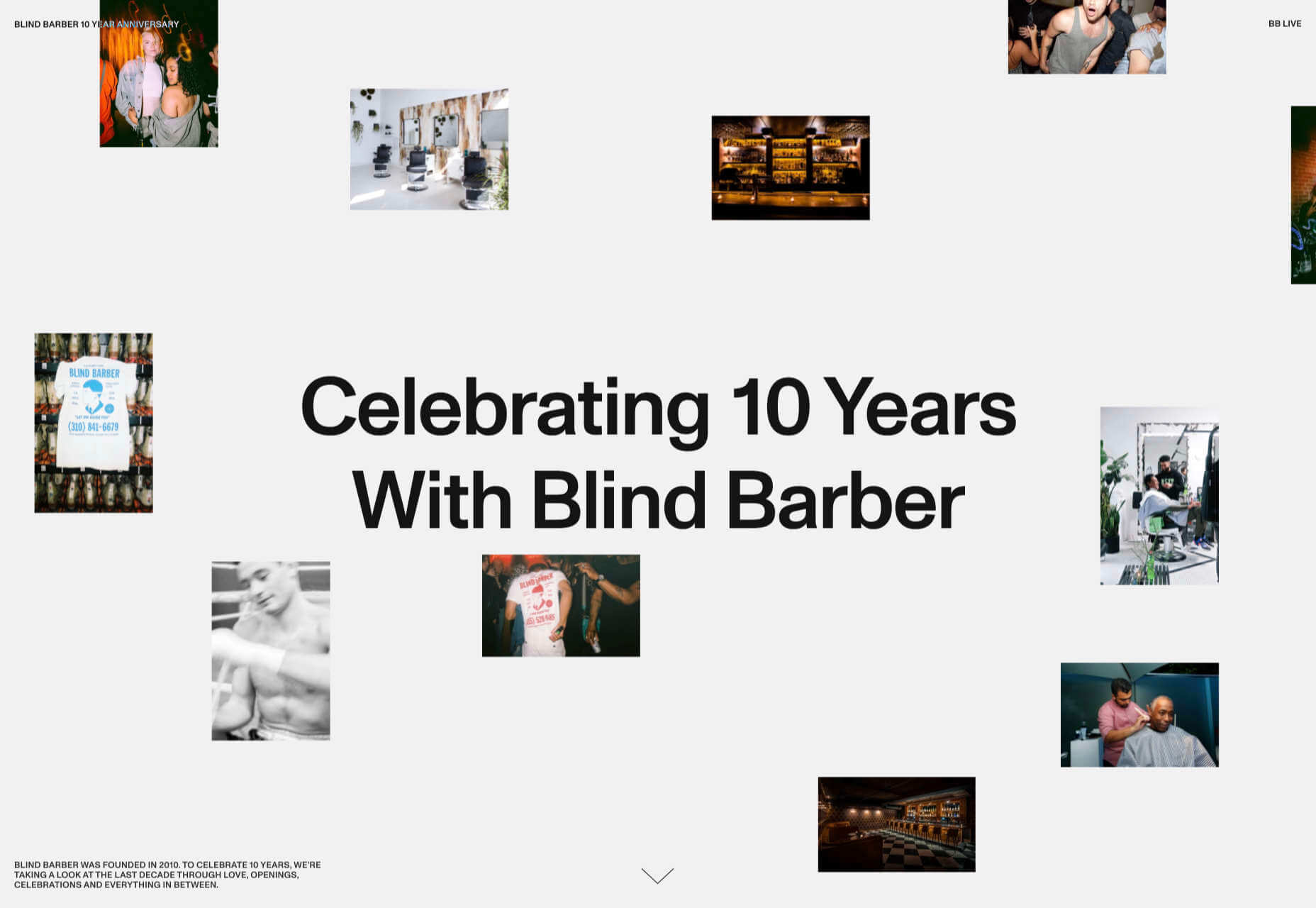
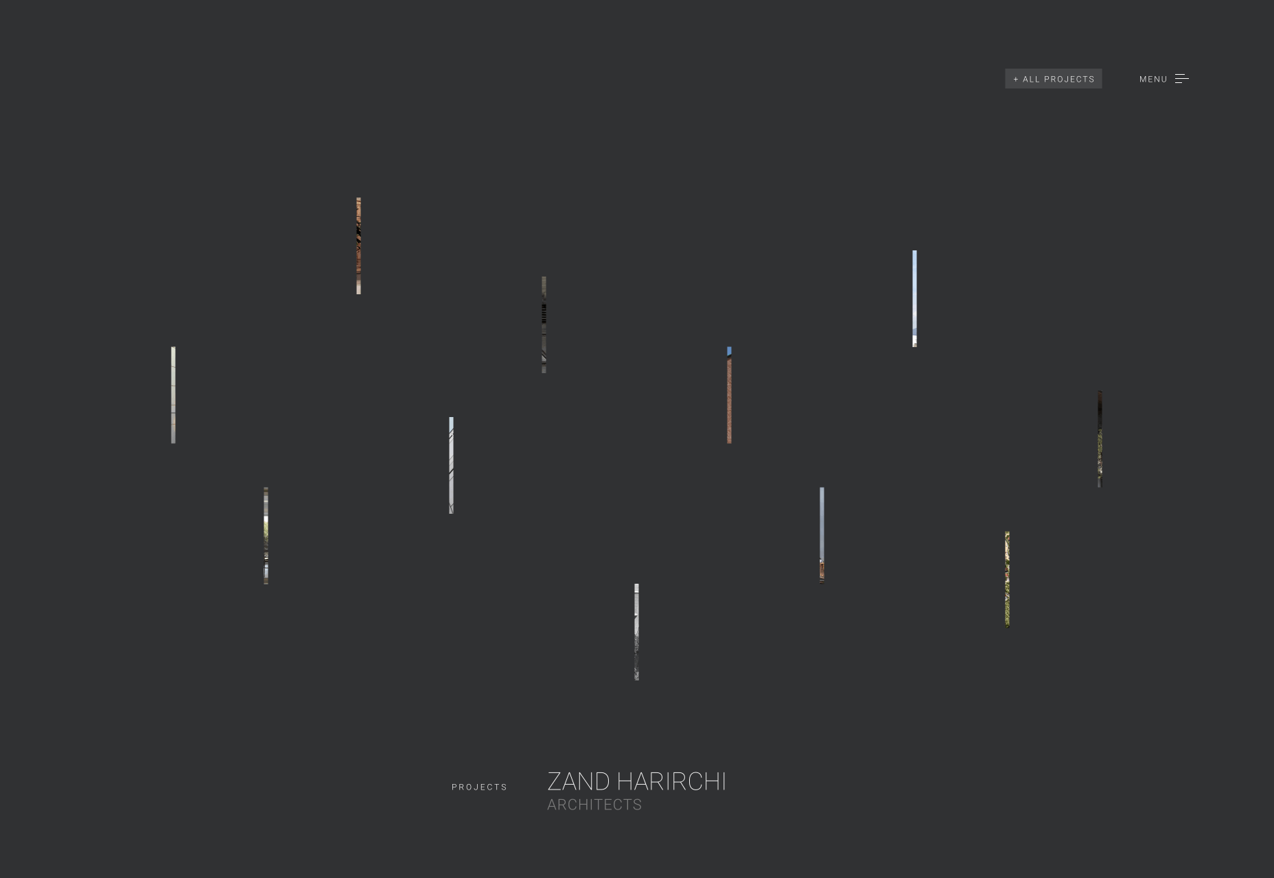
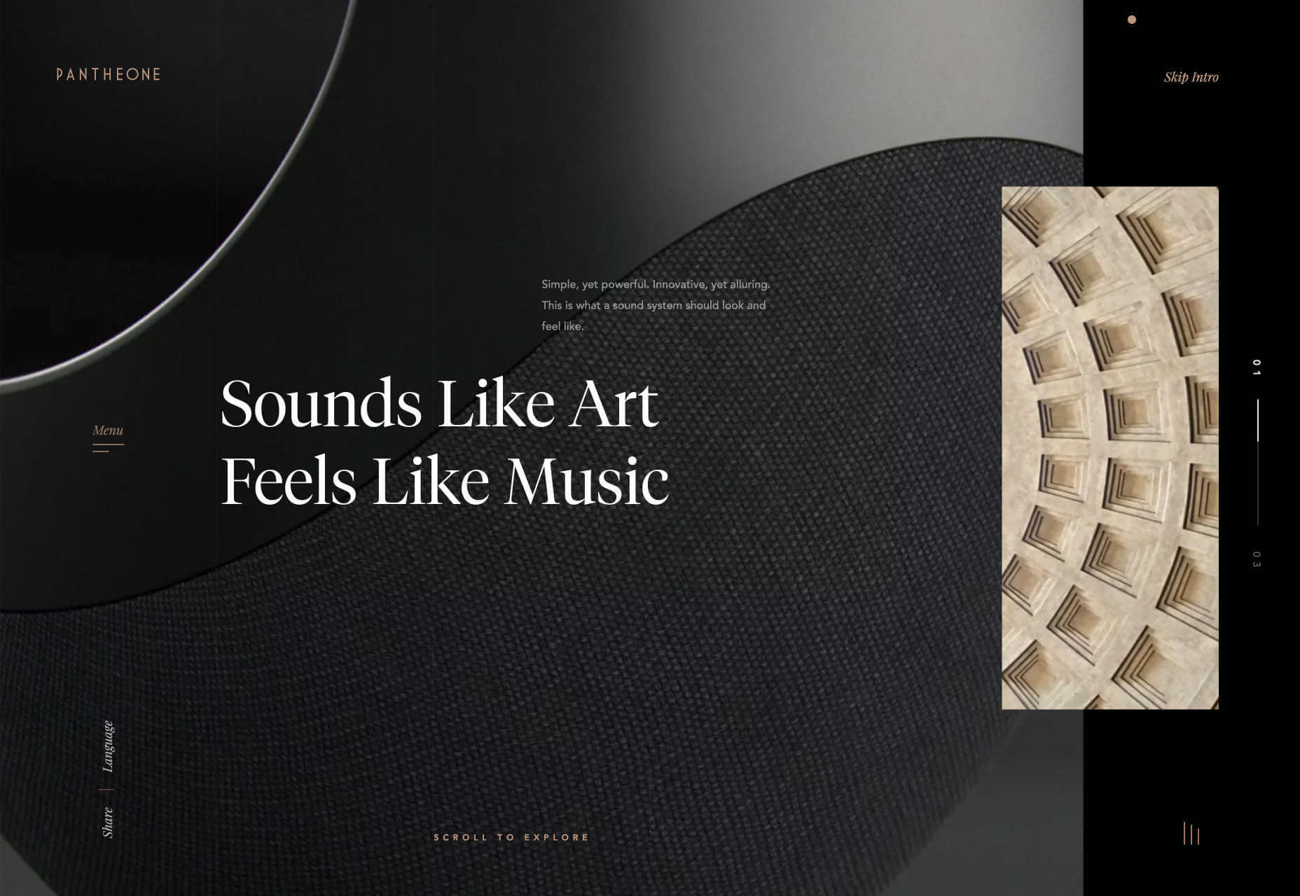
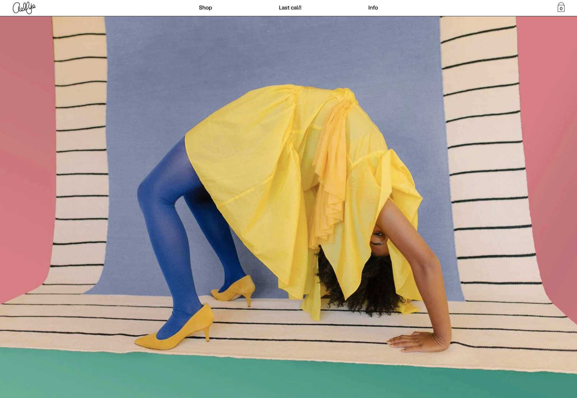
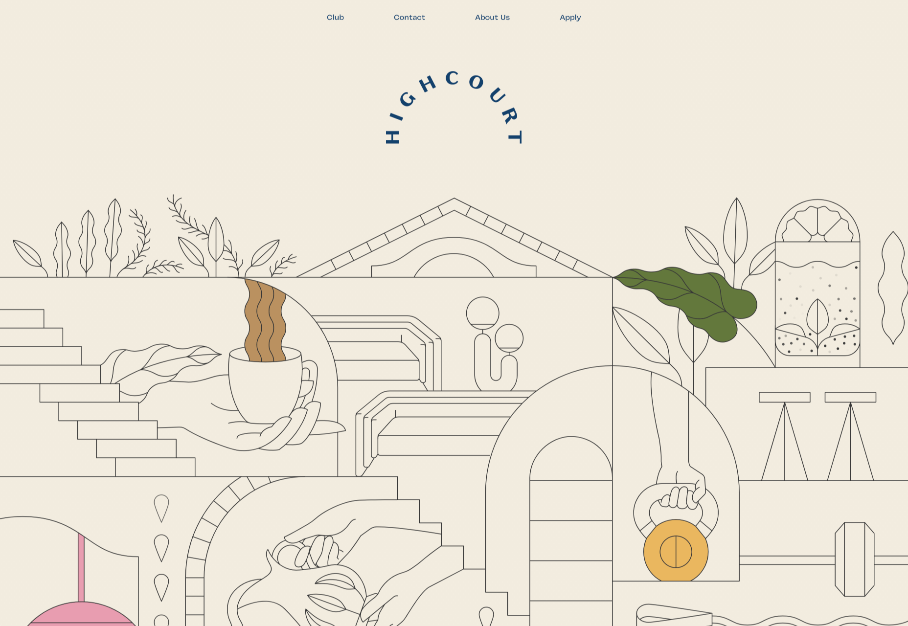
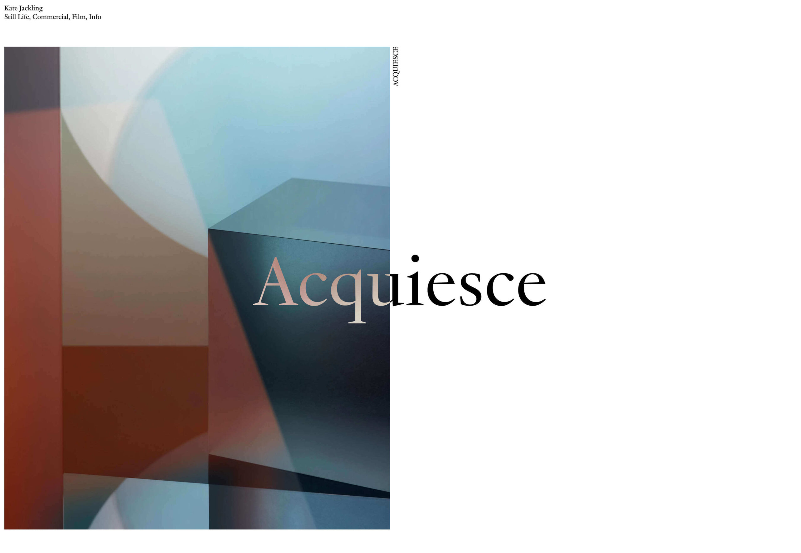
 We’re going to try something a little different this month; with this roundup of tools and resources for designers, we’re going to pick a few of our favorites and group everything else in a manner that makes it even easier to find elements that will work for you, and your projects, right now.
Here’s what’s new for designers this month…
February’s Top Picks
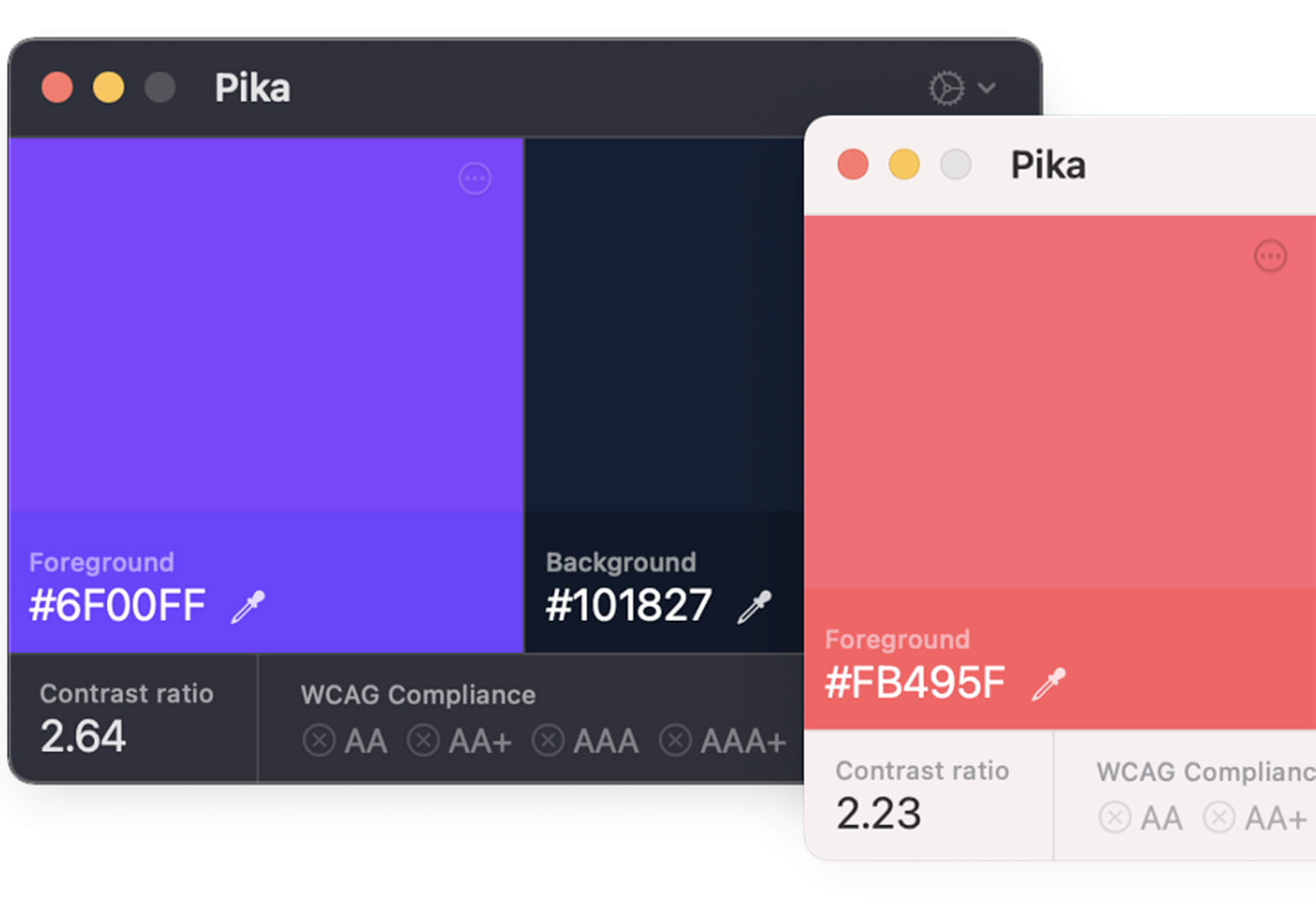
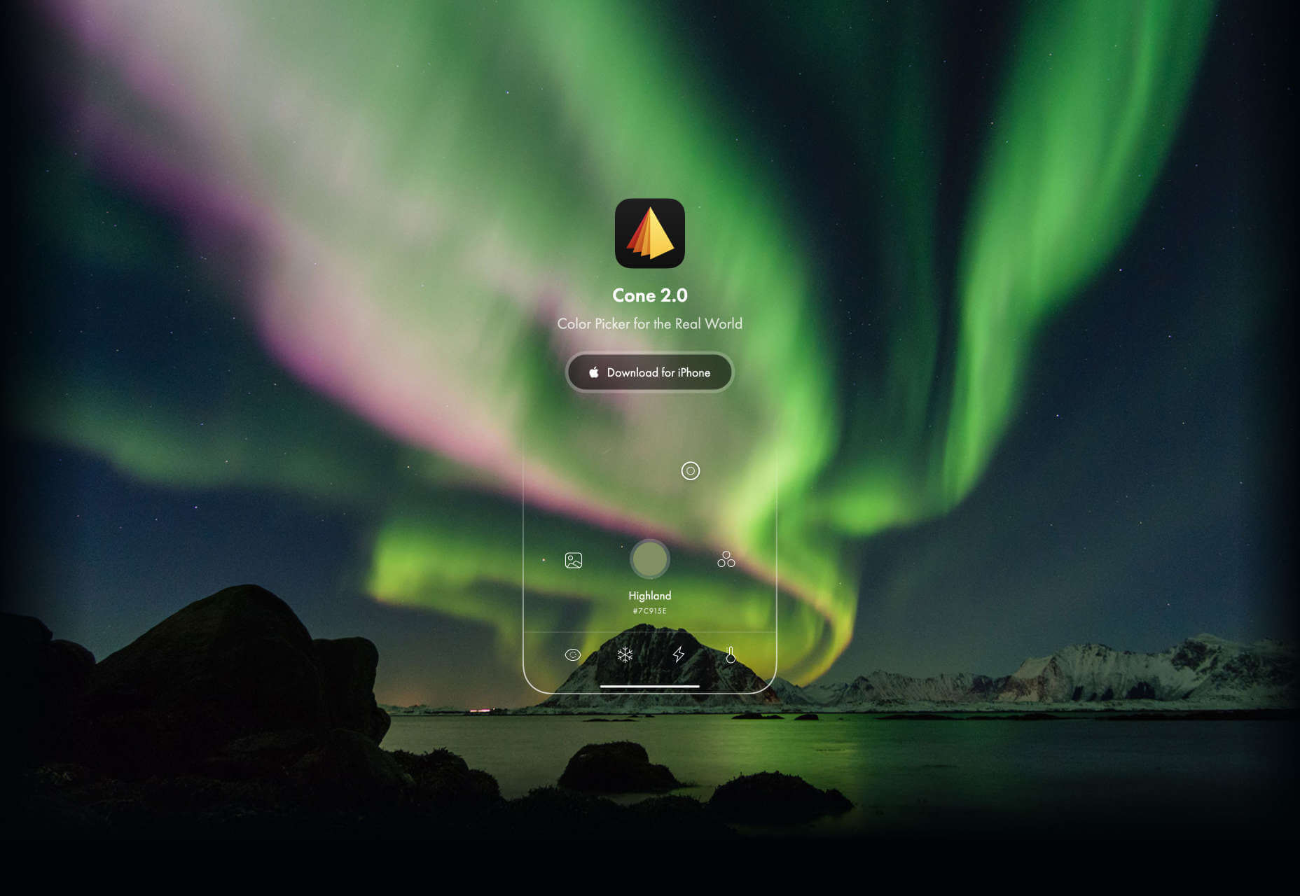
Pika
Pika is a new Mac app that is an open-source color picker. It helps you find color swatches on-screen, saving time and design headaches. Plus, it’s packed with bonuses such as the ability to confirm accessibility compliance for colors, compact size and style, easy to access from your desktop, and format-friendly with plenty of color code options.
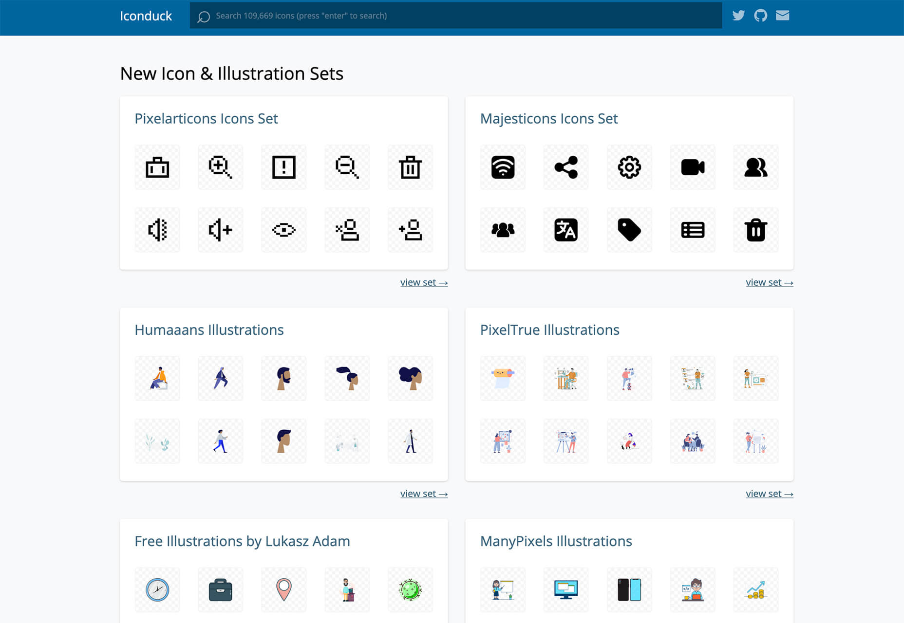
Iconduck
Iconduck is a searchable database of more than 100,000 icons in one place. (No more searching various marketplaces!) The goal of the project is to make open-source icons and illustrations more accessible. So, everything you find here is free! The site does all the heavy lifting for you by collecting icon sets, tagging them, and making them searchable.
Descript
Descript is a premium tool that eliminates some of the intimidation factors with audio and video editing. With a design that functions as a word document and allows you to transcribe, record the screen, publish, and edit, all with some cool AI features.
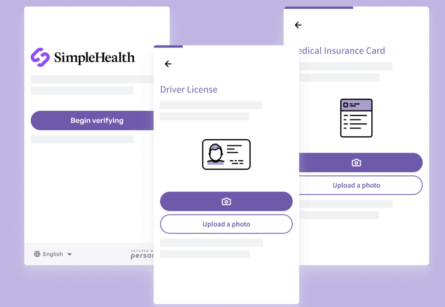
Persona
Persona is an all-in-one identity infrastructure that allows you to collect, verify, manage, and decide customer identities from a single dashboard. Everything is fully automated, and most users can be up and running in about 10 minutes. The premium tool does have a free version for small-scale verifications.
6 Productivity Boosters
Peekalink
Peekalink turns standard links into rich content that users will be delighted to share and engage in. And it’s easy to use. Just send a request to the API with a link and get a response back to use, including a rich link for your project.
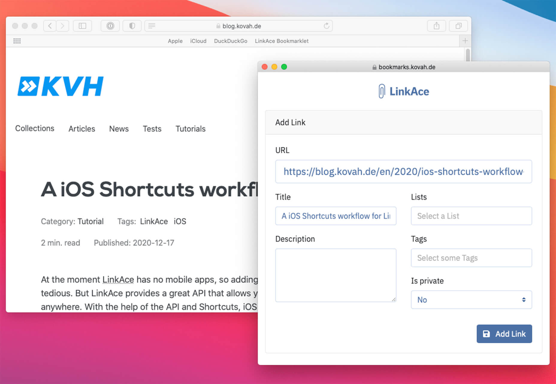
LinkAce
LinkAce is an open-source and self-hosted archive to store and organize links that you want to save. You can search thanks to tags and lists, and all of the content is available thanks to automated backups and monitoring. There’s a demo you can try before installing it yourself.
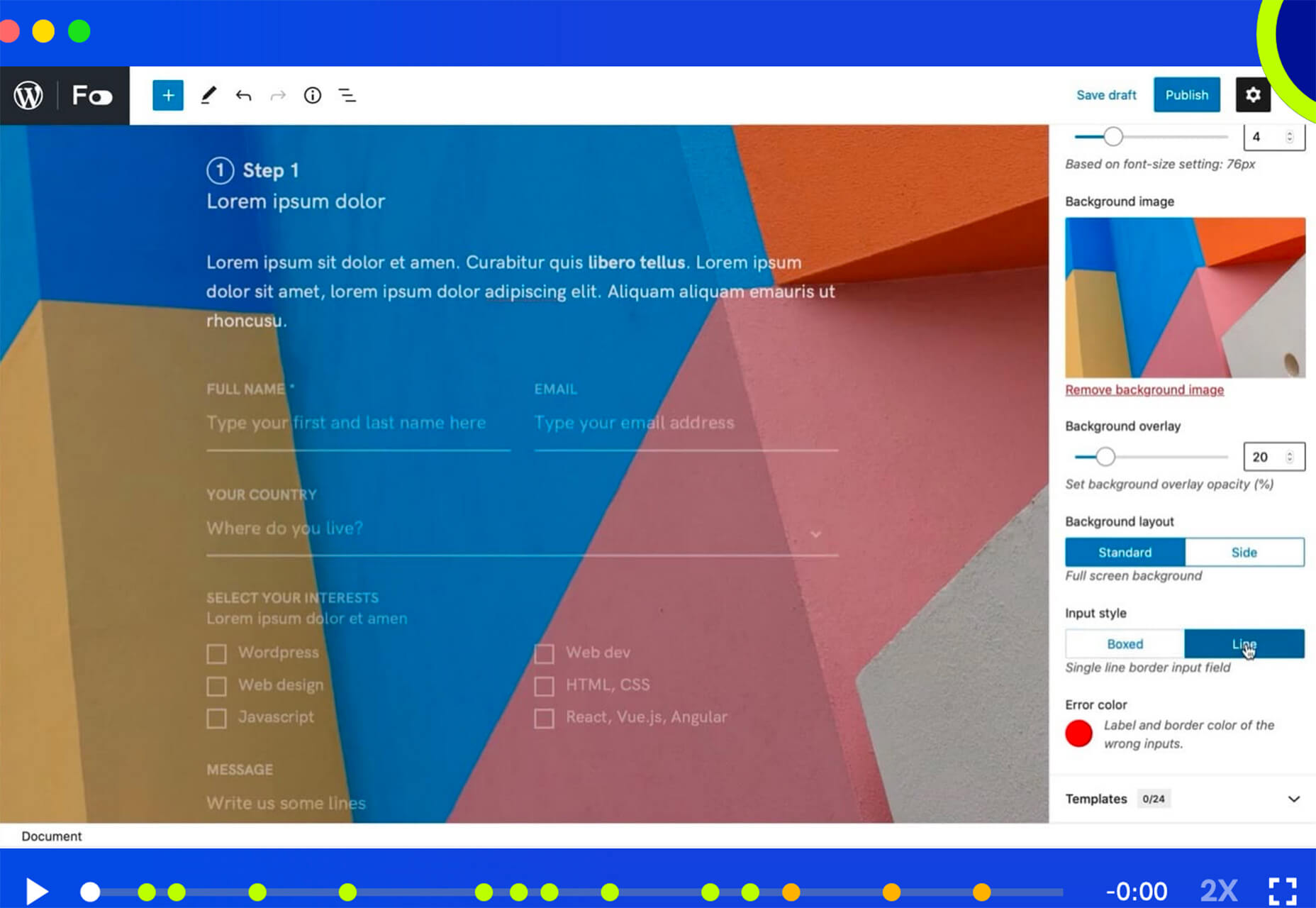
Formality
Formality is a WordPress plugin that helps you make forms a little bit easier. It’s made to work with the Gutenberg-based form builder with a single block format to control the form. The plugin has a theme-agnostic design that works with any layout style and includes customizations to make it feel a little more personal.
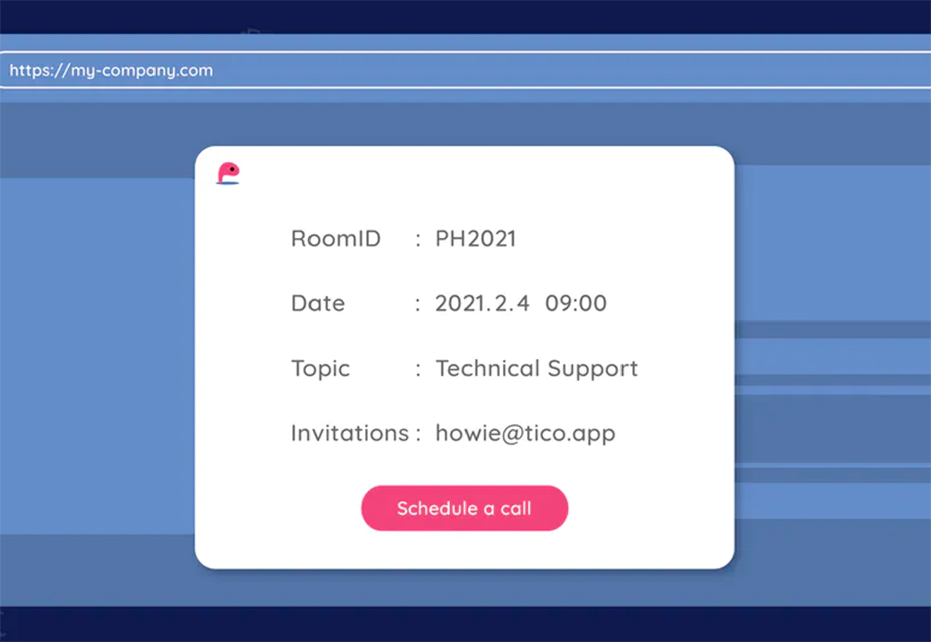
Wondercall
Wondercall is an embeddable video call system for any website or app. You can make calls and schedule them with a widget you can embed right into your design.
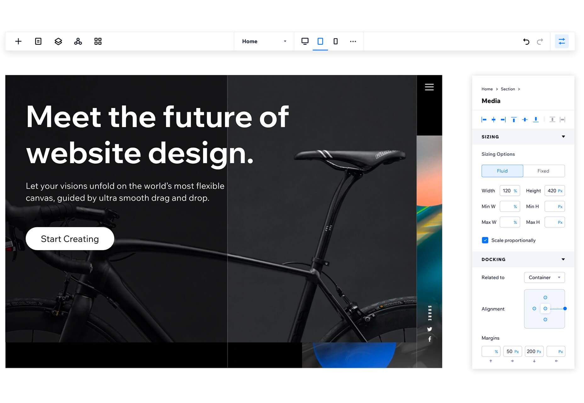
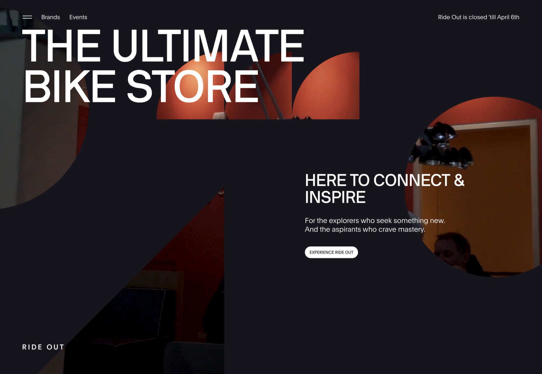
Editor X
The Editor X website builder is out of beta and ready for mainstream use. The platform is designed for designers and agencies to create websites collaboratively and quicker. Features include live commenting, roles and permissions, and shared design libraries. Plus, the platform offers code-free interactions.
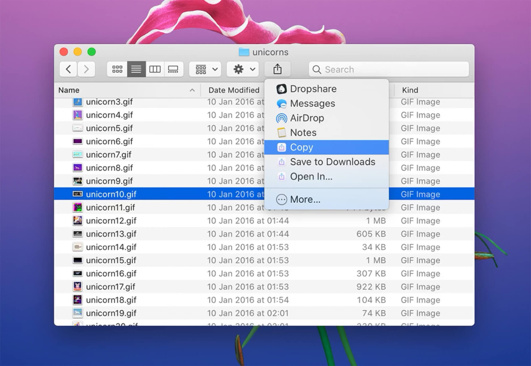
Shareful/h2>
Shareful is a Mac app that makes the system share menu more powerful. You can copy, save as, and open indirectly from the system share menu.
2 Icon Sets
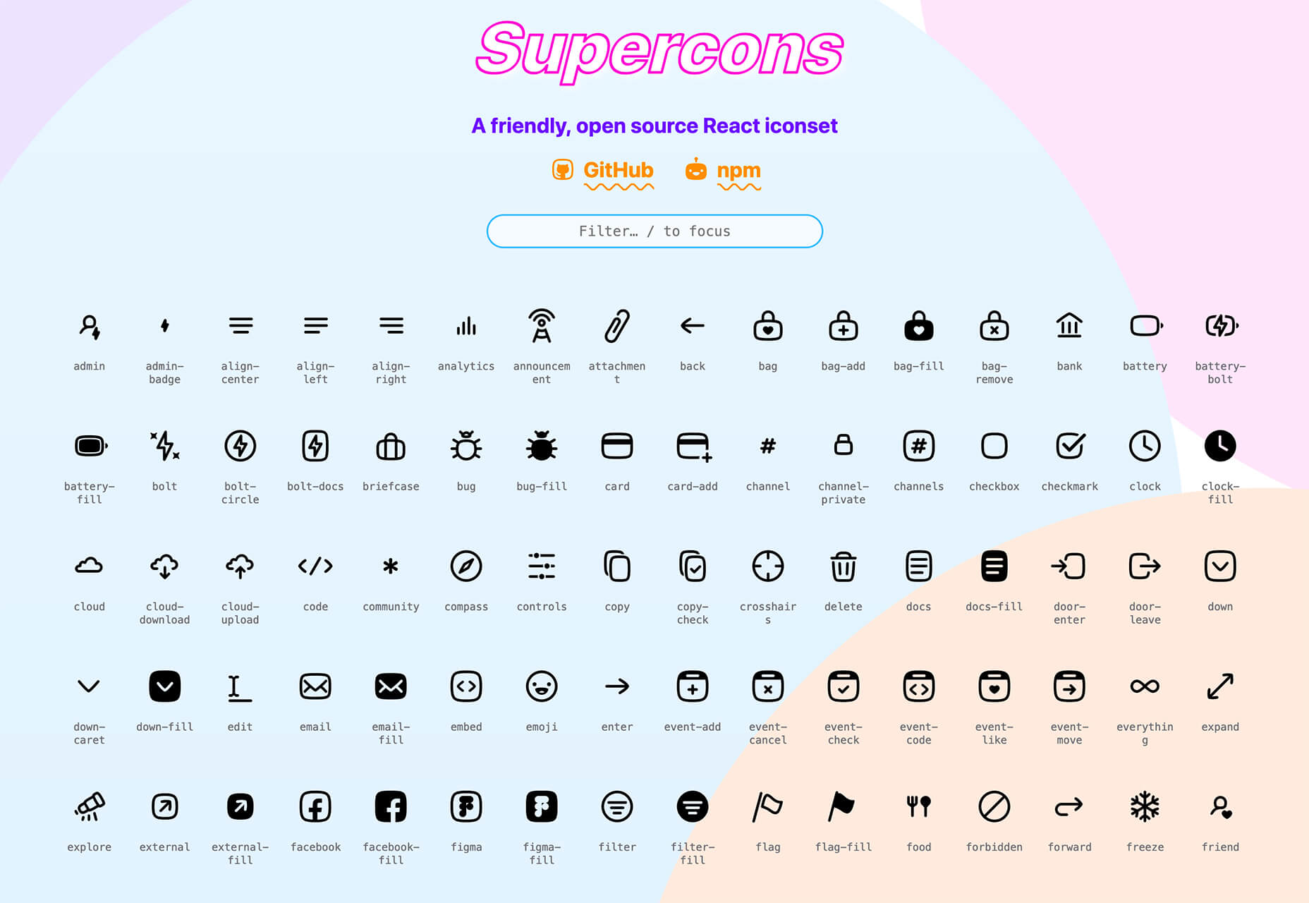
Supercons
Supercons is a giant set of icons in React. They are all open-source, and there are plenty of choices to help you propel projects forward.
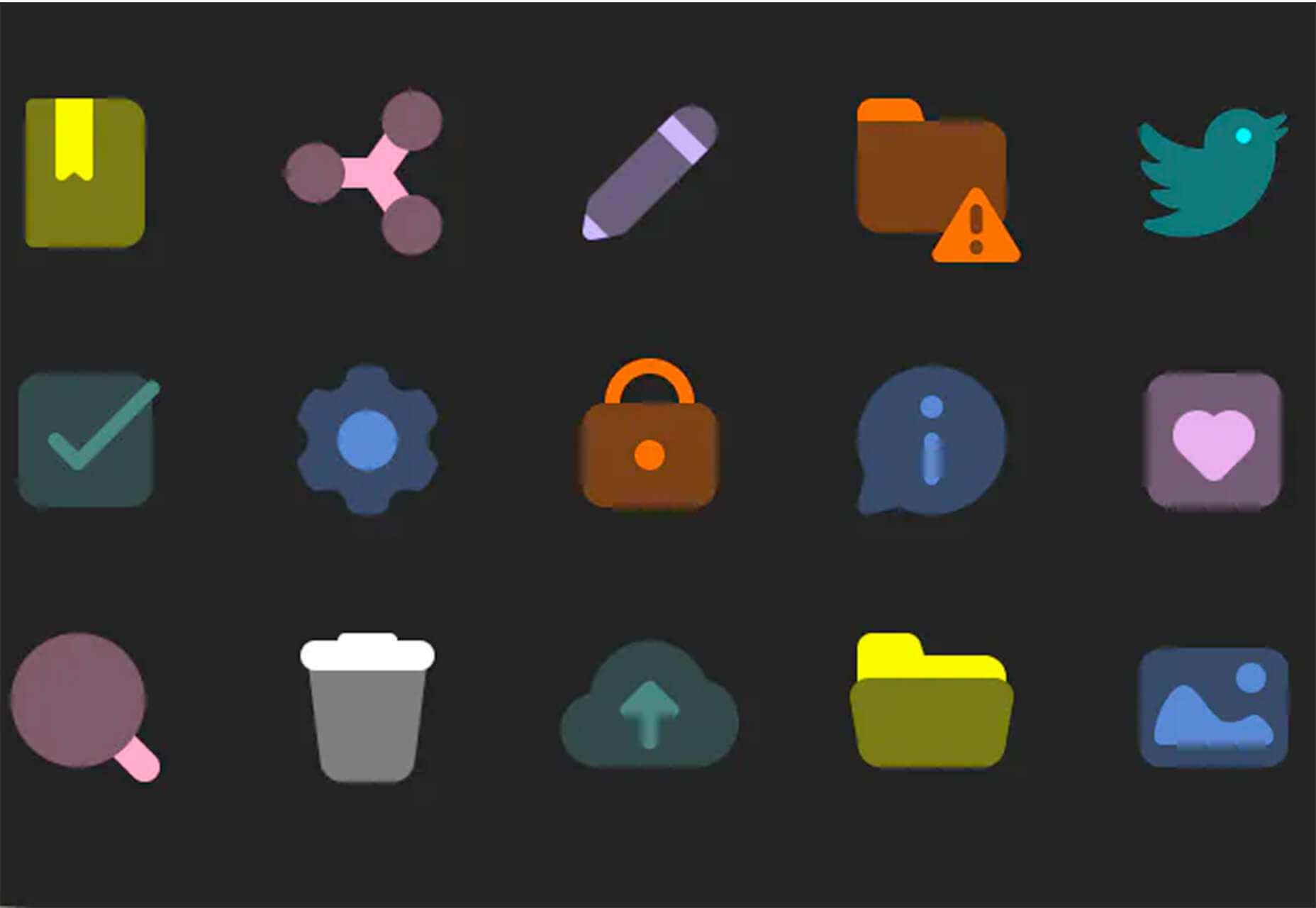
Plumpy Icons
Plumpy Icons are packed with style. The set of icons has a fun design, comes in duotone colors, and scales to any size. Plus, there are more than 4,000 icons in the collection. There are free and paid options depending on the file type and use.
3 Tutorials and Demos
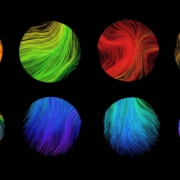
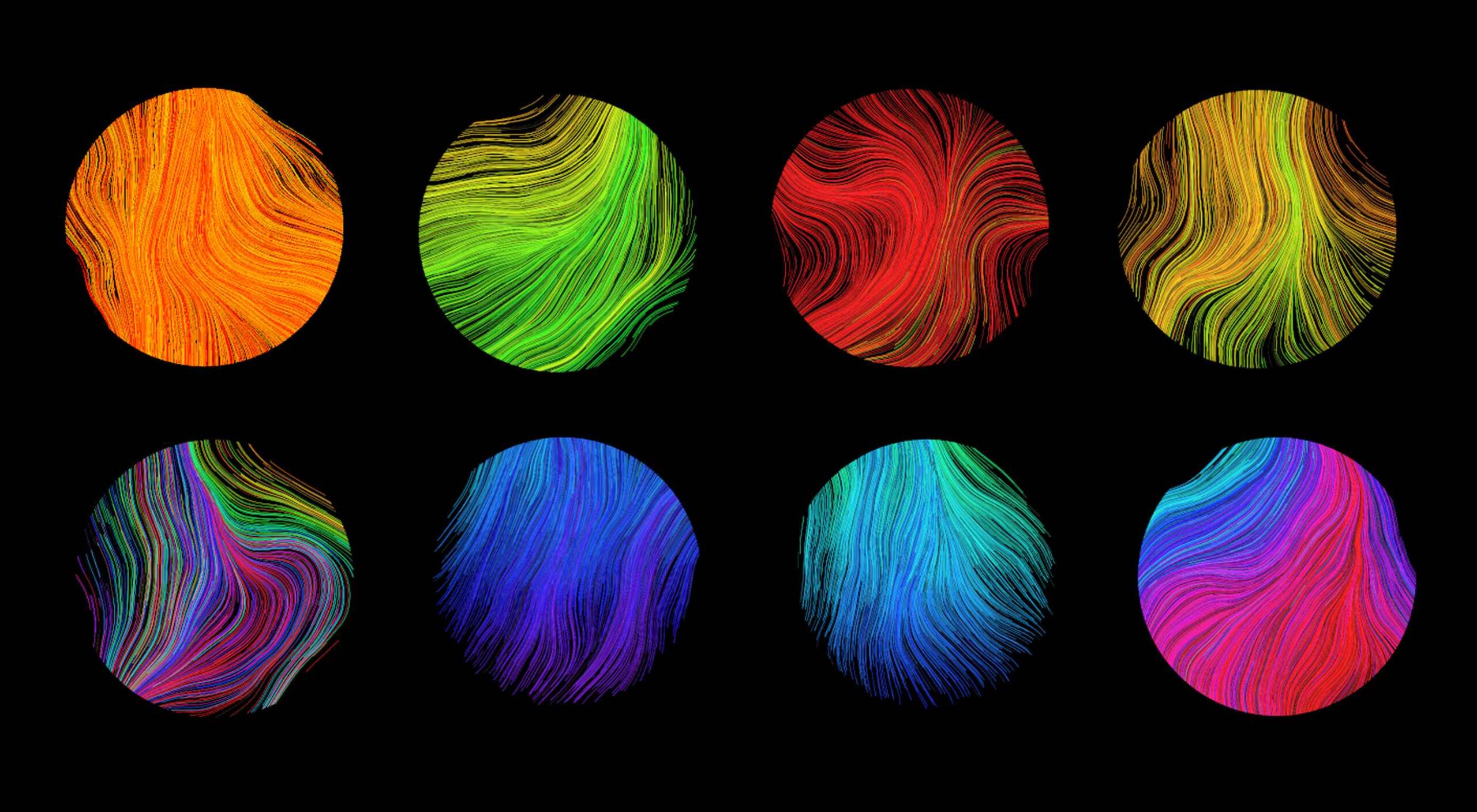
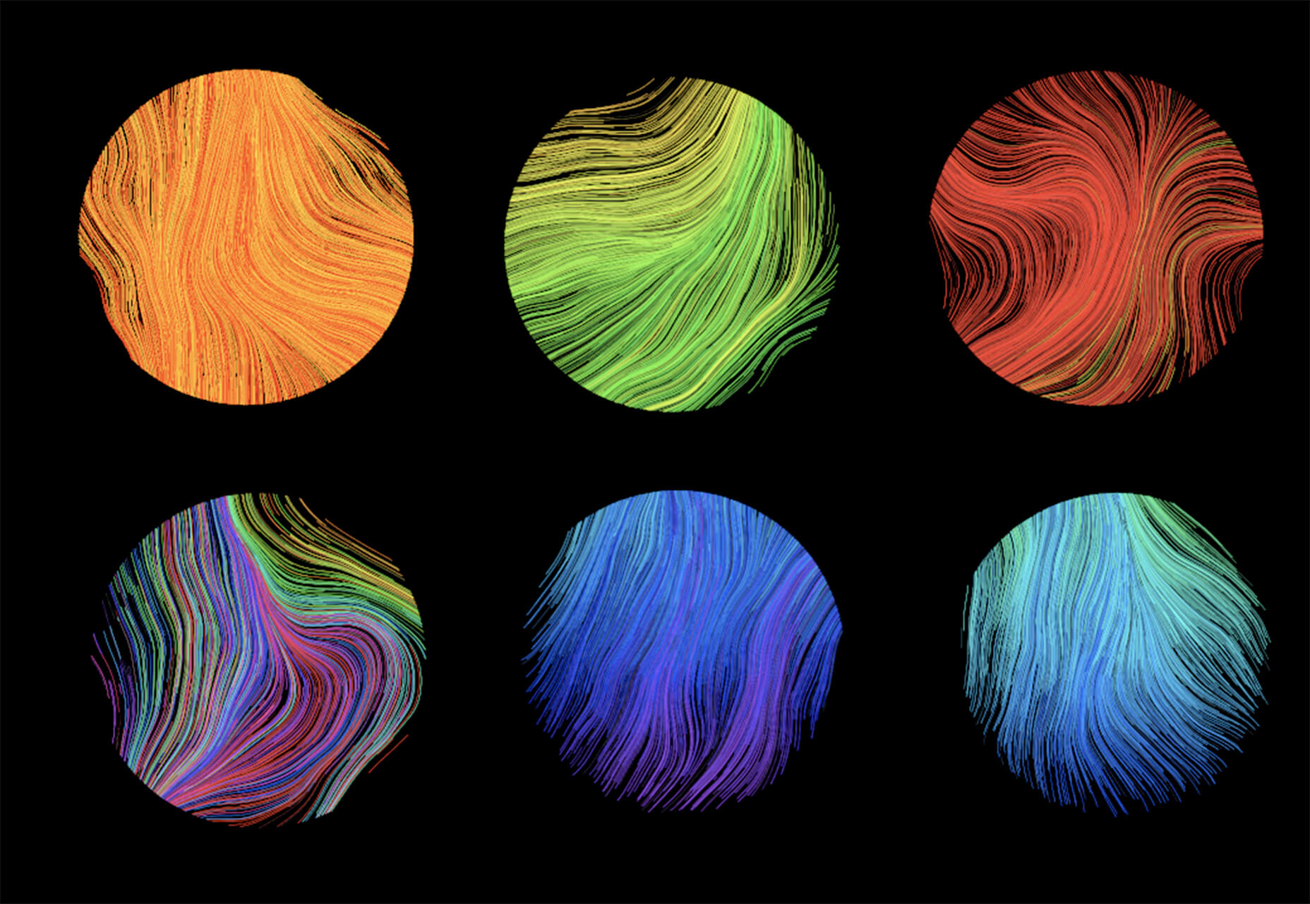
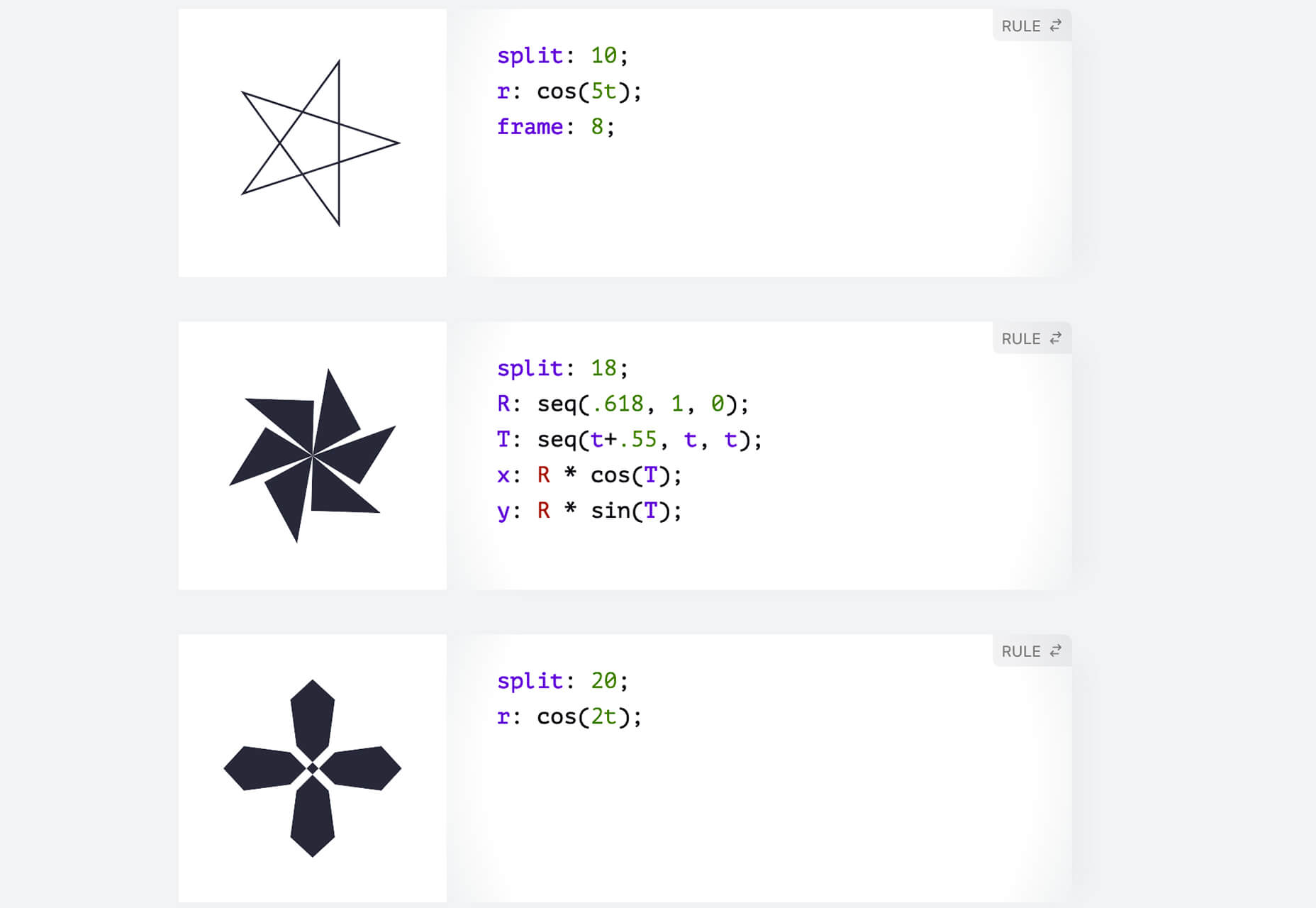
Noise Planets
Noise Planets is a fun look at plotting random points in a circle to create amazing art pieces. You can generate fun shapes and textures and even animate your results with the tutorial and code snippets’ help.
CSS Polygon Shapes
CSS Polygon Shapes are generated using CSS-doodle and clip-path. You can go in and make adjustments to customize shapes further and use them in your website projects.
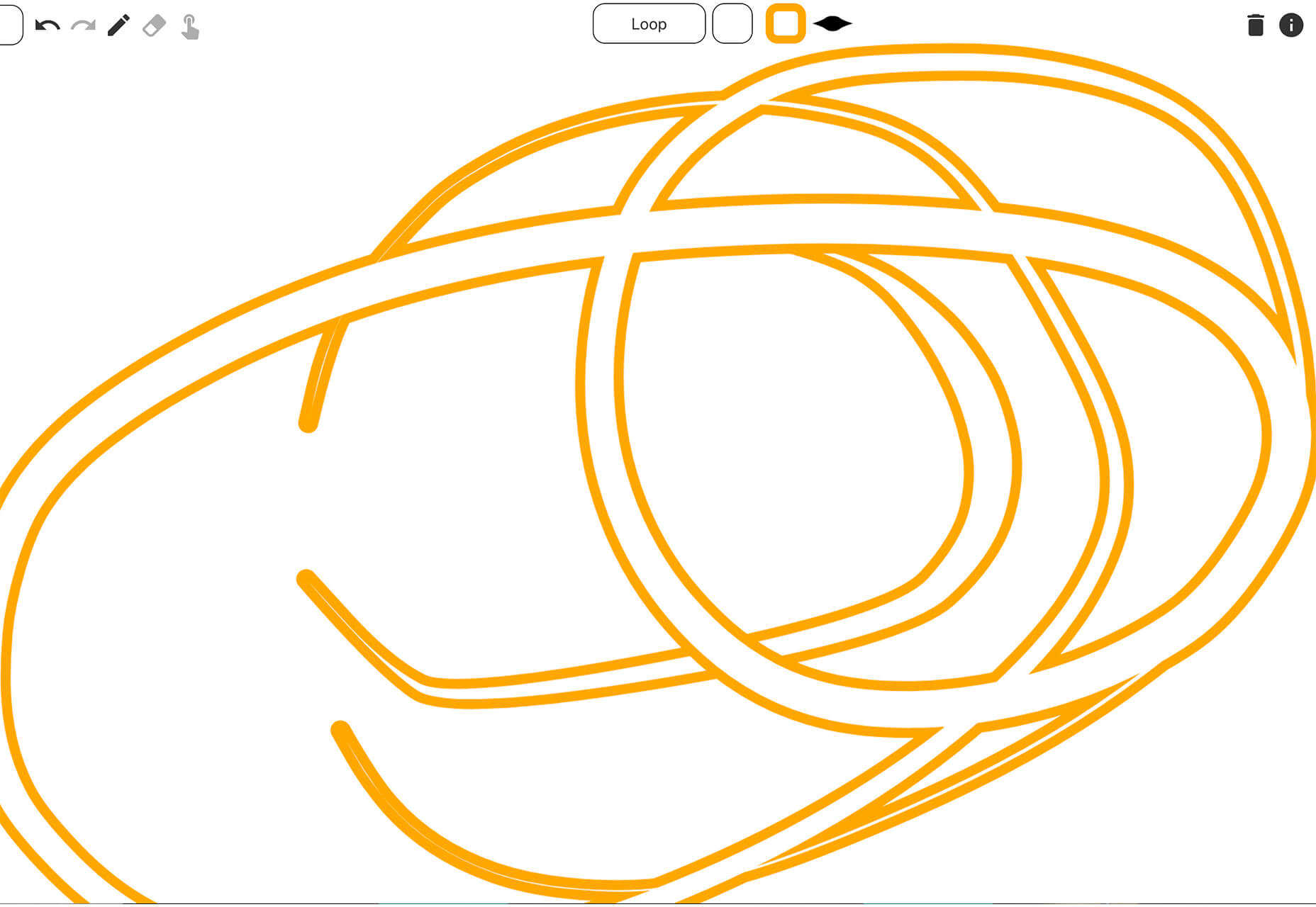
Mutsuacen
Mutsuacen is a little app that lets you create animated and interactive drawings. There’s a lot of potential with this tool if you have some true drawing chops, but it not; it’s just fun to play with. Create a doodle or sketch and export.
5 Fresh Fonts and Text Tools
Text Warping – Animated
Text Warping – Animated is a fun effect pen from Lokesh Dhakar. It feels funky while leaving text pretty readable. Play with it for sure.
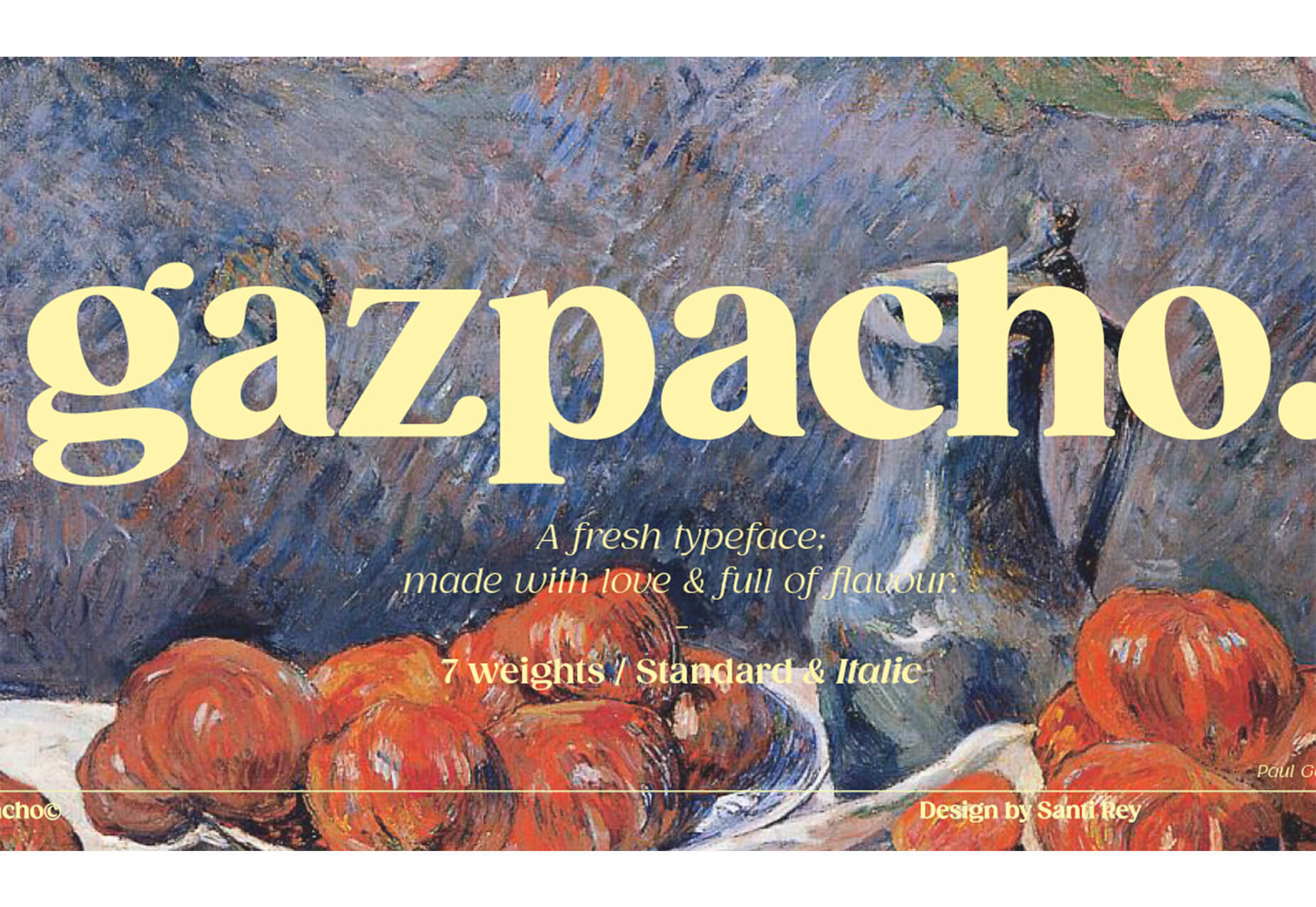
Gazpacho
Gazpacho is a fun and flexible premium font family with 14 styles from thin to heavy italic. It’s a highly readable serif with a wider stance and great curves.
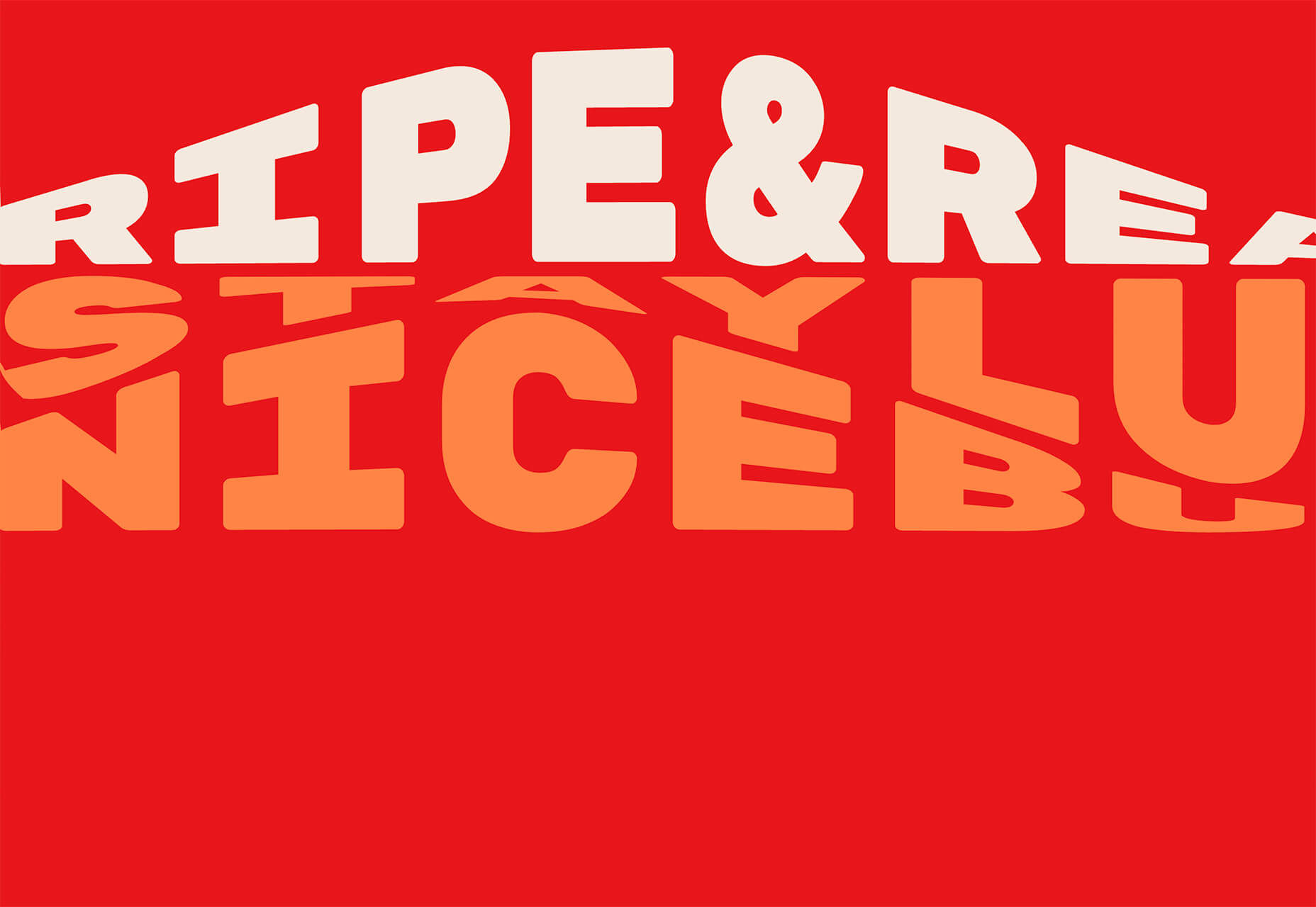
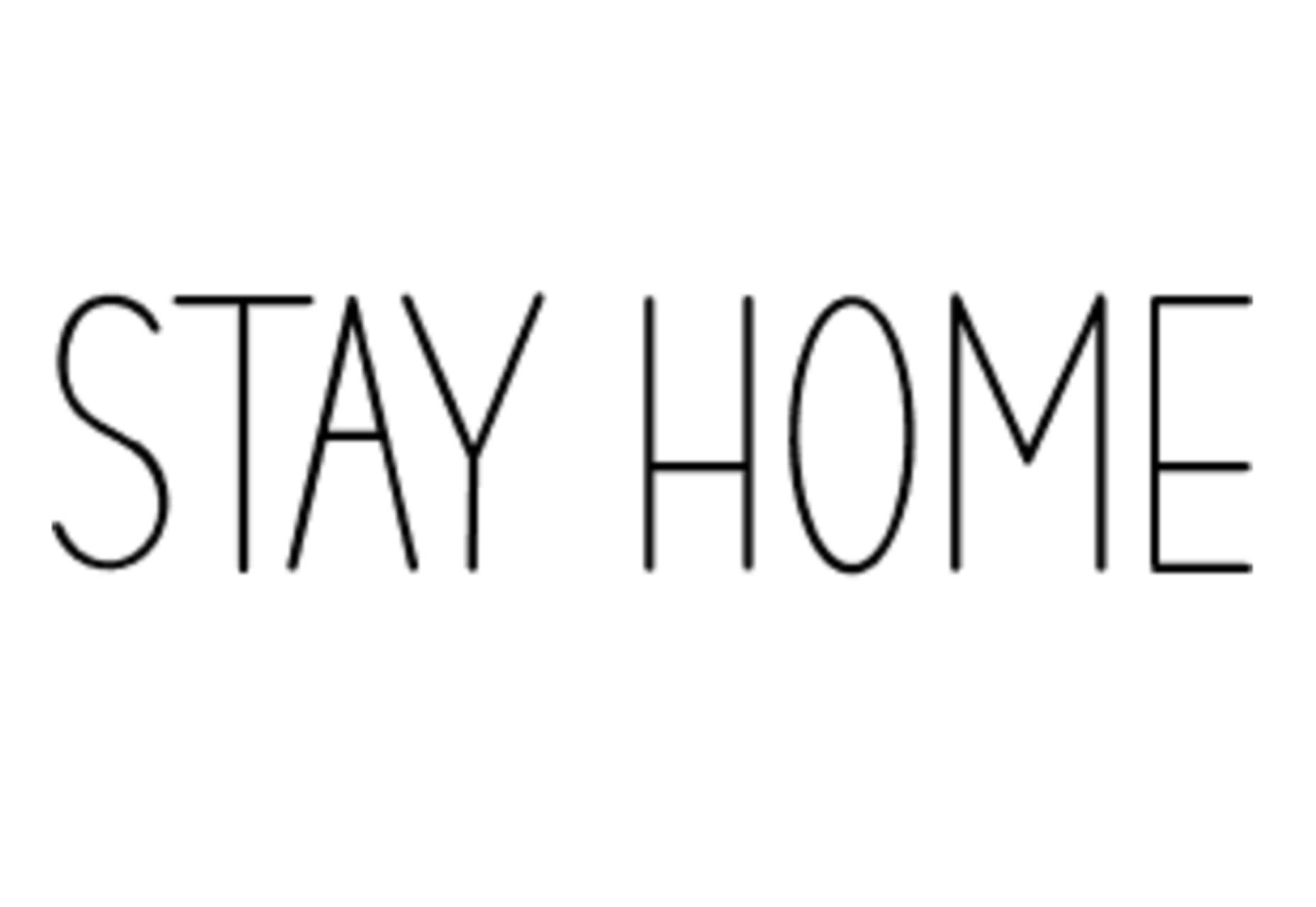
Stay Home
Stay Home is a simple, line-style all caps font. It has a limited character set but could have some fun applications.
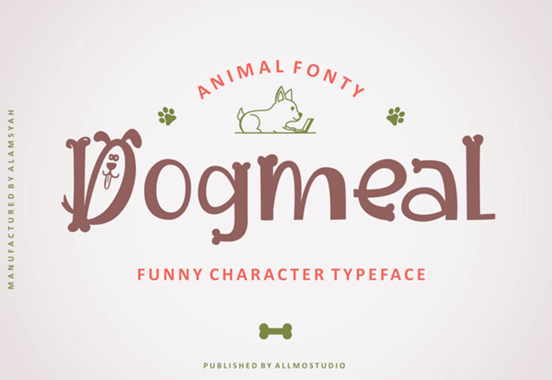
Dogmeal Figure
Dogmeal Figure is an almost silly novelty typeface with dog faces and paw prints in the character set. It might make a fun option for a kids’ project.
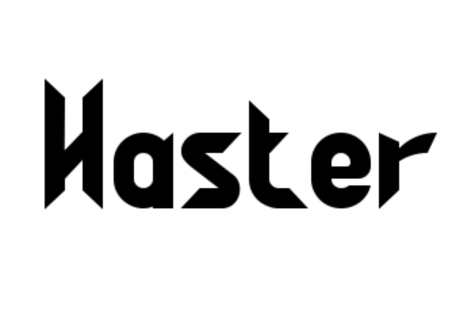
Haster
Haster is a futuristic-style slab with a limited character set. It does have shapes and lines with a lot of impact for display use.
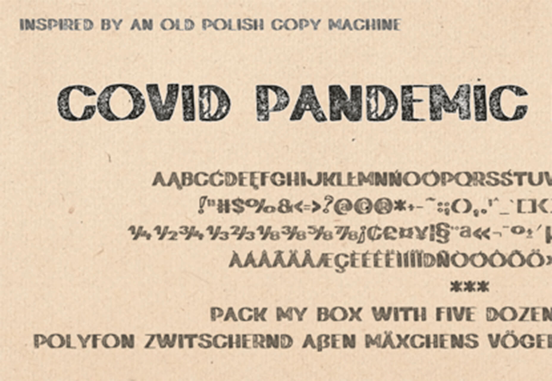
Covid Pandemic Lockdown
Covid Pandemic Lockdown is an interesting novelty font with thick lines and a brush-dot style. While it probably won’t read well small, it could be fun as a display option.
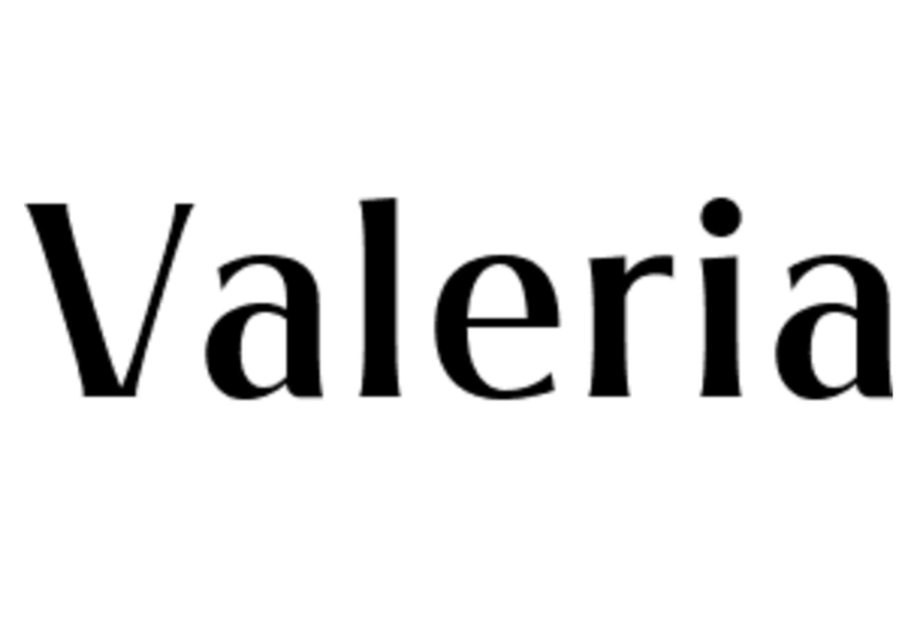
Valeria
Valeria is a simple typeface that’s a little wide but has a nice shape and structure. It includes upper- and lowercase letters.
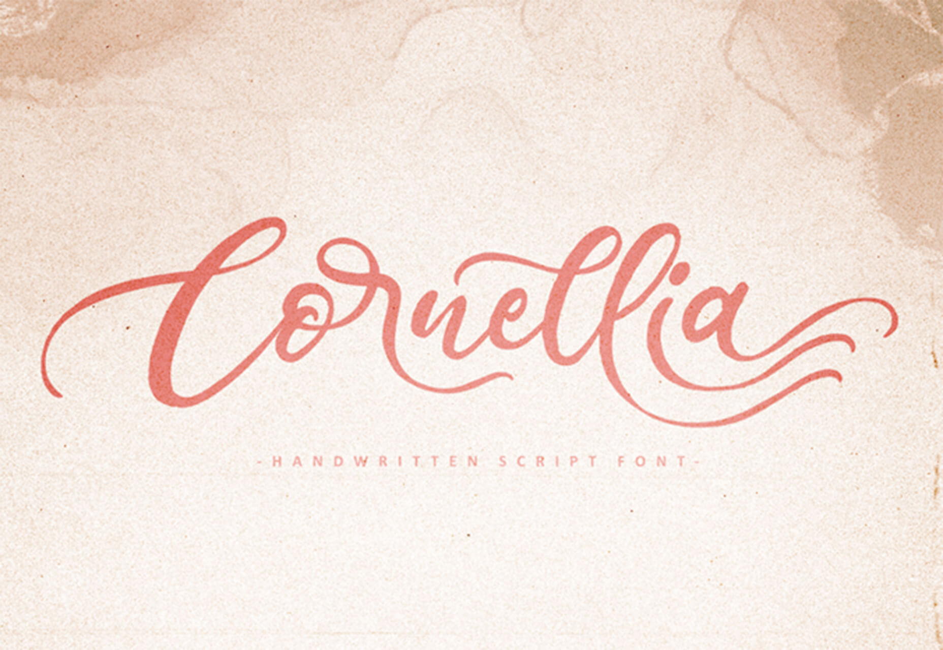
Cornellia
Cornellia is a beautiful script that has amazing letter combinations for use with long swashes and tails. It can add extra elegance to almost any design project instantly.
The post 23 Exciting New Tools for Designers, February 2021 first appeared on Webdesigner Depot.

 Welcome to our roundup of the best plugins for popular CMS, this month. We’re going to cover plugins built to enhance WordPress, Shopify, Craft CMS, and Joomla. Enjoy!
 If you’re here, then you’re thinking about becoming a web designer and wondering if it’s a smart move.
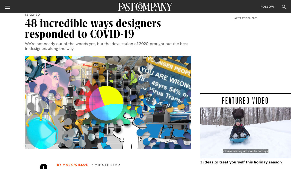
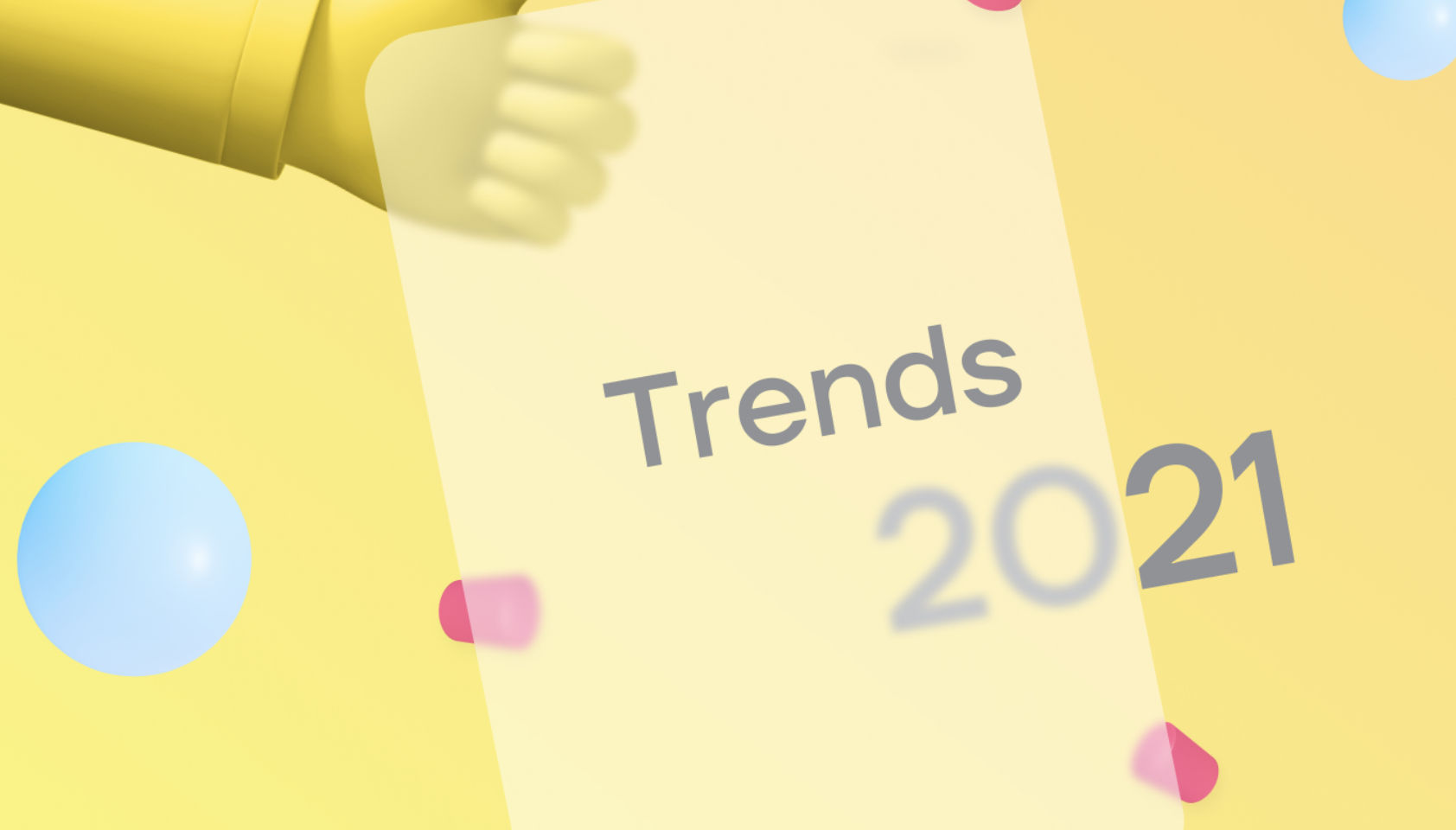
 Here we are into a brand new year, and although we’re far from out of the woods yet, there is a feeling of renewed hope on many fronts.
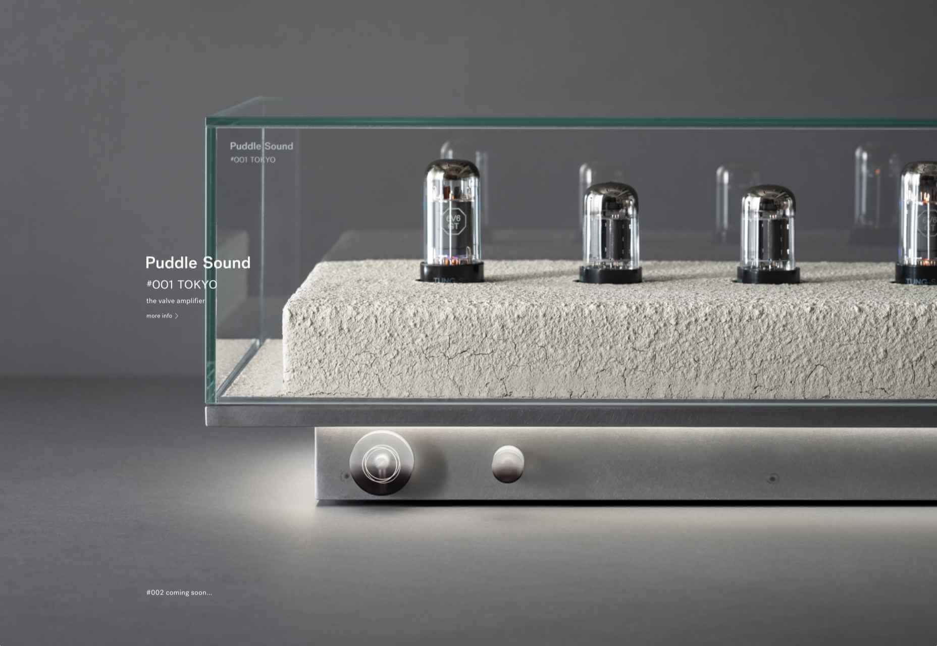
 If you already have a good idea of what you want a new website to look like, the next step would be to decide on the tools you’ll need to put into play to turn that vision into a reality.
 Every week users submit a lot of interesting stuff on our sister site Webdesigner News, highlighting great content from around the web that can be of interest to web designers.
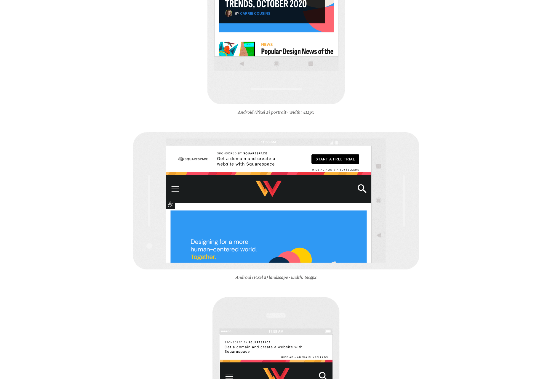
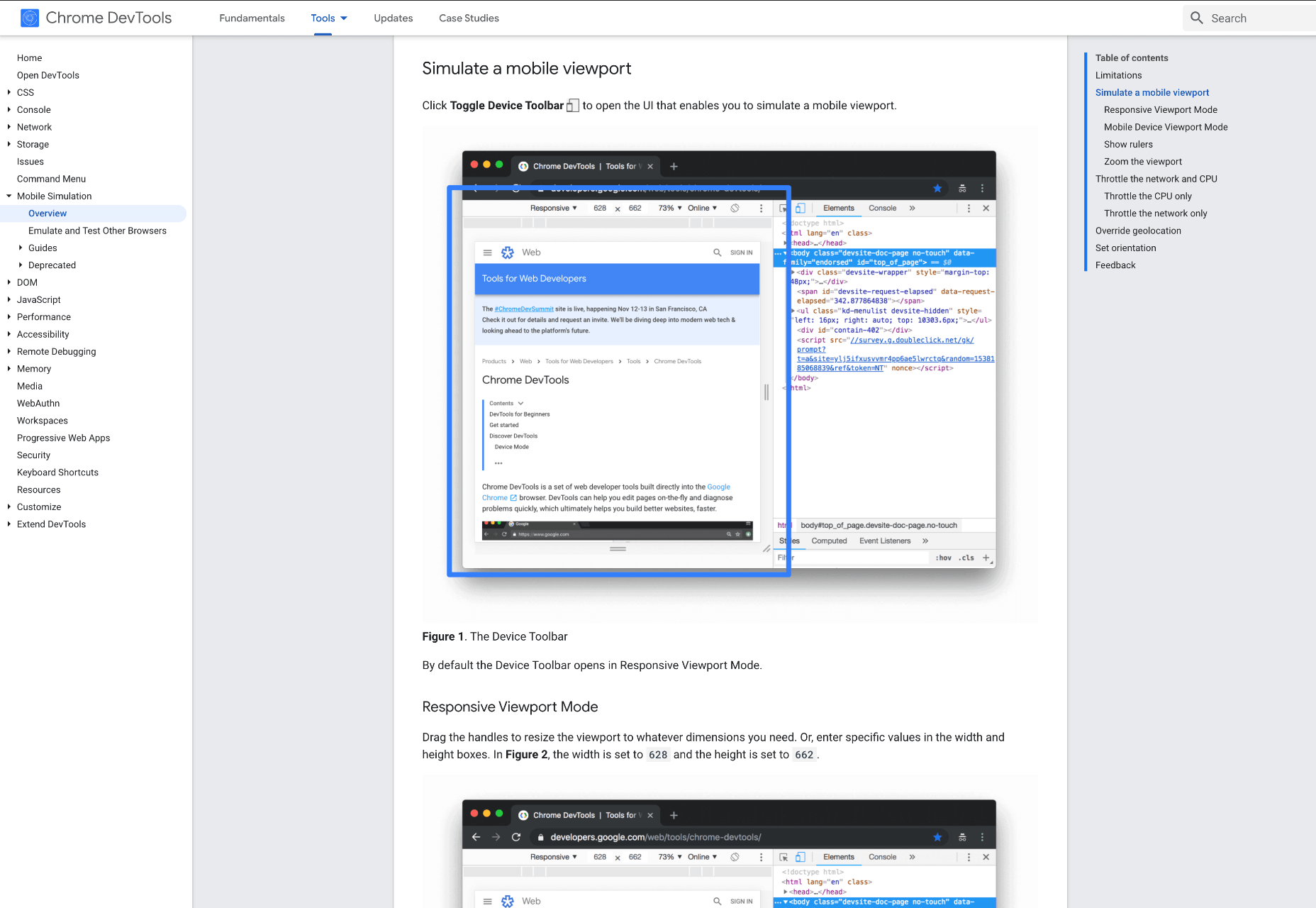
 When creating a website, it’s vital to remember that not only does it need to work and look great on the device you are creating it on, but on all the other devices, it might be used on too.
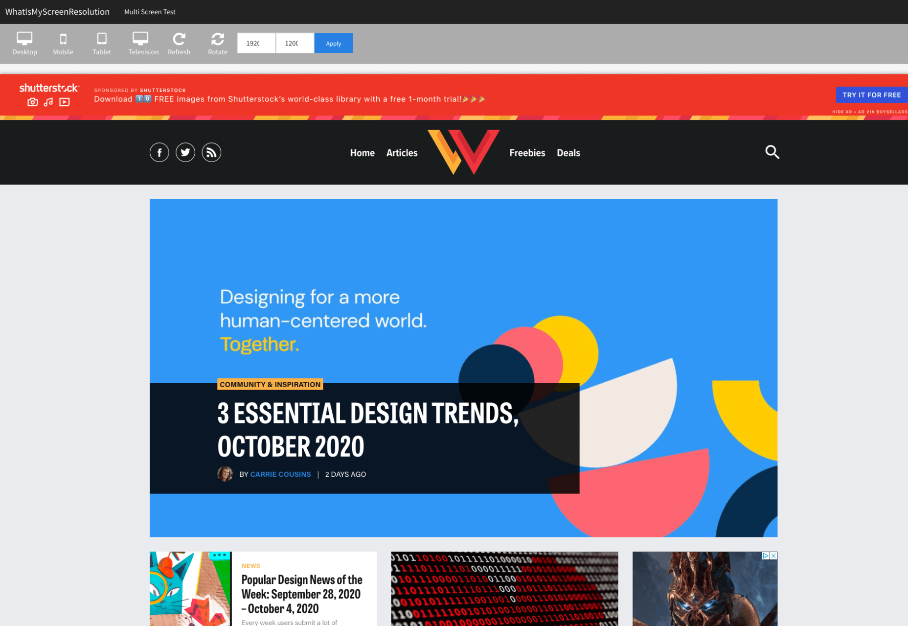
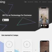
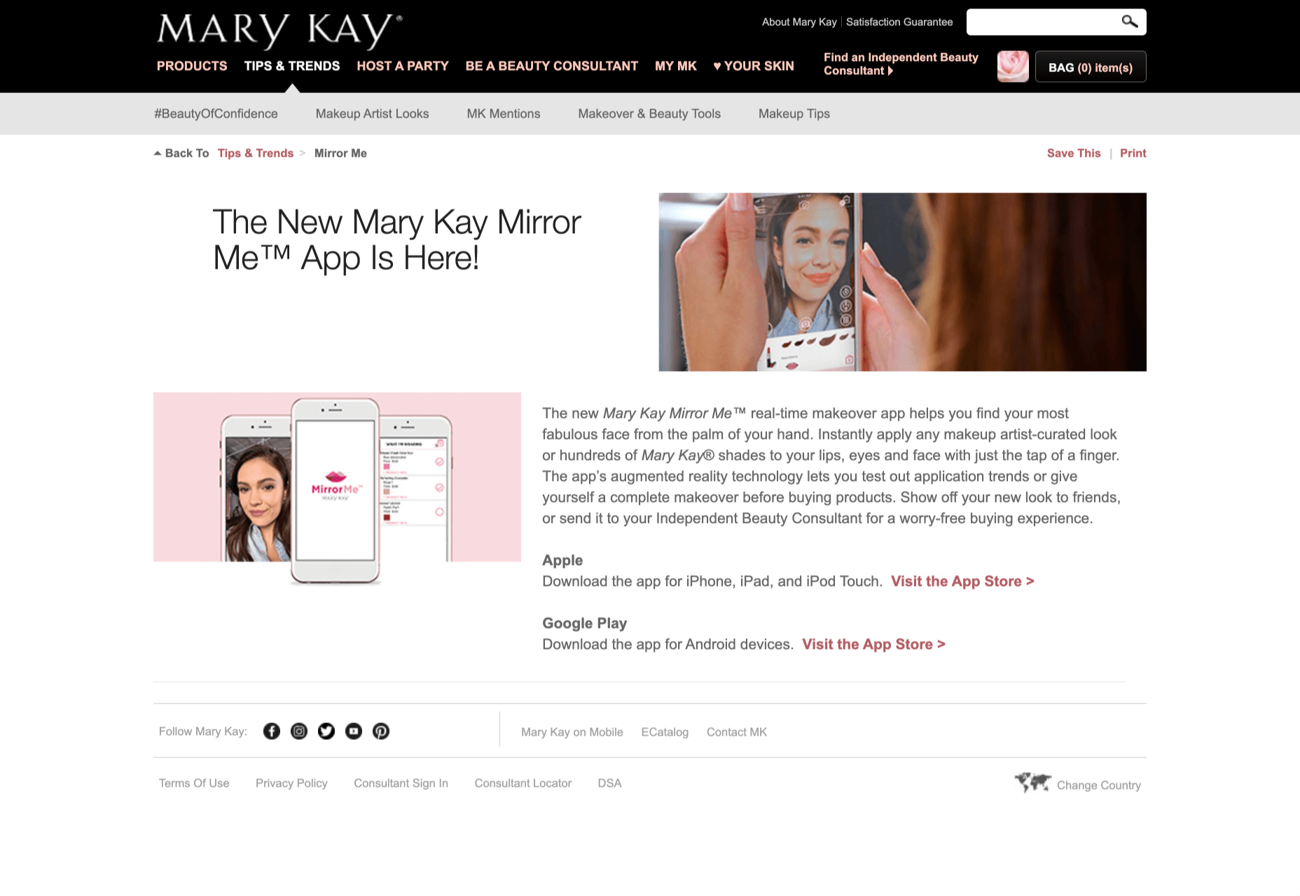
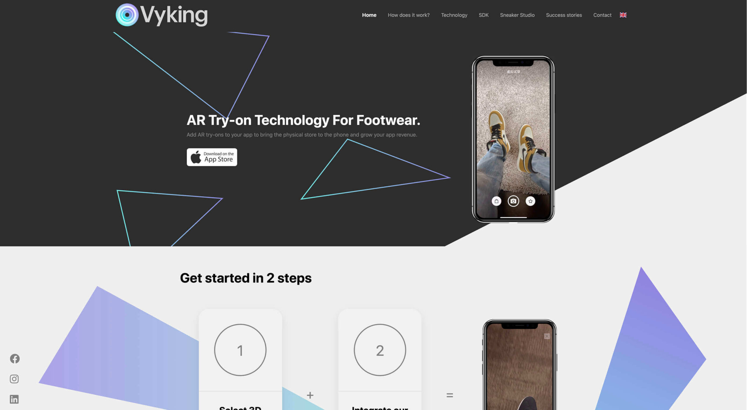 Over the years, experts have repeatedly discussed the possible impact of mixed realities on web design. Concepts like AR and VR are expected to have the potential to change the way that we interact with websites on a fundamental level.
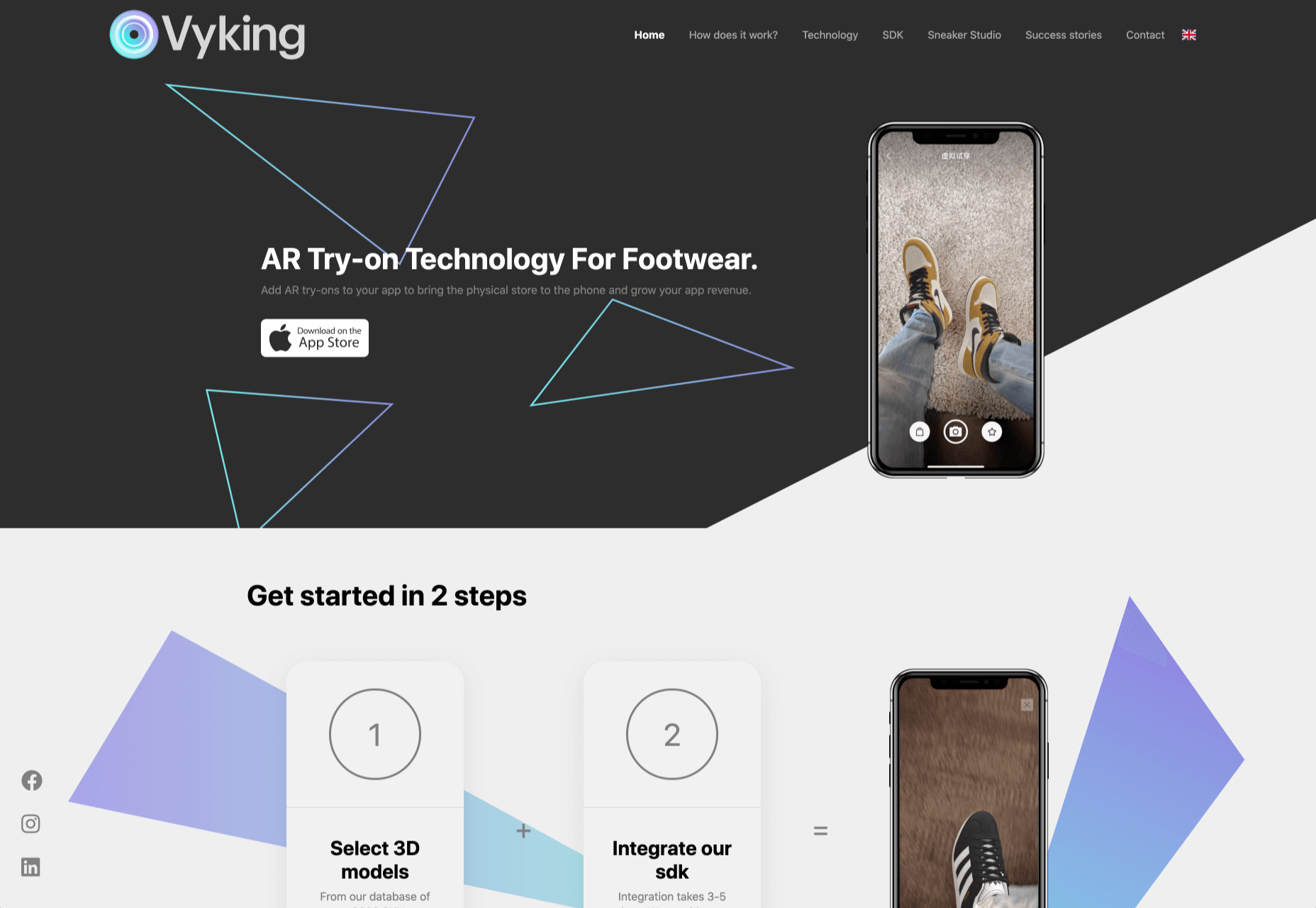


 Every week users submit a lot of interesting stuff on our sister site Webdesigner News, highlighting great content from around the web that can be of interest to web designers.