Articles

In the spirit of fall feasts, this month’s collection of tools and resources is a smorgasbord of sorts. You’ll find everything from web tools to icon libraries to animation tools to great free fonts. Let’s dig in.

Here’s what new for designers this month.

The Good Line-Height

The Good Line-Height is the tool you won’t be able to live without after using it a few times. The tool calculates the ideal line-height for every text size in a typographic scale so that everything always fits the baseline grid. Set the font size, multiplier, and grid row height to get started.

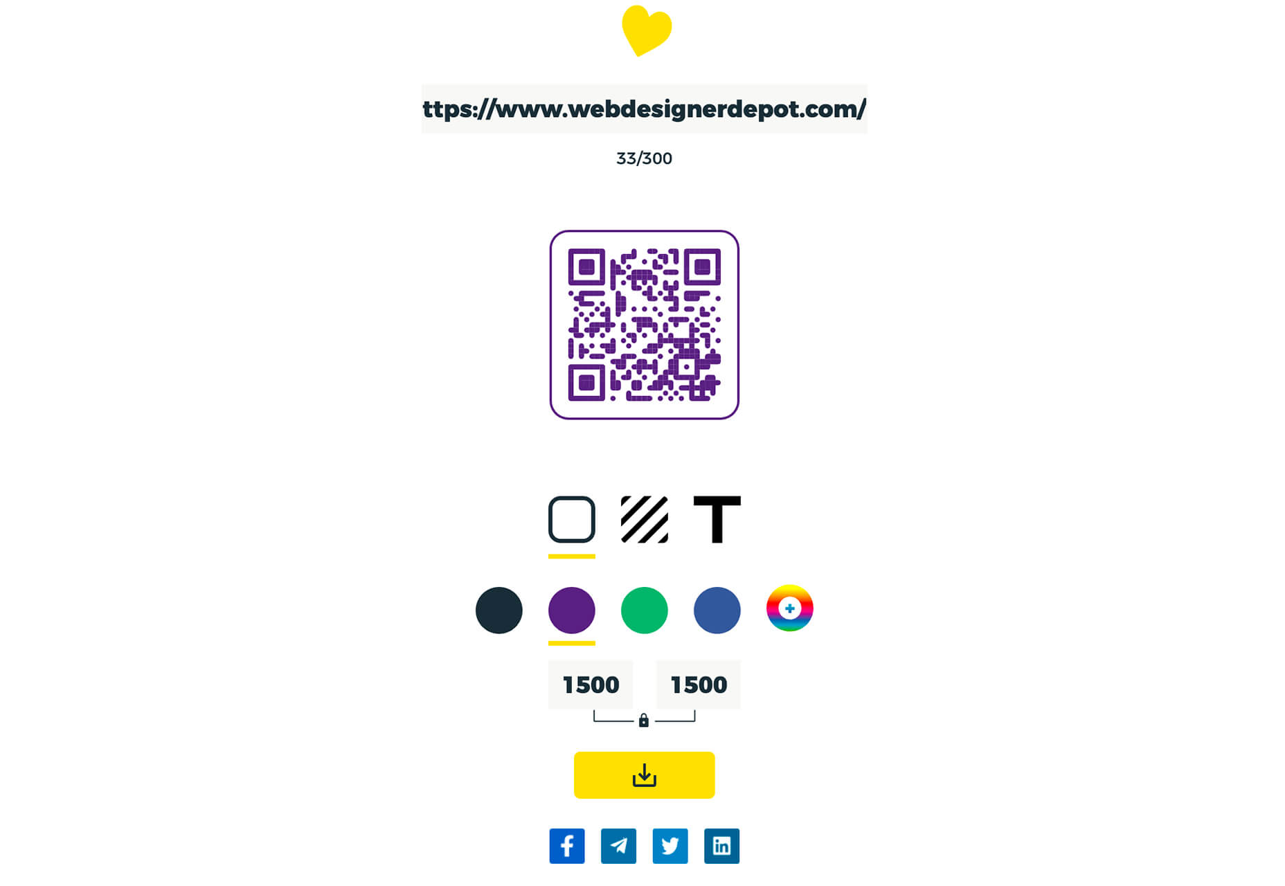
Link-to-QR

Link-to-QR makes creating quick codes a breeze. Paste in your link and the tool creates an immediate QR code that you can download or share. Pick a color and transparency, plus size, and you are done.

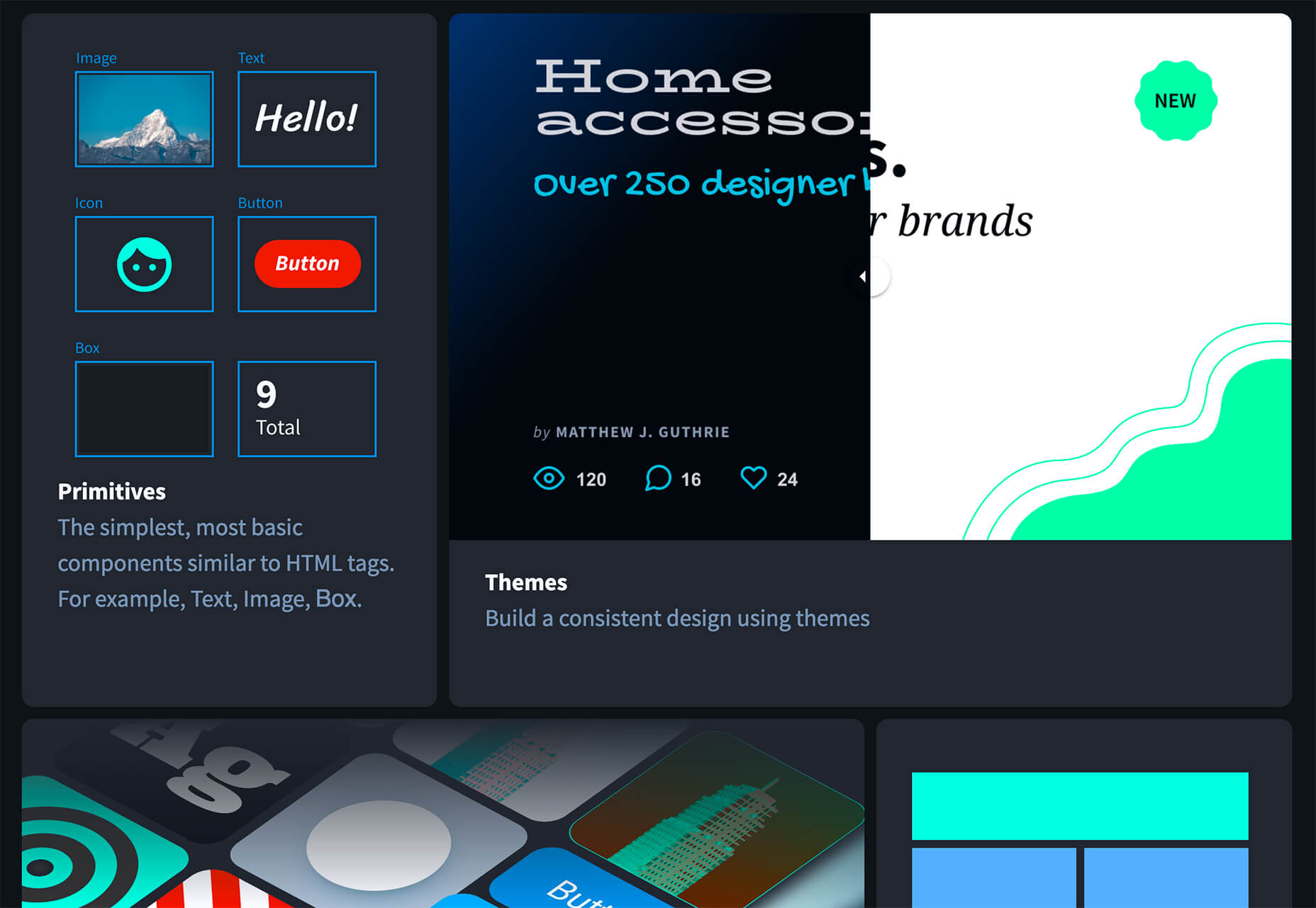
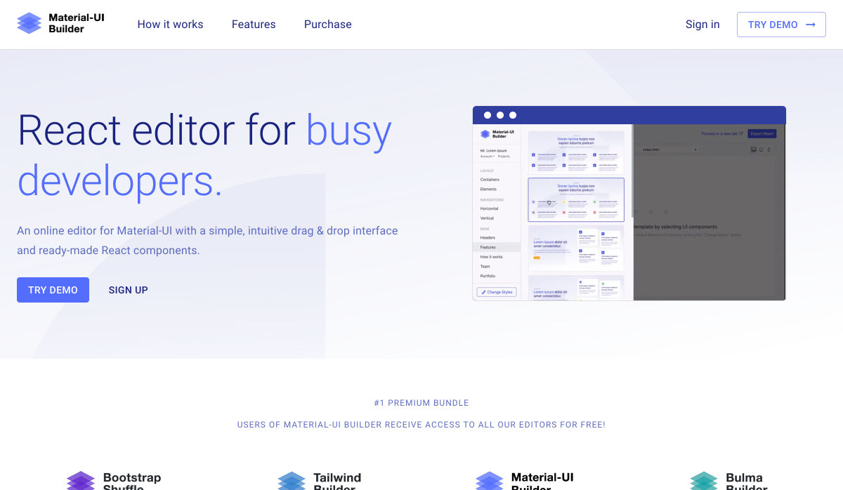
Quarkly

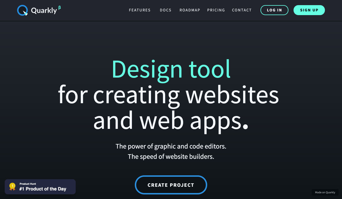
Quarkly allows you to create websites and web apps both using a mouse and typing code – you get all the pros of responsive editing, but can also open the code editor at any time and manually edit anything and it all synchronizes. The tool is built for design control and is in beta.

UnSpam.email

Unspam.email is an online spam tester tool for emails. Improve deliverability with the free email tester. The service analyzes the main aspects of an email and returns a spam score and predicts results with a heat map of your email newsletter.

Filmstrip

Filmstrip allows you to create or import keyframe animations, make adjustments, and export them for web playback. It’s a quick and easy tool for modern web animation.

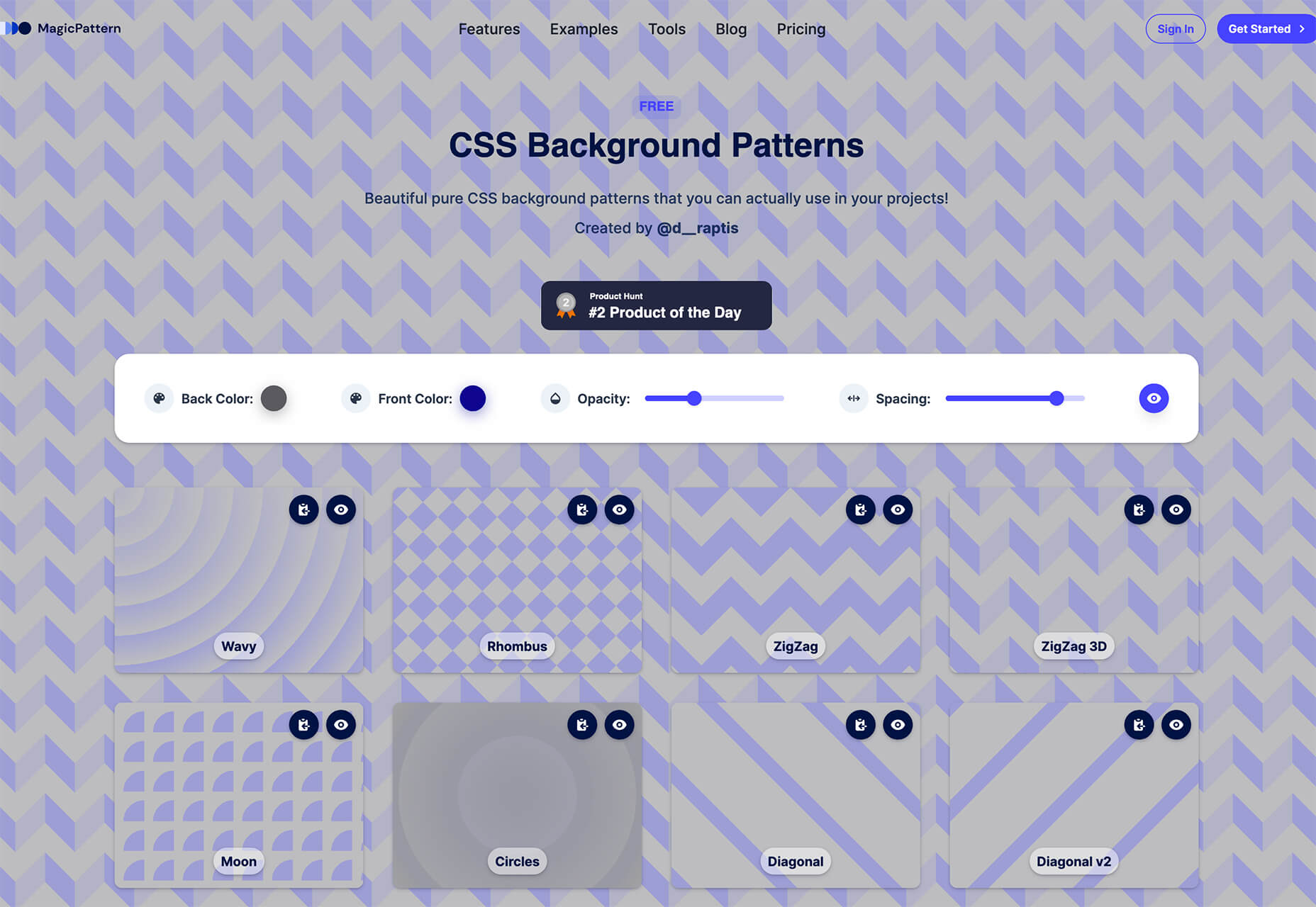
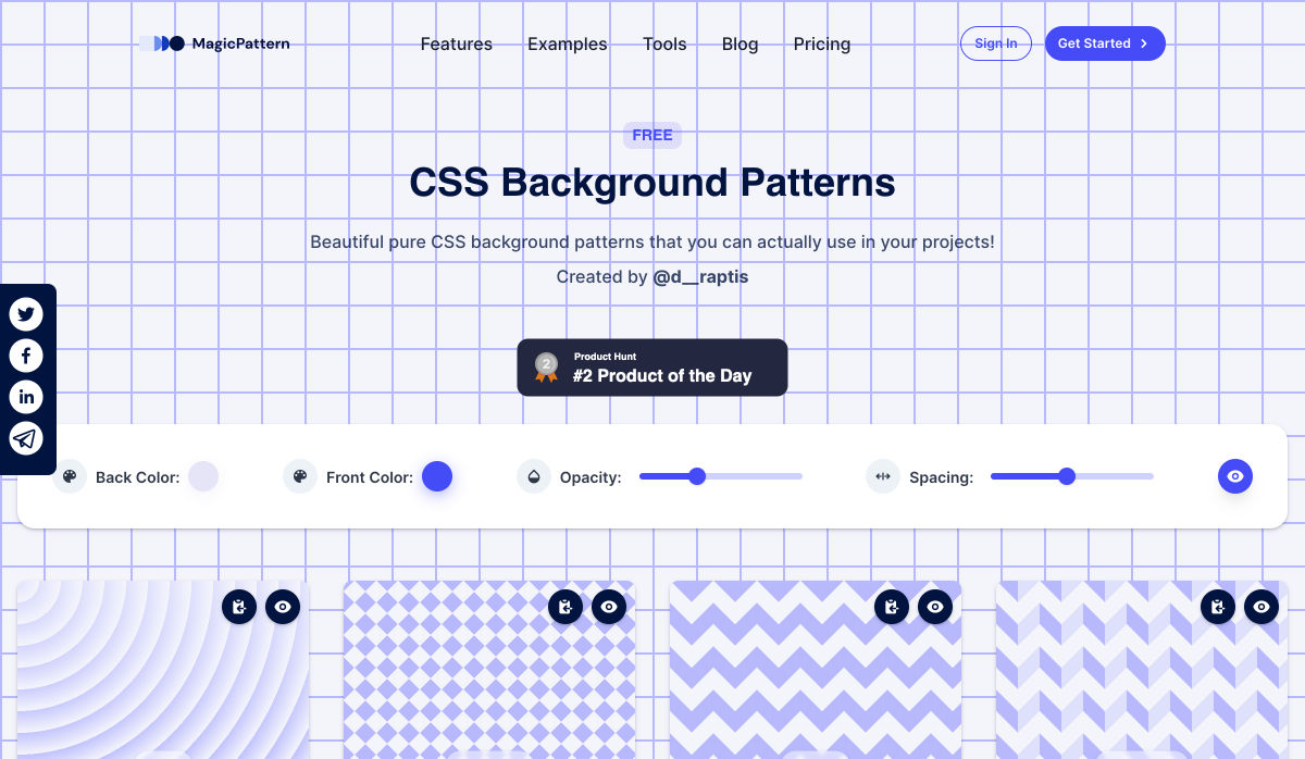
CSS Background Patterns

CSS Background Patterns is packed with groovy designs that you can adjust and turn into just the right background for your web project. Set the colors, opacity, and spacing; then pick a pattern; preview it right on the screen; and then snag the CSS. You can also submit your own patterns.

Neonpad

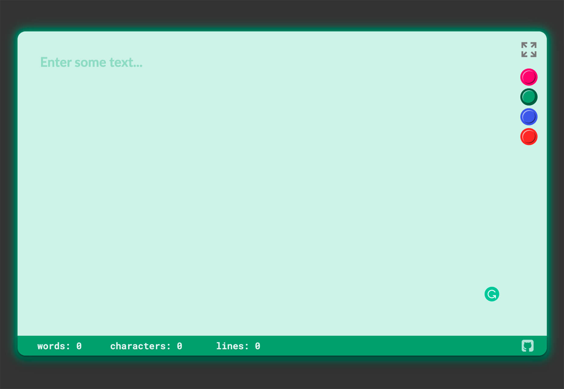
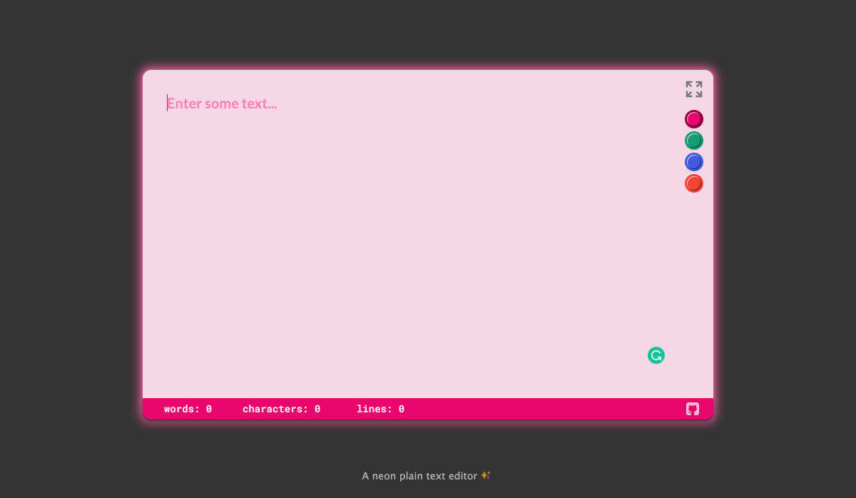
Neonpad is a simple – but fun – plain text editor in neon colors. Switch hues for a different writing experience. Use it small or expand to full browser size.

Link Hover Animation

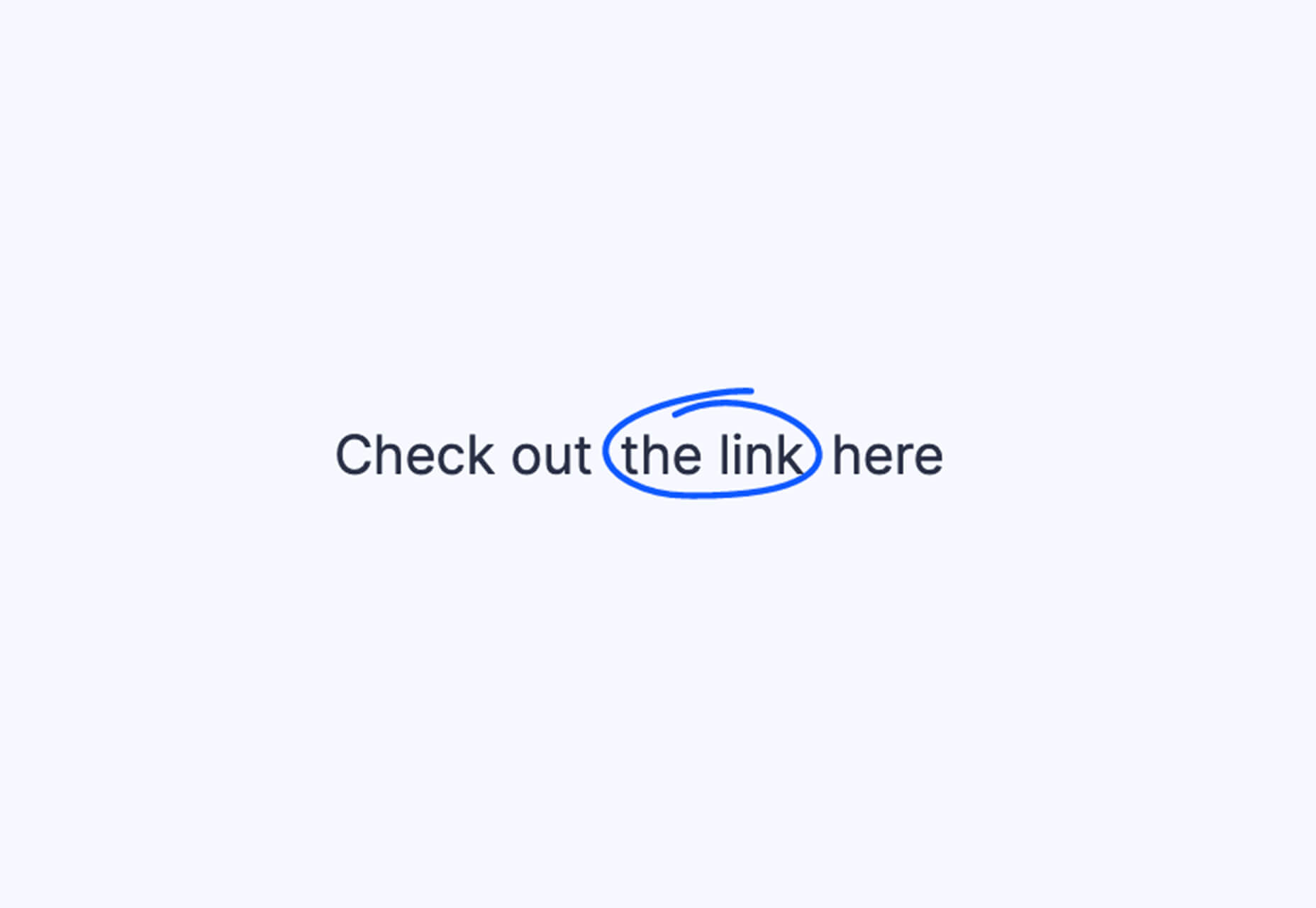
Link Hover Animation is a nifty twist on a hover state. The animation draws a circle around the link!

Tint and Shade Generator

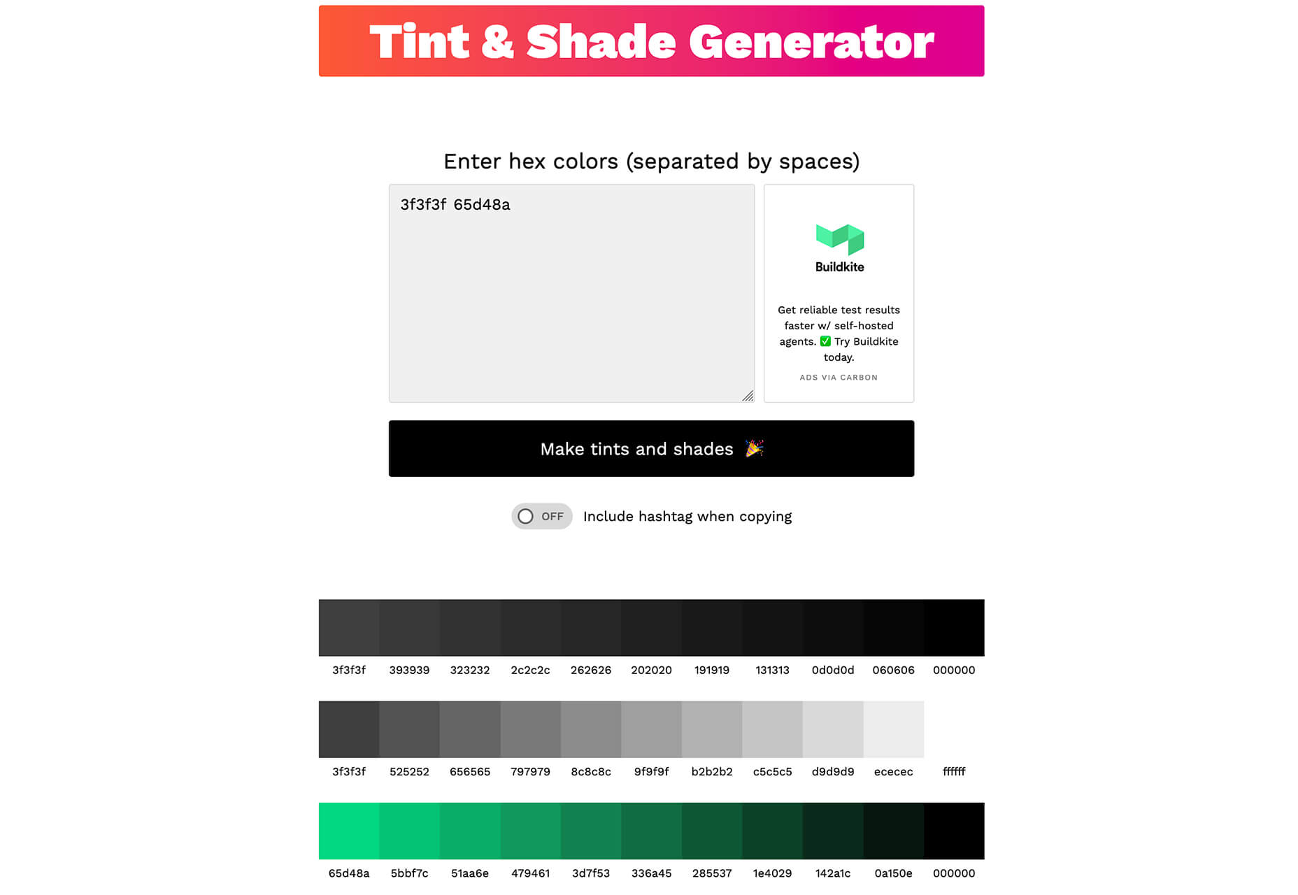
Tint and Shade Generator helps you make the most of any hex color. Start with a base color palette and use it to generate complementary colors for gradients, borders, backgrounds, or shadows.

Pure CSS Product Card

Pure CSS Product Card by Adam Kuhn is a lovely example of an e-commerce design that you can learn from. The card is appealing and functional.

Free Favicon Maker

Free Favicon Maker allows you to create a simple SVG or PNG favicon in a few clicks. You can set a style that includes a letter or emoji, font and size, color, and edge type and you are ready to snag the HTML or download the SVG or PNG file.

Ultimate Free iOS Icon Pack

The Ultimate Free iOS Icon Pack is a collection of 100 minimal icons in an Apple style. With black and white version of each icon and original PSD files, you can create sleek icons for your iPhone screen in minutes. And it’s completely free! No email address or registration required.

Phosphor Icon Family

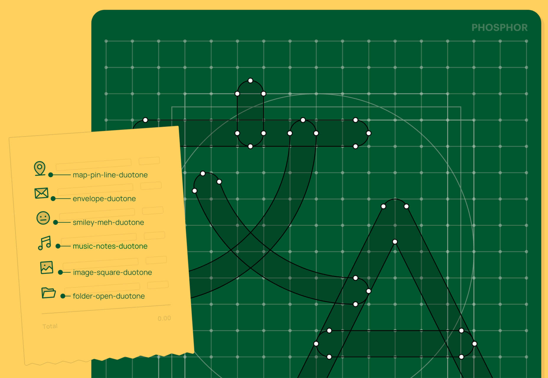
Phosphor is a flexible icon family for all the things you need icons for including diagrams and presentations. There are plenty of arrows, chats, circles, clocks, office elements, lists, business logos, and more. Everything is in a line style, filled, or with duotone color. Everything is free but donations are accepted.

3,000 Hands

3,000 Hands is a kit of hands that includes plenty of gestures and style in six skin tones and with 10 angles of every gesture. They have a 3D-ish shape and are in an easy to use PNG format. This kit has everything you need from a set of hand icons.

Radix Icons

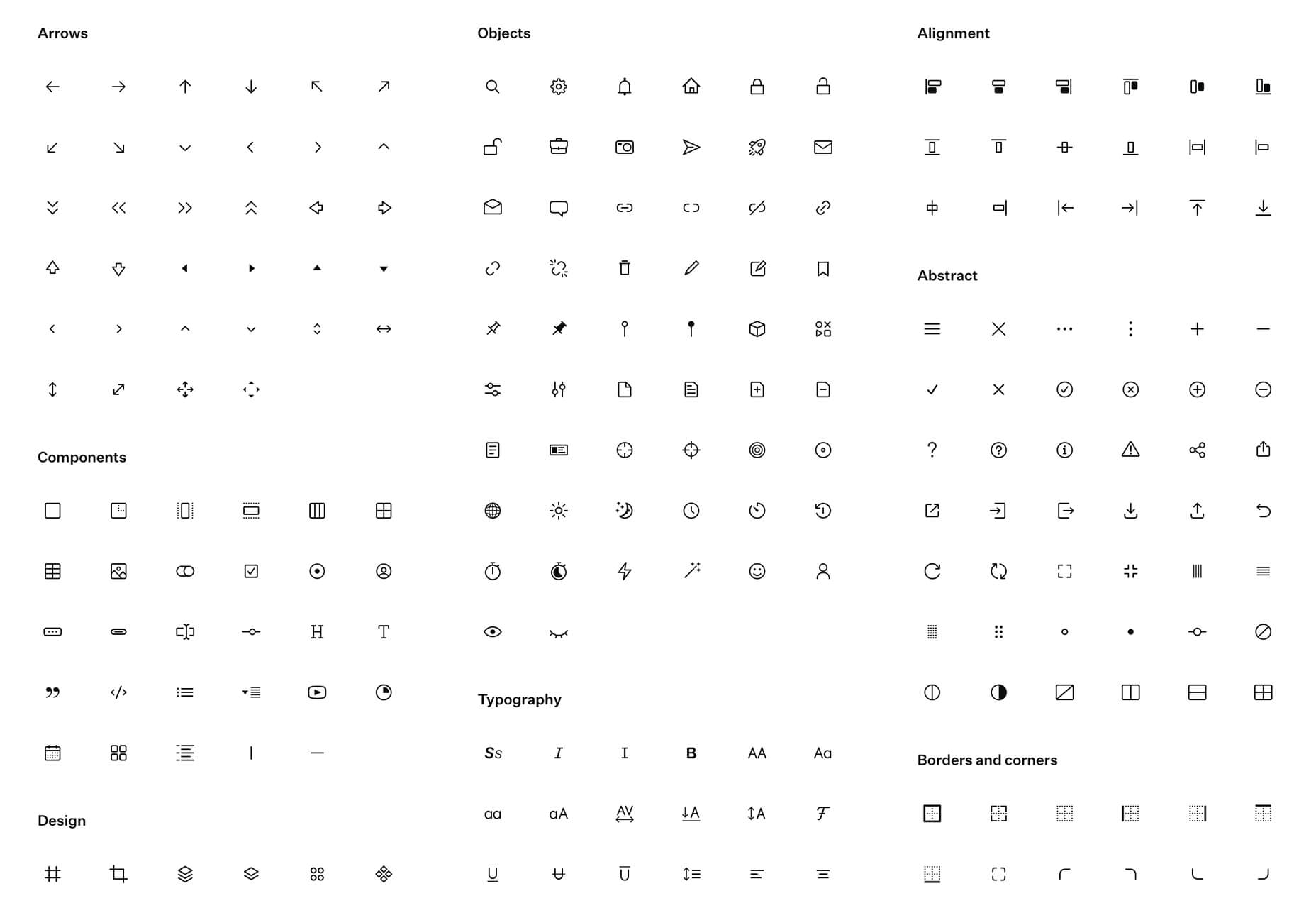
Radix Icons is a set of 15px by 15px icons for tiny spaces. They are in a line style and are available in a variety of formats including Figma, Sketch, iconJar, SVG, npm installation, or GitHub.

Deepnote

Deepnote is a new kind of data science notebook. It is Jupyter-compatible with real-time collaboration and running in the cloud and designed for data science teams.

ZzFXM Tiny JavaScript Music Generator

ZzFXM is a tiny JavaScript function that generates stereo music tracks from patterns of note and instrument data. Instrument samples are created using a modified version of the super-tiny ZzFX sound generator by Frank Force. It is designed for size-limited productions.

Image Tiles Scroll Animation

Image Tiles Scroll Animation is a different type of scrolling pattern using Locomotive Scroll. The grid creates a smooth animation in a fun and modern style.

Bubbles

Bubbles is a Chrome extension that allows you to collaborate by clicking anywhere on your screen and then dropping a comment to start a conversation with anyone. This is a nice option for work from home teams.

Tyrus

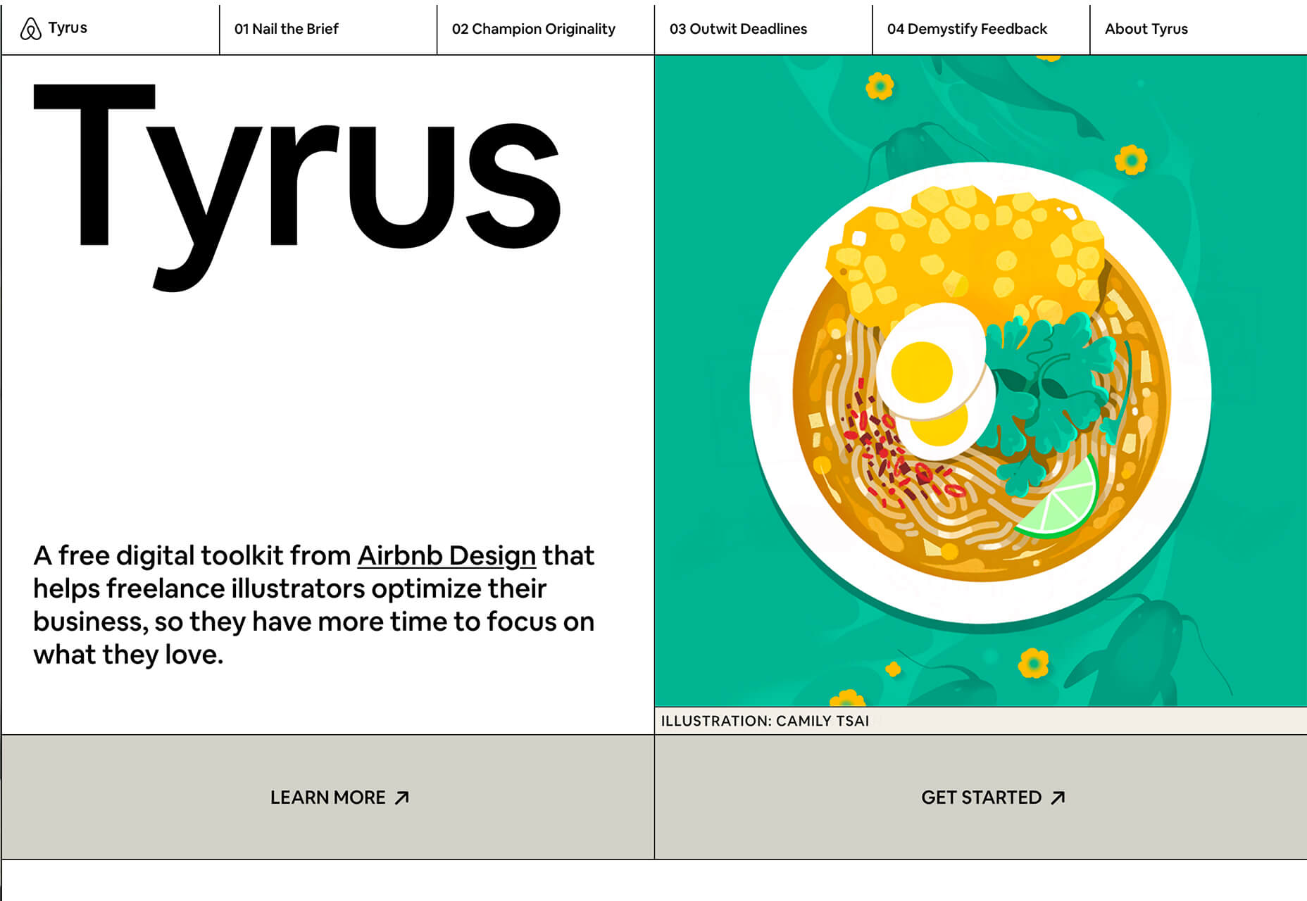
Tyrus is a toolkit from the design team at Airbnb to help illustrators make the most out of their design businesses. It is broken into sections to help you with design briefs, originality, deadlines, and feedback.

PatchGirl

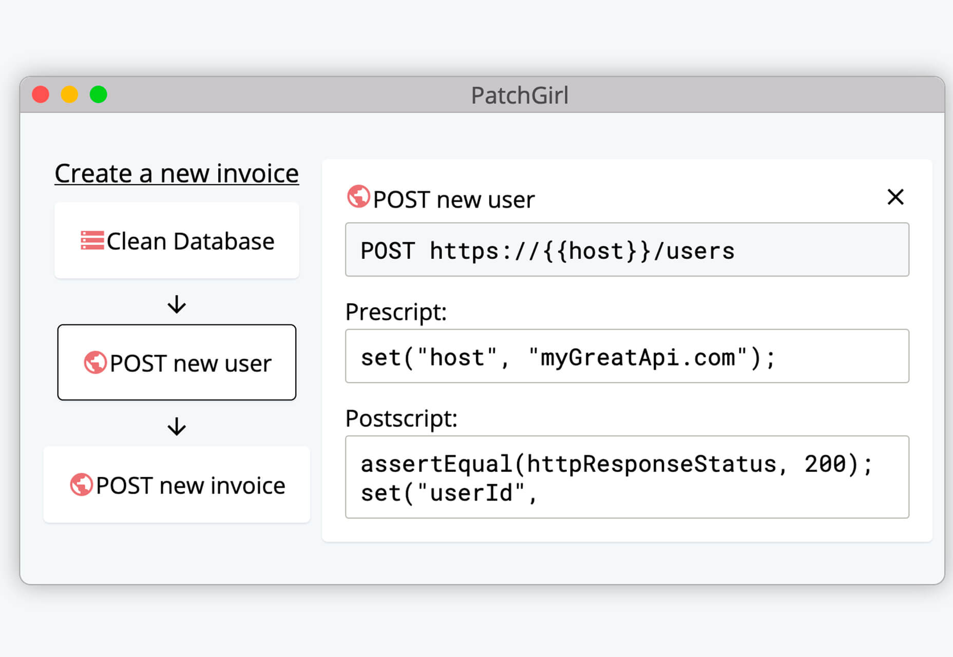
PatchGirl is an automated QA tool for developers. You can combine SQL and HTTP queries to build any possible state of your database.

Apparel

Apparel is a beautiful premium typeface family with plenty of versatility in a modern serif style. It is a contemporary, classy, and fresh serif typeface with a laid-back. Its medium-large x-height makes it ideal for headlines and brand identity design.

Christmas Story

Christmas Story is a nice solution if you are already starting to think ahead to holiday projects or cards. The long swashes and tails are elaborate and fun.

Nafta

Nafta is a fun handwriting style font that has a marker-style stroke. It’s a modern take on the popular Sharpie font. It includes all uppercase letters.

Safira

Safira is a wide and modern sans with ligatures and a stylish feel. The rounded ball terminals are especially elegant.

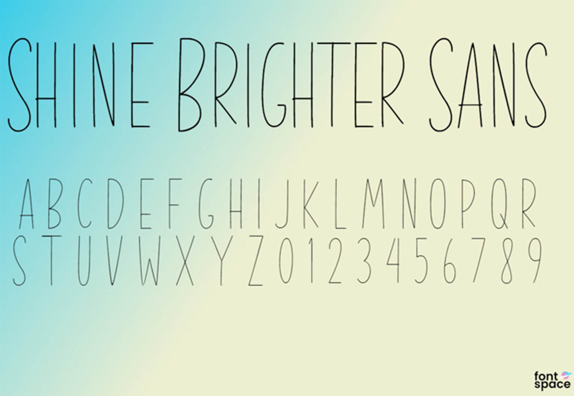
Shine Brighter Sans

Shine Brighter Sans is a super-thin sans-serif with a light attitude. The limited character set combined with its light weight is best for display use.

Source


Source de l’article sur Webdesignerdepot

Every week users submit a lot of interesting stuff on our sister site Webdesigner News, highlighting great content from around the web that can be of interest to web designers.
The best way to keep track of all the great stories and news being posted is simply to check out the Webdesigner News site, however, in case you missed some here’s a quick and useful compilation of the most popular designer news that we curated from the past week.

Quarkly – Design Tool for Creating Websites and Web Apps


Create your Personal Branding Strategy in 4 Simple Steps


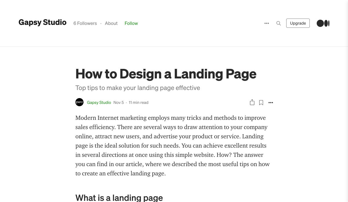
How to Design a Landing Page


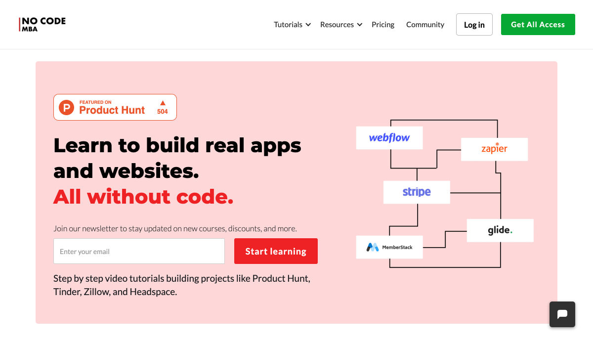
No Code MBA – Learn to Build Real Apps and Websites Without Code


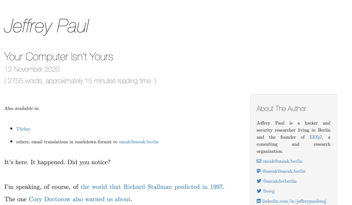
Your Computer Isn’t Yours


Swatches – Generate Colors for Every Purpose


Markabaly – Cross-platform Markdown Editor


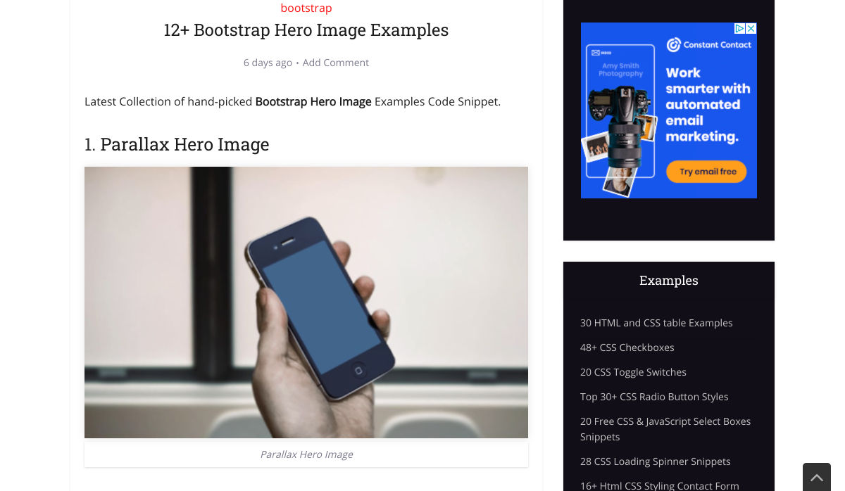
12+ Bootstrap Hero Image Examples


The UX of Among Us: The Importance of Colorblind-friendly Design


No, your Clean Code won’t Save the Planet


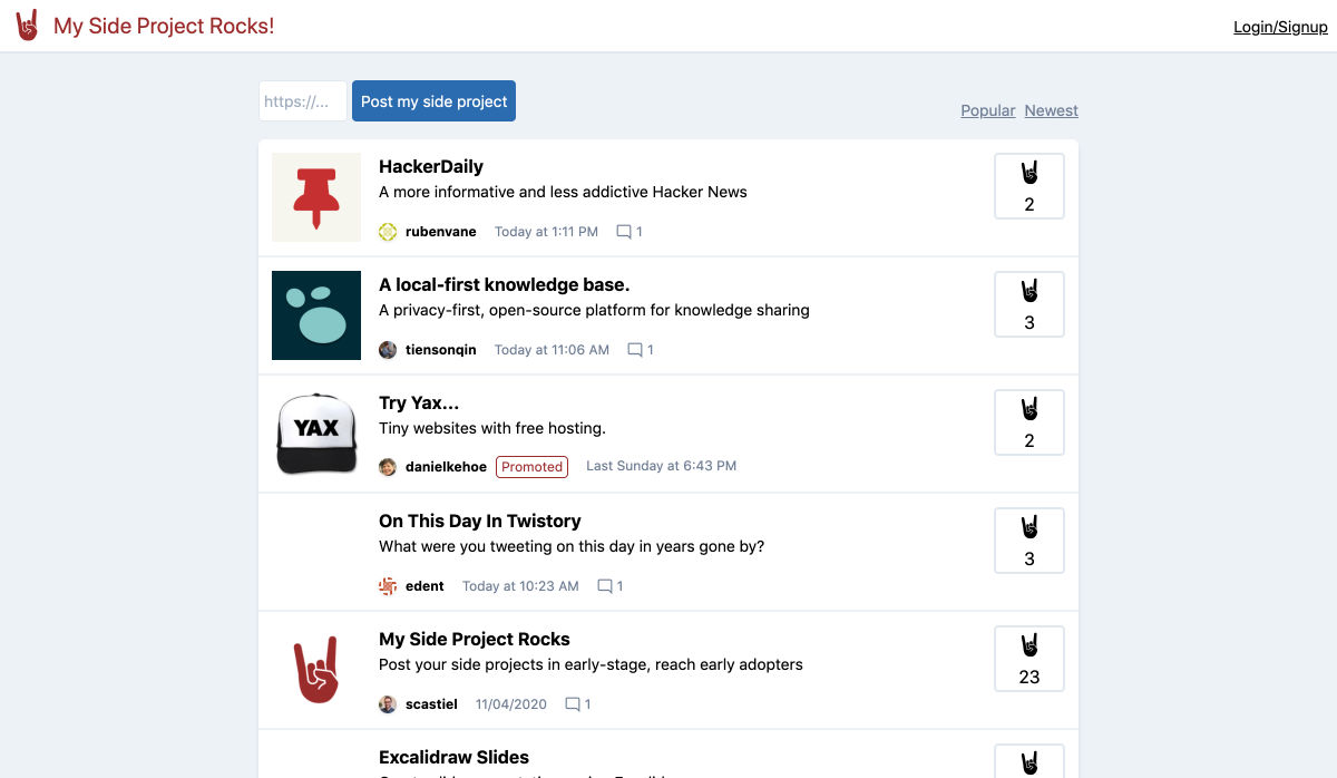
My Side Project Rocks – Share and Discover Side Projects


How to Test Content like a Pro: A Step-by-step Guide


MacOS Big Sur is Here


Free Fonts for Prototyping and Wireframing


Gamification: The Broken Way of Carrot and Stick


Everything You were Wondering About Apple’s New M1 Chip


Please Unsubscribe – Fwd Emails to Unsubscribe from Marketing


The Fonts in Popular Things Identified Vol. 2


How to Become a Self-taught Graphic Designer


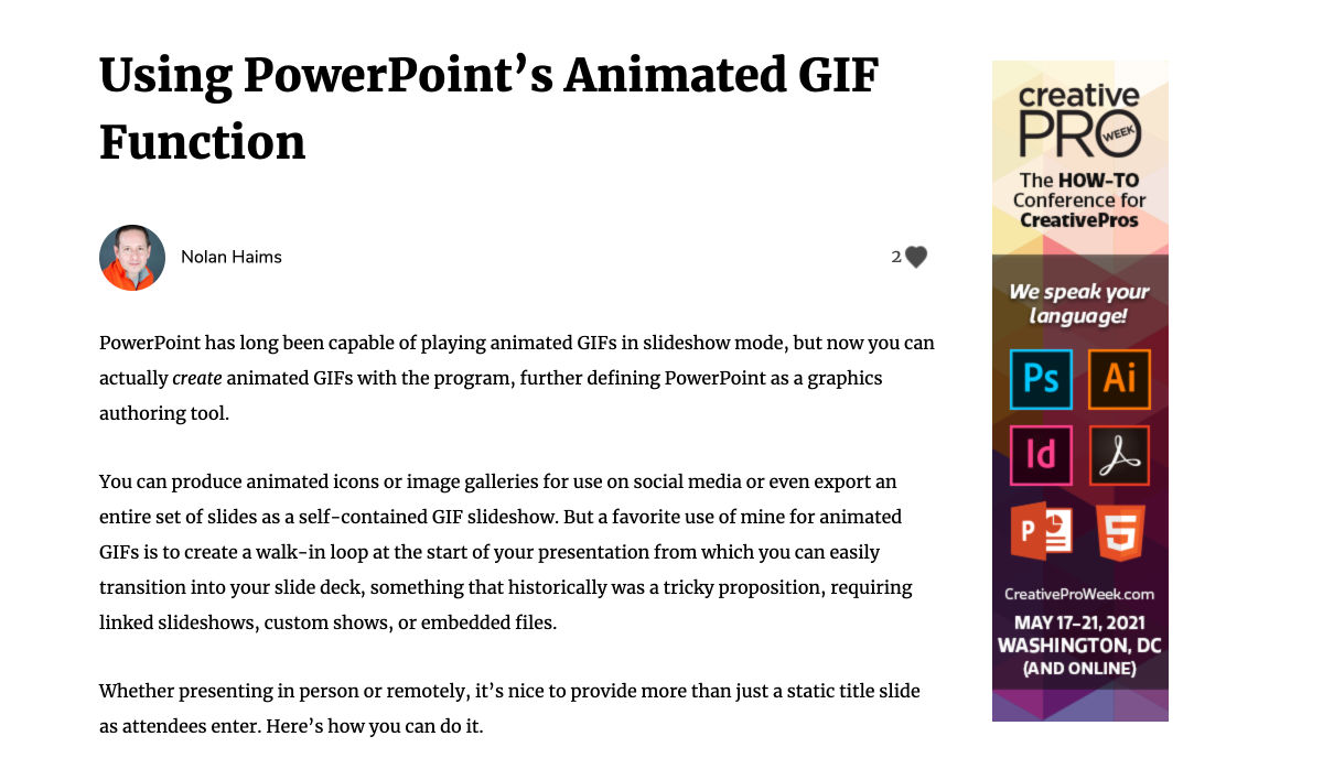
Using PowerPoint’s Animated GIF Function


Scribbble.io – A Blogging Platform for Developers


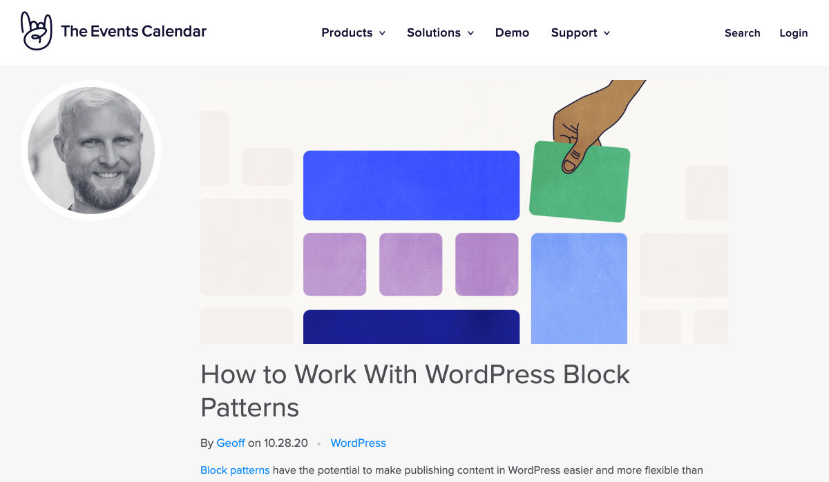
How to Work with WordPress Block Patterns


The Power of Happiness: Being Safe, Free, and Supported


How to Handle Scope Creep in Web Design


Building Products


Want more? No problem! Keep track of top design news from around the web with Webdesigner News.

Source


Source de l’article sur Webdesignerdepot

A hacked WordPress site is as damaging as having your home burgled. It can completely shatter your peace of mind and adversely impact your online business. 

Why do hackers target WordPress sites? The answer is relatively simple: WordPress is the single biggest platform for website creation these days, so there’s a larger base to attack; this attracts the attention of online criminals. 

So, how can a hack impact your website? 

Depending on the type of attack, your website could suffer any of the following:

  • It could be defaced completely;
  • It could load or operate very slowly on any device;
  • It could completely crash and malfunction;
  • It could display the dreadful “White Screen of Death”;
  • Its incoming visitors could be redirected to other suspicious websites;
  • It could lose all your valuable customer data.

This list is not exhaustive but you get the idea.

Now that we know how a successful hack can impact your website and online business, let us look at the top 10 reasons behind WP hacks and prevent them.

1. An Insecure Web Host 

Like any website, WordPress is hosted on a web host or server. Unfortunately, most site owners do not pay much attention to the web host they select and choose the cheapest they can find. For example, it is more affordable to host a website on a shared hosting plan — one that shares its server resources with many other websites like yours.

This can make your site vulnerable to hackers as a successful hack into any website on the shared server. A single hacked site can consume the overall server bandwidth and impact all the other sites’ performance.

The only way to fix this problem is to opt for a reliable host and a virtual or dedicated server.

Pro tip: If you’re already using a shared hosting plan, check with your hosts if they offer VPS hosting and make the switch.

2. Use of Weak Passwords

Weak passwords are the main reason behind successful brute force attacks that target your account. Even to this day, users continue to use weak and common passwords like “password” or “123456”; if you’re one of them, your website could land in trouble!

Guessing weak passwords allows hackers to enter the admin accounts where they can inflict the maximum damage.

How do you fix this problem? Simple, ensure all your account users (including admin users) configure strong passwords for their login credentials. With at least 8 characters, passwords must be a mix of upper- and lower-case alphabets, numbers, and symbols. 

For added safety, install a password management tool that can automatically generate and store strong passwords.

Pro tip: You can use a plugin to reset passwords for all your users.

3. An Outdated WP Version

Outdated software is among the most common reasons why websites get hacked. Despite being free to download, most site users defer updating their site to the latest version, for fears of updates causing their site to crash.

Hackers take advantage of any vulnerability or bug in an older version and cause issues like SQL Injections, WP-VCD Malware, SEO Spam & other major issues like website redirecting to another site.

How do you solve this problem? When you see a notification about an update on your dashboard, update your site as soon as possible.

Pro tip: If you are worried about updates crashing your live website, you can first test the updates on a staging site.

4. Outdated WP Plugins and Themes

Similar to the previous point, hackers also take advantage of outdated, unused, or abandoned plugins and themes installed on websites. With over 55,000 plugins and themes that are available, it is easy to install a plugin or theme, even from unsafe or untrusted websites. 

Plus, many users do not update their installed plugins/themes to the latest version or do not find the updated version. This makes it easier for hackers to do their job & infect sites.

How do you avoid this problem? As with the core WP version, update each of your installed plugins/themes on your site regularly. Take stock of all the unused ones and remove them or replace them with better alternatives.

You can update your plugins/themes from your hosting account.

Pro tip: We suggest setting aside time every week to run updates. Test them on a staging site and then update your site.

5. Common Admin Usernames 

In addition to weak passwords, users also create common usernames that are easy to guess. 

This includes common usernames for admin users like – “admin”, “admin1”, or “admin123”. Common admin usernames make it easier for hackers to get into admin accounts and control backend files in your WP installation.

How do you avoid this problem? If you are using any such usernames that are easy to guess, change them immediately to a unique username. The easiest way of doing it is through your hosting account’s user management tool, by deleting the previous admin user and creating a new admin user with a unique username.

As the first step, change the default username of your admin user and limit users who have administrator privileges.

Pro tip: WordPress has 6 different user roles with limited permissions. Only grant admin access to users who really need it.

6. Use of Nulled Plugins/Themes 

Coming back to the importance of plugins/themes, users have access to many websites that sell nulled or pirated copies of popular and paid plugins and themes. While these are free to use, they are often riddled with malware. They can compromise your website’s overall security and make it easier for hackers to exploit. 

Being a pirated copy, nulled plugins/themes do not have any available updates from its development team, hence will not have any security fixes.

How do you fix this problem? Simple, for a start, only download original plugins and themes from trusted websites and marketplaces.

Pro tip: If you don’t wish to pay for paid or premium plugins and themes, opt for a free version of the same tools that will have limited features but are still safer to use than the nulled version. 

7. Unprotected Access to wp-admin Folder

To take control of your site, hackers often try to break into and control your wp-admin folder in your installation. As the website owner, you must take measures to protect your wp-admin directory.

How can you protect your wp-admin folder? First, restrict the number of users having access to this critical folder. Additionally, apply for password protection as an added layer of security for access to the wp-admin folder. You can do this using the “Password Protection Directories” feature of the cPanel in your web host account.

Pro tip: Besides these fixes, you can also implement Two Factor Authentication (or 2FA) protection for all your admin accounts.

8. Non-SSL Website

You can easily migrate your HTTP website to HTTPS by installing an SSL certificate on your site. SSL (or Secure Socket Layer) is a secure mode of encrypting any data transmission between your web server and the client browser.

Without this encryption, hackers can intercept the data and steal it. Plus, a non-secure website can have many negative implications for your business – lower SEO ranking, loss of customer trust, or a drop in incoming traffic.

How do you fix this problem? You can quickly obtain an SSL certificate from your hosting company or SSL providers. It encrypts all data that is sent from and received by your website. 

Pro tip: You can get a free SSL certificate from places like Let’s Encrypt, but these provide limit protection that will only be sufficient for a starter site or small site.

9. No Firewall Protection

Lack of firewall protection is another common reason why hackers can bypass website security measures and infiltrate the backend resources. Firewalls are the last line of defence against hackers and work like the security alarm installed on your house. Firewalls monitor web requests coming from various IP addresses, including the suspicious (or bad) ones. 

They can identify and block requests that are known to be malicious in the past, thus preventing easy access for hackers to your website domain. Web application firewalls can thwart various attacks, including brute force attacks, XSS, and SQL injections.

Pro tip: A firewall provides much-needed security and is  your first line of defence. But it’s important to also have a malware scanner installed.

10. Lack of WordPress Hardening Measures

Typically, hackers target the most vulnerable areas or weaknesses within a WP installation, to illegally access or damage the website. The WordPress team has identified these vulnerable areas and has devised a list of 12 hardening measures recommended for every website.

A few of these include:

  • Disabling the File Editor;
  • Preventing PHP execution in untrusted folders;
  • Changing the security keys;
  • Disallowing plugin installations;
  • Automatic logout of inactive users;

How do you implement these hardening measures? While some steps are easy to understand, others require the technical expertise of how WordPress works. 

Pro tip: You can implement hardening measures on your own. However, some measures require technical expertise so in these cases, it’s much easier and safer to use a plugin.


Featured image via Pexels.

Source


Source de l’article sur Webdesignerdepot

As we turn the corner into the final part of the year, many of the new websites and redesigns that we see during much of the rest of the year tend to slow down. Many businesses are focusing on fourth quarter and holiday sales.
With that being said, there are plenty of holiday flourishes already showing up on many websites. But there are still a few trends that don’t have a holiday theme.

Here’s what’s trending in design this month.

1. Beautiful Connectivity

Web elements that merge and flow into one another can be difficult to design but the payoff is totally worthwhile. This website design trend exemplifies connected elements in a way that’s beautiful and mesmerizing.

You can accomplish it with static elements or interactivity; the common theme is that design parts enter the space of one another and merge in ways that are seamless and visually interesting.

The thing that makes it exceptionally tricky is responsiveness. To ensure that pieces work well at all sizes when they overlap or encroach on the space of one another takes a lot of planning and testing.

Here are a few examples of projects that do it well – and each one does it in a different way.

Kirk Whayman’s website uses a floating ice cube over simple lettering. The interactivity is spot on here with hover actions that allow you to move the block with the letters refracting in an expected manner. (It would be easy to play with it all day.) But the coolest interaction happens when you “break it” (click on the cube). The elements continue to merge and interact in a new and different way.

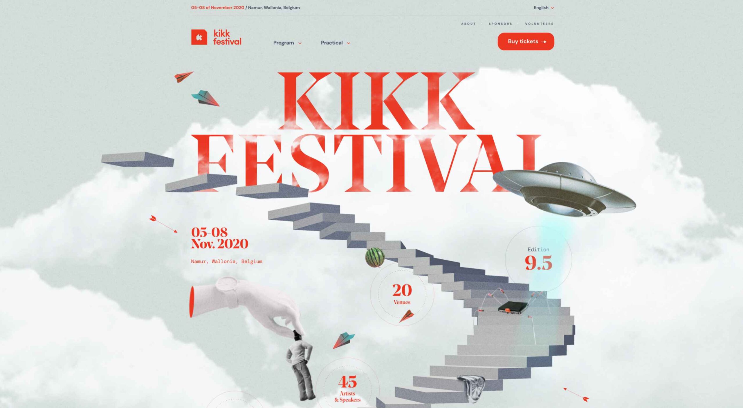
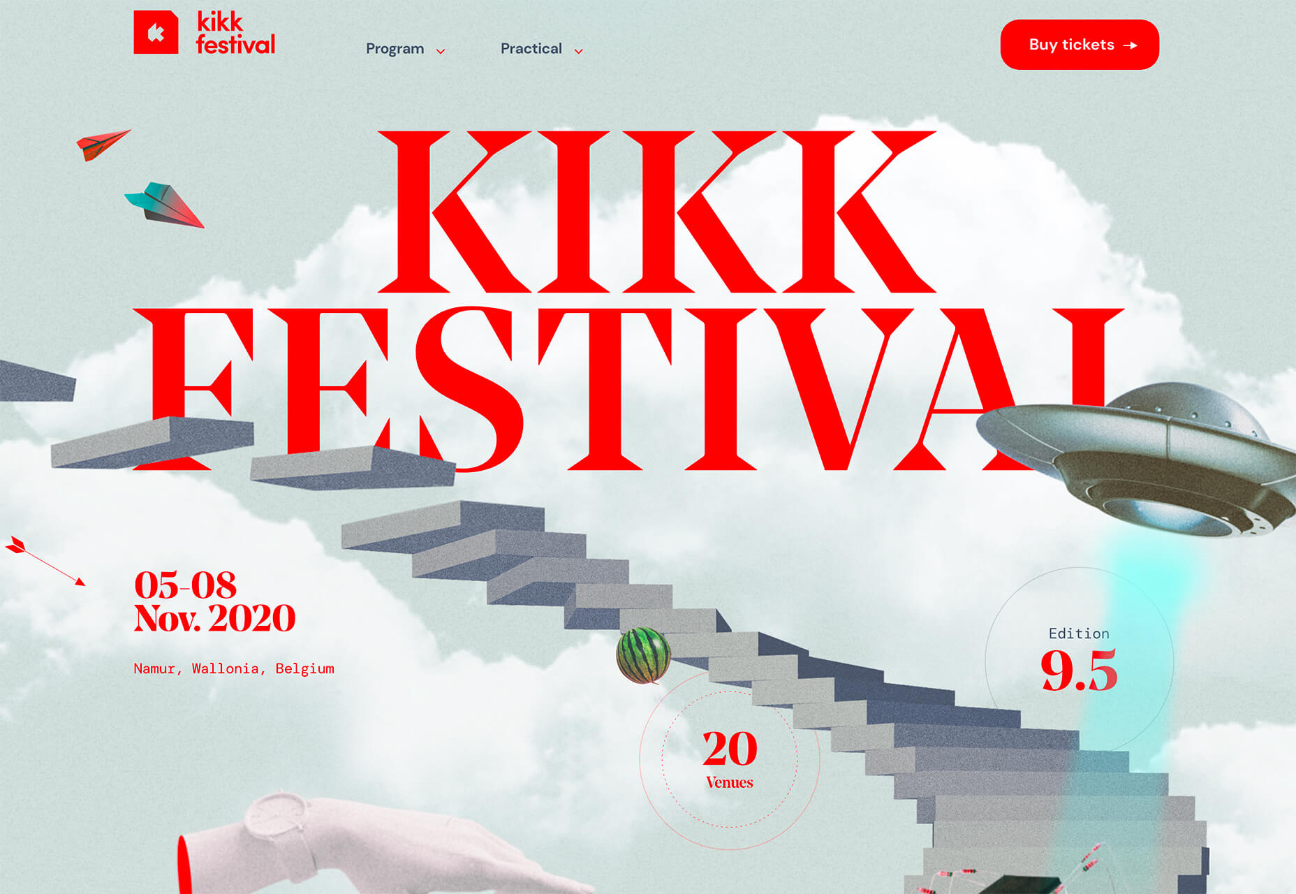
Kikk Festival uses animations and giant scrollable illustrations and plenty of elements that overlap within the space. What’s neat is that everything on this canvas seems to touch everything else. The staircase design encourages scrolling and lettering and smaller animated elements all connect to the steps in the sky motif.

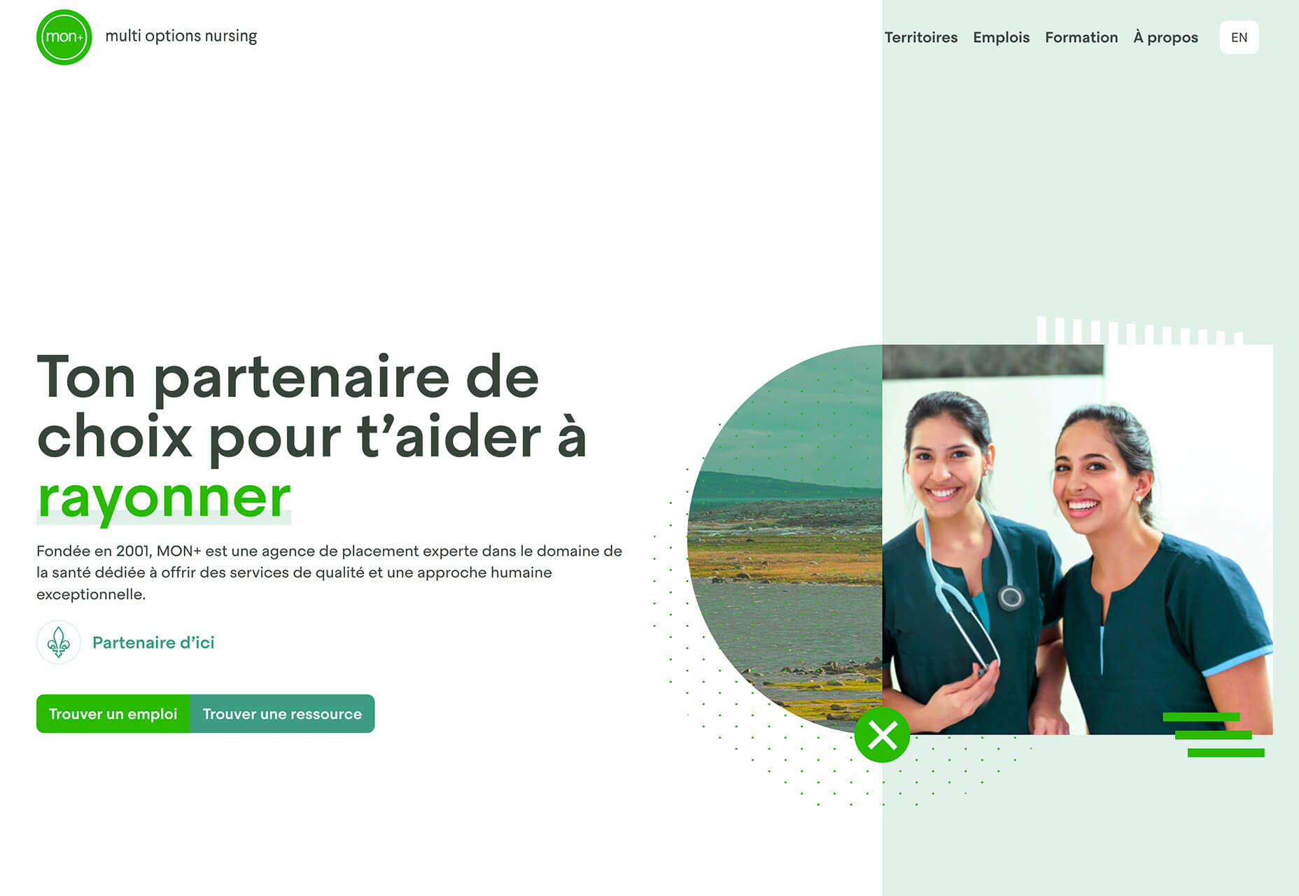
Multi Options Nursing takes a totally different approach. It uses a static split screen with a photo on the right side that merges into a round graphic element. It takes two not-s-interesting images and makes something out of them. The design carries this theme below the scroll as well and this style of image presentation carries a nice visual weight without feeling heavy.

2. Almost Brutalism

Brutalism just seems to keep coming back around. For those that love this trend, it keeps evolving as well.

The latest styles of brutalism are a little less mono but still pretty sharp with harsh lines, questionable type readability, and a lot going on in a compressed space. These projects also seem to be embracing color and alternative font choices more readily.

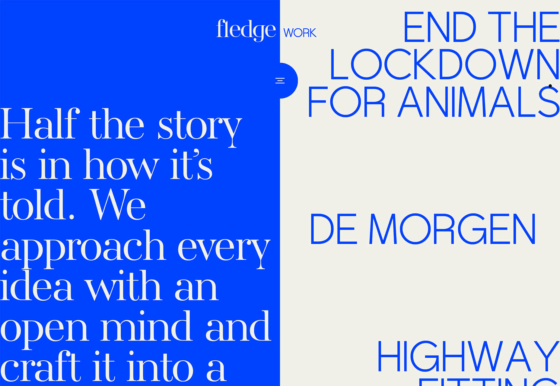
Fledge uses a split screen – still a dominant trend two years running – with a blue that’s almost too bright with an almost white offset color. The text is big and smooshed into the space tightly. Depending on the breakpoint, you might not even get the whole phrase on the left side. The design challenge is what are you supposed to do here? There are some hover animation cues, but they aren’t very direct.

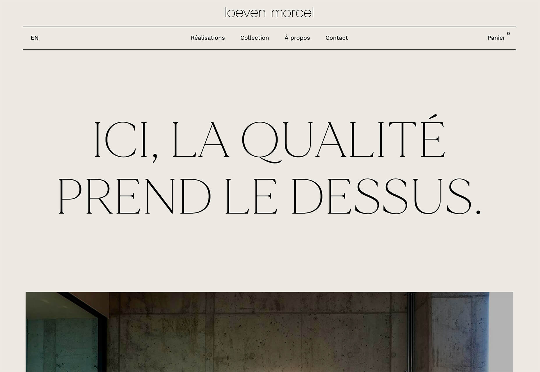
Loeven Morcel’s design has hints of brutalism and elements of elegance. What makes this design skew toward the brutal side is use of space and typography. Like the previous example, it falls into the territory of “what should I do here” with some concerns about readability. Most of these issues are resolved on the scroll if you move beyond the homepage.

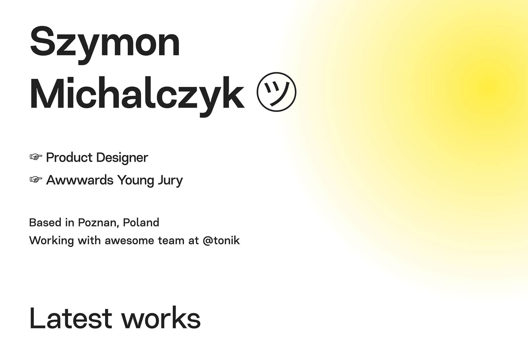
Szymon Michalczyl’s site is another that is close to brutal in style but has an element of sleekness that doesn’t quite carry it over the edge. The simple framework has that brutalist feel but the use of simple, clean fonts with plenty of space pulls it back into a more mainstream design scheme.

3. Beige Everything

Is a shade of beige the color of the year for 2020? Or is it just how we all feel?

Beige backgrounds are everywhere, making this one of those design trends that you can’t miss. The good news is that designers are playing with different shades of beige as well as warm and cool variations. Beige on its own can take on some of the color from accent hues and imagery, so that’s important to keep in mind when using this in the background.

The other variable is how saturated to make beige coloring. Most designs are using some of the more muted options while mostly playing with the levels of green and red. But darker beiges are also an option.

Simon Daufresne uses a beige that is the color that comes to mind when you think beige. It’s simple, a hint reddish, and is used with black only to maintain true color.

Discovered Wildfoods uses a more neutral feeling beige with a more green undertone (or is that color feel coming from other design elements). The neutral and natural color fits the brand and association this website is trying to create.

Aebele Interiors also uses a more traditional beige but with a bold mustard accent that makes the color feel exceptionally warm. What’s nice about this color combination is that in small sizes the mustard colored-type almost falls into the beige background, but at larger sizes seems to almost jump off the screen. It’s an interesting color juxtaposition.

Conclusion

Personally, this month’s trends are a mixed bag. I love the lines and interactivity of the beautifully connected examples. It shows that elements can cross and work together well.

On the flip side, brutalism and beige just aren’t my style. But apparently, they appeal to a lot of people based on the number of projects using these styles. What do you think? I’d love to know how you feel about these trends. Let me know on Twitter.

Source


Source de l’article sur Webdesignerdepot

When it comes to compliance, website developers need to keep their eyes on more than just ADA regulations and Section 508. Privacy laws are a big consideration and decisions on how to build privacy into a website start with architects. 

And that’s exactly what website developers (and designers!) are. They build up attractive, functional websites and apps for their clients. Yes, they work closely with clients, copywriters, vendors, and other professionals to get the job done, but the developers are the ones who put it all together. 

That’s why it’s critical that website developers are well-versed in marketing privacy laws — these regulations directly impact the end results of their work. But how does a website architect create a digital platform that honors both user privacy and the needs of their clients? 

What Privacy Laws Are Important For Web Developers?

The two biggest privacy laws that web developers need to keep tabs on are the General Data Protection Regulations (GDPR) and the California Consumer Privacy Act (CCPA). Each law has its own unique scope and provisions, but they both shifted the landscape in defining an individual’s rights to their personal data and set mechanisms for how these rights would be protected and enforced.

Each regulation also carries with it fines, fees, and legal measures for non-compliance. These can be substantial. And if that’s not enough, there’s an ever-increasing consumer demand for websites that prioritize privacy and security. Consider these statistics:

  • 82% of Americans surveyed say they are concerned about the security of their online data
  • 79% of adults claim they are very or somewhat worried about how companies use the data they collect about them
  • 63% of Americans believe they understand very little or nothing at all about privacy laws and regulations that are intended to protect their data

How Can Developers Implement These Laws?

Privacy by Design is Critical for Websites

Under GDPR, web developers are required to adopt the Privacy by Design framework, which is a multi-point methodology intended to standardize data protection measures. 

Building privacy into websites shouldn’t happen at the end stages. It should start with how the websites are conceptualized in the first place. Here are points to prioritize:

  • Minimize that data you’re collecting and pseudonymize it to protect data privacy
  • Are you capturing consent? How? Where?
  • Integrating security measures to protect data — anytime you capture data or implement a third party product, a security risk is born.
  • Knowing where you’re introducing privacy and data sharing notices
  • Implement just-in-time notices to provide consumers transparency and build trust 
  • Giving your users the opportunity to manage their personal data

Let’s look at these a little more closely…

Data Minimization is the Goal

Data minimization is an important principle embedded in GDPR. Data minimization itself is a pretty straightforward concept: organizations should limit how much personal data they collect and only process the information necessary to accomplish their business purposes. Once the data is no longer useful, it should be deleted. 

For web developers, this means several things. When it comes to building websites, forms, cookies, and other methods should only ask for essential information. For example, if you are creating a pop-up to collect email addresses, don’t ask for their location unless it’s relevant to the email list and better serving their needs.

How and Where Do You Introduce Privacy Policies and Notices?

Let’s say you take data minimization seriously. That’s great! Now you need to put those data collection practices into words and share them with your customers. 

Privacy policies and notices are a big part of both GDPR and CCPA. Both the CCPA and the GDPR mandate that your privacy policy detail why you’re collecting information and how it will be used, as well as what the individual’s rights are and how they can exercise them. 

CCPA takes a slightly different angle, requiring privacy policies to disclose if the business sells personal data and what third parties have access to the data. CCPA also dictates that privacy policies and notices are current, updated at least annually.  (Nota bene: GDPR also asks for updated privacy documents, but doesn’t specify frequency.) 

How does this translate from policy into web development?

  • If you’re collecting data to improve user experience, allow for targeted ads, or sharing information with third-parties, this information will need to be included in a privacy notice. Remember, CCPA works with a broad definition of selling data, so you may need to account for a “Do Not Sell” link on your home page. 
  • Considering using data beyond these purposes? Plan to obtain explicit user consent for each additional purpose.
  • What’s your plan for the data after the user gives it to you? Where is it stored? Who has access to it? How long are you keeping it? These are all questions that a website developer should consider, and that needs to go into a privacy notice. 

Just-in-Time Notices for Transparency and Trust

Part of Privacy by Design is the use of individual components of your website to create transparency and support compliance. From a development and design perspective, this means you should always be looking for ways to communicate the hows and whys of data collection. 

Yes, your privacy policies and notices aid in this, but going beyond these pieces is important. Customers recognize when businesses go the extra mile for them, after all. 

So consider implementing just-in-time notices at points where users enter their information. These notices are a chance to share your data collection practices with your users. It’s transparent! It’s open! It aids in consumer awareness! 

Keep Users in the Loop

Want to win over your customers? Make it as easy as possible for them to manage their personal data and how it’s being used. This starts with making sure they are aware of why you’re requesting their information and how you’re planning on using it for the website. You should also:

  • Get user consent — clear and unambiguous user consent — prior to gathering any data at all. This includes cookies.  
  • Don’t pre-tick boxes for consent. Just don’t. (It’s bad practice AND it’s against GDPR.)
  • Link to all legal documents on the site. Users should be required to agree to them before using the service. 
  • Want to send marketing communications like email newsletters to your customers? Make sure they agree to this. Expressly. 

One helpful tool for keeping users in the loop is a marketing preference center. A marketing preference center allows users easy access to their information. From there, they can manage, edit, and delete their information at their discretion.  

Bonus? A marketing preference center is an excellent point at which to communicate a business’ commitment to privacy. While users will pick up this through all the discrete elements of privacy on your website, putting it all into one hub that also allows users control over their data really reinforces this message. 

Remember, it’s not just on the consumer to manage their data. Web developers should commit to managing the data in their systems. This means they should:  

  • Maintain accurate and clean records of users’ data consent preferences
  • Send regular reminders to users to update their personal information in your system
  • If a user deletes their account, promptly delete all of their personal information  
  • If your client goes out of business or is sold, they should delete all personal information in their system

Make it User Friendly

A final point: making your websites user friendly is important regardless of privacy compliance. Users expect websites that don’t make them think deeply about, or worry about, their privacy. Make it accessible and easy. Don’t make people figure it out on their own.

Give them value for sharing their data

Your users don’t have to share their data. They’re choosing to. So in exchange for their personal information, make sure you’re using it to provide a user-friendly website. Offer them a secure, enjoyable experience.  

But don’t ask for more than you need

Let’s loop back around to this point again. While consumer data can help you build a better website, don’t plan your websites around it and don’t demand data to create a good experience. 

Usability, web design, and website security; all of these things benefit from consumer data. But privacy laws should always guide how any personal data is collected and used, and respect for consumers’ individual rights, and honoring their privacy should be top-of-mind for web developers. 


Featured image via Pexels.

Source


Source de l’article sur Webdesignerdepot

The world of search engine optimization was born with all sorts of different hacks and shortcuts that many people use in an effort to grow their business.

Knowing effective SEO tricks would be incredibly profitable, but unfortunately it’s not that easy

This becomes evident as soon as you do a Google search about anything SEO-related, only to find pages and more pages replete with blog posts and videos disclosing all the tips and tricks you “need to know” in order to achieve the best SEO results, in the fastest way possible.

Knowing effective SEO tricks would be incredibly profitable, but unfortunately it’s not that easy.

In its essence, SEO isn’t about hacks, shortcuts, and hidden optimizations, but rather about resource allocation. Keep reading to learn why!

Be Careful About Over-Reliance on Hacks

Before we start talking about resources, it’s important to understand why the quick and easy SEO hacks we’ve all read about online aren’t as reliable as they might seem.

The reality is that yes, there are some traditional hacks and optimization tactics that many people swear by. However, SEO has become way too competitive for these hacks to still work.

Think about it: anyone can learn about these hacks and shortcuts in a matter of seconds, which means that anyone can use them, which means that they’re not going to help your website stand out. By way of example, when thinking about keyword usage, many websites simply decide to put them everywhere on their website, without actually planning and strategizing. Perhaps years ago, doing so would lead to excellent results, but that’s not the case anymore.

What I want to go over, and what I mean with this article, is that when developing your SEO plan, you should think less about hacks, and try to focus on strategy and resources instead.

As tempting as they might be, most SEO hacks won’t really go that far.

What does go far are those strategies and resource allocation decisions, which you can master as long as you know three things:

  • Who your competitors are;
  • What you have;
  • and What strengths you can double down on.

Base Your SEO Strategies on Your Business’s Resources

So, SEO is about resource allocation – we know that now…but what exactly does that mean?

Well, this logic is based on something you might have heard of before, and that is the three pillars of SEO.

As a refresher, everything in SEO revolves around three pillars:

  • Link building and referring domains;
  • Content development and content marketing;
  • Technical SEO.

Many businesses have a limited digital marketing budget and, as if that wasn’t enough, their SEO budget tends to be even more restricted.

This means that we can’t try every hack out there or do every campaign we can come up with, hoping it will lead to positive results. On the contrary, it means we need to be methodical and understand which strategies have the most potential and are actually worth exploring.

In summary, there’s one big challenge that every SEO team and company experiences, and that is the limitation of resources versus possible operations, and that leads us to a question: what mix of SEO pillars will give us a good shot at ranking high and surpassing our competitors?

Develop Your SEO Strategies Based on Your Inherent Strengths

The mistake that a lot of business owners make after reading SEO articles or hearing about amazing case studies is that they try and copy the strategies they learned about, from beginning to end.

However, contextually, each case study or article could refer to a strategy that was specifically optimized for a different type of business.

So, although copying what other successful businesses can work in certain situations when speaking about SEO, it’s best to borrow ideas and use the ones that fit your inherent strengths.

Based on the pillars of SEO that we discussed earlier, there are three strong points that a company can have:

If You Have a Strong Network…

Some businesses don’t have the resources to create an in-house content development team or outsource writing services.

However, they have another strong suit, which lies in their ability to go out into their community, speak, and be heard. They can do this because they have built a strong network over the years and, in cases like this, what we often do is use a backlinking approach.

When working with businesses that have a strong community presence, go out and double down on their network. Pitch their relevant contacts for guest speakership and guest posts, building thought leadership, while also driving links to their website.

If You’re Not That Popular But Are Good With Words…

Right now, some of you might be thinking: “Yeah, well, that’s easy when you’ve built the exposure, but not all of us are lucky enough to be well-known”.

Listen, I get it, we’ve all been in that position.

For clients and businesses that feel like they don’t have the brand equity or exposure to develop a strong backlinking strategy, opt for another route, and invest much more on content (and/or technical SEO, see below).

If the client has a team who’s ready to put its head down and get to work, then focus on producing a lot of content for their website.

Ultimately, the goal is to build a content library that is thorough and expansive, and that provides the client with more opportunities for keyword rankings, while also reinforcing the relevance of their website for those specific SEO keywords.

If Technical Knowledge is Your Forte…

You may not like (or have time) to write and you may not have a strong community presence, but if you have advanced technical skills and the ability to create a strong website quickly, then there’s another approach you can take.

This leads us into the third pillar of SEO: technical SEO.

This solution is indicated for technical teams that can create large websites, databases and user experiences in no time, and it is typically adopted by tech startups that are trying to create an app that provides user value.

First and foremost, winning at technical SEO requires strong technical skills that will allow you to build the web assets that you need, but that’s not all. It also requires you to understand how you can double down on these skills and manage large websites in the rather complex Google ecosystem.

So you need, for example, to know how you can get Google to notice and properly index the new pages you create on your website, even if you already have 100,000 pre-existing pages.

Or to ensure that each of your new pages is properly optimized for the best keywords.

Needless to say, using technical SEO does become a complex operation. However, when done right, it can lead your SEO to grow by sheer size, with the hopes that certain relevant keywords will start to rank for your business naturally.

Conclusion: Your Strategy Will Probably Be a Combination of the Three Pillars

When it comes to SEO, honing in on your strengths and accepting the fact that you can’t do everything is definitely the way to go.

When you’re running an SEO campaign, you should always focus on what you’re good at, know your resources, and augment what you already master – and that will put you in the right direction.

By focusing your resources on any of the pillars of SEO (or even a mix of them), you substantially increase your chances of achieving long-term success, which will not happen if you go for hacks and shortcuts instead.

A long-term, highly-organized, resource-allocated SEO strategy won’t only guarantee continuous success, but it can ultimately become self-sustaining, meaning that it will allow you to keep growing and growing, becoming an organic part of your marketing plan.

I’ve seen a lot of people try SEO hacks for two weeks, only to realize that they didn’t work and that their efforts had been in vain. 

It’s unfortunate because by doing so, you’re turning your back on a marketing channel that is very valuable to a lot of people, and these hacks trick people into thinking it’ll be overnight.

So remember, resource allocation over hacks and shortcuts!

Source


Source de l’article sur Webdesignerdepot

With billions of internet users worldwide spending several hours online each day, the online presence of brands is now a necessary avenue for building, boosting, and maintaining positive value and attracting and interacting with customers. 

This has created increasing pressure for web design agencies when creating and managing websites. This pressure is multiplied by all the projects that web design agencies have to handle at one time. This is because different clients demand different things for their websites, whether it’s a signature feature or specialized functionality. 

Hence, it’s vital that the tools the agencies use to work are simple enough and suited to the tasks they have to accomplish in order to build and maintain these projects. Having the right tools can increase efficiency and effectiveness in managing websites.

Challenges in Modern Web Design

Building a website with all the essentials in mind is always easier said than done. Websites have to be both functional and easy on the eyes to invite traffic, disseminate information, or appeal a product or service to a target audience, and all while having an attractive and convenient interface.

The good news is that it’s perfectly possible to design a quality website and without spending a fortune to do so. Below are some of the challenges that web design agencies face when trying to deliver and reconcile efficient user experience and effective user interface in web design.

1. Appealing User Experience

Designing a good website means ensuring that the user experience is appealing to a general audience, but this is one of the most difficult parts of web design. Agencies must be careful not to turn off users with a confusing user experience. For instance, making important information difficult to find on web pages, using technical jargon that ordinary users wouldn’t understand, and focusing too much on the design rather than the overall experience are a few big mistakes that no designer should ever commit.

Instead, web design agencies should focus not only on making the design look good but also on making the experience smooth and fast for the regular site visitor. This includes improving design elements to make navigation easier as well as optimizing webpage load speeds.

2. Working With a Budget

It’s common for the client and the web design agency’s budgets to not line up at all times. Either the client will find the project quote too high, or the designer will find the client’s budget too low. The cost of a web design project can vary greatly, depending on what needs to be done. 

Although having to build a good website on a budget may be difficult, it’s important for both parties to come up with a set amount before the project even starts. The client should always specify what they want to achieve and how much they’re willing to pay to get it, and the agency should let the client know beforehand if this is possible.

3. Integrating Third-Party Functionality

Sometimes, clients may make requests for third-party functions that may not be easily integrated into the site. To prevent this, web design agencies should always consider integration when building a site. Most businesses and companies now have at least one social media account, so it doesn’t make sense for their site to remain disconnected.

When a website visitor shares an excerpt on a social media site like Facebook, Pinterest, or Twitter, other people who can see their posts may become interested in visiting the original post on the website. Properly integrating third-party applications and functions into a website can get it more online presence and popularity.

4. Suitability to Different Devices

There are many devices that people can use to access the web. From smartphones to desktop computers, from cars to game consoles, and even wristwatches and digital cameras, all of these can be web-enabled as long as there’s an available internet connection. 

Websites nowadays should always be compatible with any of the devices people might use to go to the website. They should look pleasing and load fast regardless of what device a visitor is using.

5. Security of Personal Information

Most websites require personal or financial information, whether for account verification, for website subscription, or something else. Websites should be designed with personal security in mind, which is even more important since hacking has been on the rise since the coronavirus hit.

One of the biggest threats that websites face today is phishing, or when an attacker will pretend to be a trusted contact and attempt to compel you to click a malicious link. Another is ransomware, or where cybercriminals hold customer data for ransom and attempt to extort online business owners. Yet one more is SQL injections, or where hackers will attempt to execute malicious SQL commands in your website’s database. 

The best practices in regards to web design to mitigate these risks include third-party plugins and themes, keeping all of your software up to date, setting your web applications so they run the fewest privileges possible, and utilizing SSL certificates and HTTPS protocols. 

Adopting Site-Building Platforms

Gone are the days where you had to be technologically gifted to design a website from scratch, usually through manual HTML codes. Back then, you had to know your way around the web if you wanted to set-up and manage a site of your own.

Now, there are a lot of good website builders that allow you to create websites in a faster period of time. Even web design agencies now make use of such builders in order to make the job easier and more convenient. Not to mention, it allows agencies to focus on the design alone.

Although these platforms offer predesigned templates based on the most common purposes of websites, they normally allow the user to white label the website into the branding specific to the business or agenda of the website owner. The text styles, colors, and sizes coordinated to the website’s theme, and colors can be designed specifically to match the business or organization’s image and identity. 

Simply put, creating websites through a web builder platform can provide web design agencies with easy-to-understand tools that their teams and members can all uniformly use to more effectively and more efficiently handle all their projects.

With services that allow mobile optimization, site management, and even drag-and-drop editing, web design agencies can now better manage their projects and finish with their tasks more quickly.

Not only that, by using white labelling, services can conserve their time and energy into focusing on creating the best website for their client. With all the website builders currently available on the market today, just picking the right one can give web design agencies the best tools to use when creating, designing, and maintaining websites. 


Featured image via Pexels.

Source


Source de l’article sur Webdesignerdepot

Today, great design isn’t just about conveying the right amount of information in a certain number of pages. 
There’s more to creating the perfect website than experimenting with visuals and sound. Designers need to think carefully about how each element of their site impacts the overall user experience. 

After all, with billions of websites available to explore, it takes something truly immersive to convince your client’s audience that they should stay on their pages. The more convenient and attractive your websites are, the more likely it is that visitors will want to stick around. 

Minimalism, one of the more popular styles of web design from the last few years, can sometimes assist designers in making attractive and effective websites more functional.

The less clutter and confusion there is on a page, the easier it is to navigate. 

So, how do you embrace the benefits of functional minimalism?

Understanding Functional Minimalism

Many webs designers are convinced that minimalism is all about aesthetics. 

They see a website like Hugeinc.com and assume that the minimalist appearance is all about making the website as attractive as possible.

However, the underlying ideas of minimalism in web design go much deeper than this.  The history of minimalist design begins with Japanese culture. Japan has long focused on balancing simplicity and beauty with its architecture, interior design, and even graphic design. In the Western world, minimalism got its day in the sun in the web design environment, after customers endured years of cluttered and complicated web pages with difficult navigation, overwhelming information and clashing graphics. 

Designers began to experiment with the idea that less really could be more — particularly when it came to the digital landscape. 

The Functional Rules of Minimalist Web Design

For a while, minimalism was the most popular style for a website. During 2018, in particular, minimalist web design soared to the top of the designer demand list, as companies fell in love with a combination of white space, simple navigation and bold text. 

While now, there are other design trends stepping into the industry, designers can still benefit from exploring some of the essential rules of functional minimalism. After all, visual complexity has been proven to damage a person’s perception of a website

Additionally, a study conducted by the EyeQuant group found that a clean and simple design can lead to a lower bounce rate. Minimalism gives viewers less to contend with on a page, which can allow for a simpler and more straightforward experience. Additionally, a clean website can also drive additional benefits, including faster loading times, better responsivity between screen sizes and more.

Because you’re only using a few images and well-spaced text, you can even experiment with different strategies, like graphics and dynamic fonts. Look at the Manuel Rueda website, for instance, it’s a great example of how a minimalist design can be brimming with activity.

So, how can any designer use the principles of functional minimalism?

1. Focus on the Essentials

First, just like when designing a landing page, designers need to ensure that they’re concentrating only on the elements in the page that really need to be there.

This means removing anything on the website that doesn’t support the end-goals of the specific page that the viewer is using. Any pictures, background noise, buttons, or even navigation features that aren’t going to support the initial experience that the visitor needs, must go. 

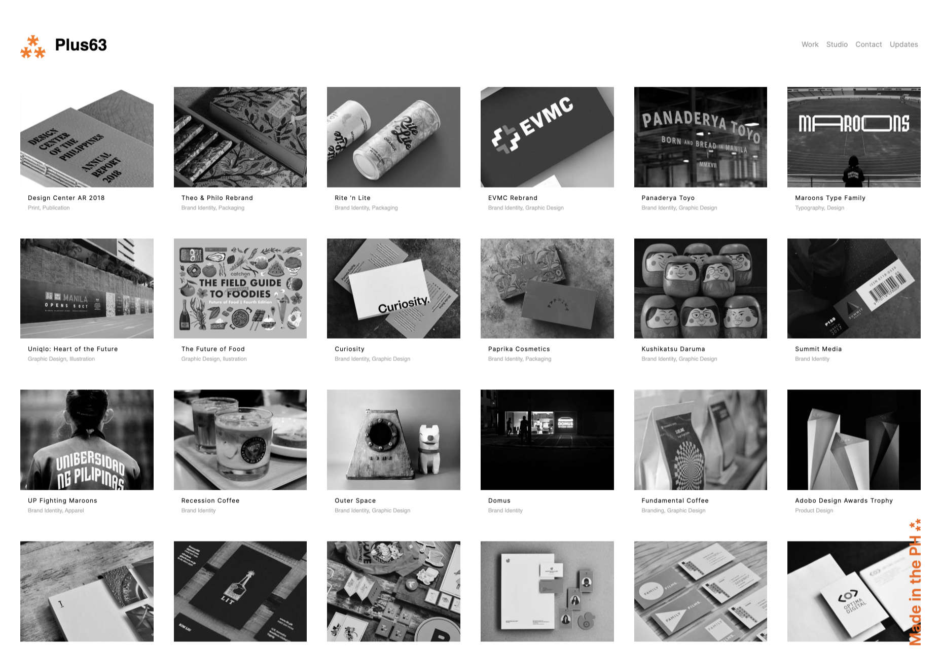
Think about what’s going to distract your visitors from the things that are important and concentrate on giving everything a purpose. For instance, the Plus63.org website instantly introduces the visitors to the purpose of the website, then allows users to scroll down to get more information. The data is spread clearly through the home page, pulling the viewer into a story. 

2. Embrace the Positives of Negative Space

Negative space is one of the fundamental components of good minimalist web design. 

Every part of a good website doesn’t need to be filled with noise to make a difference. White, or negative space can help to give your viewer the room they need to fully understand the experience that they’re getting. 

From a functional perspective, it’s the difference between placing someone in an overflowing storage container and asking them to find what they need or placing them in a room where items are carefully spaced out, labelled, and waiting for discovery. 

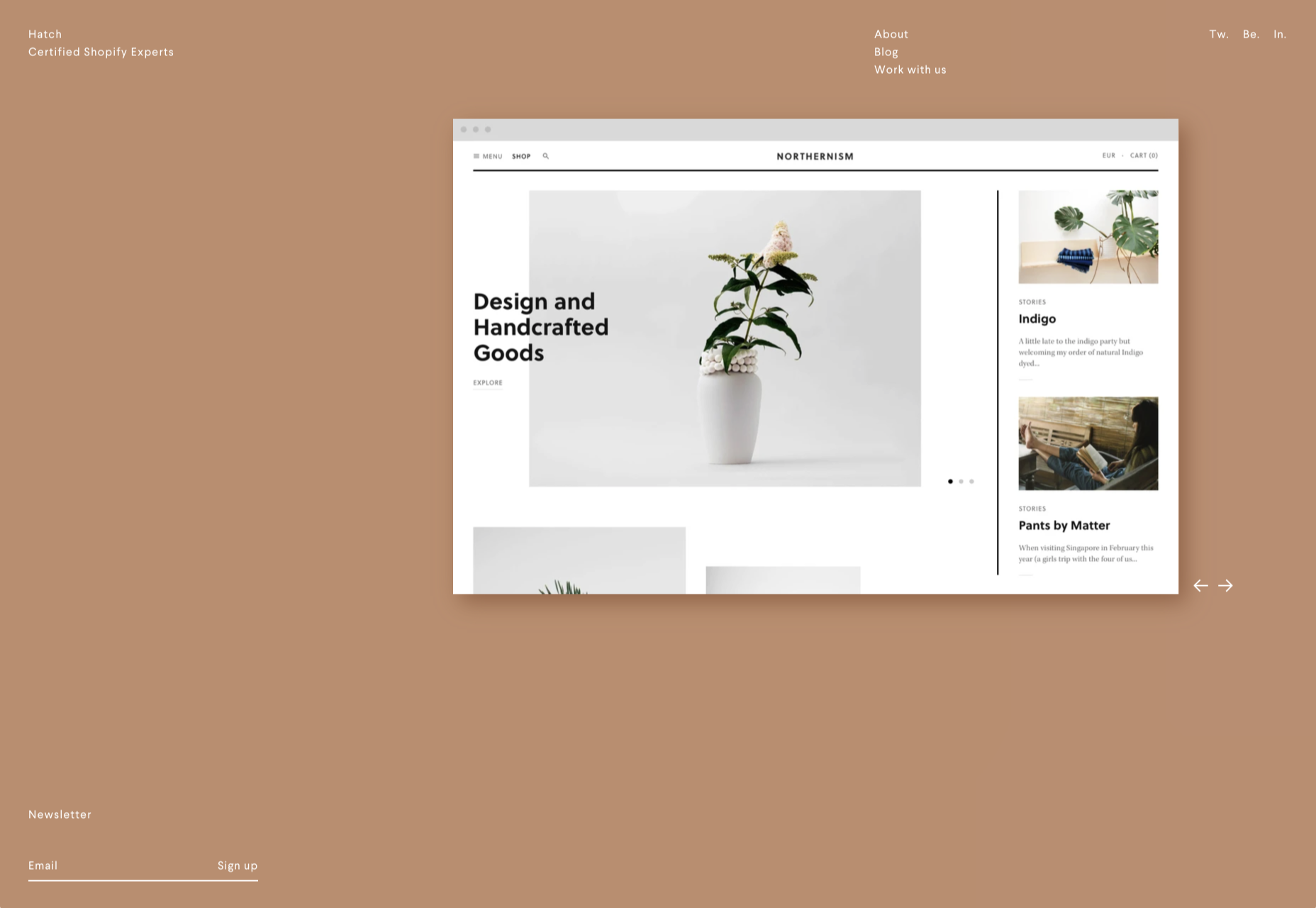
The Hatchinc.co website uses negative space to ensure that information is easy to consume. You can find the different pages of the site easily, the social media buttons, and the newsletter subscription tool. Plus, you get a chance to see some of the work behind the site.

3. Make it Obvious

One of the biggest problems that consumers have encountered in recent years, is the concept of “choice overload”. 

Whether you’re in a store, or on a website, you’re never sure what to do first. Do you check out the blog posts on the site to learn more about the authority of the company? Do you visit the “About” page, to see where the brand come from? Do you head to their product pages?

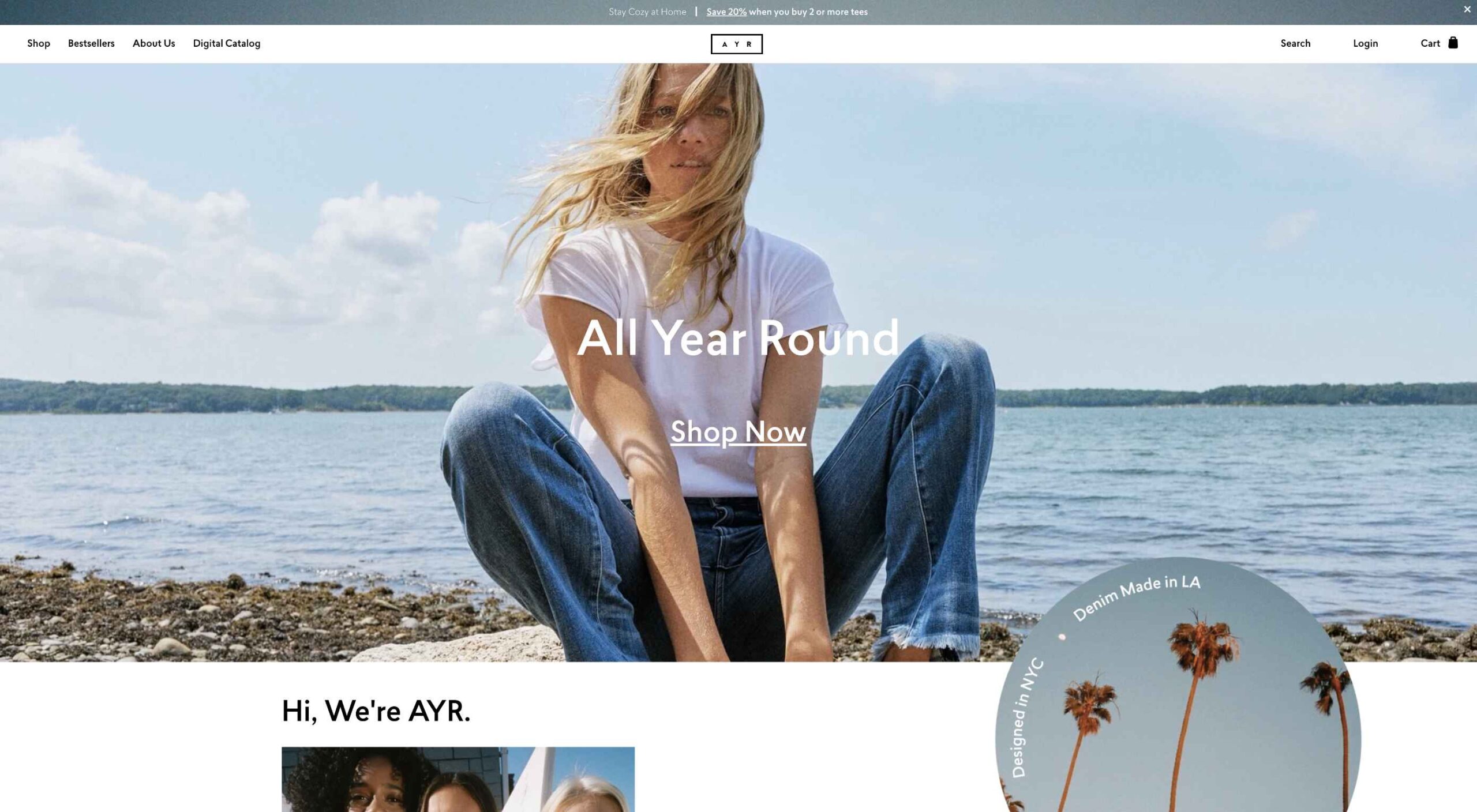
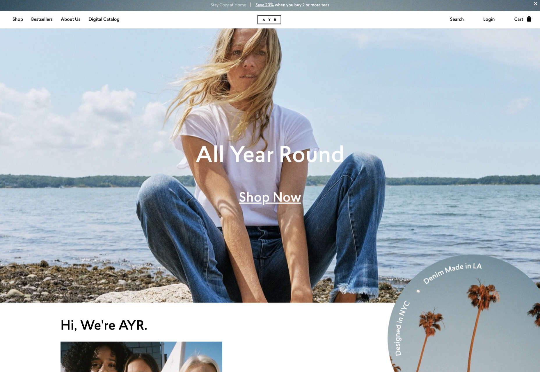
As a designer, functional minimalism can help you to make it obvious what your audience should do next. As soon as you arrive on the AYR.com website, you’re not overwhelmed with choice. You can either head to your bag, “shop now”, or check the menu. 

Since the “Shop Now” CTA is the biggest and most compelling, the chances are that most visitors will click that first, increasing the company’s chance of conversions. 

4. Simplify the Navigation (But Don’t Hide It)

The AYR.com example above brings us to another concept of functional minimalism. 

While minimalism and simplicity aren’t always the same thing, they should go hand-in-hand. When you’re designing for functional minimalism, you should be concentrating on helping visitors to accomplish tasks as quickly and easily as possible, without distraction. 

That means that rather than overwhelming your audience with a huge selection of pages that they can visit at the top or side of the screen, it may be worth looking into simpler navigation options. A single menu icon that expands into a full list of items remains a popular design choice – particularly in the era of mobile web design. 

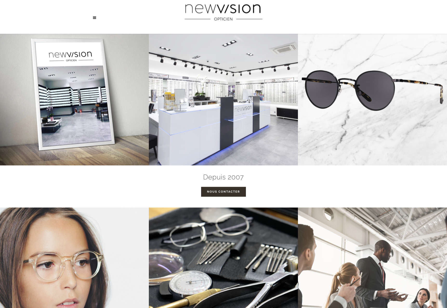
For instance, look at the simple menu on newvision-opticien.com.

With this basic approach, designers can ensure that visitors are more likely to click through to the pages that their clients want their customers to visit. They can still find what they need in the menu, but it’s not taking up space on the page, or distracting them. 

5. Set Great Expectations with the Top of the Screen

Functional minimalism can also help today’s designers to more quickly capture the attention of their visitors from the moment they click into a website. 

The content that’s visible at the top of the page for your visitors is what will encourage them to take the next step in their online experience. Make sure that you’re providing something that keeps your audience interested and gives them the information they need. 

That way, you’ll lower the risk of high bounce rates for your clients, while also taking advantage of minimalism’s ability to deliver quick access to information for your audience. 

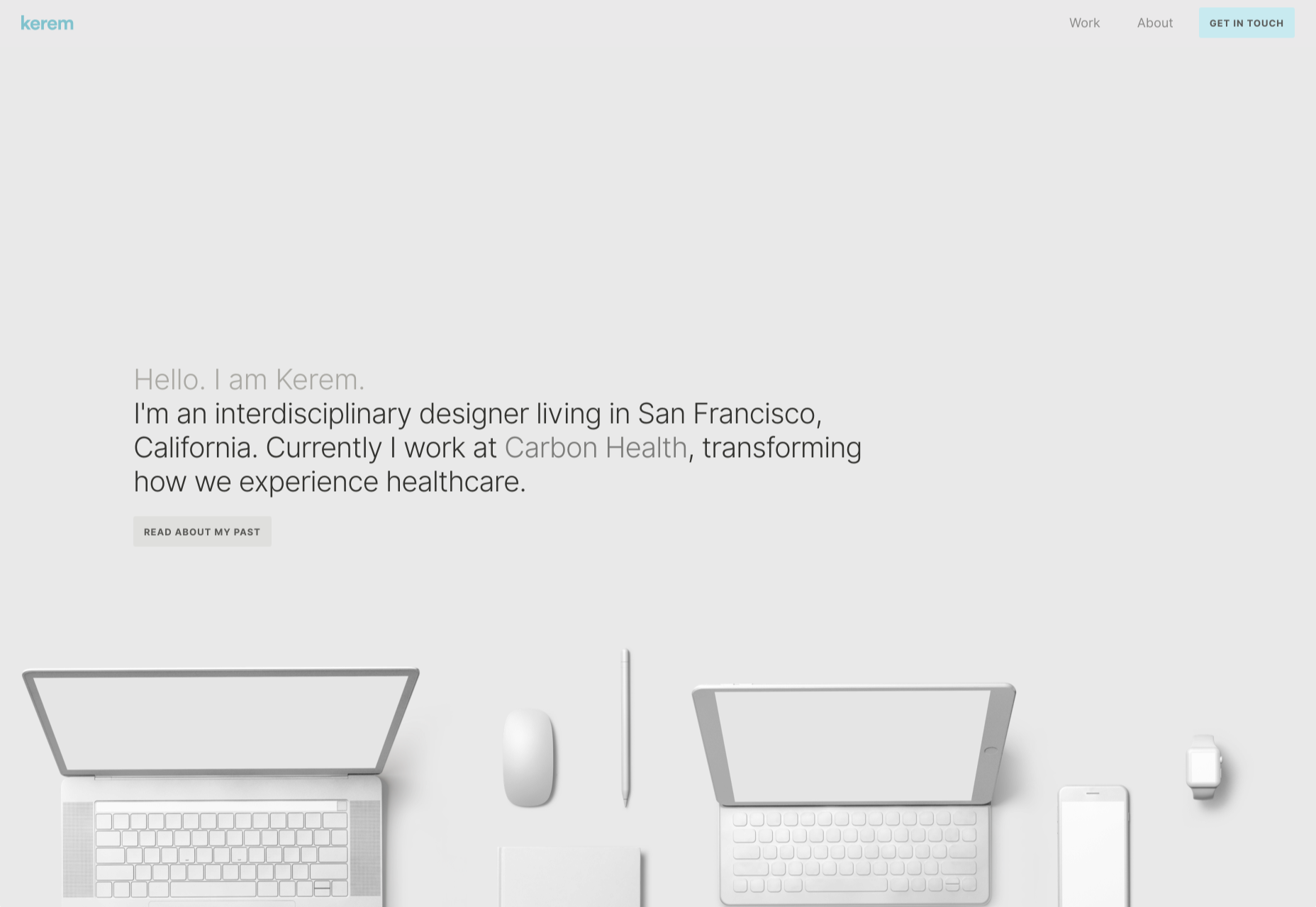
At the top of the page, the Kerem.co website instantly introduces the visitor into what the website is all about, and what they should do next. 

You can even deliver more information in one chunk at the top of the page, without cluttering the environment, by using good UI animation. 

Consider implementing a slideshow of pictures that flip from one image to the next, or a font section that dynamically changes as your audience has chance to read each sentence. 

6. Use Functional Minimalism in the Right Spaces

Remember, functional minimalism isn’t just for home pages. 

Depending on what you want to accomplish for your client, you could also embed the components of minimalism into landing pages, portfolios, and squeeze pages too. 

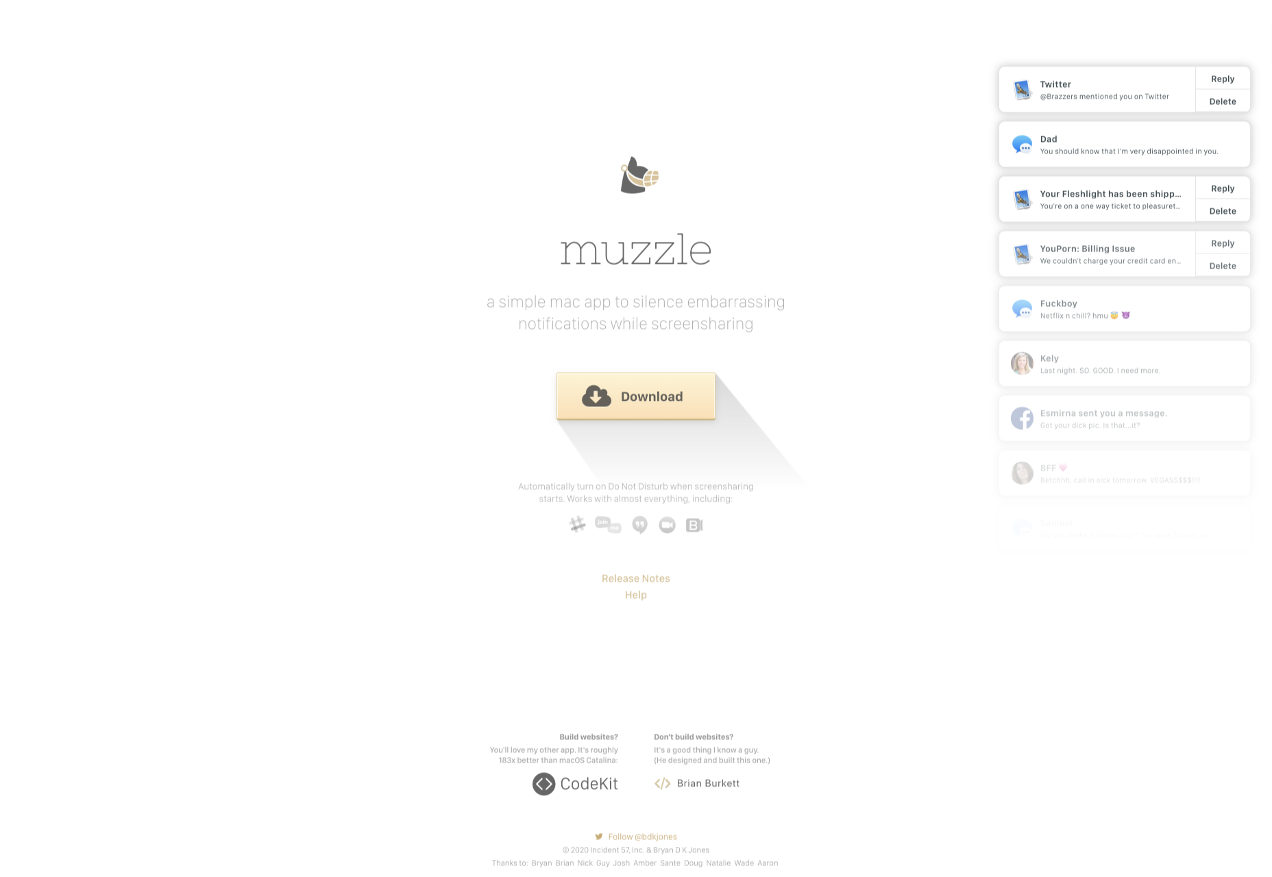
After all, when there’s less clutter and confusion on a page to distract a potential audience, there’s a greater chance that your visitors will scroll to the bottom of the page and complete a conversion. For instance, look at how simple and attractive the Muzzleapp.com landing page is.

The page provides useful information and tells customers exactly what they need to do next. There’s no confusion, no complexity, and nothing to hold visitors back. 

Just be careful. While functional minimalism can be very useful, it won’t be right for every website. A lack of elements can be harmful to websites that rely heavily on content. That’s because low information density will force your user to scroll excessively for the content that they need. Using functional minimalism correctly requires a careful evaluation of where this technique will be the most suitable. 

Minimalism Can be Functional

A minimalist design isn’t just an aesthetic choice. The right aspects of minimalism can simplify interfaces on the web by eliminating unnecessary elements and reducing content that doesn’t support an end goal. 

The key is to ensure that you’re focusing on a combination of aesthetics and usability when creating the right design. An easy-to-navigate and beautiful website can be a powerful tool for any business.  

Source


Source de l’article sur Webdesignerdepot