
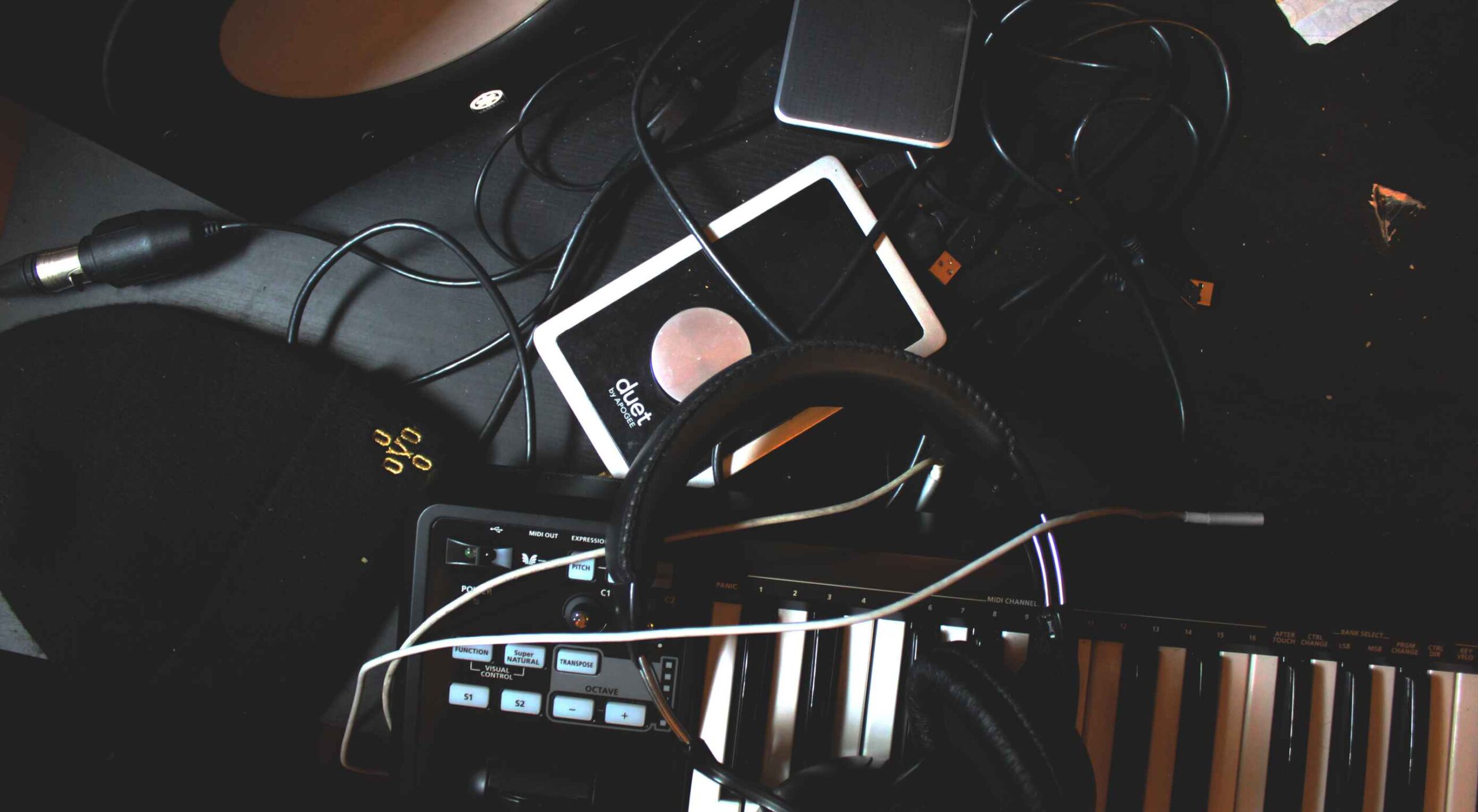
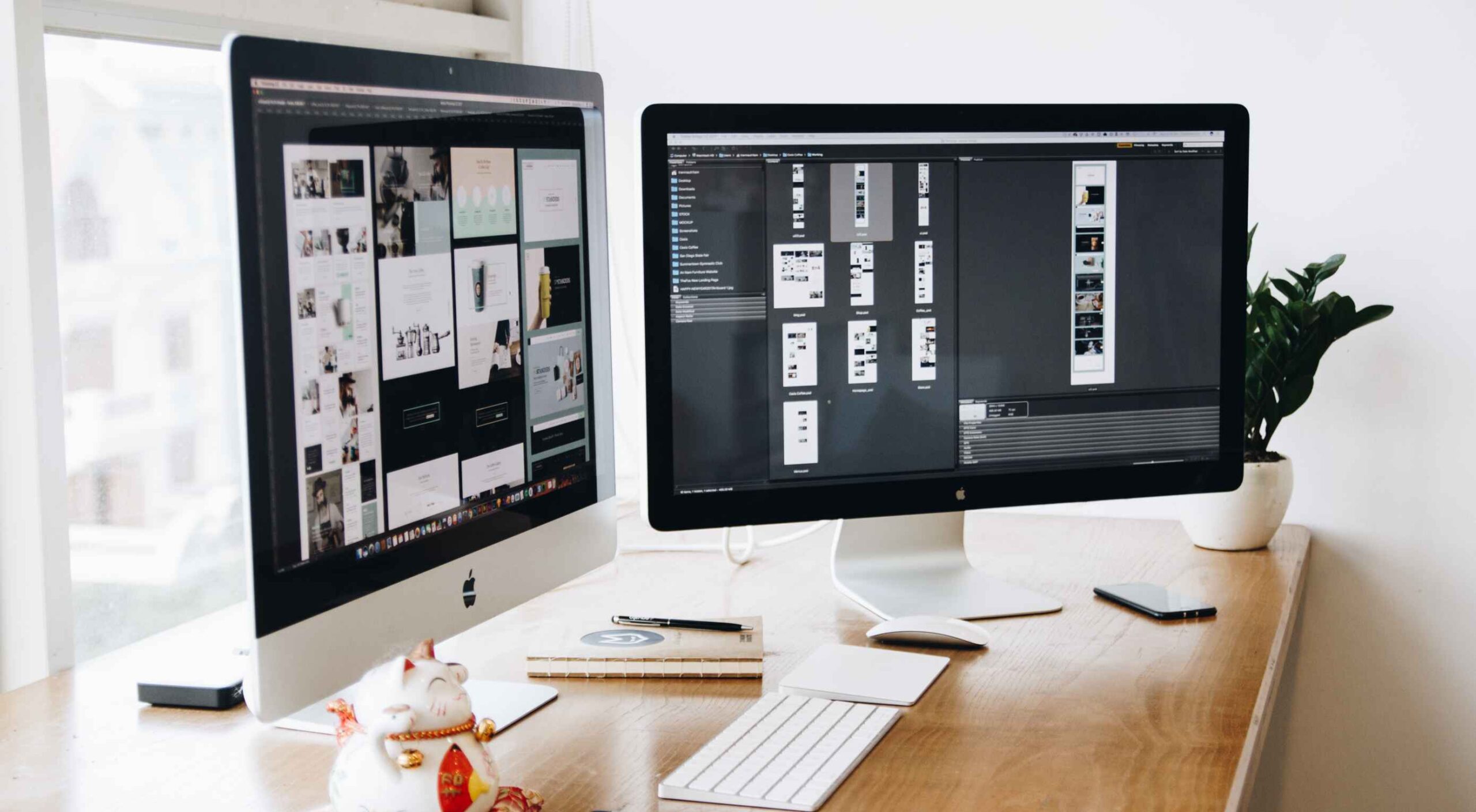
 Creating videos for social media or to embed on your site can be a fun and creative way to promote your brand or business. More importantly, time spent on a page is a significant SEO ranking factor, so providing a video to watch is of enormous benefit.
However, coming up with the music for your videos can be challenging. You want something catchy that fits your video’s tone but don’t want to violate copyright laws.
Music licensing can be tricky, but if you’re smart about it and know what license your needs fall into, things will go swimmingly. Many different types of licenses cover differing budgets or use cases.
Public Domain: Public domain music is music that is not protected by copyright and can be used by anyone for any purpose. This includes traditional folk songs, classical music, and works released explicitly into the public domain.
Creative Commons: Creative Commons is a license that allows you to use someone else’s work for free, as long as you give credit to the creator. There are several Creative Commons licenses, so read the terms before using any music in your videos.
Royalty-Free: Royalty-free music is music you can use without paying royalties. This means you can use the music in your videos without getting permission from the artist or paying for a license. You can usually find royalty-free music on stock audio websites.
10 Places to Find Music for Videos
Below you’ll find the ten most common places to find music for your videos, including Youtube, Instagram, and TikTok videos.
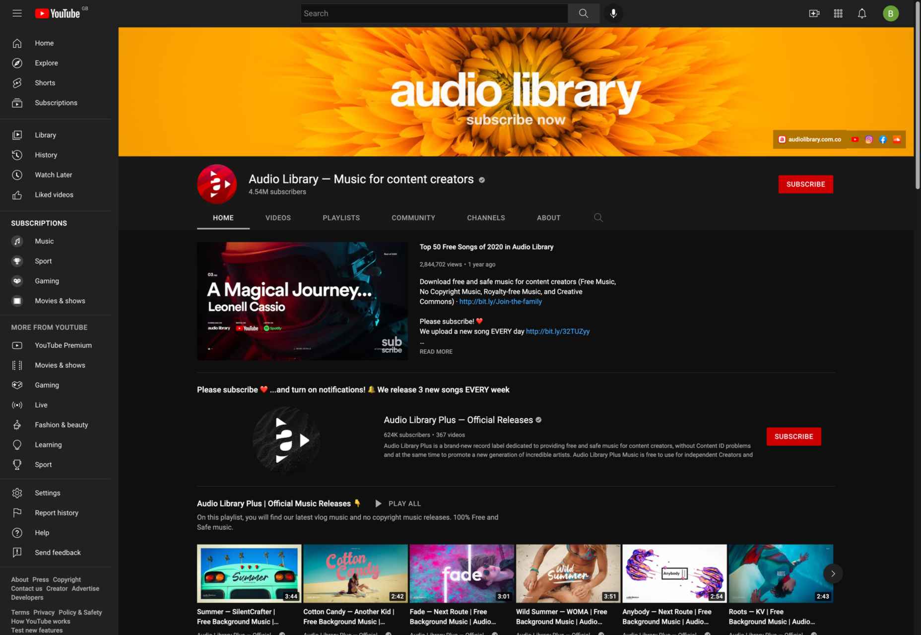
1. YouTube Audio Library
The first place to look for music is YouTube’s Audio Library. This is an excellent resource for finding free, high-quality music for your videos. You can search by genre, instrument, mood, or duration and preview the tracks before downloading them.
You can use music from the YouTube Audio Library in your Instagram and Youtube videos. Just make sure you follow the copyright guidelines specified on the YouTube website.
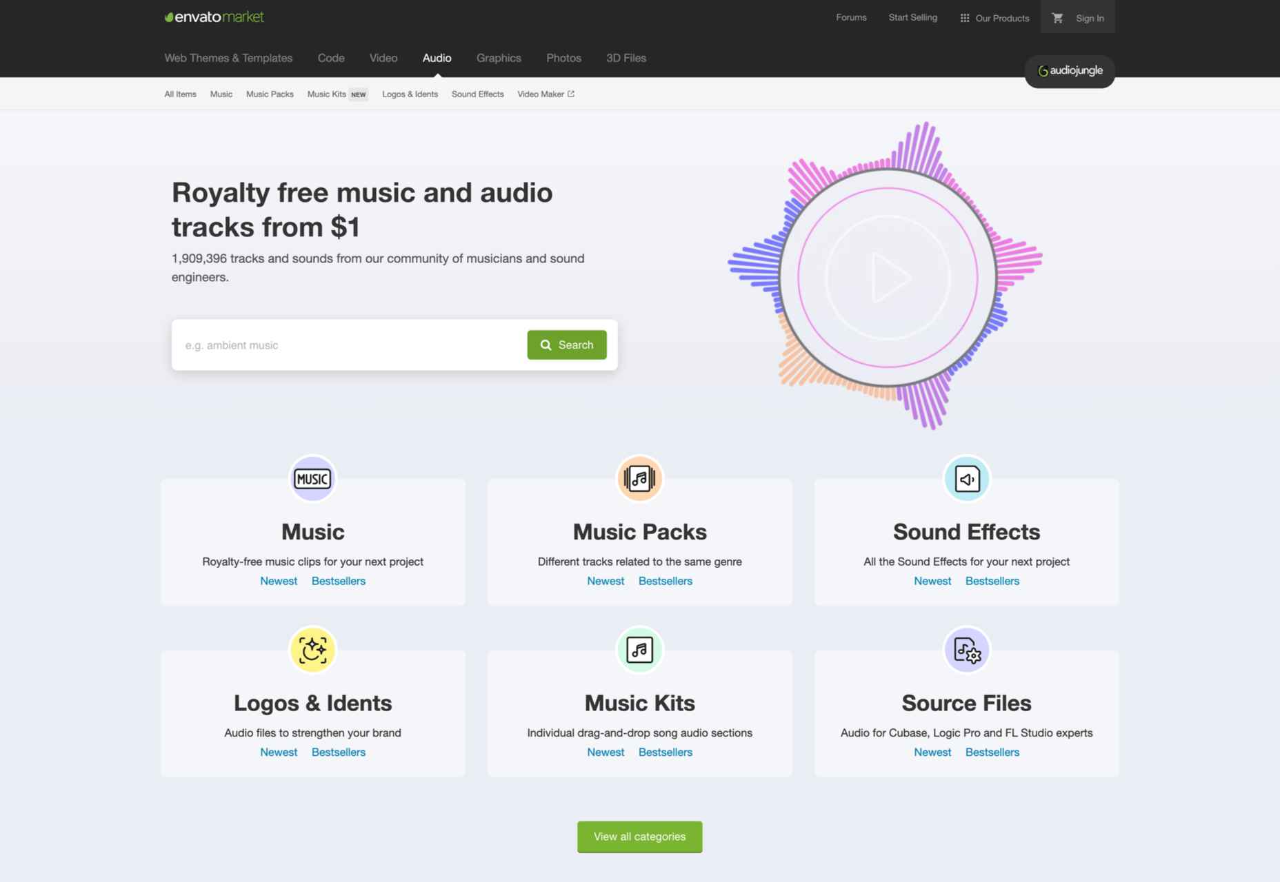
2. AudioJungle
AudioJungle from EnvatoMarket is an excellent resource for finding high-quality music for your videos. You can search by genre or mood and listen to previews of the songs before you download them.
AudioJungle offers a variety of paid plans that give you access to more features and higher-quality audio files. Prices start at $12 per month for the basic plan and go up to $48 per month for the premium plan.
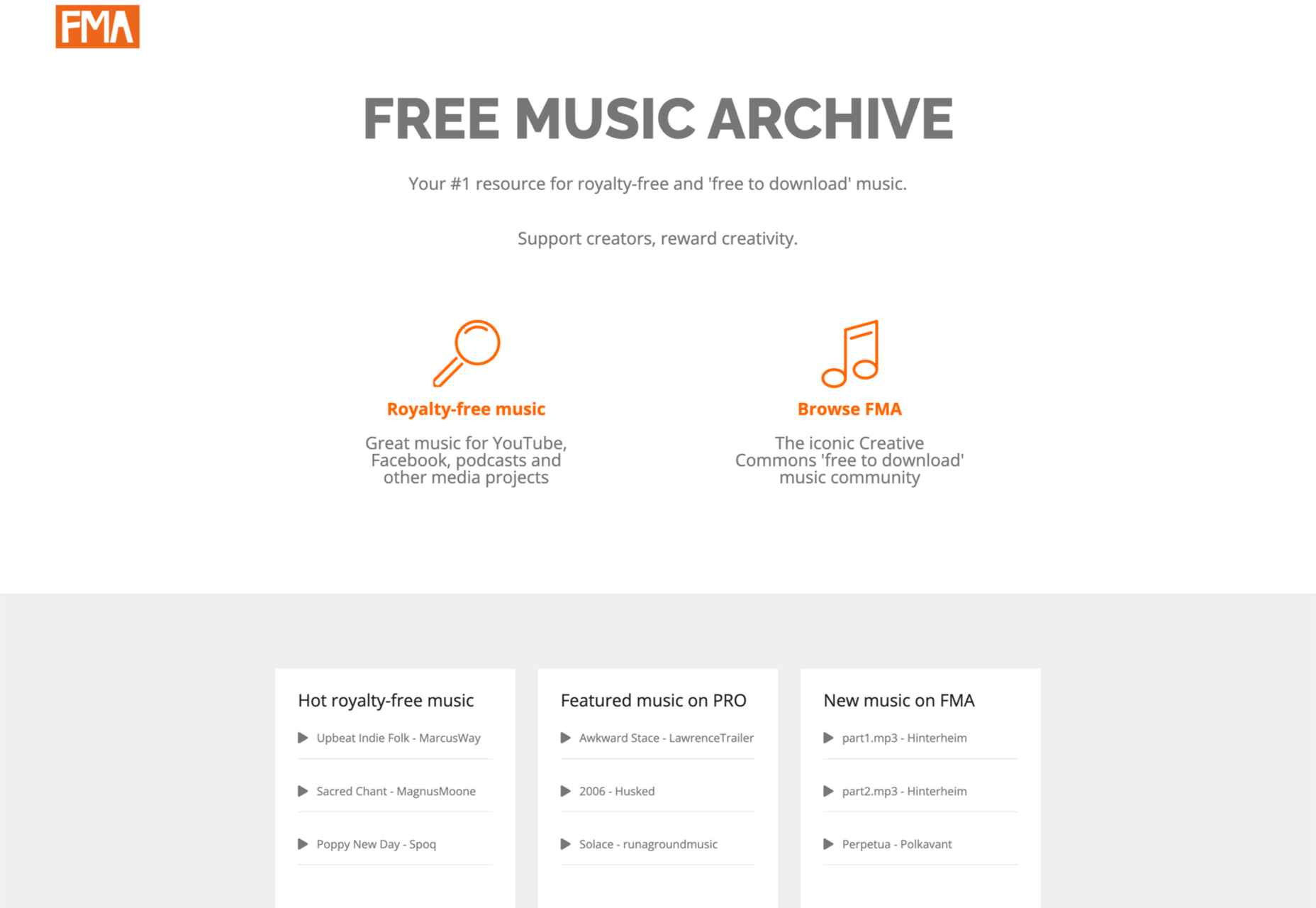
3. Free Music Archive
The Free Music Archive is another resource to search for free music. It’s a little more eclectic than the YouTube Audio Library, so you’ll find a broader range of genres and styles here.
However, all of the music on the site is licensed under Creative Commons, so you’re free to use it in your videos. In addition, you can search by genre or artist and even listen to previews of the songs before you download them.
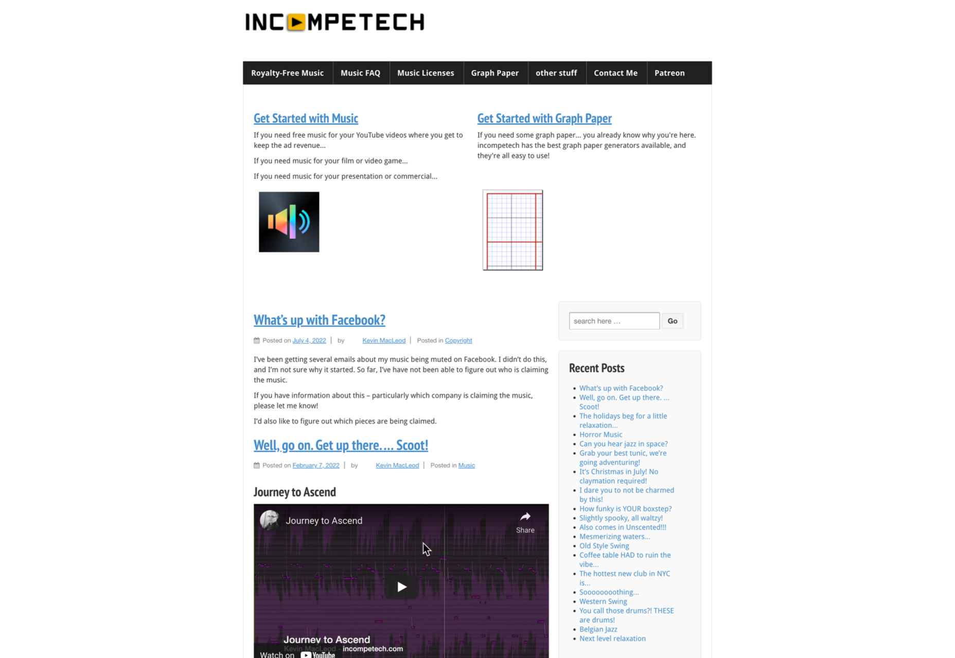
4. Incompetech
The next website to find royalty-free music for videos is Incompetech. You can search by genre, mood, or instrument, but also read about music licenses. Besides, the site has a handy “music for video” section that features tracks that are specifically designed for use in videos.
Incompetech is free for users, but the company still earns money on display ads and Patreon donations.
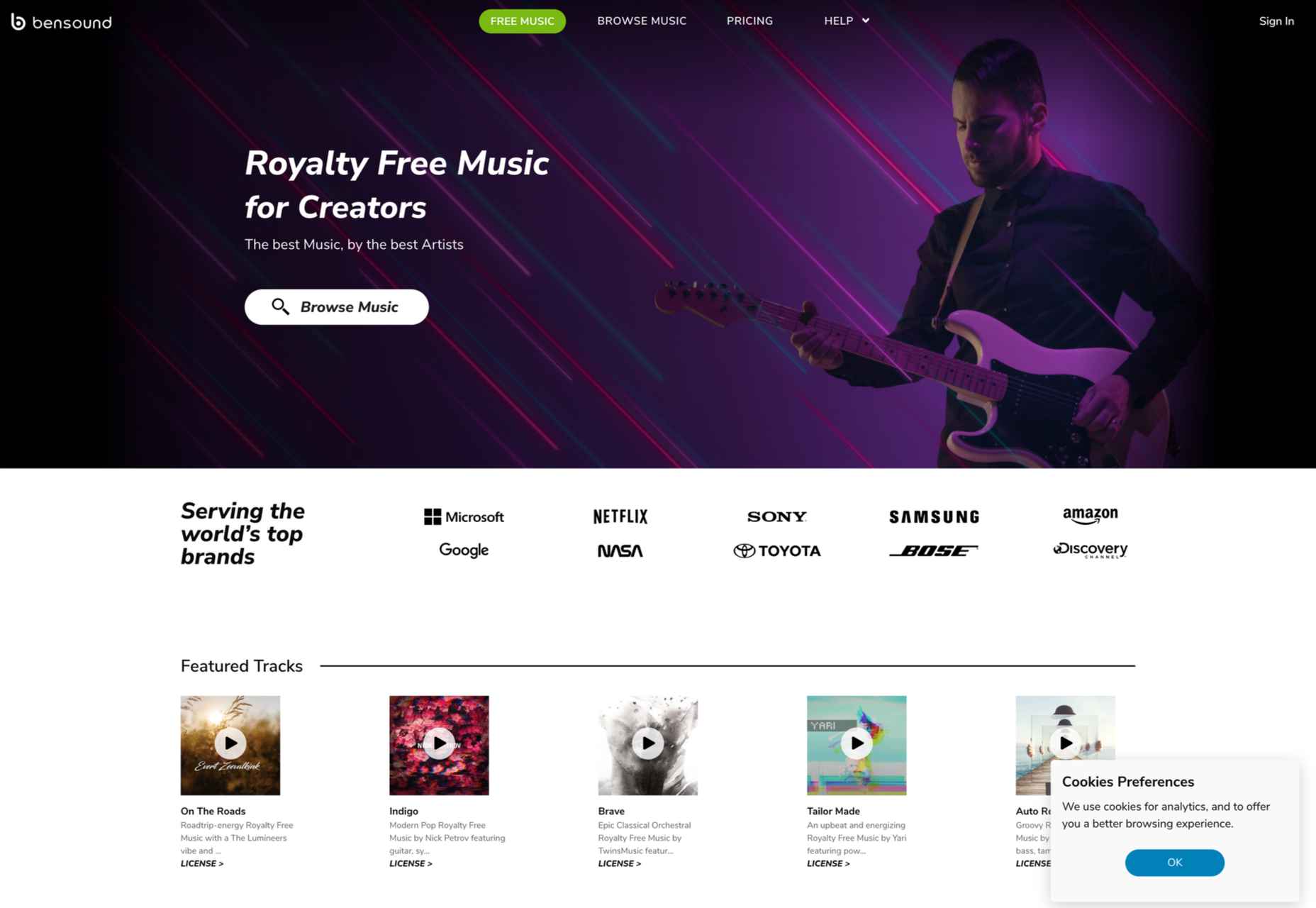
5. Bensound
Bensound is a website where you can find high-quality music for your social media videos. It has a library of music that you can choose from, and you can also create custom playlists. The site is easy to use, and you can search for music by genre, mood, or artist.
All of the music on the site is licensed under Creative Commons, so you’re free to use it in your videos. Prices start from approximately $12/mo subscription, or you can pay $34 per track.
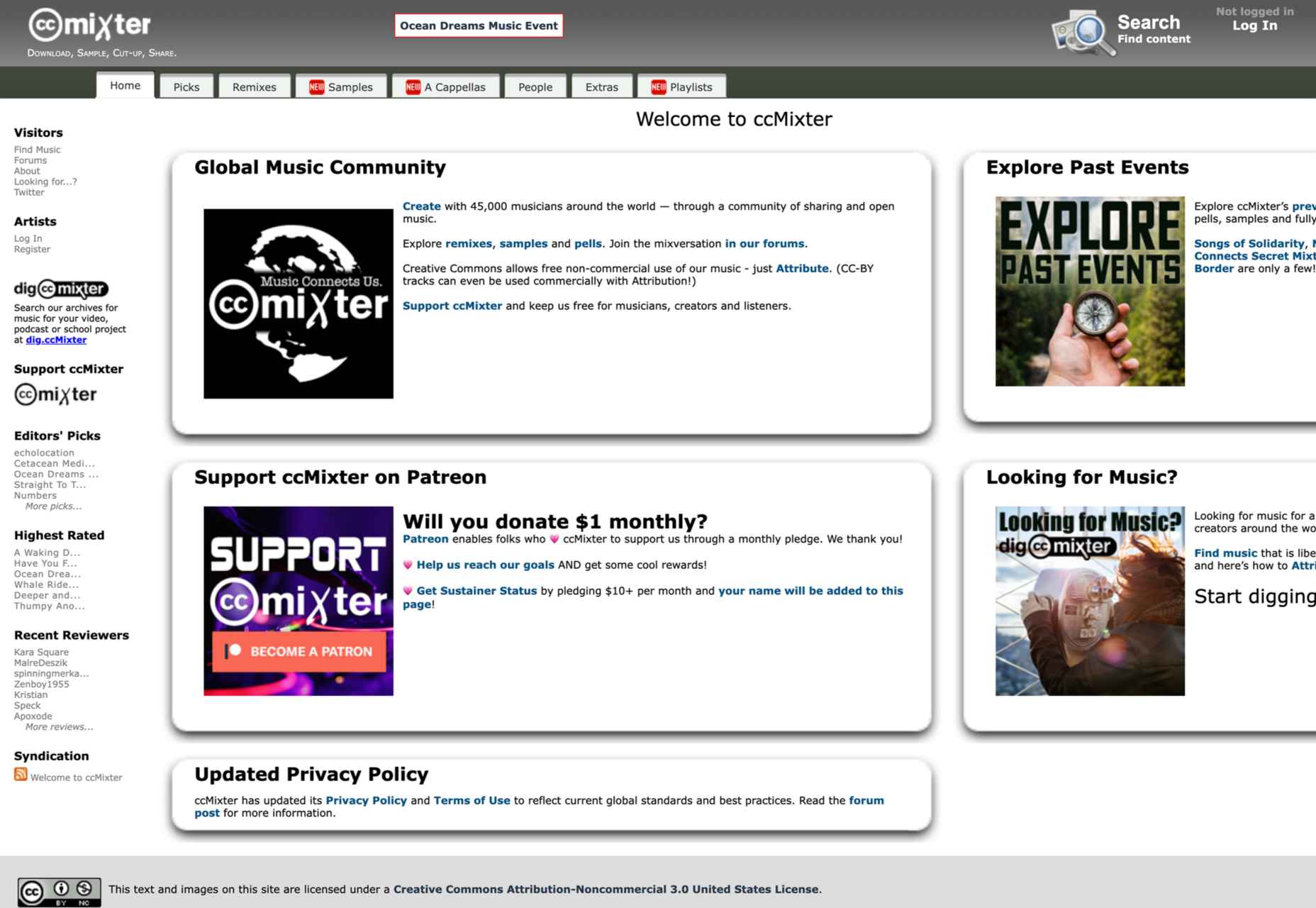
6. ccMixter
ccMixter was created as a Creative Commons Project. It is a collaboration platform for musicians who want to promote their work. The site also has a handy “music for video” section that features tracks that are specifically designed for use in videos.
ccMixter offers a variety of paid plans that give you access to more features and higher-quality audio files. Prices start at $12 per month for the basic plan and go up to $48 per month for the premium plan.
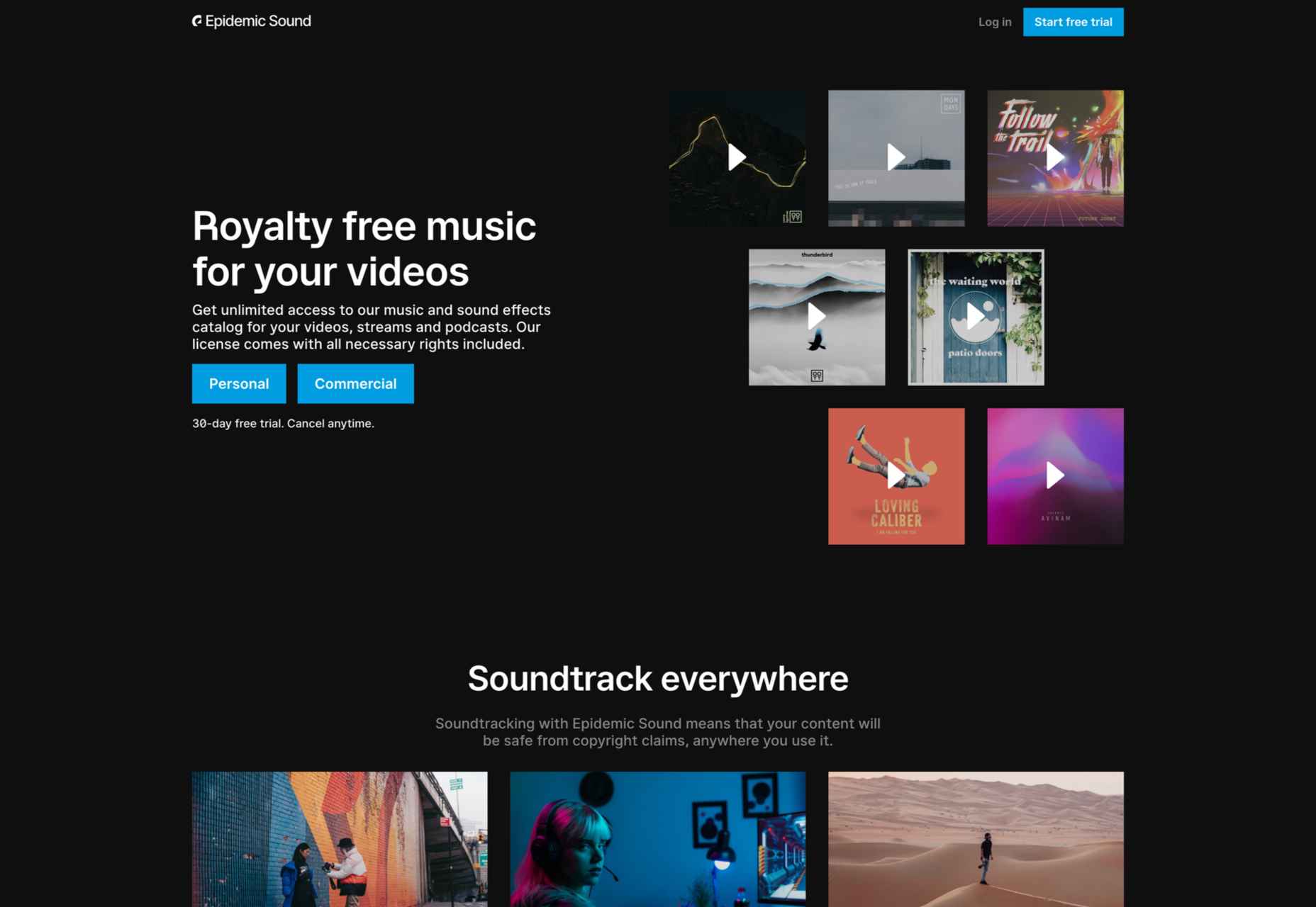
7. Epidemic Sound
Epidemic Sound is a music company with a rich history dating back to 2009. They provide high-quality music for social media videos, and their library is constantly expanding. Epidemic Sound was founded by three friends working in the music industry. They were frustrated with the quality of stock music available, so they decided to create their own.
Epidemic Sound has since become a go-to source for high-quality music. In recent years, the company has been working hard to expand its library and make it easier for people to find the perfect song for their videos. As a result, they now have over 30,000 tracks available.
Epidemic Sound’s monthly subscription service starts at $15/month. This gives you access to all of the site’s music, and you can download as many tracks as you want.
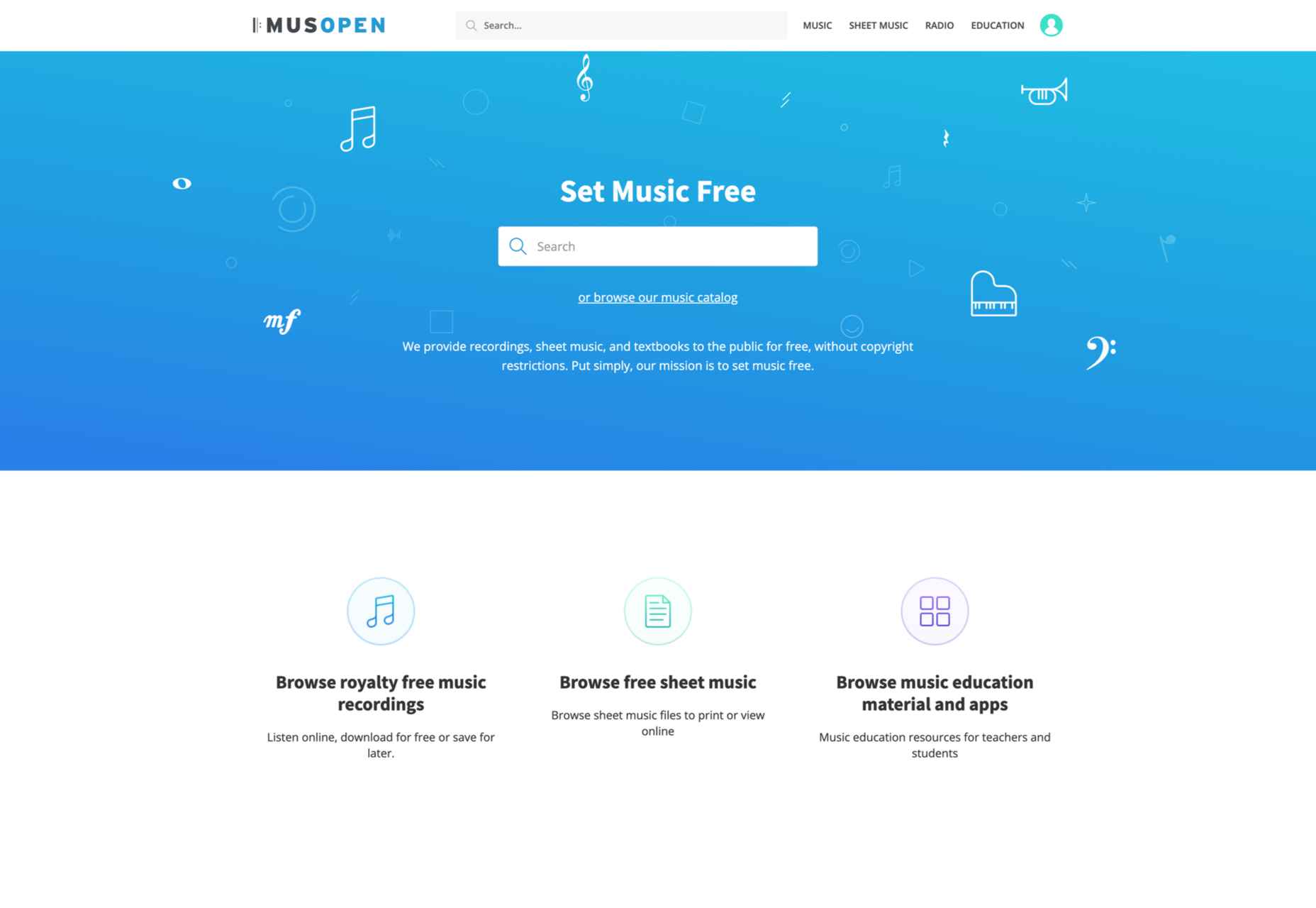
8. Musopen
Musopen is a perfect website for finding classical music for your videos. The site has various tracks to choose from; you can filter them by composer, orchestra, period, mood, length, and more. In addition, all of the music on the site is licensed under Creative Commons, so you’re free to use it in your videos.
Musopen offers a subscription plan that gives you access to high-quality music for your social media videos. You can choose from three different pricing plans, and each plan comes with a different number of downloads per month.
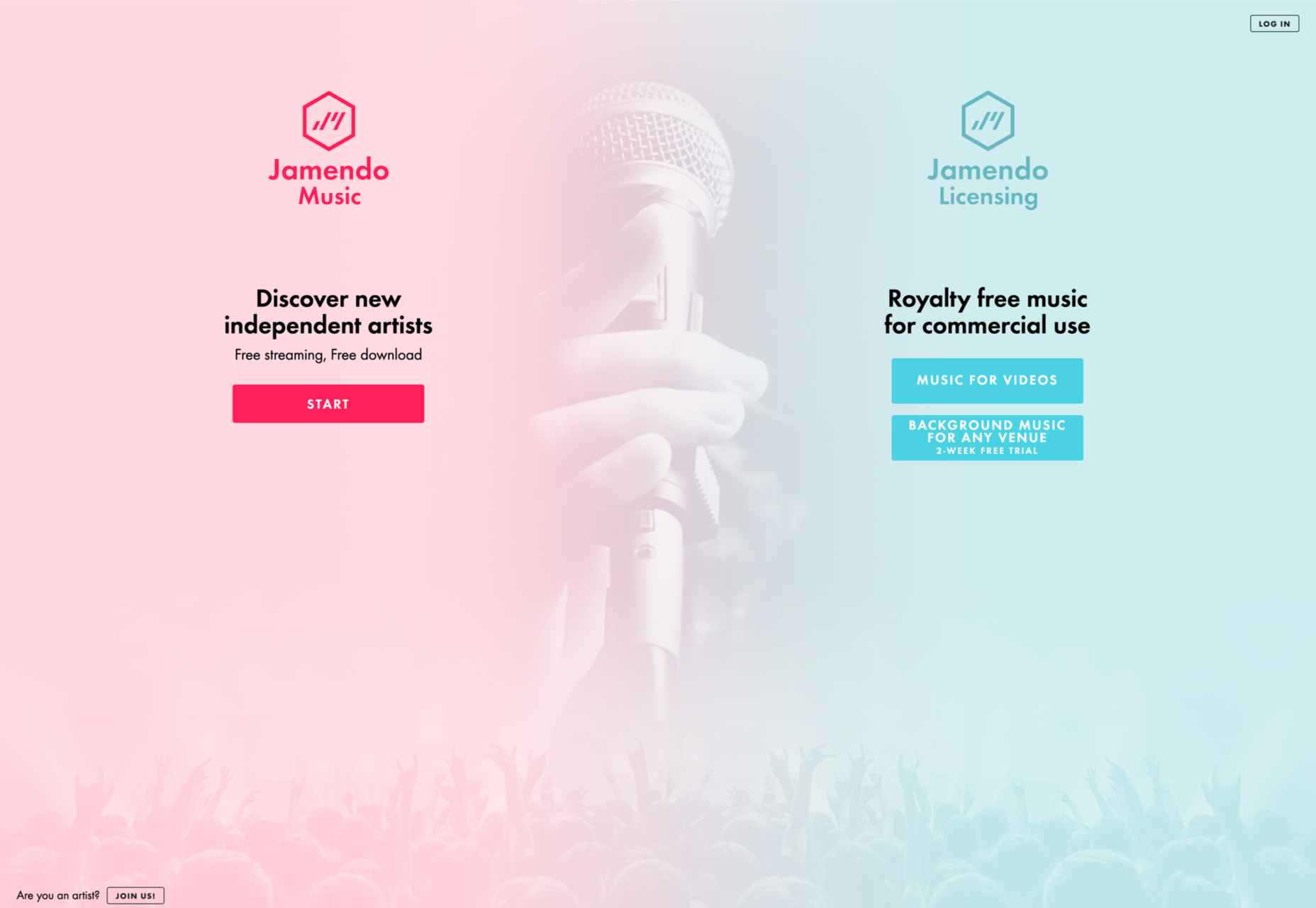
9. Jamendo Music
Jamendo is a website where you can find royalty-free music for your social media videos. The music on the website ranges from rock to electronica, and there is something for everyone.
You can either browse the music by genre or use the search function to find the perfect song for your video.
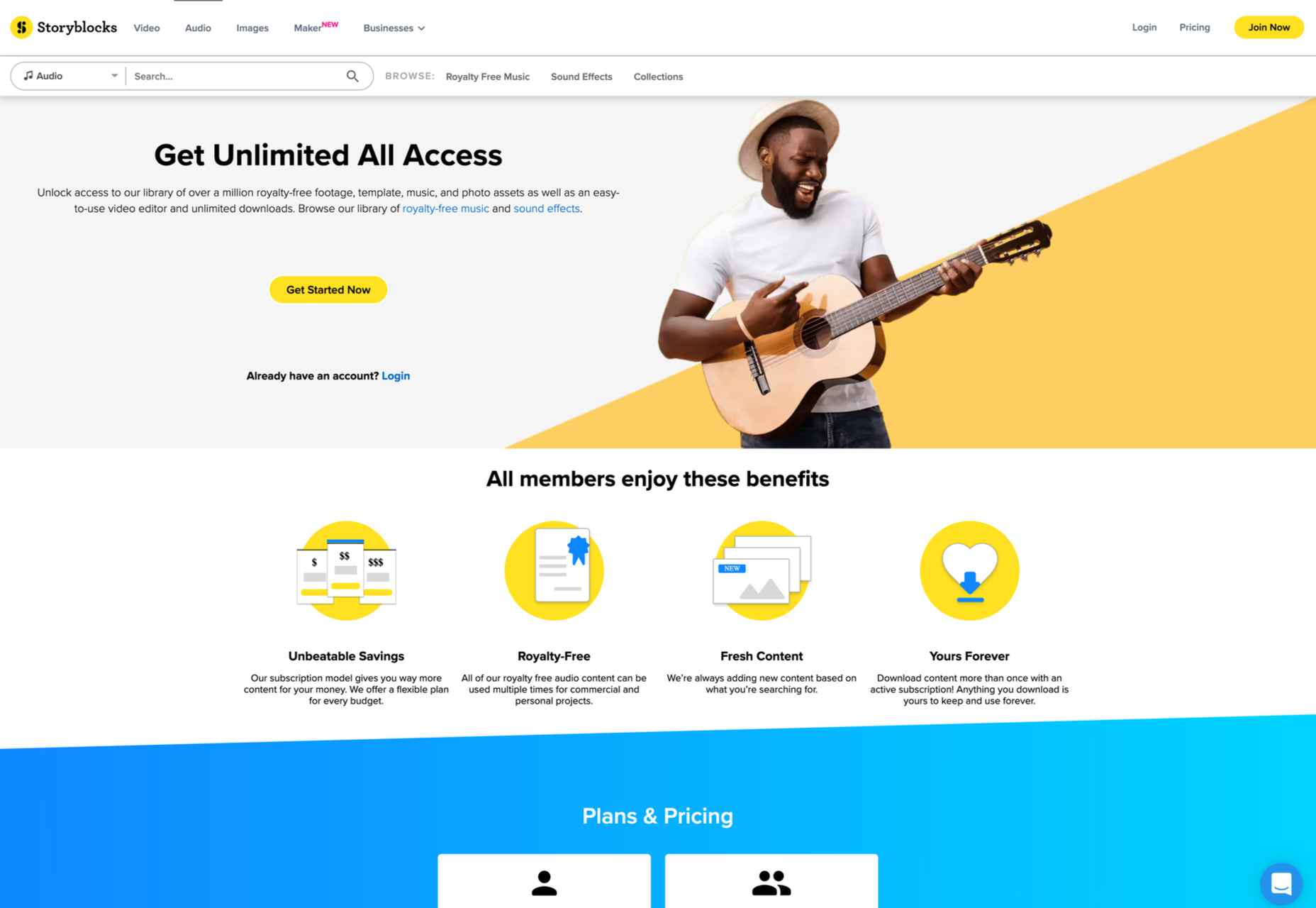
10. StoryBlocks
StoryBlocks is a website created by two brothers, Aaron and Evan Sharp. It has a royalty-free music library with various music genres to choose from. You can find everything from pop to classical on this website.
There is also a section of the website devoted to social media-friendly tracks. This means you can find music perfect for your videos without worrying about copyright issues.
Featured image via Unsplash.
The post 10 Great Places to Find Music for Videos first appeared on Webdesigner Depot.


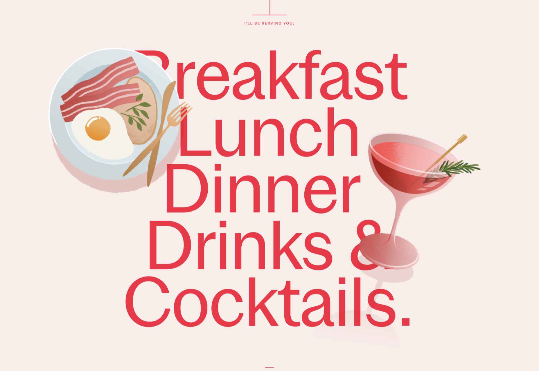
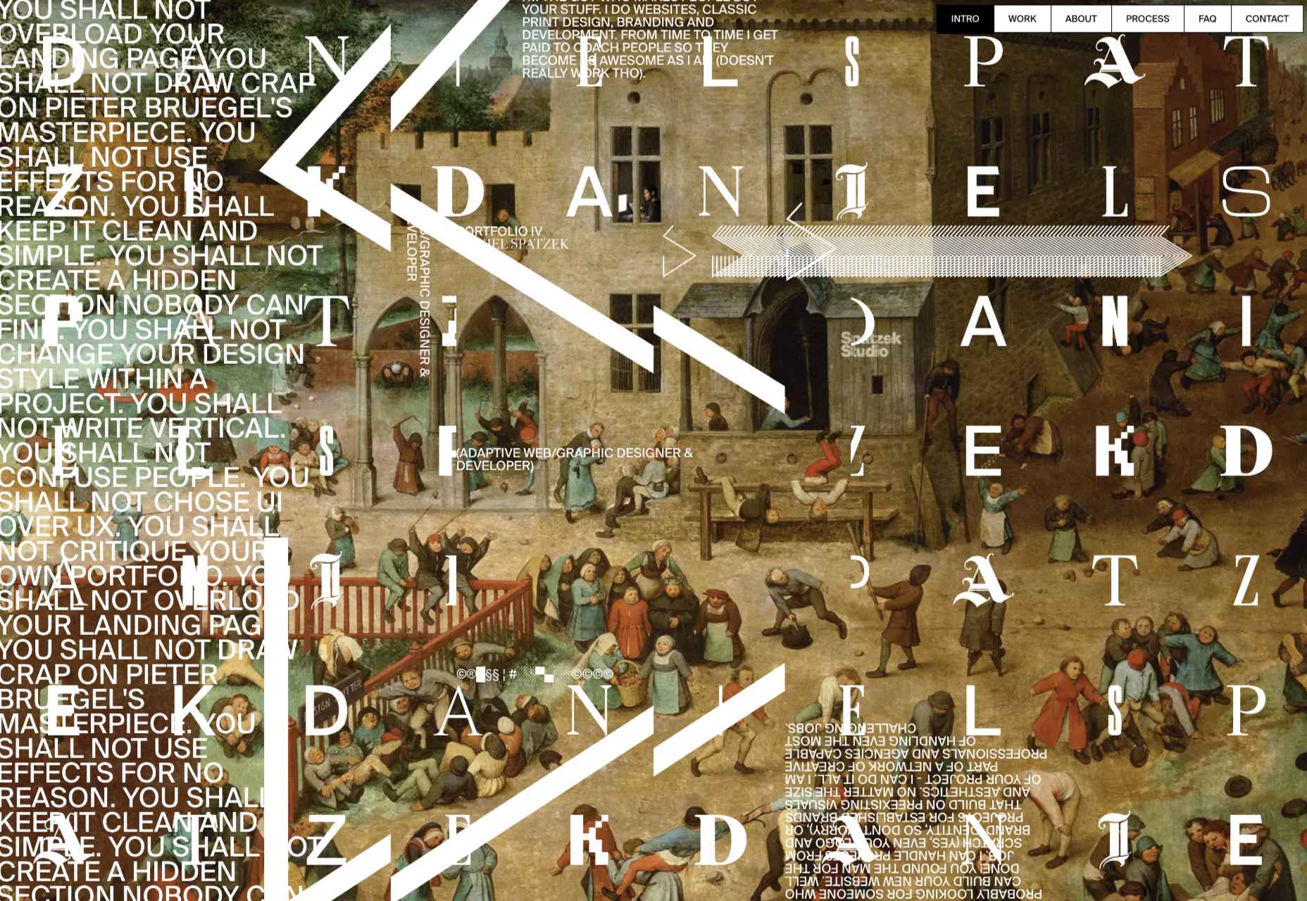
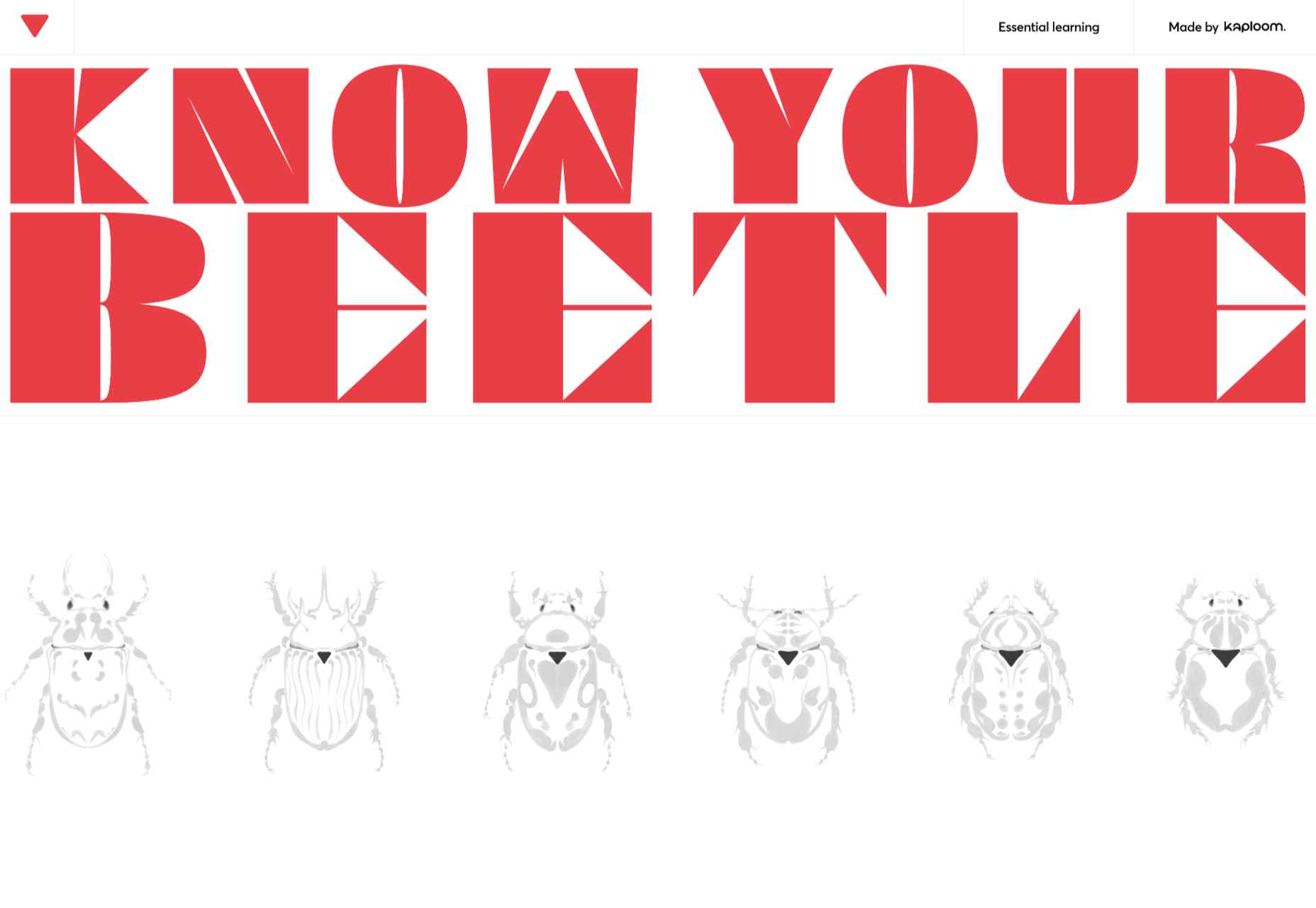
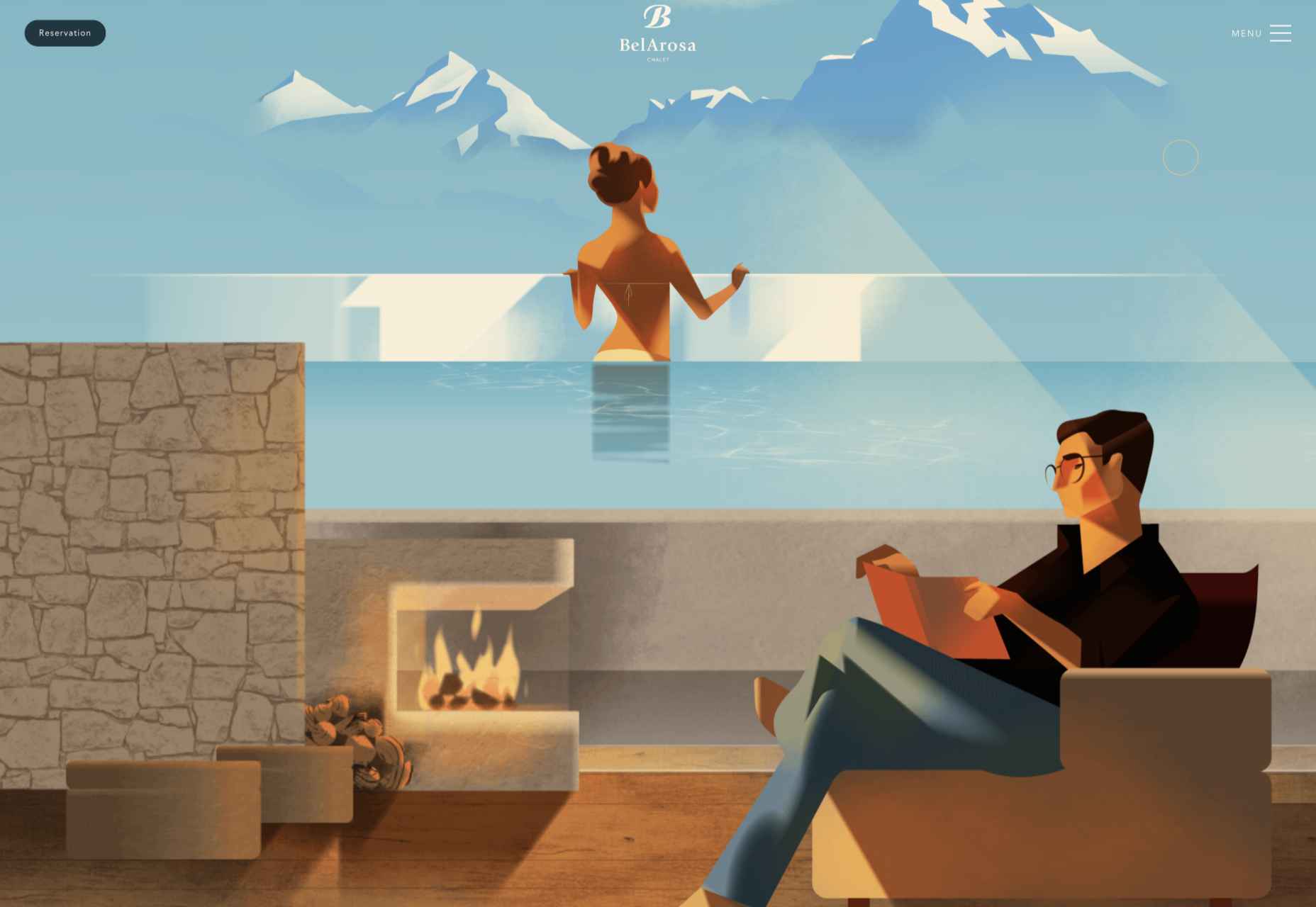
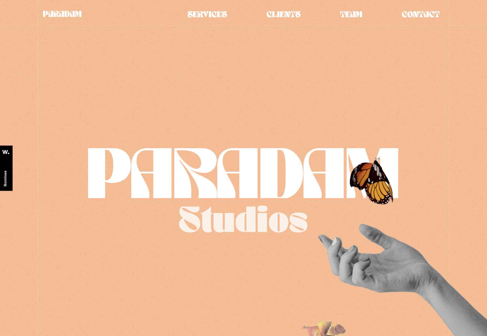
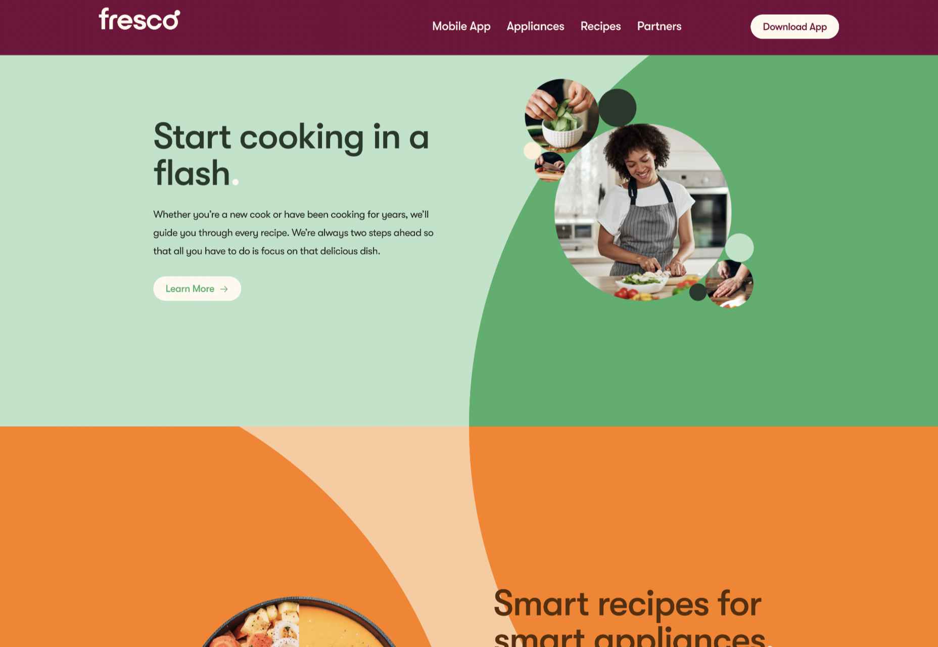
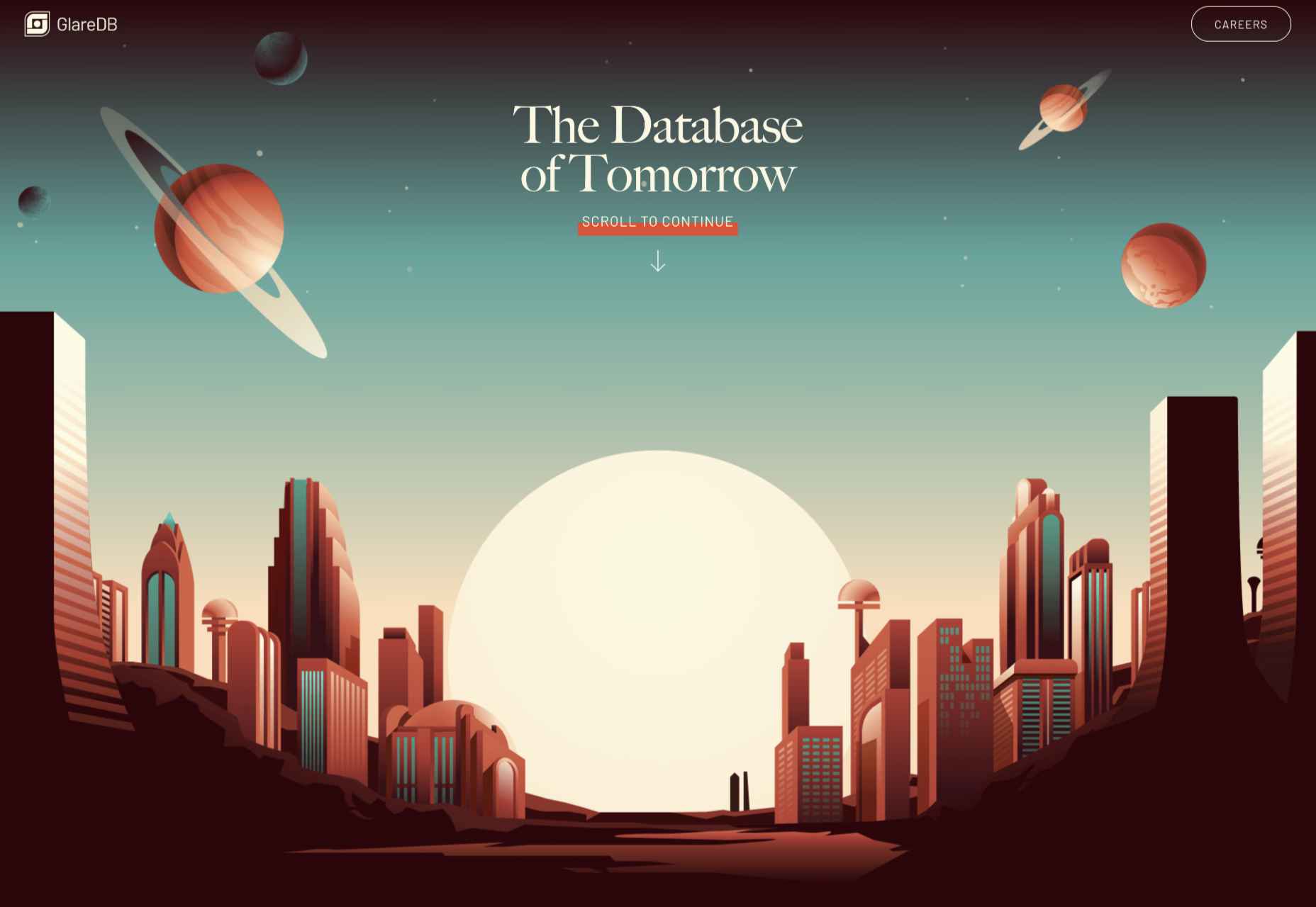
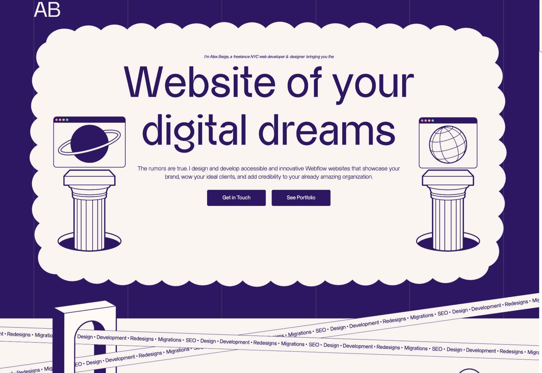
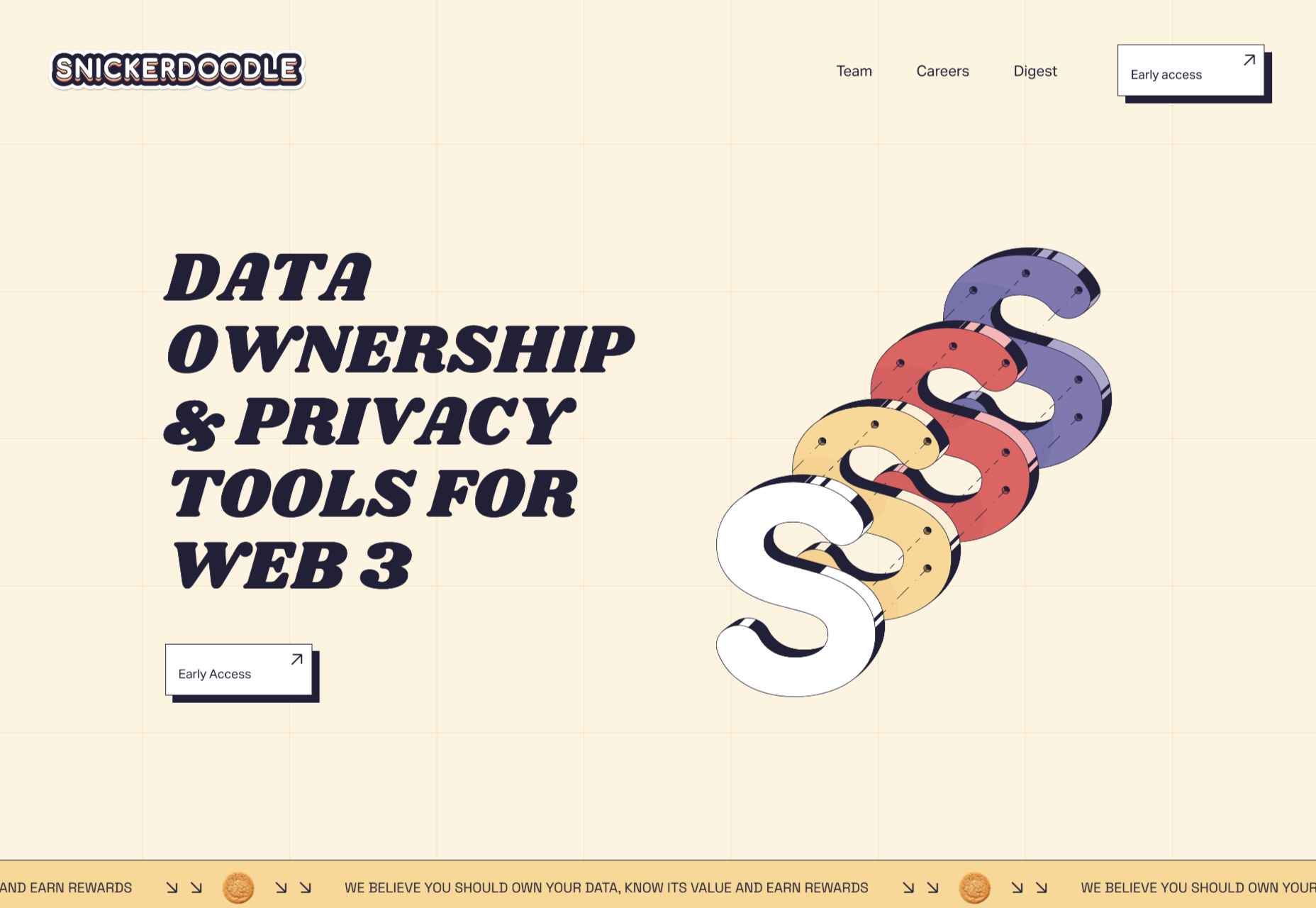
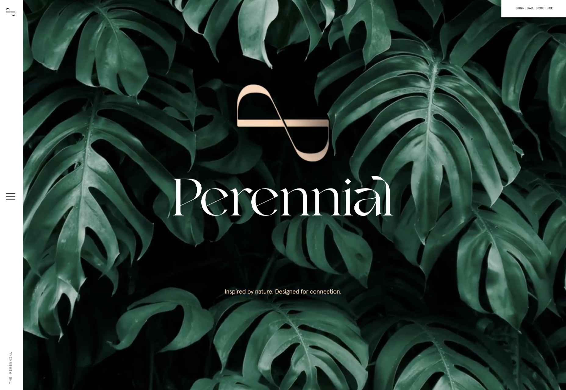
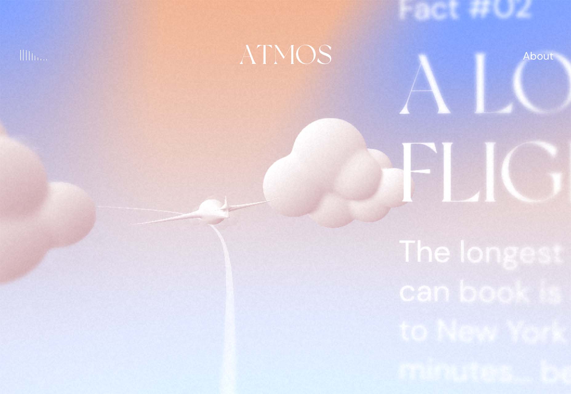
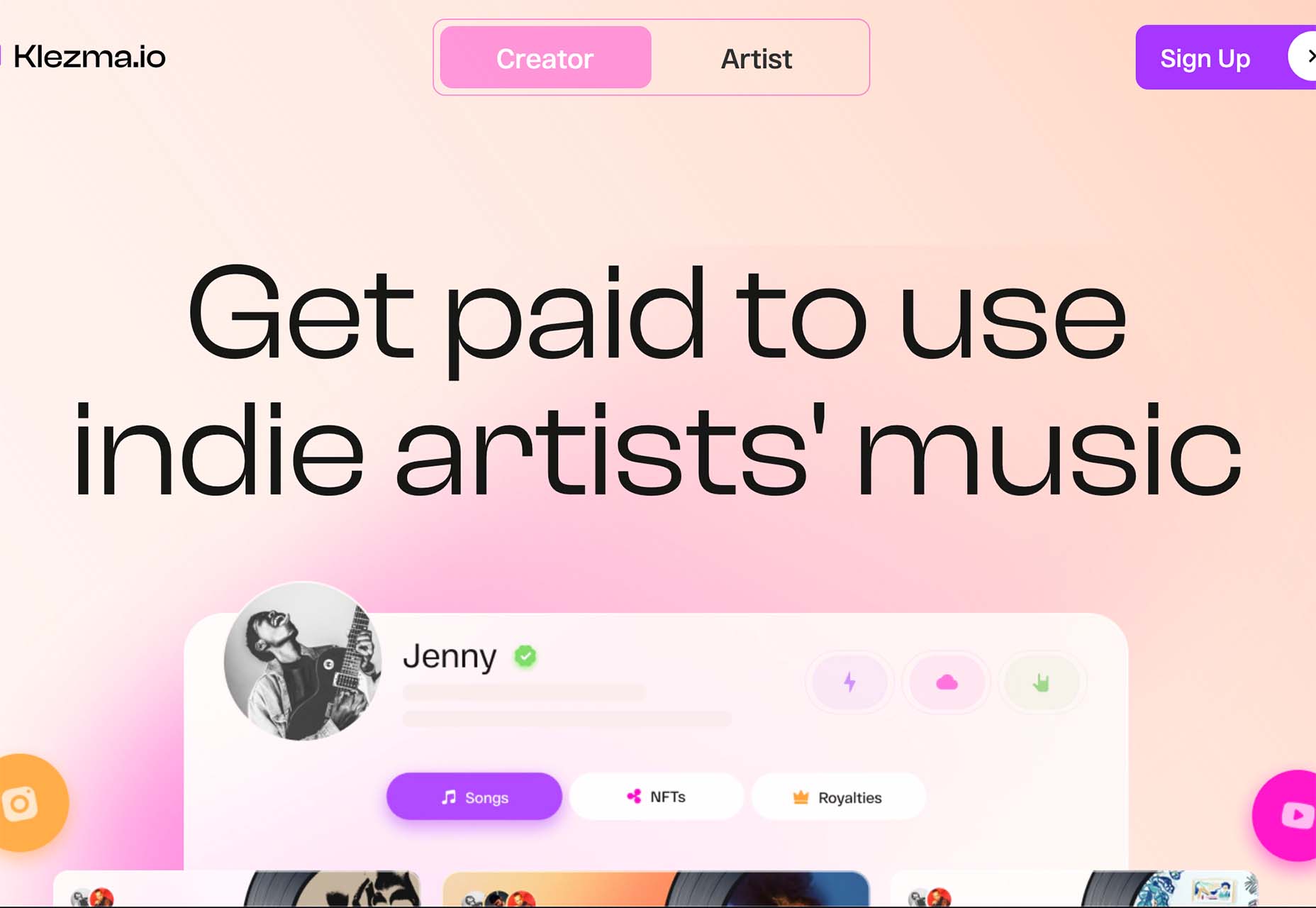
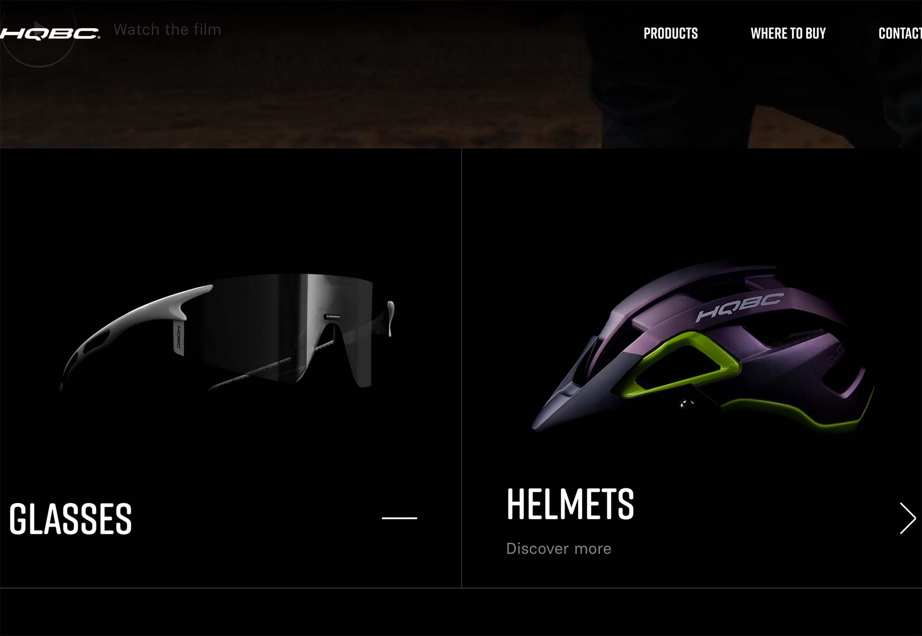
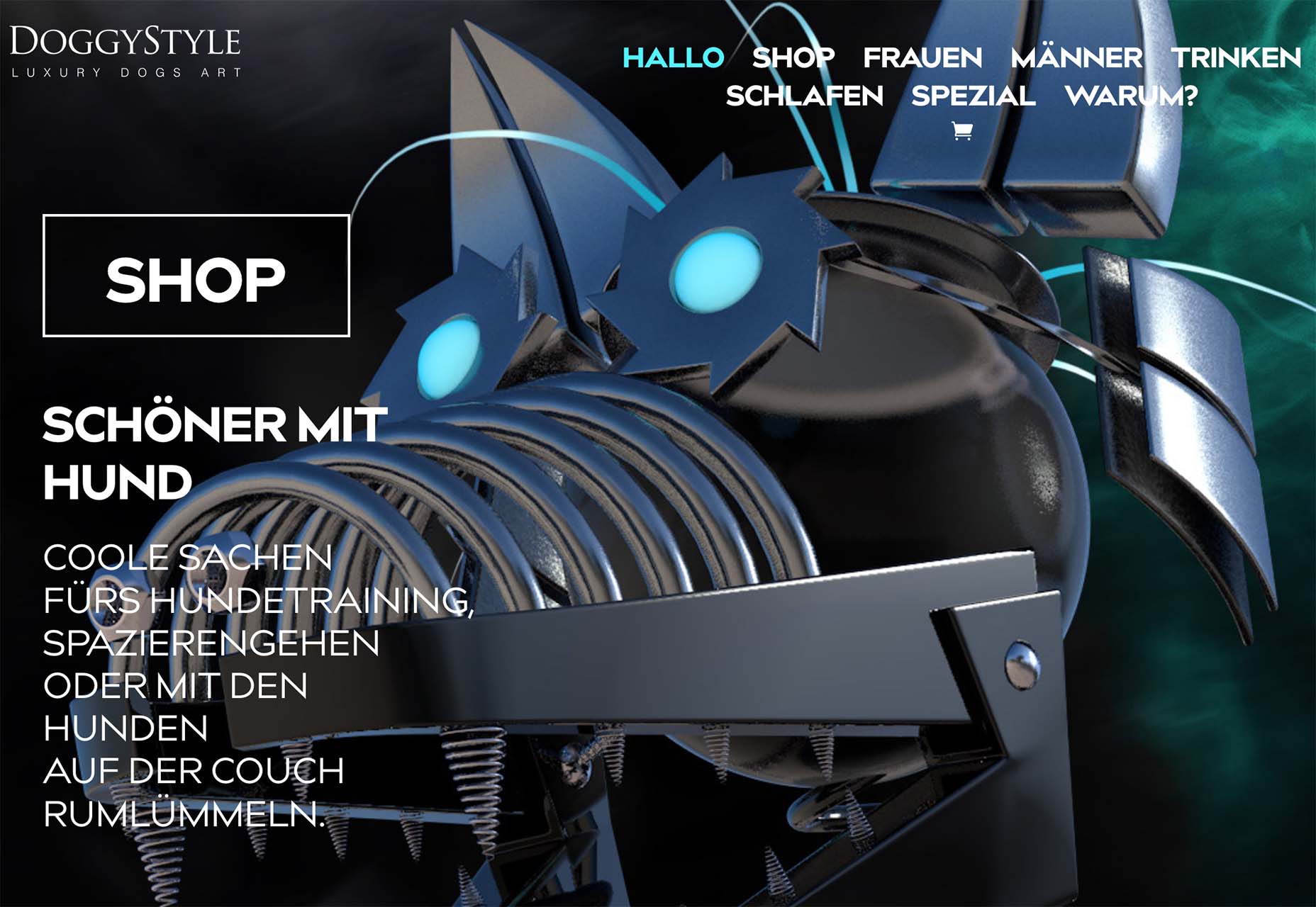
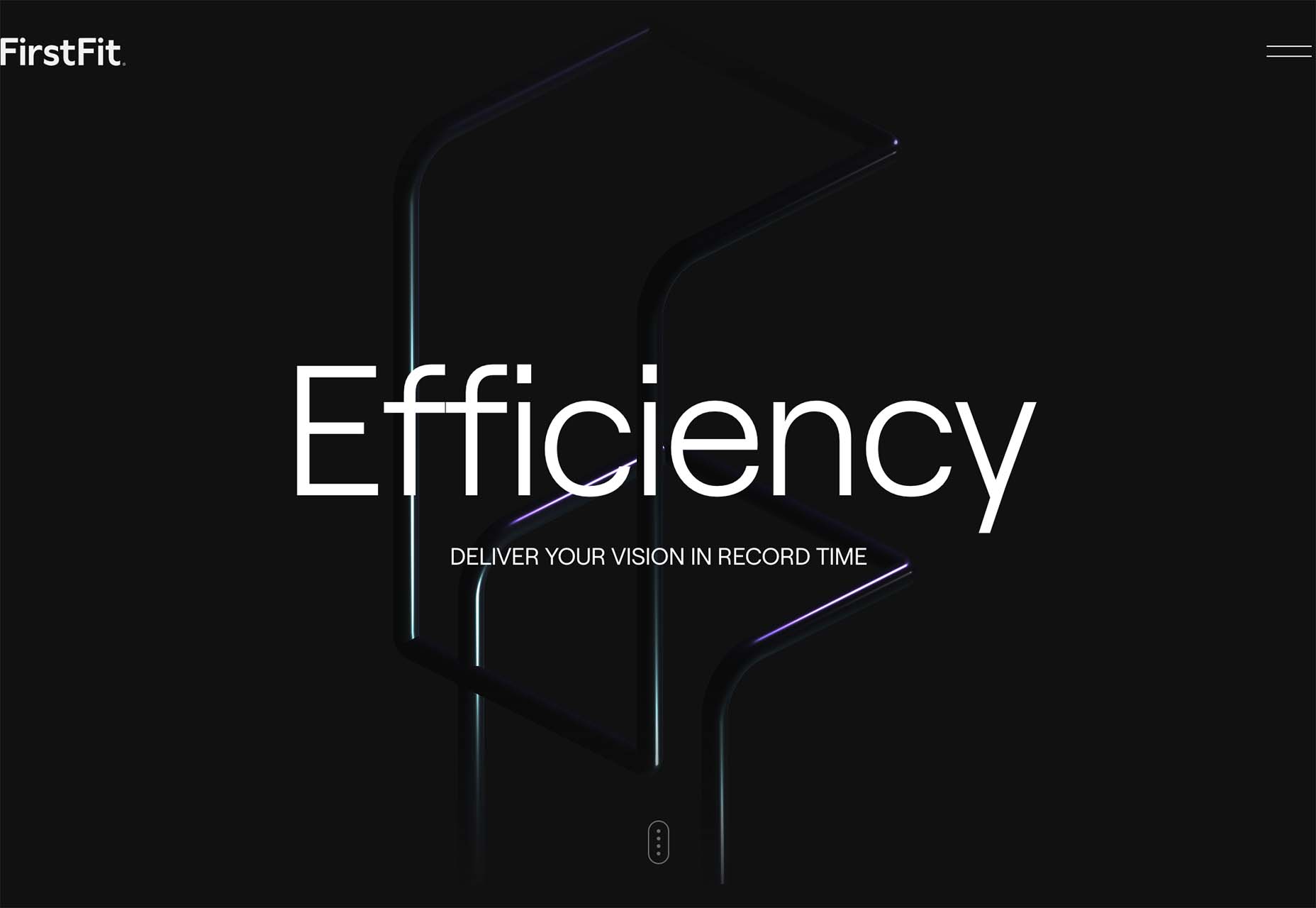
 Welcome to our guide to the best new websites this month. If subtle, minimal sites are your thing, either look away now or prepare to have your preconceptions challenged because this month, we are going maximalist.


 An unreliable, semi-broken and unresponsive website is an excellent way to lose leads and visitors — regardless of how aesthetically pleasing or well-designed, the visual elements are.

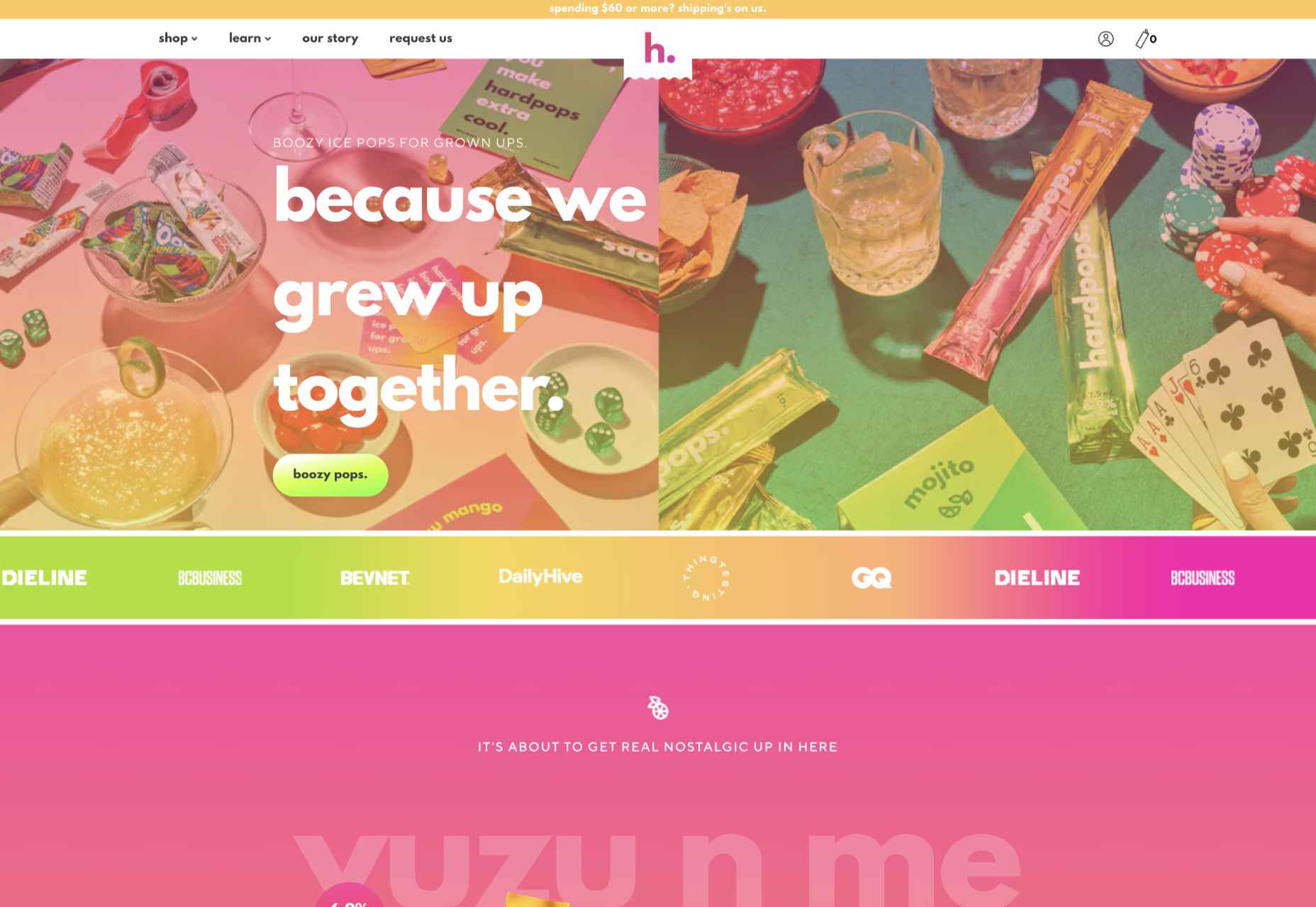
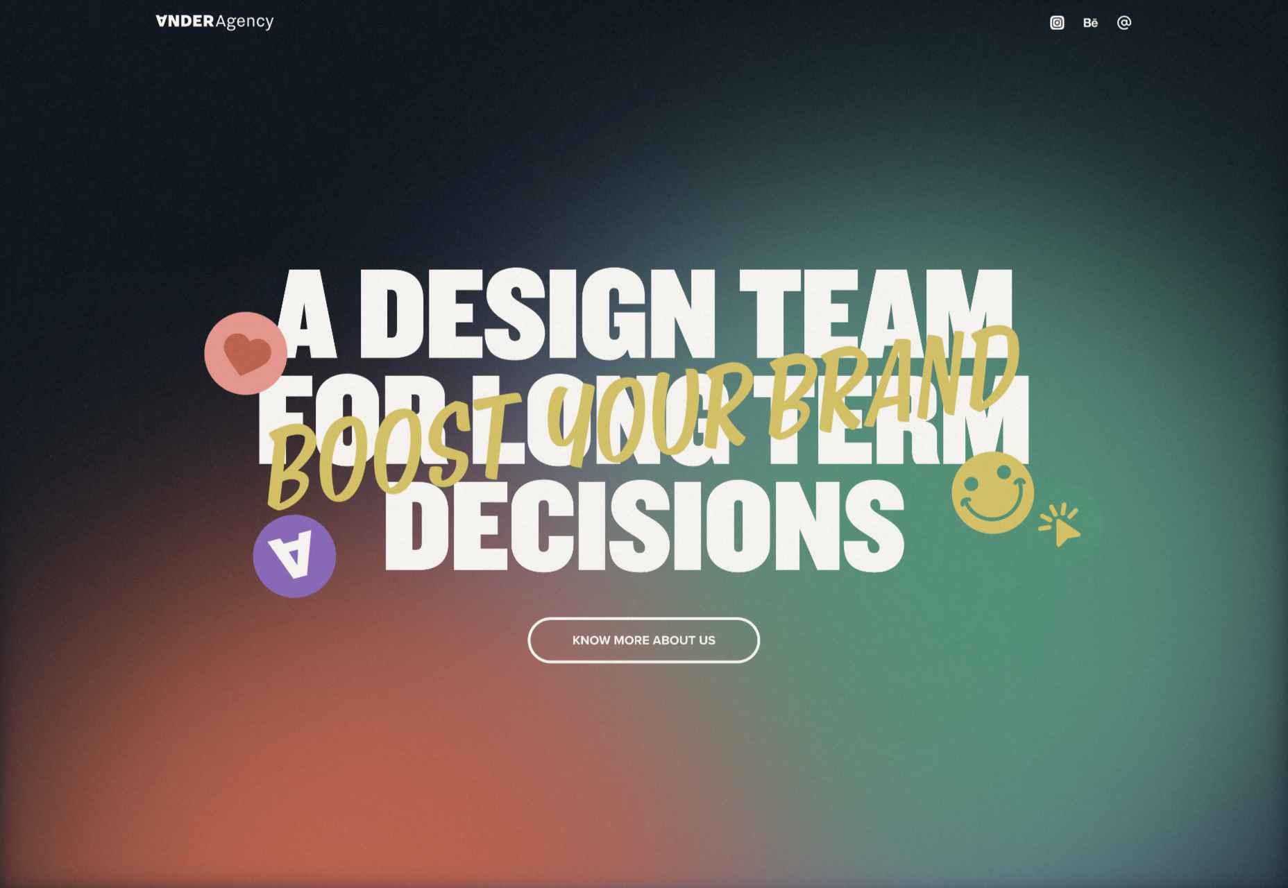
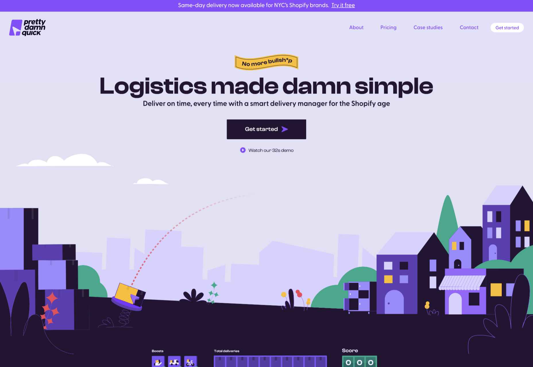
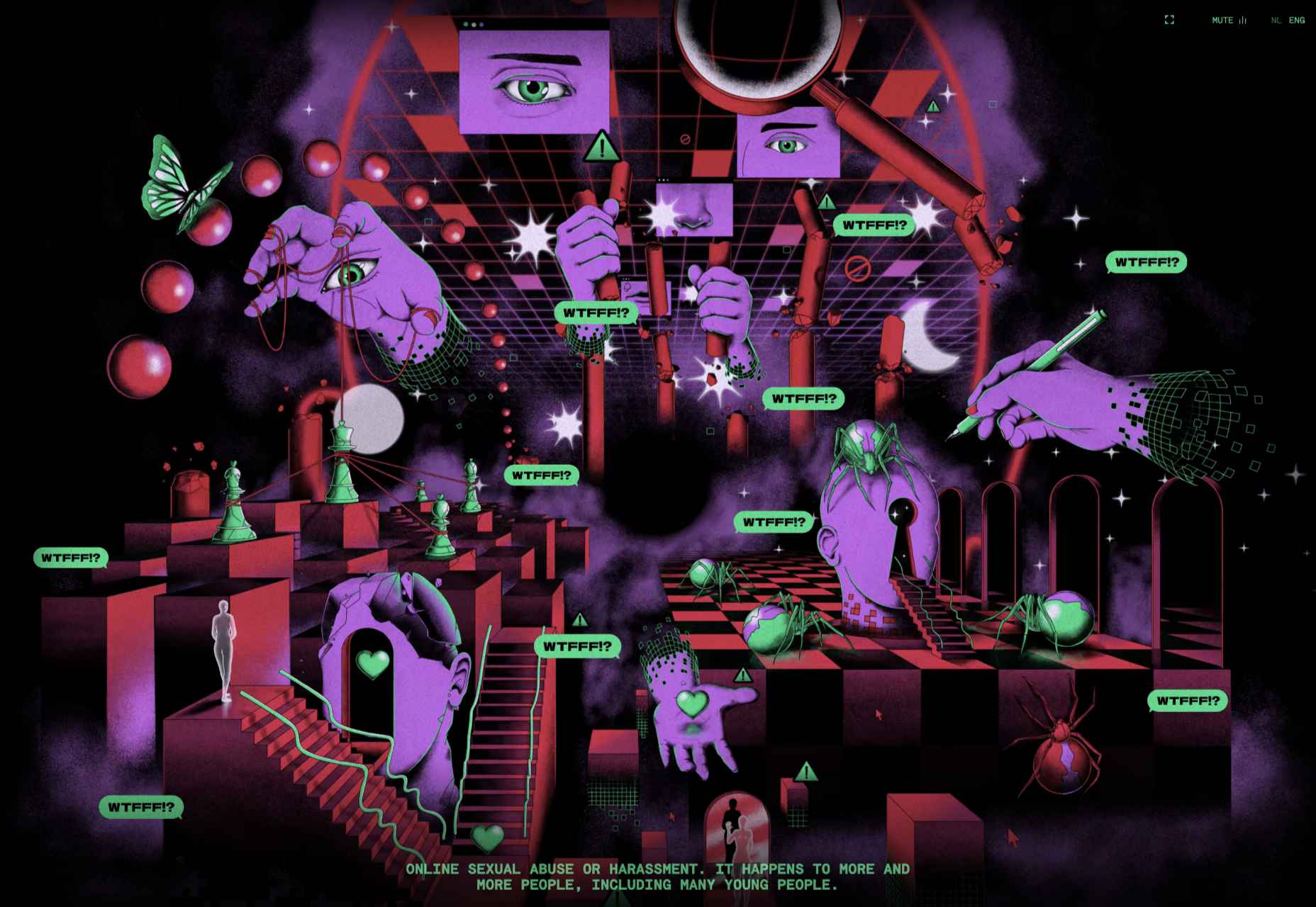
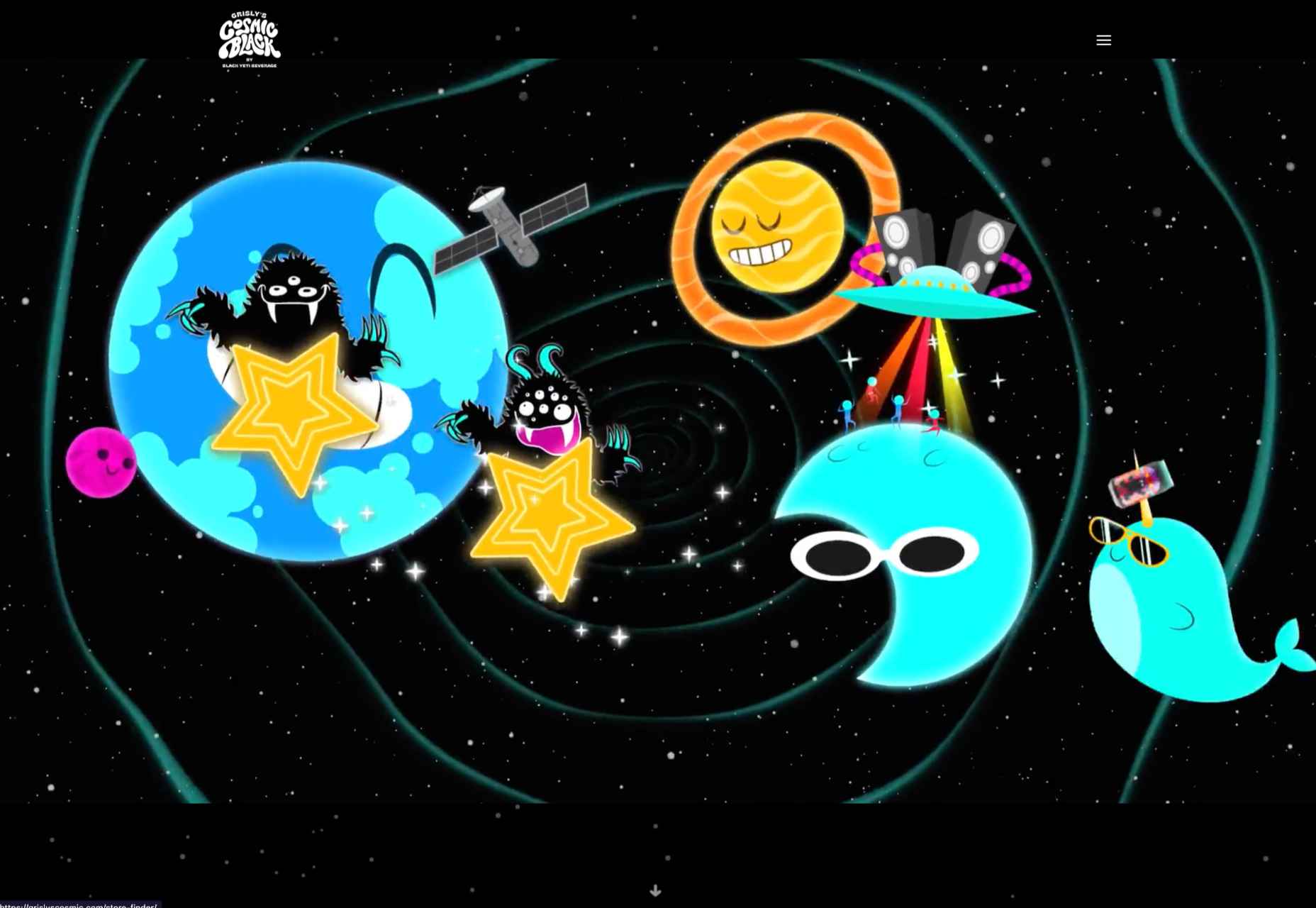
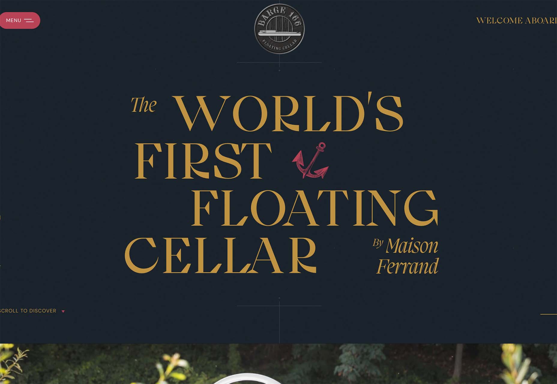
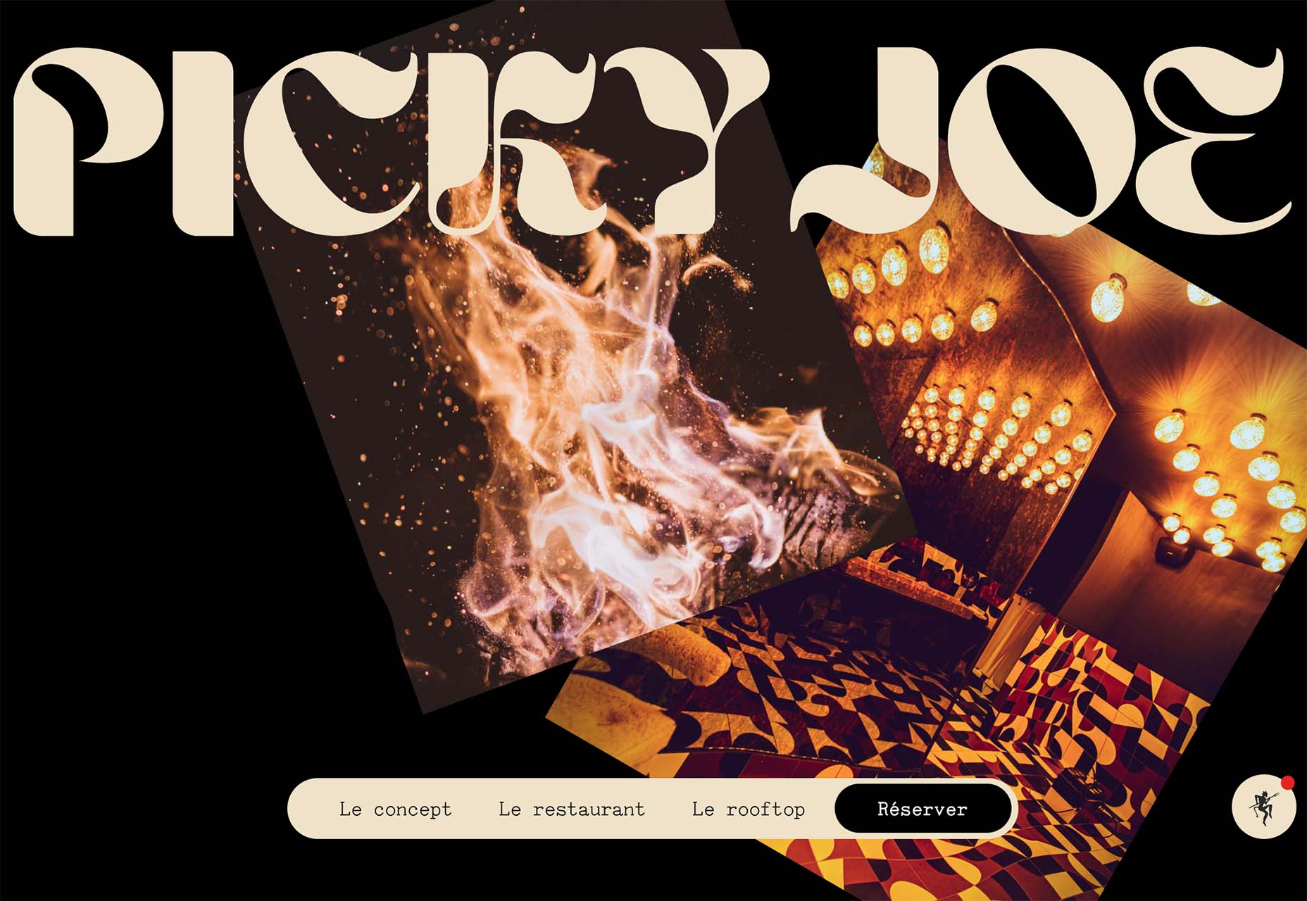
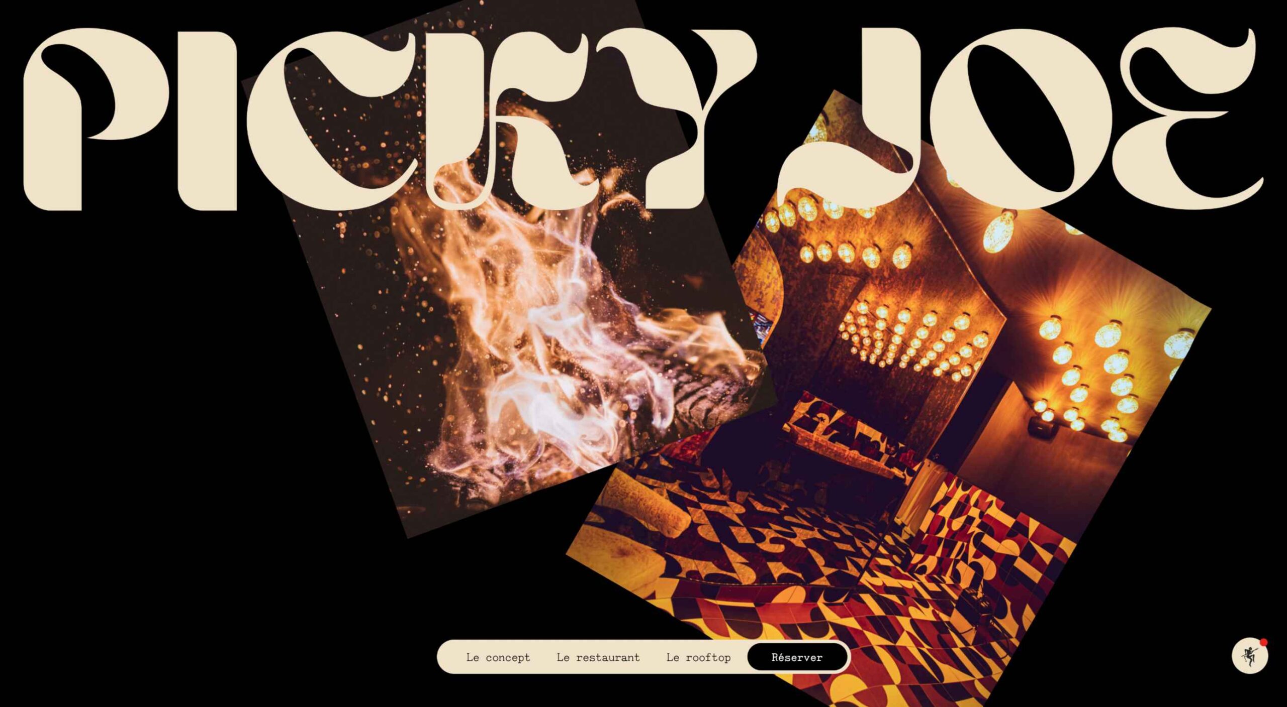 There are a lot of dark, retro vibes trending in website design right now. Although there are still some light projects popping up – including a pastel trend below – a lot of what we are seeing has a quite moody feel.
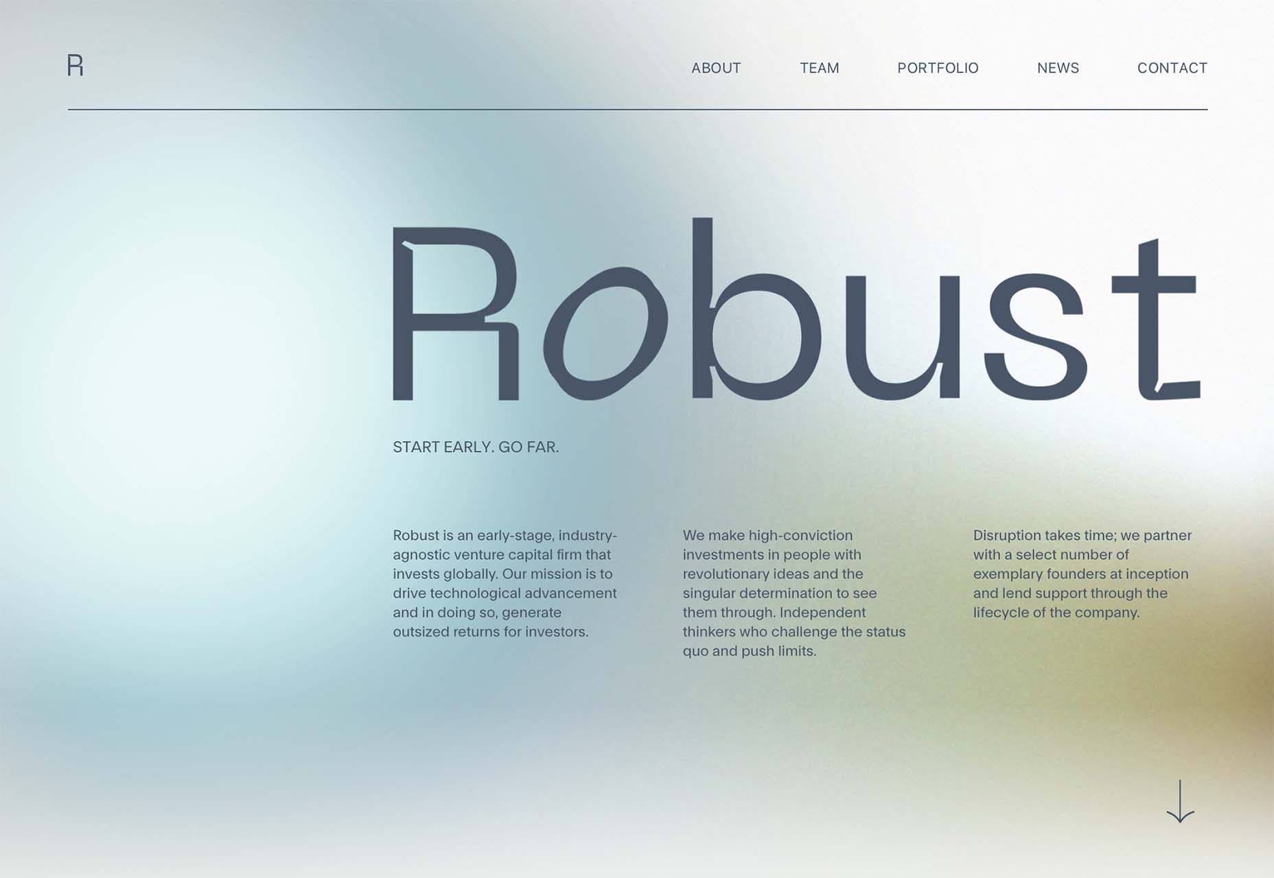


 The hardest part of designing websites for a living is setting your prices. Setting a fair price for your services is something that nearly all of us struggle with.
 Starting your own business is a process with a fair share of challenges. Even in the web design world, where you can potentially minimize costs by working from home and collaborating with freelance contractors, many expenses exist.
 UX laws are an invaluable tool, providing guidelines for designers that ensure we don’t have to continually reinvent the wheel when crafting experiences for the web.
 Navigating the world of web design can be difficult. There is so much conflicting and outdated advice.
 Websites haven’t always been as adaptable as they are today. For