 Last week, you started a web design agency. This week we’ll help you take the next steps towards making your agency viable.
The first couple of days were spent on legal checks and taxes. After that, you’ve picked a niche to specialize in, an awesome name, worked out how much you’re going to charge, and set up business accounts. Then, finally, you took a day off to prepare for this week. (If you skipped any of those steps, go back and catch up now.)
This week, we’ll start defining who you are as an agency. The process is the same as last week: focusing on one task per day. By the end of the week, who you are as an agency will start to become apparent.
Day Eight: Choose Your Clients
For any new business, the temptation is to grab any work you can get to keep the money flowing in. However, chasing money is counter-productive; you end up clutching at opportunities instead of taking a targeted approach.
Last week you selected your niche. Today, you will choose the clients you intend to work for. And we mean that literally: draw up a list of target clients.
Do you want to work for Nike? Fine, add it to the list. Think Apple would look good in your portfolio? Add it too. Make sure you add a few that are more realistic but don’t aim too low.
By the end of the day, you should have a spreadsheet of companies to target.
Day Nine: Tech Stack
Now you know who your agency is planning to work for, it’s time to identify the technology stack you’re planning to offer them.
It may be that you will be a full-service agency handling everything from branding to custom apps. Alternately, you may perform better handling one aspect of the job well and outsourcing the rest.
However you plan to approach the actual work, you’ll need a full-stack solution for most clients. That means brand design, web design, marketing and content, front-end code, content management, and SEO.
The best advice is to focus on your existing strengths and develop a skill to an expert level. Then, once you’ve done so, you can expand sideways to plug any gaps.
For example, moving into WordPress development is a good option if you already know HTML and CSS. On the other hand, if you’re more design orientated, a site builder approach using SquareSpace or Shopify might be a better fit.
Technologies change, so you shouldn’t expect your core technologies to stay with you throughout your career. But these are the solutions you’ll become an expert at over the next few years.
Day Ten: Define Your Red Lines
All companies have brand values, whether they define them or not. So at this stage, it’s more practical to look at what you’re not prepared to do.
Everyone has red lines that they’re not prepared to cross. Would you work for a pornography company? Would you work for a radical political group? Would you work for a controversial religion? Would you work for a company with a patchy human rights record? Would you work for big pharma?
There’s no right and wrong answer to this; it all comes down to your personal values. However, you will be asked to cross the line at some point. It’s easier to say “no thanks” if you know where the lines are in advance.
If you don’t have red lines, that’s valid too. But be aware that once you’ve crossed a line, that line will stay crossed; you’ll attract more of that type of work, which will define you.
Day Eleven: Write Your Elevator Pitch
An elevator pitch is a short couple of lines that can be delivered to a prospective client on a (hypothetical) elevator ride between two floors.
When someone asks you what you do, “Um, well, you know, mostly just websites and stuff.” Is not a good answer.
Your language should be natural, non-technical, and self-assured. Something like, “We help startups like yours outperform their competitors on Google.”
Once you’ve settled on a good elevator pitch, practice it over and over. Write it on a post-it and stick it to your monitor, screenshot it and use it as your phone’s wallpaper. Say it over and over in the shower, in the car, and in the elevator. Learn it so that when someone asks, it trips off your tongue effortlessly.
Day Twelve: Pick a Coffee Shop
You don’t need fancy offices to start a web design agency, and in fact, the first agency I worked for tanked primarily because they couldn’t afford their office lease.
People are used to remote work now, and most meetings can be conducted by video call. But you will still find clients who like to meet one-to-one, especially for a kick-off meeting.
It’s always best to visit a client’s premises if you can, but coffee shops are a good alternative, and every new agency should have one.
Consider your coffee shop your meeting room. If you’re lucky enough to be in a town or city where there are a few to choose from, try to pick one that matches your values: quirky and independent, efficient and corporate, etc.
Check when the quiet times are (you don’t want to be shouting over the buzz of rush-hour orders). Make sure you know where the nearest parking or public transport is so that you can direct clients. Ensure the wi-fi is OK, preferably free, and find out the password in advance.
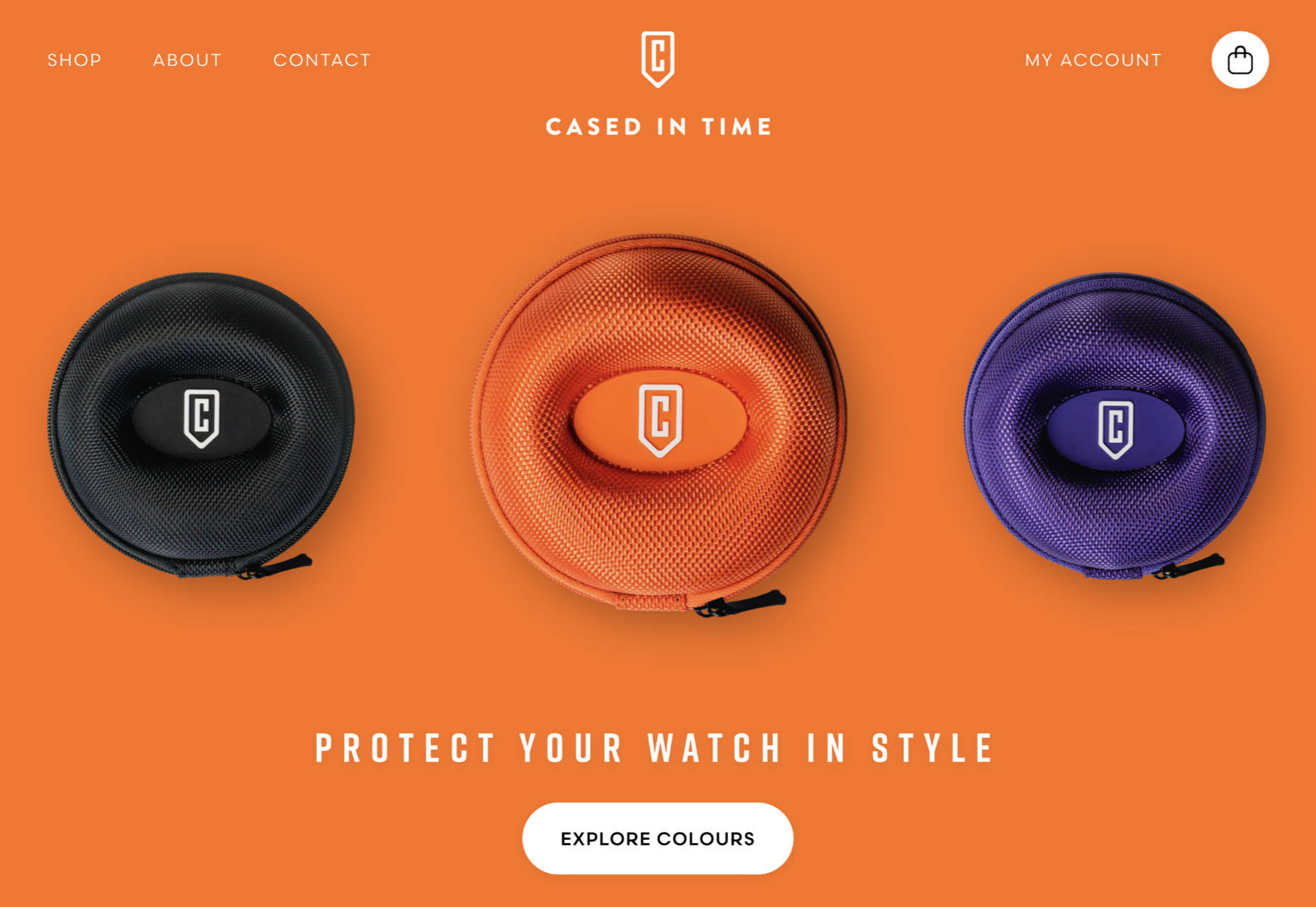
Day Thirteen: Start Your Branding
Two weeks in, you finally get to do something creative: design your logo.
If you’ve been matching days to the days of the week, then it’s Saturday. That should give you more time for this task, but don’t go to town. Your logo is going to change and evolve. It is far too easy to get wrapped up in tiny details like logos and lose sight of the bigger picture.
Remember: no logo, no matter how cool, ever won a pitch.
If you’re a designer, you probably ignored us and started the logo on day one. In fact, you’ve probably had something knocking around in a sketchbook for a while.
If you’re not a designer, type out your name in a geometric sans-serif, tighten the tracking, and call it a day.
Either way, by the end of today, you’ll have something that fits your niche, ties into your elevator pitch, and appeals to your target clients.
Day Fourteen: Rest
Hopefully, you learned the benefits of a rest day last week, and this week was easier as a result.
It’s time to do whatever you do to relax. If you can, do it outside away from your computer. Create some distance and recharge your batteries.
Next week, we’ll start putting together the assets you will use to present your business professionally.
Featured image via Unsplash.
Source
The post How to Start a Web Design Agency in 28 Days: Week Two first appeared on Webdesigner Depot.
Source de l’article sur Webdesignerdepot

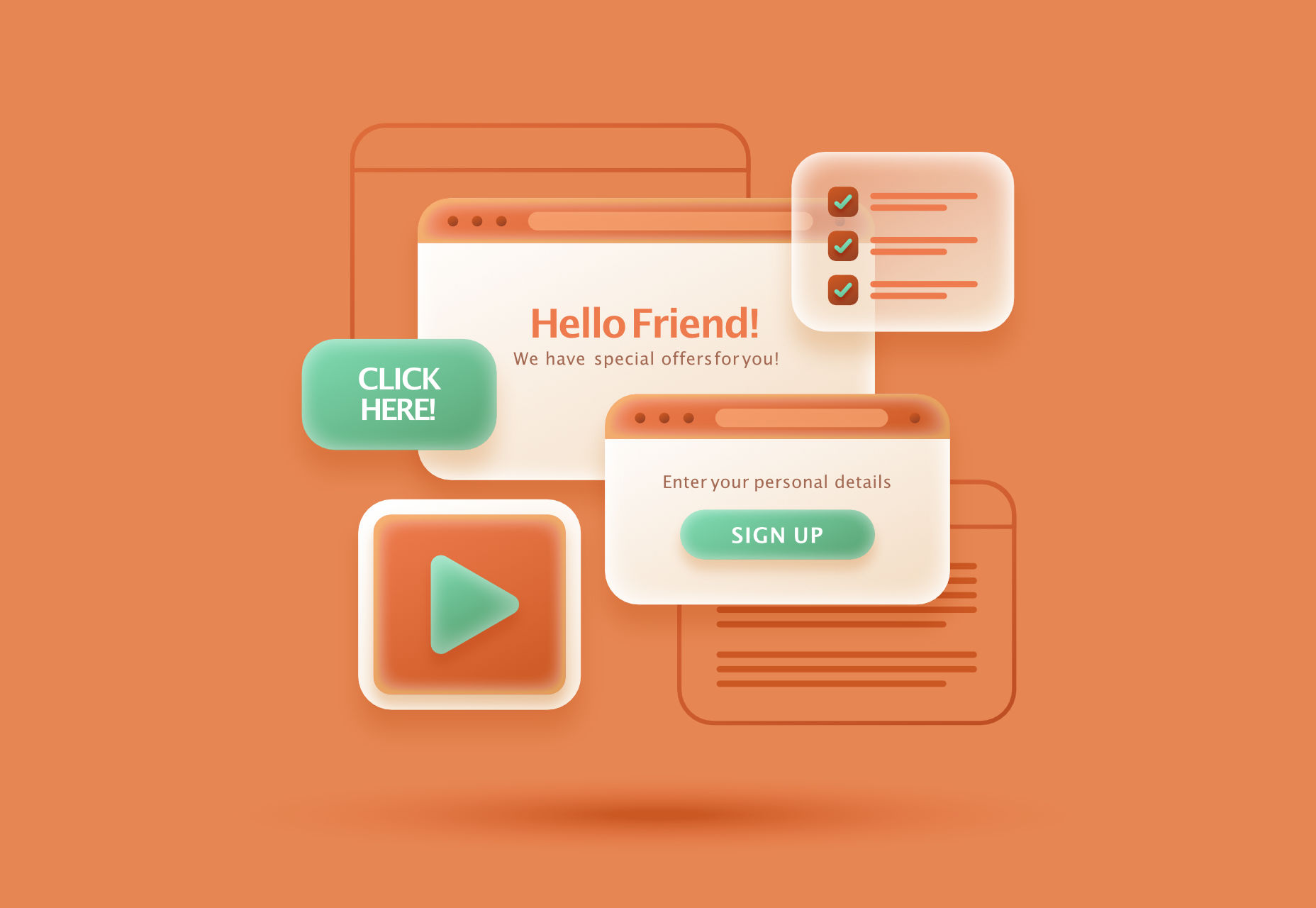 Modals, a nifty little feature that allows you to display different messages at the top of your website, have been touted as extremely useful. Some even claim that they are helpful enough to completely replace the banner ads we all hate so much. But are modals in web design a UX disaster?


 Three weeks ago,
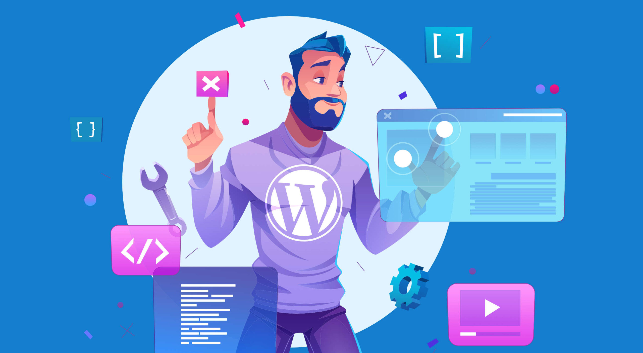 I bet you didn’t know that WordPress is the world’s most popular website builder and content management system (CMS).
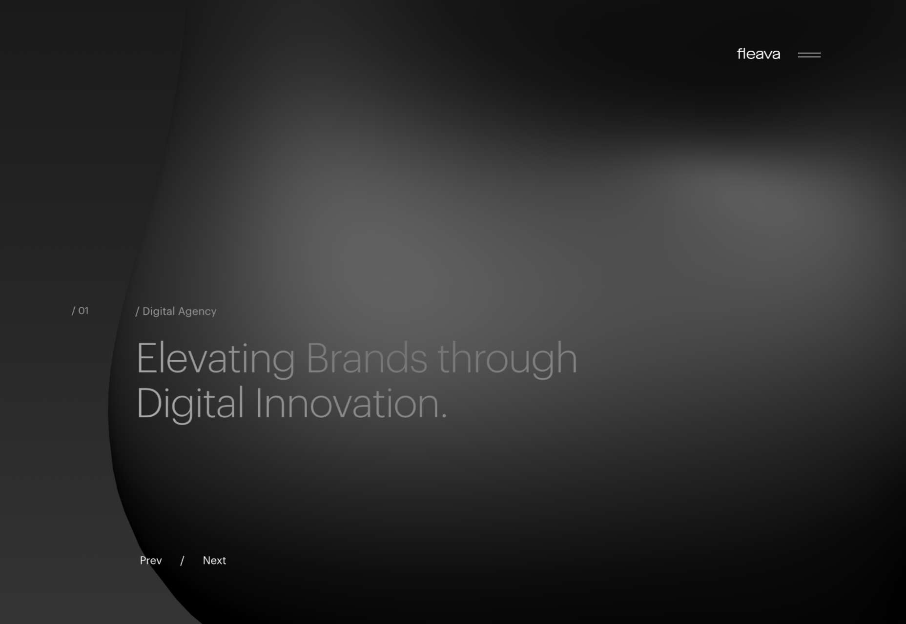
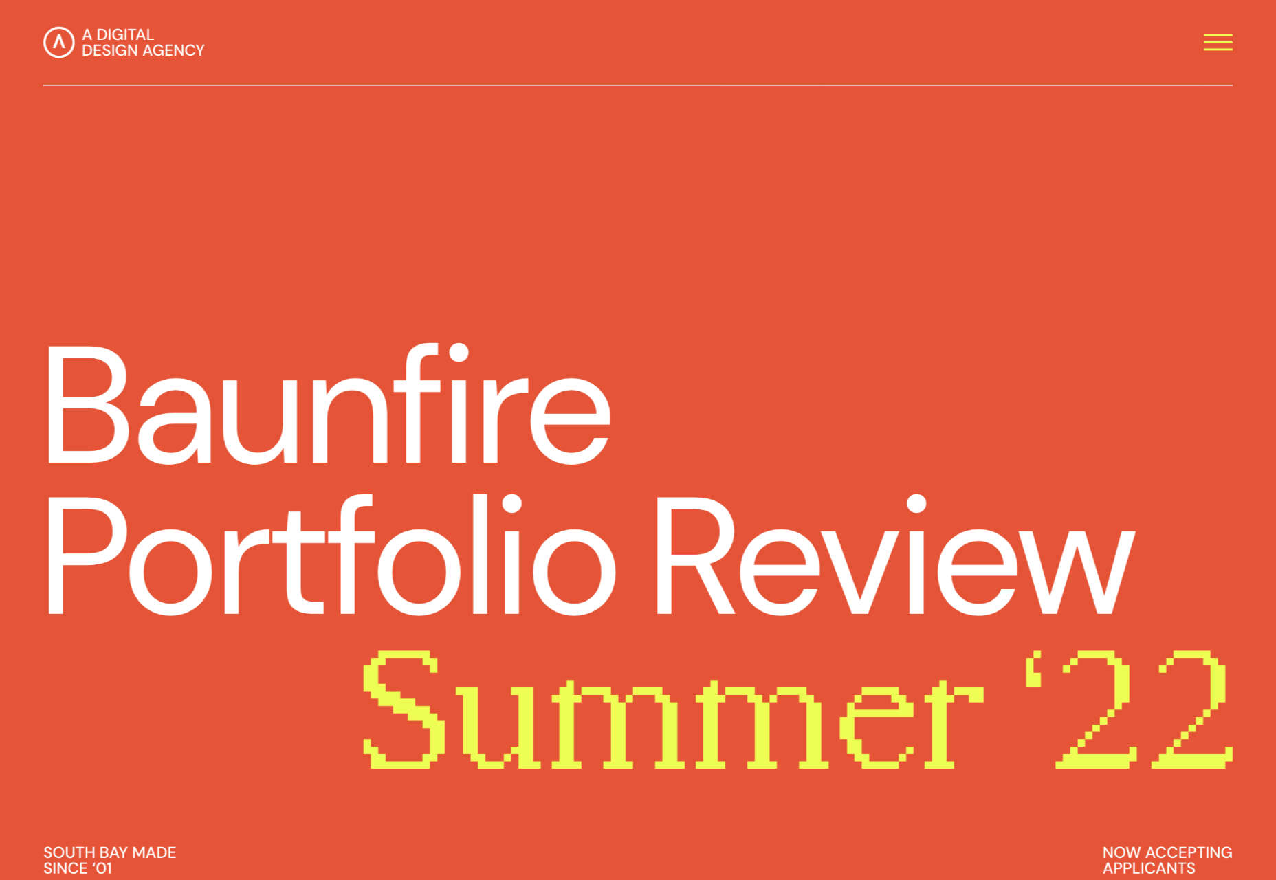
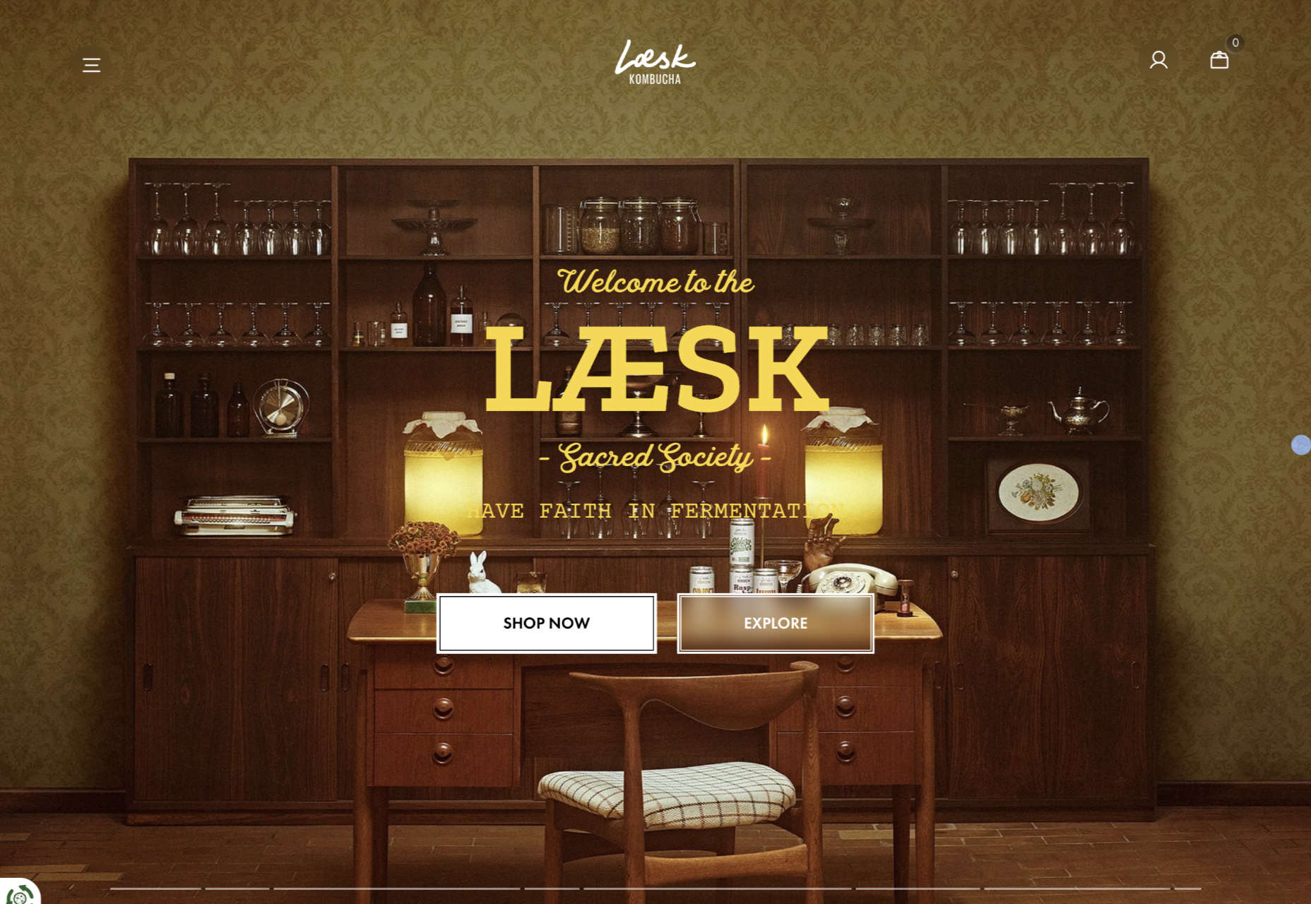
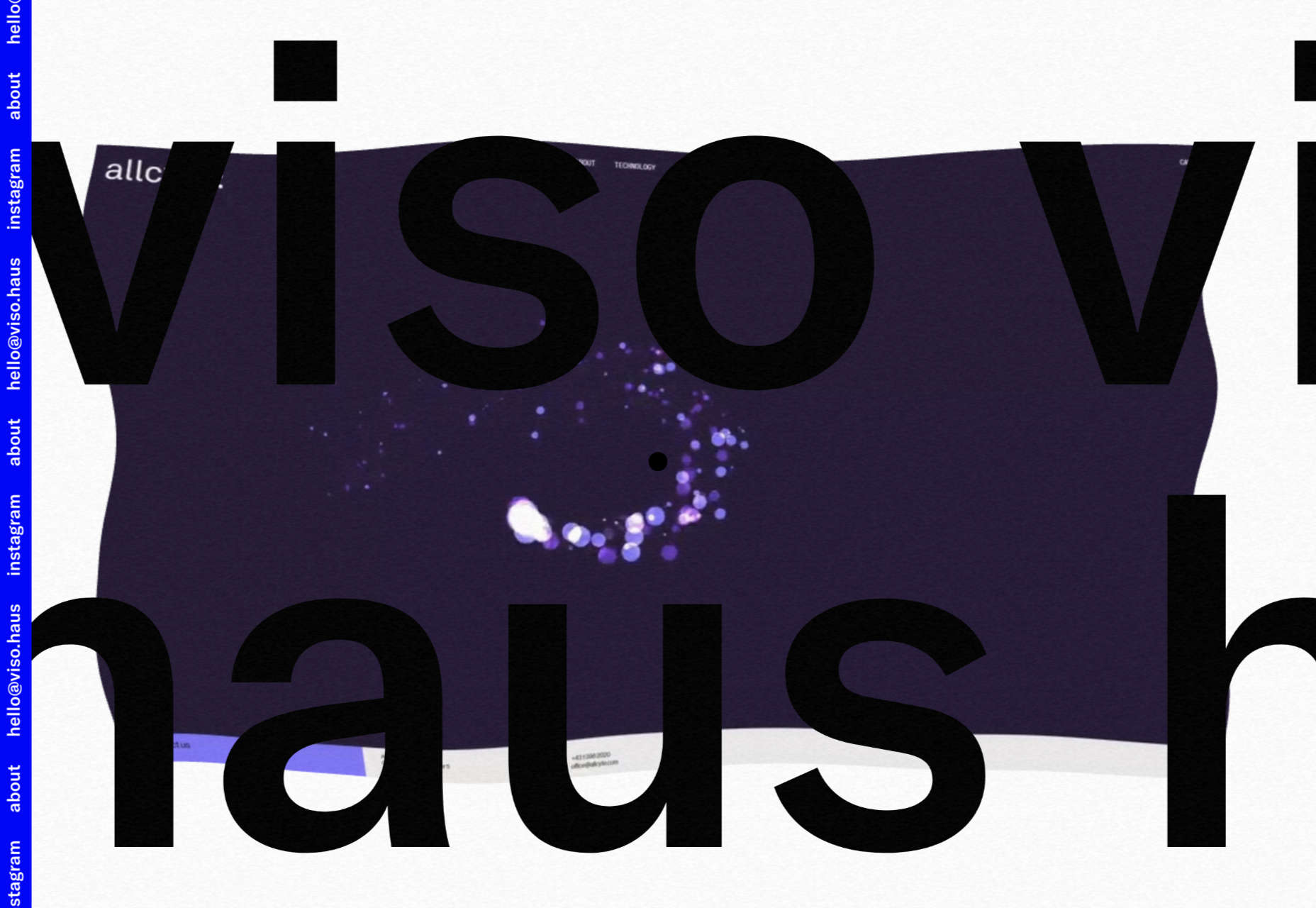
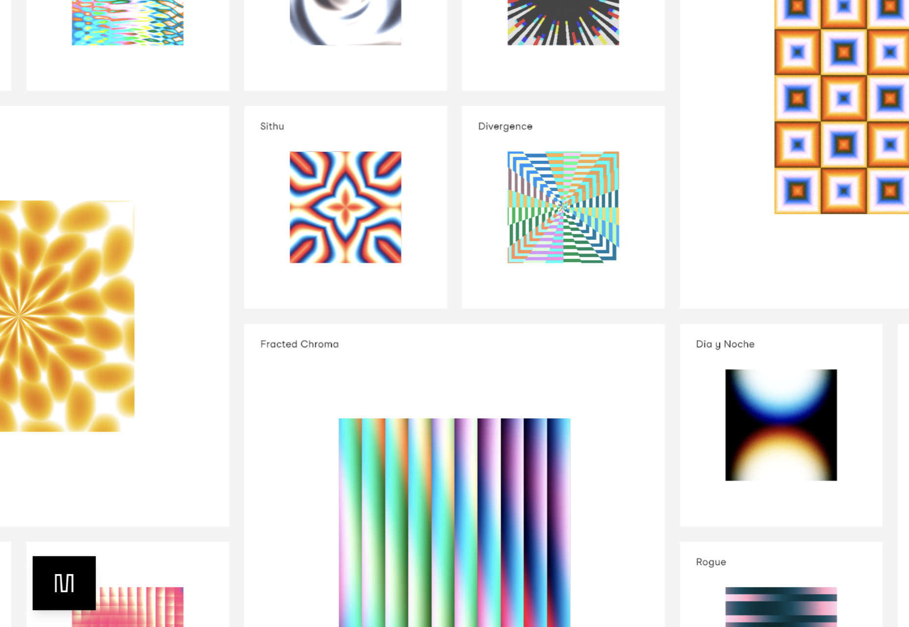
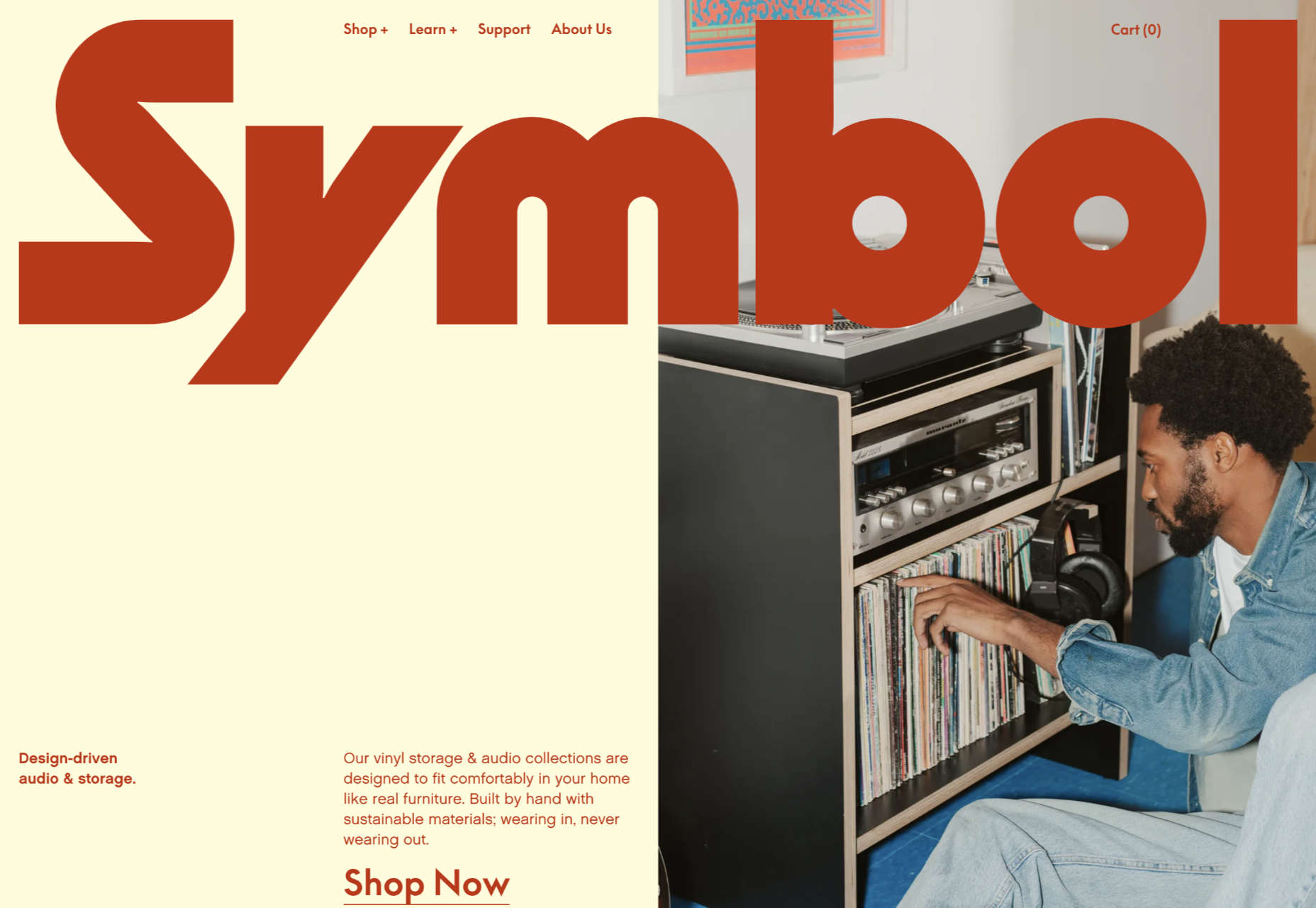
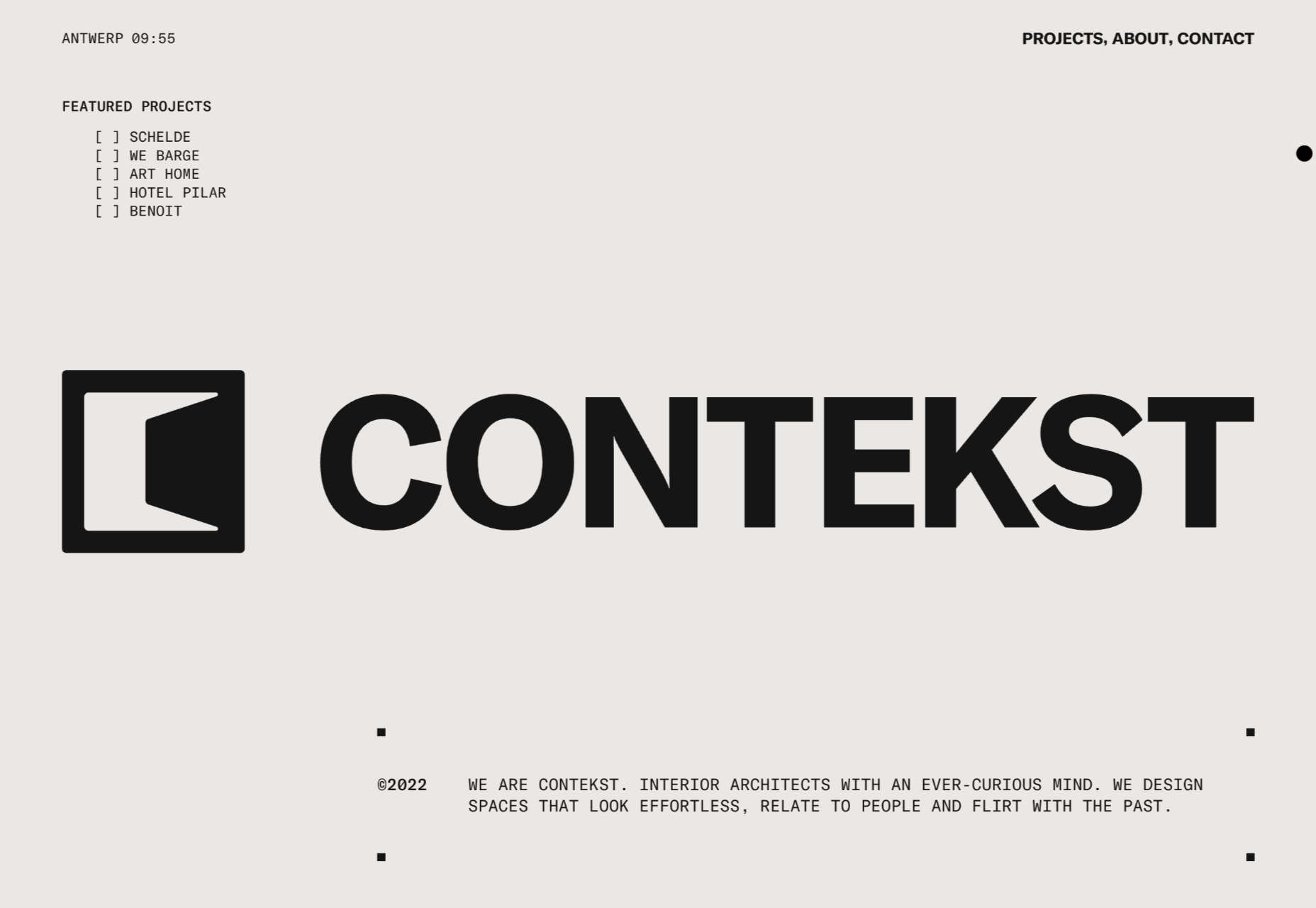
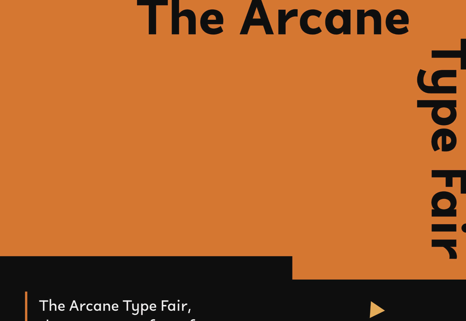
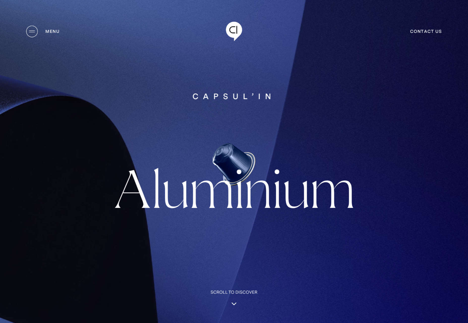
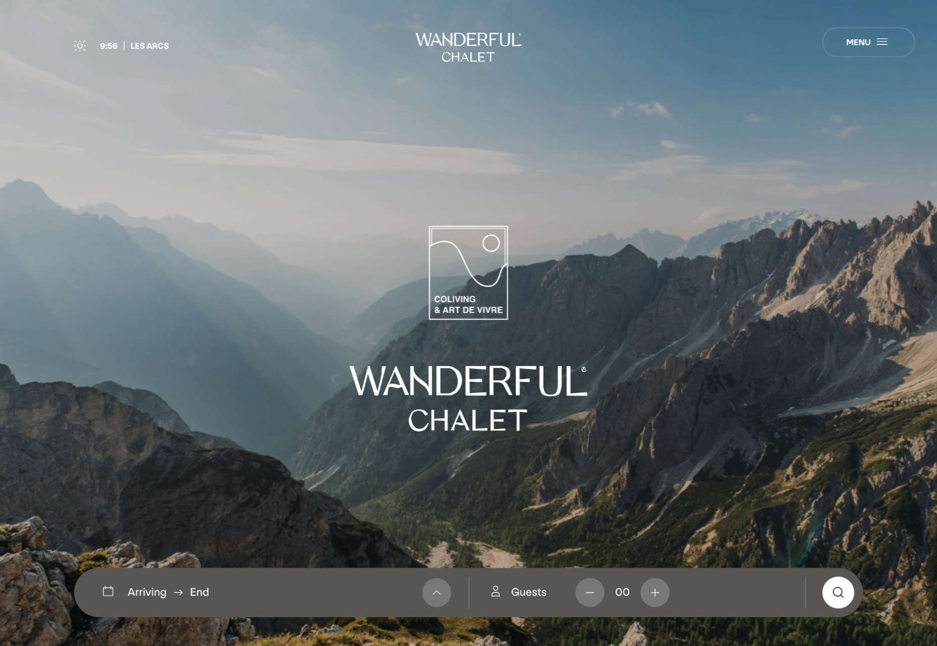
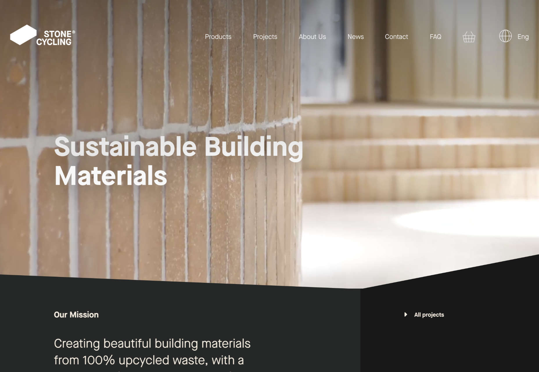
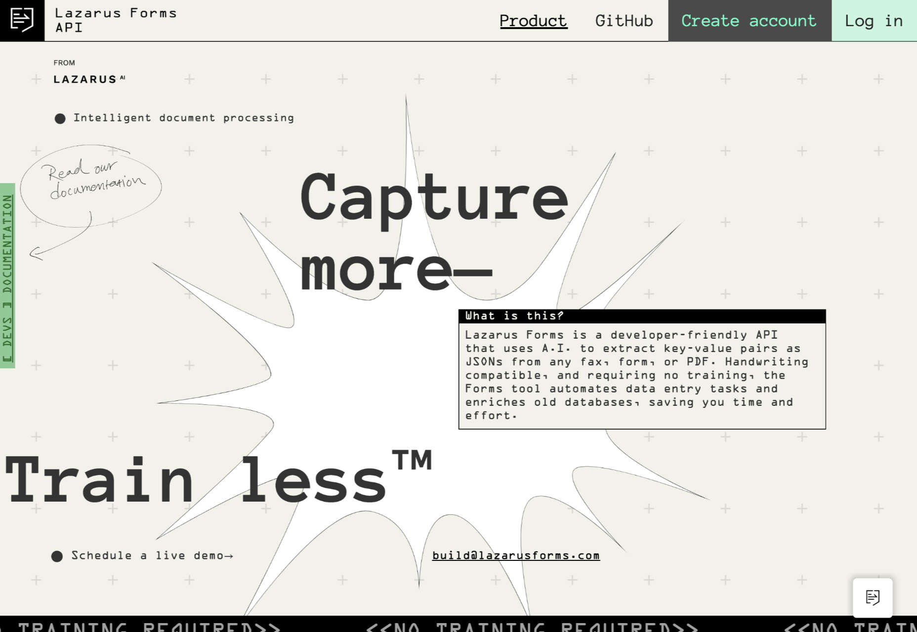
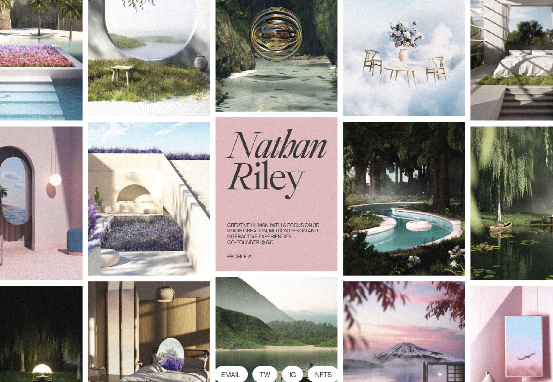
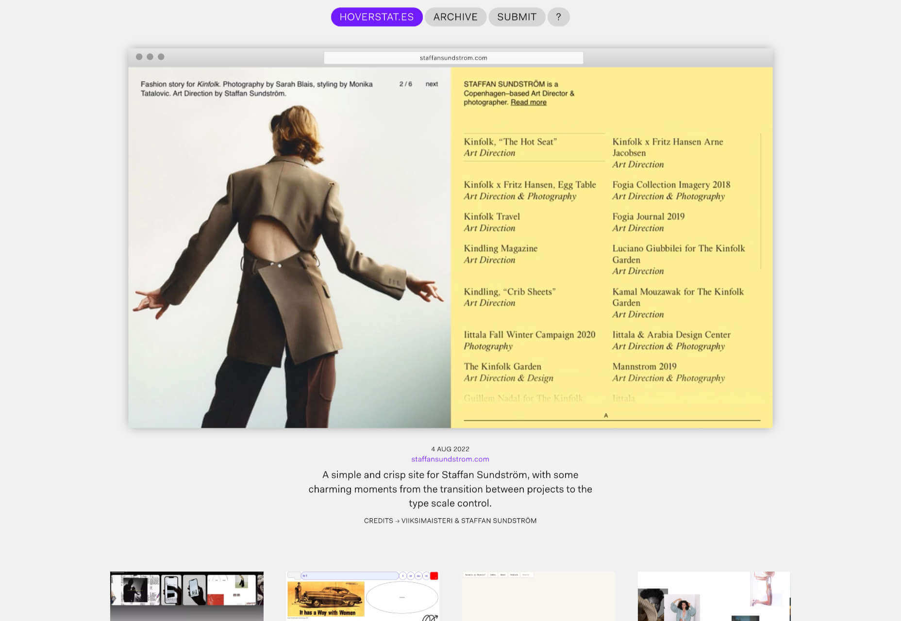
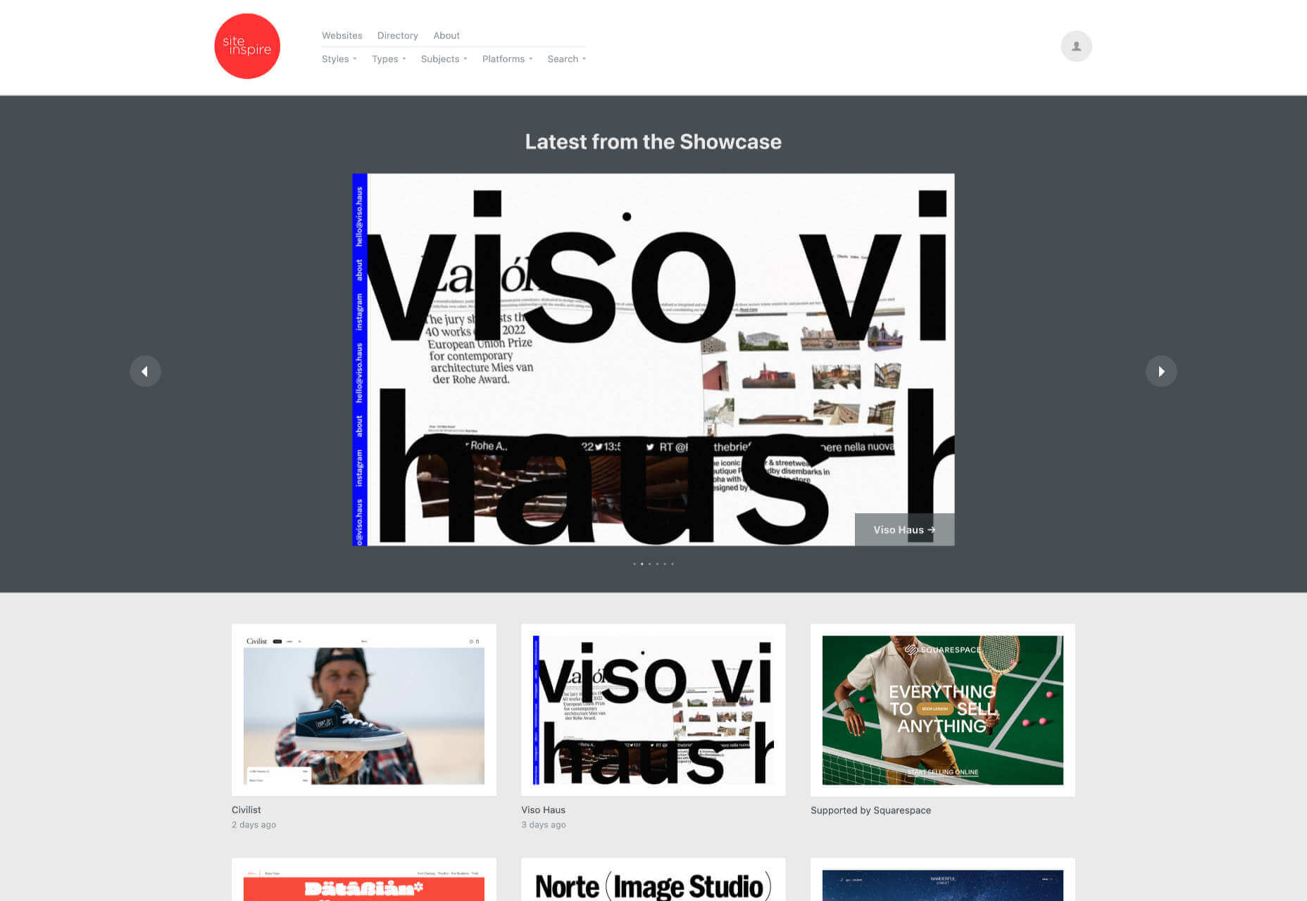
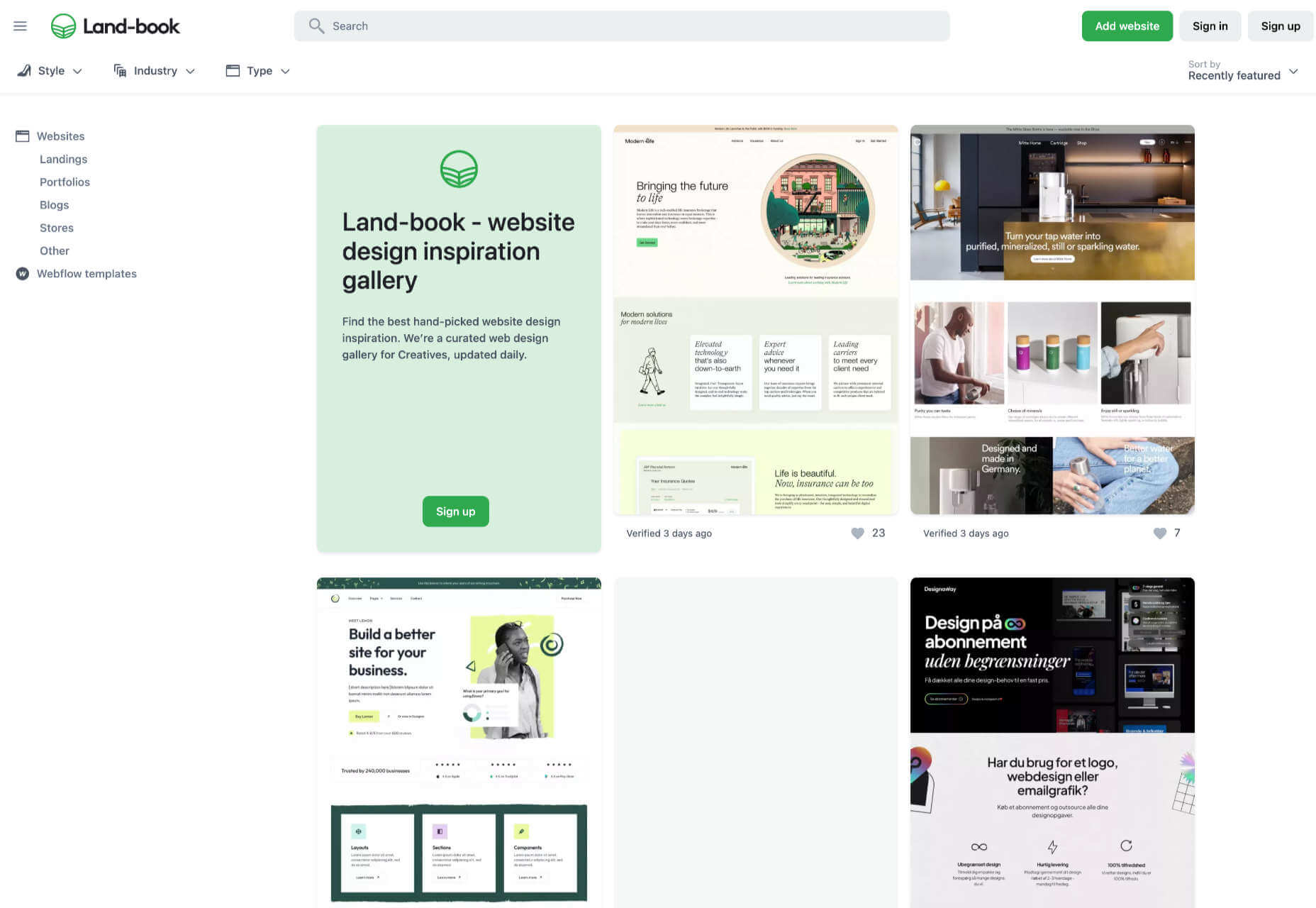
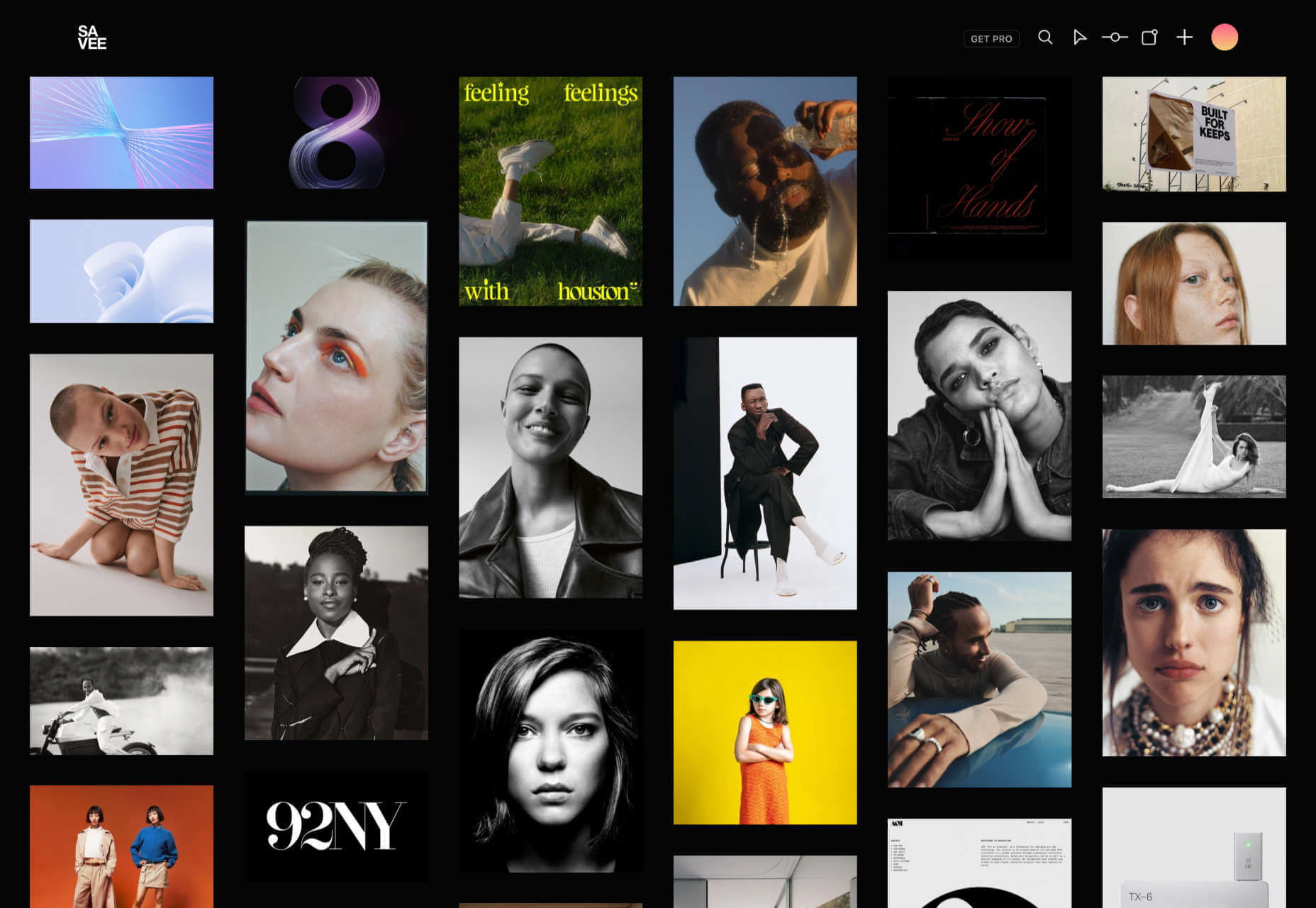
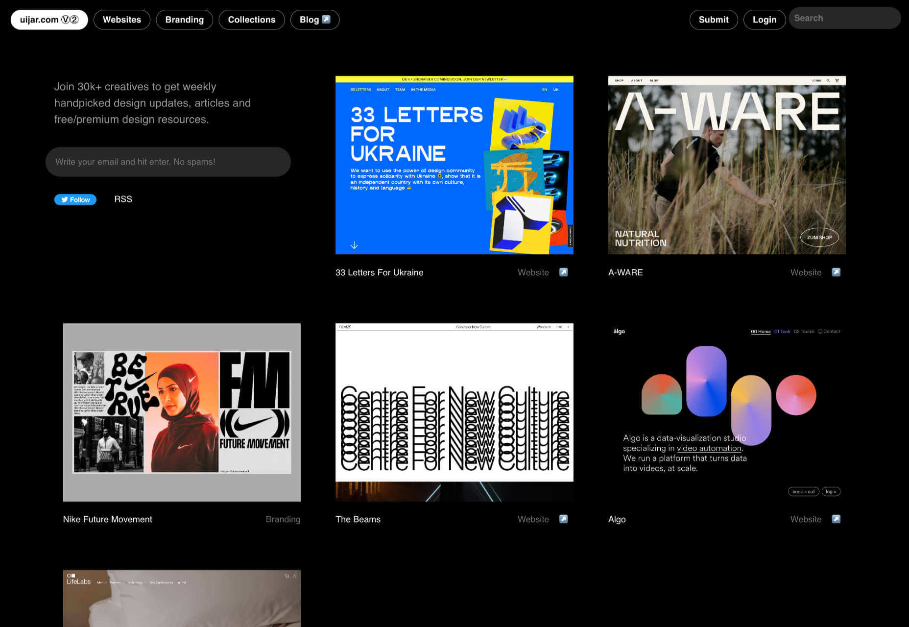
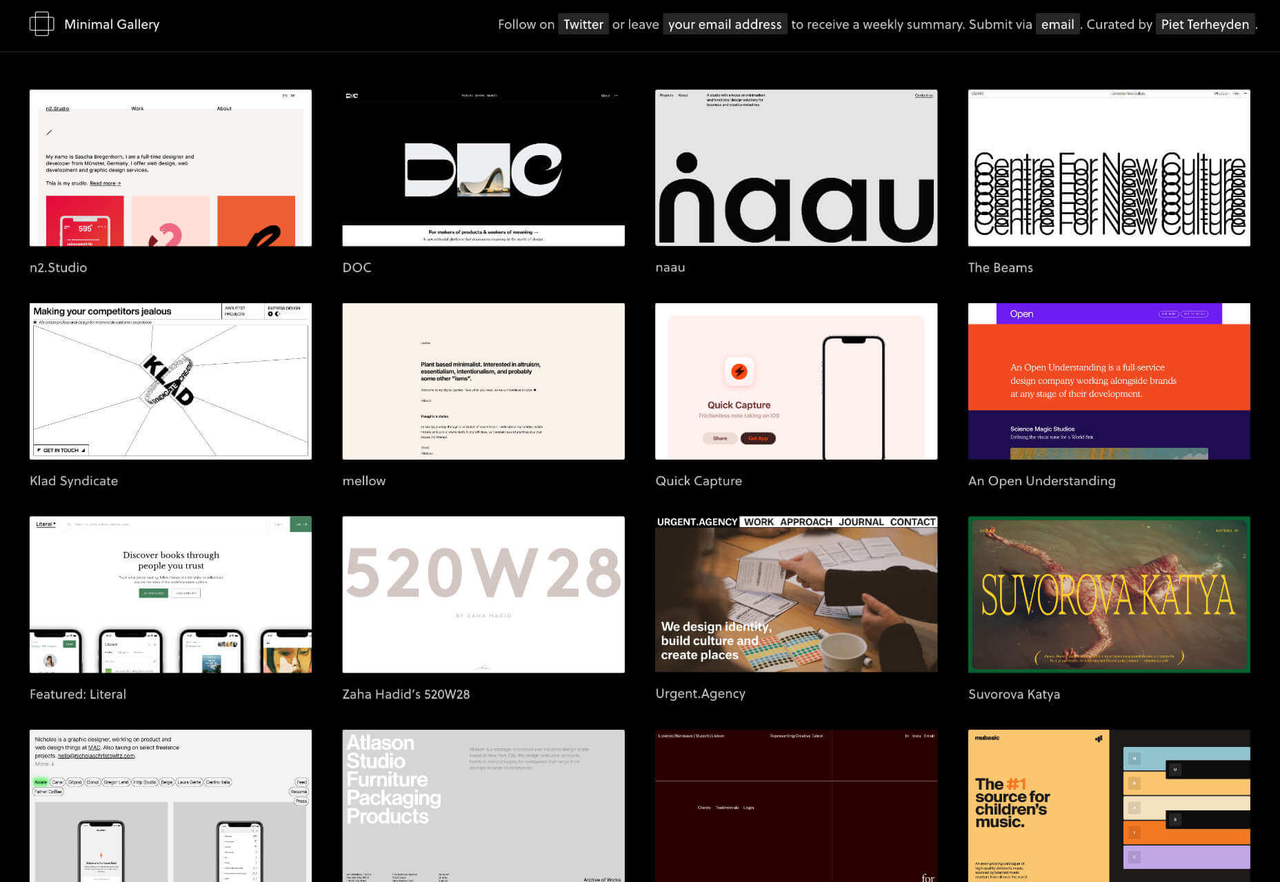
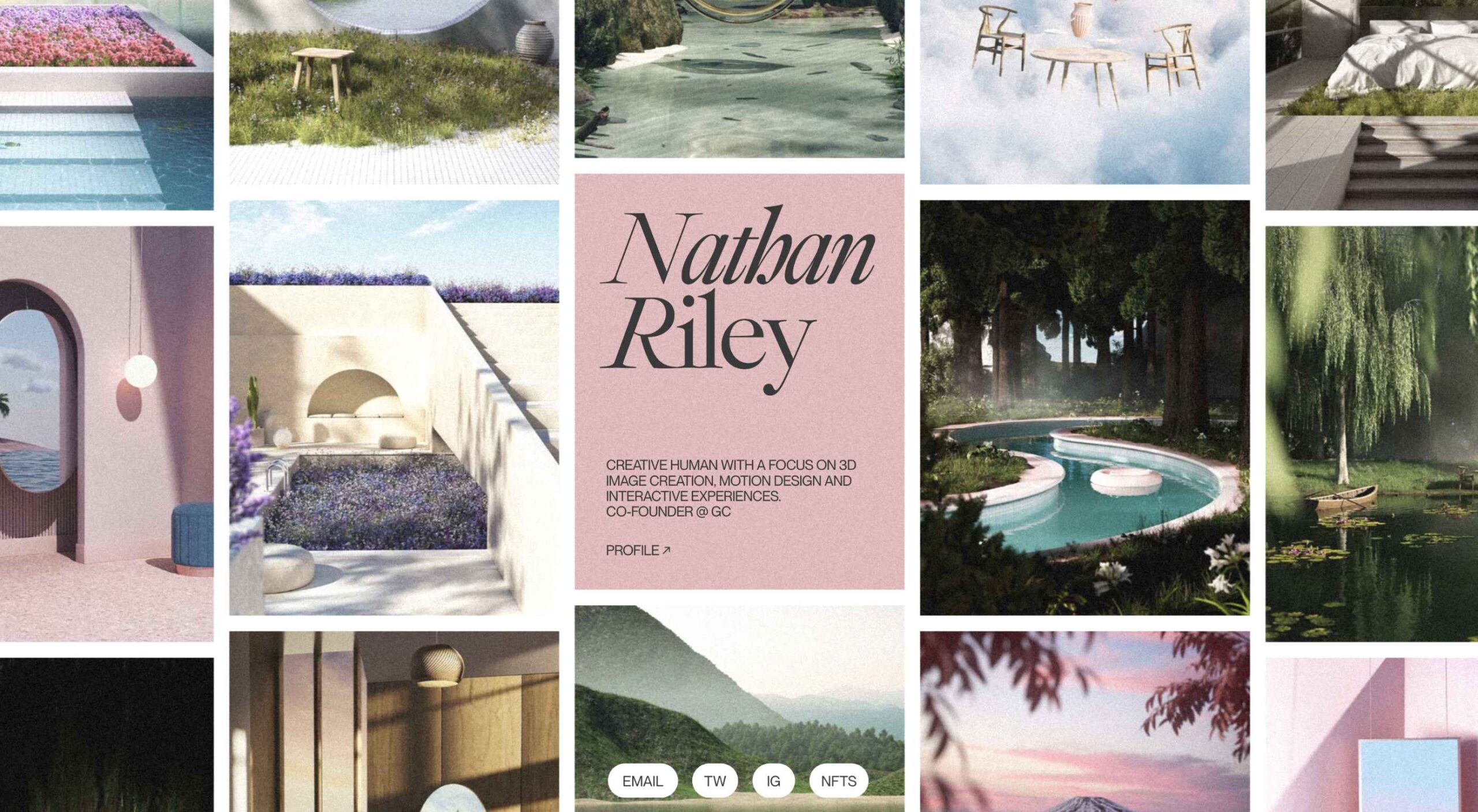 This month we’re seeing websites that are very conscious of the design trends they’re following. Designers are making conscious choices to adopt styles, and opting out when it doesn’t suit the site. What we end up with is a crop of sophisticated, well-designed websites that use style as a technique to further their aims.
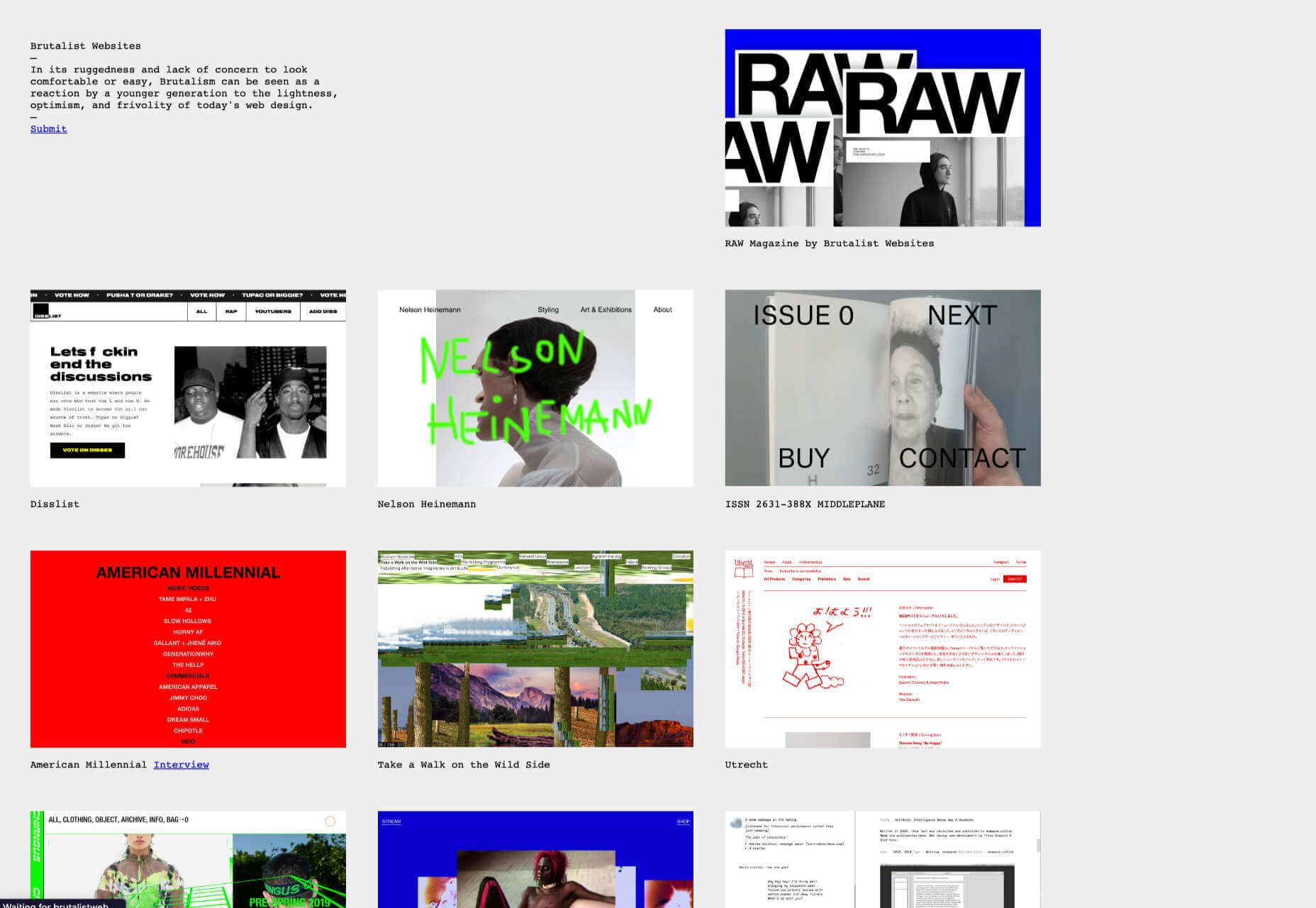
 Web design is often stagnant because designers look at the same work and follow the same trends. Unfortunately, algorithms promote work that is liked, and designers produce content to get likes, which leads to a self-feeding cycle.


 Users expect websites to load quickly. As a result, companies like Amazon and Target spend millions of dollars optimizing their sites to make them load as fast as possible because there is a direct correlation between site speed and conversions.