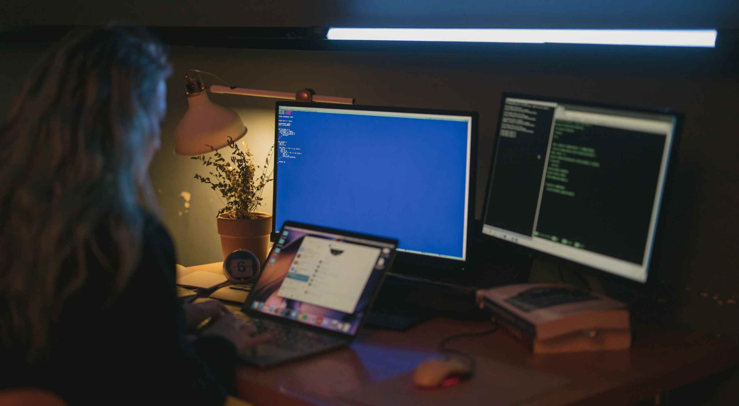
 A hacked WordPress site is as damaging as having your home burgled. It can completely shatter your peace of mind and adversely impact your online business.
Why do hackers target WordPress sites? The answer is relatively simple: WordPress is the single biggest platform for website creation these days, so there’s a larger base to attack; this attracts the attention of online criminals.
So, how can a hack impact your website?
Depending on the type of attack, your website could suffer any of the following:
- It could be defaced completely;
- It could load or operate very slowly on any device;
- It could completely crash and malfunction;
- It could display the dreadful “White Screen of Death”;
- Its incoming visitors could be redirected to other suspicious websites;
- It could lose all your valuable customer data.
This list is not exhaustive but you get the idea.
Now that we know how a successful hack can impact your website and online business, let us look at the top 10 reasons behind WP hacks and prevent them.
1. An Insecure Web Host
Like any website, WordPress is hosted on a web host or server. Unfortunately, most site owners do not pay much attention to the web host they select and choose the cheapest they can find. For example, it is more affordable to host a website on a shared hosting plan — one that shares its server resources with many other websites like yours.
This can make your site vulnerable to hackers as a successful hack into any website on the shared server. A single hacked site can consume the overall server bandwidth and impact all the other sites’ performance.
The only way to fix this problem is to opt for a reliable host and a virtual or dedicated server.
Pro tip: If you’re already using a shared hosting plan, check with your hosts if they offer VPS hosting and make the switch.
2. Use of Weak Passwords
Weak passwords are the main reason behind successful brute force attacks that target your account. Even to this day, users continue to use weak and common passwords like “password” or “123456”; if you’re one of them, your website could land in trouble!
Guessing weak passwords allows hackers to enter the admin accounts where they can inflict the maximum damage.
How do you fix this problem? Simple, ensure all your account users (including admin users) configure strong passwords for their login credentials. With at least 8 characters, passwords must be a mix of upper- and lower-case alphabets, numbers, and symbols.
For added safety, install a password management tool that can automatically generate and store strong passwords.
Pro tip: You can use a plugin to reset passwords for all your users.
3. An Outdated WP Version
Outdated software is among the most common reasons why websites get hacked. Despite being free to download, most site users defer updating their site to the latest version, for fears of updates causing their site to crash.
Hackers take advantage of any vulnerability or bug in an older version and cause issues like SQL Injections, WP-VCD Malware, SEO Spam & other major issues like website redirecting to another site.
How do you solve this problem? When you see a notification about an update on your dashboard, update your site as soon as possible.
Pro tip: If you are worried about updates crashing your live website, you can first test the updates on a staging site.
4. Outdated WP Plugins and Themes
Similar to the previous point, hackers also take advantage of outdated, unused, or abandoned plugins and themes installed on websites. With over 55,000 plugins and themes that are available, it is easy to install a plugin or theme, even from unsafe or untrusted websites.
Plus, many users do not update their installed plugins/themes to the latest version or do not find the updated version. This makes it easier for hackers to do their job & infect sites.
How do you avoid this problem? As with the core WP version, update each of your installed plugins/themes on your site regularly. Take stock of all the unused ones and remove them or replace them with better alternatives.
You can update your plugins/themes from your hosting account.
Pro tip: We suggest setting aside time every week to run updates. Test them on a staging site and then update your site.
5. Common Admin Usernames
In addition to weak passwords, users also create common usernames that are easy to guess.
This includes common usernames for admin users like – “admin”, “admin1”, or “admin123”. Common admin usernames make it easier for hackers to get into admin accounts and control backend files in your WP installation.
How do you avoid this problem? If you are using any such usernames that are easy to guess, change them immediately to a unique username. The easiest way of doing it is through your hosting account’s user management tool, by deleting the previous admin user and creating a new admin user with a unique username.
As the first step, change the default username of your admin user and limit users who have administrator privileges.
Pro tip: WordPress has 6 different user roles with limited permissions. Only grant admin access to users who really need it.
6. Use of Nulled Plugins/Themes
Coming back to the importance of plugins/themes, users have access to many websites that sell nulled or pirated copies of popular and paid plugins and themes. While these are free to use, they are often riddled with malware. They can compromise your website’s overall security and make it easier for hackers to exploit.
Being a pirated copy, nulled plugins/themes do not have any available updates from its development team, hence will not have any security fixes.
How do you fix this problem? Simple, for a start, only download original plugins and themes from trusted websites and marketplaces.
Pro tip: If you don’t wish to pay for paid or premium plugins and themes, opt for a free version of the same tools that will have limited features but are still safer to use than the nulled version.
7. Unprotected Access to wp-admin Folder
To take control of your site, hackers often try to break into and control your wp-admin folder in your installation. As the website owner, you must take measures to protect your wp-admin directory.
How can you protect your wp-admin folder? First, restrict the number of users having access to this critical folder. Additionally, apply for password protection as an added layer of security for access to the wp-admin folder. You can do this using the “Password Protection Directories” feature of the cPanel in your web host account.
Pro tip: Besides these fixes, you can also implement Two Factor Authentication (or 2FA) protection for all your admin accounts.
8. Non-SSL Website
You can easily migrate your HTTP website to HTTPS by installing an SSL certificate on your site. SSL (or Secure Socket Layer) is a secure mode of encrypting any data transmission between your web server and the client browser.
Without this encryption, hackers can intercept the data and steal it. Plus, a non-secure website can have many negative implications for your business – lower SEO ranking, loss of customer trust, or a drop in incoming traffic.
How do you fix this problem? You can quickly obtain an SSL certificate from your hosting company or SSL providers. It encrypts all data that is sent from and received by your website.
Pro tip: You can get a free SSL certificate from places like Let’s Encrypt, but these provide limit protection that will only be sufficient for a starter site or small site.
9. No Firewall Protection
Lack of firewall protection is another common reason why hackers can bypass website security measures and infiltrate the backend resources. Firewalls are the last line of defence against hackers and work like the security alarm installed on your house. Firewalls monitor web requests coming from various IP addresses, including the suspicious (or bad) ones.
They can identify and block requests that are known to be malicious in the past, thus preventing easy access for hackers to your website domain. Web application firewalls can thwart various attacks, including brute force attacks, XSS, and SQL injections.
Pro tip: A firewall provides much-needed security and is your first line of defence. But it’s important to also have a malware scanner installed.
10. Lack of WordPress Hardening Measures
Typically, hackers target the most vulnerable areas or weaknesses within a WP installation, to illegally access or damage the website. The WordPress team has identified these vulnerable areas and has devised a list of 12 hardening measures recommended for every website.
A few of these include:
- Disabling the File Editor;
- Preventing PHP execution in untrusted folders;
- Changing the security keys;
- Disallowing plugin installations;
- Automatic logout of inactive users;
How do you implement these hardening measures? While some steps are easy to understand, others require the technical expertise of how WordPress works.
Pro tip: You can implement hardening measures on your own. However, some measures require technical expertise so in these cases, it’s much easier and safer to use a plugin.
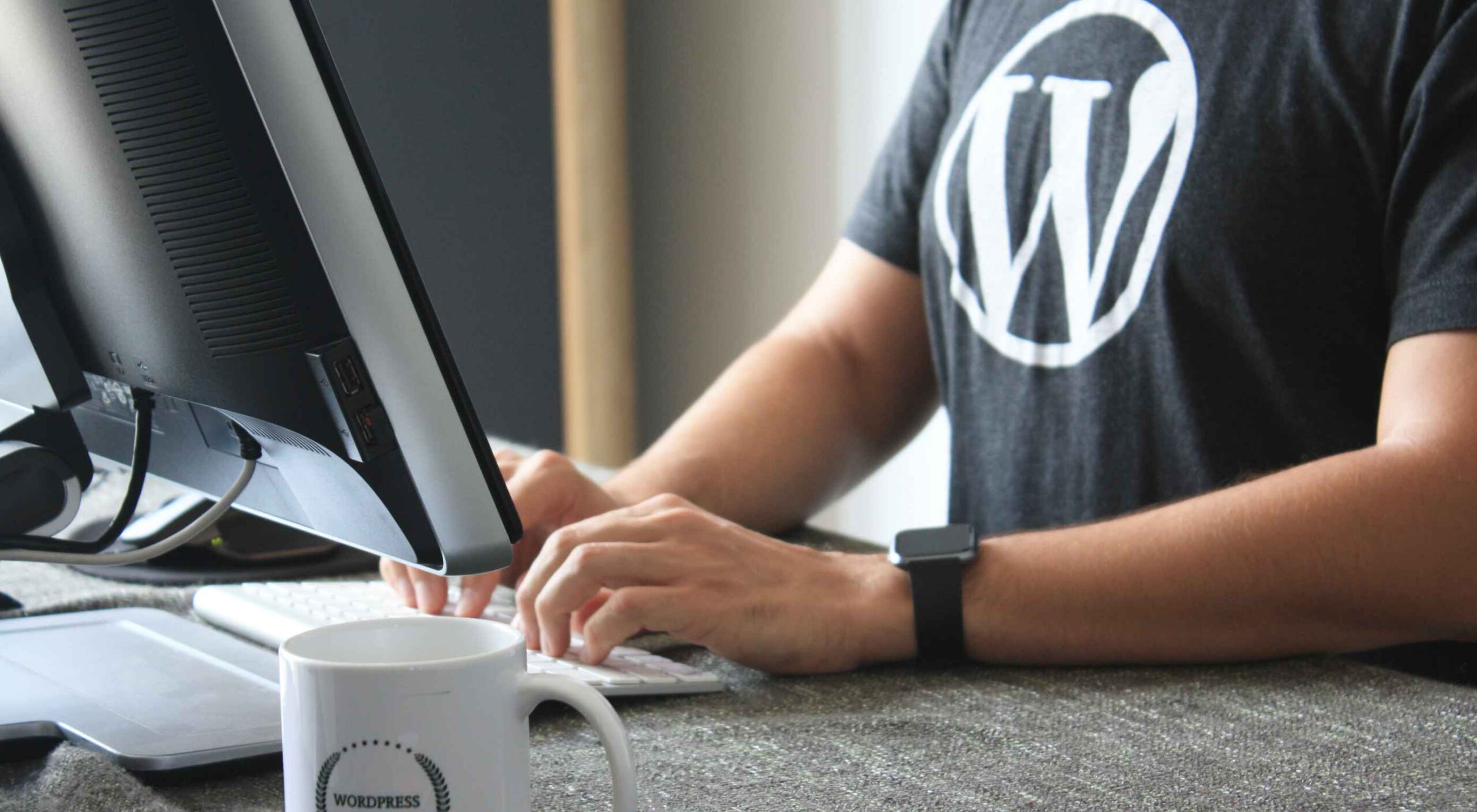
Featured image via Pexels.
 How can your customer reach you? If a client arrives on your website after searching on Google, what can they do to take the next step in a relationship with your brand, without buying anything?

 The transitioning of power is fraught with difficulties. Different teams have different values, different experience, different expertise, different priorities, and that leads to different tooling, and different methodologies.
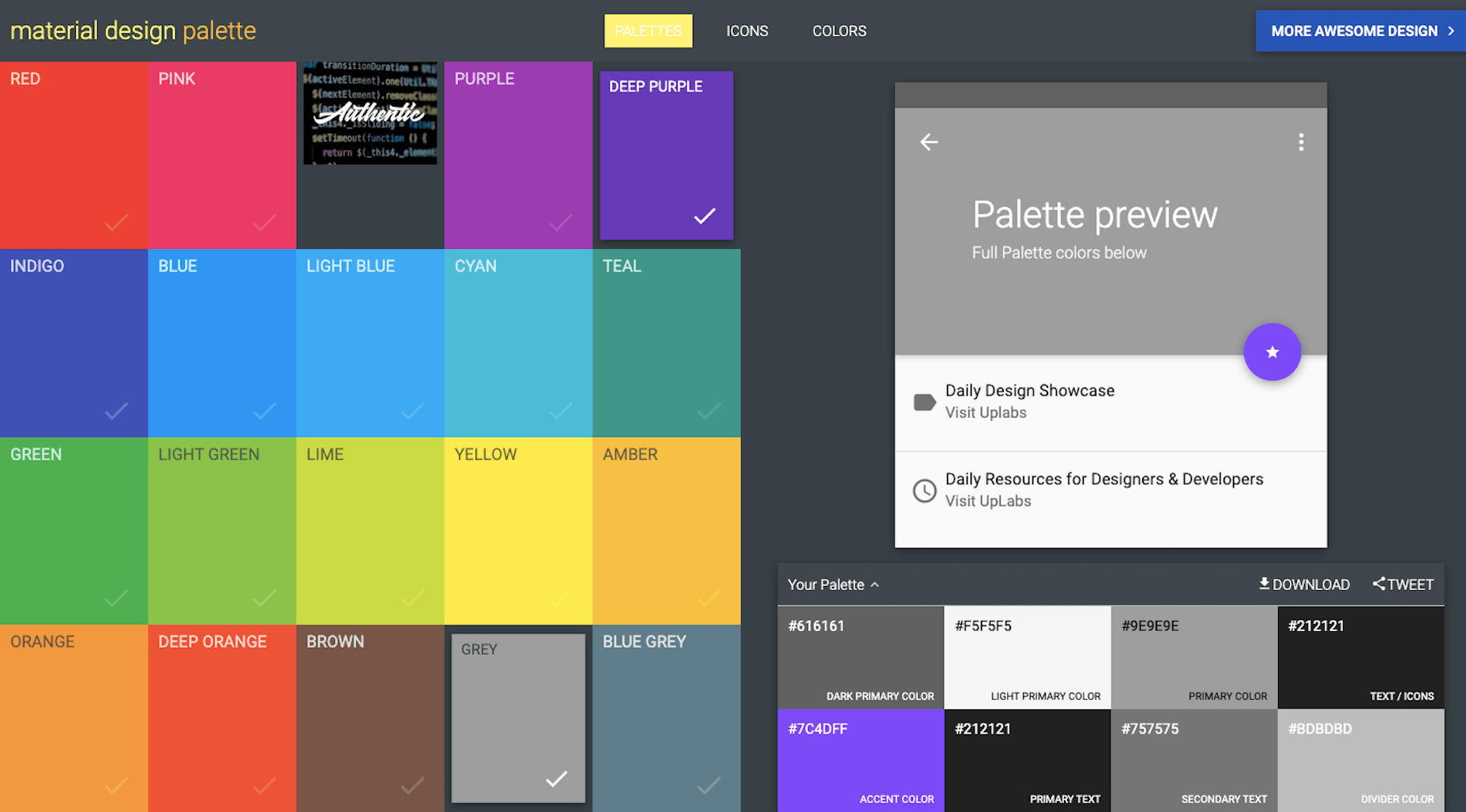
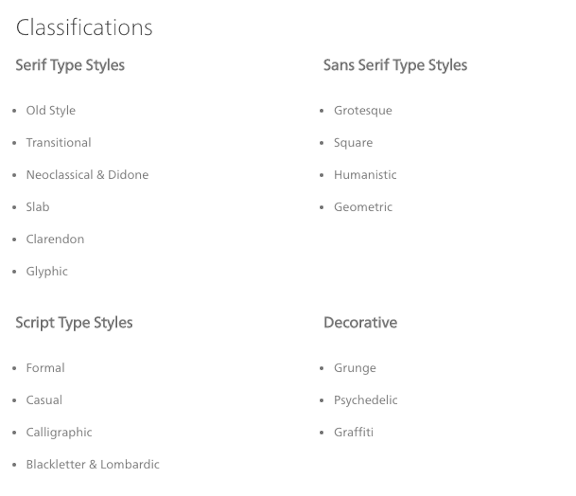
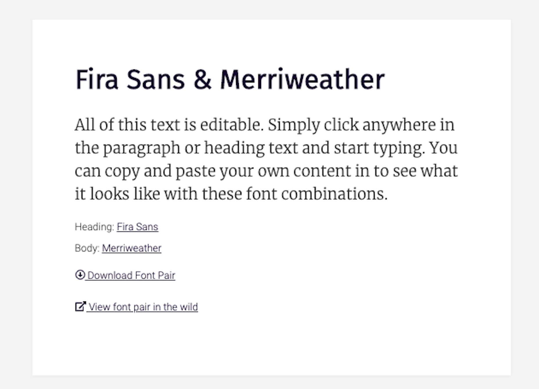
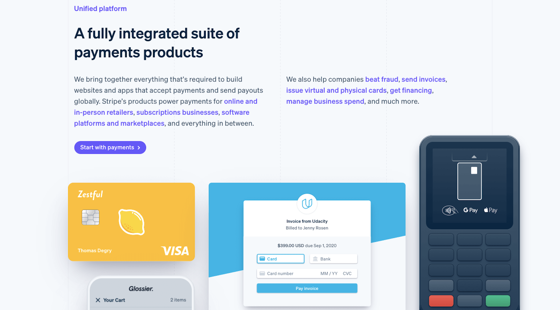
 Every week users submit a lot of interesting stuff on our sister site Webdesigner News, highlighting great content from around the web that can be of interest to web designers.


 There are so many things to think about when first starting a business. What will your business offer? How will this differ from existing solutions? Who will benefit most from your offering? And why are you so passionate about this?


 When it comes to compliance, website developers need to keep their eyes on more than just ADA regulations and Section 508. Privacy laws are a big consideration and decisions on how to build privacy into a website start with architects.
 With billions of internet users worldwide spending several hours online each day, the online presence of brands is now a necessary avenue for building, boosting, and maintaining positive value and attracting and interacting with customers.
 Plugins offer a ton of benefits to developers and website administrators; from flexibility, to saving time in development, the right plugin is priceless to a project.
 Dark themes are everywhere these days.