Articles

The world of search engine optimization was born with all sorts of different hacks and shortcuts that many people use in an effort to grow their business.

Knowing effective SEO tricks would be incredibly profitable, but unfortunately it’s not that easy

This becomes evident as soon as you do a Google search about anything SEO-related, only to find pages and more pages replete with blog posts and videos disclosing all the tips and tricks you “need to know” in order to achieve the best SEO results, in the fastest way possible.

Knowing effective SEO tricks would be incredibly profitable, but unfortunately it’s not that easy.

In its essence, SEO isn’t about hacks, shortcuts, and hidden optimizations, but rather about resource allocation. Keep reading to learn why!

Be Careful About Over-Reliance on Hacks

Before we start talking about resources, it’s important to understand why the quick and easy SEO hacks we’ve all read about online aren’t as reliable as they might seem.

The reality is that yes, there are some traditional hacks and optimization tactics that many people swear by. However, SEO has become way too competitive for these hacks to still work.

Think about it: anyone can learn about these hacks and shortcuts in a matter of seconds, which means that anyone can use them, which means that they’re not going to help your website stand out. By way of example, when thinking about keyword usage, many websites simply decide to put them everywhere on their website, without actually planning and strategizing. Perhaps years ago, doing so would lead to excellent results, but that’s not the case anymore.

What I want to go over, and what I mean with this article, is that when developing your SEO plan, you should think less about hacks, and try to focus on strategy and resources instead.

As tempting as they might be, most SEO hacks won’t really go that far.

What does go far are those strategies and resource allocation decisions, which you can master as long as you know three things:

  • Who your competitors are;
  • What you have;
  • and What strengths you can double down on.

Base Your SEO Strategies on Your Business’s Resources

So, SEO is about resource allocation – we know that now…but what exactly does that mean?

Well, this logic is based on something you might have heard of before, and that is the three pillars of SEO.

As a refresher, everything in SEO revolves around three pillars:

  • Link building and referring domains;
  • Content development and content marketing;
  • Technical SEO.

Many businesses have a limited digital marketing budget and, as if that wasn’t enough, their SEO budget tends to be even more restricted.

This means that we can’t try every hack out there or do every campaign we can come up with, hoping it will lead to positive results. On the contrary, it means we need to be methodical and understand which strategies have the most potential and are actually worth exploring.

In summary, there’s one big challenge that every SEO team and company experiences, and that is the limitation of resources versus possible operations, and that leads us to a question: what mix of SEO pillars will give us a good shot at ranking high and surpassing our competitors?

Develop Your SEO Strategies Based on Your Inherent Strengths

The mistake that a lot of business owners make after reading SEO articles or hearing about amazing case studies is that they try and copy the strategies they learned about, from beginning to end.

However, contextually, each case study or article could refer to a strategy that was specifically optimized for a different type of business.

So, although copying what other successful businesses can work in certain situations when speaking about SEO, it’s best to borrow ideas and use the ones that fit your inherent strengths.

Based on the pillars of SEO that we discussed earlier, there are three strong points that a company can have:

If You Have a Strong Network…

Some businesses don’t have the resources to create an in-house content development team or outsource writing services.

However, they have another strong suit, which lies in their ability to go out into their community, speak, and be heard. They can do this because they have built a strong network over the years and, in cases like this, what we often do is use a backlinking approach.

When working with businesses that have a strong community presence, go out and double down on their network. Pitch their relevant contacts for guest speakership and guest posts, building thought leadership, while also driving links to their website.

If You’re Not That Popular But Are Good With Words…

Right now, some of you might be thinking: “Yeah, well, that’s easy when you’ve built the exposure, but not all of us are lucky enough to be well-known”.

Listen, I get it, we’ve all been in that position.

For clients and businesses that feel like they don’t have the brand equity or exposure to develop a strong backlinking strategy, opt for another route, and invest much more on content (and/or technical SEO, see below).

If the client has a team who’s ready to put its head down and get to work, then focus on producing a lot of content for their website.

Ultimately, the goal is to build a content library that is thorough and expansive, and that provides the client with more opportunities for keyword rankings, while also reinforcing the relevance of their website for those specific SEO keywords.

If Technical Knowledge is Your Forte…

You may not like (or have time) to write and you may not have a strong community presence, but if you have advanced technical skills and the ability to create a strong website quickly, then there’s another approach you can take.

This leads us into the third pillar of SEO: technical SEO.

This solution is indicated for technical teams that can create large websites, databases and user experiences in no time, and it is typically adopted by tech startups that are trying to create an app that provides user value.

First and foremost, winning at technical SEO requires strong technical skills that will allow you to build the web assets that you need, but that’s not all. It also requires you to understand how you can double down on these skills and manage large websites in the rather complex Google ecosystem.

So you need, for example, to know how you can get Google to notice and properly index the new pages you create on your website, even if you already have 100,000 pre-existing pages.

Or to ensure that each of your new pages is properly optimized for the best keywords.

Needless to say, using technical SEO does become a complex operation. However, when done right, it can lead your SEO to grow by sheer size, with the hopes that certain relevant keywords will start to rank for your business naturally.

Conclusion: Your Strategy Will Probably Be a Combination of the Three Pillars

When it comes to SEO, honing in on your strengths and accepting the fact that you can’t do everything is definitely the way to go.

When you’re running an SEO campaign, you should always focus on what you’re good at, know your resources, and augment what you already master – and that will put you in the right direction.

By focusing your resources on any of the pillars of SEO (or even a mix of them), you substantially increase your chances of achieving long-term success, which will not happen if you go for hacks and shortcuts instead.

A long-term, highly-organized, resource-allocated SEO strategy won’t only guarantee continuous success, but it can ultimately become self-sustaining, meaning that it will allow you to keep growing and growing, becoming an organic part of your marketing plan.

I’ve seen a lot of people try SEO hacks for two weeks, only to realize that they didn’t work and that their efforts had been in vain. 

It’s unfortunate because by doing so, you’re turning your back on a marketing channel that is very valuable to a lot of people, and these hacks trick people into thinking it’ll be overnight.

So remember, resource allocation over hacks and shortcuts!

Source


Source de l’article sur Webdesignerdepot

We have become so used to using web sites just to buy stuff that it is easy to forget that the web has more to offer. So this month we’ve included some because-it’s-interesting sites, some micro-sites and some just-for-the-sake-of-it projects.

Many of these are about selling or promoting products and services too, but in a more oblique way that is frequently more engaging than a straightforward sales site.

Micro sites can be a great way of including content that doesn’t fit in neatly with the rest of the main site, or is temporary, or to show a lighter, more fun side of a brand. And a well thought out micro site can act as a gateway to pull in even more visitors to its ‘parent’ site.

Your World Your Way

Your World Your Way is an interactive portal for the University of Auckland. An optional questionnaire customizes the experience, and clearly a lot of effort has gone into this in terms of the questions and possible answers, and the presentation. It is engaging and enjoyable to use, and the information provides links to the main University of Auckland website.

Blind Barber

This micro site is to celebrate 10 years of barber shop chain Blind Barber, which started as one shop with a bar in the back room, in New York’s East Village. An entirely black and white design provides a clean backdrop for color photos and videos, and some great scrolling animations give a pleasing flow to the content.

Brews & Grooves

Brews & Grooves pairs records with different beer. Although a ‘fun’ project, it is still a well designed piece of work with some vintage style typography and some pleasing rollover animation effects. It is an effective advert for those involved in creating it, as listed in on its ‘credits’ page.

Gucci Bloom

As part of a new campaign to promote it’s ‘Bloom’ perfumes, Gucci have created a Gucci Bloom game. The player has to pick up flowers and perfume bottles, but miss a flower and the vines get in your way.

808303Studio

808303Studio is a digital musical instrument that emulates a Roland TR-808 drum machine and TB-303 bass synthesizer, created in conjunction with the Design Museum (London). It’s fully programmable and there is even short video tutorial with A Guy Called Gerald on how to use it.

Aelfie

Aelfie is a home furnishings brand with a focus on bold patterns and bright color. Their site reflects this with its use of block color, irregular grid, drawings, and type that feels a little off-kilter. It creates a hand-made feel that embodies the brand aesthetic rather well.

Media Election 2020

As we approach one of the most significant, not to mention acrimonious, elections in US history, Media Election 2020 uses AI to analyze the volume of media attention each candidate receives, in real time.

Curbed

Magazine website Curbed has now become a part of New York magazine, and had a redesign in the process. It follows a discernible grid, but distorts it just enough to create an edge. The highlighter color frames, and underlines on rollover, add movement and ‘cool’.

WFN

The WFN (Women’s Funding Network) is an alliance of funds and foundations working to promote gender equity and social change internationally. The site is clean, with strong typography and a sophisticated color palette.

The Fabric of America

Internet, telephone and TV service provider Xfinity is behind the Fabric of America project. It is a collection of voice recordings, the idea being that each voice, and each person’s story, is a thread that makes up the flag that we see on the screen.

Minimal Ceramics

Minimal Ceramics is a concept site, showcasing the work of London based potter, Tom Crew. The design of the site reflects the simplicity of the showcased work, using great photography and simple typography.

Normal Now

Normal Now is part of an awareness campaign to highlight to consumers the positives of electric cars. Taking a fun approach to engage consumers in a serious subject, it uses a fake retro tech style.

Superfood Gin 

Superfood Gin is a gin made using superfood botanicals, that claims to be fruity and fresh rather than crisp and peppery. The soft color palette, along with the soft lines and curves in the background illustrations, reflect this well.

Maison Louis Marie

Maison Louis Marie is a natural fragrance company. While this site does nothing really groundbreaking, it does it well. Botanical drawings on a white background, along with clean typography, help create a refined, luxury feel.

Think Economia

Think Economia is a platform taking a fresh look at economics and the future of economic growth. It doesn’t sound like the most exciting subject, but it is presented here in a playful and intriguing way.

Chernobyl

From Uprock, a Russian design studio that also offers courses in web design, Chernobyl is a thought provoking exposition of the Chernobyl disaster. The design aesthetic is muted, allowing the images their deserved impact, and the brief sections of text to be absorbed.

Declamatuus

Declamatuus is a lingerie company selling gift sets. What stands out here is what you don’t see — live models in underwear. Instead the outline of the body is created with animated particles.

Odisea

Odisea Expedition is a documentary series following two friends, a surfer and a snowboarder, as they explore remote parts of the world. The photographs and video are everything here, and all other elements are kept minimal to avoid detracting from them.

Riffyn

Riffyn Nexus is a ‘Process Data System’ for storing and analyzing scientific data for laboratories. It is a very corporate site and yet it is put together in such a way that doesn’t feel dull.

Maison du Net

This site for digital design agency Maison du Net takes a risk mixing corporate with cutesy, but it works. Offset frames and underlines create interest without overdoing it, and the very bright green is used sparingly enough to liven things up without being overwhelming.

Source


Source de l’article sur Webdesignerdepot

With billions of internet users worldwide spending several hours online each day, the online presence of brands is now a necessary avenue for building, boosting, and maintaining positive value and attracting and interacting with customers. 

This has created increasing pressure for web design agencies when creating and managing websites. This pressure is multiplied by all the projects that web design agencies have to handle at one time. This is because different clients demand different things for their websites, whether it’s a signature feature or specialized functionality. 

Hence, it’s vital that the tools the agencies use to work are simple enough and suited to the tasks they have to accomplish in order to build and maintain these projects. Having the right tools can increase efficiency and effectiveness in managing websites.

Challenges in Modern Web Design

Building a website with all the essentials in mind is always easier said than done. Websites have to be both functional and easy on the eyes to invite traffic, disseminate information, or appeal a product or service to a target audience, and all while having an attractive and convenient interface.

The good news is that it’s perfectly possible to design a quality website and without spending a fortune to do so. Below are some of the challenges that web design agencies face when trying to deliver and reconcile efficient user experience and effective user interface in web design.

1. Appealing User Experience

Designing a good website means ensuring that the user experience is appealing to a general audience, but this is one of the most difficult parts of web design. Agencies must be careful not to turn off users with a confusing user experience. For instance, making important information difficult to find on web pages, using technical jargon that ordinary users wouldn’t understand, and focusing too much on the design rather than the overall experience are a few big mistakes that no designer should ever commit.

Instead, web design agencies should focus not only on making the design look good but also on making the experience smooth and fast for the regular site visitor. This includes improving design elements to make navigation easier as well as optimizing webpage load speeds.

2. Working With a Budget

It’s common for the client and the web design agency’s budgets to not line up at all times. Either the client will find the project quote too high, or the designer will find the client’s budget too low. The cost of a web design project can vary greatly, depending on what needs to be done. 

Although having to build a good website on a budget may be difficult, it’s important for both parties to come up with a set amount before the project even starts. The client should always specify what they want to achieve and how much they’re willing to pay to get it, and the agency should let the client know beforehand if this is possible.

3. Integrating Third-Party Functionality

Sometimes, clients may make requests for third-party functions that may not be easily integrated into the site. To prevent this, web design agencies should always consider integration when building a site. Most businesses and companies now have at least one social media account, so it doesn’t make sense for their site to remain disconnected.

When a website visitor shares an excerpt on a social media site like Facebook, Pinterest, or Twitter, other people who can see their posts may become interested in visiting the original post on the website. Properly integrating third-party applications and functions into a website can get it more online presence and popularity.

4. Suitability to Different Devices

There are many devices that people can use to access the web. From smartphones to desktop computers, from cars to game consoles, and even wristwatches and digital cameras, all of these can be web-enabled as long as there’s an available internet connection. 

Websites nowadays should always be compatible with any of the devices people might use to go to the website. They should look pleasing and load fast regardless of what device a visitor is using.

5. Security of Personal Information

Most websites require personal or financial information, whether for account verification, for website subscription, or something else. Websites should be designed with personal security in mind, which is even more important since hacking has been on the rise since the coronavirus hit.

One of the biggest threats that websites face today is phishing, or when an attacker will pretend to be a trusted contact and attempt to compel you to click a malicious link. Another is ransomware, or where cybercriminals hold customer data for ransom and attempt to extort online business owners. Yet one more is SQL injections, or where hackers will attempt to execute malicious SQL commands in your website’s database. 

The best practices in regards to web design to mitigate these risks include third-party plugins and themes, keeping all of your software up to date, setting your web applications so they run the fewest privileges possible, and utilizing SSL certificates and HTTPS protocols. 

Adopting Site-Building Platforms

Gone are the days where you had to be technologically gifted to design a website from scratch, usually through manual HTML codes. Back then, you had to know your way around the web if you wanted to set-up and manage a site of your own.

Now, there are a lot of good website builders that allow you to create websites in a faster period of time. Even web design agencies now make use of such builders in order to make the job easier and more convenient. Not to mention, it allows agencies to focus on the design alone.

Although these platforms offer predesigned templates based on the most common purposes of websites, they normally allow the user to white label the website into the branding specific to the business or agenda of the website owner. The text styles, colors, and sizes coordinated to the website’s theme, and colors can be designed specifically to match the business or organization’s image and identity. 

Simply put, creating websites through a web builder platform can provide web design agencies with easy-to-understand tools that their teams and members can all uniformly use to more effectively and more efficiently handle all their projects.

With services that allow mobile optimization, site management, and even drag-and-drop editing, web design agencies can now better manage their projects and finish with their tasks more quickly.

Not only that, by using white labelling, services can conserve their time and energy into focusing on creating the best website for their client. With all the website builders currently available on the market today, just picking the right one can give web design agencies the best tools to use when creating, designing, and maintaining websites. 


Featured image via Pexels.

Source


Source de l’article sur Webdesignerdepot

Today, great design isn’t just about conveying the right amount of information in a certain number of pages. 

There’s more to creating the perfect website than experimenting with visuals and sound. Designers need to think carefully about how each element of their site impacts the overall user experience. 

After all, with billions of websites available to explore, it takes something truly immersive to convince your client’s audience that they should stay on their pages. The more convenient and attractive your websites are, the more likely it is that visitors will want to stick around. 

Minimalism, one of the more popular styles of web design from the last few years, can sometimes assist designers in making attractive and effective websites more functional.

The less clutter and confusion there is on a page, the easier it is to navigate. 

So, how do you embrace the benefits of functional minimalism?

Understanding Functional Minimalism

Many webs designers are convinced that minimalism is all about aesthetics. 

They see a website like Hugeinc.com and assume that the minimalist appearance is all about making the website as attractive as possible.

However, the underlying ideas of minimalism in web design go much deeper than this.  The history of minimalist design begins with Japanese culture. Japan has long focused on balancing simplicity and beauty with its architecture, interior design, and even graphic design. In the Western world, minimalism got its day in the sun in the web design environment, after customers endured years of cluttered and complicated web pages with difficult navigation, overwhelming information and clashing graphics. 

Designers began to experiment with the idea that less really could be more — particularly when it came to the digital landscape. 

The Functional Rules of Minimalist Web Design

For a while, minimalism was the most popular style for a website. During 2018, in particular, minimalist web design soared to the top of the designer demand list, as companies fell in love with a combination of white space, simple navigation and bold text. 

While now, there are other design trends stepping into the industry, designers can still benefit from exploring some of the essential rules of functional minimalism. After all, visual complexity has been proven to damage a person’s perception of a website

Additionally, a study conducted by the EyeQuant group found that a clean and simple design can lead to a lower bounce rate. Minimalism gives viewers less to contend with on a page, which can allow for a simpler and more straightforward experience. Additionally, a clean website can also drive additional benefits, including faster loading times, better responsivity between screen sizes and more.

Because you’re only using a few images and well-spaced text, you can even experiment with different strategies, like graphics and dynamic fonts. Look at the Manuel Rueda website, for instance, it’s a great example of how a minimalist design can be brimming with activity.

So, how can any designer use the principles of functional minimalism?

1. Focus on the Essentials

First, just like when designing a landing page, designers need to ensure that they’re concentrating only on the elements in the page that really need to be there.

This means removing anything on the website that doesn’t support the end-goals of the specific page that the viewer is using. Any pictures, background noise, buttons, or even navigation features that aren’t going to support the initial experience that the visitor needs, must go. 

Think about what’s going to distract your visitors from the things that are important and concentrate on giving everything a purpose. For instance, the Plus63.org website instantly introduces the visitors to the purpose of the website, then allows users to scroll down to get more information. The data is spread clearly through the home page, pulling the viewer into a story. 

2. Embrace the Positives of Negative Space

Negative space is one of the fundamental components of good minimalist web design. 

Every part of a good website doesn’t need to be filled with noise to make a difference. White, or negative space can help to give your viewer the room they need to fully understand the experience that they’re getting. 

From a functional perspective, it’s the difference between placing someone in an overflowing storage container and asking them to find what they need or placing them in a room where items are carefully spaced out, labelled, and waiting for discovery. 

The Hatchinc.co website uses negative space to ensure that information is easy to consume. You can find the different pages of the site easily, the social media buttons, and the newsletter subscription tool. Plus, you get a chance to see some of the work behind the site.

3. Make it Obvious

One of the biggest problems that consumers have encountered in recent years, is the concept of “choice overload”. 

Whether you’re in a store, or on a website, you’re never sure what to do first. Do you check out the blog posts on the site to learn more about the authority of the company? Do you visit the “About” page, to see where the brand come from? Do you head to their product pages?

As a designer, functional minimalism can help you to make it obvious what your audience should do next. As soon as you arrive on the AYR.com website, you’re not overwhelmed with choice. You can either head to your bag, “shop now”, or check the menu. 

Since the “Shop Now” CTA is the biggest and most compelling, the chances are that most visitors will click that first, increasing the company’s chance of conversions. 

4. Simplify the Navigation (But Don’t Hide It)

The AYR.com example above brings us to another concept of functional minimalism. 

While minimalism and simplicity aren’t always the same thing, they should go hand-in-hand. When you’re designing for functional minimalism, you should be concentrating on helping visitors to accomplish tasks as quickly and easily as possible, without distraction. 

That means that rather than overwhelming your audience with a huge selection of pages that they can visit at the top or side of the screen, it may be worth looking into simpler navigation options. A single menu icon that expands into a full list of items remains a popular design choice – particularly in the era of mobile web design. 

For instance, look at the simple menu on newvision-opticien.com.

With this basic approach, designers can ensure that visitors are more likely to click through to the pages that their clients want their customers to visit. They can still find what they need in the menu, but it’s not taking up space on the page, or distracting them. 

5. Set Great Expectations with the Top of the Screen

Functional minimalism can also help today’s designers to more quickly capture the attention of their visitors from the moment they click into a website. 

The content that’s visible at the top of the page for your visitors is what will encourage them to take the next step in their online experience. Make sure that you’re providing something that keeps your audience interested and gives them the information they need. 

That way, you’ll lower the risk of high bounce rates for your clients, while also taking advantage of minimalism’s ability to deliver quick access to information for your audience. 

At the top of the page, the Kerem.co website instantly introduces the visitor into what the website is all about, and what they should do next. 

You can even deliver more information in one chunk at the top of the page, without cluttering the environment, by using good UI animation. 

Consider implementing a slideshow of pictures that flip from one image to the next, or a font section that dynamically changes as your audience has chance to read each sentence. 

6. Use Functional Minimalism in the Right Spaces

Remember, functional minimalism isn’t just for home pages. 

Depending on what you want to accomplish for your client, you could also embed the components of minimalism into landing pages, portfolios, and squeeze pages too. 

After all, when there’s less clutter and confusion on a page to distract a potential audience, there’s a greater chance that your visitors will scroll to the bottom of the page and complete a conversion. For instance, look at how simple and attractive the Muzzleapp.com landing page is.

The page provides useful information and tells customers exactly what they need to do next. There’s no confusion, no complexity, and nothing to hold visitors back. 

Just be careful. While functional minimalism can be very useful, it won’t be right for every website. A lack of elements can be harmful to websites that rely heavily on content. That’s because low information density will force your user to scroll excessively for the content that they need. Using functional minimalism correctly requires a careful evaluation of where this technique will be the most suitable. 

Minimalism Can be Functional

A minimalist design isn’t just an aesthetic choice. The right aspects of minimalism can simplify interfaces on the web by eliminating unnecessary elements and reducing content that doesn’t support an end goal. 

The key is to ensure that you’re focusing on a combination of aesthetics and usability when creating the right design. An easy-to-navigate and beautiful website can be a powerful tool for any business.  

Source


Source de l’article sur Webdesignerdepot

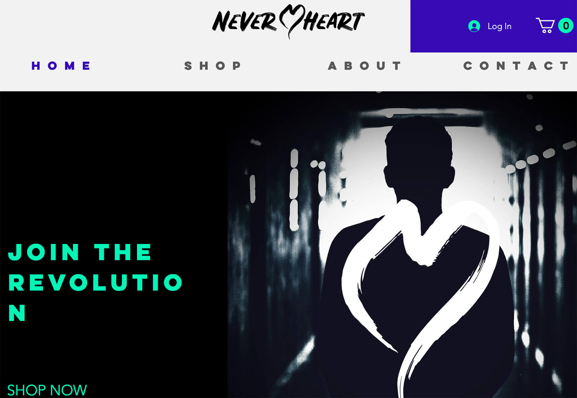
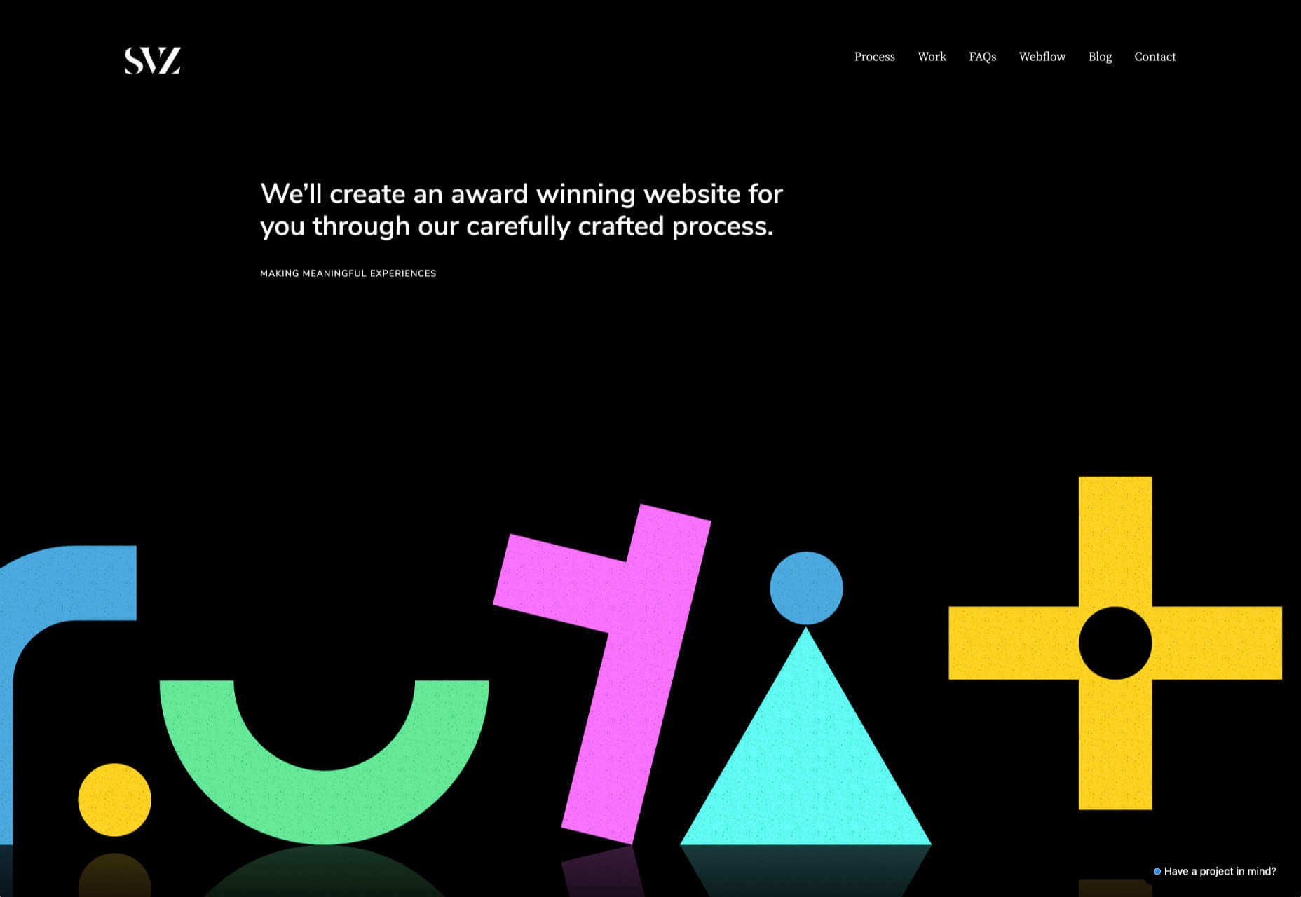
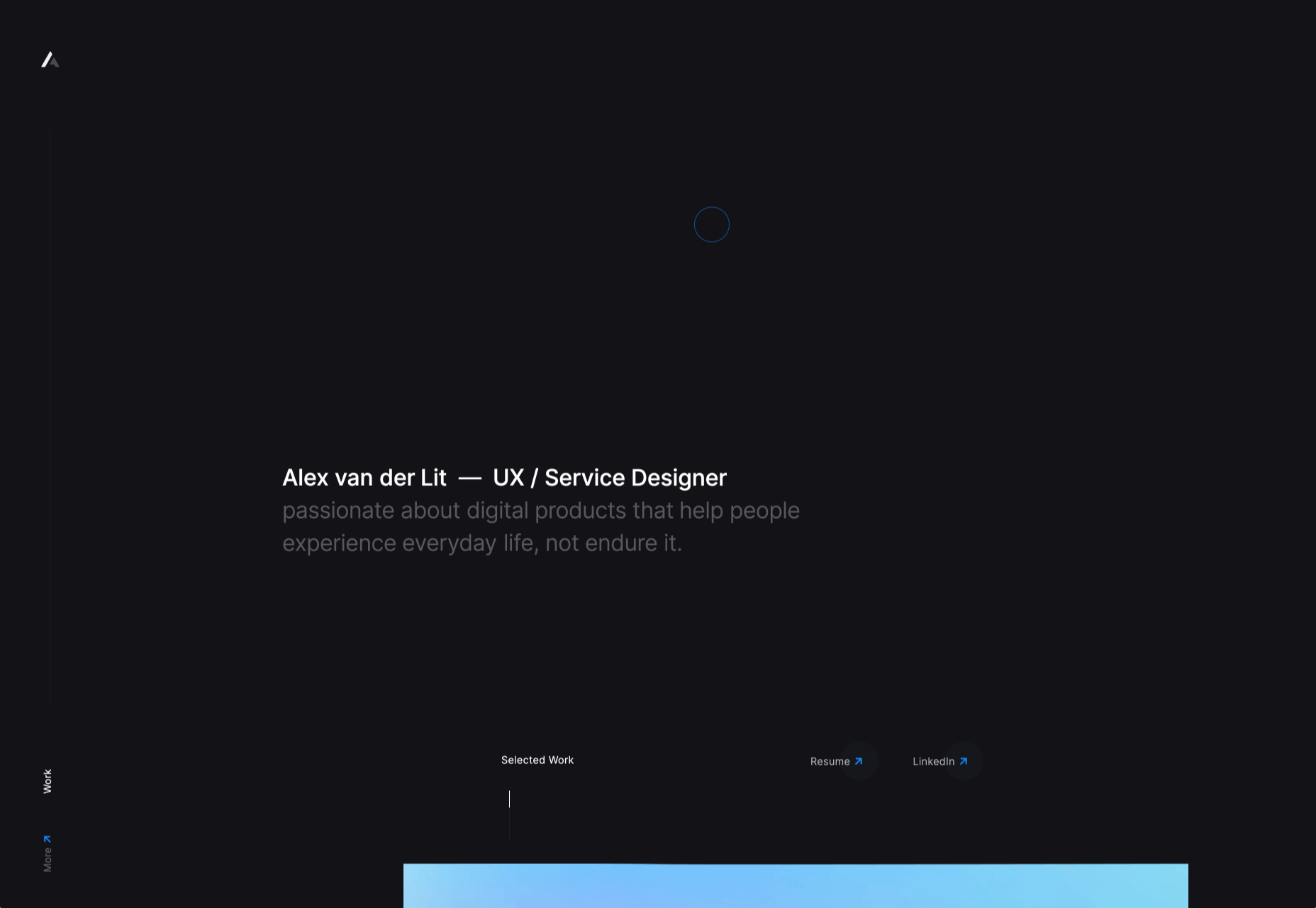
Dark themes are everywhere these days. 

As human beings continue to spend more of their time interacting with technology, dark themes provide a more relaxing way to engage with the digital world. More often than not, these themes are easier on the eyes, more attractive, and perfect for the dedicated user

Throughout 2020, countless leading brands have debuted their own version of the dark theme. Google has a solution for your Drive, while Apple and Android have built dark theme performance right into their operating systems. 

If you haven’t learned how to make the most out of dark mode yet, then you could be missing out on an excellent opportunity to differentiate your design skills, and earn more clients going forward. 

Why Dark Mode?

Before we dive too deeply into the possibilities of creating your own dark theme, let’s examine what dark mode is, and why it’s so effective. 

Ultimately, dark themes are created to reduce the amount of luminance emitted by everything from your desktop and laptop, to your smartphone and smartwatch. Dark themes help to improve the visual ergonomics of design, by reducing eye strain, adjusting brightness to suit current lighting conditions, and more. Additionally, many dark mode offerings are also fantastic at conserving battery life. 

Here are some of the main benefits of adding dark themes to your design portfolio

  • Better user experience: A focus on user experience is one of the most important trends of the digital age. You need to be willing to deliver incredible experiences to everyone who visits your website if you want to stand out today. Dark mode reduces everything from eye strain, to battery power consumption. This helps to keep customers on a website for longer.
  • Innovation and cutting edge appeal: Most companies want to prove that they can stay on the cutting edge of their industry. The ability to offer an opt-in dark mode version of a website theme or appearance can help your clients to stand out from the crowd. As the environment becomes more mobile-focused, more companies will be looking for designers that can provide the best mobile experiences. 
  • Support for universal design: Dark mode isn’t just great for people who have light sensitivity at night. This solution could be more comfortable for visually-impaired users who would struggle with eye strain when visiting your websites otherwise. If you want your content to be more inclusive for a wider range of viewers, then learning how to design for dark mode is a good way to start.

Best Practices When Designing for Dark Mode

Designing for dark mode is easier than you’d think. Most of the time, it involves simply thinking about how you can replace some of the brighter, more overwhelming aspects of your site, with something deeper and darker. 

Here are some useful tips that will get you moving in the right direction. 

1. Experiment with Colors

A big issue for a lot of web designers when it comes to developing a dark mode solution is that they get too caught up with things like pure white text against pure black backgrounds. However, this high-contrast option can be a little much after a while. 

It’s often much easier to use a dark grey as your primary surface color, instead of a true black. Additionally, rather than using bright white, think about slightly off-white alternatives that will be warmer to the eye.

Experiment with surfaces and color combinations that are unlikely to cause too much eye strain. Dark grey foundations often offer a wider range of depth, too, because you can demonstrate shadows on grey. 

Additionally, when you are experimenting with colors, remember that saturated colors often vibrate painfully against very dark surfaces, making them harder to read. Desaturating your colors will help to reduce the contrast and make your websites more welcoming. 

Lighter tones in the 200-50 range will have better readability on dark themes. However, you can always experiment with your choices. Google Material Design recommends using a contrast level of around 15:8:1 between your background and text. 

2. Consider the Emotional Impact

Much of the effort involved with dark mode design is figuring out how certain colors work together. It’s easy to get carried away with stark contrasts, particularly when you’re used to working with a white background. However, you need to remember that you’re designing for a user that’s primarily looking for an easier and more subdued browsing experience.

While you’re working, remember to consider the emotional aspect of the design too. The emotion in colors can make or break a buyer’s journey in any environment. However, an often overlooked-aspect of color psychology, is that people perceive shades differently when they’re on a black background

For instance, think of the color green. On a light background, it conveys nature and even financial wealth. However, on a dark background, the same green could come across as something venomous, toxic, or even sickly. It’s important to think about the kind of impressions end users are going to get when they arrive on your site.

3. Give Users the Freedom to Choose

One of the biggest mistakes you can make when you begin designing for dark mode, is thinking that you should focus entirely on your dark themes, and nothing else. This lines you up for a problem if you interact with users who want the best of both worlds. If you’re designing for apps in particular, you’re going to need web pages that can switch naturally between light and dark themes. 

Learning how to implement both a dark mode and a light mode option into the desks you create will help you to reach a wider selection of customers. Remember, you’ll need to test the performance and impact of your designs in both themes, to check that they deliver the same kind of experience, no matter how your user chooses to browse. 

Although dark mode should offer a different experience to end-users, it still needs to feel as though they’re browsing on the same website. That means that you’re going to need to experiment with the most natural combination of light and dark mode options.

4. Remember the Basics

Remember, although the three tips above will help you to get on the right path for dark mode design, you’ll also need to consider the opportunities and limitations of the platforms that you’re designing for. The kind of dark mode experience you can deliver for Google Chrome websites is going to be very different to what you can create for something running on iOS.

Examining the documentation provided by the system that you’re designing for will help you to develop something with a close insight into what’s actually possible. 

Other top tips for dark mode design include:

  • Focus on your content: Make sure that your content stands out on the page, without being too overwhelming. 
  • Test your design: In both light and dark appearances, you need to make sure everything is working as it should be.
  • Adopt vibrancy for your interfaces: Vibrancy helps to improve the contrast between your background and foreground. 
  • Use semantic colors: Semantic colors adapt to the current appearance of a website automatically. Hard-coded color values that don’t adapt can seem more aggressive. 
  • Desktop tinting: Try experiment with things like transparency and filters to give your websites and apps a slightly warmer tint – ideal for late-night browsing
  • Icons: Use individual glyphs and icons for dark and light modes if necessary. 

Ready to Design for Dark Mode?

Preparing your web development and design portfolio for an era addicted to dark mode can be a complex experience. You need to think carefully about how people are going to browse through your websites and apps when they’re searching for something more subtle, and less visually overwhelming than the websites that we’re used to making. 

The most important thing to remember is that everything on your website or application should look just as beautifully tailor-made in dark mode as it does in light mode. Simply adding a dynamic black background when people want to switch settings in an app isn’t enough. You need to go in-depth with your designs and examine how different fonts, colors, and images work together.

Source


Source de l’article sur Webdesignerdepot

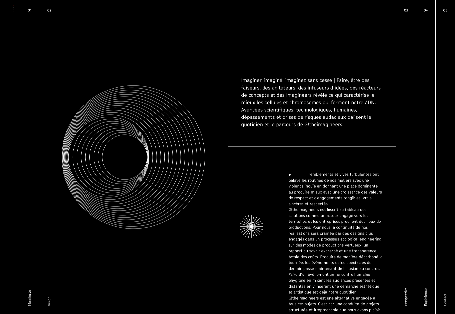
When starting a new business (or even venturing into the world of freelancing for the first time), there are some really big, important steps you have to take.

Step #1 is choosing the right business name for your brand identity.

Your business name isn’t something you can casually choose either — especially if you have lofty long-term goals for your company. It’s not as though you can’t change the name down the road, but that comes with a ton of work and will require you to rebuild pretty much everything all over again: your visual brand identity, your reputation, and your SEO…

So, it’s a good idea to spend time choosing a business name that’s going to work for you now and long into the future.

Today, we’re going to go through the process of how to name your brand. These questions will have you thinking beyond just “What name do I like the sound of?” and have you more focused on important questions like “What is my unique value proposition?”.

Let’s get started:

How to Name Your New Business

For those of you considering taking the easy way out and using a business name generator tool, let me show you why that’s a bad idea:

This is a list of business names suggested to me when I told the generator that my business is related to “design”:

  • Design
  • Normal Design
  • Regional Design
  • Design Partner
  • Design Stock

Even the more unique names on the list are unusable; they have no connection to me personally or to the kind of business I plan to start.

This is why it’s so important to sort out your brand identity and make sure you pick a business name that resonates with you, and your target audience. To do this yourself, answer the following seven questions:

1. What Services Will You Provide Or Products Will You Sell?

The one thing that name generators get right is including a descriptive word related to your business. That way, it doesn’t take an actual visit to your website or a look through your portfolio to figure out what you do.

Even if you have a very niche specialty, sum up your offering in one or two words. For instance:

  • Web design
  • Digital design
  • Design & development
  • UX design
  • Graphic design

Unless you run your business through your own name (which I’ll talk about shortly), your business name should include a simplified version of your offering in it.

2. Who Is Your Target User Persona?

A user persona is a fictional character created using the demographics and psychology of your ideal customer or client. You can use Hubspot’s Make My Persona generator to create a card that documents these details:

Once you sort out who you serve, what makes them tick, and how it fits into the bigger picture of their business, you can better pitch your solution to them.

For instance, Joanna above is a real estate agent and owner whose primary goal is to capture leads and generate sales. You know how effective a real estate website can be for improving an agent’s visibility online and streamlining how they earn money.

So, including words in your business name that speak to that persona as well as their goals might be really useful.

Just keep in mind that web designers don’t always commit to one niche or stick with the same niche over the long run. So, you might not want to make your business name too specific to an industry (e.g. “Real Estate Design Solutions”) and more related to higher level themes and goals.

3. What Are The Names Of Your Top Competitors?

Do you know who your main competitors will be upon entering this space? If not, now’s the time to look them up.

When it comes to business names, you want to see if you can identify common threads among them. Perhaps they use puns or include location-specific descriptors. Or they just stick with the names they were born with.

While you don’t want to come off as a copycat, you can imbue your business name with a similar theme or tone if it’s proven to be successful with your shared audience. 

4. What Makes You Different?

Every business has a unique value proposition (UVP) — something that sets them apart from everyone else in the space. What’s yours?

Do you operate within a large metropolitan area where your prospective clients’ industry is booming?

Did you previously work in the industry for which you now build websites?

Are you an SEO expert who builds enterprise websites that rank?

In business, it’s good to be different — so long as it benefits your clients.

If you have a particular UVP that’s going to make you stand out, you’re going to use it everywhere to market yourself — your website, social media, sales pitches, etc. So, you might want to consider using a unique keyword from it within your business name.

5. Where Do You Envision Yourself In Five Years?

No one’s future is set in stone. However, if you’re seriously thinking about starting a new web design business, you have some ideas about where you want to go with it:

  • Do you like the idea of being a lifelong freelancer or digital nomad?
  • Would you like to operate your own design agency?
  • Do you have aspirations to build and sell website products, like plugins, themes, or UI kits instead?

If you expect to pivot your business at some point, be careful about choosing a business name that paints you into a corner. Keep it broader so that prospects don’t have to wonder what it is you really do.

And if you plan on scaling your business beyond yourself, using your own name might not be the best idea. You’ll want clients to associate the brand name with your agency, not with you specifically.

6. Will Your Business Name Be Easy To Remember?

At this point, you have some business names brewing. So, now we need to look at the more technical aspects of naming your brand.

Here’s what you need to do.

a. Write down no more than three to five business names you like.

For example:

  • Honeymooners Web Design
  • Charles Murphy Design & Development
  • FoREver Websites
  • SOLD Web Design Agency

b. Mash each name into one long lowercase string. Don’t include any punctuation.

For example:

  • honeymoonerswebdesign
  • charlesmurphydesignanddevelopment
  • foreverwebsites
  • soldwebdesignagency

c. Are any of the names difficult to read? Too long? Do any of them cause confusion and look like they mean something else?

If so, get rid of them as a matching domain name won’t work. Or, if you absolutely love them, fix the name so it’s clear, readable, and short. For instance:

charlesmurphydesignanddevelopment becomes charlesmurphydesign or just charlesmurphy.

7. Does The Name You Want Already Exist?

It’s a good idea to have a backup name in case you discover that the name you want already exists. Due to trademarking issues as well as possible confusion for your clients, you’ll want to avoid using a name that overlaps with or is the same as any other company (in or outside of web design).

Do a Google search for the business name you want to use. Check out the top 10 search results to see if there are any other matches.

You’ll also want to test out the domain name. Go to Domain.com and run your business name string through it:

You have a few options if this happens:

  1. Choose a different top-level domain (e.g. .tech, .io, .design).
  2. Use an abbreviated version of your business name  (e.g. solddesignagency.com).
  3. Move your backup business name to the front of the line and see if it’s available.

It all depends on how attached you are to the business name you’ve chosen. Just make sure that any changes you make to it (like shortening the domain name or using an alternate TLD) doesn’t cause confusion for prospects who look you up online. You don’t want them confusing someone else’s domain name for yours if business name and domain name don’t line up.

Choosing a Business Name Is Just the First Step…

Once you’ve settled on your business name, share it with a few people you trust. They’ll let you know if you’ve totally missed the mark or if it’s something you should be excited to run with.

As soon as you’re 100% sure it’s the right name, buy the domain name and register your company. Then, it’ll be official!

Of course, this isn’t the end to branding your new business. In our next Branding 101 post, we’re going to look at the next step: How to create the visual identity for your business.

Stay tuned!


Featured image via Pexels.

Source


Source de l’article sur Webdesignerdepot

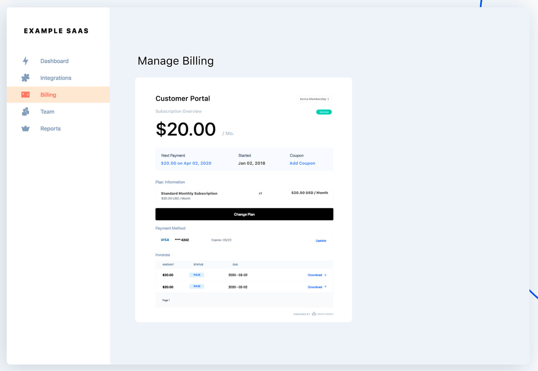
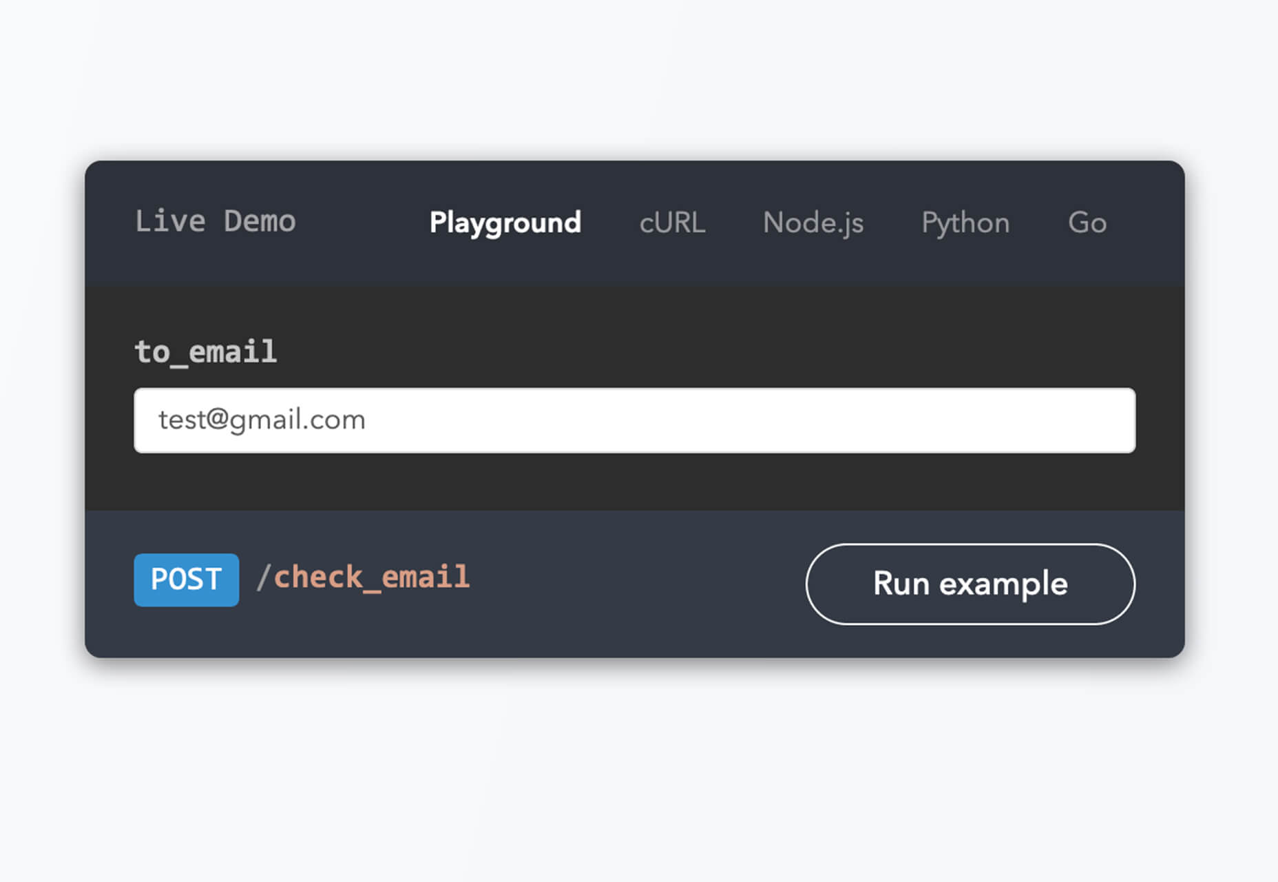
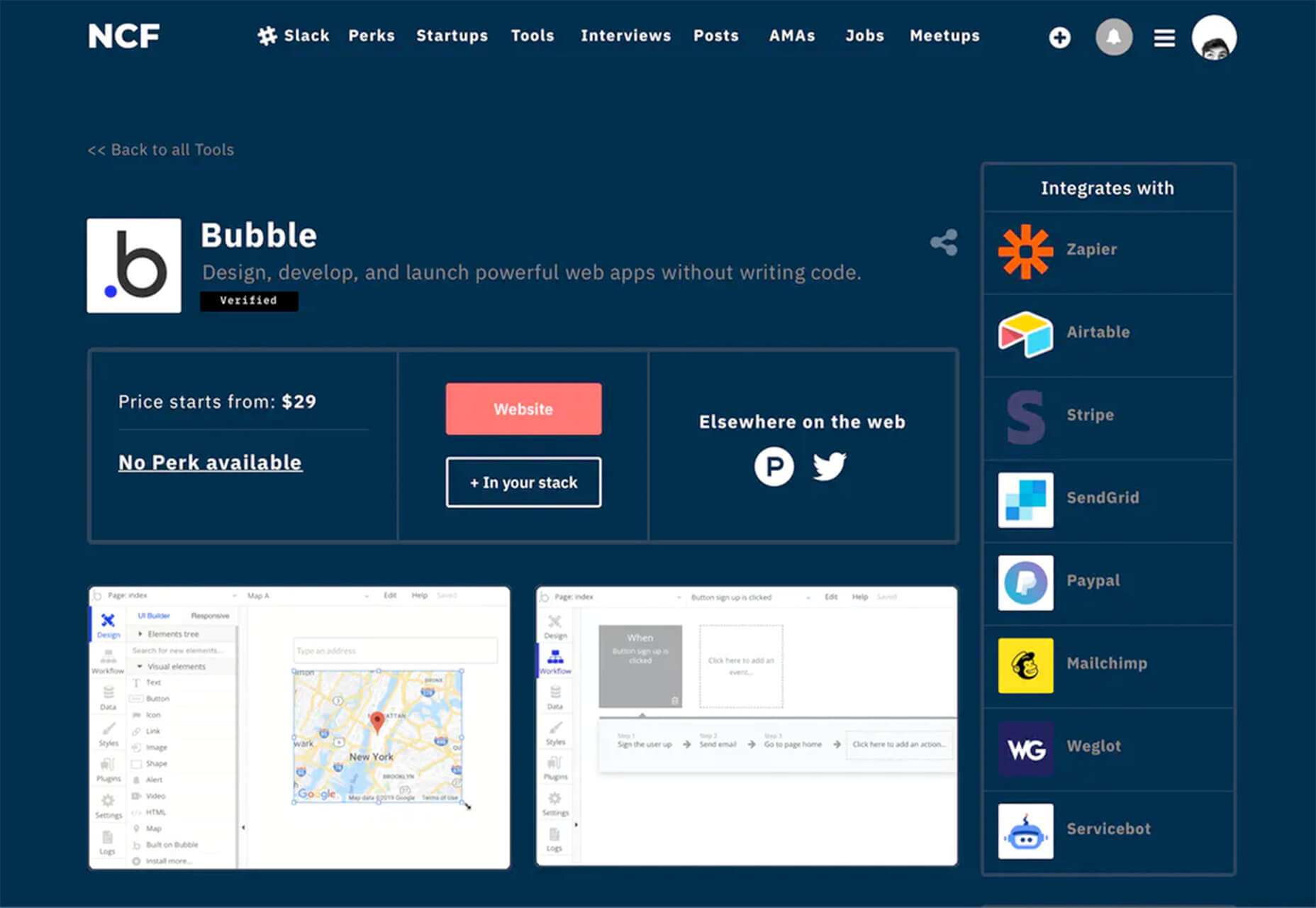
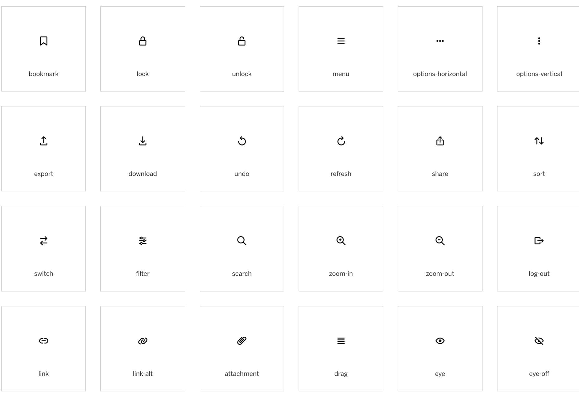
This month’s collection of new tools, resources, and freebies for designers is a smorgasbord of sorts. You’ll find everything from useful APIs to icons to tutorials to fonts.

Let’s get right into it, here’s what new for designers this month:

Tooltip Sequence

Now that your app or website is ready, you might need to help users engage with it. Tooltip Sequence is a simple JavaScript package that helps you create a series of small tooltips that will guide users through product features with a small description of what they need to know. It looks great and the best part is this tool saves you from having to create each tooltip description manually on each page and link them together.

Serenade

Serenade allows you to free up your hands with voice coding technology. Use natural speech and stay productive with this tool that allows you to code without typing. It works across multiple coding languages and platforms. It’s as easy as “add function hello” and the tool knows what syntax to use.

Gazepass

Gazepass, which is still in beta, is a nifty API that allows for passwordless multi-factor authentication for any website or mobile app. It uses biometrics on any device or platform to make getting into apps or websites easier for users.

Filters.css

Filters.css is a CSS-only library to apply color filters to website images. Installation only takes three steps and includes a variety of filers, such as blur, grayscale, brightness, contrast, invert, saturate, sepia, and opacity.

Sidebar Webring

Sidebar Webring is a collection of blogs and websites that are focused on web design. The curated list is handpicked for superb content for designers and developers. But, what’s a webring? It’s a collection of linked websites in a circular structure that are organized around a theme. The term is a throwback to the early days of the web in the 1990s and 2000s.

Wicked Templates

Wicked Templates is a set of responsive HTML templates made with Bulma and Tailwind CSS that you can style and use as you wish. Use these templates to jumpstart projects. Free and paid options available.

WP Umbrella

WP Umbrella will help you keep sites running in a healthy and safe manner on WordPress. Monitor uptime and performance, PHP errors, and keep up with hundreds of websites from one dashboard.

Servicebot

Servicebot helps you create customer-facing embeddable billing pages that work with Stripe payments. This premium tool is quite user-friendly and works with websites or SaaS.

Custom, Accessible Checkboxes with Perfect Alignment

Create custom, accessible checkboxes with perfect alignment every time. This walkthrough shows you how to use CSS to align elements and labels.

Sombras.app

Sombras.app is a nifty tool that creates 3D object shadows. Use the easy on-screen controls to get just the right orientation and shape.

urlcat

Urlcat is a tiny JavaScript library that helps you build URLs with dynamic parameters and without mistakes. The friendly API has no dependencies, includes TypeScript types, and is just 0.8KB minified and gzipped.

Reacher

Reacher is a real-time email verification API that lets you check the validity of an address before you send the email. Reduce bounce rates in an instant. (The personal version is free.)

Swell

Swell is a most powerful headless ecommerce platform for modern brands, startups, and agencies. Create fast and flexible shopping experiences with the API and headless storefront themes. This is a premium tool but does have a free trial.

No Code Founders 2.0

No Code Founders 2.0 is a platform for discovering the latest startups built with no-code and the tools used to build them. Browse startups, tools, perks, interviews, jobs, meetups, posts, and more as part of the no-code movement. The community engages on Slack and requires an email to sign up.

How to Pick More Beautiful Colors for Your Data Visualizations

Beautiful color choices will make your data visualizations that much more impactful. This tutorial by Lisa Charlotte Rost will help you make better color choices on the way to better infographics and charts. Plus, it’s well developed, designed, and packed with useful information.

IconPark

IconPark is a collection of more than 1,200 high-quality icons with an interface that allows you to customize them. It uses a single SVG source file that can be transformed into multiple themes. The library includes cross-platform components and is free to use.

Mono Icons

Mono Icons is a simple and consistent open-source icon set that uses mono spacing. The collection includes 136 icons.

BGJar

BGJar is a free SVG background generator for digital projects. Pick a category and customize the result to fit your project or needs.

HitCount

HitCount is almost too simple to be true. This tiny tool lets you add a hit counter to your website that’s as easy as adding an image. Copy the code and make any customizations you want. Then paste it to your design. That’s it!

Blacklight

Blacklight is a real-time website privacy inspector. The tool by Surya Mattu scans any website you enter in the scan bar and shows what user-tracking technologies are used on the website. This allows you to see who might be gathering data about your visit.

Alter

Alter is a customizable – and experimental – three-dimensional typeface that you can experiment with. It’s as fun to play with as use.

Autobus Omnibus

Autobus Omnibus is a simple all capitals font with new wave styling. The character set has 96 glyphs that are perfect for display use.

Deathmatch

Deathmatch is a seasonal blackletter font that’s ideal for the upcoming Halloween holiday. The character set includes plenty of options and there’s a full version (paid) for commercial use.

Futura Now

Futura Now is a premium typeface and update to a font you may already know and love. The new version has 107 styles in a massive family.

Pumpkin Soup

Pumpkin Soup is a fun almost handwriting style typeface with a cartoonish vibe. It includes a regular and italic style and is most appropriate in limited use.

Source


Source de l’article sur Webdesignerdepot

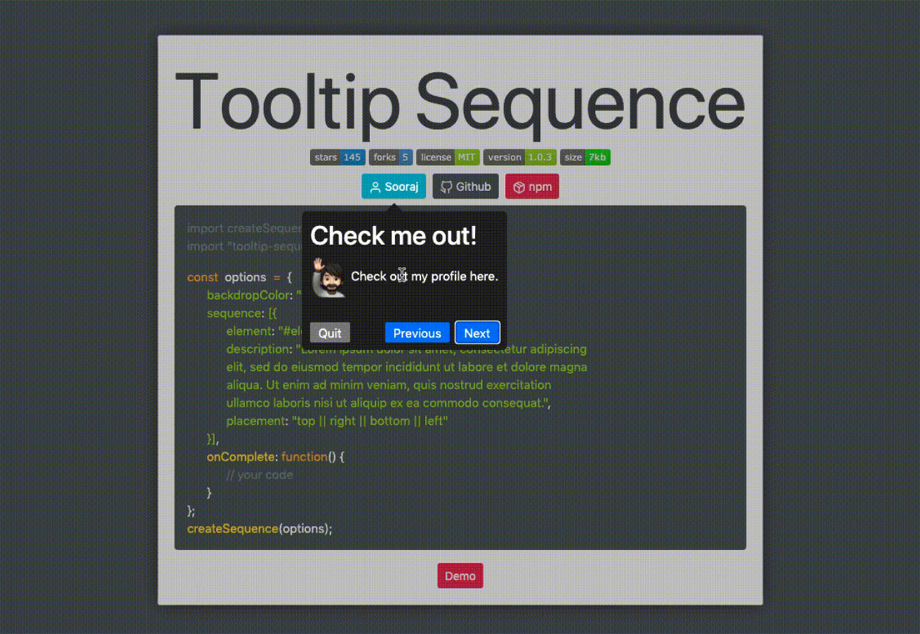
The digital world is a place of constant change. Just as you get used to a new design trend, another one appears, forcing you to rethink the way that you approach each client project. 

As a web designer, it’s up to you to make sure that you have your finger on the pulse on the latest transformations in the industry. However, it can be challenging to know for sure which trends you should be taking seriously, and which you can simply ignore. 

One option to refine and enhance your design journey is to pay attention to influencers. 

Influencers aren’t just there to guide customers into making purchasing decisions. These people are thought-leaders in their field. They spend all of their time tracking down ideas and concepts that really work. That way, they can maintain a successful reputation online.

Sourcing information and motivation from the following UX influencers could help you to create some truly amazing websites in 2020: 

1. Andrew Kucheriavy 

Andrew Kucheriavy is the phenomenal co-founder and CEO of a company named Intechnic. Andrew was one of the first people in the world to be given the “Master in User Experience” award. This means that he’s an excellent person to pay attention to if you want help understanding the ins and outs of user experience design

As one of the leading visionaries in UX, business strategy, and inbound marketing, Andrew has a lot of useful information to offer professionals and learners alike. Andrew is particularly active on Twitter, where he’s constantly sharing insights on design and marketing. You can also find input from Andrew on the Intechnic blog. 

2. Jeff Veen 

Another must-follow for designers who want to learn more about understanding their audience and their position in the marketplace, Jeff Veen is a leader in UX and product design. Veen got his start with the founding team for Wired, before he created the Adaptive Path company for UX consulting. Jeff Veen is also known for being responsible for various aspects of Google Analytics. 

Over the years, Jeff has expanded his knowledge in the design space, and mentored various companies, from WordPress to Medium. He also has a fantastic podcast that you can listen to for guidance when you’re on the go. 

3. Jared Spool 

Jared Spool has been tackling the most common issues of user experience since before the term “UX” was even a thing. Excelling in the design world since 1978, Jared has become one of the biggest and most recognizable names in the user experience environment. He’s the founder of the User Interface Engineering consulting firm. The company concentrates on helping companies to improve their site and product usability. 

Jared offers plenty of handy information to stock up on in his Twitter feed. Additionally, you can find plenty of helpful links to blogs and articles that he has published around the web on Twitter too. He’s followed by Hubgets, PICUS, and many other leading brands. Make sure that you check out his collection of industry-leading talks on UIE. 

4. Jen Romano Bergstrom

An experimental psychologist, User Experience Research coach, and UX specialist, Jen is one of the most impressive women in the web design world. She helped to create the unique experiences that customers can access on Instagram and Facebook. Additionally, she has a specialist knowledge of eye-tracking on the web. You can even check out Jen’s books on eye-tracking and usability testing

When she’s not writing books or researching user experience, Jen is blogging and tweeting about usability and researching new strategies in the web design space. It’s definitely worth keeping up with Jen on Twitter, particularly if you want to be the first to know about her upcoming seminars and learning sessions. 

5. Katie Dill 

Katie Dill is the former Director of Experience for Airbnb, so you know that she knows her way around some unique experiences. With an expertise in working with companies that harness new technologies and UX design, Katie Dill is at the forefront of the user experience landscape. Dill attends various UX conferences throughout the year, and publishes a range of fantastic videos on YouTube. 

You can find blogs and articles from Katie published on the web; however, you’ll be able to get the most input from her by following Katie on her Twitter account. 

6. Khoi Vinh 

Khoi Vinh is one of the most friendly and unique UX bloggers and influencers on the market today. He knows how to talk to people in a way that’s interesting and engaging – even about more complicated topics in UX design. Vinh is a principle designer at Adobe, and he has his own podcast called Wireframe. However, he still finds time to keep his followers engaged on Twitter. 

Over the years, Khoi has worked as a Design Director for Etsy and the New York Times. Vinh also wrote a book called “Ordering Disorder” which examines grid principles in web design. According to Fast Company, he’s one of the most influential designers in America. Additionally, Khoi has a brilliant blog where you can check out all of his latest insights into UX design. 

7. Cory Lebson

Cory Lebson is a veteran in the world of web design and user experience. With more than 2 decades of experience in the landscape, Cory has his own dedicated UX consulting firm named Lebsontech. Lebson and his company concentrate on offering UX training, mentoring, and user experience strategy support to customers. Cory also regularly speaks on topics regarding UX career development, user experience, information architecture and more. 

Cory is an excellent influencer to follow on Twitter, where you’ll find him sharing various UX tricks and tips. You can also check out Cory’s handbook on UX careers, or find him publishing content on the Lebsontech blog too. 

8. Lizzie Dyson

Another amazing woman in the industry of UX, Lizzie Dyson is changing the experience landscape as we know it. Although she’s a relatively new figure in the web design world, she’s recognized world-wide for her amazing insights into the world of web development. Lizzie also helped to create a new group specifically for women that want to get involved in web design. 

The Ladies that UX monthly meet-up welcomes a community of women into the digital landscape, helping them to learn and expand their skills. Lizzie regularly publishes content online as part of Ladies that UX. Additionally, she appears on the Talk UX feed – an annual design and tech conference held for women around the world. 

9. Chris Messina 

Chris Messina is a product designer and a technical master who understands what it takes to avoid disappointing your users. With more than a decade of experience in the UX design landscape, Messina has worked for a variety of big-name brands, including Google and Uber. He is best known as the inventor of the hashtag!

Chris is a highly skilled individual who understands the unique elements that engage customers and keep people coming back for more on a website. You can see Chris speaking at a selection of leading conferences around the world. Check out some of his talks on YouTube or track down his schedule of upcoming talks here. Chris also has a variety of fantastic articles on Medium to read too. 

10. Elizabeth Churchill

Last, but definitely not least, Elizabeth Churchill is a UX leader with an outstanding background in psychology, research science, psychology, artificial intelligence, cognitive science, human interaction with computers and more. She knows her way around everything from cognitive economics, to everyday web design. Churchill also acts as the director of UX for Google Material Design. 

A powerhouse of innovation and information, Churchill has more than 50 patents to her name. She’s also the vice president of the Association for Computing Machinery too. When she’s not sharing information on Twitter, Elizabeth also has a regular column that you can tune into on the ACM Interactions magazine. 

Who Are You Following in 2020?

Whether you’re looking for inspiration, guidance, or information, the right influencers can deliver some excellent insights into the world of web design. There are plenty of thought leaders out there in the realm of user experience that can transform the way that you approach your client projects. You might even discover a new favourite podcast to listen to, or an amazing series of videos that help you to harness new talents. 

Influencers are more than just tools for digital marketing; they’re an excellent source of guidance for growing UX designers too.


Featured image via Pexels.

Source


Source de l’article sur Webdesignerdepot

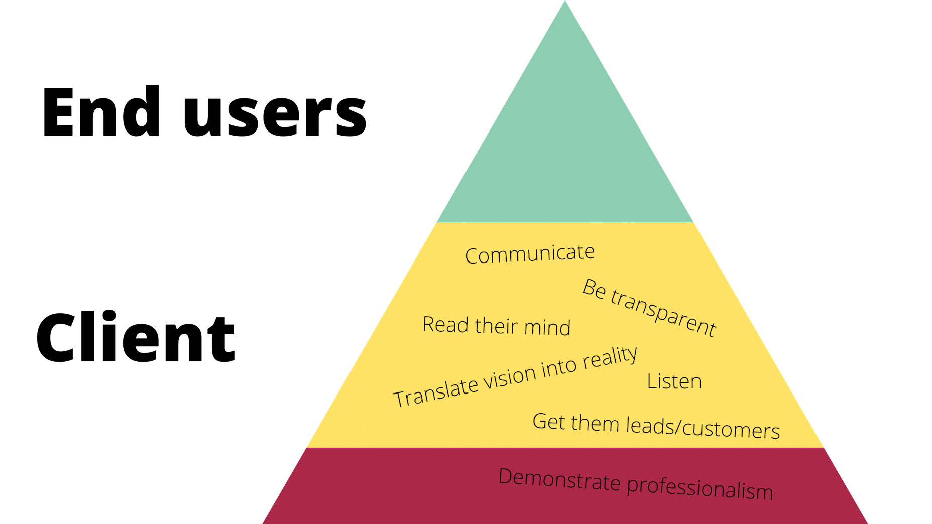
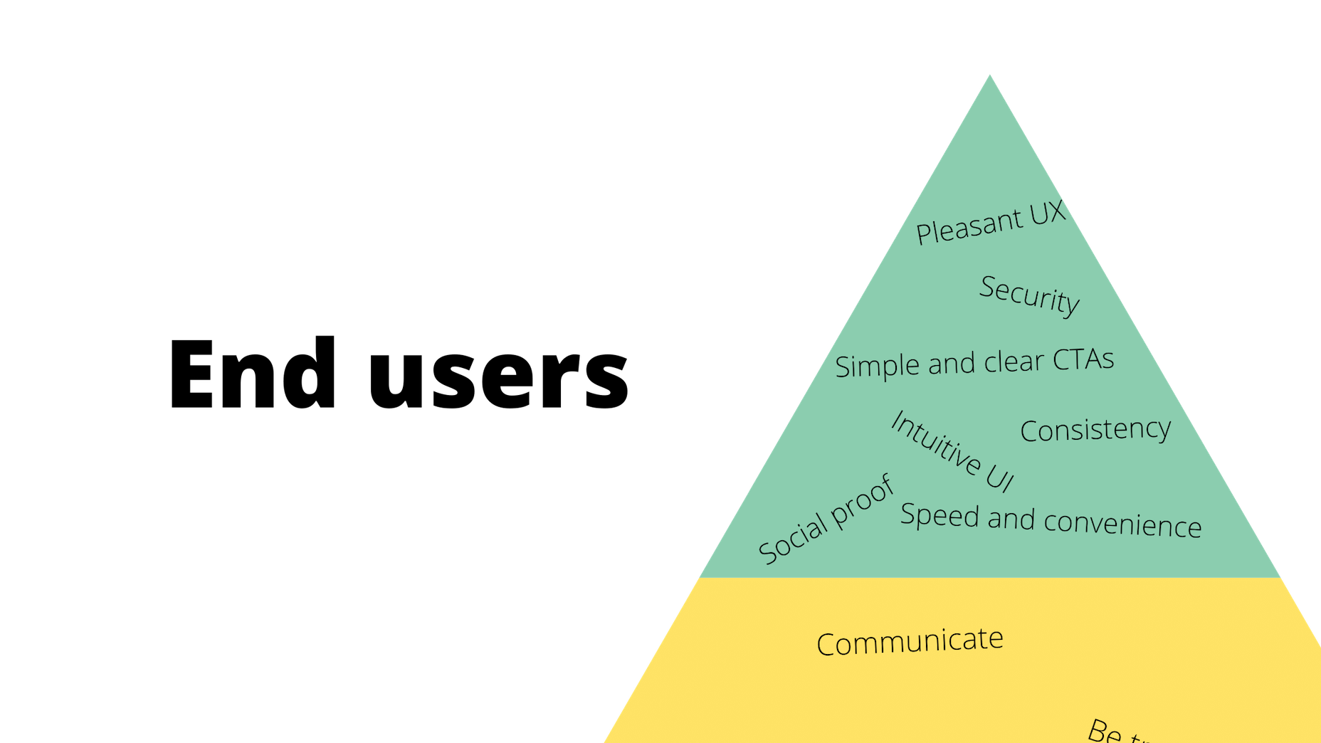
It would be way too easy to answer this question with: “Whoever pays your bills.” And, honestly, I don’t think you can be a very successful web designer if you’re only driven by what the person paying you tells you to do.

Then again, that doesn’t mean you should swing to the exact opposite end and say that you only serve the end user.

When you take an extreme view or approach to this, you’re bound to leave someone or something important out. Everyone along the chain of command — your boss (if you work at an agency), your client, and their customers — matters.

So, what I’d suggest you do instead is approach the idea of who you really work for the way you would Maslow’s Hierarchy of Needs.

Establishing Your Own Hierarchy of Needs

Who do web designers really work for? I think the true answer to this question is: “Everyone.” But there’s a catch…

Think about some of the requests you’ve received from superiors, or clients in the past. How many times have you rolled your eyes at their wacky requests?

  • “The contact form would be better in the header so visitors can always see it.”
  • “Let’s use this stock photo of two women shaking hands that I’ve seen a few other companies use.”
  • “Why don’t we redesign all of this and make it look like this site my brother built last night?”

You’re the design professional. That’s why they’re paying you to design their website and they’re not doing it themselves. So, there comes a point where you have to push aside what they want for what they need. And this will ultimately help you figure out who you work for and what you actually owe them (because fulfilling every nitpicky and unreasonable request will never lead to anything good).

So, here’s where the Hierarchy of Needs comes in. If we’re creating our own, it would look like this to start:

Working for the Boss

According to Dr. Neel Burton on Psychology Today:

Maslow called the bottom… levels of the pyramid ‘deficiency needs’ because we do not feel anything if they are met but become anxious or distressed if they are not.

I’d argue that these basic needs are like the ones we fulfill for bosses (or clients, if you’re a freelancer and work for yourself). It would look something like this:

Of course, you’ll feel a sense of accomplishment by meeting these needs, but, as a creator, how important are these really to you? These are the basic things you have to do in order to make your boss happy and to stay gainfully employed. They also help to ensure that the client is happy with the boss and agency in the end.

Bottom line: Without these needs fulfilled, you won’t be able to move any deeper into the triangle/hierarchy. So, when focusing on working for your boss, make sure the basic needs are met so you can move on and serve others as they need you to.

Working for the Client

Now, if your boss and client are two different people, you’ll have a second layer of needs to attend to here.

Just as your boss wants you to help them make more money and earn a strong reputation within their space, so too does your client. However, the work you owe them is different. Here’s how it would be represented in the triangle:

Again, you’ll be pleased if you can do and be all these things that your client needs, but is this ultimately what drives you as a designer? Sure, you want to build great relationships with clients so they return to you time and time again with all their website and marketing needs. But in terms of being fulfilled by being a good listener or a timely communicator? Probably not.

All the same, it’s important to be skilled in this type of work and to know how to serve your clients in order to get to that top level. It’ll also help you prioritize their needs accordingly, so you’re not jumping at every single thing or request they claim to “need” and blowing the budget or scope of the job.

For example, if they start demanding more of you (like bombarding you with emails every day wanting to know what’s going on), you can confidently remind them that things are under control (because you’re adhering to the project deadlines, per your boss) and you’ve already scheduled the next client check-in for this week (because you’ve been a good communicator, just as they need you to be).

Working for the End User (Customer)

Maslow refers to the top-level of the pyramid as the growth need. And here’s how Dr. Burton sums this one up for us:

Once we have met our deficiency needs, the focus of our anxiety shifts to self-actualization, and we begin, even if only at a sub- or semi-conscious level, to contemplate our bigger picture. However, only a small minority of people are able to self-actualize because self-actualization calls upon uncommon qualities such as independence, awareness, creativity, originality, and, of course, courage.

These characteristics perfectly sum up everything you want to and should be as a web designer. Unfortunately, it’s those employer and client needs that can stand in your way before you can truly flex your muscles as a creative.

Once you’ve attended to the basics, though, you’ll get your chance to design the kinds of user experiences you know will delight your client’s customers.

Here’s how their part of the triangle should look:

These are universally applicable needs and cannot be ignored.

After you’ve addressed them, though, you will have fulfilled your responsibility to all three parties: your boss, your client, and your end users. And once you’ve done that, you are free to be the creative designer that you are.

Wrap-Up

What I want you to take away from this, is that there are certain basic needs which you must fulfill when working as a web designer. These are the ones you’ll put into your own hierarchy of needs.

Take a systematic approach, starting with your boss and ending with the customer:

  • What do you have to do to ensure that your boss is happy to have you on the team?
  • And that the client is pleased with the site you’ve built them?
  • So you can design a website and experience that end users respond to positively?

Once you’ve figured all this out, you’ll unlock the answer to whom you work for and, more importantly, how you should work for them.


Featured image via Pexels.

Source


Source de l’article sur Webdesignerdepot

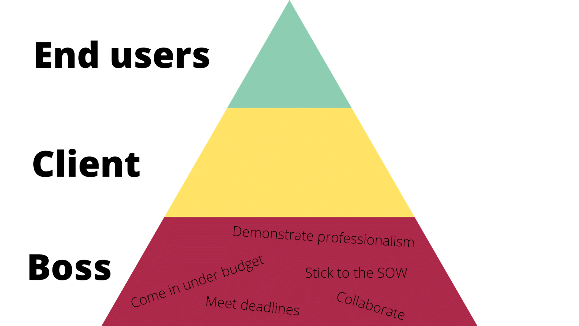
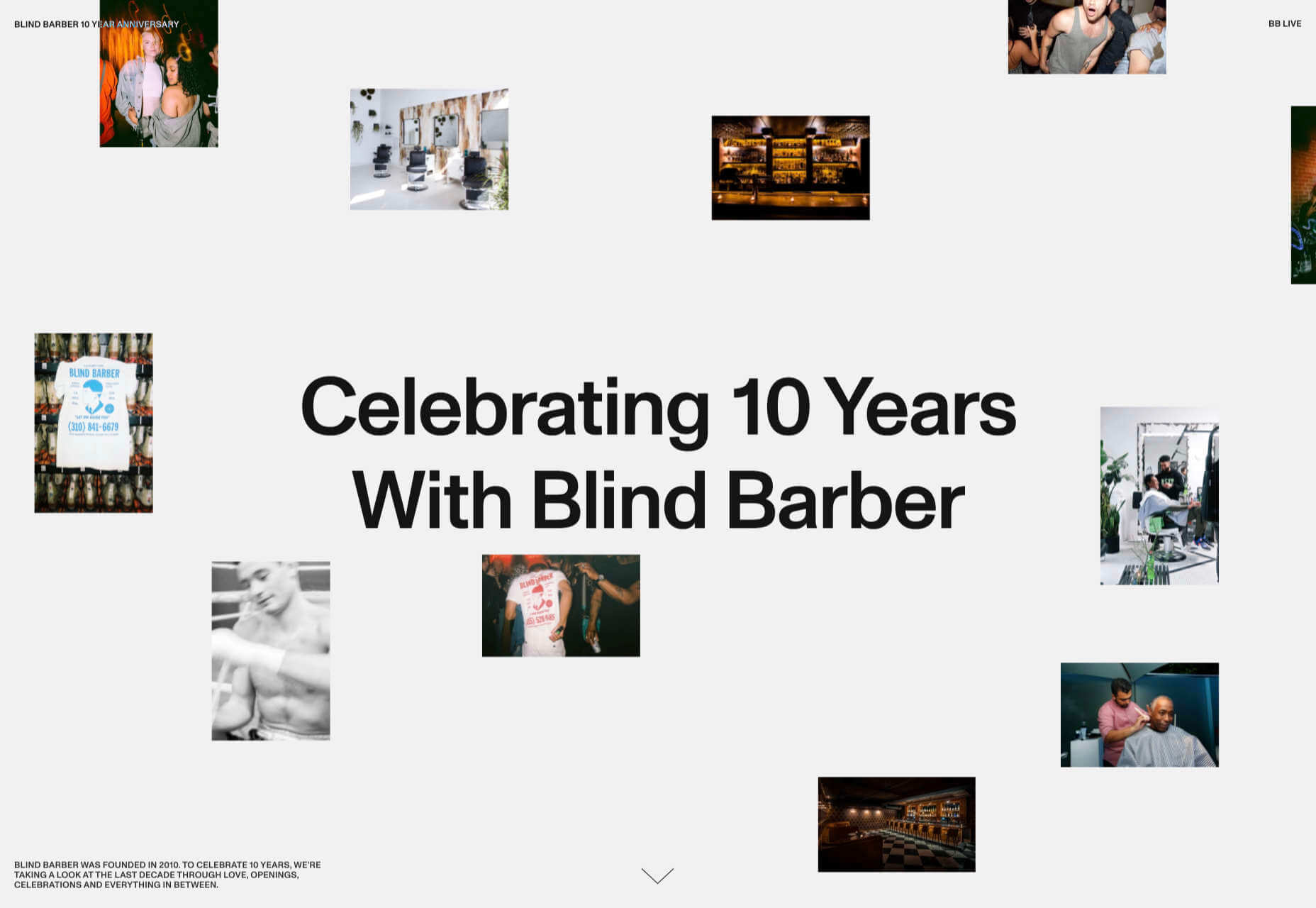
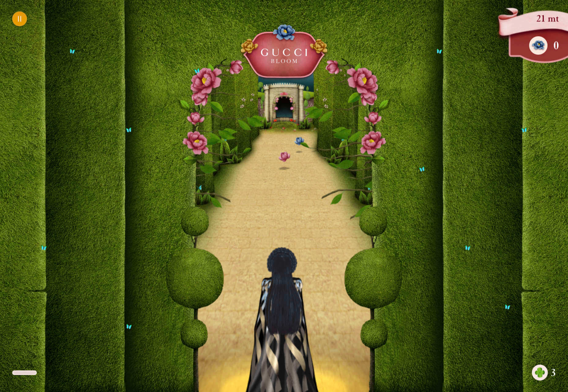
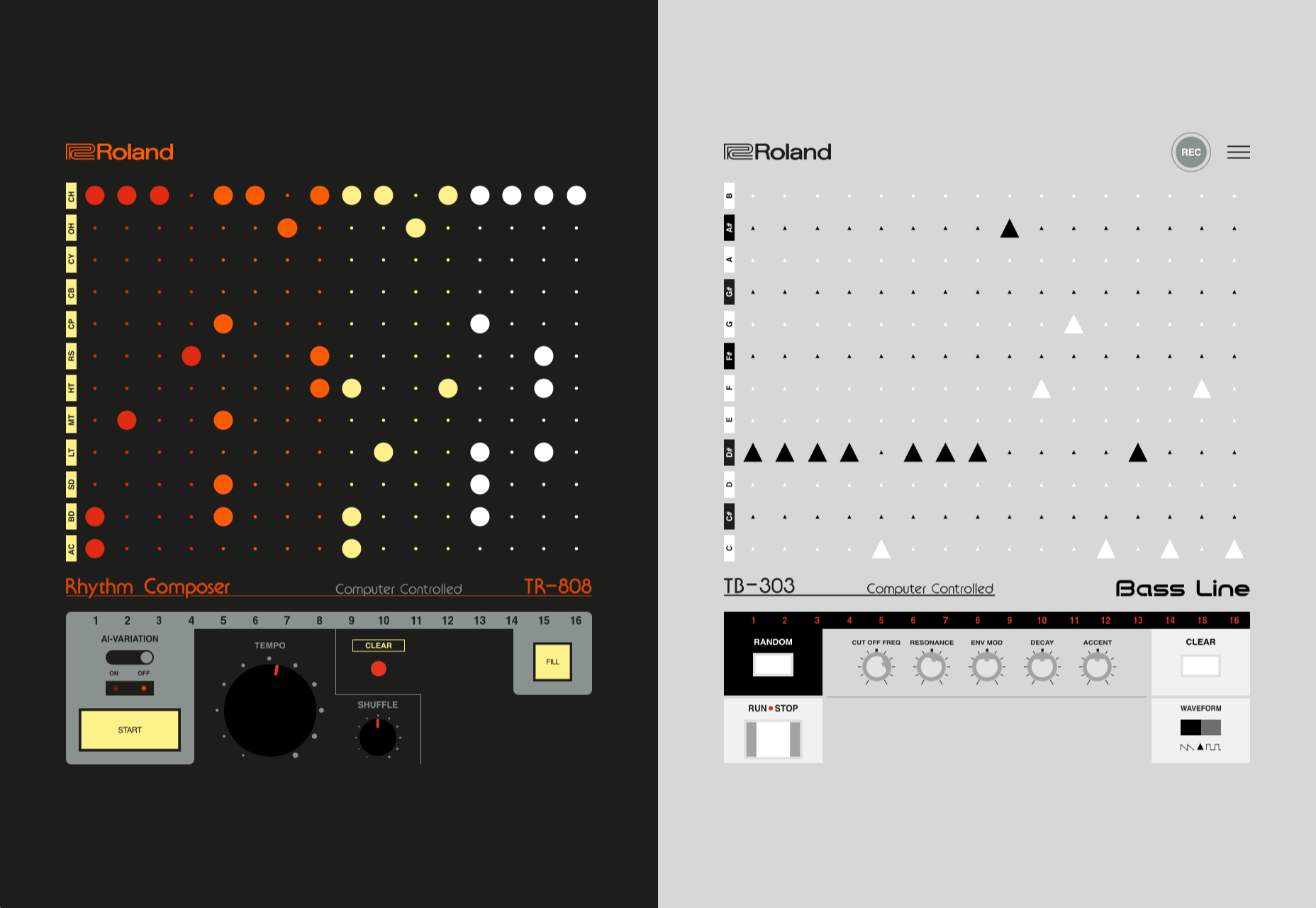
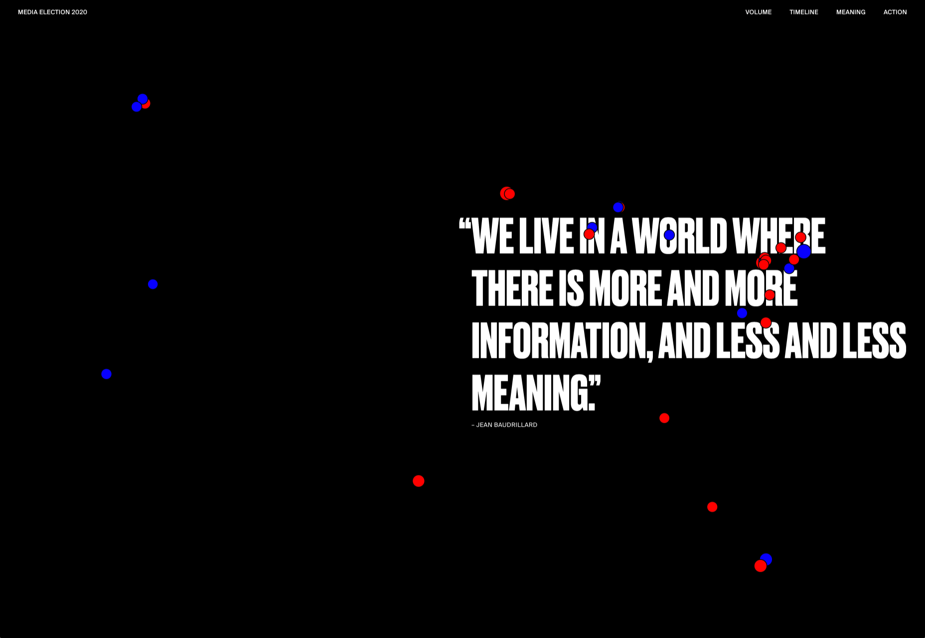
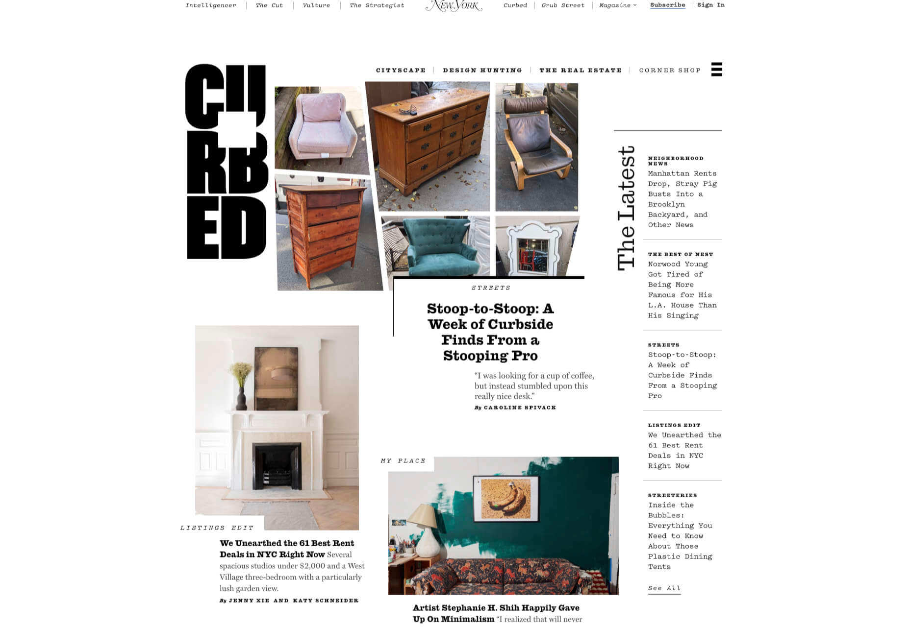
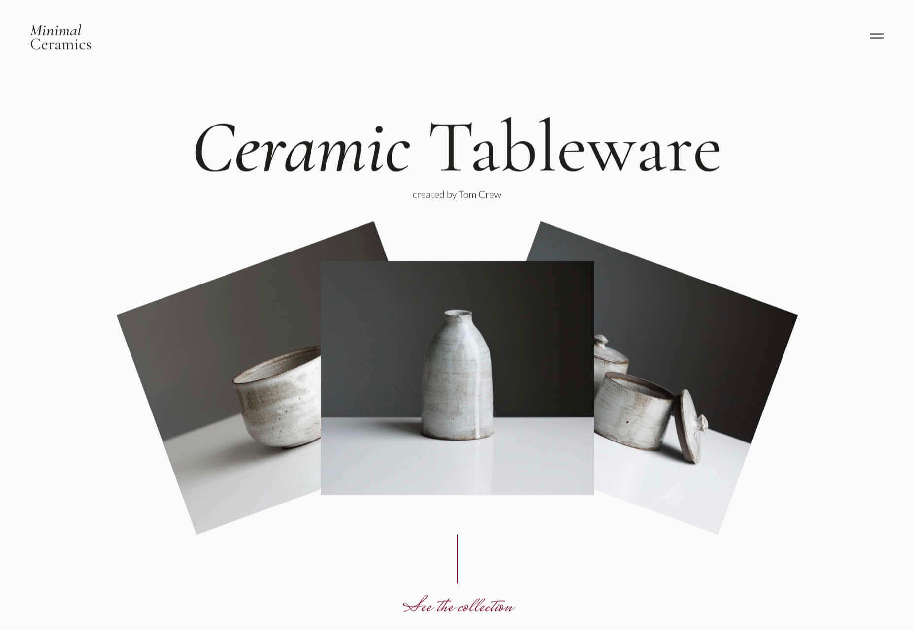
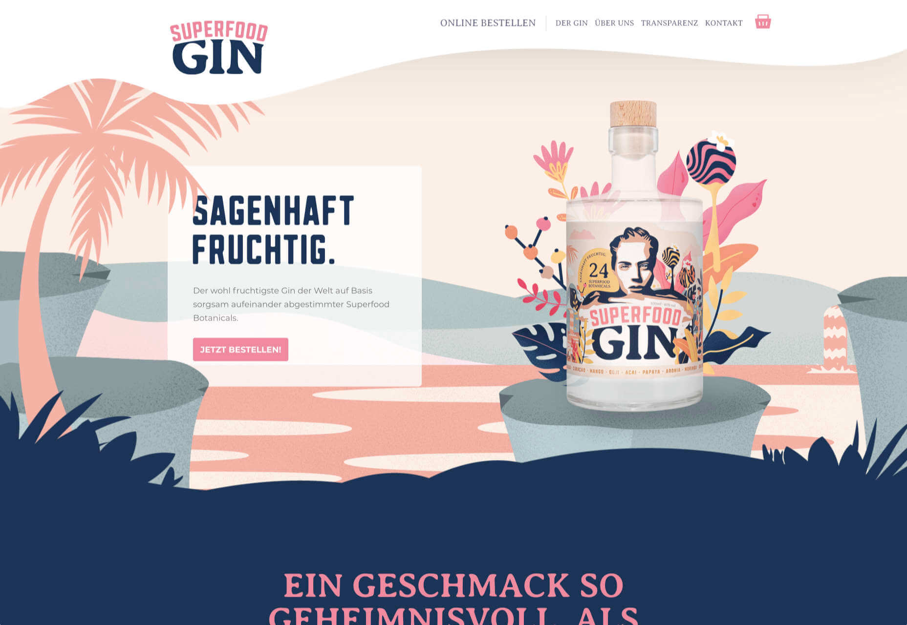
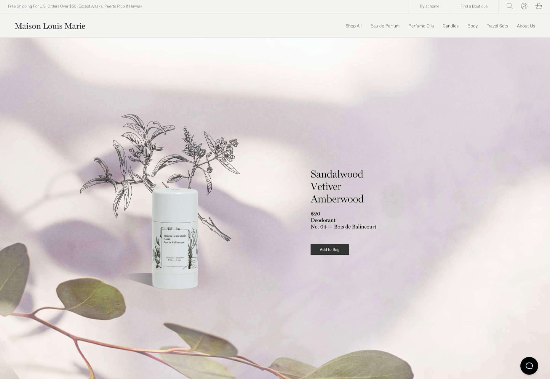
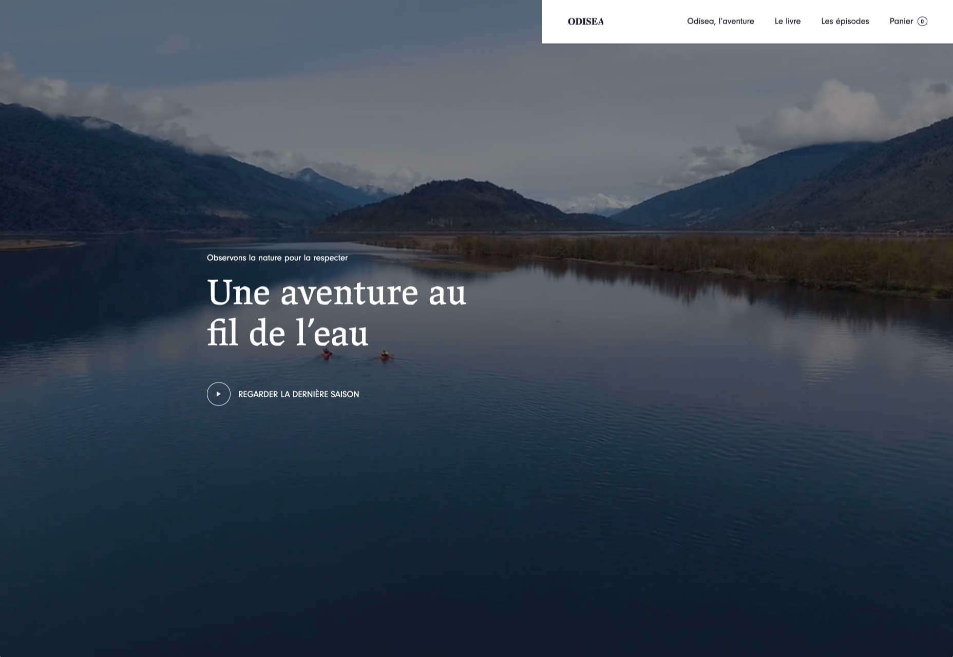
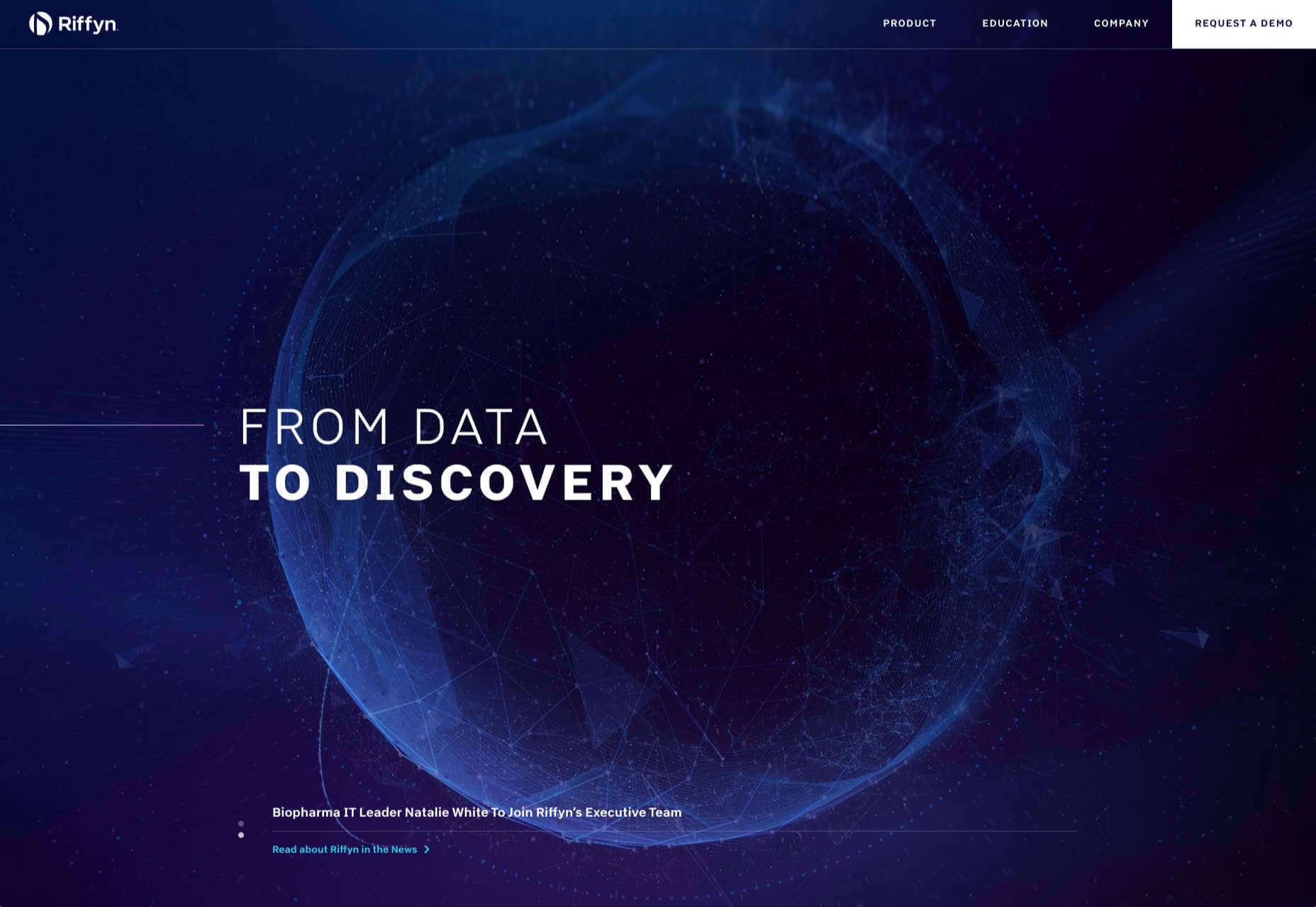
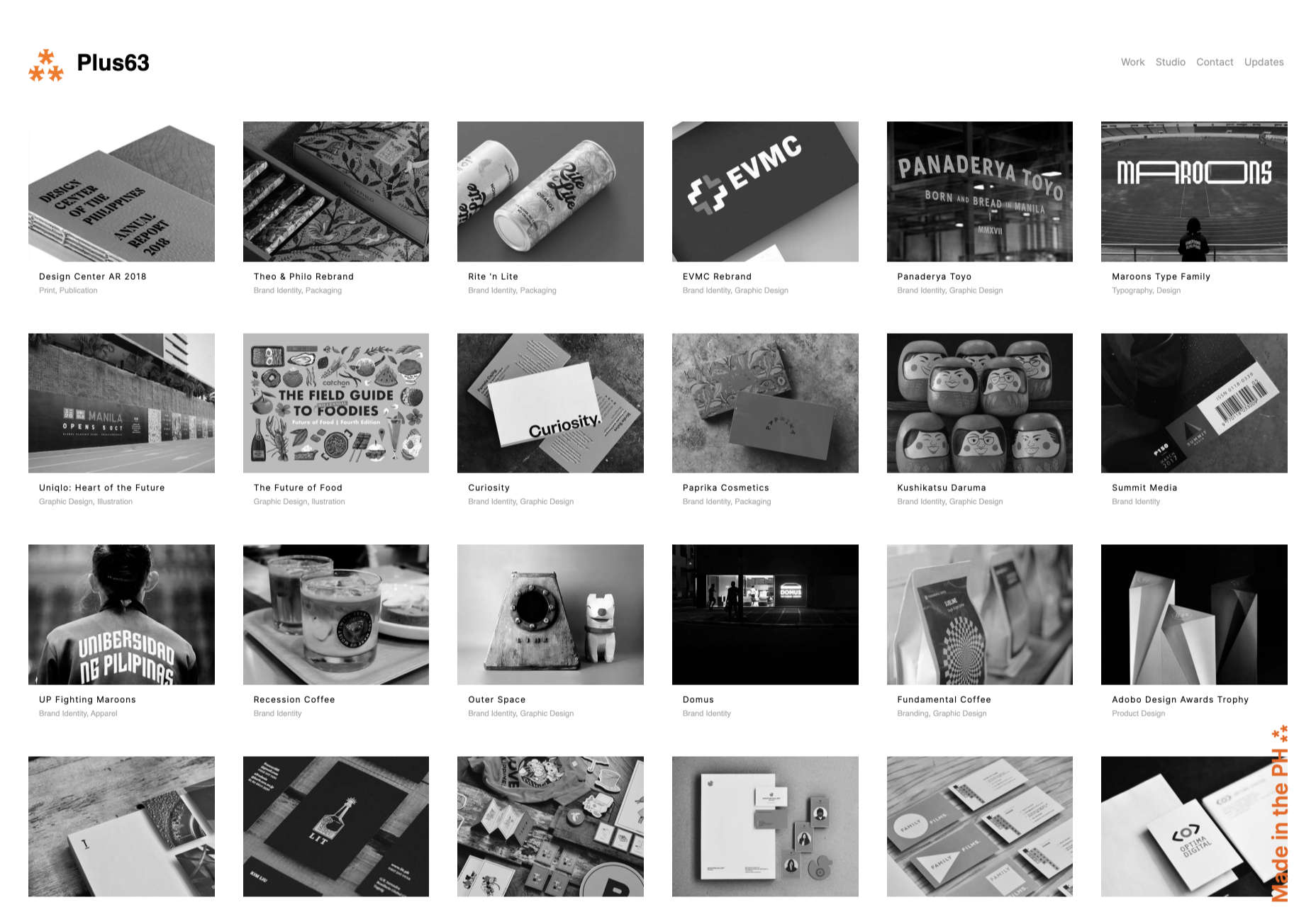
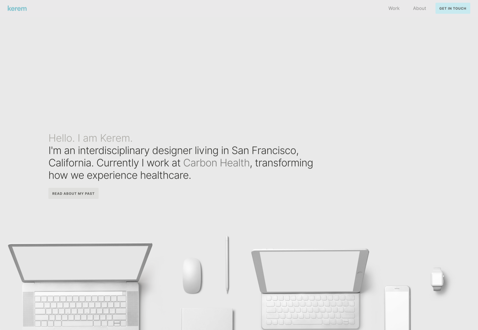
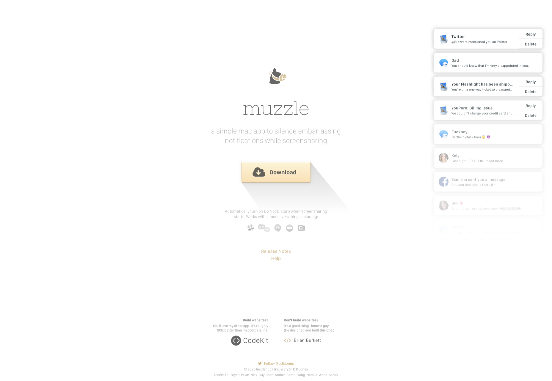
Design can make a statement. It evokes feeling and can encourage thought and conversation. That’s the common theme among the three trends in website design this month.

Each trend is rooted on the time and place where we live and includes elements that provoke thought. Kudos to these designers and design teams for jumpstarting conversations. Here’s what’s trending in design this month.

1. “Taking a Stance” Design

From social to environmental issues, design projects are echoing the sentiments of their audiences and organization in a way that take a stance on an issue.

Once taboo, this is becoming increasingly used as a technique for brands who are no longer worried about turning off a certain segment. The goal is to rally the core audience and people who feel the same way about an issue or cause.

There’s also a secondary thing happening here. Some designs aren’t really position based, but use imagery and language that resonates with a movement to associate with that feeling.

Never Heart uses “Join the Revolution” and a dark image with a heart to tug at your feelings. It can help create an association to a cause that you believe in without stating that cause directly. The design feels strong and inviting while making you feel like part of something.

Skye High uses “powerful” twice in the headline to convey a particular messages to women. The agency is looking to work with “powerful” women. It’s a timely statement and message that could resonate with a lot of business-women at various levels of their careers.

Discovered Wildfoods is a brand that is rooted in sustainability. The corporate model and responsibility of the brand shows through in the website. This type of design helps connect people with mutual feelings to the brand and products.

It’s refreshing to see more websites and brands embracing social causes and issues. It can be tricky for a number of reasons. But for some brands, it pays off.

2. Abstract Art Elements

If you are worried about a lack of images, or not sure how to portray images in an appropriate way due to the worldwide pandemic – groups or not, masked or not – abstract art elements can be the solution.

Widely used for startups and apps, more abstract design elements are everywhere. It’s an easy way to create strong visual interest without photography.

The most common use of abstract art elements is often in the form of geometric shapes with animation. This is something that almost anyone can understand and simple shapes and movement can be quite stunning when done well.

The good news is this aesthetic can work for almost any type of website. Try it for a redesign when you don’t have photography that feels appropriate in the current environment or if you want to create focus for content that drives website visitors to the words or scroll. This works with more abstract concepts when they are simple and help you move quickly from the visual to text.

Here’s how each of the examples handles abstract art elements:

Indicius uses bouncing circles that move toward text and down the screen to drive users to the headline and scroll action.

With Code uses a fun fuzzy circle with different animations to draw you in.

Appimized uses bright color and a monotone scheme with geometric shapes to sell its services.

3. Images That Make You Think

This might be the most visually interesting, and thought-provoking, website design trend we’ve seen in a while. These designs all feature images with a little something different or unusual that make you think.

There are a lot of different ways to do this – marry photographs and illustrations, create imaginary imagery, animations or effects, visual tricks that play on depth perception or create pseudo-3D effects.

The commonality is that the visual is so striking and unusual that website visitors stop and engage with the design. What do the “oddball” visuals mean? What message do they convey? How did they do that?

All of the questions could be associated with this different style of visual representation.

Bling uses a combination of a photo with illustrated animated elements to draw the eye. The yin and yang between reality and fantasy is quickly evident and makes you want to know more. (It doesn’t hurt that the animation uses dollars and lightning.)

Kibun is interesting because the photo choices create an optical illusion of depth. It matches the content of the design well because the website features artistic textile panels with an artistic design. The illusion is in the angles and coloring of photographs and their placements on the screen. The only downside of this design is that it loses the artistic panache on mobile because the images stack.

Oddball images can sell. We Are Mad stands out because it uses a contrived image, but doesn’t go oversized with it. The more subtle placement is ideal and arguably more attention-grabbing.

Conclusion

Website design can be a powerful thing, as these trends and examples show. Don’t discredit the power of choices in color, imagery, animation, and text when creating a digital experience. Design can mean a lot of different things depending on the audience as these examples show.

At the same time, these design trends are powerful and meaningful. They provide context into our world, our time, and our feelings. Don’t be afraid to experiment and make a statement with your design work. Just remember to keep in mind all potential impacts (positive and negative) before taking the project live.

Source


Source de l’article sur Webdesignerdepot