 A new design trend has emerged in the last year: Soft UI or Neumorphism is everywhere.
Even Apple is in on the trend; the company introduced a host of changes in both its mobile and desktop operating systems that use the style. The elements of Soft UI introduced by Apple reflect various aspects of the Microsoft Fluent UI design too.
So, if soft UI is such a huge concept, what do we need to know about it? How does soft UI work, and what are the pros and cons of using it?
What is Soft UI (Neumorphism)?
Soft UI involves using highlights and shadows in design elements to make them look as though they’re layered on the page.
The term neumorphism is derived from a previous design style — skeuomorphism, where designers create something as close to its real-life counterpart as possible. If you remember the shift between iOS 6 and 7, you’ll remember the switch between skeuomorphic and flat designs. However, neumorphic design isn’t quite as dramatic.
Neumorphism doesn’t focus excessively on things like contrast or similarities between real and digital elements. Instead, this “soft UI” practice creates a smoother experience for users.
With neumorphism, you get the sense that buttons and cards are actually part of the background they’re on. This trend removes the flashier aspects of a typical interface and focuses on a softer style that stays consistent throughout the design.
The Common Features of Soft UI
Soft UI is all about smoothing out the experience by making everything feel more connected. There’s nothing overly harsh in the aesthetic, hence the term “soft.”
So, what kind of features can you expect?
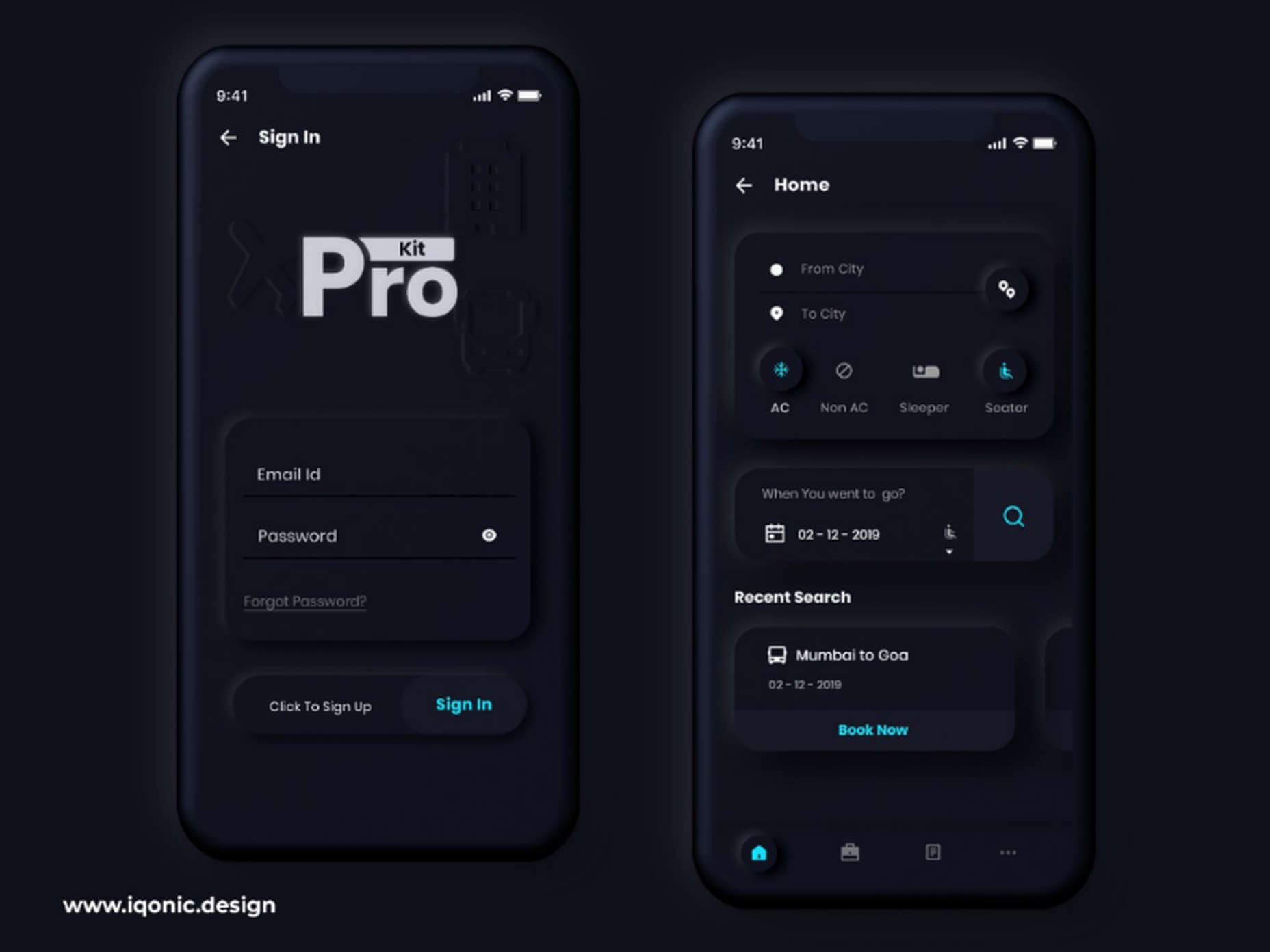
Rounded Corners: Soft UI removes some of the sharper parts of the interface, like the corners on modules and segments. This allows for a more gentle appearance overall. In this experimentation from Iqonic Design, we can see how the round corners tie everything together.
Transparency and Background Blur: Background blur and transparency are more popular today since the infamous iOS 7 solution emerged. Most people hated the appearance of ultra-minimalism, combined with thin fonts. However, the background blur effect was more popular. The blur in soft UI shows that part of the window is connected to the rest of the OS. It seems like parts of the background in the app are pushing through to the surface.
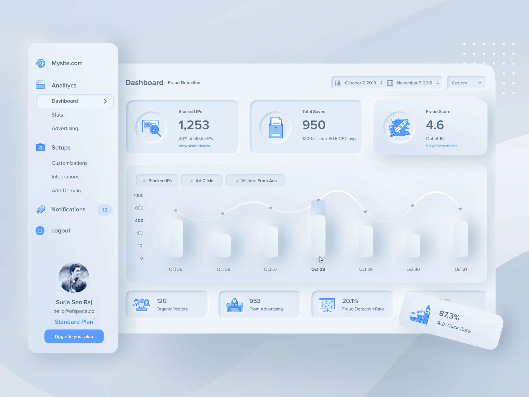
Unified Symbols: Everything needs to fit perfectly in a soft UI design. Anything that doesn’t look like it’s part of the same entity throws off the experience. In this design experiment by Surja Sen Das Raj, you can see how all the colors, shadows, and gradients tie together consistently. Because everything is more uniform, the experience flows perfectly for the end-user.
Implementing Soft UI Elements in Your Design
So, what does neumorphism look like in your UI design process?
Ultimately, it’s all about subtle contrast and aligned colors. Every part of your interface needs to look like it’s part of the same form. Your element and background need to be the same color so that you can create a feeling of objects protruding from the background.
With Soft UI, the keys to success are shadows and highlights.
Let’s take a look at some key steps.
Achieving the Soft Look
When you’re designing your interface, remember that sharp edges make the interface more serious and formal. Rounded corners are more playful and friendly.
What also makes the design look lightweight and delicate is plenty of deep shadows and highlights. When you add shadows to elements, you create a visual hierarchy. The items that cast a larger, deeper shadow are the ones closest to you. That’s why only a few elements need to cast an intense shadow. Everything else should work in the background.
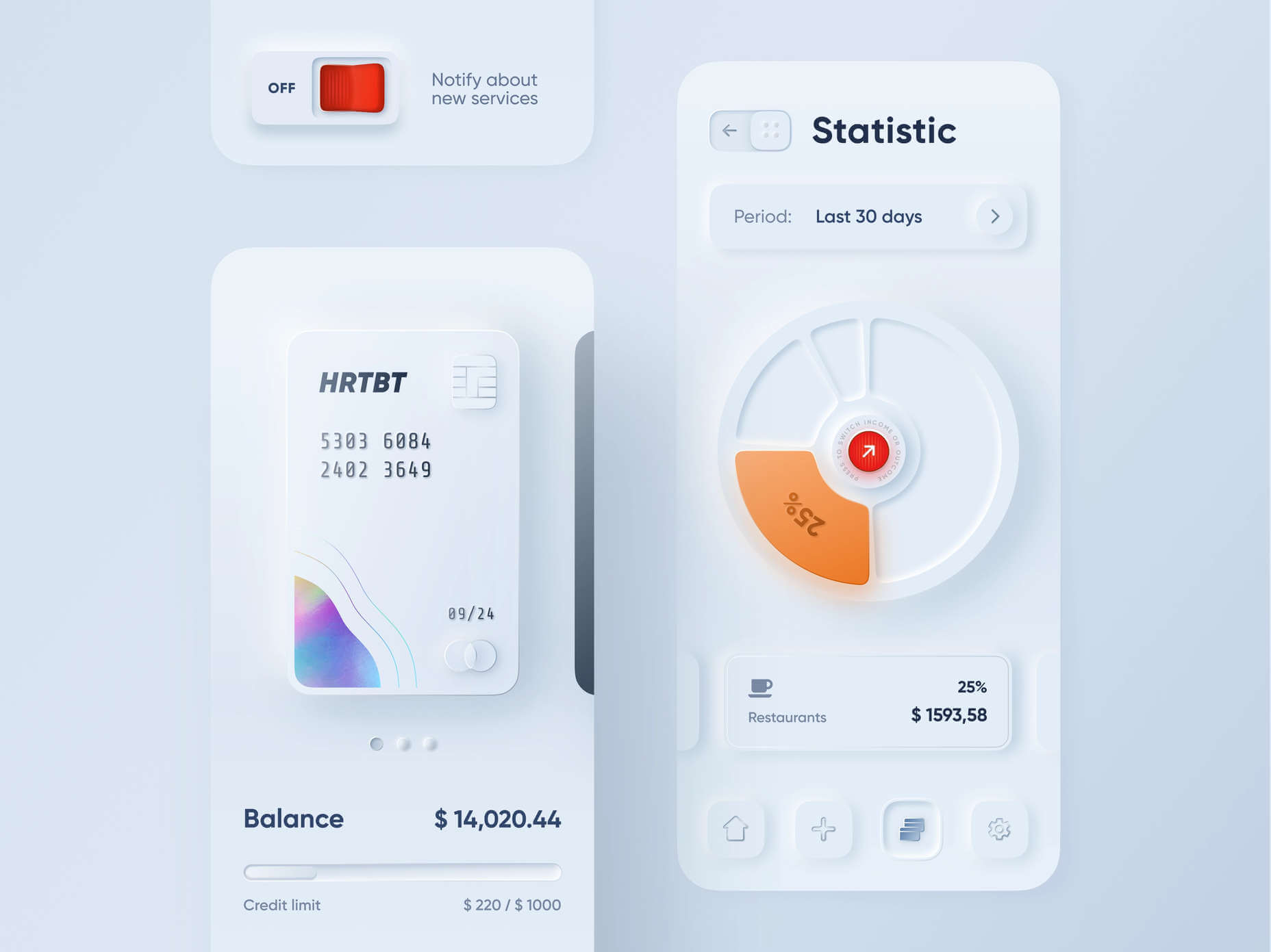
Take a look at this design by Alexander Plyuto, for instance.
Creating Smooth and Delicate Gradients
Gradients are part of the shadow and highlighting process in Soft UI design. Ideally, you’ll need to choose colors from the same palette, just toned down or brightened, depending on your needs. The gradient needs to be barely visible, but just enough to make the elements stand out.
For white gradients, like highlights, use a very delicate color somewhere between white and your background shade. For instance, consider this design from Marina Tericheva.
Consider the Little Details
Finally, remember that the neumorphism design principle is all about little details.
Choosing a font that visually matches the background is an excellent choice. However, you can also choose something more contrasting, as this will help information stand out.
Adding a little bit of the background into your fonts might be suitable too. For instance, if you have a green font and a grey background, add a little grey into the mix.
Extra elements in your design, like allowing a button to shift into a more recessed state after being clicked, are a great way to make the soft UI more engaging. Everything your end-user interacts with needs to feel smooth and perfectly unified.
The Problems with Soft UI Design
Just because a design process is trending – doesn’t mean it won’t have its issues.
Neumorphism is a fun way to make apps, operating systems, and websites feel more friendly and informal. However, this softer approach has a weak spot too.
When you’re dealing with a small margin of contrast and color where neumorphism works well, it’s hard to get the effect right every time. For instance, this all-yellow design for Dtail Studio may be overwhelming for some.
A slight deviation in saturation or a problem with your shadowing could render the entire effect of Neumorphism completely pointless.
Another major issue is accessibility. The soft UI design looks great for people who have a full visual range. However, visually impaired users might not see the same benefits. Anyone without perfect vision may see crucial objects disappearing into the background.
Your users don’t necessarily need significant vision problems to struggle with neumorphism, either. The design is all about softness that causes elements to almost blend together. People with low-quality screens that don’t have as many pixels to work with won’t see these elements.
Issues With Buttons and CTAs
Another major issue of neumorphism is that its subtlety can lead to problems with attracting clicks and conversions. Usability is the most important consideration of any UI design.
Unfortunately, when you focus on subtle elements throughout your entire interface, usability sometimes takes a hit.
Let’s consider buttons, for instance – they’re essential to any interface. To simplify the customer journey, these buttons need to be noticeable, and they need to shift into different states when your customers interact with them.
For the button experience to be excellent, users need to notice the design instantly. However, the heart of neumorphism revolves around the idea that nothing stands out too much.
This isn’t just an accessibility issue; it’s a problem for conversions too.
Neumorphism is soft on the eyes, with minimal color contrast and few color pops. This means that CTA buttons don’t stand out as much as they should. Buttons almost blend into the background, and the website struggles to pull attention to the areas that demand it most.
How to Experiment With Soft UI (Free Kits)
The key to unlocking the benefits of soft UI interfaces without getting lost in the negative points – is proper experimentation. Like any new design trends, professionals and artists will need to learn how to merge the elements of soft UI together in a way that doesn’t compromise usability.
Trends in UI design can’t focus exclusively on aesthetics, as a customer’s comfort will always be an essential part of the process.
If you want to start exploring, here are some of the best kits and freebies to get you started:
Closing Thoughts on Soft UI
The world of design and the trends that we use are constantly changing. Companies are always searching for the best ways to connect with their users. Often, this means focusing on an interface that really connects with your target audience and delivers the best possible results.
The soft UI design trend has its benefits and its downsides. On the one hand, the smooth appearance of every element on a combined screen can deliver a delightful aesthetic. Buttons feel less imposing, and elements are friendlier and easier to interact with.
On the other hand, neumorphism also makes it difficult to truly capture your audience’s attention in the places where it matters most. It suffers from accessibility issues and requires plenty of care and practice.
Source
The post Soft UI: Making Sense of the Latest Design Trend first appeared on Webdesigner Depot.

Source de l’article sur Webdesignerdepot
Cybersécurité : Quelles solutions pour vos mobiles ?
Actualités, Sécurité de l'information et du SI, Sécurité de l’information, Sécurité du système d’informationLes cyberattaques sont de plus en plus fréquentes. Le télétravail et la mobilité permanente des collaborateurs sont devenus incontournables et exposent les entreprises à de nouveaux défis en termes de sécurité mobile.
The post Cybersécurité : Quelles solutions pour vos mobiles ? first appeared on UnderNews.
Source de l’article sur UNDERNEWS
Feature Flag, What? Why? How?
Actualités, Méthodes et organisation des process ITVelocity in agile development measures the quantity of work a team can accomplish in a sprint. It can be measured in story points, hours or days. The higher the velocity of a team, the more features it delivers, the more value it brings to customers. Sprint velocity is a good measure in sprint project management to evaluate and estimate team productivity.
The measure of the velocity is based on multiple factors: the continuous integration (CI) process, the time to qualify the code changes, to test the regression, the security, the delivery, etc…
Source de l’article sur DZONE
64 % des entreprises adoptent ou prévoient d’adopter la technologie SASE l’année prochaine
Actualités, Sécurité de l'information et du SI, Sécurité de l’information, Sécurité du système d’informationSelon une étude mondiale réalisée à la demande de Versa Networks, le confinement imposé par la pandémie a fait grimper en flèche l’adoption du SASE (Secure Access Service Edge) par les entreprises. 34 % d’entre elles disent avoir déployé la technologie SASE l’année dernière, et 30 % prévoient de le faire au cours des six à douze prochains mois. Cependant, malgré cette adoption rapide de la technologie SASE, la majorité (69 %) des professionnels de l’informatique et de la sécurité ne savent toujours pas ce qu’elle signifie vraiment.
The post 64 % des entreprises adoptent ou prévoient d’adopter la technologie SASE l’année prochaine first appeared on UnderNews.
Source de l’article sur UNDERNEWS
87 % des Français prêts à partager leurs données pour accéder à des services en ligne gratuits
Actualités, Sécurité de l'information et du SI, Sécurité de l’information, Sécurité du système d’informationAccepter la circulation des données : 87 % des Français prêts à partager leurs données pour accéder à des services en ligne gratuits. D’après une nouvelle enquête de Kaspersky, près de neuf internautes français sur dix (87 %) sont prêts à partager leurs données personnelles pour accéder gratuitement à des services en ligne 35 % seulement des internautes […]
The post 87 % des Français prêts à partager leurs données pour accéder à des services en ligne gratuits first appeared on UnderNews.
Source de l’article sur UNDERNEWS
BIOS Disconnect: New High-Severity Bugs Affect 128 Dell PC and Tablet Models
Actualités, Sécurité de l'information et du SI, Sécurité de l’information, Sécurité du système d’informationCybersecurity researchers on Thursday disclosed a chain of vulnerabilities affecting the BIOSConnect feature within Dell Client BIOS that could be abused by a privileged network adversary to gain arbitrary code execution at the BIOS/UEFI level of the affected device. « As the attacker has the ability to remotely execute code in the pre-boot environment, this can be used to subvert the operating
Source de l’article sur The Hacker News
Building a Lightweight Trino Distribution
Actualités, Méthodes et organisation des process ITToo many data frameworks built for large scale have unacceptable complexity at small scale. But with a few tweaks, Trino scales down to run nicely on small single-container configurations.
Trino (fka PrestoSQL) is an open source query distribution engine.
Source de l’article sur DZONE
Plus d’un tiers des organisations ne juge personne responsable des cyberattaques
Actualités, Sécurité de l'information et du SI, Sécurité de l’information, Sécurité du système d’informationL’étude mondiale de LogRhythm révèle le décalage entre les décideurs des entreprises et les équipes de sécurité, alors même que les nouveaux risques liés au télétravail et aux rançongiciels augmentent.
The post Plus d’un tiers des organisations ne juge personne responsable des cyberattaques first appeared on UnderNews.
Source de l’article sur UNDERNEWS
Soft UI: Making Sense of the Latest Design Trend
Actualités, ActualitésEven Apple is in on the trend; the company introduced a host of changes in both its mobile and desktop operating systems that use the style. The elements of Soft UI introduced by Apple reflect various aspects of the Microsoft Fluent UI design too.
So, if soft UI is such a huge concept, what do we need to know about it? How does soft UI work, and what are the pros and cons of using it?
What is Soft UI (Neumorphism)?
Soft UI involves using highlights and shadows in design elements to make them look as though they’re layered on the page.
The term neumorphism is derived from a previous design style — skeuomorphism, where designers create something as close to its real-life counterpart as possible. If you remember the shift between iOS 6 and 7, you’ll remember the switch between skeuomorphic and flat designs. However, neumorphic design isn’t quite as dramatic.
Neumorphism doesn’t focus excessively on things like contrast or similarities between real and digital elements. Instead, this “soft UI” practice creates a smoother experience for users.
With neumorphism, you get the sense that buttons and cards are actually part of the background they’re on. This trend removes the flashier aspects of a typical interface and focuses on a softer style that stays consistent throughout the design.
The Common Features of Soft UI
Soft UI is all about smoothing out the experience by making everything feel more connected. There’s nothing overly harsh in the aesthetic, hence the term “soft.”
So, what kind of features can you expect?
Rounded Corners: Soft UI removes some of the sharper parts of the interface, like the corners on modules and segments. This allows for a more gentle appearance overall. In this experimentation from Iqonic Design, we can see how the round corners tie everything together.
Transparency and Background Blur: Background blur and transparency are more popular today since the infamous iOS 7 solution emerged. Most people hated the appearance of ultra-minimalism, combined with thin fonts. However, the background blur effect was more popular. The blur in soft UI shows that part of the window is connected to the rest of the OS. It seems like parts of the background in the app are pushing through to the surface.
Unified Symbols: Everything needs to fit perfectly in a soft UI design. Anything that doesn’t look like it’s part of the same entity throws off the experience. In this design experiment by Surja Sen Das Raj, you can see how all the colors, shadows, and gradients tie together consistently. Because everything is more uniform, the experience flows perfectly for the end-user.
Implementing Soft UI Elements in Your Design
So, what does neumorphism look like in your UI design process?
Ultimately, it’s all about subtle contrast and aligned colors. Every part of your interface needs to look like it’s part of the same form. Your element and background need to be the same color so that you can create a feeling of objects protruding from the background.
With Soft UI, the keys to success are shadows and highlights.
Let’s take a look at some key steps.
Achieving the Soft Look
When you’re designing your interface, remember that sharp edges make the interface more serious and formal. Rounded corners are more playful and friendly.
What also makes the design look lightweight and delicate is plenty of deep shadows and highlights. When you add shadows to elements, you create a visual hierarchy. The items that cast a larger, deeper shadow are the ones closest to you. That’s why only a few elements need to cast an intense shadow. Everything else should work in the background.
Take a look at this design by Alexander Plyuto, for instance.
Creating Smooth and Delicate Gradients
Gradients are part of the shadow and highlighting process in Soft UI design. Ideally, you’ll need to choose colors from the same palette, just toned down or brightened, depending on your needs. The gradient needs to be barely visible, but just enough to make the elements stand out.
For white gradients, like highlights, use a very delicate color somewhere between white and your background shade. For instance, consider this design from Marina Tericheva.
Consider the Little Details
Finally, remember that the neumorphism design principle is all about little details.
Choosing a font that visually matches the background is an excellent choice. However, you can also choose something more contrasting, as this will help information stand out.
Adding a little bit of the background into your fonts might be suitable too. For instance, if you have a green font and a grey background, add a little grey into the mix.
Extra elements in your design, like allowing a button to shift into a more recessed state after being clicked, are a great way to make the soft UI more engaging. Everything your end-user interacts with needs to feel smooth and perfectly unified.
The Problems with Soft UI Design
Just because a design process is trending – doesn’t mean it won’t have its issues.
Neumorphism is a fun way to make apps, operating systems, and websites feel more friendly and informal. However, this softer approach has a weak spot too.
When you’re dealing with a small margin of contrast and color where neumorphism works well, it’s hard to get the effect right every time. For instance, this all-yellow design for Dtail Studio may be overwhelming for some.
A slight deviation in saturation or a problem with your shadowing could render the entire effect of Neumorphism completely pointless.
Another major issue is accessibility. The soft UI design looks great for people who have a full visual range. However, visually impaired users might not see the same benefits. Anyone without perfect vision may see crucial objects disappearing into the background.
Your users don’t necessarily need significant vision problems to struggle with neumorphism, either. The design is all about softness that causes elements to almost blend together. People with low-quality screens that don’t have as many pixels to work with won’t see these elements.
Issues With Buttons and CTAs
Another major issue of neumorphism is that its subtlety can lead to problems with attracting clicks and conversions. Usability is the most important consideration of any UI design.
Unfortunately, when you focus on subtle elements throughout your entire interface, usability sometimes takes a hit.
Let’s consider buttons, for instance – they’re essential to any interface. To simplify the customer journey, these buttons need to be noticeable, and they need to shift into different states when your customers interact with them.
For the button experience to be excellent, users need to notice the design instantly. However, the heart of neumorphism revolves around the idea that nothing stands out too much.
This isn’t just an accessibility issue; it’s a problem for conversions too.
Neumorphism is soft on the eyes, with minimal color contrast and few color pops. This means that CTA buttons don’t stand out as much as they should. Buttons almost blend into the background, and the website struggles to pull attention to the areas that demand it most.
How to Experiment With Soft UI (Free Kits)
The key to unlocking the benefits of soft UI interfaces without getting lost in the negative points – is proper experimentation. Like any new design trends, professionals and artists will need to learn how to merge the elements of soft UI together in a way that doesn’t compromise usability.
Trends in UI design can’t focus exclusively on aesthetics, as a customer’s comfort will always be an essential part of the process.
If you want to start exploring, here are some of the best kits and freebies to get you started:
Closing Thoughts on Soft UI
The world of design and the trends that we use are constantly changing. Companies are always searching for the best ways to connect with their users. Often, this means focusing on an interface that really connects with your target audience and delivers the best possible results.
The soft UI design trend has its benefits and its downsides. On the one hand, the smooth appearance of every element on a combined screen can deliver a delightful aesthetic. Buttons feel less imposing, and elements are friendlier and easier to interact with.
On the other hand, neumorphism also makes it difficult to truly capture your audience’s attention in the places where it matters most. It suffers from accessibility issues and requires plenty of care and practice.
Source
The post Soft UI: Making Sense of the Latest Design Trend first appeared on Webdesigner Depot.
Source de l’article sur Webdesignerdepot
Pakistan-linked hackers targeted Indian power company with ReverseRat
Actualités, Sécurité de l'information et du SI, Sécurité de l’information, Sécurité du système d’informationA threat actor with suspected ties to Pakistan has been striking government and energy organizations in the South and Central Asia regions to deploy a remote access trojan on compromised Windows systems, according to new research. « Most of the organizations that exhibited signs of compromise were in India, and a small number were in Afghanistan, » Lumen’s Black Lotus Labs said in a Tuesday
Source de l’article sur The Hacker News
Cloud Security Management Is Flawed
Actualités, Méthodes et organisation des process ITThe network model for security fails in the cloud. While the old on-prem model made sense in the earlier days of computing, the rapidly expanding suite of cloud providers, along with their infinite combinations of settings and services, now places an extraordinary burden on security teams to become cloud-centric. An enterprise that doesn’t fully understand its role in securing its data in the public cloud is taking unnecessary risks with its outdated security strategies.
In the traditional data center, the network provided a secure boundary for the organization. The network was carved up into zones and trusts were established within and between zones. Security architectures were established and tools deployed based on this strategy, which largely involved monitoring the traffic flows and enforcing controls where the zones met. But in the cloud, this approach is no longer relevant. Time and again, in breach after breach, headline after headline, the modern attack cycle, particularly in the cloud, starts with identity. Attackers seek access to the identity, then pivot between resources, discovering credentials and other identities that give them more and more access to get what they want.
Source de l’article sur DZONE